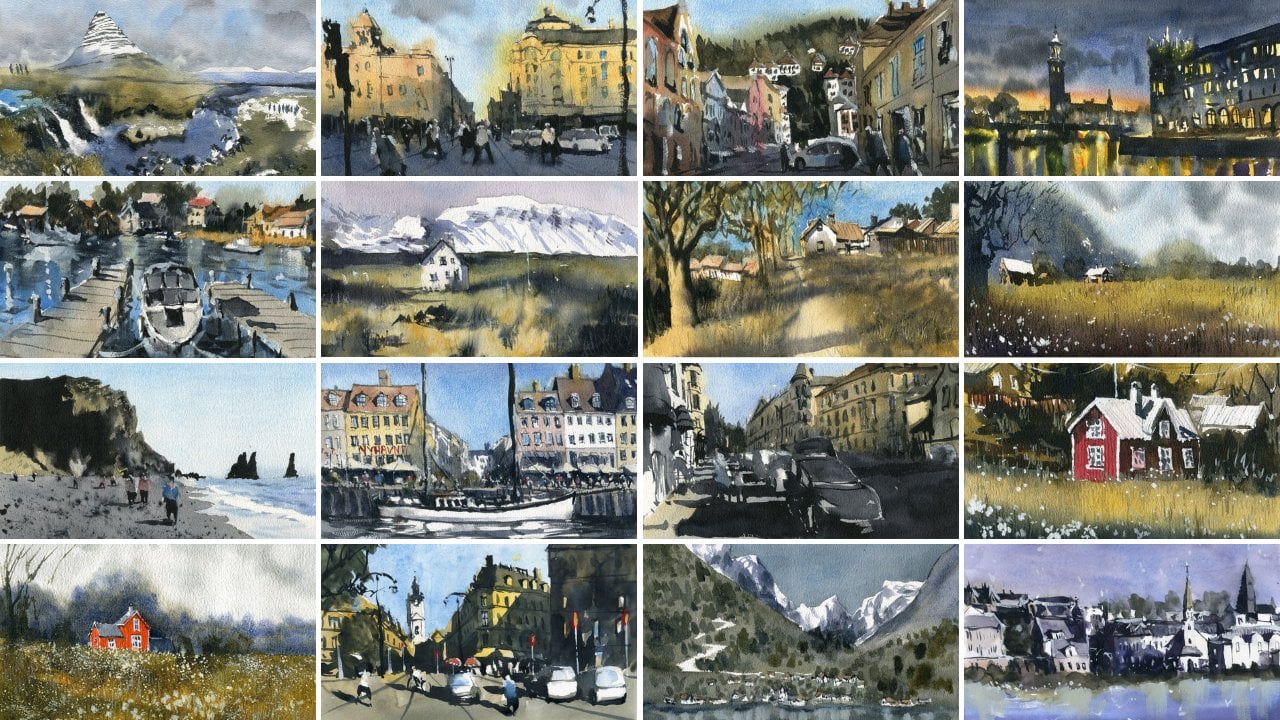
Transcripts
1. Introduction: Hi, everyone, and welcome
to line and wash for beginners Nordic
scenes made simple. My name is Darren Yeo, watercolor
artist and instructor. And in this class, I'll
be guiding you through the relaxing and creative
world of line and wash, otherwise known as pen and wash, where loose watercolors meets
expressive ink linework. Together, we're going to
be creating a series of Nordic inspired landscapes
and streetscapes. And you learn to build confidence ink linework using
simple shapes and textures. We're going to be going
through how to add depth, mood with different
light watercolor washes. Simplify complex scenes into elegant minimalist
compositions and develop your own expressive sketchbook friendly
line and wash style. This class is designed
especially for beginners. So even if you've never picked
up a pen or brush before, and I'm going to be guiding you through every
step of my process, all of my techniques
along the way. And by the end of this class, you should have a beautiful
collection of Nordic scenes and the skills to create your own pen and wash
artworks anywhere, whether you're at
home or traveling. So grab your pen,
your watercolor set, and let's get started painting the quiet
beauty of the North.
2. Materials Required: So I want to go through the
materials that we're going to be using in this
class, and by no means, is this a prescriptive
kind of instruction? It's just going
through, I guess, the materials I use and how to get the same or
similar results. Now, in terms of paper, I'm using cotton
watercolor paper. So I've got various
sort of surfaces. This one is hot press. So it's basically a
very smooth surface. As you can see,
there's no texture on that paper compared
to this one here, which is cold press Okay. And you can see, there
are lots of kind of divots there,
lots of texture. So you do get slightly
different kind of looks, as you can see, that one
looks a little bit smoother, especially with a
sky less blotchy, but you also get more
dull tone down colors compared to the hot
press paper, okay? Now, they're all made of cotton, but again, you don't
need cotton paper. Any type of watercolor
paper will do you fine. But just keep in mind, if you're not using
cotton watercolor paper, sometimes that can be a little trickier for beginners
because you know, you do get blotchiness, some unanticipated effects,
that kind of thing. This sketchbook, as well, which I do a couple
of scenes in, is 100% cotton paper, and also, also, as you
can see, hot press. There's no texture on there. With hot press paper,
it is difficult, more difficult anyway to get these nice transitions
here and there, because the paper does not dry evenly like you do
with hot press, not cop press, but
cold press and rough paper like
this with texture. So yeah, if you're starting out, I wouldn't worry about
it too much, but again, I think, yeah, paper
with a little bit of texture on it
is more forgiving. And again, cotton paper. But if you don't
have that, just make sure you use whatever you have. Now, in terms of pens, I use, you know, two types of pens. So these ones here are
basically and as you can see, just ink pens, and
the NIBRey pens. These come with, like,
a liquid ink inside and basically like a
ball point on the top. So this gets you, like, a much more I don't
know how to put it, but a much more distinct
kind of look to your lines, Okay, compared to
say this one here. Okay? So this one it was drawn
with these pigment liners. So pigment liners are kind of
There's ink inside as well, but they have this kind
of felt tip on the top. So yeah, it basically
doesn't look as harsh and the I do find that the top of the pen
will skip over the paper a little bit as well. So it just looks a
little more loose. So yeah, just something
to keep in mind. These ones are a lot
cheaper, though. So yeah, it just depends on the kind of style
that you want. I do find with the
pigment liners, as well, is that they do come
in many different sizes. So if you're going to get a
normal ink pen like this, probably a 0.5 or 0.7 are
the best options to go with, whereas these ones come in
various different thicknesses, you know, 0.05 up to 0.8. And, in fact, I have
another set that has a few other interesting
kind of nibs on them, as well. But yeah,
they're not needed. At the end of the
day, if you just have a 0.5, that's fine. Big thing to make
sure is that these pens state waterproof on them. So you can see here on the side, there's waterproof, same
with these pigment liners. It's very important
because once you draw, you don't want to go over
with the watercolors and cause a big mess with all
the ink going everywhere. So they need to they really
need to be waterproof. So let's move on now to brushes. These are the brushes that
I'll be using in this class. And I have these
round brushes here, just some synthetic
round brushes. Now, you're not going to
really need all these. Probably a small one and
a large one's going to be fine and also a
watercolor mop brush. And if you don't have the
mop brush, that's fine. But the mop brush does help
to pick up more paint. So if you're painting
large areas like skies, maybe some
of these trees, you don't have to
keep going back to the paint well and picking up more color over
and over again, having to mix it
up and find this is a great little tool to use. And yeah, with pen and wash, you're not really looking at the full set of brushes
sometimes that you get with actual proper
watercolor painting because it's kind of
like a coloring in book. You're just filling
in bits and pieces here and it doesn't
have to be perfect, and it's meant to
be quite quick. Now, this is a little set
of watercolors that I use, and there's various different
sets of watercolors, okay? But I do use these ones here that have these
dried up pans. Now, if you you know, if you've got liquid paint,
that's fine, as well. I actually get liquid paint, squeeze them back
into these wells once they run out and they
end up drying up anyway. And I just find it a
little easier to control the quantity of paint
on my paint brush by, you know, when they're
dried and I can actually take out however
much I actually need. So yeah, in terms of the colors that you'll
need for this class now, basically, there's just a few colors that
I often go back to. So there's a bit of white here, and I do have some
yellows, a yellow ochre. There's an orange here. Do you have a Hansa yellow in
a separate palette as well, do you have a red, can be permanent red,
can be piral red. Some earthen colors
are important. So if you have, like, a
darker brown, that's fine. Then you can just dilute it
to make a more lighter brown. Cerulean blue for the sky is
an important one, as well. I got a bunch of blues and
purples here at the bottom. But yeah, essentially, if you've got your three primary colors, you've got if you've
got a yellow, if you've got a
red and you've got a blue in there should
be absolutely fine. You can mix up most
colors with those. The white is more of a bonus color because I
like to mix that with the yellow to make it kind
of creamy yellow ish color. So that's it for your materials.
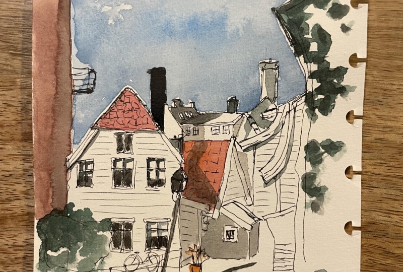
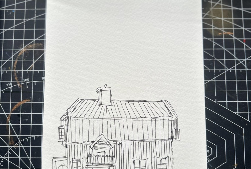
3. Bergen, Norway Drawing: We're going to get started
with the drawing on this one. I'm going to put the
bottom of the house here, scenario in Norway
called Bergen. I took this photograph
because I really liked how the light just reflects
off these white houses, and we've got this one here. I'm just going to
draw free handed holding my pen
right at the edge. Roughly look at where the
roof of the house is. Now, this bit of
paper is a little bit longer than the
actual photo reference. I'm going to have to
make a few bits up, maybe they won't be exact a
proportion, but that's okay. There we go. That general
white house there. You can see I've finished
it off round about here. You've got a bike, maybe here. I'm going to draw that in a
quick little scribble here. You got the seat and maybe the handlebars here,
something like that. You've got also
some railing there. The house itself, you
can see the rooftop has this separation up area
here, this top section, where you've got the
just some little tiles, which I'm going to quickly
indicate like this. Not too much, but just enough to indicate
something up there, of course, you can start
putting in some windows. Remember, there's
two sets of windows, three levels really this top one there and then
you've got one here. You've got one just directly
below that top one there, and one here not
percent symmetrical. But these small little
features like this, again, they're not going to make a huge difference at the
end of the day once you finish off the whole scene, no one's really going to notice, but I try to get them roughly
as per the reference, and you've got these window
frames as well that you can just put in again,
fairly roughly. I'm um not going to try to go
for complete accuracy here. That's there you go. You can see also within
the windows that there are some darker
areas within some of them so you can go ahead and add in little
details here and there. The great thing
about this pen is if you don't try to
make it perfect, it ends up actually
looking better. If the line a little bit
wonky, as you can see, not all these lines are perfect, just leave it in
and continue along. This is just a
sketching exercise. Think of it as an exercise rather than trying to
come up with something that's completely completely
formulated and finished. I like to hold the
pen right at the end because it helps me
to keep things loose and more relaxed rather than overthinking everything the further down you hold the pen, the more accurate you can be. Okay. But for a
more sketchy look, I'd recommend holding the
pen a little bit further up. Again, not worrying too much
about the detailing and look at all these objects as all these windows
and stuff like that, just as objects. Shapes. This is a square
within a rectangle. If you draw the
shape, it will look like the actual thing you're
trying to draw rather than trying to look at it as
a whole as a house because the complexity of this again can be overwhelming
for a lot of people. If you draw shape by shape, you'll figure out at some point, it will then start
looking like what you're trying to actually draw. So it's another house or
whatever at the back there. It's kind of difficult to see
exactly what's at the back, but I'm going to try my best
to get in this other house. It's like the side of a house
out the back with again, like a rooftop there, a couple of chimneys, and it sort of runs down in this other house
runs to the right, like the rooftop of it, and then you've got
this little chimney or what have you
there on top as well, look just again, very quick
little scribble like that. You've got a bit of darkness on the right hand side
there and then it just trails off here to the
right let's have a look. It's actually probably a bit, um, like that, there's a darker section there
to the right of the house. I'm making this a
little bit bigger. I just want to emphasize it more and here you've got another
rooftop of another house, there's another rooftop of
something out the back there and another really
tall area here, like a chimney or something, I guess, make it a bit
more three dimensional. Um, like that. Then we've got all these white houses coming in from the right hand side, which I'm going to just um, pencil in and simplify down. You've got this one here. Again, I'm not really looking at them as houses or
anything serious. I'm just looking at them as basic shapes and trying to
replicate those shapes. All this stuff again is going
to be in the dark here, so we don't need to focus on
the complexity of detail. Just try to work on those lines. This is the side of the house, I guess, here, bits here. Um, there we go. We've got this house here, in the background, the
side of it from the right. In this overlay, I suppose, of these houses that just, um, run down the side here. There we go there, and then we might
have another one coming all the way up here, and then it finishes
off the top like that. That disappears off
a little bit there. Then down the side
of the building, you've got these
horizontal lines, linework running down
the side of the house. Um, all these houses over there just have that
kind of finish to it, the wooden planks going
across stops around there. Let's start um detailing this extra area at
the back as well. That can be again,
just another one. Again, very simple.
I'm not trying to getting a huge
amount of detail here. What else do we have
around in here? Look, this house as well, there are little bits of
darkness on the right side, the rooftop here could
be darkened like that. A bit of hatching in the
direction that I want to imply some shadow. There's things
people do as well. For example, you can
just for example, hatch in some of this
shadow shape here. Now, again, there are windows and stuff on the side
of this building. I can just um, put in like that, little indications of windows, and then I'll just hatch
downwards like this. Again, this shadow
like shape. Like this. You don't need to do
this shadow as well, you can wait right till
the end if you want. This is the boards of these houses and what have you at the back
simplified down. Of course, this bit
in the sunlight here. There's a house all the way
back there and then again, more details coming
out like this. I'm just simplifying this section out the
right down here, might actually put in maybe a person walking
here a couple of figures because there
is a bit of white space that I can fill in like that, just a couple of people maybe
walking into the scene. Here is going to be
really dark as well. The left hand side. Plus you got this other
building that runs all the way up and finish well, finishes all the way to the
top of the scene there. It's a little balcony
here as well. Yeah. Running down. That's going to be all dark. Same on the building. You've got a tree here that's
put in this tree, a little shape of the tree
in the side, and of course, you have some of this
railing now that just comes all the way
out into the foreground, but I can extend
it out to there. Again, you've got this shape
here with the lamppost, which I can indicate
this like that. Quick little indication
of that lamppost. A lot of this stuff
here is pretty dark, so I don't need to really
detail that much in there, but another thing you could do is perhaps put in a figure here in the foreground. I'd like to put if I'm going
to put figures in here, I'd like to put in
multiple figures. We've got a few, not just one or three maybe walking through
to indicate this um, sense of light not sense
of light and shadow, but sense of depth in the scene. Having a look around, do I have anything else I want to
potentially put in here? I mean, the building, you know, as you can see, there are some
little lines running across all the bits of
wood and what have you. So I can just skip
over some parts. Let's just try to indicate
some of this stuff. Yeah, these little planks of wood are very important
because they indicate, I guess, the design
of these buildings. And, um, have a look,
what have I done here? An area. It's part of
that house, I guess. Let's have a look at
what have I done? Probably should put in the side of some area there
of this house. Um, shade that in a little bit. Great. Let's get started with painting.
4. Bergen, Norway Painting: Of cerulean blue for the sky. Drop that straight
in, like that. I want this to be really light. I mean, pretty much 10% paint. The rest of it is just water, and I'm just dropping
this in with a mop brush. As you can see, it's like a really large
brush that helps me to spread this paint around without having to go
back into the palette again. Just cut around
the houses because really important
thing here is that we're leaving the houses white, which is a main feature of
the scene of these houses. Marry that around here. Let's go around here, be
careful with this one. Yep. Around like this. Okay. Great. All we got
to do with the sky. I might just spread
that around a little, put in a bit darker blue or
something up the top here for a bit of
variation like that. Good. All right. I'm going to let that all dry off mop a bit of that up first. Good. I've got a bit here. That's no big deal. Right toe. What I'll do now is maybe swap to a slightly
smaller brush, a smaller ground brush, and we're going to put in a bit of the warmer colors
on the houses. I've got a bit of brown and red. I think this is going
to be good like a brownish red for this
top of this house. Something like that,
like a brownish red. You can mix one up
yourself as well. Try not to get the sky
to mix in with it, but something like
that should be fine. I believe this one
also there's a bit of brownish red color on the top of this
roof, maybe a bit. Actually no, that's
fine. Bit here, perhaps the side of this house. There we are. Tiny a bit
more brown in there. Good. Aria. What else
do we have? Good. I pick up a bit of
this yellowy color and start putting in a bit of that roof these little
little chimneys. There's maybe some gray which I'll pick up that's just
left over on the palette. I want to get in some color
here for the rooftops. So gray Gray is just a mixture of every
color that you have. If you have a messy
palette like me, it makes it a lot
easier to get this in. This is basically just a
general rooftop color. That's a bit too blue. Let me just mix in some
of this other stuff here. Okay. Good. I might actually leave
in the little bits of white on the left
side of those chimneys, but this one does need to
be perhaps darkened a bit. I have to go into
that one more time actually afterwards darken it. Good. Here we have also some darkened area here
where the house is and going to put in this bit darker
darker grayish shadow or whatever that's running
across this building. There and actually,
if you look at it, it's running all the way down. This is just a
bluish gray color. Can you a bit of purple
in there as well? Running all the way down
here and it's creating this really interesting contrasts
around these figures. Make it dark there
in the background. Here. All right. Good. It looks like there is a bit of a shadow there in the back running through the center
of all these houses here. Oops. I've gone over
this one a bit too much, but this house a bit too
much, but it should be okay. So that, let's have a look. There should be a bit
of shadow here too. All right. Maybe here there
doesn't have to be perfect. I just want to make sure
the light source coming in from the left hand side
that you've got a bit of, yeah, a bit of darkness
running to the right. A lot of these houses,
they're pretty much not pretty much in the light. There's not much we
need to do there. Might just make this
bit up here and, um, get an indication of some
shadow running to the right, just to cut around
that figure a touch. Okay. Great. This building here, I will put in a little bit
of some kind of shadow. That, yep. Blue and brown mix makes a really nice grayish
value as well. Great. Because we need to have something running
through the base of this get some blue
and brown together. Purple is also a
great shadow color. I do use a lot of
purples in my paintings. Over here, I might just dab
off a little bit of that and leave some of this
light in the background. But otherwise, I will
actually just get in this big shadow in the
foreground running to the right. I'm using some gray
now, just pure, dark gray to create a very, very dark contrast here and also maybe get in a few of
these little marks running into the
foreground like that. This house actually runs
all the way down here, so I can just imply
the bottom of that house there Okay, good. What might help is if I just wet some of these areas
of the house here, here, just wet this
area a little bit, where we've got some
shadows and I'll just drop in some little uh, I don't know, indications
of shadows that might spread out along
this area of the building. Here, let's do the same thing. Like that, drop that in a bit. This building to the
left is really dark, so I'm just going to
drop in this dark color, bit of orange as
well, like that. Runs to the left and then
disappears off there. Good. These look a little bit
like softer shadows, I guess, running
across the building. Good. These little,
as you can see, these little bits and pieces. Might be good at this stage to swap to a smaller
brush when you're detailing and slow down a touch. When you're detailing these
shapes like the lamp posts, the tiny details
here they will help to bring out the I
guess the story, the scene that you're trying to tell story you're
trying to tell. Leave a bit of time
there to do that. There's a bike here at the back. As well, I can just indicate
bits in this railing. It's a really dark color, really dark black there and um notice I'm just paying a bit more
attention to that area. Plus, you've got these windows. You can put in a bit of some detailing
there for the windows. I mean, there's a fair bit
all over, to be honest, but, you know, just something like this
maybe to darken up. Bring out the contrast of those window frames,
those white frames. This thing, as I said before, needs to be darkened to
touch the background there, that chimney or what have you. Maybe this roof as well. I could do with a bit of
darkening and I'll leave a bit of these windows or whatever
they are, those windows. Move that across there
and then I'll Oh. Let's just get in
this other rooftop. Again, this is a section
that's quite dark. So it's almost like I'm just redoing this shadow
section a touch. Because it does as you
see in the reference, it does need to be darker than what it looks
like at the moment. But I'm leaving on a bit
of that previous wash as well so that it still
looks like something. Is multiple layers of detail
running through here. Then here at the base, I'll
go a bit more easy like that. This probably should
be a little darker in there as well, like that. Uh, Yep, really just darken around some of these figures
of touch as well. I like to also put in the legs of the figures
around this time, so you can put in one leg there, a couple of legs,
really dark paint that hits the ground like this. There we have it. Then
we have this figure here walking into the scene. Legs here could be walking
towards us as well, tell. But these ones in the sunlight. That's important to
just get them in. I will include this shadow, legs just running to the
back a bit like that, some shadows and same with this one touch maybe
running towards the front. That shadow of that figure, um, these bits of railing
and stuff as well, should have some shadows, um, not to mention perhaps some darker sections of
shadow also down the front that's weaving into this other
bit of the shadow. Yeah. Various bits of, um, detail. You have to make sure
you add in so that it's not too boring and
all the same value. That could be a bit
of darkness in there. Let's have a look in here, maybe a bit of darkness in here. At this stage, you're making
it up a bit because there's so much complexity
in there that if you try to I don't know. If you really try to get this in exactly as per the
reference, it's so stressful. Look at some of the darker and lighter values in here
on the rooftop here, just underneath sections
like that and just add in a bit of darkness or
light in certain parts, not chimney but
the balcony there. Yep. This needs to be darkened
down a little more here, just want to really make
its presence known. The windows, again, let's just put in a few more
of these windows. Again not perfect, but, um, that one I'll leave the windows white
more white like that. The people still appear
like they're back there. That's good. I'll just again bring out the colors
of them a bit more. Okay. Darken that right hand
side of the building. You want to make it look like that light patterns moving
towards the right hand side. See little bits shadow and
things running across. This building has maybe
some architectural details there and perhaps a little bit of shadow on the side of
it as well, like that. But Let's put in
some more details. This is some rigging, I don't know what it's like
a bit of fence or whatever, there, put something
in like that. I might add in a bit of
color for the figures, so a bit of blue, touch of cerulean
blue for that one, just for the shirt
or what have you. There, why not try
for this one here as well to bring that
figure out a touch. I might add in a bit
of white to this one, just a touch of white to change the color
around a little. There and the other one we can leave as the
same color if you want. You can put in other colors like a bit of yellow or something. I usually add a bit
of white in with the yellow to make
it stand out better, the clothing, leave
the other one white. Maybe a bit um I think got
a bit of red somewhere. Unfortunately, I've mixed it
up with some other colors, the red does look a bit dirty, but we should be okay. Just a bit of something
for the faces like that. Good. Yeah. And, uh, more detailing for this building, a
little more detailing. So under the
rooftops and things, you know, you can
see just a touch of shadow appear here and there. So I am just um implying this specially on the right side of
the windows here there is a bit of shadow
running to the right like that. Okay. Okay. And that is finishing touches on this chimney there and
there. And we are done.
5. Busy Canal Drawing: All right, let's get started. So we're going to
start at the center of the scene roughly about here. And to you all the
way in the back, there are some
triangular shapes. These are these, I guess, umbrellas, shades, all
the way in the back. And from there, we
are going to start drawing a bit of detail
around here for the canal. There's some kind of
canal in Amsterdam, and it's going to come
forward like this and run out through to the
front of the scene here. You can see where it
hits the water maybe here. Okay, it's all dark. But actually here, you have a platform where people are
sort of walking around. There's benches, things
like that, tables. So we can just imply
some of this stuff here. There's like railing
as well. Okay? Like that. You've got people kind of sitting down
there's a person here, another person here, imply the back of this
person sitting down there, maybe at a table of
some sort there. There's people here to
the right that are just walking along as well. So there's someone
like a bit larger here in the front
we're carrying a bag, kind of outstretched
here like this, that kind of walking around
the front of the scene. His head a bit smaller. Okay. Great. I mean, there's still
more people here kind of standing
out in the back, and I like to just imply rather than put in too much
detail for them, get them to sort of
look smaller and smaller as you move off into
the distance like that. Okay. Now, this is a fun bit. I like to put in
these umbrellas. But yeah, I'm kind of just estimating
if I've got enough space. Do have enough space.
The umbrellas are roughly just around
the same level of these ones in the background, but just a little lower. So you can see there's one here, we can make one here. There's multiple of them, so it's difficult to
see exactly where one starts and one finishes, but roughly like this,
down here like that. There are a couple of
umbrellas here, again, here in the foreground, that are overlapping with each other. I just put in a bit of darkness underneath them in ways
and then the stems, as you can see, just run
down all the way here. To the bottom of the scene, stem there, another stem there. There's probably
another stem there for another umbrella that's
covered up there. There's a flag here as well. Do you know what flag that is? It's look like a country
flag looks like, actually, probably
is a country flag. I can't recognize
exactly what it is. But I'm going to
put that in there. And let's start putting in this window windows there, okay? The whole idea of this is
not to think too much, okay? You anchor, you know, the first part that I was drawing, these
umbrellas at the back. That's kind of like
your anchor point. So if you get roughly
where that is and then you start drawing
outward from that point, everything will
roughly make sense. Okay, so there's another window. I mean, people can
spend, you know, ages and ages just
drawing these things in, but I would really
prefer not to do that. I don't have the
patience for that, and I don't think
it would fit into the into the kind of
style of this scene. So I'm just drawing them in
pretty simply like this. Okay? There's bricks and stuffs on the building.
That's no big deal. Okay, so let's start with these, you know, on the
right hand side, I don't know what they are, but there's some older
buildings here in the back, they've got white
parts of the bottom. There's the rooftop
here, bits here, and then you can see the
buildings go up like this, you can see just top of
that building there, there's a that one there. They just overlap with
each other in parts. Here and here, here as well, let's have a look.
Another one here. We've got as we start nearing this building,
let's have a look. We've actually got
larger one comes down, and then we've got
more this one here. Let's a look runs up the top, cuts off the top there. And we'll just separate
these buildings in half, like that. And of course, all
these buildings have little windows and
stuff on them as well, so I can just indicate
some of this stuff, some little windows here. You know, on these buildings
in the background, it's less of an issue. You've got you know, it's all kind of in darkness, but still still, you want to imply something
going on in here. So I just put in a few
little downward pen marks like this to indicate some distant windows or
whatever on these buildings. Great. Let's get in the left
side of this canal now. And here you've got this kind
of part that sticks out at the back and might as well start drawing in some of
these boats as a boat here. That's just be a boat, just an impression of the boat. They're just boxes
floating on the water, and you can see there people
in these boats as well. I'm just going to
draw a little bit of something going
on, but I mean, in all reality, it's
not you can't see all that much until you get closer to this one here, for instance. I made a mistake there.
Just continue on if you have a stray line or
something, don't overthink it. Someone here in the
boat and there's some details and bits
and pieces in the boat. There's a motor here, and
then here right at the back, you've got this larger boat here and I might not
have enough space. Let me see. Maybe just have enormous just enough space there and there's some people just sitting on the boat here doing having a nice little ride, something simple like that. Okay. Now, let's get in the
left side of this canal. Here, we're just going to
finishes roughly about there, but we're just going
to put in the edges of the canal like this. There we go. Great. There's so
much going on here, but this can all be reduced
down to simple shapes. That's a building there
in the background, then you can see they
just go further up. Details and just
disappear up like that. And the buildings kind of have some little separator
points in there. And one thing to remember as well is that all
these buildings are, in fact, in the light. So you don't want to paint
over these areas too much. And actually, when
you look closer, there's a lot of
detail on there, but the last thing I
want to do is add in too much stuff because it's
going to be a bit stressful. But here is a little platform, I guess, and a viewing area. So you can see
there I don't know, it almost looks
like these people have parked their bikes
and things on this, area there, so I'm going
to just indicate that. This runs down like
this here. Good. I got a window
here. Let's put in a window side like that. Usually I pay a
bit more attention to objects that are closer up. They need to be detailed. There's a lamp here, which I will again use that same detailing for this lamp since it is closer
to the front of the scene, you can see the
lamp comes in here, disappears off like that. Then you've got some kind
of design underneath there. I don't know what this is. It doesn't matter. Another thing I can do is just make
up a second window. You know, and maybe a third one. A lot of this stuff is kind
of open to interpretation. Don't be too concerned about
the accuracy of all this. Especially the
windows. There's like 1 million windows running
through here, and, you know, you really be spending your whole
life drawing these in if you drew each
individual one. So I'm just keeping it simple. Okay? Finding ways to just
simplify this all down into one big shape. Great. All right,
let's have a look. What else do we have in here? I think that might be almost it. I do like that there's some detailing here for
the figures and people walking through
the front of the scene. So they'd have some
guy just walking here. There's a table or something. We can put some bits and pieces of scaring
the people walking past, maybe put another
person here as well, walking into the
scene or who knows? Okay? There are doors behind
these people as well. So let's just indicate some
of this stuff doors and bits in there, okay. Great. And just seeing if there's
anything else I need to do. I think that should be it. So let's go ahead and get
started on the painting.
6. Busy Canal Painting: The first thing I
want to do is put in some of the warm colors. I'm going to go in with a bit of yellow, yellow and brown. Yellow and brown for this
building to the left. Just a dull sort of warm value, maybe even a bit just gray. So sometimes have a bit of
black that's mixed in there. Okay. And don't be afraid to leave out a touch of white
as well in areas. So that's going to, I
guess, make it appear. I suppose, there are
some window frames and that kind of thing as well, it's just a warm color. That's all I want in here. I don't want it to be
too vibrant as well, so yep, let's bring this
down to the left hand side. Still a lot of light. You have to remember
with this scene, there's a lot of light
on the left hand side, we must preserve that. Here there's actually a
ton of white as well. I'm going to be a bit
more careful with this and put the bottom of
that area in like that. Maybe adding some more blue, something like
that. Great. Okay. So right hand side, I don't think I need
to do all too much of the buildings
except maybe put in some little bits indications of color in areas
like the rooftop, I like a bit of orange for that rooftop, what
else do we have? I mean, the rest of them are
pretty just a warm color, like a dull grayish warm color
in some parts like that. Okay, it doesn't
have to be much, something to just add
in a bit of light for the buildings, and great. Now, the sides of the
buildings as well, I'm going to pick
up a bit of kind of reddish brown and
let's pop that in there. That's too much, way too much. Let's pick up some other
colors and drop that in. I just want a really light, kind of grayish, slightly warm, grayish value for
these buildings. Um, Yeah. Leave the top of that one
showing through like that. Here's cut around
these umbrellas. This building here is
almost white in color, but it's kind of
like a creamy white. So I'm going to put
in that sort of creamy white color there in the middle to kind
of obstruct that. Now, to the right,
this building is, like, a bit almost
reddish in value. So let's drop in
some of this color. We mix with a bit of red. Okay. I like to just let the
colors blend together, not worrying too
much about them. Rather than looking
at the actual color, I just look at whether
it's warm color or is it a warm color or is
it a cool color? So kind of closer to blue or
is it closer to, um, red. So this kind of needs to go
down as well, maybe in here, just a bit of continuation
down below. Okay. Something just a bit
of this continuation, I suppose. Yeah. Okay, great. Now, I'm going to get in the
sky with some cerulean blue, pretty straight from the
palette, just cerulean blue. And I've got a bit of
water mixed in there, but not too much really. Just want it to be quite
strong so that I can use this to cut around the
buildings as I normally do, just cut around like this. Using the tip of the brush, there we have it there that's
one side anywhere here. And you can kind of just leave white of the paper
to indicate some of this. Can you see just some of these
white areas of the roof, I suppose, these buildings, the tips of the buildings, but join it on in some
other spots as well so that it's not separated
completely with the sky. It's dark in the top
bit touch like this and we'll bring this
continuing down here, all the way down to
these umbrellas. So yeah, I'm not really using
much paint at all here, a lot of blues, a lot of pigment,
but not much water. That's what I'm trying to
say. So bring that down. So that's a lot of a lot
of sky work, really. And as I continue down, what I'm going to
do is just bring that sky wash into the
water because actually, I need to add in a bit of darker blue with this cerulean
blue because actually the water here is a little
bit darker, this wash here. So drop that in. And move this whole thing down, kind of the reflection
of the sky. Right. And this is going
to go all the way down around the boats, cutting around the
boats, as you can see, cutting around the boats and
around the boats as well, I'm going to start putting
in some darker values. I've got some purple,
maybe purple and blue. Let's drop this in.
That's all right. Maybe less darkness to the left and more
darkness on the right. But yeah, I want this
kind of to mix in, blend on to the cerulean
that I put in there before. And on the right hand side, it's actually quite dark. It's almost as dark
as you can get it. So I'm using a thick purple
mixed with blue here. And I'm going to continue this
kind of pattern, I guess, not pattern, but the amount of paint that I'm
adding in here. There we go. Drop that in and
let it mix with the blue. That's already in the water. The kind of, lighter
blue and you can drop in a few smaller waves to mix that around a bit like that here as well,
maybe to the left. I'm just trying to
be a bit spontaneous here so that it
looks more natural. Some black here at the canal, the edges of the canal. Great. Good. Now, this should maybe
have some yellow, I guess, and here some lighter
value in there, dropping in some color,
whatever it might be, just warmer values, further up. Bit of red now for these
umbrellas, a bit of red. Like that. Could be orange red. I don't really have
a proper red here, but this should do. Here we go. It's like a bit more vibrant
actually in the reference. And we can get in these ones
here in the background too. There's two red kind of
umbrellas sitting in the back. There's also this flag. Bit of color for the figures. I'm going to go with some
blue for this one sitting down, really warm, warm, less warm, some colors
that we can drop in here, make this look a bit more interesting with
the people in there. I mean, there could be
a person in the boat, just with some color on as
well, color on clothing. That's all you want to
imply just some interest, little bit of interest
in this scene. Too much. So just dab off. Um, it could be this person
as well here a bit of red for the heads of these
figures that are closer by maybe arms like that. A couple of people
here. Good. Okay. Now, this kind of, what do
you call it umbrella has some you can see just
underneath some darker spots, which I'm going to quickly
indicate like that. Okay. Now, really now for
the wrestler scene, it's just like detailing
tiny little bits and pieces. I might have, for example, this window frame that's
like, well, the window here, that's maybe a bit
darker on the inside, so I can just imply that there. We can do it here as
well for that one to look maybe some
purple here, black. And yeah, just some
little bits and pieces, because we've got, of course, this whole almost monolithic style bunch of buildings
here to the left that I've combined all into
one because why it's just too much work to actually paint each individual
window and building in. So that is the way to do it.
That is the way to do it. When you're sketching,
simplify it down, save yourself the stress. There is this kind
of water pipe. This water pipe running
down here that's like a cerulean blue color. I
don't know. I'll put that in. Why not? Put that
in like that. Okay? This fence as you
see up ahead here, it's kind of got this bluish
color to it, as well. So why not put in a bit
of that do that, as well. Great thing about these um, great thing about
these sketches that you kind of at some point, stop looking at the reference. So I'm just going to
darken that area. I don't know why I just
thought maybe having a bit of balance here would be good. And some shadowy areas maybe underneath here as
well, something here. All right. So I'm going
to start putting in some darker bits and pieces. Now. We can see underneath here, it's pretty dark, and then
underneath this darker area, it combines and
joins up like this, and you have really some
seriously dark areas. And I'm going to just
use this brush to kind of work this out, basically just adding in this darker shadow over the
top of everything here. Of course, like don't go over
the entire previous wash, leave a bit of it
still showing through, but this is going to help. Here we go. There's people in here as well. So I'm just cutting around some of the people
and I don't know, just indicating detail by cutting around underneath
the umbrellas as well is a good opportunity to just darken a bit more so that
the umbrellas show through. But you can see the figures, it's important to just
cut around them here. You're not painting the
whole thing this color. Because this area
is pretty dark. But of course, it does
have some mid values in there as well that
you want to leave in. And the figures, of course, illuminated by a bit of light. Okay? This is a
great way to do it. You're just leaving parts of the previous wash. You are also creating a bit
of extra detail. So there we go.
This is also dark. Another figure walking
here and then foreground. So I'm really making it
a bit more darker here. I mixed in a little bit of
gouache there as well to kind of correct this hazy sort
of look here in the front, and then I'm going to darken it off more at the base here. Okay. Like that. What we got the background, just leave some of those stems. Bits and pieces where you can sometimes indicate some
extra detail, pop that in. The windows, like this window. Look at that, that's
just completely dark. So you can, you know, add in some details with
the windows like this. I don't know if we want
color them all in. We can maybe color
some of them in. Sometimes leaving some of them white or whatever just
makes it I don't know, just makes it look
more interesting so that they don't
look all the same. And really you're just
using the brush here to to solidify the scene by
adding on little details, the frames of the windows. And I know the frames are
actually, like, brown, so you can you can use
a brown if you want. I think just any dark
color should do it. Any dark color and dry brushing that color
on a bit as well. What's this here? It's like some other
something that sign. Maybe I'll get the flag pole, draw paint that in a bit more
like that. I don't know. So, a bit more window, some windows here, and here
on the side of this building, let's put in some windows. These maybe bring out
the light a bit more. Here, same sort of deal
for these buildings, maybe just to indicate
the light. Great. And same thing goes for some of these
buildings, you know, some little darker spots
in the buildings can help. Um, boats. I want to put in
a bit of shadow. Running here. Because the there's gonna be some shadow running to the left. And just get some of these
railing bits in as well. Why not just while
we can underneath, there's a bit of this boat, these waves and things as well. D more black in some spots here to really bring out
the edges of this canal. To be honest, some of this stuff here is
really, really dark. It just goes downwards,
because that's where it sort of hits the canal.
The water anyway. There, there, there, there. Okay, great. Let's
look at the umbrellas. Probably put in a bit of shadow there for the
umbrella underneath. What else can we do? There's
like a bit of shadow here. Edge of the umbrella
maybe getting a shadow cast onto it here maybe. Okay. It's really just detailing
work from this point onwards, like this area here, see
where this person is walking. I can bring out that figure a bit more by adding
darkness around the figure. You don't have to
do this. It's just a technique to
bring out contrast, especially in the
figures that are closer to the front
of the scene. I do find it's difficult
otherwise to make out what's exactly
happening there. There's a guy standing
at a doorway, and the rest of them
are kind of all the way in the back and I
might just put there, you know, some indications
of the legs here, a bit of shadow or
something like that. Who knows? Maybe there could be some darker
ones here in the back, too, just indications like that. I think there's
some kind of Yep. Okay. Boat. Again, we've just darkened some areas
of the boat to the right. Great. And that's
it for a sketch.
7. Cafe Scene Drawing: Okay, let's go ahead and get
started with this drawing, and I'm going to put
in the bottom part of the scene basically where the road ends right
at the back here. So just a quick
little line there, might stop it shy from
the edge of the paper. And let's do this building
here to the right. Okay? First, we've
kind of got to measure roughly where
the road finishes, maybe there, so I'm going to start the building like here. Okay? Maybe here,
maybe the side, so we're going to go up. It's just a really, really sort of tall building, goes all the way up
to the top there. Let's kind of end it
maybe about here. And there is a top
part like that. Sticking out. There's a bit running
to the side there, and then it comes down. Okay, here we go. Great. Alright, so that's
the main sort of, you know, I guess, silhouette,
I guess, of the building. And we'll get the
side of it here and just can see it running
down to the side. I'm going to exaggerate
this a bit and make it look like there's more yeah, there's more details,
and there's, yeah, there's more of that
side of the building showing. And we can kind of put in a few of these
lines to indicate, like, the perspective
of the scene. Okay, there. And I might just put in a line running to
the right there, as well. Oops. I've gone too far to the
right. That doesn't matter. Uh I can't just kind of
transform this into, like, a tree, maybe coming
in like tree to the right. Trying to, like, make it work without having to erase anything
with all this pen workk, it's impossible to really get
in a perfect looking scene. You just have to work
with what happens. Okay? And we'll
separate this out. There's like two sides here. And I'm just looking
at the structure of the building and finding ways, essentially, to just separate out into smaller structures. So you can see this
kind of just squares, bits and pieces in here. Actually there's actually
three stories in here. I'm going to have to extend this extend this one
out maybe a little further and close this one a bit more just to make
it look more even. So I've got one, two, three, four, five, six. Okay, there we have it, so. And then at the base, there are some umbrellas, so you can see sort
of this area there, and then you've got these
kind of red umbrellas, one large one here,
and there's, like, another one to the right, which are very characteristic of these European
sort of scenes. The umbrellas. Okay. Yeah, sort of bit underneath that's
going to be darker, we'll get that in afterwards. It's quite tricky to
see what's going on. Sometimes I like to go
into the image itself, brighten up the image, adjust the exposure, and
that sometimes helps to, to sort of bring out
a bit of the details. I'm just trying to Okay. Now, let's continue on. There's more bits
and pieces here. There's a bit here sort of on the left side
of the building. There is something here. There's a building
in the background, and you've now got this
interesting kind of building here that sort of the side of it is exposed
here in the back. You can see the rooftop there. Okay, simplification
of all this hatch the side of that building
there. It's going to come down. And on the left, you've got all these kind
of details which I'm going to just um, makeup, really, there of buildings running running to the
left of this scene. Okay. Great. I actually made
that building a lot larger at the back.
Doesn't matter. Mm. There's also, like, a shadow that runs across the side of that
building, as well. There's all kinds of details. You know, you've got a
bike here just, like, next to this hole, okay? So indication of that. Let's get, like, a person
maybe walking here. We have another
person walking here. This photograph was taken kind of from a
lower perspective. Okay, so let's go here and someone walking in to the scene, and maybe like, arm that Okay. There there's a
person there. Great. And here in these sort of cafes, you can see
that there are, like, tables, chairs, and kind of bits and pieces
where people hang out. There's trees and stuff out
the back there, as well. Okay. And the shadow just
runs across the scene. But the road actually curves all the way to
the right like this. So you can see it coming from a distance and
curving to the right, and then you've got the other
side of the pathway there. And then you've got
the main road there. Okay. And yeah, all in the
background, there's, like, other buildings and
bits and pieces that we can sort of
put in there as well. But again, it's not a huge deal. I'm just going to make
some of this stuff up a little bit back there. Um, yeah, the details, little architectural details you can put in, just draw them in. Like the top of these
doors, you can see, they have these kind of
shapes like a triangle, and the ones like a semicircle, and then it goes back to,
like, a semicircle here. All right. And the
doors, not doors, the windows themselves,
you can see some of them are kind of
more open than others. So you can, like, play around
with some of this stuff, hatch shade, that kind of thing. To create a bit more interest
in this section here. Yeah. I just want to
hatch this one out completely so that
it looks darker. Here. I'll bit
darker there again. Same sort of deal here. Okay. Great. Okay, Cafe. D on. Let's Zone. It's Okay. Beer. Just a bit of
scribbling in there. And I think I'll actually
put in a car here. There is no car
actually in this scene, but I think putting one
in is gonna help us. I'm going to draw
something that resembles a car in the back a
couple of wheels there. And there we have
it. We have a car. This is going to help
cast a bit of a shadow, shadow kind of shape as well, running to the right
hand side of the scene. You know, maybe I could
have another one here, just kind of trailing
behind a bit, as well, not to mention
some figures more figures. Anyway, someone there maybe have some smaller figures
here in the back. Why not? Um, you know, here's another one, maybe all the way in the
distance like that. And not even taking my hands
off the paper, you know, sometimes you get people sort of sitting down at these tables and they maybe having a meal,
that kind of thing. So you just want to
indicate some of this stuff going on
in the background. Okay? There's a lot of stuff
going on in this restaurant, and so really, it's
just this cafe. So really, I'm just indicating
stuff going on back there. There's the stems
of these umbrellas, maybe, like, I could
make them more obvious. All right. Let's have
a look. What else? Um, yeah, the bike
I kind of lost out. So that could be the bike. There's a lot of these bikes in Amsterdam. Uh,
let's have a look. Let's scribble in some
more little details for this building
here to the left. Not much needs to be done
because it's all in the dark. Okay. And let's look up here, maybe some chimney type details. And we're ready to get painting.
8. Cafe Scene Painting: So I'm going to start with a bit of cerulean blue for the sky. And I'm cutting around all
these buildings, okay? Just bring all this paint
up through to the back. Okay, cut around the
buildings because we want to make sure we've got some warmer paint for the buildings later. Okay. Cross like
this, ul and blue. No fussed about how detailed it is or
anything at the moment. We're just trying to get
in skywhe nice skywah. That's all we want like
that. Fantastic. Bring this down here as well. Great. Now, the building
is actually white. So I don't think I'm going to
touch that building at all. But you do see on some other parts of the
scene that there are some kind of yellowish tinted buildings
like this one here. Just add a bit of
yellow back there, maybe a bit of white and
yellow mixed together to get some kind of a warmer
yellowy color back there, the rooftop, some
brown mixed with red, perhaps, this Good. Trying to just mop this
up a little bit so that it is lighter. Okay. Great. Let's have a look. What else do we have? I
mean, really back there, it's just a mishmash
of warmer colors. So I'm not fussed. Let's just put in
some warmer values there and get back
into that area again. Um, the side of this
building is, again, kind of like a white, so I'm going to leave that
really, for the most part. Okay. But yeah, I'm going to
kind of indicate a shadow or something running along
this building cast by the other these buildings
here to the left. So yeah, just some
more warm colors. All of this isn't going to
be a big deal because, like, when we get the main
values in afterwards, the darker values in, it's going to go over the top, okay? But yeah, warmth is
important, I think. Or those buildings to the left. Okay, great. And
let's have a look. What do we have here? You know, we really I'm just
sort of thinking what we can do with any
other details in here. I mean, there are some like
the windows, you know, these little shadow bits we could potentially
put in here because the paint really this
area is all just white. So the shadows, I can drop in while I'm waiting for the other
stuff to the left to dry. Like that. Yeah, it's the light source is coming from the
top of the scene. Okay, so this is
just a way to get in some indications
these shadows, I suppose, the white
building. Yep. And let's put in
some nice red here. So vibrant red lease
umbrellas. Check that out. Can't get better than that. Great. All right. Alright,
let's have a look. What else do we
have? To the left, maybe some small
architectural details like the parts of the
roof and what have you. Like that just darkened in areas like this,
chimney, as well, like the So uh bits here. Yep, uh Here we go. Sometimes a smaller
round brush can make a big difference as well
if you want to detail. So this is really the smallest one I have
in this little set, so I can play around with this. Okay. Helps to kind of get in these architectural details. I needs to be lighter,
lighter. Yep. The thing with
watercolor is that you have to remember this is a lot of just layering over
the top of things, okay? So it doesn't look
like much until you actually get in the
rest of the layers. So, don't worry. Let's just continue
with the process. That's the main
thing. Continue with the process and trust
that it will work out. Move this paint downwards now. I want to add in a bit
of warmth to the ground. Just get a bit of
yellowish color. Mix, maybe a bit of
gray with it as well, like a warm gray value,
something like that. Yeah, that should be fine. Maybe with a bit more
purplish in color in there. Here's the mop brush
where you need it. There you go. This just
makes it so much easier. The mop brush covers
a larger area. Okay. Okay, so everything has
more or less dried off now, and we're going to start putting in a lot of these darker values. So I've got some purple. And I'm just mixing up a bit of purple and a bit of brown. This is one of my
favorite purple brown and ultramarine blue, just like a favorite kind
of shadow color, I suppose. And I reckon what I'll do is start here with this
building to the left. Let's get in this one first. Okay. And it's probably
about 30 or 40% water. The rest of it paints, so it's fairly thick sort of paint. And I've got a small round
brush here for this. And what I'm going
to do is also here, follow this kind
of pattern here. You can see with the
reference photo, the light kind of hitting the side of
that building there. So put that in and then we're going to get the
side of the building there, facing the right
hand side there. So you kind of get
a bit of light maybe showing through,
peeking through like that. And these cars, as well, you really want to make sure
you cut around those cars, and some of the figures here just make it look
more interesting so that there's elements of
light elements of shadow all throughout
this scene. Even here in the back, you know, you might want to leave a little slither of light here and there, like showing through. But really, for the
most part, it's just quie as you can see, like, really monotone, okay? And the figures here
at the back as well, you know, same deal,
just cut around them. Here's something that I want
to just do with this scene. I want to put a sharper kind of shadow on the side
of this building, presumably coming from the
building to the left, okay? Like that. So it's just to create a bit
more extra contrast, bit of extra darkness to this white kind of
building, okay? So that's it, just a
bit of something there. Mm and these cars, as well, are going
to have some shadows underneath them like that. Um, now, in the reference,
actually, there's, you can see the shadow just
running alongside here. I'm going to do
this for the car. But, um, as you can see, I'm just letting some of these figures show through a bit. But the legs of this figure
here in the foreground, that's as you can see, I'm just putting in a bit of extra darkness to the legs and connecting those legs
onto a shadow that's running towards the
back like that. Okay, good. Might be another
shadow coming in there. Um, great, great, great. I'm just sort of
seeing what else could we possibly could
we possibly do? I'm thinking I might
actually soften something. Just soften this part of the
shadow here for a second. Just want the roof to
really show through more the light to show through that roof
a bit more anyway. But I'm still preserving this sharp edge where I can you can redo bits
and pieces in watercolors. Um, great. Let's go through here. Now, this is all pretty
dark behind these figures. So, um, as you can see, I'm just going for it. Brown's bit of brown, bit of black back in this area. Okay. Purples. Well, this
is going to bring out the light as well on the scene. The people here in the
foreground walking. Okay? There we have it.
Okay. I'm going to stop shy of that area maybe. And on the ground as well, this is where I'm
just going to pick up some paint and drop it in. Now, this is the,
I guess, trees, some loose tree shapes, you know, running in from the left hand side of the scene. So they don't have a very um, you know, defined edge. You get away with it.
Good. And these figures, let's just I'm gonna
join the legs on too. You got figures. It's really just a bit of darkness running
through the scene. Um, there we go. Bit of that shadow running
to the right again. Join onto the legs. This You can also grab color, like a bit of blue,
for instance, and drop it in for
details on the figures. Like this one, I just put
in maybe some yellowy color that to make it look like there's someone
walking around in the front. Simple there's a person there, but I'm going to make them
kind of have a red shirt, and the one in front,
I'll leave white. You've got these cars as well. I do think a bit of blue could help some something like that, double down that color of touch. Okay, good. And I'll just shape
these the wheels and the bottoms of the cars a bit more with a
bit of black paint. There we go, really
bring out that shadow, extra bit of shadow
for the figures. Really need to do
this. So parts. Maybe a bit of
extra darkness for some areas of these
windows, here, here, you know, just bits
and pieces here and there. Um, there maybe to the right
side of the building. Right. And, of course, the little
windows and things, you know, you can go over the top
and indicate some windows, like the directionality of the buildings as
well, like that. Um, let's have a look some
windows here on the side, um, minor architectural
details, I suppose. It's a great way to do this, to really sort of bring
out bits and pieces. These windows, as well,
they are so um obvious. And this building is, um I think I just need to I have to go in there and add
in some more detail. So I just want to do it. Okay. And underneath the
umbrellas as well here, maybe a touch of extra
darkness in some spots. This whole area is
pretty wet still, so I can go ahead and do that. And the black will
just melt nicely in. Okay. You can do it here in the back and some
other areas as well. Just be careful not to
overdo it because you want to leave some
of that previous wash in there as well. But it's almost like you, it's really just doing some
really quick finishing marks. You know, there's even some
architectural details that you might want to imply like this here. A bit of red maybe for the face. These figures, faces some hair. Cars kind of still
look a bit abstract. I'm trying to bring them out to touch by outlining
the backgrounds more, adding a bit more color
behind these buildings. See, just a little bit of something here to bring
out the buildings more layering really is the
key to watercolors. Doesn't look like much until
you've made it to the end, so trust in the process,
and we are finished.
9. Gotland Sweden Drawing: Getting started with
this drawing now, I want to make a really,
really light pencil sketch because there's
so much going on. So this is the ground here, and I'm putting it
about maybe a quarter to a third of the way from
the bottom of the page, probably about a third away, maybe a little bit
less, actually, about a quarter,
something like that. Okay. So we know the
center of the scene here, we have this kind of
house, and it goes up. I'm just going to put in
the general proportions of it like that. And then we've got
this other one that comes up here like that. And then that out like that. So this is pretty simplified. I just want to get
the main shapes in and then we'll
get the pen work. So, just make sure essentially
that I have enough room. So just triangles, bits
and pieces, really. I don't want to spend too
much time in here, and, yeah, it's just a bit of tiny
bit of detail, okay. Look at these objects
as basically shapes. That's what you want to do. Don't look at them as buildings. Otherwise, you're going
to get really confused. So the top of the roof,
there's a triangle here, and then it comes down there in the back and then there's
the side of the building. There. What else
have you got here? There's this kind of
yellow house thing over here in the background. Let's get that in, and
there's like a rooftop. I think this actually
should be enough for me to start going in with
the main pen work. But I just wanted
to start putting in something like this
to begin with. So I've got a 0.5 hen here. And as a sketch, I'm really not concerned about all the minor details here and there. I
think I'll start here. So let's go through
here. Rooftop. And we've got a chimney
of some sort here. Go to put that in side
of the chimney there, kind of goes behind
the building, and then you can
see it sort of cuts down like this, okay? That's the chimney on top of
the building. Pretty simple. It's also I don't know, some sort of structure
on top here. It's like, circular almost. I don't know, cylindrical base sort of structure
up the top there. That's fine. Let's continue on. And we've got another sort
of chimney, like shape here. And again, this other object chimney there on top object
on top of the chimney. Let's continue on
to the right here. And right about here, you've got the building
that comes down. So let's just get that
side of it in here. So it's actually composed
of two buildings, so you can see the
split is roughly here. And we'll separate
this out to one and building two
here to the left. And it just comes down, hits the ground, round about here. The second one round about here. Let's get the side of the
building in as well, like that. Then we've got this
building here to the right. So there's the rooftop, there's the other section there that just sort of goes
off into the distance. And here you've got bit
a few bits and pieces. So you've got this
kind of window here. So let's draw this in like that. There we've got some frames and bits and pieces which
I will put in a bit later. But before that, let's just get in this other
window to the right. Extended the size of the
window a little bit as well, just so that I can get in maybe a bit more
detail line over here. Okay, now this house
actually comes all the way down It's a proper house. It's just like a front of
a shop here in Gotland. And we're going to go
and just put in some of these little shady bits here. These little shade
areas, you can see, just kind of following the general structure
of how it appears. There's a few kind of windows. There's a window here.
There's a window here. Well, we got one here
on the right hand side, as well, we've got
a bunch of another, you know, a couple
of windows here. How detail you want
all this is up to you. I'm really just doing
this quite quickly to put in the general bits
and pieces that I see. And let's continue on. Now, this needs to go all
the way to the ground. There are bits coming up
in the front as well, like lamps and things like that, which I will get in a bit later. But for the time
being, I'm not really worrying about any of
this stuff at all. I do see there's some tables
and bits and pieces here. It's not a huge
deal, but there are some kind of vertical details. There are some trees here. So let's, you know, indicate
some trees or something. Okay, so round about here is this tower in the background. I'm going to put this in here on the left
side of the towel, let's get that in as
well, roughly like this. Okay? There and it
comes up like that. This section there,
I mean, down. And let's draw this in. We've got this part of the towel kind of coming
up like this. There's a bit here,
and it sort of just goes up into
this triangular, kind of pointy bit up the top, something like that, okay?
Something like that. There's a couple of windows. We can also leave some
of this stuff for later. We don't have to draw all
of it in at the moment. You know, on the roof
as well, you can see, there's just little details
with line and wash. It's really up to you how
much detail you want to put in to the bits and pieces
here on the rooftops, okay? But yeah, there we go. I actually need to outline some parts of the
roof roofs, as well. You can see near the gutters
and bits and pieces. Actually thicker lines there, which have a have kind of effect on the style
of the building. So yeah, I'll have to
do that a bit later, but let's put in this shade or whatever here on the
front of the building. And it looks like
the front of a shop. You know, there's
actually a ton of restaurants all kind
of around here, but there's no one around at the time that
I took this photo, it was off peak season. And so there was just
really no tourists. There were a few
places open here or there. Completely empty. But for some reason,
they were mostly open, and you can see here that's like a door or
whatever to the back. Okay? Again, this side
of this building has a bunch of interesting windows, like features, so
I can just kind of indicate some windows or
something back there. It's not really a big deal, but there are these
areas, I guess, that are fenced
off a little bit, which I will just indicate. Okay. Something like something
like that. Um, good. And let's see. What
else can we do? Let's start over to the
left hand side now, kind of where I was drawing in. So there was this building here. It comes in from the left. And then we have another kind
of pointed building here. Okay. Again, you don't
have to make this, um exactly as per
the reference photo. I'm kind of just I'm kind
of just deciding as I go. But I do really like how the rooftops of these
buildings look. So I'm trying to
get in some kind of resemblance there's another
triangle here and a bit of, like, something to the
right hand side like that. There is a window here underneath and a little
bit here in the back. Um, little windows in
there. Again, no big deal. Let's bring this
down roughly about here and we're going to
connect this up like this. And on how far do you want
to go roughly about here. Okay. And then the side of
this building comes down. I mean, there's a
smaller building there in front and it's got like a side little bit that
sticking out like that. In the front of this building, we have got like a shade here. There's another shade
here to the left, and there is a
let's have a look. What do we have?
There is a hoops. Door in the center,
so straw that in. Good. It's a door. And there's actually a
dog out there the time. I don't know if it's still
there the Opens photo. Might be. Maybe not. Yeah, I've been around
the corner somewhere. Ah, shot there. There's all this, you know, mess and stuff out the front
blocks and things like that. You don't have to draw any
of these things in, okay. Just make sure roughly the door lines up
with this door here. So I'm bring this down
a little bit like that. That should do the trick. And these are kind of,
like, windows, really. So I'm going to
just extend these down a little bit, okay? Windows of this building. To the left, it's like,
kind of another building. I don't know what
that is, but there's, like, a gate or something here. You know, you just
kind of make stuff up. I mean, these are just bicycles that are
parked out in the front. They're all over the place. And there's so much
going on that you could really get dragged into this mess and trying to
identify everything here. But just a few circles like this and some stems and
stuff sticking out. And you have maybe an
impression of these bikes. I'm going to leave
out all those blocks because I just don't
like the look of them. I mean, yeah, now,
this building here to the back just going to bring that down
a little bit there. Okay, so that's the
side of the building. That's another
building here behind. I've kind of haven't
drawn that one as nice as I would like,
but that doesn't matter. There is this building here, kind of, like, a side
of this building. And what's behind
it, there's, like, another house like there, maybe, you know, another
one here like that. There behind That's good. That sort of forms part of
this whole building, actually, that runs like this, and then
you comes down like this. Great. That's back in
the distance there. Get this triangular bit
on top of this building. There's also some windows there. There's a bunch of houses and chimneys that stick up
here in the background. Look, just go to indicate some of this stuff,
whatever it is. I'm not fussed about it, but just somewhere off
in the back like that. Here are some other houses that I can also indicate there. Yep. It gets quite messy back here
and to the point where you can't really make out
what's happening. But that's the side
of a building. And this here is another building that
kind of goes behind, and it's got kind of like
this point like that. There, let's have a look.
What else do we have? We've got, like,
another building here. I've got a bit too far
there, but let's not worry. Okay. I tend to find
that the more you go and try to correct the mistakes
of bits and pieces, they just end up
looking looking worse. So you kind of just have
to accept it and move on. Okay, that back of
that house there kind of goes back
like that a touch. Okay, let's have a
look at this building. Make this one go kind
of a bit out there. Good. So just having a look. This building kind
of looks a bit yeah, it looks a little
bit out of place, but it should be okay.
It should be okay. I just want to make sure
that there is a kind of area that it recedes back and things look smaller
there from the back. Alright, so I've got some
other pens that I'm going to start messing
around with now. Now, these pens, basically, they have a flat
tip, flat tip pens, and they allow me to
just get in another kind of another kind of shape running through
all this sort of stuff. So here's what I mean. This area here is the rooftop, and you can see
there is this kind of darker frame or
whatever to the building. You can get that in.
I think this one might be too. Well,
this one might work. Let's try, say if I go
here. Yeah, there we go. Thing with these pens
is that, you know, you think they're
running out of ink, and then you leave
them for a little bit, and they kind of
rejuvenate slightly for me to do another little drawing. But, you know, here you
can see that's quite dark underneath and on
the right here as well. So you can go in through
using these sort of thicker And you don't need a thicker kind
of pen, as well. You can just use a thinner
pen and color it in. I'm just doing this
because it's faster. Getting these frames or
the windows in like that. Okay. There there's, you know, a little bit of railing or
something on top of that, and there's a chimney that sticks out to the
right hand side. Let's get that in. You know, let's let's detail a little bit more some of these frames again. That's like another flat
tip pen that I have. Look, uh, and yeah, with pen and wash, you kind of you kind of just adding
in details as you go. All right. And
you're not thinking too much. Don't overthink it. Let the pen sort of glide
a bit over the page and leave a bit of leave a
bit of error in there, I suppose, because the last
thing I want to do is draw everything in here 'cause
this is gonna take me a really long time. Okay, but we can get in, I think, reasonable enough
impression what is happening. These doors here in
the back as well. They are quite dark. I
can get in this door. Just a little little bit of something like
that to the window, put in something there.
What else do we have? The windows up the top here, actually, more
detailed, and again, you can just sort of, uh, Add in a bit of that
detail, if you want. Okay. Yeah. Alright, so there's sort of like little
windows on the side, top of these buildings here. There's like something
here, you know, this little part that
sticks onto the roof. Um, yeah, the sides of
these buildings have, like, a really nice sort of border. And so I'm trying to imply that along with the
tiling of the roof by, you know, creating this sort
of, as you can see here, this sort of jaggedy effect. And, um, yeah, I mean, really, I do have
other pens as well. So if you want to, you
know, if you get, like, a 0.1 pen or
something like that, which is very, very very
sort of thin nibbed pen, you can just sort of
go over here and do the same thing on
areas like this, look like for the
indicating the tiles. Okay. And this is the easy way to do it rather than actually go in and draw each
individual one. Even this pen is, I believe you almost be running
out of running out of ink of a 0.2 should do
similar sort of job. That's better like that. Okay. Well, because I don't want to sit here and draw
every single tile in. I just want an impression, and you can do the same
thing here as well. And the main thing I
want to do is just imply the kind of bit of
directionality with these tiles. So following the sort of
perspective of the scene. Okay. Now, give a bit of
texture to the buildings. Okay, let's have a look.
What else do we have? We've got windows as
well down the bottom. So let's put in some
of these windows. Here, that's another window. This is like some type
of tree. No problems. We'll just work that
later, work on that later. Here again, there's,
like, I don't know, some type of door on the
side of the building. Plus, there's a lot of darkness around the edges, as well. So, look, I'm just adding in a little bit
of something there. No big deal. And yeah, the side of this one, as well, gonna put in
a few kind of windows. Okay, let's start
getting into some of the details on the
left hand side. And again, the rooftops here, there is a bit there. And, um, you know, also, it's kind of like
the right hand side of the buildings, you can see, darker areas and just underneath
the rooftops as well. There's this kind
of darker sort of I guess lines that you can find throughout the scene. Alright. Yeah, I'm kind of thinking whether I want to make this one, that sort of tower a bit darker, but I think we should be okay. Little chimney or
something there, perhaps. The thicker and thinner lines together are going to
create more interest. So I just like to leave a good combination
of them in there, and that's like a fence. Again, just making that
fence go a little bit further up into the distance. Probably should use a
smaller nibbed pen for this. Let's have a look front
of this building. We've got something here, like, this kind of
doorway, like that. Then there's a few
little windows to the right side
of the building. Let's start putting in this, the front of the house, like there, like that.
What else do we have? You know, at this point,
I look at the reference, and I'm just loosely sketching based on where the lights and the dark areas are in the scene. And it might seem a bit chaotic. But at this point where you have most of
the form in here, it doesn't quite matter anymore. It's really just
getting in some of these thicker lines
and strangely enough, it helps to imply extra
detail and shadows. Well, you know, in the
front of this building, there's just things that
I've forgotten to put on. So this, you know, had some air of the
house here on the front, which I've forgotten to add on. So there's
something here. Plus, there's a bit of shadow to the right side of it there, so I can add that in quickly. You know, bit of architectural
detail like that. Another window, couple
of windows there, and start putting in, like, the details of this building. Let's have a look at this one. There's another dark
sort of section there, and underneath this
building, there's a bit of darkness here. This shade has, like, a bit
of darkness to the right. The light source is coming from the left
hand side to the right. Remember that? And
and for later. But, yeah, it kind
of is important, even right now where I'm drawing and kind of adding
in some of these shadows, like the shades you can see that has a bit of shadow
to the right. With the windows and
things like that, it's not necessary
to really get in all the shadows for the windows
straightaway underneath, but you can kind of like
what I'm doing here. Just don't overdo it. Tall grass and there's
there's toll grass and Okay, put that on. We got what else do we have? Is little signs and things
that you can sort of add in, you know, in front of these
restaurants and things. There's always like
a signboard with specials and that sort of deal, maybe a sign sticking
out the side of the side of it like that. And here we have, of course, this little bit that I
really can't help doing, but this darker section here of the roof
to the right side. A lot of this, though, we're going to get in
with the watercolors. Like, you don't want
to shade everything in this darker value
because it's too much. It's this one here.
That's another building. There's a couple I think there that could be the
side of the building there. Some edges that I didn't define
so well before, you know, I've started to add them in with a bit more detail
and intentionality. And it's just embracing
that sense of, hey, it's not gonna be perfect, but you're going to get
the idea across that, you know, these are
separate buildings. And they should at some level, at some level, represent what you are drawing from
in your reference photo. You know, these are just little
who knows what these are? They're just squares and things. There could be bins and stuff here on the
street. I have no idea. But I'm just drawing
some little shapes to keep things moving. This is another kind of
chimney up the top there. There's actually two, so I can put one behind there, as well. There's a chimney
here, a chimney here like that. What
else do we have? There's a separator
that's also darker, this part of the
building that is darker, too, and all this kind of mess and who knows what
going on down the base? So this is where I sort of start to be a bit more abstract. Okay, so for the most part, I think we have, you know, a decent sort of drawing. You know, I may
have to make some of this stuff up
because I went a bit too far this with
that line there. But that's no big deal. I'm just seeing what else
could be put in there. I think some people maybe
some people walking through here because generally there would be people
walking through here. It's just unusually quiet. And not to mention, there are some additional
signs and stuff like that, not signs, but, um, but, yeah, basically, street
lamps, that kind of thing. So let's have a look. Firstly, I think I might
just put in a bit of the detailing for
these rooftops. So that Okay. Pretty simple, yeah. I'm not I don't want to spend
too much time doing this. A bit of hatching
for the rooftops. And maybe here in
the background, this could have some hatching,
some downward strokes, some more downward
strokes for this one, and perhaps a separating
edge here like that. I don't know. That
could be a bit much, but we'll be okay. Okay. Okay, let's let's have
a look at what we have. Okay, so I do see
there is some type of, like, street lamp here. It comes down like this, and then you can see it
just goes all the way down. And noting, I'm not really measuring or doing anything too, you know, too precise here
as well. There's something. I don't know what this
is, but it looks like a funny kind of I don't know. It looks like a funny
sort of pole in there, which I'll just maybe
extend out to about here. Maybe I'll turn it into a
lamp, another lamp as well. Maybe there could just be
two lamps here. Why not? Just make it up. Um, Yeah, I don't
know what this is. This is like some sort of, uh, something just next
to the poles, I guess, the blocks people for
people to sit on, okay. So I'm just gonna just an indication,
something like that. Again, not a big deal. I also deciding the
direction of the shadows. I think I'll have the
shadows run, kind of, um, I'll have the shadows
run a little bit towards the front right instead of running directly right to the front right
indicating the lights, maybe coming from loop
more of an angle so then I can create a bit of shade
on that tower, as well. And some people. Let's
get in some people. You know, we've got to
find some areas that I can maybe put in
ahead of a person. I could put in ahead
of a person here, and this person can just
sort of be in the foreground walking into the scene
or even walking away, you know, maybe just a
general figure like this. And, again, the shadow maybe I'm just indicating the
shadow at run to the right. Again, I'm not really sure
where to put the shadow, but I'm guessing
for the time being, you can have some arms there
kind of closer to the scene. So there's a bit more
detail for this figure. Let's see what else could we do? We could maybe put a collar or something like
that on this person. Um, great. When you move a bit
further into the back, you're going to find that
these people get smaller. So, you know, you can
put a person like here and get this person sort of walking into the scene
a little bit like this. Okay? Make them might actually probably be a little bigger than how I've drawn them
like this, perhaps. They're kind of walking in to the scene again with a bit of shadow running to the right. We can have smaller people here just in the
distance, like, again, simplify this down because I don't want to end up with a scene that's
just filled with, um, you know, filled with the same looking people and also to detailed looking
individuals as well. Here is maybe another opportunity
where I can put someone walking to the
left of the scene, leg coming out to the
front and the leg here running to the back, okay? That's probably actually
a little bit too close to the right hand
side, but it doesn't matter. We can make do there maybe he's holding something
like a briefcase or whatever like that.
That's a person. I can have just a person
standing in one spot here, you know, just a
little person just standing in a stagnant
in one spot as well. Okay. Let's just get the
legs of this person in a bit better and
this one as well. I find that as long
as you get the legs in the rest of the figure tends to look okay just good. Now it's starting to
really come to life. Starting to look
like there's people walking around, like
they're doing something. Maybe maybe there's a
person here that's about to just head to the
shops in front. And it's kind of difficult
now to draw people because there is yeah, a lot of stuff in the
background, but as you can see, I've kind of made do and
drawing them in front. Okay, what else is there?
Let's have a look? Is there anything else that
we could put in there, maybe another another lamppost
or something here, behind? Yeah, maybe another
here. I don't know. Just something there,
that could help cast a shadow and imply
a bit of directionality. Okay, good. Let's get started
now with the painting.
10. Gotland Sweden Painting: Starting off with the mop brush, what I want to do is basically
get in some sky color. And I'm going to use a bit of
cerulean blue mixed in with some grayish value
or purplish value. Maybe just drop
that into the sky. Now, I'm using a
lot of water here, so it's mainly probably
about 90% water. Okay? So I want to
keep this really nice and fresh and light. And using this mop
brush, as you can see, you can cut around lots of
details and the buildings. So we don't want to go
into the buildings. We want to sort of stop
shy of the buildings, and that's going to allow us
to get in the warmer colors. And this mop brush is a
fine tip which allows me to cut nicely around the
rooftops, as you can see. And if it goes into a
bit of the rooftop, it's look don't panic,
just continue on. As long as you leave most
of them, you'll be okay. But there needs to be separation between the sky
and the rooftops. So as you can see, I'm just
going to cut around there, there, there, look
what else moving down. Oops. Okay, let's continue to the right. Okay? So we've got the
sky in for the most part. Now, just cleaning up a
few little spots here, and then some people at
this point like to add in, you know, some clouds, some darker shadows,
that type of thing. You can do that by,
say, picking up a bit of a bit of paint here
on the palette and just, like, dropping it in like this, a bit of thicker
paint, mind you, and this will just
create a bit of extra darkness in some spots. You don't need to do this.
And if you're new to it, probably don't worry about it. But yeah, just a bit of something in there,
you don't need to. Depends on the type of mood
you want to imply, as well. Now, I've got a
larger round brush, and the rooftops here are
kind of a burnt sienna color. So yeah, burnt Sienas
like a reddish brown. That's about the right
color I'm looking for, like this. Let's just go in. I'm going to just do this
building to the right first, and light wash is why I'm using mostly just water
in this mix again, 90% water cut around. Let's get this whole area in. Okay? The warm areas, basically, you want to just imply the
nice amazing warm color showing through these rooftops. And do you remember that
some of the buildings, like the right hand side of
the buildings are pretty much white in color. So let's just remember
to leave the white of the paper where where, you know, whereas necessary because you can't really
recover that afterwards. Not so well anyway. You can play around
with some guash, but it doesn't look so great. So, the right hand side of this building actually
is a little bit darker. I'll figure that out
later because what we're doing is we're painting the
light first, so no stress. This building is maybe
like a creamy color to it. I'm gonna pick up a
bit of this creamier, white value you maybe
put in some red. It's almost like a creamy sort of pink color, so let's
just get that in. Don't have to do this either, but just something like that. Almost like a pasteli
type color, okay? Notice how quickly
I've done that. It's almost pretty
much no time at all, okay? No time at all. You're not laboring over it. And this building here
it's like a yellowy color. Let's pick up some
yellow and drop that in. Not too vibrant, maybe
like a yellow ochre. Like this, that should be
fine. There we have it. Yeah. The first bit
of yellow puddings probably a bit too much,
but it doesn't matter. Let's just leave it
and continue on. So there's a bit of yellow
for this building as well. And it's actually more kind of pastel yellow color
as well here. So let's drop that in. Yeah, right hand side is also kind of like
a yellowy value, but it is darker, so I'm going to have to
put that in afterwards. Same with this kind of
part of the building, it's like, it's pastel
yellow sort of color. So why not do it now at
the same time, you know, considering that I've already
got some paint mixed up, let's do this now. Get
this out of the way. And let's have a
look. That tower in the back is not
completely white. It's kind of like
an off white color. Let's see if I can get in a slight wash of that paint there. That looks better.
Alright. And really, for the rest of it now, we're
looking at burnt sienna. So we've got burnt Siena here. Yeah, the roof of
this thing, oh. Kind of like a really
nice kind of burnt color, like a reddish brown color here as well, let's
get that one in. Like that. Um, here, as well. Um, this one here. That building like that. Let's get that one in the
side of that building, this one, here, here, here. Yeah, well, this should actually
be yellow, to be honest, like inside, but I'll do
that in a moment there. That's actually quite
dark. Doesn't matter. Let's just put that in. Anyway. And maybe
in the distance, let's get some yellow
ochre and just change the colors of these buildings to a more yellow ochre
type color like that. And I'll most likely make this area a little bit
darker in the back later on. But just a bit of
slight darkness back there should be good to
go. What else do we have? This rooftop is actually
still also this color. I did have this
where was it here, this area here that was maybe
a bit yellowy in color. So, good. You end up for
some reason why I do anyway, just end up missing little
areas here and there, and don't panic
when that happens. It's just part of the whole process when
you're painting loosely. You know, what we want to do is, well, we want to get in
some color for the ground. I've got some premixed gray, which is basically panes gray. Let's have a look. I want to
make it maybe a bit warmer. Let's add in some yellow ochre to this pains gray to make it, like, a warmer sort of gray. Let's have a look how this
appears. That's okay. That's okay. Maybe a bit more gray in there
to dull it down. And I'm gonna go over
the top of all these, um, you know,
background areas there. Let's just go over
all this stuff, blend it downwards down
the page, that there. What would be better is
actually using a mop brush. Miss mop brush. Yeah, bring that
down there. Okay? This makes it a lot easier. This is the type of gray
I'm kind of looking for, actually, a bit more neutral. But, yeah, I do want to I do like this kind of
warm theme of this scene, so I want to be kind of
faithful to that, as well. Okay, good. Now, one thing I like to do at the front of the scene is
maybe pick up a bit of darker paint and drop this in at the front
to create a bit of bit of slight bit of
darkness here, okay? And another thing I sort of
thought of doing is, yeah, just leaving it in maybe getting a slightly darker
shadow, running across. Maybe it just will
make the scene look a bit more interesting. There could be like
other I don't know, another building or
something running through, but still leaving a bit of
light in the background there so that I can get in some of the details
of the figures, the shadows of the figures. But yeah, bit of bit
of darker, I guess, color at the bottom
helps to create contrast and a bit of difference between foreground and the background, okay? So Great. Let's let this dry
for a little bit. Okay, so here comes the fun bit. We're going to add
in some shadows. You finish this all off and got a smaller
round brush for this. And the way I mix up
my shadow colors, I've got two ways or
three ways, technically, I've got a bit of
ultramarine blue, and I mix it in with some brown, so a bit of burnt
tumber, raw umber, and the proportion of each basically dictate
whether you get, like, a cooler cooler
gray or a warmer gray. Now the thing you do is mix a red, yellow, and blue together. That gives you a gray as well. Or you can just use a pre mixed gray or
a pre mixed purple, which I find can make really
nice shadow color as well. But I know some people don't really like
that purple color. So yeah, I'm going to mix up just a general gray
value here, okay? And probably a bit warmer,
slightly warmer gray. Let's see how we go. Now, the side of this
building is actually it has, like, a softer shadow
on that on that area. But, um, I think to keep it
simple to keep it simple, we might just yeah, we might just use a darker gray. Okay, so this is just
a bit of gray here. Let's drop this in,
so this can be like the shadow part of
the building, right? And it kind of goes behind
that building there, so there's a bit of shadow. Proportion of water,
probably 15% paint, you know, round that much. And like that. I do want there to be a
significant kind of shadow, especially difference
between the light and shadow on the buildings. Great. Now, again, I'm kind
of making this stuff up because the shadow in the reference photo was
different from this one. So that's the rooftop,
bit of shadow there. Let's maybe get in a bit here, right side of this building, bit of shadow kind of the right here as well,
of this building. You just have to be consistent
with it and make sure that they all have shadows that fall in
the same direction. Maybe this side there also
is going to be in shadow. This one here must be
consistent that rooftops. This area here has to have
some shadow, you know, and this is this area here in the back that I was kind
of unsure of what to do, but I'll darken a little
bit like that, as well. Um, good, maybe a bit of
shadow behind in there, too. Let's see. Is there
anything in here? Maybe, maybe a bit
of darkness around here, that sort of area. I do like this kind of softer shadow here
in the foreground, but I don't know if we're
gonna be able to keep all of that I might have to just go
over the top of it later. This building here just
gonna add in a bit of shadow to this side of it. Again, it's not
in the reference, but um, but hopefully it will
make sense once we're done. Yeah, maybe some
soft soft shadow like there. I don't know. If you just leave that,
that should be alright. Um, I reckon I'm gonna make some of the
shadows of these buildings, like, come out towards the
front a little bit, like this. Okay. This is a bit different
from the reference, obviously, but Okay. There, I can get a darker shadow maybe moving like this the other
side of the scene, the left side of the scene,
something like that. Um kind of a bit more dramatic, as you can see, compared
to the reference. But I I guess my hope here
is to create more contrast, a bit of extra um sense of
light and dark that was, I believe, kind of
missing from the scene. 'cause it was a
very overcast day. I only just managed
to take this photo when the sun peaked
out for a moment. And even then, it
wasn't the best. Conditions. So often when you take
these reference photos, you just have to put
up with what you get. And here's the legs
of this figure. Yeah, let's put in the legs. These usually put the legs in pretty dark, as you can see, to really just highlight the
presence of those figures. Let's mix up this paint
here and the shadow, again, in the same direction
of the other you know, there's even some
shadows for these I don't know, bits and pieces. I gonna miss that
out, but that's okay. They all kind of
have to fall within that same sort of direction, so you can see, for
this to make sense. And there's a lot of, like, wet areas in here as well. So you're just doing what you can to try to get this to
make sense. Okay, like that. I mean, this figure here
is a little bit too much. I've put too much too much into the shadow,
but, that's right. It will still work. Okay. This can maybe be darker shadow or something cast by another
building out the back. Like, there maybe here, it's
just a bit of Extra work. Okay? All right. So colors for the
shirts and stuff. I'm gonna make this guy blue, a bit of blue there with
the front of his shirt. Um, a person here on the right, maybe yellow or, like, a warmer value,
something like that. I'm just picking up
some random colors to add in for these figures, but you don't have to do
too much with them really. I mean, it's just a bit
of something. Okay? Some of these ones here in
the back might help to add in a bit of color for the shirts
to indicate where they are. But again, it's not
really so necessary. Implying what's happening
is enough like that. Red the face. Some
of them anyway. Yeah, this one in the middle I might want to add in a touch of this teal color as
well, something like that. Um, here, and then of course, here comes the windows, which you can leave
as they are or, you know, put in a bit
of blue. So parts. I'd like to do this I
guess it might imply that the reflection from the
sky, that kind of thing. Especially if you don't want
to add in too much detail, bit of Imut in a bit of shadow up here for this
chimney these two chimneys. Forgotten that a bit to the right hand side
of that building. It's a bit of shadow underneath these areas and maybe underneath
this rooftop, as well. This area here probably be under a touch of shadow as well, underneath
this building. So you drop some color in there, a bit of darker color to make that look better,
make more sense. A bit of extra detail
for the legs of some of these figures
here in the distance. I've kind of lost them before. So, yeah, it dried off a
bit This allows me to just, um, put some of these in better. Okay, could simplify
the shadows down a bit. There. Um good. Okay. And a bit of white guash to top this off with
the kind of, you know, light running to
the left side or a bit of light sort of
hitting the left side of some of these figures and maybe buildings,
that kind of thing. That's just dry that brush off. It's a bit much at the moment. Um Yep. But you can imply that, as you can see pretty well. You have to be quite
sparing with this. But it just makes the figures in the back especially kind
of pop out a bit more. Like that? Um, not to mention, maybe some of the
buildings, like, might have a bit of sparkle
or some kind of, you know, bit of light hitting the
top of the buildings, that kind of thing there that
you can just quickly imply, you know, bits and
pieces here and there. Um you want to be careful with
this so that you're not overdoing it as well. You know, some of these like
bikes and things you might get something lit up a bit
there in the corner there. And Another thing I might want to do is just add
in some little guidelines. Maybe running through parts of the scene you know like this. Perspective lines. They're just simplified
perspective lines. I don't want too much detail, but it makes the scene look a bit more three dimensional
running towards the back. That Okay, it looks okay. Hair, maybe some of them. Not mandatory, but something
11. Helsinki Finland Drawing: Let's get started with
this little sketch now. And firstly, I'm not going to go in with any type of
background drawing. I'm just going to start
putting in this area at the back of the buildings, and you can see there
are these little triangles and bits and pieces or of market going on
in the background. So I'm going to put this
in roughly around here, just a few little triangles. Okay. And over here, we're going to start
putting in these buildings. So to the right hand side, we know we have this
sort of smaller building here with the side
of it exposed there, and then you can see it
just goes up further up here and we've got
a building that goes a little bit further
up to the top like this. Okay, so that should
sort of disappear off. This is a side of a building and get in a bit of
a detail like this. Okay. And I'm going
to have a look. What else can we put in here? This kind of walkway that runs
to the front of the scene, and there's a walkway
here as well, kind of runs to the front. Like this. These little
guiding lines are great. And I'm going to
start putting in this building here
to the left and it's really just tricky
to place it exactly, but you can see the side
of it there and we're going to go up and you can see a bit of this edge
of the building here, and then it goes all the
way up to the top of the scene, kind of disappears. That's the side of
the building here. And this is all going
to be in shadow, and it will cast a shadow
there to the right hand side. But we know this kind
of needs to go down a bit more sort of
around here like that. And same with these buildings. Some of these just need to come out a little bit more like that. Okay, let's have a look. So
split this building in half. There's a section like this running down the sides
of the building here. You can see just these
ones down the top as well. They become a bit more
pronounced up the top. Um, there we go. This side of the building here. I've missed out a bit of the right hand
side, but that's fine. Let's put in some
windows, bits and pieces. Now, I do have some people just sort of walking
around here. I'm going to put a
bunch of figures just sort of walking from
the scene here. And then there's also a
couple of people walking to the front of the
scene, there's one here. Maybe and maybe another
person sort of again, leaning this way, walking
that same kind of direction. There is also a car here, which I'm going to draw in. There is the light and the front part of the car,
you know, the bonnet. And underneath here, there's a bit of the grill
of the car like that. And let's get in this wheel. Yeah. Like that. And the top part of the car, which is this sun roof
or whatever there. Let's get in the side
window like this. There's a door, kind of
a bit of a split there, and this car goes
out of the scene. But actually, I should put in the back wheel here because I've left in
actually a bit of space, left more space
than the reference. So let's add in some little details with
the wheels as well. So these you can see just these little darker
spots in between the wheels, which we can indicate like this. Again, this is kind of like
casting a shadow underneath. You see a bit of shadow underneath the car
running to the right. Here in the background,
we're going to put in this I believe it's a cathedral, so let's put this in
here, this top part. Triangle, okay? You've got these pillars
running down kind have this almost Roman type
style and the stairs, just really run
all the way up at a quite an impressive
set of stairs here. And that's going
with these pillars. Lo, I'm going to have to kind of make some
of this up as well. I've changed the angle
a little bit like that. This is part of it as well. A lot of this you're
probably not going to be able to get in exactly. There's no point of trying to
get this in exactly anyway, just doing a quick sketch, especially with this stuff
here in the background and breaking down everything
into smaller components. So this dome is a semicircle, top part of the dome there. Here, let's just
outline this again like that and this runs across here. Loop straight maybe
a bit higher there, and then I'm going to get
in the second part of this and here you like that. And behind, we have this
larger sort of dome on top, and I was actually under restoration at the time
I took this photo. So you can see there's bits and pieces scaffolding,
hanging off the building. And, of course, I'm
not going to draw that in for this
particular scene. I'm just going to pretend
that it's not there. There is a dome up
the top here as well, which I'll just get in
little details like architectural details
on the building that you can drawing, not necessary, but
yeah, there we go. So we got that going
in the background. And let's put in some
of these windows here. And yeah, I've kind of simplified this building actually
down a little bit. It should perhaps be a
couple of buildings, but look, it's not a huge deal. Let's get in some
of these windows running on this building
here to the right. Let's get some more up the top here. You know, very simple. Loosely following
the perspective. But I'm not by any means trying to get a huge
level of accuracy in here. It's actually a person, a bunch of people
behind this car. Let's maybe get in some people
here who are not getting. So here as well in
the background, just walking into the scene
like that. Let's have a look. This building, you can see, there's all these little bricks and you can either
draw them all in, which I'm not a big fan of. I'd just like to draw in
a few here and there. There's a plaque here. Especially when we're
doing sketches. It's really the last
thing you want to do. There's tree a shrub or
something there to the left. And, of course, the footpath, little bit of the
details of the footpath, but really it's not, you don't need to
indicate that at all. The perspective should just be enough to figure
out what's going on. And small people just here in the background
just popping in a few little people
tiny people here in the background just
standing around really just get their
heads and their legs in, and you should be
able to indicate a sort of scene like this. And there's all these
little balconies and stuff, you know, hanging
off these buildings. But again, simplification, drawing a few little
bricks and things here. You know, that's
really going to be enough actually holding the pen by the end, as
well, which helps. And such a look. Here. And the top
part like that. Fantastic. Let's get started. Actually, let's just finish
a few of these off first. I'll sign here, we pop in
a few of the windows here, I think that should be
good for the drawing.
12. Helsinki Finland Painting: So a bit of color now, and I want to pick up
a little bit of blue, and let's put that into this top of this building
here in the back, just a tiny smidge of blue here. This is not ultramarine,
but cerulean blue. The sky needs to actually
be a lot darker than that, but that should be fine. And I'm going to
continue downwards. Now, this building has kind
of got a milky sort of color. So I'm going to mix
a bit of yellow with white for some of this detail
in the building. Okay? Just a touch of that.
But I also leave, you know, amount of that white. I don't want too much in there. Okay. And let's have a look this building here
to the right as well. It's kind of got a bit
is bluish tinge here. And let's have a look. What else can we
pop in here a bit of orange color for this building of some
sort, like a warm color. I'm not fussed normally with
these colors, you know, even a bit of brown as
well as fine like that. I like to just get all
this to mix together, a bit of yellow here, for
instance, just to mix together. Okay. Pretty bit of
yellow for this, um, the stairs that are
running up there as well. Okay. The ground also is kind of like a bit of this
yellowish value because, you know, it's a
kind of warm day. I'm mixing a bit of the yellow
with white to dull down the yellow a bit
because I do feel like it's a bit too much
at the moment. And it's also the same color as this building to the left. So let's just drop in
a bit of that here. You can go to the
edges if you want. Okay, something like that. Blend it along with the people carry this all the
way into the ground, maybe up into the front
of the scene as well, like that. Uh Okay. Great. This car is white, so I'm not going to do
anything with the car. Really, I'm just using
quite light washers here. Don't worry about how
concentrated the pigment is. It's just going to be light, mostly water. All right. This is all kind
of starting to be finalized a bit now in terms
of the colors setting in. Now, on top of these domes, I would like to add in a
little bit of extra darkness, a ton of a little bit of
extra blue or some sort here. And this one as well, a bit of extra blue on top of the domes. This is going to help them, stand out a bit, come
out of this um area. But I don't want it to
be too dark as well, because it's these domes are
still kind of in the light. And I think I'll pop in a bit of green here for this tree
or shrub to the left. It's all using a mop brush, so really there's just
not much detail at all. We're just layering,
putting in a bit of paint. Okay, so into the sky, I'm going to start putting in
some darker value a bit of ultramarine blue mixed with cerulean blue to get
a kind of darker. There we go, like a
darker kind of blue, but I still want it
to have that sort of cerulean blue kind of look. So cutting around,
and hopefully this area where the buildings
are is starting to dry off, so we can get a sharper edge. But if it hasn't
completely dried off, it's not a deal breaker as well. Just continue on. Okay? I think the big thing is these domes. You just really
want to make sure you're cutting
around them a bit. Let's cut around
this building first, come down here this dome. It's cut around there, there. You can also just
like leave a bit of white on the edges so that the water doesn't
run through. Okay? But we do want the
sky darker than the buildings have a look. Probably just wipe
this area off. This should be kind of more white there in the background. Okay. While this is all sort of drying off, it's time to put in a bit
of color for the car. For the car, I'm going to just do the simplest thing, really. I've got a bit of
black and maybe blue, and I'm going to drop this in for the windows
here. You can see. I'm using a smaller round
brush here like this, a bit of black here
for the window. On the front, the
window is still black, but it's kind of a bit lighter, so I'm just going to put
a bit more water in here. So that's the kind
of windscreen. There's like, I
don't know, sunroof or something like that
there for the car. And underneath
there's a bunch of little bits and
pieces, this grill. And here we have the
wheel of the car. Again, we're just indicating these darker spots that we
had drawn earlier in pen, so just indicating those
underneath the car. And, of course, this shadow
that forms the basis of or creates the creates
the shadow underneath, it needs to be around here. The shadow runs directly to
the right, and of course, there's actually another
shadow coming in from the left here of something else like another
car maybe in the distance. I'm just going to
put that in for fun. And of course, we have some of these figures which I'm
going to use again, some of this darker
value dropped in here for the feet,
the legs there. There's another leg there, really just blue and black
mixed together for this. Okay? And you're
going to have to wait till the paint dries
a bit before you do this. Even now, it's
spreading a touch, but I'm not too concerned. I just want to get the legs
some legs of these people in and I'm going to actually put in another wash over
the top of all this, like a general shadow
sort wash and yep, I just want to make sure
I get this in first. These people actually
should be lighter, maybe just take that off. Let's have a look. Good. Now, I think what we can do is start with some sort of
shadows on the left side, and then we're going
to move the shadows to the right hand
side of the scene. So larger round brush, and I'm going to
pick up some yellow. And what I'll do is just
dull this down with some brown and black. Okay? I want to make a
kind of test that out. That's probably not the
right value Jess yet. Bit more brown here, maybe a bit more a
little bit of blue, bit of ultramarine blue
in here to to, uh, add a tiny bit more um, like kind of a combination
between brown and blue, I guess, brown and blue. You'd be more blue. Yep. It's a bit of teal, I believe, here as
well. Yep, that's fine. Look, all I want is
just to make sure and highlight that
there is some kind of shadow here on
the right side. Okay? So, you know, having a bit of
different colors in the shadow also helps
makes it interesting. And see how I let the sky kind
of blend into it, as well. A touch, you know,
that's no big deal. Even just going more blue
in general might help. Now, all these kind of bits
and pieces in the background, you can see what you call these umbrellas
and things like that in the background. I'm
just going to leave them. Now, the general
shadow on the ground, I'm going to make more bluish, and this is going to
reach across the scene, kind of comes across here, and it's going to cover a lot of this stuff running to the right. But I'm going to leave
the shirts of the people, some of them anyway, a bit, um touched, so that you've got some light
coming through this area. It's quite difficult
to imply this. Even the shadows of the
people, we can start putting in a bit so that they run to the
right side as well. The shadows here on
the ground like this. Let's just bring this across. Looks. That's right. That's right. Great. Now, this is some kind shrub here and that's going to cause a create a bit of a shadow there running
to the right as well. No big deal,
something like this, maybe another abstract
sort of shape. I think it helps to have some
mystery shadows, I suppose, you can call them
just running in sometimes from
outside of the scene. I just helps to create a bit of extra contrast and imply there's something
else there, really. So something like that, I think should be nice.
Let's have a look. This building here is
going to be in shadow. So this one here, pretty much
the whole things in shadow. So let's just get
that all in at once. Again, leaving out
this the shirts of these people as well
here in the background, that's going to help a touch and leaving some of the
light on the building here. So it kind of looks like some of the building is in shadow. Some of the building has
some light on it here. Down a bit more blue in here to just cool the
shadow down a bit. These people here
that I left out, I'm going to go a bit
darker around them so that the bodies kind of stick out the shadows a little
bit more like that. Okay. Again, let's just darken some of these wheels and areas
underneath the car. You can just continue going
on and re darkening areas where you see fit because yeah, it's at times you just need to really
bring this out better. I'm going to put in a few little maybe some little guiding lines that run into the
scene like this. Um, there we go, just to give a bit of
um a little bit of, uh, directionality to all this. You've got some of these you see these tiny little bricks and
things just in the ground. This is your opportunity
to just pick up the brush and paint or draw or whatever
you want to call it, put them in, essentially. I like to do what I did here on the side
of that building. It's the same thing, but it helps to create
a bit of a sense of detail in this scene where perhaps it wasn't
so apparent before. Okay. And remember, this
is a sketch, though. The whole thing, as long
as when you look at it all in one go,
it makes sense. You're gonna be absolutely fine. Um, let's see. Probably just I'm
going to put in some details for this
building here to the left. I don't want to ruin it
as well, so you know, being a bit lighter, having a lighter touch in
some of these areas would be good, like that. Underneath this building,
there's a little shadow. You can see in areas, you can find some signs
of shadows that again, imply the directionality of the light coming from the left. So that's like a bit
of shadow there. Let's have a look Lee's pillars on the right
side of the pillars, you can see, there's
a bit of shadow forming on the right
side of the pillars. It's very subtle and you have to be careful with this to make sure that
you don't overdo it. To look right side of this
also has some shadow. So just pick up a bit of something bit of shadow
there, right side. Just like that. Pretty simple. The right side of the dome also has a tiny bit of shadow on top, like there. Pretty basic again. You might even want to
do the same thing with these domes touch here,
touch here. Okay. So finishing touches, I'm just going to pick up some
really dark paint, and I'm going to pop in some
details of the windows, and some of this will just
really be dropped straight in. In here, it's like the darkest paint that I can find really. It's just black. You can use
purples, that kind of thing. And I'm going to redo
some of the legs of these figures as well
here in the background. And there you can see
just trying to get in some extra detail for the figures that are moving through the scene at the back. These ones here that are in the light, I
might think, well, let's put in some blue
or something to make these figures come out a
little more in the foreground. I got a bit of blue here
and for the other one, why not pick up some orange
like that? Lighter like this. They just look more
like people, I suppose, usually for the faces,
I'll put a bit of red, but I don't think I have any
red in here at the moment, maybe a bit of orange. Normally, I have a
bit of red for this. That should be okay. Pinky
color. And we're done.
13. Nordic House Drawing: Okay, let's get started
with the drawing, and I can see the kind of road coming in from
the back end here, which I'm going to put in, and you can see it kind of dips down here and then runs
all the way to the right. Yeah, until you
can't really see it. So, well, it's kind of like a thin a bit of gray
there, I suppose. But this here, I suppose, is what you would call the I wouldn't say the horizon line, but kind of around
there where you've got all the houses
and what have you, you've got this house, which we can start drawing in now using this road
as a bit of a guide. You see just the end
here where that bush is. You can tell that there is a bit of this building
to the running above. So I'm going to get
that in. And let's go ahead like this. I do want to maybe exaggerate
this building a bit more too. Let's see how we go. Um, Alright. And then here we can kind of maybe make
the top of it there. Like that. Like that
or round here anyway. And the base maybe here. And a lot of it is actually
obscured by these trees. So really, there's not a huge
amount we need to put in. Oops, kind of like that. It doesn't matter. It's gonna be covered by these
trees anyway. All right. And I also want to put in
the base roughly about here. I'm gonna straighten
this out a little bit. The photos taken
on a slight angle, fine, but for this scene, I think it might
be looking better, if I straighten it
out a bit and also work on this area
so that I can see also the side of the
house a bit more, okay? Maybe have, like, a
bit of a tree here. You can shift things around
in your actual scene. You know, don't have to
stick with the status quo. Um, there's a windows. They're actually pretty wide, these windows that go kind
of all the way like that. Alright let's get in these frames. Like that. I mean, there's
actually all kinds of little details in
there, but, um, we can simplify down this like six darker dots or whatever inside the windows, that should do fine. And the one below here as well, which is like this same
kind of structure. And, uh there's more of like this Chris cross
kind of thing going on. One, two, three, four,
one, two, three, four, one, two, three, four, and one, two, three, four. There we go. That's
how you get in some very quick quick little
details on the windows. I mean, there's small bits on the house there and there,
that kind of thing. And also, you can see on the
building, there are these, like wooden boards
running across. So I'm going to just
try to indicate this. Okay. You can spend all
day doing this, or you can do it
quick like I am. Don't worry about it too much. Um, at the base of the house, there's actually
some details there. There's like a bench or
something, something like that. I don't know, something
there. And there's a bit of a tree here. It runs down and kind of
finishes roughly about here. There's other bushes and
things like that nearby. Let's just get that in here. We can get this other tree in. So I'll put it a little
further back, actually. Another tree here. There's all these
extra additional trees and foliage and
stuff back there. There's also a really large
tree here in the front. It kind of finishes here. And of course, we actually have
some other houses, let's get some of these in. So just rectangles. So I'm looking at rectangles, and I'm drawing
those rectangles in. There's one house here
that's kind of, like, got its rooftop there, then it comes down and it just sort of
disappears off, I guess. To the left, where it's engulfed by all
these additional trees. So again, I'm not worried
about all that stuff. Um here, we've got
more trees, okay? And I think what I want to do is also maybe put in a person. Let's put in a person or
two, walking around here. Maybe they're moving
forwards that way. Why not? Um, maybe another
person here in the distance. Also walking around a
couple of people, you know, so that it just
looks like there's some life and maybe
another one here, just a bit closer, head tilted forward
and leg here, leg coming towards the back, so that we've got yeah, just a bit of extra detail. Now, the light is running
from left to right, so a lot of the shadows are going to move
towards the right. That's fine. It's a chimney
here as well. On the rooftop. It's like a rectangle,
and then on top, there's a smaller one like
this there and actually, there is like a kind of
tree line here in the back, I'm going to
exaggerate a bit more. Here we go. Good. So now we should be able to
get on with the painting.
14. Nordic House Painting: Okay, so a bit of yellow mixed
with some of this White. And this is going to give me a slightly milky sort of yellow. And I want to, I
want to get that in here for the building
very light wash. And cutting around the frames
of the windows as well. And also, yeah, that
top part of the house, which is, as you can
see, it's like, white. So we want to keep it
nice and clean like that. Okay. Good. Of course, I've forgotten this one
here in the background. That's like one there as well, and that's actually a
bit of yellow behind it. This house, the left
has kind of got like a milky milky sort of
yellowy color to it there. Whereas the rest of
them are just a, they do have a warm a bit of a warm color to
them at the base. But other than that, I mean, they could almost be brown
or something, as well. Okay, the rooftops, I'll
just get in with some. Gray like this. It's a bit of a gray color. Okay, this should mix in
and do something nice. Now, I'm just going to get in the road here with a bit
of leftover gray paint, and it's kind of like
a cooler gray color. Move that across to
the right like that. Okay. And now let's mix green. So basically just yellow
and blue together. I want to create
a really vibrant looking green and
quite light, as well. So that means I'm using
more water than anything. Just squeeze out that
paint there to the side. Okay, let's get this all in
with hopefully one wash. I don't want to get in any of the darker details
yet of the trees. All I want to do is
just get in, like, a light wash and keep it like, fairly vibrant, as well. Fluid, and, you know, I'm actually mixing
in some additional yellows into here so that it just appears
brighter because afterwards, we'll go over the top, add
in some more darkness. But for the time being, I
really want lighter values. Oops. Let's just
bring this down. Sounds like a vibrant, very
vibrant yellowy green here. Just before everything
starts to dry, I want to connect
this all up nicely. In fact, this area out the back here is probably a darker green. But we can go over
that later on. That's not a big deal. Okay. So more yellow down here. All right, a bit more yellow. Just to get in that
beautiful light. And while this is
drying off slightly, I'll just use this to quickly
to get in a bit of the sky. This is some cerulean blue that I'll just add in at the
top, bring this down. Into the trees and stuff, Let's just try not to
disturb the trees too much, but a little bit of mixing
will be fine, as well. Okay. Cut around the rooftop. Okay. Good. You can also maybe put in a bit
of a cloud or something, some some little Clouds and larger ones up on
the top of the scene. Here, while the paint
is still drying, this is a great
opportunity to just, I don't know, create some
of these cloud effects. Don't have to do this. Right. So this is all doing its thing now
and starting to dry. Down at the base, I'm going to start picking up some purples. I really like mixing
purple over the top of this yellow because it creates
a really nice contrast. And, you know, of course, I'll just also add
in a bit of green. But see how it just
mixes so beautifully. And, you know, I want to leave
a section there as well. But, yeah, you can see it just running
through this light. It's amazing light
the quality of that light running through
the scene, the base. Okay. Probably should go with a bit extra darkness here as well, in some areas of the
base, like here, Okay. Okay, good. Now, this tree here, some of these trees
anyway, you can see, they're actually pretty dark. So yeah, I'm gonna go
and mix up some colors, darker values for
some of these trees. Really just it's a blue and
a yellow mixed together. And let's get ahead with
these some of these trees. The right hand side
of them anyway, you can see they have a fair bit of this darkness
running through, okay? I'm going to cut over
the top of some of those little houses
and stuff as well. And here, let's try
over this side now, just a bit of the darkness to the right hand
side of these trees, leaving the left side kind of without much color in there. Good. I think this background and I just need to darken
it a little as well. Needs to make the
house pop more. There's an interesting
kind of bloom effect happening down here, right? I'm gonna just leave
that do its thing. You've got these people as well, walking around, and it would be good to add in some
details for the feet. There's legs here. Maybe another one
here just walking around in the foreground. Okay. Mm hmm. Mm hm. I can add in a bit of color. Sometimes some cerulean
blue for the shirts. Kind of draws a
bit of attention. Make that. Good. And of course, the shadow
on the ground needs to be running to the right hand
side slightly like this. Oops, more darkness. That shadow. Oops. Really just getting that
consistent shadow pattern, light pattern for
everything in the scene. So it's yeah, so that
it looks consistent. And even the house
there will have a shadow running
behind it, like there, which I'm going to emphasize more though it's not
really there like that. This shrub, as well, would have a bit of shadow
to the right like this. Stuff running across the road, like little shadows running
across the road like that. Um, plus this house would probably be a bit more
subdued in color. Let me just put a
bit of a gray over the top like that. There. The trick of watercolor
is just leaving a bit of the previous wash in. That way you have a variety
of different tones. This one here is,
like, a bit darker. This tree on the right. So I'm going to get
that in just with the leftover colors I have
on the palette like this. Now, over the top of everything, you can see that there
are these, like, real darker kind of trees and things which I want
to emphasize get in. So here at the top of the scene as well, you can see, like, kind of branches and stuff, you know, coming across, coming
down, that kind of thing. And you have some darker
spots, of course. Um yeah, you have some
darker just clumps of areas, but then you've also got some
of these smaller patches, just peek through kind
of thing. All right. So the round brush, thankfully, is the same shape as these
leaves, you can see. So if you kind of press down
and lift off like that, you can get in I don't know, somewhat leafy looking
shapes like that. Okay. Try not to overdo it. But something like this,
But they do need to be fairly dark to come forwards to make them come forward, is what
I was trying to say. And, of course, you can
join some of them up with these branches and that
kind of thing, as well. Um, yeah, not a huge deal, but it's uh yeah, I almost as like
a framing effect to this whole scene, you know, I've been extra darkness
on this tree on the right hand side of that
tree anyway, like that. This stuff here is
should be dried, most of this in the foreground. And I do like how that shadow has turned out, the
light and shadow. So here I'm just
going to scratch off some of these bits of grass. You can see in the reference, there are these
little kind of, like, bits of grass or whatever that cut through break
through all this, um shadow almost adds a bit of sparkle and interest to
the front of the scene, so I'm gonna get
this going through. This is just a little
effect that I like to use, especially to join up
areas of light and dark. Here, you know, we can do
some larger ones, maybe. Well, I don't want to overdo it. But the ones in the front
should be a bit bigger, taller. And also try to make some of them go off on funny
angles here and there, that make them all
exactly the same. I can accidentally do
that sometimes, and Yep. And that's just you don't
find that in nature. So, yep. I out the back
here or something, as well, like smaller ones. Okay, and I'm gonna
call that one done.
15. Porvoo Finland Drawing: Alright, so let's get
started with the drawing. And basically, I'm going
to start around the back here where we see a
bit of this path, and it kind of runs down here and kind of
into this field. Okay, and it actually goes all the way towards
the back there. It's obscured by this tree, which I'm going to
draw in quickly. And there's also some trees
here in the background. Alright? And they kind of, uh
go all the way up, and there's quite
a lot of detail in the branches and the
leaves, that kind of thing. But I'm just going to
put in a quick one like that just to get me started now. What we can see here in the
main part of the scene is that you've got this kind of
house right in the center, which I'm going to draw
around about here, okay? So it's quite you
can place it fairly easily because it's right in the center of the scene, okay? But we do need to take a bit of care in putting in the details. So that's the side
of it there, there. And basically, you
look kind of closely. There is this kind of
triangular bit on top as well, so I want to bring this across
so that we've got a kind of area for the rooftop. So this is the rooftop. And then in the center here, we have this part
that sticks up, so it's kind of
going up like this. Okay. And this goes up to, like, a point again
up here there. So it's kind of like two sided, two sides on the left, two sides on the right, very, very very, very subtle. It's almost like a horse
saddle, is what I was told. So here we have the rooftop, and I'm going to
bring that across like this to the right. Okay. And I'll join this
up to this left side, right side of the
house here, and we're going to bring this
down like that. Okay. And this is kind of like the side
of the house. Okay. And actually goes all
the way to the back. You can sort of see it run
towards the back like that. And a lot of it's
just obscured anyway, so there's not a whole lot
that we need to put in there. But it's something
like this, and you've got a couple of windows. There's a window
here, window here. Maybe there's a window a couple of windows there in
the back as well. Here, there's, like,
a sort of balcony, so I'm going to just draw that in like a quick
indication of one anyhow. And there is the kind of window or something
here, door behind it. The frames like a bit darker
so something like that. In fact, this is kind of this roof area here is a
bit more three dimensional, so I'm going to add in
a bit of that there. I've also forgotten to put on
a couple of these chimneys, so why not just put a couple
of them on like this, you know, to the top of the building like
that, pretty basic. I do notice there are
some these lines as well, running across the rooftop. So I will put some of
these in like that. And underneath here, we have a kind of a line and another
line running to the right. And underneath we
have got a window. And here there's
also another window. You know, in fact, this kind of smaller window structure up here can barely see it,
but it's just like there. And yeah, I want to space these windows apart
just enough. Okay. And of course, the frames
come into play here, so I can indicate some
of these frames, okay? I don't want to overdo it, but just simplify it down, so we've got some frames in. You know, underneath here,
there seems to be, like, a shade or something, and then maybe like
the door underneath. But there is a bit of this, I don't know, like a
fence or something here. Uh, yeah, but it's running
underneath the building like that and obscured by all these trees
and bits and pieces. Now, the trees we don't
need to worry too much about other than just getting
in some of these branches, and that's more of just an indication for me
because I'm going to actually put more of those in later with the watercolors. Okay. The main thing I want
to get in is that house. Here in the front of
the field, as well, there's really not much
I need to do, as well. You know, there's, like, a power line that's
running here. There's all these trees. There's another tree here. There's another tree
running up here. Again, all this stuff can be
done with the rigor brush. There is another building
all the way in the back, but I don't want to
get that one in. It's just I think it's going
to look better this way. And maybe some trees
there in the back. So yeah, let's have a look
at it. It's looking good. I will get in some of these little wooden boards
here on the side of the house, so you can see just
running through, there are these like horizontal boards like that. And in fact, they
kind of some of them run down the
side of the house, as well, like that, as well. So I'm gonna get a few
of these in like that. Okay. Good. Take a
little step back. I think that's looking good. So
16. Porvoo Finland Painting: It's time to put in some color. So I'm gonna paint straight
from my palette here, and I do have a bit
of payer to on top, but other than that,
it's not much. Mm hm. So the house I will get
in with a kind of yellow, like, a yellow and
white mix, okay? It's like a got a bit of white here in the
palette so I'll use that. I like a milky white color. Yellowish, milky white. Okay? So I'm doing this first
because I don't want to risk this turning
to green later on. When you mix white titanium
white into watercolor paint, as you can see, it kind
of turns a bit opaque, which can be annoying if
you want to get you know, all these lines showing
through pretty decently. But yeah, there's still a level
of transparency in there. That's fine. And here in the background as
well. Okay, good. So that's the house.
Now, the rooftop, I'm going to just use a cerulean blue or like a cooler color. You can even use
like a lilac, okay? Just a cool color here. Might even mix in a bit of
ultramarine in there as well, seeing what we can do here. Alright, chimney as well. Try to paint the top bit first. Luckily, this paper is flat. It's a hot press paper so
that it dries fairly quickly. Otherwise, yeah, a
lot of this blue can actually go downwards and
bleed into the yellows. And if a little bit of
that happens, it's fine. It's just that if you get
too much of it happening, it then disturbs the the
harmony of everything. So, you know, you see a bit
of that happening here. I'm going to just
lift off some of this paint because it's
actually a bit lighter than what I've implied. This part is darker to the right like this subtle differences, um Okay, let's have a look. The windows, I think, could
do with a bit of, like, a bluish tint running
through them, as well, like some cooler tint that just to emphasize it's catching a bit of
light from the sky, this little shade
here at the bottom, as well, I'm just
going to gray it down, put some color there to yep, just mute it a
little and same with this kind of fence or what
have you here at the bottom, just a bit of muted color. And it's probably kind of a
bit purplish, which is fine. Now, let's go ahead with some of these colors
in the background, and I reckon we can go with
some muted, greens, perhaps. So I've got some blues
and blues and yellows, which I'm going to mix together. Let's see. 'cause it's actually pretty muted down
in the background. So yeah, I'm just going
to get this all in okay. It's yellow and a bit of ultramarine blue,
essentially, okay? Yellow ochre and
ultramarine blue. So they're in the
background like that. Okay. I should probably get the sky as well around the same time. I think it's just
going to be easier to get a very light wash of kind of I don't know. It's definitely a cooler color, but it's also muted down a bit, so I can pick up a bit of
gray and just mix that in my ultra with my cerulean, because it was a kind
of overcast day. So yeah, just something
like that really basic to get rid of
the whites of the sky. And then, really the rest of this stuff can be
done quite easily. Yeah, I do find that
with line and wash, it's much more forgiving. And especially when you have
areas of overlapping colors, it actually looks
quite nice if it does overlap in areas
and even dries unevenly. So I'm not concerned if
it does mix and create some interesting blooms
and that sort of stuff. So wet and wet here as
well as fine. Good. So yeah, again,
blues and yellows. I'm just mixing together for this kind of like a
muted blues and yellows. Okay, behind the house, here, here in the bottom, it sort of gets a bit darker, and here in the background, all these trees are fairly
dark, if you look at them. So there's a, you know, you can get them all in in
just a quick sploge like that. And important thing is to cut around the
rooftop like this, sides of the building, which will make the house
like really pop out of this this scene. So Okay, a bit of a different, more vibrant green here. It's just a more yellowy
mix of the green. And again, I'm just the reference photo
doesn't have this here, but I'm just putting
in a few more bits of green and shapes in the background to draw out the house
a bit more, right? The top of that house. I just want that to
really show through. Okay. So that's a little
technique that I use. Alright. Now, as we move down
to the bottom of the page, I'm going to pick up
some just grayish value. And I used this for
the sky before. So I'm going to just
drop that in here for this path that runs and then sort of
disappears down there. And actually, this is
the path that goes into the foresty area. I actually had a walk from there and came down and found
this little house. And there's a river further
behind the scene, as well. So I will now get in
thumb, let's have a look. We want, like, a more
vibrant kind of green here. Lighter green like this. So I'm just going to
place that underneath and hope this stuff
mixes in a bit, okay? To the previous wash above. Some of the stuff I'm gonna
have to darken as well. But that's okay like
that. There we are. So I'm cutting around,
again, this pathway, but a little bit of a
little bit of it where it joins on and becomes
sort of dissolves into the path as well is fine because it will just
make it look more natural fine when you make
too many sharp looking areas. It just starts looking too
forced and your eyes are drawn to the sharp sharpness in certain areas where you
almost don't want it to be. Okay? So yeah, overcast days
are funny because, you know, it's difficult sometimes
to place those shadows, those because you have to
simplify everything down. Alright, continue this down. Just a mixture of a
general green color. Okay. So I think a medium value. So not too light, not too
dark, like a mid tone. Okay. So we've got, you know, this general washing, and here I like to maybe put in some nice wet and wet stuff. So I've got some leftover
greens and things, and see how I can just
flick the paint brush upwards and create a bit of a bit of something
here, right? Just some vertical. And it just really helps
to drain the scene up a touch because
otherwise it looks a bit too one dimensional, alright? There's even this path
you can just bring out a bit of the shape again. This separation here needs to be more more obvious as well. So here in the background
with this this mixture. I'm just going to drop it in. It's like a darker mixture
of green and brown. Again, I'm using just
very muted values, another maybe another
darker area here in front. Okay? Like this. You see there are
some little marks and things which I'll
add in like this. Watercolor is about
building up the details. And here in the bottom of this fence of the
house, as well. I don't know if it's a
fence, but something here. All right? It's actually darker, so
I need to imply that. Actually goes over to
the right side of touch, as well. I don't know. It's like a fence or something. Yeah, but I'll let
it blend in. Okay. So you can see here
how you've got this really nice
softness in some parts. And then in other
parts, you've got more sharper brush strokes. And having this kind of duality is what makes the
painting look more interesting. Now, small rigor brush here. I'm going to add
in some details. For instance, all these
trees and stuff at the back, and it's just black that I'm
picking up for this now. So let's get in some
of this stuff here. With the rigor brush,
it makes it so much easier because all
you need to do is hold the brush at the end, and you can imply
these small details, especially near the
top of the scene where the paper is dried. See how you can
really just get in a few of these bits and
pieces with the trees. Um you know, they're
just verticals, really, and then they
branches running around. You know, it doesn't
have to be perfect. I mean, there's no way you
can get this in perfectly, but just something to really create a bit of darkness and contrast in the background. Okay. The one here as
well, this tree there. The, like in this, foresty sort of
area down the back. Yeah. I was well. Los good. Maybe some little ones
here or something. Yeah. Good. And I will pick up some leftover paint
here on the palette, just some grayish colored paint. And I'm going to add in some little, like, subtle shadows. It's underneath
the rooftops here. Kind of imagining the sun is
coming straight from above. Okay? Just casting a
little bit of a shadow. It's very subtle. I mean, in this
particular scene, you can barely tell, to be honest, but, uh, Yep. I do think just some more
like shrubs and stuff here, like some darker shrubs
and here something here as well to just
break this up a touch. The right looks fine. But just around, like, here, you can see, I don't know. I just helps to join up
join this all up nicely. Yeah. It's this combination of sharpness and softness that makes a painting
look interesting. Gray for some areas. Like underneath the rooftop, that should be a touch darker. Just small details.
Again, this is, you know, just to add
some finishing touches. Maybe a bit of something here, just a shrub coming
into the house to the left and something
here to join it to the scene a bit more
because there's just a touch of it's sticking out
too much for my liking. Okay? And quick little thing
I like to do as well is to grab out a small
pocket knife or, like, a credit card,
something slightly sharp. And you can do this.
You can scratch off some small verticals
here at the base, and it kind of comes out as like a whitish color or basically
like a lighter color. So this way you can get in some textures of the grass
and things here at the base. Again, to create some
different looking textures. You can even do it here in
the back in some parts as well, not so necessary, but I think I think it's
a nice little touch, especially in
watercolors where you have sometimes difficulty
in getting tiny details on. When you're focusing on bigger sort of
washers, this helps. Okay, create a bit of
dimensionality and interest just little tufts
of grass and things here. I'll put some here,
as well, why not? Great. And I would say
that is finished. Mm.
17. Reykjavík, Iceland Drawing: Okay, so let's get started
with this drawing. This is a city center of
Reykjavík in Iceland, first thing I think we will do is separate this
scene into half. I'm going to put a
line roughly around here, very light line. A bit of a guiding line and
then further down below, we've got the road here
and there's a fence. I can see a white
fence that's in the distance there and then
it stops roughly about here. It's just a quick little
thing that I'm going to anchor my scene to and you can see a couple of people maybe walking
around the distance. I'm just going to put in a brief little scribble
there for them. Okay. I think it's important
at the start of your scene to anchor the horizon line and a few little
objects around there, you've got these trees
to get you started. There's a lot of stuff
here in the distance. You've got houses. I can't even really see what's back
there in the reference, but I'm going to just
simplify this down and create some blocky looking
buildings and things here in the background. I think the important
thing as well, is to make sure that you have this building here
on the right hand side. It's quite interesting building. You can see it's a rooftop
comes all around here, like a triangular or rooftop. I'm not fussed
about getting this in exactly as per the reference, but I want there to
be some resemblance of what we're drawing. Also, the light is coming from the right
hand side. Remember that? The top of that building there, it's got this chimney or
something that's exposed. The left side is darker because of all the light
coming from the right. There's a couple
of windows there. There's a tree in
front of it and I'm going to try to
eliminate that tree, pretend that it's not there. Like that. There's
maybe a couple of pillars or something here. I can't see exactly,
but it seems to be a couple of pillars and
then in front of the house, you've got this white wall and then there's all these
shrubs and things around it. Let's get that in this right
side here of the house, then it comes down
here like that. And this part here, there's windows, doorway, I'll emphasize a
bit more like that as well. Me some more windows
here to the left. Something like that. I
might put in indication of some little shrubs,
whatever down there. Now, where these people
walking, you can see, you've got a road that
runs all the way out and then keeps going
around about here. Then you've got this right
hand side runs maybe about here and it runs to
the right hand side, disappears off there and
you've got shrubs and things. There's a tree I
can put in there that a lot of this stuff we
can just make up in a sense. Um and I like how there's a bit of a shadow here running along
the footpath as well. I'm going to put in some
indications of these, uh, bricks and things. Let's just roughly
draw these in. You can see some
little separations between some little separations, but I'm not going to try to indicate all of them
enough, so you can see, just to indicate that uh directionality
makes it look like there's more interest here in the footpath draws
more attention to it. Especially here in
the foreground, maybe just a few more little separations and what have you. It's not a necessary thing, but I do find it makes it
look more interesting. All right. Got that house behind it, we've
got these trees. So let's just draw
these trees and there's one that goes up a
bit higher like that. I'm going to just
scribble in a top of that tree there, there. Um there are some other houses back in the distance like
that, and we'll go up. This is the church, actually, all the way
out in the distance. I'm going to emphasize
this a little more. A little more than it actually
appears in the reference. I'm going to make it taller,
a little bit larger. I like that because I think
it's such a integral part of this scene helps to identify what we're
looking at, essentially. Something like that, there's
a couple of the windows. We can just pencil this in. But again, I don't want to
make it too obvious and too detailed because it has to fit in with
everything else. Again, I'm just picking
out a few houses, the rooftops and things here, that's sticking out in
the distance like that. There you have a you know, this larger sort
of building here, and then you've got another building to the right like that, and then the rooftop here. So let's just emphasize that. Then of course,
you've got just all these trees and things. Might actually just
draw like a tree here, this larger tree blocks the view of the side
of this building, but you do have another
one here as well. Just bring that downwards. And of course here you've got some other rooftops
of buildings. And I'm going to emphasize
some of this stuff, just suburban houses.
Here in the background. We don't want too much
detail there at all. Then you've got this
road that comes in. Now, over here, let's have a quick look
now. That's the fence. We should have maybe
another tree here, the start of another tree here. Then you've got a car that's just along here in the distance. I'm going to put
the windscreen in. The top of the car, then maybe let's get in
the side of it, like, the front of it as well. A couple of lights, the bottom part
of the car there, and then we're going
to bring that back. We've got a wheel,
another wheel here. There we go. We have a
car. You have a car. There is a fence here plus
the road curves in like that. Then you've got that fence that just runs along this bridge. There. I believe this is it's
a lake or something nearby, maybe on the left or
right. I can't remember. But, um, that's the railing, I suppose, then you've got the little patterns
of the footpath, on the other side as well. So you can put that in a little bit
of that detail anyway. Then you have this car here, which is just back facing here. Then you've got maybe part of
the side of it showing and, really, it's just
the back of it, so just get the bottom
wheel in like that. Like that. I got a
wheel down there, and I will hatch the
windscreen in a bit, these two windscreens and just a little bit of darker color. We had these two figures here which I had forgotten about. I'm going to draw their legs
in a bit more like that. I also do think that I should put in another figure
here in the foreground, maybe just walking to the right. Yeah. I want to make
it look like there is, something else going on. Maybe there's a couple of people that are
just talking here. You know, who knows? A couple of people that are
just talking here. We could be walking
forward. I don't know. Um, a figure in the foreground, I suppose, and darken some
of these areas a bit more. Let's have a look. I'm liking how this is looking in
terms of the overall, uh, amount of detail. I don't think we really
need that much more now. So, let's go ahead and get
started with the painting.
18. Reykjavík, Iceland Painting: First things first, a bit
of cerulean for the sky. I'm just picking
up a large amount of cerulean blue, lots of water, probably about 60 to 70% water, and I'm going to just
drag that all the way through the top like this and we'll bring this down. Around the houses and
that and I'm going to cut around the rooftops
using the mop brush. Great thing about
these mop brushes is that they have a sharp tip, so you just can really cut
around things while still preserving a nice wash Okay. Good, especially around
this one here in the back, just go to be more
careful. Great. That's our sky pretty much done. You can also add in
clouds if you want. I do have some gray and
stuff that I just maybe drop in indication of a cloud or something up the
top. Who knows? Here, don't have to do this, but I just create a bit of extra interest
here in the sky. As I move further down, I'm
going to pick up some yellow. I'll just clean off
the brush first, but I do have some yellow. This is like probably
a little bit greenish actually because
I' accidentally mixed in some green from
the previous wash, I'm going to drop this
in here a bit of yellow plus maybe gray to just dilute this down and make
it a bit more um Oops. Yeah, just a little
bit more duller. That's Let's just get in the right hand side
as well. More yellow. Maybe a bit darker, some brown or something down at the base just to
change it up a touch. But I still want it to be fairly light throughout
most of this wash. Okay. Now I'm going to drop in some color for the
background here, some green. I've got
some blue and yellow. I'm going to mix this up
blue and yellow here to create some greenish
value in the background. Do have other greens
as well that we can just drop in like this. I'm just going to
cut around some of these houses and stuff and get it to also blend in
a bit with everything else. Well, you see the
figures here though, I'm just cutting around them a touch and leaving the white on this house
to the right as well. But you do get, as you can see, these trees here on the right, which I can just add in
a little bit of light, but also remember that
these are going to be they're going to be
casting shadows to the left. Here we've got some other trees and all that here
in the background. They're a bit darker, the Now, what else do we have? These ones are a
bit darker as well. These trees here. I drop in a bit of
that moving here. Get an indication of that
fence maybe coming in, bit of black as well, maybe a bit of darkness
in the distance here to bring out the cars
more and the people. Good. Great. Now, smaller round brush. I'm going to just put
in some details for the buildings at the back a bit of yellow there
for this building. So it's a church,
actually, like that. Something like that.
This house is fine. I don't need to
really touch that, but we do see some
brownish color on the rooftop there,
brownish grayish color. Whatever it is, it's
just an indication that what else do it? It's an earthen
value in some areas, putting that in in some spots, and uh, have a look. A lot of this stuff it's
just really abstract. This on the left hand
side of the church, you can see it's the darker, so we need to really imply that. It goes all the way
up to the top there. I want to let that melt in
slightly back there as well. I'll carry some of this
darker values well down. I can indicate
perhaps rooftops and things out there as well. The trick of watercolors is that you just got to let it
do its thing at times. I lost the will to try
to control everything. And when you do that, it tends to actually
work out better. You give up a degree of control
and realize that some of these effects just look
amazing if you let them let them do its thing. This area here's
probably a bit of darkness there behind that
building behind that. Could be I don't know, another
tree or something here. Tree here, darker house.
Who knows what that is. But again, just leaving the white in there to indicate maybe those houses
back in the distance. Okay. Let's put in the feet, the legs of this figure,
walking to the front, and then you might have
this other one here. It's kind of walking. God knows, but there
might be just talking, just implying some life
or whatever going on. And of course, we have these
uh, trees and what have you. I'm going to pick up a bit of purple and blue and mix this into this whole equation here. You can see there's
a bit of shadow coming from that right
side running to the left, and it goes all the way
back there as you can see. I'm just going to
go nuts with this and try to get in this
indication of all these shadows, hopefully in just a few
little strokes like this. They join up in parts as well. Because the paper is wet, you can actually get some
amazing little soft shadows running through as
well like this. I am mixing up just a bit of darker purple for this
and here as well, you can get some running in
there here in the background. This car will have
some shadow running underneath as well like
that. This one, too. Bit a shadow to the left. Okay. In the background, you might have some
shadow there as well, some little lines
running through. Try not to control everything, let it do its thing. Windscreens here. And this car want these
windscreens to be a little darker like that and maybe a bit of the detailing
on the car as well. Okay. R preserving the light on
the right hand side of the car is important
and also getting in this indication of the wheels and the darkness
underneath the car. It's very important. Helps to anchor everything down the important
subjects in this scene. Of course, you have this
house here in the background. I quite like this house, but
it does need some little detailing these windows and
such, something like that. The black is for me, I like to use black
to just bring out some stark contrasts
in all this road, a bit more of the road
perhaps like that. Let it run. Let the colors run
and do its thing. Okay. Now, some finishing
touches on the people now. But you get some little
windows up there. It's probably a bit too early. I think it looks like windows. Basically, I want to
put in some blue maybe, clean something to just give
the figure a bit of color. I've got some of
this cerulean blue, maybe pop a bit of
white in there as well to just change
it up a touch. No. It could be a person and then you've got another person
here to the right. I'm going to put in a bit
of yellow for this figure, maybe some orange. Why not? Just a touch of orange for
that figure standing there. These two figures here
in the background, I don't think I'm going
to bother too much, just leave that in like that. But I will get a bit of red or something just for their
faces, something here. Just a warm color is fine. I've mixed all my colors up so that you
can't really tell. At this point, you sort of you don't really care too
much about the exact colors. As long as you
have an indication of warmth and warm and light
colors, you should be fine. A bit of maybe darkness
with the hair or what have you just to make them come
out better like that. Again, a bit of
messing around with the legs again because these ones are quite close
to the front of the scene. I just have to tidy up
the legs a little bit. It's still pretty abstract, but that's no big deal. Maybe this person's carrying
a bag or something here, I can just indicate something like a shoulder strap like this, or this one could have a
bag, like a shoulder strap. We're done.
19. Stockholm Drawing: Okay, let's get started with
the drawing for this one. And I'm going to
start roughly at the maybe one quarter mark
of the scene about here, and I'm going to draw
a line running across. This is going to be the
water line and also where the footpath kind of
trails off into the distance. And one thing I am
undecided on at the moment is whether or to
put this big fence here. It looks a little bit ugly. So I'm thinking I might
actually exclude it and perhaps extend out this path a little bit further
to the left like that. Okay, so there we go. It kind of disappears off
into the distance. Now we can start scribbling
in a few bits of details. Now, over here, we have a kind
of large ship to the left. I'm going to just pens, draw in a few little
bits and pieces of the ship and details there. I mean, in the back,
it's really quite difficult to see exactly
what is going on there. There might be another
ship back there. I'm not exactly sure,
but I'm going to just make it up, as they say. And as we move
over to the right, we're going to get this
kind of area here. This is a walkway, so it's just runs right next to
the water. Okay? And then you've got this kind of little island area here,
which funny enough, it's interesting these
little umbrellas here, colored umbrellas,
and I can just draw in some triangles
here to signify this. Where do I you know, why
am I putting it here? Well, basically, this is where the path finishes about there, so I'm using that as
a kind of anchor. So really, the main
line that you put in and and the general path, I think, is super
important because it helps to really give an indication of where everything
else should be. Now, here we have got the uh, Sdsset and I'm just putting this in and put that in there. It's like this tower
in the distance. And I'm going to sort of
draw the top of the tower, as well, while I'm here, okay? And notice how I'm really not spending a heap of
time doing this yet. It's just enough to
indicate something there, and we're going to move on. There's actually a tree, a kind of funny tree there. There is now over here, like a side of a building,
I believe, here. Rectangular on the side of
a building running down that drone it a little bit too big, but
that doesn't matter. We can kind of make dow. Around the top, we have
got another building. I mean, there's so
many these tiny sort of buildings that run, you know, next to
other buildings and there's shadows and
stuff like that there. So, you know, the
main thing I'm trying to do is just
simplify this down. And let's put this in kind of rooftop
sort of thing there. Okay, here, that
comes down like this. You've got, like, a right
side of that building, maybe. I'm going to just indicate it a little bit more. You know. All I'm doing is just picking
out shapes and drawing in those shapes and
trying not to kind of go over previous parts again, and you can see the windows. Look at that. I'm
just simplifying these windows down with, like, kind of square shapes or just a single line as
well, should also do it. Get that tree or
something there. There's some more stuff
here in, like, behind. There's another building
here in the distance. Again, it's something
that you don't need to think about too much because it's quite
far back in the distance. You might have some
bits and pieces there, like a couple of little
portholes or something there. Alright, now here comes
the big building, and we Oh, I'm going to
make it maybe this wide. I might have to extend it over to that side 'cause
I've made the path a little to the left. I wanted to make it
larger so that we can get the people in
with more detail. Okay? So here is one kind of
part of the building there. I was. But and I'm going to just put in the little details like the top part just
underneath the roof. Here. Good. Draw the building in
kind of segments. This is the only way to do it. You know, there's that
rectangular bit there. Then on top, we have
the dome like this. Whoops. That's fine. Again, it's not meant to
be perfect, just a sketch. And coming across like
this and down here. Okay? Yeah, we have it. And then behind, I think this might be I'm
not sure what it is. It might be a church
or something. It looks quite I don't remember the
name of this building, but as you can see, it just sort of sticks out behind like that. Doesn't require much detailing. At all, this is going
to be kind of darker. So, just some chimneys
on top here, and, you know, you've got
little bits, you know, on the side of the buildings
that you can maybe put in. What else do we have?
Good. Let's have a look. Down here, we have got
a bunch of windows, so one, two, three, four, five, six, maybe. Who knows? I'm just going to put in some real
basic indications. This is, again, one of those things that
if you could spend all day doing and
stress yourself out. So I'm just trying to simplify this as
much as I can, okay? Maybe just put in a few lines
like that for the windows. I don't want to make
this a huge deal, okay? And let's get the top of
these bits in these, uh, domes. That's. That's Okay. It's a great kind
of practice to sort of play around
with these shapes, drawing these shapes without much fiddling around, I suppose. And sometimes you can do this, as well, like a bit of hatching. So a downward a downward line like this to make an area
darker, like the roof. Remind myself, you know, I
could do it for this one, as well. This one here. You know, even for this
building here in the back, I can hatch sideways
a touch like this, and that would help
as well. That's it. Alright, let's move on
to the right side here, we're going to just draw
the side of this building, and it's all kind
of in the darkness, so there's not much you
really need to do here, put in the side of
that building there. You know, that is definitely
some sort of side there. And then you've got, like,
the rooftops, like that. And that is really about it. I mean, everything else
in there is pretty dark, so I can kind of just wing that later and
get in some more uh, yes, some more sort of bits and pieces and
details and darkness. For the shadows, you can put in maybe indications of
windows like that. Um, that separator areas can help with the
buildings, too. Okay. Oh, so here
comes the fun bit. I'm gonna start putting
in, like, the people. And, uh, firstly, let's
just start roughly here. We might have this person
here in the foreground that's just walking
right into the scene. And, um, it looks like
she's kind of holding some tote bag here,
which I can indicate. A little tote bag and legs, leg forwards and maybe one leg
going backwards like that. Okay? And we can now just start putting
in some other people. So here's maybe some other
person here in the distance. I'm going to just
put in some outlines of bodies and go pretty kind
of loose with this, as well. I don't want to spend
all day doing this, but at the same time, you know, having some difference in
the figures as well helps. See, I'm just going to
get one moving here, maybe got one
standing still here. Maybe there's one, just
kind of looking over the edge of the water like that. Okay. And more of these umbrellas, I want
to make some more. There's actually
quite a few of these. And people actually
just hang out and sit under these umbrellas and, I guess, enjoy the bit
of fresh air over here. And I'm going to go and put
in some of these trees. Now, I've decided I'm not
going to put in this fence. I don't like that fence.
It's a bit annoying. I don't know. Yeah, I could put it in, but I'm just sort of
thinking for a moment, is it going to obstruct the sky? Could do. Um, yeah,
so tell you what. I'll just leave it
for the time being. You can see here there is kind of a light lamp post there. So I can draw that
in and then get a bit smaller as you go
into the distance. You see that round kind of B sort of thingamo
on the top like that helps to indicate helps to indicate perspective
in this scene. I think of putting in some
more perspective lines. Let's just see how we go. Okay. And the shadow is running
to the right hand side, which we'll do later on
with the people, okay? For the time being, I'm
just going to get in some very basic sort of figures, people, I guess,
walking walking around, maybe some smaller ones. It's getting some
smaller people here in the back or something. Okay. I want it to be probably
a bit more crowded, looking a bit more crowded
than the reference photo. Why not? Okay. I think that
should be good for a drawing.
20. Stockholm Painting: Okay. I'm going to
grab a mop brush. You can use a large
round brush as well. That's not a big
deal, but a mop brush just tends to pick
up a lot more water. And let's go into the sky. Gonna just add this cerulean
blue with a touch of water. Okay, let's bring that Oh, the way to the top of the
scene here. Bring it down. I want this to be
a really nice sort of nice sort of day with yeah, just a nice fine day. So, let's see. I'll go
right to the edges. Now, haven't take this paper
down or anything like that. With line and wash,
I don't even bother. Easy to just easier to
just paint directly on. And if the paint warps or moves the page
around a little bit, it doesn't make a huge
difference because you can still see a lot of this
linework running through. The structure of it will remain. So yeah, let's just cut
around this building now. And again, more ultra not ultramarine blue,
but cerulean blue. Though you can use ultramarine blue for
this, if you want. A lot of it's just mostly water. Okay, great. Okay, so that's the
sky sort of done. And some people like to put in, like, clouds
like maybe, like, a darker cloud or something
running across in areas. It's, you know, this is what I'm doing now just to
show you the effect, but we don't have
to actually yeah, we don't actually have to do
that if we don't want to. Okay. Moving down further, let's put in a base
wash for the building. So I'm going to grab myself, and you can see the paper
start to warp a bit, which is why some
people really like to tape everything down,
even with line and wash. I definitely tape it down
when I'm painting, you know, just a normal watercolor painting with no pen
because I do apply paint in a more in
a much more sort of thicker way and
using more water, but we should be able to
get away with it here. So this is a bit of brown, a bit of yellow mixed in
with the touch of brown. Okay. I just want to create some warmth here on the
side of this building. Okay? Whatever it is,
it's just a warm color. Yeah, just a warm ish
sort of color, okay? And I've even put in a little
white in there, as well. Why not? And let's continue pretty much
this entire building. This one as well is
kind of warmer there, so I can drop in a
bit of that color. And you want to use a
lot of water here to make the the building
appear lighter. So lots of water. We'll go
over the right side as well, 'cause it's most
likely the same color, but we'll actually add in another shadow
underneath afterwards. There we go underneath
the umbrellas, cut around the
umbrellas a little bit. And what have we got here? This building is like a
kind of it's almost white. We'll use a bit of this off
white color white there. Okay, bit of that there as well. Let's have a look at this
one. Again, it's kind of. And let's have a look. Put in a bit of this
brownish color here. Yeah. And, um, same for
this over the building. Okay. Remember, this is
just the lighter value, so you're using a fair
bit of water in this mix. Okay? And what I'll do is also add in a bit of green or
that's not green. Where is it? It's
the bottom here, so a little bit of
greenish value. Kind of sort of sort of
mix it yourself as well. In here, I want it
to be a bit dull, not too not too much
vibrancy. Okay. So I'm kind of using maybe
a bit of yellow ochre and a bit of cerulan blue for this. Tu muted green. Let's put that in here
as well for this tree. There's some trees
in the background. It just needs to be
darker, little darker. Okay. Why not? There we go. This is a tree as well in
front or something like that. Add in some more of
this There we go. Good. Um, well, I
forgotten this one. Yeah. This is a tree, as well. Put that in. Yeah. Okay. Good. I mean, there's
some smaller ones here in front of the
buildings as well. I don't know, put them
in like that, too. Okay, now, let's start
doing the ground, and it's, like, a grayish value, and I'll probably just use whatever neutral color I have left on the palette which
is really just a lot of, yeah, just all the other
colors mixed together. So that's why I never
clean my palette. I just use all that stuff
that's left over to to, um, mix up a gray. This is a little purplish, actually, but it doesn't matter. It's like, use did mix up a purple from
a previous painting. Let's go across. Probably the mop brush
is gonna be easier. Okay, good. Just needs to be fairly light. So that the sun it looks like the sunlight popping
out. The sky. Okay, now, down here, we have a bunch of colors for the water. It's kind of like a teal
color in some parts, but in other parts, it's just really kind of
darker ultramarine blue. Um, I should have
done this before, but there is a little ledge here that could do with
maybe a lighter color. Yeah, maybe a bit
late. Doesn't matter. We continue and continue
down like this. This is a bit of cerulean
blue to match the sky. Okay, so I'm just dropping
that in here to the base. Using mop brush is
actually easier. Sizing is a little bit funny on this paper, as you can see. Sometimes you get
watercolor paper that just isn't sized properly in part, so it's a bit blotchy, but
I'm going to continue on. Anyhow, that's no big deal. Let's pick up some other kind of blues and drop that
in like this, see? And that's going to increase that extra darkness and add
some more interest here. The water Okay, needs
to be fairly dark. In fact, it needs
to pretty much be almost the darkest section of the painting besides some of the shadows on the buildings. So grab bit of purple, as well. A bit of purple is
gonna really create some more these wave
like effects, okay? And it's all wet into wet, so you can see everything's just sort of blending together, which is good. All right. Now, at this stage, the buildings should hopefully be dried by now or mostly dried, so I can pick up a
smaller round brush. And we can put in the
darker sort of details now. So I've got, like, some purple, I've got some blue
and maybe a bit of a bit of brown that
all mixed together. And this will create
a nice sort of shadow color start over this
side side of that building? Let's Is that dark enough? Maybe. Um, Okay. Good sharper edge like that. There's some darker bits behind there behind the
boat here as well, you see, you got to go up to
the top of this tower. Good. Okay. Good. Alright,
let's have a look. The rooftops. I'm going to just dilute
this down a little bit. The rooftops are
darker, so you can see, so I'm going to just get in
a bit of that darker color. Yeah. The right side of the
buildings there as well. Great. And the top parts of this building need to
be darker, as well. So let's just get some
of that color in. Here. And I've forgotten to put in some brown
for the left side here, so let's just do that
bit of brownie color. Like that's not a big deal. Um, it's still pretty
dark on top, anyhow. Move that down the page.
What else do we have? Okay, let's, um, put
some of this stuff here. Okay, and this right hand
side of the building, this is where it's
all under shadow. So using a fair bit of purple here and just mixing
it in you know, you can leave in a little bit of light to peek through in
areas, but other than that, I wouldn't bother much with it, let it be completely dark behind that area to just
highlight the shadow. Okay, there's these windows, and, you know, here we go. We can just sort of, with
the brush, as you can see, just indicate some architectural
details for the windows, like linework, bits and
pieces here and there. Be a bit of brown at the top. Okay. These little
chimneys like that. Alright. Let's have a look
what else do we have? Um, yeah, I'm just sort of dabbing in a bit of this
darker paint here and there. And I've noticed, like, kind of near the edge of the water, you can see where that ledge is maybe a bit of darkness
back there, as well. This boat might
have some wavy sort of bits and pieces
going through. Not only that, you do get some sharper waves here and there, so I can just drop
in a bit of see just a few marks like that
to add in a bit of texture. Okay. Mm, add in a bit of this brown here near the
ledge, where the path is. Okay, and as, uh, yeah, you can see there's
some water that's sort of spilled over in parts. So I can, kind of indicate
this in areas, I guess. But Okay. Okay, let's have a look at this, umbrella, maybe
some red or orange. There we go. Something
interesting. What else can we put in? Yeah, I'm thinking more
kind of bright colors and bright warm colors for some of these because we don't really have too many
in there anyhow. The people, same sort of deal. We can put in, like, a
bit of blue for this one, a bit of orange or something
like that for that one. Just some interesting colors. And some of them you
can just leave white, even if you want to kind of
portray a white shirt sort of thing that maybe a bit
of gouache or just, like, white, titanium white
paint. That helps as well. Um, let's have a look. Right? Might extend down this
tree a little bit, maybe this one
here at the front. Um, yeah, having maybe
one a bit closer. Um, yeah. I know it's not
in the reference, but I'm just making
this one up. Mm. Good. Now, the shadows, I'm
going to just start putting in their legs
like the best figures. We can blend them
in, create a bit of interest for the legs. That you know, join
them onto the bodies. That's the front leg here,
then the back leg there. Great. And contrasted
against the ground, you'll notice that
there's a lot of light. It appears that there's
some kind of light. So now I can just
sort of do this. I can say shadow running to the right
like that, like this. Might sort of have it go off on a slight angle as
well, like this. Sometimes I find it just
looks a bit more interesting if you do that may be another shadow of a
person in front that's casting a bit of, that's Finishing touches. I mean, we're pretty much done. This is just anything that
you might want to add on. Quite honestly, I
don't see too much. There's some parts I missed out. Maybe this side of the building
could have been darker. Um, apart from that, yeah, it's really just bonus stuff. I mean, you can just pick up the brush and start putting in little details and bits of
linework and stuff like that. Rooftop here. There you go. This boat probably
could do with a bit of shadow to the right of it. And a touch of red paint for some of the heads
of these people, sort of, put some in like that. And I can also just grab some color drop that
in, put the hair. Some of these people.
And we're done.
21. Swedish House Drawing: And I'm going to draw a
line roughly around here. I don't want to
leave too much room at the front just
enough so that I can get in some of these shrubs and
things like that here. Okay. The house is the main attraction
of this whole scene, so let's get in the
bottom part of it first. So I think the simple
thing is to just basically separate it
into two portions. So we've got the well, well, basically, the rooftop and
the bottom part of the house. So get in both sides like this. And there's a fair
bit of foliage, trees, things like
that around, as well. But, yeah, we want to make
sure we get this one right. Now, there is a balcony here. And I'm going to just
really lightly pencil in the rectangular
structure of it like that. Then up the top here, start adding in a
few details here. Okay, good. Like that.
Just the rooftop. And yeah, the main roof of
this whole building sort of comes out like this on the back. And then, um again to
the top area like this. So let's get this in. Okay. And, draw this line kind of
running across roughly here. This roof is made
up of two parts. As you can see, it's
sort of a flatter part, and then it goes up
a bit near the end. Okay, let's get in some
of this detail I've got. This is just the
chimney here so you can put in some detail of
the chimney like this. It's a bit of something
up the top there. I'll just start
putting in this, like, window frame or
whatever in here, just behind the door, but the door behind the balcony. Okay, let's go ahead. The and we'll start
adding in this like this white area here with the balcony with
this white fencing, well, part of the
balcony here. Good. Just at that line at the bottom. Now, here is actually where the top part of the door
starts. It's like the frame. Is starts pretty high
up, as you can see, but there is a staircase that's kind of obscured that
starts roughly around here. So, all you need to
do is just draw in a few horizontal lines to
imply that. Like that. I don't even really need
to yeah, do anything else. There are some shrubs
and stuff, you know, around it as well, so that's just going to
quickly put that in. And let's get in this area. This running down here. And then this right hand side also running down
the page like this. Then a couple of areas. So to the left and right
of this staircase, these stairs that run
up, so they're good. And I'm going to just outline
the roof areas better this. Good going to really make sure that this
pops out of the sky. Some stronger lines are
going to help that. Also, the side of the
building, running down. And actually, there
is a water pipe, you can see just running down the side of the building,
something like that. And an auxiliary kind of air of the house out
the back here as well, which I can just add in. I can't really see much of it, but I do see a window
up in the corner, like there, and there's
like a rooftop here. There's a window, and the
details of which we can add in these little sections add in like that. Put the frames in There's one window, and now another one
here to the right. Let's put that in here. It's the same sort of deal just putting in these
frames so that they, um you know, they
look more present. Okay. The edges of the frames, as well, the window
frames, just like that. Outline those stairs
a bit better. And also the bottom of the
house that hits the ground. This that used to
be better outlined. The balcony like that. Same with the details. Got the door here actually has got its own frame. Just make it out like this
white frame of the door. Just draw that in. There's a few
details on the door, as well, which I don't
know what they are. They're kind of
these three sort of rectangular shapes on the door. Bottom of the house also
has something here, like just a section
of the house, I guess, you know, the
bottom, which is, like, lighter in color, I'll just
draw a indication of that. And of course, there are
some of these shrubs and stuff obscuring it, as well. Okay. Um, now, the rooftop
could do with a little bit of this sort of what would
you call it linework, light kind of linework. Um I don't want to overdo it, but just, um, But of course, the
house as well, does have a bunch
of these blanks that you can see just
sort of visible. So I'm going to use
this basically this thinner N. Probably
the 0.2 would be better to imply
some of this stuff. I think lighter is better
here on the right hand side. This example is
much much better. Shows the details of
the linework better.
22. Swedish House Painting: I'm going to start
off with the sky here with a bit of cerulan blue, really light wash of cerulian. Bring this around. And uh basically using a mop brush to get the most amount of paint
I can into this area. Very light wash, only
about five to 10% paint. The rest of it is just water. Okay, I just want to
cut around the rooftop as well of the building
and the chimney. One thing that's really obvious about this scene is the
light on the building, and we have to preserve
that as well as we can. The side. Okay. Oh, right. Now, with the rooftop, I'm gonna pick up a
bit of grayish sort of paint and drop that straight
into the roof like this. Move that across. If some
of this goes in the sky, it's also not a huge deal. It just needs to be a
like a warm gray color. That should do the trick.
Bring that across. That's uh do that Section two. Good. So we've got the roof in. Now, time to do this part here, which is basically all
that kind of reddish, dark, reddish color
of the building. And I've got some
pearl red, and also, I'm going to drop in a bit
of a bit of Burnt sienna. Okay. So burnt sienna
and that red together will kind of just neutralize
the red a little bit. But it will still look
nice and vibrant. So yeah, basically
what you're doing here is cutting around
all these white frames. You're gonna have
to leave in, make sure you leave in some of those white frames or areas. Okay. Okay, let's just continue. Behind here as well, and here. Ah, right. So that's a pretty really
solid wash there for the red. And I'm going to also lift out maybe a little bit of color here and there so that it
just looks more inconsistent, not just completely the same
color all the way through. I think, this helps a
bit with watercolors. And also, yeah, just maybe light
in an area here to the right implies some
extra light in there. Okay? So that's looking
decent in terms of the red. I'm just looking if there's anything else that
we've missed out. Perhaps in here, I could have
put a bit more in there. I'll just add in some,
but nowhere else, there's not really any other maybe up the
top actually here, I forgot to get this
section in, and actually, this section also has some these lines running
down as well, like this. So I just put them in quickly forgotten
to do that earlier. The bottom isn't also
that white as well. It's probably more
of a grayish color. So I'll just add in
some filler color here. Okay. Building in the
background also has, like, a bit of a
warmer tinge to it, so I'm going to add in
some of that colour to fill in that house
there in the back. Rooftops. You got like a yellowish color
right to the top, so I can just add that
in quickly like this. Just a bit of yellow,
yellow ochre up the top, and then I'll leave the
white part of the chimney. There. And some more green. I'm going to put some green
here for these, like, bits of shrub that actually
grow next to the stairs. And in fact, it extends
all the way down now, so we can grab the mop brush, wherever it is, mop brush. And I'm going to extend
this down the page, maybe add in some more
yellow in spots as well to give it a bit more brightness,
a bit more vibrancy. Um there's also, you know, trees and stuff running
to the left and right. So this is just something I'm going to add in more
detail afterwards, but just put in a bit
there for the time being. I also maybe a bit behind there, but this is all going
to be a second wash once this is dried off. The main thing is
just this bottom part of the scene that we want to make sure we get in and I will darken a bit right at
the base here. Good. There are a bunch
of shrubs here, which I want to add in just the shadows running
to the right. Like this. Um like that, maybe just sum up the top
here where the stairs are. There should be a bit of shadow running to the right, as well. Yeah, just shrubs and things
growing in the front. And I'm using a rigor brush to add in this kind of detail, some darker ones maybe there's also darkness
behind like this. So I'm just gonna
pick up a few kind of brush strokes there to
indicate those shrubs. It doesn't have to be
much, just a little bit of something there to
keep it interesting. All right. So blue. I thought it would be
nice for the windows, some areas within the windows or some cooler colour of sorts. So just I'm going
to drop that in, cut around the frames
a little as well. Okay, let's put in some shadows. So underneath the rooftop here, there's gonna be
some darker shadows, and depending on how, you know, obviously you
want to make these as well. Like the And I'm just picking up really a
purplish color to do this with. It's coming down to
the left like that. There you see in the windows, there's also some darker
spots that you can imply. Well, you don't have
to do it all over, but just in some spots here. You And this larger kind of shape, well, I just quickly put in some extra something those bit
up the top of the balcony. But, yeah, just here, you can see it's sort
of casting a shadow. You can see to the right
of the building here. And it's like these
downward bits like this. And we'll just color
this all in pretty much the same value almost. It's just a bit of purple. And that's going to
blend nicely with the red purple is kind
of close to red anyway. And, see, move
that to the right. W the window would make sense if this was a bit darker as well, so I'm going to just add in
a bit of something here, but leave a bit of light sort of showing There's a tree to
the left of the scene, and it's casting a
shadow on the rooftop. So I'm gonna imply
that shadow like this. Be a bit further
down here as well. I'm gonna just darken and get in more of this tree shape or this darkness
behind the building. Any kind of dark green
will do for this. Right hside This large tree to the left needs
to be pretty dark. I'm just gonna go for
it, really, like this. Mm, more brown in this mix. Bit of green. Hopefully this will bring out the
house a bit more.
23. Zorn House Drawing: Okay, so let's get
started with the drawing. And over here, I've got a
bunch of these pigment liners, and basically, they are
various different sizes. I'm going to mainly use the 0.5. But for some of
the thinner lines, I might swap to, like, a 0.2 or a 0.3, but really, you can
just use a 0.5. And this is just going to be
a fun little sketch here. So one of the things we need to do is
separate everything. So basically the buildings
from the ground. So I think I'll leave
about just less than maybe a third of
the way down about here, so I'm just going
to draw a line, a very light line
using this yeah, using this pigment liner,
running across like that, just so that I can
place the building. This is the apparently the
Zorn building over in Sweden. And we're going to go
ahead and put in firstly, some little quick details, I guess, the outlines of
these trees here to the left. It's going to come in like this. Okay. And let's get the house. I think the most tricky
bit is getting in, like, the rooftop area, making sure that there's
enough room there. Okay? Now, what I
like to do is sort of use the side of the pen
and put in some very, very light marks on points, like the rooftop there, you can see that sort
of triangular rooftop, so I'm just going to put in
some points like that, okay? And I guess you could call it drafting or just
getting, you know, some of the basics in before
I actually make those lines, more obvious and more permanent. So yeah, when you're sketching, you can always just, of course, use pencil if it worries you
to go straight in like this. I mean, it does worry
me as well sometimes, but at the same time, you don't want to
overthink it, yeah. So, yeah, I think the main
the main sort of bits and pieces you want to make
sure are in properly are just the yeah, the
rooftop areas. Okay, so I'm just sort of having a quick look at the trees. Uh Okay. That should be okay. Now,
again, if it's not perfect, it's not the end of the world, yeah, this is just a sketch. Cross like this and you've got this larger structure that just goes all the way
up to a point here, crisscross kind of over
at the top, like that. And then this comes
down right about here. Good. And let's start putting in the bottom part like
this here as well. And I'll move this across there. You're just trying to break down all the constituent parts of this house here
in the background, you know, and if you
look at it closely, it's just made up
of smaller shapes. You know, rectangles, squares. You know, this part
here is, like, separated into three
little blocks like this. Again, I'm not
measuring exactly, and that's fine, you know? There's another
window here seems to be obscured by a plant or something in the front,
but it doesn't matter. I'm not going to include
that plant, actually. And underneath this roof here, you can see that there is a little shade that
runs like this. Okay. With a slight window bit of window exposed down
the bottom like this, let's have a look
the other side. We're gonna have
to imitate that, so just draw a line here, this and a bit of darkness underneath the
bottom part of that window. Does have a shadow
there as well, which will get in afterwards. And you can see just
directly below, there are also two smaller
windows, this squarish shape. Let's put that in
other squarish shape. The, uh actually should go
more to the left like that. And this is the front
entrance of the building. So let's put in the main
darker doorway, like this. It's a darker sort of doorway. And what else do we have here? We have got a few
other bits and pieces, like some darkness
behind as well. Mm, this whole area, in fact, will have some
darkness, some shadows. Okay, now, I'm
going to just start to outline this part of
the building a bit better. So let's bring this up. Okay. And you can see it kind of has this point up the top here that I'm
going to join up now. This, and we'll join it up here to the right
hand side, there as well. Bit of shadow to the
right, no big deal. UT part of the
building has, like, a bit of darkness in there too here bring this down like this. Okay. Now, there are some little architectural
details that we can include like
this area here. It's like, looks like a
kind of diamond shape that. And I will start putting in some extra little details
that then comes down like this and blows across and
smaller things in here as well, which we can imply. But again, I don't
want to overdo it and you sort of spend all day
with all these minor details. And there is it looks
like a window here, actually, like a
rectangular sort of window. It just looks like a rectangle, so I'm going to draw
in a rectangle, and then we can figure out
the details as we go by. There appears to
be maybe some sort of shade on top there that's, like, rolled up and it's dark. In that part of the
window, something hanging out as well, okay. And I'll start as
well just again, outlining the areas
of the rooftop here. And one thing I've found
with this rooftop is that it's actually kind of
not as you can see, it's not completely flat. It's kind of got these sort of jagged sort of
edges on top here. Like that. So I'm going to
try to imitate that a little. And then, you know, there's also some details
of the roof that we can put in fluting or whatever. That goes all the way to the
left there where it hits that tree. Ah, right. Now, here we've got this right
hand side of the building. So I'm gonna put in a bit of extra detail
for the rooftop. We'll come down here. On the right hand side, there
are these little bits of the roof all the way
in the background that sort of stick out the side. And I'm going to put in here, I'm going to put
in some windows, this row of windows
running across. I think it looks like
there's four or so windows here of some sort,
keeping it simple. Of course, now, I'm
going to swap to, like, a smaller nibbed pen, and this is so that I
can put in some of this detailing here for
these wooden planks that you can see run
across the building. Okay. Just run across. If you use a thinner
or smaller nibbed pen, the lines just don't appear
as obvious and yeah, they just look better,
in my opinion. Okay. And all these lines, once you're done with
the painting afterwards, actually stand out and
look pretty pretty stark. So you have to make
sure you're just careful with what
you add in there. Okay, let's put in a tree
or something here on the right hand side. Now,
this is interesting. There are smaller kind of trees and bits and
pieces behind, so you can see here
just, you know, bits of trees and things like that here
in the background. So I'm going to put that in. And this really helps to make the building pop out from
the background, actually. So Yep. And look, all these
details on the windows, you don't have to get
them all in right now. So there comes a time
where you might want to add in some extra
details at the end once we finish with the kind of
painting and what have you. But for the time
being, this is fine. It's going to it's going to be enough to
sort of get going, but I do like to just put in as many architectural
details or imply some of those architectural details as possible now because it does form a good guide
for your painting, so you're not kind of doing
as much guesswork afterwards. Okay, there's a lot of
shadows actually in here, but we don't have to
draw the shadows in. That's all going to be
done with the watercolors. Just having a look
if there's anything else I need to draw in. This shade above here is it just didn't
look strong enough, so I need to just detail
that a little more. The bottom part here is
it sort of comes down. Okay, so this looks alright. Alright, for a sketch. The windows have actually some extra architectural little
details in there as well. So I mean, depending on how Depending on how
you want to do this, you can really add
in extra darkness and bits and pieces
in here yourself. Or you can just
leave it to later, leave it for the
watercolors, as well. Let's just get that window
in a bit better. Okay. Yeah, I guess
normally there would be a flag or something up there. I think I'm just
gonna leave it as is. Yeah. I think I'm just
gonna leave it as is. I'm just going to
outline the bottom of where the house
hits, as well. Here, there's also,
like, a shrub or something here
in the foreground. Now, I'm always tempted to
add in some people because, you know, with these
sort of scenes, often, yeah, often, it can be it just looks a
little bit lifeless without some characters or some figures walking
through here. So I'm still deciding on whether I want to
do that or not. I mean, some people
say it's a bit of a gimmick and a
bit of a cop out, I guess, but at the end of
the day, it's up to you. I mean, if you think
it looks better with some people in there, I
think just add them in. And I'm probably
going to do that. This is a path that's kind of this sort of grayish
path in front of the house, and then it goes all
the way to the right. You know, I actually
don't know if I'm going to keep this path in here, but I'll draw it in anyway
just for the hell of it. And there. And we have some shrubs and things just growing
here on the ground. Now, this shadow I really like, but we're not going to do
anything with the pen. That's going to be with the
watercolors afterwards. I will, however, put in a couple of people,
maybe just walking. Add these people in pretty loosely as loosely
as I can, actually, because I don't want, I don't want them to look
too kind of stuck on. So kind of making it look like they're walking
into the scene. You know, maybe there
could be like a person here on the right
side of the scene, just walking forwards,
leg forwards, and then the other leg
backwards like that. There could be, like, another
person just standing here, for example. I don't know. I guess this is a museum
or something like that, you know, during the
day here in Sweden. So you've probably got people walking
around there anyway. But I do like I do
like the feeling of it just having yeah, just having a bit of
life run through. And remember, this area
is going to have all kind of what you call it, light. So if I put in someone
here or a person here, it's going to give me an opportunity to
add some shadows in. Now, I reckon I'll
put the third person. We should I put
the third person? Maybe I'll put the third person here and I'm going
to make this person bigger so I can play along
with this shadow as well. So one leg maybe there forward
and the other one there. You know, it doesn't
have to be perfect, but just kind of implying
that maybe this person's, walking through, and I can get a shadow running to the left. And it's important you make sure the figures are smaller
as you move back. So I think that should be good. And, you know, for
a pen drawing.
24. Zorn House Painting: Let's get started with
some of these washers. So I'm going to use some
cerulean blue here for the sky, and I've got a watercolor
mop brush, which is, like, a very well, one of the largest brushes I
have anyway that just picks up a ton of water
so that we can get in some sky nice sort of
even sky wash like this. I don't think I want to add
in any darker colors in here. I'm quite happy
with how it looks, but I will add in
maybe just some, you know, blobs of
inconsistencies. So you can just add
in a little bit of extra paint in
some areas to make the sky just look slightly
darker in some areas, but other than that, just leave
it mostly the same value, if not just the
same value soever. Okay. So there we have it. We going into the trees as well. It's no big deal because
the trees all going to be green anyway. Okay. These wash is very light. You're just using
a very light wash, five to 10% color. The roof of this building
is kind of a grayish value, but like a cooler gray color. So I'm going to add in
maybe a bit of Yeah, just a bit of leftover
paint here on the palette, but I'm gonna mix
that same blue, maybe a bit of teal in there. Alright, let's see
how that looks. It's not bad,
something like that. For the rooftop. Let's get that in. Again, I'm
using that same mop brush. If I don't have to
switch brushes, I usually don't more efficient. That. Right. So yeah, front of the house
is mostly mostly white, but I think I want to make a
more golden looking scene. So I've picked up a bit of Well, I'm going to be picking
up a little bit of this yellow here, okay? So this is like a really
light yellow value. Drop that in here. In fact, it has to be lighter,
way lighter than that, almost imperceptible, like that. This is Indian yellow. It's kind of like a golden
yellow color like that. And the rest of the
building also has a bit of this warmer yellowy tinge, which I'm going to add in here. All the warm colors, you want to add
those in as soon as you can really like that. Okay. I've accidentally gone over these little
shades, but that's fine. Eave them B, maybe a bit of burnt sienna here for this area. Burnt sienna plus
some yellow ochre. Don't worry too
much about things mixing at this point. You're
just putting on color. You don't care whether it's implying much detail
or anything at all. It's just to get in
the lighter values, put in a bit of that
gray here as well, for that shade on the
building, maybe a bit in here, a bit of blue for the, you know, indicating some I guess reflection from the sky in
the windows, like that. Let's see. Where
else can we do that? Sort of do it in areas on the scene like
that, maybe here. Okay. Now I'm going to go for the well, actually,
before I do that, I'll just start putting
in a bit of this kind of grayish paint
here for this path, which I wasn't sure
whether I'd get in or not, but I think I'll yeah, I
think I'll just do it. So it's just got a
bit of gray there. Okay. And now we're gonna have
to pop over to the greens. So what have we got here? We've got whatever
green you have. To be honest, it's
no big deal at all. I've got something
called undersea green, which I'm going to mix with some yellow to kind of lighten it up, touch on the edges. Some of this is probably
going to go into the sky. I'm not fussed as long as it doesn't spread
too much, okay? And this is, again, a way to
just bring the building out. Bit of the green behind. I don't know whether
I should actually extend this further up, maybe, maybe, or extend
the green up there. Why not? Maybe up
here like that. Okay. You've got some here. Then all you're doing
is just dropping in this color around the house, and some of this will blend. Hopefully, most of
it will stay put. But as you can see, I'm adding in some
darker areas as well. You can see there's,
like, some darker bits of shadows and what have you, which is very crucial
to add in here, here. In here, well,
around the figures, cut around the figures. More yellow in this
green mix here. You can see it gets pretty
dark around the figures. So you want to keep it that way. I'm just using whatever
darker paint that I have on the palette and dropping
it in here, okay? I don't care what color is, as long as it's dark, I'll mix in all turns to, like, a grayish green
sort of color anyway. Just drop some in there. And this is somewhat
unpredictable. You don't know exactly what's
going to happen at times, but it's great fun.
I'll tell you that. Alright. So we've got that
one kind of in there. This I'm gonna drop in a bit of darker
green for this tree in the back because I
don't think we're going to really go back to this again. Once I, basically,
once I put this in, I try not to re jig those trees and stuff in the
background anymore, okay? Because it's going to otherwise, you might ruin this nice kind
of soft look that you get. This tree here to the
right. Same sort of deal. I'm mixing in a bit of
yellow with a darker green. And I'm going to put
this in there some more. What else do I have here?
Just another darker green. There. Look, and some of it, as you can see, it
blends in to the sky. No big deal. Okay? Cut around the figures. That's important. 'Cause we got to put some colors on for
their clothes, and Oh, maybe not, we can leave them
white as well. Alright? But here, you know,
you've got this tree, which I do think I
need to make it sort of darker around some
parts like here. Kind of mimicking
the left hand side, and we're balancing it out, and it's all just one shape, but you're implying the
details within those shapes. That's the important
thing to do. The green kind of comes
down the page, like here. Actually is a very
light green, mind you. I've gone over some of
these figures oops. Okay, no big deal. Now, I'm going to just carry
over some of this green. I'll leave that path first. I'm going to carry over
some of this green down here. All right. Beat in yellow because I want to keep this
whole area in the front nice and light with
a ton of this green. I've got some yellow
and green and keeping it very light by
mixing in more water. That's how you do it.
Just mix in more water. Okay. Carry this down. This is
probably going to be, you know, very similar
color all the way through. I don't mind carry
this down the page. And as I go further
down the page, I'm going to just
darken this a bit. And there's actually a
shadow, as you can see, that just runs
through the scene, and I'm going to put that in. Okay, so I think a soft shadow will do
better in this scene. The sharper shadow is nice, but it does draw away
from I don't know. I think it just
looks it could maybe look a bit too jarring. So I will go with, like, a softer sort of shadow. So all I'm doing is picking
up some dark paint. I've got purple, and
I've got a bit of green, and I've mixed them together, and I'm dropping them
onto the wet paint here. That's too much. You don't
want something like that. So just move that around
a bit more like this. So this is kind of, if
you think about it, like an imaginary you know, an imaginary shape or something
of a tree to the right. One thing I've
forgotten is to put in a tree or something
here, as well. This something I just forgot that there is a bush
or something in front, which I will indicate here. And this is to
give more sense to maybe a shadow that I add in
to the left, what have you. Might actually use
the round brush for these shadows so
that I don't overdo it. Okay, like that. Let's go back to the Okay. Well, less you fiddle
around with this, the better because
at some point, it starts looking to it starts looking a
little unnatural, so just be careful with this. And the edges of
this path as well, you can maybe just add
in a bit of extra, you know, bit of detail, a little bit of outline there. And of course, I not
added this in already, but there are these
small, you know, shrubs and things,
maybe like a tree here in front that just sort of, you know, hedges and
things like that. I don't know, you don't
have to really do this, but I think it can help. Add a bit of extra detail, but
I don't want to get rid of all the light on
the house, as well. So we just have to be
careful with this. Okay. I notice how this is all just one big wash. Everything
is blending together. Something's happening. Alright? Let's have a look. This is a nice soft shadow. It's definitely a
lot softer than what the reference
picture looks like, but I do think it has a subtlety that I just want to
portray in this scene. I don't want too harsh of
a shadow running through, but I will probably have a
sharper shadow running yeah, running through
for these figures up ahead, just to
bring them out. Bit more. Yeah, I've
given this quick dry, and I want to now start working a bit on the
details for the building. So for this stage, we're going to need
smaller brushes. I've got a small round brush
here. Smaller round brushes. I'm not sure exactly
which size these are, but essentially you
just need to choose a size of brush
that's going to be enough to pick up
a bit of paint, but still small enough to
detail what's going on in here. So let's see what
we can do first. I want to get in some of these, like, frames and stuff
of the building. Like up here, you
notice there's kind of this uh wooden frames, bits and pieces on the
roof, even in here. This is a burnt sienna, which is kind of a goldeny
reddish brown color, which is absolutely
perfect for this. I've used it already on
the right hand side, and I'm going to go
back into it again. But, um, you see, I'm just sort of dabbing in a
bit of that here and there. This pilar supporting
pillo or whatever is also also has the same color. So I'm gonna drag the brush
down, something like that. Is there anymore? Not really. So here on the right,
let's go in up the top. Like this, okay? Like that. Sort of criss crossy kind
of area up the top there. No big deal. Now, this area
is kind of like a bit darker. So I'm going to add in some
extra darker paint, okay. But it's pretty much
the same burnt sienna with a bit of maybe burnt umber, raw umber through that mix. Okay. Let's get this through. Bit of darker brown
running through here. And leaving by putting a
bit of darker brown next to the light of these frames, you really, as you can see here, makes it look like it's
caught a bit of the light. Alright. This isn't
the shadow just yet. This is just the color
of these planks of wood. We still need to
get in the shadows later or some of the
darker shadows anyhow, but this is a good little start. Bring this down here, like that. See how I'm also
preserving a lot of the light that's crucial
that you preserve the light. All this warmth
here on the side of the building is going to give
reason to this darkness. Otherwise, it's not
going to make any sense. So I'm just going to blend in a few inconsistent
areas like that. Really just looking for parts where I could
outline a frame, a window frame or something
like here, for example, there are some like
window frames, again, that are the same color. So you can, like, just make them look more
detailed like that. This frame actually
goes down further. Let's have a look.
What else do we have? Yeah, I mean, there's some areas in here
that could do with a bit of this golden
color as well. Again, the same old
frames up here, but I can just put in Okay. Sometimes less is more with
this sort of thing. Okay. Alright, so really what comes next is your darkest portions, your shadows and
stuff like that. Before I'm going to just
let that all dry a bit, I'm going to just
work on these people. Now, here comes, you
know, a bit of fun. You can really just put in whatever color you
want for these people. I'm going to put this
guy's shirt or whatever in as this lighter blue color. And then, let's have a look. This person here. It's an interesting kind of
shadow pattern, isn't it? Like just thinking I'm just thinking because
the shadows actually appear to be coming from
the left to the yeah, kind of like directly above. So the photographer would have been standing
underneath the tree. It looks like the shadows are coming in from right to left, but actually he's standing
underneath the tree. So that's where this shadow here is why that shadows there. But actually, the shadows are
running to the right, very, very slightly, okay?
Very, very slightly. So it's kind of
above to the right, so you can see underneath the
rooftop, there's darkness. There's a bit of shadow
to the right here. But this is going to mean that
these figures are going to have a little shadow that perhaps runs to
the right as well. So you have to make this
all consistent Alright, so I'm just thinking about
all this as I continue on. I'll probably leave
this guy's shirt white. And the one here right
in the background, we can maybe use
some I don't know, maybe some brown or whatever
for this person's shirt, here in the background,
something different. There's some people
here as well. I'm going to put in a
shirt for that one, maybe a bit of blue
for this one here, and I'll leave that one, the other one white. And let's put in some legs, just some darker value. I've got some neutral
tint or purple. That's whichever one
is going to be fine. So the legs are super important. Just have to get them in
kind of once like this, join them onto the body. Here's another one. Yeah,
this person here as well. So kind of just standing
off in the distance. I can imply that the legs there. Then you've, of course,
got these people really far in the distance, and it's hard to see
exactly what's going on. But, yeah. So I guess you'd have a shadow
running sort of like this. Underneath to the running to
the right a bit like that. Okay? I don't want to overdo it,
but just something quick. And, uh, something
quick like that, okay? It has to match with
the rest of the scene. You can't just, you know, make the shadows going
any kind of direction. So here's the fun bit. I really like doing this, but this shadows
on the building, and I've mixed up a bit of
paint and it's a mid value. So it's like a grayish
paint that I've added in, like, a grayish purple paint. And it's really maybe
50% paint, 50% water. And you can see just where
the shadows are coming from. Like, there's one that runs down the side of
the building there, so I'm going to,
like, get that in. It sort of cuts across this, um, what do you call
it this shade here? That one kind of
shape like this. And then you've got darkness running to the left hand
side of this building. This runs down the
page like this. Let's go. There we go. And the bottom of this
building is really dark, so again, I'm going
to just add in some more of this
purplish paint here. Good. What else do we have? Bit of, again, a bit of darkness
underneath these windows, and they will have a
shadow again, like this. Okay, bit of that shadow like effect a bit under
here, here, maybe. Um, let's have a look here. And, um, this this darker paint to imply
imply these shadows. They're just so
subtle but important. Um to give sense to all this I'm just having a look
to see if there's anything else really missing, for the general shadows
of the building. I think that looks
okay. But we do need to add some more up
the corner of this part, like bit of brown,
bit of purple. Here. It's running up there. And I'm coming down here, running behind as well. That have a look. I just want to make
it look like there's some shadows forming
underneath here. These are really dark shadows. A bit of extra darkness
in this doorway, too. And a little I guess bonus you might want
to just add in some more of these lines that run across like
this in some parts. Just bring out that area better. Bit of hair for these
some of these figures, maybe, bit of hair. And a bit of paint a little bit of red
paint for the faces. Okay. Talk like that. I will add some extra, like, darker spots here
to the background. So I'm picking up
some neutral tint, dropping some spots in with the brush to perhaps
just I don't know, just get in, just some of these sharper values
for the background. In some areas, anywhere,
it's not a huge deal, but I'm just dry brushing
this on using bit of leftover paint that I've just
picked up from the palette. And hopefully this will
also help these figures in the background move forward
a little bit, as well. And not only that,
hopefully create a bit of contrast between the
trees and the house. Okay, I don't want to get rid of all the light on the trees, but I do want some texture and some extra darkness like that. So yeah, it's just whatever
paint that you can find on the palette
doesn't have to be any color in particular. But, yeah. Extra darker
spots, you know, here and there, good have a look. I'm just trying to outline
some of these paths a little bit better
in some areas. You know, here in the
background as well, you can see there's, like,
a fence or what have you. I'm going to just
put indicate some of that stuff there and also
the same deal with these, like, darker trees,
just add in a bit of scumbling and
darker color here. Okay. And this will
kind of make them stick out a bit more. Yeah. I think I did say I wasn't going to go
into this area again, but I'm going to just
violate my rule here just a bit so that I can maybe darken and create
a bit more detail, contrast, I guess, for
the house as well, maybe with some extra tree like shapes running
in the background. That
25. Conclusion: Congratulations on
completing line and wash for beginners, Nordic scenes made simple. You've now learned
how to combine ink and watercolor to
capture atmosphere, light, and texture in
simple expressive ways. Remember, the key
to pen and wash is simplicity and spontaneity. So don't worry about perfection. Just let your lines be loose and your colors flow naturally. Each sketch is a moment
captured in time. Keep practicing
these landscapes and scenes and experiment
with your own subjects. Make sure you fill
your sketchbooks with memories and impressions. Thank you for joining me, and I hope you found this
class relaxing, rewarding, full of inspiration. Until next time, keep sketching, keep painting, and I'll
see you in the next one.
 Watercolour Mentor (Darren Yeo Artist), Art Classes, Mentoring & Inspiration!