Transcripts
1. Mastering Realism: A comprehensive Guide to Advanced Sketching Techniques: Are you ready to take your drawing skills to
the next level? Join this comprehensive
sketching course, master and realism, a comprehensive guide to
advanced sketching techniques, and learn the art of capturing intricate details and
textures with precision. In this drawing course, you will gain the skills and techniques necessary to bring your portraits to life using just a few graphic pencils
and a single eraser. Each module is designed to focus on a specific element
of portrait drawing, ensuring detailed
understanding and practical proficiency
in applying the perfect combinations
of hatching, cross hatching,
and shading dyers? Through carefully
designed lessons, you will master techniques that include analyzing
reference samples, using great method,
free hand drawing, and measuring with pencil
from realistic artworks. You will also learn how to
use tracing paper effectively with various
examples. Hi, Remand. My name is Ava Madi,
and in this course, I will guide you
through the art of observation and
pencil techniques, enabling you to transform basic sketches into lifelike
portrait masterpieces. Let's dive into the
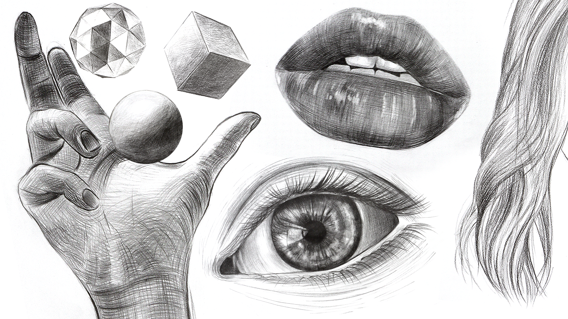
word of rendering life like eyes, nose, lips, hands, and hair, and master various skin textures
using only pencils. You will learn how to control your hand movements
and pencil pressure, essential techniques
for capturing the sense of each subject. Whether you're a beginner or looking to
refine your skills, this course offers
something for everyone. What you will learn
in this course. The introduction section, each lesson is crafted to
guide you through every step from layering down initial
sketches to applying final touches that make
your portraits outstanding. Skills that you will learn from this course
include hatching, cross hatching,
shading, and layering. We will go through these points. In the eye section
of this course, you will learn to
depict the human eye. We will cover everything from
basic to advanced shading, and hatching techniques that enhance the eyes
beauty and expression. We will also master the art of detailing to add
lifelike reflections, realistic eyelashes,
and mesmerizing iris. In the no section,
you will explore the intricate structures of
the nos from various angles. In the lift section
of this course, we will guide you
through the techniques, teaching you how to capture
their texture and volume, adjust for different
expression and apply detail shading to emphasize
form and lighting. In the hair section,
get better in wide range of hair types
from wavy to bred the study, learning to sketch and shade each strand with
life like detail. The hand section.
This course will also guide you through the intricate
details of drawing hands, focusing on anatomy, proportion, and the subtle movements
that convey expression. You will learn to apply precise shading and
picturing techniques to bring out the realism and character in each
hand sketching. Full portrait and drawing
and shading of discourse. In the full portrait
drawing and shading module, you will learn to
use light and shadow to highlight facial
features and expression. You will master shading
techniques like gradation, and cross hatching and
explore drying methods, such as the grid techniques, pencil measurement,
and free hand style. By the end of this course, you will improve your
drawing skills and will be able to confidently
create realistic drawings and complete lifelike
portraits with each lesson filled with guided practices to advance your artistic skills. So what are you
waiting roll now? Let's start your
artistic journey today.
2. Shading Techniques Dark Tone: Hi, everyone, and welcome. In today's video and
also in this course, we are going to use
minimum amount of tools. For instance, we're going to use a few pencils like
eight B, six B, two B, H pencil, or two H. Any of them you
have, they're sufficient. I'm going to teach
you all about them. We're going to use some
needed, pencil eraser. And maybe with a little ruler. If you can draw need line, then you won't need ruler
as well. Let's begin. In today's video, I'm going to draw these scores that you have seen here to show you how
to do different gray scale, the value of the scale
and the contrast. The most important
and crucial topic for understanding and learning
the basics of shading. Very important, please practice your introduction the most
because you're going to use all these
techniques later in many different topics and models that I'm
going to teach you. A these squares
that you see here. The scale that I'm
going to show you, we're going to apply
on different models. Let's go to start, I'm going to go
through the first one. Have a look at my
hand movements. I draw the table ten squares. You can see here two by two. Anything you do is fine, even on a circle or a square
is fine. That's great. Now, let's start
going through that. This time, I'm going
to use pencil eight B. This is quite dark
guys. It's very soft. What's the different
between H and B skill? B collection, pencil. They're much softer. I'm going to tell
you more a little about them later in this video. However, for now, please
follow my hand movements. Always try to have your paper and pencil in hand when you start a practice so we
can practice together. I'm going to start darkening the first square
from the left side. I always start from left. It's extremely important guys that you follow from
exactly where I'm starting. For instance, if I'm
starting from left side and from a corner from the
edge, please follow along. Make sure that your
hand movements is It has the same speed. That's quite important because
I see many of my students. That's one of the main
reasons I started with introduction with such
a simple introduction because I see many of you you're trying to
finish the introduction so fast that you actually don't try to practice for instance, try to have this simple pencil in hand and practice with it. Looking at this pencil. Again, I mentioned, I'm
starting from left, applying control pressure with
slanted shading technique, drawing thin lines, guys, extremely thin lines to
each next to each other. If there is much, I use needed arrays that you saw earlier in this video
that I used it. Make sure that you I don't want your papers to get
d. That's quite important. Even if it's a simple practice it's crucial to achieve
a polished look. Have a look how
slowly move my hand. I keep going back and
forth from left to right, even my hands angle,
same pressure. I go back from the
left side and move my hand towards the right side and reduce the hand pressure. That's extremely important
for you guys to follow along. Now, see how I don't have any
bracken lines in between. That's the reason and
why is the reason? It is because I keep
starting from the left side. Now this is called
circle um movements. After I have done
the line practice, I go back and then I start moving my hand in
circular movements. Slowly, there is no rush, and then I continue the
rest of the square. Controlling your hand pressure
is extremely important. Gradually please add the
darkness to your layers. Look closely at my hand
movements and repeat after me. See how I'm going
through all the spaces, making sure that I
leave no empty spaces. Try to control pressure
so that the darkness is evenly distributed
across the entire paper. I don't go out of the edge that's quite important practice. We don't care about the square
or if it's a circle here. It just give you a
discipline here, making sure that you don't
go out of your outline. That, for instance, imagine this is ellipse
shading that you're doing or eye shading you're
doing. Is the same technique. This is exactly
the same technique on the corner of the eye. Later on, you will see how much I'm going to
apply this shading. On many different models. In this course, we're
going to go through different facial features and also complete facial
portrait drawing. You can see slowly. I'm going to fill up the
corner of the square. Try to make sure that I'm slowly moving my hands
towards the edges. I shade that from the
top of the square towards the center
using the same angle, maintaining my hand movements, the same pressure hand movements when it comes to hatching lines. One of the best ways to learn the techniques is to
follow my hand movements. Please do that. Now,
this is another part. Now, it started from
the right side, the same angle, from the corner side and
go to the middles. And then with circular
hand movements, I continue and going forward. As you can see, we have a few other squares
to go through. This is the maximum hand
pressure I'm giving. I'm not overdoing it. This is dark enough, and also we are doing it
with pencil number 88b, which is quite dark guys when it comes to B
collection pencils. As you can see here, these examples, we're
going to go through them, but even better techniques. And you're going to practice them when it comes
to this taterial, we're going to go
through all of them. A great, we talk a little
bit about pencils as well. Why I start with
pencils, for instance, with simple tools and not with something
more complicated. Pencils are fundamental
tools in drawings, everyone. Each type distinguished
by its lead hardness, which affects its
mark on the paper, like how you can see here. Understanding the
different types of pencils and how they impact shading is crucial for any artists. Now you
have started this. This is the beginning of your
another artistic journey. It's important that you are completely satisfy and
understand the pencils. Whether you're beginner
or professional, we're going to go
through some of the breakdowns of
common pencils grade. While the one that we
use in this course. The ones we are using now, it's B pencils and HP pencils. I'm going to start with them. B pencils, the hardness B
stands for black or soft. The range from B, which is called a B soft to
nine B, which is the softest. The more numbers you
add next to the B, it will be softer.
It has softer core. The characteristics, the
pencils deposit more graphite, creating darker, denser
lines with less pressure. As you can see here, this
is what we are practicing. So you don't have to put
too much hand pressure, but you have to be
able to control the. That's quite important
because they are dark. If you use too much
darkness suddenly on some part of your lips
drawing lip shading, it's not going to be
easy to take them off with your eraser
or needed eraser, which you're going to learn how to do it later in this course. It is perfect for creating strong dark lines and
shading in drawings. So that's what we are often going to use for
expressive sketches and add in depth and texture when it comes to different
examples in this course. Now, for the next square, we're going to move and
start using six B pencil, applying a shadow again
from left to right side. With the same degree, like 45 degree angle, and a bit more hand pressure, but not as much as before. We want to make sure that it's slightly lighter than
the first square. This is a great practice for you guys to reduce your
hand pressure and make sure that you can compare the first square and
the second square. Again, as you saw in
the previous square, we did a few layers. We applied shading a few times. Now this time,
because maybe it's your first time doing
introduction or if you have taken
my courses before, you know how to do this. But again, make sure that
the first layer is not that dark and then apply
less pressure. Then as you can see, I'm going
on it for a second time, circular hand movements,
second layer. Make sure that I'm adding a
bit more pressure onto it. As you can see it is slightly
lighter than the first one. I'm learning how to control
my hand pressure here. That's the lesson
that you're learning. Make sure that you fill
the whole square up completely and don't go out
of any of the edges, please. Great so far. If you're
practicing at the same time, if great you send me
your assignments, you can message me
directly or you can share your practices, your artworks with the rest
of our amazing artists, whoever enrolled in this course, we can look at them and see
our practices together. As we were talking about
different pencils, I already covered
pencil B pencils, which I told you stands
for black or soft. Now, a bit about HP pencils. HB is in the middle of B
collection and H collection. That's why we call them HB, and it stands for in the
middle of hardness scale. That's what it HB stands for. The characteristics of
this pencil is offers a balanced medium
between hard and soft producing a
moderate blackness. Whenever I want to
sketch something normal, like I don't want to
use a lot of pencils, HB pencil would be the
perfect example to go to. For instance, you don't want
to buy a lot of pencils, especially H collection
or a lot of B collection. HB is a perfect
pencil to start with, especially if you don't want to spend too much money
on your tools. For instance, with
one HB pencil, and maybe four B or
six B collection, you can create a lot of different examples and
create a lot of artworks. For example, for this course, you don't need to
buy all the pencils. For instance, you don't
want to buy the whole pack, like what you are seeing here. You can complete this course
with only for instance, these two pencils as well. However, I'm going to use
multiple different pencils, just in case you
have different sets. For instance, some
of you might have only some H pencil or
two B pencil or four B. We're going to use all of them. Don't worry about tools. Just the important part is to pats and your hand
movement, hand pressure. Making sure that you
stay within the lines. For instance, how I'm slowly going towards the edge
from the middle part, and making sure that
nothing has left over. We don't have any space
left over. That's it. Now we have continued
and finished the edges, that's important
for this course. Please bear that in mind and
let's practice together. Now I'm going to finish this square and moving
to the next one, I haven't told you
about H pencils, H stands for hard ranges from, slightly hard to nine H, which is the hardest one, the core of the pencil. The characteristic
of these pencils, they produce lighter
fine liners. The harder the pencil, the less graphite it releases resulting in sharper,
more defined lines. If you have enrolled
in my other courses, that I don't prefer
to use any H pencils, precisely, especially nine or
eight H. They are so hard. When it comes to beginner level, if this is your first
time, for instance, you're picking any pencils
or you're just intermediate. Sometimes it's hard to work with just H pencils because you really need to know
how to control them. Otherwise, you're going
to leave a lot of traces on your paper. What I mean by
that, for instance, imagine you're using
a very hard pencil and you cannot get
colors from it. You get frustrated, you use
more and more hand pressure, and it's going to leave
a lot of pencil traces. Sometimes you might even
break your paper with it. Be careful when you
are using H pencils. However, the ideal for
technical drawings, detail work, and
initial sketches. I prefer for initial sketches to use HB pencil, especially
for beginners, so you can take them
off your paper with just easily be eraser
or with needed eraser. That will be okay. We know
all about pencils now. Let's complete this one
and move to the next one. Now, this time, we're going
to use another pencil. We're going to
start using two B. Make sure that your
pencil is sharpen. If you have a sharpener, use it please now and then
start right away, the same time that I'm doing. What I'm holding my pencil w is called pencil
extender holder. You can buy from anywhere because I don't want to
throw my small pencils away. They requi not that pricey, but you don't want
to waste them. It's good that you
use pencil extender, you can buy one and
use it forever. I'm using the wooden one, which I prefer. I'm used to it. Maybe next time when
you're going to your local art shop or
any art shop nearby, even you can buy from
Amazon or anywhere online, but maybe you want
to try it first holding it to see if
you're comfortable. Being comfortable with your
pencil is very important. Also what kind of
brand that you get, for instance, this one
is Windsor and tin. However, next time that you're buying another
version, which is fine, any other brand that you have, as long as you're
comfortable with that brand and with the texture that it
does, that's quite fine. This time, again, we
use less hand pressure. I make sure the first
layer is lighter. Again, with the same techniques,
circular hand movements, I went on it the second
time. I'm taking my time. This might be if you feel it's tedious, it's introduction. I know these things.
Great. I know you know it. It's good even once
you practice it, make sure that you
have warmed up. It's like going to a gym. You have to do certain workouts before you go through
the main ones. I don't go to the
gym, so I'm not sure how should I
give you examples. But Look at my hand moves again from the edges. I started. Have I need to start
going to the gym. Again from the left side, I move slowly, going to
the right one, right side. I'm giving a bit
more hand pressure here because I don't
want to leave any trace. Where I make sure
that I'm giving those hand pressure evenly. See if I went out, I'm trying to be precise, I'm going to get rid of anything that I feel like
shouldn't be there. This goes for your lips
drawing or eye shading, nos shading as well. Now from the right
side to the left side, I'm going to do it as well. Look at my hand movement, giving a bit more
pressure on the corner, circular hand movements, slowly
going towards the middle. Making sure that I
leave no parts empty. While we're finishing
up this one, I'm going to tell you about
the next square as well. We're going to use
pencil number F, which you will see how
it's going to looks like. It's somehow between y is
called F is called fine point. It's hardeners is slightly
harder than an HP, but softer. I can say than an HB pencil. Now we're almost
done with this one, going around the edges. A bit like circular hand
movements, and again, more reduce your hand pressure and then go around the edges. We are almost done. I'm
going to at least apply some more pressure to the previous one to
adjust the color tone. Please have a look
and follow along. The important tip here, whatever happens,
If you feel okay, there are some uneven parts, use a darker tone, go on it, slowly without any too
much hand pressure, darken the square. Try to maintain the pressure. For instance, you feel like this needs to be a little
darker. You go on it. Imagine this is
part of your lips, and you feel like the
middle part is less darker. Apply a bit more
pressure on the edges. For instance, if you're
doing lips drying, and then go back on it. With a lighter pencil. Now, moving into the next one, guess which pencil
I'm going to use. This is called F pencil. Is between B and H. Meaning it is not too dark and or too light with controlled
hand pressure, I darken the The next square. First, slowly, same hand pressure from the
left side, the same angle. I'm going to start hatching it. Or basically not becomes shading because our hatching
lines is so precise, and we are doing it with sharp pencil, it
becomes shading. Then after that, again, you learn this circular hand
hand movements. We go on it. When it comes to the second
layer or the third layer depending on your first layer
shading. Take your time. There is no Please try to take your time when
you're doing this. No haste. Now let's change our pencil to HB and then go on
it second layer. We have already determined the lightness of
the first layer. We're going to mix F and F
pencil and HP pencil together. Let's continue. I have
mentioned this before, but I'm going to
repeat one more time, even in my previous
courses, again, one of the most
important points, guys that you need to take into consideration while working on any type of work is making
sure that your work space, your paper, they are clear. You have a clear work space, have asors next to you. Make sure all your
pencils, they are sharp. So when you start, it just you focus on your
techniques and practice. Make sure that you use
perfectly sharp tip of a pencil and work
from the edges. We could cover all
parts of the square, same level of intensity
and hand pressure. Now you can see with
more hand pressure, circular hand movement,
I darken the area. You have to learn
how to mix and match your pencils for better shading. We have been practicing for around 20 to 20 minutes
to half an hour. If we would create
every 30 minutes you give yourself a break, make sure that you're
satisfied with your practice and then
move to the next one. Initially, I wanted to put all these squares in one lesson, but it's always great after 30 minutes you
give yourself a break. This is what we're going to do. After this square is done, let's take five, have a rest, go around some stretching, then come back straight away to continue the
next squares as well. We're going to go
through lighter shading and practice together. Just going to continue
this part as well. You can see how I'm
moving my hand. This is the real speed. I make sure that I'm not
making this speedy enough. No twice the speed or 1.5 speed. This is real time. I want you to take your time and spend the same amount
of hours on it. She from the bottom parts, the edges, and go up slowly. Just take your time,
make sure you're happy with the level of hand
pressure you're using. Great work so far. As you know, all my courses, we have downloadable resources
that you can get access, download them, and
practice from them, it includes outlines,
grades, and assignments. When it comes to
the assignments, you get to learn these
techniques one more time there and also
practice extra things. Now, When it comes to
outline and grids, especially when we go forward, we're drawing facials,
we're drawing portits, or facial features. All the outlines and grids
are available for you, just in case you are not you're a beginner and you cannot
do free hand drawing yet. There are means for you to
practice faster and easier. Don't forget to
download them as well. You can see, I'm just happy with the last square of
this theaterial. Take some rest, and we come back and go through the
rest of the squares. For now, take care, and I see you soon in
the next theaterial.
3. Shading Techniques Light Tone: Welcome back, everyone. We just finished
previous taterial, and we're going to continue with our shading, different
gray scales. I picked up my pencil, which is F pencil. We talked about it in
the previous tterial. If you have listened
to it and practice, at the same time,
you know what is F, which is a stands for fine pencils in between
H and B collections. I'm going to go through the
first square of this tterial, and the fifth square of the whole this scale that
we are going through. Please look at my hand moves, making sure the
lines are so fine. Also, this is the maximum
intensity of darkness, you can get from F pencil. Let's compare this together and how much you can add
to your hand pressure. But if you're using,
for instance, I'm going to show you in
the rest in this deterial, the difference and when it
comes to hand pressure. However If you are using
a two B or four B pencil, you need to carefully
control your hand pressure because you don't know
how much darkness you can bring on your pencil, but this is the maximum level of intensity and
pressure you can get from your F pencil unless you keep giving different
layers to it. For instance, this
is the second layer, and this is how much I'm
giving. For instance, the edge. I'm really trying
to put pressure, but please do not add
too much or otherwise, you're going to hurt the
texture of your papers. Be careful of that. Go around, make sure first with
the same angle, you finish the first
and second layer and some circular hand
movements that you have learned in
the previous tutorial. Using pencils with
different cores can be beneficial,
as I mentioned, especially those who are not sure how to control
your hand pressure, and it can really help you
guys reach the level of darkness that you're looking for with a fixed hand pressure. If you're a beginner and you haven't taken
any of my other courses, and you just started working on hatching and
shading techniques, it's better to use maybe
pencils with different coords. Even for instance, you borrow
from someone or a friend, or sometimes when you
go to an art shop, they have all these pencils. They can give you an
example, you try them on. You can ask them, go to
the counter and ask them. I use this pencil before I buy? Do you have anything in hand
that I can just try it out? Try them because they
usually have it. If you ask nicely, they
can give you some. Or even you can ask them, do you have any spare?
You can give them to me? I have asked them
before, especially a few years ago when I
went to artworkshop, I didn't want to spend, and I didn't have that
much budget for my tools. I would ask, Do you
have any extra that I could use for my artworks? You can always ask those
from your local shops. You can see the
different levels from the very intense one that we did in the previous
eterial and to this one. Now let's move on
to the next level of shading and hatching. Look at my hand moves
and follow along. For this layer, I'm going
to change the pencil to two H. You mentioned about H pencils and two H,
how hard they are. The more you go
towards like two H, three H, and nine H, nine H is the hardest one, and nine almost doesn't
have any color. You'll see and we're
going to use them soon. Make sure the tip of the
pencil is perfectly sharpened. We use this pencil to add
lighter hatching lines and create lighter and
smoofer shading layers. Please follow my hand movements. It's even important how I'm holding the pencil
from the middle part. Sometimes when I go more
towards the t part, holding it like
this because I need to focus more and to do
circular hand movements. Otherwise, I hold it a little more towards
the middle part. Let's keep adding initial
layer hatching lines and clear lighter. To this part. Still I'm using circular
hand movements and then I'm going back to the shading
lines next to each other. See how sharp the pencil is and how I'm moving my
hands left to right. No, please take your time. I wanted to say no haste. Make sure you have patience
when it comes to shading. That's quite important. Sometimes some of my artworks
take 50 hours to 100 hours, especially when you're doing
realistic shading pencils. So If you see a charcoal
or a pencil portrait, it's so nice and realistic. It doesn't mean
you cannot do it. Maybe you need to do
your technique practice. All these practices to start of going through and creating
beautiful portrait drawing, beautiful, still life drawing. You need to make sure that
you take your time and spend as much as hours that you can on your drawings and be patient. That's quite important. Now,
let's move to the next one. The next pencil, we are
going to use four H pencil. As usual, we're going to start this same angle,
same hand pressure. Look where I'm
holding the pencil, more towards the
middle part because we haven't started doing
circular hand movements. Also, whoever taken one of my really old courses
when I was doing charcoal, course still one of
my favorite ones. We can use other tools
to create contrast. For esp, we can use blending
stump or different fineness, even for shading or brushes. To create different
shading levels. All depends on your
taste and style. As you can see, this one is much lighter and harsher pencil compared to the previous
one we have been using? Look moving my hand, going to add the initial layer. However, if you ever not
satisfied with any of the areas, you can use your needed eraser with gentle taping movements. You can lift them. You'll see that I'm going to do this on different occasions and you can try and repeat after me and you will
learn how to do it. Where is the best
place to use it? Especially in lighter layers, it might happen to have
spots like some spots that you need to clean them up with a needed erasor
and take them off. You can easily just lift them up with needed raisor
by tapping them. Can you see I'm using the tip of this pencil and to do some both lines and circular
hand movements going Take your times when
you're doing gradients, different shading layers,
especially from dark to light. This is extremely
important practice, guys, and I hope you
are doing it this. Some artists only use pencils for their works,
like Charles Bark. We have these artists
and I have used his samples for one of
our courses, actually. His techniques require a lot of control and knowledge
when it comes to pencil. But you can become
a famous artist only by using only
pencils, guys. The next one we're using is
five H right now, sharp tip. We are going to start adding hatching lines next
to each other, but our hatching
lines are so neat and so precise that creates that shading
layer that we want. Look at my hand movements
and repeat after me, please. Why you are practicing
at the same time, using the same hand
pressure and hand method. I'm going to tell you a bit of about like shading techniques and pencil grades and why
they're quite important. There are several reasons. The depth and dimension guys. Different shades help create
the illusion of depth, making a two dimensional sketch appear three dimensionals. Even here some of the
squares you can see from the edge towards
the middle part, it creates that effect. Also, for instance, now, I use the needed eraser here. That's what I was telling you. When it comes to
texture and details, using various pencils and shading methods can introduce
different textures, making the artwork more
engaging and realistic. It all depends your
hand movements and how you're doing this. Just use for, I just
use my finger and use some to create that shading
feeling and texture. So you can create many
different textures with pencil and hand movements. Also, when it's come
to emphasize and focus, through
strategic shading, artists can direct
the viewers attention to focal point
within the artwork. That's quite important guys. Also, mood and atmosphere. Shading influences the mood of drawing where darker
shades can suggest a not happy artwork while lighter shades can
convey a more lively scene. For artists, the
ability to manipulate pencil types and shaded techniques is not just
about technical skills, but also about
expressing vision and emotion through
light and shadow. Whether you're sketching a
quick portrait or crafting a detailed landscape or
a detailed portrait, which we're going to do all
of them in this course. These skills are integral to creating compelling and
expressive artwork skis. Look again here with just
tapping the needed eraser. I'm taking off both colors, and maybe some additional
layers that we don't need. With a minimum hand
pressure guys with either h6h pencil
or eight H pencils, go on the last one. I'm going to leave the last call the square empty. Why is that? That's not shading? That's
not a practice? Yes, it is. Why leaving some parts empty, just keep the whiteness
of paper is important? I have mentioned that
in some of my courses, how much you try, try
to create highlights. For instance, the
highlight of I or highlights of sunset
that is happening. You cannot get the p, the perfect whiteness of
your paper with any pencil. Even if you try to use, let's say acrylic,
white acrylic. Some artists they
do that to create that highlights when they
have lost the beauty, the whiteness of their paper. For instance, they try to use
either as a pencil eraser. We will use that later
you'll see what is it? The whiteness of your paper quite important you leave them. For instance, now, let's
go through these gradients now. From the very beginning. Always go back, try to with
the pencils that you had, try to make sure that
they are perfect. I perfection is when
it comes to drying, even when it comes to lines, it's good that that
becomes your habit. You don't leave even the
simplest assignment, the simplest practice,
leave it out, make sure even your simplest
practices, they are perfect. As we can see, we're going
back on our layers again. I started off with eight B
pencil while I was talking about the whiteness
of the highlights. We started with eight B pencil, the darkest part, then four B, then we use pencil two B, and then we're going
to move to HB pencil. Then as you recall,
for the 50 square, we have F pencil. L
et's complete this. I'm even going on some of the areas that they were
not done perfectly. This is the perfect shading. You could have ever done guys. Please send me your practices. That's quite for me to see which level are you and how much you have
done this practice. I can for instance, say, if you have done shading on
your lips and you feel like, my shading is not perfect, I I see your practice, we can correct your shading on any model that you have done. It's important for me
to see your practices. H Minimum hand pressure. I'm holding the pencil
from middle part. Barely the pencil, the H pencil
is touching the surface. Now you know which pencil
to use and how to use them, how to hold pencils, how much hand pressure and pencil pressure that
you need to use. See how important this
practice was for you. You have learned
the smooth levels, how to adjust the
level of darkness now. Take your time, work on
different parts step by step. It's delicate practice. Other great practice to
warm up your hands before starting your main model. As you can see, I'm
fading the layers, do not forget sometimes you
need to fade the layers at gentle hand movements,
using your fingertips. Also if you didn't want to use your finger,
you didn't like it, you can use some swab or
something that is very soft, cotton soft, you can
use them and fade them. If you have any
questions regarding the tools and materials, right away, please ask me. This is the beginning
of this course. I'm always so you know
I'm always online to answer all your
questions and I cannot wait for you guys to go
to the next lesson and old lessons and learn how to use these techniques
on real models. I'm quite excited. I hope
you're excited as well. I have seen thousands
of practice. Whenever you guys send
me your practice, it makes me so happy
that I see you are practicing at the same time and you send me your practices. See how much I
could be done here. Sometimes you have to
actually understand when you're done
with your artwork, you have to stop, you
say, Okay, I'm done. I'm not going to
add any more layer. This is enough. I live it. If you keep adding, sometimes too much cutter,
that's not good. That's another tip guys for you. Do not overdo it as well. Sometimes you leave
it without complete, but sometimes when you
really want to work on it and overdo
it, it is not good. We're almost done
with this titerial. Let's make it perfect,
M our squares perfect, and we know that we are not
going to have a squares. Why we are making this perfect, just that level of detailed that you pay attention
to is quite important. For instance, for a tarias, what's important is for
you to make sure that the outlines are done perfectly before you
start your shading. That's why we are doing this. See, now it looks good better. I hope you enjoyed these
introduction theaterials, the previous one and this one. In the next one, we're going to go through another introduction. The hatching one, different
hatching lessons. Please practice this,
send me your practices, and I see you in the next one. Make sure that your surrounding your paper is neat
and clean as well. For now, take care and bye bye.
4. Hatching Techniques: Hi, everyone. Welcome
back to another tutorial. In today's video, we
are going to create a contrast table using
hatching techniques. We have five square
cells, as you can see. The first one, I'm going
to draw a normal hatching. In the next two videos, we're going to go
through different hatching styles as well. This is a quick
video, a few minutes. However, it's very
important you follow along. I'm going to start
using my pencil, which is two B pencil, starting from the
very first square. Please look at my hand
movements, my hand, how the hand angle,
pencil angle, and also pressure of hand
pressure and pencil pressure. Please repeat after me. If you have a paper and pencil, we are going to start from
the part, from the square. Step a step, I'm
going to show you how to do it from the darker
part to the lighter. More hand pressure to
less hand pressure. Now let's start
going through this. See how I'm going to
start from where. Observe my hand
movements accordingly. This one is going to
be the lightest one. Now, from this part,
it feels like I'm drawing the lines, the strokes. Very neatly, in a subtle way. Try to do it. Start again from the edge and repeat one more time to
create a second layer. Extremely important practice, where you're holding the
pencil is very important. Having a sharp pencil is
very important as well. This is the third
layer that I'm doing. Look at the difference from
Some parts for ins here. Now we are having
the same intensity. Look how I'm holding it again. One more time. Follow please
exactly what you're saying. It's extremely important
for you to do. Because if you
know this, you can learn how to do this
sample as well. Both this young and old person, you can see here, I have
used the same techniques. You can see how important these techniques are and
how much you need to practice before you apply them on these eyes in the future. This is one of the samples
that we're going to work soon. Please practice this, and
then we're going to move to the next square with
less hand pressure. See how careful all the lines I have drawn
them correctly. Now when I'm happy
with the hatching, then I'm going to
move to the next one. Less pressure than
the previous one. I know this might feel
like tedious practice. You feel like, I have
done the first one, so I know how to do this, is on the line
practice, but it's not. The more you
practice, the better. Sometimes some of my
students just send me, for instance, one square
practice or two square practice. I'm like, Okay, this
is not sufficient. This is not enough,
you need to do more. You need to fill up this paper with not just this
paper, maybe ten papers. With hatching styles,
hatching practices for you to warm up your hands to
realize your hand pressure, you understand your
pencils and how they work. Hatching is a fundamental shading technique
used in drawing skis to create tunnel or shading effects with parallel
lines as you can see. It's very important
to learn this. This method you can see here can vary widely in
style and application, allowing all of you artists
to develop texture, shadow, and dimension
in your artwork. Understanding different
styles of hatching that, for instance, we're going
to learn in this eterial, and in next tterials, can greatly enhance
your ability to convey visual depth and
interest in your drawings. Look at the hand pressure, the difference between
the very first one, and this is the second
one I'm working. Same angle, how I'm
holding my pencil. For instance from middle part. Now look how I'm holding
it and I'm going to move it along from here. Now I'm going to go
through this one. The lighter you want, you need to go further
and hold your pencil. Practice this a few times, please and send your
practices to me, so I can see your hatching. This was a simple
hatching style, one way hatching. I can say. Next time, we're going to learn how to do it
in a different way. Quickly, this was a short arial. Let's go to the next
tarial and practice our next hatching technique.
For now, bye bye.
5. Cross Hatching: Hello, guys, and welcome back. Let's quickly jump into our
next hatching style practice, which is called cross hatching. We'll start with either HB
pencil or two B pencil. I'm using pencil holder. Please look at my
hand movements. This is quite similar to
the previous one so far. Let's see the difference. Make sure that when
you're drawing it, your strokes, your lines feels like you're throwing the lines. Now, this is the difference. Change your hand position, the direction of your hand from here to here,
left to right. One more time, have a look. I'm going to create
cross hatching here, opposite direction.
Now, let's start. Look how it looks like. Please
do it one time with me, and then let's continue going
through the whole thing. Now we've created our cross
hatching. Don't overdo it. First, make sure that you're
happy with the first layer of your hatching style,
then the next one. Now again, decide, do not
bring too much hand pressure, make sure you understand
your hand pressure. We talked about it, the introduction when we were going through shading a lot
about your hand pressure. Make sure you know when to stop. Now, I'm quite happy
with this one. When I'm creating this, I can apply this on many examples. For instance, look at this
one, which is lighter. I'm throwing the strokes. I it's like a ball that you're holding it and then you're
throwing it up to the sky. Now change the direction
your hand movements. As you're repeating after me, sometimes try after
this practice, change the direction
of your hand movement. As you can see, for
instance, again, on this example, I showed
it to you earlier. When I applied this cross
hatching on this nose, you can see some of
the cross hatching, they are not too straight. They are somehow hatching. You have to make sure you
understand this one first, and then you can apply
it onto these examples. Make sure you're happy with
your pencil pressure, guys. You make friends
with your pencil. Try to use it gently, don't put too much pressure
on it and hold it correctly. This one needs to be lighter, so I need to hold it from here. Control your pencil guys. Always maybe if you're sitting on a chair, change
your position, try to move yourself
to make yourself comfortable when you're changing your hand position,
your hand direction. The lighter you get, you
need to make sure you apply what you're seeing on this theater and
apply the same thing. Now, for instance, if you
want to go on it again, apply another layer to
create more shading, to create darker shading here. This is how you should
do. If you didn't need, for instance, on this example, you can see on some parts, you don't need to use too much pressure on
some parts you need. So far as we're going back and adding more
layer hatching, we have different
styles. Single hatching. Which are lines that are
placed in single direction. This straightforward approach is effective for simple
shading and can be adjusted by changing
the density of lines to create light
and dark areas. This one that we are
learning cross hatching involves placement a second
set of lines over the first, typically at an angle, forming a cross pattern,
as you can see here. It adds depth and more
dynamic tunnel range by increasing the density
of intersecting areas. I would like to go through
another technique with you. Imagine you're not happy
with one of the drawings, one of the hatchings
that you have done. What you should do, get
your needed eraser. Then either tap on your paper or slightly the way I did and go on it one more time and
create your shaving. How I could do this in a
very neat way is because I didn't apply too much pressure
on my very first layer. That's why I can correct the extra ones like you can see here because I haven't
damaged the paper. That's why I can erase
the extra parts. As you can see here, every time I go back on it, I keep using fine hatching, which means uses very
close wine fine lines that are often hard to
distinguish individually. It creates smooth
gradient effect, ideal for areas requiring subtle transition between
light and shadow. We do have random hatching
as well that lines are placed irregularly or in
a loose scribbled manner, which we are not going to use
it in this course for now. We're now doing layer hatching involves
multiple layers of lines. We are done with this
hatching theaterials. In the next one, we're going to use another method for now. Py and I see you in
the next taterial.
6. Square Cross Hatching: Welcome back, everyone. This is another criteria. We are going to use our two B pencil and go
through our cross hatching. With a sharp tip
and two B pencil, first draw horizontal lines, as you have learned
in previous lessons, how to hold pencil, and how to draw the lines with more and
less hand pressure. Again, horizontal lines and vertical lines in a cross
hatching manner, left to right. Do not bring too much hand
pressure at the beginning, and just to do your fine line
hatching in a subtle way. Please follow my hand movements. Always have your pencil and
papers on your next to you. While you're watching the TT, you can practice
at the same time. Now you can see, I have used all the hatching techniques
you have learned, for instance, on this
particular lesson that we're going to learn soon. For instance, I see that some of the lines that they
cross the edges, they cross the main outline, it's very important
you stay within lines. Either use your needed
eraser or pencil eraser. This is called pencil
eraser and go through it and make sure that everything is neat, everything is clean. Keep this manner for your
entire drawing practice. For instance, this part, I added too much pressure.
What should I do? I'm just going to get my
needed eraser and reduce some of the pressure
too much color, too much shading
that I had on it, and I took away with just a few tapping
with my needed eraser. If you are not sure about
your tools and materials, please ask me, send
me your messages, your questions, you can get access to your
downloadable resources. Well, all this information
are there as well. This time, again, we're going to go through another one
and less pressure. If you want to add, you
can go on it and add another layer of horizontal and vertical that they
cross each other. The importance of this hatching is about control offers you precise control over your tonal variation and textural effects
within a drawing. Another importance of hatching, it can be adapted
to a wide range of artistic style from very detailed and realistic
renders that you can see in this course to expressive
abstract compositions that it actually belongs to one of my courses, this
one that you can see. Let's look at the
examples, for instance, this one, and also another one. Have a look how I use hatching style in a lose
and abstract manner. You can see there
are more towards expressive and abstract
compositions that I have used. Let's keep practicing. We can understand that this
kind of hatching provide a powerful tool for visual
story telling, and expression. Each style that we
have learned so far can contribute
differently to the mood, texture, and overall
impact of our drawing. This one, this kind of hatching, the previous hatching
that we learned. Making hatching a
critical skill in the toolbox of what you have learned of both novice
and seasoned artists. They need these practices. I hope you have enjoyed
these last few taterias. In the next one, we are going to learn another
different shading, which learn how to do fa
fait shading, I have to say. For now, I'm done with
this tateria almost. I keep adding layers. You can do that as well. Try different layers
and experiment more with your pencils and
send them to me, please. For now, take care, have a rest, and I see you in the
next taterial. Bye bye.
7. Fading: Hi, everyone, and welcome
back to another theaterio. This is going to be the
last shading technique that we are going to learn. In this shading technique, I'm going to teach you how
to shade and also fade in order to have a very
nice and subtle layer. Continuing on the topic of shadows and contrast,
let's have a look. I'm going to go through the
first layer with r2b pencil. I'm going to start drawing
the darker section with heavy hand pressure
from the corner, reducing darkness as I move towards the top
part of the square. The way I'm going to rotate
and repeat that motion. I'm going to create a
faded effect really soon. Please follow my hand movements. As usual, please have your
paper and pencils in hand. Now I'm going through circular hand movements from the corner, the edge of our outline. You have learned
this technique and the very first introduction
that we went through. First you add the layer, then you add circular
motion on it. Let's have a look, how
I'm going to create this and with another tools, which is called stump
blending or blending stump. Different website, you can
find different versions of it. I'm going to make
sure that we have a very nice and smooth
layer after a while. Now, have a look, I'm going to create the first one,
and then after this, the way I'm going to
go to the next square, I'm going to make sure
that they blend so well together that we don't see the lines in
between each square. Please pay attention to
my hand pressure that it drops when towards the lighter
parts of the right side. Again, the second time, I'm
going to do a repeat myself. I'm still using the same pencil. We're doing a flat shading, involves applying
an even pressure every time we are going through each square across this area
to create uniform shading. Is ideal for backgrounds or when smooth texture is needed
without much variation. As you can see, involves gradually the pressure to
transition from dark to light. We will create a smooth
gradual change that helps in rendering spherical and also
different forms as well. We do have different forms
in this course as well. Especially the sphere, which is very important
for you to learn. Shading specific direction to emphasize the shape and
contours of the subject. It's very important.
That's why we are learning this method. Now, this is the stump blending that I was telling
you, which is again, stump blending, a tightly
rolled pieces of soft paper or felt to smooth
and blend pencils. Look how I'm using it every time if you feel you need to have a smooth
layer, please use that. Now, another method, use
your needed eraser tap on any part that you feel it
has too much color, take it. Again, repeat after me the way I'm holding our
stone blending here. Now I'm going to keep
repeating this process a few times to ensure that we're
happy with our layer. With our stump blending, we can. There are a few
ways. We can use it. First, softening hard edges, as you can see by gently rubbing blending stump over
pencil lines like here. In this way hard edges
can be softened, which is crucial for creating realistic textures
like skin or sky, as I mentioned, or
the background. This is a perfect
tool in order to achieve seamless transition
between different shades. This method is commonly used in porches to blend
skin tones as well. However, when it
comes to skin tone, when I want it to be extremely
smooth, I use brush. I don't use this
one. As you can see, this is a perfect smooth
layer that we have, compared from the the moment
we started this and now, if we go back to the
beginning of this lesson, we realize it can help
us to enhance realism, control focus and mood. As we are talking why
this is important. Let's make sure that when we
are working on any sample, even the samples, we are doing it in a neat way,
have this discipline. When it comes to your
work. Now I'm going to make sure that we don't have any additional shading
underneath as well. This is a normal eraser
that I'm getting help from. Se it feels much better now. I hope you enjoy this
tateria as well. Have a rest and I see
you in the next one. For now, bye bye, take
care and see you soon.
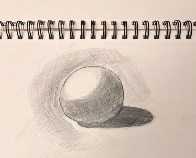
8. First Layer Sphere Hatching: Hi, everyone, and welcome back
to another the materials. In today's video,
we are going to go through this sphere that
you can see on the screen. As always, please have your
papers and pencils ready. You can use any kind of
pencils such as Fabriccle, or Windsor anion or any
others that you have that belongs to HB
collection or B collection. This one I'm using
is HB or two B. First, we're going to go through the initial pattern
with our pencil. I draw a perfect round
or light sphere. If you had any issue
drawing the circle for now, either sometimes try to clean
it up and draw it again, make sure that your
outline is not too much. Now I'm going to go
through the shadow, have a look when I'm looking at the sun,
when it's coming out. And doing the measurement. The crucial aspect of
shading this sphere, as you can see, is the direction of light, as I mentioned. Determining which side of the light is coming
from what side. The more the light
hits horizontally, the darker the shadow
behind the sphere will be. Also, if the light is more
vertical and from a valve, the sphere shadows
will be smaller. Bar that in mind, please. Considering the light direction, I'm going to draw the shadow
underneath the sphere. Please look at my hand
movements where I'm going to do the highlight and where I'm
going to cast the shadow. Look closely at
my hand movements and try to repeat after me. Please pay attention
to the way I'm holding the pencil that I'm adding these layers and how
I'm working through. Let's define the dark parts and the darkest part of
the sphere after this. My pencil is always very sharp, even when it comes to
the hatching part. It's quite important you
understand this because these example is going to help you for instance to
draw this example. After you have seen the example, I'm going to define the
darkest part of the sphere. In the next step, let's draw curve lines
for the gray shadows, the grayer part on the sphere. I start shading from the
bottom part of the sphere with me and medium hand pressure
and medium pencil pressure, creating mid tone shadows, not too dark, not too light. We need to keep in mind where the sources of light coming
from throughout the work, and then add our
layers one by one, building them up to show the lighter and darker
part of the work. Why we are doing this because
this is going to help us. For instance, when we are
drying and shading an eye, that's going to help
us a lot as well. We have started darkening the underneath this shadow,
the bottom part. Follow my hand movements. I'm going to apply lighter
gray on this part as well, reducing hand pressure to
create a lighter shadow. It's extremely important
you follow the way I'm doing the hatching parts
and the shading parts. You have learned more about these shadings and layers in previous in the
introduction parts. Make sure you have done your
practice on those lessons. Very important, the way
I'm holding the pencil, the way I'm moving the pencil. All of these are
extremely important. Try to do the same
layering that I'm doing. Also, if you had any questions, you know that I'm always online to go through
your messages, please DM me, and
I'll get back to you. Feel free to send
me your practices and assignments as soon as
you have done them as well. Slowly, you can see that I
reduce my hand pressure when I go towards the top
part of the sphere. Slowly, I go back and
forth on this area. These are very close
and fin hatching lines under this part of
the sphere I mean. Then I'm going to darken it further with more hand pressure. Bear in mind, I'm shading in different directions
for the shadow, but still my hand is over here. Now, I moved my hand
towards here to start to cast the shadow. You can see the difference
of my hand movements, I'm going through the hatching
lines. Now I did it here. You can see the lines, even though the way I move
my hand, they're quite neat. First of all, I don't
go out of the outline. I try to stay within and draw neat hatching lines next to
each other parallel lines. Now look at the way
I'm holding it. Let's do cross hatching here. Excellent job guise, considering the right placement for
the source of light also enables us to determine
the placement and the accurate form for the cast a shadow of the
sphere on the ground. You have to bear that in mind. I just define the border
line between the sphere and the shadow with darker line. We need to carefully
distinguish between the two. Please make sure that the tip
of your pencil is perfectly sharp sharpened and follow my hand move so add these
lines and layers over here. Now, with a bit less pressure than the main line that we did, with less pressure
less shade and darken the shadow underneath the sphere using hatching lines. Again, you have learned this. The way I'm doing
the hatching lines, it feels like I'm throwing
them up to the sky. You have to make
sure that you're comfortable with doing
your hatching lines. It's quite important
you practice them as we have practiced in
the previous lessons. Please keep lower your pressure. When you get away from your main outline,
that's quite important. If you do all of it the
same hand pressure, you're not going to get the
effect that you want to. Sometimes you ask
me why my shading, all have the same color. It's all about your hand
pressure and pencil pressure. I proceed to shape the lighter
areas under the sphere with lighter pressure,
creating smoother transition. Please look closely
at my hand movements and try to repeat after me. Just clean whenever
you feel like you have done something that you shouldn't have, it's okay. I use pencil eraser so
I can do it accurately. Here is very important to control your hand pressure
because it's lighter parts. One of the very important
steps of our works, and we need to learn
how to do it with more and more practice,
the hand pressure army. You practice makes
perfect and after you're comfortable with your hand pressure and
pencil pressure, you can do magic with
only one or two pencils. I'm doing cross hatching here. Try to work as delicately
as possible on these parts, we want to adjust our
layers on the edges, but we do not want to damage
the rest of the parts. Again, another cross hatching, another layer on it.
Look at the difference. Please follow exactly as you see throughout this taterial. That's really going
to help you to create a wonderful sphere. I know you feel like,
this is introduction. Maybe I would like to
move to the eye lesson. I want to do portraits,
I want to do this. Is all we're going to go
through them one by one. We have all of them
in this course. It just you have to
practice this first, warm up your hand, make yourself comfortable
with your hand pressure, with your hatching lines, with your shading techniques, then we're going to move
towards those lessons. Now darken the shadows under
the sphere using H pencil. We have talked about what pen. What is H pencil, the hard one, creating
different angles of hatching. The reason is that
they have less color. Comparing to the HB and the
two B pencil we're using. As you can see, we are gradually
building up the layers. I'm just taking off some of the outlines to make
them less visible. See I slow down my hand
movement for here. When it comes that you need to pay attention to
the highlight area. Just take your time. Any of subjects that you
start do and try to enjoy it, see how slowly I'm
moving, there's no rush. Sometimes I receive a lot of assignments and artworks
from my students. You tell me, for instance,
there are two questions, common questions I hear, especially when it
comes to shading and. One of the questions,
our artworks are not as dark as yours, why we cannot get the darkness like you, Why for instance, ours doesn't have that
three D dimension feeling, is all about what
you're seeing here. First, do not rush your
any of your assignments. Make sure that you
take your time. That's the beauty
of art because it gives you that art
therapy feeling. You need to enjoy the process. When it comes, y is
not dark enough, you haven't done your shadows a few layers properly,
and that's the reason. As you can see, continuing
with this pencil, going through the top
part of this sphere. Just a bit at darker ones
from the main outline. Slowly, please don't
overdo this part. You need the whiteness
of the paper, please place for instance, the exact parts of the hatching, place it exactly where
I'm putting them. Now you can see the
cross hatching here. I'm going to apply these
shadows the hatching lines until middle part of the sphere where the
shadows should be darker. I use hatching to blend
them into the white paper. Make sure you're using just the right amount of hand
pressure for these parts. Also, don't forget to go through your
downloadable resources. You can find
different information that will help you to go through the lessons in much
faster and smoother way. Make sure that you
check them out. I also have lots of different
e books that I'm going to write the names down in
your downloadable resources. If you wanted to
have any of them, please let me know
and I'll send you the link for you
to download them. As you can see here,
I'm shading around the sphere with
various hatching, especially hand direction here. Pay attention to the
movements of my hand, especially now and how I'm holding the pencil more
towards the end of it. Keep changing it according to the roundness of the
sphere. I keep changing. That's quite important guys, especially when it comes to for instance hatch or shade
the lips drawing, nose drawing and eyes drawing. They all have this roundness. Either like lips, they have it, the tip of the nose,
it does have that. This part of the hatching is not just a background
for this sphere. It just is preparing you for the next lesson that's coming. Please make sure
that you practice this hand direction
and hatching properly. Continue shading all
around the circle with lighter and
darker hatching, the way I'm controlling
my hand pressure, based on the different parts
of the sphere as well. If it's darker or lighter
according to the light. If any time videos
are too fast for you, please watch the part,
pause the video, apply the same hatching lines. Use the same technique, please, then resume the video and
continue the lesson with me. Excellent work so far, I hold the pencil from
almost towards the end. I have reduced my hand pressure here significantly, I can say, or you can use
another pencil like two H or H pencil
to make sure that you're comfortable
at the beginning. I still you're not comfortable
with your hand pressure. Holding the pencil
like this also leads me to move
my hands free in a free way in a way that I
could add layers accordingly. As you can see, I'm using
looser hatching for the shadow, even underneath the sphere, then I switch I have switched
back to two B pencil to darken some of the areas for maybe second
or third layers. Or you can just change pencils. We need to carefully learn how to control
and hand pressure. How many times I changed
my hand direction here? I just want you to
follow along, please. Now I'm changing the pencil. You can for instance
use HP pencil for here. Look how I'm doing this part. Either creating diagonal
or vertical hatching, around the sphere and
darken it. Take your time. Do not rush any of these parts. As you know, we need to take and create this step by step, work on the lines and layers
gradually, building them up. This is the right
way of practicing, making sure that you enjoy the process, you take your time. It's a great practice for now. Just going to add a
few more here as well. Great job so far. This is the part number
one of this lesson. In the next part, after you have some rest and
maybe take some break, we come back and go through
the main hatching parts. Make sure that everything is darken, everything's
correctly done. Well done to you all that
finish part number one. After some rest, let's
start part number two. And see you soon, take care. Let's continue this in
part number two, bye bye.
9. Second Layer Sphere Hatching Completion: Hi, everyone. Welcome back
to part two of this sphere. Right away, let's go back to
our practice and continue. I've started using my pencil
closer and darker this time. Go through the line around
the sphere, making it faker. Make sure the tip of your
pencil is sharp as usual, and you have perfectly
sharp ended. Let's work on the lines as
delicately as possible, like previous lesson
that we have done. This time we're
going to use it with a bit more hand pressure and
a bit more pencil pressure. L et's darken the shadows.
What we have done. We're just going to go on
those areas one more time. A few more times, I have to say. Let's use the same pencil
that we have used, our two B or HB would
be sufficient as well. I shadow over the sphere from
right to the center part. Look closely my hand movements
and repeat after me. From time to time,
it's good to take a step back from your
work and look at it from general point of view to see what you have
done and how we need to move to more areas. Make sure you check the process
of your work constantly. Please follow my
hand movements here at diagonal and vertical
hatching lines. This way. You can see I'm
still carefully controlling my hand pressure and
I'm adjusting it to the level of darkness that
we need for each part. You have seen in
part number one, how many times we have added different layers here.
Now it's the same thing. We're just adding more hand
pressure on these areas. From hatching skills, now
we're moving towards shading. Now look at this
part. With H pencil, I continue shading
towards the center of the circle to plan the lines. I use needed eraser as well. Sometimes if you want to get rid of extreme harsh
in between lines, it's good that you use
some needed erasor. Please look closely at my hand movements
and follow along. Now with much less hand pressure and the way I'm holding the
pencil towards the end. You have learned more
closer to the tip, it's more hand pressure and
more away from it, less. I just took away some pencil hatching from those areas
because as you recall, I mentioned that the
whiteness of the p would be the best highlight that
you can create and have. Look at the angles of
the hatching lines, horizontal, vertical, diagonal, and how I
mix them together. Please follow along.
Going through this lines, making sure that I'm
happy with the outline. You can see when the main outline of the sphere,
I just read it. Then from that part, I went a little out
towards the background. That's going to blend
them perfectly. Please practice this as well. Here again, follow my hand
movements with less pressure, especially for this area. I'm going to go on it again. You might say, I know
that I have to do this. I'm just going to do
all of it at once, I'm going to put much more hand pressure to be done with it. No, it's not how it's done. If you want to just
get to that level of realistic point and make sure that your
artwork looks good, you need to take the steps. You need to apply this
amount of layers. All step by step should be done. Again, I have
mentioned this before, considering the light angle
from the upper right, this part of the sphere, should be a little darker and top part of the sphere,
should be brighter. That's how stands out
and it should be done. Always know the
source of the light. Let's look closely at
my hand movements. I'm holding the pencil here. Keep moving between your pencil, to B pencil and
just your H pencil. Also to everyone who send me your practices amazing
job for part one. Hope you are doing
Part two as well. Soon on the cast shadow, the main shadow of the sphere, we're going to
darken it much more, and you see you will see
how we should do that. Let's just go through the
midtone of this area. Look at the general
form of the sphere now. I have already darkened the
area underneath the sphere, but this darkness is less
than the shadow beneath. These are all important
points that we need to keep in mind
while working so we can easily form the shape and differentiate between
different parts of the work. Now, the way I'm
holding the pencil, more towards not
the middle part, but two third of the pencil. I should a bit of the outer edge of the sphere and mix them
with the main outline. Lo closely has done. Working on these parts, which are the lighter
side of the sphere, our hand pressure should
be on its minimum. Continue. You can
see layer by layer, I'm adding more hand pressure, a bit more, not too much. Now, make sure that
your pencil sharpened. I just did that. Now
let's go through the shade underneath this
er, making it darker. Much more hand pressure here. Lines have different angles, horizontal vertical
and diagonal. Step by step, we're building up our cross hatching
layers. Follow long here. Now let's do the main
cross hatching parts here. Again, from the beginning part, next to the outline, we add more hand pressure
for the second layer. A bit reduce your
hand pressure towards the outer dis part,
as you can see. Create some cross hatching here. Follow my hand movements
and also my hand direction. Please remember to keep the form in mind
how the form looks like and also make the line distinguish the sphere
and the cast a shadow, which they should be darker
than the rest of the parts. It more feels toward shading, but it does have that effect
of hatching underneath. This is what we
are creating here. With back and pencil strokes, just creating the shadows
darker and darker, adding more depth until
it's completely dark. I'm using two B pencil
guys, by the way. Now. From this part that I just put for you
needs to be darker. That's how it should be done. Should be darker than the rest
of the parts of the form. Keep working on these lines, add more hand pressure. Very important to
do exactly how you see On this part, especially, let's maintain
our hand pressure, and the direction as well. Let's move forward. One or two more minutes working on this area and we are done
with the cast shadow. Let's just take our time. I just change the direction
of my hand movement. Excellent work so far.
Hope you're following. Great job, and we're
done with this part. We're going to finish it now and move towards
the rest of the areas. Now we have done the shading the darker for the
darker shadows park. Parts. Let's move upwards from
the underneath the sphere. From the right side
of the sphere, I add hatching lines to
make it even darker. Look at my hand movements, try to repeat after. Now moving towards
the left side, and we are done again,
from the right side. We go through the left. Just change my technique
to more shading, sometimes circular
even hand movements. You have learned these
in introduction parts. Now more here, more
straight lines. Let's do a cross hatching
on it diagonal way. If you go back to the
beginning of part one of this lesson and compare
it to this very minute, and then you go towards
the end of the lesson. Again, compare it, you
see the difference. Sometimes it doesn't
show because you keep following every
second every minute, but if you go from the beginning and look at the middle
part and the end part, you will see how your effort, how much you have put here, you can see the difference, especially if it comes to all this layer
layers over layers. You're adding another layer of hatching lines to
make it darker. Here, don't forget to keep the form of
the sphere in mind. Do not go out of
the lines, please. As you can see for now, I'm holding the pencil
almost in the middle part. More towards the
tape to make sure I'm adding more
pressure suitable for darker areas
that I'm working. As you can see, we move forward, list some of the hand
directions in hatching. We do have horizontal hatching. Lines are drawn horizontally across the surface of the paper, and they create a sense of
stability and structure guys, often used for depicting
calm and static scenes. Also, after this, after
horizontal hatching, we have vertical hatching. Lines are drawn vertically from top to bottom or button to top. They convey a feeling of
height or upward movements, suitable for depicting trees, buildings, or tall structures. As we talk, we do have
diagonal hatching. Lines are drawn at an angle, either uniformly or
varied in direction. Adds dynamism and
energy to the drawing. For instance, here, you can
feel that dynamism here. Commonly use for depicting motion or creating
visual interest. I have used all of
them in this practice. It means you have used
all of this as well. Now, we do have curve touching. Extremely important, we going to use it a lot in
ports drawings. Lines that follow the curves and conto of the subject
enhances the sense of volume and form
ideal for rendering rounded objects or any
facial porches drawings. Also, we have talked about
pencil techniques in hatching. The pressure variation. Adjusting the
pressure guys applied to the pencil can
create different lines, weight, and tones,
as you can see here. Light pressure produces
lighter nal lines while heavier pressure results
in darker and fier lines. Then we have line density. Spacing between the lines. For instance,
sometimes you can see the background has wider lines. It has different line drawing than the sphere which
has thinner line. Lines can affect
the overall texture and depth of the shading. Closer line creates darker areas as we have done
underneath the sphere, more towards the bottom part with less visible paper texture. While wider spacing
allows more of the paper to show through
producing a lighter effect, which I'm going through
right now, actually. Also look at the background.
That's what I meant. The whole thing we are
doing is called layering. We talked about it many times in this lesson and also
in previous lessons. Building up multiple layers of hatching can deepen shadows
and increase tonal richness. Each layer guys as complexity
and depth to the shading, resulting in a realistic
representation. Here we can know the results. We have light pressure, which on the top part,
medium pressure, middle part, and heavy pressure. Which we can see exactly where
I'm moving my hand right now and the shadow and the
cast shadow of the sphere. The light pressure,
delicate lines, produce with minimal pressure
or with any light pencils. The lighter pencil and also minimum hand pressure
is quite important, which they are suitable for
creating subtle textures, soft transitions, as well as initial sketching and outlining. Now when we talk about
medium pressure, applying moderate pressure, resulting in darker,
more defined lines. Ida for feeling in larger
areas with consistent shading, especially here, adding mid
tones value to the drawing. We just talked about
heavy pressure. Just keep pressing
down the pencil, Cris bold, slid lines, and then move towards
shading feeling. Adding dramatic contrast
to the drawing. That's what we wanted, and
that's what we achieved. It's actually
important I talk about the importance of hand dire, pencil techniques, and
hand pressure in hatching. Expressive range, I have to say, different hand direction,
pencil techniques, and hand pressure of artist, offer artists a wide range
of expressive possibilities. Allowing you guys to
convey various moods, texture, and form
in your drawings. Now when we talk about
control and precision, master these techniques
enable you to have precise control over
the appearance of your drawing from subtle
to bold statement. Also, let's not forget
the visual interest. By having different
hand direction and employing different
pencil techniques. We can create visually
engaging composition, like the background of
here, the sphere itself, captivate any view and the viewer's attention and enhance the overall
impact of the artwork. That's why we do all of this. That's why simple sphere
takes for the mins to draw. If you combine part one and part two of this descans
there are 40 minutes strand without in real time. I assume that you are taking
the same amount of time. Experimenting with
your hand direction, pencil techniques, hand pressure in hatching, which can lead to discoveries of new ways to manipulate
line and tone. Ultimately like enriching
your artistic process, resulting in more compelling
and dynamic drawing skis. That's what we want to
achieve in this course. That's what we're
going to achieve. After you have learned this, we're going to do a few more
of this practice as well, and then we're going
to move towards the very exciting lessons. We're going to have some
angled ball drawing, as you can see here, and
also the square one. Then after this, we will move to facial porches drawing and
then full porches drawing. First, we have learned
the techniques. Then we're going to learn
how to draw them actually, go through different
drawing parts, and then we're going to
have our full ports, which is our ultimate goal for you guys to learn it
in different methods. For instance, free hand drawing, or how to do it precisely
with different methods, or even grid how to use
it and how to do it. So we're almost done
with this tutorial. I hope you enjoyed
it. If you had any questions about any of the
parts, please let me know. Just doing some last
touch ups here, and then we're done. I'll see you in the
next tutorial, guys. Please take care of yourself and send me your
practices. Bye bye.
10. Square Hatching Lighting: Hi, everyone. Welcome back, and I hope you're doing well. The simplest shape to
shadow is a square cube. Here we go, Let's start by
sketching it, the form, and then we're going
to add the shading and all the techniques that we have learned in
the introduction. These are quite essential
that we learn throughout this course before
we jump through the facial features and
complete portrait drawing. Please pay close attention to the way I'm holding the pencil. If you feel that your
outline is not okay, just erase them anytime and make sure your outline are
not drawn too bold. You will be able to erase them. Have a look. I'm holding
the pencil in this way. I have a wide range of movement, and I can apply
minimum hand pressure, try to work the same way as
how I'm doing here. Here too. It's better to have the
sample ready next to you, so you can keep looking
at the shape, how to do. I'm using to be pencil. I sketch the initial
drawing for this, draw the horizontal
line and a guide, then drawing the opposite side with vertical line
that you have seen. Next, just the angled line
to shape the lower side. Measure the different parts. Simply with pencil you're using. You can determine the right angles for your lines as well. Just follow my hand movements. I'm going through them. We are going to use a lot of different pencil
measurement techniques. In this course, this
is one of them. Also, I'm going to
teach you how to use the same pencil
measurement when it comes to draw
portrait. Let's go. It wasn't good
enough, so I'm going to erase them and redo them. But you can see
when I erase them, I don't see any trace of pencil because I apply minimum
hand pressure in order. That's why I was
able to do it again. Now I'm drawing this
part one more time, but this one in a correct way. Again, first use minimum hand pressure
when you draw the lines, then use back and
force hand movement on your pencil to emphasize
on them, but not too much. We just deter mining the right
angle for the lines here. Even when it comes to s, if you wanted to look a three D, try to be as precise
as possible, try to do your best, even with simplest shapes. That will make you to be become better and better
in drawing guys. I want you to do your best in any kind of subject
that we're going to go. Either is a simple
square drawing or sphere drawing or any kind
of even introduction. But doing the facial features, this practice is going to help us to achieve the best results. Now, follow my hand
movements for this area. Look at my hand movements, I'm holding the pencil, that's quite important guys you hold the pencil the
same way I'm doing it. Look at the angles
line that I have done gradually the
square takes shape. Always remember that
whatever we add to the work needs to
complement it forms. One of the best ways in
order to learn is looking closely at my hand movements and repeat after me
while I'm doing it. Here is quite important
every time you look at it, maybe pause the video, follow along, and then
resume the video. Let's draw the all the squares. These angles, they need to be the focal and have the
same focal points. I'm taking my time,
going through it, making sure that I'm
happy with all the sizes. If you had any questions
regarding the tools and materials being used or the
techniques being applied, feel free to send me
a message and ask me. I'm always available online, to go through your
messages and answer them. Why I'm emphasizing
on these lines? Because in the future, it will help you
to, for instance, while we are learning this portrait drawing
that you can see, exactly this practice
going to help you to go through this one much
quicker and easier. Again, I'm going to
correct the edges one more time for you to see if you
needed to erase any part, it's okay to do
it, but make sure that your outline
is correctly done. I have seen many practices, guys that you send me
and the outline not ready and you have
in an impatient way, you started applying
the techniques on it, applying the shading
and hatching. You really have to make sure your outline is correctly done. Otherwise, you're
painting your drawing is not going to come
out good in a nice way. After I make sure all the ss lines done correctly
and I'm happy with them, then I'm going to bold the
lines, not at the beginning. The most important is the
minimum hand pressure. Now it's much better. Let's go. Put this together as
well. Connect them. We're going to get rid of
this line. Almost done. I have to make sure
that the tip of the pencil is Ovals
perfectly sharpen, so you can work on the lines and layer as delicately
as possible, guys, especially when you're adding more hand pressure and making
lines and layers bolder. Make sure you have all the
materials next to you, the pencils that
you want to use, for instance, if it's a two B or an HB pencil, they're sharpen. We do have different sharpeners. You have to make sure the one
that you get is good so it doesn't break the core of your pencils. That's
quite important. Now we're going to
pull the lines. We're going to make
them a little thicker. You can use maybe two B or if you're not comfortable
with your hand pressure, you can use four B depending if you have the pencils or not. It really depends on you. But if you want to do it in
an easier way here like here, please have a look how
easy I just pull the line. It's maybe four B
or six B pencil. You don't have even apply
too much hand pressure. But the way I'm just doing the line is extremely
important practice guys here. You might think it is just
a simple line drawing, but I have seen a lot of my
students when they're drawing line with one stroke from
left to right one time. They do a very bold one. First of all, it
cannot be a ras. Second of all, they're
not perfectly done. It's okay to be broken. It's okay, but your wrist, your wrist movement, your hand movements needs to be correctly done like these, as you can see up and
down, up and down. As you can see, repeating
the process here as well. Drawing straight. You just have to do either
diagonal or vertical lines. Every time I go on it,
with needed eraser, I just tap on the previous
outline and then use this one. I still can see the
trace of the pencil. I just do it with
a boulder pencil. As I mentioned, you can
either use B or six B. I cannot emphasize more the importance
of making sure you're using correct hand pressure
on the sharp tip of pencil. After a while, after
you have practice, you will have good way
to analyze the sample, where to add and how to do. Or, let's start with shading it. Very important again,
looking at my hand movement, I'm holding the pencil, and start the hatching
slash shading here. Quite different from
the sphere that we did. From the top corner start again, diagonal hatching downward, make the hatching irregular
in different ways. Please pay attention to the direction of
my hand movement, how I adjust it,
how hold the hand. Every time c, do not
go out of the line. Try to remember this and bear this in mind that
I don't want to go out of the line
when I'm drawing. Change the hand direction. This is in between
hatching and shading guys. That's quite fine when
we are doing this. Now again, one more
time. Adding a layer. When you completed hatching
on one side of the square, we hatch from a different angle. Still using sharp
pencil for this. Let's look at my
hand movements and the layers and the cross hatching lines that
I'm building up. Again, I change.
I'm quite paying attention to the
side of the square. Quite different from
the sphere, isn't it? Very different hatching style. The previous one was quite neat. It had to be done
in a perfect way. It was all hatching
and shading it became shading feeling because of all those layers
that I added. It took 40 minutes to
do the sphere one. However, this one,
as you can see, different hatching is
a much faster one. More varied, more
irregular lines. Look closely as my hand
movements and repeat after me. If you feel if it does
specially disp guys, if it's too fast for you, just stop the video, try to finish one part, and then resume the video. Now I'm using diagonal
hatching style and this part, the corner side. Now I change my hand
direction one more time. Every time you needed
to ewe needed eraser, tab, and clean up. Quite happy with this one. I love this irregular hatching, a lot of great artists use
this kind of hatching. Try to Make sure your hand get used to
this hatching as well. The previous one, the
sphere one that we did, and this one quite, very important for you to go comfortable with
the techniques and then apply them on more
important subjects. I'm not saying square is
not an important subject, but it's not as hard as
drawing an eye or the nose. We're going to apply
this on those as well. I just I want you
to be comfortable and be ready when we move
towards those lessons. For instance, have
you look at this eye. You can see some of
the irregular ones here, but most of them, it goes with the
previous lesson, the sphere that we learned
because they need to be done in a very
systematic way. All these practices making
you ready for this practice. Then after this practice
makes you ready to go towards the full
portrait drawing. A few more layers,
then I'm going to move on to the top
part of the square, then I'm going to move
to the other side, and then we're going
to do the background. This is how we're going to do. However, after I'm done doing some more irregular
hatching on this one, we're going to do the same one on both sides that remained. However, it's quite
important you see the amount of different
directions that I use and it's so
different from this one because this one has so many
layers on top of each other. However, the other one
is quite important that you do it in a very
artistic, different way. You'll see what I mean in a
few minutes, how to do it. However, take your
time when you're doing the top part and also
the background one. As you can see, this
side quite dark now, and we need to show the
level of lightness, the right level of lightness
and darkness in this work based on the positioning
source of light, which is coming
from the left side, the top on the top. Now with my pencil,
let's hatch from here, different angle, start
from the corner, towards the middle, and
then towards the end, you should not have too
much or basically none. This one is quite important, guys, as I mentioned to you. Much less hand pressure. We're going to do this one on the other side and the
background much quicker. Now, another direction
here, let's change again. Half ro, another one change. Just do the same thing. Look how holding the pencil
to increase the range of movement and reduce hand pressure for the
initial layer for this part. This way of holding the pencil
also helps us to maintain a safe distance between our
hand and the other side, so it doesn't make your work dy. Or if you couldn't do it, just put a piece of paper
underneath your hand. Guys. You can see toward the edge. I just leave some parts
a very fine line empty. Make sure that
this part is neat. Just go to redo this one that
got raised one more time. Now, again, with
different hand direction. Second layer, I'm
going to go on it. At this time, you can
see distinguished. After I did this part, I'm going to do a little
more hands share towards the edge special this
part, and then we're done. We can move to either
side of the square. Now look here a bit more. Hope you have done
the same thing and you're comfortable with doing
irregular hatching style. Continuing the other side. Darken the lines and then
we're going to continue. See how many times I
change my hand as well. Always start from the corner, Much easier for
you than start in the middle because when
you start in the middle, you cannot really
control the movements. You need to have a good
point of start here. Follow my hand movements. Also, you just noticed that
I made the outlides darker. Please do that as well. Minimum hand pressure, adding lighter initial layer as we
did on the previous one. Using cross hatching lines
but irregular version. Continue adding hatching
in different direction. Consider workings of the
light and shadow skies. I just have fun when
you're doing this. I'm having a lot of fun
doing irregular ones. Quite interesting. Now, just change my pencil, you can use maybe
H pencil because this part needs to
be quite light. Again, consider the lights and shadows and the source of
light that will help you. Because if you couldn't control your hand movements
and hand pressure, for instance, I'm
very light pencil. Pay attention to the way
I'm holding the pencil, increase the range of
movements, reduce. Again, even though
I'm using for H, I have reduced my
hand pressure and maintaining a safe distance
between my hand and the work. Next step, I'm going to add
a bit more hand pressure, but this time is fine. Just a add a bit here as well. Let's use another pencil. Maybe two B is better for you. You can use four B as well. The second layer and
after this until we reach towards the mid
part, we should be done, and then we're going to
move onto the background, and then we're done with this. Okay. Example and this taterial. Next one is going to
be a a longer one. However, it's a last
one that we're going to do practice on our hatching
skill and shading skill. After that, we're
going to move on to more challenging
examples for you guys. Please send me all
these assignments. I know it be like
too much hatching, but I promise you is
for your own good. The more you practice this,
the better you will get, the more comfortable
you will get, and we can create
better more realistic. Portraits. Look at these angles. Just bolding, I'll
just make them bolder. The lines underneath the square, add more thickness onto them. Just because I wanted to start adding this part
of the background. Very important the direction how I'm doing it, the angles. This one is just not irregular. Please repeat exactly
what I'm doing here and try to remember. Two sides of the square diagonally and vertically
to complete it. As you already know,
it's not hatching only shape itself that
we need to work on. We also need to
work on the lines, the layers, surrounding
the work to shape it. This one is like we are adding the shadow,
the cast that shadow. Reduce the intensity
of the shadow to blend the hatches uniformly, darken each side carefully and with careful hand pressure. Don't suddenly add a
lot of hand pressure on one side and the
other side, not a lot. Make sure you maintain it. With four H pencil, I'm adding, take your time to build up the layers, please. Excellent work so far. Now I'm going to add some on the top part as well as some hatching on
top and front side. If you go back to the
beginning of lesson, just looking at the outline
and the results that we created with few
hatching techniques, look how beautiful it got. The corner side needs to be darker guys to
create that effect. That I'm going on
it one more time. B pencil or two B pencil. You can see some of these
badges, they cross each other. Excellent work so far, guys. If you had any questions,
please send me. We're just going
to add a bit more on this ones and
then we are done. Just let's work on it, maybe
a f four more minutes. Then we're going to go
to the next lesson, a different shading tie and tie, and then we're going to
move on to the portrait. Using four H pencil because I just want to make sure
I control my hand, and I'm not adding this part needs to be as
light as possible. Look at the contrast between
one side and the other side. You can either use H pencil or four H pencil for the lighter parts and two B or four B pencil for this parts. The corner one of this
one and the top part. If you needed to use
needed erasers to clear up some of the
areas, please do that. Make sure that everything is quite neat and you're
happy with the lines. Just going around,
amend some details, adding some details as well. Even when it comes to building
at the main outlines, I do it gradually,
not all at once. You can see I added more
hatching style next to the line. These are the last
details, guys. We're done with this taterial. I hope you enjoy these. As always, you know I'm always online to answer your questions. Let me know if you
had any problem with any of the lessons or theaters or you were struggling with
some of the techniques, so I can help you
out with those. More hand pressure
here, cross hatching. One more thing you
need to know is when to stop adding anything. Otherwise, you have to keep going back on it
and clean it up. We are done with this tia, as I mentioned. I
hope you enjoyed it. I see you in the next one. Please sum your assignments. Go through your downloadable
resources as well. For now, care and b by you guys.
11. Angled Ball First Layer: Hy Bon, welcome back
to another tutorial. We're going to continue
our lessons on shadows, shading, different
hatching styles as well. I've chosen this multifaceted
circular shape for shading. We're going to work around
10 minutes just drawing it. This lesson, we're going
to focus on how to draw, take our time and go through
the outlines correctly. Look at my hand movements,
I'm doing the circle. I really care about doing the main outlines correctly and you take your time
while you're doing. So look at my wrist
movements quite stable. I just move my wrist and
do this circle like this. You can do it with either HB or HB pencil or two B pencil. It's easier for
you to erase them. The amount of time you go
on the circle is okay. Just practice and make sure
that you use your eraser or needed eraser and get rid
of the initial sketch. Do back and forth
for pencil strokes. Now, choose the one you
like and go through them. No hand pressure guys, so you can erase them
easily as you have seen. I'm holding pencil
from the middle part. I have a wide range of
movements and I apply low hand pressure while doing
the initial sketch guys. Always have your need
eraser ready next to you and don't be afraid
of using it. It's okay. Just make sure that
your initial sketch is done perfectly. From here and here
should be the same size. Practice makes perfect. Try to do this as much as you can and practice as
much as you can. Take your time, and
warm up your hands and work on the lines and layers with minimum
hand pressure. Just cut the circle in
half from both sides. Now we have a plus
sign in the middle. Draw vertical line, then
horizontal, then diagonal ones. Subsequently, use
diagonal lines to further divide it
into eight sections. Now, while we have this, one of the best ways in
order to learn is for you to look to look closely at my hand movements
and repeat after me. Especially when it comes
to the shading force and especially when even when it comes to the outline,
take your time. Straight line from these two, again, we're going to
repeat the process. As delicately as possible. Take your time while
you're doing this. I'm just going to
repeat this and connect all the dots together. I assume you're going
to do this drawing a few times before
you apply shading. Maybe even ten times or 20 times practicing the half
line, drawing the circle, drawing the plus line on in
order to make them to half, and then connecting the lines,
that's quite important. Now, two third of the
line on both sides. This one needs to be done
a bit more correctly. Now, do a triangular
from both sides. Hope you're following. Make sure you pause the video and then resume the venue after
you have drawn it. Now this one,
another triangular, just do it one by one so
you don't get confused. While I'm doing this one, I make sure that
they're correctly done. Now from here,
let's do this one. Please follow along, and we're going to
connect these two. Excellent work so far. If you had any questions, send me your questions online, I'm always there to answer you. Send me your practices
as well, please. This one, let's
connect them together. Great job so far. Look at this a bit further
from the main outline. Make sure that your lines quite straight
after you're done. L et's do this one as well. Minimum hand pressure, guys, please pay attention to
have minimum hand pressure. Take your time when it
comes to drawing this one. I'm going to spend nine, 10 minutes on drying it. Almost. Look at this line, It's quite straight from the
top part towards this here. Now let's connect
the ones together. Practice this as many
times as you can. Keep working on the lines, try to keep an eye on
your eye on this one and also the sample that you can find in your
downloadable resources. You can find out lines, grades, and assignments there. Carefully sketch the triangles, connecting them in
various direction as you can see exactly
on the screen. Let's create a pattern, and then we're going to erase the extra ones and make sure
they're done correctly. I'm just going to take my
time and now correct it. Anything that you feel
like it should be done differently with specific
angles and a certain pattern. After we're done with the initial sketch and you're
sure about your outline, then you're going to a bit den the outline, not
at the beginning. I have received a few
assignments previous lessons, which it was about sphere
and square drawing. Again, I saw some
of you guys draw it with quite bold outlines
your initial sched. I have repeated this many times. Please make sure that you apply minimum hand
pressure guys. This is needed eraser. Just making sure all
the triangles are done quickly correctly here. Take your time while
you're doing this. I'm not going to fasten
this part of the theateria, even though you might think, we can go a little a bit faster. Now, let's watch it
in real time and see how much time I put in in order
to draw the main outline. I'm just taking my time, going through it for 10 minutes, then we're going to go through the shading and techniques. Continuing shaping and
completing the lines. Great job, everyone
following along. I'm just making the
circular ones more towards angled half circle
ones on the sides. Get rid of this double line. Make this one straight. Same thing here as well. We are almost done with
the main outlines. Let's get ready to go through the hatching and
shading techniques. You need to practice
these outlines a few more times as well
before apply the shavings. Let's correct this
one a bit more, and then we can go ahead. Just analyzing where else. Maybe here a bit more. Now, this one, I'm drawing the
shadow, the castle shadow. This one is quite different from the previous one we
have drawn as well. Look at it. We have different all walls crossing each other. Please repeat after this,
and then we're done. Then, let's move on to the shading techniques and
hatching techniques now. Have your pencils ready and
your raises next to you. Let's start from here. Now, what we're going to do? We're going to start
with the darkest ones, go through all of the
triangles that needs to be darker, have darker shading. Probably five to six of these shapes going to be
darker than the other ones. Then we're going to go
through the mid tones, a bit darker comparing
to the last ones, which is going to
be quite lighter. We can do them with H
pencil or HB pencils or four H pencil depending the range of darkness we
need and the lightness. Look at the amount of time
I change my hand direction. This is between the first
lesson for this one, the sphere one that you learn, and also the square one
that you learn in between. Another very important practice for you guys before we dive in onto the more
complicated examples. Make sure that your
pencils are all sharpen. I'm going to do that and
then bring them over. Now start from the line. Now I'm bolding it, you can see, initially, not at
the very beginning. Please follow along. You
should do the same thing, making sure that your outlines quite satisfied with
your main outline. That's quite
important. Now, let's do a cross hatching here. Quite parallel, quite
next to each other, and then it will create
a shading feeling. From the middle part,
here, and then we're done. One more time layering. When I'm doing this, I'm
adding different layers. I have repeated
myself many times. Please do not art at the darkest hatching lines
from the very beginning. By adding layers, by
adding different layers, you need to add that
level of darkness, not just by your hand pressure. That's extremely important
guys in order to achieve realistic shading effects.
Now let's do this one. Please follow my hand move and see which side I'm
holding the pencil, like for instance, how many times and also the
level of darkness. Practicing hatching and
shading techniques, why I'm emphasizing on
this before we move on. For instance, why
I didn't dive into portraits hatching
drawing or hand drawings, which is hand
drawings even harder than eye drawing in my opinion. Before tackling more
complex subjects in drawing is critically
important, guys. This foundation skills from the bedrock of most visual
art forms influence textures, depth, and overall dynamism of the artworks of any artworks that you're going to
do in the future. While I'm using my two B pencil, what we are learning here,
precision and control. Learning to control
the pencil with precision is
fundamental everyone. By practicing
hatching and shading, artists develop steady hand and intuitive sense of
how much pressure to apply to achieve
different tonal fix. That's why we are keep
practicing this ones, and that's why I'm
just emphasizing the importance of
shading and hatching. Then we will understand
the light and shadow. Effective shading and
hatching requires good understanding of how
light interacts with objects. We have learned
square and spheres. Now we are learning this one and object with
different angles. Practice helps artists visualize how light and shadow manifests
on different surfaces, enhancing their ability
to depict realism. Another important
point we're learning here is we're exploring
textures as well. Different thing and shading techniques that
you're learning here allow you to represent various textures in
a realistic way. Regular practice
helps in mastering the ability to mimic these
textures accurately. Everything you have you're learning here is an
essential skill for drawing complex subjects
like fare, metal or glass. Also another important
thing we're learning here. Different tonal values. Shading allows for reacher
palette of tonal values, especially like for instance, the first free triangle
you learned here, and now we're going
through different ones. You saw that another the
second road that we draw, the triangles, they mid
range, they're less darker. Look at this free. For instance, that's why the tonal value
is quite important, guys. Practice enables you
to create a range of shades from deep blacks
to subtle grays. It's very crucial for volume
and weight in drawing. For instance, if
you learn this and you keep practicing practices, you will understand where to put more pressure when
you're shading an eye and where you
should put less pressure. If you apply all of them the same technique like the same level of pressure
and tonal values, it's not going to come out next. It's very crucial to understand volume and
the weight in drawing. Also, After you have done this, let's look at this one and
the range of value for this. Now I'm doing a cross
hatching for this one, so I have to add a personal
style onto this as well. You will understand your
personal style after a while. This might be my
personal style that I have acquired over
years of practice, but yours going to be different. As I'm applying the same
range tone here, lighter. I have learned this
through years of practice, the source of write,
the tonal values. But maybe after
while you practice, you will come up
with your own way of shading and
moving your hands. After your practice, you often develop unique ways of
applying hatching and shading. It might be very different from what you're learning here today. It's great that
you're practicing and repeating exactly
what I'm doing. But after a while, contribute to your own personal
drawing style. That's what we're looking for, and that's what we want to
achieve in this course. This helps you set
your work apart from other people and adds an authentic voice
to your creations. Also why we are
practicing shading and hatching so much before jumping onto any other difficult model
is confidence in drawing. Regular practice such as
this, builds your confidence, which is crucial when
approaching complex subjects, and artist, which is you now. Should familiar yourself
with your tools, techniques, then you take more
challenging project, assuring you how to become
more creative in the future. First foundation, basic hashing
shadings, you master it, you explore more advanced
drawing techniques like cross contouring,
sophisticated blending. That's what we are doing. Sophisticated cross
contouring here. These skills are often
necessary when dealing with intricate subjects like human faces or
dynamic landscapes. Also, speed and efficiency. You're like, I'm
drawing the eye. Where should I put darker ones? How should I move my hand? Is this the right
way I'm shading? You won't question
those things anymore. The speed is beneficial
after you practiced this ones when working
on complex pieces. It's like a problem
solving skills guys. Practicing with simpler subjects allow you to encounter and solve various artistic
challenges without adding complexity of a difficult
subject matter. These problem solving skills are transferable
as well and it's invaluable and finally tackle
more advanced drawings. Look at here, different
range you have seen from the darker one
and the mid range ones. We have different
tonal range of gray. You will see the lightest
one as well after this. After I've completed this one. Practice in this fundamental
hatching you see here, like hatching and shading will enhance your
technical abilities. Depends your understanding of visual arts,
expressive potential. It also ensures that when you progress to the
next lessons of this course, you're well equipped to handle
them on your own as well. When it comes to
creativity and skills. I'm sure that you
will achieve this after you have completed
more than sure. You complete these lessons exactly as you see,
the introduction, you don't just jump over, and I promise you
creativity and skills. Your approach and
learning and development will be essential
for any artists, your aim to grow and
excel your craft. Now, with minimum hand pressure, I'm going through
the last few pieces. Now, this one, let's have
the same amount of pressure, a bit less maybe. Even my cross
hatching became less. Emphasize on the outline
a bit more. Now this one. Great job, everyone. Send me your practices
so I can see your hatching and cross
hatching and how you have done. So if there is
something to improve, I could help you
before we move on. Now let's go through this one. You can see it becoming dark. A I'm going to repeat, always good to start with lower hand pressure
and add pale layer of hatching lines before
we continue adding more layers and darken
all those layers. Ensuring we have
different shades of gray for each triangle, continue shading, and then we're going to move
on to the shadow. The direction again, including horizontal vertical
and diagonal. Don't delay any of your
practices, just get into it. Make sure you keep
doing your shading. I again cannot
emphasize more, guys, please be careful of
your hand pressure. It's important that all
the triangles have add necessary layers
on them based on the light and shadows.
After that, we're going to. You have seen that be darken
beneath the sphere here, applying shading. That's
the right way to do. Now for this three remaining, look at my hand move
as m holding it, should be much lighter. I'm not changing the pencil, but because I have that
practice as you have right now. I don't need to have four H in order to control
my hand pressure. You just can't control your
pencil. Great job so far. We're almost done
with the first part, part number one
of this taterial. Have some rest. If
you're not tired, let's dive in right away onto the second part and I see
you in the next taterial. Bye bye now.
12. Angled Ball Second Layer Lighting: Hi, everyone, welcome back to the second part of this taarial. In today's video, we
are going to continue and go through this sphere, almost angled so
many triangle on it. What we're going to do today. If you have already continued
the previous tiarial, we are going to go
onto the shading, the cast shadow ones, and to go onto different layers as well to add more layers. So let's draw more
lines underneath. With our two pencil. We're going to
complete the hatching and shading beneath the sphere, a bit more hand pressure, more hand pressure next to
the outline and less pressure when you go away from
the main outline. Quite important
you follow along. Make sure you're using
sharp tip pencil while working on these
darker lines and layers. W as delicately as possible. I just change the direction of my hand movements on
the half vals here. Another important point is while you're working on
these cast shadows, you still need to keep the
general form of the ball, this sphere in mind while
you're adding the layers. That's the tip, I wanted to
remember to let you know. You can see the
different direction of the lights and shadows
we can see on it. We have to uplight here as well. They shouldn't be all
the same direction. Just going to get rid
of the outer outlines. It looks more realistic. We have mentioned
the importance of shading and hashing in
previous deuterial. It's precision and control. Understand the light
and shadow guys, and also understanding
the texture. Then here it all comes
to tonal values. See For instance
next to the line we have especially here, darker ones, when you go away, lighter ones, change
hand direction. And different ones. It gives you rich a palette of
tonal values here. It's essential for adding
dimension to your artworks. So many range of shades I'm adding deep black
to subtle gray. It creates that volume
we need for this sphere. Angle sphere. Look here how many times I change
my hand direction to make and to correct it. L et's add a bit here as well. Try to apply a practice a
law so you have confidence. Now, going back on
to the main one, I'm going to just add a bit a few more layers and then
we're done with this tateria. You can see I really
took my time if you combine previous
tateria and this one, which they're continuous
of each other. You see like we have worked
on it for 40 minutes. I assume you're going to
spend the same amount of time 40 minutes to 1 hour on
this particular practice. Do have some rests in
between because if you feel like every 20 minutes, it's good that you stand
up, you take a walk, you look at your artworks while just going around the house, or if you're even doing this outside while sitting
on a bench in a park, it's fine, just take
some rests as well. However, do not
rush the process. That's the important
part. From darker one, we add one to two more layers and then we are
done on each one. Look around, make
sure that you're happy with cast a shadow. We have already done a lot of hatching and shading techniques. Next taterio, instead of like applying this,
it's the best. We learn how to draw different
facial portrait ones. We're building up our
layers one by one. Look at my hand movements, please and repeat after me. Make sure when you're
darken any of the lines, carefully assess the
overall pattern as well. Before you do that, before
adding more shadows. Make sure that also you keep an eye on the
sample as well. Your sample is either
this one or the artworks that I has submitted on your
downloadable resources, which where you can download
them and look at them. These parts needs
to become darker. Make sure you're using the
sharp tip of the pencil, and look at my hand move
and just doing the line. It's just not one line. A few times I go back and forth and move my
hand correctly. I can intensify the shading in the central triangles using hatching from different angles, stronger hand pressure, and
here, less hand pressure. Creating that different
shades of gray here. I refind the triangle here. You should do that as
well whenever it's needed to better show the form, should be point t and sharp tip. You can see I'm emphasizing
on the main outline here. While we are doing this as
important to follow along, it's also important you
enjoy the process as well. Any part of the introduction, even you feel like this is
beginner level, is fine. Just try to enjoy it. Make sure that you
understand this is part of you become a
great artist here. That's why we need to enjoy
every step, every lesson. Shade the left bottom
triangle here, showing each triangle
has a consistent shade, contributes to the volume and three dimensional
appearance of the sphere. This follow along now. Here less pressure. From the
outline towards the end. Make sure you have
sharp pencils. Now, if you feel like
you cannot control your hand pressure or you need
a visible shading effect, use your four H pencil. This is the maximum darkness you can get out of this pencil. That's why it's
good sometimes for beginner level or
intermediate level. You use the pencils. I'm just tapping on it
because we want to get rid of the layers to have
a lighter one. It's always okay to correct it. Don't worry about like,
because I have done it, I don't want to be wrong, so
I'm not going to correct it. I use needed eraser,
as I mentioned. We need to have a clean, clear work space while
we are working on it. Also, if you want to
be more accurate, you can use pencil eraser like mono eraser
as I'm using here, is great tool to have guys. Even you don't want to
use it that's fine, but I really suggest you buy one mono pencil
eraser for you. It's great for hair drawing, creating highlights
to get rid of some details that you
want to be accurate. It has a sharp tip.
That's why it can delicately remove some
lines and tidy up the work. At this point, we just worked on the edges of the triangles, edges of the sphere
to make them pointy. These are the last details I'm bringing in the last layers. Still using four H pencil. Now for the outline, you can see with just minimum
hand pressure, just changing it
to a two B pencil, the difference
between this one and a four H that we just use. You can see these few
different direction. Excellent work so far, guys. This one, the hatching
lines the more visible. As we are reaching the end of the taterial, I hope
you enjoyed it. Looking forward to receiving
all your artworks, your practices, what
we learned here, how to combine
horizontal vertical and diagonal hatching in a uniform and also irregular
war in different direction. We worked on our
pencil pressure, line density, and
different layering. We have applied all
these techniques. I assume you have learned it, you're ready to
move on and we go through next terials as well. I just showed you three
different triangles, the different ones,
the lightest one, the midtone one, and
the darkest one. I assume that you reached
the same level as well, same level of layering. This means you understood
light pressure, medium pressure,
and heavy pressure. Delicate movements,
apply moderate pressure, results in darker,
more defined lines. Then for instance
next to the outline, have some heavy pressure. Firmly pressing
down your pencil, creates bold and solid line. Here we have some expressive
range of hatching direction, different hand
direction, I mean, sorry, and pencil techniques
and hand pressure, which offers a wide range of expressive
possibilities guys. It has various moods,
textures, and forms. I hope you really enjoyed
the tutorial guys. I really enjoyed it. This was the second
part of this. The last one that we are
doing with four H pencil, we apply a mild hand
pressure on this ones. Just experiment with
your hand direction and pencil techniques. Then let's move on to
the next one and I'm excited to go through
that. For now, take care. Send me your practices. Just make sure that you are satisfied with all the outlines, and I see in the next teral. Take care, bye bye, guys.
13. Two Portrait Drawing Tracing: Hi, everyone, and welcome
back to another taterial. In today's video, we
are going to try and practice these two eyes
and half face together. This is a practice before we actually in the next taterial, going to draw these two porches
with free hand drawing. Why we are doing this, it's a
great practice for you guys to get familiar and warm up your hand with the
facial features, the sizes, and everything. I'm going to use a tracing paper transparent
paper on it for you to see. Have a look. Let's start. Continuing, I have
already placed the tracing paper on
this two portrait. I'll draw the two
eyes side by side, one depicting an older person
and one younger person, and you're going to see
different textures and how we have to observe
differences between the two. Starting with the iris, You need to follow my hand. This is a great practice for you guys, especially
beginner level. If you are intermediate
and advanced level, you don't need to
go through this, you can straight away, go to the next terial, which is part two of this and start drying this phase
and then we're going to learn how to do trace
hatching and shading after that. For now, this is again, practice from a tracing paper, but this is not what
we're going to do. However, in other criterias, if you want to use tracing paper and your beginning level, that's complete defined
as well. It's okay. You can trace it and then
transfer that trace onto your main paper and then apply the hatching and
shading technique. I actually suggest that
technique, suggest this way, if you beginning level and you want to practice
your skills, your techniques at
the very beginning. It is a good way. If
you want to do it, I suggest that as well. We have already started doing
the iris as you can see. Draw the dark lines to defide the going around the main line. Why we do this. It's not just you say, Oh,
it's a waste of time. I would like to actually go
straight onto the drawing. When you understand the
placement, the sizes, and everything, at this point, we need to practice
more and more. The more you practice,
the better you get. We're going to go through
the upper eyelid right now, the edges and add a in line
for the eyelid itself. Use a lighter line to indicate the lower part of the eyelid, you can see, understand
the details. Try to absorb everything
that's going on. Just follow my hand movements. If you don't have Tracy
in paper, that's fine, just straightaway, go
to the next taterial, or you can wait and get this
and practice these outlines. That's actually a
great approach to practice outlines
in project drawing, which has several benefits
that you can go through it. The first one is to
understand the proportions. That's what we are
understanding, we are understanding
the proportion of the eye between the
eyelids, as you can see. For instance, here, we just drew in line for the
lower eyelid as well, the edges and the shape, the eyelashes for both
upper and lower eyelid. We understood the length and
the angle of the eyelashes. I can say that among all
the courses that I have, which quite a bit, I have seen that
most of my students, this struggle when it comes to drawing eyelashes
and eyebrows. This would be an amazing
practice for you guys to see how the actual painting or the how actual photos the eyelashes looks like
and should be drawn. Because most of
you either draw it is so parallel next to each other without any different
angles or direction, it doesn't come out
in a natural way. This would really help you
guys whoever struggling in drawing eyelashes and eyebrows. All those hair strokes. Look at the way I'm
completing this part. As I was mentioning,
understanding proportion, tracing helps you recognize and replicate correct
proportion in human faces. This foundation skills is crucial for realistic
portrait drawings, everyone. Also, developing muscle
memory. Why I'm doing this. The more you
practice, imagine you get a lot of tracing
paper and go through all this course and
all the examples and print out all the
pictures that I have already Put all of them in your
downloadable resources. When you go through
all this practice, you're developing
your muscle memory, repetitive motion, such as tracing outlines,
builds muscle memory. This makes it easier for you
guys to replicate shapes and lines free hand
in the future. Not just that, what
I'm doing here, I'm going through the shadings. Then you realize where should be darker and where should be lighter because
at the beginning, you might struggle
with the light and highlights and the
shadows and everything. Where you have to use, let's say hatching
and cross hatching. This will help you a lot. Also, observation
skills. By tracing, you will pay close
attention to details such as let's say the
crenes of everything, the curve of the lips, the shapes of the eyes, the positioning of
facial features. This enhances your
ability to observe and capture these details
in your sketches. Look how much detail I'm just going through like when
I'm doing the eye here. Imagine you practice
this five times. It's much easier when you do it free hand when it comes
to the next terial. What we have done, we have done, practice the eye
lashes, the eyebrows. We follow the direction
of the hair grove. For the eyebrows arch, we use vertical and
straight lines. As you can see, the
carrying is very important, and we make sure the tail
of the eyebrow, carry. All those details,
please go through them. We realize we have
to darken the pup. That's the darkest area, and the highlight was the shape of the highlight
inside the pu ple? We realize how to
shade the iris, eight keep it lighter
than the pu pol part. Leave the area when the light
hits the iris blank guys. We're going to use the
whiteness of the paper to achieve that highlight. We have already applied
minimal shading to the white part of the eye. We avoid that shading
in very bright areas. That's what we're going to
do in the next theateria. I'm practicing on
warming of my hand, which is you are doing
as well right now. Just print out, the w
and one tracing paper, see how much you can practice. Going to help you tremendously.
I promise you guys. For the upper eyelid, Cris, I use vertical
and tl guys. It works similarly for
the lower eyelid as well. Look at the way I applied
light and subtle shading, a lower eyelid, different
from the upper one. Now, as we are going through
the shading around the nose, you will realize
where you should add darker parts and also lighter. Look at the cess, the curve line around the upper and lower eyelid and
how I'm going through it. For the upper eyelid,
please follow this part. I'm doing a cross
hatching, look at here, gray out this area
and also this part. As I was mentioning, this is not just
going to help you with understanding
the proportion, and also your observation skill, but it's going to
build your confidence. Especially for beginner level, this blank sheet can be just having a blank sheet
can be intimidated. It was for me at
the very beginning when I was learning
how to do drawing. Maybe tracing provides
guided pathway, reducing anxiety, and help you guys gain confidence
in your drawing skills. That's what we're
looking for here. Also your technique is going
to improve a lot everyone. You can experiment
with different types of strokes like pressure, learn how this affect the
outcome of your drawing. You're exploring here. This exploration aids in developing a personal
style and technique. For instance, here,
while you're doing this, you realize, I want to do
the hatching this way. For this part of the nose, I realize this is a
cross hatching a use. You can develop your
personal technique as well. Look at here how
I'm going through. These are the places that you go to practice in
the next theaterial. Also your speed, your speed is going
to be very different. This kind of tracing can accelerate the
learning process by allowing you guys to focus on individual aspect of
drawing without getting over, overwhelmed by having
to get every part right on your own
from the start. I'm encouraging. Most of you, even if you're intermediate,
especially beginner. Well, if you're advanced
in this course, I mentioned this I think
twice or three times already. Straightaway, go to
the next theaterial, which is a long one. Be prepared, have your
paper and pencils ready. In the introduction,
you have learned all about pencils and
the techniques, and we're going to apply all
of those onto this ones. I'm excited to draw this in a free hand
style for you guys. Let's see how it's
going to looks like. As you can see, for the upper
eyelid, use gentle shading. This part needs to be much
darker, corner of the eye. Now, just practice the
outlines around the eyes. This part, the nose shading, important, darken the
bridges, sides of the nose. Where are the
nostrils. Now you're analyzing the tip of the nose, it has the highlight,
the whiteness. Now more a little go above, then I have some shading. These are the places, for instance, this
part of the nose, I need to put more shading. Now you're analyzing all
of this you're practicing. You'll memory to
remember all of this. Darken the nostrils as well. Draw the line for
the nose wings, and we define the tip of
the nose with dark lines already and hatching and cross hatching on the
rights of the nose. Now, let's look at the
difference between these two. Now right away, let's start going through the same
thing we have done. Why I'm starting
from the pup again, it's just gives me
a sense of center. Now that's the point I'm going to draw
everything around it. That's why a lot of
my drawings start with the eye because
when I place the eyes, the right side and
then then left side, then I can place the rest of all the other facial features, the proportion
correctly around them. Now, look at the way
I move my hand when I'm drawing the eyebrows. I really want you to
practice a lot because I know I've mentioned this at the beginning
of this taterial, but a lot of you struggle when
it comes to hair drawing. This is a great practice for you guys to understand how
it actually should be drawn. Now we're going to
go through some of the wrinkles around the
eye on the left side, like our our left side
model. That's what I meant. Look at some of them
irregular lines, and shading, we're
going to apply soon. Use hatching to create the
darkness around this area. Our cross hatching is
vertical and diagonal lines. I'm just following
understanding how I should draw the wrinkles when I'm
doing free hand drawing. This is where the
hair lines should be. Have a look at here around
the eyes much lighter when it comes when we look
at the rest of the face, like the nose and other areas. That's what we're
going to use as well and we have to analyze. When it comes to
free hand drawing, I don't have this underneath my hand, but you
have learned it. This is, for instance, let's
say you're going to use four H or H pencil for around the eye because
it's much lighter, and I'm going to
use maybe two B or HB pencil for the
cross hatching bonds for the shading
part of the nose. You're analyzing all
of this before even starting your main artwork. Be patient, try to practice and practice
and practice more, and then let's dive in
onto the main artwork. And then you will see
the improvement that you have achieved throughout
these lessons. Look at even the size between the upper eyelid and the
eyebrows quite important. You have already learned
how to do grid drawing. I'm not worried about that part. You can go back to that tuarial, or if you haven't gone
through that tuarial, because sometimes I
know that some of my students they
jump through some of the lessons that
they want to learn. We do have agreed tarial
teaches you how to do it, non free hand drawing
to do a full pro. I know that if you practice
that twice, three times, not one time guys and then finish like let's say two hour, three hour or lesson
in half hour, no, that's not a great practice. You need to do the same time, you need to put
the same amount of time and then do it
over and over again. That's what I did as
well a long time ago. I'm still doing again actually, this tracing is really
going to help me for the next uterial guys. We're almost done with
this one as well. Let's work maybe around one
or two more minutes on it. Then straightaway,
we're going to dive in to draw this on our paper, a blank white from scratch. Hope my muscle memory. I hope my memory is going
to remember all of this, we shall see how it's
going to turn out. Keep practicing analyzing
where your dark areas. Now this is going
to be when you use less hand pressure is great practice for your
hand pressures as well. I didn't mention this at the beginning, which
I should have. Now when you practice
on tracing paper, you understand where you
should put more pressure and less pressure. How
is it going so far? Are you following along? I
hope you have your paper and Fences next to you
and you have done the same thing right away
while I was doing it. What I'm doing, I'm
just analyzing more and understanding more about
the shading areas. Now, look at the hate
direction of my hand. This is what I'm going
to do in the next tatera as well because I just
realize I have to do it here. I going in between the lines
when I have drawn the nose. Again, I change my
hand direction. I can't wait to draw
this and I hope you're excited as well
for the next eteral. Just finish up the nose
outline, and that's it. I'll see you in the
next terial, guys. Hope you enjoyed it,
see soon and Bobi.
14. Two Portrait Drawing Young Skin: Hi, everyone, and welcome back
to another two materials. In today's video,
we are going to complete this portrait
that you just saw, these two portraits
next to each other. In the previous lesson, we learn how to do
the sketching on tracing paper and we
analyze the whole thing. Now it's time to do
free hand style. Also, remember, if you are not comfortable with free
hand drawing yet, your beginner level, and you suddenly wanted
to do this portrait. You can go to your
downloadable resources and then download either the
outlines or the grades. And also you can get access
to the artworks themselves. Then, it's very important
to have a sharp pen pencil and also a good paper that is suitable for drawing
pencil and charcoal. And then follow my
hand movements. If you feel the video
is too quick for you, please stop the
video at any moment. Draw that part and
then resume the video. You can see I have completed the left eye of the
first portrait, the younger version of the guy. I started with the
pup, the iris, lower and upper eyelids, then this is the highlight
inside the pupil. We do have different highlights. If you want to learn
more about eye drawings, you can go through
my master class, but that one is in medium
the charcoal medium. Whereas this course is all about pencil drawing
and sketching. I'm just going to make sure the outline is correctly done. I usually say in all my lessons because I would like you guys
to pay attention to this. Whenever we are doing
the main outline, the first initial outline, please take your time as much as you can. There is no rush. You need to make sure the
main outline correctly done. Otherwise, when you apply
your techniques on it, it's not going to
come out like nice or interestingly in
an interesting way that would look nice later. That's what I meant. So Again, we are going through
the initial design. Please pay attention if
some of the lines inner, how I hold the pencil, and all my pencils
when I use them, there are very sharp, and I'm using minimum
hand pressure, doing the eyebrow,
the left side. Now let's do the
main facial outline. If you had any
questions, let me know, and also make sure either you have a piece of paper
underneath your hand, or you maintain a safe
space between your hand and the paper because
you don't want to smutch the pencil all over. We want a clean space. The corner of the eye needs
to have a very thin line. Not all of the lines, they have the tone, the same pencil pressure. This is a nose, very easy, just with two or three lines
and the nostrils area, we are done because we
are doing half the face, is quite different from just
drawing the whole nose. Everything should be like
half rough and that's fine. Let's design finish
up the nose as we here and make sure that all the sizes
are correctly done. I'm not done with
the outlines yet. You will see the difference
between hatching and shading. We do have a mixture of shading and hatching
techniques altogether, which that's if we go
through our lips drawing, the realistic version one. You will see a
different technique. Now let's do the second phase, an older version of our
model on the right side. I specifically
chose this artwork for you guys because I
wanted you guys to see the difference
when we are adding a certain hatching techniques
for a smooth skin. Whereas we are adding
a different skin, I have to say that has
some wrinkles on it. Now this time, I
draw it differently. I started with the t
line of the whole thing, which can be done in
an incorrect way, so make sure that you erase it, and I can erase it easily
because of my hand pressure, there is no hand pressure. That's it's very
easy to erase it. Now the correct way was to make sure that your pup and iris been done first and then do
the upper and lower eyelid. Please follow my hand movements. Look at the sketch of
the younger phase. We began sketching
that one first, and then started sketching
the left side with older fa, mirroring the outline
of the younger phase, but with alternation for age. I really take my time
when I go around the eye. The eye should be drawn with slightly more dropping upper
lids and perhaps deeper set. Then we're going to
add wrinkles and the other details typically
form around the eye. You will see the
difference between the two noses as well. That is changes with aging, reflecting the common changes
with aging. I have to say. Going back to the sketching, look how and where I'm
starting to do the hatching. When it comes to the pupil, first start darkening
all that space. Make sure when you're
drawing the outline first is lively and open,
reflective of youth. We are actually showing
the sharpness of eyelids and the eyes outlines. We need to add fine
details to the eye now, especially to the iris and pup, indicate lashes, eye lashes, but keep them natural
and not too heavy. You can see my
role speed when it comes to the pupil area, how much I take my time and I'm actually sharpening
my pencil now. Every time, make sure that
your pencil are sharp, especially when you're doing realistic drawing and hatching. Because here we are creating a smooth skin texture, use fine, close parallel lines
when we start hatching, such as the useful
smoothness of the skin. Also, in this tutorial, we are going to avoid any
heavy or dense hatching. Light strokes are sufficient
to convey the softness. One thing I would
like you guys to notice because I do
have many courses available and some of
them they are actually teaching different
portrait drawing, some of them they're still live. One thing that I have seen when it comes to beginner level, let's give this pupil
part as an example. You will darken the whole
area like the same. They all have the same density, same darkness. It's
not like that. Some of the areas should be
lighter, some of them darker. All these little details can
make lots of difference from beginner level to intermediate intermediate to advanced level. Look for instance, the upper
part of the pupil is darker, the lower part is
less dock lighter. You need to analyze like
in the previous lesson, we did analyze all the details. But after you understood
what's going on, applying it is
another challenge. I suggest after a while, and when you finish this course, you have learned how to do this. Especially now when it
comes to do the iris part, really make sure that you don't put too much pressure and when
you're doing line drawing, you don't go around
it like fully, some of them it has
lighter outlines, some of them fier. It all depends on your model. And what you have perceived, what you have learned
when you analyzed it. Now, whenever I start actually shading or
hatching the iris, I always start from
the outline like here. Please do not start from the middle part. It
doesn't make sense. You're going to
have broken lines, and it's not going
to look realistic. You need subtle cons, subtle shadings, light shading
here to suggest volume. Hope you're following
at the same time, this is a best practice if you're following
at the same time. I would like to give you some
tips and hacks while I'm going through the iris and you're following
hopefully at the same time. When it comes to the
outline of the face, use a light touch to
skid the outline. Maintaining soft curves, here
we didn't have jaw line, but if you wanted to add
jaw line and checks, maintaining soft curves
are quite important. Also, another e an Oval
shape as a guide for the face if you couldn't
do free hand drawing. Also in your down resources, I have added all these
outlines or grids, but you still can use
lots of al shapes at your guideline for the face to help you help keep proportions
balance before detailing. For now, let's just
focus on the ID telling. I always say if you
spend more time on the eye than the rest
of the facial features, also part all the features
are as important as the eye. But eyes, they convey. You need to spend maybe
a bit more time on it. Let's draw a detailed iris and a reflective highlight within the pup to bring life
and sparkles to the eye. There's a tip here. Add a
thin line for the eyelashes. I'll show you how to do that. This should be
natural and subtle, not overpowering the eyes. But one more important tip is that when it comes
to the eye lashes, especially in the
previous lesson, when we were just doing
it over tracing paper. I really emphasize on the
eyelashes and eyebrows. Please try to practice your eyelashes and
eyebrows separately. The line practice line drawing. The curviness of these two
should not be similar. We do have lots of
different length, some of them shorter, some of them longer, thicker, thinner. You need to bear that in mind, not all of them the same size and parallel
next to each other. It is not hatching when you're doing eyebrows and eyelashes. The reason I'm
emphasizing a lot on this because over my 70 80,000
students that I have. Most of them, the first, the big the beginner levels. When they send me
their practices, I have seen how much they have struggled with the
eyelashes and eyebrows. It's because the length of
the eyelashes and eyebrows, they all have been similar. That's why maybe they look
unnatural. I will do it here. Bear that in mind when I started doing the eyelashes
and eyebrows. Make sure that you do that part try to be as
similar as possible. I'm spending some time
on the highlight. The lower part of the
highlight, go around it. You can see I left a highlight line around the pupil between
the pupil and Iris. Make sure that you follow these techniques that I'm using. Then after we need it, we go around and fill
up that highlight. Why we are doing more
shadow on top of the iris. Usually because of the
shadow of the eye lashes, we should have tone on top of the iris comparing
to the lower part. Always make sure that the top
part of the iris is darker. And also use directional
hatching that follows the contours of the face for
more natural appearance. Keep these lines very
light and close together. As close as it feels like it's shady to suggest smooth skin. Look at the top part
of the upper eyelid. I'm going to try to
blend our hatches lines slightly with my
finger like this. If you had any feeling
that is too much, just spring in your
needed eraser and then go on it because now you have that light
gray feeling on it. The whiteness of the eye
is not actually white, so you always need to have that very light gray tone on it. I continue shading around the
iris, darkening the area. Then after this, when we are
comfortable with this area, we can move towards
the upper eyelid and the eyelashes later. Make sure you do have
control pressure when you are doing
the edges specially. Then work on the
lower eyelid here. Let's see, from the corner. I'm just going to create that gray light gray feeling
that I mentioned to you. Then you can use heavy
pressure to shape the outer corner of the
eye, the tear duck. Here, there is not
much to say actually because you have learned
the techniques already. It's all about continuing and follow along at the same time while you're
watching the theaterial. We sharpen pencil. Look at the initial creness of the eyelashes that I'm doing. These were just some hints. We will go back and
do more eyelashes. Now, just spend some time
on the corner of the eye, the tear dog, and add details. We can increase
our hand pressure and pencil pressure
little by little. Not all at once. That's quite important to bear that in mind. I have mentioned a few times. If you had any questions, please let me know and
submit your assignments, submit your practices
at any time. You don't have to finish up
your drawing then submit it. It's actually
better to submit it in the middle of
work so you can get some feedback and reflect on it, or maybe if you wanted
to do some changes. Just going around
the iris a bit more, with more hand pressure here. G in between the lines. Look how close my hand is
to the tip of the pencil. I need extreme and
like pencil control. When I need to draw details. That's why I'm so close
to the tip of the pencil. Otherwise, when you're
doing the sketch, you need to be further away. My hand movements on
this part is quite important when it comes
between the upper eye lid. Those two lines look how I'm moving my wrist
back and forth, left and right, which area I'm adding more pressure
and which area I'm reducing my hand pressure. Try to do subtle shading
at the very beginning. If you wanted to create
this highlights, it would be easy to
do. Follow the curved. The shadow typically falls within these areas that you can see on the eyelid itself
from eyelashes a shadow. But for the lower eyelid, a very subtle shape hatching can help define its form
without making the eyes, especially the left
eye here only, appear tired or aged, unless that's
intended expression. That's a different case guys. This one is very mild
bland expression, so it doesn't show that it's like laughing or it
is happy or sad. It just just wants to
show realistic feeling of face looking through you,
looking straight at you. Leave some areas unshaded or lightly erased
for the highlights to create a lively
typical realistic eye. Now I have started
doing the eye lashes. Extremely important part,
maybe the most important part, because if you do the
eyelashes correctly, you will have either like a beginner level or very
advanced level artworks. This little detail,
the eye lashes can make lots of
differences guys. Look at the creness of it, how they become like
triangle feeling, how they tangle. They
cross each other. They have different length, and how I'm actually
drawing it from the line. I don't draw it
from the princess. The top to the bottom
actually is from the eyelid, should start and going up. It's like you're throwing
the stroke, the line stroke. Please try to really imitate
this one man a few times. I don't want to say
like a hundreds times, but it's a very important factor when it comes to
realistic drying. I don't want to force you
to practice too much, but the eyelashes and eyebrows
can be very important. Try to do and practice
it as much as you can. Creating More here. Please
follow my hand movements. Now this part, the ing and the hatching and then
cross hatching important. With mild hand pressure. The middle parts should
have the highlights, please. Make sure
you follow that. Eros should follow a natural bone structure
above the eye. Use light feaery strokes
to mimic hair growth, which typically starts
ficker near the nose and different length
toward the temples. We need to build up the
eyebrows with layers of these hair strokes. Particularly in the fuller part, keep the direction
of your strokes consistent with hair growth. You do have different direction, not all of them the same, some of them they
cross each other. Whereas eyelashes curve outwards from the lead, not straight up. I think I mentioned
that many times. Draw them with a
slight curve and make sure the base is
ficker than the tip. For a natural look, vary the length and
direction slightly. This both eyebrows
and eyelashes. Avoid making them uniform, not all the same spacing
between the strokes, please as they can give a
less realistic appearance. See how much time
I just spend on the eyebrows and eyelashes,
quite a bit of time. This part, at any time, please try to stop the video. Practice as much as you can, then maybe apply what you have learned on
your main model, which is your new skill now. I would be great, however you have done your
eyebrows and eye lashes, please send me at any moment. I great, if I can
see your level, then I can tell you what
to do to improve them. That's the whole goal here. Here we have to understand
our directional hatching. We need to align
our hatching lines with the contours of the face. This approach helps to enhance the three
dimensional form of the features and contributes to a cohesive, realistic prekis. Look holding the pencil. Subtle hatching and shading. If you felt you have
done it too much, just lift up those areas
with your needed raiser. Especially here, when it comes to hatching
and cross hatching, consistency is the key. Consistency is key. Maintain consistent
details level across features to avoid any single element appearing out of sync with the
rest of the face. If the eyes are highly
detailed as we have done, and realistic, we have
to ensure the nose, the mouth, we don't have the
lips here, for instance. The eyebrows are all realistic, they are all given
equal attention. By focusing on all these tips and hacks you're learning today, you can significantly improve your ability. I'm sure of that. Going to go underneath
the eye and do the lower eye lid eyelashes, different direction
both right and left. As you can see, for
a natural look, we need to draw our
eye lashes like this. Having subtle hatching is key. Then after we're
done with this part, we're going to start
shedding underneath the eye. But before we move on, look at my hand movements and
the direction of it. You have to make sure the
circle is perfectly done. The outline is the
most important part that should be done
correctly from the very beginning and adjust it at any time that you need just don't
leave it like that. I have seen many practices
that some of my students they care about the
techniques more than the outlines, which is not good. Just going to do a bit more
of the eye lashes here, and then some cross
hatching corner of the eye. Apply a light layer of hatching
under the eye to suggest the natural and fin skin, be cautious with the darkness to avoid an overly edge look. For the other character, you can add more here and deepen the wrinkles and
bags under the eyes. But not here. The
Carnes that I do, and inconsistency is quite important because you
can see some areas here. We didn't draw the first layer of hatching. We left it out. Let's talk about
the nose a little, use vertical or slightly
diagonal hatching lines along the side of the nose to define
its width and structure. This approach helps to suggest the plane changes
without stark lines. Quite maintaining the
same hand pressure that I have done
around the eyes. If I want to give
you some instruction for the tip of the nose, either we do it or we
don't do it depending on your personal preference when it comes to different artworks, the tip of the nose should be, should have lighter hatching, that can help it appear more
rounded and also forward. However, the line
around the sides should be the same
darkness as the eye. This was a little too much. We have to go on it and to do a more delicate one
with less hand pressure. Now let's do the
nostrils and shadows. Nostriuls typically
require darker shading to emphasize death, use tighter darker
hatching and shading within I have to say the
left side nostrils or the right side if we do both
and extend this slightly to the areas directly below the nose where shadows
are commonly cast. Please avoid heavy hatching. I have to say, on the bridge, unless the lighting
calls for it, and it can appear
unnatural though. We have to be careful. Now, we do a cross hatch here
with more hand pressure. Let's do this one as well. If we felt it is too unnatural, you can eliminate it as well. You don't have to
draw the right side. Here, let me show
it to you if we did one part that
we didn't like, and we felt the
light was incorrect, and our approach to
analyze it was a right. Because we didn't use
too much hand pressure, we can easily erase it and maybe hatch the
other side of the nose. For instance, let's
redo this part again. Let's go on the right side
with our sharp pencil. Let's have a look
where I started. We're almost done
with this taterial. In the next lesson,
we're going to start the other portrait. For now, take care of
yourself, have a rest, and I see you in the next
lesson. Bye bye now,
15. Two Portrait Drawing Old Skin: H i one, welcome back to the
second part of this terial. We have already done our younger face on the
right side, then right away, we're going to dive in and
start going through the eyes, the highlight of the eyes. Then let's go
around the eye ras. If you had any questions about the previous part,
please let me know. I'm always online to answer you. Make sure that your pencil is sharp and you have good control. For instance, if your
pencil is very short, try to have your pencil
extender attached to it. This is the wooden
version that I'm using. Now as you can see,
we have started going through the left side eye. Doing the hatching and
detailing the older phase. We're going to
start with the eye and surrounding area first. Always start from the
base from the people, and then the iris, as we
have done on the right side, that's intensify hatching
under the eye afterwards. We will include a lot of different hatching
comparing to the other one, small cross hatching strokes
at the corners as well. Look at my hand
movements, please. So far, very similar to the right side I that we have done, the
previous portrait. Make sure you don't
bring too much pressure. Then again, you have learned this in the
previous tutorial. Look how I'm going
through the iris. I have sped up this one. It's just because we have learned this in in
part number one. We don't have to go
through the real lifetime. I mean the real time speed. However, if it was fast for you, please stop the video, finish the part, and
then resume the video. Make sure that you start from
a certain part of the eye, the line, and then darken. Please do not go
to the highlights because you need that whiteness, the whiteness of the
paper to be intact. I change my hand movement, so I have better control over
lower part of the eye ras. Now with your either needed
eraser or pencil eraser, lift up the areas that
you felt is too much, and then go on it again. Let's put a bit more
pressure on the pupil. Try to follow along
at the same time. Either use two B
pencil or HB pencil. I suggest two B or
three B for now. If you wanted to add
more pressure and you couldn't begin a level, just use four B for certain
lines that needs more color. For the eyes, we had to
ensure the upper eyelid is curved and the lower
eyelid is less pronounced. Now, I'm just going
to take my time, make sure that this
part is done correctly. In this episode or
lesson I have to say, you will see a different
hatching style compared to the previous lesson. Also very different eyelashes. I talked about eyelashes
quite a lot actually in the previous tutorial because
it's quite important. But this one, when it
comes to different age, eyelashes should be different
as well. They are less cy. Taking my time for here. Lines should not be
overpowering the eye. Look at the eyelashes here, quite a few of them comparing to the one on the right side. Now for the actual
upper eyelid eyelashes, and the line, let's see how we're going to
complete this part. Let's have a chat about
eye and surrounding area. We should intensify
hatching under the eye tissue finning
skin and backs. Include small cross hatching, strokes at the corner
of this corner of the eye next to the t. For deep set eyes
or this kind of eye, emphasize the brow bone with lighter hatching above the eye to create a shadow
feeling as well. Also, since we have to create wrinkles with hatching
and cross hatching, use void hatching lines. Some short and others longer and deeper to create
realistic wrinkles. The best way to learn is to
follow my hand movements. However, talking about
cross hatching works, well for deeper, more
pronounced wrinkles. To make wrinkles
appear more natural, vary the pressure on your pencil to create a mix
of soft and hard lines. We making the irregularity of real skin with hatching and cross hatching because we are not doing actual shading here. Comparing to the
right side phase, we will have more gray tone on this one to show the
skin tone difference. We have to make sure that we prevent some areas
from looking too flat. The actual wrinkles here next to the line
should be darker. Then we have to enhance contrast from the line different areas. We're going to keep doing that, depend shadows in older face, especially this area
under the lower eyelid. For this part, after
you draw the wrinkle, a subtle shade can help define its form without making the
eye appear tired or aged. We just need to create
that expression. Keep working on this area. Now let's do on the eyebrows. Look at the difference between this one and the one next to it. As you know, you do have access to your downloadable resources. If you ever wanted to
have more information, or you were not
really comfortable drawing this free hand style at the very beginning and
your level is beginner or intermediate just go through your
downloadable resources. However, after a
few times practice, especially the
first part of this. I mean, the previous lesson, part number one when we
were doing the outlines. If you practice like five to ten times the free hand style, I would actually I believe that you will be comfortable
drawing this. Not by one time or two times
or five times practice, but maybe with 20 times
practice, you can do this. It's all about your practice. Look at the difference of it. The eyebrows is more towards. It has some bendiness, I have to say onto it. Now let's work on this
area right and left. You really need to
go according to the lines and change
your hand direction. Accordingly. Whenever you
feel like you have wrinkles, darken wrinkles on the face, try to blend the areas
around the lines, for a smooth appearance. For now, let's do
some cross on this and then bold the upper eyelid. L et's emphasize on this line. After we have done
some hatching and cross hatching and maybe
done with the nose. I haven't drawn the nose yet. We're going to do that
free style again. I'm going to work on
the right side as well. I didn't emphasize on the
hatching and cross hatching in the previous part number one because it's good that you do have a balance
between the two. Unless I didn't know how
hatching cross hatching shading, I do have on the second example, I should not darken the
whole part number one. Phase I have the first phase, I'm giving it part
number one, two number. However, this is what
you should do as well. You should do it step by step. Not darkening it is layering,
layering and blending. All these factors are very important in order to
achieve a realistic look. Working on the nose,
please follow along. Look how many times I did hatching and cross hatching
in different directions, especially around the nose, and please compare
it to the other one because even though they
are looking straight at us, but they do have
some free quarter feeling, especially the nose. The one on the right side
is more towards left, and the one on the left
side is more towards right, the nose I mean. You need to pay attention
to all these details. Now I'm going to add more
wrinkles around these areas. This one is very important. That's that's not only, but that's the main difference
between the two examples. Always next to the line, do not leave the
lines just like that. You need to add more sad either shading or
hatching style technique. Next to the wrinkles, either wrinkles or its eyelid
line or its nose line. Do not leave them like B, add some depth onto it. Some volume. Otherwise, it's not going to look
three dimensional. Met minimum hand pressure,
Keep layering up. When drawing an older face guys, the hatching techniques
you employ can significantly enhance
the depiction of age related characteristics
such as wrinkles, the skin is a different skin to the younger version comparing and more pronounced
bone structure. You need to understand all
these details and factors. Dep wrinkles that we are working on and then
cross hatching. Start with light hatching and wrinkles in these
areas, as you can see, where deep wrinkles
or folds occur, especially around the eyes, the corner of the eyes, gradually build up the
density of the lines to deepen the shadows within
these wrinkles step by step. Now doing more cross hatching, apply cross hatching
in the deepest part of the wrinkles. We will do more. This is the first layer,
so don't worry about it. We need to have better
textures around our wrinkles, the textures that can mimic the complexity and
irregularity of age skin. Now, we know how the left
side portrait looks like. Let's work on the right side
a bit and add more layers. If you again ask me because
I mentioned why I didn't do all the layers in one go in
part number one, lesson. It's because I wanted to see how my ports on the left
side it looks like, the sizes, everything
I have done. Now I can compare
them, understand them, and add either more layers
onto this one or the left one. Naps and going back because
you were like, Okay, this contours, this kind of
hatching I have on this side. Now I need to add those
on the left side as well. I just changed my
pencil to a sharp one and also a darker version. Maybe four or five B. If you had any questions about
your pencils, let me know. I'm using Fb Castle one. For this one, I'm going to
use either four B or free B because the previous
one was HB or two B, and if you want to add more
with better hand pressure, more hand pressure, you need
to have a stronger pigment. Follow the vey lines. Just going to go on all the
areas that I have done, maybe one more time,
and build up the layer. Subtle hatching,
lighter cross hatching. But again, because we are
using a darker version pencil, even those subtle hatchings, is going to bring more color, more tone onto these areas now. We are still creating
a subtle version. Subtle texture ment. Look with a few hand
movements left and right, the line on the upper
eyelid. Much bolder now. Look how holding the
pencils. Quite important. Follow how I hold the pencil and where I
place my hand on the paper. Let's follow the
using hatching lines that slightly curve. Still we're using very
light and fine lines. But we have to ensure
the hatching lines follow the form and
curvature of the face. Keep adding layers on this
part of the nose and eyes. We're adding more
defined hatching. Keep the pressure liight to
maintain that young feeling, the softness of the skin. Have add more defined
hatching around the nose and eyes where
shadows are naturally deeper, but keep the lines
soft and blended. Avoid hard or stark lines
that can age the face. We need to have selective
cross hatching. I our cross hatching, they are not all in one go. They are selective. Especially the inner corner of the eyes or under the nostrils. Use this technique,
this hatching technique that I'm teaching you to avoiding the skin, which could make it appear aged. Layering the lines delicately
to enhance depth without compromising the smoothness
of this young skin. Even adding some cross
hatching within the iris, actual lines because we
have done the shading, so we are just adding more
cross hatching lines onto it. As we're controlling the texture in areas with a slight texture, differences such as the
eyelis or around the nose, use minimal cross hatching to suggest these subtle changes
in the skin texture. But next to the cheek
bone, we need to add more As you can see, I always have a clean need ers next to you to lift graphite gently
from high points on the face like the che bones, the tip of the nose,
or these areas are. You will achieve a glow
feeling for the skin. That's going to a bit more
dark dark points here. But if you want to do it, you need to ensure that
your pencil is sharp. I think I've said that maybe hundreds of times
in this course. It will be interesting to
see if any of you is not going to sharpen your
pencil when you're drawing. I have to say actually your
practice is going to show, please make sure
that you go through the little points that
I keep mentioning. I just needed to
reduce the size of this one because it was much
bigger than the left side, and the shadow the shading
was too much on it. Always the correction
can be done as long as you haven't added too
much hand pressure on it. So we can erase it and redo it. Now time, we are done
with the young phase. Now it's time to
go the other part of the phase, the older version. Which I have to say,
it has aging skin, that's better way to call it. Now we're going to
work on the yes as we have done a few minutes ago. Just add more dark
tone in some areas, not all of it, just some areas. We're going to need to have
the same dark level of face outline on
this part as well. We're almost done with this. I hope you have
enjoyed this so far. If you had any questions,
let me know at any point, Please have a look at my
hand move as am doing it. Just expanding the area. When it comes to hatching, but then cross hatching, apply cross hatching in the deepest parts of wrinkles
for additional depth. The crossing lies at a
texture that can mimic the complexity of the age skin. Look at the nose, the different
noses of our two models. Please have a look and
analyze the differences, especially the hatching and cross hatching differences
between the two. When focusing on the eyes, the eye li texture
and under eye bags, detail under eye bags with hatching that curves
with the shape of the bag, start lighter and build
to darker tones toward the inner part of the eye where shadows are
typically stronger. Then also older eyes typically
show more texture on the eyelis due to thinning
skin and wrinkles. Use fine soft hatching to add this texture layering
your strokes to build of the depth gradually. If we look at the difference, look how we have
done so far now, and if you go back
a few minutes, you will see the difference. How much adding a few lines, a few layers with mild hand pressure
can make differences, can make this difference. The most impact. What you can practice the most
should be the eye, the iris, the outline around
the eyes and the eyebrows. Those are very important
to practice separately, then apply it on
to your artworks. Please do that. You can send me those
practices separately. We can work on them a few times. Then we can apply everything that you have learned from the introduction part, all the lessons on to this one. If you hatching
underneath the nose, Again, I hope you enjoyed it. We're almost done
with this theaterial. I'm just adding last few bits, and then we're done.
Please have a rest. But if you wanted to
continue this one, please do so and then
send me your assignments. So we can go through your artworks and see what
you have done so far. And I see you in
the next taterial. For now, take care
and bye bye. A
16. Lips Drawing Tracing: Hi, everyone, and welcome
back in today's tateria, we are going to
draw the s lives, which is a full smile version. Now you can see, I
have already placed our tracing paper on this print. We have already talked
about tracing paper, how to fix it, and we're going to start with our two B pencil, going through the lives, draw it, make sure
that we practice, practice where we
should do the outline, how to start and get ourselves warm up our hand before we dive in and go through
the next tatera, which is we're going
to go and do the lips. In full. Look at my hand movements and
follow along, please. Start with minimum
hand pressure, and this is what I would expect
even in the next lesson. Try to have even pressure when you go through the outline. The pressure is in a way that
if you wanted to erase it, you would be able to do that. I don't want you to
have your main outline. The first outline that
you draw is you have put so much pressure on it that
when you want to erase it, you can see the trace
underneath the paper. We have already
drawn everything. This is a great example to
help you to draw and practice. Be consistent with your
lines and hand pressure. Look at all the details, carefully observe the
front teeth as well. They're barely
visible. After this, that you're sure about
the main outline, then it's time to go through hatching and shade
the whole lips. This is exactly what
we're going to do in the next taterial as well. The whole purpose of doing this to understand shapes and sizes. Tracing different lips, help you guys notice the
variety of shapes, sizes, and curves
that lips can have. This is essential for capturing realistic expression
in portraits. Quite important guys. Is precision details. Lips have subtle details that are crucial for
conveying emotion. As I talked about how
important eye drawing is and how eye is going
to portray the emotions, Libs they do as well. Tracing these
features, allow you to practice achieve the precision, which is vital when adding final lines in free
hand drawing later. In this suteria,
unlike the other one, unlike the eye drawing
that I did for you guys, I'm going to teach
you how to do draw the free hand right
away after this when I put this on
the side next to me. This is a different version. Tracing versus
free hand drawing. I proportion awareness. That's why we are doing
this because by tracing lips on various faces, you will learn how to lips proportionally relate to
other facial features, enhancing enhancing your
overall drawing skills. I talked about this many times, Tracing really going to
build your confidence, guys. I'm sure about that. There I have to use this word. I'm so sorry. There is no
shame actually using Tracing. It's a great practice for you to understand and
learn the details. Because in this course, we have so many free hand drawings. This is going to help you a lot. Don't worry about just
using these methods to make sure that your
ability, your skills improve. Quite rapidly, I have to say. This practice improves
your hand stability even, which is beneficial when you the transition to free
hand drawing after this. As you can see, we started this going through the shading, how I'm placing the
shading and where are they near the outlines. This is how you're going
to get that caness. Look at the cross hatching
that I'm doing here. That's quite important now. You have to understand
where to draw bolt and faint and
thin and thick lines, where to darken the areas, which is below the leaves. The upper lip doesn't have
very dark lines actually, but these corners that
you can see, they do. Now it's very important to
follow my hand direction. Right now, my pencils is not
sharp enough because I'm just going on this tracing paper and I don't want to break it. But when it comes to
the real painting and in real drawing, your pencils needs
to be very sharp. These highlights
that you can see on the lips is going to be
extremely important, and we're going to
apply all of those, and I know that you know it, how we can create these highlights is the
whiteness of the paper. I don't know how many
times I said that, so please make sure that
these parts are intact. However, even if it
happens it's fine, you still can use
your mono eraser. Which is called pencilser. You have seen it that I've shown you when we are
doing introduction. Now, this part, much lighter. But the direction of hatching
is quite important, guys. Please try to imitate and practice as much as you can closer to what
you're seeing here. Don't rush it, just follow the hand movements
and analyze it. See where you do, you
do cross hatching. The highlights as
we just talked. Even how which cross hatching is lighter
and which one is not, that's quite important as well. Repeat the same process. Define each area.
Leave some space. Do not fill up the whole area. You just need some
areas to have space. Here, look how we are going through the
center of the lips, which one's vertical,
which one's horizontal, and also diagonal? Great job, everyone's following. Make sure you have steady hand. Follow the conto. I want to say it in a
french way, conto. But the contours
accurately, please. Practice will help your hand and how to make sure that you
have stable hand movement, and pressure, pencil pressure. All of them to be very important before we move on
to the free hand drawing. I'm pretty sure if all of
you started doing tracing, you have build up your
confidence and you're even more ready to move on to the free hand drawing.
I'm sure of that. It just practice and
practice and practice. Now we are doing the
shading on this side, the shadow of the castle shadow. We're going to
apply all of this. You're going to learn
how to do it when it's comes to the real live shading. Look at the way how
everything moves. We're almost done with this one. And then in the next part that we're going to
just start right now, have your papers
that are suitable for pencil drawing ready with any kind of
pencils that you have. Now I'm going to show
you to even with A four, you can draw this because
I'm just going to teach you how to do
free hand style. In a smaller version and the original model that we
have on the right side. Let's see how we
should draw this. First, I'll draw straight
line and a horizontal line. Now, please anytime you fill this too fast for
you, stop the video. And make sure that you finish that part and
then resume the video. I'm just going to
take my time even with doing the guidance lines. Just going to make sure with
a pencil, this is a size. That's how I'm doing the
measurement right now. Twice of this, that's
going to be the size. This is the size of the
middle part because the leaves is not fully close
and it is not fully open. Now let's see how I'm going
to measure the corner sides. Consider the
guidelines, lengthwise. Go through also
the vertical line. For instance it's
not in the center. You have to make sure that
when you see, for instance, all these elements and the te, the corner sides, they are quite important
for you to follow. Now the side of the one, the upper lip and the lower one. We are doing smaller
version as well. So far, I have used my pencil to mark the upper and lower
parts of the liens leaves design and place the design inside a
rectangular frame. Now starting from the upper lip, draw horizontal line
from the center, and draw lines towards the
corners with a gentle curve, as you can see
here, not too much. Draw lines under the upper lip. Then next, I'm going
to design and draw the area under the upper lip, indicating the contact point of the upper and lower
lips with a curve line, and the draw lines
towards the corner. Now, look at this, the
size of this until here, this curve one, and until here. Just follow my hand
movements, please. Stop the video at any time
you feel this too fast. Again, I don't know how many
times I have said this. Maybe some of you say,
k, stop saying it, but hand pressure, guys,
minimum hand pressure. I don't want to see any of
your practices has like so much pressure that you
have is breaking the paper. This part of the lower
part of the lips is Kerby. Let's design the lips from the
center towards the corner, continue the line upwards. Contact the areas of the
upper and lower lips with the straight line.
On the sides of me. Now, for this part,
look at the carbines. Going through the corner parts. I keep looking at my
model on the right side, you have to keep your eye, keep an eye on the main
artworks anytime that you do. If you feel it's not correct, just raise it. That's fine. We need to design the
teeth inside the mouth, draw two straight and then
vertical short lines for the t and then draw the front
two t as much as visible. They should be clear.
In the next lesson, I'm going to add more of this, so you can see if
you want to add urat how we should do that. Actually, let's draw them
because I can see some of them. Maybe it's not visible that much because the
print is too dark, but let's see if we want to draw them how
they will look like. Here. I'm just
drawing it now here. Good job, everyone. That's it. The Lord Faith that I mentioned to you are very faint and lightly visible. So we have to shade
them lightly as well. Our drawing is complete now, we should erase the
guidelines after that and finalize this design. We have to give
different line variation with pencil and
adjust the pressure. We're going to darken the areas with more hand pressure
and thicker lines. After we are done with this one. After we have I clean
the guidelines. Make sure everything is clean. This is a needed as, by the way, I'm using. Now let's go through
this part as well. Anything you feel is extra unnecessary to be
there eliminate them. Okay? Even take your time because you don't want to
ruh it and erase some of the details you need and
some of them stay the Now, what's important here is that
my pencil is very sharp. You can either use two B or
HP pencil or even four B, going through the
outline, take your time. By the way, this is only
the first practice. We're going to go through
the whole process in the next lesson.
Don't worry about it. Just warm up your hand, do this process a few times, do the tracing and the free
hand drawing with guidelines, and then we're going to go
through the whole thing. Again, in the next lesson. Also, it's going to take
a while, so be prepared. If you don't have time, maybe do it the next day or
during weekend, so you can just complete the
whole lessons in few hours. But after you're done, you really going to enjoy
your having beautiful lives. You can even frame it, though. As your maybe second or third
artwork from this course. Even the outlines, the way I go back and
forth is very important. I just don't do it in one go. Please pay attention
to that as well. Same goes here. I really hope you enjoyed
the theateral guys. If you had any
questions, let me know. As always, you do have
access to do resources, which includes outlines,
Gres and your assignments. There are more information. If you wanted to get access to my ebooks about more
details, drawing. I have different e books, just take me DM, what kind of e books
are available, and if we can get
access to certain ones, then I can send you the link. Now, I'm just going to complete
this part and we're done. Okay guys, hope you enjoyed it. Let's have some res and I see you in the next
theaterial. Bye bye.
17. Lips Drawing Shading First Layer Upper Lip: Hi everyone, and welcome
back to another taterial. This is going to be
an exciting one. We have completed
some other lives drawing and in the next step, we are going to learn how to
apply this kind of shading. If you recall, we learn how to do this
kind of lips drawing. We also tracing paper
and free hand style. Now, you can see how
I'm holding the pencil, a very sharp pencil. You can use to be, and
I'm going to start shading the lower edge of
the upper lip and try to lift to go through the spots
and each part, step by step. If you wanted to
reduce each spots, this is what I wanted to say. Please use needed eraser. For now, please follow
my hand movements. If you haven't seen
the previous taterial, how to do leaps drawing,
please go through it. When it comes to
realistic shading, you have to be careful
with the first layer of doing the shading, and then we're going
to apply hatching. For now, just see how I'm
doing circular hand movements. You have learned this technique in the introduction section. You know how to do it. See
how I'm just taking my time. This is a real time tateral. I have divided this shading and hatching into different
parts because as you know, I would like my students to have to take some
break in between. Every half an hour,
take a step back, have some tea, go around, do some stretch and
look at your artworks, this kind of artwork
and your practice from another point of view. I'm just lifting some
more of the first layer. Drawing realistic lips involves understanding their
anatomy as well. That's why I just had another complete
separate tutorial in the previous lesson. Now it's time effectively
using shading and hatching techniques to convey
free dimensional form. Now we're going to go through
step by step guide to help you master drawing and shading lips in a
realistic manner. Make sure before you do this, when it comes to your
free hand drawing, if you couldn't do it, go to your
downloadable resources and take a good look because usually you do have the outlines and the outlines on grades and the
artwork itself. It helps you to draw this
without any difficulty, for instance, your
beginner level. So while I'm going
through the first layer, see how slow moving my hand. I suggest that you do the same because this is not a 5
minutes shading guise. For instance, if you feel
like why my artwork, they don't have the same effect, why they don't have the
same darkness as you, why they're not realistic, is because mostly it's because of the time
you spent on it. It's not because of your
techniques or skill. All of you can acquire
skill over time. Either from the beginning, you feel like you do
have them and you're applying them or you're
learning within this course. But if you don't put the time, the effort, Of course, it's not going to turn
out realistic as well. I suggest if this course the whole theoria
all three parts, they are like around 1 hour, you spend 2 hours on this lips. Feel like this is an
art therapy for you. Just spend that 1 hour, 2 hours time on it. Now, I'm just giving more
details onto the lips. This is the line the lips meet. That's why it should
be the curve lines. We have to do to have
good observation. Please let's pay attention to my hand movements on
this part specifically. For instance, the right side, I overdid it is darker
than this part, so I just lift off some areas. As I mentioned, when it
comes to free hand sketch, let's begin with a
light loose sketch. You can draw a
horizontal line where lips meet the mouth line, ensuring it has a gentle
curve that's higher in the middle and deeps near the corners, as
you can see here. We keep the initial lines light so adjustment can
be easily made. Se even the out lines here, it's been done in we can do a lot of adjustment on it because it's not too dark. Okay. Whenever we wanted to
do adjustment on the lines, adjust the initial outlines
based on your observation. When you have the
artwork next to you, ensure the proportions between the upper and lower
lips are realistic. I'm still shading this part with the same pencil
and step by step, I go through each area. In this tutorial
specific lesson, we're just going to
work on the upper lip. As you can see, the upper
lip is usually inner and has more pronounced curves
than the lower lip. We have to define lip contour, sharpen the contours
of the lips, make sure the peaks and frost of the lip curves are smooth
and natural looking. And also correct any
asymmetrical parts unless intentionally stylized. If you have done it like
sorry, I meant intentionally. If you have done
it, that's fine, but if it's intentional because
your lines not too dark, you can adjust them correctly. As you can see, we are going
through the base layer. For this part, either use
to be or free B pencil. Start with a light
layer of shading, not too much hand pressure. Only next to the
lines, for instance, you can see here
that I'm working on, this part a bit darker than other areas because
next to the line again. But the rest try to do moderate
shading. Light shading. The upper lip typically
receives less light and is generally than the
lower lip. That's why. We have to use
tighter hatching to add depth to the darker areas. For instance, here, especially
along the line where the upper and lower lips meet and the corners of
the mouth, of course. Try to remember
that. These facts, these tips they don't change. Any other lips and shading that you do is
going to be the same. Especially how we draw the corner of the mouths
and how we shade them, how next to the lines where the upper and lower lives they meet, it's going to be darker. One point that we should remember about the
highlight on each part. The whiteness of the paper is going to create
us that highlight, is going to give
us that highlight. But if we want to actually
add more highlights, we can use our pencil eraser, which I'm going to
teach you later, and you have learned it
already in different examples. But we're going to see how
to do it in this example. Try to move your hand
slowly. There is no ruh. Take your time. Now we're going to move a bit
faster because you have learned how to
do in real time, and how slowly you need to move your hand when it's
come to first layer. I'm just speeding up a bit. But still, please try not
to speed up your process because you have
learned that speeding up is not going to give
you any realistic effect. Still we are going
through the base layer, shading with our two
B or three B pencil, depends like which one you
have. Let's have a look. If we want to go right and left, and you have these extra
lines on the side here, make sure that you
take them away. You don't have broken
lines in between, especially when you
want to connect them. When you have that base layer, you have to go on it with circular hand movements
like how I'm doing, and make it looks realistic. Which means adding depth, tighter hatching, especially along the line that you can see. Now I'm going more
towards the corner of the corner of the right side. I'm just taking away again,
the lines around it, like those lines that
I stop, shading. Again, you have to
go on it and add but take away any extra
shading like I'm doing. Now you can understand how
to increase the darkness. Involves balancing
dark darkness and brightness to give volume
and shape to the lips. Whenever you need to use needed eraser to
lighten up the shades, then you have to reapply
the shading with pencil. Like I'm doing here.
The more hatching, drawing vertical
and upwards strokes towards the upper leaf, and I remove spots again here. Try to control the
pressure to maintain a consistent and not
too dark shading. For the sides of the leaves, I use diagonal hatching. As I was mentioning for
the sides of the lips, the sides of the lips, let's use the same way
of my hand movement, hand direction,
diagonal hatching. Don't make it too
dark at this point. Just try to in a moderate way, she and do different
layers and make sure that you go in
between each shadings. With the same pressure. I did both horizontal and vertical
trading on the side. But how I hold the pencil, that's quite important because I'm using sight of the
teeth of the pencil. There are no how, for instance, and
also the pencil barely touching the paper. Again, go on it one more time. Perfect layer here. We have to keep using
circular pencil motions. It's diagonal and close
together shading for now. We haven't used hatching
techniques on it. Just to let you know, we're
going to do the first layer, which is shading, and
then we're going to apply some beautiful hatching
techniques on this one. Now we are working
on gradient effect. Create a gradient that
softens as it moves towards the center and also corners
of the lips, the edges. This technique gives the lip
a round that appearance. Again, I have to mention
one more time that I have sped up this part a bit. If you want to slow down, the video maybe stop the video, try to finish up this part with the real
time speed and then resume. This technique, this hack that I'm doing is quite
important, guys. Whenever I do hatching
and I stop in the middle, I have to use needed eraser to take away those harsh edges. That you can see, start with light strokes, light shading. Follow the form of the lip. Always analyze the
form of the lips. For instance, see Hm
doing the shading. Even for the base layer, I'm doing it in a car. You need to follow
the form of the lip. The foundational layer
helps in establishing the volume and all the lips. L et's shade darker along the borders where the lip meets the skin to
emphasize depth. Look at my hand movements. I'm holding it from
the middle part, not too close to the tip
and not too far away. I have a perfect control, perfect space between
my hand and the lip. Look at this perfect
shading here. Really happy with this part. I hope you're following
and doing the same. When we are adding depth, we have to focus on the areas that would naturally
be in shadow, such as under the curves of the boots bow and the
corners of the mouth. Then we got to use cross
hatching to build up depth and applying layers gradually
to avoid harsh transitions. For now, let's have a
perfect base layer. With the same technique
that you're seeing, please follow my hand movements. We have to know
that middle part of the upper lip often
catches some light, less than the lower lip. Gradually, as you can see, am lightening this part, it goes we will
use less darkness. That's what I mean. Gradually
lighten your hatching, you're shading as you approach this area to simulate
this effect. We have to consider overall adjustments and
corrections as well. When it comes for
intent to blending, softly blend the edges where
the lips meet the face to integrate the lips into the overall facial structure
without distinct borders. We really have to be cautious when blending inside the lips. Let's maintain
some definition to avoid losing the texture
and the form details. It means we should not go out of the outlines and stay within. For instance, you can see let's compare these two part together that I'm showing on the screen. The lower part next
to the outline. But when you go more towards the other side of the outline, it
should be lighter. Please lift up any extra
gradients in the middle. Lets smooth it out. For now, let's softly blend the edges. We all the shading. Meat. We also need to re examine the contrast and the balance between
the light and dark areas. Adjust as neat to ensure that
lips look natural and three dimensional and clean
up any stray marks around the lips to sharpen the overall
appearance guys, please. As you can see here, Let's
do an observation here. You can see near the line,
it should be darker, and you have learned
this technique in your introduction
part of this course. This is exactly the same. That's why we spent
quite a bit of time going through
those introduction and all those techniques
because you can see I applied exactly the same
technique on the lips part, the upper lip one,
and I'm going to do the same thing for the
lower lip as well. Everything that you learn,
all these processes, all these step by
step techniques, they have a reason and you can apply them on
different artworks. For exp, this is lips drawing, or nose drawing, or any
other facial features. We have completed the left side. Let's go in between these parts, and then we're going to
complete the right side. Then we're going to have
some rests and start doing some beautiful hatching
on the upper lip, and then we're
going to continue. Let's gradually go,
make sure we're happy with all the layers. Maintain your speed and
sto hand movements, the same level of pressure, hand pressure and
pencil pressure. Every now and then, please
examine the contrast, the balance between the
light and dark areas. Let's adjust it if we need it. Now, just with my finger, I go around it not too
much like pressure, just blend a bit. If you didn't want to
do it with your finger, you can do it with either
tissue or st blending, which I advise not to do
for this specific lesson because I want you to keep the textures that you have done. This shading texture. If
you do it with blending, all the textures
going to be done. Now I'm going to go in
between them and lift up those harsh edges. Continue with the tech
share. We are almost done. L ater on, I will teach you how to have some highlight control. Highlights should be
used in a certain way. To many highlights can make the lives looks moist or glossy, which might not
always be appropriate depending on the expression
or the context of the drying. But we're going to
apply a certain amount of highlights for these lives. Quite excited for the last part. For now, let's do
the first layer of shading and then hatching, and then we will
apply the highlights. Now, almost done
with the right side. Go back and forth. Let's fit
the area with our finger. Go around with your
needed eraser, take away the harsh lines. Lo I'm holding the pencil, and then we are done
with this theaterial. In the next part,
we're going to apply some hatching techniques
exactly here. I'm going to work more on it. For now, if you're not tired, let's dive into the next part, and if you are tired, maybe take some rest and we
continue. For now, bye bye.
18. Lips Shading Lighting Upper Lip: Hi, everyone, and
welcome back to the second part of this tateria. In previous lesson, Tatera, we completed shading
the upper lip. We spent quite a
bit of time going on it now with our sharp pencil, two B or three B
pencil. Very sharp. You can see I'm just making sure we have sharp next to
our hand and making it sharp. Start with the outline. Starting from the
center of the lip, the upper lip, with precise
hatching technique. This time we have done shading
technique and I'm going to apply hatching
technique on it. From the bottom to the top. You can see how I'm doing
the lines, the strokes, leave the pencil at
the end to maintain a thin line and then do
a cross hatch like this. Look at the difference from the first layer to this layer, just by applying one more
layer of hatching techniques, it looks so different. Ue needed erasor whenever
needed to create highlights on the lip and then
adjust the shading with a pencil on the
highlighted areas. You can say I don't
do the cross hatching all over and the
in the same way. It should be different. You need to have different hatching. This one had a harsh
hatching line, so we can actually
utilize it and create some highlights
on it like this. Just lift up with
your needed eraser. Then if you go in between
them a little more, they will stand out
even more, even better. If any of you missed the previous deterial,
please go through it. Do the first layer of hatching, take your time, spend
half an hour on it, and then start doing
this part because if you have done a
perfect shading layer, the hatching one and
the cross hatching would be so easy to apply. Differentiating should
have been done with the light broad strokes
to create an even base. However, let's
remember the lower lip usually reflects more light, so should appear lighter
than the upper lip. Our foundational layer will help us establishing the volume. Looks more three
dimensional right. Let's shade darker
along the borders where the leap meets the skin
to emphasize the depth. Also, we need to
focus on the areas that would naturally
be in shadow, such as under the curve, all the parts that you can see here exactly where I'm
moving my hand now. Lo how moving my hands.
It's quite important. It's not just about
hatching technique, it's about how you
move your pencil, how much pressure you bring on. All these factors you
need to consider. For instance, look at
the cross hatching on this one, how I'm doing it, started from the other side, and then in a diagonal
way, do a cross. Not too much hand pressure. I'm really moderating here. The line practice
is so important, guys, because your lines, if they are not perfectly done, they are not parallel
next to each other. I wouldn't look like this. So please follow exactly what you see in this trial and
go through all the details. Not just details you
see on the lips, but the pencil movements
and pencil pressure. Let's don't miss out
the corner parts, and then we continue
our hatching. However, clean any area that you go out of
the line like here. Now, just correctly doing
the curve part of the edge, the edges of the left side, and see how I'm
changing my hand. Let's maintain diversity in hatching throughout
the shading process. I draw both diagonal
and vertical line. Here, exactly this area. I reduce my hand pressure, use lighter pressure for brighter areas and also needed
erasor to reduce darkness. Let's be consistent
in shading and use needed erasor to
help this process. Look I'm doing the
highlights here, reduce it. But please do not overdo
it because you can lift up too of your shading. You have to moderately apply it. We are going through
our basic hatching, which I just add some diagonal version of
it on the left part. Look at the difference from the right side which
we haven't added, and the left side that
we have added maybe one or two layer of hatching,
and the difference. Doing some para line. Hatching involves
drawing a series of parallel lines close to
each other, close together. These lines are used to suggest shadows and mid tones
in your drawings. I have to mention
the density and spacing of these lines
quite important. They determine the darkness
or lightness of the area. Now, what we are doing,
creating some highlights on the hatchings, like a star. But let's see how I'm
just going to go next to it and add some hatching lines. This is how it should be done. The direction of our
hatch lines can influence the perception of the form
in your drawing guys. By aligning hatch lines with
the contours of the subject, you can enhance the
f dimensional feel. I have to say this is advanced technique
for cross hatching, cross hatching for realism. If you have reached this level, really congratulation, please try to make sure that
you follow the same speed. There is no rush. Let's do
the layering correctly. Cross hatching involves placing another set of hatching
lines over the f. Usually at an angle
that you can see. This, cross hatching layering
can can create a reacher, more range of tones, which is essential for
achieving this kind of realism. I have to say common angles, this diagonal cross
hatching that I keep saying are usually 45 degrees or 90 degrees or even 30 degrees to the initial hatching
that we have done, depending on the
desired effect of the contour of the
subject, of course. When by increasing the density, especially near
the main outline, where the upper and
lower lives they meet. You can depict deeper shadows
illusion of that depth. You can create that. See I
have changed my direction, the crevness of the hatching. For instance, here. I
don't continue it fully, so I let go of the
hatch cross hatching when it comes to the middle
part of the upper leaf. Still, I'll do some
highlights on these areas. Try to control your
pressure here. This hatching can be achieved by gradually changing the
pressure on your drawing. Start with lighter touch and gradually
increase pressure to darken the areas without needing to layer more
lines immediately. But you need to
understand and analyze. For instance, here,
I'm just going to do a bit more pressure comparing to the other sides the upper
part of the upper lip. Combine hatching with
the dots that you can see can soften the transition
between different tones, useful for creating more realistic skin
textures or shadows. Also, I think so far, you know how important
it is this consistency. Keep your lines as
consistent as possible. Try to bear that in mind. Keep your lines as
consistent as possible, as I mentioned, in
terms of spacing, angle, pressure to
maintain a coherent look. Inconsistencies can distract
from realism of any piece. For inst, if you have done consistency for only left side, and then you're inconsistent on the right side,
imagine the result. It's really important
you understand the light source
and be aware of it. Like for instance,
we have analyzed it. You know where should be darker, where should be lighter. But if you didn't
know, for instance, if was another lips drawing, another format, maybe
three quarter view. Always consider direction
and intensity of light when deciding on the
placement of hatch lines. This awareness
helps in rendering more accurate and
believable forms, guys. Even though I'm not
using lots of materials, but I'm using good
quality material. The pencil needs
to be a good one. You can have only
two pencils to go through this whole course, but at least have a good brand. This can greatly affect the
outcome of your hatching. Smooth paper, good hb2b, or four B pencil, and that's it. If you had texture paper, they can add
interesting dimension, but I suggest at the beginning, just use smooth papers. Of course, we have to be
patient and practice. Mastering realistic
hatching requires lots of patients and practice. Take your time, please.
Because if you speed up, it will show on your drawing. Look at my hand movement here, how many times I changed
my hand direction. Different cross hatching
direction here, and we are almost done
with the upper lip. I hope you enjoy this
deteria. In the next one. We're going to continue and go around the rest of the areas. I'm just going to add
a little highlights before saying goodbye
to have a rest. See not too much pressure because you have to do
it in a delicate way. Look at the difference now. Always go around the highlights. Never let your highlights
to be on attendant, and we're done with this. I'll see you in the next one. Let's take rest and
bye bye for now.
19. Lips Shading Completion Lower Lip: Hi everyone, and welcome
back to the last part of this deterial number three, after completing the upper lip and doing all of
moderation on it. We're going to
start going through the teeth and also
the lower part. Please follow my hand movements, have your artworks next to
you in front of you and me. If you haven't catched the
previous two t materials, please first go through
part number one and two, and then let's
complete this one. Slowly, follow my hand
movements with the same pencil, maybe H or HB. Let's
complete this part. We're going to go through the
darkest area, the corners. We have to completely darken
the space between the teeth. Maintain the same pressure. Completely darken it, but
not too much pressure. Go between all the spaces
with more circular movements. You can see I did first or second layer
between the spaces. I just didn't darken the
whole thing in one go. Otherwise, it would have
damaged the tooth of the p, the texture of the paper. Let's do this part as well. This part, try to be more careful, is
quite important part. Very delicate hand movements. Let's darken between the
spaces completely as well. Make sure your pencil
is sharp enough. I'm just going to
take off some of the additional one because it needs to be like a
fin line in between. Like this. Just a bit go up in between the main lines
and if you did overdid it, just take them away with
your needed eraser. Also, if you had any questions, please send me your questions
as well and your practices. We are almost done darkening between the spaces of the teeth. Now with light pressure, let's start hatching
the These parts, barely touch the paper. Look at the difference
between this one and the upper lip hatching
and cross hatching. Horizontal and
vertical, consistent space between the
hatching lines, please. Light pressure. Take your time, shade them with a slightly
lighter gray tone and go on it and create that highlights
on the cross hatching. Please use needed
eraser, where needs, where we need to
brighten the area, and then we have to
go again on it with our pencil and shade
hatch around it. Let's apply the same shading and hatching techniques as well. Great job so far, guys. Make sure s come to
the teeth outline. If the teeths are visible,
which they are here, sketch them lightly behind
the parted area of leaves. Avoid hard lines. Please. I have said
that many times, even though when we go through
the spaces empty faces, and we're going to
darken the whole area. Still the line of the, the outline needs
to be done lightly. Should not have harsh outlines as this can make
them look natural. Take your time Use
very light shading, ensure that the tone is uniform, but with subtle shadow
at the gap between T to such as depth and
separation without stark lines. As we mentioned, avoid any hard lines even on
the cross hatching ones, I needs to be done moderately. We need to avoid any lines
that make it look artificial. They need to represent
their white, but we cannot leave
them to be white. Doesn't make sense. They need
to have some shading on it. Let's maintain the whiteness w defining their shave
light hatching. Right. We are almost done. After we are done with the
cross hatching for this area, we're going to move
on to the lower lip. The same technique that we
have done for the upper lip, we're going to apply it here and complete our drawing today. This is the last part of our
drawing and shading theater. Then when it comes
to the lower lip, we have to start with the main line with
the main outline. Slowly go on it to
determine where is it, but with not a lot
of hand pressure. Also, don't forget to go through your downloadable
resources because you will find all
more information there and also these outlines. They are ready for you to
download and print out, so you could practice on those. The reason I'm doing some
work on the upper lip right now because I took
some time off, gave myself some space, and when you come back to your drawing after
a few minutes, you can see some details
that you need to add. This always happens. You look at it with fresh eyes. Now, guys, let's go through the crossing one straight away. Let's analyze and look at
the difference between this one and the previous
layer that we did. Previous layer, we did
very realistic layer. I was about to say Lady. However, this one, we are
doing more towards again, realistic shading, but it does have some cross
hatching within. It's quite a new technique. I have to say that I
have combined shading and hatching together.
They're not separate. Slowly, I'm going to
increase the volume by enhancing shadows,
but not yet. You can apply initial shading, apply a lighter base with either two B
pencil or H pencil. My hand movements here,
quite curvy lines. I'm following the curve, compared with the upper lip, the c lines, how we did there
and how we are doing here. Then we're going to
apply another layer over the first one that
they meet in between. This will be increase
the volume by enhancing shadows under the lip and adding subtle vertical lines to suggest the
texture of the lip. Please be careful not
to overdo these lines. They should be almost
evenly space next to each other with the same
movements, same hand movements. Then you go for instance towards the middle
part like now, you will increase
your hand movements, but still the lines
they're not changing. They are evenly spaced. I'm mixing, again,
as I mentioned, hatching and shading
together at the same time. Whereas previous deterial, part number one,
when we went on it, I was doing the shading first, and then I did the cross
hatching afterwards. I was differently done. Now look how I'm doing
the cross hatching for the next to the line. Again, you can see, I'm mixing
the two techniques here. Make sure that your
pencil they're sharp. When I sharpen it, look
at the difference now, way better than the
previous layer. It feels so good when you sharp your pencil and
you do cross hatching. The quality is much better. This is a great example when you compare this part
and this part together. This shows having
right materials and also correctly using them. They make a lot of differences. S. It feels like a fresh vegetable and
they look much better. Having a sharp, a pencil, it feels like a fresh vegetable. Weird example, but maybe that
would make sense somehow. I'm adding more pressure here. The second layer of
cross because we need to be consistent
with our two lives, the upper part,
and the lower one, to have the same volume. Anytime you wanted to
create high lights, let's use an eraser
to gently tap off some graphite to create high
lights on under lower lip, especially in the middle
where light often catches. Do you have some control
over your hand pressure, especially this area
because it's wider area. If we make mistake, we have to clean it up. Afterwards, make sure
your hand movements and the hand pressure
been done correctly. Use hatches close to each
other for uniformity. Draw a slightly
inclined lines for the leap edges and straight
lines for the center. Like how I'm doing here, the standard cross
hatching that I'm doing. Darken this part with
more shadows like more original shading
next to the line. Now let's do some on this f, the rights of the lower lip. Create more darkness from the left side to the right side. It's good to have
some guidelines. I just did more blending
with my finger. You can do it either
with tissue if you didn't want to use
your finger here. It's like blend former
effect on this one. You can see the
hatching technique on the corners quite different
from the middle one. Middle one, we has standard
horizontal vertical. But here we have
more curvy feeling. Let's continue on the right
side, create more darkness, draw clear lines, vertical hatching and then
horizontal ones on it. At any point, when you
look at your model, when you see that there are
some harsh in betweens, you can use your finger
to blend in or go on it like this and add more
layers in between them. Then we can use some
needed eraser to remote spots and then shade
again with the pencil. We have to understand about overall adjustments
and corrections. Because at any point, we can make some mistake or
put too much hand pressure. Our pencil like the direction of our hatching
wouldn't be correct. L here, this is the
correct way to do. But for instance, if you do
another way of carry lines, the other way around,
it's going to look weird. We have to learn about overall adjustments and
correction as well. Be cautious when blending
inside the lips, maintain some
definition to avoid losing the texture
and form details. Do the highlight look
using the needed eraser, we're going to use a lot
later in different areas. Especially on the lower lip
where pores might be visible. We need to have some
highlight control. Follow along, please,
follow my hand movement. For instance, I'm
doing the lines here, and then go on it
again, cross hatching. Gradually change the pressure, which let's finish
the first layer of our cross hatching, then
we're going to do that. Now again, make sure
Carvey lighter touch, gradually increase the
pressure to darken the areas without needing to layer more lines immediately. Let's go towards the line here. If it was too much, just
reduce it with your needed and make sure that you go on it again. Don't let it be. Look how I change the
direction of my hand. I will have more control
when I did that. Just make sure you're
using a sharp pencil. I just sharpen my pencil. And the effect is better. Please add some more
details around it. And if you didn't like it,
take away, we can do it again. Sometimes you feel like, Okay, I don't want my lips that
I'm going to frame and put it on the wall to have
more skin texture around it. I'll take my time
a bit more here because I need to analyze
that I'm doing it correctly. At this point, when I'm adding more hand pressure
for the last layer, it's quite important
because if we do something wrong or incorrect
hand movement, if we needed, it's okay. We can do that. It
just is going to take a while to bring back
the first layer, second layer, and all the
hatching details on it. Such as here. For instance, let's see, For instance,
we corrected that, then we have to
make sure we go on it and add the disels
one more time. If you feel like your
pencil is too dark, just change your pencil
to a lighter one, maybe two B or HB, instead of like four B. I'm just playing with a needed eraser to have the right shape when
we create highlights. Now I'm just adding more
details everywhere, and we're going to add lots
of highlights in a bit. I need to do some corrections
on the right side, Let's take off some
pigments and then redo it. I want to change the
direction on hatching. Because this hatch
lines can influence the perception of
form in our drawing. If we felt is not correct,
we have to redo it. Just adding more pigments here. When I say pigments, it's like more hand pressure with
very nice hatching lines. Don't forget to go through
your assignments as well. Each comes with
specific assignments that is suitable
for this kind of w. The whole purpose
of this course, of course, and these
theaterials is for you to progress
better and better. Please take your time,
do your practices. There's no rush,
do the techniques. I know some of you may have
passed the introduction, didn't want to go through it, but you can see how I use all those techniques that we learned in the
introduction here. Also, about our
highlight control should be used correctly. Let's put them in
appropriate places with our pencil eraser. You can do it with
needed eraser as well. For instance, if
you didn't want to purchase an extra tool,
you don't have to do it. You can use needed
eraser as well. It really depends on your
personal preference. Or if you didn't want
to get needed eraser, pencil eraser would be
sufficient as well. So as you can see, we
are doing final touches. Kind of re examine the contrast, the balance between the
light and dark areas. It's important to understand how we should go
around the highlights. When you create the highlights
on existing pattern, existing hatching
and cross hatching. The way you go in between them should be inconsistence
to the previous layer. It just you go around the high lights to make them stand out. But please do not overdo it or just do it in any
direction that you want. It doesn't work like that. You need to analyze,
you need to examine everything and then move
your pencils on those areas. P Just simple highlights they
make lots of difference. I'm just going to do some here, changing my hand movement
and even I'm holding it more towards end
part of the pencil. Combining more horizontal
and vertical lines dow. We're almost done,
as I mentioned. I'm just going around
making sure that I'm adding as much as
detail as possible. Fs this last minute
hatching and cross hatching will make lots of differences. Look at my hand movement from
here from the main line. Please do the same thing.
Practice your line drawing before applying
it on your main model. Evenly spaced lines
next to each other. Let's do it the
other way around. And then move towards
the left part. If we go back and count. I'm not sure how many
layers that we have added, maybe six to ten layers
depending on which area. This is the amount of layers
you need to add as well. Don't think that if you add the same level of darkness
at the very beginning, on first layer, you
can achieve this. Please make sure you exactly do what you see on the
videos and theaterials, and follow the layering, especially like this one. If you need to add six layer, that's fine as
well. Try to build. Take away all the
additional rubbers, the leftovers with
maybe clean brush, instead of like touching them with fingers and take them away. I don't want you to smug
your beautiful artwork, especially towards the end. All right, guys, we are
done with this tateial. I hope you enjoyed it. If
you had any questions, let me know, and I see
you in the next tterial. For now, bye bye
and see you soon.
20. Eye Drawing Tracing: Hi, everyone, and
welcome back to another taterial.
In today's video. Again, we are going to use tracing paper in order
to practice our drawing before we dive in to actually draw this from scratch
in the next taterial. We're going to continue with our facial components and drawings. I want to demonstrate
how to draw eyelashes, a single eye, how to do the P, and all of those
within this taterial. We have already fixed our
tracing paper on our model, and then we're going
to start going through the whole details
with our two B pencil. Have you look at
my hand movements, I'm going to go through it. We're going to start
with simple outlines. This would encourage you
to begin tracing with simple outlines without worrying about details guys.
That's quite important. Also, this builds
an understanding of basic forms and structure
of the eye here. Look how we should put the
upper and lower eyelid, you see all the
details right now. Like the lower eyelid, there are two lines there. Also, I have mentioned
this before that a lot of my students they struggle with eyebrows and eyelashes
the hair strokes. Now you see some of
the hair strokes, they are straight like
showing it feels like coming towards you rather
than being upwards. It's not like that. All these details, we're
going to realize them. Look where is the pupil
here and the highlight. Look at the highlight,
how it looks like here. That's quite amazing
when you look at it with these details. Gradually, we're adding all
the finer details here. This theateral this lesson, it's a great practice because when it comes
to the next lesson, we're going to go
through a very long one. I think in total, there will be 34
lessons that we're going to spend just drawing and shading this eye and drawing it in a realistic way
to turn out like this. We are going through the
details now as you can see. Let's define the
lines around as well. Also the dark side
where are they? Under the eyes, we
have wrinkles as well. We have to care about those. Now, as I mentioned, drawing the eyelashes and
eyebrows quite important. Look at my hand movements. This is quite important
part of the practice here. Starting eye lashes from the
corner of the eye in a way, and then follow along. Some of them
smaller, some of the inner in shorter
and longer version. Not all of the hair
strands are the same size. Look at this way, how
they cross each other. Now the wrinkles underneath
the eye. We do have them. Now look at this way how
I'm holding the pencil, how they cross each
other like here in a carry way quite important
to start and finish. Let's pay attention to how small and short
or longer version they can be. That's
what I meant. S add some finer details here. If you are practicing this at the same time,
great job, everyone, quite important for me to follow along while
you're watching this. All of these, the
artworks, the greets, the outlines,
everything available on your downloadable resources. Even in the next
daterial lesson, we're going to draw
this free hand style. If you're still not comfortable, your beginning level,
your intermediate level, either you can use
this trace and just transfer it to your main paper. You can just turn this around and follow the
lines and draw again, and that's going to
transfer onto your paper. But it's going to
be the other era. Different degree.
However, all the grades and outlines available for
you to download as well. This is you starting the outlines without
worrying about the details. That's quite important to understand the
structure of the eye. Gradually, you add the final
details, how we are doing. You can also experiment
the different kinds of tracing paper as well
and drawing tools, like pencils, as we have
here, different pencils, B collection, H collection, or even charcoal guys. After a while, maybe
just have fun. I have charcoal courses. You can add those techniques onto these ones as well
and just have some fun. Each material can affect
the drawing differently and offer unique learning
opportunities, guys. As I was mentioning,
after a while, it's time for next lesson, it's time to incorporate
free hand segment. After you have become confident, I encourage you to replace this tracing with
free hand drawing. Gradually shift when you're comfortable enough to do that. Also, tracings allows you directly compare your work
with original image as well. It's immediate feedback without having your instructor
right away next to you. That helps you recognize and correct the errors
in your drawings. For instance, when
you have next to you, you have actually drawn
all the outlines from it, and you know where
are the dark ones, where are the highlights, the shadows, hatching
parts, the lines. When you're doing free
hand drawing after that, you see, Okay, this
was my mistake. I know it because I have already done the tracing is next to me. I understand where
I did go wrong. Tracy can also introduce you to concept of layering
in art as well. We have talked about
layering many times, I think you're really
familiar with this concept. How build a drawing from basic shapes to more
details feature. It is a fundamental skills in many forms of art, everyone. As you know, we're going
to learn about eyes, noses, mouth, different
leaves shapes. I'm really glad you
can to understand a variety of human facial
features in this course. I hope you follow
along and please send me all your
practices because I'm always online to answer your questions and
give you feedback. This part of the people, always the darkest one, as you can see. Well, just compare it with
the corner of the iris part. You can see they have
some similarity. That part is quite dark as well. The highlight, for instance, it feels like triangle shape, which has even different
details of highlights in it. We need to pay
attention to light and shadows, starting
with the people, and then the details around it, which line is going to be figer, and which area is going
to be the dark area? Understand the cares, different
crenes around the iris. Then from the ris right
now, the details, those lines coming out, it's
going to be very important. The amount of time
I'm going to spend. Drawing this is going to be like maybe 40 minutes to 1 hour just this part to create
a realistic version. I really suggest you spend the
same amount of time on it. I have to say when you
send me your practices, I can definitely say, which one of you spend the
same amount of time on your practice and which one of you actually just rushed it. Since we are doing
this, let's do it right and really make sure our skills can get
better and better. Look at my hand movements. I suggest you do the same. Either I have to
say if you don't have any tracing paper for now, you can just move to the next lesson.
That's fine as well. Or you can just download your outline and
practice from that because what I mean by the
outline, I have drawn this. You can just practice your
lines tracing that one. That's going to help your
muscle memory as well. Look, even this part of the eye, we have some shading. Don't worry about it.
We're going to spend a lot of time on it
in the next lesson. This is just a warm up. I have said this many times especially in my
previous courses, also in some of my
master classes. Eye is quite some of the most
important part of the face. It's not just because
they have a lot of details or something else, you get you understand the
emotion from the eyes. It's not from the nose or lives. Of course, lives can show
to you that smiling or sad. But if you spend most of your time drawing and adding
the details onto this one, your drawing is going
to be outstanding. You can see the emotion like how this I feels like right now. This part of the
corner of the eye, tier dock, we call it, is going to be the darkest
part when we draw, and we have to
realize, for instance, in between the lines, how we're
going to add the shading. Look at the details between the tier dock and the
main part of the eye. Also, the other side of the eye, we have some cavinss, we have to follow all
of those details. It's not just the
connect to each other, we have to create that
caviness around it. This is the hatching part, the shading parts
behind the eye lashes, upper eyelid, and
then also de side, please make sure that you pay attention to my
hand movements as well. The way I'm going through
adding details quite important because
I'm going to do the same thing in
the next lesson. Look at the way. The way I
just change my hand direction, and I did it one more time here. I go around the edges, and then I go around and
draw these curvy lines. I'm adding bringing
less pressure and your hand pressure
and pencil pressure should be practiced
now instead of you experiment all of
this in the next lesson, understand and analyze
everything here and today. Unless after this
right away you jump on to the next theateria,
which I would love that. If you could send me your
theateria, that would be great. Maybe for instance,
once or twice a week, make sure that you go through this course and you practice. If you have time, of course,
that would be great. But take your time when you're doing any of the practices. Don't rush through any
of the lessons, please. My pencils almost finished now. In the next one, you'll
see that you have to sharpen your
pencil quite a bit. Not like this. This
is just per practice. But when it comes to
realistic drawing, your pencils needs
to be very sharp. Look at the way moving
my hand, my wrist. That's very important for the lines we're
going to draw soon. Well, we're almost done. I really hope you enjoy
this lesson. Practice it. Please send me your tracing, I have to say practices
so I can see how you have analyzed the shading and the hatching parts and
also the outlines. I can help you before
you move on to the main lesson so you go
through it completely. Look at the way I'm just
practicing one more time. The eyelashes. This is a
very important part, guys. Do this maybe ten times 20
times on a piece of paper. All right, guys, this
is for this lesson, and I see you in the next one, let's get ready, and let's go. Bye bye now.
21. Eye Drawing Outline: Hi, everyone. I'll
welcome back to another torial.
In today's video. We are going to draw this I, as you can see, I have printed it and put it next to my hand. First, have your piece of
paper and your pencil ready. Maybe with pencil H, which is good for
drawing outlines. Let's start, is
quite a large piece. In the next few parts, this is going to be
mainly the drawing part, but in the next two lessons, we are going to learn how to do realistic and hyper
realistic shading. For now, I'm going to teach you how to do
pencil measurement. Please follow my hand movements, and I'm showing it to you here. Again, we're going to create a hyper realistic
drawing of Ii. Involves attention to detail and foro understanding
of the anatomy here. We're going to break
down the process into detailed steps. The basic idea behind the pencil measurement technique
is to use the length of a pencil held at arm's
length to measure and compa ratios and proportions
in your visual field. The the pencil acts as a constant measurement
unit to hop the relative sizes and
distances between objects, or for instance,
the eye risk here. How to use pencil measurement as to how I'm holding
the pencil here, hold out or drawing pencil, like how I'm doing, fully extending your arm
in front of you. Make sure to keep your
arm straight throughout the measurement process
to ensure consistency. Use one eye to view
the subject and close the other eye to
avoid parallax error. Which can distort
your perception of alignment and proportion. Align the tip of pencil with top of the object
you want to measure. We do sometimes do comparing proportions without
moving your fam, rotate or move the pencil
to another part of the scene or another feature
within your subject. This allows you to compare the first measurement directly
with another dimension. For example, you can
compare the height of a person head with the width of the shoulder
directly by seeing how many head length
fit into the shoulder. For now, let's concentrate
on this eye drawing. We're establishing
the proportions using pencil measurement, comparing various parts
of the eye feature. We need to get the
proportions correct. That's crucial, guys, especially when it
comes to hyperalx, shading that we're going to do. I'm measuring key
distances right now, like the distance
between the eyes, the width of an eye
compared to the I mean, like the upper upper eyelid
and the lower eyelid, right side of the eyes
and the left side. We need to check angles as well. You can also use pencil
to estimate angles by aligning it with lines
or edges in your scene. This that I mentioned helps in accurately rendering
perspectives, especially in the
architectural drawing or landscapes as well. This is a great way.
This kind of pencil measuring is a great way
to do free hand style. Also, we can do some scaling down or up, translate
the measurement, obtain with your
pencil into skills, skills appropriate for
your drawing surface. Some of the tips while we are going through
the upper eyelid, please have a look how
holding my pencil and also the pencil pressure
that I'm bringing in. That's how you should
do your first outlines, and also consistency key. Always hold the pencil
at the same arms length and use the same eye for viewing to maintain
consistent measurement. I'm going through
the corner of the a. Look at these two lines. Make sure the length is
done correctly from here. Let's do it one more time. Using this pencil
measurement technique enhances your
observational skills, everyone, allowing you to create more accurate and
realistic drawing with good proportions
perspective. Just going through
the pupil again. Because when you have
the main outlines, you have to redo
your measurement. You have to double check
your measurements. It is a fundamental
skill for artist guys. This pencil
measurement technique that you are learning right now, especially useful in
traditional drawing. So this is the highlight, doing the pencil
measurement here. One more tip that I
would like to mention. Please do not suddenly
sharpen your pencil and use the same pencil
when you're doing pencil measurement
technique because the size is going to change. Even a little bit,
that's not good. In order to recap, first I draw the main
lines with my pencil, starting from upper edge
of the upper eyelid, and then draw the
main upper eyelid. And then you have to
focus on the people, define the light inside
the eye with clear lines. Making sure where the darkness, all those shadows inside the iras and the
details of the iras. We're going to add
some fine lines like small wrinkles, where needed. After p some measurement, you need to add the details
before start shading it. With least minimum
hand pressure guides. I think I have said
that many times. I'm going to spend some time
on the corner of the eye, the tear doc, making sure all the lines are
being done correctly. Why I wanted to
have this lesson, particularly this
I in this course. First of all, we are
drawing a very, very large, big proportional like I here. The reason I this is
good for you guys to see more details when
it comes to e drawing. What kind of details Iris has, how the people like
all the highlights, the details around the eyes. When you're drawing
a different eye drawing like in full portrait, you know what's going
on in an eye drawing. That's quite essential
skill that you need. That's why we are having this. Look at this part of
the upper eyelid, the vines, there are two lines. The line of the eyelash, as we call, where
eyelashes grow. It feels quite thick if you
look at it on like here, if you pay attention, please. We do also need to pay
attention to light and shadows. Everyone. Starting
with the people, L, for instance, on
this side of the iris, the side that we're
going the right side, the corners, the curve lines
with small wrinkles on them. Let's review the materials. Use a paper that is useful and usable for pencil or
charcoal drawings. You can send me what kind of materials papers that you have, and I will tell you if you can use them or
you need new ones. When it comes to pencil, please make sure either
you're doing with H, HB or two B pencils for now. You will need maybe four B or six B for the epipole side as well and the very dark ones. Especially if you
are not comfortable with pencil pressure
and hand pressure yet. I'm just making sure the pole is round enough,
taking my time on it. In this part, before we
move to second part, we're just going to
focus on the outlines, and I'm just going to
darken the p. That's it. The reason is that we are
not just going to continue on the realistic shade
until next lesson. I just I want you to spend as much as you can on
the outline only. I'm double checking everything
and refine the lines. For highlights, let's make sure we have drew them correctly. For highlights, I'm not
going to add shadows yet. And we have to pay attention
to the color of the iris, which quite light, and we're going to go through
the iris in the next lesson. Today, please just try to
lend your pencil measurement, try this eye a few
times, not one time, not twice, maybe
five to ten times. It's okay to practice as
much as you can, guys. But if you're practicing for one time or two times or twice, it just really take your time, please when it comes
to pencil measurement. Maybe spend half an hour
only drawing the eye. This is quite important. Now I'm going to go
through shading. When I'm shading the dark areas, please pay attention to
my hand movements because if if I'm going to
darken a certain area, I still should not
damage the paper. I know it's going
to be quite dark. But the way I'm going
to give darkness to it is layer by layer
and step by step. Have a look how I started
from the outline. I'm not going to start
from the middle part. I'm not going to start
from a little like next to the line from the
outline itself, please. It's very important actually
to start like this. Slowly and gradually go
towards the middle part. After you have done
the first layer with circular motion of shading
technique, go on it. Make sure that you cover
all the whiteness, the graininess of the paper. Please do not go
onto the highlight. You need to keep the
whiteness of the paper. Then I just did the first layer. Again, I'm going on it with
circular hand movement. And I repeat the process. If you look at the iris
on the right side, you can see it's not
quite round because of the light or whatever the
photography is like this. The iris is not quite round. For now, we will
leave it like this, but in the next lesson, I'm going to add those
details around it. It's worth mentioning
that you need to choose high quality ph
photos when it comes to hyper realistic
shading techniques. If you wanted to know where you can find different artworks, different examples to
challenge yourself. Pixabay and Pexels, there are
two websites that are free. So there's no copyright issue. Instead of going, for instance, finding somewhere like on Google or sometime
Pinterest, you can, you have to just make sure, but Pia and PEs, and there are good websites,
that is free as well. You can just download. Then
we are towards this site. See how I finished this
area. That was it. Try to do this of shading
a few times as well. Maybe on a separate paper, and then bring it onto
your main theatera. Main artworks I meant. Just don't leave it, make
sure that you go around. You're sure about the details. The way you do it, you just
have to make sure it makes sense the proportions
and all the details. Now, these are the last details. As I mentioned, pencil
measurement technique is a fundamental
skills for you guys. Very useful, very
important to learn. Try to maybe watch this
theaterial a few times. Practice this eye drawing a few times and send
me your assignments. Also, I know that
I mentioned this in literally every theaterial, but you do have access to
your downloadable resources. You can go through them
and all these outlines, they are available there. If you're not comfortable
with drawing like free hand style or pencil measurement
style yet, you do have. You do have access to the
outline and the grids. For now, I have to analyze
around the people and the iris and see what kind of details I'm going to
add in the next lesson. Understanding the lies and
shadows, where everything is. Doing some analysis
on your artworks. It, very important step, guys. Also, have a look I'm holding
the pencil every time. We're almost done
with this part. If you're not tired
and you have practiced your eye drawing and
your outlines ready. Let's dive in onto second part, next lesson right away and start shading the iris
in a realistic way. We're going to go through
full y ris drawing, and in the last part, we're going to complete
the whole eye. Upper eye laid, the eyelashes, the surrounding of the eye, and all the letal details
that we need to learn. See, I'm just cleaning up everything around it
with my needed eraser. You can say I spent five
to 10 minutes just on the p. This is the time that you
need to spend on it as well. For now, take care and I see in the next taterial. Bye bye.
22. Iris Half Shading: Hi, everyone, and
welcome back to the second part of this lesson. We're going to go through the
p part and add the details. Using the same pencil. Make sure you're following
my hand movements since I'm adding in a hyper realistic way. The hand movements
and hand pressure and also pencil pressure is going to be very important
in this lesson. This is the first
layer around the pile. We have to identify
lights and shadows. Begin by identifying
where the light hits the eye and where
the shadows fall, considering both
the light source and the natural form of the eye. Light typically affects
the upper part of the iris and the
white of the eye. While the upper eyelid casts
a shadow over the eye. Usually that area is darker. Start with a light
layer of shading. Around it and we will gradually
add more layers using gradients that are slightly
darker near the als lines. Now it is a good time to talk more about the iris
and the texture. Iris should have a
rich texture with radial lines extending from
the p to the outer rim. Make sure you use
sharp pencil to add these fine lines and
move your hands slowly. Again, let's use sharp pencil
to add these fine details. The darkness, they
are different, not all of them the same, even though we have to
keep adding layers. Darkness, the different
dark areas of these lines, Well add more to the
ris natural pattern. Consider adding slight when
I say color variation, it means like different
gray color tone. Using darker shades
near the pup and along the outer edge edge
of the ris part. We need to increase the depth
by shading around the p, making it darker as
part of the iris. Not just in this taterial, but in the next taterial, we're going to work
on it even more. The reason I put it like every
20 minutes or 30 minutes. I just does a good amount of
time to work on a painting. After that, it's really
good for you to have a s, do some stretch
and take a break. After that, maybe after
15 minutes break, when you go through
the next lesson and continue the iris, you will look at it
from fresh eyes, like you do have
better observation. And you can analyze
what you have done to see if you need to add more details or even eliminate some with
your needed eraser. Look at the difference near the iris near the pupil
and more outer side. Please do not go
onto the highlights. You need to keep it white. The whiteness of the paper is the best highlight you can get. Make sure you move your
hand quite slowly. This is the real
speed of my hand. Slowly and gradually
fill up each portion, then I'm going to move
towards the next part. You need to follow in a
similar manner, please. Drawing a hyperalistic iris with graphite pencils needs
certain materials, such as needed erase that I use, so you could take away some of the extra darker areas that
you don't need anymore. These of drawings involves a detailed understanding
of the ris anatomy, and meticulous attention to textural and tonal variations. As you can see, this video and next video is a step by step, there are step by step
guide to help you achieve a lifelike representation of the ris using graphite pencils. L et's continue this area. I have added more
pencil pressure here. The graphite pencil
that you use, maybe when you're
doing the outline, e H pencil and HB
pencil for light. Then for dark tones, please use two to six pencils. Also, I have mentioned this
in the previous tutorial, but I'm using high
quality drying paper, is a smooth paper,
doesn't have texture. Smooth paper is ideal
for detailed work. But slightly texture paper
can also add some depth, but I wouldn't suggest it
for this particular one. Also talking about as a needed eraser you can see
actually on the screen here. We need a needed eraser
and a fine point eraser, which we call it
mono zero eraser for creating high lights
and adjusting details. It's good that you understand
the structure of iris. What kind of details the
details that you can see here? Quite a standard
P is quite dark. Around the p would be dark as well and also next to
the outline like here. As you can see,
I'm going through circular hand
movements to make it. These are going to be
the same technique you can use in any other eye
drawing and shading. And the iris near
the upper eyeli, that area is always
the darkest part. The reason is that the shadow of the eye lashes make
that part dark. If we want to talk about
it in a more academic way. The central zone
around the people often denser and
sometimes darker. Make sure your initial
sketch is done lightly. One thing that I would like to suggest because I have seen it. I do have other master
class courses that I have covered eye drawings
and facial features drawing. I have seen lots of
practices from students. You need to make sure
the circle is even. That's quite important
because I have seen many of my students, the first drawing, the practice. When they send me,
all the circles, they are shaky,
they are not even, they are not in right place. They're not correctly
proportioned in relation to the
size of the eye even. Getting the main outline right, correct at the very beginning, it is very important, guys. Lightly draw the
basic patterns of the radial fibers extending from the pupil to the
outer rim of s here. These lines should be very
faint, as you can see, as they are only guides
now, the first layer. We will add more on it later. Also, again, let's remember, this is a very bright ris. We're just adding
base tones now, Layering and gradation
is very important here. We should start adding
layers step by step. This part, let's work on it. Then in the next daterial, I'm going to go around
the whole iris. For now, we're just
practicing our base layer, base tones, which has
different initial layering. Start adding layers of tone to the ris beginning with
a light application. So you can use either HB and tub pencil to
establish met tons, ensuring to follow
the direction of radial lines and develop smooth gradation from
the people outward, getting slightly lighter
towards the edges, but with a dark ring
around the edges, I have to say of the iris. I think they call
it limbal ring, but I'm not sure like limb, if you know the actual name, let me know in the
common section. I've never been good with
names, I hope I'm correct. The next step would
be radial texturing. Let's make sure our
pencil is sharp. I just sharpen my pencil. Each stroke is very important, and it should mimic the natural
flow of the iris fibers. Different pressure to create
natural variation in tone. It's like we're adding unique
characteristics like flex, strakes, or darker patches using darker pencil like
four B or two B pencils. These features should be sobtly blended into
the surrounding areas, but distinct enough
to add realism. Look how much time I'm
just spending here, going around the a few areas, and how slowly I'm
moving my hand, building up the layer,
creating that volume. You're just deepening
the shadows near the and at the
edges of the iris. We need to create
that dimension. Also, let's focus on
areas that naturally catch the fire and
fire the light, such as edges of the radial fibers or around
any textural features. Then it's all about blending. What we are doing is
blending as well. Because this is hyper
realism shading, we are not doing hatching here. No hatching style, no
cross hatching style. We're just doing shading,
blending adjustments, smooth out gradation, and
textures using one pencil. These steps, these layers is crucial for creating a
realistic appearance as it softens the layers when
you add it in this way. And also we are creating
details at the same time, making final adjustments
with our needed eraser, enhancing the contrast
where necessary. Making sure Iris
looks vibrant and lifelike with a sense of death. If I want to give
some final tips before end of this tutorial, let's study some from real
life, whenever possible, study from real eyes or high quality photographs
to understand the subtle version of everything that we're doing
that makes each ris unique. Also, one more thing
that I need to mention. Maybe two more things would
be patients and layering. We patients while
layering, I have to say, achieving hyper realism in graphite drying
requires patients guys. Build your tones and
details gradually through the multiple layers that you can see right now in this titerial. In the next titerial, I'm going to put away our w
and make this scene larger, so you can see the
details better. But when you're
drawing and painting, it's good that you do have your artwork next to
you at all times. Don't forget that sharpen your pencil every now and then to maintain precision
in your details, especially when working on
fine textures such as like the ris textures and
subtle tonal changes. We have to meticulously apply
these steps and techniques. You can all of you create stunning realistic
ris drawing that captures the captivating beauty and complexity of the human eye. Every time you get a chance, please send me when
you have time, send me your assignments and
your practices step by step. You can easily just take a
picture and then upload it to the com or directly message me and ask me any
questions that you have. As I mentioned in the next, we're going to complete the s, but with more textures. Because as you know, Iris
is not uniformly smooth. It has various textures that
you should aim to replicate, incorporate a mix of
smooth and rough textures. But first, we need to do this
layering and overlayering. Then we're going to
use pencil strokes and different pressure. We do have some rougher areas as well that can be achieved by siping or using harder pencil for tight or irregular marks. Look at my hand movement,
how I'm doing it, making sure the
measurement is correct. Double check everything. All these pieces are
very important guys. Even now, at this point, I'm doing my measurement
one more time. Correct anything if needed. Look at the outline
that I'm adding underneath the previous layer. This is how you
could correct if you wanted to add or erase any part. This is how you
should do. Filling up the layer with darker tone. Doing the measurement one more time, the pencil measurement. Look, I'm just going
to add a bit here. Make this circle looks
more like a circle. Very important details, guys. And then clean up the
clean up your paper. Now, for this area, it's good that we
add more layer. Even make it docker even more. I hope you enjoy this deterial. If you are not tired, let's
dive into the next one as we're going to complete the
iris. You have learned it. You know the drill here, how to do these things. We're going to apply
even more layers. We're going to
apply more details and different
techniques on the iris. I'm not going to
say goodbye here. It just after you're
done with this, let's take a rest and then I see you in the next tuterial. Oh.
23. Full Iris Shading: Hi, von, and welcome back to another part of this tutorial. This is part number three. As you can see, we have
already done the outline, refine the outline
and went through the pupil and some
parts of the iris. In this part, you can see I
have enlarged the screen. The bigger this part,
the better you can see. Now let's go through more
details even so you can understand how many times
and how I use this pencil, how move my hand over the
layers and add more details. We are going to create a
hyper realistic ris here, drawing using graphite pencils. These steps involve detailed
shading of the iris, refining all the
parts that you can see here and enhancing
the eyelashes, eyelids, each critical for
achieving lifelike realism. If you are ready
and you have done your risk because in
the last two parts, we went through a lot. I assume that you
had your rest, you, full of energy, we're going
to go and complete this one. L et's add needed eraser
wherever we wanted to lift off any area or
add more highlights. I have mentioned this
in many other teteras. Whenever you wanted to do this, you need to add around or on that part that you have used needed eraser to create
a better volume. Look at the details now
I'm adding on this part. As you can see, we are creating that radial patterns here. Well, actually with
the shade in style. After we establish the
basic radial lines, enhance them by varying the
darkness and thickness. Still eh pencils, p. Not all
lines are uniformly visible. They should be the
way I'm doing. Some of these radial patterns, they appear softer
or brick midway, depending on the light and the unique
patterns of the iris. Each they are different
whenever you start drawing. Look at different artworks, for instance, go online. Search it on the Internet. You see different iris examples, and for instance, black eyes, brown eyes, green and
blue, see the difference. I believe I have lost count on how many
layers I have done. We are going through layer in coloring through
working in gray scale, simulate the depth
of color found in real irises by using different
hardnesses of pencil. For instance, either two B
or HB or even six sometimes, depends like how dark
you want it to be. This way, you can
create softer shades or for lighter areas or use some of them
that are perfect for deep shadows and the rich
border around the iris, for instance, this part that we want to add more and more. The best way is to follow the screen whenever you
felt it's fast for you, just to stop the video. I have sped up this part, a little speedy comparing to the real speed that I have used at the beginning
of this lesson. In this way, you can stop the video and you have
more time to practice. Look I'm creating darker
shades around the outline, towards inside, I have to say. The pigments and textures they are showing themselves now. Because when I create that
highlight and I go around it, then you can see the
beauty of the iris. A tiny details, you
need to add them. These are common in human
irises that you can see, any kind of pigment
flax or textures. These can be randomly placed, but should be concentrated around the border of the
iris and near the people. Also, let's talk about
sharp highlights. Use a sharp eraser or this needed eraser that I'm
using it with sharp point. Pinpoint highlights in the iris, reflecting light source and adding spark of life to the eye. Also, for any of you who lost the whiteness
of your paper, and even how much you're
trying with your eraser, you cannot bring
back any highlights. There is another way
you can do that, and that's a white gel or white
acrylic. You can do that. I'm just going to go
around this area. I don't want you to
miss any section. Just because we are
doing this technique. We're repeating this technique over and over again for
instance this part, and it's the same. It doesn't mean that we have to fast forward because we have to do that as well in order to
achieve this results guys. It's very important
maybe this is six or seven layer
that I'm adding here. Not all of them at once. The direction my hand
movements is quite important, please, for example, don't
go right left and right. Hand movements here is up and down in a correct direction. See how emphasizing on
the highlights here now. Detail shading of
the iris is crucial for achieving a
hyper realistic look in your portrait drawings. Maybe this one is the most important part
of any drawings that you. So let's take our time and
put our energy onto it and. The i as is not just a
colored part of the eye, but a complex structure
with unique patterns and textures that are different
from person to person. We're just going through one of the examples, as you can see. If you haven't started
this and you're watching the video without doing the
practice at the same time. It is important to understand the natural patterns
found in rises. Do your research,
watch the video, understand how many
layers that I add. Understand the radial
lines that I'm adding with shading techniques from
people to the outer rim. Most rises exhibit
radial lines or fibers that might appear
straight or slightly wavy. We are not using wavy ones yet or we might
not even use that. But actually, in
some of my artworks, I have used even wavy patterns, slightly, not too much though. We do have some small irregular
gaps, as you can see, in the iris fibers, creating areas that look like
tiny craters or fissures. Also, some circular lines that can be found
around the iris, which appear due to the
changes in pus size. Also, we need to talk about
pigment spots as well. Often rises we have tiny dots, which we have to
create them with our needed eraser
or pigment spots, we call them, which can add to the unique
characteristics of each iris. We are still going
through the base layer. I just focus on
this part because I wanted you guys to
see how we do one part. However, we're
going to go through the whole area as well
in today's video. Now, I'm doing more
highlights here. Randomly, some of them,
but some of them, I have to see how it looks like on the main iris
and then go on it. Make sure that you don't lose your outlines and where is it. When I'm doing line
drying, some parts, I'm just going to
make sure I add more hand pressure and some
of them less hand pressure. For instance, when I
go around like this, they're all the same hand
pressure. Like here as well. But create that persistent
similar lines pattern. You can switch slightly either to harder or
softer princels, depending on which area you're working and adding radial lines. They're gently curved,
I have to say, but still straight lines and extend from the people to
the outer edge of the iris, as I mentioned, and they vary
in darkness and thickness. Well the thickness
is not going to be that much because I
made sure that we have a good amount of sharpness
on our pa and pencil. This way, our lines that
were going to create, they going to look natural. Not all lines should
be uniformly visible. Some of them should be
just background layer. You can see I deleted
that part like raised that part because we needed
it to be less visible. Going around the people part, but this part needs
to be lighter. I just created the
outlines around it. At any point, if you had
any questions, let me know, and also you do have access to your
downloadable resources, all the information
there, the outlines, grit, and the artworks, and also your assignments. Please download them and
start going through. You can see how I'm
creating the first layer. I do the first shading, then I erase it,
slightly erase it. We still have the
background feeling, but it's not too dark. This is great for the highlight. Here I use tapping method when you use your needed eraser. Again, make sure for
any line drawing, your pencil is sharp. Also, you saw that I use my
finger to fa some areas. You can use either blending stub or tissue as well for
this kind of method. It means you need
to fade that area. Now if we look back, look
at the artwork itself. Here, we do have lots of reflection of the eyelashes
that we have to do. So please follow
my hand movements. How from the line, we go towards the
pupil and draw lines. H hair strokes.
Continue on the line. Now it's time to go
around this part and keep adding the
rest of the layers. Please follow my hands here. Let's enhance the depth. Please use a fine point pencil. I don't want to
say sharp anymore to delicately add
these layers here. These layers is to be
subtle and not overly done. Just a step by step, let's do that, line
drawing first. And then adding
highlights in between. It's the same process, guys. We've watched it quite slowly in the previous part and also at the beginning of this lesson, but now we can move faster. Does that mean you
need to move faster, take your time, please
and add all these layers. It's exactly the same process. You add the underlayer,
you go on it, you add your eraser, create the highlights,
then you go on it again. We are creating
the pigment spots. I'm giving color variation here. You can see. Some of these highlight spots
can be irregular. Doesn't mean we don't know
how we are placing them. It just how it is on
the artwork while I'm just analyzing and then
replicating it here, blend them slightly into the surrounding areas to avoid
them appearing too stark. To simulate the multi tonal
effect seen in many rises, especially for
instance, this one, lightly overlay different
shades by going back and forth, this way that I'm doing
up and down with pencil, maybe use different
pencils if you need. Now moving toward this section. As you can see,
the video is a bit speedy by my hands in real time, they're not speedy.
Take your time. Use either five B or six B here. Anything darker that you have
because when you are near the and you want to add
those really dark spots, this one would be very easy
to add and you're not going to damage the per. When you start a
drawing like this, I have to say observation
is key, everyone. Always work from a high
resolution close up image of an iris to capture the
intricate details. Try to be subtle when
it comes to details. The details so not overpower the general tone and shading of the
ris like this. Make sure you go through
the shading correctly. The under layer needs
to be done perfectly. So just don't add all
the layers in one layer. And add the details
in a subtle way. Layer gradually. That's
quite important. I know I've said it many times, but please take your time
when you layer gradually. Build up the shading
gradually layer by layer to increase the depth
and intensity naturally. You can see how sharp
my pencil is here. And for instance, when I'm
going through this outer part, how all the lines
perfectly sits. All of them, they sit
perfectly next to each other. By focusing on all these
techniques that I mentioned to you and understanding the
unique patterns of the iris. You can create striking, realistic and captivating eyes in your portrait,
not just this one, any other iris, or any other eye drawing
and shading that you do, you're going to create
a really good one. You have learned
all the techniques. You are learning
all the techniques. For instance, see how I'm
going layer by layer here, just the highlight alone, and then I'm going inside. Creating different tones
here, different layers here. Then go on it and create the highlight more highlight
with your needed eraser. They feel randoms, but they are not because you know
what you're doing. Then add more maybe with
your 5b4b pencil or six B. Any of these that
you have is fine. That's why I keep mentioning
different numbers it's all because this B
collection when you go towards higher numbers, they are dark enough. It's fine. We're just going to go through the s and
finish up our iris soon. Drawing is a skill that improves with practice and patience. After you have learned all the fundamentals,
for instance, you know how to do
different, cross, shading layers, focus on mastering these basic
shapes and forms. Focus on mastering all the introduction
parts of this course, go through them
step by step again. Make sure that you memorize your muscle memory should be
it's like going to the gym. Your body will remember
those movements. Your hand will remember
as well what to do. For instance, here, I need to use needed as and then
I need to go on it. You're going to remember to do circular hand
movement technique. You're going to
remember, I need some cross hatching here,
like how I'm doing. But it is cross hatching, but in a shading style. All these points, are fundamentals to remember
mastering basics. You might feel like I know them. Yes, we all know them. We have learned
them, but practicing them is a different point. Then we tackle more complex
subjects because we know them and anything we want to do
would be a piece of cake. Nothing else can be harder than this kind of ris
drying and shading. One more thing I would like
to add is about proportions. But before diving to the
proportions that you need to study human anatomy
because we learned it here, it just you need to work
on your shapes and forms. That's quite important,
especially if you're into porches
and figure drawing. Knowing typical proportions
and how they change under different poses or actions can significantly
improve your drawing. This might be your first iris. If you really want to learn, you want to do hyper realistic, you go online or in scram
and tik tok, you see people. They are doing
great art and say, Oh, I never going to be like
that. It's not like that. I always believe practice is
all about your practicing. It's not about skills. Sometimes when you
have a skills, you can do it faster. Does that mean if
you are, let's say, I'm not a natural born, but I practice a lot. That's why I'm really
good at it now. It's all about practicing, Experimenting with
charcoal, maybe pastels. Is, Inks is a great
great or fine liner. Great practice to do. Each tool can offer a different texture and
enhance your artistic style. Just do a mixed media add different pencils
onto your iris. For instance, use
different pencils, make sure that even
combined color pencil, combine different H collection
and B collection together, anything that you feel like
you need to do, that's fine. Just experiment more
with different mediums. Just going to go
around this part. We're almost there guys. We're just going to make sure that all the layers
done correctly. Going to add more
highlights on this part. To go around it. Just make sure you don't put too
much pressure on it. Just tap in a very subtle
way. Excellent work. If you had any questions, let me know as well
about any of the parts. First, you say ate, 25, you were doing this or any similar questions,
please let me know. Usually I say
materials not matter. I I don't mean do not invest
in non good materials. Maybe you don't need a lot
of them. That's what I mean. But if you're getting it, maybe please faber
castle or ins or newton, like the good ones
that you can find. They have good graphite core,
that's quite important. Invest in good quality
drawing materials. You don't have to get a lot of it like high quality paper. You can have a few
paper of it a few pad, but you don't need a lot. However, getting a smooth
good quality paper, you will have a better results. You can practice
your introduction and everything on normal papers, not this kind of papers like
on A four, any ping papers. However, this one, you
need to practice it on a good quality
charcoal slash pencil related to try to invest
in good materials. Make sure you clean around your space like sometimes
you smudge all over because of your hand unless you
want to have a piece of paper underneath
your hand and paper. I'm going onto this.
Slightly adding more layers. I'm not going to
say this is cross. This is just a line that
crosses over the other lines, but not too maybe a few of
them would be sufficient. If you are doing this
for a hobby or you're just enjoying art
therapy, that's great. Just practice as you can. But if you want to
take this seriously, I will suggest a daily practice. Try to draw something every day. Even if it's just
a simple sketch. Consistency is key in building and maintaining
drawing skills. Maybe have a sketchbook, if you want my advice
that you carry around to sketch wherever you feel free time or when
inspiration strikes. This habit can also help in documenting your progress
and ideas, everybody. Remember when I was
doing jewelry designs, at some point, I was carrying
a sketchbook with me. Like for instance, when I
was going underground and just running like going on
a long trip with train. Always had my
sketchbook and draw different designs even from the like the train
inside the train, like the patterns on the chairs or anything that I could find. It's interesting
that I did design some jewelry from
those patterns. I didn't tell anyone that
that was my inspiration, but that's how it is. Maybe practice regularly
is quite important. It will help you progress. It's like warming up, warm up your hand, you get more confident
picking up pencil. You're not like
it's like driving. At the beginning, you're like, I'm not sure if I can
go alone somewhere. You need someone to sit next to you at the
very beginning. You feel like not confident
starting the engine. All those things similar. The more you practice
with pencil and paper, the more confident, you're
not scared of them. You just pick them up
and keep practicing. That's what we want. That's the whole
purpose of this course. I want you to progress, especially in everything
that you have learned. As you know in this
course, we have many examples, many lessons. I know it's a very long course. Just try to go through them
one by one, invest your time. Since you have
purchased the course, why not invest in
your time as well. Practice, I'm not
going to say daily, but at least twice or
three times a week. 1 hour, that's not a lot to
ask. That will be great. If you had any questions, I'm always here to support you. Give you feedback. Support
you emotionally if you need. So we're going through a few
last layers as you can see. I'm giving more line techniques here rather than shading now. I want to create those really
nice realistic feeling. Make sure you don't overdo it. That's why I keep
layering because I have to build up layers and I should make sure that
I'm not overdoing it. Each layer, I understand how much darkness I
have used and created. Then I know when to stop
and if I need to continue. Sometimes do even
outdoor sketching guys. I forgot to mention this. It will be a very
interesting way. I have seen a lot of people that I know in my
class, my students. They go for instance, sit
in a cafe, sit in a park, and with a group of friends, and they just try to do some paintings for
1 hour or 2 hours. It's very enjoyable. It would be interested to
collect references as well because whatever you
see that you really fancy, maybe just download it or
build a library of images, or physical objects that
you can use as references. This can be anything
from photos, model figures to
objects from nature. One more thing that
is important if you go to an art
gallery or museum, maybe analyze artworks, that's a lot of
inspiration feeling. Because for instance, even
I myself when I go to a museum and I see those
amazing artworks on the wall, I'm like, Wow, how could they
do these amazing things? I'm just wow, full
of excitement. When I come home, I start painting and drawing
more and more. But also, what's important
is analyzing those works. The works by other artists, both historical
and contemporary, analyze their techniques, compositions, and
material choices. Just really have
a close up look. I know it feels weird. You're so close to an
artwork in a museum. But try to look at the
techniques that I use, where they use the highlights, how they created those
highlights, for instance, some of the paintings
that you see in a museum. You see wow, the light been painted here is crazy,
how they did it. When you have a closer close up, when you look at it
in a closer way, you see how they have done it. You see, for instance,
how much white acrylic with pinch of like yellow they have used in order
to create that highlight. That's oil painting
I'm talking about, just to clarify. All right. Talking about our painting
here, our drawing here. We're almost done
with this part. Before you finish up any part, try to make sure
before moving on. For instance, say, if
you want to add more, however, I do have that habit. I come back. I look
away, I go have a rest, and when I come back to my art, I'll see that I have
missed a few layers. I have missed a few details. That's the case for
many artists guys. Please do that. A Look at
my hand movements here. Last bits here. We're almost done with this taterial, guys. I hope you enjoyed it.
Let's have some rest, and we will go through the
last theial of this course. Of this rising and yer we're going to go
through the eyelashes, all the upper and lower eyelids, and the extra details
that we need to add. For now, t, have a rest, and I see you soon. Bye bye.
24. Full Eye Shading Focusing on Eyelashes: Hi, everyone, and
welcome back to the last part of this
tiaterial. Are you ready? As you can see, we are done with the iris
and all the details. It was a long tiaterial, but we are done with it. Now it's time to go through the whiteness around the iris. I believe they call it sclera. I'm just going to say
it scleroshading. If you could tell me if it's a right word that I'm
using for it, let me know. However, what's important here, what kind of pencil you're using and how you're holding it? Those are the two
important factors that you need to bear in mind. It is possible to
use maybe four B, three B or even four B pencils. Sorry that I just
mentioning all the names. You can even use five B
depending on your hand pressure. When you go on it,
just try to hold the pencil the way I'm
holding it this way. The, the minimum hand pressure, guys, please, go around it. Then either with blending your
finger or piece of tissue, try to fade away,
blend all those parts. Again, I have to mention
this a few times, the least hand pressure. Scleroshading, this part should
not be let w. That's why we are giving it those
great tones to it. Should have a subtle gradation
of shadow, I have to say. Darker near the
edges where it meets the eyelids and lighter
towards the middle. Use a very light touch with these pencils that I'm using
to achieve this effect. Use very light touch, and when you create
highlight, again, go on it, with your pencil and try to create the effect
of the veins in the sclera. We're not going to actually draw the veins in a delicate way. We're just going to use
our shading technique. Skill, I have to say, I know you like you have
learned the techniques, and this is your ska. Now we are going to go through
the tier dt, refining it. This area needs to be
as dark as the pupil. Shaded to show
depth and moisture. Use light shading maybe at the beginning and
then add layer, or you can follow
my hand movement, just make sure that
you don't go out of the line and you do it within the outline
and correct shape. Let's emphasize the depth here. Look where I'm ending it and
reducing my hand pressure. Now doing circular
hand movements here. Make sure you have a
sharp pencil as well. Very fine line drawing. Keep correcting it if you
feel like you have added too much graphite at it. Let's go through
this area that we have some less darkness, more from top to bottom
part this one, like this. Look how change my
hand direction here and also my pencil pressure. Now from here, add
even more details, then let's go back
towards the tear do. For better reference,
maybe look at your eyes and see
how it looks like. You'll see that you need to add these details and
where the highlights. Thus for now, try to follow this, that will be sufficient. Later on, you can go back and look at different
references. I was mentioning, when you
go away from the tear dock, you need to reduce
your hand pressure. To have that natural
appearance here. More shading, darker
near the lines, less dark when you go away
from any of the outlines. I keep creating the
highlights with the needle eraser and I go in between them to create
that depth, that volume. That's very important technique.
Please try to do this. I think I've used this
technique on the s and most of these two materials that we went through
in this course I mean. Try to imitate that as well. Keep changing my hand. Now it's time to go through this part. This part should be
a bit darker, guys. Comparing to the left side. Look at my hand here. We're going to fade it
away with our finger. Or as I mentioned earlier, you can do it with sto
blending or with a tissue. If you wanted to keep the texture, you
don't have to do it, but we just did it.
Back and forth. Make sure that you sharpen your pencil to go through
the main outline. Next to the outline, because it needs to be darker to create that correct feeling. Because the iris had it, I just showed you the tear dog, and then we're going to
go through this part, but it shouldn't be as
dark as those parts, guys, p. Just try to slowly add
your layers so you understand the tone think this is the third layer
that we have added. Let's continue more
towards the iris. You can see on the top part, I'm adding more and when I go in the middle part
is we have less. Let's even create more
highlighted there. We need to do these things.
Please follow along and try to do
exactly how you see. For this part, we don't need to have line drawing or
hatching a style. Try to do it shading
style and technique. We need to control your hand. Adding even more, and when we go near this part,
less hand pressure. You can see I keep adding
layers and lift up some areas in order to create those volumes,
those highlights. Go in between the lines, make sure you f
between the lines. This is the procedure. You need to do it and
learn this technique. Now, if you're happy with it, we can continue with the lines, upper lid and lower lid. It. It's time to go through upper eyelid creases, the crease about the eye can be defining characteristic
in a portrait. Very important. We're going
to go more towards hatching. If we want to do this
part in a shading style, it would take quite a while, maybe another one or 3 hours, one to 3 hours, I have to say. If we want to continue shading, you need to continue
the way we have done the whiteness of the eye. This clara one, I mean. I clean the area and then I'm going to go on it with
even sharper pencil. I'm following the curves here. I just added the base
layer of the hatching, then I'm going to follow
the curves, part by part. This is not consistent one, whereas the first layer, we had consistent hatching. Very important you follow
this exactly as you saw. This is quite important when you go through the eyelashes, let's watch this
quite slowly now. These curves needs to
be done precisely. That's why I want
you guys to see i do the eyelashes here. Eye lashes should vary
in length and curl, and they should fan
out from the lead. They are typically denser at
the outer corner of the eye. Draw each lash individually,
the way you're seeing, starting fier at the base
and tapering to a fine tip. Avoid making them
look too uniform. I have seen students they try to make them uniform.
Should be like this. Change your hand direction
towards the left side. As this can detract form
realism if you don't do it. This direction cs
very important guys, the direction in which the eye
lashes curl should reflect the curvature of the eyelid and the way light
interacts with them. We should generally
curve upwards, but not extensively so. Repeating the process now. Drawing eyelashes
and understanding the nuances between upper and
lower eye lashes as well as detailing the anatomy of
upper and lower eyelas are key aspects in achieving this specific
realistic eye drying. As you can see, direction
is a key point here. Please do not overdo it as well. It needs to be as
natural as possible. As I mentioned, we are
doing the upper eye lashes, generally curve upwards
and slightly out. They are longer than
the lower eyelashes and can vary
significantly in le. With the longest lashes, typically towards
the outer corner of the eye that you
saw, I just did. Do them one by one individually. That's very important. If when it comes to
volume and density, typically upper eye lashes
are denser and fuller. When drawing, start
at the lash line and flick your pencil upwards to
create each lash like this. Just let's get rid of
that line for now. Ensure that the base
of each lash is figer. If you need to
create highlights, you can go on it with
your needed eraser. I mentioned if you want
to do base of each lash, which is figured
tapering to a fine tip. Then you can do the hatching. One tape I would like to give, if you are doing shading layer
underneath, not hatching. You need to do the
shading layer, the base first, and then do the eyelashes. You
cannot do it the other. You can do it, but then again, you have to go through
the eyelashes and do one more time layering and that might not
be too natural. Please take more care
about these details. Like adding here, just imagine
if this was full shading. The contrast wouldn't
be too much, so you would need color, more tone on your eyelashes. When this comes to grouping
eyelashes, you can see, often clump together naturally, Illustrate this by grouping a few lashes together
at the base. Now for this line,
upper eyelid line, the structure and
contour very important, and also lower eyelid. I'm just going to
mix these two parts. I'm making sure I go along
with the main outline. Unlike the upper eyelid, the lower eyelid is
often less define. Lower lashes are shorter. Less dense and more subtle compared to the upper
lashes, as you can see. They tend to point slightly
downwards or straight out. When it comes to their spacing, when drawing lower lashes, space them sparsely and keep them finer than
the upper eye lashes. It's crucial to avoid over emphasizing
lower lashes, guys. This can give an unnatural
appearance to the eye. Please follow long hand doing. And then let's create depth
and add shading here. Hold the pencil like
this, gradually add it. You're creating that roundness
around the eyelid now. As you can see, lets
define this part, does not have that
prominent crease. It does play a crucial role in showing the eyes
shape and condition, such as signs of aging
or tiredness, as well. The upper eyelid covers the top part of the iris
and sometimes the people, depending on the
person's expression and unique facial features here. This line should be as dark as the line for the eyelashes
guys, very important. As you can see, we're
creating more depth, both sides add shading
above the lashes and also around the teared
dog. The skin falls. Sometimes can cast
subtle shadows, which are essential
for adding realism. Use soft graduated shading
or hatching on it. Then this is what
I was mentioning. You need to go on it on the eyelashes one
more time if you have done some base layer
behind the eyelashes. Please do this one
as slow as possible. There's no rush for you. Least hand pressure here, does create that
shading feeling on it. I'm just reinforcing on some
of them, not all of them. L at the spacing, with drawing lower eye lashes
here. Separate them. Avoid over emphasizing
on any of them, please. Now going back to
the upper eyelid. I added much more
hand pressure here, and then faded away
with my finger. If you recall, I told you
I go around sometimes to create or add some parts that I felt like,
now I need to add. Be now since I'm comparing it with the eyelashes or
this part or that part, now I feel this area needs more. Make sure that you
sharpen your pencil. If you want to add maybe more h, more vein feeling stuff on it. Your lines needs to be precise. These are the extra
details that I'm adding. If you don't feel confident
to add more and more lager, just to stop at some point here. Do not overdo it for your
first practice. I mean. With the sharp pencil, Let's go around,
add more details. We are going through deepening
our color and textures. We have established
basic structure on all areas like shading of
the iris, further layers. These further layers can
add depth and intensity. Use the same pencil
that I'm using for instance four B here
to add darker tones, especially around the and at the outer edges of
the iris, I have to say. Focus on the natural
variances within the iris. Some areas may have darker pigmentation or
denser radial lines. Adding these subtle
differences can significantly make
your drawing better. Intensify the radial lines. All these ones that I'm
going through, add more The eyelash feelings
on it as well, the highlights, the
reflection I meant, sorry. Vary the darkness and thickness
here of these lines to mimic the natural
gradient seen in the h, the eyelashes that
we have just done. This can be achieved with
different hand pressure as you draw each line. Sometimes it should
be lighter at the center and amply more
pressure as you move outward. The strategic highlight
that you can see, just sharp use
sharp needed eraser or pencil eraser at
small highlights. Position is highlighted
thoughtfully, not just wherever you see it. Usually where the light
would naturally reflect, reflect, that's the important
part to analyze and stand. Common areas include near
the top of the eye ras, for this eye, we
had so many of it. They are crucial for giving
it a most and realistic look, making the eyes appear
lively and expressive. Also, we have to adjust
the highlights correctly. The intensity and sharpness
of the highlights can affect the eye's
emotional expression. B, more pronounced
highlights can make the eye appear
better or more tearful. Why ssler highlights such as
a normal calm expression. Also manage your
hand pressure here. Here we are adding more
pressure, for instance, because of the shadow
of the eye lashes, the top part of the iris
needs to be darker. This different pressure you
apply with your pencils. The lighter pressure
allows for amer texture, suitable for areas where
light hits the iris. In contrast, heavier
pressure can be used to create deeper
shadows and textures, particularly around the
people and the outer ring. As I practice transition
and transitioning the pressure smoothly to
avoid abrupt changes in tone, which can disrupt the realism. I'm just adding the last
bit of details here. Unlike the upper eyelid, the lower eyelid is
often less defined and does not have prominent
crest, as I mentioned. Look how different it
is from the upper part. As you can see, lower
eyelid is more subtle. This part I needed
to correct it. If I want to give you some
tips for drawing eyelids and eyelashes, Study real examples. Observing real eyelashes in various lighting
conditions can help you understand how eyelashes and eyelids behave in
different scenarios. While blending can be
useful, over smashing, can lose the
definition needed for realistic lashes and
eyelid textures. Please be careful, have a piece of paper underneath your hand, especially if you're drying
and shading such a big eye. Also try to maintain
proportions, do not add too much line to it. Always keep
proportions in check. The eyelids shod
correctly frame the eye. The lashes, eye lashes should enhance not overpower the
overall look of the eye. By focusing on these details
that I'm mentioning, you can enhance the realism and expressive power of the
eyes in your drawings guys. Eyelashes and eyelis are
not just functional, but there are also key expressive features
that can convey mood, health, age, and attention, making them tential elements
in portrait drawings. Now, since we are done
with this theateria, I would like to ask how you
felt about this theteria, this long eye drawing, which was quite big one. I hope you really enjoyed it. I enjoyed drying it
and teaching you. If you had any questions,
please let me know. I look forward to siving
all your artworks at any stage when you have
done the outlines maybe, you have done the first layers. I would like to guide
you as much as I can. I really hope you enjoyed it. I know I said it a few times, but this one is one
of my favorite ones. It takes a quiet time to do it, but it's worth the
effort that you put. It can be challenging, but I know you can do it. At any point, any artist, they need to know when to stop. Maybe this is my call. Let's wrap it up and I
hope you enjoyed it. Talk soon and bye bye.
25. Hand Tracing Analysing: Hi, everyone, and welcome
back to another taterial. Are you ready to
do a hand drawing? First of all, I have my
artwork printed out and I have placed my tracing paper on it. You know how to do this. If you have tracing paper, please let's go through
this example and warm up and to go
through this part of the arm and the hand and all the additional details
on this hand artwork. This is going to be
a warm up before we actually to do the
free hand hand drawing. You can see, we
have already placed the tracing paper on it
with our two B pencil. I'm going to go on it and draw all of these details
that I'm showing it to you. We started with observing, analyzing the sample carefully. This is a great way you
understand the wrinkles, where there are some cracks, maybe practicing how to see
and observe the sample, and the sketch, the light, the shadows, and everything. I suggest to do this a lot. You do have all of the
artworks and also outlines or the outlines on the grid in your
downloadable resources. It really depends on your
personal preference, how you want to practice
your outlines drawing. However, it's great that you
do all of them together. For instance, what
I mean by this, now you're going to
understand the sizes. Like for instance, the thumb of the hand, this is
how it should like. It's just here and the rest
of the other two fingers, for instance, more towards the wrist and how everything
should be positioned. There are the highlights. For instance, maybe you can see the highlight of this part
of the hand, too light. Now you can see it
you're observing it, you're analyzing this part. When it comes to
the actual drawing, this would be very easy for you. However, for any of you who don't want to
do this practice, you just want to jump
into the free hand style, please go to the next lesson. Because I'm going to teach you how the structure with
a fixed structure to draw the hand this way in a free hand style
without tracing paper. However, it's great that you do some practice is a warm up. It's like any sports or music. If you want to play piano, you warm up fingers before
you do like a concert, maybe. Or when you are doing
sports or a gym, you warm up your body first. This is exactly the same. It's not a waste of time. It just makes you better, and the only thing I want for you guys is to get
better in drawing. All my curriculums,
everything that I put and the way I plan everything is
for you guys to get better. Now, this is the actual form
of the hand until here. It's one of my
favorite practices. Actually, I really love to see how it's going
to turn out because we're going to apply hatching and cross hatching
techniques on this, which I really love
those techniques on it. Look at all these
details, all the lines, understand the sizes and
how they cross each other. You can see if we
have already defined all the main lines
and the nails. Now we just have to go through the dark lines and the
highlights and the wrinkles. Use final lines for those areas, and then revisit the lines that we have already
done and drawn, so we can analyze and consider the light and
darker parts a bit more and also understand how to adjust our hand
pressure on each part. For the wrist and forearm, draw thick consistent
lines and darken them. Look closely at my
hand movements, sketch the fine lines between the fingers to separate them. These lines either here
or in the next taterial, needs to be carefully drawn. All these lines need to
be carefully drawn with the sharp tip of the pencil
as delicately as possible. What's important
to consider here, even on this practice, this tracing paper
doesn't matter. Even on this one, I
control my hand pressure. I control the pencil pressure. I make sure that I'm
doing everything even perfectly on this one
on the practice itself. For whoever wants to use
this tracing and actually just use these outlines instead of free hand
outline next lesson. What you can do, you can turn
this around and actually on another paper on maybe
spare paper to work on it and make sure that you
go on the outlines exactly, and again, turn it
around and then go on it again on
your main paper. That's how it should be done. Now, I'm taking a step
back from the work, looking at it as
a whole and trace the different parts
and make sure that you have
included everything. This hatching cross
hatching that I started, even when it comes to the
practice and the tracing, I tried my best to
be as as possible. It's very easy to analyze it, especially when you have black and white
artwork printed out, and also you have a
tracing paper on it. You can understand all
the details much better. For instance, look here, I'm adding the details
for this part of the arm. Look at my hand movements
and the direction, and repeat after me,
please. Even for this part. However, if you're extremely comfortable with this lesson, please just move
to the next one. That's completely fine as well. However, for the rest of us, let's carefully hatch
catch these areas. For the brighter area,
I avoid hatching. Or I'm going to hatch it with maybe two H pencil or H
pencil, which is quite light. We're going to go over
these areas as well before moving towards the
finger fingers. Follow my hand moves, great practice, great
work so far, guys. Let's do cross hatching here. You can do a second
layer of hatching lines, opposite direction
of the first layer that we have added to create
that smooth hatching lines. After that moving to
the palm of the hand, carefully control
your hand pressure as we build up the
layers one by one, especially around
the main outlines. Consider the details and shadows on the palm
of the hand and add your hatching lines in accordance with the
main form that you see. For instance here. Follow along please using hatching lines
to build up our layers. Now, this part, you can see
first and this part where we have that whiteness,
which is the highlight. For instance, let's compare
this part this here, the dark area, here also. I can understand that drawing hand and fingers
can be challenging, comparing to hair drawing or even let's say lip
dtrawing or nose drawing. Hands can be more challenging,
to be honest with you. I do understand because nose
drawing and lips drawing, they have a certain format, it's easy to follow and you have learned either you have learned it so far or you
haven't reached those lessons, depending on which lesson
you have chosen yet. If you had any
questions regarding the format of the hand that
forms how you should do it, or there are other ways, please reach out
to me and ask me. Because I do
understand this one is quite a bit challenging
comparing to other parts of the either
porches or body that we draw. For brighter areas,
for instance here, I create subtle hatching, se minimum hand pressure
to create the texture. Just show the form of the hand, to be honest and that creness. Let's say go to the lighter area compared
to the darker parts. Let's look at my hand movements. I'm going to do this part for instance, that one is so dark, and there is a
line between them, and this part is so bright. But we have to
make sure there is no distinctive line
in between them. They should merge together. That's quite important. Do do a comparison between each part. The lighter and the
darker parts here, let's not add anything because
it's very, very bright. Now, look how I go
in between them between the dark ones
and the lighter parts. If you couldn't purchase
any tracing paper, just watch this video for you to analyze for
the next lesson. Now, this Creins, you have
to make sure that your hand move you're following my hand move,
so it's done correctly. Also, the fingernails that
we are going to at hatching, should be done with
more pressure next to the lines next to the main outlines between these layers to differentiate
between the layers. That's what I want. Because
they have different textures. At this stage of the work, what matters is
making sure that we carefully following the
patterns of light and shadows, adding them accordingly,
and building up the layers. Now doing cross
hatching on this area. Pay attention to
the wrinkles and parts of the fingers
that they bend. So we could add darker closer to the areas that they
actually bend. Now here, we're just doing cross hatching and
welding of layers. For instance, this is the second or third, I don't recall. However, you will
see how we're going to do this correctly,
next lesson, which is a two part lesson because it's quite
long and I prefer my students to have after 20 minutes or half an
hour, maximum 35 minutes. You do have a break. That's
why I made sure that all the lessons
they have timeline. Even though some of them
they're quite longer, make sure after half
an hour or 40 minutes you give yourself a break. Then come back to your painting, analyze it, see
what you have done, or go through your
tracing paper, especially after you're done
for instance for this one, you're going to take off
the tracing paper and you see everything that you have
done, everything will show. You're going to
say, this is what I should do on my main artwork, this is what I shouldn't do. Because the form of
the hand will show, and you can understand, this is what I did correctly, or this is what I
have to improve before I apply any techniques
on the main outline. Because you don't want to spend 1 hour or 2 hours on this hand, this is like let's say 1.5 hour practice,
the next lesson. You have to make
sure that you are comfortable with the outline, which you are now, and then how I'm going to do with
a free hand drawing. Make sure that you're comfortable
with all those things. When you apply the
thing for half an hour, 40 minutes, it's going
to come out nice. We're going to do look how I'm actually doing the fingers. What was the direction
of the line. I didn't do it from top to
bottom part of the nail. I did it left to
right. These are important details
that you need to pay attention. For
instance, this part. I'm not just doing it because I see let's do it
this way of hatching, I just want to change my
hand move and the other way. I I like to do it, is the right way to do it. It's good that you follow along and practice exactly the way
you see, for instance, here. Look how I'm going in
between the wrinkles. Here left to right again. I what extensive
hatching as well, though, for some areas. Make sure that your
movements, your hatching, the they make sense.
It's not too much. Now I can say that your
hands, your wrist, your arm, they are all warmed up to go to
the next lesson. We're almost done. Maybe let's
work on another 2 minutes, and then we can have a wrist and then go to the
next theaterial, and start drawing
this beautiful arm from scratch on a white paper. For instance, even
on tracing paper, I eliminate as some parts
that I need to erase. Now, let's see if there are any areas left
that we need to add. I know I have mentioned this in all the tterials and s
and also in this one, but you do have access to your outlines and
downloadable resources. If you couldn't do your
tracing, it's fine. Just go to your
downloadable resources and download this artwork and
practice on that specific one. If you didn't have
tracing paper, you can just print that one out. Here we're going
to leave it out, here, we're going to
leave it out as well. This highlights the
should be pure white. This analyze,
everything that we have learned here is
going to be quite essential for the
next theaterial. This part is very dark, these areas, and this one. We know that we have to
build up a few layers, maybe two or three, or even four depends
on our hand pressure. Look how I'm doing the carving
us here. Almost done guys. I'm happy with this practice. We can just have a rest
and go to the next lesson. For now, take care, and let me know if you had any
questions in the meantime, send me your assignments
and questions. Bye bye now.
26. Hand Drawing Outline First Layer Hatching: Hi, everyone, and we'll come
back to the second part of this hand drawing and
also hatching techniques. We are going to start working on the sketch one more time. This time, I'm going to teach you how to do it
free hand style, with more structured, of course. We have already observed and analyze the sample thoroughly, and now we understand the forms, the workings of lights
and shadows on it. Let's follow my hand movements. If you felt at any time, the video is quite fast for you, please slow down
or stop the video and make sure that you draw the form perfectly and
then resume the video. Let's follow my hand
movements here. Look at the way I'm doing the
measurement from the arm, the palm of the hand, the foam, starting from the top. Minimum hand pressure. I don't want to see a lot of
hand pressure here. Please reduce any hand
and pencil pressure here while you're
adding initial layers, starting from this part now. Simplify the general forms
into smaller section to understand better and draw
the general forms first. As we go on, we will add more and more
details to the work. Now, this is our
main general form. Have you done it already? Please make sure that you have correct paper that is good for pencil drawing and maybe HP
two B pencil next to you. Look how I'm going to go
and delete this part. Just clean it up a bit. It's all about
geometric shapes here. We have to see how I'm going
to shape this part as well. Very light smooth sketching. Look closely, please
repeat after me. These are the other two fingers. Please take your time. There is no rush when you're
doing the outline. This is the most important
part of this theaterial. As you can see, we have
divided the whole hand into four parts that are considerably simpler than
the forms itself yet. Try to see the hand
in geometric shape. Simplify the sketch. If it's not hand, any other like hand position that you have
see if it's not this example. Do the same thing as well. Analyze it first
like previous part. Then after the
section by section, you understood how to do it. Now we're going to go and
create the real draw the form. We have the fingers
that are bent. Let's keep an eye on the sample to determine
the right places. Follow my hand movements. I'm pretty sure you know this. I don't need to repeat myself. But every time it's good that I mention every lesson
that you can go to your downloadable resources
and find the outlines if this free hand drawing is still difficult for you and
you're beginning level. They're ready made
outlines. Ready for you. Use erasor at any time
whenever you wanted to remove the extra lines
that we don't need anymore. We can also use needed
erasor to remove extra guiding lines
delicately from the surface. Look at my hand movements here. I'm just going through
the carry parts. Excellent work so far, who were following
at the same time. After you have done the
main shape or raise any additional lines with
minimum hand pressure, please. I don't know how many times
I have repeated this, but there is no rush and we
should not insist on having lots of pressure here
because we want to delete raise additional
lines at this point. Try with more precision, adding curves instead
of sharp angles now. Step by step, we're getting closer to the shape
and form of the hand. Using back and forth movement of our hands and the pencil. We are going to
strengthen the lines we have drawn before and
making them bolder. Look how go back and forth. Start drawing the index finger as well, creating raised shape. Use gentle curves, please. Refine with more details later. Space that you can see if you're making the lines
and shape smoother. Look how doing the
nails for this part. Always have your artwork next
to you or in front of you. I have it, just because
I want you to have a full screen for the
painting for this drawing, I have it next to myself. Also, I know I'm sure
that you know this point. Always have your pencils, always make your pencils sharp. Try to work in
clean environments. That's why if you have
less hand pressure, you can clean up all
the guiding lines easily and have a
clean environment, which is quite important, make sure you remove
extra lines and layers when you're
done with them. See how much I'm taking my
time. There is no rush. After I draw the middle fingers, I'm just spending my time on this one is quite
tricky this one. You have to make sure
that you get it right. I think previous
lesson I mentioned. When it comes to drawing
different parts of either body parts
or facial features, hence hand drawing can
be the trickiest one. It requires loss of practice. I'm sure that you're doing this because we have two hand
drawings in this course, might be difficult
at the beginning, but I'm sure that
you can keep up and complete your practices. Look, I'm doing this last one. I was about to say
one more left, but we don't have six fingers,
so it's the last one. Don't be afraid to draw your
lines and forms and shapes, make mistake, erase them,
and keep drawing it. This might be your
first drawing example. You don't have to apply any
techniques on this one. For instance, in the next part, we're going to apply the
second layer of hatching. This part is all about
taking our time, drawing the finger,
all the shapes, and then apply the first
layer of hatching. This hatching technique
that we're going to learn in this part and
next part as well. Using hatching and cross
hatching techniques without traditional shading can create striking and expressive results. I really love this kind
of hatching techniques. Here's step by step, that's how we're going to do it. This part and also next lesson. There are two connected ones. But as you know, I would like you guys after each half an hour, take a rest. And then come back
to your paintings. So, I'm taking my time here, going through the basic outline, basic shape, L lightly sketching the overall
shape of the hand. Use simple geometric
shape to represent palm and fingers and
the arm al wrist part of the hand. Of course. Then refine the outlines
as much as you can. Once you have the
basic shapes down, refine the outlines
to more accurately reflect the contours of the
fingers, joints, and palms, and the palm, and then
comes at structure lines, which we should define
the join finger details, slightly sketch lines after this to indicate where the
joints and knuckles are. These lines will guide you hatching later,
as you can see. At lines for creases
in the fingers, which will help you
place the hatches correctly to suggest
form and movement. After we are sure about
this and the form, we're going to start
hatching as well. Uh For this terial, we're going to go through
few parts for hatching. Because if you compare this hatching technique
that I'm going to do, which we have done it maybe
on some other examples. But this one, this
directional hatching is really going to show itself. You see how it stands out. Start by hatching along the canes of each
part of the hand. This helps to
emphasize the form and the volume of hand,
and then uniformity. Keep your hatching
lines parallel and evenly space initially. Decide on the direction of each set of hatching
lines based on the Underlying anatomic
guys. For instance, along the length of the fingers. You will see what I mean in a bit we're
going to go on it. But for now, I'm really trying
to focus on the outlines. These are intricate details
and we have to take our time. We're still going through
the light sketching, overall shape of the hand. Making sure everything
done accurately. Defining the joints here. Indicate where are the joints. See how cleaning
up the space now. Now we're showing the places correctly to suggest form of
movements of each part now, like, for instance, the
joints of this area, where the main lines. Great job so far. I hope you are following and
taking your time. We're adding a bit
more details now. Still, even at this part, at this point, make sure the tip of your pencil is
perfectly sharpen. Constantly keep an eye
on the sample and refine your lines as you work
as you keep working. Need erasor would
be a great eraser, of course, if you could
purchase for anything, I'm still using it now. Ready next to me, which I can use it immediately and
apply the changes. I've already determined the right places for
all the details. After we are done with
the first outline, also, you can see it quite minimum hand pressure,
especially here. Have a look how much
pressure I'm bringing in. Then we're going to go again
the outline and b b them. Try and sketching human hand is a fundamental skill for
any artist students, guys, due to the hand
complexity, as I mentioned. It can convey a wide range of range of emotions and actions, and it often consider one of more the more
challenging subjects, due to intricate
anatomy that it has. Before maybe start
sketching at some point, if you wanted to know
a bit more about it. I can give you some ideas about bones and the joints and
muscle and tendons. Maybe we interesting for you
guys to know that bones, the human hand
consists of 27 bones, including fingerbones, and bones of the palm
and wrist bones. All of this all of
them would be 27. Each finger has three
joints as well, except the fum, which has
two. You can see here. Now at this point, this is
the time that we actually apply more pressure because
we have the main outline. These joints that
you can see allow the finger to bend stretch. With your drawing, you can show that. You
need to show that. I'm just not delayed. Raise the part to go on it. You can see even now, I slowed down my
movements even more. Really taking my
time going on for the nail part because we have
a tiny triangle over there. Look here. Now you
can see perfectly. If you're not h, just
erase it and redo it. Even with other examples, always begin by
sketching simple shapes to form the basic
structure, how we did here. Use a lot of rectangulars and ovals to represent
the palm and fingers. That will help you a lot. You can analyze it, especially
after you have done the tracing paper
example and analyze and learn what to do and
how overall shape is. Then you can use a lot
of geometric shapes, rectangulars, and ovals to represent the palm and fingers. It will help you getting
the proportions right without barked down by details. After that, what we're doing
is refining the outline. Once the basic shell
shapes are in place, refine the outline to more closely resemble the
contro of the hand. We need to pay attention to
the natural curves like here. Exactly, I'm making sure
how much caviness it does. It's not just one simple line. Look at this form. We have to pay attention to the natural curves
of the fingers. Go on it, make sure you erase it if you're not happy
if the cavinss is too much or less. We will add to it. Then it comes to
structural details. But now we need to
refine the outline. This is what we are
doing. Then we're going to sketch the joints. You can do it here. We haven't done we did it in
geometric form, but you can do it with
circles and vals. In one of my master classes, I actually did the
whole hand with circles and ovals. You
can do the same thing. It serves as a guides
for later detailing. Look at the difference,
refining simple lines, make your painting much more beautiful. This is
the difference. If you have patients,
for instance, I like shorten it by a bit here. If you have patience
and take your time, making sure you
refine it perfectly, then your techniques going
to look very beautiful. I'm just paying attention to
the natural curves of here. And where are the joints? Where should be the lines
here, the Kerry lines? I like those parts
that fingers bend. I have to make sure
that they makes sense. I e looking at my artwork and understand the details here, which serves a guide for me. Make sure that you have some final adjustments
before moving to the technical
parts, the techniques. Step back, review your drawing, make any necessary adjustments
to the proportions. Use the eraser as as you can, lightly to create
a perfect shape and reduce the harsh lines. Why we do this practice
like for instance, why we just didn't end up with the tracing paper when we did it because we have already
done it in the previous part. I would love that if you guys
could practice from life, You will get better and better, and that's what I want as your instructor to
see your progress. Practice by drawing
your own hand or models hand like your
parents or your partner, your friends, hands in various positions
will help you a lot. Try to get your hand or
maybe take a photo of it, but live models
are invaluable for understanding how
light interacts with the form and
texture of the hand. It's fun. However, if
it's not fun for some of you because even I myself I'm very shy to have someone in
front of me sitting down, so I just do
photographic reference. But try to use high
quality photos to practice different poses
and lighting conditions. This way, when I have
a good photograph, I can focus on proportions. If you want to
understand a bit better, the palm is roughly the
size of the fingers. Have a look and you'll see, yes, the palm and the fingers, I know, sorry to say this, but the fingers they
have different sizes, but overall approximately, the palm and the
fingers are same size. The fingers v
slightly in length, but not that much with the middle finger
being the longest one. Getting these proportions right is crucial for
realistic hand drawing. Even though we're not
doing realistic shading, but our hatching, it
is quite realistic. Also, for instance, you say, I'm doing a complex one, which this one is actually a complicated version. That's
why we are doing this. It's okay that we
start with a hard one. Because if you do this
hand with a complex form, you can do any
other form as well. For complex poses, such as clinch or a hand making
intricate gesture like this one, break down the hand into even simpler geometric shapes to help manage the complex sg. The But when you do the
refining your outlines here, please, I think I mentioned this thousand
times in this course. Your lines should not all have the same level of darkness. You can see forces on this
two parts, have a look. As you're going through it, you can see these two parts. These two are darker, comparing to this
part, for instance. If you look around, you can analyze where I added
more hand pressure, more pencil pressure, and the line shows more
and where I did less. Drawing hands well is a skill that can
take time to master. But I'm hoping this lesson, you will learn a lot to
try to be persistent with your practice and develop a strong capability in
this challenging area. Each one of these
drawings that you're learning will improve
your understanding and ability to
capture the beauty and complexity of human hands. Other parts that we
are doing such as the lips that we have
done, the nose section, the section that we have done, and also the full patits
one that we have done. It's all about practicing guys. I know you can do
this, take time. Take your time and
just practice. We have learned all
the techniques. It's all about you just want
to progress step by step. T. Again, here analyze where I'm adding more hand pressure. Of course. Also, I'm still using
either T B or H pencil. You can do the HP
pencil for drawing and then pencil when you're doing refining the outlines.
That's fine as well. Look at all the small curves
that I have done already. Going to go through the
details now, wrist area, the parts that needs
to more adjustment and also more details and the palm. Any questions that you
have, let me know as well, you can send me your
questions and artworks. Let's do the details on
the palm of the hand here. Look how many I have
added before we start doing the first
layer of our hatching. We can add more details
on the fingers, but still we don't need it that much because we're
going to spend some time like maybe an
hour on the hatching only. Then, are you ready let's start at our hatching technique? We're going to
start from the top, the index finger shading
diagonal and vertical lines. No rush and also see how
I'm holding my pencil. You can use either HB or B
pencil is the first layer, so it shouldn't be too dark of a pencil
that you're using. Please make sure that
you're holding it the same way that I'm doing B this way you can make sure
that you're applying minimum hand pressure and you have a wide
range of movement. Again, I go on it again in this diagonal way
doing cross hatching. We are creating very pale
cross hatching layer actually. We can add more later
in the next part. Next lesson. But for now, we go on it and let's maintain this hand
pressure overall. Do not add more. However, if you recall
in the previous tateral, you saw where we
have the highlights, we have the absolute whiteness, and where should be the darkest. Please follow along
how we are doing the para lungs for hatching
and cross hatching. Even though I'm doing it
with real time practice, I think it's good that
you stop the video, especially this moment
and finish the hatching. Take your time because
I know if you rush it, you might bring too
much hand pressure and I don't want that
happen to your practice. After this part, we're
going to move to the other part of the fingers, index and the middle finger, then pros it with
the other ones. They call it I believe ring
finger and pinky finger. For the palm part,
add shading to the fingers, ma
continue consistent. We have already done a lot of analysis in the
previous lessons, so we know the amount
of hand pressure we need to apply for each part. But keep an eye on the sample
both on the artwork and on the tracing paper that you have done in order for you
to follow the patterns. We are doing cross
hash in line with minimum hand pressure on
this one, and we're done. If you felt you have
done too much or some places you didn't
need to know to do, just use your needed
rats to take them away. Building up the
layers for each part, section one by one. Please follow my
hand movements here. Start hatching next to the
curve part of the hand, and then slowly from there
as like a guidance line. Then go towards the middle part, which is the palm area. This helps to emphasize the form and the
volume of the hand. Keep your hatching lights
parallel and even, please space them correctly. I know that you can see how I have decided on the
direction of each, but please follow the direction of each set of hatching
lights that I'm doing. Because I'm doing it based on the anatomy and along the
length of each finger. All about, the uniformity of it. How is it going so far, guys? If again, you had any
questions, let me know. Now I'm doing the
cross for this part. Now, what left are
these two fingers, and then we're going to
move onto the wrist area. But first, let's go
through this section. I'm holding the pencil. Now next to the
line for the nail, should be darker,
as you can see. Keep adding proper
hatching lines with the same hand pressure that you have done
for the rest of it. We need to make sure that we
are the fingers similarly. We can use our mono eraser at any point that we wanted to take away or create highlights
or needed eraser. Moving on to the next one. You can see it's the
same hand pressure. We did the diagonal
line, the hatching one, and then another one added in order to do cross
following them. Next to the line should be. After this, we're going to
move on to the risk area, and we are done
with the first part of this lesson antaterial. If you're not tired, we can dive to the next
part right away. But if you are maybe
do some stretch, have something to eat, or I to say have some
milk for some reason. Then we come back and move on to the last part of this theater to finish up this cross
hatching and build layers. Next part is actually my favorite one because we're going to go
through the second layer with more hand pressure, and we're going to love how
it looks like at the end. It's going to look
like a real artwork that you would like frame
it and put it somewhere. I hope you enjoyed
this hand drawing, one of my favorites one. You can see in between
the line for the s, I went on it as well. That's how you should do it. With diagonal and
vertical hatching, giving a more defined shape. Try to keep an eye on the
sample for this area. For instance, you
remember recall this part was darker
next to the line. Making sure including
all the details as well. Seems difficult at first, but I know that you're
comfortable now after watching it and took your time
to go through this lesson. Okay, guys, we're almost
done. There's a bit here. If you had any
questions, let me know, please send me your
first part and second part assignment
and practices, and I see you in the next part. Take care and Bybi for now.
27. Hand Drawing Second Layer Hatching: I. Hi, everyone, and welcome back to the last part of this taterial, right away with the same pencil that we were working in
the previous two parts. We're going to dive in and go through the second
layer of our hatching. We're going to increase
our hand pressure here in order to darken
this part of the foam, adding shading to hatching towards the fingers
and then the wrist. Just like the beginning
the last two theaterials. Please make sure we analyze the working of
lights and shadow. While we're adding more layers. Now this is the main
part of this theaterial. I mentioned to you, I was really looking forward to go
through the last layer. We might even add
another layer as well, but first of all, let's
focus on this one for now. We did learn about
basic outlines, the sketch, how to do the basic shape,
refine the outline. Now it's all about
hand pressure, increasing hand pressure
on the first layer. Once the initial layer
of hatching is complete, begin to cross hatch by
adding another layer here with lines that cross the
first set at an angle, how I'm doing here, focus this technique on areas
that need more depth, such as the underside of the
finger and the deeper cases. For instance, this was too, I just took off
the wrinkle part, the joint part, the line. We enhance the diss. We go back and add final lines. For instance, what
we are doing here, such as finger tips
and around the nails. Then we can adjust the density, like increased density of
your cross hatching in the shadowed area to boost the sense of the
depth and volume. This part is longer than
the previous two section, the previous two lessons, because we have to
make sure we adjust all the details,
enhance the details. For instance, if I'm spending
10 minutes on this part, I assume that you're spending like 15 minutes on this part, because you need
to stop the video and repeat and then
resume the video. You cannot let go and finish
this part in 2 minutes. Just because you can do hatching and cross hatching
doesn't mean you have to finish up quickly because
that's not a good layering of. You need to take your
time and do it correctly. For instance, I'm trying
to have clean edges, making sure that I'm evaluating the contrast part
as well. Step back. That's why I just use my needed eraser for
that part because it assesses the contrast from
my previous two taterials. If needed add another layer of cross hatching in
the darkest area. That's what we're going to do. Just let's make sure
we clean the edges, use an erasor which is
needed eraser to clean up any smudges or overly dark spots that may have formed around
the edges of the hand. For instance here or
the finger nails. Consistency is a key here, guys. Keep your hatching lines
as consistent as possible. This as to the clean how clean your work is going
to come out professional, of course, when it comes
to his appearance. Also, you can see
the direction of my hand movements,
the pencil movement, but the direction of
your own hatching can significantly affect
the form as you can see. This theaterial, we're
just focusing to make sure that our works
looks beautiful, looks like a realistic
work artwork, this technique that I'm
using and you're learning. The textural details, adding a free dimensional
look to our subject. You can see that it's
been a few minutes. I just spend on just the fum. Now I'm just moving to this
part after many minutes, like spending on one small area. Look how I'm moving my hand. Slowly, in a carry way, parans next to each other
in a consistent way. I add just a bit to
my pencil pressure. Because this is
the second layer, we're going to have
another layer as well. But for now, we have to make sure the second
layer looks nice, and then we have to make sure the third layer
looks nice as well. This cross hatching
is a method where a second set of lines is
drawn across the first set. Usually at an angle,
as you can see, creating a fine mesh of lines. This technique essential for building up shadows
and volume in drawing. That's why we don't
do it at all at once. You feel like, if I
do the whole thing, but with more hand pressure, why do I need free layers?
No, it's not that. You need to do this.
You need to go through these stages,
different angles. This technique is essential, as I mentioned for building up shadows and volume
in your drawing. With one time, like doing it, just because you felt like, with more hand pressures done, no you cannot do the volume, and expect your drawing
to look realistic. There's no detour here. You have to go through this
and enjoy the process. That's the whole thing. After we laid down our initial hatching, we began our cross hatching
by applying a second layer of lines that intersect the first. This should be space and
angled, as you can see here. But here, for
instance, the caves, I'm having it in the middle. So the sides have
more highlights. The space and angled sh complements the direction and
the cavins of our subject, enhancing the form guys
rather than flattening it. A For instance, if you don't have those
high lines in between, it feels like it's flat. You have to understand
how to choose the angles like the
angle at which you cross hatch can dramatically affect the perception of depth. Common angles include 45 degrees or 90 degrees to
the initial lines, but this can vary based on shape and movement of the
object you're depicting. For instance, curved
surface might benefit from sly curved hatching
lines, especially here. Follow the conto. Also pressure and density that I'm
just doing here. This pressure on each line. For instance, let's say the line the wrinkles on the joints area, the areas that bend. That's why we have those lines. We need to have a bit more
pressure and density, adjust the pressure
of your pencil to vary the darkness
of the light. For deeper shadows,
increase the pressure and density of your cross
hatching on the line as well. It's not just a
simple line to do. You need to apply the cross
hatching on it as well. Also use lighter pressure
for areas that are closer to the light source or where
less shadow is needed. Or if you have done
it by mistake, or it's not just mistake, you have done it and
you want to remove it, use your needed eraser. After this, for instance, after the second layer, for the third layer,
or now, for instance, you can see, I keep saying
second layer or third layer, but already amount fourth layer for specifically this part, the amount of time I went on it. In this step, our focus is shifted to improve the
clarity and realism of drawing. Specifically this part that I'm doing fine details and textures. These are the fine lines
that I'm bringing in. Just don't be afraid to do it, but you have to maintain the same colors if
when I say colors, the same hand pressure
you're doing. Look at the specific
characteristics now. All the texture of the skin
wrinkles that I'm doing. I'm just using lines curve lines here to add these details, adjusting the closeness of the lines to match the texture. I know I've mentioned it, but still you can see
my pencil is sharp. Please make sure that your pencils are
sharp at any stage. This is how you can achieve
clear and delicate lines. Otherwise, it is impossible. I just change the direction
of the curve here. Switching between hardness,
grades of pencil. We just even with f pencil even. Please follow my hand
movements how I'm doing. I did the carvings on
this part and then I did cross hatching
technique on it. I'm still keeping the highlights
on the sides as well. I'm doing some If you
just watch carefully, I circle around maybe
two or three times. It's needed when it comes
to the tip of the finger. Those are like
hacks when it comes to hand drawing and it's
for advanced level. This we have talked a lot, but it's quite important
to remember again. You can see next to
the finger nails. We have darker areas. Then when you go away
from it, we have less. See how I'm adding more.
All these details. Follow up my hand movements, and also specifically the
direction of my hand movements, I'm doing the carvings. For instance, at this
part, stop the video. Make sure you have done this Cv parallel line
next to each other, and then let's resume the video. Even after we erase, we still can add our lines and layers using minimum
hand pressure. There will be no trace after
we removed it with eraser. We can add better
technique a afterwards. Great job so far, guys. Really glad that you're
following along. If you had any
questions, let me know, you have access to all your
downloadable resources. Also, I do have some e books for more information
about like drawings, for more advanced level. If you wanted to get
access to those ebooks, just message me so I
can send you the link. They are not available for free, but for my students, they are. This way, I can send you
the link and you receive it and go through more tips
and hacks for drawing. Also, one thing that is important
is about the materials. If you had any questions about the current
materials that you have or one of them that you want
to know my opinion, please let me know. Especially if you want to buy and you haven't
purchased yet, maybe it's better to ask me. When we're buying online, we don't have access to certain brands that might
be even cheaper but better, so it's good that
we know about it. This part, I just
the finger the nail. How I'm doing the nail, please have a look at the shading part. Precise. We needed eraser. I keep going on it, create
those highlights around. We need to make sure we're emphasizing the darker
corner of the nails. Use more hand pressure
on these parts. The highlights. Slowly,
I move away from nail, the finger nail area. Onto this part. Now, it's all about focusing and because you know
all the techniques, it's all about
having your focus, making sure that you're watching the at the same time and
practicing at the same time. In between the two
line parallel lines. When I started from
the certain line, I added more pressure. Now I'm just going to do
some adjustment on it. Even while you're in the
middle of your practice, you can send me your questions
as well if you are not sure about a certain technique, and et cetera, et cetera. It's good that we
are understanding about contrasting
and blending here. Contrast effectively by
placing darker areas next to lighter ones to make elements pop out for a more
dynamic drying. Some parts we have already done some of our final touches. But when it comes
to final touches, use eraser to lift
graphite for highlights or to clean up any excesses line that may have
muddied the drawing. That's what I keep
doing and also re evaluate the overall composition for balance in tone and detail. Making sure that the
focus points draw the eye effectively and that new areas we overworked
or underdeveloped. So I'm going for
instance onto this. Making sure it's
completely developed. Took away this part
why I did this. This part had different tone and also different
cross hatching, which I had to make sure
they're all consistent. That's why I deleted it
and I'm correcting it now. This is a great example
for you guys to see. Whenever you want to correct it, because for instance,
you have done some parts of your drawings, and the whole areas
like three quarter of the whole whole artworks
has the same technique, but one area doesn't. Of course, correct it, just go on it and either
erase it or for int, if you were doing oil medium. You can even correct
that part as well. It's all about adjustment, and analyze it if you have
done it correctly or not. Look how my hand moves
here, back hand first, and then I'm doing
cross hatching on some part of it, not all of it. I will go on it and to
do the other parts, but I don't want the
cross hatching to be on the whole area in
one go, I meant. Will go on the wrist area, the lines, adjusting
my hand pressure. Continue hatching
towards the palm. Sort making sure next
to the lines they are darker on the wrist
with diagonal hatching. I think the most
important thing would be my hand movements here and how I'm doing
the hatching purse. There are more details
actually on the palm of the hand that we have to spend
some time and to do them. This is a multi layered
approach that we are doing. Beyond the second layer, you can add third four
or even more layers of cross hatching each
at different angles. This technique that I'm
using here precisely, builds a deeper
tonal range and can create a more intense
depth or softer gradients. Here we are actually
doing softer gradients depending on the spacing and
the angles of the lines. Now we have moved on to the wrist and more
towards the arm. One thing we have
to c because I'm doing it now is
control overlapping. With each additional layer, slightly reduce the spacing between lines in
the darkest areas. This adjustment
helps in creating a smoother gradient from
dark to light areas. You have seen it,
especially when we have done it earlier,
how should be done. Now, talking about directional variation like how I'm doing each part of here,
follow form curves. Adjust the direction of your hatching lines to follow
the contours of the object. This helps in emphasizing the
three dimensional form and make flat images appear
more rounded and dynamic. When it comes to
expressive textures, we should change the angle sharply in specific areas
to suggest changes in textures or to draw attention to certain features such as
the roughness Here is skin, but when we are
doing roughness of fabric or smoothness of skin. Now here, what we should
talk about is fine lines, is called micro detailing. Use the tip of a
sharp penser to add very fine details
such as skin pores, hair strands, if we had
or subtle wrinkles. This level of details can significantly enhance the
realism of your work. However, let's focus
on some more layering, then we can go more towards
micro detailing as well. Now I'm changing the
pencil, sharpen it. I'm going to use four B, or you can use six B as well. This is the real work. The real work is
going to start now, because we're going to
go for the final layer, and you can see
how much pressure I'm going to bring in right now. However, it's not too much, it's just I'm
bringing a bit more. I have already sharpen it, it's ready, same direction. I'm control my hand. L lightly, go on the same ones, add more, as I mentioned, micro detailing here, intensify the darkness by applying more layer
of cross hatching. Pressing harder here or as
we're using softer pencil, which when we are talking about
softer pencil, of course, higher B value, which
would be four B or six B, and we should make sure that we still understand
balancing light, Ensure that the lighter areas
maintain their brightness, avoid overworking
these sections, sometimes less is more. Because even a
razor cannot create that beautiful highlight of
the whiteness of the paper. One little point that
I'm sure that you know, however it's good
maybe mentioning. Keep some safe distance between your hand
and the surface, and if you cannot do it, you forget and you
go on your main out all your shadings and you're going to
smudge all over, maybe have some piece of
paper underneath your hand. I'm actually having
the same effort here. However, because I have
changed my pencil to a softer pencil like
four B or six B, I'm creating those
hatching lines that I need for this layer. That intensity that we need. Just make sure you're
using enough pressure, but not too much with
sharp tip of a pencil. Look at my handbook as m
applying more and more. Repeat after me, please. You can emphasize the lights by using your needed
eraser as well. Do you have any
questions so far? Please, for instance,
if you have a certain question
at this moment, just stop the video, send me your message or DM me, and then I can answer you while you are going through this assignment,
this practice. Some emphasize on
the lights by using the needed eraser here. Making sure that going
through these lines as well, adding more Micro details. I don't know why it
makes me smile whenever I say micro details. A. Look how I change
the hand direction and doing a beautiful
cross hatching here. Keep looking at the sample, so keep an eye on the sample and find darker parts
where they are. You have already done it. Let's build up layers
for this area as well. Depending the shadows, this area this specific
area require more depth. Applying more layer
of cross hatching. Let's press it a bit harder now. I'm just going to emphasize
on the line as well. Just some parts of
it, not all of it. Especially the t
part of the finger, see how much I emphasize, and then I gone it and take away some of
the extreme bonds. Because we need it
to be neatly done. And balancing the light between the main outline and
the cross hatching. We should maintain
the brightness. We should avoid overworking, especially the t part of the
finger, as you can see here. Now it's all about
repeating the process. I'm going to do
the same thing for all all the other areas as well. Just deleted this part because this part we had
some highlights. Let's see how I'm
going to do this one. Please follow along. Make sure you understand
that I'm doing some part of the
finger, not all of it. Look at the cross, which area I did it and which
area I didn't. Emphasize on this
outline as well. You can see the canes between the joints are different.
They are not the same. If you look at these two
parts and compare them, you see they are not the same. Also, this part as well. Please follow and right now is all follow along and
imitate what you're seeing. After a while you
can analyze and just do the w you want as well. Step back frequently, from your work allows you to see it from a
new perspective, it has a good overall effect on your hatching and
detailing when you do that. Another way you can assess
your work without for instance showing me or any other person is not by
actually looking at it. The interesting part is that looking at your
drawing a mirror, would be a good move
to do. Trust me. Try it or flipping
it upside down can help you see areas
that might need more work or correction.
Don't be afraid to do it. When I was much
younger, way younger, I didn't have this
confidence maybe or I was not brave
enough to keep looking at my art
and make sure I get a good assessment or feedback because I was maybe
I'm not good enough. That's why Probably I
didn't want to do it, but it's the wrong way. That's why at this stage, at the earliest
stages of your work. I would be really grateful
if you don't do my mistake. Make sure that you keep
getting feedbacks, looking at your artwork. Either if you don't want
to show it to people like use mirror or flip it around upside down so you can see where
you can work more. Just don't leave it hanging. Just work on it a
bit more. It's okay. Every time you practice
more and more, you get better and better. I'm always there to
give you feedback. Going to continue hitching
with more pressure here. I just use some pencil
as mono eraser. And also use needed
erator if you need to, which we needed
to for this area. I'm sure that you
know each lesson, each part designed is joined by carefully designed
assignments for you guys. When you're done with a lesson, maybe make sure that you go
through them and practice. There are reminders of how
we have done this course, what kind of tips we
have done the hacks, the picture of the work, so you can print out
and work from it. For now, we're going to
continue emphasizing the hatching layers,
closer to the palm. The direction of this part
was quite important, guys, because this pinky finger, we have to careful to
create that bendiness, and the crees of it. But I still have to
make sure when I'm deepening the shadows and
balancing the light as well, maintaining the correct
good brightness. Avoid overworking on
some of the parts. Yeah. Let's adjust the
pressure of my pencil here. Quite important to
follow the cavines, and the way I'm moving the pencil is extremely
important guys here. If you do this part wrong, the whole drawing is not
going to come out correctly. Please make sure that
you practice left to right hand movements a
lot before applying it here. I can insist more, but this hatching
requires line practice. It's all about your
wrist movements. Left and right, left and right, try to do your line drawings, and then to do cross hatching, especially this
cross hatching has that caness onto it as well. They're not all the
straight lines. They might be a bit
more challenging. I'm just connecting between
two, but not too much. That's the beauty of it.
Refining and detailing now. Going more through the
textures of the skin and wrinkles of this area,
following the pattern. Understand the
reflection of the light. You can see I'm just adjusting the closeness of the lines
to match the texture. We are towards the end
of this lesson as well. I hope you have
enjoyed this so far. Let's add more details where we need, and
then we are done. This part of the palm had way
more than cross hatching. We did so many layers, that if we didn't do it from the beginning
layer by layer, it would have been confusing. That's why we had a previous
lesson to go through just one layering and then now
we added layer by layer, so you don't get
confused how it's done. Just adding intricate details. Consider using a
sharp pencil guys to achieve clear delicate
lines for this area. How many times I changed
my hand direction here, I lost the count. Going in between them, so we don't have absolute
highlight in the middle of it. Analyzing where else we
need because we keep looking at the artwork to see, here, I need to add a bit more Now, here, these are the last
parts, the last details. Look how I'm holding the pencil. That's quite
important this part. How I'm using is more straight, more different from this part. I just change my hand direction. Slowly, going next to the outline and go
towards the finger. And we should do
cross again from the outline and again on
it as well, another layer. It's all important to
do section by section. How is it going so far? I hope you really
enjoyed this lesson. I really love these
three parts of our hand drawing and hatching. As you know, this is
my favorite technique, this kind of hatching. I hope you enjoyed it as well. If you had any questions like either for this lesson or
other theateria, let me know. I'm always online to answer you. I see you in the next
theater for now, take care and bye bye.
28. Hand Gesture Outline: H i, everyone, and welcome
back to another torial. After previous lesson that we learn hand drawing and
also the hatching style. We're going to go
through the same method. But this time, our hand
position and the direction, the way it looks
like is different. This is a practice, whoever wants to do
hand practice more, this is a great
theorial for you guys. But if you want to go through another lesson which
has different examples, please feel free
to do so as well. We're going to do
the drawing hand, using hatching and cross
hatching techniques again, as you have seen in
the previous lesson. Going to create striking
and expressive results. Step by step, I will guide
you to help you to capture the intricate details and contours of a hand using
linear techniques. Just follow my movements, see how I'm doing
it as you can see. Again, I put a tracing
paper on the artwork, so we could practice the outlines and how
it should looks like. This is in order to warm up your hand before we
go on our main paper. Again, I'm going to
teach you how to do this free hand style
in the next tuaria. I have put this certain hand drawing onto three different
taaria for you guys. Have a look. For instance, this is the side of the
finger and the nails. Now I'm going to
do the last one. Just finishing up the
left side of the hand. Then I'm going to
analyze where should be the dark parts, the shadows, where I need to
do more hatching, a few layers of it, and then
where we need highlights. Look at this side of the
poll and all the wrinkles. Especially this area. I'm just going to go through
them a little faster. This is not the real time. I have sped up a little this part because in the
previous theateral, the previous hand drawing, you have learned how to do this. This is just another example
for you to see and practice. What you should do, you
should either go to the next lesson if you want
to learn the free hand style, or when it comes to this one, you know exactly what to do. You put the tracing paper
on your printed artwork, and then you understand where and how to do all the outlines. I'm just going to go through
the dark areas such as here, the shadow of the
fingers on the palm. Where are the joints
and all the wrinkles. Start try to do
lightly sketching, the overall shape of the hand. Now, this part, look
at my hand movements, left to right, I'm doing it. Now this part. You
can see the Carnes, all the lines parallel
next to each other. In one lane, I have to say, and then I went on it again
for for the part next to it. See how I'm analyzing it, then I'm going to have
this tracing paper and the picture next to me
for the next taterial. T. Actually, we're going to do
the free hand terial in this lesson as well. Just keep watching
it and the practice. In few minutes,
we're going to go through the outline
on how to do it. If you have your tracing paper, I would love to see how you
have analyzed your artwork. Also, if you want to do
any other hand drawing, like maybe is a fist or the position is different,
please let me know. I do et keep going
adding this parts. Some here. Look at
my hand direction. I won't leave any part B, make sure that I go around. Great ones here and the
wrist area on the side. That's why you can see the
middle part of the wrist. We have highlights and also these areas
they're all highlights. We have to be careful to keep
the wideness of the paper. We're going to continue on
these areas. Look here. The best practice is to follow along to see where I'm going
to locate the highlights, as you can see here,
and if I locate it, how I'm going to
do the hatching. Comparing for and
this one should be left or right in this way. This is a great practice. Then for and this
one on the nail, look at the location, look at my hand movements and how
I'm placed in the hatching. Just going around, these
are the last parts. Make sure that you
have your paper ready and your pencils. You can use either HB or
two B and four B pencils. I'm going to teach you how to do all these areas that you can see and how to analyze
it in a few minutes. These parts, the highlights, do not go on them. Let's have the
whiteness of the paper. We're almost done. I
hope you did warm up, you're ready, and
then we're going to move on to the real dry, the free hand style. Let's see if any part. That's it, guys. All right. Now it's time to move
on from this one. We're going to start
with the basic outline. Let's sketch the basic shape, start by lightly sketching the overall shape of the
hand, using geometric shapes. This part might take some time. But that's quite
important, guys. You take your time and make
sure you're following along quite important part of
the drawing because if your main outline
is done correctly, then the hatching part
and the techniques when we apply is going to
come out quite nicely. Go on it, I have the artwork next to me
and I'm looking how to do. Se I'm using different
rectangular shapes. A would be great while you're
doing this light sketching, the overall shape,
whatever you're seeing, stop the video and then draw exactly what
you see on the screen, follow my hand movements,
watch it again, make sure you're
outline correct, especially at this stage, and then resume the video. We have to make sure that
these geometric shapes represent the palm
and the fingers. Then after we're
done with this one, as you know, we're going
to do refine the outline. Once we have the
basic shapes down, we have to refine the
outlines to more accurately reflect the contours of the
fingers, joints, and palm. We're going to sketch. Again, when I say lightly means no hand pressure
because we're going to erase all of these. You have to make sure
that lightly sketch lines to indicate where the
joints and knuckles are. All of these lines, after we have finished the
geometric ones, we're going to go on them
and make sure that we do it in the hand form, I mean, and then we will
add the hatching later. Now it's time to go
through the form again and correct to do the main
outline, refine the outline. Because we have the
basic shape down. We're going to go
through all of them, and please follow
my hand movements. I'm doing it. We will add
the line on the fingers. Go on to the second one. This one can be a tricky, so you have to make sure
you follow along exactly. Look, now I'm going to clean up the guiding lines
with our needed as. If you had any
questions regarding the drawing parts or anything
similar, let me know. I believe in the
previous t utorial, I mentioned to you that
when it comes to draw different part of let's say port our portrait
facial features or hands or feet,
toes or anything. Hands and fingers are
the trickiest one. We really have to make sure that everything is
done correctly. Otherwise it's going to
come out quite weird. The amount of time I'm going to spend going
through this finger, for instance, it will be more like I do a lips drawing
or nose drawing. So let's move on to this part. Just doing the last touches
for this area before moving to the pinky
finger. The smallest one. If you recall when we were doing practice like
a few minutes ago, we just have to follow
the what we have learned. Let's clean up the
guiding lines. For instance, after I
finished the nail part, I'm not sure about the
left side of the outline, so I'm going to just correct it. If you're unsure
about the part and you keep want to work
on it, please do so. Because I'm using the minimum hand pressure
and pencil pressure, I can keep cle up, so it's okay. Now, here, I'm
going to make sure all the locations
are correct here. And then I'm going to get rid
of all the guiding lines. This is the lighter sketch. Then we're going to
go on even the light sketch and refine everything, make it even better and better. We have different stages. You saw that we had
a practice stage. We warmed up our hand, understood and
analyzed the work. I just didn't dive in right
away to the use lines. I made sure that I do practice, understand what's going on and
the location of each part. And then the geometric one. I put everything there. I was like, this is
fine, this is correct, and then I went on it, which is this is a fird
stage. I can't say. Then after that, we're
going to make sure all the outlines
are done correctly. This is the first layer, the first stage of the outline. Until I make sure
this part is okay. I'm not going to let it go. So let's clean it up
one more time, redo it. It's getting there. I keep
looking at the artwork. That's why I keep cleaning up and make
sure the size is okay. We can do the pencil,
for instance. This was the size for here. And now after a mature of the
size from the artwork size. If you couldn't do this free hand and
what you are seeing, even though I asked you
to do the geometric one, then stop the video and make sure that you're
doing everything correctly. You can go to your
downloadable resources, which you have all of this one, all the outlines, and the grids, then it would be easier
for you to do all of this. Now we are going on
the main outline, just making sure
everything is okay. I think I've said it many times, these hashing techniques
that we're going to learn on this quite my
favorite technique. Quite pretty. Comparing to shading shading is
very nice as well. It just is more time consuming. Whenever you have
one more hour time, I prefer to do shading. But when you want to spend like 1 hour less
or two hour less, this is a great technique to
learn and to do realistic. Technique, hatching style and any subjects that
you want to draw. Go through the joints, the areas that bend, so they have wrinkles. Keep looking at the artwork and use my needed
eraser if needed. We're doing the
finger details now. This will help us to place
the hatch and the hatches correctly to suggest
form and movement. Moving on to this part now. The second one,
the second finger, which is the middle finger here. I'm going to do the curve lines. This part so be a bit different. Follow my hand
movements, please. In this theateral, we're just going to go
through the outlines. For you to get it
right, then you can have a rest and
in the next lesson, we're going to do the
first layer of hatching. This again, like previous
lesson drawing, it has three. Going to make this
part a bit bet now. Go through the nail. The finger nail here. It doesn't matter you spend like 1 minute or 10 minutes on one. Just make sure that you are happy with the outline
before moving on. Even if you have doubt, like one person doubt, that is not correctly done. Just take your time, redo it, make sure you practice, and you can see that is correct. Because there is no point
actually to draw it in a sty way that
nothing is correct, because we just want to
apply the techniques. It's not going to come
out nice or interesting, and then we can lose our
interest in drawing, just because we didn't spend five more minutes
on the outlines. This is quite
important titerial, more important than
any techniques. So it's worth it when I spent 20 minutes or half an
hour just on the itself. So if you were not sure, just make sure that you do look at the outlines that I have put for your onto your
downloadable resources, or you have learned
pencil measurement, just to do pencil measurements. I. To connect these
two parts together, and then we can move
to the last finger. I really need to
have the eraser in my hand because I need a lot
of correction on this one. As I mentioned at the
beginning of thesis, drawing can be very tricky. You need to spend
more time on it. Almost done with
this one as well. Done with this part. I'm also going to clean up these
areas and refine the line on one side before
going more towards the See how I'm just connecting these
areas together. This one is quite important.
You follow along. L all of them, please make sure that you follow
along at the same time. Since we're reaching
the end of this lesson, please let me know if
you had any questions, I'm always online to
answer all your que, through your
assignments as well. You can go through more information through
your assignments.
29. Hand Gesture First Layer: Hi, everyone, and
welcome back to the second part of
this theaterial. In today's video,
we are going to do the first layer hatching
on this handwriting. As you know, in the first part, we went through the sketching, the outlines, how to
refine the outlines. Now, we have done the practice, the hatching practice, even
in the previous taterials. We're going to just go through everything that we have
analyzed and apply it here. I carefully start
from the t part of the index finger shaping the dark areas with
diagonal lines and creating vertical
and straight lines d across hatching. As I mentioned, this
is the first layer. If you go through the end of
the taterial, for instance, especially next part,
which is the next tarial, you see the end results. If you for instance,
think, right, let me do the whole
layers in one go. Why should I not just spend more time to do a few layerings? That's not the right way. You need to make sure that
you do the layers and you build up all those
layers with each other. Have you look at my hand
movements and follow along, you can change your pencil
either to two or four V. Four V is the best one
for the next tterial. Because we need darker
ones for darker areas. For brighter areas,
I avoid hatching. We are still
analyzing the sample, which we have done as well and working on the light
and the shadow areas. For the darker parts,
as you can see, I'm going to add more hatching
style and techniques. Pay attention to the
parallel lines that I'm adding to these
parts, medium layer, mid tones, You will see when we are doing
the hatching ones, how are we going
to do the opposite direction of the first layer. Not in all cases, but you will see
where I'm adding, the most important part is
to follow along and control your hand pressure while we're building up the
layers one by one. Consider all the details, the shadows on the palm
of the hand and add your hatching line according to the form that you see,
for instance, this part. There are some areas
that they are lighter, so I leave them B. Now I have done two layers on this one before moving to
the middle finger one. Darken the spaces between them. Especially let's go on the nail. Look how going on
it, do base layer. If you had any questions about the hatching
techniques or any of the base layers or the second layers that I'm doing here, please let me know. For instance, if you're not sure about your hand pressure, you can send me your examples
and I can guide you better. Let's create a subtle hatching
minimum hand pressure to create the texture
that shows the form. We need to demonstrate
the lighter layers comparison
with the darker ones. You will see which parts we have intense slight and
which part we don't. We have seen it in the previous
material and analyze it, but we have to up them. We have to understand them now, and remember, of course. Let's use the wideness of
the paper as much as we can. In the previous hand drawing, we had a different example. You learned about how
to begin hatching. But it's good that we revise. We remind ourselves that it's important to go
through the hand direction, the minimum hand pressure
at the beginning, and also directional hatching. Start by hatching along the
of each part of the hand. This helps to emphasize
the form and the volume. Keep your hatching lines
parallel and evenly spaced. At the very beginning. You have to make
sure for instance here, we have the dark parts. You have to make the decision on the direction of each set of hatching line based on
the underlying anatomy. For instance, along the
lengths of the fingers. For these areas, we really
need to define the joints, lightly hatch the hatch around the lines to indicate where
the joints and knuckles are. Look my hand movements,
how I'm creating that ces, the feeling of it. We add more lines and do
cross hatching on it. You need to understand first to do vertical or horizontal. First, you need to
create that caness on the finger and then do
cross hatching on it, correctly, suggest the
form and the movements. That's why we are
doing it like this. The direction of your hatching is extremely important, guys. Start by hatching along
the cavin as I mentioned. Try to keep them
parallel and even. Before I start any part, for instance, on this finger, I make sure that I decide on
the direction of my hand, the direction of my pencil, how I'm holding the pencil. For instance here, look how evenly I'm doing
the parallel lines, and then how I connect them. Now I just change the
direction of the hand. Then we do the cross
hatching for depth. Once the initial
hatching is completed, for example, for each area, begin to do cross hatch by
adding another layer of lines that cross the
first set at an angle. Here, you saw exactly,
this is what I mean. The first layer of this
V parael lines finished, then I'm going to do
the cross hatching on it by adding
another layer of lines that crosses the first one with this angle of
my hand movement. Now, another one to
define the shape even more and then emphasize
on the first layer. For now, specifically
in this part, the second part of our tateral, before we go to the next lesson, we're going to focus
on the fingers now instead of the
palm and the wrist. I want you to get more
comfortable when you do the finger ing and the wrinkles. All those areas that needs to have highlights and shadows. Another initial layer here of the hatching and also on
the finger nail paw part. L doing this form and
going between the lines. Emphasize under lines even more. Focus this technique
on these areas which need more depth, such as undersides of the
fingers and deeper creases. It's all about also
pressure variations. Use different pressures to
create range of tonal values. Lighter pressure for lighter
areas and harder pressure for darker areas help
in adding contrast. Now we're going to go
back from the beginning. As you can see, start
adding more pressure, the same directions
that we have done. Follow along, please,
either you put add more pressure on
your pencil or you change your pencil
to two B or four B, depending on the previous
one you have been using. If you were using
for instance two B, the previous version,
the first layer, then you have to use four B now. Because if you work
for instance two, if you add more pressure
on the two B, that's fine. But if you want to have
even better quality work, this is the best way to do different layers,
hatching and hatching. We go back onto these areas
that need more details. Especially the fingertips
around the nails, for this around the
joints, the wrinkles. Also make sure that your
pencil do sharp every time you are doing this and
follow my hand movements. Then we can to
adjust the density, increase the density
of our cross hatching in the shadows area to boost the scent of
depth and volume. If you are not happy with it, just delete it or it's
not like deleted, raise it, and then add the
hatching lines again on it. As you know, consistency is key. Make sure all your
hatching lines keep your hatching lines
as consistent as possible. This add to the cleanliness and professional appearance
of your drawing. Even though I have mentioned many times, but
direction matters, the direction of your, the
direction of your hand can significantly affect how
the form is perceived. Align hatching with natural
flow of the anatomy. That's what's important. Adding a bit more
pressure on this part because we just erased
the previous layers, and then we're going to create some highlights with our
needed eraser on this area. L et's move faster this pars and develop these shadows
to create more depth. We're just doing
some fine tuning. It feels like texturing, create those textures with our hatching and cross hatching. I'm just doing more details now. Look how I take my time
to do these details here. We need to focus on the
proportion as well. The the proportion of the fingers should vary
slightly in length. But this one is even trickier.
Let's redo this part. I felt like we could do the
hatching even and better. Look at my hand direction,
how I'm doing this. T. Do some more cross hatching here. I'm sure that you're familiar
with cross hatching, which is a method
where second sets of line is drawn
across the first set. Usually at this angle, different angles that you're seeing helps us building up
shadows and volume in our dw. We are almost done
with this finger, and then we got to
move to the next one. Change the angle of the. This might be the or the first one that we
have done, the layering. If you recall previous Titerial. You remember that we
did this for the same. I'm just applying it free hand
style here because we have learned how to do
it and where are the shadows and the highlights. I go around it with
our needle eraser and clean it up and keep
adding the layers. Make sure you choose
your angles correctly. You can see when near the lines, the hand directions
is different. A After we have added more layers again
back to the first finger, let's create some
highlights on it. After eliminating those areas, and this is how you add more
with the same hand pressure. Don't worry, in the next, we're going to go on it
with more hand pressure and a darker pencil and do the last hatching techniques on it with a different
pressure and density. We add some curvy
horizontal lines here in the middle of it. Let's adjust the
pressure of our pencil. On the lines for deeper
shadows around them, let's increase the
pressure and density, and then we do cross hatching. First, we do do
horizontal curvy lines. Then when we make
sure that we have some pressure on them, we do the cross hatching. This time, the curve
needed to be the other way around because of the way
the hand is right now, the direction and
the position of the hand. It makes sense. H. Now, please have a look, how much pressure am I
adding on the main outline. Then I'm going to go near the nail and how I'm doing
the cross hatch here, small parle langs
next to each other, and then another one cross hatch with the different angle. Let's emphasize on
this part as well. I'm just doing sharpening
my pencil now because every time you f you don't have a
sharp pencil, please do that. Let's continue now. S cling this part and then we redo the line on it, refine it. We're going to improve
the clarity of the line with fine
details and textures. We have to make
sure we understand the characteristic of skin, wrinkles, all those specific
details on the hand. We have to understand
that maybe look at your hands or look
at some pictures online to know more about your subjects
before you start doing it before you
start drawing it. For this part, they had
more intricate details. We consider using a
sharper pencil or a finer tip to achieve
clear and delicate lines. Especially here, I'm
adjusting the line weight. The weight of the lines by
changing pencil pressure here. More hand pressure. When it comes to lighter lines, less hand pressure or with
more different pencil, like maybe HB or H
or two H pencil, but this time, this
is sufficient. You can see what we are doing. We use contrast effectively here by placing darker lines next to lighter lines to make elements pop out for more dynamic drying, all those dynamic effects. When for example for this part, blend some of the
hatching slightly. When we say blending them, when you do cross hatching or to do more cross hatching or sometimes you have
seen with my finger. I go on it and
blend it together. You can do it with
blending stom as well, but I don't suggest it for now specifically
for this lesson. How is it going so far? I hope you're practicing
at the same time, Let's add more pressure here. You can see just creating that
dark shadows around here. Now go around the fingertip
to do some cross here. Let's analyze different tones, especially in areas
between the lines, the finger lines, the
skin, the hard lines. We should make sure they
don't look unnatural. We are doing some
final touches here. If you needed to use
eraser to lift graphite, if you didn't do it correctly, you can redo it. That's fine as well,
or you can clean up some excess lines that
may have the drawing. Then since we are finishing
this theaterial now, we're going to continue the
rest in the next taterial. Make sure you re evaluate overall composition for
balance in tone and detail. Make sure that the focus point
has been done correctly, so it's not overworked or underdeveloped.
That's what I mean. Look how I'm doing this part. For instance, darker on the
right side and lighter on the left side, even more now. More hand pressure on the
right side of the fingernail. More shadows underneath it. I just need to do
some correction here because after
I looked at it, we need to do some tuning here. That's exactly what
I did. I re evaluate the overall composition here. Make sure that that
part maybe is lighter. Doing some cross here,
look at the angles. Just create a bit
more highlights here. Let's correct it and have more
I wanted to say whiteness, would highlight the slash
whiteness, I have to say, At this stage of work, what matters the most is
making sure that we carefully following the patterns
of lights and shadows, adding them accurrently,
and building them up. Determine the right places for the darker shadows and add
them with hatching lines. According for instance
to form here. Really paying attention to
the wrinkles and the parts, the fingers that they can
bend to add darker lines, but pay attention to
add them accurately. Look specifically here. Look at my hand movements and clean any part that has
been done too much. All guys, we have reached
the end of this theater. We're going to continue this
lesson in the next part. Have a res and I see you
in the next part. Bye bye.
30. Hand Gesture Second Shading: Hi, everyone, and
welcome back to the last part of this taterial. We have gone through first part and second part
previous lessons. Now, right away, let's dive
in with our needed eraser. We're going to go on the finger ls and create more highlights. As you saw at the very
beginning of this lesson, I showed you the end results, so that's what we want to
achieve. Let's carry on. Now we're going to go through
these parts again and do our hatching and cross hatching according to the lines.
Please follow along. If you had any questions, let me know while you're
doing any of the parts, because for instance,
this course had a free section and taterials. You can just do the outline, then ask me if it's correct, then do the first
layer of hatching, then send me your progress. We can see, then
you can carry on. Make sure your
pencils are sharp. If for instance, this pencil
is getting really short, you can use pencil holder or pencil extender,
they call it. The wooden version, that
will be really nice, you have more control
over your pencils. We just cleaned up this one
in order to redo it with a sharper pencil to have a better hatching
and cross hatching on it. Depending on what
pencil you are using, either use two B or
four B for this part. Emphasize on the main lines, let's adjust the pressure
to complete the drawing. It's very important to keep
an eye on how I'm working on different parts and then
try to rep it after me. Even if I'm correcting
some parts, it's ok, don't worry about it. It's great that if
you do that as well, you will understand how to do correction on your
drawings and hatching. It will be worth it.
I remind you that you have access to your
downloadable resources, thee, the ready made
outlines and grids. My suggestion is that
go through them, have a look at them
before you start any of the theaterias, for all of them,
not just this ones. Every thei in this course, they have specific
downloadable resources. Look at my hand movements
going through this part, working on the form and adding some highlights with the
needed eraser on the thumb, which is partially visible here. So some parts of it not visible, so we have to make sure we do it correctly and do the
cross hatching correctly. This might be your
first time to do hand drawing and hatching if we didn't go through the
previous tateras, which we had the
other hand example. But remember that
practice makes peerwect, your drawings might
not looks like this, any of your drawings. Don't let it discourage you. You really need to practice. I have done maybe hundreds
of hand drawings so far, even more than hundreds. I make sure I observe, analyze my work, and I
have learned all the tips, the tricks, the hacks. That's why we are going
through a faster version. You know all of them, that I spent many
years to learn them. Now you're learning
them as well here. Really grateful you chose
to have my course and I hope that you're learning
here and progressing. Look how I'm creating the
highlights on this part, going on the main outline, refine it, draw a
fier line feels like. But in a delicate way, step by step, we're
going to make our line bolder, which
we have done it. Look at my hand movements, the way I'm doing the, different directions, going
in between the lines. Very important you
follow along and do it how you see and place
them correct area. Whenever you need and you see that I'm using
needed eraser, have it ready next to you, so you can easily modify
your lines on a spot. Let's look closely at
my hand movements here behind the fam,
creating the shadow. Overall the analyze
overall shape of the shadows as well
before you do that because some of them
might feel like triangle shapes or some
of them square feeling. For instance here, let's do the lines on the
palm of the hand. Since we are progressing, we really need to have a
clean work space guys. Every time because we
are working with pencil, what's important to remember, if you cannot control
your hand movements, which many of the students
at the very beginning, beginner levels, they cannot, have a piece of paper
underneath your hand, so you don't smudge
all over your drawing. You have a clean paper. Now I've done the lines. Look closely, if you need
to use your needed eraser, remove extra lines.
And draw it again. Using a very sharp
pencil for this part, well for all of my
lessons in this course. Adding cross hatching,
lightly shade in this area, the lines on the palm of hand, as we have already
drawn the main lines. Start adding more
lines on this area. Look how I change my hand.
More towards this pace. Don't make sure that when you need to change
your hand direction, you even move your body as well. For instance, if you're
sitting on a chair, just move your chair
maybe towards left side, so you have more control
on your hand and wrist. Let's refine the lines here, Let's follow along the line and move away from it
like this until here. Excellent work so far. This shape is showing now,
we are getting there. The next step is
working on this area. Then we're going to add
more details on them. We have to make sure is
concave part or convex part, how they are, and add
the lines accorrectly. And according to the shape. There is always room for making it better,
more development. Feel free to work on your lines and layers as many
times as you need, edit them, adjust
them. It's okay. Just the more you practice,
the better you get. Now here, you remember we
had lots of highlights. If you recall the
first tutorial. This part of the palm, we had lots of
highlights and we have to keep the whiteness
of the paper. We also had lots of shadows, which I'm working on it now. Going in between them. You don't need to move your hands as fast as I'm moving, take your time. Doing some second layer here. Add more details, really controlling my hand
pressure here. I have to make sure that
carefully I control my hand pressure minimum especially here
because if it's not, you have to it and then redo it. Now, again, from the lines at more pressure,
refine the line. Change the direction of
my hand movements again. We are creating a pale
cross hatching layer here, compared to the other
parts we have done so far. Even paler one here, the least hand pressure, these areas, let's maintain it whenever we go around
it and not overdo it. Consistently adding
the hatching lines, den towards the
par, the palm area, Now do cross hatching
on this one. How's it going so far, guys,
Are you following along? Do you have any questions? For instance, I know I have said if you
have any questions, but when I'm asking now, maybe paseive with you, write your questions down
or send me right now, or you can write
all your questions at once and send
them all together. Either you can
directly message me, or we do have a community. You can message, so
your fellow students, your fellow artists
can see your progress, and they can post their
artworks as well. This way, we can encourage ourselves to do
and to work more. Here, what I have done, I was too much shading. So we had lots of
highlights here. We needed to reduce
it in order to minimize our hand pressure
and add less hatching. L et's move on to
the wrist area. The lines quite different. See how neat they are. Now diagonal hatching,
less consistent. Now, if you want to redo it, let's see how we can change our hand direction
and go around. Refine the lines. We have entered a advanced
cross hatching now, because we are doing
multi layer approach. Whenever you do beyond
the second layer, you are doing advanced layering. You can add the f or
the four or fifth, even more layers of cross ching
each at different angles. Depending on the spacing
and angles of the line. Like here, just sit the diagonal version on a vertical hatching that we have done
underneath the layer. Here, when it comes to
advanced cross thing, we have to have
controlled overlapping. What I mean with each
additional layer, slightly reduced spacing between lines and the darkest area. These adjustments
helps in creating a smoother gradient from
dark to light areas. Work on this part, Let's
add more hand pressure because if we have a certain hand pressure on the wrist and the
hatching on those parts, we have to do the same thing
around the palm as well, although the corner areas. Otherwise, it's going to
looks weird and not advance. We have to be consistent guys. Follow the for the
c form curves. We're adjusting the direction of the hatching lines to follow
the contours of the object. We have a lot of
expressive textures here. Can you see different angles, how many direction
I have done it? That's very expressive. When we change the
angles and sh, like what I'm doing here in specific areas
such as the wrist, suggests changes in texture or it draws attention
to certain features. That's why it's very expressive. Now, what we're
going to do, this is the main part of our drawing, and this part is
my favorite part because we have done it, we are confident about it. We're going to go through
the whole hand drawings, all the hatching and add the best and darkest
hatching that we can on it. Not too much, but just
according to what we have done, especially around the
wrist area, this part, then we're going
to have the same tone rest of the hands as well. See how many times I have done different cross hatching on it. Let's work on these
areas more even. Control your hand,
the carvings here, create fine lines to create in order to create
excellent and subtle textures. Add more details on this area. Now we have done it.
We have the main form. We just have to go on it with more hand pressure
and complete it. Then we are almost done
with this theater. Back and fors. The darkest part of hatching should be here. But still control your the
lights and everything. Still we have to control it, but we have to make it as as possible with enough
hand pressure. Refind the line, the
line on the nail. If you were not happy about it, like me, I wanted to do a different direction
of hatching on it. Let's do that because now either it makes sense or you want to
do correction on it. Even you have done
different analysis or you have done it before
on your tracing paper, when it comes to
the real drawing and hatching techniques, you have to see what's
going on under. You understand better after you have done it,
you're like, Okay, looks good, or maybe no
it doesn't look good, I'm just going to delete it. I'm just going to
erase it and redo it. Which is completely fine, guys. About you and your imagination, your creativity as well. Because you have
learned the techniques, you know how to apply them. Now it's about tuning
them, refining them, depending the
shadows right areas in the areas that
requires more depth, intensify the
darkness by applying more layers of cross hatching because you
have learned it, how to do it, and if
you have done it, you didn't like it and erase it, it all depends on you. After you have done
a few practices, you know where to press harder or use a softer pencil
like B values pencils. Now of here should have some balance light,
maintain the brightness. We need to even avoid
overworking these sections, the middle part sections, sometimes less is more. Beautiful hatching here. G on the shadows even
more on these parts. The overlap, the
overlap so make sense. That's why we have to reduce this part and redo it because
it didn't make sense. It didn't look natural. That's why we have
to do it again. Now to do the same thing
on the other point. We need to assess our
work, evaluate our work. Make sure sometimes you
step back from your work, see it from a new perspective, assess the balance,
the overall effect of your hatching and detailing. See if you need to
erase it and redo it, or if you have overdone it, We're almost done
with this taterial, but these details that I'm adding are the most
important ones, compared to anything else
that I have done so far. If you do everything,
but you don't add these interesting lines
with good hand pressure, our drawing is not going
to look good at the end. Adding last bits of details. While we are finishing
up this practice, we need to mention
about practice because practice is key to mastering
all these techniques. For instance, if you
have done this hand, maybe do a second time or time a few times and see your progress. Then you'll understand
you will observe how lights with different
surfaces and forms. You will understand
where and how to apply these advanced
hatching techniques. Even though you're watching it, only by watching and
one time applying it, you're not going to master it. Your muscle memory
is not trained yet. You need to do it few times so you memorize
these techniques. Then without watching, you know how to apply
any techniques. For instance, when it
comes to the hatching, when it comes to give
volumes or to create more highlights or to
erase and redo it. All these things depends
on your practice. A few more lines, wrinkles feeling lines
here, here as well. Doing the last bit
of cross hatching, and then we're done. How was it, guys? Did you enjoy this theaterial
as much as I did? Please send me your assignments, your practices, this one, the previous two theaals, and if you had any questions, let me know, and I see you
in the next theaterial. Bop by now, D.
31. Portrait Grid Method : Hi, everyone, and welcome
back to another taterial. In today's video, we
are going to go through this beautiful portrait
drawing from scratch. We have the artwork printed
out on the right side. I chose this portrait, and then we have our blank
paper next to the artwork. I have prepared a ruler
because in this torial, the first part, we are going
to learn how to do grids. I know in your
downloadable resources, you do have access to ready
made outlines and grids, but it's good that you learn
how to do this as well. The measurement is well, my measurement is
usually centimeters. I'm going to do three
by 3 centimeters. That's going to be the
square patterns on my model. Each measuring is going
to be three by three. However, if you wanted to
see another measurement, please ask Google and how to
do different measurements. I replicate these square
lines on my drawing paper, creating a puzzle
like arrangement. I continue discrete
across the entire paper. Please follow along and you
see how I'm going to do that. First, on the artwork, I'm going to place my ruler
and then have a look, and this is a four as well. Probably we're going to
have to have nine rows. As you can see, let's
start here, one, two, three, four and five. We have done it. Let's do
the corner sides as well. Now let's go towards the
bottom part, the end part. Let's do the same
thing. We will. You can see that this
is on A four paper. We have to continue
the same one. Two. Make sure it's correct, three, four, five, and the last one. I counted one more because I counted the first
part as well, which I didn't do it
at the very beginning, so don't get confused. Now let's connect them because the last one is
not a full square. I can see it perfectly, but maybe because under camera that I'm
filling this taterial, it might not show perfectly, but it still is visible.
L et's connect them. This is a very
important part, guys. Please make sure that you take your time while doing this. I'm going to connect the
lines from the top to the bottom and from
right to left. Let's try to work with bold and distinct
line that it shows. While I'm doing this, let's
talk setting up grids, creating a grid on
the reference image. Usually you select a
reference, such as this one, the one that you enjoy doing it, the one that you
want to practice. Because if you
like your artwork, you're going to spend a
lot of time doing it. Maybe your favorite
actor or actress, model, or your idol, whoever it is, as long as
you are happy with your tw, you're going to enjoy
the whole process. For instance, this is a
two hour and a half tuial. Which is it has four parts. However, I'm going to enjoy this because I quite like this
artwork that you can see. Choose a clear and high resolution portrait
for photos guys. This will be a reference image throughout the drawing process. After we printed it, we're
going to draw the grid lines. As you saw, we're
going to use a ruler, draw grid over the
printed image, make each square three
by three centimeter, resulting in grid that divides the image
into nine squares. Use a light pencil as well, but make sure that is visible. What's the purpose
of using grids? Proportion control. Grids help ensure
that all aspects of your subject are in
correct proportion, relative to each other. By breaking down
a complex image, something like this into
smaller manageable squares, you can focus on
replicating one section at a time without losing track
of overall composition. That's why I always
have grids and ready made grid in your
downloadable resources. Now it's ready. We're going to connect the right and
left side together. Also, you're going to be very accurate when it
comes to details. Grets enable artists to
capture intricate details. This is crucial when
working on portrait or realistic landscape
where precision is key to achieving
life like results. One, two, three. Let's go through the first one. Row number four. Take your time. You can see that I take my time. I'm not speeding up
the process because I want you to see
how long it takes. Just drawing the squares, is taking 14, 15
minutes to do so. That's only thing we're going to practice in this today's video. In part number two,
we're going to transfer these details
onto our paper. It means again, we have to
draw the grades on the paper. Also, the grids will
really help you when you need to change
the size of an image. Grids can help scale up or down while maintaining
the correct proportions. This is particularly
valuable for artists working on murals
or larger canvases. Now we are ready to transfer this onto our
w onto our blank paper. Let's make sure double check everything that you set
up your grid correctly. It's really great to choose a clear detailed reference image and the paper you
will be drawing on. Make sure that your paper
is a good paper for drawing suitable level of detail that you want to capture. This is another A four. I'm making sure I'm capturing that tiny space between the
lines. Can you see that? This one, let me show it to you. L et's make sure
we're going to do it on the other side as well here. There are two blank white
parts on both sides. We just have to make
sure we capture that. We need to be detailed
when we are doing grades. Every little details
important to notice. Both on top and also
bottom of the paper, we do have those blank spaces. Now we're going to go
through the measurement, the squares, exactly what we
have done on the artwork. Now we're going to
transfer it here. Use a ruler to measure that
you're comfortable with guys. Divide the reference image
into try to do equal squares. Maybe measure it few times. The size of the squares
can vary depending on the complexity of the image
and the details needed. Commonly, squares are made
1-1 centimeter to five, and five by five. On by one, three by three or five by five
are good numbers. One important point that
I would like to mention. I'm sure that you know
it, but just in case, Use a light and removable
marker or pencil to draw the gris on the reference image
and on your paper. If it's too much, and
suddenly you have done a lot of you put lots of effort and you have already transfer even your main
image onto your paper. Suddenly, you cannot
erase all these lines, it will be a disaster. Make sure that your your hand
pressure not move too much. You can erase all these
guidelines afterwards. Also be precise and consistent with your lines to
avoid confusion later. Make sure maybe count
them a few times, sure the grid on your drawing paper has
exactly the same number of squares and dimensions
as a grid on the reference. Unless you're scaling the image. If you're scaling, adjust the size of the
squares accordingly, but keep the ratio consistent. Double check that the grid is aligned currently on
your drawing paper. This means starting and
ending the grid lines at the point as on the reference. Now, all the lines,
they are very light, so they don't interfere
with your final drawing. They're easily erasable, you can see. They're
light enough. Later on, we will work
square by square to avoid feeling overwhelmed by the
complexity of the image. This approach can help
maintain accuracy. Now I'm doing this all
over on each part. I would like to
mention another point that will be for digital tools. For digital artists, grits can be easily
applied and remove using layers in moth
graphic editing software. This simplifies the process and doesn't require
physically drawing on the reference image.
We're almost done. We just have to connect
them now together. It might feel like
consuming task, but try to go through it as delicately as possible
and step by step. Use minimum hand pressure while we are trying
to fix the squares. Great work so far. Let's connect these ones as well
and then we're done. As I mentioned in the next part, we're going to go
through how to transfer the art onto our paper because
we have the grids ready. Now, this one, as
I was mentioning, grids are a powerful tool
in the artists toolkit. Useful, not just for
beginner learning to manage proportions, but also for
experienced artists, tackling complex or
large scale projects. By mastering the use of grids, you can enhance your accuracy and confidence in
drawing from references, allowing for more detailed and proportionally
correct artworks. So Let's see what we have
done in this tterial. We have created the grid
on the reference image, and also we replicate the
grid on our drawing paper. In the next terial, we
are going to transfer these beautiful portrait
outlines onto our main paper. We will begin the outline
transfer very soon. If you are not tired,
let's prepare your grids, take your time, and I see
you in the next tterial. For now, take care and Bebi.
32. Grid Method Transfer : I. Hello, and welcome back to the second
part of this theaterial. In today's video, we
are going to transfer this beautiful artwork that
we have already ready, and we do have the grids
on it onto our paper. Everything ready, we
have our nine squares, free by 3 centimeters. I did the sketching in
the previous taterial. If you have missed it,
please go through that and make sure everything
is correctly done. Let's do double check, do the size one more time
before we actually transfer. Because if anything's
done incorrectly, it will be not good to start
go g transfer the image. At the very beginning.
Carefully observe each pattern. Now, we have to
see how we start. We're going to start from the
left side of the eyebrow. Now I'm going to do pencil
measurement on the grid. This is another
important technique that we're going to
go through today. Slowly follow my hand. What we're going to
do in this titerio, and what we're going to
do in the next part, which is next lesson, quite similar, but what's
the difference? We're going to apply
minimum pressure and just going to make sure that where everything should be, like the eyebrow
measurement, the eyes, everything, and then we have
to do a lot of correction. But in the next
one, next lesson, we're going to make
sure and refine the outlines and add more details before
apply any techniques. Take your time. I'm going to
spend some time on this one. Then I'm going to move to the next square as you can see for the eyebrows and complete
the corner of the eyebrows. Still I'm doing a corner
of the eyebrows here. You have to count which
square I'm doing in frien square number two or
number three from the top. All of these details the matter. This is real time. Video. I would like you guys to see how much I take my time. There is no rush, so I want
you to do the same thing. Now let's do the
full measurement for the left eyebrow
here. It's correct. For each part, double
check everything, please. It's quite important. You make sure of
all the details, especially if this is your
first time doing great. But however, if you are intermediate or advanced
level, it's fine, you can maybe do it faster
or you can even do it free hand style because we
had learned in this course, a lot of free hand styles. A porches and. Facial features. Now I'm going to do this part. Look where i brows start, the right side one,
and where it ends. You can see the some parts of it are in between
the squares. I'm just going to follow
and count this one, one, two, three here. One, two, three. Let's
go through number four. Keep counting guys. I'm going to get good at math
here, which I'm not. Excellent work so far. Always start with basic shapes or where you're comfortable. For instance, I'm comfortable
with the eyebrows. That's going to determine
everything else as well. That's the best one to start. But for instance,
do some experiment. It's okay. For
instance, experiment, if I want to start with
the nose or the eyes, or the actual pale. However, I suggest you follow my hand movements and
start with the eyebrows. But again, that's quite
personal preference. The best way is to start
with basic shapes. Look at each square individually and begin
transferring what you see from each grade on the photo to the correspondent grid
on your drawing paper. Let's focus on drawing
basic shapes and lines, not details now.
Just the basic ones. The detail ones, we will
go through next theateral. Today, let's just get
the main outline. Figure it out. Not details. We're going to maintain
the proportions. Pay close attention
to where features line up in relation
to the grid line. For example, how
far and I is from the grid edge or the
corner of the eyebrows. After this, I'm going
to move towards the right side eye and
then the left eye, and then gradually,
I'm going to go through the rest of
the face features. Frequently, step back to view
your drawing from distance. This helps in checking the
alignment and proportion like different proportions
of the features as they relate to
the overall face. For now, let's focus
on the upper eyelid. This one should be even more
accurate than the eyebrows. Eyes are the most important one. That's why I wanted to have
the eyebrows done first. So we have more reference,
more guidelines. Look, how many times,
I'm going to make sure of the measurement on top of between the eyebrows and the upper eyelid and
also lower eyelid here. Let's connect this
part together now. How's going so far, I hope you are following along. After we are sure about the
positioning of the outline, when it comes to
the eye drawing, then we're going to add
the details of the i. Also, if we're good
to mention that I'm using HB or two B
pencil for this lesson, and our paper can be any paper that is suitable
for pencil or charcoal. Great job, everyone. Try to follow with
the same speed. We keep analyzing
the refresh image before beginning any
part of the transfer. Spend some time closely
examining each line, like for instance,
here is the ris ron. And the pup I mean. Maybe we should mention how to notice how the lines of the face such as
the edges of the eyes, nose, limbs, and jaw line
intersect with the grid lines. This will help you
more accurately replicate the positions and curves of these lines
on your drawing. In our common section, you know we have a community
and comment section and you can also
message me directly. I would be really
interested to see which part you
start to do first. For instance, did you start
with which key feature? Could you let me know? Did you start exactly with the eyebrows, what you saw in this,
or you preferred, for instance to start with
the eye itself or the leaves? For some reason. If
you let me know, I'm very interested to see how you have done your transfer. However, again,
let's do a recap, begin by transferring the most central
features of the face, such as the eyes, starting with the eyebrows,
nose and mouth. These are like comes at the end. These feature often define
the rest of the proportions. Getting this
accurate is crucial. We need to maintain proportions, make sure that the scale and
proportions are maintained. As you transfer each feature. Now we have moved for instance
towards the left eye. Look at the lines, the
columns, and the rows. Look at the corner in between. The t, O. Let's do pencil measurement
from the eye rows to the corner of the eye. So transfer each part
correctly, please. Look how much space each
feature occupies within each square and replicate
that on your drawing paper. For instance, if the I,
as you can see here, t takes up half the square or in in between of the
square on the reference, it should do the
same on your grid. And make sure you
understand what is pencil measurement
and how to do it, for instance, I'm not going
to sharpen my pencil anymore. On tip, I have to let you know
about pencil measurement. Make sure that you don't change your pencil when you're
doing pencil measurement because that's going
to even 1 millimeter if it changes is not good
for realistic drawings. Now I'm doing this
pencil measurement. Imagine I sharpen this and the tip of it would
be twice the size now. Everything would be
quite a disaster. Try to remain like
use the same pencil. We're going to go through all
these details one by one, but first let's finish this. If we felt unsure
about each part, just erase it and redo it. Look how much space each
one they have in between. Analyze all the features. We need to after we
position the eye, we need to draw
the details inside the both right eye and left eye. And then later you
can add the eyelashes and work on eye res
and pupil even more. Let's first get
the main outline, correct? Get it right. Now, done with the upper eyelid. Again, let's do the
measurement for the left side the corner
side of the left eye. Slowly, let's do this. If you had any questions
regarding degrees or any other u If you had any
other questions, let me know. Also, you know that
you do have this grids ready in your
downloadable resources. I think I always mentioned this at least one time or
twice each lesson. You have memorized it
that you do have it. Sometimes I receive
some comments that we don't have enough assignments
or different materials, which maybe I feel like you guys haven't reached out to the
downloadable resources. That's one of the reasons
I keep mentioning them to make sure that you
guys are aware of this fact. If you couldn't find it, let me know because
for some reason, maybe you cannot find them,
so I will send it to you. Now, I would like to count
the squares to go through the nose drawing,
12345 should be. And then s to the pencil
measurement for this one. Now we need to understand the nose proportion
here and maintain it. Go through the tip of the
nose and the nostrils. I'm going to speed
up a little here. I have speed up the video, not the actual my
hand movements. You have seen so far for
the past 15 minutes, how slow I move and
how I take my time. For anyone who wants to a little see the end results,
I'm going to speed it up, but you can always stop the
video at any moment and then finish up
that area that you are drawing and then
resume the video. But for now, a little
speed up the process. The side, the wings of the nose. We call this, the side ones. Look at here. Now this is one. Please make sure when you
do the pencil measurement with your thumb and
when you bring it here, you don't really change it that. These points are
quite important. We're going to go the lips part. Check and adjust, please. We are doing the
initial features. Then we have to step back and review the drawing
from a distance as well again for
each part actually. Then you can always adjust proportions if
anything looks off. Now is the time to
make corrections, not after you have started the actual hatching and shading. It actually is easier to
adjust lines at this stage. That once the detail shading and finishing touch have been added, it would be really h to correct. Now, I'm just going to spend
some time on the lives. If you wanted to do any
other artworks, let me know. If you had questions
for different examples, when it comes to
different examples, I'm more than happy
to go through these examples with
you and analyze them. So we are done with this one. Let's do some Let's make
sure it's done correctly, and if we want to
do any adjustment. Now let's go more
details of these parts. Now we're going to go
through the Min outline. Look at the ear is there.
Let's do one more. We do have lots of
different fabric or for instance,
jewelry details here. We're going to go
through all of those in the next theaters. I think that would
be the last lesson. As I mentioned in the next one, we're going to refine
all these details. For now, it just transfer everything that we see and take our time while
we're doing that. Now this is going
through the jaw line. L et's be mindful of
our line quality. Use a light hand to sketch
the initial lines as some might need adjusting
as the drawing progresses. Let's make sure that
our lines are clean. When we do line drawing
is one time we do it, not like five times go on it. If we want to do that,
make sure the lines are so lightly done that we can erase it and just keep that main line. Now we have finished both sides, the jaw lines, going through
this one. Let's go up. They cross each this one. We're going to spend some
time closely on this part. Examine each s and count them. You have to make notice how the lines of the face,
the edges of the Here and the jaw line. We have to make sure of
the main phase event. Did you see how just did the full phase
proportion analysis? You do need to step back and look at everything,
all the details. That's quite important, guys. Even though you have done it, do it for the second time and the third one time?
Try to take your time. It's okay. Spend as much
as you can on this one. This can be one of the most important lessons
in this course. Of course, all of them are,
but this one when it comes to grids drawing and
transfer all the details. This much is very important. That's why I wanted
to put this at the very beginning
of your course, maybe even first lesson, but I didn't want
to scare you off. I was like, maybe not yet, let them go through
the introduction, and then they're going to
go through the grades. As you can see, I
mentioned previously, we're going to go through
the details here. Even drawing the jeweler
wants, everything around here. Even here, make sure that you do your pencil measuring technique. It's not just about the phase, everything should be as
precise as possible. Almost done with this
taterial as well. Maybe we're going to spend
five more minutes on it, and then let's have some rests. In the next tateral, we're going to refine
all the outlines, get rid of the grades,
erase everything, clean up the space, and we're going to add
all the details. Next, actually tateral,
going to be exciting one because when you
are sure you have all the details done correctly, you have draw them
in the perfect way. You spend so much time on it. Now we should be really excited to go and
add all the details. M We are kind of working on the garment until
everything is complete. The collar, the necklace, and we should know where where
is the hairline as well. We are kind of almost done with the detail of the necklace here. Let's move towards
the left side. Make sure where they are. Should be this is
part of the hand, the arm here, and also
the shoulder down there. Now let's count here and make sure we have drawn it correctly. The lines here, the
hair and the ear, also. This is the ear part. Also there is another ear ring on
the left side as well. Pay attention to his figure, how the earring is
quite carry earring. Quite interesting, even for all time vogue, I have to say. If you know which g, which ear this belongs
to, let me know. I will be I will be very
interested to know. Now, go through the
hairline. We're almost done. Don't forget to go through your downloadable resources
and assignments as well. If you had any
questions, let me know. One more time, I
would like to add, please use minimum hand
pressure and pencil pressure. In the next lesson,
we're going to add more pencil pressure and
refine all the lines. For now, please take
care and we're done. I'll see you in the next
theorial. Bye bye now.
33. Full Portrait Outline: Hi, everyone, and welcome
back to this portray drawing part number
three, deferred one. If you have gone through
the last few parts, you recall that we have learned how to do grids and how to transfer our main
outlines onto our paper. Now it's time to actually go through the outlines
and refine them. The drawing is complete. Start working from the
pupil and the iris. Also, I'm going to use
a darker tone pencil, a softer one, which can be maybe two be if you were using, for instance, H pencil or HB pencil in the
previous session, which was just transferring
the outline with the minimum. And pressure, now's time
to add more pressure. L et's go trace the
phle and the iris. First, we're going to work on the upper eyelid and
then the lower eyelid. I know that we are sure
everything's done correctly, but at some point, maybe every now and then, do the measurement
one more time, since you have the grids
still on your paper, and if this is your
first time doing it. Now you can see I slowly move
my hand, I take my time. If your pencil like mine
has become so short, you can use pencil extender. The Wt one would be good. Or pencil holder,
depends if you go to your art local shop or when
you're searching online, you can search both terms.
That would be okay. So talking more about
perfecting outlines. Even now I'm doing pencil
measurement to make sure to ensure that
everything is done correctly. This is what I was mentioning
a few minutes ago. While we are talking about
refine and outlines, I'm just going to work on the right side, and then slowly, I'm going to go
through the eyebrow and then the left side,
I and the eyebrow. Let's talk about smooth and adjust with the basic
shapes in place, refine outlines to smooth any rough or inaccurate
edge edges here. Let's adjust the curves
of facial features, anything that we have done. Even later like the
jaw line, nose, and lips, these are the
things we need to adjust. Like create those carvings,
those beautiful placements. We need to define
facial features now. Even though we have done
some drawing outlines, we haven't defined it yet. Begin to more clearly
define the eyes. Now we are doing the eyebrow and also the hair
strokes quite important. I have talked about hair
strokes quite a bit. I'm not sure if you have gone through those
lessons yet or not. However, we talked about how much effort
you should put for line drawing and practice
and hair strokes, especially when it comes
to eyebrows and eyelashes. Make sure begin to
more clearly define the eyes and all the details inside the eyes that
we are doing now, then move on to the nose, mouth, the ear placements, using the grid as guide still
for symmetry and alignment. As you can see, I'm really
taking my time because perfecting the outlines
in a portrait drawing, maybe not even in still life,
especially or landscape. But when it comes to
portrait drawing, perfecting this
kind of outlines is a crucial ph guise where you refine and clarity
the initial lines you have transferred
ing the method. This step ensures that facial features are
accurately shaped and proportioned before moving on to the more details like
the hatching and shading, because we are
adding details here. For instance, now I'm
doing the eyebrows and some of the hair on
it, the hair strokes. Let's compare this one
and when I'm doing the actual shading and
hatching in the next theater. You can see how
crucial this phase is. This step, I told you going to ensure that the facial features
have been done correctly. We're kind of perfecting
the outlines now. Also, we need to
assess everything, begin by critically assessing the accuracy of
your initial lines, yourself, sometimes step back. Look at it. Keep measuring
de grades, and again, your outlines, compare
each features placement, size, and shape against
your reference. Look for any that you
feel is not correct, like maybe in angles, curves, and distances
between features. For instance, now
that I have done the tip of the nose
and the sides, Let's see if we can understand the sides between the lips and the noses correct. Let's do the measurement
one more time. Do this details, please. I'm still using clean
and sharp pencil to smooth out any rough edges. However, please make sure even though I'm doing more
pencil pressure, but it's not that much that
is going to hurt the paper. I'm controlling my hand, I'm controlling the pencil, and I'm doing it
within one line. For instance, when
you're going through the main outline and the
jaw line and the chain, let's try to do it in one go. Not all the lines should have
the same pressure on it. So parts should be darker, some parts lighter,
that's the beauty of it. That's we show and differentiate between a beginning level
and advanced level. Slowly, going through the
detail of the earring. Let's take our time to do the care of lines parallel
next to each other. For any line drawing, try to use sharp pencil. Let's go through the neck line, all the fabric and the collar
and the necklace design, if any features at any point
appear out of proportion, now is the time to adjust them. This might involve slightly
moving the position, for instance, of the eyes. I know that we didn't do
it in this session because we spend so time
in the previous. But if you need it
like slightly moving the position of any eyes resizing the nose or adjusting
the curve of the leaves. This is the time now. It's
crucial to get these features right as they greatly affect the likeness and
expression of the portrait. The detail for the
necklace will affect less, but the position
of the eyes will definitely do have some effect. A few things we need to take
care of is eye details that we have done and nose and lips, ears, and hair line. I just mentioned them. The ones that I felt is
more important to the ones less important when it comes to proportion,
they're all important. Look at the Look at my hand movements
I wanted to say and the details of the necklace, please and overall
harmony of the whole. Step back and view and
the details around it. We have to see if all features are
cohesively interacting and facial expression
is consistent with the intended emotions
the emotion. After this, we're going to use our eraser really soon and
get rid of this outline. It's very useful
at the beginning, but now let's get rid of them. One point I would like to say, I know that you might have
seen it in previous tterials. Whenever I use my
eraser and we have left over the rubber some
leftover on our paper. Let's not touch
it with our hands and smudge everything
all around. Let's for instance, have
a clean brush next to ourselves and clean up everything that are extra
on the paper with that. Also, it's important to
go through some tips, maybe, keep steady hand. Use confident steady strokes
to refine your outline. Maybe having shaky
outlines is not good, hesitant or shaky lines can make the portrait
appear less polished. When you keep going back
and forth on the line, it's not really refined line. You need to practice your
line drawings quite a bit. No hesitancy. The hesitant or shaky
lines is not good. Try to practice any of the lines before bringing it
onto your paper. That would be quite an
important practice. Like for instance, when I say confident line,
this is what I mean. Look how I move my hand. Even I might feel
like it's wrong, but still I have some
confident lines there, which is not wrong
because we have we have measured
the outline quite precisely in the
previous torial. Since we are using reference, is worth mentioning that continually refer back
to your original image. Keep it next to
you, keep it close by and frequent compare
it to your drawing, even well, definitely
in the next terior, because we need it for
hatching and shading. One more thing, if you felt
having it in color is hard. Maybe use some computer effect and turn it into black
and white picture. You can see the highlights, the shading, the shadows,
the cast shadow, everything the With
a normal eraser or with a needed eraser. You can go through the whole
thing and as you can see, let's get rid of
everything we have done. Also, another practice
that you have seen, I taught you before
if you haven't gone through facial features, yet, so you don't know this. I usually put a tracing paper on the actual artwork and trace the outline before
actually drawing it. Even before the grid, that would be a great practice
to warm up your hand. We didn't have it in this tal, but I do have it in a lot of
theaterial in this course. Sometimes having
some of the grease on the eye or lips is okay, but we should not
have it on the skin, even a tiny trace of it. It's okay to take your time
while raising any parts. Even if you go on your
main outline, is fine. Just get rid of everything. I have sped up the video, however you can take
your time, do it slowly. Because for instance, just
imagine I have mentioned this, shading a part of the eye, and we have some
guidelines on it. The shading is not going
to look professional because the guidelines still there and it doesn't look good. So done with the main
part of the face, and then the shoulders, the color, all these parts,
everything that you see. L et's not forget the
eyebrow. Everything here. I still have some traces
down there, so it's okay. Okay, guys, we're almost done. If you would like,
have some rest, then let's dive
into the next part, which we're going to
use our shading and hatching tie and
complete this one. Take care and I see you in the next theater
for now, bye bye.
34. Full Portrait Shading: Hi, everyone, and
welcome back to the last part of this tutorial. You have learned how to do this portrait and
to do the grids, how to do the outlines, how to transfer the
outlines onto your paper, and how to refine the outlines. Now it's time to go through the hatching and
shading techniques. In this course, We do have different facial
features and you have either you have gone through
those videos or not yet. We have learned how to do each facial features separately, eyes, nose, lips,
all those details. Now it's time to put everything
together and to create these artworks that
we can see next to us and create a
beautiful portrait. For this full portrait drawing, we're going to start with
the eyes, as you can see. Always go through
the pupil first. Make sure that it's done
correctly. It's dark. Use your either two
B or three B pencil. Go through the iris. Take your time while
you're doing this, make sure that you're
not going to go on to the highlight because
we need the highlight, the whiteness of
the paper for it. Even we try our best, we cannot create that beautiful
highlight with eraser. Keep it intact, and then add not some, eyebrows,
eyelashes here. My apology. Because we have done the outline quite beautifully, they're
all accurate. We just have to go on it
and refine them even more. As you can see, we started
with the right eye, begin shading the right eye, pay attention to the eye ras, the people, the eyelid shadows, use fine hatching to
create depth and texture. The best way to do your practice is to
follow my hand movement. Doing the lower eye late
and the eye lashes. At any point, please stop the
video and complete the eye, the right side eye, and then move to the left one. I'm moving my right
left, right left. I keep doing this method. Is quite important method
for realistic drawing. I am uncomfortable
with this pencil yet. However, if you are not use
pencil holder or extender. Now let's do some
hatching on here, upper eyelid until the eyebrow, and also underneath the eye. Make sure that your pencil is sharp while you
are going through the details of the eye and also the hair strokes
for the eyebrows. Earlier, in the
previous tutorial, I mentioned to you if coloring this model that
they are in color, they're challenging for you, you can choose a black
and white photo as well. Or easily with any photo edit, you can turn it into
black and white, even if you have
iPhone or Android, your phone can turn them. You don't have to go on any
certain app to do that. If you didn't know
exactly how to do it with any of your apps, either with iPhone or
Android, let me know. I can guide you through
those apps as well. Zoom in, please. I
put more energy and more hand pressure
on the right side of the eye row compared
to the left side, I like the beginning
of the strokes because those are single hair strands. Whilst this one, we have some tangled hair hair
strokes together. If you felt you
have done too much, just clean it up and redo it. Always there are some
rooms for errors. It just you have to
figure them out, take a step back and look at it again and see if there are any parts that you need
to clean up and redo. Finalizing this work
with our two P pencil. A going through all the
shapes, the shadows, Look at the eyebrow lines. Now we're going to give
some highlights to our eyebrow with our
pencil eraser and take away any feeling of our guide line from the
previous part from it. I spend some time on
this. Take my time. Eyebrow is quite important and drawing it like this
will require some time. I know for the first few
times that you're drawing it, it might be challenging, but try to practice it
on a separate paper and then transfer your skill, transfer your skill,
what you have done, your experience onto
your main model. We don't have any
whiteness on this part. We have to actually have some great tone
on all the areas, especially the tier dog, which is going to be dark as
well, the corner of the eye. That's what it's
called tier dog. Starting with the left eye pu, the pup is darkest
part of the model, and I should
completely darken it. As you can see, this
model has bright eyes. We should not really
emphasize on the iris. Make sure that your lines and your shading
techniques is quite light, not too much h pressure. Either you do line drawing on it or circular hand movements. Again, like the
previous one here, make sure that you don't
go onto your highlight. I'm doing some layering, first layer and second layer. Why we don't give all
these layers in one go. That's not how it works.
We have to create that volume, that texture, and we can create it just by going through
different layers, creating different layers. For now, let's
repeat the process, ensuring both eyes look symmetrical and convey
the correct expression. The gaze of this
girl is amazing. We have to make sure that we really convey
this expression. Very charismatic.
Great job so far. Look, I'm going
through the eyelashes, please repeat after me. I'm sure eyelashes
can be very tricky. It might be a little harder at the beginning,
and you feel like, all the hair stroke
should be parallel, the same size, not curve enough. It's okay, just practice more and keep looking
at this theial. Also, I have done lots
of eye drawing in these taterials as well and different facial features,
go through those. You will see more examples. You have one lesson
that I have that I drew one young face next to
older version of the face. I did emphasize on the eyebrows and
eyelashes a lot there. That's a great
example for you guys. I'm not sure which lesson it is. Please make sure that when you go through it, you catch up. Going through more details. The lower eyelid eyelashes. Look how I move my hand. M hand movement is quite
important that you follow the curvines Then look how
I'm holding the pencil here. I do have wide range of movements when I hold
a pencil like this, and I use minimum pressure. That's why I hold the like this when I'm
going through these areas. Part four of this portrait that we are going through
shading and hatching is where your portrait
starts to come to life with depth,
texture and dimension. Like for instance, holding
pencil in a certain way, adding a certain details. All those factors, all those details is where your portrait starts
to come to life. This phase is
extremely crucial in transforming a flat
line drawing into a realistic representation
through the strategic use of light and shadows
Even hair drawing, while I'm going through
this certain eyebrow, the way I'm moving
my hand and and putting all these lines
together is quite crucial. We are going to go through an in depth
exploration of how to proceed with this
intricate process. But I would like to ask you
to try to repeat after me, and I don't want to say imitate. It just practice
exactly what you are saying because that's
the best practice. Maybe just practice the eyebrows on the side, the
eyes separately, everything separately
once or twice, and then when you're
doing it here, you know what you are
doing and how to do it. Of course, watching the tutor a few times going to help a lot. We're going to start
shading the upper eyelid between the eyebrow
and the upper eyelid using soft shading to define the curvature
of the upper eyelid, which typically casts
a shadow over the eye. Go through the eyes again. Every now and then
it's good that to go around add more details, keep building up the layers. This helps overall
shape overall features, appear more resist
and realistic. Go through the nose now. And the shape of the nostrils, applying some
hatching around them. Please let's note that I'm not going to shape the
tip of the nose here. After that, after we're
done with this part, we're going to go through
sides of the face. They shape the eyebrows and surrounding areas to give some volumes with
darker shadows. Still, please have a look
I holding the pencil. We need to pay attention to the nose structure,
breach and sides. Start by lightly shading
the sides of the nose, increase the shadow under the
tip and nostrils as well. Now we have moved to the sides. We need to have a
smooth transition here. Now you can see from the side, I'm going through in
between the eyebrows. Please have a look I'm adding the first
layer of hatching. We're going to build
up layer layer by layer. It's good
that I mentioned. I keep looking at my
artwork next to me. You should do that
as well. It's not that I memorize everything. For the leaves, I follow
the same process, work on the upper leap and
darken it with great tone. Look holding up up and down, holding the pencil here. Use ing method for this shading. We need to define
the form. Upper lip. Typically, the upper lip is less illuminated
than the lower lip. Shade this part slightly darker. Use curved hatching as well, that follows the form of
the live to enhance volume. However, for this
one, the lower lip, especially the corner
part is darker. Use lighter shading, but reinforce the shadow
under the leaf to make it appear fuller at
subtle vertical line to mimic the natural texture. Also remember the
details and highlights. There are lots of
details on this. Add a slight highlight to the central part of the
lower leap to reflect light, contributing to the plumess. Plumbness, is that correct? Yeah, I believe so. Be careful with the
placement and intensity of highlights to maintain
a natural though. We're going to go on
it one more time. That's okay, or
maybe a few times. It really depends on your hand pressure and
pencil pressure. Add more vertical lines, the hatching lines in a vy way. Keep going back and forth. We darken the lower
leave as well, we close up close set hatching. Slightly look at this part of. This is how we
should work on it. I'm practicing on my main model. Maybe this is a
good practice for you to understand how you
should do that as well. Let's keep working
on the lower lip and darken it with these tones. Now, while I'm
holding it like this, it means I want to focus on detail on line drawing
rather than just shading. Now when I'm doing the shading, look how I'm holding the pencil. If you had any
questions about how to hold the pencil, let
me know as well, p. Just going around,
making sure everywhere. I'm not missing any parts.
That's what I wanted to say. We are like adding some shading, upper left side of the face, diagonal hatching
towards the eyebrow. Also we need to shade under the eyebrows and the eye the
corner of it as well. Again. Also the checks beside
the ear to create depth. T. Forehead and cheeks they are related
next to each other. Use a combination
of soft shading and fine hatching to
build up the tones on larger areas like the
forehead later and checks with the side of the
forehead, I have to say. This should be subtle to
maintain a smooth skin texture. Then we go to the
jaw line and in with a slightly darker shading to
enhance the fas structure. Still I'm using the
pencil like this. Now you can see, I started
doing some shading, for the upper lip under
the nose as well. Using diagonal and vertical
hatching with light pressure, holding the pencil like this, extend the lines toward the
nose to make them darker. After this, we're going to spend some time on the
sides of the nose, and then we're going
to move towards the right right side of the I wanted to say forehead, but it's the side
parts and the cheeks, but it's better maybe to
work on the earrings a bit. For instance here, still you can see the amount of
pressure on bring it in. I suggest you do
the same as well. Take your time. Here,
I'm going to add a bit more pressure
comparing to the ones that I was doing a few seconds ago. In order to have some effective shading and hatching
on this part, let's have consistent
light source, and we need to understand
how light works as well. Always keep in mind the
direction of the light source. This consistency is key
to realistic shading. We have talked about
light and dark areas in other lessons as well. I have to say, but it's good. It's worth mentioning
it again as well. As you can see
here, for instance, the cheek parts and
towards the jaw line is how I gradually
building up the layer. Build shadows and textures
gradually, please. Layering slowly allows for more control and prevent
overworking the drawing guys. Have control over
the line drawing. See how creating
these carry lines. We learned how to do
this actually when we were doing the hair section. We had lots of carry hair, and that I think helped us
to build up of these layers. It's quite similar to that one. Now make sure next to the line, you add more pressure and have some
highlights in between. That's how you can create a realistic version
of the earring. Hope you are enjoying so far and following along
at the same time. That's quite important. Make sure you keep your tools
sharp, all your pencils. Sharp pencils provide more
control and precision, especially important
for fine disels that we just did on the earring, but the most important one would be the eyes to
be honest with you. Let's make sure you
have sharp pencils. To create fine, subtle textures. Working on the details. In the meantime, if you
wanted to add high lights, you can use pencil
eraser and go in between your hatching
technique shadings or even hair lines to create those highlights
with your pencil eraser. Look at this part.
This part next to the cheek and also
side of the eye. Keep adding more shading here. I'm just going to
get rid of them with our needed eraser if we
didn't need it and redo them. Holding the pencil like this, maybe a longer pencil. It can be F or H or two B even. Now with maybe a darker pencil, for instance, again,
two or four B. Let's add these details
going through the hairline. Look at my hand movements, I'm doing the Kerry lines. Very fine lines, guys. I expect your lines to be like this after
a while as well. Try to keep practicing. Now, look how holding the pencil when I want to add
precise hairline. But if I just wanted to
do a wide range of it, I would hold the
pencil differently. Now here, let's
add some as well. If you look at the
artwork here is quite the darkest one,
the darkest shadow. We have done shading the hair. It's time to go through
the rest of the details, especially the
color, the clothes, the neckline she's wearing, and all the details
of the necklace. Very important to have
sharp pencil guys. I just change a pencil
to maybe a lighter one. It's easier for me to be
faster when I'm moving. I'm putting more pressure on the jaw line, and these parts. Look at the angle
and how like here, the least pressure
that I can bring in. Now, now I'm adding
more pressure, like it's for the second layer or third layer. Let's do that. How we are doing the hatching, please go according to the line. For instance, our
hatching is quite curvy, not very straight. These are the details
of the necklace. Every time we are doing
fabric, for instance, we have to pay attention to the clothing textures
like fabric folds, pay attention to the fools
and creases in the clothing. Use sharp angular line for stiff fabrics and softer
c lines for fluid fabric. This differentiation
helps convey the type of material and how it
interacts with the body. Also, there are some
skin of the neck showing in between
the fabrics here. Ayer shading for depth as well. We need to talk about this,
so it means build up shading and layers and clothing
to create death, especially under folds or
over the fabric bunches. While we are working
on the necklace, adding detailed elements like necklaces and
closing to portrait can significantly enhance
its realism and its appeal. Be careful of the
outline the necklace and try to do the outlines
the way I'm doing, carefully sketch the outlines. Be it does have some
intricate designs elements. Make sure these
are proportionally correct and well positioned, relative to the figures
anatomy as well, such as the neckline
and color bone. H For fabric, apply base shading, use a light touch
of shade around and under the necklace
around the neck as well, creating a subtle
shadow that suggests weight and presence
on the figures neck. This helps to integrate the necklace into
the overall sinus, making it appear as part of the figure rather than
just placed on top. Look holding the pencil here, moving my hand faster in different direction,
hatching direction. I'm shading each part like individually, each
component individually, considering how light interacts
with rounded surfaces, I have to say, use circular
hatching, I have to say, for round beads to
enhance their volume. Here, maybe we need to
identify the fabric. Sometimes you need to identify the fabric if you really
want to do hyper realistic. Since we are doing realistic
drawing, that's fine. But if you are doing
hyperrealistic drawing, identify the fabric type. Like different fabrics
have different textures and we reflect light differently. That's
what I wanted to say. Like linen, silk and cotton. For instance, should be treated distinctly in terms of hatching. Silk might requires smoother shading with soft transition, whereas cotton could
have more texture. Also, while we are
working on the head, let's see where the
lines they meet. To create the texture
and the volume here. The density and direction of our hatching is
quite important here. We cannot see part
of the head here, so I'm just doing this part from my own
imagination, maybe. However, we can see some parts. Also this is old hairstyle.
Very classic one. I shouldn't have
said my apology. It's very classic,
beautiful hairstyle. We did have this
waviness at a time. Now again, holding the
pencil towards the towards the end of it and doing the hatching in
this way, this angle. We're entering towards finite
touches. I have to say. We need to go back towards
the details with the figure, ensure that all details
such as this part of the nose and the lips
at the very end, we're going to add a
lot of layers on it, so don't worry about the lips, but we have to go
around and make sure that all the layers
are done correctly. If we wanted to add highlights, we can use eraser to pull
out highlights on any area. We need to check overall
balance as well. Look at this part of the nose, how we are checking
overall balance. We sometimes have to step back and review the nose shading. For instance, which part of it, it has more shadow, which part has more highlights. The details should lead
the viewer's eye across the artwork without
causing distractions from the central focus,
which is the face. By carefully considering how
you hatch and shade details, you can add rich layer of
realism to your portraits, making them more lifelike
and visually engaging. That's why we spend
quite a bit of time. And all the details. This was a very thorough lesson a guys from the greed
initial outline, transferring the outlines,
and then now going through layers building
up the layers. Quite important. We are making our portrait more
lifelike and visually engaging. That's why we are trying to a. These details while subtle play a crucial role in the overall narrative and
depth of the portrait guys. Now, it's all about layering, let's have a look together
and try to repeat after me. Step by step, we're
going to go through the nose and then more maybe
towards the cheekbones. Keep adding subtle highlight. I'm going to clean
up the forehead. We don't want to see any
tracing of previous outlines. Need to go around and have careful consideration of
light, texture and dep. Now, we're going to work on it for maybe ten more
minutes, 15 more minutes. At this stage, we need to review existing work and build up our layer and keep adding
layers correctly actually. Begin by critically assessing the work you have done so far, look for areas that might need
more depth or correction. Identify features that
require more definition or areas where the shading may
be too harsh or too light. For instance, next to the
jaw line and the cheeks, we have to add, especially on the left side comparing
to the right side. Now here, next to the hair
line, let's add more. Look at my hand movements and the way I'm
doing the carvings. It's all about your
layering techniques, guys. Gradually build up the shading
using layers of hatching, starting with the lightest layer and moving to darker layers. I know have said it many times, even in this course
and other lessons. What is good that we
keep reminding that? Because it will be interesting
to see if some of you guys just send me your artworks and you have done
just one layer. Even after mentioning it maybe more than ten
times in this course. Make sure that you
do gradually built up the shading using
layers of hatching. Maybe this is the
third or fourth some. I'm going towards the hair part. However, one more thing, overdoing it is
not good as well. It's not that to keep layering and that layering
is going to give us volume. It's not just that correctly
doing it. That's important. Let's see how many layers
we're going to add because we have done first
and second layer before. The lightest one. Now we're going to move in
towards darker layers. Let's emphasize on
the middle line. At any point, if you get
tired working on the lips, maybe go around at
some let's say, on the fabric with
different hand direction, at more curvy lines. That's okay as well
or the hair lines. Then you can go back to
the and keep layering it. You will look at it with
fresh eyes if you do so. For instance here. Now I'm
holding the pencil like this because I want to
emphasize on the lines here. Now we can move on to
create more layers here. This time, I'm going to add
more pressure comparing to the previous two or four layers that we have done. I lost count. Consistency is very
important here. Consistently apply your
understanding of light and dark shading across this upper lip and
also lower one. Keep looking at your artwork, where it should be darker and
where we have light source. Lift up any additional layers that you don't want
it to be there. Now going to go towards
the left side of it. I'm really taking
my time to build up because she has quite
beautiful lives. We need to spend
some time to create that volume on it and
all the textures. Let's focus on the
small details even here to give character
to each part. We always start shading
from the corner of the lips and work inward. The corners are typically
less exposed to light, but still depends
on your artwork. Therefore, they are darker. Especially near the lines. We need to add a gradient
effect by increasing the lightness as you move
towards the center of the lips, which usually
catches more light, especially on the lower lip. You can see on this artwork, we have so much highlight on the lower one, the
lower lip one. Libs act they have unique texture due to their
natural line and moisture. Create this effect by adding very fine vertical
line on the lives. Especially here, very fine lines and vertical a bit curvy. These lines should be
subtle to avoid giving the lives like appearance. We don't want it to feel
like it's been cut. For a more hydrated look, something like
what we have here, leave some small areas
of higher brightness, high litament, on
the lower lips, volume, reflecting light and
giving them a plump look. Make sure we do have
some clean edges. Define the edges of the lives by reinforcing the line between the lives and the mouth line, which can be slightly darker, but should not be stark. Solid line. It should blend out slightly into
the surrounding skin. I'm leaving out the highlights. I'm really careful not
to go on it too much. Use a very light touch here
to add a faint shadow. Helps to set the lives off
from the chin and add depth. Use radar here to gently off a very light area along the center of the upper
lip and also lower lip. Maybe a tiny spot on
these areas that you can see to mimic the natural
gloss or moisture of leaves. Now I'm I had a sharp run
next to me and quickly, I just make sure I
have a sharp pencil. Very important to have
sharp pencil guys. Again, you can go back
to the corners and add more line details,
hatching details. You can see I
started more towards the corner side and then
move to center of the lips. Here catches more light. That's what we are building. The step off some here
with our needed eraser. Hope you enjoy this theater
our beautiful model. Resembles our artwork now. It's quite similar now and
I'm happy with the outcome. I look forward to receiving
your portrait at any stage. Are there even grades one,
the initial outlines, so I can give you
feedback before you apply this a lot of
hatching because you can spent around
more than 1 hour just on the hatching
and shading techniques. I sped up some parts. That's why it was
less than 1 hour. But in real time,
I spent more than 1.5 to 2 hours on
the shading parts. Make sure you take
your time as well. Just went on the I highlight to emphasize on it a bit here. Look, I'm holding my
pencil at this stage. Almost the end. We're almost done
with this tateral. I really hope you enjoyed it. If you wanted to work on any
other artworks, let me know. You also have some more
examples I in your assignments. Please go through them
and let me know if you needed some help with those
as well, your new challenges. Just adding more onto the main line in between
them in between two lives, upper and lower, and
then we're done. All right guys, we finish
hatching slash shading this por from scratch,
I have to say. If you haven't finished
any other theaters yet, please go through them and send me those
assignments as well. For now, take care
and bye bye. A
35. Hair Drawing Hatching: Hi, everyone, we'll come
back to another theaterial. In today's video,
we are going to continue our discussion
on pencil drawing. This time, I will be
working on the sketch and the shading of this hair stock that you can see
on the right side. Look at the original
model, please, draw a curve line from
the top of the head, and I will continue it in order to complete
the hair part. Draw a line for the
skull part from the top, then a vertical line for
the side of the face, and a curve line for
the back of the head. It's the best that you follow
my hand movements here. I'm going to show you a
pencil measurement as well, how I hold the pencil, follow the movements
and pay attention to the way I'm holding the
pencil here exactly. This way, I can apply
minimum hand pressure. That's why I'm
holding a car here. Another important point is printing out and having
the sample picture ready right either next to
you or front of you so you can constantly check it
out and follow the lines. We're not going to work
that much on the sketch. For the face part
is only about hair and the hatching technique that we're going to apply on it. Our main focus would
be on just the hair. We're going to go through the general shape
of the face now. That's sufficient
here. Have a look. Again, I'm holding the pencil, be careful of your pencil
pressure and hand pressure. Define the placement of the
face with simple lines. You have seen that I draw vertical line for the
neck under the chin, and then I have completed the hair part on the right side. I'm using a two B pencil. Look how I'm actually doing the measurement with
a pencil like this. Repeat after me, and make
sure that you're using this pencil correctly and you
have sharpened it before. Again, I have said
this many times. Please use minimum
hand pressure, which enables you easily
remove any line that we are not sure about
it with an eraser, either a normal eraser
or I use needed eraser. Never be afraid of drying
your lines and layers, experiment with them,
with your hand pressure, with your pencil pressure. It's okay to make mistakes. You can always erase and
work on your lines again. Try to get used to
practice more and more. By looking at the video and
try to repeat after me. Complete the hair part now. You can see I spend quite a bit time just going
through the outline. It's very important
that you make sure you're happy
with the main outline before you start hatching techniques or shading techniques
on any of your drawings. Even going through the face again to make sure that
the placement is correct. Keep comparing it
to the right side and the artwork that
I have printed out. You do have access
to all of this in your downloadable resources. These are all without details. We are not going to go through
this face with details. The hair banks from the front with horizontal line and
a vertical line in front. Overall frame of the
face, as you can see. Hope you are following
these hand movements at the same time while
you're watching this. Now I'm going to do more details on this side of the
hair, the banks. Now you can see the form
of the head a bit better. Add more lines on this part. It's it's a free quarter view side of the
face and the hair. Some parts should be longer the hair I mean and
some of them shorter. After we have done some
more details on the hair, I'm going to start the hatching. Going to teach you how
to do hatching parts. This hatching techniques
is quite my favorite ones. From here, diagonal lines first and then
horizontal hatching. We're going to do a lot of cross hatching here today as well. For you to see for instance
this part the darkest parts, how we're going to do
that, and how we should move our hands and do layering. We do not have this part that I just show you to
you the head parts, the roots of the hair
in the photograph. Maybe the photograph is not that good or maybe sometimes blurry, the ones that you're using, but we can work on it based on the rest of the
parts that we have. Here, look at my hand movements
doing the cross hatching. Consider the general form
of the pace, please. Shading from the front side. The shorter part of the hair on the front and diagonal lines first and then horizontal line. Excellent work so far, the minimum hand pressure
that you can bring, please. Look here I'm doing
the cross hatching. I do part by part, not to go through all of them. You can see these techniques on animate drawings as well a. Either maybe comic books
or different animations, we do have this cross hatching
on different characters. I've started from the upper
part of the head and added our initial hatching lines according to the
form of the head. Also the darkness that I see. It's quite important, guys that you exactly apply the angles, the direction of the cross
hatching that I'm doing. Please try to imitate
as much as you can, especially if you're
beginner level. Dway your hands, your
muscle memories. You're going to remember how to do these things for
future references. Shade downwards now
under the chain with vertical and
faint shadow feelings. Then we're going to
darken this just part. You can see next to it should be lighter due to the artwork. Use gentle hand movements. I'm going to go on the
line, you can see. It's quite a beautiful hatching
when you go on the line. Carefully control
your hand pressure while working on these parts, depending on the dark
areas and lighter areas. We can see on the sample, we're going to adjust
our hand pressure. I'm hatching lines it
downwards now from the front of the face,
shading diagonally here. Look closely please
as my hand moves. Now I'm going to go
through the front view. This part, even less
minimum hand pressure. Really careful because
it's more details. It's good that you
change the pencil, for instance, you use H pencil, which is much harsher and also lighter pencil compared to two B pencil
that we were using. Look at the difference
for the highlights. This might be better. You can control
your hand pressure and pencil pressure better here. Great work, everyone. If you had any difficulty
doing with one pencil, have H or two H pencils in order to control the
highlights of your drawing. For instance, I just
eliminated this part, erased it to have highlights and to go on
it with lighter pencil. Now for this part, you can see the highlights on the artworks. That's why I'm still using either H pencil or two H pencil. The same direction of
the hair next to it, but with lighter pencil. Now look at this part, you can
see on the on the artwork. I mean, the highlights
where they are, so we have to control it
on our drawings as well. Even with two H, I'm using
minimum hand pressure, and you can understand
that because I'm holding the
pencil like this. More towards the t
part of the pencil, more pressure you can
bring on and also control. I'm doing layering now. Even going on the previous
layer of the two B pencil, doing cross hatching,
look at the directions, please and start adding exactly how you're
seeing on the video. Please look how I'm going on
opposite direction as well. You've already determined
the darker parts and add our shading layers. From now on we're going
to work on the mid tones. I really love this hatching. I hope you are enjoying as well. Sometimes hatching
techniques are more enjoyable than shading,
because first of all, you can create very
beautiful like layers, compared to shading
that you need to spend way more times in order to create the beauty of it
and create realistic feeling, which I love shading as well. This one is much faster, and it looks beautiful. Again, let's use two B
pencil for this part. We have changed the pencil. You can do that as well. Well, for this part, you need to use the HB or two B pencil. You cannot continue
with H collections that you have learned about them
in the introduction section. You have to make sure that H
one is not going to give you that darkness satisfaction
that your artworks needed. I have to ask how's
your practice going. Please do send me either
the finish artwork or even gradual if you have
done like half of it or just the outline and you
want to get some feedback. Before aplying the techniques, please send me all
your artworks. Don't forget to go to your downloadable
resources as well, which you have the outlines and the grids as well
in order to do. Just make these lines
distinguished. Screen here. Drawing the hair lines with a sharp pen and
more hand pressure, creating dark and light lines. This one is quite a standout. If you look at the
artwork next to it, Now, from bottom to the top, doing more layering here. Use sharp tip of the pencil. Make sure that is always sharp while you are
doing at this part. Look at my hand weapons, how many times I have
changed my hand directions. Just doing the top
of the head for now, continuing the lines
and the hatching until our work is done. We have to be careful not
to overdo it as well. Let's see how many
times For instance, this is like a 15 minutes,
17 minutes artwork. You can use maybe
half an hour if you have to stop and watch
the video and continue, but we should not
overdo this one because it's not
shading technique. It's a beautiful hatching
cross hatching layers. Maintain the form,
please do not go out of the outlines of these areas. Try to do this parse
any of them delicately. You can see that I don't put any there is no pressure
on the pencil now. That's all about
your hand movements. Once more, we're going
to go onto these areas. You can see that I have put
more pressure on this one, and how many times I change it. Not all the directions should
be done at the same time. The hatching directions. I mean, especially on the lower parts. We have darker
areas on this area. Comparing to the
rest of the parts on this side of the head. As the head is the
three quarter view. We can see only some parts of the hair on this
part, the right side. Just make sure that this
was only darker and when you go towards
the more right side, less dark highlight area. In order to create highlights, you can use your needed eraser or in order to
clean up your work, you still can use some
needed eraser as well. Make sure you're
not removing any of the main lines and the layers. Like this, you can
remove anytime you want. Don't be afraid if you wanted to remove and go on
the layers again. For instance, we needed
more highlights here. Let's see how we're going
to create that again. To create the lights on this part of the front
side of the head. You can use H pencil, much lighter comparing to
the TV as I mentioned. You can see how I'm holding
the pencil while I'm doing while I'm working with
H pencil like here. Just going to go around
the last details. Now, working on this part, a bit more pressure on your hatching technique,
but not too much. We need to keep the
highlights guys. But maintain the outline. Just sharpening the pen
and add the pencil now. Please make sure
your pencils are all sharp as well and you're
using the correct one. Just following the main lines. If you had any questions,
please send me as well. We are almost done
with our taterial. After this, if you
are not tired, go to the next tutorial right
away and keep practicing, or you can watch this a
few times or practice your hair and hatching
techniques a few times as well. For instance, how to do
the hair lines here, how to add more pressure
and less pressure. This is a very important
practice, guys, even though it doesn't
have the facial features. But in order to get the
outlines correctly, the correct size and also to do this hatching techniques is
a very important lesson. Just going to do more pressure on the lines and
then we're done. Well done and great practice. That's it for today's tateria, and I see you in the next
lesson. For now, bye bye.
36. Wavy Hair Drawing: Hi, everyone, and welcome
back to another taterial. In today's video,
we are going to draw Jennifer Aniston hair, which is famously known for its smooth layer style and
often highlighted with the sun kissed L. Can be a great exercise for practicing hair drawing
and shading technique. Also, here's a step
by step guide, help you draw and render our beautiful actress iconic
hairstyle effectively. As you can see, I already
have the paper next to the here on the screen, and also look how I'm holding the pencil with two
B or HB pencil. We're going to start
doing the outline. Please follow my hand movements. You have access to all the artworks in your
downloadable resources. Also what kind of
materials I use. Now, it's important that you
follow my hand movements, I'm doing the measurement. For instance, when it comes
to free hand measurement. The pencil measurement,
this is how I'm doing it from the tip of the pencil until I measure
with my fingers here. For instance, the forehead, the triangle shape here, we're not going to go through
the facial, just the hair, and how to shade it, how
to actually to understand the highlights and the dark
points of the hair here. I have you have started going through this
one with me as well. Quite different from other
taterals that we have, either you have gone
through the hair taterals, or this is the first one. We have many different
examples like braided hair, ec hair, a different
hair styles. This one, I thought it
would be a good example for you to practice this of shading. It's great that you
analyze your artworks, the measurement like
everything that I'm doing before you go through
the main techniques. For instance, doing the
outlines a few times, make sure that you're confident
with your main outline, then start outlining
the techniques. You could understand the flow, the volume color and the
texture of her hair. We are doing the basic sketch
now, outline the head. Started with basic outline
of her hair and face, ensure that proportionally
the sketch we sketch out where the hair
will sit on the head. I'm just going to draw the general shape of the right side. As you can see, I'm just making sure the measurement is correct. Jennifer Aniston often
sports a parted style with smooth rounded volume that framed her face, as
you can see here. After we have done here, the next step would be
adding details like strands and layers, wave patterns. You know that this
kind of hairstyles is known for its detailed
layered look. Draw the top layer,
top layers lightly, following for under layers to
pick through like here now, I'm done with the underlayer. This can be achieved by
lightly sketching lines that follow the flow of he hair
from the roots to the tips. While her hair is
not overly curly, it has soft wavy texture. Include these waves by
adding gentle curves to the strands here. Great work. If you're doing at the same
time excellent job because that's the best way to practice while you're
watching this video, you follow my hand movements, you see how I'm doing
the measurement. For instance, these
curving ones, which ones should be
on top of each other, how I'm doing the top part of the head. And the underlayer. All these things
quite important. You follow along
at the same time. If you had any questions about the materials and
tools, let me know. I'm always online to
answer your question either you can submit
your assignments or your questions or you can
just message me directly if you don't want others to see what kind of
questions you have. But it's okay when you just
post it on our community, you can see and encourage
your fellow artists to practice more when they
see your beautiful practices. Just going to go with
normal eraser to clean up the space and use brush to
take away the remainings. Because if you touch it
maybe smudged around, so you don't want that happen. Now with either HB pencil or two B pencil,
continue the details. When it's come to
shading and texture, it's great that you
understand the light source, the base shade, and then we
build layers and highlights. What I mean by light source. I'm sure that you have gone
through many of the lessons. That's why you are
here because we had a lot of facial
features examples, the introduction part, and also lots of detailed lesson
that we went through. The light source determine where the light is coming
from in your drawing. This will guide where you
place highlights and shadows. Just going to emphasize
on the chin part. I just do a little more
hand pressure here. Use a light pencil, maybe HB or two B to lightly
shade over the head, and also the outline, establishing a base tone. For this part, please
follow my hand movements. I started going
through the details. For instance, look at this
part of the detail of the ha. Let's determine where
we should place it. For a few minutes, I'm just
going to focus on going and making sure that the
outlines are correctly done. This will guide you to do
better when it comes to the building layers
and the shading parts, which I'm going to go
through the whole hair line, and then I'm going to
add the techniques, the shading techniques onto it. Great work so far. You can see that even when it comes to the line
drawing, I take my time. No forceful, not too
much hand fresher. Even when it comes
to line drawing. That's why I keep
saying line drawing is quite important practice for you guys. It is like a music. It's like dancing,
everything that is delicate. This is delicate as well. Look how I'm doing the lines. Effortlessly try to put
the line on your paper. A bit of earring details here. Okay. If you didn't want to do the
earn detail that's win because this is a lesson that we focus
on the headline. But it's good that
even you get yourself familiar with extra details
that you see around, you will get used to it to be foro when it comes
to your drawings. This is a real time drawing, I'm not using any speed. You can see that I myself, I take my time, look at the
way I'm doing the lines here. Sometimes you don't have to do a brake line, a gradual one. As you can see, we continue
our pencil hair drawing here. Always have your sample
next to your hand. Just going to make
sure that I add the details and determine the
right place for the work, general placement of
all the outlines. Try to hold the pencil
in your hands like me. For instance, here,
I need to have more control and add more
details on the roots. That's why I'm holding it like this to have a wide
range of movements. Also, you will have even wider
range of movements if you hold it more towards
back of the pencil. That's when you want to do the main outline of the
hair or any other outline. Still with the same pencil, you have to make sure the
symmetrical point is there. Even now it's good that you use your pencil to measure part of the fore like the back of
the had that we are doing, the upper parts of
the head moment. We are drawing the over volume. Here, still using
the same pencil. Some of them are parallel, some of the more curvy lines, drawing in a subtle way
to shape the whole part. Look at my hand movements right left to right
and back and for. That's the right way to
do. Look at the line, the vy line practice
that I'm doing. It will be great, great
work, great practice. If we could do this on the side, then you do it on the
head, your model. Some of them irregular lines,
some of them more regular, considering the overall
shape of the models, or this model that we are doing. Make sure you have
confident when you're doing the lines and
working on the sketch. Never afraid of doing any
kind of experiment on it. For esp, if you overdid it here, just erase it and do it again
with minimum hand pressure, so you can erase it and remove the lines and layers when
you're not happy with that. Let's add extra
extra lines here. You can go back and
forth with HB pencil and two B pencil to have
darker shading, darker pencil pressure,
continuing lines on this part before we go back
to the left side of the hair. Also, you can use
four B as well. L et's draw the
curve lines here. Look closely as my
hand movements, please and repeat after. Look how I'm just
crossing it now. It's better you do
the back ones like the back hair lines and then
the care we cross lines. Let's continue and do this part. Make sure your
pencils are sharp, they have sharp tep you could do the lines drawing
perfectly like this. If you had any questions, when it comes to any, and
not just this lesson, but when it comes to hair
drawing the line practice, and Kerry lines,
please let me know. Just erase that part
to add this area. Even though I have
emphasized it, many times about the
sharpness of your pencil, it is quite important, guys. Look, if I couldn't have
done this line drawing right now if my pencil wasn't sharp, it wouldn't come out nice. We're moving from
up to this part, the half of the hair. Look at the hair strands that
I'm doing on the left side. At any point, you can
remove extra lines with an eraser if you
didn't like them, even now. Look how the air ones. Carefully follow the line and the outline, the initial sketch, make sure you're using
your guidelines, which are the main
outlines that we did. That's why we spend quite
a bit of time doing the lines accurately one by one before doing this hair shading. Add in different hair strands with different hand direction. Now let's move on
to the right side. Please start from the
beginning of the root. Don't start from the middle
part doesn't make sense. If you want to
have broken lines. Again, you see that I go
back from the beginning, then I add in the mid part
again from the beginning. That's quite important, you follow the movements correctly. Let's complete the general
parts of this part as well. Just for the other side. This part of you can see
on the actual artwork, this side is completely dark. Well, I can say dark brown
because of the picture. We add these details. Keep our eye on the sample
constantly and adjust your hand pressure
and movements and also the details
that I'm adding. Gradually working
on the lower parts. As I mentioned, if you
ever wanted to just don't be afraid to use
any kind of lines, you have eraser, you can remove extra lines and then redo them. Some of the hair strengths
are entangled, one another. That's why we're
doing it this way, especially on the lower parts. Is a hair style, so we have
to follow the hairstyle. Look closely. I'm doing
the second layer now. This one is going to be a bit different because it's
not just line drying. It has some shading
on it as well. Now, I can see that how the hair looks
like on the root area. That's why I'm adding darker layers specifically
on this part. We have done the midtones. Now we're going to
do the darker ones. Look at my hand movements
back and forth. How it moves. Please try to practice this. Well, it's not just
hand movement. It's mainly related
to my wrist movement, and also my hand pressure. And also pc movements. So you really have to have all of bear all these
de cels in mind. You can see the hand pressure I'm bringing here is
much darker, isn't it? Comparing to the other
ones we have done so far. Because you can see
on the picture, this part of the hair, we
have lots of shadows on it. Now even here, continue adding more hatching
lines, hair strands. With more hand pressure. Sometimes it's good that
take a step back from your work and look at
the initial sketch, look at the mid tones, and all the details
that you have done before moving on
to the next steps. I have to be careful that
my pencils are all sharp. Otherwise, this part is not going to come out interesting. Especially the second layer. If you wanted to do
any other artworks, make sure you collect some
maybe high quality image and when it comes to the hair, so you can see the details. You can focus on the hair from different angles in different
lighting condition. This is a great
practice for you guys. It will help you to
understand the flow, the volume, the
texture of the hair. Look how this time, the direction of
my hand movement. M hand movement was
different here. Very smooth. Doing more strands and layers, lightly adding more. We have to allow under layer to have a peek through it shows, we should not overdo
the second layer, nothing shows from
the underlayer. It's very important you
do have that balance in your work to achieve
that light sketching lines. That follow the flow of
the hair from the roots to the bottom parts to the
tip part of the hair. This is how I can
create highlights. Either it's you're doing
charcoal or pencil. You can use your pencil eraser easily and create
a lot of highlights. I use it a lot and it's a great tool to use to
create the strands. Take away the extra ones with the brush or maybe a tissue, but or don't overdo it, not with too much pressure. Okay. Doing a bit more here. How is it going so far? I
hope you're enjoying as well. I really love doing
this hair style. Now after we have erased it, let's do use our monos
pencil eraser here. When I say monozer, Maser, they have they rounded. The t parts, they
don't have a square. Be careful. This style
of pencil eraser. There are two kinds.
Some of them circle, and some of them square. Don't get the square ones.
I've never used them. Always use this one.
Also, at some point, you can use some
blending stem if you want to soften and
blend the graphite, mimicing the smooth
texture of the hair, but I don't use it for here. Now it's about detailing,
as you can see. We have to go back, look at
our model, refine the waves, and the edges of the hair at more detailed lines to suggest the individual strands
and the layers. That's what we are doing here. We're just adjusting
the contrast now. Depending on the overall look, let's adjust the contrast by deepening shadows or
enhancing highlights with our pencil eraser to make the hair looks
more free dimensional. When it comes to
the final touches, it's good that you
always do a clean up, use a needed eraser to clean
up any stray marks outside the hair area or any dark or if you have done
some smudging, please clean it up, so your practice
your art looks neat. Maybe it's good
that we go through some tips for drawing
realistic hair as well guys. First is observation,
second is patience, and then the lastly is practice. When it comes to observation, spend time observing how hair behaves in different
lights and angles. Even look at your hairs, look at your family
members hair, how it looks like in for
instance dark time or in light. The more you understand
it dynamics, the better you can replicate
it in your drawings. Hair especially detail a
layer like Jennifer Anistons, requires patients to build up the layer and
texture gradually. Especially you have
to be careful of the caness and all
those details. The more you practice,
these curvy lines and your hair strands drawing
or just line drawings, the more intuitive the
placement of shadows, highlights and
textures will become. This kind of hair
drying, especially, Jennifer Aniston, hair can
be a delightful challenge. Especially for myself, I
really love this actress, one of my favorites
that allows you to hone your skills in
hair tture and shading. Each step can be adapted
based on the style or specific look that you're
trying to achieve or you'd really love to
to actually practice, making this a versatile project. Just going to add one more
layer, then we are done. Please follow along
at the same time. Look how I'm holding
the pencil here. These are fine details that I'm adding on the corners
on the edges, a bit more hand pressure here. Darker layers on this part, beneath the rest of the layers, consider their forms and
add them one by one, like how I'm doing I'm adding the hair strands one
by one on this part. Now you see how it looks like. You can create that cavins
with this technique. I've reached the
darker section in between the strands of hair. The reason we can use these details at these
details because we already determined
the right part of the lighter and darker layers, so we can easily
emphasize on them now. I keep looking at my
sample on the right side. Keep adding here,
right and left, look at my hand movements, how I'm doing this, adding a
bit more darker layer here. So lonely hair strands on it
as well. Add more details. Remove any extra lines
that you don't want with your eraser and remove the remains
with your hand or with a brush with a clean
brush from your paper. I mentioned if you
don't do that, your paper might get dy. Near the phase where we have some figure lines for
the strands of the head. The rest of the layers
are mainly light. That is why we are removing
more and more layers from those areas as well. Here should be the force darker. You can see I change how
I'm holding the pencil. I have wider range of
hand movements here. I just want to add more
and more and quicker. That's why I'm
holding it like this. Again, even though I'm holding
the pencil still the same, but the direction of my
hand movement change. Every now and then, take a
step back from the work, see what you have
done, and compare it to the sample
picture, analyze it, observe it, observe the
process of your work and build up the layers and
add more details afterwards. I'm using minimum minimum
hand pressure here. Just trying to have that mid
tone that slight graininess, grayish feeling on the hair. That's why we are doing this. We just to have some
color on the hair, so it's not just white paper. That's why I'm holding
the pencil like this and adding the
layers this way. You can control the lagers, the colors more and more. Now for this part, look here. We need to add some
highlights, these areas. Either you're doing with
charcoal or pencil, always use your monos. I have mentioned this in
the middle of this lesson. But I'm emphasizing again, that's how you can
create the highlights. And then you can
use spare brush to remove the extra erasor
remains from the work. I'm still creating those
highlight strands. We're almost done with
this torial guys. How was it? I hope
you enjoyed it. You did you have done it and you had some rest in
between as well and continued. If the videos, you had
any questions for any of the videos and the
torial let me know. I'm just going to remove the remains of the erasers
and then we're done. Don't forget to go through
the next theorial. You can either go through some other hair examples
that I have in this lesson, but you're ready to go through
other lessons as well. As you can see, make sure
you clean up your artworks, everything around it,
and then wrap it up. I'll see in the next theorial. Bye bye.
37. Beginner Braided Hair: Hi, everyone, and welcome
back to another lesson. In this eateri, we are going
to go through this example, as you can see, to go through the braided
hair of this model, or sketch, and shade
a section for this. In the next taterial, we're going to do another
braided example, but that one, the texture and also how we're going to do and apply all the texts we have
learned is very different. This is the first lesson
for this braided hair, and the next lesson, we're
going to do more realistic, a different version of it. Let's go. We're going to do
only this part of the hair. If we wanted to go
through the whole thing, it would have taken a long time. That's why we're just going
to go through this sample, Let's determine the right place
of this part of the hair, and we're going to work
on it with our pencil. First, let's define the upper and lower
limits of our drawing. This pencil measurement
that I have done it. We don't need rulers.
Let's do it with our hand. T para lines on the
top and the hair. Let's follow my hand
movements and observe how I'm doing. Start from here. Look how I'm going to do this. We're going to go
through this sample but realistic version in
the next tateria as well. This is a good
practice, a quiet, fast practice before we
move on to the next lesson. No and no too much
hand pressure, please. Make sure that your pencils and you will control
your pencil and hand pressure while you are doing this because we don't want our outlines damage the
tooth of the paper. Despite having look I'm doing, we're going to work
on the second, smaller version,
opposite direction. Please follow my hand movements. The placement, how they are. Take your time while
you're doing this. I don't want you to do
this in a few seconds. Make sure that you
take your time, you pulse the video, finish each portion of it, and then resume the video. Make sure the tip
of your pencil, which is HP pencil that
I'm using is sharp. Use minimum hand pressure. Look how I'm going
to connect them almost. This is the
important part. Again, this is just the first practice in
the next lesson, we're going to do this
in a realistic way. And then we're going to apply our shading techniques on it. Look at my hand direction. You can see the whole work here. Again, don't forget that
you need sharp tip pencil. With your pencil eraser, this is called mono Zero eraser. Go through the outline on
the sides and erase them. Clean up your surface. Excellent work. Just have a certain paper in your hand
and try to repeat after me. If you're not sure
about the texture of your paper and pencil, which one you need to use, you can send me your questions. This part of the hair, you can see how I'm
connecting them. Like this. Look at
the shape, please. Still initial sketch,
you have to make sure you're satisfied with the main outline
before you move on. As we're going to make sure
all our pencils are sharp, I'm just analyzing how and where we're going
to have the darkest area and the highlights. For instance, look at this here. This is the highlight and the
direction of the highlight. I have to make sure for
instance if it was here, I would have had the
highlights in a different way. Also, I have to compare it. It's good that you
analyze and just not apply all the techniques the
same amount, the same way. You need to analyze it and make it different and
similar to your artwork. That's why it's good to have
your artwork next to you. Here, just from this moment, follow exactly what you're seeing if you're done
with the main outline. If not, pause the video and
finish the outline first. I'm going to do the left and
left part of departed hair. I just change the direction
on my hand. Now again. Right to left, a bit
more hand pressure. If the parts are small, we need to make sure we
consider the small lights that will help us to add dimensional
values to the work. Just the other part
of the hair here that you can see light and
shadows, they intervene. We have to have them all here. You can change your pencil
to be pencil in order to have better shading
on the left part. We have done the dark line from the bottom
part of the hair, then we continue to the
top part, a bit more. Now, look at how I changed
the direction of my hand and going through the main outlines and where I'm adding
more pressure. You can see some parts, and I'll do go on it one more time, so
you can have a look. Even the lines on the outline are being done
in a very delicate way. You really need to practice your line drawings before going through any
of the lessons. Because if you are confident
with your line drawing, you can do a lot of
different techniques. Please have a look where
I'm adding more pressure. For the other side, you can see the initial lines now and the direction of
my hand movements. Please consider them, either being convexities
and concavities of it, adjust your hand pressure
onto them as you're adding darker parts onto it. It's very important to
consider the forms guys. Again, make sure you
have your sharp pencils, emphasize on the lines now, making them bolder, showing
the forms even better now. Always remember that
whatever we add to the work, it will complement the
general shape and the forms. Look closely at my hand
movements and repeat after me. If you had any questions
regarding tools, materials, or any of the
techniques, please let me know. I'm always online to answer
you and also go through your downloadable resources.
Great job so far. Have a look how
doing the shading. You can use mono zero s, your pencil eraser because
this is very pointy, it can emphasize the light. These are the parts that we
need to have those lights on. You will see the
difference between this lesson and the next one and how this one in 10
minutes, we wrapped it up. But next one, we're
going to take our time for the braided hair, and we're going to do it
in a more realistic way. Next to the line, I'm
doing more emphasize. I'm adding more layers. Please do that, but
do not overdo it p, especially for the right
side. Keep it clean. I'm paying a lot of attention to the forms and add
them one by one. Again, it would be good to use either HB pencil
and two B pencil. Then if you were not okay with your hand pressure and
pencil pressure yet, you can use H pencil
for the lighter areas. But I think at this point, you're comfortable
using these two pencils and control your hand pressure. You can see I'm going
on the middle part a bit for the second layer. Continue the process
until we're finished. We're going to finish
in one or 2 minutes. We're almost done. If you look at the technique
and what we have done here and you can
see what we're going to do in the next lesson now on
the corner of this theater. You can definitely
distinguish you can see the difference between
the two techniques. We continue building up
the layers even more. Great job so far if
you're following and doing your practice
at the same time. I'm just going
through the outline. You need to hold the
pencil like this. You can see is more straight, so I have more control
on the pencil. Just going through the outline. Not too much, guys, please, just a bit more. Keep applying it. I'm just doing some on the left side now. Continue and adding more
hand pressure ale, too. Then again, with your moiser, we're going to do some
highlights in between them. See how I'm holding
it and going on it. This we're adding some dimension of the values onto the work. Keep working on the lights with the sharp tip of the
mono zero eraser. I usually don't touch the
leftovers of the eraser. I do it with brush, so there is no extra smutch on the paper and you
have a clean surface. We're done with this theaterial. I hope you enjoyed it.
Make sure that you do your practice and send me
any questions that you had. I see you in the next tal as we're going to go
through the sample that you just saw earlier and we can learn different
technique on this. Have a great day and bye bye.
38. Braided Hair Drawing Shading: Hi, everyone, and welcome
back to another theorial. In the previous theateral, we'll learn how to do display that hair in a different
style and technique. In today's video, we're going
to go through our sample. You can have the artworks and download them from your
downloadable resources, but lets draw them in
a free hand style. Please follow my hand movements, have your paper and your
either HB or two B pencil. Next, let's start
going through this. It the initial lines. Let's do the sketching.
Then we're going to do more realistic shading compared
to the previous terial. I'm quite excited to go
through the outlines now. Please follow along. While I'm doing this curry
nees for the braided hair, make sure that you
pause the video and finish up this
part and then resume. Lightly sketch from
the left side. We're going to finish it
up here around this area. Look at how I'm doing
the measurement, please repeat after me, and we're going to
erase the extra parts. Please also pay attention to the way I'm
holding the pencil. This way you can control it and use minimum
hand pressure, which is crucial for
the initial sketch. During initial sketch, we
need to do it like this. I just take my time, make sure I'm ha with the braided hair, the initial sketch as I
mentioned that I'm doing. Control my hand pressure. The reason I keep repeating
this because it's so important and even after one year working with
some of my students, they still struggle with the
hand and pencil pressure. They send me a lot of their
assignments and I see that the main
outline is so dark, it's done in a way that it's
not even erasable anymore. That that how much hand pressure they have used for
their outline. Let's practice on that. Now I'm going through this part of it. If the main outline
is quite challenging for you at the
beginning, therefore, just download your
downloadable resources, which it contains this
outline and also the grids. Now, I just made sure the
tip of the pencil that I'm using is perfectly sharpened and allows me to work delicately as
possible on the lines. We are drawing the second one. Almost done with this one. How's it going for you guys? Are you doing it at
the same time as well? If you are not happy
with your main outline, just erase it and start over, do not insist on an outline
that most of it is not okay. Done wrong. We can redo it
and also practice as well. The more you practice,
the better you get. Let's refine the sketch with
our needed eraser like this. Why I am going on this because
we want to not to have all the outlines show
too much. That's why. Now we see how the pencil, how sharp the pencil is. Now, after I have erased
the first initial, I see a hint of it on the paper. So let's pay attention to
my hand movements now, which part of the
cave lines darker and which part has less
darkness under it? These details makes different. Your work from either looks a beginner level
or advanced level. Step by step, I'm going
to make the lines bolder and gradually add more
hand pressure onto them. Now let's move on to this part. After we're done, you can see how much I'm taking my time. Then I'm going to move
on to the shading area. Please have a look
at the connection in the middle how I'm doing it. It has a beautiful canes
on to it. Like this. If you compare this tuorial
with the previous one, you see how much more we
are spending for onto the outline and Also when we
go through the techniques, you'll see the
difference as well. This is the difference
between a 10 minutes artwork and also a half an hour artwork. Great work. If you had any questions,
let me know as well. I hope the twists and
the turns are done on the hair now with
correct hand movements. We have done the same thing for both left and the right side. It's just more
different direction. Now, the hatching lines, let's see how I'm going to
create dark shadows on it. Pay attention to
my hand movements, and let's start going
according to the form of the hair, the caring. When you're closer to the outline to the main
outline, it should be darker, and when you're
away, for instance, the middle parts, should
be a bit lighter. You can create that dimension. It feels like it's more curvy like this. Look
at the difference. I know I have mentioned
this many times, but it will be great to follow along while you're
watching the torial. Then it takes more time. But whenever you're drawing, just wait for a bit, stop the video, complete
that part, then resume it. That's the best way to learn. Maybe have another piece
of paper next to you. Repeat the technique,
somewhere else, then bring it onto your main
art, for instance here. It feels like we are working
on each part separately, but the all small sections they are related to each other. We have to make
sure we analyze it, pay attention to each form, and we have to do the hatching lines
according to the form. If you had any questions about the tools and materials,
let me know as well. Here, you can see
from the middle part, I added a bit more pressure
and went away less pressure. Now, again, the same
technique repeated. It's a very simple technique,
but this repetition, while you're repeating
this is going to help you tremendously. The am is a beauty of how
closer to the outline, you have to have more hand
pressure and pencil pressure, and then you go away less. When you finish
this braided hair, these two parts, your
techniques has improved a lot. That's why I wanted
to have two different braided hair section
in this course. One really quick. You get warm up and get
familiar with how to do drying. Then this time,
you take your time and create a realistic
version of it. I'm controlling the
pencil quite a lot now. Especially where the hair
parts are crossing each other, the lines become darker. Look at the concavity
of the form, and the lighter sections. I'm still using the same pencil. Only two B is a perfect pencil for this
lesson, this is a specific one. Darker the corners of the hair and near the
outlines, I mean, I just making sure take my time more because it's
closer to the other side. I have to make sure
that the color. It doesn't match too much, but it's not too dark as well. Because this one is more front, it should be darker
than the ones behind. How is it going? So far,
are you following along? Now here, I'm just trying to slowly match them up
and connect them. How easy it is the technique. It's all about your
hand movements and the pressure that you
bring with your pencil. Apply more hand pressure shadows to the central vertical
line of the hair, darken it towards
the bottom part, and let's continue the process until the end is the
same process guys. While we are repeating
this process, let's go back and repeat what we have done so far about the
sketch for the braid hair. First, we started
with the outline with basic outline
of the brad shape, sketching light wavy lines to indicate the flow and major sections that
you can see here. We divided the b, marked the section where
the strands overlap. Each typically looks like
small stretch diamond. After say, then we
refine the sketch. That's what we did.
Shape the segment. Each segment should
be taper and curve according to the braids
tension and direction, as you can see, especially
in my hand direction. Then we added the details. Sketch in individual strand, which each segment for a
more detailed texture. After sketching, which you can see and you have
done it so far, we started doing the shading, you have to analyze
your work guys, identify the light source, determine where the
light is coming from, to guide your shading. This is not for this
specific lesson, it is for all lessons
in this course, or any other course that
you actually purchase. The base layer and built
de is quite important. When it comes to our base layer, which we have already done it, and we're going through
half the second one, use a light pressure with
a two B pencil to lay down a base shade on the underside
of each bread segment, where shadows naturally occur. Increase pencil
pressure afterwards or switch to a softer pencil
like four B or six B, if you're beginner to
depend the shadows under the overlaps and out the
outer edges of the bread, like how you can see here. You have learned in
the introduction. You could use blending
stump as well. I really don't want
you to use it here. But if you're not comfortable
with just pencil, you can use your
blending stump or your fingers to soften and
blend the pencil marks, creating a gradual transition
between light and dark. I still don't
suggest you do that. Just try to do what
I'm teaching you here. However, you have learned how to do it, especially
into introduction. Why not just experiment it because we have
already those tools. I well, you have your fingers, so you can try to see how you can soften and blend
the pencil marks. But maybe not do it on this specific lesson,
maybe another one. Another example,
the same example, but another version.
That's what I mean. This way you're creating
a gradual transition between light and dark. Then it's all about high
lights and texture lines. You can use a needed
eraser to gently lift graphite off the highest part of the brad where light
heats directly, which you can obviously
see where they are now. After we have done
like two of them. This lesson with
a harder pencil, maybe HB or H, I'll gently add fine lines along the brad to suggest texture
and enhance the realism. But we're going to
just do this one with two B pencil or four B
pencil, both would be fine. Even HB would be fine. That's okay. Whatever
tools you have, you don't have to buy
too many of them. It all comes to final
details, which I'm doing now. Review the light and shadows,
make final adjustment. It's okay that you
erase it to ensure the brad looks free
dimensional and vibrant. This is what is important. Also, when it comes
to straight hair, you can see how I'm doing it. I'm trying to show
that we do have that straight heirs feeling, add a few straight hairs
around the brad to break up the uniformity and add
life to your drawing. That's why this one
is different from the previous lesson that
we have done, guys. Now next to the outline, make sure it's darker.
It's consistent practice. These are tips for
effective drawing, not just for this lesson guys, is for every other lesson that you go through
in this course. Regular drawing
helps in developing steady hand and natural
feel for varying pressure. We're done with di first layer. Now it's all about details, creating more highlights, making sure doing any adjustment
that we need to do. Even though I mentioned, any
kind of material is fine, but if you use
quality materials, the good quality pencil
and paper can make a significant difference in the control you have over
shading and textures. That's the important
thing. Another tip that I would like to
tell you is be patient, especially if with complex
forms like braided hair. Take your time to build
layers and details. For instance, you can see I went on it for the first time. I'm not leaving it alone now. I'm just going to go
on it one more time. Just make sure that it's
okay, you're happy with it. For instance, now I'm emphasizing
on the straight hairs. Adding a few hair strays
that I mentioned, going to break up
the uniformity of the first layer that you have done and add life
to your drawing. That's why we are doing this.
That's why we are doing more lights and shadow
on the second layer. Analyze it and and add
those straight hairs. Master and hand pressure
is all about this. It's all about these examples. Applying it to specific
drawing challenges such as the spray that hair allows you guys to create detailed realistic,
expressive artworks. This skill enhances not only the technical
quality of your drawing, but also the overall
beauty and impact. More practice, the better, as I was mentioning,
these practices is all about gradual
line drawing. Draw lines that start
with lightly and gradually increase to very dark. Try to make the transition as
smooth as possible, L here. This helps in
understanding how pressure affects the darkness
and thickness of life. Also, now we are
doing more shading, but do practice the difference between hatching
and cross hatching. Also, for instance, this one is more towards realistic shading. This comparison and practices with different pencil grades to see the effects will
help you a lot. But always regardless of what kind of techniques
you're doing, start with light
pressure and maybe like HB pencil or harder pencil
and use softer pencil with firmer pressure afterwards like maybe 2b4b after that is a great exercise
for improving hand and stability
and precision. Also, one practice I
would like to again emphasize is your circle
and line drawings. Fill pages with
circles and lines. For instance, I don't want
to see the lines is all in one in same pressure, varying the pressure to create different shades within
each shape or line. This is extremely useful, guys for any kind of practice. When you do just circle
drawing and line drawings, you have no idea how
much is going to improve your skills. Way more. It will also teach you how to
control your hand pressure. It will teach you how to
apply the techniques. If we want to repeat
what we have done, we're going on this is a third layer or it can be our fourth layer depending
on your hand pressure. See, I'm just repeating and
adding more layers here, especially near the outlines. If we go back, we
structure the hair, started with simple strand brace and gradually worked
up more complex style. For more practice, maybe
you can do different, more complex styles as well, focus on getting the structure right before adding any details. You can search them online from different websites and get different artworks example or just go onto your assignments. You could get access
to more practices. I really look
forward to receiving this specific practice
from you guys. I want to see how you have done with draw hand
and pencil pressure. It's quite important for
me to see your progress. When it comes to
sequential drawing, break down the brad
into its components in step by step drawing. This kind of approach
helps in understanding the brace construction and how effectively render with pencil. Also, it's very good
if you could use photographs of different braided hair styles as reference, try to replicate the brads, using your drawing skills, paying close attention
to how light interacts with the hair and where the
shadows and highlights fall. It's all about repetition
and variation guys. Draw the same brad
multiple times, experimenting with different lighting conditions and angles. This repetition helps in understanding the
form and texture of brads better and becomes
a powerful learning tool. Look at here how
I'm just putting way more hand pressure on
this part of the outline. You have to do it like the
first layer, second layer, third layer, fourth layer, or even fifth layer depending
on your hand pressure. This repetition is going to
help you, as I mentioned, become better and better and understand the
form and texture. This is like practice create different
textures on braids. The shininess, smooth
and the course. I'm really careful of the
dynamic light sources, draw braids with
varying light source. You can see not all the
high lights like the same on this specific example,
they all varies. This practice helps in making your drawing more adaptable
to different environment. Well, we say color blending as well, color blending practice. If color pencil,
that's different. But when it comes to
using one pencil, that's coloring as well. We are practicing blending different shades of gray
colors braided hair here. It's really good. If you
want to like to know how to do better practice,
keep Sketchbook, maintain a dedicated sketchbook
for these exercises, O time you will be able
to see your progress. I always had sketchbook, made sure that whenever
I want or had some time, I did some practice, and you can't send me
any kind of practice. It doesn't have to be
just braided hair. You can do any kind of
practice and send me so we can look at your practices and
I can send you feedback. So if you share your
work with me and also all our students in this
community that we have, you get constructive feedback,
and that's the best. As you can see, I'll just use some needed eraser
whenever you want to take away some of the areas you have done or
even create highlights, use your needed eraser
or pencil eraser. I'm going to finish this layer. I'll add maybe one more layer or two more layers
and we are done. Really beautiful technique
shading techniques that we are working on now. Work on step by step. Make sure when you're
doing the artworks, if you want to make sure that everything
is clean around you, have a piece of paper
underneath your hand, so your main paper,
it doesn't get dark. All my pencils are always sharp
while I'm adding a delay, especially the strands
hair strands here. If you had any questions,
let me know as well. Either for this lesson or any of the lessons
that you have done. Try to keep an eye
on the sample. I'm just adding more single
line effect on the hair now. This should be done
at this time of the practice lesson because first we have done the
layers underneath layers, then we added details on it. While you're working
on this part of the layer the details, we need to care about
the direction more. From which part we start doing
the hair strands and where you finish and we should
not overdo it as well. For instance, next to
the next to the edges, I have more pressure
of this hair strand and when I go
out, less pressure. Now we create some highlights in between. Lo I'm doing it. At the beginning of this lesson, I mentioned, this
one is more front, so it should be darker
comparing to the ones behind, but we're going to add another
layer on that one as well. Now we are done
with this part of the with the needed eraser. Then it's time to go
through the last layer for the other one, and
then we are done. How's it going so far? I hope you're enjoying this as well as much as I'm
doing right now. You really need to enjoy any techniques that
you're applying. This way, you enjoy
your time and also your painting your going
to looks much better. Just going to a little move faster now since you
have learned it, but I assume that you're
going to maintain the speed. The previous speed, the so you take your time.
You can't take your time. Next to the lines. This darknck, next to the line and edges.
This goes for everything. For instance, when I'm doing eye drawing and eye
shading, when I'm closer, for instance to the
upper eyelid is like that kind of vy lines, is darker and the darkest one. It's quite the same technique. Continue adding more strands
of hair with sharpen. Gradually darken this one, and then we're done. You can see first we
apply midtone gray, then we apply more with
more hand pressure, create darker shadows on
shadings on the hair. Again, you wanted to create more highlights or take
away some of the colors. You can do it with
your needed is. Like this, or. Let's make sure that our
outlines they show, continue shaping it and
incorrect direction. Now, this part, going back to the end part of the braided hair at,
additional hatching layers. Even now that I have been using my pencil
for half an hour, my pencil is still sharp. It's me I keep sharp in it. Please do the same
thing as well. That's very important detail you need to consider
all the time. These are the last details. Since we have finished this one, how was it? I hope
you enjoyed it. Please send me your
artworks and assignments. If you had any difficulties locating your downloadable
resources, let me know. Also if you had any questions, please let me know as well. L et's add the last details, and then I'm going to see
you in the next theaterial. Don't forget to take your time and add as much as
detail as you can, but don't overdo it. We need to know where when and how to stop as well
at the right time. I'll see you in the
next thei and Bobby.
39. Hair Design Shading: Hi, everyone. Welcome back to another taterial
of hair drawing. We are going to continue and go through the
sketching of this hair. This hair style. It's good that you have your
paper ready next to you. I'm going to put
the artworks here, and I'm going to show
it to you how we could do this part of the hair. Enhance the volume of hair by playing with lights
and dark tones. I'm going to go through
all those details and teach you how to
do this hair style. We have done many different
hair styles in this course, and this one would
be the last one. If you have done
the previous ones, maybe not according to the way that I have put
them in your course, this might not be the last one, but it's the most
complicated one when it comes to the vi,
all those curves. Now I'm doing the measurement. Look at the picture
of reference, the horizontal and
vertical lines around the model's head. Start with the horizontal line, then vertical line, match drawing to the size of
the original model. Please work with these
guidelines that I'm doing. It will be much easier for you. From the upper left
corner of the head, draw a prominent line. Extend this line from the front of the
face from the back. Draw a line and imagine
a circle for the bomb. The bone of the hair, and that draw a raised line from under the gathered
hair, I have to say. Then we're going to do the
neck and the back of the head. We are using pencil
measurement techniques here. Look how I'm doing this,
for instance, now here, now should be we should
extend it from this part, so the space is correctly done. Now this one, let's look
at the size is here. Perfect, please follow along. Now let's do the space for
this one is almost correct. We don't need to
change it. But if you do the measurement for
instance for this one, now you see here. You couldn't just guess it. It's good that you learn about pencil measurements as well and know the size of the bone, the hair parts, and also
all those spaces around it. Minimum hand pressure. Please have a look
holding the pencil. This way, I have control over my pencil and I
have a wide range of hand movements without
having too much pressure on it. Make sure that the
sizes are correct. I usually say this in
all these taterias, that we need to measure the
right sizes with the pencil. Before we are happy, we are sure about the sizes. Then we move to the
either shading, hatching, or just give volumes
with our pencils, different techniques onto it. If you're not sure
about the outline, please do not move away. Now let's look at the caves. We're still doing pencil
measurement techniques. Step by step, we're
going to go through each part at initial
lines, accordingly. Minimum hand pressure,
guys, please. At this point, I
don't want to see any harsh out lines or
too much pencil pressure. Look at the lines that
I've started to do here. Please focus while
you are doing this. Maybe put away anything
that's going to distract you. While you're watching this, go through pencil measurement, look how we are doing it, stop the video,
finish that part, and then resume the video. See my hand movements here. I'm going through the outline. I'm really taking my
time and measuring it precisely using fine
point of the pencil. You can see I set from
top of the head and continue drawing
lines below here. There are many details
on this hairstyle. We need to consider them all. All the high lights,
the shadows, where they start, how
many wins we see there. It's a beautiful hair style, hard to draw, but
it's beautiful. Look closely at
my hand movements and repeat after me, please. It the easiest way while
you are following, break the work into
smaller pieces and work on them one by one. Start by carefully observing
the sample, analyzing it, the measuring parts,
with your pencil, then you can transform them onto your paper
onto your work. We need to work on
these carry lines for a while and build up layers. Just make sure you're using minimum hand pressure and
considering all the details. Just don't leave
out any of them. If you do it part by
part, it will be easier. Even for the curvines
to the measurement, because now I just did one
of them. I was not correct. I erased it, and I'm
redoing it again. It's worth mentioning,
if you had any questions regarding
the tools and materials, they are in your
downloadable resources, but you still can
message me at any time. For instance, when
you're done with the outline of this artwork, just send me the outline while
you're resuming the video, so I can go through your
practices, look at your work, and before you apply
the techniques, I can correct your outline. That's the best way. That feels like you have your
instructor with you. I don't want to say 24
second, but every day. You also have all the outlines
and these artworks on grids in your
downloadable resources. If you couldn't do
free hand style, those ones going to help you. Also, you know, one of the practices I asked
my students to do is with tracing paper to put a tracing paper
on your artwork, practice de sizes, how
you should draw it, and then you're going
to transform that onto your blank paper. Look carefully at
all the details that I'm doing and how much
time I'm spending here. Just take your time. For now, let's measure different
parts carefully, determining the right places. Later on, we're going to add more details onto each layer. This is not hatching and
cross hatching layers, and it's not shading
layers as well. It's just creating and
drawing this hairstyle. Then we're going the
technique we're using is to add strands of hair in
a curly form onto it. With different hand
pressure style. Now I'm just making sure of
the spaces around this part. Look how I'm holding the
pencil when I'm drawing it. It's very important you
hold it the same way. You need to get used to it now. Let's measure it correctly. Try to work the
same time with me. Whenever you need to use eraser to remove the lines
of the work, please do so. Sometimes we need to correct it and sometimes we
need to get rid of the outlines in order to do
the techniques on our work. Also, you have to careful
placement of the e, especially when
you go around it. After I'm done going through
the old drawing parts, then I'm going to refine
the lines carefully. L et's make sure this
part is correct, which we needed to
correct it again. I'm really going
to take my time. For instance has
been 10 minutes, we have We have been working
on this part of the, the outlines, with the
same hand pressure. Let's erase the guidelines
around it, the square one. Now let's refine the lines
with more hand pressure, or you can change your pencil. For esp, if you are using
H pencil or two H pencil, you can use two B or HB pencil. It's not good to use four B still if you cannot control
your hand pressure. If you can control
your hand pressure, you can use four B. That's fine. Be if you adjust your hand pressure to the level of darkness of layer, you will have a better drawing. I really take my time. Even
I have done the outline, and I'm just refining the lines, I'm going to take my time to
do the details step by step. Just emphasizing on some of the lines a bit more
and some of them less. I carefully follow the lines, the initial sketch
that I have done. Then after that, we're going to do hair strands one by one. I constantly check my sample. I'm not just doing
it from memory. I keep looking at next to my
hand, which the artwork is. You can put it maybe in
front of you as well. Look at the hair strands here. L ese do measurements here to make sure it's
correctly done. As keep ani on the sample, especially when we do
the forehead area. Pay attention to my
hand movement here. Now the ear part around it. This part is more delicate.
You need to take your time. Any of these lines, they have been divided
to maybe lighter tones, mid tones, and darker tones. Moving down here, the
lower part of the hair. We're going to clean it up, and focus on this part for now. Look going to do
the shading here. If we look at the artwork, here is the darkest
one, so we're going to go through
the darkest areas. My hand directions each
time is different. This one as well. Have a look. I'm just going to continue
around this area. I'm going to make sure that
I'm close to the outlines. When I start
darkening each part, then when I move away
from the outlines, I will reduce my hand
pressure and pencil pressure. The highlight they
show themselves more. I just need to finish up shading every dark part of the
hair. It's quite easy part. Just make sure that you have
done the outlines correctly. And when the placement, are all all right, this part would be easy
shading the dark parts. Let's pay attention
to my hand movements here and how many
layers I'm creating. We need to show the contrast next to the medium grace to
complete the work. For instance, every time
I add more hair strands, please have a look
how I'm moving my hands and consider all the details that
you see in this trial. Look how moving the pencil now. Make sure that your
pencils there is sharp, s continue shading in this manner until we are
done with this part. We can have lighter
and darker bonds here. Creating textures with
this way of shading. Creating this of hair style with a bond and elegant curves can be an excellent exercise to practice shading
techniques guise. This step by step
material will help you sketch and shade
this style effectively. Let's now focus on creating
volume textures in a intermediate beginner
realism style. We have to make sure ensure the proportions are all correct. The outline of the hair, including the position of the bone at the top
or back of the head. These parts that
I'm showing it to, we need to make sure they're all correct. Keep measuring it. Remember the bond should
look rounded and voluminous. With your hand
movements and shading, you still have to keep the feeling of the
bone on the hair. For this first layer, make sure you are doing soft carrying lines coming from different parts of
the head towards the bone. This shading lines ensures
c for elegance and flow. While we are working on it, we need to again emphasize
on initial shading, the first layer, the
directional light, which we have to determine where the light
source is coming from, and Also by looking at the subject like the
artworks next to our hand. This will influence where
highlights and shadows fall. Use light pencils such as HB, or maybe two B, but HB would be a
good one here to apply gentle base shade
over the entire hair. This establishes a
mid tone upon which you can build darker shadows
and brighter highlights. Here on these areas, we have to deepen shadow
the shadows here. If you have any difficulties
for these areas, maybe use two B or
four B pencils, begin shading the areas under the bone, which we have done it. Also where the hair twist
or overlaps, I have to say. I'm not sure we call
this twists or overlaps. At the roots, we have to go
through all these parts. Choose the sections that
are easier for you. But please try to repeat
after what I'm doing. The areas that are
typically less exposed to light really shows
on the artwork. So we can begin
with those parts. It's really great
for this theaterial, we are doing smooth gradients to create a natural appearance, and with this way we can
blend our pencil strokes, which this one is
quite different from the hatching techniques
we're going to go through, like the ones we have used for the hand drawings,
the hand lessons. We had so many hand
lessons and we did a certain very nice
hatching techniques. This one is very
different from that one. If you had any
difficulties to do this blending with pencils, you can use blending stump or piece of tissue or
even with your finger. You can soften the surface. Spot out the gradients between the dark
shadows and midtones. Then for instance, now, you can see what I'm doing is detailing and more highlighting. It's like fine details, those hair strands,
with sharp pencils. Let's create the fine lines that suggest individual hair strands. These lines should follow
the flow of the hair. As you can see here, look at my hand movements and
add to the texture. It will we're enhancing
the volume here, adding more layers of
shading to the bond. It will enhance the volume. Let's pay special attention
to how the section of bond overlap and cast
shadows on each other. This caness, we still
have to keep it intact, follow the line,
the main outlines. We have to look at the
highlights maybe after a while you can use a
pencil eraser event, to gently remove
some graphite to create highlights or keep
the whiteness of paper. I. I'm going to do more hand pressure
on this parts. We need to check our contrast, reassess the overall
contrast of our drawing and then add more shading, more hand pressure,
pencil pressure on our painting on our drawing. Also, we need to ensure there
is a good balance between the dest shadows and the lightest highlights to give the hair a free
dimensional look. Also don't forget
the clean up part, use a needed eraser to clean up any stray marks outside the hair area to ensure
a clean presentation. If you you feel it's going
to become too messy, maybe have a piece of paper
underneath your hands. You control the
messiness, I have to say. Some tips for drawing hair maybe is flow and form and also
layering and observation. What I mean by that always consider the form and
the flow of the hair. Curves should be
smooth and natural, contributing to the overall
elegance of the ho. And when it comes to layering, build layers of
shading gradually. This allows for
more control over the tonal depth and
complexity of the hair. Also the observation
that I mentioned, Study photographs or
real life examples of similar hairstyle to understand how hair naturally
behaves in such style, how it reflects light
and cast shadows. You can see I use brushes here whenever I have some
extra stuff on the paper, and I don't touch it with my
hand because it's going to be the paper might get dirty. What we are learning here
is this tutorial provides a structured approach to drawing and shading this of
hairstyle with a bon, emphasizing the creation volume
and the interplay of lie, alight and shadow to achieve a realistic
and appealing results. You need to have patience, follow along, make sure that you do the
outline correctly. All these details are
quite important guys. Now, this is what I meant
for creating highlights. You need to use pencil eraser to achieve the highlights
that we were talking about. Here, we need to have a talk about use variety
of pencil strokes. We are using a lot of pencil strokes to add
richness to the hair texture. Not all of them the same as you can see, especially
on this part. For example, short
and sharp strokes can mimic different hair styles. While longer,
smoother strokes are ideal for slick
sections of the hair. Layer your strokes in
different direction guys, where the hair naturally
changes direction or where there are twists and
overlap in the bond. Here I created more highlights
with my pencil eraser, and then I go on it with my
two B pencil or HP pencil. Look how I'm creating
those hair strands, creating the volume on it. This is how you should
hold the pencil. Discontinue adjusting the
shading around the bone. Depend the sense of volume here. All this mix of
highlight and shadows. Let's pay attention to the way shadows form in the deeper parts of the bond and under
any loose strands. Use the side maybe while either exactly imitate
what I'm doing or use the side of your
pencil lead to create broader softer shading
areas that suggest the bulk of the hair without
defining it too sharply, which can flatten
the appearance. These are all tips and hacks. Adding realism to
your hair style, to your hair drawing through
highlights and shadows guys. When you go through the hair
section of this course, I don't think there's
any other hairstyle. We have worked on them all. After you have gone
through all the lessons of the hair lessons
of this course, you can tackle all
kind of hair styles. Just do the observation,
try to practice, make sure that you follow
this tutorial step by step, all of them, not just this one. Also, in regards to
any of the lessons, if you had any questions,
let me know, please. Adding more and
more layers here. Use pointed eraser to lift some of the
graphites in or to create light catching strands. Remember, guys, Highlights
are not just uniform lines. They should vary in
thickness and intensity. Especially where
hair bends or turns. Your hand movements, they should be like what
you're seeing here. Please try to repeat after me. We're deepening the shadow
areas of this part. Even though we're going
to leave it as it is, you can use maybe darker
pencil such as six P, that's quite dark, and then
even add more and more. You experience a
different version of this hair after you
have practiced this. See how it's going to be. Try to experiment it
yourself as well, gently apply those darker tones. Another point that
you need to bear in mind is consider the
overall shape of the head. When did I consider
it at the beginning, when I was doing the outline, when I was doing the undertone, the mid tones, and even
now, I'm considering it. You have to consider the
overall shape at all times, especially when
placing these shadows, ensuring they follow n c the curves and enhance the
three dimensional feel. I really love this
lonely strands here. Just let's not overdo it. We can clean up and then make
sure we have a clean space. These loose strands, these
flyaway hair or lose strands can
significantly increase the realism of the hairstyle. Try to practice them
as much as you can. This should be drawn with a
very light or very sharp. In different places where
they will enhance the style. Typically, as you can see here, they should be around the face and at the edges of the bond. As I mentioned, use a
very sharp maybe HB or two H pencil to create
these final details. The harder pencil will prevent the lines from
becoming too dark or dominant. Let's bear that in mind. All these details
that I'm doing, we have to make sure
these diss are well integrated into the
rest of the hairstyles. They should enhance the
drawing, not distract from it. Moderation is very
important as well. Use light shading
around these areas to blend them smoothly into
the rest of the hair. Then we have to do final
review and touchos, which is we are almost at
the end of this theaterial. The overall harmony. Let's step back from your work and view
it from a distance. This perspective can help you see the balance and flow
of the entire drawing. C heck for any
areas that may need more balancing in terms of tone, textures or details
at the very end. While you are looking at it maybe from a certain distance. Make sure the darkest shadows and the brightest highlights are where they should be to maximize
the impact of the light. Then it comes polishing. Use your eraser to
clean up any smudges or stray marks that
might have occurred during the drying process. This will help sharpen
overall appearance and ensure the focus remains on the detailed work
that you have done. By following these
detailed steps and focusing on the lights, shadows, texture,
your hair drawing, this kind of hair
drawing with a bond, we not only capture the elegance and style of this
kind of hairstyle, but also showcase your skill in rendering detailed and realistic textures in pencil drawings. For this lesson, I
use either one HB, but mostly two B pencil
and my mono zero eraser. You don't need a lot of
tools and materials to draw something this beautiful,
beautiful hairstyles. You can do it with one pencil
and wrap up your artwork. That's the beauty of it when
it comes to pencil drawing. So we're almost done. I'm just adding a
few highlights here. Make sure you clean it up, and then let's wrap it up. If you had any questions, let me know, and I look
forward seeing your practices. I'll see you in the next
taterial, and bye bye.
40. Curly Hair Drawing: Hi, everyone, and welcome
back to another taterial. As we can see, we go to continue our topic of hair
drawing and shading. With our pencil two B
and four B pencils. In this lesson, we're
going to work on this short curly hair that you saw at the very
beginning of the taterial. Make sure you have
all the tools and materials and the
artwork that you can from your downloadable
resources next to your hand, ready and let's
start work together. I'm going to go through
the initial sketch now, with our sharp pen
with two B pencil. Let's start with the main
outline of the face, although we are
not going to draw the face and its features, but our focus
remains on the hair. This prominent jaw line,
let's go through it. Please follow my head movements. If you follow the
titeral is fast for you. At any moment, please stop
the video and then draw it, what you see on the screen. If you had any questions, please send me your questions, and then you can
resume the video. This is overall shape of the hair with minimum
hand pressure. Let's do the general outlines the general form of the
hair around the face. I just did the pencil
measurement on the sides. Let's keep an eye on
the sample picture. Now, I'm going to go through the curves to see how they
should look like here. You're just emphasizing
on the lines around the face first and the
form to see it clearly. Let's do it step by step. This might take a while to do. Please spend maybe around 1
hour for this hair drawing. It is a great way to
warm over your hands and learn how to do different sidings when
it comes to this style. Square is a three
quarter angle view. Now we are doing
the curves ones, as you can see.
Please follow along. Look at all these ones. Drawing curly hair can be actually very
rewarding challenge, especially given its complex
texture and shadows. While you can see, we're
going to use two B or four B pencils along with
monoizer, and needed erases. You can effectively render the depth and dynamism of curs. As I mentioned, this is step by step guide to drawing
a curly hair style. Incorporating both hatching
and shading techniques. I'll show you what
I mean in a bit. At first, this by ones
that you see just going to show to you how what's
the feeling of it? Then with hatching style, I'm going to do the
underlayer like this. Let's start doing it. We're going to do
cross hatching. When it comes to materials
from two B pencils, they are really good for
medium shading and detailing, F B pencils, for darker
shading and deeper shadows, and mono zero eraser for the highlights, details,
and corrections. But needed eraser
for lifting graphite to create soft highlights
and for cleaning edges. We have already
positioned the curves, but let's do the cross hatching these areas
on these areas. We're going to observe
and do the sketch. You can look at your artworks, observing the curves, either from a reference photo
or maybe even a live model. But these photos that you can download from this
course would be sufficient. With any kind of
artworks that you have either from this
course or online, notice how each, its direction, the thickness, and how it looks. We're just sketching
the general flow of the Keels lightly
with a two B pencil, or four B pencil, depends
which one you have, and both of them fine as long as you control
your hand pressure. We're going to do this
cross hatching for a while. At speed up this part
because it takes a while. You just take your time. You don't have to rush it just because I'm speeding
up the video. You can take your time
and do this slower. We have to do this all
over until it's done. Even though the videos faster, I usually really
prefer not to do this, but this one is quite
repetitive and you need to do it is a great practice for your
cross hatching guys. Just try to take your time and practice
this step by step. You are doing sketch the general flow of the curse
lightly with our pencil. Don't worry about
the details yet. Focus capturing the volume and the direction. At this stage. A Then we're going
to define curves. For now, we're defining
them with hatching. We are just use light hatching
to mark the darkest area. These are typically found
at the maybe roots and where cls overlap or
talk under each other. Also, why we are doing
different direction, the direction of
your hatching should follow the curve of each car, which helps reinforces
the form and volume guys. We are almost done. I hope you didn't mind that I had
to speed up this part. I'm just adding a bit more
hand pressure on some areas. You can see, not all
the cross hatchings, they are the same. Now at this part
of the arterial, make sure that when we
have started the curves, you have a very sharp pencil. Start using your FB and
look how doing the curves. This actually should
be your real speed. How much I'm taking my time, and creating the curves. With the initial
hatch marks in place, Let's start defining the
shapes more clearly here. Adjust the curves and loops to vary the size and
direction of the curves, to create a natural. Remember this. C, these curly
hairs are rarely perfect. They vary greatly. They're all different
in shape and tightness. We can see now,
even at this stage, I'm doing some layered ch add another layer of h
to increase the depth, especially in the under
layers of the hair. This technique is
particularly used for showing the
density of curly hair. S. Keep the pencil stroke, light and consistent, ensuring the curves
along with the hair to enhance the They have
geometric shapes, I have to say forms
like cylinder shape, when it comes to each car. Look how I'm doing the
curves on this part. Follow my hand. You
can see the left side, darker, and the right side
has more highlights onto it. Now, if we use our needed
eraser, let's see the effect. We're going to lift
some graphite. Then it's because
we need to create softer highlights
and clean the edges, as I mentioned earlier. Now we're going to
do one next to it. I hope you're following
along as well. When it comes to this
curly hair drawing. The first step is understanding and positioning the curl skis. Observation and sketching
is very important. For instance, here, see
when I'm doing the curls, how I'm positioning them. Begin by observing
curs either from a reference that I mentioned or just by looking
at my hand movements. Look at the direction, the
thickness, how it looks. First, we understand how
to sketch the general for flow of each one
that I'm doing here. Don't worry about the details. Just try to repeat after me, focus on capturing the
volume and direction. That's what we want
for this part. You will get better and better. We have already defined all
of them with our hatching. That's the reason because
if you want to do this one without any underlayer, it would have taken more
time and Carly hairs, it's very time consuming
to be honest with you. This hairs, if you want
to do it realistic style, it might take a few days actually to just
finish this one, not in half an hour,
as you can see here. That's why it is still
realistic style, but we are just wrapping
it up quite faster. You have learned in
this course how to do hyper realistic as well
and all the techniques. It depends what kind of
techniques you want to use. Even you can just
use catching and cross hatching that you have
learned in the hand section. That would be
interesting as well. If any of you wanted to apply that kind of techniques,
please let me know. It will be very
interesting to see how your artwork
is to look like. How I'm doing these
parts together. If you want, you can
slow down the video. There are some On the video, you can either do twice the
speed or even reduce it. Depends on your
personal preference. We use light hatching to mark the darkest areas within
the cars actually. So I think I mentioned this, but I'm going to say it again. These are typically
found at the roots and very curls overlap or
talk under each other. The direction of your hatching should follow the
curve of each carl. Exactly what I'm doing here, which helps reinform
the form and volume. Bear that in mind, please. Look how I'm doing. Just take your time when
you're doing this. Some of them the hair st the lose hair strands
at the end of the edge. L here. That was
step number one. Step number two is
refining the curl shape. When you go back on
it, for each part, you have to make sure you're
refining it like here. For instance, I go back on each one after I've
done the first layer, and then I make that for
instance the left side of it is darker and right side lighter. With the initial
hatch marks in place, start defining the
shapes more clearly. Adjust the curves and loops with different size and direction of the curves to
create a natural look. None of them should be perfect. Just try to make sure
that you're doing this, drawing it in this way to
actually create a n actually. The shape and tightness
they are all different. Here we're going to add
another layer of hatching, shading here to increase the, especially in the under
layers of the hair. This technique that you can
see here is particularly useful for showing the
density of curly hair. One point that it will
be interesting to mention is that if you
start from the left side, it might be easier
for some of you. I feel like your artwork, your paper is going
to get dirty, smudge all over,
just have a piece of paper underneath your hand
or start from the left side, and then go towards
the right side. Make sure your pencils sharp and apply pressure
gradually to build up the darkness without
overwhelming the lighter areas. Create fine lines, follow the curl pattern to mimic individual strands
as well like here. This step brings a bit more realistic
texture to the hair, making each curl distinct
and tangible, I have to say. At any point, if you wanted
to create highlights, use the mono zero
erase to carve out in lines of highlights
on the upper side of the curls where the light
naturally heats Also, let's not forget
our needed eraser. Needed erasor can be dubbed on broader areas to
softly lift graphite, creating softer highlights
and also increase the volume. If you notice here or
on top of the head, the strands of hair and the curls are going
to be shorter, consider their forms and
add them one by one. Let's perform the same
progress on the left side, shading the hair and
the head and the hair. It's exactly the same technique as we have done on
the right side. Also, it's worth
mentioning, again, try to hold the pencil like ham holding and sometimes
from the middle part, so you can maintain
a safe distance between your hand and
the surface of the work. Let's look at my
hand movements here. Maybe let me know if you
felt the right side, it was different
from the left side. It would be interesting to hear your observation, your analysis. For those curls that
are close to the face, as they become shorter, be careful with their forms. Look at these loose
hair strands, but is Cary, quite different from the previous hairstyles
that we have done. Consider the form
and the length of the curves and adjust your hand pressure
while you are doing it. More towards downwards,
from the left side, shaping the hair into a
twisted forms, all of this. Let's maintain both
light and shadows. Continue adding more and more. Hope is going well
for you as well. At any point, you can
use another pencil, maybe four B or six b if you
wanted to add bolder lines. Lift off some graphite. If you want to have
more delicate lines, especially for the face area. This will be
interesting to show it. It feels like more
modern painting when it doesn't have the
facial features on it. What are we going to do now? We're going to go
on it again with sharper pen with a darker one. If we were using two
B, let's use four B. If you were using
HB, let's use two B. You can see, it should
be a darker pencil. We're going to go on each
part, add more details, and then we're going
to use our eraser on different areas as
some highlights and also needed eraser, then add a bit more details, and that's it, then we are done. These are our final
adjustment that we are doing. We have to review it, step back and review our drawing and
add all these details. Understand the balance
of light and shadows, adjust any necessary parts
that we feel left out. They need to look more free
dimensional and vibrant guys. That's why we're
adding more here. Just make sure you
don't overdo it. Again, use the eraser to
clean up any smudges or like, what I'm doing, add
more hair strands. On the sides, the edges. Drawing curly hair using
this technique allows you to wrap it up faster and also captures unique texture
and volume effectively. By I have to say
gradually building up layers of graphite and carefully managing
highlights and shadows, you can create a lively and realistic depiction
of curly hair. Just adding more loose
strand hair strands here. F sharp lines in a. Just going on it another
layer, and then we're done. Whenever you use your
monel eraser and you have extra rubber stuff
on your paper, try to use a clean
spare brush to remove extra the remains from your work instead of
like touching it. These details are quite
actually important, it shows difference
between intermediate and advanced or from beginner
to intermediate level. As I mentioned, this final
touch is quite important. So I'm just going
to add a bit more, and then I'm going to
start using my monorizer. Also, have a look
where I'm holding the pencil like this or
more vertically in my hand. We're going to use our mono eraser all over, and then again, we going to have
we're going to bring our pencil one more time to do final polishing, and
then we're done. Remember that not all curs in a head of hair are identical. Almost done. Just adding
the last details. I do need to mention not overdue your mono
eraser as well. We're just going to
do it some areas. We're just adjusting
overall balance. It needs to have a
balance, not all of it needs to be dark, not all of them
needs to be lighter. We don't need to use
our pencil eraser everywhere to create
that highlight. Some place needs to be
darker, some lighter. This is for overall balance
and composition guys, to adjust the contrast and depth where needed
to ensure that the hair integrates seamlessly with the rest of the drawing, maintaining consistent
light, shadow, texture across the work. And we are almost done. Again, I look forward to seeing the end
results of your work. If you had any
questions, let me know. Try to do your
practice step by step. And consider all
the techniques that you have learned,
the hatching ones, which was like under layer, how you used to use
different pencils, first two B or four B ones. When you create highlights
with your monozer, how to add more color layers. With your pencil, let's
consider all these factors. I hope you enjoy
these theorial, guys. We're done and I see
you in the next lesson. For now, take care of
yourself and Bye bye. D.
41. Grid Nose Drawing: Hi, everyone, and welcome
back to another theaterial. In today's video,
we are going to draw this nose using
greed approach. Look at my hand moves.
Let's have a ruler. If you don't have that's fine, just do free hand drawing. With our two B pencil, we're going to do the sketching. Start, pick up your ruler. Draw a square round around
the nose from the below here. Draw the line and
next to the nostrils. Then we're going to
draw two vertical lines four by 4 centimeters. If you have different
measurement from different countries,
that's fine as well. T equal squares would
be fine, four of them. Good job so far. If the video is
too fast for you, please stop the video, draw the squares,
and there isso. Now, just making sure that the size is
correct, both sides. Connect these ones as well. And then here, another
two centimeter. Here we go. This is
it. We have it now. Now from here, please
follow my hand movements, how we're going
to draw it and we side now it's time to draw exactly what we
have seen on our paper. It's very important
to make sure drawing the guiding lines
are drawn correctly. Double check your
measurement, please. Also, you have all
these available, all the downloads the grades available on your
downloadable resources. You can find different
information there, which they are
already done for you. So you can get access. Now two centimeter here. Let's connect these
two together. Excellent work so far, guys. Please send me your
practices as well. This is quite a quick one. We are not going to spend
too much time shading it. We're just going to go
through drawing to make sure that you know
how to do g outlines, to do the measurement and
correctly draw the nose here. Now look at here the
nostril, the right side. Keep an eye on the sample, transfer what you see
exactly what you see based on the grid lines onto the other grid lines
onto your paper. Now, slowly, I'm just
going to go and here. That's it. We have it here. Let's do the tip
of the nose here. You can see is more towards
the side of the line. Then and then decide, please have a look,
how how it is here. We're just going to
connect this part together and then go up. We're almost done
with the main drawing of the nose on this part here. When you want to do
the measurement, you can do it with a pencil. The tip of the pencil
until the main line. Look at my hands. That's it. We have
done it correctly. Now, after this is all about going through
the shading part. We are done with
the main outlines. Look at the side of the eye. This is how this part of the nose and the upper
side of the eye, they get connected. We're done. The nose is completed now. Quite happy with it. Now, just to go through the
darkening parts. When it comes to the main
example and good hatching, your pencil, the tip of the pencil
needs to be quite sharp. But now it's okay. We just have to go through the outlines, the measurement, that's
what we are doing here. For you to practice and warm up your hand and get more
comfortable when it comes to grit drawing and
just shading afterwards. With more hand pressure, satiating the nose, the nostrils area and
the wings on the sides. Now, I'm just going
to darken this ones. Look at my hand movements. Even when I'm trying to darken the lines,
for instance, here, as you can see, has more darkness is darker
than the middle part. When you're drawing
a certain line, not all of them should
have the same tone. Make sure that you bring that
beauty of different tones, different gradients
onto your drawings. Now, these areas, I'm going
to do some cross hatching, the tip of the nose, and
then some on the other side. Both side of the nostrils, I add some hatching, add a bit more here. You can see on the
picture because there are too much light on this
certain picture and photo, we cannot add more
shading onto it. That's one of the
maybe good thing because you can finish
it up quite quickly, but it's a downside
of this photograph. When you're choosing
your photograph or artwork that you
are drawing from, quite be careful, if it's
too bright like this one, you won't be able to analyze
it at the beginning. Maybe one good thing
is that there are many apps that you can gray turn this into
white and black. Picture. It will help
you much better to understand the the gradients, which one should be,
which size should be lighter and the
highlights where they are. It's going to help you a lot. We're done with
this one as well. Please send me your assignments or any questions that you have. Don't forget to download your downloadable
resources as well. That's a bit darker on
the sides, and that's it. I see you in the next
theaterial, Bybi.
42. Nose Drawing Hatching : Everyone, welcome to this
taterial. In today's lesson. I'm going to do a very quick nose drawing
and nose shading. Right away, let's draw a
nose using guidelines. First, I draw the guideline from the top to the
bottom of the paper. Horizontal and vertical lines. Like a cross. Now, from here, I would
like you to exactly follow my hand bopens
where we are placing the nostrils on both
sides of the guideline. Make sure your hand pressure and pencil pressure
are moderate. Just draw two smart cave
lines, please follow along. If you felt the video
is too fast for you, please stop the video, make sure that you draw
it exactly as you see. For instance, where you have to put the nostrils right here. This is the right side and the
left side quite different. Next to the nostrils, I draw the cave
lines of the nose, the wings, we call it
alongside the guideline. I draw straight vertical
line for the nasal bone. With more hand pressure, we're going to make this parse
much darker, distinguish. This is a three quarter
angle nose drawing, as you can see, We are
actually almost done. That's it, guys. Now let's
just do the hatching. See how fast we ate. Start dking the lines. Look at my hand weapons and
repeat after me, please. Continue the shading lines. These areas are the ones
that you have to do. The canes of the hatching
here on the sides. And here above the lips. Every time you use
needed erasor to remove the guiding lines as we
do not need them anymore. Be careful not to remove any of the remaining lines and layers,
keep them where they are. This side, we do some
cross hatching and here a bit here on the nose, below part, and here. Keep an eye on the sample,
especially this one, determine in order to
determine the right spots for the shadow while using thing
lines according to the form. How is it going so far? We are almost done guys.
See how quick it was. We took our time
sometimes with some of the leaps and eye drawings and also facial drawings
like two, 3 hours. But this one, a four
minute one. That's it. You can see different versions, different drawings you can do depends on your
personal preference. I really hope you enjoyed
this quick video. Please send me your
practices so we can see and let me know how long
it took you to draw this. This means you have to
draw this a few times. All right, guys, that's it, and I see you in the
next uterial as well. Don't forget the guidelines
and don't forget to do the correct hatching
for now, bye bye.
43. Front Nose Drawing Hatching: Everyone, I welcome
back to another lesson. In this theateria,
we're going to continue our facial features education. This time we're going
to design this nose, and we're going to
add our shading. As you can see, I have
added our tracing paper. You should be familiar
how to do this. I have placed the tracing
paper on the print already, copying a personal choice. We're going to learn how to draw the nose of our model and how
to do hatching and shading. Start with simple outlines, and then we're going to
progress to the details. It will help us to
understand the depth and the intricacy of these
facial features, especially of the nose. I'm using a certain pencil, which you can be two or HP that you are using or any other
pencils that you have. Please follow my hand
movements as you can see. Again, I have place a tracing
paper on the printed model. I'm just analyzing,
learning what I should do, where are the lines, and then after this, we're going to write
away in this theater, going to draw this free hand
style in another paper, and we're going to learn how
to it in a very good way. Please follow along until
we complete this lesson. You have already seen how
I've done the nose wings, the nasal, the bone
structure of the nose. You can see the hatching, how I'm doing the
cross hatching. These are the things you need to analyze as well,
for instance, if you're doing a new artwork that you're maybe
not familiar with, this is the best way maybe as a beginner level,
you can analyze. This part the darkest area, comparing to the right
side of the nose. Look at the darkness, comparing the left side darkness and the right side.
Look at the difference. This part is the
highlight of the nose, especially the tip of the nose and on the forehead in
between the eyebrows. We're almost done
with analyzing it. After that, we're going to put this beautiful artwork
next to our hand. I suggest you how you
do the same thing, have the artwork next to you. Then, or on the right
side or left side, how either your right
handed or left left hand. Please put the artwork and then have your pencils ready next to you and we start doing it. Quite excited to go
through this model. I have already
learned how to do it. I have analyzed it. As usual, let's do the guideline. I'm going to do the measurement. Look at my hand, exactly,
please follow along. I will demonstrate here
how to do the nose, without copying it,
without the tracing paper. Going to make it
twice the size of this of the main
subject, here and here. We have to simplify the nose, draw the small circles for the T and the wings.
Please follow along. If the video is
quite fast for you, please stop the video. Draw everything
that you're seeing, try to experiment with
your pencil measurement, and then resume the video. I'm just showing you all
the dimension both length, the, and how we
should double it. Look here and here. Make sure you don't change
the tip of the pencil, so your measurement
it doesn't go wrong. And the two circles here. I do have master classes
that I'm going to go through many different
facial a portrait drawings. But as I mentioned, that's in charcoal drawing. If you wanted to have a
look at it, please do so. This is these are dark
area, the nostrils area, and then I'm going to
connect these ones together. Great job so far if you're practicing at the same time while
you're watching this. If you had any questions, please let me know, send
me your assignments. We do have also downloadable
resources that I have put all every material
such as the outline. If you didn't have
tracing paper, that's fine and the grids, and also, as I mentioned, your assignments are there. Just raise the guidelines, so you have a clean space. As I mentioned, I started with
those three nose circles, and then I outlined
the nose wings. And then now I'm going
to go up these parts. Now, I'm just going to put the artwork side
because I want you to just focus on the shading
and the hatching parts. Let's follow my hand movement, make sure that your
pencil is very sharp. You can use maybe
five B pencil here, which is very good
for the dark areas. I'm going to show
you how to do that. Continue towards the lines
and the tip of the nose. Just make sure you
don't overdo it because we don't want the whole
outline to be dark. The beauty of hatching is
like we do have broken lines. For instance, here,
if it's very dark, maybe a little away from it, it should be less dark
like exactly here. Look I'm just changing the tone. One part darker, one lighter. If you feel you have
done it overdid it, just make sure that you
get rid of those darkness. Excellent work so far. If you had any
questions, let me know. You can also send me like
part of the progress as well, you don't have to wait and
send me the finished material. Now we're going to
go through here. After that, I'm going to
get rid of this part. Redo it in a better way. This nose shading hatching is one of my favorite
ones actually. You will see I really
adore this style. It gives me that old fashion, but still you can use
it in a modern way. After I have finished
hatching the whole nose, you will understand why I
love this style of hatching. Quite different from
the other hatchings that we have done
in this course, which the other ones may
be extremely realistic, or some of them maybe
towards more shading. But this one, the hatching is particularly like I have to say, is very pleasing when
you do it this way. Look at the curve lines of the nose wings
extending upwards. Please follow along.
Take your time sp this comes to the outline. Look at here. I have spent maybe five to 10 minutes
only doing the outlines. I made sure that
everything is fine. Now I have started doing the hatching and
then I'm going to go and to do some cross hatching
on the c parts of the nose. Start with the line, and then when you go out of the line, it should be less dark. Look at my hand movements, how I'm doing this caving is really this hatching
is quite beautiful. I really really adore
this technique. You can see not all
of them the same. You have to make sure you do have some highlights in between. Pay attention to the placements of the highlights and
where I put more and less. For instance, if when
I'm doing it again, if you want to do it,
how it will look like? I'm just connecting this ones. You can see from the wing side, the outline of the nose wing, the part here, as
you can see darker, and when we go further away, it should be lighter,
for instance here. You have to pay attention
to these things. When you're just
moving your pencil, not all of them has
the same darkness. Now we are shading areas
next to the lines. Look, I just did a cross hatching on the
side and also here, see how neat they are. Downwards, I have to say, keep going downwards
and in a carry way. Do not overdo it and make
sure please make sure that your pencils is sharp when
you're doing this hatching. If it's not sharp, it's not
going to look like this. From this part until the
end of this tateria, is all about you following
exactly what you're seeing. The techniques you have
learned it is all about you follow what you're seeing and try to practice it a few times, not one time a few times, especially for instance,
this cross hatching here. You saw how I did it
on the left side, then I did a cross hatch from the right side
of the nose to the left and I just
did the middle part. Just take your time for
this hatching, please. For instance here, see how
I take my time to do this. Did a diagonal hatching over
here on the right side. For instance, I just need
to reduce some part. This is how you do it. We didn't need to do it, but
if you need it, this is how you should
do. Repeat the process. Keep doing your cross hatching. We're just making the lower
part of the nose darker here. Please control the hand pressure and your pencil pressure and make sure you go around the high lights so
you don't overdo the highlights area because we need the witness of the paper. Use your needed erasor. I didn't mention but I assume that you know that this
is needed erasor that I'm using because
you have seen me using it quite a
bit in this course. Creating high ls places I want. Look at the way I have I'm
holding the needed eraser. That's how you should
do it as well. As you can see, I continue
creating the highlights. Took away some of
the darker areas in order to add some cross
hatching on a diagonal one way. You can actually finish it here, but we're going to
add more so you can see I wanted to say
finished product, but finished artwork
when you continue, for instance, here, just making some changes. On the nose, this part a bit. The tip of the pencil barely touching the paper right now. I'm quite careful with the hand pressure with
the pencil pressure, I'm sorry this time that I'm
bringing onto the paper. Even here, I keep doing
layering rather than just create the whole darkness there over one
time like drawing. No. I just keep
and overdoing it, make sure that the layering is done quite correctly and
I have not rushed it. That's what I want you to do. This part of the nose next to the dark areas always we
have some highlights. Now it's all about building
up layers as you can see. Maybe sometimes
challenge yourself to have the side by
side comparison of the trace noes that you just did versus your free hand
one that you are doing now. This reinforces the
skills that you have done so far and also
demonstrates your progress. L et me know how you feel
about free hand drawing and also greed drawing,
which one you prefer? I'm just not saying if I'm doing hatching or
cross hatching because I'm 100% sure that you know after going through all the
introduction and everything, I'm just doing the layers, building up the
layers right now. That's the only
thing I should do. After that, I'm going to go the middle part of the nose
and complete that part, and then we are done with
this lesson as well. Whenever you are doing this, make sure that you understand
the shapes and sizes, you have analyzed it. Make sure you understand you
want to do hatching style, this hatching style, or
you want to do shading. You just don't do a mix and match that doesn't go
well with each other. I think here we understood variety of tonal values as well. Even in this short lesson. Created a range of shades
from deeper black that you can see on sides of
the nose to subtle gray. Look at my hand. I just
created that feeling of shading just by but
when you do this style, please do not overdo. Otherwise, your artwork is
not going to look looks nice. Just going through
some last details, we are almost done
with this tarial. This is standard cross
hashing that I did, and I just went on it
with my finger to create some layer underneath it that it feels like it has
more volume onto it. Now here as well. Very last details. Make sure that you analyze and understand my
hand movements and also how I hold the pencil
in different timings, not all of them the same. Just doing a bit more
faster hand movements, but you can't take your
time when you're doing it. I just change my pencil to
more subtle one for this part. You can use maybe HB
or even H pencil. Look here, some of our
last cross hatching. How is this going so far? Are you practicing
at the same time, which I'm hoping
you're doing that. Just taking off some
of the darkness from this area because if you
remember our main artwork, this part was much lighter
comparing to the left side. Make sure that you
analyze these things. I wanted to have some
more distinguished nose hatching on this part. Everyone, I hope you enjoy this theaterial.
We are finished. I would love to see this
artwork and your practices, please send me and I see you in the next theateral. Bye bye.
44. Front View Lips Drawing Shading: Hi, rev, and welcome back
to another taterial. In today's video, we are
going to sketch the lips with a profile view and with more
details using gray shading. Start by sketching
the upper lip. Draw a gentle curve for
this upper lip part, extending the lip lines towards
the corner of the mouth. Then define the
volume of the lips and proceed to draw
the lower one. Please follow along. This
is a free hand drawing. You can also begin with a
short horizontal line for the center of the lower leap and continue the lies towards
the corner of the mouth. Excellent work so far. All the outlines available for you if you couldn't
do free hand drawing. As well, you can download your downloadable resources and get access to all the artworks. Also the grids as well. I use a sharp pencil tip, which is a two B pencil. I'm going to go this part of
the middle part of the lid. A simple sketch, and then we're going to spend our time
doing the shading. This is not hatching technique, this is shading techniques. Even though we will use
some hatching and cross hatching techniques to create this more realistic
shading technique. Please repeat after me. If the video is
quite fast for you, please pause the
video at any moment, make sure that you do
it and then continue. I wanted to make
some changes here. You can see. Look the change
that is going to happen, especially at the
corner of the mouth. Look at the corner parts, how it should be.
Excellent work. Now, I'm going to connect
this as well in the V way. Now, this part of the lives, always you have to
add these detils. The details are quite
important for you to add. Especially when you're
doing the outline, take your time to make sure that you have all the
outlines correctly. There is no rush. Make sure you spend the same
amount of time, amount of practice that
you see on this lesson. For this is 25 minutes practice, try to practice this
in half an hour. Drawing lips accurately is a crucial component
in portrait arts. As lips are a central feature, shows the express a wide
range of emotions as well. For instance, smiling
or non smiling. The expression and the
likeness of person. Using hatching
technique and shading techniques to draw
leaves can add depth, realism, and texture, enhancing the emotive quality
of approached guys. Here's a detailed look,
how we should do that. This leaves drawing, and
how hatching techniques, shading can be
effectively applied. I have added a lot of lives drawing actually in this course. It is because of the importance
of drawing lives as well, which is expression of emotion, focal point of intraction, and also the that shows the complexity of
anatomical complexity. You can see I started shading from the
corner of the mouse. I'm going through
the first layer doing in a circular
hand movements. Please follow along.
Throughout the work play attention to the
direction of the lines. You need to add the
different directions that you need to add to
different parts. All the layers. We add to complement the form and the way you move
your hands quite important. See how slowly I'm
moving my hand. I'm using circular hand
movements and technique. You have learned this
in the introduction. I have completed the
corner and I'm going to connect the two parts. Carefully moving my hand. Please repeat after me. Creating enough darkness. Again, let's repeat what
we have done already. We have started shading
from the right side of the upper leap,
creating darkness. At this stage of the work. What matters is making
sure that we are carefully controlling
our hand pressure, which I have mentioned
a few times in this course to build up the layers for the darker
and lighter parts. I simultaneously
lift off the pencil, while shading spots on the lips. Follow my hand movements. Especially this
area, you can see I have left some areas
to be lighter. Try to have your sample
next to your hand, so you can look at it while
you are doing your drawings. I still using gentle circular shading
technique for the upper lip, especially next to the outline
with gray midtone shadows. For instance, we are going
to spend 25 minutes on this. But if you want to do another lips drawing such as this one, you need to spend more than
1 hour on its techniques. While doing expression
and emotion, especially on the lips, creating all these feelings, subtle changes in the curve
thickness or position of the lips can dramatically
alter the portrait emotion, form happiness, and warmth
to sadness as well. In portrait lips,
along with the eyes, often serve as focal points, viewers typically pay close
attention to these features, making accurate and
expressive depiction, essential for a
successful portrait. This is the first layer I'm
going through and make sure that the middle part of
the lives are lighter, I reduce my hand pressure. Subtle hand movements in
volume, texture and color. When I say color, we create
the color with one pencil. Please follow the natural curve of the lips with
your hatching lines. This technique
helps to emphasize free dimensional form and the plumness
characteristics of lips. That's why we spend some time and also slower hand movements. For deeper areas like the lines between the lips or areas
where the lips meet, the skin cross hatching or this shading technique that I'm doing adds depths and shadows, increasing the
realism of the lips. Look at the circular hand
movements that I'm doing, especially the corner on
the corner of the lips, slowly moving my hands and
doing the second layer now. This building layers,
building textures. Lips have a unique texture that is different from
other facial features. Fine hatching can mimic
the subtle textures and variation in tone that are necessary for lips
to look lifelike. When it comes to leave
shading, actually, varied line density can reflect the slightly uneven
surface texture of the leaves as
you can see here, for instance, this part, which
is not perfectly smooth, but has ridges and variations. We need to also talk about light pressure ching and
blending or shading. Using a lighter hand to
crease softer transition now. This is particularly
important at the edges of the lips
where they meet the skin, ensuring they don't
appear harshly defined or unnatural,
for instance, queer. Smudging or blending
over your shading or sometimes hatching techniques
can soften the appearance. Using for showing the
delicate transition in tone found in the center and
outer edges of the lips. Also, when it comes to
highlighting and detailing, leaves area of
lighter hatching or blank space to represent
highlights on the leaves, especially the middle parts, which are crucial for following the moist reflective
quality of leaves surface. Details such as the
subtle vertical lines on the leaves can be drawn
using fine light shading, adding to the
realistic appearance. Here, I just added that line between the
chain and the lips here. We have full portrait
drawings as well, but it's better you understand each facial portrait
elements separately. Understand how shading
and hatching works, then we're going to then move
to the portrait drawing. Adding more layers
next to the outlines. Since we are going around here is good that I
mentioned again that if you had any questions regarding the tools and materials that are being used or any of the
techniques that are applied, make sure you send
me your messages and let me know if you
had any questions. I'm always available online to go through your messages
and answer you. Let's shape more
intensely, I have to say, with more hand pressure from the outer left and also right
corner of the upper. I'm going to do the same
for the lower lip as well. We have to add more shading, to add more layers here. Look I'm emphasizing on some
part of the middle line. We do have assignments
for each lesson as well. Make sure that you go
through your assignments and practice with more hand pressure,
intensify the darkness. As you know, one of the
best ways of learning is looking closely at my hand
movements and repeat after me. Make sure you're
constantly checking my hand movements and also
the direction of my hand. Let's increase the
darkness around here. So keep going back and
first on the layers. Look I'm going right
right and left. Wit more pressure now, a bit more pressure. Same now. Now with your needed eras, remove some of the spots. Always keep in mind that no
matter the size of the work, we need to make sure that we have clean and clear work space. Shading techniques when applied
to the drawings of lives can create a more dynamic
and engaging portrait guys. As I mentioned earlier. I'm really happy you're going through all these techniques, either this one or more
realistic technique of the another
lives that we have, and we're going to
go through it or the hatching ones that
you have learned so far, the detailed textural rendering, the subtle shading, and the effective depiction
of light and shadows. These techniques going to really help you throughout
the whole course. By practicing these
methods, artists, which you can enhance it can enhance your ability to produce not only realistic, but also emotional emotion like beautiful
resonant portraits, capturing expression, especially
that lives can convey. I just change my hand direction. You can see every time. You can observe that the middle
part has more highlights. Try not to create the
whole layer in one go. Make sure that you spend the
same amount of time on it. Now you can create
the highlights with your need eras, the
way I'm doing it, or even use electric
eraser for this area, using it to create
strong highlights. Then we're going to
add more shading with sharper pencil in between
them. They stand out. Look carefully how I'm doing it. I go around it with not
too much hand pressure. When we analyze the samples carefully, before
we start doing it, we can detect the
smallest details and how the layers need to
become lighter and darker. Also, if you recall, there is another great way to do this is when you
put tracing paper, those transparent papers
on your main artwork, you practice the outline
and the hing on that, then you do the free hand
drawings on this one. That's another good practice. Even though we didn't have it
in this particular lesson, but you have learned
how to do it. Just do some tapping. Now I'm going to clean around the surface to do this
line one more time. L east hand pressure, and also this part, slowly
and building up the layers. Just a bit on here, the care of parts, not
all around the outlines. Then the circular
hand movements, carefully going to
darken these areas. I have changed the direction of my hand more towards
left and right. Then this part is just those cracks that we need those textures
on the leaves. When you create these textures, you need to go around them. Carefully control your hand
pressure, especially here. Let's darken more, you can see, maybe this is the fourth or
fifth layers that I'm adding, so you have to
build up carefully. We're towards the
end of our titerial. We just have to add more
layers and then we're done. Please don't forget to send me all your assignments each time
that you finish a lesson, that would be great
that you take a photo of it and
then you send me. I can see your progress. I can see where you
can do better or if you had you were uncertain about a certain
area, let me know. Absolutely no hand
pressure here. I'm just building up the layer. Lives drawing quite enjoyable, especially when you're doing
hatching or shading on it, because you can create that
expression of emotion. Any subtle changes that we're bringing on the
curves, the thickness, or position of the lips can dramatically portray
the emotion here. Going through this parts, creating more
highlights around here. You can either do it
with neither eraser or this eraser
that you just saw, which is called, I
don't quite remember, as a pencil eraser or
with the electric eraser. If you didn't know
where to find any of the materials as to your
local shop or ask me, if you wanted specially
to buy online. If you didn't have it and you were 100% sure you
want to buy it, it would be great if you
could ask me, maybe. Especially if it's from
Amazon or another place. I can let you know if it's a good one or maybe another brand, is it better if the price
is not that different. Now, I make sure that my two
B pencil is quite sharp, going around the outlines. Take your time while
you're doing this, going through these details. Please try to repeat after me, especially my hand movements. These are the last few
details I'm adding. We're almost done
with this lesson. I hope you really enjoyed it. I mentioned a lot,
I think drawings enjoyable for me,
especially shading it. I think still my favorite one our eyes because it's
more complicated. We still lives enjoyable. Especially adding these
details at the end of the shading onto your drawing. You can use electric eraser, create stronger highlights here. There's a bottom next to
it when you press that, it's going to start
circling around and will create harsher
highlights on your drawing. Here, these details. I just took away the same
thing and what I did there. I took it away with that and needed eraser because we
didn't need to have that. You can do the
same thing because your hand pressure is not a lot. Anything you do, you
can erase it easily. Just adding a bit here. Create that dimension. That's it, guys. If you had any questions,
please let me know. Also go through
your assignments, and if you had any difficulty downloading your
resources, let me know. So I can guide you
better where they are. Don't forget to sharpen
your pencils as well. I see you in the next theater. For now, bye bye and take care.
45. Side View Lips Drawing Shading: Hi, everyone, and welcome
back to another taterial. In today's video, we are going to go through
the lips drawing. This time, I'll be drawing
the lips from the side view. Let's pick up our two V pencil, Sketch the mouth, the side
view one, the side view lips. As you can see,
unlike other tarial, our guide lines quite different. Please follow my hand
movements and draw these two lines that
they cross each other. Now I'm going to just
do the upper lip, the side view one version. And then I'm going
to do the lower one. Creating a gentle curve
for the up per one, have a look, then move
on to the lower leap, start by drawing
sll another line, I have to say, on this
side, line is, I think. Think what do we call it. Then now another guideline. Usually the lower lip needs to be some distance
from the upper one. Just clean up the area. We don't need the guiding
lines. That's what it. It's quite easy to
draw side real lips. However, if we want
to go more towards realistic like hyper
realistic drawings, I do have a master course that I go through
different drawings. But that one is with
charcoal, not pencils. We finished these parts as well, the corner of the mouth. Try to place everything
where they should be. When you're happy with
the main outline, then we're going to move
towards the shading parts. Make sure that you're
happy wherever the sizes, the proportion and everything
that you have done. Look at the, for instance, make sure that this part of
the lives, the lower one. W so funny when I'm saying this, I'm actually pointing
at my own lives. When I'm talking this ones. Maybe look at yourself
on the mirror, try to see your friend or
your family member are, and then try to imagine
also the artwork, the prints that they are available for you to
download and look at. You need to analyze it
and understand the sizes. Starting with shading
of this part, first, I darkened the lines, and then I started learning. First, we're going
to do the upper, shading the upper lip,
and then the lower one. I quite close to the
main outline first. Now we need to pay attention to how the
lines and layers we add are all in accordance with the general forms and are
actually complementing them. Always have the general forms in mind and keep on
working based on them. Now, doing the cross hatching. This is more to our shading guys honestly rather than
just hatching style. It means the hatching lines quite next to each
other, fin lines. No hand pressure
whatsoever, please. Let's go through
the main outline of the upper lip.
Please have a look. These areas that I'm
pointing right now, they are darker.
Gradually add pressure. As you know, there are
several ways we can use to darken certain
part of our works. We can add to our hand
pressure or we can use the same minimum to
medium hand pressure, but build up our
layers one by one, in other ways using a
pencil with a darker core. You can see the tip of
the pencil quite sharp. I'm going to do
something a little different technique on this one. As I mentioned, this is more
toward shading technique. After we have our main layer, and we are satisfied with it. I'm going to apply some
hatching technique on shading technique, and you will see what
I mean in a bit. It means you have the base all those colors that you need, especially like you can see, where are the darker areas on the upper and lower lip part. Then we're going to
add some hatching and cross hatching technique. It's going to be very nice. Again, still with the
same hand pressure. Let's go through them. Define the lines a bit more. Here we're going to use
electricical eraser. Whenever I wanted to use this, it means you really want
to create some highlights either on dark areas or you want to clean some
areas that you feel like, it's hard to clean it
with normal eraser. Now I'm going to use
needed eraser to blend the light and
shadows and create those highlights
that we require. Hope you are following,
if you had any questions, please let me know,
send me your messages. I do have a lot of ebooks
that I have written, even though for people like whoever not my
students there for sale, but for you guys,
you're my students. If you ask me for e books
that are based on drawings, charcoal drawings,
or I do have it on other techniques and mediums. If you send me a
message that we would like to get access
to your e books, I can send you the link. So you can download
them and read them. You can see the upper
lip quite darker now comparing to the lower one. Always remember that
everything we do is careful observation and
our previous analysis on every part that we have done. This is what I meant some cross hatching now on
the shading areas. We have already started to apply different technique
that you have learned so far. See the direction of the lines please and also my
hand movements. It goes according to the
general form of the in. They are not quite straight. Look at my hand movements. Now, let's do some
cross hatching, minimum hand pressure guys. Just with the tp, you can shape the needed,
your needed eraser, so you can make it quite sharp in order to create
some highlights or take off some really in areas when you don't need it or create highlights
as well as I mentioned. Now again, I'm just taking
off some areas that I felt like is too
dark just by tapping. How is it going so far? I hope you're enjoying this
course and also this tuorial. This bit of the
lip, I had to make it a bit darker compared to the other part and create
some highlights on it. I took another pencil
that is darker. You can maybe six B or four
B would be okay for here. You can see. I'm not
adding more hand pressure. It's just because I changed
the pencil. It feels darker. I just doesn't feel
darker, It is darker. Now again, be the previous one, which is, two B pencil. Let's go through this area. Great job so far. We're almost done with
Dis Lson as well. I would love to see the end results for your works as well, so please send me
anything that you have done, even the progress. You don't have to send me
the end results, guys. You can send me the first layer, second, third one,
like every picture. For instance, just the
outline, that's fine as well. I can see and say,
this is what you have to correct or this
is what you need to add. A lot of times, I
tell my student, please do not rush it.
Just take your time. Okay guys, hope you enjoy this lesson and I see
you in the next one. Bye bye now. T.
46. Three Quarter View Lips Shading: Hi, everyone, and welcome
back to another titero. Today, we are going to go
through this lips drawing. I'm going to draw
the guidelines down. It's quite tilted lips
like three quarter one. That's why we have to
draw the cross like this. Start by as I mentioned,
drawing the guidelines, the vertical and the
horizontal line after that at a subtle slope and
make it like this, right away, we're
going to start going through our lives in
the middle of it. The right side and the left
side, please pay attention. A anytime, if you
had any questions, let me know and if you felt
like he needs some time, stop the video, make sure that you have done your
drawing and then resume. Just having a normal
paper that is suitable for shading and
our pencil can be two B or four B.
Look at the sides. Now I'm just going to go
through it and bold the lines. Try to keep an eye
on the sample. Look at the middle
of the lips here. Pay attention to
the carness of it, and how it is different from the other two side of the leaps. What I meant, it's important
that you care about the carves and how you should
draw each part differently. Now, straightaway, we jumped
to go the shading area, started with a lower lip. Began shading, use
vertical hatching to darken the lower lip. After shading the lower lip, I use hatching for the
upper upper lip side, and drawing lines
from top to bottom. Again, continuing going
through the shapes. Now with more hand pressure, add more horizontal line on
these areas that you can see, increase the hand pressure more and more, but not too much. Subtle g subtle. Hatch from this time
from bottom to the top. The lower leap and
preserve the area, the light, the high light area. One of the best ways learning is honestly looking at
my hand movements and follow exactly as you are seeing it and
repeating after me. If you had any questions
in the meantime, just send me as well, please. Make the upper lip darker as
well with cross hatching. Especially the meter part, the one that I just mentioned, define the border between the upper and lower lips
with dark hatching, especially the corner
sides, more hand pressure. Now another layer, even
with more hand pressure. The sides darker. In a bit. I'm going to show
you how you can use needed eraser or
you can even use a pencil eraser and lighten up create some highlights
for the lower leap. Then we're going to
draw darken around it, and you'll see how it's going
to looks like. Let's go. Create that to create that volume onto it,
the dimension feeling. Now again, from this side, just make sure all of them connected correctly and
you're happy with it. Just going to do the
other side corner. My apology, if you
cannot see a bit, it just exactly what I
did on the left side, you're doing on
this side as well. It just this is the correct
way to hold the pencil. Please try to repeat after me. Darken the arch of the lower
with more hand pressure. Carefully analyze where I put the darker area and the
highlights and repeat, please. L et's start adding
more layers after this. Quite happy with this
part. We're almost done with the shading. Please do go through
your assignments, each less and they have
assignments, and more practices. Also, on your
downloadable resources, you can get access
to all the outlines, for instance, this Lips
outline and the grid outline. They will help you to
draw to draw anything, especially when it comes to the outline better and easier. Just make sure that there are
no guiding lines visible. We're just going
to add a bit more hatching around here,
and then we're done. Thank you for watching this one. I hope you enjoyed it, everyone, and I see you in the next. Take care, send me your
assignments and bye bye.
 Ava Moradi, Art and Design Instructor