Transcripts
1. Masterclass of cultural clothing design and drawing from around the world: When you look at traditional clothing styles from
around the world, you can't help but feel the rich history and
culture behind each piece. Each culture has a unique
and distinct clothing style that tells a story of its
people and traditions. Have you ever wanted to
learn how to recreate these traditional
clothing styles in the easiest possible way. Look no further than
our masterclass of cultural clothing's design and drawing from around
the world course. In this comprehensive course, you will explore and analyze traditional clothing styles from 15 different cultures worldwide, including Armenia, Korea, Japan, China, Africa,
Netherlands, Saudi Arabia, America, chile,
Scotland, Britain, Thailand, India, and Persia. You will have the
opportunity to work on the same subject with
various mediums, including pencil, fine liner, markers, colored
pencils, and watercolor. Enhancing your skills
with every lesson, you will learn the
importance of color and culturally
related clothing and how to create different
material textures, patterns, and details. You will master figure
painting and how to draw male and
female figure physics, but realistically,
and imagining. This course is designed
for both beginners and experienced art lovers who enjoyed delving into
new realms of art, experienced new and
traditional designs. Every country has
unique details that make its clothing styles
distinguishable and unique. In this course, you will learn
how to observe and analyze male and female
clothing styles for different countries and
cultures through time. The course is accompanied by carefully designed
assignments to help you practice your newly
learned techniques, including observing, simplifying and analyzing
clothing styles, mustering different
tools and materials, creating different
material textures, patterns, and details,
and using negative space. In this course, you
will learn how to paint the intricate
patterns and details, fluoro decorative patterns, detailed line, and doodle art. With each lesson,
you will broaden your horizons by
learning how to recreate traditional clothing styles
from different cultures were derived in the
easiest possible way. Join us today and gain access to an immersive learning
experience that caters to beginners and experienced
art lovers alike.
2. Clothing Analysis and Movement in Art: Hi there. Welcome to today's tutorial. As you can see, we've gathered some samples here and
we're going to talk about different styles and different clothing
within art history. So we're gonna go through the
different movements here. First, we go through
the Renaissance Period, which was in the 15th
and 16th century. This period we can see a lot of religious and holy Mary images. As you can tell from this image, the cloth that covers their body is like a robe or a cloak. More like the painter showed
the form of the cloth and the shading layers very delicately with a
lot of layering. These paintings have lots
of dimensions as well. So there are different
elements to focus on, but these combinations
are repetitive, so you can see them in different
paintings from that era. Now, the paintings
are classic and all parts have standard sizes. Take a moment to take
a look at the details. Enjoy them, observe them. The shading layers,
cloth creases, and the other elements
like curtains. They have lots and
lots of details. You also have the clouds, the curtains appear that
different tonalities. The cloth creases, they're
drawn quite realistically, which is quite beautiful
to observe as well. The painters drew exactly
what they saw and clothes without applying any
changes are exaggerations. But the paintings were more
colorful with more details. So maybe some details were accentuated via brighter color
or maybe an extra crease, but that's how it is. Now, the next period after
the Renaissance is mannerism. As you can see from the image, the figures are longer,
so they're a bit taller. And with a little
bit more deformity, it means that the
painter went beyond the classic form and
change the body of the figures just a little bit. The bodies, clothes
and robes are longer, elongated in the image here. So the proportion of
the body is long. In El Greco is artworks, the apostles and Christ robes. They were sketched
simply and also extended in a longer
vertical perspective. The paintings from the
Renaissance Period have more details, but in mannerism period, the paintings are simpler, they're more simplified and
don't have a lot of details. They're more focused on just
the clothing or the figure, but not the surrounding. We can see more brushstrokes in the Renaissance
paintings as well. Sometimes we may see that
the cloth of the crisis completely read in accordance
with the composition. And it makes the painting
more attractive or puppy. So the main difference between those two paintings is
the size of the clothes. So the robes of mannerisms
period are elongated longer. The next one is the
Baroque period. The paintings of
this period have details the same as
the classic paintings, but the quality of
the colors is better. In this painting
here we can see lots of color and light separations. So you have the highlights of these tonalities are lot clear. Look how the painter showed this slide part very specially. You can take that Brown at
it almost becomes an orange. That's how much highlighter
has this period. There are lots of paintings from the Netherlands and Italy. And as you can see, the model of the hats
with their feathers, the robes, the model
of the puffy sleeves. They were very common in their
own region and geography. Therefore, they're depicted in, at that time, as it
was mentioned before, the technique of this
period is classic, but the quality of the
colors is definitely better. The next period is a Rococo. This period started in France. Look at the way that the
cloth is depicted here. The details, the frills, the paintings of the period have lots of exaggeration
and dislike. Central aesthetic here. This is a very famous painting
from the Rococo period, which has a lot of detail. So take your time to take
a look at it, explore it. We can see lots of the
cloth greases that are exaggerated and
multiplied as well. And you can see more
highlights and decreases. Although we can
see cloth creases in the classic period too. But in Rococo period, the colors are lighter. They are not lighter, softer, they're
softer and lighter. There's, there's this
sense of a dreamy, dreamy aesthetic to them. The material of
the cloth is shiny satin and the color is pink. Here. You can see delicacies and lots of details in the
paintings of this period. The clouds or the women
have lots of details. The sleeves and skirts
are puffy as well. So take your time
to take a look at the different periods here and the details in
each one of them. The artists showed the
material of the cloth by tapping the brush on the paper. The next period we're going
to look at is romanticism. The paintings of this
period have a sad, almost like a somber
and romantic atmosphere at the same time. It's through the choice
of colors really. As you can see, this is the painting of a
woman who's been killed. And you can see that the detail
is really about the body, about this cloth that's
wrapped around it, the scene. But the body takes
the highlight reel in the party of the woman
as well as exaggerated. It's like elongated or
spread across the painting. The clouds of this period
have a lot of detail. So e.g. look at this image. The clothes have lots of creases and delicate,
delicate details. We can see the feeling of sadness and sympathy in
their clothes and creases. Especially, especially the
women's clothing like where the painter might
take advantage of creating more of
those details here. Now, the next period is realism. There are lots of rural
clothes in this period. But in the Romanticism period, there are lots of clothes from prominent and important people. The clothes have lots of creases and a delicate details as well. It's really nice
to be able to see the differences or just noticed how one period is
different from the next. But here in the Realism period, the paintings are
related to poor people. The paintings show
the social situation, the economic situation, and the livelihood of
different people here. The clouds of these
paintings are related to the poor and your
typical everyday person. Now we go through
the modern period. The next period
is impressionism. As you can see in this image, this is the clothes of
a French noblewoman. This is an event which
occurred in France. You, the important thing is the brushstrokes of the artist. Look at how the painter
created the clothes with these brushstrokes that are quite curved and
delicate and layered. The clothes are related to the 18th and early 19th century. And we can see the clouds of typical and prominent
people that were created with lots of
creases and layers. The sky is also incorporated
in this image here, which extends on
these brush strokes. We can see net
clothes, big bows, and skirts with lots of
creases in these paintings. There is a sun umbrella as well, which is another form of
cloth or a detail added here. The paintings of
this period to have landscapes with natural light. So as you can see, the light shines on the
creases which create beautiful visual effects
and shadows and so on. We can say the clouds
are special in that sense or standing
out actually they are related to the 19th century, just to be specific. The artworks of the painters were different in
accordance with their countries or a geography
or what's available. So e.g. this painting is from a French
artist called a Monet. The artists drew the Clouds
according to their country. And the painters drew the
clouds based on that period. So it helps to differentiate and to make these realizations because then we understand
where they fall in history. This period deals with the
pain and suffering of war. And we can see
close of the poor, which are very simple
in this period. The Cubism period,
we deal with forms and shapes instead of clothes. We make these differences here. Clothes are meaningless
in this periods, simple shapes and forms
are used during this time. In the surrealism period. The clothes vary based on the
subject of the paintings. So sometimes you can see that the way that
it clothing has been painted as inspired
by the landscape or the skies, and so on. In the contemporary period, the artists create a variety
of paintings based on their own style and
region and geography. Personal style means
that the artists create their artworks based on their perspective
and their geography, their country, they're the past, the present, the style, history. So all of these play a role. They also create a
variety of clothes based on their own personal styles. Although the painters use the same principles as
the classic period. Nowadays the artists have
their own styles in order to create different characters. Remember to make use of your downloadable
resources which have all the information
that we go through. And in every tutorial, you'll have this information
available to you. It's there to help you assist
you and to learn from. Well, that's it for today. I hope that you've
enjoyed this tutorial. Don't forget to use
this knowledge and explanations in order to
increase your creativity. Try it again, lots of
visual images by studying the history and the different
cultures and then use them in order to make
your own style see what inspires you and take it from
there as a starting point. But it's an exercise
to simply push us forward and to learn
a lot, a lot more. Thank you for watching.
3. Introduction to Clothing in Different Cultures: Hi there. Welcome to the tutorial. In this course, we want to learn how to create
different characters. The character of every
country and region has special clothing elements,
colors, and motifs. So we need to use
that element in order to create a character. Generally, every artist has its own special ways and techniques for
creating character. We want to use the visual elements of each
country of our characters. Actually, we want to use these
elements as materials in order to create new characters
by using our creativeness. So it's an exercise of
creativity or something to trigger us to
create more details. If you are referencing
a certain culture or a certain geography, it's best to reference it and then study it really well and then apply
it in that sense. We're going to see
different images and become familiar with different techniques
and practice with different materials
such as brush and ink. Here, we use different
fine liners for sketching. We also use colored pencil,
watercolor, markers. And we can even use the
collage of the images. It's really up to us. Anyway. We need to be creative
and see lots of images in order to create
different characters, you need to be able to
make those differences and observations and study a
little bit more about them. We should be open-minded and see lots of
images in order to combine and use them
in our art work and be inspired by them
and reference them. In this way, we can be
more and more creative. We need to see and
become familiar with elements of different
countries in order to create a variety of attractive characters
and to do them justice. Take your time to look
at the different images. Make use of your
downloadable resources. There'll be available
there for you. In this course, we're
going to become familiar with different
countries and cultures in order to consider their special
elements and motifs, we want to learn how to use
these elements in order to be more creative for
creating characters, but also to learn a
lot more about them. To look at how the clothing represented the
culture they economy, the work, the artist's, the time period and so on. We want to consider all
the visual elements and the motifs from Iran
and other countries. We're going to consider
the elements of images and sketches from books. We want to consider the elements
of architecture as well. All of these sources
and elements help us to create new and a variety of characters
and to represent them as truly as possible, but also be inspired by them
to work on something new. They are like raw materials that help us to create new art work
from which we're learning. Thanks for watching and see
you in the next tutorial.
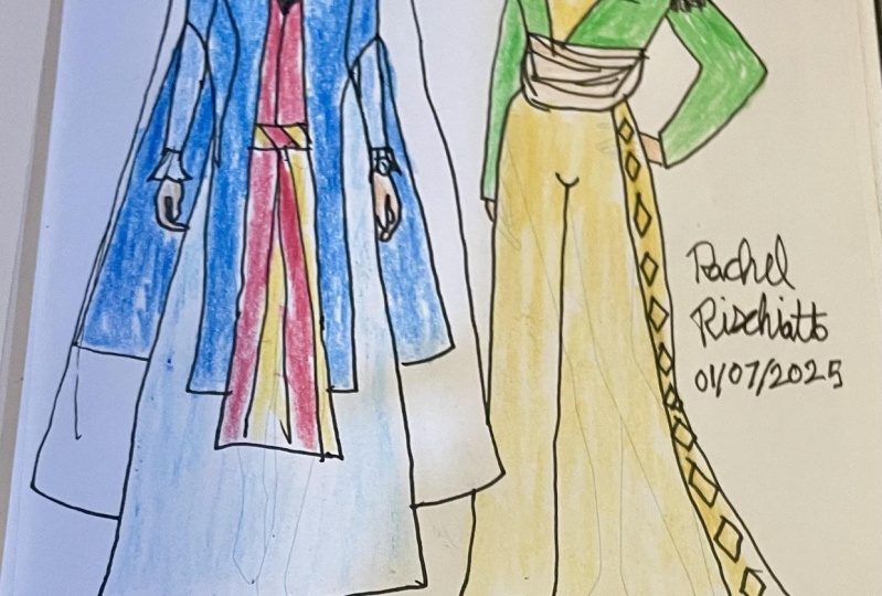
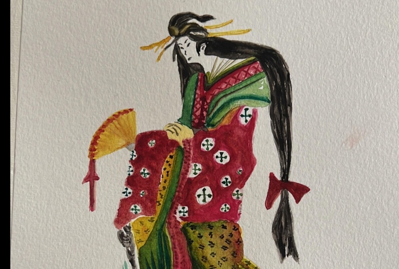
4. Female Clothing Study Drawing: Armenia: Hello everyone. Welcome to today's tutorial. Today we're going to be drawing our median women's costumes
and jewelry or accessories. Take your time to
set yourself up. Remember to make use of your downloadable
resources either before or after you
follow the tutorial. It has all the information necessary on every
class that you follow. Here are some samples of
the women's clothing. Take your time to observe them. In this photo, you
can see an example of men's costumes as well. Their books, Bible or
even architecture. We can see some samples
of their costumes. We want to use some of them as basic elements to
create a new composition. So care be inspired by these
details because it's in these details that we
can reflect the culture, the style, the politics, economy may be, the colors
that were available. We recommend you
pay attention to all the details of these motifs. They are inspiring. And you can memorize some of them and use them in your works. You can study and
learn a lot about the architecture
of old buildings and churches of Armenia as well. And you can also include illustrations of their
books and the Bible. And you can see how do these intersect in these
different elements. You can learn about their
relationship with angels, women and animals, and
men and landscape. These motifs in
the margins here, which are inspired by
plants and animals, do look at how they, they show up in different, different illustrations
or paintings. We can use them to draw our own characters and different techniques
like watercolor, colored pencil, ink
or other techniques. We can also simplify them
in our own characters or exaggerate them considering
a different light and shade. It's all about practice and getting comfortable
with our medium, but it's mainly about these motifs and
elements and details. We want to start drawing
with this fine liner here or any other simple tool
to simplify these costumes. So make use of what's
available to you. So if you have something
different than what I have, don't let that hold you back, use what you've got and
let's start together. We want to draw
the women wearing the Armenian clothing here with a hat and scarf and long skirts. But in a brief look as
well, we're simplifying it. We take a look at the outfit, we look at the proportion. By simplifying it is that we are taking a drawing that has a lot of information in terms of color and shading
and details. And we are reiterating it
and drawing it using lines. Okay? So we chose our media for this tutorial, the
Armenian clothing. The outfits and their details. Before drawing very
carefully, analyze them. You choose one, okay, So we've chosen one here. We pay attention to
their hairstyles. You want to incorporate as
many details as you can with your fine liner or any
tool that you are using. At first, we try to draw them. We tried to draw them exactly
based on what we see. We will get to the
exaggeration part and addition parts and multiplication
of certain details later. Because later on that's when we can make our
desirable changes to them depending on how it
inspires you, and so on. Feel free to send me any
questions you might have along the way. I'm here to help. Here we've exaggerated the
size of the scarf on her head. Make sure your model
images in front of you placed in such a way that it's comfortable for
you to keep looking at. It's your best reference. It's giving you the
information you need in order to
draw your lines. We use her sleeves here to
draw the hands as well. We draw her hand
out of her cuffs. Remember that when adding the details exactly
as you see them, what we mean is draw in
your simplest lines. Your lines are really
unique to you. So they can be simple. They might not be even in terms
of color across the line. It's really, it's really different from one
person to the next, but the point is
that it's unique, so don't let that hold you
back or you think, oh, it's not the same as what is on the tutorial or not the
same as you had imagined. Just keep drawing. We've added a little bit more layer into the clothing here
as you can see. And by looking at them, you see these basic
geometrical shapes, that triangular shapes. And you have other forms such
as rectangles that extend. But it's nice to
be able to look at these geometrical
forms and use them as a way to simplify drawings. And look. The details are in harmony. Now I've remained consistent and my lines and my
use of the shapes. So we used simple
geometrical forms to create our own
character here. And you can add as many
details as you want. The point is to be consistent. Keep observing your model. Look at the details and
whether there's something else you want to maybe add. But we're starting step-by-step. Now we want to draw
this woman with simple shapes here to make some changes to it
later on and to create our own additions to it. We draw her face
with simple forms. Now we draw her scarf or shawl, of course, with a little
bit of exaggeration. But we keep the original form. It would be like this. We use our model image here
and we follow the details, but we simplify the forms. So don't feel like you have
to fill in the texture, e.g. or the patterns. We're going after the
general form first, but we're adding to it and we're trying to mimic the proportion. So we have it looking similar and harmonious
in terms of sizing. If my pace is too
quick, pause the video, take your time, and then play again when you're ready
to continue together. So far we've been
drawing the outlines now we add the details of her dress. So in comparison to
our first sample here, we're adding a little bit more
detail still using lines. Alright? We even simplify the details. It means that we only
show their general form. We draw them with simple dots. Our lines without
adding too much. In removing the
extra information that we see from
our modal image, we are creating a different
style of drawing. Her skirt is playing and
there's no detail on it, so I'm focusing on
the other parts. We even add her face as details with simple
lines and forms. Now we add the patterns
over her scarf. Let's add the fringes
of her shawl to. This is also done in the simplified form or in a
way of simplifying our model. Now, if we want to
make changes to this character which we
drew based on our model, we can add or
lessen the details. It's really up to you. But you want to go through
the different stages of adding or removing
things just to practice. We can exaggerate some parts or we can create
our own character. Take a moment to look
at your model image. Also from drawing these two
samples, how do you feel? Do you feel inspired
to add more removed? E.g. we draw her head and top part of the
body is smaller. And let's say her lower
part of the body, like her skirt or lags will make them
a little bit longer. So that's the exaggerated part. When you exaggerate
a certain part, Let's say you select
the hat or the top of the clothing or the
bottom part and you choose to make it
smaller or bigger, like to exaggerate
it in such a way. You're bringing high,
you're highlighting it, you're bringing attention to it. And playing around with the
medium a little bit more. While drawing, we can
have our own technique. This technique is drawing
with free lines right here. That's why I was saying, no
matter what the result is, draw the lines as you see them. So look at your model. You find that this leaves has this textured pattern that
can be done in lines. Just apply your lines exactly as you visually understand
them and see them. If at any point in time you're unsure of what to do
on a certain part. Just follow my lead. Here, as you can
see in our drawing, we've lessened the
size of her shoulders. We drew the orange shorter. We want to see what the result would be in a trial and error. So we tried different
ways to see which makes an
attractive character. In the end, we added the
shawl around her waist and then we exaggerate
the size of her lower the lower part
of her clothing. Look how far I'm going in these exaggerations is just a way to discover, to discover our own style, see what we're attracted
to, what we're good at. We're more comfortable with. And also of course, practice
more using the fine liner, using the tool
that you're using. Because the more
confident you are, the better it gets. We did it here in free hand
because we are free and character drawing and we can add changes to the model
image that we have, which is what we're
referencing as our basic starting character. By making it shorter or longer
here, fatter or thinner, we can make a new character
and make it different from the reality and actually
make it unique to us. I'm adding some
facial details here. As you can see as a result
of doing these techniques, you gain a new perspective. More unique drawing.
And it stands out. It kind of sticks in one's mind. Again, we want to draw
one more, this time, much shorter than reality, just to create
another character. But making choices that
are on the other end. So instead of a taller bottom, we're going to make
it much shorter. We use our model to draw
and test different new, unreal or surreal characters. This way we can enhance our creativity or just
test how we can be triggered or what triggers us to create more creative details. You know that an exaggeration, the proportions are
not real or standard, although you're still
referencing your model image. Different costumes
and clothing and cultures help us to add those details and we need to practice drawing these
exaggerated proportions. This kind of Schaller,
this sleeve, the model of her skirt and other details of her
costumes are in fact our basic elements to creativity and making
new characters. If we want to do it
using only genes are T-Shirt then will be
limited to do so at most, we can change their sizes. But we have these varieties in the elements of
traditional clothing. And then we can create
numerous types of characters. Adding these details. Redraw her arms here
longer than the standard, as you can see in
this character. On her body should be shorter. As we are drawing. Remember
that we want to be careful and not try
to draw caricatures. This is a practicing
act to exercise, to draw new characters and be inspired by how
creative we can get. But it's not about creating character tours
are funny figures. It's a practice to
become more creative and to practice using the tool, but also finding our own style
and sketching like this. The lines are free so it doesn't matter if
we cross the lines. We don't want to
draw realistic work. There's an aesthetic to
the drawing style itself. So don't worry too much if
your lines cross each other. We can already see here that
we have a shorter character. Feel free to send me your
drawings at any stage, really, I'm more than happy to
give you some feedback, maybe some guiding
pointers. I'm here to help. Now we've used the striped
patterns here and we've crossed the lines to
create visual effects. We can also draw her
shawl like this. We've also added the fringes to her Shaw, this simple dashes. And it would look like that. Now we want to do the same with other real characters and create new characters out of them. E.g. a male character like
this with this outfit, which even in reality it
has lots of details in it. We want to use these details and characteristics
in order to practice. First we draw his clothes
in very simple forms. Again, if you're
unsure what to do on a certain part or
what's the next step. Just follow my lead. As you can see here,
we didn't draw the outline of our outfit here, the meal outfit, or we're
completing it only by drawing the motifs
are the details. These motifs,
alongside the details of his clothing give us
strong visual attractions. It also teaches us a lot about seeing different
possible ways to draw. As you can see, we're drawing the whole figure
using these motifs and I'm keeping my lines consistent in terms
of thickness. Take your time. If you
feel like you want to practice this technique on
a separate piece of paper, you can just to
give it more space. Because it could be
really inspiring, like to try and create a
drawing without the outline. Now, as you can see, the motifs are drawn mostly
using these straight lines. And we have an outline that we're still able
to get addressed and a gesture of the clothing here that there's a person
as well standing. This is an attractive technique. And of course, all of
these techniques that we've used are
attractive, They're good. First we practice in these sizes and then
we can draw them in bigger sizes and add more
details as we move along. Remember, keep practicing. Thank you for joining me
today in this tutorial. Hope you've enjoyed it and
see you in the next one.
5. Male Clothing Study Drawing: Armenia: Hi there. Welcome to a new tutorial. In today's tutorial,
we're going to draw an Armenian character
on this part here. Take your time to
set yourself up. Now, first we're going
to sketch his beard. We can also draw
the general form of the body at first and
then add his head. It's really up to you. Now to put it another
way we can draw the initial sketch
with pencil at first. And then we're going
to work more on it using a fine liner. Look at how we've simplified
the character. So e.g. we can draw the moustache, but not really
determined the lips, or we can draw one eye, but not both of them. We've simplified the characters
in our sketches here. The shoulders of the
character are wide. Remember to make use of your
downloadable resources. They have all the
information you need on every tutorial
that you follow, listing everything
that we go through. And you have your
model image and so on. So do make use of them. They're there to
help you practice. And they have the base
sketches in case you want to sketch with a pencil
before a fine liner. There's a cloth
around the stomach, which is like a belt and we're going to draw it like this. We draw the legs
short in this way. We need to add some patterns and motifs on his
trousers as well. Now we're going to draw
his arms and hands. We're sketching in a
very geometrical way. So if you observe the
way that I'm drawing, I'm basing it most
that's more geometrical. The important thing is that
we know the anatomy and then we simplify the
body into our sketch. If we are beginners and we want to draw
the figure correctly, we draw it's real
figure once in order to learn and become familiar
with its anatomy, or a few times, as many
times as you want. Then you move on
to exaggeration. It is, suppose that
we knew and learned how to sketch and
draw a character. If there's a problem
in sketching, we need to draw the real form
of our figure a few times, get used to that, then are exaggerations
become more proportionate. After that, we can simplify
it and add special details. We can exaggerate and make
the figure longer or shorter. And we wouldn't have
that much challenge. So e.g. we draw this
figure shorter than his standard form
in this course, it's suppose that
we know and learn the real anatomy of the figures. We decided to draw. This meant shorter according to the feeling that we got
from the model here, It's what inspired me as well. We drew the shoulders wider. We use the triangular shape for the body and short
rectangles for the legs. Although our model has
standard body shape, but we use more geometrical
shapes and our sketch. And it's a way to show more of the clothing
really to give it more space and to
bring highlight. And although the
shoulders are wide, we exaggerated them
and made them wider. And even though we have, we can use curved lines, but we decided to use
geometrical shapes and have these more
straight lines. Anyway, it depends on ourselves in order to make decisions
for our figures. So it's just about
playing around really. But in the beginning
we should know the standard anatomy of
the figure very well. Then we go on to add
these exaggerations. And now we're going
to draw some more of these figures in
the next lessons. Thank you for watching. Hope you've enjoyed this, keep practicing and see
you in the next one.
6. Armenia Clothing Pattern with Organised Doodle Technique: Hi there, Welcome back. Today we're going to
draw this figure here in a bigger size and completed
a little bit more. So we're going to add more details and
give it more space. We start with a basic
drawing of our figure. We start drawing our model. This is our photo, which we want to sketch only
the motifs without outlines. So take your time to observe it. Take a look at the details
and what we need to add. If you're a beginner,
you can draw it first and have the outlines. Then add the motifs and practice until you get
the mastery to draw without the outlines
where you can gauge the proportions and add the details like
and using freehand. So you can also do it in pencil
if that makes it easier. Now, this technique here
that we're going to use, It's different from
the realistic drawing. Of course, we can create special works using
this technique. It can inspire us by simply focusing on the details
and not the outlines. We start from the
color of her dress. We pay attention to
the patterns and the motifs and we draw
them as we see them. Take your time. Remember to make use of your
downloadable resources. They have all the base sketches and grids to create
your drawings. As you can see here, we're
drawing her arms so we change the direction of our lines and the details to indicate
the shape of the arm. We need to lessen the sizes of the lines here as the
form becomes narrower. And most important practice
here is to observe your model and observe
the details and add them. In order to draw like this, we need to be familiar
with the anatomy of the body that
we're drawing here. So we haven't had exaggeration
on our drawing so far, but we can add it
little by little. But practicing the anatomy
is very important. So if you need to do
that a few times, go ahead and do that
in pencil or pen. Pay attention as beginners, we don't draw or exaggerate or add the
motif simultaneously. Don't do them at the same time. You need to do one
and practice one. And then once you've gotten down the anatomy and
the proportions, then you can move on
to create it again, but then exaggerate them. Otherwise, it'll,
your final result will look a bit confused. It's much better to add the details in different
phases of our drawing and how we're moving forward and practicing and getting more confident and familiar
with our tool. We've left a blank space on the color under the
chest for the hand. It's a little bit
of a blank space for where the hand would be. This is the shawl
around her waist. We can only add vertical
or horizontal lines. But here we added motifs to
which depending on the forums we create by some broken
cut or curved lines. Again, add them as you see them. It's not necessary
to draw the lines or motifs exactly like the model. By analyzing our model, we simplify the
lines and we draw them because in the
exercise of simplifying, you choose an easier line or a short-term line
or a cleaner line. In fact, we summarize the motifs as they
have a lot of details. And if we want to show them
in such a sketch or drawing, they wouldn't necessarily be
eye-catching on their own. It's about the combination
of them together. So if you need to take some of the motifs and on
a separate paper, just draw them on their
own just to practice and then multiply them
and see the effect. Feel free to send
me any questions you might have along the way. I'm here to help. If at any point in time
you're not sure what to do on a certain part. Just follow my lead. Mimic the way that I'm drawing. And what it is that I'm drawing. We are looking at the
details of every part. We were analyzing them
visually by looking at them. We're going over the details and then we're care for
the adding them. Remember to draw in your
most basic simplest way, like the simplest way
that comes to you. The primary way, the way that
you would naturally draw. Don't try to, don't be
pressured by having to have your drawing look different or maybe it's not what
you have in mind. Because our lines are most basic lines are
very unique to us, like you're drawing
style and the way that your drawing
is unique to you. Now as you can see here, we have geometrical shapes like rectangles,
square, triangle. There are lots of other details
which we don't include. We're only using lines in geometrical forms to
develop our work. Pay attention that we're
not drawing a flat surface. We must consider the general
form of the body and if necessary draw them considering the curvatures of the body. So we take those straight lines and we curve them
dressed a little bit just to indicate a little bit
of volume or a curved area. Here the body is
wider so we give it its curvature while
adding the motifs. We show that gesture of
her body at the same time. Feel free to share with me
your drawings at any stage. I'm more than happy
to take a look, give you some feedback, maybe some guiding
pointers. I'm here to help. Now, while we're sketching
here are drawing, we're not we're not trying to be obsessive to add
every single detail, but just want to be consistent. Have symmetry, show
the curvature. It's those kinds of details that we're trying to practice. Of course you can, you can do this drawing. I'm using different
exercise is really just to see how you do like
you can do it on a timer. You can do this drawing by
repeating it several times and seeing how much
detail you'd achieve or how much different year details look across different ones. You can also use digital
programs or apps to draw it. The most important thing
is how innovative and creative you can be
while drawing like this. Is it inspiring you? What does it inspire you to do? What kind of details does
it lend itself to you? To create more? Take your time. Keep
observing your model. Now as you can see here. The squares, they are so
practical and showing the motifs because they are contained space
and then you add some more detail inside of it. Now we can add this, these diamond shapes here. We add some dots at the
bottom of her skirt. Her skirt is almost complete. This is actually a kind of a
print which she's wearing. Now we want to add her skirt, which she's wearing
under this apron. Her skirt. And this part is in three parts of which the
middle one is darker. The pattern of the middle
part is striped like this. We show the light
parts untouched. We use the whiteness
of our paper. So it's important to make
sure that you're not drawing on parts that you
want to keep white or clear. We showed the light
parts untouched. The third part here has
more creases on it. And for the upper light parts, we don't draw any lines and
we keep them untouched, as we said before. Imagine we color this drawing, it becomes so attractive by
these simple vertical lines, we show them a increases. It depends on you
if you want to draw short or long lines are
exactly the same size lines. Now we're going to
work on the color. And this is her necklace. Look at my hand movement and see how I'm
working on this part. Redraw her head and face to try to consider all
the details one by one. Make sure you're
including all of them. It doesn't matter to change your technique a little
and draw lines which aren't in harmony
to the whole work because we're practicing really, there's no wrong
way of doing it. It's about gaining
confidence with our medium and the technique and seeing where it takes us. So that's her head. We had to and darken the
bottom of her skirt. Now, we do it like this. Follow my application. Observe how I'm drawing these lines and follow
my hand movement. What is important here is that
the hatchlings mustn't be different from the lines
we used on the whole work. We need to achieve
visual harmony like they need to look
like they belong as part of the work and not very different in terms of shape
or size or technique. Or hatchlings must be in harmony with the
rest of the work. We're using, organized
crosshatching for the bottom of her skirt. So pay attention if we use this organized lines for such a work that has
so much geometry would be spoiled
and unattractive and may be separated from
the rest of the drawing. So you want to take a moment, pull your head back,
maybe look away, look back at your
drawing and you'll have a chance to look at
it with a bit of fresh eyes and you'll
notice like what's missing, what can be added? Whether visually, everything
looks harmonious, like it belongs together. We continue adding
these details. Now her feet. For the left foot, we drew an outline
while the right one is the same as the other
parts without an outline, it's better not to
draw outlines for such works you want
to avoid that. This is an Armenian woman
with this attractive, attractive piece of clothing
with lots of motifs here. Now we add the
details of her face. Again, we're using simple
lines for completing her face. You want to complete
her arm and hand. We want to make sure we show the curvature
on the shoulder, the breast here, and the
motifs on her dress, whether they're curving
in those details. And the convex lines on both sides of the
bottom of the skirt. Also, we created
some texture here. Take your time to go
over the details. Keep practicing. Thank you for joining me today. I hope you've enjoyed this and see you in the next tutorial.
7. Armenian Clothing Patterns with Fast Sketch Technique: Hello everyone. Welcome back to New lesson. Today's tutorial, we're going to draw another Armenian character, but we want to use
more irregular lines. We're going to draw
this figure again, but with irregular lines. Observed my hand movements. Take your time to
set yourself up. And the quickest
way to practice is to mimic my application. Just copy what I'm doing. Then the more you practice, the easier it will come to you. We can exaggerate as well in this technique a little
bit more easily. We don't add lots
of details on it. We apply the lines
as we see them. Sometimes I feel in order to overcome our fear of drawing, we just need to go a
little bit faster. And it helps you make
decisions in the moment. Now we're drawing
the skirt like this. The square root of this
character is puffier. Now remember all the
outlines and the grids. They are done and ready for you in order to
practice your drawing. They're available in your
downloadable resources. They're there to
help you practice. Take your time. Keep your wrist loose. You don't have to put so
much pressure on your pen or your fist on the page. Irregular lines means
lines of any kind, but they are just looser. They're made quicker. Look at how we
draw the motifs of this character in this
very simplified way. The lines can also cross
each other like this. Feel free to send me
your drawings no matter what the result is
or at any stage, I'm more than happy
to take a look, have a chat about it, and give you some
feedback if you want to. Now if a line crosses from the main lines like these parts, we can repeat it on the
other parts as well. So the idea is it's more
important to be consistent. If you've done a
line that looks a little bit different
or off just Miracle, on the other side.
Balance it out. We need to add some
lines on the skirt. We should not use a
lot of lines in order to not get out of the
standard form of the skirt. But we wanted to add
the lines necessary. If we use lots of exaggerations, we may change the clones of
that culture or country. So we should use exaggeration properly and not go beyond like a standard form which deforms those details that
we've been focusing on. We showed the color of this
part with hatching lines. We draw the shoes, and now we can add some
lines to draw the head. Look at how we draw one figure, but in different ways. We can add some lines on
this part in order to make the skirt a little bit
puffier here on the right. If we look at this character, we understand that
her skirt is puffy, but for the other one, we need to show the skirt
with different lines. Actually depends on
ourselves whether to have regular lines are not like
regular heartstrings or not. If we wanted to have a
character with irregular lines, we should draw it like
this on the right, like the character
on the right here. But if we want to
sketch easier or draw variety of
characters or just have this aesthetic of sketching aesthetic we should draw like
the character on the left. Pay attention that
we should keep the standard form of
the character as well. We should draw and show
the main lines generally, and don't add the lines
on the right places. As you see, we should not add regular lines on
this character here. We used broken lines instead
of straight lines on this part because the
form of these lines is different from
the other character. We're trying to practice showing the same character but
indifferent drawing styles. It's another exercise to get creative and practice
drawing from top to bottom. So we draw the head, the body, the skirt, and the motifs
according to the form that we choose for the lines. We need to pay attention
to these points in order to create harmony in our sketch. Really. Always take a moment to pull your head back
and look at your drawing. It doesn't make sense if
we use straight lines and rectangular shapes
for this character, e.g. on the left, the head of the character should have harmony with the
other parts as well. So make sure that
the style of it, the quality of the
line is the same. We exaggerated this
part a little bit, which is the skirt part. We can make this character
more complete and special by adding
more details onto it. The one on the right here, because it lends itself to
have that much detail onto it. Now coloring the character can make it even more
beautiful as well. So we're going to add color on these characters
with color pencils. As you can see, we draw the
lines of this part straight, but we don't do it for
the other character. We should keep practicing and practicing practice a lot
these different techniques in order to be able to use the lines properly
according to what you want. This figure is regular, but we sketch this character
with irregular lines. We're going to add color on
them in the next lesson. So continue to practice drawing and sketching and making
those differences. Thank you for joining me. Hope you've enjoyed this. See you in the next one.
8. Armenian Clothing Patterns: Adding Color: Hello everyone. What continued tutorial? In today's tutorial, we're
going to add warm colors on these characters which we
have drawn and sketched. Red and warm colors are used
more in Armenian clothing. We're going to color this part with a scarlet colored pencil. It's number 70. Coloring can make our
work different and change our technique completely. And of course, the final result. To have harmony in our work, we need to add color
in the direction of the lines and forms. Because in the final result, the direction with which you
color in terms of lines, vertical, horizontal, or curved. These will show through I'm coloring alternating,
alternating lines here. You can make some parts of
the lines darker or lighter. That's really up to you and
how you see the shadows. We're using this
color for all parts. Feel free to use
different colors than the ones we're using here. Or if you have different
colors or access to different colors than the ones we're using in the tutorials. Just use what's available to you and don't let
it hold you back. Take your time,
apply your color. Now, the next color
that we're going to use is anthro coin, Carmine colored pencil,
that's number 580. We bring in this also warm
color, It's more brown. And we start adding
it to the details. Remember to make use of your
downloadable resources. They will list all
the colors that we use in a tutorial and everything that you go through for every
tutorial that you follow. It's there to help you practice. The next color we're
gonna be using is the orange colored pencil
that's number three is zero. Now remember using these
different tonalities of like using tonalities
of different colors. But the tonalities are
close to each other. They're all warm and
harmonious in a sense, it adds a lot of richness
to your artwork. Remember, we need
to keep some parts untouched so you don't
add any color on them. They need to be the
white of the page. If you're unsure which
parts these are, just follow my lead. Apply the color where
I'm applying it. The more you practice, the more seeing
the highlights and the shadows gets easier and
more instinctive for you. Now we're going to add the middle where the gray
color on these parts here. That's pencil colored
pencil number 713. Now we need to use the
orange colored pencil. Again, that's number 30. We need to use it on
this triangular shape as well. Right here. Now, we need to work on creating that harmony between the colors and it gets better and better. The more you bring
these tonalities that are talking to
each other together. It depends on ourselves
whether to color the figures are not
for this character. We can add the colors
more irregularly. So our application is looser. Let's color the
character on the left. We need to use a Cornelia and
colored pencil that's 850. Pay attention that we don't fill these parts with
color completely. We used this way of
coloring because our work is irregular or
using irregular lines. Now remember all the materials and colors and grids
for sketching. They're all available for you. Everything that we're using
on this course is available, available for you on the
downloadable resources. And feel free to send me your questions at
any point in time. Now, look at how we've used a variety of colors
according to the lines. And in our, in our
character on the left, we don't color very regularly
either like our hand. Our application is looser
or hand is lighter. Here we're coloring
these parts of the Scarlett pencil,
That's number 70. Next, we're going to add
color on these parts here with the green ocher. That's number 25. It's
like a very olive green. Actually, we want
to be more free and not choose the colors
exactly based on the, the modal image or the culture and the
clothing in front of us. You can divert from that if you have different
preferences, really. I always find it helpful and
beneficial to go with the original for my
primary practices and then sort of
take it from there. Now in this tutorial, we just wanted to use
colored pencils a little. We need to add color on
these parts as well. We can add more details
on this character and increase the contrast
of our work. But take a moment to
pull your head back. Move away from the
drawings and the coloring and notice what
you might need to add or remove and how this has accentuated
your artwork as well. Combining different mediums to create an artwork is something very attractive and it
needs practice depending on the combination of
mediums you're choosing. But that's about it
for today's tutorial, don't forget to practice and hope you've enjoyed this one and see you in the
next tutorial.
9. Clothing Patterns with Advanced Line Drawing: Hello, Welcome back
to new lesson. In today's tutorial, we're going to draw an Armenian
men on this part here. We've colored in R to Armenian females here
in the last tutorial. We're going to draw the face
of the character like this. We're starting off with sad, the eyebrows, the eye. There's a turbine on his head. Now, remember to make use of
your downloadable resources. They have the grids for you
to create your basic sketch, which if you choose to
do in pencil, you can. But I do encourage you to
just use your fine liner. Enjoy the process and
the matter, the result. Now here on our character, the shoulders are wide. I'm adding details
as I'm moving along. This part of his
clothes has some first, I'm trying to show that texture. And also in your
downloadable resources, there's all the
information that you need in order to practice. So it's there to help you
practice on your own or anytime you want
really to inform you. Because it lists the
colors that we use, the grids, that
information, and so on. Now keep observing
your model image, makes sure it's sitting in front of you in such a way that you can comfortably
look at it constantly, because that's what we're doing. Now here, notice how we're using both regular and
irregular lines. So some of them are really
straight and geometric and others are curved. So it's a combination of
both techniques that we've used for the other
two characters. We want to use more hatching
lines for his clothes here. Observed my application. Now remember if you're
unsure at any point in time what to do
on a certain part, how to draw on a
certain section. Just follow my lead. Keep your wrist light. We use different hatching
lines for this character. We're sketching our figure
and his clothes right now. So it's both, It's not just
the anatomy of the body, but it's also the
clouds and how they're curving showing the
body underneath. Don't worry too much. If your drawing is not
looking as you had in mind, it would look or maybe different than your model
drawing model image, which is completely
normal because we are, we are developing a
drawing aesthetic. We are not developing a
realistic image here. We are using these
realistic indications and references from our model
image and we're drawing them in order to transfer
it into this medium. So of course it's going
to look different. The idea is to practice and get better and get
more confident. We need to draw the legs bigger. So even the clothing
is a bit bigger here. Then we're going to add some hatching lines on
the pans in this way. Also some details. Some of the pattern, those are the motifs
that we talked about. So they're not as exact as you would with a regular lines are
very geometric lines, but they are indicated. Now, the idea of
sketching or using irregular lines or even
just drawing in general. Use any line you
will need to use in order to create your
drawing v at irregular line, irregular line,
hatching, crosshatching, curved ideas to get
the proportion right. That's really what
we're practicing. And yes, that differs
in terms of how it looks in the end depending
on the tool you're using. But practice does make perfect. Because you can see
here we've used different lines and hatching
lines for our character. We've mixed them up. We've used lots of lines and we've achieved
this aesthetic. And no matter what you choose, in terms of aesthetic and
lines, just be consistent. Do it all across your drawing. So it looks harmonious. Now we're going to add
some hatching lines on his face like this. Because of the model
of his clothes, like the style of his clothes. And it's fors, we use a
lot of hatching lines for this character
to achieve these, these details, these
characteristics that make it look
the way it needs to look or as closely as I can see it from my modal image. We have used hatching lines for all parts in order to create
harmony in our sketch. That's what we mean
by visual logic. Visually harmonious,
everything looks like it belongs in the same drawing. Really enjoy sketching with
lots of hatching lines. There's so much to learn. So we've sketched this
character very simply. We've simplified the lines. We draw this one with
irregular lines. And then we drew the
last character by using different hatching lines. Choose the technique that
you like, you prefer. You find yourself inspired by and practice. Keep practicing. The important thing is
to use the motifs and elements of the character
like the country, the region of the clothing
that we are drawing. And to make sure
that it's there, that you can see it. You know, that's the
point of this course, is to draw clothing and characters wearing those clothing's from different
parts of the world. And here I'm just
making these lines a little bit bolder is just a way to finalize
our drawing here. Because you can go back
with your pen even after you've used
your color pencils. But that's about it
for today's tutorial. I really hope you've
enjoyed it and you've got to practice another
drying technique. Keep practicing and see
you in the next tutorial.
10. Fast Figure Drawing Sketches: Hi there. Hope you're all well. We'll continue tutorial. In today's tutorial,
we're going to sketch an Armenian woman on this
part of our page here. Take your time to
create your sketch. Make use of your
downloadable resources. In this catch, we're
going to use a variety of hatching lines in order
to create our character. If at any point in time
you're not sure how to do a certain part
or what to do next, just follow my lead. Notice my lines. Here we are going to
exaggerate her skirt. As you can see, my
lines are pretty loose. They're irregular. They're not very straight. Which is why they're
called irregular. Redraw the motifs
and the elements in this very simple, simple way. Take your time. We need to draw all
the details patiently. Just because we are
drawing something loosely doesn't mean that it's inaccurate or that it
doesn't have the details. These are the elements
of this country here, the motifs of Armenia that you find on the clothing
and its culture. And we've used it on different, different types of clothing
here on different figures. We can also sketch the phase of the characters with
these motifs as well. Like if it's on a head
piece or a necklace. We've used elements of
Christianity for the, for the cloth creases as
well in this one here. If you look at the early
Christianity images, the cloth creases are like this. They're quite numerous,
they're multiplied. Since they are this special
elements of this region, we use them for our character. Feel free to send
me any questions you might have along the way. I'm here to help. The combination of
colors and lines is a big challenge for
the artists in order to use the best of them. So it's a balancing act really. And practicing. Also feel free to share
with me your drawings, whether you've used regular
lines are irregular. Maybe it's an unfinished
drawings or completed drawings. You can share with me your
drawings at any stage. I'm more than happy to
just have a chat about it. Give you some
feedback if you want. And of course, address
your questions. Keep observing your
model and apply your lines as you see them. Now every art work, it's really depending on you
and what's inspired you. Sometimes we use more
colors than lines, so our drawing is pretty
clean in terms of the fine liner or the outlines. And then the colors are, they come in and they
populate the entire artwork. Sometimes we don't use that many colors or
any colors at all, and just rely on
the line drawing, which is also a challenge. We can create better
harmony if we just work with hatching lines. It's something that requires practice and a lot
of observation. We're going to add
some more motifs. As we move down the dress. If we want, we can
add more exaggeration on the characters as well. Now these motives are
in standard form, but we can, we can exaggerate
them in the next drawings. Or if you repeat the same
drawing and you want to choose a certain
part to exaggerate. But look at the differences between all the figures
that we've drawn, the clothing, also
the technique. Are your lines consistent
across every figure? We can also draw the
legs are smaller or longer or shorter. We need to search and see different images from a certain
region in order to become familiar with a variety of elements, motifs,
different clothing. So the more information
you have, the better. Because then we're
going to sketch different characters in
accordance with their motifs, elements and cloth and
culture and colors of course. So take your time, practice, and especially practice
simplifying the drawing. So you're creating a line
drawing from a modal image, which is a photograph
or a painting. And finally, we use
our techniques in order to have our own
characters because we don't want to copy exactly
the same models we're trying to be inspired to
create our own style, right? That's the whole, that's the whole purpose behind
such an exercise. So once you've drawn the character in front
of you as you see it, then you try to exaggerate
a certain part. Then you use it as a
point of inspiration, something that it has inspired you are triggered
you to realize, I like to use dots more
than hatching lines, maybe crosshatching,
more than just hatching. So we've used the
elements of Christianity, as you can see here
from this period. We've used regular lines for this character here
we've used the motifs on this character here on the man reviews lots
of hatching lines. We've showed shading layers with the hatching lines as well. And as you can see from
the previous sketches, we've used simple lines
and geometric elements. We have tried them out here. We've used some
irregular lines on this character over here. While here they're more
regular the more straight. So it's really about a
combination of them and what you're more comfortable
with and practicing. We've used all these
elements and techniques in order to create
our own characters. Thanks for watching. See
you in the next one.
11. edit this video voice: Hello everyone. Welcome back to this tutorial. In today's tutorial, we
want to use the elements of the Armenian architecture for the character we are
gonna be working on. Actually, we want to use
the models and forms of the church domes and combine
them with the figure. Learning how it can be done
as accurately as possible. So let's observe
our model image. Use your downloadable
resources to gain access to these images and the grids as well in order to
draw your base sketch, this work needs a lot of creativity in order to use
the architecture of some of the buildings as a source of inspiration for the form of
the body and also the dress. So we need to practice
a lot and we're going to go through
it step-by-step. We start our work with and
olive brown color pencil. It's number 39. That's 39. First of all, we're going to
draw the dome of the church. Try to be accurate and follow my head movements as
closely as you can. A good observation of our modal image is the
first step in drawing. Of course, you can
draw it freehand from observation or you can follow my application like my hand
movement and the way that I'm drawing. Take your time. Keep your wrist light. Hold your pencil in
a comfortable way. Because sometimes we
can be overwhelmed. We might be holding our
pencil too strongly. Now, this can be the crown of our figure which is
placed on the shoulders. Look closely and see how I'm
working on it step-by-step. If you need to rewind certain parts in order
to practice together, just go ahead and do that. If my pace is a bit too quick, maybe you can pause the video, create your sketch, and then continue together
when you're ready. As you can see, we combine the crown
with the church dome. Look closely and see how all these elements are
coming together and creating a new character with different dress styles
and characteristics. Now the idea here of taking inspiration
from the buildings. So we're still inspired
from the Armenian culture, but we're taking inspiration from the buildings just
like you would take inspiration from any
element in the world to create a new clothing piece. It could be nature, it could be a cartoon, cartoon character. It could be the skies and
could be really anything. So this is the
same idea in order to trigger our creativity. We also analyze the trial
and errors in order to see what our sketch looks
like if we draw it like this. So don't limit
yourself in any way. Just experiment and draw. It gives you a chance
to use your tool, get more comfortable
with it and be familiar and create
even better drawings. The hands are thin
and facing downwards. This is exactly how we
need to work on them. Now we're going to add
some columns on this part, which is between the
hair and shoulder. Take your time. Go over
the details patiently. We're going to
complete our sketch. Look closely and follow
my hand movements. It is good that we go through these different steps together. It's always beneficial
to practice at the same time as the tutorial. We try to create harmony between different
parts of our sketch. And this harmony comes not
only from a good observation, but also from practicing and not being afraid to be creative. Or try something that
you might not be too comfortable to try, experienced the world around
you and try to combine different elements
in the best way as possible while drawing. Now, remember to make use of
your downloadable resources. They will have all
the information you need for every tutorial
that you follow, listing all the steps that we
go through, the materials, the grids you need to draw, the base sketch and so on. It's there to help you observe the drawing
that I'm creating. Now, we've done our sketch with lots of imagination
and creativity here, so you can pause the
video if you still need time to sketch this drawing. We used elements of
the building motif, native elements and
even clothes and combine these all together to create this
figure right here. So that's an a way, an exercise to trigger
our creativity. So now we're going to
add hatching lines on our work using a
black fine liner. First we're going to
work on the cross. We use different
short hatching lines, tried to look closely and
follow my application. Look at the way
that I'm drawing. Feel free to send me any questions you might
have along the way. You can even share with me
your drawings at any stage. Maybe just if you want
to share and that you've used different techniques
to create the drawing. Or if you want any feedback, I'm more than happy to give
you some guiding pointers. Notice how I'm crossing
my lines here, where they're not all
going in one direction, they are creating a texture, but also shadows where some of them are darker
than other lines. We add the hatching
lines like this. If you mimic my application the exact way that I'm drawing. And then take a moment
and stop drawing. Pull your head back, look at what you're creating and you'll notice what kind of texture
you've been creating. Because sometimes we need
encouragement or that we're not convinced that what
we're doing is giving us the effect
that we want. Density and the distance
between the hatching lines or less on the lighter parts as
we see here on the right. And see how I maintain
the gaps in between these hatching lines
because we're not trying to fill in all the
space completely. There's still the
white of the page, the highlights that we
need to show and so on. Now again, feel free to message me at any point in
time if you have questions. I'm here to help keep observing the model image. This is the dome of the church, which we worked on with
different hatching lines. We've tried to
mimic that texture. We continue. Now we go through the hair
of the model here. I'm always really curious
how, how each one of us, or how each one of you gets creative or ends up
creating the artwork. So that's why I would
be more than happy to receive your drawings at
the end of your practices. I'm always online
and available to check your assignments
and answer any questions. What's mainly important
is to enjoy the process. Don't worry too much about what the final result
is going to be, or maybe a line is wrong or not, how you wanted it to be. Just enjoy it, practice, get familiar with your tool. And the more you practice, the more confident you
become in this medium. We continue adding hatching lines here on the lower parts. This is like the
column of a building. We go through these
curved parts. We add hatching
lines on the hair, shoulder and the curved parts
that we drew while being inspired from architecture and the different characteristics
of buildings. There is something,
a little bit of a surreal approach here
that I'm going for. It's just a way to
trigger our creativity. See what comes to mind
are what we feel like drawing more of as we try it. We go through the ear here and then we're going to
draw this braided hair. We tried to show the phase of the model using
hatching lines as well. One hatching lines are added in the accurate
directions and angles. They can be really
complimentary to the form. And this is exactly
what we're doing here, even though we're
using the same pen, the one pen to create
different hatching lines. It's the way we
apply these lines that creates differentiation
between the face, the texture there
of the shadows, the hair, the hat, the top part. So the clothing really just
takes a bit of practice. The more you practice, the instinctively you'll be
able to decide what kind of lines you want to apply to show the difference between
the face and the braid, e.g. or the hair and the top
part of the clothing. As you can see, we combine
the face and head of our model with
architectural elements. And we've built up our
layers step-by-step. We draw the details and design elements of
the crown like this. Every few minutes
as you are drawing, make it a habit to stop. Pull your head back, look away, look at your, look back at your drawing
with a little bit of fresh eyes just to see whether you're achieving what you want to achieve
in your drawing. And to notice in this quick
little exercise like how to, what might be missing? Is it more shadows on some
parts as a more highlights? The highlights or
the important part because they are the
white of the page, right? So we want to make
either visual notes or make a marker like on the side to point that
this part needs to stay white and take it from there. Now we're adding some shading
layers on the clothes. We combine the form of
the dome with a form and details of the clouds in
order to create harmony. So we stopped to
check to see whether there's also visual
harmony there. There are lots of
triangular shapes on our sketch which
we add like this. Take your time. Now we're going to add hatching
lines on this part. We draw these triangles
exactly the same as the triangular shapes
of this part on top here. We want to create
a visual balance. So the drawing, all elements of the drawing look like they
belong to the same drawing. That nothing sharply stands out as if it's a
different style. Of course, you can
combine different styles. So if you want half
of your figure to be very geometrical
and the other half, not very like using
irregular lines, you could do that, but
for now we will need to practice creating
a full figure, full drawing using
consistent technique across the entire drawing. Once you've practiced
and you feel that said you are
confident to go ahead and mix different
different styles. Then you go ahead and do that. We've gone through this
part here and we've created a texture with hatching
lines down the arms. The important thing
is to create harmony. It means that when we
sketch a character, we should have, we should have consistency between different
parts of our artwork. And they should be in the
same direction as well. In terms of lines
on different parts. We draw the necklace of
the character like this. Well, actually, we've
used our imagination and creativity in order to
add all these parts. And that's the real exercise. We used our imagination, our creativity in accordance with the motifs and the
colors and the clothes, shapes from the Armenian
figures and architecture. In order to get
inspired and to see how else do we want to
expand on these elements. That's why it's important
to observe the content. We used all of these things as raw materials in order to grow our imagination and create
different and new sketches. We tried to use all these
elements for our character. I decided to work on our
sketch with hatching lines, but we can use color
pencils as well. And again, what
remains important is, is to draw an ad What's on
your mind onto the paper. And it's an exercise to inspire us to get
towards our own styles. So whatever you're inspired
by is to go for trial. We need to work with
love and passion. We should practice a lot and
learn from our mistakes. These are the key steps that
help us improve in our work. We should continue
and never give up and practice a
lot in order to become better and gain
experience and confidence. Look carefully that how we draw the hatching lines to
complement the form. So we direct our lines
in accordance to the body part that we're working or the
shape of the cloth. For these parts of the clouds
right at the edge here. We got inspiration from the form of the gable
in architecture. Notice how I take
a moment between drawing several hatching lines. I stop. Then I go back and I continue. It's just a moment
for me to look at my drawing and see
what I've achieved. What can I add? We use triangular shapes
here and lines in order to add more harmony and
more detail to our sketch. We draw the accessories based
on our search and models. It's important to reference
what we're inspired by. It's something really
good to be able to say This is what I'm
inspired by this era, this cloth, this culture. And to take it from there and show why the inspiration came. Now we change the direction of the hatching lines and we
draw them in this way. Remember to not fill
in all the spaces. You want some
whitespaces and some of the lines to have bigger
gaps between them. As you are going
towards the highlights. We go through the skirt. Here. We continue this part
of the skirt and we create the texture of
this part like this. Observed my application. As you can see, we've used different lines and a variety of hatching lines in the directions
that they need to be. In order to build our
character and not just give it a texture and
highlights and shadows, but to give it some
patterns as well. So our lines define what
it is that we are drawing. So we have straighter and
short lines for the top part, the hat on top of the head, which is very geometrical. Although you have
very straight lines as well on the skirt, you still have a little bit
of curvature at the bottom. Also, the detailing on the
neck and the shoulders. We forget to keep this
part of the hand White, same as the right hand, but it doesn't
matter. It's okay. We can draw these kinds of
sketches several times and practice this part of
the building which is placed on the head and
shoulder of the figure, is resting on the back. Actually, this can be an
interesting combination between the face and the building
on the clothes here. Moving on, we go
through this part, moving down to the back. Let me connect these
lines to the body. All these things are just points for us
to practice more or build our sense of
drawing and grow and expand our creativity in how we're imagining what
we want to draw, and how we can create a
special character with a combination of the
facial expression, the pose, the clothing, and the elements that architectural elements
that play a role. The play a role here if we want, we can work more
on these kinds of artworks and add more
details on them. We want to add more of
the details on our sketch in accordance with these
Armenian miniature samples. Look, we can use the angels, birds, the plants on the building and add all
of them on our work. Of these are elements
that inspire you and lend themselves to you to
be more creative. Just incorporate them. We should research, consider these details and
elements in order to use them for our
sketch correctly. And see where they can take us. You can place your model image right next to you as
I had it right now. And simply have it
right next to you just to continuously
look at or be inspired by an add extra elements that you might have
thought of on the spot. Right now we're working more
on this part of the clothes. We use the architecture for different parts of our models. I'm taking a moment. Every time I add something, I'd take a moment to take
a look at my art work. I want to make sure
that all the elements are visible in their own right. And at the same time
check on the harmony. So based on our imagination, we drew this figure with a
combination of buildings, clothing and accessories such as the necklace and the head
piece and the hairstyle. And this crown there is this crown element to it and
also a bit of super real. But we studied the motifs
and the Armenian elements before deciding to create
our own figure here, inspired by these elements. Just so we can have
different variety of forms and geometrical
shapes and models for our Median clothing and
figure drawing here. We should not limit ourselves, we should study it, researchers and keep the
elements in our mind. Then we use our creativeness in order to create
new sketches and artworks and find out more about our own style and what
we find inspiring. And as you can see,
we got inspiration from architecture
for the shoulders. The clothes as well have
architectural elements. And the hair and the
crown combination. There is a net above
the head that have been continued until this part. Down here. We can add
this to our work or not. It's really up to you. Well actually there is a
net on this part here. We're going to
draw it like this. If you feel worried
about doing this, just do it with a pencil first and then go in
with your pen liner. But don't be scared
to go for it. I always encourage all of you
to just not worry too much. The only way to learn is
by making these mistakes. These mistakes that are
related to proportions and how to draw and where
to draw the lines. Just take your time. Be patient. Keep your wrists really light. See how we've used
these hatching lines in different forms. They have different
distances so they indicate different
shadows and highlights. We also use different textures onto our work and it
shows that how much we've used our creativeness
and practice these different applications
of the hatching lines, it's really important
to practice that. Because if you're
using one pen and you're using the hatching
lines technique, but it's in the differentiation
of application. That's where the magic happens. We complete the model
of the clouds here. We want to make sure this veil has all the
details that needs. It is quite a big
piece and it has, it's delicate and has
the most light in it. So that's why I was
taking my time. Just adding some shadow here. The more I look at
this head p is, the more I realize it needs a little bit more
shadow just to indicate that it's sitting on
top of the hair here. It gives it presence and
contrast and a bit of weight. So once you've done
your sketch, again, I repeat, take your time
to look at your drawing. It gives you a chance to just notice what
might be missing. Now, we were to add more shading layers on
these parts in order to add more dimension
on our character, we want to give it that
depth of perception, right? There's more to look
at and the contrast, just like the highlights
which are the white parts. They're really important. They really make the work pop. All of these trial and errors. Because we are drawing what
is on our mind and we've added the details step-by-step
based on our experience. So this is really a
great, great exercise. You can repeat this
drawing several times and try to do it with different
shading techniques. Crosshatching, dots,
irregular lines. I advise you to just
enjoy the process, learn from it,
make the mistakes. We add some shading
layers on these parts for the contrast
of our work here. Gave a bit of attention to
every part c, what it needs. Our work is nearly done. We've created a character in accordance with
the combination of the Armenian Architecture,
jewelries, clothes. And we've also built
this character. This figure is
female figure with all these elements based
entirely on our imagination. Really hope you've
enjoyed this tutorial. Keep practicing and see
you in the next one.
12. Advanced Style Clothing Design with Architectural Elements : Hello everyone. Welcome back to this tutorial. In today's tutorial, we
want to use the elements of the Armenian architecture for the character we are
gonna be working on. Actually, we want to use
the models and forms of the church domes and combine
them with the figure. Learning how it can be done
as accurately as possible. So let's observe
our model image. Use your downloadable
resources to gain access to these images and the grids as well in order to
draw your base sketch, this work needs a lot of creativity in order to use
the architecture of some of the buildings as a source of inspiration for the form of
the body and also the dress. So we need to practice
a lot and we're going to go through
it step-by-step. We start our work with an
olive brown color pencil. It's number 39. That's 39. First of all, we're going to
draw the dome of the church. Try to be accurate and follow my head movements as
closely as you can. A good observation of our model image is the
first step in drawing. Of course, you can draw it freehand from
observation or you can follow my application like my hand movement and the
way that I'm drawing. Take your time. Keep
your wrist light. Hold your pencil in
a comfortable way. Just because sometimes
we can be overwhelmed. We might be holding our
pencil too strongly. Now, this can be the crown of our figure which is
placed on the shoulders. Look closely and see how I'm
working on it step-by-step. If you need to rewind certain parts in order
to practice together, just go ahead and do that. If my pace is a bit too quick, maybe you can pause the video, create your sketch, and then continue together
when you're ready. As you can see, we combine the crown
with the church dome. Look closely and see how all these elements are
coming together and creating a new character with different dress styles
and characteristics. Now, the idea here of taking inspiration
from the buildings. So we're still inspired
from the Armenian culture, but we're taking inspiration from the buildings just
like you would take inspiration from any
element in the world to create a new clothing piece. It could be nature, it could be a cartoon, cartoon character. It could be the skies and
could be really anything. So this is the
same idea in order to trigger our creativity. We also analyze the trial
and errors in order to see what our sketch looks like
if we draw it like this. So don't limit
yourself in any way. Just experiment and draw. It gives you a chance
to use your tool, get more comfortable
with it and be familiar and create
even better drawings. The hands are thin
and facing downwards. This is exactly how we
need to work on them. Now we're going to add
some columns on this part, which is between the
hair and shoulder. Take your time. Go over
the details patiently. We're going to
complete our sketch, look closely and follow
my hand movements. It is good that we go through these different steps together. It's always beneficial
to practice at the same time as the tutorial. We tried to create harmony between different
parts of our sketch. And this harmony comes not
only from a good observation, but also from practicing
and not being afraid to be creative or try
something that you might not be too
comfortable to try. Experienced the world around
you and try to combine different elements
and the best way as possible while drawing. Now, remember to make use of
your downloadable resources. They will have all
the information you need for every tutorial
that you follow, listing all the steps that we
go through, the materials, the grids you need to draw, the base sketch and so on. It's there to help you observe the drawing
that I'm creating. Now, we've done our sketch with lots of imagination
and creativity here, so you can pause the
video if you still need time to sketch this drawing. We use the elements of
the building motif, native elements
and even clothes, and combine these all together to create this
figure right here. So that's in a way, an exercise to trigger
our creativity. So now we're going to
add hatching lines on our work using a
black fine liner. First, we're going to
work on the cross. We use different
short hatching lines, tried to look closely and
follow my application. Look at the way
that I'm drawing. Feel free to send me any questions you might
have along the way. You can even share with me
your drawings at any stage. Maybe just if you want
to share and that you've used different techniques
to create the drawing. Or if you want any feedback, I'm more than happy to give
you some guiding pointers. Notice how I'm crossing
my lines here, where they're not all
going in one direction, they're creating a texture, but also shadows where some of them are darker
than other lines. We add the hatching
lines like this. If you mimic my application the exact way that I'm drawing. And then take a moment
and stop drawing. Pull your head back, look at what you're creating and you'll notice what kind of texture
you've been creating. Because sometimes we need
encouragement or that we're not convinced that what
we're doing is giving us the effect
that we want. Density and the distance
between the hatching lines or less on the lighter parts as
we see here on the right. And see how I maintain
the gaps in-between these hatching lines
because we're not trying to fill in all the
space completely. There's still the
white of the page, the highlights that we
need to show and so on. Now again, feel free to message me at any point in
time if you have questions. I'm here to help keep observing the model image. This is the dome of the
church which we worked on with different
hatching lines. We've tried to
mimic that texture. We continue. Now we go through the hair
of the model here. I'm always really curious
how, how each one of us, or how each one of you gets creative or ends up
creating the artwork. So that's why I would
be more than happy to receive your drawings at
the end of your practices. I'm always online
and available to check your assignments
and answer any questions. What's mainly important
is to enjoy the process. Don't worry too much about what the final result
is going to be, or maybe a line is wrong or not, how you wanted it to be. Just enjoy it, practice, get familiar with your tool. The more you practice, the more confident you
become in this medium. We continue adding hatching lines here on the lower parts. This is like the
column of a building. We go through these
curved parts. We add hatching
lines on the hair, shoulder and the curved parts
that we drew while being inspired from architecture and the different characteristics
of buildings. There is something,
a little bit of a surreal approach here
that I'm going for. It's just a way to
trigger our creativity. See what comes to mind
are what we feel like drawing more of as we try it. We go through the
ear here and then we're going to draw
this braided hair. We tried to show the face of the model using
hatching lines as well. One hatching lines are added in the accurate
directions and angles. They can be really
complimentary to the form. And this is exactly
what we're doing here, even though we're
using the same pen, the one pen to create
different hatching lines. It's the way we
apply these lines that creates differentiation
between the face, the texture there
of the shadows, the hair, the hat, the top part. So the clothing really just
takes a bit of practice. The more you practice, the more instinctively you'll be able to decide what kind of lines you want to apply to show the difference between
the face and the braid, e.g. or the hair and the top
part of the clothing. As you can see, we combine
the face and head of our model with
architectural elements. And we've built up our
layers step-by-step. We draw the details and design elements of
the crown like this. Every few minutes
as you are drawing, make it a habit to stop. Pull your head back, look away, look at your, look back at your drawing
with a little bit of fresh eyes just to see whether you're achieving what you want to achieve
in your drawing. And to notice in this quick
little exercise like how to, what might be missing? Is it more shadows on some
parts is a more highlights. The highlights or
the important part because they are the
white of the page, right? So we want to make
either visual notes or make a marker on the side to point that
this part needs to stay white and take it from there. Now we're adding some shading
layers on the clothes. We combine the form of the
dome with the form and details of the clouds in
order to create harmony. So we stopped to
check to see whether there's also visual
harmony there. There are lots of
triangular shapes on our sketch which
we add like this. Take your time. Now we're going to add hatching
lines on this part. We draw these triangles
exactly the same as the triangular shapes
of this part on top here. We want to create
a visual balance. So the drawing, all elements of the drawing look like they
belong to the same drawing. That nothing sharply stands out as if it's a
different style. Of course, you can
combine different styles. So if you want half of your figure to be
very geometrical, the other half, not very
like using irregular lines, you could do that, but
for now we will need to practice creating
a full figure, full drawing using
consistent technique across the entire drawing. Once you've practiced
and you feel that said you are
confident to go ahead and mix different
different styles. Then you go ahead and do that. We've gone through this
part here and we've created a texture with hatching
lines down the arms. The important thing
is to create harmony. It means that when we
sketch a character, we should have, we should have consistency between different
parts of our hard work. And they should be in the
same direction as well. In terms of lines
on different parts. We draw the necklace of
the character like this. Well, actually, we've
used our imagination and creativity in order to
add all these parts. And that's the real exercise. We used our imagination, our creativity in accordance with the motifs and the
colors and the clothes, the shapes from the Armenian
figures and architecture. In order to get
inspired and to see how else do we want to
expand on these elements. That's why it's important
to observe the content. We used all of these things as raw materials in order to grow our imagination and create
different and new sketches. We tried to use all these
elements for our character. I decided to work on our
sketch with hatching lines, but we can use colored
pencils as well. Again, what remains
important is to draw an ad What's on your
mind onto the paper, and it's an exercise to inspire us to get
towards our own styles. So whatever you're inspired
by is to go for trial. We need to work with
love and passion. We should practice a lot and
learn from our mistakes. These are the key steps that
help us improve in our work. We should continue
and never give up and practice of
law and order to become better and gain
experience and confidence. Look carefully that how we draw the hatching lines to
complement the form. We direct our lines
in accordance to the body part that we're working or the
shape of the cloth. For these parts of the clouds
right at the edge here. We got inspiration from the form of the gable
in architecture. Notice how I take
a moment between drawing several hatching lines. I stop. Then I go back and I continue. Just a moment for me to look at my drawing and see
what I've achieved. What can I add? We use triangular shapes
here and lines in order to add more harmony and
more detail to our sketch. We draw the accessories based
on our search on models. It's important to reference
what we're inspired by. It's something really
good to be able to say This is what I'm
inspired by this era, this claw, this culture. And to take it from there and show why the inspiration came. Now we change the direction of the hatching lines and we
draw them in this way. Remember to not fill
in all the spaces. You want some
whitespaces and some of the lines to have bigger
gaps between them. As you are going
towards a highlight. We go through the skirt. Here. We continue this part of the skirt and we create the texture of this
part like this. Observed my application. As you can see, we've used different lines and a variety of hatching lines in the directions
that they need to be. In order to build our character. And not just give it a texture, highlights and
shadows, but to give it some patterns as well. So our lines define what
it is that we are drawing. So we have straighter and
short lines for the top part, the hat on top of the head, which is very geometrical. Although you have
very straight lines as well on the skirt, you still have a little bit
of curvature at the bottom. Also, the detailing on the
neck and the shoulders. We forget to keep this
part of the hand White, same as the right hand, but it doesn't
matter. It's okay. We can draw these kinds of
sketches several times and practice this part of the building which is placed
on the head and shoulder, the figure, the
resting on the back. Actually this can be an
interesting combination between the face and the building
and the clothes here. Moving on, we go
through this part, moving down to the back. We connect these
lines to the body. All these things are just points for us
to practice more or build our sense of
drawing and grow and expand our creativity in how we're imagining what
we want to draw, and how we can create a
special character with a combination of the
facial expression, the pose, the clothing, and the elements, architectural elements
that play a role. The play a role here if we want, we can work more
on these kinds of artworks and add more
details on them. We want to add more of
the details on our sketch in accordance with these
Armenian miniature samples. Look, we can use the angels, birds, the plants on the building and add all
of them on our work. Of these are elements
that inspire you and lend themselves to you to
be more creative. Just to incorporate them,
we should research. Consider these details
and elements in order to use them for
our sketch correctly. And see where they can take us. You can place your model image right next to you as
I had it right now. Simply have it right
next to you just to continuously look at or be inspired by an add
extra elements that you might have
thought of on the spot. Right? Now we're working more on this part of the clothes. We use the architecture for different parts of our models. I'm taking a moment. Every time I add something, I'd take a moment to take
a look at my artwork. I want to make sure
that all the elements are visible in their own right. And at the same time
check on the harmony. So based on our imagination, we drew this figure with a
combination of buildings, clothing and accessories such as the necklace and the head
piece, and the hairstyle. And this crown, there's this crown element to it and
also a bit of super real. But we studied the motifs
and the Armenian elements before deciding to create
our own figure here, inspired by these elements. Just so we can have
different variety of forms and geometrical
shapes and models for our Median clothing and
figure drawing here. We should not limit ourselves, we should study it, researchers and keep the
elements in our mind. Then we use our creativeness in order to create
new sketches and artworks and find out more about our own style and what
we find inspiring. And as you can see,
we got inspiration from architecture
for the shoulders. The clothes as well have
architectural elements. And the hair and the
crown combination. There's a net above
the head that have been continued until this part. Down here. We can add this
net to our work or not. It's really up to you. Well actually there is a
net on this part here. We're going to
draw it like this. If you feel worried
about doing this, just do it with a pencil first and then go in
with your pen liner. But don't be scared
to go for it. I always encourage all of you
to just not worry too much. The only way to learn is
by making these mistakes. These mistakes that are
related to proportions and how to draw and
where to draw the lines. Just take your time. Be patient. Keep your wrists really light. See how we've used
these hatching lines in different forms. They have different
distances so they indicate different
shadows and highlights. We also use different
textures onto our work and it shows that how much we've used our creativeness and practice, these different applications
of the hatching lines, it's really, really
important to practice that. Because if you're
using one pen and you're using the hatching
lines technique, but it's in the differentiation
of application. That's where the magic happens. We complete the model
of the clouds here. We want to make sure this veil has all the
details that needs. It is quite a big
piece and it has, it's delicate and has
the most light in it. So that's why I was
taking my time. Just adding some shadow here. The more I look at
this head p is, the more I realized that needs a little bit more
shadow just to indicate that it's sitting on
top of the hair here. It gives it presence and
contrast and a bit of weight. So once you've done
your sketch, again, I repeat, take your time
to look at your drawing. It gives you a chance to just notice what
might be missing. Now, we were to add more shading layers on
these parts in order to add more dimension
on our character, we want to give it that
depth of perception, right? Is more to look at
and the contrast, just like the highlights
which are the white parts. They're really important. They really make the work pop. All of these trial and errors. Because we are drawing what
is on our mind and we've added the detailed step-by-step
based on our experience. So this is really a
great, great exercise. You can repeat this
drawing several times and try to do it with different
shading techniques. Crosshatching, dots,
irregular lines. I advise you to just
enjoy the process, learn from it,
make the mistakes. We add some shading
layers on these parts for the contrast of our work here. Give a bit of attention to
every part c, what it needs. Our work is nearly done. We've created a character in accordance with
the combination of the Armenian Architecture,
jewelries, clothes. And we've also built
this character. This figure is
female figure with all these elements based
entirely on our imagination. Really hope you've
enjoyed this tutorial. Keep practicing and see
you in the next one.
13. Female Clothing Study with Color Pencil: India: Hello everybody, welcome
back to another tutorial. Now, the next country that
we're gonna go through and work on their
dress style is India. Indian culture has a lot
of patterns and colors. There are lots of God's
elements and symbols in India. Let's take a look at their
special clothing here. These are stories
that women wear. If we look at the history, we will see the variety
of clothing for inspired from the different gods and Indian men as
well wear them. We can also see local clothing
in different regions. Like this. We should just research and understand these Indian
elements and then we're going to get inspiration from them and use them for our sketches. All these elements and combination
can be a way to create a new figure with a new style that is inspiring
to different regions, e.g. or certain elements that
are exaggerated and so on. In today's tutorial,
we're going to use colored pencils so we don't have black hatching
lines with fine liner. Now we're going to sketch this figure as simply as we
can. The one right here. We use the permanent red color
pencil, That's number 61. And then we're going to draw the initial sketch of our work. We draw the initial sketch
with our colored pencil. You don't need to use
a graphite pencil. Then we're going
to personalize it. We try to draw it
with simple lines. So remember that your lines, your simple primary lines, they are unique to you. So don't be disheartened
if it's not looking the way you
want it to look, or maybe the way it is
on your model image. It's not meant to look the same, it's meant to look
more unique to you. So the first step, we're going to add
the color parts. We're going to add some
color parts on the color. Remember to make use of your
downloadable resources. They will have all the
information necessary for every tutorial
that you follow, listing everything
that we go through, including the materials
and the tools. Now on our drawing
here we also add some red parts on the
vest and the trousers. Try to follow the way
that I'm applying my color heel here while you are working on your own sample. So practicing
together as a very, very good way to practice. It just tests your, your speed. It allows you to make decisions
just a little bit faster, although it's not, it's
not really necessary. You can pause the video and complete your drawing
at your own pace. Now we are going to
add an orange color, like the carnelian color pencil. That's number 850. Since the Indian clothing, characters and the other
things are quite colorful, we use colorful pencils in. Instead of adding black lines. We want to inspire colors from everywhere and refrain from
having that black outline. It doesn't mean that we
won't have outlines. We'll, we'll just have
them in different colors. So let's see what will happen if we use just colored pencils. Feel free to send me any questions you might
have along the way. Or even if you want to share
with me extra information, I'm happy to receive
what you want to share and address
your questions. Now, we don't show
the dimension of the clouds and we sketch
it in a very simple, basic way because we are using simple geometric
shapes here. This is one of the most
efficient ways in some, simplifying a complicated form
or to take reference from a something still-life or realistic image and then try to create a
drawing out of it. That's what simplifying means. Taking an image that is
realistic or has a lot of information and then you
try to recreate it in. A drawing. So the aesthetic is different, The approach is different. The final result is
going to be different. It's not going to
be as realistic. And all of this is
intended to be that way. Feel free to share with
me your drawings as well. At any stage, bid
complete or incomplete. I'm more than happy to give you some feedback if you wanted to. Maybe some guiding pointers. After every part
that you color in, you can take just
a moment to take a look at your drawing
in comparison to your model image and see if you're achieving what you
want to achieve with it. Now, the next color we're going
to use is called rosette. It's a rosette color pencil,
That's number 605065. We draw the hair
of the character. We're using circular
motions like this just to give it its
characteristic. We grow through the
arms and recolor them. Observe your modal image and notice where else you
need to add this color. It's a darker tone, which is very beautiful with
the other tones as well. Although these are
different colors, but they share that
warm tonality. It's always nice to practice combining different colors are placing them right
next to each other. So the more you practice, the more experienced you'll have with color combinations as well. As you can see, we've separated the colors from each
other simply by leaving a tiny small distance between them or changing the
direction or the density. The skin color of this
character is not visible, but the Indian people have slightly more brown
skin tonality. So maybe we can use that color. We're using an exaggerated
the skin tone here, maybe a little bit
darker than intended. We're using a raw umber
that's colored pencil 548. We're going to add some lines on these parts just to show
the form of the clothing. Better. Observed my application. And if you're not
sure where to place the lines or what to
do in a certain part. Just follow my lead. Mimic the way that I'm
coloring in these parts. Mimicking what I'm doing is
the best way to practice. To start off if you're feeling like you're not sure what to do. And then we take it from there. The more you practice, the more easily it
will come to you. Look at the simplicity
of the lines that we're using in order to
show the cloth. We can test and draw
this pattern on other parts such as pants
or the necklace as well. Mean in terms of
technique or style. Again, if you're
inspired by others, other ways of using
the color pencils, you should go ahead
and do that because the whole point of this
exercise is to get inspired and to work
towards our own style. Then we go through
the Bangles here. We add some lines on
these parts as well. Look at my hand movement, my application really well. I'm using this color
pencil as a way to give some outlines, some contrast. And observe how we drew this figure in this
very simple, basic way. And it's abstract and
it's colorful as well. So we've created an
abstract colorful character wearing quite
beautiful clothing. Now we go through the
same steps and we draw another figure
on this part. Let's start by using the
permanent red color pencil. That's number 61. And then we're going to draw the initial
sketch with light lines, not, not bold lines. Now remember, your downloadable
resources have the grids and the sketches
you need in order to create your base
drawing like this. When a combination our
sketches attractive to us, we can use it for another
character as well. So if you feel like there's
an element that really stands out to you that you feel it has given you confidence
or inspired you. Use it. Keep practicing using that. Now we're going to add color
on the skirt like this. Also, if you prefer that your
pencils are more sharpened, you could do that as well. Regardless of whether
you using the top part, the tip of your pencil
or the side of it. A sharpened pencil is
really a preference. Now remember, if you don't
have the exact materials that are listed on your
downloadable resources are the ones that I'm using
here in the tutorial. We can work with anything
that's available to you. Anything that you have, anything that's
easier for you or more or you prefer better, just go ahead, don't let
anything hold you back and stop you from drawing and
learning and practicing. We start with the
smallest of details, the most straightforward
details that we see. Now we're going to
add the orange color. That's pencil number
30 on these parts. Take your time. The next color is going to be a
green ocher color. That's pencil number 25 to five. The colors are separated
from each other. We're leaving this tiny, tiny space between them
just to accentuate them. The form of our sketches,
very geometrical. You have this
triangular scourge, you have these straight lines. It's quite beautiful. Now we're going to add
carnelian color pencil number 850 on this part. Same as we did on
our first figure. Every time you add a new element or color in a new part in
a different direction, or adding some shading ticket. Take a few seconds
just to just to stop. Look, look at what
you've created. Is it looking the
way you want it to look or you've intended
for it to look. Very good practice just gives
you a sense of what can be addressed it or added
or highlighted and so on. Next, we're going
to add color on the skin with the raw umber. That's colored
pencil number 548. These illustrations
are used a lot for children's
illustrations as well, because they're quite
simplistic and they show each, each form this nice
separated way. Simple colorful surface and
simple geometric shapes are more understandable
visually. But they can also be used to simplify the complicated forms and develop a style
for drawing in itself. Take your time coloring
in the different parts. I find coloring to be
really meditative. And of course, if other
color tonalities inspire you or you prefer using other colors other than the ones that we're using
here in the tutorial. Go ahead and do that because that's the whole point
of this exercise is to be triggered to
an inspired to be, to create more and be more creative and add
different parts. Are figures. Moving on? We're going
to draw some lines on the clothes in order to
show their model better. We are using the same technique we used in the first figure. Just want to give some movement
here using these lines. Since these white parts
don't seem attractive, we're going to fill
some of them with them. Carnelian colored
pencil, that's 850. Again, if you prefer a
different color combination, you can use that such
that these white lines in between are a different shade of red or orange or brown
or anything you prefer. See how the simplified
version of, of drawing where you're
using color pencils has achieved us this beautiful
simple drawing of our figure. We're essentially just
showing the form of the clouds with some
lines and some shading, of course, with
our color pencils. These kinds of characters
are very practical for children or illustrations
or basic illustrations. They're attractive,
they're easy to understand, and so on. We're now going to go through the skirt and add
some darker lines, like some black lines with a black color pencil,
that's number nine. If you're unsure where to place these lines or
how to apply them, just follow my lead. Then we're going to add
some lines on these parts. And you don't have to mimic or be loyal to your model image or the sample in
front of you so much. If there's something you
feel you really want to add, just go for it. You need to enjoy
the process and find ways to be inspired to practice and redo drawings
and enjoy it, and learn. Now we're going to draw another figure on this
part in order to see whether the combination of these simplified characters
become attractive or not. Okay? So we're going to use the
olive brown colored pencil that's number 39. Feel free to send
me any questions you might have along the way. I'm here to help we observe our model in order to, in order to get the information from it in terms
of the highlights, the shadows, the look of
the clothing and so on. But as we are applying it, you can add as much or as
little detail as you want. We're going through these
tutorials and achieving those different aesthetics
in order to practice them. And from there,
then you can gain your confidence and be able
to develop your own style. One drawing at a time. First, we have started with a simple color
surface like this. Then we're going to add details. When a character is simplified, or a drawing or a
figure is simplified, we understand it better
and that way we can deal with different parts
one at a time. It's better to
simplify and then add the details later
or exaggerations or motifs and then combine it with other elements because
that way you're taking it step-by-step and you're able to appreciate and practice
each step on its own. Then make decisions as
to what you want to add. We do it with different
techniques in order to become familiar with these techniques
and their differences. Of course, we grow
our creativeness as well and we become familiar
with different techniques. We also get to understand which technique is
suitable for us, for our style of drawing, for the way we hold our pencils, the way we want to
achieve certain things. In this tutorial, we just do a trial and error in order to discover a lot of
things and then we work on them in order to
strengthen them or improve them. The next color that's
going to be added is a lemon yellow that's
colored pencil number 240. Take a moment to look at
your artwork, your drawing. Just to keep visual
note of what to add. Next, we're going to use the scarlet colored
pencil, that's number 70. On this part here. We are coloring the blouse
which is underneath the Sadie. Again, sharpen your pencils to your liking and to the texture you want to
achieve and shading. Now, moving on, we're using an olive brown that's
colored pencil number 39. As you can see, we are drawing this
figure of our sample, the one right here. Look how we've simplified it. So look at that comparison. How we've taken the major
lines and put them down. We just used one color
which is raw umber, that's colored pencil
number 548 for the skin color of
all three figures. If you have any questions
about the materials that we're using or the color combinations, or how to work on your
color combinations. Just feel free to
message me at anytime. I'm here to help. You can share with me your
drawings, your artworks. It's not necessarily about feedback. You might not need it. Maybe just to share. I'm here to help. Next we're going to
add the scarlet color, That's pencil number 70. We're using it
again on this part. You can add your
details step-by-step. You're creating a
base color and so on. Then you can go on
with your details. The next color that's
going to be added as raw amber colored pencil 548. Keep observing your model
image, your sample. Here we add an olive brown
that's colored pencil number 39 on these parts. Again. Notice the density
on some parts it's more concentrated or more solid. Now we're going to
color the hair with a black colored pencil,
that's number 009. Some of these simple
details make our work attractive like the model
of the back of the hair. The other example
is that we added earrings instead of the
ear for this figure. The one on the left and we
made our work more attractive, are complimentary to the outfit. Now we're going to add some
lines on these parts in order to show the
form of the cloth. So we're being consistent
as well in the steps. And again, we're doing
this to practice. Practice, looking at our sample practice
creating those proportions, coloring, creating these shapes, simplifying more complicated
imagery into a drawing. All of these things
need practice. The more you practice
and confident you get, the more instinctively these
decisions will come to you. Now, we've added these lines in the direction upward
of the cloth creases. Since Indian salaries and
skirts have lots of creases, we need to add some
lines on them. First we added the
simple colored surfaces without any extra lines. And then we added some lines
in order to make them more attractive and bring
more detail and more, more texture to our
flat drawings here. Actually, these are the
lines of the clock. The clothes creases,
the creases in them. So we show the geometric
forms of the clothes better and some lines and we give
them some movement as well. So these lines are important. We need to practice them because they are singular lines, right? And don't worry,
don't be overwhelmed. We use a variety of forms
of the lines as well. Some of them are
lighter or darker depending on what we're drawing. We can also add some
details on the figures. E.g. we add an earring for this figure using an
orange colored pencil, That's pencil number 30. So we're giving her
an earring here. We can see quite a lot of accessories that are
prominent in Indian outfits, which is quite beautiful. And we draw them in
this very simple way. Any detail you want to add, you can try and
simplify it and added. Work more on the geometric
forms of the hair. Here. We'll leave
some light part in the middle where
the hair parts. Take a moment to look
at your drawings, make these comparisons. We're adding a hair clip here. For this figure. We just want to give some
details in our work here, something to accentuate
these, these characteristics. These three dots on
top of the hair clip, they just make our
drawing even more beautiful and more complete. We show some lines,
some creases. These little details
really catch the eye. Observe your sample and you can pick any detail really
and decide to add it. You decide to simplify
it and added. We show the lines in the
creases of the cloth like this. And of course it's a
little bit more abstract, but it gives you the general gesture of the
cloth here it's very important to be able to show these characteristics
in this simple way. Now we're going to add some shading layers
on these parts. The part underneath
the figures feet. Just to give them a little bit more presence
on the page here, that they have a shadow and
they are grounded as well. These shading layers
add more dimension and make it more
beautiful. In my opinion. We don't fade the shading
layers in order to have harmony between
the other parts. So if we add some
details on one part, we should do it for
the other parts in order to create
harmony between them because you want your image
to visually look logical. And that all parts belong
to each other and nothing looks like it's a different
technique or different style. So you want to look at
your drawing and make sure that everything
visually is harmonious. Look at all the details. We should not make a part
different from the other parts. Although we are shading in different directions
like the shadows in the circular motions. And, um, but generally speaking, the application, the technique
is the same everywhere. Now we're going to
add some details on the hair of this figure here. We're finishing up
really our work. This work and tutorial
is different from the other works which we had where we have
used the hatching lines. But here we've used
our color pencils to achieve the details
that we have. In this lesson, we've used
the clouds of Indian women are from the Indian culture
to create these characters. We make, we also
made the skin tone of the figures darker. So we use sharp colors and
included Indian elements. So if a person sees the work, they will understand that these, these characters at the, that's the body parts, the skin tones and then the rest are the clothing or to let
the clothing standout. So that Sam, I hope
you've enjoyed today's tutorial and we're able to practice different
techniques. Thanks for watching. See you in the next one.
14. Female Clothing Study with Color Pencil: Thailand: Hello everybody. Welcome back to
another tutorial. And today's tutorial,
we're going to draw a Thai woman with the techniques that
we've learned so far. This is our sample. Look at the special elements
of her hat and clothes. So we're going to use
these elements in order to create our own
character, own drawing. We're doing this exercise
in order to learn more about the clothing and
the culture and how, how certain motifs
play a role in displaying that
cultures clothing. And to be inspired by this exercise into
getting creative, we need to use our orange
colored pencil here. That's number 30. Remember to make use of your
downloadable resources. They will list all the
materials that we were using. They will have all
the information for every tutorial that you follow. It's there to help you practice. Now, we've simplified
the head piece here and we drew it like this. Now we're going to
color her lips. So we're going to draw the
lips and we're going to use a scarlet color, That's pencil number 70. We can draw the initial
sketch before coloring, so that's an option and you can use a colored pencil if you wanted to avoid having any
graphite or that dark color. Again, we need to use the
orange, That's number 30. We continue adding the details. Keep observing your model. Redraw the armbands of
the character like this. You're looking at
the basic shape and you're drawing
it as you see it. Now. The next color that
we're going to use is a purplish red that's
colored pencil number 350. Now keep in mind if the
materials you have and the color palette you
have is different than the one I'm using here, different than the one in
your downloadable resources. Don't let that hold you back or make you feel discouraged. Just make use of anything
that you have available, anything that's easier or more, or that you prefer more. Just enjoy drawing,
coloring, learning. Next, we need to use
a scarlet color, That's pencil number 70. And then we're going to draw
the details of this part. We add some bracelets
on her hands. This character has lots of smaller elements or details that can be incorporated
which are quite beautiful. We're going to work
on this part with an anthrax crinoid pink color,
excuse my pronunciation. That's pencil number 571. It's a very special color. It's neither pink
nor is it orange. It's more like salmon. We need to choose and use appropriate colors
for our characters. Like colors can play a role
in representing some parts of the culture or the
design of the clothing. Now although the model has white or really light skin here, we're going to darken the skin of the character
and we're going to use a raw amber
colored pencil 548. Take your time. Feel free to send me any questions you
might have along the way. I'm more than happy to give you some feedback. I'm here to help. Now, we've exaggerated the
body of the figure here. We have elongated
the body parts. So you see that the arms, that top of the arms
are quite longer. You have a long-neck,
long top body. We need to add more of
the purplish red color, That's pencil number 350. You need to use it
on these parts here. The hands are very long. There's a shadow between them. The beauty of this work
is its simplicity really. We're going to add some
motifs on this part here now. So being able to simplify a more complex form
means that you would use regular lines and
geometric shapes and apply the details
as you see them. We're going to draw the hip of the character a little bit
wider than our sample. One to have my diamonds
in the right place, I've created a
little curved grid. Notice how my geometrical shapes are curving according to
the shape of the hips. As you can see, we've used the motif, this, this pattern here in
order to show the shape of the legs without using
any outlines around them. So this is very
important to practice, which is how to create
patterns and place them in a shape that gives the gist of the shape of the body part
without using outlines. The blue that we've used
is a light cobalt blue. That's pencil number is 661. And here, as mentioned earlier, we've exaggerated the
body of our figure here. Although we are simplifying the different elements of the, of the model, we're also exaggerating by making
the hips wider. I go back to my blue here. We draw and color this
part in this way. We didn't copy our model. In fact, we just
got inspired from our models sample
and its colors. So we just used the elements
of the model for our sketch. So we use those
details and we've applied them to our own drawing. And it's just a way for
us to really dressed, move or invigorate our
creativity and see what triggers us and makes
us one to draw more. We color this part with a
very light green color, That's a spring green that's
colored pencil number 470. Then we're going to
complete her belt with the anthro crinoid pink color, That's pencil number of 571. We also use a spring
green color pencil again, the 470 for the earrings. The figure that we're drawing in the character
that we're drawing is quite special
and very beautiful. Now we're going to add some
lines on our character using the raw umber that's
colored pencil number 548. Take a moment to
observe your drawing and look at the details
that you're adding. And just to check if something is missing and
what can be added. It doesn't need to add the lines exactly on the outlines here. There's a little
distance between the lines and the
outlines of each part. So pay attention to the way
that you're adding the lines. You also have highlights
to look out for. If at any point in time
you're not sure what to do on a certain part
or what to do next. Just follow my lead. Observing my application and
the way that I'm drawing and mimicking it or copying it is the first step to practice. Then once you do it without following my lead
and you do it free hand, you get closer to getting
comfortable with your medium. And you find out more
about your own style. Take a moment in-between
adding details just to look at your drawing
and see what you've added. How does it look? Does it achieving
you what you want? Now we're going to add
some shading layers and dimension on our sketch. Now remember, practicing
makes us more confident and more familiar
with our material, with our medium and our tools. So try to practice every
technique that you've learned. The drawn out lines will
help you to practice your drawing and also help you to get better outlines
at the beginning of your art journey to apply these techniques
that you have learned. So don't feel like it's a step backwards
if you use outlines, not at all, or a base
sketch, It's very important. Even for advanced artists. It's something
that is necessary. It's our guide in order
to create an artwork. As you can see, we drew a time woman in accordance with the
elements of that country. We added shading layers, dimensions, and motifs on it. So we've taken as
well the motifs and consideration of the shape
and the form of the hips. So we try to use
the elements and motifs of this country
and its culture and get inspired
from them or use them as our point
of inspiration. Although we become familiar
with these elements, we also learn how to use the
elements in our techniques. It's also a chance to learn
more about that history or the clothing and its details. It's a very important
part to focus on these details and how to apply
them in these techniques. We need to see a variety
of images in order to have a good
visual information. This way, it helps us learn how to use our
visual elements and techniques properly
because we want to apply them the correct manner. We want to apply them in a sense that does justice
to the culture, shows that we are inspired
by it and that we've created a drawing and inspiration
from it and so on. So it also helps us to strengthen our
weaknesses and increase our sensitivity in
motifs and elements, colors and forms in order to
use them in the best way. It also helps us to have
visual solutions and visual harmony in order to
achieve better artworks. In the end. That's it
for today's tutorial. Thanks for joining me.
15. Male Clothing with Pen, Color Pencil and Hatching style: Thailand: Hello everyone. Welcome
back to another tutorial. In this course, we want to draw a variety of characters based
on different countries. In today's lesson, we're going
to work on the clothing. Thai men are from the Thai
culture and the male outfits. As we know, we need some special elements in
order to make the character unique and reflective of the
details of the clothing, we reach these elements
from the culture, the clothes and the
motifs of a country beat architecturally
or from the landscape, or the culture or the
economy and so on. In this course, we practice looking and finding
these special elements. So research is very
much part of it. We want to find the elements and learn how to use them
for our character and how we can incorporate them in clothing once we
get to a part where we are getting creative and we want to exaggerate some
parts in the drawing. Sometimes we need
to exaggerate or combine or simplify
the elements, and then we use different
colors, symbols, and motifs. So take your time to take a look at your
downloadable resources, which will have all of the
imagery that we're looking at. It will list everything
that we go through, all the materials as
well and the grids you need in order to create
the base sketches. So do take advantage of your
downloadable resources. Now, this practice
here of looking in combining and simplifying
our image or our drawing. It helps us to look very
well at our figure. Change what we saw
to the thing that we want and go beyond
the reality and create something of a character that's more unique to
our style of drawing. Creating a character
doesn't mean a copy of the character
exactly from the sample. We are using it as our
point of inspiration. So although this
character exists, but we want to use
the elements in the outfit or anything else and change them in order to
create our own character. This character helps us find
the special elements look better and understand these
motifs and details better. Now let's analyze
this figure here. The close of this time n
is special and unique. His trousers or almost
like a skirt or a cloak. Look at the robe
which he's wearing. There's creases coming down. Look at the color, look at the details on it. And these are the
special clothes and details that we see over here. Also the way they're
being worn as something. Now, to draw this figure here, we can use exaggeration
in order to show the contrast of
the work and make it special with the model of the clothing that
he's wearing over here. And the point of the exercise is to be inspired by these details. Still reference
the Thai culture, but somehow be creative
and try to create an outfit that you come up
with in terms of creativity. So the exercise is to trigger
us and see whether we feel creative or something
lends itself to us for us to take it further. So first of all,
we're going to draw the initial sketch
using a pencil, the pencil I'm holding here. And we draw it in a simple way. So simple lines, so your lines, your most basic lines
are unique to you. So don't be disappointed or
disheartened if it's not looking the way you want it to look or if it's not
looking like our modal image. Of course it's not meant
to look like our sample, but it's meant to be unique
to you and be simple. So we're simplifying it. We're using basic lines. And of course, then we take some elements and
we exaggerate them. After that, we will
work more on it with a black fine liner
and color pencils. We draw the upper part of the body a little
bit thinner here. We just draw a simple
sketch and we don't involve ourselves with
the proportions just yet. So don't worry too much. Just jumpin. Draw, enjoy the process. Keep looking at your
sample or modal image. Draw the lines and the
details as you see them. The time and here. Whereas a lot of accessories. So we want to make the character prominent
and exaggerated with the Ty elements and the
details of the accessories. Keep the pressure on
your pencil light. We're just trying to create a base sketch that
will be our guide. Now here the lower part
of the body is bigger. Feel free to send
me any questions you might have along the way. Or maybe your drawings, you can share with me your
sketches at any stage or your, your drawings at any stage
we'd finished or not. I'm here to help.
We continue to draw the clothing all the way
until the bottom here, we extend it further
to the right. We can use our imagination
for drawing the character. So if you feel like you want to make it even bigger or more, that's really up to you. Don't be afraid if
the work comes across as not really real or
maybe surreal ideas to practice and to get
confident and to try out drawing these details, we need to use a black
fine liner. Now. Then we're going to make the
lines of the sketch folder. We're going to add hatching
lines on this part. We should pay attention
to the shading layers and creases of the clothes. Tried to look closely at my hand movements and
mimic what I'm doing. Copy the way that I'm drawing. In your sketch, you can add as much
information as you want. Remember when I said
that it's your guide. So you could have
these creases and the places where you
want to cross hatch. Just as your guide as to where
to apply your fine liner. Some people prefer drawing
the general outline of their finger but not
add the shading. And then they would go in with
a fine liner and do that. But it's really up to you. Take your time. Now, keep in mind that we are
adding the shading layers and accordance with the
direction of the creases. So they're not straight lines. They curve and they break up into the shape of what it
is that we are drawing. The best way to
achieve this or test it out is to practice
using hatching lines. So keeping the distances between the lines
larger or smaller. Having some parts
a bit darker and more dense than others. Where you need to do
right now is simply draw the hatching lines
slowly and patiently. Look at your sample, reference. It, it, it gives you information in terms of the
highlights and the shadows. After we make the lines bolder, we're going to add color on our character with
color pencils. Also, don't worry too much
about making mistakes. It's really the best way that you'll learn by
making those mistakes. You get to see why it's
not proportionate. You get to see how you can
do it better than next time. But practice does help us with our confidence with
the tool that we're using, the pen liner or confidence with the medium itself
and drawing with it. Actually, we don't learn
anything if we think that our first sketch is done on successful without any mistakes, we need to keep practicing the mistakes which
happened while sketching and help us learn. So e.g. if we have irregular and not
beautiful hatching lines, we will understand that what, what is, what is suitable
for our drawing? What is the more correct
hatching lines for our drawing? When we see good hatching
lines, sketches and artworks, we understand the mistakes of our work better and we
get to improve it better. We should look while in
order to find out where we have made some mistakes
and work on them. Control the pressure
of your hand on your pen because you can
create delicate lines, are lighter lines, just
like I'm doing here. They are relatively lighter than the first lines that we drew. So don't think and be sure
that your first sketch, if this is your first
sketch of this, that there's going to
be some disproportions, some mistakes, and
that's completely fine. These are happy mistakes. Good. It's not really about talent, it's about practice.
Somewhere you practice. The more control you have
over your, your technique. Now to show the form
of the clouds in this part we draw the
hatching lines like this. So look how they're crossing, but they're also curving. To show us the way that the
cloth looks in this part. We draw the hatching lines in this way in order to
show the creases, we can draw the lines
smoother as well. Take a moment to look at your
drawing and make visual, a visual decision as
to how you would like to create your hatching
lines as well. We practice the form
of the clouds before. And by this tutorial, it might be a little
bit easier to maybe draw some
details of the cloth, but not necessarily
every time it can be a new challenge or
something new to learn. We need to practice
several times in order to draw the form and the creases of the codes more easily or more instinctively. The direction of
the hatching lines differs from section to section, from drawing to
drawing and so on. They shouldn't be
in one direction even on a flat drawing
or a 2D drawing, we're going to add some
hatching lines on this part in different directions in order to achieve the details
that we want. These decisions and these
things are very important in order to have a
beautiful artwork. You not only add hatching lines in the
direction of the form, but you also make it bolder. Wherever necessary. Of course. Feel free to send
me any questions you might have along the way. If you want some feedback on
anything, I'm here to help. This part is lighter. We increase the contrast
of the work step-by-step. We add the general
hatching lines first, and then we're going to add
shading layers and bring more contrast and work on
these different parts. As we move along. Observed my application. If at any point in time
you're not sure what to do in a certain part or
what's the next step, just follow my lead. We can use hatching
lines for exaggeration. It means that we can use the hatching lines
as texture as well. It's not just about
highlights and shadows, but you can create
textures with it is just about creating different lines. And we'll work more on that and I'll show you a bit more
on that in the next step. First we add the
real hatching lines. The more you build
on your image, then you make decisions
as you move along. My God, how delicate
these lines are. This part of the clothes
is folded so we change the direction of the
hatching lines like this. And also the length
of them changes. For the light parts, we lower the density
of the hatching lines. And remember, you need
to keep the white parts, which are meant to be
the white of the paper. You want to make sure you don't color them in and leave them. Now remember, if you don't have, the materials, are exactly the materials that are one that we're using here. They're listed in your
downloadable resources. Or sometimes we are
missing some materials. Don't worry about that. Don't let it hold you back. Work with whatever
is available to you, anything that you are more
comfortable in using. Don't let the difference
in materials stop you from drawing and
practicing and learning. This step here it takes a lot of time because we are
drawing the form of the codes precisely like
we want to show the shape, the creases and so on. And the best ways
to practice is to practice together as
the video is playing. Because then you have a sense of comparison and you have
timeframe as well, which encourages
you to go for it. Take your time. Keep
observing your sample. Just to get those, um, the information on the creases and the shadows and
the highlights. And again, feel free to
share with me your drawings. If you want feedback on them, I'm more than happy
to give you feedback or maybe some guiding pointers. This volume has
cloth it, I mean, it looks very feminine as well
and with a lot of creases, but in fact, it's the
clothes of a man. So that's why it's important to learn and research
and understand more about the different cultures and the history as well
and what used to be worn. But it does look quite
beautiful and feminine as well. That gender is not what
we're focused on here. The important thing is to
focus on our work and draw the clothing carefully and
to practice drawing cloth. This is why it's
important to keep our base sketch really light. Because you don't want it to
come through your pen liner. But there you have it. We've
added the hatching lines generally and we've shown
the creases as well. We can draw the hatching lines regular and uniform
if, if we wanted. And it gives us a regular and
beautiful texture as well. It's just a matter of choice. It's just two
different approaches to creating hatching lines. We can also use curved lines, but we used broken lines
here for this drawing. So it depends on
ourselves whether we want to draw irregular, irregular line or lighter style, aesthetic drawing with
lots of details and dots. To increase the
contrast of our work, we're going to add shading
layers on this part here. Now we're going to add lighter hatching lines on some
other parts as well. You want it to be
really, really light. So you're keeping your
wrist very light. We're just trying to work with
the shape and the volume. We add these hatching lines in different directions in order to create the texture
of this part like this. Take a few moments, every, every few minutes just
to pull your head back, look at your drawing just to get a quicker sense of what might be missing or what
you want to add. Now we continue to add
hatching lines on this part. First, we add the
initial hatching lines varies in a very simple
straight forward way. In order to show the
creases of the clause. Then we're going to add very delicate and lighter
lines on all parts. So follow my application, observe the way
that I'm doing it. My wrist is light. Almost no pressure
on my, on my pen. This is another way
of cloth sketching. You should pay attention to
the light and shading layers. Pay attention that
we should not add the shading layers on
the corners and edges. So we try to add medium shading layers on
these parts, not the edges. In order to have
better dimension. We should use medium
shading layers for every sketch and drawing. It gives you a chance to make
corrections and changes and achieve curvatures and catch the high light and the
shadow in the right places. It's very important to take a moment every few
minutes and dressed. Take a look at your drawing. The shading layers
should be nearer to the edges and not exactly on the edges of
your drawing by the way, just to achieve that shape because it fits
right at the edge, it'll become more
like an outline. As we see this part, we dark in the middle of
this part, not the edges. If we don't do it,
our sketch will lose its curvature or this little bit of highlight and shadow
that we're trying to, we're trying to add in
order to make it less flat. So we need to pay
attention to these things. We should draw the
hatching lines quickly like this and lightly. Although we worked on Indian characters in
this very simple, different approach,
but we are adding lots of details on this drawing here. For the Indian clothing, we use our color pencils and our drawing
technique was different. We try to use a technique, a different technique
for each character from each country
in this course. Now we're going to add some hatching lines
next to this dark line. We should pay attention to all details because we're
sketching very delicately. Sketching the clothes
creases is very attractive at the beginning and middle
of the Renaissance period. When we compare the
artworks of this period, we will understand the
growth of the painters and the artists from one
timeframe to the next. We see that GO TO art works. That was an Italian painter. Then we go through the
Renaissance artworks like Leonardo da Vinci. And we understand
that the sketches and paintings become
more delicate and there's more technique
to show these details. So it's good to make
these comparisons of the artworks and
learn from them. It's not that one is
better than the other. It's just the progression and the change that
happens really. Now we're going to darken
this part carefully. Here we should add
the shading layers slowly and not all at once. So take your time. We darken this part all at once in order to make our
sketch a bit better. But we need to do it patiently. We should add the shading
layers slowly and carefully. Especially with this aesthetic, with this style of drawing. Don't forget to make use of
your downloadable resources. All the information is
available there for you to read through and make
these comparisons and look at the
different images. It's there to help you practice, but also look a little bit more at the
history of the content that we are referencing and taking inspiration
from in this course. We need to increase the
contrast of the work. So we're going to add
darker shading layers on these parts here. Our work is almost done. Contrast and highlights brings so much dimension to the work. So the lighter parts are just as important as these
contrasting darker parts. When we practice a lot, we will understand that we are
at which step of the work. We also understand
whether we need to work more or maybe it's time to
finish it and that it's done. Sometimes our work
will not finished. So we need to decide based
on our experience in order to finish it at which
step and how to do it. So also, completing
our work takes time. Feel free to message me and
send me any questions you might have along the
way. I'm here to help. Now in case you're going
to practice this drawing. Again, remember that the outline's there in your
downloadable resources. And the outlines are
really help you in drawing and recreating
this sketch and taking it further really. So having the right
outlines will help you throughout this improving of technique and approach and how to create your art work
with a lot more confidence. We're going to add some lighter hatching lines
on this part like this. We should add the hatching
lines in different directions. If they're all in one direction,
are scheduled change. To a completely
different aesthetic. That's a decision that you would make in the
beginning of a drawing. So let's say the next time
you practice this drawing, you decide from the
beginning you're going to have hatching lines
in one direction. So it's just a matter of being consistent that
if once you've made that decision to continue using that same
technique throughout the whole until the end of the completion
of your artwork. If we add hatching
lines in one direction, it becomes very
difficult to make it look like it belongs
to this drawing here. You have to decide it
in the beginning and then continue using the
same technique throughout. It's very good to try and
analyze different techniques. And it isn't supposed to be like mastered
every single time. It's a process, it's
a growing process, it's a practicing process and developing and
gaining confidence. We need to do lots of
trial and error and try different techniques in order to achieve the thing that we want, the drawing that we want. Now we're adding
some hatching lines on this white part here. Sometimes we need to
continue our work with a brush and ink instead
of a fine liner, if you feel like it's
going to give you that, that shadow, that
dark, dark parts. And also the combination of fine liner and ink is
quite attractive as well. They compliment each
other very nicely. Anyways, but in this tutorial, we are working on a sketch with hatching lines using
a pen liner here. Well, this is the black and white sketch of the character. Now we're going to use colored pencils in order to
make it more attractive, to add color to it. So we're going to add this
light blue color here, that's pencil number 161 on this part with minimum
hand pressure. Notice the way that
I'm holding my pencil. The colored pencil takes, takes away some of the fine liner effect
because you're layering, you're adding a
second layer on top, but you want to keep it
really light so that you still see your, your pen work. The next color that's
going to be added is a lemon yellow color
pencil, that's number 240. Then we're going to use an orange colored pencil,
that's number 30. Again, we need to use the lemon yellow that's two number 240. And it's a combination of the
orange colored pencil and the yellow colored
pencil in order to create these
blending tonalities. Now while using color pencils
make our sketch just, they just add a lot of color
to our, to our artwork. If you like color,
then it's making your drawing even
more beautiful. They make the creases of the clothes more present
like they give them a little bit more presence
and contrast in the artwork. They're also more attractive. Now we're going to color
this part with a red color, like an anthrax Kino
and carmine color. That's number 580. We always see the red and gold colors
in and royal clothing. I'm adding this color over
here as well because I see it. Now we are going to work on the upper part of the
body with a fine liner, which has a thinner tip. We draw these lines
very delicately. We never outline our work and
sketching your sketching, you're not creating
this solid line that goes around as a contour. You're sketching your lines. So instead of going
around the figure, we're going to sketch
inside of it with small lines to show the details. If you're unsure what to do on certain parts or where to
draw your sketching lines. Just follow my lead. We're using different
hatching lines in different directions. Now, remember, all of the
materials that we've used, they are listed on
your resources. So don't worry about memorizing or her or wondering
which tools we've used. They're all listed
there for you. The pen liner with the thinner, with a thinner tip
just helps to achieve these very delicate details or lines that you barely
want them to show. But what we need them to gesture like the
facial features, e.g. for showing the eyebrows here and the eyes just like that. You can shade with this, with this pen as well, but you just want to
be very delicate. Next we are going to cover the entire body
with the hatching lines. So the torso, just like that. We're doing this instead
of in order to create a skin tone or give a
tonality to the skin. Follow my application. We need to make the part
underneath the chin just a little bit darker just
to create that contrast, to show the neck and to show
that there's a shadow there. Going over the arm here. Take a moment to look at your drawing and what
you've achieved so far. We need to add some shading
layers on the body. So just to define the
different parts here. So observe, observe the
way that I'm drawing it. But again, you don't want to add the shading layers on the edges. You want to avoid creating that sharp outline on the edge. We're adding our hatching
lines inside the body parts. There are some shading
layers on the arm, so we're going to add those. There works aesthetic here is it has a little bit of a
realistic element to it. So it's almost like
a realistic sketch. Now we're going to add
some hatching lines. The phase, we've added
some on the hands. Now once you're happy
with your hatching lines, Let's go back to using
our color pencils. Here we're going
to add the lemon yellow that's colored
pencil number 240. And again we alternate
with the orange. That's pencil number 30. I'm gonna go over
these parts with them. Observe the way that there's this impressive and exaggeration of the figure at the bottom. You have these elements with
the volume and the creases. We were able to achieve that
with our hatching lines and adding color to our artwork. Now we're going to
draw this character simpler on this part of
the paper one more time. We noticed some details
when we draw it once. So when we draw it again, we can use some of the
details and strengthen, and we can strengthen
them really. Finally, we need to work
more on these parts here and strengthen them because the effect of these parts was
covered by color pencils. I hope you've enjoyed
today's tutorial. Thanks for watching
and following. Do keep practicing. The more you practice, the easier it will be.
See you in the next one.
16. Male Clothing Study with Pen and Marker Block Style: Thailand: Hello everybody. Welcome
back to new tutorial. In today's lesson,
we're going to draw this time and again, but we're going to work
on it with a marker. Our marker pen here
has a thinner tip. Remember to make use of your
downloadable resources. They have all the
information necessary for every tutorial
that you follow. Listing all the materials and all the steps that
we go through, it's there to help you practice. Now, we're going to draw
this character like this. It's a simplified version of this drawing which we've
created in the last lesson. We've exaggerated
the bottom part in the sketch on the left. We're using a
different type of line here to create the sketch. It's just another
way of drawing. Lines are simple and irregular
and some are curved. It's also, it's better to draw the initial sketch
of our work with a pencil in order to have
the correct proportions or to make some corrections
of our sketch. But it's also okay to
just use this thin, fine liner and to go for it. We need to gain confidence
with our medium and our tool. And the only way to do
that is to use it and to enjoy the process
and make these myths, proportions or
mistakes in drawing. There you have it. We've
drawn the lines of our character in this
very simple, quick way. Just want to add any
remaining lines. It's very sketchy
and very loose. It's not a very tight
drawing where you have all more hatching lines. It's more about
deciding what lines show the right gesture. That's why it's
very important to practice this
proportion drawing. Once we're done with our sketch, now we can color our sketch
with a marker or watercolor. We start off by
darkening the body of our character with a
black marker that's number one to zero. We add flat colors
on our sketch. Now we color the close of
this time men like this. If you're unsure at any point
in time what to do next, what to color on a certain part? Just follow my lead. Mimic what I'm doing. Then practice it
again on your own. And it's in the
repetition and in the practice that we
get to understand the proportions better
and get used to the materials and
the combination of two different mediums. Look at how we've shown
the contrast of our work with very simple
gestures of the marker. You need to repeat
the video several times in order to
practice together. You could do that as well. Now remember this catch, the grids for sketching our base sketch are available in your downloadable resources, so make use of them. It's there to help you. Now, here, since we didn't
have a blue marker, we're going to color these
parts with a cool gray. That's Margaret number eight. Markers can be quite
dominant as a medium, especially when you're using
them on top of a delicate, thin, fine line drawing. But that doesn't mean
that it will take away the fine line drawing
at the bottom. It's there. You can see through
if you choose to choose to use a
lighter marker colors, that's also an option. Now we're going to use a scarlet marker, That's number 13. Instead of a yellow
marker for these parts. I've made those decisions based
on medium that I'm using. So for the meeting
that I'm using, I feel like a red
works better here. That's what I want
in terms of the to complement the shading
that I'm doing. Recreate our character
in this very simple way, very straightforward, using simple lines
and colors things. If you need a separate
piece of paper on the side just to test out every
marker before you, before you apply it onto your artwork or
onto your drawing. You could also do that. Well, we've done here is that
we've simplified our sketch and we've shown the cloth
creases with some lines. And we've accentuated some of our lines using our marker here. Since I want it to work faster, I didn't draw the initial
sketch with pencil, but we can sketch our
character with a pencil and simplifying the cloth
creases even more. But I did want to create a quicker sketch so you
get to practice it. But to to get a chance to create something with a lot of details in a shorter
amount of time. Don't be afraid of
complicated sketches. As you can see, we use very simple
triangular shapes for our character and we've
applied them with our marker to show these different creases and
shapes in our cloth here. So don't be afraid
and practice a lot. And that's the only way to gain experience and confidence. And it's the only way
to make mistakes that will lead to you
discovering your own style, your own sense of drawing. We're going to add some
patterns on his clothes here. We color the skin and we add contrast on his body and cloth. The lines are simple, basic. We show the general form of our work with some contrast and both thin and thicker lines using pen liner and marker. Now we're going to color
the arm bends like this with our color pencil. That's the lemon
yellow number 240. And then we're going to add some shading layers on
the face, as you can see. Now we need to add some
dots on the clothing here. Because it is a gold
embroidered clothing. Look, look how we've
shown the details of this part with
very simple dots. We can use the techniques
of this tutorial in order to create a
variety of drawings, a variety of artworks, really the comparison
between them. We drew the real form
of this character with lots of hatching
lines here on the left where we
simplified the character on the right with sharp
and broken lines and showed the contrast
and shading layers of the cloth using
geometrical shapes. We did the same steps for
his body and clothes. We did it a little
bit quicker and with some little details
here and there. We added red stains on these parts in order
to create harmony. As you can see, the red stain. So this part helps the harmony of our sketch all together, just brings it together
from the bottom to the top. We use the elements of
this model in order to create this, this
character here. This is the model that we're referencing that we are using. It depends really on
our creativeness. In order to understand and decide how to
use these elements. For our sketches, we should use the elements from
different cultures and countries in order to
create a variety and attractive drawings and figures and reference them correctly. Get to know their history. But that's about it
for today's tutorial. Thanks for joining me and
see you in the next one.
17. Male Clothing Line Drawing with Marker: Thailand: Hello everybody. Welcome
back to another tutorial. Today we're going to draw a tie character with
irregular hatching lines. And we need to use
a cool gray marker. That's number seven. Redraw regular hatching
lines like this. They should be in the direction
of the form of each part. Make use of your
downloadable resources. They will list all the
materials that we're using and the colors. It's there to help you practice. Now over here, if we use different and varying
hatching lines, we can have a good visual image or a lot of visual
information to work with. And we can use those
for our artwork. You want to just make
these decisions as you're starting your, your drawing. And let's practice doing
it this way today. Now we're sketching
this character with the regular hatching lines, meaning straight hatching lines. And developing the details. Regular hatching lines are
dressed as attractive. They're just different. That's all. We add hatching minds in different directions in order to make our work more beautiful. We also keep some parts white. And that's the white of
the paper or the color of the paper in order
to show the light like the highlight and
the shading layers in comparison to the highlights. So other than leaving
bigger distances in-between hatching lines
to show a lighter parts. You can leave some
parts completely white. And that's the light
coming through. Now, it may need your drawing, may need to have it the hatching lines
drawn several times. You may need to draw your
hatching lines several times. But that's okay. It's really a process of
building those layers. If you choose to use an
even lighter marker, that's also an option. Now we're going to color
this part of the cloth with a Scarlett marker,
That's number 13. We need to add some regular hatching
lines on this part so we're remaining consistent with our style of hatching lines. We simplified our
sketch as well. Now remember if the
videos too fast, my pace is too fast
and sketching, always stop the video. Take your time to complete
your sketch or rewind so we can practice together
and then play again. And we continue. Just don't want you
to feel overwhelmed. Just enjoy the process, go for it and practice. We're going to add some red hatching lines
on this part here, dressed like the middle
character that we've drawn. And it's about creating visual
balance and our drawing. Now we're going to
color the body of the character with a
powder pink marker. That's number 27. This marker is an example
of what I meant by using a much lighter marker in order
to create different parts. Pay attention that we
should use our technique for all parts in order to have our drawing look harmonious and balanced and consistent. All the colors in the
materials that we're using, they're listed in your sources. So if you have any
questions about them or just want
to reference them, they're there to help. Also feel free to send me
any questions you might have along the way or share with me your drawings
at any stage, I'm more than happy to
give you some feedback. Take a look at them. I'm here to help. Now we're going to
color these parts with a raw umber. That's number 10. To putting the armband here, we need to add some hatching
lines on these parts here. Now keep in mind if you
don't have the materials, exact materials that
we're using here, or you lack some materials. You can work with anything
that's available to you or anything that you are
more comfortable working in. Don't let the difference in materials stop you
from drawing and practicing and getting to
learn from other tutorials. As you can see, we're adding some darker shading
layers as well. We can add flat
colors on our work, but I prefer to use
hatching lines, like colorful hatching lines. The important things to
keep an eye out for is to simplify our sketch. And any approach
or technique you decide to use or
combination of techniques, just be consistent, do it
across the entire drawing. One of the ways of
simplification is to draw the real form of the character like we did on the left here. One time you do it once, and then simplify it. Create other drawings to
simplify based on that primary, based on the primary drying. We want to simplify character using geometrical
shapes as well. That's the technique. We can have
three-dimensional characters by adding shading layers or just using hatching
lines in order to have two-dimensional
characters. We added some dimensions
on our character here using our regular lines and the different directions. We were not going to draw
the head of the character here just due to a
lack of space really. Now, in today's tutorial, we became familiar with
the combination of colors, the use of markers. Also clothing depicting clothing and a different technique
and different styles. And we've exaggerated or
less than the exaggeration. As we moved along. I hope you enjoyed
using the markers and noticing the differences
and tonalities. And of course, you
can always go back in and add some more. The next lessons
we will go through other countries
motifs and details. We're going to add some
gray hatching lines here. On these white parts. We can add flat colors as well. It's really up to you. We've used different colors today and they're not exactly
the same as the model. The important thing is how
we've used our surfaces of our sketch and how we've
combined different mediums. We've also gone through
the different stages. So thanks for watching and
see you in the next one.
18. Female Monarch Style Drawing and Coloring: England: Hello everybody. Welcome
back to new tutorial. Now, the next country
that we want to draw a figure or a
costume from England. Here we are looking
at paintings of a queen and aristocrats in the, from the 1800s century
England, the clouds, as you can see,
we're exaggerated. You have the puffy sleeves, the smaller proportion
of the head. And some details, lots of
decorative little details here. So it's good to spend
time observing them. Look at the proportions
of the dress on her body. Notice the exaggerated
skirts with lots of creases. Also the form of the color. In comparison to the delicate. These are the thinness
of the body really. Because of this
kind of exaggerated costuming our work as
much easier now as we don't need to
make much changes 3D because we've been simplifying drawings but exaggerating
certain parts. Now today this is such
a familiar characters so we can easily work on it. What we do is use our own technique for making
a variety of characters. That's why we're
doing this exercise. Now to start off
with a fine liner, we start drawing our lines. Of course, if you're
at the beginning of your drawing journey, it's better to start working on your base sketch with a pencil. It's also if it helps you gain your confidence or
be more comfortable. Go ahead and do that. But we start off by
drawing our sketch and we draw our main lines,
the main outlines, and then we add the details
in the motifs and the dots and the hatching lines or
basic shapes later on. So as beginners, we were using
our pencil to sketch it. We draw her head, the sleeves, the torso. We're using geometrical shapes. You have the oval for the face, other forms of oval and
triangular edges for the sleeves. We've specified her hair. We added her neck and color. It's better to simplify
the work by analyzing it and dry it out
of basic shapes. It's just a technique to take something complicated in front
of you and simplifying it. So our only, but
over here we're only copying the painters
work by some, by simply turning it from a picture into a drawing
in pencil drawing here. Summarizing it. And as you
see with some broken lines, you can give it an attractive
and artistic look. Actually illustration as an old and strong
art in England, the main reason is the
storybooks which contain lots of illustrations of real or fictional or
imaginary characters. Really. Remember to make use of your
downloadable resources. They will list all the
images that we looked at, the grids to create your base sketch and
all other information. Now, now that we've drawn our base sketch
with our pencil, and we've added some
lines patterns. We're gonna go in
with a fine liner in order to strengthen our lines and add
a lot more detail. Feel free to send me any questions you might
have along the way. Or if you want to share
with me your drawings and you want some feedback, I'm more than happy to give
you some guiding pointers. We're adding details
of her dress here. Keep observing your sample or model image and apply the
details as you see them. We might draw similar lines, dots and motif several times
in order to achieve the, the general texture and
the details that are referencing this culture
or this history. And of course, what we
see in our model image. Now we outline the arms. If at any point in time
you're not sure what to do in a certain part
or what to do next, just follow my lead. You can also rewind the
video and observe how I'm drawing certain lines and certain details and
practice together. In comparison to our
sample we've exaggerated or we've exaggerated
a little bit more. Some of those details
like making them puffier. Just to, just to practice it a little bit more and make it a bit more special. The same time we're simplifying
our sketch just like this by using simple lines, basic lines, basic gestures. My wrist is really light, so my pressure on my
pen is really light. So keep that in mind. Now, in this technique, it doesn't matter if we cross the lines like the
edge, the outline edge. It's actually how the aesthetic
of this technique works. It's okay for it to
cross the liner to have this like really
loose aesthetic. That's completely fine. Going through the torso here. Feel free to share with me your drawings at
any stage, really. If you want feedback, I can give you some feedback
and some guiding pointers. And of course address
your questions. We're starting to work on the bottom part of
the dress here. We want to draw the main
creases of her skirt. There's this back part here. The partying and the hair
here is just like this. So both sides are in
a triangular shape. So we want to mimic what we see. So over here, not only are you practicing creating
these details on drawing them with a pen
liner or simple, basic lines. But you're also looking for
points that are interesting, that can be exaggerated and
trigger your creativity. Now here There's jewelry
and other details which we add just like this or starting
from the head here. Just be patient at
these delicately. In every few minutes. Take a moment. Stop. Just look at what
you're drawing. Pull your head back
just to create some distance and you'll
get to see what's missing. What's out of
proportion maybe are, where are the highlights that
you need to watch out for? Don't worry about
making mistakes. It's the only way to learn. The only way to see
something that's out of proportion is to draw it wrong or out of proportion reading
or adding her hands here, her arms or stretch
to the front, like in front of her. Observed my application. Look at the way that I'm
creating these lines. Let's add some hatching
lines like this. Look at the way they changed
curvature in direction. Now when it comes to adding layers of crosshatching
on this part, we add texture to
the work as well. So you're hatching
lines are not just for highlights and shadows, but they're also to depict
texture and details. The more you practice, the more you'll be able to create these lines
instinctively. We see this cross line
pattern on her dress, which I'm trying
to achieve here. Then we add some
delicate lines only by touching it and not by drawing dark lines
are quite light, so my pressure is really low. This drawing is much simpler
than the actual model on the lines of the
patterns seem to have more gaps between them. Then you'd expect
from the drawing. Now remember, you can create a simplified drawing like this where you've added
the texture, right? These diagonal crossing lines. But then you can
actually go back in with another layer of hatching lines. But these would be
for the shadows and the highlights to apply the shadows or make
some areas darker. Make sure you go over all
the details like all parts. Look at every part and
see what's missing. You can add things
just like this. Next, we're going to erase the basic lines which we
drew with our pencil. Just because there's a
lot of detail here and we don't want any extra lines. Make sure you go
easy on your paper. Remove any excess
eraser residue. And now we use a black marker to create contrast and to
darken some parts of it. It's a very quick way or a
quicker way than pen liner to add some contrast and to increase the depth of
perception of our work. Because you can create
it with a pen liner would just need more layers. Whilst a marker, not only does it complement the
medium of pen liner, but it achieves you that the density of color
a lot quicker. And look at how
beautifully this character is popping off of the
page, becoming less flat. The character is standing out, that dress is standing out. Again. If at any point in time you're not sure what
to do on a certain part, where to apply the marker. Just follow my lead. Send me any questions you
might have along the way. I hope you're enjoying the
process and using the marker. And adding those details
here of the shadowed areas. We've shaded under the arms. You can also control the pressure on your
marker, by the way, because the way it dries, it dries and a lighter tone as you can see
from the other parts. We move on to shade and
dark and more parts. She's holding this fan, her hand right here.
We need to add it. Take your time on her
long pearl necklace here. These details help us better
show the character and the details that we see from
these paintings that we are taking inspiration from
taking reference from. That is why it's
very important to pay attention to those details. And if you can go
ahead and add them, just add detail and delicate menace to our
work and richness. Next we draw her eyes. The eyebrows are quite faded and you can't
really see them. Now we're going to
apply a red color. You can decide how much of your work must be colored
or needs to be colored. First, make sure you don't
need to edit your drawing. And that your lines, your base sketch, your pen line, pen liner drawing, and your
marker drawing is accurate, and then go in and color
it with different colors. By coloring we're giving, we're giving it a more
attractive final look. We're adding more to
the details as well. We're adding some
dots dressed too. It's not just on the top part. Feel free to share with me
your drawings at any stage. I'm more than happy to give
you some feedback on them. Now with the white
tip of this marker. So make sure you
using the wide tip. We're going to add some
shade on her dress. Pay attention to my application. The way that I'm using
the marker where I'm shading would look like this. Remember you can use lighter
tones if you wanted to, if it makes you more
comfortable, more confident. Because markers can be a
little bit intimidating. These shades, they add
perspective to our work. It also shows the
exaggeration of the dress even better
like this size of it, how big it is. It allowed for our character to look more developed
and beautiful. No matter what
technique or what you decide to add to your
drawing or artwork, make sure you're consistent and you're creating a balanced
across your entire drawing. You want all the elements
to look like they belong in this drawing. Nothing looks out of place. So notice how I'm adding these
little bits on the torso, keeping it consistent,
so not leaving any part without the shade, even if it's very small. So it looks something like this. Take a moment to look at your own drawing and observe
what you've created so far. And remember it's
not meant to look exactly like your sample. We are using this exercise
of simplifying and exaggeration and
turning an image which is a painting or a
picture into a drawing. So that process, as well as taking away a lot
of information. We need to make these lines
here a little bit bolder. So I'm going in with my
marker with a finer tip. We need to color her hair in
yellow with a brown shade. I'm going to use some
colored pencils here. That's about it. I hope you've
enjoyed today's tutorial. Keep practicing and see
you in the next one.
19. Block Style Female Monarch Drawing with Marker: England: Hello everyone, Welcome
back to another tutorial. Today we want to see
what happens if we use this composition and
other characters. We painted the screen
with a little change. Now we want to see what other
characters would be like if we make this change
to them as well. Take your time to go over your downloadable
resources which will list all the information for every tutorial
that you follow, and also listing the techniques that we've gone
through, the materials. Now, although over here, this is a freehand technique. We do it very delicately. How we want to draw another character
with this fine liner. We simplify it and at the
same time we exaggerated. Then we will hatch it
with this technique. Make sure you use the grids and the outlines
available to you and your resources in order to
create your base sketch. Over here we see a tweet
in the color of her dress, which we can show like this. Mimic my hand movement or imitate the way that I'm
drawing these details here. It's the best way to start
practicing or to maybe give something like
irregular hatching or drawing techniques that try. Look at my hand movement
and the lines that are created like this in
order to show texture. The tool tool is this transparent material
that's a bit rough, but it has a lot of texture. Really. Make sure
your sample image or modal images placed in front of you in such a
way that it's comfortable to look at often because we
are taking reference from it. Not only for the shadows
and the highlights, but all the details. These details in the
clothing that are referencing some historical
points, some motifs. Or drawing the body
of our figure here, thinner than our model image. Her waist is thinner, her arms are longer. So there's this sense of elongation that's
happening in our drawing. We draw the tool around her
sleeves more obviously, so we make it a little
bit more prominent. We draw her skirt like this. Notice how we can create a new character
which isn't re-lend, doesn't exist, but it's developed purely based
on our creativity. Are doing this
exercise to trigger ourselves to be creative with
certain details exaggerate, either smaller or bigger
or more prominent. In several ways. We use the same texture here of the tool that we
did on the shoulders, on the color and we
do it on the sleeves. You can do all the process with color fine liner or like this. First draw it with a pencil
or black fine liner. And then you go into add color. If you decide to add color, it would look
something like this. The lines for the dress. We draw the feet
much smaller here. Keep observing your model
and adding your details. You can add more than
what I'm adding. It's really up to you. If at any point you don't know what to do in a certain
part or what to do next, just follow my lead. Right here. We're using hatchlings for the bottom of her
skirt or the dress. We had two instead
of the motifs on her dress as we're
trying to simplify it. So we're trying to just
give it the shading of the creases of the
dress as opposed to adding the texture or a pattern. When we're simplifying, we
can't add lots of details. That's why we're
hatching like this. We use these hatchlings
all over her dress as they're counted as the
details of her dress. Take your time. Keep your wrist light and the pressure
on your pen medium. Notice how little my
hatching lines are here. Basically in this technique, the motifs start from one
part like a central point, and are drawn towards the
surroundings like that. And it goes all the
way down the way we create a fine harmony
and our work is to be consistent and to apply
the same strategies of hatching or technique
of hatching everywhere. Once we've added the details here and there next we want to consider this part of her head to the central
part of the motifs. And we draw more
of them downwards. And by reaching to
the other parts, we less than the number of motifs were just trying to create a balance
in our drawing here. We use this texture
on the entire sleeve. Notice how my hatching lines
are a little bit curved. Drawing hatching lines. And in accordance to the shape that we're we're drawing onto. You just need to be patient, observant and add the
details as we move along. Now in order to show our figure better
character you could add or darken the background. It's a technique just to make our character pop or
more present on the page really are going
to add the details on the head and the face in a very simple way
using simple lines. We're going to draw
small hands like this. Now we darken the background
and around our figure. In fact, we're darkening
the negative spaces here. I'm using my marker,
observed my application. We use cultural or fashionable
elements of that time like these huge puffy
sleeves or the big skirt, the square skirt from the
top and we exaggerate them and compared to other
parts of their body, we draw such figures. Were the body looks
smaller in comparison. We can use it for
other characters with different outfits 3D that can have motifs from
different cultures in terms of referencing
the shape from here. But we can apply it to
different characters. These are the
visual tricks which we use in drawing or
creative drawing like this, we can even make changes
to an ordinary character with common clothes and decide
to exaggerate any part. It's just an exercise to
trigger our creativity and see what lends itself to
inspire us to create our own. Our own characters, our own
sense of a design and style. So we can draw other
characters and other costumes were not only limiting this technique for English characters of the
one-hundredth century, we can use it for
other characters from different countries in different eras, even
contemporary ones. After practicing lots of figure, like lots of figures, then it'll come more
instinctively to you and you can easily
apply the sense of creativity or point of inspirations to
other drawings easily. Illustration requires a lot
of attention to detail. Take your time to color
in that background. Be specific, be detailed to it carefully around the details
like the head piece here. And feel free to send me any questions you might
have along the way. Or if you'd like to share
your drawings at any stage, more than happy to take a look and give you
feedback if you wanted to. We create contrast
inside of our drawing, just like we're doing here. And we don't limit it
only to the surroundings because as mentioned in
the previous tutorials, you could use your
marker in order to achieve that intensity
of color or shade. But of course you need to. You're not filling
in the entire space, you're being specific. We can make numerous changes to our figure here because we've combined two
different mediums together. The changes we make are inspired by the model image itself. We take the information
it gives us be it highlights or shadows
or texture or motifs. And they would be a starting
point for creativity. Then from there you can take it further and change
it accordingly. And we combine it
with our own methods in order to create, get closer to recognizing
our own style of drawing. If you, for instance, practice for one year on different characters from different areas and
their costumes, then you will be
experienced and you can mass or such drawings perfectly with something that interests you as an exercise, then practice really
does bring confidence, not just in the content or getting to learn more about the history
and the culture. But drawing in itself and using the pen liner as
a medium or the marker, or the colored pencils or
the combination of them. The more confident you
are with a medium, the better the results are. After finishing
your drawing here, only then you can color it in. So make sure you're happy with your drawing before
you go in with colors. Because sometimes it
might be difficult to go back in and add more hatching lines in black. Try to go over all the parts, check all the details. We darken below her skirt here just to keep the
harmony in the work. To create a balance between using our marker
at the top of the drawing, on the hair and underneath
the chin for the shadow. So applying some shadow
underneath the skirt as well. We've colored in the shoes. If you need to pause the
video and take a moment to stop drawing and look away and look back at your drawing just to
notice and be able to see what might be
missing in terms of shadows or highlights. Just completing the background here a little bit more and
making it more uniform. There's a pearl ornament and a diagonal shaped
like this here. Completing a drawing is always different from one
artist to the next. So you might be done in
a couple of minutes. You might decide you want
to add so much more to it. It's really up to you. Because sometimes it's up
to our preferences as well. If we'd like a more delicate
aesthetics of the lines are not so dark and we decide
that it's that it's done. Completing an artwork usually really different from
one artist to the next. But now only once you're
done your sketch, you can add color to
your, to your drawing. You can use colored pencils for her dress and show
these details, these laws, and just to complete its texture all the way up. You can also scan the image
and apply the color using Photoshop or similar programs to show the stains of
color on her dress, like the different
shades over there. By coloring, we need
to do a trial and error to get our
desirable result. For me, the drawing
in pen liner and marker and these
hatching lines is so important before I go in
and add any color to it. We're here, we're just adding these crossed lines down
the middle of the dress. We see a symmetrical
composition on this work. As our work is black and
white and the aim was to complete it by simple
lines and hatching. We were not going
to color it today. You can color it on your
own if you want to. Right now I'm concerned with the visual balance of the work. But that's about it
for today's tutorial. I hope you've enjoyed it
and you're able to practice your drawing skills further
and use new techniques. See you in the next one.
20. The Queen Elizabeth I Drawing and Coloring: England: Hello everybody. Welcome
back to another tutorial. In today's tutorial,
we're going to draw another dress for a queen that
is from the 16th century. We want to work on the form
and the model of her clothes. Mainly. We draw the
face of the queen. We use a pencil. We make a very simple, basic lines based drawing. And then we're
going to determine her hairstyle and crown. Redraw the net which is
around her neck like this. This leaves are quite puffy. We draw the net of the
sleeves like this. We draw a small triangular, triangular shape on
this part of the chest. Her waist is thin and there's a clock which is on the body. There's a mouse on
our hand as well. The mouse is like a
little pet, loyal pet. There you have it. That's
our initial sketch, and now we're going to work
on it with a color pencils. So we've created an
outline with our pen, with our graphite pencil, our color palette
here to color it in includes in the throne, blue color pencil,
violet colored pencil, slate, gray, light colors, skin tone colors,
carnelian colored pencil, like the 850, the lemon, yellow and gold colors. This is our color palette. We don't use a huge variety of colored pencils
because we want to have a very simple work, a very straightforward
simple work. Now we're going to
color these parts with a violet color pencil
that's number one to zero. Observed my application. And the way that I'm
holding the pencil. Take a moment to address the way you're holding your pencil. Be comfortable because
sometimes we might be overwhelmed and holding
it a bit too tightly. The colors of this part ever
separated or coloring in this very simple way and see how it will
be very attractive. In the end, we're keeping it consistent and we're applying
our colors uniformly. Then we're going to add
details on them later. When we simplify and
sketch and color, it becomes very attractive. It's almost like
all the information is right there in front of you. It's very easy to
look at and read. Now remember to make use of
your downloadable resources. They will list all the colors
that I just talked about. Also all the techniques
that we go through. Your downloadable resources
that are available for every tutorial
that you follow. It will also give you information in terms of the drawings that
we're going through. It's there to help you practice. After the tutorial. If you want it to repeat
your drawings again. You can watch the
tutorial again. Here we're drawing the net
around the neck like this. Now we're going to specify
some circle on this part. I'm adding the texture here. Starting to put details. Then we're going to
add color around these circles with the Endo thrown blue color pencil,
that's number 649. Now we're going
to alternate with the slate gray that's
colored pencil number 495. We add the colors and show
the texture very delicately. And we will see that how, we will see how the
work becomes a lot more attractive once
we simplify it. The way we color the
surfaces as well, the more clear they are in
smooth they are achieves us a little bit further
of that simplicity that we're trying to achieve. Remember we can add light hatching lines with
color pencils. They are pencils after all. If you want a different result
from your color pencils, you could sharpen
them just to have a little bit of a
sharper result. So it doesn't need to use, you don't need to use maximum
head pressure, either. Whether your pencils
are sharpened or not. We continue to go
through the same steps. For the next part. If at any point in time
you're not sure what to do on a certain part
or what to do next. Just follow my lead. Copy. What I'm doing. Coloring is quite meditative. And sometimes I just really enjoy following
a tutorial where I don't have to think too
much and I just want to follow what's happening
and create the drawing. Also, remember that if you are using different materials than the ones that I'm using in this tutorial or different than the ones in
your downloadable resources. Just work with anything
that's available to you, make use of anything that you're comfortable with and
that's available. Don't let the lack of
material hold you back from drawing and coloring and enjoying the process
and learning from it. We can draw a simple
hatching lines or curved hatching lines
with color pencils. So before drawing them, we can also test them a side
piece of paper just to get oriented or get to figure out whether we do want to use
them or not on our art work. It's better to try
different models and use different elements on our work such as dots
and hatching lines, surfaces, or different
tonalities onto our art work or the
character that we're drawing just to get a
good result at the end. Because once you multiply or add more tones in terms of colors or a variety of
hatching lines, e.g. or comb combination of
mediums and techniques, you get a richer artwork. It's good to try at least once, give it, give it a try. Now we're going to add
some shading layers on these parts with a slate
gray colored pencil, that's number 495, and the Indian thrown blue colored
pencil, that's number 649. So we're going to add gray
shading layers on these parts and create lighter
shading layers as well. So you can control the pressure you're placing
on your color pencil. You can shade lightly
in comparison to the tonalities that
you want to create. Now we're going to
color this part of the sleeve with slate gray, that's colored
pencil number 495. And the violet color pencil, which is one to zero. It's a balancing act really. Every few minutes, take a moment to look at your drawing the code that
you've created so far. Just to see what might be
missing or what you want to add more of, and so on. Once you are done with your
art work or practices, please send them to me, share them with
me so I can guide you and give you some
feedback if you want. Because our practice
runs show us as well. What's the, how we're developing the colors
of the clouds here. They are very attractive
on our drawing. So we don't want to ignore
them or not do them justice. Let's try to color them
as best as we can. We can simplify them, of course, and use them in order to have to create a
variety of artworks. But we want to shade
smoothly coloring. Create these tonalities. When we want to sketch
the clothes of, let's say, our grandmother, we can use the model of
the Queen sleeves for, for the grandmother with the, with the Layered, Layered
cloth or the puffiness really, at least maybe that's
just my reference. We can use the elements
of this leaves here to depict different
types of clothing. All these things and models
and elements they help us to sketch more creatively
or have more ideas. Really. See that this mouse here makes our work
more attractive. The one that's on our hand, just trying to color around it. All these things in details. They help us to try them out in terms of coloring them
in and drawing them in and create
beautiful characters. So it's all really
good practice. In the end, if you're only
inspired by 23 elements, then focus on these 23 elements. Repeat, create artworks using
only these 23 elements. Now here, the mouse
on our drawing can be maybe the pattern on her clothing and
not a real mouse. But anyways, this mouse shows a friendly relationship
between the queen and her pet. So we think about these
elements and we try to maybe select
colors to show how we want to show these
elements and depict the stories wafers
to get imaginative. Now as we're coloring in
these different parts, we need to be patient in
order to finish our sketch. Remember, don't
forget to make use of your downloadable resources. Have all the information, all the steps that
we're going through, the list of colors and so on. Just in case you
want to go back and recreate an artwork or
this artwork again, you'll know which
colors to have in your hand ready to use. Now we're going to make the part underneath the mouse
a little bit darker. If you feel like this
color is a bit too dark, you can opt for a lighter
or a lighter tone. We add some triangular
shapes here. In this order just to show
the net cuff of the sleeves. When you're using
really dark colors like this, be particular focus. Your marks have to be intentional because it's
quite a dark color. Keep observing your sample and getting your
information from it. Keep in mind that it's
completely okay to practice from the available outlines and
the grids in your resources. Even if you print out your sample image or the
grids and you trace them, you draw on top of them. Especially if you're
at the beginning of your art journey. Once you've practiced them
and you've gained experience, you will slowly start
to draw freehand. So you can freehand draw
something that's in front of you like a still
life or a model. But it's completely
okay to use them. It's not a point to
be discouraged by. Next, we're going to color the hair with a
brown ocher color. That's pencil number 37. We divided the hair
into two parts like this and we're
coloring it in. This is a base color really. Make sure your fist
is not sitting on top of any part
of your drawing. You're keeping your wrist light. We want to keep our artwork
as clean as possible. Take your time. Now we need to color this part with
French gray ten per cent. That's colored
pencil number 802. Now we erase the extra lines of the face and then we're going to color the face with
a Naples occurred. That's colored pencil
number eight to one. We also color in the hands
using the same pencil. Next we're going to add
some shading layers on the cheeks using the French
gray 10% colored pencil. That's number 80 to keep observing
your sample image. Now we make the hair
darker with a raw, umber. I went over with a gray, but I think it
needs a raw umber. That's number five for eight. Then we're going to
add an orange color. That's pencil number 3030. Because the hair color
is a light brown. But notice how we're
building those tonalities. We have the raw,
umber, the orange, and they've given
us this rich color. That's a bit more complex. Again, we go back
in and we add the raw amber colored pencil number five for eight on this part. Next, we're going to
determine the eyes. If you need to sharpen your pencil or determined the eyes differently
than how I'm doing it. Go ahead and do that. Sharpening our color pencils
is really a preference. How you sharpen, how
much you sharpen them. In order to achieve the
detail that you want. Just creating some tonality
around the eyes here. Now we add the Cornelia
and color pencil That's number 850 on the cheeks. Since this work is not really done in the
realistic style, we don't fade and
blend the colors. We just do them lightly and IQ. Apply your colors
where you want. We color the cheeks and the
lips of our queen here. The nose as long we go over
it with this color pencil. It's just a way to
flatten those tonalities. We need to add some shading
layers on this part. Right here on the side of the face because
there's a shadow. Although our sketches simple, but we can use shading
layers just to, just to bring a little bit
more detail to it and to add a depth of perspective. Now we add a ring
on her left hand. As you are building your
image every few minutes, take a moment to take a look at your drawing and check
what might be missing, what can be worked on just to observe what you've
created so far. Now we add some colorful
dots on this part here. These are some more of the
details that we're adding. Now we're going to
add lemon yellow, that's colored pencil number 240 on the circles
on the sleeves. The combination of yellow
and blue is green. So around the circles, at the edges of the circles, they become green because the yellow has intersected
with the blue, which is quite beautiful. It was better to add the
yellow and then the blue color after if we wanted the yellow
to be really prominent. You could also sharpen your
pencil very sharply and, and do it several
times in order to make that yellow color pop even
more in these circles. Another coloring
technique is gouache. So we can work with
gouache as well because we can add the
colors layer by layer. So that's a technique that
allows you to do that. Now we're going to add some dots on this part
here in the middle. We're using an anarchy known
Carmine colored pencil. That's number 580. We determined the jewels
of the clothes was very simple, marks like this. Now, we want to add a little
bit more detail here, just to give it that structure. Now for her skirt, the bottom part of the dress, we can use a warm gray or warm gray
colors similar to that, like the slate gray that's
colored pencil number 495. Now we're going to add the Indian thrown blue color
pencil, that's number 649. We're doing it
around the sleeves. Actually, it's
more like a cloak. There are some
creases on this part. I do want to show those details. Are those creases? Again, remember to just keep checking on your
your hand pressure, how much pressure you are
placing onto your pencil, because that translates
into how much color your pencil is transferring
onto your paper. We're showing the creases in this very simple shading
where some lines are lighter than others or some parts of the sleeve or
darker than others. Observe my application. Working on the other side. Now, I'm observing my sample and adding the tonalities be darker or lighter tonalities depending on what I'm seeing. So apply your tonalities
as you see them. Now we're going to add some
details on the cloak in order to show it's
relevant material. You want to go over
these details. Look at a variety of colors
and patterns that we've used in order to make the character that
we're working on. It's quite attractive. It has a lot of elements. It's soft and simple,
but also complex. It's a drawing and
drawing iteration of a painting from
the 16th century. Although this course
is about the clothing, but it's about being
inspired by creating such details and working
on cloth and clothing. Now we're going to add
details of the crown. We try to add details as much as possible on the places such as the hair and the
face and the crown, and all the other
parts that have details which you can add. Go ahead and do it. It's good to try to practice a technique or an approach that you're not used to
or comfortable with, or maybe you don't
find as necessary, it's good to just do it once. And then from there you take
from it what benefits you, what's good for your practice, and you, you go with it. And if we use an
element in one aspect, we need to look at the rest of our drawing and
whether it's used on other parts are not realized. We need to balance it out. Do we need to use
this color maybe at the bottom of the drawing and
not just on the top, e.g. now we're going to
add an orange color, That's pencil number 30
on these parts here. We simplify all the
parts, but if we want, we can add some patterns on some parts as
an exaggeration, as something added
that we have added based on our imagination and inspiration from
any given culture that we're working
on in a tutorial. And the combination of colors, we try to add the colors as closely as possible
to the sample, but we can also create special combinations
of colors that We are more attracted to or we'd like to try them together. It's really a trial
and error. So e.g. the combination of
orange and purple here, that's really beautiful. Now we're going to
add violet around, around these areas here. That's colored pencil
number one to zero. By the way, this part is like a metal which is
hanging from the neck. Now we're going to
determine the fingers using a raw umber that's colored
pencil number 548, are working on the skirt now. We're going to color
this part with a slate gray that's colored
pencil number 495. The design of the
skirt is striped, so it has stripes on it. We should keep these
white parts in order to have harmony in our
work because we have those white parts separating certain textures
on the shoulders. Now we have them on the skirt. Take a moment to look at your drawing and
visually make comparison or look at the whole thing
from top to bottom and whether everything looks like
it belongs in this drawing, is there something that's
turns out that it looks odd, maybe that needs more work. Now we decide ourselves
whether the white parts need to be regular
and equal or not. That's also an
aesthetic preference. We used colored pencil
technique in order to show the details on the patterns of the
Queen's clothes. In this texture and the
color pencil texture. We can draw her castle with this technique as
well in the background, it means that we will
really simplify the castle. There will only be a gesture of what it looks like
in the background. In terms of coloring strokes. Then we color it
in very lightly. Make sure you go
over every part. If you're working on
the skirt or the metal, or the hands or the sleeves or the head are there, or the face. Just take a moment
to take a look at your drawing and see what can be addressed it or edit
it or added or removed. I mean, we could
try to remove some. That's why we always
say work lightly. The next thing we need to
do is color the mouse. Now although we've built all these layers and we've
added a lot of details. We shouldn't leave the
final steps of the work. We shouldn't leave them out. Like we need to complete it. You need to look at
your drawing and feel that it's finished,
it's completed. So go over those details
and draw all parts. But anyways, it depends
on ourselves whether to continue or complete
a work or not. Every artist is different when it comes to
finishing an artwork. Just determining the edge of my drawing here,
the bottom edge. We forgot to color the mouse. We need to color the mouse. It's better to color the
mouse with a lemon yellow. That's pencil.
Pencil number 240. We're going to darken around the mouse with a black color. That's pencil number nine. Just to give it a little
bit more definition, we've added the eye. And your next practice. If you are going to practice
this drawing again, you could opt to not
have the mouse at all. And just coloring that
part as the sleeve. We need to add some
shading layers on this part here of the skirt. Observed my application. The colors are separated. Our work has
two-dimensional aesthetic, but we can make it
three-dimensional if we wanted to. We can add these shading by shading and mean
that we're adding shadows to show that the top part of the skirt is darker and then it gets lighter. And it gives a bit of
dimension to the work really depends on ourselves. But it is good if we try both dimensions and compare
their visual qualities. That's also another
thing you could do every time you repeat. Or practice a drawing. Again, you could
apply something new, like try to add more shading or less
shading or more highlights or a different technique
and coloring and so on. It's just a way to discover
a bit more and learn. We need to make these parts
of the sleeves darker. Make sure you avoid the circles, the yellow dots because they
are quite a nice texture. We should check the visual
effects of our work regularly in order to see which part is attractive or not, we should study the history
as much as possible, go through the images because we can learn a lot of
things from it. Even if visually absorbing
all these details, then you have them
as a reference. This painting helps us to
create special character and we learned lots of visual
effects from, from it. And we can show the
visual effects with the techniques that we
know are that we've practiced or that we're
going to develop our mind should have these
like as a reference. We need to get lots of
information and images and study the history just to do it
justice and reference it. And keep it in our mind
and use it as part of our elements to refer to, especially if it's a part
that really interests you. So don't try to
exactly copy from the contemporary
painters because this is not the origin of the ideas, is not why we're
doing this exercise. We want to be inspired by them and have them as a
point of inspiration. These painters use and achieve
their own techniques from the old images are from nature or from
what's around them. So we should not copy their artworks and
claim it to be our own. We are simply using
it as a point of inspiration and learning. In order to develop ourselves and develop our own techniques. We should use the copy
technique consciously. We use the copy technique
just for learning. Unfortunately, there are lots
of painters who copied from contemporary painter works
instead of referencing them, giving them credit and put
it as their own style, which is not a good thing to do. Do not do that. Because you wouldn't want
someone to steal your work. And also you prevent
yourself from growing as an artist
like you prevent yourself from discovering
more about you and increasing your practice
and your expertise. Our growth is created when we develop our trial and
error, we try things. We see how it goes. We take it from there
and we developed. Do not stop at any level. You should always seek
to do more different, better in your own work and
try to draw a new works. Take inspiration
from New York's. Take a moment to look
at your drawing. Just to check on what
might be missing. We're going to add a
darker shading layer underneath the middle here. We need to make these
parts darker as well. On the other side, feel free to send
me any questions you might have along the way. You can even share with me your drawings or your artworks, or even your sketches if you wanted some
feedback on them. More than happy to give you some guiding pointers and address your
questions, of course. Now we are going to add
small dots and details on the color in order
to show its net. So our color, because
it looks unfinished, so we need to add
more details on it. Once you feel you've added
some information there, you erase the lines on this part here because you don't want it to come
through your coloring. We're not creating outline, an outline artwork
we're coloring inside the shape,
inside the form. We can keep this part why
it or add lines on it, but it's better to
to keep it white. I mean, it's pretty striking. Want to make the eyes
a little bit darker. We add a little bit of pink using colored pencil number
581, that's pink white. On this part. We make the lips read with throw a
quinone Carmine color that pencil number 580. As you are finishing
up your art work, you try to make the
decisions as to whether you want to make some
parts lighter or darker. But that's an according
to having harmony in your artwork that
everything looks logical, visually logical, balanced,
same style everywhere, nothing stands out as odd. This lighter part
is surrounded by a lot of darker parts here. But who was vice versa, it would seem a little bit
odd as well, but it's doable. Now we're going to
add some details on the crown with the
throne blue color. That's pencil number 649. We didn't copy the
crown from the sample. We use our imagination really exaggerated
or added more to it. Our data, our work is done. We can color this
white part here with a medium color like
a pink white color. And the creases of the cloth, the pink white color, that's pencil number 581. So this pencil is
one of these colors like the really light
gray that flattens areas. It harmonizes between
different tonalities and it brings them together
so you can go over other parts
because it's light. Recolor these parts as well. So balance, you want
to always be balanced. If you do something on one
side, do it on the other. If you have the same
cloth or texture. When we combine the colors, especially with a polychrome
owes color pencils, our work becomes more
complete, more harmonious. We can create attractive
shading layers by adding lighter colors on top
of the dark background. Observed my application. If you're worried
about combining or placing a certain color
on top of another, try it out on side
piece of paper. Look at what it's giving me. It's quite beautiful. It's bringing in the highlight. Simplifying the colors doesn't
mean that our work doesn't have dimension or
detail, not at all. Well, there you have it. Our work is done. We drew a queen from
the 16th century with a combination of
simplified colors. We need to add some
details on these parts. There you have it done. We've analyzed the clouds from
England than its elements. And then we drew this
queen character over here. Now in the previous lessons, we drew the character
very simply just with lines with
a different medium. We can analyze the clothes, combination of colors and
accessories of this region in order to use their
elements of our character. We can find very attractive
elements that can be used, that can be useful for
creating simple figures. So if you're interested
in creating figures or cloths or clothing
or closed figures, and you want to
find inspiration. It's good to learn what's out
there, what's the history, why you inspired by this time and whether it means
something to you. We can use the elements of each country according
to its history in order to use them for their
presence stories right now. But we don't copy them and
claim them to be ourselves. We're just taking
inspiration from them. And we can say we've
created this character inspired by these elements
from this culture. We simplify the
elements and we create our own character
is really that's, that's what we're learning here. We're learning
about the history. We're exposing ourselves to these details just to know more. We draw them. We've used pen liner and other techniques and
we learn from them. Hope you've enjoyed
this tutorial. See you in the next one.
21. Male and Female Traditional Clothing Design for Dance: Scotland: Hello everyone, welcome
to another tutorial. Now, in today's tutorial, the next country we're going
to work on and get to know more of its clothing
style is Scotland, which is known for its
unique patterns and colors. The skirts men usually
where in Scotland is one of the typical features of
clothing in this area. Right now we're going
to start our work with more historic or the
more historic picture. And we're going to
start the sketch with a marker like this, using the brush tip of it. We start with the color black
and also try to constantly check the sample picture
and do the sketch. So have your sample in
front of you is such that it's easy for you to
comfortably keep looking at it. Keep the pressure on
your marker light. We use exaggeration
in our sketch. So please look at my
hand movement closely. Mimic what I'm doing. Remember to make use of your
downloadable resources. They have all the
information for every tutorial that you follow. Now, there are pictorial references here
that make a figure recognizable and we
try to add them all. So add as many details as you can and as delicately
as you can. Like these feathers here on the hat with their special
colors which will come in. Your downloadable resources will list the materials
that we're using, the steps that we're
going to go through. Also the grids and the outlines necessary for you to create
your base gets so you could, ideally, if you want to create the space catch and a
pencil first, you could. Now at this stage
we're only sketching. So look how freely
I'm moving my hand. Try to mimic my application. There's no need
to be overwhelmed because we're here to
learn and improve. And the only way to
do that is by making the mistakes because
you get to see them. There's a long piece of
fabric like a shawl. The shoulders of our character here which redrawn this way. The shell comes down
underneath the hair that is tied to a knot at the back
of the figure like this. This shawl continues
down all the way. If you follow my sketch
and how I'm drawing it. You can repeat this
part of the video again and again if you
want to practice together. We started working on the
code of our character, the one he's wearing
using a blank XB marker. If you're trying out a new way of using
your marker or you're trying to create a gesture that's maybe a
lighter or darker. You can have a separate
piece of paper on the side to try it out before you
apply it to your drawing. Here we need to draw the
sword and then the skirt. This type of clothing is
very typical to the men. To the men's outfits
in Scotland. Another recognizable
characteristic of the clothing in Scotland is the
patterns of the fabrics. Observe my drawing. Mimic the application. We're adding as many details as possible in the sense that
we want our drawing to be, to reference or look
more realistic, to be less flat really. But we're also moving our hand freely and our wrist is relaxed, which can still achieve you a realistic final,
final result, really. We are going to draw long and thin legs for
our character here. Look at my hand movements. Because the color
of the marker can easily transfer onto the
page a bit too much. So you want to keep
your application light, your pressure light. We have exaggerated
on the legs by drawing them in this
way, elongated, so they are quite longer in proportion to the
rest of the body. The torso is short in comparison to how
long his legs are. We've brought attention
to the legs by choosing this element
to exaggerate. Now we could have also drawn the initial sketch
with a pencil, as I mentioned before, and then made it
bolder with a marker. And that's really up to you. The figure has a trumpet in his hand here and
he's blowing into it. We're working on this detail. These details that are
easily added to the work, they give beauty and a
depth of perception and a lot more to look at
in your drawing. So if you're able to add a
detail, go ahead and do it. It's the same thing
goes with whether you start off with a pencil or
start off with your marker. I want to encourage you
to just use your marker, enjoy it, make the mistakes. Don't worry about it because it's the only
way to learn and get comfortable
and get confident with our material and our tools. We're now going to use the
red marker, that's puppy. Are 5651 of the interesting
characteristics of the clothing is the
pattern of the socks. Look at how basic
this pattern was created with these
crossing lines. We add the red color
for the sword as well. Then we continue working on
the pattern with the shawl. If you're unsure at any
point in time what to do on a certain part
or what to do next. Just follow my lead. Mimic what I'm doing. So we've applied the
clothes on the skirt, the scarf which was on the front part of the
chest and now to the back. The patient observe
your sample and apply the details on the
lines as you see them. Using the initial marker
again, the black. We're going to add more
lines on our character, slightly moving it away
from being realistic. Observe my application and all the different
parts of the figure. We can add these
lines and details. All we have to do is to
make sure we're working in accordance with the form that it's logical to the form of the element that we
are adding it to. Feel free to send
me any questions you might have along the way. Or you can share with me
your samples if you wanted. I'm happy to give you
some guiding pointers. As you can see, we added the color layers in
the same way as well. We did not add them exactly
in the shapes that we've marked and let
this free feelings show itself throughout the work. Now using the black marker
here again and its brush tip, we're going to sketch the female character with
her clothing as well. Of course. Please pay attention
to my application. See how I'm handling
the brush and controlling my lines
and try to mimic it. That's the best way to practice. Copy what I'm doing. You can pause and watch
some of the parts of few times and practice together. And then we move on
to the next step. So take your time and be
patient while practicing. In case as well.
Maybe my pieces. Two quick. Just don't want you to feel discouraged in any
way or overwhelmed. It's all a learning process and a way for us
to discover more, to make mistakes for
us to learn more. So they're happy mistakes. Now the movement and the wave of the fabric of the woman's
skirt do they can easily be drawn by simple
shifting lines like these. So try to just mimic the
swift in curved lines that are almost touching
each other at the edges that are
mimicking the cloth. It's as if the skirt has
a rhythmic movement. We are actually exaggerating
on our model at this point. Working on the
sketches can happen by emphasizing on some points and changing how some parts
of the skirt look. Really depends on us. Keep observing your sample. Add the details, keep the
pressure on your marker light. You can exaggerate
if you want to make the bottom of the dress even
wider, you could do that. It's really this exercise
is not only to get familiar with these
histories and the clothing, but to practice and see what's, what's inspiring us in
terms of our creativity. It's very important
to constantly observe the sample picture. As I mentioned before, not only to be accurate, but to see which parts can
be emphasized more on what can be changed and
generally what are exaggeration point
is while sketching, see the wave on the skirt
that shows its movement, which is done by only adding the right lines in
the right form. So we didn't fill
the entire space. We easily showed how
are other characters also dancing with
these waves and small, using small touches, we can see the same feathers we had on the male characters had
for the woman as well. We add them accordingly. Then we start adding
the lines that show the hair of our
character in this way, emphasizing on the fact that the figure is actually moving. We add these curved lines on the chest and hands as well to better show the movement
and the curve of the body. And our characters. Pay attention to how all parts
compliment one another so they have the same style or
technique applied to them. We are now going to add the
necessary shading layers on this side of
the figure's body, just like the sample picture. It's very simple lines, but we need to be specific
where we are replacing them. So take your time. We're essentially revisiting
some of the parts and we're emphasizing on our lines by giving it that much color on it. We need to maintain balance
in our work as well. If we have a darker layer
on this part on the left, then we add this dark part
on the right as well. Want to check if it's there. We did the same while working on the head of the character, the hat and the hair, and how they move, how they move in order to
create balance in our work. Again, we're going to
use the red marker and we start adding the
colors for the pattern. Look at my hand movements and see how I'm adding these parts and accordance and actually
complementing this sketch. So you're not putting
it everywhere. Although we have a line that shows us where to
add the red color, but We move it and dash the line according to the shape of the dress
and the movement. Again, if you're unsure what
to do in a certain part, just follow my lead. Also. It doesn't really
matter if we go beyond, if we cross the lines a bit
of the outline of our image, it can actually add to the
beauty of the work in general because we are drawing
and sketching manner. So having these fleeting lines are crossing lines is fine. When we feel like the patterns
and details are too much, we can add a color
layer on one part like this to create more
balance in our work, just to make it seem like it's
more included in the work. The third color
we're going to use in our sketch is green. And we will add it
with color pencils. As we move on. We can add these red
dots on the cheeks of our female character to
add to the beauty of it. These are little tips and
hacks that can be used in illustration and in order
to develop our characters. This work can be considered
as a free sketch that has all the traditional
elements that can be found in this cottage,
Scottish clothing. But we have added our
own touch to it as well by exaggerating
on certain parts, simplifying some other parts, and maybe adding
some color effects. We have added all these extra
effects on our characters, but we have to keep
in mind that they all come from the
picture itself. We just shed more light on some parts and less
to the others, as well as maintaining
the balance. As you can see, we did not
add all these details and elements from our image that we see on the
original picture. We selected some of them
and added them with our own personal touch
to the characteristics. That's how you
select the tails and you simplify them by
so by removing some, that's what's simplifying means. Now we're going to use
the green color here. That's the color pencil, cobalt green number one, A2. To complete the patterns. As you know in our
Scottish color palette, the red and green can be
considered as two of them immediately recognized
and familiar colors. We start adding the
green in this way. Observed my application. Move your hands
freely on the sketch and don't be afraid of
crossing the lines. We're combining two
mediums together, the marker and the
colored pencil. While you are practicing
and sketching, try moving out of your
comfort zone and experiment. So for instance, if you are
usually a very tidy person, try not to be so
tidy and vice versa. Just take your time
and keep practicing. Because the more you practice, the more confident you
become with your mediums. Now we add the green on
the woman's dress as well. Work freely and tried
to show the feeling of the whole sketch with the
colors and the patterns. Feel free to send
me any questions you might have along the way. Or if you feel like
sharing with me your sketches or
drawings at any stage, I'm more than happy to take a look and if you want feedback, I can give you some
guiding pointers. And of course I'll address your questions.
I'm here to help. Now, as you're coloring in your character here
with the green, we need to keep in mind that the white color of the paper, we need to keep
some parts of our drawing white, like the paper. We start adding colors to
them at the very last stage. Here. The next thing
that we're adding is a cadmium yellow
That's five to zero. We need to add it on
some of the patterns. We tried to create a balance
between the white and the colored parts on the upper
parts and the skirt here. We're just keeping in mind
where the highlights are, where we need to
leave it as white. That's what I meant. We're going to color the face
here with the pink white. That's number 581. Simply like this. Just for a bit of skin tone. That's it for today's tutorial. Thank you for watching. Keep practicing and see
you in the next one.
22. Modern Clothing Design for Dance Male and Female: Scotland : Hello everybody. Welcome back to
another tutorial. As you know, we drew two
old dancers from Scotland. In this tutorial, we're going to draw two modern characters. Take your time to
set yourself up. Make sure to make use of
your downloadable resources. They have all the
information necessary for every tutorial
that you follow. Now we start off by drawing the coat of this
character like this. You are downloadable resources
will have the grids and base sketched for you to create your drawing or your art work. So feel free to
do them in pencil first before going
in with a marker. Although I want to encourage
you to just use your marker. And so the only way to get
familiar with it and to not be worried about the
tool that you're using. So do take your time. Note the white parts
that we're keeping. Whites, such as the
buttons on the jacket. That slit of space between
the arm and the body. It's a short code. If at any point in time
you're not sure what to do next or what to do
on a certain part, just follow my lead. Now I'm drawing the bow
tie on this part like there's there's
there's something like a metal which is
hanging on this part here. Try to control the amount of pressure you are placing
onto your marker. It will dictate how much ink is being transferred
onto your page. We're drawing the
checkered texture or a pattern of the skirt here. We're drawing the
shoes like this. If you need to rewind
the video in order to watch a certain sketch again and again for us to
practice together. Just go ahead and do that. As you can see, we are
using a black marker that's number one to
zero for the dark parts. We're going to add color
on these parts later, but were majorly using the
black color to show the, the, the more prominent points. Remember that the
grids and the base sketch available for you on
the downloadable resources, they're there for
you to practice and don't feel discouraged
because you're using them. Everybody needs to
create a base sketch. Even artists who
are who have been using their medium
for years and years. So don't let that hold
you back or make you feel like you're
reliant on them. Just enjoy the process. Learn, keep practicing. Now we're going to
color this part with a light cobalt blue
colored pencil. That's colored
pencil number 661. The next color that we're
going to use is the Indian thrown blue colored
pencil, that's number 649. Combining these two tonalities, the next layer is going to be the Andhra Kenan
Carmine color pencil, excuse my pronunciation. Colored pencil on number 580. I observed my application. Keep in mind that we're not adding these colors everywhere. We're, we're adding them to the specific places
they need to be added. We've given the
blue some tonality. Now here we're going to need to add the lemon yellow
color pencil, That's pencil to 40. Now we're using the
prime rose color pencil, that's number two for two. The socks here are white, so we're not going
to color them in, but we're using this
pencil for the skin tone, so we need to do
the hands as well. We did the face, the
knees, the hands. Now we're going to draw
a woman on this part with the same technique that we used for the men character. If you really want to test
yourself on proportions, whether what you're seeing
in your model image is what you can draw in the
proportions that you see. You can put timer on the timer. So it forces us to go for the lines that
we think are best and that helps as well in terms of improving our drawing skills. Remember that you are
downloadable resources will also list all the materials that
we're using, the colors. That tonality is an all the
steps that we go through. But also keep in mind that if you have different materials, different colors
you are, it's not, don't make it hold you back
or discourage you from, from practicing and drawing
and using your marker. Dress. Enjoy the process. Make use of anything
that's available to you or any materials that you
are more comfortable with. We're here to learn. Take your time. We drew the model here. But it's just the clothing. It's a lot of focus on
the clothing like this. Then we add the other details
to show the body, the face. Observe how we simply
drew our character with these very simple
and geometrical shapes. Now we're going to
color the skirt and we go back to the answer, Aquino and carmine color pencil. That's number 580. Again, we're not applying the
color everywhere. Pay attention to the way that I'm coloring
in this technique, the color crosses the lines. We use this technique for all
these characters as well, where it goes beyond
the line and outside. There's no outline per
se to our characters. The next color we're
going to use is the light cobalt
blue color pencil. That's number 661. And that's quite a light color. Depending on how intensely
you want to use it, you could have started
with it If you liked, then your next practice. Now the next color is the middle verdigris colored
pencil, that's number 713. And I go all the way to
the bottom and the sides. Now, we're going to
color her blouse. We're going to use a brown olive that's colored
pencil number 732. Then we need to color the
skin with the prime rose colored pencil.
That's number two. For two, we did the same thing
with our male character. We're going to color
her hair here with an orange color pencil,
this number 30. And we're going to
add some lemon yellow as well, that's 240. Actually, we show most
of the details of these characters with
some color stains. So we're not applying
too much color, but we need to show
these colors so we place them in
the right places. E.g. we create the symbol with just some stains like that. So we use these techniques
in order to simplify our characters that it
doesn't have to be elaborate. That's the idea. We also draw the
traditional clouds of this country as well. As you can see, we
created our characters with curved and broken lines. We can use this
checkered pattern for all parts of our sketch as well. E.g. we can use vertical and horizontal
lines for the clothing, but also for the head and the legs to see what
the character looks like. You can still refer to your
geometrical shapes and lines in order to organize your
sketch or your drawing. And to have it look nice
and logical and that, that we've created harmony
in our artwork as well. So there's a sense of
balance all the way from the top to the
bottom to the clothing. So the little details. So you've indicated
everything that's necessary. We can use these visual
elements in order to create more special characters. But that's it for today. I hope you've enjoyed
this tutorial, keep practicing and see
you in the next one.
23. Male Clothing Study, Drawing and Coloring: Chile: Hello everybody. Welcome back to new tutorial. Now, the next country
that we're going to work on is Chile. She lays in South America. The traditional clothes are
quite special and unique. As we're going to see
here on the samples. These are the male figures
that have special clothing, boots, hats, and neck scarves. So take your time to
observe those details. There's quite a nice
pattern as well. There also these nice
writing clothes on the left. We should consider the colors of their traditional
clothing in order to use them properly
for our sketch, because you want to reference, you want to reference
those details correctly. Now we're going to
start our sketch. We're going to create
our Chilean character on this part with
hatching lines. Remember to make use of your
downloadable resources. They have all the information necessary for every
tutorial that you follow. They will cover all the
steps and also include the grids in order to create our base sketch as
we are doing here. The grids and the base
sketch are there for, are there to help you practice. So do make use of them. Now we're going to add some
motifs on this clothing here, this piece of
clothing like this. If you're unsure at any
point in time what to do on a certain part
or what to do next, just follow my lead. This type of clothing is what
is referred to as Cowboy. Now we're going to draw
the straw hat like this. Look how these simple lines have been used to
create the hat. Pay attention to
the way that we're using the hatching
lines as well, that they're slightly curved. Feel free to create
your base sketch with a pencil if that makes
you more comfortable. Although I just want to
encourage you to use your pens. Don't be afraid of it being perfect or if there are mistakes that
are going to happen, it's the only way to learn. Now we're going to add
some hatching lines here on this part. We should practice a lot and use different hatching
lines in order to see which ones sued us better. Because your drawing
technique or your most basic drawing
scale is very unique to you. So practicing hatching lines
is a very good exercise. Just helps you get a sense of what kind of hatching
lines you're more attracted to
your better at. And take it from there, develop your drawing
skill from there. To pay attention to the way that we're drawing are
hatching lines here. Make sure to go over those details no matter
how small they are. Feel free to share with me
your drawings at any stage. I'm more than happy to
give you some feedback. If you have any questions
I'm here to help. As you can see, we've
used a variety of hatching lines for
our character here. Every couple of minutes, take a moment to stop and
look at your drawing. Look at what you've
created just to take a moment and see
what might be missing, what can be added and so on. Now we're going to use
the black marker number one to zero. Then we're going to
draw this character simpler on this part. Observed my application. You can rewind it
several times if you want to watch it and
then practice together. Also observe your model
image really well. Like look at what are the most prominent lines,
are important lines, and apply them because the
marker is very different than the pen liner. It has bigger strokes. We need to draw simple
lines like this. This is where you
can make use of your outlines and grids that are on your
downloadable resources. They're there to help you practice throughout the lessons. To kind of guide you into drawing these
different drawings. Keep observing your model. It's easy to make a comparison
with the first drawing, but you want to
look at your model because it has more
information for you. Follow my hand movement. We drew our character here with very simple lines and
simple movements like this. They are gestures. That's what I mean by looking at your model image and picking
the important lines, what is necessary
in order to show that this is the
shape of the legs. This is where the feet are. This is the shape of the hat. So it doesn't have to be
too much information, it can be just enough. Take your time. The best way to practice is to practice at the same time with the tutorial. Now, we're going to
draw this character again and work on it
with color pencils. We need to use the
lemon yellow here, that's colored
pencil number 240. I'm applying good amount of
pressure on my yellow pencil. The next color that
we're going to use is the anarchy known
Carmine color pencil. That's number 580. Remember to sharpen your
pencils to the degree that you are comfortable
with that you want. Because sometimes our
color pencils can give us a little bit of a
different effect or more delicate lines
if we wanted to, we can sharpen them a bit more. What we're doing
right now is we're adding the base
colors of our sketch. We need to add the colors in this very simple way
and very primary way. We should have a reason for everything that we
do for our sketch. So you wanna be decisive where you're placing
your colors, What's the shape that you're
putting them in, and so on. E.g. if there is a geometrical
shape on this part, we shouldn't change it
and dry it as we see it. We've been using this technique. So if we create geometrical
shapes on our part, we need to draw it on the
other parts exactly the same. It means that we
should not change the form of that
geometrical shape. It's about reflection
or creating balance and symmetry
between the two sides. Now we're going to
create some geometrical shapes on these parts with the anther coronoid pink
color. That's number 571. We color these parts with
a Prussian blue color, that's pencil number 159. Let's say darker blue, really. The next color that
we're going to use is the end and thrown blue color. That's pencil number 649. Observed my application. This character is
wearing navy blue jeans. Remember that you are
downloadable resources will list all these
colors that we've used. But don't let it hold
you back if you have different colors or
that you've used different colors,
that's completely fine. Make use of anything that's available to you and
that you're more comfortable with and
confident with ideas to practice and enjoy
learning and drawing. We need to add a
primrose colored pencil, that's number two for
two for the face. Adding the shoes here. We're also showing the
cigarette smoke like this. After that, we're going to
add some shading layers on the hat with the answer
Kenan Carmine color, that's colored
pencil number 580. Just want to add
some details here. As you can see, we've sketched three models from one character. I'm noticing, I can add just
a little bit more here. Take your time to observe your drawings and see
what might be missing. We need to add some black
layers on this part. These are the three
forms of this character. We draw one of them with a
irregular hatching lines. It's pretty light. We're
using our pen liner. We worked on the next
one with a black marker. And we drew the last one
with color pencils here. Now we're going to draw this character with
irregular lines. So let's see how that
goes in comparison. Look at the simplicity
of these lines. Because the simplicity
of them might discourage us making it
seem like that's not, that's not looking nicer, That's not enough information, but just be patient. Keep drawing and make the final result as
basic as possible. That's the idea here. We can use elements
such as the cloak and the next curve and the hat
of the Chilean character. Still with these very simple
lines showing the hat here. Because we want to
add those details even though we're
using less lines. Technically this drawing
is more difficult than the other ones because I want
to use less information. So the lines that we're
applying need to be exact. As you can see, we are drawing this character
with very simple lines like can be is there
and back artworks. We use irregular lines and hatching lines for
this character. We use black and white surfaces
for this character here. And for this one we
use colored surfaces. We can create another character
and work on them with irregular colors and
combine them and whatnot. So it's really up to you, but you just need to
keep practicing and see what kind of effects you can get from creating
these drawings. But there you have it. These are the four
techniques that we've used for the
Chilean character. I hope you've enjoyed
this tutorial and see you in the next one.
24. Female Traditional Dress Evolution: America: Hello everybody. Welcome
back to need tutorial. Today we're going to
be drawing figures that are wearing
American clothing. We know that America's
original residents or the Native Americans, but we're going to draw early
American settlers outfits of the 18th century
and the 19th century. The outfits are
those of Europeans which have changed a lot
throughout time, of course. But we're going
to try and convey as much of the detail
as we can here. We want to start drawing the American outfit or the American clothing
starting from the 1840s. We want to do is to
show more effect and the development of the
clothing across time. We're going to draw
the figures in this diagonal axis line so we can compare them very easily. Remember to make use of your
downloadable resources, which will give
you the grids and the base sketches in order
to create your drawing. This characterization
we're not supposed to draw realistically were
inspired by the models, but we make our
own changes or add our own style to
them in some way. So we start drawing them
in diagonal forums here. Try to look closely at my hand movement and
follow my application. This costume belongs to 18, 42 or the nineteenth-century. Remember to make use of your
downloadable resources. They have all the
information necessary for every tutorial
that you follow. They will list all the
steps that we go through. All the materials that we use
are the different colors. They will also have
the grids for you to practice and create
your base sketches. This one belongs to 18, 43 in which you have wide colors here and hats with the ribbons to be
fastened under the neck. These were quite
fashionable at that time, so you see them often. Tight wastes and puffy skirts
were also very common. The second character looks more diagonal than
the first one. Make sure your model image
is placed in front of you comfortably such that you can
look at it often, easily. Now, our next character, the next figure
we're going to draw, their outfit belongs
to the year 18, 44. There ribbon bows
on her sleeves. If at any point in time
you're not sure what to do in a certain part
or what to do next, just follow my lead. There are some stripes
on her skirt here, so we want to add that detail. By practicing these figures, we can simply draw any character
from the 19th century. We need to study and observe these outfits which
belong to that sensory because we don't have an
idea about the kind of clothing or detailing they
used to wear at that time. So take your time observing your model images and look at
the material that we have. Just two. Sense of inspiration,
but also information. Now the beauty in illustrating such costumes depends on how familiar we are
with a specific, the specific details
and how they look. So the more familiar you are, the easier it will come to you. We tried to simplify
our drawing by using geometrical forms here. And as you can see, our fingers are a little bit diagonal or leaning
to the right. The next character
is one from 18, 45. Character has a
hats on the head, short cape on her chest. For this kind of practice, old drawings are a great help. Before clothes used to have a lot more fabric and this
Kurtz were puffier and huge. So there's more
detail to add here. I want to add those details, those frills and lines. Now the next output
we're going to draw is from the year 18, 46. Feel free to send
me any questions you might have along the way. I'm here to help. You can also share with me
your drawings at any stage really am more than happy
to give you some feedback, maybe some guiding pointers. In our drawing. Today, we not only are
looking at model images, drawings of that time
where the figures were drawn in a
diagonal direction. We're also drawing them in that diagonal direction just
to mimic that style as well. Let's dial up drawing. So as you can see,
they're leaning a little bit to the right. Little bit more elongated. Could have been
the artist's style or maybe an American
tradition and drawing. We can have available
references of our drawing, our drawing details here, they're available on your
downloadable resources. The next figure we're going to draw their clothing
is from 18, 47. The dresses at that time are mostly they call tail like this. The sketches and the
grids available to you, they're there for
you to practice. So it looks something like this. We can show texture, styles and colors and
our illustrations. Observe the drawings
we've done so far. This point in time,
if you need to rewind and practice
together again and again, you can do that as well. We have illustrated the
clothing here in this line-up, which is a little bit diagonal. Just to show the difference or how the dress has
progressed over time, what details could have
been added and so on. And what things could
have changed in terms of the color or the dress
itself from the bottom. There you have it. This is the progression of the female dresses
in America and how they were like
in the 19th century are part of the 19th century. Also the style of drawing
or illustration here is inspired by American
drawing of that time, which is a little bit diagonal, a little bit elongated
in terms of the body. And you have the
head or the top of the body a little bit smaller. Take a moment to observe your drawing and see
what might be missing, what you might want to add or remove in your next practice. You can add as many details
as you want your drawing. It's really up to
you whether you want to add more hatching lines, more darker spots, or to show a little bit more of the
shadowing or the highlights. I'm adding these diagonal lines on this dress here because our hatching lines
can not only to show shadow and highlight, it can also be a pattern. So it would look
something like this. Now remember, although materials are listed in the
downloadable resources, but if you've chosen to
use different materials, not use a pen liner,
it's completely fine. Make use of anything
that's available to you. You can color in your figures as well that you've illustrated. Feel free to share with me
your drawings at any stage really am more than happy
to give you some feedback. Now here we can draw our
figure a little bit more diagonal if we wanted to in
this direction like this. It's almost as if there's
like a big gust of wind. There is very simple way. We've just made
it more diagonal. Now we work on the
upper part of the body, the head and the heart. And as you can see, we can draw a variety of models like this. And practicing There's no
need to put too much focus. You can simply sketch fast
and quickly and so on. You can decide which posture suits a certain figure
while practicing. During such fast sketches
like this exercise, it allows us to learn
how to simplify a model because it forces you to
choose your most basic line. You're the lines
that are necessary. So it's very good exercise. Practice this a few times. Just enjoy the process and
look at the progression. Look at how different
your first sketches from your second and
the third and so on. Now we want to go back
to earlier years like the 1800s and draw some
clothing from that period. Clothing is also
interesting from that time it has
its own details. You have a short coat
and a long skirt here. I'm using a pen liner
with a very fine tip, so it allows me to create
those little details here. The skirt is long, but we drew it a little
bit longer here. It's a pleated skirt which is layered or tiered at the bottom. I'm adding that detail
here as you can see. We're giving her
some heels here. Look at how long we drew
her skirt and legs here. That's an exaggeration. Or adding some stripes. And it would look
something like this. Upper half part of her body is shorter and the lower
part is much longer. In comparison, in
terms of proportions. The hats had brims and
ribbons like that. Now we're going to draw
another figure with a short upper body
and long legs. The head here is a larger hat, a bit taller upwards. At that time, most
other illustrations show that people
are wearing hats. The skirt is up to the chest, as you can see here. I'm adding the
detail of the arms. You can add as many details as you need to know. There's an umbrella in her hand. We're going to draw her
arms a little bit longer. The body is diagonal
like what we drew above. There's this slanted
goodness about the figures are almost curved. Redraw the axis line
in the diagonal form. If you research the
drawings of that time, most of the drawings of the 18th and 19th century
are drawn in this format, this diagonal curved format. This practice can help us a lot in illustrating
characters or characterization as a way
for us to be inspired. And somehow some
detail might inspire you to create your
own unique character. These kinds of drawings
are useful if we study carefully all the details
that they can offer or what, how cultural influence
these details. And we can practice
them in drawing. Having that information
will help you draw better because you know how to show all the details and to do a certain style justice. Our figure here is
diagonal from this side. It's leaning towards the left. When the above row of figures are all leaning
towards the right. Now we want to add
texture to her dress. If you're unsure at any point in time what to do in
a certain part, just follow my lead. Adding details is really
completely up to you. If you want to add
this much detail, then go for it. It's good practice. And if you want to practice not adding detail but just
adding the right lines, you can also do that. Look how attractive it is. Now, let's draw another figure. Amongst all the figures
that we're drawing here. If you have a favorite one, you can just repeat that
one again and again, just to see how
much detail you can achieve or how little detail you can illustrate
your drawing with. We add the back of her dress and their creases
on it as well here. So this is the
back of the dress. The back of her dress
is also pleated, but there aren't any creases on the front part of her dress
and it's not pleated. So the back is the one that has a lot more detail
working on the hat here. Now sometimes we
might not want to add the details for any
given reason really, but I would encourage you
to do so at least while you're practicing
for the first time. A certain illustration of a
certain culture and so on. Just because then you'll
learn something from it. You would have tried
it at least once, practiced it so you can
portray it properly. Now we're going to draw
another figure and the next dresses from 18, 17. The color is straight
and upright like this. We exaggerate the form of her
sleeves just a little bit. Again, this the
skirt is right on the chest or starts
from the chest. On to add the detail
of the hat here. Take a moment to
observe your drawing every couple of minutes to stop. Pull your head back, look away, look back at your drawing and see whether you're
achieving what you are, what you are drawing. Now with some zigzag lines on the sleeves
here we have shown a pattern on the sleeves and
we also showed the texture. We add the motifs at the
bottom of the skirt. Just going over all parts because you want to go
over all the parts. Even if you decide
not to add anything, but just go over it, take a look at it and make sure it's how you want it to be. Now puffy sleeves in the upper parts are
what we're seeing here. And then they get tighter and around the elbows
and the risks. That's our next figure. Pay attention to the
model of the hats, which can help us a lot in characterization
and illustration. They can be a point of
inspiration in themselves. We can characterize a
figure simply by drawing their hats because
belong to a certain era. Or maybe our
inspiration is around the hat or a specific
detail and so on. Just adding these very fine
stripes here on the skirts, you have these stripes that are consistent on the shoulder, puffy sleeves, the
hat, the dress. I'm adding some shadowed
areas, the shoes. So it looks something like this. Look at all of these
figures right next to each other and the
progression within them. These are different figures
of the 1800s venture and you can see they were drawn
diagonally like this. And you can see their
dresses and the fashion of that time and how there
were slight changes. You can learn a lot about
the variety of hats and dresses and
fabrics in general. We emphasize their
skirts and we drew them longer just as a
point of exaggeration. It doesn't look nice if we draw the upper part of the
body longer as well. We've chosen one just
to show a bit more. We drew the lower parts
of the skirts longer to emphasize the model and the
dress and the details on it. And to mimic the style of
drawing of that time as well. So not only are they diagonal and curved around the belly, you see the details on the
top part of the clothing, although it's a shorter
part of the body. We exaggerated the puffs or
size of the skirt or sleeves. Or if they're long way
even drew them longer. So we took that exaggeration to our advantage in
order to show more. So we drew the dresses here of a 120th all the way to 18, 48. That's it for today. Keep practicing and see
you in the next tutorial.
25. Drawing and Coloring Male Figure: Native America : Hello everybody. Welcome back to new tutorial. Today we're going to look at older generations like
American Indians. We see new and special elements and details in their clothing. Take a moment to
set yourself up. Well, actually, native Americans used more special elements, feathers and sharp as
well in their clothing. We are familiar with these
elements which were, which was created by that
people and their culture. So it's indicative
of their culture. And at that time as well, the more information you have, the better in order for us
to be able to illustrate these details correctly and
to do the cultural justice. Now remember to make use of
your downloadable resources. They have all the
information necessary for every tutorial
that you follow, including the base
sketch, the grids, and your model image, which is what we're
referencing here. Now in today's tutorial, the figures that we are drawing, the clothing that
we are drawing has feathers on the head. We are drawing a
male figure here, the clothing of a male figure, a man of the tribe. They also have special details of makeup or colors on the
face that are applied. All the materials
that we're gonna be using and colors we're
going to be applying. It will be listed in your
downloadable resources. Now, for the face, in order to draw the face, they have a very square face. Just quite beautiful. And it's an, if you find it difficult to
draw the shape of the face, you can refer to your
geometrical shapes. Of course. We're drawing the feathers
on the top here like this. Don't worry about your
lines being very simple or very basic because those basic simple lines
are unique to you. Each one of us has very
unique basic lines. And they have their
own aesthetic. Just keep drawing,
keep practicing. If, if at any point in
time you're not sure what to do on a certain
part or what to do next. Just follow my lead. You can also rewind the video
and watch certain parts again and again while you're practicing so we can
practice together. That's the best way to
practices to do it together. Because it gives you
a time limit as well, which forces us to choose the right lines and make the mistakes that we
need in order to learn. Now this character here, it's a very
attractive character. There are lots of elements, lots of details that we
can add or that we need to add an order to really
illustrated and to show, show all these elements. So take your time, be patient. The work is going
to be beautiful. Just add as much
detail as you can. Even if it's not perfect or not how you imagined that it
would look in the end. You want to keep practicing. Our work becomes
difficult if we don't have any details for sketching. If the drawing is quite basic, like a basic t-shirt and
a basic genes. Why not? Because it doesn't
have those details, but because you have to
create very specific lines, they're little lines,
not a lot of details. So they have to be correct. You'd have to practice more, but here you're practicing
both the proportions, the details, the texture. There's a lot going on, so it gives you some leeway to practice more things
at the same time. There are a lot of
elements to add. You want to use these
elements to your advantage. So try to illustrate them
as correctly as you can, exactly as you see them
on your model image. Or paying attention to the code here and the creases
and the details. Feel free to message me
at any point in time. I'm here to help address your questions and give
you some feedback. Feel free to send me your
drawings as well at any stage, I'm more than happy to give
you some guiding pointers. Are figures holding
something in his hand here. Figure that also
holding something else. And the other hand. We can deal with these
elements abstractly. So if you don't want to
add too much details, you could do that. Now we can use these
elements and draw them in a more obvious way by
adding more details, but it's really up to you. The important thing is
to pay attention to the beauty and to show
them in some way. And to illustrate the
importance of these elements in order to reach the, the, in order to be able
to show the local traditional, traditional
clothing here. Take your time applying the
details as you see them. So place your modal image in front of you in
such a way that it's very easy to keep looking at it because it has
all the information. It has the most
information for you. Apply your lines
as you see them. I've used a simple line here, but we've managed to
draw the clouds in this very simple, basic way. My pen liner has
quite a thin tip, so I'm able to add
little details. Now, the next step
we're going to make our character more
prominent and we're going to use the black marker, that's number one to zero. The black marker
helps you achieve those shadowed areas are more prominent areas with a little bit of a
different aesthetic. But that works well
with your pen liner. Let's start using
our marker here. Observed my application. Mimic what I'm drawing
with a marker here. It's the best way to practice. There's a shadow on the inner part of the
arm at the bottom. I've added that little bit on the feathers on the shoulder. Another reason to use the markers that it
brings contrast. It brings a much higher
contrast to our drawing. We can add lots of detail and elements on the head
of the character. We can use the
elements that are from their local culture and just
emphasize them a bit more. In terms of feathering here. Don't use one image
for sketching. We need to look
at lots of images in order to become familiar with the cultural clothing and
the different symbols and elements and what they mean and then use them
in our sketches. Then try to sketch them once
you've researched them and read about them and looked at
the images, then draw them. It'll help you a lot in terms of sketching because you
will visually NO. And mentally know that
there's more detail here. So you go back and
you look at it more. Don't be afraid of
sketching and being eager and just going
for it on your page. These are black feathers going light on the tip of my marker in order to
achieve that detail. Because the marker has quite
a big brush stroke, right? So you want to keep
your wrist light? Again, the best
way to practice is to follow my hand movements. You can stop the video, watch a few times if
you need to practice at the same time, and then resume. We want to add as many
details as we can. But you wanna do it
delicately and lightly. Take your time, go
over all the details. The marker is quite
a high amount of quite a high amount of contrast and it gives
quite a lot of colors. So you want to be more specific. Keep observing your model. You can also just
follow my lead, do exactly what I'm doing. We've drawn a variety
of clothing up until this point in this course. And the practices
to be able to be inspired and learn more
about the cultures, but also draw clothing. If you're only interested
in the clothing part, you get to learn about them, but also draw them and
use different materials. It shows how much
creativeness we have and how attractive older
models can be of clothing, of course, and how we
can draw the figures. It's all about
looking, discovering, and using the elements and
enjoy the process of drawing. And remember, we
need to practice a lot and gain experience in order to
create our own characters. It's not about you shouldn't be copying
any other characters. You can be inspired by them. You can reference them. But this kind of exercise is
what helps you be inspired to create your own
unique character based on your imagination. We can create combined
forms by using different elements from
different cultures in the world. There has to be something that inspires you and why
it inspires you. We can use these
attractive elements for clothes sketching. So all these elements and
details can be a good source of inspiration and a
good point of learning. Take your time
adding the details. Especially with a marker. You want to take
your time and apply the lines exactly where
you want them to be. We want to keep the pressure
on your marker light. Take a moment to observe
your artwork, your drawing. Look away, look back at
your drawing and see you'll be able to notice what might be missing or what you
might want to add. The final details of the
sketch make it attractive. And sometimes it's difficult
to finish an artwork, but it's, it's okay. Just keep trying. Now, we're going to color these parts
with a deep red marker. Marker number ten. We're going to color
our artwork now, but we continue using markers. Now remember, markers dry a little bit lighter
than what you see. So if you want to
test them out on a side piece of paper
before applying them, you can do that. We make these feathers
read as well. I'm going over the top
part of the clothing here. As you can see, our
character here, our figure is very special and the clothing includes
a lot of feathers and details and creases and even the shape of the
clothing matters. So there's quite a lot of elements and it's
very attractive. That's why let's try and add
as much detail as we can. Now we're adding the
salmon pink marker to the face and the hands. That's marker number 25. Then we're going to
color these parts. We don't need to
color all parts. We're using the same marker
to add some tonality. We need to make the face
a little bit darker here. So we're coloring
it in with a bit of orange colored pencil,
that's number 30. We're doing the
same for the hands. We're simply adding
a little bit of an orange tonality
to the skin tone. Then we're going to
add the anthro cannon Carmine color pencil
on these parts here. That's colored
pencil number 580. Observed my application. We are combining two
different mediums here. You need to color this
object here as well. There you have it.
This figure is done. If you need more time,
just pause the video. Now the next character
we're going to draw as an American character with
its military clothes. Perhaps he's a Native American, but war military clouds observed my application. Look at how lightly I'm drawing. It's a very free drawing. Not being particular,
I'm applying my lines, which are irregular lines. I'm drawing the
details as I see them. So pay attention to my hand
movements and mimic them. We're very, we barely take
off our hand from the paper. If we practice a lot, we don't need to draw
the initial sketch. It doesn't need to be
very sensitive and drawing and we just
review the elements. Now, the more you practice, the easier this primary
sketch will come to you and you won't feel the
need to do it in pencil because you're worried. That's why encouraged
to just go for it with your pen liner
and enjoy the process. It's the only way to learn. Now we're going to color the
upper part of the body here. We're going to add the anther keynote and
carmine colored pencil, that's number 580. And we're going to apply
it on the sleeves. Again. If you need more
time for your sketch, just rewind the video or
pause, take your time. Finish your base sketch, and then we start
coloring together. Going over this leaves here. Now we're going to color
these parts with the Indian thrown blue color pencil. That's number 649. Now remember, although your
downloadable resources. All the colors and
the materials that we've used and the steps
that we go through. But if you have
different colors, you're using different
colors or you prefer to use
different materials. That's not a problem at all. Don't let it hold you back, just enjoy the process. It doesn't matter that we're
using different colors, are slightly different
pencils or pens. The ideas to learn and
to enjoy the process, and to increase our confidence with drawing and coloring
and illustrating. Here we've created
this character with color pencils and a
black fine liner. Now we're going to add some
yellow on these parts here. That's the lemon yellow. Let's colored pencil number 240. We need to color the skin on
the face with Naples occur. That color pencil
number eight to one. The next color that
we're going to add on the phases carnelian, that's colored
pencil number 850. You can control the pressure you're placing on your pencil. You can also test
the combination of different color pencils on the side on a different
sheet of paper and see what kind of
tonality it gives you. By testing them together. You don't necessarily
need to apply so much pressure
on your pencils. Having our pen liner
as our base sketch allows us to still
see the details. Even though we're coloring on
top with a colored pencil. We want to do the same for the hands and the face
of the character. Here I'm applying a
lighter color on top, which automatically makes
it a little bit lighter. Now we're going to determine
the details of the face using a dark indigo that's
colored pencil number 639. Take your time, keep
observing your model. Apply the details
as you see them. As we can see, we draw the hands in this
very simple way and we don't use the
sketching elements. We just want to indicate
that the hands are there. Remember, we sketch
freely and we allow for trial and error in order to see what will happen
to our sketch. So especially if
you're combining mediums or trying to create
a sketch with color pencils, let's say, and not pen liner. You need to leave room
for mistakes to happen, for you to play around,
test things out, because that's the
only way you'll learn and discover a bit more about the mediums and your
own style, of course. Now we're adding some violet, as you can see on these parts. That's violet color pencil
number one to zero. And finally, we're
going to cover all parts with colored
pencil number 802. That's the French gray, 10%. Feel free to send
me your drawings at any stage bead completed or not, or in different mediums. I'm more than happy to
give you some feedback. Maybe give you some
guiding pointers. And of course, feel free to message me or get in touch
at any point in time. I'm here to help. This character is faded here
we've applied the gray to flatten and bring together as well harmonized between
the tonalities, but we haven't lost
some of the details. You can see the details of the clothing and the
hands and so on. But now we're going to sketch
on it using a black marker. That's number one to zero. And if you're worried
about applying marker on top of your
colored pencils, you can try it out on the side, on the side piece of paper
just to get a feel for it. Because even though we might
have used markers before, you might have used
colored pencils often. But sometimes when we're too
focused on one thing and then we want to switch to
another, another medium. We just need a moment
to reorient ourselves. In that moment of reorientation, just take a side piece of paper. Use your medium, use your marker and just apply it or draw with it just to
get a hang of it. And then you can go into your art work and start
applying it there. As you can see, we've combined color penciling in
the background. Then we've applied the gray in such a way that it makes it flattened or harmonize and
it's faded in the background. And then you go in with your
marker in order to create those black stains and details and bring some
contrast to the work. Make sure you go over
all parts of your sketch so we're continuing
the other parts of our sketch using the marker. We are not going to color
the lower part of the body. Just like we've
left some places in our figure on the
left, uncolored. We're also going to leave the bottom part of this
figure on the right. Uncolored. We sketch this character
without any background. The attractive elements
of this region help us to create our artworks
here the idea is to learn about
them and to try to recreate them and do them just as an apply
all the details. I erased as light
and not applying a lot of pressure on my marker. We're going to add some
lines on these parts. It's almost just to show
the details more than, more than shading really. First we draw the initial sketch and then we're going to add details and shading
layers step-by-step. That's what we've done. We've colored in
the upper part of the body and then we
sketch the lower part of the body in continuation
with the marker. We want to show all
the details here and the comparison between
not having color, but it also having color. It's better to say that we
sketch our character and then we colored the upper part
of the body and faded it. Using this technique, we
increase the antiquity of our painting and recreated a
new visual effect as well. So this is just an
idea of what's, what can inspire you if you are more attracted
to the top part. And you just want to cover
that and you can do that. It's really a visual effect. We need to add some in-depth
thrown blue colored pencils, 649 on these parts here. Because sometimes we are
more inspired or were more attracted to a certain part and we just want to
cover that part. And it's an aesthetic
in itself by having one part uncolored and another
part completely colored. Now we're going to fade it with a gray ten per
cent color pencil, That's number 80380 to, sorry. Next we're going
to color this part with anthro cannon
Carmine color. That's pencil number 580. It's really up to you what you want to color in and leave. But it's definitely a technique that can inspire, inspires. I'm creativity. There you have it. Our work is finished In this
tutorial we drew to Native Americans with different techniques
and different outfits. Just remember to
keep practicing. Make use of your
downloadable resources. Everything we've gone
through is listed in terms of colors
and base grid. Thank you. See you
in the next one.
26. Traditional Clothing Study: Saudi Arabia : Hello everybody, welcome
to new tutorial. Today we're going to
draw two characters and show their clothing and
the details within them. So we're gonna
become familiar with their clothing just a little
bit more in this tutorial. Take your time to
set yourself up. Make use of your
downloadable resources which will have the grids and the basic sketch for you
to create your artwork here. Now, to draw the characters, we need to know the different Arabic elements of the different
cultures as well. In some parts of the Arab world, the Arab men wear a head dress
which is called a Kavya. And the women have a hijab
and their special clothes. First we're going to draw
the initial sketch of an Arab man with a
black fine liner. And we show his local
elements as well. There are different
countries in the Arab world. And the sketch that we're
creating today seems to be from the Ottoman
empires are quite awhile ago. But let's go over
all the details. Make use of your
downloadable resources. They have all the information necessary for every
tutorial that you follow. They will include all the
materials that we're using, the colors, and the steps
that we go through. And as mentioned earlier, the grids and the sketches for you to create your
base sketch here. We draw the mustache and the beard of the
character like this. And the beard crosses
the jaw line. Make sure your model images placed in front of you
such that it's easy to constantly look at it because it has the
most information. And it will help you
draw all the details. The model of the Arab robe and its leaves is particular
and it's different, different types of clothing
from different cultures. Not only do they show the culture and the
detail and reflect the nature and the
design of the time, but also how clothing was created in such a way
in response to the weather. This type of a robe, clothing is very common in the Arab world at
that time as well. Has socks are showing
to be read in our model image and
the shoes are yellow. Feel free to send
me any questions you might have along the way. You can even share with me
your drawings at any stage, I'm more than happy to
give you some feedback. Or maybe some guiding pointers. Keep your wrist light and the
pressure on European liner. Very light. Observe your model and apply
your lines as you see them. We draw our lines
freely like this. If you wish to create
your base sketch with a pencil first and then complete it with
a black fine liner. That's also an option
in case you're worried about how the sketch is going to turn out to be and
that's completely fine. Although I would encourage
you to just go for it, enjoy the process, even if
some mistakes will happen, it's the only way to learn. Now here, you can
use a different line in order to portray the pattern. On certain clothing as we've done in different
tutorials before. So like the checkered
and stripes for creating attractive
visual effects or to convey the pattern
on the clothing. You have these visual
elements that you want them to be more prominent
and more attractive. So we show them a
little bit more. During this course,
we are sketching the clothing of different
cultures specifically for this, for this specificity
of the elements and the motifs and the details. So do your best to add
as many of those details as possible just to enjoy
drawing the clothing. And we learn a little
bit more along the way about the culture, about the way to
draw certain cloth, certain motifs and so on. If we look at the great
painters artworks, we will see these
motifs and elements that painters have
used and referenced. Totally the patterns
and motifs are very useful for adults or
children clothing. The clothes with motifs
and elements have a more beautiful visual
element or more understanding of the culture and
the time and so on. As a painter, we need to add the motifs on simple clothing. Because as we're
using a pen liner, we're using the same pen to create these different
effects, right? So using a pen liner
is not only to use hatching lines to create
shadow and highlights, but to also create
pattern as I'm doing here on the clothing. On our model image here
we can see lots of striped patterns
on the clothing. So I want to show that pattern on the cloak that's hanging on the
shoulders and onto the back. His coffee is also striped. Although coffee is differ from one country to the
next in the Arab world, depending on what
they represent, in which country they represent. You have patterns that
will go along the cavea. More than one pattern that
will go along the coffee. And it would be different
from Iraq to Syria and so on. There's a distance
between the lines because of the
creases here as well. So this is an important
point in order to draw the creases of the cloth. But there you have it.
That's the initial sketch. And we want to determine the
shadow of the man like this. Now we're going
to sketch a woman on the right here on this part. She wears a scarf like this. I'm drawing freely. I'm applying my
lines as I see them. Not too worried. Just drawing my lines
in the direction they should be to indicate
the shape of the cloth. If we pay attention to the
details of each region, we will see lots of patterns and designs on the women's clothes. In some regions as well, you can see very
simple tattoos on Arab women's faces pertaining to different tribes and they symbolize different
things as well. So there's a lot to learn
and research on this part. If you want to know more. If we search on the internet, we can see the tattoo since the face of
the character small here we cannot show these
details or add them. The women of Iran from the south cities have
these tattoos as well. Women from different regions
of the Arab world and grandmothers from older
generations might have simple tattoos as
well on their faces. Remember to make use of your downloadable resources in order to go over this
information or a little bit more details in terms of the clothing and the region that we
are referencing here. Also you are downloadable
resources are there to help you
practice drawing. They'll have all the
information you need. Now that we've
drawn the top part of our sketch here
of her clothing. We draw her pants like this. Female figure here is
not wearing any shoes, so she is barefoot. Our character is wearing
a boot camp as well. Vertica is a, both a decorative piece and a
covering piece on the face. And of course it's
different from different parts of the
world and the Arab world. We need to use these details and add more
elements if we want to make our character more
local and more specific to their culture, of course, and we want
to do it justice. And we use more
elements from the past because clothing from
before they have, they have more motifs
or more patterns. We want to add those details. And totally the people were
lots of clouds in the past because depending on the weather or the culture or the
economy and so on. But now the clouds might
have been simplified, but yet still around and
referencing that same history. If you want to have more
motifs and patterns, we should get more
inspiration from older representation
of the clothing or clothing from that time. Now we're going to
draw the patterns of the scarf like this. So look at those
delicate lines I've created on the left
and now on the right. By the combination
of several images, we create a very
special character here. You can use these motifs from
two different times, e.g. and combine them
on one figure and see how that will turn out. So we take a look here, and we can take two
different motifs and elements as well
from the same image, but combine them on
the same character. So we can look at all these details here and make a visual decision as to
what we're going to add. Now we're going to add a checkered pattern
on this part here. To show the creases
of the close, we're going to draw
the lines like this. We interrupt a line
and continue it from the other part in order to
show the clothing creases. So this is a good technique. Can practice it a few times. We can also add the
roots of the scarf in order to make the
character we're special and that's
like the ends. Like that. As you can see, the more details that we
add to our character, the more we do it justice, the more unique it becomes
an especial as well. Here we're going to add some
tattoos under her eyes. We also want to show
the hana on her feet. I do it with color. So this is the initial
sketch of the characters. Now we're going to color
them with colored pencils. These are colored pencils. First we call it
the Arab man with a light cobalt blue color
pencil, that's number 661. We want to add color
beside these parts, not exactly on them. Follow my lead. If you're unsure what
to do and any part, just mimic what I'm doing. We want the colors to be on specific parts but
not everywhere. This is a technique
of coloring that lots of painters
use in this way, we can make the colors
more attractive. When we look at the details of history images and then
see the painters artworks, we will understand that
they use history images in order to strengthen
their weaknesses and create their own techniques are developed their own drawing or coloring style while drawing something from a culture
that they are inspired from. Feel free to send me any
questions you might have along the way. I'm here to help. So this is the way that we
need to follow as well. We want to put the colors
exactly where they need to be. But if we copy the artworks of good painters from
Europe, France, and America, or anywhere really it means that the painter
borrowed from the Art History. And we're borrowing
from their art works just for inspiration
and not to copy them off. Because if you just copy, it, really might end up having
poor results or poor artworks because you want a reference and give credit to where
you're inspired from. When we get inspiration
from the images of history, we will learn how to be more
creative and strengthen our sketching so we don't need to copy from the painters artwork. I eventually you want, you want to improve
your drawing skill. And then you want
to move towards you drawing anything that it is that you want to draw
and develop your own style, especially if you're into developing your own
sense of drawing. And so on. We need to find a way of being creative instead of just
copying artworks. So K2 redraw the same
image again and again. But if we're talking about
creating your own drawings, your own style, you need to
be creative and original. We should try to work
on our own creativity. And of course be different from others. We should be different. Even all the people use a
special way for creating a character and it
remains unique to you and true to
your art practice. We should have an open mind
and do good sketching in order to create variety
of variety of artworks. When we draw this figure
correctly in a few minutes, we can simplify our
exaggerated as well. So you could repeat
this drawing in a more simplified way
or with simple lines. But it's good to go
over the details and add as much as you
can just to try it out, you need to at least
once add the details, try that aesthetic
before simplifying it, we should take sketching
seriously and use art history and the
images of every region as well for drawing characters
in order to learn and practice and be
inspired and so on. Let's just important to refer to the original sources and reference them correctly,
give them credit. Now we're going to
color these parts with a scarlet colored pencil,
that's number 70. When we follow this
way step-by-step, we will find out that
this way is endless, are creativeness and techniques
will keep developing. Keep observing your
model and applying your colors in the right places. Also on some parts, the red might be more
intense than others. So you want to apply
more pressure or less pressure. Take your time. Pay attention to the way
that we are coloring. We add our colors underneath
our patterns here like this. You have the black dot, but then you place the red next to it as if it's like a halo. Don't be afraid to experiment. You should let your hands
and mind free and not limit yourself and color
in whatever inspire, what inspires you more. The idea here is when you're
working on an artwork, if we use a certain technique or approach on one part of the
painting or your art work. You need to do it for
the other parts as well in order to create
visual harmony. So your art work
altogether looks harmonious like everything
belongs in this artwork. We colored the shoes
here with lemon yellow, that's colored
pencil number 240. Next we're going to use the light cobalt blue that's
colored pencil number 661. And it's a lighter,
lighter, colder, blue. And we're coloring
this part here. We can keep the convex
parts untouched and not add color onto
them that curvature, just an order to maintain the highlight and
the right places keeping in mind
which parts need to remain the white of the page. It is good to analyze
the contemporary painters art works
in order to find out the techniques that the
artist used at that time. So it's also nice
to be able to see how certain illustrations
were created at that time, what colors were
available and so on. So it's something to
learn from as well. We need to analyze
the characters and ask ourselves some
questions such as what techniques are used by the drawers are
painters at that time? And does the painter copy from other painters or the
culture around them? Or is it unique to them
and their art practice? One of the good questions
is the visual solution that the painter used as well in
order to convey their work. It means that which
techniques were used to avoid having repetitive work? Or maybe have it
repetitive and where everything clearly is
by a specific artist. We need to consider the visual techniques which were used in different periods
and we can study them and be inspired by them. The important part
here is to research. Research, learn about these
different regions and cultures and clothing
and do them justice. You want to be sensitive and looking at
different artworks from different time periods and
train your eyes to see those details and
understand them really. I wanted to add a light color
here for the skin tone. When I apply the color
to the hands as well. It's key to try to understand the different styles and
artworks that we're referencing. And learn from the
drawing technique or painting technique,
but not also. And also of course, from the culture that
we're referencing, the details that are
there and compare them to the next region or
somewhere very different. Here again, we're colored
or coloring the skin tone, the same tonality on
our female figure. The feet, the hands, the face. The code, the color that
we're using is a raw umber, That's pencil number 548. The skin color can have an
attractive visual effect. And as we can see
here, the clothes of both the male and
female are quite light. So the female figures clothes
as almost white here. So because of the
warm weather as well, and in the desert you
have more tan skin tone. Now we're just trying to make these aesthetic decisions
really just to make the clothing stand
out as that's what we're focusing on
in this course. Now, because of the warm
weather, the deserts, you see a lot of white
or light clothing, white and black chapters that are illustrated in
older paintings. The colors of the
chapters were less, so we can add more
colors ourselves. So they're quite light. We're going to add a chromium
oxide green colored pencil. That's number 212 on
these parts, as we know, we don't add the color
exactly on the patterns. Colors like lilac or purple
or new colors because we cannot see these colors
in the older clothing. Now, depending on
the reference image that you're looking
at and how old it is. It might have, the
colors might have been brighter a long time ago, but maybe more faded also, as mentioned earlier,
the availability of certain colors might have affected the colors that we see. But here the colors such as pink and lilac and light blue, we're not very often seen. We need to add
lemon yellow here, which is pencil number
240 on these parts, which is the cuffs. Next color that we're
going to use as Scarlett, that's colored
pencil numbers 70. I'm adding it to the burka. We want to make
the feet a little redder in order to show
the color of the henna. Maybe. If we look at the paintings and Qajar
period and go this tan palace, we will understand
the hands and feet of the women were orange
because of the henna. It's a natural material, the dyes, the skin, and it's drawn in
certain designs as well. And the artists showed
that people had had on their hands and feet, depending on the
occasion or adjust for health benefits as well. Or just because they wanted to. We can make the feed
completely orange or reddish brown if we wanted. And that's completely okay. Since we've indicated
the skin tone to be a bit darker here, the hana seems a bit
less or less prominent. There you have it. Those are the two Arab figures that we've drawn wearing
Arabic clothing. I hope you've enjoyed
this tutorial. Keep practicing and see
you in the next one.
27. Male and Female Clothing Design: Traditional Netherlands: Hello everybody, welcome
to a new tutorial. Today's lesson,
we're going to draw some characters from
the Netherlands. As you see in this sample here. This is the image of an
old man and a woman. The puffy skirt and the sleeves and the
scarf of this woman can be good elements in order
to create our drawing here. So they're good things to illustrate or to
practice drawing. There are lots of creases
and details to go over. Now we're going to draw
three small characters here. We're going to draw the
puffy sleeves like this. Remember to make use of your
downloadable resources. They will have the
grids and the sketches for you to create
your base sketch. You'll also have all the
information you need for every tutorial
that you follow. They will list the tools that
we're using, the colors. If we've added colors
and some information. Here, we've drawn the color
and the other sleeve. Now. Next we're going to draw our figure
and her scarf. Make sure your model image
is placed in front of you such that it's easy
to constantly look at it. Look at the width of the
skirt and the shape of it. The character has white
apron or white apron. And we sketch the
rest of her clothes which is under this
current like this. We need to use our black marker that's number one to zero now. And then we're going
to color the sleeves. If you're unsure at any
point in time what to do next or what to do
on a certain part. Just follow my lead. Copy what I'm doing. We exaggerate the sleeves
just a little bit. Her hands are in front
of her body like this. There should be a distance
between the sleeves and the chest because
we don't want to make this part completely black. You should leave that white
line separating them. So we create two white lines on this part as well to
show the middle color. You can also create white
lines on the shoulders and wrists. Just like that. Now as you can see, we're not copying exactly what
we see in our sample here, or inspired our samples there to give us the
most information. But you're free
to add as much or as little as you want from these elements in order
to create your drawing. In the case where
you are creating a completely new character, but you're inspired by, let's say, the skirt, e.g. then you are not copying at all. You're creating your
own character entirely. You're just being
inspired by it. So your image is
not going to look anything like the model drawing, which is completely fine. Here we're showing the
creases of the skirts with some line drawing
the lines like this. Now we're going to draw
the hands very small. Then we're going to add shoes. This character
becomes dull looking. Now we're going to draw this
character and another form. The sleeves are puffy. I'm still using my black marker. Now remember if you have
different materials than what I'm using here,
that's completely fine. Don't be discouraged. Make use of anything
that's available to you. Anything that you
are more confident and comfortable in using. Just enjoy drawing
and learn from the process. Take your time. Just balancing out
the sleeves here. We draw the skirt
longer on this sample. Feel free to send
me any questions you might have along the way. Now we're going to draw her hair and show the
crown of the head as well. We can work more on the
form of the shoulders in order to make them
like butterfly wings. This way we can
make our character even more unique by
exaggerating a certain part. Now we're going to draw a
Dutch man on this part here. Has had is quite long. The form of the hat brim is like the shoulders of
the woman. Really. We exaggerate the hat the same as we did with
the shoulders. So you can pick any
one part and just exaggerated and pick
your favorite part. Observed my application. Now remember if the video is too fast or my pace is too fast, you can always pause the video, take your time to
complete your sketch and then play when you're ready
to continue together. It's better to practice together and because it gives
that time frame, but it's completely
fine to go slower. Idea is not to be
overwhelmed that you just want to enjoy
the process and learn. Here we're adding some
creases on his clothing. As part of the
clothing is curved. Feel free to send
me any questions you might have along the way. You can even share with
me your drawings at any stage finished
or unfinished. I'm more than happy to
give you some feedback or maybe some guiding
pointers. I'm here to help. Now we're going to draw
the shoes like this. Drawing as an artwork
completely with a marker, just requires a bit of
practice in order to alter your hand pressure on your marker, achieve
different details. We simplified this
character and we've added exaggeration on it. So our character becomes almost comical or a bit of a
fantasy character here. If we want, we can make our
character even more comic by exaggerating
certain features. Drawing character
doesn't mean it necessarily has to be
a comical character. It can be more
realistic as well. There are lots of techniques of creating fantasies, sketches. But this is as referencing
our model image of the Dutch clothing and to Dutch figures wearing
Dutch clothing. Here. We can color these characters or make the special elements
of them a bit longer, like we've exaggerated
the skirt. We can make them shorter or oblique or bigger
on certain parts. So we can use these techniques
in order to create a fantastical are more
realistic characters. Something that
inspires as are more unique to what
we're attracted to. Now we're going to add
some shading layers to our work here. Now remember we have
colored markers as well. So the colors will be listed in your downloadable resources. And you have very
light markers as well. Here we're using a cool gray, That's marker number five. We use the wide tip of the
marker to fill a larger space. These are the shadows of our characters and
they are upwards. That's why we're drawing
them in that direction. Now remember, you need to
practice with color markers, even the black marker in
terms of application, because the way they dry, depending on the layering
that you were creating or the pressure you've
placed on your marker. The shadows here
actually they should be like this because our
work is fantastic. I mean, you can have them
in any direction you want, but we're elongating them here because our characters
are pretty tall. We're going to apply a shadow
to our first sketch here. You want to be
specific and apply your color in the right place. Now remember the outlines
and the grids on your downloadable
resources there to help you practice so
you can print them out. Practice creating the sketch
on top of them directly, or create a new
sketch on the side. And so on. So you can either draw from them or print them in practice, it's really up to you. Now, the shadows can
be strange as well. It doesn't need to be
the same as the figures. As we all know our
shadows are not exactly the way we look. But it can be a point of
exaggeration if you wanted to. And here we're using the shadows to complete our work actually to have a placement or
weight to our drawings. Maybe we haven't seen shadows
in our artworks enough, but the shadow of a figure can make the work more attractive, more present, and it
heightens the contrast. So we can use different
forms of shadow for our figures in order to make our work even more fantastical, if that's the point that
you want to go for. But that's it for today. I hope you are able
to enjoy practicing drawing the Dutch figures and their clothing
and the shadows. Just keep practicing, keep using your tools and see you
in the next tutorial.
28. Advanced Line Drawing with Traditional Clothing Design: South Africa: Hello everybody, welcome
back to another tutorial. Now in today's lesson, we're going to work on creating drawings of
clothing from Africa. Region has lots of colors and a variety of tribes as well. There are different
countries within Africa. Now, our model image is referencing the
early 20th century. And based on our
model image here, you could create a huge
evolution and painting by accessing the sources and the local images of the
clothing at that time. Picasso and Brock
created cubism idea by looking at the African masks and they founded the movements, these movements
within modern art. Now there are many
variant elements and in terms of the African motifs and visual effects and colors, of course, that we
can use in our work. But we want to do justice
to our modal image here and try to recreate it. Now we're going to sketch
an African woman and we're going to exaggerate the
clothing just a little bit, just because this course
is about the clothing. We're going to
shore show more of what the motifs is being
specified and the cloth, and the cloth creasing as well. Remember to make use of your
downloadable resources. They have all the
information necessary for every tutorial
that you follow. They will include the grids, the base sketch as well, which is necessary for you to create your base drawing here. Right now we're drawing
our figures head dress. Our figure here has a short
nose and nice beautiful lips. We want to illustrate these different elements
of our character. So as you're looking
at your model image, tried to add as many
details as you can see. Apply them as you see them. We might be seeing a lot of accessories, maybe some makeup, different characteristics
to the clothing in terms of not just
creases in the cloth, but patterns and so on. And this combination between
geometrical patterns, but also patterns that mimic animals can patterns and so on. And also these vary depending on which tribe our model
image, clothing is from. There are some tribes that don't have a lot of pieces
of clothing really. They cover their body with
the colorful patterns. Instead. You can get to learn a little bit more by
watching some documentaries. Over here, I'm
using a pen liner. I want to add as much
detail as possible. If you want, you can
use a pen liner with a finer tip as well
if you want to. If you want your details to
look even more delicate, I'm trying to draw the
necklace very carefully here. I want to add those details. It's very important
to do it justice, to do the clothing justice. We draw her head
scarf and it's almost like a not like this, that it comes together. We draw the pattern on
this part like this. Then we're going to draw
her arms, the chest area. If at any point in time during
the lesson you're not sure what to do on a certain
part or what to do next, just follow my lead, copy what I'm doing. And later on when you repeat your practice
and you draw it again, you'll get to rely
more and more on yourself and your model image. But the best ways to
practice together, the best way to start. Take your time. I stop every few seconds because I'm
looking at my model image. I'm looking at my own drawing. And I'm wondering if I'm
achieving what I want, that I draw the line that I
had in mind and that I see. We didn't exaggerate
these parts. We just, we're just drawing
the figure the same as they are as closely as
we can to our modal image. Don't worry if your drawing is different than
your model image. It's meant to be different. The only way to learn
and to practice drawing proportions
and free hand drawing is to practice and to
make these mistakes. Because if we don't make
mistakes, we can't improve. So we have to just
enjoy the process, learn and keep drawing. There's a lot of cloth
around the waist here, which is almost like the
beginning of the skirt. We want to work
more on this part. Feel free to message me
at any point in time. If you have any
questions or want some feedback, I'm here to help. We continue to work
slowly and patiently in order to draw the
details completely. So even if maybe
you're feeling like some details are not necessary or you don't want
to go over them. I would recommend trying to draw all the tails at least once. You will learn
something from it. Now, drawing clothing
and figures, wearing clothing from
different regions around the world and different
places as attractive. It's very good practice. It can give you some inspiration that allows you to learn more
about a new culture. And discover a lot more. Here to learn about new things
and become more familiar. In order to be able
to draw better. You continue to add the
details as we see them. So look at how
irregular my lines are, but that's how I'm
seeing as I'm seeing the lines as this form. So I'm applying it as I see it. Just by keeping at it and continuing to add those
lines and the creases. Look at how we've, we drew
the skirt of the character, the entire piece of clothing
at the bottom here. Now we can add pattern either to the accessories
or to the clothing. Really. Feel free to share with me your
drawings at any stage B, it completed or not, or colored. I'm more than happy
to take a look, maybe give you some
feedback if you want. Some guiding pointers. I'm trying to add
the pattern here. But along the curvature
of the cloth. If you need to rewind some
parts in order to watch them again and again and notice
how I'm applying my lines. You can go ahead and do that. Let's try to add as
much detail as we can. Now, the patterns that we
see in our modal image, we can either research a
little bit more to discover more about them and
apply more of them. Or you could exaggerate
some parts of it in order to make it more prominent
and to show it differently, you just need to go along with the shape of the cloth
and the way that. Cloth is creasing. Now we can add lots of motifs and patterns on the cloth here. Keep observing your model
and add those details. Make sure you go over all parts. Because sometimes we might
be really focused on one part and forget a certain
part that's on the side. Take a moment every few seconds. Pull your head back, look at your own drawing
and see what might be missing or can be
added, and so on. It seems that the body
is covered and lost between these cloth pieces
are the creases really? Make sure you're keeping
your wrist light. Your application consistent. I want to add these
motifs patiently. Being patients is
very important. We want to add as many
details as we can in order to really
convey the, the culture. And we see it in
our model image, so we want to apply it here. The medium of
drawing is obviously different than more
simplified than an image. So if you feel like some
motifs are not getting enough attention as a
drawing or in your drawing, you can exaggerate them
or make them a little bit bigger or wider in order to
make them more prominent. We're using a variety
of hatching lines here. As you can see, we have
regular hatching lines. We have cross hatching
lines, parallel ones, straight ones, and also
irregular ones, betweens curved. The grids and sketches
that are available in your downloadable
resources for you to create your sketch
of your drawing. They're there for you to
download or print out and you can practice
directly on them. You can draw freehand sketches, but they're there to help you. The idea is for you to be
able to practice away from the tutorial or at the same
time as the tutorial really. So don't feel discouraged if you think that using these
grids is holding you back or it means that your drawing is not
improving, Not at all. Even professional,
advanced artists use grids and sketches in order
to create their artworks. We've completed that
bottom part of the cloth. We can add some shading
layers as well. It depends on ourselves
whether to continue like this or make it more realistic by adding shading
layers and dimensions because you can use hatching
lines to create patterns. But you can also use
hatching lines to create shadows and highlights. You want to just look at all the details and see
make that decision. You can maybe
select some places, not everywhere to
add some shadows, like add the shadows where you feel it's absolutely necessary, it needs, it makes
it more beautiful. So we're adding some shading
layers with hatching lines. We did it on the head piece, we're doing it down here. We show the lights and the shading layers
with hatching lines. So the curvature of the cloth creates a shadow at
the bottom here. So I'm trying to show
that it's a bit shadowed. We can add hatching
lines instead of color on the body
in order to make the skin tone or show that
this is skin color here, we just need to be consistent. Take your time. Take a moment
every couple of minutes to look at your drawing and
assess what might be missing, what needs to be added. As you're adding
the hatching lines, you want to pay
attention that you're placing them in
accordance to the form. If it's on the cheek
and it's a little bit curved or on the arm. And you need to change the direction of your
hatching lines and so on. They can't just be
straight lines. They need to have some
shape to indicate the curvature of things
and different body parts. We add the hatching
lines according to the form of the
face and the body. This technique of creating an entire drawing
using the same pen, alternating between hatching
lines that are creating pattern and the ones
that are creating shadow and highlights
does take practice. You need to practice, practice, practice again and again
and again dressed to know your tool a lot better
just to be able to use it and be more
familiar with it. The more familiar you are, the more confident you are. And that's the way to grow. We're adding some
shading layers, as you can see on
the cloth creases. We can use real models for
creating the shading layers, but if it is difficult, we add the shading, shading layers in accordance
with the model of the cloth, a model image that we
see in front of us. If you have any questions
in terms of materials. And let's say
creating this artwork using a different pen or a
different marker and so on. Feel free to send
me your questions. We can have that
discussion and I'll give you some feedback
or my opinion on it. We've added the lights and shading layers on
this part here. If you need to pause
the video and take your time to finish shading or add more shading, just do it. We can continue together
when you're ready. What's important is
that we should have consistency across our artwork and harmony between old parts. If you've used a certain
techniques somewhere to also apply it in other parts. So visually your artwork
looks more harmonious. The best way to keep
practicing drawing using hatching lines is to, is to create is to create
the right outlines. So if you have your base sketch and I would practice that. And once you are confident with creating your base sketch, then I would jump
into practicing the hatching lines because
then you're applying them on the right form or the form that you
are happier with. As you can see here, we're adding hatching lines in the direction of the creases. Take your time. It's definitely challenging to use
this technique, to use your pen liner to create both highlights,
shadows, and patterns. But the more you practice, the better it gets
can only get better because it's the
only way to get more confident and comfortable
with your medium and to understand your medium and
how you can manipulate it, and what effect you
can get from it. Keep in mind some
hatching lines are more distanced from each
other than others. So they're more dense and darker and closer to
each other when there's a highlight or a very
particular tight pattern. Some little parts
are white there, the white of the page. But they're very few. Just working on the shadow here. There should be harmony between
the lights and the dark, shading in different parts. You want to keep that balance. We could keep that white part untouched and finish
our artwork really. Because although it's not white, but just mean like a
lighter part of highlight. We continue our
sketch in order to see what our character
will look like. At the end, you want to add
as much detail as you can learn from this process and
see whether you've achieved those differentiations
between the cloth and the skin tone and so on. And whether you've
achieved the highlights and the shadows. We need to add darker
shading layers on these parts in order to
have a better sketch. Completing an artwork is really varies from one
artist to the next, from one person to the next. You might want to keep
working for another hour. And you're just adding
details because you see them and you want
to put them there. You might look at
your drawing and feel that it's finished
here, happy with it. So it's really up to you. There. You have it
our sketches done. If we want, we can add color and make it even more special. Or we can add colors to some
parts and not all parts. Let's, let's try to add
a little bit of color so we need to use a
chocolate marker, that's marker number 92. We're going to add some
of it on the cloth part. Observed my application. If you're unsure where
to apply your marker, just follow my lead. The marker in combination
with the hatching lines, the pen liner, it does make these parts a little bit darker, but you can still see
where there's a highlight, where there's a lighter part
where the hatching lines are bigger distance
away from each other. Now we're going to
use a wine red marker that's number one. Redraw some red lines. We do it here as well. Colored markers are
quite versatile. You can test them out
on his side seat piece of paper before applying
them to your art work. Just to see how you
feel about them and where you would like
to add them really. But that's about it
for our drawing. Thanks for following
this tutorial. I hope you've enjoyed it. Keep practicing and see
you in the next one.
29. Traditional Clothing Design Examples: South Africa: Hello everybody, welcome
to a new tutorial. In today's lesson,
we're going to draw an African married woman on
this part of our page here. We're going to start drawing
her clothes like this. Now remember to make use of
your downloadable resources. They have all the
information necessary for every tutorial
that you follow. They include the grids and
the sketches for you to create your base sketch
as we're starting here. The sketches are there
to help you practice. So do make use of them. Even if you prefer
starting with a pencil and not with a pen liner
as I'm doing here. And if you're more comfortable
and confident in that way, just go for it, do it. I go for a pen liner
because I don't know. I don't mind making
those mistakes. Some drawings as well,
some drawing style. It's okay for the lines to
be overlapping or not 100%. It's only when we practice
do we get better. But don't be scared. I'm
trying to encourage you. Don't be scared
of the pen liner. In our modal image
here our figure has a longer body or
muscular body as well. The body proportions
of the women are like, they're very attractive
and we can show these features as the
long legs and the torso. So add as much
details as you can. Feel free to send
me any questions you might have along the way. I'm here to help. Just drawing in the feet here. I'm creating my base
sketch with a pen liner. If you're creating
it with a pencil, I would go over it
with a pen liner before moving onto
the next step. In creating a little
bit of a pattern here. If you need to pause the video. At any point in time. If you feel like I'm
going too quick or maybe you need a bit more
time on a certain part. Just do it. Just pause the video
and then continue when you're ready to
continue together. Now I'm using a
black marker here, and I'm going over the details. There are lots of
details and textures on this part that we're going to show them with bolder lines. So the marker helps you achieve
that higher contrast are more concentrated color with less strokes than when
using a pen liner. Because with the
pen liner, you can create hatching lines. You can do layering in order
to achieve that aesthetic. But with a marker, it
has its own aesthetic. It's quite sharp in terms of
the shadow and the contrast. Take your time, keep
your wrists light. Feel free to send me your
drawings at any stage, really be complete or not. I'm more than happy
to take a look, give you some feedback
if you wanted, or maybe some guiding pointers. Now we're going to add
some shading layers on this part with our marker. Notice the direction
with which I'm applying my hatching lines. Keep observing your model image. It has the most
information for you. And you can choose how
much detail to add really. Because technically
we're turning an image into a drawing, so we're already simplifying it. We're going to continue
using markers, but a different color here. Here I'm using the fruit pink
marker, That's number 28. If at any point you're not sure what to do in
a certain part, just follow my lead. Mimic what I'm doing. Now we need to use a
medium cadmium yellow that's colored
pencil number five. Zero. And then we're going
to color this part here. As you can see, we're
combining two mediums, so our markers and
our color pencils, which is completely fine. The contrast between
the light colors and the skin color is very high. So we use these colors
for the clothing. Most of the colors are sharp and light and beautiful and fresh. Here I'm using a red
marker, that's number one. We're going to add
it on these parts. So once you've decided
to use two mediums, you can either test it on
a side piece of paper, what a certain marker
will do on top of another marker or colored
pencil and so on. But it's nice to
create a balance between them such that they
compliment each other. Here we can use the motif separately and
develop them in order to make our work more special
or more detailed really. But again, the idea
is to be consistent. You want to create
harmony in your artwork like you want the top
part to look like it's still belongs as part
of the same artwork and coincides with the
rest of the artwork. I'm adding more details here. Now we're going to
color the skin tone with a raw amber colored pencil. That's number 548. This combination of colors is very special and interesting. We color the head scarf or
the light blue color pencil, that's colored
pencil number 161. The combination of light colors can be very useful for sketching different characters
really brings out this kind of
interesting parts, might accentuate the shape
that you've drawn are ready. Within Africa, there
are tribes that have less clothes
or special makeup. So e.g. they have special
face application coloring. And now we're going
to draw one of them on this part here. We don't add any hatching
lines on the face. I'm using the raw umber again. We add the first layer with a raw umber that's
colored pencil 548. We color and draw
the neck as well. Take your time. We need to use a scarlet color
pencil number 70. And then we're going to
add color on the lips. We add color on the
nose and this makeup, which is like a V-shape. So we want to design
the facial makeup here. Keep observing your model. You can also just
copy what I'm doing. But the best way to practice
is to practice together. Now we're going to combine
the colors with white. That's colored
pencil number 001. And we're going to fill the
white parts of the paper. By filling the white parts, it just means that
the raw umber, it has a texture when we
colored onto the paper. And the white pencil
goes in and it fills in. It fills in those those parts. So you don't you don't see. Don't see the white of the page. It's almost like it flattens that we make the cheeks and
the nose a bit lighter. Next week color this part
with a chromium oxide green, that's colored
pencil number 212. This green-blue color makes
it even more attractive. We add color on
these parts as well. Observed my application. Although the colors are darker, but we use lighter colors because they make our
work more attractive. So the contrast is just as
important as the highlights. You can go back in with
a lighter color and go over and look at how beautifully it's
all coming together. You can tell the nose and the eyes and the makeup
on the face as well. This is just an example, one example from many, there's so much
information to find out and to learn more about different places
around the world and different tribes and different villages from
different countries. And why a certain, like, why a certain element
exists in a certain culture. Because there's
meaning behind it. There you have it. Now we're going to draw a face
on this part here. And it's going to be
in the side view. We add the first layer using our raw umber that's
colored pencil number 548. After we've determined the head, we're going to add some branches
on the head as a crown. If you have any questions about the art materials and
using one over the other, maybe you're having some
questions about using markers or pen liners or colored
pencils, and so on. Feel free to message
me anytime I'm here to help you and talk
about it or just have a chat about it and
share your drawings. Now we're going to add the
anthro Canaan Carmine color. That's pencil number 580. If you want to achieve
a little bit of a more delicate
detail, let's say, because using color pencils, some people are more
comfortable with a less sharpened pencil. Some people like a
more sharpened pencil. So it's really up to you. So that's also an option. I'm just reminding. Now we're going to
combine and fade the colors with a
white color pencil. That's number 001. It's like a gray colored
pencil that flattens or harmonizes between
colors and tones. Between them. It gives
us like faded aesthetic, which is quite beautiful. We can create attractive
faces just with these brown, white, and red colors. The faces are quite fast, special and visible
and they have lots of visual effects in
terms of makeup and accessories and local
and natural elements such as branches and
crowns and so on. Look at how I didn't apply
the white onto the crown, I only applied it
onto the skin tone. So use that to your advantage. And that's what I mean
by using your medium. Enough or so much like practice to the point
where you know, how you can manipulate it, what effects you
can get from it. The more we practice, the closer we get to developing our own sense of drawing
and our own sense of style. Just going over the
crown with my raw umber. Next, we're going to
color the hair area with a chromium oxide green that's
colored pencil number 212. We can change the
colors according to the various elements
that we have here and to the makeup design. So e.g. we change the
color of the hair. Here. Here we can use a yellow tone or an orange tone or a red
tone for the skin color. So you can go over it just
to add a bit more tonality. Now we're going to
add a lemon yellow. Lemon yellow is colored
pencil number 240. We're going to apply
it to the face. We're just trying to
balance out that tone. There you have it. A
simplified head drawing. If we go through the
Pharaoh characters, we can see lots of attractive
motifs or specific, specific details that are
unique to them as well. So that's from the Egyptian era. We want to observe
these different details and make these
comparisons as well. And how do they
affect each other, right, so there's
a lot to learn. So as we can see, the
artist used human and nature to create characters
and the best way. And then the artists
put the characters in geometrical shapes. The artists makes the
crowns and the colors exaggerated and also
simplified, e.g. the eye makeup of
the women here. It's quite simple details, but they combine them together, like the flatness of
the clothing here. All of these elements, they can be our sources for creativity or inspiration
and learning. Most important needs to learn from them and how
to use them and how did these artists apply
these colors and so on. So it's important not to copy
such artworks as your own. You need to give them credit and say where you've
been inspired from and what you've learned
from them, and so on. And this character, they
are exaggerated as well. You can exaggerate
the hair part, e.g. or the clothing if you want to give it more attention
in your drawing. When we look at
these characters, we will understand
how the artists drew these Egyptian
African characters. The artists simplified
the characters and use geometrical shapes and
extra makeup in some parts. But the idea is to study these, these things in elements
were used for men as well. So there wasn't
just for the women. And we get to understand
a bit more about that history and why, why the clothing was
as such at that time. These are Pharaoh character look at how the painter simplified the skirts and showed their
form with a triangle. And we learn from
the deformation that the painter used here. The painter simplified use
geometrical shapes and flat colors and immortalize
the characters in history. The model of makeup, the combination of front
upper part of the body with side legs and legs are very
beautiful and attractive, which is done by the painter. There's some strength in the position as well that
they're standing in. And we cannot do anything if
we want to sketch from it. We cannot exaggerate
because the painter did it. The only thing that we can do is look at these images very well. And you can recreate
the drawing. But you need to learn
from the way that the artist drew them,
the geometrical shapes. We can create sketches and
be inspired by them and consciously learn from them and improve our drawing skills. Of course, we can change the characters
into geometric shapes, exaggerate them more,
maybe simplify them, even. Use different colors
or more colors and make some motifs
more prominent. But the idea is to
learn from them. This exercise is great for drawing clothing from
different parts of the world. But if it has inspired
you in some way, it's just important
to give it credit as to where your
inspiration came from. Here we drew sketches
from our model images. We made the close of
this character longer, but we can go
beyond it and maybe exaggerate the clothing if we wanted to give it
even more attention. We can also deform it in order
to get more elements and new sketches and then create a completely new
iteration of it. That's it for today's tutorial. I hope you've enjoyed creating these two figures and
working on the cloth. And I would recommend to keep practicing and combining
two different mediums. And that's it. See you in the next tutorial.
30. Female Traditional Clothing Study with Watercolor: China: Hello, everybody will
continue tutorial. Now in today's class we're going to draw some traditional
dresses from China. China has very special
and different cultures and traditional tips and
detailing in the clothing. Their traditions and cultures
are old and valuable and the Chinese people emphasize on their culture from the
past up until now. So it isn't difficult
to search and see their cultural elements and
study them a little bit more. We can see their makeup, hairstyles,
accessories, clothes. There's also inspiration
from architecture and local elements which
are accessible as well. Make use of your
downloadable resources. They will have all
the information necessary for every
tutorial that we follow. So you can find some
more information there. Now, in today's tutorial, we focus and work
on their clothes as we are doing in this
whole course with different countries
and different regions. But if we want to work on the other aspects of
Chinese paintings, we will understand that it has a quite a very big
world as well. Since we are working on the
clothing and accessories, we use these elements
within our sketches. We can exaggerate
them a little bit to give them more attention. We're going to start by
drawing a traditional. We're going to draw a figure of a girl wearing
traditional clothes. We want to use
watercolor and ink because some of these
materials are visible in the, our, our model images
and in research. So we want to try and
mimic that as well. Remember to make use of your downloadable
resources which will have the grids and the
sketches for you to create your base sketch here. So over here we're drawing
the initial sketch. Take your time if
you need to rewind the video or pause it until
you're finished your sketch. You can do that as well. Now in China, using the
inking brush is quite an old, I'm an old technique. And they use these materials
for their paintings. So we're going to try and use these materials as well
for our work today. But again, we start off by
drawing our initial sketch. We need to use a
round tip brush. And then we're going to add color on our, onto
our character. We can use cadmium red, deep hue, watercolor,
That's number 98. We determine the color
of the clothes here. Take your time if you
need to practice on a separate piece of paper before applying it
to your artwork. You can do that if it helps
you not be overwhelmed. We want to draw as
delicately as we can because there are
some details to cover. Redraw the main lines. First of our, of our sketch, we want to simplify
the clothes really. We want to draw the clouds as
straightforward as we can. Basic shapes. We want to have flat
watercolor layers. Keep observing your model. Redraw her waist and the bow
of the clothes like this. Now we go through this leaves. Feel free to send
me any questions you might have along the way. And the inquiries,
I'm here to help. What we're doing here
is we're going through the edges of the clouds. We have drawn this part wrong, so we need to edit it. Don't worry too much
about making mistakes. There's either a way to work around it or fix it
and that's okay. It's the only way to learn. The skirt of the character
is read as well. I've added a little
bit more water so I can dilute the color. I've given a chance
for the ribbon to dry. The ribbon on the the clothing. Just make sure your work
lightly and delicately. It's better to work lightly
and build those layers. Then work with more
color and more dark. And it becomes more difficult to correct or make additions. We make this part wet here
and then we add color to it. It's like pooling where you
place the color and you leave it to take any shape
it needs to take. But you control where
it goes by only putting water exactly
where you want to color. Then we continue to add
red layers on this part. This technique is
called wet on wet, which gives us a
beautiful texture. It has this cloudy aesthetic. So you'll see as it dries, it becomes a little bit cloudy. And watercolor in itself
has its own aesthetic. And it shows the dimension
of the skirt as well. Here we have some lighter
parts and darker parts, which is the shadows
and the highlights. Now we wash the
tip of the brush. Next we're going to
make these parts wet. So you have to be
specific which parts you are making wet or
adding water too, because once you add color, it controls where
the color goes. We don't add water on the margin of the
work of the clouds. Next we're going to show
the flower pattern of the cloth with some
red dots like this. Observed my application. We don't want to add extra
delicate details on our work. We just want to add enough information because
watercolor, you don't want to. I can easily blend with each other the different layers so you want to just be careful. We add water on these parts. Again, here. Give a chance to other, for other layers to dry. We've added a couple of
stains on this part here. Once you let another
part dry and you go in with these little dots, it spreads less because
the water has dried off. We make the red color a bit darker here with a brown tone. We're going to use a Van
**** brown watercolor, that's number 676. Then we're going to add color on these parts. As you can see. We need to add some shading
layers on this part in order to make it a bit darker and
show that there's a shadow. If you want your color
to spread a bit more, you can add water to it, but if you want to remove it, you use your tissue
just like this. It doesn't matter if
the colors combined together because the Chinese paintings
are dressed like this. We tried to show the feeling of the elements from
each country in our paintings because
we are referencing older paintings of
such clothing, right? Of different cultures clothing. And we want to mimic the way the artists
at that time created these drawings for us and how
they've sketched clothing. Now we can make a purple
color like a mold, going to use watercolor,
that's number 398. We can make it a
watery in order to add some shading
layers on the sleeves. So you don't want a
very concentrated move. You can just make it
quite diluted and add it. Don't worry about the dots
or the flower pattern. You can go over it again. We shouldn't be afraid while we're working with
watercolor trial and error and mistakes help us to learn better and
understand the medium. So as mentioned before, the more you use a medium, the more you understand how, what effect it can give you, what aesthetic it can give you, how you can manipulate it, and how to use it and
you gain confidence. We shouldn't be worried
about making mistakes. Because it's the
only way to grow and develop your own sense of drawing or
sketching or coloring. In watercolor techniques, we see the result of our
work very quickly. So it's very good for
learning and taking risks because you can
see a certain part dry off and then you can come back and work on it while
one part is still wet. Again, we're going to add
some stains on this part. Remember when I told
you you can go back in and add those details. Remember to make use of your
downloadable resources. They will list all the
colors that we have used, all the materials, all the
steps that we go through. And don't be discouraged if you, if you are using different
materials than what I'm using, don't be discouraged,
don't let anything stop you from enjoying the
process and learning. Make use of anything
that's available to you. Anything that you're
more confident and comfortable with using. Here we're making
these lines just a little bit bolder
just to show our bot. Keep working on those details. Now we're going to
determine the lips. Next, we're going to determine
the hair of the character. Give it some shape. Again, remember with watercolor, you can go as light
as you need to. So if you feel like that's too much color and
that overwhelms you. You can put less color.
There, you have it. Simple curved strokes. I'm adding the eyes here. We're drawing the moon lid, eyes of the character
with ivory black. That's watercolor number 331. We add some details on
her hair like this. Now we're going to
determine her hands. Her fingers are long. We drew these Chinese character very simply as we
know, watercolors, that traditional medium in
terms of Chinese paintings. So that's why we've used it. We show her traditional
clothes were the watercolor. Now we're going to add
some shading layers on these parts in order to show
the distance between them. So remember, if you want to add more specific details
with watercolor, you need to have less
water on your brush. And that makes your Inca
bit more concentrated. And you have to be careful where you're applying your color. If you want to make some edits, Let's say you want to
remove a certain detail, then you add clear
water just to make the color move or be
removed from the page. Now we can draw different
Chinese are women with their special clothing such as imperial dresses and so on. It's really up to you if you do some research and get to
learn a little bit more. And if you feel
inspired by them, then you could try and
create these drawings. Just to practice watercolor. Next, we're going to create another Chinese figure on
this part on the right here. We're also going
to use watercolor, but we're not going to
create an initial sketch. The close of this character
has lots of bird patterns. We can't draw all the
details completely. We just keep their parts
untouched like Swan feathers, which is the white of the page. Other birds, of course. So instead of adding
them later on, like we've added dots on
our figure on the left. Instead we're going to
leave a negative spaces. So right now I'm using a almost, it's like a wet on dry. My brush is very it's
wet but it's only very, very little dampness. And my page is dry and
I'm adding those details. You can also do dry
on dry where you're applying dry color
onto dry page. Let the water helps move
the color across the page. Make sure your model image is
placed in front of you such that it's easy to keep
looking at it constantly. We've drawn the sleeve
on the left here. I'm using the tip of my brush
to create those details, but I use the side
of my brush to release more water and color. Observed my application. Look at the way that I'm
creating this pattern. And we keep these spaces
in-between the pattern, the white of the page. We keep them untouched. You don't touch them, you
don't add water to them. Now remember all the
material that we're using, the colors that we're using. They're all available in your downloadable resources
so you don't have to memorize the colors
that we've used. You also have your grids in your patterns to
create your drawing. Again, if you feel more
comfortable creating this, let's say we're working
on this character here. If you're more comfortable
to start it off with your pencil, you could do that. Go ahead. Do what is more
comfortable for you. What helps you
learn what is more, what is more beneficial? I've diluted or added
more color here. We're using a wet
on wet technique. So I've specified where the where I've placed some
water and added some color. We're going to spread the clothing all the way
up to this part here. I'm making this
part wet as well. Make use of the
reduced amount of color in your brush in
order to kind of create a sketch or a guideline as
to where you'll be applying your water and your
colors and so on. We make this part completely wet and now we're adding
color onto it. Observe my application. Look at the way that I'm
applying that color. I'm being specific. I'm not only reliant on
where I've applied water, but I'm also spreading the color according to how I
want it to spread it. Use the aesthetic of your
medium to your advantage. Here I'm using a darker color. Although the character here, the clothing, has
a lot of patterns, but we choose to add the
colors in this very simple, simple way to gain that nice solid color
right next to the details. Keep observing your model. Your model image has
the most information. It tells you where
the shadows are, what the tonalities are. Since we're transforming
it into a medium that is less information
technically, you can decide how
much detail to add. Take your time. Now we're going to draw some
patterns on these parts, same as the other part. We draw irregular
lines like this. When it comes to techniques and practicing them in any mediums, you need to do it at
quite a few times before applying it to your
main artwork like an R-group or artwork that
you really want to develop. Because the more you practice, the more confident you are and the better the results are. Switching between
two tonalities of the Red Dress in order to
convey shadow and highlight. The red color on this
pride is very bright. If you need to lift the
color from any part, you need to add some water and then use your tissue
and lift the color off. Here I'm being very
careful because I'm applying only water. You need to leave your
base layer dry very well. Before doing this. Now we're going to
determine her lips. We let it all dry a little bit. Now we're going to
work on her crown. Show the jewels and details
of the crown like this. It's very simple gestures. They are dots or tear
shaped dots, lines. My wrist is really light. Observe the way I'm
holding my brush. My pressure is very
little onto my brush. I'm using the tip of the
brush and not the side. We color these parts
where the red as well. We show the pearls of the crown
by adding dots like this. It's very delicate
little details, but the more details you add, the more beautiful it is. With watercolor, you have this contrast
between the cloudy, solid colors and the details
that you could incorporate. We can draw the main
sketch of the characters same as this one with
some brush movements. And then we're going to add the delicate details
with our brush tip, just like we're doing here. But again, you need to practice the only way
to achieve it and to, and to really get a
sense of your medium. And what it can give
you is to practice and use it and make
all the mistakes. And also create all
the drawings that you want because you might
discover something, a certain aesthetic or a certain thing that is a happy accident, you end up getting closer
to your own sense of style. Now we're working on the face. We're going to work
on the face and the hair with ivory black. That's watercolor number 331. Again, diluted. If you feel like
it's really dark. It can be intimidating to
use a very dark color, especially when you're near
the end of your artwork. You can also try it on
a side piece of paper. Before applying it
to your art work. Of course, we want to make the inside parts of
the color black as well. Adding a bit more
details on the crown. We're adding some shading layers on these parts very carefully. Observe the way
that I'm doing it. We can work more
on the shoulders. The square root as well
could be longer or very long to the side. But here because we have
a drawing on the left, we don't want to ruin it. But it's just an example of exaggerating one certain parts. Now we add some black
detailing here, some patterns and some
dots on this part. We go back to the chest area where we add some more details. And it's really a
balance between those cloudy background
colors that we've put, the details that we've added. You can go back in
and add more details. You can go back in and add a bit more tonality or
color, solid color tonality. I want to specify the
address of the dress here. We add some black
dots on the crown. There you have it. We drew our figure here by adding and removing
some details and balancing solid colors
with the detailing. Just keep practicing. I hope you've
enjoyed this lesson and see you in the next one.
31. Female Traditional Clothing Design Variations: China: Hello everybody. Welcome
back to another tutorial. This video, we're going to
draw another Chinese character alongside these characters
that we have already drawn. Take your time to
set yourself up. We need to use a round
tip brush and we're using the ivory black watercolor,
that's number 331. And then we're going to start
by determining the hair. We want to draw the character
in a very simple way. Very basic design. We draw circle ensure
hairstyle just like that. Then we go down the side. Remember to make use of your
downloadable resources. They have all the
information necessary for every tutorial
that you follow. They will list the
colors that we're using, the mediums, the steps
that we go through. They will also
include the grids and the sketches in order to
create your base sketch. They're there to
help you practice. Now we're going to draw
the edges of the clothes. We should pay attention
to the distance between different parts. We draw the form
of the color the same as the form of
this part of the hair. You can see that there's
a reflection here between the hair line and the color. Place your model
image in front of you such that it's
easy to look at it constantly because
we're constantly looking at our model image to pick up the information
and apply it on our page. Now we go through
the skirt here. We draw the main
lines of the skirt. It's a very beautiful
skirt as well. Now the next step is to add
some water onto the sleeves. So when you add water
onto a specific area, you are controlling where
the color is going to go. So you're drawing with
your, with your brush, but you're applying the
water exactly where you want to be applying
color to the sleeves. We can exaggerate the form
of the sleeves as well. If you want to exaggerate, the more we add cadmium yellow hue here
it's watercolor number 109. We're adding it
onto this leaves. Observed my application. I could the way I'm
holding the brush, look at the way I'm
applying the color onto the area I've made wet. You'll leave some of the
color pool in some areas. If you've applied
too much color, you can lift it
with some tissue. When we draw this
leaves like this, we need to make this
part wet as well. We add our cadmium
yellow as well here. I'm adding water just to alleviate the color
and spread it as well. So I've made it less
concentrated from the top and then I've
dragged the color down. Next we're going to add a darker red color like
an alizarin crimson hue. That's watercolor number 003. We blend these colors like this. Observe how I'm using the
aesthetic of watercolor. And just placing the
color in such a way, Pooling it in such a
way that we're allowing it to blend with
the cadmium yellow. Take your time, make
your decisions. We want to add some red
dots on these parts here. You don't have to copy exactly
from your modal image. We color and draw the
details ourselves. Like if you wanted to have
stripes instead of the dots, if you wanted to add
a certain detail that you think will bring out more of the cloth
or your art work. I would just go ahead and do it. We shouldn't limit ourselves
and we should just try to let our creativity flow. And just like this, we're
able to create figures and artworks by combining
different techniques. Now we let it dry. Feel free to send
me any questions you might have along the way. I'm here to help you. I'm coloring the a print
of our of our figure. I'm being particular
and specific. Although all the materials are listed in your
downloadable resources and the list of colors and
the different mediums. Feel free to send me any
questions you might have about the materials and what else you want to
be using them for. Or maybe combine two
different mediums. I'm here to help. Notice how I'm leaving that white line at the waist and then
down at the knees. Now we're going to determine
the lips of our character. Notice how closely I'm
holding my brush here. To be specific. We've drawn the almond eyes. We show the nose as well. We can add red stains
on the cheeks. We add lighter red
stains on the cheeks of this character as
well. Right here. This part is almost dry. Now we're going to add some
lines on the skirt like this. We've initially
created this pattern and then blended
colors so it faded it. Remember that you are in
control with watercolor. You can control
where the color goes just by limiting the amount of moisture or liquid
on your brush. Next, we added belt
on her apron here. We need to add some yellow
dots on these parts. We need to use
cadmium yellow hue, That's watercolor number 109. And then we're going to
add some small details on the cuffs and the lower part
of the skirt like this. These are beautiful
elements that add more beauty to our character. They bring more
definition as well, especially while we are using the watercolor technique because you're able to add details. But sometimes some
details are best at it as like using the
dry on dry technique. Or wet on dry. But they are definitely
details that bring more beauty and depth of
perception to our work. Some parts are not
dry completely, but we've gone back and added some stains at the bottom here. Interesting thing happens
without knowing them sometimes just like we've
added stains at the bottom. So it has created this combined
shade or blending shade. We should try different things as we are working
on our artworks. We may damage our work, but that's not, that's not
a problem, That's okay. The only way to learn
and discover more is to test things out
and play around. The important thing is to do
a trial and error Look at, look at how the texture
of this part becomes more attractive just
by leaving it dry, observing it, and
then going into a more additions or maybe
it's turned out to be great. I enjoy filling my page with different figures and
different characters. Now we're going to draw the next figure
here on this part. We go through her hair at first, as we did with our last figure. Observe your model image and create your artworks and
your lines as you see them. We don't want to
fuss around too much with watercolor
because we will not have a great result in the end. You want to be specific way which area you're placing water onto your drawing
with the water so that you can apply the
color in the right places. We're going to color
the clouds which are under the kimono with
a cadmium orange hue, That's watercolor number 90. Observe the way I'm
holding my brush. Observed my application. There's a very
common position of the hands That's quite
prominent in Chinese paintings. And that's when the hands
go into each other, almost cutting each other. Maybe the figure holds her
forearms with her palms. We draw her apron like this. Before drawing the character, we need to analyze
the details of the clothing here
and simplify them. Visually. Look at
your model image and simplify them and see how you can draw them onto your page. Because in this course we're
focusing on the clothing. We make this part more yellow
with cadmium yellow hue, That's watercolor number 109. And then we're going to color
this part of her clothes. We simplify the colors with
simple shapes and then we're going to add
them like a puzzle or construct them
around each other. With watercolor, you want to put the different parts
next to each other. You want to be particular in terms of what colors
you're adding. So be specific. Choose your colors,
look at your palette, and choose your color
and apply it in the right place. We let it dry. And next we make this part wet. It doesn't matter if the colors blend with each
other a little bit. Don't worry too much. With practice, you get to control more and
more how to place colors right next to each
other in watercolor. But we can work more
carefully as we move along. So don't forget that
we shouldn't be too worried about damaging the
worker making mistakes. It's the only way to
learn and progress. Next, we're going to add a dioxazine violet watercolor,
that's number 231. We're adding it on
this part here. Actually we're playing
with the characters in terms of playing around with
the medium and drawing them. And we're doing a trial
and error in order to get creative or allow
our creativity to flow. So just observe
my hand movement, my application, and you can
mimic exactly what I'm doing. You can also make different
color selections really. You can apply your
color differently. The idea is to just enjoy
the process, learn from it. Take your time. Now we let it dry a little bit and then we're going to add water
to the upper part here. Feel free to send
me any questions you might have along the way. You can even share with
me your drawings at any stage are more than happy
to give you some feedback, maybe some guiding pointers. Or if just, if you
just want to share, I'm happy to take a look
and have a chat about it. Now, we're going to add a cobalt blue hue on this part That's
watercolor number 179. If you feel like you've
applied too much color, you can lift it with
a tissue paper. Just remember that I'm blending a little bit between
the blue and the violet so we can create that transition. We need to color
this part as well. Keep observing your model. Get your information
from your model image. Technically, we're simplifying
our forms because we're, we're taking our
information from a photograph or a
painting and then we're turning it into
watercolor or drawings are line drawings and that's
already simplifying it. So you get to choose how much information you want to add. Look how particular I'm being, I'm being careful
and being patient. Be selective where you're
placing your color. Use the tip of your brush or adding more color
on different parts. Remember that even though
the list of colors is in your downloadable resources and it's there for you
if you're using different colors or
if you have access only to a different material, don't let it discourage you from enjoying the process
and learning. Just keep drawing,
keep painting, and make use of
anything available to you in anything you're
more comfortable using. The details of the clouds
here, they're very beautiful. Same as this yellow line across the side and these different
edges that we have. So it's nice to incorporate as much of the details as possible. We should try to incorporate the details so we
can at least give it a try or give it a go once
adding everything that we can. We're adding some blue details. Down here. We also want to add some
blue details on the hair. I'm adding this very
delicate lines here. Her face is small, but her chemo and skirt, they're long and quite big. So they're taking most
of the attention here, which is the focus of
this course really. But there's accessories
on the head part, like head pieces that are
quite important as you can see on our
character on the right. I want to incorporate
as much as I can. But mainly the close
of this figure here, the one we're working
on is they're blue. We can see lots of
elements and details on both the female and
male figures here. These are wedding dresses, e.g. we can see a lot of dragon
patterns on their clothes, different parts of
the clothes and hairstyle and the head
pieces and accessories. They're designed
quite intricately and they are very attractive. We can use all these
elements in our sketches. You can incorporate these
elements just as a way to show inspiration and appreciation
from this model image. We're going to add some details on the hair with a
cadmium orange hue, That's watercolor number 90. These small details
that I'm talking about, they make our work very special. They add so much more
for you to look at. They do just a
little bit more to the style that you
are drawing in terms of clothing
and accessories. It's also a very
good exercise to try and draw them
with the tip of your brush to go in
and add these details. When we don't know what things
we can add on our work, we can use these details that
are there in your image. They are there
available for us to be able to understand and
learn about and draw. We add these details
on the hair in these very simple
lines, as you can see. Very simple gestures or
dots and lines and circles. We can add a dragon pattern on this part with
a darker color, but we need to wait
until it dries. Or we keep this part simple
without any pattern really. We're going to draw
the lips here. We're also going to make the
cheeks a little bit red. We need to determine the eyes. The head is, the phase
is pretty small, so we just want to, adding any details to the
face is very small dots. All the attention
goes towards the, the outfit, the dress. Observe your artwork,
look at your drawing. Look at what you've
achieved so far. Take a moment to notice and make comparisons also with
your model image. Of course, it's not
meant to look the same, but if there are details
that you want to add or incorporate your modal image will give you that information. Here we're going to add
some patterns on this part. Observed my application. These patterns are inspired
from a dragon design. We can search different
patterns and use them as well. If they are relevant to this, to this style of clothing, to this time as well. We're going to show
the creases of the skirt with black lines here. I diluted it so
it's quite light. Going over them one more time. These lines help us make
our work more complete. When we add these details
onto our figure or our work becomes more detailed, it will have a bit more
of depth perception, more beautiful as well, because you've
added more details for the viewer to look at. Take a moment to look at
what you've created so far. Look at your artwork and
whether you're happy with it. Now we're going to draw
shoes for this figure here. These are Chinese shoes which have a convex part on the front. We don't know that this
character had shoes are nod, but we're adding them here. Just because I felt like it
needs to be more complete. And there you have it. We've drawn the shoes for her. Take a moment to look
at your artwork, observe it, maybe look away and then look
back at your work. Pull your head back,
make these observations. You'll get to notice whether
something is missing, whether something can be added. I've added more of the head piece on our
character on our left here. Please remember that if you
have any questions about the medium that you're
using, which is watercolor. Or if you want to combine
it with other mediums. If you have questions
about that, I'm here to help
just message me. I'm just taking a moment
looking at my model image, looking at my art work and
seeing what else I can add. How can I complete each
one of my fingers here? I'm adding a head piece
here to this figure. This is the first figure
that we worked on. You need to practice
a lot and gain experience in order to
create the characters. As we are doing here, you want to keep
practicing and keep trying it out and enjoy
the medium itself. You can also combine mediums if you're more comfortable
with other mediums, but you still want
to use watercolor. We're going to add
some imaginary details on our character here as well. Just I feel inspired
in that sense. There are elements that I
can see in our model image. And that's what I mean. You can add different
elements and somehow create something that
can be more fantastical. It's up to you and your
creativity and whether you want to exaggerate certain
parts of the figures, we can make them more
abstract or simple or add more detail
or remove detail. You can combine
different parts where some parts have more detailed than others are quite simple. Because adding some green here, I make sure I add it to the
back of the outfit as well. And that's what we mean
by visual harmony, that everything belongs
to the same image. You want to be consistent. There you have it. Our work is almost
completely done. I hope you've enjoyed
this tutorial. I hope you were able to practice a little bit
more using watercolor. It is a challenging medium, but definitely a rewarding one. Keep practicing and see
you in the next lesson.
32. Male Traditional Clothing Design with Watercolor: Japan: Hello everybody, welcome
back to another tutorial. In today's lesson,
we're going to draw a character from Japan. Japan has some other Chinese culture motifs and also lots of beautiful motifs that are
quite unique to Japan itself in relation to nature. We can see lots of attractive
motifs and sketches and the Japanese art prints. You can see them on the
clothing on the chemo nose. Also in the style of the artwork itself that's
portraying the clothing. There are different
crowns, makeup styles, hairstyles, also accessories
for the hair such as clips. They are aerobes have quite delicate and
attractive patterns as well. There's a lot to work with and it's quite
exciting to tackle. So set yourself up, makes sure that you're
nice and comfortable. We should look at
these details and elements carefully
before we start and then use them in order to create
a beautiful figure wearing the clothing and maybe
create the spaces around it. But the important
thing is to understand these elements and
use them correctly. After that, we can
add more details. If we wanted to. Look how these figures
are looking over here and look at primarily
the beauty of them. They're elongated, they
have all the details. Now we're going to draw a
figure on this part here. So firstly, we're going to draw the initial sketch
of the character. We want to add a little bit
of exaggeration on it so we can make the clothing a
little bit more prominent. Japanese paintings
are very delicate. We can go through them to get inspired by their simplicity and beauty and to get to
know a little bit more about the history
of them as well. Another beautiful element of the Japanese clothing or
the creases and the cloth. And how there's a
delicate NAS or lightness to them that we're
going to try and portray. Now remember to make use of
your downloadable resources, especially for the grids and the sketches that are
available for you to be able to sketch your base
sketch here as I'm doing. They're there to help you
practice and guide you. Here. A downloadable
resources will also list all the information necessary for every tutorial
that you follow, listing the colors and
the materials and so on. Take your time to create
your base sketch. It's your guide for when
later on we'll be adding colors and really developing
our artwork here. Also spend more time looking
at those model images and the paintings and drawings,
the Japanese paintings, just because you can tell the brush movements in
them how smooth they are, how special, how particular
the details are. It's quite delicate
and quite beautiful. So it's nice to
familiarize yourself because then the way we draw, we are more informed. Remember that there are a lot of European artists that God inspired from these
Japanese paintings and use their motifs and elements to reference them and
to show that there has been travel or trade
or economy and so on. So there's a history
to it as well. E.g. James Whistler was a painter that got inspired
by Japanese paintings. Art nouveau use the
Japanese elements as well. Also the sign of the whistler is based on the Japanese prints. There are all these
little details that have stories behind them. In history. We sketch this character
with a combination of different elements here. So we have exaggerated some part of the clothing so
we can show it a bit more. I'm using my pencil just to jot down my drawing
very lightly. And then we move on. Now we need to use
a round tip brush. And then we're going to
add color on this part. I'm using a cadmium red hue. That's watercolor number 908098. I've diluted my colors, so it's quite light. Observed my application. We are working with
watercolor and blending the colors on our
palette here like this. So you make these
combinations ready for you to use by just adding
water to them. So you combine them. Maybe you want your red tone to be more brown and you
add a brown to it. Now, don't forget, your
downloadable resources would list all the colors and the
materials that we're using, of course, in the steps
that we go through. But if you have any
questions about the materials, or maybe you've, you prefer to have used different colors and so on and you want to talk about
them or have questions. More than happy to address your questions.
I'm here to help. Just take your time. There's no town
holding my brush, how I'm applying my lines. These are the, these are the techniques you are
observing in order to learn from and try to
develop and take forward. First we drew the
red, these red lines. We want to indicate
some circles of the pattern here is
just a reminder. So remember how your
base catches your guide. So it's just a reminder for
you that this is where you want to draw in the circles. Now we're going to wet the
areas around the circles. So look, I'm being particular,
I'm being specific. I'm not applying it everywhere
because it does matter. It controls where your
color is going to go. Be particular focus. We should involve
ourselves with. The details are locked. We need to draw a
general sketch of our work at first
and then we start adding the details and working around them
and building that up. We don't want to add color
onto the circles for now, so we are coloring around them. Now after we make
these parts wet, then we're going to add
darker colors on this part. We blend a Van **** brown
watercolor that's number 676, with a cadmium red deep hue. That's number 98. In order to make a
darker red tonality. If you need to make note of
these color combinations on the side on a
separate sheet of paper. It can be your guidelines
sometimes as you're working, It's really your preference. It's also there on your
downloadable resources. If you feel like you've
applied a bit too much color, remember to make use of
your tissue paper just to dab gently onto your
page to lift some color on. These circles, make our
work more attractive. They are bringing out a pattern. Make sure your model image
is placed in front of you in such a way that it's easy
to constantly look at it. And pick up the information from there and apply
it onto your artwork. Now we're going to
add some patterns inside of the circle. Next we're going to work
on the other sleeve here. We draw some circles
on this part. Then we're going to blend
the cadmium red hue, that's 98, with a Van
**** brown, That's 676. We get that same color
combination we used. On the other side. Just make sure your
wrist is lifted, your palm is lifted so that the other side might
not be completely dry. We don't want to
damage our artwork. The circles are irregular. They are not a regular pattern where they're
equivalent in spacing. They are more random. Now if you are using
different materials or different colors than
the ones listed in your downloadable resources and different than the
ones that I'm using. Don't let that
discourage you at all. You're free to use any color tonalities that
you want or anything that's available to you that's more
comfortable for you as well. Don't let it hold you back. Just enjoy the process. Use what's available
and learn and practice, and keep improving. We add color onto the
color as you can see, and then we add a different
color under this part here. First, we need to
make this part wet. Before we add color. Once we've made this part wet, then we're going
to color it with a yellow ocher watercolor,
That's number 744. Remember you're being
specific where you're adding your water just because
it's translucent, it doesn't mean that it's
not that it can go anywhere. You're specifying where
the color is going to go. Take your time. And now we add the ocher
color on this part. Don't be afraid of
the combination of colors, light colors. Making mistakes is
completely normal. Making choices that
we might end up not liking is also
completely normal. But give your medium at chance, maybe it'll look a bit
different once it dries. I'm also making mistakes
is completely okay. It's the only way we learn
and we get to improve. The next color we're going
to use as a civilian blue. That's watercolor number 139. If you're unsure at any
point in time what to do or what's the next
step on a certain part, just follow my lead. Copy what I'm doing. It will make sense the more
we build up our image. The colors might
blend together in certain parts and
that's completely fine. It happens if it
really bothers you. You can take your tissue paper
and carefully lifted off of that part just to control
it a little bit more. But I would encourage you
to just trust the process. Now we're adding ever
read in hue watercolor, that's number 696 on the color. Writing it down here as well. Feel free to send
me any questions you might have along the way. You can even share with me
your drawings at any stage. I'm more than happy to give you some feedback if you wanted, or maybe some guiding pointers. I'm here to help. We extend the robe of the
character until here. You can exaggerate it even
more if you wanted really. Now we go through the
same steps for this part. We don't use wet on wet
technique for this part. It's either wet on
dry or dry on dry. Just to achieve a little
bit more of those details, those, those details that give us some contrast
and some shape. Now we let it dry. You need to leave all these parts dry because
some of them are quite wet. And we move on to draw
the hair of our figure. We need to use ivory black, That's watercolor number 331. We use a dryer techniques. We have a very limited amount of moisture in your in your brush. Observed my application. Drawing hair is a little bit
different because it has a, has its own aesthetic. We want to show a bit more
of the nature of hair. If you need to practice
on a side piece of paper, just do it and it's
completely fine. Even if you've done it before. But with watercolor, you have
these different tonalities. You have the pooling
of the color in certain parts which
makes it darker. Just keep practicing. We exaggerate the
hair like this. Keep observing your model image and every few minutes
take a moment. Pull your head back
maybe Luca way, then look back at your artwork and you'll be able
to look at it with a little bit of fresh eyes to get a sense of
what's missing, what can be added? What's next? We're getting inspiration from the Japanese paintings
for the hairstyle here. We're drawing it as we see it. These paintings were drawn in this simplified geometric
and delicate way and there's this specificity
about the brushstrokes. So that's why I'm
saying be patient. And you can see this
delicate brushstroke and quiet every part
of the painting, It's the style, is the Japanese
style of these artworks. I'm keeping my wrist light, my pressure is light
onto my brush. I only add color when I need it because your brush
holds that color. Use the tip of the
brush to apply these very thin, delicate lines. And just pay attention
to the form of the hair. The best way to practice is
to mimic what I'm doing. Just follow my lead. Practice together with me. Notice how important your
base sketch is at this point. It's giving you an
indication where the faces, where the neck is,
where the color is. The information
you've applied in your base sketch is your guide. It helps you along the way. Take your time. We need
to go over all parts. We want to complete the hair
a little bit more here. We draw a delicate hair
strand on this part. We can see it on
our model image. The painter drew it very beautifully and we want
to try and mimic it. Now we're going
to draw his belt. This part here. We need to add some
lines on these cards. And we need to do it using
the ivory black watercolor. That's number 331. Make sure your wrist is
nice and stable and light. We're going to add some patterns inside the circles like this. We only did it for one of them, but we need to be consistent. If my pace is a
little bit too quick, you can pause the video, complete a certain part, and then play when
you're ready to complete the To
continue together. But my point is don't
be overwhelmed. So you can pause
the video, you can rewind certain parts
again and again. Whether you're using watercolor in future practices
or other mediums, you just need to
keep practicing. You. The more you practice
with a medium, the more confident you become because you get
familiar with it. You get to understand it better. You get to know how to use it, how to manipulate it, and know what kind of
aesthetic it can give you. So keep practicing. We're adding crosshatching
lines on this part here. I'm doing it very
delicately and carefully. Notice how we're
building the layers. We started off with these
background cloudy colors, and then we're going
into add more details. The more you build
on your artwork, the more beautiful
it's going to become. It continues to
add the details of the circles on the other side, on the other sleeve. And it doesn't have to be so
particular the details that can be a bit more faded or less. Now notice how the textures
of the clothes become more beautiful and
attractive when the colors blend together. So even though e.g. there's a part that blended down here a little bit more
than I needed it to. Its still looks very,
very beautiful. Now. We need to use a sap green watercolor,
that's number 599. Then we're going to add
some dots on this part. We added cross lines
on the color up here. And now we're adding
dots in order to see which of them is more
attractive and comparison. The thing with dots is it can make you impatient
because it's dots, but then they end
up being blended. But over here I want to try
the different patterns. I wanted to see if they contrast each other or
compliment each other. It isn't our last
Japanese lesson or on Japanese clothing. We're going to
practice more and draw another Japanese figure
wearing Japanese clothing. But it's good to test ourselves. But we're going to
try different forms, patterns, and
movements on our work. During the lessons, here we're adding some flower
patterns on the clouds. Again, if you're working on your art work and
creativity strikes you to add a certain detail that you notice on maybe another
part of the painting, but you want to add it onto the one you're
working on right now, just go ahead and try it. There's no harm in doing that. It's the only way to find out. You could also try it
on a separate sheet of paper if you don't want to. If you want to see
what it looks like before you apply it
to your artwork. Now we go through the same
steps on this part here. Really enjoying the background blended color of the ocher
yellow and the green. It's quite beautiful
and it gives a depth TO YOU to our artwork. We drew the pattern
on this part here. We need to use a
smaller tip brush. And then we're going
to add some details on the next parts using
an ivory black, That's watercolor number 331. We continue using
the ivory black, but we're changing our brush. This is a mechanical
brush that releases water if you press
on the side of it. And the tip is thinner, so it gives you a bit more
control and a bit more detail. Observed my application. Go through your downloadable
resources as well, just to look a little bit
more at the images that we've shared in terms of the
Japanese paintings. And just to get more informed, unfamiliar or in terms of that
history and that imagery. I'm switching between my brushes according to what I feel I need. Take your time. Just focus on the details. Apply your lines and watercolor and apply the
details as you see them. After every detail that I apply, take a moment, I look at it. I look at my drawing
and I continue. It's just a way to
check whether what we're applying is working out. We draw these lines here freely according to the Japanese
paintings that were, that's the inspiration for us. It's important to
pay attention to my hand movements and try to
mimic them and copy them. Feel free to send
me any questions you might have along the way. Whether it's about the mediums, whether it's about the
drawing. I'm here to help. Now we're going
to draw the eyes. I'm adding the eyebrows
very delicately as well. The nose is a very thin line with a very small dot
at the end of it. There's also a hair
accessory here. Remember, you can exaggerate
it if you really want that hair piece to
stand out or be bigger. We color this part in order
to determine the chin. And it looks like the
hairs spread back there. So it gives it a background. Giving you a bit of
definition to the ear. Redraw a bow on this part here. We need to add some
details on these parts. Would that same
color we determined the lips with a
tip of our brush. It's barely a small gesture, almost like an oval
with a bit of a point. When you have a
color on your brush, look at your artwork
in general and see where that color might
be missing are needed. Because we want our artwork
to visually look harmonious. You want it to look logical. So here we've added the black
dots and then we've added some red dots and it's
a nice transition, it softens that stripe. I continue adding
the dots down here. We need to keep practicing
in order to gain experience. In order to create. Our art works a
little bit easier or with a little bit more and less, less fear from it in a sense. So don't be afraid to
keep testing things, playing around with
your media and making the mistakes, creating
something unexpected. These are all very good things. We shouldn't worry about
the result of the artwork either and think whether
it's beautiful or not, we shouldn't be afraid of the mistakes and be
disappointed by them. The idea is to learn and
to discover and to look at something in a positive way and develop from
there, learn from it. Now we're going to add some
details on these parts. The distance between
these details is a little bit more like it's it's I'm trying to
bring them a bit closer. It means that the details
are irregular in that sense. So I want to create
something that brings them closer to each other
and harmonizes between them. Next, we're going to add
some details on the head. I'm going to use a
cadmium yellow hue. That's watercolor number 109. Then we're going to
color in the fan here, held in the hand. Our character is holding a fan. It's a beautiful addition and it can hold a lot of
detail if you want. When we add more details
to our character, it becomes more attractive. It has a sense of depth
and richness to it. You can use your imagination. I mean, take inspiration from the model image in front of you. And you can use your
imagination to either expand on those details, explore them a little bit more. We exaggerate this character a little bit in terms of
the clothing and we drew it with a combination
of reading inspiration from different paintings
that I've been looking at. Our modal image, of course, we need to work more on this figure and
change some elements. We can change the colors, we can simplify some parts are make them wider or shorter. We can add irregular
brush strokes as opposed to regular
brush strokes and separate them from
the colors as well. We can draw this character
several times and change it with different techniques that we've learned
along the way. So really you can add and
remove details as you like and work more on some parts
and strain, strengthen them. So don't just copy the piece. You can get creative with it. I hope you've enjoyed this
lesson. Keep practicing.
33. Male Traditional Clothing Style Study: Korea: Hello everybody. Welcome
back to a new tutorial. In today's lesson,
we're going to be drawing another figure from Korea using the artisanal
watercolors technique. Our figure is a Korean man. Let's take a look at our image here just to see what
our model images. Place it in front of
you such that it's comfortable for you to
look at it constantly. We're going to start by drawing his special attractive
Korean hat. And we're using a brush
with a scarlet color. That's a scarlet red.
That's number a. 106. Observed my application the way that I'm
holding my brush, using the tip of my brush. When you get the
mastery of drawing, you can directly draw with
a brush and watercolor without having to create
the base sketching pencil. But that's really a
preference as well. Sometimes we like to
just start it off, but if you feel more comfortable
creating the sketch, just go for it. You become experienced
with time as you do a drawing several times, or maybe you're just more
comfortable with watercolor. You also get more comfortable mixing colors and diluting them. And they can act as a form of base sketch if
they're really light. Now I'm using an
indigo watercolor. That's a two to six. We're using it to draw the phase and some
other parts as well. Remember to make use of your
downloadable resources. They will have the grids and the sketches for you to
create your base sketch. They will also have all
the colors and the, and the list of colors and
the steps that we go through. So make use of it. We let the colors combine
a little bit here. Although we might
be intimidated to create an art work directly with watercolors as
opposed to creating a base sketch and
then water coloring. But I would like to
encourage you to just go for it and practice and try it out. Now we see some big circles from the picture of the Dragon
here on his garments. So I'm trying to recreate
those spaces there, especially on the sleeves and the front part
of the garment. Take your time to observe
your model image. You can visually
decide where you're going to apply your color. Which parts as well are you
going to leave the white of the page where there's no
color in them, those circles. Notice how I continued
to use my brush, although the color has reduced, I take advantage of
that light tonality and I continue to
draw and sketch. But of course you can add
more color if you wanted to. Here I'm making my page wet. In order to continue coloring. With watercolor, you must make
the area you want to paint wet in order to control where
the color is going to go. Take your time. Feel free to send me any questions you
might have along the way. You can even share
with me your drawings. At any stage bit
finished or unfinished. I'm more than happy to
give you some feedback or some guiding pointers.
I'm here to help. I'm adding a bit more color now. We add another layer of watercolor in order to
darken a certain part. So I want it to be a
little bit darker, especially that it's dried
a little bit more than the other parts were simply making our work layered and we're putting parts
together as well. So first you want to
analyze your model and divided into certain
parts so you can work on them with a bit of clarity and not feel
overwhelmed by it. Then you start working
on the different parts. And in that way you
leave some parts dry while you work on others. His garment is pleated, so I'm trying to show that
detail as well in it. We draw vertical lines
with the tip of our brush. I'm adding a little
bit more color here, or darkening this area by applying another layer of color. Next, we want to
draw the image of the dragon inside
the white circle. Take your time. Make sure your
wrist is light and lifted. You're using the absolute tip of your brush so you can
achieve those details. Redraw it briefly and
faded only touching the paper very gently
using our brush. And it would look
something like this. It's mainly a gesture
and indication of it. Then you can go in with a
bit more concentrated color like darker spots and
add more details. Now we draw another dragon
on the sleeve here. We're repeating
the same process. If the materials that you are using are different
than the ones that I'm using are different
than the ones on your downloadable resources. Don't let that hold you
back or discourage you from practicing and drawing
and enjoying the lessons. Just make use of any materials
that are available to you. Anything that you're
more comfortable with and confident with. And just enjoy drawing and
painting and coloring. The more you practice,
the better you get. Now remember, as you're
doing this here, you mustn't, your brush
mustn't be soaked. In fact, you should get
the extra wetness off on your tissue and then touch the paper very gently
and add the details. It's a more concentrated, focused application
of the design here. You can clean up
the circle around. Some lines, remind us of
the shape of dragons. But we can simply represent
them with such lines, showing that there is some
detailing happening here. Can add a bit of
detail on the belt. Every few minutes stop and take a look at your own artwork. Look at your drawing, look at
your painting and see what. Take a moment to just stop and notice what
might be missing, what can be added and so on. Now I'm mixing a civilian
blue, That's A123. We use it for this
part of his hat. I'm pulling the color here, but we need to wait for it to dry to see the final effect. Now the next color we're
going to use is a mint green. That's a E14 and recombine
it with a bit of sepia. That's a two-sevenths three. When we want to use this
color combination to draw the peacocks
feather on the hat. Doing it freehand very lightly. If you want to watch
this part several times before doing it yourself,
you can rewind. I'm adding a bit of detailing
on the top of the hat here. Next we're going to use a
black color, That's a war. It's number 163. And we want to add some shade
on his garment here. Take your time, keep
your wrist light. Notice where I'm applying
the black color. It's diluted, but it's another
layer to be added here. You're being specific,
even when you're applying a dark color on top of
another darker shade, they still have
different tonalities and you can see that. And you can make one more
concentrated and more specific. Focus on where you're
placing your color. As you can see, we're using
some basic shapes are some geometrical forms in
order to work on the garment. We're adding the eyes
and the eyebrows here. Nice thicker eyebrows, the
almond-shaped eyes, the nose. And of course we've exaggerated
the proportions here. We contracted as hot and face. And then we stretched the body, making it a little bit
elongated or bigger. In order to give focus
to a certain part. Or if you want to show
more of a certain part, you can just exaggerate
and make it bigger, more prominent than other
elements in your artwork. Now we'll let it dry. You're drawing a chance to dry. Next, we're going to
use an apricot color, that's A21 to and we combine
it with a yellow ocher, That's A11 three to make
this sort of skin tonality. In these small spaces. If you feel like you've
applied too much color, you can lift it with your brush or move it back
into the right space, are lifted with
your tissue paper. But notice how I'm leaving a little white line
above the eyes. Now when it comes to skin
tones or skin tonality, it can be a little bit
challenging to create them. So do have a few trials. Test out some tonalities
that are more brownish or pinkish or reddish. Just needs a little bit of
practice that mixing of color. We use a tissue
here to lift some of the color just to make
it a bit lighter as well. Which might give you the
effect that you need really, but it's nice to have some
color on there so you can make your color
mix a bit lighter. I'd keep in mind, even when
you're using a tissue, you're not pressing really
hard on your paper to remove, to remove some color you
want to do it gently. Next, we're going to add a
serenely in blue that's A123, just to work on the details of the peacocks feathers here. We're almost done with
our Korean figure wearing the Korean outfit
here. Keep practicing. I would recommend
repeating this, this artwork or this
drawing a few times. Just to work with using these tonalities that
are close to each other. And that's it. Hope you've enjoyed
this tutorial and see you in the next one.
34. Royal Imperial Male Clothing Design: Korea: Hello everybody. Welcome
back to new tutorial. So far we've
characterized and drawn some figures and their costumes and outfits with their motifs using their
traditional clothing. Today we're going to draw another Korean figure
here we choose a model and then make
our desired changes onto our artwork here just
to give our character a little bit more
emphasis or to exaggerate a certain part to give
it a bit more attention. So now in this older
Korean men's clothes has had is something
that is quite notable. Starting here with the pencil. Has eyebrows and eyes are even more notable
and attractive. So as his mustache and beard, they give him a kind
of like wise look. These elements which
seem attractive or stand out are a good
opening point-like or appoint to exaggerate
on or focus on in order to build our
character and draw them. We simplify and summarize
what we want to draw and we exaggerate some parts of it in order to create
something new. So by exaggerating,
it means that if you're really attracted
to the hat e.g. you make it a bit bigger. If you want to focus
on the clothing, you make them bigger
in proportion to the head or the
body in a sense, we draw a bigger body
comparison to our model here we can exaggerate the size of his hands on the
garment as well. On the other hand, you
could do the opposite where you draw his
head much smaller. And so that the outfit
looks a bit bigger here. And as you see, the color of
his clothes is red and this leaves make his garments
look even bigger actually, the way the folds are. Take your time to create
your base sketch. You want to do it very lightly. In the middle of his garment
here there's a picture of a dragon and there's a
circular space for it. Generally, a dragon is an interesting element
in costumes and designs. It has some detailing on it, so we'll try our
best to achieve it. On the shoulders we see
drawings of dragons as well. Since later on we want to draw the dragons
with our brush and watercolor relieved these parts untouched in a sense like
the white of the page. So later on we can add
those details and have the option of having
the brightness of the page come through here because also the
garment has two colors. So we want to indicate which
parts are the highlights. There are two slashes on
both sides of his garment. So I'm indicating
that, as we said, His garment is in two
tones to colors outside of it is a read and the
inside color is a blue. If you're not sure at any point what to do on a certain part or how to convey a certain section. Just follow my lead. We finished drawing
the base sketch here. We, it's our guideline in
order to apply our colors. Now we have our
palette on the right. As you can see. Take your time to
set yourself up. We start off by making
this space wet with water. We're using our wet on wet
technique to color the fabric. We're applying water
onto the surface. So our surface is wet and
then we're also applying wet color onto it that's
wet on wet technique. Apply your water exactly what onto the places you'll want
to color, not everywhere. We make the brush soaked and apply it on the
part we want to color. We don't touch the
middle circle. Use the tip of your brush to get specific and detailed as
to where the water sits. We've made it completely soaked. Now. We've outlined our
circle very neatly. If you need to pause the video, do it and then press Play when you're ready to
continue together. Now, we're using a Scarlett that's a 106 with
a little orange. So we're mixing that color mix, an orangey yellow, which is A11. For now we apply it
onto the clouds. Observed my application. Look at the way I'm
applying the color, I'm creating more mixture. And I go back in and they add my color carefully and onto the
parts that I made wet. Take your time the patient. Remember to make use of your
downloadable resources. Your downloadable resources
have all the information necessary for every
tutorial that you follow. They include the medium
that we're using, the tools that we're using, the colors that we're
going to be using, the list of steps
that we go through. They will also
include the grids and the sketches for you to
create your base sketch, which are there for you
to be able to practice. So do make use of your
downloadable resources. They're there to help you
throughout the entire course. Now, look at the texture
that we've created so far. We make the lower part of
his garments width two, and then we apply a little
bit more red color. I didn't wash my brush
completely because I'm applying the same
color down here, so it's okay that it's diluted. I just wanted to make the
area a little bit more wet before I apply
my color here. Observe my technique. We are here to learn together so you can mimic what I'm doing. We're applying the color now onto this part even without
any light and shade. So you're pulling the
color a little bit in a place which is
more concentrated in order to get a more shaded area, then you spread it out
where it gets lighter. But you don't need
to do so much for the lighter part because
you have this background, this nice, lovely
pink background. When you apply your color, you can let the water run
with the color intake, the color to the other parts. And it naturally creates these light and
shade along the way. We want to go over all parts. Now we have the
base of our work. You check that a part is dry before we start working on it because then we can assess how
much water to add. The part on top, go dry so
we wash the brush very well. We make the circle in
the middle wet because we want to avoid having any color transfer
it into the red. Here I'm using a yellow pale
color, that's A13 nine. And we apply this
color on the circles. You can direct the color
right to the edge. You just wanna do it
carefully so it doesn't seep into anything that
might still be wet. You can mix the yellow with a little bit
more brown if you wanted to. Look at how beautiful
it becomes. We're assembling the
different parts together. We want to create this
background tonality so that once we add our
details and build the layers, you'll have this nice
rich full art work. Now we let it dry. We let the yellow parts dry. And again, we wash
and clean our brush. Before we move on
to the next step. Here we're adding
a Prussian blue, that's an a E116. We apply them on these parts, which is the inner
part of the garment. Remember how we said
the inner part is that now with a black noir, That's A16 three,
we color the hat. We color this figures hat. We don't need to make the paper wet at this part
since it is a bit smaller, you can just have
enough moisture on your brush and just go
in and color the hat. Feel free to send
me any questions you might have along the way. Be it about the materials or the process or anything you
want. I'm here to help. Here we're coloring his beard. His beard is long
and under his chin, so we add it like this. We do a curve at the
top of the beard in order to be able to
show the chin as well. We then add the eyebrows. Notice the way that
I'm holding my brush. Look how close my fingertips
are to the tip of the brush. We add the eyebrows
nice and carefully. You can control your moisture
in your brush even more. Or adding the eyes as well. We have a top line and
bottom line for the eye. If you find it a little
bit challenging, you could do it in a pencil just to direct yourself a bit more, but it's it's good
to just practice going over the mouth area, the nose, and his face would
look something like this. Next I'm going to use a color
that's called Bordeaux red. That's a two-sevenths six. With this darker red color. We can mix it with a bit
of a brown tonality. We draw the dragons inside the circle so you need to
give them a chance to dry. So if you need
more time for them to dry the yellow areas, just pause the video and then go in and add the
details when you're ready. Observe my application. We draw the pattern
of the dragon, but we don't draw all of its details only
a general shape. Let's see how it's
going to look. And as mentioned earlier, if you need to use
your pencil just to go over the sketch
of the dragon, just to know where to
apply your lines here. You can do that. The alternative is to
simply keep looking at your model image that's in
front of you or next year, you apply the lines as you
see them as best as you can. Don't worry about mistakes. Just enjoy the process. Apply your focus,
apply your lines. As you see we're completing this dragon with
some curved lines. With these curved or wavy lines, we can create the general
form of a dragon. Adding some dots. Feel free to send
me any questions you might have along the way. You can also share with me
your drawings at any stage. I'm here to help. I'm here to give you feedback, maybe some guiding pointers. Now, because we've
darken some parts we need to dark and
other parts to. And of course we need
to leave some of the yellow background
that has to come through. You're not you're not. We're not trying to
cover everything. We just want to show some
of that dragon drawing. So you need to have the dominant background
as your yellow. The yellow is the
dominant surface. It's the context
where you're placing this dragon and composition
of the yellow background. We're using your
board door red and some black to create the dragon. So you have these
dual tonalities here. As you can see, we've
created the background within a general
circular outline. It's not extremely precise, but it's a general
circular outline and that's about enough. It's a yellow stain. Without a specified outline. The beauty of this border, border less part is that we can draw something straight and sharp lines within
it and go over the edges and still
have that nice, beautiful the yellow halo. Next we draw the
lines here between his sleeves. Just like that. Take your time. Notice that
with just some simple lines, simple touches that we've added the creases of the fabric. At the same time,
we didn't have to go through a lot of detail. We just need to indicate where the creases in the fabric are. Every few minutes,
take a moment to look at your art work.
Stopped for a moment. Look away. Look back
at your art work just to have a chance to look
at it with fresh eyes. And you'll notice right
away what might be missing, what can be added, what's next? It's good to generally
just take a break because we can focus so much
on our drawing. We might even forget to
look at our model image. Again on the shoulders
we're adding the figures of the dragon again, our colors a little bit lighter, were also drawing some clouds
on the garment itself. It's okay if we cross the lines, that yellow halo, We've done that in the
middle circular areas. So it's okay, just adds more
detail and makes it more consistent and makes our
work more beautiful anyways, with more details. Even at the shoulders. Notice how some
lines are crossing the outline of the
shoulder, which is fine. It's part of the
aesthetic of watercolor. It's not necessarily
seen as a mistake. Continue adding our details. You need to add the feet here. If you prefer to have your
color a little bit lighter, you can dilute it. Next we're going to add
some crosshatching, cross hatching lines to
these parts of his garment. We don't want to
add more details. It's just an
indication that it's on the inside of the garment. You want to limit the
amount of detail you want to put in this style or
this aesthetic of artwork. The beauty of such work
is in its simplicity. In fact, with the
simplest touches, we could create this
character several times while altering
colors and other aspects. We add the final details. Here. We finish our artwork. Add your details. Make sure you go over all parts. But that's it for
today's lesson. I hope you've enjoyed
it and you're able to practice more. Keep practicing, gain your confidence
and enjoy the process. See you in the next tutorial.
35. Female Traditional Clothing Design with Watercolor: Russia: Hello everybody. Welcome back to new tutorial. In today's tutorial,
we're going to work on some Russian
traditional clothing, same as China or red. The red color is used a lot in Russian clothing,
especially local dresses. And it's a color that's also permanent and
not just on fashion, but also in the cities
and own buildings, such as you have the
Red Square in Moscow. Now we're going to draw
two Russian characters. We're going to
simplify their clothes and color them with watercolor. Take your time to
set yourself up. Remember to make use of your
downloadable resources. They will have the grids and the sketches for you to
create your base sketch. Here we're starting our initial
sketch with watercolor. You're more than welcome
to started with a pencil to create your base sketch and then go in with watercolor. That's completely fine. But remember, you can
use your watercolor for your base sketch if you dilute your colors a bit more as well. Remember your
downloadable resources, they have all the information necessary for every
tutorial will include the list
of colors that we use or color combinations, the materials and so on. Now we draw the
outlines of the drugs. We're using a round tip brush. We're also using a cadmium
red deep hue watercolor, That's number 9898,
observed my application. After we determine the lines, we're going to add water
on these parts here. I'm applying it to the
other side as well. And then we're going to add a cadmium red deep
hue watercolor again, that's number 98. And we add it to these parts
because we've added water. So now we can add the color in. Take your time,
clean up your lines. This is a red dress with colorful margins
and white sleeves. Make sure your wrist is light. No, Tom holding my brush and how I'm applying the color here. Feel free to send
me any questions you might have along the way. I am more than happy to assist. You can also share with me
your drawings at any stage. I can give you some
feedback if you want to, or some guiding pointers. Now we connect these
two parts here. Now we go through the chest and draw this part of the
clothes like this. Next we're going to determine the hair of the character
with ivory black, That's watercolor number 331. Her hairstyle is
very simple without any details nor accessories. This is considered
traditional Russian clothing. Now we're adding the elements of our character without
any extra details. If you have any questions about water coloring in general. And maybe ideas you
might have about combining two different mediums like watercolor and maybe
using a pen liner and so on. Just feel free to message me anytime I'm more
than happy to chat about it and maybe
give you some, some ideas or some pointers. Now, here we color this part
with a cadmium yellow hue, That's watercolor number 109. Recolor. The bottom parts as
well, the open spaces. Now we color this part of this leaves with cadmium
red deep hue. Again, that's number 98. We make the cheeks of
the character like this. Our character is
blushing a little bit. We're going to add
Alizarin crimson hue. Now, it's watercolor
number three. And we're adding
it onto this part. Take your time, be patient, and apply the color
everywhere it needs to be. We're going to add
shading layers on these parts as well here. We can also use the gouache
technique in order to add separated colors
on to our character. And it doesn't matter whether we use watercolor or gouache. It's really up to you. And up to us really whoever, whatever techniques
suits you best. Next we show this leaves with some brush strokes like this. Very simple brushstrokes just enough to indicate that
the sleeve is there. Observe my application. Look at the way I'm creating
these lines very freely. The sleeves are puffy and we used watercolor
in order to show the shading layers of the sleeves and in
fading them as well. We use the watercolor
techniques for this leaves because I can achieve that
translucency with it. I can go very light and
make the color diluted. So it looks transparent. Now the more you practice, the more the easier
it will come to you and you'll be
able to create those. Those techniques are those gestures and
that transparency. It'll come to you easily. You just need to practice. Try to pull the color at
places that have a shadow. So that way they dry
off as a shadow. We're adding the lips
of our character here. Character is wearing
a necklace as well. Now remember if you don't
have the same materials as the ones that I'm
using are the ones on the downloadable resources. Just work with anything
that's available to you. Anything that you are more
comfortable working with, don't let the lack of
materials stop you from drawing and water
coloring and practicing. Now pay attention here that
we keep the white parts, the light part that we want them to be the
white of the page. We need to keep them white. You don't want to touch these, you want to leave
these as they are. Now, we're going to add a viridian hue watercolor
on this part here. The viridian, viridian hue
watercolor is number 696. Our character looks
like a doll here. Now we're going to draw another
character on this part, same as, same as we
did with this figure. We go through the same steps in order to build
our figure here, the idea is to focus on
the clothing really. First we're going to
draw the main lines. We need to add some red
lines on these parts here. You want to add your
details carefully if there's too much
color on your brush, just dab it off onto
a tissue paper. This leaves are puffy sleeves. The cuffs are wide. Until this part gets dry. We're going to fade this part. On our other figure. We fade this part because we can make our work more attractive with lines and faded colors. Give it a try. Don't
be too worried. The only way to know if
different techniques or the combination of different medium works together is to try it out. You can observe my application
and see how it turns out with me and then apply
it onto your artwork. Don't be afraid of using
the different techniques. It's the only way to
learn and discover and play around and know
more about your medium. Remember to make use of your downloadable resources
because they have all the information
that you need for every tutorial
that you follow. It's there to help
you practice and look at the material
and get familiar. The more you practice,
the better you get. Now, this fading
technique that we've added to our figure
here on the left, made it more beautiful, a little bit more
faded on the edges. As if there's this transparent
cloth or the round, which is quite nice. Now we're going to draw
the shoes like this. Next, we're going to determine the head of the figure
here on the right. I'm just separating
the hair into sections so I can
show the form better. We color this part
with ivory black, That's watercolor number 331. Observe my application. We sketch the form of
her dress like this. Of course, every dress and clothing has its own
special model and design. So we want to keep looking
at our modal image and replicate and redraw it onto
our page as best as we can. We blended the color
of some parts and kept the color of some parts
without fading them. I'm just giving some detail to the bottom of the dress here. Tried to simplify your drawing or your artwork as
much as possible. Don't worry about
creating basic drawings, basic artworks because
those basic lines that you create
their unique to you. And that's the nice part. And you keep practicing
and keep developing. And you can discover
more and more about your own style of drawing or water coloring. These are the cuffs
of the sleeve. And we determine the hands and the sleeves with the ivory
black watercolor as well. Again, that's number 331. Next we use some
red for the lips. The cheeks are red while, and we're going to
show them like this. We sketch these figures
almost like a mariachi codon, Matryoshka doll, excuse
my pronunciation. And the cheeks of the
matryoshka dolls are like this. They have these red circles
on them for blushing. Take your time, Keep
going over the details. Although the
sketches are simple, we need to add some
details on the figures. These little details
are simple in themselves because they
are dots are little lines. It's about placing
them alongside these faded background colors, cloth creases and so on. So the details are
important because they bring character and
contrast our art work. And they give our artwork some richness because
there's more to look at. The sketches should not
have a lot of detail. So when you're sketching
on the other hand, which is the base sketch, it doesn't necessarily have
to have a lot of detail. Especially if you're creating an artwork where it's
solid colors, big, flat areas, it can be in
that aesthetic as well. So it's not a rule that
you can't have details or you can add as
many details as you want or as
little as you want. We are drawing a red shoes
for this character here. Sometimes, brushstrokes
using a black watercolor can be a little bit messy. We're going to cover them with some hatching lines like this. So the dress of our
figure on the right, the brushstrokes of
the ivory black, which is grayish, can
look a little bit messy. So I want to make it look more attractive by adding
these hatching lines. You can also add
some darker shades. As I'm doing here. You can go over it with
another shade of color. I'm adding some details on
the shoulders for the eyes. Pay attention to the
direction of the hair here. It's almost swinging
to the side. We need to edit this part here
because it's better to add a darker shading layer on these parts instead
of hatching lines. And it's more true too, the model image that
we're referencing. So it's really up to you if you want to add hatching lines or a darker shade of
color, a darker layer. Give it a try. Either way. I'm adding some
more details here. I want our work to look attractive and the more
details I can add or that I see in my model
drawing model image and that I apply to my
art work, the better. It's just good to
practice at one. So at least to put
all the details. Although details can make
our work more attractive, you can choose to
put less detail and apply a different aesthetic. Really. Take your time to complete your artwork and feel free to repeat
it as many different, as many times as you want
with different iterations, like adding different
details in order to get inspired or to
exaggerate certain parts of it. Keep in mind that
you can go back to the lessons before
in this course. And if you feel like a certain
culture or two cultures, they compliment each other. And you'd like to
create a figure that's wearing a piece of clothing
that's inspired by both. You could do that. That's very good practice. We've looked at different
cultures and it's good to have learned
from it and to look at the material that
is available to you and your downloadable
resources to learn more about these cultures and
the history of it really. Now, you have some
history here as well, where some elements that we're looking at or images
that we're looking at. Their photographs or paintings. Some of them are
inspired by Chinese art, others are inspired
by the Qajar period. And you can see the details
either on the faces or the bodies and the details
of their clothing and so on. But that's it for
today's lesson. I hope you've enjoyed it. Keep practicing and see
you in the next tutorial.
36. Traditional Female Clothing Design: Persia: Hello everybody. Welcome back to new tutorial. In today's lesson,
we're going to draw an Iranian woman
that has black hair, black eyes, and eyebrows. We use the Iranian motifs
a lot in our works. We're going to explore
it a little bit further. I'm using a pen liner here. Now, it might be a little
bit more challenging to create a card or
woman character here. But we're gonna do our best. Remember to make use of your
downloadable resources. They will have all
the information necessary for every
tutorial that you follow. They will also include the grids and sketches for you to
create your base sketch. They will list the colors
that we'll be using, our color combinations and
the steps that we go through. So do make use of your
downloadable resources. They're there to help you practice and assist you
throughout the course. Take your time to create
your base sketch. I'm using my pen liner here
to create my primary sketch. We're going to add some
more details on the head. These elements help us to
increase our creativeness. As we did in previous tutorials, you look at your model image, you look at the elements of
the motifs and the details. And you can either
exaggerate them to give them more attention or add some more of them on
different elements. Although some elements
might seem repetitive, there's still new and
attractive and you can apply them in a unique way. Our figure here has a uni brow. We add lots of jewelry
onto our character here. We're going to draw
this leaves like this observed my drawing the way that I'm
applying my lines. Place your model image next
to you or in front of you in such a way that it's easy for you to constantly look at it. Your image has the most
information for you. Our drawing, our
artwork as a form of simplification of that
image because you are creating it in a
different medium that is using only lines or a
different sorts of colors. So you can put as much or as
little details as you want. Really, over here, we're adding as many details as we can because we should try
it at least once. We use the elements of
the characters here. And then we're going to create our own character like
exaggerates some parts of it. To make it more unique to us, we should get inspiration from
the older images in order to create and your
iteration of them. We need to study some of the history and every
culture that we have covered or region that we have covered
in terms of clothing, it's better to know
more about the history. And here it's the Iranian
history in order to become more familiar with the elements
that makes it easier to draw, because you are more
aware that information. There you have it. That's the initial sketch of our figure or our
character here. Now we're going to continue
working with watercolor. First, we're going to cover
the hair with a watercolor. That's number 8001. Redraw her hair all the
way until her waist. And you can exaggerate the hair. You can make it big and volume
as you can get creative. The cadre of period has lots
of attractive artworks and they beautiful color
palette and added some special visual effects on Iranian imagery in general. Just make sure you spend some time looking
at that imagery, reading about the
history so you get to know a little
bit more about it. And so that when you use it, you do it justice. Now, as mentioned in other
lessons and tutorials, we should not copy
exactly the same, the same thing that we're
seeing in our model image. There's no problem in trying to recreate the
exact same image. But we want to use these
special elements in order to bring them
forward in some way, give them some more
attention, exaggerate them. Just as an exercise for
us to get more inspired. Some colors like brown
with a red tonality and burnt sienna or used a
lot in these images. So we color this part with
burnt sienna watercolor. That's number 8303. There are lots of warm colors in your paintings or imagery. Follow my lead. You have any questions about
the materials, the tools that we're using,
the color combinations, or maybe some questions about some new color combinations are techniques that you've used. Feel free to message
me at anytime. I'm here to help. I can give you some feedback,
some guiding pointers. Just to assist you
along the way. Now we need to color
these parts with a chrome orange watercolor. That's number a, one-zero six. The next layer that's going
to be added is scarlet red. That's watercolor number 8201. We choose the colors
of our palette based on the imagery
in front of us. Of course you can. You can make them brighter
or different a little bit. That's up to you really. The cadaver imagery has lots
of decorative elements, especially with the pearls here. There are details that
let's try to incorporate. We color these parts
here with a dark brown like a burnt
umber watercolor. That would be number 8305. We make the hand orange in
order to show the henna. The figures can
have Hannah also on their souls are on their feet. We're creating this artwork on the Iranian character as
a model, as a one-off. But you can also find out more details on the evolution of Iranian Iranian clothing
as well across time. There's a lot to discover. But look at the detailing
with these little lines at the bottom of the skirt and also the dots for the texture. Take a moment to
observe your art work. Maybe look away and
look back at your work. Give it a sense to look
at it with a sense of fresh eyes and notice what might be missing or what can be added. We do this exercise
just as a way to make sure that our work
looks visually logical. Well, we drew this character and according to the Qajar elements, and we've changed
them a little bit or made them a little
bit larger and bigger just to show more
of those details. Notice how I didn't
give an outline for the skirt or the
bottom of the dress. I just created it with
my base color and the details and the
different brushstrokes. When we analyze the end of the elements of
different countries we become familiar with their culture is a bit more than we can work
more on those elements in order to create special
and unique characters and unique artworks. And it's nice, of course, to always give credit to where your inspiration
has come from. And you should look at
different images from different countries in
the world in order to find the source as to where
their colors have come from, where these elements
come from, the details, the motifs, the
symbols, the history. So it's always good to be
informed and learn a bit more. So we should find these elements and learn how to use them, how to draw them, what's the best medium to
show them just to create our own style of
drawing or painting. And also discover why
something inspires us. And in a sense, you'll
understand more as to why you've created
certain characters. So first we've copied the form from the
images that we have, and then we've
exaggerated some of the elements and develop
them in our own techniques. We simplified our characters. We made some elements bigger. We've added jewelry
onto our sketches. And we tried to create
new characters based on our own understanding
and creativity just as an exercise
to get more creative. And then we've used different
visual images and we got inspired from them
for our sketches. I hope you are able to practice and try out different
techniques throughout. As you know, you can create different characters with
a variety of techniques. So you can combine
techniques and you can also combine mediums. So that's always good practice. And don't be afraid, don't worry, It's
all trial and error. You need to make the errors
in order to improve, in order to see how to get
better and to keep practicing. Always keep practicing. It's the only way to get
familiar with your medium. To get more comfortable
with your tools. Understand what kind of effect and aesthetic
they can give you. And that way you become
more confident and your application becomes
more relaxed and free. So you should look for a
variety of images just in order to have that
information, that knowledge. So when you are drawing, when
you're creating an artwork, you're more informed and, um, you know the source
of your inspiration as well by practicing, we learn from our mistakes, so don't worry about mistakes. And there's always room to grow. We should look well and use original sources and
reference them correctly. So that's it for today. Thanks for watching. I hope you've enjoyed
this tutorial and use the techniques that you've learned in
your works in order to increase your creativity. See you in the next tutorial.
37. Traditional Couple Clothing Design: Persia: Hello everybody. Welcome back to new tutorial. Today we're going to draw two uranium characters
from the Safavid period. Let's take a look at
our model image here. This is our sample. As you see, the form
of the bodies is exaggerated and a
little bit elongated. We can use the elements of this image in order to create a special and a bit of a
fantastical figure character. Each surreal or unreal element
can be unique and special. We can use these points
for our sketches as a point of creativity
and exaggeration. These elements were
repetitive and used a lot, so they are quite common
in Iranian paintings. Now we're going to
simplify this sample and start by sketching
it onto our paper. First, we're going to start by drawing the initial
sketch of our work. Now, remember to make use of
your downloadable resources. Not only do they have
all the information necessary on every
tutorial that you follow, but they include the grids and sketches for you to be able
to create your base sketch. They will also list
the colors that we're using, the color palette, the color combinations, the
steps that we go through. And it will also have your model image on
some extra information. So do make use of your
downloadable resources. They're there to help you
practice throughout the course. I'm creating my base
sketch very lightly here. You can add as much
information as you need in order for it
to be your guide. So your base sketches, your guide as to where you'll
be applying the colors. So if there are certain details you don't want to miss or a highlight that you want to
keep the white of the paper. You want to indicate
where it is, just so you don't miss them. First, we need to understand the elements and the features and then use them in
order for them to, in order for us to be
inspired by them or use them to create our
own character. Take your time to create
your base sketch. Remember that it's
completely okay to practice from the
available outlines. And you can even print them out and trace them at the beginning. When you have practiced a lot
and gain that experience, you will slowly start
to draw your base sketches freehand using
freehand movements. And in this very light style, It's really about looking at
your model images and being able to draw the lines
as you see them. But we all need to use a kind of outline or a beginning place where it makes it
easier to learn from. Once you've completed
your initial sketch. Then we're going to color
it with watercolors. As we've practiced before. What we first need to do with watercolor is wash your brush. You can have very
little color in it. Then make the tip wet and add water to the surface
you want to color. We're using the wet on
wet technique here. First we've made these
parts wet and then we're going to add color onto them by specifying the area
you want to color your controlling where
your color is going to go. The first color we're going
to use is a scarlet red. That's watercolor number 8201. You can make your mixes
onto your palette here. Observed my application. The way I add the
color and let it take its direction and then
I move it around. It's not attractive to use the texture of this Part a lot. So we're going to add this
texture on the right places. So there's a certain
aesthetic to watercolor, that cloudy, cloudy aesthetic. Now, this is the shading
layer of the hand. We're going to color
this part as well. We're just making a
slight separation between the arm and the torso. Now remember if you don't have the materials or maybe are using different materials than
the ones that we are using here are that are listed in your downloadable resources. Don't be discouraged. Don't let it hold you back
or make you think that your work is not gonna
be as nice, Not at all. Enjoy it. Use anything
that's available to you. Don't let a lack of
materials stop you from watercolor in
drawing and practicing. Next, we need to add
water on this part. You clean your brush
as much as you can, but it's okay for it to
have a little bit of color. It will act as a base
watercolor sketch for you. And it will mark the area
you are going to work on. I'm applying the red color
again to this part here. You can drag your color
into the corners and the detailed outlines
of your art work. So use the tip of your
brush to lead the color, spread it to the right spaces. Observe my application. We don't color this part here. We want to pay attention that
we need to add the colors on the right places and
accordance to our sketch. That's why we have our
guideline as our base sketch. And it's okay if
mistakes happen, you need to practice
several times in order to gain that
experience and that confidence to apply the water exactly where
it needs to be and so on. Now we're going to draw the
woman figure on this part. We need to watch the
tip of the brush. Over here. I noticed that I forgot to mark the hand of
our male figures, so I'm just adding it. And visually that reminds me
to avoid this area. For now. There's also a goblet and
the male figures hand. But now we're adding water on this part using the
tip of my brush. We need to use our
techniques for all parts in order
to create harmony into our sketch so we keep
our techniques consistent. We need to use now a spring green watercolor
That's number a 600, so six zeros, zero. And then we're going
to add the color onto the female character. Here. We move to work on different parts
while working with watercolor because you need to leave the first parts to dry. Now remember if the videos are a bit too fast or my
pace is too fast. Always pause the video. Take your time to complete any
part of your art work that you were working
on and then play again when you're ready
to continue together, I do advise to work together at the same
time with the lesson. It just gives us a sense
of time and a little bit of speed and consideration for how our watercolor or
watercolors are drying. But do pause the video
when you need to. There's no need to
feel overwhelmed. Now we're determining
our sketch here, our artwork by adding colors
on the parts that start to bring out the outlines or the general shape of
our artwork here. Be patient. Take a moment. Every after everything
that you add, take a moment to look at your artwork and assess
what needs to be added. Now we're going to work on other parts with
a dry technique. We've used the wet on wet technique so far
in order to create the background shading
layers onto our characters. Next, we're going to use a more derived techniques
so there's less moisture. We need to use a
Violet watercolor. That's number A4 zero too. The way that I'm
holding my brush and applying my Violet watercolor. We add color on these parts. The combination of colors in Iranian paintings
is very beautiful. I'm applying my violet
to this part here. If you're worried
about a certain color, maybe being a bit too dark next to other tones
or other colors. You can dilute it a
little bit and see how it dries and then build
more, add another layer. If you feel like you
want to make it darker. Using your tissue paper, we need to take off the
extra water of some parts. Then we're going to
add color on it again. But the difference
is that you can add the color with less
moisture, e.g. you can remove it in
order to make some edits. So you don't want to
press too hard with your paper towel or
tissue onto your page. You wanna do it gently
and lift the color off. I'm adding my red back in here. Just to re-emphasize
the arm and the torso. I'm adding my darker shade
of red here in parts were there can be a shaded
area or more of a shadow. Next we're going to
color the socks of the character with a
Violet watercolor. That's number A4. Zero to. The more you practice, the more you'll, you'll, you'll know how much color
to add to your brush, how much moisture to add to it, depending on what
you want to achieve. All these decisions
will start to come instinctively to you. That's why it's
important to practice. Because the only way
to know and feel those things is by
using them yourself, trying them for yourself, and seeing what kind of
effects they can give you. Redraw the socks like this, as you can see. Now we're going to add some patterns on these parts
with the tip of our brush. It's almost like little stripes, but they are curved stripes. The secret to successfully
creating drawings with clothing from
different cultures is really to add the details. And we keep building
those layers. And the more details you add, the more you're referencing
that culture, that history. And there's more to
look at and enjoy. I'm using very simple lines like dots or tear shaped dots, curved lines, and I'm
adding the details. The details also allow
for your artwork to be richer and have a higher
depth of perception. So there's more to look at. We add some details on the
clouds as you can see here. Just like this with
a combination of three dots that almost look like it's a pattern or a flower. And these details as well, They bring your work together, they make it look more
complete and they referenced the culture more appropriately or
the modal image. Now I'm adding details to the clothing of
the female character. We're going to work on the woman's socks
with scarlet red. That's watercolor
number a to 01. If you have any questions about the materials,
the color combinations, or if you want to combine two different mediums together
to create your art work, you can message me at any time, we can have a chat about it. Tell me what you have in mind. And maybe I can give you
some guiding pointers with the same color. I'm going over the belt area. Take your time. You want to add the
details step by step. I'm adding the lips here. Since our eyes can
recognize the legs, we don't need to
draw the outlines for the calf and
the leg area there. So we don't draw all the lines because we want to
simplify our sketch. We want our artwork to
look a bit simpler. So there's a certain aesthetic
with how the clothing, the outline of the clothing is already giving shape to the leg. So you leave it, just let it be and it looks
very attractive or ready. Now we're going to
work on the hair. We're using a watercolor
that's number 8001. Observed my application. If you need to rewind while I'm working on a certain
part again and again, just to look at it or look at what we're trying to achieve. Just watch it several times. You can practice
on a side piece of paper before you apply
it to your art work. But mainly just mimic what I'm doing, copy
what I'm doing. We're here to learn together. And over here we've really
simplified the hair. It's these curved lines, these curly lines just
to indicate the hair. Uranium paintings
have complicated sketches with lots of details. So if we simplify them, we can have new sketches. It's like a new aesthetic
or more basic aesthetic, which is also beautiful. Again, I'm adding
the mono brow here. In many cultures, a mono
brown was a symbol of beauty. And there are many
other aspects that are considered
symbols of beauty, both for male and female
in different cultures. Feel free to send
me your artworks or your drawings or
sketches at any stage B, it finished or not finished. I'm more than happy to
give you some feedback. Maybe some guiding
pointers if you need them. Just finishing up the hair
of our male figure here. Then I'm adding also the facial features being very specific and particular. You want to focus. Now I'm applying some
color to the hat. The hats of each
figure are different. Now, for the next part, we color it with a burnt
sienna watercolor, That's number 8305. Burnt sienna is one of
those versatile colors. It harmonizes. It's a very warm tone as well. There's an instrument that
she's holding in her hands. So I'm just trying
to show that part. Adding the detail of
the necklace here. We color the color of
the man figure as well. When you have a
color on your brush, before washing it out, look at your artwork and try to find if there's other areas that need
that same color. Applying one more line here on the color area for
the female figure. Next we add color to the
crown of the woman's head. Next we are going to add a
bright color for the hat. That's a sunburst
yellow watercolor. Now remember if you want
it to look brighter, you need to completely clean
your brush or your water. But if you want that tonality, that little bit of
brown tonality, just leave it in and let it dry and then you
can build on that. I'm always curious to
look at different, different results in
different artworks by people following the lessons. So feel free to
share them with me if you have questions
about them as well. I'm happy to help. So we've added a
bit more color to the instrument where we've completed the shape as you saw. Now we're going to color the skin tones of
our characters. So here I've combined a
magenta, That's a 400, and I've combined it
with a sunburst yellow, which is a one-zero, one-two. I'm trying to do
it very lightly. Just being careful from the
other details on the face. We also need to color
the hands as well. We've almost covered all
parts we're getting there. If you feel like you've
applied too much color, just use your tissue to
gently remove excess color. We've almost covered all parts. We need to let our sketch dry. We need to keep some
white parts, Y2, we don't want to touch
the parts on the socks. Now we're going to add
some details on this part. We create the texture of
this part with some details. The next time you practice, if you are going to repeat this artwork again or
this drawing again, take a look at your
source images. Visually decide what
details you want to add. Those patterns that I'm adding, they can be different.
They can be stripes. They can be any element that is showing in your image
and your model image. Now we should look at the
original Safavid artworks and analyze their details and elements and see which parts we can be inspired
by and learn from. Now we're going to determine the lips of our male
character here. It doesn't really matter if
the faces of our figures, they become a bit
deformed or not looking the way you expected,
that's completely fine. We've just determined
them just to indicate that this is
the head or the face. Now we need to draw
the goblet or the cup, which is in the
male figures hand. We're showing it with
a triangular shape. You can also choose to play certain elements or color the menu using
a different medium. So e.g. you can use a colored pencil technique in order to work
on the couplets. Say, it's really up to you. We're going to add some details
around the figures now. Now when you're looking
at your model image or a source of images to learn
from and get to know more. You can, you can look further and see what's
in the background. What techniques have they use to illustrate such drawings from that period or that
era or that timeframe. And you can kind of create a
background for yourself here that you have
developed yourself. What our work is mostly done. We've simplified and
sketch two characters according to the figures
from the Safavid period. And it's better
to take a look at the original images and analyze
the details and elements. After that, you
can simplify them or exaggerate them in
any way that you can. So the rule is get
familiar, get informed, and inspired from the
images, and then, and then proceed to practice and create
your own character. That's it for today. Hope you've enjoyed practicing different techniques and see
you in the next tutorial.
 Ava Moradi, Art and Design Instructor