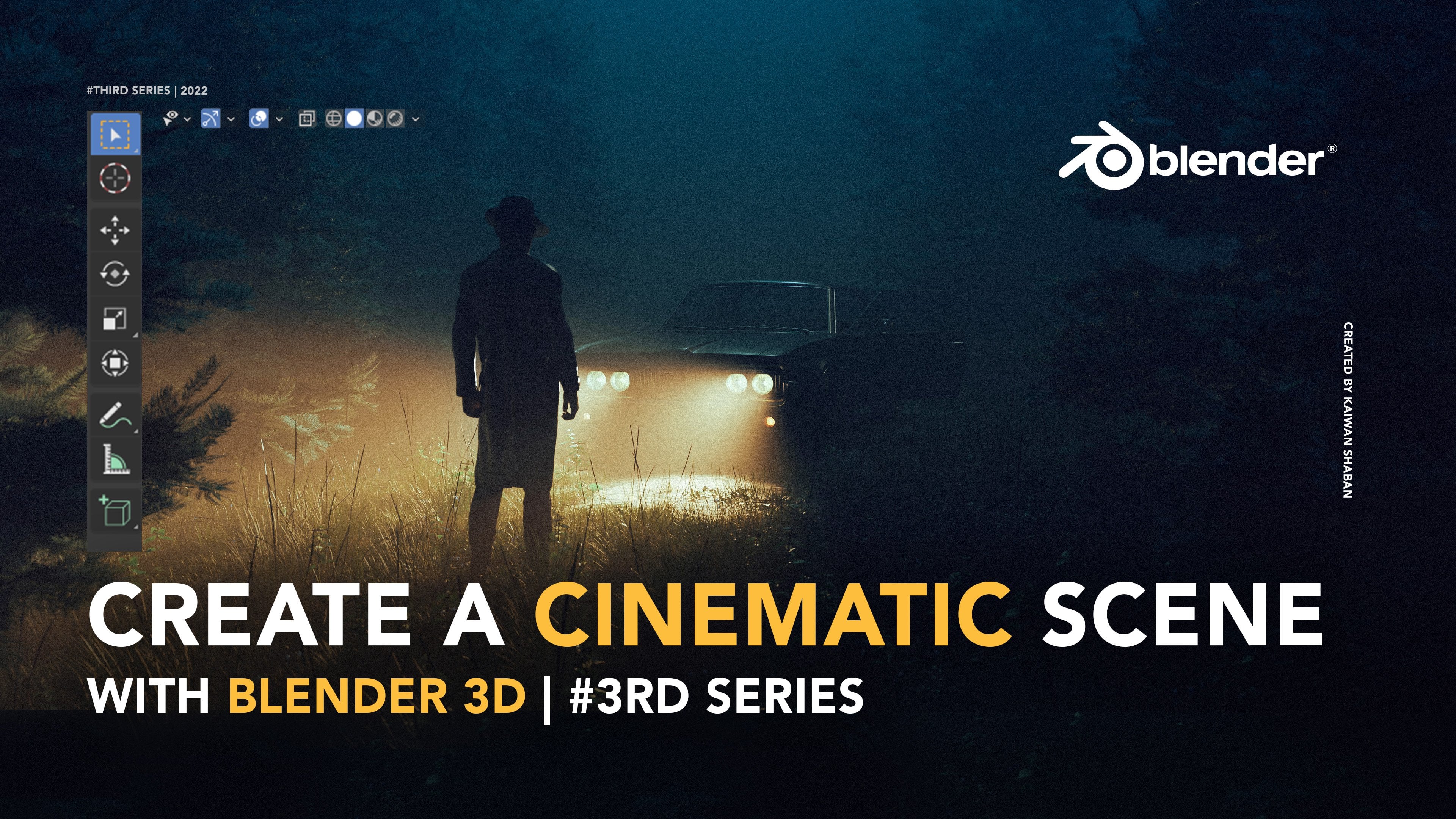
Transcripts
1. Intro: M Welcome to C hapter six
of my Blender master class. In this class, you will
learn step by step how to create this exact
scene from scratch. But why stop there when you can create multiple scenes from that same environment for a better and more compelling
visual storytelling? If you don't know who I am,
my name is Kwan Shavon, and I have a decade
of experience in photography, cinematography,
and blender. I have worked with top
clients like Apple, Adobe, and quite recently, Jaguar, in which I have applied the same principle of
visual storytelling. One environment,
multiple scenes. You want to enhance
your portfolio, contribute to film projects, or simply just bring your
imaginative world to life. You are in the right place. And I would like to mention that this class is not entirely
beginner friendly, so please watch
earlier chapters or other foundational resources
if you're just starting. We will start by understanding
visual storytelling. Following that, we will
break down some of my work that I
created for Jaguar. I will talk about
the importance of having set of references
and storyboard. Then we will get
into the practical application of the
whole project, such as building the desert
terrain from scratch, adding elements like
fog, character, and a car for more
depth and narrative. After that, we will
get into how to add multiple camera angles to capture the environment from various perspectives for
telling a compelling story. Finally, we have the
post production phase, which is refining our
scenes in light room and photoshop to ensure a
polished cinematic finish. Of this class, you will
know how to set up a scene from multiple angles and
manipulate focal lengths, composition, and depth to
make each shot unique. Quick disclaimer. I will use some paid add ons
for efficiency, but most assets that I
will be using are free, and the paid ones
are affordable. Don't forget to
post your projects in the project gallery. I would love to see
your creations, and don't be afraid to get creative and add your
own touch to it. So if you're ready,
grab your coffee, fire a blender, and let's
create something together.
2. Visual Storytelling: What is visual storytelling? Visual storytelling is
such a powerful tool. It lets us convey emotion, narratives, and theme
through images. In a cinematic environment, every asset, camera angle, and lighting setup plays a crucial role in this
storytelling process. Think about it. Effective
visual storytelling can make a big impact, and it creates a very
strong connection between the audience
and the scene. Setting the tone and giving contextual clues about
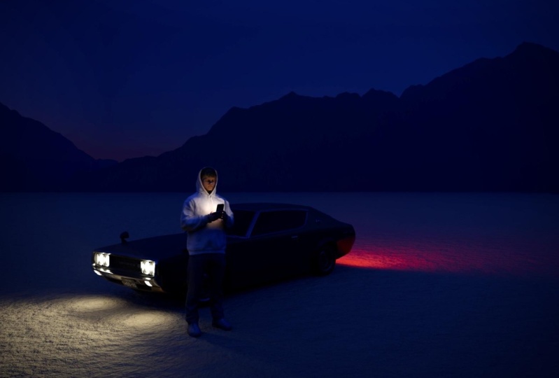
the narrative right away. For example, this dimly
lit alloway artwork that I created a few years ago can
evoke mystery, and tension. However, for this project, I wanted to create something
bright and serene, like a desert and landscape to convey a sense of
hope and freedom. And as I mentioned, light,
color, location, characters, the body language
of the characters, all of these plays
a very crucial role in building this narrative. Storytelling also
immerses the viewer, making them feel like
a participant in those environment rather
than just spectators. And this obviously is
achieved by carefully arranging assets and
meticulous composition, drawing the viewer attention to specific focal points while
building a cohesive world. And this quickly reminded me of something I always
mentioned to my friends whenever we talk about art. And that is every
artist is a director, more like a film director. What I mean by
that, a good artist will probably make
you feel something, but a great artist will direct you to where the focus of
the piece should be going. Like a good artist will
manipulate in one way or another to make you focus on a specific part of the image. And that is all done by manipulating composition,
the lighting, there's a lot of
technicality aspect to it, but also concept and the idea. And finally, what are
you're trying to tell? Ultimately, how we use
visual storytelling affects how our audience
looks at our work. So our choices in asset
placement, lighting, and composition should always align with the story
we want to tell. Ensuring that every
visual elements that we add is making the
whole scene complete.
3. Jaguar Collection Breakdowns: Oh. Welcome to this part of the class where I get to share
something really exciting. The Jaguar collections
I created. I might sound like
a fanboy right now, but this is one of the proudest moments
of my entire career. I worked on not only one but
three different collections, and they perfectly illustrate what we've been
discussing so far, which is applying
design principle to real world projects. And due to privacy reasons, I cannot show you the
actual project files, but we will be able to break
down each collection to see how my choices has enhanced
the visual storytelling. Now, before we get into each
collection individually, I want to share some common elements in
these three Jaguar sets. The first common thing
would be brand identity. Each set shows Jaguar as a
symbol of luxury and power. And this is a crucial
point I'm mentioning here because if you're an artist and you want to
work with brands, you have to understand
their vision. Like not only think about
your creative choices, but also think about from the
brands vision perspective, like, what do they
want to achieve with this project?
What is their goal? And trust me when I say this, once you understand
that as an artist, you will be unstoppable
because you will be able to find yourself working and being interested and finding a middle
ground between your creative choices and also aligned with
the brands vision, which is the whole point of
any brand working for you. Other common thing would be
lighting and atmosphere. What you see here, obviously, is a strategic
lighting highlights the cars features and
sets different moods, especially as you here, we have three different sorts
of lighting for each set. For example, for
this collection, we have this emitted sphere that is creating this
illusion of light, and also that creates this
very beautiful color harmony. Between the deep
purple and deep blue. And this create contrast, and there's a lot of
layers that goes to separating the actual vehicle and the character
from the background, which is and lighting
can become really handy when it comes
to object separation. Another point would be
the dynamic composition. So you might have noticed
right away that we have a variety of different angles
and different composition. And the goal of that obviously
is to keep things exciting and engaging and highlight close up features
of the car as well. And this works super well for let's say an Instagram feat, or you want to
showcase a portfolio. Variety in composition
definitely helps you with that. There's obviously a
lot of commonality, but the last common
thing I want to mention would be the
mysterious characters. Something I do in
most of my artworks, which I always try to never expose the
characters I'm using. And it creates this
very mysterious vibe that also aligns very
well with the brand. Jaguar also emphasized
on the fact that that the pieces must
not give away too much, and this aligns with the
type of artworks I do. And this is one of the
reason I reached out. So these were some of the commonalities that I
wanted to mention. But really, when you look
at all the three sets, you can tell that there is a dotted connection
between all of them. For example, the first
two projects I did, I wanted to create
this piece for the male character and
the female character, which resonates
very well together, and they are in two different
world, two different. Like you can go as far
as bringing metaphors in these And this obviously needs some creative push from
your side as an artist. But I don't want to I can rent about this
as much as I can, but I think I want to
get into the pieces a little bit and briefly
talk about each set here. So this mountain sunset
collection. Let's call it that. The theme here is pretty much the nature and serenity
with this mountain here. Let me actually start drawing, even though you know
I'm not good at it. Nature and serenity is
the theme of this set, and I wanted to create this beautiful layer of
mountains which creates depth. And speaking of depth Obviously, you also have this fog or haze. And the idea was this is coming from the
exhaust of the car, which creates this very nice
separation from the actual, you know, car and the background and
the mountain as well. And obviously, lighting plays a major role in bringing
the car's features. Like, lighting has
to be soft and create this beautiful
lines on the side. It was very important to
have this creamy look. I Think that's the best
way to describe it. So, yeah, this is
pretty much it. I'm not going to
go piece by piece, but I'll only mention the
important things here. And one thing if
you notice, like, there is this, how do
you say, this line here, which in the beginning
was not intentional, but then I tried to actually connect them for
the instagram feet. It looks very good. And you can see on
their Instagram page, the line are also connecting. So this is another way
to get creative here. Alright, let's get
into this one. So from this
collection, this one is probably my favorite. I just love the simplicity
side of things, like, you just have the ground floor with high detail texturing, and then you have the kelight
from one side emitting the car here and creating
this very beautiful line. So in this way, you create
a very balanced contrast. One side is high light. The other side is shadow. The goal for this
collection was to go for an urban setting with a
city scape and moonlight, adding this mysterious look and elegancy, you would say. And It might not be as
always realistic, like the moon rarely
gets this big, but that's really not the point. The point it was to create an intriguing look that would also help to bring out
the features of the car. As you see this
moonlight is so powerful that it becomes the
light motivation for this key light here. And it's a very
soft light as well. And this is basically a
feel light from the sight. And that's something you
always have to think about. Like, where is my
light motivation? And then you have to place your light according to where is your
light motivation. Again, now, now we
have for this pieces, the beautiful separation
from this haze. And I did this through
my brush pack, I think, one of the
brush packs called fog. And I just sprayed around
and drop the opacity, and this creates a
very nice separation. And we have a
silhouette character. And here, the pose is
very, very important. L, the way you pose
your characters. It depends on the story
you want to tell, but in my case, I had to make the pose confident and powerful because body language is pretty
much everything. If she looked sad or like her maybe head was tilted
down and like towards, like this direction,
it would have probably not gave the same
vibe and feeling of, like, confident and power in her pose as it does now. So keep that in
mind when you are creating and especially
playing with character. Again, same thing here, and I intentionally
made her out of focus to create and guide the audience to look at the
main feature of the artwork, which is the brand and the car. Plus, it helps us to not
expose the character. Alright, our final
set here would be neon Futurism collection.
Let's call it that. And the theme for this one, obviously is more
or less futuristic. You can already tell. The goal was when
I created this, I wanted to create something
that you cannot simply replicate it in
real world setting. Like, it's probably
gonna cost at least half $1,000,000 to create a set
like this in the real world. Not only the crazy
lighting here, this whole line of lighting, but also all these column and, you know, whole set, the crew and this is the
beauty about three D and creating
environments in general. You can create something
that it's almost impossible, or it will cost, like
an insane amount of money to replicate
the same setting. Anyway, if there's
one thing you notice here is the composition. Leading lines are
very important, and I actually utilize
these columns to help and guide the viewer
when they look at it to just directly look at the center of the
image because that's where everything is kind
of like pointing at. And this is the power
of composition. As a photographer,
it helps a lot to understand these
things because these are, very unconscious things as
an artist to understand, but once you get into the game, you will slowly realize the importance of
composition, lighting. Again, here, we have close up highlighting some of the
features of the car, and this all can be done
with proper lighting. I was very difficult,
I remember, it was very difficult to lit this part of the car without, you know, like, creating
a harsh light because our light object was
quite, you know, harsh. So I had to be very careful. I had to play around to create alternative light
solution and still making the audience believe that this light is coming from
the same light source. This is one of my favorite
piece from the whole set, especially because of
the light emitting here. The side of the
light just creates this very elegant look with highlighting the
Jaguar logo as well. And then we have this very
soft light from here, and this color harmony, again, between deep blue
and deep purple. And then we just have
slight reflection of the main, you
know, source light. Just creating the illusion of the source light
coming from this side. Finally, we have this piece, again, one of my favorite, I wanted to create
a very beautiful, kind of reflective
column among these. And that wage would just kind of like mirror the vehicle here, and we still have the light
source coming from here. Again, the pose is
very important. If she looked sad, if her body language
would be like, I I don't know, I
don't want to go on, and I don't feel the day. You can tell, but this
is a powerful pose, which very much aligns
with the brand. Again, I'm talking
about the brand, and I'm emphasizing a lot
on this point because I think it's a crucial point for artists to understand
brands because, like this creative
freedom is there. L Brands gives you
full creative freedom, but it has to align
with their vision. If you come up with something
completely different and unique and it doesn't
align with their vision, then they most likely
might not go with you. So, that's pretty much a I wouldn't say a full breakdown
of jaguar collection, but I think there's a lot of hints and there's a
lot of things you can pick up and you can utilize
it in your own workflow. So I hope you learn something. And would that be said, let's jump to the next video.
4. Refrence: Before we start placing assets or adjusting
camera angles, I think there's a very
crucial step that can break or make the success of your
cinematic environment, which is preparation
and exploration. And what I mean by that
is basically a metaphor for it would be sharpening your axe before
cutting the tree. I honestly don't know if that's
the right way of saying, but you get the point. Especially the initial idea and gathering the right references,
which this video is As you can see,
for this concept, the initial idea is
pretty much to create aesthetic Arizona kind
of vibes, Desert. Here's some references
from one of my favorite movies of all time, which is Paris, Texas, directed by the German director, Vin ender, is truly one
of the most iconic films. And this one, the
infamous Mad Max for So you already know
what's up with this. And then a bunch of these
I got from Pinterest. I think I really
like this look here. I might lean towards this look, and I know exactly
how to approach it. Generally, these are
just for inspiration. This is not to say, you have to have everything
figured out. Not at all. There are times I completely changed
the direction of my artworks and
like in the middle of creating, something sparks. And time to time, these tend to be some of
the best decisions. Just remember, you're not bound to always follow
your initial idea. Barbaros would always call
these happy mistakes. So enjoy the process and let your flow take you
wherever it feels. That all being said,
I think it does help a lot to have an
initial concept in mind that way you will not get
too lost and spend too much time not
knowing what you are creating and also get bored in the process and even get
discouraged creating. That has happened to me
many times in the past. So I try to always
have an initial idea, initial concept in mind. And then if along the
way, I change my mind, I can. And just
so you know here, you know, all these
references I collected, Inspiration doesn't always
mean creating the exact scene, but to be able to
mix it with some of your own creativity
and your own interest. And gathering these references
definitely help you to think outside of your,
limited imagination. They do provide a visual
guideline and help maintain the consistency
and realism in your work, if that's what
you're looking for So, I mainly use
Pinterest, as I mentioned. There's also other platforms
like shot Deck and film grab for collecting
these film references, but it can be pretty
much anything, artworks, even physical objects that resonate with the
theme of your project. Just remember, the goal is to extract essential
elements that will help you evoke the
right feelings and stories through
the environment. With all of that being said, I'm going to see where
the flow takes me, but so far, I'm
feeling this one. But yeah, we'll see how it goes. Moving on to the next video, which I will talk
about the importance of having a storyboard. So with that for ado,
see you on the next one.
5. Storyboard: Storyboards. Let's talk
about that for a bit. Now that we have
our initial concept and references lined up. The next step in our workflow would be creating a storyboard. I know what you might think
at the moment, be like, Well, you're probably
saying K one, I have no idea how to draw. Well, I'm a really
good example of that. I generally don't
know how to draw. And the good news is you
don't really need to. You just need some
simple drawing like a kid would
draw, literally. So basically, a storyboard is a good visualizer
for your scenes before you fully commit to
building them in blender. It's like a blueprint for
your cinematic environment. So right off the bat, I'm using a very cheap Wacom tablet. You don't really
have to use that. You can also use
your mouse or you can use an iPad and a
pen if you have one, or simply use a paper and pen. So I'll also drop this PSD template for you
to download and just, you know, have these three boxes and come up with
your own scenes. I have something like this
in mind for this concept. Let's say these
are the mountains. All right. Very good. Let's say we have desert, kind of like texture
on the ground. Let's say this is our guy. Oh, my God. What
is it? This is our Okay. And this is
our car. Oh, no, no. I don't know. This
doesn't look like a car, but think you will
get the Alright. Well, yeah, so this
is pretty much the ratio that I have
in mind, you know? I think you get the point. And for the second scene, I'm thinking for
something more close up. Maybe I would go
with I don't know, like, just I say,
this is the guy. I already have the model, so I know how the
model looks like. This hat is not true. He doesn't wear any hats.
He just wears a bean Okay, so let's say this
is him. This is him. This is the desert and so on. And then we have
mountains again. And I'm thinking to add, like, maybe a moon
or something here. But yeah, you get the point. This is more of a close up look. And finally, I want to create a kind of like a high top angle. I want to go a
little bit higher, so I'll just This
is the car. And all And this is the
guy. And obviously, this is that certain stuff. You get the point. Here,
there will be no mountains. I kind of want to just go towards a simplistic
feeling for this one. And if you want to
erase some of this, which I just make sure the
capacity in the flows 100. All right. Okay, so yeah, that pretty much sums it
up with my drawing skills. It's hard even for
me to look at this. I don't know how you
can handle this, but you get the point. This storyboard will
be very useful when you want to set up
your camera angles, and then you can come
back and take a look. So you can know how to
position your cameras and come up with the right
composition and focal length. You can go as far as writing
down details such as, you know, what would be the
focal length of this one? Like, maybe I would go with
85 millimeter for this one. I don't know. Maybe this one, just a 35 would be good. So, you get the point. It's really about
how far you can go. And if you are good at
drawing, then God bless That needs another
year or two for me to even get to the basics. Anyway, in the next video, I will run blender and get
you guys up to speed with my customized default start up and finally get to the action and building
the environment.
6. Default Startup: All right. So here we
are. Finally, in Blender. As you can see, I'm using the
latest version of Blender. As a moment, this is the
latest version, which is 4.1. And first thing first, let me go ahead and click on, you know, new file General. First thing first, you might
have noticed like this is a completely different
user interface than the standard default cube, the one you always
delete, by the way. More so, this is a
customized layout based on my liking
and my workflow, and it's set as a
default start up, so I don't have to redo it
every time I launch blender, meaning that all the
setting here, everything, the layout has been customized
based on my workflow. For example, the
MAC samples here, the viewpoord, all of my adjustment here
has been customized. And here, you probably
notice we have a funny looking model named Bob. It's a very bad version of a real life scale
of a human being, so you can compare it to other objects to see
if they, you know, kind of represent the
realistic and accurate size in real world. Basically, this is a
great way to correct your proportions and bring
more realism into your scenes. Now, I know you want
to follow along, so I have put the
blender file of this exact default startup
in the project file, so you can go ahead and simply download and run it and blender, and then all you have
to do is go to file, and then you have
default and then save this file that you've
opened as startup file. And once you do that, that's it. Every time you open Blender, it will give you
this exact look. And if you go to the
Render viewport. I've also used the basic default sky
texture from Blender as, you know, like the
main sky and texture. So you don't also have to
do the step adding light, but obviously, you can always
change it if you want. You can just delete it and do other things and
add your own HDRI. But I'm definitely
going to be using sky texture for this
project as well. All right. Now I'm going to
do some quick adjustment. First of all, I'm going
to go to render and then change the feature
set to experimental. Because we will create a terrain from scratch,
a detailed train, this feature will unlock
the advanced tools that we need for the
creations of this terrain. And so far, this
is the best method for creating realistic
terrain in Blender. Down here, we have the
render max samples. I'm going to downgrade
it 512-5 to two, five, six, almost half of that. Mainly doing this,
so I don't run into any issues when I'm rendering
a high detail terrain, and it won't really impact
the overall quality. It's almost no noticeable. Here, we will come to light, and then we have advanced, and down here we will
come to light path. And I'm going to also
downgrade that 12-4, and I'm going to come
to the second option, which is output,
and I'm going to change the resolution 1080-1920. And then I'm going to change the Y resolution to one to 1080. This way, we have a wider
ratio for our scene. It's not only more cinematic, but it fits exactly with
the narrative we are going to tell when all the scenes
are finished together. And here I'm going to downgrade
the resolution 300-200. I suggest you for
resolution scale, you don't go lower than 100 for a decent quality
on your renders. Only go lower if you're out of RAM or you cannot simply render. And it's also a good way
to experiment because every PC comes with different
specs and also laptops. All right, so I think that's pretty much it. You
should be good to go. We are ready to start. In the next video,
we will create our terrain or we
can say mountains. Very excited. Let's get to it.
7. Creating the Terrain: Now, before I do anything, I just want you guys
to save your file. So I've already did that. All you have to just go
to save S and then name your scene scene number one because that's the first scene we're going to be working on. And then later on, I'm going
to tell you guys a bit about my file organization and how I save my files when it
comes to multiple scenes. So yeah, just make
sure every now and then when you do
something heavy or like, when you do some steps, every few minutes, just press Control S on your keyboard
to save the project, and that way you will not lose
the progress you've made. Usually like to start with the base ground, but this time, we will start by creating
the terrain first, and then later on at our ground that will match with
the terrain as well. Again, make sure that over here, you have your feature
set to experimental. Otherwise, it will not work, and you have GPU instead of CPU. For those who have, you
know, you use laptop, CPU can work, but there's
definitely a limitation. Yeah, but GPU is
definitely required. First of all, let's go
ahead and delete the plane, the plane that we already have. Even though we're just going
to create another one, but I want you guys
to just follow along. So creating a plane, shift a plane, and then
make sure the size is 20. I've already done this.
Now, it's 20 here. And obviously, we're
going to scale this up, but for now, this
is good enough. And then we will go to modifier
and then add modifier, and then in generator, you have subdivision surface. And then make sure
to click on simple, then turn on adaptive
subdivision. Subdivision basically
increases the numbers of vertices allowing for
more detail shaping. And adaptive
subdivision basically keeps the shape simple, but adds detail based
on the camera distance. Then over here, we have material and then just create
a new material. Now, if you see some
extra stuff here, that's just my add ons,
like, material full. Don't really get confused by it. I'm not going to use any of
these in this whole project. So just quickly down here, you should have a setting. And then down here, you have surface and change
the displacement from bump only to
displacement and bump. Setting allows the material to change the actual
shape of the plane, which leads us to create a
realistic bumps and textures. And now, all we
have to do is just go to our shader tab here, change the plane to something kind of like a
brown brownish mountainy, earthy look, we can say. Then here, we're
going to add shift A, we're going to add
a noise texture, and then we will
bring it here and connect it to displacement. And here, I'll just
change from render viewport to just
viewpoar shading, and I will change
this to render. So we can see like
an above angle to see what's really
happening here. And press on it. And then here, obviously, we're going to add some
scale for more details, and then go all the way up
with details. You can see. I'll keep the scale
at five for now, and then add a displacement between the noise texture
and the actual displacement. But make sure the fact
is connected to height. And obviously, now you can scale the height for more
realism shaping. I'll keep the scale around
somewhere around 4-5. I think it's pretty good here. And then between the noise
texture and displacement, obviously, make sure the
details all the way there. And roughness is also
something you can play around. But I think I'll keep it 0.5 and this one, I'm
not going to touch it. And now we will add a color ramp between our noise texture.
And displacement. Basically, a color ramp allows us to remap the values
of noise texture, and this way, it provides more control over the height
variation in the train. The color ramp is
an amazing tool, and in this case, it helped us, as you can see, it helps us to remap the
values of the noise texture. And this provides more control over the height
variation in the train. By adjusting the ramp, we can pretty much fine tune
the look of our mountains. And you can go as
far as, you know, extending the height
of the mountains here. But I'm going to go for a more settle look and
just bring down these. Yeah. This is pretty good. Let me just take Rob away for
a second. And focus here. If you notice here, we have
a little bit of kind of like a glossy look
to our material, so going to go ahead
press on it and go to our principal BSDF, and I'll just add
more roughness to it. This way, that
shiny look is gone, and our train just looks
more natural in general. Let's go ahead just hide these
for seeing more details. Now, obviously, so
far, this looks great, but I want to add
more variation to it and not be able to only
add variation to it, but also control
those variation. And we can simply do that by Duplicating the noise texture and the color rab and creating, you know, a mixed RGB, and I'm going to do all of that. But before doing that, I'm just going to do two things. First, I'm going to
add more roughness to our terrain to remove pretty
much any shiny element. This gives us a more
realistic look. And then down over
here, and render tab. You should have
subdivision and then make sure to downgrade the viewpoint
from eight px to four. I'm going to get a
little bit nerdy, but the reason we're doing
this is basically the setting controls the density of the
manch in the viewpoart, which means a higher
density equal to smaller px value allows us for having more
detailed geometry, which is a crucial
step for accurately displaying the
displacement effect. Alright, now, that's
out of the way. Let's go ahead and
create variation. Now, we have our
first noise texture. All we have to do is
just duplicate it by holding shift and just
bringing it here. And then I'm going to be adding a mix RGB between the two noise texture
to this color ram. And I believe the name
has changed to mix color. So don't get confused. If you have an older
version, you'll probably have mixed or GB. So now we have mixed color. They are pretty much
the same thing. And then I'm just
going to connect it to this first noise texture, and I'm also going
to connect this to the B noise texture. Now, if I go and change the
slide here of the factor, we will not see any changes. And that's because the value of these noise texture
are the same, and it only can work when
you go ahead and change, let's say, the scale of
the second noise texture. And I'm just going to bring
down the scale for this one. This will allow us to create
more complex variation, which leads to a more
interesting and complex look. I'll stay around 2.5 somewhere
around here for now. Yeah. And then what
I'm going to be doing, I'm going to also duplicate this color ramp again and
then just bring it here and connect this noise texture to this fact and also create
another mix color and connect the two color ramps from A to B and connect
the result to height. All right, so now we're talking. Now we have an empire of
these nodes that will give us so much control in terms of creating different variation
from the same terrain. So I'm just going to go
ahead and play around with these lighters here
from the color ramp. Obviously, you can
always come back to it. If you don't like the result, you can always adjust
it the way you want. I think I'll be changing the
scale from the displacement. So I'll just go down a
little bit. Yeah, like this. And obviously, I'm going
to add more scale here from the noise texture and
change up the fact a bit. Yeah, I think I'm going to
go for something like this. I'm going to pretty much
play around until I get to something
that I'm happy with. And honestly, the most
exciting aspect of this project for me is
that each one of you will have a slightly different
terrain because of the inaccuracy of the
color ramp slider and all these variation
that you've created. And this gives me as a teacher an opportunity to see
your unique results and encourage you as artist to think creatively and
develop a unique perspective. Of the terrain. So I'm just eager to see
what you will create. It's ironic. I just lost my
key light from this site, but I have another
one from this site. So no worries. Anyway, I must give credit
where credit is due. I learned how to
create this terrain from Chuck CG on YouTube. So feel free to check
his videos out. Alright. Now I'm
just going to play around with the variation tools and get to a place where
I'm kind of happy, and then we can get going. So I'm just going
to speed this up. And quickly, also get
back to the base color. Maybe I can bring down Yeah, the color to something. I think this works. Again, you can always come
back and change the color. But yeah, this
doesn't have to be the final result because
I can always come back to the shader tap and switch up things
along the way. So yeah, don't feel that you have to figure
your terrain out yet. We can just go with the
flow at the moment. And yeah, this is pretty much how you can create
a realistic terrain. And for the next video, we will create our main ground. So we can match it
with the terrain and have an overall
realistic look.
8. Creating the Ground: In this video, we will be
creating our base ground. First of all, the
reason we're creating a ground because if
you look at this, this is not a ground. This is just nothing.
It's just a plane. So we have to create a ground that will match exactly
with our terrain. And before we do that, I want to just make the
terrain look a bit darker, just slightly darker here. And now there's just
a slight problem. So when I place my camera here, I have to go under just changes solid to
and just changes to to go under this plane to actually see the ground to get close to the ground
of this terrain. So to fix that, we're just
going to go ahead and bring our camera up
above the ground, right? And we're going to go to this placement here and
just scale this down. And I know we're losing all the terrain,
but we'll fix that. We'll bring back
the terrain now, just to fix the
placement of the plane. And here, we'll just bring up the mountains here again and
add more maybe scale here. Just playing around is
pretty much the key for for getting
realistic result. Also adding the factor a bit. And finally, we can
also bring down the mid level further. So 0.1 is fine. All right, now it's time to
bring Bob to compare it to our scene and where our terrains proportions
are at the moment. As you can see, this
is just not realistic. So this is the human scale size, and this is all of our train. So I'm just going to
go ahead and push it as as I can until
it makes sense. And now you don't see anything, but maybe scale X, this should be fine. Les go up. Now, I'm just going to
bring down the plane a bit further. All right. So I guess this now
makes a lot more sense. You don't have to go too big, but I want to get as
realistic as possible. So let's go ahead and push it. Push it down a bit.
Yeah, I think. Yeah, scale it down a bit less. Yeah, and then push it up. Super. So, something like that. Now when you see it from above, it's pretty much
the same terrain, but by the way,
this is clipping, so just press n and go to
view and add more to the end. Go with ten. Now you can see, it's pretty much
the same terrain, but now it's mid level, and it's aligns with our camera, and now you can see
everything here as well. And I'm just going to make the camera a little
bit bigger as well. So when I'm just moving
around in my scene, I can see it, but pretty much it's the right scale
proportion at the moment. And this is why Bob is
very helpful or any mesh that you have that has the same real size of a human, it can be very helpful to compare it to your actual scene. When I move around this
terrain right now, you can get different
result in seconds. You can get completely
different result. And this is the unique thing
about creating a terrain. You can literally create
full variations because every movement could end up getting you a different
result, even rotation here. You see? And you can go crazy
with this to be honest. So I actually really
like this already. And again, mentioning what
I said in the last video, the beauty of this
project is that every one of you will have
a different result. At the moment, this is how
my setting looks like if you if you want to replicate I don't know if
that's even possible, but this is my noise
texture number one. This is noise texture
number two, color ramp, color ramp mix factors here,
and then displacement. So you can take a
screenshot and try to imulate as much
as possible here. But good luck, doing that. Alright, now it's time
to create our ground. So we have our camera here, and I want to try to
add a cursor here. So whenever I create
something new, it just goes near the camera. It just like ends up showing
in our render viewpoard. So I'm going to
add a plane here. Oh, my God. It is such a small
plane. Two, what we have. And I'm just going to
make it a little bit higher so you can
see it in the scene. And here where the fund begins, because I'm going to be using a add on called Blender Kit. Many of you already know
about this amazing add on, but if you don't, Blender Kit basically
has a library of over 24,000 free models
materials and HDRI, which allows you to
quickly drag and drop your assets without
leaving Blender, which is incredibly convenient. So if you want to access
to all the assets, I think it's almost above
like 50,000 in total. Can sign up for
their subscription, which is very affordable. I think it's like $10 a month or $6 if you pay annually.
I should mention. Also, I'm part of their
affiliate program. So if you're interested
in getting full excess, just follow the link on the
screen for a 10% discount. Anyway, generally, this is what I do for most of my artworks. I use pre made assets
if they're available, and I've saved the textures that I'm going to
use for the ground. So if you go ahead, these are the two texture
I'm going to be using. So desert sand and dry sand. And I believe desert sand
is a procedural texture. So when I drag it here, it will automatically detect and create a nice look already. It doesn't matter how big it is. But let's get a closer
look to our texture, and then I'm going
to mix it with another texture so we
have more variation. Actually, I'm going to
bring Bob back closer to the camera and just push
him down Yeah. All right. Maybe the camera is very low, so I'm just going to
push it up a bit. And obviously, you
can play around with the sun intensity and the
size and the rotations. I'm just going to rotate
it a bit to just create a more interesting look
and to have a better view, you see for our out, it's showing more for
our material here. So as I told you, this material here
is procedural, and it gives us already
a very nice look here. But I want to make it I want to go further
and make it even bigger. But to not confuse you with these two planes because the
terrain is also a plane. The ground is also a plane. So I'm just going
to go over here, and in color, we have random. I'm just going to
separate the colors. So now we have this green
color as a terrain, and this is as our base ground. This is just a very good way to separate and know what
your click At the moment, we only have one material,
which is this one, it's called, by the way, I want to just quickly show
you, which one is this? So this is called
this Desert Sand by Blender Kit Community. This one is called Dry
Sand by Ninja Wizard 180. So make sure you have
these two as unsaved. So and it's very simple to save. For example, if you go to sand
and search it in texture, just, you know, that's nap. So if you go here and if
you want to save this, all you have to do
is just click on this icon here, and
you can save it. And then every time
you go to material, you just click on this one, you have all your saved ma here. Anyway, it's very convenient, and for models, obviously,
you can do the same thing. You can just search
up any models, and you have it. For example, all of my saved
model here will show up. And we're going to
be using this model later on. I'm going
to add the element. These are pretty much what
I like, what I've saved, and you can go obviously
do the same thing. So, let's finish our
creation, the ground here. And there's a really
nice way of like mixing with another
shader for realism, which is basically
creating another plane. And this one, you're not going
to show it in the camera. This is just for the
purpose of dropping this dry sand on it. And then when we're
going to go ahead and select all of this, control C to copy it, and then go back to
our main sand layer, and just go ahead and control
V to paste all of this, and then just bring it down
so they don't get mixed up. And mix these two, but before I do that, I want to change the color
ramp of this material. Now, we have this terrain here, but the colors
don't really match with this desert
looking material. So to change that, all we have to just
come here and then just make the color
a bit darker. And then simply
bring down to add more darkness to the color and do the same thing
on this side here. Click on it. Now, it just just makes a
little bit more sense. Maybe it was too much. Yeah. So yeah, that's
pretty much it. And then I'm going to create a mix shader between
this and this. And now you can control which
one you want to show more. As I said, this fact is like the balancer
between the two. But to make it more interesting, let's just go ahead and have a close up view of the material. If you go full like this, still a nice look, all the
way here. Also a nice look. Something in between
would be nice, but I'm going to go a little
bit further by adding a color ramp to create
more variation. And I will link it
to FAC and just, you know, bring this here. So it's not as noticeable
as you might think, but it creates this nice
overlap between the two shader, and you can come here if you
have any adjustment to make, or if you want to let's say change the scale value of this. If you think this is too big or too small, you
can just, for example, add another change it 2-3, and then all of a
sudden, you have, let's say, smaller lines
and smaller shapes. So, I think I'm very
happy with it so far, and I'm just going to make
it a little bit bigger, so it's almost not
noticeable here, but this will not be as obvious, especially when we add
elements like fog. So that's how you create
a ground material. It's a very simple process, and all you have to do is
just download blender kit. And if you don't
like this particular look of this material, you can obviously
search for your own and look for your own material, but make sure it's like
a procedural material. Definitely, it helps to scale it up and kind of
not get repetition. So, so far, we have this result, and I'm very happy with it. In the next video, we
will be adding elements. I'll see you guys there.
9. Adding Elements: No. In this video, we will be adding our elements, such as Fok character, car. We will see how things go, but I have saved a few
assets in Blender kit. And the first one we will drop would be our human character. And this one I really like. I think it resonates very
well with our environment, which is a guy in a bomber
jacket by anistra Studio. So all I have to do is just drag and drop, it's as easy as that, and make sure it's near or it's close to
where our camera is. I think our camera is way
too big for the scene. So I'll just, you
know, bring down, bring down this Yeah. And we can finally get
rid of bomb because we can compare the proportions
to this guy from now on. I'll just have to rotate
his position a bit. Something like that
would be pretty good. We push down the camera
a bit even further. So we can see some of that
texture on the ground. And the cool thing
is like once you have this color enabled,
anything you add, it will come with a
different color that way, you have a very good separation in terms of your viewport. Now I'm going to go
ahead and add the car, which is a free car that I
downloaded from Sketch FAP. You can also easily download it. I'm also going to drop the
link in the project file, so you can go ahead and
download it for yourself. I download most of my models
pretty much as GLT F format. They are pretty much the best
way to for me, at least, the best way to import them because they
come in handy and they also take less space
in your blender project. So make sure you
download this one, and I'm going to go
ahead and import it. All I have to do is go
to import G LTF two. Here, I have
downloaded it there, and all you have to do is
just import the scene, and it should be
somewhere here soon. All right. So the scale and
proportion is also correct. Sometimes you don't
always get that, so you have to fix it up, and just go to drop it. Drop it somewhere here and make sure to delete this floor
that comes with it. And now we can just press on this and move it around
the way we want. Now, I think positioning it
like this is pretty cool. Something like this, actually. For now, it looks really nice. But I also kind of want to change the color of
the car, to be honest. So I've already saved
another material here. It's called car paint,
and I've saved it. It's car paint by Stephan
and I've saved it here. So all I have to
just drag and drop the car paint onto the car. Boom. And you can also adjust
the color right over here, if you want, maybe we can
go all the way white, but also make sure that
it's covered fully. So here, this part is
not fully covered. So let's go back to black, and now simply press on
the same material again. And now you should be having a match color
paint of the car. As you can see,
it's all good now. And I just really love
black because it creates this beautiful contrast between the ground material
and the color. So, right now, the fact that we added our car and
the characters. I already looks very
good in my opinion. So make it more interesting, I'm going to add a fog. And to do that, all you
have to do is just go to, by the way, before that,
before any of that, make sure you save your file by hitting control S. And
to create the fog, all you have to do is just
go shift A at a cube, and then just scale it
up as much as possible. As much as you can. Like, This one is
going to be our right. I think this is good enough, and then all you have
to is just create new and delete principle BSDF. And then make sure you add principle volume and
connect it to volume here. And here just bring down the
density as low as possible. Make sure you also lower the
cube as much as you can. And now we have a more
interesting look. You can obviously make
it even more interesting by adding more anastropy. This will just kind of
like add that glow to our sun and still be able to see the mountains
behind the terrain. Just going to bring down the
intensity even further to maybe something like
one. Yeah. This is good. Let me go ahead and quickly
save our projects so we don't lose anything.
**** add it. And this cube can be
annoying because you constantly have to
go and through out. So if you want to avoid that, just go to object here
and then go to viewport. And then from viewport, you have texture,
change it to wire. And now you can just go through in and you wouldn't
have any issue. And the best way to get
back to where the action is happening is to click
the Toggle view camera, and then you're
back, and then you can just go around here again. So now I think it's a matter
of positioning this well. So I'm just going to
play around until I'm happy with the look
that I'm trying to get. So the car maybe here, composition is very
important as well, and also the focal link which
we will get to in a bit. So I think if I
push this guy here. Yeah, kind of like
this right now. And obviously, we can play with our sun rotation here and see what kind
of look we can get. We can also add a little bit of that orange stone by adding
more air, maybe dust, maybe too much,
but sun rotation, as you can see, with every
movement of the sun, it can give you a
different variation. Incredible, just like
the terrain as well. I think something on
the side might be nice, something like this, and you can go a little bit
higher as well. And you can obviously rotate the terrain if you
think you need to. Maybe add more dust here. I can also bring down
the sun intensity. I think I'll change
the position of Yeah, this is pretty cool so far. I also have another object that I think might
be a good fit here, which is City of winds. So if I just dropped this, and it might not be the best representation because
it's a desert and sand, it's probably hot, but the
position might be cooler. Yeah. Yeah, I actually
like this more. Again, by Cistra, obviously, they're all scanned, but they've done a really
incredible job with that. So that's how it's
looking so far. I'm actually very happy with it. When I quickly take a
look at the composition. Maybe I can push this a
bit on the side, you know, Rule of third and
also push the car a bit maybe further near
change a position. Yeah, something like this, I think, more symmetrical or. Yeah, I can just
create a distance between the two and have
something like this. But now, I'm just going to
I think this looks good. This looks better in general. Just slightly tilted side Then I can also play around
with the camera a bit, maybe pushed the focal link
a bit from the subject, and then change the rotation a bit to the center,
the sun rotation, obviously, or even here, which creates a very
interesting shadow here. The sun looks too big here. I'm just going to bring down the sun size and make it
a little bit sharper. We also have a
sharper shadow here, which is a more accurate
representation of the sun. So, yeah, I am very happy
with the results so far. I'm so excited what you guys
have made until this point. But we are pretty much there. The next video, I'm going
to finalize my scene, and I'm going to add
multiple cameras so we can create a compelling visual story from this one environment.
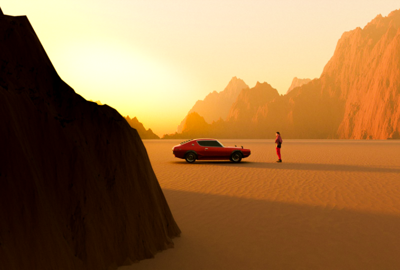
10. Adding Multiple Cameras: I believe I have finalized my first scene. I
like the angle. I like the composition. There's, you know,
rule of third, and everything is looking good. But before we do that, I
want to create variation from this scene as we've promised in the
beginning of the course, which is adding
multiple cameras. And to do that, all you have to do is just duplicate
the current one. So make sure you select
your camera and shift D on your keyboard and then
just duplicate it again. So you can go as far as adding, I don't know, 12
cameras, if you like. Maybe actually, they just duplicate two more just
for the experiment. So maybe we can do two, like extreme close ups. I don't know, but this
one is pretty good. So far, you know, this will be considered
our first scenes. And I want to save this as it is before we make any adjustment
to the other scene. So if I go ahead and
control shift S, which is going to be save S, it's already saved
here as C number one. So I'm just going to
hit control S again, and this is saved right now. Now I'm going to control shift
S again and save this as C number two because
we're going to play with another angle. So let's go ahead and quickly click on the second camera and then change this asset
browser to timeline here. And here we're going
to add a marker to it. So you can also just press
M. Once we add the marker, we can bind this marker to the current camera
that is selected. So now this zero,
as you can see, we have a line here,
this frame is literally connected to this first camera. And then let's go to frame ten. It doesn't really matter or 15. All we have to do is just do the same thing for
the second camera. So let's go to any
other frame and then simply select
the second camera, add a marker, and then bind
that marker to camera. And now when you go from this frame to this frame,
the camera switches. And this is a great way
to visualize your scene, to just go and explore
without interfering with the same camera
angle all the time. So let's just go ahead and
have fun with this one. So we can go as crazy
as we want because now if we want to go back to the first frame or first
camera, we can always go back. We want to play with
the second one, We can also do that. Remember when we
did the storyboard, obviously, it's here. And I'm sorry that you
have to see this again, but I believe we already have something close to
our first shot. So I'm going to aim for
something medium shot close up. More or so just kind
of like showcasing the out of focused
look of our character. Maybe the car can be here as well for
more aesthetic look. But let's see what we can get. And you don't have to keep
the same position, actually. You may maybe when
he is looking front, it looks better for
this particular scene. So I think this is fine. We want to try to aim the camera to a background
that has more detail, and I think this side
definitely gives that vibe. And we can simply
move the car Yeah, I think I really like this one. And then we can simply go ahead, save it as the second scene. And now when I go back and
see our project files, we have this scene
with this angle, and then we have second
scene with this angle. And simply, if you
want to get back to your original scene, you can just open this
scene and render. And pretty much is
the same process for creating multiple
scenes and having each project saved the way it is without interfering with
the other composition. This is also a great
way to organize your blender file projects when it comes to creating
multiple scenes. All right, let's get
back to this one. And I think I would like to have the characters
a bit ad of focus. And then here, I'm
just going to go to camera camera selected
and add depth of field. And the reason I'm
doing that is to add more realism to our scene. So if I go ahead and just select where the focus
point should be, I'm just going to go
ahead and choose the car. And this exactly aligns with the position and the
placement of the characters, which he's looking at the car. And we obviously have
the terrain as well. And the beautiful part
about this right now, because we're on
the second scene, I can also move around our
terrain and look at this as a form of experimentation to see if this is what I
really like, right? I think I'm going to go back. Maybe just rotate
it this way a bit. You have to be very careful
with the movement here. Yeah, I think this
looks very good. And I also can push
it down a bit. Maybe it's a bit too high here. And we won't see anything
going on because of the fog. So it's just amazing. This looks pretty
good, in my opinion. If I go back to the camera, maybe I'll just push it back, just go higher a bit. And then here in shift and Y X, I might just play with the y x is just slightly
bring the lens down, you can also play
around with F stop, but obviously, we don't
want to go that far. 224, 2.2 is good and change the ratio to all the way up to two for a more
anamorphic look. And that's pretty much it. For the second scene, I'm going to go ahead
to save it and then go to save S again and just
add this another number, C number three here, and just save S. Now, We can add another camera here. We can select it and
add another marker, and then just bind
that to this camera. Now you see this
camera is in control, and then we can
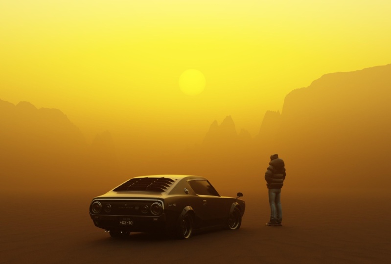
just move around. So now we can do this angle, this higher angle that we want. And I think the idea would be to follow the shadow of
the character here. So the sun is coming
from this side, and I want to focus on the character shadows
that will be kind of like a long shadow coming from the character
from this side. So let's just see what
we can do with that. Now that we have this angle, obviously, we can again, simply go around and do a
many adjustment in terms of the terrain in terms
of the position of the car in terms of
pretty much anything, so I can go as high as I want. Remember, we've already
saved the other two scenes, so we can always come back to them and make more
adjustment if we want. Now, I'm just going to
rotate the car position. Maybe have it
something like this. So we can already
see that shadow, but I think I'm going to
play around with the sun for this one, see sun rotation. Yeah, I want
something like that, like the sun coming
from this side. I also want to position
the camera a bit further. So if I go to data and then just bringing the
camera down a bit, I think the only way
for the sun to hit our elements is to rotate
our terrain a bit. Let's see. Yeah,
something like that. It's also creating
this very nice shadow from the ground texture
like this so far. We can go back to the world and even make the sun size
a little bit smaller, so we have a sharper
shadow here. And bring down maybe
the sun elevation. Slightly. You can also just slightly change the angle. Make a subtle adjustment. I'm just going to bring
down the terrain a bit. I feel like, yeah. I really like it from here
and all the way to the right, but I don't like this
high terrain here. So maybe I can just play around with the
color ramp a bit. I hope I don't ruin
it, but let's see. Maybe I can just
bring down this. Yeah. Okay. Maybe not too Yeah, I think something
like that. Yes. Perfect. So pretty much,
as you guys can see, it's all about controlling
the variation, and trying to get what
you have in mind. Like trying to see what
works, what doesn't, and with a lot of adjustment, you can get to a place
where you're happy with. Now, I am very happy
with this third scene. And again, if you want to create even more scenes, you
do the same thing. Now if I can go ahead and
switch in between, obviously, the first two scene will be ruined because we've changed
the position and everything. But right now I'm very
happy with the third scene, and all I have to do
is just go ahead and control to save it. And now when we go to
our project files, we have all these three
scenes ready to be rendered. And then I'll jump
to Light room and photoshop and do my
final post production, and we should have
all the scenes ready. When it comes to rendering, which is the final step, if you run into any issues or you just run
out of, you know, RAM or space, you
can always downgrade the MC sample or the
resolution here, but don't go lower than 100. It's just in case. And if your computer or
laptop cannot really handle this terrain with all
these information in detail, then I highly suggest
you just go to Blender Kit and just
search terrain. And I'm pretty sure you will find many alternative. You see? They might not be the
exact same result, but when the object is that
far and you have this fog, it will definitely
still look good. So make sure you utilize this tool and
take advantage of it. You see you have a
lot of options here. And I'm just mentioning
this in case you really want to follow
along and still do it. This is a way to do it. So in the next video, we will be doing the final
phase of this chapter, which is post production, Light room and photoshop.
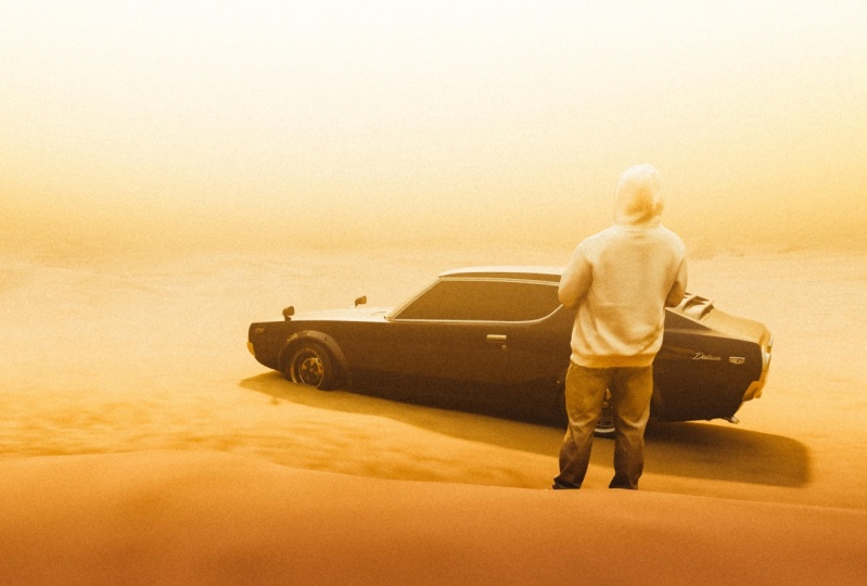
11. Lightroom: In this video, we're going
to be editing these renders. So now, as you can see, I
already have my first scene. This is the second one,
and this is the third one. I am very much happy
with these results. But why stop here when you can make them even look better. And that is by
adjusting it intrum. This has been my workflow since the very beginning of
my blender journey, and I've always loved the
fact that I can utilize my renders in this post
production phase of using Ltruum. Sometime photoshop if needed. So let's go ahead and
start with the first one. And the beautiful
thing about Lightroom. Once you have done one edit, you can copy that same style and apply it to the
rest of your images. In this case, it's just
going to save us time, and we have pretty
much the same feeling to all the other scenes. So let's go ahead and add contrast somewhere
about around 60, and then I'm going to bring
down some of the highlight. I'm going to bring down
some of the shadows to just bring out some of
the details far away, and then add a little
bit of whites. Bring down some of the Blacks and I'm not very much
happy with the colors. So I'm just going to
go down over here and play around with
the temperature, maybe add a little bit
more temperature here, and then also add a little
bit of magenta tint. You know, kind of like
getting the Dunes vibe, Mad Max vibe, which
I really like. I think I can stop
around 16 here. And then this could be 28. And now the fun part, which is the color mixer. Obviously, I'm not very
much happy with this color. I want to lean towards a
little bit more orange. So I'm just going to select this yellow slide and change
the hue a little bit, add a little bit of
saturation and come over here and bring down the hue
more towards magenta. But I must say it might be
at a little bit saturated. So just minus ten,
something like that. So so far this is before, this is after, and I'm quite happy with the
result to be honest. I'm just going to
go ahead and add a linear gradient slide it from the bottom of the
image and create this gradient and just slightly
bring down the exposure. Not too much. Also the
contrast, just slightly. These subtle details that creates an overall
interesting look. So what I'm going to
be doing right now is I'm going to copy the exact. Let's see if there's
anything else before Yeah, I can play around with color
grading a bit. So like Yeah. I like to go towards a bit
green tint with my shadows. Highlights are interesting, but I think I like the
highlight the way they are, and you can also
play with midtone. You can also bring
down the contrast the shadow and highlight
of these of each element. So I think this is good so far. Now I'm going to
copy this style. So all have to do is just
control C on my keyboard, and I'm also going to copy the masking because
I've already done one. We'll see if we
don't like it on the other one, we'll just remove it, so make sure copy, and then all you
have to do is go to the next scene and
then control V. Now, this might be a
little bit too contrasty, so I'm just going to bring
back the contrast a bit here, and the rest should be good. And same goes for this
one. This one I like. So the only thing I
want to add actually on top of all of these is
a little bit of grain. And I want to add
grain individually for each scene because when you
have different composition, it's better to do
it individually. And I like this one. This one, I'm just going to go a little bit higher
with the size. Yeah. And then this one, just a slight grain as well. Maybe I add a little
bit of roughness. So this is it. If there's
anything else I want to do, obviously, for example,
if I want to maybe, I don't like this terrain here or I don't like
the shape of it, I will just simply
go to photoshop, use healing brush
tool or anything that can easily remove
that with no problems. But overall, I'm very
happy with the result, and I think it's good to go. Now I'm going to
export all of these, so I'll make sure you
select all of them and just go ahead and custom setting. And what I do for my exports, I again, select all of them. I export them through
Ti, full size, 16 bits and the color
space as adobe RGB. But in photoshop, I
actually change it to S RGB because that's the best color space
for social media. So I do this just
mainly if I need them for print or any other purposes. So I go ahead and export, create a folder,
and then export. In the next video, we will
use photoshop if needed and create a collage out
of all the final results.
12. Photoshop: In this video, I will be doing some final adjustment to all the three scenes
that we have, and then create a compelling collage
out of it, so you can, for example, post it on social media or just
make a print out of it. Whatever you feel like doing. So, first thing, first,
what I do in photosip, I always duplicate
my backgrounds, and then I can pretty much do
anything from this moment. Thing that's kind of bothering
me is this shadow here. I know it just makes sense
because of these side mirrors, but I'm just going to
go ahead and remove that or just make it
a little bit shorter. Yeah, I think
that's just better. And I'm nitpicking here, but it's all about
these small details. Maybe the shape of this mountain here is not as, you
know, pleasing. So what I will do,
I'll just push it down a little bit
with a liquefy tool. Yeah, and simply press k. And think I'm pretty
happy with it so far. Do also do some dodge and
burning like shift back space, and then I can fill
this with 50% gray, and then change a normal
blend to overlay. I can use Dodge and Burn tool. Dodge is for brightening the bright areas and burn is for darkening
the dark areas. For example, this helps us to bring more contrast and
create more separation. Within our elements. So you can see a simple
brush can create a subtle impact
that will help us to create a better and
more interesting look. So I'm just going to bring down the capacity of this and
then go a little bit further and then make the brush
just bigger and just paint over on the bottom of our This creates a
very, how do you say? It brings the attention to
the center of your image, which is the most
important element. This is where we
have the character and the subject,
which is the car. So this is before and after. Again, the capacity
might be too much, so I'm just going to bring
it down to around 25. And so far, this
is before after. Again, subtle adjustment, but
very happy with the result. Try to see what I
can do for this one. I think I'm going to do
the same thing here, liquefy tool for this
side of the mountain. I'll just push it down
a bit. Yeah, this one. I'll just push it down. And then see the previous yeah. I think just creates better
alignment and then press k. And maybe I can
do a little bit of more camera
filter adjustment. I think it just needs a little
bit a push from highlight. Yeah. Definitely. And here, maybe I can pinch a
little bit of shadows to bring out more of these details. So I think this is Yeah. Better. And finally,
we have this scene. Again, I'm probably
going to just go over the side of the image and
then just go to liquefy. Kind of just push it down a bit, kind of taking the attention away from the center
of the image, and then press ka, go back up. And then I can go to
brush healing tool. Just shorten this shadow. Then I think I'm going to
do some dodge and burning. I'm just going to go ahead,
shift back space again, 50%, gray, and then change
the normal blend to overlay. And here, I'm just going to
use burn tool and slightly, I think, around this
area. Makes sense. Make sure not to overdo it. It just creates this very
interesting gradient. So I'm just going to
bring down the capacity, and the rest should be good. Yeah, this is before, after. Very subtle adjustment, but makes the overall
scene just better. Now I can export these. And then finally, I can create a collage out
of it and show you guys the official final
result, all combined. I'm just so glad that
during this whole process, I kind of went with what I
felt good in the moment, and the whole workflow felt
very genuine and authentic, and I ended up with the result
that I'm very happy with. So to export, all
I have to do is go to file, export, export as. And then I usually
export as JPE and here I make sure it's
converted to SRGB. And then simply go ahead. If you want to scale the size
up, you can also do that. Go ahead with 200, but I'm fine with this size, and I'm just going
to go and export it. All right.
13. Creating a collage: Now that we have all
of the pieces done, I can create a
collage out of them. All I have to do is just
bring the second piece and just drag it and drop
it in the first one, resize it a bit, presenter, create a duplicate
from the first one, and then just drag and
drop this one here. And then I'm going to
do the same thing. You're not going to see it yet, but duplicate copy and then
control V to paste it. And then I'm going to also
bring this down here. Now I'm just going to go
to Crop Tool and make sure here you don't
select generative expand, default transparent
because we don't want to generate anything here. It's already too
good. Oh, my God. This looks amazing. So look, this is final result. Alright, it's
official. Here we are. This is probably one of the most exciting projects
I've done so far, and this is how you can tell
a very compelling story through different angles and composition in all
using one environment. This is obviously just one
way to create the collage. It's going to be a great way
to post for your stories. And if you want to
post as a post, you can also just go to
crop and do a four by five. But, ah, guys, this is it. I'm very excited to
see what you guys will create and looking forward
to see all of your results.
14. Outro: Have finally reached the
end of this chapter, and I hope you enjoyed it as
much as I did creating it. I'm actually very
excited to see what you guys will create out of
everything I showed you. So don't forget to share your
work in the class project. Throughout this class,
we have covered key techniques and
essential tips to enhance your workflow, maybe hopefully spark
your creativity and help you create
fully unique pieces. I truly hope you found
these insights useful. Now it's time to experiment with everything you've learned. Try different
concepts and element to craft your own
unique artwork. I'll see you guys
in the next one.
 Kaiwan Shaban, Visual Artist