Transcripts
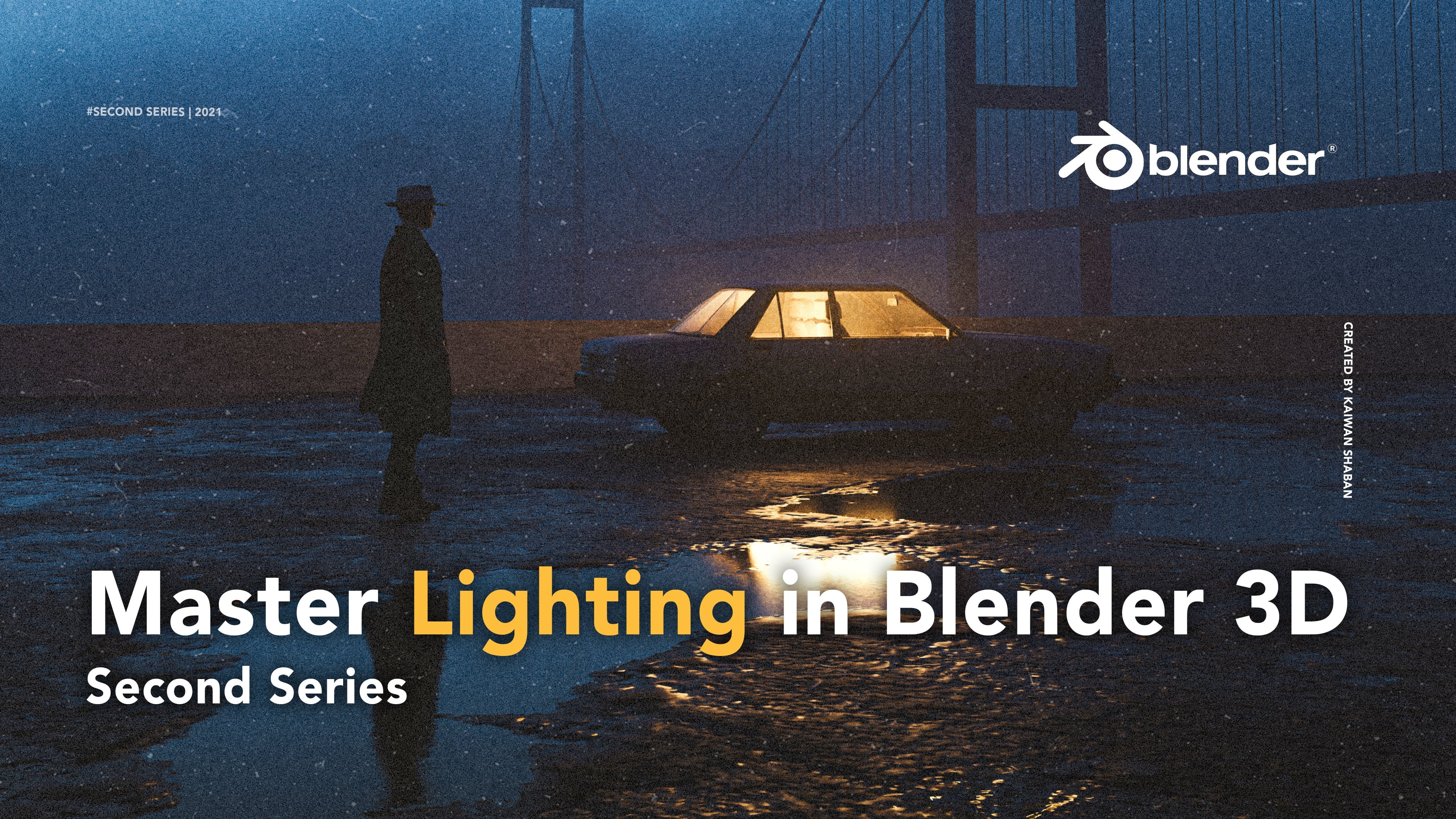
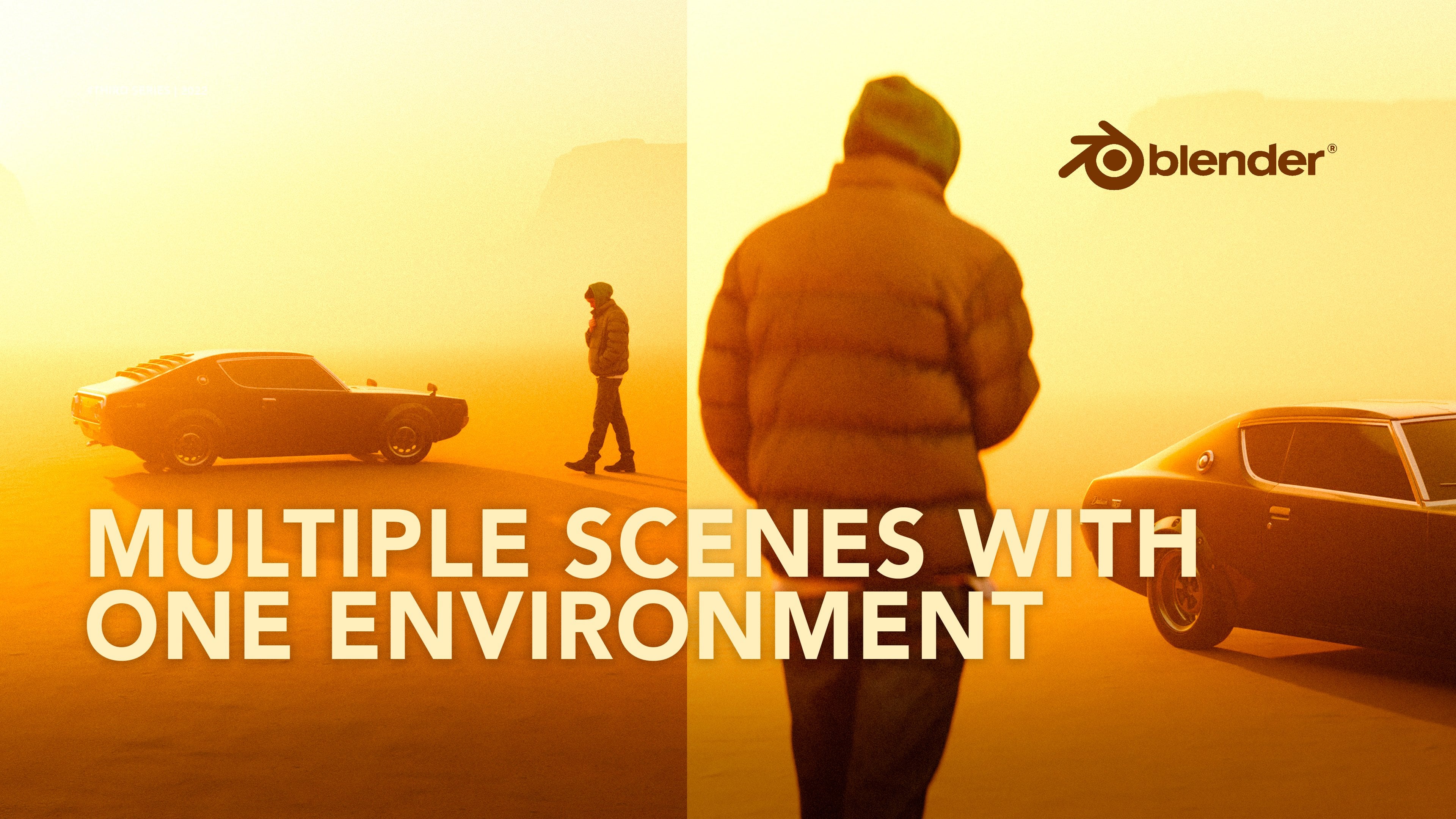
1. Intro: Hey folks, my name
is Kaiwan and this is the third series of my
blender masterclass. If you've watched the
two previous series, you will know that
we covered bunch of things like an overview
of Blender basics, how to find your style or niche. And we created this
scene from scratch. Well, the second one, we talked
about the fundamentals of lighting and how to take full advantage of
them in your work. In this series, I will walk you through my creative workflow, mainly the decisions I make and the reasoning behind
those decisions. We will start with
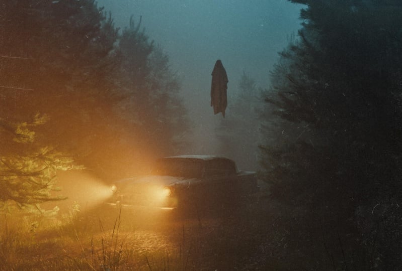
a blank project and ends up with a
result like this. Keep in mind that this
class will not be a bleed beginners if you're
just getting started, I strongly advise you to watch
the two previous series. So by no means this is like
full education material. It's more focused
on why Then how? Because in terms
of technicality, You can always learn them from other sources that do
a better job than me. Quick disclaimer, I will be
using certain plug-ins and asset that are paid since
it will save so much time. And it's just pretty
much how I create my artwork to keep
it consistent. You might be familiar
with the idea of modeling every
element in your scene. And that is obviously great, but it could take days or weeks, especially if you're going
to make a detailed seen. Personally, I don't
see anything wrong using 3D assets or
plugins that could help your creative
workflow as long as you modify them in
your own unique way. Now that's out of the way. Let's talk about what you
should expect in this series. In the beginning,
we will talk about the importance of finding
a good reference. Then we will jump to blender and start building our environment. Following that, we will
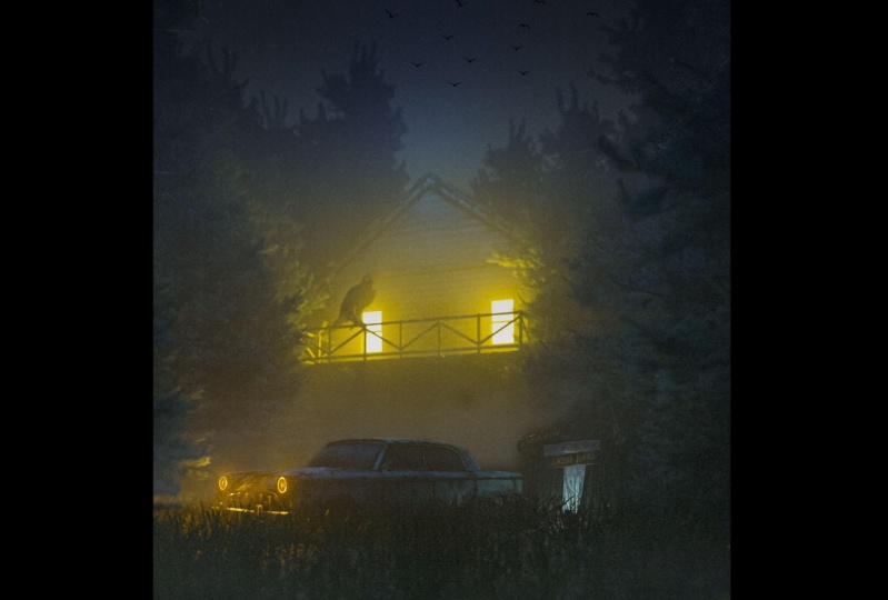
learn how to add fog, a 3D car asset, and our main character. After rendering the scene, we will jump into Lightroom
to color grade the artwork. And finally, we should end
up with a result like this. Alright, so without further
ado, let's get down to it.
2. Reference: Hi friends. We are going to start talking
about the importance of using reference before you
start creating anything. This is something I've only
recently started doing, but it's already made a difference in my
creative process. So these minor
details contribute to a much more
realistic outcome. And as you probably know
in most of my artwork, I tried to recreate scenes that are based on real
life scenarios. Not all the time.
Sometimes I go crazy, but most of the time and having a few reference
helps immensely with grasping and discovering
all the details that you might overlook
or never consider. So here, as you can
see for this piece, I downloaded a few reference from a website called Shot deck, which is a fantastic
tool for filmmakers and cinematographers to
find inspiration and download stills from movies. So if you want to recreate
cinematic scenes, which has a case here, this is a must-have
for 3D artists. However, it is paid, but I believe you can get up to 15 days free trial if
you want to give it a shot. So as you can see, I just
downloaded some bunch of reference in a
forest looking vibe. I'm not going to exactly
recreate those scenes, but it seems helps a lot
to see how real life works and how the lights
contribute to the overall scene. And you can easily
get inspiration and grasp all these details over here and basically
get inspiration from those and apply
them in your scenes. In the next video, I will
start building my scene. Obviously, you can go crazy
with this if you want to. I've only used five
reference and I believe it works pretty well for these things
I want to go for. So yeah, let's get
to the fun part and start building on Blender.
3. Environment: We are now officially
in Blender. A few things I want to mention
before we start actually creating blender as a piece of software has
definitely improved. Like right now we have
the default denoise or here while rendering
geometry and shader tap and many other
features that are now available on the
default nicer has definitely been a time-saver because now you
don't have to go to compositing anymore
and denoise it manually after rendering like
we did in the first series. Besides from that,
the design interface has remained nearly unchanged. I also discovered that your default startup
could be customized. This means you're
in full control of all the adjustments,
layout, and panels. And then after that
you can just make them your default startup. So you don't have to
repeat the cycle over and over every time you
start your blender, every time you start
creating something. Now as you can see here,
I customized mine. This is basically if I
go to File new general, I have this same theme here. And this is very, very helpful and I
strongly advise you to do the same to save
more time and to do that, first of all, you need
to adjust your setting. Anything you do, it will
be saved as your startup. So here I chose GPU, obviously choose your Mac
sampling for your viewport, your Mac sampling
for the render. Here, I adjusted all the ratio,
quality, the resolution, the word you want to save it, or what type of color and color depth you
want to go with. All of these settings
can be customized. And here, as you can see,
I have three view ports. Here have shading tab. The reason I have shader editor here is because now I don't have to go to Shading every time I wanna do something
in the shading tab, it's just right over here and it's big enough for
me to work with. And I deleted the cube or
you just don't need it. And yeah, so after
let's say you've done all your adjustments
from layouts and panels. All you have to
do is go to File, default, Save Startup File. I've already done it and I
have all my settings ready. So yeah, this is highly
recommended and we'll save so much time from your
creation process. Now, let's get started. I'd like to begin by
making a road here. This gives me some
kind of direction and guides in defining my next step, which is gonna be
really helpful. All you have to do is
just press Shift a mesh and then add a plane
and just scale it up. I'm just going to delete it
because I already have one. So now what I'm gonna be doing, I'm going to start duplicating this plane by holding Alt D and then middle click on my mouse and then slightly go
to this direction. Now it's duplicated and we're
gonna do the same process. The reason I use aldi is because I just want to
duplicate the Mesh, not the data itself. That way we will have less space and it will help
us to have less render time. It won't make any difference
in terms of quality. So here we are going to do this. And the more you go, the
more distance you go, the more you have
to kinda duplicate, the easier it
becomes to duplicate if you'd like to go
further like this. So I think that's enough. And now we have like a, something to work with here. I'm going to my Render view port and I'm just going to add some light to the world so we can see what's
happening here. Obviously so far, we haven't
added any materials. But as I mentioned
in the first series, I important most of my materials through
Quicksilver bridge, which is a great software to
quickly import 3D assets, surfaces, materials, any kind of displacement in
your blender seen. So here I'm gonna
go to the ones I've already downloaded
on my search, mossy. Something that we
can work with here. I think I'll go
with this and see. So now, as you can see, it's exported to
Blender right away. And here we're going to click to one of these planes,
doesn't matter. It could be anything because
they're all connected. And now we're going
to change from the default material
to Mozi ground. Can see we have something
here by default, I don't know what has happened recently to quicksort bridge, you have to do some adjustment because this is not
the actual look. They've made some mistakes
in the shader Taft's. So here, roughness,
As you can see, it should be linked
to reference. All I'm just going to change
from specular roughness. And they did the
same thing here. So normal map should be
linked to normal nodes. And here we have transmission. The same thing with this. I think this is a
big downside for the software because not
many people know about this. I think they need to fix this and they should be
able to fix it. So yeah, if you've ever used
the Quicksilver bridge, you will probably
have this issue, but yeah, that's how you fix it. It's not that difficult. So now we have this
muddy ground and those small details make a difference even if the ground
will not be seen as much. In the final result, now that we have
finished with the road, it's time to start
building and laying grass. The botanic plugging is one of my favorite ways to
add grass and trees. Obviously, there are
many other plugins on the market to add grass, but I've been pretty happy
with botanic so far. To add the grass, you can
simply press Shift a. And instead of playing, I'm just going to add grid. But different is grid has some kind of
subdivision already, which is a bit easier to
work with since I'm gonna go ahead press tab and add
more subdivisions to it. The reason I'm going to
add subdivision cuts is because later on it
will be easier for me to brush off
the grass to give some realistic fuel to
the grass and the forest. You'll understand them a bit. So now we have another plane all after it
is just slightly make it under Position it under
our main road plane. Now that we have that here, and now it's time to
add the grass press N. And here you have
all your plugins. And here you have, first of all, click on it, and then you
have this plus button. And here you have all this
time different type of things. Like different type of grass, maybe lily pads if you want. But I'm just gonna
go with grass. And one of my favorite
is European meet doll. Not sure if that's how you
pronounce it, but yeah, click on that and click Okay, and you have the grass here. Now, obviously, I'm going
to adjust the grass a bit. For example, I'm going
to add more scale to it. Maybe add a bit
more of the grass. Can randomize it a little bit. Two, that add more
realism to it. This is quite
interesting so far. And I'm just going to
go a bit upper with my camera since we don't need shading tab and I can
just drag it down a bit. Alright, so what I'm
gonna do basically, I'm going to keep
this grass for now. I can always adjust it later on. I'm going to add another grid. This time is I'm
going to focus around these area from this
side and this side, it's going to make my
grid a bit bigger. And I can easily hide this, so you can call
this front grass. The reason I'm going to hide it, it will make our
creation process much faster right
now, see I can move. It's smoother all of a sudden, so I'm just going to add more
subdivision here as we did, we can brush it off easily. I think this is enough
and I'm going to add the same kind of grass
for the sake of realism. I'm just going to put it
under this position is here. Again, I'm just
going to add scale, randomization a bit,
add more number. And now I can easily go to paint and paint on the areas
that I want to be visible. I want the grass on. Make sure you don't go
with one strength down. Just adjust these a bit. And here you should be able, so you could find some reference
on how the grass looks. In real life, it's
usually very random. Keep in mind that it doesn't have to be perfect and that's
the whole point of it. All right. I think it should be good to
see you have some kind of now let's unhide our front. You see where we are going? Yeah. So I think this
is quite nice. Okay. I'm going to hide our
front grass again. So now I can easily duplicate this by holding Alt D Again, we don't want the
metadata of the grass to be copied on all of
the duplicated parts. We just want the meshes, but the metadata will be
linked to this plane only. Here. Just kinda duplicated. As you can see from a distance. It slowly gives it a
more realistic look. And I'm gonna do the same
thing for this side. I have to do is just
rotate a little bit. Oh my God. I think we're in a
right direction. Alright, so let's
bring back the front. Yeah, I think we're done
with the grass for now. We can always come
back to it obviously and adjusted, randomize it more. But since later on we'll, we're also going to add
haze that will probably hide the imperfections and it will add more
imperfection, sorry. And it will hide the distant
areas more that way. The main focus will be
only in the foreground, which it should be. So I might just move the
camera a bit as well. Just like this. Okay, so in the next video, we will be adding
trees the same way we did and continue building
up the environment.
4. Adding Trees: In the previous video, we added the grass. Now it's time to add the trees. I'm going to use
botanic plugging once again to add the trees. Here. If you go to the plugin, you have an asset. And when it comes to trees, we have a number of options. I'm going to just
quickly to show you how many options
you have here. And you have even snow
trees for your snow scene, and you have different
type of seasoning trees, I would say so. Yeah, you have lots of options. So I'm just gonna go
to the first one. I would go with this. Abby is con color. I think that's how
you pronounce it. So I'm just going to click Okay, and you should be in
my scene right away. Now obviously the
scenes is pretty heavy. So what I'm gonna
do, I'm gonna hide the front and all the other
grasses just for now. So I can play with these trees
freely, so much smoother. All of a sudden, what I will
do basically I'm going to randomize the trees so
they look more realistic. I think if I make this
a bit big, bigger, just like this slightly
this way, obviously, I'm going to duplicate
them through Alt, pressing Alt D on my keyboard. So same reason to
save more storage. So I'm just going to
slightly rotate them, make them bigger bit. And you also can click
on randomized variant. For example, I'm just
going to click on it. It might not work, but yeah, sometimes it doesn't work. But now you see it's
a bit different than what we had before. I'm just going to
scale it down a bit. The whole idea of having
this randomize it more, just going to put it there, this one on the backgrounds. So it shows that we have
like a forest looking. You just have to rotate a bit. I know this might
not look realistic, but it works when it's distance. I'm just going to
add another one for the sake of randomization. So I think maybe this one, I think this one
would look good. Alright, I see, I'm just
going to add it here, make it a bit bigger. Now I'm just gonna
do in duplicated, I'm going to add one more
similar to this one, just to be here. For the sake of adding
more symmetry here. That's quite nice. I think. Obviously make it,
can make it slightly. I think we're in a
good direction so far. I'm going to turn on the
grass to see how they look. Actually. Yeah. Now you see we have other
grasses in-between. So now what I'm gonna
do, I'm going to push these grasses a bit on the site so they appear
more here as you can see. And same for this side. And we can always customize
it and adjust that later on. But I think so far we
are in a good place. The only thing that
I wanted to do, I want to just duplicate
this big tree and put it behind this and behind all the trees so that way we cover the white spots
in the background? Yes. Like a bush. It's more like a bush right now. So yeah, pretty cool, right? I think for this front
grass, what I will do, I will paint a bit over it just lightly on the sides
that I want to be. Let me just see how it looks. Now. It looks more like a road. I'm just going to push this. Yeah, I think it's so far,
it looks pretty good. I'm just going to add more brightness to
see what's going on. You can also change
the viewport, the render view port to shading, to see the textures thing. That's a easier way to
see what is going on. I think I might just
push this a bit more. Yeah, so the car will be here. Alright, so now we add
a trees and the grass. The next step is
we are going to be adding haze or folk
to kind of give some depth and more
imperfection citizen to give that realism look. So, yeah, I will see
you in the next one.
5. Adding Haze: When it comes to my
creation process, adding fog or haze is probably one of my
favorite things to do, and it is surprisingly
quite simple to do so, so to add haze, all you have to do is just
to start by creating a cube, Shift, a go to Mesh cube, and scale that cube up, skill it as much as
you can possibly can scan to press S and then
middle click and go. This way, the scene is
slightly getting heavier, so it's hard, harder
to work with. I would highly
recommend you to check your normal, regular viewport. You don't need rendered viewport at this particular moment. As you can see, middle click on the other side and just
make it a bit higher. Just make it a bit
bigger generally. So now what we're gonna do, first of all, we can, you know, it's annoying
to look at this, right? So we have to kind of make it not visible and just
something there. So to do that, you have to go to the cube properties and
here you have visibility. And then actually it's
a viewport visibility. And from textured as a mesh, you can change to wire. And now you can just see some like corners and
you can click on it, you can move it around. The best part is you can see
what's happening inside. Now we can go to shader
tab, by the way, if you don't know how to add
these panels, I'm sorry. I should have mentioned
that in the beginning. All you have to do is just
go to one of these corners and add a new 3D view port. And here you can change
to any tabs you want. Here you have shader editor, and that's how you
can get it to close that panel or layout,
Right-click close area. So here I have my shader tab. I'm just gonna go ahead and
click New and make sure to delete the default principal B as the f, you
always have that. So press X to delete, Shift a. Again, I'm going to be adding
volume, principal volume. This way we can add our haze, so link it to the volume. And here we have the intensity. I would go with 0.1 and
see how it's going to be. Obviously, if you go
to render view-port, you will see it's
quite dark right now. And especially if
I go to the world and completely remove the
strength of our light, the surrounding lighting, you have complete
darkness right now. So how I can brighten my Hayes, how I can give it a forest, the dark moody look to it. You can simply add some kind of emissions by going to shift a. And here we have light. And I'm gonna be
using point light. So what I'm gonna be doing, I'm going to position
my point light slightly above our haze here. I'm just going to move
it a bit to this. I think it's quite good. So what I'm gonna do here, I'm going to add
as much as power as possible until we
see something here. So first of all, I'm going to change the
color to a bit like this kind of light
blue. And here we go. I'm just going to add power
until we see something. Usually it will take a while, but you can see we
are slowly seeing some details and it's
looking pretty good already. In a way, it's a
light simulation or emulation for the moonlight. And I really liked
this kind of vibe. So now I'm going to go ahead and duplicate the
light and maybe duplicate it to more than
just add another one slightly around this area
and another one here, this one, it should
be a bit higher. This one as well, slightly higher than usual. And obviously I can
add more power to it. And now, just by
adding the haze, you can see the shades of the horizon like
the depth in it. Like you can barely
see this tree here, and you can slightly
see this tree here. You can see this. This is the beauty
of adding haze. It creates depth and
I really love it. It's one of the
things I actually use a lot in my creation process. This is pretty much it. In the next video, we will be
adding our main car asset, and that's where the
real magic happens. And then later on we
will add our character. So yeah, I'll see
you in the next one.
6. Adding a car: Keep in mind that if
you want to add a car, you can use pretty much
any free car asset you find on Sketchfab
or any other platform. But in this Scenes
I'm going to add my own 3D car that I've completely customized
it for myself, my team and I have
been working on this asset for more than
three months and I'm so glad it's finally
here and can be found on KLM production.com. I probably sound bias, but this is without a doubt, the best 3D car asset
I've ever used. It's fully rigged within
interior and exterior. That is extremely detailed. It has all the
practical lights and it comes in three
different versions. Clean dirt and hide dirt. Overall, you're not
entitled to go and buy it. But if you're interested, make sure to use the
coupon code K22, get 20% off from
the original price. This discount is exclusively for the students of this class. Now that's out of the way. I'm gonna go ahead and
import the car asset. The best way to do that
is go to File append. And here I have all
my folders saved. I'm gonna go to 3D car model, go to the folder location
that you have, asset, the projects, and here
you have the clean, medium dirt and
hide dirt version. For this one, it makes
more sense to use the medium dirt version
because the road is muddy, so I don't think the car should be very
clean and polished. Here, once you click
on your project file, you can go to object and you can basically append
all the components, whatever you have beside the camera because
we don't need it. Click on the first component
are the elements of the car. Until you go all the way down, you don't need the
plane as well. So you end here and hold
Shift and click on this one. Now, you have selected all
of them and all you need to do right now is append. As you can see, the car
is already imported. For now, I will move the
car a bit first of all, and I will hide my Hayes So the scene gets a bit
lighter to work with. And I'm also going to
change my viewport to just viewport shading. Here we have the car, now we can play with it a bit. We can also make it a
bit bigger if you want. But I think the size is
it fits with the scene. So we're going to
keep the same size and I'm just going to
position it a bit. Now. Lucky me. It already comes with lights on and I'm not going
to switch those light. However, you can easily
do that by just clicking on those lights here and
by setting the power to 0. Now you have the car here, what I'm gonna be doing. So basically I'm just
gonna get back to render view-port to
see how it looks like. For now, I don't think I
need the shader tap as well. So I'm just going to this I'm just going to
rename it quick. This is the hay sides. So now all I have to do is just change the position of the car. The cool thing about
this car as it is, you can also open the car door to add more
storytelling behind a piece. Basically rotate it
to the other side. If you don't want too much
light on the foreground and you have technically
something this, which I cannot really
like to be honest. Maybe I'm just going
to do it this way. Pose the, the scene is so heavy, It's almost impossible
to see what's going on. Once again, I'm going
to hide most of the grass and trees
right now to see. Okay, so first of all, we have some problem
with the positioning. The tree looks way
bigger than the car, so I'm just going to make
it a bit bigger and just move it on this side or
bring it on this side. And now things look better. I think this should
look better generally. Add the haze again. Yeah. Okay. Now we're
talking now the grass is back. All right. So yeah, it looks pretty cool. You can also turn on D noise to see the viewport being
the noise right away. So far I think it looks good. I think the tree is looks
a bit bigger than usual. So what I will do, I will
just make them a bit smaller and duplicate
more of them. Maybe in the next video, I'm going to also
change the ratio of this scene could look better than the four by
five Instagram ratio. So yeah, I will see
you in the next video.
7. Character: Characters can be added to your scenes in variety of ways. Typical characters
can be downloaded from websites such as Sketchfab, CG trader and others. Human Jen, a blender
market plugin is also another way to
add your characters. However, for the
majority of my fingers, I use a program called Das 3D. Studio allows you to
make your own characters and they have a large
collections of figures, outfits, and poses
to choose from. When it comes to
figures and clothing, I was definitely a bit pricey, but you can look around
there's shop to see which figure you want to buy or
what kind of closing uni, I spent a lot of money trying
to find different figures, but I finally found
what I was looking for. Now, I'm just going
to open this 3D here. Obviously I'm not going to
get too technical here. I will however, include
some links in the project PDF to walk you through
the download process, learning the software and how
to connect to your blender. Now, this is the interface
for the desk 3D. What I have is the saved files, Credit bunch of figures here. As you can see, that
the one I use the most is this character, my iconic character, so high. So now we have the character
is not going to show his face for the sake
of keeping the privacy. But yeah, as you can see, it looks pretty decent. Usually what I do I
imported to Blender and I also changed the shades
of the clothes as well. That's what's cool about having a actual 3D model where you can change the layers
of the clothes. So what I'm gonna
do basically I'm just going to import
it through blender. So to do that you have script bridge blender and then you have this plugin that
you have to download. It's called Das to Blender. Here you can. I usually go with level-0. I don't check any of those. Just click accept. It will automatically
convert like the pose, the clothes and everything
into das to Blender. Plugging here, going to the plug-ins here you
have das to Blender. Before I go ahead and
import my finger, I'm just going to uncheck
some of the things here. Updated viewport shading. We don't want to change
the camera angle. Update camera. Yes. So these two just uncheck them, the rest you can keep
them on and just like double-click and you should have the character in
a minute or less than that. Yes, Here you go. You might have some
kind of error, but I always ignore them. So now that I have
the character, it will automatically
change to the pose mode. So I'm just going to bring
it back to the object mode. However, you can
play with the rig to pose because it comes
with rigging as well, which is really cool. Now. It's locked. If you try to move it, it's
not going to move. So press N on your keyboard, and here you have the item, the coordination of your model. You just have to
uncheck all these logs. You can play around
with the figure. So in my case, I'm just going to move it a bit, put the character here
like something like this. Alright? And now, as you can see, the hat is not
positioned correctly, like you always
have some kind of technical issues
with the software, but at least it
gives you something. So now I'm just going
to reposition the hat. It might take some time here. You can see what's happening. Yes. Looks good so far. So let me just check the rendered viewport
to see how it looks so far because I feel like there is some perspective
issues we have here. It's either the
grass is too big, whatever it is, we can fix it. Alright, so now we have
the character there. I think what I'll do, I'll just push the
grass a bit further. By the way, to see more of this, I can simply hide all
the trees for now and also hide all the grass
to just see how it looks. Just keep the front
grass. Okay. Yes. I definitely think the
front grass is a bit too too big for this scene. It is much better. I did scale it down right now and it looks so much better. Okay, so now I'm just going to add everything back
the way it is. And I think we're
pretty much done. I can't believe I'm
saying this, but yeah. I'm just going to
bring back the trees. Now, obviously that you
have so many details here, That's the one of the reason why the scene is too heavy and it's almost impossible to see the full details in
your rendered viewport, but you will see a much better
result after rendering, especially if you're rendering
at a 512 max sample. I'm just gonna go ahead and
render to see how it looks. Yeah, I don't think
anything else is necessary. Sometimes it just ruined
everything by doing more stuff. I think we got to a point
where everything looks good. So I just need to render
to see how it looks. Obviously, I'm going to render
in two different ratios. The first one will be this
four by five Instagram kind of cliche ratio on the second
one would be something that I'm very interested
is would be 1920 with x 69 technically and on 80 here. That's why we have a way
more cinematic ratio. And I just want to experiment with this to see how it looks, I think is very
interesting here. This looks even much better. Oh my God. Yeah, I
think this is the one. So yeah, this is it pretty
much now all I have to do, I'm just going to render
with this ratio for now. I'll do the other one later. I can also add some depth. Go to the Camera,
click on the camera. Here, you have depth of field, so you just click on it. And I think I'm going to choose the car and I'm not
gonna go too crazy. So I think somewhere around
four aperture for is good. We'll see how it looks at
the end of the result. So yeah, now I think
I'm ready to render, but I think the last
thing I wanna do, I think the intensity of the
light is a bit too much. So what I'm gonna do, I'm gonna decrease it to 5 thousand w, which is the power
of the intensity. And both sides, I think it's
all connected. Yeah. Okay. It seems all connected
on this one. Okay. This one again, yeah,
should be good now. So let's see the final result. I'm just going to change
it back to the viewport shading so they're
seen as less heavier. Let me just save this
as a final all right. So it's time to
render this scene. I'm just going to close this
area because we don't need anymore go to Render,
render image.
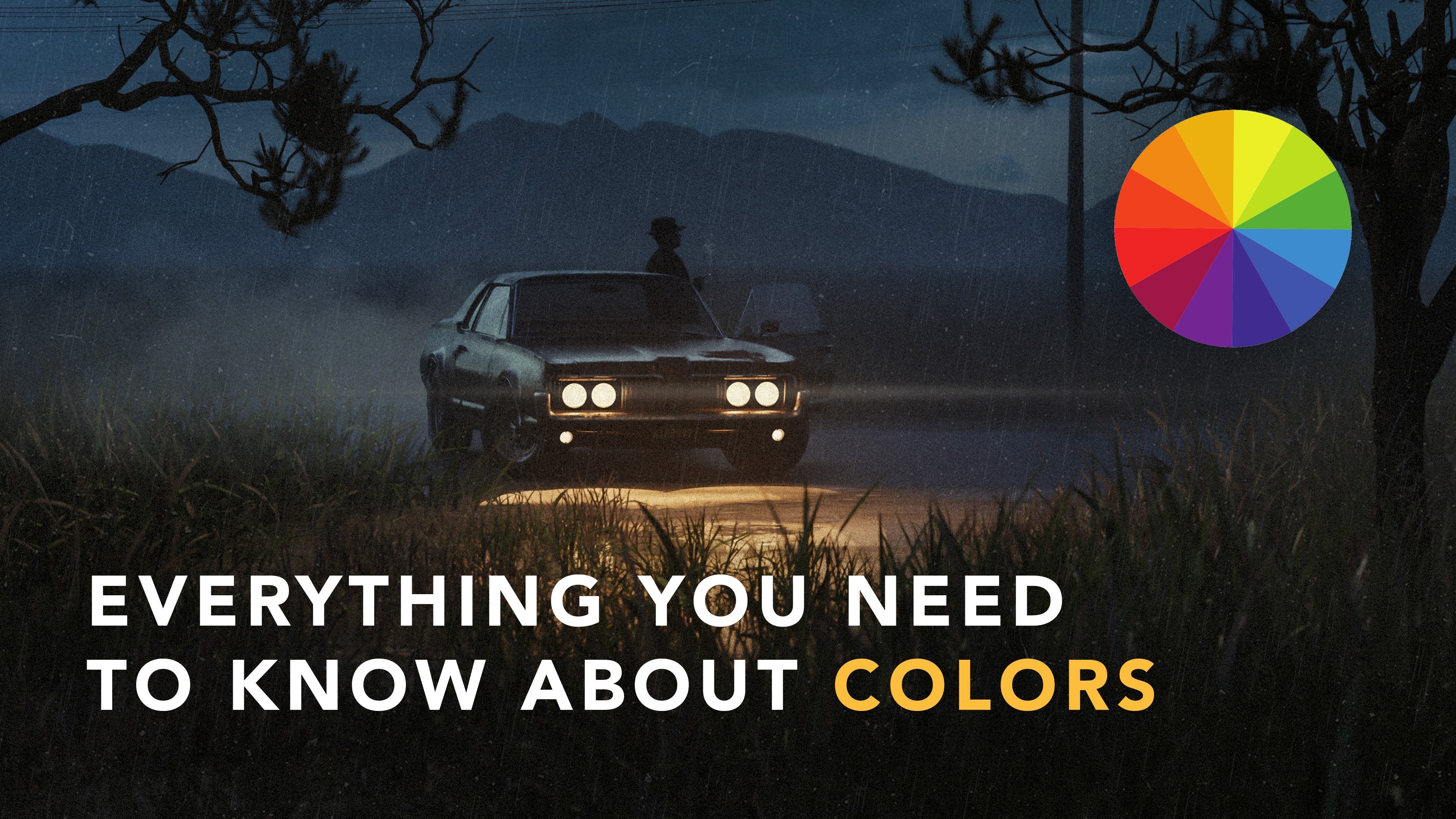
8. Lightroom: In this video, we will be
enhancing our final renders seen by adjusting the colors using Adobe Lightroom Classic, you can also use Lightroom
CC or mobile Lightroom. I just prefer using
classic sense. I'm more familiar with it. As you can see here, we imported our final render and
what I usually do, I usually start by applying
one of my presets over here, especially made for
renders like this, cold cynics log cinematic
preset for Blender users. Anyway, I planned to put this preset pack life
back in the first series. For some reason I forgot, but it's officially
out right now and can be found
on KM production. However, you don't have to pay for the full pack because I am going to be including this preset that
I'm gonna be using, which is called cynics 11. As you can see,
this is the before, after slight adjustment. But obviously we're not
going to stop here. But if you are interested
to get the full pack, feel free to go to
camp production and use the coupon code K24, 20% discount from
the original price. A very important things to
know about preset many people, things that you
just have to click the preset and it will
magically do the job. But that's not the reality. You don't necessarily get the best results
just by one-click. So it is crucial to do
some slight adjustment because each renderer should be treated differently
from one another. Now, here we have this very nice moody look
from just one click, but I don't want to stop here. So what we're gonna do, we're going to obviously bring back the colors of the light, the headlights back
to more oranges. So to do that, I'm gonna go
to the color grading here, and here we have the mid tone. So I'm just going to slightly go towards the oranges tone. And here you can
adjust the brightness and darkness of the midtone. Yeah, I think I'm done
with color grading now, if you see this is before,
after, before after. I think I got like
the orange tone that I was looking for
the headlights. Now what I will be doing, I will go to masking here
and we have liner gradient. This is one of my
favorite tool that I usually use using Lightroom. So I just created a
gradient on top and I'm just going to
add some bluish tone to it slightly from
above to kind of wash out the debt tones with
this blue cinematic tone. As you can see, it's
quite interesting. Obviously, you can see it
looks much better now, before, after you have some contrast, the complimentary colors between
the orange and the blue. And this is one of
the things I usually do to make my artwork stand out. Now I'm gonna go
back to masking, go-to brush and just
brush on the light. You don't have to go
crazy and slide details. I'm just going to
brush over where we have the light and what
I'm gonna be doing. I'm going to add a slight lean, more warm temperature here. So we have some warmer tones
and add a bit of magenta, I think is quite interesting. I'm pretty happy with
it. I, so far this is before and after. I think it's pretty good. I can bring down
some highlight here, maybe add some shadow so we can see some details
around the area. I'm just going to play
with temperature, but so, yeah, pretty
much, that's it. We have tone curve here. Now, the last thing I wanna do, I want to add some grain, one of my favorite
things to do as well, just it gives a whole C. Now we added the grain, makes it a lot more
interesting to look, at, least in my opinion. So here we have the
grain and this is before adjusting on
Lightroom, this is after. So as you can see, a Lightroom is a big part of my creation process and
I hope this is helpful. Alright, so this
is pretty much it. This is before Justin
on Lightroom, after. And it all started by
using one of these preset and just going over and
adjusting it the way we want. So I'm pretty happy with
the result and I would usually finish it off
by going to Photoshop, but I don't think there's
anything necessary to go to Photoshop or if
there's anything to add. So this is the final result.
9. Outro: We finally have come to
the end of this series. I hope you guys enjoyed it as much as I enjoyed making it. I am super excited to see what you guys create with the
techniques I showed you. So tag me on Instagram or
Twitter if you post your work, I hope you've benefited from the principal and the
tips in this course, and they help make your
workflow faster and inspired you to basically
create your own unique stuff. Now, don't forget, experiment with everything
you've learned and apply different elements concept to create those unique artworks. This serious will be the
first of several to come. So stay tuned for that. Make sure to follow me here and all my social media accounts so you can be notified when I release the upcoming series. If you have any questions, don't hesitate to hit me
up and I'll do my best to help stay creative
and have a great one.
 Kaiwan Shaban, Visual Artist