Transcripts
1. Intro: Hey friends, my
name is k1 and this is my fifth series of
my blender masterclass. And today we're talking about
something that is super, super important in the world
of art, which has colors. Now I know some of you might be thinking k1, I'm
just a beginner. I don't know much about colors. And you know what,
that is totally okay. Back in the days when I started my photography
journey because I was a photographer for about
eight years before I get into learning Blender
and getting into visual art, I had no idea how
important colors were. I was just following the trends
just like everyone else. And for a long time I was not being intentional
with my colors. So we'll have to start somewhere and hopefully
this class will be a great start to
finally understand colors and use them
intentionally. And your art, particularly
if you're interested in creating cinematic
visuals using Blender. In this class, we will
explore the role that color plays in creating visually striking and emotionally
resonant art. We will cover topics
such as color theory, color psychology,
color palettes, complimentary colors, and the practical application
of color inside Blender. By the end of this course, you will have a deep
understanding of how colors can be used
to enhance your RNN, to take your cinematic stills
scenes to the next level.
2. Why learn about colors?: You might be wondering
why you need to understand colors as an
artist anyway, right? This question came up to my mind and the
beginning of my journey, I'm like, it's not necessary. I'm not going to
overload the amount of information I already have
because they are so good. You know, like when
you're starting, you kind of like if
you don't have like a humble mindset about it, you will try to avoid a
lot of things to learn, and this was the case for me. Now, as an artist, understanding color is very
important because colors are one of the fundamentals
elements of visual art. They can be used to create
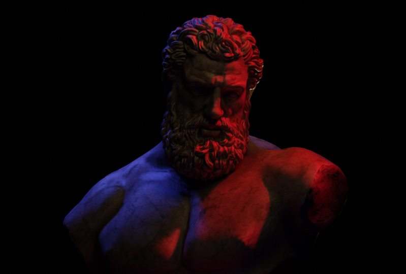
mood and interests and draw the viewer's attention to a particular area of
the artwork, e.g. where did you instantly
look in this artwork? I would assume that
the first thing you notice was this red backlight. And if you ask, how did I know? Well, what I know is that red is one of the most
powerful colors and it can dominate your art worse compared to other colors
you have in your scene. And just by knowing that now you can really take
advantage of this color and use it to draw attention
to a particular area. Obviously, it should make
sense within your scene. I wouldn't encourage you to use a color just for the
sake of using it. Tried to tell a story
with using colors. Colors can also be used
to create sense of depth, movement, and harmony
within your piece. Additionally, understanding
color theory, which is a study of how colors
interact with each other, can help an artist to create more cohesive and
well-balanced composition. Overall, a strong
understanding of colors is essential for creating an aesthetic and
impactful work of art.
3. Color Theory: Color theory in art is a
set of principles that dictate which colors will look appealing when
used together. It's like a recipe for a
visually delicious masterpiece. The color wheel is a
visual representation of these principles and shows the relationship
between primary, secondary, and tertiary colors. Speaking of primary colors, have you heard the
joke about three primary colors
walking into a bar, red, blue, and yellow. They walk into a bar
and the bartender says, What can I get you? The red says, I'll
have a red beer. Blue says, I will
have a blue cocktail. And yellow says, I'll just
have a yellow water. Now. I know this is a very
lame and silly joke, but now you probably never
forget the primary colors. But seriously, primary colors are the foundation
of the color wheel. They include red, blue, and yellow and cannot be created by mixing other colors together. Secondary colors,
on the other hand, are created by mixing two
primary colors together. And tertiary colors
are created by mixing a primary color with
a secondary color. The color wheel can
also help you to find complimentary analogous triadic
color schemes which are commonly used in art to create harmony and
visual interest. So next time you are
creating a piece of art. Remember to consult
the color wheel for a little guidance on
which colors to use.
4. Color Psychology: Color psychology
is a study of how colors can affect human
behaviour and their perception. It's like a secret weapon for artists and
designers who wants to use color to influence the emotions and actions
of their audience. Different colors can evoke different emotions and
associations in people, e.g. have you ever noticed how
fast food restaurants often use the color red in
their branding and decor. That's because red
is often associated with passion and danger, and it's often used to
grab people's attention, as I mentioned in
the second video, blue, on the other hand, is often associated with
calmness and trustworthiness. That's why you would
often see used in branding for bank and
health care companies. Green is another
interesting color when it comes to psychology, probably noticed that it's
often associated with the grove and nature, sometimes business and
trading, e-commerce, but it's often used for
eco-friendly products. Just think about the color of leafy tree of a fresh
blade of grass. It's no wonder that green
is often associated with things like things that
are natural and healthy. Here's a few examples
of my works where I use colors to make the viewer
feel something specific. When you look at this scene, I don't know about you, but I immediately feel the warmness and
coziness of the artwork. And that's mainly because of
the color of the arc work, the warm feeling
you get from it. You can sense that
the protagonist is in a calm and peaceful place. Now, just by changing colors
from orange tint to read, I change the complete narrative. Now, you feel something
completely different. You feel the scene in
a more of a seductive, or even, let's say dangerous, more passionate or
even mysterious. There's really no
right and wrong and she could go both way. But it comes down
to one thing which is being intentional
with your colors. I personally want it to feel the warmness and the
coziness and the scene. But you might want to
approach differently. It is crucial to
understand and be aware how the audience will feel
once they look at it.
5. Cinematic examples in Color Psychology: As we mentioned before, color psychology
is a study of how colors affect human
behavior and perceptions. And it's often used
strategically in film to influence the mood and
emotion of the audience. Some of you might be
thinking what this has to do with creating art. Well, studying these film
examples will help you to understand the color
influence on the audience. And therefore, these
color breakdown will make you more intentional
with colors. Next time you create
an artwork which is an essential
skill and itself. One classic example
is the use of color green in the
film The Matrix. The use of green here is
worth mentioning as green as often associated with growth,
nature and tranquility. And in the matrix it
is used to represent the artificial and
controlled nature of the virtual world. This is most notable in the green-screen effects used in many of the films
action sequences, which helps to create a sense of detachment and
disconnection from reality. The film The Godfather is another classic example of the use of color
psychology in this film. In this case, they use of
color red is worth mentioning. Red is often associated with
passion, danger, and love. And in The Godfather, it is used to represent violence and danger of the
criminal world. This is most notable in the film use of red
lighting and set design, which helps to create a very moody and
unsettling atmosphere. The use of red also serves
as a visual representation of the blood and violence that is a central theme of the film. These are only two examples of how color psychology can be used effectively in the film to influence the mood and
emotions of the audience. Understanding the psychological
effect of color can be a very powerful tool for
filmmakers and artist. It is important to note that these associations
are not universal and can vary depending on factors such as culture and
personal experiences. However, understanding the
general psychological effects of color can be
extremely useful for artists and designers who
want to create art that evoke a specific emotional
responses and their audience. So the next time you're
creating a piece of art or designing something, consider the emotional impact
of the colors you choose.
6. Complemantry colors: Complimentary colors
are like the Yang Yan, they are like the peanut butter and jelly of the color world. These pairs of colors which are located the opposite
of each other, have the ability to enhance
each other's brightness and create contrast when used
together in a composition. Now, you might be wondering, what is a color wheel. Now I, now I already talked about the color wheel briefly, but basically, a
color wheel is like a pie chart for your eyeballs. But instead of delicious
license, you get red, blue, and yellow wedges with
this side of green, orange, and purple, plus a
tool that helps you to not look like a
colorblind person in art. And especially when it
comes to designing as well, what it does, it helps you to create contrast within your art. And contrasting colors
can be pleasing to the eye because it's create visual interests and makes the elements of the
art stand out more. The human visual system
is wired to detect contrast and helps us quickly to identify the objects and understand the
spatial relationships. Additionally, high
contrast can also create a sense of
movement and depth, making your scene or design
more dynamic and engaging. That's why black and white, it looks so good together, or red and green and
blue and oranges because of the contrast, and especially black and
white because they are the extreme ends of the
lightness spectrum. Now you're probably
aware that I use complimentary colors
pretty much all the time, such as orange and teal. And my art works to create visual contrast
and add interests. My pieces. That contrasting nature of
these colors causes them to stand out when placed
next to each other, which helps to draw
the viewer's eye to a specific area
of the artwork. I'm quite intentional
with the use of these complimentary
colors to create a sense of depth and movement within the
pieces I make, e.g. in this piece, I used orange
as the dominant color. And the blue
surrounding the orange is more like a assistant
color is more like a directional color that at
Guy's the viewer to directly look at the orange color
because of the dominance. Or we can say how has been
placed within the scene. So by using complimentary colors like orange and teal
and my 3D yard work, I managed to create
dynamic and engaging pieces that not only
look good together, but also make the viewer
intellectually engaged. And you can probably
tell in my art works every time I try
to use these colors, I do it with intention. I just don't use the orange
just for the sake of I just don't throw the colors out
there just because I want to, you know, 99% of the time, it has to make sense. Sometimes if I go
artistic where I create something has to
be so realistic, then I go crazy a bit.
7. Cinematic examples in Complemantry colors: Here are two examples of how complimentary colors
have been used in film. Mad Max Fury Road, the film Mad Max Fury Road is a great example of the use
of complimentary colors. In this case, they use of
complimentary colors such as blue and orange
is worth mentioning. These colors are used to create a sense of contrast and
tension within the film, reflecting the harsh
and unforgiving nature of the post-apocalyptic world, the use of blue and orange is
particularly effective and action scenes where it helps to create sense of
energy and intensity. They use a blue and
orange is also used to create a sense of
contrast between this course and
barren landscape and the vibrant color of the vehicle and costumes of the characters. The film Blade Runner 2049 is another example of the use
of complimentary colors. It's fair to mention
that I might be biased choosing this film
because it's my, one of my favorite
films of all time. Again, here we have
orange and blue, which is worth mentioning. These colors are used
to create a sense of contrast and tension within
the film reflecting bleak, dystopian nature of the future. They use of orange and blue
is particularly effective and creating a sense of
atmosphere and creating a mood. And it's used to great effect in the scenes that take place in the dark and rainy
streets of LA. So the next time you're creating a piece of art or
designing something, consider using a
complimentary colors. Just be sure to use them in moderation and find
the right balance to create a cohesive and
harmonious overall look.
8. Inside Blender: So here we have, our scene is one of the
recent art works I made. And it's probably
one of my favorite as well when it's
come to close up orchards is the first time
I actually kind of got to where I'm comfortable sharing
close-up 3D portraits. Now, there's a lot
going on here, but what you should know is that I have three
source of light. First one on the left, right, I'm creating a key light. There's another one
just behind the model. Here. You can see
that way it creates very nice rim light if
you go make the zeros. So this is zero. You can see
that the rim light is gone. I'm going to undo this. And you can see the
rim light is back now. But the one that kind of Changes Everything is the one here that behind the curtain, basically, as you can see, let's go ahead and change
the color from here. As I showed you the
example before. I'm going to set this to read. Obviously, I'm going to try to copy the hex number and try to change the same color and
set it to the other ones. We also have the rim light. Now as you can see, this could
be a little bit to read. But if you zoom back, maybe the light is too much. So maybe I'm just going
to bring down the light a bit and also bring
down the light here. So you do definitely need
to make some adjustment, but you can feel a completely different
sense when it looks, when you look at this artwork. You can also, now
what I wanna do, I want to change this
color to bluish, something like this or green? Because green and red, they are complimentary
color and you can see, it actually looks pretty
nice as you can see. Yeah, I think it
matches very well. I don't want to change this. The red and green looks
really, really good together. You can also change
this to blue. Blue, blue, and red. They also look good together
to a certain point. You can see here it's creating this beautiful
neon vibes here. Just make sure you
don't overdo it. Balances key here and yeah, have fun play around.
9. Artist's Review: Alright, so the first
artists I want to talk about is my good friend,
T-Shirt, lattice energy. Now, I might be biased, but I absolutely love
this guy's work, especially when it
comes to colors. Like if you look at
this artwork, e.g. you can see the color harmonies
quiet, well organized. You have green. Here, you have red. You have almost shades of red. You have dark red, brighter red, and a
little bit of cyan blue. To balance it out. Here you have very similar
and consistent colors of green, red. These are two dominant
colors that he usually use. And I'm quite impressed. And as you can see
here, sometimes you use teal color as well. Just amazing, they're quite pleasing
for the eye to look at. This is one of the
characteristics of tissue works. Sometimes he goes completely
the opposite of like, you know, mostly
blue and then red. But you can always
see like these are the elements of his work. Besides talking about colors, you also very recognizable elements that is
worth mentioning. E.g. in most of
his artworks there is like a kind of
like a Doberman dog. I think that's the name. That's the right name. Or sausage dogs. Yeah, here. And these are these are elements that is only recognizable. And when you see them
again and again, you don't consciously
notice them, but you know exactly
who made this artwork. Colors is one way to go for it. As you can see, red, green. He definitely studied how colors work together
and Dalloway, he creates a very unique
and harmonious color theme. What's crazy about this? All of this is just
painting from scratch. That is impressive.
Like the first time, the first time I
actually saw his work, I thought it was 3D,
but it's all paintings, t-shirts work is definitely
something you can study and see how he approaches his colors and get
inspired by that. The next part is I want to
talk about is mad dog Johns, if this is his actual name, but it's a pretty cool name. You can see here as well. His work is quiet
vibrance with colors. You have pretty much
all shades of colors, but dominant colors
are with say, our purple, blue, magenta. And Dalloway creates very
nice neon kind of by hand. Most of the themes
artworks feels like they were painted in Japan. The streets and the writing. And this guy's work
is incredible. And the amount of details and
the shades of colors that way creates a really nice,
harmonious color theme. Definitely something you can
look into it and study it. E.g. why he would use certain
colors here or there. That way you are more
intentional, e.g. he used a very bright red here. Your eye directly goes to the windows and the
top of the artwork, which is the red here, the rest is just cherry on top. It helps you to see and identify the shades
of this artwork. As you can see, the
amount of details That's another characteristic of his
work, is just incredible. Like you can see
all these details. Colors are super vibrant. I really liked his work
next door to us I want to talk about is grand ribbon yarn. I hope I'm pronouncing
his name right, but I found I found this guy's work a year
ago in the NFC space. He built a quite a reputation in the NFT space and he's one
of leading artists when it's come to some of the highest
sold pieces and the beauty of his work to me as the
minimal side of it. And also the color
theme is coloring here. You can feel that
it's quite past all. It's very subtle. Shades is usually
shades of green and mixed with gray
and dark green. And you can see that in pretty much most
of his work here, like you have the same thing. And you can still tell that this art work is done by Grant, which is absolutely amazing. This is something that you should look into
it for your work. You should have elements when
it's come to colors where you can tell right away,
this is your work. See how simple, how minimal and the art style
is self as well. You can tell right away, but colors have huge impact when it comes to
creating your style. So make sure to be intentional
with what color you use an always write to connect the dots between your
other previous work. These are few examples that are very far from each
other when it comes to the colors and the style
that you can study from, see how artists C and
see how they approach their work and try
to come up with something unique and visionary.
10. Why you need a color pallete for your art: Having a cohesive color palette is very important for any
artist, in my opinion, as it helps to establish
a visual identity, a sense of consistency
in their artwork. A cohesive color
palette is a set of colors that an artist uses
constantly in their work, often featuring a limited
numbers of colors that are chosen specifically
to work well together. You can argue with
me, but I believe every successful
artists usually has a cohesive color
palette that can be recognized for
several reasons. Reason number one, establishing
a visual identity, a cohesive color palette
helps you to establish a visual identity as
an artist and can be used to differentiate
your work from others. A recognizable color palette
can also help you to build a strong brand as an artist and create a sense of
consistency in your work, creating harmony and balance. A cohesive color palette helps you to create
harmony and balance within your work by carefully selecting colors that
work well together, you can create a sense of unity and cohesiveness
within your work. Now, keep that warden
in mind harmony. You've probably
noticed when you go to someone's profile
and art is that you really admire and you like they have this element
in their work. You'll look at their feet
and you scroll down, you can not get annoyed by it. There is nothing that
really distracts your eyes. Everything is well fit together. That's why I'm most, most, most artists struggle
creating a cohesive feed. But when you have a sense of harmony and unity
within your work, that wouldn't be a problem, evoking specific
emotions and responses. A cohesive color
palette can also be used to evoke a
specific emotions and responses in the viewer
by choosing colors that have a particular
association or meanings. And artists can use
their color palette to communicate a specific theme
or ideas within their work, standing out from the crowd. This is by far my
favorite point. Now, the reason why it's a cohesive color palette
can help an artist's work to stand out from the crowd and catch the
attention of viewers. That way you as an artist, can differentiate your
work from others and make it more memorable
and more impactful. Now you can obviously
tell that I follow this mindset and I do have
a color theme for my work. I almost think of it as a
trademark, to be honest. And I would also like
to mention some of the artists I
personally admire with the way they approach
their work with their unique coloring and style. Now it is important to note
that you should try to get creative here and not
copy other artists style. I think this is like a
foundation for you as an artist. If you try to copy other artists style the other elements
that other artists use, it can be easy to be spotted. That's what I'm trying to say. You can always see
how they approach their work and come up
with something new. I bring something new
to the table and it's important to develop your
own unique color palette, represent your own vision. Don't just do it because an artist has already
succeeding at it. Like let's say you see someone
is already building style out of it and you see he's succeeding and making
money and all that. That shouldn't be a
motivation for you. You should think about what
are your favorite colors? What is a style that would
represents you as an artist? This will definitely
help you to stand out from the crowd
and in the art world, which is super competitive
and supersaturated now. And that way you will
be able to create a distinctive visual
identity for your work.
11. Outro: Thank you for joining me on
this journey to understand the importance of
colors as an artist, I hope you gained some valuable insight and
techniques that you can use to enhance your art and create beautiful and emotionally
powerful still scenes. Remember, the power of color should not be underestimated. It can be used to
create contrast, balance, harmony, and
emotion in your art. Use it wisely and your art
will truly come to life. Thank you so much for watching, and I look forward to seeing
your amazing creations.
 Kaiwan Shaban, Visual Artist