Transcripts
1. Intro: Hey guys, in this
class I'm going to share with you 17
useful tips and tricks to enhance your workflow in affinity photo version two. Over the last three years, I've been posting hundreds of tutorials for affinitive photo. In this class I
will condense that. I will take the
best parts and put them into one online class. I have prepared a
workbook for you, so there will be
outboard for each trick. For each hack, I will ask you to download my files and
practice with me. This way, you can try it
straight away after you watch the video and you can memorize it in case you try it and
something is not right. You can rewatch
that video or even ask me a question straight away. All right? So that's the plan. You're going to
download my files and then I will show you page by page how to use those hidden
tools, interesting hacks. I will show you
some common tools, but I will use them in
different ways that people usually don't think
about that kind of case. I will also show you which tools are cross compatible
that you can borrow from affinity designer or maybe affinity photo as well. I hope at the end of this
class it will be way better and work way faster
with your affinity photo. Let's get started.
2. Workbook: Thank you for
joining this class. As the name said,
it will be full of useful hacks that will
enhance your workflow. To make a most of your time, I have prepared this workbook. I split it into two chapters so it will be easier to open it up on the slower computers. We're going to start
with the Chapter 1.8 Artboards in that chapter. There's also chapter two, then you need to switch
to the second one. We move from Alport nine to the very end to tip number 17. All right? I will also include those files that I using
during those videos, the one that I'm
experimenting with, showing you those tricks. I will put them at
the very end in case you want to reverse
engineer on stab, you like to dig deeper. You can see my files as well, but the one you're going to download below this video,
they are the blank one. I didn't do them yet because
that will be your part. I will show you how to do
those tricks and tips and you will practice them one
by one on each artboard. We will do one artboard
per video together. You can get ready by zooming in. I like to zoom in comment the way that you see
the first art board or the Spacebar to drag, to pan the camera
around like that. We are ready to
start this class. Keep in mind the structure of this online class
is a bit different. I try my best to design
it in a way that you can jump into any lesson
in any order. Very rarely we will
build at the top of the knowledge from
the previous class. Think about it as 17
independent mini lessons. Don't feel discouraged
if you, for example, forget to study for a week
or two, doesn't matter. You don't need to
remember what happened in the previous artboard to do the next tip to learn
about the next thing. All right, so feel free
to jump in and out. Depends on your free time
and let's get started. But before that, I'm going to do a quick recap of the
interface in the next video.
3. Interface: Before we dive deeper
in the first tip, let's just quickly
recap on the interface. As you can see here I am on the desktop version
of the program. I'm using Mac. But the Windows
version I'm using Mac. But the Windows version
is very similar. On the left, that's
our tool panel, that's the most important place. Starting from the top, there is a move tool that allows us to move
different objects around. Also allow you to make basic transformations
like rotation. You can pull the
stretch objects, you can also move them around. There's a little trick that I'm going to show you later as well, when you can just press command to make quick
duplicates of objects. That's all. With the
move to keep in mind, we can quickly delete
them by pressing delete on your keyboard
or by undoing. Undoing is a very essential
shortcut in my opinion, because very often in graphic
design we experiment, we try stuff out, and we are not happy
with the result. Simply undo command or control controls that on
windows to undo several times. And we are back here
The next tool on the list that's color picker
to I can pick colors. There's also style
picker as well that will pick the style of the whole layer including
special effects. If you pick the color, then the color will
be active over here. Next time you draw a new shape, this will be in that color. If you've got shape selected already and then you
use color pickle to you will recolor
that selected shape. There is a crop tool here and selection brush tool,
very important one. Why selecting your
pixels in your images? Because most of the time we don't want to affect
the whole image. We want to select only area that we want to
change the color, remove the back drop
or something else. Very often we need to do
some kind of selection. We can use selection,
brush tool. There's also flat selection, also called Magic one selection. We got the very basic
rectangular market tool. Same for the oval and our
little free hand to also called lasso selection when you select the area in
the free hand mode. There's also bucket
tool for filling the selections of
colors, gradient too. And the brush tool as well. If you click and hold, you will see there's also color replacement
brush under the pixel. Keep in mind the brush come with many controls at the top so
we can change the size of it, opacity, flow, and
even hardness. Over here we got paint mixer brush that will be important for people that
are into digital art. You want to apply colors
with the brush, mix them up. There also eraser tool, not many people use
Erase the tool, but there's a special
Alta function called background
erase the brush. It's really powerful and you cannot see it very
often during tutorials. I'm going to show you
that in this class, this standard do clone
under brush tool. We got a little blur
here if you want to blur on the small areas in painting. Brush tool, that's very
powerful tool that's in our healing selection over here. And there's also some
small vector section including pen to no two. We got different premade shapes and the list is quite nice. There are many premade shapes. As you can see, I got
ready small screen, so I need to click
arrows here at the bottom to see
more tools like text. We got Warp tool and Zoom tool. I don't like a zoom
with the tool. I usually zoom using
common minus common. Plus I press Space bar
to move myself around. At the very top we
got additional tools. The highlight picture of
this software personas, we've got photo persona,
that's the default, but we can switch
to liquefy persona, develop persona, and tone
mapping persona as well. There's a final one, the
export persona personas are like little interfaces, so the interface will change
if I move to export persona. As you can see, my tool
selection are limited. I got additional options
here on the right side when I can select how I
want to export my layers, my artboards, which format. I can export multiple
files at the same time. I can change the size. Why exporting? All
of that is here. This whole work space
was created for people that intend to export
their artwork, The default photo persona. It's more like a
very standard tool set that you may know from different programs like for
example, Game or Photoshop. That's where we're going to work most of the time in
the photo persona. But keep in mind some tools may be delegated to
different personas. Like for example, there's
a liquefied persona when you want to use
the liquefied tools. As you can see at the top, I got my snapping
options on my pixels. Try to snap when there's
some geometric pattern. When I'm moving this one around, they look, it's
trying to snap to the center of this page. That's because I
turned on snapping by pressing this little
magnet icon at the top. We got some alignment
options here. Below that there is
our color wheel. We can decide about
colors below that area. It's your layer panel, Very important
section because it's very common mistake
when we try to apply some files,
effects, use brushes. If you are on the wrong layer you will get a different result. And it's going to be
really frustrating because very often program will not communicate any errors. Because we simply painting
on the layer below, we cannot see anything. That's where people get
angry on the software. Always double check which
layer is currently active. Also, additional
studios for channels, for brushes, for stock images. Keep in mind we
can control that. You can pull studios out, close them, we can
turn them on and off. If you go to window, you will see which studios
are on the check mark and which studios you can turn
on if you need from here. We can also reset your studios
to the default settings. That's what I just did, It's all reset now. I still got my
colors here, layers, but there's additional section, Navigator, and transform,
and history as well. History can be very
helpful when you want to undo multiple steps. Take a look, we can go
back in the history. Nice. All right, that's the
interface of the program. Now we are ready to
learn more about very useful tips and tricks that should enhance
your workflow, your speed y using
affinity photo.
4. Project: Project is a very important part of a skill check class for us. We got this ongoing project
in form of the workbook. So there's no like one
big milestone project at the end of the class. We don't need to
wait until the end. We can start practicing
since video one. We're going to
practice page by page. As I mentioned, and as
your final project, just send to me a screenshot
showing your workbook, showing your work, your
practice approach to this task. All right, so to do that, you can snap a screenshot of the whole chapter
of your workbook. To do it on Mac, for example, I will need to press
comment shift number three. I snap a screenshot. That's the shortcut for
Mac Windows is even easier as a print screen
button on your keyboard. Or if you are fan
of one of those, like Tip for example, you really like the fact
that we can use in painting, feel this was surprising
and useful for you. You can share only
that artboard. If you like to do that,
select the artboard, be sure you completed
the task correctly. In my example, I
already we removed several balloons
from this image. As you may remember, I'm
done with this task and I'm ready to share that
with community with me and other students. To do that, click file, then you can search
for export option. You can export only that one
artboard that you're proud of and send that
as your project. Keep in mind we got ongoing
project here in form of the workbook and
that's what you can send at the very end in
the project section. Please don't forget, keep doing. Keep working on your
workbook in between videos or with video
playing in the backdrop. And at the very end,
send me the workbook. And this way we can close this class nicely
with this practice. All right, so let's get started.
5. Artboards: When you open our workbook
for the first time, you may be a bit
surprised to see multiple artboards by default. You may see them
all, just like that, you will have to zoom in a bit so you can see only
one artboard at the time. Because we're going to do one by one in each video lesson. Each artboard is a
one useful tip and the artboard is the place
for you to practice with me. Let's zoom in via an
ipad. That's really easy. You simply pinch your
fingers on desktop version, I like to use popular
shortcut command or control to zoom in. Command or control
minus to zoom out. Keep in mind if after you zoom in you don't need to zoom out. Every time we can pan around. There's this little hand
tool, call a view tool. We can just move around
the camera, you could say. But I like to simply
press and hold space bar, it will jump to
that panto and you can drag yourself
around the workspace. Be sure you zoom in to see
only one outboard at the time. Announce the question,
how I even managed to create multiple artboards
in affinity photo. This tool, this feature
is still missing in version 2.3 The trick was I initially create multiple artboards using different software
from affinity family. I use the blue one
affinity designer and create myself document
with multiple pages. Then I save it and open
in affinity photo. That's one of the way you
can achieve this effect. If you plan to use
affinity photo for more like a graphic design task, when you need multiple pages, you need to export your document as PDF of multiple
pages, for example. That's the way to do it.
You can simply create your project in designer
first and then you can reopen that in affinity
photo because the version two programs are very well
compatible across the family. That's nice. What if you don't own the software right
after you designer, you're just looking at the example of the
file created there. By owning this workbook, you will be always able to
copy and paste my artboard. Take a look, the artboard
is nothing more. That's a glorify shape. We can duplicate the
whole artboard as well. Let's try to do that
in the layer panel, I will just try to copy and
paste the whole artboard. Take a look, you got a
new artboard over there, you can copy them to
different documents as well or even add to
your assets panel. After you've got
the first artboard, it's really easy to
create the next one and the next one because you
can copy and paste them. You don't need to refer to affinity designer all the time. That's the trick number one. You can actually create
documents with multiple pages, multiple artboards
in affinity photo by using artboards from affinity designer or by using the documents that previously got artboards
like this one, we can simply copy
and paste them. And then you can resize
them as you want because the size will be shown here in the transfer panel. Take a look at the bottom right. This is a 42907210
in millimeters. You can change that here to get a new size for
your artboard. You can l have multiple
artboards with multiple sizes in one
document as well. All right. So keep in mind, this document is built with
multiple artboards. One artboard for each trick. And you can do a
similar document in affinity photo two simply
start in designer and then reopen it in affinity photo to have a
document with multiple pages. All right, that was our tip
number one. Easy, right? Let's move to tip number two. This one will be about a
background erase brush. How we see you in
the next video.
6. Background Erase Brush: My second tip is on a
bit undiscovered tool. Whatever you search
for tutorials or the ways to erase backdrops, you will always
find out a way with selection and then refining selection and stuff like that. But there's another
tool that we can use. Most of curses tutorials, classes skip this tool because
it's a distractive tool. The instructors usually
make assumptions. I should show a better way, but we shouldn't forget
about this very powerful, easy to use tool, especially for quick fixes. It's called background
eraser brush. It's in front of the brush, that's why it's so
accessible here. I got the image on
my second artboard. I'm going to select this brush, go for the eraser
tool over here. By default it's called
Eras brush tool and it should erase
everything that is touch. All right. Take a look. I create a big hole in my image. Below my image there's a
white, white artboard. So that's what we can see below. That's not what we need.
Let's I can under comment. All right, let's
click and hold on this eraser tool and select
the second option here, Background eraser brush tool. Good thing about
erasing background is we can do it with this brush, so we can control
the size of it, hardness of the brush, and all of the other properties of the regular brush tool. We don't need wet
edges, for example. All right, now I got this
Erase the brush tool. Let's zoom in a bit by comment. If I want to erase the
backdrop around here, I simply be sure that most of the brush is pointing
to the backdrop. All right, so take a look. Even though my brush is touching the bird, it's not erase. Because the brush will check where is the
center of the brush? The center of the brush should touch the backdrop
and not the object. We want to keep this
way Very quickly, I managed to remove the color around this very
detailed small object, and then I can use
the larger size. And to change the
size, as you can see, I can use the slider or I can use square brackets
on my keyboard as well. Square brackets.
Then you can keep erasing stuff with this brush. Or what I suggest is to simply use this brush where
you are at the edge, close to those objects. You want to keep like that, nice, we got the bird in. But when you want to
erase a simple backdrop, go back to a regular
eraser brush. As I mentioned before, keep in mind this is destructive way of getting
rid of the backdrop. We cannot get the backdrop back. That's why I suggest to
actually make some copy of the original image below on the layer panel in
case you need it. All right, so take a look, We erase the backdrop around
here. Let's continue. Again, I want you to learn about this background
erase brush. This special brush allow us
to erase backdrop around objects without need for precise selection.
That's the goal here. To save time is not
the most precise way, but it's really fast way, very easy for beginners as well. Sometimes we just need to
remove a bit of sky or something like that or cloud and this will
be a perfect thing. We can maintain important
objects like those birds and still erase the backdrop
between Why is a hidden tip? Because nowadays most
people totally ignore. Erase a tool that's
like destructive, not proper way of editing. But I still think that
we should know about this little tools can be
really time saver sometimes. All right, for the
second artboard. That's our practice here. Try your best to
remove the backdrop around those birds
without deleting birds. You will need to use backdrop
erased brush as I show. And also I recommend you to zoom in Use Common Plus you
can zoom in really close. Try your best practice with this second artboard
and when you are ready, you can move to the next tip.
7. New Brush: All right, let's move to
the artboard number three. A good brush can enhance your editing experience in
any photo editing software. Whether you just want to
draw a quick cloud on the sky or you want to
some deep graphic project, right, like fly or poster. The good brush can be
everything to create a brush. Usually we need to
go this long way by creating a new artboard, cleaning up the backdrop, and then extracting this
one image as the PND. To create a brush, usually
we need to go the long way. Create a new document, put the image in it, you raise the backdrop. Export as PNG. Then import back
this PNG as a brush, set up the brush, and then
we can finally use it. Luckily there's a quick way call new brush from selection. If you are halfway through your project and you look at the object like this
flower and decide, oh, I will turn this
into a brush so I can draw a few more
flowers like this. You can do it from within
the program without actually creating a brush during this whole process,
as I mentioned. But first, let's check
the brush panel. It should be on the
right side here. Brushes, they are divided
into several groups. We already got multiple brushes, different textures,
different media style brushes are here. Let's go to the basic group. Our task for this third
outboard will be to turn part of the image
into a new brush. If you cannot see a brush panel, you can always head to your window and check that
the brush panel is turned on. Need to have the check
mark next to it. All right, what we
need to do is we need to select the flower. Let's use a very
easy selection tool. Call a selection brush tool. Over here, as you can see, it's a brush, so I can just
paint over the flower. What we've got here
today is what we can consider a easy selection. There's high contrast
between the flower and the backdrop and there's also very low focus
on the backdrop. The backdrop is blurry. Let's make it way
easier to select. Let's zoom in a bit
for greater detail. Zoom in comment, plus. All right, let's make
this brush a bit smaller. We can select those details. We can use this
slider to make it smaller or we can
use square brackets. Take a look. Square brackets
will also resize the brush. All right, with
the smaller brush, I can select some details. Don't want to be
too precise here. I just want to rough quick
brush from selection. If you notice that
you select too much, like in this case, take a look. I select part of the backdrop. Change the mode from
add to subtract. This way we can remove
from selection. Nice, same here,
subtracting this part. All right, let's try to
turn this into a brush. After we apply the selection, we head to the brush panel. And then on the right side, click the menu and search for
new brush from selection. As you can see, it's right now, gray out means we need
to rasterize this layer. This layer is an image. We can right click on it
and we can rasterize it. Now it's a simple pixel layer, and we can use the
selection on that layer to create a new brush from
selection Here take a look, a new brush appears. That's the image brush that may contain all of the colors. We can double tap
on the brush and we can even modify some
properties of it. I like spacing. For example, flow of the brush rotation. We can use dynamic
options like that. We can scatter this around. With this new brush all set up, we are ready to use it.
Let's try to use it. I'll dielect command
D to dielect. Then by selecting the
brush tool on the left, I'm going to use my
new brush all around. And that will be
your practice task. Try your best to select the
flower on the third artboard, turn it into a brush, and then paint with this
new brush all around. Just like that. A messy out
pot with our custom brush. All right, so good
luck with this tip.
8. Vectors: When Affinity Designer
was first released, there was a huge
deal that there is a pixel persona built in
in a vector software. There is something like a
vector persona built in affinity photo even
though it's not a separate persona on the list. There are many vector tools are available for us in this
rust editing software. The vector graphics is
the one that is made of curves and shapes like
this little Mogi. Here the advantage is it can be scaled up and down
without losing quality. And we can quickly recolor those vector shapes as we want. Let's try to lock this layer
first in the layer Pal. I will click this padlock. All right, now we cannot select
this, we cannot move it. Our task for this artboard
number four would be to use some vector tools
to recreate this shape, to show you that it's
totally fine and possible to create simple
vector combinations. In this rust editing software, we got our shape
tool here and take a look that are so
many ready to use shapes for us from stars that we can modify
even further by changing some points and also by pulling those
orange points around, Take a totally different shape
made of star very quickly. There are many shapes that
we can modify even further. But there is also a proper
penolokI, Click and hold. Click, hold to adjust the curve. The pentol is really powerful
tool that I was to draw. Any custom shape in
this case is block. We can modify those nodes
with this wide node tool, not the black selection tool. This is the one that
move the whole shape. The white one is the one
that move, move the node. You can also press and hold the penol to see the
node tool just below. All right, we can draw custom shapes and we can modify those nodes with
the node tool later on. Today we're going to
try a primate shapes. Then we will customize them using something called
geometry operations. All right, I'm going to
start with this rectangle. Draw the rectangle first. We are doing some
vector graphics right now in affinity photo. Now I will go to
round those corners. Let's change the
corner style to round it and make it really, really round it,
almost like a circle. All right, 40% Now we need to create those
eyes. How can we do that? We can just simply
draw our O right. There's ellipse tool,
normally it's oval, but if you hold shift, you will go to one
to one proportion. That's nice. You don't need
to be too precise with that. We don't need to have exactly
the same size of ice. All right, I got one and now I can just simply copy and paste. To do that, I will
hold command and drag it out and I got a copy. All right, hold shift to select both position like that
and now it's cool part. Let's select all three shapes. I can click on the first one, holding Shift, click on the last one in the
layer panel like that. Or you can simply click and select them all here
in the art board. Now by right clicking. Let's for section called
Geometry Geometry. We've got some options to
combine vector shapes like add, subtract, intersect,
divine, and combine. Let's start from subtract. By doing that, I cut out a
hole in that shape at the top. Take a look, that's
nice. What else? Now we're going to
use segment tool, that's another shape
tool on the list. Just click and
hold to see all of the shapes segment
tool like that. Let's rotate all the way. Use the orange control point. We can scale it up a bit. If you like place here,
select them both. And again, right click,
such for geometry. And we can subtract again. And we end up with
our own emogy here. That's nice, that's your task. Create your own little emogy
by combining vector shapes. But while we are still here, I'm going to show you
all four actions. All right, let me
just move a bit here. Okay, let me draw a
rectangle ellipse, we can see all four operations. Now I'm going to copy
this four times. I can come and see
command V. I can also click right click
here in the layer section, and then I can duplicate that. All right, if I select two or more shapes,
right click on them. There's a geometry
that I can add in. That option will add
those two shapes together to create a new one. The second option, as
I already showed you, is to subtract, In this
case, the top shape. The key shape will make a
hole in the bottom shape. Next one will allow
us to intersect, only this intersecting
part will be left. The final one will
allow you to divide. And that's opposite of that. We cut in little
pieces, take a look. Every little piece of that
composition is now separated. Keep in mind, even
though Affinity Photo is a rust editing
software for doing some photo editing and a
bit of graphic design, there's still a proper
vector persona. You could say there's
a pen tool shapes. And we can also apply actions operations
between those shapes. Unite, subtract,
intersect, and divide. All right, your task is to make this little MOG
using vector tools. I will see you in
the next artboard.
9. Tools: You may notice that my tools on the left are a bit different. They're in two
column, not in one. This way I can see all of them. Even though I'm
using laptop now, a bit smaller screen. How can you customize
your tools? To speed up, that's
our tip number five. We had to view and search
for customized tools. Click on it. Now you will see
all of the available tools, why there are so many here. Because very often under one tool there is
another hiding. But if you use that tool, often you can drag it out and
say it as a separate tool. That's what I did
with the node tool. Normally, the node tool is
hidden below the penol, but I drag it out, I can say it as a separate
tool. All right. So you can do that.
What else can you do? You can, of course, change. How many columns do
you need? Take a look. If I got only one column, I cannot see all of my
tools on my laptop screen. It's not big enough. So I change to two columns. You can try three if you like. All right, so I will
stick with two columns. And you can see also
I got this wide line separating selection
tools from other tools. This line is over here and
this is the separator. You can create your own
sections in the toolbar and separate them
using this handy line. Take a look, There are more
tools than you may think because some of them
are groups of tools. For example, remember there's
the whole group of shapes. But if there's a shape
that you use very often, for some reason, you can
drag out this certain shape. You can drag out, let's
say, this clout shape. If you are doing some comic like design, you
can put it here, you can click close and then you'll have a quick access
to that certain tool. All right, as the
tip number five, you will have to
customize your toolbar. Check that there are
some tools that you want to have in your tool bar, you can reorder them. Maybe there is a software
that used before. Maybe you are coming to Affinity Photo from
different programs. Now it's time to adjust this
tool panel on the left, so it's going to be more similar to what
you already know. All right, play around and if you feel
like you messed up, click reset and you are
back into the default one. What I did, in my case, I switched from
one column to two. I drag out the span tool to the bottom next
to the zoom tool. I also drag out this No
tool to be at the top. So I got a black one for
moving the whole object. And I got the wide one
node for moving only nodes because I use a lot of vector
elements in my designs. All right, that's how
I customize my tools. You can customize this
area as you want, then click close and then we
are ready to move forward. All right, your turn.
10. Blur: If you are affinity photo user, you probably know all
about blur filters but there is one that is a bit undiscovered.
Under appreciated. Depth of field blur, that's the one I'm
talking about. There are two ways we
can apply blurs to our pictures or
areas of the image. We click on the image or
we select the area first. And then we can use
this menu here in the layer section
directly he is, we got some handy blurs. Or we can refer to the
top menu called filters. From here we can select a different filters that are group in different categories. The very first one
is for blurring. That's blur such for the
depth of field blur. After that, you will get this nice circular shape that we can adjust to blur the
part of our image. In my case, I got
multiple artboards, so the filter freak out a bit. Let me just reposition
and let's scale it down a bit to blur only this one
certain image on our artboard. Six, most of the time we
work on one hardboard. So that will be just
fine in our case, because we break
some rules here. We need to reposition
this guy here. Okay, take a look. Also, I need to be sure that this blur is on the
correct artboard. As I mentioned, that's
something that you need to be worried about only if you are breaking those rules
and you are working with multiple artboards
in affinity photo. What you need to do,
you need to first add a radius to it and see that
the layer below will respond. In my case, everything is fine because the
correct layer was selected before I apply the
blur, right? Take a look. First one is the
radius that will blur around the second rim. The second circle, the
thing at the center, will stay focus and the stuff outside or around the second
rim will be blurred. That's can be really
handyful portraits. When you want to avoid
precise selection, we can change the
vibrant. Take a look. The green color is pops. We can even add clarity to it even though it's blur
is look a bit sharper. All right, This is
a perfect filter. If you've got this one
object you want to focus on, keep that object in
this first circle. Then you've got this area
that is gradually blurring. Then you got your
blurred backdrop. The advantage of using
this filter is you don't need to make any
precise selection. We did not select
the lady at first. We just adjust the position of this blur indicator normally, when you apply the blur, there's nothing
like this ellipse. This deep field blur is really nice because we
got this full control. Take a look, I can move this
around now the lady is blur, put it back here
and she's focused. All right, very interesting filter because you
can avoid slow, precise selections by using
it. Let's click Apply. Here is we apply the blur
to the image that was easy. All right, that was
our tip number six. Try to do the very same thing. Apply the blur, keep
the lady in focus, and blur the back group a bit.
11. Power Duplicate: Let's move to the
artboard number seven. This one is all about
power duplicate trick. You may already be
familiar with duplication. That's when we create a copy
of the existing object, whether it is a pixel
selection or a vector object. Let me just quickly draw a simple vector object
for this demonstration. All right, we got
this hard shape here. There are several ways
of duplicating that. Let's just go very
quickly through basics. We can just come Common
V, copy and paste. We can right click in the layer section and
duplicate from here. There's a very handy
one when we press command down on the keyboard and then move the object out. But instead of
moving the object, the original one stays there
and you make a duplication. That's when you
hold your command or control key on the keyboard. But there's also something
called power duplicate. What's the difference
in power duplicate? You not only make a
copy of the object, but also the last
transformation. For example, if I press command
and duplicate this here. Now I head up there and I
want to duplicate this again. I can use something
called power duplicate. All right, in layer
section search for duplicate selection
and shortcut is J or control J on the keyboard. If I click that, take a look, not only have a copy but the
copies moved to the right. Exactly same distance If I use the keyboard shortcut command J. Here's another one
on the right side. This way we can very quickly
create multiple copies, but also maintain the
same transformation. If I draw narrow
rectangle like this, then I move it here, I simply
place J and J come and J. I got so many copies
and the distance between them is
exactly the same. That's really handy. It would be exactly
the same result with a pixel based selection, like some P and G
elements. All right. There's also another
way of doing that. Let me show you the new way, very recently added
to the software, going to draw this triangle. All right? I want the stroke, the line around it to be
a bit thicker like that. Now you don't even need to do
the initial transformation. You can click on the object and hit Enter or return
on your keyboard. And you will have
this very new pop up box move duplicate. From here, you can
make some movements. You can move this object exactly 10 millimeters
to the right. If you put minus ten, you
will move it to the left. But the best part is we can also use this
for duplication. Just turn on the
duplicate over here. Now we can decide how
many copies do you need? We can not only move
objects around, but we can actually change there and go add
some rotation to it. If we got a rotation
on it, take a look. We are duplicating this
all around multiple times. I managed to create over 40 copies here using
this very quick dialog box. Very handy way of making
power duplicates. Keep in mind power duplicate
is when we not only copy the object but also copy
the last transformation. Try yourself make some power duplicates on this
board number seven, using the shortcut command
J or control J on Windows.
12. Refine Selection: My tip number eight is
refined selection button. With the tip number eight is to use refined
selection button. Whatever you use selection tool, it's extra option for us to do fine last improvements on our selection before
we commit to it. You cannot see this
button with any tool. If I pick a regular brush tool or maybe patch tool,
I cannot see it. You need to select
a selection tool, like for example, the
free selection tool. Then you see the refined
button over here at the top. All right, when you
make a selection, you are able to
click this button, it will give you this pop, a box refined selection, where we can make some
adjustments on that selection. As you can see, my
selection is terrible right now because it was so unprecise. Let's just zooming a bit. Everything that is marked
with the red color will be the one that
is not selected. Everything in full
color will be selected. We can use adjustment brush
to mark the background. Let's switch to
background and try to tell the program that actually this is
also the backdrop. We don't need this part. As you can see, it's
getting marked as red. We already improve the quality of the selection
just by doing that. Even though you end up with
not very precise selection, you can still improve
on that a little bit just before the end by using that refined
selection button. Take a look that was nice. Let's zoom in even further. It's very challenging topic for selection, a dog like that. All right, maybe a bit here, a bit Here I'm changing the size of this brush using
brackets on my keyboard. I make super bad
selection at first, but by using the refined option, we managed to fix it a bit. It's way better. I think it's not perfect,
but it's better. How about here? All right, then we can also use slides. We mark the background. If you are in the
opposite situation, you may consider
marking the foreground. If something is read
but it shouldn't be, then you can use that
to show the program. That's not right,
that's not a backdrop. I want to keep that in
my selection by using the foreground option and then touching what's supposed
to be in selection, we can adjust the
border with a bit. That's the area when
the program try to smartly detect what
should be selection, what should be not by, by detecting the
contrasting the focus. Not very useful right now. With my rough selection we can smooth the
selection a bit. We can feather that to blur the distinction between
selection and the main object. We can ramp it, move it away from the object or
closer to the object. Now I'm moving this away
by moving to the right, take a look less red, and then move it closer to the object with
the minus values. That's actually will do. I think finally we
can decide what will be the output of
the selection on mask. A new layer, new
layer with the mask. The last option is the safest
one. Let's go with that. Okay, at first, it seems like nothing changed
here because there is still a layer of the original
picture somewhere here. Let's just switch off the
visibility of this layer by clicking the door
over here, gone. Now we got a layer with the mask that's the result
of our refined selection. From here, we can see there
are some dirty areas here. How can we clean it? Right now? What can we do is we can click on
the mask itself. Mask is a special layer
that is black and white. We can use black
and white color, uncover and cover areas here. And take a look. I got my
flower brush still active. If you are in the
same situation, just go to your brushes and
let's switch to something round and soft that
will do round and soft. And be sure we're using
a black color and not the images selected
by the mask mask itself. All right, let's
click on the mask. With this black brush, we can cover those
areas as well. The black brush will cover stuff in the mask
and the opposite, the white brush, when uncover
the part of the back drop, we can still get our backdrop back if you hide too much
using the selection, that's also important to know
that it's undistractive. We can still get stuff
back if we need. All right, even I create this terrible selection
for this demonstration, we managed to save ourselves by using the feature
care, refined selection. Keep in mind to see
the refined button, you need to have any selection tool active in
that very moment. All right. So try your best to select this dog using the
refined selection option. Help yourself with
the selection using the refined dialogue
box as I did. All right, this
was our eight tip. We are almost halfway through. You could say we are past the half way because we got
17 tips and few extras. But in the next lesson, we will check what we
have already learned. You got any missing outboards in this section 1-8 You
may take time to catch up and be sure
that everything is finished here before you listen to the little halfway through
summary in the next video.
13. Half way: Nicely done. We are
halfway through this online class and
we already learned about eight different
tips that can enhance our workflow
in affinity photo. Let's review them.
Let's not wait until the end of
this online class. Let's just review what we have learned so far halfway through. I hope you already get a great
value and you can already use that in your current
and future projects. The first thing I
mentioned was that you can actually borrow some
tools from designers. We actually borrow all of
those art boards here. We create a document in designer and that's the one we are
looking at right now. By default you've got only one artboard
in affinity photo. But if you create
document in designer first you can have
multiple artboards. That's a nice little hack. Second one is the
background erase brush. Not many teachers,
online classes, not many tutorials
about this hidden gem. There's actually a brush
that can help you to erase the backdrop and maintain those objects in the foreground. That was really handy. Then I show you
how we can create a brush from the selection.
Really quick method. Just make a selection,
turn it into a brush. Be sure rasterize your layer need to be a pixel based layer. There are some powerful vector
tools in affinity photo, not many people mentioned that. But you can literally make a nice vector illustration like this little mog
within the program. You don't need any third
party software for that. You can customize your tool bar. I did, I customized mine. I got two columns.
As you can see, it's way better this
way On my small screen, on my little laptop. I hope you took some time to
customize your own toolbar. Then I show you how you
can blur the backdrop, but still keep a
focus on the part of the image without making
a precise selection, without wasting your time. That's called depth
of field blur. That's a special option here in filters at the top
as you may remember. All right, then I show you
how we can power duplicate. The duplicate is
not a simple copy, the power duplicate also copy
the last transformation, that's going to be really handy. And then I make the super
terrible selection. But we managed to fix that using the refined selection button. Congratulations, you reach
half of this class already. Trust me, maybe around
30 to 40% people that enroll reach this point. Seriously, I'm not joking. Very often people buy the class, do one or two lessons, and then they decide, oh yeah, I will continue tomorrow, I will continue next week. When I got more time, they never find
time to come back. You're already heading
to be at top of this class just by being here. Don't give up and continue. You're already
halfway through it. I hope you got great
value already. Let's continue in
the next section, there's a next file
for you to download with nine more tips. All right. So I will see you in the next section
after you finish this little quiz coming next.
14. History: We already finished tips 1-8 Now it's time for
our second document where you will see your tips 9-17 Open the second
document and let's dive in. I'm going to zoom in a bed. We can see only one hardboard at the time board number nine, the tip is you can
save your history. The history are all of the changes we are
making to the document. Keep in mind it's a local
state. It's there for you. You can do, you can go into history panel and
undo multiple steps. But after you close the program, the history is gone by default. When you reopen a
file that you save, you cannot see the history
from the previous session. You cannot undo anything you're starting
new, you could say. But you can change that easily. If you click File at the top and click Save
History Document, they will ask you
for confirmation. Yes. From now on your history will be
saved within document and even you close it
and open or open in another device, on
another computer. It will be still,
therefore you can do, you can see changes from
the past in that design. Why it's off by
default, two reasons. One, it will make a
file a bit larger. And the second, sometimes we don't want to pass our
history to someone else. Right? We don't want
to show our process. We don't want the history to
be there in the document. If you're going to work for a long period of time
on the same document, it's may be a good idea to save the history
of the document. Even though you close it
and reopen it's still there for you to use. All right. So that's really easy tip to
apply just to your files. Save the history of
this document and you are done with art
board number nine.
15. AI?: Ai enhanced tools can be a great time savers in
any graphic software. People have a misconception. They saw like
somebody just typing a prompt and AI
generated a whole image and it's like creepy how it may replace an
artisan, whatever. I'm not talking about this
AI generating engines, I'm talking more
about tools that use AI in the back end to
improve our experience. Something that we
can do in Photoshop. Currently, when
you simply can use the selection tool and
pig option select Sky, select the person,
the program can analyze the image so the program knows
what's in the picture. And we don't need to do
like manual selection, manual masking, or we can say replace the
sky or clean up the grass. We remove the trash
for you because the program analyze what's
actually in the picture. They are like very
helpful tools that are nonexistent right now in a definitive photo in version 2.3 that I'm
running right now, there are no AI enhanced tools. Ai tools are not announced
for the software just yet. More than that, we got
a bit mixed messaging from the company. We get posts about that
they are not planning to do any AI image generated. That's something that
you can just prompt something and it's generated, they're not working on
something like that. But then we got some
direct information from developers that are looking into hence selection and hence masking with some AI. That's what I'm talking about. Not just the generator
for images generating is fine for extending backdrops and erasing unwanted objects. But I would like to see
some enhanced tools, especially for the selection. Right now, there are no AI
tools in affinity photo. If they're going to
add some, don't worry. I'll update this
online class and you will see this just
after this video. There will be extra art board
with my update on AI tools. Okay, I will keep it fresh. If they're going
to add AI tools, don't worry, it
will be all here. Don't forget to recheck with this online
class in the future. But for now, for now, we can still use
third party AI tools. I will just show
you what I'm using. I'm not saying that's
the best thing. If you want to speed up some
processes, boring things. You don't need to use
only affinitive photo. I know this class is supposed to be about
affinitive photo, but right now, right now, we need some workarounds for AI. In my case, I've been using the aluminum near
for some AI features. So we can replace sky
as you can see here. We can select sky and make a sky replacement, Here it is. We can also make
some adjustments on that clarity with AI that will control that we are
not over burning any part of the image as well. That's one thing we can do. There are multiple other
tools we can smart era. We got some painting
in affinity photo, so don't worry about that. We can do similar stuff but
the difference is with AI. Ai, try to not only use what we got around the
object we are raising, but also try to generate a
new content based on that. Try to remix this a little bit. That's why the smart AI erase. It's a bit better than
understand that in painting, but don't worry,
there is in painting. I'm going to show you that
as one of our tricks. All right. As you can see, there are some
helpful AI features. If you ask me, my
favorite one is to simply be able to
select certain objects. For example, in this case I was recoloring
the car quickly. This was like very
quick mock up. I don't, I don't want to really
select the car manually. So what I did simply when you apply any of those like
adjustment layers, right? We got adjustment layers
in affinity photo, but we need to always mask them manually
ourselves or we've used of some magic tools that can be used to some
extent that's true, but whatever you use like Any of those, like
adjustment things, take a look to adjust some properties of
the color saturation. There's also a masking option
when you can use AI mask. And that's what I
really need right now. That's my most used
AI feature this year. Ai masking, where I don't need
to manually select staff, I want to save time on
this one and I really, really hope it's coming. Take a look, detect several
things in my image and then I can select transport
and that will be a car and the car is
masked out for me. All right. I'm hoping
this AI masking analyzing image coming to
affinity Photocon Alumina. Nia is the one I use. Meanwhile, this one is a paid software and there's also a free one that you
can use, Photop. Photopy also got some AI
tools added recently. Just keep in mind you can
use Photop for free of art. You've got art on the
right side taking your screen and also
whatever you use AI tools, there will be some
pop up art as well. So that's something that will
bother you all the time, but that's what it is when
you use a free software. Guess we got some
third party options. Ai is also now integrated
with a casual software. If you ever use Canva or a Express the casual
design software, both of those programs now got some form of AI integration. When we can tell the
program what to do, what to generate for us, how to change the
layout as well. Ai is coming, and I
hope it's coming, to affinity photo as well. For now we are using some
third party programs. That's all right, to boost your workflow with
some third party programs. But if this change,
as I mentioned, I will put an update
right here in this online class so you
will see it. All right? You don't need to do
anything for this hardboard else than just
understanding that AI enhance tools are important, not currently available here, but feel free to use any other third
party software that can improve your
specific workflow. All right, you are
not locked into affinity photo right now. Also little programs,
plug ins that can help you out if you're working
on something very often. For example, if you
recoloring pictures like black and white pictures in affinity photo just
like the website. That can help you out with
that, Just use that stuff. All right? Don't feel
like it's cheating. It's part of the
process right now. Don't be shy about AI tools. All right, that was
artboard number ten. More talking than doing, but I think we need to talk
about this important topic. All right, let's move
to the next tip. That would be the next
artboard, artboard 11, about very, very interesting feature call
frequency separation.
16. Separation: It's finally time
for tip number 11. This is a good one. It's
about frequency separation. It's a built in feature
infiniti photo, Not like different
programs that lead to some special plug ins
or some extra updates. We got this right here straight
from the filters panels. If you click on
the raster image, you can go to your filters and apply frequency separation. But what is it? Let's imagine for a
moment that you try to modify your picture. When you try to modify
the color aspect of it, you try to adjust colors. You always worry about
the texture of it. You worry that if you
make the sky brighter, it will mess up the
texture of the cloud. It will be too bright and lose details or other way around. Whether you try to adjust
the texture of it, might try to make a
part of the image sharper or denoise that
part, change the texture. You worry about colors that
you will mess up colors. This frequency
separation is like splitting the image into
two separate images. One is only the texture from the image and one is
just the color of it. Without sharpness of it, we don't need to worry about messing up the texture right? Take a look, I got
two parts here. On the left, I got high
frequency, that's our texture. On the right, we
got low frequency, That's the color
aspect of the image. Just by splitting
the raster image into those two frequencies, we can use all of
our available tools. All right, the program
will act exactly the same, but we can modify it separately. If I'm making changes here to colors on
the low frequency, I still getting the texture from the skin because that's on the high frequency
right now because we split this image one side, right side in my case, that's the color left side, that's the texture of it. That's really interesting and give us more flexibility
with editing tools. No special editing tools, we keep using the
very same tools. If you want to modify
the texture of the skin without changing
the color of the skin, you work in this side high
frequency. All right. We can now go for tools
like blemish removal tool. All right, we've got two
layers here, take a look. High and low frequency, they are like separate layers
that blending together. Now we're focusing on
the texture, right? We can use this tool
over here if we want to modify the texture of the skin without touching the
color, the low frequency. In our case, we can go even
further in painting brush, we want to get rid of some
details, make it rinky. All right, we are dealing
with our high frequency. If you turn on the visibility
here, take a look. Even now, I'm removing some details from
my high frequency, from the texture layer, and the colors are untouched. That's open up more
retouching techniques. It's very useful especially for phase phase retouching and modern glamopictures like that. Okay, take a look.
I'm getting rid of those darker points from forehead without
destroying the texture. Right. The color is original. One, I just modify the
texture just a little bit and it's still feel natural. From other hand, we can
move to the low frequency. Now we can do something
crazy about that as well. In the low frequency, we can modify colors without worrying about the
texture of it. The texture is on the
high frequency layer. You could say simplify
words, right? In the simplified way
we got high frequency. I'll make this image sharp, low frequency, give us colors. If, if colors on the
low frequency layer I will not affect those details
from the high frequency. We don't need to be that worried
about losing details and similar problems that can end up when using the
adjustment layers, right? So we can put adjustment. All right, so we put
some adjustment layer, you can see it in
the layer panel. And this adjustment layer, right now, it's below
high frequency. The high frequency is above it, so it's not affected by
the adjustment layer. This one only
affecting our colors, and on the top of that we still
got the original texture. This way this adjustment
is way safer, way smarter to put it in
between those two layers here. Take a look. Even though we bump the contrast were
details are still here. They didn't this appear because of the over,
over contrast. Like you've got too much
dark or bright color. Sometimes this can
kill your details by separating the frequency of the image. You can save that. It's really just a tip 11 just to let you know
this feature is here. It's for you to explore and we could make the whole to
our long class chat about frequency separation
and how we can use that photo editing. But in general, keep in mind
you can split your texture, your details from the color. You can split high frequency, that's our high frequency. We can see all of those
details from low frequency, seems like blur image, just colors of the image. Then we can apply any editing
tool that we learned about before to modify
that certain layer separately from each other. At the end of the day,
they will blend together, giving us back the original
image with our improvements. That's your frequency
separation, very powerful tool that
needs some exploring. But keep in mind if you're
trying to edit your image, you're changing some
colors but it's ruin the texture or you're
changing some texture. By changing the colors,
you can split that. You can separation and edit
that on two separate layers. And that's our tip number 11. Your task is to split this image by clicking
on the original one. Had to filters and turn on
the frequency separation. Create two layers with the high and low
frequency and try to play with it a bit before you
move to the next artboard.
17. View: If you like to work on
big screen, big monitor, or maybe multiple screens, you can consider
float view mode. Right now we got this standard
view mode where all of the studios snaps
to the position. If you customize stuff
like I did before, let's move colors over here, layers to the left. I can customize
those studio panels. I can snap them around. You can always click on Window Studio and Reset Studio to go back to the
default settings, But we can also change
the whole view mode. Let's open Window menu at
the top and the option for float view. What happened? As you can see, now my artboard
is also floating around. It will give me a chance to
customize it by placing that, let's say on the
separate monitor, opening the same
document multiple times. So I can look at the
same project with different level of zoom. So we can float the main
artboard stage here. I can drag it out to
my second monitor. You cannot see it right now, but it's on my
second monitor now. All right, that's
a nice addition. We've got our
floating main window. We can move it all around to different monitors. That's nice. I know this tip is useful only for people with
multiple screens. But everybody can customize the work space by
moving around studios. Keep in mind some of those studios are
switched off by default. If you are in the Window menu, you can see that some of
them are switched off. If the studio is
currently turned on, you got this check mark. If it's off, there's
nothing next to it. So for example, if you
use your quick effects, lay effects very often
you can turn it on. And now we got a new studio
here on the right side, but you can also drag it out. I just drag it out to my
second screen as well. It's also totally
possible we can drag around those elements
to different screens. If you click View
and then new view, you will open the very same
document for the second time. Now I can place that on the second monitor and I can adjust the zoom level. Here I'm looking at the
very same document twice. Take a look, move this element. I can see it on my left window when I zoom into
just one artboard, but I can also see it in my second view window that
I see the whole document. I see all of the artboards
there and I can move this around and changes appears
in lifetime. All right. So very handy if you are
somebody with multiple screens. Keep in mind you can
use your ipad as the secondary screen as well. You can float your windows, your studios are around, and customize your
work experience. I hope this little tip
is useful for you, and I will see you on
the next artboard.
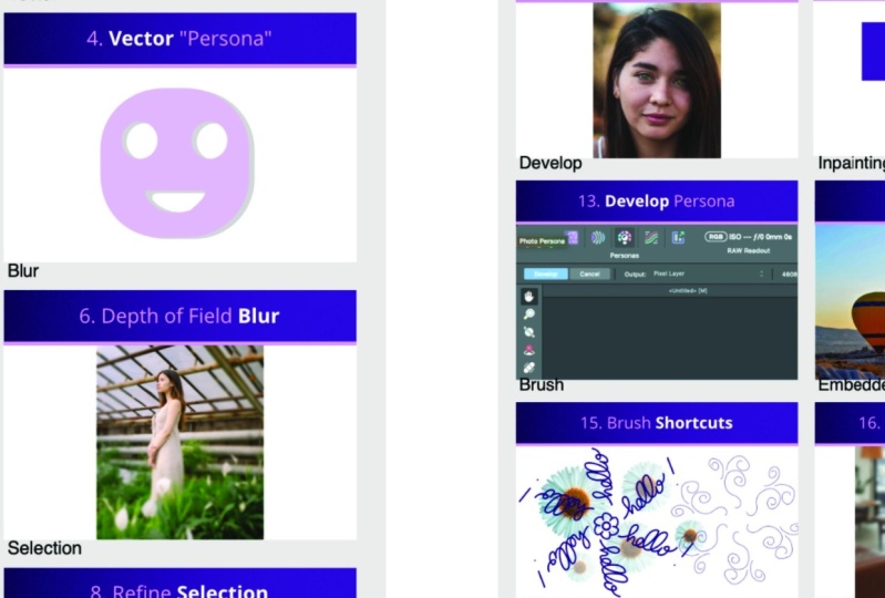
18. Develop Persona: Tip number 13,
developed persona. Wait a moment, That's not a tip. Any useful trick that simply a interface design
of affinity apps, signature thing for
them to divide and group our tools in two
separate personas. You probably already know about existing of developed persona. If you head to the top, yes, you can see I'm now
in photo persona. That's the default state. Liquefy persona and then develop persona.
Let's click on that. As you can see, we
cannot turn it on without image
selected by default. Developed persona is the tool for us to develop raw images, but not only if you select any image that's already
existing in the design, even the screenshot, that
is not a raw image at all, you can switch to
develop persona. Take a look. All right, now I just need to
rasterize it, right? Click on the image layer, I'm going to rasterize it. That will allow me to enter
the developed persona. No problem. Here I am. Even though I do not develop
a brand new raw image. That's the tip is you can use developed persona on
any pixel based layer, any raster layer, not
only on raw images. I assuming most of us know
about developing raw images in developed persona as
the default persona if you load the raw
into affinity photo, but you can also open this
persona with any raster image. As you can see, I got access to all of the developed
persona tools. I can change exposure and modify all of those adjustments here
on the right side, even turn on stuff like temperature for the light
balance, all of that. We've got lens corrections, details, tones, overlays,
everything is here. We can analyze our meta data. We can even change it from here. All right, and then
on the left we've got this limited tool panel
for developed persona. When you hit develop, all of your changes will apply and you will
back to photo persona. All right, so let's take a look. Let's zoom in back
to our Arbour 13 then you can see that my pixel layer now
it's change the tone, the exposure is a bit different and the color is a bit
different as well. The tip number 13 is not that there is developed
persona for us, but if you've got a
raster based layer, the pixel based layer
you can just right click and rasterize
any layer you want. It is rasterize. Then you can switch to
develop persona and use those developed persona
tool if you are already proficiently
developed persona. That's something
that you can use even with Jpeg or PNG's, not only raw files. That was our tip number 13. And your task is to simply rasterize this layer
with the screenshot. Had to develop persona and try to change the color
a little bit.
19. Inpainting: Next step is a bit
forgotten feature called in painting feel. I'm not talking about
in painting brush, I think most people
know about the brush, but there's also
something called in painting feel that
works very similar. But instead of
using the brush and be limited to the
brush tool options, we can do selection using any selection tool you want and then fill that selection
with in painting. Let me just remind you
with the brush first, when you've got an image and you want to remove something, if the background around
is simple enough, you should be able to
simply paint over it in painting feature and it will generate a new feel
for that little gap. What we don't want to do is we don't want to remove that area. Remember what will happen
if you remove something. You use eraser. Then if you remove something you can
see this white color below. That's not nice. Let's undo. All right. We can use a special brush for that and it's called
in painting brush, it's in healing tools category. You must search for
your healing tools, this clone brush tool
here. Let's go here. I got my healing
tools over here. Any of these tools can be like the first two healing
brush maybe patch tool, just click and hold until
you see all of them. And then select in
painting brush tool. With this brush you can brush over the object
you want to remove, then the program, try to generate a new backdrop in that area that matched
the original one. It's superhndy
feature really quick, it works well with
the simple backdrop. Black, sky, water,
grass, all right. But there's also another
way of doing that. In some situations, the
brush is not good fit. What we can do is we
can do a selection. There's so many selection tools. Let's start with the
simple one, lasso. If you select the area first, you can still use in
painting on that whole area. Simply had to eat it feel. Then we can click in Painting
Feel as you can see. Now the program fill this area with the
surrounding backdrop. It's a little
glitch here because he Duplicate this whole balloon. Look fake right now,
but that's fine. Let's click Apply. Now let's try different selection method. Now we can select this
area, click in it. Now we can click Fill. It will be in
painting by default. Now advantage of this is
we can see the preview. I didn't even click
Apply just yet, but we see the preview
of the in painting. It's fine. I can click Apply. The biggest point with
this is we can use any selection tool we want. That's the difference between using in painting
brush and selecting the area first and then filling this area with in painting. All right, it's your turn. Try to use both in painting
brush and then a selection. And in painting, this is really handy option
for us because in painting feel works with
any selection tool, there's no need for brushing
and playing with the brush. Now it's your turn and I will see you on the next outboard.
20. Brush Shortcuts: We are in art board number 15. This one is about
brush shortcuts. There's a separate
video later in the summary all about
keyboard shortcuts. But I want to list up brush shortcuts here
as tip number 15 because I think they are very
crucial to good workflow. Why is that? Because
when you select the brush tool and then in
the brush panel on the right, you select your brush. In my case, I'm
selecting the one we made in this online
class, the flower brush. As you may remember, you
want to use the tool. You don't want to change all of the brush properties using the slides at the
top all the time. You can use keyboards. So your left hand
is on keyboard and the right hand is controlling
your pen or your mouse. With the brush, that's where the keyboard
shortcuts really shine. Take a look. By default, I got my brush here. If I want to change the size, I don't need to go
all the way up. I can simply use brackets on my keyboard make my brush larger or smaller.
And that's not all. I can use arrows on my keyboard, right arrow or left arrow to
rotate my brush on the fly. The best part is you are
still using the brush and you can see the live
preview of the brush. That's what I really
like about designer, that's what I really like about affinity photo that we
got this slide preview. We don't need to click first and we don't like the result. We must undo the affinity apps, always give you live
preview. That's really nice. I'm controlling the
size and rotation of the brush using my keyboard, I can keep using my
brush in my right hand. What else can we do
here from the keyboard, We can very easily
change the opacity. When I click number
one on the keyboard, I got 10% Number two, that's 20. Number three, 30% 45678, 80% nine, 90% and zero will
jump back to 100% opacity. You can control size, rotation, and opacity very quickly from the keyboard without
need for messing up. Here at the top, I think while we are already here
talking about the brush tool, I want to show you one thing that many people will
actually tell it is not here, that's not in the
program. Forget about it. When you are using the brush, you can actually turn on
something called symmetry. If you check for
like symmetry tool, the way it's in procreate,
it's not really here. But the brush got a
special symmetry mode. It's not like the
symmetry thing, but it's quite close
with symmetry. You will be able
to create a line. All right? And this will
allow us to draw symmetrical. Right now I got
multiple artboards. Let me just readjust the
line to be on artboard 15. Let's take a look one more time. Now I got two axis, vertical and horizontal one. And drawing in the
symmetrical mode, as you can see, it is totally possible just turn
on symmetry here. You can even adjust the number of lines you need
for your image. Then you can drag the line. You can even rotate that line. Take a look, the
Rhine is rotated. There's no asymmetrical mode
for the whole artboard, but you can turn on
symmetry y using the brush. That's a little
addition, all right? This tip number 15
is all about brush. Try out those shortcuts. Try to use the brush and change the size of the rotation of the opacity of it
from the keyboard. All right, you are not allowed
to use the settings here. You must use only the
keyboard shortcuts for that, then don't forget to
check the symmetry. Make this artboard messy. Try different brushes.
Use the symmetry. Try to control it from the keyboard so we
can make it larger. We can make it really tiny. Now make this one
messy artboard. So I can see that you
practice with the brush. All right, focus
on your shortcuts. And also you can check out
the symmetry option as well. That's our tip number 15.
21. Embedded Document: Can you use smart objects
in affinitive photo? The short answer is no. We cannot turn the layer into smart object like in Photoshop, but we can embed
another document within affinitive
photo document. It's exactly the same thing, but instead of turning a certain
layer into smart object, a placeholder, when you can have a document in the document, very common used as
a mockup design. We can do it here as well. But instead of just one button, we need to drag and
drop another document within the interface
of affinity photo. So take a look, I make this very simple mop of
some kind of business card. I'm going to close it. You can download this
Mokup if you like, from this lesson files or you can use any other
document that you got on your computer that you
create yourself before. That will be fine as well. All right. I close that. I save it on my drive
and now I will drag, drop this whole document to
this document. All right. So we embed one document
inside, another document, let me show you here is I just drag and drop
this document and as you can see we
got a new layer, the icon for the layer type that's embedded document icon. All right, you may notice this. Before each layer got
this little icon, we can hover our mouse
on it and it will take tell us what's the name
of the type of the layer? This is text, for example. Rectangle. This one over here, the new one is
embedded document. What's the advantage of it? It's like a placeholder. It's like a variable. We can change what is inside a document without destroying
what we've got here. If for example, when I
set some mockup here. All right, so I
place it here and then I will put a mask on it. The mask will be similar
to that wide area. Let's switch off the
visibility for a moment. All right, now I want to select the white area
from this original picture. We can do it with this
quick selection brush. Let's make it a bit larger. Remember the brush shortcuts, We can use brackets. All right, we select
the white area. Now I go back to this
embedded document and use the Quick mask option to
mask it out like that. Nice, this is like
the mock up thing, but we can always double
click on that embedded layer. And we open this
another document. Take a look, I got
another document. We got a change in e mail that we need to change
this logo to be yellow. All right, we make
a change here. I can save and close
this document, take a look at the change
appear in the mock up as well, embedding documents. It's exactly the same
process as smart layers, smart objects in
Adobe Photoshop. It's got different names, but very similar
functionalities. Try to embed a document
on this artboard. You need to drag and drop another affinity photo document. Then try to change it a bit, see that it will respond. All right, that's really
powerful feature. Don't forget, you can
drag one document into another and this
will help you out with more ups and similar design when you
have like two sources. One is the one I want to
show your client and one is the original design that you
have created somewhere else. All right, now we are ready
for the very last tip. Let's watch the next video.
22. Affinity Family: Here we are. Tip number 17 is to utilize the whole
affinity family. If you own affinity designer, the blue program and
affinity publisher, the orange one, that
you are the owner of. The whole affinity
family designer, that's a vector
editing software. Our affinity photo, that's
a rust editing program. And the publisher is for multipage publications
like magazines or books. All right, but very often they adding a feature
that can be used across the whole
affinity family. But maybe this feature is
very important for designers. They're going to promote
that new feature in the context of
affinity designer. They will never ever tell
you that actually it's the very same feature added to Photo and Publisher as well. We need to be proactive whenever they make updates
for other software. Sometimes those
updates also affect our program, our affinity photo. Let me just give you a few
examples what I mean by that. For example, they
add a very handy, a quick grid option
for designer. You can use it here in your affinity photo,
so take a look. When I want to draw a star, I can actually just press
arrow to the right arrow. Down this way I can draw
several shapes, same time. I can even press and hold the
arrow to add spacing to it. This feature is
called Quick Grid. It was on the feature list
for affinity designer, even though as you can
see we can use it here in affinity photo before we already borrow some
tools from designer. Remember this whole artboard
thing going on that we got multiple
artboards, take a look, we got multiple artboards, that's not a native feature
for affinity photo. I create this document first in designer and then reopen
in affinity photo. If you need a table in your
affinity photo document, you can borrow that
from publisher. There's no table tool here, but if you open your affinity
publisher and add a table, you can copy and paste that
here. That's really great. What I want you to do
is to be aware that multiple features from affinity
designer or publisher, they're also affecting
our software. Our affinity photo as
I just showed you, the quick grid can be
used here as well. Next time you see an update for affinity designer, go and check. Maybe some of those
features can be also used here in our affinity photo. All right, tip number 17 is
to be aware of new features and tips and tricks
for the whole family because many of them
are cross compatible. All right, so that's our
last trick and there's also a whole summary section
when I'm going to show you three more tricks for
affinity ipad versions. So we're going to learn
how we can speed up the workflow in ipad
version of affinity photo. And also I will
give you some solid keyboard shortcut
for desktop version. Just a moment, just
a few more videos. We almost there you are already
in top 30% of the class. Only 30% of the students
reach this point. All right, you are doing great. Just few more videos
and we are done. So see you in the
summary section.
23. Shortcuts: All of those hacks and tricks can be great to
enhance your workflow. But we cannot forget about the very basic hack that is
building into the software. We can trigger
different tools and features to our
keyboard shortcuts. Keep in mind command on Mac
equals control on Windows. If you ever watch Tutorial recorded on Mac and
you see the command, you should press control
other way around. If someone is recording on
Windows and you are on Mac, just press command instead. All right, I got ten essential keyboard shortcuts
in this video. You can also download this PDF. You can see right now in case you want to
keep it somewhere else, you wallpaper, you can
print it out if you like. Just keep in your notes. You can click and
download the PDF as well. Let's dive into first
section about navigation. We got common plus
to zoom in common minus to zoom out and hold
the space back to pan around. Let's try this out. Common plus I'm zooming in
common minus I'm zooming out. If you press and hip
holding the space by you can pan the camera
around the artboard. There's one more I
didn't mention here. You can also press
command zero to get the optimal level of
zoom for your artboard. I mentioned that before
in the previous videos. All right, that's the
basic for navigation. You can use left hand. I'm guessing you holding the pen or mouse in your
right hand and using the left hand to just
indicate those shortcut without switching from
the current active tool. That's great. All
right, what's next? A very basic one,
command for undo. And if you press the
shift as well to command shift z, you will redo. If I move this stuff
around, that was a mistake. I can press Z to undo,
That's helpful below. I got some selection shortcuts. We can command A to select. Now I got the selection
marker across this whole artboard
that's useful Even more, we can disselect from
the shortcuts to come. And D, I mentioned that before. Disselection is important. Why? Because with
active selection, let's say I got active
selection here. With active selection like that, my tool set is
limited to that area. Even I grab a brush and
try to paint outside, nothing's happening,
plus there's no error message or anything. If you are a beginner or
even you are more advanced, but you just forget
about the selection. Somewhere you go up there, you cannot even see
that selection and try to paint. Nothing's happening. You can get angry, right? And take a look. I can paint inside
the selection, I cannot outside and
that's the case. Always select
unwanted selection. Command is the fastest way if
you've got several objects. And when I keep together, you can also group them. If I select those two
text boxes and I press command G. Now that's
in the one group. Keep in mind if you forget
about the shortcut, you can always group stuff on the right side from the
layer panel as well. You can group them here again, if you presses with shift
shift, you will group. And that's a common
pattern as you can see. Com shift Z, redo
negative action, common group, command
shift G group. All right, the last section here for more hidden shortcuts, we got common J for
power duplicate. Remember that that's
really helpful. Whatever you got a shape, or text, or any element really, you can power duplicate. That power duplicate is
not only making copy, but also making the last
transformation duplicate. But I also move it to the right. If I press command J, it's not only make a copy, but also make the
last transformation. We call this process power
duplicate. That's command J. Command J to power duplicate. But there's also a trigger use multiple times I mentioned that, but I want to keep it
on this list as well. You can simply press down Command on Mac or Control on Windows while
using the move tool. This way you can drag
the object around, not moving the original
one, but making duplicates. In addition, you can
also hit Enter or Return while the object is selected
for this pop up window. If you plan to just type it from Keyboards may
be also a good idea. This way we can type
it in if you've got a very specific geometric
pattern you want to create. All right, here are just
ten, but in my opinion, essential shortcuts to
have a better workflow. Please try to lend those ten first and then you can
build on the top of that. Keep in mind every tool on the tool panel
comes with a shortcut. If there's a tool you use often, I will investigate
what's the shortcut. If I hover my mouth
on the move tool, I can see the letter V. That's the shortcut
for move tool. If you use a
selection brush tool, that's if I use that tool
often I should memorize. If I press W, I will pick
smart selection tools, right? So keep that in mind. Each tool on the list, each group come
with the shortcut. You can use that as well. All right, as I
mentioned, a PDF. From these videos,
you can download the ten essential keyboard
shortcuts as PDF as well. We almost see you
on the summary.
24. iPad: How about the ipad version? On ipad, usually we
will not work with the mouse and keyboard,
but actually you can. If you simply connect with
Bluetooth mouse and keyboard, you will get back some of
those desktop features. Like some of the keyboard
shortcut we work. But by default we will use this right Apple pencil
if you ever follow any tutorial for
affinitive photo and it was recorded on the
desktop version and then you struggle
to follow an ipad. It also includes some of
my tips from this class. The best approach is to toggle on the special virtual buttons. Let's head to the
hamburger menu at the top and search
for command control. We want to turn this on. It will appear as this
semi transparent circle. If you press on it, you will notice
familiar buttons. So I can press and hold to turn on shift I got now
virtual shift press in. If somebody used Shift
on the workflow, you can mimic that even without the keyboard on ipad as well. Let's test it out on one of the tip I
already share with you. I mentioned that if
you got a shape, let's draw that shape. Here we got a shape. I mentioned that if
you use the move to, by default we are moving
the shape around. But if you press
and hold command, you will be able to
duplicate the shape. Let's try to use the
virtual command. Now the command is press, take a look, we got a duplicate. Actually, even you are using your ipad version
of the software. Many of those tips and
tricks will apply as well. I recommend highly to turn on those virtual buttons because that will be a great
asset for you. If you are like me, I use my
desktop, my laptop version, for like 90% 85% of time, and only really I use
this ipad version. And in that case, I always mix up those gestures
and forgetting them. But I remember all of the keyboard shortcuts
from my laptop. So this way I can still use shift command option
and control buttons to indicate some of those important
shortcuts and speed up my workflow, also on ipad.
25. Summary: Nicely done. We have reached the end of this online class. You have learned 17 useful tips and tricks to enhance
your workflow. In affinity photo. We've been using this digital
workbook all the way to practice each hack your task. Your project is to share
the workbook with us. Show us your practice workbook. In the project section, you can pick that
you want to show the chapter one or chapter two. Then simply snub a screenshot
of your artboards. That's the easiest
way for you to share the whole chapter
of the workbook with us. This way we can see how you
play with those tricks, how you practice with them, how you remix what we
have learned together. And that's your final step
to complete this class. Please don't forget to post a screenshot
of your workbook. You can select chapter
one or chapter two, doesn't matter that much, Just simply snap a screenshot and send it in the
project section to us so we can all see
each other work and congratulate each other
on completing this class. And by the way, trust me, only around 30% of viewers reach the very
end of the class, You at top of this
class already. If you like this
learning style of those like mini independent
hacks and lessons, Keep in mind I got very
similar learning experience prepared for affinity designer as well here on skillshare. So you can dive into 17 tips and tricks for
affinity designer next. All right, thank you
for learning with me and I will see
you next time by.
 Mark Krukowski, Kru Mark Tutorials