Transcripts
1. Introduction: Hello there, I
mark and I will be your teacher in this class, we're going to learn
more about Vector Warp, added recently to Affinity
Designer version two, we're going to use this
special non-destructive way to warp text into a shape. So we will create interesting Creative compositions
made of vector shapes, but also fully editable text is a perfect way to create a quick and easy Graphics for
a t-shirt or social media. Alright, I hope you will have
tons of file here and we're going to learn
something useful K, I will show you how
to use the tool. I will also show you
some good practices, but then then you
will have to develop your own little project. You will make your
own text warp around, warp inside are certain
shape of your choice. I'm going to show the whole
process three times to give you workflows that you can use an remixed to
create your own thing. I hope I will see you
in the first lesson.
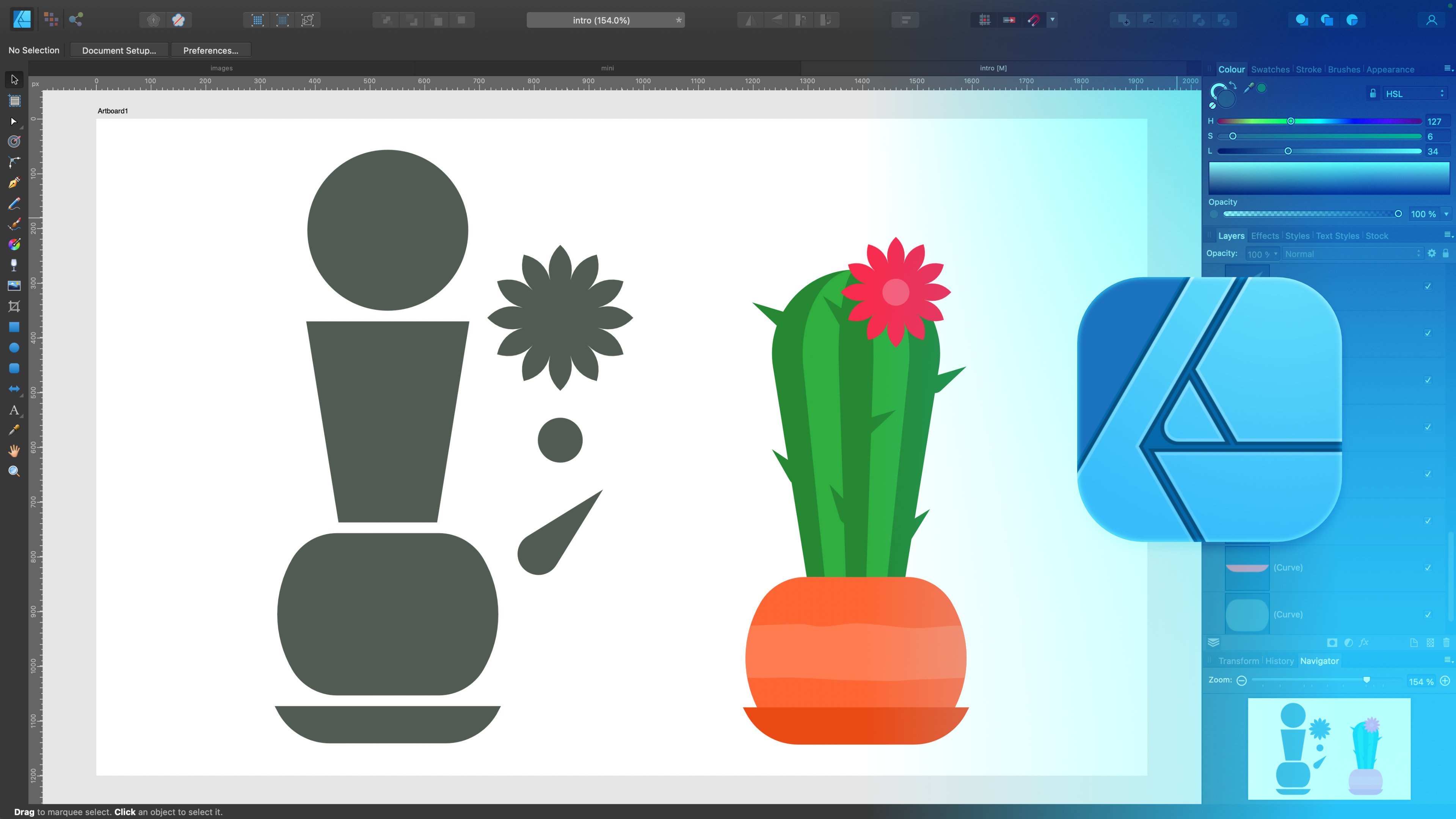
2. Warp Tool: In this class we're going
to warp text into a shape, but before we start, let's look into a tool. It's self. So if I select any given shape, like this one over here, I can warp it. This will be a Vector Warp,
so it's non-destructive. But if you look into our
tool panel on the left, we cannot find a warping option here because they added
under the layer panel. So take a look. Here's
our layer panel. On the right side. There is
at this warp icon just below. Click on that. And we'll have several presets. Lets go of the mesh. This is the most
classic one when we got F freedom to just drag
those points manually. To create some kind of warp. We can remove a point by
hitting delete on the keyboard. We can add a brand new one
just by double tapping. So as you can see, the vector shape is warping
based on those points. I can move them around, but I can also simply move those control points
around to change the curve. As I mentioned already, you can delete some of
them because sometimes too many points may result
in strange result. Something's not like
not enough points, but too many, too many points. So it's warping too hard. Alright, so as you can see now, my, my shape is warped in
really strange manner. But I want to show
you one thing. You look at the right side, we got something
called warp group. Open it up and there is the
original shape intact inside. So it's all non-destructive
Vector Warp. If I draw a new object, let's say here, it's will
not interact with this warp. But if I pull this object inside the work group and Try
again, take a look. Now, it's warping as well. So we can remove and add objects into a warp group like
this guy over here. Alright, so that's how it is. We can find the warp
tool in the layer panel. You must select the object
first to apply the warp. But after that, you will have
your warp group create it. With this, you can always add or remove objects that
are inside this group. Alright, we know the basics. It's time to start
with our project
3. Warp Presets: Okay, let's try
different Presets. This time, not on a
shape but on a text. Let's search for a Text tool. Here is now going to
type a sample text. Sample text to this. Let's select that. We can scale everything up
and even modify a phone. Alright, here's our sample text. Let's make it green. And now it's time
for our Warp Tool. Like last time, you can find it below your layer
panel over here. Last time we went with the mesh, Let's check the quad. The first time nothing happened, but we got the option to
drag any corner we want. This warp is very often use to give a different
perspective to the object. As you can see, we can quickly modify a
perspective of this text. And I agree for I can
open up the warp group. There is the original
text still inside. I can even change this with the Text tool so I can
even modify the text. Take a look. I just
retype part of the texts and it's automatically
applied to this warp. That's really, really handy, non-destructive text
inside the warp. Alright, what's the next
Presets on the list? That's the actual perspective. Very, very similar. But in this case, you will be able to work with those four
points again and also add additional points easily in the center to alter this to even weirder and more
advanced perspective. Keep in mind, you can also
drag the line itself, just like dad without
adding extra point here. So that's also possible. Alright, You know what? There is a reset
button at the top. If I click on that. Back here. If I change to known, we are back where we started. Alright, keep in mind we apply already two different
presets on that guy. So that's maybe too much. We got warp group
inside the warp group. Did you notice that? We probably need
to clear this up? What if I pull this text
outside completely? Now, both groups are empty. I can simply delete them. And we start, we are
back to the beginning. Alright, let's go with the
next thing we got Arc. And now, instead of applying another preset on
already existing preset, we can change the preset
from here at the top. You see the preset and you
can switch between them. This way. You can keep it simple
with just one presets on. Alright, so quad, we
already know this one. We Try perspective as
well. A moment ago. Alright, I changed to AHRQ. This is the vertical one. I can move it manually as well. We can also use the
horizontal one. And we could the value here. If you don't want and
just modify this manual, you can move the
slider for the value. We can bend again
vertical and horizontal. And again we got value. That's really
interesting effect. And less fisheye for you. With this slider. There is twist. We can twist the whole thing
around the center point. Lego ways. In any given moment, we can jump in, add a new point, move it around manually. Take a look, just like that. Alright, so we test
out some Presets. And this time on a text itself, not on a shape. And keep in mind that text inside this warp group
is still editable. We can edit this text
any given moment. All right, with that in mind, we can move to the next step. Let's try to draw
a shape and then try to warp at text inside
that shape for a cool effect. Alright, I will see
you in the next video.
4. Warp Text to Shape: Let me show you what our
project will be about. Don't worry, you don't need
to follow my steps just yet. Just sell it to warm up to show you what
we're going to do. So we will need to shape. In my case, I will just draw a heart shape using
the Shape tool. I can hold Shift to
maintain a proportion. From here I can make some
changes to the shape. Alright, so that's my shape. And next step will be to put a text and warp it
to follow the shape. So let's use the Text tool. And we want to type a word
that is related to the shape. Love will do in this case. It's also important to
pick a nice matching font. So I don't want to use this
very super modern font. I don't want to use a
bolt form like this. I will stick with something
like billion dreams. Almost like a lettering
font for this heart-shaped. Alright. So we've got the shape
and now we got at Text. And we're ready to
wrap this text. So I select my text wrap tool and I will start with the cord. Thanks to this, we will
be not overwhelmed by too many nodes from the geico. Alright, so I'm starting
with the chord. I going to add a point here. Alright? And then I can modify that. And keep in mind,
we can press on the line as well and we can drag it to match this shape
as well. Using the line. Drag the line, move the point. Sometimes you want to make
this note a bit shorter. Just like this way you
will have better control. Alright, so we got
some warp text here. And we tried to warp
it the way that it will match the shape. It's a little bit too big, so I will move it a bit inside. Inside, right? And we end up with
something like this. Of course, we can still
make more changes. Over here. Everything
is editable. Dots. A huge advantage of Vector Warp versus raster warp, alright. And with this text, warp to the shape, we can also apply
some effects on it. But this little thing you need
to remember if I click on the warp group and then
Fx the bottom here. And let's say I tried to
put like Inner Shadow. Take a look. There's
something strange going on. The Effect only appearing in
the area of the genome text, not the warp one. So let's close that. We don't want that. Let's open up the
group and click on the original text and
apply Fx over here. So here's our inner shadow. Right? So just keep in mind
if you are applying special effects, layer Effect, put them directly on
elements inside the group, not on the whole group itself. So we've got some inner shadow. We can get the globe as well. So get those nice
finishing touch. All right, and that's
something we're going to try to do
during this class. Draw a shape, pig award, adjust the font and then
warp it into that shape. Of course, not only one word, we can write down a whole sentence and then try to wrap it up into a shape as well. Before we start, I
want to show you one more way of putting
text on the path, how we can curve the text, but this time without warping. So I will see you
in the next video.
5. Text on a Path: Warping is a great way to modify our Text and still
keep it editable. But it is also another way I would like
to remind you about, you probably know this already. If you got a vector path like this circle over
here, I'm just drawing. Alright, so if there is
vector path like this, we can grab at Text Tool. And if you hover your mouse with the Text Tool above this Path, you may notice how it
will change the icon. This is where we can start
typing on this path. So here's my text. I will need to select this, change the font to
more regular shape, modify the size so we
can actually see it. Right? And then we got this green point
and also red point. That's how we can modify
the location of our text. And as you can see, now, we did not wrap the text around. The text is simply
on the Vector Path. Alright? So that's one thing we can do. We can flip it to be
outside the path as well. And in that case, you may want to modify
those points again. So we got green on this side
and read one over here. And our text is on the path. And of course, we
can change that. We can modify the texts as well. Alright. So that's the on the
path that this is shape, but we can draw custom paths. So if I grab the pen tool, if I just grab a pen tool and make some
custom path like this one, I can use the same trick, peak at Text Tool,
hover above the Path, click and take a look. We got a nice text on
the path right now. That's something you can
do us well in some cases, that's not only about warping, but it's also on
putting the text on the path and we can modify the path after.
So take a look. You see that now in
just moving the Path and the texts Try to bend
to follow that as well. So that's nice. Right? So now we know all about putting text on the path
and also how to warp it. We are ready for our project. So in the next video, we're going to set up
a brand new document for the project
6. Project First Try: Let's set up a new
document for this project. So I'm hitting File New. And I think I will go with
something squared is time, so we can search for
the categorical web. And from here there will be
some social media Presets. Let's go with this
social media square. 1080 times 1,000 at. I will hit Create. And here's my new artboard. I can press Command Plus. It's will be Control plus on
Windows to zoom in a bit. Alright? And I actually don't want you guys to follow
my steps exactly. I want you to use my techniques
to create your own fame. That's why I'm going to create
this project three times, just to inspire you, just to show you steps. Your task is to do with
only one time, alright? So you don't need to do
three different projects. You can do just one. But I will show
the process three times with different results
to give you some ideas, give you some creative
inspiration and techniques. But it's your duty to
your own spin on it. Alright, so don't just recreate what I do here one-to-one. Take the technique and make something that is
your own thing. That's the plan. So let's get started. I will put a simple
rectangle here. I got a plan for this
one already in my head. So I got this rectangle
using the Shape tool. Next, I will type
name of a country. And I will try to
reposition this just above. My goal is to make some kind
of flag like Frank here. I will need a bolt
square font for it. So I'm referring
to my font list. There's one really old school
one I would say nowadays. So I will go with this one. The bus chi dad's old font, but we perfect here. Oh, okay. So that's my thing. I will make this top part a gray and the bottom part is red. I need this red part to be
exactly same height, okay? And now select both
objects and I will apply our warp on it, mesh warp. And in this case, I just
want to move this up, maybe this one up again so
we can have this nice wave. Keep in mind. We can control those
points as well. I think I will
zoom a little bit. So again, common class. If you zoom like this, you cannot see the main subject. Just press space bar and you
can pan your camera around. Alright? And same thing here. I'm using Node tool to
adjust those nodes. And I got very nice way we
text looking like the flag. A flag pole will be a
finishing touch on this one. And here's one way how we
can approach this project. We can do something
country related by putting texts and shape together
and try to create outflank using a nice warp. Let's just modify this poll. I'll lay two bit. I build it using a OVO
and a rectangle to K. Now I'm using the Move tool
to make some transformation, a finishing touch
for this project. That's nice. Let me just zoom. So this time common minus. And I will stretch this
guy all the way up, all the way up. Alright, and here's
my first project. I create a flag like warp Text. You can use this idea. You can try to make some kind of flag when you blend
together a shape, any text, and then use the warp to make it as
a way we flag banner. Alright, as I mentioned, are going to do
this project three times to give you a better
idea what is expected. Alright, see you in
the Try number two
7. Project Second Try: For my Second Try, I don't need to create
a brand new document. I can simply insert a new
output to existing document. I will click on the
output Tool over here. And I will press
Insert Artboard. When you press this for
the very first time, you will not insert
artboard just yet. I just unlocked the
existing Art board one. But if I press it one
more time, take a look. There's a brand new artboard and new page in
the same document. So that's what I'm going to
use here for my Second Try. Again Text tool. This time Apple. I think I will need to
modify the font again. Let's search for
something a bit softer. Arial, Rounded will be
perfect for this one. But I will need to use
capital letters, I think. All right. Not bad. Now it's time for my shape. This time. It's where required
some shape building. So we will draw one
oval like this, a bit of rotation. I will use common C command V, copy and paste,
flip horizontally. Let's try to join them together using the add
action at the top. And I will use corner tool and try to round
those two points. And here's our upper shape. Alright, I don't want a
fill color for this one. So I will flip it. I don't need fill color, I just need the outline color, outside color, you could say, let's change the
stroke properties. Alright, perfect. I will use the same
color for the text. And now my task will
be to warp it inside. Before that, I will copy and paste this texts
like three times. And I need to make this gap between those lines
are bit smaller. So we need to change some
Text Settings. Alright. I click this letter a at the very top,
character settings. From here we can change, we can modify some
texts settings. We want to change the gap
between those letters. So that's this option here. Nice. Now I can simply
close this tab. Scale down my letters. Let's scale up the whole thing. Now, I will apply warp. This time. Let's start with actually
fish I have. How about that? Fish? I warp. And then on
the top of that, I will make some changes myself. I need to make some changes. Let's zoom in like last time, last time I zoom in
using Command Plus. You can also hit to the View Zoom and then
zoom in from here. If you are not familiar with
some shortcuts are right. Now, I'm adjusting this guy
to match the outline shape. Just move nodes using no
to take it slow, no rash. And keep in mind
you don't need to position them perfectly
in the first go. As you can see, I plan
on returning to some of those points like this one. How about this one? K, That's, this one is
still a little bit weird. Try to make those nodes shorter rather than longer
to have more control. K. And how is it? Apple, apple, apple, not bad, a little bit weird down here. So let's try to make this
node a bit short term, this one as well. I'm happy with this one. As a finishing touch, I will click create a leaf
at the top using oval two. But then I will convert
to curve and turn those two nodes from regular ones smooth
node into a sharp node. Just like that. A bit of rotation. And here's our little RPO. Let's hope nobody
when sue me for Dan. And that was my second
approach, Second project. As I mentioned before, your task is to just
design one thing. I want to give you
three different ideas. So you can see the
workflow three times. And based on that, I hope you'll be able
to make your own thing. Alright, let's try one more
time in the next video.
8. Project Third Try: In our Second Try, the upper one, I
keep this outline. But of course, it's gonna be our Creative choice to get
rid of deadline as well. If you want only letters
to show the shape, that's fine as well. Keep in mind for
this kind of Warp, I recommend you to like heavy bold letters so
we got more color. In my case, I will keep the shape on because it's
giving me this nice, fresh look and matching the
style of the letter or right. Let's go for the
Try number three, this will be the last one. After that, I hope you can pick a topic for your own project. So let me just insert
one more Art board here. And by the way, if
you zoom out a bid, comment minus or Control
minus on Windows, you can easily move those
artboards around as well. So if you prefer to have
your pages 1 and another, There's nothing
that will stop us. Alright, so keep in mind, it's totally fine to reorder
this stuff as you want. If you got multiple
output document and then you export this as PDF. Each artboard will be a
separate page, alright? But of course we can
also export each output separately asked totally
new image, right? And here we are in odd
port number three. This time, I will start
with the text summary. Let's change the font. So I'm kind of searching for a proper found the one we
used before, remember that? But the sky does
will be perfect, bold, the heavy font. Just like dad, I will
keep it black at first. This will help me to design
with our worry about colors and contrasts and
drawing oval right now. That's my overall, I hold
Shift while drawing this oval. So it's a perfect circle. So we get this
perfect circle here. On what Text and texts is
aligning in the center. Can you see those alignments line the red one
and the green one? If you cannot see
them on your project, keep in mind, you need
to turn on snapping. Here it is at the top
little magnet icon. We can turn on snapping to geometry and to Shape key
points that will help you out. Right? Snapped this guy here. Now it's time for the warp. This time, I will go with
a very simple quiet. Very simple quiet to start with. Right? So I need
something like that. And from here with
will quiet like this. I can actually bend those
lines without adding points. I will try to do that. Nice. So actually less points very often result with
smoother, smoother letters. If you've got this
trouble that your letters are very wavy to rinky, Try again and this
time is less ponds. I started if only four
points here, take a look. There's four points
for this warp. If you look at it on
four points in it. But I move those walls, I drag directly the line. Okay, I will now duplicate this whole word
group with the text inside, so I right-click on it
in the layer panel. Duplicate. I got a copy of it. I'm going to flip this horizontally or
vertically like this. So we get flipped vertically
at the very top here. And then a line that
just below a new, probably guessing what I'm doing here and doing some
kind of reflection. Let's get rid of the shape now. This was a very
helpful guidance, but I don't need it anymore. I got this reflection. I'm going to place it like here. We got two groups. We've got summer,
let's recolor dad to be a nice orange
and the reflection. I will pick the same
color for that. And then I will actually tried to blurred this
whole group a little bit. So if I click on the word
group, let me show you. Then you will end up with the result alike than we
blending this feign bad. What I recommend is to go to
the text inside that group. So undo using
Command Z to go into the text inside the
group and apply this On the text inside
the warp group. Ryan, this way we got
way better result. I'm blending this
around ten points. Maybe it's a bit
too strong heart, maybe eight points
then eight points, changing the color
from orange to yellow. And I will also try to apply
some kind of mask on it. So it will like this
appear I click the mask, why the layer was selected. And in that case, I got the mask on
the original text. So let's check what will happen. I will just click on
the mask layer and try to put a gradient on it. And as you can see, white to gray gradient will
make this to fade away. So this dark color, it's the invisible one. Right? And I find with
this composition, this text is a bit too blurry, but no worries, we
can back to it on FX. And then we can pull
the Gaussian blur lower because it's non-destructive
layer Effect. Right? So we got this summer we will kind of reflection
in the water. And to finish this one, I will use what we have learned before when we put
that text on the path. So let me just draw a vector path that's a
circle as you can see. Alright, now we can
position that over here. And I will click that text
and click on this Path. And now I can just
type summer 2023. And then I will make copy of this so I can
paste this several times. It's way too big, we cannot see anything, so let's change the font size. Summer. All right, That's nice. Let's copy this one more time and reposition the
beginning of it. Beginning will be here. And the end will be
very similar spot. So we will go all round. But keep in mind, the beginning must be a
little bit above the end. Otherwise, your texts,
we'll just jump inside. Alright, one more copy of this. And now we should
be able to adjust this and two bit further. Step, good, This
one part inside. So I need to get rid of Dann by maybe generating
more space here. So let just change
the font size to 28 and that resolve
the problem for us. K, how about 29? That's almost perfect. All right, so we
can this one here. And that's will be,
That's will be it. Let's try to move it this way. And then this inner ring, we don't need an
inner ring here, we just need to move the
red one are very close, the green ones, so we go all
the way around like that. Okay, Here's my text on
the path around the shape. We can even change the size of it right now after
we add a text. So that's really handy. Just keep in mind to
have enough space. Otherwise, part of it takes
will jump to the inner ring. Alright, so we got this warp
summer with the reflection and also the summer 2020 trees
all around this as well. Closing up this little Design, I'm still worry about
this blood text. You know, it's kind of
out of the style for me. So Luckily, I apply layer Effect. This is non-destructive,
so I can very easily revisit than
switch this off. And if I don't like it, I can keep it off. In addition, I can also apply other effects
from this palette. So why we asked Hill already, let me show you this also. Spatial style for our shapes. We use this with the very
first introduction one, we would have shape
hobbies to remember. We can put shadows, we can make Auto Glow, so we can make our
lytic glow color. In that case, this should
be something yellow. So we can have glowing letters in the color we
desire like that. We get gradient so we
can change the field, we can overwrite
the original field. And this can be really useful
because we can also blend this with the origin
of feel, right? And then we get Color Overlay. When you put a new
color on that shape. Good, Inner Glow. So shape
is going inside in a shadow, something we used before. Remember that give you
this paper cut field as a 3D will give you some
gloves and shadows same time, make it like a bit
like Tweedy balloon, but we can change the
direction of the light. Over here is outline that will draw a line
around this shape. And there's also
hamburgers here. Give us also this fake 3D
vibe, kind of retrofit. Alright, so I switch off
those layer effects. And now I want to revisit this
and reevaluate that this. Okay, let's say like this. And I think the reflection one, we've just fading away a bit. It's way better solution. So here's our final Warp. We warp summer into half of
circle than duplicate dot, flip it and make it
their reflection. In addition, we add a Path
around and type it text on it. So that gives us this
additional nice effect all around here. Alright, This was my third idea. So let's recheck. The first idea was to make a flag of the
country using warp. Second, we pick
fruit, In my case, up or you can pick a totally different fruit harbor banana that will be interesting
and put a text inside that warp it
nicely using fish I at first and then
adjust to the borders. And the last one is
more like design job. We got the main text, summer reflection and
additional text on the Path. All are wrong or right. I hope this one of
those ideas speaks to you and now you are ready to
create your own projects. So after this video, please create a square Artboard and start working
on your own idea. Something that you
will be able to post in the project section. And I will see you
in the summary
9. Summary: It's time to
summarize this class. I hope you managed to
design your own wrap text. We use a shape as a base
and rapid texts around that concept to make
interesting Graphics. It's really cool thing to put on a t-shirt or any other
printable media. So you can try this out later on with your
Graphics or right. Before I finish, let's just write down a summary
over here in the center. Let's warp it in a very popular, very popular shape nowadays. So I need some strong phoned, the one I've been using
before, that will be fine. As you can see,
simple forms are a little bit better for
this kind of work. Alright, so let's say
we got our summary here and we want to make this
bottom Arc alike thing. But if you are afraid that you cannot
align that perfectly, you can draw a shape
first, like this one. Alright? And then we can
modify it with no tool. So if I just convert to
curves and grab a node tool, I can just drag this
top part, unlike this. And this will be a helpful
guidance for my text. So now I can just reposition
my text around this area. And I will simply add warp. And I will go up the
quote this time. That's the simplest way. And as I mentioned before, sometimes it's better to
start with a simple way and then modify this nicely
to match this shape. Just like that. And now we can even get rid
of that shapes. So delete on my keyboard. And here's our summary. Summary texts with
the but'm Arc Warp, a very popular one, I must say. Alright, so here's
our summary time. We create a flag, a fruit. Also this summer like globe. What's that? What is
this? Peace and love. I don't remember doing this one. You write in just a moment ago how I did
something like this. Very simple. Let me show you what's
inside this work group. If I open the warp and
take out what's inside, you will notice it's really
simple just to texts, peace and love, separate
things with seperate colors. But if you select both of
them in the same time, apply warp and this time I
use twist, the last one. We can very easily use this slider to twist
this stuff around. Take a look. So we are still learning
something new even in this is just a summary, right? So that's the last thing you can see on this summary page. How about your project? I hope it's ready, so let's check it out. If you're project is ready, click on the artboard
with your project. Hit to file and you can export this project as the
separate JPEG or PNG. Don't forget to post this in our product section
here on Skillshare. This way, you will get a
certificate for this class. Alright, so finish
up your project, export as PNG or JPEG posted to get a certificate
from Skillshare. And I hope I will
see you in one of my other classes for
Affinity Designer, Pi
 Mark Krukowski, Kru Mark Tutorials