Transcripts
1. Introduction: Loader, I'm teaching mark, and in this one hour long class, I will teach you
everything you need to know about Affinity Photo. To start with the program. After you complete this class, you will be able to approach harder and more
complex tutorials. You will also gain all the
necessary skills to work on basic editing projects
like enhancing colors, cropping images, masking
part of the image, or even changing color of certain object
in your pictures. We will start with
interface introduction, and then we'll move into
working with a layers, working with different
selection tools to end up with filters, adjustments, and
special layer effects. Alright, I promise you, after you finish this course, you will have all unnecessary
basics to kick off your photo editing projects in this great software
called Affinity Photo. Photo is quite
similar to Photoshop, but it is much cheaper. So it's a great choice if you don't want to pay a
monthly fee for Photoshop, but you still want to have fully fledged professional
software to your disposal. You can use Affinity
Photo on desktop, on Windows and Mac, but also on your iPad if you
are into touch controls. Okay, I hope I will see you in the very first video
where I will show you the interface
of the program.
2. Interface Overview: In this video, I'm
going to walk you through the interface
of Affinity Photo. This is desktop
version of the app. In my case, I'm using macOS. It's very similar on Windows and a little bit
different on iPad OS. Alright? As you can see, that three
main sections of Interface. We've got our
toolbar on the left, very classic position for Tools. Menu bar at the very top. And studios on the right side. There are many little tube's, little studios on the right and we can kind of
even rearrange them. Switch positions are even
drag between different areas. I just moved my brushes
here to the bigger area. We can move it back here. So that's my studios
on the right. That's can be customized. Menu at the top and tools
on the left or right. I already load a sample
picture in the center so I can tell you
more about each area. But before that, you might
notice that my menu at the top got text
below each section. Sun as selection, Quick
Mask, snapping, etc. If you would like to see texts describing each section
in your interface, simply right-click on it
and select icon and text. By default, we got icon only. Like this. That's what you
got probably right now. So click here at the top
and select icon and text. That's really beginner
friendly because we already know what is
what without guessing. Or by default, I like
to keep my colors here on the top right corner and
my layers as the first, very first studio here. In raster editing software, we always work with layers. This case, I got only one
layer with this photo. If I keep adding more
pictures or text or shapes, they will all jump
on new layers. So I need to always keep in mind which layer is at
the top, which is below, which layer is selected
right now, okay, Take a look, some
additional options here, the top after I select a layer. So that's depends
on your context. If I select a certain tool, like brush to right now, it's all change
and adjust to two. That's gives you a
greater control on the currently selected
tool or image or shape. Let's talk about the unique
thing about Affinity Photo. Persona's top left
corner over here we got several different modes that we can switch between
90% of your time, you will be in a photo persona. Then the very next one is
called Liquify persona. I need to select some
pixels and I can go into liquify
persona with dad. I got my pixel layer, and now I can move
to liquefy persona. And from here we got special brushes that
can modify the image. I'm sure you saw
something like this. People try to enhance
the pictures. Make some parts of the
body larger, other parts, smaller dots, usually
Liquify tool. In Photoshop that is just liquefy tool
that open this menu. But in here we got the whole dedicated persona so we can dive into the process. Keep in mind, this is not
an easy tool for beginners, in my opinion, is required some understanding of the
program to do it correctly. Otherwise, you will just deform the image and everybody will be able to see that you
liquefy certain areas. Alright, let's move
to the next thing. I will. Just move to the next persona on
the list over here. It's our developers salon. It's dedicated to photograph
for us with raw files. So if you go to your
picture is in raw files, that's where you
want to place them first so you can develop them. As you can see, our
interface have changed. We got sliders on the right that will help you
to add or remove contrast. In this case, I already
got develop JPEG, but as you can see, you can change
clarity, saturation, vibrance, and applier,
even more adjustments. This also histogram for you
to look at all the time. Honda left, we got very basic
set of tools this time, this time focusing on
adjusting colors with sliders, but you still can remove some
damage from the picture. Like here. Red eyes. All the basic cropping
tools are here, so tools are very basic. We're focusing on developing, we're focusing on
colors in this persona. As I mentioned, this is for
photographers with raw files. Very next one. We got tone mapping persona. As you can see, they
already suggests me a few different options
like high contrast, black and white or dramatic. So in this persona, you can work with your
tones a little bit similar to develop personas. You can see we've
got multiple sliders on the right ready for us, play with to adjust
tones in our image. There are also some presets
by default are five. You can load more over here,
changing the category. Crazy. And as you can see, we've
got more presets to use trade away, like this one. Alright, so that's our
tongue lapping persona. And the very last
person on the list, It's called Export persona. As, as you can guess, export persona will help you to export and share your work. So from here, you can simply select a preset
like PNG or JPEG, size and quality and
export your file. You can also use a slice tool and slice
the or big picture into several smaller pictures
and export them separately. Alright, so that's all we got,
12345 different persona's. But in our case, purpose of this
begging and guide, we will stick with
photo persona. Alright, so let's back to Photo Persona and explore tools. On the left, there's a very
basic set of tools here. We go, all in it. We're going to learn them, why we need them. I'm not going to read the
old names for you right now. That's not really the way
of learning new apps. So there are several
different tools. As you can guess, from
selection to brushes. We will learn more about
them a very, very soon. You've got your
tools on the left, menu at the top, and your studios
panels on the right. The studios pylons
can be customized, as I mentioned before. If you mess up, you customize them too
much and it looks strange. Now you cannot
follow the tutorial. You can always go up to
your View menu over here. You can go to Studio. From here you can turn
on and off studios. So if I'm got some
studio and you don't, for example, cannot
see your layers. You can probably turn
them on and off. From here. As you can see, there are
several different students that are turned off by default. And if you want to reset
everything that is very handy. Reset Studio button at the
very bottom of the list. Click on that. And everything will back to a default
position here. Alright, so that's the
interface we're going to use. Don't worry if it's a little bit overwhelming, light down, we're going to learn
everything step by step. Okay, I will see you
in the next video.
3. Layers and Masks: Let's talk about layers panel. It's over here on
the right side. By default. It's studios
so you can move it around. I like to keep it here. So I got enough space to
see all of my layers. Nothing here just yet because
my document is blank, is empty as you can see. So let's use our shape tool
from the tool panel here. This shape tool, you can
see only one shape first, but then if you click and hold, you will see all shapes
are valuable for us. So let's draw a simple
ellipse like this. You can hold, Shift on your keyboard or place additional
finger on your screen, an iPad to maintain the
one-to-one proportion. This we're going
get perfect circle. Alright? And I got the first
object on my layer panel. Right now this ellipse, the fill color is set up white, my backdrop is wide, so let's change this
to something visible. Alright, we got blue
ellipse here, blue circle. Let's add additional element, one more shape maybe. This time rectangle. Again, you can free draw
like this or you can hold shift to get one-to-one
proportion a perfect square. This time I'm going to change the fill color again like this. And I go to different shapes, to different objects in
my project right now, I can see rectangle an
ellipse in my layer panel. Why working with
graphic editors, we need to keep in mind
that the layer at the top, we'll cover the layer below. Now I cannot see
the ellipse under. I can temporarily switch
off the visibility here. It's still there. I just simply cannot see it. Other way around. If I
drag this ellipse now, click and drag above rectangle. Now this one is top layer
and covering the rectangle. We can reduce the opacity of the whole layer by using this slider here in
the layer section. This way you can make layer semi-transparent or even
completely transparent. We can also modify
the blending mode. This is determine how the colors from one layer of
blend with another. Does so many different
blending modes. So the best way to
discover them is to simply play with all of them experimental little bit and see what different
results you can get. By default, we are in
normal blending mode. Alright, let's a
load actual image. We can drag-and-drop
pictures to our art board. We can go to File. We can place image using
the place function, or we can use the built
in stock gallery. It's over here. If you move from layers, next step is adjustments, FX, styles, and stuck. You cannot see this stock panel. You can turn it on from
window here, up View Studio. Anytime you see missing studio, you can go here and check. We searching for stock. And in my case, I already got a checkbox here. It's turned on. You can turn on and off any
studio panel from here. Alright, so let me just
use a picture from here. I will just drag and
drop this to my project. Now it's low, a huge image. I cannot even see it. So I'm going to zoom out. I will use navigator here. I click minus,
minus, minus, minus. As you can see,
this image is huge. So why I'm still
using Move tool, I can just simply click, Add the corner and
scale it down. Like this. Alright, let's add
one more picture. We've got two images,
maybe this one. It's a loading and
very similar scenario. The picture is bigger
than my art board. I'm using full HD art
board in this example, so the pictures are even bigger. Alright? And as you can see, only thing visible right
now is the elephant. Even though I got four
different objects here, four different layers. Alright, we need to zoom in. Now we can again use navigator or we can
use keyboard shortcut. Zooming, it's
Command Plus or Mac, or Control plus on Windows, you can also click command minus or Control minus to zoom out. If you zoom out really far, are you zoom in really close and you wanna go
back to standard view. You can hit Command
or Control 0. And here we are. Alright, we got
four layers here. Layer at the top
is our elephant. As you can see that
very long generic name because we download this
image from the stock Bang, we can double-click on the
layer one to rename it. This way, you can keep track what is what
this layer is photo, this is image type of layer. So that's not a pixel
based layer just yet, we got image layer and
we can change the image. You see this, uh, Replace
Image button at the top. So we can still change
the image later. It's more like a
placeholder for the image. If you want to do
some editing on this, you should turn this image layer into regular pixel layer so
you can right-click on it. And you can select rasterize. This way. You will change
this image layer. So as you can see in
brackets, we got pixel. Now, that's a
default layer style that we should use
in this software. This is raster editing software. We're working on pixels
most of the time. Alright. We have this pixel layer. We can do very same thing. We can move it around. We can reduce opacity
using the slider. To make it semi-transparent. We can change blending modes. And we can also mask
part of the layer. I'm going to do a separate
lesson about selection, but let me just quickly
show you masking. If you click over here, you will add a mask to the
currently selected layer mask. And now below my layer there is a white square dots a mask. Currently it's all white because my whole image is visible. If I click on this white
mask and not on the image, but on the mask, and pick a brush tool. Let's select very simple
brush, basic brush. Like this. We'll do. The color I want
to pick right now is black. And if I use this black
brush on this mask, I'm going to erase that. So I kinda making a whole, I'm hiding part of
this elephant image. If I turn on the visibility
of the photo below, you can see that I
can now see through this picture and I can see what is below
in my layer panel. If I move my lips a bit higher, you should be able to see this ellipse as well. Over here. Turn on the visibility,
and it's here. So by masking with black color, you can make a
hole in the layer, you can hide part of the layer. It will be very handy while blending different
images together. Later on, we will
talk about masks and blending images later
during the selection lesson. For now, just keep
in mind all of your objects are in
your layer panel. So you need to be in the correct layer if you want to work on the
certain object, alright, if I want
to paint this layer, I need to select this layer. Very common mistake is
to select a layer below. And then you are using brush. You are painting and you
cannot see any result. You are really frustrated
only to turn out that you actually painting under
in this picture, under. Alright, so always keep in
mind which layer is selected. Alright, that was a
quick introduction to the layer panel. We're going to continue
in the next video.
4. Selection Tools: Why working with raster
graphics, photos, images, you probably want to modify only a certain
area of the image. Not all. In that case, you
will have to do some kind of selection to tell the program that
I want only this. You can also use selection to move part of one
image to a new layer. So we can then separate
that and apply some effects of
filters to that area. Or you can use selection to
remove something as well. So as you can see, selection is really
important part of workflow. That's why there are
several different tools that can select objects, so let's explore them now. The selection tool, number one we're going
to talk about right now is called free hand selection tool look
like lasso rope. And as the name say, this is a very
straightforward selection. You simply drawing a selection
line is follow your mouse. And when you release, as you can see, there's a selection line. It's blinking with white
and black colored dots. Selection line that's indicating what is selected right now. So I select this area. If I hit Delete on my
keyboard right now, all of those pixels are gone. I got the white hole here. Let me just undo quickly by
pressing Command Z. Alright, if I copy and paste right
now with this selection on, if I go edit, copy, edit, paste, as you can see, I got a brand new layer now
with only this selected area. So if I switch of visibility
of the original layer, I still got this on a new layer. So that's how you can
use your selection. And also you can use selection to make a
mask. I got selection. Now, if I click the
Mask button here, the mass that will appear will already have
the black color in. So everything that was
not selected is mask out by this default
selection here. Alright, let's undo this. This time I'm going to use
history panel over here. In the history panel I
can see all of my steps. You see delete photo
set visibility. All of that Add Mask is
the step I want to undo. So I'll move to step above it and we are back on the track. Now, I can move
back to navigator. Alright. Very important. If you don't need the
selection anymore, Don't forget to
de-select, go up, select. And there's also a
de-select option. You can see it's Command D on Mac or Control D on Windows. Select, and the
selection is gone. Alright, that's just
one tool Lasso. It's working three
different modes, freehand, polygon or you can make
a short straight lines. Why clicking? Very handy with buildings and straight objects like furniture. Alright, I will deselect, but this time using keyboard
shortcut Command D, perfect. And there's also magnetic
selection with lasso. So in this mode, it will try to stick
the last So for you to similar colors work on
like the color contrast. Alright, so I was able to select this stone more and less using these magnetic feature.
Why selecting? It's also good to zoom in. So you can see your
objects are close. You can zoom in
by going to View. Zoom, zoom in. And I already mentioned
in the previous one, you can use keyboard shortcuts, Command Plus and common minus or the navigator minus and plus. So I recommend shortcuts. This is the quickest
way to zoom in and out, and you can still
use your mouse Y, zoom in and out without Picking navigate
and stuff like that. Alright, so that's our
frequency selection tool. We can also use a shape
selection like this. If you've got something
that is really in shape. There's also oval version of this tool and are also
smart selection tools, tools that are designed to help us out to speed
up the process. Like for example,
Flood selection tool look like
little magic wand. If I click using this tool, he tried to select a
similar color values. It's why the selection
looks so strange right now, Let's de-select that, reduce the tolerance
using the slider, the top, and try again with
maybe this blue one here. And as you can see, I select only part of this blue stone. Alright, let's de-select again and try my favorite
selection tool, selection brush tool over here, also called Quick
Selection by song. In this case, we will be
painting with lead to brush. You can make this blob brush larger using this slider here. So we got this little brush, little circle and
now we can paint around the object
we want to select. And that's my favorite way of selecting objects
in Affinity Photo. Alright, I select too much here. So I will change my my mode
from adding or subtracting. Over here top-left corner. I'm still using the same tool
this time in subtracting mode because I selected too much and now
it's much better. Now I could simply use comment, shortcut, copy and paste. And I got this little Stone
separated on a new layer. I can even export this to PNG with a transparent
background now. Alright, so here are some
basic selections method. In the next video we're going
to practice a selection. We will try to select
an object and change the color of that object without
touching the background. Alright, so see you
in the next video.
5. Selection Practice: In this video, we're going
to re-color our picture. But you want to change color of the main subject only and keep the background
as the original one. So to change the color of anything in the picture
of the whole image, you need to move to
adjustments. Over here. This is the studio
next to your layers. If you cannot see
adjustments studio, don't forget to
check in the window, in the view that
you're studios for, adjustments are turned on. In my case, you can see
I got this checkbox, mean, I'm good to go. So there are multiple different
adjustments we can apply. For example, we can
invert the whole image. Here it is. We can use black and white
adjustment and many, many more as you can see. So I encourage you to
experiment a little bit with different adjustments
before we move further. Feel free to do some tests. And after that, you can simply get rid of all of the adjustment
layers you have created. So as you can see, each
adjustment appears as a layer and there's a
white mask applied to it. We don't need to worry
about the mask right now. Simply remove the whole layer. Alright, the adjustment
I need to use in this case should be
somewhere around here. So the adjustment you need
to search for is cold. Here, H L. So let's go with default. It will pop up the
adjustment window like this when I can
move sliders 11, right? If I move the top slider, I will recolor the whole image. So the original pink flower
can turn green or maybe blue. As you can see, in the
process of doing that, I'm also affecting the backdrop. The background is
changing as well. So that's not what
we really need. So let me just remove
this adjustment for now. And before we apply adjustment
to re-color the picture, we will need to select the area of the image
we want to recolor, in my case, only the flower. So let's try to use Quick
Selection Tool. Again. This brush is quite small. Let's make it larger
and using this slider. Cool. And because our backdrop
is quite simple, it should be a straight
forward process. Alright, make a selection. As you may remember from
the previous video, there's more than one way
of making a selection. There are several
different selection tools you can choose between. I'm using Quick Selection
Tool right now. This is the most universal one. Right? Why not to zoom in a bit to check how precise
is our selection? This way you can
easily add or remove. In this case, I select too much. I need to switch to Subtract mode and remove
this rm selection. Now I will switch back, okay, kind of played by going
forward when you needed. That's nice. We can also refine
our selection. So let's click
Refine button now. And it will give us a
preview of the selection. Everything that this red will
be outside the selection. So if you see
something like here, part of this live, we can mark it as background. I drop. Take it away from selection. If you mark something
as foreground, you will add it back
to the selection. So that's the perfect moment
to make some last changes. Polish destination
before we apply it. So there are different
outputs we can use. We can have selection as output, mask, new layer, new
layer with mask. In my case, I just simply
want a selection apply. Here's my new refined selection. And move this selection here, I will select Adjustment Studio, and again, I will pick this
adjustment h as default. Bart, take a look what happen. If I go to my layer panel. You may notice now that my
adjustment got a dark mask, masking part of my image. So now I'm only adjusting
the flower itself, my backdrop, my
green layer below, everything stay in
the orgenic color. So as you can see, selection process is really important this way we can tell the program that
we want only work under certain part of the image. We want to skip backgrounds
and stuff like that. So we can select only flexes the hair color of somebody
modified that color, and everything else will be in orogenic colors like I
just did with the flower. So I select my flower. And then when I select
adjustment layer, I make dose adjustments
with colors only inside the
selection right now. Alright, so that was our little selection training with some adjustments as well. Let's move to the next video. We're going to learn how to
crop and straight your image.
6. Filters and Adjustments: I already have mentioned
adjustment layers. You can find them
over here next to your regular layers
is a huge studio with multiple different
adjustments inside that will alter the color
of your original image. So let's say you want to
black and white picture, just click on that
correct adjustment. There will be options
to start with. Let's go with
default and usually adjust all come with
different sliders for you to make some manual changes before you decide to apply
or merge the adjustment, can you see Merge button here? If I click merge, this adjustment will be merged
with the original picture. Now the original picture
is black and white. But keep in mind, you
don't need to do that. Let me just undo. I can keep my adjustment
as a separate layer. I can turn it on
and off any moment. And I can even delete
it if I change my mind, if I double tap on
this additional layer, I can always modify
sliders later on. So that's really, really handy. So you've used adjustments. You can have those
adjustment layers that are non-destructive. Your original picture is still somewhere in
their project and you can even modify
the values later. So that's the great
thing about adjustments. I encourage you to experiment
with different adjustments. The one that people
use often is this one for brightness and contrast. Very often we got some pictures with low brightness
and contrast. We need to add it up
using some adjustments. So we want to bump up the
brightness and contrast. And then as you can see, we got additional layer called
brightness and contrast. If I turn on and
off the visibility, I can see the original
picture below. Alright, so that's the great
thing about adjustments. We will have
additional layers that will filter through the image. Alright, so here's adjustments, but there's also one more thing
you can do if your image. So let me just delete this
brightness and contrast. Select the original layer. And I will go over here up, does the group called filters. And inside that we've got several different things we can apply on our image like blur. Let's say we want
a blurry image. And here's my new
image, blur on it. Of course, there's a slider
for me to modify the blur. Let's say 15 pixels
apply and take a look. I make changes to
the original layer. This not like filter
layer on my layer panel. So keep in mind, why are you using filters
that are destructive? They would change the
original picture for you. So one thing you can do is
to simply let me just undo. Let me show you before you
apply some strong filters, you can just make a safe copy
of the original picture. So right-click on it. Select Duplicate. Now I got two copies. So even if I change
my mind later, I can kind of go back
to the original one. So let's say I make
this copy and now I going to use sharpen clarity. That's also a very
popular filter. I can make this image even
sharper with this slider here. Alright, so let's say I got
this image sharper now, but I can still see this
was the original one. This is my new image
with a filter. I can hide the original one. For a while. It will not be bothered me and jazz in case if I want
to go back to it, it's still in the project. So if you want to adjust
the image itself, you can search for adjustments. If you want to change color. If you want to modify
the image even deeper, make it sharper,
and it gets blurry. You can go for
filters over here. There are multiple different
filters for you to choose. Sharpen blur, as I
mentioned before, we can distort image as well. In some cases, this
will be useful for you and we can
turn it into pixels. So you can have a
pixel art image using a filter on multiple filters for you to explore
or check them out, check filters,
check adjustments. This will be helpful later on. In addition, keep in mind if I make a
selection in my project. Let's say I select
this area here. And then I apply the
filter on the layer. Let's go with exactly
same filter pixelate. This filter will act only
inside the selection. This will only affect the
selected area like this. Alright, so you've got filters and adjustments
to your disposal. Let's move to the next lesson.
7. Layer Styles: In this lesson, I'm going
to show you how you can add a layer style
to your layers. It's very useful because you can have this
instant effect. Very handy, especially
if you go like texts layers of some PNGs
with transplant backdrops, you can quickly add
glow or shadow to them. But before that, let's
take a look here. I got this wall texture, but it's far too strong for me. I want to deem this.
How can I do that? One way of doing
that is to simply create a new layer and
blend them together. So I will use very
simple shape tool. As you can see here,
inside shape tool, there are many different shapes, pre-made shapes for us. That's much better
collection that most robust editing software. So let's use
rectangle this time. I can draw a
rectangle over here. Then I can just simply
stretch it up to cover my whole art board. It should nicely
snap to the corner. If you cannot see the
snapping line, like me, be sure you turn on snapping
over here at the very top, snapping off, snapping on. Alright, I snap my new shape. And now I'm going to modify the fill color for
this shape over here, top left corner
there's a fill color. I need something cold and dark. Almost black will do. Alright, and now I cannot
see the texture at all. It's still below and
I cannot see it. So let's reduce the
opacity of this new layer using opacity
slider 50 per cent. So I can see through this layer and see
the original texture, maybe 75 per cent. This is something else
we can do as well. We can change the
blending mode as default. It's normal, but you
can modify that. The blending mode
is simply the way how two layers will blend. This layer at the top, we'll use Hard Mix to blend
with the layer below. Each Blending Mode give you a little bit different result. So you can explore
that on your own. I encourage you to do that. In my case, I will keep this
color as origin O 1 100%. We'll move it below the wall. What I'm going to
do is to simply apply a blending mode
to the wall itself. Let's try this way. Overlay, alright, and reduce
the opacity of this wall. And this way we
got nice backdrop. I can, for example, change overlay to
color or saturation. This way we can get rid of
colors and only keep texture. Luminosity will do I think
the best result in that case, if you want to only keep texture to blend with the color below, luminosity is the
best blending mode. But if I go back to normal, they can look, it's still here. My textures here. I can put it one per
cent is non-destructive. We just blending, we're just
changing the way it blends. Alright, so here are
your blending modes. There are many of them,
so don't be overwhelmed, just experiment with
them a little bit. The one at the very top
usually blend dark, dark colors than light colors. Then both. And then you've got
spatial blending modes like the one I'm
using right now. Luminosity is we'll blend only texture and skip the
original colors from the wall. As you can see, I cannot I
cannot detect any colors, the orange or red colors. I can only see colors
from my backdrop layer. Alright, we change bending
mode, we adjust opacity. I can now select both layers. You can do that
by holding Shift. Normally you can
say only one layer, but if you hold Shift
you can select two. And you can even right-click on that selection and
group them together. We'll have this nicely to fall down with two layers inside. That's handy if you've
got big projects. This is my backdrop. I can even log the backdrop
using this lock icon. This way I will not
move it by mistake. I made my backdrop, but well, my layer
styles that I promise. Alright, let's add
additional element. I'm going to use type tool, letter a over here
below shape tool. Let's type something,
maybe my name. I can stretch it up. Select again to change the font. Right, we can modify the color. We got dark backdrop, so let's use a bright
color. It's nice. And of course we can use Move tool to reposition
this element. If you've got snapping on, you should be able
to see the lines indicating the center
of the art board. Cool. And now is the whole trick. Select the layer with the text, and you'll need to click the fx icon here below
the layer panel. Click on the little icon. It will pop up this
layer effect window where you can apply
several different effects. You can turn on or off effects. If I turn on the blur, I will blur this layer. Let's switch this off. My case, what I need for
this one is outer glow, but let's explore
other effects first. This is outer shadow. It's very simple. You got this nice shadow
behind the element. In a shadow, we'll draw the
shadow inside the elements. Look like this is
some kind of hole. And this outer glow, something I'm going
to use right now. You can use the size
radius slider to make it larger. Take a look. The highest number
is 100 pixels, but you can override
this from keyboard. I can type 200 Enter. It's even bigger now. Alright, I will
stay with 100 door. My color will be yellow. So I can imitate some
kind of neon sign here. Let's go inner glow as well. Nice outline. I don't need
outlining this case. Fake 3D look like this. It can be handy. But in this case, I will
go with something similar. Before slash m rows. I will use DAD inside the text. So we got this fake 3D thing. And I will reduce the
opacity of my dark color. I will even change
this dark color to be more like orange. We can add noise using
this slider as well. That's really handy
in Affinity Designer. You can add a little
bit of nice texture. Alright, that's nice. I really like the result here. And then this Cover, Color Overlay when we can
overlay objects with colors, for example, it goes from P and G icon that is not
a vector base. And you can change
colors simply by putting a new color
as the layer effect. And the last one
is very similar. Instead of putting
new color on it, it will put gradient. Alright? If you are
happy with your results, you can click Close. And here is our text
layer, whip effects. We got this little fx icon here. I can click on it.
I will go back to this pop-up effects window and I can tune
effects on and off, modify them, and
adjust them as I need. Alright, so now you note three methods to apply
some special effects. Adjustment layers for
color correction, filters to modify
the appearance. And then you can also
apply a layer style to certain layers for
additional gloss or shadows. Alright, I will see
you in the next video. Don't forget to practice. Try to do something
very similar. Put some kind of
texture in the bag, type your name and play
with different layer texts. Different effects
for our layers. Experiment with them. You don't need to
do a knee on one. You can try it with shadows
or something like that. It's the best way
to kind of learn how each effect will
appear on the screen. Just experiment with them
one by one as I just did. Okay. Do your practice and then
play the next video.
8. Crop and Straighten: In this video, we're going to straighten and crop this image. So we're going to use crop
tool here on the left. After you select Crop tool, you will notice that part
of your art board gray out. It's darker outside. Now, the program is trying
to show us what will be the new version of the image if I drag one
of those corners in, this is grayed out. So to be cropped out in the
new version of the image, we can adjust the mode. It can be ordinal
ratio, ratio like this. In this case, you cannot simply destroy the ratio the
program tried to keep it up. So the height and the white is as in the original
version of the picture. That's very handy if you
plan to print it out. But you can also
make a custom one. You can type it
from the keyboard, or you can even
pick it from one of those common use ratios like
one-to-one, two-to-one. If you pick that, the size of the clip will adjust to
that new ratio, you select. All right, In my case, I will stay with
the original ratio. But before I crop my image, I want to straighten it. So I'm going to click
here, straighten. And now I will draw a
line that will be used by the program to kind of evaluate what should be
the proper horizon line. Draw release. And this is our
straightened image. Of course, now I need to
still adjust the cropping. We will lose part of the
image in the process. And if you are happy
with the result, you can just hit Enter on
your keyboard or select Apply at the top-left
corner here, apply. And that's my new version. I think it's much, much better. So that's just very simple tool, more like a special mode
crop tool here where you can crop or adjust the horizon, the rotation of the
horizon as well. We can select few different
ratios from here. So if you got some very
specific ratio size, you can also select
that from the list that should help you out to
crop the correct size. Alright, that was short and
straightforward lesson, and I will see you
in the next one.
9. Common Mistakes: Why working with
professional photo editing app like this
one for the first time, it's really easy to
make some mistakes. And more often than
not really errors, but simply misuse
of the feature. So we are not our
awesome features and we use them by mistake. And then we got strange results. That can be quite
frustrating because the program will not
indicate any errors. All right, So let's talk about the most common
mistakes. By beginners. Very, very often, we will have multiple layers in our projects. So I got the bottom layer here. We have this nice forest
top layer, some badges. And very often people do not
pay much attention to that. They will select a bottom layer, even though they want
to edit the top layer. And then they select, let's say, Eraser tool, simple
eraser, right? And then they try to
erase part of this image, are using the eraser tool. And they cannot see anything changing Q nothing
is happening here. And that's quite frustrating
because we don't have any error or any indication
that something's wrong. So we are getting
mad on the software. We are erasing, erasing, erasing only to find out that actually a different
layer is selected. And I was erasing the
layer below all that time. Alright, so very common mistake. Pay attention which layer is
currently active because you will be using your tools on the active layer even
you cannot see it. Sometimes, if the
button is active, I will be erasing the
bottom layer and that's it. Alright, let's go back. I'm going to undo
all of my steps. I erase several times. So I don't want to do it
manually by going Command Z, Command Z, undo, undo. I will simply go to
History panel here. And I will move this slider
to undo multiple steps. All of those erasing. Alright. Now we are back and we can talk about the second big mistake. It's all about selection. We already know that different
ways of selecting objects. So let's say you've been
working on something here. You add selection. Then you make some
adjustments and you forget about the selection. And now you want to
paint with the brush. You select your brush, you got a nice green
color, everything's ready. And then you start painting. I'm painting and
nothing is happening. So I double-check my layers. Alright, I'm on
the correct layer. That's not a problem. So what's wrong? Keep in mind, you can use only tools inside
your selection. So if I paint inside
the selection, That's alright, outside,
nothing will happen. So whenever you finish using
selection for any purpose, don't forget to de-select. You can go up,
select and deselect, or simply use a shortcut Command or Control
D for de-select. That's very important. You stop using the selection, de-select so you can
work on the whole image. And very often this is some
kind of small selection here. And you even zoom in. You can not see that
selection anymore. Now you try to use
the tool here. Nothing is register. You don't have any
error, any indication. You get really angry and
shut down the program. So that's very common mistake
as well for beginner users. And the third kind of bonus
thing happen more and more often because we use
magic miles, we use touchpads. People start to rotating
the art board by mistake. So that will happen
only when you got some kind of touch
surface on your mouse. If I hold Command or Control
and use this touch surface, me scroll, this will
rotate the canvas. I think you can even do it
nowadays with normal mass, with normal scroll wheel. So if you, for example, you try to zoom in, you hold down
command or control, but then you also move your mouth slightly
and you rotate. So it's much easier
to do by mistake on the Magic Mouse,
on the touchpad. Then on the classic wheel. Because we just, when I click, but we slide our finger more of a finger slightly on the surface and is Rotate us instead. So touts happen very often. And if you rotate your
canvas like this, you can just simply go to View and you can find reset
rotation over there. So you are good to go. You reset your rotation. Alright? So there are three
common mistakes. You must pay attention to which layer is
currently selected. Always take a look. There is no selection left because you can
only work inside the selection if you
don't need selection anymore, simply D, select. And if something strange
happened and rotate your canvas or some panels
in the interface disappear. Keep in mind there's
always some kind of reset button in the menu above. Alright, so try to
avoid those mistakes. And I will see you
in the next video.
10. Healing Tools: Many of us use raster editing software like
Affinity Photo or Photoshop or GIMP
to simply remove some imperfection
from our photos. So let's explore
healing tools group. It's over here. The bottom part of our toolset does several tools,
hidden insights. If you click and hold, you will see 12345
different tools. Keep in mind that
icon at the top will depend on the last use tools. Alright, let's start with the
simple Healing Brush Tool. If I tried to click over
here to heal this area, I will get some kind
of error message that my Healing Brush Tool
need some kind of source. I need to show the program
what is the result I want. So I need to hold
option on my Mac. Now I got this lead to cross
and I can mark the source. And now I can use healing tool. Select the layer and click. He'll simply click on the area. And now he's taking
this source as example and try to fill this
area of the same thing. I can move my healing tool
as many times as I want. I can move the source
here and I can try to heal it up from this side
to make it more natural. Alright, let me just undo what I just did using Command C, Command Z. Alright, let's
explore the next tool. Patch tool is a
little bit different. In this case, we're going
to draw a selection around the area so it's more
suitable for larger areas. And after you've finished doing your selection, you
will see you've got, you can move it to direction to select the texture
that is surrounding this area than I
need to double-tap. To confirm this new result. You can also use this in
something called source mode. If I turn on this checkbox, I will be able to simply
use this as a source. So now I can stamp
this around if I need. Of course, in this case, I would select it the
other way around. So I will make a selection, let's say, of the
healthy part here. And then I can use
this as a stamp that I can apply in multiple areas. And the program tried to blend this new stamp with a new area. So it's not like very
bold copy and paste area. Alright, so that's
our Patch Tool, Dann, it's very, very popular tool
called blemish removal tool. This is the main tool for little imperfections
on the face, maybe dirty t-shirts,
little stains. You can simply tap, tap, tap. And the program
will try to blend this imperfection of
the surrounding colors, surrounding textures. Just few clicks away and
we got cleaner image. Very, very popular tool. You can modify the size of
the brush, can be huge. I do not recommend that, but it will work if
the smaller one top. Several times if
you need to remove some imperfections not only
for the facial features. As I mentioned,
that the t-shirt, that's something that you can clean up with this tool as well. And then they'll is very
famous in painting brush tool. This is something very, very similar to contexts, our field in Photoshop. So this brush will check the context around
the surrounding areas. So painting this here, the brush will
check the contexts. Let's undo. So we got some
imperfections, right? So if I'm using this
inpainting brush, I can brush around. Wait a moment and
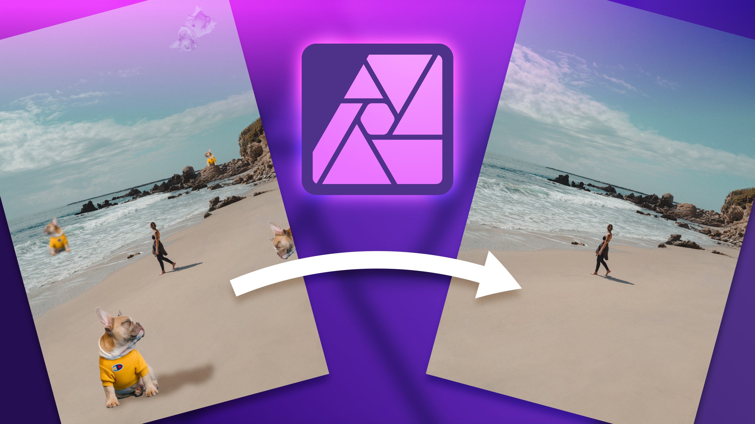
then it's gone. This is really powerful
tool and it can be used to remove whole
objects from the pictures. So you got carrying
the backdrop, you get plane on the sky
and bold underwater. Something with irregular
backdrop like grass, water, sky. You can use this tool to
erase the whole object. Let's try it out. Let's load a new picture. Alright, let's load a picture
of some objects like this. Maybe I will drag and drop
this into my art board. It's load, but it's really
large like last time, so let me just scale
it down a bit. All right, This should do. I will also rasterize
and three my image. Now I can use Command
or Control Zero to go back to the
optimal zoom level. Cool. Let's try this in
painting brush tool over here. So I'm going to paint this with this red selection color
release. And it's gone. This is really powerful tool. It can help you to remove unwanted objects
from your images. You can also clear some
facial imperfections, stains, and similar things. As you can see.
It's really good in detecting the surrounding area. So we cannot even see where the balloon was
in the moment ago. Alright, so dance the
inpainting brush to end. The last thing is a simple red eye removal tool where you can, when you can remove red eyes, you must select the
area like this. And it's simply a
bit desaturated. I don't have any eyes here, but I think you can
have a picture of God. Simply select the eye
and it will saturate, reduce the redness and ice. Alright, so here are
our healing tools, starting with healing
brush tool, Patch Tool, blemish removal tool in painting brush tool and
little red eye removal tool, I strongly recommend
the combo of blemish removal tool
plus in painting brush, you can literally fix or remove anything you need to
keep those two tools. Alright guys, that's
enough about healing. I will see you in
the next lesson.
11. Project: Alright, that was
really intensive hour, we'll learn a lot. So let's put everything we
have learned into good use and tried to remind
ourselves all tools, all tricks while working
on some mini project. As you can see here, our angle, my blank canvas. I going to use built
in stock library. It's over here. As you may remember, if any of those studio patterns are missing in your interface, you can go up, up,
view and Studio. From here, you can
turn them on and off so you can customize
your interface. In the worst-case scenario, we can also reset everything
to default settings. All right, let's
search for balloon. And maybe this peak will do, I will just drag and drop. Now this picture is very, very large, bigger
than my art board. So I'm going to zoom out. I can use navigated too for dad. And why I got my
move tool selected. I can easily scale stuff down
by dragging the corner in. Like this will do. Now I will right-click
on my layer of the picture and
rasterize and trim. Nice. I can double-tap to
change the name of this image. Photo. Alright, we got one pixel
layer with the photo inside. And our task now will
be to simply erase one of those balloons competently and
re-color another one. To do that, we will need to create some kind of
selection for sure. So let's select the one
on the right first. I will zoom in. Now I can hold space bar for Pen Tool and drag
my camera to hear. Nice released the space bar. That's how you can navigate. Just hold space bar, then you can pan around. Release. In back to
the previous tool. We got quite simple
backdrop around. So let's try Quick Selection
tool we used before. Right? That should do. Let's just paint,
draw all over this. Almost good, few more. It's really colorful, so
we must be careful here. Do not miss any of those colors. Now is zoom in even
closer at this time, we're going to use shortcut
Command or Control plus. On your keyboard. If you are on iPad, you can just simply pinch
to zoom, of course. Right? One basket here as
well. You know what? I'm going to de-select
this basket. I don't want the basket
in this selection. I'm just going to re-color
the balloon itself. So I'm using subtract now to take away from
my selection. Nice. It's really good selection. I think. I'm ready to refine
the selection. All I spot something
here, take a look. This one is de-selected. Let's select this up over here. N here. Why making selection
don't rush through it. That will very much
defined the final product, the quality of the final image. Alright, let's click Refine. To see the preview
of my selection. It looks alright. I going to use output as a
new layer with mask. Apply. And if I switch off the
visibility of the original photo, I can see there's a new layer
with only this balloon. Everything else is mask
it out with black color. Now, I will select
adjustment layer. I need my HSL layer, hue saturation light
default at first. And now I'm going to modify
this by using the top slider. As you can see, it's changed
color of everything, everything below this layer. So even the original photo
is affected right now. We can fix that by right-clicking on this
layer with the adjustment. And we can select mask to below. This way. This adjustment is
inside this pixel layer. Mask and adjustment inside. I still can double-tap
on adjustment. To got my slider out
and modify the color. Now I, so you can see it's only affecting
this masked layer, not the layer below. Cool. So we changed the
color of one balloon. That's done. And now I'm ready to erase the second
balloon completely. I'm going to use in
painting brush tool. Let's check this tool first. Not sure how it will work
with such a large objects. So let's give it a go. Ryan in painting brush all over. It's processing right now
and it's gone nicely done. So we totally modifying
this picture. First, we re-color one object and then we completely
get rid of the second one. That's really nice
mini-project to summarize everything we
have learned so far. Alright, now the question is, how can we export this new image out of the
program so we can show it. There's a special
export persona, as you may remember, over here, our persona's
different interfaces and there's export
persona at the very end. You can click on that. It will reload your interface. So don't be surprised. And now from here, I can simply select
my image, my slices. I got one slice only. I don't need to slice it into smaller images or
anything like that. This is not interface. This is just a simple photo, so I can select this
one main slice, select the preset
for it, PNG or JPEG. And then let's say
JPEG, high-quality. I got my layer selected and I just click Export slices here. And now I'm able to save
this on my computer. Alright? Alternatively, you can export image while you are
still in photo persona. So I went back to Photo Persona, go up File, Export, and select format
you need JPEG, PNG, PSD is here, PDF, so multiple formats to choose from and then hit Export here. You can also check out the preview and
modify the quality, the compression we're
using the slider. Alright? What if you need to keep this as the project file with layers so you can make changes later. Maybe this green
balloon right now, It's not good enough. Maybe someone will call you
tomorrow and tell you to change this to pink like this. So you don't need to do the
whole project all over again. Simply save the project file or gentle Affinity
Photo source files. So File, Save As, and then you can save this as affinity for
the project file. Alright, done. Our little mini project. I hope you will be able
to complete yours and share with us in the class page. In the next video, I'm going to summarize everything
we have learned so far. See you in the summary.
12. Class Summary: Congratulations, You made it to the end of this short
quick start class. And now you're ready to take
on some harder tutorial. So please explore our
Skillshare platform in search for more advance, interesting tutorial
for Affinity photo. You can also filter some free
websites like YouTube does. Many YouTubers that pose interesting tutorials
about Affinity Photo. It's more and more popular
software because of its fair price and
really powerful tools. Nowadays, it's considered as a really decent
Photoshop alternative. Now, you know all the basics and you are ready
to expand on that. Why you searching
for new materials? Keep in mind, it's
always best to do a practice part to not only watch video or read to tutorial, but take time and go
through it slowly, post from time-to-time
and try to recreate similar effects
from the tutorial. So far, you all need to
know about basic tools. You know how to
work with layers, you know about common
mistakes to avoid. And also, you are
aware how you can switch between different persona and use the interface
of the program. That's a great starting point. So don't wait and jump on your next class on next
tutorial straightaway. Thank you for learning with me. And if you are into
Affinity software, unlike for example,
Affinity Designer, the Vector Editing up. Don't forget to check my other classes
here on Skillshare. I hope I will see you in
my next tutorial. Bye.
 Mark Krukowski, Kru Mark Tutorials