Transcripts
1. Introduction - Mountains in Watercolors: Hi, everyone. Welcome to the watercolor
painting challenge. This class is all about
painting mountains. I'm so excited to have you here. If you're someone who loves landscapes and wants
to paint mountains, but at the same time, you feel
they are too complicated, then this class is for you. Mountains can look very detailed and
complicated at first, but they don't have to be. In this painting challenge, I'm going to show you
how to simplify them, how to approach them
in an easy manner, how to create depth
and dimension so that painting them
looks very effortless. We will learn to break down the composition into
simple and easy steps. And we will also learn to
create different textures and effects in your painting
without overworking on them. Over the next 20 days, we will learn to create
different mountains, different textures and learn how to create depth
and dimension in them. The goal of this
challenge is not to achieve perfect
mountain paintings, but to enjoy and build
confidence in painting them. You can follow along with me or you can challenge yourself to paint on your own as we
go forward in this journey. There is no pressure at all
to create perfect pictures. You can just show
up for yourself and have fun along this journey. Grab your brushes and let's
begin this journey together.
2. Overview of the class: Hi, again, I'm so glad you
decided to join my class. I'm going to walk you through all the chapters before
we begin the class. So first, I'm going to show you all the art supplies that I am going to
use in this class, starting from papers, colors, brushes and each and
everything that I am using so that you can find whatever is
available with you. And then we will discuss how to approach
painting mountains. What are the factors
to consider. I'll be showing
you some examples. I'll be talking
about water control, where we discuss some
watercolor techniques and how to control water. And then we have a
chapter on brush control. There we will talk
about how you can hold your brush and how you can
create different textures, and it's mostly about
the brush marks. In this brush control chapter, I would want you to practice on a rough paper
so that you build a good muscle memory and painting these brush marks would become very easy for you. And next, we have a chapter
on layering and depth, how to create multiple
layers and what to avoid while you
are painting on layering technique and why
it is very important in mountains to build
that intensity and depth in your painting. Also, I'll be talking about some common mistakes that
you need to avoid before painting or gentle
mindset shifts that you can adapt in order
to create better paintings. I would also want you to feel free while attempting
this painting class. Take it as a fun challenge. Do not restrict yourself into
creating perfect paintings. Just let go of that
control and have fun. And once you're confident
with the basics, then you can move on
to the class projects. We will begin with a simple and easier project on day one, and slowly and gradually we will level up
with each project. Each day, I'll be posting
a new class project, and for the next 20 days, we will be painting together. If you have any
doubts or queries related to the class
projects or art supplies, you can ask me under
the discussion section. I would be happy to
answer them for you. And as we paint together
through this journey, I would really encourage you to be a part of this community, share your work, appreciate what others are creating and
support each other. Let's keep it a space
where we can learn, grow, and cheer each other on. All right. In the next chapter, let's have a look at
all the art supplies.
3. Art supplies: In this chapter, I'm
going to talk about all the art supplies that I'm going to use in
this whole challenge. Let's begin with papers. For papers, I'm going to use Chitrapat 270 GSM
textured paper. This is 100% cotton paper, and hence it will help us retain moisture and
wetness as we paint. This is the close
up of the paper. It has very rich texture and because it is
a extued paper, it will help us create
exture as well. So I would recommend you using either rough paper or cold press paper so that you get nice texture
in your mountains. If you don't have one,
it's totally fine. You can use any paper that's currently
available with you. Okay. And the size of this paper
is about a five size, and most of them are
rectangle in shape. I'll be either painting in a landscape orientation
or portrait orientation. And to tape down the paper, I'm using this a glass sheet. You could use any clipboard or any flat surface that you have, and I'll be using masking tape to tape down all the sides. Also one important thing is to tape it down
on a flat surface. You would notice I'm mostly turning around
the paper like this. I'll keep it in a tilted manner so that
the paints flow down. This aspect, of the painting
is very important where I'm moving the paper to let the paints flow in
different direction. So make sure you're not
taping it down on the table itself because I've
seen a lot of students, they just tape it
down on the table and it doesn't allow
them to move the paper. Now let's talk about the colors. I'm using this air tight
container for storing my colors, and it really helps me to paint whenever I'm in
a mood of painting. It makes the whole
process easier. If the paint is dry, I just use a spray
bottle and spray some water it re wets
the paints instantly. Now for the class projects, I'll be using colors only from this palette and also
a white gauche paint, which I'll show you later. Now, let me just
walk you through the colors in my
palette and I'll also show you the
most used colors throughout this journey. Here I have black. This is lamp black. I won't be using black
much in the projects. Here is Pains Gray. This I have used literally
in every project. This is important. If you
don't have Pains gray, then you can use indigo. Then the next most used
color is ultramarine blue. You can mix it with pains gray to create a darker
blue color as well. Then I have kobar blue, which will be used in
some projects, not much. This is erlean blue. Again, not much used. This is aqua blue. I don't think I've used this color in any
of the projects. Then shadow green. I really like using this color, but I have not used in the
current projects because I feel this is not very commonly available
in most palettes. I have avoided this color. Then there is forest green. Again, like a cool green color. I think I've not used this much. There is sad green, which, yes, I have used for some paintings, and we have olive green. Oolive green is one
color that I have used a lot in some projects. So if you don't have
an olive green color, you can take any
regular green in your palette and mix it
with maybe a brown color. It could be burnt
siana, burnt amber, any brown that is
available in your palette, mix it together and you will
get a nice olive green. If not, you can simply
refer to your color veal. Like the opposite
color to green is red. So when you mix red and green, it gives you a
brownish green color. An color you don't
have with you, you can refer to color veal. For mixing different shades. You can look up
for color heel on Internet or YouTube videos and find tutorials
on color viel. If you want me to make
a color wheel video, let me know I would make that in future and the next
color is volet. This is intensively used
in most of the projects, and I really love how
vibrant this color is. Next is burnt amber and
also a little bit of sepia. I'll be using both the colors, mostly burn tumber because I like to mix burn
tamber with paint gray. I'll be talking about each shade before using it in my painting
project, don't worry. Next color is raw amber, again, rarely used
in the project. Then I have, um, one Siena in two wells. I'll be using this color
in most of the project. Then I have opera pink. I'll use this color to paint pink skies or pink
mountains in the project. If you do not have opera pink, you could choose crimson, rose Madow or any pink that is already there
in your palette. Next is red. This
is a warmer red, not very important, but yes, you can have it in your
palette for color mixing. Like I said, for olive green, you can mix green and red. Then I have permanent yellow. This is actually yellow, but I have mixed red here, so it looks orangish, but it is permanent yellow. This is yellow ochre, here, this is red oxide. I've not used this
color, so don't worry. This is cadmium yellow. I have mixed it with sap green, so it looks like
light green color, but totally ignore
the messy palette. You can use cadmium yellow or any yellow
that is there with you, doesn't matter much, and this is lemon
yellow rarely used. I think in one or two projects, I've used this Okay. Yeah, and a little bit of
gauze I have poured here. So for Gauche, I will be
using this Gauche tube. This is by Brustro Gauche color. Why I'm using Gauche is to create an opaque consistency
in some of the paintings. Because watercolors
are transparent and to block that transparency and make the colors a little opaque, I will be mixing white paint
with the existing colors. I'll guide you as and
when I'm using it, but just as a heads up, I'm letting you know that I'll be using white
gauche paint. Also, it can be used for
some detailing work, but I've tried to avoid the detailing work with
white gauche paint. That's about the colors. Don't worry. If you don't have any of these
shades, don't worry. You can use the basic
colors in your palette, refer to a color wheel maybe and try to understand how
different colors are formed. Next, let us talk
about the brushes. For the entire
painting challenge, I have only used three brushes, and most of the painting
is done with this brush. And this is a mob
brush by Brustro. I have used this
just for wetting the area because I'm painting
on a smaller sized paper. So I will be using this
medium sized brush. If you are painting
on a bigger paper, then maybe you can go
for a bigger brush. I'll be explaining more about usage of the brushes in
the upcoming chapters. But this brush alone has this thick belly
and pointed tip, which helps me to create
multiple brush strokes. This brush is used for
detailing purpose. When it is wet, it creates this pointed tip which helps
me create detailing work. Next I'll be using
two jars of water. One jar will remain clean because if I would
need clean water, I would take from a clean jar. The other jar would be to clean the dirty paints
of the brushes. Currently, it is dirty. But when you're
starting a painting, make sure you're taking
two clean jars of water. Or if you can manage with
one, that's totally fine. You can use a pencil
and an eraser for the basic sketching and
we would need a napkin. And some tissues for
wiping off the paints from the brushes and also to lift off some paints
when we are painting. Have some tissues and napkin
when we are painting. It is going to make the process so much easier for you and you can also have a hair dryer to speed up the drying process. If you are in a humid area, the paints dry very slowly. So it's good to
have a hair dryer which helps you to
dry the paper faster. So whenever I paint
in my hometown, it's a very humid area. The paints take a
long time to dry. But when I'm in Bangalore, the paints dry quickly because
of the dry climate here. So it depends on
wherever you are, you can choose accordingly. Okay, so that's about the
art supplies that I'm going. Okay, so that's about the
art supplies that I'm going to use in this
painting challenge. You can use whatever similar supplies that
you already have. You don't have to buy
exclusively for this challenge. If you're starting out,
maybe you can invest in good papers so that you have a nice painting experience. Papers are the most
important thing in a watercolor painting. All right. So that's
about the art supplies.
4. How to approach painting Mountains.: To help you understand
mountains better, I have created this
small three D model. I have made it using simple household materials and note that it is fully white. There is no color variation. It is only to understand how things actually
appear in real life. So sometimes when we look
at reference images, it is two D. So we don't really understand form and
depth in the images. That is why I have created
this three D model to help you understand and visualize the form and
depth of the mountains. Currently, the light
is from all the sides. Now I'll change the direction of the light and you will pay
close attention to the screen. Observe the changes carefully. So what was your
observation here? Let me explain it again. Here, I'm keeping the light
source on the right side. Right side of the mountain is illuminated and the
other side looks darker. But the initial color of the
mountain was purely white. And now we are seeing
this change in color. So why is this happening? This change in color is mainly because of the presence
and absence of light. Presence of light makes
the area brighter, and you can also see some creases and the
area where there is a separation that is
called the ridge of the mountain where the
two planes get divided. Now I'm slowly changing
the direction of light, and you can see the
light is on the top, and the shadows are falling
on the bottom part. Now I'm moving the light
to the left side of the mountain and you can slowly
see the shadows changing. Now, the left side of the
mountain looks luminous and the right side looks
darker because of the shadows. And also notice
the cast shadows. This usually falls on
the other mountains. That is why we have
different shadows, lights and variation in
the mountain ranges. Next, let me show you
another case where the light is diagonal side. The shadow is also diagonal
and only a part of the mountain will
have shadow and rest of the area will
look illuminated. Like only 25% is shadow and 75% of the mountain area will look bright
and illuminated. I hope you're
understanding this. Similarly, if the light is hitting diagonally
from backside, then only around 20, 25% of the mountain
will look bright and illuminated and rest of the
mountain will look darker. So basically, it's all
about visualization, how you can visualize
light and shadows. Okay, so with this
three D demonstration, I hope you have
got a better idea and visualization
about mountains. Now, let's talk about the
texture of mountains. Mountains don't always
need to be very detailed. Yes, they can be,
but you don't have to copy everything you see
from a reference picture. Whenever you have some idea, you can simplify them in a
way that makes sense to you. For example, in this painting, the mountain could have
had a lot of details, but I chose to break it
down into simple two parts, the shadow and the highlight, and then some basic brush marks. That's it. You can always simplify based on what
feels doable for you. In this painting as well, I've tried to kept
everything minimal with one background element and
one actual focus mountain. In this painting, we
have multiple layers, but we have also used the negative area of the
painting to suggest the mist. So here, this painting might
look a bit complicated. But during the painting process, I'm going to simplify
each and every step, so you will feel
confident with that. And the details that you see
here are all brush marks. So don't get scared when you see something or when you have a reference image. Whenever we pick
a reference image or a clicked photograph, the image might have
100 elements in it, but you choose the
focal element. For example, here, I have tried to keep this
as my focal element. This mountain has some details. Was the rest of the
mountains here, it's very loosely done. So you choose your
level of painting. Here I'll be guiding you through each and every
step as I paint. But if at any point you
feel it's complicated, then maybe you can watch
the entire video and try to understand it in your way in a way that's easy and
digestible for you. You don't have to get disappointed and make
a meaning out of it. Sometimes we see something is difficult and our
brain tries to pull us down by saying all kind of negative things
about our skills, about how we are
not good enough, how we don't have
talent and all of that. Try not to fall for such trap. Keep practicing and you will
get better at your art. There might be
complicated shapes. So you can try to simplify it. For example, in this mountain, this looks a little bit
tough. I know, I agree. We will be painting some
easier mountains first, and then we will go for this. But if you feel this is stuff, then you can maybe simplify
it into two parts. One is darker and other
one lighter and only add some brush marks and do not worry about
creating perfect shapes. We are not machines
here, we are humans, so we should learn to
embrace our imperfection. Here, even here, I
have made mistakes. If I had worried so much about creating perfect artworks,
I'd have been stuck. All these brush
marks are imperfect. Some birds are also imperfect, but that doesn't mean
I will stop painting. Give it a try and be
kind to yourself. Most importantly,
trust the process. The middle part of the
painting might look messy. You might want to stop painting
and give up the process. But it's very important to embrace that messy middle
and towards the end, you'll be really happy
with your painting.
5. Water control | Techniques: So before we start painting, I want to quickly talk
about water control because this is really the
foundation of watercolors. We are not just
painting with colors. We are actually
painting with water. So water is the crucial element
in watercolor painting. And depending upon how
much water you use, your paints will behave
very differently. So there are different
approaches with watercolors. I'm going to show
you one by one. Let's demonstrate some
techniques one by one. I'm wetting the paper. When the paper is wet, the paint spread very easily. And you can see the colors
creating a nice bloom. So in this condition,
the paper is fully wet. That's why the colors
are flowing easily. So this technique here is called wet on wet where we are applying
wet paints on wet paper. This is the foundation. Most of you might be
familiar with it. This technique is
widely used to create soft edges and sort of diffused
effect in the paintings. Now let's say we want to
create a soft mountain. I'm going to extend the same area and show you
the example here itself. The paper is wet. Now I'm going to
create a mountain. Apply wet paints on this wet area and see how
the colors are spreading. So this technique can be approached for the
entire painting. But I approach it for the background or
the midground elements. And for the foreground, I mix it with some
other techniques as well because foreground needs
some detailing work, right? You'll understand more about it as we paint different
class projects. And also remember the
direction of the flow of water decides the texture of the
painting of the color applied. So here, if I apply the paints and
just leave it as it is, the paints run in
this direction. But if I'm keeping my
paper like this at an angle of about 80 to 90
or at least 60 degrees, it flows down and I can guide the paints to come
in lower direction. A you see that? This is how you dide and
not control the paints. You can create
misty mountains or anything soft using
this technique. The next technique is
where the paper will be fully dry and we will
be using wet paints. If I have to create
this mountain again, When the paper is fully dry, it creates sharp edges. It is used to create defined lines and
details in the painting. I will be using this
technique for most of my foreground elements where I want to add details
in the painting. So you can clearly see
the difference here. This has sharp edges and
this has soft edges. So based on what kind of effect you want
in your painting, you can choose the
technique accordingly. Now, another technique is
where your paper is damp, which means we apply water and
let it soak for some time. We will let the paper sit
for about two or 3 minutes. In this, you will see
mild sheen on the paper. When you observe, the light is being reflected on the paper. Or you could also use tissue paper and lift
off excess water. Now if you apply the pins, you will see that we are not getting that hard edges
as that of this technique, and it's not as flowy
as the wet on wet. Here, you can use the damp brush if you want further
softer edges. And the next technique
would be dry on dry. Here, the paper would be dry and the paints will
also be in dry, which means your brush will have very minimal
amount of paints. Which helps you to
create texture. The texture is mainly because of the texture of the paper. If you're using a hot press or a flat paper
without any texture, you won't be able to achieve
this kind of texture. Yeah. So yeah, these are the basic techniques that
depends on the water control. So which is basically
wet on wet wet on dry, wet on damp, and dry on dry. Now, listen to me
very carefully. If at any point you feel
that your paints are running too fast and you're not
able to control any shape, I'm going to show you
why that happens. Now let me demonstrate
you with a small example. So here if you notice, the paints are running very fast and not able to
retain any shape. The reason for this to happen is because there is a lot
of water on the paper. This is a reason why water
control is very important. This can be used
in certain cases, but in our painting in
our mountain painting, we will not be using
this kind of technique. See, you can clearly see that the paints are
running here and there. You can use a tissue
paper and lift off the excess pains if this
happens at any point. Pybe Now let's talk
about the brush control.
6. Brush control | Brush Marks for texture: Let's talk about brush control. Like I said earlier,
I'll mostly be using this brush for
most of the projects. Here, this one brush
has multiple use cases. In some cases, you will
see me using this brush at an angle about this
45 to 50 degree angle where I'm using the
belly of the brush. I'm painting this
normal brush strokes. I will be painting
to create texture. And if I use the
tip of the brush, I can use this for
creating details. So the dry brush
technique that we learned earlier can be used to
create textures on mountain. Another technique is to create
these kind of brush marks. These brush marks are very necessary for painting
the mountains because it helps us create layers and texture
in the mountain. You'll be creating
textures like these. I'll show you the paintings. So in this painting, we have these tiny brush marks
like this or some patches. With darker color like this. No complicate it. You are just creating the impression of
textures and creases. We have some other
textures as well. Here I will be using
my fine liner brush. So here you can see some lines. You just have to use
the tip of the brush. By applying less pressure, you create thin lines and by applying more
pressure on the brush, you will get thicker lines. You will vary the pressure accordingly to get
different thickness. We will not be using
any fixed pattern or rules as such, don't worry. You don't have to get
it exactly the same. Here, if you see, I have applied textures like this,
somewhat round shape. You can practice some textures. Here in this painting, I have created some
light colored textures using similar brush marks. You could also use splattering technique and also maybe use your fingertips
to smudge the colors. Creating texture on mountains is all about different
brush marks. You can see the brush marks. This is a little bigger. All are very random
and doesn't have a fixed pattern as such
because in nature, if we try to create
fixed uniform pattern, it will start looking inorganic. Let's practice few brush marks. Let's say we have a mountain. We'll paint a triangular
shape, something like this. Now, apply some darker color. Let's say this is
our shadow side. This is the mountain. Now, on the wet surface, we will paint one
layer of details, randomly adding
some brush marks. On the shadow side, a little darker brush marks. We will let this dry. See the paper is not fully dry. This is what happens
when you apply paints on semi dry area. We will wait for
the paper to dry. Meanwhile, let us
practice the brush marks. Okay. Now listen
to me carefully. When you are painting
these lines, do not try to paint it in
same length or same angle. Try to bring in a variety, maybe some shorter lines, some longer, some
thicker, some thinner. Keep it very irregular. Basically, avoiding
uniformity, right? Now the paper is dry. Now let's go ahead and
add some textures. So here you can see how
I'm changing the size. You could even add some
dots in between You can vary the pressure on
the brush to create different sizes or I'm going to apply darker pans to create a sense of separation, to create the rich in between. You could also glide your
brush creating the texture. There is no hard and fast rule that mountains have to
be painted like this. You can take your
own creative liberty and explore something
of your own style. Moving on, let us paint another style of textures
on the mountain. I'm taking brownish
color and with this, I'll paint a mountain. Use diluted color and then
gradually build the layers. This is the base
of our mountain. I'll drop in some shadows
with a darker color. This is the brighter part, luminous side of the mountain, considering the sun
is from the side. Now let us allow it to dry. The paper is dry. Now let's add some details using wet on dry and
a fine line of brush. Here I am creating some
creases on the lighter areas. Some are thin, some are thick. You can vary the
pressure on the brush. Here I'm using diluted color. You can wipe off the
excess paints of the brush to get
a nice precision. It creates the impression of freezers and different
texture on the mountain. You can create bigger
creases as well. Like I said earlier,
there is no fixed pattern or shape that you have to keep in mind while you are painting. You just apply some
random brush strokes that depicts the texture
in the mountain. Maybe you can try practicing on a rough paper before moving
on to the actual project.
7. Layering and Depth : Now let us talk about
layering in watercolors. Layering is nothing but you're applying paints one
over the other, you apply one layer, then you wait and then
apply another layer. Likewise, you'll apply
multiple layers. This helps in building a sense of depth and dimension
in your painting. If your painting
doesn't have layer, it will look flat. For example, here I have painted my first layer and then
I'll wait for it to dry. Working with layers and letting the paints dry is very
important in watercolors. If you try to apply
on wet layer, it will look paint might spread a little
bit here and there. You can apply the layer when it is damp but not when fully wet. We will wait for
the paints to dry. Now the paints have dried, we will take slightly
darker color and apply second layer. With wet on dry, you get sharp edges, whereas if you apply
paint on a damp layer, you get a softer layer. Then we let it dry
again for some time. Okay, so the paints have dried. Now let us paint another layer. I'm using slightly
darker color so that we can clearly see the transition
from lighter to darker. This was our layering technique. So for layering, it doesn't necessarily have
to be wet on dry. You could use wet on wet for background areas
like I mentioned earlier in the initial chapters. The most important
thing is to dry the previous layer before
approaching the next one. Like in most of my paintings, I use wet on wet for
background layers. Like in this painting, here I have used wet on wet
to create this blurry effect. And here, it's wet on dry
for the detailing effect. And in this painting, the background area
is very blood, diffuse and out of focus. All our attention goes to
the foreground element, which is why I prefer wet on wet or wet on damp for most
of my backgrounds. And for this painting, you can see the background
is not very focused, and the foreground gets
all the attention. Here as well. Distant mountain, which is not seeking much attention and have
not given the focus. Here we have used wet on
wet for this technique. Here, it's a combination of
wet on wet and wet on dry. These details are wet on dry. And for the base colors, I have used wet on wet
for blending the colors. And here I have used wet on wet for both background and
the main mountain as well. That's why we have got this
granulated texture defect. It's really beautiful. But for the foreground area, I have added some details
using wet on dry. Now, let us discuss the technique that is used
to soften the hard edges. Let's say we have
painted something with sharp edges and we don't
like how it is looking. I'll show you how
that is achieved. So now you clean your brush, wipe off excess water. Then we have a damp brush. Now with this damp brush, we will lift off the paints trying to
soften the hard edges. So our brush is damp and has some water in it because
of this dampness, it will lift off some paints. This is really good to
make the corners or the edges softer and
make it look seamless. You can keep cleaning your brush in order to get
nice and clean results. You can clearly notice
the difference here. Here, we still have sharp edge, and the other side
is slightly softer. Next useful technique is pulling technique where you apply
paints in desired manner. Then you take clean wet brush
and pull the paints down. Keep it in a tilted manner. This creates a soft graded
effect from dark to light. We'll keep it for some
more time so that the paints flow down seamlessly. Now again, if you want, you
can soften the hard edges. Grab some paints while the
paints are flowing down. This creates a nice soft
mist and foggy effect. That's about layering and
creating depth in watercolors.
8. Common Mistakes to Avoid: In this chapter, I'm going to discuss the most
common mistakes that most beginners do.
Let's talk about it. The first one is overworking
on your elements. Let's say this is one area let's say
this is another area. Here I am overworking, applying multiple colors, going over and over
on the same area. Maybe you're not satisfied
with what you have painted, so you're trying to fix it, trying to make sense of it. You're basically painting
like an acrylic art work. Whereas in the first one, you have kept it very minimal
and limited brush strokes. Which one looks pleasant to
the eyes? This one, right? This looks overworked and it looks mostly like
gauche or acrylics. It doesn't have the
beauty of watercolors. So please try to avoid painting
multiple brush strokes. Keep it minimal and simple. Trusting the process
is very important. We need to build layers
but not overwork on them. Another thing is not
letting the layers dry. We talked about layers. If you are not letting
the layers dry, what happens is, if I'm
painting like this, it will not hold the shape. This kind of approach
is usually good for the background where we want
to achieve diffused effects. But for foreground areas, I would always prefer
clearer and distinct layers. In some cases, you can
paint on damp paper, but try to avoid painting
on a very wet paper. Again, it depends from
person to person. You can paint an
entire painting with wet on wet if you have
mastered the techniques. In watercolors,
usually beginners try to control everything. They approach the medium as acrylics or any other
painting medium. Watercolors don't work that way. You need to let them flow and be okay with
making mistakes. Sometimes you need to just let go and wait for the
magic to happen. You cannot control
each and everything. So try to let go of that
control and paint freely. The next common
mistake would be to focus on detailing in the
early stages of painting. We all have done that mistake where even though we are in the beginning stage
of the painting, the base layer itself
is not done and we are all set to
create the details. Let's say I want to
paint a mountain. I have painted a
background wash. Now I'm painting a mountain. This is my base stage. At this point, if I try to add details like adding
the brush marks, texture and small tiny trees. If I try to paint
everything at this stage, it will not look good. You will not succeed in this. It is going to spread and you will only waste your time
in adding the details. What's the ideal scenario is to wait for the
layers to dry. Like in this painting here, I had only initially
painted some layers and all the detailing work
was done towards the end. In most of the paintings here, you can see the first few layers are just meant to
create the structure. You know to lay the foundation. But once you are almost done, once you are almost 70, 80% complete, then you
go for tiny details. You do not add details
in the starting stage. So if you are focused on adding details in the early
stage of the painting, you will only waste
your time and energy and it will result in a
muddy and messy painting. I avoid that. All right. And the other common
mistake is comparing your artwork strictly
with the reference image. So when you are trying
to control each and every aspect of your
reference image, you are restricting yourself and trying to
control everything, which is never possible
with watercolors. Watercolors are meant to flow. Watercolors have their own mind because we are playing
around with water, right? So never fully try to control everything
in your painting. Just have a basic
guideline for yourself, simplify the composition and allow the paints to just flow
and create their own magic. And also, the most
important thing is to embrace whatever
output you have achieved. Don't fall for the
comparison trap. If you are stuck with the idea of achieving perfect results, then you would be stuck forever. So allow yourself to play, have fun and be open
to make mistakes. It's fine. Sometimes you will discover some
happy accidents happening in your painting. Make more space for that. So these are some of the common mistakes
that most beginners do. And I hope you have
learned your lesson. We are going to paint and
explore some mountains. Feel free to do it
in your own way.
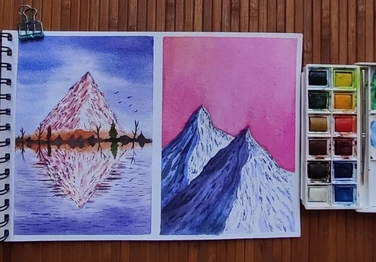
9. Day 1 - Mountain & Reflection: Okay, so let's begin with
our day one project. Today, we are going to create this beautiful mountain artwork. Let's begin. Okay. Let
us tape down the paper. This is in a portrait
orientation. If you are using a square paper, then maybe you can ape it down in a way that
it looks rectangle. Just giving a thin
border to the painting. When you are giving
border or taping it down, it secures the paper well and the paper remains
intact during the painting. For our first project, we are going to keep
it very simple. Divide the paper into two half. This is the horizon line, and we are going to paint
just one mountain today. Below the horizon,
we have a lake, the reflection of mountain
will fall on the lake. Let's draw the
reflection as well. Try to create a replica of
what you have drawn above the horizon and on the horizon, we will draw some
grasses or some trees, whatever you want to
create in your artwork. Now, it looks very symmetrical, maybe to break the symmetry. I'll add a tree on
one of the sides. Just one tree or maybe another
wet tree or like that. Okay. So the approach for this painting would be to paint the sky first and the
reflection of the sky. And then as the layer dries, we will paint first
wash for the mountain. Then we will leave
it for drying. And once the paper
is entirely dried, we will add some details on the mountain and
some trees here. We'll try to keep it
as simple as we can. So now let's wet the
paper completely. Apply multiple coats of water. The reason to apply multiple
coats of water is to retain the water and let the paper absorb good
amount of moisture, which then lets us paint
for multiple layers. Now let us mix the colors. For the sky, I will be
using ultramarine blue. I don't want the sky
to be this bright blue since I'm going to
paint evening sunset view. Maybe I will add a little
bit of red to this. This looks a little laty. I think that's okay. I don't
have to overthink so much. Now, just start
applying the colors. Applying simple
horizontal brush strokes to paint the sky. I'll try to create a
sort of gradation. And around the mountain area, I'm just applying some
thin brush strokes. The tiny white gaps in
the sky are intentional. Similarly, let's
paint the reflection. Try to create a graded effect from darker to light
and darker to light. Around the horizon, we
have almost a whitish sky. Since we are trying to paint
a very simple painting, so I'm keeping the
sky simple as well. Now, let's take pink. I'm using opera pink. You could also take crimson
rose mato or any pink you like and a little bit
of permanent yellow, mixing it together to
form peachy pink color. I like this color, so I mix
this in most of my paintings. Now, let's imagine we have this mountain and we are
dividing it into two parts. I'm going to apply
this color only on the left side
of the mountain. And slowly towards the
bottom side of the right. Now let's take Burn Siana or any brown color and apply
it along the horizon line. This is to create a
base for the tree line. Again, take pink and yellow. This time, a little
darker consistency. Wipe off the excess
pains and apply some paints over
the first layer. Apply some simple brush marks
like slant angular lines. Now, some brush marks on
the empty side as well. Trying to break the symmetry by increasing the height
of the trees here. Next, it paints gray in thicker consistency and applied
along the horizon line. This should be thick.
If it is watery, it will run into all the areas. And apply vertical brush
strokes like this. Now, you may want to add
some trees so you can use paints gray and green
or Ole pains gray is also good enough. And the bare trees, we can paint the details
once the paints are dry. But for now, I'll use
the back of my brush, creating the impression
of the trunk of the tree. Maybe I'll add few
other trees as well. The details like
tiny branches can be added once the paints
are dry. All right. Now we will let this dry. I'm using my head dryer to
speed up the drying process. Okay, so the paints have dried. Now I'll take the
pink mix again, which is basically a mix of opera pink and permanent yellow. Now I'm going to paint
some brush marks only on the left side of the mountain, creating
some details. Wipe off the excess paints from the brush using
a tissue paper. Just dab the tissue or napkin on the area where you have
applied more paints. It's easy to lift off
the paints that way. Now I'll paint on the
reflection area as well. For now, our focus is only on the left side of the
mountain and its reflection. Next, for the brush marks on the right side
of the mountain, we will use diluted paint. Add some water to
the existing paints, or you could use
a tissue paper to lift off the excess paints. Some simple brush marks. Now Pains gray. Next, we would need a darker
version of the pink color. So I'm going to take
a little bit of pains gray and some pink. This will create a
darker pink color. Now, use this color
mix to create darker brush marks on the
shadow side of the mountain. Whatever you do here,
you need to create the same brush marks on the
lower reflection as well. Do not get very fixated
with the exact positioning. It's fine if it is a
little bit here and there. I'll also add some
brush marks on the other side as well,
the lighter side. Okay. I'm going to create
some textures now. Just simply glide the belly of your brush,
creating the texture. I just noticed that
the reflection looks slightly bigger than the actual mountain,
but it's fine. Sometimes when we see
reflections, it looks bigger. So nothing to worry about that. I'm mixing some more
darker pink color by adding pink gray. So textures on the
right side as well. Glide to create dry brush
effect or dry on dry technique. Defining the peak
area of the mountain. Now, let's take this
bluish violet color mix. Using this color, we will create some ripples
in the water. So you just have to create
these tiny impression. Even though this is a
mountain painting class, we would also need some
other elements to bring out the essence and create a sense of balance
in the painting. Some ripples suggesting
movement in the water. And with this color, again, some movement around the
mountain reflection. Keep it very subtle. No big brush strokes. Adding some pink brush
marks in the water as well to create a sort
of distorted reflection. U towards the foreground area, apply some bigger brush strokes to suggest a sense
of perspective. Next, I'll take a fine
line or brush and pinch gray or black or whatever
dark color you have, let's paint the trees. Here you just add some tiny branches defining
the shape of the tree. No fixed shape as such. Go with your intuition. T. Initially, I had only
planned to paint one tree, but now we have these tree trees and some little lines
here and there. These little lines will act
as the filler elements. Now take paint's gray and create some brush marks on the
shadow side of the mountain. I'm adding simple brush
marks, no complicated shapes. Also, you can glide your brush, creating a sort of
texture on the mountain, which also brings a
sense of contrast. Now, let's paint some birds. If you have watched
my previous classes, you would know how much I love adding birds in my paintings. So add as many birds you like, roughly marking the
reflection of birds. Okay, so we are done
with our first project. Now let us spin off
the masking tape. Okay, so this is what
we have created today. I hope you like this artwork. If you found this difficult, maybe you can try it again
with a simple approach. You don't have to add all
these multiple layers if you are not confident with
your painting skills. Do give it a try. We
have a long way to go. I'm sure you will improve
over time in the coming days. Do share your projects as
you paint along with me. I'll see you in the next
chapter until then bye bye.
10. Day 2 - Soft Mountains with Pink Sky : Hi. Welcome back. Today is day two
of the painting challenge, and we are going to paint this lovely snowy mountain
with soft pink sky. Okay, so I have already taped down the paper
using masking tape. You can take your time if you want to tape down the paper. Now let us begin by sketching the composition
of the artwork. Take a pencil and we
will start sketching. I'm drawing a small triangle like shape to depict
the mountain. This side is shorter and the left side is
slightly longer. Now I will divide this
area into two parts, one for the brighter side, and other one for
the darker shadow. Next, I will draw another mountain a little behind this foreground mountain. Again, dividing it
into two half and then connecting it with
the foreground mountain. Erasing the darker pencil marks. These two are the brighter areas and these are the darker
areas in the painting. Easing darker pencil
marks will give us a seamless painting because
once you have painted, you won't be able to erase
the darker pencil marks. This is going to be a
very simple painting. We will be painting this artwork using the techniques
that we learned earlier. Now let us mix the colors. Mix ultramarine blue, take
30% of paints and 70% water. It should be a runny
water consistency. Now using my mob brush, I'm applying the paints
on the shadow part. Carefully apply the paints
on the marked areas. Do not brush through
the process. Have fun and enjoy the process. Clean your brush, and we
will soften the edges. Don't want the edges
to be this sharp. Have a tissue paper handy so that you can
wipe off the paints as you lift off the paints
from the hard edges. Now, take diluted
ultramarine blue and let's create some brush
marks on the white area. These are some creases
on the snowy part. There is no fixed pattern
or definite shape. You can simply move your
brush in repeated manner, creating different
kinds of brush marks. You can observe how I'm varying the size of
the brush strokes. Next, let us paint the sky. I'm going to make pink. This is opera pink. I'm going to add a
little bit of yellow. When you make pink and yellow, it gives you a nice
peachy pink color. I have mixed the color
in mid tone consistency. Now let us apply it around the boundaries
of the mountain, paint it very carefully. You can use any pink color that is already there with you. I'm going to apply
flatwh on the sky. Okay, so I have fully applied
the pink paint on the sky. Now, rotate your paper and
tilt it in this angle, about 60 to 70 degrees. Clean your brush, load
it with clean water, and you can drop some
water like this. Here, when you are applying
or dropping water, it creates a nice flowy
effect in the sky. You can see the paints
flowing down oh Again, softening the hard edges
using clean brush. Let the paints flow. I have kept it in
a tilted manner so that the paints keep flowing. When you're adding water, the paints will
fade a little bit. It's fine. I can drop some paints in
between like this. I'm dropping in some
more pink paints because I felt I need
a little vibrant sky. It's a really fun activity. You can play around and have
fun with water and paints. I really enjoy doing this. You can change the direction
of the paints flowing. If you move it in the
opposite direction, the paints will also flow
in opposite direction. It depends on you, whatever direction you
guide the paints to flow, it will flow in that direction. The paints have
fallen on the table, so I'm just wiping it
off using tissue paper. Okay, so here you
can see we have got a very soft sky using
the flowing method. Now let's take Pains gray and there is
something on the palette. I'm mixing it with that, it will have a pink
thunderton maybe. You can take pains gray alone. Now, let's apply
this paints gray on the darker side
of the mountain. I'm not fully applying it, partially adding a
layer on the damp area. This creates a separation
from the background mountain. I'm repeating the same step for the background
mountain as well. Now mix ultramarine
glue and pins gray. We'll create some brush marks on the brighter luminous
side of the mountain. Very the brush strokes, the pressure on the brush, that will create
different textures. I'll glide the belly
of the brush to create this texture
defect on the dry area. It creates a nice transition
from darker to light. Around the peak area, the paper has not dried because we applied
water for the sky, I'm using a dry
tissue and lifting of the paints around that area. Now going back and creating more texture and
some more brush marks, we will create the
brush marks only on the lighter side as of now
because for the darker side, we will be painting once
the layers are dry. Defining the peak area
using bluish colors. So we sometimes enjoy painting something so much that we keep
adding them more and more. Same is happening
here. I'm enjoying painting these tiny textures. So I'm going back
and forth again and again applying these
tiny textures. Now, you can either wait
for the paper to completely dry or you can add the details
while the paper is damp. My paper is almost 60, 70% dry, so it can
hold the shape. That's why I'm adding
the brush marks and textures on the shadow side. You could use any darker color. I'm using some paint gray and black to create
these brush marks. Paint these brush marks
in different sizes, try to break the
uniformity and have an irregular size of textures. I'll also add some textures with darker color on the brighter
side of the mountain. A few of them, not much. You don't have to follow
the fixed pattern or position where I'm
adding these markings. You know the drill by now. We have practiced it in
the brush control chapter. I will resist myself from painting birds
in this painting. Let's keep it neat and clean. Okay, so we are done. All right, so we are
done with this painting, and this is how it looks. We have created nice
sharp contrast with white and blue colour and
a contrasting pink sky. I hope you enjoyed
painting this with me. Do share your projects
under the projects gallery. And if you have any
questions, feel free to ask. Okay, bye. I'll see you
in the next chapter.
11. Day 3 - Hazy Mountains: Hi. Today is day three of the mountain
painting challenge, and we are going to
paint the soft mountain. For this class project, we are not going to
do any sketching. We will directly be
painting using our brush. Okay, so let's wet the paper. I'm using my mob brush. H apply multiple coats of water so that the paper absorbs good amount of moisture. So for this painting, we are approaching it in a
slightly different manner, which is to apply
thick paints first. I'll show you how it is done. For this painting, I'll
be using my mom brush. We will be using the paper in landscape orientation
in rectangle mold. For the next step, we
would need thick paints so you can grab your fresh
paints and keep it ready. Here I'm taking paints gray
first in thicker consistency. Start applying from
the bottom area. Apply very thick
paint in the bottom. Next I'm taking olive green
in thicker consistency. So if you don't
have olive green, you could mix sap green
with tiny bit of red. This will make
olive green color. Applying very thick consistency. Apply thick paints
in angular motion, making sure to apply only around the lower
half of the paper. You could also use black. Any very thick dark color, okay? I If I applied the paints like this, now, clean your brush. Keep your paper in
a tilted manner. I'm using two masking tapes
to create about two inch of elevation making the paper stand in a tilted angle and
letting the paints flow. Now take a clean brush, apply water on the white area. Not exactly near the
panes, leave some gap, and then apply water so that it flows and then creates
nice texture defect. So you can see the colors are flowing down, creating
nice textures. Just look at them how
beautifully they're creating this runny effect. And now take a smaller
regular brush, and you will take paints
gray and ultramarine blue. Me ultramarine blue, okay? And we will be painting a distant mountain
here, another mountain, blend it well into
the background, leave a tiny white gap so
that it doesn't look overlap. Oh now if you feel the water is only
flowing in one direction, you can tilt the board, try to guide the paints
in different direction. Maybe you can
splatter some water. If the paints fall
down like this, don't worry. It's normal. Now again, I'm keeping
it in a tilted manner. Let it sit and create
the textures naturally. I'm using this tissue paper
to wipe off the paint so that the paints don't flow back when we keep it straight. I'll keep the sky white and
not add any colors here. I'm just looking at the
textures being formed. It's very satisfying. The paper has fully
dried and we can see that the color looks
dull, but it's fine. Now, let's take pink gray and bon tamber
mixing it together. This will give us a
darker brown color. Use darker brown color or even black works
to paint the trees. Here I'll be painting
some were trees. You could use a fine line of brush or the tip of
your existing brush. Just quickly move the brush in upward direction and then
loosely paint the tree trunks. If you're not confident with
the loose brush strokes, you can maybe practice
it on a rough paper. It is mostly to do with
practice and muscle memory. The more you practice, the more confident your brush
folks will be. Now, taking a thin, fine line of brush and
adding some tiny branches. That is it. This is a
very simple painting. Here, this is the
slope of the mountain. It's covered with haze and a little bit of mist
around in the atmosphere. I'm lifting off some
colors from the trees so that it looks like it
is covered with haze. Okay, so we are done. So this is what we
painted in today's class. I hope you enjoyed
this simple artwork. Do share your class projects
under the projects gallery. I'm really looking forward
to see your artworks. Do share. Okay, bye.
12. Day 4 - Violet glow Mountains: Hello, hello. Today is day four of the
mountain painting challenge, and we are going to
create this mountain. Okay, let us begin by
taping down the paper. Tape down all the sides neatly. Apply the masking tape gently, giving a thin border. And once you're done, just run your finger over the edges to make sure it is
tightly sealed. Okay, so now let us
start sketching. I'm going to mark the
basic rough composition. I have decided to create this painting from
my imagination. So I'm going to add
my own details. Start with drawing
two mountains. These are the
foreground mountains. Another set of mountains
in the background. It is very simple. These two are the
foreground mountains, and in the background, we have different
set of mountains. So we will be painting
layer by layer, right. This area is for the sky. Now we will divide this mountain into two to three sections. I'm further dividing
these sections. Let's do the same for
other mountains as well. Keep the lines a little wobbly
so that it looks organic. We have marked the mountain
ridges and creases. Now let us mark
the shadow areas. Anywhere you can create
these kind of segments. These are not compulsory
to add shadow lines, but it actually helps to simplify and recognize
those areas while painting. Also make sure to draw it very gently and do not create any sharp pencil
dents on the paper. I'm considering the light source to be from the right side, which means the shadows
would be on the left side. So let's keep the focus more
on the front two mountains, and less on the
background mountains. And also, I'll try to
lighten these areas. Pencil lines on the right side because we are trying to paint it in lighter colour, right? Okay. Now take your mob
brush and wet the paper. I don't want the
paper to be very wet, so I'll apply multiple
coats of water, then wait for some time. So I want the paper
to absorb some water. We will wait for some time now taking my size
eight round brush. Now let us paint the sky. For the sky, I'll be
painting with yellow color. I'll pick a permanent yellow. You can take any low of your choice and mix it
in mid tone consistency. Fully applying the yellow mix on the sky without leaving
any blank spaces. Next time I'm going to mix
a darker yellow color, probably like a brownish yellow. For that, I'll mix a little
bit of let to yellow. Since violet and yellow
are complimentary colors, they create a brownish color. Now take this brownish color mix and dab it on the sky area, creating the
impression of clouds. A on the upper part, I'll create bigger clouds as I move towards the
horizon mountain area, I'll paint with
smaller brush strokes. Intentionally leaving
some blank spaces to show the yellow color. If there are any hard
edges or patches of color, you can use a damp brush and blend it into
the background area. To I will keep my board in this
direction because I don't want the paints to
flow towards lower area. I just keeping the
masking tape under this. Also turning it around so that the colors move and
create a soft sky. This technique for
painting skies creates a beautiful effect. You can write on
a different paper probably where your focus
is only on the sky. This painting is coming
mostly out of my imagination. And, of course, practice
as well because that gives me the confidence to
attempt something on my own. That being said, I can use
whatever colors I like. I'm going to pick let for the mountain and my
brain goes like, why is the reflection
not on the mountain? How will you manage let
and yellow together. But I just want to
play around and explore as I teach you. Okay. So here I have taken let
in mid tone consistency. Let's quickly apply the paints on the shadow side
of the mountains. Observe how I'm
applying the paints. They are quick diagonal
brush strokes. I'll repeat the same for
the other mountain as well. Do not worry about
detailing at this point. Applying the paints in
diagonal brush strokes, it gives nice flowy effect. Now, take ultramarine blue
and mix it with violet. I'll use this in diluted very watery consistency
for the background area. Applying the paints only on the shadow side and keeping the right side blank
at this point. Don't let the blue get
mixed with the yellow. Be very careful around the boundaries of
the mountain here. Now I'll take let
again and apply some paints in the lighter side. Just realized I have
painted on the white area. I'm trying to lift that
off using clean brush. It's not coming off that easily. I'm using tissue paper to lift off some of the paints
while it is still wet. So I'm also lifting the paints
from the other mountain as well so that the colors don't flow and bleed into these areas. Now take violet and
some pains gray. I basically want a
darker violet color. That's why adding paints gray. Now, take a tissue, wipe off the excess pains, and we will apply some shadows on the areas that
we marked earlier. Basically creating
some creases and shadows majorly on
the shadow part, and some tiny brush marks. Paint the brush marks
in different sizes. Vary the pressure when you are applying the brush strokes. I will automatically change
the size and thickness. My paper is damp at this point, so I'm gliding my brush, trying to create a soft
texture and variation. If your paper has dried, then you can create
a dry on dry effect. We can choose the
technique or change them on the spot based on the
dampness of the paper. Now take ultramarine blue, and again, for the
distant mountain, we will be adding some details. Not a lot of them. You don't have to put much
focus over this mountain. Since it is in the background, we don't have to put
much attention there. Keep it loose and vague. No need of much detailing. Now, we will let it dry. Okay, so the paints have dried. Now we will go with wet on dry for some final
detailing work. Take boil it and paint scream, wipe off the excess paints, and here we will be
adding some brush marks. So tiny brush marks along the ridge, creating
multiple layers. Vary the pressure as you
apply these brush marks. Gently glide the brush to
create texture on the mountain. Moving on to the other mountain. Again, we will use the same
techniques where we are applying multiple different
sized brush strokes, which suggest the textures, creases and different
effects on the mountain. Again, gliding the brush gently on its belly
to create texture. Next, add some water
to the toilet mix. Make it very watery, apply it on the white
area of the mountain, these tiny brush marks,
suggesting the texture. It is hardly visible, but it makes the difference. When you are up for
detailing work, do not overload your
brush with paints. Take minimal amount of paint, maybe have a tissue paper, wipe off the excess paints, and then try to
create the details. It gives nice precision. Now, let's add some details
for the background mountain. I'm using ultramarine blue, some tiny brush marks
on the shadow part. Whenever I feel I have applied more paints
or darker paints, I immediately use tissue
paper to lift off the paints. It always comes to the rescue. Now to create a separation, I'm applying paints
over here like this and trying to blend it
into the background area. Now, take slightly darker
violet and paints gray mix, and we will add some
darker patches, some areas to define the
boundary of the mountain. Some brush strokes to
simply enhance the texture. Again, remember
no fixed pattern. Just go with some
random brush strokes. Anything that you feel
like adding in the moment. All right, we are almost done. Now let us paint some birds. So bigger birds and some tiny
birds in the background. Okay, so we are done with this. There you go. This is how
the mountain looks like. I hope you enjoyed
painting this with me. Do share your class
projects or work in progress under
the project gallery, or you could tag me
on social media. I would really love
to see your artworks. I'll see you in the next chapter
until then, bye bye. But
13. Day 5 - Soft Textured Mountains: Hello. Today is day five of the Mountain
painting challenge, and we are going to create
this extured mountain artwork. Let us begin by marking the
composition of the painting. I'm going to paint the artwork
in landscape orientation. Okay, so this is
my horizon line. We have some slopy area. Then we draw a mountain, which is also our focal element. Here, this mountain is somewhere
around midground area, but we are paying
attention to that. We will keep the
foreground area a bit diffused and some more
background mountains. Okay, so let's wet the paper. I'll take cerulean blue
and paint the sky. I have intentionally left
some spaces in between. This will depict the
white clouds in the sky. Take a damp brush, lift off all the excess water. Okay, so our sky is ready. Next, let us paint
the distant mountain. So I'm mixing cobalt blue. You could take any blue color. Okay. Now let's paint
the distant mountain. If the pencil marks
are not so dark, then you can increase or decrease the size
of the mountain, based on what looks good to you. Next, let us take
cobalblue and burn tamber. When you mix brown
with the blue color, it gives you a sort of darker, bluish kind of indigo color. You could also add pains gray. Makes the paint in thicker
consistency. All right. Now, apply the paints
on the focal element, which is the main mountain here. Fill in the complete area. Now take pains gray or indigo and apply this paint along the edges of the mountain. Uh, And once you're done applying the paints, keep your paper in
a tilted manner, allowing the paints to flow down so that the paints
don't flow upwards. If you keep flat, it goes back. I'm keeping it in this manner. For this section, I'll
paint with green. You could use any
warmer shade of green. Now, we will use allow for the foreground fields
not fully applying, leave some empty
areas in between. I'm using paints gray
and Copal plume mix. Applying this darker color
mix again on the mountain. Because as the water flows down, it creates some
textured defect which looks very lovely. Oh. The paints are flowing down. I'll apply some
olive green paint on the areas around the mountain
defining the grassy part. Keep it tilted at
about 60 degrees. We will let this dry naturally because
with natural drying, you'll be able to get
nice textured effect. I'm using this two inch
masking tape under my paper. And as the paints are drying, here I am mixing olive
green and coval blue, making a darker green colour
to splatter the paint. Okay, so this is how
it looks after drying. Look at the texture
created here. Now we have nothing much to do. We will just add some grasses in the foreground maybe
with the same green color. Make it a little darker. You can apply some grass blades to put little details
in the foreground. Do not try to
overdo this because our focus has to be
on the mountain part. You can cover the upper
area and just platter it. Here we have created a very
soft mountain painting. The mountains doesn't
need any detailing here. The texture of the mountain
speaks for itself. Also, let's add some words. Now take any darker green colour and apply it on the foreground, creating some contrast against
the light green colour. Alright, we are done. Now, let's peel off
the masking tape. This is how the
painting looks like. Here, I wanted the
focus to be on this mountain here to
create this texture. This overall painting hasn't
turned that great as such, but I really love the
texture of the mountain. Loving the textures
here, so pretty. If you are facing any difficulty creating these pictures
and you want help, you can reach out to me. I hope you have enjoyed
painting this with me to share your art project under
the projects gallery. I would really appreciate if you could also leave a review for the class that would really
help me reach more students. I'll see you in the next
chapter until then bye bye.
14. Day 6 - Tiny Village and Mountain: Today is day six, and we are going to create
this beautiful artwork. All right. I have already
taped down the paper. Now let us begin the sketching. So somewhere here in the
lower part of the paper, I'll mark the horizon line. This is our horizon line. Drawing another parallel line. This is the section
for the village area. Here we will draw a partial
slope of the mountain. And then inside this area, we will draw multiple lines depicting the creases
and textures. And in the background, we will add another mountain. The composition is very
simple. We have the sky. We have this distant mountain and then the
foreground mountain, which is our main focus. So only part of that
mountain is visible. And here in the foreground area, we will draw some tiny houses. Drawing some of the houses here. Very simple ones. This is a small village where
there are a lot of houses. Draw some tiny houses as well to create a
sense of perspective. And some trees around that area. When I'll be painting it, I might approach
it very loosely. So this is just a rough
depiction of a village. Some rough lines depicting
an organic appearance here. I will use my razor to
lighten the pencil marks. Here we have some
ground and grassy part. So we will paint that with the green and brown color mixes. Okay. So now let's
wet the paper. Apply generous amount of water. When you apply more water, the paper won't dry
while you're painting. Make sure you're
applying multiple coats. We will wait for a
couple of minutes so that the paper
absorbs some water. Switching to my size eight round brush and let me mix the colors that
we need for the painting. For the sky, I'm going
to use cerulean blue. Now for the distant mountain, I'll be using ultramarine blue. Wash the brush thoroughly. Now for the front mountain, I'm going to mix a
warm green colour. Here I'll take olive green and sap green, mix
them together. Here we would need two
different shades of green. One is this olive and sap mix and the other
one is a darker green, which I will create
by mixing sap green, paints gray, and burn tamber. This will create a
darker green color. These are the color mixes. Now clean your brush thoroughly
for the painting process. The erlein blue color
mix that we had mixed, I'm going to add a little bit of white paint to make it opaque. You could paint with just
transparent color as well. But here I'm adding
gouache paint to make it opaque and hold
the shape of the clouds. With transparent colors,
it looks like a clear sky. Apply the paints
in bigger blobs, leave some white
intentional area to depict white
clouds in the sky. Now towards the lower parts, I'll add tiny shapes because in the upper
part of the sky, we will have bigger clouds. As we move towards the horizon, the cloud size diminishes. This is our sky. Now let's
take ultramarine blue. Again, for this, I
will add white paint. Now let's paint the
distant mountain using opaque ultramarine blue. Apply quick brushstrokes. Now let's take olive
green and sap green mix. I'm going to paint the
mountain in a diagonal manner. Let your brass strokes
be just like this. Can loosely apply the paints
here around the lower part, leaving some negative
spaces for the houses. Apply the paints in diagonal strokes,
something like this, only in one direction from up
to down in angular strokes. Now let's take the
darker color mix. I can apply this again in a
slant diagonal brush strokes. Now for the ground area, you will take burn tumber My paper is almost
dry in the bottom area. So I'm just applying
water around the paints so that I
can blend them well. I will let it blend. Here we are allowing
the green and brown to blend together, leaving some tiny white
spaces for the houses. Also apply some
greens in between. Do not overwork, leave it
as it is at this point. Now let's mix a
darker green color, sub green, paints
gray and burn tumber. With this darker
green color mix, I'm going to paint the
impression of trees. You just have to apply some vertical brush
strokes like this. You can take some red and just drop the colors depicting
the roof of the houses. Some blue. Here you can add any colors
like white, blue, red. I'll paint it very loosely. Here, my idea is to create
a village like appearance. You could take some
white gauche paint or white watercolor
drop in between. This should look as if there
is a civilization here. Next, let us mix
darker green color. Let it be very concentrated. We'll apply wet and thick
paints on damp paper. Now let us paint some darker
freezes on the mountain. This darker and lighter areas suggest that the mountain has
ups and downs uneven edges. Don't forget to leave some
lighter areas as it is, not fully cover it up
with darker colors. I have added two layers
in this mountain, which adds a sense of depth. Now, we will let it
dry for some time. Okay, the paper is fully dry. Now, let us add some details. Take darker green color. Now with this darker green, I'm going to apply
layers on this mountain. Once you apply
these slopy lines, now we will soften the
edges using a clean brush. You can play around with this. If you want, you can
create some textured, dry on dry kind of effect or maybe apply
thicker brush strokes. Whatever you do,
make sure it is in a slopy diagonal manner so that it goes with the
flow of the mountain. Adding some tiny brush marks, making the mountain
rich in texture, and some natural effect. Oh All right. That was creating the
texture of the mountains. I'll add some texture on the
distant mountain as well. This is an optional step for adding details on the
background mountain. So here I am using
the same color, maybe slightly darker,
not very dark. Here you can simply dab
your brush creating the impression of
texture on the mountain. Okay. Now, let's
paint some trees. Using darker green colour
to paint on the trees. Adding second layer
on the trees. Okay. The trees are done. Now let's take red and
mix it with born tumbo. It will create a
brownish red colour. Painting the roof of the houses. When you are painting with
wet on dry technique, you are actually creating
the details on the houses. We had painted the base
layer very loosely. Now we will make it
slightly detailed. Now take white gauge paint. And on some of the houses, just apply this
paint. Not fully. You don't have to, like, paint each and every
wall or every detail. Mixing it with some blue just
randomly adding the paint, leaving things up to
viewers interpretation. We are just creating the
impression of a village. Now take paints gray
and add a bit of white and we are going to
create these horizontal lines. You don't have to draw
each and every detail. You can leave some things unexplained so that the viewers can interpret in their own way. That's a beauty of painting. So I've taken brown, and I'm going to just
swiftly move my brush, creating some textured defect. And now some green color. You can take paints gray
or indigo or even black. An darker color, basically, and put some dots
around this village. And swiftly apply some horizontal lines
on the ground area. Since our focus is
not on the ground, so it's okay if it is
very roughly done. Now, some tiny lines around
the houses and trees. Now let us paint some
birds in the sky. These are very simple, just
shape inverted V shape. Okay, so we are done with this. I hope you enjoyed
painting this with me. This is how the painting
looks like once we are done. Yes, a little messy over
here, but it's fine. Do share your class projects
under the projects gallery. Oh
15. Day 7 - Pathway through the Mountains: Hi. Hello. Welcome back. Today is day seven, and we are going to create
this beautiful artwork. Without any delay, let's begin. Okay, so I have already
aed down the paper. This painting will be in
landscape orientation. We will use this in
horizontal mode. Okay, so now before
we start painting, let's do a small
composition sketching. Okay, so we'll gently
mark the mountain. I'm leaving a tiny space
here for another mountain. Draw with very
light pencil marks. Here, we will draw a curve. It's like a road
on the mountain. This is another mountain
in the foreground here and in the background, we'll draw few mountains. In the foreground bottom area, we will paint some fog. Here as well, we'll
paint some fog and here one more mountain. All right. Let's paint now. Now let us begin painting. I'm going to wet the entire paper for
wet on wet technique. Apply a good amount of water so that it remains wet
for a longer duration. Let the paper absorb
moisture and also make sure there are no
pool or puddles of water on any surface area. For this painting,
I'm going to keep the sky very minimal. Maybe a little bit of cerulean blue or you can
even use cobal blue, just a tiny bit of the
light bluish color. Next, let us paint the
distant mountains. For that, I'm going
to use black color. You could also use
paints gray and brown for a blackish
kind of color. We are painting distant mountain
using this black color. You can paint them in same tonal values for all
the background mountains. We'll work on adding layer and depth as we proceed
with the painting. For this mountain as well. Okay. Next, we will add some
depth to these mountains. So take a tissue paper
and a clean brush. We will lift off some paints. So you just have to take a clean damp brush and
lift off the paints, wipe it off on a tissue paper. To create denser foggy area, you can use tissue paper
to dab it on the paper. Once you have lifted, you
can again use a clean brush. To create a nice blend. Here as well, I'm lifting of the paints
using tissue paper, and then to avoid sharp edges, we will use clean wet brush to blend it and create
a nice foggy effect. Now apply darker
color on the edges of the mountain to enhance
the foggy effect. First, apply the darker
color along the edges. Then you can pull it down to
create a smoother finish. Observe what I'm doing here. It will be easier to follow. For the foreground
mountain here, I'll be using raw umber. If you don't have raw umber, you could mix yellow ocher and burn tumber to get
a similar shade. Use it in mid tone consistency. Applying the paints
on the mountain area, leaving some blank
space for the road. And towards the
bottom area here, I'm reserving some area
for the foggy effect. So do not apply any
paints as of now. I'll keep the masking tape under the paper because the colors are flowing inside the sky area. I'll lift off the paints and create a separation between a distant mountain and
the foreground mountain. Next, let us also lift some
paints along this pathway, the road that we have
on the mountain. Lifting the paints with
clean and damp brush. Have a tissue paper handy so that you can lift
the paints easily. And then creating
softer blend around the bottom area where we
wanted to have foggy effect. Basically, the idea is to
have a smoother transition. I'll use white gauche paint
not on the white area, but on the brown area. It will look like the fog
is slowly settling down. O plin the gauche paint on the background
mountain as well. I'll further lift
the paints along the pathway because I want the road to be
very defined here. Use clean and damp brush. If there is water, we will
get cauliflowery effect. So be mindful of that. Now take darker brown color. I will be taking
this raw umber and black and paint this area
with darker color. We are painting another
mountain which is partially visible inside
the painting frame. I want the other mountain
in the foreground to be a little defined and
has sharp edges, so I will mix black and raw umber and darken the
edges of this mountain. I want the focus to
be around this brown and the darker brown mountain because we
have a pathway here. Here in this mountain, I'm going to make another road. This was unplanned. I'm doing it imprompto
on the spot here. Lifting of the paint
using a damp brush, just like to show a
continuation of the road from the previous mountain
to this mountain. Now using tissue paper, I want to lift some paint. So I'm making shape like this
and lifting off the paints. It's very easy to lift off the
paints using tissue paper. You'll have to keep
doing it repeatedly so that the excess
colors is lifted off. Now, we will wait
for some time as it dries partially
until it is damp. Now while it is damp, we will add some darker colors to define the mountain shape. Maybe you can add some lines depicting the creases and
some shapes of the mountain. O I'll be applying some paints along this road, the pathway that we have here. Next, let us add some detailing
on the brown mountain. I'm taking raw umber and a tissue paper and create some texture. Now, along the edges, we will apply paint
in jaggedy manner, move your brush up and down to create this kind of
effect along the edges. It will look organic. X for the darker side, mix raw umber and
black to depict the shadow of the mountain
and apply the paints. As we are coming down towards
the bottom of the mountain, we will reduce the intensity of the color because we have
a foggy effect here. Let's create some texture here. Do not worry about
achieving perfect results. It's okay if it looks
rough or uneven. That will bring its own
beauty to the painting. Okay. Now take a little bit of black and add about 90% of water. We will apply this in the bottom area to cancel
all that bright white. Initially, I had planned to
use intense white for fog, but I felt that it is drawing all the attention
from the mountain. So I decided to mute
it down a little bit, flying some brown color along this blank area to
define the pathway. Y use black and create some texture on this mountain defining the overall shape
of this mountain. Now, taking this
darker brownish color and applying some texture on
the brown mountain as well. You can just dab your brush and create
this kind of effect. Applying some diluted black in the lower part and blending
it into the white area. Okay, so we are almost done. Now I'm going to
paint some birds. Okay, so we are done with this. There you go. This is how
our painting looks like. I hope you enjoyed
painting this with me. Whatever progress you
have made in painting, you can share it with me
under the project's gallery. I would really appreciate
you posting the artworks. I'll see you soon
in the next chapter until then, bye bye.
16. Day 8 - Faraway Mountains: Today is day eight, and we are going to create
this serene mountain. Okay, let us begin. I'm going to tape
down the paper, giving about half inch border to the paper on all the sides. Once you're done taping down, run your finger over the edges to make sure it is
tightly sealed. Now I'm going to mark the
composition of the painting. In the foreground, I'm
going to have a tree line. We will paint some pine trees in a slant or slightly
diagonal manner. Then we will have
another tree line. These tree lines are
actually mountains, but we can only see a part of the mountain slope because it is close to the
viewpoint here. This is the distant mountain. And in the background, we will create some mountain. Even though this mountain
is a little far, let's think of this as a clear day and the mountain
is clearly visible. So I'm not creating any haze
or mist in this painting. This is purely very
clear artwork. Now I'll use my eraser to
lighten the pencil marks. All right. Now let's
start painting. I'm going to use clean water, wet the paper thoroughly. Apply even coat of water and make sure there are
no pool of puddles. And sometimes water remains on the sides of the masking
tape. Just lift it off. We don't want any back
runs in the painting. Just wiping off all the
excess water on the paper. Switching to my
size A town brush. So in this painting, I've decided to keep the
sky very clear, maybe a little bit of
blue on the top part. Very light, very
minimal. That's it. Okay. So I'll take
black and pain gay. A little bit of
white gauche paint. Basically, I have mixed a grayish color wipe
off excess paints. Now we are going to create
a diffuse texture defect. I'm applying the paints, leaving some tiny
white gaps in between so that it looks like a snowy mountain in
the distant area. Applying slightly intense colors on the right side
of this mountain. If you observe the
left side looks slightly empty, that
is intentional. This whole idea of getting diffused effect is for
the base of the mountain. Now to this color, I will
add a little bit of brown. Here I'm mixing a
brownish gray color. You can see I'm adding
white gauche paint to this with this brownish gray, we will paint the next mountain. Again, use the same
technique of leaving some white gaps in between
so that it looks natural. Apply the paints using
the tip of the brush. It doesn't have to look perfect. Some brush marks, leaving
some white gaps in between. While the paper is still damp, I'm going to paint
the tree line. I'll take burn tamber. Here, the idea is to
paint some brown trees. We will paint it as
the first layer. We can add the details later on. One tip here would be to use vertical brush strokes
so that it looks like trees and keep it
in different sizes. These vertical lines
will simply be depicted as the tip
of the pine trees, and you can notice how I have changed the size of the trees. Some are short, some are tall, that makes it look organic. This is the second
layer of the tree line. I'm not painting till the bottom because we have
another layer coming up. Now let's take black and paint the foreground area. First, you can simply apply the paints on the bottom area. If you are someone
who is totally against using black
color in Watercolor, then you can mix your own black by taking different
darker colors. Here to depict the trees, I'm again using
vertical brass strokes. I think that is one of the easiest ways to
paint group of trees, and maybe at the end you
can add some details. Now I'm going back and adding some details like the foliage, the tip of the tree, making it look like a forest. This way, here, it would look as if we have put a lot
of efforts creating this. But we are being smart about it. I want to have a slope
suggestion here. I'm just covering it up and trying to create
this slope area. You can also use a
fine liner brush if you want more detailed trees. I'll use brown and apply some brush strokes
for the mountain. So this mountain is partially covered with the pine trees. Some black and white quash. I'm going to create some
texture on the mountain. Try to keep it very minimal. Do not overdo it. And vary the size of
the brush strokes. You don't have to make
it fully crowded. On the left side
of this mountain, I'll add very minimal
brush strokes. Now, take dark or black. We are going for a second
layer of the patches. This creates certain
depth in the mountain. So tiny dodge. Now, some black again
for this mountain. I'm really liking how this is turning out like an elegant, magnificent mountain
in the background. Next I'm going to
add some details on the brown pine forest. You can take burnt umber
and a little bit of black. Use a tip of the brush to
create the shape of the trees. For darker brown, you
can mix black and brown. Notice how I'm blending the
trees into the black area. I'm not leaving it midway. This will make it look complete. Smudging it with my fingertips. Just a few trees here and
there would be enough. You don't have to fully cover
the brown area with trees. For rest of the area, I'll just add some
filler elements like vertical lines in between. Try to keep the
blending organic, the area between the brown and the black area needs
to blend well. If it has slightly sharp edges, you can use a finger
tip to smudge it well. Now, I'll paint some birds. Using my fine line of brush, and I'll be painting
simple birds with some V shape and
inverted V shape, keeping it very simple and easy. While I have this black
color in my hand, why not just add some
details on the mountain? Very simple ones, use thick colors to make the
black patches stand out. We are presuming
that the day is very clear and we are able to
see the distant elements. That's why this mountain is very clearly visible
to the viewpoint. Why I say this is because I usually follow the rule of atmospheric
perspective, where the distant element looks blurrier
because of the haze. So here we are ruling out that factor of
atmospheric haze or dust. That's why the day is clear
and we can see the mountain. I hope that makes sense. Okay, so we are done with this. Now, let's peel off the Masking tape. There you go. We are done with this. I hope you have enjoyed
painting this with me. Do share your class projects, and I would love to see
how you have recreated it. Thanks for joining. I'll see you in
the next chapter. Until then, bye bye. Oh
17. Day 9 - Green Slopy Mountains: Today is day nine, and we are going to create this beautiful green
mountainscape. Okay. Let us begin. I'm going to tape down the
paper on all the sides. Just like other class projects, we are going to give half
inch border on all the sides. Tape it down gently. Tape down all the sides neatly. Once you have taped it down, just run your finger over the edges just to make
sure it is tightly sealed. Now let us start the painting. Before we move on to
the painting bad, I'm going to sketch
the composition. Oo, our main focal point is
the foreground mountain. We will treat it
as one solid unit. Now we'll begin by drawing
a soft wave like curve, almost like gentle
number three shape. Repeat this curve. This will form the base
structure of the mountain. Now, draw the lines suggesting the slope
of the mountains. Try to keep it relaxed so
that it looks natural. Now connect on the opposite side to make the mountain complete. Finally, you can soften the sharp edges by drawing
some subtle curves. Usually in nature, these
are not very pointy. So let's soften them to feel
more organic and realistic. The shape three was just to make the process
easier. That's it. Now here in the background, I'll be drawing some mountains. We will draw two
layers of mountains. This is the foreground mountain. This is the midground
one and this is the farthest mountain
in the background. We'll just keep the focus
on this and this can be a bit of abstract
mountains in the background. For the sky, we can just paint
a minimal appearing sky. Don't have to put
more efforts there. Okay. I have three brushes. Let's keep it aside. Now, let's wet the paper. Apply the water
throughout the paper. Not just one coat, but apply multiple
coats so that the paper absorbs more moisture and remains wet for a
longer duration. Now, I'm going to start
by painting the sky. So for the sky, I'll
use ultramarine blue. There's a lot of cat
hair in my palette. My cat just sleeps
on it sometimes. I'll just apply some paints
by dabbing my brush. Also leaving some
areas in between. That will depict the
white clouds in the sky. Now, I'll take ultramarine blue and a little
bit of paints gray. I'm going to paint
this mountain. Use a mid tone consistency because we do not want much
focus on the background area. Try to not use darker color. I have applied the paints
almost still here so that there is no white patch once
we are done painting. Okay. Now I'll take paints gray. Now we are painting the
second layer of mountains. These are the
midground mountains present somewhere between the distant and the foreground area. We will paint this slightly in a darker than the
previous color. Next, let us paint the
foreground mountain. Here we will use olive green. I'm going to paint this
area with green colour. Since this is the focal
point of the painting, I'll try to add in
some variation. Adding in some
darker green colour, can add in some yellow as well. Painting some areas with
the diluted paints. Leaving some areas
diluted and transparent. Basically, I'm trying to create a variation in this
part of the mountain. Now I'm going to keep my paper tilted in
this angle so that all the paints flow
down and creates a nice flowy effect on the
surface of the mountain. Dropping in some olive green. We can already see that it has created a nice flowy effect. Next, let us paint the
brown area of the mountain. I'll take burnt
tumber little bit of let and painting on the
other side of the mountain. Can add some green as well. Applying some darker brown, adding a sense of depth
around this part. I don't want these
colors to flow inside our main
mountain peak area. I'm just lifting the paints, creating a sense of
separation between the midground and
the foreground area. Can splatter some
paint, sorry, water. I'll apply some
green paints around the peak area to create
a sense of distinction. You can let this area dry. I'll use a hair dryer to
speed up the drying process. If you don't want to use a hair dryer or if
you don't have one, then you can let it dry
naturally for about ten, 15 minutes depending on the
temperature of your area. All right, the paints
have dried completely. Now let us apply some details. I'm going to mix a
darker brown color. Mixing burn tambo and boil it a little
bit of paints gray. This is how the
paints look like. A I'm going to take
a tissue paper, dab off the excess paint. Here I'm using the tip of the brush to create
the detailing effect. If you are comfortable,
you can use this brush, I mean, size eight brush or you can even go with your
fine liner brush. It's up to you. Now adding
some lines and creases, creating a three
dimensional effect, which adds depth and dimension on the shadow brown
side of the mountain. There's no fixed
pattern as such. Just try to create these vertical slant lines to depict the texture
on the mountain. I'm not applying the
paints in a straight line. You can notice how
I'm moving my brush, trying to create
wobbly brush marks, which creates an
organic appearance. Also remember not to overwork add some extra paints, defining the mountain shapes. Now take some green
colour and we will create some brush marks on the
green side of the mountain. Just dab your brush, create the impression of grass blades or the
texture of the grasses. You can smudge it
using your fingertips. You can mix a darker green color by taking green and some
paints gray or brown, and we'll create
this shadow green. Apply some grass blades and smudge it using
your fingertips. So this is an optional step. You don't have to create
all these details. You can keep it simple as well. Painting some grass blades around the edges
of this mountain. You can cover this part
and splatter some paints. The intention behind covering
rest of the area is so that the paints don't fall on the sky or the other mountains. Let me also splatter it on the upper part of the mountain. Okay, so this is done. Now, I'll take some
paints gray and add a little bit of
brown and boil it. It's a very dark color. Now using this color, I'm going to add some
very intense shadows. The presence of
these darker colors make the lighter colors
pop in the painting. Having contrast is
equally important. We are done with this. Now I'm going to add some birds. I'll be using the same
darker pains gray and violet mix and paint
some birds in the sky. Okay, so we are done with this. Now let us peel off
the masking tip. I hope you enjoyed
painting this with me. If you have enjoyed and
you have painted a loong, then you can share your projects with me under
the projects gallery. I would really love to see
your artworks. There you go. This is how our
painting looks like. I'll see you in the next
chapter until then bye bye.
18. Day 10 - Dense Fog around Mountains: Hello. Today is day ten, and we are going to create
this dense foggy mountain. I have already taped down
the paper on all the sides. Now let us sketch the
composition of the painting. All right. I'll try to simplify
the sketching process. You're going to roughly draw
like number three shape. From here, you will
extend a little bit. From here, you will
draw a slope line. Next, over here, I'll
soften this curve, making it look natural. Now draw slant line
on the opposite side. Here it is like a peak. You need not draw the
full mountain shape because it will be
covered with the fog. Here, I'll make
the lines wobbly. The initial straight line was just to make
the process easier. Now, let's lighten the lines. This is an optional step. If you don't want to
do it, it's okay. I've decided to keep these
lines very lighter so that the pencil lines are not visible at the end
of the painting. Now, let's wet the paper. We'll go with wet
on wet technique. Spreading the water well
throughout the paper. Make sure it is thoroughly wet. Now let's take a little
bit of ultramarine blue and pain gray ultramarine
blue and pains gray. Mixing this in
watery consistency. I'm applying the paints
around the mountain. We are doing this to achieve some color variation
in the dense fog. It is simply a base wash. Along with this, we will
also paint the sky. I'm creating a foggy appearance. Then take pins gray and
a little bit of black. Now, I'm applying second
layer into this foggy area. If you have observed
the dense fog, it has different color
variations to it. It's not just plain white. I'm trying to create
exactly that. Also with watercolors, once the colors dry,
they appear lighter. Now, let's tilt
the paper and move it around in
different direction. This step ensures that
the paints look very diffused and nicely blended into the white area
of the background. If not, it might look hard
and patchy at some areas. So it's about these
little tricks that you follow while painting that makes your painting look much better. Now let's take raw
umber and Bonsiana. You can take any brown
that's in your palette. Don't worry if you don't
have exact same colors. Load the paints in your
brush and meanwhile, keep your paper in
a tilted manner, like in this angle. You can keep something under this to create a
slight elevation. Now, apply the paints,
let it flow down. You can guide the
paints with your brush, but do not fully control. Let the water and
pigments do their job. So here I lift the pains that it doesn't move
into the bottom area. You're applying some water. Applying water creates
a nice backward flow. Now in between some areas here, let's paint with
brown and black. This darker brownish
color depicts the surface area of the
mountain beneath the snow. Keeping the paints diluted so that it blends
into the fog area. Now, adding some darker
colors around the edges of the mountain because
the peak area is not covered with snow, so we can make it darker. But rest of the area
is covered with snow. And in between, I'm making the brown parts
visible to suggest that that particular area is not so much covered with fog. Now, using some
darker brown color, you can apply some thin
grass blade like shapes. You can mix black and brown
making it darker brown color. Just adding some character to the mountain instead of
having it flat area. Some brass strokes
like this while it is still wet or damp. Try to apply loose
brush strokes. If you are applying very
controlled brush stroke, the painting looks
sort of inorganic. Keep holding it like this. The paints flow in
right side direction. Now the paper is fully dry. I'm going to take a raw
umber and some black, a little bit of raw umber
for that reddish shade. Now take a tissue paper, wipe off excess pains, and we'll create the details. Also, you can take a clean
brush and pull the pants down. Adding some tiny lines depicting the texture
of the mountain. Again, blending it with clean brush so that we
don't have any hard edges. Take this paint again in diluted to midtone
consistency and repeat the same step by creating these wobbly jaggedy line to
create an organic effect. Now with very diluted paint, we are going to blend this
area into the foggy part. Make sure there
are no hard edges. Try to blend them well
with clean water. Now with clean water, again, blend the colors. There should be a
smooth transition. Keep repeating this
step of blending the paints and make
sure it looks seamless, take a darker mix and apply
the colors on some areas, just dropping in
the darker shades. Getting the texture. This is the other side of the mountain. Now, I lift the colors
around this area like this. And some grass
glades like shape. You can use a fine
line of brush. These tiny grasses are optional if you want
to have some details. Not everywhere,
only on some areas. And this is the foreground part. So I'll be drawing
some bigger grasses. So grasses with darker color to bring in a sense of contrast. I'll paint some birds. So this is the thick fog
part in the mountain. So dot like shape here so that
it doesn't look inorganic. I'm not very happy with how
this painting is turned out. There are some patches, but I didn't want to
overwork on this. Sometimes we just have to let it be and accept what it is. But at least I'm
happy that I could share the techniques
that I have used here. Okay, so I have peeled
off the masking tape, and this is how the
final painting looks. I know it's not that great, but I really hope
that you have made a better painting than
mine because why not? Okay. I'll see you tomorrow
in the next chapter. Until then, bye bye.
19. Day 11- Mountain Blossoms: Hello, and welcome to day 11 of the 20 day Mountain
painting challenge. Today, we are going to paint
this background mountain and some beautiful trees
in the foreground. So let's begin. I've already
taped down the paper. I'm going to start by marking the composition
of the painting. So here I will draw this inverted V shape
for the mountain. And a line in the center
to divide the mountain. So this is our focus
in the painting. Now, we will mark the
area for the trees. These are rough tree blooms with some tree branches on them. The composition here
is very simple, a mountain and an
area for the trees. Most of the work will be
done while we are painting. Okay, now let's wet the paper. Uh I'm using mop brush and clean water to wet
the surface of the paper. Apply even coat of water
to make sure it is thoroughly wet and the water is evenly applied on the paper. Taking my size
eight round brush. I'm going to create a little
bit of dramatic sky today. Let's take orange and I'll be taking Bn tamber. Another color is a little
bit of red and bon tumba. You could use any similar
color that you already have. We have two colors here. Let's apply the
yellowish color first. I'll be almost covering the sky with the diluted
version of this color. I am applying this color on
most of the areas in the sky. As if the base wash for the
sky is yellowish color. Now let's take this color
red and burn tumbo. I'm going to create
some dramatic effect. Go for loose and
rough bras strokes. Don't think much about
creating perfect shapes. As we approach the horizon, that is the mountain area, apply some thinner
brush strokes. That is a rule of perspective. As we move towards the horizon, the size of the
clouds look smaller. I've always talked about this in my other
classes as well. Now let's go for a slightly darker tonal value
of the same color. Now, take this yellow and brown. Also take a tissue paper, wipe off all the paints. Now, at this point, the
brush has very little paint, so you can control the
flow of the paints. Creating texture on the
mountain, leaving some gaps. Just dropping in some paints. Now, let's take Pains gray
and apply it below this. This creates Applying
pains gray creates a smoother transition and suggests a separation between the forest and the mountain. It creates an atmospheric haze in between with this gray color. Applying some yellowish brown
colour on the mountain. Take yellow and again, burn tamber and paint
some foreground trees. This is to be painted roughly. Don't have to worry about
shapes at this point. Mix burn tamber with let and apply it on the
lower part of the tree line. I'll just blend these together. Oh. Apply clean water
and pull it down. The tree line that
we are going to create in the foreground looks like a very wild and
not in a perfect shape. So it's okay
whatever you create. That is what it is. Don't worry much about it. Here, the focus will be on the mountain since this
is a mountain class, we don't worry about creating
other shapes perfectly. On one of the side, we will add more color and little
bit of white area. It will create a three D effect. Having one side
darker and other side lighter makes the mountain
look three dimensional. Having light and shadow,
you know the drill right. Smudging the paints so that
it looks like misty effect. Now take let and brown, apply it on the bottom area. Like another tree line. We are doing it in an
abstract manner here. Don't worry. Trust the process. Hello and burnt umbo. Create separate layers
of golden brown, darker brown and boil it. Next I'm going to use
the back of my brush. You could use any
sharper object. Creating the trees. Drag it upwards and
create the tree branches, make it look organic, have different sizes and
structure for the tree. You're creating this
in an abstract manner. So lines I put like
this in this direction. Now, take paints gray. A little bit of violet. And add some details. The paper is still damp, I think I'll add details later. For these sharp patches, I'll use my finger to
smudge the paints. I just realized that
this looks a bit off. I'm going to add some wilet to cover this area,
the white gap. This is how my painting
process is messy, imperfect, somehow fixing
things as I paint. Next time going to splatter some paints on the lower area. I'll cover the upper part
to preserve our sky. Okay. Now, let's splatter
some yellow paints, some purple maybe to create that nice tree blossom effect
on these tree branches. Okay, we will let this dry. All right. Now the paper
looks completely dry. Now I'm going to take
my fine lino brush. And again, I'll take
boil it and burn Dumbo. Now, let's paint the detailing
work on the mountain. I've taken this toilet. Okay. Now, I'll wipe
off the excess paint. And let's add some detailing tiny brush marks like this to define the
shape of the mountain. Trying to create a sort
of textured effect, defining the ridge here. When I first started
my painting journey, I used to feel so intimidated
by painting mountains. I didn't understand
the basic concepts like light and shadow, and everything felt confusing. Now, after so many
years of practice, these concepts feel much easier. Looking back, it's funny to think how difficult
it once seemed. So I think a lot of things
in life are like that. We feel scared to start
because something looks complicated or
beyond our abilities. But once we begin and practice consistently,
we gain experience. Then it all starts
to make sense. So the hardest part
isn't doing the thing. It is taking that first step. I'm really proud of you all for taking the small step every day. My hope is that by the
end of these 20 days, you will feel more
confident painting on your own and trusting
your own decisions. You don't have to create
perfect paintings. Confidence grows with practice. Okay, so the texture on the
mountain is almost done. Next, let us paint some tree branches using
a darker brown color. Yes, we had created some tree branches with
the back of the brush. But this time, we are creating
more detailed branches, tiny twigs and all of that, using fine nino brush. It adds more realism
to the painting. Astly let's paint some birds
fly flying in the sky. If you don't want birds, you can skip this step. It's totally optional. Some people don't like
birds. I don't know why. But for me, this is
the favorite part. If you have seen my art journey, almost all my paintings
have birds in them. Okay. Now let us peel
off the masking there. Another satisfying part of the painting process is
to watch these ape peels. Okay, so we are done
with this artwork. This is how it looks
once it is ready. I hope you enjoyed
painting this with me. Do share your class projects
under the projects gallery. I would really love to see them. If you can share
the review as well, it would be really helpful to me to reach more
students like you. I'll see you in the next
chapter until then bye bye.
20. Day 12 - Misty Mountains: Hello. Today is day 12 of 20 day Mountain
painting series. And in this session, we are going to create this beautiful misty
mountain layers. Okay, so let us begin. I'm going to ape down the
paper on all the sides. Once you're done taping down, run your finger over the edges to make sure
it is tightly sealed. Let us start with the sketching. I'm going to mark
the composition. Take a pencil and gently
mark the mountain areas. These are the distant mountains. You're going to draw some
wobbly jaggedy lines, suggesting some trees
on the mountains. Here, we are going to
create multiple mountains, and between these mountains, we have some mist
and foggy layer. It's a simple painting, but it needs some patience. Okay. Okay, so let us now wet the paper thoroughly
using a mob brush. And once it is wet, we will leave it for some time to let the paper
absorb the water. We don't want to apply the
paints on very wet layer. That's why we will wait
for some time and let the paints take
up its own shape, not run very wildly as
we apply the paints. This method works if you're
using 100% cotton paper. But if you're using
cellulose paper, you can go ahead
and start painting. Now, I'm going to mix the
paints needed for the painting. We are going to need a
darker bluish color, so you can either take indigo or use paints gray.
It's up to you. We would need to mix the paints in multiple
consistencies. First, I'm mixing it
in darker consistency. Then I'll add some water, making it slightly
mid tone consistency. Remember, we are not using white color for
the misty effect. We will be using
the white color of the paper and the
transparency of watercolors. And also mix some
green and paint gray. This is forest green color, kind of cooler green. You could use viridian
hue or aridian green. If you don't have that,
then you can take ble blue or ultramarine blue and mix it with whatever
green you have. Then mix that green
with the paints gray or indigo to form
a darker green color. I'm using a clean
tissue paper and dabbing off the excess
water of the paper. This is one easy way to
make the paper damp, but make sure you're
not fully drying it. Now take thicker consistency. And apply the paint, you can see the paint
remain on the same area and doesn't spread on the wet paper because the paper is damp. Leaving some tiny area
in between like this. Now take another clean brush and pull the paints down, leaving some tiny
white gaps in between the blue to suggest some
misty appearances in between. Now, take the paints and let
us paint the next mountain. A concentrated
pains for this one, we need to create
the tree effect. We will do this zigzag
movement with our brush. Now again, take a clean brush. You can keep it in
a tilted manner. And for this as well, I'll start from here and
move towards the left side. Make sure these
mountains look very seamless and there shouldn't
be any hard edges. Here we have some sharp patches. You can use clean and
damp brush to smudge it can create some tree like effects here as well. Now, with almost clean brush, I'm pulling the paints down
like a very diluted paint, giving a base for
the next layer. Next, I'll switch to
my size aid brush and I'm going to paint some
trees using paints gray. Once we have the base ready, we can then add the
trees so that it blends into the
other painted area. So again, for this layer, I will keep the tissue paper removing the excess
water from that area. Tap on it, very gently. Now on the damp area, we are going to paint
the next layer of trees. Again, this is
darker blue color. You can take pink gray or indigo and we will start
painting the trees. Move your brush in up and down motion with vertical
brush strokes, creating a sense of
tree line effect. Now move your brush from left
to right or right to left. Do not stop in between. Keep pulling the pants down. If you stop in between, there will be some hard patches. Make sure you're continuously
moving your brush. Now as we are coming
towards the foreground, we will make it a
little detailed. That is because the
elements closer to the viewpoint appears
a little in detail, we will add some hint
of detailing work here. You don't have to sit
and paint each and every tree here that will
take up a lot of time. What we will do here is paint some random trees
here and there on this tree line area and
then fill it up with some filler elements and some dots like how
I'm doing here. Adding some diluted
colors in between, suggesting the
movement in the cloud or the mist Now, I'll take the green
and paint cream mix. We are going to paint the foreground area with this color. Why this color?
Because the elements closer to the viewpoint
appears really saturated. But the elements in
the far appears hazy. Now let's create
the misty effect by applying water and
lifting the pints. I'm using a tissue paper, pulling off the
paints and leaving some white color of the paper. Now I'll apply water
on the bottom area and lift off the
water excess water using the tissue paper. The tissue paper has to
be dabbed very gently. If you apply more pressure
lifting off the water, you will create hard edges, which will again look inorganic and hard edges in
the painting. Be very gentle. Now take a dark concentrated
greenish color, and we will again
paint these to and fro vertical brush strokes depicting the forest or
the misty tree lines. First, you paint the upper part, creating the shape
of the misty forest. Once you're satisfied
with the shape, then you can fill in
the rest of the colors. We'll cover the foreground
area with pinks gray plus green or pinks gray, whatever color you want
in the foreground. Painting some pine trees here. Some pine trees in
the previous layer. Try to blend the layers well. Make sure there are no
hard edges in between. You can lift off some paints
in the foreground area, suggesting mild mist
around the trees. Let's paint some board. In the foreground part, I'll add some filler elements
like vertical lines. This makes the area look fuller, like a dense forest. Okay, so we are done with this. Now let us peel off the masking tape and reveal the final look
of the painting. There you go. This is how
the artwork looks like. I really hope that you enjoyed painting these misty
mountains with me. Do share your projects or reviews under the
project gallery. Okay. I'll see you
soon. Bye bye.
21. Day 13 - Feirce Red Mountains: Hello. So today is day 13, and we are going to create
these simple red mountains. Okay, so let's begin. Okay, so I have already
taped down the paper. Now I'm going to mark the
composition of the painting. First, I will draw a slant line. This is the depiction of the cast shadow from
another mountain. This area of the mountain will appear darker because
of the shadow. Now let's draw the
main mountains, which is the focal
element of our painting. We will create the mountains, the basic shape and
then draw the ridges and some lines creating
three D effect. We will mark the shadow areas, mark whatever shape you
want and shade that area. It's simple to recognize
later while painting. One thing that I have learned with mountains is that marking your shadow areas
makes it so much easier to simplify the
process while painting. Otherwise, once the
paints are on the paper, you get confused where the
shadows are going to be, where the highlights are. This is the shadow of
the other mountain. Basically, cast shadow of the other mountain falling
on this particular mountain. All right. Now let's
paint the mountains. Okay, so let's wet the paper. Apply multiple coats of water. Let the vapor absorb moisture and it will remain
wet for longer time. Just keep applying the brush
strokes into and fro motion. Now let's paint the sky. Here I'll take paints gray. With this, I'm going
to paint the sky. This is basically flat
wash where we will apply even coat of paints
throughout the sky area. We are first painting a
flat wash sort of effect on the sky and leave
it for some time, then come back and
add the clouds. Okay. Now, take slightly darker
consistency of paints gray and apply it on the foreground area where we have planned the cast shadow. This is for the base
layer of the cast shadow. Later on, we are going
to add red on this. Next, let us mix paints
gray in thicker form. Concentrated pains gray, and I'm adding a little
bit of gauche paint. Just to make it a little opaque, you can see how this
has become thick. Now with this thick paints, I'm going to paint the
clouds in the sky. The reason behind adding
white gauge paint to paints gray mix is so that it holds the shape of the
clouds that we are painting. If we apply transparent paints, it just smudges and
doesn't retain the shape. And if you're interested, maybe you can take
two separate piece of paper and try this technique
to paint the clouds, one without gauche
and one with Gauche, and you can actually
see the difference. This actually helps
to hold the shape and also block the transparent
white area of the paper. Now let's take red and
a little bit of orange. And I'm going to paint
inside this area. Just apply quick brushstrokes
without overthinking. Now quickly apply
the paints here. For this area in the foreground, I will be using paints gray. Now you can mix red and pains
gray a little bit and apply some brush strokes on
the car shadow area. H. This is the shadow. Notice how I'm trying to
make it look like mountain and not simply a straight line
depicting the cast shadow. So this is the cast shadow
of the other mountain, which falls on the focus area. We will let this dry. Okay, so this is how
it looks after drying. Next, let us take
slightly darker red. For that, I'm going to
take burnt Shiana, red, and a little bit of black, which makes it
like a darker red. In this layer, we are painting
a slightly darker layer. We can paint around those areas where we had marked
the darker colors. Simple brush marks,
nothing complicated. Do it in your own way. These were the marked areas. Now I'm going to roughly
apply some brush strokes. You can take a tissue paper, wipe off excess paints
and create some textures. Here, having a
tissue paper really helps to create this
textured effect. Now, I'll apply some
lines around this. Tiny lines of different sizes. Bring in a sense of variety. Now, again, let's mix
darker red color. So take the red,
black, and burn siana. It will create a
maroonish red colour. Now let's add the details. This is the second layer. We will apply it
partially on some areas. You can paint them
in different sizes. Make sure to avoid
uniform lines. Otherwise, it will
look monotonous. We need to add a sense
of variety here, some lines thick,
some thinner lines, some longer, some shorter. You know the drill by now. M B now using the same darker color, I'm going to add second layer on the cast shadow area to make
it a little more defined. Use the color in mid tone
consistency, not darker. I felt that the
previous layer that we created had already
lost its definition, so I'm doing it again. Now with black and pink gray, I'm going to cover
the front area. Ve. The presence of this darker area brings out that glow
in the red mountain. I think that's the beauty of creating contrast
in your painting. You can use black color
to create some tiny dots and lines around the
surface of the mountain. This will make it look
very natural and organic. Next, I'm going to take
my fine liner brush, and I'll add some details
using pinks gray and black. This is optional step. You don't need to add or
create such precision. It's fine to leave it
loose and natural. Okay. Now let us create some free flying
birds in the sky. All right, so we are
done with this painting. Now, let us peel off
the masking tape. There you go. This is how
the artwork looks like. I hope you enjoyed painting these fiery mountains with me. If you have painted along, you can share your projects
under the project section. I would really appreciate
seeing your artworks. I'll see you in the next
chapter until then. Bye bye. Oh
22. Day 14 - Mountain Ranges: Hello. Today is day 14, and we are going to create this beautiful, misty
desert mountain. So grab your supplies and
let us begin painting. I have already taped
down the paper. Now let us mark the
composition of the artwork. Take a pencil and eraser. Okay, so I'm first drawing
the distant mountain. I don't want the
pencil line visible, especially for
this last mountain because it is very far away, so we are keeping it very light. Next, let us move on to
the other mountains. Another mountain here. Another one in the foreground. One more in the foreground. Again, keep the pencil
marks very light. For these mountains
in the foreground, we are going to paint
it with darker color. So around this area, if the pencil marks are
darker, then it is fine. But over here, we are
going to create a sort of misty foggy effect
using lighter colors. This part is very important. Now let's wet the paper. Apply clean water on the
paper using a mob brush. Oh. Apply generous amount of water and make sure they
are equally distributed, which means no pool or puddle
of water on the paper. Taking my size
eight round brush. Now take bald blue
and a little bit of let I want somewhat lety blue, like a periwinkle leave some white
areas like this. Keeping the skies as
simple as we can. Now, just make
sure that there is no excess water over here,
lift off everything. Okay. Now let's take Pains gray and mix it with Kobal blue, more of pains gray so that
it looks darker blue. Now, let's paint the
distant mountain. Just moving my brush into and fro motion like this
back and forth. Now, clean your brush, wipe it off, and then
pull the paints. Here we are trying to
create this misty effect. Take some darker
color and on the top, we will apply to increase
the intensity of the color. Also here trying to vary the shape instead
of a flat mountain. Now take brown or sepiam. I'll take burn tamber
and mix it with a little bit of oilt Now, paint another mountain
leaving some white gap. Now take a clean brush
and spread the paint. Something like very
diluted brown color. Now take the same color again, burn tamber and boil it. Now let's paint
another mountain. Again, bringing the
previous mountain back. It's okay. It doesn't have
to look exactly like this. You can create your own shape. Clean your brush and
drag the paints down. Burn tumbo and boil it. Increasing the saturation and
intensity of the mountain. Just make sure that the
paints don't look patchy, try to blend them well. Now take burned Siana. This is a little warmer
version of brown. If you don't have
this burnt sienna, then you can mix orange
with any brown you have. Reason for using this
warmer brown is because the objects tend to appear warmer as we get
closer to foreground. Wash your brush and again, pull the paints down. Bhasically we are creating a graded effect by adding
more water to the paints. Oh on top of this mountain, we will add the same
brown and violet mix. Now let us move on to painting
the four Brown mountains. You can start with
diluted colors that we have on the
palette and then slowly introduce burnt
siano initially, apply the paints only
on the upper part of this mountain and slowly will
introduce darker colors. Next, we will take
burned tumber and boil it in a darker consistency. We will apply this
on the lower part of this mountain and slowly drag the paints upwards into the burned Siana that
we applied earlier. Make sure you're
blending it well. Creating these ridges like this. Now, one more time.
Apply Bonsiano leaving a tiny gap like this. Be very mindful while
applying the gap here, because if we blend it together with the
previous mountain, we won't have a neat or
distinguished separation between the two mountains. We are creating this
gap for time being. Slowly, we can blend them
once the colors dry. Now, again, take boil
it and burn tumbo. Mix the colors and slowly apply inside the
orangish area as well. The foreground, we need to
create a little brighter. Now, take a damp brush and slowly lift the pains from
this foreground mountain. And as I'm lifting, I'm covering that white gap. The tiny gap that I left in between was to
create the separation. If I had immediately
applied the colors, it would have bled
into this area. That's why I kept that
separation initially. Now you can clearly distinguish
between these two areas. That's one simple
trick that I use. I'm going to clean the
brush, take some water, clean water, and splatter
it on the wet paints. This will create the tiny
water droplet effect, which creates texture
on the mountain. Now, we will let this dry. Okay, the paper is dry. Now, let's take boil
it and burn tumbo. And with this darker color, we are going to add some details in the foreground mountains. Paint some diagonal lines, creating the ridges and texture
effect on the mountain. You could switch to
your fine line or thin brush for extra precision, wipe off the excess
paints on a tissue paper. Thin brush helps to
create tiny lines. Do not go overboard with
the lines, keep it minimal. Now, for the next mountain, we will draw the lines
diagonally opposite. So here we are just guiding the perspective of the viewer. Next, take diluted paints, add water to the paint, and create some texture on
the midground mountain. For these areas, we will not add any details because it is far and we won't be able
to see much detail. And it is also covered with fog. We will let it be like this
and only focus on this. Now, using paints gray with
the existing brown color. I'm painting some birds. You could use black
or only paints gray or any darker
color you would like. Using the belly of the brush
to press against a paper. And that is how I created a bod. If you're not comfortable
painting this kind of bird, you can simply paint the V shape and the inverted V shape
birds that we always do. One more. Board? So smaller bird in the distant area. Now I'm taking this tissue paper and lifting of the excess pins. I want to keep the
birds a little lighter. Now I'm taking darker colour and adding details on
the lighter base. Simply apply some darker lines. Okay, now we are done. Okay, so let's peel
off the masking tape. There you go. This is how our
final painting looks like. I hope you enjoyed
painting this with me. Do share your projects
under the projects gallery. I would be really happy
to see your artworks. Let me know what do you
think about these projects. If you have made any changes, any color changes or
any doubts if you have, you can feel free to ask them under the
discussion session. I would be happy to
help. All right. I'll see you soon. Bye bye.
23. Day 15 - Mountain Sunbeams: Hello. Today is day 15, and we are going to create this beautiful sunlit mountains. Okay. Let us begin. For this painting, I'm
keeping the mountains in the distant area as main
focal point of the painting. The idea is to capture the beautiful sunrise when the first light hits
the mountain peak. You'll often notice that
the snow starts reflecting those warm golden or
peachy tones from the sun and that's exactly we
are trying to create here. Don't worry too much about
painting every detail. Instead, focus on
creating the feeling of light gently falling
on the mountains. We will keep some areas warmer, some surrounding areas cooler to depict a nice mountain scene. Let's begin. So mountains in the midground area. Now let us draw
some more mountains towards the foreground area, but we are not keeping this as our focal element like
we discussed earlier. The foreground mountains
are just going to exist. Not much details here. So when we want to create the sunlight effect or the
bright luminous effect, we will erase the
pencil lines around that area because we
want the focus only on the sun and to keep it
sort of clean and neat. All right. Now let's
wet the paper. I'll use my mob brush to spread water
throughout the paper, making it ready for
wet on wet technique. Apply even coat of water
and make sure there are no excess water on the surface. Taking Princeton long
round size eight brush. Alphast Coval blue paint on
the upper part for the sky. Once I've applied
the sky paints, I'm tilting the paper
in a slanted manner. This allows the
paint to flow down, create a natural clear
sky like appearance. I'll just keep the masking
tape under the paper, not fully covering the sky, leaving some white
areas as well. Now, let's take orange. You can use any orange, yellow, orange, or
reddish orange color. Here I'm using permanent
yellow and little bit of red. To create the luminous effect, we need to leave white area
and use negative painting, which is painting
around the subject. I'll have an imaginary
circular shape in the center and around that, I'll apply these colors. I'll apply some orange paints on the main mountain as well. Here, slowly I'm trying to create a transition
from white to orange. Slowly trying to negatively paint around an
imaginary circle. You can see there's
a bright white spot that I'm leaving in the center. Try to create that
white sunlit effect. If you're not able
to do it, it's okay. You can simply create the
sunlit effect on the mountain. So now I'm adding slightly
darker orange color, trying to blend and
create a transition. But leave it here for now and then we will
add some darker colors and blend it together
forming a sunlit mountain. Let's see how it goes. Now take paints
gray and boil it. I'm mixing these two colors
to make a darker let color. Apply this shade on the mountain in upward direction
towards the sunlit part. We are creating a
smoother transition here. Applying this darker violet
color only on the sides. I'll come back to painting this. Meanwhile, I'm going to apply color on this
midground mountain. Now coming back to
this sunlit mountain, I'll re wet the area again so that we can
paint it nicely. Now take orange and apply it around the mountain area to create that sunlit
smoother transition. On the left side
of this mountain, we have let, which
is the cool shadow, and on the center
and the right side, we have this warmer
orange stone. Now, applying some darker orange around the mountain peak. Now you can use your
clean damp brush and lift off the excess pans
around that circular area. Now take some darker orange
probably by mixing Bnciana with orange and define the shape of rest of the
mountain in the background. Uh here I want the sun
to draw our attention. I'm using our tissue paper, making a small circular
shape and lifting of the paints if the paper is damp, you can also create these
sunbeams on the mountain. It will really enhance
your painting. If you're not able to do
this, it's totally fine. We can create a simple mountain with some brown color on it, suggesting the sunlight part. Now, to enhance the overall
sunlit area in the mountain, I'm going to add
some darker violet on the lower part
of this mountain. Like I always say
in my paintings, to enhance a lighter area, to make it stand out, you need to add some
darker colors around it. That's the whole idea behind enhancing or creating
that illuminated effect. Do not get disappointed
if you are not able to get it right, it's okay. Never shy away from experimenting or
trying out new things. Using a darker color define
the midground mountain, although it doesn't
need much attention, but we are going to create
some contrast in between. Defining the mountains
in the background. Do this step only if
your paper is damp. Do not touch it if it has dried because it will create
cauliflowery effect. Going back to our
main focal element, which is the mountain, adding some brown around
the sunlit part. And if you think your
mountain is already looking perfect and it doesn't need any alteration,
then don't touch it. Just leave it as it is. Now let's paint the
foreground mountain. Here I'm using Bncana. I'll just roughly apply color
inside the sketched area. Now I'll take paints
gray and black. Applying this on the shadow
side of this mountain. The other side is
sunlit partially. Now I'm going to use the
tip of the brush creating these tiny lines and
imagine a ridge in between. We will draw some slant lines
on the other side as well. This in the middle
is the ridge point. You work well on this, it will create a three
dimensional effect. Applying some darker brush
strokes, creating layers. Here I am applying the
paints wet on wet. So it is going to appear
slightly dull when it dries. That is done
intentionally so that all the focus goes on
the backside mountain. Now I'm going to let it
dry and once it dries, I will create some
more layers as well. So this is how it looks
once the paints dry. I'm going to add
more layers into it so that the overall
painting looks good. Okay, burn Siana and apply the colors again in
diagonal manner. This is to make the mountain
look slightly vibrant. I'll also add some
black in between. Adding some black and creating a natural
mountain like appearance. It doesn't have to
look like mine. You can create your own
shape of the mountain. Take violet and paints gray and define this
midground mountain. Adding some details and darker shadows on the
background mountains. I don't know why I'm painting this background
mountain again and again trying to make it better. But I think that is it. I have to accept that
this is how it looks. So yeah, this is how it is. Now, let's add some birds. I'll create sunlit effect
in the birds as well. You can use brown and lift the paints using
a tissue paper, on the other side of the body, you can use black color. This will make the bird
look partially sunlit. All right, so we're done
with this painting. Now let's peel off
the masking tape and reveal the find and
look of the artwork. There you go. This is how
the painting looks like. I hope you enjoyed
painting this with me. Do share your projects
under the projects gallery. I'll see you in the
next chapter. Bye.
24. Day 16 - Snow-dusted mountain: Hello, and welcome to day 16 of the 20 day mountain
painting challenge. Today, we are going to
create this mountain. Without any delay,
let's get started. Okay, let us begin. I'm going to tape
down the paper. Apply the masking tape
on all the sides, giving a nice thin water. Okay. Now let us draw the mountain. This is a bit complicated. I'm going to show
you how I'm drawing. You can use this
reference image and draw on your own if you want to. Let's start from here. We'll keep it a little
wobbly and not straight. Okay. So from here, we will divide it
into two parts. One is this area, another one is this area. Okay. Now further inside this area, we have two separations. Okay. Now from here. We'll come back like this. We're drawing this area. This is the shadow part. And don't worry about
achieving perfect shapes. A little bit here and there
is totally fine from here, we will draw a line towards
the bottom of the paper. We'll draw these tiny
patches for the brown areas. Marking the shadow
areas makes it easier to recognize which areas we need to paint
with darker colors. Here, we will mark the
darker shadow area. Around this area, we have
snow which is white. Again, here we will
mark some patches for the visible layer of the
mountain around the snow. This is the snowy part. You can see here this is the brighter side, this
is the shadow side. Don't stress much about
creating perfect shapes. We will try to keep
it simple by adding some shadows and
some lighter areas. Let us begin painting. I'm going to wet the paper
thoroughly using my mob brush. Apply generous amount of water, making sure that the
paper is thoroughly wet. And make sure you have applied even coat and there shouldn't be any pool
or puddles of water. If there are any,
then you can lift it off using your mob brush. Now I'm switching to my
size eight round brush. Okay. I'll be painting
the sky first. I'll take pink and yellow, and a little bit of
white gauche paint. For this painting, we
would need white paint. Take a little bit of it. If you have a ready peach
color, you can use that. Here I'm mixing pink and
yellow to form a peachy pink. Leave some white areas for the sky to
depict white clouds. Take paints gray and white gauche paint
or white watercolor. Make a little bit of blue. This should look like an
opaque bluish gray color, sorry grayish bluish gray rect we are going to
paint the clouds. These are very
dense thick cloud. As you come down towards
the horizon area, you just fill it
up with the paint. I lift some paints from here to suggest thicker
and denser fog. Okay. Now take
ultramarine blue and some white let us paint the shadow side of the mountain. Why I'm using blue
is because the white snow in the absence of
light looks bluish. You just trust the process
and towards the end, you will see how
beautiful it will look. This has to be slightly lighter
than this color. I'll just add water. For this area, you
apply diluted paints. So shadows over here. Okay. Now let us paint
the brown areas. Take burn Siena, a little
bit of burn tamber or sepia. Basically, we need a brown
that is in medium color value. We can leave some white
very diluted areas. We want this part to be white, do not cover that area. I'm also applying on
rest of the area as well because it
won't matter much. We're anyway going to cover
this area with darker color. Try not to fully cover the
white area with brown paints. We need some white
snow areas as well. I'm trying to retain the white spot on the
peak of the mountain. I will be using
this tissue paper. I want this area
to be very bright. Now take pains gray and brown. Basically, we want
a darker color. It could be any darker
color in your palette. Doesn't necessarily have
to be these colors. Now add shadows. Find the pencil marks that we had marked initially and
apply the colors over that. I'll add ultramarine blue to the color mix because it
is turning greenish here. The brown that I added
here had a warm undertone. When I mixed paint
gray and brown, it created a greenish color. To avoid that, I added
this ultramarine blue. Gently add the brush marks, creating these tiny lines doesn't have to exactly
look like this. Applying darker paints on the patches on the shadow
part of the mountain. I'm trying to paint most
of the elements using wet on wet technique so
that in the next layer, I can only add few details. Again, it's not compulsory to paint everything
at this point. Now we will let it dry. All right. The paints
have dried completely. Now let us add some details. I'm going to switch to
my size two round brush, and I'll take this burned Siana in a medium to
diluted consistency. We are going to create
some tiny marks depicting the texture
on these areas. I'm smudging the pines using my fingertips so that we
don't have any sharp edges. Next, we will add details
on the darker areas. I'm going to take pains gray. You could also take
indigo or black. Uh, And with this darker color, I'm going to create
some brush marks and some random patches
on the shadow area. You just follow along me or you can create
your own textures. It doesn't really matter. It doesn't have to
look exactly as mine. Adding these darker
patches creates a sense of contrast and illuminates
the whiter areas naturally. Be mindful of not
covering the entire area. Leave the previous
layer visible as well. Now I will add some more
brush mas with diluted color. Now take born tempo and
mix it with paint gray. You'll get a darker brown color. I will paint the textures in the foreground underlying
mountain area. Take the paints, apply it, and just drag it down. Let it create some
texture there. We're using dry on
dry technique here. Make sure you don't have a
lot of paint in your brush. Like this, dry on dry in effect. So basically, this
doesn't have to be this exact same color. Any darker color
will do the job. Here again, I'm creating the texture using dry
on dry technique. Go now we will create some texture on the
right side of the mountain. We will apply some
diagonal lines and some tiny dots around
the peak of the mountain. Oh. Here, there is a pencil line, so I'm going to
add another layer, making it a little
intense and complicated. You can skip this step
if you are confused. Next moving on to the
foreground mountain to add some textures
and simple lines. Adding some more textures
around the shadow areas. Now we are adding
the final touches, some tiny dots and lines
to make it look fuller. Next, let us take diluted
ultramarine blue. With this, I'm going to create some brush marks on the
snow part of the mountain. You just have to apply some
repeated brush strokes. Here, I'm trying to create some texture using
dry brush effect. Adding some tiny dots on
the peak of the mountain. Okay, so we are done. Now, let's add some
flying birds in the sky. I'm going to paint very
tiny birds, simple ones. Maybe I can add some
bigger birds as well. Okay. Now let us remove
the masking tape. Alright. Thank you for joining
me and painting along. I hope you had fun
painting this mountain. Do share your project under
the project's gallery. I would love to see
your recreation. Also, here is another attempt
of the same painting. I've done it in a loose manner without trying to
add much detail. Kind of liked it, but I wanted
it to be more structured. So I did another one. Alright. I'll see you in the next
chapter until then bye bye. And
25. Day 17 - Barren mountain : Hello, and welcome to day 17 of the 20 day
Mountain painting challenge. Today, we are going to
create this mountain. Alright, so let's get started. Let's tape down the paper. Gently tape down the
paper on all the sides, giving equal amount of border. Okay, so you have put
the masking tape. Once you have taped down, just run your finger over the edges to make
sure it is tightly sealed. Now let us quickly draw the
composition of the painting. So I'm going to
draw one mountain, something like this,
like an alphabet A. Okay. From here, you will draw another slant
line like this. This will create a
sense of dimension, making it look like the
shadow and the brighter side. So this is the shadow
part of the mountain. We'll just mark it, and
this is also shadow part. Towards the bottom side, we will mark the simple
shape of the mountains and then add the shadows
and highlight areas. Here we will mark
the shadow areas. And here as well. So this is the main shape here,
the focal element. Here we will loosely drawn. I'm going to lift
off the pencil mass. We will try to keep it loose
and avoid rigid lines. Firstly, let us wet the paper. I'm using my mob brush. This is Brustro size
four round brush. Just wet the paper thoroughly. Apply clean water and move
your brush into and f motion. Here, the aim is
to wet the paper and let the paper
absorb moisture good amount of moisture
so that it doesn't dry faster and remains wet
for longer time, right? Next I'm switching to my Princeton long round
brush of size eight. I'm going to paint the
base wash. For the sky, I'll use ultramarine blue. I just apply the paints
and let it flow down. Keeping the paper tilted, we'll let the paints flow
down because of the gravity. I painting blue sky, you can use any color
of your choice, trying to achieve a graded sky. You can keep the paper in a tilted manner for a few
seconds or a few minutes. Let the paints flow down. I'm going to keep this masking
tape under the painting. Now clean the brush. Now let's take a This
is burned Siana. I'm going to apply it
in a diluted manner, a little bit of yellow as well. Yellow is mixed
with burned siana. It looks a bit like orange. Spread the paint across
the mountain area. This is the base wash. Next I'm going to dab some
paints on the painted surface. It is going to create some textured effect
on the mountain. You could even splatter as well, but I don't want the
paints to fall on the sky. Randomly dabbing the paints. Now, dabbing let again
on random areas, use medium to
diluted consistency, not thick consistency at all. The reason why we
are doing this is A, we need some texture
on the mountain and B, it will create a variation
on the mountain surface. Next, let us apply some let
on the marked shadow area. Now I'm going to let this dry. You could also use a hair dryer to speed up the drying process. All right, the paper is dry. Next, let us add some details. For that, I'll use wet on dry. Let us mix some wet paints. Here I'll use two combinations. One is Bnciana another one is a mix of Bnciana and
boil it. All right. First, let us take Bnciana I'm going to apply it
on the shadow side, creating these sharp
detailed lines. Here, I'm adding the
darker colors only on the areas where I had added the darker
pencil marks, right? You remember? So just carefully
look at your painting. You will find those lines. Next, I'm taking
toilet and applying on the lower part of this shadow area just to have some depth
around that area. Now, marking some shadows on the lower part where I had
marked the pencil lines. This lower part of the mountain is not
very important here. I want to draw the attention
on the upper part. You can take the liberty to paint it very roughly as well. Painting some tiny lines, creating some creases
on the mountain. Here this is the shadow part. Art was never meant to
feel like pressure, don't worry if you're
making mistakes. Stay curious and keep learning, but don't turn every mistake into something you
judge yourself for. Because the moment you get trapped in rules
and restrictions, you stop enjoying what you love. Be aware of it. Now, adding some creases
with the darker toilet. Now you can take a fine
line of brush and add some tiny lines depicting
the texture on the rocks. These textures and creases
make the mountain look organic and it doesn't
have to look like mine. You can create your own shape of textures and creases
on the mountain. You could also use dry brush technique for
creating the texture. That's also one way. Now let us add some freezers and lines on the darker side. Now take darker violet color and we'll create some marks on
the shadow side of the rock. If you want to keep the
mountain very minimal, you can just go
with the base wash and a little bit of detailing. You don't have to do so
many lines and textures. It's totally fine.
I want you to give that liberty of having
your own creative voice. Now, with same let and burn yao. I'll draw some birds in the sky. I'm using simple shapes
like V and inverted V I'll be adding some
more tiny lines on the mountain surface. Okay, so we are done with this. Now let us peel off
the masking tape. There you go. This is how
the painting looks like. I hope you enjoyed
painting this with me. Do share your class projects
under the project's gallery. I'll see you in the next
chapter until then. Bye bye.
26. Day 18 - On the Peak of Mountain: Today is day 18, and we are going to create
this lovely mountain artwork. Alright. Let us begin. So I have already
taped down the paper. Okay, so yeah. Now let us mark the
composition of the artwork. I'll start by drawing a giant mountain in
the foreground area. The slope of this mountain is slightly more steeper than the other mountains
that we have done. Now, once we have the
basic mountain shape, then we will divide
it into two sections. Draw a very wobbly line, making it look natural. Now, let's mark a few tiny
patches on the mountain area. These patches represent
the rocky texture, creases and uneven surface of the mountain that are
peeking through the snow. So these patches can be
of any shape and size. There is no fixed pattern. Since we are painting
something natural, irregular shapes actually make the mountain look
more realistic. So feel free to vary
the size, placement, and form as you add them
across the mountain surface. And darkening these patches helps me recognize where
these are located. Now, let's move on and create a tiny human on the
peak of the mountain. I'm creating it in a very
simple, as simple as I can. Don't have to
complicate anything. Just make a simple
silhouette of the human. Now, let's draw the
background areas. Here we have a pine forest. Another layer of pine forest,
slightly bigger trees. In the background, we
will draw some mountains. In the background, we will have multiple layer of mountains. This is about the composition. Here we have the sky and
then some distant mountains, we will create a hazy effect for these mountains and
slowly we will bring saturation closer
to the foreground, slightly bigger trees and
this as our main mountain. I'm planning to keep this
side as the brighter side. Now let us wet the paper
for wet on wet technique. Before that, let
me erase some of the darker lines so that it's not clearly visible at
the end of the painting. Just making it lighter. These lines are all okay because I am planning to paint
them in darker color. But wherever we have
lighter colors, I would prefer avoiding
darker pencil marks. Wetting the paper fully. Oh Ta cerulean or cobalblue. Let's paint the sky. Like simple brushstroke, try to create a graded effect
from dark to light. Lifting of the paints on the sides so that if
the paints go back, it will create
cauliflowery effect. I'm trying to avoid that. Around this area, I'm
lifting of the excess water. Take ultramarine blue and
some paints gray or indigo, make a dark bluish color. Now to this colour mix, I will add white color, making it slightly opaque. Wipe off the excess
paints from the brush. Now let's try to paint
the distant area. Leave some tiny gabs suggesting
the snowy mountains. Here I'm painting
snowy mountains. But since it is in the
distant faraway area, it's not clearly visible. That's why I'm leaving some tiny white spaces
to depict snow. I'll add some more
paints gray here to depict the shadows
in the background area. Don't try to make it perfect. It's okay. Just have fun. So I'm basically trying to
create multiple layers in one go without waiting for the
paper to dry and all that. So when an element is
not the primary focus, you can take the
liberty to explore with different techniques
and just play around. I do that in my paintings, focusing on one or two elements, and rest of them,
I'll just paint closely without having to
worry about the results. Adding some darker colors. Here in the background mountain, we have three tonal values, the lightest color is white. Then you have
lighter blue color, and then we are moving
towards darker blue. This will basically create an overall balance in
the background area. Or you can squint or squeeze your eyes and see how it is
looking from a distance. You'll get a better idea. You don't have to compare
your work with mine. I'm just here to guide
you the techniques and just simply follow
along as a anchor. But I would not encourage you to blindly follow
all the things. Use darker blue. It could be paints
gray or indigo, any darker blue and use it to apply the
paints around the edges. It defines the overall shape. Okay, so this part is done. Now let's take pains
gray and some green. So I've got this darker
bluish green colour. I'm going to apply the paints in vertical brush
strokes like this. Try not to let the paints flow
inside the main mountain. If it does, you can use a tissue paper and
pick up the paints. With this repeated
brush strokes, we have created the
midground pine tree layer. Now drag your pans till the bottom area around
the mountain section. Once this base layer is done, then we will add second layer of trees with a darker color. Before we move into
our next layer, let me define the shape
of the tree line here, adding some vertical lines depicting the peak of the tree. You can lift the paints
from this section. It will create a
nice defined look. Clean brush and gently
gliding your brush. I will pick up all the
paints that's not needed. Can see how I'm trying
to create this effect. You don't have to
stress much about it. I'm just trying to create
a defined and clean look. Next, we will take
paints gray and any green mix them together
to form a darker green color. We need a strong
pigmented color. Let's paint another
layer of trees. This time, slightly detailed. Why add details? Because if an element is closer to the viewpoint
or the observer, then it needs some
detailing work because we can see the details
through our naked eyes. And cover up the
rest of the area. I'm going to repeat the
same on the left side as well by adding trees
of different sizes. So tall, some short to create
an organic appearance. Once you're done
painting the trees, then fill up the bottom
area with the same color. Okay, so this is done. Next, take ultramarine blue and a little bit of burn tamber. Uh this should look like a bluish gray color. I'm going to take this
in a very diluted form. It would look something
like this, very diluted. Now apply the paints, keeping the shadow side on the
left side of the painting. This side is wet, so be careful around that area. I'm leaving tiny gap. Oh. Apply the paints in
a wobbly manner. Again, here I'm applying the paints partially
on the bright side. Here our focus is going
to be the white snow. In case you have applied the paints in a
darker tonal value, you can use tissue
paper to lift off the paints dropping in some darker blue color
along this wobbly line and some random areas to create a variation
in the tonal values. Next, we will take red and let's paint the tiny
human on the mountain peak. I'm taking red and
applying it on the back of the human and adding small red colour
on the head part depicting a cap that
the person is wearing. Oh next, take any darker color
and taking black. With this color, let's paint the legs and
hands of this human. Try to keep it very simple. Do not overcomplicate stuff. This person is wearing
a red backpack and a red hat and the outfit
is black in color. I've tried to simplify
as much as I can. Moving on, I'm mixing
a darker brown color. It is by taking burn
tambor and black. Mix these two colors together
forming almost black color. Now I'll paint inside the marks that we have
sketched earlier. This is the underneath layer that's speaking
through the snow. Use different tonal
values of this color. For some areas you can
apply very diluted pains, some thicker pains, so that we have variation
in this texture as well. Also don't forget to vary
the size of these textures, keeping some of them
tiny smaller patches, some bigger patches. It adds a sense of character
to the whole mountain. On the other side, I'll paint it later because this
area is still wet. So tiny dots around
those areas so that it looks organic and not
some random patches. Now, take ultramarine blue in slightly darker consistency. We will paint the
shadow of this man. And some further
shadows on this area. This variation in
the tonal value here depicts the uneven appearance
of snow on the mountain. It kind adds some depth on the snow rather than
keeping it very flat. B. Now let's add black and brown, basically darker brown color
on the shadow side here. Make sure it is damp or dry. Do not appl on the wet area. Slowly paint the rocky
texture in different sizes. Do not make it look
uniform or symmetric. Bring in variation. Adding second layer on these you can glide your brush to create
the dry brush effect. It gives a nice raggedy texture. Now adding the sharp shadow of this man on the
mountain snow area. Next, I'm filling up this tiny
area that I left earlier. I can simply splatter some paint to create an organic uneven
appearance on snow. Now I'll add some birds
freely flying in the sky. All right, so we are
done with this painting. Now let us peel off the masking tape. All right. This is how the
painting looks like. I hope you enjoyed
painting this with me to share your class projects
under the projects gallery. I would really
appreciate you posting your artworks under
the projects gallery. I'll see you in
the next chapter. Until then, bye bye.
27. Day 19 - Rosy glow: Hello. Today is Day 19, and we are almost at the end
of this painting challenge. In this chapter, we are going to create this mountain artwork. Let's begin. Tape down
all the sides neatly. Okay. Once you are done taping, you can run your finger over
the edges to make sure it is tightly sealed and
doesn't come up while painting or doesn't
let the water seep in. All right. Now let's draw
the painting composition. I'm going to draw the
mountain one slant line here, then a horizontal line, slant horizontal line,
and then again here. So this is one whole mountain, and from here, we
will draw the ridges. On the right side, we
have this sharp shadow, and on the left side, the mountain looks luminous. Wherever we have these aches, we will mark some shadow areas as well so that it is easier to recognize the parts where we
need to add darker colors. Now, this particular
area on the other side of the ridge is the
main shadow side. Inside that, we will mark some areas for further
darker shadows. We will see as we paint. I'll darken these areas to guide us during the
painting session. I'll mark the bottom area because this will be fully dark. And on the right
side of the ridge, we will have the darker shadows. So I'm marking it here as well. So it doesn't look uniform
and very symmetrical. I'm breaking the pattern and
creating some more creases. The pencil marks are completely
fine on the shadow parts. But on the areas where we have to create the luminous
part of the mountain, we don't want the
darker pencil lines. Now let us begin. We will also have some
background mountains. I'll pick up the darker
pencil lines for the background
mountains. All right. Now let's wet the paper using a mob brush for faster coverage. Move your brush in
to and fro motion, so that entire area
gets wet evenly. And I'm just keeping
my board like this. So that whatever
extra water is there, it just comes out like this. Now switching to my
size eight round brush. So here, I'm going to take
opera pink and yellow. This is permanent yellow. When I'm mixing
these two colors, it gives a nice
peachy orange color a little warmer pink color. So let's paint the sky. Just one quick stroke. Now take Kobal blue
and Pains gray. Kobal blue and Pains gray. More of Pains gray. This looks something
like Persian blue. Now I'm just going
to keep my paper tilted so that the
colors flow down. Look at this how beautiful
it is flowing down. Now to avoid these
hair like structures, I'm moving it in
all the direction. Okay. So our sky is done. Now let's take the
same color and apply it on the left part
of the mountain. I also use some yellow. So pink with yellow. Actually, you can paint
all the mountain area because this area
is anyway going to be covered with the
shadow colors, right. So it doesn't matter much. Now I'm going to apply
some vibrant colors like pink and yellow
and some strong pink. Next, let's take let and mixing it with the cobalt
and paints gray mix. So it will give us a
volety bluish color, and I'll use that for
the distant mountain. With this lety color, I'm going to paint the distant mountain
in the background. You could use blue as well. Doesn't necessarily
have to be this color. Well, again, keep
the board tilted so that all the
colors flow down. Even the mountain
colors will flow down and create nice texture
in the mountain. Just apply some water drop. Gently dropping in
water droplets, something like this and letting the paints
flow downwards. And splattering some
water through the brush. Keeping this masking tape
underneath the paper. Okay. Now let's take pink. This is opera pink, and I'm going to mix a
little bit of brown. This is born tamber pink plus brown, plus
little bit of let. I'm going to apply this
on the shadow side, a little bit of let as well. Also apply this darker
paints on the marked areas. It doesn't have to be
very dark at this point. We're just building
the layers. Oh. Now take black and mix
it with pink and brown. Now apply on the bottom part. This will suggest
the cast shadows from the other mountains. Leave some pink areas, do not fully cover
it with black. This is to suggest some shadows of other
mountain falling on this mountain. Nicely blended. Now I'm going to dry it. Now, the paper is fully dry. Let us paint the details
using wet on dry. I'm going to use the same paint, but this time, a
little more pink in it for the first
layer of detailing. Okay. So let's add the
areas that we had blocked. You'll create some
dramatic effects. Do not try to control
or chase perfection. Here, I'll try to vary between darker pink and the
yellowish color. And the creases do not have
to look exactly same as mine. You could create
your own version, your own style of lines here. Adding these darker
colors brings out the essence of the
luminous part of the mountain. And from bottom,
anyway, it is darker. You can just glide your brush, creating this texture defect. You basically have to
cover up the bottom part. Now take black and pink. Now with this darker color, I'll paint the shadow side. This is what creates the three dimensional
shape in the mountain. We will try to leave
some negative areas like this trying to depict
the highlight. Now, going back to the brighter luminous
side of the mountain, we will add second
layer of details. This creates a variation in
the texture and appearance. Now, use your fine line now
brush and any darker color. With this, we are going to add some thin creases
on the mountain. Just to show the continuity. It also gives a
organic appearance on the mountain texture. Also, remember to vary the pressure as you are
applying these lines. Nothing black. You're adding more details and layering
with this black color now. When you add black colour
on the shadow side, it further intensifies
the layers. Thank you. We will be adding more darker almost black color on the luminous side as well, just so that we can bring out the brighter part
of the mountain. The one thing that I always
say is to add darker colors around the lighter areas if
we want to brighten it up. So it's about perfect balance
of light and dark colors. So tiny dots. And some texture. Wipe
off all the paints. Here I'm using dry
on dry technique to create this texture defect
on the mountain plane. Now, let's draw the birds. Drawing the basic shape of bird. And then I fill in the color. If you find it
difficult to do this, then you can paint the
simple birds as well. Now, some tiny bods
in the distant area. Okay, so we are done
with this painting. I really love how
this has turned out. I think mountains are becoming my favorite
thing to paint. Let's peel off the masking
tape. There you go. This is how the painting
looks once it is done. I hope you enjoyed
painting this with me, do share your class projects
under the projects gallery. And let me show you my three different attempts
at painting this. I loved all of them, but I felt more inclination
towards this third painting. So I kept this for
the class project. Which one do you like
more? Let me know.
28. Day 20 - Moon Glow : Hello, everyone.
Today is day 20, and it is the final day of our
20 day painting challenge. I hope you have had fun painting
all the projects so far. So now let's create our
final painting together. Okay, so I have
already taped down the paper on all the sides. Now, let us sketch
the compositions. This is a very simple
mountain range that we are going to paint. We will start with
the simple mountain and continue adding more
mountains around that area. The end result of
this is going to be a very abstract
mountain range. The focus will be
around the center area, and we are going to
keep the bottom part of this painting very
simple and plain. The area around the center
will have more focus. You can add these ridges and add the shadow parts
while sketching. If you see the finished
painting on the screen, it looks very abstract, so you don't have to do all the sketching work
at this point. So based on the sketch
that I have done, these marked areas
are for shadow, and the empty plain areas
are for the lighter colors. We'll try to maintain
that composition. Apart from that, you can add any kind of abstract effect that you want in your painting. All right, so let's begin
with our painting process. I'm going to take clean
water and my mob brush, wet the paper thoroughly. Make sure you wet the
paper thoroughly, and there shouldn't be any pool or puddle of water on the
surface of the paper. It should be equally spread. Next, let us start painting. So I'm taking this
yellow orange color and applying it
throughout the paper. The paints have to be
diluted so that it can spread well when
we move the paper. Now I'm tilting the paper, letting the paints flow down. Some of the paints might
be coming outside, so you can use your mob brush
to lift off the paints. I'm going to apply another layer of yellowish orange
on the surface. Next, I'm going to
take Opera Pink, mix it in medium consistency, and I'll be applying it
with my mob brush itself, not switching to other brush. Notice, I'm applying
horizontal brush strokes. Next, I'm going to apply
second layer on the mountains. So here I've taken
mid tone consistency of permanent yellow. Roughly apply it. And next
let's take opera pink. With this color, I'm
going to apply again, some random dabs on
the yellow part, since we are painting abstract, so you don't really
have to worry about creating exact shape
at this point. Next, let us take boil it, and I'm going to apply it on the bottom part of the paper. Let's consider this
as a shadow of another mountain
falling on this area. Our focus is on
the center itself. Now, let's mix violet
and opera pink. You can mix two colors, whatever you have used, and we will slowly start
building the shadows. I'm mostly going to apply
it on the marked areas, leaving the yellow parts
for the sunlit appearance. You can see how it is
slowly taking shape, right? Next, I'm going to create
a moon in the sky. I'm going to use a damp brush, lifting of the
paint from the sky. It's okay if your paper
has dried at this point. You can simply
apply white colour. If at all your paper
is slightly damp, then you can use
tissue paper to lift off the pins in circular area. And if you don't want to
create a moon in the sky, then you can leave it as it is with whatever sky
you have painted. It's totally okay. Now, I'm going to apply water and make sure it
is in a circular shape. Once the paper is wet
on that circular area, it is easier to lift the
paints using tissue paper. I'm going to pick up the
paints inside that area. Now, I'll use paints gray
and black to paint the moon. So I have applied some darker
paints and then applying water around that to
depict a beautiful moon. Now again, dropping
in some colors. If you are not painting
the moon with me, then you can wait until I finish this and move on to
the mountain part. I don't have any idea why I
felt like creating the moon. It was not in the
plan initially, but somehow I ended
up adding this moon. Now I'm going to take white
gauge paint and add it in between to create that
brightness in the moon. I'm applying thick paint so that it looks white and defined. Okay, I'm going to let it fully dry. All right. The paper has completely dried. Now let us move on to adding
the details on the mountain. So here I'll mix violet
and paints gray, making a darker
volety blue color, almost like a black
color, I would say. I'm going to add this
on the shadow part. Also keep a tissue
paper ready so that you can lift the paints
whenever it is needed. Here, you will slowly apply the brush marks with a
slant motion of the brush. Again, I'm marking
the paints only on the marked sketched area. Now slowly add in some
tiny brush marks. As you see on the screen, these lines are in
a diagonal manner. You're going to repeat
the brush marks in varied sizes so that
it looks natural. All right? So far, the painting is going
in a structured manner. Slowly, we will proceed to
add more abstract layers. Now let's take opera pink or
any pink that we were using. Now, add some brush strokes, creating a vibrant
look in the mountains. I'm applying this right
next to the darker area in between the yellow and the violet color that we
have in the mountain. Now take the darker color mix that is violet and paint gray. Here, I'm slowly applying some diagonal lines covering
the foreground area. Now, let's add another layer on the shadow side with
this darker color. This defines the mountain. This is where we are
making it abstract, and the brushstrokes are
also loose and sort of bold. Adding in some tiny brush marks. Going back to the moon, I'm adding some
white gauge paint defining the shape of the moon. Once the paints dried, it kind of looked a bit dull. So I'm adding more white
paint to make it shine. Next, we are going to
scrape out some paints. So for that I'm using
my credit card. While the paints are wet, you're going to pull the
paints down using the card. This will create a textured
effect on the mounting. This is why I call it abstract. And to do this is kind
of satisfying as well. Okay, let's not overdo it. So I'm going to wrap it up here. All right. Let's peel
off the masking tape. Okay, so this is how the
abstract mountain looks like. I hope you enjoyed painting all the mountain
artworks with me. I'm so grateful to have you join my class and
finish all the paintings. This really means a lot to me, and I'm really grateful
for your support. Please share all your artworks under the project's gallery, or maybe you can share it on your social media platforms
and tag me there. I would be really happy
to see all your artworks combined or whatever you have painted, please
share it with me. Also, if you like this class, please leave a review for me. That would be really helpful. Feel free to ask your questions or doubts that you had
along this journey. I'll see you again soon in my next class until
then, bye bye.
 Shanan Subhan, Watercolor/Gouache | Art Educator