Transcripts
1. Welcome! Start here: Welcome to UI Animation
After Effects where you will learn how to bring static
designs to life with clean, scroll stopping motion graphics. After effects is one of the most powerful motion
tools on the planet. But let's be honest, I can
feel totally overwhelming. You open the
software and freeze. Too many panels, too many tools, no clear starting
point, you get stuck. Lose motivation and never
finish your project. Class is made for
designers, creators, anyone curious
about UI animation, especially if after effects felt overwhelming or too
complex to start. I spent over a decade
editing videos, managing two of the biggest
channels on their niches, and building creative
systems that drive results. I've built editing systems that generate millions of
views, in this class, I'm showing you exactly how
to bring the same level of craft and polish to
your own animations. Together, we'll cover
three main areas, setting up your UI designs, animating with pro workflows
and after effects, and finishing a piece
with sound design and create a polish UI animation
project ready for Tik Tok, Instagram and YouTube shorts. I've included free
downloadable UIs, templates, and practice files
to help you along the way. I recommend watching
videos in Adi because every lesson builds
onto the previous one. You can control the
playback speed, and the volume of every video
to learn at your own pace. If you get stuck needing help, be sure to drop your questions
in the Q&A section below. Just make sure to check the existing questions
first because there's a good chance that
the question to ask has already been
answered in detail. At some point, you'll be
asked to leave a review. Please wait until you've had a chance to really
experience the material. Your feedback helps
me improve the course and better serve you student. Thanks again for
joining this class. I'm genuinely excited
to help you create beautiful professional
UI animations and to give you the confidence, use it in real projects where the personal or clients based. Let's jump into
the first lesson.
2. Download All Class Resources, UI Kits, and Practice Files: Now, somewhere around
this video player below or to the side of it, you will find
downloadable resources. These resources will
help you learn better. On top of that, you'll
get some of my templates that you'll be able
to use in the future. So I really recommend you
to go there, do it quickly, and then let's jump into the next video and talk
about your animation.
3. Where to Find Free UI Designs for Animation Projects: Talk about how to get
UI designs for free. There's a big variety of
ways on how we can do this, but over the next
couple of videos, I want to show you the easiest and most
convenient ways to do it. We'll have two approaches
with after effects, and we'll have two
approaches with Illustrator. So if you don't have
the Illustrator, you'll be able to use the
approaches with After Effects. But if you have access
to Illustrator, or you can get access
to Illustrator, so you can purchase it
or you have a subscript is going to just dramatically improve the whole experience. So I really, really
recommend you that. Now, the hardest
part with UI designs is actually not the animation. It's the preparation of
the UI design itself. The animations are
pretty simple. Like, even if we have to animate 100 different
positions and layers, it's not a problem at all
because there are some tools. I'll show you how to
use those, and we can put it into three
D. It's it's super, super easy, but then
the preparation part is actually the one that
takes the most time. Of the next four videos,
we can talk about that, and let's jump into the
next four videos. See.
4. Workflow 1: Animate Screenshots Using Masks in After Effects: The easiest but quite time consuming approach
that we can use, and this is the first
one which is going to be a screenshot
plus after effects. For example, I took a
screenshot of Massagm page, and if we want to animate this, then all we have to do is to break it down into small pieces. You can take your own
screenshot or you can use this one. It
doesn't matter at all. I'm just going to put the
screenshot into after effects, and I'm going to create a composition of the
size that I want. I'm going to click it's
going to be 1920 by 1080, and it works absolutely the same for talking about
the horizontal video, so that will be 1080
by 920, but anyway. And in terms of length,
doesn't really matter. But in this case,
it's 8 seconds time. I'm going to press
okay. And then I'm going to put the
screenshot here, and I'll go into the
horizontal workspace. Now, I'm going to
select our screenshot. I'm going to press
Shift Option Command or Control H. And it's
going to fit our screenshot basically on the side so that the side of the
screenshot is touching this side of the composition and the side of the screen shot is touching this side
of the composition. You can press Shift
option command G, and it's going to fit it at the top and the bottom,
but we're doing side. I'm going to press on S, shift P to open the
position and scale. And actually, I'd love
to move it a little bit, like so so that we
don't have the side to the left and potentially
like zoom in a little bit. We have the same amount of space on the left
and on the right. And then at the bottom, we can apply a crop effect. So I'm going to
search for effects. This is called an FX console, and you can search
for it online. It's just a pop up that
allows us to search for effects instead of me having to go to the Effect
and Presets panel. Okay, so I'm just
going to search for a crop. Crop edges effect. And you can see that
we have the crop. So if I increase or decrease it, it happens on all four sides. And because we have
this thread part, it means that we have
an expression here. And if I click on
Option or Alton PC, I'm going to disable it. Now I'll be able to
independently do it LO. So I'm actually going to click on every single one of these, and I'm going to click on Reset, reset, and reset Leo. And then I'm going to
increase it from the bottom and we can zoom in to
make sure it is perfect. So let's try 28. 29 29 is actually perfect. Maybe 29 comma one. Yes. I think this is
going to be even better. So you can see we
cut it precisely. I'm going to press
Shift slash in order to go back to
the full screen. And right now, actually, we can lower it
down a little bit, like so that it's the
same size at the top. Here, we have enough space at
the top and at the bottom. And another thing we
can do is we can press Command Y in order
to create a solid. We can add a white solid and put it on the background so that there you go.
We have our UI. Now, in order to break this down into lots of small pieces, we have to use masks. And before we do
that, it's actually better to rename our layers. In this case, it's
going to be re genole. Now I'm going to duplicate it, and I'm going to
disable the original, and we'll have the original too. Now, we have to select
our shape tool or we can just press on Q and it's
going to select it as well. And now we just need
to cut era in parts. So for example, let's
select our original layer, and let's make a selection.
So there you go. We have one selection. Now,
I'm going to duplicate it by pressing Command D or Control G. Press on M
to select the mask, delete the mask, and
then press on Q again. And let's select this gear icon. Then once again,
Command D, M, delete. And let's select
flat at D grade. Now, once again, command D M, delete, and let's do this part. D M, delete. This part. D, delete. Zoom in select this part. And now we need to go through every single thing that we have on the screen
and cut it out, create a mask, basically. After that, we'll have like 50 different layers, maybe more, maybe less, and then we'll be
able to animate it easily. So let's do a couple
of more things here. Just to save you a
little bit of time. I'm not going to do a
very good selection, but I'll just speed
this up a little bit. So for example, I'm
going to select two instead of each one
of them separately. D, delete. Let's select this part as well. Come on, D, M, delete. Let's select this
part at the bottom. Like, roughly so great. So if I disable,
yes, there we go. One thing I do recommend you to do is to rename it properly. This is going to be IG
handle, for example. This is going to be,
like, gear icon. This is going to be name. And for the text, instead of just saying the
name, for example, we can put my actual name, which is Vlocity, which is
what we have on the Instagram. There's no right or wrong.
It's whatever works best for you and it's easier
for you to understand. Then for this part,
this is posts. This is followers following
Avatar Avatar picture, buttons, highlights, and
this is going to be posts. This makes it a lot better. Another thing we can
do is, for example, we can select all of these and set a specific color,
like, for example, orange so that we know
that everything that we have the orange is going to
be like here at the top. And then, for example, for the buttons, we can set
the buttons another color. And let's say we had, like, a couple of different buttons, then it would be
pink or actually, let's put fucha, it's going to be just a little
bit more contrasty. For the highlights
and the posts, that can be another one. Or, for example, if we had
like ten different highlights, we'd have ten different layers, and we would put
different colors. So that's how you do it. If you have any questions, let me know. A than that to you
in the next video.
5. Workflow 2: Recreate UIs from Screenshots Directly in After Effects: For the second approach
to create UI designs, we also have to
use after effects, but in this case, we have
to recreate the UI design. Let's use exactly
the same screenshot as we had in the previous video. I'm going to create
another composition, which is going to be
horizontal and I'm going to put our screenshot
here or actually, we can just copy
our original plus the white solid from the
previous one, pas here. And enable the screenshot. And you might be
wondering, what's the reason for this recreation? And there's a very good reasons because if we go into
the previous comp, I'm going to create
a null by pressing Shift Option Command Y and
then select everything, click on the null by
pressing Command or Control, and I'm going to parent
everything to the null, press on S, increase the scale, and let's do like P as well. And we can see that
when we zoom in, we have bad quality. This is not good quality. But if we recreate it ourselves, then we'll be able
to sturize layers. And I'm going to show
you what that means. Let's zoom a little bit back. Let's write this word taffy, which is the name of the dog. Not Tafo but taffy. Okay. And let's make it
a little bit smaller, just to make sure it fits P
and I'm going to put it here. And you can see
that the text layer has this button here, rasterize. I'm not even able to disable it. I'm actually going to
put it a little bit to the left so that we
have a good comparison. And I'm going to parent this
taffy to the null as well, and I'm going to
increase everything in size. You can
see the difference. This has an amazing quality. This has a terrible
quality because this is screentot and this is a
rasterized text layer. So that's the whole reason
why we have to do it. Like so. I mean, you
don't have to do it, but it's a very good way
to keep the quality. And for example, if you really
want to zoom in to some of the texts or some of the layers, this is
the way you do it. And I'm also going to show
you later how you can save everything as a template so that you don't have to
recreate every time. Let's come to comp number two, and let's select the
round rectangle tool, and let's zoom in. So here, we'd have to go
for something like this. By the way, it doesn't have
to be, like, super perfect. I'm going to open the
rectangle path and decrease the roundness
a little bit so that it's a perfect fit. All I'm doing here
is just saying, does it fit to this line or not? And when it does,
it's good to go. Great. This is going
to be shapier. And for the color, I'm just going to
select this color. Then we can duplicate
it, press on P, move it to the right, and we can zoom in to make
sure it's perfect. Hmm, roughly like this. Once again, doesn't
have to be perfect. When people see these
Yo animations line, people don't even realize
they don't register, things like this because it's just the way our brain works. So we would need to
call this button left. This is going to
be button right. And let's disable this. See what we have
in terms of text. Edit profile and view archive. Okay. So let's put our text in. I'm going to disable
these buttons for now. Edit profile, and I'm going to zoom in. Yes, there you go. This is perfect
fitment. And now, if I enable the left button, put it here and
select these two. So if I disable or enable it, we cannot even tell
the difference, before and after,
before and after. Of course, there's a little bit of a very little
bit of difference, but such small difference, people never realize it. So I'm going to duplicate the
edit profile, press on P, and let's change the
text to view archive, press on P once again
and move it to the left. There you go. And now I'm
going to parent the view archive to the right button and edit profile to
the left button. And I'm going to also
enable, like so. Because we parented it, I use
if I move the left button, you can see that we have the
text move with the button, which is super convenient, and that's the way it should be. For this text, it's
pretty easy to replicate. It's exactly the
same thing. You just create a text layer
and put it in, make sure it fits perfectly. The pictures, it is
a little bit harder. Longs are short, we
will never be able to rasterize pictures unless it's
AI or something like that. The pictures are always
going to lose quality. So if you have a
high quality picture yourself, yes, you can do it. So you would do it like so. You would create a circle. Okay, let's say it's
going to be like this. And then all you have to do
is track mat the picture of yourself to that shape layer and it's going to be
this cutout, right? But then whenever we are
going to increase in size, it's still going
to be the picture is going to decrease in quality. If you want to go
through the trouble of doing it for every
single picture, you can. But with pictures, it's
okay to create masks. Everything that has pictures, we are just going to
keep it as it is. And just for the text
and for the UI buttons, we have to recreate it. And if we are talking
about these buttons here, we can recreate it by
using the shape layer. So we would have to
create actually, let's select the
rounded rectangle so we can do it like so. And by pressing shift, I'm going to make sure
it is square rectangle, rectangle path,
decrease the roundness a little bit so that it fits. Instead of the solid color, we're going to use
a solid stroke and we'll make it this color, decrease the stroke
width, for example. Within this shape layer, we are going to create
another shape going from here to here and I'm
going to press on shift. It's going to create
the shape layer. And I'm going to draw I'm going to select the shape layer, draw a line from here to
here and from here to here. And then in the middle,
we need to create the striangle which we
can do with the startol. So all we have to do is to create the startol and then
with the scroller of a mouse, decrease the number of angles
to create the striangle. You just need to make it
a lot smaller in size. Like, how big is this one? Roughly like so. And
then for this polystr we just need to open its
properties, and I mean, we can move it
like so, or we can open the transform properties of it and then move
it right and left. And now, if I move this
whole shape layer, which is going to be this
button. There you go. We just recreated this
button ourselves. And if we were to it in the previous
position where it was, you cannot even tell
the difference. Maybe we can decrease
the stroke a little bit by selecting all the layers
and then the stroke width, let's put it to two, make
it a little bit smaller. And then for the S, we can decrease actually, we need to put the anchor
point to the center. For that, I need to
select your layer and press on command and
then double click here, it's going to center
the anchor point here. Now if we decrease the scale, this is what's going to happen. I'm going to open the
shape layer contents polystarF the polysty
itself, the stroke color, we're going to use the solid
fill color and we need to make it this color, like so. And, okay, we can increase the scale of this
thing a little bit. There you go. So
that's how you can recreate every single button. This one is a lot easier. This one is a little bit harder, but it's exactly the same thing. It's exactly the same process
of just recreating it. Once you have all these layers, ready to be animated, over the next two videos, I'll show you how to use Illustrator. So if you don't use Illustrator, you
can skip those videos. But if you do want
to know how to take it to the next level, then I really recommend
you to watch next video. So if you have any questions, let me know, add that
in the next video.
6. Workflow 3: Animate Figma Designs with Illustrator + AE: Welcome. In this video,
we'll explore how to use Illustrator with FIGMA. FGMA is an application where you can get all sorts of
interesting designs, and it's absolutely for free. You don't have to pay
for it or anything. So just have Figma
installed, login. And then once you log in, if you download an app
or use the browser, it's very similar, so you need
to go into the community. And here we need to search
for all sorts of UIs. So for example,
we can search for MAC UI It's going to open
a lot of stuff here. But I actually quite
like this one. So if I double click on it, and then I click
on Open Infigma, it's going to take
some time to load. We have a lot of different
UI designs here. And if I zoom in by
pressing command or control and using the
scroll wheel on my mouse, I can really zoom in and can see the quality stays very good. Right? I can zoom in into
absolutely everything. The quality is insane because
we're using S SVG files. And these are the files that is basically the same as
the text and after effects, which they can sturize. So that's why we have
this very good quality, even if we really,
really zoom in. So we have lots of stuff. And we need to select one of the
designs that we like. Let's select this
very first one. We can select the black
one or the white one. The way you select Figma is
you need to double click and you can move things
around whatever you selected. But we selected both of these, and we can either kind of go
here and select it like so. Now, we selected the Black one. Or let's say I just
disect everything, I can double click select
both of these again, and I can double here again, and now it's going to select
the one on the right. So you can either click here on the left until you select
exactly what you need, or you can just
click on the screen. And let's say I want
to select like music. I have to click, Duble click, double click until
I select the music. But we don't need
to go that far, so I'm going to zoom
out a little bit, select select. This is
the one that I need. And I'm going to right click copy paste as SVJs
really important. Now, we need to open
Illustrator and click on you. Web Large, 1920 by 1080. If you want to four K,
you can always do it, but 1920 by 1080 is going
to be very, very good. By the way, the bigger
the resolution, the harder is going to be on your computer because this is going to take quite a bit
of power for your computer, especially in after
effects. So that's great. 1920 by 1080. And because we copied SVJ, I'm just going to
press on Command V, and it's going to
take some time. There you go. You can see that the size is
slightly different, and we have to search for
fit artwork to bounds. So we need to go into
object, artboards, fit to artboard bounds, and it's going to automatically
fit it to the screen, which just makes
things a lot easier. Now, the way it works in
Illustrator is you have layers. Right now, this
is all one layer. But if I open it up and
open up and open it up, we'll have quite a
few more layers. The problem is that
when we have one layer, that layer controls everything. And if we want to separate
these into different layers, we need to select all of these. So we need to open it
up until basically we get a lot of different
small layers, and then we need to track them out into the layer number one. And now by selecting
the layer number one, we need to click on the
three dots here and click on release two layers sequence. Now, we need to select
these once again, select everything and then
drag them out of that layer. And so now you will see that
we have this part separate. We have this part separate, this part separate, you know, this button separate,
the background separate. Whereas before we had it
all into under one layer. And let's say I want these
to be separated as well. So we need to select it, and it's going to
be layer number 19. Let's open it, open it, open it, open it. There we go. And we have
now a lot of stuff. So I'm just going
to select all of this, everything
that's under this. Select everything.
The clipping mask is not something
we have to select. It's just a mask that it was a mask that hid
these parts at the bottom. Now that we dragged it
out into undid layer, we just select once
again our layer, click here once again,
release to layer sequence. And now, once again,
select all of this, 181 layers and drag
them out of that layer. And now every single piece
is going to be separate. So now I can move
music, this part, this background,
this background, every single button,
move every single thing. Now, for these parts
at the bottom, because they are just a little
bit weird at this point, we can either select
it and delete it. Like so and this part as well. Or we can do it later
in after effects. But at this point, what
we're going to do, I'm going to press on Command
zero to fit the screen. And now I need to press on Command S to save
this as a file. I'm going to save it on desktop. As Illustrator file, yes, save and pressing Okay. Now, when we come
to after effects, I'm going to just
drag our file here. And here's a very
important part. You have footage and you have composition in the import kind, and we need to import
it as composition, super important this step. Now, in the footage dimensions, we need to do layer size. The difference
between the layer and the document size is when
we have the layer size, it means that every
single layer will be limited to its original size. Basically, the mouse will
be the size of the mouse. And if I try to touch it, it's going to be the
size of the mouse. But then if we have the layer
size as the document size, imagine the mouse that
we see is this small, but then when I try to touch it, I'm going to move the
whole room around me because it's going to be
the size of the document. Basically, every single thing here is going to be the
size of the document, and we don't want
that to happen. We want to be the layer size. So I'm going to press Okay, and it will take some time to load. That usually doesn't
take a lot of time, maybe a couple of seconds,
sometimes like 20, 30 seconds, sometimes even a minute, depending on how
many layers you have because it has to go through every single
layer to import it. There you go. And now, if I
double click on our Untitled, we will have it here. I just needs to load a little bit because we have
a big amount of layers. And now, you'll see that we have every single thing
as a separate layer. But if I press on Command K, you'll see that the width
is 14 40 by height, 900. So the size is quite small, and then if I zoom
in, we can see that the quality is not super great. But honestly, it doesn't
matter because we can increase the the size to 1920 by 1080, going to press K, p person
shift slash so that it fits. And so remember when
we imported it, it was roughly like
so in Illustrator. It wasn't perfect fitment. The artboard, the background was just
a little bit bigger. And now, what we can do here, something super interesting
is we can create a null, shift option command Y, select everything by
pressing Command A, and then holding
command or control, select the null to deselect it. And then parent everything to the n. It's going
to take some time. Actually, let's
select everything and click on this button
to rasterize everything. Once again, it will take
some time to load it. But then once we increase
the size of everything in after effects,
let's increase. There you go. You
can see the quality stays absolutely the
same for everything. The quality is
really, really good. It's almost impossible to
get this kind of I mean, it is impossible
to get this kind of quality from screenshot. Now that we have all
of these layers, we can increase or decrease the scale of
every single layer. We can let's say I select
this one person P, I can move around
every single piece. So this is how you create your
I designs in Illustrator. Let's jump into the next video. Also another way to create
I designs in Illustrator. And soon after that, we'll jump into animating everything. So if you have any
questions, let me know, and that to you in
the next video.
7. Workflow 4: Import PDF UI Files into Illustrator and After Effects: Okay, let's talk about the
last way to create UI designs. Imagine taking a
screenshot and then having to cut out
every single word, every single just icon here, it's going to take
quite a bit of time. And we can speed this
process up significantly. I'm going to show you two ways, one on Mac and one on Windows. If we go to Safari, we can actually go into File
and then export as PDF. Go to Desktop, Google, let's call it, Mac here. And then the same thing, if we go into Chrome, we have to go into File. Print, Save as PDF, and let's save it as a PDF. And let's come to desktop
and call it Windows. Now, I found that it works
a lot better on MAC through Safi because of the way
Safi creates a PDF. Basically, what we
do is we create PDF of the page on
whatever we are on. And this is, if I preview, this is what the
page looks like. But then if I go into Windows, this is what the
page looks like. Slightly different.
So this is from Chrome and this is from Safari. Now, what I have to do
is, so this is Mac. This is Safari, right click
open with Illustrator. Some of the PDF
objects have been reinterpreted because it's not always perfect, just press Nook. Replace fonts, it's
okay. Just click on UK. You can select the font that
you want to replace it with. And there you go. This is the whole page.
It's this simple. Now, we can obviously
select everything. Actually, we select the layer, click on release
layer to sequence. Select everything
and just get it out. And then we can move
every single thing. Every single thing is
its own layer now, which is super,
super convenient, right? Exactly the same thing. Just save it as an
illustrator file, put it into after effects. Good to go file, save us. Illustrator, Adobe
Illustrator, and yes, save it. Great. However, if I do the
same thing with Windows, it's exactly the same process. So open with Ado
Illustrator, pressing okay. This is our page, which you can definitely tell looks
slightly different, but still good enough
for animation. And we have to do
exactly the same thing, release layer to sequence, select all the layers,
drag them out. And then once again, every
single thing becomes its own thing to animate. So let's do exactly
that, save us. Illustrator, and we save it on desktop, there's
going to be windows. And now, if we select our MAC, for example, and put
it in once again, composition layer
size, super important, press N k. It's going to
take some time to load, and then we'll
have to do exactly the same thing for the Windows. Now, if I double
click on this one, a very similar thing
as we had before, we have, once again, hundreds and hundreds of layers. Every single layer is movable, and there you go. We just have to
select the right one. Perfect. And then we can
move every single text here just to show you that we
have exactly the same thing for the Windows one. Here composition layer size, click on Okay, double
click on it. There you go. This is a slightly
interesting color, so I'm going to add a solid. Let's make it white,
and I'm going to put it to the bottom,
and there you go. And once again, we can move
every single part here. So it's just the
difference between the safari and the chrome
is the formatting. The formatting of
safari is better, but we can do it for
different websites. Some of the websites don't
work really well because if I, for example, go to YouTube, and I do the same
thing with YouTube. Export SPDF. Yes, let's do it on home screen. And then this is YouTube. I'm going to open it with
Illustrator, person k. You can see that actually, all of the text
is looking weird. It's because of the different
formatting that they use. If we were to do it, like so, all we have to do
is, for example, we select our text,
something like this, like smartphone Awards 2025, go into Illustrator, Zoom in. On cheat, like the text, put it in, and there you go. It's exactly the same
thing. It's just we have to work on
it a little bit, but saves quite a bit of time. So every approach is quite good, but every approach
has its advantages, disadvantages, and it's
just the way it works. If you have any
questions, let me know. Add than that see you
in the next video.
8. Build Reusable UI Templates for Future Motion Projects: In this video, let
me show you how to create reusable templates. Whenever we have a screenshot, we just created masks
around in after effects or we re created a
screenshot in after effects or we used an
Illustrator or PDF. The way we can reuse this in the future is save the
after effect file. With this, all I have to do is press Command S and it's going to ask me
to save the file. I'm just going to save
it on a desktop press and save and I'm going
to close this project. If I create another project, it's going to be, for example, with this new composition, all I have to do is to select
our Aftereffects project. This is going to be template, and I'm just going to
drag and drop it here, and it's going to have our
different compositions. And so all we have to do is to drag our compositions here
and it's going to work. Whenever we do changes here, for example, we have
the different layers. We increase some of the layers. Let's maybe select a few more. Person S, increase
a couple of parts. I mean, you can see we've made some differences
here, right? And I'm going to person
and as say this project, there's going to be
like video project, and I'm going to
close this project, and I'm going to
open our template. And our template,
nothing has changed, but everything that
has changed has only changed in this after
effects project. So this is the way I
can create template. Obviously save the
illustrator files. It is particularly really
useful if you're using the screentot because if you are using the illustrator files, obviously, you can
just drag and drop it into the project and create
a composition with it. You don't necessarily
have to save an after effects
project with it, but still going to add just a little bit more
convenience for you because you don't have
to import it next time. And for example, if you moved
a couple of things around, it's still going to
be quite useful. So that's how you do it.
If you have any questions, let me know that see
you in the next video.
9. How to Use Animation Composer for UI Motion Design: Welcome. In this
video, I'd like to introduce you to
Animation Composer, an unbelievable free tool that will help us to
animate everything. So this is a Mr. Horse website, misterhors.com, and here we have the
Animation composer, which you can get by going into the products marks
for after effects, and we are going to have
the Animation composer. Now, the link is going to be
in the resources section, so you can easily
access it there. This is a free version, but there's an option
to get a paid version, which is going to
have a lot more. But honestly, the free version is unbelievably good, and
I use the free version. By the way, it's
also for premiere, so it can be really,
really good. Anyway, you can take a look
at what this consists of, but I'm going to show you how we are going to animate
our UI designs with it. So when you get into after
effXs once you install it, the installation
is pretty simple. Follow the
instructions, going to window and animation
composer here at the top, and then you will have
this window pop up. I just put here on
the right because it's convenient
for me to be here. And in the vertical,
I have it here. Let's say, I'm going to import this video
here composition, layer size, and person K, and I'm going to open it. So we have 100 differ layers, and let's say want all these layers to pop up
on the screen one after the other so that we have this very interesting effect
where it's one by one, almost like a machine gun. In order to do that,
we just need to find the layer that
it starts with, and this case,
this would need to find maybe this. Let's check. So layer ten. And then if I select
this, Okay, great. Great. Great, great, great. Okay, so until here. And I'm going to mark it
with another color. Let's go for orange.
Let's just double check that whenever
we select T layers, it's going to be something else. Okay, so we are going to
animate everything that starts like everything that's below this point and
above this point, basically everything
we have here. Basically, like this. We're going to animate
everything like this. And to do that, we
selected all of these. Mark them with another color so that it's easy for
us to identify it. And now we need to once
again select everything, and we need to go to
animation composer, and we need to browse
for motion presets. Basically, it's just the way a certain layer is going
to appear on the screen, and you have a lot of
different options. The moment of the
animation composer oftentimes comes from
the anchor point, and we can see
that the nc point, it is here for let me
actually show you. So for this layer, it is here. For this layer, the ancho point is right there in the middle. For this layer,
it's in the middle. But sometimes it's
not always perfect. The ancho point might
be a little bit off. So let's say, for
specific words, the ancho point might be we can change the ancho
point by pressing here and I can move the ancho point a
little bit to the left. And what will happen is, let me press on S. If I decrease or increase
the size of that layer, it's going to decrease or increase based on
the ancha point, which is what we do
not want to happen. I want to make sure that the ancho point
is in the middle. And the reason why
I'm telling you this is because if let's say the ancho point is
a little bit to the side and we press in
some sort of animation. Okay, let's go for this one. Yes. So you can see it's going to appear a little
bit from the side, which is something we
don't want to happen. So in order to avoid that, if our anchor point is a
little bit to the side, all we have to do is
to click on the stool and just move the anchor
point to the very middle. Or if it is a little
bit on the side, we can press on command or Control and then
double click here, and it's going to be right
in the middle of that layer. Now that we have
that out of the way, let's select all of our layers, and let's browse and let's
do this one overshoot. And let's click on I. I'm just going to
fit to the screen. And there you go. We have all these layers appear on the screen
all at the same time. Now, if I want each layer
to appear one by one, so one after the other, we need to select
all these layers. And then if we go into the edit tab in the
animation composer, you'll see that we
have layer selection. Here, we need to move
this a little bit by, let's say, like one frame. So I'm just going to add here one at the very end
and press on Enter. And you'll see that it will
move every single layer, a little bit to the
side so that we have this very smooth animation. Now, let's play it
and see how it looks. Great. And here we can actually customize
which one we like. So we can do it randomly. We can do it in a selection order or we can
do it ascending, descending. So if I wanted this to
happen the other way, we would do exactly
the same thing, and I would just put wonder
at the end, person enter. So instead of it being
from the bottom, it would be from the top. Let me diselect. You can diselect everything where
person Shift Command A. So if you have, like,
a lot of selections, you can press Shift Command
A and going to diselect. Yeah, there you go. Very,
very good, very smooth. With animation composer, I
mean, there's a lot more. There's all sorts
of text animations, but we're going to
talk about text in a couple of videos
where we'll use the text Evo in unbelievable
free tool as well. Then we have titles,
transitions, graphic components, sounds
really good, as well. So you can definitely explore. It's just I really
wanted to show you that you can animate in bulk and something that's going to save you an
unbelievable amount of time. We can also go and do random. See the difference. So now, as you can see, it's just
a little bit random. But the difference
is not significant. So we can go ahead and do
random but a little bit more. Let's go for, like, 14 There you go. Looks really, really
good. Imagine doing this by hand with
every single layer, it would take a ton of time. So really, really big saver. Now, you might be
wondering, okay, how do we put that in the video? And then in a couple
of videos, once again, I'll show you how I actually
create a full video out of this using the animation composer and all the layers and, like, all the
methods that we use. So we'll cover that next videos. Add than that, if you have
any questions, let me know. Add that, I'll see you
in the next video.
10. Add 3D Depth with This Must-Have After Effects Plugin: In this video, we'll
talk about how to take our Yo animations
to the next level. If you have a words
UI animations online, then you will see that
sometimes these animations become three D. And the question is, how do we make it three D? There's a very easy way to
do it in after effects, it's actually with the
plugin called depth. Once again, it's
absolutely for free. Just go ahead and sold it. So let me show you
how it's done. When you get to this website, just go ahead and click
on the price zero and then click on purchase this case purchase again because
I've purchased it before. Go ahead and get it. You have to put it into Adobe After Effects
folder into scripts. Script your panels and just drag and drop it here you can
see depth. I have it here. And then once you come
to after effects, just go into Window, and we need to have it enable here depth. So I put it next to
animation composer here, and we once again, need to identify which
layers are where exactly and identify
which layers we want to make three D, which layers we want to separate in three D. In this case, I want to separate
everything that's going to be here in the middle, like within the finder,
within this folder. I want to make sure I
find every single okay, so we have something here. So we have this text, okay? We can mark this with orange. Basically, we just need to
find everything that's so we go from the top to the
bottom. Okay, until here. The way I'm doing this is
I'm just trying to find the layer that's
not in the middle. And I start with layer that's where is it
with this layer, which is the first layer
within this frame, within the folder
because this one is, like, is something else, right? I'm not sure what it is exactly, but it's definitely
something different. Anyway, so we need to
mark these with color. Let's select everything
press on orange. Okay. So now we have
everything in orange. Great. So whenever we turn something into
three D and after effect and we create space
between three D layers. If we move the layer
a little bit further away or closer to the camera, the layer either becomes a little bit bigger or
a little bit smaller. And this plugin allows
us to basically keep the same size
whenever we move it a little bit further or
closer to the camera. Let me create another
composition to show you this. Let's say we have
something like this. And let's say we turn both of these three D by clicking
on this button here. By the way, if you
don't have the three D, you can just switch
by clicking on this button here
to Toggle Switch, and you can make it three D. Move it a
little bit to the left, and I'm going to add
a second viewer. And this viewer is going
to be from the top. And to make things a
little bit simpler, let's go to Advanced
three D, the renderer, and let's add a little bit
of the extrusion depth so that we can see things
a little bit better. This is our circle, and
this is our rectangle. And if I click on R, I can show it to you
like this, right? So you can see this is
the view from the top. This is the view
just from the front. Let's person P. Let's say I want to create some
space between these two, so I move our circle a little bit farther
away from the camera. Or, in this case, we don't
have the camera yet, but it doesn't really matter. We move it further,
and you can see here, it becomes a little bit smaller. So when person commands that, it became a little bit bigger. This one became a
little bit smaller, and you can see it kind of moves within the screen as well. And if let's say I want
to move this one a little bit closer to the
screen or to the camera. So now we have some
space between them. You can see this
one became a lot bigger and changed
its position as well. Now, we can actually avoid that by having the depth plugin. Let's turn off the
three D. Let's say it's just kind of the way it should be from the
very beginning, right? And I click on disperse. Okay. So currently, these
are in the same position, but if I click on
disperse again, you'll see that it did
move a little bit. So this one is now further
away. This one is closer. But even though these
changed the position, you know, on the screen, they stay the same, right? So before and after before,
after before and after. And if we take a look
at what's happening, the scale changes and the
position changes as well. For this one, the position is zero because that's
where the zero is. But for this one, for the square, it's a
little bit further away. It's at 1,000, and that's
exactly what we have here. The layer spacing is 1,000. And if we want the layers
to be moved further away, closer away at the
same distance, all we have to do
is to parent them. So impress and commands it, and let's create shape layer. This is going to be by the way, it's another important part is that it's going
to go from the top. So whatever layers on
top is going to stay closer to the camera
and whatever layer is further down here, it's going to go further
away from the camera. So I just duplicated it. Lim press and P, moved a
little bit to the side, so now we have two of these. And I'm going to just parent, let's say, layer
one to layer three. Basically one
squared to another. Let me tell you the camera. I'm going to select
all of these, and I'm going to click on disperse the same
issue. Click disperse. And you can see because
we had these parented, they are now further away at the same position
here at the top. So a couple of things we can do. We have this part which we
can keep here at the front, and therefore, we are going to parent all of this
to layer number one. So we select all the
layers of parented to layer number one. Like so. Then when we go to
the very bottom, we will also pan that
layer number one. We just need to go
a little bit up. Well, not layer number one, but layer number seven, right? So we have everything layered put to layer number
seven, great. And now we can do layer
basically all the orange layers. We will pan to the
first orange layer. There you go. Now when we select these and
click on disperse, we should have exactly
the same thing happen. So if I go into second
Viewer, it made it perfect, but we actually needed all of these buttons to be in
front instead of the back. So for that, what I would do
is I would select this layer 52 and put it to above
layer number one. And then I would
once again select everything and
click on disperse. Perfect. So now we have the
background further away, as you can see on
the screen here, and we have basically all the orange part
here at the front. And if we select our camera to open camera option
depth of field, if we enable it and
increase the aperture, let me show you it
with one viewer. You'll see that because we have all the orange layers
a lot to the front, we can isolate it
with the background. Another important
aspect why we're doing this is because of the
thing called parallax. Parallax is basically whenever
you drive with a car, you will see that the
mountains stay in one position and almost never change because it's
very far away. But, for example, like a house that's going
to be in front of the mountains and
yourself is going to move a little bit faster
because you're driving. But things that are
very close to you like flowers on the side of the road are going to move even faster. This is called the parallax. Let me quickly show it to you. So the clouds that
are very far away, they move very little bit compared to something
that's in the front and something that's in between the very far clouds
and the very front, it moves somewhere
in the middle. And we can actually achieve exactly the same thing,
exactly the same effect. So we have our camera
and our camera is connected to the
camera controller. In this case, it's a null. If I click on P, and if I move it a little
bit to the side, you'll see that we have
exactly this effect. If we move up or down, the background doesn't change as much as the foreground changes. And the orange layers
are in the foreground. And because of that, we have this slightly
different movement, which tells us that there is a little bit of space
and this three D, which makes it a lot more expensive when it comes
to these kind of videos. So this is the depth plugin. Now, imagine putting
that together with animation composer
with motion presets, let's go and use this one, and then we can go ahead and randomize do
something like this. So we have all of these things
appearing on the screen. Oh, I see what happened now. Didn't work because all of these layers are parented
to layer number one, so we need to command Z, select all of the layers, all of the orange layers, and then click on non. So it's going to be
parented to none, but now when we select it, and let's say we go to browse and we do exactly
the same thing in, then we go to edit
stack it randomly, add a little bit
of this randomness and deselect everything. Great. And now,
let's say we also animate the camera
to go, let's say, from actually, we can go from a little bit lower
to a little bit higher. So I'm just adding keyframes and having it
appear on the screen. We can also selective press N F nine to make it a
little bit smoother, customize the graph so that the graph is a little bit
smoother as well, like so. And you'll see that we have this interesting three D
movement and popping up. It looks very, very expensive. Obviously, we'd have to play around with the
background a little bit. Move it a little bit to a slightly different position so that it looks a
little bit better. So anyway, if you have any
questions, let me know. A than see you in
the next video.
11. Speed Up Your Text Animations with TextEvo: The last super useful tool that's going to help us speed up the animations and
make our lives a lot easier is text Evo. When you come to this website, you will see that it is $30, but then if you put a zero
here, you can get it for $0. So you just name your own price. I mean, obviously, if
you are a business, then you need to read
the description, but if you're an individual, then you can just go ahead and
add a card and use it for. Once you install it, once again, it's a very
similar thing. All you need to do
is to put it into script UI panels and just go ahead and drop it
here so you can say I have text E two here. And then when you come
to after effects, Window and text
Ear at the bottom, and then you can just drop it. I have it here, in the
horizontal workspace, and in the vertical
workspace, I have it. Why do we use this? Is because in order to animate in text and after
effects, of course, you can apply some sort
of effect on the text, for example, like a
typewriter effect, which is going to be great. But if you want to have very interesting customization
to the text, it's animation, then textiv
is going to be super useful. Let's put some text
on the screen, make it a lot bigger,
make it white. Great. And let's just put
it right in the middle. So we can search
for effects like, once again, typewriter
effect, right, and it's going to type the text, which is an interesting effect, or another thing we can do
is we can animate the text. So we can add a
character offset. We have the range selector,
then we can animate the end and the start and then we can customize it. Kind of useful. But then text Evo makes
things so much easier. So in order to use the text Evo, all we have to do
is click on Plus. When we have our text selected, we need to click
on Plus, and it's going to add the
text Evo effect. If we have nothing selected, you're just going to
add a text layer. And then we can go ahead and customize this
exactly the same thing. We can click on Plus,
and when we open, we have two keyframes. One is the starting keyframe
and one is the end keyframe. What we can do is we can
change the movement, the opacity, the blurriness, the whatever of the
first keyframe. Whenever we get to
the second keyframe, it's going to go from that
set to this original state. By the way, we don't even have to kind of be on the keyframe. So for example, if I
change the position, and let's change the
let's say Y, right? It's going from the
bottom to the top. There you go. Super simple
and already animated. Couple of things we can do.
Some of the great things I like is having the
opacity at zero. So it's going to happen like
this. Already looks cool. Then we can do the blur, so we can customize the blur. Let's put it to 101
hundred here as well. So it's going to appear so then you can customize
the delay or the direction we can
customize if we go here and if we go into text if we pop up or panel we need to
change based on. We can do it on letters. It's letters sasless
words, lines or cancel. So if you want it to happen by words,
just click on words, and we need you to
select it, right? Yes, this one, let's say words. And instead of it
being by characters, now it's by words, so now
the whole word appears. And if we have a
couple of words, text animate. Okay,
what happened? Text Animation, select the text, make it a little bit smaller. There you go. Text
animation. Perfect. So as simple as that. There are many things
you can customize here. So I would just encourage
you to go ahead and explore, see what you like, see what you would like to use. Most oftenly, I just use kind of the either character or word animation and something as simple as it
appearing on the screen. And by the way, you can
also save presets here. So you can select text and
you can click on preset, and you can add a preset of whatever animation
you have on the screen, and then it's going
to appear here. Or you can apply an animation
that you saved before. You can remove. Let's say, click on this
one, and I remove it, but I'm not going to
do that, or you can refresh if it needs a
little bit of an update. You can also copy the effect, for example, if I
select this layer, so I'm going to
duplicate, click on it, delete the text Evo press on P, move it a little bit higher. Select the text animation, so I can copy this animation, and then I can paste it here and we have things
exactly the same. And by the way, I can
press on you to reveal the keyframes and then move
the key frames around. So I can select
like this and just going to appear from this
point. So that's how you do it. When we recreate the text going to be super useful to have another layer of animation of animated text going to
make it so much better, and this tool is going to
save us a lot of time. So if you have any questions, let me know and see
you in the next video.
12. Congratulations!: Congratulations. If
you are watching this, it means you made it halfway
through the course content, off covered a lot,
so congratulations to you for making this point. And there's a lot more
valuable content coming soon, but before we get
to the next video, I want to simply ask you if you found value in this program
up until this point, take 60 seconds to leave
you honest review. Of course, I will
immensely appreciate this, and feedback will massively help future students in deciding
the best program for them. So leave you feedback
now, and of course, if there's anything
I can help you with, please let me know in
the Q&A section below. You're doing great. Keep going. Without being said. Let's
get to the next video.
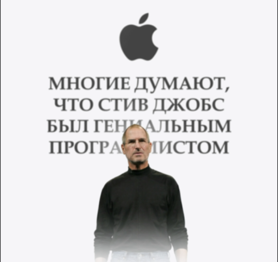
13. Use ChatGPT to Brainstorm Viral UI Animation Ideas: Welcome. In this video,
we'll explore using HGPT to come up with
IDs, to brainstorm IDs. So whether you're using
JTPT to work with your clients or to create
videos for yourself, it's going to be super
useful. Let's begin. The first thing I'll
do is I'll talk to JGPT explain what I want to do, and then we'll see
what JGPT does. Hey, JTPT, I am creating
video about UI designs. Actually, it's not
necessarily about UI designs, but using UI designs. So that's going to be UI panels, there's going to be websites, there's going to be interfaces,
all sorts of stuff. Specifically, I want to create
a video about Steve Jobs, the person who created and I want to create
a short film video, which is going to be, let's say, like 30 seconds long, and
we need to use UI panels, and we need to tell an interesting story about him that either has
not been told yet, which probably it has, but at least that
is not as popular, but it's very interesting and, like, a thumb stopper. First of all, I
need you to give me interesting ideas of
what we can talk about. Potentially, if
there are non ideas, we can talk about his net worth, about how much money he's
made, things like that. Having some sort of interesting fact about him would be great. So go ahead and first of all, tell me the interesting
facts about him, and then after that, we'll
decide what to do next. So, the more context I give to JDPT the better
because it's going to understand what I'm going for and really great, great results. Yes, this is actually true. He was fired. This is true, as well as if these
facts are not true. I like the fact that
his salary was $1, so I think we can
lean into that and we can use different
UIs. That's correct. So let's go and create the
script for a 32nd video, starting with a
very strong hook, then the value part, then the very good ending,
satisfying ending. Let's go ahead and
create the script, and I'll give you feedback. You can see he kind of wrote
for me all sorts of stuff, and I'm just giving
feedback back to ATPT. Hmm. Actually, now that
I'm looking at it, don't like how it's how
the story is developing. Okay, let's create a video
about his net worth. Let's talk about his
net worth when he died. Let's not talk about, like, the fact that he died, but
let's just overall talk about, you know, that he was worth I
don't remember what it was, but like ten plus
billion dollars. And that the interesting fact
is that he actually made, like, a lot of that from Pixar. Okay, let's first talk
only about the narration, about the script itself. And then in terms of DOI, we will figure it out later. I think this part is good. So I think we can kind of use this part. I don't
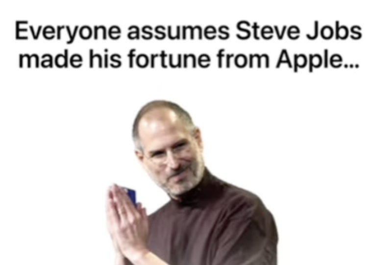
like the ending part. Everyone assumes Steve Jobs
made his fortunes with Apple, but that's not actually true. But that's actually, what am I right? But
that's actually wrong. When he died, his net worth was a little over $10 billion, but the majority that Mm hmm. I think this is going to be this is going to be a
really good script. So we will use this script. This is a really,
really good idea, and we just need
to make it happen. So if you have any
questions let me know, other than that see
you in the next video.
14. Prepare UI Assets and Layouts for Animation: Welcome. In this video,
we need to create our UI designs using our script. We will also ask ITPT to help
us a little bit with this. And we can definitely
use our own creativity, and I have a couple of thoughts
on how we can do this. But I also would like to see
if there's anything that IDPT will suggest that potentially we'll
make it even better. HITPT. So let's use
this as a script. I think this is going to
be really, really good. So we're just basically
getting rid of the ending. And for this, I
need you to suggest what kind of UI
designs we can use. So for every line or for every
change of the UI design, I need you to tell me what
exactly needs to be used. Okay, let's not add
this much texts. Let's shorten your
response by 75%. What I need you to do
is to next to the line, just kind of after a dash, write what kind of UI
we should be using because what you're doing
is a little bit too much. Can you give an
example of a card? You're talking about some
sort of finance card showing apologo and then later you're talking
about a card. So can you explain what
that means or visually show like visually find an image online to show it as an example? Okay, this is very interesting. Anyway, let's do it ourselves. So for this part, I will
actually use Apple logo, ah in mind, where it's
appearing step jobs. So this is going to
be an opener overlay of bank account design. It doesn't have to
be like exactly that because we might change a couple of things a little bit later. It came from Pixar. Pixar animated logo
on the screen. Here we need article from
Internet and other article. And here, great question.
What can we use? We'll think about this one.
Potentially, we can use like an iPhone orally or
something like that. We'll see. We'll see. So Apple logo. I will go just a
faraway and just search for the Apple logo. It's best to have it
Bing gi. This is great. Going to download it.
Bank account design, this is actually
something I have already in one of
the UI designs. So this is the bank
account I have. I will just copy it and
put it to download. Then let's search for
Pixar animated logo. Okay, great. So I'm just
going to copy the link. Go to a website, which is tdwn dot TO and
download this video. Doesn't matter
which tool you use, it's just some sort of download. You can Google it,
and you'll be able to easily download it. It's
going to take some time. Great. Just downloaded it. Perfect. And what
else do we have here? Articles. So for that, I'm just going to search
for an article Okay, this is actually pretty good. I'm just going to
make a screenshot here and I'm going to put it to downloads that we
have the screenshot. Perfect. And now we need
to have another article, and I'm going to make a
screenshot here as well, and it's going to be put
here as well, right? So we have two screenshots. Perfect. Now we just
need to record an audio, and we will be ready
to edit this video. If you have any
questions, let me know. Other than that see
you in the next video.
15. Animate Your UI Design in After Effects (Part 1): Video, let's create
the animations. So what I did is I
recorded the audio, cut it into Premiere Pro, and by selecting,
right clicking, replacing it with After
effect composition, I put it into after effects. Just important parts that
whenever you do this, you have to add some
sort of graphic. Otherwise, you will not be
able to import just the audio. Once I put that
into after effects, I just deleted the graphic, and now we have our composition, which is 1080 by 1920, 30 frames a second, and it's exactly the same size as our
audio in the background. We're going to select
all the audio and press Shift Command C or Shift
Control C to precomposite. This is going to be audio, so I'm going to call it
audio just to make sure that it is organized there
are less layers. I'm going to go into vertical, and I'm also going to
go into UI Designs, which is our Apple logo payment, the screenshots, and the video. G select everything,
put it here, and I'm actually going
to put it in a folder, and we'll call it UI designs. And now, all we have
to do is to just edit the video we have our text
here, our transcript. Everyone assumes Steve Jobs made his fortunes from Apple,
but that's actually wrong. By the way, I completely
forgot to find a picture of Steve Jobs PNG. Let's see what we have here. Why don't we use this one? Even though it's slightly worse quality, still pretty good. Going to dragon drop it here
and put it into UI designs, although it's not a UI design. First thing, I'm
going to press on Command Y to create
a solid layer, which is going to
be white solid. And then I need to put a PNG of steep jobs here and Apple logo. So I'm going to decrease the Apple logo and this is going to be
the very beginning. Actually, what we can do
is we can copy these, paste it here, and
then put markers. I don't remember
how to put markers, so I'm just going to
open keyboard shortcuts. You can just open them by
searching keyboard shortcuts, and this is going
to be a shortcut for you to open the shortcuts. So let's search for marker, and it's going to be Control eight in my
case, Control eight. So that I know where we
have layers and grades. So now we have here, here, here, here, here. So we have every
single new speech happening at the
marker, which is great. So in the very beginning,
we have this speech which everyone assumes Steve Jobs
made his fortunes from Apple. Okay, I'm actually
going to start with the second with the UI
design with the payment. By the way, it did not
import it correctly, so I'm going to
delete the payment, and I'm going to drag
and drop it like so. When you put it with other
layers or with other files, doesn't import it the way
we imported it before. So this is going
to be our payment, and I'm going to change 1080
by 1920, so it is like. Going to create a
null by pressing Shift Option Command Y, select everything by
pressing command A, and holding command, I'm going to press on null
so that we deselect it, and I'm going to parent
everything to that null. So now, whenever I increase
or decrease the scale, everything is going to
decrease or increase. Now, we need to find this text, and we will have to put other numbers
here because we have 134,000 and Steve Jobs net
worth was a little bit more. So we have this line here. When he died, his net worth was a little over $10
billion, 10 billion. It's this number here.
That's quite a lot. And what I'm going to
do is I'm going to create a text where I'm
going to put one, actually, and I'm going to search for a preset which you can find in the downloadable
resource section. You can just apply this preset, and basically preset that
allows us to control the numbers and we can
animate the numbers. This one needs to be at zero because it
does it in circles. Basically, one circle
is 360 degrees. And when I go to
the next circle, you can see it just adds a
little bit more and I can just on making it bigger
or smaller if I wanted to. In order to put a
specific number, we need to put this one to zero and put here like 10 billion. If it's going to
work, of course, maybe it's a little bit
too much for the system. Maybe we need to
get rid of commas. There you go.
There's our billion. Now we just need to make the
text a little bit smaller. And obviously, we
don't want it to be, like, precisely that. We can make it just a bit bigger or maybe significantly
bigger, something like that. I'm going to press on P, move it a little bit
decrease it in size. Move it a little bit up. Little bit to the right
and a little bit down. Let's see how the text
was before and now. Okay, so to move it a
little bit to the right. And by the way, now
we need to also parent this number
one to the null. We can put it to the very
top. It's not a problem. So that we know that we have our numbers next to the null. So our text here
is when he died, his net worth was a
little over $10 billion. Great. So we can
just animate this. We can press on you to
have the angle control. So we put the angle control.
I know, let's put it here. But this one, we need
to make it a little bit smaller and it's going
to work some like this. So we're going to have
increasing numbers. Now for the Sam Smith, we need to disable a couple of parts that we can get
to the text. Sum Smith. This is the text. When
I select the layer, if I create a text layer, it's going to be right
above that layer. But if I don't have any layers selected and I start typing, it's going to create a layer which is going
to be number one. But we do want to make sure everything is
closely together. So it's going to be
selected layer 71, then present T and
present T here. So here we write Steve jobs, P and S, and I'm just
going to put it there. Go to disable Steve
Jobs. This is good. We also need to parent
Steve Jobs to null. And now when we increase
the size of the null, everything is going to scale. We can delete this
part and this part, so it's going to be like this. By the way, for Steve Jobs, which we can also
put at the very top, by pressing command shift and right bracket going to
become the very top layer. We can to make sure it's at
the top isn't easy to find, we can add text Evo. I'm just going to apply
one of the presets, which is going to be like
up opacity plus characters, so it's going to be
something like this. Then I'll go into transform
position and just change it so that it's not as big of a movement
in the beginning. Yeah, this looks good. Basically, we can animate
every single part here. Why don't we just use
the animation composer to create some sort of movement? Let's press in and
do a bit of random select everything, okay? So Oh, interesting. It enabled all the layers, all the visibility
for all the layers. So let me just
disable some Smet. And this select all the layers. Move it just a little bit
to the right so that we don't have any layers appearing
in the very beginning. Okay, this is pretty good. Now we also need to
animate the opacity of this text here to make sure
because in the beginning, it is visible right away. So we can do some like this. As you can see, we have lots of UI parts animated
at the same time. Like, it didn't take us a
lot of time to do this, but it looks really good. Maybe a little bit
chaotic at this point, but then we'll see
we might change it. It's not a problem at all.
Okay, so for this part, it's actually really good. So it's this part. And let's see what
we have like this. You're going to select this part and move it to the very front, and we just disabled
the Bgon. Yes, like so. So let's open our Steve Jobs, Steve Jobs video, and let's
put our payment here, which is going to be I'm going to cut this part by pricing
option right bracket, so I'm just going to cut
it until the cursor. And I'm just going
to put it here. When he died, his net worth
was over $10 billion. By the way, it needs to
be ten and not 1 billion. It's to be like
this number, yes. So we need to copy this
number and not 1 billion. Now, we go into our text, which is going to be
one, put this to zero, put this to 10 billion. Mm. And we need to
delete commas. Like so. Perfect. Delete the
keyframe press Shift P to reveal the
position keyframes, move it a little
bit to the right. Like, so great. Now, let's make
it not precisely, like, 1 billion, but a
little bit more than that. I'll select this. Come to
the very first keyframe, put this one to zero, and this one to this number, but also delete the
commas. There you go. This is what we have.
Looks really good. So when he died, his net worth is a little over $10 billion. Great. Just going to move this keyframe a
little bit further. At least one of the
UI designs is good. But the majority of that
didn't come from iPhones, Max or Apple stock. So let's search for Apple stock. It's two, five years. One year, five years, maybe we can find Yes, something like this
graph would be great. This is a great UI design. And here we can do all years, going to take
screenshot of that. Then we also need iPhones and Max because that's
what we're talking about. And for that, we can use Mmm. We can use screenshots as well, iPhone 17 because this
is the latest version, 17 PNGs going to make our life a little bit
easier if we have it in PNG. If we don't, we can
always yes, this is good. So I'm going to download it. Mac, PNG. This is a good one.
We can use it. So now we just need to
select all of these, and let's put it in our project and then just
drag and drop it here. S to decrease the scale. And now we're going to
create a mask here. And I'm going to create a mask. Like so. Great. So we
have the Apple stock, then we have the iPhones
and we have the mak Great. So I'll just put it here, and then we'll think on how to animate that a
little bit later. It came from Pixar, so this is going to be
Pixar Animated logo. Let's find this video of Pixar. Was it this one? Yes. Shift Option Command G H to fit it to the screen. I'd like to cut it
until this point. Here we have it came from Pixar, and now we'll have jobs bought pixel at some
sort of time and date. So I'm just going to put it here as to decrease the
scale a little bit. Now we can use the crop effect. Let's put it to zero. Now Did like so. Okay. Now this is great. So
now we can crop it from the top or bottom
without losing anything. Okay, so crop from the
top or from the bottom. Okay, so it looks like it's vice versa, but it's not a problem. And then left and right. This looks good. We
can cut this part. And now we have
another screenshot, about 20 years later. And we can actually, I believe. You can take the
previous screenshot, copy all of this, paste it here. Now we just need to adjust
the crops a little bit, just a little bit
from the bottom, a bit more on the
right, like so. And from the top or
let's find the stop. Like so. So let's
see what we have. In the very beginning,
this is what we have, then we have this animation. Then we have this, and then
we have this, this, which is, by the way, we can
probably move a little bit to the right and make it a little
bit higher so that these are sort of
similar to one another. And then in the end, we don't have anything
because we have not yet decided what
we'll do with this one. Actually, for this one, because we're using the for
the first line, because we're using
the Apple style, we can keep simplistic,
like Apple does. We can keep it minimalistic. And we can have text
appearing on the screen. Everyone assumes that Steve Jos made his fortune from Apple. We're going to copy this text, open the text tool,
paste it here, make it black, put
it in the middle, select everything,
make it a bit bigger. We can have a couple of interesting ways
that we can do this. So let's just cut this up a
little bit, put it, like so. Great. So let's create an
animation for the text. Actually, I will just
apply preset right away, so I'll apply up by words. Actually, I like to
make it a little bit bigger because just
a little bit too small. Great. And now we can have stiff jobs appear on the screen. So this is the Apple logo
which we can disable for now. We can see that the stiff jobs actually cut out a little
bit from the bottom, and we want it to be smooth. So I will, first of all, make him just a little bit bigger and put him
above the text. And I'm going to
create Command Y, create a white solid, which
we can mark as white. And I'm going to lower
it down a little bit. Cut it up, put it o, and I'm
going to decrease the scale. I'm also going to apply
fast box blur to it. Going to increase the blur and click on repeat edge pixels so that doesn't repeat and
let's increase it in size, press on P, and lower
it down a little bit. So this is what
we're going to have. And we can animate Steve jobs
to appear on the screen. This is Steve Jobs. We can
actually rename Steve Jobs. We can just rename the
screenshot to be stiff can parent this white
solid to Steve jobs. So we will parent it. So now, whenever we
move Steve jobs, this is what's going to happen. I'm going to press on P
to create a keyframe. This is going to be
the final keyframe, move it a little bit further. But on the first keyframe, it's going to be out of the frame. Going to select this,
press on N F nine. I'm going to open
the graph editor and make it in an
interesting way. At the end, we want
it to be smooth, so we're going to smooth it out. But in the very beginning,
we want to be the opposite, want to be as
abrupt as possible. And actually, I'd like to move step drops
a little bit lower because I'm going to change the income
point a little bit. And then for the Apple logo, let's think about
where we can put it and what we
should do with it. Can put it a little bit higher, make it a bit smaller,
put it like so. Actually, there's a very
interesting effect, I remember what it's called. After a little bit of
digging, I found it. It's called an inky Irish wipe, yes, inky Irish wipe. There you go. So, into pressing you to have
the key frames, this is going to
be the transition. Steve Jobs made his
fortune from Apple. I actually like that when
we have this full coverage, we can actually just hide everything behind
and then disable it so that we can keep
the white background, but then everything
that we have on screen is going to disappear, and then we can get rid of this circle because
it's not good. So we can just click here
and disable the circle. Great. I think at this point, it's a good idea to
take a little bit of rest to kind of reset the brain and then
come back with a fresh eye and see if anything's going
to be better or not. So if you have any
questions, let me know, and I'll see you
in the next video.
16. Continue Animating and Add Interaction Effects (Part 2): Let's continue
editing the video. Let's see what we got so far. Everyone assumes Steve Jobs
made his fortune from Apple, but that's actually wrong. So this is where we need to
say that's actually wrong. Then we have this
animation appearing on the screen, which is okay. By the way, we can
put the picture of Steve Jobs here at the top. And then we can potentially
do Zooming here. But the majority of that
didn't come from Max, Apple, or Apple stock. So this is where it needs to be. It came from Pixar. Jobs bought Pixar in
1986 for $5 million. And then, and then we say that
single deal, Okay, great. So I have a couple of ideas on what exactly we can do here. So, first of all, I
would like to highlight the fact that it was bought for a particular
amount of money. So here's what I'm going to do. I'm going to create
a shape layer, which I'm going to highlight with the shape
layer, this thing. Basically, I'm just creating
a shape on top of that. And then for the color, we are going to make it yellow. Let's do it look so. And then for the mode, we're going to use multiply
so that we can see through it and got this up now, I'm going to apply an
effect called linear wipe. And then if we do it, so we can see we can inch
how the text is highlighted. I'm going to change the angle to minus 90s that it happens from left to right
instead of right to left. And now we can create a
keyframe, press on U. So this is going to
be final keyframe. If we move a little
bit to the front, we can do it the opposite
way so it's Select this, press F nine to make it smooth, and we can do it like as well
to make it even smoother. Perfect. And then I'm
going to duplicate it, press on P, move it a little bit lower and move
it a little bit to the left. Like so. There's a couple
of things we can do it. We can either decrease
the shape itself. So rectangle path, decrease
the size, horizontal size, then press on P, and
move it to the left, like so and then decrease
the size even further. So now because the
linear wipes are in different positions and we animate in
different positions, we see the effect where
this one is highlighted, even though this one isn't. And that's exactly right. So we need to change these numbers a little
bit so that it works. Pretty good. Although
I would actually precompose this because
if we increase the scale, you can see that because we
have this linear wipe effect, which is basically I'm going
to quickly show it to you. If I apply, like, a gray, yes, there we go. If I apply a gray, just solid, and then I apply a linear wipe, you can see what kind
of effect it is. And so we are basically
animating it to go from here, which you can see our
highlight to go to here. But then whenever we
increase the scale, let me give you a quick example. The highlight stays
in the same position. The text changes its position relative to the linear wipe. So that's why we get
this weird effect, and so it would actually be a little bit better to
just precompose it. And now, if we
increase any scales, it stays exactly the same, which is exactly what we needed. And then we'll
call it Article 1, and we'll cut it
from here to here. The way cut is with
Shift Command D, it creates cut on the layer. So we have this, by the
way, for this pixer, we can also apply a
color key effect and then select the blacks thin edge by one, increase the tolerance. But then what we'll also do
is we will create a mask. So I'm going to
select the layer, click on here on our shape
layer. Create a mask. Then we'll be going to
the effects color key in the compositing options. Click on plus, create a mask, and then we need to invert
the mask so that we don't cut out any
blacks from here. So now it is perfect. 20 years later, Disney
bought it for 7 billion, so we can highlight
this line here. We can actually just go ahead
and copy this shape layer, pasted in here, like so. So the This is our highlight, which we're going to put
in the very beginning. We're going to increase
the size of the rectangle, horizontally and
vertically shift P to reveal the position
and move it a little bit. And we just need to
change this part. And we need to
change this as well a little bit, and
this should be good. Definitely making
some progress here. Everyone assumes Steve Jobs
made his fortune from Apple, but that's actually wrong. So for that actually, I think we can zoom in here. And for that, I'm going to
create an object Shift Option Command Y. I'm
going to cut it and make it lined of this part here. I'm going to connect all
of this aside from, yes, we need all of this
to then P and S, and we'll start from here. And whenever I see
in the background, but that's actually wrong, we will zoom in on that part to emphasize it roughly like so, and then we can press FNF nine. By the way, if you
have this option, the flow plugin is also really good because
I can just select it. Instead of me doing it manually, I can just select one of
the graphs, for example, like this one, it's going
to make it smooth. Like so. And one more thing
I'd like to do here at the end is create another transition
here so that we transition from this
view onto our UI video, and we can do that with
animation composer, as well, so we can
look for transitions. Here, we can do something
like a Zoom Zoom out. I think like Zoom in is
going to work pretty well, and we need to put
it at the top. So we'll do something like We have this kind of jump here from this
color to very black. We just need to add some
sort of transition. And for that, I will press
some T for this transition. It's going to go from
this super black to barely visible
to very visible. It's going to go maybe we can do it like so
just trying to create a smooth transition
that's going to allow us to create
a smooth movement. Yeah, this is
actually really good. First of all, we
can come here and let's find this part.
Where is this one. Layer 76, and we can use a picture of him
that we used before. Okay, I'm just going
to copy this steve and put it into payment here. I don't need any
position keyframes. We can just put him
there, press on S, decrease his scale a little bit, and then track mat
it to layer 76. And, I see. So it's not layer 76. It's layer 78 cause layer 76 is the blue
highlight around it. So we need to track mat it
to layer 78 and enable it. Eventually, make it
just a bit smaller, move it a little
bit to the side so that it fits there.
So there we go. We have our steep drops, and I'd actually to make this layer create shapes
from vector layer. And I'd like to make this
layer white so we can person fill and then fill it with white so that there's
just a bit more contrast. We can see steve drops
a little bit better. Okay, so we have
this very good zoom was a little over $10 billion. So here, I would like to
zoom in at this point. So I'm going to create a null. Let's see if it's
not animated at all, doesn't have any gift
range because if I press on U, nothing appears. So I can press on P and S, and then I can zoom in a
little bit on these numbers. So it's going to be
so as you can see, our step job stays in
the same position. So what we have to do is
to find it Steve jobs, and we need to parent
it to null number one. Before it starts moving, so now it stays in the
same position, great. I'm going to select
it, now I'm going to press on flow instead
of doing it manually, so it's going to save
me a little bit of time and then create a
bit more space. So let's see what we have. And I'm going to move
the key frames just a little bit faster to
start a little bit faster. For this last frame, we can move it out of
the frame, like so. So it's going to go from
here to out of the frame. And for these where
I'm also just going to click to make it a
little bit smoother. I'm going to open the graph
and in the very beginning, want to be smooth,
but at the end, we actually want it to be fast so that it
happens like this. So it gets out of
the frame quickly. Let's see what we have here. Okay, and here I'm saying the majority of that didn't come from iPhone Max or Apple Stock, I'm going to put
it to the bottom and shorten these a little bit. IPhones just going to decrease everything
in size a little bit. But the majority of that didn't come from where do
we have it here? And over here, we can actually use something
like a typewriter effect. I feel like it's going
to be a good change of the situation because we had some different animations
here in the very beginning, for this part, we can use something a little
bit more different. Typewriter, and then we
can start it from here. And I'm just going to speed
it up a little bit because I can actually hear my
voice in my headphones. You cannot hear it, but
for the sake of time, I'm going to do it quickly here. Press on P, move it
a little bit higher, and potentially decrease
the size just a little bit. Apple's stock is barely visible. We need to do something
with potentially increase it in size, like so, because the
graph is just too small. And then if we're
going to why don't we create like another mask or
does this one have a mask? Yes, it does. So we can
actually just change the mask. We can select this and then move it a little bit, like so. So I'm selecting
the mask by using the selection tool and
just putting it there. And why don't we move
it a little bit lower? Potentially put
it in the middle, like so now I'm saying
it came from Pixar. We can put this text here saying it came from and then Pixar
will be sort of like a text. Our video will act as
captions in a way. So let me put it like so. Okay, so we have a couple
of things here appearing. We have this big text appear. We're going to press on P
and S and create keyframes. And I'd like to start
from this line, which is how did Steve Jobs get into Pixar and select
these, make it smooth. And actually, for
this part here, I'd like these key frames, potentially just move it a
little bit because I don't like the way it's
being animated here. Move this a little
bit faster, as well. Why don't we find a picture of Steve Jobs for this
very last part here? That single deal
made him wealthier. Ooh, this looks
very interesting. Why don't we try
to use some this? Okay, so for disappearing, I'm just going to animate
the opacity to make it like, so And here we can also try to use a transition from animation composer to see if
maybe something like this. And then to add captions here at the very end, going to copy it. Why don't we add text E here and I'm going
to paste the text. Just select the text, person P, change its position, and let's create some sort of
animation transform position. Let's lower it down. Decrease the opacity and
increase the blur by 100, 100 going to press new and make things
a little bit faster, and then decrease the
delay to let's say 0.5. Actually, it needs
to start here. And I think the blur is
just a little bit too much. So we can decrease it to 50. And let's create opacity
keyframes here as well. So this is going to be one
and it's going to be at zero, then this one for some
reason is at five. Actually, I'd like
to precompose this and zoom in on that a
little bit, as well. P and S. Create keyframes, zoom in a little bit. Like, so select these two. Make it a little bit smoother. Okay, let's watch it from
the very beginning. A
17. Add Music, Sound Effects, and Final Audio Polish: Welcome. In this video,
we're going to do sound design right
in After effect. And in order to do that, we
need to find our audio file, which is going to
be at the bottom, and we have to press
L and L two times. And then we are going to
get the audio waveforms. This is super important
because it's going to just make our
live float easier. We'll be able to
see where we have certain words where the speech ends and the other
speech starts, basically the end
of the sentence and the start of
the new sentence. Now, in order to do
the sound design, we need to get audio, the best place that I found over the years is Epidemic Sound. Epidemic Sound is a company
that specializes in producing music, sound
effects, voiceovers. And if we come to their website
and we take a look at it, we'll see that we have
the discovery type which is going to be
like all at once. Then we have the music tap
where we can search at the top or sort by different
genres artists, things like that,
super convenient. And for the sound effects, we have lots of
sound effects here, and as you can see, we also have user interface. So we come here and search
for lots of user interfaces. What I do is I go into
the interface and I just search for some glitch. B. This is actually really good. There's going to be a link
in the description for the 30 day free trial
for epidemic sound. I recommended you to try to see how to work with
professional tools. However, to save time, I already have a folder
with UI sounds, which are all gathered
from epidemic sound. As you can see here, we have
epidemic sound at the top. So you can find all of these
sounds on epidemic sound. And let's have a little
listen to what we have here. Yeah. Yeah. Okay, so this is going to be the first sound
that we are going to use, and to make our life
a little bit easier, we can actually just select
everything here and we can precompose it by pressing
Shift command or Control C, and it's going to
be called visuals. We can use the audio here. So we can actually create
another folder and call it audio to make
things even better, and then put audio here, and then whenever we put any
other of the sound effects, we'll just put it in the folder to make sure things
are organized. So there we go.
This is our sound. I'm just going to
drag and drop it. Press on L, L again, and there we have our sound. So we can see we
have two sounds. Everyone assumes Steve Jobs
made his fortune from Apple, but that's And we can shorten
it up by doing just so. And then when Steve Jobs is about to appear
on the screen, we're just going to put
it roughly right here. Steve Jobs M So everyone assumes Steve
Jobs made his fortune. I would say that it's a
little bit easier to do sound effects in something
like Premiere Pro, but we can still do
it in after effects. So we have the sound when Steve Jobs is
coming onto the screen. Zoom Steve Jobs made his And in order to
work with the audio, speaking here in the background, it's a little bit too loud. Zoom Steve Job. We to go into Window audio. Then we are going
to have it up here, and we just need to drag
and drop it here just for organization purposes
because it's a little bit more
organized this way. And then all we need to do
is to lower the acupose. For example, for this one, I
would say we need to go to, like, minus ten.
Let's give it a try. Tom's stiff job? Everyone assumes stiff job. Mm hmm. Let's give
it a try to try -12. Everyone assumes Steve Jobs
made his fortune from Apple. But that If it's still
a little bit loud, we can lower it even further by, let's say, currently
it's at minus ten. We can do it at -20 and
this one -20, as well. So let's give it a try. Everyone assumes Steve
Jobs made his Yes. So it's settled in the
background. Pretty good. Everyone assumes Steve Jobs
made his fortune from Apple. So here for this Zoom, you can actually use
animation composer and look for sounds. And here, we can
actually just search for a swoosh let's give
this one a try. Oh, but that's actually from
Apple. But that's actually. Hmm. I'm not sure if it's
working really well here. Let's give this one try.
That's a little bit longer. His fortune from Apple, but that's actually rom. Mm hmm. Okay, this is better. For this very interesting Zoom that's happening
on the screen, we can actually use
something similar. We can just duplicate this one
and then create Swishliko. Actually oh When he died, he's not from Apple, but
that's actually rom. When he died, he's
net worth from Apple. But that's actually
wrong when he died. Great. So what I'm trying
to do is just support the moment that we have
with some sort of sound. Then for this one here, we can actually use
something like a ratchet, which I believe I have here. Yes, this can be pretty good. Let's put the ratchet here and see Presson L to
see the waveforms. I his net worth was a
little over $10 billion. But the majority of
that didn't come pixel. Jobs? What picture are you? Yes, I'm just going to use a part that's a
little bit later. Start roughly here when we see the numbers
for the first time. His net worth was a
little over 10 billion. Dollars, but we are
going to end it here. I'm going to press
Option Right Bracket to end it here. Billion dollars. But the majority of
that didn't from. Okay, for this one, we can
use the typewriter effect, which we also have typewriter. Let's just put it in and disable the visuals because
it's actually video, and let's find a place where we have the first letter start and we're going
to put it there. But the majority of that
didn't come from iPhones, Max or ApplesT. Yes, perfect. And then for every
single pictures that we have uppe, we
can use some sort of, like, a hit or some
sort of pop up, which we can actually
for animation composer. This is good. I'll
come from iPhones. So I'm just finding a
point wherein it switches, and then I'm going
to use it again. Max. And where's it in here? And let's add. Let's listen. I come from iPhones,
Mac or Apple's stock. It came from Pixar.
Josh Dobbs bought Pixar in 1986 for
just 5 minutes. And here, we can use a marker sound effect
because we're sort of, like, highlighting
it with a marker. So let's search for a marker. This will be good to go. By the way, I forgot to add it to the audio. It's
not a problem. Let's put it here,
make sure things are a bit more organized and then put the ratchet
here as well. Perfect. Okay, for the marker, let's try and drop it. Let's see when we have the
word begin. Roughly here. Just $5 million.
Okay, this is good. And then for this marker, let's use marker here as well. I'm going to duplicate it by pressing Command D or Control D, and then I'm going to move
to this place where I'm also going to press and
shift to make sure it fits perfectly to the playhead. 20 years later, Disney
body four for 7 billion. For these movements, we
can also use a swoosh. So we know this is a swoosh. We can duplicate it, put it
to the top, put it here. We start in 1986 for just
$5 million a tiny gamble. 20 years later,
Disney body four. And then use another one here, so I'm going to
duplicate this one, put it to the top,
put it to the right. Let's put it like so. By four for 7 billion. Move to bit left
to start faster. Disney body four for seven. Later, Disney body
four for seven. Maybe a bit to the left. Disney bought it for over 7
billion. That's good deal. And here we need to use
something like a fast Swoosh. So going to once again, go to Animation composer,
search for Swoosh. Bit faster, let's see. That single deal made
him for 7 billion. That single deal made him wealthier than his
entire Apple career. Everyone assumes Steve Jobs made his fortune from Apple,
but that's actually wrong. When he died, his net worth was a little over $10 billion. But the majority of that
didn't come from iPhones, Max, or Apple's stock.
It came from Pixar. Jobs bought Pixar in 1986 for just $5 million,
a tiny gamble. 20 years later, Disney bought
it for over 7 billion. That single deal made him wealthier than his
entire Apple career. Now we just need to lower
everything down by roughly 20. So if I open audio, we have it at -20. Okay, so I'm just going to
put -20 here and I'm going to copy it and then press on tab and put -20
further as well. Apple, but that's
actually Oh, okay. This is too quiet. So let's
try minus ten minus ten. Basically, the one on the left is the left ear and the one on the right is the right ear, and we can actually just take away it from the right
ear or from the left ear. From Apple, but that's
actually wrong. When Okay, so this needs to be minus ten
and minus ten, as well. He died, his net worth? This definitely needs
to be a lot quieter, minus ten and minus ten.
Let's give it a try. When he died, his net worth was a little over a little
over billion dollars. But the majority of
that did Oh, yes. This needs to be at like -20. But the majority of
that didn't come from iPhones, Max, or Apple. Oh, and this is,
like, very loud. Okay, so click on this one. -20 -20. Let's see. How loud it is?
IPhones. Okay. This is a good amount of loudness, -20. -20 is basically in
terms of the decibels. You want to make
sure that the audio is somewhere roughly in the minus in between zero and -30 in terms of
the sound effects, the voice overs,
things like that. What picks are in 19 This
needs to be at minus ten, as well, so that we can hear it, but it's not
overpowering the voice. What picks are in
1986? We just fight? This is too loud, I
know, right away, it needs to be at -25, more or less, because it's very loud. It's for just $5
million. A tiny gamble. 20 years later, Disney. So once again,
needs to be at -25. 20 years later, Disney
bought it for over seven. And this needs to be at -15. Disney bought it
for over 7 billion. That single deal made him. And this needs to
be let's try -15. That single deal made him wealthier than his
entire Apple career. Everyone assumes Steve Jobs made his fortune from Apple,
but that's actually wrong. When he died, his net worth was a little over $10 billion, but the majority of that didn't. Actually, the movement
that's when it's going down, actually, I would like to add
another sound effect here. Which would be like a swoosh. We can go to Animation
composers search for Swoosh For this swoosh, move it to a Little bit down. Billion dollars.
But the majority. And move it to roughly here. When it's about to disappear
and move into super fast. Billion dollars.
But the majority. A a bit faster. Billion dollars.
But the majority. Little over $10 billion. But the majority. Majority. Shalin. It's better here. Okay, so audio, let's do
minus ten for this one, minus ten, minus ten was a
little over $10 billion. But the majority of that
didn't come from iPhones, Max or Apple's stock. It came from Pixar. Jobs
bought Pixar in 1918. Pixar, I think, could be a good idea to
allow the visuals, allow the audio to
appear here as well. Bulltk. It came from Pixar. Jobs Bought Pixar? So
let's listen. Fullstok. It came from Pixar.
Jobs bought Pixar in 1986 for just $5
million a tiny gamble. 20 years later, Disney
bought it for over seven. Billion. That single
deal made him wealthier than his
entire Apple career. Everyone assumes Steve Jobs made his fortune from Apple,
but that's actually wrong. When he died, his net worth was a little over $10 billion, but the majority of that
didn't come from iPhones, Max, or Apple's stock. It came from Pixar.
Jobs bought Pixar in 1986 for just $5
million a tiny gamble. Ten years later, Disney
bought it for over 7 billion. That single deal made him wealthier than his
entire Apple career. Everyone assumes Okay,
this video is perfect. I absolutely love the
way it turned out. We have lots of
good sound effects, and it's really, really good. So now the last part, all we have to do is to
export the video. We are going to do
that next video. If you have any
questions, let me know. Other than that, see
you in the next video.
18. How to Export Your UI Animation from After Effects for Social Media: Welcome. And this video is sent for us to export the video. So all we have to do is go into file in the
top left corner, click on Export and
add to Render Queue. For the settings, I recommend you to keep the best settings here in the render settings
and for the output module. I recommend setting high
quality with Alpha. Basically, in terms
of these settings, if there's anything
specific that you need, you'll definitely know
because either a client will request or a platform will request or
something like that. If not, then just
leave it at best and put a high
quality with Alpha. So just do it like so. What this does is, if there's something like a background, it's going to keep
the background. But if there's
something transparent, it's going to be transparent. It's just something
I set for myself, and I always have high
quality with Alpha. It's just a little bit easier because I
don't have to switch. So that's why I always
export with these settings. And then if I click here, we need to give the
name of the video, which is going to be the name of the composition that
we want to export. We can change it
here at the top. Click on Save and then click
on Render. And that's it. After it renders it, we'll be able to
see the whole video to make sure everything's okay. If it is, then this
video is done. Let's come to the desktop
and see the video. Everyone assumes Steve Jobs made his fortune from Apple,
but that's actually wrong. When he died, his net worth was a little over $10 billion. But the majority of that
didn't come from iPhones, Max, or Apple's stock. It came from Pixar.
Jobs bought Pixar in 1986 for just $5
million, a tiny gamble. 20 years later, Disney bought
it for over 7 billion. That single deal made him wealthier than his
entire Apple career. Beautiful, absolutely
beautiful. I love this video, and this videos ready
to be published. So if you have any questions, let me know and I'll see
you in the next video.
19. Last Step!: Congratulations to you.
You're nearly 100% done with UI animation
after effects course. There are just two
small steps you need to take. First, take action. As Confucius said, a journey of 1,000 miles begins
with a single step. So if you haven't already, take your first step by creating
your first UI animation. All the best information
in the world means nothing if you
don't act on it, and even small steps lead
to massive outcomes. E. If you found value
in this program, I would really appreciate
if you could take 60 seconds to leave
you honest review. I'll be immensely grateful to
you and your feedback will massively help future students in choosing the best
program for them. Although this
course is complete, your journey has just begun. Be sure to keep me and
fellow students posted. Remember, I'm here
for your success, so if you have any questions, be sure to reach out in
the QN section below. Thank you again for choosing
me as your instructor, wishing you all the
best and looking forward to seeing you
in future courses.
 Vladislav Sateev, Video Editor