Transcripts
1. Introduction: I think it's fascinating
to study the masters. And I want to study the
masters in a way that's not so intimidating as what people normally do when they
studied a Masters. When I was in my twenties, I went to Paris and
I was at the Louvre. And there were different
people set up on their easels with their whole paint palettes
available to them. They were sitting under a
painting and they were painting a duplicate of the painting that they were
sitting in front of. It fascinated me and I've been fascinated with that
concept ever since. And studying the
masters is nothing new. I mean, that's definitely
something that we all should do at some point. But I want to study
it in a way in this class that is a
little less intimidating. After Nice Love. And I'm an artist and photographer out of
Atlanta, Georgia. And in this class, I want to study the color
palettes of the masters. I want to look at different
impressionistic art, which happens to be a particular
favorite area of art. For me, you can pick whatever area of art
kinda interests you. And I want you to
study the colors. What makes it work? What colors are they using? How have they combined them? And I want you to pull together a color palette out
of the painting that you've been inspired by and create some little
abstract art of your own. We're not trying to repaint
the masters painting in this particular
type of study. We're trying to
experiment and play in the color combinations
that have been proven over time to be amazing. See what we can come up in our little art room for pieces of art like
we'd like to create. And in this, I want to discover new color palettes
and ways to use color that I never
would have thought of, or this didn't occur to me, or maybe something that's
outside my comfort zone in a color palette that
I'm not normally going to be drawn to
or comfortable with. Doing these things. Help us stretch and grow. And it pushes us in other directions than
we might normally go. It's a really great thing
to do if you're in a rut and you want to sit at
your art table and create, but you're like, I don't
know what to create. Now, you can have
a project where in those moments where you
need some extra inspiration, plot a masters painting, and try to come up with
the color palette that is inspired by the painting and create some abstract
art off of that, you can create whole
series in this way to then share or sell or
send to the gallery. It's an excellent way to create and learn and push
yourself and grow further. I hope you enjoy the different projects that I was inspired to
do in this class. And I can't wait to see what masters paintings inspires you. I want you to come back and
share your abstracts and your color palettes
and the paintings that were inspired
when you're done, come back and share
those with me. And I can't wait to get started. So I'll see you in class.
2. Class project: Your class project is to pick a master and come up with a color palette from the
painting that you've picked. And come back and
show me the painting, the abstract painting
that you created from the old masters palette
that you came up with. This is actually a
really fun experiment. I thoroughly enjoyed the different projects
that I created in class working from
different color palettes that I might normally
have selected. And just being inspired by the old masters and doing
some little studies and a little bit of a different
way than you normally think of when you think of
doing old master studies. Normally you're trying to replicate the painting
that they created. And in this instance, I want to replicate the
color palette that created. And I want to replicate the
color palette in a style that works for my abstract art so
that I discover new things. Kinda played outside
of my comfort zone, doing a few things that maybe I never would
have tried before. And this is a super
fun experiment to do at your table
when you have nothing else that you can
think of that you want to create and you're getting
frustrated or you're thinking, Oh, what can I do to practice? I don't want to
waste my supplies. This is the perfect opportunity for you to learn and create and end up with something
really beautiful and hopefully a little bit different than you normally
would have done. So I hope you really enjoy
the project today in class, I want to see what
you came up with. So definitely come back
and share those with me. I'll see you in class.
3. Inspiration: I thought we could start
by taking a look at the inspiration that I'm gonna
be using in this workshop. So I am going to be inspired by the color palettes of the
impressionist artist. So I have a book here. This is the basic Art series, and this is the
tin and one book. And so what this is
is basically ten of the basic art series books all
smushed into one big book. And I wanted to use
the impressionist as my inspiration because I
particularly love impressionism. I love abstract art. And I thought that
this would fit right into the style of things that
I usually love to create. And their colors might introduce me to a new
color palette that, you know, maybe it's
a little bit outside my box and might
become a new favorite. So what we're gonna do
is I'm going to just take you through some of the photos here in this
book and talk about them. And you can be
inspired by any of the masters that are
particularly fun to you. And then we'll see what we can create from the ones
that we loved the best. So this book is separated into ten different
impressionist artist. And it starts off with Manet. And I really love in this particular series of
his, this, a bullfighter. And what I love is the colors. We've got kinda this raw sienna, maybe burnt umber background. We've got the pop of red. We've got some maroon and some light pink with
touches of blue. And this could almost be
like a sap green color. We've got a little white
and a little black. And you can see right there, just for me describing the
colors that jumped out at that painting that I now have a color palette that I could
do an abstract piece from. And so this one I really love might be one of the ones
we experiment with. So we will see. And then up at the
top here I've got these fun little metal book
darts that I found on Amazon. And it's the perfect way to get an art book and Mark pages that you love and be kind of
elegant at the same time. So you'll see these
little book darts on all these pages I'm flipping towards just because
I like them. I thought I'd just
point those out. They're pretty cool. We're
still in the manet series. And I really like this lady, a woman with fans, because I love this kind of yellow ocher, raw
sienna background. I love the pop of Aqua, the pop of orange, the pretty blue in here. That's really soothing and
I love that color way. We have the black,
we have the white. This could almost be like a Payne's gray rather
than a black. So lots of colors to pull from in that love the way
they kind of blend together. So still in the manet series, I just went to the bar. Still, you've got bright yellow, you've got the
sienna, some ocher. You've got like a deep
bluish purply color here. You've got like some
royal blue in here. Some fun choices there
on that painting. This is Degas. Degas, I love all of his
ballerinas in these ballerinas. And I see this too in a lot of the painters that
we're looking at, they really have color palettes that pull from the color wheel. So here we have the blue orange, which is a really popular
contrasting color. And look how beautiful
it pops here with the blue and the neutrally
background here in the orange. And I just think
that's so beautiful. Let's come back and see
what else we've got. Just trying to give you
a lot of ideas here. Again, blue, orange, yellow. I love all the shades in here. That's like a really beautiful, kinda awkward turquoise color. Really yummy there. Yellow and more of a royalty kind of blue. Look how beautiful that contrast that color and that
really beautiful. Still in the day guy. Look at how Yummy This is. We've got the background
with the white and maybe some ocher
and some orange, maybe a little sap green. With the sap green, some pops of red and some
vibrant little pops. They're in this chest that
the girl is leaning on. That beautiful love. It. Got all my
little ideas marked. Then I can go back and decide which one I'm
gonna do for class. I really liked on this page, this lady with the eyeglass, and I liked it
because it's a really soft, almost Naples yellow. You've got this yummy kind of
sienna, orange background. There's a little pop
of like light blue, like a grayish blue back there. And then you've got some
black and some white. So that's a really
nice subdued palette, but all the colors in there
just really speak to me. And some color palettes that
I kinda love to pull from. Another pretty little
ballet from de Gaulle. This one I liked the walls, the green, and the more
of the blue-green. I liked the difference there
with the pops of orange. So again, we're seeing that
blue orange combination gives a really pretty pop
of color and a lot of interest in our painting. I love these. And yeah, this is kinda
like the same painting. Like he's done studies, but you can tell even
though the man is the same man standing there
with his walking stick, he must just stand there in
class and that same pose. And so de Gaulle was like, Let's paint this multiple times. So let's keep going here. Oh, I loved the set of
colors that we have here. In this one, I liked the pink, I liked the vibrant pink, green, orange that we had
there in the background. We've got some white
and some black. I'm really feeling this color
combo here on this one. So that one's gonna be a
fun one to experiment with. And in this one, I
loved the yummy, delicious shades of blue and the background contrasted with
the yellow and the orange. That would be a particularly
beautiful color combination. We've got some different shades there that we can kind
of experiment with. And then the yummy dark blue and light blue
shades that are in there. I love this one, so
that one might show up. This one super fun. We've got the blue orange
combination again, but in different shades, lighter shades of
the blue orange. So I do like that color combo. This is weirdly enough. Favorite color combination. We've got like a light
and dark kind of sap green or mosque green
kinda in that green family. We've got some yummy burgundy, little hint of light pink and some black and
there's no widen that, but we do have that pink, kinda that lighter shade. And I just think that
is just so dynamic. So filling like this
could show up today. I don't know. We'll see. I'm loving that one. And again, that's from Degas. And that is Lady in town close. Love that this is
pastels on gray paper. But we're gonna be using whatever medium it is
that excites us today. But I do love how he experimented
with different mediums, because I love
experimenting with pastels and paints and stuff. And I love seeing when
they have mediums outside what you normally
think of them using. I love seeing that. So this one, look at this yummy
shades of blue and green, pops of red and yellow, ocher kind of shade. Love this kind of very
soothing color palettes. So that one's a favorite. Here we get into Monet. I love this Monet watercolor one that they've got
here and the cover, I like that it's got
purple and it's got this kind of green,
gold kinda color. The yummy blues. I kinda dig in this
color palette, so I've marked that for myself. Also glove in the monet. This very pretty little
piece right up here. It's very soft. It's like a landscape
at sunset almost. This is actually not Monet, but it looks like a piece
that might have inspired him. This is, I'm Joseph Maillard, William Turner, yacht
approaching the coast. And I think that
that was probably an inspiration because
it says in London, Monet was impressed by the atmospheric virtuosity of Turner's art and its
approach to light and form. The British painter was one of the major influences
on impressionism. And I can see why that's
really beautiful. And I would hang out in my house and I do love the
color palette there. It's very much ochres and some oranges and some
blue gray colors and That one's pretty. So here is a Monet boat one. And I love the oranges
and the blues in his version of that type
painting, about to say photo. But their paintings. And in this one, I really loved this one here at the
bottom, the studio boat. And what I like about it is the very soothing shades of blue and green
touches of yellow, a very muted color palette. And then look at this. I see a lot of this in art. And this is that kind of teal
and red color combination. It's very fun and pops really beautifully
in pieces of art. And I want to
experiment more with teal in red because it's a
particular favorite of mine. So I've got this
marked to experiment with for a piece myself. Because, you know, am I only do a few pieces here in class, but this is like one of those projects that you
could do for yourself. That could be a life
long kind of project. We're studying. The masters were seeing what
their color palette is. But a lot of people
study the masters and mimic the paintings
to see how they did the brushstrokes and
how they achieved the marks and the colors
and the, the whole gamut. And I love going
back and studying the Masters in different
ways like this because we can learn so
much from the things that they did in these
beautiful paintings. They're considered
masters for a reason. And I love going back and
picking an aspect and saying, okay, let me experiment with
this and see what I can do. So I love this, I love
the vibrant orange. We've got pops up like
maroon and we've got green. And I love that little combo and the garden, they're
really beautiful. Who loved the water lilies? Again, I like the
green, the blue, the pops of pink and purple, a little tiny bit of red. That's a fun color combination. I love how soothing
and beautiful this, these pieces are, these are
some of his great big ones. And I loved the
top one then it's got the purple and the green. Another yummy contrast in color, but you've also got
some other shade, some browns and things that
you could work in there. So that's a really
beautiful soothing color palette that I like. Here we go into Renoir. And this one here with the colors that raw
sienna and the ochre. We've got some touches of like a lavender and here pops of red, some black and some white. Love that color combination. That would be a beautiful
abstract piece. Here we go. This I thought
was beautiful because of its very simplistic
color pattern. You've got it. It's simplistic and at the
same time, very sophisticated. It's different shades
of blue and some white and maybe some umber,
really beautiful. And then on this other side, beautiful landscape
with the greens and the pops of color. And still in Renoir, I actually thought this
was beautiful because of how muted and
neutral the colors are. It looks like we have
like some Payne's gray, maybe some burnt umber. We've got lighter
blues over here and some yummy stuff in the
blanket around her shoulder. I actually thought
this would be fun to do as a master study
and oil paint. So I'm going to save
that as a future. Hopefully I'll get to
that master kind of study and pain at
myself because I kinda like that one
hanging in my house. I like that. See, I love
this because again, you've got the orange and
the blue color palette. You see how when we're
going all through this way, specific color palette
and color combos that these artists loved
and that really popped beautifully in their art. I definitely see some repetition there with our color palettes, again, blue and orange, but we're using those
lighter blues and orange very similar to
a piece that we saw earlier as I was
flipping through these yummy blues and greens and some black
and some orange. Again, some blues and orange. Who I loved the pop of
all the colors here. This is again, we're
still in Renoir. And let's move on. I'm trying to go
fast but give you ideas here now we're
still in Renoir. I loved the colors
of the orange and the ochre and the
subtleties there. I like that. Little combo. I loved both of these. I loved it. The one girl has the skirt
with the pop of orange and this one is the pop-up blue with little bits of orange. And I love It's a very
similar color palette, but the colors are
put together in a different way so that
they pop in different ways and still blend as
if they were like a pair or a connected set. Love that. Switch the colors up using the same color palette. Let's see what else. Look
how vibrant these are. Again, you've got the blues and the oranges, totally
different style. Now we're in Henry or so. Henri Rousseau. You might have said that wrong. I apologize if I did. His is very much more of
a folk art kind of look, look how vibrant that is. I loved these oranges, pops of blue, again,
orange and blue. Trying to speed up here before my time runs out
on my timer here. Got the orange and the gold. Very, very contemporary. Who, again, oranges and blues love
that color combo. It's kind of a
really good combo. Here we have a via bright, vibrant collection of greens and blues and different
shades in that. That's really fun. Here we are in Van Gogh. I liked this because I thought that would be another fun one is a master study because I love still-life. It's very neutral. I love that. It's just some old books I could totally see myself
trying to paint that, so I'll save that for myself. Here we have more
oranges and blues. Love that bright
color sat there. Again, super bright, but it's in the red and teal green
and orange colors. I love this because
it was very soft in the blues and the greens
with the pops of orange. Again, blues and orange. So you can kinda see
blues and orange. You can definitely see some color combos here
that are repetitive. Blues and oranges specialties. I love how this was like
blues and whites and very neutral kind
of colors there. You can kinda see
throughout this whole book. Here we have some aqua and read. Some very definite
color patterns. Here we have to loose letrec. And I loved his bite, bright, vibrant use of color also. So I want you to
pick out some of your favorite master
painters and just try to kind of play
around and mimic like I'm doing through this class, some color palettes
and you're welcome to do the same ones
that I'm doing. You're welcome to pick some
of your own favorites, blue and orange again here
with Toulouse-Lautrec. And we're just going to see
through this class, you know, as a study of color palettes of the greats that
came before us. How did they use those
and how can we use those color palettes to make some really beautiful
abstract art? So I hope you have fun
checking out the masters. This was just the
impressionists. Maybe you like some
other masters and you want to look at their color
palettes and pull from them. I encourage you to
go to the bookstore, look at some art books,
play on Pinterest. You might look up old masters. You might look up
impressionist and just see what are the options
that come up and what, which ones really
pull you in that you might want to try to mimic
those color palettes. Alright, so let's
go ahead and see what materials will be using in class and then
we'll get started.
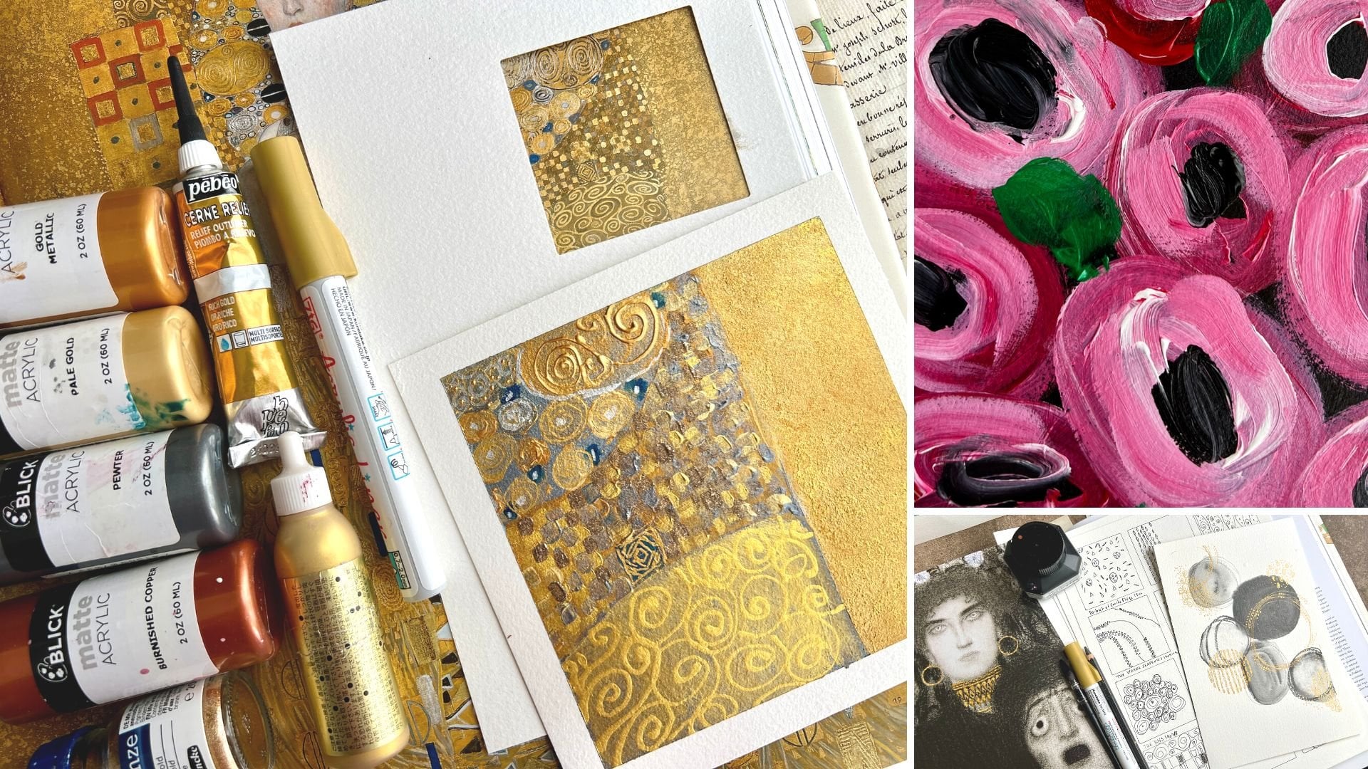
4. Supplies: So let's take a look at the supplies that I'll
be using in class. And this is the
perfect opportunity to pull from all your art supplies. A few things that
you're going to pull out to work with each piece on, which is what I love. So instead of trying to
use all my supplies, what I like to do is pull
a color palette together. And in this case, we'll be using a color palette from
one of the old masters. And I'm playing in the
impressionist series of masters. And I'm going to pull together color palettes that they've
used in their paintings. I do have my art book
here that I can refer to. You don't have to
have an art book. You can Google old masters or
impressionists and look at the different
paintings that they did and see which
ones appeal to you. And you can pull colors
from doing that. You can look on Pinterest. You could go and get a
book at a used bookstore. I particularly like that. This is a used book
that I got off of Amazon awhile back
because I want to start doing some master
studies in my own practice. And then I want to share some of those master study
techniques and things with you guys as I decide on each type
of personal project. But I want to embark on one of those personal
projects is to step outside my comfort zone and to learn new color
palettes and to see if maybe there's a new
favorite palette out there that I just have not been
using because I didn't think of it or didn't know
about it or, or whatever. And so I thought as part of an early master
study would be to try working with a color palette out of a
painting that a Master Did, you know, hundreds of years ago. And so for instance, like this one here
is Edgar Degas. This is Lady in town close. He did this in pastels. I'm gonna do this in paint
and pastels as an abstract, and it's not my goal to paint this painting
at this point. I may graduate up to trying
to copy masters paintings to see technique and style and to figure out how they
accomplished some things. But in this particular scenario, my goal is to use a
color palette from a painting that I find beautiful or interesting
or compelling. And use that color palette
to create some abstract art. So I love doing that because now we're going to discover
some color palette that, you know, maybe we
forgot about or is a little bit outside
our comfort zone. And I'll admit this
kind of sap green, moss green kind of in there. The light pink and the maroon. I used that color
palette before because I kind of have some of these
colors that I like to use, my paint bucket of stuff. But I don't want to revisit
this color palette. I haven't pulled it
out in a couple of years and just see
what we can create. And so what I'm
gonna be using in class is going to
be acrylic paints. So I have a variety
of acrylic paints. I have some sharp and paints and you don't have
to get the sharpen. You can get any kind of acrylic paint that
happens to interest. You have got the
whole bean here. I also have Liquitex
basics and I like this set because I got a big
collection of 48 colors. And as I discover, the colors that I truly love, like this light pink. There's a pretty yellow
in here that I love. It's probably the Naples
yellow and titanium as I use these little bitty
containers now I know, hey, that was a favorite. Let me go buy a big one. So instead of trying to buy 80 giant tubes of paint
that look like this, I can get all these little
ones and figure out what colors do I really like working with and then
go buy a big one. And in these you can see again, some of my favorite is
that green in that pink. I love those colors lately. And as you go and
study things and do things and progress
and your art, you'll leave color palettes
and find new color palettes. And maybe you'll come
back and revisit a color palette every
couple of years. Like I'm going to
revisit this one. So any of the acrylic
paints are fine. You can even work with high flow acrylics and
flow acrylics, you know, so you can, you can do any acrylic paints
with the abstract art. I'm gonna be using the ones. That are gonna give me a
color range that I want to use without as much mixing. I don't want this to be all
about the mixing of color, but for you it could
be as a master study, you could definitely
try coning in on the color palettes
that they used by mixing all your
colors would scratch. So if you want to have that as part of your
practice for this, that would be perfect. But I'm gonna be using some of my favorite color ways in the acrylic paints
that I happen to have. So we'll see how that works out. I'm also going to have jets, so I like using
the white gesso as paint because it's
got some grit to it. And it's cheap compared to the
nicer white acrylic paint. And it's fantastic for
using as your white and forgetting the grittiness to
layer things on top of it. And this is an acrylic paint
with grit in it basically. So I'm using the white
gesso and clear gesso. And I actually like to mix the clear in with my acrylic paint. Because acrylic
paint is basically plastic and it dries
to a shiny surface. And then it's really
hard to layer things on top of
that, like pastels. And I'm going to want to use some pastels maybe in the set. So I'll mix the
paint with suggests. So and that gives
the paint some grit. And because this is clear, it's not going to change
the colors for me, but it's gonna give
me the opportunity to then layer things on top of my piece so you can use
that or not your choice. I've got some painters tape, and I have recently been
playing with the artist's tape. This is painter's tape
from the paint store. And it's used to
say it was cheap, but it's really, it's not paint
is not tape is not cheap. It is a good one for taping
off our pieces of art and then peeling it with less chances of
it ripping the paper. But it could still
rip the paper because a lot of the papers
are not a 100% cotton. And that wood pulp really
sticks to the tape. And you could use a heat
gun and kind of heat the tape surface
up to release it so I could go either way. But I was recently playing with the Blick Art tape and this stuff just came
off like a dream. So that's another good painters tape that you
might experiment with. Especially if you have trouble
with the painter's tape, you might try the art
tape that Blick has. You can probably
get that online. And I was just at the Blick
yesterday and I thought, why not buy some more
tape while I was there. Moves like the perfect size. This is like three-quarters
of an inch, I think. Let's see. Yeah, this is about
three-quarters of an inch, give or take. So whatever is closest to that, it's bigger than the half-inch. It's smaller than the full inch. I like this size. It's a good size. And the Painter's tape
is about an inch, so it's a little bit wider and it just lets go
of the paper beautifully. So usually on stuff like this, I'm paying playing
with the Canson XL. You can play with any
watercolor paper that you want. I like the watercolor
paper because it takes the different mediums that
I might be putting on it. This is £140 cold press. But I think in this one
I'm going to work with this Fabriano cold press
watercolor paper, also a £140. So about the same. I like this size, it's eight by ten. And I feel like I can make these really interesting
and kind of tape off a yummy section in the
center and have it framed out really beautiful
when we peel our tape. So I'm going to play
with the Fabriano. Any watercolor paper
or mixed media paper. If you're not adding
lots of water, any of those would
work just fine. I have a variety of acrylic paint brushes
just to have available. This a three-quarter inch
square brush up here. This is a half-inch Royal
and nickel, the brush, and this is a brush I've had
forever that have fought, might turn into a photo
prop because it looks like a great vintage brush now with all these
yummy paint on it. But I like the size. It's got a tip versus the
round versus the square. So I'm just pulling some
random brushes here to use or maybe using
my fingers will see. And then I've got a couple of my favorite
mark making tools. This is just a mechanical
pencil and then this is a clay tool that's got the sharp pointy in
on it and I just like to drag the paint and make
some marks with that. And then you can pull together any other supplies that you feel compelled to use
in your abstracts. You could use paint pens, you could use neo color
pencils if you wanted to. I will probably be topping
these off with some pastels. So I have my handy pastel
tray sitting over here, and these are just the
nilly a half pieces that came in the senility a sit. And then when I really
loved the color, I can go back with the
little tiny piece I have left and I get a bigger
piece at the art store. So I don't know what these colors are at
this point anymore, but I'll be randomly grabbing some of these
in the right color. I can already see for
this particular piece, there's like this kind of
yummy moss color or SAP color. There's that maroon color. I've got some light
pink in here, so I can already see
some colors that I could pull from in
this color palette. I'm sure there's
plenty if I pull a different piece to
do further in class. So we'll see some also going
to have these available. These are the soft chalk
pastels by Sennelier. Any pastels you could use, you could use pencils, you could use neo color crayons. Lots of different stuff that we could make marks on
top of our Paint Farm. Little abstracts also have
some disposable palette paper because I'll be mixing the acrylic paints with
the gesso and i'll, I'll want to have plenty
of space for that. So I think that's everything I'll be
using in class today. And then pull together
whatever else you feel is going to work for you, making little abstracts or as you're creating and
you think of something, go ahead and pull
those right in. And we'll just see
what we can get today. Alright, I'll see
you back in class.
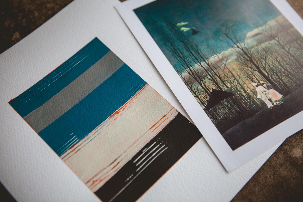
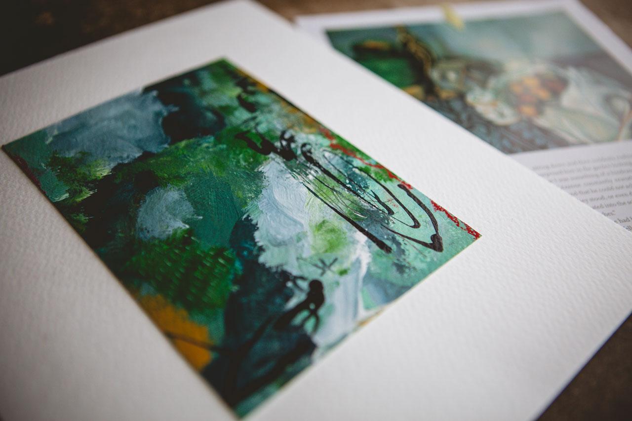
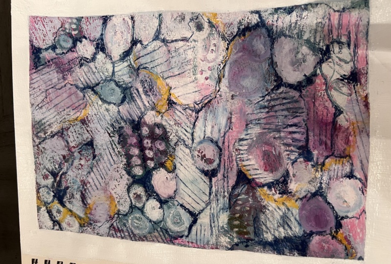
5. Degas Color Study: All right, so let's take a
look at the color palette. I'm gonna do this Edgar Degas, lady in town, close
color palette. And I've got some
of these colors in my sharpen paint's already, or at least things that
will get me very close. I've got olive green and
that feels very olivine. I've got green gold, just maybe a little brighter, but I think it fits right
in with our color palette. Okay, So I think if
we go with a mix maybe of these greens and
maybe even like this, olive green and some umber, or maybe some raw sienna mixed in that might be raw sienna. I think that we can kinda get
closer to our color here. So we may still
be mixing even if we're trying to mostly get as close as we
can without mixing. Also have this really
yummy Caribbean pink, which is a really light
pink and mixed in white. I think we'll give it a lighter. Also have this Alizarin crimson, which is almost spot on
to that maroon color. So I think I've got the colors that I'm
going to be playing in. And I've also got some
white and some black. So the white is
going to be my just so and I've got some black here. So I think I've got my
color palette down. This is my inspiration. So I'm going to
kind of put this to the side where I can see
it while I'm painting. But it's such a big book. I don't want it sitting in
our way the whole time. I've also gone ahead and taken
my paper and taped it in. I want my piece of art to be in the center with a gigantic
white background. You don't have to do
that. I just want to do that for this project. So let's go ahead and put some of our colors
out on our paint palette. Look how pretty that color is. So there's our Alizarin crimson, got some raw sienna
that we will be mixing. And maybe with
something we will see, oh see, I love that green gold. And I really think now
that I'm glancing over here at my inspiration piece, that green gold is very close. I've got the yummy, light pink. This is Caribbean pink, but you can use
light pink would be very close also in
this liquid texts. Like these thicker ones, sometimes I've got some black. This is lamp black. Just happens to be
by the whole bean. Doesn't matter
brand, I've got this green that I was kind of thinking we might be mixing
in a little bit here. Also. Got some clear just so let's get the clear just
so out here looks white, but it's clear when it's done. And we've got some white. Just so, so let's get
that out there also. So there we go. And then I will be doing some mixing of these
as we're going. And I've, I've
actually got two of the papers ready so that
I can do like a set. And then we can just
test out colors here. It got water back here, so I've got the water ready. And then we can just kind
of do some color testing. Let's see what we've
got and we can compare that to our book pages
here in a moment. This is kinda why I like
having multiple brushes. So let's just mix in and
see what we get here with. Oh, look at that.
That's a good color. Now see that's a good color. Just pull another random brush. I kinda wanna have a brush
for every piece here. For every piece, every color. Alright, so let's look at
these three real quick. Let me set those right there. Let's pull our
inspiration over for a moment and check
out these colors. So the green gold mixed in with this raw sienna
gets us closer to this kind of sap color that
I was kinda looking for. This maroon is a tiny bit
brighter than I was thinking, but I bet if we takin a little
bit of black with that, yes, we'll get a darker
color. Maybe too dark. I can put more maroon in there, but definitely closer to that. So we need to mix
in that crimson with a little bit of
black to get that richer. So kinda filling like this and the darker color
and then our pink, if we mix that in
with some white, we will get that lighter. There we go. So I feel like
that is our color range. We need the mix these
two together to get this little bit
of black in that, little bit of white in that. And now we've got
our color range. So that's what we're
going to go with. So now that we know how to
get in our colors there, let's put that to the side
and let's just get started. And so basically
we are going to go ahead and start mixing in, just in a way that
kind of grabs you. I want to mix some
clear in with my paint and that will let me
layer things on top. I could also, if I'm looking
at this thing and I'm like, Oh, it's a white page. I don't know how to get started. Come over here with say, a graphite or something that you can just scribble on the page beforehand and get rid of
that white page paralysis. That's what I call that
white page paralysis. And then we may see that
underneath and we may not. But let's go ahead and
start painting on our two. And I kinda wanna do both of them fairly close with
the same color palette, but different so
that we have a pair. So let's start with this one. And I'll get it set to
the side and drawing. And then we can move
to the other one. So we know that we
need to mix these two. If we wanted it brighter, I could put that little
bit extra green in there. There we go. I'm
just starting to layer color and get some decisions made
here on our piece. And if you've watched a lot of my other classes, you know, I generally like to cut up art, but this is the other
thing I like to do. Lay down big blocks
of color, you know, mix things around and just get the things kind
of go on and started. And as we mark, make and move
further in our exploration, we will definitely end up with some cool
pieces when we're done. So let's just kinda
like this black. So I'm going to
grab, here we go. Paint brushes to be, let me just grab another. I got a whole bunch of acrylic brushes in my
little brush pile. Maybe a tiny bit
of black in here. Let's just see. Then we can
just start layering in. I just kinda want to start off filling the
page the colors that I want, and then coming back, adding marks and
other interests. So let's just see
what we got here. Let's do some dragging. Maybe we want some marks. You could do some marks
and the wet paint. I put my hand and
paint over here, be careful with that. So we've got could come
back and finger paints, so don't waste your paint. Will just do that right there. Maybe some more white. Maybe I'll roll the brush
around a little bit and kind of get these colors
do and some other things. Do a little color mixing
just on the page itself. And I'm still kinda
mixing in the clear. I want some of that clear. I want that texture
to be available. And if you're getting some
areas that you're like, Oh, it's two brush mark key. If you're using a paint that's not this is important,
that's not toxic. Then feel free to finger paint. If you're using one of
the colors that are toxic and you look at
the pain or you can kinda Google toxic paint
colors if you feel like you're working with a color
that's got some toxins in it. Some of those, um, some of the paints
are really yucky. Some of them are not. So these
I've played with before. I gotta be careful. I tend to do too much like
I get too much go in. And I kinda wanna do some. In my mind, I want to
simplify sometimes and I don't always get bigger washes of color
where I've simplified, but I'm kind of liking that one. So let's let this one dry a bit. I also, before I do that, could come in with some marks. The pencil I got here, maybe I want some
extra marks in here. I'm loving niece who hold over that looks kinda come through
some long ones here. You know, at this point
you might be thinking, I don't know if I
like this or not. When we peel the tape,
the magic happens. Alright, so let's let
this one dry a little. Let's go ahead and come back. And we're gonna do
different colors. We may do a similar pattern, but we want to apply
it in different ways. So I kinda started off with
the maroon in the corners. And so maybe with this, we'll start with the
greens and the corners. Maybe Maybe we'll have the
green go a little further. Look at that color. Let's come back a
little bit of maroon. Look at that color.
Oh my goodness. I am kinda still keeping an
eye on my original shades. And if I get too far away from, say this being that more of a greenish
rather than a gold mine, I could come back and add
that right back on top. Then let's see, we've
got some pink here. Let's go with the pink. Kind of lighter. That was just clear gesso. I was just kind of smoothing that out
some with my fingers. We might come back
with we got here. See, I thought I had
another brush here we go. So we might come back with that. Russia has got a
lot of color in it. Let's just clean that
out with some water. We've got a cloth back there. I'm just dipping that on. Maybe I want some white in here. We'll roll this white
around a little bit. Come back and
smooth that in with your fingers if you wanted. If you don't like that, you
can come back with the brush. So just experiment there. And I like doing more than
one of these at a time for the same reason that
I like to cut up art. He do 21 is amazing. Then you're happy when you
walk away from your table. Because you're like, Oh, this
one's more is if you do it, Let's do some mark-making and
then we'll add some more. Whereas if you just do
the one and you're like, oh, that did not work out. Then you're upset because
it did not work out. So I'm just doing
some of the similar mark-making so that it
truly is like a pair. Careful getting too fast, you get weird, weird lines
go in different places. Now we can kind of
come back on top of here and start messing the
paint a little bit more maybe. Then we'll set this to the side and then
we'll let it dry a little bit as we come back
for some mark-making. On top. That's kinda fun. Just noticed I'm skipping the whole top and
the bottom of this. So I'm gonna come back
in and go to the top. I guess I thought the tape
ended earlier than it did. Oh, never mind. This is tape. Yeah, I think I
stopped that too soon, but this I'm maybe peeling
tape off so we'll see. Oh yeah, I did stop at the
right place. Never mind. I thought What
have I done there? So let's see. We want any extra little marks. Then we can set this to the
side and let it be drawing. Alright, so I'm gonna set this one to the side
and let it dry. And then we'll come back. I've got the two here. I may with my finger come
back and do some mixing. I don't know, I'm not
quite happy with it yet. Alright, so let's
set this to the dry, to the side to dry also. And then we'll come back
for some mark making.
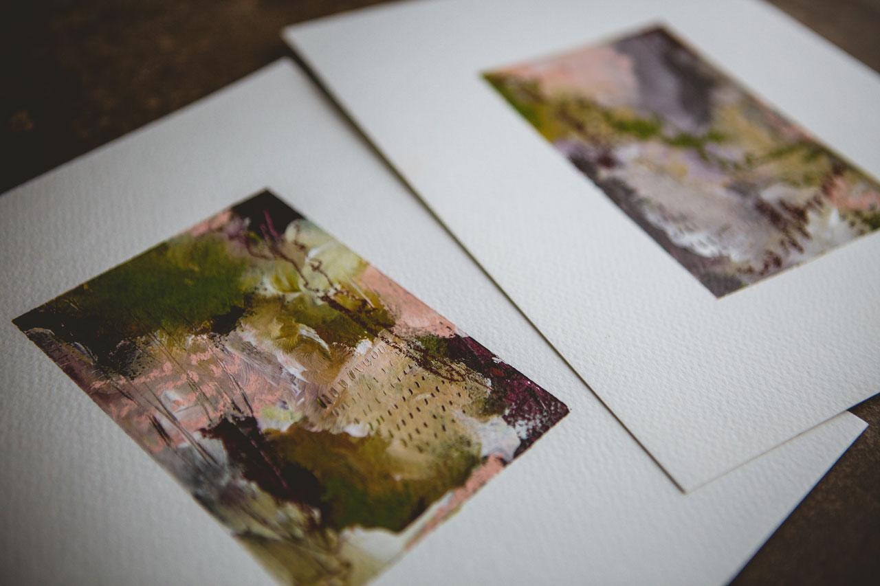
6. Degas Finishing Touches: I've let these dry a little bit. Filling like number
one, maybe my favorite, and probably gets the closest to our inspiration color palette. But I do think they're gonna be beautiful when I peel this off. So the first one is mostly dry and I've pulled
myosin LEA pieces over. I've got some fun
mark-making in here with the pencil dragged
through the paint. That is one of my favorite
ways to mark make. I'm on my pieces is just
to drag a pencil through. And so I've got one
that's well used and add some graphite in and
add some marks and lines. So I use that more than anything on these types of
little abstracts. And so on this other piece
I've tried to do similar. I've got marks, you know, dragged through it and I've got a little tick marks
in there also. So they're very similar
and at the same time both these pieces and looking completely
different actually. So now I just need to decide
what little accents do. I want a little extra
mark-making and color in. And I love this kind
of Burgundy shade because it's in our
inspiration piece. And just to get one more, look at that and see
how are we doing. Here's our inspiration
piece that we started with. And I really think, you know, even if the first, second, 15th, try, you don't get the exact dead-on color
palette of the master. That's okay. That's not
exactly my full-on purpose. I want to get close because I want to sample the
masters colorings, but I also want to discover beautiful new color
palettes for myself. And then if that veers off into something
slightly different, I think that's a plus. So we'll just see what we get. So the pastels I can now use on top of the acrylic
paint because remember, we mixed that with just so the gesso gives me enough
grit for this to stick. And so now I can just say, oh, do I want some yummy marks? You know, because
in the end this is some super fun abstract stuff. Look at that hahaha cow, pretty, that Mark is on there. I love the serendipity business of some of these
ways that we create. That's pretty, Let's
get this kind of yummy, all of the color. And just kind of add a
little extra in here. And I'm adding,
and what I like to about this is you can smear
these with your fingers. And I have a
microfiber cloth here because this is genius. Cleaning enough of the chalk off your hands that
you're not going to ruin your paper before you
get to washing your hands. So if you don't have
a microfiber cloth, you need some of
these in your life. They're amazing in the art room. And when they get dirty, you just throw them
in the washer. My favorite tool find this year, probably for the next few years, that's gonna be the
most favorite thing. I think I've got
work in MRI room. I used to go through a
million of these tiles, the shop towels and stuff, and you'll see me use any of those and all
my other classes. This has started me
conserving those. I don't have to waste them all. I see, I think I'm
done with that color. Maybe a tiny bit of
this really light pink, just as some touches. And you know, we could
use these as some, just some extra
little mark-making. You can just decide as you
go and tick marks, dots. I'm doing a little squiggly line because that's the way
that just started. We can use it for a
splash of more color if we don't have enough of a color and a certain
spot that we're feeling. I'm loving that. Just to throw that pop
in there somewhere. I like to have a color
in at least three spots. And so if you've got the color covered up and
maybe you're like, Oh, I don't have
that anywhere else. This is the really
good way to just kinda throw that in on an
edge or somewhere. Okay, I love that. Really fill in that. So let's, let's put that to
the side and think about it. And we can then add
stuff to this one. Tap off any color that
we want to tap off. This is why I taped off
the paper the way I did. You don't have to do that. You could you can have a smaller piece of paper
with the edge tape, but I want these to
be big, fat edges. And I taped off from the
piece all the way to the edge because I knew I'm messy,
I'm accident-prone. I was going to mark these
in a way and get stuff on my fingers and
get things where I didn't want it out here
on this white frame. And I want that frame
to be pristine. I want to look at that later and be amazed how beautiful
I kept that edge. So you don't have to tape
it off the way I've done. Unless you are like
me and you're like, I'm about to get stuff
all over the place, just use the tape. I know it seems a
little wasteful. Sometimes though, if
you're working on a really important piece or a set that you know,
you're going to love. Because I feel like
I'm gonna love this, that I know I'm going
to love this one. I already love it.
If you're wanting, needs to be beautiful when
you're done and you're beyond. This is just practice. Tape off those edges. Waste a little bit of tape. Trust me, you will be
so glad you did that. Brow. Let's do this. Think on this one. We're going to really
be surprised because I lost the edges of my
tape as I was painting. I painted way outside the tape. We're gonna be really
surprised when we pull this tape and
we're gonna be like, oh, look what we're left with. Maple us get this green. And I'm just working
intuitively here. There's no rhyme or
reason as to why. Maybe I want to color somewhere. And I want you to just
kind of surrender to that flow. We got that all over. Let's get that with
our microfiber cloth. Because let me tell
you, I've even wash these ones and if it
comes out and I think, Oh, that's not clean enough,
I've run them through again. I do not wash them with clothes. I wash them on their own. And then I'm like, amazed how clean they come out. Don't feel like I'm
going to like this one. So now I'm glad I did too. Just in case we'll see. Maybe I'll go back
with a darker. I know I have a
deeper maybe I don't. This one seems a
little darker though. We could come back
in with some dots. Now that I've decided
that this piece may not be my favorite,
I feel braver. Like, let's just experiment. And whatever we get,
we've learned something. But it doesn't have
to be perfect, doesn't have to
be a masterpiece. I always like it when
you're thinking, oh, I don't know if this
is going to work out and then you get braver and you start trying things that you wouldn't
have tried before. Because then you've
got some techniques in your little repertoire that you can continue to use later. And we'll see, okay, So I'm not filling this one, but we'll see when we
peel the tape off. So once we've got
it to this point, we've got all the
pain we want to do. We've got a little
extra mark-making. I want to keep the simpler. I don't want tons and tons and tons of art stuff going on. I want to appreciate our pieces. Let's peel our tape and
see how close we got. And the goal here was not
to be a 100% perfect. The goal here is to work towards a new color palette
inspired by an old master. So let's peel the tape
and see what we got. Let's peel this 1 first and I'll let that one
sit for a second. I've tried to wipe
off all my fingers. I don't want to get anything. Look how easy that
tape peels off. That's why I'm
saying if you have trouble with the painter's tape, try the artist's tape just
comes off like a dream. And trust me, when you think
in past wasteful though, because I use so
much tape, I agree. I feel it was wasteful to and
if you peel it off nicely, you can maybe set this to the side and continue to use it. For the sake of time. I'm just putting
them out of my way. Okay, final reveal. Most exciting part
of making the art. It's P on the tape
off around the piece. Oh, look at that. I don't want anything
on any part of this, so let me make sure
hands are clean. Don't be touching
the white parts. Got some pastel,
come in with a tape. Haha, look how pretty that is. Okay, a little secret here. If you get any pastel or
you didn't intend it to be. If you've got one of
these little art eraser, these things that you kinda
need into different shapes. These are great
for if you've got one tiny area where maybe the pastel got where
you didn't want it. This is what you
could use to clean up any random spot
of something like that. How beautiful that one. Oh my goodness. I'm loving that. The reason why I wanted
such a big frame, because I could frame
it just like this. I could frame it into the piece if I wanted
to frame it in. I can also now go
back, tear the edges. If I wanted a deck allege, I have some choices. Look how beautiful that is. Another thing I
don't want mentioned when I take these off, I was not being super exact about it being
a perfect square. So if you're getting to
where you're creating some of these and you
think this is so amazing, I need it to be perfect. You could measure off or have a mat from like the
craft store, you know, when you're meeting your
pieces and you could have drawn a square
and taped it off that was perfectly rectangular
because I can see now that maybe my lines are not a 100% straight, but
I don't even care. Love in that one. Let's
set this one up out of the way where I'm not
going to ruin that. And let's peel this one. All right, so let's get the
outer edges peeled here. See this artist's tape just
comes off like a dream. But it also doesn't adhere
to the paper as hard. So if you're doing like
watercolor or something, I have had issues
where it didn't give me as good a hegemon
to the paper. So take it with a whoop. Look at all that pastel
that just came off. Hang on. Oh yeah. I did it again. I
want to get that before I get anything
attached to my paper there. See how much of the
extra tape I thought when I was like I've
missed the top of that. Look at that. When we got it peeled. Oh my goodness. I love both of these. Look how beautiful they are. Now I do see with the
original color palette how, when I came this way and I
started doing the white, that those kinda mixed in with that maroon and turned
to kinda purply, but still ended up beautiful. Let's take a look at this with our original inspiration piece. Move these now that they're beautiful, I don't
want to mess them up. Okay, so now with our
original inspiration piece. So how did we do? This one is admittedly a little bit brighter
than this one, but I'm okay with that. I am absolutely thrilled with this color palette and I love the inspiration piece
that inspired it. Look at that really beautiful. Okay, so I hope you enjoyed this first project and being
inspired by Edgar Degas, lady in town close. One thing I would say, especially with color
palette inspirations like we just did. If the first one isn't
perfect and you're like, I need to keep trying this. That is the exact purpose
of this kind of exercise. You could revisit
this color palette in this painting over and
over and over again. And I promise you every
single time there were results will be
slightly different. You will get a little
bit better and better at really nailing the
original color palette. If you're thinking I want to
be nailing that perfectly. But more than anything. I just wanted to
be newly inspired. Some color palettes that
I don't usually work in to get out of a creative rut. This is a fantastic
way to grow in your art and get out
of a rut and go into new directions in the stuff
that you want to create. And I can't wait to see what
your first piece inspired by a master's color
palette is going to be, alright, I'll see
you back in class.
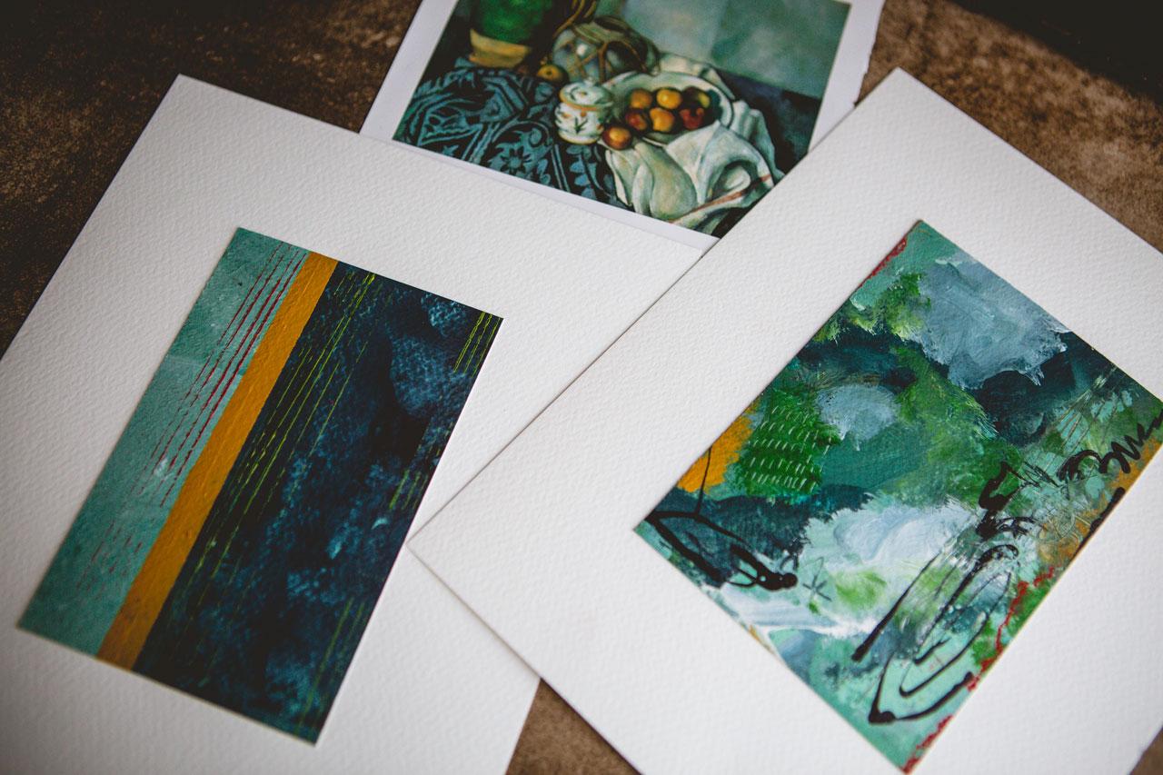
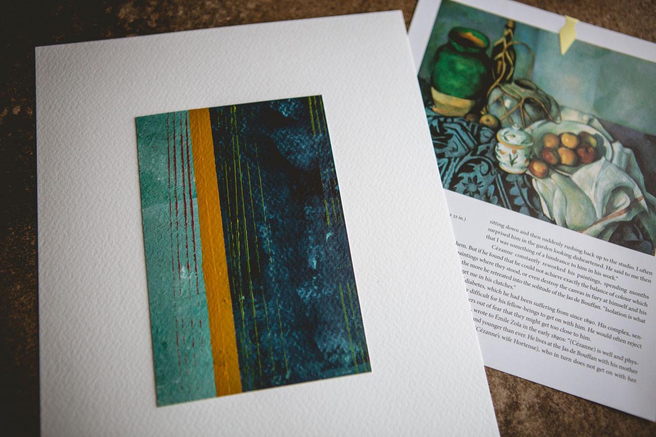
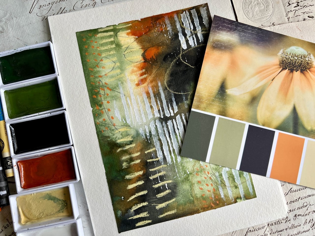
7. Rousseau Color Study: This next abstract. I've done something that's
gonna make you gas, but sometimes I buy books with the intention
of cut them up. And I've cut this
page out of here. Because when I want
to photograph this, that book is just too
big to photograph these with my little
paintings that I create. And it's so big and bulky
to move around my art table that I figure I'll
just take this back into the page
I took it out of. And I plan to use this
book from now on in different master studies for different little
projects or whatever. And so I don't mind buying a book with the intention
of cutting it up. And so this is Henri Rousseau. And this happens to
be Carnival evening. And I love it because
you got two people in here that have been
to the Carnival. I love the colors. I loved this teal. There's a tiny bit of this
pink and orange in here. And it's just so delightful. And I thought it
would be really cool because this almost reminds me of a stripe abstract
or Stripe sampler. I don't really wanna
do this like samplers, because in the samplers, we were drawing marks
all in our stripes. And I want this to be
a little more minimal. And it's striped Venus and at the same time be really
layered and interesting. So I was thinking
that striping in this little stripes in these
colorways may be interesting with the blue and some whitish gray and some burnt umber and then maybe some
little touches of the orange and the pink there. So I've looked in
my paints and I've pulled out neutral
gray because I kinda feel like that could
be the gray in there. I've pulled out
turquoise blue because I feel like that could be
very similar to the blue. Pulled out some orange, which I don't really want to
use it in the full strength, I don t think, but there
is orange all in here, so we may lighten that up. I've pulled out parchment, which is a little bit different than on
bleached titanium. And I feel like it's a
little closer to the white that's in this set. Also pulled out
the light pink and my raw umber for these darker
colors instead of black. I thought that would
be interesting. So I'm going to use
these colors and my stripes and just
see how can I come up with an interesting
striped composition inspired by this painting, these colors and not trying
to paint the same painting because this is not a
master study where we're painting the exact
painting they painted. This is a master study where we are playing in the
colors that they used. I want to do a simplified cool kinda
stripe something with this. I'm going to set it to the side. And I've taped off
some papers again, I think today is gonna be large edges with
little piece inside. And I almost want
to start off with a underbelly of a
solid color so that in the striped areas
maybe it shines through rather than starting
on a white piece of paper. So what if we start off with an unburnt underbelly of orange and underbelly of
this raw umber. And just see as we
stripe on top of that, how that changes the
look of our painting. And you can have
a third one where you're striping on top of white. But I don't want to do the
white, so I'm just gonna go ahead with the orange
in the number. So let's just get started. I want to go ahead and
layer, layer on there. I want it to have
a color that might possibly shine through
to the other layers. And the upper layers
I'll probably mix with my gesso,
my clear gesso. Got that over here steel. So that if I wanted to, I could come back
on top of that with pastels or some other
mark-making, whatever. So let's do stripe
abstracts on this one. See what we get. Okay, so we've got
the number sorry, we've got the orange. I don't even mind that there's
orange and my paintbrush, so we're just going to keep
on using the same paintbrush. We've got the raw umber here. And you know, when you're
doing a stripe thing, you might consider, I'm letting some of the stripe layers dry
in-between because, you know, you've
got a choice here. You can tape off
your stripes and then let each stripe dried
to tape off the next stripe. Or we could freehand or stripes, which I don't know. I want this a little
bit nicer than my my free handed stripe, but we'll see
you've got choices. I love is we have choices. Okay, so now we've
got a layer of that. We're going to set
that up and let it dry so that we can
start painting on top of that and see
what we get. So this is. Our first one, not completely dry but we could just
wet like right here. So we're in let that
continue to dry. If you put the tape
down on wet paint, you have the possibility of pulling that wet
paint back off. So I'm looking at my
sample and it's about halfway that we've
got this blue, about somebody in half there. So we're just going to mimic
that and see what we get. So tapes not sticking, but it's still going to give
me a nice line to guide me. And up top we've got
turquoise and gray, so let's put some turquoise. Let's put some gray. We can mix those if we want. Got some clear gesso. And I actually like my painter's palette
on this side of me. So I'm gonna move
that over here. Then. Wash, just go for it. So this top is going to be
some blue and some gray. So I'm going to
start with the blue. Maybe do some gray
on top of that. Look how pretty that is. Kinda come in here with
gray a little bit. So pretty like in that definitely
got a pretty edge. We can come back and put
stuff on top of that edge. We we don't have
to leave the edge, but I just wanted, let's put that there and
let's pull a different one. And now we've got shades
of gray and white. So let's put some of
this titanium out. I think this is a new titanium. I'm into the parchment. Oh, I do have it open already. Alright, let's put
some parchment out and kinda need to let that dry. So maybe I wanted
to umber first. Remember back out numbers about third down at the bottom. So let's do that right there. Kinda want that Omer to
be thicker than that. So now that we've done that, almost want there to be
some black and white. So I might pull back my thicker paint and pull
that blackout of there. So you can mix pink thicknesses. That's burnt. Umber
has not black. Here we go, black. So you can mix the
paint thicknesses to, you don't have to just use
one thickness here on these. Alright, so I'm gonna get
some black kinda mix this in. I want this to be
darker than I got it. I liked that there's
some orange kinda showing through,
but just barely. Look at that. Super fun. Let's switch to the other
and let those dry a little. So now we can, on this one, we could try free
handing everything and just see like what is
the difference will get. So let's, let's do
that and see what, what really looked better, taping it all for
free handing it. So let's free hand
a stripe here. Then we got some
blue at top with some gray three-quarters
of the way down. So let's say we'll go
to about right here. Very interesting. Now let's go with the stripe
here of this parchment. And there's gray
in that parchment, so I like that. And there's some
orange down here. So maybe maybe we'll have
a little gray stripe. Maybe a little bit
bigger gray stripe. See, this is the problem
with the free handing. It's hard to get an edge. Let's flip it around and see. There we go. Oh, that's fine. Let's see. We can do, I'm going to
mix some parchment and some orange for that lighter
shade that's in there. Because it's not quite orange. It's not quite it's
really close to this bright pink look
that color right there is almost identical
to this light pink. How fun. That was, parchment and crimson, sorry, cadmium orange hue. Mixed gives us that
pretty light pink in case you want to mix
yours instead of by extra colors like that. Then we can come in now and just start laying some
other stuff in here. We could lay a shape, we could build big
square or a rectangle. We can get creative. These are in the end
there abstracts. They don't have to
just be stripes. So you can kinda look
at that and decide, don't want to change
some of this up. Do I want to add some pastels? Don't want to mark make. So let's set that one up
there and let it be dry. And while we're thinking
of our options. And then we'll come
back to this parchment. This is my taped off piece. Maybe. Maybe I'll tape off
right here at the Black. Didn't get that real
straight the first time. It will get it straighter. Tape off at the blue. Maybe we'll do a
little mix here. Pink and gray and stuff. So I didn't completely
stick down my tape. Let's see how we got off any oh, no, that was pretty good. Look. Oh, yeah. Look at that. So we could come back in
here with some parchment. So from far off, he'd think it was
a solid stripe. From close-up. You'll know that it's
got a little bit of movement in it. Okay. Let's pull this one back. Free handy deal here and
then decide that we want some extra stuff going on here. So this is just that
blue and some parchment. It's gonna be lighter
because I did that. What if we do a lighter
blue like some type of box from kind of feeling
like maybe I want a little bit of assistance
to get this where I want it. So let's just use a piece of paper or a piece of
tape if you want. But I feel like I need some
assistance on the edges. That was pretty cool. I got a weird slight blue edge. Now that I've done that I
just happened to think. So That's super fun. I do kind of like that weird little stripe
there would almost be worth it to paint the
edge of a piece of paper. And just see, oh, look at that. That's super fun. Oh my goodness. Oh yeah. Hello. I'm discovering fun stuff. I was kinda fun. Just that piece of water. It's just a piece
of watercolor paper that super fun. Just like some weirdo extra
little stripes going on here.
8. Rousseau Finishing Touches: Alright, let's let how I
just did that in the tape. I didn't even get
it on the painting. Hang on. Let's do that again. I want those at the bottom. Just a little bit. Super fun. Okay, so
let's let this one dry. Come back over here. I am a little bit bogged. Before I leave this, a tiny bit bugged
with this edge. So I might grab another piece
of this, just a watercolor. Watercolor paper. Oh yeah. I like that better. All right. Oh yeah,
I'm liking that. Let's pull back this
one. Now. I'm feeling like our part
straight white paper. Like we need more
in here now that we've got some that
this has dried. And I really liked
the stripes that we just got on our other piece. So what if we striped? So fun stuff right here
on these stripy edges? Oh, yeah, super fun. Oh, marked right on down
into that look at that. Getting paint on my
fingers, on my end. Let's come down here
with the white. I like that. Super fun. Alright, fun stripes
there with paper. And then we can
take one last look. Is there anything else that
we want to do or do an appeal this and see what our
yummy stripes look like. I do kind of feel like
there's more gray up here. So we might even come in here with a gray since I don't
think I put the gray out, we could actually come
back in with some gray. Let's see, all these paintbrushes and the
water before they dry. And decide, do we
want some gray? They're just going to pull a random watercolor
brush because it's fine. I didn't want the
white. Let's get that back out of there. So do we want to just touch
up with some gray in here? Might have been nice if
I tape off a straight. Let's do that. Like That. Oh, yeah. Alright, I'm filling
that one. Alright. Let's see what we got. I don't have any
pink on this one. Now that I'm thinking
of that, but I'm good. Let's see let's see what we got. All right, so we'll
set this one up here and let it dry for a second. Let's peel some tape and
see what we got here. Peel and tape is
my favorite bit. Again, I'm being real careful. I don't want to touch the
paper with anything that might have paint on it
like my fingers. So if you need to go wash your hands before you peel tape. This, look at that
there's something right there that I did not like. I'm not sure what that was like. A white dot, some
kind of white dot. Alright, Let it do its look at that when
you peel the tape. Look how look how
good that looks. That looks so good. And you know what I really love. Now, a little tiny bit of orange coming through down
there. Look at that. Right, Let's feel subtle. Trust me, I doubt these people pieces just
as much as you do. I think, oh, I'm
not going to like these the whole
time I'm painting. I doubt it appeal to tape. And I'm like, Okay,
you renamed yourself. Try to have as much fun
at art table as I can. And I won't you.
Let me move this before I really Mockus up here. You have this much fun when
you go to your art table. Create an art gets stressful. And so if you make
it fun like this, you're more likely
to go practice. Wow. Look at that. It's got an orange
edge over here. It's so beautiful. Oh, hall. Oh, yeah. Look at that. Oh, my goodness. Dc. Why? Taping? The whole part that
you don't want to get stuff on makes it worth it. Look how beautiful that is. And our other piece,
look at those. Men love, inspired
by our piece here, mine are a little bit brighter, but I think it's just my style. Could be the printing too. I wonder if we saw
that in person. If it would be any brighter in person than it is
on this printed page. But holy cow, Look at that. I love how we took
inspiration from the color palette and a little
bit from the composition. This one probably
closest matches that where I did the
little bit of ground, the center part of the
sky and the clouds, and the upper part of
the blue and the gray. Looking at. This was
just a fun little halos, try it and see what
we get kind of game. I even like the stripe of this piece with the weird
shape in the middle. So super fun. I hope you enjoy doing a stripe color palette
inspired by an old master. Definitely looking
forward to seeing those this insanely in love with he. And I will see you
back in class.
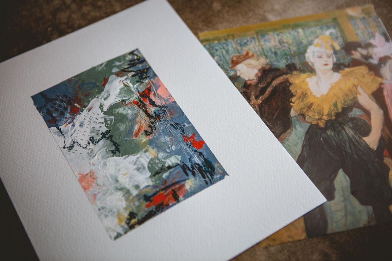
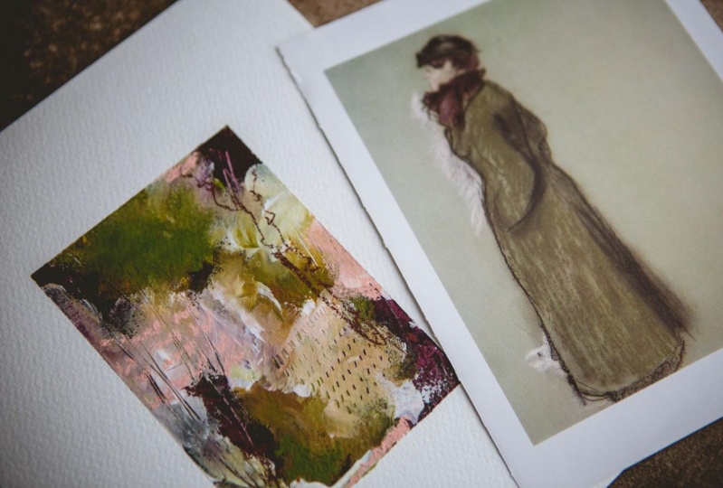
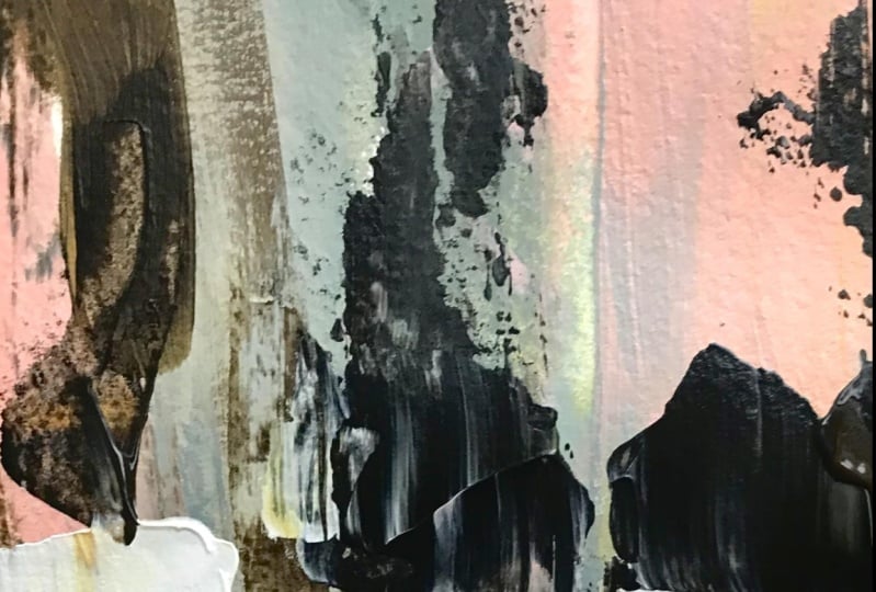
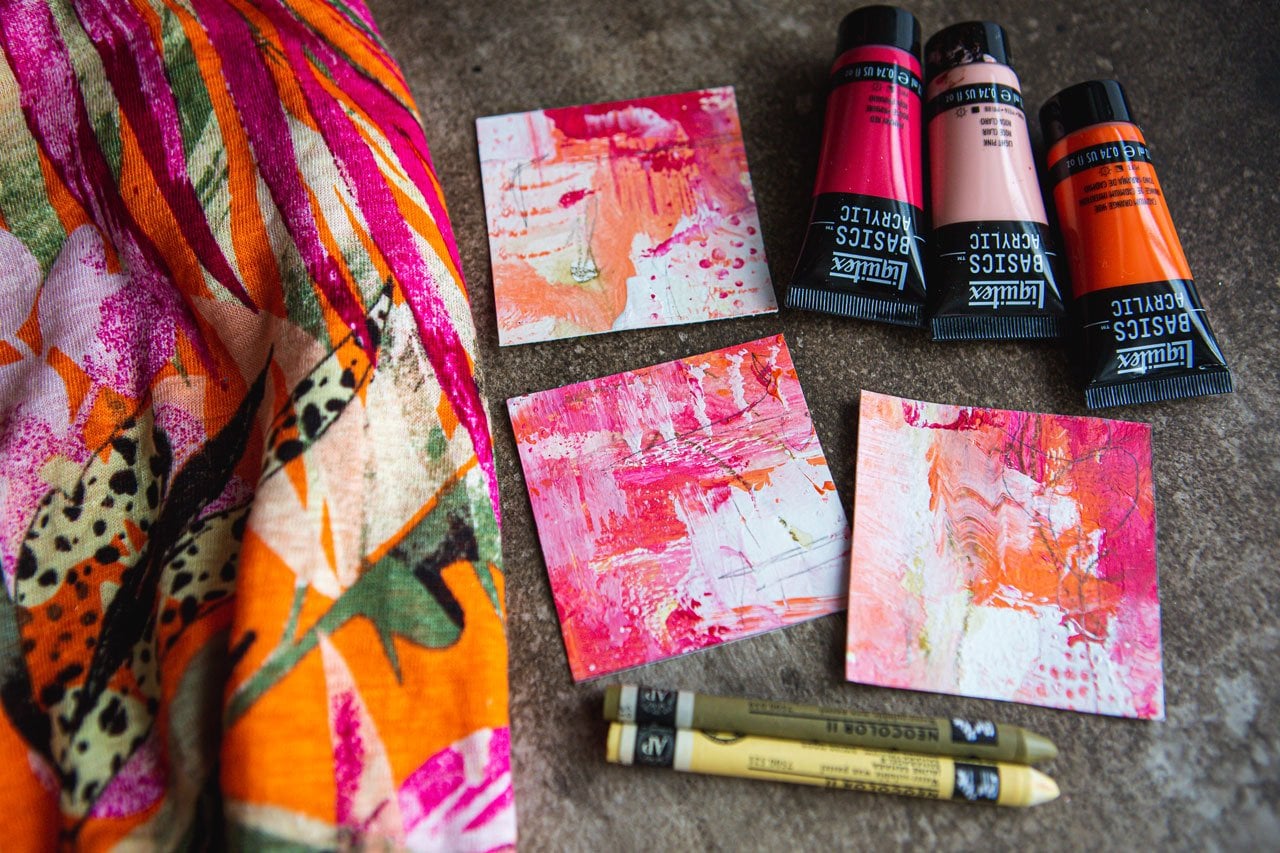
9. Toulouse-Lautrec Color Study: I thought today, since I've got some newer colors from the art store that
I got a week or two ago that are crazily enough, almost identical to this
color palette right here. And that wasn't even planned. It's a little bit crazy. So this is Toulouse-Lautrec. And I am kind of drawn to
this lighter color palette, the choppiness of everything
in this painting. I think that the Naples yellow kind of fits
in with this blouse. The blue-gray. These are the Liquitex basics. I didn't want to
this is gray green. I didn't want to use all
the thinner acrylics, but it's the ones that I
have in the right colors. So we're just gonna,
we're gonna go for it. And then a light pink. And then there's
a little touch of like a reddish color
shining through here. So that could be
cadmium red light hue. And there's this kind of brownish hue and here
brownish reddish hue. So I've pulled the red oxide and I think I could
play pretty good with this color palette without
huge amounts of mixing, which is kinda fun. There's also this
darker, turquoise, dark color that I could pull out like payne's
gray for that. But I think for
what I want to do, I think I've got some
good stuff going. I could always add this
darker little pop of color, or one of these browns are a
black on top of our piece. In some pastels are some
pencils or something like that. So this is my inspiration. I did think because these
are the thinner paints. Why don't we try putting these
on with a palette knife. So I've pulled palette knives just to step outside the comfort zone because
let me tell you, this is definitely
outside my comfort zone. And I thought we would again, we could play on
like two pieces, changing up the colors
for each piece like we did in our Degas projects. So I'm just going to pull
some of these colors out here and just see
what we can do. I particularly loved this
blue and this green. I was I'm always on the search for the
perfect kind of duck egg, blue kind of color, that yummy soft, blue tone. And so neither one of
those is that color, but I did think,
Oh, these are nice. So let's just give them a try. So I'm getting all my
little colors out here. And we're just going
to see it we can get, I'm also going to put
the white and the clear down because
still going to use that white just so I can lighten colors and I can
use that as mark-making. And then my clear gesso
because, you know, I mean, the point here, I've got some
kind of Googliness in here. The point here is not to replicate the masters
painting exactly like they painted it where simply
taking inspiration for their color palette and then creating in a way that
we want to create. So that's my inspiration here, just the color palette. So let's, let's just go ahead. I'm adding the gesso
into the paint again because I want the paint to
have a slight greediness. It doesn't change the color, but it's going to allow me to
layer things on top of it. And let's just see
what we can get. It says the first layer, so it's going to take a
little extra paint on your first layers when you're scraping it on with
a palette knife. But let's just see, Let's just see what we can
get here in this fun stuff. I do have a rag over
here to the side if I'm wanting to wipe
the night off, but for now I'm just gonna go ahead and see where
I can get it. And I'm just randomly
spreading colors on here. This is just one of the
ways that I like to create. Let me get a guitar shop towel, then I'll have something I
can just pull paint off with. I'm just creating in my
own favorite ways to create with this color
palette inspiration. So no, no particular rhyme
or reason here other than, what am I feeling in the moment as I'm painting
some of these on? Let's go in with some white. And I like doing more than one because if one of them's a dud. Good chance that the other
one will be amazing. And to be quite honest, after you paint these
and you get these, the yummy tape off, everything just looks
so much more amazing. When the tape comes off, you're just surprised yourself. So never judge the peace until you're truly
at the very end. You don't have to use all the
colors that you pulled out. If you get inspired and say, oh, I think that's enough. Don't feel that you have to
use your whole color palette. All right, We're a
little crazy here. I don't know that I want that white paper
showing through, so I'm just going back with
a little extra paint filling those white areas that are
hopefully a little bit dry now so I can continue layering
on top of it with no issue. Because acrylic paint
just dry so fast. You know, I can see why. A lot of times the master's
worked in oil paint, besides the fact that they might not have had any other choice. Your dry time to work with
stuff is just so nice. Yeah. Yeah. We're getting there. If we drag a kind of like the way palette
knives drag things. So I'm just seeing if I
drag some of this paint, you know what, That will get me. Alright, let's go to
the other one looking. Well, before we do that, let's mark like so I've got
my trusty little pencil here. And I'm gonna go ahead and do some dragging while
my paint is wet. Maybe I want some of those
yummy little hash marks. Just broke pencil tip off. Oh, yeah. Okay. So look at that. That's crazy. What? Outside my comfort zone, I set that up there
and let that dry. I do see some
particularly thick, thick areas of paint here
that I might smooth down some I don't want it to
take for ever to dry. And if you get desperate, you can always hit that
with your heat gun. All right, so let's completely change up the color palette, but still use the same colors. But now let's do it completely different in the way that
we've layered our stuff on. And the color that we
picked to be more of the majority color rather than the colors that kind of
sink into the background. Because on the last one, the pink really was just kind of a very slight background touch, getting paint everywhere today. So in this one, the dominant color was blue
and green and the pink was really pushed back
with a touch of orange. One of my own particular
favorite color palettes is pink and orange kind
of in that neighborhood. So I thought, why
not use the pink, orange and maybe that other sienna color
I got over there. What was that color? The red oxide. And see how different
we can make our second piece still using
our same color palette. I mean, already, this
was kinda talking to me. And I'm using the colors
in the pure form, but definitely don't shy
away from mixing colors, adding in white to
get other colors. Because if I add white
into this orange, I'll get kind of
a lighter orange. So maybe I want some of that
extra, ooh, look at that. Oh, maybe I want some of
that extra variation. And the shades hall. And I worked for Home Depot for a very long time
when I was younger. And you know that
Home Depot oranges. Home Depot is oranges
the main color. It's the color of their
aprons and everything. And in color theory, orange means cheap
and good value and that's why they
picked that color. I don't know if I'm cheap
and good value, but oranges, one of my favorite colors to use with pink in
paint and stuff. And I just thought that was funny that all
these years later, I'm still kind of attracted
to that yummy, bright orange. So super fun. I've kinda got
everything coated. Let's just see what
we can kinda do here. We're got wet paint
everywhere else. Pulled this in the
other way so that we don't continue to
paint all over our self. I do like kinda coming
over the wet paint some and seeing how that
makes us a little bit. I do like the the depth that we get when these colors do some of their fun, mixing and spreading. And let's go back in with
some orange up here. I don't want that paper
shine through like that. And we could come back with
some white if we wanted. I'll see. Yeah, I like that
a little bit of white. Totally crazy, different
than our first piece, but I do really like
these colors in this one. All right, so let's see. Let's add some dragging
and some marking. Alright, so we're gonna set
that one to the side and dry. I'm trying my best to move and not to
overwork the things. Because I can keep on working this arc and this arc and this, and then It's usually when I'm overworked
things that I'm like, Oh, I should've stopped
three steps ago. So neither one of
these are dry yet, so I'm going to take
a little break, let these dry a little bit
and then we can come back for some final mark making
and just see what we got when we tap
pull that tape off.
10. Toulouse-Lautrec Finishing Touches: Alright, so these are dry. Mostly. I hit him with a heat
gun so that I could come back and add
some final touches. And I'm still using the
same colors as inspiration. So I don't want to veer off my color palette for this
particular project because I want to pull in from what
our original inspiration was. So I like this kind
of dark color here. I was kinda feeling like
we could pull that in with maybe some mark-making
on a pastel. So I'm gonna go ahead and
do a little mark-making. So the paint way, way thicker. I can definitely tell
a difference here. Using that palette knife
versus what I did before. Super thick, super thick LSE. I do like kind of that green. I like that yellow. I don't know that I want to add too many more marks in here. Pull off the pastel. We could go black because
we've got black in that. And then we could
call that a day. Because I do like that
contrast of very, very dark. And then some white. And then you have like
elements that pull your eye around your piece. I could come back into
with some dots or shapes. Could've done that with orange, that might've been
fun with the orange. Just some little pops in their types are
sticking to each other. Right? Let's, let's, let's pull this one and think
about that one for a minute. That one. Sit back there for a moment. So this one here, what am I thinking? I'm kinda like in that
maroon color, I'm not sure. I want to get very far off of the colors that we've
got going in there. So I might pull this in
for that maroon that we've got back there in
his coat and kind of in the composition there. That's super fun. I do like that a lot. Got a little bit of orange. We've got we could come in with a little bit of a lighter color. I could come in
with my paint pen and do some paint pen
marks if I needed to. Go kinda like in that, I don't want too much. My idea here is to stick in our color palette
and just see what we can get. And you know, it is could
be the project that I hate. Who knows. But let's just see. I'm going
to stop there with both of these and see what we got. So let's go ahead and pull
the tape and we'll see if it's a yummy surprise or
not sure I love those. This is the purpose of
experimenting though. You're trying to figure out what elements are going to work
for you going forward. What can you pull
from this experiment? And these colors? What is it that's
going to resonate? Because the more you experiment, the more you kinda move into
your own defined style, the more you figure
out how to use your supplies. It is a bonus. While you're doing this, if you like the projects that you get. But if you do enough, then you get to the
point where you're like, I'm okay if this one
doesn't turn out. Perfect. Okay. Let's get some paint
that's holding on. Let's come from this
direction. Whoa. Look at that. Almost consider doing this
color palette in my cut apart, where I make a great big piece and then I cut out
interesting things from it. So never discount
the fact that even though I made these with
great big white borders, there's always an opportunity
to cut it up if I need to. And if I get any
pastel that I feel like stuck to the paper
where I didn't want it to. My art kneaded eraser
will get that off. These are usually gray. I'm not sure if this one turned this pretty indigo color because of something I erased on it, or if it's just that old and
they get darker with age. These are usually like a
light gray and you just kind of need they aren't
material into it and then you got a fresh
surface to erase with. So I'm sure it's all the random art
supplies that I've used. This eraser width. These are fantastic
little artist kneaded erasers and they're
nice for cleaning up. A few of the light pencil things that might have spread weirdly. Okay, Look at that. It's amazing when you peel the tape and you get all
the rough edges off. And especially if you did the piece with a
great big white edge, how that instantly elevated that into something pretty cool. Okay. I'm kind of liking that one now. Always doubt before
you pull the tape, then unlike pleasantly
surprised and you know what? I'm getting old, I've been
doing art for a long time. And I do have a lot of people mentioned my surprise
and delight. So you know what, I think? I'm always going
to be surprised, always because I looked back at some pieces I've created and I think how do I even make that? And some of these are on video. So I can be like woo, I
can go watch my video. Because when you're
all done, it's like, Oh my God, how amazing is that? How did that even
come out of me? That's what I love about art. I already like that
with the yummy age. If you look at some
of them aren't and you think, Oh,
I don't like that. That's okay. The purpose of
my art is to delight me. If a delights YouTube than yea, but if it doesn't, that's okay. Look at that. We get all that little
pastel out of there. Okay, so now what do you think? Totally turned out? Completely different. I have a little pastel
pieces going everywhere. But now it looks like a
yummy kinda grunge art, maybe kind of urban feel. And we're right within our color palette of what
we were creating from. And look how we've
used the colors in our inspiration piece
and made them into our own with her own
pieces of abstract art. Kinda like in these
color palettes. Now, I already had liked this blue-gray and this green gray, so well, all four of those really the Naples
yellow and the light pink. I'm not really in this particular mash-up
of how I've used them. But super fun to lose. So letrec inspired. So I'm loving that one. Hope you give some
color palette that's way outside your comfort zone
and try like I just did. And you'll see if you
can be pleasantly surprised when you get your finished pieces
because look at those, right, I'll see you
in the next project.
11. Cézanne Color Study: Let's take a look
at another artist. And I thought today I would
do some palsy, say Zan. And I really love this blue-green color palette
that's going on in here. This is not a color palette
that I normally design with, but weirdly enough, it is a color palette that
I love in my house. I love blue and green. And so I thought
that'd be kinda fun to play in this
color palette today. And I kinda feel
like in this blue, I've just been
looking at some of the acrylic paints I have. Maybe that could be
like a surrealism with possibly some gray or some
burnt umber mixed in. So I have pulled some
burnt umber and I've pulled some Artesia colors out. This is cool gray. There's a lot of like
an ocher color in here. So I've pulled out
a yellow ocher. I also see some red
here and the apples, and I thought maybe I
could try this crimson red mixed in with maybe
that number or that gray. And then of course
there's some greens, so I have some olive green
and some green gold. And I thought maybe I could
do a little mixing, um, of some of these colors to blend up this type of green in here. And I thought since on my
other projects I was doing two projects the same but
different color ways. Maybe on this one I could do two completely different
type projects. Like maybe we could
do a strike that. Maybe we could do an abstract
all over the place, one. So I thought that'd be kinda
fun to have a series of two that are completely different but pulled together by color. So I'm gonna be using
still-life by Paul says on as my inspiration, just looking at the
name to make sure I'm still saying
the right artist. And we'll see if
we can get, okay, So that's our inspiration piece. I'm going to set it right here. I'm going to put out a
little bit of all my paints. I'm going with the thicker
paints on this one. I really like working
with the thicker paints, so feel like they give you a thicker overall
consistency on your paper. And I kinda like that.
That's really thick. Obviously don't use this
burnt umber holding color. It's gotten thick. You know, sometimes
your paints go bad. So if you haven't used them in a long time and they're
coming out real thick. You may have to sacrifice
that and get a new one. The thing I like about
all the Artesia colors is they are all nontoxic. So if you're using
regular paints and you're concerned
that you've got some of those cadmium colors
or something like that and you don't want to
get those on your skin. I would definitely check
out this little RTs, a collection they've got like a whole little package of like, I don't know if 50 or
60 colors that you can get for about 50 bucks usually. And then you get to try them
all out and then you can buy bigger one has really, I love the little, almost like sample
or collections I love when paint
companies do that, you just go looking for some
colors at the beginning. You're just not gonna get a whole bunch of what
you're hoping for. You're gonna get a whole bunch, but it's not always going
to be the right mix. So I'm kind of
thinking on this one. What if we do the
stripe going this way? I'm going to use this piece
of tape is some help here. But like what if we kinda mimicked this stripy concoction? I actually see some variation
here in that like stripy. So we could just kind of
play around here with this. Also gonna put some clear just so white gesso
on my palette. And I'll be mixing
that into my colors too because I liked
the way it makes it kind of rough and it
allows me to then experiment with other colors, like on top, like the
pastels and stuff. So now and I'm kinda
looking at this, I'm almost wanting to perhaps mix a little bit of this and
try to get closer to this. So we'll just see
what we can get. It's not gonna be
perfect, but I can certainly who attempted
bit closer look at that. So that was a green gold and this helium that kinda
gets right in there. All right, so maybe
we'll just go ahead and do some of this over here. I do want some variation in that color because I do see
variation in this color and I think might be fun just
to mimic that a little bit. But I think I did with this. Cerulean blue and the green gold get right in there with the
color I was hoping for. Mixing color is really
stressful for a lot of people. So that's kinda why
most of this class, I have gone really close to what's coming
out of the tube. But sometimes you're just not going to get the color you
want coming out of the tube. It's very frustrating
the way that works, look how pretty that stripe is. Let's go ahead and maybe light and the stripe
right here in the middle. Look how pretty that is. I want it to be a
definite wine kinda go in there but not, doesn't have to be perfect. Then I can haul whole look how pretty that just want the
whole painting to be that now. So let's see, I need to let
that dry a little because I want more of this whole thing over here to be that blue color. So let's move over
here to this one. And I love this kind of
greeny color we've created. So I'm gonna go ahead and paint some of this on here
before it's gone and dry. So pretty like this. Oh my goodness, I think I'm going
to mix in some of this blue with this umber. I may have to get some
more of this blue out. That's really not
doing it for me. Let me get some more blue out. It's almost like an indigo color that we've got going in there. May need to look for a deeper, maybe more Payne's gray. That might be nice. Now as I'm getting
deeper with this color, I am a lot closer, maybe a little bit
of green in here. So we'll use this one as our color mixing
experiment peace. Oh yes, he now look at that. Now we're closer to this
lighter color in here. And I'm kinda feeling
like there is some indigo Payne's gray
kinda going on in here. So I may have to pull
out a black or more of an indigo Payne's gray tone
to get that darker in there. Or that could be like
what we did on top. But it is well, that's a pretty color though, and I've got some
variations in there. And now when I'm starting to add color
like this, I'm not, I'm not being super, super specific and not
being as intentional. This point on putting
in some colors, I'm moving stuff around, just kind of experimenting with the way the
color comes out. The copy that is, I
really want a dark color, something darker than I
already have out here. Don't know that I've even got a Payne's gray in
my acrylic paint, but I do have my indigo and
my Payne's gray in my ink. So let's just, let's just
throw a surprise in here. Hang on. Getting paint on
everything I touch again. I need more space and he do. I need my camera thing to
like angle out even further. But what if we came in here with this is that indigo ink and I could have
done this on top. But I know I've got
the color I want in that and look how
beautiful This is. I'm really feeling
that if you've got it in any acrylic form at
all, the color that you want. And it's not the same
acrylic form that you're working in experiment. And just throw that
in and say, Okay, it's not, it's not
that thick stuff, but can I make this work? And I magically
had that sent over here and I might not
have thought to use it if I didn't already
have it on my table. It's one of my favorite
favorite ease. He just go with it. Okay. I don't know if I'm
filling this one or not, but we're getting in
there, Let's see. Might want to come back with maybe maybe we'll come
in here with some ocher. I don't know if I'm
filling the ochre, but we might throw a touch in
here. Oh, that's different. That's definitely
outside my comfort zone here with this colorway, but I do love this. Let's get some little
touches in there. What if we wanted, we want, what we want. Maybe we'll come in
with some green at this point because we've got quite a bit of the green
and this, and that. Vase that's there
in that painting. Maybe camp definitely feeling like this is going to
have some good surprises. Let's go back to our
original brush here. Really want back
to our original, pretty colorless mixing some
more of that Cerulean green, gold, lighter blue, little
bit of white in there. The thing with
mixing colors too, is once you mix it up, you may not ever get back to. You may never be able to
create the exact shade again. So just start to embrace that
serendipitous of mixing. Let's see. Okay, let's, let, let's
let this thing do some drying and thinking. Think about that. Let's pull this back out. I wanna go ahead. Set these here. Try not to throw my
brushes in water as I'm going because then there's water in the brush and I kinda like it better dry
brush and the paint. Let's just get me a
nice line go in here. Now that paints dry. Really want this to be the
deeper kind of indigo color. So I'm gonna go ahead, put some of this ink on here, which that totally did
way more than I expected. And I'm going to mix it with
the paint that's already in my brush from that color. Because look at that,
that's coming out. These exact kind of shades
here from our piece. Did not quite mean to do. Now a whole big splotch there, but now that it's there,
I'm kinda digging. It could be just a good
dark area that we let dry. Now once you get that on there, if you're going hot, don't like all the variation
in the color there. You know, we could
take a scraper, some type of just something. You can have a silicone scraper, which I've got some
silicone scrapers, but they're hiding from me. I have this at the moment. What if we just pull through
this? Let's see what we get. Paper is a little bit warping because we
put wet stuff on it. But look how interesting we can get if we're dragging
some stuff through here. Alright, so I'm kinda,
I'm kinda dig in this. I don't know where I
put that paintbrush. Oh, there we go.
What's that one? Let's let's look that
do some drawing. Let's come back to this one. Let's do some mark-making
in some other stuff real quick before this is
so dry, can't do that. Which it kinda is dry. I kinda let that
dry quite a bit. Let's do this over here. Maybe some mark making CO, yeah, there we go. I can see that good. Kinda wanna do some
of these things. While we've got wet paint because I want to dig
through the paint. I like that. And we could because we're gonna have to let this
dry at some point. I could, could do this
yummy dark ink on here. Go ahead and get
some of that going. I like using eye dropper
for something like this, but you don't have to
use your dropper or if you prefer something a
little more consistent. I like the inconsistency
of the dropper. That's why I use the dropper
coming right out of the ink. Some people don't love that. So if you don't love it, don't
feel you have to do that. Let's set that up. They're dry some. Let's see who. So over here, shoot. Got a little bit of not being as nice and even as
I would've liked. So we'll come back over
here and get a little more of this color
kind of mixed. Or at least something
super close. Try not to let that paper back. They're dry. Alright, now we're back to where
we were. Good. Here we go. I do
think I'm going to use my ruler because I want this to be a firm line. It's a little more green
than what I had there. Kind of sad going
back over my line, but I want this to
be a firm line, so let's just do it. I'll come back with
some more color and some more paint and we'll
just we'll get it there. Some more of this bright. That'll get us right there
with their nice line. There we go. I like that. We pull our tape. I'll be a beautiful,
crisp line hopefully. Oh, look at that. So now in looking at this here, I want to let some of
this really, really dry. And maybe we'll come back with some weird little
stripes in there. So let's see. I'm going to let this
one really, really dry. So let's go ahead and take a break and I'll be
back when these are dry.
12. Cézanne Finishing Touches: Alright, so we've
got this dryer. We're ready to kind of do some more striped
bees and stuff. And I did discover in the other earlier
stripe that the edge of my paper made an amazing
little Mike Roach stripe. So I'm going to have that
over here available. Um, I'm also got that tape which I've
now hid from myself. Well, we shouldn't. Painter's
tape will use that. I liked the artist's tape. Oh, here it is. I like the artist's tape because it is really not sticky at all, but it sticks well enough to make something like a stripe. I'm kinda feeling
like what if we go over our stripe here
with another stripe? Let's just see what we can get. So what do we think about
crazy green stripe? Or Let's just do it. Let's do a crazy green stripe. But then again, I am
trying to stay within my lane here with this. So maybe about maybe a
yellow stripe or we could do maybe we should do that. Let's do a yellow stripe. We've got some little
bit of red in here. Let's alright,
Let's just commit. We might not like it
and there's color. I was thinking I
might like better. But for this particular project, I actually want to work within the color palette
pretty close if I can. Oh, yeah, look at that. Oh, that's a pretty stripe. Now what if we came back
with the micro stripes? Let's put that over there. In the red and the green. Since I'm feeling like I want
some green or something, Let's see if we can come back in with these little micro
stripes. So let's do that. Let's just commit. Be brave. Okay, let's just
see, Let's see. Here we go. We're Kim at near
I do like those. Put this lid on. I can't
tell you how many times I've knocked a jar of ink over. Man, does that make a
mess? Look at that. Oh, look at that. That is pretty pretty all right. We'll come back on this other
side. Oh, you know what? I really love? Turquoise and red. Check it out. I'm about to throw some
red on top of this. What could be
considered a light? Look at that. But really could be considered a light, kinda turquoise there. Look at that. It's amazing what
just a piece of watercolor paper can do for us. Let me put that out of the way. Alright, now I just
got to decide, do I have enough stripes there? Sir? Any little
something I need to add? I'm kinda like it not
just like it is though, because once we
pull the tape off, remember, we're kinda
within this section here. So let's think about that. Then. Pull this down
and just decide. Anything else I need
to tack into here. And I kinda feeling
it just like it is in kinda feeling it. Let's go ahead and
call this one. Yummy. Let's go ahead
and call this one done for today for this
project and pull the tape. Because let me tell you, no matter what you're creating, if you put tape around it and then you pull
tape off of it, you've instantly I don't do it. Oh, good. You've instantly Let's
move this out of the way. I have a terrible oh, you know what we could do
before we're done, done. I forgot. We could add some
pastels in here. Is there any pastels
that we want to add before I really
pull that off? Let's just think
here for a second. It's all right. It's never done until you think it's done. Kind of liking that a little
bit of red that's in there. And we could come back with
maybe a touch of that. And I'm going to be super
careful now because I have peeled the tape
off the paper part. But what if we want
just some touches? Barely showing through, maybe
doesn't have to be a lot. I just might want to. Have that suggestion.
Yeah, I like that. He and then looking at my
inspiration piece here. Sir, anything else that
we might do to it? But I think that little blip of red might be exactly
what I wanted. So let me get the
read off my fingers. Little micro cloth here is
so amazing for doing this. And getting your
fingers clean enough to pull tape without
going to wash your hands. These are in the
cleaning department at the big box stores and you can
find a pretty readily now, they are your best
friend as an artist. Oh, no, I got it up underneath. The tape. Must not have made sure my tape was
pressed down very well. Look at that though. Super pretty. And in a case like this, that really doesn't
bother me all that much. I could come back and
paint that border white or I could just frame it in with a mat and you
wouldn't even see it. So I don't need the mind. I'm loving that
color way and look how close we are to
our example piece that we were kind of
copying the colors in it. Super pretty. I'm loving that. Alright, let's look at this one. Okay, What kind of
feel like this one is? I like it. Let's just peel the tape and see if we think it
needs anything else. But for the stripy ones, I want the stripes
to be the hero. So I'm okay with not adding
too much more to it. So let's just see what we got. Hopefully I press the tape down. So if you don't press your
tape down and you get any run off like I just
did on that piece. Just make it your plan to
put them at around it. Don't let that be the determining factor
whether you like the piece or not because I
actually love that piece. We can just mad it. Oh,
look how pretty that is. Look at that. And as a
companion piece to that bullet. And as our color palette coming
out of our piece of art, look at that. Super fun. I hope you enjoyed
this color way. I definitely think
you should give the blue-green color a try. I liked this because
unlike the other projects, this one required
quite a bit of color mixing to get some
of these colors. And I think that
as you progress, you definitely
want to experiment with how can I get
that color closer? How can I get right
on the money so that, that color really is the color in the color palette
I'm inspired by. I want you to get a painting out of the ones that you try start off with some that
just take straight color. And I noticed that the ones
that are pencil drawings, like they're done with
pastels and stuff like that. It's pure color because
you can't really mix those up like you can paint. But the ones that are like tru, oil paints or acrylics or
whatever it is that they were using to paint these these
have more mixed colors in it. So earlier in the projects, I did notice that I pulled
some pencil ones and it was really easy just to
pull a color that matched. And then this was a painted one. And you'll notice that we
had a lot more color mixing. But look at that. I mean, that is like one
of my favorite colors. I like aqua. And now that I can
see how easy it was to mix that
beautiful aqua color, it might definitely find its way into some of my color
palettes going forward. But what do you
think? How do we do? I think we got pretty darn
close to matching our colors. These greens look beautiful too. They are pulling right
off of this container. I don't know what
is that an urn. The yellow poles
write-off those apples. We've got that. So really in color coming
right out of here, we use the really dark, dark indigo coming right
off the dark cloth here. So I think we did
a great job today. And I definitely
want you to start with things that maybe are straightforward and
then advanced to things where you're trying
to mix that color because you just expand yourself when you've
got colors that aren't, just aren't coming
out of the tube. So I hope you enjoy, enjoy this particular project and I'll see you back in class.
13. Fixing Rough Edges: So after I stopped
the tape rolling, I decided how I was going to fix this and I thought,
You know what, I'm going to show
you how I'm going to fix this real quick because this is kind
of nice little hack. If you did something
where it went outside the lines and
you think, Oh no, I've ruined it and now I
can't use it or whatever it is that you're got running through your
mind because trust me, it runs through my mind too. I'm going to cut this piece. And the real good too. It's going to really tell me
if I got my lines straight, but I'm going to
cut this piece on the edge all the way around. And I'm going to stick this onto a nice clean
piece of paper. So now we're going to have
our beautiful edge piece. And I've cut a tiny bit off, but I don't even care because my lines
are crooked because I was not perfect when I was creating those lines.
But that's okay. It doesn't have to be perfect. And now we have some
room to fix this. Because look at this
when I get it, uh, said, I'm just lining my
edge up here with my cut line that
I've got on here. And now we don't
have to despair. My line is not straight, so I'm scooting it a little bit. There we go. Now we don't have to despair when we get up onto
the tape like that. Which instantly when I thought
of it made me feel better. See, look at that. That made me feel
so much better. Now, all I'm gonna do is take my favorite glue and do some
Tukey spots on the back. I'm going to glue this right in the center of a brand
new piece of paper. And we have fixed our error or any kind of mistake
that sank under our tape and now we fixed it. So I just want you to
know you have options. Don't despair. If you get something out underneath
your tape there, cut it, and remount it. And now you have a brand new, beautiful piece of art
with the clean lines. And if it weren't straight, like mine work straight, just tack a little off. It's not a big deal. I didn't lose anything by just tacking off that millimeter of color. And so I'm going
to glue this down. We yes. Paste. You can glue your
thing down with any kind of archival
glue that you want. If you've got a glue
stick or whatever. Yes, paste is just
really nice and thick and I don't have to ever worry
about it detaching itself. But you can glue down
whatever you've got handy and there you go. Now you're all set. All right, I'll see
you back in class.
14. Final Thoughts: So I hope you enjoyed
this experiment. We are taking a
look at the masters and study in the masters
and coming up with a paint palette inspired by whichever masters paintings
that we found to be particularly interesting
or beautiful or dynamic. And then creating
some art of our own using those color palettes. And that's a little bit
different way to study the masters than most
people are study. And most people
study the masters to replicate the painting. To look at the brush strokes, to look at the color palette, try to recreate the
entire package. And that's a little
bit overwhelming. And I feel like if you start
off dipping your toe in, study in the masters, that then when you get onto bigger master projects where you are trying to then replicate
a painting that they did. It makes it a little easier because you've already
dipped your toe in. You've kinda feeling
good about it. You've got some art books
that you've enjoyed and you've created from some color palettes
that you've studied. So I love this
particular project. I've come up with some
new color palettes that I might not
have done otherwise, doing different little
studies like this. I hope you enjoy studying
the masters with me and creating some paint
palettes from the paintings that you
particularly love. And I want to see what
abstracts you've come up with, with those pink color palettes
that you've studied from. I'm looking forward to seeing those definitely
come back and share. I love logging into my
account and seeing that somebody shared a
project and I'm like, well, we can't wait. Go look. I hope you
have enjoyed class. I cannot wait to see what
you create your art table. And I'll see you next time.
 DENISE LOVE, Artist & Creative Educator