Transcripts
1. Introduction: Hi everyone. I'm Denise Love. Are you tired of diving into your abstract
paintings without a clear path only to end up with a piece that feels
directionless and lacks focus. In this class, we're going to
unravel the secrets behind crafting abstract compositions
that truly captivate. We'll kick things off by delving into the
world of composition, why it matters, how it works, and the incredible impact
it can have on your work. We'll explore some of my
favorite ways to select colors. And through engaging samplers, we'll witness how colors play a pivotal role in your
composition's success. Then we'll tackle larger
abstract paintings, implementing the techniques
we've learned and bringing our ideas to
life on the canvas. Get those paint brushes ready, and let's dive into the world of abstract art with confidence.
2. Class Project: For your Cla project, I want you to create a
series of samplers of your own focus on different compositions
and color choices. Then I want you to pick your
favorite combination from the samplers and create a
larger abstract piece or set, and come back and show us
what you've been creating.
3. Supplies: Let's take a look
at the supplies that I'm going to
be using in class. I do have some videos showing you a couple of things
that I've got here. We talk about color
and color palettes. I like using color
palette cards. And I have some of the color
cube color palette cards that I like to refer
to a lot lately. Really makes it easy to pick colors and see what
might go together. And not as much with a color range colors that you could use to
deep dive into a palette. Because sometimes you'll pick two colors because
they're complimentary, then you might get
stuck with, well, what could I put with
those two colors? Where could I go from here? What I like about these
is say like these are colors that are side by
side on the color wheel. It expands that
idea and makes it a more complicated and
interesting palette for you. It's my goal is to play in
different color palettes that I would normally
not use or pull from, or think of, And
make them four or five colors or six colors
instead of, say, three colors. I'm finding it really helpful to use something like
a resource like this, which you can get
ideas on Pinterest. You can search color
palettes on Pinterest, and that's a free resource,
and I do that too. You could also make your
own color palettes. And I have a couple
classes here on skillshare for making
your own color palettes. Vintage sources, or
using antique fabrics, or using the old
Master's paintings. There's lots of
different ways that you can draw ideas from color. Then I also mention Confident Color and
Artists Guide to Harmony, Contrast, and Unity
by Nita Leland. Because this is such
a beautiful resource for really diving deep into all of the
color concepts that you usually want to learn
when you're making art. This is such a good book,
I do show you that. You don't have to
have that book. I just like to show
you some resources that you could possibly
check out from the library. Or maybe you do want to add
this to your home library, but they're just
such good resources. Another thing I
highly recommend that you might have is a color wheel. I like this color
creative color wheel because it's two sided. But any color will fine. Because when we
talk about color, we're going to talk about
different color schemes. And how you could
pull a color scheme together yourself if you're not using some of the resources that
I like to use. I'll also be using
throughout class this Canson XL watercolor paper. It's a nice student grade paper. It's good for
experimenting and playing, which is what we're
doing in class. We're learning composition
and playing with color. This is a good paper
for just experimenting, and that's what I'll be
using all through class. I take these down
to artist panels. A lot of people ask me what these little panels
are that I use. I use artist panels. You can get off brand ones or you can
get some from ampersand. Then I'm also using to
tape my stuff down, painter's tape from
the paint store. I'm trying to keep it
simpler and not use like every thing I have here
available in my art studio. Because if you like edit down what
you're going to use and restrict yourself to say, one type of paint and one type
of mark making something. Pick a few colors. As you restrict the
options that you have, the more creative you are
when you're creating. It's weird because if you have
too many choices you have, you get paralyzed from choices. I like to pull the
color palette card, pick five colors, and then pick what I'm going
to mark, make with. And then let the piece guide me. As I'm going, I'm
going to be using these little Liquitex basics. Acrylics, which are also a really nice
student grade paint. What I like about these
little sample sizes is once you use a color, then you can go buy
a big tube of that. And then you'll know, oh, okay, I love this color. Let me go buy the big one rather than buying lots of big ones. I've been using the same
set for a very long time. I switch back and forth
between supplies too. I do have a big pink, several things that I've gotten that I really love
that I've run out of. But these are so good,
they go a long way. I also like having
just something sharp to mark make with. This is a clay tool with a real sharp point and like
a little scooper point, that's good for just
dragging through a piece. Also, drag through a piece
with a mechanical pencil. That's favorite little tool. I also like using matt pencils and stuff
to draw lines on. I also recommend the neuro color two crayons if that's going to be your mark maker of choice. And you wouldn't have
to necessarily put any finishing spray on top
of this type of crayon, and it comes in lots of colors. It's one of my favorite
mark making elements. I'm going to be using some
soft pastels in class. If you use the soft pastels, you do need to finish those. I use the senile soft
pastel fixative. The powder always will shed. Generally, I will test out, make a test piece, spray it, make sure that I
like what it does to the colors because sometimes
it darkens the colors. If I'm okay with
the sample piece, then I will go ahead and
spray my final pieces. But I have sprayed
final pastel pieces and it changed the color
completely and ruined it. I want you to do a test piece if you're going to
be using pastels. Normally, if I'm doing pastels
on top of acrylic paint, I can't even tell that
it's been sprayed. When it's dry, it's
perfect for that. That's how I finish those. I also am going to maybe
use some Posca pens. What I like about these is they come in lots of
different colors. You can get really creative with your
marks and your colors. White and black
are the ones that I like just at a minimum. And then I'll also be using some Princeton embryo
paint brushes and maybe some other
paint brushes to gather some of your
favorite paint brushes. And that's what I'm
going to try to use on the different
projects today. I'm going to try not
to overwhelm you with the million supplies
that you could be using. I want you to pick some
and then start creating. All right. I'll see
you back in class.
4. Composition Ideas: I want to jump right
into composition for class and talk about different compositions
that you might consider why composition
is important. Composition is
important because it shapes the viewer's
experience of your art. It drives the viewer through your work and the
different points that you wanted the viewer to see in the order that
it was meant to see. It's a big part of what
makes a piece eye catching, dynamic or calm and soothing, or disoriented and off kilter. If you look at different
pieces of artwork, you might start to then think, how does this piece of
art make me feel like? A lot of times, if
a piece of art has the subject shoved
right up to the side, it almost feels like that piece is going
to fall off of that. Maybe it makes you feel nervous. Maybe it's a tranquil ocean and maybe it makes you feel
soothing and it's got to rising down low or
maybe it's got a lot of angry lines in there that are radiating out
from the center. Then maybe you're like, okay, I'm a little bit frantic
with this piece. We need to start looking at
different pieces of art, trying to figure out what was their composition in this and
how does that make me feel? I'm going to go through some
different compositions. I have just drawn
these boxes on a piece of Kenton Heritage Excel paper. I just cut a square
out and just drew some squares in here so that
I was keeping it uniform. I could have drafted it out
with my rulers and stuff, but that's a lot of work when I could have
just done little boxes. The goal here is not perfection. The goal here is to create
yourself some cheat sheets on composition that you
can then hang up on your wall behind your art
table where you're working. You can look up and
refer to that and make some decisions about where you want to go with
your piece of art, what you're trying to convey, and you'll have some guidance
in how to get there. Let's talk about the
different basic compositions that have come up
through history. You've got the
cruciform or the cross, which is basically
what it sounds like. It is a composition that
comes out in a cross shape. Doesn't have to be
a perfect cross. It can be a little off
center. It can be perfect. It could be higher,
it can be lower, but it's basically a
cruciform or cross shape. The next composition
is a horizontal, something that's got
horizontal stripes or horizontal things in the piece. I like doing a lot of
junk art collages. Those are horizontal or
vertical compositions. For me where it's different
stripes of different art. That's a composition that I
actually use quite a bit. The next one is frame and frame. That's where things
are overlapping. Maybe they're framed
within each other. Maybe you've got some
different things going on. We also have a spiral or radial. Think like snail shell, something that's spiraling
through the piece of art. Another one that we can
have is a high horizon. And this might be
a landscape where the horizon is in the
top third of the piece, we have low horizon, that might be where it's in the bottom third
of the piece. And another popular
composition is shape. That's basically
what it sounds like, it's something that
is going through and shape windy roads,
things like that. Another composition
is triangle in shape. We can think just like triangle in the piece that's
not completely centered, but you get the idea. It's something that has a
triangular shape in there. Actually, that bugs me. Let's make that a little better. Because I'm keeping this, I'm going to hang this on my wall. But something that comes out in a triangle as the
composition in the piece. Maybe there are
different parts of the composition that hit
the points of the triangle. That's what you're
going for there. Then another one that's really popular is
like an L shape. Something in there is
shaped along an L in there. Then let's go on
to the next page. I've made this where I can really scan these in for you guys and give
you a copy to have. The next one is strata vertical, which is similar
to the horizontal, but everything's
going up and down. That's a real popular one. Another composition
is mass or central, something big like right in
the middle of the piece. That's one that I don't
use so much because really everything
that's in the center is usually the
least interesting. But you learn all these rules so that you can figure
out when to break them. Another popular
composition style is things on the diagonal, things that are going
through the piece. On the angle that
one's really popular. Another one is something that's like a Y shape
coming through. Maybe it's roads converging, like in a landscape or
something like that. Another one that you might do would be like things
that radiate out. Maybe you have things that radiate from the center
or lower center. Then one of my very
favorite types of composition and use this
a lot in photography, also is the rule of thirds. This is basically where you
split your page into thirds, going on the horizon, on the horizontal
and the vertical. Then the most interesting
composition within the rule of thirds is to put your
subject on one of these, where they cross over this one. I actually want to focus on some more because there's lots of things that we can do
in the rule of thirds, we can, for instance, cut off the piece at
the bottom third. Then we could also cut it
off at a third, coming up. Then maybe you could put some interesting item right
here on that third line. That's a really good one. We could also cut
it at the bottom, come up on the third
from this side, and then come up a third from here and have different
elements in there. These are some rules too that work really
good with collages. If you'd like to
do collage work, these might be good
collage compositions. We could also split the paper
into thirds and then put a large element or focal point on the third,
crossing those lines. That's another
idea. Another idea is we could cut the paper
into thirds from the left. We could cut it into
a third from the top. Then what if we put
something interesting over here on the side,
some focal element? We could also cut the
paper into thirds. We could have some element coming through the
center at a diagonal. That's something
that we could do. Another idea is cut
it from the third. Let's come from the
third this way. And then maybe have
a third up from that and have some interesting
element in there. Let's see, what
else could we do? We could also come
up from the center, which I don't usually
like stuff centered. But what if we came up
from a third on each side? That would be very interesting. We could cut the paper into third and maybe have something in the diagonal
coming up in that third piece, Just that center section, perhaps that might
be interesting. Another thing that we could
do is cut it from the center. Maybe cut it from
the third over here. Center from the third going
up in the third over. And then maybe
have a big element crossing over that
could be interesting. We could even do a third from the bottom
and we could have something crossing that line and having like a mass in the center that could be interesting. You see how many different
ways that we can split this paper into
thirds and then into thirds again and
overlap with elements. This is why Rule of
Thirds is one of my favorites because we can keep cutting papers into different thirds and different
ways and coming up with different places to
put paint and marks and texture and elements and
things that are interesting. I'm also going to leave you
some boxes that are blank and a blank sheet for
you to come up with some more ideas of your own. I'm going to scan this in
and make a copy for you as a PDF so that you can print this out and have this piece
that we created in class. Keep this and hang it up. And come up with different
interesting compositions. Or refer to it when you
feel stuck or you want some ideas on what you can compose that
would be interesting. So I'm going to go
ahead and put this undo your projects
and resources. And we're going to use
this throughout class to guide our abstract art
pieces that we create. All right, I'll see
you back in class.
5. Exploring Color: Now that we've talked
about composition, and edged out and drawn some composition ideas that we're going to consider
in our pieces. I want to talk about
color and how we go about choosing
colors for our pieces. The easiest way is to get
yourself a color wheel, to start playing in the different color schemes that are known to be interesting and dynamic and will work well together without you really having to think
very hard about it. This is the creative
color wheel. It's got colors on both sides. These are the lighter shades, these are the darker shades. This will go from the
pure color to the tint. These are tints,
the lighter shades, from the pure color
to the tones. The darker shades are
tones and shades. And tints tells you
on this color wheel, what you're looking at. I like using this because let's say orange is
my favorite color, and I'm thinking, what can I put with orange that would
be super interesting. What it gives you is
different color schemes. Complementary, split,
complementary triad, monochromatic, analogous,
analogous, complementary. It gives you some terms. It tells you what those are. It directs you right here on
the center of the triangle, on how to get those colors. One of the most dynamic ranges would be the color and the
color that's opposite it, which is its
complementary color. Another way to do that would be the color and the
two colors that are split on either
side of that color, directly opposite of it. Another way to do that
would be to pick a color a third of the way around
and use those triad colors. You can see how we could get some interesting color
ways by doing that. We could also pick colors
that are side by side on the color wheel for
interest, I do that a lot. Orange and pink and red are some of my favorite combos that
are right next to each other. Picking here in this range might be something that
I would like to do. I also like blues and greens. That's another go to for me. And you'll notice that they
are also next to each other. Here on the color wheel, I want you, at the minimum, to invest in a color
wheel for yourself. And start looking at
these and thinking, okay, what interesting thing could I do in one of the
color schemes that are known to be dynamic
color combinations? Another thing that I like
to refer to is books. I love looking at books. I have a big library of art
books and design books. I find endless amounts
of inspiration. This is a newer
book that I've had. This is Color Confident, An Artist's Guide to Harmony, contrast, and Unity,
by Nita Leland. I actually really like this book because she breaks a lot
of these color terms and things down really
nicely for us in this book to get a deeper
understanding of color. These are some of
the sources that I like to go to and then think, oh, okay, how could I use that
green, violet and orange? And what would that look like? It gives you really nice
inspiration for color. And then talks about color
and design and values and hues and different contrast
of the color in that way, the intensity, the temperature. There's so much to know with color that this book is
a really nice deep dive. If you want something
that you can refer to, it gives you the
different color schemes that we just talked about. If you're wanting to deep dive and do some extra
study on your own. This is an excel***t
book for breaking all of these down and having
beautiful examples. I just wanted to share that with you just in case maybe you could get one from the library also. There's a good choice. That's another way that I like to deep dive and study color. Then from some of the
classes that I've posted, some of the other
things that I do, I have dove into my own
personal project this year, which will go probably
for many years, is color palette cards. And I've been using the Color
Cube by Sarah Renee Clark. I also like using the
Design Seeds website. I also like searching color
palettes on Pinterest. I also like making some of my color palettes as
I knock things off. These are sitting right
here up on my desk. I like making some of
my own color palettes. From some of my photography, I have just become obsessed with finding pictures that I
already find very pleasing. They're very interesting. These are my own photos, and then these are photos
from the color cube. I like chal***ging myself to use a more complicated color
combination than just say, two colors or three colors. I find that by using color palette inspiration,
like photographs, I can now get into 5.6 color palettes that are
very interesting. They have a lot of
depth. I've already seen that they match
really well together. This has been the way that I
have started experimenting. Deeper with color is different color
palette cards and sources see like this
one even has like six. I find these are expanding my own confidence
in playing with color. It's making some really
interesting abstract art that I never would
have made before. This is another source
that I've always also encourage you to explore. Pinterest is the easiest, least expensive way to do that. You can search for
color palettes on Pinterest and then
pull those up. You can use them at your art table if you
have an ipad or a phone, Or you can pull that
color palette up and just visually look at it
and match things to it. Just trying to give you ideas of different ways that you
can play with color. Some all the way down to free By searching color
palettes on Pinterest, all the way up to some other
options you might consider. I find that color is one of the most difficult
things for everybody. There's a couple of
people out there that just naturally pick
perfect colors. But the rest of us need a
little guidance and help, and little prodding in one direction or the
other to be like, oh, check out this. Or here's what I learned. And you may not like
everything that you try. That's of the learning
process in figuring out what you love and what it boils down to what you
want to use going forward. So these are some of
the sources that I'm going to use for picking
colors for my abstracts. I just wanted to share
those ideas with you so that you could
take a look at them too. All right. I'll see
you back in class.
6. Mark Making Ideas: Let's take a look
at some mark making elements that we might
consider as we're creating. I have mark making sheet that
I keep up on my wall with different sizes and
different marks and things that are interesting. I want to make a new one just of some of my most
favorite marks and things that I want to consider using in the pieces that
we're creating today. I want to give you some
ideas of different things that you might be
that you might like. Then you can start
looking around at different ideas that
you find interesting. I posts, I neocolor to crayons. I like lots of different
elements to make. I like using paint to mark make. Which is why I like the pens because these are acrylic paint. In these, all I've done is draw some squares here on a piece of that watercolor paper just
to start giving myself some ideas and things
that I might want to use in our projects. One of my favorite
marks is some dots. That's a really good one. Another favorite mark that I are just rows of lines like that. We can have several
rows together. I've got a stencil that
looks like this also where it's just rows
of lines and it always looks good
every time I use it. And we can get the exact look. A fat paint pin, that's two favorite things
that I know I like. Something that I've been
doing recently that I really like on more delicate pieces. This is a black posca pen with a 0.9 to 1.3
millimeter tip. It's not the finest tip,
but it's a nice tip. This is the little
0.7 millimeter tip, which I really love
this for doing lines and dots and
different things like that. It gives you a nice fine line. A lot of times what I
like to do on these lines is come back and
put little pearls. It just makes it a nice
whimsical little detail. Another thing that I
like to do with a line, a lot of times is put
little leaves on the lines. I will do some little
lines with pretty leaves. That's a good one.
It's real easy. You can make the criss cross
like we've crisscrossed the. You can make them
do their own thing, but those are super fun
and I use that a lot. That's a favorite
mark that I like. Let's see, what else can I do? I also like birds. I've been doing
little V shapes a lot lately in some of my art. That's a favorite mark
that I've been going to, especially if I use these
vines or these lines. I like little areas where maybe there's little marks
like that. I love that. Another thing that I love is
little circles we can fill like a color in with another
color of neocolor to crayon. Like if we did a light pink we could do red circles on top. That's another thing that I enjoy doing as some
of my marks lately. Let's see what else
is there sometimes if you've got what I really love
doing is random scribble. Let's get some scribble. That's definitely a favorite
thing that I enjoy doing. I like holding my pen or my pencil way far back
when I do those, so that I have less control. I'm looking for the
least amount of control. I don't want it to
be a straight line. I don't want it to be
exact and precise. I want it to be as
messy as I can get. It's what else do I love? I also love doing big, heavy splotches of color. You'll see me do this a
lot with the pastels. That's another favorite thing
that I like to do lately. I want you to start thinking. And I'll give you a copy of this sheet so that you have
a few of my favorite lines. And I'll leave you
a couple boxes to do some of your own
favorite lines. I want you to start gathering your own
reference library of marks and things
that are some of your favorite things to do
and add your art pieces. These are the pieces
just off the top of my mind that I can think of
that I've used recently. This is the one I
keep on my wall. I'll, I'll give you this
page two for more ideas. I want you to continue creating some of these yummy
ideas for your own art. And then hang them on
the wall along with your composition pieces,
your composition sheets, Because these are valuable
artist resources that you're going to keep using for the life of your art creation. I want you to have
some good ideas to sit up there and
be inspired by. These are some of my most
current favorite marked things. And so every time you come up with a new favorite
thing you like, do doing add that to
your sheets and then you'll have your own
reference library to go with. All right, I'll see
you back in class.
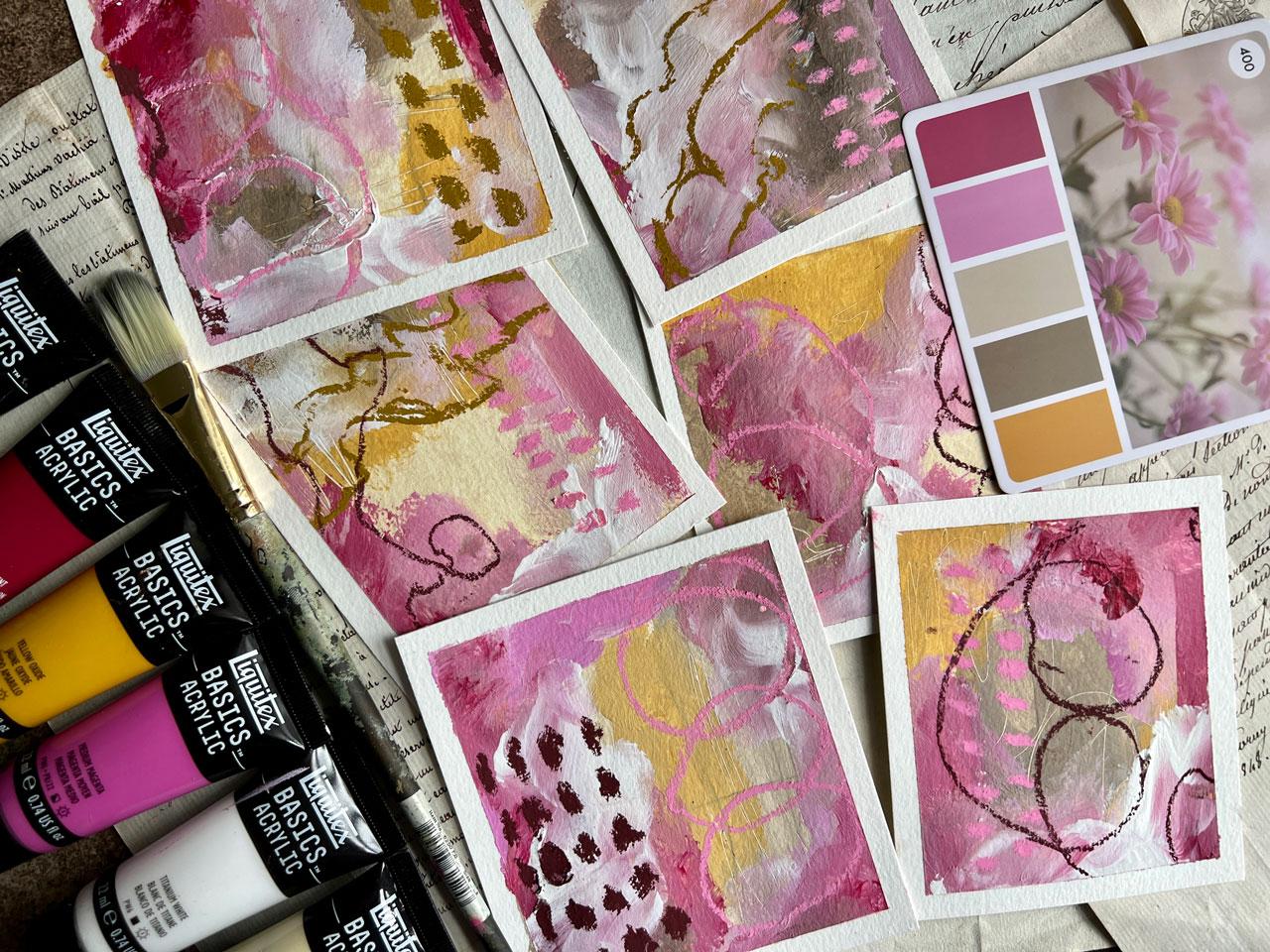
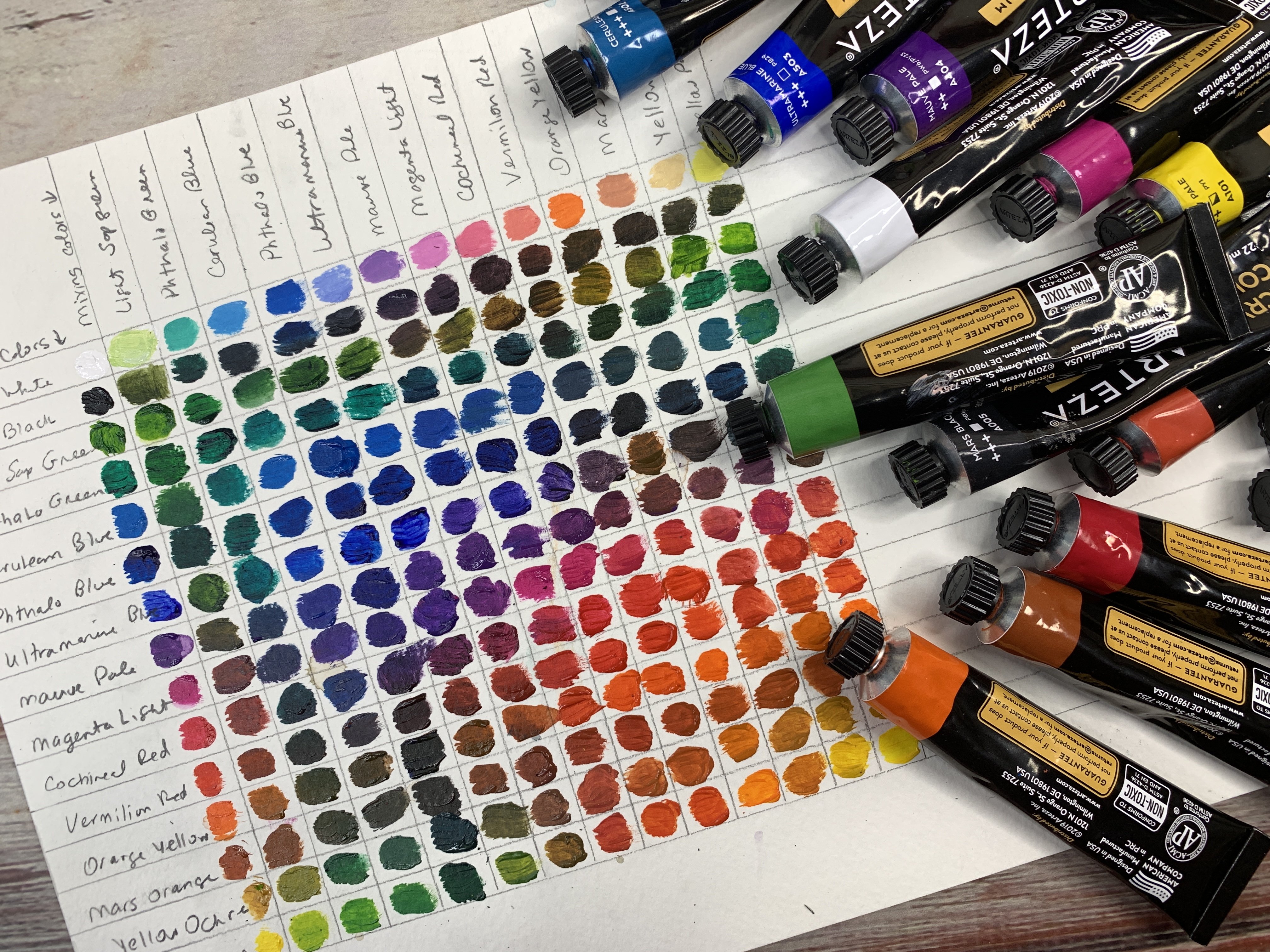
7. Samplers - Color & Marks: Let's talk about color
and mixing some color using a color palette that
maybe you've found or you've decided on whether you've picked it from
your color wheel, or you've picked some of
your favorite colors, or you've taken one of
the inspiration cards from Pinterest, or design seeds, which are both free resources, or the color cubes, or you've made some from your own photos,
Lots of choices. I'm using these
because I can hold them in my hand while I
talk to you about it. We can look at these
colors and see does it fall along any of
our parameters here. Because we've got
like a yellow ochre. And in that yellow ochre, if we're looking here, we've
got yellow reds and pinks. We almost might say
this is more of an analogous color scheme with some neutrals
added in there. I like that because
I like the yellow, orange, red side of
the color wheel. You can look and say, okay, what do these
colors fall in? We're going to say
colors that are side by side on the same side
of the color wheel. Then some of these, I'm using acrylic paints. I'm using these Liquitex basics acrylic paints
because you can get a whole set of these little tubes and you can test and play and have
a lot to pick from. Here's the whole little set that I took them out of the box, but it's like a little box of colors and you have a
pretty good selection. Then what you can do
once you decide, okay, I love these colors here, then if you start to run out, you can buy bigger ones
of your very favorite. It's a nice way to test
out lots of colors without investing in lots
of big tubes of paint. Then when you get low, you know what your favorite colors were. I have picked out my goal with something like
this is not to be exact. Like, I'm not trying to get
this exact shade of yellow. If your goal in your project
is to learn to mix colors, then definitely pick that, that exact color and get
it as close as you can. My goal is to work
within a color palette. Even if I'm a shade
off here or there, I'm still working within four or five or six shades
that I was trying to work in. Just seeing how
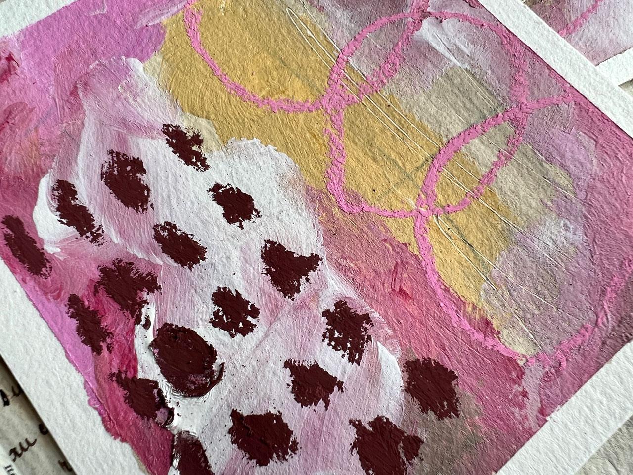
close could I get? You'll notice on this set, I've picked a lizard and
crimson for this dark color. I have picked magenta, medium magenta for
this lighter color. And I need to maybe add white to it to get it a little
tiny bit lighter. I've also got bleached titanium. I went ahead and
picked raw umber, which is way darker
than this shade here. But I can mix it with white
to get a lighter color. Then this last shade I
have is yellow ochre. Then I've got titanium
white out here. But I also have white Eso. I like having Eso
on the palette. White Eso and clear Eso,
both minor Liquitex. I like having those out here because I like mixing
my acrylic paints with Esso that it makes it less
plasticy when it's finished. It gives it a little bit of a
matt look instead of shiny. It makes it where you can layer
stuff right on top of it. Let's just take a look at what these colors
actually look at, actually look like as I
put each one out here. And maybe I'm going to mix
this one with the pink, then we can see how close
are we getting there to our color palette and see if
this is what we want to use. I did like this
unbleached titanium just like it was then. I'm just using a
Princeton Umbria Filbert. I think this is the
number eight here today with this Brown. I want to mix it with the
white and get more of a tan. Oh yeah, see. Perfect. Then for this last color, I'm pretty good like it is. I'm going to use this
clear Jess out here. I'm using the Jess even in my little color swatch so I can see exactly how it's
going to perform. The Jess makes these
easy to b***d. Let's see how we did. That's
almost spot on there. With every single color, I'd say we did pretty well picking five colors
from our Swatch. I'm going to start
making little samplers. My very favorite way to do
that is to take a big piece of paper and cut it into roughly
three or four inch squares. And start painting
different compositions. Or a lot of times I'll intuitively paint and not even worry about
the composition. But on this one, I want you to focus on some compositions. Play and practice. I want you to look at
all the options that you have been given
in your guide. Because I did make you a
copy of these and think, okay, let's try
some of these out. Are we going to do Rule of thirds and split it
into different rules? Are we going to try
out low horizon, high horizon things in stripes? Do we want to try out that
cruciform frame and frame, what is it that we're
wanting to try out? And you can even sketch some
of these out on your paper. If you think, oh, I
need some help here. Maybe we're going to do one with the center mass. I like that. Then maybe we're going to
do one in say, a Y shape. We want to do something with
this cruciform somehow. We're just going
to get some type of shape going on there,
like a cruciform. Maybe I want something
interesting with a horizon line. Maybe on this one I want
to go shape through it. Let's do something
with an S shape then. Maybe on one of these, I want some big items. Now we've decided, here's
what we're going for. We don't have to have exact, doesn't have to be perfect. The goal here is to just start learning and experimenting and figuring out what we want to do. Then after you've
done some of these, then we can mark
make on top of it. And we can just decide we've already got some
color palettes here. I want you to get started with some of your colors
and just see like, where is it that we can
take each of these pieces? I'm just jumping right
in, just seeing like, what can I get if I do whatever it is here
that I'm thinking? I like to be loose and messy. I'm not trying to get exact, I don't know where
we're going to end up, but we're going to at
least give it a try. This is totally
different in the way I usually do some abstract stuff, but always time to learn and play and
figure some things out. What's really cool about, don't dip your
hand in the paint. What's really cool
about playing and experimenting in this way
is when we peel this tape, we're going to have
some cool stuff that we didn't even know we were
going to end up with. I like that. Then as we go too, we may then come back and do
some stuff on top of this. We may hide and bury that
composition a little bit, but I want you to at least start with a composition
that you think, oh, this is interesting. Let's just give it a go and
just see where we can end up some of that out of the brush and we'll
pick up another color. Let's see, let's
pick up this yellow. Oh, I'm just messy. Ever were today, maybe I'm going to come in here
with this over there. Maybe I'm going to start
filling some colors in here. You might see your pieces turn into something else
after you get going. Like maybe you start
with one composition, but as you get
going, maybe we work in stripes and you're
like, oh, got to stripe. One another thing I want to think about too is
marking as we're going, we don't have to just
mark make on top. We could go right now and start dragging some
stuff through, getting some interest with
something sharp or a pencil or I do love mark
making on top of stuff. Oh, yes. See I like all that. All right. We're getting somewhere here. We are getting places. All right, let's come
in here with some. It's my goal to make sure I use all the colors in
the color palette. Usually, when I'm doing a
color palette like this, my goal is to start with whichever is neutral and I
think I can grow from that. Or whichever is my favorite. Whatever color you're avoiding, use it as a little tiny accent. You don't, you don't have to make it like a
big feature element. But I do want you
to make sure you use all the colors in the
color palette you choose. If you're using some type of color palette card
like I've got here, I do want you to make sure that you use all the
colors on the card, even if it's just a touch
somewhere here and there, just a dab, I still want
you to try and use it. All right. I like
where we're going, I'm going to get over here in
this darker color and see. I can't tell you that I'm
going to like all of these. I like doing multiple
pieces at a time because then I usually like one or two. I usually don't
like at least one. I usually love one or two. And it's those one or two in the multiples that I'm going
for on that paint day. Because then every day
is a good paint day. I like to paint a
little more intuitively I do more than one because then I know I'm going to do something
that I love that day. Now I'm just layering paint on. I know we started with
a specific composition. Some of these are going
to lose their shape, but I am making an
effort to keep those. You may not be able to see
what that was when I'm done, but I did start with an effort. Learn all the rules and then you'll know how you
can break them. That's one of my favorites. That's why we learn the
different rules so we can see stuff you may not be able to see when I'm done what
I started with. But at least I'll know there's some interesting
things in there. Maybe there's some elements that just brought
it all together. I really like this darkness
of this color here. And I want to make sure that I'm actually
keeping some of that. I'm holding my brush
really loose a lot of times on purpose I don't want to be so super
tight with what I'm creating, that it's very stiff and
I want to loosen up. Holding your brushes
or your tools looser help help you do that. If you're using nontoxic paint, don't be afraid to
get your fingers in here and do some of this
stuff with your fingers. Got some nice dirty
water over there. Let's see, what else
can we come back with? I need to come up with some more color and let me
get some more of this. White. Just like white. Just because now I can
look at it and think, does it need anything else? Do I want to do any of
this with my fingers? Look at that. Finger
painting is fun. Gives you a different shape
and some other things going on with the different
compositions. A lot of time the goal is to make sure that you
can still see it. If I lose my compositions in my intuitive painting
here, I apologize. Sometimes when you're
painting, you just got to go with that flow
and see where it takes you. I can still see the
Y there. Oh, X. X is another take
on the cruciform. Could have done an X
on our little sheet there. You might add that in. Okay, I do got a lot going on here feeling like maybe we could do some
work making on top. We could do that with pastels, We could do that with
neocolor, two crayons. I generally like using pastels, but let me tell you,
they make a mess. We could do that with Stabilo, we could do that
with acrylic inks. There's all kinds of things
we could do it with Posca, so much that we could do on top. But what we need to do is
let this layer dry a bit. Let me let this dry and
I'll be right back. All right, this is
quite a bit drier than it was thinking. I'm going to do some pastels in here just because
I'm going to still stick within my color
palette and pick colors that I like out of here. I can see some of
my compositions. I had a circle that was center. This one was the y. This one was like the cross. We had high horizon, we had the S shape. Then I think we had some
rules of thirds there, maybe. I don't remember
what I put there. I'll have to watch the video to see like what
did we have there. But now I can come
back and I can start mark making
on top of my piece. I can keep in mind
like the things that I had as my composition. Or if I got way off of the composition that
I was trying to do, I can now veer off into a composition that I think
is going to be interesting. I different marks, I
like using stencils now. I never used stencils
before this year really. I had a bunch of them from years ago, but I
never used them. But I'm all of a sudden
obsessed with stencils. I like things that look like
lines and dots and dashes and some different elements that are some of my favorite
things already that look like abandoned lines and things that are scratchy and
things that aren't perfect. That's what I seem to like. You can do these marks
here and different shapes. You can do those
with acrylic paint. You can do them
with Posca marker. You can do whatever it is that you're thinking
hook at that. I like that. For some reason lately I really perfect circly
things like this. I love that. I just like coming in and
playing at this point. If I end up way off
of where I started, that is just fine here. These are scene pastels. These are the half sticks that I'm playing in because
I got a box of half sticks and found this lovely antique drawer that they sit in very prettily
over here on my dresser. I love this items. One of my favorite
possessions because it's all colorful and pretty,
that's pretty cool. This one had like an S shape. I could come through here and
pick up some of that shape, again, with some of my marks
that are coming through. If you lose some of your
elements of the composition, you can have your marks
bring those elements back with some imperfect lines or dots or shapes or whatever. That's something to consider. I like this yellow mustard pastel. It's pretty. Let's
do this one again. This is our, our high horizon. See how I can pull some of these back in where
we've lost what it was. Don't despair if what you end up with is a little different
than what you started with. Let's see what other colors
we can do could do this. Dark, reddish? No, it's too red, burgundy, Like this
burgundy shade. I think that's too purple. Let's go with it. That's
the closest one I've got. We'll just see, maybe we
could pull some darkness in the edges or in different
spots of the piece. I'm just playing
nothing exact here. We don't have to be perfect. I might pull some of
these in over here. Oh, look at that. I like
that. Okay, that's good. Let's see, maybe we want
something interesting over here. If you don't want to
deal with powder, then definitely do this
with something like the neo color to pastels. And I could have
used that. But man, I just love what
these look like. They're just so
yummy. All right? I'm loving that.
Okay, I'm feeling like maybe I want a line to
come up through this one way. Yes, I like that.
Okay, super fun. Maybe we want one
of these over here, just like a side piece. It's just about play. I'm not worried about
ruining something. I'm not worried about where
I've gone with the pieces. I'm having some fun. I'm
enjoying where we're going. I do keep a microfiber cloth
here in my cleaning room. This is the best tool in my cleaning room,
in my art room. The best tool ever for getting all this
stuff off your fingers. And then you're not going to
be getting stuff everywhere. Let me put this
over to the side. I think I have a whole
lot of layers going here. What we could do at this point is peel the
tape and look at it. But let me tell you how
I deal with pastels. Before we get too far, I forget if I'm using
pastels on a piece. I do use a fixative
on those pieces. I use the senile soft
pastel fixative. And I will hit these with this fixative and set that powder. I don't blow you notice the
whole time I've done this, I've not blown powder
all over my surface. Usually what I will do is take a paper towel or
something or take it outside. I don't want all of this
powder all over my surfaces. I will just tap that powder off and then we are ready to go. Usually, before I peel the tape, I'll set that real quick with the fixative spray that'll set the powder so it's
not always shedding. But for this purpose, I'm going to go ahead
and peel the tape. And just see what we got. They may be recognizable in our compositions
and they may not. That is just the way that I
create. I just go with it. I might start with
one idea in my mind, when I'm done, we may be there
or we may be beside there. But I think by starting with a composition
that's interesting, then you're setting
yourself up for success. And you'll notice after we peel the tape and cut these up, they're still going to
be very interesting because we tried look at these. Wheeling the tape
is magic magic. If you have trouble peeling
tape off your paper, different papers
react differently. You can heat the tape with your craft gun and that
will release the adhesive. If it's like tear in your paper, then I want you to do that. Let me tap this off
in my trash can. We can get our cutter. I like using this little
fisker paper cutter and just cutting these up. You can also just cut
them with scissors. Oh my goodness, I feel
like we got off some of our compositions and they
still came out amazing. That's what I love about
we start somewhere, we get going, and
we're having fun. We're getting inspired. And we might end up a little bit to the left
where we started. Man, look how good these turn out good paint,
they already area. Look at this. Okay, so that was our big item in the center. I kept it with the
extra marks on the top. Love that this one was
our horizon near the top. It's not as defined as say, a landscape, but
I still love it. This one, I don't know
what was this one? This one might have
been in the third. I forget what I did,
but look at that. Yum, yum. What was
this cruciform? I think I can see the
cross underneath it. We didn't end up with
a cross in our thing, but we still kept it
in mind as we were working and still got
something very interesting. You can see if you start
with at a direction, your stuff is so much more interesting than if
you're just willy nilly painting and wondering why it's not working sometimes. Okay, look at that one. This one I might could
add some more marks to. I'm feeling like
it needs a little extra. And look at that. Lovely, lovely. Let's see how we did compared to our inspiration color palette, which we're going
to call analogous like side by side
on the color wheel. Look at these, oh my gosh, look at these, the inspiration colors that
we were going for. I think we hit that right on in a color palette that
was beside each other. Here on the color wheel, we were right in here
with some neutrals. I think we did pretty darn good. Today, I want you to
do bunch of these. These are going to inspire the larger pieces that you're going to
create after these. If you have some pieces
that you're like, check out this composition. I really like how
this worked out. I want to go with this idea
as we get a little larger, that's what these
little pieces are, meant to inspire
your larger pieces that you're going to
make later in class. I want you to do
a bunch of these. I want you to try at least three different color palettes. Make at least three
different collections. Study in the different
compositions that we came up with in class or some of the ones that
maybe you've thought of. Also, I want you to
at start with this, even if you don't
completely end with it, I want you to at least have a direction where you started. So that when you get to the end and you have a piece
that you're like, whoa, look at this, it worked out so good. Or whoa, look at this, it did not work out at all. Where did I go wrong? You have some evaluating
that you can do. All right? So I'll see
you back in class.
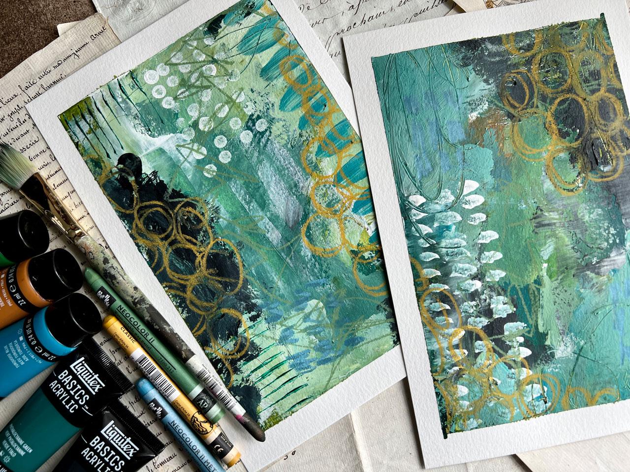
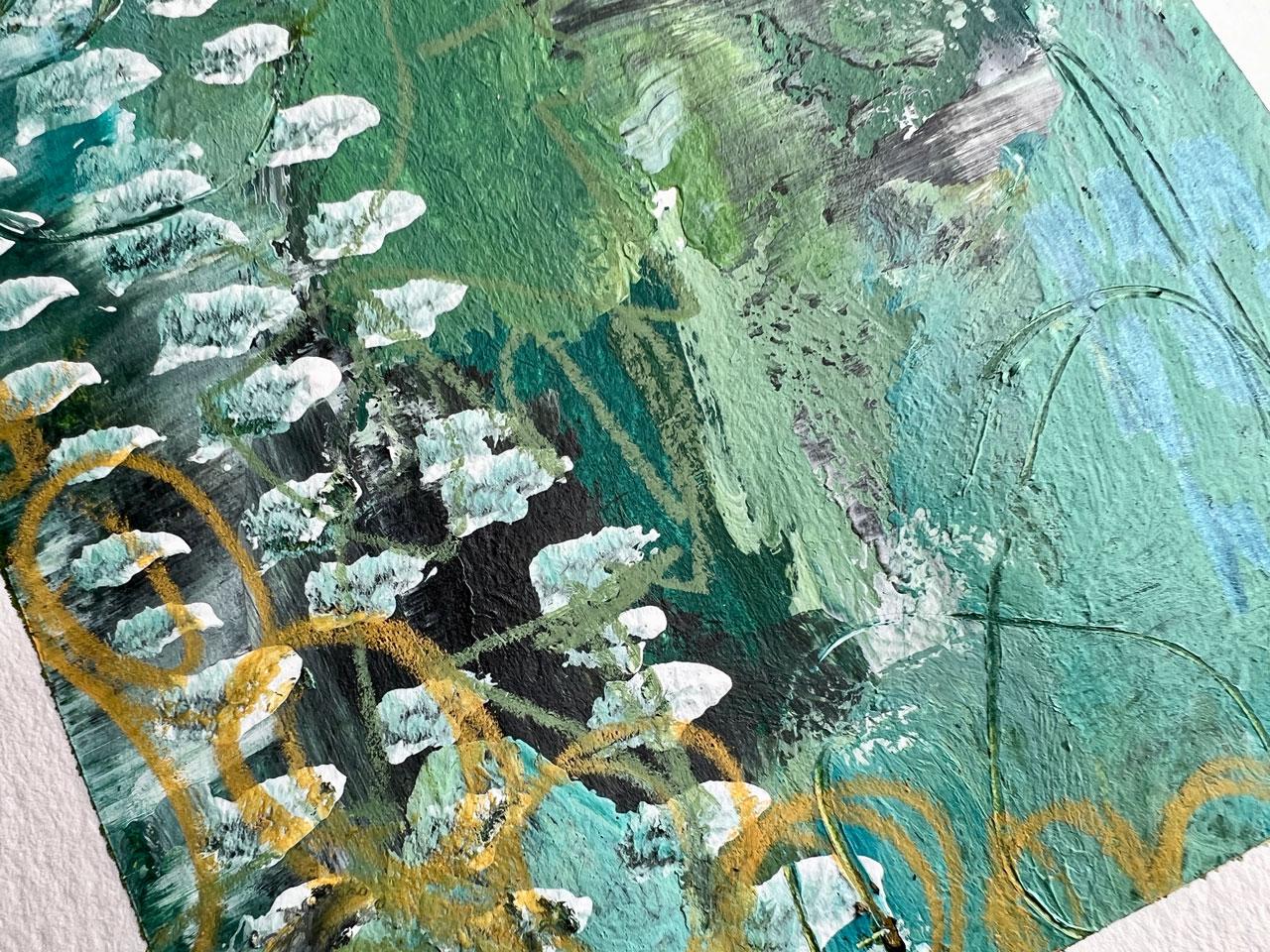
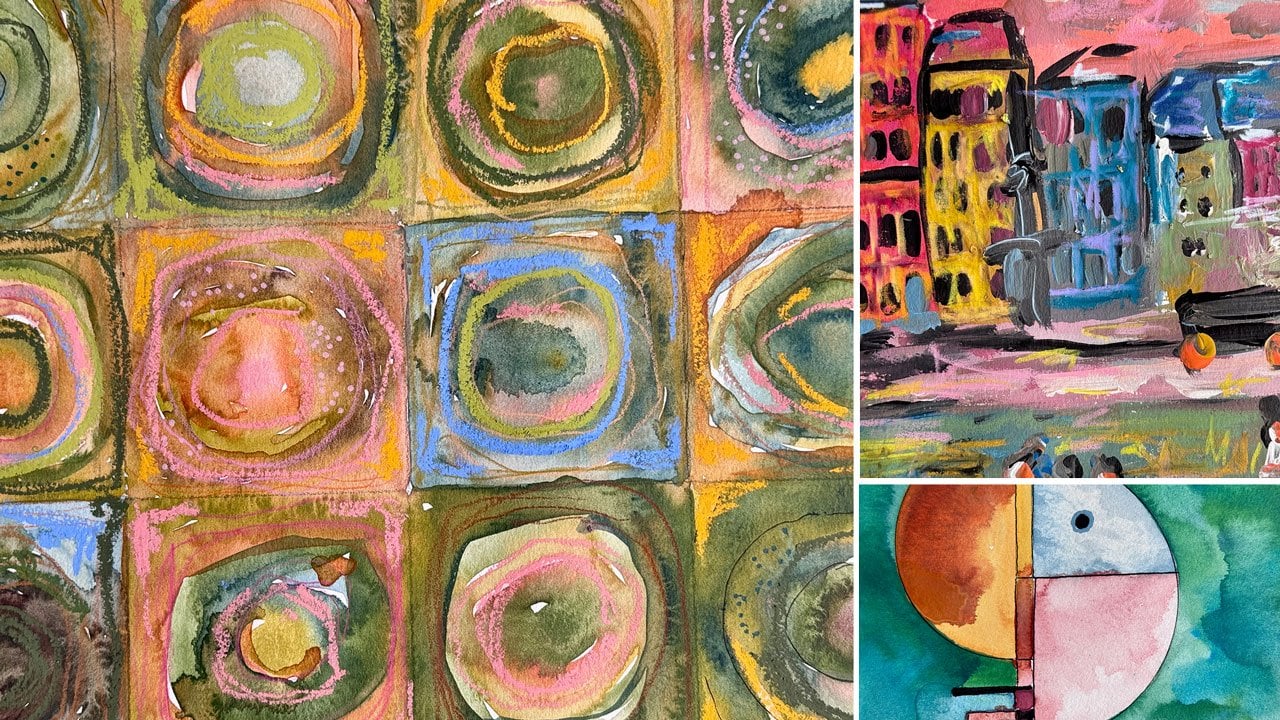
8. Half Sheet Abstracts: All right, in this project, I want to do some
half page pieces. And I'm still using that
Canson Excel watercolor pad, a nine by 12 pad, 140 pound cold press paper. This time I've pulled a palette
in the blues and greens. So we've got that
nice color palette where they're all sitting
next to each other. Again, this is in the shades of blue and green that I don't necessarily have all
those exact colors. I've put them in range like this because I think
what I can do is maybe take some of this
green and some of this a tan color and come up with
that pretty green color. I think I can mix these colors to fit better what
I need them to fit. Now that I've got
that going in there, it's really good fit in there. Let's just mix a bunch
there for ourselves. You see how we can get the right shade just
mixing a couple colors. I think I can that green and maybe this blue with a
little bit of this tan. And I'll get some
of this blue too. Oh, yeah, see perfect. I can just go on down
the line with these mixing a little bit
of this color in with that color to
get the right color. Then of course, I want to have some white and clear Jesse. I do like to mix and make
some lighter shades. I will be putting
some Esso down. Also makes my paint
where I can put stuff on top of it and
it makes it more b***d. Those are liquid,
so I have pulled raw sienna black,
the two ends there. I have pulled this low cyan
green for this darker color. I've pulled hookers green for
that lighter color to mix. Then I've got turquoise blue
in the middle to also mix. I think I can get there
fairly close with these five colors or it will be at least close enough
for me to get there. Then you just have to
think composition wise, are we looking to do like
some type of rule of thirds? Are we looking to maybe
do some type of S shape? I feel like a lot of
times I like to start abstracts with a color
coming in from the edges. I'm going to work
on the diagonal. Let's just jump in and do it. Let's use some of this
green that I just mixed. And just get in there with
our fingers if we need to. If you've got non toxic
paint and I'm just going to start spreading
color then on the other one, do we want the same composition? Do we want to vary it up? Do we want to have
something coming in? A lot of times I have something
coming in from the side, then I fill in the
corners on the other side and snake through like
our S composition. But a little, tiny bit
of a variation on that. You can see I've already started laying out my
thoughts in my composition. I'm going to have to maybe do more than one layer because this green was semi transparent. So we'll be layering
things on top of these. Part of what makes abstract
so interesting is the layers. And it's also interesting with the marks if you get
where you're like, hm, that's not quite
what I was thinking. You don't have enough layers. More layers. Just going for it. Just throwing some
stuff out there. Because I know the more I do, the more layers I get, the
better I'm going to love it. Let's do with this darker green. I want it to stay in
the same color tones, that blue that we created. But I don't want it to quite
be as black as the black. I come back with some of that. I don't know where I want this. Oh, here we go. Oh,
look at that color. Sometimes it'll take a minute to get your rhythm. That's normal. Don't get discouraged,
just keep going. Rolling my brush sometimes. That's always fun. I've got my mark maker tool over
here. Oh, look at that. We can, while the paint is wet, don't forget to start creating
some interesting marks. I'm doing that little scribble
thing that I like to do, that I showed you
in the mark making. Then we can come back and we can shed some out our brush here. Just we'll get there. Let's go back with this
green, even lighter. Can we make it lighter
and pull some of that in? I know we just got off our
color way a tiny bit spine. Because now you get in
here and we can start mixing colors and
discovering new things. And just deciding like, oh, what are we going to get today, these colors now that
I've started work, this is exactly why I like experimenting in color palettes. These colors are crazy. I don't know if I love love them or if I'm
thinking maybe not. Again, I don't know,
do I love them? What do you think?
Do you hate them? Are you thinking hot mess? Because at the moment
I'm thinking hot mess. Let's go ahead and mix
some a lighter blue. I'm just keeping the
same paint brush. It's fine if you get where you're painting
and you're like, wow, what is going on there? Just remember, layers. Layers is the secret here. Then we could take our finger and come back with some
white. We could let this dry. I could've let this do
a little bit of drying, but I can start
manipulating a little of that color with
some white and just see like what
are we going to get? Don't forget to, you can use
other tools to paint with. You don't have to paint
just a paint brush. We could paint with
some catalyst wedges, like what about that? What if we come back in here
a totally what I want to do, some mart making, we're
in the upper third, keeping that rule of
thirds there in mind. Or maybe we can drag some of this paint and
see what that does. I can still see my
curve going there. If you lose some of
that composition after you get
going, that's okay. The goal here is just to have a plan when
you get started. As you're going,
that plan changes. But that's okay, because you had a plan when you got started. My goal is to be abstract art. At some point, you do
want some focal areas, you want directions
for the eyes to go. But I do tend to move along
and do some other stuff too. I think I like a big took, this like this, I
didn't like that. What if we did this?
Okay. Yeah, I like that. This is pulling that third rule where we've got
third, third, third. A little bit interesting though, with that little
mark layer in there. Now let's add some
layers on top of this. Feeling good about it
a little bit here. Just see where we
can get this to go. I almost want to
pull stencils out, but I want to resist. What if we start mart
making with some paint? Like what if I start doing
just interesting lines, whatever floats your boat there? That's pretty cool. I could do get my edges back over here still. Just playing,
mixing in my color. That's fine. Oh, I won't paint all over the brush.
I'll get that everywhere. All right. What if we started doing
some with some white? Oh, see, now that
I'm loving that. Just with the tip of the brush, just getting some interesting
marks and movement. That might be my favorite area, just get creative and
where you put stuff in, some marks that you make. Now I'm liking that,
that was exciting. We could come back in,
could go ahead and do a little more mark
making with my sharp, whatever it could be a pencil. But I like the
layers that we get when we drag that
paint and we can see what's under it,
especially right there. Did you see that?
Look at all that. All right, that's fun. We could come back in with some
more, more layers. We could decide, I have some little catalyst
wedges over here. That's catalyst wedge. This is a master's touch brush. We could do some
marks with this. See now. I like those.
Oh yeah, those are good. Do we want to do let's let this dry a little
and think about it. I almost want some circles. I have some of these little show off special
tools for stencils, little dauber set, that's
what I'm looking for, it's a Uber, I have some of these like a
little dauber here could come back with some dot
with some white over here. Doesn't have to be white.
It could have been green. It could have been black.
But I like circles. I like, I'm a circle dot girl. Think of some different
things that you have around your house that can give us
some interesting texture. If you've got some
of these little craft tools, they're fantastic. I'm not trying to get exact, but I do find the different
things interesting there. Let's do that then. I just usually just
wipe these off on my microfiber cloth and then I just set them back
over here and use it again. Those are easy to
clean up and use. I almost feel like we need
some contrast over here. I might come back in here with my brush with some black on it and put maybe some of
our contrast back. Then I might look
at it and think, does it need any pastels? Does it need like neocolor, two crayons on top? Maybe we could now start doing
something on top of this. Let me let this dry.
Let me put those paints over there before I
get paint everywhere. Tell the worst of that, maybe we'll get some little neocolor, two crayons out and I'll be right back looking
at our pieces. Now, our compositions. This one was a curvy thing, this one was on the diagonal. I've lost a little of that
composition as I'm going, but I do have
elements to look at, draw you through the piece. I'm okay with that. We could come back and see, will the crayons do anything
if we color on top, I could come back through and
start adding some marks and some scribbles still on this little diagonal
would be interesting. These definitely are on the paint really easy because I've got that
gesso in that paint, but they're not
really standing out. This one we did
that circle around. I could actually come
through with these marks along that path if I
wanted. That's pretty fun. That didn't stand out nearly
as much as I thought. Let's just do some
random stuff on here. Part of abstract art for
me is the experiment, the having the fun, not worrying about where it's going
or how I got there. It's all about what
makes it interesting. Colored circles, Not
something I do a lot of, but look at this, that's pretty
cool. That's an element. I'm actually digging there. We just made our composition
go up this other side, so we're still on a diagonal. Just go with me here. I like just
experimenting playing. A lot of times I do a lot of intuitive work without really having like defined
direction and stuff. And I'm okay with that because I've been doing
stuff for so long. I tend to do things
on the rule of thirds because of my
photography background. For so long I did art
for so many years and then rebelled against
art with photography. Now I'm rebelling
against photography and going back to art because I'm a little burned out
on photography. Doing it every day for 11 years, basically, in one very
long 365 day project. Now I'm swinging back to my art roots now we can see
a little bit of a curve. We just curved it differently. I really like big heavy lines. I'm just doing some of the
things that I was showing you on my mark making sheet that I like just because I like them. You don't have to
do these. This is more in that blue range. I just want to see,
when we peel this tape, is it a hot mess or does it
turn into something very interesting way different than anything I've been doing
lately. I love that about it. All about what
feels good that day and in the moment today, this is what felt good, I guess. I also like paint, pin dots and all kinds of stuff. But now I think I've got
a lot going on here. Maybe we should just peel this
tape and see what we got. Because peeling tape is magical, turns every piece
into magically like a finished piece of art when you're like hot mess
with all the tape on it. But I will say too, on this one, I wanted a fatter border, so I did cover as
much of the white as my tape allowed
me before running out of tape because
I wanted it to be like a nice framed out, whatever it is that we did. Oh, look at that.
All these are crazy. In like a very
interesting good way because as the tape comes off, you can really see it tighten
up the composition and the color and we get right
there into look at those. See, I almost thought, almost thought I
want to scrap these, but now that we've peeled
them, check it out. I'm actually digging that. These are a crazy, a little more scribbly, little more urban art feel. I am totally digging that. You can see my composition
started off going this way, but I've actually
made it go this way. We'll say this is
a little bit on the diagonal with some rule of thirds hanging out in here. This one, we started
off curving, pulled the curve back
in there with the black over here leading the
eye back into the frame. And some other elements
as we're going. There's just a lot
of interesting, yummy things to look there. I like it when
it's like a set of two or a set of four,
or a set of six, because then you have like a
whole little collection that pulled your pieces
together. All right. I hope you enjoyed
this color palette in the blue green on the same
side of the color wheel. And I can't wait to see what you pull together for
your little half page pieces. I'll see you back in class A.
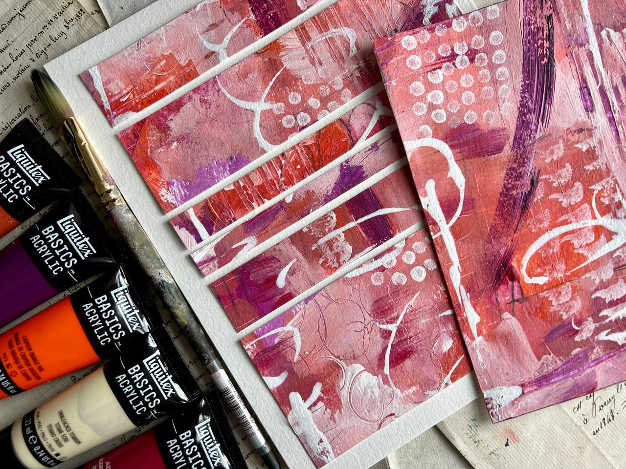
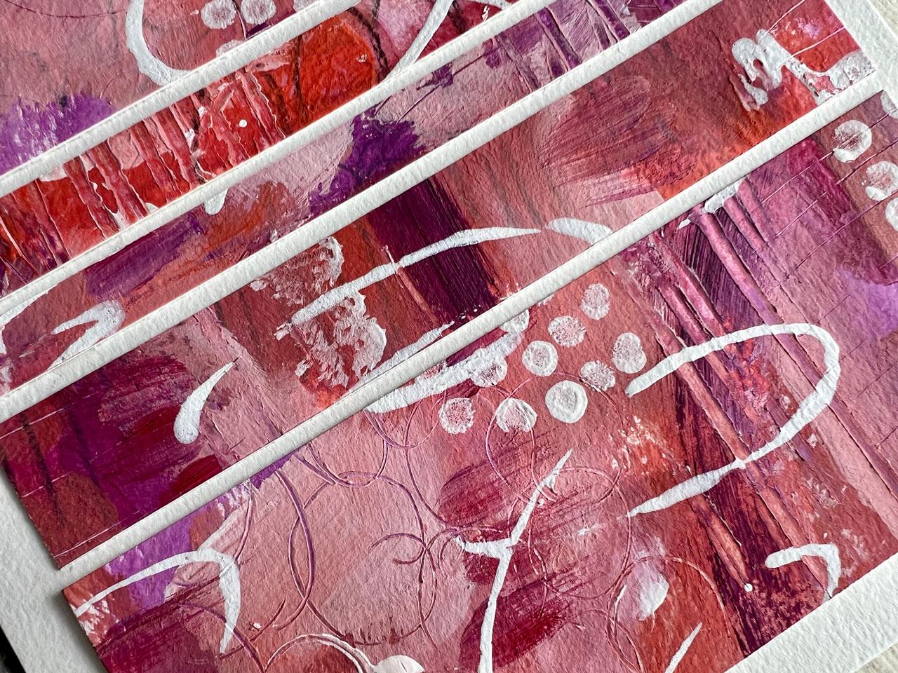
9. Searching Out Compositions: In this project, let's take a look at one of my
favorite ways to create. It freezes up in the near future of worrying
about composition. Then as we finish this piece, we're going to cut it up into
some lovely compositions. And then we'll be
able to look around the piece and decide which parts are really
working for us. I'm going to be using this
color combination here. This is one of those
looking at the color wheel that's all along this path
here on the same side. Some analogous colors, if we look at what
that really means, 3-5 adjacent hues
on the color wheel, sharing a common
color such as blue, violet, violet, red, violet. With the possible
addition of violet, blue and violet red, it just means all the colors that are sitting next to each other. As you can see here,
we're going from this purple shade all the way
over here to these oranges. It's the perfect
analogous color scheme, without us having to think
too, too hard about it. I pulled some colors out. I've pulled the deep
violet for that purple, and I've pulled
Alizarin crimson hue. For this one, it's
a little brighter, but we can darken that down with some purple or we can
just use it brightly. My goal is to get close
to the color palette, not match the colors exactly. I've pulled this red oxide for this middle color,
which is more pink. I may mix these two together
or mix it with white. Then I've pulled out
cadmium orange for these, which I can mix white in. I've got a little titanium buff because I thought
maybe that would mix right here with these. What we're going to do is paint the whole page and
just see what we get. One of my favorite ways to get started is to do
some mark making. Because then you start the page and you get past
that white page paralysis. And you just,
whatever feels good, we may not see it at all. But it is fun to get
something on the page, and now it's already ruined
and you're not scared to ruin it. I'm not sure why. Why are we always afraid to
attack that white paper? It's just, it's just paint. Why are we scared
of it? All of us. Are we all have this issue and I wonder why do
we have this issue? Paint cheap paper is cheap. If we don't like it,
we can start over. Although I guarantee you
if you start painting with the intention
of cutting stuff up, you do get to a point
where you're like, oh, I like way more of this
than I ever thought I would. I'm just going to pull
out some paint brushes. Got the Filberts. This
is a 34 inch square one. We'll just see what we can do. We're just going to paint and just put stuff anywhere we want. It's what feels good, not what looks good. We're not worried
at this point about where things are going
or what they're doing. I like painting this way
because it's very freeing. I also have the white
and the clear Jess, so here and I do that
so that the color mixes a little easier and
I can layer stuff on top. I am using that in here. This purple is even brighter
than I thought it was. After you get your color set and picked to worry about it, my goal is to work within a color palette
in a range of color. And it doesn't really matter if it was exactly right on say, those sampler cards that I
like to play in. It's okay. The goal is not to be exactly exactly the
goal is to work in that color palette and just be creative and experiment
outside of your comfort zone. This is definitely one of my favorite ways
to paint and play. Getting outside of what
I normally like to do, it leads me to bigger
projects and normally classes because I
discover new techniques, new skills, new
things that I'm like, oh my gosh, I love this so much, I'm ready to make a class. So it's a lot of times how
I get to my next classes. What if, while we're painting, oh, oh, did you
see what that did? Let's totally drag our little paint brush
through that paint. Look at that. That
was super fun. Let's go ahead and do
that over here too, just to see if I can
get any fun dragging. I like that it made a stripe
there. That was super cool. Trust me, you're going
to see these and think, oh, this is a hot mess.
I don't know about this. That's the goal. I'm looking
for some hot messes. Let's just see where this
can take us when we're done. At the very end, I always end up with
stuff that I'm like, oh, who even knew we
were going to get there? I love coming up with random color palettes like this too, because you never know how it's actually going to
look and work on your paper. Like this is not what I was actually expecting
it to look like. Not at all what I was
thinking I was going to get. Maybe just come
back in here with some of this white
and I just use that white Esso for
that because that's basically white acrylic
paint with some grit in it. It's fine to just paint with it. Also, if you want
to just use that as your white a little
bit, not a big deal. While this is wet, don't forget, we can make, we can draw
stuff in our piece. We can do little hash marks, little tick marks or something can pull
some lines through it. Because remember, it's all about the layers at this point. I don't want you to worry about where you're putting what. I'm not trying to create a specific composition
at this point. I'm to give lots of interesting sections and
areas that I can pick from. Basically. Super fun, that was a bunch of good stuff. I'm going to come
back maybe with some. This is a point too where I
like to use some stencils. Sometimes you don't
have to use stencils, but I'm just throwing
that idea out there. I think it's fun to have some repetitive areas you can make with different
tools that you have. The end of a paint brush
who see there, that's fun. Let's do that over here
after you get going. If you're like in a color
palette and you get inspired to use something else that maybe you
didn't start with. Like say if you want a
dark color in there, like black or some color
that really gives you a pop. Something different than
you've already got going on. Don't be afraid. Go
for it. Go ahead. Let's use some of
this purple here. Be brave. I have some
T shirts printed for myself and I'm going to
start wearing those at my art table that say, be brave. I don't know what the
heck I just did there. I just threw that purple on there like it was just wanted
to like fly through it. I don't think I like it, but I want you to do
stuff that you're not sure about because this is how we're going to get to
more interesting things and figure out what do we like
to do when we're painting? What's our favorite
ways to paint? Just throwing some marks
in here, different colors. Okay, that's crazy. We can take the end
of paint brushes and do some, Oh, look at that. Oh, that was some good
dragon dragon dragging. We can get some yummy
show through under there. Don't go all the same direction. Oh, yes, See I'm liking that. Here's where we're going. Just to give you an idea, I like to take little pieces of mat that are either pre cut or that you cut out of a
piece of watercolor paper. Then I like to search out compositions within
my larger piece. This is my favorite
way to create. I like to paint and not
worry about the hot mess, and then come back
and figure out what works and
what doesn't work. Then we can start to identify
areas that were like, oh, this is very interesting. We can turn things around, not do it the way that
we painted it and think, oh, look what we got here. This is my favorite way to
paint and search things out. Just figure things out. What do we like?
What do we not like? Do I need more stuff on here? Do like the little dabs. These are little craft
daubers from Michael's. They got like a little
spongy piece on the top. I've decided I like dots
and things that make dots, and I've decided these little
daubers make great dots. What you could do if I'm not sure where I want
to put something. If you get to a point
where you're like, I think I'm ready to cut it up, but I don't think I've done. Go ahead and cut it
up and then you can evaluate what else does your
finished little piece need? You can finish it
off at that point. I love doing stuff
like that. You know? This is like doing dots
with your paint pin, but it's a much larger surface. I do like little dots. I'm a dot girl,
give me some dots. Don't stick your
hand in the paint. How, How many of you have
to remind yourself of that? Don't put your
hand in the paint. Terrible. And then I
just wipe it off on my little rag and it's
ready for the next time. That's super fun. I've also some white acrylic in. I'll throw a little
ink in here on you. This is the Liquitex, which I might not have
mentioned in the supplies, but I want you to keep your mind open to everything
that you've got. What I like about the inks
is we can draw with them. I can draw onto this. Something interesting,
perhaps, maybe not, but we're going to do
it anyway. Be brave. You're going to hear
me tell you that now. The next time you do
something and you're like, I don't know, I'm scared. I'm scared too. And I
got to tell myself, just go for it, just paint. What helps? Also, if
you start painting with no expectation in mind,
that helped me out. That's when you're the most
disappointed you're painting. When you're all done, you had
this picture in your mind, let's say like you
wanted to draw a tree. And you're like, okay,
I'm going to draw a tree. And you get your paper
out and you start drawing and your tree looks like
something a five year old did, which is not what
your intention was. Then you're really
disappointed because it was a failed tree attempt. If you start off
your abstract pieces with no expectation, nothing really in your mind, you don't know where it's going. Then when you get
to the end of it, you're excited because you're
like, look what we got. I didn't even expect this. That's my favorite
way to create. I want to eliminate some of the expectations
and the pressure that we put on ourselves. When I paint, I want to
paint, I want to have fun. I want to make a mess. It's like slapping paint all over it. And then in the
end, I want to see what I can achieve by maybe
cutting something up. I'm going to have to let
this dry, then I'll be back. Okay, This is dry. I just peeled the tape off
and took it off my board because I now want to start looking at
this with some viewfinders. This is just a piece of Matt
that I got at the Michaels. You can get it at frame stores, craft stores, they come
in different sizes. This is like a five inch
by seven inch size. Just like a 3.5 inch
by five inch size. You can make your own
like three by 3 ". You can make different sizes. Some people also like to
take little strips of watercolor paper and then you could get different
sizes out of that. It's out there, I've tried it. What I like to do now
is start looking at these and searching out
interesting compositions. And if you're thinking
well what's interesting, this is where we'll start looking at the
composition pieces, ideas that I gave you
on the resources, the project resources page. Let me make sure
that, here we go, You can start looking at
some of these and thinking, okay, I'm looking for things
that are not centered. Maybe there's some
stripes in there. Maybe it's got some
movement in it, or it's on the diagonal. I'm looking for
interesting things. If I'm going to
off center things, maybe there's some things in
there that's interesting. That's what I'm thinking. What have I created within
this larger piece of hot mess that's going to
give me something interesting If I stop right here now I have some stuff
on this third of the paper. There's some interesting stuff on this third of the paper. Nothing's really
directly in the center, which is what I go for. I don't want the
subject to be centered, that's the least interesting, unless it's on purpose. Generally though, I
like it to be a little less going on there
and the action coming in on the upper third, I've got lots of good action. On the lower third, I've
got lots of good action. That's a good candidate. Also, like this one here. What I like here is we've got some horizontal lines in here, we've got a shape coming
in from the side. We've got some
decoration over here. Overall, we've got
tons of movement in this piece that leads our
eye throughout the piece. Now, I'm not done looking, I want to pull this
every direction that I can say, okay, what about this? Here we've got action
on the upper third, we've got action on
the lower third. It's a little simpler
in the center, I'm liking it, that's
a possibility. What else do we have
more than anything? I'm moving this around, looking for things
that catch my eye. If you're using a big piece
like this and you're like, okay, I'm not getting
it with this size. Go smaller, you don't have to have a bunch of big
pieces out of this. You can go smaller and start searching out interesting
things and say, okay, now I, I've got some
vertical lines, I've got some movement
coming in from the side. I've got these yummy
dots. I'm loving that. Now that I've gone smaller, you don't have to go larger. But as I was moving it around, I'm loving this right here. Now I've got the swoop of something coming
through the piece. It's leading my eye somewhere and you're thinking,
oh, where does that go? What is beyond the frame? I've got some dots coming in, I got some interesting things on this third coming up from the bottom, we've
got some movement. Now look at all these things
that my eye is looking at. And I know that it
continues because some of these things go out of
the frame and I'm like, oh, what does the rest
of that look like? It piques your interest and to see what else is going on
that maybe you can't see. Let's see, is there
anything else feeling like this was
the one that I really, really liked because I
like this thing swooping through that when you
get one that you like. And the reason why I
like this double frame is because I can go
a little bit bigger. There's p***ty of room
to frame this now. All I do is I just take a pencil and I draw out the square of whatever I'm
going to cut out. You can do this with
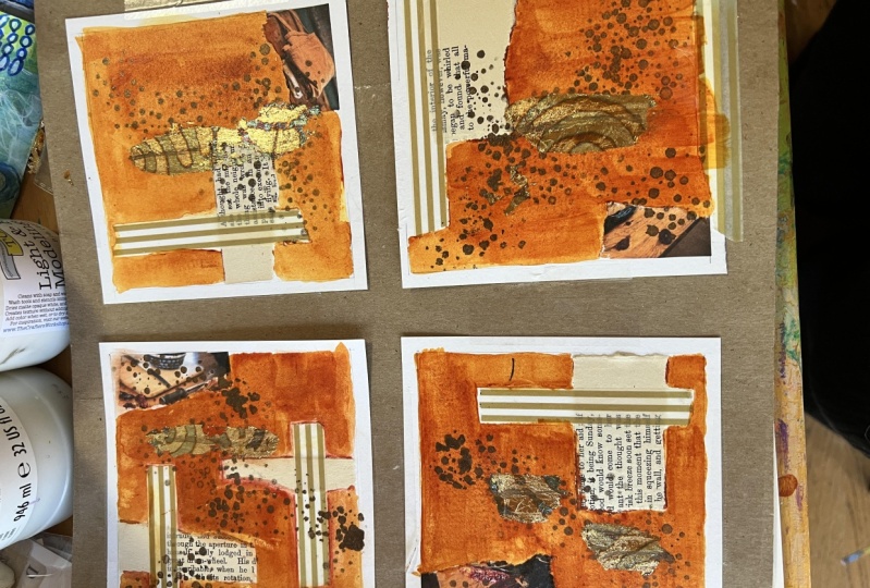
scissors or paper cutter, whatever you're more comfortable with, then we just cut this. Another favorite thing
to do, we might as well, while we're talking
about cutting up art, might as well do it because it goes right in with our
stripe composition. I like making things that
I call junk art collage. That's basically using all of these pieces that you
either love or don't love. You cut off of the
left over the junk. We make something out of it. Here we go, Check it out. Oh, look how pretty that is. All right. I'm loving that.
We're going to keep that one. What if we took
our paper cutter, cut this up into stripes? And I want them to be hope there's no wet
paint still on it. We'll cut this off here. I think there is a little bit of white paint that's still wet, So I'm just going to be careful. We'll cut this off here. We'll cut this off here. All right? Oh, look at
that. Look at that. Maybe I like that instead
of cutting it up. Well, I still want
to cut it up though. I'm going to get
a piece of paper. What did I do with my pad
of paper? Here we go. Stuff on my fingers. But I got some paper here
and I can get a clean piece. I can cut this piece down to a size that I want
to use preferably, that is going to fit the piece
that we're working with. If I'm working with a
piece that's this size, I might want to cut
that right about here. Then I know that that's going to fit. Let's put that there. Now here is what
I'm going to do. I'm going to cut this
into different sizes. Let's get a big one in there. Let's just get this one here. We can cut some more
up if we need to, but this will get
the point across. Now what I want to do, reorganize these
into some format that it didn't actually
get painted in. Pull the stripes differently
than what we painted. And we can move these around, we can think about it,
then look what we got. I like to leave a
little space in between each one and then we have a super fun junk art striped
collage with slightly different than we painted or it could end up following the
direction that we painted. But we could also turn
some of these around. If we're getting to much the
same of how we painted it, we could just re arrange
them all together. But I like when we start turning them around
because then, you know, they're
going to be different. Look at that, then I just glue
that down with some glue. I have yes, paste that I like
because of the thickness. I like a thicker paste. But check out that, how
super fun was that? Looking at compositions,
we're doing that. Horizontal strata,
looking at this work, at the movement, and we talk through what was so
appealing about this to me. That's what I like
about doing these. I like going through
and cutting out the appealing pieces and going, okay, here's what is
amazing about this section. Even if the whole piece wasn't
amazing, that section was, let me tell you, it's
very liberating to cut up art when you've
never done it before. You just all of a
sudden free yourself from all the stuff that
you just get stuck in. Then cutting them up
into something like these stripes and gluing
those down, that's super fun. Those look really cool. We didn't have to actually
follow any of the other rules. We've got lots of movement. We've got the, and we've
just got the interest that we've created in how we've laid these
down on the paper. I hope you've give
both these a try out. This is two of my
favorite ways to create some abstract without getting bogged down into heavy thought of
composition and color. And just have some
fun. All right, I'll see you back in class.
10. Finishing Sprays: Let's talk about
finishing our pieces. If you're just doing
acrylic paint and maybe the neo color two crayons, you probably don't
need to finish those, I generally don't finish those. I will just store those in a clear archival are like I've done some of the
pieces from the other classes. I will keep those in
that sleeve until I'm ready to give them away
or use them for an example, for a class, or to sell it, or to have it framed. Generally, when you're
doing abstract work, you'll want to go ahead and sign the bottom right corner
and maybe put the year. Maybe sign the right
corner and put the, sign the left corner and put the year on the right corner, whatever floats
your fancy there. And you generally do that
in pencil so that archiver can tell it was an
original signature and not a print or a stamp. Generally, you would do
that before you take it to the framer so that you
know which way is up, because I can't
tell you how many times something gets framed. The framer looks at
it and thinks, oh, let's frame it this
way, and then you get it and you're like,
oh, it's upside down. If it doesn't have
anything on it that's going to
get on everything. I generally don't do
anything other than store it in a clear plastic
archival art sleeve. If like I did on some of the pieces today I
use chalk pastels, then I almost always use a soft pastel fixative
on it to set the pastel. This is generally when I've
just used the pastel as a mark making on top of
watercolor or acrylic paint, like I've done today, I
will fix that pastel so that it's less likely to
smear before it gets framed. It won't continue to
hopefully shed in the frame. You do want to do a test piece before you do your
final pieces to make sure that it doesn't
darken it or do something funny with the supplies that
you've used in your pieces. Do a little test piece and
spray that test piece first, because I've ruined a
pastel piece that I did on pastel paper that shouldn't have been sprayed. And I
didn't know any better. And I'm like totally
made it all dark. Now I'm real big about doing
test pieces to make sure I know what to expect when
I use it on final pieces. Soft pastels get soft
pastel, fixative bili. If I use oil pastels, which I do a ton, I'm obsessed
with oil pastels lately. Then I will use the oil
pastel fixative, baila. Because the oil pastel never really seems to
dry, stays tacky. This will help that set
up and create a film on it so that it doesn't continue
to remain tacky forever. Let's say you're not
using pastels and you're using all acrylic
or using all water color. You're using
materials on top that don't smear, smudge shed. Then you're welcome to not finish it and just
store it in a sleeve. If you're working
with something that's got layers and you
need to layer on top of it without that
layer changing Cry on Workable fixative is a good choice for
that it protects pencil pastel and chalk drawings prevents smudging and wrinkling, allows you to easily
rework things. It's acid free and
archival safe. You can get these
at the art store. You may can get them
at the paint store. But I tend to think that the paint store
are the paint ones, but you just have to look. But I always want to say
acid free and archival. Because if you're
putting this on a piece of art that you want to keep an archive and it looked good
for years and years. I don't want to have the cry on paint clear stuff
because those could yellow. If you've just got to have
something to go on top, then I do have the Mar varnish that I've used on
lots of pieces. It's a good art varnish. If you're doing oil paintings, Gam var has a good varnish for. That really just depends on what you've put on your piece as
to if I finish it or not. If you need one, go
for an art varnish. This you spray spray
layer, You let that dry. A very thin layer. You don't hold these on the art piece and
let it build up. It's a very thin
layer, let it dry, very thin layer, let it dry, very thin layer, let it dry. And two to three layers is what you're going
to want to do there. Then I wanted to say acid free. I also usually wanted to say, now this is non yellowing
protection for oil, acrylic, and water color. It does not reactivate
your water color. It's not sitting
on the water color wet long enough
to reactivate it. Generally, it's a thin layer that dries almost immediately, so don't worry about that. So those are the
finishing options that I might recommend, other than just storing it in a sleeve until it's
ready to be framed. That is most of the time what I do if I
don't have pastels on there. All right, I'll see
you back in class.
11. Final Thoughts: As we wrap up this journey into the world of abstract
art and composition, I hope you're feeling as inspired as I am by
the possibilities that intentional composition and
thoughtful color choices bring to our creative process. Remember, every
stroke of your brush, every hue you select, and every shape you create contributes to the story
your artwork tells. By focusing on composition
right from the start, we've unlocked a powerful tool that guides our creativity, allowing us to craft cohesive and captivating
abstract pieces. As you take these
new found skills and insights into your own
artistic endeavors, I encourage you to keep experimenting and
pushing boundaries. Thank you for joining me in this exploration of
abstract art composition. I can't wait to see the
incredible works you'll create, armed with the tools
and techniques that we've covered together. I'll see you next time.
 DENISE LOVE, Artist & Creative Educator