Transcripts
1. Welcome!!: Hello. This is imati artist, art educator from
Artists Castle Westr. Come to this wonderful
wild pestle class. If you have ever
wanted to create vibrant realistic food
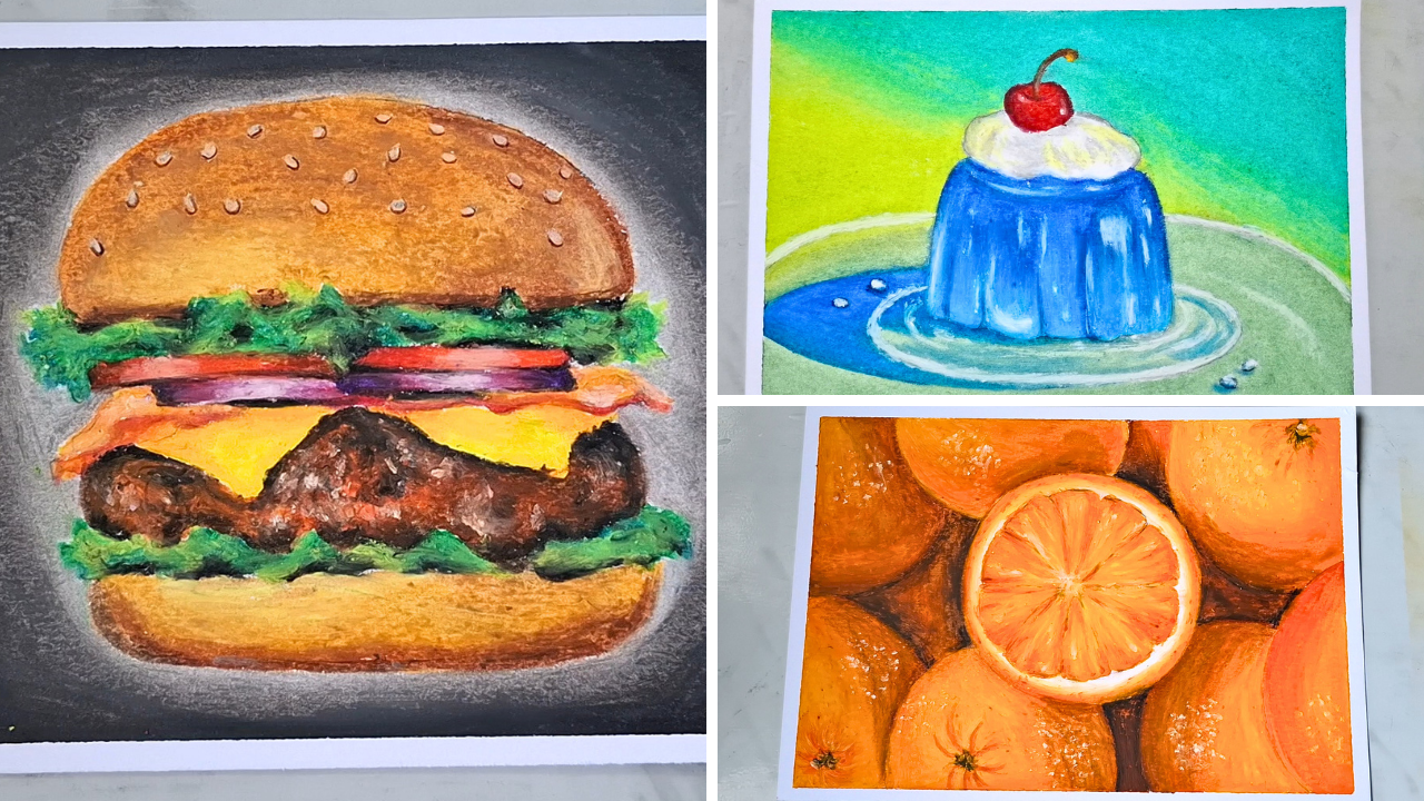
illustrations without using paint, this class is for you. Together, we'll complete
three exciting projects that gradually build
your confidence. A juicy burger filled with
delicious textures, a bright, glowing orange composition that teaches realistic
fruit rendering, a colorful jelly
cake with creamy frosting and glossy
cherry highlights. Throughout the class,
I'll guide you step by step from the first sketch
to the final highlights, while sharing simple techniques
for blending, layering, creating adding
realistic textures and making your artworks pop. Whether you are a beginner or someone looking to improve
your oil puzzle skills, you'll finish this class with
three beautiful artworks and techniques that can be applied to many
feature drawings. So grab your oil pastels paper, and let's start creating
vibrant food art together.
2. Art Materials to get ready with!!: Here, we're just going to
discuss about the art materials that we're going to use
for our oil pastel medium. And I have just chosen
with a mixed media paper, which is A four size and may
just cut down into A fi. And it's the 230 GSM,
which is hot press. And you can see it goes
with various mediums. We can use various mediums over it because
it's mixed media. And the paper here, it's
completely a little thick. So we can use washes
for this paper, too. And I have chosen
this one to draw. The second thing is
with the pastels. So for the oil pastels, I'm going to use the
camel Brands oil pastel, which is 50 shades and can
see all the beautiful colors. So it has various colors and
so smooth battery to use. So we need the
second main thing. And finally, we just need
with our eraser, pencil. Mixed with enough amount of tissues and these cotton pads. So these are the
tools we are going to use for blending the pastels. And the very final thing
is this fixative spray. So it's for the last process, the mandatory procedure to be followed to fix up
the pastel work. So it could not destroy the other paintings when
you keep it closer. Also, the pastels will
not get come off, okay. So two just protect. For the protection, we
are just going to use our fixative spray and
in the final segment. So that's it for the materials. And now let's get started for the basic techniques
in the upcoming video.
3. Tools & Techniques : So this portion is going to be completely discussing
about the techniques, the practices to
be followed before just using the oil pastels, because these are
much important. And we are just going to use different tools to learn with the blending and study about how the oil
pastel really works. So this is absolutely great for the beginners to
learn all the practices. So here, you can just see with the light pressure
and the high pressure. So for light pressure, it is just nothing but
we have to just hold our pastel and need to just
gently swatch this way. So not pressuring greatly. So it's just a gentle pressure. So this is how a
light pressure works. And in the high pressure, we need to give a
lot of pressure with the pastel and no whites of the paper is
completely visible here. We need to move it more closer. This is how the swatch works. Now, next is the
other great thing where the pastels is completely
using the blending tools. So the pressure practices must to maintain the blending work. So this is the very first step
to learn so practice this. And the second thing is blending with the cotton swaps first. So this is our cotton
swap and we are going to blend pastel things
after shading with this. Firstly, we are just going to
choose a few set of colors. So with multiple color swatch, we can learn greatly
with blendings. So the first color and
is going to use is with a sunset colors that
is primary red, starting it from
the so the color that I'm just going
to choose is with the primary red,
vermilion, just orange. It's with a yellow ochre. Medium low, and
finally light yellow. So these are the six
colors I'm just going to use for our practice work. I'm just going to start
it with the light yellow, and every time before, we need to just clean
up the mess we have, or we already used worked with the previous projects and the color blending when we
just blended with the colors, this originality may
change to the other color. So it may have some dust like this shades of
the other color. So we need to just
gently wipe it, clean it with a tissue, remove all the colors. Clean the pastel before
starting the work, and now it's ready to work. So we need to just follow
this rule mandatorily, starting with the light low. So this is like blending
of two colors Ha rule. We are just going to start
with a high pressure of the color that
we grabbed first. Slowly just reducing
the color because here I'm just going to switch
the color to medium meow. So before switching, we need to just reduce the
color, the pressure. And when just switched to the second color,
the medium mellow, we need to start over from the previous color like this
with a medium pressure or light pressure like this and
then increase the pressure. How slowly reduce it. This is the technique
to be followed. And next with the yellow ocher, same way, starting with
the light pressure. That's it. Now, again, just reducing because I'm going to
switch it to the orange. Starting it over from
the yellow ocher. Now, reduced pressure
is increased. And finally ending up, so you can see a long
swatch of various colors. Now with this, we can
just add vermilion. So if you want a great gradient. So with a rmilion too, it's starting from
the light pressure most to the high pressure, then again raising to the light. And finally, with the red. It's completely mandatory to start working from the lightest color and move to the darkest. And also, in the second rule, we should not get back with the same side of the cotton bats after moving to the darkest and working again from the
starting of the lightest. So that's strictly not allowed. So because this red may just get into the yellow and completely spoil the artwork. So every time it's required
to move from the very first, the lightest to the darkest, we can just change
to the new one. Now just I'm holding it with
a good pressure this way, starting from the very corner. And moving towards all the side, entering to the medium low. Just go front and back. Now, in the orange shed also, I'm just moving front and
back for the several times, which forms the proper
gradient effect. So you can see the
proper gradient effect then and it has completely
turned into the red. So what should not be done
is we should not come from the first using this side because you can see
the mess happens. So this is completely avoided.
This should be avoided. And we can use the other side, the new side and start it freshly to make the
gradient effect. Now the first tool is completely learned
and the second one is going to be with the tissues. So with the tissue paper, we're just going to
learn the second type of blending and I have
changed the color set. So it's with the ante blue, cobalt blue, light blue, prescient blue, and
brilliant blue. So all these five are going to be used on here to
make a gradient. And I'm going to start
with the lightest color. So the light blue. As usual, it's going to be
with a high pressure then reducing lost like this. I'm switching to the Kobal blue, starting it over from
the previous color area, reducing, increasing the color. After the pressure increase, now I need to decrease it. So we are just going to
switch with the other color. It's with a brilliant blue. Starting from the
light pressure, increasing it to the medium. Ready using it. Next is antwup. Finally with a Prussian blue. So for the tissue work blend, I have just brought my tissue
and teared a small part of it this way. So now we're not going
to use it directly. Instead, we need to just
make a folding like this to multiple folds which
gives this much width, you see this much width. With this, we're
just going to move it from lightest color. During to the Cobalt blue. So this is how the
blending should happen. And again, after
reaching this point, we should not put
up the same tissue and start from the
lightest work. So next technique
is just simple, and we're going to do
that with the pastels. So it's in the third one, it's going to be just
directly with the pastels. And I have just grabbed
only four colors for this. So you can see, it's
going to be dark violet, light let, gray rose,
and the violet. So these are the four colors. And I'm just going to
start it over from the darkest color
that is dark violet, so it can just go
with this side. With good pressure, And slowly just reducing it. Now, after this, I'm switching to the second darkest
that is violet. So start it from the with
a light pressure that is light pressure over from the dark violet and
switch to the medium. Then troduo Next is
the light violet. So this is the first
layer of application. I'm producing it finally. And the gray rose. So you need to blend it to the last. And with just toilet, I'm moving again over
the dark toilet. This is the second
layer application and with a light toilet
to go front and back. Finally, with the gray rose. So this is the blending happened after making with the pastels.
We need to just lay it up. And most importantly,
it's good to start with darkest and end
up with the lightest. So we need to just keep on blending with the
colors with layers. The final technique is not
used for all the time. It's like, only used during the necessary and
required places. So that's with our fingers. So for this thing, I have just chosen my leaf green that is
starting from the sac green. I reducing the color. I have used only
minimal citta follow here, the light green. And finally with a yellow green. So we need to just
move on from I'm using my index finger and just move from the
lightest to colour. Blending towards the top.
Moving back and forth. So this happens only
at a defined space. Here, you can just closely
see all the types of blendings happened
and just practice this before we get started
with the main project. So you can just practice it with some rough area or the
paper you choose with some kind of hiereism and it's low gim
paper or avoided it. So just practice and yeah, let's get started with
the main project.
4. Project 1 - Burger: Here, the paper is ready, and I'm just going to get ready for the first
main project. And to make that, we're just going to tape
down on all the four sides, the masking tape, so the colors will not get out and it
forms a great neat border. So with this tape, I'm just
going to remove the is blue, just tapping on some cloth. So after that, you can paste it. So the first thing we're just going to work
out is with a burger, and I'm going to attach the picture reference image
on the side over the screen. So you can just make a quick
sketch with a reference. I'm going to make a
little fastening up. So this is with
the cheese layers. On the top airing
with onion slices. It grows in a cylindrical shape. And finally, on the top over the onions with
the tomato slices. I sesing see into the top. So this is just the rough sketch I have done for the buco, and it's not going to
be the strong one. It will change
with the coloring. So we need to
create textures and depth at depth
with the coloring. So this is just a rough sketch, and we're just going to
remove the blackness. So if you have just
needed eraser, you can go with that or
simply with a regular eraser, we can just remove off
the excess blackness. So this blackness, when it just mix us up with oil pastels, produces kind of muddy effect. So if it is dark
color and it's not a problem using light colours and mixing
up with the pencil, blackness will completely
damage the piece.
5. Project 1 - Part 2: So first is like, I'm just going to color the top
portion of the bun, and this is the color
palette I have chosen, orange, brown, Simon pink, light yellow, buff, and
finally light brown. So these are the color
I have chosen to make with the coloring work on here. And for this, so we need to just keep on layering
with all the colors. I'm here just going
to shade with the orange as a base layer. So again, it's going to
be with a light pressure. This is nothing but
under colouring. So just going with
the other shade. So which due kind of a
crispy baked colour effect. And on the sides here, I'm
just going to use the brown. Don't worry about
the sesame seeds. You can just play
with a yellow last. Next with the light brown. Just going with the colors here. And adding a little bit
of brown at the top. And a very light pressure
of the brown mix on here. So this is layering. Now using buff at here. Now, using the light
brown. Then finally, with the lighter low on giving
highlights at this place. O just blending with the fingers to
make it even tone. Just simply I'm wiping all the extra passes
from the sheet. Now finally, just
liking my white. So white is a little dirt, and I need to just remove so
you don't need the colors. So this is to add
a sesame the top. Just make a little dab and drag. Give more pressure for
the colors to up play. Okay, just removing
off the colors. So this is just the
first process of adding the sesameA and this
is not going to be the end. So here I'm just going to take my brown colour pencil or you can just go with
Brown colour pastel. We need to just add
a little amount of shadows just below the sesame to make it look like a three D. I'm going to make
below it like this. This is a white pencil and
for more precise details, we can just add up
with the white. Now I have with my color
pencil, brown color. So with this, I'm
just going to add with small shallow details. This will be more precise. So it's like in
the first option, we could just go
with our oil pastels or we can just use
our color pencils for more bigger details. Now here to create
the leaf portion, I'm just going to use
four different colors, the dark ones for the shadow. This is for Hilightsen
light falling area. So this is leaf green, yellow green, dark
green, and black. These are the four colors.
And with black first, I'm just going to start
making with these shadows. Just this place. So at random positions, I have applied with the
blackness for shadow over, I'm just going to use
our darkest green. So this is like, we need to
start from the highest color, the dark value to light value. And with this, I'm going
to make the shapes, blending with the blackness
and not at much places. It's just like here and there. Just thinking of from which
area the light comes, light source comes and from which area it
creates with shadow. So with that imagination, we need to keep and build
the coloring layering work. Now, after this, I'm
switching to leaf green. So with the leaf
green, we can just blend over from
the black and dark green just lightly because we need to add more amount
of yellow green. With the yellow
green. And for this, just randomly making the shape and highlights with
the light color. Next for tomato slices, I have picked up my
three colors that is primary red, starlet
and geranium. So all these three colors.
So first starting with the highest value
that's the primary red. And with that, I'm just
going to make with the areas that are little hidden on this side, too. So next is switching
to the scarlet. And finally, with the
geranium in the middle. And this is not going
to be the effect. Finally, I'm just going to
add with light shade of white swatch for showing
the shine over the tomato, adding more layers of white. Next gan. I'm just going to take my round for this area,
starting with the brown. Mix with the red, starting over from the brown to
show great darkness. And finally, scarlet
blending over from the red and
uranium in the middle. So next is, again, adding highlight in the
middle in this place. Yeah. Here you can find two onion slices
sliced and to make that, you need to choose
a dark toilet, light toilet, carmine,
gray rose and white. So these are the colors
and starting with the darkest value
with a dark toilet, just making it on the sides, the edges adhe like this. And then one from this place. And next is going to
be with a carmine, starting from violet
in a little amount. Next to the light violet, sitting from here,
overlapping on carmine. Then the gray rose all over, smudging it, starting
from the dark violet. Need to smudge it beautifully
spreading all over. Then finally, with the white. Now, for making the sauce layer, we need to again change with
the colors to a medium hue, light orange and medium yellow. So with the dark value first, I'm adding the shadow
portions at here and adding a little bit of red to this
just a light layer of red. And just to the base of onions,
adding shadow portions. D with a vermilion hue
bending over for the red. And finally, with
a light orange. Then with a medium low here. And a bit of highlights. For the cheese, I have just deep in my
hand and with that, layering first using the
deep low base to the sauce.
6. Project 1 - Part 3: Now here with a medium yellow after playing with the deep low, we need to just
add the highlight to make it look
like a real cheese melted leaving some gaps for adding
the lemon lo. The low yester value, but it
looks fritcher in the color. So with this lemon lo,
blending it completely. For the patty, it looks kind
of more brownish shade, also in that fleshy part
goes with kind of orangish. So we need to just pick up with our vermilion and scarlet. Next us with the brown. So you can just go
with a dark brown burn Siena and just brown. So these are the colors. And finally, with blacks
for the darkness. I have chosen six colours and starting from
the darkest value, that is we black and adding a little more details
here and there for shadows. So one d this much is
done with blackness. On mixed with the dark brown. Blending it in the sides. A light doesn't fall over there. And over this dark brown, we can just mix with
our just brown too. Next with the brown is giving the first
layer of brown here. And a light shade of vermilion here and there over the brown. So this is, like, a little bit roasted and not that great. So the greatly roasted part goes with the darksa shades of brown, black, with the scarlet. Now with the whites, adding
kind of oil reflections. Now, just leaving
this and this for the homework that you have
to make it after the class, as we discussed with
the color palettes in the previous
on here and here. But in this case,
for the bottom one, we're just going to avoid using
the technique we used for sesame and just using onely the browns, we're
going to layer it. I'll just attach the
picture on the side. Also that's available in the
project assignment area. So you could just download
and have a colored knowledge, then a play with it. So I'm just going to
color this little faster and it's completely
left as assignment for you. So here you can see the
completed work of the burger, and the final thing
is to add background. And for that, I have chosen
with a black and just gray. So around here, I'm just going to make
with a black color. So swatch it all over around,
leaving these spaces. So on the corners, I'm just going to start
with the highest pressure. And when nearing towards
the burger, inwards, I'm just going to
reduce the pressure to medium, then
finally to the low. You can see a little
fast forwarded version of this portion. Now switching to the gray
color and started it over from the plaque
using medium pressure, where we ended up with lower
pressure using the black and nearing towards the burger
without disturbing it. Now it's time to blend. We can't leave as it is, so I'm just going to
take my cotton swabs. So with the cotton swab, just starting from the
lightest color value here and working closer
without disturbing all the greens or
browns of the burger. We need to apply heavy pressure so it could just blend smoothly. Moving around just
a little faster covering all the gray
spaces with the butts. It's going in between the meeting point of gray and
black and just blending it. So we can go either with a
tissue now because I just chose the herbs because just near the object,
the main character, we cannot use the tissue because we need to show up
with the details carefully, using tissue and blending at very closer places
will really feel harder to avoid that riskiness and go smooth pension free, I just chose this
so it can go in all the edges in between the edges and just
blend smoothly. Now, with the other side, I'm just going to blend it between. So as a final ketchup, I'm just going to
use my index finger and blend with the fingers. Now, final thing
is to just peel it off just giving it from the
outer side, not inwards. The very first main
project is completed, and after completion
of this trial, just submit your assignment in the projects mission
area so that I could review and just give a
feedback on your work, and you will also feel benefited by the certificates
on coach completion. So we'll be meeting you in
the second main project soon.
7. Project 2 - Oranges: This is set up for the
second main project. And here I'm just going to draw a little circles for making the orange stuff together and just one piece of
orange cut into slices. So we're going to just
make circles and add it a big circle in the center. This is going to be a cut piece. And the second one is going
to be the bottom one. So this is how we have
just made circles. And one the centerpiece is going to be the
orange cut slice. So in the center with a light pressure of
the black HB pencil, I'm going to mark
the center portion. And with this center portion, you can just make
little triangles I need to just segment
like this with triangle shapes a little
space in the middle here. The next part is going
to be with a coloring, and we are just
going to use kind of a monochrome shades because it's completely a pile of oranges, and we need to just go with shades and family of orange and a little mix of the browns to make the
shadow portions underneath. Here for the par colour palette, I'm just going to go with
these minimal shades, mostly with the orange family, and just sub green for the stem and light allow and
white or for highlights. So under the orange family
is going to be light orange, orange, vermilion hue, scarlet, and finally, brown for
making the shadow works. So these are the colors
that we need to make this. And first, I'm just
going to start with the brown stet here. Before that, we need
to just as lighten it. First with a brown.
Just watching on these sides to create
the shadow effects. Shading, we just need to
go like a circle shape. So with this, not only
going to cover here, but also at this place, again taking the dark brown. Then with a brown. And with a dark
brown just shading here for the other
orange underneath. So you can find something
under very under, and that are going to be
covered with vermilion. So this dark vermilion shows
up the shadow portions and underneath Vermilion
coloring works. Next is going to be with orange. So with just orange,
we need to start blending it from this part. First to separate with the top
orange and the bottom one, I'm using a layer of black like this to show the
shadows very well. I'm just blending
it with fingers, smudging with the
previous colors. Now with light orange, can just go colour here
and a bit of medium alo. Just a medium low or deep
low will be perfect. With a deep below,
coloring in circles. And now, finally,
with a vermilion hue again in the corner here, just adding with the
patterns like this. Then with a green sap
green to make the stem. And adding white to
the top of the stem, a little bit of whites on here. And here on the top, I'm just going to use a little bit of the browns and
reduce the pressure. I just switching to
the vermilion hue with the just orange covering
all these places. Here is the orange. Making
it in low pressure. Mally with a deep yellow just giving colours
over the top. Blending with the fingers.
8. Project 2 - Part 2: This last piece completely goes with lower shades of
the lighter value. So we need to just blend the brown base layer
using vermilion like this with a light
orange, just orange. You need to blend it more going with a
lighter pressure adhere and blending finally that placed with a medium low. Now, we need to just gently
blend it with our fingers. And with a regular brown. Adding the base layer
in lighter pressure. Then blending it again. And finally, with a
medium aloe All over. Then with the black for shadows, I'm just adding it under this portion and blending
it with the fingers. So carefully just moving
around this shape. Now, with this,
I'm just going to blend with my index
fingers slowly and merge black with orange to
show the shadow effects. Also with little amount
of brown in the base. Now with a vermilion over
this place in a light range, light pressure, and then going to use with just
orange all over, blending it from the brown. Then after this, like I said, adding on light
orange. Then over it. Just sting in the swirls, I need to look like
a three D shape. Then finally, using my medium low before that with orange. Then using my medium low. It's scarlet, adding more amount of the depth, blending it. Finally, with the sap green, you need to add
the stem portion. I'm adding white to the top. This blackness just
not only goes there, but adding the
shadows even at here. So far, you might have
known about how to create using from the
layer of darkness, starting from the brown as the base layer as we have done. And over this, we'll be just
making with a vermilion hue. So we'll just go with a layer of vermilion hue like
this till this place. And depending on the
light source, reflecting, what will happen is we need
to just keep on changing with the color to the lower
value with just orange, light orange or
medium mellow mix. And finally, adding the
highlight pots like this. So this is what we keep doing, and I'm just going
to finish one is. And these two pieces like we'll be having the
reference on the screen. So with that
reference, also, I'll just put up with the
reference picture. The project area. So you can just refer to that and complete this
too on your own, and I'll be just teaching
with this and this leftovers. So now here we need to just
again start making it with a light pressure mix
with the orange. And this is vermilion hue. It's just going with the vermilion hue
again on this side. Next with just orange, blending brown with the help
of orange good pressure. Now, then with the
medium mellow. This gives shining effect
when looking at the artwork. And also, we need to
shade according to the shape like a three D. Smoothing with fingers. And now the task is
to take our scarlet, adding little depression as we did for the previous orange. How about the sap green. In between, just
adding the black. And I'm just going to
complete this too, and the final piece
will be made after. So these two are your projects, and you are going to just try and after completing just feel free to upload in the
project session area so that I could
review your work. For the center piece,
I'm just going to use my orange and make
an outline around. So it should not
exceed the boundary, so it should be on the
boundary like this. And next with a
medium low over like this and ending up
with a light pressure, we need to directly apply medium low over
the just orange. It's a second layer. And then with a white color, we need to clean up the white over tissue if it is not clean, and then just making
it with a good blend. Now, again, just orange
with just orange, we need to make patterns that
goes inner words like this. And just end up with a lower
pressure of just orange, and this should be followed for all the segments and high
pressure at the top. We need to swatch it
towards the down. So I'm making a little
faster work here. Now with the medium
mellow, again, we need to just pull it up from the bottom and blend with
all the colors like this. Now here, it's not end, and we need to just make
with our white and pull it here and there to
create a juicy effet. So this is how we need to
blend after application. And finally, for details
some more details, we can add vermilion
here at the top, or scarlet, just a light
pressure and blend with fingers. Now, just to make the purse, adding little dots in the sides and blending them with fingers. Patterns for each object will give a great
realistic work. So the color choosing
is much important here. Only with color selection, we can create the great works. And finally, we need to check to give the highlights
wherever needed. So the next thing is
to wrap the tape out. So we are done with
our second project, too, and left with
the last project, it's going to be
more interesting transparent to one. So
let's meet up there.
9. Project 3 - Jelly cake: For our last main project, we are just going to
make a jelly cake, and that's going to be more
kind of a transparent effect. We're going to learn how
to make a transparent one and add also the reflections
with great whites. So a jelly goes kind
of a mirror effect. So we need to just
create a sketch. I'll be adding the picture
reference on the screen. First, I'm making a plate that's going to be
a shape of ellipse. So this is the plate. And we're just going to make every sketch using
the lightest pressure of pencil and not high. Next, with the center here, just make a little
wavy base of the cake. Then after a little height, we need to end up
the top of the cake. Now, on the top, we need
to add up with the cream. So for the shape of the cream, we need to go with
improper curves. Then cherry on the very top. So this is just a simple
sketch we have done, and we need to add
kind of peel effects. All the edibles, here
and there like this. Another plate
around which grows, which just covers this much
space, a bigger space. And we need to measure it from this end and connect
it to the other side. Like this. This is just a
simple sketch we have done. Next is going to be
the coloring work. Now here we're just
going to color with the background
and the colors or emerald green and the
yellow green, so two colors. Starting with the emerald
green from this side, I just going to make
a crossover just a light crossover like this which we're still here. So all this area going to be
covered with emerald green. The other side here is going
to be with the yellow green. The color that's visible through the glass plate is going to be some kind
of different green, and we are going to
change the green there. So first, starting with a good pressure at the
corner with emerald green. And slowly just
reducing the pressure here from medium to low. You need to be careful
around the cherry disturbing their stem
and their boundary. And just a quick whiz. What tool should we use here? Because you can see the object cherry in between to blend the emerald
green with the leaves, yellow green, what
tool can we use? Just have our ances
written somewhere and let's see what
we're going to use in the blending time. So that's it with
our emerald green. Next, we're going to
switch to the other one. And here just starting again
with the low pressure. So low pressure because we just need to blend
both the colors. So over that previous
emerald green, we have to apply
little pressure, and just away from
that, the other parts should be covered with
little greater pressure. Now you can see, I'm
going to take a bit of tissue unfold it well. So I have this match and
I'm going to fold it greatly like this and start
from the light pressure. So again, we need to just start from the
lower green value. Y green on both the sides, covering the y green
on both sides. Around here, we can use. If you feel a
little complicated, we can also use
with our earbuds. So now I have a
little experience, so I could just manage going in. If you feel complicated,
you can simply go use our earbuds. Now here, I'm just
going to add a bit of yellow green again
over like this. I'm going to blend again
with the same tissue. Now, just coloring
for the plate, I'm just going to switch to the other green
that is gray green, and you can see the light
portion it is from this side. So we need to just make the shadow portion of
the plate from here. So I'm just going to leave
those places like this. So this place is leftover for
making the shadow portion, and we are going to cover
the other rest place. This place is leftover
for the gray green and the other places
to be filled with the mix of gray green and white. So here I'm just going
to add a medium pressure of gray green and then blend that with white and the rest portions here to be completely covered
with the gray green. Now, just leaving here
these white peers. I don't know the
actual name of that. So we need to carefully
color around. And even here, we can just go either the tissue if we
can do it carefully. If we can make it carefully,
the blending process, if not, we can just go directly
using with our ear buds. You're adding a little bit
of white here to blend. I'm taking again with
the small amount of tissue to blend
this green, pre green. Here I have chosen
my brilliant blue. So with this, just going
to make a shadow portion, just below in this plate. Creating a very precise
detail, fine detailed shadow. So it's not going to be
blended with the green green. You need to obtain
the exact shape. I'm just colouring around here. Now, with this,
I'm just going to switch my blue to the other one. As I here a little bit of the
same blue, Brilliant blue. Then the other side
is going to be filled with a cerulean blue mix. Now, with this
tool, the earbuds, I'm just going to blend
blues from the light. So going around,
it will be easy. Now, as the shadow part, I'm just going to add a bit of blue on here so we can either go with a
brilliant blue or we can just use our Prussian blue like this to create the shadow
effect with the pearls.
10. Project 3 - Part 2: Now for the reflections
over this glass plate, it's like the reflection
from the jelly cake. I have leftovers of blue in the tissue, sorry,
in the ear buds. I'm going to swatch on here. I can do the same leftovers. I'm just going to add
reflections on here. Also for the shadow
poi. Say at this page. Now, finally, with
the white pastel, I'm just going to give a
white coverage on here. Now, here for the jelly blues, I'm just going to
use my light blue, Cerulan blue hue, antib blue, ultramarine blue and white. So starting with our portion, coloring from top to bottom, and the color value
scale is going to be the darker portion
to the lighter portion. So starting with
the ultramarine, then changing to
cerulean and finally to the light blue and
a light mix of white. So this is going
to be our order, and let's see how to color. So first, starting with
the ultramarine blue, making the shadow
effects just below the cream on the sides. We need to color
along the shapes. Create all this. Hanging to my unto a blue giving a light shade to the base. Our next is going to
be the cerulean bloom. So with cerulean blue, just blending it over from
the ultramarine bloom. Now finally, with the light
blue, just from the base. We need to lift up
the colors from the bottom to the top to make a good perfect
finish of blending. Then with the white,
blending it from the base. So again, with our cotton swab, we need to blend
it from the base. Again, just coming
down in the base. Smoching it with my fingers. Now, again, we are
just going to use our Prussian blue to create the shadow effects
in a good amount, a little amount of
division splits. Blending it with our fingers. Applying the prussian blue over as a layer and blending it down. In detail, we can
just add our whites, but it's like highlighting
should be added at the last. And we are leftover with just
the cherry and the cream. So for cream, we can just
take our gray and white mix. So with a just gray, I'm showing little depressions. Rest part is going to be just blended with our
white completely, starting from the empty space. So for reflections two, I'm
just adding a little bit of light low on this
side, blending them. Light shades of
the light are low. Then for the cherry, finally, we have to take our
maroon car mind. So with the maroon
on the sides here, just making it look more shadow, look darker and on here. Next to with the primary red, blending the other color. Then with the burnt sienna. At the very top, we're just going to
add a medium low here. Highlight, just light
falling on this place, which is going to make
our white no adhere. So that's it with our project, and we need to now
add the highlights. To add the highlights, finally, I have chosen the soft pastel, so it's lesser in oil and
it's binded with no oil, so we are just going to
use our soft pastel, and it's kind of similar in the pastel
shades like oil pastels. So oil pastels has
kind of other binders, and this is less in that. So to add the highlights, I'm just going to use the white pastel and
just go on here. Just blowing out. Now, little highlights on here. So depending on
the light source, we can just add up with our highlights and
blend them little. Finally, this place. So when applying
with a soft pastel, the oil pastor
layer removes app, we don't want to blow that. And we need to just
blow that up or very gently lend with the previous
layer of oil pastors. Adding the second layer with the soft pastel to make it
look like a glass line effect. Now, next, I'm just going
to add up it on here. And again, we need to
clean up the pastiles. So it's like more choky
texture cups around the fingers when you grab
to just cover up here. Now, instead of
this soft pasitl, if you just want to go with some kind of other
white highlighters, so that could be
with acrylic marker or white acrylic paint, gouache, anything, so we can
just go with our choice. Finally, with this plate. Going to shape it with a
second layer of white. I like this to adhere with
reflections of glass plate. This is the reflection
part adder, and if needed, we can just
add with more of designs. So it depends on the interest. You can go anywhere, and this is the thing I'm
just going to stop with this. Finally, adding
small layers here. Removing off you So now this final piece
is going to be just spray down with
protective spray. So after applying
the spray all over, it will give some kind
of a glossy effect. It depends on the spray you use. So this is the first project
and after the spray, you can see it gives
kind of a glossy effect. So mat finished spray gives
kind of a line effect. So reflections
here will be less, and after application of
spray you can see the result. And while spray, we need
to keep it a little away straight and then
keeping it up straight, then spray it and just avoid direct contact of sunlight
with the spray and spray.
11. It's a wrap!!!: Now we are in the very final end and look at the works
that we have done. So it's the very first project. It's our burger,
and we have just completed with a great
colors blending techniques. And then finally just went with our spray
work and fix it. Next is the second project
and the pile of orange stack. So here, it's kind of
similar to the monochrome. Mostly it goes with
the orange family, and you might have
learned how to add up these detailed works
and textures for creating the orange
and just tacking up all the shadows
and highlights. And finally, we have just made our third project Jelly one. To make the reflective work. So here you can
see the shine the gloss effect after the
spray application. And this reflections can be done with many
types of mediums. It depends with
whatever you have. But you can see, all
the glass things. So this is like great
work for beginners, and I hope you all enjoyed all the three and learned so many
things new in the class, and just recommending everyone to create the projects,
all the projects, commit in the project
assignment summation area so that I could review all
your works done and just give the feedback so that
you could just come out with what is correct and what should be
improved in your work. And if you are
interested to work with some different
type of image, also, you can just try out
that with all the techniques, all the blending techniques,
all the tools I have taught to be applied
on that new image, and we also share that image in our
project summation area. So I hope you loud and
we'll be meeting with a great thing in upcoming class. Until then, it's bye bye from Sri art educator from Artist
sel pastry. Thank you.
 Srimathi, Artistcastlebysri - Art Educator