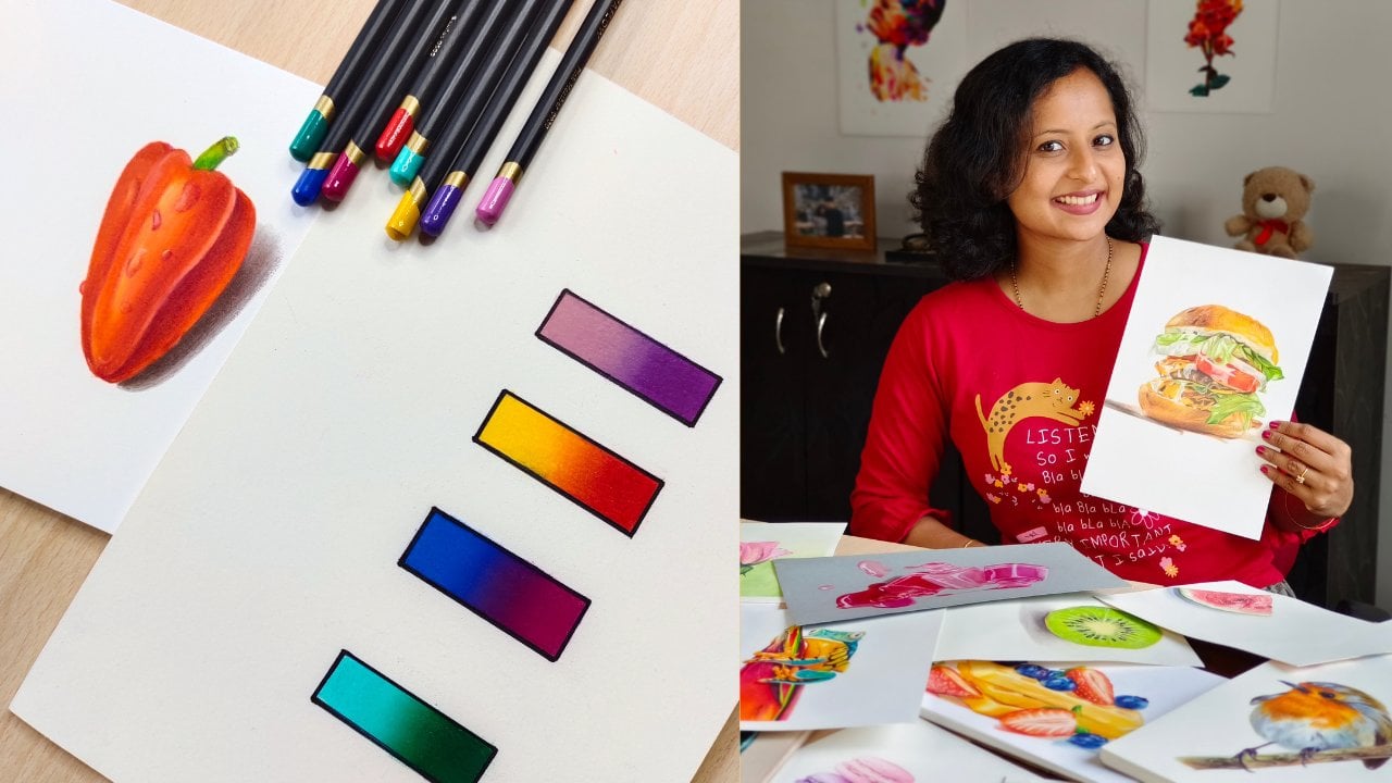
Transcripts
1. Introduction: Flowers are beautiful
gifts of nature that uplift your mood and
improve emotional health. Combining them with art can
be extremely meditative. You can create something
as relaxing and vibrant like this using
just oil pastels. Let's explore this beautiful and versatile medium
in this class. If you're someone who
always avoids drawing subjects with backgrounds
because you find it difficult, then you are in the right place. We will tackle the same here
as drawing backgrounds with oil pastels is relatively
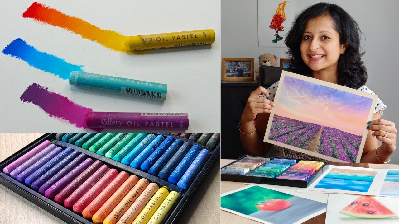
fast and simple. Hi, I'm Smitha, an artist and an art instructor based
out of Bangalow, India. You can find me on Instagram and Youtube as art underscored
by Underscore Smitha. I have already published a beginner friendly
oil pastels class on Skillshare and a couple of
colored pencil classes too. If you're completely
new to oil pastels, I recommend watching
my previous class as it covers everything that
a beginner needs to know, like choosing the right
materials, basic techniques, dos and don'ts, and practical application
of these techniques. If you'd like to skip it and directly watch this
class even then, it's fine because I've briefly covered those
topics here as well, so that even a
beginner can follow. If you're at an
intermediate level, then you will still
enjoy this class and learn some new techniques and
improve your skill level. Here's what will be
covered in this class. We will start with the
materials required, an initial prep that needs to be done before starting
any oil pastel drawing. We will then learn to draw a blurred background
and a detailed flower. After that, we
will learn to draw florals on a bouquet background. Throughout these drawings,
we will focus on values, picking the right
colors, oil pastel, blending techniques, use of different tools
to achieve texture, and certain best
practices to follow. You can draw one or both of
these as your class project. All right, then let's
unwind and enjoy some positive energy with
oil pastels and florals. See you in class.
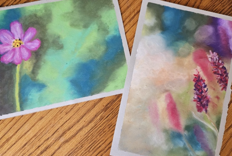
2. Class Project : For your class project, we will be doing these
vibrant florals. You can choose any one
of them or even both. We will first start with the simple blurred
background and understand how to
render different tones. How to create a
seamless transition and get a smooth background. We will also learn to create
intricate details on petals. After that, we will move on to a slightly complex
bouquet background. We will understand
how to achieve it and add subjects on the
foreground and make them. We will also learn to create
textures using simple tools. Throughout the lessons, I will explain to you different
blending techniques, dos and dones and tips that I have learned through
years of experience. The reference pictures
and color charts for both the drawings
will be provided in the projects and
resources section. I will be explained to you in detail a section of the drawing. And then you will have to
apply these techniques and draw another section
and complete the drawing. This will let you
decide and pick colors independently instead of
just copying whatever I do. The purpose of the
class project is to enable you to
tackle subjects with backgrounds easily and to be able to draw anything
from a photo. Your oil pastel set might not contain the exact colors
that I will be using, or it might even
contain lesser sheets. That's totally fine
because our goal here is not to replicate the reference
picture pixel by pixel, but to focus on
values and contrast. All you need to do now is head over to the projects
and resources section, download the necessary details, and then complete and
upload the project there. After watching the lessons, please feel free to
post your questions and seek my guidance
in case you're stuck. At any point in the next lesson, I will let you know about
the materials required.
3. Materials Required And Initial Prep : You will be needing oil pastel
set of 24 or set of 48. You can use any decent
brand of your choice. I will be using the
gallery soft oil pastels. As for paper, I will be using the Anson Tans pastel paper. They are available in
different sizes and colors. You can get them as a sketchbook or as loose sheets
like this one. I will be using the
smoother side of the paper and not the
textured honeycomb side. You can use any brand of
your choice here as well. Make sure that the paper is able to handle layers of oil pastels. You can use a white paper or
even toned ones like this. If you are a beginner,
I suggest that you pick papers of light
tones or meet tones. Avoid black or very dark tones Until you are comfortable
and confident enough, I will be using the
shade called Azure. This is a very pale sin shade
and it looks almost white. You can download the
materials list and recommendations from the
Projects and resources section, cut the sheet into size. You can even go for four size. If you want a bigger drawing, you can stick the paper
onto your drawing boat or mat on all four sides so
that it remains intact. And also you will get
a nice clean border. Here is a quick tip. You can first stick
the masking tape onto the boat or
even your clothes. And then remove it before taping it on to the
edges of the paper. This will remove the
stickiness and makes it easier for you to
peel it off cleanly. Later on while drawing, you can place a tracing paper or even another sheet of paper under your palm to
avoid smudging. For blending, I will be using my fingers tips and
blending stumps. You can use any one of these cleaning the
blending stumps. You can use a sandpaper. You can also use a
tissue for blending. I will not be using
it for blending as I'm not very
comfortable with it. But we'll be using a tissue for cleaning the oil
pastels and my fingers. These are the reference
pictures that we'll be using for
the class project. Please download them
onto your devices so that you can zoom them and
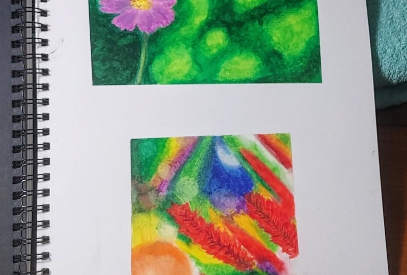
refer to them while drawing. Before starting any drawing. It is a good practice to start out with
thumbnail sketches. This is nothing but a rough
sketch so that you can get an idea of the
composition and colors. Based on this, I have
made a color chart. These are the colors that I
will be using in the project. This chart is available to download in the Projects
and resources section. This is just to give you an
idea of what colors to pick. You can use similar colors or even modify the color
of the flower or background depending on what is available in your
oil pastel set. Now that we have
the materials and the reference pictures
ready, let's start drawing. In the next lesson,
we'll be drawing this beautiful cosmous flower
in a blurred background.
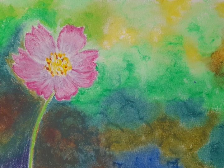
4. Flower On A Blurred Background : In this lesson, we'll be drawing this pretty flower on
a blurred background. I hope you have already
downloaded the reference picture and the color chart from the
projects and recurs section. There is nothing
much to sketch here. I just made a rough line
drawing of the flower. Let me erase any
harsh graphite marks. With this needed eraser, you can test out the colors
on a rough sheet of paper. I'm using wet wipes to clean my fingers and a tissue
to clean the oil pastels. Since I'm right handed, I will be starting
from the top left. I'm observing the reference
picture and starting with light greens and then gradually moving towards mid
tones and dark tones. Only once you have applied
enough layers, start blending. You will get a grainy
look for larger areas. It is easy to blend
with fingers. Make sure your
fingers are clean and keep changing your fingers
for different colors. You can also use a Q tip for very dark tones, you can add olive green, brown, raw umber
and Prussian blue. Avoid using black directly, as it will give a flat look. Try to layer dark
colors on top of each other and to get a natural
black only if needed, you can add a
little bit of black on top of these
colors carefully. It's all right if you don't
have these exact shades, just focus on getting
the contrast right. Try mixing white or yellow for lighter areas and dark blues
or browns for darker areas. As I move closer to the flower, I'm using a blending
stump as I don't want to drag these greens
inside the flower. Blending stumps are quite useful when you want to do something
delicate or detailed. Let's move on to the flow. I'm using these pinks and
purples along with white. You can check the color chart if you want to get
a clear picture. I will start with the mid tone here and then add lighter tones. After a few layers, I will blend the colors
and then add highlights with the white and the
darkest tones with the lilac. You can also use a dark
purple for dark tones. The way the colors
have been named could vary depending on the
oil pastel brand. For such smaller areas, I prefer using a
tip for blending. Keep rotating the
Q tip and switch sides to avoid carrying
any unwanted color. I would like you to follow the similar approach and complete two more
petals at the bottom. After that, let's again move to drawing the
background on the top. Now let me show you another
way of doing these petals. We can also start from the inner side of the
petal with a white, and then move towards the
mid tones and dark tones. I'm showing this
method just to let you know that there is no
hard and fast rule here. Try different ways and stick
to what works best for you. Generally, most artists go
from dark to light with oil, pastalstimes, even
light to dark works. You just need to be
careful while blending, not to accidentally cover the lighter areas
with dark tones. That is why it is
important to use a clean blending tool for
light tones. Every time for this section at the center, I will be using a lemon
yellow and a darker yellow. Just make large overlapping
dots and don't blend them in between. You can add
brown lines like this. I hope you are looking at the reference picture
throughout this lesson, as that is how you
will be able to notice all these minute details. Always ensure that
the reference photo is of high quality. If you are aiming for
a realistic style, you must be able to zoom it
in and observe the details. If you closely look at
the reference picture, you might feel that this
area looks maroonish. You can add reddish
brown or maroons. But I did not add them as I was happy with
the dark tone that I achieved with raw umber Prussian blue and dark greens
for the stock, you can add yellowish green. You can now notice that
I have slightly modified the lighter tones by adding yellowish green and grass green. I wanted to make
it look brighter. That is the beauty of oil. Pastls, you can always rework as it is a very
forgiving medium. Observe that I'm using different fingers for
different tones here. This is how the drawing
turned out in the end. I hope you enjoyed the process and have created your
own masterpiece. I'm looking forward
to seeing the same in the projects
and resources section. Don't hesitate to post
your questions or seek my guidance in
case you are stuck. At any point in the next lesson, let us learn to draw
a bouquet Background.
5. Florals On A Bokeh Background : In this lesson, we'll learn
to draw a bouquet background. And we'll see how to add
subjects on the foreground. If you look at the
reference picture, you will notice that
the orientation is in landscape format. Keep the paper this way, Have a look at the color
chart before you begin. I will start with moss green and olive green
towards the left. And then as I move
towards the right, I'll add dark green
and bluish greens. Let there be overlap between these shades so that we
can blend seamlessly. Again, adding some
olive tones and then blending with
fingers circularly. Keep switching your fingers for the bouquet effect. Make small circles with white, olive yellow, and light green. The circles should
just fade into the green area and
should not look sharp to get very dark tones. And mixing violets and
purples with brown, this part is simple. Just add whatever colors you can see in the reference
and keep blending. You can always go over to
the color chart that I have uploaded and get an idea
of what colors to pick. Here I have added
white, light gray, salmon and yellow, orange, brown on this side. Now I would like
you to continue. In a similar manner, I have completed these blurred flowers using carmine and scarlet. I will demonstrate
it to you shortly. In order to get this
blurred effect. Don't make any sharp edges
or outlines on the subject. This is how I drew them. Start with a scarlet
and carmine, Add a little bit of salmon
or pink towards the sides. Then softly blend. Don't add too many layers or too much of color at once for the duck is town on
the left side of the flow at a dark
brown or raw umber. Now let's understand how to draw this flower
on the foreground. Start with scarlet and carmine. Make tiny dashes or quick
short strokes overlapping each other wherever you see dark tones at violets
and raw umber. Remember what we learned
in the previous lesson. We will layer dark colors
on top of each other to get a natural black instead
of directly adding black. Now blend with a tip
or a blending stump. If blending with fingers, be careful not to smudge too
much for the highlights. You can add salmon and white. Now let's learn how to
add texture to this. I have used this palette knife to gently scrape
off some pigment. This will remove
the topmost layers and give us a nice texture. You can use a metal ruler
or any scrapping tool. Some oil pastel sets
provide a scrapping tool. Be careful not to
damage the paper here, adding some brown occur. This section is quite abstract. I'm adding greens, browns, reds, and softly blending for
the brightest areas, adding white, cream, light gray. I'm not replicating the
reference picture exactly here, but instead using it as
a guide to pick colors. You can add light
colors on top of dark. And this is one of the
advantages of using oil pastels. Here is the completed drawing. Just remember, for
the background, make soft abstract shapes
without much detail. And for the foreground, make distinct shapes
with sharp edges. Hope you enjoyed this lesson and are already on your way to uploading your finished drawing in the projects and
resources section. Do post your questions too.
6. Closing Thoughts : Congratulations on
completing this class. I hope you enjoyed every bit of it along with
learning something new. I'm looking forward to
seeing your drawings in the Projects and Resources
section on Skillshare. I will have a detailed
look and provide feedback. You can also tag me
on Instagram at Art, Underscore by underscore s
Meta if you posted there. Here's what we learned
in this class. We started with the materials
required, oil pastels, papers, tools, thumbnail
sketches, and color charts. We then started with
a beautiful flower on a blurred background and understood how to pick
the right colors, looking at the reference
photo to focus on values, how to create a
smooth background, and how to add intricate
details on a flower. After that, we moved on to
another floral drawing. We learn to draw a
bouquet background and to add florals on top of
it and make them pop. Throughout these
drawings, we learn different oil pastel
blending techniques, dos and don'ts, how to use different tools to add textures. By now, I'm sure that you are no more intimidated
by backgrounds and are confident enough to draw any subject of your choice
by looking at a photo. If you enjoy this class, please leave a review in the review section
here on skill share, along with suggestions
for my class. Your feedback is extremely
valuable and will help me improve and come up with
better ideas next time. If you'd like to get updates
on my future classes, please follow my
profile on skill share. Thank you and see you soon.
 Smitha Rao, Pencil and Pastel Artist