Transcripts
1. Introduction: If you're looking for an
inexpensive dry medium that does not require
any fancy tools, produces a finished drawing
that resembles a painting. Oil Pastels is a
perfect medium for you. It is a versatile
medium that can be applied on paper board. Wood, and many
other surfaces. Oil Pastels are not just
meant for kids to scribble and hove fun. You can do
much more with this medium. Be it abstract Art, impressionism, or
even hyper-realism. Let's explore this bold and
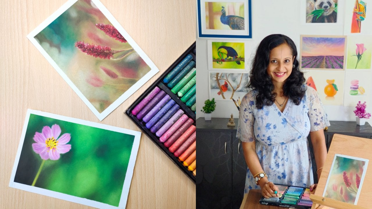
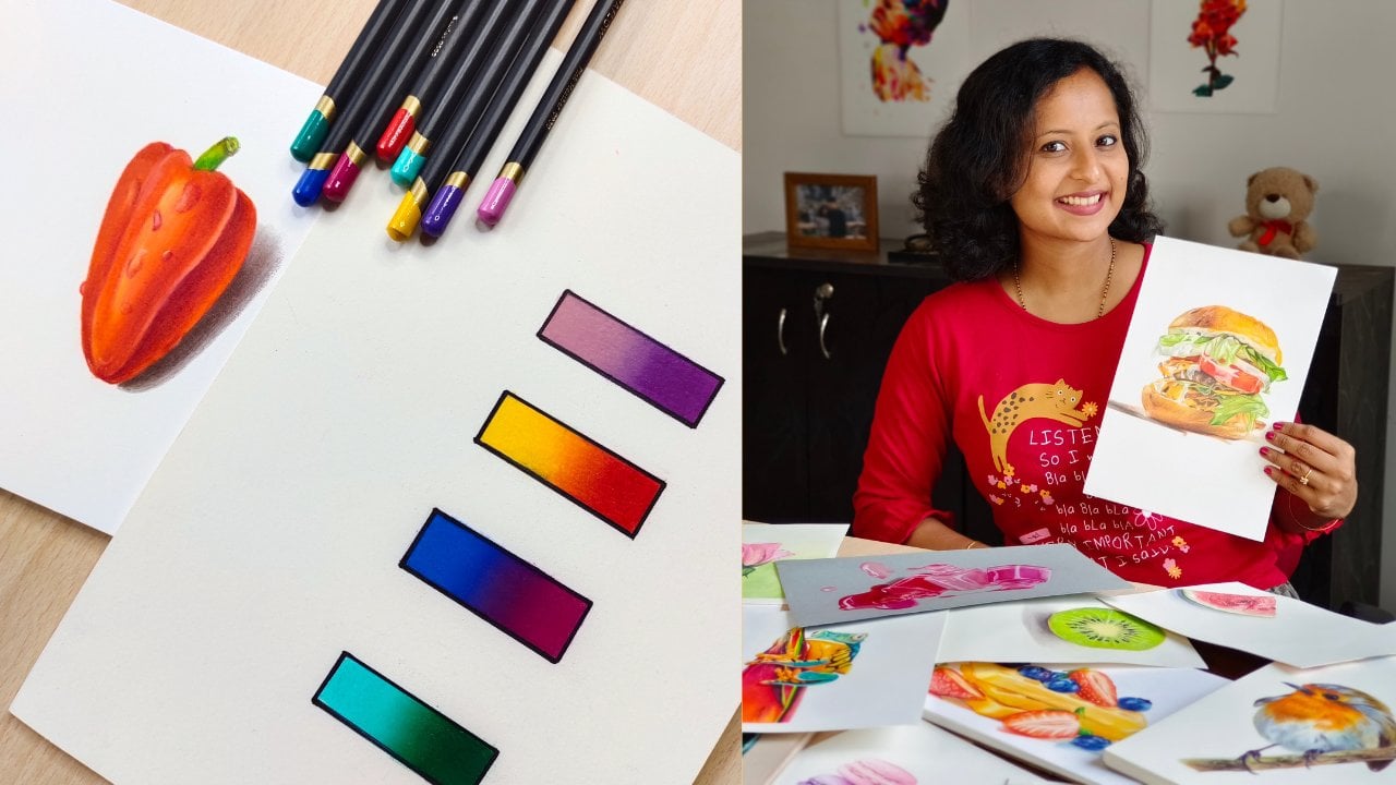
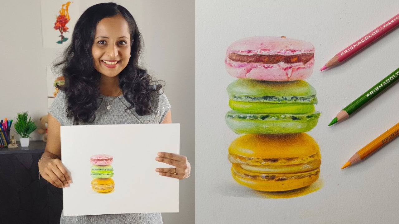
vibrant medium in this class. Hi, I'm smitha, an artist and an art instructor based
out of Bangalore, India. You can find me on Instagram and YouTube as art underscore by Underscore smitha. I have been teaching Art
for over five years now, and I mainly work
with dry medium like Oil Pastels and
colored pencils. I have published two
beginner friendly Colored pencil classes on Skillshare. And one of them is
a staff pick. You can check these
out in case you're interested in colored
pencils as well. This particular class will
be all about Oil Pastels. Here's what will be
covered in this class. We'll start by
understanding the medium, different types of oil
Pastels, surfaces, and tools used for
blending them. We wikk understand all these with the
help of practice exercises, We will also learn some
of the best practices, will apply all these
techniques onto a beautiful Relaxing
Landscape Drawing, which will also be
your Class Project. If you're using oil
Pastels for the first time and want to get a good
grip on the fundamentals, then this class is for you. If you have already had some
experience with oil Pastels, but want to take your drawing skills
to the next level. This class is for you. Or if you just want
to have some FUN, draw something, Relaxing
to calm your mind, then this class is for you. Let's dive in to the beautiful and colorful
world of oil Pastels. See you in class
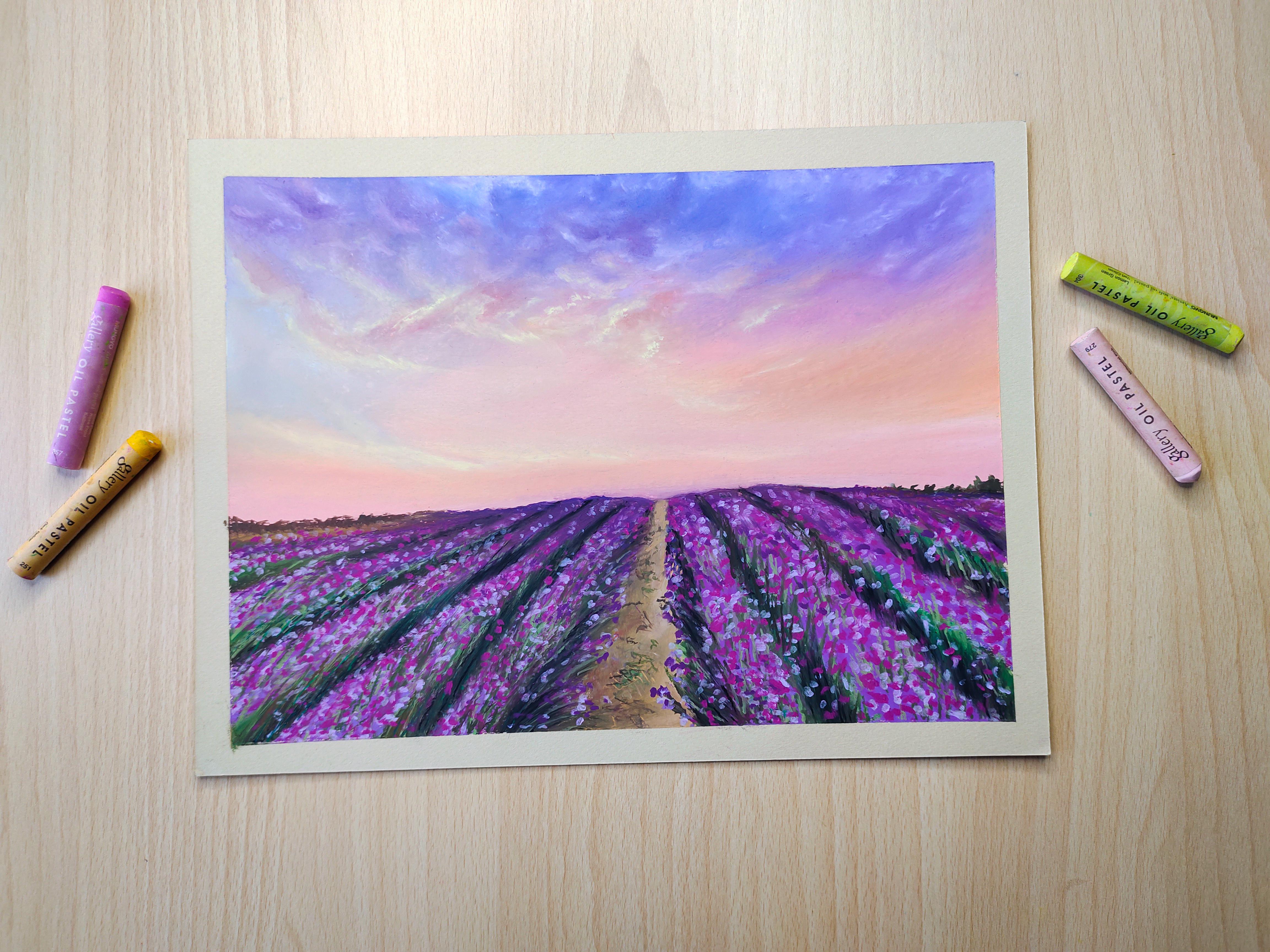
2. Class Project: For your Class Project, we will be drawing this
beautiful landscape under my guidance
from start to finish. I have designed this project in such a way that we
will be applying all the basic techniques learnt and we'll be using
different blending tools. I will be providing you with the reference
Picture, Color Chart, and all other
necessary details in the Projects and Resources
section on Skillshare, I will be demonstrating to you a section of the
drawing and then you will have to draw
another section on your own in a similar manner. This is because I want you to be confident enough to
pick the right colors, apply the right techniques, and draw independently
instead of just copying what's on the
screen in case you need any assistance and picking the right colors or choosing
the right ad supplies, then please post your questions in the discussion section. Lighter weight. I
will be glad to help. Once you finished
the class project, don't forget to upload it in the Projects and
Resources section on Skillshare so that I can have a look and give you my feedback. In the next lesson,
I will give you some insights regarding
the oil Pastels medium, and we'll let you know the add supplies that are
required for this class.
3. Materials needed for the Class: Let's understand a bit about the oil Pastels medium and materials that we'll be
using in this class. Don't confuse the oil Pastels with the
irregular wax crayons. In case of Oil Pastels, the pigment is held together by a non drank oil and wax binder. Whereas in wax crayons, the pigment is held
together by wax. It's quite hard to
blend wax crayons that as oil Pastels are softer, cranial and are easier to blend. All Pastels are vibrant and
more saturated because of all these characteristics of finished Oil Pastel Drawing
usually resembles a painting. Let me for sure you,
the oil Pastels and paper that I'll be using
throughout this class. After that, I'll suggest you
some alternatives as well. I will be using the
galleries of oil Pastels. This is a set of four D, and I have a few more
that I put openstack. These are resolved and
are very easy to blend. Although I would say that
these are not too cheap, but they are not super
expensive either. I got these decent price when
there was a sale on Amazon. So I highly recommend
that if possible, you enlist on these. I will be using this Canson
mid-tones Pastel Paper. This particular sketch book comes in four different sheets. There are several
other sheets of label. Each sheet contains a
smooth side, on one side, and on the other side it
has a honeycomb texture. Oil pastel drawings look
extremely beautiful and vibrant on Don't surface as
compared to a white surface. Let me show you some of the
drawings that I made on this paper using the
gallery oil Pastels. I don't use any fixatives to protect my oil
pastel drawings, but I place a butter paper or a batsman paper on top of each drawing to
prevent smudging. As I told you earlier,
oil pastel drawings look good on paper, especially for
subjects like this. Here the inside of the box on paper as compared
to that of a white. Here are few, most still
life drawings that I need. I also tried a couple
of floral compositions. This one, I used a white
gel pen for the highlights. Then these have tried a
few cityscapes as well. These are relatively
easier to draw as compared to the ones
that I showed earlier, although they require
a lot of blending. Now let's look at some of the lesser expensive
Oil Pastel brands that I sometimes use. These are from Bruce, true. They are pretty decent, they have good Color Range and are easily available
here in India. Also there is this
brand called dorms. You might find these
in me or supermarkets. And I think most of the kids, six, seven-year-olds use this. They are very inexpensive. So if you're just
starting out with oil Pastels and you're
not sure if you like this medium
or if you're not yet ready to invest
in a better brand, then you could start with these. Of course, the quality would be different if you compare them with the gallery oil Pastels, which are far more superior. Here, I'm just
doing a comparison between the gallery
oil Pastels and Donts. On your left-hand side, you can see the
gallery all Pastels. They can be blended very easily with just
finger pressure. And on the right-hand side, I'm trying to blend the dorms. It's a little hard to blend
them with just your fingers. Also, if you apply
a lot of pressure than the old vested pigment
just comes off the paper. So you better use cotton buds or blending
stumps to blend these. This slide, I've
mentioned few of the well-known Oil
Pastel brands. Some of them are pretty
expensive as they are of professional quality and
some of them are mid-range. Their availability to truly
depends on where you live. Some are available in
some parts of the world and not available in
other parts of the world. So I suggest that you do your own research and decide
what works best for you. For this class. If you have a set of
oil Pastels contains 24-48 sheets and you're
comfortable with the set, then that's more than enough. I'll be using the
Canson me dance paper as I'm quite
comfortable with it. You can use a
cheaper alternatives like a cartridge paper or mixed media paper or any other paper that
suitable for Pastels. Make sure that the paper is
able to take enough layers. Don't use a very
rough paper as it's going to be difficult than
to blend the Pastels. And it will also eat
a lot of Pastels. Initially, when I started
learning oil Pastels, I did not have any expensive
of standard at supplies. I use this particular
it's pretty inexpensive. Let me show you some of the
drawings that I need on this using the cheap
don'ts oil Pastels. As you can see, you're either
not focus much on getting a smooth blend or making
something very realistic. I focused on the values, the color theory, and
understanding the medium. Practice regularly
for a few months. And once I was confident enough, I invested on
good-quality at supplies. And let's add it to take
my Art to the next level. Now, let's look at
some of the tools that you will be
needing for this class. In order to blend oil Pastels, you will need these
Q-tips or cotton buds. Or you can also use these blending stumps in order to clean the blending
stumps and sharpen them up, you can use sandpaper. What these tools are easily available and are
pretty inexpensive. You can use whichever you
are comfortable with. You will also find me use my fingers for
blending oil Pastels, especially for larger areas. Or you could also use these tissues or paper towels
for blending oil Pastels. I generally don't use this method as I'm not
very comfortable with it, but I'll be using paper
towels for cleaning my fingers or cleaning the
surface of the oil Pastels. You will also need a
masking tape if you want to stick your paper
onto the drawing board, or if you want to get
a nice clean border, I will be using
this butter paper to prevent smudging
while I draw, you can also use any regular
paper or a tissue paper. So that's all about the supplies that you'll be needing
for this class. In the next lesson,
we'll understand the basic Oil Pastel techniques with the help of
practice exercises
4. Oil Pastels Basic Techniques: Let's understand how to blend oil Pastels to get a
smooth color gradient, I'll start with
warm colors first. I've chosen a 1 million, a darker orange, a lighter
orange, and yellow. Always choose analogous colors when creating such gradients. I first start by
cleaning the tips of the oil Pastels
with a paper towel. I start from the left-hand
side with the darkest color. That is the vermillion. Towards the left-hand side, I apply a little more pressure. And as I move towards the right, I reduce the pressure
because that's where the next color overlaps. The first one, I follow the same step with
the darker orange. That is where this darker
orange meets the woman. I reduce the pressure and where it's going to
meet the next color. Towards the right-hand side, I, again reduce the pressure. I repeat these steps for the
rest of the colors as well. This particular gradient, I will show you how to blend
with your fingers. Make sure to start
with clean fingers. Start from the
lightest shade and gradually move towards
the darker shade. You circular motion and try to blend in one color into another. Blend with gentle pressure. Don't press too hard onto the paper or else you'll end
up lifting off the pigment. Just notice that I keep
switching the fingers in between in order to avoid transferring one
color into another. You may not. Let's move seamless blend with
just one layer. Don't hesitate to
add more layers and then repeat the
blending process. Makes sure the Pastels and your fingers are
clean every time. You can always mix a color
with white if you want to, make it look a bit lighter,
just talk blending. Once you feel you have got a smooth gradient,
don't overplan. Now, let's blend these
three cool colors. Steps that F follow
in the beginning are same as that I followed
earlier for the warm colors. But here I'll be using a cotton bud or a
Q-tip for Blending. I'm just using
different methods of blending so that you
understand how each one works. Feel free to try along with me, and then you can decide for yourself what works
best for you. The blending process is
pretty much the same. Just make sure to use
the entire Q-tip. For example, I'm
using one side for the lighter color and then
I'm slightly rotating the Q-tip and Blending the
darker tones so that I do not carry over the lighter
shade onto the gecko one. For the last one, I'll be
using a blending stump. I've mentioned the names of
the sheets that I've used. You can use similar
ones if they're available in your orange. Feel free to use any three or
four sheets of your choice. But make sure that they are closer to each
other in the color. We don't try to blend complimentary colors or else
you will get a muddy result. Start with the lighter color, just like we did before, and move towards
the darker shade. Make sure the tip of your
blending stump is clean. In order to clean
the blending stump, you can rub it over a piece of clean paper until you get
rid of all the pigment. Or you could also
use a sandpaper. Blending stumps are
extremely useful to get sharp clean edges that as Q tips can be used to
blend smaller areas. Feel free to try
another gradient and blend it with a paper towel and see if that works for you. They mainly using
these three tools. That is a Q-tip,
a blending stump, and a finger for
larger areas here. Tomorrow, gradients
that you could try, I highly recommend that you do these Blending exercises and get comfortable with the medium before you actually
start a drawing. If it all you try
these gradients. You can upload them
in the Projects and Resources section so
that I can have a look. In the next lesson, I'll
show you some of the dos and don'ts that we follow
while using oil Pastels
5. Oil Pastels Dos and Donts: Let's look at some of
the best practices that we follow while
blending oil Pastels. First one is tried to always
blend from light to dark. You're more likely
to get a smooth, clean blend if you do so. When you blend from
the darker side towards the lighter side, what happens is your fingers or the blending
tools tend to carry the pigment from
the darker side and they get deposited onto
the lightest site. This gives a streaky or an
untidy look onto your drawing. I'm just demonstrating what
happens when you do so. Always ensure that the tips
of the Pastels are clean. Be very careful when using
lighter tones like this. When working with Q-tips, keep rotating them so
that you always have this to work on when you switch from one color to another. The same goes for
fingers as well. Tried to use a different
finger for a different color. For shadows and darker areas. Tried to layer dark
tones on top of each other to get
a natural look. Avoid using a black directly. If we don't have to use black, tried to use it along
with other dark tones, always start from one
side of the paper and move towards the
other side while shading, you can also keep a sheet of paper underneath to
prevent smudging. Since I'm right-handed,
I always start from the left side and gradually
move towards the right side. It's time now to apply
all these techniques and tips into a Relaxing
Landscape Drawing, which will also be
your Class Project
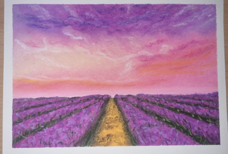
6. Reference Picture, Color Chart, Useful Tips: Before you get started
with the drawing, I suggest that you
make color chart like this with the oil Pastels
Set that you have. This will give you an idea of how each color looks on paper. You can always refer to this job and use it to pick
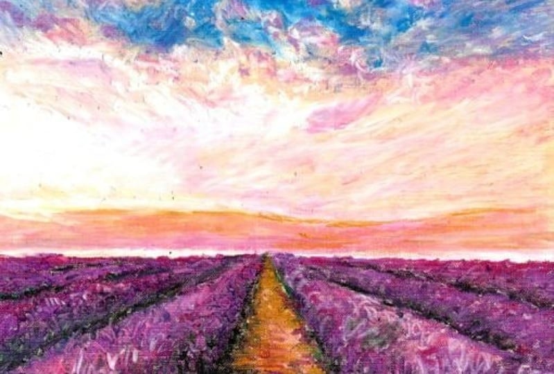
the right colors. Here is the reference
picture that will be using. I'll be attaching this and the Projects and Resources
section so that you can download the scene are in, is not to copy the reference
picture pixel by pixel, but to just use
it as a guidance, will be focusing more on the
values and the textures. These are the colors that I'll
be using for the project. You may not have the same
colors available in your set. Just use this as a reference and tried to pick colors
that are close to this. You can take a small
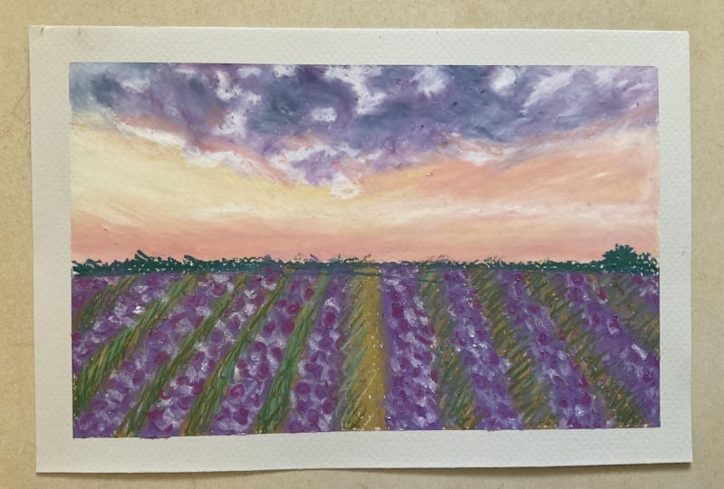
sheet of paper and make a thumbnail sketch. Sketch using the colors
that you've picked. Don't spend more than
a minute on this. This one, just help you
pick the right colors. I'll be using a toned paper and I'll be working on
does Moodle site. You can also use a white
paper if you want to stick the paper onto your board or if you want a
nice clean border, you can use a masking
tape or an artist tape. I generally stick the papal onto the board or
onto my clothes and then just press
it and peel it off before I stick
it onto the paper. This is to reduce its
stickiness and to prevent any damage while I
peel off the paper later on. Head over to the Projects
and Resources Section, download the reference
picture and the color chart, and pick the colors
so that we can start drawing this guy
in the next lesson.
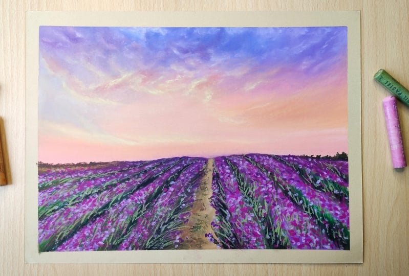
7. Landscape Drawing Part 1: Let's get started with this guy. I'll start out with
purples and blues. What I will be doing
is I'll observe the reference picture
and I'll just block out the colors
that I can see. I'll mentioned the names of all these colors and
the color chart, and you will find that in the Projects and
Resources section, I suggest that you download the color chart and also
the reference picture. I highly recommend
that you observe the reference picture
and then start drawing. Instead of just replicating
whatever I'm doing, whatever you see on the screen should just be a
guidance for you. Initial layers of oil
Pastels always look messy, so don't worry about this. Once you have
enough layers down, then you can start Blending. I'll be blending
with my fingers. Make sure to keep your fingers clean if you're
using your fingers, are as you can also use a blending stump or a
paper towel or a Q-tip, whatever you're
comfortable with. Just keep adding more
layers of colors and keep blending them until
you get a smoother result. Now, I'll be adding
slightly darker tones. That is darker blues
wallets and purpose. In case you're set doesn't
have these lilacs or purpose. No problem. You can
use more views. Just that the sky will
look more bluish. In case of colored pencils, we generally go
from light to dark. In case of Oil Pastels, you can add your
dark tones first and then add like don'ts on top. So we need not leave any space for the highlights or the white. Here. We can add in all the colors and then add
the highlights in the end. While blending, please recall what we learned in
the earlier lessons. Use circular motion. Don't apply to Once pleasure and blend
from light to dark. For the clouds, I'm using
white and a very light gray. And for blending them, I'll be using a Q-tip and a
blending stump as tiny area, it would be a little difficult
to blend with fingers. You can also add a very light pink towards the
edges of the clouds. If you observe the
reference picture, that will be very clear to you. As I've explained,
each and every step for the left-hand
side of this drawing, what I want you to do is follow similar steps and complete
the right side as well. Now for this section, I'll
be using a very light gray, somewhat like a bluish gray. And then this creamy shade
salmon and a very light pink. By using this light tones, make sure to keep the tips of the Pastels cleaned by
wiping them with a tissue. First LB blocking
in all the colors, and then LV blending them. You need to have enough
layers down for you to be able to blend
smoothly with your fingers. It also depends on the quality of the
Pastels that you use. Some Pastels blend easily
with just finger pressure. Whereas for others you might have to use a blending stump. You can mark these clouds with slightly higher pressure
as the kind of standout. At certain places, the
clouds look quite dark. At those areas. I'll be using a 1 million. Let's follow these steps and complete the right-hand
side as well. For this side, I have used a salmon of being light purple, a very light gray. And at this area where there's a transition from bluish
purple to Salman, I have used light purple, light gray, and I've
blended them with a blending stump
because we want to get a smooth,
seamless transition. It is very important
for you to absorb the reference and notice the
direction of the clouds. For example, here,
the cloud seem to be in a diagonal fashion. So that's how I'm adding the
colors and blending as well. We know how to finish
the rest of this guy and also the lavender field will
do that in the next lesson.
8. Landscape Drawing Part 2: Let's continue with this guy. Towards the right-hand side, you have a peachy tone. To get this tool, I've mixed a salmon pink along with
an orange-ish yellow. And adding the Cloud with the orangeish yellow
itself don'ts magic too much towards
the lower end of the sky where it
needs the horizon. I've used a few pins
and a salmon as well. Now I'm adding a cloud
with a greenish yellow. It looks very bright
in this region. I'm going to add a
golden yellow as well. If you want to get
darker tone anywhere, you can use a while million
or a scarlet and magic. Close to the horizon, we have a very bright region. So are we adding a
very light pink there? Now that they've
completed this guy, Let's start with the
lavender fields. If you absorb the reference, you'll notice that it's
an one-point perspective. So I mark that first. Are they using these two colors? And I'll be mixing
them together. I'll demonstrate
this side to you. And I would like you to follow the same steps and do
the right side as well. For the grass in between, I'll be using yellow ocher
and a couple of greens, like almost clean
and an olive green. It's easier to blend this
area with a blending stump, add glass in-between, as well. As you move away
from video standing. That is, as you move
towards the horizon, you will have more
dark tones and you don't have to add too
many details there. For that. You can use raw
umber or dark browns. And in case of purpose, you can use a darker
purple and you can mix violet or imagined. Also Let never does a lot
of shadow falling. You have a very dark tone. If an audible to achieve it
with just greens and browns, you can mix them with black. I'm using Latino blending
stump here to mark the grass. Now that we have the
base layer ready, Let's add some details. I'll be using this light purple, violet to mop the floors. Just make random dots. You need to press a bit
hard for it to be visible. In order to achieve contrast, I'll add few more
dots with this shape. Let it be random again. For this, but in between, I'll start with a
yellow ocher, a salmon, and for the darker areas, dark browns and row onwards. I mentioned all these
details in the color chart that you'll find in the
Projects and Resources section. You can add some stray grass and weeks at the center to
give it more texture. I'll do my style
of Art as realism. Here. I did not aim to make the drawing
looks super realistic as it's a bit hard to do hyper
realism that oil Pastels. You can do it easily
with colored pencils. For this drawing
are focused more on the values and on the texture. I would like you to
follow these steps and complete the other half
of the field as well. This is how my Drawing
turned out in the end. I'm carefully removing the tape, peeling away from the drawing. I've tried my best
to include a lot of knowledge and techniques
into this project. Please upload your
finished project in the Projects and
Resources section, I would love to have a look
and give you my feedback. Also, if you have any questions, you can post them in
the discussion section
9. Closing Thoughts : Congratulations on
completing this class. Um, thank you for taking
all the time to watch it. I'm looking forward to
seeing your drawing. Please upload your
finished drawing in the Projects and Resources
section here on Skillshare in case you post
your drawings on Instagram, tag me there as well. My Instagram IDEs at underscored
by undisclosed smitha. Here's what we learned
in this class. We learned all about
the oil Pastels, medium, surfaces, and tools. We also learned different
blending techniques. We then went through
certain dos and don'ts. We then apply all
these techniques and completed a Relaxing
Landscape Drawing. I also have another
request for you. If you enjoyed this class, please leave a review on Skillshare and let me know
what you like the most. And this class, what would you like to learn from me
and my future classes? This will help my class get
discovered and will also encourage me to come up with better ideas for my next class. Don't forget to follow
my profile here on Skillshare so that you get
updates on my next class. That's all for now. See you soon.
 Smitha Rao, Pencil and Pastel Artist