Pastel Pencils for Beginners: Draw a Realistic Cherry in 30 Minutes | Smitha Rao | Skillshare

Playback Speed


1.0x


  • 0.5x
  • 0.75x
  • 1x (Normal)
  • 1.25x
  • 1.5x
  • 1.75x
  • 2x

Pastel Pencils for Beginners: Draw a Realistic Cherry in 30 Minutes

teacher avatar 
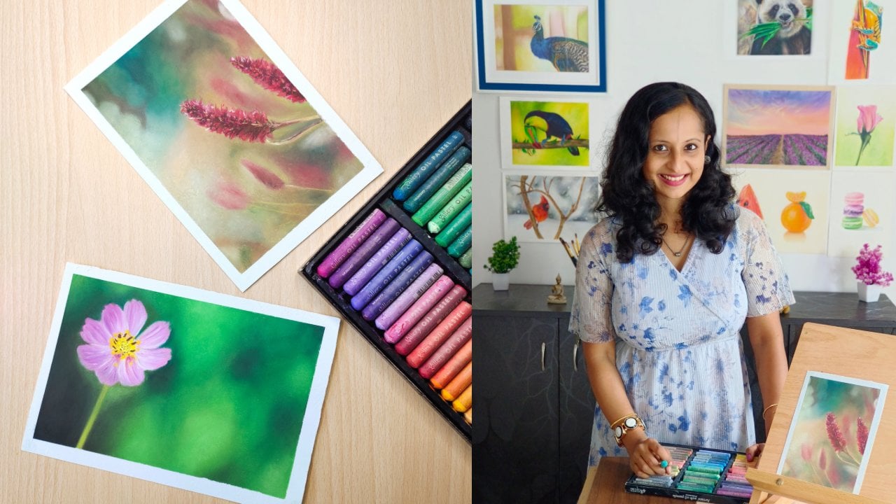
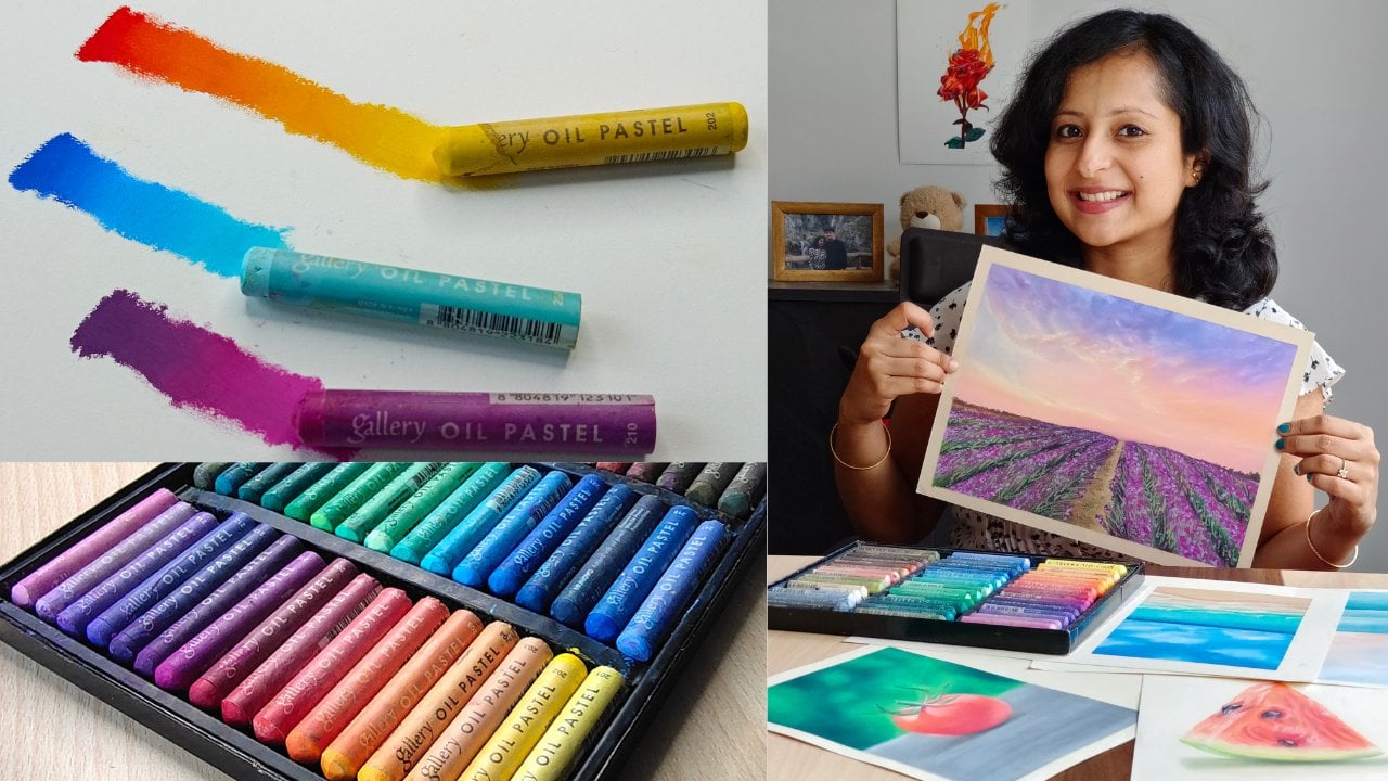
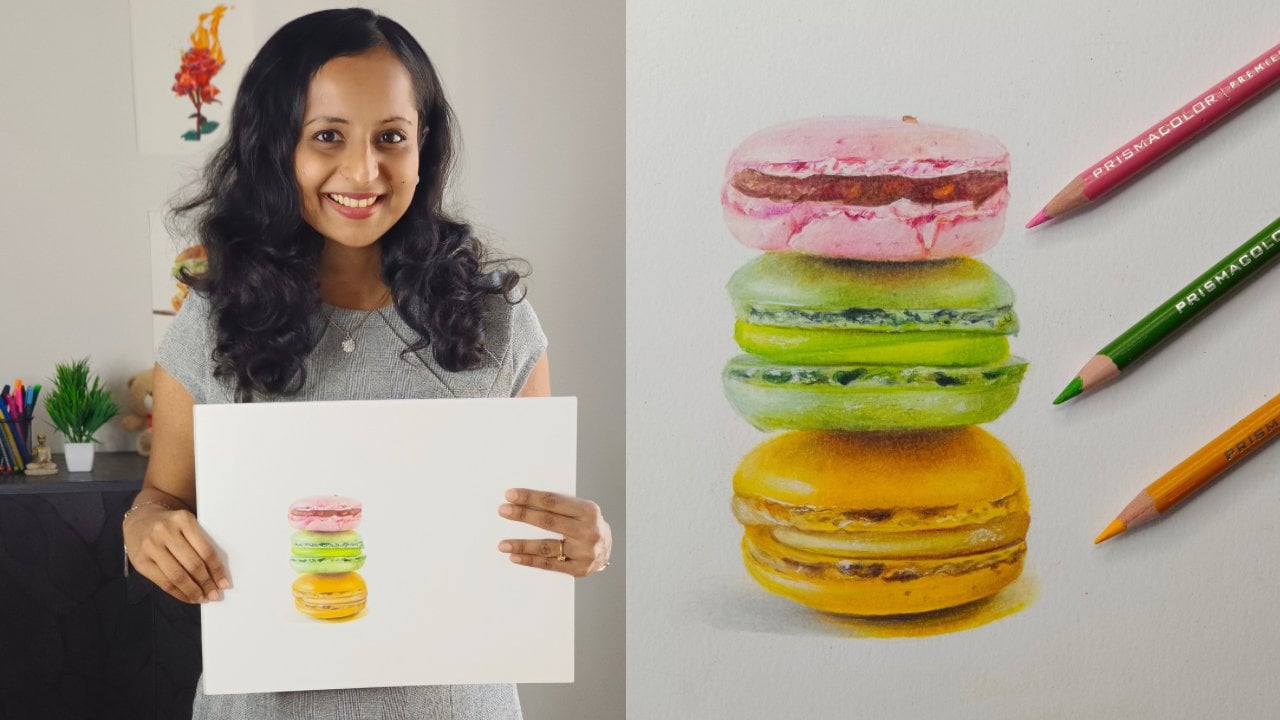
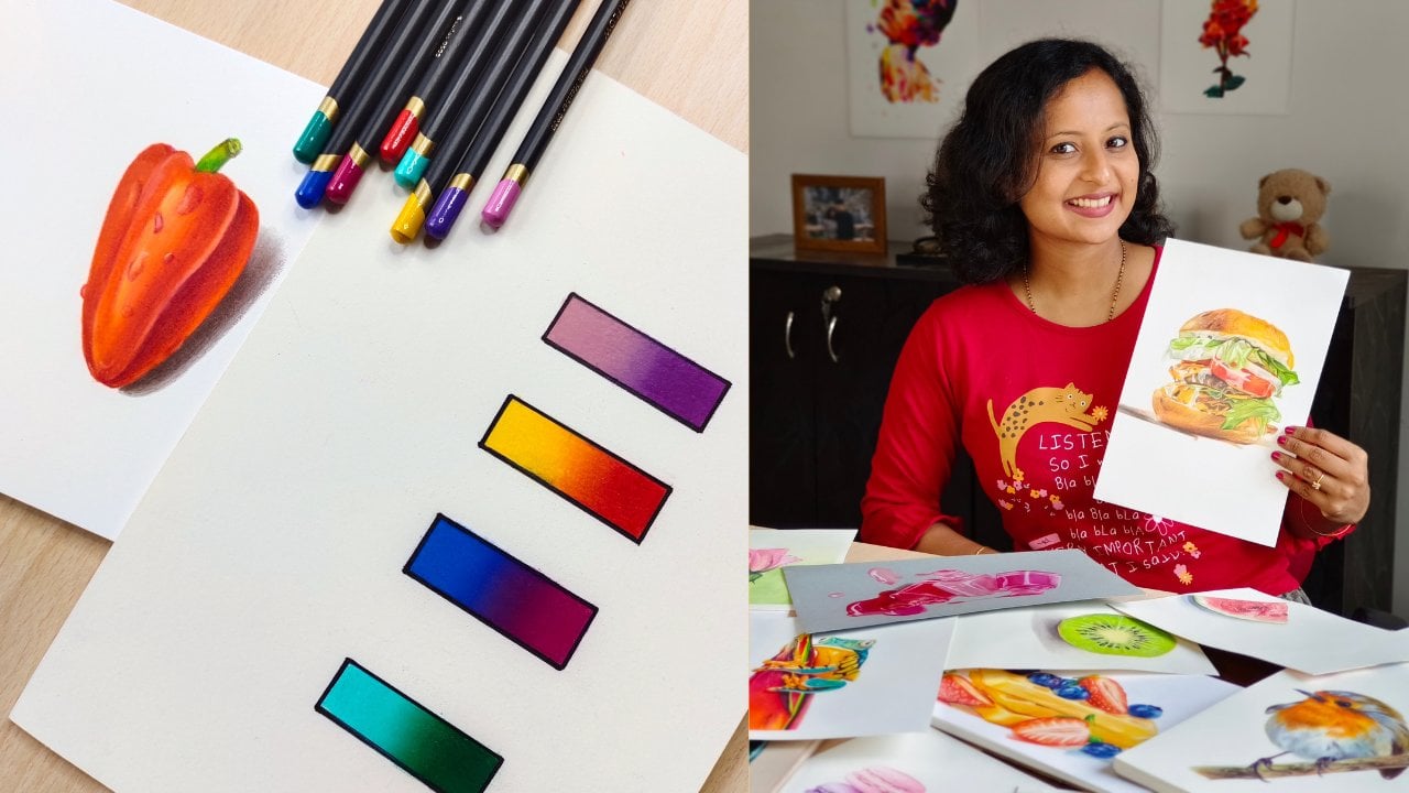
Smitha Rao, Pencil and Pastel Artist

Watch this class and thousands more

Get unlimited access to every class
Taught by industry leaders & working professionals
Topics include illustration, design, photography, and more

Watch this class and thousands more

Get unlimited access to every class
Taught by industry leaders & working professionals
Topics include illustration, design, photography, and more

Lessons in This Class

    • 1.

      Introduction

      1:18

    • 2.

      Cherry Illustration

      9:55

    • 3.

      Finishing Touches

      3:35

  • --
  • Beginner level
  • Intermediate level
  • Advanced level
  • All levels

Community Generated

The level is determined by a majority opinion of students who have reviewed this class. The teacher's recommendation is shown until at least 5 student responses are collected.

17

Students

2

Projects

About This Class

Stop overthinking and start creating:

If you’ve ever felt intimidated by professional-grade art mediums or overwhelmed by hours of technical drills, this class is for you. Pastel pencils are a magical bridge between drawing and painting, offering the vibrant, velvety glow of pastels with the familiar control of a pencil.

In this short, focused class, we are stripping away the long lectures and complex blending theories. Instead, we are diving straight into a hands-on practice session designed to help you find your creative flow and let go of the pressure of perfection.

What You Will Learn:

We will explore the unique feel of the medium through a simple, step-by-step Realistic Cherry illustration. This isn't just about the final outcome; it’s about the practice. You’ll learn:

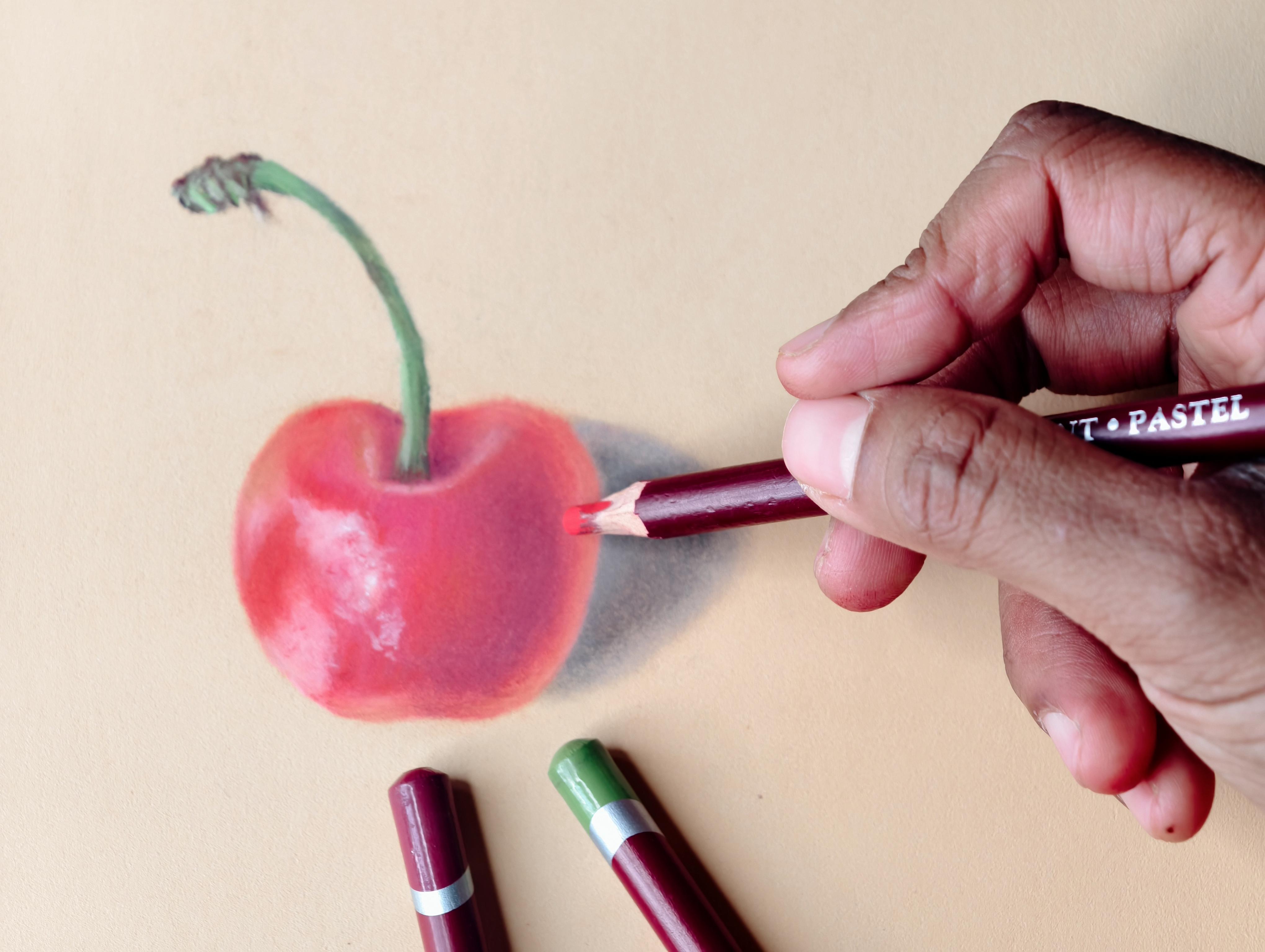
  • The Basics of Texture: How to work with sanded papers (like Pastelmat) to hold vibrant pigment.
  • Layering Light over Dark: A unique superpower of the pastel pencil medium.
  • Simple Blending Hacks: Using everyday tools like Q-tips to achieve smooth, professional gradients.
  • Class Project: By the end of this 15-minute class, you will have a beautiful, realistic cherry drawing and a fundamental understanding of how to move and blend pastel pigments.

Who This Class Is For:

  • Beginners who want a "quick win" and a stress-free introduction to a new medium.
  • Busy Creatives looking for a 30-minute creative reset or a warm-up exercise.
  • Anyone who wants to practice the art of "letting go" and just enjoy the process.
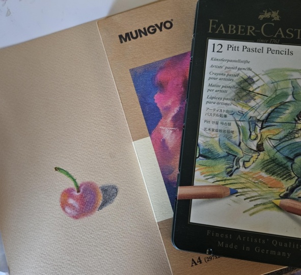
Materials Needed:

  • A set of Pastel Pencils (reds and greens mostly), a textured/sanded surface that can hold Pastels, Q-Tips for blending and a Craft Knife/Stanley knife to sharpen your pencils

Check the Projects & Resources section for exact shades that I used, the Reference Photo and a list of art supplies/brand recommendations.

Join me in class, and let’s turn that "blank page anxiety" into a beautiful, tactile practice!

Meet Your Teacher

Teacher Profile Image

Smitha Rao

Pencil and Pastel Artist

Teacher
Level: Beginner

Class Ratings

Expectations Met?
    Exceeded!
  • 0%
  • Yes
  • 0%
  • Somewhat
  • 0%
  • Not really
  • 0%

Why Join Skillshare?

Take award-winning Skillshare Original Classes

Each class has short lessons, hands-on projects

Your membership supports Skillshare teachers

Learn From Anywhere

Take classes on the go with the Skillshare app. Stream or download to watch on the plane, the subway, or wherever you learn best.

Transcripts

1. Introduction: Hi, I'm Smitha, and I welcome you to the short class. Pastel pencils are a truly magical medium. They give you the rich vibrant glow of traditional pastels, but with the control and precision of a pencil. This class is a little different from my usual deep dives. Instead of starting with long lectures on a medium or complex blending exercises that can sometimes feel a bit overwhelming, we are jumping straight into the fun. We are going to get hands on immediately with a simple step by step cherry illustration. It's a perfect little project that you can complete in just 30 minutes to really get a feel for how these pencils move and blend. Our aim here is to focus on the practice, not just the final outcome. Allow yourself to let go of perfection. For this project, you'll need your pastel pencils and a heavily textured or a sanded paper. I'll be working on this buttercup shade of pastel mat, but a gray or a white surface works perfectly, too. You'll also want a craft knife or a Stanley knife to keep those pencils sharp. For blending, you will need a few Q-tips. I've included more details on these supplies, few brand recommendations, the Cherry reference photo, and the color chart in the projects and resources section. See you in class. 2. Cherry Illustration: Start with a simple line drawing. I used a pale peach shade for it. On pastel mat, it's better to use a light shade of pastel pencil for your outlines instead of a graphite pencil. Observe the reference photo and identify the area of darkish stone. I used a burgundy to map out the dark tones. You don't need to keep your pencils super sharp when it comes to pastel pencils. Try to use the sides while shading. Use small overlapping circular motion. Since this is a sanded surface, there is minimal pastel dust. The pigment grips easily onto the paper. Use a maroon next to the burgundy for the dark areas on the right. Remember to have a look at the color chart that I've uploaded in the projects and resources section so that you get an idea of what colours to use. You don't have to use the exact ones. Use similar shades from your set. For the mid tones, I used two shades, a crimson and a raspberry. You can use any pinkish red shades from your set. Remember not to use heavy pressure. Use light to medium pressure. If you apply too much pressure, the pastel tips get damaged. You will end up filling the tooth of the paper too early and you won't be able to add more layers. This will also result in a lot of pastel dust. Use heavy pressure in the very end only if necessary, like for sharp details. Leave the small section blank, as we'll be using green here later on for the stock. Use a pale pink to mark the light tones and the highlights. We will also use a white here for the highlights later on. Observe the reference closely, and you will notice hints of oranges at the sides. If your set contains a duller shade of orange, use it to mark the same. Otherwise, you can use any orange that you have and you can mix it with white. Now that we have mapped out all the tones, let's start blending. Since this is a small subject, it's better to use tools for blending instead of fingers. I will be using a Q-tip as I'm quite comfortable with it. Hold it at an angle and blending gently using one of the sides of the Q-tip. Once it has gotten dirty, you can use the other side. Now, time to add another layer with the same set of colors. Again, medium pressure. While we continue layering, let me talk a bit about how pastel pencils are different from colored pencils. The main difference lies in their composition and texture. While colored pencils are wax or oil based, allowing for precise translucent layers that build up on the paper, pastel pencils are made of compressed chalk and pigment. They have high pigment and less binder. This gives them at velvety finish and a much softer consistency that blends almost like paint. Because they are opaque, pastel pencils allow you to layer light colors over dark with ease, something that is nearly impossible with traditional colored pencils. In order to blend colored pencils, you need to add a lot of layers gradually increasing the pressure and then burnish in the end. Or you might need to use solvents for blending, whereas pastel pencils can be easily blended with fingers or blending tools. Unless you're drawing something very fine or detailed like whiskers, you do need a very sharp pastel pencil. For this drawing, I only sharpen my pencils in the beginning one. Using a raft knife or a Stanley knife is the most economic way to sharpen your pastel pencils. The pencil cores are fragile and hence, a regular sharpener might cause damage. With a craft knife, you can carefully remove the wooden casing without putting pressure on the delicate core, but you need to be super careful and not cut your fingers in this process. Remember to keep blending gently in between layers. You can use your fingers to roughly blend an area. But for blending narrow areas or when you need more precision, use a Q-tip. If you notice, I have rested my hand on a wax paper. This is to keep the surface clean by avoiding smudging or transferring pigment. Observe that you can easily add light colors on top of dark with pastel pencils. Tint the highlight area with some pinks to make it look more natural. Now, if your set contains a cadmium red or even a darker orange, then use it on top of the crimson layer on the left hand side and the center of the cherry where it kind of looks glowy. This step is going to enhance your drawing and make it look three D. Now, the cherry is almost done. Just observe the reference photo and refine. Use a white to enhance the highlights. This is a needed eraser, a handy tool to remove pastoral dust and tidy up the surface, as it doesn't damage the paper tooth and doesn't leave any residue. Just gently press it on the paper and lift. Do not rub. If you have one, please use it. Don't aim for too much perfection. Stop when you feel you have all the values and textures in place. Adding more layers unnecessarily can cause the colors to look muddy and dull. Also, the pastel starts sliding off the surface instead of sticking to it because the paper can't hold any more layers. Let's stop now and move on to the stalk and the shadow in the next lesson. 3. Finishing Touches: Start with a darker shade of green. Map the entire stalk with it. Use a lighter shade of green over the dark green on your left hand side where there are light tones. This is the beauty of pastel pencils. You can create more depth by adding the light green over the dark green. You can also use another bright green to mark the highlights. Just repeat this for a couple of layers. You don't have to blend here, keep it simple and textured. If you closely observe the reference photo, you will notice dark browns on the stalk on your right hand side and also on the top. Use a dark brown for the same. You can also use hints of reddish brown for the area on the top. For the shadow, use a sepia or a gray. I used both. I actually started with the Sepia and then felt it looked too dark after blending. So I also used a gray on top to dull it down. It's quite easy to fix mistakes with pastel pencils as it's a forgiving medium. I hope this project gave you a real feel for how pastel pencils move and help you find a moment to simply practice and relax. Your finished drawing may not be perfect, neither is mine. And that's exactly the point of this exercise. I'm so excited to see what you've created. Please apload your final piece or even an in progress photo to the projects and resources section. If you have any questions, please post them in the discussion section of this class. If you enjoyed this class, please consider leaving a review. Thank you for your time, and I'll see you in the next one.