Transcripts
1. Introduction : Have you ever wondered
how this will make such hyper realistic drawings
with just colored pencils? You can do it too with
the right guidance. Hello everyone. I'm Smith, I'm a
self-taught artist and an art instructor
based out of India. You can find me on Instagram and YouTube as underscored by undisclosed mid dark
colored pencils is a versatile and relaxing medium that slows you down in
this fast-paced world. I have been working with this
medium for over four years now and have conducted several
classes and workshops, both online and offline. I'm quite thrilled
to be launching my first-ever class
on Skillshare. Once you understand
the basics of colored pencils and are
comfortable with it, I'm sure you're going
to love it as it's mess free and lets you add
the finest of details. Whether you're a beginner or
at an intermediate level, this course will be a
perfect fit for you. Here's what you will learn in this beginner friendly class, you will first
understand all about the materials like different
types of colored pencils, papers, and they are important. You will then learn
the basic lead pencil techniques like layering, blending, burnishing,
with the help of practice exercises
that I have designed. After that, you will
understand the importance of light and shadow with
the help of an example. Your class project,
we will be applying all these basic
techniques and we'll be drawing a hyper-realistic
still-life object. I will be providing
step-by-step instructions for all the lessons and for
your class project as well. By the end of this class, you will have a good
understanding on the basic colored pencil
techniques and you will have completed a
hyper-realistic still-life drawing. Also, you will be confident enough to draw
anything from a photo. I'm super excited to share my knowledge and
experience with you all. See you in class.
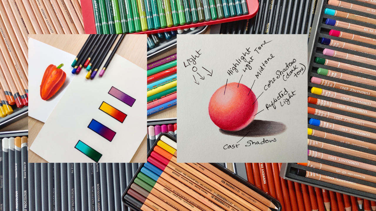
2. Project: For your final project, you will be doing this hyper-realistic
still-life drawing, applying all the techniques learned in the previous lessons. Let me first give you an overview of the
concepts that you will be learning and
practicing before you actually start the
final project. You will learn all about the materials like different
types of colored pencils, papers, and other tools. We will then learn the basic
colored pencil techniques like layering, blending,
and burnishing. I will be demonstrating
to you how to blend two colors and create a
smooth color gradient. After that, we will be
understanding the concept of light and shadow with
the help of a 3D sphere, I recommend that you do these practice exercises
along with me so that you have a hands-on experience on the basic techniques
for your final project. I have included this
hyper-realistic drawing of a red pepper. I have designed this project in such a way that we will be applying all the
previous techniques that we have learned, namely blending, burnishing,
enlightened shadow. Once you're confident that
the basic techniques, you can start your
final project, first, head over to the project
and resources section to find the reference picture
and the color chart, please upload your
finished project and the project section here on Skillshare so that I can have a look and give you my feedback. See you in the next lesson.
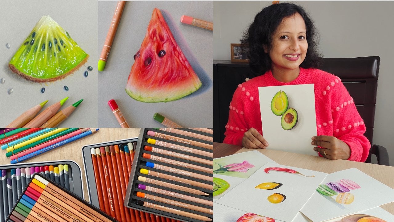
3. Materials Needed for the Class: You will need a set
of colored pencils. Please make sure that you have a decent set that contains
at least 24 pencils. Of course, you can use
a bigger set as well. You will also need a sketchbook that is suitable for
colored pencils. I recommend that
the paper will be 160 GSM or above. What is GSM? I will explain to you
shortly in this video. Please don't use a
very rough paper or a super smooth paper. It's better if the paper
is slightly texture. You will also need a
white gel pen and then basic stationary like a
graphite pencil for sketching. And it is an A-sharp node to sharpen up your
colored pencils. Now, you might have
a lot of questions like what brand of
colored pencils to use, how to choose the right paper. Don't worry, I'll
address them now. Let's understand
colored pencils first. Colored pencils at classified as wax based and
oil-based pencils based on the binder that holds the pigment of the
binder is wax based. They are wax based pencils. If the binder is oil-based than they are oil-based pencils or eBay Spencer's have a hardcore
and wax based pencils have a softer code. Let's understand the
difference between the two. This is a wax based pencil. As you can see, it's
quite vibrant and opaque and appears much
softer on the paper. Blending is a lot
easier with this. You can sharpen them
up to a fine point, but they will not hold good
point for a very long time. This is an oil-based pencils. As you can see, you can get
quite crisp edges with this. And they will hold the
point for a very long time. They are ideal for
fine details like fur or hair with a
good sharp know, Rackspace pencils can also
be sharpened to find point, but they will not hold that sharp point for
a very long time. This will get blocked. Also certain brands or wax based pencils are quite
soft and they might even snap as oil-based pencils retained a sharp point
for a longer time, they need to be sharpened
less frequently, and hence they last longer. Backspace pencils are more
suited for backgrounds, portraits of subjects that require a larger coverage
and a smoother finish, because oil-based pencils
can be sharpened, draw a very fine point. It's better to use
them for subjects like animal fur or feathers or hair. Something that needs
Chris or fine details. Of course, you can only use wax based pencils for
such subjects as well. But these details are easily achievable using
an oil-based pencil. Or you can also use
a combination of both wax and oil-based
pencils and your drawing. This drawing was made only
using wax based pencils. As you can see, it
looks quite vibrant. Now let me show you some of the wax based
pencils that I use. This is the current
ash luminance. This is widely used
by professionals as it is one of the best
available wax based pencils. Then there are some
mid-range ones, like the turbine, chroma flow and the Durbin Pro Color Range. I will be attaching a PDF
with all these details in the project and resources section so that you
can have a look. I also use a couple of
professional oil-based pencils. This is a dove and
light fast, strange, and this is the Faber-Castell
polychrome most, these are just recommendations of some of the good brands. It's not mandatory for you
to use the same brands. You can use any brand
that fits your budget. My advice is that you do your own research based on
the information that I have provided and invest in a decent mid-range bass so
that you get the best results. Now, let's quickly understand
a bit about papers. For realism with
colored pencils, choosing the right paper
is also important. Let's understand a
few concepts first, earlier in this lesson, I told you that it's better
to use a paper that is one-sixth about what is GSM? Gsm is nothing but
grams per square meter. It's a term that is used to measure the
weight of the paper. The weight of the paper is also measured in terms of pumps. Use a slightly textured paper. Or if you want something
a little smoother than you can use a hot
pressed watercolor paper, but don't use a cold
press watercolor paper, or a rough paper. Now, let's understand
a little bit about the texture
or the paper too. If you consider a super
smooth paper, e.g. your regular printer paper, it has a flat surface
with almost no tooth. Hence, it cannot take many
layers of colored pencils. But if you consider a
paper wet medium two, then you can find such hills
and valleys in the paper. And it's excellent
for colored pencils. Paper has a lot of tooth and
you can add multiple layers, but there's a downside to it. That is, it makes blending quite difficult and you're finished
drawing can look grainy. It also eats up your
colored pencils. A medium tooth paper
has just enough to hold the colored pencil pigments
and let you layer freely. Now, let me explain this with an example so
that it's clear. This is a cold press
watercolor paper. As you can see, it's
quite textured. Although I'm using
a sharp pencil, you can still see a lot of whitespace is here. That means. Add a lot of layers and apply a lot of pressure to
get a smooth finish. This is a medium tooth paper. It's quite evident
that the result here is much better as compared
to the rough paper. You can also use a
smooth Bristol paper or a hot press watercolor paper
along with colored pencils. Such papers are ideal when
you want to add a lot of fine details or you want an opaque vibrancy
furnished to your drawings. Since mood papers
have lesser tool, there's definitely a limitation on the number of layers
that you can add. The key here is to work with light pressure and gradually
build up your layers. But if you are a beginner, I suggest that you start with a slightly textured
or medium to paper. And once you're confident, gradually you can move to hot press paper or smooth
Bristol paper or this, make sure to check the
specifications on your sketchbook. Whether it's acid free, is it suitable for
colored pencils? What is the weight
of the paper, etc. This is a 165 GSM
medium to paper. It's quite inexpensive and I use it for most of my
practice sketches. I will be attaching a PDF in the project and
resources section with details of the sketchbook and few more that I recommend. Please have a look
after this lesson. When it comes to papers, I can only say
what works for me, but you need to try
out different papers, experiment with them, and then
decide what works for you. This was the first
sketch book that I use when I just started
with colored pencils. This is a dome tanned, recycled paper by Strathmore. This one is quite popular among beginners because
it's good to start with a tone surface rather than a white one because
it lets you add your dogs and your
highlights easy and the colors pop
on this surface. This drawing was done on
a gray tone sketchbook, but another brand
called our desert. Some papers are quite
easily available at reasonable price in
some parts of the world, and they are not in some
other parts of the world. So it depends where you live. Although both these sketchbooks, they just about 80
pounds or 180 GSM, they do take in a lot of
layers of colored pencils. As I already showed you. I have done some quite
detailed drawings on these, so it's a good start
for beginners. Some artists prefer a lot
smoother surface to work on. So you can also use such hot
press watercolor papers. These are by Dove
and, and Fabriano. There are few more
good brands as well. Particular papers are
generally heavier. These weigh about 300 GSM. This drawing was made
Fabriano watercolor paper. As you can see, a
smoother surface makes your final drawing look
very glossy and vibrant. As I said earlier, when it comes to paper, It's all about your
personal preference. What suits your style, how much pressure you apply, what kind of drawings
you want to make. These are those track more of Bristol series white papers. They come in two varieties, Bristol smooth, Bristol velum. The Bristol Smooth
is a smooth surface and Bristol velum is
slightly textured. Both are well suited
for colored pencils, bootstrap mode and Darwin makes it even more
higher-quality, extensive 100% cotton papers that are also different
professionals. For now, you can start off
with the Darwin sketching paper or the Strathmore
toned paper, or any other brand that has
similar specifications. So here's a quick recap. You will need colored pencils, set of 24 or above, papers suitable for
colored pencils, white gel pen, and
basic stationary. For more details,
please refer to the PDF attached in the projects
and resources section. And in case you have
any more questions regarding art supplies, post them in the
discussion section so that I can guide you. See you in the next
lesson where we'll be understanding the basic
colored pencil techniques.
4. Basic Colored Pencil Techniques: In this lesson, we will
understand some of the basic colored
pencil techniques and some important tips
that you must follow. Firstly, make a color
chart similar to this one using the colored
pencil set that you have. Just write down the
name of each sheet as mentioned on your pencil and
makes watches next to it. Always refer to this chart whenever you need to
pick the right colors as this will give you an idea of how each color appears on paper. Keep your pencils sharp so that the pigment easily deposits into the tooth of the paper. Don't hold your pencil
too close to the tip. So what happens when
you hold this way is you tend to exert
a lot of pressure, which we don't want to hold
it further up this way with the first two fingers and then rest it onto
the third finger. Hold it with all
the three fingers. But make sure you
hold it further up so that you apply
lesser pressure. And this gives you
a lot of control. While shading tried to
move your entire arm. Here, I'm giving you
a demo of how it looks when I hold the
pencil the right way. As you can see, the
strokes look uniform and I have a lot of control over the
pressure that I can apply. Whereas if I hold the pencil
too close to the tip, the strokes look quite patchy and this gives me less control. Hold it very close
to the tip only when you need to apply
a lot of pressure. Otherwise, holding it
much further up gives you Good control while
shading don't make slipping or standing
lines like this. Instead, make uniform
circular strokes. You can make overlapping
circles or ovals this way. Now, let me show
you how to shade this tiny rectangles smoothly. Hold the pencil a bit
further up, as I told you, make uniform circular strokes
overlapping each other. Remember to apply very
light pressure initially. Instead of covering the
entire rectangle in one go, I'm going to add
a lot of layers. Although I'm making
circular strokes, I'm sticking to one
particular direction. I'm going to add the
first three layers with very light pressure. Afterwards, I'm going to
change the pressure to medium for another company layers,
leaving the following, this layering technique and
all our lessons from now, when you gradually
build up your layers, you're drawing gets more depth
and looks more realistic. Otherwise, it will
just look flat. If you go too dark initially
with very high pressure, then it's going to be
very difficult to fix your mistakes as colored pencils are not very easily erasable. Now that have almost covered
the white of the paper, I'm going to increase
the pressure and hold the pencil
closer towards the tip. I'm going to follow a
technique called burnishing. Burnishing is a
technique where you add a lot of pressure on top of the existing layers so
that no more paper to issue. Burnishing, a glossy
finish to your drawing. Since burnishing flattens
the tooth of the paper, It's quite difficult to add more layers if you have burnished with very
high pressure. So it's better to
burnish in the very end. In case the strokes from your previous
layers are visible, you can burnish in the
perpendicular direction and flatten it out and make
your drawing look smoother. Instead of following
the layering technique that we just did. If you state a bit Beneish
with very high pressure, then your final drawing is
going to look flat and patchy. So the right way
to go about with colored pencils is to
gradually build up your layers with
light pressure and then burnish with high
pressure in the end. Now we'll do a simple
one size of blending two colors to create
a smooth gradient. For this, you can pick
any two colors that are adjacent to each
other in the color wheel, please don't pick any
complimentary colors I've chosen to cool colors are
dark blue and light blue. You can also use a dark green or a light green or
anything similar. I'm going to convert
this rectangle into a smooth gradient of
dark to light blue. I'm shading the first half of the rectangle with
a dark blue pencil. Keeping in mind all the
tips that I mentioned earlier are sharp pencil
holding it the right way, circular, overlapping
strokes and light pressure. I reduce the pressure
to bare minimum as I move towards the
center of the rectangle. Now from the other end, I start shading with the light blue pencil
in a similar manner. Even in this case, I made sure that I
reduce the pressure as I move towards the
center of the rectangle, I also make sure that there
is an overlap between the light blue and the white blue or the
darker shade of blue. I repeat the same steps for
another couple of layers. The second layer
with light pressure and the third layer
with medium pressure. After about three to four years, I start burnishing
with high pressure. Even then burnishing,
I tried to reduce the pressure as I move towards the center
of the rectangle, especially when using
the darker color. Since it looks a
bit streaky here, I also burnish in the
perpendicular direction. My aim here is to get a
smooth transition from dark to light blue without
any start stop points. So I use them alternatively at the center until I
get a smooth blend. Some brands come in with
a colorless blender that you can use to
get a seamless blend. A colorless blender is typically a pencil
without any pigment. It contains the same wax
binder as your other pencils. You can also use a white pencil
for blending two colors. But for the white pencil, what happens is finished drawing might look
a little duller. So you need to go over with
the colors that you used. Once again to brighten it up. I generally don't use
any blender, burnisher, or a white pencil for
blending with practice, you'll observe that by layering
with the right pressure, the colors blend
seamlessly on their own. You don't even have to apply a lot of pressure and burnish. As you can see, we now
have a smooth gradient. If you'd like to practice more, you can repeat the same
exercise with warm colors, e.g. red, orange, and a golden. Here are some more
gradients that I need. You could also use
any of these colors. Here's a quick recap. Always keep your pencils sharp. Don't hold them too
close to the tip. Start with light
pressure makes a killer overlapping strokes
gradually build your layers, chain the pressure to
medium towards the end, punished with more pressure
once there are enough layers. Here's what you need to do. Prepare a color chalk
practices, blending, exercise, and repeat it with warm colors
if you'd wish to. Also don't forget to clarify your doubts with me in
the discussion section. See you in the next lesson
where we'll be understanding the importance of light
and shadow in realism.
5. Light and Shadow: Let's understand the concept
of light and shadow. Consider a spherical object. Observe where I've placed the light source and where
the shadow is formed. In case of a spirit, the shadow will be
elliptical absorbed that way the light is falling
directly on the object. You have a very bright spot or the highlight as you move
away from the light source, you can see darker tones. The darkest area on the object
is called the core shadow. Understanding these concepts is very useful in photorealism. Now, let's convert a circle into a 3D sphere with the concept
of light and shadow. For this, I will be using
three colors are light pink, a slightly darker pink, and red. Typically a light tone, midtone, and the dark
tone of any color. I have roughly drawn
a tiny circle. And now I'm going to lighten the sketch up with the
help of a kneaded eraser. Let's consider that the light
source is on the top left. This will be the highlight area, which I'll be leaving
white for the time being. I will be sharing the entire spear with the lightest tone, that is the light pink. I make sure to shade
along the curvature of this beard so that
it does not look flat. As mentioned in the
previous lesson, I shared it with a
very light pressure and make tiny
overlapping circles. After covering the
entire region, I start shading with the middle
tone that the dark pink. In this case, I leave
the first one-third of the spear as it is and start
shading from there onwards. So now we have a highlight
and a light tone close to the light source and further
away we have a midtone. Light can bounce back
onto the subject after hitting the surface or
the surrounding objects, and it can cause some
reflected light. I'm going to mark that here
with a light or a mid-tone. And then I will use
a red pencil that is the darkest tone here
for the core shadow. Please note that there are different factors
to consider here, like how far the
light sources or how huge or small
the light source is, how reflective the surface on which the speaker
is resting, etc. I'm not going to cover all those technical aspects
as it is not need it. I'm just giving you a
general idea as Anyway, when doing photorealism, we're going to use a
reference picture. Now I'm going to start
with the second layer. So I'm going back
to the mid tone, that is the dark pink
shading with the dark pink. I make sure to make some
overlap with the red so that there's a seamless transition
after layer of middle. I go back to the light tone, that is the light pink
making an overlap. Again. I repeat these steps for
another three to four layers, gradually increasing the
pressure from light to medium. For the highlight, I add a very light layer of
the lightest tone, that is the light pink, and then I add a layer of white. I repeat this
process for a couple of times until I
get a smooth blend. I don't want to leave the
highlight area pure white. Instead, I want to add a very, very light tone there so
that it looks more natural. Now let's move to
the cast shadow. As I said earlier, this will be
elliptical in shape. I'm using a couple of Greece and a dark brown for the shadow. The shadow will be quite dark where it's touching the object. And as it moves away
from the object, the shadow will get fainter. This exercise not only gives you an understanding of
light and shadow, but also will be useful whenever you're drawing
anything's pedicle, say any still-life object
like a fruit, etc. Here's a quick recap
where the light is hitting directly
onto the object. We have the brightest
spot or the highlight below which we have a light
tone. I'll mark that. And then we have a mid-tone
and a very dark tone, or the core shadow that is the darkest area on the object. After that, we have
the reflected light. In case of a sphere, the shadow will be in
the form of an ellipse. The cast shadow
will be very dark where it's touching the
base of the object. You can try this
exercise if you want. Also, you can observe these concepts on a
cube or a cuboid. Please feel free to post your questions in the
discussion section. In the next lesson,
we'll be doing a hyper-realistic
still left join, which will also be
your class project. See you in the next lesson.
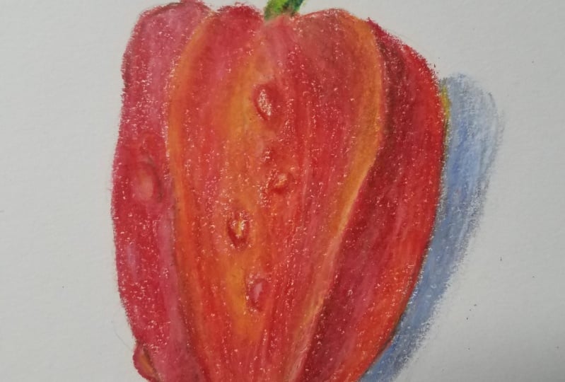
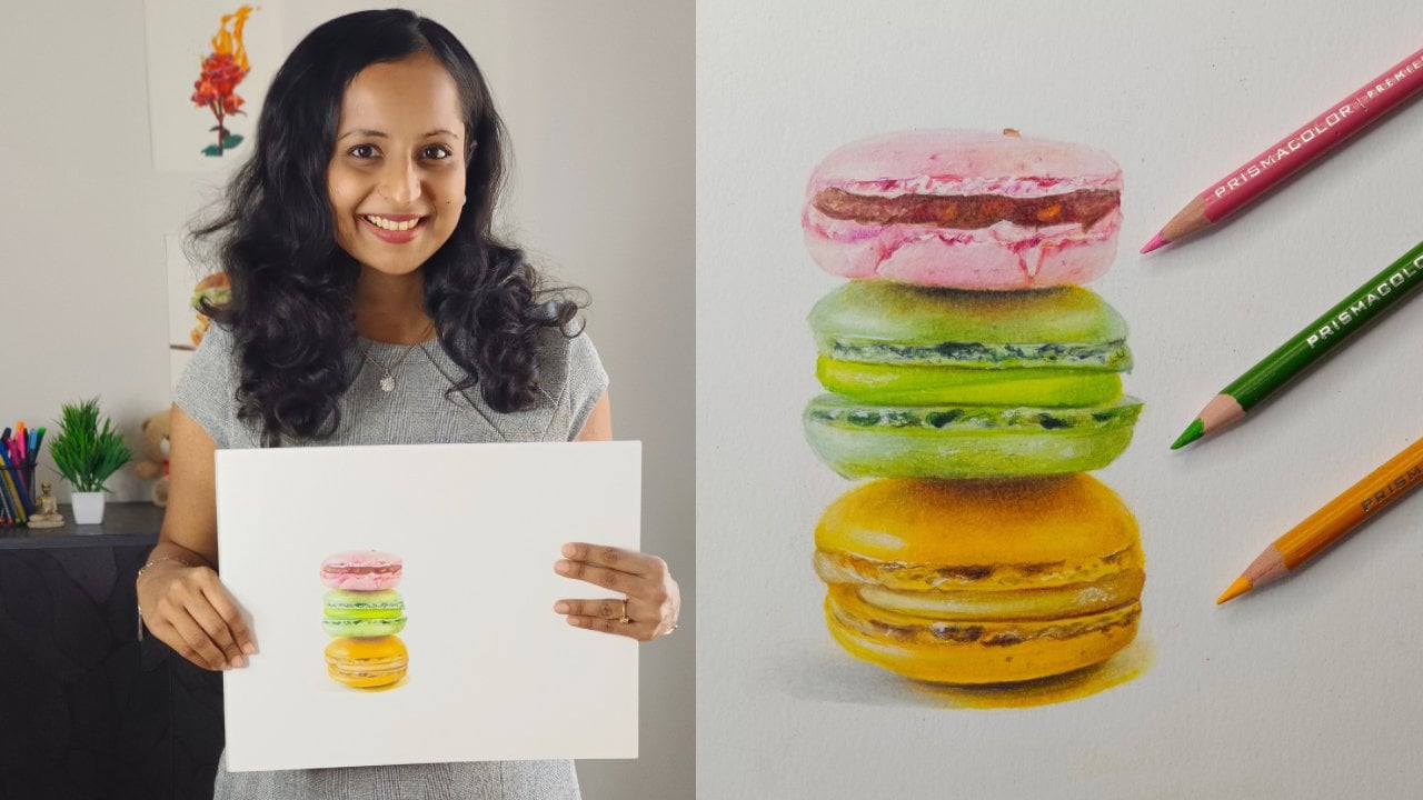
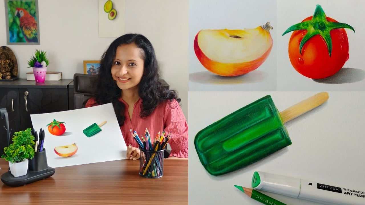
6. Hyperrealistic Still Life Drawing: For your final project, we will be doing a hyper-realistic
still-life drawing, applying all the
techniques covered so far. This is the reference
picture that we'll be using. You can download it from the projects and
resources section. Before starting, I suggest that you study the
reference picture for few minutes and
apply the concept of light and shadow as
shown in the picture. I will be guiding you with step-by-step instructions on
how to draw this red pepper. You can draw it along with me, or you can also draw any of these peppers that you
can see on the screen. By applying those techniques, I will be using these set of 24 backspace colored pencils. The reason why I'm
using a smallest set, although I have
much bigger sense, is because as most of you, I'm sure you will be
having a smallest set. Also, I feel you will
be able to learn a lot more with a
limited color palette. I will also be using
a watercolor paper. You can use any other
paper that I have recommended or anything that is suitable for colored pencils. These are the colors
that we'll be using. The names will be
definitely different. If you're using a different
set for the stock, will be using yellow and a
light green and dark green, indigo or a darker
blue and a dark brown. For the pepper, we'll be using. Orange, light pink,
lighter shade of red, a darker red, magenta. And reason is nothing but
like a reddish brown. For the shadow will
be using gray, dark brown, and again,
a reddish brown. You will also need a white
gel pen for highlights. I have included the
color chart and all the material details in the project and
resources section. Please go through them
before you start. I have sketched out
the pepper here. This is a very simple sketch
and you don't need to have any extra ordinary
drawing skills to be able to draw this, make sure to lighten up
your sketch. One's done. Let's begin with the stock. I start with a very light layer of yellow colored pencils. It's important to know that we need to go from light to dark. So I start with the
yellow and then a light green and followed
by a dark green. Please make sure
to keep checking your reference picture
that I have provided. Instead of just copying
what I'm doing, you will be able to learn
a lot better if you draw from a photograph
for the darker tones, amusing and indigo
and a dark brown. Throughout the project.
Make sure to use a sharp pencil and gradually
build up your layers, as explained earlier,
you can also use a white pencil to just blend
all the layers together. For the pepper, I start with a very light layer of
orange and a light pink. I call this the base layer. So how does one decide
what colors to start with? What you need to do is observe
your reference picture and see what colors you can see around the area
of the highlight. In this case, you will be able
to find some peachy tones. That's the reason I'm
mixing orange and pink. Gradually build up your
layers from light to dark. Please recall what we learned
in the earlier lessons, where we created a smooth
gradient and then drew a 3D sphere and apply those
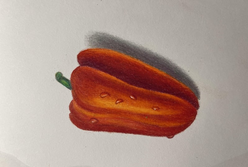
techniques here as well. Now, I move towards
the mid-tone. First, I start
with a light layer of scarlet or the
lighter shade of red, and then I add a darker shade, red or the strawberry
in case you're set contains only
one shade of red, then use the same red twice. First with lesser pressure, and then with slightly
increased pressure. I repeat these steps with
the same set of colors, gradually increasing
the pressure. Once I have enough layers down, I burnished with
the lightest tones, that is the orange and the pink. You can also use a white pencil in-between to blend the colors. Adding a couple of
water drops with a darker shade of red and
with a reddish brown. I will explain to you in detail
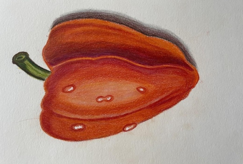
how to draw water drops. In the next section. For this section, I
will be following the same steps that
I followed earlier, except that I will leave some whitespace at the
Center for the highlight. The highlight area will be following the same steps that we followed in those peer that is in the lightened
shadow lesson, I will be adding a layer of light pink and orange and
blend them with white. If you observe the reference
picture carefully, you will notice that
there's a darker tone here. Next slide, and adding a
layer of magenta on top of the reds to enhance it
and get a deeper tone. For the highlight. I also use this Darwin Chinese white pencil as it's quite opaque and is one of the best white
pencils available. Once I added all the colors, I marked the shape of the water drops with the darker stones. And then I add invite and
blend it along the mid tones. If you want extreme
white highlights, you can use a white gel pen. Each voter rolls is different. So you need to observe the
reference image Giphy. Since we need a very dark
tone for the core shadow, you can directly start
with the darker colors. That is the darker shade of red magic and the reddish brown. If you observe your reference, you will notice that as you move away from the core shadow, you have some lighter tones
or the reflected light. So you can use orange
and red there. If you're not sure whether you got the lights and
darks correctly, you can convert your
reference picture into black and white. You can take a picture of
your drawing as well and convert it into black and
white and compare both. Picking the right colors
by just looking at the reference photograph
comes with practice. If you're a beginner and you're finding it difficult to do that, then you can use the
color picker tool or the eyedropper
tool on MS Paint. Another tip that I can
draw it is always use high-quality photographs
as your reference picture. Websites like Pixabay, Pexels, Unsplash have several
royalty-free images that you can use. For the cast shadow. I will be using a light gray and a darker brown as I don't have
any dark gray in the SEC. Remember that the
shadow will be quite dark where it's touching
the base of the object. Adding a hint of red
here on the shadow, just a single layer with
very light pressure. So here's the finished drawing. I'm super excited to see
how yours turned out. Here's what you need to
do before you start. Note that reference picture, color chart and other details and notes that I've uploaded. Pick the colors closest to
the ones that I've suggested. Use the techniques taught
in this lesson and the earlier ones as a guide
to finish this project. Remember, with colored pencils, practice and
patients is the key. Don't be in a hurry to finish. I have actually spent 1 h on
this drawing in real time, but I've included
all the techniques, tips, and steps that are
followed in this lesson. If you're stuck at any
point in this drawing, post your questions in the discussion section
and I will guide you. Lastly, don't forget to
upload your final drawing.
7. Final Thoughts : Congratulations on
completing this class. I'm looking forward to
seeing your projects. Thank you for taking the time to watch my first-ever
class on Skillshare. Here's what we learned
in this class. We first understood all about the materials like
different types of colored pencils
and papers within understood the basic colored pencil techniques like layering, blending, burnishing, with the help of
practice exercises. After that, we understood the importance of
light and shadow, an example of a spill. We then applied all
these basic techniques and drew a hyper-realistic
red pepper. I'm sure by now you have
a good understanding on the basic techniques
and are confident enough to draw
anything from a photo. Please upload your
finished drawing in the Skillshare projects gallery and tag me on Instagram
if you share it. My Instagram ID is
add underscore. Underscore Smith. Please share your valuable feedback and suggestions for the
upcoming classes. See you soon.
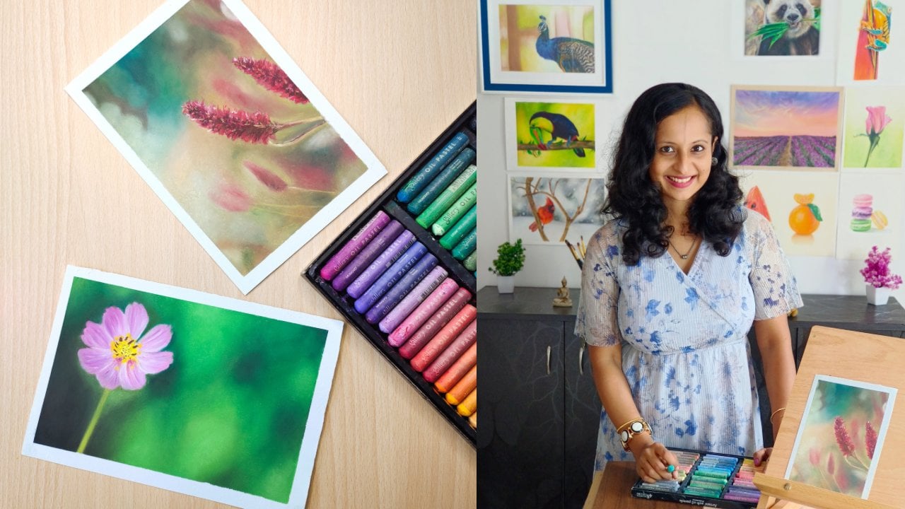
 Smitha Rao, Pencil and Pastel Artist