Transcripts
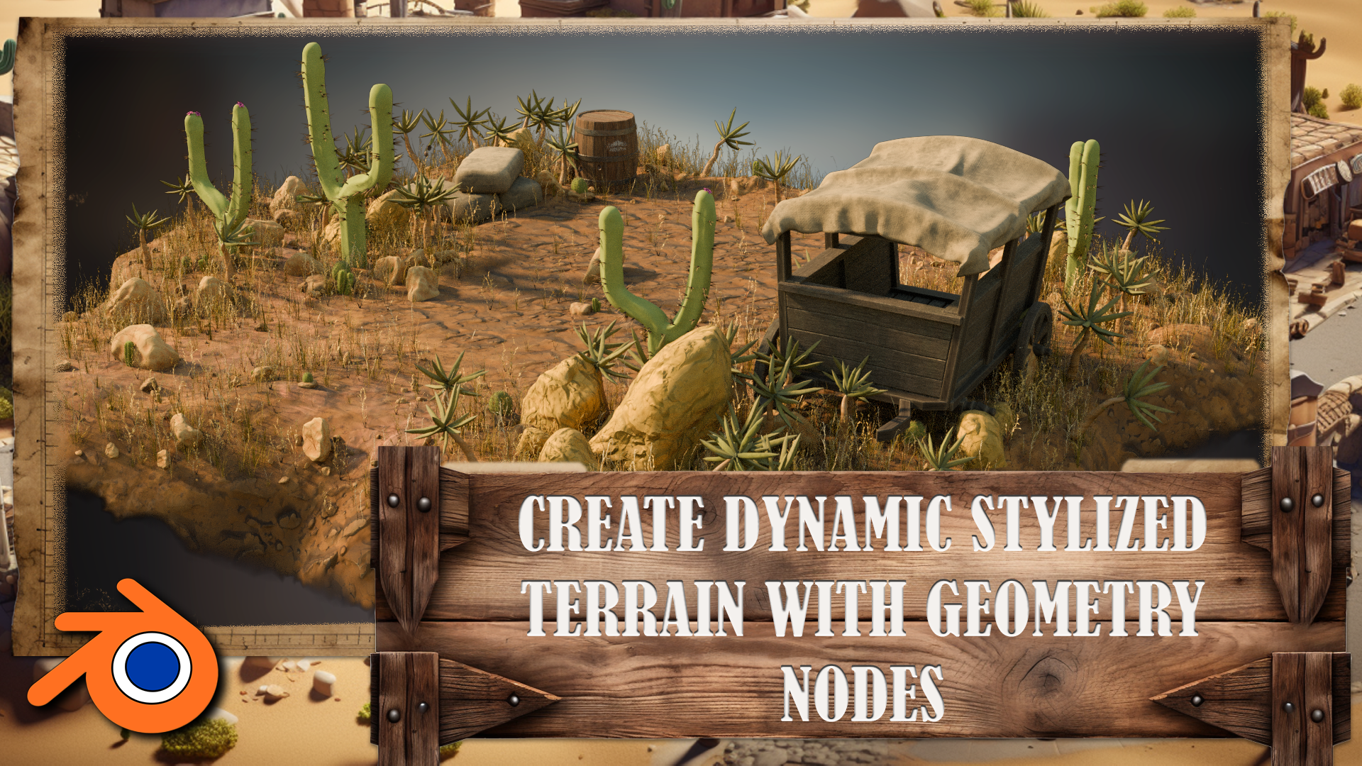
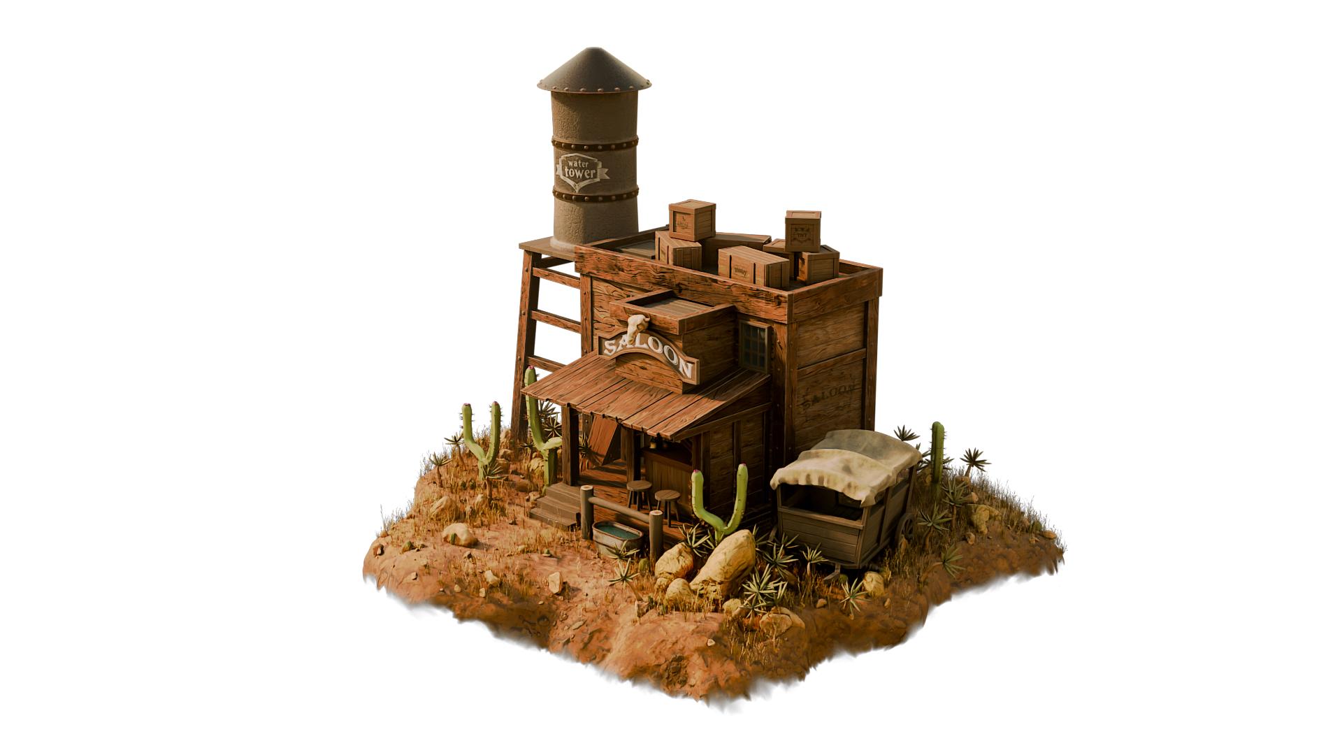
1. Class Introduction: Hey, there, and welcome to the Master Blender Fred with Wild West
Environments Course. If you've ever wanted to create a full freed environment
from scratch, one with personality, story, and a classic Western charm,
this is the course for you. Over the next several hours, we're going to go step by step through building
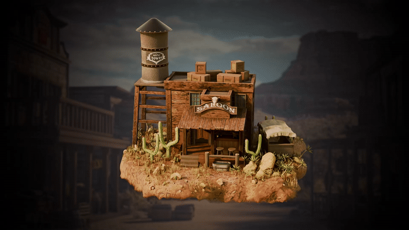
this entire scene. That includes everything
you see here. Even the terrain itself, we're going to go through the setup. In the best part, you don't even need to be an
expert to follow along. We start at the beginning. I'll show you how to gather and organize your
references using PUF, something that's
often overlooked, but it is incredibly important for creating
believable environment. From there, we'll dive into
the grey boxing process, laying out the scene
with basic shapes to nail the scale and
composition early on. This is how professional
environment artists work, and it sets the foundation for everything else
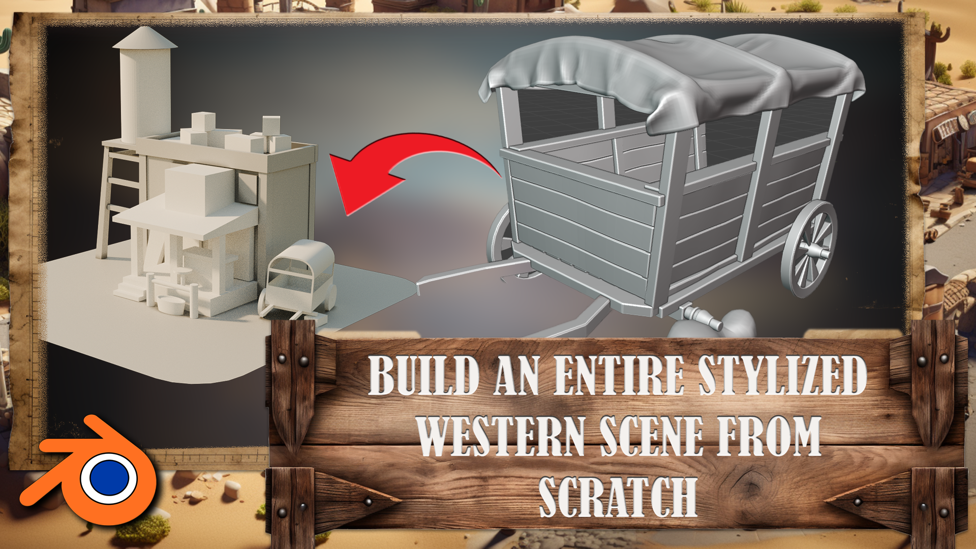
we'll be doing. Then we start modeling, and we keep things modular. You learn how to create
reusable props like crates, planks and barrels, all with clean topology and designed
to work well together. These assets will form the
building blocks of the scene. One of the key props we
create is the water tower. It's got stylized
charm, simple geometry, and it gives us a
great opportunity to talk about things like scale, material definition,
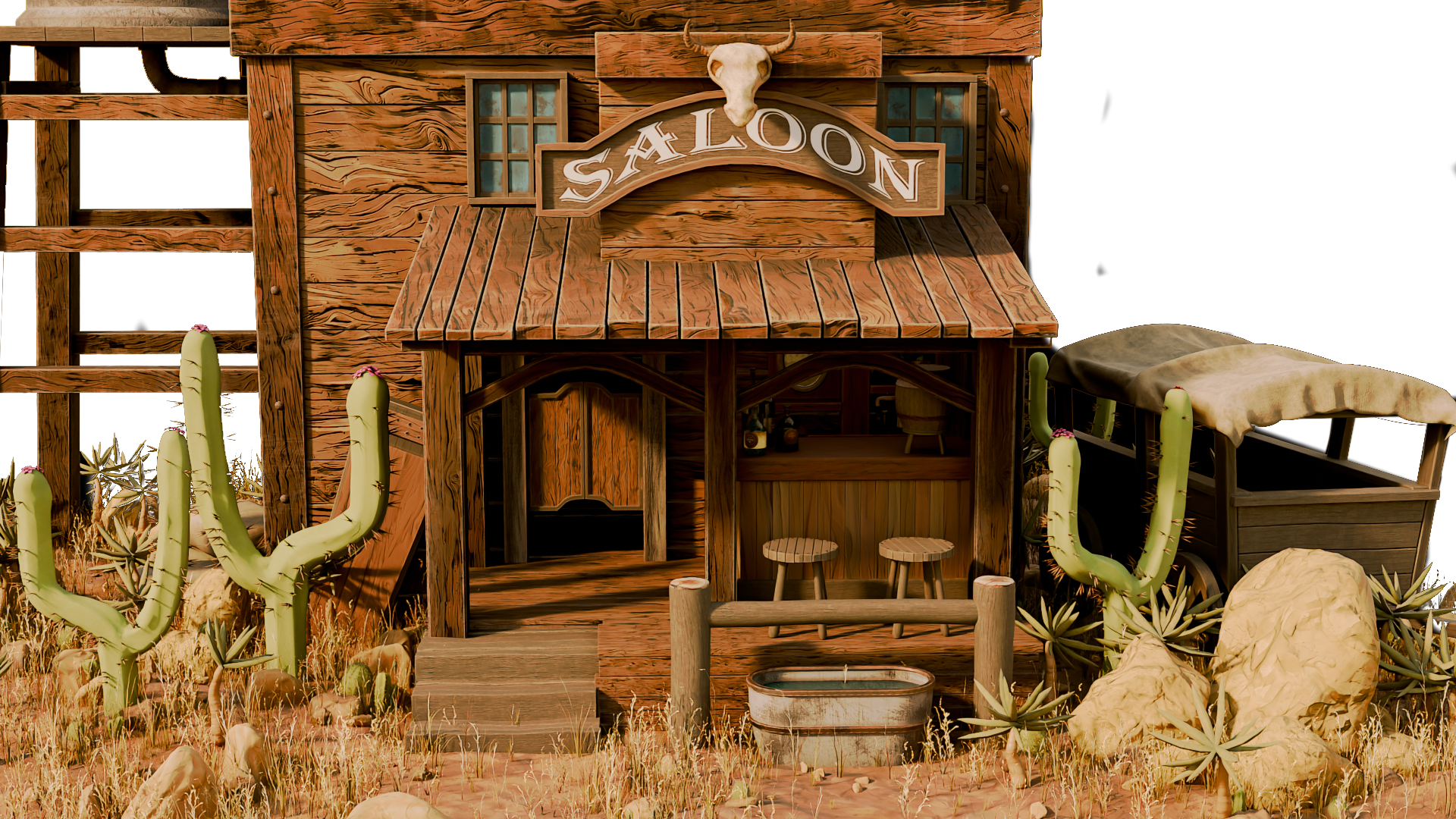
and silhouette. We'll also model more
complex structures like saloon front and back, including the classic
swing indoors and even a bar setup with
bottles and stools. Throughout the
course, I'll show you the techniques that are
both fast and clean, making it easy to tweak, reuse and build variation
into your work. We also cover UV mapping
and texturing in detail. You learn how to mark
seams, wrap models, and apply stylized
textures that bring out the wood grain and dusty
charm of the Western world. We explore shade
of creation, too, especially how to use Edgeware and procedural detail
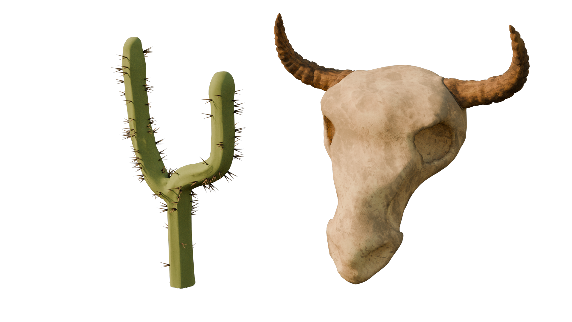
to add realism. On top of that, we sculpt
organic props like the cactus you see and a
cow skull for the sign. These small details help elevate the scene and
give it character, and we keep the sculpting workflow lightweight
and optimize. Perfect for stylized game
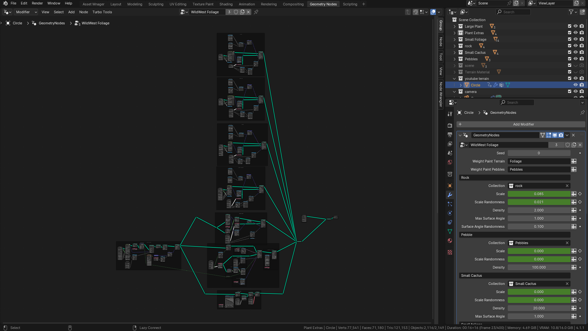
assets or render ready artwork. If you've never used Jome
genots before, don't worry. We introduce them in
an approachable way. You'll use them to generate
wooden planks procedurally, build stylus terrain,
and scatter props such as rocks and
plants. It's powerful. And once you learn the basics, it'll massively speed
up your workflow. As we near the end
of the course, we'll cover lighting
and rendering. You'll set up the
full render scene complete with camera angles, color correction, using
blender compositor and a turntable animation. By the time you finish,
you'll not only have created a beautifully
wild west scene, you'll have learned
a complete work plow that you can apply
to other projects. So if you're ready to
sharpen your blended skills, build your portfolio and have fun creating something
truly unique, join now, and let's dive onto
our pretty world together.
2. Referencing Basics: Hello, and welcome everyone to Master Blender Free D with
Wild West Environment. Before we get
started, we're going to dive into resource pack. And for that, we're
going to go over the basics of the
PureRef software. If you are already familiar
with the software, you may skip this lesson
and go onto the next one, and we're going to cover the
resource pack within there. Thank you so much
for watching, and I will be seeing you in a bit. Welcome, everyone to our in
depth referencing guide, and it's very important that we actually use
references in pretty much any kind of modeling or environments that we're
actually going to be work on. So before we actually
do anything, before we put any cubes
down or anything like that, it's really important
that we have some really, really decent references
to actually work with. So the first thing I want to recommend is that you can use something to actually
put all your references on like Photoshop or even word. But what I'm going
to recommend is that you use something
called pure ref. So if you go to the site,
that's called purev.com, you will actually open
this, and from there, you can actually
click Get Pure Rv, and that then will take you
to this download screen. And you will see at the moment, you've got 157 or custom amount. You can actually put this on zero and actually
get this for free. So it's completely free, and you can come back and
make a donation if you like. And then all you need to
do is click Download. So the only things
we're going to talk about pretty much for
reference in here, are going to be free except
our mid journey part. But there are other
alternatives like Dolly and a load of others
out there that you can use instead of mid journey. Once you open up pura, then, this is what you will be
greeted by this screen. And if you want to right click, you can actually drag
this around to any of your screens or you can actually
make it smaller like so. And it's a really, really
good program this really, really handy, highly
recommend getting this. So now let's actually think
about getting our references. And there are a few sources that we use to actually
grab references from. But generally, what you
want to do is you want to build up a kind of
reference pack if you're going to be a hobbyist or a professional in
three D modeling or environments where
you're going to see things perhaps on
Pinterest or sketch up, and actually, you want
to save them in a file. So I know people with
thousands and thousands of images that they've
saved over the years. And whenever they're
coming to a project, they'll then dive in
and actually find all of the images that they've
got that particular thing, this could be a Samurai
warrior or a Chinese bell. Also, a lot of people
I know as well, who are working
professionally at this will go around museums. They will take their
own actual images, and then they'll also upload
those to the file as well. So the first point of call
if you're not actually got your own database yet is probably going to
be actually Google. So let's open up Google, and you can see here
that at the moment, I'm looking for a
Victorian delivery truck. I'm going to do is I'm
just going to go through these and get some nice
references like this one, for instance, and then
I'm simply going to right click and I'm
going to copy image. Then what I'm going
to do is I'm going to go over to PUR RVs. I'm just going to open it
back up, press Control V, and you'll see now that I've
got my nice image in here. What we're also able to
do with PUREvs we're able to also pull it out and
make it bigger if needed, which is really, really
handy when we're putting in lots and lots
of actual images. Now, the next thing
I recommend you do once you've actually
got an image in there, is what you can do
is you can left click and drag it
over somewhere. And then what you can do is
you can press Control N, and you can actually
make a note. So let's call this Victorian. Trucks. Let's put it Trucks. Now, within my scene,
I might actually want a Victorian lamppost as well as part of the scene
or something like that. So let's actually
look at the next one. So the next point of call is actually going
to be Pinterest, and let's actually put in Victorian lamppost.
So let's try that. Like, so let's see what we get, and we can see we've got many, many styles,
especially this one. This one's actually really nice. This one's also really nice. So what I'm going to do is I'm going to actually take this one, I'm going to right
click Copy Image, go back to my PUEv and then
drop the images in there, like so, and maybe make this
one a little bit bigger. What I tend to do is I gather a load of images for
each of these things. When we're actually
building a scene or even just the model, you want to grab as many
images as possible. I'm talking hundreds
of images here. And especially if
you're doing a scene, you want all of
the little parts. You want everything
down to the lighting, the environment, the trees. You want to grab references for absolutely everything because it will make your
scenes just really, really look so much better if you've got some
really good references. So now let me show
you this is one that I'm actually working
on at the moment, so if I come over
and load Reason, and I'm just going to
load this one here, and you'll see at the moment,
I have all of my props. I have all of my main
buildings that I'm going to be looking at
to use as references. I have a ton of doors. I even have a load of foliage. I have all my windows. I have my lights over here, and I also have, more
importantly, all of the lighting. In other words, it's a scene. So what time of day
is it going to be? Is it going to be, you know, early in the morning, or
is it going to be at dusk? Is it going to be a night scene, or is it going to be midday with that sun beating
down on my scene? Just make sure that it
actually matches the scene. There's no point having
a scene like this, for instance, so this one here. If you've got a log
cabin out in the snow, you really want it to
match your actual scene. Now before moving on,
there are a couple of other places that we do go
to use for referencing, especially something like
sketch up, which is really, really great because you can actually come into
an actual scene. And then what you
can do is you can actually rotate
around it and really, really check out how a
model is put together, like something like this, which is one of our actual own. But you can see here how
easy it is then to get a good idea of what actually
incorporated in this scene. And what you can actually
do from there, then, is we can actually come down
and we can actually get some screenshots of this or even right click and copy image. Also, let's say,
if we wanted to do a Victorian truck, for instance, to keep the same theme as
what we've been doing, you can see that
there's no end of actual Victorian or vintage
type vehicles on here. Not as many as what
there is on ArtStation, but still a very, very good place to start looking
for reference in. That leads me on to my next one, which of course is ArtStation. This simply is one of the
biggest resources for referencing or for looking
up artists in the world. So let's put in a
reference of Victorian, for instance, and let's
see what we actually get. Let's search artwork. So we're going to search artwork and let's see what it
actually comes up with. Should be lots and lots of
things to work with here, especially good, if you're
looking for actual lighting. So you're looking for lighting effects
like this one here. And again, we can take these actual um use them
for references. And the best thing is about
ArtStation is we can also come down and look at things
that may be our concept art, so two D or actual three D, and we can also come down as well and look at what
subject matter it is. So it could be automotives, so Victorian automotives, or it could be architecture
or something like that. So the possibilities with ArtStation are
pretty much endless, and you're able to grab
tons and tons of really, really high quality references. There are, of course,
hundreds and hundreds of other places you could probably
go to grab references, but I'm showing
you these because as far as references go, these are some of the
best places to go. Let's move on then to one of the things that we
really use a lot of now, which you wouldn't have
thought actually would come into it as far as
referencing goes, but it actually is
really, really handy. So let me introduce
to you now Chat GPT. So here is Chat GPT. You can see that we
have Chat GPT four, but we also have 3.5. 3.5 is actually free, and it is actually good enough
to do whatever you want. You really don't need to pay
for this. It's also free. So what I'm going to do
is I'm going to go to message, and I'm
going to type in, give me ten different buildings for a Victorian town scene. Something like that. Let's click Enter and let's see
what it gives me. So you can see now it's given me a lot of things to
actually work with here. And the best thing about
this is you can also say, give me ten more. And it will just then go
ahead and give you ten more. Now, these things
are really handy to use because then I can simply take these ideas and it'll
also bounce other ideas to me, and I can then go
into Pinterest. Or Google search and actually look them up or try and find
something like this. And I can kind of get
ideas and design my scene around there using all of those things and
especially Pure Rv. We can also take them in
to our actual Mid journey. Now, again, our mid
journey is paid for. I think the lowest amount is
$20 or something like that, but there are many, many
free things out there, but it will still show you
what we actually do with our AI based image generator. So you can see at
the moment, this is the image that we've
actually generated. I know we've called it it's
Victorian era delivery van, and this is what
we actually get. If we go to my images, you will see that
we've generated a ton of images about
all of the things. Especially, we use this as
well to generate textures. It's not just there to actually generate images and ideas
and things like that. You can actually use it to
generate transfers that are going to go on Windows or
adverts or actual textures. And we do use this, especially
for things like curtains, because it's really,
really easy to get that look that you're
actually looking for. You can see here,
we've got a lot of ideas for living rooms, we've got a lot of ideas for bedrooms and
things like that. What we can also do
in mid journeys, we can also go and explore. And what you could do is
you could look up with a search prom Victorian. Let's put in carriage. And then we can also
get ideas from this. So if I put in
Victorian carriage, you can see this
as what comes up. Now, if we come over to here, we can also see if
we click on here, this is the actual prompt
that somebody put in, so you can actually
take that prompt, maybe change it around a bit, and then get your own
images rather than just simply copying
other people's images. It's a great place to start to actually gather
your own images. The other thing is
about mid journeys, I can come in for instance,
let's just go back. And then what I can do is I
can hold the shift but down. I can grab all of
these, for instance, and then what I can do is click the Download button and
download all of those images. And the best thing is
about PUREv is you can bring in multiple images
at the same time, so you can just drag, drop them, and then they'll all appear
actually next to each other. So really, really
handy things to. So, lastly, then, to sum up, don't do what I did
a few years ago, where I just dive straight into blender and not even think about references and just
find references if I had to while I'm
actually building something. Don't do it that way. It leads directly into building a
beautiful gray box, as well, all this, because first of all, you grab all of your references, you make sure
everything's set out. You can go and find some more
references if you need to. You know, if you suddenly
have a spark of inspiration, you want to make
something on the fly, then grab some more references
for but to start with, grab all of your references, have them really, really
nicely laid out, and spend, you know, even half a day to a day grabbing all
those references. You can then save
the pura out as well into individual files, and then you'll have all
the other references around that particular
build in there, ready to use maybe on another
project in the future. Or everyone, so I hope
you found this useful, and I'll hope you'll take
my advice going forward. Thanks everyone. See you
on the next one. Cheers.
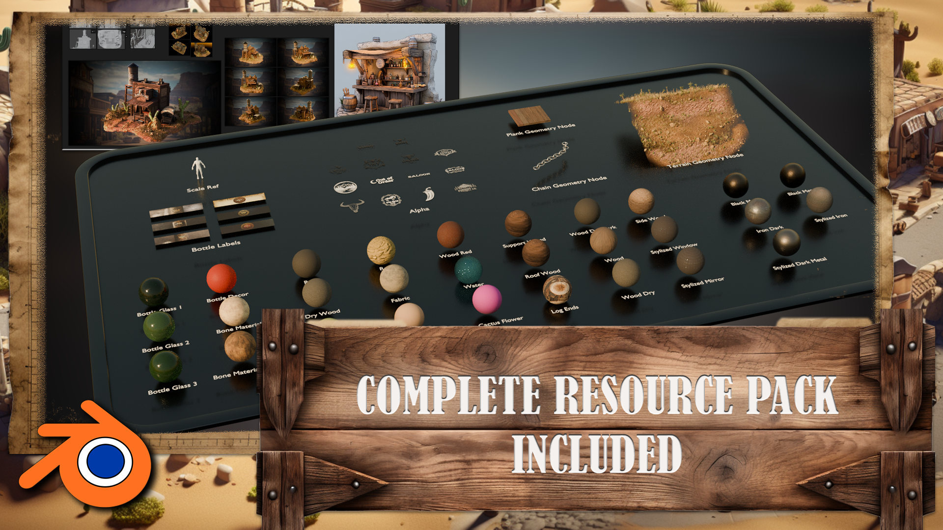
3. Resource Pack And Its Overview: Hello. Hello. Welcome back, everyone to Master Blinder free D with Wild West Environment. Within a resource pack,
you're going to find yourself a couple
of pure ref items, Scene scale reference
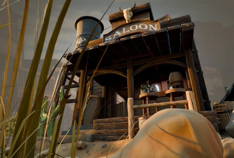
and saloon reference. Let's go over them real quick. Within a saloon reference, you're going to find
the generated images that will help you with some referencing in terms of the mood and
just overall style. It's really good for
just basic type of just visualization and figuring out what works within
a Western scene. Although these images are
well generated with AI, they are really helpful for
getting the base reference out in terms of what works
well within Western scene. So I do recommend
you go over that. The base starting point of
every free D environment should be always starting
off with the mood board, sting with the references and figuring out where
to go from there. And this is a great,
well, first piece. Afterwards, we're going to have one on the right
that we picked for, like, main more of lighting, which is giving us a
nice contrast setup, as well as just a real nice
diama type of a setup, which we're going to base
our environment with. And down here, we have
the type of texturing, the type of coloring
that we're going for, it's going to be
more of a lighter, more lightly saturated type of colors, texturing
and whatnot. So that's what we're going with. You're going to be able to
explore all of that within the Puref of the resource back. Afterwards, within the
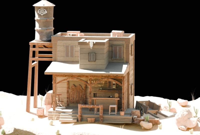
scene scale reference, we have this file over here, which is going to help
you reference all of the tiny parts and
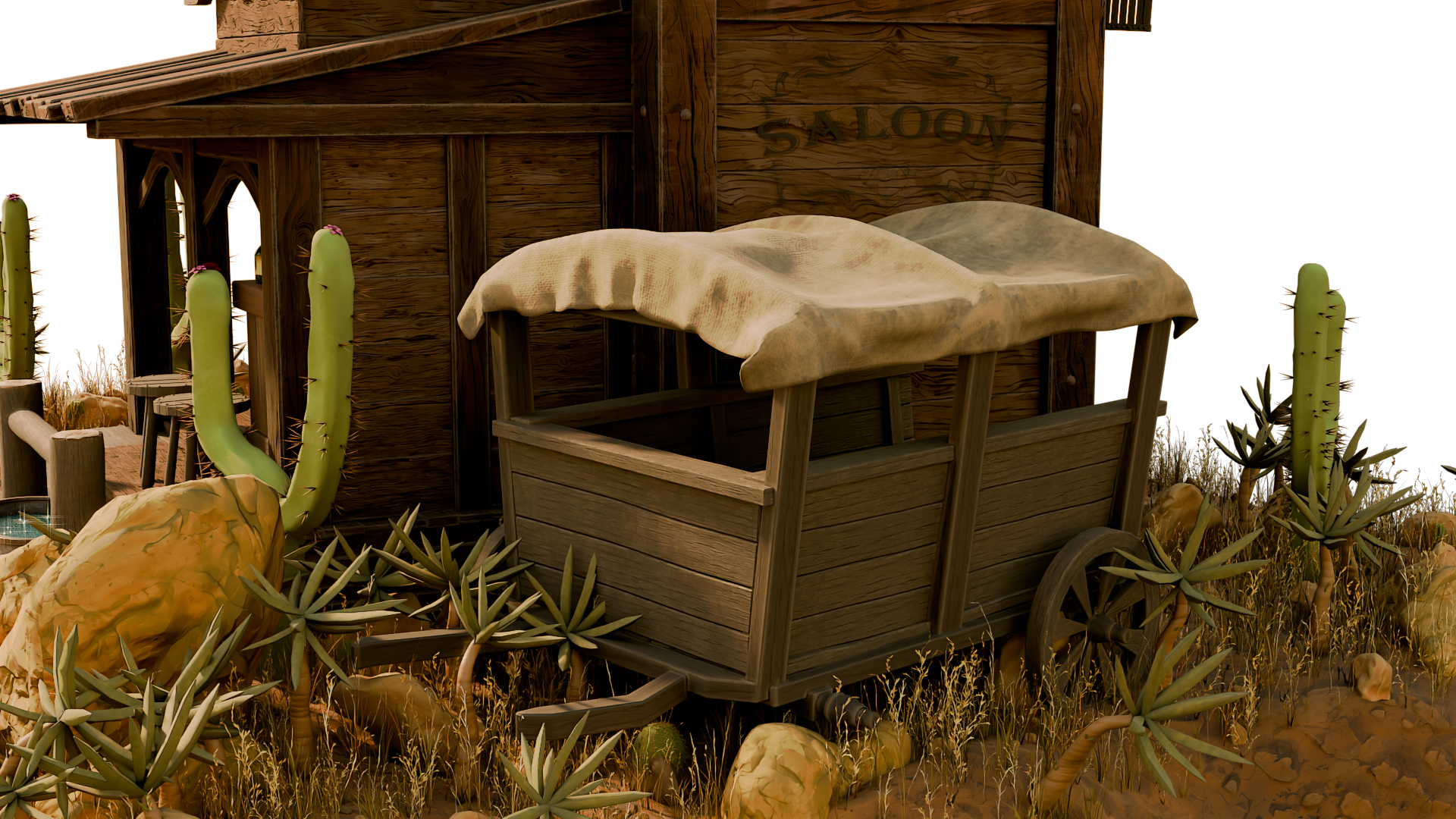
items within the scene. For Sarus, we have the
front back and side top, the bar, wagon, all
those close up shots. Really good for just visualizing
and seeing how it looks like within the scene in terms
of the models themselves. Afterwards, we have well
detextured pieces over here, that's just from
different angles. Also have a final piece, final image that's
rendered and set up to use it as a basis for
a render compositor. And we have some various
different angles from within a
turntable that just showcases the scene, the setup. Again, again, you may use
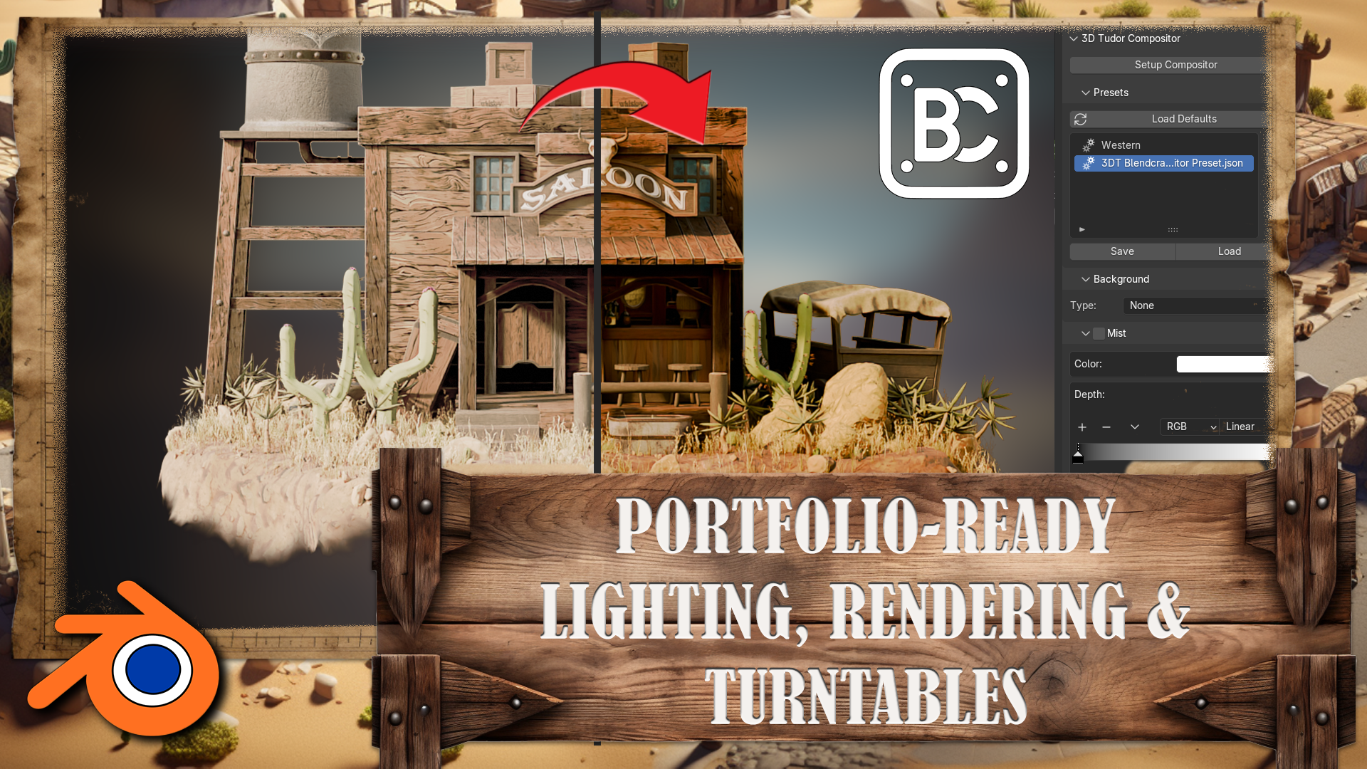
this for referencing. Speaking of compositor,
speaking of rendering, we also have a file. You're going to find a
Blend Craft compositor preset JSON file. So this is going to
be the preset file for an add on that's
going to be also included of a Blend
Craft compositor. We're going to go over the
setup within the lessons, and you're going to be
able to just if you want to skip a part that well, showcases the compositor
setup, you may do so. You may just apply this, and it's just going
to set your scene up with that exact same
lighting and setup. And we also have a
Western background, so this can be used for the background that's going to be used with the compositor, and you may use your own
custom image if you'd like. But again, this is just going to give you
the scene over like this with a nice
Western type of a look. Now then, within the resource
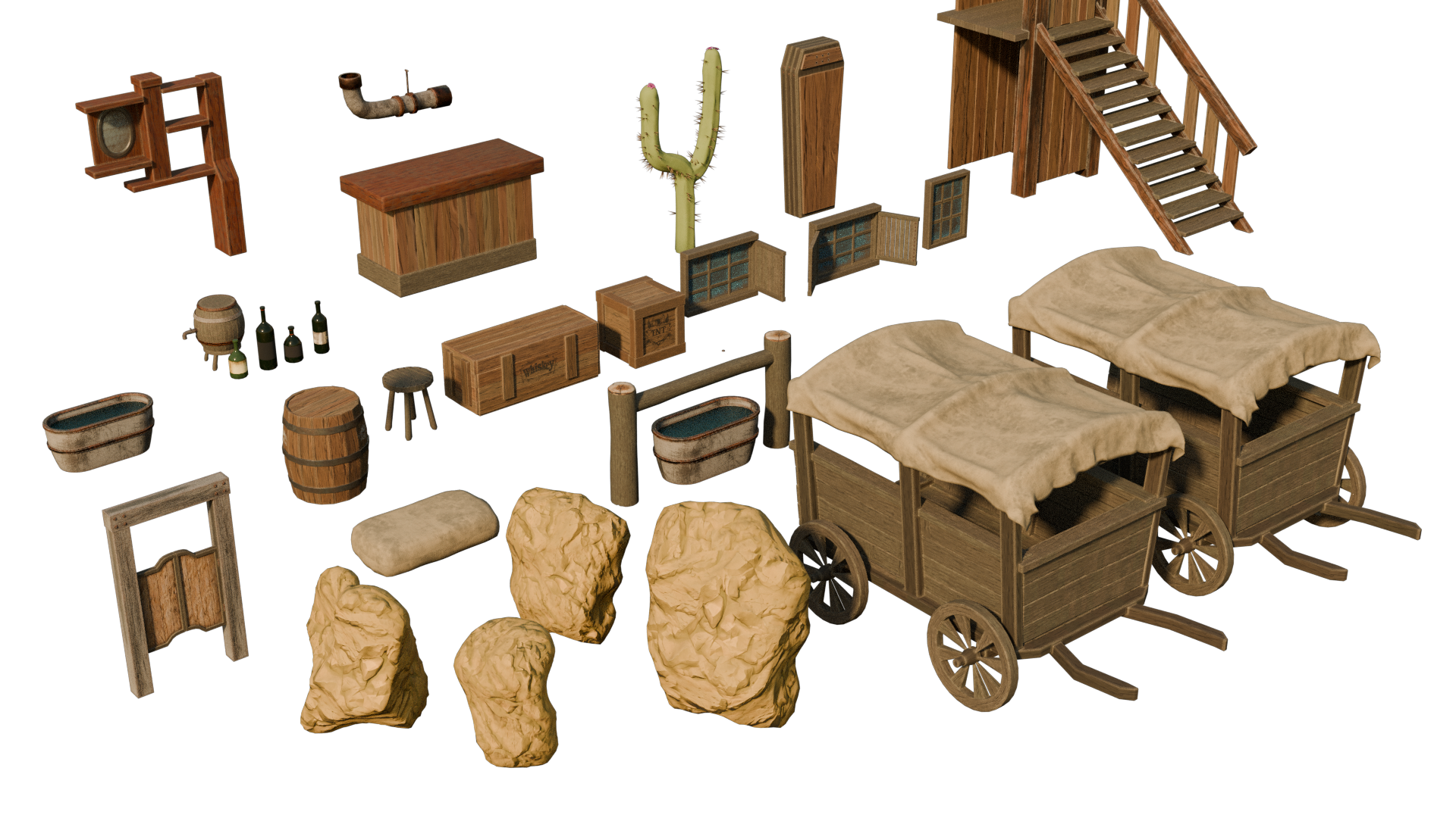
pack blender items file, we're going to find
all of these textures, materials, decals, as well
as the geometry nodes. So let's go over
them real quick. All of these are going to
be used within the scene for the materials over here at the bottom. Then we have labels. So these labels are going
to be for the bottles, and we have a human
reference which we're going to make use out of
within our grey box, making sure that the scaling of items is proper for
the freed environment. Then we have Alpha. Alphas are going to be used
within, well, sins, within barrels,
crates, and whatnot, as well as the sign
for, well, the saloon. Finally, we have
the geometry notes. These geometry notes
will help us to speed up our workflow by
helping us generate certain three D
detail, essentially. So this is for chain. This is for planks, which we're going to be using
a lot throughout the scene for walls and
other pieces as well. And finally, to help us populate
our terrain to make sure that saloon doesn't look
basic and too plain, we're going to make use
out of this to generate a bunch of detail
for Western scene, such as, you know, cactuses, rocks, plants, and whatnot. All of these you're able to make use out of within your
personal projects, although you're not going to
have a commercial license, so you cannot use them
to reselect and whatnot. But for a course for
educational purposes, it's a really good pack, which, again, we're going
to make use out of. So yeah, that pretty much
covers the resource pack. In the next lesson,
we're going to start off with a brand new project file, and we're going to go over
the basics of blender itself. Which will help you
out with, well, starting off with the
movement and whatnot, navigation of blender software. So you don't have to
worry about anything. We're going to go through
every single step to make sure that no
matter your skill level, you're still going to be able to pick this up quite easily. That's going to be it for me. Thank you so much for watching, and I will be seeing
you in a bit.
4. Blender Navigation Basics: Okay. Hello and welcome
back everyone to Master Blender free D with
Wild West Environment. In the last lesson, we went
over the resource pack. Now we're going
to start off with a brand new project file. Notice that I am using
a version 4.3 0.0. If you're not seeing
this, you can go on to edit preferences. And within the interface, you're going to be able to go onto Status Bar within here. I do recommend you enabling
every single one of them. It will give you all of this information on the
bottom right hand corner, one of which is going
to be the version. So at the very bottom
right hand corner, you see 4.3 0.0. That's the version we are
using for the Blender file. Again, this also allows us to see the amount of objects
within the scene, as well as the current memory
usage for the program. All of which is a really
good information to have. Now, once we have the
blender file opened up, we're going to be introduced
with the basics camera, cube, and the lighting source. We're going to go over the basics of viewport
navigation first, and then we're going to start
working within the scene. So that's going to be it for me. Thank you so much for
watching next lesson, we're going to start
working with the gray box. Welcome, everyone to the
basics of blender navigation. Now before we begin, it's
important to understand how the axises work within blender. So we can see at the
moment, we've got a green line going this way and a red line
going this way. This is called the Y axis, and this one is
called the X axis. We also have one
that is the Z axis, which we can't see right now. It doesn't actually come in with blender viewport as default. But if you want to
actually set it on, you just come up to the
top right hand side, where these two interlocking
balls are and just click the Z axis, and
now we can actually see. So how do we actually move
around the blended viewport? There's a number of
ways of doing this. One of them is over on
the right hand side here. You can see if are over here, it's the zoom in and Zoom out. I can actually left
click and move these up and down then to
zoom in and Zoom out, or I can use the actual
mouse to actually zoom in and zoom out using
the actual scroll wheel. There's also another thing
you can do with Zoom, which is holding control shift and pressing the middle mouse, and you'll see you have
a lot more control over zooming in and zooming out. Now, the next thing
we want to discuss is actually rotating
around an object. So how to do First of all, we'll bring in a
cube with Shift A, bring in a cube. Now, if I press the
middle mouse button and move my mouse left or right, you can see we can
actually rotate around. Unfortunately, though, we're not actually rotating
around this cube. So to actually fix that, we need to center our view
onto the actual cube. We basically want to focus our view onto this actual cube. So to do that, we're
just going to press the little dot button on
the actual number pad, and then you'll see that we
actually zoom in to the cube. If I scroll my mouse wheel out, you will see now if I hold the middle mouse button
and turn left and right, we're actually rotating
then around the cube. And this is important because if I actually bring
in another cube, so if I duplicate this
cube with Shift D, move it over, so bring
in my move Gizmo. And now you'll see if I
rotate around this cube, I'm not rotating
around this one. So to fix that, press
the dog butt again, Zoom out, and now I can actually rotate around this
cube, as well. Now let's look at
something called panning, which means that we're actually going to move left and right. And we do this by holding the shift button, holding
the middle mouse, and then we can actually
scroll left and right around our
actual viewport. So now we've actually
discovered how to zoom in and the
different ways we can actually do how to rotate around an object and
how to actually pan. We can also come up to
the top right hand side here and use these buttons here. So again, remember we're
looking at the Y axis, the X axis, and the Z axis. If we come to our Y
axis and click that on, you will see now that you've got a front view of the Y axis. If you click the X axis, then we can change it
to that red X axis, and finally, the
Z axis, as well. Now, there are
other ways as well that we can actually look
around the view port, and these involve using
the actual number. So if I press one
on the number pad, it's going to te me into that
white axis or front view. If I press two, it's going to actually rotate
that slightly. And if I press two
again, it's going to rotate it slightly more. Now, if I press
the eight, it will rotate it the other
way, as well. Now, to go into the side
view or the X axis, we can also press three
on the number pad, and that will give
us that effect. We can also press seven to
go over the top, as well. Now, what about if we actually want to go
to the opposite? So instead of going from
the bird's eye view, we want to come to the
underside of our model. Well, that's actually
quite easy, as well. All you need to do is
press Control seven, and that then will take you to the bottom view of
our actual model. We can also do the
same inside view and on the x axis and YXs. So, for instance,
if I press one, I'm going to be
going into Yaxis. If I press Control one, I'm going to be going into the opposite side on
the actual Y axis. Can also find these
options just in case you forget the top left hand
side here under view. So if I go down to view and
go across the viewport, you can see here that this actually tells me exactly what I need to press to
get the viewpoint that I've just
actually explained. Now, we also have the button on the number pad, which
is number five, a number five button
in blender toggles between perspective and
orthographic views. Perspective view offers a more natural realistic
viewpoint with objects appearing
smaller as they get further away, mimicking
human vision. Orthographic view removes
perspective distortion, making all objects appear
at their true size, regardless of distance, useful for precision
modeling and technical work. The other thing that number
five does, for instance, if I come to my cube, at the moment, I am able to
actually zoom into the cube. However, if I press number five, I will not be able to
actually zoom into this cube no matter
how far I zoom in. I'll still be able
to move around it by pressing the little
dot button, like so. But if I actually
want to actually work on the inside of an object, I can quickly press number five, and then I can
actually go in and work around the inside as well. Now, if you're working on a
laptop or something like that or a tablet and it doesn't
actually have a number pad, you can also use,
if I press five, the actual squiggle key, which is under the escape board on the left hand side
of your keyboard, and that then will
give you pretty much the same options
as we had before. So we can click the right view, we can actually click the back and we can
click the left view, for instance, the opposite
to what we had before. So instead of pressing
one and three, we just press the
little squiggle line, and then we can actually view
whichever side we need to. Now, we're nearly at the end
of this short introduction, there are a couple more things
that you can actually do. If you come over to
the right hand side and you see here where we've actually got the name of the actual parts
within our scene, we can also grab them from here and then press the
little dot B to zoom in. So I can grab this one,
press the little dot B, and that then will zoom us in. The other great thing about
this is we can also come in, shift select them press
a little dot button, and then we're able to actually rotate around both
of these cubes. Alright, everyone. So
I hope you enjoyed the short introduction to the
navigation within Blender, and I hope from now on, it won't be a struggle
navigating around the viewport. Thanks, o, everyone. Cheers.
5. Greybox: Hello and welcome everyone to Master Blender Free D with
Wild West Environment. And we're going to go
ahead and start right off by getting ourselves
a human reference. So we could start
with the gray boxing. Let's go ahead and go on to the resource back of
the blender file. On the upper left hand side, we're going to see a
human reference like so. We can go ahead and select
it and we can click a dot on our numpad to
focus on it if we want to. But all we have to do is
basically we can select it, click Control C to copy it, and then within the new
project that we created, we're going to go
ahead and click Control B and paste
the reference in. And within the project, we should have it
up on the side. Going to keep the
same location as it did for the reference as
it had for the reference, so we might want to move it
back to the centerpiece. So we can click GY and GX to move it up to
the front leg zone. All right, so now
we have ourselves a nice little reference
to work with. I might as well just move it a little bit downwards as well. If we click one, we can see the reference
of a human scale in comparison to the in
comparison to the cube. And what you'll notice with the human reference is that it's almost two large squares
in regards to the grid. This is an average human scale. So an average human
is 1.8 meters and square of this is going
to be one unit or 1 meter. So it's almost 2
meters basically. And that's going to help us out. If we grab ourselves the pure reference for
sin scale reference, we can see all of our
human reference over here. We can see the front,
the back, side, and the top in regards to how this
environment looks like. And we can see
that, for example, this entire building is
going to be a free humans stall or 6 meters in comparison. So we're going to start
off with the gray boxing. And if you want,
you can compare it to the gray box
blender file as well. I do recommend you
working using the images. The reason being is it
helps with developing how basically to get from two D on the free D space
type of a mindset. All right, so we're
going to start off by getting the
entire building set up. We're going to
have a larger part in the back and a smaller
piece at the front. And with the gray boxing, the way it works, essentially need to be as
simple as possible. And my personal rule for working with it is
going to be just mainly to use primitive shapes with
a couple of exceptions, which I'm going to
cover in a bit. And let's go ahead and start
off by deleting the cube. We're going to hit Shift and A and grab ourselves a new cube. There is a reason for that, though, in this particular case, if we go to add cube
section over here, we can move this Z value by one, and that's going to move
it at the very top. Then afterwards, with the free cursor
being in the center, if you have the default project, it should still be there. If not, we can click
Shift and S and select cursor to world origin. This will make the cursor
to the bottom of the cube, basically, this
outliner at the bottom. We can then right
click and set origin. Two free cursor. This will make it
so the origin of this object is going
to be at the bottom. The reason we're doing this is basically now when
we're scaling it, for example, I click S, Z, it's going to be scaling
it from the bottom. And that just makes some work some workflow a little
bit easier for us. It's not going to be scaling
from the centerpiece, it's going to be scaling
from that exact bottom part. Going back to the reference, the front piece is going to be, as I said, 6 meters. So let's go ahead and scale up the the cube over
here to 6 meters. You can do so by just going to clicking one to
the front view, clicking a Z, and scaling
it up to run that amount. So in regards to the web length, if you go to the top down view, we're going to see that this is the type of a section
that we're going to have. It's going to be, I'd say, 3 meters around if
you compare it to the grid over on the
side around 3 meters. Let's go ahead and fix that up. So right now it's 2 meters
and I can scale and Y axis, it doesn't have to be perfect, but we can just do it
something like that, and we can see that
it's now 3 meters. And in regards to the
scale for this, let's see. So I'm just checking the
upper grid over here. So one, two, three,
four, five, six. It's going to be in 6 meters
length. That's fair enough. Let's go ahead and fix that up. So we also know that this
is going to be 2 meters, so we can upscale this
Y in free amount. Oh, sorry, S X, free. So that's going to be
three times the amount, which because it was two, it's going to give
us exactly 6 meters. So that's the base cube
that we're going to have, and we can compare
it to the human and the nice little start that we're going
to have like so. Alright, so the next piece is going to be part in the side. We example, the water tower. We can go ahead and create
ourselves a new cube. In this particular case,
I don't really care about the origin point. I can click S Z and
just scale it down. The reason being is that it's going to be a small platform. So I'm not really concerned
about this setup too much. In regards to the position
of this, let's have a look. It's going to be just slightly lower than the main structure. So let's go ahead and
just have it like so, and I want to know almost going to be the same
size but not quite. I'm going to go ahead and
upscale it around this amount, maybe reposition it
just a little bit. We don't need to worry
about the accuracy in these points. We just want to have a
blow with creativity. We want to make sure everything is nicely fitting in
regards to composition, and we can always tweak it
and adjust it afterwards. That's why working
with gray boxes is all about making sure that the
base shapes are in order. Something like that is
going to be quite well. Now in regards to the support, we can probably grab
this cube over here. I'm going to hit Shift D,
GX, move it off to the side. Then I'm going to click Alton S, which is going to
reset the scale. It's a real nice
tool to make use out of if you haven't applied the
scale for transformation. Can click and using Z, we could move it upwards. Or alternatively, we can lock the z values to kind of
shrink only X and Y axis. So using Shift Z by tapping it once we
are in a scale mode, we can just shrink it down like and get this
type of a setup. So basically, again,
when in scale mode, we're going to hit Shift Z, and that's going to Z axis only giving us the
scalability in Y and X. Real nice functionality
when we want to kind of shrink it
quickly, certain objects. And I'm going to go ahead and
just move this to the top, like so give it a certain width and whatnot
with in regards to the setup. I think that's quite right.
Something like that. Again, I'm not too worried about the overall
positioning too much. I'm just trying to get
the overall shape. So I think something like that is going to be quite right. The other thing that we need
to consider is going to be, if we look at it, the
angle of the water tower. This is not as important
in this particular case, but if we do want to do that, we could potentially rotate it, let's say, like this. Maybe that would be quite right. But again, I think
we can keep it for later setup and move on to the other parts
of the grey box. So in regards to, let's say, the part in the back, I really like to get this piece out of the way
first because it's a nice, small structure at the back. It's for a toilet, let's say, and you
can go up the stairs. There's a nice vertical type of structure over here,
which we're going to set up. So if you notice that
it doesn't reach the upper limit of the building, it just helps us to break
down the overall shape, so that's what we're going to
make use out of, basically. I'm going to duplicate
this object over here. Going to click Alton S,
move it off to the side, and I think I
actually moved it a little bit. Yeah, there you go. Just going to fix it. I
moved it up downwards. That is, I just fix
the verticality. Yeah, throughout
the entire setup, you'll see me going
through Numpad, just switching between the
view ports and whatnot. And this really helps to visualize how it looks
like from multiple angles. I recommend you
getting used to that. And going back to
this structure is a little bit, I think, too wide. I'm going to go into
scale mode, clicking S, Shift Z scaling this
downwards a little bit, and see how this looks like
once we put it closer. Is that going to
be the right size? I think at this point, we should grab ourselves to
human reference. So this with its hands
stretched seems to be I'd say a human length, a little bit wider than that. Let's see if it works out with our human
reference over here. So this is almost, this is a little
bit still too wide. I'm going to go back onto scale. So shift E to scale
it downwards. Just like that. All right. So I think yeah, this will work much better. Okay. Afterwards, because we have the origin at the bottom, we can click S Z and Whoa, I'm going to click
escape, going to change my position of a camera because I had it too close
to the origin point. I was going way too crazy. As you notice, whenever
we're scaling, the reference of the scaling
goes from the origin point. So whenever we're
getting closer, it's going to get
closer to zero. Whenever we're getting further, it's going to be scaling
it outwards, basically. And if we have the mouse too
close to that origin point, it's going to give
us an insane amount of sensitivity. We
don't want that. Make sure you have
the mouse a little bit further from
that origin point. So something like that,
we'll do the trick. I think that's quite
right. And yeah, let's continue on with
the blocking real quick. The reason being is that we
still have a long way to go, and we're going to continue on afterwards with the roofing. I'll explain you when
we start using a bit of an extra setup of a
then primitive shapes. But all of that is going to
be further down the lessons. So we are running out
of time with this one, so I'll be seeing
you in the next one.
6. Edit Mode: Hello and welcome
back, everyone to Master Blender Free D with
Wild West environment. In the last lesson, we
left ourselves off with a basic type of a
start for gray boxing. We got ourselves a human
reference over on the side, and we're going to
continue on just by simply looking at the
images, referencing it. Continue on with
the gray boxing. So we could get right nice
proportions out of the way. And let's go ahead and start off with this water
tower on the side. It's going to be super
simple, super easy. Let's go ahead and
click Shift and A, get ourselves a mesh that this time is going
to be a cylinder. Let's go ahead and do that.
And we're going to move it, where is it location
Z up by one. So it would be at the base
of the cursor over here, just like we did previously,
Origin to free the cursor, and this way, we can
just scale it up and down whenever we feel like it. Now, let's go ahead and
move this up onto the side, just like that. All right. I'm going to scale it up again in accordance to the
preference that we have. So this water tower is
going to be quite tall up. I would say it's 3 meters, almost actually 4 meters. We're now including
the top section. I'm going to show you how
to set that up in a bit. And yeah, let's go
with 3.5 meters wide. So I'm going to click
one on our blender file. This way is going to give us that same exact graph
and I'm going to get ourselves that lengthy type of a setup, something like that. I'm also going to click seven
to go to the top down view and position the
structure just like that. Alright, so I think this is looking quite nice
proportion wise. Of course, we don't have
the entire structure, so it's really
hard to measure up whether or not it's going to
look good composition wise. Especially when
creating a new piece, it's really hard, again, to get the overall feeling and aesthetic of the proportions when working with stylized especially with the
stylized pieces, that is. But once we start
working on them, we can come back
and just, you know, scale it up down however
we feel like it. Okay, so going back to the
setup, most of the time, 90% of the time when
working with gray boxes, you'll only want to
use primitive shaves. However, the 10% that we want is going to be with cases
where it's slanted sides. So, for example, over here on the water tower or on
this part of here, or even if you look at the front or
actually side view better, it's going to have a
front roof also slanted. We can't really get that with just basic primitive shapes
unless we example rotate it. But we don't really
want to do that. We want to make
sure it's actually properly slanted just to kind of give us a better preview
of the wall composition. I think that's the only
case where I would go and edit in the parts
for gray boxing. So in this particular
case, over here, what we can do is we can just duplicate this part, like so. Then we can scale this
down a little so, so for such slanted
roofs and whatnot, we will need to make use
out of the edit mode. To better understand what it is, we're going to go
over the basics, over the main controls of it, and then we'll be
able to navigate through this entire environment
a little bit easier. So I recommend you
take it in a pen of paper and take some notes down, and then afterwards, when
we come back to this piece, we'll be able to make use out
of the information and get ourselves some nice slanted
base roofs for the grey box. So, yeah, that's going
to be it for me. Thank you so much
for watching, and I will be seeing you in a bit. Welcome everyone to the basics
of modeling in blender. And this is a short
introduction just to get you started on a few of the
basics in modeling. So the first thing I want to
do is bring in a primitive. So the way that we're
going to bring into primitive is press Shift and A, and then what we're going
to do is open up a menu, and you can see that
we've got all of these things along this
actual primitives menu. But the one we want to focus
on is the actual mesh. And from here, you can
see we can bring in many, many things like cylinders, cubes, planes, and the
one we want to bring in just for now is
going to be our cube. That we brought our cube in
the next thing I want to discuss is object and edit mode. And you can see at the moment over than the left hand side, we're actually in something
called object mode, and this means basically we can manipulate this whole object. So if I press G, I can actually move it around
my viewport like so. If I press S to scale, I can actually scale the
whole of the object in. But the thing is, we
don't really want to work in object mode necessarily, and a lot of the
time, we're actually going to be working
in edit mode. So we can come up to
the top left hand side and put this in edit mode, or we can actually press the tab button and jump
into Edit mode that way. You will notice once we've
actually gone into Eddy mode, we have a lot more
options to use, and more importantly,
we have a lot of the topology now to
play around with. So the first thing you'll notice the difference being is that we have now these three options
up at the top and side. And if you have over them, it will say vertex,
edges, and faces. Now, vertex is going to be
these little points here. The edges is going to be these edges of my cubes
or any of the edges. And finally, we've
got the faces, which is actually the
whole polygon face. Now, you can also instead
of clicking on these, press one on the keyboard, and that then will jump
you into vertex select. If you press two, you
can go into edges, and three is going to
take you into faces. From here, we can actually
manipulate any of these parts. So you will notice
at the moment, I've got gizmo here. Now, if you don't have
the Gizmo available, coming over to the
left hand side, and you'll have this
little button here that says move or you can press Shift spacebar and bring
in your move tool like so. So now because I'm on faces, I can actually pull
out this face like so, if I go to edges, I can
actually grab one of the edges and pull
this out like so. And if we're on vertexes, I can grab this vertex or grab the second vertex with Shift Select and then
pull this out like so. Really, really easy to actually
manipulate things once you know how to select
each of these parts. Before we go too much
in the weeds with actually modeling in
this actual Edit mode, let's just jump back into
Object mode for now. What I want to show
you is how we can actually move this
actual cube around. So as well as moving it
with the actual gizmo here, we can also press G
and actually fremve this object around or we
can press G and Y, too. Let's put it along the Y axis, move it around or the X axis, for instance, and
move it this way, or even the z axis and
move it up and down. To drop it back
where we started, let's just right click like so. So that's actually
moving the location of it's not a cube anymore, but let's just say it's a cube. We can also scale this in
as well with the Sb so we can scale it in or
scale it out like so. Now we can also
press the S button, hold the shift button,
and then we have a lot more finesse
on actual scaling. We can also scale this up by, let's say, a factor of two. So S two, enter,
and there we go. And of course, we can scale
it down pretty small as well. Now the next thing I want
to discuss is rotating, because if we rotate it with
R and just rotate it around, we haven't got a lot of
control over how this rotates. So what I want to do instead is, I always want to press R, then attach it to an axis,
which might be the Y, so the green one, and then
rotate it either by free hand. Or by actually inputting the
value under our number pad. So if I want to rotate it, let's say, by 90 degrees, press the ends button, and I've rotated this round
by 90 degrees. Now, if I want to
rotate it back, I can press O Y, the little minus button
on the number pad, 90, and then we can
rotate it back. There is something else
that you need to know. We also want to reset
our transformations, and this is one of the most important things within Blender, because if you don't reset
your transformations, Blender still
considers this a cube, even though it's not
really a cube anymore. So what we want to do to reset our transformations
is press control. A, all transforms. Then you'll notice that
the orientation has moved over here because it will always move to the
center of the world. From there, then we
want to actually reset our orientation as well. So we want to right click, set origin to geometry, and then it's going to
put the origin right back in the center
of this object. Now, it's also important
to know resetting the transformations will also impact things like UV mapping,
things like modifiers. Basically, if you ever
have a problem in blender, always make sure that you
reset your transformations, and then most of those problems
will definitely go away. Alright, the next thing about resetting our
transformations, it makes it really
easy then to get something back to how
we had it before. In other words, if I press
S and scale this down, and then let's press R and Z and rotate it round this way, because before this, I
actually reset my rotations. What I can now do is press lns and put it back to
the scale that it was before I did anything and
then alternR and actually reset that
rotation as well. So really, really handy, once you've actually reset your transformations in
what you can actually. Moving on, we're
actually going to be looking now at duplication. So if I come round here, I'm able to actually
duplicate this. If I press Shift D and
then press the Enterborn, it's now a duplication, and I can move this over
to the right hand side. So now we have
actually two objects. Now, what if you want these two objects actually combined, and you didn't mean to actually duplicate it in object
mode, for instance? Well, that's easy.
We can just shift, select the other one
and press Control J, and now they're both actually join together,
as you can see. So if I press tab now, we're able to come in and actually work on them
both at the same time. What happens if we want to
actually split them up, so we don't want the objects
to actually be together. That's also easy. Just make sure that you select
one of them first, and then all you're
going to do is press L just to select everything. So all of these faces, then you're going to press P.
Come down to say selection, and now if I press tab, they're both actually split off. Now, of course, using
the same command, if I press tab, I can actually
come in, grab a face, for instance, press
Shift D. I can actually also duplicate things with
inside Edit mode as well. So we might want to duplicate
all three of these. Shift D. I can actually come in then and actually
duplicate them like. It also means, though,
is that these, when you duplicate them in edit mode will be part
of the same object, of course, because in edit mode, they're not actually
classed as an object, they're clustered as
the same actual part. Now, for the next
part, I'm going to bring in a brand new cube, and I'm just going
to show you some of the basic modeling
techniques within blender and go through
a few of the options. So here we have a
brand new cube, and the first one I'm
going to show you is, if we come into Edit mode, we'll always be working
in edit mode to show you these things, make
sure you're in edit mode. I'm going to grab the top face. And what I'm going
to do is press E, and that then is going
to extrude this out. Now, sometimes you will
need to extrude something out and it will need to be
along A axis, for instance. So all I'm going to do is go
to Edge ect, grab this edge, and then what I'm going
to do is press E, and you can see, because it's not
tied to an axis, it's floating around everywhere. However, if I press the Xpon, you can see now it extrudes out, following along
that actual axis, which then makes it
really, really easy to manipulate it where
I actually need it to. One we're going to look at is
something called beveling. And then all I need
to do is come in, and I'm going to grab my edge, so I'm going to press
two on the keyboard, grab an edge like so,
and then I'm just going to press
Control B like so. And you'll notice now it's actually bevelled off that side. You'll also notice down on
the left hand side here, we have something called
an operator panel. It will be closed. Just open it up, and from here then with the actual bevel, we're able then to
turn the bevels down, for instance, turn them
up, move how the shape of the actual bevel is going to be and all that
other good stuff. Pretty much anything you do in blender is going to give you
an operator panel like this. We're not going to go too much
into this, but basically, the moment that you press Tab button to come
out of Edit mode, this is going to disappear, and then you're locked in
with the actual shape that you've chosen or the
insert or the extrusion. So just bear that in mind. So the moment I press tab,
that actually disappears. Now, what about if we want to bevel vertices and not edges. So for instance, if I come to a vertice like this
and vertice like this, press Control B, you'll see
that it bevels off like this. But if I come to one that are the
opposites of each other, press Control B, you'll see
nothing actually happens. However, if I press
Control Shift and B, then we're actually
able to bevel off the actual verts like so. So that's another handy
tip for actually bevel. Now the next modeling
technique we want to discuss is actually edge loops. So how do we get more
geometry onto this? So, for instance, I want to
bring some edges on here. I can press Control, and that then will bring me
one edge in here. If I left click then, you can see that I can put this either this side or this side. But let's say I want it
right in the center. I'm just going to right
click on the mouse, and that then is going to
put it right in the center. Now, the other
thing I can do with the operator panel
again is then come in and turn all of these up to give me more
actual edge loops, and I can even move them
to the on the right. Now, I can also, if
I press Control ed, come in, press control law. I can actually scroll up on the mouse wheel to give me as many edge loops
as I actually want. Or if I want a little
bit more fins, I can actually type it out
on the actual number pad, so I can type out 120, for instance, and
have 120 edge loops. To cancel it at any time,
just press the escape board, and then that will
cancel it out. Now the next modeling
technique I want to show you requires two actual blocks
or two cubes like this. And all I'm going to do is I'm going to come in and I'm going to select opposing
faces like so. And then I want to actually join these together,
for instance. So all I'm going to do,
I've selected them both. I'm going to right
click and come down to it says bridge faces. And now you can see I can
actually join those together. Now, if I Press Control's dead
and just go back a minute, you can also do this
by coming in and let's say grabbing
this and this edge. And what I'm going
to do instead is, I'm going to press
the F bone like so, and come down to the
bottom, as well, and then grab both of these
and press the FBne like so. Sometimes bridge will
not work because bridge has to work with two edges
and nothing in between. In other words, nothing
selected there. If I come into this
one now and try right click and come
down to where it says, bridge edge loops, you will see select at least
two edge loops. So we can't actually
join up from there, and that is when
it's a good idea to use the FBne instead. Now the final modeling
technique that I actually want to show you is
something called insert. What I'm going to do is I'm
going to grab this face here. I'm going to press the
ebonne and then you can see you can actually
insert this as in, and from there, you can actually extrude it out if you want to. You can also then
press Control B and bevel it off if you want to. And you can see now
it's really easy to use all of those techniques
that I've actually showed. Now, lastly, the
last thing I want to show you is the insert again. But this time we're
going to grab this base and this base, and if I press I,
it's true you can actually insert them
both at the same time. Now, the best thing
though about insert is, if I press the I and
then press I again, we can actually insert them separately from
each other like so. Now, I see a lot of
renders on Facebook and other social media that kind of look really,
really blocky. For instance, if I press tab
now and go into object mode, you will see this actually
looks pretty blocky. But there's a real
easy fix for this, so it doesn't actually
have to look like that. All you need to do is once you've actually
finished, right click, come up and where it
says, shade auto smooth, and that then will shade it off based on the actual angle. So really, really easy
to either shade flat, shade completely smooth like so, or shade auto smooth like so. If you actually are struggling
and you actually want it to shady a little bit
smoother than what it is, you can come over to
the right hand side where this little triangle is, go down and open up the normal, and from there, you can
actually increase this and shade it even more smooth
based on a higher angle. The default is always set to 30, just make sure you set it to 30 in case you actually overdo. The last thing I
want to show you in this introduction is the actual cursor because
I think it's very, very important to
actually modeling. So what I'm going to
do at the mono is I'm going to make another
cube with Shift D, and then I want this cube on top of this
cube, for instance. Now, if I move my
cursor over here, so shift right click. And then what I can do is
I can press Shift Desk, and I'm going to go selection
to cursor, keep offset. And that then is going to move the exact center of this cube, all the orientation
to my actual cursor. Now, how would I get this
then on top of this cube? I would literally
grab this cube. I would, first of all, right
click and set the origin to geometry just to make sure that origin is right
in the center light. So I would then press Shift
Desk cursor to selected, and that then is going to put my cursor right in the center. And then I would grab this
cube, and from there, I'm able to go Shift Desk
selection cursor, keep offset. And now that cube is right
next to this actual cube here. From here then, I can
actually bring this up, and let's actually just have a quick play aound of
everything that we've learned. So you can see now if I pull this going to join them both together
then with Control J. And then the first thing
I'm going to do is come in, grab this face and this face, and we're going to
right click then, and we're going to come
down to bridge faces. And then I'm going to
bring in some edge loops. So let's bring in two
or three edge loops. Left click, right, click. And then what I'm going to
do is I'm going to press Alt Shift and click
just to select all of this edge going
around here and press the S but and pull
it out like so. From there, then, what
I'm going to do is I'm going to bevel off
both of these tops, so I'm going to grab this
top, shift select this top. I'm going to press Control B and actually bevel them off like so. From there, then I'm going
to bring in an insert, so I'm going to grab
the front off here. I'm going to insert this
with the eye button like so. And then from there, I'm
actually going to extrude out. So I'm going to extrude
this out like so. Now, let's say I
want a bigger piece on the next bit, I'm
going to press Shift D. Pull it out. So this is a
duplicate of this face. I'm going to press the S but to make it a little bit bigger, and then I'm going to press E and pull that out
along the axis. Finally, then what
I'm going to do is grab this one and this one and going to right click Ben
and bridge faces like so. And you can see just
how easy this really is now to actually start
building out some really, really complex models with everything that
you've just learned. Alright, everyone, so I
hope you enjoyed that, and I'll see on the
next one Cheers.
7. Backside Greyboxing: All we have to do is go on
to Edit mode by hitting Tab, then clicking two,
which is going to give us the selection
for edge selection mode. And then afterwards, we can
select this piece over here. Click G Z, move this downwards. And just like that,
we create ourselves a very basic type
of a slanted roof. And right away, you can see that it's a little bit too
slanted, for example. I'd say, yeah, too slanted. I'm going to go ahead
and just fix that up. Going to even go onto face
selection mode, clicking free, selecting the top GSD, and just making sure
that is not too wide. And afterwards, yeah, let's go ahead and
just scale this down. This is too high
up in comparison to the roof that
we have over here. So let's go ahead and just
nicely scale this down. So I think this is going
to be much, much better. And at this point, we can start working with a little
bit of better shapes. And to see those shapes, we're going to go
ahead and go onto this upper right hand
section onto the arrow. We're going to enable
ourselves the cavity. Cavity will highlight any
of the edges like that, and it will give us a
better understanding of those shapes that we're combining and just kind of highlight the overall setup. Because when we're texturing, we're going to add
edgeware and whatnot. So we're going to highlight
any of the pieces, and essentially
having this cavity on will help us to give us a nice preview of the
overall composition. And yeah, let's go ahead
and move on with the setup. If we look at the
staircase over here, we can set it up with a
nice basic type of a setup. And I would say that's exactly
what we're going to do. Just do not stress
ourselves over it too much. I'm going to check how
many stairs there is. So let's say 12 stairs, it's going to be a good number. Let's go ahead and
sort that out. And if we look at it
over here as well, even though this section
over here is in a way, you can see that
the staircase ends around let's say
closer, where is it? There we go. Closer to the entrance basically
of this section. So we can go ahead and
just sort that out. Let's go ahead and
grab ourselves, in this case, we're
just going to grab ourselves a simple cube. Origin point doesn't really
matter for us because we're just going to work
with a fin panel. So sometimes I prefer
to duplicate it from already existing one just to get that origin
point nicely set up. But in this case, it
really doesn't matter. So for this particular case, might consider how to set ourselves up with, for
example, modifiers, a Ramesh would be really
good for giving us that nice type of
a setup over here. But I would say that it doesn't really matter for
this particular case. The reason being is that
we really want to just get ourselves keeping ourselves as simple as possible with
the gray boxing and just keeping the overall
workflow nice and creative. So I'm going to click Control
O to go to the back view. Just the opposite
off the front view. And then afterwards,
I'm going to go ahead and just click Shift D, move this upwards, shift
D, move the upwards. And I think something like
that will be pretty good. I'm going to go
ahead and check real quick if the gaps are okay. So for example, maybe
they're not okay. I'm going to go ahead
and just offset them out a little bit. Something like this. We just need essentially
just four steps. After which we can make
a duplicate out of that. So now we have eight, and if we duplicate it again, we'll have 12 steps,
just like that. Now we can go ahead
and just reposition our camera to make a nice
box selection like so. If you're not able to make a box selection just like that, just make sure you are
in box mode over here, and then afterwards, you can
click G to move it around. If you want to get
the Gizmo back, you can just click on
the move tool over here, and that's going to
give us this setup. Over here, I'm just going to
move it to this point like so and I think this
is not good enough. The reason being is that this
is going to be higher up. And another thing I
made a mistake is, if we click Control one, is this is too close to the base. I'm going to move this upwards a little bit. It's
still not enough. I'm going to click, as I said, I'm not too worried about
the thickness or anything at this point, just
overall pattern. So something like
this, I'm happy about. We can go ahead and keep this as is and in regards to the
structure over here, this is something for a bit of an extra just to
make sure kind of flows nicely overall
in the building. But I would say,
again, we can just use primitive shapes,
going clicking cube. Actually, sorry, I'm going to delete that going to duplicate this piece just to get
myself a nice origin point. Like, so I'm going
to click seven, going to click scale down
actually, like this. And what is it that
we'd like to do? Well, we'd like to make
sure this is not too fix, so let's go ahead and click SY, this, as I said, this, something like this type of piece is going to
be quite right. Again, I'm not too
worried about the overall pattern too much. Just interested in this nice
type of structure of a stu. And here is going
to be also a beam, a support beam on the side. I'm going to make
sure we have that. I'm actually just going to reuse this piece over here as Y, make it thicker, R Y, and just scale it. And in regards to
scaling, we need to, we need to scale it
in, I think, Z axis, but not in the global Z axis. By default, by default, the way the scaling
works is going to be in regards to the
world positioning. So if I click S Z is going
to scale it upwards, even if this is diagonal, so that's not going to
give us the right option. We need to go and change
this from global to local. You'll notice that the move,
if we have this enabled, that the move has been changed. Now it's pointing towards
the same part as an object. And we can click S Z and
see that it's now even scaling it outwards to the
same rotation of an object. So that's pretty neat
way of just kind of quickly dealing with
this issue over here. I'm not too worried about
the overall setup too much. All I'm really looking
for is going to be just an overall
thickness, let's say. So I think this is I think it needs to be
a little bit thicker. So as Y, just picking
it up a little bit. So as I said, touching
the other section. Maybe something like this. Or maybe I'm just going to
lower it down a little bit. I'm just looking at mainly
the positioning and rotation. So yeah, I was worried
a little bit that this part of the back was a little bit too high up.
That's why I moved it. That's the main reason for it. And I think that's going
to be good enough. We can just duplicate
this, actually. I'm going to go ahead and go back to global transformation. Click Shift D, GS move
this upwards just to get a nice piece of railing and I am going to go back to local in this particular case
because I want to click S X and just squish it down a little bit as to why
maybe bringing this outwards. Maybe something like this. No,
I'm going to keep it right above this upper piece and just move this to
the side just like that. Again, not worried about anything other than
just overall structure, which I think in
this particular case is going to be quite right. I'm worried about worried
about a pattern overall. Maybe this is not enough. But again, keeping it simple, keeping it fast
pace and whatnot in regards to gray
boxing is key here. And yeah, again, don't
worry about it too much. In regards to the setup.
All we need to do is just consider how the
overall structure looks like. I'm going to now work
on this piece over here at the back if we have
a look at the back over. When we look at the back, it's not really easy to see. Maybe it's a little bit
better from the side. We do have a structure above it. So this above
structure is going to be this part over here. And if I were to highlight it, so this part over here is mainly there to help us
break out this empty wall. Otherwise, this entire area
would have been too empty. At the base, we
would have, like, some small props, you
know, barrels, et cetera. At the upper section, we need to help us break
up this flat wall. So that's exactly what
we're going to do with this type of an extension. We're going to go ahead and get a cell set up a cube, sorry. I'm going to
duplicate this piece. To click GY, just to
move it up to the side, Alton S to bring back a nice little cube and move it up to the
side just like that. Now, let's look about how
it's being supported. I'm not sure it's visible
over here too much, but it does have these large
beams going downwards. The reason being is that
extension by itself would be a little bit too much
for the weight supported. We would even need
to get ourselves this kind of structure support to make sure
it's supported. Or because we, in this case, want to have a sign over here, we're going to get the beam
going downwards all the way. The sign could have
been, for example, in front of that beam like this, you know, and the beam
would have been behind it. But all in all, I think it's a
little bit better, especially considering
that there is a long structure
right next to it. So it's just easier to
consider this kind of support, I would say, when we
have it going downwards. Also, another thing is going to be that we are going to have a real nice type of support
for the staircase, as well. So that's going to
help us break down this nice linear
type of a staircase. I'm going to grab the
supports from the back, I'm going to click Shift D GX, move it up to the
side, just like. GY. Just like that as said
and something like this. I'm also going to make it quite a bit smaller actually,
in this particular case. Or actually, I want to know
if this is not too much. So this is too much of a cube. I'm going to go ahead
and, for example, check the upper section. It's more of a rectangular
shape just to keep up with the overall appearance
of, well, rectangular pieces. We got to make sure it's
being kept the same. And in regards to just overall
pattern of this piece, I'm going to click S and Y, just kind of squish
it down, I think. Like, so the question is, if this is going to be now
enough, or the support. So I want ideally the support to be starting over here and then ending it maybe somewhere around here,
bigness quite enough. So we want to reposition
this a little bit. And actually, this entire
support can I think, yeah, they can actually
be quite a bit smaller. So in this particular case, we can select both
of them like so, and there is a nice
little function to help us scale it down. So if we click on
Transform pubodPoint, we can change it to be
individual origins. This will mean that
whenever we're scaling, we're going to scale it based on each individual points of an object because we're scaling, we want to scale
two pieces at once. It's going to be quite helpful. We can click S and then shift Z and then kind of make
it a little bit thinner, but not too thin,
something like this, maybe just a little bit bigger. Just like so. That's better. I'm going to go back
onto median point. This is the default I prefer
and actually going to go back to transform orientations
Global because otherwise, we might forget and that might
mess us up in the future. And for this piece, I'm going
to bring it up like this, maybe scale this down
just a little bit. Something like this. I don't
like scaling it down at wrap or just move this a
little bit more to the side. Something like this, that's
going to be perfect. Like, so this piece at the top needs to
be a slanted roof. Let's go ahead and
do that real quick. I'm going to scale this
down just to this point, make a duplicate
out of the piece, and I am going to scale it
down again, go to edit mode, and put it, so I've pink this
is a little bit too much. Going to bring it upwards, select the piece at the top, and something like
that. Let's see. Yeah, it's nicely. I was actually touching the
upper section over here, and it's going to have a frame, so we need to not
forget to set that up. I think that's going
to be quite alright, we do have a nice support
part on the side. Like here. So we're going
to be working on that, and it's actually, yeah, this should be closer to
the top, I would say. Or actually, you know what we're going to continue on with this in the next lesson. We can tweak small parts, reposition a little bit, change up, you know, the overall scales of
individual pieces. But all in all, I think it's shaping up to be pretty nice. So that's going to be it for me. Thank you so much for watching, and I will be seeing you in a bit. I never heard of.
8. Working With Greybox Slopes And Wate: Hello and welcome back,
everyone to Master blend the PD with Wild
West Environment. And last lesson, we got
ourselves slanted roofs, and now we're going to continue on moving with the gray box, making sure it's nicely set up, and we get ourselves an overall nice feel for the backside. One of the backside areas,
even though it's the front, but the backside will
also be visible with it is going to be this
part at the top over here. Look at it, we're going
to have a roof over here. So even though this
is only a gray box, it is good to have
those slanted surfaces just like with the
roofs we had here. And it's actually
quite simple to do. All we got to do is
just make sure we duplicate this, like so. Then, well, let's scale it down first to a reasonable amount. Let's say this seems
to be quite right. Afterwards, we can
go into Edit mode, select the top, just
scale it down, like so. And that's all we need to do and scale it up a little bit
just so we could have a bit of an angle coming
out from the side. And actually, let me just go
ahead and check real quick. I think I made it
too big for this. So this was 3.5, and we had an extra almost
an entire meter for the top. So closer to a half, actually. So yeah, let's go
ahead and see that. So yeah, 3.5. Just like that and
almost a meter. So this one will be
something closer to this. We can even compare
it, actually. If we put it one
next to each other, just like that, we can
totally just compare it. And that seems to be
alright. Okay, we don't need to touch it
anymore other than that. For now, it is. The next
thing that I like to talk about is in regards what
slanting other than roofs, like these ones over here. We're also going
to have support. So if we have a look at
the support over here, it's not exactly straight. It is going in an angle. So let's go ahead
and work with that. And actually, if you'll
notice this part over here is quite an interesting one because I'm not sure
if it's visible. It's basically going to have only one side of
support to the side. Let me just explain to
you what I mean by that. If we want to go ahead and make all of these go outwards,
we can totally do so. We can go ahead and just
select all of them at once. And then with all
of them selected, we can go onto Edit
mode by hitting Tab. Then let's go ahead
and click free to make sure we are within
the face election. And we're going to go ahead
and actually double click A, which will unselect everything. So clicking A once we
select everything, double tapping it will
deselect everything. And I'm just going to
go ahead and select all of these pieces at the
bottom, just like that. Now, when we click S, we should be scaling
it outwards. So this is a good
base for a gray box. I think that's a
good foundation. And as you can see, the outwards parts are
looking pretty good. These supports over here on the side are not looking so good. So what
is happening with? Well, if I was to
click Control Z, the reason being is that
because they're going outwards, and if we want to
keep the same style, we got to consider how
they're going to be looking when it's
connected to the building. So what I'd like to do instead of just scaling it upwards, so I'm going to make a quick
duplicate out of this. So GY, just put it
off to the side. The reason I'm doing
this is because we can select these
like we did previously, scale them outwards just to
get them angle properly. Because we're using
median point and we have all four
of them selected, it's going to be scaling outwards from the
center piece and giving us that nice angle
going outwards like that. Afterwards, we can go ahead and select these two,
just delete it. And the reason we
had the duplicate over here is because we have now nice perfect type of a setup for going
upwards, just like that. We might even make this
quite a bit bulkier as well. Let's go ahead and click S, then Shift Z, just make it a
little bit bulkier, like so. And just like that, we're going to get ourselves
a nice setup. Afterwards, we're going
to try to connect this to extra
supports and whatnot, which we can work
our way down line. Uh, but for now,
though, let's go ahead and consider this
overall structure. So I think it can be, going a little bit inwards. Like, so it doesn't
need to go outwards too much. That's going
to be quite alright. And I'm going to duplicate
this to the outside as well, just like that. To make sure we are
consistent with the setup. I think
that's quite okay. And at this point, we can start thinking about the upper section of the roof. We do want to have this, let me hold on a second. This part of the top. So the
frame that goes around it, if we look at it
from the side view, it helps us cover this section from the side
of the frame that is. So I think that's going
to help us out just break up the overall squarish
shape that we have so far. What is the easiest
way to do that? The easiest way and I think the least time consuming
way at the moment, photo gray box would be to
just simply duplicate this, bring this outwards,
click R Y, oh, sorry, R Y, which will allow
us to rotate it in Y axis. And then instead of
rotating it with my mouse, I'm going to type in 990, like so, and that's going
to give me the nice setup. And in this particular case, I'm just going to go ahead
and just tweak this setup, maybe make this a little
bit larger as well. I'll probably do that.
So I'm going to click. In this case, X is
going to be the axis. By the way, I'm looking at the top right hand corner,
so this one's over here. So I can see that it's going to the left
side is the X axis, which we don't want to
scale up or in this case, we do want to scale
it up a little bit, but we don't want to scale
it up in regards to it. Inflating the object.
Basically, we want to make sure it's scaled up
to make it thicker. We're going to click Shift X, and just do what we did with the Z value with the z axis,
upscale it a little bit. So I think that's quite
right. Maybe a Z a little bit as well to make sure
we get nice type of A. Support. I think that's
looking qua right, actually. I'm going to go ahead and just duplicate it to the upside, so keeping it simple,
keeping it basic. All in all, I think
it's going to be quarter just like that. I'm going to go ahead and
just click Shift D Z 90. That's going to just rotate
it completely to that angle, going to click S Y and
scale it downwards, like so, and then
just reposition them each individually,
just like that. Alright, so we're
getting somewhere. I'm going to maybe
just lower them just a little bit so we can have a
separation between those two, between the vertical and horizontal logs
going on the top. And yeah, that's looking
pretty good so far. Okay, so in regards
to the supports, we talked a little
bit in regards to these supports because we want to make sure we support
the tower over here. It's going to help us support the overall water
tank at the top. But we can also use
this as a framework for the house for
the tavern that is. So we can just I'm just going to make this go inwards
just a little bit. Like, so make sure we don't
have the sticking out. We're going to
basically get these out onto the other side as well. Let's go
ahead and do that. I'm just going to duplicate
it, move the outwards, like so, and I think that's going to look
quite nice overall. Bring them inwards,
if more, there we go. So that's looking pretty good. I think I'll just make sure that this sticks out a
little bit more. Like, so Alright, all
in all, nice stuff. We got some overall
nice structure coming up for the upper section. So that is looking pretty good. I do want to set up now the quick supports for
this overall water tower. And the reason being
is that it just allows me to see how much of the visual way of breaking, let's say, what this overall
silhouette we can do. And what I mean by
that? Well, let's go ahead and just
do it right away. I'm going to duplicate
this corner over here just so we could
have a nice small plank. Going to click R Y 90, just to rotate it to the side. X and just get it downwards because we're
using global position, we're only looking
at the world X axis. Before we were using I
believe local, local, we were using local
for these parts, for example, over here
to scale them outwards. But because we're using
the world position, we can use the X in this case. All right. So what
I'm going to do here? I think the thickness, I'm
going to keep it the same. So it would look like it's
made out of the same log, for example, or
something of that sort. And now we can just
figure out what exactly we're going to
do with these parts. So I think we can just
go ahead and do that. That's already
looking pretty good. And I'm just going
to go ahead and click G move it
downwards a little bit, so this one maybe needs to
go a little bit inwards. But in this case,
you can see that this part over here
doesn't really want to go stick onto the wall because this is
diagonal type of a beam. We need to figure out
how we're going to be setting these up to be
supported by the wall. I'm going to go ahead and
delete this and figure out with the first one
and then move from. So for SAS, we
definitely want this to be sticking in the
centerpiece over here. For this part, however, we want to decide
if let's go ahead. I want to grab the
face on the back side. The easiest way to
do that is going to be by clicking
isolation mode. So isolation is going to be the question mark next to the right shift on the keyboard. If we were to click
that the diagonal dash, we're going to go into isolation mode based
on the selection. Allows us to just
go into edit mode, click on the face at the back, and now we can go out of the isolation mode
with that same button. And now we have the selection
and we can move it around. If we're not sure about that, we can also click Old Z, which gives us a what's
called ghost mode, I believe, it's actually
just enabling X ray. There we go. At the
top right handside, you can see that button. So this is what
we're enabling it, and we're just using
Shorca for that. So we can also do
selection with that, but I prefer to go with
the isolation mode. Y, let's go ahead and decide how we're
going to set this up. I think I'm just
going to move this to the right to the left. I'm going to get two
fds into the setup. I think that's
going to look quite nice with the overall beam. And now, if I duplicate it, move this downwards, think free beams is going to
be quite all right. Let me just have a look
previams is right. I do want them to be up higher, so they wouldn't get
in the way of if we add some bags and whatnot,
they wouldn't get in the way. Thepersection requires more
structural support anyways. Afterwards, we can go ahead and go into Edit mode with
all of them selected. And I will actually this
time just use the Xray mode, select each one of them
individually and just click GY, move them up a little bit
and see how they look like with that kind of setup. And think this looks quite nice. The beams, however, need
to be slightly adjusted. Sorry. I need to make sure they're somewhat
consistent with the setup. So there we go. I think
that's quite nice. The upper end also needs, of course, the
beams on this side. So the easiest way to
duplicate it without any modifiers or anything of the sort is if we
were to select it, click Shift D, GY,
move off to the side. We're going to duplicate it
in regards to its pattern. But as you can see, it's not going to work in
the same way because it's going this beam over here is going the upper
so to mirror that, I can click S Y, and we can scale it
basically in that direction. And if we were to type
minus one, so negative one, it's going to basically scale it in the opposite direction. So that's a pretty neat way of sorting that out in
regards to the angles. We might need to adjust them individual though a little bit. Don't want to spend
too much time again because we can always come back and adjust it afterwards when we're setting it
up in more detail. I'm going to just maybe move
them a little bit outwards. So again, not too worried
about it too much. The reason being it is because we're going
to come back to this. Now that we have this setup, I am a little bit concerned
about this upper piece. I don't want to have
too much support. If you look at a reference
point, for example, I think it's also
the case over here, although it's not quite as
visible from this perspective. In essence, we have free
beams over like so. But if we rotate this, it's only going to have one beam on the top section over here. As the support overall
is going to be supported from the up
side for the building. We just want to make
sure that it doesn't imagine if the wind is
pretty harsh and whatnot, the wind wouldn't let
it wobble this way. But in that way, the building is already going to have the
full support on its back. So we just want an
extra beam on its side. I'm going to make sure I
duplicate the beam, click RY 90. Oh, sorry, RY 90. Yep. And then R z 90 to
have a nice rotation, put it up to the
side, just like that. And finally, scale it
a little bit inwards, just like that. Like so. I think that's going to be
looking pretty good, actually. Maybe even lower down
so it wouldn't be on the same exact height
as these ones. Maybe this one needs to be
going a little bit inwards. All in all, that's looking
pretty good so far. Okay, so in the
next lesson, we're going to continue
on with the setup. Thanks so much for watching
and I will be seeing you in a bit. Okay
9. Greybox Preview Setup: Hello, and welcome
back, everyone to Master Blend Free D with
Wild West Environment. In the last lesson,
we got to sell some nice supports
for the water tower. We ended off on that, and we're going to continue
on with the setup. But before doing that, before getting any further, ideally, I'd like us to get
a nice preview of what the overall setup looks like outside of just
free D viewport. Of a modeling section. So I want to make
sure we get ourselves a nice just overall
preview of a render, how it's going to look like with the
lighting and whatnot. All right, so for us to do that, we're going to go on to shading
at the very top, like so. And once we click on it, we're going to see ourselves a bit of a different view in
regards to the viewpoard, how it's set up, we're going
to see a new window at the bottom called
well, shader graph. Right now for this, it's set
up by default as object. We're going to change
this to be set to world. This will allow us to change the shaded parameters
for the world itself. And once you have this set, you're going to be able to
see this type of setup. If you're not seeing it,
you should be able to click the little dot on
your numpad like so, and it will zoom onto it because by default,
it should be selected. Alright. So once we have this, we're going to go ahead and
change what this looks like. You can see we have
a different visuals in comparison to what we had before because we have a
preview studio lighting, but we want to make sure we have a custom setup for
the sky texture. And there is a very
nice note for that. We're going to hit
shift in A and search for sky. There we go. Sky texture to
actually search on it, make sure you have your mouse
hovered over the graph. Otherwise, if you were to press it on the viewport itself, you're going to have a
complete different menu. That's for the viewport
and not the graph. So just make sure to hit Shift
and A on the graph itself. And then search.
Automatically, you can type in search search for sky basically. Sky texture to get
this type of a node. This node can be right
away just connected to the surface of the world
output, just like that. And then afterwards, we're going to be able to see
a bit of a difference. In this default view, it's not going to be visible, but if we were to go on
to Viewboard shading, you will see quite a
bit of a difference, like so and right away. With the sky texture node, we can go ahead and rotate
the lighting source, for example, over here, like so. And we can also change
the sun intensity. So right now, it's a
little bit too bright. Let's go ahead and change
this to a value of 0.5, and that's going to lower
it down a little bit. And finally, the air is
going to allow us to give us that western type of a feel
towards the environment. If we were to increase
it, you can see it giving us that orange type of a gloom, we can change the
s value of 2.5, and it's going to give us
a nice bit of orange setup that's more closer to the
environment of a Western scene. So I think just by doing this, we're going to give ourselves
a nice type of lighting. And in regards to lighting, if we were to go and change it from within the render tab, there is a render engine we can change this from EV to cycles. And then right
away, I'm going to go ahead and change
the device to GPU to make sure it
goes runs faster. If you're not
seeing this option, make sure you go to
edit preferences, and within the system, there is going to be
cycles, random devices. Make sure instead of none, you have it set to
EVA one of these. I'm using KURA that seems
to work best for me. OptiX is pretty good as well. And yeah, once you're
done with that, you can change the mac samples for a preview, I'm
going to use 20, and for the noiser
I'm going to also take this on to make sure we're getting ourselves a
nicer type of a preview without that noisy look
that you'd get from cycles. Alright, so so far so good, right now, the overall material
is a little too white. We can go ahead and fix that because this material
doesn't have anything. It's just going to give us that plain look that we
have over here. So we're going to go ahead and get ourselves a new material, set ourselves up
with this gray box, and then it will give us a much nicer preview of
what we have so far. We're going to go and select Eva one of
the object pieces. We're going to click New and that's going to create
ourselves new material. We can now double click
on this material. We can call this gray box mat, so in order to edit
this material, we're going to make use out
of the Shader tab over here. Instead of the world, we're going to change
it to an object. By default, it is set
to complete white. We're going to lower this
down by a little bit. To a more reasonable amount, let's say something
like this will do. Since it is a gray box, we might as well get ourselves
more of a gray value. Afterwards, we also want to
have a bit of an extra setup, and that extra setup is going to be using
ambient occlusion. So for us to do that, we're
going to click Shift and A, search for ambient occlusion. Little node will allow us to get a more definition
between object pieces. It'll define how the form looks
like a little bit better. If I was to connect it right away, we can see what it does. And I'm not sure it's quite as visible,
but in corners over here, for example, we can see that it's giving us a
darker bit of edge. And also control it with
something called color ramp. So I'm going to click Shift
and A, search for Color Ramp. This one over here. Let's
go ahead and connect it. And now, if I was to drag
the dark piece over here, we can see that this
is getting darker up. And just like that, we're able to get ourselves a much nicer definition
on the form. It's only for this
piece for now, we're going to fix
that in a bit, but that's more than
enough for now. It is set to be white. We lost that control
for the base color. If I was to hold control, we can take it off. We
still have that gray. So what I'm going to do just
to make my life a little easier is I'm going to
select back onto this color, going to go ahead and where would it be in the
hex value over here, I can select it, can
just tap on this, click Control C to copy it, and then go ahead and
reuse that color. I'm going to go ahead
and click Shift and A, going to then search
for color mix. Sorry, mixed color. There we go. Mixed color will allow
us to combine colors. So the ambient
occlusion is going to be applied on top
of the color we want, so it's going to be set as B. We're also going to
change it from a mix. We're going to change
it to multiply. This will turn every
part that's darker than the original value of A
into an even darker value. But whenever it's a
lighter type of a result, it's not going to give
us any other change. And I'm going to go to
A and just paste in this value by clicking
Control B, just like that. That's pretty good. Let's
go ahead and connect it. And now we're seeing
that we have ourselves a nice bit for the side. To apply this for all of
the setup, we can do that. We can click A, select
all of the pieces. Then we can click Control
L and link materials. This should link all of the material that we set up with the rest of the
pieces, just like that. Maybe looking at it now,
it's a little bit too dark, I'm going to increase the value just by a little bit like so, and I'm going to slide the
whiteness a little bit. Closer to the dark, so it wouldn't be as
smooth of transition. We're arhing that up. Just like that, a thing
that's going to work out quite nicely for us. Alright, so we got
something going here. That is looking good so far. Now, let's go back
on to modeling mode and continue on with the setup. So now, whenever we want
to preview the setup, we can go on to the render mode. I'm going to double
check it's still on compute and 20 samples, and we're going to get
ourselves a real nice preview. As a bit of an extra,
I noticed that this piece over here
is not smooth shade. Smooth shade is basically allowing us to average
out to vert six. We'll talk a bit about
that later in the future, a little more in depth. All we need to know now
is that we can right click and we can click
on Shade Auto smooth. On the bottom left and corner, you'll see that the menu pops up with the angle by
default set as pretty. We're going to get
a smoother shading. So before you can see
each individual topology, but with this enabled, we can
just smooth everything out. And for now, that's more than enough of
what we need to know. All right, so that's going
to be it from this lesson. Thank you so much for watching, and we'll be seeing
you in a bit. Okay. Oh
10. Working On Back Attachment And Base: Hello and welcome
back, everyone to Master Blender Fred with
Wild West Environment. In the last lesson, we
left ourselves off with a nice render setup preview so we can actually visualize
what it looks like. One thing I did forget to
mention is if in shading, if you want to
increase darkness, you can do so through
the factor over here. So maybe just a little bit, we can go ahead and increase it. It's not going to
matter too much. I think just keeping it on light shade is more than
enough with the overall setup. Let's go back on
the modeling setup and start with thinking about the backside in regards to additional tiny
objects and items. So for example, this
part over here, we have a nice extension, a nice setup overall. I will extend this
roof, for example, just a little bit so it could
have a bit of an overhang. Tiny bit, so not too much. We're going to worry about
that later in the end. The ofring well,
let's go ahead and extend it just a little bit
more to the sides. Like so. Okay. The other thing that we
need to consider is, again, how this is going to be behaving in the environment.
What's the purpose of it? And, well, this is an extension. After all, we want to make sure we set it up as a nice piece. So what I mean by that is we
can add a window over here. That will make it seem a bit
more pleasant to the eye. I'll make it seem
like from the inside, you can just sit on this
overhang or whatnot and just enjoy a book
or something, you know? We can even compare it to the
human scale just in case, I'm going to click Control O, see how it looks like in
comparison to a human. So yeah, just sit on this ledge or something or
have some items over here. It's quite nice for
additional setup. I think that's quite right.
It's not a separate room, it's just a bit of an extension. And, for that reason, let's go ahead and add
a small window piece. I think I'm just going to make a duplicate out of this part over here and just move it off to the side, scale it downwards, scale it in regards to Y axis, get it closer, just
so we could see what is going to
happen over here. I think a window like that
is going to be quite right. Now we need to consider
the scale of the window, so maybe a little bit higher
up, something like that, right in the middle
in regards to left and right side
and a little bit higher up in compared
to the overall set. I think that's going
to be quite okay. I'm going to rotate
this human RZ 180 just to make sure it's facing us when we're
working with the backside. Okay, so yeah, we have ourselves
a nice setup over here. We're also going to
consider what's underneath because if we look
at the perspective, let's go ahead and find it real quick, this part over here. Are we going to want to
have something hanging, and this part's going
to be a sign indicating that this sign is indicating that the
toilet is over here, we're going to have
a nice moon shape. All of that is going to be
bought out in the future. But for now, we just
need to think on how we're breaking up
this overall shape. The alternative way for
this would have been maybe, again, supports
sideways like this. But because we already have
the supports going downwards, too much of it would have
been a little excessive. So just having this
sign over here helps us to break down this
overall square shape, otherwise, it would
have just been 90 degrees type of an
entrance, just like that. I would have been
quite rigid looking. Let's put it this
way. Go ahead and just add a quick sign. We can just duplicate this part. I'm going to go click seven,
move this to the front. Sorry, R Z 90 to make
sure it's rotated properly and just put it in
somewhat around this area. In regards to scale of a sign, this is such a small prop. We don't really need
to consider ourselves a part overall setup. All we need to
think about is just how low it's going to go
in regards to the style. I'm going to go
ahead and move this a little bit to the
front, so this way, we can click Control one to go to the
back of you and just see if a person going up here
is going to bang his head, maybe they need to lower
their heads a little bit. Maybe every once in a
while, a taller person would end up just smacking
their heads a little bit, but that's quite right. Going to go ahead and
select both of them. Control one and C. This
first stair is over here. And see how it looks like. Honestly, this height
is quite alright. I'm quite happy with this.
Let's go ahead and keep this as a template for
our future sign. And now let's go and start
thinking about this well, these parts over here they're going to be placed with smaller props and whatnot. I'm not too concerned
about that, but on the other hand,
I am concerned about the wagon on this end over here. So this wagon over here is
going to help us break down this overall scene
with the view. I think that's going
to look quite nice. We just need to consider
its size and space. Before doing that, though, I think it's time to finally get ourselves a nice
surface to work with. And what I mean by
that is right now, we're just working
on an empty void. The character is not able
to stand or anything. This house is just
floating in space. Let's go ahead and fix that.
We're going to go ahead and set ourselves up
with a nice base. I'm going to hit Shift D, get ourselves a plane, and then upscale it to
anything that I want. Well, not anything.
Let's go ahead and see the top perspective. It's going to be somewhat
of a square, but not quite. It's actually has a
bit of rounded edges. So for a gray box, we can just round off the edges, and I think it's
going to be more than enough for an overall setup. In regards to the wb, both sides seem to be having a little bit
of that extra space. From each larger asset. So we can leave that
out a little bit. The front space is kept a little bit empty for
an entrance, obviously, so we have to consider that, but the backside is also kept around the similar
distance and whatnot. So yeah, we can work on that. We can set ourselves up with. We don't have the front yet, but that's going to
be quite all right. Let's go ahead and
just figure out how it's going to look
like from the top u. So the top is going to be, let's say, around this amount. That seems to be
quite all right. Then a front is going to be
here and then extra space of an empty setup
over here with, of course, the nice
wagon on the side. So that's good. That's good. We have ourselves the base. I do want to round it off,
as I said previously, we can go onto Edit mode and
we can use beveling option. There are two bevel
options in Blender. Uh, if you click Control B, you're going to bevel of edges. Even if you are in
vertex selection, you are going to be
beveling of edges. But if you click
Control Shift and B, you're going to be
beveling of vertices. Once we click that with a
selection of all four vertices, we can move our mouse
and increase the edge, sorry, the vertex bevels. We can also use our mouse scrolling up or down to
increase the resolution. I'm going to add an extra bit of resolution like so to
get this type of shape. Once we're done with operation, we can use left mouse button to apply the transformation
or sern bebel. And then we're going
to get ourselves the extra menu on
the left hand side. So this is going to give us the additional tweak tweaking
that we can do using it, and we can see the
values that we're using. So all we need to know
is width and segment, and that's pretty much it. We don't need to overcomplicate ourselves for this
particular purpose, since we're just sorting
out the gray box, let's keep it simple. All right, so we got ourselves a nice piece with a back sort. Let's go ahead and
see how it looks like because we had the
amid occlusion, we're going to have the bottom piece added with the ambient. And I think because
we added this, I do want to go back real quick and adjust just a little bit. Back within the shading and just tweak it just
a little bit more. There we go. Something
like that reas this darkness. Much
better. All right. So the reason I'm
doing it is because the bottom piece was now
adding the extra shading, so I just want to make
sure I count for that. And honestly, this can also
use the same material. We can go into
material properties. We can add gray box material through the button over here, and that's just going to use
the same type of a material. Alright, so we are
sorted with the back, I reckon that's going
to be quite right. We have some small
props and whatnot, which you can think
about in the end. But overall scalability in
regards to the proportions of an asset is looking
pretty good so far. We now need to consider
the overall setup in regards to the front side. So let's go ahead and move on with that and
the next lesson. Thank you so much
for watching, and I will be seeing you in a bit.
11. Greyboxing Smaller Props To Break Up: Hello and welcome
back everyone to Master Blender Free D with
Wild West Environment. In the last lesson, we
left ourselves off by getting last back pieces, finalized a bit of
smaller items and whatnot for windows and the
sign placement. But now we're going
to continue on with setup of additional props. I do want to leave the front out a little bit for the end. So we're going to
continue on with some smaller props,
which, again, because this is a gray box, we're going to keep them down to more of a primitive shape. Let's go ahead and start
off with a cylinder. Like so going to click
G Z mode upwards. And just to make sure
it's the origin point, this orange dot is downwards so we can have
a nice scalability. I'm going to go ahead
and make my life easier by going on to Edit mode, going to click free,
select this bottom piece, then hit shift in S, and
then cursor to active. Now using this cursor, we can do the same setup as
origin to geometry. Sorry, Origin to free
the cursor. There we go. And we're going to get
ourselves the same result as we did previously
in the past by just moving the primitive upwards and then setting up the
origin point underneath. All right, so we're going to
think about the scalability for these crates and
whatnot, for the barrels. I'm going to move this
person off to the side. So turn this around even. At this point, it can
be facing forwards. And now we can click
one and see how it looks like in regards
to the person. So something like this, it's
going to be quite right. If we look at the
examples over here, best example would
be probably here, we can see that it's
getting to its hip section. So that's around the
area that we want to go in regards to this setup. Maybe we want to also
make them a little bit thicker so we know where
they're touching and whatnot. These barrels do
look quite thick. They are expanding and
whatnot in the middle, which we're going to be working, but it's best when working
with gray box to have a bit of a larger box instead
of a smaller otherwise, you'd be forced to shrink
them down, for example, so they wouldn't be touching and whatnot or colliding
with one another. So it's easier to, it's
easier to work with larger grey box items rather
than smaller and then, overcomplicating
yourself with things not fitting in that area. For that reason, I'm going
to hit scale, ship z, and just upscale it by A little bit too much.
Something like this. Perfect. All right,
so let's go ahead and think about how it's
going to fit in the backside. I'm going to go ahead
and just move it up. Move this over here, maybe. Yeah. So we're going to
fill these with barrels. So if we look at the reference, it has a couple extra barrels. It's more than okay to just
heave leave this is for now. And then because we're
going to be working with maybe smaller type of barrels
with smaller hit box, it's going to be easier to fit the additional barrel
in afterwards. Afterwards, let's go ahead and just add one more
barrel over here. That's going to be
a looking quarter. I'm going to select this and do real quick Shane
Otis move just so we wouldn't have those topology, ugly topology of the faces. And this is looking good so far. I don't think we need to add
anything extra for the side, Let's go ahead and check
the perspective real quick. Everywhere else it's
going to be crates. Yeah, that's going to
be it for the barrels. It's going to be
more than enough. For the section, we do have a small barrel over
here at the front, which we're going to
work on later down line. But for now, though,
let's think about what other props we're
going to be placing. In regards to props, we have a square type of crate. We have also elegated type of crate that has a longer length. And finally, we also have, if we look at which perspective would that
be this part over here. Underneath the water tower, we'd have these kind
of bags over here. So it would be ever
grain and whatnot. They're going to be
just additional items, small props for the scene. So all in all, we can
just place them around. I'm going to go ahead and
create ourselves a new cube, going to make a similar size around a similar size like this. It's going to be quite alright. Maybe maybe smaller even. Crates can be smaller
a little bit. Like so. Going to compare
it with the size. So, honestly, yeah, it's quite
small crate, that's right. And we're going to
just place them down. I'm going to make a
duplicate version of this, going to click SX,
make a larger version. These do seem too big. Going to shrink them down. Going to grab going to
grab the human reference, bring it closer to the top, so I would know what the hell
I'm doing with the scaling. I would make them too small. Like, so there we go. I think that's quite
right. Up to your knee, quite a nice type of crate. And with this, we can just grab ourselves
a nice placement. So notice how every single crate over here is slightly
at an angle, slightly scattered and whatnot. That's exactly what we want
with our own type of crates. We want them to be
just slightly tilted. This will give us a nice, more organic type of a look
when we're building them. Again, this is just a gray box. So we don't really need to worry about the angle too much, but it will help us if we have it more at a reasonable setup. And I'm just wondering,
in comparison to this, we don't have enough space
over here to work with. If we look at space
over here versus the space of what
we have over here, these parts are at
a little too fake. So let's go ahead and fix them. The easiest way to fix that
would be to just probably select select both sides like so and click AY and just
scale them downwards like this to a reasonable amount and select these
parts over here, go to edit mode and select
these bases like so, click SX and scale them
down a little bit, like so. The reason I'm
doing it like this instead of just selecting
all of them at once is because we want to
make sure they don't scale in another weird angle. If I was to have them all selected like this and
try to scale them, you can see how it
starts behaving weirdly. That's not what we want. So let's make sure
this doesn't happen, and that's why I did
it in a nicer manner. Let's see what is happening
over here. Oh, I see. We need to move this
a little bit to the side and just fill
in the gap like this. All right, so we're
going to have ourselves a much nicer type, a setup. I'm going to double check visually if this
is not too high, so it's a smaller space,
I think in comparison. We're actually this
might be quite alright. We might need to
adjust it whilst we're working with more detail, but for grade works,
I think that's more than enough of a setup. Alright, so going
back to the crates, let's go ahead and
work with this. And we're going to
have two duplicates of It's a little bit hard
to see from that angle, although it would make
it easier for me, but let's go ahead and just have two duplicates
of the crates. Like so have them a little
bit rotated. Like this. And another thing I
should probably mention is how we should be working
whilst rotating and whatnot. At this point, we should
be starting to think in regards to the
main camera angle, how it's going to look like. Before we were working
on the backside, so it's not as important, although when doing a
turn table and whatnot, it is still quite interesting to see all the angles and whatnot, all the composition shots. So it is still
important to break down the overall surfaces
and whatnot with, like, extensions of a house and whatnot, make it
more interesting. But from now on, we're going to start
thinking about the main shot about how it's going to be presented
as a main render image. So in this case, we start
thinking about these crates, for example, over here, if we have them too
much and whatnot, for this particular
case, for example, so it's going to give
us a nice way of breaking up the silhouette
of the top of the building. Let's finish this up real quick. I'm going to move this
character off to the side. Going to add a bit of additional crates over here,
rotate them a little bit. So to get this type of result, and then you can just
move this like this. So each crate would be
originally rotated. Now, when we're thinking
about the angle of a camera, we're not setting that up yet, but whilst we're looking at it, we got to consider
how it's going to look with the
overall silhouette. So right now before, it would have been just
basically a square, it would have been
flat on the top, but now we're able to
just break it up a little bit with these additional boxes
coming out from the side. And just to make sure
it's not just, you know, permits being built because they're just having
that triangular shape, we are going to add an additional box at
the front real quickly. So just to kind of
help us break down this shape pattern,
just like that. I think they still need to
be a little bit smaller. But again, we can
scale them down once we have the proper assets
that we're able to work with. The fing is going to be a slide hatchet over
here on the side. If you look at it, that's
what this part is. So we can have a quick box. Yeah, perhaps like
a box duplicate, going to move it off to
the side and just make this smaller shrinking
and down like so. And that's pretty much it in regards to the
setup for the top, that's more than enough. We can keep it as it is. Maybe we can balance
it out a little bit more in the center,
just like that. In the next lesson, we're
going to start off with a quick wagon setup on the side, and then we're going
to start working with the front as well. So thank you so
much for watching, and I will be seeing
you in a bit.
12. Using Transorm Data To Keep Wagon: Okay. Hello and welcome back, everyone to Master
Blender Free D with Wild West Environments. And in the last lesson, we ended up getting ourselves
to top section sorted. Now we're going to continue on with this section at the bottom. And I reckon we can just do a little bit of the
setup for the wagon. So since this is still
a gray box part, we're going to keep it simple. We're going to keep it basic. I'd firstly like to go ahead and fix up this person
over here floating. We can click Alton G, which is going to reset
the transformations. This only works if you haven't applied
the transformations. And by that, some
of you might know that control and A
has apply setup. So if we end up
applying location, we're going to have ourselves the transformation
of the character, which can be seen if we press N, we're going to be able to
basically hide and hide. And if we have the
person selected, we can see the location
is going to be offset. And this is the location that tells where the character
is essentially. And if we reset these
to zero or click OG, which is going to move this
to B at the value of zero. That's all it's doing the setup. The reason I want to do it is just to have it on the ground. This, what I
mentioned is going to come in handy for
the wagon itself. Before doing that, I'd like
to move the sun a little bit, so I'm going to go
onto the shader and I'm going to go onto
the world setup, rotation for the sun. I'm just going to move it so
we could have a little bit more of lighting coming to
this section over here. Now, let's go ahead and
start setting ourselves up. With the S wagon, if we have a look
at the reference, we'll notice that the wagon itself is in a corner over here, and it's just a little bit
higher than a human being. So imagine the
character climbing in, being able to sit
inside and whatnot, and it's just going to
be quite nicely set up. W is human reference height. So another thing is
going to be its shape. It's as you can see, is more of a squarish
type of a shape. We can start with that and
work ourselves from there. Alright. To start off, what I'm going to do is I'm
going to create a cube, like so going to actually, I'm going to reset it. I'm going to delete this cube, and I'm going to reset
the fred cursor. So shift an S cursor
to world origin. So it's going to put it
at the very base like so. Then I'm going to create
a mesh cube, like so, and I'm just going to
move it upwards just to see in regards to the height
and move it to the side. I think this height
might be quite right. Just going to check
from the top. I am going to make
this a little bit bigger in regards to its length. So S and Y and just extend
it a little bit, L so. And as a starting point, all we're going to do is
we're going to make sure it's nice shape and it's
recognizable as a gray box. So this is floating. The reason being is
that we do want to have some wheels if we have
a look at a reference. The one to the side over here, you'll notice that we
do have the wheels, but the one on the front is going to
be held up by a rock. Either way, we do need to have that main box shape to be
slightly above ground, meaning that we do need
to just have the base of it slightly just
floating in the air. So let's go ahead and
do that. I'm just wondering if this
is not too big, I think overall it is too big
because we elevated this. We're going to make this smaller just scaling it
down a little bit. I'm going to click seven just to see how it looks
like from the top, compare it to our reference, and let's have a look. I think all in all, this
is a reasonable size, maybe needs to be a
little bit elegated. So the width is a little
bit going to be wider. And in terms of the setup, it should be quite a bit
lower actually, like this. I think that's quite right. I'm going to grab the
top a little bit and just pull it upwards just
a little bit, like so. All right, so now we have
the nice base of a cube. Now I'm going to
have a final look in regards to the shape and maybe make it just a little
bit small in this area. So probably something like this. And if I want to
apply the scale, we can still see the
menu by clicking N that the scale over
here is now different. If I was to make it the same, it's going to just give
us the normal cube. But because we were scaling
this in object mode, we are going to have
transformation scale and rotation being applied on top
of the primitive cube. The reason this is important to know is because if I was to edit this cube in edit mode by just moving
these pass around, so, you'll notice that if I was to go back
onto object mode, these scale dimensions are
going to be exactly the same. Now, the main thing why this is important is because if
we want to use modifiers, if we want to use something like Bevel, for example, as well, it's going to change the way they interact
with the object because the transformations of mesh gets applied after the fact
that they're being used. And what I mean by that is if, let's say we want to have a curve at the top
of this object, we're going to go
on to Edit mode. We're going to click two
to go onto edge selection, select upper section like so, click Control B,
and we'll notice that this is looking quite fine. So if I was to select all four faces and try to
upscale it just like that, we'll notice that it's giving us a bevel that's
going to be closer, more pushed at the front. The reason being is that well, the scale is not
proportional to the cube. We can probably see
it a little bit better if we had a
cube more like this, and if I was to do it,
we can now see that it's giving us more
of a roof type. We don't want this in
this particular case. What we do want is we
want to make sure that we have always more of a
consistent type of a modifier. So in this case, we want to simply fix the
scaling issue over here. We're going to click Control
A and apply only the scale. The reason we're only applying the scale is when
we click on this, it's going to reset
it to one, one, one. The reason we only want
to apply the scale is because when we're
done with the setup, so right now, for example,
we have the basic cube. We can click R Y, maybe have it a
little bit rotated towards this side because
the wheel is missing. R z rotated a little bit
towards this side, like so. So we're going to have
a nice position of the set we're done
with the gray box, we can re use this
as a base setup by resetting the entire
rotations and whatnot. We can click Alt R and Alt G, which is going to
by clicking Alt r, we're going to
apply or not apply. We're going to reset
the rotation transform, and by clicking Alt G, we're going to apply the
location, transform. And why that is important is because this is going
to give us back onto the default setup of the world
as we had it originally, except for a scale
that is because we applied it and
we've not reset it. If we do want to
apply the scale, we can click Alton S.
It's not good to do anything because we did have it applied already beforehand. Anyways, the reason we
want to make sure we're setting it up like this and not any other way is because we have it set up nicely and in
the right position. What we can do is if we want to, we can make a
duplicate out of this. We can reset the motion, the location and rotation. Then we can do
symmetrical type of work. So, for example, we can add wheels in this
particular case. I always has to move it
upwards a little bit. At this point, it
doesn't really matter because we are in the
right spot of the world. We can go ahead
and add cylinder, like so, put it off to
the side. Just like that. Move it a little bit higher and reposition it like that. Of course, a little bigger, so it would be
touching the ground. Maybe something like
this is quite nice. Let's fiin it out. This
is only for a gray box, but it's nicer to see
the overall shape setup. Maybe I'll just put it off
a little bit to the front. If we want, of course, we can just work just
on this piece. I'm going to select
both of these, the main cube and holding
Shift, the wheel. And then I'm going to
click the question mark or the slash that we have next to the shift on the
right side of the keyboard, which is going to
isolate our view. By clicking, again, we can go
out of the isolation mode, and this is really
nice when we want to just work on simple objects to make sure we don't get confused with the
items in the scene. Anyways, afterwards, we
can go ahead and just simply duplicate
this wheel, like so. And right now, what I'm going to do is just to keep it simple. I'm going to select both
of them, shift D, GX, mood off to the
side, and that's how easy it is to just
get a basic shape. This cube over here, although this is
still a great box, it's still nice to have
a nicer base setup. So I'm going to get the shape
that we have at the top, a little bit that extra
curve that we see over here. We're going to select both
sides just like that. We're going to hit Control B to bevel, whilst we're beveling, we're going to use
our mouse wheel to increase the topology. And this is going to
give us the setup. Of course, at the bottom
left hand corner, we can change this
tab over here, so increase the segments,
for example, to six, we're going to get ourselves
a nicer base to work with. I think for now, that's going
to be more than enough for a setup. Yeah, you know what? I will I think I will
change this up a little bit to make sure that we have some hollow section
on the inside. So what I'm going to
do is I'm going to click on a edge
loop, so control R. But that's not going to give us an edge loop that we want. The reason being is that we
have an endgon topology. This right here on the front means that we have
more than four faces. If it has more than four faces, you can see the yellow
line doesn't go over it, and that's exactly why. So we're going to
fix that real quick. We're going to click
one. We're going to select one of the vertices
at the very bottom. Going to hold Shift, select up one on the upside, click J. That's going to
join them together. This way, when we
click Control R, we'll see that the
line now goes across. Of course, we'll do the
same at the back as well just to make sure we
have a nice consistency. And again, the reason
we're doing this is simply now that we have
our setup like this, we can create ourselves an
edge loop just like that. I'm going to select
all of these pass so click sorry and ones
at the top as well. So something like this, click I, and that's going to In set. Oh, sorry, I'm going
to double click I. There we go. And
that's going to inset the setup like this, very basic, very simple
type of a shape. By double clicking I, it just means that we have the individual piece
ticked on over here, and afterwards,
we're going to just delete the faces so we
get something like this, a basic shape of the setup. I'm also going to
delete the wheel at the front so we know what the hell is going
on with our setup. Then I'm going to
hit Shift an A, create ourselves a cube, and put a little bit of a base so we would know what
is going on with the setup. This, again, is just real quick, real sketchy and messy
way of doing it. So we would know what we're
working on with the setup. I'm not going to focus
on the proportions of how big how thick the frame is at the
moment, nothing like that. I just want to make
sure that we have a very basic shape a silhouette that's going to help us
identify what this piece is. And yeah, this should be right. Then afterwards, I'm going
to select one of them going to hit ship D R, Z 90, and then aX, scale it down, lower
it down a little bit. And this way, we know
where our wheel goes. So something like this. I
think that's quite right. Yeah, that's quite right. Just going to make
it bigger like this, so the axis is visible. Going to make the wheels move
out a little bit, like so. Just have them stick like this, not worried about them being in center or anything
of the sort, making sure that we have
something to work with. After we're done with
it, you'll notice that all of these items
are separate pieces. So what I'm going to do
is I'm going to select everything with an object mode whilst this piece is isolated. So again, just selecting
everything for this piece. Then I'm going to hold Shift
and select the base item. So that's the main
cube that we have. The reason being is that
we want to make sure that the transformation
that we're going to be applying is going
to be applied onto that same origin point of the cube otherwise
it's not going to work. In the way I'm going
to show you basically. So once we hold Shift and
select this last piece, we'll notice that
it glows orange instead of that darker
orange highlight. We're then going to right
click Set origin to oh, sorry. We're going to we're then
going to click Control and J, like so, and there we go. It's one single piece. Now we can click the dash icon to go out of isolation mode. I'm going to select this we're
going to select the cube, and then whilst holding Shift, we're going to click on
the wagon that we created, and then we're going to click Control L and L
link Object data. So that way, as you can see, we're going to get
ourselves a setup that's placed directly in
a location that we want. And I think that's pretty good. So now we can just delete
that duplicate over here and we're going to
have ourselves this setup, which by the way, we
can still work on. We can come back
whenever we want by clicking Alt G, Alt R, and that's just going to again, reposition it to be completely centered and nicely set
up for symmetry work. So that's the reason why
we're doing it like this. Perhaps the scale is a little bit too big now that
I'll look at it. Maybe I'll just scale it down, like so and click Control A, apply scale, only the scale. We still have these
transformations, and I think that's
quite all right. I think I'll just maybe
slightly readjust this. So the wheels are actually
touching like so, and let's see where the
position is within the setup. So what we want is
we want this to kind of break off the
side wall over here. So I'm going to go ahead and do just that somewhere around here. I think that's quite right. Maybe a little bit off to
the side, just like that. Let's ignore the
human collision, and we're going
to quickly create a rock just to make sure
that it's not just floating, and we remember that there is, in fact, something that needs
to be placed over here. I think that's quite
alright to do. I don't really care about
this rock positioning. We're going to be setting
it up afterwards. Anyways. Let's just
make sure we place something and we have ourselves
this type of a setup. I think that's quite right. Just to make it
nicer, since we have some nice pebbles on the side, we can just right click
shade Auto Smooth and we don't need
to worry about it. I just didn't like
those flat faces that we'd otherwise see over
here, you see, over here. So that's why we're
doing it like this. Alright, I think that's
it for this lesson. Thank you so much for watching, and I'll be seeing you in a bit.
13. Modeling Front Section Of The Greybox: Hello and welcome
back everyone to Master Blender Fred with
Wild West Environment. In the last lesson, we
learned a little bit about the setup of
this wagon and how to make use out of the transform to keep the symmetry of an object. Now we're going to continue
on with the setup, and we're going to, well, work with the front section. So to start off, I reckon we can just get ourselves
a nice platform, and we simply need
to make ourselves a cube that's small enough
for this type of height. I'm just going to
casually place it at the base of this building. Now we need to decide the
height of this platform. That's the main thing I think that really
needs to be done. If we have a look
at our references, maybe this one would be better. We'll notice that
the platform itself goes just above the knee level. And so we get
ourselves a couple of steps walking up where
would the steps be? There we go a couple
of steps, walking up. And that way, we'd be able to break up a little bit of
that frontal section, whilst at the same time not
raising it too high up. We don't want this to be
affecting the second floor. After all, the roof
ends over here, so we'd be able to get ourselves some extra windows just to break down the
walls at the top. So let's go ahead and do that. So think honestly, I just managed to get just
above the knee level. If we do want to
slightly adjust it, we can go on to Edit
mode, click free, base selection, just
slightly scale it up, like so and that is
more than enough. Now, in regards to
the setup over here, we want to make sure that the
base is going to be close to the support whilst the up side is going to end with a little bit
of an extra space left, so we're going to
go on to Edit mode, select the edge, the
face of an edge. Click GX, move it like so, and I think we can leave it just a little bit like so to have
a small piece of a platform. Now that I look at it, I think it's a little
bit too high. Et me just go ahead and
just lower it slightly. There we go. Perfect. All right. So now we can think about
how it's going to be set up in regards
to the staircase. The easiest way for
us to do that would be to just make a
duplicate out of this. Like, so position it slightly. To the right amount, a nice little cube, GY, there we go, a nice little cube. And this way, we can work
with the setup over here. Yeah, we basically want this to be either two or three steps. Let's figure out which
weight would work best. But before doing
that, I'd really like this to be going inwards, a little bit, like something like that would work quite well. The only thing though,
is that we now will have an issue with this platform
going from the side. So what I'm going
to do is I'm going to, I'm going to fix that. I'm going to go onto Edit mode. I'm going to click
Control R and move this line whilst holding a left mouse button
to this position, and now I'm going to
do the same over here. So it's going to be touching
or cube just like that. Then I'm going to go into
isolation mode and just going to take these parts
off, so delete faces. Now I'm just going to fill
out these parts like this using F. And if we have a look, we're now going to be able
to nicely fit this piece in. So that way, we can now
select this edge and click Control B and start
working with the setup. What we want over
here is we want to make use out of
the profile type. Within the profile
type, there is a very nice hidden feature. Let's go ahead and have a look. If you click Custom,
we can select presets. Preset that we're looking for is going to be called steps. So we select it, it's going to give us this type of a setup. Now, this setup is going to be based on the segments
that we have. So if we decide to lower it by a couple and then use this
arrow of here to reset curve, it's going to give
us this setup. I am a little bit
worried, though. That they are a little too
wide. Why is that happening? Well, because we haven't
applied the setup. Yeah, I'm going to click
Control Z real quick. I'm going to go on
to object mode. Now I'm going to
click Control A and just apply all transformations. Like, so it doesn't matter about origin point
because we need to just simply have
mainly the scale, to be honest, we don't need to worry about location
or rotation. We just need that. Now we can go ahead and use that again, and we're going to get
ourselves much more spread out type of a setup. So whether we should
have three or two, that is a great question, and I think we
should get ourselves a human reference closer. So that way, we could see
the height of those steps. So now I can click Control B
and see how it looks like. And ideally, we want
these steps yeah, we want these steps to
be around this amount. I think that's quite okay. I think we can also adjust
it upwards as well. So S is, scale it down. So this way, the platform itself is going to be a
little bit higher. And something like this is
going to be quite right. I'm just going to
select the bottom real quick and move it downwards, so the base step is not
going to be so thin. As a gray box, I think
that's more than enough. Alright, so I think the height
for this is quite nice. Now the next step
I reckon is going to be setting up off the roof. That way we know the
boundaries of what we're working with in
this small section. I think that's the
best thing we can do. Or actually, I think the platform itself is
a little too small. So I'm going to go
ahead and select both the stairs and a platform, and I'm going to just check the reference. Where
is the reference. So you can see the part on
the back is this height, whilst this is going to be, I'd say, 20% wider or lengthier. And because of
that, I'm going to go ahead and just position it. Oh, actually, I'm going to click Guy and just move it
outwards like so let's see. It looks like I'm going to
hide the base real quick. That way, I can see
the difference. So let's see. From here to here and from here to maybe a little bit more
yeah, that looks perfect. All right, I'm just going to grab the platform
at the back, push it all the way to the
back to the back. Like so. And we have ourselves a
nice platform to work with. This looks much
better in comparison. Now we'll have plenty
of control to work with this section
over here. All right. The next thing I
wanted to do was roof. The roof itself is going
to be quite simple, if we have a look over here. Where is the sideway view. So that's just going to be
pretty much a triangle. We just need to mainly decide on the height and the angle. And the best thing we can do in this particular
case is going to be I reckon I'm just going to duplicate
this bottom piece. This way, I can actually
have something to work with. I'm going to go into Edit mode, select this these two pass, click Shift D, escape, so it would cancel
out the duplicate. And now we can move
it easily to the top. G, you said, move it upwards
like so, and there we go. We got ourselves
the base. Click P, separate by selection. So that way, this would
be in object mode, a separate object, essentially. And we are going to, let's see, go on to Edit mode. Click E. Oh, sorry, click A to select it. Click E and extrude it. Like so now we can go ahead
and just have some thickness. We can go and select
the front, click seven, GY, and extend it just
a little bit outside. If we have look
at the reference, the roof extends
just this tiny bit. So that's exactly
what we want to do. Go to double check real quick. So this is the normal extension, and this is going to be
that extra extension. I think where the step ends is going to be a
perfect spot for it. Right. And now we need to
decide again on the angle. So the angle itself
is going to be well, we need to make a
selection for the edge. I think the easiest
selection for me to do personally when I'm working with the
setup and I can't see what's inside over here, we could make a
selection like that actually on edge selection. But in most of the cases, in some cases, it's not
going to be viable. What I like to do
is click Alt Z, and that's going to
go on to Xray mode. We can then select these edges because they're going
to be seen through the wall then click Old Z to
go out of that X ray mode. Then sorry, GZ, and just
raise it up like so. And I think we raised it to a reasonable amount,
just a little bit more. Yeah, I like the amount,
but let's remember that we do need to have some
space for the windows. And those windows are
going to be around. Well, from head to
the knees section, I think that's a
reasonable amount. So I'm going to go
ahead and just position my character like so and put this roof a little
bit lower just like that. Let's have a look. In
this particular case, we can then decide on the
boundaries itself on the setup. And if we have a look in
comparison to the setup, we have a box, essentially, of this
proportion for the front. So just a little bit wider in comparison to this
building part in the back. So let's decide if that's actually going to
be viable for us. I'm going to click
three to move this. I'm going to click H as well to hide the wagon and
see that right away, this right now is way too elegated in comparison
to the setup, we definitely are
overly extending. I'm going to go ahead and
select all of those pieces. I'm going to hit tab and well, make sure we don't have
the mannequin selected. All these pieces at the front, click free to go onto the
right orthographic view. Click tab and then I'm going to make use
out of that ghost, sorry, the X ray view, Z. This way, whenever
we make a selection, it's going to select
past all the parts. You see, all those
edges are selected. If we didn't have that and
I tried to make selection, the parts in the back are
not going to be selected. That's why I'm using
ldZet for that. Anyways, clicking free, going to click one now to go
into vertex selection, selecting these parts at
the front, clicking GY, and moving it accordingly
to let's see. In comparison, ie
balling it and all, something like this perhaps, let's see where
those windows are. These windows, I think has a
little bit too much space. I'm going to raise
this up a little bit. So that way, we do have some
space for the character. So if we put it over here, it seems like you should
just getting through, but keep in mind that this roof is going to be where
would it be seen best? It's going to be
hollow on the inside, more or less or actually, sorry, we're going to have
boards over here. So we do need to heighten
this up a little bit. To a more reasonable amount. I think that's I
think that's alright. I think that's
right. I do want to have a bit of an extra
space over here. So I'm going to do
the same thing and just kind of move all of this part over here to
the side to readjust it. So we'd have space for this
wonderful coffin over here. I think this is
looking quite nice. I'm going to select this
piece at the top real quick, select these parts olds to make sure we're
not in the X ray. GZ, just slightly moving
downwards. There we go. I think that's more
than enough space for what we're trying to do
with this upper section. Yeah, that's going to be
more than enough space. Absolutely. And yeah, we can move on now
with the upper parts. So that's going to be
it from this lesson. Thank you so much for watching, and I will be seeing
you in a bin. Okay. So
14. Working With Bar Proportions: Hello, and welcome back
everyone to Master blend of Free D with Wild
West Environment. In last lesson, we left
ourselves the section to be left with a nice
proportion to work with. We're going to continue
on with the setup, and now we're going
to think about the upper section of the roof. So this part over here. And I'd like to ideally start off by getting
these windows. Out of the way first, so we know exactly where we
need to position them. And for that, I think
the best option for us would be to grab
the block in the back. This one is going to go to be a very good initial point
to know a reference, let's say, for the
scale of a window. It doesn't have to be exact, but I'm going to
just duplicate it, click GY, move it off to
the side, and there we go. We got ourselves first window. But of course, well, it
needs to be changed up, and we can think about
the scaling and whatnot. So how much space are
we working with here? I think we can definitely, well, for sides,
make it smaller. I'm going to just click Sx and make it quite a bit smaller. Click S Z increase the scale. Is that good enough? Well, let's check with this human over here. We assume there is a second
floor and it's just going to be standing and watching
over, for example. And I think for now, that's going to be quiet
enough for the setup, maybe a little bit wider, but that's pretty much it. The roof itself will
have some space, I reckon to move upwards. But, yeah, that's that's good. Okay, so we're going to now move one duplicate to another side. So we know there is going
to be a window over here. And this part, we want to be going on this
section of the roof. So essentially, we're going to make a partial symmetry
for this section, so imagine there is going to be a properly
set up roof over here. We want an extension
within the middle part of this roof and we're going to have two
windows on both sides. Of course, there's going to
be a massive gap over here, but we're going to just fill this in with
additional support, have a bit of extra prop over on the side
and all of that good stuff. But all in all, that's essentially the setup that
we're going to go with. All right, so let's have
a look about this setup. We're just going to grab a cube, extend it, and leave it as is. I would say, it would go like 50% inwards in regards
to the main roof shape. I think that's a
reasonable setup. So let's go ahead and
make a You know what? Let's make a new cube. So we just have a fresh cube like so, and we can just position
it like this over here. Now the question is, if it's going to be big enough or not. It's hard to see
from the top view, but I'm just going
to go ahead and turn on rendo view just to
see the shadow a little bit. And I think that's a little bit. Is it a little bit too big? I wouldn't say so. I would yeah, I would lower this down a little bit. And yeah, you know what? I'll just make it a
little bit smaller, push it inward as well. And so it would have a bit
of an extra gap on the top, and then we can work
our way with that. There is going to be
a sign at the front, which we're going to be
working on and whatnot, but general proportions, I
think, are quite important. Especially when it comes to the smaller parts once we
start setting them up, we definitely need to
think about all of that. This roof is, it is a
little bit too small now that I see that we
have additional space for these windows. We can move them
upwards a little bit. We can move this entire piece
just a little bit higher. And there we go. I think
that's much nicer. All right. So just to make sure we remember how
it's going to look like, we are going to
go ahead and add, we're definitely going to add
some supports to make sure we know what we're doing
with them afterwards. I'm just going to
go ahead and move them off onto the side, make them reasonably
scale like this, then scale them upwards. And I'd want to origin point to be at
the bottom probably. And I'll just go
ahead and do that. Probably, I'll go
on the Edit mode, click on the snapping
tool to the face GED. So would snap to
the top section, actually, that's going
to be easier for us. And now we can just
select the bottom piece. Go and snap it to the
bottom, and there we go. We got ourselves a nice setup. It's just using snapping mode, which allows us to
control it based on whichever snapping
criteria we want. In this case, we're snapping
to the faces of this um, staircase and the rooftop. Well, whilst doing
that, keep in mind that if you are moving it, it's going to be
based on your curse. So let's say I want this to be touching the side or the
bottom piece of the window. If I click, GZ, I can move it. Nothing's going to
happen here. But once I start moving my Oh, sorry, let me just turn on the snapping
mode, there we go. Once I start moving
it, my cursor towards this section over here, you see, it starts
snapping or over here. It basically snaps to
wherever the cursor is. So whilst moving, just make sure you position the
cursor properly. All right, so this
part over here, I reckon can be a
little bit inwards. Something like this. Oh, let me turn off the snapping mode. Something like this, I think
it is going to be quite okay. Yeah, something like this. I'll reposition some parts
if needed afterwards. Then, of course, we're
going to duplicate this GX, move it off to the other side. And there we go. We now know how much space we got
to work with the set. Alright. We can now think about
the inside parts of these front sections, and we can start off. Honestly, I want to start
off with the table, probably the largest part
that's going to be positioned inside in the
middle of the room, and then we can build
around the overall setup. And for that, I'm
just going to go ahead and create a cube. Like, so click as
Z, make it thinner. Probably even thinner like that. At this point, it
doesn't matter too much because, again,
we're blocking it out. I'm going to move it
up next to, like, where the belly button would be of a person next to its waist, maybe a little bit
lower like this. S Y, lower down, maybe make it thinner, even, something like this, not worry too much about
the setup at the moment, making sure the scale
is nicely set up. I do want to have a pillar right in the
middle of these two. The easiest way I can think of doing that would be if I grab a, if I make the freed cursor to be centered
between those two. So what we can do is we can grab holding two of the
pillars and then click Shift and S and get
the cursor to select it. This way it's going
to be between those two origin points. We can then click Shift D and make a duplicate
out of this. And afterwards, we can click, Shift S again and
selection to cursor. There we go. This way, this is going to be right in the center between
those two pillars. Now we know what we are
working with. All right. So in terms of the setup, I'm wondering whether or not, we have enough space for
the chairs, the stools. So if we have a look over here, we have some stools
over on the side. And we have stools over here basically in front of the bar. So for that, we need
to determine how big the stools are if we need to move everything a little
bit to the back or not, or if this is more than enough of a space
for us to work with. Or maybe alternatively, we can just extend
this part as well. That would be also an option. So I'm thinking whether
or not we should do that. Well, let's create a base
setup base shape for a stool. I'm going to create a
cylinder, going to click S Z, make a flatter surface,
scale it down. Let's see what we have so far. All right, I'm just going to make another cylinder, actually. Just have these two. So I'm going to use
the isolation mode, the dash, that is, then just simply set
something up like this. And from there, we can
start working on the scale. I'm not too worried
about the setup or what kind of stool
I'm using at the moment. Main thing I want to do is just get the base
shape out of the way, make sure that the scaling and whatnot is fitting
for the setup. And let's see how close
to the bar would they be? Well, we don't want
them to be overlapping. We want to have some space for a person to sit, basically. So if we have a look at this, where the leg thickness is, something like this, they'll be sitting and hanging
their feet over here. I think that's quite enough. This is overlapping
with the section, so I don't really want this. I'm going to grab these pillars and the table a
little bit, like so, GY, move them a little bit to the back or actually
in the chair as well. GY, move it everything just
a tiny bit to the back, like so, and even further, there we go enough
space in the back. Just a little more. There we go. This way, if we
have a look at it, we do have yeah, we do have a lot of
space to work with here. Okay, I'm quite happy
with this result. I'm going to just move
them off to the side. Or you know what? I will create the base over
here for the table. So we'd know what is
going on with this. The easiest way is to
go on to Edit mode, select this base,
click I for Inset, and then extrude downwards. And there we go. We now know just these
shape of the setup. There is going to be
a wall over here. I'm not doing that just
yet because we're able to get additional bit of
detail in these parts. Now we need to decide
whether or not we want a shelf over here, which, of course, we do
looking at the reference. We want the bottles
to be placed, and we want the
mirror over here. We want some bottles to
be placed over here. I think we can continue on with all of that in the
next lesson, though. So yeah, this is a good
place to end the lesson. Thank you so much
for watching, and I will be seeing you in a bit.
15. Adjusting Proportions Of Bar Table: Hello, and welcome
back everyon to Master Blender RD with
Wild West Environment. In the last lesson,
we left ourselves off with some base table and chairs, stools to make use out of. Now we can go ahead
and check the bar. If we have a look at
one of the images. It's going to have this sort of a setup just above
the waist line. It's going to be over here, and we need to have enough
space to place all of these bottles like so and
whilst at the same time, leaving enough space
for a person or someone to walk in and actually
do a bartender job. So let's go ahead and start off by just
creating a simple cube, getting some nice
dimensions out of the way. Let's think about
the scale of this. If we have a look at it, it's not actually too much
wider in comparison. It might be a bit harder to see, but in comparison to the human it's just a little
bit extra wider. In comparison to its HIPs. So let's go ahead and just
compare it real quick. See how that would look like and see what
we can do with it. So I think let's see. I think that's too much. Let's go ahead and make this smaller and maybe a bit bigger. There's plenty of
space to walk past. Well, all is good. This seems right.
Are the bottles? The question is, are the bottles going to be going
past all right? Maybe a bit thicker. There
we go. Plenty of space. Everything is good. We can leave this as is and then work
with the shelf later, making the mirror and whatnot, adding bottles and all
of that good stuff. But now we know that we
do have enough space. In case you don't
have enough space, the easiest way to fix
that would be well, it would be a bit of a
cheeky way, if you'd like. You could select all
of these objects, then go on to Edit mode. Select click one, click Old
Z to go into iframe mode, select all of these parts, and then you can click G Y and then kind of extend
it as much as you want. The downside of this is that origin points are
going to be moved off, but we're not really
worried about them because it's simply
as a gray box. We're just going for quick, cheeky way of just moving
everything around, making sure that all
the proportions, all the items and all of the sizing just makes
sense in the environment. That's where the brain
starts picking up all of that stuff
in regards to that. I want to really quick check in the front section.
So we have an entrance. You can see like this
is the staircase, and the entrance is a
little bit off whilst giving us some space
between the shelves. So we got to decide
on the width of the shelf, because right now, I think it's a little
No, you know what? That's actually alright. It's perfect. I'm
going to make sure I duplicate this to figure out
where the door would go. And if we look, again, back onto the reference, compared to the human scale, it's going to be
well, slightly wider. Let's say, where the hands end. That's a good place
for it to be. So I'm going to just
go ahead and think about the whip. There you
go, something like that. Perfect. And yeah,
we're going to leave that extra bit of space in between this maybe make
this a little bit, smaller, going to turn off the X ray vision so we don't
see through the parts. And I think something
like this is perfect. I want to leave that same amount of space between left
side and right side. I think that's quite reasonable, just to have that additional bit of small symmetry in the setup. Yeah, that looks
quite nice. Alright. I'm going to go ahead and make a quick duplicate out
of this cube, as well, just a quick reminder that
we do have something in here and that
something is going to be if we shape it a little bit. Oh, as X, there we go. And I'm going to select the top. E extrude, E extrude again, as X, there we go. Coffin shape. We got ourselves and I set up, going to rotate it a little bit, just like in a reference,
so not worried about the scale or
anything of the sort. Although I do worry
about the scale, I'm going to shrink it down a
little bit, then rotate it. Oh, R Y. There we go. And yeah, that's quite okay. But a setup. Of course, there's going to
be an additional beam going up on the side, maybe quite a bit smaller. But all in all, is
going to just help to stabilize this
piece, just like that. We can think about
the positioning. It's not too important because no other parts are going to go next to this piece. I
think that's quite right. We now need to think about how the interaction of the
front is a little bit more. So we have these two stools. We also are going to have a
place for the horse to drink. So if you look at
it from toe down view, we have this
piece over here. Which we can create it super easily. Let's go
ahead and do that. We're going to grab a cylinder, GY, and then R Y.
Yeah, there we go. Scale it down, so extended as X, like this, then duplicate, escape R Y 90, GX, scale it outwards a little
bit to make it thicker as Z, something like this as a
base is more than enough. Like this to consider where
we're going to put it. I'm going to select
all of these pieces, click Control J to
join everything up, and now we can think
about the scaling and the overall setup. So this is going
to be around here, maybe a little bit smaller and actually quite a bit tightr. But we can work on with that. Yeah, let's see from
the top down view. We want to be going inwards
a little bit, quite a bit. I think that's, you know what? That's okay. I'm quite
happy with this. We can move it down a little bit and then think
about all of it later, but we need to leigate it. We need to extend
it a little bit. We can't just simply extend
it like this because it's just going to
ruin the cylinders. I'm going to go on to
Edit mode, click one, Olds select these parts, GX and to a reasonable amount. Then we're going to have
something for the base. I'm going to create a new
cylinder, move it down. Like, so to make sure we know that this is a
place for horses to drink. I'm going to extend
this. You know what? I'm just going to extend
this part like this. So we know exactly what's
going on with this part. And maybe the bottom piece needs to be a
little bit thinner. So just the base is going
to be more than enough. And you know what? I will
just extrude in words. There we go. Something like
this and shade to smooth, so we could have yeah, we could have a bit
of a nicer part. Please, we're not shade moving. We can do that as well, all in one go. Shade Osmo. It doesn't really
matter. At this point. I just like it for the preview. I'm going to go on to Rene view and see how
this looks like. Perhaps at this point,
we can start playing around with lighting
a little more, seeing how it is
designed and whatnot. But all in all, I am quite
happy with this result. We just need to think
about additional parts. These parts would
be rocks, cactuses, as well as well, the wagon is if we click Alt and H, we can
bring everything back. The wagon is going
to be on this part. But all of these
that we see outside, they can be easily set up and they're not really dependent. Their scale, their shape, they're not really dependent on what's going on with the
main building itself. We had to mainly set up with the logistics of the
overall proportions. The building, which
I think we did, so we can continue on with
the modeling process. So thank you so
much for watching, and I will be seeing
you in a bit.
16. Modeling Water Tower, Add Collection Management: Hello, and welcome
back everyone to Master Blender Free D with
Wild West Environment. In the last lesson,
we left ourselves off with the base setup
for the grey box. We now have ourselves a
reasonable proportional setup of the overall scene. Of course, we don't
have any foliage or anything of the
sort just yet. We're going to be working with
that later down the line. But for now, we have the basis of all the major items set up, which we can now
essentially start modeling, doing the one part, the stuff that really makes it pop instead of just modeling
with primitive shapes. So for starters,
let's go ahead and start working with
this tower over here. A very nice and simple tower, and yet it's going to make the overall scene
look quite nice. The reason being is that
this overall setup, it's going to well, add the overall silhouette to be looking more interesting. Otherwise, without
the Water tower, it would just look
too flat at a top. Let's go ahead and start
working with this. We already had a
nice base cylinder, and I think we can
start working from this I was worried a little bit that we might not
have enough topology. And you know what? We can
actually check the top. I'm going to hide
the upper section. We can check the
top if it's okay. I'm looking mainly at
these points over here, whether or not it's
going to be enough. And you know what,
just in case we are going to bring
ourselves new cylinder, just so we could start
adding additional detail, and you'll see that we'll add rings around the water tower, and that'll just make
the overall setup look well, a little
more interesting, but at the same time,
all of the topology is going to be a little bit more visible that you
can see at the top. So for that, let's go ahead
and select the cylinder. We're going to hit Shift
and S, cursor to active. Then we're going to
hit Shift and A, make a new cylinder, so we're going to
change this to be 64, so double the scale,
double the density. That way we have plenty to
work with just like that. And I'm going to go on to Edit mode, select upper section, go into X ray, select this
middle dot over here, should give us the
nice election. Click GZ and move this upwards. And just to make it
nice and simple, I'm going to go
out of the X ray, select the snapping tool
with the face election, G Z, and just snap it
right onto the setup. This way, we can see that
we have two cylinders. Go to turn off the snapping, going to just make sure that one that we have selected
is the higher poly. Going to click going to
select the lower poly. So with this one
over here. Go to select it going to click Delete, Alton There we go. We got ourselves a nicer base
to work with. All right. So the next step is going to
be deciding on the rings, the ones that we see
over here, basically. Let's go ahead and start
working with them. We're going to start off by just adding additional topology. Let's go into Edit
mode, click Control R, and we're going to add two
rings, actually, like this. So by using our mouse
wheel, we can just do that. Left click, right click, and there we go.
Number of cuts, two. And the setup for
these is quite right, although maybe I want to move
them a little bit closer. Yeah. So before doing anything before adding rings,
we're going to click S, Z and then bring them just a little bit
closer. Like that. That's looking great. We can now before creating those rings,
work on the shape itself. If we have a look at it,
it's not directly straight. It does have a little bit of that extra curve going inwards. So it would support
the overall weight. Those rings are kind of giving
that additional density, kind of bringing
everything cylinder, this metal sheet together. So yeah, we're going to
go ahead and click S. And we're going to use shift and z which is going to scale everything within Y X
axis except for Z axis. You can see it bringing
it inwards like. So that's quite nice
because it keeps the same position in regards
to the height of the setup. And I think that's
a little too much. I'm going to click Control
Z and do it again. So shift and Z Oh,
sorry. Open Z. S, shifting z, there we go. And just by this amount, 0.95 or close to that value, just a little bit to get a nice shape, which
is quite nice. Now we can go ahead and well, go out of Xray mode, click Control B,
and there we go. We're going to get
ourselves extra rings, going to just click
Lp Mouse button. We had from the steps we
had the previous setup, let's go ahead and just
change the preset to default. And let's go ahead and take off the segments just to be one. So this way we just have a
nice ring going around it. Uh, I'm going to also adjust
the whip a little bit. Let's see from a
distance, how it looks like just a little
bit holding shift. Something like this
that's quite nice. Going to then, click E, Enter. That's going to
give us extrusion. So if we click G, we can see
that we made an extrusion. But we don't want this to be
just extrusion on its own. We want to be inflating. So Alt S gives us
a nice inflation, as you can see over here for
the thickness of the rings. So let's think about
the thickness. Think something like this is going to look quite
nice, actually. I'm quite happy
with this result. Now, in terms of
this upper section, let's think a little
bit about that. I am worried that, again, it might be too low in topology. So I will make use out of the
base of this water tower. I'm going to go into
isolation mode, going to select top section, like so and then click E, Enter. Then we're going to click
S to scale it outwards, and we're going to
get ourselves this kind of a mushroom setup. We can then click E again or actually scale it
down a little bit. It's a little too much. We
go, something like that. Let's click E again, scale it outwards, like so. Let's go out of
isolation mode so we can see where this
upper section is. I'm going to take on
the snapping tool, GSN and just drag it
to the centerpiece. So this way I know it's
exactly where it needs to be, and we can just readjust it
a little bit, this setup. Maybe make this a little
bit larger at the bottom. So right now, what I did was I simply grabbed the
entire edge loop. So whilst holding Alt, I tapped left Mouse button and selected this bottom piece, which gives the entire edge
selection going across, and we can just
readjust the setup. I think that's a
little bit too much. We're not going to go upwards. We're just going to match
the overall radius. I think that's quite all right. Before doing anything,
I'm going to go ahead and move this
mannequin out of the way. I'm going to select everything. And if we have light sources
and whatnot selected, we can hold control and
then drag it across to only have this gray
box mesh selected. Then we can organize it a
little bit. We can click. We can create a new
selection, new collection, that is, and we can
call this gray box. So let's go ahead
and click Create. Then I'm going to minimize this and select back
onto collection. So whenever now I
create a new object, it's going to be created within a collection and not a gray box. You can actually click H to hide out of the way
the older parts. And yeah, this is looking
like a really nice start. Alright, so one
thing we should talk about is going to be
how this setup is. It's now going to be
straight to begin with. Even if it's diagonal,
we still need to add a bit of an extra depth. So what we're going
to do is we're going to click Control R. We're going to make a single
edge loop closer to the top, not the middle, a little
bit higher up. There we go. I think it's a
little too high up. So we can click G twice and
then move it downwards, so to slide it across
all of the edges. Then we can click S to scale it outwards, just a
little bit, like so. Now we can click Control B and create a bevel with
additional segments. I'm scrolling upwards my
mouse to get this nice, simple type of shape. So even though it's very
small type of a change, we can still see that we are getting a bit of an extra curve, which I think is going to
look really, really nice. The other thing to
consider is going to be this base over here. This is way too sharp. So while folding
Alt, I'm going to select this entire circle, this entire edge loop,
click Control B, and we can play around with
the setup with the shape. I think this is too much. We're going to lower down
the segments down to one. We don't really need
too much width. We can hold shift
and just get this. There we go, something
like so not too much, but still quite nice. We can select this entire piece, use shade Otis move, just so we can see
what's going on. I think this is a
very, very nice base. The only thing now that
we need to do is really, realistically upper section, we need to make sure
it's just not flat. The way we can do that is just
select this section inset, another piece, very small one, and just kind of
upscale this outwards. So this way just
smooths everything out. And of course, I'm going
to move it outwards, upwards, that is, so
GZ just a little bit. So that shades move
is going to be able to sort it out. Ah, right. So the final pieces are going to be for these rings over here. So these rings, you can
imagine them being too they can be separate material in comparison to the main cylinder
piece for the water tank. So these will be just
added on top of it. Why we don't really need
to bevel this edge, but we do need to bevel
out these parts over here. And the reason being
is that we do want those rings to be smoothed
out a little bit, so I'm going to select
holding Alt and shift all of those edge rings outside
of, well, the rings itself. I'm going to click
Control B and then make a small bevel just like that. I think yeah, I think I'm quite happy with
this result. All right. So we got ourselves a really nice base setup
for the water tank. Now, if we look at it from
the texture perspective, we don't really have much. We'll need to work
on that, so we can continue on with the
setup in the next lesson. Thank you so much for watching, and I will be seeing
you in a bit.
17. Modeling Metal Bolts: Hello and welcome
back everyone to Master Blended Free D with
Wild West Environment. In the last lesson,
we went ahead and added some extra detail
onto our Watertower. We're going to continue
on setting this up. And the next thing
that we're going to do is going to be needing to add certain bolts onto
these water tower pieces. Going all the way around
each one of those rings. The easiest way
for us to do that. The best way is to make
use out of the modifier. But before doing that, we need to actually get
ourselves a shape, a bolt to make use out of. So let's go ahead and do that. We're going to go
ahead and create ourselves a simple circle. So let's go ahead and go on
to mesh, create a circle, like, so the vertice amount, the vertice amount is
going to be rabbit low. The reason being is that
we don't exactly need a lot of detail for these bolts. We can make use out of eight
that's going to give us a nice spherical
base as a shape. Now let's see where
that has been added and it's been added
onto the freed cursor. Whenever we create
something new, it adds on the free D cursor. Let's go ahead and click
GZ and just move it upwards like this so we can
see what exactly created. Then we can go and hit
tab to go into Edit mode. Click F, and that's
going to give us a nice foundation base
for us to work with. And then after all of that, all we need to do is just
click I to make an inset. Let's make it up to well,
let's make it quite small. If we want to, we
can then use S to scale it down and get
something like this. Maybe that's a
little bit too much. Something like this, doesn't
really matter because it's such a small detail and it's going to
be smoothed out. It's not even going
to be visible. Afterwards, we need to click G, Z, and just move it up like so. Then we just need to
create ourselves, maybe too high,
something like this. Then we just need
to click Control R to get initial edge loop. Left click, left mouse
click, right mouse click, that's going to give us
an edge loop right in the center with just a
single number of cut. We just need to
scale this outwards using S and just scale
it out like this, maybe click G Z, move it
upwards a little bit, something of this shape, and we can adjust the
rest of the shape using Control B and positioning
or setup like this. Change the segments down to three or, let's
increase it to three. Width should be
something like this. Mirror shape is
going to allow us to doesn't seem to want to work. Okay. Instead,
we're going to make use out of the super
eclipse. There we go. That's the reason why if we
enable super eclipse type, that's going to allow
us to change the shape. So by using this, we can
go inwards or outwards. In this case, we just
want to go outwards. And that is a very nice base. Maybe we can go back, click
free to go on to face Mode, select the upper section, click GZ, move this downwards a little
bit, and there we go. We got a very nice base. Let's just make
sure that we don't have anything for
the bottom piece. Over here, we want to be empty. The reason being is it saves
up the UV space as well as just no need for extra faces when rendering
just a good practice to have. So no faces underneath
for this piece. We're going to right click shade A Smoove, and there we go. Got results a nice setup. All right. So the next
thing that we want to do is just scale this
down by quite a bit. We can use Control A, apply rotation and scale. So it's going to give us
this as a default size, which I think is going
to be quite alright. I'm going to just move this GX, move this to the
side a little bit, and we're going to start
by setting ourselves up with a Curve, we're going to
need a curve to be applied on the
side of the rings. So let's go ahead and do
that. We're going to click Shift and A and curve circle. Before doing that, just
make sure you have this centered out,
this free decursor. If you don't have
it, you should be able to just select
the water tower, click Shift and S
selection to sorry, cursor to active, and that's just going to
give it centered. Doesn't matter about the
height, we just need to this free Dcursor
to be in the middle. Afterwards, we can click
Shift and A circle and it's just going to
give us a circle which we can then scale it up and
down just like that. Right now we just wanted to position it
something like this. So we could see and click
back whenever we need to. Don't have it too close. Otherwise, it might
be hard to select it. Alright, that's going to
be it from this video. Thank you so much
for watching, and I will be seeing you in a bit.
18. Using Modifiers Array And Curve Deformer In Blender 3D: Hello and welcome
back, everyone to Master Blend three D with
Wild West Environment. In the last lesson, we left ourselves off with some bolts, and now we're going to
go ahead and attach them onto our curve. The reason this curve is needed is because
we're going to be setting this bolt up
with an array mesh. And for us to do that,
we're going to go on to the Modifier Stab located at the bottom right
hand corner over here. We're going to start
off by clicking at Modifier and
searching for array. So when we click
on the modifier, we can just search for it
right away, select array. And to start off, we're going
to just increase the count. And afterwards, we're going to need to then deform
it for this curve. So for us to do
that, we're going to click on Add modifier again. We're going to search
for curve, deform curve. That's added in. And
then we'll notice that there is another modifier right underneath the array. We're going to click on curve Object Pipette over
this symbol over here, and we're going to select the Bezier curve that we
created just like that. So you can see this is
what we're going to get. It's going to start moving
around this section, but you'll notice that
it's not exactly aligned. The reason being is that we need to make sure
that this is set up nicely to where the setup
of the Bezier curve is. In other words, the origin point that we see at the center when we
click on the curve, this orange dot over here. This has to be aligned
with our setup over here with this origin point that we have all the way
on the left hand side. We can see that it is centered to the bolt that
we have, like so. And if you're
wondering, by the way, how I disable this curve, we can use these
icons over here. These icons are
very nice whenever we want to disable
or enable them from whether it's render view or viewport
or even Edit mode. So for example, right now,
this button is turned off. But if I go to Edit mode, you'll see that it goes back. The reason being
is that in Edit it just goes to a different
view, essentially, and the array itself will
not have that ticked off, but the curve will
have it ticked off, and that's why we're
not able to see it. We can turn this
on, for example, if we want to and
see them back on. But again, it's probably for the best to
keep this as it is. Alright, so the next thing
is going to be going back. We need to put this
origin point to be aligned with the bolts
that we have over here. So for us to do that, we're going to firstly, just in case, we're going to go
ahead and reset the curve setup with the
free decursor that is, we're going to
select on the curve, we're going to click
Shift and S. We're going to cursor to active. There we go. And then we're
going to select the bolt. We're going to
click Shift and S, and we're going to do
selection to cursor. Actually what this will do is, if I was to disable
both of the modifiers, this is just going to move this origin point to where
the free to cursor is, which I just moved by accident. Sorry about that. So the way we're going to do it
is we're going to click ShiftinS selection cursor, and now it's going to be
position right in the center. If we enable both of
them on like this, we'll see that now it follows perfectly
with the curve setup. So that's really nice and
useful because both of these, the bolt and this curve
are perfectly aligned. We can also offset it
if we want to click GSD and moving it up and down and whatnot. So that's quite nice. But the next thing that
we need to do is, well, probably we need to
rotate them around a little bit because they're
facing upwards vertically. We can click RX 90, and that's just
going to flip them, or, sorry, we're
going to do -90. So RX -90, we can also put minus symbol at the end
whenever we write that in, and that's just going to
give us this nice setup. And if you notice, all we do is simply just rotate around. So instead of facing upwards, it's now facing sideways, which is exactly what we want. Next thing that we want to
do is make sure that it follows the curve accordingly
with the whole length. One way we could do it
is we could use just relative offset over here
and just offset it manually, but that would be
a little tedious, especially if we want to
change the count type. Another way we can
do it is to use fit type to change
it to fit curve. And we're going to select
this curve over here. Now, it's going to be perfectly spread out across
this entire curve, and I believe, yeah, if we start making it
larger or smaller, and if we use the relative
offset with that on, we're going to be able to just have the right amount of offset. We just need to
make sure that we see the original one where it is because if we
get it too close, we're going to see
that it's the pattern is going to be a little off. So whilst holding shift, I'm
just going to readjust that, and I'm just going to make it
around 3 meters like this. I can see that the one that was getting
closer disappeared. Now that way we have ourselves
a reasonable offset. I'm going to just select
the curve now and reposition this a little bit to get closer to the
setup. There we go. And let me think
we should probably make these quite a
bit smaller as well. Actually, after this setup, I'm going to just hold Shift again and reposition
this a little bit. So all right. Afterwards, we should probably
make this smaller. So I'm going to go
onto Edit Mode. I'm going to click A to
select the entire setup. I'm going to just click Asad, so we can see what's going on. This is in the center,
and then I'm going to just click to scale it down. And to see what's
going on, actually, I'm going to enable
this in edit mode as well, the curve deformer. So this way, we know how
big it's going to be. And actually, yeah,
This looks pretty good. I like this. I'm just
going to readjust the offset again. There we go. And I think this looks, this looks pretty good. All right. The other thing that we need
to is probably going to be just duplicating it upwards. So I'm going to click Shift
the GZ, move this upwards. I'm not worried about the gizmo over here because it
only starts acting up whenever we offset it
from the center point. But right now in
regards to z value, it's going to be still kept to that nice deformer going all the way around. That's
quite nice for us. I'm quite happy with
this. We only need to think about this last
piece going upwards. So I'm going to again
select this, click Shift D. Gs, move this upwards, like so, going to now, click seven
and GY move this outwards. So right now, we were talking about not moving
the origin point, and now we're actually
going to make use out of the origin
point by offsetting it. Even though this is still
using that save curve, the same bezier that
we had over here, if I was to just going
to go to Wireframe mode. So this Bezier curve over here, we're going to make
use out of it. But by just simply
offsetting it, so GY, we can move this off to the side and reposition
it the way we want it. So we want to be close
to the edge like this, GY so even though we're expanding
right now the radius by just moving the outwards, these are not changing in scale, and that's
exactly what we want. We want consistency
with the bolts. The only thing, though,
is that now we need to readjust the way this is set up. So I'm going to go
onto Edit mode, going to click old Z so we can see what's going on inside. And I'm going to click
RX and just move this, so you can see the inside
this mesh over here, RX just slightly
changing direction. And that's exactly what we want. And I think that's quite nice. I think the origin point
was a little offset, but that's okay because we're
able to just reposition it. Normally like so, maybe
a little bit like this. And I'm going to click Go back on the Object
mode. Click GY. Sorry, select them
back. Go click GY, and then move them
outwards a little bit. Is that better? I think they're
a bit too close to edge. So GY. Going inwards. G Z like this. Yeah, I think that's quite nice. Alright, so we're pretty
much done with the bolts. Now we're going to
continue on with the setup in regards
to texturing. Thank you so much
for watching, and I will be seeing you in a bin.
19. Seams And Sharps Basics In Blender 3D: Hello and welcome back
everyone to Master blend the Free D with
Wild West environment. In the last lesson,
we left ourselves off by setting these nice type of volts going all the way
around on our water tower. The one thing that I
didn't forget was adding a little bit of an extra touch at the very base at the bottom. If we have a look at the setup, we do have this last piece, so let's go ahead real
quick and add that in. Go to select the tower,
click onto Edit mode, Control R, and holding
Left Mase button, which is going to lower down. To a reasonable amount,
something like this. I'm going to add another
type of a edge loop, click Control R, left
mouse, right mouse. That way we can have
something in the middle. We're going to then click
free to go into face mode, hold Alt left mouse
button on the side of the faces like this to get an
entire edge loop selected. We're going to then click Alt
and S to scale it outwards. And I think something like this is going
to look quite nice. I do want to add
a bit of a bevel, so holding Alt, selecting
the edge, control B. Lower down the amount,
something more reasonable. So, there we go. That is looking really
good. All right. So the next thing is going
to be start to setting it up for a UV processing. And for that, we're
going to need to learn a little bit
about SMs and sharps. I'm going to now play Sims and Sharps basics
Introductionary video, which I do recommend
you going over to get a better understanding
of how they work. And afterwards, we're going
to do in the next lesson, we're going to start
setting up this with UV unwrapped parts. For some of those textures. So thank you so
much for watching, and I will be seeing
you in a bin. Welcome, everyone to the
short introduction to marking seams and Sharps
part of the course. So before I give you examples of what I'm
actually talking about, let me just briefly
explain what they are. Seems you can think of like
seams on a piece of clothing, like a shirt or
pair of trousers. The main job of Seams
is to make sure the texture that
you're trying to place on your mesh
goes on correctly, but more importantly, gives you control of how that
texture will look. Sharps are more like seams, but serve an entirely
different purpose. We use sharps to
give us control of how sharp and soft angles
are on or measures. This makes them look realistic. It is also important we do this not only for
rendering and blender, but also sharps carry on through to other
software or games engines anyone to use like substance painter or unreal
engine as an example. So with all that said,
let's get started. So here we are in blender
with our starting Queue. Now, if I click on my cube
and go to my UV Editing, you'll see that the cube is basically unwrapped
in this actual way. So basically, it
unwraps like a present. Now, if I come across and I grab this circub and
I press Shift D, and then we press Shift
Spacebar to bring in our Gizmo, and we
move it across. And now let's say I want to
alter this cube a little bit. So what I'm going to do is I'm going to press the tab button, and I'm going to go
into Face Select, click the top face Shift Spacebar to bring
in the move tool. Bring it up so. Now, let's say I
want to unwrap this. Now, if I grab this
with L just to grab everything and I press
the U button for unwrap, you'll see that it unwraps
exactly the same way. Even if I reset the
transformations of this, it will still unwrap
exactly the same way. Now, let's mark some
seams and see how that has an actual effect
on our actual unwrap. So let's grab the top, and
we'll come down to the bottom. And what we're going to do is we're going to press Control. Then come down to
where it says, Mcms. Now, it's important
to remember that it's Controlle to mark
seams in facelect. But if, for instance,
we're in Edge Slick. So if we come to this edge, if we press Controlle, you will get this option
up as well, MokeMs. But you can also right
click in Edge Select, and you can also see we can
mark a seam this way as well. So for now though I'm not going to actually
mark this scene, what I'm going to do
is I'm going to grab the whole thing with L, like so, and now I'm going
to press Unwrap, and you can see it unwraps
completely different. Now, let's bring
in some textures so you can see what
exactly I'm talking about. So if I press S tab, I'll come up to my
materials panel up here and I'm going
to give this material. So I'm going to come across
to the right hand side, click on my material button. So let's now bring the material
I've already prepared. So if I come across
this little down arrow, come on down, and you
can see I've got one here called wood, and
let's click that. Now you can see what's happened. We've actually applied our
material to this object, but you can see, it's
pretty much a mess. The top of it looks fine, but the bit going around the
side is all bent and skewed. So if I zoom out and
I press Tab now, you can see that the
reason is that it's not actually UVnwrapped correctly.
So how do we fix that? If we come up to Edge set,
I'm going to grab this edge, and now I'm going to do is
I'm going to right click, come down to mark Seams, and now grab the
whole thing again. I'm going to press you, unwrap, and now you'll see it
unwraps absolutely fine. You can see that
woods looking really, really nice actually
on this mesh now. So what this does, the seams do is actually gives you control of how this actual texture
is placed on this mesh. You also need to take
into account that this is basically
an infinite loop. So if I come around and I look at this face and this face, you can see that
they're going round. If we have no seam, when I
talk about infinite loops, it's basically going
around and around and Blender doesn't actually
understand how to unwrap it. So you'll end up with
that mess we had before. Now, the other thing to
take into account is, if I turn this board around, for instance, Swan going to do, I'm going to come over
to the left hand side, the viewpoint of my UV editing, press A to grab everything, 90, spin it round. Now, the other thing
I want to show you is that where we join these
actual seams up is also really important because
you'll never ever get it perfect on here where
there's an actual seam. So let me exaggerate
this a little bit. So what I'm going to do is
I'm going to press tab. I'm going to make
this a lot smaller and I'm going to move it into the center of my UV map and
then I'm going to press tab. Now you can see that
these edges don't line up whatsoever against
this other side. So this texture here doesn't
line up with this texture. And the reason is because
we've got a seam down there, and that is the actual
break in the texture. Yet, if we come
round to this side, and I spin this round. So if I grab it or Z 90 and now go to this
one where we can see, you can see that these
line up perfectly. And the reason is
because obviously, there's no seam there.
The seam is here. So you need to take that into account on your own measures and objects that when you're
applying textures and materials, try and put seams where
you're not going to see them. So if it's on a door
handle, for instance, try and put them on the inside where no one's actually
going to see them. So always bear that in mind when you're actually
marking your seams. So now let's discuss sharps. So if I bring in
a new primitive, so if I press shift A, I'm going to go across the mesh, I'm going to bring
in a cylinder. Now, you'll notice
that this cylinder has all these little
edges around there, and let's say you want to
make a cup or something, the last thing that you want is all these hard edged
faces in there. Now, there are things we
can do to sort this out. So the first one we can do is we'll bring in another cylinder. So I'm just going to move
this one out of the way. So shift Base bar, bring in my gizmo, move it
out of the way. Shift A, bring in
another cylinder. And this time, we're going to
come down to where it says, add cylinder and turn
up the vertices to 100. And now you'll notice that
we do have a round edge. But the problem is
that we've brought in 100 vertices to
actually achieve that. And that's not
something we want. We want to use as
few polygons as possible while still getting
a really good looking mesh. So how do we achieve that? Well, there are a number
of things we can. First of all, we can come
across to this right hand side, what we can do now
is come to where it says normals and
click on Auto smooth. Then we can right click on the viewport and
click Shade Moo. Now you'll notice it's
actually been smoothed off. But the problem with this is, if I turn up my Autosmooth, you can see if I turn it up
all the way, it goes really, really funky, that is
because at 107 degrees, Blender decides that these
edges along here needs moving. So it doesn't give
us a lot of control. If we do this on the other
one, so if I grab this one, right click, Sheets
move, Atos move on, you can see again, even with
lower amounts of polygons, we're still able
to smooth it off. But if we turn this up, we're
still going to end up with the same problem as what we had before. So how do we solve that? Well, if we come in now,
press the tab button, come to the top, grab the top, shifts
like the bottom. Press controle because
we are in face leg, and we'll come in
and mark a shot. And now you'll notice
if I press tab that now it's got
hard edges on there. This gives us control. So this is why we
actually use shops. No matter what I turn
this up to 180 degrees, which is the highest it goes, it will not get rid of
those shops that we mark. We can also mark shops
around the edges as well, Server grab this
one and this one. And now because we're in Edge
select, we can right click. Come down, mark a shop, press the tab button,
and now you'll see you've got hard
edges on there. So it's very important
that you mark shops where you're going to
actually want hard edges. It's also important that
you get into the habit of marking shops when you're
actually marking seams. And then what happens is,
when you join two objects together and you turn up
the auto smooth if needed, you're not going to end up
with some measures like this. Okay, every one. So I hope you enjoyed that
introduction to marking scenes and shops and as
they say, on with the show.
20. Creating Seams For Water Tower In Blender 3D: Hello, and welcome
back everyone to Master Blender Free D with
Wild West Environment. In the last lesson, we left
ourselves off by adding this extra piece at
the very bottom and going over the basics
of SMS and sharps. Seems mainly the ones
that we're going to make use out of to learn a
little bit about the setup. In the basics video, you saw
a bit of an older version. The change up the
interface a little bit, but the essence of the
setup is still the same. Let's go over that real quick. Before that, though,
I'd like to get this entire setup all of
its pieces in one setting. What I mean by that is, let's
go ahead and select it. I'm going to click G to make sure it's in the right place. And then I'm going
to go on to object. Going to select it all,
convert everything to mesh. And now we should have a
whole setup nicely done. We can click Control J. There we go. All right. So now on to the next step. If you're not saying
the same shader, just in case you can
click Shade Smooth, and the angle, I think by default is 30 degrees.
That's more than enough. I do like to change this
up to 40 degrees just so we could get a nicer
smoothing effect, especially for the top. Make sure the top is
nicely set up over here. The next step is going
to be getting rid of the if we go to wireframe, this little part over here. That's going to be the line
that we had, the edge curve. We need to just delete it, and we're going to have
ourselves a clean topology. It's not just going
to be empty vertices. Okay, onto the setup
with the seams. I really like this part because it's just starting
of the texturing, getting the colors
right and whatnot. I like this a lot. Let's go on to UV editing and
start the process. So what I like to
do is I like just isolate the view by clicking
the isolation button, like so we're going to get
this individual piece. We can then hit tab and we can
see what we're working on. So, by default,
we're going to have on left hand side
an empty square. And even though
we're not going to be using that just yet, it's nice to know that it's UV. It just shows UVs, the textures, the two D textures that we have applied basically
onto our free object. But again, for now, let's
just focus on the seams. Oh, what you notice
is by default, we're going to have seams sharp. Those are indicated
by blue edges. So everywhere we
have black edges, but on certain edges,
we will have them blue. The reason being is that they
are shown as a seem sharp. When we clicked
Shades Otosmooth, it gets automatically applied
with the modifier and applies that sharp
sharp edges, basically. So by default, we don't really
need to worry about that. The seams, though,
on the other hand, they're going to be interesting
because we're going to use that to unwrap our
really the object. It basically tells
where the textures go, sorry where the UVs go, where they need to be split up. And for that, we'll start off by just optimizing
it a little bit. The base. We don't
really need that. We can get rid of it. We let it. It's going to be
hidden by a platform. So we need to just make sure we don't have anything
if we go inside. We don't have any
unnecessary pass, and you can see it's somewhat
of a clean topology. I do say somewhat because there's always ways
you can improve it. You can really, for example, these bolts over here, they are sticking out
inwards a little bit. And when I started off working with free de
modeling and texturing, I always was worried
like, if it's, like, you know, not a
perfect mesh and whatnot. But at this point, when even baking
parts and whatnot, they don't really affect that much, anything
of that sort. And I am looking at these bolts, if we're
talking about them, they do have a setup that's
a little bit too sharp. We need to increase
the angle or reckon. There we go to hide
them out of the way. So angle of 43 seems to do. Okay. So going
back to the seams, all we need to do is we
need to consider how this object is going to be
set up in a two D space. So let's start
from the very top. We're going to ignore the bolts, and I will explain you when
we are actually unwrapping, but we're going to ignore them and just focus on this
massive cylinder, which is, if we click L, notice that it is
just one object. So we're going to start off
by getting the top piece off. We can imagine this
just being a top, just a simple circle shape. So for that, we need
to just simply hold Alt and select the
edge on the side, meaning that this bottom piece will be separate from the top, and we're just going to flatten them out onto tutti space, making them like pancake
shape, basically. And we can then right click
Mark Sam and there we go. We're going to get
ourselves a red edge. Afterwards, we can
go ahead and do the same part for
this over here, Mark Sam and that's going
to separate, I do it right? Mark, there we go.
We're going to separate now this bottom piece from
this entire cylinder. Which goes up to here, we can separate ring, these rings with the
cylinder itself. I'm going to do it
for the upper and the bottom part because they're going to be
as separate objects, separate material that is, and it's just going to avoid
unnecessary UV deformities. So, Mark, I always think
about when doing this, how many pieces is
going to be as well. So, for example, write
this, this entire cylinder could technically be
just one massive piece. But at the same time, splitting them off onto five different parts is
still not a big deal, especially when using
seamless textures. Still totally okay and
fine. Make use out of that. Since with stimulus textures, we can just not really care
about zero to one UV space. If it was being baked into
the textures and whatnot, as a different workflow, then maybe we'd need to
consider it a little bit more. But again, this particular
part is still five piece, it's not a big deal. When it comes to
more complex meshes, when it comes to hundreds of
different types of pipes, for example, of that same setup, then maybe we need to
start considering, like, maybe we should
keep this as one piece. But again, this particular
part is totally okay to just be separate especially because these are going
to be different material. All right, so this part, this bottom part, I don't
think we need to separate it. This can be just
one mesh material. I think it's going to be more than enough, more than fine. Or actually. Now that
I think about it, even though this is going
to be the same material, it's best to split this off. And the reason being is
that we want this to look like it's a separate piece. It comes from a chunk, so we want to differentiate some of that noise
from the texture, and for that reason, I am
going to add a seam over here. Just so it could make it look like it's a different piece. Even though when we
look at it mesh, we can see that this
sharp type of line going across is somewhat indicative that it
is a separate piece. But when we start applying
material and mesh, just mixing up with the shaders, then it just might not look
like it's a separate piece. So yeah, again, for that reason, we are adding a seam over here. Um, and that's pretty much it. All we going to do now is just consider how it's going to be set with the two D space. Again, we just split
up these parts into multiple
cylindrical pieces, but we don't really tell how it's going to be unwrap
onto the free D space. So for that reason,
we're going to go ahead and select one of
these edges over here. We're going to hold control,
select the bottom piece. In this case, I will go out of isolation mode to see
where this is selected. And we want this to be in
the least conspicuous place. So maybe in the back, we can do it like this. Oh. Yeah, we're going
to do it in the back. So select one line,
hold control, select the bottom line, and
this is not the right line. There we go. So we're
going to just select that. We're only going to select
lines going across here, through the cylindrical
parts, the cylinder itself, the rings, and not touch
this part at the top. The reason being is
that they're going to be flattened regardless. They're going to just
be circular objects. This, if we think about vertical parts when they
switch to this edge over here, well, let's get back
to that in a bit. I want to firstly just right click Mark Seam so we
get this out of the way. Okay, so this part, you
might be considering, why are we not splitting this up in between these
parts like this? So we'd have a part going across like this and maybe some platin parts going
across like this. The reason being is
that these parts are going to be folded
in a hud space, giving us just a nice line, a nice edge going across. As long as we have a way to
break down this surface, which is what we did with
this line over here, it's just going to
give us straight line, which we'll see in a bit once we start working
with wrapping. All in all though,
that's pretty much it. In regards to bolts. They
are just let me show you. They are just simple
parts like this. They can be flattened out
into just two D space, if you imagine this just
being two D like this. That's what's going
to look like, except the parts on the
end is just going to be extended a little bit to give us more density for the sides. But honestly, we don't
really need to touch them. They're going to be
fine, just as it is. Oh, yeah, not a big deal. Pretty pretty good setup. We got ourselves some seams. Oh, I'm going to click Olden Age just to make sure I go out of
that preview mode. We got ourselves
the entire setup. So thank you so
much for watching, and I will be seeing
you in a bit.
21. UV Basics And Importing Resource Pack: Okay. Hello, and welcome back everyone to
Master Blender free D with Wild Wise Environment. In the last lesson, we
left ourselves off with some nice seams going
across the setup. We're going to learn how
to make use out of them, and now we're going
to go ahead and get ourselves to materials
needed for the setup. So firstly, I'm going to scroll my mouse wheel to see in
the top bar over here. As you can see I'm
scrolling through it to see that we need to enable
people hading materials. That way we can actually see what materials
we are applying. We're going to now
go open ourselves up onto the resource pact
we and realistically, we only need stylized dark
on and stylized dark. So I think stylized. So these two, essentially,
I'm just going to double check the material name. So yeah, stylized on and
stylized dark, yeah. The thing, though,
is that we can just grab these two and move them
across using Control C, Control V from one
project to another. Or alternatively, we could just grab this entire
section and just move it so we won't have
to waste our time going back and
forth. The future. I think that's
exactly what we're going to do with this
particular case. We're going to go ahead and
just grab this entire piece, going to hit Control
C, make a copy. It says, 121 items copied, and I'm going to go onto
this piece over here. Go to hit Control
B, paste it in, wait a little bit because it
is going to take some time. And I'm going to move all
of them off to the side. So I'm going to click
going to do GX 50. There we go. We move them
all quite a bit to the side, so it gets out of our way. Now, I do not recommend you doing this perhaps if you
have a slower computer, you can just select these two and do them one by one
whilst we're working. But my personal preference
is just to grab everything that we have and
just move it onto the scene. That way, we're able to
work with them all at once. So next step is going to be
just applying the material. We're going to go onto
the material tab. We're going to hit new,
and we're going to find ourselves the iron that
we were talking about. Stylized iron. There we go. We're going to apply
it right away. We're going to see that, Hey, this is looking quite bad at this point.
What is going on. Well, for SRRS, we're going
to need to UV and wrap. Going to go ahead
and click Control S because I haven't done that, and I'm going to make
sure that external, I will go ahead and
enable external data. This doesn't really
matter unless you want to move a project from one
computer to another, but it's just a personal
preference that I do. Okay, so let's talk a
little bit about the UVs. So we're going to hit tab, and the easiest thing that
we can do is just click A. So the entire
section is selected. You can see that if we don't
have the items selected, nothing is going to be shown. If we want to, we can
use UV sync selection. So this is going to
be when enabled. It's going to show
everything within our UVs that is
within the edit mode. And for me personally, that's pretty useful because
that way I can just, for example, select
parts of the mesh, and I can see where exactly
on the selection it is. So honestly, 80% of the time, I will be working with UV
sin selection personally. That's just honestly just
a personal preference. Then the next thing
is going to be just starting the
unwrap process. And because we already
placed all of the seams, the easiest thing for us
to do is just click A, click U and unwrap. We have multiple options. There's projection based at bottom, like middle and bottom. But the ones that
we're looking for is going to be the
free at the top. Angle based, conformal
and minimum stretch. Conformal is the usual UV
unwrap that we see before. Personally, though, minimum
stretch is a new algorithm, and I really like this
one because it just gives so much better results in terms of the way it stretches
out the angles and whatnot. It's mainly for organic organic
looking meshes, though. And angle based is if we
want to how should I put it? If we want to base the wrapping
based on more of angles, if we have more
extreme angle values on certain parts, we
might want to use that. But honestly, again,
minimum stretch is the way I usually go for, and once we click on it
with everything selected, we're going to see this setup. So what is going on right here? For Sus, we have the top, the bottom because it's
been separated by the SMs. We also have all of these
parts separate as well. I can make use out of selection, clicking L. We'll give me
select based on Linked. If we click on
this graph, sorry, not graph tab over here, we can select use Select
Linked based on SMs. That is what I'm
using right now. So these red lines
again, are called SMS, and we are limiting selection based on
that. So there we go. We click L, for
example, over here, we see that the entire selection
is still being selected, even though there
is a line over here because it goes all
the way around. And the only limiter is these horizontal edge lines over here at the top and bottom. So yeah, because of that, we're able to see
how the islands are, and we have multiple
selections for that. So all of it is pretty good. The thing I mentioned before is these parts over
here, the bolts. So they get projected basically from the
front and unwrapped. And the parts on the edge are
going to be just flattened out to give you the best
density possible out of these, which for the shape in particular is totally okay
to have it like this. So now that we have this setup, we're going to go ahead and talk a little bit about how
seamless sections work. Right now, we have the
seamless sections like this, and you might be
wondering if it's okay if it's not to have this amount of
density and honestly, because of the way this
texture is set up, it is a seamless
texture, meaning that, wherever this texture ends, which in terms of texturing, it is zero to one space. This square over here is
just zero to one space. Whenever it ends, it's going to seamlessly
loop that texture. So if I was to put
the V over here, you wouldn't be able
to see the difference in this seam over here. The reason being again,
because it loops seamlessly. So that's quite nice. And Huh. Yeah, I was worried for
a second that like, Hey, there is a line over
here. Is that a seam? No, that's not
actually a seam Seam is going to be over here, which is not going
to be visible. This over here is just
part of a texture. So it's just a scratch a
words, part of the texture. So, that scared me for a second. All right. Everything is okay. The other thing I'd
like to talk about is other than seamless textures, meaning that we
could technically just grab this entire thing and just scale it up to
control the density. Before doing that, I'd
like to talk a little bit about the way these are
stretched out, for example. We do have them being
weirdly confronted. They are not perfectly straight. You might be worried
about them not being straight, but
that's totally okay, especially for this particular
case where the noise of a texture is consistent,
going up and down. There is no direction or
anything like in the wood grain, so we don't need to
worry about that. In the future lessons, I will show you how to approach that, especially with wagon
wheels and whatnot. But again, this particular
case, it does not matter. It's totally okay to
leave it as it is. The other thing I'd like
to talk about, though, to make our lives
easier is going to be the setup of averaging
out UV density. So in this case, if we
make this, for example, much smaller, you could see a big difference between those two materials
between those two parts. And the way to fix it is
to just grab everything, go to UVs and average
island scale. This will just average everything out in
terms of the size, which is going to
make the texture more consistent
throughout the setup. Afterwards, we can worry
about well, the placement. We can put them back in between
the zero to one UV space, which we can make use out of something called
pack islands. PAC islands, if you'll notice, automatically does
scale and rotate. Scaling is relevant to
the already existing UV. So for example, if one part is much larger in terms of density, it's going to scale
everything but leave that larger part to have
more extra UV space. So that's why it's important to average out the island
scale and maybe do a little bit of extra adjustment before doing PAC islands
because as an example, you see that this part
now is much larger. So again, average
out island scale is done first and PAC
islands is done after. The next thing is going
to be within PAC islands. What is it? How does it work? Well, PAC Islands just again, puts it into zero to one space, and we have a couple
of shape methods. I use usually just a normal one, as is, scale rotate. I keep them on because the
scaling is going to well, it's going to be
needed to be done to fit everything into
zero to one space. Rotation, we have
control over how we're going to rotate.
Rotation method. I personally prefer to just keep it as axis aligned vertical. It means that every
single one in terms of length is going to
be position vertically, so it's going to rotate
us according to that. And for something
like this metal, it might not be
quite as visible, but for other materials,
it's definitely needed. So in general, I just tend
to keep this as the default. Scale margin method, we
can just leave it as is. But the margin itself is going to be affecting how close
to UVs is one to another. If you keep a zero, it's going to be just
touching the edges. That's not something
that we want because the reason being is when you
think about texture density, you might think that the pixels, for example, might bleed
out onto one another. But the main reason
is that, for example, in game engines, they use
texture optimization. They got bitmaps and
whatnot that essentially work as LODs if you know
what LODs are with mesh. So they lower the resolution of the texture based on how close or how far you are
from an object. So if you're further away, it's going to look like
it has less resolution. And then it starts to
real bleed out issues. So always, always try to make use out of the
margin when you can. A good default value is 0.03. And if we click PAC, we'll notice that even
though it's not as visible, once you start zooming
in, we see that there is exactly that gap that
we were talking about. So it's tiny gap. It's not going to lose a
lot of density over it. It's really, really useful
to have that margin spacing. Otherwise, again, it's going to bleed out meshes
with one another. If you're doing
something like Sci Fi, where it has emission, texture, and whatnot
onto the same mesh, then it's especially
going to be visible. So really, really,
really try to have that margin spacing
in between the UV. Okay, so we got ourselves
the EV setups. Now what? Well, we're going to continue on with splitting up materials
into multiple pieces. Yeah, again, we have
multiple pieces in here, so we need to figure out
how we're going to do that. But for that, we're
going to do it all in the next lesson. Thank you so much
for watching, and we'll be seeing you in a bit.
22. Shading Basics In Blender 3D: Hello and welcome
back everyone to Master Blender Free D with
Wild West Environment. In the last lesson,
we left off with some nice textured water tower. I'd like to now
play a quick video explaining how the shaders work, and we're going to be using a little bit from now
on in regards to that, especially if you want to make some additional
customizations. Welcome everyone to
the blender shading and texturing introduction. And you can see here
within my scene, I've actually brought
in a few shaders just to kind of explain
how they actually work. So first of all, what
is an actual shader? A blender shader is a
type of material that can be applied to three D
models within blender. Shaders define the
way surface of objects appear under various
lighting conditions, simulating a wide range of materials and effects
such as metals, glass, plastics, wood, and more. Essentially, shaders tell
blender how to render the surface of an object based on its
properties like color, transparency, shyness,
texture, and reflection. So within blender,
we use actually a node based system for creating
and customizing shaders, particularly within its
powerful rendering engines like cycles and the newer
EV render engine. Now, it's important to note
that the actual shaders within blender react differently to each of those shaders. So at the moment, you can see that I've actually
got this on IV. But the moment I
put this to cycles, these actual shaders,
some of them, at least, will
react differently. Now you can see that
our emission here that we had that was glowing
doesn't glow anymore, and that's what happens
typically in blender cycles. Also, the glass now, we can actually see
through the glass and see this is actually
a glass shader. So it's important to
know straight off the get go that
some shaders will work in EV and some in cycles. Now next of all,
we need to look at the different types of
shaders within blender. So some are created entirely in blender
through node systems, which we're going to look
at in just 1 minute, and the others are
created through textures. Generally, these
will be PBR text. Now, a PBR texture is a physically based
rendered texture, and it's a texture
map designed to mimic the way light interacts with
surfaces in the real world, based on physically
accurate models. These textures ensure
that materials react to lighting conditions in
a realistic manner, making them essential
for creating lifelike three D models and
environments within blender. So now, enough of all the
backstory on textures, let's actually go up
then, and first of all, we want to bring in an add on. Now, this add on is in
built within Blender. In other words, it
comes with blender. I wish they would
actually turn this on as standard, but so far, you have to actually
enable it, but trust me, when I say, it's one
of the best add ons that blender ever produced. So let's go up to Edit, and what we're going to do
is come to preferences. We're going to go
over to add ons, and the add on we want is
called the node wrangler. So type in node, make sure the node wrangler
is turned on, and then all you need to do
is just close this down. Next of all, we're going to
go over to our shading panel, which is this one over here. And then what we're going to do, we're going to
click on this cube, which at the moment,
doesn't actually have a shader on it
or any material. We know that because if you come over to the
right hand side, where our material
panel is here, you can see this is
completely empty. Also, in the shaded panel, you can also see if I zoom out, this is also completely empty. If you do happen to
have a shader in here, and then there's
nothing in here, just zoom out as far as you can, and then you'll find
all of the nodes. Now, what I'm going
to do, first of all, is add in a new shader, and what we'll do is
we'll double click it and we'll call it wood. Like so. And now you can see
how it's actually set something up within blender, just a basic principle BSDF. Now, this basically
is the super node. It's where all of the
texture maps will plug into. This is the main node
that you will be using. Alright, so now what
I want to do is I just want to click on this node. And what I'm going
to do is I'm going to press Control, Shift, and T. And what then that
will enable me to do is open up my actual
computer file, and from there, I just
want to find my textures. So here are my textures that I'm going to use as an example. You can see here
we've got wood grain, and you can also check out
what these actually look like by coming over to
the right hand side here and clicking this on. And now you have a good idea of what these are actually
going to look like. We can also make them larger
as well if we need to. So you can see here
at the moment, the size is 128, and we can just bring that
up to actually make them bigger and see exactly
what textures they are. Now to bring them
in, all I need to do is select the
first one, shift, set the last one, so
we've got them all selected and click
principle texture. And what blender is
going to do from there is is actually
going to bring them all in and set
them up for us like so. So you can see now because
of the node wrangler, everything is set up for us. Now, within our
actual shading panel, you will see over
the left hand side, we actually have a UV map here, and it's not actually showing
anything at the moment. If we come on over and we select one of these actual
textures like so, you will see if I zoom out, we've actually selected this
actual metallic shader. I can also come down and select the roughness,
for instance, I can select normal, or I can select the actual
image texture like so. Just remember if it's
on the wrong one, it's probably because
you've got one of the textures or the wrong
texture actually selected, and I generally want to
have it on the base color. Now, with blender four comes
a new principled BSDF, and now a lot of the options are actually hidden behind
these little tabs here. So omission, for instance, is now hidden behind here, so I can turn this
up, as you can see, bring it down, and change the
color of it if I saw one. So just remember that some of
them might actually be hid. Because this is a basics video, we're just going to
go through a few of the actual options that we normally get within
our actual textures. So a PBR setup normally
consists of a base color, known as the albedo or
cut just a color map, a metallic map, a roughness
map, and a normal map. They're all more maps, but they take a
little bit of work to actually set them
up within blender, and this is the basics video, so we won't be going into those, but we will be going into
those later on in the course. The first one, which
is the Albedo map, it just defines
the basic color of the material without any
lighting or shading effects. It represents how the material looks under natural lighting. If we go to the next
one, we've got metallic, and this map defines which parts of the texture
are metallic and which are not influencing how the material reflects light. Metals have a high reflectivity and distinct coloration
in their reflections. Now, you will notice if I click on this one, it's
completely black. Because this wood has
absolutely no metallic. If this was completely white, all of this wood would
be completely metallic. And if it has kind
of graze in there, that then is defined the roughness of the
actual metallic. In other words, those
little spots that you see when you shine
light on something. The next one is roughness, and this isn't to
be confused with metallic because roughness
is how shiny something is, and metallic is obviously
how metallic something is. Generally, as well,
with metallic, either something's
metallic or it isn't don't really get in the
real world half and half. The roughness map
controls how rough or smooth the surface of
the material appears, affecting how sharp or
blurred the reflections are. A lower value results in a smoother surface with
sharp reflections. Why a higher value leads to rough surface with
diffused reflections. Now, when I'm talking
about values, I'm talking about
these values here. So the more sharp this
is or the more blurred this is or the more darker
these little spots are, that will give you the result that you're
actually looking for. And finally, we're going to
go now to the normal map, perhaps one of the
most important maps. And the normal map simulates
small surface details and textures without
actually changing the geometry of
the three D model. It affects the way light
bounces off the surface, creating the illusion
of depth and detail. And this is used
a lot in games to actually look as though there's more geometry than
what there is. Now, let me show you
how that works, then. So if I come down to this
strength at the moment, you can see that we've
got our wood here, and it's kind of defined. So if we look from here, it
kind of looks like it's, you know, three D, and these
little grooves are going in. But if we turn this
all the way up now, you can see that's the
effect we actually get. So you can see now
it looks as though it's much more ripply
along the edges. We can see big grooves
going down there, and this is what the
normal map actually does. Now at the moment,
with our actual QPR, you can see we've only got
one actual material on there. And what about if
you want to put multiple materials
onto an actual object? I'm going to do is, I'm just going to
click the plus button. I'm going to click
the down arrow, and I'm just going to
choose one like Blass. I want to click the
plus button again. Click the down arrow,
and this time, I'll choose one that says stone. Now, if I go into my cube and press the tab button
in actual Edit mode, come over, select
one of these faces. It only works on faces. By the way, you can't select an edge and apply a
material on there. You have to select a
face or multiple faces. So what I'm going to do
then is come down to glass. And finally, then I'll
click a sign like soap. Then I'll come round
to the other side. I'll click this
face and this face. And what I'll do
is I'll come down, click the stone
and click a sign. And there we go. Now
we've actually got stone, we've got wood, and
we've got glass. And if we put this on
our rendered view now, you can see exactly how
that's going to look, and you can see how the light is interacting with all
of these surface. If I come over just to
the right hand side quickly and turn around
my sun rotation, we can get a clearer view of
what we're talking about. If I come even further around and bring it to the front like, so you can actually
see that glass then is actually starting
to be seen through, and you can also see
that actual normal map working on the
inside of this cube. Now, let's quickly
go back to our wood. So to do that, what I'm
going to do at the moment, you can see that
we're probably on the stone in this one in
this shade of view here. It says actually stone here. Actually come down
and click on my wood, for instance, and
then it will take me and put the wood
on there as well. So that's another way
to actually apply them. Instead of the stone,
it's actually just put on wood instead,
as you can see. Now, what I do want
to do is I want to come in to my actual wood. So that's the one that
we actually brought in, this one here and just show you, for instance, we can actually interact with all of
these texture maps. Now, there's thousands of
nodes available in blender, and the way that you
put them all together, it can become
extremely complex with huge hundred node
maps and shaders. So I'm just going to
show you something of the basics just to
get you started, and that will be an RGB curve. So an RGB curve, as those of you may know, who use Photoshop
changes basically how the actual image
is actually lit, darker spots, lighter
spots, things like this. So if I come in
and press Shift A, search RGB, and you can see, I've got an RGB curve here. Now, just before we do that, if you do press shift
day, you can come down. You can just see get a flavor of how many nodes there are
actually within blender, and you can see also how many shaders there
are within blender. Let's discuss that
after, but first of all, we're going to go
with RGB curves, bring that in and drop
that down like so. And from here now, you can see
that I can actually affect the color of this actual wood on the fly in real
time, like so. We can also put this
onto the metallic, onto the roughness and even
onto the normal to get different effects and
different ways that the metallic or
roughness actually work. Now the next thing is we want
to discuss is just shaders. So as I said, this is the
main shader within blender. This is like the one
ring of shaders, and basically this will be the main one that you actually use. But of course, there's
plenty of shaders. So depending on what
you want to do. If you come down, you can see, we've got diffuse, we've
got emission shaders, we've got glass glossy
and a whole range of other shaders that you can
actually try out and use. Now that we've discussed
that, let's actually come over two are actual shaders
that I've got set up here. Now, you can see
with this glass one, it's just a very
simple shader of glass and got some roughness on, and, of course, an IOR value. Next of all, then we've
got an emission shader, and you can see now this
is using texture maps, and it's slightly more complex, and you can see how all
of these things plug in. In other words, what
I'm showing you is shaders can be very, very simple or get
to be very complex. So the next one is the metal, and you can see this
gets even more complex. The next 1 stone, and
you can see, again, this is slightly more complex, and the final one is wood, and you can see
things like this. So we can see that
we've actually got some edgeware on this wood, and all of this is actually
done within blender, again, with quite a big
setup for the nodes. But it's unbelievable really what you can actually do with these shaders once
you've actually got your head around how to
set up the node system. Really are just
scratching the surface in this blend of shaders and
texturing introduction. And even on the right
hand side here, you can see you've
got all of these options as well to
play around with, as well as the fact
that you can actually put these into your
asset manager as well. But this is just a
basic introduction just to get you started. Alright, everyone, so I hope
you learned a lot from that, and I'll see you
on the next one. Thanks a lot. Cheers.
23. Assigning Material Variety To In Blender 3D: Hello, and welcome
back around to Master Blender Free D with
Wild West environment. In the last lesson,
we talked a lot about how UVs interact and how we
can pack them up and whatnot. Now we're going to finalize
our setup and think about, firstly, the density
of this water tower. So since this is a
seamless texture, we can scale it up and down. We have the consistency
of average out UVs, and we don't really need to have it into zero to one space. I am just worried
that this is yeah, this is a little too
large of the density. Not too large of a density, too large of the scale. So I'm going to increase it to make this quite a
bit smaller like this. And I'm quite happy
with this result. Let's go on to endo view
just to check how this looks and yeah, it's
looking quite nice. The only thing is that I don't like this being
at the very front. So I'm going to go
ahead and just move this entire part just to
make sure it's not in the center because this part is going to have a text
for the water tower, but we don't really need
to worry about that. What we do need to do is we need to apply another material. So this entire bar, these two metal rings need to
have a different material. And I think yeah, the roof as well will have a
different material. So for that, we're going to go ahead and select these parts. The easiest way to do is to
just simply let me think. The easiest way to
do it would be to, well, make use out of the seams. Since we already have
the seams set up, we can go ahead and click free
to go onto Face Selection. We can click L to select
the upper section, the bottom section of the roof. Then we can click L on both of the rings and there we go.
We have entire selection. We're going to click
Plus symbol over here to add a new material slot, and we're going to use
already existing material, so black metal just like that. And once we have this assign, we need to assign it
onto our selection. So that is where this assigned button is going to be useful because with this, we can assign the material
slot onto the setup. And right away, we're going
to get ourselves this result. So if we have a look
at the render view, we're going to see
how it looks like. And you'll notice that
it has rust it has all sorts of extra detail that we've not seen in a material. The reason being is that these are not simple material setups. They are made for blender, a specific shader
that makes use out of the edge masking
within the renderer, as well as ambit
occlusion to give additional depth
and extra grunge inside of the well material. We don't really need
to worry about that, but I'd like to
just emphasize that this is already been
set up and adjusted. All of these can be controlled. It is nicely set up for
you to make use out of. For example, if we
want, we can totally make use out of the flatware, and that's just going to give us additional UC controls like we don't really need
to touch it, though. Everything has been
set up for you, so we can just focus
on the moraling part of this blended journey. And, again, the same can go
for these two materials. If we want to change
between the materials, just go onto a
different selection, and you can adjust
them to your liking. Going back to the setup, though, I believe that's pretty much it for the UVs for the
materials of the tower. We honestly don't really
need to do anything else. So we can think a little
bit about the density, for example, of the setup. Previously, we changed
up the density for the tower mainly whilst
looking at the gray parts. But what if, let's say, the dark parts are
quite a bit different. It does use a different
material after all. So what do we do? How
do we adjust that? Well, if you go onto selection, I am going to go back
onto material mode, so we have more performance
whilst recording, that is, we can go on to tab
and to make a selection, I am going to double click A to deselect everything firstly. To make a selection based on a specific part of a material. What we can do is firstly, we can make sure that we are on the face mode by clicking free. Then we can select the material that we want to make use out of. We can click Select, and
it's going to select all of the parts that are using
this specific material, which is quite nice
because now we can hover over with our
mouse onto these parts. Within the U V section on the left hand side
and we can just click S and scale it up or down
depending on the choice. Maybe I'll just want to
scale it up a little bit. At this point, it
doesn't really matter if they overlap
with one another. Again, the reason
being is that this is a completely different material and it's not going to
affect us in any way, so it is going to
be totally okay. I'm going to go ahead and check just in case ran the view. I, I think I'm quite
happy with the setup. So that's going to be it for me. We're going to end it
short. Thank you so much for watching
and I will be seeing you in a bit. Good.
24. Create Cube Shaped Create, Modeling Frame In Blender 3D: Hello and welcome
back, everyone to Master Blender F D with
Wild West Environment. In the last lesson, we
left ourselves off with a nice setup for
the water tower. So already it's looking
pretty good with the setup. Of course, we need a
little bit of a sign, but we'll get to that in a bit. Now, though we should focus on working with
additional objects, additional items, in this case, it's going to be a barrel,
not a barrel, sorry, a cry Barrels and
crates are usually the foundation of
environments when it comes to helping you break
down some of the parts, making it look more organic
or just adding that extra detail to well, any
environment, honestly, every environment, whether
it's Sci Fi, medieval, or in this case, Western, will use some
storage containers. So barrels and crates
are a way to go. Usually, so without further ado, let's go start doing the
modeling process for it. We're going to go ahead and
well, this is just a cube. We can just create our own cube in the center of the world
and start working from there. I reckon that's going to
be the best way to do it. Let's go ahead and
click Shift an as cursor to world origin, create a new cube, going
to just extend it. So right now it's just in
the center of the world. I just prefer that because it makes my life more organized. I reckon, anyways,
go into the cube. Wow, what do we do?
How do we set it up? Well, let's go ahead and figure out what kind
of barrels we need. We're just going
to have some edges going across sideways, some support, basically frames, and then we're going to
have some wooden detail that's going to go for
the grain of the wood, basically, for the
planks of the wood. And yeah, it's not much
overly complicated, as long as you stick
to a certain workflow, and we're going to
try and attempt to have that certain
workflow ourselves. So by workflow, I mean, it's going to be way easier
if we just start working on one piece on one side and then carry on that process onto all the other sides,
basically duplicating it. Let's start by creating ourselves the frame
that we're looking for. What's the best way to do
it? Well, the best way, the easiest way will
probably be to just create ourselves
new pieces from it. I'm going to click Shift
and S cursor to active, so we'd have it right in
the center of this cube. Then we're going to go ahead
and create anomer cube, G, Y, move this outwards, make the smaller, and start
thinking about how to apply this onto the side
of our barrel. So how big should this be? Well, honestly, I think this
by default is quite nice. We got to consider
that all the asides will have this setup, so we need to have a
reasonable amount. It is a stylized setup. Oh, I'm going to
click Control Z. So the length already
is quite nice, but I don't like
the width of it. I do want this to be
a little bit thicker. I'm going to use S and then shift in z and then
thicken it like this. I think that's quite nice.
Yeah, that's quite nice. We're going to make a
duplicate onto the upside. So ship DGX. If you're worried about
mired and whether or not this should be mirred,
I'm doing it manually. The reason for it
is that it does add that extra bit of
natural aesthetic to it. That's why I'm just moving
it manually, eyeballing it. Basically, we don't
need to be accurate, but it does help to have some bit of symmetry when there we are when
we're setting it up. But again, I'm not using
mirror or anything like that. I do want to be
looking more organic. So that's going to
work out quite nicely. All right, so we have this part, we're going to just
select both of them, going to hit hip D, escape. And now because we
have medium point, meaning that between
those two objects, we're going to have an
invisible origin point, essentially, we can click R z, and you can see that
it rotates based on that invisible point, we can click R Y and then 90, and that's going to rotate
it exactly in the center, exactly giving us this setup. So now the question is whether
or not it's good enough? Well, I think, we have
it nicely set up. We can click S and X to
extend a little bit outwards. And I'm going to click G Y to move it out
like this as well. So yeah, this is
looking quite nice. And I'm going to manually
probably adjust it yeah, I don't like the way these
are interacting over here. So I will go ahead
and select them. And yeah, what I will
do here is I'm going to add thickness to each
one of them individually. So I'm going to actually click GY to reposition them
as I had before. I'm going to make use out of the transform pivot
point individual origin. So now when we click S,
we can see that they are individually scaling on
their own origin points. We can now use S and shift in X, and that's going to do
Z and Y values scaling. So we can make them thicker
just a little bit, like so, and that's going to remove that overlapping issue
that we had previously. And already, it's
looking quite nice. We can actually even make
these side ones smaller. So as a shorten them
down a little bit, like so reposition them, making sure that they'll
look nice and snug together. I'm going to go ahead
and select them all, click Control J at this point. You know what? No, I
will do that separately. I'm going to click Control J on the horizontal ones as well as the vertical ones
because they're different. They have
different variation. And the reason why it matters is when we're beveling them, we're going to fix them up. One thing I did forget is
you can see that beveling is the edges on vertical and horizontal lines look
completely different. We need to go ahead
and just select everything, click Control A, apply rotation and scale, and now it's going to give
us consistent bevels. I'm going to just readjust
them holding shift. To make it a little bit
more organic. There we go. I am going to click As Z, and although we did
just apply scaling, because we're doing such
minimal adjustments, we don't really need
to worry about it. So that's going to be okay. I am going to do additional
bevel over here as well. And something like this. So we can have
little bit variation beveling for those two, as well as it's going to be important because let me think. Yeah, it's going to be
important because we need to now move this
around and whatnot. Before doing that, I do
want some variation. I really do, like, some
variation for myself. So what I'm going to do is to make it a little
bit more stylized, I'm going to go ahead
and just select both the vertical or horizontal, and I'm going to
add some edge loops in the middle like this. And then I'm going
to just select all of them, so click scale. And because we have it based
on individual origins, we can just scale it
down a little bit, like so having that bit
of an extra detail for a touch of yeah, just more of a stylized. Look, let's put it this way. So this is looking quite nice. Let's go ahead now and apply all of this to all of the
edges. How can we do that? Well, the easiest
way would be if we change the transform pivot
point to free decursor. If you remember we had the preecursor right in
the center of this cube, which you can reset by selecting the cube
cursor to active. So now we can grab this
duplicate it, Shift D escape, so we wouldn't go on
to duplicate options, and then we can use R z and 180. This way, we're duplicating
this to the other side. Now, we don't need these
horizontal parts on the top. We just need to make
use out of what we have over here, these
parts, basically. So we can use Shift D, RX 90, and then just duplicate
it to the other side. So shift D, so now it's
going to be in Y direction, so this way, just
flipping it around. So R Y 180. And there we go. Now let's go ahead and just
see if it's looking good. Something is not looking good. What is happening
over here? Gee, why? Somehow. This is not
properly adjusted. So it's probably because these are not perfectly
aligned, but that's okay. We can just slightly
adjust them ourselves. Like, so we get
ourselves a real nice. A bit of a design. There we go. So I'm scaling it. So S Y, GY, just slightly putting
it in the center. We do want to have that bit of bevel going to be visible
a little bit basically, maybe a little more.
Okay, perfect. Already, we can see
that we are getting a real nice design
for this crane. Now What can we do
about the inside parts? Well, the inside parts, there
are two ways of doing it, but I will tell you about one way of doing
it in the next lesson. So thank you so much for watching and I
will be seeing you in a bin. I
25. Modeling A Single Wood Panel With In Blender 3D: Hello and welcome
back everyone to Master Blended F D with
Wild West Environments. In the last lesson, we left ourselves off with nice
frame to work with. Now, at the very end, I did mention there's
two ways, essentially, how we can approach
the wood panels. And the first one would be
more for I reckon game design. The reason being is that it's
less in terms of topology. So let me show you
right away, actually. The way we could
do it is firstly, we could grab ourselves a phase. I'm going to make a
duplicate out of one phase. So I just selected the cube, went into the phase
selection, hit, ship D, escape, and I'm going to click P,
separate by selection. There we go. We got ourselves a simple base of a shape
to start working with. I'm also going to click scale
to scale it down like this, G Y, bring it out towards, like, and I think that's
a good starting point. Yeah. I think that's quite nice. Maybe reposition
it a little bit. So now, what can we do? Well, within Edit mode, we can start by
clicking Control R, and that's going to
give us the edge loops. I'm going to increase it
to the amount that I want. In this case, I think three or four is going to be enough. That really depends up to you. But yeah, I'm going to make it into into three reckon
into four, sorry. Yeah, that's going to be aqui. Alright, so next
step is going to be setting up the
gaps in between. So we can ever make each one of those phases as separate
individual mesh piece, which would allow us to
get more gaps in between, for example, or have a
certain additional control. Or alternatively, we can
keep this entire section as one plane and get those gaps to look like
their individual pieces. So I think it's better
if we do it this way. We're going to go ahead and
select this entire piece. We're going to slightly scale
this down a little bit, as Z a little bit as well. So it would fit right at
the edges of where we want. I'm also going to go
on to object mode, right click Set
origin to geometry, and I'm going to rotation
and scale, apply that. So when we're doing inset, which is what we're
going to do right now, it's not going to
affect us too much. So I'm going to click I
and then click I again, and going to make a
little bit of an inset. Oh. Again, there we go. Going to make that
little bit of an inset, not too much, just a
tiny bit, like so. So we have a small
short bit of a gap. I'm then going to
click E and Extrude, and right away, we
can see that we are getting ourselves the setup. Now, what's interesting
about this, if I click GY to just
show it from the side, we are still having
this as one plane. So that's quite nice for us. But it allows us to
do all sorts of stuff and treat this as
individual piece. We do have some parts
on the sides like this, but I usually just keep it as is. It gives me a nice control. I do want to make it
look more organic, this. This is just too straight
as a plank of wood. But before that, we can just add that bit of an extra
softer touch using modifiers Bevel tool like this to emphasize where
those parts are in between. And now we're going to go back onto Edit mode,
click Control R, add additional edge loops, let's say, or left
click, right click. So the reason we're doing this is because we can now
offset this a little bit. So if we were to go
to vertex selection, then click A to select Cl. And we can go on to mesh,
transform, randomize. So this will allow
us to randomize this entire section and
give us a nice variation. Holding Shift, I'm going to lower this down by quite a bit. So just a tiny bit, so 0.005 seems right. And just by doing
that, we can get ourselves nice variation. We can also select
one of the planks. For example, we can go to proportion editing
and click GZ, slightly offset it
maybe like this. Maybe it's a little
bit too much. So just a little bit. Not too much. Just a tiny bit. So it looks like they're
more organic, basically. I'm going to also
use R Y as well, but not too much.
Just a tiny bit. If we want to have more
control over the rotation, just extend your mouse
from the centerpiece, and we can have a slight
different variation. Again, not too much,
just a little bit, but even this is too much.
I'm going to undo it. R Y yes, a little bit, like so. And that's it. That's
pretty much it. We're going to get ourselves
some nice gaps in between. If we want to have
variation between those gaps, we can do that. We'd have to the
best way would be. The easiest way would be to just grab one of
the edges like so, and now using the
proportional editing, with combination of
random Randomness will allow us to grab all the other vertices based on random selection and random
proportions, basically. So if I, for example, click
GSD and increase this, you can see that it offsets it just like that with
completely random setup. So it's quite nice, especially
for the parts in between. Maybe I want them to
be some areas wider, some areas smaller and whatnot, can just have a bit
of control and make a little bit of extra
setup, just like that. I think that's quite nice.
So by moving it up and down, we're going to get ourselves
nice bit of variation. Is that enough or
is that too much? I think the end
part is not needed, and I think this is a
little bit too much as well in regards to the
straightness of this plank. It's a little bit too
much. There we go. Okay, so just a little
bit of tweaking, just a little bit
of messing around. It might not look much, but if we go into
maybe range view, maybe that would be
a bit more obvious, we can see that extra bit is going to look really nice once it's applied
onto the grate. I am worried, though, that this maybe needs to
be adjusted manually. I'm going to turn off
the proportional editing and just slightly tweak
this to straighten it out, so it wouldn't look too
off just like that. Because we have the
beveling setup, the smoothness of it is
going to be consistent. Let me let me check something
real quick, though. So right. What is happening right now
is the clamping of bevel is not working in our favor because some parts might potentially be overlapping
with one another. Otherwise. So what it's
doing is it's giving us the highest potential that we can get out of this clamping. But it's probably the issue
would be probably within, like, closer parts of a here which are not
going to be visible. So what we can do is we
can go onto geometry, we can turn off
the clamp overlap, and that's going to give us
a full control over bevel. So we're going to make this
just a little bit like so and now we have ourselves
proper smoothed out parts, which is looking quite nice. Okay, so this is
looking quite nice. And maybe we want
some parts to be a little bit extra or too much, but it doesn't mean
that we have to have the same thickness that is. So we change it up a little bit. We can now put it back on to the crate and see
how it looks like. Something like this
will be quite nice. And because of the
way we set it up, we can see that there's
no gaps in between, so it's going to be
really well done. I am going to right
away, apply beveling, and I'm going to go on to
wrapping UV and wrapping, going to click a selected
UV and wrapping. And in this case, I am
going to use SMRTUVPject. Smart UV project will allow us to do quick UV and
wrapping work. It's really nice and handy, especially for these kind of
parts where we have a lot of elegated parts that will give us the same
direction of the setup. To go on to UV Editing real quick to show you what I mean. I am going to just select
this entire piece. Going to find the part
over here and open it up. So UV unwrapping what
it did, basically, is it gave us these parts
of here you see separate, but it also gave us the
parts in the middle and it will help us to work
with the wood texture. And yeah, that's
more than enough. You might be worried about
the gaps left in between, so this is just an entire
panel in the back. But for this particular
case, because, again, we're using seamless textures
or all of the materials, we don't really need to
worry about the scaling or overlapping as much, so that's going to
be a little more forgiving for the setup. Okay, so we can now find
ourselves the wood for that. And yeah, the reason why we
did this kind of wrapping is because sometimes
it's better to have duplicates of the UVN
wrap already preset. I was worried that maybe this
part would be too complex. It doesn't always work with
automatic UV and wrap, and we might have potentially needed to do seams and sharps. But yeah, this turned
out quite nice. If you're worried about
these parts like here, they might not look the
best, but that's okay. Well, we can see that
they're actually hidden or are very tiny and you're
barely able to see. They are done because
of the bevel, because we apply the bevel with a modified tie with a
modified tab that is. Oh, yeah, all in all,
it's a good setup. We can now go ahead
and just duplicate this to go across
all the upper spots. I'm going to go ahead and use what's it called
precursor, transform pivot? Go to hit Shift D, escape RX 90, Shift D, escape RX 90, shift D, escape RX 90. Essentially, going through
all these parts like so. Then I'm going to go ahead
and select top bottom, Shift D, escape, R Y, 90, just like that. And we got this
part, kind of thing. That's pretty much it. Yeah. All right, good stuff.
So now we can go ahead and work with maybe making
some additional adjustments. So for example, this can
be rotated different way. So it would go the same
way as these parts, maybe that would be
aesthetically more pleasing. So RX 90, I just personally prefer when
the horizontal part goes all in the same
direction and then top att is really going
to match at some point. So it is what it is. Then we can maybe think about additional
adjustments, but honestly, because of the way the texture
is going to be set up, we don't really need to
worry about anything else. But we can if we want
to, we can, for example, squish it down a
little bit, this part, so selecting it all a Z, squish it down a little bit, so maybe extend all just like that to have
some nice variation. But now, I think, honestly, all of it is perfect. We're pretty much
done with setup. We now need to just do
some texturing work. So for that, we're going to continue on with
the next lesson. Thank you so much for watching, and I will be seeing
you in a bin.
26. Creating Material Duplicates And Adjusting UVs: Hello, Lo and welcome
back everyone to Master blended F D with Wild
West environments. In the last lesson,
we left ourselves off with a setup or crate. Now we're going to continue on the setup and well, add texture. For that, I reckon I'm
going to check real quick. Yeah, these ones have bevel. I'm going to grab
every fin like this. Going to go object,
convert, mesh, just make sure
everything is taken off, taking care of for that. I'm going to select all of
the framework like this. And I'm just thinking
about the fastest way of working with this. I'm going to connect the frame, so it would be just
the frame itself, so there is a cube which I want to going to hide
this, delete the cube. So this one not needed anymore. Let's go and delete
it. Go to click Alt don't hide it. There we go. Again, hide and hide is going
to just hide the setup. It's not going to
use that isolation. So the slash button is the one that's like a different
height type of feature. So it's not going to be
affected by Alt H and H for hiding stuff. Okay, so material stuff,
let's go ahead and do that. We are going to go ahead and
select this entire setup, going to use SmartTV project, and it's going to give us
nice base or well textures. Let's go ahead and find the
wood that we're looking for. And I need to remember
which wood it was. So I don't think it's this wood. And I think I think
it was this one, actually. Yeah. All right. So the only thing, though, is that maybe, you know, the grain is a little bit too
much, it looks like timber. It looks too grainy. So we need to fix that. We can do that. We
can totally do so. I'm going to go ahead
into selection mode, and I'm going to upscale
it for starters. So that's going to because it's a sealess section that's
going to go like this. You might notice that in the
image, it goes horizontally. The reason being is that within the shaded tab, if
you go onto it, then check the wood because it's the first time working
with the wood at this point, we're going to find this setup. And you'll notice we do have controls for changing
the rotation over here. We can change the rotation over here and it would
go back to normal, but I prefer to have the
wood going vertically. I always do that because
when using packing, which we talked
about previously, we have the packing
set to vertical, and everything just goes in my workflow
vertically, basically. And that's the default
setup even if visually, it's not going to
correspond to that. So over here, it's
going horizontally, but personally, I like it
when it goes vertically. So anyways, let's go back
to talking about this. We can increase it to get
a finer type of grain, maybe too much like this. But maybe the grain
itself is too wonk. It still looks like timber.
What do we do about it? Well, because everything
is going vertically, we can simply click to scale and X and just
squish it down, like, so because we're
squishing it out, I'm not sure if it's visible. Sorry, not squashing it down. We are going to well,
stretch it out. And once we start stretching
it out, it's going to, like, add a lot more grain. It's going to make it look
like it's straighter. This is, well, way too much. Let's go ahead and make it a little bit less,
something like so. And because of we're
going to have, well, in a way, customized
type of a material. So even if it
looked like timber, now it's going to
look like wood, let's go on to the material itself to see how it looks like. And there we go. A nice
type of timber or or this. Yeah, it looks quite nice. I'm quite happy
with this result. We just need now to get
some wood for this setup. I'm going to select all of these pieces just like
that. Join them up. And now I'm going to I'm going to go ahead
and select it all. I'm going to Oh, we
already have the UVs. They are overlapping
with one another. That's right. Because
now we can just go on to new material
and apply wood. So I believe it's
going to be wood 001. No, that's not it. Sorry
about that. You know what? Yeah, instead of just messing around and setting up a wood, I will show you how
to make really quick and easy adjustments
for the color. So let's say we do
want to make use out of the same wood as is, it's really nice to reuse it. All we got to do is
let's go ahead and grab ourselves original wood,
make a duplicate out of it. So wood 002 or 001. And now we can go on to shading. The reason we make a duplicate
first of the material is because we're now
able to adjust this, and it's not going to affect the frame that
we had previously. But right now we need
to set up the color. So this is, well, quite finicky over here. You can see that we do have
a lot of controls over here, but all we need to
know is that whenever we are working with
the base color, we can just apply additional RGB curves that
will allow you to, well, adjust the
brightness over here. I am, for example, increasing
the brightness over here, and that's going to increase
it to quite a huge amount. I alternatively, if you
have just a PBR material, you can simply grab an RGB curve and just put
it right before base color. If you're using something
like note wrangler, this base color would
be connected to the base color over here without
any additional settings. But when we want to make
adjustments like this, we can totally just
increase the scale of this and get ourselves
nice set up. So what is happening over here? Um, I think my
gray box was left. Gray box over here was ticked on. I'm just
going to take it off. There we go. Alright, so
what is this looking like? Let's see. And yeah, this is looking quite nice,
maybe a little bit too much. Going to lower this down just a little bit nice
bit of a change. I think that's okay. And you might think
that this is a little too bright for a scene. So what I will do is I will
go on to render Options, color management, and there is within color
management exposure. I'm going to lower this down. The reason I'm doing this and
not using post processing or anything of the
sort is because it just helps me to lower
the overall exposure of the scene without
changing anything. And generally want to have the brightness of the
sun as realistic as possible. If you think about the
environment itself, the sun is quite bright, but your eye readjust
to the lighting. So if you go from, like, super dark place
to a bright area, it's going to be
looking really bright. So exposure kind of helps to alleviate that and get
back the colors that we want. And here, it's
looking quite nice. I'm just worried about this. So we have an issue for
the frame, I reckon. The issue with the frame is that as too much color variation. And what I'm going to
do is I'm going to also make a material duplicate. So material duplicate for
this. I can call this. Actually, we can even rename it. Yeah, we're
going to do that. We're going to rename
this to be frame. So, so wood dot create frame. And for this, it's just going
to be wood, dot, rate base. Like so. And the reason
we're doing this is, again, because we want this original wood to
be used elsewhere. But for this particular case, we have random per island, and you can see this
is way too much. So if we have a look at it, if we start looking at how
the shader interacts with the base color is it uses ten
to mix up this information. And the way it mixes
up is it has factor. Factor will allow you
to go between A and B. So this is how it looks like for the color information that goes completely from this part. And you can see it gives
us that nice variation. If we start going closer
to a value of zero, which is value of
the base color, it's not going to give us
any information at all. But if we start increasing
this a little bit, so we get a bit of variation,
but not overly too much. I think it gives us that
consistency of the crate. For this, we can lower
it down, honestly. It doesn't really
matter too much. Actually, we can keep it at the same value because
it's only a plane. When we're going to be
working with another crate, we're going to have a bit
of a different variation. But for here, it's going
to look like this, and it's going to
look quite nice. All right. So let's have a look. Yeah, this is
looking quite nice. We can now go ahead and
just select it all. Click Control J to
join, and there we go. We got ourselves a nice barrel. Oh, it seems like I
missed the space part. So let me go ahead and
fix that up real quick. I'm going to click Control
J. Sorry about that. To go out of there we go, to go out of joining it.
And what happened here? Seems like Okay, it seems like this part was just
simply not long enough. So what I can do is
I can click one, go on to edge right
side selection. Click A Z to see through it. Click one for vertices,
select all of this base. Click G Z, move everything
downwards just in case. And I'm going to double check. There's more missing. I'm not sure why that happened. I'm going to go ahead and fix
that as well, just in case. So this, make an
entire selection. These parts are fine, so it's
just over here that needs fix going to go ahead and
just move it, like so. I'm only selecting
this upper section. Basically, we can do a
selection like this as well, and there we go. All right. So I
don't want any gaps, basically, and they
were quite visible. And right now, all
of it is fine. Maybe this one as
well. Seems like I missed it. Yeah, I did. I'm going to go ahead
and select it across, like so GZ Oh, sorry, G Y? No, G sed. There we go. Everything downwards.
There we go. Nice. Set up. Okay, so we got
ourselves a crate. We're now going to work on a different variation of a crate and carry on with the process. So thank you so
much for watching, and I will be seeing
you in a bit.
27. Creating Crate Individual Planks Of Wood In Blender 3D: Hello, and welcome
back everyone to Master blender Fred with
Wild West Environment. In the last lesson, we
left ourselves off with a nice crate setup
and ready to be used. Of course, we're
going to go ahead and just combine
everything together. We're going to click
Control J, and there we go. And since we had the fred
cursor right in the center, we can also just set origin to fredcursor just to
make it centered. So if we are rotating,
it's going to be centered. It doesn't really
matter. We can also do something similar
with origin to geometry. But again, all of
that is not really relevant as it just is
there to help us well, rotate it if want to on
a more convenient way. But yeah, we're going to move
this a little to the side, and we're going to
work with a new crate. So this one is going
to be more lengthier. Let's go ahead and start
working with that. Alright, so to do that, we're going to go
onto Edit mode. We're going to click S and X and scale it outwards like
so, something like this. Or you know what, to
make it easier for you to make sure the right
proportions are there, we can do ax two or
actually SX 2.5, there we go, just a
little bit of an extra. I think that's a great
scale for a crate. Okay, so the way we've done before with the
pattern for this, let's talk a little
bit about that. We went ahead and created a single plane and
then used inset. For this case, we're going
to go in another way. We're going to create
ourselves panels, multiple panels in fact, and then we're going
to use them as boards. So let's go ahead and do
that. We're going to firstly need multiple edge loops. So let's go ahead and get
a for each on each side. I think that's quite
all right. And the same thing for the top like, so this way, we have
everything broken up. Now we just need to actually break this entire section up. We're going to hold Z and make sure we are
not in sea free mode. And now we're going
to grab each and every single piece of those
and break those panels up. And yeah, the way
we're going to do it is we're going to
just make sure we break them up into separate panels so we can use
letter Y on our keyboard. If we now click G and move it, we can see that they're
now separate pieces. So that's what we're going to do for each one of those parts. Like, so Y, and then G. There
we go. Nice and separate. The only thing perhaps
that we need to do is, yeah, you know, what we're
going to do is we're going to make it more efficient. We're going to
streamline our process. We're going to do only top, this side and this
side, and then we're going to flip
the entire part. So now what I'm doing is I'm
selecting every upper piece, going to click G, moving this, you can see that it's separate. And we're going to do this
as well, our way around. So now, all of these parts should
technically be separate. If we go ahead and
select it all, click P, select separate by loose parts, we should have each one of
those as separate pieces. So I did that just to make
sure we have it nice separate. This part, the upside, essentially, is
not really needed. We can go ahead and
delete it like so. We're going to be left
with all of these parts. So I'm just double
checking that each one of them are separated
in object mode, so, then what we can do is we can make use
out of one of them. Work with one of them and create sparsaa solidify, like so. Solidify will allow
us to there we go, extended outwards,
just like that. Even as a nice plank, I'm going to hold shift to
make small adjustments. Then I'm going to use bevel. Bevel is going to be over here, hold shift to make sure
it's nice, set up, like so. So this is looking quite nice. And we can apply the same parameters onto
the rest of the parts. So how can we do that? Well, these are ways
just to select it all, so hold Shift tap this
as the last piece, so it has that orange highlight, meaning it's the main selection. Then we can click Control
L, copy, modifies. There we go. And there we go. All of them turned into
nice chunks of planks. And those planks are going to be real nice and
useful to make use of, especially for
controlling the width and variation in between them. The alternative way
for how we can set them up is by just
joining all of them up. So we can actually join
all of them up now that we have all of these
parameters over here, modifiers, click Control J, and you'll see that all of them will have that
same parameter value. The other way I wanted to
show you real quick if I undo these parts, like so. So instead of just linking
and copying modifiers, if we have this entire selection and this is the last piece, we can click Control J, and you'll notice that now everything has
that same modifier because that last active part
had all of those modifiers, it just applied it onto
the rest of the mesh. So yeah, that's pretty much it. Afterwards, we can play around
with the way it's set up. We can go on to mesh,
transform and randomize. Oh, let's go ahead and make
sure we click A to select everything, mesh,
transform, randomize. And I'm going to hold Shift and just undo it just a little bit. You can see, by just
adding that a little bit, you can see those
extra planks going sideways and whatnot and giving us a real
nice result overall. And that's pretty much it. So now we can go ahead and
duplicate it to the upside. The way we can do it is we
can click Shift D, Escape, then RX 90 and R Z 90. Oh, sorry, not that. What am I missing here?
Oh, sorry about that. Go to click Control Z.
So we have second piece. We're going to do a z minus one. So it's just going to be
flipping mirroring, essentially, and then a Y minus one
and a X minus one. So we're basically minusing
all of the scaling, and that's going to give us
that perfect mirror effect. So that's quite nice. All right, now we can go ahead and just combine these two. Let me just make sure I
select them all combined, so. And I think oh, I made a bit of mistake. The reason being is that
because this is scaled inwards, it's going to have
normals flipped. And what I mean by that
is if I was to turn solidify real quick and
show you face oritation, it's not going to
be shown over here, but if I was to join with this, which resets the
what's it called? W resets the scaling, it's going to then
flip this around, which is going to
mess up or solidify. So how do we fix that? And the reason we
need to fixing it, by the way, is
because where is it? Because the planks
are going inwards, they're based on normals. The solidify is working
based on normals. So we have two
separate pieces now, two separate object pieces. We're going to go ahead and
simply click Control A, apply rotation and scale, and then we're going
to go select it all, shift and N, and
recalculate normal, to make sure that they are
going in the right way. But I'm still not
seeing the right setup. So what is going on over here? Let me just click
Control Z and do that. And let me try to think
on the best option for us right now to
keep that nice setup. I think the way I'll do it is I'll just go ahead and
select both of them, control J, join them in, then go on to Edit mode and
click Shift and N, and that hopefully
will sort it out. Some of the planks are still not properly behaving because
they're separate pieces. I think I'll have
to just manually go into them, select all of them, the ones that are going
inwards like this, and then click Shift and N, recalculate normals
with insight. This basically flips them around to the right
setup like so. So we have these planks before adding a bit
of frame and whatnot. Before adding detail, I want to talk about the
difference between this setup for plank
panels and this setup. This type of setup is really nice when we want more control. So, for example, we want to maybe add a bit of
a gap or something. We can totally do so if I was to make an edge loop over here. Or over here, it's fine. I can scale this down
a little bit, like so. And if we turn back solidify, we can have those nice plank
gaps whenever we want, and it just is going to be really nice an extra
bit of detail. The downside of this, though,
actually, you know what? I will add that bit of an
extra detail over here. When we go into edit mode, I'll just take this
off. There we go. And yeah, it's quite nice.
I think I quite like it. So the downside of this, though, is that it does have that
backside of the face. It will have those
backside faces. We could potentially
remove them. And before talking about them, let me just go ahead and go onto object mode, convert mesh. So this way, we would have
solid mesh piece over here. So on the inside, we could manually just
go through them and, you know, delete those faces, like so but the thing is, if we do have gaps
like over here, if we do have gaps like that, we would be able to see
through the entire mesh. In game engines, for example, it wouldn't be quite as viable because you would be
seeing through planes. You only have one sided renders to optimize
real time rendering. So that means that
if we have a plane, like so, let me just move this
to the center real quick. If we have a plane and talk
about face orientations, which we touched a little bit in regards to the
modifier over here, based on the normal, it's
going to show us the results. So everything that's blue
is going to be visible. Everything that's red is
going to be invisible because it's only going to show
you one sided render. With a blender, that's
not an issue usually because you're going to be
able to see a mesh evil way. Because by default,
it's two sided renders or the setup of blender. And yeah, but if it's
in the game engine, you wouldn't have
that and everything you would have deleted inside, you'd have, for example,
some environment shining through and whatnot
from inside of the box. So you ideally don't
want this to happen. That's why for something
like game engines, maybe the option would be best to just keep it as
something like this. The good thing about this is, again, you have so much
control over the setup. You also have some nice
freedom over the setup over here where you want to keep
those edges as wooden. So in this case, maybe I don't want the
frame to be on the side. Maybe I want the frame to
be closer to the center. And we can totally have that. We can totally just
keep it as it is. I do want to select those faces over here
real quick on both sides. And I'm just going to click S Y and just scale it inwards, there wouldn't be
as high of gaps. I think that's a bit better
looking, to be honest. Maybe same I'll do on the
top as well and the bottom. So GZ sorry, S Z. There we go. Yeah, I'm quite
happy with this result. Okay. So the only thing that we need realistically
is going to be setting up material
and some frame to just enhance the
look of this box. So we're going to continue on
with it in the next lesson. Thank you so much
for watching and I will be seeing you in a bin.
28. Modifying Crate To Have Variation From In Blender 3D: Hello, and welcome
back everyone to Master Blender three D with
Wild West Environment. In the last lesson, we
left ourselves off with some nice planks going all
the way around or crate. We're going to
continue on the setup, and we're going to add some
additional support for this. So the easiest way for
us to do that would be just to add a nice
additional cube, move this off to the side so we can see what we're
doing, make it smaller. And I just realized we
need to turn this off. So transform Pivot point. Let's go ahead and go back onto median point.
That's the default one. So this way we could just
scale this part properly. And I am going to move this
to the side, just like that. All right. Now let's think
about the actual setup. Ideally, I want to have basically couple
of these supports going on each side of this crate. So let's
go ahead and do that. I will make this a
little bit thinner, like so, and I think
that's looking quite nice. All right. Let's go
ahead and just make a duplicate or this other side. We don't have to
make it perfect, just a general area
because it's going to look a little more organic if you don't just
mirror that stuff. And I'm going to put it onto
the other side as well. Now I'm thinking whether or not these are a little
bit too high up, which I think they probably are, so I'm just going
to select them all. Click GSEed, move
them downwards, and now they're
looking quite nice. And yeah, I want them to be
also on these sides as well. Let me just go ahead
and select one of them, clicking seven to
go top down view. Shift D, hard set, 90, and positioning them like
that should be quite right. Yeah, it seems quite
alright. Okay. Shift D GX, move the off to
the side. Like so. And yeah, I'm quite
liking this design. Go to go ahead now and
combine all of them. This way, we can just add a
bevel. Oh, sorry about that. Let's do Control A, rotation and scale applied. Now we're going to search for
bevel in the modifier tab, and we're going to
get ourselves in nice bit of bevel
going just like that. I, I think, honestly, that looks quite right. Okay. So is this enough? Is this going to be good looking or do we need
to do anything else? Personally, if I have
planks like this, I would sometimes
like to select them. So, for example, click
SX and just kind of extend them just a
little bit outwards. Like, so since we have
this extra geometry, we might as well make
use out of it and get additional displacement on
the very end of the planks. Alternatively, we can also for the top section, for example, to make it look a little bit more I should I put it a
little bit more unique. We can switch them
up a little bit. So the bottom can stay
the same whiles the top can just be a little bit smaller
and we pushed downwards. I'm going to click Sx as well. Increases so. So this is going
to look like it's a different type
of a surface and compared to what
we see underneath. And because of
that, we'll be able to essentially
rotate this around. So if I was to do it like this, sorry, as an example. Oh. RX RX 180, there we go. It would look like a completely different type of a setup. So I'm quite happy with
the way it turned out. Alright, now we just need
to set up the texturing. And I realized that there
are some areas that have some weight lines so
that can be fixed with Shade Otis move. There we go. Nice and simple type
of setup. Very nice. Okay, so let's go ahead and
start texturing process. We are going to go
on to editing mode. We're not going to
be seeing the crate because we need to go out
of the isolation mode. And Alright, we are now going
to go ahead and just y, select these two crates
going to go back into isolation mode
within the UV editing. And now we're going to
just select it all. Click U Smart UV
project UV and wrap. That's going to be quite right. Oh, I just realized
I just realized one thing and that these
parts are separate. I'm going to check that yeah, this one needs to have
the bevels applied. I'm going to apply it right now since I want it
to be one object, going to go ahead
and join them up, then afterwards,
shade out a smooth. So it would be the
same as before. Now we can go back
onto Edit Mode, select it all on Wrap, SmartVPject. There we go. We're getting something
nice. I am going to go ahead and just simply reuse the same materials
we had over here. So create frame, create base. Let's go ahead and use
that new create base, so going to match this to be the same as
this density visually. So I'm just going to increase this to a reasonable,
more reasonable amount. Then click SX and just
expand it a little bit. Like so not too much, but it's just going
to straighten up all of those wood grains. Then for the darker one, we can use the frame wood. Let's go ahead and do that.
I'm going to go ahead and select every single
one of those end pieces. Like, so, which, honestly,
I don't think about it, we could have just joined them
after we texture them all, but that's okay.
And that's good. Alright. Now let's go ahead and just create a new material, select the frame,
assign and let's see. Does that look good? Do we
need to do anything extra? I think we can extend
it a little bit as X, extend it even more. There we go. That's
looking quite nice. I'm quite happy
with this result. Let's go into renove to
see how this looks like. Now that we have both crates. I'm thinking whether or not from a distance is going to be
quite alright with the setup. I don't like how
this is too light. So I think let's go
on to shading again, quickly adjust the wood. So both of these crates would look nice together
because otherwise, I think it's just a
little too light. I don't like the way
the base is looking. Let me just go
ahead and fix that. I think I can just
lower this down. No, not this one. Sorry.
This one down a little bit. Like so. There we
go. More like this. Yeah, I'm quite happy
with this result. I'll do a little
bit extra writer. A little tweets like that
is always nice to have. But honestly, I'm quite
happy with this result. Okay, so next up, it's going to be the
setup for decals. We're going to
continue on with it, though in the next lesson. Thank you so much for watching, and I will be seeing
you in a bin.
29. Crates And Decals, Learning Multiple Ways In Blender 3D: Hello, and welcome back
everyone to Master blended F D with Wild West environment. In our last lesson,
we left ourselves off by creating a
couple of crates, which are looking pretty nice, but we do need to add
additional detail to them. And what I mean by that is if we go out of the isolation mode, we can see that the
materials we have over here include Alphas. So these alphas, you're free to make use out of
them in any shape, way or form in regards
to this project. And you can set some nice combinations
with them, for example. For the Audo, we're going
to set ourselves up with the T and T trading. I think that one is quite nice. And finally, we can
get the whiskey. I think these three
are quite nice. And I will show you how to actually readjust
them and fix them, but I do want to see
how they're going to look like on the crates myself. So what we're going to do is
we're going to grab them, ship the move them
off to the side, just so we could kind of
have it next to our crates, like so and start it
off with the first one. So how we're going to do it is we're going to
well, click seven, move this off to create
RX 90, and there we go. We're going to get ourselves
a nice create setting. So the only thing, though, is if we have a look means that we need to get it onto
the barrel itself. So I'm going to move
it even closer than this until we start having those letters
disappear just like that. Then we need to do
some adjusting and optimization in
regards to the setup. So firstly, maybe just move
it downwards a little bit, reposition this to
be more centered. Like, so and we're going to cut off the
top and the bottom, even if they're not visible, they still tend to give
additional rendering issues. So what I'm going
to do now is I'm going to add some
edge loops over here, going to select these
parts, delete it. So then as for this part, what we're going to do
is we're going to adjust it to the shape of this
part going inwards. So the way we're going
to do it is we're going to make an
edge loop over here. We're going to click Control B. Bevel it out a little bit, like so, and we can
probably just delete it. Let me just go ahead and
check it how it looks like. Like, so I think that
looks quite right. If we need to adjust
it once we delete it, we can select one of these parts like so and
then double click G, like so, and then that
allows us to bring it even further down the setup. But honestly, I am quite
happy with this result. So yeah, the reason we're making this kind of a gap is because this plank did have
these two planks basically had a gap in between, and by doing it,
we're able to give that additional plank
type of grain, basically. It lets the decal to
flow with its side. So afterwards, we can just put this on the
other side as well. I'm going to click
ship D R Z 180, GY, put up in the side, so this is the most basic way of setting up the decals after we're done
with this barrel, we can just go ahead and add
it onto the crate itself. So let's go ahead and just
join them all up together. And now it's going to look, it's going to look quite nice. So as for this crate over here, let me show you a little bit of a different way of doing it. We can simply go ahead and well, attach one of them I'm going
to rotate it, rotate it, so GI, move this in and
reposition this entire square. We are then going
to go ahead and find ourselves the
modifier stamp, something called shrink wrap. So shrink wrap will
allow you to get a more of a nicer
attachment to the barrel. Thing we need to do is just
make sure that it's hovering over and not in interlapping
with the mesh itself. So we're going to make
it even smaller this. We're making sure that
now part of the mesh of these vertices are actually
going inside of the crate. The next thing that we need
to do is to set it up. It's going to be adding
additional topology. We need to go onto
Edit mode, subdivide, and we're going to increase
it to something like 20. So I think that's quite enough. That should be quite okay. And afterwards, once
we have the setup, we're going to click on Target, select the object cube, and we're going to
get this as a base. It might look a little wid, and the reason being is
that we just need to offset it a little bit once
we start offsetting it, we're going to get
the right setup. So the reason why this might be more beneficial is for starters, actually, let me
just have a look. I might need to increase
a little bit more. There we go. The reason why this might be a
little more beneficial is because it will
firstly completely projected onto multiple planks. So it's going to
definitely be there attached properly
onto the crate. The other thing is that when
we have this plane attached, we can make we can have more
control over the setup. When we were simply
attaching the whiskey sign, we tried to just keep in mind with only what this
sign is going to look like, how we can just cut this part over here so it wouldn't just lose
a lot of detail. But with this one, we can slightly experiment
it a little bit more. I just moved it a little
bit out of the way. And what I mean by that is
we can go on to materials, and we can change this alpha
to any alpha that we want realistically so we can even
grab the whisky and whatnot. We can grab other ones as well, and that really is up to us. So what I like to do personally
with certain crates, with certain objects
is I like to have multiple
variation of them in regards to the setup and in one crate that
is so for example, we have one of the setup over here and
if I click G sorry, shift D, G Y, move
it to the side. Going to just make sure
it's close enough, but not messing
around completely, going to set up our 180, like so and turn the
shrink prep back on. Maybe needs a little bit
of adjusting. There we go. And yeah, the up side can
be complete different one, and that's going to
give us some real quick and fast control over the crate. These are not right ones. Let me check which
material is that. So 29. Let me just go ahead and
make use out of that. 29 is going to be
this one over here. All right. Now that
we're done with it, the only thing is that
we can either attach the shrink wrap directly
onto the object. So we can just
simply apply these. Or alternatively,
we could attach the planes onto
the crate itself, so it wouldn't affect whenever we're just
moving it around. It's not going to be stationary. So I'll show you the second
way real quick if you do want to keep the modifier on. Sometimes it's necessary,
sometimes it's good, especially when you want to maybe make adjustments
for the crate. So let's say I
want to make well, this, for example, go inwards. We can do so or go
outwards a little bit. We can totally do so, and
that would totally work. So the way we do it is you
will just grab both of these, grab the crate as last piece, and use Control and
P. Object to parent, set parent, keep transform. And that way, when
you select the crate, it's now going to be
completely attached. So that is one way of doing it. The other way would be
to just simply grab both these pieces, go to object, convert mesh, so they would
be normally attached, and then just combine
it onto the crate. And there we go. Alright, so now that
we have this setup, I'm going to also mention
how you can do it for the water tower. So the final way
would be to just grab a piece of mesh
and make use of it to set yourself up with
the well, with the Alpha. And for that, I'm going to check real quick. Which
one would that be? So that will be water
tower, Alpha 30. Perfect. So we're going to do that
over here at the front, which I think I'm going to
turn on the gray box back on, so I can see where
exactly is the front. Click H on these two to
hide them out of the way. Okay, so let's go ahead
and simply select a part, the chunk of a mesh, maybe
something like this. We don't want it to be
completely in the middle. I prefer to have some
parts at an angle. So I think, something
like this is quite nice. I'm going to hit
Shift D, Escape, P, separated by selection. We already done those parts. The next thing I'm going
to do, I'm going to go back onto Edit mode, and then I'm going
to hit Alt and S, which is inflate shrink. This allows us to do
that. We're going to go up to so we'll be
pushing outwards. We get ourselves the
menu for offset. So for offset, we're
going to use 0.001, and that's just going to
offset it just a little bit, so it would always prioritize this mesh piece instead
of the one behind it. So it's not going to
be flickering and glitching out basically whenever mesh is exactly on
the same location. The next thing
that we need to do for this part is just going to be simply grabbing
Alpha ferti. So Alpha ferti so and then we're going to go ahead
and use unwrapping. So hit tab, select it all,
unwrap minimum stretch. We need to go onto UV editing for this
one, unfortunately, going to go onto
the water tower, rotate this by 90 degrees, rotate this again,
by 180 degrees. So we'll have it properly
set up, and there we go. Just going to position
this to be nicely set up, so it would not overlap
or anything of the sort. But yeah, just like that, we're getting ourselves
a water tower setup. A quick thing, if you do want to change the color of the Alpha, all you got to do
is just go onto the shading tab,
select the Alpha, like so and then you can use the base color to
change it to any color. So if we want it
to be green, red, or just black, we can
do so just like that. All we need to do now is just place the crates
over on the top, work on a barrel as
well at the back, and we're going to continue with all of that in
the next lessons. Thank you very
much for watching, and I will be seeing
you in a bit.
30. Modeling Barrel, Using Circular Planks And In Blender 3D: Hello and welcome
back, everyone to Master Blender Free D with
Wild West Environment. In the last lesson, we got
ourselves some nice crates which we're going to be able to make use out of for
the top section. But I would also like to get ourselves some barrels
for the environment, as well to put it in the back. So let's go ahead and right
away, start modeling. Okay, so we're going to go ahead and just create ourselves
a cylinder as a base. This time, 32 vertices, I believe, is going to be better or actually, sorry about that. We need to consider the planks, the way they're
going to be going. So for that, we need to decide how many vertical planks
we're going to have. I'd say 12 is a little
bit not enough. If we get closer, we'll
notice that it's just going to be too thick of
each plank individually. 16 might be a little bit better. But just to be safe, I think we're going to go
with, no, you know what? 16 looks perfect. Let's go ahead and
isolate the entire view. We're now going to go ahead and start working with
this entire setup. So how are we going to do it? Well, pally, it might
be best if we were just to take off the material view. And we're going to elongate
this a little bit like so. We're also going to
make sure that there is a nice type of whip
in the middle. We're going to create
ourselves an edge loop. So Control R, left
click, right click, scale this outwards like so a little bit
extreme to that point, then we can use
Control B and get ourselves a real nice base
shape just like that. All right, this is looking
more like a proper barrel. There we go. Okay. So the
next thing that we need to do is just separate the pieces. And that's going to be probably
the best start would be with just separating each one of those planks
individually. I'd say also split
this off as well. I'm going to select
the top and bottom, click P, separate by selection. That way we have
these two separate. For the barrel, we're going to just do every
single one of them. So the top one, we're going to hold
Shift left mouse button, click on it, then hold Control
and select the bottom. So it will pick the
shortest path basically. And doing that, we can
just go all the way around until we get to this point and then we're just going to get ourselves this nice setup. We can click Y and
then separate it. And this, hopefully,
Yeah, there we go. Separates it properly.
We're going to then use solidify modifier
to increase this. Oh, what's happening over here. I think it's going
the wrong way. So let's see. There we go.
Now it's going the right way. We're then going to
go ahead and add also well, beble as always. It's nice to see
that. There we go. That's looking a lot better. Let's see if this is actually
looking good for us. I'm going to turn off the bevel because I think I noticed
a bit of an issue. So when doing this, we need to consider the solidifier in regards
to thickness, whether or not we want it to be going outwards or inwards. So right now, when
going outwards, we can see that the
backsides are barely touching one another just
with their vertices. That means that whenever
we have a bevel, it's going to create as well, the bevel itself is a little too extreme if we lower
this down a little bit, can see that it creates the
gaps because those vertices now those corners end
up being beveled off. So for that reason, we need to go back onto the
solidify and use the offset. So the offset will
allow us to kind of bring this back
in just like that. I'm going to do it just a little more so they will
overlap a little bit. We wouldn't have to see
anything on the inside. And with that said, we can also offset and randomize those parts a
little bit as well. I'm going to apply
now the solidify, so we could have those
geometry pieces to work with. We need to be an object
mode for that. So solidify. Now we're going to just apply
there we go. All right. So after we apply it, we now have proper full
solid pieces to work with. And with that, we
can select the mole. We can go to mesh
transform or randomize, and just by a little bit, we're going to randomize it, so it would look a lot
more organic and natural. The thing is that
we need to do is just slightly offset
some of those parts. So this, for example,
can be going upwards. This can go upwards. And whatnot. Or I think
I'm going to make use out of the proportional
editing with random selected, so this way, we can
just go upwards, downwards, whichever way we want just to kind of
slightly offset it. And I think that's
going to be quite okay. We don't need to do it too
much, just a little bit. So someplace a little more, someplace a little
less. There we go. Something like this. All right. So now we have ourselves
the barrel base. The thing that we're missing
now is going to be rings, and I somewhat
forgot to add rings. It's best to have that base of a mesh before
breaking this down, have this cylinder basically before creating planks out
of them as a duplicate. But it's okay. Not
a brick problem. We can create rings from this section over
here, I reckon. And I'm going to
just duplicate this, going to go and delete
one of them going to go ahead and let me think. What would be the
best way of doing it? The best way would
probably be to delete the dissolve phase. Nope, that's not it. So I want to delete the phase, but not the vertices. And I wonder if I can
do that only phase. There we go. That's
what I was looking for. Then I'm going to go
ahead and just Oh, extrude this selection,
which is not letting me. Why is it not letting
me? Let's see. Oh, because it was in
the phase election. Now it should let
me. There we go. Oh, right. I had proportional
editing. That's not good. So let me just go
ahead and undo that. Turn off the proportional
editing this time. Click E whilst in vertice mode. There we go. G s. And yeah. So just to kind of cover what I did over
the Spinky motion, I turned off the
proportional editing, went to vertices because
we only had vertices and edges to work with of
wise it wouldn't extrude. I extruded, clicked escape, and then click Gs to move it upwards. That's basically it. All right, let me
just put this down. So I'm going to move
this downwards, like so going to right click
Set origin to geometry, so it would be more
centered and how we can upscale this outwards. Like so. And I'm going to manually
take the position of it. So this, I think I want it to
be a little bit higher up. Like, so, and I think that's
going to be quite okay. I'm going to make it
a little bit thinner, and I'm going to slightly readjust this to be
covering the base. Now we can add solidify or actually, we're going
to do it manually. The reason being is I want some additional detail for this. So I'm going to go
ahead and select it all going to click E, Enter. Now we can use Altns
and that's going to inflate it in a similar way
that we did with solidify. I want this to be
inflated to this amount. I think this amount is good. Other thing I want to
do is I want to get a bit of additional
type of detail. And what I mean by
that is I want this. This is too fake. I'm
going to lower it down. I want this to have a
certain pattern, let's say, so it would look like there
was a metal sheet that was made into a ring,
so it's overlapping. And the way we're going to do it is we're going to
select these two. Actually not needs two because we need to create
additional detail. We're going to use Knife tool. So knife tool is very nice, especially when wanting to
create additional detail. We can either use this button
over here or we can click K on and when we have a selected face,
we can start drawing. We're not going to be
able to do any drawing. Oh, it seems to allow
us to do drawing now. Why that is the case,
I probably is because by default, there we go. By default, now
this is ticked off. So yeah, we are
going to go on to the knife tool over here just to double check the settings. The custom sorry, the shortcut for that would be K to start using the knife tool, but we can just use it for here. Only selected will
allow us to make knife make use out of knife
tool only on selection. So I think that's exactly
what we're going to do. And then I'm just going
to start using it. I'm going to make this
sort of a pattern. There we go. So now I just want to make sure
I guessed it as much. I didn't quite touch the
edge of this vertice. So you can see it separate. The bottom piece is
just one vertice, but the top one, I
want to connect it. So what I'm going
to do is I'm going to select these two vertices. I'm going to click M and at last because the first vertice was selected that was offset, last one is where
it was supposed to. Now we got ourselves
nice set up. The next thing I'm going to do is I'm going to select
these two parts. I'm going to click E, Enter, Alterns extrude it just
a little bit, like so. In this part, I'm going to
reattach it back to here. So merge. No, I got to do it
by each vertice. Merge by last, merge
by last. There we go. The reason I'm doing it
it's going to look like it's just getting
pushed out like this, and we're hiding, basically, that's not just one piece. The other thing that we
need to do is going to be adding some nice
bubbles, of course. Or here, I'm just going to manually select this
part over here, like s and that's going
to be good enough. Let's see. Let's click B. Control B that is. I'm going
to lower down the amount, like sew segments and yeah, I'm quite happy
with this result. We can now make use out of this for the bottom
piece as well. I think it's a good
opportunity to do that. I'm going to go ahead and
just click Control D, G Z, move this downwards. I'm also going to do S minus Z, sorry, S Z minus one. No, S Z minus one. There we go. The reason being
is that this was shaped to be going
inwards or at the top. So we're going to make
use out of this to our advantage and just lower it down to where
we want it to be. If we want to readjust it, we can totally do
so if I want this to be more for the centerpiece. So let's say shift D, G Z move this upwards. I can scale it up a little bit. Oh, no, we need to scale it. Click S, and then
Shift Z, there we go. We're going to be scaling it
in X and Y direction only. I'm going to position it like. Then the next thing that I
need to do that we need to do is move all of this
outwards a little bit. Yeah, that's exactly
what we're going to do. So we're going to grab
the bottom faces. Let's go click one to
go onto side view, Old Z to go into Seafru view. I'm going to select
these parts over here. I'm also going to
use proportional editing with smooth turned on. The reason being is that we have these parts that need to be slightly
adjusted as well. Or you know what? We can do
that manually ourselves. So I am going to take this off. Then afterwards, we're going
to use a simple S shift Z, readjust it a little bit. If we do it too much, it's
going to start increasing the thickness amato because we're only tweaking
it just a little bit, we're going to get
ourselves nice result. Let's see. Yeah, that is nice. This part, however, needs to
be just slightly adjusted. So I'm going to use Alt and S. No, that doesn't work. I need
to manually use a gizmo, which is a move tool and just manually move that
out of the way. Like, so oh, there we go. So I'm just using
this blue square, which will allow
us to use X and Y, but not z values. By manually doing it,
I think we can get ourselves up to a
nice little setup. Yeah, I'm quite happy with this. Alright, I think I'm going to
do shade Oto smooth though. With this lower down, down
to 30, the usual amount. Yeah, this looks nice. Go
to do it for all of them, actually, just to check
if it looks alright. The only thing I'd like to
also add is going to be additional bevels on
these parts over here. Let me just have a
look real quick. We can just select all of them, so Like it doesn't
want to. There we go. Like so Control B and
just moving it off. I'm going to copy this
value for the width, so Control C, 0.02, basically, it'll be fine. I'm just going to reuse that everywhere in these
parts as well. So 0.02. Yeah, it seems right. Quite happy with the
result over here as well. I wasn't sure if we should
add more segments, maybe. But I think looking at it, I'm quite happy with the result. Okay, so now that
we're done with this, we're still left
with the top bottom piece, and of course, we're left with the
texturing part, which all of it, we're going to continue on
in the next lesson. Thank you very
much for watching, and I will be seeing
you in a bin. Okay
31. Modeling Barrel Top And Starting UV: Hello, and welcome
back everyone to Master Blender Fred with
Wild West Environment. In the last lesson, we
left ourselves off with a nice little barrel
base, the sides that is. We're now going to continue
on with the setup, making sure that we have the
top to work with, as well. To start off, I'm going
to select the top, go select, separate
by loose parts. Reckon we can just work
with the upper section, and that's going to be
more than enough for us. Now going to make use
out of these vertices. I am going to just drag this out so we can fix that
positioning later. So we could actually see what we're working with
at this point. Going to go on to
tab mode vertices, and we're going to make use out of these vertices to create ourselves some
pattern, essentially. So the way we're going to do it is we're going to select
these two vertices. We're going to click J to join, and that's going to give
us this part over here. So this part, let me think
if that's actually correct. No, no, that should
not be like that. Sorry about that.
This part, like so. So like this, there we go. A bit one closer. So now if we click J, we're going to have
this part over here, so just four points and
its own separate piece. Right now, we're going to
continue on with the setup to get all of these
setup like this. Oh, so we select
one, we hold Shift, we select O J that
joins the vertices, giving us a nice line. And as you can see, now we
have a pattern to work with. And for this particular case, I think we can get away
with setting ourselves up with just a bit of an inset. And yeah, that's going
to be more than enough. I'm going to go ahead
and select it all, click I and make a small
little inset like that. Then click E extrude, giving us a nice little
thing that's at the top. Bevel, let's go
ahead and test out the Bevel if it's going
to look good or not. I think that's quite all right. I am going to select
this and just, you know, click GZ, move them outwards a little bit, move them outwards,
some of them inwards. Like, so maybe even rotate it. We don't really have to worry about too much of destruction. Since we're not applying
Bevel right away, we have smaller amount of
vertices to work with and in turn and get ourselves some more interesting shapes in certain cases. Yeah, I
think that's quite nice. Let's go ahead and
apply the bubble now. Going to place this
downwards like this, maybe scale it
down a little bit, maybe scale it down a
little bit too much. There we go. Nice little part at the base. I do want to perhaps, I do want to increase
the thickness for this, and I'm going to check
real quick the setup. So yeah, the way we can do it
is we can go on Edit mode. I'm actually going
to just take off the lid so we can see
what we're doing. We can go into Edit
mode for this. I'm going to select every single part like this at the top. Like so. Going to go all
the way like this. And the next thing
that we can do is select go onto selection, select similar
normal, I believe. Y, and we can just increase it. This should. No. Linked flat faces, and then
we can change the angle. And there we go. By
increasing this, we're able to basically
say that like, Hey, whenever the angle
is not too sharp, you're going to be able
to make selection, and that's just going to give us this entire selection inwards. I then we can then
click Alternats and just bring this thickness a little more
inwards. There we go. Even more, actually,
shouldn't be afraid of overlapping
them too much. There we go. I think
that's quite right. I'm just trying to
match this upper thickness with the base. And now I think it's quite nice quite a nice little barrel. Yeah. Okay, let's
go ahead and do the same for the base except we don't really need to do
the same for the base. We can just select
the top, hit Shift D, escape RX 180, and because
well, we were kind of close. I was hoping that
because the origin point is in the middle, I
was going to say that, it does exactly the same setup, but unfortunately it
did not, which is okay. And, yeah, that's all. That's it. Good job, everyone. Let's go ahead and add some good looking
barrel, in my opinion. We just need to fix
a couple of parts. For example, we need to
smooth it out edges. We can all do that when we
grab everything together, go to Object Convert mesh, just to make sure that we
apply all of those modifiers. Then click Control J
and Shade Auto Smoove. I'm just going to double check if everything is
right with that. Angle of 40 seems to be right. And yeah, let's go ahead now and start
the texturing process. The texturing process
itself shouldn't be too much of a nuisance. We can go on to the editing. I'm going to isolate
this barrel again, go on to just texturing mode. I'm going to take off this
Wild West sign over here, and let's go ahead and start off by just unwrapping
Smart GV project. Let's see what this gives us. Half of it is okay, so it speeds up our
process, but not entirely. Let's see what we can
do with this setup. Alright. So firstly, these are probably going
to belong to the rings. Again, if you're not able
to select like that, just make sure the
upper left hand corner, this UV sync selection
is ticked on, and then we're able to
have a proper go at this. Okay, so I just noticed that
it's not an entire barrel. What is going on here? Let me go out of
the isolation mode. I think we are missing
a couple of rings. We are definitely missing
a couple of rings. Yep. Let's see. But these we or I have not added them to the
group, but now I have. I'm just hoping that I
didn't mess up selection. No, I didn't let's go back
and even wrap it again. So we could have a nice
base to work with. So for the rings, let's see
what we can do with them. I'll personally just go
ahead and select them, so click AltngO sorry,
shift and H. There we go. Remove the inside parts. They're not going to be visible. They're not going
to be seen even with the gaps in between. So for that reason, they
can go out like that. The reason we're doing
this is now we can just simply create a quick little
loop somewhere in the back, like so create a mark seam if we have a look at it,
let's see how it looks like. We do have an interesting
shape over here, but I think this should
still conform nicely. So we're going to use minimum
stretch, and there we go. Let's see what this became. So it slightly warps
the parts over here. But because it's
such a thin piece, I reckon we can allow ourselves
to stay with that piece. The other way of doing it would be the other way of doing it would
be actually to just break the UVs in those parts. And I think we might
as well do that. Yeah, we might as
well do that. Okay. This is what I'm going to be doing completely unnecessary, in my opinion, but if we want
to keep certain standards, we can just go ahead
and clear Seam, then go back onto this
and instead just set up nice part going all
the way across like this. So whilst holding Alt and Shift, I'm just selecting these parts. It nicely selects it for me. And should give you the
same result as well. The reason we are
doing it like this instead is because
these parts will now have the way to stretch out outwards whilst not boering
the face in the middle. So this face will
not be bowed by it. And I think I just
made a mistake. Seems like I need to mark Seam. There we go. Not a sharp. I'm not sure why
that was the case. All right, so let's
go ahead and mark, sorry, unwrap minimum
stretch. There we go. Now they have plenty
of space to grow outwards whilst this is not going to be
distorted as much. I'm much happier
with this result. And we can go ahead and just select these parts, move
them off to the side. The reason being is that
we can click Alt and H, and we know that these have
been properly sorted by us. The other parts, we can
continue on working, but since we are
running out of time, I reckon we can continue on
with this in the next lesson. Thank you so much
for watching, and I will be seeing you in a bin.
32. Uv Unwrapping Techniques For Barrel Using In Blender 3D: Hello. Welcome back,
everyone to blend the Master P D with
Wild West Environment. In the last lesson, we
left ourselves off with some basic setup for the UVs. We're going to continue on
with this process and get ourselves just a little bit of an extra touch in regards
to this overall setup. So we have a setup that would work in giving us
the nice sort of UVs. But not UVs detectures, but we could make it
better, honestly, we can definitely
make it better, especially in production setup. If we want to make sure
that everything is nicely set up and optimized
for specifically, like, professional use,
you would definitely not want to keep those kind of setup like this where it's
just a lot of extra UV chunks. So let's go ahead and fix that. The easiest way to
fix that is firstly, figuring out whether or not
the edge loops that we're going to get are going to
be in the right setup. So what I mean by that
is I want to make sure that what we're working on over here is going to
be giving us a nice loop. And it seems that, yes, it is giving us a nice loop whilst folding lt and
clicking on this. So I'm just wondering what the best way for this would be. And honestly, yeah, I will show you my usual
way of approaching this. I'm going to click one, and that's going to
give us the side view, going to click free,
which is going to go on to the base selection. So this one over here,
hold Z for se fru, and we can select all of the parts at the
top just like that. So we're going to be left
with just this selection. Go to do the same thing with
the bottom piece as well. So holding Shift this time, so we can have a selection
for the base as well. This is only for the planks on the outside
and nothing else. So let's just double check that no upper
selection is made. And I think that's
quite all right. And then afterwards, we
can go on to selection, select loops, select Loop
boundary. Oh, sorry about that. We need to firstly
goo edge selection. So selection, select
loops, boundary loops, and now we'll see that
everything that was selected, it will have an edge line
going all the way around, so that's going to give us nice upper and bottom
pieces to work with. Then we can go ahead
and right click, Mark C and there we go. We're going to have
ourselves a nice setup. Now, what do we do
about the vertical way of breaking up this wood? Well, we can start off by making it a little bit easier for us to see what we're doing over here. I'm going to click free
on the selection mode, and I'm going to click one. I'll Z, make it SFR, select upper section like so. I'm going to click Control plus, which is select More. Control plus allows us to
click in it multiple times, allows us to select
the entire piece, like so, which afterwards, we can click Shift and He. That's going to hide everything
else except for these, and that's going to make it a lot easier for us to work with. And afterwards, we're going
to go onto the inside piece. I think that's the best. Yeah, that's going
to be the best way. I'm going to go ahead
and click free, select this on inside, select the bottom using Control. Hold Shift, select this, hold Control, select this. And by doing that, we're going
to go all the way around. And the reason we're
doing this is that we want to select inside pieces. And there are multiple ways of which we can set ourselves
up with the seams. In this particular way, I want to make sure that the seams do actually go on the
right and left hand side. And the reason being is
that we're not going to be seeing those
seams regardless. And even if there's going to be a little
extra more chunks, it's still going to
be clean topology. You can do that.
So holding shift, select first, holding
control, select last. And just like that, we can
go one, two, one, two, and for all of them like that, maybe if it was less boards, it would have been a bit faster, but honestly, it's
quite fast as is. All right. Afterwards,
click two edge selection, and let's use the
same boundary loops. There we go. And
you'll notice that the upper section is at the
bottom section as well, do have already
that same edge loop that we had or Markem. So when we click Markem, it's just going to just
do additional ones for the vertical
lines on the inside. So that's quite nice.
We're going click Old H when we are in edit mode to make sure that we get all of the up mesh back, double click to go out
of the selection mode. And let's see what else we got. We got this part on the
top and the bottom. I'm going to click L, L, and shift There we go. Now, how do we approach this? Well, honestly, the
best way would be if we decide whether or
not we want to keep the outer edge previously
on the not the barrels, the Boxes, you notice that
we left these outer skirts, which is totally viable. Honestly, it doesn't
take up too much space, but I'd like to show
you an alternative way. Or actually, you know what? I will show you one way for the top and another
way for the bottom. I think that's more than
enough for viability. So we can select upper section
like that off the faces. Of the faces, just
the upper section. Click Control plus a couple
of times, and there we go. We're going to get ourselves
this type of selection, which does not include
those parts in the middle. Afterwards, we can click
Control I to Invert Selection. I'm going to click ld Z and hold Control and just
deselect the bottom piece, like so, and we can just simply delete this
part over here, which is going to give us those separate planks that
we always like. And the thing about
this, though, now is going to be
if I click sorry, ld Z. Yeah, there we go to go out of the transparency mode. We can see that those
gaps are going to be perhaps a little visible
when seen from the top. Whatnot. We can avoid
that by clicking one, going into the side view, clicking our 01, which
is above our letters. We're going to go
ahead and select this section over here,
and I just made a mistake. Sorry about that. Going to click Old Z and select this
part over here, so. With that selection, we can simply see the middle
part and use Shift and S, sorry, Alt and S to expand it to the point where it's going to be overlapping
with one another. That's just going to increase
the bottom pieces a little bit to the point where we're not going to be
able to see that. See past them that
is. All right. So after that, all we need to do is just
figure out how we can, well, break up this shape
in terms of the UVs. My easiest way would be to just go onto the top down
view. You know what? I will hide the bottom
part out of the way first, so we can talk a
little bit about that. So once we go into
the top down view, we'll notice that these
are diagonally placed. We can click four to kind of rotate this entire selection to make it easier for ourselves. This way, we can have it
more straightened up. And afterwards,
we can click free and using Alt and
Z transparency, which you can see the.in the middle because
it's activated. Or if you want to reposition it a little bit at
the top section, we can go ahead and just
drag it across like So holding shift drag
across like this. And what we're doing here
is selecting upper parts, bottom parts, and
the middle parts. So essentially, we're going
to have a selection where these parts I'm going to
zoom in a little bit. These parts are going to be selected for each plank
except for the outside parts. And this will allow us to
nicely break apart the section. When we think about
UVs and seams, it's always hard to imagine
certain parts and whatnot, especially when
it comes to parts that are going to be more visible in your
face and whatnot, where the seams would
be more obvious. In this particular case, we need to just worry about
the way the grain is going. So because it's going sideways, that is in length in its length, it's just not really going to bother us when we have
a seam over here. You'll notice that
my view is a little different in orthographic
view because when I clicked seven and clicked four and then moved
my camera around, it just kept that
orthographic view. So the easiest way to fix
that would be to just click any of the top down view, for example, and then move
it out of the way from that. That's just going to change from orthographic
to perspective. You can see on the
top left hand side of the viewport. With
this selection. Anyways, let's go back to the
setup with this selection. What we can do right
now is we can click two and do the same thing of
select boundary loops. There we go, going to
give us a nice selection. We can then right click
Mark SM, and there we go. And for the parts that
are top and bottom, what we can do just to make it a little bit
easier for ourselves, we can go to the top down
view old Oh, click free ds. There we go. We can make use
out of another selection. So instead of using box select, which we usually do by default, we can make use out
of Select Lasso. Select Lasso will allow us to just do this kind of selection, like so sort of a sideway
smiley face and holding Shift, we can do the other
side as well. Like so, and there we go. That way, we're
going to get these upper and bottom
pieces off the plank. And again, using
that same method, we're going to be able
to select boundary and get ourselves a nice edge
loop. I am worried a bit. Yeah, I am quite
worried about that these edges are
intersecting like that, and I'm not quite
happy about it. So what I'm going to do is
I'm going to Click Control Z, and I'm going to instead
of clicking Control plus, I'm going to click
Control minus this time. And you'll notice that it
shrinks the entire selection, giving us a very nice just square over here. And
that's all we need. Basically, we can click to, and we don't even need to
worry about the boundary. For some reason, this
was not selected, I'm going to select
it just in case. And this was not
selected either. I'm not sure why. Just double
checking the selection, making sure that we
have a reasonable selection top and bottom, just like so, and I'm
quite happy with. Go ahead and right
click Mark Sim, and now we can go ahead
and select these parts. Click U Brab minimum
stretch, and there we go. Look at how nice
this looks like. So we can move this
off to the side. We don't need to
worry about that and start on the bottom piece. The bottom piece over here, we can work in a little
bit of a different way, but we are running out of time, so I'm going to show
that in the next lesson. Thank you so much for watching, and I will be seeing
you in a bin.
33. Alternative Way To Unwrap Uvs In Blender 3D: Hello and welcome back a run to Master Blender Free D with
Wild West Environment. It'll last lesson we finished up the top section for
the UV and wrapping. We got to sell some
nice setup over here. Now we're going to
continue on with the setup for the bottom
piece, of course. And let's go into Edit mode. Click Old H to get
the nice setup. And I'm going to click Shift so we have ourselves
the base to work with. So the thing is before we deleted those lower
parts over here, now what I'd like to do
is try to save them. So the easiest way to do that is if we go from the top view, we can just select parts over
here right in the middle. And you'll notice that
if I click Delete to refocus my selection
with the camera, we'll see that once we
select the middle part, it's going to be going
right across the top, throughout the sole mesh. So that's what I
like to do ideally. Just make sure it's selected with just right in the middle. So if you're not able to
get that close and whatnot, just make sure to click Delete
on the first selection. No delete, sorry, the
dot on your numpad, which will give us that
refocus of the camera, and that will allow us to
nicely zoom in and out. So doing that, if
we make a click, we can just again redo it. Once we are happy with
that, which I am now, we can go ahead and right click Mark SEM and there
we go. All right. The next thing is
going to be top and bottom selection like we did previously, similar to that. We can go ahead and
click Free Old Z, and use that same, what's it called select Lasso? Just make sure you select the
entire part just like that. Old shift, and just do it
from the other side as well. Going to double check if
the selection is nice. Which I believe it is. Okay,
I'm happy with the result. Liking old Z number two
for the edge selection, select loops and boundary
loops, and there we go. So with that, we can go ahead
and right click Mark SM, and that should
be all, honestly. Let's go ahead and test it out. Let's go ahead and select
it all UV and wrap, minimum stretch, and let's see. The only parts that I'm worried a little bit,
well, not only parts, but the parts that
I'm worried about the most are going to be these parts over here.
So how did they look like? I am happy with the
sideway because I know my wood grain
will go vertically. And these parts over here are
also going to go sideways, which I'm honestly happy about. So yeah, these are the exact chunks that we're
looking for. That's great. When UV and wrapping, mainly, you need to consider how the material is going to be set up, whether or not the mesh in that area is going
to be visible, and how much time
you want to waste, honestly, with that
kind of stuff. So we're trying to do it
in the most efficient way whilst not lowering
the quality or setup. And all in all, I think that's good. We can go ahead and select it with in the UVs, move
it off to the side. Doesn't matter if they're
overlapping or not. It's not really a
problem at this point. So I think that's pretty
much it. Let's have a look. Oh, we have some
left. What are those? These are Oh, I see. Okay, so these are
the wood that we had, but we already made the seed. We already made the seams. All we need to do is
just select all of those wood pieces like so. And I just realized by mistake, we need to make sure that
select link is set to normal. So when we select, we are going to select
all of these planks, including the back
side, the front side, and a upper and bottom pieces. So let's go ahead and
go all the way around. So this one is just going to make sure that
everything is selected. Honestly, we could have
dragged across zero to one space like through here would have done
the same result, but I wasn't entirely
sure if whether or not we left extra
pieces on the UV. So this just double checks that. Okay, let's click U. Let's click Minimum
stretch and there we go. We got ourselves nice UV setup. For these to be
slightly short shot, I think it's
reasonable, honestly. I'm not sure why it's
stretching it out like that. We'll try a different result. The best way to do it
would be with UV squares, but I'd like to avoid
it at this point. Oh, conformal works
quite well, actually. Let's go ahead and
keep it with this. I'm quite happy
with this result. I'm just double checking if these are separate,
which they are. And yeah, that looks perfect.
That looks great for us. Let's go ahead and move
it off to the side, and yeah, everything
else is as is. Let's go ahead now
and select it all. Let's go and average out the island size and start
packing up the process. So let's check that the
settings are correct. Scaling, yes. Rotation, yes. Rotation method. We want
to be vertically aligned. Scaling margin method, we
want to scale it by 0.003. Good default setting. And let's go ahead and pack it. So this would be a perfect
setup for texturing process. Lucky for us, we do have also
the shaders to work with, which applying them
will not be an issue. We can go ahead and just
do that right away. So let's go ahead and do that. I'm going to let's
see the best way to do that would be yeah, I'm going to go ahead and just
add a new material first. Going to search for crate. So crate frame. That's a good base to start
with, and there we go. We got ourselves nice base. We then can just adjust
it, change this up. So the upper sections. Let's go ahead to do that. Upper, lower section. So this one is just one piece. We can go ahead and select
it, add a new material. This material is also crate. This one is a base
though, a sign. So it's just lighter variation. I would like to see how it
looks like in a rendezvous. Let me just go ahead
and open that up. And yeah, I think
it looks alright. The only thing that
we need to do is just change up this to a metal. So let's go ahead and
change these rings up. Yeah. Let's go ahead and
create new material. Search for dark
metal, iron dark. I think that's going to
be looking good. As sign. And I'm just going
to double check, click A to deselect
everything, select, create base, select, and
yeah, it is selected. So I just wanted to make sure that we attach the material. So we are done with the setup. Usually, when using some
other texturing software, you would scale these
textures if you're using just one material and you're texturing everything
onto one object. You would scale these down
in the settings itself, so within the material fill
or whatever you're using. But for this case,
because we are re using the same materials
of the crate in order to preserve that scale
and not affect that setup that we have
within the shading settings, which if we open up
the shading settings, we could technically change
up this scale over here, but that would also change the scale of the
material for the crates. We don't want that.
We want to make sure that this is nicely set up. So for this reason, we're going to go
ahead and select well, select the frame material. It's going to select,
and we're going to increase the scale
until we are satisfied. So I'm not going to stretch
it outwards because I'm quite happy with the
way the barrel is being affected with this
rough looking wood. I'm really happy with that, but I just want to upscale
it a little bit. So from a distance, it's
going to look quite right. Going to go on to endo
view just to double check. And yeah, it looks quite nice. Then we can go ahead and double click A, select Create base. Go click Select, and we can go ahead and just
upscale this as well. Let's see. Yeah, I'm
happy with this result. As for the medal, though, we can also double click
A, iron, select, select, and just upscale it upwards until we're happy
with the amount of detail. So this type of stuff is
honestly your preference. The only thing I would
say is that whenever you're working with just
details in general, don't be afraid to just zoom out and look at it
from a distance, maybe, you know, go
out of isolation mode. So if you go back to
modeling mode and just go out of isolation mode
with the materials, on, we can see the overall
consistency in the material scaling with
the crates and the barrels. And yeah, there we go. They're looking quite nice. So the key point when
working in environments, just make sure that
consistency is there with certain parts
and certain pieces, but not to worry
about it too much because again, with this crate, we want to make sure that the the wood is a little
bit more coarse looking, a little more how
should I put it? Not as like, you
know, straight up, not as straight as the planks. So that way we can see that
it's a little bit more gives us that more aged type
of a barrel look. And the final thing
that we need to do is going to be add
decal onto the barrel, and then we can start placing those barrels and
crates into our scene. So that's going to be
it from this lesson. Thank you so much for watching, and I will be seeing
you in a bin. A
34. Adding Decal Onto Barrel, Using Cut In Blender 3D: Hello and welcome
back everyone to Master Blender free D with
Wild West Environment. In the last lesson, we left ourselves off with
a nice barrel to be used and set ourselves
up with an environment. Of course, one thing is missing, and that's going to
be certain decal. We can go ahead and add
that up quite easily. The best way for this
particular one would probably be just doing something similar to what we
did with the water tower, since we can just
copy a section of a geometry and conform it
to well, to this curve. So what we now need
to do is simply set ourselves up with decals. And the easiest way for
us to do that is going to be if we select a
couple of planks, like so we now need to consider how the
decals are going to be set, and it needs just to
be a simple square. So you can imagine that this being between the rings is
going to be quite nice. We're going to make the same selection on the
upper side as well. And now what I'd like to do ideally is cut the
bottom parts off. But of course, we need to make sure that the decals
are placed nicely. We're going to use
ship D, escape, then AlpenS to inflate 0.001, and we can use P separate
by selection. There we go. We can now use these parts
as a separate piece. The thing that we want
to do is firstly, we want to remove these bottom parts because
they're not needed. We're going to go
onto Edit mode, select it all, and we
thin the knife tool. We're going to use it
slightly differently. So only selected
doesn't need to be, in this case, a clue geometry, we're going to take
it off as well. The reason being is
that we want to cut it across the entire piece. So we're going to do it for
the bottom part like this. So we can left mouse
button on one side, right then left mouse
button on another, click Enter and do it for the top piece
just a little bit. Not too much,
something like this, so it wouldn't be
touching that rim. I'm not quite happy about
that. So there we go. We're going to get
this sort of ae we can click back onto
the Gizmo mode, click free hold Z, and we can select upper section, hold Shift, select
the bottom section, delete faces, and we're going to get those nice faces
basically going like this. The thing that we now need to do is just position
or camera like so. I'm going to select
these four pieces, going to use U
project from view, bounds, and it's going to
give us this type of a setup. This is just going to
project from is going to use our camera perspective
and project the UV information
onto the setup. Now we need to do that for each part individually
for the back and front. Otherwise, it's just going to distort it based on
the perspective. Going to set up a similar angle, use project from view bounds. The difference
between project from view and project from
view bounds is that it's the bounded one is
going to be done in zero to one space
within the square. And if it's not within bounds, it's just going to give us whatever based on your
perspective, honestly. So now we get this.
What can we do with it? Well, we can go out
onto the object mode, delete these materials
for this particular part, and replace it with an Alpha. What Alpha you want to use
really depends up to you. We have a bunch of setups that you can definitely
make use out of. I like the cargo
logo. I really do. And I don't think this frontier fried co
is also quite nice. I think I might keep
it with that one on. Afterwards, we can just
select these pieces, click Control J to join
them up, and there we go. And if you do want
to change Alpha, we can just select on
Alpha over here and just switch it over to
whichever one we want. So we have ourselves a
barrel with the decal, and of course, we can
place it within the scene. So for us to do that, we're going to go out
of isolation mode, and we're going to get
ourselves the gray box back. Where would it be
at the very top? We need to go to the collection. There we go and make it visible. Then we can play
around with these and place it within our scene. I'm going to make sure
I save my project at this point, let's
not forget about that. With this entire setup, you can Eber turn this into
assets using asset manager. Or place them around manually. Really is up to
you. We're going to learn how to make your setup
asset manager first though. But before doing that, we need to clean up
this a little bit, because I noticed
that performance is chug in whenever we are
changing from the material, everything is being loaded, including this part on the back. So let's go ahead and work on cleaning this entire piece
up with collections, with renaming and whatnot. We can do all of that
in the next lesson, though because I firstly like to go over the entire
setup of the collection. So thank you so
much for watching and I will be seeing
you in a bin.
35. Collection Basics: Hello and welcome
back everyone to Master Blender Fred with
Wild West Environments. In the last lesson, we
left ourselves with a nice barrel setup,
we got free crates. But before making
use out of them, I'd like to ideally fix
up on all of this setup. So for that, we're going
to go over the basics of the collection and
it's setup and then we're going to make use
of it within or seen itself. So that's going to
be it from this one. Thank you so much for watching, and I will be seeing you in the next Welcome everyone
to our collections guide. And you'll notice over the
right hand side in Blender, you will have something that's called them
collections over here, and this is basally how the old blender used to
actually handle layering. So with different layers, you would have different scenes or different objects in place. It's changed a little bit now, and in the new
blender 2.8 onwards, we're now dealing with
scenes and collections. First thing you'll
notice is over here that we've got one
that says collection. Let's call this
collection plane. And then what we'll
do is we'll actually put our plane into
that collection. Now, at the moment, you can
see within this collection, our plane is actually here, and we don't actually
want the other three. We want them basically into
a different collection. So what I'm going to do is
I'm going to right click. I'm going to go and
click New collection. And then what I can do is I
can call this cube. Like so. And then what I can do is I
can left click and drag and drop my cue into
the new collection. And then what you can actually
do is you can actually close these up and you
can see how neat that is. Now, what we're going
to do is I'm going to show you the other way
of doing this now. So if we come to
our actual sphere, what I'm going to do is I'm
going to press the button. I'm going to then
click New collection, and I'm going to click Sphere. Like so, press Enter or hit the Okay button,
and there we go. Now we've actually
got a new collection with our sphere in there. The other thing is,
you can also come, you can press the end button, and then what you
can do from there is you can actually
click on one of these. So let's say we wanted
this cylinder in the cube, and it will automatically put
this cylinder in the cube. Now, if you don't want
that, you can press the end button again.
New collection. And let's put cylinder like so, and then click Okay.
And then we go. Now we've actually got a
really nice collection sorted out really fast. Now, what about the
objects in there, then? Well, what you can
do as well is, let's say we want
to change the name of this cube. We
come on over to it. And instead of actually going
in here and renaming it, what we can actually do
then is press F two, and there you go, the
object name comes up. And if we change
this to cube 33, press en you will see now if we go to
the right hand side, this cube is called 33. Now, it's important
in large scenes to actually put things
into collections because that way
you can actually increase the performance
of blender or you can hide certain things
out of the way because what you
can also do is you can grab multiple objects, press the M button again, drop them in a new scene. So if a press, new collection, and let's call this one objects
like so, and there we go. We have our new one with all of the objects
actually in there. Now, you can see, as well that because nothing
is left in there, we've not got this
little arrow there, so all of these are now empty, but it's quickly and
easily able to just press M and put them in their
own collections once more. The other reason why
this is actually important is because many of the displacements
or particle systems and lots of other things within blender or even geometry nodes, you can actually use
collections to do certain things to a certain
bunch of collections. Okay, so the next thing
we're going to look at is over on the
right hand side, we're also able then to hide
any of the collections. So if we click the
little on here, that will mean that this
collection has been hidden away from
the viewport view. Now, it's important
to distinguish between viewport and Cam review. So the Cam review basically means that if I click this off, when I actually am to
render this scene, everything within
this collection will be hidden out of the way. It won't cast any shadows
or anything like that. I will all be hidden
out of the way. Now, the other one we've got
is this little Tik boon. If I select this, you will see that it just
turns both of them off, so it won't be visible in the
viewpot nor in the render. Now, the other thing to look at is if we click this
little down arrow, we also have a few
interesting ones here. So we have one that
says indirect only. We have one that says hold out. But the ones we're most interested in is
actually this one here. So if I click this little arrow you can see now we
get a new option, and if I come and
click it on here, you will see now that
if I come across, these will still be
rendered in the viewpot, still rendered in the render, but I'm not able to
actually click on them, which makes this really
handy if you're trying to grab a load of actual assets or objects that you
won't actually be actually selecting this
collection on top of that. The other thing is,
if I turn this on, I can also do a search
here for let's say cube, so if I type in cube. So I'm able now to
quickly and easily find it within my actual scene. The other thing is over on
the right hand side as well, the double tap, the A button to deselect everything
also actually works. So let's turn this off now. So now let's have a
quick look at this in actual action in a real scene. So you can see here we have a
scene here with many, many, many parts which aren't named we need to
basically put these into their own collection
because you can imagine a scene like
this with thousands of parts all in the
same collection is obviously having an impact
on the blender performance. So what I'm going to do is I'm just going to hide the floor, hide this part of the floor, hide maybe this
car, and then what I'm going to do is I'm
going to go over the top. And all I want to
do now is just make sure that I'm not
going to select anything else apart from
this actual building here. And then all I'm going
to do is I'm just going to press B
and just try and select everything on that
actual building like so. Make sure I've not got my camera selected or anything like that. And then what I'm going to
do is I'm going to press the N bourne new collection, and let's call it butchers shop, and then press Enter
and click Okay. And now what I'm able
to do is I'm able to now come all the way
to the top of here, so if I go all the way to
the top and then let's start closing up these
collections like so. So we've got square
building there. We've got bookshop and butchers, and now we've got
the butcher shop, which is the one that
we've just made. And now you can see just how quickly I can actually
clean all that. I have come along and
I double tap the A, so I've not got
anything selected, I bring back my floor like so, I double tap the A again. And then what I'm
going to do is just close hide the butcher
shop out of the way. And you can see this is the parts that I've actually missed. And then all I can
do is I can select these three parts or
four parts like so, press M, and let's drop them
into our butchers shop. And then they'll be
hidden out of the way, leaving the other
parts that are left, which I actually missed. So butcher shop again,
and there we go. So now we're able to hide the butcher's shop or we're able to bring it
back into the scene. So from there, going a little
bit more advanced now, what we're also able to do is hide all of our
collections in one go. We just need our mouse
in the viewport, and then all you need
to press is number one, and what that'll do is hide
all of these collections. From there, what
you can actually do is you can press number two, and what that'll do
is actually bring in the grey box or the second
collection on there. Number three then brings in the third actual collection and so on and so on and so on. As you can see, up to a maximum, I think, of either nine or zero. So you can see very,
very easy once you've put them
in collection um, to rename them to actually increase the
performance within blender, to hide them in the actual viewport or
hide them in the render. And then also once you've
done that, to select them. I'd have to be a
very, very big scene to have more than
ten collections. Within the collections as well, you can also add
inner collections. So if I put new here, and you'll see if
I open that now, we've actually got a
new butcher shop one. So within the collections, you can also have collections
within themselves, and you can build a really, really large
hierarchy from there. Alright, everyone, so I
hope you enjoyed that. I hope you found it useful. Thanks, every one. Cheers.
36. Collection Setup And Asset Manager Basics In Blender 3D: Hello and welcome
back everyone to Master Blender Free D with
Wild West Environments. In the last lesson, we went over the basics of the
collection setup. Now we're going to just
make use of it and get ourselves the nice
setup for this part. Before doing that, though, I would like to note that we should check these collections
that we already have. These collections over here
if you'll have a look, are setup for us. And the reason being
is that some of the geometry note does make
use out of collections. So, for example,
this terrain over here is going to make use out of the
collections over here, and we don't really
want to change them. We don't want to mess with them because it's
already set up for us. So for that reason, all of the ones that we copy that we've taken
into our scene, we're going to just hide
them all away, like so. And once we hide them, we are basically just left with the rest of the items
that we can move around. So let's go ahead and do
that. We're going to go ahead and just grab
the rest of the items. We're going to hit
M, new collection, and that's just
call it resource. Pack, just like that, create we can hide
it out of the way. The next thing that I'd like
to do is going to be simple. It's going to be
what happens when we overlay already existing
setup with the gray box. Basically, the gray box
items which we already have with the items that
we create afterwards. If we click Alt and H, we'll
see that, for example, this tower is being overlaid
with the tower underneath. And we don't want
this to happen. We want to make sure that
whenever we create something, we don't really need to
delete out of the gray box. We can keep the gray box,
but at the same time, it's just not going
to be in our way whenever we are checking
for other objects. So grey box right now is
not going to do that. And for that reason, what
I like to do every once in a while is just select the parts that I
already completed, then click M and create
a gray box complete. There we go. Once we create it, so we can then work with the parts that
we have not created, and we don't need to worry
about anything else. So, for example, right now, we have these barrels over here. Let's go ahead and set them
up to be used for the scene. And before doing that, though, we do need to work on
the asset referencing. So we're going to go over the basics video of how we can set up asset referencing,
and then afterwards, we're going to create
ourselves our own one and put these objects in so we can just populate the
parts that we need to. So that's going to be
it for this video. Thank you so much
for watching, and we'll be seeing you in a bit. Welcome, everyone to the
Blender Asset Manager guide. And basically, what we're
going to do in this one is just go through the asset
manager, show you how it works. It does seem fairly complex
when you first start this, but actually it's quite simple once you get your
head around it. So here you can see, I've got a standard scene here and
I've actually brought in some actual assets,
and they're named. This is important, actually, that just make sure you
name the assets before you actually put them
into the asset manager. Now you will notice when you
first come into Blender, whether that be Blender
three or Blender four, at the top here, it doesn't
actually say asset manager. So that's the first
thing we want to do. So to do that, all we need to do is come to the little plus but. We're going to come across
to where it says, general, and then we're
going to go down to where it says asset manager. And once you click that
on, you'll actually be taken into the asset manager, and this is the easiest way
to actually work with this. And the thing is now
you'll see at the moment, we have our asset manager down here with all other files
on the left hand side. And in this, we'll be
populating all of our assets. Let's actually just pick
this up a little bit, then. And then what we're going to do is you can see at the moment, we have current file and we have essentials and under
essentials is basically all of the assets
that Blender has decided to put into the
asset manager as default. What we want to do is we want
it to be on current file. So now I'm going to
do is I'm going to come to my first asset, which is going to be my tree. And now what we're going to
do is we're going to add this into our current
file asset manager. With this selected, if you come over to the
right hand side, you can see here it says tree. If a right click,
you'll see here, it says one that says
mark as our asset. The moment we
actually marks asset, you will see now that actually appears in this space down here. You will also see that if we
put this onto material mode, and now if I come in and
actually drag this out, you will see that it
actually comes out with materials
actually attached, which is really, really handy. Now let's delete this out away. And what I'm going
to show you is now, if we focus on our actual car, let's press shift in Spacebar
just to move it over here. And then what I'm going to do
is I'm going to come over, right click and markets asset, and you'll see now our
car appears there. Now, if I come up and
right click and put clear asset and then
spin this round Z -90, like so, right click
Mark as asset, you'll see it appears
exactly the same way. So to actually
change the rotation in the asset manager itself, what you need to
do is you need to now reset all of the transforms. So what I'm going to do is, I'm just going to
clear the asset. And then when I put Control A, all transformed, right click, set origin to geometry, and then right click and when
I come down, mark as asset. And now you'll see it's actually rotated that round for you. You'll also see, as well, now, if I pull this out, it comes
in with all the material. We can actually do some
other things as well. We can actually also
save out materials. So what I'm going to do,
first of all, though, is I'm going to come down and click the little plus button. And what I'm going to do is I'm going to call this Assets. Like, so I'm going to call the next one materials. Like so. Now I'm going to do is I'm just going to save out my work, and then I'm going
to go to unassigned. And you'll see at
the moment we have these two assets that
we put in there. We can simply shift select them both or shift
select them all, if you've got a
lot and drop them then into our actual assets, and now they're
going to appear in our assets. Now let's move on. And if we click on this bench, what we'll do is we'll
come over to our material. And we can see we've got
two materials in here. So let's right click this one, Mark as asset, the same thing. And then what we'll also
do is come to this one, and we'll right click
and Mark as asset. Now, you will see when
you've marked them as asset that we've got
this little book here, the same as we've got up here. And now you'll see we haven't got any assets in
there at the moment, so these two materials
didn't go in there, and that is because they
will be in unassigned. Now, let's grab both
of these materials. Now, drop them into
our materials, and there we go, we've got materials, and we've got assets. Now, the best thing
about asset manager, what you can also
do is you can also use this for things
like geometry notes. The only thing that
you can't use it for at the moment is animations. But pretty much
everything else you can use it with
the asset manager. Now the next thing we
want to look at is actually doing that then with
an actual geometry node. So I'm going to do
is press Control V, and here is a geometry node
that I've actually created. You can see here
that if I pull this up over on the right hand side, you can see it's actually
a geometry node, and at the moment, if I press tab, you'll
see it has actually no mesh or any kind of topology because it's
obviously a geometry node. Now what I want to do
is, I want to come up, right click Markers asset, and now you'll see that I've got something that
says unassigned. So let's make one more
now on what we'll call this is geometry or geode. Like so, and then I'm
going to come to it on a sign and put it into
my geometry node there. So you will see now
if I bring this in, it actually comes in as a
geometry node, which is really, really handy if
you've got loads of geometry nodes and
you want to bring them and drop them
in your scene. Now, let's first of all, come up to file and save because this is
all great in that, but actually, how do we
use this in other files. So the way that we
can do that is we can come up to a new blend file. So let's open up a new blendfle so here is our new Blend file. And what I want to
do, first of all, I want to come up and
add in my asset manager. So plus asset manager. And at the moment, you'll see
there's nothing in there. And what I want to do now is, I want to go up to edit. I want to come to preferences. And within preferences, you will have one that
says file path, and this is basically
going to tell Blender where it needs to go to look for asset manager. So let's actually come in, and what we'll do is
we'll click the plus, and then all I'm
going to do now is find where I've
actually saved out that previous file
and I saved it in something called Blender
Asset Manager, which is here. This is the one that
I'm going to add it to. You'll see here that
it doesn't show any blend files or
anything like that, and then all you need to do
is add asset library like so, and then we can actually
close that down. Now what I can do is I
can come down and you'll see that I've got one that
says Blender asset manager, and here are all of those actual files that
I actually put in there, as well as where it says
assets, geodes and materials. So now I can simply come in, drag and drop my
actual truck in there. I can actually turn
on the materials. And now you can see, once again, it actually comes in
with all the material. The best thing is,
if I actually bring in a cube now and
just drop that there, shift space bar just to move it, and then what I can also do is I can come to where
my materials are, drag and drop straight
on to my actual cube, let the actual shader compile and load up, and there we go. Now we can actually drag
and drop materials as well. Let's come to our
geometry node then, and I'll show you
that that also works. So now we can see we've got a geometry node that
we can actually use, which is really, really handy. And now you can see just how useful the actual asset
manager really is. Now, the other thing,
if we go up to edit and go to preferences, you will see that
we are able as to add many, many asset libraries. Just make sure that you
save your blend file. So if I bring this over
here just to show you, just make sure you make a file, and then within there, you're going to actually save
your asset manager. Because the most important
thing actually is, when you're actually
saving it in here, you will see that what else comes in is an actual text file. This text file gives
Blender all of the data that it needs to
actually set up these groups. So very important if you're moving your asset manager
to a different file, make sure you move this
text file as well. All right, everyone. So
let's close that down. And lastly, before I finish,
what I will show you is, if you come to current File
where we don't have anything, you can also select all of
the things in your scene. Right click, go down
and mark as asset. And then you'll see that the get put into the asset manager. Alright, every one, so I
hope you enjoyed that, and I'll see you
in the next one. Thanks a lot, Cheers.
37. Placement Of Asset Browser Props Onto In Blender 3D: Hello, and welcome
back, everyone to Master Blending Fred with
Wild West Environment. In the last lesson, we went over the basics of asset manager. Now we're going to
go ahead and create ourselves the setup. I'd like to start ideally
with the where is it layout? Because I don't have it
by default, the setup. I think I'm using I don't see the asset
manager setup over here. So if we click on Layout, we get ourselves the nice setup, and for the layout itself, we just need to change
this bottom piece. We can drag this out
by the way in and out. We can change this piece to be asset browser. There we go. That's what we're looking for. Afterwards, we can start placing items in and get ourselves the setup
that we're looking for. So for these particular parts I also want to start
renaming them as well. So, for example, this one
is going to be create. This one is going to be
create square, create, square, and this one
barrel. There we go. And after we're done
with the naming, we can go ahead and right click within the scene collection
on the right hand side. If you're not seeing
this, by the way, you can use the dot on
our Numpad to refocus. So that same dot
that allows us to refocus the camera will work when hovering over with a
mouse on outliner over here. So that's quite handy. Then right click Marks asset and Walla within
unassigned setups, we're going to have ourselves
the asset over here. Just in case I do
recommend you to all straightaway setup
asset library to be current file because we don't
really need the other ones, and when we are
creating categories, in which case, we do need
to create a category. When we're creating
a new category, it will allow us to
create a catalog. If we don't have
this selected as a current file, it won't
allow us to do that. So let's call this
Western props. I think that's quite right,
and just have this create, move it to the Western props. Just like that,
we're going to do it for the other items as well. So barrel, right click,
mark acid, unassigned, move it to Western props, and create as well, mark
acid, move it to the props. I'm not going to do this after every single one
that we're creating, but for this particular one, we do want to start populating the scene with these items, and it's so much nicer
and easier to do. The other thing
is that I do want to actually make them
smaller before doing that. Right now they're quite
big in comparison. Let's go ahead and just look at the scale on what we
are dealing with. So proportion wise,
they're nice. So all we need to
do is just think about the scale itself, and something like this
will be quite right. We make it smaller, just looking at the
grey box items. And yeah, this size is
going to be quite right. I think that's
something we can keep. Barrel itself might be
a little bit small, which I'm going to
make it larger, something like this.
Perfect. All right. So now, once we
have it like this, we can go ahead and
select all three of them and apply scale. Then we should have the
same scale over here. The reason being is that
this icon shows that, Hey, this is linked
with the asset manager. Even though we delete it, if we apply the scale, it's going to be applying
it onto the data of the transformation
within asset manager because it's saved
within that same pile. So that is why we now have
the size that we want. Another thing to consider
is that because these are linked as an asset item, if I was to make adjustments
for these original ones, so let's say I
make it like this, I take the crate out, it's going to be adjusted. On the other hand, if
we drag out this crate, with object mode,
if we drag it out, we can see that this
one does not have that same asset library icon. Meaning that if now
I make an adjustment for an original one, the duplicate one,
it's going to well, keep the original one as it is. So that's something worth considering maybe
the original ones. You might want to keep it
elsewhere, and for that reason, we're going to go
ahead and create ourselves a new collection called asset browser items. Like, so this way, we get ourselves
a new collection. We can move it off to the side. I'll move it to the left side because on the right hand side, we have the resource pack. And if we do want to update it, let's say, within a new project, we'd have to drag out the asset, then we can right click and if it sees that
it's the same name, it would override the setup. Anyways, once we're
done with this, we can now hide the asset
browser items and think about what we're going to do
with these well, objects. Before thinking about that, we should definitely
rename this layout 001 because this one is
going to be asset browser. And then we can go back
on the modeling part. And I'm just going to double check where we have the setup. So a couple of barrels
at the bottom over here. Couple no at the top, the barrels at the
top. All right. Let's go ahead and just
repopulate the scene. So barrel over here. And I'm just going to use
the gizmo nicely set up, move this off onto
grey box complete, duplicate this, and then escape, move this couple
over here barrels. I think I have them
positioned our way around. So in order to fix that, to make sure we don't
always bring in the same barrel
other way around, I'm going to real quick, go ahead and find the
asset item or a crate. Going to just select this, click Control A and reset a rotation. So this way, it should bring them on proper
sided. There we go. So in this case, it
doesn't really matter. We can just flip them manually. But in the future, it might
be best to have it as is. These ones, we can move them
out onto grey box complete. I'm going to rotate
them each individually. Real quick, like so. There we go. All right. So now that these are duplicates and not
the original ones, we can actually do
something a little bit about it in regards
to customizing it, the decals in particular. So since we already know that it's not going to
affect the original one, we can just go into each one of them and maybe change them up to whichever type of
different logo we want, have them nicely packed up. Maybe I'll just put it,
something like this sideways. It's going to look quite nice. This one, I forgot to actually flip it
around. Sorry about that. There we go. And let's
see where the logo is. I do want the logo
to be visible, but I don't want it to be the
same as this one, perhaps. 25? No, that's the toilet logo. Saloon and whiskey. We can't have a
barrel of whiskey. Why not? Of course, we can. So yeah, that's pretty
much it with the setup. We can now set up the
crates at the top. I'm going to grab
one crate like this, one crate like this, and then start working
with the setup. Go to click seven so we can have a look on what
we're working on, what we are working on. I'm going to just
position one like this, one like this, and
one like this. There we go. All right. This one can go over here. I'm not worried right now on anything other than
just the placement replacing the ones that we have since we were happy
with the grey box. We can adjust and tweak how the overall
setup is in a bit. But for now, though,
let's go ahead and have everything
nicely set up. So you notice that I
went out of the view, changed up the height back
onto the top down view. And just everything. The logos, I probably don't want them
to be facing upwards. But again, we can change
all of that in a short bit. Now that we're happy
with the setup, let's go ahead and move all of those crates and whatnot onto, I think I clicked on the wrong
one outside of the setup. So I think I have not
selected all of them. There's one underneath. And for that, you know what? I'm just going to move
them gray box complete, hide this out of the way,
move this gray box complete, ldn age, and there we go. And this one was
hiding, as well. Gray box complete,
and there we go. Alright, so for now,
let's go ahead and reset this origin to geometry, so it will be centered Rx 90, so it would be in a front and maybe a little bit
position like this. Doing the same for
this one, as well, except I cannot do the
same thing for this because our X 90 will
give us this result. The reason being is that
we're using a world Gizmo, which is always going
to be facing this way. For us to be rotating
it based on an object, we need to change the transform
orientations to local. Notice how the
Gizmo has changed. Now, if we rotate it
around the X axis, it's just going to be like this, which is exactly what we want. X 90, there we go. This one probably as well so our X 90 and we can play
around with the Alphas. I'm thinking whether
or not it's best to grab different
alphas and whatnot. Because we have some
variation front to the back, we can just rotate it around. Honestly. Oh, no, that's not it. I'm going to click RY. Yep. So RY 180, and there we go. We have some nice, quick
variation for that one. We can do it in the
same way as well. So a nice quick technique. So TNT, some part over here, and I will rotate this, so Yeah, I think
that's quite nice. One barrel for that,
couple for TNT. This one, we can change it
around to be a reasonable one that's going to maybe fit
the whiskey a little better. Oh, I like this one.
And for the back, we can change it
to we already have TNT maybe something lower, not a water tower,
that's for sure. We can also have a whiskey, but it's going to have
a different name. I think that's quite nice. Now that we have it,
so we can see that maybe we need to readjust
the positioning. I'm going to change it back
to the global and move it a little bit
to the back so it wouldn't be overstepping in. Then I can check how it looks
like with the positioning. We can see that there are
some overlapping parts, so this one moves a
little bit to the side. Going to hide this side
of the way to see. Yep, we need to move this
a little bit. There we go. So now I'm doing
small movements, so it would actually
make sense the way the props interact
with one another. And this is going
to sit on the top. Okay, I'm liking this so far. A little bit maybe higher up. There we go. Perfect. This
seems a little rotated. I'm not sure why. I'm going to click Alt and R just to check. And yeah, it seems like it is rotated. So what is
going on with that? I'm going to go on to N
rotation and see that, A, Y is for some reason rotated. So let me just reset that. The other ones are going
to be fine. Is is. So quick little fix. This one might be as well. Yeah, somehow I managed to
Oh, no, that's location. Why for this is okay, and these ones are fine as well. All of them are fine.
Seems good enough. Okay. So what I want to say is that we are actually
running out of time. We can just double check how the placement is if
everything is on the ground, if nothing is overlapping
with one another. And once we're happy
with the setup, we can check it in a
random view, of course. So front, back with the barrels. Everything looking
pretty good so far. But that's going
to be it for me. Thank you so much for watching, and I'll be seeing you in a bit. Okay.
38. Modeling A Front Platform Using Plan In Blender 3D: Hello and welcome
back everyone to Master Blender Fred with
Wild West Environment. In the last lesson, we
left ourselves off with a nice setup for the crates
going around the place. We're going to continue
on with the setup. This time, we're going to work on the structure
itself a little bit, and we're going to do
the front section, since it's the main part of
just looking at the front, and essentially, we want to
make sure that it looks all nice and set up for the scene. So for that, we're
going to start off by working on the
platform on the base, then we're going to
be able to figure out how we can place
the items around it. So for that, we're going to make use of the geometry
node provided. The one that if we enable
the resource pack back on, we're going to see it over
here, plank geometry node. There are two ways for doing it. One, we could just add a simple primitive mesh and select at modifier
geometry node, then select the I believe that's planks
geometry node. 1 second. Let me just check,
planks geometry node. If we were to do that,
we're going to get ourselves to default
setting like this. But alternatively,
another way for doing it would be to make a copy out
of the already existing one. So this one over here,
we could just copy it, so I'm going to put
it off to the side. And at the same time, what we need to know is
that when we duplicate it, it's going to place it in
the same resource pack. So we want to move it out
of this resource pack. I'm going to click going to put it onto just
the collection, like so, and then afterwards,
we can work from there. So, what can we do
about the setting? Let's go ahead and just
simply start by Yeah, let's go ahead and start by making a duplicate out of this. The reason being is
that we can just simply reuse it afterwards when we need to shift DGX, make a
duplicate like so. Then we need to
decide on which way the wood will be flowing.
Which way would be better? Would it be better
this way or would it be better going diagonally? I think in this particular case, I'm going to do it diagonally. The reason being is that it's going to just look much nicer. In combination with
the table itself and the flow of the
stairs, the shape that is. So what we want to
do is we want to decide on how the
shape is going to be. I'm going to make this as a starting point much smaller and then we
can work from there. So we can click S, make it
smaller to this amount. Say that's quite right. A little bit, push it
outwards, like so. And then we can
decide on what we're going to do with this shape
because as you can see, the shape over here is not
exactly just a square, although we do just have
a square over here. And before doing anything, we can assume that this
entire piece is a square and then we can just shrink some
of those planks backwards. So for that, we're just going to bring all the planks to the back to the
amount that we want, like so, and I'm thinking
whether or not that's enough, which I think it might be, but I do want to lower
down the length, sorry, the width
of these planks. If we have a look at the
bottom right hand corner, when we are adjusting
this modifier, we have a lot of
options to work with. A lot of them are
useful when we want to generate anything in
terms of wood plank. But we're going to stick to
the most basic ones for now, as it's just quite helpful
to get around with them. The width will allow us
to control how close, how far away the
shape of the wood is, whilst with randomness,
for example, would allow us to
control the difference between those width
of individual planks. So what we want
right now is we want to decide on the plank width, just overall,
something like this. Then we want to increase or decrease the
width randomness, depending on whether or not
we want to shrink them or expand them based on random,
as you can see over here. So I think I'm just
going to lower this down to negative, like so, and something like this is
going to be pretty good, something small, but it's still going to give us a nice result. Afterwards, once we're
done with the with, we can go up and
increase the gaps. Let's see how well
the gaps will do. We can leave it to a very
minimal amount, 0.001. The reason being is that
we're going to apply bevels. So with that said, it's just
going to extend those gaps. But let's go ahead and fix the overall situation
with this entire area. We want to increase the length, so it would match
this overall section. Let's go ahead and
do that. Like so. A little bit extending outwards is going to be great for us. We're also going to
increase the length randomness whilst holding shift. And if we do that, we can
see that we do increase and adjust the randomness
of those planks. But because some of
them are going inwards, I'm going to increase
the length a little bit, so it will go past that
initial point, like so. Maybe adjusted over here, so I'm just going to increase it just a
little bit, just like that. The thickness of these can
be lowered by quite a bit, just like that for
normal planks. Thickness randomness
is going to give us those offsets of the
planks over here, and that's exactly what we want, but not too much, though,
the value of 0.028. I think that's
going to be great. And let's go ahead and
increase the count. Now we have the whole setup, we can get it all
the way to the back. Let's not forget
that there is also going to be a door
at the back as well. So I'm just going to add
couple just in case. So we'd have plenty of
space to work with. And once we're happy
with this result, we can make it
seem a little more organic perhaps
using displacement. So displacement scale
will allow us to, well, offset this entire piece, so if we do it to a
very minimum amount, it's just going to help us get those uneven edges
looking from the side, which is going to be
very nice for us. So afterwards, we can simply
apply the geometry node. We can add bevel, like so, and we can see that this is
looking quite nice already. Afterwards, we can go
ahead and add a bevel, and this is going to
smoothing off those edges. And already, we can see the massive result that we're
getting with this setup. The thing, however, is that we'd like to get some
additional yeah, we definitely would like to get some additional difference in scale. Now that we look at
it with the bevel. So I'm going to go back onto
the width randomness and just lower this down a little
bit more to value of 0.05. I think that's going
to much better. Okay, so now that
we're done with that, I'm going to go ahead and make sure that the bevel
is properly set up, which it seems to be the case. I'm going to go ahead
and then duplicate this and move this
off to the side. So we'd have some saved out parameters that we are
using for this floor, and perhaps we can reuse it for edges on the side as well. Although, I will make sure
I apply this geometry node. The reason being is that this
way we have ourselves to work with this
particular set of mesh, which we need to adjust. We're going to
click free, select all of those planks over here. The ones that go
touch the staircase. And the next thing that
we need to do is going to be making use out of the
proportional editing. The reason being is
that if I was to click Gx and move it, it's not going to move past those edge lines that
we already have. We need to enable
this, and within it, there is an interesting
option called connected only. This will make sure that other
planks are not affected, only the ones that
I'm selecting. So we can then click Gx
and move this backwards. If you're not seeing that we're
getting the right result, we can always increase
this brush over here, and that's just going
to move everything to the back just like that. Like so, we just need
to basically push these parts over here
off the edge loops, a little bit more to the back,
maybe a little more even. Like, so I'm just checking
if I didn't push the very back that they're still in the same area, which
they seem to be. That is good for us.
And the next thing is going to be I'm going to or we are going to set ourselves up with the wall on the sides for the platform. So we already have this. I'm
going to make use out of it, but it's just not going
to look quite as well because the ground plank should be a little bit
different in variety. I'm going to click RX 19
move this onto the side, and we can just go on
to geometry nodes, change the width quite a bit, like so, and that's just going
to shrink everything down, making it seem like a completely unique
and different type of a wall thickness or the
planks for that matter, that different planks
are being used. And also, we're going to shorten down the
length holding shift. We can just do that. Like so I think
that's quite right. Of course, the count has
to be much, much lower. Something interesting happens
when we love at the count. And I think it's because the bevel just doesn't
want to be adjusted. So I'm going to
readjust his bevels, so we get this sort of a result. Afterwards, we can just
slightly tweak it, maybe even scale it
up a little bit. So S Z scale it outwards
onto the platform, just like that where
we touching the base. And we can leave this bit as is. Click Shift D R z 90, move this off to the side, and we got ourselves a very
nice corner, just like that. The platform itself is
getting a little in the way so I'm going to go
ahead and select the platform, click H, and see how
this looks like. I see that some of the parts are a little bit too
much bevelled over here. So I am going to go and change the bevel on the part
for the floor as well. So holding shift, just
manually selecting. Like, so there is this plank
that is very, very thin. Every upper plank is fine,
except for this one. So I think I will
or, you know what? Instead of doing
anything like that, we can just this a little bit, like so, and that's
going to be pretty good. We can push this inside as well, so it wouldn't stand out. And yeah, that is
quite nice result. Let's go ahead and
click Shift D X and then move this
onto our side. If we want some variation
within these planks, we can do so we can go ahead and simply use seed
at the very top, which is going to
give us completely different randomization
on the seed. So maybe we need to lower down the count for this one
if you so choose to, and that is going to give us
a very nice organic result. Length is a little bit
too much over here. Let's go ahead and lower it. And just like that, we got ourselves some nice piece
of wood on the side. For this staircase, we can
hide this out of the way, and we can just duplicate this. So I'm going to go ahead and move this on 90
degrees like this. Put this in the back as well. Maybe change the seed once more. Every time it seems like it's increasing in scale
for some reason. Way, let's go ahead
and shift rotate it again, and there we go. We don't really need to
be worried about a mesh going inwards because
it's not visible. It's not going to
be seen. But we do want the planks to be
looking quite nice over here. So, for example, this one is coming out a little
bit too much. I'm going to click
as said and just shrink it down
just a little bit, like so, and there we go. This, however, needs
to be a different one. So we're just slightly
scaled up. Like so. And I think it's quite a nice base for
a platform. All right. So of course, we're left with additional parts
such as staircase, but we are running
out of time, so we're going to continue on with
this in the next lesson. Thank you so much
for watching, and I will be seeing you in a bin.
39. Modeling Front Roof: Hello and welcome
back everyone to Master blender Fred with
Wild West environment. In the last lesson, we ended up working with the platform. We're going to continue
on with this process. And this time we're going
to look a little bit into the thickness of the planks itself
because we can make use out of it to create
these staircases. So for Sutters, let's go ahead and talk a little bit
about the thickness. So, for example, these
planks over here, we might make them
a little thicker. The reason being is that
the side is visible. We want the space to
look a little sturdier. So for that reason, are going to go ahead and just
increase it by quite a bit. And with this same method, we can just make these
staircases over here. So let's go ahead
and just do that. I'm going to hit Shift D G Y and just move this off
to the side, RX 90, just put them flat and
with the thickness in mind and lower down lnkness because it's a
little bit too long for us. Let's go ahead and
lower down this lngness so we can put it in the section for where
the staircase would go. Then the next thing would be to just increase the
thickness, and there we go. We're going to get ourselves
the staircase like this. The thing you'll need to know is that it's going to be going from the base from
the middle section, sorry, and it's going to
increase upwards and downwards. So it's going to lower this part at the
bottom part as well. It doesn't it doesn't
really matter for us, but we could technically
adjust it afterwards, after we're done with
the fickness like this. Honestly, though,
the fastest way to do this would be if we have the centerpiece of the origin to be where the ground level is. So you see right on the ground. So that way, we can increase, decrease the setup in any
shape or form that we want. The next thing is going to be deciding how many planks
we want this to be. In this case, we can lower
the count down to three. That's going to be
more than enough for this type of a setup, and we can place it down. So, the other thing that
I'd like us to do is going to be setting ourselves up with a little bit more
of deformation. So let's go ahead and firstly
change up the length. So we'd have a proper
setup over here. Like so. Then the formation over here,
the displacement scale. We're going to play around
with that even more. So while solding
shift, we're just going to increase it
just a little bit, so we are already getting
this kind of setup. We're going to right
click Shade Smooth, give us smooth angle, modify at the very bottom, allowing us to control welded
smoothness of the setup. So this will have
some sharpness. Let's go ahead and
ignore sharpness, and this will allow us to get those smooth base
foundation that we're looking for because we're increasing the displacement. The faces are going to be
quite a lot more visible. So let's go ahead and make
sure we don't see that. Afterwards, we can
hit Shift D GY, move this onto the upside. If we want to, we can
change the seed up a little bit to get a
more unique variation. And of course, the thickness,
we're going to increase it, so we could see these
steps over here. Like so maybe the width
is a little bit too much. Let's go ahead and decrease it. But like that, we're
able to get ourselves some unique shapes out of this. Length randomness. I
think it's way too much. Let's go ahead and increase
it to something smaller. So we get more conform
type of staircases, like so, and we're going to duplicate it again once
more for this part as well. So shift the GY. Let's go ahead and change
up the seed as well. Change the thick like, so I'm only increasing it, worried about the top
section, the bottom. I'm not really
worried that much. We can also just change this to be a simple mesh and afterwards, readjust the bottom pieces. Right now, though,
let's go ahead and worry about this
setup over here. So is this going to be enough, or is this going to be too much? Let's go ahead and
increase the amount of wood planks that we have
over here. So count. So and I'm going to increase the width
a little bit just so we could fill out this entire
section, just like that. Then I'm going to
hide the staircase just to see how this looks like. And yeah, I think this
looks pretty good. All we need to do is perhaps readjust this a little
bit more to the right. I'm not too keen
on that because I don't want this to
be sticking out. We have this platform, this pillar right in a
place where we want, although it's too
thick at the moment, we're going to be fixing that. So what we're going
to do instead, in this case is I'm
going to select both of these or actually, I'm just going to select
this and I'm going to increase the
length a little bit. Like, so move this
off to the side. And yeah, perfect. All right. This part over here, I think
it is quite okay to keep it. This might need to
be You know what? I will change the length
for this as well. Going to make sure it's
somewhat the same. I don't like the planks now
sticking into this over here, so I'm going to
change the length. And by tweaking this a little bit, we get the right result. Just going to look at our
side if it's not too bad. No. All seems to be well. So we got ourselves
the base foundation. Let's go ahead and
click Old Age. I'm going to select this
platform over here, and I'm going to move this
onto grey boox Complete. Same goes for the staircase,
this part over here. Move this to grey box complete. And we got ourselves to base. The next step is going to
be setting ourselves up setting ourselves up with these support
sections over here. And before doing that, it might be better to create a rooftop so we would know exactly what
we are working with. So I think that's the next
big step for us to do. Let's go ahead and grab the
original planks this time, not the ones that we
had for the platform. We can adjust that from scratch. I'm going to just duplicate it, move this on to the side. And we do have
deformation over here, which allows us to bend
and whatnot, the setup. But the way that we want
to bend it is going to be simply rotating this
along the side. So we're going to make sure that what we have over
here looks a little bit chunkier and not just
enlarged type of planks. So firstly, we'll want to change the width of them to
something more manageable. So the next step will be
well, change even more. The next step will be
change with randomness. We get a more reasonable
amount and increase the count. Let's go ahead and
increase it all the way. So I'm going to lower down the gap as well,
but not too much. We want to have a
little extra gap in comparison to
the base over here. I think that's going
to be much better. Then let's go ahead
and add bevel. The bevel, of course,
is too big by default, so let's go ahead and lower this down. Something more reasonable. Then we can simply reposition
this entire setup, maybe increase the
length a little bit. Would cover this entire
rooftop, and there we go. We got ourselves a nice rooftop. Maybe the length randomness
needs to be changed up. We do want to break down
this surface at the front. So let's go ahead and change up this length randomness to something that looks quite nice. I think something like this
is going to do quite well. The thickness also
needs to be changed. Let's go ahead and change the
thickness overall firstly. Something like this looks great, thickness randomness, of course, we're going to be changing that. And let's see. I don't like the way these
thickness is going, so I'm going to go in
a negative direction, and it doesn't
seem to let me go. In case sometimes geometry node or any other parameter doesn't let you go
in a certain way. You can always just
click on it and use a custom value yourself. So if I type in minus one, it's going to now let us go
into the negative value. And with that, then
I can crank it down. To a more reasonable amount. So while it's holding shift
afterwards to make sure I tweak it a little bit smaller, and I think, yeah,
super small values. Like, so I think that
looks pretty good. As an extra touch,
I do recommend you increasing
bending a little bit. So you see the way the
bending works over here. I do want to bend it
just a little bit. So while holding Shift, I'm going to just
increase this just a tiny bit for both
minimum and maximum, have a small value. So 0.07 and 0.09
between those two, that's going to give us a
slight bit of curvature, which is going to overall make this overall setup look
really nice, I think. The next thing is going to be figuring out how we're
going to support this, how we're going to set this
up to be supported by, well, the roof
itself, those planks. And we're not going to
over engineer this. We're just going to create
ourselves simple cube. Place it on the side. Like so. Let's make sure we
move this down, and we are going to get ourselves something
of this setup. Alright, let's go
into edit mode, and to make sure we
have a nice control, we can go ahead and click
free, select one phase, click GY or use just a
Gizbod to be honest. That's also fine. Let's
go ahead and move this without the
proportional editing. Let's go ahead and move
this off onto the side, like the up one, the upper part is also going
to be moved to the up side. And let's think
about the thickness. Is the thickness too much?
Is the thickness just right? I think it can be
a little bit less. So I'm going to click A
to select it all, scale, and then use Alt Y. Sorry, Shift Y. There we go to just kind
of shrink it in on itself. Shift Y again. Sorry, scale, Shift Y. There we go. And that looks quite nice. All right, so now we
can get Bevel at Bevel. So if you're not
getting this same setup or maybe scaled it up
in the object mode, you can click click Control A, apply scale, and that's going to fix it to get a better setup. Of course, the amount
now is, for some reason, changed up because it
was still thinking that it's that scale. In regards to it being smaller. Now the cube
originally was bigger, but we ended up scaling it down. So that's why it changed. But yeah, this is looking nice. Going to go ahead and just
move this onto the upper side. We're actually
just going to move this probably a little
bit inwards as well. We want some of that piece
to be going overhang. And now we can go onto the
upper side with that as well. Doing a similar setup. Yeah, that looks quite nice. We can now take this and hide it out of the
way to see how it looks like. So I'm going to move this
onto the grey box complete, and this is what we're
getting the base setup. The bottom piece is going to
be supported by the columns, but we do need to have
some of those parts covered up to make
sure that there is no, side of the roof that just
looks like it's missing. So yeah, we're going to
go ahead and fix that. The easiest way for us
to do that is if we were to just duplicate
this cube over here, move this upwards, click
go on to Edit mode, click as X to make it thinner. Like, so now we can
select one of the edges, realign it to the way we want. I'm going to select
it all, actually, move this downwards
a little bit, like so and select the edge, increase this in height,
and there we go. We're going to get ourselves
a very nice simple setup. Yeah, I'm quite liking this one. Let's go ahead and
move this. So shift D GX, move this to the outside. We want this position to be somewhat in the middle of
this pillar over here. There we go. And let's
make sure that there is no visibility on these parts coming sticking
out of the plank. So something like that is going
to be really good for us. So yeah, that's pretty
much it for the roof. We're now going to
continue on moving on with the supports themselves. So thank you so
much for watching, and I will be seeing
you in a bin. C
40. Modeling Front Supports In Blender 3D: And Hello and welcome back around to
Master blender F D with Wild West environment. In the last lesson, we
left ourselves off with a nice roof followed
up with the platform. We're now going to continue on with the setup and make sure that we have some supporting
beams nicely placed up. So for us to do that, we're
going to firstly figure out how we're going
to have this set. And ideally, we'd want the supports to be well
vertical as these, but we also want to have
additional supports in the way horizontally
to make sure that this is more of a sound more structurally a stronger
type of a structure. So that's what we're going
to be doing the well, with the setup, we're going
to go ahead and start off by figuring out how thick of the beams
we want these to be. I'm going to make a
duplicate out of this, going to add this onto
just a collection, like so this way, it's not going to be
part of the grey box, and we can make use out of them. The next thing is I'm
going to just well, set ourselves up with more
of a manageable size. I reckon that's a good start. Let's go ahead and click
S and then use shift and Z and scale this
inwards just a little bit. So I think that's going to
be looking much better. And at this point,
I think that's all we need to do for the
setup of those beams. We're going to go ahead
and use Bevel over here. We're going to use shift sorry, Control A to reset its scale, and we're going to
lower this amount, so we could get
something like this. A little bit more. There we
go, something like this. Looking pretty good.
Let's go out of it and we have ourselves
a normal beam support. In terms of it going
into the floor, it doesn't matter much at
this particular point. And I think it's going to
help us out because in case we are seeing through
some of those planks, we're going to be
able to see that, there is an additional
support for them for the setup
of this platform. So I'm quite liking this design. Let's just go ahead and paste
them through the setup. But of course, we
need to figure out how we're going to interact
with the rest of the columns. So for this particular
reason, well, firstly, I'm going to go
ahead and move this to grey box complete so we could actually
see what's going on. And the way we're going to interact with this is
going to be quite simple. We're just going to make
an arc going on the top. I'm going to duplicate
this one over here, going to click RY 90 and move this a little bit
closer to one another. Go to go onto Edit mode, as x, scale this down to a
more manageable size. And it's too big overall. I'm going to scale it
down to make it smaller, so to get something like this. Once we do get
something like this, we can then start thinking
about how we're going to just connect the
setup of the structure. And for us to do that, we should get the support to
be in the middle, as well. What I'm going to do is I'm
going to select the support. I'm going to hit
shifts cursor to active so select
this hit Shift D, escape, and use Shift S to
use selection to cursor. This way, it just places this
right in the center exactly where we want us to
be so we can hide the gray box part and
have something like this. The other thing that I'd
like us to do is going to be make this smaller in regards to the width because we
ideally want this to look like a bit of a smaller support
because for starters, it's within the interior
piece, and secondly, it's just going to have a
nicer variation overall. So I'm going to go
on to Edit mode, use Shift Z. Oh,
sorry, not Shift Z. Use scale, then Shift Z. There we go, and then make
it a little bit smaller. Like to get this sort of result, making it seem that
this is also too big. I'm going to lower this down. We want this ideally to be going inside of both of these setups. So I'm just going
to scale it down even more, something like this. I think that looks quite nice. We can also just select to grab the bottom part and lower
this down a little bit, so it's going to look
like a thicker beam, but not as thick in
regards to its width. So that's going to look
quite nice for us. The next thing to do is going
to be setting ourselves up with a beam archway going
in between those two. So the way we're going
to do it is going to be using shifty GZ,
move this downwards, and I'm going to bring
this in to make sure it's not as high for the
base for the base. Then we're going to go ahead and make an edge loop
right in the middle. So using Control R, left click, right click, and that's
going to give us this. Afterwards, we're
going to click G Z, move this upwards to
something of this amount. Yes. Going to click
Control B and increase this to quite a reasonable amount,
something like so, and we're going to play around
with the Well for Sardis, we should increase
the segment amount, something to a value of 12
is going to do quite well. Then we can just
simply manage it so have something like
an arc like this, and it's already
looking pretty good. I'm going to go ahead
and select it all, click SY, kind of shrink
it down a little bit. GZ, move this down, and let's see if this
is looking quite nice. If we do want to, we can
adjust it afterwards as well. We can select middle edge loop, so holding Alt,
tapping it over here. We can then go onto our trustee proportional
editing GSD and move this upwards
and use our mouse wheel, of course, to change up
the scaling for the setup. Something like this is going to look quite nice, I reckon. Looking at it from a distance, I'm quite happy
with this result. Yeah, I'm quite happy with
this result. All right. So the next part will be, well, setting ourselves up
with some textures. The reason being is
that we already have the main parts over here
which we can reuse, and we just don't want to do repetitive work of re
texturing since we know that this is going to be a duplicate on the
up side over here. So for that reason, again, we're great to go ahead and sort ourselves out with the textures. So let's go ahead and see what type of UV texturing
we need to do for this. We can go on to UV editing. And once everything loads, I am going to take off the resource pack over here on the side so it
would load faster. Resource pack, there we go.
Let's just stable that. There we go. And this
is in a random view, not texturing. There we go. Okay, so I'm going to go
ahead and just select it all, select all of them
within the setup, use unwrap Smart TV project, like so, and just in
case before actually, I'm going to go on
to object mode, rotation and scale applied, so it's not going to be warped in any way,
shape, or form. And that's going to
give us this setup. You'll notice that this time,
when compared it to crates, I didn't do what's it
called the Bevel appliance? And the reason being
is that it does give you UVs from the information
that we already have. So although those edges are not visible in comparison to
if we were to apply bevel. So if I was to apply
Bevel to show set, you see how the edges
here over here. These were not here if we
didn't have the bevel applied. So they do give us the textures on top
of it, but personally, I don't like using
the bevel as is, especially for more
complex shapes or something like
curves over here, they might not give
us the right type of way for the flow of UVs. So actually, I might
be able to show you what I mean once
we sort this out. So once we have this
setup, of course, we need to straighten this
part out, this entire section. The reason being is that
if we do not do that, we're going to have a bit of an issue with the
flow of the wood. We can apply the
wood right away, and I will show you what I mean. I'm going to go ahead
and use support wood. So we can click on Support Wood with this
entire section selected. You'll notice that
only this wood has the material applied. If we want to have
multiple assets to have applied the same
material all at once, whilst not combining
all of these assets, we can use Control L,
not copy link materials. There we go. We can
use this button, and that's just going
to sort everything out. This particular
wood does seem to have the horizontal
flow of the wood, which we can fix it for now, though, let's go
ahead and rotate it. The reason being is that we
don't need to worry about it at this point in time. So there we go. The flow of the wood
is going nicely. And if we have a
look at the bevels, they're not going to be visible. But this archway
is going to give us width way of wood
following through it. So we need to
definitely fix that. The easiest way would be to
select this entire section and use the square UV and BAB. So yeah, within GitHub, you're able to get yourself
free add on UV squares. If we click N, we can see
UV squares being here. So once you download it, all you need to do is
just enable UV squares. And again, it's completely free. It's just widely used, and it's really good
for straightening up those pieces like over here. So all we need to do is
just use a grid by shape, or the shortcut
for that would be Alt with this UV sync
selection ticked off. So Alt E, there we go. That's what we're
going to get. And I'm going to go ahead and go
click L on this part. Make sure I am using
the limit to UV, it's only this part selected, then select this entire section, Alt E, and there we go. We're going to get
ourselves the grain following nicely
through the side. All right, so what
can we do next? Well, we can set ourselves up with some additional
information. We need to now know
whether or not this texturing is going to be good enough and
whether or not we need to fix the base as well. As you can see, the
foundation already has some nice texture
for the wood, but we probably need
to replace it to make it look a little bit more fitting for
this environment. And that's, I think,
what we're going to do. But since we are
running out of time, we can continue on with
it in a next lesson. Thank you so much
for watching, and I will be seeing you in a bit.
41. Texturing And Shading Basics In Blender 3D: Hello and welcome back
everyone to Master blend of F D with Wild
West Environment. In the last lesson, we left ourselves off with this setup, and we're going to keep
it here as it is for now because we'd
like to firstly, well, set ourselves up with
the rest of the parts. I'm going to go on to
modeling mode so we could actually have an entire
window to ourselves. Then we can just go ahead and duplicate the rest of the
parts that are needed. So let's go ahead
and just, um yeah, the way we're going to
do it is a little bit is going to be a little
more interesting reckon. If we just simply
select this part, click Shift and as
cursor to active, then we can go ahead and move this onto gray box complete, duplicate this part over here, and use shift as
selection to cursor, and that's going to replace
it in the right spot. We're going to do it again for
this hour piece over here. Shift S, cursor to active and move this onto
grey box complete, select this part of a
duplicate, and there we go. We're going to have
ourselves a nice setup. We got some part that
is seen through. I'm just going to
go ahead and select these parts over here, like so. All of them seem right,
except for this one, I just want to lower
it down a little bit. Get some texture for
these parts as well. Yeah, these parts over here
need some texturing as well. Let's go ahead and
add some texturing. So I'm going to select both
of them actually going to select the so UV and wrap, smart UV project,
just like that. And let's apply the support
wood material. Like so. So we're going to go on to
Object mode, click Control L, Link materials
Sava side as well, go to UVs, and real quick, let's just switch them around. So I'm going to click Alton H or go out
of isolation mode. There we go. Select
both of these parts and rotate them around just so it wouldn't get in
our way. All right. This part over here
on both ends as well, we can simply just UV and wrap them with automatic UV
and wrap just like that. Select them both. Go on
to support wood as well. Click Control L to
link materials, go on to UVs, select
them, rotate them around. There we go. Okay, so we got our selves to set
up and this one over here. It is still part of
a geometry node. We can simply go onto the material over here
and change this to support, like so, and this will
change it like so. As you can see, though, it is rotating this
entire part around. So the easiest way to fix it would be either
to make this a mesh, convert this to a mesh like we did before or alternatively, we can grab a
material support over here and make a
duplicate out of it, then reapply this
duplicate onto the setup. So support 001. So go on the shading panel, and we are going
to start working with the shader
itself a little bit. So all of it is set up for us. But before we get into
this entire setup, I'd like to play a quick introductiony video
about the shaders, how they work and how they
interact with your materials. So that's going to be it for me. Thank you
so much for watching. And in the next lesson,
we're going to work on the materials itself. Welcome everyone to
the blender shading and texturing introduction. And you can see here
within my scene, I've actually brought
in a few shaders just to kind of explain
how they actually work. So first of all, what
is an actual shader? A blender shader is a
type of material that can be applied to three D
models within blender. Shaders define the
way surface of objects appear under various
lighting conditions, simulating a wide range of materials and effects
such as metals, glass, plastics, wood, and more. Essentially, shaders tell
blender how to render the surface of an object based on its
properties like color, transparency, shininess,
texture, and reflection. So within Blender,
we use actually a node based system for creating
and customizing shaders, particularly within its
powerful rendering engines like cycles and the newer
EV render engine. Now, it's important to note
that the actual shaders within blender react differently to each of those shaders. So at the moment,
you can see that I've actually got this on IV. But the moment I
put this to cycles, these actual shaders,
some of them, at least, will
react differently. So now you can see that
our emission here that we had that was glowing
doesn't glow anymore, and that's what happens
typically in blender cycles. Also, the glass now we
can actually see through the glass and see this is
actually a glass shader. So it's important to
know straight off the get go that
some shaders will work in EV and some in cycles. Now next of all,
we need to look at the different types of
shaders within blender. So some are created entirely in blender
through node systems, which we're going to look
at in just 1 minute, and the others are
created through textures. Generally, these will
be PBR textures. Now, a PBR texture is a physically based
rendered texture it's a texture map designed
to mimic the way light interacts with
surfaces in the real world, based on physically
accurate models. These textures ensure
that materials rect to lighting conditions in
a realistic manner, making them essential
for creating lifelike three D models and
environments within blender. So now, enough of all the
backstory on textures, let's actually go up then, and first of all, we want
to bring in an add on. Now, this add on is in
build within blender. In other words, it
comes with blender. I wish they would actually
turn this on a standard. So far, you have to
actually enable it, but trust me, when
I say it's one of the best add ons that
blender ever produced. So let's go up to Edit, and what we're going to do
is come to preferences. We're going to go
over to add ons, and the add on we want is
called the node wrangler. So type in node, make sure the node wrangler
is turned on, and then all you need to do
is just close this down. Next of all, we're going to
go over to our shading panel, which is this one over here. And then what we're
going to do, we're going to click on this cube, which at the moment,
doesn't actually have a shader on it
or any material. We know that because if you come over to the
right hand side, where our material
panel is here, you can see this is
completely empty. Also in the shader panel, you can also see if I zoom out, this is also completely empty. If you do happen to
have a shader in here, and then there's
nothing in here, just zoom out as far as you can, and then you'll find
all of the nodes. Now, what I'm going
to do, first of all, is add in a new shader, and what we'll do is
we'll double click it and we'll call it wood. Like so. And now you can see
how it's actually set something up within blender, just a basic principle BSDF. Now, this basically
is the super node. It's where all of the
texture maps will plug into. This is the main node
that you will be using. Alright, so now what
I want to do is I just want to click on this node. And what I'm going to do is
I'm going to press Control, Shift and T. And what then
that will enable me to do is open up my
actual computer file, and from there, I just
want to find my textures. So here are my textures that I'm going to use as an example. You can see here
we've got wood grain, and you can also check out
what these actually look like by coming over to
the right hand side here and clicking this on. And now you have a good idea of what these are actually
going to look like. We can also make them larger
as well if we need to. So you can see here at the
moment the size is 128, and we can just bring that
up to actually make them bigger and see exactly
what textures they are. Now to bring them in, all I need to do is select
the first one, shift select the last one,
so we've got them all selected and click
principle texture. And what blenders going
to do from there is, is actually going
to bring them all in and set them up
for us like so. So you can see now because
of the node wrangler, everything is set up for us. Now, within our actual
shade in panel, you will see over
the left hand side, we actually have a UV map here, and it's not actually showing
anything at the moment. We come on over
and we select one of these actual
textures like so, you will see if I zoom out, we've actually selected this
actual metallic shader. I can also come down and select the roughness,
for instance, I can select normal, or I can select the actual
image texture like so. Just remember if it's
on the wrong one, it's probably because
you've got one of the textures or the wrong
texture actually selected, and I generally want to
have it on the base color. Now, with blender four comes
a new principled BSDF, and now a lot of the options are actually hidden behind
these little tabs here. So omission, for instance, is now hidden behind here, so I can turn this
up, as you can see, bring it down, and change the
color of it if I saw one. So just remember that some
of them might actually be. Because this is a basics video, we're just going to
go through a few of the actual options that we normally get within
our actual textures. So a PBR setup normally
consists of a base color, known as the albedo or
cut just a color map, a metallic map, a roughness
map, and a normal map. They're all more maps, but they take a
little bit of work to actually set them
up within blender, and this is the basics video, so we won't be going into those, but we will be going into
those later on in the course. The first one, which
is the Albedo map, it just defines
the basic color of the material without any
lighting or shading effects. It represents how the material looks under natural lighting. If we go to the next
one, we've got metallic, and this map defines which parts of the texture
are metallic and which are not influencing how the material reflects light. Metals have a high reflectivity and distinct coloration
in their reflections. Now, you will notice if I click on this one, it's
completely black. Because this wood has
absolutely no metallic. If this was completely white, all of this wood would
be completely metallic. And if it has kind
of grazing there, that then is defined the roughness of the
actual metallic. In other words, those
little spots that you see when you shine
light on something. The next one is roughness, and this isn't to
be confused with metallic because roughness
is how shiny something is, and metallic is obviously
how metallic something is. Generally, as well,
with metallic, either something's
metallic or it isn't don't really get in the
real world half and half. The roughness map
controls how rough or smooth the surface of
the material appears, affecting how sharp or
blurred the reflections are. A lower value results in a smoother surface with
sharp reflections. While a higher value leads to rough surface with
diffused reflections. Now, when I'm talking
about values, I'm talking about
these values here. So the more sharp this
is or the more blurred this is or the more darker
these little spots are, that will give you the result that you're
actually looking for. And finally, we're going to
go now to the normal map, perhaps one of the
most important maps. And the normal map simulates
small surface details and textures without
actually changing the geometry of
the three D model. It affects the way light
bounced off the surface, creating the illusion
of depth and detail. And this is used
a lot in games to actually look as though there's more geometry than
what there is. Now, let me show you
how that works, then. So if I come down to this
strength at the moment, you can see that we've
got our wood here, and it's kind of defined. So if we look from here, it
kind of looks like it's, you know, three D, and these
little grooves are going in. But if we turn this
all the way up now, you can see that's the
effect we actually get. So you can see now
it looks as though it's much more ripply
along the edges. We can see big grooves
going down there, and this is what the
normal map actually does. Now at the moment,
with our actual CPA, you can see we've only got
one actual material on there. And what about if
you want to put multiple materials
onto an actual object? I'm going to do is I'm just going to click the plus button. I'm going to click
the down arrow, and I'm just going to
choose one like glass. I want to click the
plus button again. Click the down arrow,
and this time, I'll choose one that says stone. Now, if I go into my cube and press the tab button
in actual edit mode, come over, select
one of these faces. It only works on faces. By the way, you can't select an edge and apply a
material on there. You have to select a
face or multiple faces. So what I'm going to do
then is come down to glass. And finally, then I'll
click a sign like soap. Then I'll come round
to the other side. I'll click this
face and this face. And what I'll do
is I'll come down, click the stone and click
a sign. And there we go. Now we've actually got stone, we've got wood, and
we've got glass. And if we put this on
our rendered view now, you can see exactly how
that's going to look, and you can see how the light is interacting with all
of these surface. If I come over just
to the right side quickly and turn around
my sun rotation, we can get a clearer view of
what we're talking about. If I come even further around and bring it to the front like, so you can actually
see that glass then is actually starting
to be seen through, and you can also see
that actual normal map working on the
inside of this cube. Now, let's quickly
go back to our wood. So to do that, what I'm
going to do at the moment, you can see that
we're probably on the stone in this one in
this shade of view here. It says actually stone here. Actually come down
and click on my wood, for instance, and
then it will take me and put the wood
on there as well. So that's another way
to actually apply them. Instead of the stone,
it's actually just put on wood instead,
as you can see. Now, what I do want
to do is I want to come in to my actual wood. So that's the one that
we actually brought in, this one here and just show you, for instance, we can actually interact with all of
these texture maps. Now, there's thousands of
nodes available in blender, and the way that you
put them all together, it can become
extremely complex with huge hundred node
maps and shaders. So I'm just going to
show you something of the basics just to
get you started, and that will be an RGB curve. So an RGB curve, as those of you may know, who use Photoshop
changes basically how the actual image
is actually lit, darker spots, lighter
spots, things like this. So if I come in and press
shift a search RGB, and you can see, I've
got an RGB curve here. Now, just before we
do that, if you do press shift day,
you can come down. You can just see get a flavor of how many nodes there are
actually within blender, and you can see also how many shaders there
are within blender. Let's discuss that
after, but first of all, we're going to go
with RGB curves, bring that in and drop
that down like so. And from here now, you can see
that I can actually affect the color of this actual wood on the fly in real
time, like so. We can also put this onto the metallic onto the
roughness and even onto the normal to get
different effects and different ways that the metallic or roughness actually work. Now the next thing is we want
to discuss is just shaders. So as I said, this is the
main shader within blender. This is like the one
ring of shaders. And basically, this will be the main one that you actually use. But of course, there's
plenty of shaders. So depending on what
you want to do. If you come down, you can see, we've got diffuse, we've
got emission shaders, we've got glass glossy, and a whole range
of other shaders that you can actually
try out and use. Now that we've discussed
that, let's actually come over two are actual shaders
that I've got set up here. Now, you can see
with this glass one, it's just a very
simple shader of glass and got some roughness on, and, of course, an IOR value. Next of all, then we've
got an emission shader, and you can see now this
is using texture maps, and it's slightly more complex, and you can see how all
of these things plug in. In other words, what
I'm showing you is shaders can be very, very simple or get
to be very complex. So the next one is the metal, and you can see this
gets even more complex. The next one's stone,
and you can see, again, this is slightly more complex, and the final one is wood, and you can see
things like this. So we can see that
we've actually got some edgeware on this wood, and all of this is actually
done within blender, again, with quite a big
setup for the nodes. But it's unbelievable really what you can actually do with these shaders once
you've actually got your head around how to
set up the node system. Really are just
scratching the surface in this blend of shaders and
texturing introduction. And even on the right
hand side here, you can see you've
got all of these options as well to
play around with, as well as the fact
that you can actually put these into your
asset manager as well. But this is just a
basic introduction just to get you started. Alright, everyone, so I hope
you learned a lot from that, and I'll see you
on the next one. Thanks a lot. Cheers.
42. Applying Textures To Our Front And In Blender 3D: Hello and welcome
back everyone to Master blender FD with
Wild West Environments. In the last lesson, we
left ourselves off with this nice setup,
which goes sideways. We still want to keep
this modifier planks to be going with
that same material. We don't really want to change it to a mesh at this point. So we might as well just make a duplicate and play around
with some of the settings. So for Saudus at
the very bottom, we'll find within
the wood controls, we'll find wood rotate. So this can just
if we rotate it, we can see the rotation. And if we want, you can hold shift to see how it
interacts with the planks. So I'm just rotating until
I get the right result. Value of 10.26 seems to
give me the right result. Afterwards, we can play around
with additional setting. So for example, this
is a wood support, and perhaps we want to add a bit of an extra touch.
We can work with that. If there is a rainy scene
or something of that sort, we could take this
down and get ourselves more of a wetter surface. So if we put it down to zero
or close to a value of zero, or even in the negative alley, we can see the wet surface
that we're going to get. So that's sometimes
quite useful. The other thing that we can do is change up
the normal scale. So normal scale is going to be the intensity of the
normals, essentially. If we start lowering, it's
going to flatten it out. If we increase it, it's going
to increase that as well. So that's quite nice. Wood scale might be quite good
over here because we're not able to change the
UVs from the geometry node, which we can actually do that. We can just change it over here, something like four,
and that's just going to increase that UV scale. But the alternative
version for that would be to just
change it over here. And that's just
going to increase the amount of wood we're using. So 2.5 for this particular case, I think it's going to
be quite all right. I think it's looking quite nice. Grading control
is an interesting one because it allows you to control some coloring based on the setup that
we have over here. So if we see we are
increasing this and the gaps in between the
coloring are being affected. We want to see how it
exactly looks and interacts, we can hold Control Shift
and click on the node to see that this is how it looks like this is the mass that is
getting applied on top, and that gives us a really nice variation for the
top of the wood. So we can even, for example, lighten the overall settings. Let's go to a normal
material control shift and click on the very end shader
to see what it looks like. So something like this. And if we select this arrow over here, we can change up the brightness and darken it if we want
to if we choose to. But honestly, all inol that's looking already really good. Occlusion will allow us to
darken between objects, the way they interact
and whatnot. We can even sharpen this mask so by getting it
closer to the setup, and all inol as you can see, it just helps us
to stylize a bit that weathering effect
on the top of the roof. The final thing, flatware is just going to be
what those edges, the way they are stroked. Setup. Those white
lines over here, that's what's being
controlled basically. And we can either do a flat edgeware or we can
do an edgeware over here. So perhaps we want to have
some scratches going across, so the edgeware itself is what the white
lines are going to be, so we can just tweak them to increase them
a little bit to make sure that the roof has a nice way of itself
being broken up. And with that said and done, we are pretty much ready to
continue with the texturing. So the bottom piece, I
showed you how you can set yourself up with just
changing the overall setting, so you wouldn't have
to remove the planks. But for this particular case, we can just grab this
entire platform, like, se all of its pieces, making sure that
everything is selected, including these parts
on inside as well. So everything for the
platform is selected. I'm then going to go
ahead and click Object, convert to mesh, like so, and now we can go ahead and
just change up the material. So it already has
a wood material. All we got to do is just
use this button over here to search for side wood, so side wood, like so, and away, we should get
ourselves a real nice result. The UVs are there for the setup, so we don't really need
to worry about that, but we might want to
increase the UVs just to make sure it's not overly
exaggerated with the setup. Let me just go ahead and
double check. We'll cook. Yeah, we definitely
need to increase it, so the grain would be
visible a little more. Let's go on to UVs for
that. Let's select it all. I'm going to go
back onto UV sink, and I'm going to just
scale everything upwards, so let's see how
this looks like now. And yeah, this looks
quite nice already. The only thing, though,
is that the stairs perhaps might need a
different type of a setup, so I will go ahead and do that. And I just realized that there is only one wood
that I was changing. So let me just go ahead and
quickly grab everything else. Yeah, let me just go
grab everything else. For the setup, I'm going to
click Control Z actually real quick to grab back onto that selection that
we had. There we go. So that's the
selection that we had. I'm going to go ahead
and click Control J, since we can just join
everything up. There we go. Remove all the materials, except for the side
wood. And I see. All right, so we need to go
ahead and select it all. Click Control Click R, 90 degrees, and there we go. A nice bit of a setup.
Now it's too small, so I'm just going to
lower this back down. To a more viable setup,
which I think now it is. The stairs, I want them to
be a little different color. Let's go ahead and
go onto the stairs. Click L, throw
this entire setup. Oh, let's make sure that
we have normal selected. That way, when we click L, we're going to select all
of these mesh pieces. So for all of the stair pieces, we can go ahead and click
on a plus symbol over here, select the side wood this time
and a sign over, like so. Sorry, not a side wood would
dry in this particular case. There we go. That's the
one we're looking for. I'm going to go ahead and
rotate this nine degrees with the proportional editing
turned off. There we go. Let's see how it
looks like. The grain is way too small, going
to lower it down. Until we get something like
this. So it looks chunky. It looks dried up. It
looks like it's just been a clunk of logs stacked
together for the base. That's exactly what we want. All right. Now let's go ahead and fix up this
upper section over here. So we have this, which should probably go
inside of the side over here. Good to hit Shift D, GY. Move this off to the side just to kind of help us
break this down. I am going to select
this over here and I'm going to place a wall so we
could cover this all up. But before doing that,
let's go ahead and select these two supports. Click Shift D, GX and put
them off on the side, so Nice and symmetrical. I think it's going
to be quite right. The wall over here can be done with these planks
over here as well. I'm going to go
ahead and do that. Going to make a duplicate RV, going to go onto the setup, change the wood
to use side wood. Side w. So rotate the UVs. We can do that
afterwards, actually. Let's go ahead and place this
entire wall onto the side. We're going to rotate this by Z. We're going to rotate it by
Y 90 degrees, 90 degrees. Put this out using gizmo. There we go. And these should
definitely be a lot wider. Let's go ahead and
increase the width. There we go, something
to this amount. So five planks, even actually six planks
should be visible. Let's go ahead and change it. Six are visible. There we go. Something like this. Perfect. We can lower down the
count, of course, once we get to the right
amount, there we go. And of course, the length
should also be a lot shorter. Length randomness.
We don't need that. But we get ourselves a
nice wall over here. So this just helps us to
break down what's inside, so it wouldn't be just
constantly visible and so open, and the bar wouldn't be exposed to the web,
of course, as well. The other thing that we
need to do is consider ourselves if the bevel is alright, which I
don't think it is. I'm going to lower this down by quite a bit until we
get small bevels like, so much nicer, much
sturdier of a wall. And just to help us out to
break this entire setup, I am going to go ahead and add an additional support this
time, the shorter one, going to click Shift D, GX, move off to the side RZ 90 because I believe we have
a bit of a different width, just a slightly different
width in between. And to make sure it's
perfectly center, I'm going to grab both of these. Use cursor to
active, select this. Use selection to cursor. Oh, sorry. That's
the wrong selection. I need to do cursor to select it and then use
selection to cursor. There we go. It's going
to be perfectly aligned. Maybe drag this
out just a little bit and right in the center. So I'm quite happy with
the way this is set up. The only thing though is that we need to make sure that this does have some proper textures
that aren't going sideways. Let's go ahead and apply
the geometry node. Like, so I'm going to
go on to UV Editing, selectl RZ 90, and this
should be alright. Maybe make it a
little bit smaller, so we could increase
that grain over here. We can check how
this looks like. Maybe the grain is a
little bit too small now. And there we go. We got
ourselves a nice room interior. So that is going
to be it for me. Thank you so much
for watching, and I will be seeing you in a bit.
43. Working With Walls And Front Extention In Blender 3D: Hello and welcome back around to Master Blender Fred with
Wild West environments. In the last lesson,
we left ourselves off with a nice foundation, the front section of our setup, and it's already
looking quite nice. The shape there is getting
there in regards to the environmental setup
of our Wild West. Anyways, let's get
started with the process. And I'd really like to get this front piece on the top
out of the way, as well. There is within a reference,
if you have a look at it, there is a skull and
whatnot on the top. We are going to
skip these parts. The skull and the sign over here are going to be left
to be done last. But we can do the part where this would actually
look like it's well, properly sound structure as just an extension
of this building. So, for us to do that,
we're going to need, of course, the trusty planks. At this point, I'd like to
make some planks o variation. So I'm going to hit Shift D and just move it
off to the side. I'd like to make these planks
to be ano variation of the setup in a way that it
would be fully for the walls, going for this extension, as well as the building
parts over here. And for that, we'll
need to set ourselves up with well, some
customizations. Let's go ahead and
have a look at them. For Saras, these planks need
to be longer and thinner. So let's go ahead
and do that. We are going to extend the
length of them, like so, and make them
quite a bit thinner. So the whip, not the with, sorry, the thickness is
going to be like so. The width itself can be
a little bit longer, so width randomness is going to be just a little bit
increased, but not by too much. We want to have some sort of
consistent looking planks. And I think the best way
for us right now would be to place this entire part onto the side of the wall so we could actually have a look
how it looks like. So R Y 90 -90, there we go. Place it on the side
of the wall. Like so. And let's have a look.
Is this going to be a reasonable setup or if we need to make a
lot more adjustments? So these planks
are way too large. We can just scale them down. So scaling down like this
will scale the entire part of the transformation
whilst keeping all of our settings still
properly set up. So I think that's quite right. I'm just going to use that to our advantage to make
this kind of a whip. Alright. Let's go ahead and
increase the count to 12. 12 seems to cover
this entire piece, and I am quite happy
with this result. I'm quite happy with
this thickness. I'm going to go
into modeling mode so we could actually
see what's going on. The thing that we need
to do is at this point, lower maybe the length, so we could visualize it a little bit better,
how it looks like. Then the ness, a little bit thickness randomness is
going to be quite nice, not by too much, but
just by a little bit, so we could have some variation. We also need to add
bevel over here, and we're going to add a bevel just so we cover
those edges like so. Then we're going to go
back onto gaps and gaps, I think are quite right. I
think they're quite nice. I'm going to extend it
a little bit, actually, just to make sure that the
upper section is covered up. But this now is a
little bit too much. I'm going to lower
this down like so and increase the
length a little bit. So not the length, the leave
its width. There we go. So you are extended
or alternatively, we could add additional plank. But this, to me, seems like, Yeah,
it's too thick. It's too much too much width. We're going to increase
the count to one more. We're going to then change
the length, and there we go. That's going to be
perfect for us. That's looking already
really good as a shape. I'm really liking what
we have over here. Let's go ahead now and make a duplicate out onto the side. I'm going to hit Alt R to just put it like
this to the side. And now we can work
with this entire setup and place it alongside
of our building. So this is going
to use side wood, but I don't want to adjust
I don't want to adjust the material whilst applying the modifier every single time. I'd like to make a duplicate
out of a side wood, so I'm going to go
ahead and just find myself the side wood so it
could go on to shading. The material itself
needs a duplicate, like so side wood 001, and we are going to well, make sure that modify is
using that duplicated wood, side wood 001, then rotate us around until we get
the right results. So something like, there we go. 10.29 seems to work because it's not using angles and using the values itself, it just converts it naturally, but we can visualize it easily
whilst rotating it around. And this is going to
give us a nice setup. We also should probably
work on the wood scale. It's a little bit too much. We can change it to
something like free. And that's going to give
us quite a nice setup, actually, maybe 3.5 actually. I think that's
looking quite okay. The only thing though is that this might be a little
bit too grungy, normal, I'm looking
for normal scale. I'm going to change this to one. Let's see. Two, there
we go, perfect. As for the grunginess, I don't want this to
be grungy, too grungy, but at the same time I do want
to separate those planks, we'll go to ambit occlusion for that because if we
use ambit occlusion, we're able to break
this up a little bit. We just need to be very
careful with tweaking. Value on a f. Yeah, I'm increasing the essentially, I'm increasing the contrast. The gradient can also be
used for that if we want to we can get this much, much closer to one another, and it's going to give
us some nice variation. All right. So that is
looking good so far. Looking from a distance,
everything is right. Let's go ahead and reuse all of that on route the building. I'm going to make just the most basic of
the setup right now, and then we can
tweak it afterwards. So right now, what we're doing is we're moving them around, and we're going to get
ourselves the setup that we need in regards to
the length, mainly. You'll notice that sometimes
the length affects the UV, so just switch it
over a little bit, and you're going to get
yourself a nice result. And afterwards, we can
even just scale it in the geometry itself
using the S shortcut. And quick and easy
modifications will give you real nice base to work with. Then afterwards, outside, we can just duplicate
this part over here. Move to outside, like
so just like that. And I think I'll do that same
for the back and the front. So just duplicate
it. If you do want variation, we can totally do so. We can just change the
seat, for example, and just slightly change
up the width if we choose to just to kind of
get that nicer variation. So front and the back, I
really want to change. These two sides aren't
as important to me because I know I'm going to be adding a little bit of an
extra detail over here. Help us break down
this entire wall. Of course, we're going to do the same thing on this end as well. But again, we're not
really too worried about that at this point yet. All in all though it
is looking quite nice. And, of course, we're
going to make use out of this wall for
this front section. So we were building
this entire setup to be used for this
extension over here. We're definitely going
to make use out of it. We're going to lower
the amount of count. Like so we're going to lower the length by quite
a bit, like so, and using ism to
reposition it nicely onto the set maybe even lowering
the width just a little bit, lowering the length,
a little bit. Something like this. I'm going to upscale sideways,
hit Shift D, GX, move this to the outside, so looking at the bottom, if it's going to cause
issues, it might. But these parts over here
are real nice a set up, so I'm not going to
touch them actually. The thing that I
want is, though, the front to have a
nu plank of wood. I'm going to change the
seed for this though because otherwise
it's going to be too obvious if it's too similar. Let me just go ahead
and change the seed, increase the width
by a little bit, and we can scale the length, like so for some reason, the UVs weren't working quite
well when I was upscaling. I don't really want
to touch the UVs. I'm quite happy with
the way they are. I just want to make sure
that this is nicely set up. The upper part can be done with the similar
setup that we have over here. I'm just going to
go ahead and copy the one that we already
had for the platform. Going to put it over like so and just slightly
tweak some parameters, so we get a nice basic setup. So in the geometry node, we're going to change
up to length, like so. I'm not worried about
these edges or corners. I am going to
change them around. The idea is that we're going
to do something similar to what we have over here
with this extension as well. So that is why let's not worry about something that's not going to be visible. And once we're done with that, this cube over here can just
simply go onto the grey box, which is good for us. I'm looking at the
final parts if we need to add additional stuff. But all in all, for now, we are good to go. So that's going to be it for me. Thank you so much for watching, and I will be seeing
you in a bit.
44. Creating Backroofs: Hello and welcome
back everyone to Master Blender F D with
Wild West Environment. In the last lesson,
we last ourselves off by creating this bit
of an extension. We're now going to
continue on with the setup, and
before doing that, I'd like to change up
the setup for the top. We're still using the
same default wood. We're going to go
ahead and firstly change this to be a
dry wood with a dry. Here we go. It's going to look quite nice for
the upper section. I believe it will.
And we're going to start by setting ourselves up with a bit of a
frame on the sides. So the frame itself is
going to be quite simple. We just need to make a cube. I'm going to create a p decursor over here,
cursor to active. So when we create a cube, it's going to be right in the middle where
we want it to be. Then let's go ahead
and just adjust it by clicking
going to Edit mode, clicking SX and giving
ourselves this sort of a setup. So when doing this, we got
to make sure that we are simply having a nice thickness, but at the same time, we
don't want to be overdone. We want to keep it reasonable in comparison to these
up planks of wood, especially to their thickness. If we have a look
at that thickness, this is the type of thickness
we're working with. And so we want this
similar thickness to be over here as well. That's exactly what
I'm going to do. I think this is going
to be quite nice, a little bit thicker
than this, but it's a small plank of wood, which I think is
going to be okay. All right. So now
let's go ahead and just do the upper sides
as well for this. We can go on to scaling
this down a little bit and lowering it a
little bit as well. Putting it inwards, like
so, and there we go. We're going to get ourselves
this type of a setup. So it's making
sure that it's not going outwards like this
or anything of the sort. We're just pushing it inwards into the front of the frame. Then afterwards, we can go
ahead and simply combine them, click Control J to join, use bevel, slide bit of a bevel, like so, adjusted holding shift. And that is looking pretty good, I reckon. Yeah, it does. Okay. The other thing is
that it's going to need, of course, UV projection. So we can just use this vertical
alignment. That's okay. Let's go ahead and make
use out of the setup. So that's going to be the material that's going
to be support wood? I think 001, the
duplicate that we did, that's going to
look great for us. Yeah, I will, and we can do
this upper part as well. For these, I'm going to go ahead and select all of
them, hit Shift D, escape, and then move these
onto the gray box complete. So then we can select the rest, Control J, join them up, bevel offset the
bevel a little bit. Click Control A, rotation. Sorry, just scale is okay. So the bevel is going
to be more consistent. And I think that
looks quite right. I'm worried that, for example, some parts have a bit of
an extra gap on the sides, which we can fix that actually. If we go into the side, we can select both of
these edges just like that and just move them a
little bit to the side, select them all
with the Edit mode, SmartTV projection,
and that's going to give us a nice setup
for the supports. So support would Serio one, so already looking pretty good. Maybe too small as a grain. But honestly, yeah, I'm quite
happy with this result. We got some bit of
grain coming over and whatnot, which
is pretty nice. And of course, for
the upper section, we need to do a duplicate
as well for the planks. We're going to place
them over here. Of course, increase the count, so it would fill out
this entire space just like that,
increase the length. No length randomization.
We don't need that. And just like that, we're
able to cover up a lot of the service area with our setup. Of course, this is just
plain blank type of setups. So far, we need to carry
on with the overall setup, add additional
detail and whatnot, which we're going to do once
we sort these parts out. We need to make sure
that these parts are also set as support. We're going to go
ahead and select it click Control, sorry, click Shift D, Escape, move it to the
grey box complete. And now we can go ahead and
select a mole like this, and I'm going to click Control J just to join them all up. I think it's a fair thing to
do for the vertical beams. Then add Bevel onto
them, click Control A, apply scale, and now we can
adjust it to look like this. Support is going to be the
support wood zero as you want. There we go. Let's
unwrap everything. Smart UV project, UV unwrap. And so far, is
looking quite right. Yeah, I think it looks
quite right. Okay. The only thing, though, is
that this upper section, I'm worried that it's not using the right type of roof material, so I'm going to go
ahead and check if I do have roof wood. There we go. Oh, that's
a different one. We can continue carrying on with covering up the
walls and whatnot, since we are already at it. I'd like the roof to be
similar to this over here. So we can somewhat copy it, but ideally, I will probably use a
different material for this. And the reason being
is that just to break up this
oversight over here. So for starters, we're going to copy this entire
section over here off the roof. Like so, hit Shift D, move it off to the side, Z 180, like so, and now we can try and see if we can work
this out from this setup. So firstly, we're
going to need to have a lot smaller
amount of tiles. Let's go ahead and do that. So let's go ahead
and select this. Count is going to
be a lot smaller. Like, so I also don't like
the with randomization. I'm going to lower this down by quite a bit to get this result, maybe increase the with a
little bit more lower count by a couple extra planks, and there we're going to get
ourselves the base setup. These parts, I'm going
to select both of them. I'm going to go on to edit mode. Click one to go to
the selection set, and now we can select the front and readjust to the
way the height is. And for that, we might need to move this a
little bit to the back. So it would actually be
attached to the roof, and we could see how high up and how the setup
would need to look like. So something like this is going to be
looking quite right. Let's go ahead and readjust it. And this height
itself for the roof, we should probably fix up the
angle as well a little bit. So I'm going to go ahead
and lower this down. Like, so I think that's
going to be much better. This length can be much
lower so length, like so. And all we need to do is just simply place them up together, maybe adjust the angle. And right away,
we're going to get ourselves a very nice setup. And I'm thinking we should
probably get additional count, like so, so we can have a bit
of a wider part on the top. And this outside can
just be duplicated. Like so. This part should be going across
as well for a support. So I'm going to right
click Set origin geometry, shift D R z 90 and move
this over to the side. So make it a little bit smaller, just like that, and
then expand it like so. And once we're happy
with the result, I'm going to select all of these base parts just like that. Click Control J,
select it all on wrap, SmartUPject, and we should
have a real nice basic setup. But this one is using support
wood that goes sideways. Let's go ahead and
just real quick in the UV map, turn them around. Let's see if the scale
is going to be alright. And let's go into
the render view. I think that is
looking quite nice. We can just go ahead and
delete these parts on the side that we had it
from the previous roof. And of course, for
the wood itself, we could probably use the
original wood that we had or even wood dry that
we use on the staircase. But honestly, this
wood is a nice setup. I think it's quite
nice as a whole. So what I'm going to do now is simply just duplicate
this, shift D, and RZ 90, so sorry, R Z -90. You can just move it can
rotate it around over here and reposition it
for this kind of roof. So what does this roof need? Well, for Sarus it
needs to be a little bit lengthier. Like so. And honestly, we should probably consider whether or not we need to change the angle. In this particular case,
I don't think that we do. We just need to readjust
this a little bit, and we're going to get
ourselves a nicely slanted roof with a reasonable
count for this. The only thing that
we need to do is just consider how we're going
to set up the back. So let's go ahead and just
quickly add that in as well. We can go into Edit
mode for that. I think that's exactly
what we're going to do. We're going to select
this front piece. Click L, Shift D, GX, sorry, Escape GX, and that's not going to select
the entire piece. The reason being
is when I click L, it needs to be set to normal. Shift D, Escape GX, and that's going to
make a nice duplicate and allow us to move it around. Like, so I'm going to probably make a new
part for the back. Let's go ahead and
click Shift A. Use a cube, which should
give us the setup over here. The cube is way in the back. The reason being is that we don't have a free
decursor over here. Let's bring our free decursor
to the active selection, which we can then use
cube to scale it down, move it to a proper setup
for this back wall. Like so. And just like that, we're able to get
ourselves a nine setup. The question, the last
question probably will be whether or not we want additional support
going over here, and that really depends on whether or not this is
going to look good. We need to UV unwrap it as well and rotate
it by 90 degrees, make it smaller because
I know that by default, wrap it if we wrap
acid parts on its own, they're just going to
cover the entire UV space, and that's a little
bit too much. But over here, right now, I think that's going
to work quite well. I think we do need to have an additional part
for this edge roof. So I'm going to go
ahead and select this, shift D, escape, RY 90, and reset some settings, make it a little bit smaller. We don't need it too
big. But something that's going to work out
quite nicely for us, bring this part inwards. It was just too much out. And once we're happy
with this result, we can go ahead and UBN wrap it, SmartStretch, rotate around. And the last part is
going to be this. We need to just make sure that
there's no gap in between. So for something like this roof, I think it's going to look quite nice for the
back just like that. All right, so we're
pretty much done with the setup of
these miniature roofs. Thank you so much
for watching, and I will be seeing you in a bit.
45. Modeling Outdoor Toilet Extention Of A In Blender 3D: Hello, and welcome
back everyone to Master Blender free D with
Wild West in environment. In the last lesson,
we left ourselves off with some nice
back and rooftops. The front setup is already there in terms
of the structure. It's only the smaller assets that needs to be
set up over here. Well, the table and the door and whatnot could be considered a bit larger than small assets. But ever way, let's
go ahead and just continue on with the
backside a little bit. Since we added those roofs in, we might as well just add
the rest of the items. For that, I reckon
we can start off with the toilet over here. This structure is going
to be a place for a toilet that is. So
we have an entrance. We'll have a nice
side, and of course, we have to add a bit of a door
over here as well for it. All in all, it's going
to be a nice setup. Of course, we do need to just simply set
ourselves up with that. But we don't want to just do
every single plank manually. We are going to make use out of the ones that we already have, and we are going to
make use out of this to make use out of the
planks going vertically. So instead of going horizontally like we
have on the wall, we're going to rotate this in terms of it being
vertically set up, so we're then going to determine how thick off those planks
we want them to be, how wide that is. And I think by default, it's just going to give us
if we lower down the count, it's just going to give
us four in a little more. We want to fit in
five or even six. That would be better within
this length of a year. So while holding shift, I'm going to change the width, like so, and there we go. We're going to have
ourselves nice set up. Let's just make sure
that the length, which is going to control
the height of this going to be quite long, like so. You might think that this right now is quite
a bit too long, as a simple plan, and you would be totally right. This is too long, and we're
going to be fixing that. But we will do that with just breaking up the edges
using the frame setup, and I'll show you what
I mean that in a bit. But for that, let's
go ahead and fix the back side as well
as the front side. Then we can go ahead and set the rest of the
parts, essentially. Let's go ahead and just make
this setup for the back, which is just rotation of this. We can change the seat
if we choose to and maybe readjust this a little
bit. Seems quite right. And then again, shift DGX. Let's move this off to
the side, just like that. And this is going to be
way lower off length. Because we want to have
a door at the top, we're going to go ahead and make the bottom planks only
separate, like so. Then we're going to make a duplicate out of
this, push it upwards. And for this part, we are going to change the width
by quite a bit. So holding shift, let's go ahead and change it
to something like this. Length. Let's lower it down. And this will do quite well. The thing that we're
going to do with this is going to be firstly, we'll set up the
frame and then we'll add a bit of an extra touch to make it seem like it is truly the entrance for a toilet. Before all that, though, we do need to work on, again, the frame setup.
Let's go ahead and do that. The easiest way for us to
do it would probably be wonder if we can just
copy one of those over here. Totally can. I'm going to make
a duplicate from the front and just move
it off to the side, just reusing parts is always recommended when
doing this kind of setup. If you're able to
speed up the process, you totally should do that. I'm going to make it a
little bit smaller, like so, and I'm going to grab
with an edit mode in the front like this,
maybe the back as well. Old Z will allow me to
select this part underneath, see if we mode, lower it
down, and there we go. Going to have ourselves
a nice setup for here. The question is
whether or not we need another part over
on the other side. And let's try it real
quick. I don't think we do. The reason being is
that we already have such a bulky setup for
the frame over here. We really don't need
to do that, but I do need to fix
the top a little bit to make sure it's not
seen the plank over here. So this is looking pretty good. Let's duplicate it to
this side as well. Let's see how this
would look like. I do want to bring it
outwards a little bit, so it would be consistent with this frame coming outwards, like so, and I am going to put it onto the
other side as well. So just like that, we're
going to get ourselves a very nice base of a frame. So this is looking pretty good. The thing now that we can do is going to be just selecting
this box over here. I'm going to move it
to gray box complete. And the next thing that we want to do is we
want to as we said, break down this part over here. Which, honestly, we can do
it a little bit differently. Instead of just having
planks going across, so we can if I was to find it, we can grab these
parts over here, make a duplicate, and I'm
going to put it over, like so. The reason we're doing it like this instead is
because it's going to make it seem like there is
a floor going behind it. So if we have something like so, perhaps a little bit too big, so I'm going to lower this down, like so, make it stick
out a little bit. And the width, sorry, the length is going
to be sticked out as well to give us a nice result over here.
Length randomness. Let's go ahead and increase
that a little bit, so we get a real nice
variation in between the wood. Although for these parts, I reckon that's a
little bit too much of a setup that definitely is a little too much. Yeah, it is. Alright. We're going
to increase it over, like so and we will extend these a little
bit outwards as well. This way, it's going to allow us to hide those parts behind. Maybe the length randomness
is a little bit too much. Let's go ahead and lower this down till we get
something like so. So we have a nice
base going across, and all of it is
looking quite nice. Now, in terms of texturing, this can be wood dry. So let me just go
ahead and do that. Changes to dry wood. Like, so already
looking really nice. The other wood over here, I think it could be kept the same just to break
down the surface. So we definitely
can make use out of default variation or
alternatively, of course, we can just check
which we're using, so side wood, we're going to apply this side
wood over here. Side wood copy. And then what we're going to
do is we're going to grab the sidewood
over on this end. So this will allow us to go
onto shading tab and make some further adjustments
because I'd like to ideally make a duplicate
out of the sidewood. So this time, it's going
to be sidewood 00.002. We can go on to
shading and we can darken it to be a similar
version to what we had before, except it's going to have that edgeware nicely
set up for us. So if we find ourselves the
color so grad and control, we can darken this
down by quite a bit. I just realized
the mistake I did. I didn't change the side
wood over here, actually. So we made a duplicate
of the side wood, and we were using 0.001. We should be using 0.002. Now we're going to get ourselves the nice result that
we're looking for. And once we're happy
with the result, we can readjust the
door a little bit. This time, I'm not even going to go into the modifier stab. I'm just going to
tweak it a little bit. This is getting in a way for me. I am going to go ahead and
select it so hold control, Deselect the rest of the parts. Click H, and now we can just work with this
piece of eight door. Like so. So for Sarus, let's go ahead and
just use Gizmo to use S Y, scale it
down a little bit. A bit nicer of a variation. I am going to slightly
bring this in, so this part is not
going to be visible, although it is part of the gray box, we can
fix it afterwards. The thing that we
need to do is perhaps we need to work on
the upper section, so we have some caps
basically going in between. I'm going to lower
down the length and increase the length
randomness just like that. So this is going to be
perfect for a door. What we need now, though, is a shape that's going to be
going for this toilet door. We can do that, though
in the next lesson. So thank you so
much for watching, and I will be seeing you
46. Using Knift Tool To Cutout In Blender 3D: Hello and welcome
back everyone to Master Blender Fred with
Wild West Environment. In the last lesson,
we left ourselves off with this type of a door. Of course, it doesn't look
quite like the door just yet, so we're going to go ahead
and work on it a little bit. So, for us to set it up nicely, we're going to make a nice shape of a moon
of a crescent moon. Uh, for that, we're going
to just select this. We're going to turn this
into a mesh because we need at this point to have a certain mesh for
us to work with. Then we're going to
isolate the view, click one or three to get
to this kind of view. We're then going to
go on to Edit mode and make use out of Knife tool. So knife tool with a clue
geometry turned off, only selected turned off. X ray doesn't really
matter at this point. We can go ahead and make a
shape going across this setup. So what I mean by that is we can start, for
example, over here. So think about it of a middle
where the middle would be, so it's somewhere in
this part of here, we can then start cutting
across the mesh like this and creating
ourselves a crescent moon. Just like that. So we can be as tedious or as
accurate as we want. We can zoom in whilst
working and hold Shift and middle mouse button to move it around whilst not
leaving this part out. And all in all, it's just making a general shape of the moon. We don't
need to be accurate. We don't need to make it look too smooth or
anything of the sort. But when we do create it, it's going to look maybe
something like this. Afterwards, we can adjust
the shape a little bit. Or, yeah, honestly, it looks I think it
looks quite alright. We can keep it as
fundamental as we can. The reason being is that
it's going to make it seem more authentic
as a cut out piece. Once we're done, we click Enter and we're going to
get ourselves this shape. Then afterwards, we're
going to go on to the edit mode again with the
selection holding shift. Oh, sorry, let's
go ahead and click Alst to make sure that these are visible and we're
going to be able to make selection out of it. So I'm going to make
general selection like so and then we can go ahead and deselect
certain parts. So just doing it, so very, very just all over the
place. That's right. And then afterwards, we
can look at these dots over here and just make the selections based
on those dots. So wherever there are
dots outside of the mesh, or in certain cases it might be inside of these
parts as well, then we need to just hold
control and deselect it. The other side should
have the identical setup, so that's why I'm not worried about it because the front and the back had those
identical shapes and identical density of a mesh. And yeah, in this
part, for example, I deselected this part over here because this was an end gone. This entire square
was the same shape, essentially, and the center
of that shape was over here. That's why I knew that that shape needed
to be deselected. Yeah, but once we have all of those dots deselected
from the part, we're going to get
something like this. Afterwards, we can
simply go ahead and just click let just go ahead and
check this real quick. I think I missed a
part out. There we go. Double checking
always good to do. Afterwards, once we're happy, we can go ahead and
delete the faces, and that's what
we're going to get. And you might be wondering how we can fill all those spaces in. It should be rather simple if
we go on to edge selection, go out of the ghost mode, select these parts, so
we can do it like this. Or alternatively, what
would work is mesh, clean, and fill holes. If we increase this
to more sites, we might need to make a
selection of the entire mesh, then mesh cleanup fill holes. We should get ourselves
a reasonable result. In this case, it doesn't
seem to want to work. That's okay. We can go ahead
and magnetically fix it. So going back to the setup, we basically hold Alt, make some selections
on both ends, so if you get an error
like that, that's okay. We can just do it manually. And we are essentially
redefining where the setup is. Once we get, let's say, every other piece, then that face fill will be
much easier for you to do. And that's what I'm looking for. I'm just making sure that
the angles where it would be more complicated in cases where there is actually
an angle over here, it might struggle, so
I'm just going to go ahead and fill those parts up. Handguns over here, it
would also struggle. So that way, just a couple
of fills afterwards, we can go ahead and
select it mesh, clean up, fill holes, and let's go ahead
and have a look. With the increased amount, this should work quite
well. There we go. All right, so that
seems quite okay. The UVs, the UVs themselves were quite okay for the main default setup. The shape on the other hand did not have that setup itself. If we make a selection
based on an angle, that would be an interesting
one because if I was to make a selection so
across the planks, across the planks that we're
having this crescent moon, what we can do is we can
do a select similar, and we're going to go ahead and use select link,
link flat faces. Sharpness is going to be
increased by quite a bit. And because of that,
if we don't reach that point where it
selects the smaller parts, it should give us
a good selection. So 45 above 45 degrees a little bit is going to give us that selection. That's
exactly what we want. I'm also going to go ahead and
select these two parts and do the same thing
again. There we go. So what is happening
right now is because all of these
edges have bevels, we're able to make a
selection just like that. And these parts where we cut
out did not have the bevels, so we were able to make
a selection like so, and now we can
invert it and we can click L and do Diselect
based on normal, L, the select based on normal and LDselect based on normal. So now we have a
proper selection, which we can unwrap
Smart TV project, all that good stuff. And I'm not even worried about the parts being way smaller because when
we are having it, so it makes it seem like just
a bit of that extra detail. Like, it's roughened up around these parts because it's been used like a chainsaw
or something to cut it out. Like, so we might want to maybe readjust this entire
piece a little bit, like, so just a little bit, not too much because
as you can see, it is stretching the UVs, and I don't really
want to touch them at this point, to be honest. So I am just slightly moving it whilst making sure that the
UVs are not touching it. If we want to, we
can just select the entire piece to be
honest and use UV and wrap. That would be, I think,
quite right as well. But again, this
kind of a setup for a back room toilet is going
to be really nicely set up. So let's go ahead
and have a look. There we go, or crescent moon in this piece looking
quite nicely, maybe a little bit
extension of over here. Yeah, that looks really good. All right, so that's going
to be it from this lesson. Thank you so much for watching, and I will be seeing
you in a bin.
47. Creating Bolts As Asset Browser Item: Hello and welcome back
everyone to Master blended free D with
Wild West Environment. In the last lesson, we
left ourselves off with the base setup for this toilet. And now we're going to
continue on a little bit, adding that extra bit of
detail onto the setup. First things first is
we're going to want to add a little bit of the detail
for the roof using the bolts. So what I mean by
that is we're going to create ourselves a new mesh, simple UV sphere, like so, and that's going to be a
very minimalistic one. So eight by six should be
quite right, I reckon. Yeah, that's going
to be perfect. Let's go ahead and
bring this up. We're going to well, take off the bottom part. So like this, I'm just removing
it using box selection, removing this
entire bottom part, just like that, we're
left with this, scaling it down a little bit to get somewhat of this
kind of a shape. So we're having similar shape to what we had for water tower. Instead, this time, we're
going to make use out of it for the bolts, basically. We're going to grab ourselves the iron
that we use over here, so stylize iron. Stylized iron. There we go. And by default, this is too high in UV space. Let's go ahead and go
onto sorry UV editing. There we go. Onto
back onto that bolt. Like, so we're going to just
lower this down so we could get ourselves something like this that's going
to be way better. All right, so now let's
go back on to modeling. We're now going to make
use out of this bolt. We're going to change
the name to bolt, and we are going to
make this into an acid. The reason being
that we're doing it like so and moving it to acid browser items is
because we just want to drag them out and quickly
create additional detail. So now within unassigned,
we are going to have bolt. I'm not going to
assign it anywhere because we just want to quickly
add additional details. So right now, if I
start adding it, so if we're adding
on this surface, it's going to add this
sort of a detail. If we're adding it somewhere on the ground, it's going
to place it like. And that's really,
really good for us. So we can work with that. But before doing that, I'm
just looking at the scale. I'm going to go back onto the asset browser bolt over here and make it
quite a bit smaller, I reckon, like so and we're going to
market as asset again. So apply scale. They should fix it to a more reasonable size
there we go, perfect. That's exactly what we want. We can now start doing some additional work that
will add some nicer details. So over here, what I want to do ideally is add some bolts, maybe like this or like so. This would have to be
a little bit extended, unfortunately, a little
more something like this. And if we can, we're going
to extend this a little bit as well. Just like that. Okay, is this going to work out? I think it's placed nicely. And yeah, it's going, I think, to look quite nice. Okay, so these bolts, we can just place them out
around like this. So three different bolts, just to kind of break up
the surface over here. And this one, I think I can
place it in the middle, like, so let me have a look
if this is a good size. Honestly, the size can
be a little bit smaller. So I'm going to go ahead
and go back to the bolt, like so and make
it even smaller. So making it smaller,
apply scale. Let's see if the scale is
going to be better now. Yeah, that is definitely better. Let's go ahead and make
use of it instead. So this size, will help us break down that surface that
we're looking for, like, so. And the top section as well, we can do that, as well. We can just plunk down three
bolts in the same line, making it seem like it's being placed for
this area over here. I'm actually going to
go ahead and select these three bolts if that's
going to allow me to do that. Like, so there we go and use this green part over here to kind of reposition
it a little bit. So it'd be right where this
part of the roof ends. So that's going
to be quite nice. I can even just make a
duplicate and move this using the X and Z values. So the Y wouldn't change at all. A place like over
here, and there we go. This way, we're able to break down the surface quite nicely, giving us that bit of extra
detail on the surface. And it's already
looking quite nice. The other thing that I want
to do is realistically, I wanted to change up the way this outliner looks on the
back. We can see inside it. We kind of want to change
that with the smaller parts, it's going to be quite okay with this part over
here being visible. But this I'm not
quite happy about it. Let's go ahead and
quickly create a basic plane, rotate this. Around until we get this
result and plunk it behind it, hiding entire section like so. There we go. Now we
just need to make sure that when we are
creating a new material, we can call this black, and we can change this material color through
the shade itself over here, black color to make
sure it's black. But even if it's black, it's going to reflect
a lot of lighting, even though it's a little
bit hard to see here. So we're going to increase
the roughness to almost one, but not quite one
because it's going to absorb all the
lighting completely. But if we do it like this,
it's going to give us that bit of an extra look like it's just
really dark inside. I think that's
quite nice overall. These bolts, by the way, can be used everywhere
throughout the setup, which I think we're
going to do right away. So the easiest way
to do it would be just to manly plunk them down so we'd get a reasonable
setup for ourselves, like, so going all the way
around just like that. Maybe this one a bit higher,
something like this. So that's looking quite nice. Our side as well can
be placed with bolts. And you know what
we're going to do is we're going to
select them like s we're going to duplicate it Z 90 and move them
to this part instead. Like so. Oh, I
think we need to do Rs at 180 because they were
flipped completely on us. I'm just slightly
pushing them outwards. So they would be
positioned like so. I'm going to bring them
upwards a little bit, as well. The reason being is
that we'd want them slightly offset
from one another. So even some parts like this
can be slightly offset. And once we're done with it, we can just grab them, so I'm going to hide
this barrel other way, so I could grab all of
these just like that. And after grabbing them, we can make use
out of these bolts onto all of our other supports. So let me just go
ahead and do that. Once we're happy
with the selection, we can go ahead and hit
shift the RZ 180 or sorry, RZ 90 after we duplicate
it, there we go. And move this to the side. Let's see. We just need to make sure we position
it properly. Like so. And that is, that's looking quite right. The up part can be
done like this again. I was considering
whether or not we should grab the over bolts
and just redo the part. But it's probably
for the best to just do it manually like so. And again, shift Z R Z 90 and move it to
this part over here. So the question is
whether or not what we did is properly aligned with all the detail because
it's such small detail, I'm not concerned
about the placement. So for example, maybe
these would want to be closer to the edge of the
roof and whatnot, maybe not. But again, this is just sort of a support
additional type of detail that doesn't ruin any of the proportions
or anything of the sort. So as is, this type of detail is already
looking really good. So now we can continue on with the rest of the
setup on the back. Want some staircase set up, and we're going to be able to
do that in the next lesson. So thank you so
much for watching, and I will be seeing
you in a bit.
48. Modeling Staircase In Blender 3D: Hello and welcome
back everyone to Master Blending Free D with
Wild West Environment. In the last lesson, we got to sell some additional type of decoration going across
the entire environment. Now we're going to
go on to creating those magnificent stairs
that we have over here. Let's go ahead and start off by just grabbing all of
these parts like so, and I reckon we
can just make them into a piece for a gray box. So I'm grabbing all of
them just like that. Going to make a
duplicate, shift D, escape, then I'm
going to Control J, and we have ourselves a
duplicate of the gray box part, which we can then move it onto the gray box complete or just the gray box
for now, actually. Let's go ahead and move
it to the gray box. Like, so I'm going to hide it. The reason we have done
that is because I do like the placement of these stairs that
we have over here, even though they are
placed somewhat randomly, we can make use out of it. So Psas, I think it
would be best honestly, I'm quite happy with
the way they are. And for that reason, I was thinking whether
or not we need to replace them using
an array mesh, which would give us
the entire setup. But honestly, this
piece of setup is going to work really,
really well overall. So I'm going to go ahead
and join these parts up. Going to add some
bit of a bevel. Like so use apply scale before making
use out of the bevel. And now we can just
have this little piece. That's going to go
across, like so. As for this beam, we need to decide whether or not the
placement of it is good. And honestly, this beam
as well is quite nice. I'm going to reset
rotation in scale, use bevel on it,
lower the amount. And the next thing that
I'd like to do is going to be let's see. Let's take an edge on the side. So this edge over here, and I'm just going
to real quick, move this downwards so it would be placed
towards the ground. If we want this to be placed based on the normal
map, we can do that. So that would be we
can't actually do that. So what I'm doing right now is we have this edge selected, but the problem is
that this edge, I'm trying to move
it sort of wouldn't change the thickness of
this beam over here. This kind of an issue
could normally be fixed by if we were to
select based on normal, which would allow us to, for
example, let's select this. It will allow us to move
it based on the base or edge way of positioning. But because this is an angle, we need to do is we need
to figure out how we can make use out of
it of the setup. So one way to do
it would be if we were to use cursor to active, this would give us the cursor with that type of
same oritation. Then we can select this
edge over here and use cursor like so. And that's not going to
give us that unfortunately. So I think we'll have to do
it manually, unfortunately. Yeah. So I was hoping that the cursor will
keep its orientation, but again, for some reason,
it's not going to work. So let's just go
back onto Global. I'm going to click
one or instead, Control free. No control one. There we go. And we're going
to with that selection on, we're going to just move
this like so onto the base, just like that, and there we go. Well, at the back over here, we can do something similar. Or honestly, I think I'm
going to keep this oversight, so let's go ahead and make
a duplicate to the outside, so we'd have a nice
base selection of the stairs where it would
be supported, like so. So it's already
looking quite nice. As for this beam
going over here. Are going to be adjusting
it a little bit. And the way we're going to
do it is, well, firstly, we need to definitely
fix this back over here. So within that mode, I'm going to go ahead
and use normal, just kind of bring
this back a little bit to the point where it's touching
this angle over here. I think that's quite okay,
something like that. And this I'm going to
manually there we go, Control one, going to
manually just move it back. So here is it seems like it's a proper
setup for the normal, so I'm not sure why previously it wasn't working,
but right now, the selection over here
is going to allow us to move this backwards
just a little bit, so we could have it
touching it barely like so. Then I'm going to add
Bevel, have this, make sure that this
is properly scaled, and the amount is going to
be, of course, lowered. The other thing that we can
do with this is going to be if we have an additional
edge loop over here, like so we can then
extend this to be a little bit higher
up, just like that. And then we can use Control B, like so with less
segments perhaps. To have a nicer setup. So in regards to the shapes, we can then work
with shapes itself. We can create our
own custom shape, and by just moving
this graph over here, we can see the type of
variations that we're getting. This really depends up to you. I really do recommend you actually to play around with it. But essentially, the
closer it is to this part, the way that the shape
is going to be in the middle and as
it goes further, from there, those are
the endpoints over here. So from that, knowing
that we can, for example, have some bit of a flatter
looking upper section like so, and then maybe
have it like this. So I made a mistake real
quick. I'm going to reset it. I'm going to do the top section, like so, have it like this
and probably more like this. If we have too many points, we can go ahead and select it. Click on Delete point over here, and that's going to
reset it, like so. And having something like this, that's going to look quite nice. I'm quite happy
with this result. Let's go ahead and keep it. There we go. A really nice
and basic type of a setup, which we can make use out of. The upper parts are
going to be over here, which I think I'm just going
to go ahead and delete these ones over here and reset the placement
using the array mesh. The reason being
is that I do want to have some control over seeing how this
interacts with one another. So I'm going to increase the count to
something like eight. At this point, we want
to make sure that we are seeing how thick or how
wide these parts are. So maybe it's a
little bit more to the side and like
this over, like so. Alright, so there is a
slight problem over here. This part of the beam in the middle is
going to be in a way. So I'm just going
to slightly offset this a little bit like so and
see if that will help out. Maybe lower it by one and
just offset it. There we go. This beam now is
right in the middle. So seven was the right
number for this. And once we are happy
with this result, we can go ahead and maybe
play around with the shape a little bit or add bevel, see how this looks like with the scale applied,
lower it down. And let's see. We can ever add
additional detail, but honestly, it's not really
necessary on this part. What I'm going to
do is I'm going to select this part over here, this edge over here, so going to go to global
transformations and just move this upwards so it
would be barely touching. That way, we're going to have that nice separation between the support of the
vertical beams. And I think that's going
to be quite nice overall. We just have to
make sure that we are putting this inside of it, just to make sure that the
parts are not floating. Like, so and all in all, this support is
going to be, well, quite nice, except I noticed that these parts over here are quite
a bit offset. Let's go ahead and fix that. We're going to go back to here, hold shift and just
slightly tweak it, like so, and I think
that's actually perfect. Very nice. Okay. So let's go
ahead and apply the array. I'm going to go ahead and
delete the one in the middle since it is sticking
out like a so thumb. Let's go ahead and do
that. There we go. We're going to get
ourselves a very nice, basic type of setup with
some staircase going along. I like these parts going out into the section
on the side, but this part is not doing that. So we'll go ahead
and real quick, just grab all of these
parts on the side and just extend it just a
little bit like so, grab the other part from our outside and bring it in a
little bit, just like that. So it would have more or less the same type
of a distance. We are going to go
onto the edit mode, click P, separated
by loose part. All of them are going to be
its own independent objects, going to select one
of the staircase as the main selection
just in case. And then we're going to
use radozed transform. When we're using
it, an object mode is going to give us
a lot more control. So for example, location, rotation, we're going to
make use out of all of that. And I just realized that we might need rotation as
well if we were to rotate it, so we'll notice that it's not
going to give us nice setup because all of these stairs make use out of that
one origin point. We want to right click Set
origin point to geometry. Now each one of those
staircase pieces will have its own origin points. And that's important because now we can use that transform over here random transform to offset this set
of values like this. You can see that now each one of those staircase is
randomly rotated, we're going to do it a
very minimal amount, a value of 0.5, so
just a little bit, but it's going to give
us such a huge effect. L one is going to
be the location, especially the z value. So it's going to be
again, very minimal. But just by doing
it a little bit, so you can see that
just offsetting it, that uniform effect that look is not going to
be there anymore. And all in all,
this staircase is going to be looking
much, much better. So now, we're just left
with UV unwrapping them, texturing them, and
setting it up to be well, part of the toilet, probably. Let's go ahead and do that
in the next lesson, though. Thank you so much
for watching, and I will be seeing you in a bin.
49. Texturing Staircase, Fixing Uv Double Data In Blender 3D: You know, Hello, and welcome back everyone
to Master Blender F D with Wild West Environment. In the last lesson,
we left ourselves off with this nice
stylized staircase, which we're going to set ourselves up with
some nice textures. To texture it, we are going to start off with the
staircase over here. Let's go ahead and just
grab every single one of those staircase parts and wondering if we can simplify it a little bit
with the selection. Maybe if we were to make
a selection like this, then hold control and
deselect all the upper parts, that would speed up the process. There we go, having this
staircase selected. I'm going to double
check if we have anything extra other
than the bevel. It doesn't seem to be the case. Let's go ahead and join
it all up and now we can just make use out of
a single material. So for this particular one, we can make use out of something similar to this
staircase over here, which was wood dry. Let's go ahead and
use that. I think it's going to be quite alright. So wood dry. Let's see if that's
going to give us the right setup in terms of UVs. I'm going to double check
real quick what sort of UVs these doesn't have
the right UVs. We definitely need to fix that. Let's go ahead and use
automatic UV project. So let's see if those UVs are now good or if
they're too small. Maybe they are too
small, actually, I'm going to lower
this down so we could have some more texture
out of this. There we go. In comparison to, for example, the wall or the
barrel over here, we definitely have it just
too much texture noise. So there we go. Now it's looking
much, much better. We can also compare to
this one over here. But honestly, it's looking
already much better, and now we're going
to go ahead and just fix these up
as well over here, the side of the staircase. We can go ahead
and select it all. And I believe we can go
ahead and click Control J. No, we cannot do that because we need to apply
Bevel beforehand. I'm going to go
ahead and do that. Convert to mesh, so everything is getting
applied, then Control J. So this way, Bevel doesn't get applied onto this staircase
over here on the side. All right, let's go
ahead and just simply use the usual SmartTV project. There we go. For
this particular one, we can get away with using the
same support type of wood. I will just go ahead and
double check before that. Support wood zero, zero, one, the one that
we used previously. Let's go ahead and see
how this looks like. Yeah this is looking
pretty good. Okay. These parts can be VN wrapped with the setup
and for the type of wood, I'd like to make use out of
the same wood over here, which is the default
wood that we were using. I think that's going to
be quite nicely set for this particular scene for
this particular setup. So I'm going to go
ahead and use that. Just a simple wood
over, like so. And I believe even the grain itself is looking
quite nice overall. So yeah, I'm quite
happy with this result. Now that we have it like so, we can have a look
around and see that we should probably
get all of it in one setup and set
ourselves up as a reference reference,
sorry, acid browser. So let's go ahead and grab all of these
parts over like so. I'm going to grab it from
the top just like that. Hold control, deselect
this bottom piece. Let's see if I grabbed it all. I think I did. So that's looking quite good
except for this barrel, we don't want to have
this barrel on side. And yeah, since we are
happy with this selection, we can now go ahead on to object convert to mesh just in case, all of these modifiers
would be applied. Then we can go ahead
and Control J. So everything is joined
up nicely together. And afterwards, we can find
it in our setup over here. Double click, rename this
as something like a toilet. We can just call it like that. That's right. Right click
and market as an asset. So this way, when we
look at our browser, we have the toilet set up, and if we want to add it onto any other types of
pieces, we can simply do so. It's adding it
slightly diagonally. The reason being is that
probably we need to reset the rotation
and scale for that. Now, once we add
it, there we go, we're going to have a nice
attachment to the side, which we can always do
to add extra details. So it's just a reference like
so, which is quite nice. The next step will be adding,
I'm just going to check. Oh, it seems I missed
this door over here. So let me just go ahead and add this door over to
the side as well. Just making sure that
everything is selected, including this black piece
over here. There we go. Now everything's
selected. We're going to hold Shift, select
the main piece, click Control J, and now
this should also be updated. There we go. It's going to have that
toilet door just like that. A simple fix. All right? And I missed another part. Seems like, which
can fix it, like, so now for sure, we are going to have all of
these pieces that are needed. It seems like there is a bit of an issue with
some of the texture. The reason being,
is that right now it's using perhaps two UVs. Let's go ahead and check that. We can go onto the data, and yeah, we are using two UVs. So if you're seeing one
or the other UV setup, just go onto the one that
has most of the textures. So for example, right now, it
seems the door is missing. And what I can do is just
go onto the material, select the one that has
that type of texture. So in this case, it
would be just wood. Let's go ahead and click Select. It would select these parts, so then we can UV and wrap it and it would give
us back the setup. I think these parts over
here are also a bit messy. So I'm going to click L,
Tap forroo these parts, grab all of the pieces
for the door as well. I think that's all.
And afterwards, I'm just going to just
simply UV and wrap it with that UV
selected, basically. So because we have the
button over here icon, it's going to be
used as a main UV. And all we need to know is that when we are UV and wrapping
with the Smart projection, we're going to get
those textures back. And if we need to, we can
even go to UV editing to slightly scale them up and
see how it looks like. And a little more. There we go, perfect. All right. Now that we're happy
with the setup, let's go ahead and double check the acid browser, this
toilet over here. I think it's looking
pretty good. But I do see that there is an issue with these parts
over here, actually. Totally forgot to add those
tiny bolts over here. So let me just go ahead
and position my camera or even hide some of
those parts over here. Like so. So now I can
position my camera properly. And select these
rest of the parts, making sure that only
this is selected, holding shift and tapping on the toilet, click
and Control J. Now ld J, ltH sorry, and we should have ourselves
this entire setup. We fold the little parts
just like that. All right. So finally, we're able to
move on with the next setup. So now that we have this toilet, we can just move it onto
our Western props and move this to be as part of the
asset browser items, actually. Like so. There seems to be that this part over here is also
as part of the staircase. I'm just wondering if we have a duplicate of that.
No, it's not that. So let's go ahead
and move this part to grey box complete, which we can hide
it out of the way, and it should give us a nice
little outcome. All right. So now we're able to
continue on with the setup. We can work on this extension
over here or better yet, we're going to work
on the windows, since this window is a
little more complex, so we're going to get a little more practice in
regards to that setup. And yeah, thank you
so much for watching, and I will be seeing
you in a bit.
50. Modeling Western Window Using Solidify Modifier: Okay. Hello, and welcome back everyone to Master
Blender three D with Wild West Environment. In the last lesson,
we left ourselves off with the nice backside
of the toilet. Now we're going to continue on with the setup and get ourselves some windows for
these front parts. So for us to start off, I reckon we can just simply
grab this as a base. Let's go ahead and
do Shift D, GX, move this off to
the side, and I'm going to isolate everything
except for this little part. Now, we're able to
work with the setup. I'm also going to click A
and move this to collection, just a normal
collection over here. So it wouldn't be part of
the grey box. All right. Now we can go ahead and think about how this window
is going to look like. Firstly, I want to just grab only the plane and nothing else. I'm going to click
Control I to invert the whole selection and only
select this part over here. Then the next part is going to be figuring out how
it's going to look like in terms of the
setup for the frame. So what I mean by that is
whether or not we want to have a frame more diagonal, which would be a super
simple thing to do. If we click I, we'd be able to drag it inwards. Notice how these lines
on the end are diagonal. That would help us with
the setup of that frame. But in this case, I
will show you a little bit different of a setup first. I think that's going
to be much better. What I tend to do is when
creating these kind of windows is just simply
duplicating an upper part, Oh, duplicating another part and offsetting it a little bit. Then I'd like to scaling
it down, basically. If we start scaling it down, we see that everything is generally nicely set up for
the top and the bottom, but the sides are
a little bit off, so I'm going to scale that
inwards like so til we get somewhat of an even type of a
setup, something like this. Afterwards, I select the top
and the bottom, like so. Then we can scale it,
extruding it first. Let's click E, Enter, as Z and scale it
outwards a little bit. After which, we can go
ahead and fix these up. So if I select one
of those edges, we can make use out
of the snapping tool, like so making use out of the snap to edge and then we can just simply drag this out onto these edges like so and you'll
notice if we use the Z, it's just going to
perfectly snap. So we're going to do that
for the up sides as well. Holding Alt, we can
select this entire edge, Shift Alt, the over edge, then click E, Enter, scale, X, and let's
skate it outwards, so just a little
bit, just like that. Going to hold control
to select this upside and position
it to the upper end, like so, hold Alt to select the uperside and position it to the very end
just like that. The reason being
that we're doing it is because we want
those straight lines. Notice how if you turn
off the snapping mode, notice how these faces now have horizontal lines
that allow us to well set ourselves up with
some nice frame in just a bit. But all in all, now that we
have this kind of a setup, we can go ahead
and work with it. And before doing
that, I'd like us to grab this piece over here. We're going to now click E, sorry, Y to split it off. It's going to give us this
entire piece just like that, and we're going to put it just
a little bit to the back. So we're going to grab
the bottom piece, so click Y, split it off, and same pot the
top piece as well. Select it, click Y, which is split, check it, we can click G, move it
around, and there we go. The reason we want to do that is because now that we have it so we can go ahead and make a really fast frame
going around the window. I'm going to go ahead
and select this base first and this part
on the back as well, we can click P
separated by selection. Only this part is left. Again, these parts are separate, so separate mesh, we can
solidify this. Like so. And if you increase the
thickness to the outside, we're going to get
some thickness just like that for the window. The thickness itself doesn't
have to be too much, but I do recommend you doing
it just a little bit extra. The reason being is
that we are going to be placing it outside
of the walls, going into the walls
themselves a little bit, so we want to be able
to see the edges, like, hanging around floating
windows or anything like that. And yeah, let's go ahead and just increase it
just a little bit, like so. And you might be wondering why
did we do that separation? Well, if we add bevel,
we're going to see that, Hey, Presto, we're going to get these parts
separated completely. I'm going to reset
rotation and scale first and readjust the thickness because I forgot to
do that beforehand. Something like so,
then go on to bevel holding Shift,
readjusting this part. And just by doing something
simple like that, we're able to separate these
pieces to make it seem like it's just another frame, basically, another part of
the frame for the upper, for the bottom part, like so. Alright, so now that we have this part over here,
what can we do about it? Well, firstly,
let's go ahead and select the part in the middle. I'm going to just
separate it by selection, so it wouldn't get in our way. Then we can go ahead
and work a little bit with the way the windows
are going to be set. So for starters, we
want the windows to be certain window panels. We want to be separate
into free by free panels, and that's going to look
pretty good for us. We're going to go ahead
and go on to Edit mode, create this kind of
plane free by free. Like so now we have the
split of these panels, so we can go ahead and select all of them
just by going cross. Oh, we should be able to
select them all, or maybe not. Let's go ahead and just
make a selection like that. The alternative way for
selection, by the way, a real nice trick would
be using a letter C, and that allows us
to use our left mouse button to select it all, utilize our middle mouse
button to deselect it all. And just like that,
we're able to get a really fast and
quick selection the right mouse button
to cancel that tool. And after we have something like this, we can
click Control B, make a bevel something like
this, will do quite well. Of course, we need to
have some outer border as well just to make sure
it looks a lot better. We're going to select the
upper and the bottom part, do something similar
to what we did before. Enter, scale Z, and I'm going to do it
manually this time. Like, so to match the borders
in between, basically. Do the same for this part, and then we're going to get ourselves this
type of window. Because we made it a
little bit thicker, we can make it smaller. I'm going to reset the origin
point to the middle part, going to shrink it
down a little bit, so this border would
be over like so. And then the next part would be setting ourselves
with these borders up. So we can start doing
a similar process. We can grab the vertical
parts to what we had outside. This time, however,
I would like to have the middle parts to
be completely well, not completely to be a
little bit less thick. So we have that
extra separation, which we can totally do. Once we have a
selection like that, we can click Y,
make a separation, and then we can even just
separate it by selection, so it will be a separate
object like so. Then the next part would
be just to grab all of these horizontal
pieces just like that. Like, so Y separation A is good. Oh, P, separate, actually. There we go. Much
better, much easier. And afterwards, we can
grab a simple setup, the same setup,
actually, as the border. To make it easier for ourselves, we're going to select
the frame completely, hold shift, select
the out of frame, click Control L, copy
modifiers, and there we go. We're going to get exactly
the same modifier, except it's going to be
a little bit too much. It's going to be a
little too thick, and overall, it's not going to work quite as well
because we need to reset rotation and scale. There we go. Now we're going to have something that's
overly too much. Let's go ahead and
fix that. For Taras, we can change the
solutipi over here to make something quite simple for this part and thickness over here to be just going just a little bit
outwards from this. And I would say the bevel at this point should also be
smaller, just like that. It shouldn't be quite
as soft looking of a frame. There we go. So now we just need to
put the glass back in, like, so, maybe a little
bit more to the back. No, that seems perfect. I'm going to select
it all going to bring this entire piece to the back of the window,
something like that. Again, when I talked before for keeping
the frame thicker, we're also going to
keep some bit of an extra gap over here
in between the window, so it's not going to be
pulled all the way back. That way we could push the window a little bit
into the wall itself. And I'll show you
why in a second. But essentially, because we have a free D type of a wall with the planks and those planks
have a different offsets, it's better to just
push that window into the wall to make sure it's not looking like it's floating. So once we have ourselves
this type of a window, we can go ahead and start
the texturing process, which we are going to do in
the next lesson, actually. So thank you so
much for watching, and I will be seeing
you in a bit.
51. Texturing Window, Reusing Window Mesh To In Blender 3D: Hello, and welcome back ever to Master Blender RD with
Wild West Environment. In the last lesson, we left ourselves off with a
nice window frame. We're going to continue
on with the setup and make sure that this time,
we're going to texture it. So what I'm going to do is I'm going to grab this entire piece, going to click Control J to
join everything up together. If we select one of the
pieces as a main part, Control J, and it's going
to mess everything up. The reason being is that we've
not applied the modifier. So let's go ahead and do that. We're going to
convert this to mesh, Control J, and now there we go. We got ourselves a setup. The next thing is going to be, of course, the UV editing. We can get away with honestly
with just UV and rap, Smart UV project and
for that reason, because we're able to get away. The reason being is
that these parts, each is individually just
a square going across. So the UVs that are going
to be getting wrapped are going to follow that
along quite nicely. That said, we're now going to go ahead and grab
ourselves this setup. So we're going to start
off from the material of dry wood over, so. As a nice bit of
start for this base. The next one is going to be
the parts in the middle, the frame inside. So let's
go ahead and do that. We're going to go ahead
and select all of these pieces just like
that by clicking L, making sure that we have
delimiter set to normal. It worked with the seam because we had no seams at that moment, so that's quite okay for us. But it's just better to keep
it at normal by default, so we can select the entire mesh that's connected
with one another. Okay, so now we have a
selection like this, let's go ahead and
click a plus symbol. Let's create ourselves. Sorry. Let's grab the material. Let's grab the dark
wood dry dark, like sew and assign this
to this particular part. Already, it's going
to look quite nicely. Part is going to be over here. Let's go ahead and just select
all of these planes like. So let's grab yet
another material. This one is going to be window, stylized window
over here, assign. And just like that, we're going to get ourselves nice setup. We've not talked
about window at all, so let's go into the setup and see what we can do with it. By default, if I was to select this window over here and
go on to the rendeVew, we can see the setup
that this gives us and we have right now, the way it's set up
is to be used for a variety of different
uses of windows, and it looks quite a bit hefty. But we can back back engineer, basically reverse engineer
this kind of setup. So for example, at the very
end, we have mix shader. We can see that this mix shader
is using something called factory factorio which is a
value for metal decor scale. So this is not using the setup we don't need
to worry about this part, for example, we
can go downwards. It's mixing up two
parts over here, so metal decor, and the rest, the other one would be
the main glass shader. The main glass
shader will be mixed up with a variety
of other parts. So cavity masks, for example, which we shouldn't
have cavity mask. The only thing that we did
need to worry about is going to be center mask grudge. This one is the
most important one for this specific window
because we can control it. We can see how it affects the overlay of
the window over here. And also, we have color. Color itself will be this
litter part over here, base color over here. So this will allow you
to make, for example, more of a green
tint if you'd like to. You can go
ahead and do that. And I really do recommend you playing around
with these values as it can give you a really nice and unique
type of result. Of course, by default, this is going to be already
nicely set up for you, so you don't really
need to worry about it too much as it's going to be just right for
this particular scene. All right. So moving on, let's go ahead and go on
to modeling and start setting this up for use
of reference manager. Let's go ahead and just
let's see the naming for it. Should Probably double click
on the name, call it Window. The biggest question
for me personally, whenever I do this kind
of project is whether or not I can reuse already
existing parts. In this case, let's go ahead and check if we can
reuse that window. I am going to go ahead and
drag this onto Western props, just to make sure it's
over here and then drag it out onto this part, like so. So first things first,
what do we want out of it? Well, we want to make sure
that we scale it down a little bit in regards to the setup and we want to
make it a little bit wider. One way we could do
it we could start with would be if we were to rotate this 90 degrees on Y axis like this, but we're
not going to do that. The reason being
is that the frame, I like the frame,
the way it's set up, where the upper
and the bottom are the main parts of the frame. So we're going to do it a
little bit differently. For Sus, what we need to do is now we need to think
about overall scale, which is going to be around
this amount, there we go. So we lower down the scale. The next thing that we
need to do is figure out how we're going to
stretch it out across. We can't simply
scale it outwards because it's just going
to stretch everything, all of the detail,
including the frame itself. What we're going to
do is we're going to I'm going to move it outwards like this so we can
see the window. What we're going to
do instead is we're going to go onto the edit mode. We're going to select
these parts over here, and then we're going to
manually select them, so let's not forget
to click Old Z, by the way, to make sure we
are in transparent mode. That way, we can just match this corner to that part,
this corner to that part. And afterwards, these two
can be matched as well. Something like that. The U Vs are going
to be stretching, but we can fix that afterwards. We just now need to
figure out whether or not this is going to be
a good setup for us, which, to be honest, I'm
quite like there's a result. The only thing that we need
to worry about is if you click Control one to
go to the back view, we need to worry
about the frame, and I think the frame can
be worked on a little bit. So for starters, I'm going to select this part
and holding Shift, select these vertices over here. So we can now click a and just shrink it
down a little bit, like, so it's not
going to affect these parts too much if we don't do it to
an extreme value. So not to worry about that, but it will give
us a nicer border for the top and the bottom, which we can make use out of. Because it's such an
interesting attachment, I do want to add a bit of additional detail to
the frame itself. So for that reason, we're
going to do is we're going to select these
parts over here, and because it's bevelled, we're going to
reuse these bevels as well to make sure we
don't stretch it out. So we're going to
click Control plus. We're going to select those out, and we're going to stretch
it out just a little bit. Again, we're not too worried
about the UVs themselves. We are just thinking about how
we can get a nicer result. So this part, I want to
be a little bit higher, a little bit going
outwards a little more. So it would look like a
window, what's it called? The one where you
can just play stuff around on the window itself. And now the next thing is, I'd like to go back
onto the setup, onto the vertex selection, select these parts over here, select both of them, actually, and just lower this
down a little bit, like so this part as well. So this way is
going to look like a very unique window because the top panels are
going to be longer. The bottom panels are
going to be shorter, and it just makes a lot of variation by just
having it like so. Of course, we're not quite done with modifying this window. We need to make sure we get even more detail out of this
with the textures that is. Let's go ahead and
select it all, UBM rep, Smart TV project. Let's see if we can
get away with that. And I believe we can. Honestly, the detail in the
wood and whatnot is the same. So the scaling hasn't
changed that much. We are getting ourselves a
very nice window over here. And I think all in all, it turned out quite nicely. The only thing now that we
need to do realistically is going to be
setting ourselves up. Wait a second. Let's see,
there is a part over here. Let's move this to
gray box complete. The other thing that
we need to do is, let's move this
pack a little bit, so it wouldn't be flying
as a window, like so. The other thing
that we need to do over here is going to be adding some shutters for the
window just to add that extra bit of detail
in regards to the section. To help us break
those vertical lines especially because right now, if we look at those lines,
it's just going straight down. And if we are doing like
a turntable or something, this line over here is definitely not going to help us out with the overall setup. It's just going to look
way to too straight. It's just definitely not
going to look organic. We definitely need
to break this down. If we have something that
helps us to, you know, break this place
out a little bit, the shutters over here is
definitely going to help us. We just making it
look a little bit more unique and stylized in
terms of this environment. So that's going to be it for me. Thank you so much for watching. And then in the next
lesson, we're going to continue on with the role setup.
52. Window Shutters In Blender 3D: Hello, welcome back everyone to Master Blender three D with
Wild West Environment. In the last lesson,
we left ourselves up with a very nice
setup for the window. Of course, we're
going to continue on with it and create ourselves some nice shutters
for it just to help us break down this very, very flat looking
vertical angle over here. So for us to do that,
we're going to go ahead and select this
window to start. We're going to isolate the view, click Shift S, cursor to active. This way, we can create objects
from within this angle, and then we're going to
start by creating a cube. Next thing that
we can do is just make it quite a bit smaller, and then we can
start working with the overall setup of how
exactly we want it to be. So for this particular moment, we're not going to worry about angle or
anything of the sort. We're just going to
focus on its dimensions. So what I mean by that
is we're going to just make it smaller and we're going to make sure
the top and bottom is well made quite nicely. So let's go ahead and
do that. Let's go ahead and select
this upper section. We can work with that,
so bottom as well. So now we have the
top and the bottom, so it's going to nicely
be opening up and down. We can leave a little bit
of a gap, to be honest. I think that's quite okay,
so it wouldn't be just scraping every time it's just
trying to close the window. The next thing is
probably need to set ourselves up with
a different length. So let's go ahead and
do that. We need to consider how this window is going to be
opened and closed. And the best way to consider that would
be just to look at an angle over here and
consider that there's going to be a hinge over on this side, like and so when we close it, it just needs to go
somewhere in the middle. It doesn't need to
be super perfect, but I do recommend you having somewhat of a nice dimension. So something like so
will be great for us. This way, again, it'll look like like the shutters
are closed on both ends, it's going to just give us
a nice closed off window. We're not going to worry
about the other side. We're just going to focus on this particular one,
particular side. Uh, the next part
is going to be, well, opening this part back on. So the easiest way for
us to do that would be if we used an angle
over here on the side. We can go ahead and select this entire piece by clicking A, hold shift, and just select
this angle over like so. Then we can use active element, which will allow us to well, rotate items based
on that angle, based on the selection that is of specific edge and whatnot. So if I had an edge
selected over here, it's going to put
the gizmo here. If I have an edge
selected over here, it's going to put
the gizmo here. Active one is the white one, by the way, not the orange ones. Although the other ones
are also selected, the last selected one is
called an active one. So let's go ahead
and just rotate it by 90 degrees -90 degrees, and we're going to get ourselves
this type of a result. So it's already
looking quite nice. And I'm going to also move
this a little bit further. Off to the side, so something
like that, and there we go. We can finally start
working with this setup. So 90 degrees, nine
setup and just in case I'm going to set origin
to geometry, Control A, apply rotation and
scale this way, when we are applying
ourselves with bevels, it's going to look
quite alright. Okay, so the next thing is
we can just grab a plane. We can delete the
rest of the parts out of the way and
just work with this. The reason we can do
that is because, well, it's going to be a
little bit too much with working with
just an entire three dimensional object
right off the bat. We already did a certain
workflow with the frame. We're going to do something
similar this time as well. However, what I'd like
to do is I'd like to use an edge edge loop. So control R, and then I'm going to click and
hold Left Muse button, bring it upwards to
a reasonable amount, something like this,
will do great. Do the same thing for the
bottom piece as well. So. And the next thing that I'd like to
do is going to be, well, that's going to be
left a little bit later. This time we can just go ahead and select
these two parts. Click Y, and then it's
going to be split off. So that's quite okay. Then we can go ahead and click Control R on this selected
piece Control and R, and it should allow us to it doesn't seem to want to let us select the part
in the middle, just wondering why that is. It's probably because it's connected with these two parts. So just to make it easier, I am going to slightly offset it, so just a little bit, we can put it back if we want to
later down the line. So now we can go
ahead and just make nice setup of a frame on
vertical pieces like so. Another thing I'd like to do is slightly offset this angle, these two angles from its edges, so as Y, and it needs to be based on a median point as
Y. I go just a little bit. The reason being
is that I do want these upper and lower parts to be extend just a little bit, like so, and I am going to bring this outwards again just so we could see what
we're working with. Let's make sure
we click Y first. Then move outwards like so. And now we can work
with this in terms of how many planks we want,
how much of a setup we want. So I reckon, let's say we want something like six or seven planks going vertically across. So what we're going to do for that setup is going to
be clicking Control R, making sure that we
have seven faces. So, six, seven,
perfect, left click, right click, number of cuts six gives us seven unique faces. And afterwards, what
we're going to do is we're going to
select the edges, all of these edges
in the middle. Don't need to select
the outer edge, just these ones over here. The reason we're doing this
is because we can now click Control B and make
those kind of gaps. Now we can go ahead and
go to phase selection, click Delete Delete
phases, and there we go. Right away, we're
going to get ourselves with this type of a setup. Afterwards, all we
need to do is just realistically add a solidify, like so, and we are going to. We're going to increase
it by a little bit, push it outwards, like so. I think that's quite okay. Then we can go ahead
and add bevel. Bevel, again, is going to be just that's sold
the pi sorry about that. I'm just going to go ahead
and fix this up a little bit, with the bevel turned off. There we go. All right. So something like this doesn't
need to be perfect for this particular point because we're going to adjust
them individually. I just want to ideally have
most basic of the shapes. And right now, if we were to lower this down for the bevel, we're going to get
this type of result, which I think is
looking pretty good. So what we're going to do now is we're going to split parts off. I want the upper section and the bottom
section to be split. Then these vertical parts
to be split as well, and this part can
be stayed the same. The reason we're doing this
is mainly because we're then able to have some additional control
over the solidify. So now if we were
to increase this, we can make this
quite a bit thicker, quite a bit chunkier, like so. To a reasonable amount, then we can do something similar for this vertical
pieces like so, and right away, you
can see how easy it is to bring out this entire
setup just like that. And I think all in all, it's already looking
quite good actually. We can go ahead and add
additional detail and what we're going to do with that is using the bolt that we
previously created. If we just attach
it to the side, wherever it went, I think it actually went outside
of the isolation mode. I'm just going to go out of the isolation mode. There we go. That's the bolt
we're looking for. We're going to continue
on with the setup. So what I'd like to do ideally now is just make this
quite a bit smaller, like sew and make some nice bolts going
across this entire window. I think that's going to look
quite fitting for this. So for us to do that, we can just make use
out of the array. Array, like so, increase the count to something
reasonable and offset it to make it fit a little bit
more with the setup, something like that, top
and bottom, of course. And I'd like to add it probably to this inside part over here, I think that's going
to look quite nice. So I'm going to go
ahead and click seven, go to the top down view, and
position it to the outside. Click Rs 180. So the outer side over here, I don't really particularly
want these bolts. I just want them to
be going vertically. So for that reason, I'm
going to just switch them up to be going this
way over, like, so to go only on this
part, just like that. I think it's a
little bit too many. I'm going to go ahead and lower this, increase the amount, just like that, and we're
going to get a bit of nice typo decor in this area. Yeah, I think, all
in all, this kind of setup is quite okay. Let's go ahead and just
mix everything up. So we can now go ahead
and just select all of these parts and
I'm just looking, making sure that
the setup is okay. The thing that we need,
though, is a hinge. Let's go ahead and do
that one real quick. I'm going to make a simple
hinge out of eight polygons. It's really basic,
really simple. We just need to make
sure it attaches to the side of our window. Like, so something like that. Just a very small
type of a detail, but it's just going to make
it seem like it's not just floating in air,
this entire window. So I'm going to go ahead and just grab the upper
bottom parts, click E, as said, and then scale it inwards,
like so and just like that, we're going to get
ourselves this nice little piece of chunk, which is going to work
out quite nicely. I'm going to do one, actually, going to make it a
little bit smaller. Now that I look at
it from distance, it's definitely going
to be a little bit two in a way of
the entire setup. I think now it's quite okay. Let's go ahead and
just do one for the top and the bottom,
and that's quite okay. So. All right,
let's go ahead and now grab all of these pieces. Let's go ahead and click
Object Convert to mesh. And now we can start
the texturing process. We can go ahead
and select it all. Click UV and wrap
SmartUVPject, like so, and all we need to do is add dry wood wood dry or all of it. Now, for some reason, this piece, I just realize I have not joined all
of them together. Let's go ahead and
join everything together. And there we go. We're going to get this setup. I'm going to go on to
the UV setup, though, real quick and
readjust this section. I'm going to probably make
this quite a bit smaller, so this wood would look a
lot chunkier as a whole. And yeah, that's
looking quite nice. For here, I'm going to
go ahead and join these two up going to add a metal. So the metal that we're
going to use is iron. There we go. Stylized iron. I think that's quite okay to use the same as
this one over here. And we don't really need
to even change the UVs. Oh, we do definitely
need to change the Vs. The best thing we can do for this probably is going
to be just select roll. Click on wrap and this time, we're going to use A if I was to find it cube projection, sorry,
not cube projection. That's not the one cylinder
projection. There we go. So it's going to get
some top a little bit different because it's just going to project
all the way around it, and the top at the
bottom is just going to be its own flat projection. But all in all, it's
just going to give us the right type of a setup
for this particular case, because this is
vertically placed. These two hinges, we can
do both of them at once. Usually, if two
objects are separate, you would need to
do them separately. But again, you can imagine just one cylinder in this area
whilst we are projecting. So it would look
something like this as a projection, if
that makes sense. Be going all the way around, and then top and bottom would have its own projection with these particular
small parts. Alright, now that
we have this setup, we can go ahead
and select it all. I'm going to select the
hinge as the last part. Click Control J, and
I just realized that these parts also need to
be combined, like so. So now we have an entire window, which I'm going to
click Control Z because these parts have not
been properly set. We need to convert
them to a mesh first. And afterwards, we can
go ahead and select it, and now hopefully
they're going to stay. There we go. The reason we
selected the hinge last is because now we
can just rotate it in and out like that, and it's going to work
really great for us. I'm going to go ahead and make a duplicate to the outer side. So shift D, GX, move
to the outside, and now I'm going to
click X minus one, which will allow us to
give that mirrored view. So these, for example, parts over here will
be going on inside. So that's quite nice for us. And I think all in all, yeah, they definitely worked
out quite nicely. Okay. So now that we're
happy with the setup, we can just go ahead
and slightly rotate it, play around with the shape. And even if we have this
rotation over here, we can slightly rotate it, tilt it a little bit to make it seem like it's not perfect. We can do the same thing
over here as well. You can imagine the weight
of these parts to be, like, waiting down
on the hinges, making the one at
the top a little bit loose whilst the
one at the bottom, like, crushes into
the wood itself. So and honestly, just
by having it like that, is going to give us a
really nice and simple type of result for this window,
as you can see, like so. So that's going to be it for me. Thank you so much for watching, and I will be seeing
you in a bit.
53. Adding Wood Planks On The Back In Blender 3D: Hello and welcome
back everyone to Master Blender Fred with
Wild West Environments. In the last lesson, we
left ourselves off with some nice shutters
going on our window. We're now going to
continue on with the setup and make sure that we have a whole extension
properly set up. So what we're going to do
is the easiest way to get a nice look would probably be to grab this wall over
here. Let's duplicate it. Let's just turn this 90 degrees. And I am going to scale it down. The reason I'm scaling it
down like this is because we want this to be a little bit different of a material
in compared to this, just to kind of make sure
we are able to separate it. So what we're going to
use is we're going to use the same material
as we had over here, which is going to be the default wood that comes
with the geometry node, it is a really nice type of a wood to make use. Let's
go ahead and do that. And now let's go ahead and just put this onto
the side of the wall. We can go ahead and just make the length quite a bit smaller, as well as less of
the count, like so. And I think just by doing that, we're able to get a real
nice basic type of a look. But not it's going to be good. It depends on our placement. So for example, over here, the plank at the top is a little bit just
halfway through. It's not going to
look quite as nice. I am going to either
lower the count or we can just scale it down
as z and just scale it down, and I think that's going
to work quite well for us. So a whole different type
of a setup for wood, but we're still getting
that nice overall aesthetic that we're looking for with the western
environment. So we're going to
just duplicate it, put it on our side as well. So and make another
duplicate again, rotate 90 degrees, move it down to the
front just like that. I am going to lower down
the length by quite a bit. This time, we really want
to make sure that it is placed nicely in
this section over here, going to place it
quite a bit smaller, like so to get this
result and right away, we are going to have ourselves a very nice type of a look. Now, in terms of the base, we can make use out of
this again over here. Just because it has a very
nice thick type of a setup, I am going to make it
quite a bit smaller, and I'm going to try to match somewhat with the thickness of the floor for this
toilet on the side. And I think that's a
little bit too much. Something like
this, there we go. That's going to be
great. And honestly, we don't even need
to change much. We just need to
place it like so, and it's already going to
look quite nice overall. The question is whether or
not we want this plank to be going inwards or outwards
in a way that's going to be, right next to it or going to
be going outwards, like so. And I think I believe
this is going to look much better if we have
it just like that. But we need to reconsider how the plank setup is going to
be of this support over here. I'm not going to change
much of that plank because these supports already
are looking quite nice. So I'm not going to worry about
that coming out too much, but even so I do want
to have a little bit of a gap coming from this support. So for that reason, I'm going to just move these planks
over here inwards. I'm going to already
just move this to a gray box
complete this part. And that way, we have plenty of space to
work with over here. This is good. And this one, I believe will need
an extra plank. Is definitely it. Let's go ahead and add that
one in and then we can go ahead and use S and X because the origin
point is from here, we're not going to move it,
but we can move it over, so I'm moving it
whilst looking at this specific support because
I'm liking its position. So we're going to have
something like this, whilst we're moving this back a little bit even more.
And there we go. We got ourselves a very
nice and simple type an extension for the support. This part, we can go ahead
and just duplicate it, so move these to grey
box complete and we can just apply a Boolean. I'm going to go ahead and
join them up together, so we can just do
it all at once. So sorry, not Boolean
bevel. There we go. Go to click Control A,
rotation and scale, and now we can just readjust it, to make sure it
fits quite nicely. So that's going to
look quite right. Worried about upper section
being visible, like so. So I'm going to move this
part to grey box complete. And yeah, we are going to
be seeing a lot on the top. I'm going to just
duplicate the base and just position it like so, and we're going to get
ourselves a very nice type of underneath the roof, basically, just like that. Let's just make sure
that every space, every gap is filled out. Like so just like that. And the front as well. We don't want this
to be visible. So I'm going to move it just
a little bit to the front. Something is in a way. And is
that caused by the window? I believe it is, which
is totally okay. All right, so we got ourselves
this type of a setup. Let's go ahead and reuse the
wood that we had over here, which was a support wood. I'm going to go ahead and use our Trusty SmartTV project like so then apply the support
wood 001, just like that. And you can see that the grain over here is much larger
in comparison to this, which might work quite well. The reason being is that this is a much smaller
type of timber. So I'm wondering if
it's going to work. We might need to make
it larger, actually. Let's go ahead and
do that. We're going to go onto the setup, select it all, and
just upscale the UV, make them smaller. There we go. To something like this. Maybe
it's a little bit too much. There we go. That's
going to be perfect. Let's double check
to render view. Yeah, it's working
out quite nicely. I'm quite happy
with this result. Let's go back to
modeling and let's check what else we're
required to do. So the only thing that's left
is pretty much the sign, and that's going to be
done for this extension, and we don't have enough time to make an entire sign in
just half a lesson. So instead, we're going to
make use out of our time and set ourselves up with
some asset references. I reckon that's going
to be quite all right. I'm going to go ahead
and select all of these. I'm just going to
click Control and J, and I'm wondering
if we're going to make use out of this over here. Sometimes I prefer to
keep certain assets in multiple parts
personally because then we can just quickly make
adjustments and whatnot. So for example, this window
and this frame over here, if I'd want to, I could definitely make
it as a separate piece, and I reckon we can
even do that right now. Western props, I'm going to make a duplicate of these two. So the reason being is that this is going to be control R. There we go. It's just going to be positioned
differently. We don't need any
additional rotation, so we can even do
180. There we go. Just double checking
if it's properly set. Afterwards, we can
just go ahead and find it in our setup, mark as asset, mark
as asset as well. I'm going to go
ahead and rename it. It doesn't matter if
we rename it before or after, so that's
totally fine. Window shutter. So this
one was Window white, white, like so and pink. Yeah, we got the setups. We should have that
renamed over here as well. So Window white, Window
shutter, that is all good. And then this one
can be just copied to I completely
separate setup as well. I'm going to make a duplicate, just so we could have it
separate in a side, essentially. We're going to just
double click or use F two, Window wide, 02. That's a good name for an asset and then all of these assets, we can move them to
the Western prop. I'm not going to move this bolt, going to keep it unassigned. I'm not really going to treat it as a prop, as
a matter of fact, but rather than just a quick
way to place some items, which now that I'm
looking at it, we are having
issues. Why is that? And the reason being
is that this bolt, wherever it was used, yeah, it had a ray. So that's why it's
causing it, so hopefully, it didn't mess up any
other setups over here. All the other parts seem
to be quite alright. I was a little
worried about that. But yeah, I'm definitely
going to take off this setup. Just so it wouldn't get in
our way later down the line. So for that, we can just go
ahead and grab these parts, delete faces, there we go. We're now back to
the usual self. With this bolt, I'm
going to just move this to the place over
here on the side. Same I will do for the windows. So Window wide, window shutters
and a number window wide, move this off to here. And lastly, I'm going
to select this bolt, going to move all of these
two ascit browser items, and there we go just place
it off onto the side. Alright, now we are
ready to move on with this sign to work
on this sign over here. So that's going to be
it from this lesson. Thank you so much
for watching, and I will be seeing you in a bit.
54. Modelling A Sign Using Non Destructive: Hello, and welcome
back everyone to Master Blender Free D with
Wild West Environment. In the last lesson, we left ourselves off with
this nice extension. Now we're going to work on
the setup of this sign. This little block over here
is going to be our sign. So the way we're going to
do it is we're going to get ourselves the
plank setup over here. You might be wondering that it's going to look a little
bit too clunky, but we're going to work on it to make it look a little
bit better for us. So let's go ahead and
do that right away. We're going to go ahead
and make a duplicate out of this basic setup. Then we're going to just
simply rotate it, like so. And to start it off,
we're just going to get ourselves three different
planks out of this. Let's go ahead and do
that. So, oh, not gaps. Although gaps can be
set to zero for now, I'll show you the
reason why we're going to grab three
different planks, like so so you can see
three different planks. And the thing that we can
do is with the modifiers, not only can we have
just simple setup of the geometry node, we can add additional setups. So right now, we
can just forcats add this bevel over here. I'm going to reset rotation
and scale just in case. Then I'm going to go ahead
and rotate it again, like so, and then we can start
working with this bevel. So holding Shift, let's
go ahead and just lower it down something
more reasonable, like so. Already is looking quite nice. We're going to place this in
our little sign position, and then we're going to start
working with its shape. So how are we going to do
it in regards to its shape? Well, we can go ahead and start by if we just position it just a little
bit better. Like so. I think at this point,
we can actually move this out onto the
grey box complete, like se and just work with this entire setup.
Something like this. Well, the thing what
we can do is we can also make use out of something
called lettuce deform. Lettuce deformer is very
useful when it comes to just a non destructive type
of a well, deformation. That's what it is.
That's what it does. And that's how we're
going to make use out of. To make use out of lettuce, we need to create something
called lettuce box. We're going to firstly get
ourselves to cursor to active, then create ourselves the it is going to be
over here, lettuce. Let's go ahead and add
it, and it's going to give us this type of a box. As a starting point, let's
go ahead and just quickly match the general setup of
what we have over here. So just scaling it up down
and its height, its width. More or less, it doesn't
have to be perfect, but just a general shape
of what we already have. So the next thing that
we're going to do is within this setup, making
sure that we have it. Alright, make it a
little bit bigger. There we go. The next
thing that we need to do is within this box. We're going to scroll
down. We're going to have the data properties
of the Lattice box. We're then going
to increase this, and you can see what it does. It's going to give us
more of these edge lines. So UVW, so it's just X Y Z, a different way of
saying that if it makes it easier to
navigate basically. So Z W that is
going to give us in terms of vertical.
The W that is. And we want just to have
it free, the up one. B, we want to have a
little more of that. This way, we'll
have full control over this setup of the shape. And once we have this,
we can then go back onto our well, board, we can then go onto the
modifiers and select this object to be the box
letters that we just created. And afterwards, once
we set this up, it's already set the deformer, we can go back onto the box. And if we start editing, we'll notice that it
is changing the shape, how it's interacting
with the setup. And using that, we can just
grab both of these corners. We can click GS move this
a little bit downwards, grab these corners at the
top, move them upwards, maybe a little bit, so these can just go inwards
a little bit as well, just to give that
wobbly type of effect. I'll grab this and push
it inwards as well. And just like that,
we're going to get ourselves a very nice shape. So as I mentioned previously, what's nice about
it is that we have full control over this non
destructive type of workflow. One of the things we can
do is within the lettuce, we can change its strength. So by changing it, we can go between
before and after and just seeing how it looks
before and afterwards. We can also go back to the geometry node and
increase if we want, like gaps, for example, in between now that
we look at the shape, Oh, holding shift, I'm going to just increase
it just a little bit, perhaps, to make it seem
something like this. I don't want it to do it too
much because we are going to have a sign. Over here placed with the text, and I want it to be
a little more clear. So I'm going to have just
tiny, tiny gaps like so. And then once we're happy, actually, we'll make it
a little bit thicker. So holding shift will just increase the
thickness, like so. Once we're happy with the setup, we can go ahead and just
turn this to a mesh. And then remove this lettuce. It's not going to
be needed anymore. And there we go. We got ourselves a
nice little setup. The other thing that we're
going to do is we're going to make use
out of the chain. So the chain, if
I look for chain, that's not going to
find us a chain. It's going to be
a resource pacto. Let's find ourselves
the resource pack set up over in our collection. So resource pack over here. I'm going to take off
this material mode, so it would load faster, a little nice little trick, and once we load it, we're going to find ourselves. This chain right here,
going to duplicate it, move this to a
just a collection, I suppose, that's right. Going to then hide
back the resource pack and start working
with this chain. Okay, so this chain is
a very nice and simple, very basic type of a setup, but it's so powerful
when it comes to just giving us a very
nice way of well, just making something
like hang something, in this case, a sign. And the starting point is
that it is using curvature, meaning that if we
go into Edit mode, we'll see this curvature
over here. It's not a mesh. It is a curvature that
allows us to make multiple points and control how they interact
with one another. So we'll have a line sorry, a.in between those two points. And once we click
on a dot, we'll see the way the Bezier curve essentially is interacting
with the line. We don't really need to
focus on the entire setup, but we can make it a little wobble and whatnot
if you do want to. But because of the
weight of this sign, I reckon the best way we can do what the setup is just
going to be deleting this entire piece and
creating ourselves a path PF is going to
be completely straight, as you can see, and
that's just going to give us just a straight line. So I'm going to delete the
vertices at the top and just have these two vertices that go straight
through the setup. Then I'm going to
right clicks at origin to geometry RY 90, and then we got
to decide whether or not this is
going to be enough. Or a well, the chain. Let's see. I'm going to make
this a little bit smaller, not too small, and then I'm
going to just control this. So if we want to, we can make this sign
quite a bit smaller. We have multiple ways. We
can just squish it down. Or alternatively, if we
want this well planks, these planks to look
nice, for example, the one in the middle,
I'm really liking the way it looks. But the top one could
be quite a bit smaller. So what I'm going to do is
I'm going to click free, going to go on to Edit mode, old Z, avert the selection, select upper ones, and
just shrink this down. Maybe do same for the bottom
as well. There we go. So we have some nice
variation of this whilst giving us a
little bit more of a working space. Or the chain. And next, we need to now consider how the chain
is going to interact. So we can either just push
it up and down like this. You can see this looking
quite nice, actually. The other thing that we can
do is we can then control the certain options
of the chain. So the one that we're
looking for is going to be chain thickness,
holding ****. We can just increase
it a little bit, and then we can
slightly readjust it the way they interact
with one another. So chain link distance, that's what it's going to
control the way they interact. So I'm going to load this
down, and there we go. Now it's nicely
linked up as chains. The chain radius is
going to control, well, the radius of these circles, which I think honestly, it looks quite nice. So the resolution, we don't
need to worry about that. We could lower it if we
want to optimize it. But having it as nine as a default is going
to be quite right. I think that's quite okay. The thickness, I'm now going
to just slightly scale it, there we go to make sure
that from a distance, it's going to look
quite nice and lower it actually because from a distance, it was
a little too much. There we go. That
looks very nice. All right, so now let's
just go ahead and move it to the centerpiece
of this sign, like so, and move it
off to the other side, like so, and there we go. Let's go ahead and
finalize these parts. Let's go and grab
these meshes and well, firstly, let's go ahead
and UPN wrap this. Smart project, let's
see if we can get away with just the
dry wood over here. So dry wood. W. So maybe drywood
dark would be better. I'm just going to visually check it in case it does
look quite nice. And yeah, I do want
a darker sign. I think it's going to look
much better over here just to emphasize what's
going to be on a sign, which in order for us to do, we're going to go ahead and grab a couple of
pieces from here. So I'm going to click free
to go to the Face Selection. Then let's go ahead and
double click A. Click C, and we're going to
use this type of selection this time because I really want this to look
quite nice for the selection. For the projection
where Greg bring essentially all of
these parts like so, right click, and then we're
going to make a duplicate out of this. So let's
go ahead and do that. Shift D, and then GX, move it off a little
bit to the side, and we're going
to make sure it's a very minuscule type of motion. So 0.001. There are parts that
are going inwards, but that's okay because
we can fix that. I'm going to go ahead and make a separate selection for now. Then we can go onto
the edit mode, click the Z, and we
can click seven. Just grab these ones over here. I know these ones are going to be the ones that go inwards, but quite a bit, we can go
ahead and delete those, and then we can go ahead and position our camera so click A, wrap project from view bounds, and we're going to get ourselves a very nice type
of a projection. So now we can go ahead
and adjust it and tweak it and make sure it looks
nice within our setup. We just need to make
sure that we grab one of the pieces that we
have for the Alphas. So that's going to be label. No, sorry, not label. It's going to be
one of the Alphas. There you go. That's
the right one. So Alpha 25 is going
to work quite nicely. And you'll notice that it might look a little
bit squished, in this case, actually,
quite like this, but we can go ahead and fix it. We can go back onto the setup. And because we use the bounds, it gives us that result. So we're going to click S
Set and just kind of sorry, S Y and squish it back to its original shape,
something like that, and then maybe click GY to
move it to a proper setup. Just like that,
we're going to get ourselves a very
nice and clear sign, and even though it
does have those bebls, it's going to work really
well for the setup. Let's go ahead and see
how it looks like in the rendezvous, and there we go. It follows the grain and everything is just
looking quite nice. Maybe readjust it a
little bit. There we go. Making sure that the end
of the crescent moon is not just ending
with the edge. That's what I want to
get out of the way, but maybe it's a
little bit too much. Small tweaks like that. It's
quite okay. There we go. Perfect. All right, so I really hope you
enjoyed the video. Thank you so much for watching, and I will be seeing
you in a bin.
55. Creating Water tower Supports: Hello, welcome back everyone to Master Blender FD with
Wild West Environment. In the last lesson,
we left ourselves off with this backside
pretty much complete. We can now move on
to another piece, and the next one I'd like to ideally do will be
this part of the year. This is going to be a trap
door and entrance essentially for the upper section
of this building. So for us, realistically, we don't really need to overthink too much
in regards to that. We can even reuse
the window shutter to speed up the entire process. We're going to go
ahead and just simply drag it onto the side like so, click RX 90, and we got
ourselves the base to work with. Of course, this might
be a little bit well, not enough in regards
to the scale. We're going to go
ahead and fix that. And honestly, we
can start off by just scaling it outwards, like so and then seeing how it looks like for the entire setup. I think this base is going to look quite
nice. Once we're finished. Let's go ahead and just drag
this downwards or actually, we need to fix up
this overall scale. So what we're going
to do is we're going to go to the
upper section. We're going to delete all of these hinge pieces over here. We don't really need them.
We're going to fix that. So let's go ahead and
make a selection. Fastest way for a selection would be to go to
Isolation mode, go onto the side view, and just make a
selection like oh, sorry, let's go
ahead and click ls to go into the seafru mode. Make a selection
of just a couple of pieces holding Shift. Make a selection like
this. Do the same thing for the bottom piece as well. Like so this way we have Somat selection on
each one of the bolts. We can click Control
plus multiple times, and now we can go ahead
and click Delete vertices, and there we go. All right. The next thing is going
to be, of course, making this piece longer.
So how can we do that? Well, can start off by just simply grabbing this
entire part over here. I'm going to go ahead and
go on to Face Selection, select this entire piece
over here like so, and then with the old Z, with the X ray enabled, I'm going to hold Shift,
make a selection like this, drag this outwards,
and there we go. We now need to go ahead and just simply fix these parts up. I'm going to select all of these and put it in the middle. Click Y, extend them
out in that way, it's going to look like a
completely original piece whilst we didn't have to
put too much work into it. Maybe the hinges
themselves also need to move in regards to the setup. We don't even really
need the hinges. You can imagine the
hinges being on the inside, for example, whilst it's getting opened
or something of the sort, or we can even move
them downwards over here and just make them
a little bit larger. That could also work
quite well in our favor. Of course, we need to
now go ahead and move this gray box piece
to grey box complete. Click GZ, move this
downwards, and there we go. We're going to get
ourselves nice setup. Other than this piece being
overlapped with the box. So I do want to just
move this a little bit, trying to think which
way would be the best. And I just realized that this
now is quite hard to see. So luckily, we do
have an alternative for this material. Let's
go ahead and do that. Let's go ahead and
select Wood dry, and there is wood dry dark. If we were to select
it, it's going to give us just the right amount
of variation for it. Uh, going to this setup, let's see if we can
move this entire box. They are very close
to this part. So I'm going to slightly move this back a
little bit like this. So we have enough space to
just move this forwards. And hopefully now it's not going to overlap a little
bit to the side, like so there we go.
Nice enough of gap. This is not overlapping this
is, I think, just right. So all in all, we've
done a great job. Now, the upper thing
is going to be, of course, these gaps over here. They show wood. We ideally don't
want this to happen. So we're going to fake it in the same way what we
did with the toilet, having a black
patch, essentially. And I believe we just have a material
that we named black. We're going to go ahead
and select this piece. We're going to right
click origin to geometry, shift and S, cursor to active. Now we should be able to get ourselves a plane that's
somewhat in the middle. Maybe we do need to
adjust a little bit, and we're going to
drag it to the point where it's just above
the low itself. Maybe a little bit more.
There we go, even more. So now we can go ahead and just make it black, and there we go. We're going to get
ourselves a very, very nice type of setup. Let's go ahead and
now click Control J, RClickO actually, let's
find it in our setup. We can call this trapdoor. Like so we can now Right
click and market as an asset, and we should have ourselves
the trapdoor over here, which we can move it
onto the Western props. Okay, so now that
we're done with this, we can move on to more
interesting pieces, specifically this entire
section over here. It is quite a bit of an interesting looking
one, I would say. It does have a lot of
lengthier patterns, but we can make use out of
this entire setup and get ourselves a really nice
looking support for the tower. So let's go ahead and
do that right away. First things first,
what we need to do is think about this
section over here. We can make use out of our
wood that we had previously. This one over here, I reckon, we can make a use
out of it to just get a nice platform coming down. And you know what I'm going to do to make my life
a little easier? I am going to select all
of these pieces like so. A controlled J just to make sure everything is in one
nice orderly piece. That way we can just work our entire setup with just that one section instead of just selecting
multiple pieces. Now let's go ahead
and just slightly tweak these values
and made it smaller, but we do need to make it a little bit of a
different length, holding shift to just adjust that for the thickness also needs to be
slightly adjusted. We can keep it
quite a bit thick, and I don't want variation in
this wood because I do want this to be relatively
flat, like so. And I think I think
that's quite all right. Actually I am quite
happy with this. The only thing that
we need to do is focus on these gaps over here. We ideally don't want any gaps. Like so it would
be quite straight, but we do need to bevel
it off a little bit. I'm going to click Control A, apply rotation and scale, then go on to the bevel
section and holding Shift. Oh, it seems like I adjusted. When I applied scale, I adjusted the entire setup. So instead, I'm
not going to apply the scale and just work
with this bevel as is. It should give me a good
result if I was just to low this down
to a small amount, just like that,
just a little bit, so it would break down
these patterns of wood. If we go on to rendezvous, we can see it's being
broken down quite nicely while still keeping
this entire section flat, exactly what we want. Now, let's go ahead and
change this wood to be dry. Wood dry, like se and let's work with
this entire section. I think at this point, we can go ahead and work with it properly. So let's go ahead and make a
duplicate out of this part, put it onto the gray box, and now we can butcher this
entire mesh to our content. So things first, we'll
want supports to be kept whilst we'll want to probably adjust these
two vertical pieces. The reason being that
these two vertical pieces were just quickly
scaled up outwards, and the parts at the bottom are quite a bit thicker than I'd
like them to be. So let's go ahead and
fix that right away. So yeah, let's go ahead
and fix that right away. We're going to create
ourselves a new section, a new cube, that is, like, so position it to
where the entrance of the leg is over here. And once we have
the right position, we can then work
our way from there. So it has to be a
little bit thicker. The important part is to get the right base, the right setup. So once we have
something like this, I'm going to select upper
piece, clicking Old Z, as always, to make sure
that we have that control over the X ray to see through. So we have that top selected. Now I'm just pulling it up
and grabbing the upper piece, pushing it downwards like so. And now we finally have to decide how far apart
these have to be. So, honestly, the angle
that we have over here, I'm quite happy the way it is. But just to make sure that
we have it nicely set up, I'm going to go ahead and
just move it like so, and you notice that when I
make a movement with this, it's going to say
move X, move Y. It's going to give us
certain coordinates. We want them to be
the same amount, so it would go
diagonally outwards in the proper direction and just completely
diagonal, basically. So what we're going
to do is we're just going to round
up these values. So this one is
going to be -0.33. Oh, I didn't write that
minus point free free. There we go. And this one
is going to be point free. One is negative, one
is positive because it just goes in the
direction minus Y, positive Y minus
X, positive or Y. But in essence, it
is going to give us that complete diagonal
type of a setup, and right away, we can see
that if we isolate it, it's going to give us a really
nice solid, sturdy beam. That's going to be just straight up and nicely positioned
to the tower. I wouldn't say straight up, it's more diagonal at this point, but hopefully that makes
sense for the whole setup. The upper side will need
the same type of B. So I'm going to go ahead
and just duplicate it. And now we need to
rotate this around, so we can probably rotate
it, sorry, 90 degrees. Nope. R 90 degrees. There we go. And we can just position
it like so in this way, we're going to get ourselves
a very nice setup. Now, the upper parts, since this is a duplicate, the upper parts can probably be just taken off and
quickly adjusted. So I think that's what
we're going to do. So we wouldn't have to
position those beams again, and we could just tweak them
whilst we have them around. So what I'm going to do is, I'm just going to grab those beams, like so, and then we can
tweak them afterwards. Those beams, we can just click Control I to invert
everything else, delete vases, and we are
left with just the beams. Again, we still
have the gray box. If we look at the
gray box complete, we still have that
gray box over here. So since we made a duplicate, these parts will just
be separate pieces. Go ahead and make
a bevel operation. Et's go ahead and use apply
rotation and scale first. Now we can just change
up this amount, and then we can weak the way it interacts
with this entire setup. Firstly, this part over here, this entire part actually
can be a little bit lower down because I want this ideally to be properly positioned above these
two horizontal beams. The reason being is that if we position this slightly above, it's going to make
it look like it's placed partially
in the jigsaw type of a combination with these 02. And we can even extend
it out a little bit, like so over here. So it would go half into
those beams just like that. I'm going to slightly
tweak this part over here. There you go. That's
a nice looking beam. And these outer ones, let's
go ahead and have a look. These outer ones
are looking quite nice except for their location. So let's go ahead and
fix their location. So this one over here can
move slightly inwards, like so into the middle. This upper part can also move
into the middle, like so. Doesn't have to be perfect. Because we still want to
make it seem like it's sort of a hand touched type of a building, a hand
built that is. But once we correct it, so it should give us
this type of a result. We're still nowhere near
complete in regards to the setup for underneath
detail of the water tower, but we're getting close. So we're running out of time. We're going to continue on
with it in the next lesson. Thank you so much for watching, and I will be seeing
you in a bit.
56. Working On Water Tower Supports And In Blender 3D: Hello and welcome
back everyone to Master Blender three D with
Wild West Environment. In the last lesson, we left ourselves off with the base of this water tower we're still not quite done with in
regards to the setup, but we got the frontal section positioned nicely to
be in the middle. You can see it over
here, nicely placed, except for the bottom
pieces, actually. Let's go ahead and
fix that right away. I'm going to just actually grab both of these parts, like, so push them outwards
a little bit, so it would actually go
into these pieces and then let's reposition
them so they would be quite in the
middle over here. If you're struggling to
go between the setups, we can go ahead and select these all go into
isolation mode. And let's make sure we
select upper beam as well. Go to isolation
mode, and that way, we can properly
visualize these setups. So just like that, got
ourselves a nice piece overall. We can go out of
the isolation mode and think about the
rest of the setup. Now, the one thing
I didn't say is that this part is
looking quite empty. Luckily, we already have
a window we can place, and I do want to have an
additional beam or a pipe coming out of this water tower
to make it seem like there is a certain pumping
action coming across. Owis's just going to
be looking like it's a separate tank with no way
of getting water out of it. So we're going to be
working on that yeah, the easiest way for us to start would be just to grab a window. I'm going to place it on the
side because I know for sure that this beam over here
is completely straight. If I was to try
placing it over here, you might notice
that maybe I get my window into those crevices and that's not going to give
us the straight result. Iba Boy, if we do happen to get the window or any other object in an uncomfortable position, we can always click Alt R, and that's going to
reset the rotation. So Alt R will just simply
reset the rotation. We already talked a
little bit about it when working with the
gray box of this wagon. Which, of course, we're going
to get in the near future. But for now, though, let's
go ahead and just fix these parts up, like so. And let's leave some space for the upper section to have
a bit of that setup. So it's going to be
lower in comparison to the window over here, but I think that's quite right. Let's just make sure it's
nicely positioned in a center. So like this, it's going
to look quite nicely. We're going to go
ahead and select both of these, going
to join them up, going to apply
rotation and scale, use bevel and adjust
it a little bit. So we're going to get
ourselves this type of a look. The thing now that we
need to do is going to be attach another support
over here at the bottom. So this way, we'd
be able to break down the pieces in the floor, not the floor in the
just horizontal yeah, it would be full, actually. So you can imagine
that this is like two stores high
type of a building, and we can just use it to
break the entire section up. So for us to do that, we can, we can just make
ourselves a new cube, like so GZ, move it downwards, scale it down, like so. And I am going to position
this one with an edit mode. Let's go ahead and just
expand it like so, maybe make it a
little bit smaller. I'm going to position
it so it would be going right at the top of this
uper beam over here. In regards to these
up parts over here, I do want to ideally have some pieces of
them sticking out. That way, it looks
like, you know, they are helping us support
this beam over here. I'm just going to make it
just a little bit smaller, something around
the same height, to be honest as these
ones over here. So something like
that, expanded, and we are going to get
something like this. So over here, this type of beam is going
to be quite right. I'm going to go ahead and
just use a bevel and apply that bit of an edge to
soften it up a little bit, so it's going to be quite right. The upside will also need
the same type of beam. In this case, however, we are
going to just duplicate it, shift D, duplicate it and
put it on the overside. And instead of just
having a beam like this, I would like to ideally break it down so it would
be one over here, and the other one, well, just a little bit lower so. And up one would be over here. So the reason for that
would be you can imagine the staircase being in
this area and whatnot. And this wall is just a
little bit too much outwards, so I'm just going to
bring it inwards. We can hide this box
over here already, so gray box complete. We can move that outwards. And I'm just going to move
this wall over, like, so just like that. The reason I'm
working on both sides at once is because
I do want to have certain consistency
within the building whilst just making sure
it's not to the same. So, for example, if I am working with symmetry,
making sure that, like, there is a castle with two identical towers
on both sides, I would be maybe, like, just completely
making one and then duplicating it onto the
other side, mirroring it. But in this case, I do want some detail to be consistent with in
regards to the beams, for example, whilst
at the same time, making it seem like
it's unique and just each side has its own thing and piece attached to it, whilst not looking too weird and inconsistent with
the overall aesthetics. So working over
here a little bit, working over here, taking a
beam from here and whatnot. And that way, I'm able
to get a nice setup. So, for example, right now,
I'm looking at the thickness, how much this is coming
out of the wall, and I realize that, it needs
just a little bit outwards, like so, and the wall, perhaps, we need to maybe go
inwards a little bit, like so, and we're getting
ourselves a nice result. Now, instead of a window, what we can do over
here is simply attach a sign. We
can totally do that. We got plenty of signs or
decals, for that matter. Let's go ahead and
just create one, and we're going to find
ourselves an Alpha. I believe it's going to be It's a great question on
which it's going to be. There we go. Alpha 27, that's
what we're looking for. We are going to go
ahead and attach this. So let's go ahead
and just rotate it. Sew RY and rotate it, like so and put it over here. The other thing, what we can do with these alphas, by the way, is because I'm not going to let me just go
ahead and just drag this inwards so the other
thing that we can do with them is simply change
the color for it. I've not talked much about it. And before doing
that, I'd like to just quickly fix up this. Since I'm not planning to have any upper decal in
this particular part, I can go ahead and just cut
it up like this a little bit, so it wouldn't get in the way. It's a good practice
to do to save up some of those phases because
every single phase, whether it's transparent or
not, is going to be rendered. So in terms of performance, it's a good practice to just
cut up your decal like this. That's what you saw with the original whiskey
boxes over here. So, yeah, it's a real nice
and simple thing to do, but it really is a good
practice just like that. Okay, so yes, in terms of color, what we can do is going to
be within the shading panel. I'm going to go
ahead and just find the piece over,
so material mode. And I'm going to duplicate this material so we
could just work with it without worrying about it being in the way of another
decolor or whatnot. So right now, we have
this set as an Alpha. This is just a simple image. If you'd like to have a look, we can simply take this on or actually a better way would be to just control
shift and click on it, and you can see black
and white image. That's all it is over here. And that means that the alpha, everything that is black
is not going to be seen. Everything that is white
is going to be seen. It's a simple type of a mask. And because of it, we are able to just
attach the Alpha, like so and change
the color over here. By clicking on the square,
we're able to change it to any type of
color that we want. In this case, we can just
make it a little bit brown, and using this bar at
the right hand side, we can change its brightness. So like that, we're able to
make it quite a bit dark. Let's make sure not to go all
the way to a value of zero because that's never a
natural type of a result. So a value that's
close to black but not quite is going to
be looking quite nice. Let's go on to the modeling mode and see how it looks like, into the rendeview and there
we go our saloon sign. We can even make it
bigger if we want to. And we can slightly adjust these bars just a
little bit, like so. So the wagon would not get
in the way of this sign. Just like that.
Quite a big sign. I want this to be a
little bit higher up, to be honest in comparison
to the middle section, just because I think it
looks a little cooler when it's offset
upwards like that. Okay, so now we can go ahead and just finalize these
parts over, like, so over here, we had these
I think this is good. This is good. We're
just fixing up the last type of what
are they called frames. I'm just going to slightly maybe move this a little
bit to the side. This one over here, a little
bit as well to the side. And wallah we got
ourselves nice set up. We can now probably just
select all of these like, so work on all of them at once. Let's go ahead and just convert
to mesh so it would keep that bevel setup,
those nice edges. We can then go ahead and add the wood support
support wood 001, so nice wood that
we have, of course, it's going to be only applied on one because this is
the main selection. We can now click Control
L to link materials, like so and to make sure that all of
these are properly set, we are going to go ahead
and go onto UVN wrapping, Smart TV project, and we can unwrap all of them in
edit mode just like that. And honestly, we do need
to fix them up real quick. I'm going to go
ahead and just look at this section
over here because I know that all of them will have the same scale for the grain because we unwrapped
all of them at once. We just need to pick one of the spots and then
just scale it upwards until we get something
similar to what we see on this vertical
beam on the right of us. And just a little bit. Not too much. I think
that's going to be Yeah, I think that's going
to be perfect. Alright, so that's going
to be it from this video. Thank you so much for watching, and I will be seeing
you in a bin.
57. Modeling A Water Pipe Using Bezier In Blender 3D: Hello and welcome
back everyone to Master Blender FD with
Wild West Environment. In the last lesson,
we left ourselves off with these nice
frames going around, and we got an
overall nice setup. Now we're going to go ahead and enhance this
piece a little bit more with some extra
touch from well, coming from the water pipe. And the way we're
going to set up this water pipe is going to be from the center of
the water tower. We're going to make use out of the curve tool that
we use for well, for this geometry node
over here for the chains. So it's going to
be very similar. But instead, we're just
going to do it from scratch. Let's go ahead and
start off by getting a centered piece
coming from well, the center of the water
tower, we're going to hit Shift and S cursor active, so it would be centered
to the water tower. We're going to now create
ourselves a curve, and we're going to make use
out of bezier over here. So this way, we're going to get this type of a setup like so. Now, of course, this
is going to be, well, not centered for SaaS. We're going to go
ahead and fix that. And the easiest
way for us to fix that would be to grab it and move one of the
pieces by one, I believe. So GX one. There you go. It's going to now be positioned
perfectly in the center. We can readjust this entire
piece afterwards as well. The easiest way to just fix
this to straighten this out would be if we select
both of these bezier points, we can right click
and there's going to be a set handle
type to automatic. It's just going to straighten
it up like this by default. So now we have a starting point. Where it's going
to be the starting of this center of
the water tower. And we want this
to end at the end, well, at the end of
this section over here. I'm going to lower
this down until we get it to a
reasonable section. Then we're going to select this piece at the end, click GX, move it into the wall,
and now we can start I think it's a little
bit too much in the wall actually,
something like this. Let's go ahead and turn this
into a free D mesh so we could work with it properly
a little bit better. We can go into the
curve data over here, and then there's a bunch of options for the
geometry section, and that's well, there's
two things we can do. One would be to just
use a simple extrude, which would turn this
into a flat plane. The other thing, what we
can do is if we go lower, there is depth Depth, if we increase it, it turns
it into a cylindrical object. So in this case, the
cylindrical object is going to be better for us
because it's going to create a nice look e. So
in regards to the fitness, I think what we have over
here is almost good, but we should definitely
increase it by a little bit. 0.1 actually works quite well. So the next thing is going to be going back onto Edit mode, selecting this point over here, clicking GZ, and moving
it upwards like so. Then we can adjust the curvature
by selecting this piece from the point that comes out this bezier
piece over here. We can click GZ and
just move it downwards, and we should get
ourselves a nice setup. There's going to be a bit of an issue with this
one over here, intersecting with this piece, so I'm just going to make
sure that we are moving it to a reasonable amount,
something like this. I'm only moving it in X
and Z values for this, mainly because we don't want this to be going
in wide direction. So I'm just going
to reposition this nicely until we get
something like this, and we can now grab
this, click GX, and move it until we
get something like so. So already, it's
going to give us a real nice type of a bend
going across just like that. Okay, I think I'm quite
happy with this result. I'm now going to go
ahead and adjust it. So for us to do that, to
add additional detail, we're going to go on
to convert to mesh. Now we can see the type of topology that
we're going to get. By default, this is what
we're going to get, and it's going to be good. If we want to, of course, we can
add more topology. I'll just show you real
quick how to do that. This resolution preview,
if we increase this, this is the amount of
phases we're going to get. If we decrease this,
we can see that the topology is going
to be much, much lower. So we keep it at 12. 01 is going to be
resolution over here. So this is going to
be the radial amount. If we lower this resolution, we can see that it turns it
into essentially a square. Again, for this
particular reason, for this particular situation, by default, it's going to
look quite well for us. We don't need to touch
it, but it's useful to know in case you do want
to make some adjustments. Go ahead and quickly
convert this to a mesh, and let's start
adjusting some pieces. So over here, I'm going to go ahead and
select this edge loop, and I'm going to start this
off by straighting this out, actually, going to
click S is at zero. So just a little bit
of straighten it up, so I'm going to go ahead and
select this and actually, what we're going to
do is we're going to select these two over here, like so, going to
clear Control B, extended just like that. And now we can go on to
the phase selection, holding Alt and Shift, select this part, select this part. And with this selection, we can make an extrusion. So E, enter Alt and S, and now we're going to
have a very nice and consistent thickness
going across. So we don't need to worry
about it being too much or too little with the thickness route
multiple of those pieces. So maybe we can just
readjust it a little like, so looking from the
top from a distance, if it looks nice, I think
it looks quite nice. This piece is a little
bit too thick for me, so I'm just going to go
back into the setup. There we go,
something like that. It's going to look quite
nice for us. All right. So now that we're done with it, let's go ahead and attach
some additional weight. I'm going to also right click, shade out of smooth
so we get this, which doesn't look
that good, actually. Let me just there we
go, increase the angle. Now we're getting this set up, and that's going to
look much better. Of course, we're
going to use bevel as well with lowered amount. Just like this. A little bit
is going to go a long way. Chos move again just to kind
of change the angle to 55. We're still getting these parts over here, which I don't want. I'm not sure why
we're getting this. I think yeah, we're getting
because of the bevel, so we need to increase
angle over here. There we go. Nother
we increase it, we're going to get
much better result. The other thing that we
need to do, of course, is maybe get the weight
to be supported, even if it's quite a heavy pipe, quite a sturdy pipe that is, it still might not be enough
for this entire water weight to be kept on the pipe itself. So what we're going
to do is we're going to quickly make actually, we're going to hit
Shift ans cursor to active, so we can
get it over here. We're going to quickly make
a cube and just use it as an attachment over
here. Just like that. So right away, we're
just going to make a quick line going across, so nothing too fancy, but from a distance, it's
going to look much better. Of course, we can't
just have it as a line. We need to have some
additional pieces. So we're going to put some
edge loop top at the bottom. We're going to select these
parts from the sides like so, and we can click E Enter Olds and just inflated this setup. So like that, we're going to
get ourselves nice setup. For this upper section, I'd
like to move this like so. For this bottom section, I'd like to move this if I select it
properly, like so as well. And then, of course, bevel using a nice little
bevel rotation scale applied to get ourselves a little bit of
that softer touch. So I think something like this
to be close to this piece over here will
work quite nicely. Maybe a little bit
more. There we go. Perfect. Okay, let's go ahead and apply the
material real quick. The way we're going to
do it is a little bit different compared
to everything else. Well, for this piece, we can just use
automatic B and wrap, project, there we go.
Nothing too important. And we can just put black metal black metal over here, the full
detail is okay. This part on the upper
hand is a cylinder, so we need to unwrap it a
little bit differently. But when we are unwrapping it, what we need to know is
that cylinders can be unwrapped with seams to
make it easier for us. So SMS will allow us to say
where to split the UVs. In this case, we're just
going to split it all the way across like so and we're going to click right click
Mark Sam just like that, if I was to go on to UV editing, and I'd really like to show you what it looks like
without a seam. So real quick, I can also
use clear seam for that. Then I can go ahead and select this entire part, use unwrap. And if I use minimum stretch, it's going to give us this
monstrosity. This is not okay. This is definitely a disaster. It's trying to unwrap
everything as a whole object, and it just inverts itself. It's just not going to work ever in terms of
any type of detail. If we want, we can check
with an stylized iron over here to see how messy this entire thing
is. We don't want this. So yeah, going
back to the setup, we're going to mark a seam. Now, if we end up unwrapping it, we can see that because
we're telling it, Hey, you can split over here, it's going to split it and going to give us
much better setup. If we want, we could additionally add some parts
over here, for example, to help us with the split and that would also
be quite okay. But honestly, for
this particular part, we don't really need it. It's quite just a metallic
noise type of a setup. We can keep it totally as is, and that's going to be more than enough in
terms of the setup. The only thing, though,
I would say is that we definitely need to split
up the detail a little bit. So what I mean by
that is this is only just one material for a metal. We want to look a little
bit better for our render. Even if it's something hidden, we want to make sure that
this cylindrical shape form is a little bit enhanced. So we're going to go ahead and select those edge loops like so. We're going to
click Control Plus, which will allow us to just grab all of those rings,
including its sides. We're going to add
a new material. This time, it's
going to be, well, the one that we used
before black metal, like so and assign. Just like that,
we're going to get a real nice setup for this
entire pipe of like so. Okay, now that
we're done with it, just going to check if the
scale is not too much, but I think it is. It
needs to be smaller. I'm going to go ahead and
select this entire pipe, make it quite a bit
smaller until I'm happy with a small grungy type of detail. Now it's quite nice. I'm quite happy
with this result. Let's go ahead and now
select this entire pipe, join it all up, like so. And we can, of course, rename this pipe,
double clicking on it. Pipe, right click Mark as asset. And actually, sorry, I'm
going to duplicate it. Then mark this as an asset. And I'm going to keep
this original one as is. So there we go. Mark as asset, move this into our asset browser
items, just like that. And this one can stay
as is. Final piece. Let's just go ahead and move
this Western prop over, like so, and there we go. All right, so that's going
to be it from this lesson. Thank you so much for watching, and I will be seeing
you in a bit.
58. Modeling A Door Frame, Using Boolean In Blender 3D: Hello and welcome
back everyone to Master Blender three D with
Wild West environments. In the last lesson, we
also selves off with a nice support for
the water tower. We're going to add a little bit of extra detail with the bolts. Since we have some
bolts over here, it would be a shame to just
leave these out as is. So let's go ahead and
real quick, add that in. And we're not going to
do the same amount. Going to do a bit of
a different pattern. Firstly, we're just
going to drag and drop one of the bolts over here. So where the beam
crosses like so, we're going to upscale it a
little bit, just like that, and we're going to change our transform
orientations to local. This way, you'll notice
that it's going to give us that nice angle
that we see over here. We're going to just
slightly bring this inwards since we
have outscaled it. And now we're just going
to make a duplicate, shift D, and escape, then we can just move it upwards a little
bit to the side. Just like that,
we're going to get ourselves another
beam over here. Do the same again. So duplicate. Move it using local
orientation, and there we go. Going to get ourselves quite
a nice type of a setup. They're going to look like
a bit different bolts, whilst at the same
time, it's not going to make those
beams look too empty. Going to go ahead and go back on to global transformations, make a selection over here, hit Shift D, and
then we can go ahead and rotate it by 180
degrees, I believe. This should give us a nice
angle on the other side. Maybe it wasn't 180 degrees, maybe it was just
90 that was needed. Let me just go ahead
and have a look. Seems to be right. We
just need to realign it maybe it would be best
if we do it manually, like so, just to make sure that everything
is aligned properly. They should be all going
inwards, which they are. And I think that's all that
we need to do over here. Alright. Now we can
go ahead and move on to the front
entrance type of setup. So we have this entire section
over here to work with. I'm going to go ahead and make my life a little bit easier by just selecting these main parts that we're
going to work with. We're then going to go ahead and isolate it, and there we go. That's what we're going to get. So what can we do about this? Well, the easiest way to
make an entrance to make a hole over here would be to simply make use out of this
already existing shape. I'm just going to go ahead
and grab myself a human, actually, real quick first, select all of these,
grab a human, double check the height
if it's the right setup. And yes, it is correct. Okay, so next thing
that we can do is just simply grab this cube
and make use out of it. To do that, we're going to simply go select
the wall over here, go on to modifiers, and we need to turn this
now into an actual mesh. Let's go ahead and do
that. Convert to mesh. Like so. Now let's go ahead and make use out of the
boolean, generate boolean. This will allow us
to make a hole, make a cut based
on another object. In this case, we can make use
out of this cube over here, so if we drag this inwards
and to see what it's doing, we can even hide
this out of the way, we're going to get ourselves
a real nice type of a hole. The only thing that I would
say is that we need to make sure that this bottom
piece is hidden away. So I'm going to click
Old Age, don't hide, move this downwards, click
He, and there we go. So these are going
to have white parts. But that's going to be okay
because we're going to be hiding them with hinges, sorry, with the frame of a door. And yeah, that's looking good. Let's go ahead and make
use out of this operation. We can just simply use this
R over here, click Apply, and now we can move this onto gray box complete,
just like that. Okay, so the next step would be to make a bit of a hallway, make a bit of a breathing room
basically for a corridor, so it wouldn't look like
it's just a flat surface. So for that, we're going
to go ahead and make use out of the with geometry node, I'm going to go
ahead and make this selection real quick, again. I like this human as well. I'm
going to make a selection. That way, when we go
out of isolation mode, we still have that
same selection. We can grab the planks, which I believe are going
to be this one over here. Yep. Let's go and go back
into isolation mode, and I'm going to make duplicate now and start working with this. So this wood will have a
material for side wood. I'm going to just
apply that same onto the material
over here, side wood. And I believe, sorry, I just missed, sidewood 001. So that's what
we're going to use. We are playing directly
onto the modifier, so it's going to give us the right material right off
the bat, just like that. Let's go ahead and
rotate this upwards -90, and we are going to position
this a little bit, like so. So now the question
comes whether or not we we want to make them
smaller or larger or whatnot, whether we want to keep
them in the right height. So you can see these planks are quite large in comparison. But honestly, I think they're
just the right amount. We can make them a
little bit smaller. I reckon on indoor inside, we can make them
a little smaller. That would be quite
right. So I'm going to go on to what would it be? It's not going to be the
wif. Oh, it is the whiff. I'm going to hold
Shift and just make it smaller just by a little bit, like so, not by too much, sort would still be consistent. Go to change the length to something a bit
more reasonable, making sure that material
is still being kept. And then the height, of course, we don't need that many counts. So let's go ahead and remove
this amount, just like that. And then duplicate
it to the outside. Put it at the top,
just like that. We want a bit of a ceiling. Now, as for the floor,
I think the floor should match a little bit
more to the bottom base. So we can go ahead and
fix that up, as well. Before that, I do
want to have well, a way of blocking this
down just like that. So we'd have just a
closed off space. It might seem like
there might be maybe like a gap or
something that goes through, but at the end of the day, when looking from a distance, and at this point, I'm going
to go ahead and select it. When looking from a
distance over here, we'll notice that it's just
going to be quite dark. It's going to be quite
a bit of a shadow. We're going to create
ourselves a door. It's not going to look like it's just a blocked off space. Anyways, with that
selection still on, I'm going to go ahead
and select this blank of wood this time going
to isolate the view, and I left the human on
the side, but that's okay. Going to make a duplicate out of this and just going to place it, so since this is
made for the floor, we can just simply reuse it. I'm going to double
check though if the material is set properly. So it is still side wood.
That's right for us. And I'm just going to
lower it a little bit, like so going to lower it to the point where
it's going to go under this plank over here. The reason being is
that I just think it's going to look
much nicer when there is a seemingly a step going a little bit
downwards, so. So now, all we need
to do is just do a little bit of
modeling for the frame. Let's go ahead and do that
right away, actually. I'm going to reset
my cursor real quick just so I could see where
we are spawning this cube, then quickly place it over here. Bring it upwards. Let's
decide on the frame scale. So in terms of the setup, we can always just go ahead
and make a quick selection, go out of isolation mode. See how the out frame is set up. We can even just
grab a couple of extra frames on the side. I'm just grabbing it for
reference primarily, then go back into isolation
mode, and there we go. We can then kind of determine how big or how thick
we can make it. So, for example, if this
would be too thick, this probably would
be too short. And I do want to be just
a little bit thinner in comparison to the
beams over here, since these are meant for a
support of a roof, after all, this frame over here is just
to hold the wall of well, the door hole basically. So maybe just a little bit
bigger, something like that. Perfect. All right, let's go
ahead and move this upwards. Do something of a
reasonable amount, make a duplicate to the
outside. Just like that. I am going to turn
off the rendering sion model in a render view. It just slows everything
down by quite a bit. Let's go ahead and just
move this upwards. Just like that. So
quick and small tweaks, I'm going to move this a
little bit to the right, and I am going to move this a little bit to
the front as well, so we'd have that
nice bit of edge. Then we can go ahead and
select this face again. Since we had it selected, we can just quickly tweak
it just like that. And that is almost good. I would like this ideally to be a little bit fiicker
in comparison. So I'm going to go
ahead and select this upper base upper
middle section, drag it out just a little bit. So join both these or all
three of these pieces. Rotation and scale applied. That way we can use our favored bevel option without much of a
trouble just like that. And for a good measure
well, let's see. Let's drag this down
a little bit after the bevel. There
was a bit of a gap. There we go. And
for a good measure, I am going to go ahead
and add a couple of bolts over on the side,
going to make them. Of course, we're not
going to see them. The reason being is that we need to go ahead
and select it. Go out of isolation mode. Now this is selected, go
back into isolation mode, and we can now work with this. All right, so this is
too large of a bolt. We want to be
something like this. We can make another duplicate and make four just like that. Quite easy, quite simple. I do want them to be
a little bit closer, though to form more of a square, so I'm just going to realign
it to be more centered, which I think they
are now perfect. Let's go ahead and just
make a duplicate to the outside just like that, and we can go ahead and select all of those little pieces, join them up, and there we go. We're going to get ourselves
a very nice type of a frame. Of course, this one at
the top is showing, so I'm going to go ahead
and just raise this up and actually lower the
hinge just a little bit, so this wouldn't be seen. There we go. Now
it looks perfect. So now we're going to go ahead
and start modeling a bit of those pushable doors that we all love with Western
type of setup. That's going to be in
the next lesson, though. Thank you so much
for watching, and I will be seeing you in the bin.
59. Modeling Wildwest Door, Using Boolean Intersect: Hello, and welcome
back everyone to Master Blended F D with
Wild West Environment. In the last lesson, we
left ourselves off with a nice bit of a
frame for a door, and now we're going to
model the entrance. So the best thing that we could probably do is just
quickly grab some parts, like, so we could have some idea of what
we're working with. I do want the wall
to be present, as well, actually. There we go. Now we can actually
visualize what's on the interior and now we're
going to start with, well, just a simple cube. The way I like to
do personally is just make this cube quite
a bit smaller, like so. Instead of working with planes, I sometimes like to work with
more of a three D shape to get more solid feeling of what the shape of an object
is going to look like. So in this case, well, the cube is going to be an
excellent starting point, and we can go ahead
and just position this to be at the front like. So that way, we can
just extend it, see how it looks like, and kind of get a better feel
of the overall setup. So just like that. All right. So now, once we have this
overall basic setup, we can go ahead and do
some additional modeling. So the way we can do it is simply start off by
going into Edit mode, adding a couple of
edge loops like so, and now we can start doing
some shape controlling. So over here, we can select
the face at the front. We can raise this
up a little bit, like so just a little bit, something like that, I think it is going to look quite nice. And then we can use e edge loop, holding old, dapping it, and making something
like this, actually, I'm going to then bring
this inwards a little bit, make it more manageable. And what we want to
do out of this form, out of the shape is have a bit of a curvature and
then straighten this out. So that's why we're
kind of tweaking this a little bit until we get
something like this shape. After we're happy with once we're happy with the very
basic of the shapes, we can go ahead and just make some additional while
adding additional details. For example, over
here, I would like to ideally add Control B boolean, and I'm going to scroll up once, maybe twice just to get
this nice bit of a shape. And since I'm here, I might as well just make a
bit of additional tweaking. So for example, we can
select this part over here and then use the
proportional editing. And with selected, we can
just move this a little bit, like so and that's
going to start squishing everything in nicely. We just need to make
sure we scroll up and down to kind of get
a better shape. Until we are happy
with the results. So something like that,
honestly, it's quite nice. Maybe this one is a
little bit too much. I'm going to bring it inwards and now see how it looks like. I'm going to actually
select this entire thing, grab myself that human
reference, and that way, we could see how it would
look like when a person or a character is entering
through this setup. So it is nicely positioned, maybe a little bit higher
up would be a bit better. But yeah, it definitely
needs to be a bit longer for the bottom as to
reach somewhere underneath, like, the calves area over here, that would be a
reasonable section. So we can use Old Z, select the base like so, and then move it downwards. Proportionality won't do
much if it's too small, so it's fine even away. So something like this, I
think will be quite all right. Now the upper section
is actually too much, so I'm just going
to lower this down. And yeah, I think that is going to work
just like that. All right. Now that we're happy
with the setup, we can go ahead and make
additional changes. We can go ahead
and, for example, select this part over here, go to the side, select
this part over here, and we're going
to click I Inset, and like that, we're going to make nice border
around this section. Just like so. The thing that
we need to do is we need to select offset even it's
already selected for me, but make sure you have
this selected Av wise. The shape itself is not going to be a nice border
all the way around. And once we have
something like that, we can simply with the face selected with the faces
selected on both sides, we can simply right
click bridge faces, and that should give us
something like this. It's nice connection
all the way through. I do want this up end to be a little bit thicker,
just like that. I think that's quite nice. And actually, I am going to
bring this inwards just like so so we could start
seeing how it looks like. That is looking quite nice. So the reason I want this to be thicker
because it's going to be attached to the wall that
needs to hold its weight. The upside, though,
is going to be also well mirrored with
the upside of the door, so that's going to look
naturally quite a bit thicker. Anyways, once we have
something like this, we can now go ahead and
add our favorite setup, which is going to be well, the boards, of course, let's go ahead and
make use out of them. I do want to grab the
default boards over here. So I'm going to make
use out of them, making a duplicate, and then we can just work with
them being rotated. Sorry, RX, RX 90, there we go. Let me just go ahead and position them a
little bit better. Like, so we got to
decide how often we want to see
them in our setup. And I think right now, well, we need to take
off the gaps first. We don't want any
gaps in the store. It's too small of an object. Then the next thing, the width, we can turn that down, and I am going to add
bevel right away, so we can see how it looks like. Something like so, there we go. That's going to look great. If you're wondering
about the shape, we're going to fix
that in a second. But now, though, what we need to do is add some bit of length, and probably width, we're going to lower
that down even more. There we go, so we could see four planks, just
like that. All right. Length wise, we can just elongate it to make sure we
get something like this. So right now, this is, this is looking pretty good. Okay, we can take down
the count probably. We position this a
little bit better to make our lives Now the next step is going to be to make use out of the
Boolean operation. So previously, we did
a whole out of it. I want to show you another way. I'm going to go ahead and
apply this real quick and all of this setup
applied there we go. We're going to make
use out of this form. So the best way to do that would be if we go
back onto the form, so we can select this
entire edge loop, click F. That's going
to give us the face. Click P, separate,
and now we have ourselves our own
unique type of a form. We're going to go ahead
and extend it like so. The other thing that
I like to do is use Altns and just expand it
just by a little bit. So 0.01, just like that. The reason being is that we
don't want to be perfect. We want to go into the
mesh just a tiny bit. Otherwise, the light might be bleeding through
and there might be some artificial gaps or whatnot, sometimes
when rendering. So ideally, you want to
just slightly go inwards. That's going to solve
most of your problems. Alright. Anyways, to go back onto the setup for in
regards to the boolean, let's go ahead and
select the planks on the back and use
Boolean like so. And I'm going to go ahead and select this object over here. Now, the next thing that
I want to do is just bring it into the
planks over here. Use Solver fast because well, it's faster and usually
it gives less artifacts, especially when
working with simpler and low pology type of setups. Fast solver is just
going to be much better. Right now we have the setup, so it's going to make us a
whole. We don't want that. We want the intersect to be
an option, and there we go. Now you can see the
planks disappear. That means that they
are gone somewhere. Well, they're not exactly gone. Everything that is within
the shape if you click H is going to be, well, cut into. And now, once we have it so we can go ahead and
select back the boolean, we can go ahead and apply
it old H and let the shape, then reposition this
a little bit better. And I think I can just
bring this inwards. I do want this to be
a little bit thinner, so I am going to go
ahead and do that. Maybe make this a
little bit thicker, so I'm going to select
it tire edge look like, so quick adjustments,
quick tweaks, and we're going to get ourselves
the right type of door. Now, to make sure that
it's properly set up with what's it called
the center of this door, we're going to go ahead and make a small a
quick little thing. Well, the easiest thing for
us to do would be let me think the best way for us
to make sure it's centered. I was thinking of using
the frame over here, but we place this manually. We don't know if it's
perfectly centered. We want to make sure it's
quite right in its center. So the way we're going to do it is we're going to
cheat a little bit. Actually, we're going to make a duplicate out of this wall, and I'm going to select one side on one end and another
side on another end. And that is going to give us the median point
right in the middle. Since we are using this we
use the cube as a whole. Just having those two sides is going to give us that center. So we can use shifting S, cursor to selected, and that's going to give us the
cursor right in the middle. Now we can go ahead and
just delete this hole. We have this cursor over here. We can select these door pieces. We can click Control J. I'm just going to check that they
don't have anything bizarre. They don't seem to
have anything bizarre. Actually, let's go ahead and
add Bevel right off the bat. I think that's a wise decision
for this just to make Oh, not bullying, sorry, Bevel. So just going to add
a small little bevel, like so, rotation
and scale applied. There we go,
something like this. And I'm going to increase
the scale actually, so double pieces are not
affected. All right, perfect. Let's apply, join this up. And now, so we have
that predecursor. Let's go ahead and
make use of it. We can right click
and we can set the origin to fredcursor. Now you'll notice
that the orange dot that we see on objects whenever we select them is going to be located on the free decursor.
What does that mean? Well, with a certain modifiers, we make use out of
the origin point as the basis of the way the object is well transformed
or deformed or whatnot. This case, we're going to
use a mirror over here, so to get this sort of a result. And right away, you'll notice that we're going
to get ourselves, well, a door with a
gap in the middle. But on both sides, they're going to be real nicely aligned. So a quick fix a quickest fix would
probably be to just extend it to scale it up. So I'm going to go
ahead and select it, and I am going to bring
this out a little bit, select holding
Shift, this piece, well, double click on it basically to get
this wide selection. Now we can make use out of what's it called
active element. It's going to put our
transform over here, and we can click S and X
and just slightly push this outwards until we get ourselves a very
nice type of a gap. We don't need to
close this down, but we can make it quite
close to one another. And afterwards, we can
bring this back like so, and it's going to be a very
nicely set up type of a door. Unfortunately, we're still not
quite done with the setup. I would like to ideally
adjust some bits, add a hinges to the side, add some bolts as well, and of course, texture it. So we're going to
continue on with this in the next lesson. Thank you so much
for watching, and I will be seeing you in a bit.
60. Finalising Door Detail And Starting Modeling In Blender 3D: Okay. Hello and welcome. Back every on to Master Blended freed with Wild
West environment. In the last lesson,
we left ourselves off with a very
nice looking door. We're now going to go ahead and additionally add some
extra pieces to it. So for that, we're
going to go ahead and just create a hinge for Sautus. Let's go ahead and just
create a cylinder. The cylinder itself can
be relatively small. Eight is going to be
more than enough, and we're just going to position it to be over here like so. Let's just make sure we
position it like so. And we're going to
make it a little bit longer, quite a bit smaller. It just has to break the
surface down a little bit. It's a small detail, and yet these es usually are quite nice. So when opening it,
you can imagine this being the main factor
of opening it. I am going to now at this point, probably take off the
mirror over here from the door just so we could
have it as one mesh. Going to go ahead and make
a selection like that, Control plus multiple times, and I'm going to select
this with a hinge. Like, so, let me just go
ahead and do that. Like so. And now we can see how
it's going to interact. So the main point should
be on active element. I'm going to click L on this or at the top,
actually, better. Now we can just see, I think. Honestly, that looks quite nice. Alternatively, we could move the door a little bit
off and left the gap, but I don't really
want to leave the gap. I do prefer it this way. So I think that's going
to be quite okay. The reason I don't want to
leave the gap is simply because when looking
at a render, it just well, it didn't
look quite nice. I wanted to make it
a little bit more closed off of an area. So going back to the setup, let's go ahead and just make
one underneath as well, just a couple of small hinges. It's going to be more than okay. And now we can go ahead and
just join them together. Going to write clicks
at Origin preecursor. The Freecursor is still
in the middle over here. If you don't have it,
you can just make use out of a door over here, then cursor to active. I should still be
quite in the middle. And then we can just use
the mirror we had before. Although it's not
really necessary, it's still quite nice to
do so just like that. Going to UV andRap
Smart UV Project, or we can just do
it all at once. I'm going to go ahead and
select it all, join it all up. And I'm going to
check real quick. Yeah, the UV maps. You can see that we're
using two UV maps. We can delete one of them. It doesn't really matter if we unwrap because it's going to apply the setting onto the
main one that's being used, but I prefer to just delete it just to avoid any
future trouble, especially when putting
items into a video game, it's better to just have one
UV map unless we're using light maps for some light
baking and whatnot. Anyways, let's go ahead and use SmartTV Project as a base. Then let's see what we
have with the material. And we should have a
very nice foundation. I believe I'm going to go and delete the one that's
at the top, the empty one. Like, so there we going to
change this to side wood. 001, just like that. So there we go. We got
ourselves a nice base. This should be broken up
quite nicely. Yep, it is. The pieces over here are going to be changed
to another material, of course, to make sure
that we have a nice frame. So this one is going
to be dark, dry. Let's go ahead and find
ourselves dry, dark wood. Let's go ahead and assign
this onto our selection. And we are going
to have an issue. We are going to definitely
have an issue over here. The reason being is
that the wood frame is following a
different pattern. So ideally I would
want to fix that. Before doing that, though,
I want to just quickly. Fix up these ones over
here, the hinges. Just like that, select it. Make a new material, select
for iron, stylized iron. Oh, that's the wrong one. Sorry. There we go. And a sign. There we go. It looks nice. Okay, so to fix these
parts over here, what we can do is firstly, we can go ahead and just make a quick selection
based on the material. I'm going to select both
the inside and outside, so then click and now we're going to get ourselves a bit of a missing
piece over here. I'm going to make sure that
this part is selected. So now we can click and now we're only going to be
working with the frame. The next part will be
just to simply make a selection with a
seafru type of a setup, deselect the middle
part, and we're going to get upper and bottom
pieces just like that. And made a quick mistake. I'm going to basically do an edge loop on the
back just like that. This will allow us to mark Seam. Now we can go on to the
face selection, see fru, make a selection
like so actually, let's just make an
entire selection hold control and drag a box across. There we go, upper, lower
selection just like that. We can now go ahead and click
Iron wrap minimum stretch, make it a little bit
smaller, so it would match the wood pieces and there we go. We're going to get
ourselves a nice grain following along the setup. Alright, so we got
ourselves the door. I'm going to go ahead and just
go out of isolation mode. Double check if everything
is matching up, which it seems to be the case. And now we can move on to
creating this casket over here. And I believe we still
have that rotation, which is pretty good because
we can make use out of this. I'm going to make a duplicate, move this off to the side, and I'm going to I think
the scale is okay. Checking with the human
reference on the back. I'm going to now, well, isolate this entire view, or I am going to select a human reference,
isolate this entire view. The reason being is that it's always good to have a bit of a reference when working
with something like that. Even though the casket
is the right size, I'm going to click Alt and R to make sure that we get
it properly positioned, so lz, no need for transparency. And now let's decide on how we're going to
set this one up. So ideally, I would like this to have made two sets of
plank layout on the side. So this one would go like this, and then the next one would be going inwards towards this. We don't need to have two
small planks over here. And for that reason,
we are going to go ahead and actually just delete this and
realign it a little bit, and then we can
adjust it afterwards. So yeah, let's go
ahead and do that. I'm going to go ahead and
dissolve these edges over here and then realign this aX, just maybe slightly
tweaked it Perfect. I think that is great. So now we can make some edge loops. I'm going to make
two edge loops. So these parts will be their own individual
planks like that, and it's already
looking pretty good. I'm going to go ahead
and select it hold shift and the select the front at
the back just like that. P for separation, and we're
going to do our cheeky setup, which we did for the crates, which is going to be just using that same setup over here, going inside using Inset. So click I and click I again to make sure it
has its own inset. And it seems like I am worried that we
have scaling issue. I'm going to click
Control Z real quick, going to select this,
click Apply scale. Now we're going to go back
and do the same setup, and there we go, it seems now
to be more properly set up. Anyway, so we're going
to go ahead and make a very small type of thickness
so 0.0 001, like so, and we're going to
click E, Enter, Alterns and this should give us something like
so, just like that. So already, it's going to
nicely break our shape. Of course, we're
going to make use out of the bevel functionality, which should give
us a nice setup. It's not giving us a nice setup. This time we need to go to geometry and use clamp overlap. The reason this is happening
is because we do have some really small parts over here that are giving
us the issue, which is causing us that
clamp overlap issue. The thing that's a quick fix the clamp overlap for this setup. But we can actually easily
fix this. We can do that. And I think I'm going to show you how
actually to do that. It's a simple setup
an alternative way instead of just ticking
off clamp overlap. So let's say clamp
overlap, we keep it. We want to make sure
that the apulgys clean and those pieces in the middle that we made an inset from are
not affecting us. So we can just have that selection of
all the front faces, click Control plus,
click Control I, delete these over here, like so. And we should have a very
nice base. Just like that. I'm going to go ahead and
select these parts over here. Just going to click SX and just slightly upscale this like so, and maybe select these parts
over here. Do the same part. So I'm just manually just
fixing up these gaps. Like, so they're overlapping
with one another. But either way you
saw that I was able to use now clamp overlap
with the amount, and now we can just
do it as much as we can to make it as soft
or as thin as we want. And the bottom piece, we
should probably do the same. I'm going to go ahead and
select it Control plus, SX slightly increase
it, maybe even more. We can even, you know, make the planks uneven in some
areas. That's always nice. Like, so I'm going to go
ahead and just make this one. Like so. And just like that. A little bit of uneven setup. All right. So now that
we're done with the size, let's go ahead and start working on front section as well. This part, I'm going to do it
a little bit differently in a way that's going to well, make a little more sense. I'm going to go ahead and
select only the front, click Control I, so
the back is selected. I'm going to go on
to modeling mode because we don't need
it at this point, the set So we would have more view of
what we're working with. There we go. All right, so select the front, the control I to invert it. So the back is only
selected. Delete the faces. For this part, I'm going to make this entire
piece as just wood. It doesn't need to be planks. The reason being is
that we are going to play some additional
detail on top of it, and that's going to help us to kind of break
down the surface, and it's not going
to make it seem too obvious that there is, in fact, no planks in this area. Going to just move it a
little bit inwards, like so. And I am going to click E
extrude, just like that. Okay, so for this
part, I'm going to go ahead and make a
duplicate off the front, click Shift D, Escape. So GY, we have the
separate pieces. Then the next part is I'm going to start
separating this part. So we only have this piece, so now we're going to
go ahead and select these two double
tap I there we go. And inset, something like that. I think that's quite all
right. Let's go ahead and click Control I,
delete the faces. We're going to be
left with this only, and now we're going
to add let's say, just one edge line
over here and let's add three edge lines over here. So it's going to be somewhat of the same or similar
thickness, that is. Now let's go ahead and
just grab these up, so and use inset. This time, we can just
simply double tap I and inset something small
and just grab those outwards. And for this particular case, it is going to work because
we don't need to worry about those corners or
anything of the sort. So I'm just going to make a very small motion and then GY, bring these outwards
quite nicely. So of course, we
will need a bevel, and now the bevel, I'm going
to apply scale for this one. Now the bevel should
work in our favor. The thing that we can the other thing that
we can do is just slightly offset these
parts, but not by too much. So that's another downside
is that we cannot move them off too much
because they are connected. It's going to destroy that
illusion that they're not. Slightly moving them around. And that little bit of a shift
is going to go a long way, to be honest, just like that. All right, let's
bring them all back to the coffin that
we have over here. Seems like I might
have moved this part or some reason this
doesn't. There we go. For some reason, the
bevel was acting off of, I guess, because of the
offset of the face, but it now seems to
have been fixed. All right, once
we're happy with it, let's go ahead and add
additional detail. This detail is going
to be, of course, the texturing and we're going
to add some bit of bolts, but we're going to continue
with that in the next lesson. Thank you so much
for watching and I will be seeing you in a bit. Okay. Okay
61. Adding Additional Plank Detail And Bolts In Blender 3D: Hello and welcome
back over on to Master Blender F D with
Wild West Environment. In the last lesson, we left ourselves the front
coffin to be open. We still have the
backside to do, but we can just duplicate
the front to the back. Before doing that,
though, I'd really like some additional detail
on this coffin. So let's go ahead and
do that. We can go ahead and grab ourselves
the acid browser. I'm going to make sure
that the coffin and the human is selected
as a browser, go into isolation
mode. There we go. We can start working
with the bolt section. So one thing we could do is make some triangular
patterns over here to help us get just
a nicer result. And I just realize
that we need to go out of isolation mode, double tap on it, to get
this bolt over here. Going to make it a little
bit smaller, just like that. And we are manually placing
this setup because, well, it makes it look
way more natural, and it's definitely going
to make it seem like, you know, just done
by a handmade setup. So I'm going to
go ahead and just make version top and the bottom. Like this notice how I
duplicate this part since it was the same angle. We
can go ahead and do that. Then we can just go ahead
and select all of these, so make sure that the median point is on
duplicated to the out side. Click SX minus one. Oh, sorry, SX minus
one. There we go. You should put it to
this over position. You can just slightly tweak it. So to get an overall bit of
adjustment just like that. For the front, we can also
use some simple bolt layout, but we'll get back
to that in a bit. I want to get some bolts
over here actually. Going to place one over here. And of course, we're
not going to see it. It's getting a
little frustrating, so I'm just going to go
onto this view over here. Click Old Age, sorry, shift age. Now it's going to hide
everything except for this. So instead of isolation mode, we're using a
hiding, hidden mode. I believe it's called,
so you can see every single eye on each of the top right section has been turned off. So
that's the difference. But, in turn, we can
now put these bolts, like so, and I'm not
worried about scale. I'm just placing them
around just like that. Get a general position
because I will show you how to make use out of their setup. So let's just finish up
with quick placement, so we can adjust
that in a second. Once we're happy
with the placements, we can go ahead and select
it all, just like that. And we can go ahead
and make use out of individual origins,
scale it down. And right away, we're
going to get ourselves. Well, quite nice
placements for them. I reckon that's quite all right. Maybe some of them
need to be adjusted. We can go to local
transformation and then just tweak the placement
just a little bit, like, so all is
good, all is nice. Alright, so the upper
pieces in the middle, let's go ahead and make some
quick addition to that. Let's go ahead and make a cube quickly add it in over here. So this one is going to
be quite small detail. We can just keep it as it is I'm going to rotate it by 45, sorry, R Y, 45 degrees. So it's going to be a nice, what's it called diamond
type of shape, I suppose? Something like
that. Let's go back on to transform orientations, make this quite a bit smaller. And I don't think I'm even
putting bevels on this because it's such a small
type of detail. Sometimes you don't really
need to worry about that. I'm going to make a duplicate
over here, over here, and going to go out of the material mode so we can see a little bit better. Something like this
looks really nice. I reckon bit of
that nice pattern. Like, so, yeah, that's
definitely quite nice. Okay, so this one, this one, this one,
this one, this one can be joined up together. I'm not even worried
about the backface because it's such
a small detail. It's so little
amount of apology. You could just delete the backsides over
here if you want to, but not really worth it. Okay, so material wise, let's go ahead and
add a black material. Black metal. There we go. Can start working with
this setup over here. These pieces have the material. These pieces can be a let's go ahead and check
if they have modified. They do have modified,
but it's only beble so I'm not too
worried about that. These pieces can have a material
for just a simple wood. Simple wood, so we're going
to unwrap Smart project. So let's see if
the scale is good. I think it's a little
bit too small. Let's go into editing mode. Going to go ahead and
select both edit mode. And actually, because we hidden everything up, doesn't
really matter. Yeah, let's go ahead and just scale this down
by quite a bit. Like, so in render mode, we should get, we should
get a decent result. This piece in the
back and the sides, even, I do want them to
be the same material. I'm going to go ahead
and just double check so this one has bevel. I am going to at this point, change the bevel, just so I could join these
pieces up, like so. And now we can get ourselves
the dry wood, dry wood. There we go. All right. It is maybe drywood dark
would be better in here. Yeah, dry wood dark
is quite nice. Of course, we need
to unwrap it all. Let's see how it looks like. Make it quite a bit smaller, quite a large amount of
smallness. And I think. You know what? It looks
It looks quite alright, except this wood over here. Now I'm going to turn it
into wood 001 instead. I'm not sure why it's giving such a I think it's because of the sun that
is giving such a brightness. So real quick, I'm going to check how it looks like
in comparison to the rest. But before doing
that, I would really like this piece to be
on the back as well. So I'm going to make a duplicate and move this to the back. Like, so just to close off
this coffin. Just like that. All right. We can
now go ahead and use Old Age or yeah, Alt Age. We can go out of isolation mode and see how it looks like. And I think I forgot about these bolts over
here on the side. So what I'm going to do
a quick and cheesy way of selection is just
top down selection. Then we can hold control and
deselect everything else. We can see that this is
the only selection like so and I am going to, I think, join them all together. I'm just worried
these bolts might have a different UV map, but let's see what it turns out. Going to click
Control J. And now it seems to be all good. Yeah, because we
only did modeling, we didn't use the
boards. A is fine. I'm going to go ahead and
place this coffin manually, going to click R, Y, rotate it, and just kind of do a
quick placement like that, move this onto the
grey box complete, and there we go. Real nice type of a coffin, leaning sideways onto the setup. I'm not too worried
about it going inside of this terrain mesh because it
is supposed to be dirt sand. It can be a little bit
softer, if that makes sense. So having some parts going
into it is totally acceptable. Alright.
62. Modeling A Western Table, Using Plank In Blender 3D: Hello, everyone,
and welcome back to Master Blend Fred with
Wild West Environment. In the last lesson,
we left ourselves off with a nice base
for the coffin. We can even turn this a
little bit in X axis, as well, since it
is a freed space. Anyways, let's go move on
to the table over here. I really like to create
some tables in freed space. So doing something like this is definitely
going to be quite fun. First thing though is going
to be the height is normal, but at the bottom, I do
want this to be well fixed. Or alternatively, we
can just select it all and go on to modeling mode, then go on to isolation mode to just start
doing this entire process. So the way we're going
to start is going to just be grabbing a cube, like so, we're going to start with a very foundation
of this table. The reason being is that it's always nice
to have a bit of extra foundation for something
a sturdy as a bar table. So having something like this
is going to be quite nice. The only thing
though, I would say about the position
and the layout is that we do want some bit of extra gap in the front
coming out of it. We want this side to be
quite a bit closer like so. So people maybe can of their
feet or something over here, it's going to be
quite all right. And the back side is going
to be something similar. I'm going to go now
on the Edit mode, move this a little
bit to the back. So this part, however, we don't need to worry about it too much because
it's not going to be seen. So something like that is
going to be quite right. And, yeah, I think that
is a good base setup. Let's go ahead now and just simply use Control
A rotation scale. Use a bit of a bevel, small bit of bevel,
something like this. And although this is
just a massive block, you can imagine that
in an actual setup, it would be made out of
boards or something or sort because it's such
a well hidden detail, it's not going to be
quite as visible. So it's all right with
this type of setup. Anyways going back to this, the next part is going
to be setting up this high upper
section over here. Let's go ahead and
make ourselves this top. Just like that. I want to separate
these pieces into multiple sections that way when we are working
on a middle part, we're not going to
be too concerned with the whole setup like that. In regards to when we're modeling bit of
counter on the inside. And whatnot? I think,
that's quite all right. Okay, now we can just go ahead and move this to
grey box complete. That's going to be
quite all right. Rotation and scale applied, bevel applied over here as well. This one I want to be a
little bit more rounded off, so I am going to increase
the segment's amount, like so and just scale
upwards like this, and we're going to get a nice
rounded edge shades move to help us out with that
roundness, and there we go. All right. Now with this setup, going to make a selection,
go out of isolation mode, grab the boards that
we use over here. I think these ones
are good preset. Go back into isolation mode, make a duplicate
out of this RX 90, and we're going to use these
where I believe the walls, but we're going to make use out of them over here as well. So right away, we can
just make them smaller. Going to go on to mesh
preview, what's it called? Not the material.
And then we're going to set ourselves up with
these pieces over here. So we have a general direction.
We have a general setup. The thickness, let's go ahead
and increase it though a little bit like this. With randomness, we can increase
that just a little bit, as well, and then
we can increase the count to fill up the table. And just like that, we're going to get ourselves
nice set up. We can also just scale
it up and down a little bit if we want to make some
small twigs like that, but honestly, this is
looking quite nice. The upside can also have these type of counters
over like so. Of course, we're going to make rotation to this
upside and of course, fill this gap up just like that. Lower the count and use
SY to get a nicer scale, do the same to the upside,
although it's not going to be quite as visible,
still nice to have. Now, as for this piece, we can right away turn this
into a convert this to mesh, and ideally, we want to just delete some of those
parts in the middle. And realistically,
all of it except for those two planks.
So there we go. We're going to get ourselves
something like that to make some nice counters
on the inside. One way we could
do it is we could quickly make ourselves a plane. Like, so position this
plane just like that, scale it down if we need to to get the base
set up just like so, and we are going to get
some nice counters. I'm going to make a
duplicate out of this. This way we have two planes. If I'm going to find
it, there we go. We're going to get
ourselves two planes. And yeah, we're going to
use one plane to, well, make a counter, like so using Bevel and Control
A rotation scale. Make this quite a bit smaller. And within an edit mode, I'm going to make some
additional adjustments, something like this.
Actually, you know what? Doing it like so is okay, making just a little bit
shorter. There we go perfect. This up piece, what
I like to do is I like to just make
a Oh, not this. I'm going to make edge loops, but multiple ones, like so going to make multiple
ones in here as well. And this way, we have
ourselves a couple of cubes in the corner which we can select Control I, delete
everything else. Now select all of them.
Grab them to the very end, so maybe probably select these pieces at the
bottom as well, just like that and make sure
that they're nicely placed. And this way, we're able to get ourselves this
type of a counter, which we can also make a
duplicate and just like that, get ourselves a very nice setup. Maybe we can even make a copy to the middle
part just like that. And have our selves
a nice setup. Actually, this one, I'd like to have it a little
bit more to the side, so it would have that addition look like it's part of support. But at the same time,
having symmetry is not always the
greatest of ideas, especially for corner tables. It's just nicer to have a bit more variation inside of it. And yeah, that's
pretty much the setup. We can now go ahead and
select this entire piece, deselect the base object. Oh, sorry about that.
I think I forgot. I did forget the bevel
setup over here, so I'm going to go ahead and add a bevel just a
small tiny bubble, like, so nice little
soft nut touch. Let's go ahead and select
this entire table, everything the
table, nothing else. Let's convert this to a mesh, join it all up, and there we go. We got ourselves a
base to work with, which we can now
texture ourselves in with a nice little texture. So yeah, let's go
ahead and do that. I'm going to SmartTV
project everything. We're going to get
ourselves a nice base, go into material, and make sure we start
with just the wood, like so and the next
step is going to be, well, working with UVs. Let's go on UV editing. I'm going to turn
on just a texture so we can see what
the hell is going on. Now we can go ahead and I
think I see the reason. I see the issue now and the
scale is going to be offset, which is going to cause
some very weird UBN wraps. We need to make sure
we apply scale, then UBN wrap everything again, SmartTV project. There we go. That's a much nicer base. The up thing now we can do is, well, just split up the
way the materials are set. This upper part, I got a real nice wood
in a resource pack. It is going to be
called red wood, like so, and I'm going to
go ahead and assign it. And just like that, we are going to have a very nice base. I'm going to isolate
this real quick, just so you can see what
we're working with. Now I'm going to
select the base and these inside parts
just like that. Going to make a new material. This one is going to be dry. I believe it's dry or dry
dark. Going to assign it. And yeah, it is just dry. These shelves can be
another material, and it can be just the side. Wood that we probably use the most often
in this environment. Eva, once we are done with this, we are going to get
ourselves a very nice setup. I think this is
quite a nice setup. I'm quite happy
with this result. So now we can go out
of isolation mode and continue on working
with the rest of the back. I really want to get these
parts of the interior. We're going to continue on
with it in the next lesson. Thank you so much for watching and I will be seeing
you in a bit.
63. Modeling A Shelf In Blender 3D: Hello, welcome back everyone to Master Blender Fred with
Wild West Environment. In the last lesson, we
left ourselves off with a very nice type of a
table right on the front. Now we're going to continue on moving with the
back end, as well. We got ourselves a bath
back, so, of course, we need to make a bit of some shelves to put
some bottles behind. So, for us to do that, Yeah, we're going to start by just making use out of this as a base for the support of
our first shelf. So let's go ahead
and well, actually, let's go ahead and
make a cursor, then put a cube right
in this area over here. This way, we'll be able to tell around where we
want our bottles to be. I'm going to go
ahead and just put the front to be in this
kind of thickness. I think that is going
to be quite okay. The back, we can move
it behind ourselves. But now though, let's
go ahead and just simply grab this entire shelf, and clicking, we can
hide it out of the way. I also noticed that
this side over here is going to be where perhaps
we wanted to shelf the end, but we can also do some
final tweaks because I do ideally want to have this
shelf quite a bit smaller. So let's start off by
getting this upper side over here to just be close enough to this
place over here. And I'm going to lower
it down a little bit, so we have ourselves
a very first shelf. This shelf is going to
go to the end over here. Now, in terms of a setup
that I want out of this, it's going to be a
little bit different. We're going to make
a little bit more of a unique type of a
pillar over here. That's going to look much nicer. So for that, we're going to
just simply make a new cube. The reason being is that I
just wanted to cover this up a little bit, like so. In that way, the backside is
not going to be affected, so I still want this
backside to be vertical. But this on up hand, we can just use another shape, and we can position like so, grab the upper section, put it right over here,
just like that. Grab the bottom piece, like so, move it downwards just
like that to the base, and now we can add ourselves
an edge loop over here. Then another edge
loop over here, select this base and
move it like so. And this way, we're
getting ourselves quick and easy type of additial
shape out just like that. And the thing with this
type of a furniture, the thing that I'd like to
do ideally is going to be, if I move this a little bit to the back, so so we
could check that, Hey, it doesn't
actually match up yet because we need to
slightly adjust this. So I'm going to go
ahead and do that. I'm going to select an entire
edge loop because I like to keep this a little
bit more clean, like so. We're going to get this setup. Okay, so what I
want to say is this is going to be a
pillar on its own, but I don't want no
pillar over here. I don't want a
duplicate. I don't want symmetry in this
particular corner. So we got to decide how we're going to set it up in
regards to the weight. And what I mean by that is
if we just keep it as it is, if we add bottles and then we're going to be adding a
mirror on the side, none of that is going
to be sustained by just the weight itself
being kept on this one end. So the thing that we can
do over here is going to be offsetting the weight by
just making another pillar, but this pillar is going to be supported by the upper section. And I'll show you
what I mean by that. So we can actually make
a duplicate out of this. I'm going to go ahead and go on to going to go on to Edit mode, select all these bottom pieces, delete them, like so. And this piece is going to
go a little bit higher up. So the way we're going
to set it is we're going to create ourselves
another support over here. We could make use out of
this one just over like so, but because it's on the
indoors of the roof, we can also just simply
make an additional support. So we're going to go
ahead and do that. I'm going to go ahead and
select this on the side, click Shift D R z 90, like so. And just move it up like that. Place it at the top
of this, like so. And the next thing is
going to be hit tab, click Alt &S because I do want this to be
just a bit bigger. So 0.016, quite a decent amount. Then we can move this
all the way to the back, like so, and offset
this our piece. This still has a bubble,
but if it didn't, all we'd have to do is
just click Control plus, and that would extend
to the corners. But again, because
it's a modifier, non destructive way so far, go ahead and just
move it up like this and keep it as that. So this will give us an additional support from
the top, just like that. If we move it like so, it's
going to be really nice because we're going to be able to if I move this
a little bit down, we're going to
basically be able to have this be attached
from the top down. And without the need of
another support like this, giving us a very nice and
unique type of a shape. Now, in regards to
the whip over here, what I'm thinking is we need a human reference at this point because we now need to kind of visualize how a bottle
would be placed. So maybe a little bit
more to the right, so that's going
to be quite okay. I'm just eyeballing
this at this point, and I think that's
more than okay. The other thing that I like
to do is perhaps I want to add another beam over here or just move this a
little bit to the side. I'm looking at this upside. So I do want this
to be symmetrical. So what I'm going to do is I'm going to grab both
of these beams, and I'm going to select them, click S and X, and making sure that we
do have the median point. There we go, S and X, and just like that, a little bit of an offset. It's a little bit too much. Just a little bit, like so. This way, we are supporting this edge a little
more over here. All right, so we got ourselves
the basics out of the way. Now, let's go ahead
and think about the thickness a little
bit on this part. So the thickness may
need to be a little bit thicker just to kind
of have that nicer, chunkier look in comparison
to the table, for example, that would be this would
have been way too thin, and now it's going
to be quite alright. I'm going to go ahead
and duplicate it, make a duplicate,
put it up like this. And I am going to just
move this a little bit so it wouldn't be
stuck on the side. And that is a very
nice and simple base. Then the next one is going
to be like over here. And this one is going
to be an empty shelf. This is more of a cover. So we don't really need
to be having it this big. We can just make it in half, and that's going
to be quite okay. As for this piece, we're not going to be
having it going all the way across this up side
needs to have a mirror, which we're going to
set up in a second. We'll firstly move
the shelves around. And yeah, this one is
quite a nice shelf. I'm going to make a
duplicate and just put this over here as well. Going
to lower this down. And in regards to
this piece over here, just to make it
more of stylized, I will keep this edge
slightly longer, but this is going
to be positioned in a middle of where the
mirror is going to be. So we don't know exactly where that center is going to
be, and for that reason, I'm going to keep it to
something of this distance. Again, I'm just
eyeballing for now because we need to set
ourselves up with a mirror, so we can change and tweak
the adjustment over here. This part, I do want to
be a bit lower than this, just to have a
different variation, and I am going to move this a
little bit inwards like so. We can also make use out of
the snapping tool over here. It would be very
useful with the face. So GX, and I can
just move this face. GX, there we go up to here. Can even do it for
all the up ones, to be honest. Like so. But this one over here, we can
go ahead and select it GX, like so, and now it's going to be perfectly fit on this part. These ones over here look like
they're going to be right. I'm not too worried
about that, let's go ahead and add
ourselves a mirror. I'm going to go ahead and start by setting or
geometry just so we could get myself a nice
base or that mirror. We're going to go ahead and make a super simple basic
type of a plane. Turning off the snapping tool at this point, no need for that. And let's go ahead and position ourselves with this
square being, like, so now in regards to the scale, we now need to consider
the frame of a mirror. So if I was to use
something like a cube is look a
square like this, the mirror should be
more of a roundish type. The reason being is that
it would need to well, conform to it frame. But I don't want this to happen. I do want this to be a little
bit more, well, vertical. So I'm going to
click, X and 0.8. That way, we're going to get
ourselves 80% of that scale, and it's just going to be
much better as a base. Then we're going to
continue on with this. In the next lesson,
we're going to start with an actual
mirror shape, and of course, the texturing
part is going to come next. So all of that is going to
be with the next lessons. Thank you so much
for watching, and I will be seeing you in a bin.
64. Using Subdivision To Model Mirror In Blender 3D: Hello and welcome
back everyone to Master Blend RD with
Wild West Environment. In the last lesson,
we got ourselves to bakes off the shelf. It took a little bit
longer than I expected, but it's always best to just
take your time whenever you're forming the
overall setup of, like, furniture and whatnot. So all of that is
looking quite right. I do want this to be a little
bit longer so we could just hide the beam out of the
way. That's quite right. Or alternatively, we could grab this beam and just
move it downwards, so both of the setups work. Okay, so moving
back to the mirror, what I'd like us to do is going
to be quite unique setup. And before doing that, I would like to go
back to modeling. I don't want the stuff
just to be kept as is going to go out
of isolation mode. In the modeling mode. So grab ourselves this setup
that we had previously, and I'm just going to hide everything out of the way
except for these parts. Maybe, maybe, maybe, maybe I
will like to get the roof as well and the base as
well. There we go. Alright, so now we have the parts that
we were working with. Going back to the setup, let's see what we
can do with it. Right. To set up this mirror, we're going to go ahead
and go into edit mode. We're going to grab
this mirror piece. Before doing that,
every time we should get ourselves used to
applying rotation at scale. Always good first step. And before touching anything, I do want to be up and down
to be in the same location. We are going to make use out of the snapping tool, all that. So up and down GZ and then
snapping it to the surface. Okay, so the next thing. The reason we did
that is because the next part is going
to be quite important. We're going to click
Shift D to duplicate, and then we're going to
click G Y to move it out. He separated by selection, and we got ourselves
this type of a plane. The next part is going
to be quite simple. We're going to just
select this entire piece. Click Control B and no, sorry, Control Shift B. And that's going
to start bullying this entire piece
just like that. And I think I'm going to
go to vertex selection just so you could
see the vertices. So Control Shift B, and
we can use scroll up and down to make a very nice setup. And I think we're going to get ourselves
something like this. We can make
adjustments over here. So in terms of wi, we're going to make sure
we clamp overlap so it doesn't go past this setup, and then afterwards, we can just play around with the shape. 0.5, I think, was
quite right with the super eclipse profile type. And I don't think we need to do anything else for this matter. I think that is a
nice little shape. We can go ahead and select it. We can click S and X just
a little bit to kind of address this roundness, and then we can just
scale it down on itself, and we got ourselves a
nice base or a mirror. Now, let's go ahead and just place it right on this setup. I'm going to go back and use
our Trustee snap tool GY, but it like so then it's
going to start giving us where it affects because it's exactly overlapping
with that pass. So it doesn't know
what to do. Let's go ahead and just extrude
it a little bit, like so just a little bit. We can then go ahead
and click I to inset, and we do have an issue over
here. You see this issue? The reason being
is that there are two vertices over
here, overlapping. So we're going to go
ahead and fix that before making use out of the set,
we're going to select it all. We can click or merge
and merge by distance. And because they were
completely overlapping, they're going to be in
exactly the same spot. And at the bottom, you
saw removed vertices. That means this worked. Even if it's a small margin,
it should work for you. You can try increasing this
a little bit if you want, if it's not working for you. But again, because we
use clamp overlap, it will definitely be on
top of one another in terms of vertice selection and
should give us this result. Okay, so now we can
go ahead and click I, and that's going to give
us that fixed result. And we can make another inset
over here just like that. Then afterwards, we
can select this piece, extrude it a little bit,
use AlternsO sorry, we're going to grab
this edge over here, Alterns and just slightly
push it inwards, both ends just like that. So we're going to get ourselves
this type of a result. I do want it to be a little bit smalleer I'm going to go ahead and
select these parts over here. Then I'm going to use scaling. This time, I'm going
to use scale tool so we could make use out of the scale only in
X and Z values, not Y, because we don't want
to be squished like this. We only want us to be coming
inwards and we can use this to get ourselves this border
to be a little bit thicker. I think this is quite all right. Let's go ahead and
use Shade Smooth. Let's see how it looks like. And as a base, that is looking very nice. The other thing that
we can do for this is going to be using a modifier, something called
subdivision surface. This just subdivise
the entire surface, which is going to well, average out a lot of vertices. If we go ahead and
make use out of the bevel tool to help
us ease off those edges. I'm going to turn
off subdivision real quick and just play around with the bevels
going to apply scale. Rotation and scale
up to you doesn't matter because we just
looking for a scale. Then we can just go
ahead and lower down the bevel and it's still not
giving me the right result. I'm wondering why that is. Did I turn off the subdivision? I don't think I
have. I'm going to take this off and no,
it's still there. What is going on over here? This bevel is working. I'm going to shade Oto Smoove. Maybe that will help increase
this to something like 50, and we're getting a little
bit better results. The vertice amount is still
acting up a little bit. I'm going to shade flat
to see what's going on with the setup, there we go. We want 0.001, and now if
we use shade Oto Smoove, we're going to get
this sort of a result. And if we apply
subdivision on top of it, are going to get
ourselves in mass. And the reason being for this is because when we are
applying subdivision, it is being applied
on top of the sorry, it is going to be applied the
first thing before bevel. So that's why the Bb itself
is not doing anything. But if we drag this
using this section top right of the
modified downwards to be placed
underneath the bevel, going to get ourselves
this a result. I'm quite happy with
this. I'm going to just simply select
this in the middle, going to click GY, just
move it back a little bit. The other thing that I like
to do ideally is going to be use a small inset. By clicking I and just inseting
a small piece of 0.001, and the reason we're doing it is now if we enable the
real time again, we're going to see that
this edge is going to be quite sharp in comparison, which is exactly what we want. So this way, we're able to make quite a soft looking
touch for this mir. I think it is going to
look perfect overall. So now we can go
ahead and actually start applying some
of those materials. And as for the bar
itself, of course, we'll need to make
some quick cleanup. I reckon we can do
that right away. I'm going to select
these entire parts, so, including the mirror, actually, including the
back, like, so now, before we actually
join everything up, we do have an issue, so let's go ahead and just grab everything except for
the mirror like so, and we're going to make
use out of the bevel. So I believe the
bevel should be able to be applied on
top of everything. I'm going to reset rotation
and scale for everything. The amount can be lower down. Do something more reasonable. Like so, and this
should be able to be applied control in L
applied to copy modifiers. And I'm just checking if all of this is going to be quae right, which doesn't seem
to be the case. The reason being
is that I do want some pieces to have
that more thickness. So everything actually
everything else, I do want to have
more thickness, except for the part at the back. So what I'm going
to do is I'm going to control J to
join everything up, except, well, the mirror
and this part over here. Then we can just use or shift to kind of bevel everything
off a little bit more. This piece is going to have a smaller bevel,
but that's okay. And this piece was a
combination of everything, and it's going to give
us a bit more topology, but all in all, a softer touch. And I think all in all, that's going to be quite right. Now we can go ahead
and select it all, making sure I'm selecting
all. There we go. We can go ahead and convert
it all to mesh, and, of course, apply Control Jade to join everything up together. Now we have ourselves a
real nice looking shelf sitting on the side. So that's going to be it from this video. Thank you
so much for watching. And then in the next one, we can finally do some
texturing work for this.
65. Texturing Shelf And Managing Asset Browser In Blender 3D: Hello and welcome back
everyone Toaster blended Fred with Wild West environment
in the last lesson, we got ourselves
a very nice type of a shelf to go at the back. We're now going to continue
on with it and get ourselves some texture because right
now it is still gray looking. Let's go ahead and
sort that out. Before doing that,
though, I'm just going to double check if this is okay. This piece of timber
was a little bothering me because we did stretch out, and it ended up looking a little bit too,
well, stretched out. Let's go ahead and just quickly smart project the entire setup. I'm going to go ahead and this one is going
in a different way. I'm going to change the
rotation method to horizontal, and this should give us, this should give us a
quite nice setup. Okay, as for this, let's
go ahead and sort it out. We're going to make
ourselves, well, our life's a little easier
by just going ahead and applying this entire
piece with Smart Project. Like so the wood that we want to use is
going to be red wood, the same as we did use
for the top of the bar. And I think, yeah, we do
need to unwrap it again, unfortunately, with
a vertical setup. This should give us a nice look. Going to go on to the UVs. And for the UVs, of course, we need to, well, adjust the
way the grain looks like. So I'm going to go
ahead and increase it. Like or sorry, make
the texture larger by making the UVs smaller,
something like this. There we go. The one thing
that I would like to add is going to be a bit of an extra touch on the top. I
totally forgot to do that. I'm going to go ahead and
just do it manually, like so. The thing, however, now, is that if we are adding it, we need to consider how
the bevels are set up. So since we have all those
bevels from the modifiers, it's going to be a
little bit different off a process, but we
can still do it. I'm going to make
sure that everything on the top is
selected like this. We can click E, Enter,
and then, well, AltnX Alternate is not
going to work, well, as you saw, so I'm just going to manually upscale
it just like that. And thing would be to just slightly fix up
this part over here. I'm going to select this
part at the bottom, click S z zero, just like that. And I think yeah,
that's quite good. We're just going to go ahead and readjust this entire piece. Now we can select it like so and lower this down
just like that. Just to make sure we are
having right proper UVs, I'm going to just unwrap
this small piece, like so this should give
us something like that, which of course is a
little bit too big, so we can lower down so we can get something like that instead. Okay, so we have ourselves
the wood texture. The mirror, however,
is not properly set. Let's go ahead and fix that up. We're going to go
ahead and select this piece, clicking L, selecting it like so, going
and adding a new material. This material is
going to be, well, let's start off with iron dark, like so a sign. So we got ourselves a nice base, which I am looking at the side overall material.
Quite a bit too big. So I'm going to for that reason, increase the scale of TV. There we go, even
more, actually, because we want to be, well, more fine tuned or
finer looking metal. And by increasing the scale, we get ourselves
this type of a look, which I think now looks perfect. Thing is going to be, of
course, within the centerpiece. I'm going to use C, which gives us this tool
for selecting circle. Then we can use Laufms
button to select it all right click to cancel that tool. Then we can click Control plus to make a selection Control plus again to get an
entire inside piece. Clicking plus adding a mirror, stylized mirror and assigning
it like so and that way. We are going to get ourselves
this type of a look. The question is whether
or not we need to make it bigger or smaller or how
this is going to look like? We definitely need to
make it smaller, like so. And I'm going to adjust a little bit so we're
not going to get that pattern in a
middle, just like that. There we go. Let's see the
rendezvous of this setup. All right. So yeah,
that looks quite nice. I'm quite happy
with this result. Let's go ahead and continue
on with the setup. Since we finished
up this bookshelf, we can go ahead and add a couple of items into Asset library. So for that, let's go
on to Asset Library. Let's make sure we
rename this to a shelf. Like, so we can now go ahead and I'm going to make
a duplicate out of this. Right click Mark as asset and just put
it in a West props. Like, so, put this
off to the side. Click A Asset browser items. Just like that. If we
ever want to reuse it, then this piece over here, I believe it's just one piece. We can go ahead and just use this or actually
keep them separated. We're going to just
call this frame, and this one, we can call
it door or Western door. Like, so I'm going to make a duplicate out of them
both, just like that. And we can right
click Mark as asset, and they should be
two separate pieces. And I just realized
the mistake I did. I'm going to click Control
Z and use Control A, rotation and scale first. Now we can right click Mark
as asset and there we go. We're going to get ourselves
nice frame pieces. All right. So the other things that we can do is going to
be this coffin over here. I believe we still
have it separated. I'm going to click
Alt R just to check. Yes, we do have a nice rotation. So we can go ahead and
move this off to the side, Alt R and apply
rotation and scale. F two, call it coffin. Right click Marcus asset. And I believe those free assets need to move to
asset browser items. So now we can move them onto the Western props just like that to increase our collection. Alright. The final piece could be this bar over here.
I'm just going to check. It is a one piece,
which is nice. Going to make a duplicate, put it off to the
side, just like that. Check if the naming is
proper, which is not. So let's call it table. And now let's go ahead and
right click, Mark as asset, move this on to asset browser, and all of that is
good stuff. All right. So now we're left with a couple of other
items for the front. I'd like to start off
with the chairs next. The reason being is that
they are the biggest items, and small ones can also be just quickly filled in
within the setup. So for the chairs, this by default is set with
a single type of a leg. So it's just right
in the middle. But that was done as a
quick grey box setup. We can change that up if
we want to, which we will, of course, because it's going to look so
much better overall. And as for the top, we do want
some wood type of a setup, similar to what we
did with the boards. We want this to be
on the top, as well. So we're going to continue on with it all in the next lesson. Thank you so much for watching, and I will be seeing
you in a bit.
66. Modeling Stool Using Array Symmetry In Blender 3D: And and welcome back everyone to Massing Blender F D with
Wild West Environment. In the last lesson, we
left ourselves off with some nice little
asset browser items all the way back over a year. Now we're going to continue
on with setup this time. We're going to model
ourselves a stool. So for a bar stool, let's go ahead and think
on regards to the scale, how it's going to look like, and what can we do to
make it look much better. So let's grab
ourselves this human, this platform and the
table in the back. So we got these pieces. Once we isolate, we're just going to be
working with that. The reason we're grabbing
these parts in the back are just simply for some reference on how it's going to look like. And I just noticed this bars
tool has a bit of an issue. So this part over
here for some reason, was seen through,
which we can fix it, or we don't have to because
it's not going to be visible, but it is getting
in my way of just making me a little
too frustrated when I focus on added
spot, so I just fixed it. Anyways, going back
to this stool, what we need now is going to be well, the
planks over here. We can go ahead and grew up
that and set ourselves up with the base rounded
type of a setup. So the it is we're going to firstly decide how many
of those planks we want within our setup
and how we're going to make them into
a rounded object. We already have the technique, the setup that we
used for a door. We're going to pretty
much use that same type of setup except for the planks. And the count is going to
be a little bit larger. The length is going to
be a little bit larger. And now it's a workable setup. The gaps is a little
bit too much. We can go ahead and change it. The thickness, random less. We definitely want to
change it a little bit to get this kind of
a look. There we go. I think it's going to
be looking quite nice, although it's a
little bit too much. Okay, let's lower it
down by this much. Perfect. So the next
thing is going to be grabbing ourselves
a cylinder. Cylinder can be,
let's say, let's see, 16 16 should be right
in terms of the setup. I'm going to make this
quite a bit smaller and just think about how we're
going to have the setup. So something like this
will be quite right. Okay, so now once we
have it set like this, we can go ahead and make a cut. So let's go on to this. We're going to now go ahead
and convert this to a mesh. We don't really need
to worry about it being a geometry node. So we're going to use
Boolean intersect, and object this fast. So now we can go ahead and hide it to see
how it looks like. And it looks quite right. So I'm happy with this result.
Let's go ahead and use it. I'm going to go ahead and just, what's the shift enH? Nope, AltnH. There we go. That's
one I was looking for. So yeah, let's go ahead
now and just apply the boolean AltnH and
let's delete the cylinder. Now the next thing
is going to be we're not going to worry
about the material for now. Let's go ahead and
just make everything black and white or gray, for that matter, Solly
just basic material. And let's put this over here. L so a nice little
base. For the setup. All right. So the
next thing that I'd like to do is
going to be to think about the setup on this in the way that the legs are going
to be forming out. For that, we're going to go ahead and grab
this upper piece. I'm going to use cursor to
active so we could have ourselves a very nice base
for the origin point. Then we can go ahead and
add ourselves a cylinder. We are going to make
the legs cylindrical. I think that's quite okay. This time we can just use eight. We don't need them
to be too much. Eight, I think is perfect
for something so small. And we can just move
this downwards. Then the next thing
that I'd like us to do is once we have it like this, we can decide on
what to do with, well, how many legs we
want, how the setup is. And the best thing we can do in regards to that is to
make use out of the array. So we can use mirror if we
want to have two by two legs, like four legs in total. Or if we want to have variation and control how
it's going to look like, we're going to use a bit
of a different method. I'm going to select this, and at this point, honestly, we can go ahead and
just move this to acid to grey box complete items, so, so we can focus on
this a little bit more. We can now go ahead and grab ourselves a plane
or any other shape. Sometimes I prefer to
use an empty as well, but honestly, they can
get in a bit in a way. Because it's hard to select
them sometimes personally. So I'm going to make use
out of one of the tools. Maybe a cube, good
starting point. I'm going to make this
smaller and then talk a bit about what is
going to happen. Let's go ahead and
just apply the scale. Going to make it even
smaller, apply scale. The next thing is
going to be well making use of that cube. So we're going to go ahead and bind our cube
with the setup. I'm going to go ahead
and just make it just a little bit smaller so it would intersect
with one another. So well, preview what's
going to happen. And we're going to go ahead
and select the cylinder. We're going to select object
that cube that we created, and we're going to get
something like this. It's going to look
a little bit weird. The reason being that
this is happening is because when we select this, right now the scale
is a little bit off. I'm going to select both
of them, apply scale, like so, and now
we're going to get ourselves more of an
interesting setup. So what is happening right now? Well, the way it behaves the way the ray is behaving
now is that it counts the origin point
of both the cube and the cylinder and tries
to offset based on that, how it's position,
how it's rotated, and all of that good stuff. So the thing that we want to do first is always going to be
applying rotation and scale. That way, now when we are, for example, rotating the cube, we'll notice that we are also rotating these cylinders
in the middle. And if we are moving the
cube off to the side, it's going to offset each one of those cylinders
to that same amount. So that's essentially
how it's going to work. And you might be
wondering, well, how do we actually control
this a little bit better? Well, we can just
grab the cylinder. We can go on to edit mode. And because when we are
moving an object out from that piece from
the origin point, the origin point itself is
still going to be kept in that same centered piece
that we had over here. You can see that origin point, that orange type of a dot is
still being kept the same. So what that means is that once we move this cylinder
out onto the side, we can click Z and just
move it like this. And you can see that
just by doing that, we're able to get
this type of setup. Well, we can just rotate the cube to kind of visualize
it a little bit better, and just by rotating it, we're going to be able to
do it like this. We're going to decide on the amount of legs we're
going to have. So if we have free legs, we can just select the
cube and just rotate it until we have a very
nice position like so. Or in this case, if
we want more legs, we can go ahead and
add one more and then realign the position. Until let's go ahead
and see. There we go. Until we get
something that would give us some nice setup. We can also adjust which angle
it starts off and whatnot. So, for example, if we want, we can go ahead and
select the cylinder, we can click RZ now, and that's not going to work. We're going to go ahead
and go on to Edit mode. We're then going to go and select predecursor to
allow us to rotate it. Like, so I think I'm going to just rotate
it in nine degrees. So it's going to
rotate it on a free decursorO we could have used the I believe active
element would work as well. But e a way, once we rotate it, we can see the setup and maybe rotate it 45
degrees instead. Like, so so that way, we have nice solid,
stable setup. All right, so now
we can go ahead and start finally to adjust
these legs, like, so I'm going to grab them
out and move it like this. And because we are
set with the array, we can go ahead and just move this a little bit
off to the side, just like that to get ourselves
real nice type of a look. Just like that. And then we can work our way with
the entire setup. So I'm adding some edge loops, some control edge
loops so that way. When we make a
selection over here, we can just simply tweak
some values around, play with the shape, and get pretty much any type of
form that we'd like. I'm going to right click,
shade Auto smoove and maybe even make this a little bit smaller
as well, there we go. Something like that is going
to look excellent for us. Really glad to shape. The only thing that we need is a bit of a base foundation. So I'm going to make this a little bit thicker
just like that. Although this is getting
upper section to pick. So I'm going to go ahead
and just select it, so drag this downwards,
and there we go. We're going to get
ourselves a night a stool. Going to right click Set
OgintFredcursor, actually. And I'm going to just lower
this down a little bit. So we can make a bit of
adjustments, just like that. Make this even thicker,
actually. There we go. Looking much, much better. Although I still don't
like how big this is in comparison to
the human itself, this tool has to be a little
bit smaller, just like that. And now the legs are
a little bit too off in regards to the setup. So what we can do is we can
select this entire piece, select the upper section at
the top as an active element, go to where is it? Active element rotation,
and now we can just use the rotation over here to quickly
make a nice adjustment. Just like that. There we go. Something like that
will do quite nicely. I am seeing an issue over here. I'm not sure why
that is happening. Let me just have a look. Maybe I just need
to select them, shade or smooth, and increase. There we go. There we
go. Now it's a nice fix. And the bottom piece, just quickly raising
it above the floor. All right, so I'm
happy with this. Let's go ahead and add a quick bit of some support
at the bottom pieces. Like, so Nothing too fancy, but it's just going
to add a bit of an extra touch to the
visuals, just like that. You can go inside of
the wood a little bit. I'm quite happy
with this result. Let's go ahead and
join this all up. We can bevel this a little
bit as well, course, that's going to give us a
real nice type of a setup. And I'm not seeing that
this is working properly. So why is that happening? It's probably because
we can just turn off the clam to get this
to work. There we go. So now we can just have that bit of an extra edge just like that. And yeah, we're going
to go ahead and continue on with the
setup in the next lesson. Thank you so much
for watching, and I will be seeing you in a bit.
67. Final Stool Touches, Using Array Mesh In Blender 3D: Hello and welcome back
everyone to Master blend of F D with Wild West Environment. In the last lesson, we left
sets up with a nice stool. We're now going to add a bit of extra detail with the bolts. And for us to do
that, we can just simply drag ourselves
and drop it like so, and we are going to make use out of the array
that we already have. But for us to do
that, let's make sure that this is linked off. The reason being is that
we do want this to be, well, edited and adjusted in
regards to its origin point. If I was to, for example, go to Edit mode and move
this off to the side, now the origin point is on its side, as you
can see over here. The next time if I
was to drag the bolt, it would have that origin
point also on the side. So for that reason, just make sure you have
that item unlinked. That way, you can scale
it up and down and set yourselves up with a
nice bolt control. And speaking of controls, we're going to make use out of the origin point
that is placed in this free decursor which
is going to basically centered to the chair let's
go ahead and do that. We can set origin to
free decursor like so. The next thing is
going to be I'm going to just create a cube, which is going to
be quite too big. So I'm just going
to make it smaller, so use apply rotation and scale, and then I'm going to
right click and again, set origin to free Dcursor. Now both the origins are
in the same position. Next up is going to be again, just like we do with the legs, we're going to make use array, so we can increase the count to something of a more
reasonable amount, something like 32, and
it can actually be even in regards to the
setup of these planks. So if we were to use
maths, for example, a little bit, we can
see that the amount of planks that we
have is six, nine. So nine planks in total, we want to be on
top and the bottom. So nine times two, 18. And we also want to have
two bolts on both sides. So it would average
out those distances, basically, right in the middle. So in total, that would be 20. And that would theoretically, would give us the
right amount of count. Let's see if we actually
added everything up together. Properly. So I'm going to
take off the relative offset, going to use object
offset instead, select object as a cube. And when we turn this around, we should get ourselves there. We got a very nice and
simple type of a setup. Although I will probably go
on to Edit mode for this one, use the precursor as a base, and we can just change this. I don't really like
the rotation gizmo. I don't really use
that often since I kind of find that visually,
it looks a little weird. I'm going to go ahead now and just rotate it a little bit, so it would be a little
more on that piece of wood. Then we can go back
to the cube and see if we can align
everything together. And let's see. We are almost aligning
everything together. Maybe we need to offset
it a little bit. Like, so and it seems
like it's okay. We just need to perhaps
go into this setting. I'm going to go on
to median point, and I'm just going to scale
this down by quite a bit, so seeing if I can just
adjust it just a little bit. So most of it is right. Some of the pieces are
a little bit offset, and I'm just wondering if I
can do anything about it. I can select both the
bolts and the cube, use our Z to rotate
them all at once. And I don't think I can get
it better, unfortunately. I think I might need to
adjust it manually myself. Which I think is acceptable. I think it is acceptable
for this particular case. So let's go ahead and
apply now the modifier. We can just use this
button over here. We can now delete this
cube and see if we can perhaps get a better match
before we adjust the rest. So something like this is okay. I'm going to go to
the top down view, hide this out of the way so
we can see what's going on. Like, so and now, let's see. So this part is okay. The upper section is a
little bit that worries me. Let's go ahead and fix that. Going to right away, just
grab the ones on the side, delete those vertices,
select this one, and just write a really
quick reposition this part. Like, so if we want a
quicker adjustment, a real nice way would be to make use out of the
proportional editing. Once we have
proportional editing, there is an option
called connected Only. If we have this on, that
means that we can just have one piece of that bolt selected, and we can just move it,
and this should move the entire bolt because nothing
else is connected to it, which is a real nice
bit of functionality. So I'm just making sure that
these are set on a plank, which I think now they're okay. Something like this
will do great. Maybe this one a little
bit as well on the side. There we go. Perfect. All right. So now that we're
done with the setup, let's go ahead and
just join it all up to the planks, or
before doing that, it might be best to do some UV setup because right now we do have
material applied. Onto those bolts,
but the wood itself, everywhere else is quite off, so let's go ahead and fix that. So if we can just
take off the wood completely and apply
ourselves to dry wood over, like, so then go on to UBN wrapping and unwrap
Smart UV project. There we go. Something like this will give us a nice result. Except for the parts that
are positioned over here. And yeah, I would
definitely want to fix them up a little bit. So this plank over
here needs rotating. These going horizontally
are quite nice. And this one over
here, I think the rest are the rest should be okay. This one over here as well. And this one over here
as well. All right. So these UV editor, we can just go
ahead and use R 90. I'm just going to make sure that the proportional
editing is turned off just in case it
messes something up. And now we should have all the pieces or
most of the pieces. I can still see that
I miss these two out. Have I missed anything else. And this piece and this piece as well that
needs to be rotated. The reason we're doing it
like this, by the way, is to make sure that
the grain of wood on the top is going in a
different direction to the grain on the side. That way, when we having
a look on this setup, we're going to see that it just has that bit of a
separation differentiation, which I think makes the
entire sat look a little bit better in regards to the way the wood grain
goes, basically. The other thing is that
we probably want to adjust a little bit this grain. So upgrade to go ahead
and select it all and make it just a
little bit smaller. Not too much, but
something like that, I think is quite okay, maybe a little bit smaller. Even so, there we go. I think that's perfect. Okay, so now we can go ahead and well, make use out of the
setup completely, and I am missing bolts. What happened to my bolts? Going to click Shift and H. No, alterng and I'm just going to take off
the isolation mode. There we go. Now
we see the bolts, going to go ahead and
connect them all, and we can, of
course, duplicate it onto the upper side like this. Once we do the duplication, we can even just rotate
it a little bit, but all in all, it's
going to be quite right. And just for the sake of
it, I'm going to put it on an acid reference as well. So move this out and we
can just call it share. Find it using the dot
on numpad Markus asset, and we should have ourselves the unassigned share asset now that can be placed
anywhere on the world. Of course, let's make
sure not to place it on the planks, those
crooked planks. They're just going to give
us some weight angles. That's pretty much
done with the setup. Now we can finally move on to some smaller pieces
of this interior. I think we're going to
end the lesson here. Thank you so much
for watching and I will be seeing you in a bit.
68. Reusing Asset Parts To Create Table In Blender 3D: Hello and welcome
back everyone to Master Blender Fred with
Wild West environment. In the last lesson,
we left ourselves off with a complete stool. Now we're going to move
onto even smaller props. And I do really
love making them. The main reason is because
they need to be fast, so it wouldn't take up too much of our time in terms
of production. But at the same time, they
have to be thought out, how it's going to fill
up certain space. For example, this over here, the surface is quite flat. We need to figure out how we're going to break up this
silhouette for the table. How we can make use out
of this entire setup. And if we have a look
at the reference, we'll notice that we just have a couple of bottles and
a barrel on the side. The barrel on the
side being that it's taller and it's closer to
the wall, so that way, we're able to just
have some breakage over here and then some breakage
over here on the table. And just by doing that, we'll be able to get ourselves a
very nice and simple, well, additional detail
on top of the stable. So the reason I like doing smaller props is
because it makes us think, how can we speed up the
process of modeling overall? And so, for example, with the
barrel that you just saw, we can go ahead
and try making it a bit faster in
terms of the speed. So for example, right now, we have this well, planks already set for us. How can we make use out of them to kind of speed up
the entire process? We can make use out
of a curve deformer. I'm going to go ahead and
use a cursor to active, then create a curve circle, rotate this 90 degrees. In terms of Y and in terms
of z value there we go. So it's now going to try
to follow this curve over here if we ask it to, which if we selected, it should start trying to follow this curve, which
it doesn't want to. The reason being is that
I'm going to go ahead and select apply rotation and
scale, and there we go. We're going to get this result. And now we can just
simply upscale the count, like so to get the most
basic type of shape, to fill in this gap,
I'm going to use shift and just upscale
it the width, like so. And just like that, we got
ourselves nice base setup. And I believe there is
bending minimum and maximum, there we go, which, if we have a look
on what it does, is just going to
bend the shape in a quite unique way for the
end pieces of this wood. And I'm going to set them both to try to one. It's a
little bit too much. Let's go ahead and set
it 2.5, and there we go. Perfect shape of a barrel. Now I do think that we do
need to increase the count. Unfortunately, we can readjust
that with account 42. I do think it was
a little bit too wide of those gaps if we have
a look at the reference. So for that reason, I'm
just going to go ahead and fix up this, like so. There we go. We're going to get this
nice little setup. And just like that, we got ourselves a cool looking
base for the barrel. Now, let's go ahead and complete this by turning this
into an object, converting it to a mesh. We can now rotate
it 90 degrees in X, so we can just place it like so. I'm also going to use scale Z, just kind of squish
it a little bit. You can delete this circle now. I'm going to select this part, going to duplicate,
put it on the top. Like, so or even, you
know what we can do? We can just quickly steal it a little bit from the part that
we did it for the stool. We don't really need to worry about it being too
similar or anything. We can just go
ahead and grab it. It has a very nice
cylindrical type of a setup. But the top and bottom, I'm just going to go
ahead and copy it. So ing a duplicate, selecting the top
pieces using L, inverting the selection,
deleting everything else. And I'm going to just
scale it down like this. This will flatten most of the surface, which
is great for us. And just like that,
we're going to get ourselves a way to close this top of the
barrel. Just like so. And of course, for
the bottom as well, just like so. All right. So the only things that
are left to do is going to be to make some
rings, to make a tab. And again, we can just reuse some parts from
already existing ones. Or we can create our one. So for example, the base
of this barrel does need some ways of it
being placed on a stand. We can again, make use out
of this stool over here. It's a nice little base. I'm going to drag it
outwards, like so, upscale it and see
what we can do with the legs just like that. And so I'm checking right now if the density is okay, which
seems to be the case, I'm going to go ahead
and go on to the X ray, select entire piece on
the top, delete vertices. Oh, sorry, not
vertices, delete basis, so that the vertices over
here are going to be left for us to just
move it downwards. Like, so I'm going to upscale
it a little bit as well, and we're going to get
ourselves very nice setup. Also, we can just select
it all, use Olds, and just shrink it down if we Oh, that's a
little bit too much. Let's go ahead and do that much. Just a little bit,
like so, there we go. A nice little setup
for this section. This part, I think, can be let me think This part
can be a separate piece. I do want another platform. For this particular
reason, I'm going to use curst active and
create a cylinder, so it would be more of a
consistent, flat surface. We're going to use 24 for the vertices because
it's quite a small prop. It doesn't need to
be much bigger, but I don't want the cylindrical
parts to be visible, and we're going to just
lace this a little bit, like, so adjusting
all the pieces. Now we can adjust this as well, we'll be going
inwards, just like so, and we're going to get
ourselves nice setup. We select top bottom
Control B and adjust it. Not going to work, of course, going to click Control
Z, going to apply scale. Now I'm going to go
ahead and try it again. There we go. That's
we're looking for a nice little setup
with a shade smooth. So a flat surface
of wood platform. Very good, although I think can be scaled down
just a little bit more. So it'll be just a
little bit thicker. Than this piece, which
seems to be off centered. I think it is off
centered, actually. So I'm going to go ahead
and fix that real quick. I'm going to select this piece. I'm going to use selection to cursor because the cursor
should be right in the center, and it still doesn't
seem to want to go in the center piece, so I'm just going to
adjust it real quick. L so maybe upscale it if need to or maybe
lower it down actually, there we go. Much
better. All right. We can do it like this as well. The upper piece also is to slightly be
adjusted. There we go. Okay, so almost done
with the barrel. We now need to just
make a couple of rings. We can do so by What's
the best and easiest way? Well, we can do so by just
creating ourselves a circle, like putting one over
here, just like that, using extrusion and oh, extrusion and just
moving upwards, then scaling it down to
conform to the shape. Like so. Now selecting
all the pieces and, of course, making some
thickness to it. There we go. Now, let's go ahead
and use Shift D and, of course, S Z minus one. G Z, move it down. We're going to get
ourselves a very nice base here, O I see. Alright, so I might
need to move it over, so just a little bit doesn't seem to be
perfectly centered. But it's almost there. I'm going to lower this down just so we could there we go, have ourselves a nice set up and I think the
only thing that's missing is the ring at the top, and that's
going to be it. So ring at the top can
be done in the same way, except I'm just going
to go ahead and use cursor active for
this ring over here. So that way, when we create
ourselves a new ring, it's actually going
to be already repositioned and
adjusted. So there we go. So this ring can be just
starting over here, so use extrusion and oh, what's happening over here. So extrusion. Oh, I see. We need to go on to edge or verte selection, use extrusion. Going to maybe realign it just
a little bit, there we go. Extrusion, escape,
GZ, there we go. And for this piece,
I am going to want to have it
something like this. We can have extrude and bring it outwards,
just like that. Then we can go ahead and select these parts over here
to make a quick bevel. We could use Modifier for
that, but personally, I just wanted to see
how it looks like, and I think yeah, the setup
over here looks nice. But these parts, so I will use a bevel just to make my
life a little easier, like sew, right
click, Shade Smooth. All is good. And for this piece, I believe this should already have a mesh setup,
which it does. We just need to replace
the wood that we're using. So dry wood, like
sew and the rest, we can well join all of it together after we
convert it to a mesh. Control J to join
all of it together. Now we can go ahead and select the pieces that didn't have UVs. So these ones over here
use automatic UV project, and they are cylindrical, so I do want to fix some parts. I'm going to go ahead
and just where is it? Unwrap this part at
the bottom first. So UV unwrap Smart, UV project. You should give us a nice
base, which it does. But over here, these parts
for cylindrical setup, I do want them to be well, having some seams, so
I'm just going to go ahead and select
edge loops over, like so that seems to be right. Right click, Mark S. Then I'm going to select
Edge loops over here. Right click Mark Sem and if
we UV and wrap these parts, we should have ourselves
perfect setup. There we go. Well, this needs to
be iron, actually. I do happen to have already
stylized iron on these, so let's go ahead
and just assign it, and we're going to get ourselves a very nice and simple
setup porta barrel. Unfortunately, we're
still not quite done. I really wanted to finish
this in one lesson, but we still do have a tab, and afterwards, we can then move on to the
bottles and whatnot. So that's going to be
it for this lesson. Thank you so much for watching, and I will be seeing
you in a bit.
69. Adding Decor To Our Table Barrel, In Blender 3D: And welcome back everyone
to Master blended freedi with Wild
West environments. In the last lesson,
we got this nice, really, really nice barrel, and we're now going
to go ahead and just put this on the table.
Let's see how it looks like. I'm going to go ahead
and just slightly realign it to where
we want this to be. Make this a bit smaller,
something like this. Let's see how this looks like. The legs are a little
bit too high up, so I do want to lower
this down so we could get more to this height, I think
that's going to be better. So I'm going to go
ahead and use Al Z, my trusty thing that allows
me to see through the mesh, and just like that. I think that's going to look
quite okay. There we go. Maybe now it looks a
little bit like the legs need a little bit of
inflation, lt and S. There we go. Now, perfect. Quite like this setup. Okay, so in regards to the tab, what is the fastest
way of setting it up? Well, I'll show you a way
we can use Curso to active, create ourselves
a mesh of a cube, going to make it quite a bit
smaller, just like that. And the next thing is going
to be creating a shape. We can go ahead and select all the pieces over
here, just like that. Then we can use Control B. And once we have it, we can
add a couple of segments. We can use custom shape, and we can create our
own unique shape. So let me just reset the curve first so we can
start working with it. I think I'm just going
to go ahead and do something a little
more interesting. So something like that. All right. That's going
to be quite okay. I think that's okay. All right. So the next step is going to
be well setting up the tab. I really don't like the
shape, actually, there we go. I think I'll just keep it
more standardized shape. There we go. Something
like this, much better. The next thing will
be just to select the edge or the base of
the last piece over here. We can click one, and then we
can well draw our own tab. We can hold control and use Oh, if I was to hold control and use a right
mouse button, there we go. We can essentially
draw ourselves a tab. Of course, in order
to create the shape, it's going to basically select the last phase,
which is over here. And if we do too
steep of a turn, it's going to just
bend everything, and that's not going
to look quite as nice. So I do recommend you to
add a couple of edges. So example, this part over here can be lower down like so, and that's going to give us this nice little bit of a tab. And if we want to, we can
even just use Alton S to expand it if we are using it
with proportional editing. That's going to give
us a very nice result for what's selected over here. Also for a shape. You have a voice, you can see
how easy and simple it is to create this type of a tab. Do you want to be nicely set up. There we go,
something like that. And afterwards, we can just, you know, make an extension. To this piece, like so, and that's going
to be quite right. Then we can go ahead and make
another cube real quick, which I'm going to
make it quite a bit smaller until we get it onto this area over here and
make a simple looking tap. Nothing too complicated,
a little bit of an extra shape, like so. Just like and we can extend this part and get ourselves
something like this. Oh. So real quick adjustments
to the shape, we're able to get
ourselves a nice setup, which we can then use
subdivision surface to I'll get a bit of an
extra detail out of it. I want to, for example, add a bit of an edge loop over here and at
the bottom as well, and that's going to keep
us that kind of shape, which I think for the step is
going to look quite right. Okay. So now we can go
ahead and just turn this into a mesh, C Control J, and this end piece, I do want it to be having a little bit
of an extra detail. So I'm going to go
ahead and do that. So. And yeah, that's nice.
I'm quite happy with the set. Okay, so once we have
something like this, we can go ahead and
finally add some texture. So I'm going to use iron
again. Stylized iron. Let's go ahead and check
out looks like first. For a I think it's going
to look quite right. Let's go ahead and
UV and wrap it. So for these parts, we
can go ahead and well, we need to go on to UV editing. I'm going to isolate this
entire tab. Like so. Select this piece,
select this piece, UVNRapmrtPject, put
it off to the side, and then the rest can be
just done through here using Mark Sam this one at the top
doesn't matter too much. I'm going to use Smart
projection, like so. And here, since we already have a mark seam, we can
do it, like so. The reason I don't really care about this upper
section over here, even if it has some
additional seams, again, such a small detail, and this metal has a lot
of noise and whatnot. So it's really hard
to see those seams. So that's why I'm just making
use the best use out of my time and just putting
it in the setup. I'm just packing it just
for the sake of it. Doesn't really
need to have that. But still, I think it's quite
a nice extra bit of detail. Alright. So back to modeling. Let's go ahead and
join these two parts. So we can go ahead and
call this up a barrel. We just apply a
rotation and scale. We call this table, barrel, like so, going to make a
duplicate onto the side. And of course, we are
going to right click Marcus asset and
with an assigned, drag and drop it into
the Western prop. Okay. So the next thing is going to be, well, the bottles. Let's go ahead and
just make ourselves a vari base of a bottle shape, which then in the next lesson I'm going
to show you how we can reuse that essentially
to our benefit. So cylinder. Let's
decide on starting 0.12 is going to be more than enough for a
small bottle like that. And I'm just going
to position it like so isolate this view, and we can start working within. So in edit mode, let's go ahead and just lower this piece. Let's go ahead and clip one. And now we're going
to work with it as if it's just a simple two D view. So start it off. We're going to
extend this bottle, so it has a bit of a bevel. We're then going to go ahead
and extrude this part, like so extrude it again. Low this. So that's going to be the part that
goes to the base to not the base sorry to the neck or the bottle cap
top. The bottle. Then extrude it again. This time, it's going
to be even further, like so extrude it just like
that, and extrude it again. And we're going to get ourselves well, the top of the bottle. The top of the bottle can have additional extrusion over here. We're just going to look
something like this. And now we can use
inset a little bit to make another extrusion. The reason being is that we
do want this to have well, some part that looks
like it's clogged up, and for that reason, I just add the small
version of this. And afterwards, we
can go ahead and just use some bevels kind of
smoothing out some of the shape. So bevel over here,
super eclipse to make it simple. Select this. I'm going to double click
G to move it a little bit. Then click Control B. And that's going to be a little bit too much for the segments. Let me lower this down.
Select this part. Use the segments again as one, and that's pretty much it.
Nice base for the bottle. If we want, for example, to be extended a little bit, maybe this bottle cap is
a little bit too small, we can go ahead
and just do that. And by just moving
it in and out, scaling it outwards,
then lowering it down, we can just make
small adjustment type of tweaks and get ourselves
a very nice result. This part, I don't like
it being this sharp. So I'm going to go
ahead and just use a bit of a bubble like so. And we're going to have ourselves a very nice
base of a bottle. Alright, so we're now going to learn how to make use out of this base shape to create
variations of a bottle. So for that, we're going to
do it in the next lesson. Thank you so much
for watching, and I will be seeing you in a bit.
70. Modeling Bottle And Its Variations, Reusing In Blender 3D: Okay. Hello and welcome back. A on toaster blend of three D
with Wild West Environment. In a last lesson,
we left ourselves off with this nice
base of a bottle. We're now going to go
ahead and make use out of it to set it up with
the materials needed. So we do have some nice
glass bottle shaders. We're going to make use
out of one first, like so. And let me just double check. Yeah, we only have
three of them. And for us to make
use out of it, as you can see,
right now, it's not going to look quite as great. We need to definitely unwrap it. We're going to go ahead
and do that. We're going to go to OUV editing. Isolate this bottle and now we can go ahead and
just select the base, so make a seam. Then we can hold Alt
and create ourselves an entire edge going across holding Shift, di
selecting the base. Just like that,
we're going to get ourselves a very nice
type of a setup. I'm going to Markem over here, mark them over here, like so. This part is going to be
a little bit stretched, but that's totally okay. The reason being is that the glass material
that's set for here, if we unwrap it, as
you can see over here, the glass material is just
not really required for the setup of a very
accurate or specific type, it's okay to warp certain parts. That's why when
we're looking at it, it's going to give us
this kind of result. Now, we need to decide whether
or not we make it smaller or bigger in regards
to the setup. And I think what
we have over here, I think it's quite
okay as it is. Let's go ahead and then simply
work on the next piece, which is going to
be adding a label. So, I believe, yeah, we have six different labels which we can make use out of. These ones will be if we go
ahead and have a quick look. These ones will be within
the resource pack. If you want to check
them, I'm going to move the bottle out so I can easily make a selection afterwards. So resource pack, let's go ahead and enable it
and you can have a quick glance at those
resources, just like that. And if we go ahead
and select the label, we can see that these are the type of
labels that we have. We are free to make use out of them in regards to this project
in whichever way we want. But I will show you
just my thought process on where to use what. Before doing that, though,
I do want to show you a texture so there you go, each one of them will have its own unique texture
just like that. And they're set up quite
nicely as its own material, basically as its own shader. So it's nice and simple
to make use out of. Okay, so going back
to the bottle, let's go ahead and
unwrap a middle part. I'm going to go ahead and
add an edge loop over here. Going to just isolate this
entire view, actually. Now let's go ahead and select this part of here,
hit Shift D, enter, and now we can just use Altons inflate by a
value of 0.001, like so. And now, of course,
we can go ahead and simply unwrap
minimum stretch, or this is not going to give
us the straight result. So let's try conformal,
and there we go. Nice setup which we can rotate and once we grab
ourselves that label, so label one, two,
three, up to you, we can start with just
the basic one and apply. And now we can simply stretch it out to the
way that we'd like. So we can stretch
it out like so, or we can use S Y to
kind of upscale it, so, which is going
to stretch it out. But if we do it
minimalistically, it's going to be quite okay. I'm going to go ahead and
rotate this R z 180 and just upscale it just a little more until we get this
type of a result. I think that's
looking quite nice. Once we're happy with the UVNRp
which I am not, actually. I'm going to go ahead and
quickly do it a little more, just like that. I think
now it's perfect. Okay, once we're
happy with the setup, we can just go scroll through the different labels
and see how they're going to look like
with our bottle. And afterwards, we can make, of course, the
promised variations. So let's go ahead and do that. I'm going to go ahead
and just position my camelc make a duplicate
out of this bottle. And without looking
at the texture, we're going to work with well the setup that we
have over here. Firstly, we're going to make one that's
quite a bit longer. We need to make sure
that we go to UV, sorry, the verte selection, to
select the label as well. And that way, we can just extend this to quite a bit
lengthier of a result. I also don't want this
what's it called? This end piece to
be quite as thick. So I'm going to select
all of them, like so, use TNS, and that's
just going to shrink it down by quite a bit. Use a z afterwards to get
this sort of a result. We can even perhaps lower this down a little bit. Like so. Maybe neck itself needs to be a little bit fixed. We
can go ahead and do that. To have a longer, and just like that, we're
able to have a variation. The only thing
though is we need to check how the
texture looks like. The glass in the back is
going to be quite okay. This on our upper hand might need a little bit of adjustment. Let's go ahead and fix that. So the way I'm going
to do it is just simply grab this
edge loop and well, lower this entire
part down like that. We can put it over here perhaps. And if we select the
right edge loop, there we go, we're able to
make a setup like that. So this bottle, I
personally wanted to be looking a little bit more
premium in terms of the setup, and for that reason,
I'm going to, well, adjust the label for it to make it look a
little more premium. So the darker one over, so might work quite well. The alternative, this one, bourbon is definitely going
to be looking quite nice. As for the glass, we
can either keep it or we can make use out of
a lighter variation. But I think keeping it is okay. This on the other hand,
I do want to be a little bit lighter in the setup. I'm just going to
make a duplicate. Like, so so if we don't
change the original, the shape itself, I'm
quite happy with. But, yeah, we do want to maybe make it a little
bit lighter overall. So for Saas, we can use the No, this one, which one would it be? There we go. This
one rattlesnake. That's quite a nice
setup for a drink. Let's go ahead and just change the glass to be
quite a bit lighter, since it is a lighter label. That's why I prefer to just have a lighter shade
of glass as well. The overall theme of this
bottle will be quite matching. So we have more of
a premium looking, more of a cheap looking
type of a drink. We can go ahead and make
a liquor, for example. I'm going to make a
duplicate out of this again, just so we would mess
it up with this one. So I'm going to go out
of the material mode. And for this, I'd like
to ideally select these parts over here using
the proportional editing. So now we can just use GZ and drag everything
downwards, like so. Until we get a nice shape, we can even select the
base just like that, and I'm going to expand it using proportional editing to kind of get more of a unique type
of a shape over here. Just worried whether or not you had the label disappeared, so I'm going to go ahead
and grab this part. If I make a proper selection, If we're struggling with
selection, we can click H, and then we can grab
the one Nth now, we can just expand this like AltnH that's going
to bring it back. So the bottom is okay. The top section needs fixing. Going to go ahead and quickly deform this, and there we go. This part can be more, this definitely going
to be a bit darker. The label itself can be gunslinger label.
That's quite nice. And to make it extra fancy, we're going to work
with the upper section as well a little bit. I'm going to bring
this part down, so going to extend
it just like that, going to lower the
neck upper section, and then the next
part is going to be have additional
rings going around it. So what I mean by that is if we add a couple of rings
like one over here, we can make use out
of this, actually, we can select both of them,
extrude it like this, and then go to phase selection. We can now add another material. There is a decor, bottle decor, which is
going to work really nice. The reason being is
that if we assign it, it's going to give us those
red stripes going across. Those red stripes would also
work quite well on this, more of a premium
looking drink as well. So I do want to add a quick
stripe over here, I reckon, like so decor, just like that aside
very nice little detail. So detail like that, I think
is really nice overall. It works really quite well. Okay, so this part over here
can be just simply extended. With a seafru Yep. Just extended similar to this bottle on the second
bottle that we did. We're going to work with
something in that same regard. I'm just going to extend
this a little bit, shrink this down a little
bit, make a variation. And yeah, this
definitely can go lower. Like so. And this
higher, just like that. Already looking quite nice. I'm going to go ahead and
select this entire part, including this
going to use scale, shift, and just scale it down using the
proportional editing. Scale, Shift Z, and we can get a little bit
of that unique shape. Like so the bottle necto
is a little bit too thin. I reckon I can select this
and extend it a little bit. Just like that,
we're able to create some really unique
variations of bottles, and I'm going to scale this
down using no proportional. There we go. All right. So once we're happy with
this, which I'm not. I'm not sure what's
happening over here. I'm just going to extend
this 0.001. There we go. Much better. All right. Once we're happy with the setup, we can finalize it
by just changing a label to something a little
bit more fancy looking, and we can make use
out of it in our bar, so we're going to continue on
with it in the next lesson. Thank you so much for watching
and I will be seeing you in a bit. Okay.
71. Bottle Placement At The Bar, Small In Blender 3D: You Hello and welcome back everyone to
Master Blender F D with Wild West Environments. In the last lesson,
we got ourselves some nice bottles ready to be used basically
within R scene. So let's go ahead and
click Alton H or go out of isolation mode to
get back onto the scene. I'm going to go
ahead and firstly, move these bottles onto the side so we could have it
in our Asit browser. And actually, before doing that, I will move it to the
character like so, so we could have a
reasonable size. This time we can have a look
at human reference next to the bar and just make sure
we have it at a good size. So right now, this looks, there we go. This looks
quite reasonable. It is a stylized scene,
but we don't want this to be overly scaled
or too small. We can see that these bottles
will look quite nicely in the setup maybe just
a little bit bigger. Like, so there we go. I
think that's perfect. Right. Now we can go ahead and move this off onto the side, so we can go ahead and use Control A to apply
rotation and scale. Now we can simply
locate these bottles, rename each and every
single one of them, and we can just
select the first one, call it bottle a one. I'm going to copy the name
using Control C and then go through each one
of those bottles and just changed from a one, from two of three, and so four. And we can also just do it from within the
Vpoort actually. That might be a little
bit easier. Way works. But you can see that once we
rename all of the bottles, we have all four of
the bottles, like so, we can then right
click Mark as asset. All of them are going to be
nicely marked, and of course, we can click to move it onto the assid
browser items, like so. Now within our acid browser tab, we're going to have these
bottles over here, which, of course, we can move it onto the Western props and now
place it onto our table. So within regards to placement, let's go ahead and
grab all four of the bottles onto the table like so and then we can talk actually about
the placement itself. So when I am setting up
placement of smaller props, I do consider the overall
shape of the setup. For example, when we're
looking at from this angle, so, we can see that let
me have a better angle. Camera is going to be
from around this section, so when we are looking
at from this angle, we can see that it's going
to give us a nice angle of a more of a triangle
that's higher up on its edge. So it's already going to look more interesting
instead of just having, for example, a bottle right
in the middle over here. That's the biggest
one in the center. We're trying to kind of offset it and see how it looks like in the section for the
overall environment. So for example, on
the right side, because we have a
taller bowl ideally, I want to have this
kind of an arc shape, inverted arc shape in comparison to the
upper section over here that basically has
small bottle over here, maybe somewhat of a larger
bottle to the side. So this one would
be a bit better. Like, so and this can
just be in front because it's not going to block out
any of the other bottles. And at the same
time, it's going to keep that overall silhouette
that I'm looking for. And I think that's
looking already quite nice. Placement is good. The only thing though, is that the labels the labels
are all placed sideways. So let's make sure we rotate
using our Z, the setup, and we want to be somewhat
randomly looking scattered. So this labels going to
face more to the left. This may be a little
bit more to the front. This one can be a bit more
to the right, and this one, I don't think we want to be completely
open, but there we go. Maybe the other way actually. So all of them need to be
facing the camera, basically. But something like that is
going to look quite nicely. Alright, so we have
also parts in the back. We can grab a couple
of bottles over here. I'm going to duplicate
three bottles and just move it over
to the backside, like so and see how
can we fit them in? Ideally, I want these bottles over here to fit
nicely into the shelf. So let's see if we can
make them a little nicer. Now, here is the part where we definitely need to consider
the overall scaling. We can either, A, grab
all of these bottles and use local transformation. Sorry, not local transformation. We could use individual origins and just scale all of
these bottles together. So as a quick example, I could just grab it like so, select all of the bottles
and grab individual origins, then we can scale it
down a little bit, and you can see that all of
them are being scaled down, like so the alternative version would be to fix up the shelf. So for example, right now,
these bottles don't really fit unless perhaps we want
this tallest bottle to be, well, replaced with
another shorter bottle. That's also an option. But in this case,
I really do want this one to be a
little bit higher up. So we can go ahead
and at this point, go onto the shelf itself, select this upper shelf, and just slightly lower it
down if we so choose to. So let's think if we
want this to happen. And in this particular
case, I will say yes. I do want this bottle
to be over here. And I am going to go
ahead and place it like, so maybe have the smaller
one in the middle. I like this kind of
a setup a little better, and there we go. Something like that is going
to be looking quite nice. This is still overlapping. So just as a quick get away from making sure that
it's not overlapping, I'm going to make it smaller, but just by a little bit. We don't want this
to be too much of a difference from the original bottle
that's at the front. So we're just making
a small difference. Also, we're going to
rotate the labels a little bit so it
wouldn't look the same. And there we go. All right. So the bottom piece can
have the smaller bulls, the shorter balls over here. I can have just a couple, and I think that's going to
be more than enough. This one and this
one are not fitting. So in this case, what we can do is We can also make these
bottles a little bit smaller. Again, just by a little
bit, not by too much. And if it's still not enough, then I reckon we can also use S Z and squish
it down a little bit. So it's going to
look a little bit different in comparison to this. We can even change the label. Let's not forget that we can do that. We can totally do so. So I'm going to go ahead
and select this and just change it to another label. Maybe not this one, this
looks too posh. There we go. That way, it's
going to look like a different bottle altogether. So a quick, nice adjustment
and change and already, it's going to look
quite nice. All right. I'm going to look at the
reference a little bit more. I'm going to make this bigger
and this smaller instead, just kind of fit the
reference a little better. And I'm going to change the
label over here again to make it look like it's a different
type of drink altogether. So I think I like
this much better. Alright, so we are good
to go with the bar. We set ourselves up nicely
with the overall section. And now I think it's about time we start doing
some sculpting. So I'm going to leave it here. Thank you so much for watching,
and I will be seeing you in a bit. Okay
72. Sculpting Fabric Bag And Going Over In Blender 3D: And Hello and welcome back everyone to
Master Blender F D with Wild West environments. In the last lesson,
we left ourselves off with a couple of
bottles in a bar, nicely placed on the top
of the shelf and whatnot. Now we're going to continue
on with a sculpting part. So I'm going to go ahead and just probably select everything, click H to hide
everything out of the way and start with
just a basic cube, so nothing would get in our way. And actually, I will make sure that it is placed
in a world origin, just to make it easier
for us to visualize. Then we can go on, well, we could use
sculpting option over here. It's already set up for us, but I'd rather show you how to set everything
up by default. So as a starting point, I will go on to Edit mode,
quickly, scale this, and we're going to
model ourselves a nice fabric bag
as a simple prop, a good starting point, honestly. So let's go ahead and talk
about the sculpting mode. Sculpting mode can be found on the upper left hand corner. We can go ahead and select it, and there is a lot
of new options, a lot of different
tools to go through. But I will go only through the most useful
ones that I think are the most noteworthy to know when doing any
type of sculpting work. And for that, first
things first, how do we start sculpting? Well, sculpting requires
the use of the topology. Right now, if we
go onto wireframe, this is just a cube. It's not going to
give us anything. If we try sculpting, it's
going to try to offset, but nothing is really
going to happen. So we need topology. For us, there's two ways
realistically for a topology. And the first way is to
manually decimate the mesh, which is made quite simple. In a sculpting mode,
we can click R, that's going to give us
this grid on a mesh, and we can go up and
down or sort left and right to change this density. And based on this grid, if we click our
left Mouse button, we can then use Control and R, and now you can see the cube
looks a little different. Well, if we look at
the wireframe now, we can see that this cube
now has a lot more topology. And now, if we start sculpting, we're going to be able to get
ourselves some nice detail. The other way, the
alternative way would be to use dynamic topology. This button over here,
top right hand corner, if we were to click
on it and click Okay, we can then try sculpting it, and you'll see that it is adding some additional topology. It is changing topology even. I was to get closer, we can see that it is adding
even more topology. And if I was to go
onto wireframe, we can see that it
is getting denser the closer we are to the screen. So because it is based on
the viewport closeness, we can also change that up by
the way in the detail size, so the smaller will go, the more dense of a mesh
it's going to be. The less is not better, though, so it's going to
cost performance. It's also going to
be harder to sculpt with smaller detail
if we started also, if we now go over
that same spot, you'll see that it'll
decimate everything. So take care one using
dynamic topology. It's really good for
a starting point, which I will show you with
cactuses in the future. But for now, just know
that this option is here. I'm going to now
go ahead and click Control Z real quick to
undo all of this mess, like so and talk a
little bit about, well, the scaling of the
brush and strength, the other two things that
are really important. Top left hand corner, we can
see radius and strength. We can use these bars over here. That's going to increase
the radius of the brush, the size of the brush, and how much effect it's going
to give on the setup. This really depends on the density of the mesh and which brush
exactly we're using. But right now by default, it was 0.3, it's going
to look like this. If we were to increase
it, it's going to give us a much more intense
type of well brush. And you'll notice next to it, there is size pressure. If you have a pen pressure
tablet or just well, a sculpting tablet,
you'll be able to use this to draw
onto the mesh. And because for example, right now, it has
strength pressure. If we're using a tablet, we'd be able to
control the strength, well using the tablet, how hard we press it using
the pen and whatnot, we'd be able to make full
advantage of the setup. Okay, so the other thing that
I'd like to talk about is going to be this button
over here, automsking. Automsking has a
bunch of options. The main one that you need
to know is going to be the normal based.
There are two options. It really is up to you
which one you use. Sometimes it gives
a different result, but let's see what
it does without it. So without the option Dicton, if I was to make, well, much larger brush
and start sculpting, you'll notice that, hey, ho, the entire mesh is moving,
even the underneath. And that is really important
because sometimes, if I was to go on that mode, sometimes the mesh
can be a little thin. And if we were to use
just a reasonable brush, it'll start affecting
what's underneath the mesh, and it's really, really
bad idea to have that. So using view normal
will allow you to just if I was to use it, it will allow you to just offset it what you're seeing
in front of the camera. So anything underneath
all the planes underneath will not
be affected by this. It's really, really nice type of a setup to
make use out of. There's also an
option for occlusion, so that's the one that's well, mostly are often used in
sculpting or de texturing, which will basically whenever
mesh is being included, the face is being occluded, the underneath is being ecluded, then it's not going
to allow you to sculpt that piece that's
underneath, basically. But again, usually by default, it's really good to just use just a basic
view normal option. All right. I'm going to go
ahead and just quickly click Control Z to go back to our usual box and talk a
little bit more about well, the option on the top
right hand corner. What we see on the top right
hand corner is going to be the XY Z symmetry. This symmetry is
if we click on X, we can see that well, it
enables us the symmetry. And if I'm not mistaken, if I move this off onto the side with the
symmetry of like, so it will not, it will not work because it is based on this origin point. So whenever you're struggling
to have that symmetry on, just make sure to go
onto object mode, right click and use set
origin to geometry, and this should put the
geometry to the center piece. Alright. So the main thing
now is the sculpting brushes. With the newer
version of Blender, we do have a lot of options
with the way it's laid out. So you can see at
the bottom corner, all of these brushes, they're
being placed over here. In the past, all of
them were clustered up on the left
hand corner and it was quite messy to
make use out of. Now we can make use out
of this at the bottom, or we can use this draw
the stab over here, which will give us the full tab that we
see at the bottom. Ev way works, whichever
we want to select. If you don't see the name,
we can just make use out of them out of this to see the full name of
each of the brushes. The ones that we're going to use mainly are going to be the draw, crease, inflate, and
clay or clay strips. And the final one is grab. So these ones are
the key brushes. So you don't need to overwhelm yourself with any
of the brushes. Draw is going to allow you to
give us the base sculpting, but the clay strips is the
one that you really want to use to build
up your own mesh. So for sample, we
can do it like sew, and we can build ourselves
up with a nice foundation. And that is pretty much it when it comes
to the overall setup. It just requires a
bit of practice. And the only thing that I'd
like to mention is going to be the use of shift button. Shift button will
allow you if you hold it and then click and hold, it will allow you to
smooth it off the mesh. And that's really,
really important because using that technique, we can just simply, well, soften all the corners
like sew and get ourselves a real nice and simple type
of a setup for the fabric ba. I'm just all I'm doing right now is just manually softening it. We don't really even
need this symmetry. We can just do it
manually, like so, and I'm just even maybe
sometimes using smaller brush. You can see that if we
clicking and holding, we can have a variation in
the mesh just like that. And yeah, I'd recommend you to playing around with this because smoothing tool is really
good for erasing detail, erasing edges and sharpen parts. And it's really good
to just softening up a mesh so W that set in mind, we can just go ahead
and do a little bit, couple of extra
touches over here, and I think that's quite right. If we want to bring this
piece back over here, we can use the
Trustee Grab tool. And if I was to click out, it's going to be
based on viewports. For example, if I'm dragging it while having my camera
face diagonally, it's going to drag it this
way diagonally, as well. But if I was to click
and hold Control, with control, I can
drag it outwards. And now you'll notice that no
matter where my camera is, it's going to be based on
the normals of the mesh. That's really important
with the grab tool. Holding control will
allow you to do that. Holding control with
other items such as draw, for example, will do the
opposite of what the tool is. So for example, if I
was to click and hold, it will start adding shape. But if I was to click
and hold control, it's going to start
removing the shape. So these are the main
shortcuts of the sculpting. And with that said, we got
ourselves a basic bag. So while talking, whilst able to just smoothing
everything off, we got ourselves
a bag that we can now texture, and then
in the next lesson, we can continue on working with the sculpting and whatnot. So, yeah, that's going
to be it for me. Thank you so much for watching, and I will be seeing
you in a bit.
73. Remeshing Bag To Keep Clean Topology: Hello, and welcome
back everyone to Mass Plunder Free D with
Wild West Environment. In the last lesson,
we left ourselves off with this back over here. We're going to need
to apply material. We're going to
need to apply UVs. So for us to do that, we're
going to work on the setup. And if we have a
look at the mesh, it might be a little too dense. The thing that we need to
think about when working with sculpting is how dense
of a topology we want. Sometimes it's acceptable. Sometimes we can adjust it. And I'll show you how
to do that right away. We just need to go on to data. Find ourselves the geometry, not the geometry data,
remash and we can use quad. Quad is very good
for when we want a quick and simple type of remash that will still keep us somewhat of
a clean topology. Let's say, if I were to click remash with the
default settings, we can see that it will remash with that amount of topology. Maybe it's a little
bit too much. Let's go ahead and just
drop it down to 800. I think that's going
to be more than enough. Something so simple. So as you can see, this
is where we get now. We can go ahead and
use Shade Smooth, and just like that, we're going to get
ourselves a nice setup. You'll notice that some of the detail might
be a little lost, but that's okay for such a bag. Now, let's go ahead
and apply a fabric. So let's search for
fabric, apply that. And we're going to,
of course, need UVs. So for the UVs, we can just go ahead and grab an edge loop, not going to go
in the right way. So the other way I'm going
to do is I'm going to just select the part at the top, actually, just like that. We to click Control
plus a couple of times, maybe use Control
to deselect part, and that's going to be okay. Like so we can now go
ahead and click two, go on to Edge selection Loop, select boundary
loop, like so, Mark, SM and even when such
edges are over here, set up like most of it is
going to be quie all right, and we can hide those edges
out of the way regardless. Let's go ahead now and wrap the setup with a
minimum stretch, and we're going to get
something like this. If we want to, we can go on to UV settings and whatnot and
adjust the overall setup. But if we have a
look at our render, we'll notice that
it's by default, looking quite all
right for a bag. So even the parts over
here are not quite as visible as you might
expect for those seams, since it is quite a messy or quite a noisy type of a texture. All right, now that we
have ourselves a bag, let's go ahead and
unhide or seen. I'm going to go
ahead and go on to just out of the material mode, then click Old N H, and I believe I hit my bag
over on the side, there we go. Going to place it
off onto the side. Of course, we need
to firstly grab ourselves a reference for
a human size and a barrel, so I can see how big this
has to be and I think. Something like this is
going to be quite right. Just looking at the bag, size, maybe a little bit
smaller, like, so there we go, perfect. Okay, so now we can go ahead and just move this off
onto the side. We can use move to collection
as a browser collection, Control A, rotation scale, and now we're going to
go ahead and rename it. So fabric. Bag. I think that's quite right. And right click right click on the fabric
bag, Mark as asset. Now we can go on to as the
browser and place a couple of bags at the bottom
of our water tower. So let's go ahead
and find the bag, move it to the western props, and place these bags over so. So I'm going to
place it like this, place one on the top, and slightly offset
their position, grab all of them, move their
back, and there we go. Maybe a little bit more, making sure that this
is not floating. Something like this is
going to look quite nicely. Maybe I'll just move this
a little bit to the back. There we go. Perfect. All right. So now the next part is
going to be setting up this, the sculpting of the logs, which is going to
be quite right, and setting up of the
water for the horses. As a starting point, think what I'll do is I'll just isolate this. I'm
going to select it. Use the isolation
button, make an object. So cursor to active, make
an object in this location. And now we got to make
ourselves a cylinder. Let's go ahead and
start thinking about the shape a little bit. In more detail. So
let's create ourselves a cylinder and consider how many vertices
this needs to be. I still want this to
be in a centerpiece. And actually, 32 is going to
be perfect because we have the vertices properly mirred on both sides for
the top and bottom. That's exactly what we
want. And you know what? Yeah, we're going to just
make use out of this. Let's go ahead and make
this quite a bit smaller up to the same size, basically. And now we can go ahead and start making the same well whip. And we're going to
go on to Edit mode. We're going to click one Old Z, and now we're going to select everything up to this point. Then we can click E GX sorry, click Escape after
you click E GX, and you should be able to
make something like this. If it looks messy, don't worry about the top
and bottom for now. We're just making sure
that the vertices are nicely set up over, like so. So we have ourselves
a nice whiff. Now we can probably go ahead
and just select the well, the gray box part
and just click, move to gray box complete. I think that's going
to be quite right. Okay, so now we can work
ahead with this shape. So first things first, what
I'm going to do is I'm going to go ahead and
go onto the side view, going to click Old Z and just
select the bottom faces. So going to go ahead
and let the faces, do the same for the top since A is is going to be a little
messy, and there we go. We got ourselves a nice
base clean foundation. I'm going to click Old Z to
go out of the transparency. Then we are going to select using Alt to grab the
entire edge loop, click F, and we're going to
get ourselves nice set up. Oh, base, let's go ahead and now just make it a little
bit smaller, like so. That's going to look quite nice. I'm then going to
go ahead and add a bit of an edge loop
right in the middle, like so, and I'm going to
extend it just a little bit, like so, a little bit more even. Click GZ, move it towards down. So we're going to get
more interesting shape. Click Control B and
extend it like so with additional edge loops
in between, and there we go. Nice little shape that
we have over here. Right. For the front, we can go ahead and add well, an inset, let's go ahead and use I to create an inset like so. I think that's quite okay. Yeah, that looks quite okay. I'm then going to click
E to make an extrusion, and I'm just going to make
this much smaller so it wouldn't go into the
side of the outer walls. And this as a base
is quite right. We got more detail
on the outside. We got less detail
on the inside. And if we shade smooth
in an object mode, we'll notice that so
far is looking great. Now we can go ahead
and add extra detail. So for example, right in
the middle over here, we can get ourselves an
additional edge loop, like so. And this way, we can create ourselves a nice Ringo
and around over here. So I can click E, Enter Altns
and make a nice edge loop. We're going to make a edge
loop on the top, as well. I don't want to
change the height. So what I'm going to do is
as a quick, cheeky way, I'm going to go ahead and grab
an edge loop for the top, create a new one for
the top, basically. Do the same for the outer wall. We can control the height I want it to be a
little bit thicker on the outside on the outside to make it look like the
metal is bending, basically. And once we have these
kind of edge loops, we can go ahead and
select the faces at the top, just like that. Control plus E enter
Altns and there we go. So I think that's a little
bit too much for the top. So I'm going to go ahead
and select the top. I'm going to lower this down
and get something like this. Yeah, that looks quite nice. Now, all that's left is quick
setup with the textures, making sure that we have
bubbles properly set up, and, of course, adding water. All of that we're
going to continue on with in the next lesson. Thank you so much
for watching, and I will be seeing you in a bit.
74. Uv Unwrapping And Texturing Water Holder, In Blender 3D: Hello and welcome
back everyone to Master blender Free D with
Wild West Environments. In the last lesson Rigorosells this nice little
piece of a setup. We're now going to go ahead
and start adding some bebs. So for us to do
that, we're going to go ahead and see
how it looks like, and all we need to
do realistically is just add it onto
those outer rings. So I'm going to
go ahead and just select this piece over here. These pieces over here,
like so and just like that. I'm going to click Control
B to double check, we are having a proper bevel, which seems to be
the case, alright? Let's go ahead and lower amount, holding Shift lower the whip. Until we are satisfied
with the result, which I think this looks
pretty good. All right. So now let's go ahead
and you know what? Yeah, let's start with
the texturing phase. So, let's go ahead and grab an edge loop going
all the way around, and I'm going to go ahead
and mark it as asm. And I think I'll do the same
on the other end as well, just to make my life a little
easier. Mark it as a seam. This way, we're avoiding
any warping issues, which can be caused by
the entire loop to be unwrapped and to make
sure that it is a proper, just nice ring, we can go ahead and select top and bottom, so mark seam and yeah,
that seems right. Okay. Once we're
happy with the setup, we could go onto UV editing. Let's just make sure we see where the setup is, where is it? I'm going to go ahead
and find it in outliner, selected, and I'm going to maybe click an
isolation mode twice. This should load us
up onto the setup. There we go. The
reason it took so long was because I was
in a material mode. That's okay. So with
the shape selected, we can go ahead and run wrap it, minimum stretch, and we should get ourselves this
kind of setup, which is going to work
great for our metal. So the metal that we're going
to use is going to be iron. Stylized iron, like
so nice little piece. I'm going to go ahead and just increase amount a little bit. Like so double check it
with the rendeview and I will want to change the rings to have a
different material. For that, though, this
should look quite okay. I'm quite happy with this setup. Et me just go ahead
and do the ring. I'm going to do them
individually because it's easier selecting this
entire face edge loop, click Control plus
a couple of times, and we're going to click on the plus symbol to
get ourselves dark. Stylize dark. There we go. Assign. There we go. That's the main piece. Then let's go ahead and
select upper section. Click Control plus
a couple of times. I'm just checking
if everything is selected. No, it's
not. There we go. Now another extension
fixes this, and I'm going to assign it
as well just like Alright, so now in regards to the water, we do have a nice water
shader already set up. All we need to do is just grab
it from the resource pack. If you have the entire
resource pack imported, all we need to do is just
simply duplicate this part, and we can use this
as a base for water. So I'm going to find the water. So this water uses a nice
little setup with volumetric. Let me just go ahead
and assign it. And you see this kind of a glow when we're
moving it around. This is because it's set up
with a volumetric shading, basically, if we were
to go and have a look, so it uses nice
basic principle PSF then combination of a volume, which is nicely set
up, and of course, we have some bit
of a displacement, which will help us in
the long run for this. I'm going to go back on
to UV editing, like so. And this particular case, we need to extend it a little
bit to go into the mesh, like so I think the
height is okay. So we're going to
get this result. If you go into render,
we'll see that this glow disappears and it
gets a nice bit of depth. So it helps us with that
stylized look of a water. I think all in all,
it's going to look really good for
this environment, this type of a water setup. So it's not looking too
clean, not looking too dirty. It's just the right amount. Okay, now that we have this,
we can go ahead and well, move this onto our acid
library, actually. I'm going to go ahead
and click F two, call it water drinker, I suppose, for the horses, up to you, how you call it. I think that's okay. Now let's go ahead and just simply
mark it as an asset. Like so. And you
know what I'll do? I will go ahead and go
out of this real quick. I'll go ahead and move
this off to the side, like so make it move
to the asset setup. Then we can just re drag
it, reorientate it. Onto our location. I'll put it on the ground. And I think it was, it's going to be in the same position as
the free decursor. I'm going to just do
selection the cursor, and it should be in
the same location, maybe a little bit
higher up, just so it would be placed
nicely on the ground. All right. Again, don't
worry about the glow. This is only when the material
view in the render view, it's going to look great. Now we can go ahead and start
working with this piece. This piece is going to be well for holding the
horses and whatnot. We are going to make use out of our Trusty sculpting
tool to well, add a bit of an extra detail. So let's go ahead and do that. I am going to start by
making a duplicate, so making a duplicate, then moving it to the
grey box complete. So we have just this. And
I'm going to go ahead and select these pieces like so. And actually, I'll
just select the base and the foundation
and isolate it. So we can actually just work
with just a smaller piece. I will go on to modeling
mode this time and just quickly do that
isolation same setup, so we could have this like so. The one thing I didn't mention whilst doing the bag was
another thing that I really, really like is if we go
onto the viewpot shading, we can change the viewpoint shading settings a little bit. So when sculpting, maybe the detail is not going
to be as visible. In that case, MAT
CAP is going to be great for previewing a
bit of extra detail. You can see already that
we're seeing a lot more of detail from the
edges and whatnot, and it really helps
sometimes when doing sculpting to see basically
what we are working with. So yeah, that way, we're able to get extra depth. We can also change
it. Well, flat doesn't not going to
really work with us. We can also change the type of material we're going to get. We're going to, for example,
change studio light. This one over here is going
to look more like clay. Sometimes it's really helpful. Personally, though, I prefer
to just work with this, maybe sometimes with
the red one as well, but this is honestly a
personal preference, and it doesn't really change
the outcome because, again, when we go into material, everything is going
to be the same based on the materials and
shaders that we're using. In short, the rendering,
the material view, and whatnot are now going to change through these settings. I don't think that we're left
to do in order to prepare ourselves with this
task is going to be, well, separating
all of the pieces. If we are not
separating all of them and we want to use the dyna
mesh that we used before, so Control R, you'll notice that all of these pieces
now are connected. We don't want this
to happen. We want them to keep them separate. So for that, we're going
to go onto object mode. We're going to select
it onto Edit mode, right click and we can
use the separate tool, which is P, separated
by select sorry, not separated by selection, separate by loose parts. And that way, we're
going to have all of these parts as separate pieces. Alright, so in the next lesson, we're going to continue on and start the sculpting method. Thank you so much
for watching, and I will be seeing you in a bit.
75. Sculpting And Uv Unwrapping A Decimated In Blender 3D: Hello and welcome
back everyone to Master Blender Free D with
Wild West Environment. In the last lesson,
we let ourselves off with some nice posts. We can now make use out of our sculpting skills and just get ourselves
in a nicer shape. So let's go on to
the sculpting mode. We're going to start off by clicking R and just
thinking about the setup. At this case, you can see that the entire grid is
slightly legated. Means that it is trying to give a scale on how should I put it, based on the current
transformation. What we need to do
first is we need to go ahead and go back
onto object mode, select all of these pieces, and now we can click Control
A and apply the scale. Now if we were to go back onto the sculpting mode,
use control, sorry, use R, we can see that now the grid is actually
in perfect square, so that's something
worth to keep in mind. We can do it at this amount. I think that's going
to be pretty good. Let's double check
the wireframe. If we were to click
Control R, there we go. I think that is the
perfect amount. All right. So now we can go
ahead and just use shift with small strength to
kind of go around it as a good starting point. We don't want this
to be too round, let's make sure not to do
to round it off a section. But once we go round
it as a base setup, we can now make use out
of the Where would it be? If I was to open up the drawer, I can find myself Clay strips. So this is really good
for building up a shape. Or if we were to hold control, we can remove a little
bit of that shape. And I think this
is way too much. Let's go back and let's lower the strength to a value of 0.1. Strength really depends on the density of the
mesh we're using. So right now, we're having
a much more better control. Maybe it's a little bit too
little. Like, so there we go. So a quick bit of
indense and whatnot, we can make ourselves
a very nice shape, like so, and I think
that's quite right. Maybe we can add a little bit back onto this part over here, just like that, and I think it's looking quite nice. Alright. At the top section, we
can just chip away a little bit on some
of those parts. If I was to make this a little bit smaller and
increase the strength, we can just slightly have some variation in
this wood over here. And just like that,
we're going to get ourselves nice shape. Now let's go ahead
and use decimate. I'm going to add
decimate over here, so through the modifier stab, remove the ratio until
we get something low. So obviously not zero. But the face count of 600, I think it is going to be quite right, maybe a little bit more. There you go. 900. Like, so and that's quite a
reasonable setup. Now, let's go back
on to the up side. We can do the same piece as
we did before. Scalp mode. We can increase the
strength a little bit or just like that and use shift. Sorry. Oh, yes. We need to make sure we use R and make a reasonable density. So 0.01 seems to be right. Now we can just hold Shift and just kind of quickly tap through certain parts to get that more
variation and afterwards, use clay strip to make
some variation like that. So sometimes I'm
welding control, sometimes I'm just using left mouse button to quickly add and remove and have a variation for the
wood just like that. And it makes it
look like timbere. So I'm just dragging
it downwards. Quick strokes like that,
even with a mouse with low strength is going to
give us nice results. Over here, we can
just hold shift a little bit to kind
of ease off the edges. We can even if we want, add a little bit
using control over here to kind of make a
little bit of an indent. So that's going to be
looking quite alright. And again, just
like we did before, we're going to hold control
and tap a little bit, so we'll have some nicer
variation throughout the setup. I'm not going to touch
it with the modifier just now because I'm
going to move it onto this part and we can do, again, the same setup. So R and lower down
to 0.01. Seems right. Control R, and now
holding shift, just going to make
some variation. And I'm not even going to make
much with the claim brush. Going to maybe make it smaller, like so couple taps
just like that, just to kind of give
us that unique shape at the top in comparison
to the bottom, and I think that
looks really good. Alright, so now that we
have ourselves the setup, of course, we use the decimate over here,
but not on these parts. And because they're
the similar setup, what we can do is
we can go ahead and select these two parts
and holding shift, we select the one on the left, that we use modify, we can then hold Control L or tap Control L and
use copy modifiers. That way, it's going to copy the decimator just like that. And just double checking
if everything right. I think it is, I'm
going to select it all, use Object convert to mesh, which is going to
apply everything, going to check the mesh itself, and we're going to get
ourselves to this. So it is going to look quite
messy with the decimator, but it is quite right, especially for more of the
sculpted variants of a setup. We just need to focus more
on how we're going to UBN rapid because that's the key here in terms of the decimation. It is a messy mesh. It's not fully optimized, but it's really good for static objects,
for static props. If you're not animating it, it's an excellent choice
to make use out of. And as long as it makes a
reasonable type of topology, it's going to be quite right. Okay, so first things first, what can we do about
the setup over here? Well, we can try and grabbing
just the upper section. So if I click one, click Old Z and free for
the Face Selection, I can just try to grab
all these upper sections, so maybe then hold
Control and try to deselect it as much as I
can for the top section, and then we can
check out it looks like for the selection. And you know what?
This is not bad, but there is another thing
what we can do over here. And I will show you
an alternative way or a quick fix for such a mesh. So what we can do is if
we were to use, well, select all first, then if
we were to go onto mesh, there is a very nice bisec tool. Bisec will allow us to just
drag it across like so. And you'll notice
there is a line now. This line can be
made use out of. So let's make sure that we don't have anything ticked
on over here. We don't need that. We just need to have this
line over, like so. Our thing is we need
to make sure that this setup is set as a
well, as a straight line. So we're going to make sure
X and Y is set to zero, zero, Z is set to one. This way it's going to
be perfectly horizontal. And we're going to just drag it just for the tip off the top. Like, so to get this kind
of results with this area, for example, is a
little bit too low. That's why I'm going to lower it down just a little bit, like so, so it would give us somewhat of a nice looking
circle, which it is. And once we're done with that, we can go ahead and
Right click and sorry, we need to go click two, then we can right click and Mark SM. That way, we're going
to get ourselves a perfect edge going
all the way around. So it's a nice little
trick to make use out of. And in regards to the setup, well, you know what I will do? I will just drag it
up this real quick. I do want to remove
these bottom pieces because we don't
really need them. We're not going
to be using them. So I'm going to
go ahead and just make a quick selection
at the bottom, delete faces like so and that's going to
be that. All right. So number thing is, of course, it's going to be needed to make a quick tweak in regards to
the pillar over here perhaps. I will go ahead and just
select these parts, so based on normal, so, so both of them selected, clicking H and now we
can work with this. So over here, we do
have somewhat of a nice selection going
off the sharpness around. And I think I'll
make use out of it. Except this part over
here is not sharp, so I'm going to real
quick, make a mark sharp. Think that's going to
solve the problem. So a quick cheesy
way is click L, use Sharps as a
selected limiter. Click L over here,
and there we go. We just got ourselves
faces on these ends. And now we just want
to make sure that we have a line going
all the way across. So we're selecting one edge on the side at the
bottom over here, and we're going to select
it all the way across like this using Control,
just like that. Now, right click, Mark, SM and just like that. We're good. We can click
Alt and H, I believe. I'm just going to double check. Yeah, okay, these
ones are ticked off, so it's not going to affect
whether it's hidden or not. I didn't want to unhide
the entire scene, so that's why I just made
sure to double check it. Okay, so this is going
to be the same setup. So select the bottom piece and select the upper piece over here where that red line
is, the upper seam. We're going to go ahead
and just create it across, so do this outer piece
as well. And mark seam. It is going to be a
little bit bendy, but that's totally okay, especially for such a setup. Firstly, it is an
inward type of a scene. It's going to be not
quite as visible. And secondly, it is wood, so it is going to have
somewhat of a noisy texture, although it is directional
type of a noise, and you'll see that
it is going to be barely noticeable as
this kind of a seam, even though it's not perfectly
straight and whatnot. Okay, so, the other thing that we need to
do well, finally, we just need to
make sure that we are setting ourselves
up with wood. So let's go ahead and do that. We're going to grab wood
dry, just like this. And let's double check
how well this looks like. So yeah, of course, we
need to go to UV editing. So I'm going to go
on to UV editing, going to isolate this piece. And now we can go ahead and
just select it all and wrap. Minimum stretch should
be quite right. And I think, yeah,
that is quite right. Let's go ahead and
check the texture. It seems to be rotated. I don't want to deal with that. I'm going to rotate it entirely. And this piece is not
going to ride away. So I'm going to select
this piece over here, rotate it like so,
and there we go. Now, in terms of the setup, the wood itself is way
too thin, too small. We need to make sure
we grab it all, and we're going to make
it smaller, like so. Just going to go on
to Reneve just to check. And there we go. We got ourselves a
nice little piece. So the only thing is the
log ends because these are a rounded type of log
looking setup, it's not planks. We need to make sure we
add something for the top. And for that, we are going to add ourselves a new material. We got ourselves
really nice log ends. Let's go ahead and select it. And we are going to go
back onto the setup. And select by clicking L, we're going to select
it based on the Seam. We're going to do it on
both ends, so select, select only the upper sections, click assign and we're going to get ourselves
this type of setup. Right away, it should show you the base color of
those log ends. If you're not seeing it,
just make sure you have this ticked off image pin,
and you should find it. Alternatively, you can
search it manually for log ends in this
search bar over here, and you should be able
to find this setup. Once you do, you
can make use out of these four presets over here. So we can just expand
it a little bit and quickly place it
across just like that. And you can see how easy it is. Maybe we can extend it
even a little bit more, so we get those
edges nicely set up. So you can see those edges
over here makes it look like there is thickness in
this bark on the side. And of course, we're going to do the same piece for
another end as well. This time we can move this
onto this section over here. So yeah, I hope
that makes sense. This is not a seamless texture. This is an atlas, and atlases are usually set up with multiple pieces of information of
different materials. In this case, it has
multiple pieces of log ends, which allows us to
basically position the UV coordinates
into the right spots. And I think this one
is quite nicely done, maybe a little bit to
the side, there we go. Perfect. All right. Now we can have a look on how the entire setup looks
like in our scene. Of course, we need to lower this down a little bit,
just like that. The height, we can adjust
once we see it in the scene. So let's go back and firstly, let's click Save Control NS. Now we can go and see how it
looks like within our scene. So let's go out of
isolation mode. There we go. I'm going to go ahead and quickly hide
the resource pack. And in terms of height, I'm just going to check it
with our human reference, whether or not it looks alright. I think this is perfect. So yeah, that's going to
be it from this video. Thank you so much for watching,
and I will be seeing you in a bit. Uh
76. Sculpting Cactus Using Lazy Mouse Option In Blender 3D: Hello and welcome back
everyone to Master blend of Free with Wild West Environment. In the last lesson,
we go to sell a very nice place for the
horses to drink their water. We're now going to continue
on with the setup. And before doing
that, real quick, I would just like us to
quickly fix up these assets, essentially, and put it onto our asset browser just to make it easier for
us later down the line. So I'm going to go ahead and just rename this
first, call it water. We can call it water bath, I reckon. It's quite alright. And the other piece
is going to be this so we can just
call it og supports. I think that's right. All right. So now I'm going to go
ahead and just Right click and I'm going to Right click over here
in the scene collection. Section right click, Mark
as asset, select this. Right click, Mark as asset. And now, I'm just
going to check. This one was still in the
grey box, which is okay. I'm going to select
both of them, actually, and I'm going to move them first onto the asset
browser items. Like, so then move them off
to the side, just like that. Oh, I might have had
this one already, the water drinker
has a setup already. So I'm just going to
double check real quick. Yep, it seems now I have two of them, which we don't need. I'm going to go ahead and delete one of them, clear asset, se and place these two into the setup like s and of course, we now need to just quickly replace them back
onto our scene. So this way, they're nicely updated. From the asset library. Of course, we could have
just duplicated and whatnot, but doing it like this is right, and this one needs
to quickly be fixed. I'm going to go ahead
and select this, use Control A,
rotation and scale. Now that's going to
be properly fixed. There we go and place it
like so. You know what? I will go back on to
modeling real quick and enable the
grey box complete. Just kind of reposition
this real quick. And this one over
here, just like that. Okay? We can go ahead and
start with a curve brush. I think that will be the
easiest way for us to do it, and then we can make use out of this form to create our own, well, sculpting base,
which we can work with. So I'm going to go ahead
and start with a bezier, going to isolate everything, and I'm going to go ahead and start off by deleting it all. Click one to go
onto the side view, and we can make use out
of the draw just like that and draw ourselves
a nice cactus shape. So I'm going to draw
this base shape, then go on to the curve to
actually see what we're doing. We're going to make
use out of the depth. There we go. That's
going to look good. Let's go ahead and make sure
we fill the caps as well. And once we have
something like this, we can even grab this
upper piece like so and extend it a little
bit using extrusion. We can use Altns and that's going to give us
that indent like so. If it looks a little
bit weird, that's okay. We can fix it afterwards. It might not it might not
be quite as well, actually, but I think that's okay for
this piece. There we go. We can just fix it up
like this a little bit. Boy, that's going to be
really good as a base shape. We can now go onto
actually, yeah, we can actually go
back onto the drawing, and of course, we'll need to add a little bit of an extra. So additional piece
coming out of here. Oh, that's a little bit too big. So what's going on over here,
we can fix that afterwards. I'm just wondering
about the shape. When looking at the shape, we can just make a bit of an extension coming from
this angle over here, so it's not right in the middle, but a little bit
off the side and a slight curve just like that. And I do want it to be
a little bit longer, so I'm going to go
ahead and just grab it manually and extend it. And then, again, make an
extrusion on the top, use alter to bring it in. And I am going to use S just to kind of bring
in these parts. So by just scaling
it normally using S, we can bring in this bezier
interpolation basically down. And just like that,
we're going to get ourselves a nice base setup. So maybe this one is
a little bit too big. So just like that,
we're able to fix it. And what's going on over here, I think we can just
go ahead and just put it in here, and
that's quite right. Going to select
these two pieces, use Alton S to extend
it a little bit. And just like that,
we got ourselves a nice base for cactus oh, what do we do what we get
this type of a shape? Well, we can go on
to our object mode. We can select it and
convert it to a mesh. Now, this is what
we're going to get. A nice solid piece to work with. And with that, we can
go ahead and use R. Oh, sorry, let's go
to sculpting mode. We can click R and then
just quickly decimate it. Do something like this that's
going to be quite nice. Control R. And now this is
not giving us the right setup or maybe it is quite liking
this overall pattern. But if you don't like it, you can go ahead and
click Control Z. You can then simply
go on to edit mode, select it all use
subdivision with smoothness, all the way set to
one, and that way, you're going to get a
little more control over once we go onto
the scaled mode, control R. You see that these lines that we
had before disappear, although I think for a cactus,
it might have been right, but for this particular case, it's more of stylized setup. So I think it's okay if we
were to just fix it like that. All right, so this
piece over here, let's go ahead and
just smooth it down. Looks more like a cone
so we can just fix it, make it a little bit
more rounded. Like so. Fixing up the overall
shape, just like that. And if there is an issue
with the upper section, we can always use
dynamic top topology and just smoving it out. And this should if I
was to go to topology, this should change the
apology a little bit like so. And now, this piece at the
top that we had disappears. Alright, this one, this
part seems quite all right, so I'm not going to
bother with it too much. But the thing that we need to
do and focus on is going to be the setup for creasing. So creasing if I was to
search for it, there we go. So this Crease polish and sharp Crease polish
is the one that we're going to use
this time because it gives us a softer look. But essentially, what this
does is if I was to use it, just making sure that
dynamic topology is turned off for this particular reason because we
don't really need it. If we were to use it,
it's going to give us, well, this is a little
bit too thick of a brush. You need to make it
quite a bit smaller. And if I were to use it, you can see that
there is a line. This line can be with a bit more of a strength,
can be increased, and it's going to
give us some nice way of while adding some detail. So with that said and done, we can go ahead and
add that detail. I do want to smooth out this
part a little bit, like, so to make it seem
like it's part of this act a little bit more, just like that. I think
that's quite right. Okay, so I am going to go ahead and just make it
just a little bit bigger, just like that and play
around with the strength. The strength, again,
really depends on the amount of density
you have on the cactus. So I'm just going inwards and inwards until I'm quite
happy with the sulto. So this is a little
bit too much. Going to increase
it a little bit, and I think this is perfect. May be just a little bit size
of difference there we go. So we want just a
bit of an indent, and that's going to be
really nice for us. Maybe a little bit more
for strength, there we go. You don't really need to be shy. And yeah, this is quite nice. I'm going to change the mat cap actually to a different
color this time. I think it's going to help us visualize the setup
a little bit more. So maybe this. There we go. A quick little setup. I think it's definitely
going to help us out. Although this coloring is
not really helping me, so I am going to go back
onto this. There we go. Again, it's not really going to
make much of a difference. So when doing this
kind of sculpting, all we need to think is the way of the structure
for these lines. So what I'm trying
to do right now is make sure I follow
the overall shape. So right now I'm
only focusing on the bottom piece over o and just making sure that we have
some nice variation in between those
lines just like that. And once we're happy
with this kind of layout, being square right. Once we're happy
with this layout, we can now move on
to the upper parts. So now we're going to try to
follow the line going from where it ended and
continue going upwards. So if you're not
happy with the line, you can always click
Control Z and undo it. It's always okay. And sometimes when
working with these lines, it's also quite nice to make
use out of where is it? Let me just find it real quick. There we go. Stabilize stroke. This option is quite nice. It helps us get a
smooth line like so. Notice that red line
that comes out of it. It basically determines
the longer the line is, the easier it is to
get that average type of a brush. Let's
move and brush. If you want to lower this down, you can lower this
radius over here, but by default, it's quite
alright to make use out of it. And essentially, it gives us a really nice control
with a mouse or a tablet to just have that nice curvature moving
down piece like so, and it's going to
look quite nice. So with that said and done, we're just going to continue
on with this setup. We're going to continue
on from those lines where was left out
and try to follow, to the best of my ability
to where those lines are. So here I started off
a little bit too soon. Too early in the line, and it looked like
there was an indent, so I just undid my step
and just continued on. So basically, if I was
to do it over here, you can see that
there is an indent. So if I do it a
little bit later, it should not have that
as much, just like that. And here we can just
go ahead and create a new one just like that
all the way to the top, so it's quite right. And here we can do it as well. And again, this is more
of a stylized setup. We don't really need to worry
about the overall layout, but we do need to consider just a little bit in regards to the consistency
of the brushes, just to make sure that we're not making some brushes too small, too big and camera position
on this matas slot. So if I was to be a
little bit too close, you can see that the setup
is way, way smaller. So with that in mind, I'm just going to this
was a little bit too big, and I'm going to go
ahead and do this. I think that's quite right. Over here, I'm
going to continue. Maybe I'm going to create
a new one actually. Like, so like this. And here, the final
brush stroke, I believe, is going
to go just like that. And by just doing
these kind of setups, we can see that we're getting quite an interesting
shape out of our cactus. I do want to quickly just maybe
redo this part over here. So I'm going to go ahead and use small strength to kind
of ease out these parts. So I think that's quite right. Okay, so now we
can go back on to our default Mt cap and
see how it looks like. And yeah, this is
ready to be textured, ready to be set up with some additional
detail for the cactus. We're going to continue on with this though in the next lesson. Thank you so much
for watching, and I will be seeing you in a bit.
77. Using Cavity Automasking To Enhance Sculpt: Hello, welcome back everyone to Master Blender Free D with
Wild West Environment. In the last lesson,
we got ourselves a nice setup for the cactus. We're now going to go ahead and tweak it a little bit with
some decimation tool. So let's go ahead and
do that. Let's go ahead ahead and
decimate it, like so. And the ratio, we
can drop it down to quite a bit until
we see the face count, drop to around 1,000. And that's quite right. That's a little bit
too much, actually. I'm going to increase it.
5,000 for such a set up. I think that's quite okay. I'm just going to see before and after if we're losing
any detail and whatnot, we can even drop it to 4,000. I'm holding hit right now just to kind of do small tweaks, like so, and there we go. I think it's almost great.
This part at the bottom. I'm not happy about
it, so I'm going to turn off the
decimate real quick. This bottom over here,
and I'm going to go ahead and just quickly remove
the base chest like that, since we don't really
need it anyways. So now, hopefully, if I have
a look at the decimation, this should be quite okay. Yeah. That looks quite alright. I'm happy with this result.
Let's go ahead and apply it, and we got ourselves this
nice little piece of a setup. Okay, so within
our resource pack, we have some interesting stuff to help us out with the cactus. If we were to have a look at it, we will have cactus over here, and I just want to
show you the material. So we have cactus material, cactus spike gradient
and cactus flour. We still need to make those two. But in regards to
the cactus material, you'll notice that it's a
small little bit of noise, and at the same
time, it does have a bit of a I'm not sure if
it's visible over here. It does have a bit of vertical
pattern going across. It's going to be
a little bit more obvious on the cactus itself. So let's start with
the cactus material, and then we can
work ourselves with these two later down the line. So going back to the cactus, we can go ahead and just
apply the material for a cactus cactus. There we go. Like so, and right away, we're going to get ourselves
something like this. And even though we have not
applied any UVs just yet, you can see that
it's already trying to give us somewhat of a reasonable setup
because we were using the default curve UVs. So it's quite nice as it is. But of course, let's go
ahead and just fix up some of these UVs ourselves. So the easiest way what
we can do is we can start by working on
this a separated piece. Going to go ahead
and make use out of a Lasso selection for this and just make a selection
just like that. Cut and cross like so and I just realized old Z needs
to be turned on. So we can make a selection going across like this and
something like this, I'm going to click
free, see how it looks like within
regards to the setup, and it is looking quite alright. I'm quite happy with
this selection. I'm now going to go on to select select loops,
boundary loop. Oh, let's go ahead
and make sure we are within edge selection so we
can get that boundary loop, Mark and now we have ourselves
this piece to work with. And as for this, we can go
ahead and just quickly make a a nice edge loop going across from here all the way
to the top over like so, and that's going
to give us quite a nice edge loop like this. That's actually, I'm
not quite happy because it does curve out sideways.
I don't like this. I'm going to go ahead
and select this over here, then hold Control, select it in the middle and
select this part over here. So this is giving me somewhat of a reasonable
straight line. I'm going to then mark SM
and we are done with that. This can now go
ahead and click L. Use SM as a selection,
click H to hide it. And we can make quick adjustments over
here, so selecting it, like so mark seam on
this end and make a nice seam going
across over here as well, just like that. And this should give us a real
nice setup for our cactus. Let's go ahead and see
how it looks like. Right now, it looks like a mess. That's okay because
we are setting ourselves up with UV
unwrapped minimum stretch. Alright, so in regards
to the pattern, let's have a look how it looks like with the pattern itself, I'm going to make this quite
a bit bigger, just to see. That's a little bit
too small. So yeah, around twice as big as it was. That seems to be quite right. I'm going to go onto
Reno view just double check if that is a good setup. Now, this seems to
be quite right, but if we have a look at it, the setup might not be quite
as good when looking at the redevie and that's because the detail might be
a little missing. So we can go back onto
the sculpting mode, and I will show you a
quick way of fixing this. Let's say we want even
more detail on our setup, and maybe it wasn't
enough strength. We can make use
out of our brush. The auto masking feature. And if we were to use cavity, I believe it's
going to be cavity, if we ever have cavity
or cavity inverted. So let's have a look
at what it does. Essentially, it will
take the edges of sharper areas and we'll
apply a mask, basically. So if we select cavity
inverted, create a mask. We're going to get
ourselves this with this, we can use inflate deflate
and just make a larger brush, then just quickly
tap using control. And that's going to shrink
everything down quite nicely based on these areas
that we created. Like, so now if we
have a look at it, it's going to give us
this type of result. And I think if we have
a look at no view, it's going to look
a little bit better by extending or emphasizing those detailed areas
that we sculpted out. So that's just a
quick way of fixing that unseen detail
that we sculpted in. All right, so the
next thing is going to be well adding
additional detail. We're going to go
ahead and start with creating ourselves spikes. That's going to be
quite an easy task. We're just going to go ahead
and go out of the redevew. We're going to create ourselves a simple cube in an object mode. So like this. And the next
thing is going to be, I'm just going to select the edge over here
on the side and dissolve the edges
just like that. So we're getting
ourselves a triangle. The reason we're
doing this is because we want as little
topology as possible with this next step because we are making setup for
particles, basically. So let's not overthink
it about it and just create a nice spike setup, which we can do it like so, and that's going to
be quite all right. I don't want the spike at the
end to be completely sharp. So I am leaving that
triangle at the end. And just like that, we're making ourselves this kind of a spike. Look, I'm going to
make this smaller now, like this. That's quite right. Let's go ahead now and just
quickly make a duplicate. We can make it a
little bit smaller. Make a bit of rotation to it. And I'm going to make a
rotation over here as well. And we're clustering
them up together. And the third one, we
can do it like this. So no matter from which
angle you'd look at it, you'll have yourself
a nice silhouette of just a spiky look. Maybe this one is a
little bit too close. I'm going to go ahead and
move it a little bit out. And just like that, we
got ourselves to set up. Now, we might need to actually open them up a
little bit, looking at this. So I'm going to go ahead and
just move them outwards. It's going to rotate based
on a camera when I click R. So with Tad in mind, I move my camera around
a little bit and create myself that rotation
just like Tad and a fink. That is looking much, much better, just like that. So it doesn't matter if
the bottom is overlapping. So something like
this is going to be great setup for our spikes. And of course, we do
need the texture. We're going to go ahead
and click Control J to join together and ask
for the texture itself. I don't want the bottom
pieces to be used, so I'm going to use just a
quick selection for the base, dissolve or sorry, not
dissolve, delete completely. Athlete faces, and we got
ourselves something like this. And, of course, we need
to UV wrap it real quick. So I'm going to go ahead
and select the edges, one of the edges on each side. Mark, seam and now
let's go on to shading. Going to find myself the
spikes using isolation mode, like so, and sorry, not shading UV
editing. There we go. Double click the isolation
button, find ourselves cactus, spike like so, and select it all UV and
wrap minimum stretch, we're going to get
something like this. Now we just need to
identify the setup and you see the top is darker,
the bottom is brighter. We can make use out
of this knowledge and get something like this. Or actually, it is
going to be inverted. So notice how when I'm
positioning the bottom over here, it's going to be darker. The reason being is
that the shading, if we have a look at
it, it's being used. The gradient is being used as a mask for lighter
and darker sections. And because it is a mask, the area that is wider
for the texture, that's where it's actually
going to be darker. Anyways, so this can
just set up like so, and we're going to get ourselves a very nice type of a setup. So we're keeping
the spikes simple, but we're getting ourselves
a very nice base. Just by using gradient color, it gives us a real nice
look for those spikes. And because they're
going to be so small, we don't really need
to overcomplicate the texture, the shading itself. And yeah, that's pretty much
it in regards to the setup. We can also adjust the little
bit of an origin point. So I'm going to go ahead
and select it all, click G Z and just move
just a little bit, like so. So the bottom piece can be
not at the very bottom, but where they're basically
connecting with one another, that's where I'd like
the origin point to be, and we can even check the top if it's more or less
centered, which it is. And, yeah, we are ready to
move on to the next step. That's going to be
it from this video. Thank you so much for watching, and I will be seeing
you in a bit.
79. Creating Cactus Flowers Using Manual Radial In Blender 3D: Hello and welcome back everyone toaster Blender F D with
Wild West Environment. In the last lesson, we
left ourselves off with a nice cactus having
spikes all over itself. We're going to go
ahead and remove this one that we use for
the particles as well, and we're going
to start creating ourselves a nice leaf petal. So I'm going to
go ahead and find myself a plane to
start working with, going to go on to Edit mode and just start by making
this quite a bit smaller. You know what, right away, we're going to go ahead
and add a material. The reason being is that
it's just going to make our lives quite a bit
easier down the line. Let's go ahead and find ourselves
s caked flour, like so, and we can see that
it's basically similar gradient to what
we had for the spikes. The top is going to be lighter, the bottom is going
to be darker. We can make use out
of this and set ourselves up with
a nice leaf petal. So we're going to make
a bottom piece thinner. We're going to also add an edge loop basically
in the middle, select a top and create
something like this shape. Then we can use G by
double tapping G, we can move this around. This will make sure that you
see the gradient not moving. If we were to move it, normally it would stretch out the UVs. So the only way you can adjust the edges like
that or vertices is by double tapping G
and adjusting it without those UVs being
stretched, basically. So I'm going to move
this setup over here. I'm also going to click SNX
and just stretch it out, and this is going to
stretch out the UVs, but because it's only gradient going from top to the bottom, a very simplistic type of a
design made for a style seen. I'm not really too worried
about it being stretched out. Now that we have the
setup like this, we can click Control
B and add a bevel with a couple of extra edge loops like
so, and there we go. We're going to get
ourselves nice setup. Bewls also don't tweak
those UVs as much. They just kind of interpolate the UV information between them. So it's going to keep us
with a normal nice setup. I'm also going to add
an extra edge loop over here and just make this quite
a bit smaller and I think. Maybe just move
this a little bit, so Perfect. All right. Now that we have so force
this is just a two D plane, we need to make sure
this is three D. So what I like to do is I like
to select the very edge. I like to go on the
proportional editing, click RY and oh, sorry, not R Y, RX, and you can see it rotating. So by adjusting the amount, we get ourselves nice
control over the setup. So we're going to
adjust it so it would reach entire piece, and we're going to
slightly tilt it just a little bit like so
to get this result. We're going to go
ahead and select it. Click GY, move this
entire piece, like so, so it will be centered
a little bit, so we can actually work
with some radial setup. I'm also going to
go ahead and click RX and just kind of
tilt this entire piece, like so, and something like this is going to
work quite nicely. Right click Shade Osmoove so we wouldn't see that apology. And there you go.
Basic base of a petal. Now we can just go to
the top down view, duplicate it, escape, and click Rz and just move
it around five times. I think that's going
to be quite all right. We're doing it manually
because we can and because it makes it a
little bit more organic. So even if we did with
something like a chair, for example, using
a ray modifier, because it's just pi pedals. We don't really need to overwork ourselves and complicate
our lives too much. So going to go
ahead and just make a duplicate out of this again. Make this smaller and
use R z, rotate around, bring this upwards like so, and I think that's going
to be quite right. Let's bring it a
little bit higher, and now we can go
ahead, click seven, select only the vertices in
the middle. I just like. For the box selection. So transparency turned on, going to select these vertices, so and then lower it down using the proportional editing to get ourselves a bit more
of a unique shape. Maybe it just a little
bit, and then we go. We got ourselves a nice
flower to work with. Now we can click Control J. We got a els flyer, flower that we can
place on the cactus. Oh, I'm going to go ahead and make this a
little bit smaller, going to place it right
on top over here. Or actually, I'm going to start placing it on the highest one, so we would actually
see what we're doing. And the way we're going to
do it is we're going to make three variations of
it on each side. And then when we are
duplicating it cactus, we're going to just basically remove some of them and whatnot. To make our lives, of
course, a little easier. So this one can be rotated based on the
positioning, the orientation. So it's going to be facing
that way a little bit. Like, so maybe make it smaller. We can change up the scale
just again to make it seem like it's not just a
duplicate of the same flower, and just by doing it
like quick small tweaks, we're going to get
ourselves nice flour. Let's just make sure
that in the middle, we don't really see
the green too much, and it's just placed just
maybe a little bit above it. Even if it's a little
floating, that's totally okay. We don't really need to
worry about it because it's not going to be
super close up shot. If it was, we would
have to work on setting ourselves up with a much
complex or detailed flower, maybe even a part in the middle just to
cover this piece up. But again, because
it's just for a prop, a side prop of the
main building, it's not even going to
be visible realistically when doing any type of
render for the scene. So again, I'm just going
to do the same setup over here. Just rotating. And when rotating normally, it's going to be
based on a viewport. So I'm just making sure that
my camera is positioned sideways towards the angle that I want to
rotate, basically. And that way, we get ourselves
nice rotations, like so. Alright. I think that's quite
right. So, there we go. We're done with the
cactus. Let's go ahead and make use out of it. We're not going to join
the flowers to it just yet because we want to
make use out of them in regards
to its variation. I'm going to click AltngT
unhide everything, hopefully. There we go. And now it's going to have all of the
selection for us. I don't want a selection,
so I'm just going to do a sneaky selection like this to make sure that cactus and
flowers are selected like. So let's go ahead and start positioning our lovely cactuses. So if we look at reference
for a top down view, the cactuses would be two
cactuses on the side, one next to the caravan
and one on the side, whilst placing the cactuses because they are
such large props, it's best to think about
their positioning overall. As a piece of a prop. Some of the smaller
assets, for example, would be just to
enhance the scene whilst others like this one, is helping with the overall
shape of the silhouettes, for example, two
props over here, just because this place
was a little empty, one prop over here
because it's well, quite packed up already, as is, like so, and one over here. Also, I'm going to just make
some rotations for them, and I'm going to what is
this doing? I'm not sure. I thought I deleted it, but I
guess that wasn't the case. I'm going to select this,
going to hold control, drag it across so we don't select this platform over here. Now we can make some bit
of an extra adjustment. Like, so whilst
looking at the setup, maybe even make this
a little bit bigger, we can totally do
so or because it's this kind of a main shot that I quite like, I think
this is quite right. For this one, we can go
ahead and keep it as it is, but I do want it to be
a little bit bigger. This one as well, probably
quite a bit bigger comparison. Like, so we'll rotate
it all the way around just like that.
So we get ourselves. Hey, nice. Cactus and
we can just draw it, bring it in the ground.
That's quite okay. I think that's right. Now, once we have the setup like this, we can start working
with these flowers. So I'm just going
to delete a couple from here, maybe one from here. I can leave free over here. Maybe I'll just leave two over here and leave two over here. And just like that,
we're able to create our unique cactuses for each and every
single one of them. Because these flowers
are so bright because they're so basically at
the top of the cactus, they're going to be the easiest to distinguish
on the cactuses. And that's why because
this part will have one, this will have
three and whatnot, they're going to have that
bit of a different look. Of course, the shape itself is not going to look different. But I think that's quite okay. We could make an
alternative version, but honestly, because
we adjusted it and tweaked everything a little
bit, I think it's quite okay. I do want this to be
made a little bit smaller or lowered
into the ground, like so, and that's
quite alright. Okay, so we're pretty much
done with the cactus. The only thing that's left to do is going to be setting ourselves up this cactus as an
acid browser item. Going to go ahead and
select one of them like so. Just make a duplicate
out of it, like so. Join it all up together
with these flower petals, making sure that cactus
is the main selection, joining it all up,
finding it on the name, just clicking up two and
calling it a cactus. Now we can go ahead
and right click Mark as Library asset and move this onto the asset browser
items, just like that. So within our asset browser, we should be able
to just drag it to the Western props, and
that's going to be it. So, yeah, we got ourselves
some nice cactuses, and we got ourselves a prop
to use in other environments. That's going to be
it from this video. Thank you so much for watching, and I will be seeing
you in a bit.
80. Modeling Front Saloon Sign In Blender 3D: And Hello and welcome back around to Master blend of Free D with Wild
West environments. In the last lesson, we
left ourselves off with a couple of cactuses
in our environment. We're going to continue
on with the setup, but we're going to work with
the front a little bit, the upper section in particular. We do need to have
ourselves a nice sign. And for that, we're going to quickly create
ourselves a setup. So we're going to start
with a simple plane. Let's go ahead and just
place a nice post sign. And then after we're
done with the sign, we can start working with the
skull that goes on a sign. The sign itself can be
well, quickly set up. We're just going to make
this a lot smaller. I'm going to make sure we position it in somewhat
of a center, like so. Now we can go ahead and extend it just a little
bit over like this. I think that's quite right. Yep. And then afterwards, we're going to add well, few edge loops, actually. Let's go ahead and go
with how many is that? 15 Edge loops, like
so or actually 16 just to make it a
nice and even number. I think that's much better. Afterwards, we can
go ahead and just select a face in the middle, use our proportional editing, and just kind of
drag it outwards, like so to get a really nice and interesting type of a shape. Thing that's going
to be quite right. And it is nice, but I do
want it a little bit better. For that, we're going
to use a sphere type. There's a bunch of variations
for proportional editing, so it gives us a lot of control with the
setup but over here, we're going to get ourselves very nice type of a curve like, so whilst the edges at the side are going
to be capped off. And I think that's going to look really nice for a
sign like that. Maybe maybe just a
little bit more. I would prefer a
little bit more. So I'm going to go ahead
and do it like so. And I think end it a little bit. Actually, I will start
like this and then we can just go ahead
and use this move to kind of bring this a
little bit more upwards because I want to end
pieces to be straight, and this would have a nice
and authentic type of curve. Okay, so once we're
happy with this result, we can go ahead and add, well, make it free D, basically. We can go ahead and just
select all of these pieces. We can create an
inset real quick, like, so let's make sure
it's quite a bit thicker. Well, let's go ahead and
just keep it as it is. Then we can go ahead and
select the outer edge loop, use Altns whilst it's outside
of proportional editing. And it is not giving me the
right type of a result. What I want is to extend this, but I think the alternative ways to get ourselves the
shape of free D first. So like, so we're going to
get ourselves a free D sign, maybe a little bit thinner
or something like that. Then we can go ahead and
select this entire edge loop. Use AltnS and there we go. We can make this
quite a bit thicker, just like that. Perfect. All right. Now we're
done like this, maybe a little bit too much. We're going to lower this
down, like so, there we go. Alright, now let's go
ahead and select this. Click E Enter and then
AltnS and we're going to get ourselves a very
nice and simple type of a setup, shade out a smooth, adding bevel as well, and quick and easy going to rotate transformation
at scale just in case, and then fix up this setup. Now finally, we can
go ahead and use our UVM wraps and whatnot
to get ourselves a well, a sign that's actually
going to have a texture. So for that, I believe the
best way would be to well, to start off with
automatic UV projection. Let's go ahead
ahead and do that. That is smart UV project like so and the parts in the middle, they're going to be quite
alright to have it straight. But the border at the top, I do want to be adjusted. Let's go on to UV editing
and see how it looks like. I'm going to go
ahead and isolate this entire section and see what it looks like
with a wood texture. So we can start off by
just using dry wood, like so, see what is going on. So again, this looks
great, I reckon. I think it's looking quite nice. The outside. I do want this to be bit
going off rounded, basically. I think that's going to
add so much more detail. So what we're going to
do is we're going to, well, grab this in die
piece, we can select one. We can select O. We're
going to grab this. So if we have this turned on, we should be able to just click G and move it off to the side. And that way, we can grab this in this, move
this off to the side, basically the upper and
the bottom section, like, so now we can try
straightening out. So we can start by, for example, selecting this entire
piece, holding Shift, selecting double clicking
on this part over here, which is the middle part, it's going to be the
active selection. Then we can use our UBN wrap or let's click U and use
follow active quads. This way, it's going
to straighten it up nicely so we can do this
same for this as well. Follow active quads,
length average. There we go. Nice and
simple type of a setup. And I'm going to
check real quick and believe we're still missing
a little bit of wood. Yeah, this part on a border needs to be a different
type of a setup. So I'm going to go ahead and
add a new slot for material. This wood is going to be
just a normal wood, like so. And the wood is going to be applied only plank
on the inside. I think the easiest way to do that would be if I
was to select it all, I click a sign, so
it would reassign it basically and then select
this part over here. Hold shift, select this our
part over here. Click a sign. Oh, sorry, select the drywood, click assign, and there we go. I'm going to make a small
border outside as well. So clicking E, just a tiny bit, not even by too much, but I think it's going to
be much nicer overall. And there we go. Now
we just need to fix up real quick the
setup for the UVs. I think I can select
it all upscale it all, and mainly it's okay, but I do want to adjust
these individual pieces, make them quite a bit smaller. So these parts is
going to be smaller. I'm going to put it
off to the side. These parts need
to be way bigger. And I think, there we go. We're getting there. These parts need to be rotated on the side. So 90, there we go. These parts over here as well. Need some rotation
just like that. And I believe. Yeah, I believe that's
pretty much it. We just now need to
add ourselves to sign that we have on
the resource pack. So that is going to be if we have a quick look
at the resource pack. That is going to be the
one that says saloon. So this one over here,
that is a material 26, Alpha 26, that is, Alright. Let's go ahead and hide
this resource pack back in. And quickly fix up the sign with ourselves with the well, the sign that
we're looking for. All right, so I'm going to go ahead and make a
duplicate out of this GY move this
only by a -0.001. So it's basically
sticking onto the side. We're now going to
click on a plus symbol, search for the 26, I believe. Click assign and it should
give us the result. There we go. So this is the
one that we're looking for. I'm going to rotate
it a little bit, going to do the same
thing as we did before where we need
to straighten it out. Or alternatively, if we
have ourselves UV squares, we can click Alt and E whilst being outside
of the selection, Alt and E, there we go. Give us the same result. We
can now place this nicely, like so and I'm going to make
it look quite a bit nicer. I'm going to also
squish it as X, squish it just a little bit, like so and really
depends on the style now. We can even extend
it even further, or we can just delete
these faces over here. I think that's also quite okay. I think, though, I do want this to be
extended a little bit, so I'm going to again
squish it even further. Something like this. I think it's going to look quite
nicely. There we go. Let's go ahead and have
a look. It looks like in the rendev and there we go. Now we can go ahead
and start working with our Actually,
you know what? I think it's a
little bit too low. Going to go ahead
and just click GY. Slightly. There we go.
Perfect. All right. Now, in the next
lesson, we're going to continue on working
with the sign. This time we're going
to get ourselves a nice skull at the top. So thank you so
much for watching, and I will be seeing
you in a bit.
81. Starting Modeling Skull Usying Clay Brush: Hello, welcome back everyone to Master Blender free
D with Wild West. In the last lesson,
we left ourselves off with a nice sign
at the very front. We're now going to continue
on with the setup, and this time, we're going to work on the skull that
goes on top of it. So in your reference PRF, you're going to find the skull reference if you want to have a quick look on the setup on the way
it's built, and whatnot. We can have a basically, well, a reference to go through. But honestly, working
with such detail, it's best not to just
have, like, you know, front and side top
view and whatnot. It's better to well, have multiple references of multiple angles, but
at the same time, you will rarely
have those unless you are working with a
concept artist who gave you, like, a character or whatnot. Again, because this is
more of a style I seen, you're going to be more forgiven
with the overall setup. But all in all, we
can just start off with a cube. Let's go
ahead and do that. We're going to make it smaller, bring it to the front, like so, and you know what? Need
this entire building. I'm going to go ahead and select just these parts going
to isolate our view. And I forgot to select
the cube. So there we go. All right, so now we can
just put it in the front, so let's go back on to modeling. I'm going to go ahead and
make that selection again. Back on to modeling so
we'd have a normal layout. And now let's go on to
the sculpting mode. Alright, so whilst
working with the setup, we can break down what this
is in regards to its items. And for now, we're
just going to work on the main piece of the
section on the skull. We're going to ignore
the horns for now and we're going to attach
them later down the line. So for us to do that,
we're going to, well, start off by making use
out of the symmetry, since it is a symmetrical
type of a skull. Let's make our lives
a little easier. We're going to also
enable dynamic topology just so it could be quite messy. And let's make sure that
the dynamic topology, by default, I believe it was 12. Let's go ahead and make
sure it's still at 12. This way, we can just have a nice and chunky
type of a setup. So I'm just going to tap
it a couple of times. This way I have the
topology to work with. We can also use, you know, control an R or have a basically a base
density on the mesh. So this way, we have
something like this, which I think is quite right. Okay, so let's go ahead and
start it off with the setup. So the backside, we can just
go ahead and you know what, we're going to slightly
move it forward, so it's not going to be going
into the building just yet. We're now going to
go ahead and just make this. It's smaller. So just like that. I'm just slightly refining it, using the shift
while holding it, and just moving it
out. Just like that. The next thing that we can do
is going to be using grab. Grab is really
good for just that basic stretching
out and whatnot. So we can just have
a real nice base. So this one would go downwards. We have a part over here. That's a little bit thicker. I just want to straighten
it out a little bit. And here, it's going
to be squished down. Yeah, it's going to be
squished down over here. So we're going to have
something like this. And once we get into, well, somewhat of a reasonable shape, we can start using our
clay brush, clay strips. This one is the way to go for just building up the
shape and whatnot, adding organic setup, using the Dymo dynamic topology
is really, really good. So right now, I'm
just making sure that there is a bit of an
indent at the middle part, whilst at the same time,
the curve would be a little bit going
outwards for the nose. So this part needs to be going outwards like so.
That's quite right. Alright, we now need to figure out where the holes
would be for the eyes, we can just put them in here with a little bit of a
smaller brush, like, so let's make it it a bit more. There we go and going to go
back onto the grab tool. The reason being is, again, we have kind of the detail. We're just reforming the
silhouette from its sides. Grab tool is the way to go for that when it comes to just well, checking the size and whatnot. So this one is a little
bit thinner on the ends, like, so I think so far so good. You need to make this thinner
as well. There we go. Something like this. This
quite a bit thinner as well. Now we can go back
on clay brush. So let's go ahead and go here. Clay brush. There we go. And now smaller brush, we can just add in that
bit of an extra detail. So here, we'd have
a curve going like, so the beak at the
front needs to be a little bit sharper
and not as flat, so I can just make
it quie bit like, so I'm using shift right now to just kind
of help me out with this part because it was a
little bit too big of a gap. Something like so.
It's got right. We're also going to
have a bit of a hump at the top of the head. Like so. Here is a bit of a
hole. I'm going to go ahead and fix that
up real quick. I could straighten it out
a little bit, like so. And bit by bit, we're
adding in detail. That will give us a nicer shape. So using the brackets to
make the setup smaller, we can start adding smaller
detail using a smaller brush. A little bit bigger, a little
bit too small of a detail. So now, in regard to
the shape of the eyes, now they're quite
nicely rounded. Looking at reference,
we do have it more of a squarish
type of a hole. So they'd look a little
bit more menacing instead of just round and cute. So we're going to go
ahead and fix that up. Again, grab tool, usually for those kind of sideway
adjustments are quite nice. Just make it a
little bit bigger. There we go.
Something like that. Cushing it from these ends. Like so just like that. But now we can go ahead and just slightly
tweak this part this time. So I'm going to
squish it down on the front just to kind of
have it nicely positioned. Holding control, I'm going to bring this out a little bit, like so a little bit too
much, just like that. And that's quite right. So as for the nose,
we can just have it dripping a little
bit more like so, using clay brush again. I'm going to just
find it over here. Using a clay brush, we're going to add nostrils a little bit, or the very least its location. Like so and there
we go. Nice base. Now we're going to work a
little bit more with the conor. So for example, this part over here needs a little
bit of that conor, like so to kind of highlight where the skull is
going with its shape. I think that's quite right. Here is way too flat. I do want to fix it up, again, grabbing a grab brush and just extending these parts
are not moving in the middle. I don't know what is
happening with that. Just going to check. Maybe
it's a cavity masking. I'm not 100% sure why
that was happening, but it seems to be now good. So I'm going to just
bring this outwards, like so, and bring this upper section a little
bit inwards. Just like that. Like so. All right. So if we look from
the top down view, compare to what we
have over here, we have, I believe these are nostril parts that needs
to be going outwards. Let's go ahead and fix that. I'm going to just grab these nostrils over
here and just kind of a little bit towards the
main section of the skull. There we go. Now that's
looking quite nice. Now we just need to
use clay brush to remove a little bit of
that section over here. Smaller, just like that. There you go. That's
looking quite nice. We just need to grab
this piece a little bit, making sure that
it's nicely done. Like so. I'm just looking at the side view if the side view is going
to be quite right. Mine is a little bit too bumpy, but I think that's quite okay. Just going to bring
this out a little bit. Again, small tweaks, small adjustments when
working with the setup, just making sure that the
main overall silhouette is nicely set up once we're
happy with that stuff, we can then focus on
all the bigger detail. Just like that, we're creating that main skull
section over here. This skull part
needs to be going inwards actually quite a bit now that I have a look at it, so and that is going to be looking quite a little bit more
menacing, I think. This part needs to go
inwards a little bit. There we go,
something like that. A little bit too much,
I think, there we go. And maybe a quick
smoothing part on this end on this end
at the top, as well. Maybe a little bit too much. There we go. Perfect. All right. Now we have it,
so we're going to continue on with it
in the next lesson. Thank you so much for watching and I will be seeing
you in a bit. Thanks. Okay
82. Modeling Skull Horns Using Radial Brush In Blender 3D: Hello, and welcome
back everyone to Master blend of F D with
Wild West and Barbon. In the last lesson,
we left ourselves off with this piece of a sculpt. We're now going to continue
on adjusting it a little bit. And first things first,
I'd like to make some additional adjustments in comparison to the references
that we have over here. So. What I noticed whilst being out of the lesson was that I made this nose a
little bit too small. Ideally, we want to extend it, although I like the
shape as is and we can have full control
over how we set this up, it's better to just
maybe extend it a little bit like so and
widen it at the end. Just like that. I think that's looking much better
in comparison. Then we can also straighten
this a little bit. So it would be more like this and the cent piece go
towards the middle part, just like that. All right. So now we can go ahead and see how it looks like
with the other pieces. The other thing that
I didn't like was, well, the eyes a little bit. The eyes themselves, if we have a look at
it from the side, they're going to go more
towards that section, and we have this bit
of a hump over here. So I do want to fix
this up a little bit. So after we're done
with it, we can go ahead and actually, one final piece, I want to just slightly bring this inwards
and this outwards like. And I think that's
going to be it. Yeah, there we go. Perfect. All right. So I'm quite
happy with this shape. Now we can go ahead and
finally just use R, click R, readjust the density to bake it a little
bit more dense. Click Control R. And now it should give us make it
even a bit more dense. There we go. Should give
us more to work with. I'm going to turn off dynamic topology at this point as well. And I noticed that it is
not giving me. There we go. Okay, for some reason
it wasn't working, so I'm just going to go
ahead and now fix this up, so make it something like this, Control R. There we go. We have now more
topology to work with. I'm going to smoothing
out the parts that I think aren't going
to look quite as nice. For example, this part over
here, it will be quite right. This part can be smoothing
out a little bit. Moving it out, we are removing the detail so it's
worth knowing, especially for sections
like this noise over here. Maybe we do want to use
clay brush over here, and then slightly, that's
a little bit too much. That's way too strong. Now
we have more topology, we can lower down
the strength to kind of see the results a
little bit better. So strength point free. There we go. And we can
just quickly do that. Then using shift slightly
to kind of remove a little bit extra if necessary. And this part, maybe
even like this, there we go, quite happy
with this kind of result. I think, honestly, it's
looking quite right. We can spend as much
time as we want to. But sculpting with
especially like a mouse is always going
to be quite challenging. We just need to get the
main shape out of the way. And once we start
adding texture, I think it's going to
be quite okay as a sea. Maybe the thickness though over here needs to be lower down, so I am going to go ahead
and go onto Grab tool and just quickly adjust
this piece over here. So there we go. Perfect. All right. Now, the horns, how
do we do the horns? These horns, if we
have a look at it, they do have a bit of a
pattern going across like so. We can make use out of
radial symmetry for that, and that's going to be a bit
different than what we did, for example, with the bar stool. This is going to be more
of a cylinder over here. If we take that cylinder and
use scale old s or sorry, scale shift head you go to just make it
thin cylinder like so. Go onto the sculpt tool, click R, make it a nice setup, actually go back onto object
mode, apply rotation scale, now go back onto the setup
and make a nice setup. So maybe a little bit too
small, something like that. Control R. There we go. We
got ourselves nice setup. And in the mirror setup, we got ourselves radial. This radial is going to allow us to get nice symmetry
going all the way around. So we have ourselves X Y Z. And if we look at the gizmo, you can imagine, for
example, on the Z, it will go all the way
around Z or all the way around X or Y and whatnot. So that's pretty much that. I'm just going to increase it
to six, I think, is right. And we're going to start
off by getting a bit more of a shape rather than
just a simple cylinder. I'm going to just grab
this upwards a little bit, like so Bacto sculpt
and just start smoothing out the top
section, just like that. So we have ourselves a bit
more of a unique shape. I don't want this. There you go. I want this to be a
little bit more thinner. Towards the top, and then we
can have it like so right. And afterwards, the crease
crease pol crease shop, I believe now would be
better a little bit. It's going to give us
a real nice setup if we use a little less of
radial, so this time free. And let me just have a look if this is going
to be right for us. Yeah, it's going
to be quite okay. So the way we're going to do it is we're going to make
it a little bit bigger. We're going to increase the
strength and we're just going to work on having
those radial lines, so I'm just doing quick
strokes, and just like that, we're able to have well, unique, more unique
type of a shape. Afterwards, we can
even use clay built to help us build that out a
little bit, just like that. And once we're happy with the setup we can move
on to the next part. I'm going to go ahead and go on to object mode, Shades move, so we can see what is
going on with this piece. So I believe we can
make it thinner. So I'm going to use S Shift Z and just make it
quite a bit thinner Alright, going to go back onto
the sculpting mode real quick and add that bit of an extra detail
where we see fit. So here a little bit over here. And I think that's
quite right for a horn. If we want, we can do a
little bit of an extra. That's smaller as well.
It's quite right. Alright. Yeah, I'm
happy with this. Okay. Now we can go ahead
and turn this into a horn. How do we do that?
Well, we can go ahead and make use out
of the curve deformer. First of all, I'm going to go ahead and just
reposition this horn a little bit closer to
this part over here. Yep, seems right. Just going
to make it smaller as well. Something like that will do. Reckon it's quite a good
starting point. There we go. Maybe a little bit
smaller, just like that. Alright. This seems like
maybe a little bit smaller. Okay, this seems like
a good point. Yep. All right. So now we can go ahead and use
curve, the former. Now that we have ourselves
to horn in place, we can go ahead and use shifted
as cursor to select it, so it would place the cursor right on its origin
point for that horn. Then afterwards, we can
go ahead and create ourselves a curve path. Like so we're going
to make it smaller, so it would be around
the same amount as the horn itself, like so. I'm also going to click
a dot on the outliner. So that way, we can see and identify where the
nerves path is. So we can always just
quickly select it. Afterwards, we can
go onto the horn and select ourselves
a curve modifier. Once we select it, we
can go ahead and use the curve object option over here and select the nerves path. It's going to offset
it a little bit, but what we can
do is we can just bring this back
and reposition it because the reason it's
offsetting is based on the setup of the
origin points, basically. What I want to say is
sometimes it's not going to be obvious for the path to reach
all the way to its end. So right now, if I had
my object moved back, you'll notice that it follows
that path over, like so. So sometimes, for example, it won't reach the end part
or sometimes it go too far and you won't be able to adjust or modify that end part. So just make sure
that the end part of the nerves path almost
just barely sticks out. So that way, you have a nice
quick selection to make, and you can have a custom
selection like that. Also, another thing is that, for example, this horn maybe
is a little bit too much. If we have a look
at the reference, it is way thinner in
regards to its length, and now it's way too long. So we can go ahead and select both the nerves
path and this horn. We can use S and X and kind of squish it
down a little bit, like so or what's happening right now is it's squishing
over this section over here. If I was to do it
a little bit more, you can see that it's
squishing it like so we might not want
this to happen. So what I recommend you doing is we'll notice that without
this curve deformer, we still have this
straightened out. So we can just simply use
S&X only on the horn itself, and that's going to
squish it down like so, and we can just tweak
it a little bit, like so bring this back to the
top, a little bit like so, and then we can just reattach both the nerve path and the horn back onto the setup
to have it like this. So maybe this one is a little
bit too maybe not enough. There we go,
something like this. That's going to be great,
and I'm just going to bring it out, like so. And of course, if we look at
it from the top down view, it's going to have
that frontal section going forward a little bit. So we need to make sure
we do that as well. Let's grab the nerve path again, select the last
dot and just kind of bring this to the front so, and I think we are pretty much set with in
regards to each shape. Yeah, I'm quite happy
with the setup. Let's go ahead and leave it. The only thing that
I would like to do would be to attach it
properly onto the skull. And what I mean by
that is, firstly, we'll need to go back
onto the skull itself and do some quick
sculpting for this setup. So let's go onto the
sculpt mode and use the X. Or no radial only on
X value over here. This way, when we are sculpting, we're going to have
it nicely positioned. So this is a little
bit too much. What we want over here
is to use clay brush. Clay brush is similar
to clay strips, but it's going to give us more organic look if we
have a look at it like so. And in terms of certain touches when we're
doing it for the horns, is going to help
us to kind of get that nicer attachment
to the setup, like so. So I think what we
want over here is a little bit larger of a brush and just kind of quick tap, like so and then we make it a couple of times
smaller brush, hold control, and
then bend it inwards. And this should give us a
really nice and simple type of an indent like so that
goes into the skull. And I think that just adds in that additional
look for the horn. Another thing, what we
can do is, of course, go onto our horn itself, go onto the scalp mode, and I am going to slightly
disable the real time so we can just slightly add
additional bit over here. So for this part,
I think I'll just use normal clay strip. And just add in that
extra value over like so. And just by doing that,
I believe there we go. We're going to get ourselves
a nice value over here, and the bottom part needs
to be a little bit more indented towards this section
towards the right side. So I think I'll use Grab tool and just kind
of move this entire part, maybe a little bit too much, a little bit to the side. Maybe I'll I'll
click one to go to the side view and just
move this entire part. Like, so just like that. Checking the other side as well, although it's not as important because it's not going
to be as visible, still quite nice to have it. And once we have it so we can check how it looks
like, and there we go. Maybe the one at the top needs to be going
backwards a little bit, which again, we can also do. There we go. So now, I think it's going
to look quite nice. And the only thing is that it looks a little bit squarish. I'm not sure why
that is the case. Let's go ahead and check. And yeah, I can see why it
looks a little squarish, so quick fix, like, so
nice, little bit of shape. And yeah, all in all,
looking pretty good. So now we can go ahead and
simply select this mesh. We can convert it
to a normal mesh. Now we can go ahead and
remove this modifier, select these pieces or
this piece in particular. I'm going to go ahead and use
this skull as a main point. So selecting the skull,
using cursor to active, select this horn, use
origin to free the cursor. That way we have this
origin over here. And now we can make use out
of the mirror tool like so, and it's going to based
on that origin point going to mirror to the outside, based on X axis, all is
looking nice and super cool. Alright. We can finalize it
by grabbing both of these. Real quick, I'm just
going to go ahead and convert it to mesh,
join them up, and now we can just decimate it until we get a more
reasonable of a face count, because right now it is way
too much for such a scene. So I think if I set it to 0.1, it's a little bit too much,
so now we're holding shift. I'm just going to lower it down. Until we get 23,000 is actually quite right
for such a setup. We can even lower it down
a little bit more, though. I'd like to go into 15,000. I think that's going
to be quite right. So I'm just going to
manually write in the value. And I think there
we go, perfect. That's exactly what
I'm looking for. Now we can go ahead
and apply it. And in case you're
wondering where the face count is being set, at the bottom of
this decime tool, we can see the face
count over here. So once you get to
that similar amount, we can go ahead and apply it, and that's going to fix a
lot of issues, like so, and even with that, we can check the shades move and see that it's quite
right with the setup. Now, all we need to do is set ourselves up with some material, but we're going to continue on with this in the next lesson. Thank you so much
for watching, and I will be seeing you in a bit.
83. Uv Unwrapping And Texturing Organic Sculpt In Blender 3D: Okay. Alone, welcome back everyone to master blended fret with Wild West environment. In the last lesson, we got
ourselves a nice skull setup. Now we're going to
continue on with this and get ourselves
some materials. But before doing that, I do want to point out a
certain thing about, well, the point to horns. What we can do with these if they look a little bit too soft, at the end is if we were to go onto scalp mode
and use inflate, if we were to hold control, we can essentially
deflate an asset. So if we just do it at
the tips with X symmetry, we can go ahead and make them
a little bit more point, as you can see, like so, and I'm just going to do just a little bit like that for entire setup. So we have really nice and
sharp type of a look overall. And I think that is
much, much better. We just have to make sure
that we are very careful with it because when
we are deflating, we can see that there
is a bit of an issue with once we have this
kind of a mesh decimated, we are going to have some
bit of an issue over here, as you can see the
vertices overlapping. So maybe holding shift and
just tapping it real quick to kind of fix that issue
will help you out as well, maybe over here a
little bit as well. There we go. Nice, quick fix. Alright. Now that we're
happy with the setup, we're going to start off with
the horns for the UPN wrap. And for us to do that, we can go on to Edit mode, and the best thing
that we can do right now is just select the
skull. Click H to hide it. This way, we can work with
well, the horns themselves. And I do want to make use
out of this setup is, as in a way that's just because it's
shaped like a cylinder, we can just unwrap it similar to what we'd have in a cylinder. The only thing is that
this face over here, these pass over here, we
don't really need them. We can go ahead and
take care of them. Remove it. So let's
go ahead and do that. We're going to go ahead and
just click free and click C and then just make
this a little bit bigger and grab these faces. That way, we have a
essentially hollow horn setup. We can go ahead and delete it. I'm going to click Alt nature real quick just to see how it
looks like, then control z. And by doing that, I was able to make sure
that this is not, in fact, keep giving us
any holes and whatnot. And then the next thing is
I'm going to go to the very back like this and just select
one edge maybe over here, then go all the way to the
top and holding control, select this part over here, and this should
create a nice loop except this loop is going
through the middle top part, which is going to
be quite visible. So for that reason,
I'm just going to redo it manually a
little bit, like so, and now select the top, and I think that is reasonable. Yes. I'm quite happy with this. Let's go ahead and
just mark Seam. And I believe this upside he's not going to have
that same selection, so I'm just wondering
why that is the case. And these parts
were not deleted, so I'm just looking
at the symmetry. It is enabled, but
for some reason, he just doesn't want to
pick the same vertices. So I'm wondering why
that is the case. If I click Alton H, maybe
that was the issue. No. I'm not sure why, but the easiest way
since we already had this setup is if we were to just make a duplicate onto the outside and fix
that right away. I think it'll be much
easier for us rather than just re mirroring
the entire setup. So once we're happy with this Sam let's click Alt and H. Now let's click on this horn. We can go ahead and
delete it real quick. Select this horn.
You'll be using L, click Shift D, Escape, and then we can use the origin of an active not an
active element, sorry. The free decursor that's
what we're going to use. If we don't have the
frecursor over here, we can go onto the object mode, and this should still be within
the center of the skull. Then we can use shifts
cursor to active. And that way, this duplication
is still here, by the way, we can go ahead and just use S X minus one, and there we go. Perfect duplicate
except notice that there might be some issues
with, well, some shading. And the reason is
my guess is that, yeah, it did invert
pass completely. We're going to go ahead
and fix that right away. I'm going to select
this entire piece. Click shift and N,
and there we go. Perfect duplication with a
nice bit of seams on the side. Alright, so now this part, the way we are going to do it is we're going to
remove the eye sockets basically from the centerpiece and then just going to
split the skull in half, and I think that's going to be more than enough with the setup. So let's go ahead and do that. I think the best setup will be if I was just to make a
quick selection over here. Then click Control plus
a couple of times. This should make a
grow. No, there we go. It's growing out a
little bit too much, but this should grow out
nicely, and afterwards, we can just remove
all these parts, unnecessary parts, so to make a nice piece going around
it, just like that. And it doesn't need
to be super clean, but we are looking for that bit of a nicer flow of an edge. So for example, the strangle
over here can be removed. These parts can be
over here removed. So we're just trying to
make it as straight as possible with our selection. And once we're happy with it, we can click two
for Edge selection, go to select Edge
oops, select boundary, and Mark C. We're going to do the same part on
this end, as well. And I'm just going to
go to face selection, make a face like that,
Control plus a couple of times until we get
something like this. Then we can go ahead and use more Middle mouse
button with C to remove anything unnecessary
basically. Just like that. Oh, maybe this part
was a little too much, maybe not. I think
that's quite right. Oh, going into click Control Z, did a
little bit too much. And also, think this face was not selected
for some reason. Just going to make sure that everything is nicely selected, which now seems to be the case. There we go. All right. And this is going to give
us a nice basic setup. So let's repeat what
we did previously. Make the same
selection. There we go. So when it comes
to organic shapes, we just need to
make sure that any concave areas that
are just going too much inwards are going
to be well marked seams. Otherwise, it is just going to skew and warp
a lot of texture. For something like
this, over here, I think it's fair enough. I think we don't really
need to touch it because it's not really
going and creating that, you know, deep parts like
this part over here. So I believe it will
handle it quite nicely. So let's go ahead and
just continue on. And this time, we're
going to go ahead and select the bottom
piece, like, se. And we just need to
consider basically how the seam is going
placed in this section, and I'm just going to go ahead and make a selection like that. Actually, for this part, I
don't want a selection over here and want to go with
the contour of the skull. I think I'm going to
go ahead and isolate this entire skull this time and just continue on
with the selection. Until I'm happy with the result. I'm just making sure that
this is just one large chunk. We don't really need to
worry about anything else. It is decimated. It might look well poorly in
terms of topology, but we're not really
concerned about using it for animation
or anything of the sort, and it is going to
work quite nicely. If you're doing it for a portfolio piece or
something of that sort, this kind of a skull might
be better to be used with, well, re mesh quad. That would be a little better, but you would end up
losing a lot of detail. So as a way of a workaround
for that would be, for example, to bake out normals and set
yourself up with that, but that would take extra
time, and visually, it's not going to
help that much for this particular case for
this piece to be set exact. So that's why we're
not really doing Plus, although blender does have
a way to bake normals, it's better to do it
with another software such as substance
ana, for example. Anyways, all in all, I think, I think this is a nice
selection, checking both sides. Final tweaks, making
sure that there's no weight sharp edges
for no reason. Like so. So it's not going to
be a perfect kind of well, edge seam, but all in all,
we're going to get ourselves something
that looks quite right. Okay, so now let's go ahead and just get ourselves
edge boundary, like so and mark Sam. And just like that, we can go
ahead and just select this, go on to UV editing, and and isolate this. Actually, we can just
do that as well. Double clicking
Isolation button. Like so. Now let's go and select it all UV and
wrap minimum stretch, and let's see what it
looks like. There we go. We got to sell two sockets over here, which is quite right. The top section, we can see
the sockets being pulled out, the bottom section over here, and what is happening with this. Let's see. I'm going
to go on to UV sink, my favorite little tool. Oh, those are
horns. Okay, I see. So yeah, I think
that's pretty good. Let's go ahead and
start applying the texture, the material. Let's go ahead and
find bone material, so from the resource pack, and we can start
with this as a base. So I'm just wondering,
looking at the reference, how is in regards to the size. So maybe we can make
it a little bit smaller in regards
to the overall size. I think that's going
to be quite right. I'm going to make this UVs bigger and the
texture therefore small. Something like
that, quite right, just double checking
in render mode. Yeah, that's quite
nice, actually. Just a little bit a little
bit larger. There we go. The reason being is
that we are going to be looking at it mainly
from a distance, and for that reason,
we do want some of that detail to
be more visible. So now we can go ahead
and select the horns. We can add another material. And this time, we're going
to add, again, bone. But this time,
bone material 001. Let's go ahead and assign it
and see how it looks like. And with that, I believe
it's looking quite right. We can have a quick look in regards to the
setup over here, and I do want to hide these
parts out of the way. So what I'm going
to do is I'm going to tick off show
overlay this way. I can scale up and
down the texture. And if we scale it up, we can see that this is actually directional type of texture. That's why having a
nice seam just going across one way allows us
to unwrap these parts. And also another
thing I'd like to mention is these need
to be slightly rotated, just a little bit like so so the tip would go
upwards instead, and you can see now it's
nicely going following along that curvature
of the setup. And that is perfect for us, except this time, it's
a little bit too big, so we're going to
shrink it down once we kind of work with
that direction. And something like this,
let's go ahead and have a look at the setup. I would say even smaller would work as well. There you go. Moving it around want some
nice detail in between. And yeah, that's
looking perfect. I think that's
looking really good. Let's go ahead and
have a look on how it looks like within or seen. So let's go out of the isolation
mode, and there we go. We just now need to
attach it properly onto the top of the
building, like so. So I think that's going
to be quite alright, maybe a little bit
higher, just like that. And now we need to decide
whether or not we want it to be a little bit more down. I'm looking at the
references over here, and we can see that
from certain angles, this is looking a
little bit maybe down, so we can go ahead and just
slightly go ahead and click RX slightly tilted until we
get into this kind of shape, and from this angle, well, it's going to
look quite right. I think I'm quite happy
with this result. So yeah, that's going to
be it from this video. Thank you so much for watching and I will be seeing
you in a bit.
84. Wagon Modeling, Using Greybox Wagon As: Hello and welcome
back everyone to Master Blended free D with
Wild West Environment. In the last lesson, we
left ourselves off with a nice type of a front side
with a skull included. Now we're going to
continue moving on with our next piece. This time, it's going to
be this wagon over here. So let's go ahead and
grab this out of the way. And also, we might as well grab the planks
that we had on the side. We're just going
to grab ourselves, I believe, yeah,
this one over here. So the wagon and the planks. Let's go ahead and just make a good use out of this.
And you know what? We might as well just
make a duplicate out of this and move this to
gray box complete. This way, we can just
work on this without worrying about making any
of the mesh differences. So let's go ahead and start off by just hiding
everything out of the way, so we can just use
shift and H. Like so. Now we can go and use Alt
and R and Alt and Alt and G, and this way is going to
move it back onto the side. As you remember during
the gray box time, we didn't apply the
transformation tab, so that allowed us
to just bring this back into the setup over here, and we can now adjust it and start working with
this type of a setup. So what I'm going to do is
I'm going to start it off by getting ourselves nice
planks at the bottom. We can make use out of this, and I am going to turn
off the material, so we wouldn't have
to worry about that. So let's go ahead and start
by just making a duplicate and start thinking about
the base of this structure. So we can go ahead and
go on to modify a stab, get ourselves the
width to be much smaller, something
more manageable. Like so. I believe
this is quite right. So in total, we're going
to have ourselves nine. Or let's make it ten, and
we're going to have a bit more thinner of a setup.
That's quite right. Let's move it to the front and start building everything
around it, basically. In regards to its
length, I believe we can keep the length as it is, I think that's going
to be quite nice. Yeah, it is going
to be quite nice. Now, as for the sides, we can make a
duplicate out of this. And actually before making
a duplicate out of this, we do want to make some
adjustment for this. Sorry about that. We
want to make sure that we do add more
gap in comparison. The reason being is that
this is going to well, be more of a rough looking
wagon on the side. So we definitely want
to make sure that it is looking as part of it. So for that reason,
I'm going to increase the width like this and then move the count to
nine. There we go. That's exactly what
we're looking for. Nice, spread out base with some lots of gaps in the
middle. Perfect for us. In regards to deformation, bending minimum and maximum slightly by a couple of edges, so to minimum, positive
and negative values. And then we want to have
some of the displacement. I'm going to increase
the scale for starters. So displacement scale
and now noise texture, we can lower this down and see how it's going
to be affected. So we want to have displacement, something I think that's going to need to be a
little bit smaller. So 1.1 of a noise scale,
that's quite nice. Now we can go ahead
and lower this down to a more
manageable result. And I think that's quite right. Actually, I'm not quite happy
about this way of a bump, so I am going to
increase it noise scale just by a little bit
to value of 1.2. There we go. That's exactly
what I'm looking for. That's quite nice. Displacement
scale just a little bit less. Perfect. All right. So now we can go ahead
and make use out of this, making a duplicate onto the
side that's rotated around. Oh, we need to make sure that
we are using median point to rotate it in Y
direction. There we go. And the next thing is going
to need to be for the amount. So these planks over here need to be a little bit
wider for starters. Let's go ahead and increase the width to
something like this, that's going to be quite right. I think four planks on the side is going to
be perfect for us, so we can go ahead and
lower the amount, like so. I also lower the gap a
little bit just by tiny bit. I think it's going to be
quite nice, and there we go. We already have
ourselves a nice setup. We are going to rotate
it a little bit, so it wouldn't be
perfectly well vertical. We're going to use R Y and just kind of rotate it this way. So it would go
outwards basically on as it goes up, like so. That's looking quite nice. Yeah, that does look quite nice. I'm just going to work with
one side at this point, and then we can just mirror everything else to
the other side. And I think that's going to
be for the best, honestly. So now we're going to go ahead and add a bit of those supports. So for starters, we need to, we need to add
something for the top a little bit a bit of
an extra support. Like, so, sort of a handrailing. Let's go
ahead and do that. When we're extending it, we need to consider how
it's going to be connected with the back and the front and
the back itself, we're not going to have an additional railing
going across, so we can have this a
little bit going outwards, just a tiny bit, so the front, however, is going to have
another railing. So I'm going to bring this in, and we're going to do some
bit of testing afterwards. But for now, though,
let's go ahead and see. This is quite a bit
too big of a railing. I'm going to select
it all, use Old ands and then just shrink
it all down and use S Z and just reposition it to more of a
reasonable amount. I think it's still a
little bit too big, so I'm going to lower it
down a little bit even more. There we go. I think
that's quite nice. I'm going to go ahead and
now add a bed bubble. Like, so using scale,
apply scale first. Then we can just go ahead and do small tweaks, just like that. There we go. Perfect.
Alright. That's quite nice. Now let's go ahead and do this seta for the front as well. Actually, before doing
that, we might as well get ourselves
vertical railings. I think that would
be a better choice. So for that, we're
going to go ahead and grab yet another cube. I'm going to move it downwards. Go to go into edit mode and
just scale it down this way. The transformation is
not going to be changed, and I know that we
won't need to we don't need to basically
apply the scaling again. If we're doing it
in in edit mode, the scaling, we don't need to worry about the transformation
being affected basically. And that means that when we are applying the
modifier for bevel, it's going to be
quite all right. So the positioning right
now, let's think about that. I'm going to go ahead and use
isolation mode real quick. So I'm going to select
all three pieces, going to use isolation mode. Now can just select this piece and see where
it's going to be placed. So a bit more to the front, like so I think that's quite
right, bit to the back, and now we can go
onto Edit mode, select this bottom piece, GZ, move it down, like so and G X. Like so in this way,
we're able to position ourselves nicely with the setup. And, of course, we can move it across to make a duplicate, just like that, and just like
that for the pack as well. I think that's
quite right. Now we can go back out of
isolation mode, and because we have
everything hidden, it's not going to cause us
trouble with the setup. So we can just simply
select these pieces, join them, use Bble, so transformation
shouldn't be affected. And that means we can
just do a quick setup, so I think that's
looking quite right. The only thing that bothers
me is in comparison to the planks over
here, these are really, really straight and
it doesn't look like I used type of wagon. So we're going to add
some Breva detail in regards to fixing that. I'm going to go ahead
and select all of this. Going to go onto Edit mode, click Control increase
edge loops to well eight, in this case, but we just
want some density, basically, and I'm going to
do the same part over here as well,
just like that. You can go ahead and select
the, go to mesh, transform, randomize and using Shift
I'm going to lower it down just a little bit, 0.003. I think that's going
to pick we right. And just by doing that,
we're able to get ourselves a little
bit of an offset, which is definitely going to
help us out with getting it to look more authentic
and worn out as wood. So once we're done with
that, we can go ahead and make a another version
for the front as well. So I'm going to go ahead
and duplicate this real quick, GY afterwards. So shift D, GY, and
then use Rz 90. Like, so we can see
that the scale is way too big for such a setup, so I'm going to low
it down length, so put it over here. And I'm thinking whether or not we need to rotate
it and I believe we do. In this case, because
it's a front, we definitely need to have it
a little bit more vertical. I think that's going to
help us with the shape with keeping that box
up type of a look. Think it's going
to be quae right. So now it's looking
quite alright. I think we're going to change a little bit displacement for these because
they're much smaller. They're still being kept with the same displacement scale, noise scale that is. So I'm going to go ahead and just lower this
down a little bit. So it wouldn't be
quite as offset. There we go. That's much better in regards to
the overall setup. Let's grab this plank over
here, make a duplicate, rotate it around by -90, like so, and now we can just bring this
back a little bit. I'm going to select
this part or actually, let's select this entire piece. Let's use this as active
element. There we go. And we can select
this last phase, like so and use said, sorry, SX and just scale it down
based on this active element. And like that, we're able to get this entire plank shrink
down, shrunken down. I think that's quite right. Now, let's think about
the placement over here. So when it comes to
smaller setup like that, I prefer to have this a
little bit higher up, like so, so it'll
be overlaying it. But because I know that there is going to
be an alternative plank going on the outside on the
longer sections of the wagon. We are going to,
for that reason, love this down like so, and that's just going
to nicely fit together and that beam that we're
going to crate in a bit, is going to hold everything
up together nicely. The other thing that
we need to consider at this point is, well,
the placement of this. You can see that because
this piece is being well set the way it is set up, which is, you know, going inwards at the bottom, we need to make sure that this
part reflects it as well. And at this point, I'm
not really prepared to turn this into
a mesh, just yet. I prefer to keep it as non destructive as
possible whilst working, so we can maybe change
the seed or something, you know, if we want to, we can do all of that good stuff. And so for that reason, we're
going to make use out of lettuce or sir
lattice. There we go. We're going to create
ourselves a lattice like, and move this, make sure we are changing
the scale a little bit, just to kind of make it
fit a little bit more. Like, so let's make sure properly is moved
down just like that. I think that's quite right
for such a basic setup, but it's more than okay. Let's go ahead and go all the way down until we
find the lettuce. Select the lettuce, like so, and now we can start
working with it. And let's see which one we need. This is the one
that we need. So W. I'm going to change it to five. Let's go ahead and select
the bottom pieces like so use SX just to test
it. It does seem to work. And we can make use out of
the proportional editing, I reckon to kind
of bring these in like so and I think that's
going to be quite right. I'm going to select
the top ones as well. And again, SX, bring
them in like so. I think that's quite right. And yeah, that's looking great. We just need to maybe
rotate it a little bit more, like so. Perfect. That looks
really nice, actually. Maybe even more, actually, so there we go. All right. That is looking so
nice. All right. If we do want to
have a quick look, we can go ahead and just
select this entire piece, so then hold control the gray box part and
use the isolation mode. The reason we are doing it like this is because everything
else is hidden at the moment, and we just want to work
with this one piece. The alternative way
for it would be to grab what we're working with and put it into a new
collection and then antique everything except for that new collection that we created. But honestly, it's
up to a preference. And that is usually how I work
with the setups like that. So yeah, anyways, that's going
to be it from this video. Thank you so much for watching, and I will be seeing
you in a bit.
85. Using Mirror Tool To Our Advantage In Blender 3D: Hello and welcome back round to Master Blender Free tea
with Wild West Environment. In the last lesson, we left ourselves off with
this wagon piece, which we're now
going to continue on setting it up with well, all the rest of the parts. So let's go ahead and do
that. First things first, I would like to just get this gray box back out
of the way because it's just being in the
way and I can't actually visualize it how it's going to look
like properly. And you know what? Let's go
ahead and just try to mirror this onto the other side and see how it's
going to look like. So I think in this
particular case, the best thing, the
easiest way, at least, would be if we just simply
join it all up together this side and mirror it to the other and we could do it individually for each
one of those pieces, but it's not really worth it. We don't really need to
overcomplicate ourselves, and it would be nice to keep the geometry node
still as it is, but I don't think there
is a need for that unless we want to maybe get the length randomness
just a little bit out. So I think that's
going to help us tick out these back ends. That's going to look much nicer. And, yeah, all is good. Let's go ahead and
just select it all. Go to object, convert to mesh, and let's duplicate it. So what would be the
best way of doing it? Let's select this piece, this gray box section, and use Cursor to active. Let's select now all
of these pieces. So now they're properly mesh, we can go ahead and
just join them up, and that's not going
to give us an issue. I'm going to right click
Shade Atos move as well, so there wouldn't be
faces with bad shading. And now we can
simply use mirror. Like, so and let's right click and set
Oge to predecursor. There we go. Nice
and simple setup. Very good. All right. So now we can go ahead and start thinking about
all the supports that's going to go
underneath and the way they're going to be attached
with the wheels and whatnot. So there is going to be
a plank at the back. I can just simply actually
duplicate one on the top over here and move it
all the way to the back. Like, so let's see
how it looks like. I'm going to just bring
this inwards, like so. That's looking quite alright. I think that's looking nice. And I just realized that these planks over here are
a little bit too thin. I do prefer them to be
a little bit wider. We can go ahead and
fix that actually. I'm going to select the upper, the lower section of
each one of those. So holding Shift,
selecting the top, and then select at the bottom. Then we can click Control
plus to make sure we grab these bevel iedges and
then using G. Oh, sorry, let's make sure that we turn
off proportional editing GY, and just slightly extending it, and because the
upside is mirrored, it's going to help
us in that term. So now, these supports look like they're actually wide
enough for the entire setup. And I think that's
looking much better. Okay, so the next
thing is going to be, well, the vertical
supports, sorry, the longer supports,
which, again, we can just duplicate or we can't duplicate the
top because we joined it up. So I'm going to go ahead
and duplicate this. Like, so kind of reposition it to where I want it to
be, which in this case, it's going to be
somewhere like this, a little bit more at the base. And I think I think we do want to be
extended a little bit. What I'm looking
right now is how it's going to be
positioned with the setup, and this is a little
bit too long. I just realized, let's
go ahead and fix it. I'm going to go ahead
and select it all. Going to probably going to select a piece in
the middle over here. We're still using the act
element for this one as X and just nicely
putting inside, so there we go now, I can see what's
going on over here. And I'm going to go
ahead and select it all. Use Control D select the gray box and see what's going on.
There we go. All right. So the reason I'm doing
it is mainly because we want the width over here
to be quite a bit wider. The reason being is that we
want to make sure that we have enough space to
work with when we're putting our supports over here. And I think that's going
to be quite right. I'm going to go ahead
and select it all. I'm going to select this piece, holding Shift,
double click on it. Now SY, and we are going to extend it all the way like so. And I think that's
looking quite right, except we might need to make
it a little bit thicker. I think it's going
to be quite alright. So there we go. Nice and chunky. Quite right, making sure that it doesn't overlap with
the planks themselves. Of course, because they
have a random displacement. We can't get around
from some places, but all in all, that is
looking exactly as it should. Now the next thing is going
to be adding a new cube, and we're now going to
start thinking about how those sides are
going to look like, actually, because we
definitely need to make sure that it's placed
nicely in the section. So again, I'm just
scaling it down for the editor just to make
sure it's nicely set. And when I'm moving it in
object mode, I am moving it. When I am moving the scube I
am moving it in object mode. The reason being is
that I prefer to have this origin point to
be nicely placed. And yeah, that's going to
be nicely placed overall. So I think, honestly, this looks quite perfect. Going to make an
extension like this. And I'm not going to worry about this a little
bit too much. I just want to make
sure that the placement is going to be all right and the scale is going
to be all right, which I think in
this case, it is. We are going to move it even
closer, actually. Like so. The reason being is that
we do want this to be touching and this can overlap. It's going to look
like it's just cut into this section over
here, which is right. And we do want this to
be a little bit thicker, like so, and just
the final check. We want us to be in an
area where this is at the front or on inside,
so somewhat centered. And yeah, I'm happy with this. With this thickness, I think it's going to be quite alright, double checking it with
three of them at once, which I am going to
adjust it in a bit. I just want to make
sure that the thickness is going to look quite
nice, which it is. So quick tweaking for this is going to be
okay and over here. We are going to move it into
this section over here, which now we can see that this
is being a little bit out. So the way we're
going to fix it, we can either make
this smaller or sorry, lower this down and then fix it by moving this
inwards, like so. So it will look
quite interesting. Alternatively, what we can do for this is add a bit
of a front cover, which I think is exactly
what we're going to do. The reason being
is that we do want some bit of an extra chunkiness
at the front because this is going to be supporting the very base that
we're going to have the parts that
basically hold the horse. And for that reason, this is going to be placed like this and basically
exactly the same section, maybe lower it a
little bit there we go just a little bit so
it wouldn't overlap. And this is looking quite right. This part, I believe
can now be mirrored, which again, we still have
the free deecursor over here, right click geometry origin to predecursor and
mirror like this. So now we can see what's going
on with this upper side. And we want this to be just around here. I
think that's quite right. Let's go ahead and go
into our selection. Using shift, double click SX and shrink this down like so, and that's looking quite nice. Now, what I'd like to
do is add a bit of an extra shape on
overall this setup. So in this case, I'm going to just grab these
edges over here, use GY and move this inward, right away, we're
going to get such a much much cooler
basically shape instead of just a
simple square support. Part is overlapping,
so I do want this to be bringed in just
a little bit further. So making sure that
this edge is selected as X and move this inwards
just a little bit more. So think actually, I do want to be I do want to be in words
even more, actually. So I'm going to use GX
and move this back. So it would be a
nicer bit of a gap, and SX asX there we go. I move my mouse a little bit
more from that active spot. If our mouse is too close, it's going to be
super sensitive. So if I move my
mouse much lower, you can see that dotted line that comes from the
active selection, and we can use that
to our advantage and basically create something
like this much easier. And this can be also lowered
a little bit, as well. Nice bit of a gap. I think that's actually
too big of a gap. I don't really like
it. Let's bring this upwards, like so. And that is going to look
much nicer, I believe. As I said, I'm just going to scale it upwards a little bit. Nice bit of chunkiness. That's going to
look quite alright. Okay, so lay a little
bit too chunky, lower it down,
bring it downwards. I think it's okay if
this part is visible. I think it's totally
okay. And so we got ourselves the entire
section closed off nicely. We just need now
to work a little bit more on the bottom and, of course, on the
wheels themselves. So let's go ahead and make
sure we get that proper. So for the wheels, it is going to be,
well, four wheels, so we need to make sure we
have a certain setup for axis, although it's going
to be barely visible, it's still going to have that thickness and
whatnot set up. But actually, we're going to continue on with this
in the next lesson. Thank you so much
for watching, and I will be seeing you in a bit.
86. Continuing With Wagon Modeling For Its In Blender 3D: Hello and welcome
back everyone to Master Blender Free D with
Wild West Environments. In the last lesson,
we left ourselves off with a very nice box, which we're going to continue on developing and making sure that it looks more like a wagon. So for Sarus, we're going to start thinking about
how the bottom is going to look like and how it's going to start
attaching the wheels. And for that, I think
we can go out of our isolation mode
and start by well, setting ourselves up with axis. So let's grab ourselves a cube, and I'm just going
to make it smaller. Move it on to the well
general direction of where it's supposed to be. Like, so and then we can start thinking about how
it's going to work. And I think that's a good place. So as X, I'm just
going to extend it a little bit as well. There we go. A nice little setup. We can now go ahead
and just grab the entire piece again and use Control to just select the
gray box, and there we go. Alright, so how can we attach this to support
the planks at the top? Otherwise, if we don't do it, you can imagine that all of the weight that's distributed
along these planks might end up just causing this entire wagon to break and whatnot, the base
at the very least. So we're going to go ahead
and just work on that setup. And for us to do that,
all we need to do realistically is just
select this part over here. Like so. Then I'm going to go ahead and click I
to make an inset. And the inset itself going to be relatively thin.
You can see it like so. But it's just a
small gap like this. Then we can click SX
and bring this inwards, like so and use E, and just extrude it
out like this and use SX to kind of get ourselves this inverted permit
type of a shape. And I think this is
looking quite right. The only thing that
we need to consider its width, essentially. We can go ahead and
select these two pieces, use S and X, and just Oh, let's make sure we
use medium point as X and just extend it a
little bit. And this part. Really going to depend
on how this is set up. And what I mean by that
is we're going to make use out of the setup
to also support. Let's go out of Isolation
mode to also support these. So how they are set up is
going to depend on us. Personally, the front I like the way the supports
on the front would be. I'd like them to go inwards and then close it up a little
bit towards this section. So they're going to
be smaller in width. And I'm just
checking. So we have ourselves this entire
beam going across, and I think right now it's
a little bit too wide. I'm going to go ahead
and now fix it. Select it all control
deselect our usual gray box, and yeah, we are going to make it just a
little bit smaller. So it it covers three planks
and a half, let's say. There we go,
something like that. That is looking quite right. Let's reset rotation and scale. Use ourselves a bevel and a
little small type of a bevel. And because it's
capped, actually, it's not going to do
it more than that, which I think is good for this particular reason for
this particular setup. If we want this cap to
be fixed a little bit, we can go ahead and just
grab these two parts, use S and Y, and kind
of bring this in. Again, because this
was cap this section, that's why it wasn't
giving us entire bevel, but since we brought it in, it will do it now. I think that's
looking quite nice. Now we can go ahead and well, move it to the uper section. I'm going to go out of
isolation mode real quick, move this part of the
year to the uper section, like so that's quite right. And now we can think
about how we're going to connect these
two axis over here. We can use yet another cube, and we can squish it down
to a reasonable amount. Let's move it downwards. Use a Z, make it thinner, like so use SY, extended. To something that's
going to give us a bit of an extra
on both sides, a little bit more.
So, that's good. And use G Z to go
halfway into the setup, something like
this, quite right. And finally, we
can add ourselves some extra detail on both ends. So let's
go ahead and do that. Go on Edit mode, add an edge loop around over
here just before it starts, this axis and on the other side as well in a similar area. Like so. And now we
can go ahead and select these parts
on both sides, use SX and just kind
of shrink it down. And I think this is a
little bit too wide. This part is a
little bit too wide. I'm going to lower this
down a little bit like so, and this also as well
lower down like so. Alright, that's all
we need to do over here using rotation and scale, apply that and bevel. And smaller bevel. Like so. Now we have
those two connected, increasing the overall
frame, basically, and making sure it looks
waisterier than it did before. Now finally, we
can get ourselves these lanks going
across at the bottom. I think we can do
that. And honestly, for these planks, we
can just reuse it. Why not? We might
as well reuse it. I'm going to select
it. Click B separated. So we can just work on this one piece, grab this backside, and I'm going to
start it off by just bringing it into the
middle part over here. We don't really need to go
all the way to the end. We can just go to
this section like so. Now, the other thing
that I did mention before was that we should get it to be more inwards rather
than just straight, so I'm going to go ahead and
just use this edge loop, move this using G
to slide it across, get an edge loop
over here and get another edge loop
around this area. I think that's
right. Now we can go ahead and use, let's see. We can use Old Z and use Face Selection to grab this
entire edge over here, all the pieces and then use sorry G x and move it towards
this section over here. And I'm seeing that maybe just maybe should move
this entire piece a little bit more
towards the edge. It's going to be much better. Yeah, definitely. I think we can go ahead
and select the GX, move this up like
so. There we go. And this part can now
be even closer like so, making it a little
bit looking nicer, except we need to fix a
little bit this length, so I'm going to go
ahead and select this and double tap G, slide it across even more. Like so. And as for the end bit, we can go ahead and make an
additional edge like so, grab this inwards, and that's going to look quite
nice overall, I reckon. And we just need to make sure that this is not
just going straight. We can go ahead and
select this piece at the front, use
proportional editing, G Z, and just move it
slightly like so upwards. And that's going
to give us a very nice and unique type of a shape. The last piece that
we need to do is just reset rotation
scale and add ourselves a bevel with a small amount,
something like that. I think that looks pretty good. In this case, we need to
double check the bevel angle, and I think we need
to lower this down until we get sorry, increase it? No, we definitely
need to lower it down until we basically get those edges over here
on the sides properly set, which they are at this moment. Just making sure
that this edge over here is beveled off as well, which if we go into edit mode, we should see that, yes, there is an edge, and we did
bevel it off, basically. All right, so now we can go ahead and well, mirror
it to the outside. Let's go ahead and do
that. Mirror outside. If it's not mirroring, just
make sure to set origin to free decursor
and there we go. Right, so I'm going
to go ahead and just select everything and
the select the gray box. By the way, alternative way
for selection would be if I was just to select the gray box itself and then click Control I, I can then use isolation, and that's also
another way of well, just double checking
what we have so far. And so far, we have all the
pieces nicely together. We can start working on a wheel. So here we have access, but we don't have
the wheel itself. We need to just check the height. I think
the height was right. I might as well just make a
copy out of this as a base. I think that's going to
be quite a good idea. Let's go ahead and
do that. And yeah, let's go ahead and
just simply make a separation for this
selection. Like so. Just double checking
if the wheel was nicely set up. I
don't think it was. What I'm going to do
is I'm going to reset the origin to geometry
node, set it to the middle. Now I'm going to select
this piece over here. In particular, this
part over here, going to use shifts,
cursor to active. Oh, sorry, shift and S, cursor to selected. There we go. So we have ourselves
the cursor here. Now I'm going to
go out of this and use this wheel to right click or not right click shiftiness with the selection,
selection to cursor. And the cursor ended
up being over there. I think I ended up mi
clicking by accident. So let me just try
doing that again. Selection here,
cursor to selected. There we go. We can go
out of isolation mode. Now we can use shiftiness and selection to cursor,
and there we go. We got ourselves a
perfectly aligned wheel. Of course, we need to just
bring this out a little bit, quite a little bit like So
there we go much better. Now we can go ahead and start thinking about Wheel itself, but we are running out of time, so I reckon we can continue on with this
in the next lesson. Thank you so much
for watching, and I will be seeing you in a bit.
87. Modeling Wagon Wheels: Hello and welcome back
everyone to Master blend Free D with Wild
West Environments. In the last lesson,
we left ourselves off with realigned wheel. We're now going to continue
on modeling process for it. And the first thing that
I like to do is just going to make this wheel
a little bit thinner. So let's go ahead and use S and X and just make it thinner. I will also turn off the
proportional editing, since we're not
going to need that. And now we can go ahead
and select both of the bases on the face of the wheel and
delete these parts. This is how it's
going to look like. Then we can go ahead
and just select it all, use E, enter, and
scale this part in. This way, we get ourselves
a nice base for the rim. So I think that's going to look quite right, so afterwards, we can start thinking about
how the setup is going to be I'm just checking double checking if the
thickness is right. I do want this to be a
little bit thinner using AltnSr now the next thing is going to be figuring
out how many do we need to have in this setup. So I think the best way we could do that is if we get ourselves an actual centerpiece, this way we could see how
much we need of that. I'm going to go ahead
and use Shift D, Enter, and then use AltnS and just inset this a
little bit piece. Like so I think we can
keep it as is squad right. Click F, and there we go. Now the next part would be figuring out how often we need to set ourselves
up with these. I think eight is going
to be a good amount. I think that's going to be
great. So I'm going to go ahead and try to select it all. So the best way for this
would be probably to just have an entire selection
using Alt, entire edge loop. Then we can go on to select
and check or deselect. And this will give us a nice
control over the selection. If we select deselected to be
two and selected to be one, going to give us this, and
I'm just checking if that's all right and still not enough. So I think there we go. That's what we want. So
it's going to be one, two, three, four, one, two, three, four,
eight, in total. Perfect for us. Let's go ahead. And now I am checking
that this is free, and this is one for some reason. I do want to try to offset it and maybe see if I can
go ahead and fix that. And no, it doesn't seem
to want to be fixed. So we might need to do that
manually, unfortunately. I'm not sure why
that's the case, why this is free, and
this is one on this end. It makes no sense,
but it is what it is. So I'm just going to go
ahead and do it manually. Like, so little unfortunate when a tool doesn't
work as intended, but there's always ways to go around that,
and there we go. There's going to be
free on the top, but I think that's totally okay. A little bit of an
offset like that. Yep. Alright. Then let's go ahead and click I to make an inset. Just a little bit of an inset, like so or quite a bigger
inset. There we go. Okay, then we can click E, Enter and scale
these downwards like this to get ourselves a
nice setup. Over, like so. And just looking
at it seems like, Oh, it didn't go
in the right way. Let's go ahead and
do that real quick. The reason it was happening was because when
we were scaling it down, the overall setup is
slightly offset because, again, of that free selection. So what we're going to do
is we are going to put our precursor on here. Or you know what? A
better way would be, no, the better way would be
to just select this part, use cursor to select it. And now we can go back onto our selection that we
just had. Like so. And I believe there will
be a little mistake, which seems to be fine
with the extrusion. But the mistake was, if the extrusion wouldn't
have been properly set, I would have needed to use
merge by distance on the tool, but now it seems
to be quite okay. And it still doesn't want to
go in the right direction. So I'm wondering why
that is the case. Going to click Shift
free or sorry, Control and free and see what is happening
over here with the wheel. It doesn't want to go
in the right direction, so I'm just going to manually
adjust it real quick, there we go,
something like that. We'll do the trick. And this
is looking quite right. In regards to the
Pigness itself, though, I think the wheel is a little bit these rims
are a little bit toothin. I'm going to go ahead
now and fix that. We can go ahead and still
keep that selection, click Control plus
and then use S and X, and lightly thicken it. Like so. Now let's see how it looks
like with a bevel modifier. I think this is looking
perfect so far. So for this part, all we
need to do is because it's not going to be rotated
or anything of the sort, this type of wheel,
we can just go ahead and add that bit
of an extra detail. So I'm going to go
ahead and add a bit of this sort of a setup, add a nice edge loop around it. And for this, we can make
an inset like so, click E, bring it inwards, click
Inset again a little bit, and click E to bring
this outwards. So this is going to make it look like this axis is separate, although it isn't, and that's going to be
more than okay for us. And for the outer end, I'm going to make an extrusion
to go onto the outer end. And just like that, we got
ourselves a nice axis. Although this part is
a little bit too big, let me just lower this
down. There we go. Perfect. So all we need to
do is just check the bevels, and the bevels are quite thin. The reason being is that
these parts on the inside, which I think for
this particular case, I am going to go into the geometry and take
off clamp overlap. So now we can get
ourselves bit more of an intensity with the
bubbles, just like that. Our thing that we
can do is select this entire edge
loop, use I inset, and E enter AltnS and just slightly create
ourselves this nice type of an edge rim maybe
a little bit thicker. Control plus SX and just
extend it a little bit. So we're getting more of a nice shape basically for the detail outside
of this wheel. So just like that, I think we got it pretty good. We now need to just
put it on both ends. And for that, we can
reset our setup. So I'm going to go and select this gray box that
we had shift in us, cursor to active,
select the wheel. And now I believe we can
go ahead and use mirror. Like, so onto the up side, our right click Set origin
to fredcursor. There we go. And we can probably delete this part of
the wheel as well. See how it looks like on
this end, I think it's okay. Yeah, it seems right. Now we can just bring this to
the front as well. So that's just duplicate it. Move it to the front
a little bit like so. We can go ahead and delete these wheels or this
one wheel that is, and that's going to
look quite nice. The only thing, though,
is that this front wheel is not going to be symmetrical. So we need to right away, le the symmetry like so. So this is going to
be its own wheel, and then we can just well we can just simply separate this
selection by loose parts. So this is going to
be a rim on its own. We can just go ahead
and delete it, and this should be left as is. And I just realize we need
to make a selection over here and over on
these parts as well, making sure everything
is grabbed. The reason being is that this
was a little bit offset. Let's go ahead and fix that up, center it to our
main piece of wood. Now, it seems to be the case. A is good. Although this part, I didn't move it, so I'll
just move it manually, like so, and there we go. You got a very nice
and simple setup. I think that's quite okay, although we should probably add a bit of an extra
detail over this edge, so I'm just going to add
an edge loop, use bevel, and with the bevel, I'm going to just
change the shape, or it doesn't seem
to want to change the shape because it's just
a straight line, of course. Okay, so alternatively, we
can just go ahead and make an extrusion and use Altns and just kind
of bring it inwards, like so, and there we go. Okay, so we got
ourselves to wheels. We now can start thinking about this entire piece over here. The top section needs its
own framing and whatnot, and these pieces can be set
set up a little bit monicer. Pinto, these pieces definitely need to be reckon a
little bit longer. So I'm going to go ahead and
select these parts like so and use the Gizmo to kind of move them
upwards a little bit. Like, so I think this is a
better part, just like that. I think that's much much better. This part, I don't like how, although it's in symmetry, might look a little bit offset with this section. And you
know what I'm going to do? I'm going to move this a
little bit to the side. So it's going to look
more in shape with this. I'm thinking of doing that
same part over here as well. So I'm just going to just
slightly change it up. So from the inside,
it's going to look offset, but
from the outside, this beam is going to be right in the center of the wheels, and that's going to
be much, much better. Okay, so the next part,
again, the top of the roof. We can start thinking about that in the next lesson, though. Thank you so much for watching,
and I will be seeing you in a bit. Okay.
88. Finalising Roof Supports And Starting Uv In Blender 3D: Hello, welcome back everyone to Master Blender Free D with
Wild West Environments. In the last lesson,
we left ourselves off with almost a complete card. We're now going to continue
on and set ourselves up with the upper
section as well. So for us to do that,
I think at this point, we can go ahead and hide
this out of the way. We're going to use
this as a base height, but we already know that this should be quite right
for the overall setup. The thing that we
need to do now is just quickly mirror
this out side, and I think we can do so by joining all of these
at this point together, like so setting ourselves
up with the cursor to be in the origin point to
be in the free de cursor, like so, so it would
be properly centered. Now we can use our
mirroring, and there we go. All right, so the
next step is going to be grabbing ourselves
some additional supports. So we can make use out
of a cube, like so, and I'm just going to
place it up on one of the sides and extend
this as well. We can do that in
edit mode, though. Like, so and at this point, I believe keeping it square
is going to be quite right. We can use Altnes to just kind of push it down a little bit, because it is just
a small support for the upper
section of the roof. We're going to leave
a couple of pieces hanging in front and the back, which is going to
be quite right. And just to make
our lives easier, we're also going to mirror it in the same way
that we did before. So mirror, just like that, so be exactly in
the same position. And I believe we
can now go ahead and make a duplicate for
the front and the back. So I'm going to make a
duplicate real quick, like so, and I'm going to
remove the mirror just to make my life
a little easier. So we'd have the same
kind of thickness. Now we can put it at
the front and the back. And I'm just going to
put it this manually. I'm not really worried
about perfect symmetry, but we do need to
make sure that this is a reasonable length. So the question is whether
or not we want to be going inwards or
outwards from the setup. And I think having this amount is going to be perfect for us. Just let's make sure we bring it into the piece a little more, like so, and we
can just do it for the other end as
well, just like that. And I think that
looks quite right. Or, actually, let's go ahead and put it
right in the middle. I think that's going to be
more structurally sound. You can imagine that
there might be a hole or something that
gets attached to this piece and keeps that
overall frame, like so. I think that's quite
right. Now let's just put this same type of setup on our side as well,
and there we go. Nice base structure. Of course, now we need to
consider the shape of the wagon top as well. We don't want to just
have a square like that. We want to make sure
that we are having it more of an arc. For our arc going across, we can just grab one of
the planks from here. Yeah, that's going
to be quite right. Just going to make a duplicate. I'm going to want
to make this just a little bit wider and
maybe thinner as well. So it would look
more like a plank. And the next step
is going to be just adding an edge
loop, clicking GZ, moving this to a
reasonable amount, which I think something like
this is going to do well. Yep. Then we can
click Control B and increase this to
something like so. And actually, I'm just
looking at the shape is wave because we're
not using super eclipse. There we go. Now we're
using a super eclipse, and I can just adjust and
tweak the shape a little bit. Like so. And I think that's
going to be quite all right. The thickness though is a
little bit too thin now. So I'm going to get
back that thickness. Right click, shade auto smooth. Like so. So it's already
looking quite nice. And now we just need to work
on the placement for them. So they need to be sticking into the planks of wood,
a little bit themselves. I'm also going to use SNX just extended a little bit, like so. And I think that is quite
reasonable for a setup. Now we're going to make sure that every single one of them, every single one of those
pieces has that type of a setup, like so. And like so. I think that's quite
right or a wagon. Now we just need to
make sure that all of these pieces that
we have over here, we can go ahead
and actually just combine them real quick, including these
pieces over here. I think that's quite
right. I'm going to do a quick object mesh
convert, Control J, and now we can use Control
A to apply the scale, so the beble will work
well quite nicely. And we're doing all
of them at once, so we could have the same amount of thickness
throughout this setup, just a little bit more
maybe. There we go. A little too much. Yeah,
that's quite right. So yeah, they will
have the same amount of thickness through
the bevel setup, and that's looking quite nice. And now we can start working
on the lecturing process. And we're going to, of
course, set ourselves up with a cloth for
the top as well. But for that, we
need to make sure that everything is well properly set up and is set
into a simple mesh. So, yeah, let's go ahead and do that right
away, actually. We're going to go ahead and
just grab this entire piece. We're going to convert this to Amesh and join all
of it together. I'm just double checking that
everything was selected, and we're not missing
anything out. Seems right. Let's go ahead
and join it together. I don't think we
can join it because we have this piece over here. We don't need this
anymore because we converted this front section. So now we can go ahead and join everything
together, like so, and I have a suspicion
that this part does not have the right face
orientation, which is the case. So real quick fix. Let's go ahead and select it all shift and end, and there we go. We got ourselves back
onto the usual setup. So I saw the face normals. I saw the way the shading
was done on the wheel, and it was just
not looking right. So that ended up
fixing the setup. And now, all we
are left to do is, again, texturing and
cloth for the top. So we're going to go ahead and start by grabbing
all the materials loss, removing it and
grabbing ourselves a nice little wood dry. We believe that will be
a good starting point. So this way we can see
where we have the setup. And also, I'm going
to double check. Yeah, we are having
multiple UVs. So just to make sure it
doesn't get confusing, I am going to go ahead
and remove one of them, so we are kept
with just one UVs. Then as a quick repercussion, we're going to click Control A, apply scale, so it
doesn't affect the UVs. And now we can
start doing UV and wrapping for all of this
wagon, all of it at once. So let's go on to UV
Editing real quick. I'm going to go into
isolation mode right away, double tapping on it, and
we should see this result. Okay, so now as a
quick starting point, I am going to go ahead
and make start off. Actually, let me just go
ahead and turn this on. I'm going to make use out
of quick UV and wrapping, UV wrap smart UV project. The reason I'm doing it
for all of it at once, including the planks
that already have the UVs is mainly
because they're going to end up having the
same scale and yeah, I think that's a
good starting point. Let's go ahead and do
that. I was worried a little bit if the displacement
was a little too much, those plank setups that have the UVs following the offset is not going to
look quite as good. But in this particular case,
it's not going to matter. It's not big enough of displacement or the UVN
wrapping to matter. Let's go ahead and just do
a quick Smart UV project. Let's make sure the
vertical aligned is set, and it should give
us as a nice base. All right, so we got ourselves, well, let's say, 70%
of the work done. We just need to focus now on the curves mainly and certain
other parts a little bit. So for example, this
part over here, I can see that it is not
curving in the right way. So I'm going to click L, use UV, and then that way, we can
just select the UV slick. So see where it is in
regards to the setup, and I can see that the
bottom piece is also here, so we might as well select that. Then we should have
this nice setup, and at this point, we can click Alt and E, or if we have this
disabled so Alt and E should give mainly
the right choice except for this part over here. So I'm just going to do
it mainly maybe manually. I'm not sure why it
was overlapping like this. Just one by one. Oh, this doesn't like
being straightened out. So I'm not sure that's the case. Go to check it in a bit. But if it is working,
it's great for us. So for example, this piece
is a little bit thinner, I'm going to use SNX to
kind of stretch it out, and it should be giving us a
nice wood angle over here. And for this piece over here, which didn't want to
be UV and wrap nicely, I'm going to rotate
it a little bit. Going to double click
on this face over here. UV and wrap follow
active squads, and this should give
us this result. And these pieces, I'm not
sure what these pieces are. Let me just go ahead
and have a look. What is going on
with these pieces. Okay. So these I
think with both ends, they don't want to
be set over here. Hmm. If that happens, we can just manually
reattach them, actually. I think that would be the
simplest way of doing it. So I'm going to move this
out a little bit like so, and I'm going to find
which edge it is. So this is the edge. That way, you can go ahead
and select both of these edges and use Stitch. So right click and there
should be there we go stitch, and that way, we can
stitch it back on. Here, I'm just
going to stitch it only to this part because
the other part is missing. The reason we're using automatic UVN wraps is
because it's pizza, but the other thing is that we might need
to, for example, UVN wrap some parts
manually because, well, some parts
would be missing. But in this particular case,
I don't think it matters. It's such a small detail in the bevel that it's not
even going to be visible. Plus, the edgewares just going to hide that
out of the way. And all in all, I think it's going to
look great, like that. Let's not overcomplicate
ourselves and continue on with the setup. In this case, we still
have the arc at the top. We still have the wheels, so let's continue on
with the setup. So over here, we can just
go ahead and select it, see where it is, move
it off onto the side, so we can see exactly
which ones we need to fix. And the ones that we need
to fix are going to be over here and here. All right, so I'm
going to go ahead and just use Face Selection, select these parts over here, use Control to deselect
whatever was not needed on the side and try using Alt and
E. Hopefully it will work. Partially it worked.
I'm not sure why that is happening again, so I'm just going to spread
them out a little bit. Maybe that will help and
now use it one by one. Or if it is not working,
see what is going on. So this part, this is just
a simple triangle again, because of the beveling,
which is totally okay. And here, again, its
to give that type of result. Like, so. And I'm just going to move those strangles
out onto the side. And yeah, sometimes, you
know, when UBN wrapping, there are people who
leave beveling for the very end and they do the UVs whilst the modifier is not being applied,
essentially. But I find that it's not going to give you as high
of a control over the UVs. You're going to let
the program basically determine on certain parts. For that reason, I prefer
to just do it manually whilst it is being beveled off. I honestly believe it gives
a better result because we're able to have a
better UVN wrapping setup. And, this now has a nice curve, which is great for us. Now we just need to do the
wheels and break off some of those materials with
different type of a texture. All in all, we're
going to continue on with this in the next lesson. Thank you so much for watching
and I will be seeing you in a bin. Okay.
89. Wagon Uv Unwrapping: And Hello and welcome back around to Master
planet three D with Wild West environments. In the last lesson,
we left ourselves off with most of
the texturing done. We just need to do
some quick tweaking in order to get ourselves, well, nicer look for this wagon. So first things
first is we need to decide how this wheel
is going to be set up. So right now, we can see that the entire grain of
the wood is going upwards, and it actually needs to
follow along the wheel itself. You might imagine it as just
being bent completely around itself or made maybe into four pieces and whatnot. We
can go ahead and do that. So for us to do that,
we'll need to well, grab ourselves all of
those wheel pieces, especially these ones over here, we're going to use normal as the limiter and select
all of them like. So then a nice quick
little thing that we did was because this is set
with, well, the endpoints, can we should be able
to make use out of Control minus, and
it is not working, so I'm going to go ahead and do a manual deselection using Alton Z and three to
go onto the side view. I'm going to go ahead and just deselect the parts
of the wheel like so and these parts over here. So this way, we're only
left with the rim, which we need to go
ahead and UV and wrap. So, this is a good setup. Alright. I'm going to now
go ahead and real quick, find it located within the UV setup, which
should be over here, going to move all of it onto a separate section
so that way we can make a quick
selection just like that. And now, we can
just quickly make a nice little well selection.
Let's go ahead and do that. We're going to firstly, grab
ourselves to the front, like sew on all three of
our wheels, just like that. And the back as well,
we can just do it from the up end just like that. And quick little selection
over here as well. All right, so we go to sell
a selection for the rim. I'm going to move it
off onto this side now, and we're going
to go on to well, edge selection,
select boundaries or select boundaries over here. There we go. Right click, Mark SEM and we go ourselves the seam
that we're looking for. And I believe that's
going to be it, actually. We just need to go back onto the selection for the entire rim and try seeing it if it will
work with UV and wrapping. Oh, the only thing that we did forget was setting
ourselves up while an edge loop that crosses or breaks down that loop.
So we can do that. We're going to hold
Control and Shift to make sure that there is an edge loop going across each
one of those wheels, and then mark Sam and now we should be
able to go ahead and select it and unwrap based
on a minimum stretch, and this is what we should get. We can see that most of
it looks quite right. This looks quite a bit odd, and these look alright, though. So I'm wondering what is
going on with this part. I might even try to
UV and wrap it again, and stretch, see what it does. Doesn't seem to want
to work. So with the UV and wrapping,
there is iterations, which if you're lowering it, you should get yourself back to the original and
then increasing it, it basically tries to
relax the vertices. But even so it doesn't seem to want to work. So
what is happening? Maybe we can try using another algorithm,
and there we go. That's a better type of a setup. So yeah, I'm not sure why that algorithm wasn't working,
but there we go. We got ourselves nicer setup. I'm going to go ahead
and just quickly fix this part over here, and I don't want this to be I don't want this
to be separate, so I'm going to quickly
make a selection. Like, so if we have
this turned off, we can rotate it manually without actually
breaking those vertices. And here, we have a bit of an odd looking
space over here. I'm trying to figure out
why that is the case. I'm going to go ahead and
select it and go back, click on this spot, like so see where it is. Where is it being located? And it's being located
over here. Oh, I see. Alright. So what's happening
here is that oddly enough, this one particular part
didn't get UV wrapped. And I am not sure why
everywhere else we see a nice UBN wrapping,
except for this part. So real quick, I'm just
going to go ahead and select just this
piece over here, nowhere else, making sure that it is just this piece
by moving it around. And now we can go ahead and use automatic UBMrap SmartVPject
and this should. I'm going to make it smaller
just a little bit from now. This should give us a nicer
minimum stretch. There we go. The right type of a setup. And also, there was
an issue over here. What is this issue? Again, I think I believe the same wheel. This part is actually
from the inside. I don't really
mind it having it, it being there.
It's quite right. All that matters is
that we have ourselves a nice edge loop now
going for the wheel. You can see the timber, the texture itself
looking much, much nicer. And I'm just double checking everywhere that
it's looking right, which it seems to be now we only have access to worry
about these parts over here. So essentially, when working
with automatic V project, the pieces that are going
to get in the way are mainly going to be
curve type of a mesh, as well as cylindrical
forms or spherical, so more like organic forms. And but yeah, all in all, because of those planks, we are not going to have much trouble with the
rest of the setup. I'm going to go ahead
and just quickly do isolation mode or
actually in this case, shift in H. There we go to height selected because
we are in edit mode, this is a different hiding in
comparison to object mode. So it's not going to affect hiding and hiding
in object mode. For example, if I was
to go onto object mode, we still have this entire wagon visible, but in edit mode, it just hides everything else
out of the way based on, well, whatever we
have in edit mode. All right, so let's go
ahead and just quickly grab front and back of each
of the axes just like that. Front and back, front and back. And like that, we have
an entire selection. I'm going to make my life
easier and just click two. There we go. Edge selection, Mark C and there we go. Now, let's go ahead
and just go on to Edge selection for
the bottom piece. Oh, let's hold Alt and
basically make a selection like that and do this for
every single one of them, an entire edge being
selected at the bottom. That way, it's going to give us a really nice type of a setup. Let's go ahead and now mark SM selected, click UVNRp minimum, and we can even check
out it looks like, and it looks quite right, but I do want to rotate
this by nine degrees. So this way, the wood
is facing that way, which I think is looking
really good now. Okay, so now we can go
ahead and break down some of the material a little
bit, and realistically, all we need to do is just
the frame itself, actually. Yeah. So we're going to select
each one of those pieces. Let's go into edit
mode, AlternHT hide it. And let's select it
based on normal. All of the pieces at the top. Oh, I just use Left Mouse
button by accident, click Control Z to make sure
I get this selection back. And this type of
selection seems right. And this on the sides as well. It's this at the
bottom. There we go. I think that's good.
Let's go ahead and add a no material. So that's going to be dry, dark. Click a sign, and let's
see how it looks like. Right away, we're going to
get ourselves nice setup. I am going to double check the UV scale actually because
we did soon wrapping, I am going to go ahead and do average island scale and now quickly see if
everything is right, which it seems to be quite
nice Lee setup actually, let's go into Rando view
and double check if everything is going
to look quite nicely. I think all of it looks quite
good except for the front. The front, I think is
too light of a color, let's go ahead and fix that up. We're going to go ahead and
select these parts over here and also apply
wood dry dark. And I think that's
going to look good. So that is looking good. We just need to select the axis as well and darken them so we could just have it nicely
split within the wheel. So let's do that. Assign dark wood. Let's
see how it looks like. Now, I don't want to
overuse the amount of materials that we're doing that we're
having over here, but I think just by having two variations
is more than enough. So for example, for
the wheel over here, we could have maybe another
material for the rim, but ideally, we'd like to keep
it as a same type of wood. This one over here
perhaps, though, needs another variation. Just kind of help us
break down that form. And yeah, that's pretty
much it. For the setup. We're now going to be
able to continue on with the setup of a physics
cloth for the top. So we're going to continue on with that in the next lesson. Thank you so much
for watching, and I will be seeing you in a bin.
90. Wagon Cloth Roof Simulation In Blender 3D: Hello Loren, welcome
back over to Master Blended three D with
Wild West Environment. Now that we're done with
the texture for this wagon, we can go ahead and work with the cloth simulation
for the top of it. We're going to go on to
modeling section real quick to get ourselves
a nicer layout. And, of course, the thing
that we need to now consider is going to be how it's going to be well set up with the
physics simulation. And what you need to know is that the physics simulation
is going to use, well, your object of
choice as a collision. In this case, we have
this wagon over here, and the wagon that
we're going to use is going to have
this amount of vertices. And the thing is
with the collisions, it's better to have
more vertices, more topology when setting
it up with collisions. For example, this bar over here, it might have a bit more
of a glitchy outcome or some cloth maybe is going to overlap on its corner or something of the
so to avoid that, to make sure it's more
stable of a simulation, I do recommend you
adding more topology. But of course, we
don't want to be added directly onto our wagon, which has somewhat
of a nice topology. You know, it's
looking pretty good. We don't want to mess this up. So what we're going to
do for that reason for that case is we're going to
make a duplicate out of this, like so and we're going to
hide it out of the way. And this way, we just
have this version, basically, an alternative
version, a clone. So again, this previous one
is going to be over here. I'm going to just hide
it out of the way, and this one is
just a duplicate. Then we can go ahead
and just select it all, go on to phase selection, subdivide it, and just
do it a couple of times. So until we are happy
with the result. So I think we can
do it even f times. That's quite all right.
I'm just worried about this blank over here, not having enough topology, but honestly, I think
it's quite right. So a quick and easy
type of a setup. Now, the next step is going to be getting ourselves a cloth. So for that, we're going
to get ourselves a plane. So let's go on to
the mesh plane. And let's go on dragging
this at the very top. Like, so we're going to click seven and just kind of
extend this a little bit. Like, so I believe that's
going to be quite all right, just a little bit
from the outside of the edges of the wagon. You can click SY as
well to kind of get extra on the front and the back as well, and
that's quite all right. Let's go ahead and
click Control A and apply scale and rotation. Then we can go on to edit
mode and add subdivision. So simulations of a cloth or for a mesh in general
is going to be again, based on the mesh. So the reason what we
did with this collision, going to use this for collision for is going to be
similar for this as well, except here, because it's going to be set
with the simulation itself, each one of the vertices
is going to be trying to simulate a certain result. And for that, we
need to go ahead and subdivide an entire mesh, and we're going to increase
it to a reasonable amount. And for some reason, these are not just wondering if they're okay.
They seem to be okay. Okay. Anyways, what
I want to say is we can't go past the
ten number of cuts. If we don't not
going to be enough. So for example, we can just
write down italian manually. 2040 pin 40 is quite enough. And the best thing to think
about this is to make sure we find the most
optimal amount of vertices. If we're doing it too little, is going to not
have enough detail. If we're doing it too much, like something like 80 perhaps, it might be too much in
regards to the detail. And the reason it's
going to be too much, it's going to end up looking
like some silk or something with extra super extra wrinkles. We don't want this to happen. So maybe let's go
ahead and check 50. I think 50 is going to
be quite alright for us. Now we can go ahead and
plan out our simulation. So all we need to do is go on to modify a sap
and find ourselves clove. Within a clove setup, this is going to
be at the bottom. We will need to have ourselves, we will need to have
ourselves a new section. So a layout maybe would be better or we could
just drag ourselves upwards like this and
grab ourselves timeline. So the reason for that is
because now if we hit play, this is going to start
going downwards. So let's make sure that the
timeline is set to zero. That way, it's just
not going to spawn randomly at the
bottom, and yeah. Essentially, once we have
the cloth turned on, we're going to be able to
see that when we hit play, this is going to start falling. So, of course, just falling itself is not going to help us. We need to make sure
we set it up properly. So we need a couple of tweaks. First things first, we need to, well, set the wagon
up as a collision. We need to go on to
Physics tab or the wagon, and we need to
enable collisions. This will help us, well, if we click Play, it will
help us get a collision. Now see it's colliding
with the setup, which is great for us,
but we're not quite done with the setup
of the entire cloth. We need to go back
onto the cloth and play around with the
settings a little bit. We need to well, go on to
the physics staab again, we can firstly click
on one of the presets, which is over on this
button over here. There is cotton, for example. That's pretty good one for
this particular setup. Can go ahead and click on it, and that's going to well, apply the right settings for us. The other thing
is at the bottom, there is an option
for collisions. We need to make
sure that object. No, sir, not object self
collision is enabled. This will make
sure that whenever it's touching, it's parts, it's edges, it's going to
not just overlap basically. So now we can go ahead and
hit Play and see the result. And that's the result
that we're going to get. So I'm just checking whether
or not this is right. And ideally, the
front is quite okay, I think, I'd like the front
to be a little shorter. The back is a little too short. And the sides, I think definitely
they're way too short. So I'm going to go back
onto the zero setup, going to go onto Edit mode, click SNX to kind of
extend this a little bit and move this a little bit
to the back just like that. So now we can see
how it looks like with the setup, and let's see. And I'm going to hit
leave it playing for a little bit until it
settles a little bit, so a couple of frames. So now we can go back
through the frames and select basically which
of the frames we prefer. So something like this, I
think that's quite nice. We can now go ahead and fix up a little bit in
regards to the setup. So for example,
firstly, the setup is, well, quite pixelated. We need to use shade
smooth for that, already, it's
looking much better. The other thing is that this cloth can use a little
extra nicer details, so we can go back onto Modify Stab and use
the subdivision. Subdivision surface
will allow us to well, subdivide moving out some of those transitions
between the vertices. So if we look at it before, you can see some parts
are not quite right, but if we add that subdivision, it's just going to
relax a little bit, some of that simulation. So already it's
looking quite nice. The vital effect that
we need to consider is going to be the thickness
of it, actually. What we can do is
add a solidify mode, solidify modifier, like so. And now the solidifier
is going to give us a nice clock thickness, which we can use
shift and just kind of make it maybe a little
bit smaller like this. I think that's quite
all right. We can make it a little bit
chunkier, actually. You shouldn't be afraid
to do that. So 0.004. I think that's going to
work quite nice for us. So already, we can see that
this is looking pretty good. We can go ahead and use our sculpting setup to make
it even better if we want to. But before doing that, I do recommend you
applying cloth simulation. And the reason for that is if we were to use well, sculpting, as is, it's not going
to do anything, so we need to make sure that we are actually, let
me have a look. So Grab tool we were to try doing it, yeah,
it's not going to work. Our reason the main reason
I want to say that is because if we were to move
the frame rate by accident, it's going to try to
resimulate entire setup, and that's way worse because we would lose all the progress, especially for
modifying the mesh. So let's go ahead
and apply this cloth so we still have the dynamics
of division and solidify, so it's not going to be quite
as heavy for our setup. And now we can start thinking about how the cloth is going to look like with certain
well sections, where the tension is going
to be and how we can enhance this entire
look of a cloth. The main thing, whilst looking
at this stuff is going to be if we go on to Ed
Mode, going to check. Yep, we have proper
controls now. The main thing is going
to be making use out of a believe it's going to be with clay and crease polish. So
this one over here. And if we were to use
it both of them nicely, we can create some
nice extra results. So for example, over here, you can see I can
create a bit of an extra part that goes inwards. Maybe it's a little
bit too much. But when we are thinking
about sculpting, we want these high tension
areas for the frame, mainly arc areas to be kept as is and the places
where there would be, for example, less tensions, for example, in this
part over here, so holding control, I
can just move it down, holding shift, I can just
remove it a little bit. We can lower this entire
section, like so. And I'm just going
to double check no auto asking is turned
on for me. That's good. So holding control, I'm just tapping it inwards a little bit, like so to create less
tension basically over here in these parts,
just like that. Then the dynamic crease sorry, the crease polish
can be used to get ourselves that bit
of an extra up, especially for the
front over here, we can use it as with control to kind of get
ourselves in nicer setup. And I cannot see a lot. I really need to change
this to a different MDCap. So let me just go
ahead and do that. There we go. Much nicer to see. And now we can go ahead and just play around with those edges. So simple tabs going back
and forth over here, enhancing those
creases, basically. It does wonders to
those overall setup. And I'm going to just tap
mouse button over here, so it goes inwards and maybe
enhance this entire section. If we want, we can also
hold Shift to kind of, like, smoothing it out
a little bit more. I think that's quite right. Here, we can just slightly make it more wrinkly basically. These parts, I think
that's quite right. And holding control to
enhance this a little bit. I think that's quite okay. This part, I'm not too
happy about this part. So I'm going to kind of,
like, smoothing it out a little bit to make it look like there is a bit more tension
basically instead of just dripping on this part. Same on this end as well, reckon, going to be quite right. There we go. So they look a
little bit more tensed up. And in terms of the edges, I think they're
quite nicely set up. It has a little bit
of that extra detail, which you can maybe
enhance over here. But honestly, we don't
really need to overdo it. It's already looking quite nice. We're just making sure
that the wrinkles are just drooping down a
little bit more basically, towards the end on the sides. And just like that, we're able to get
ourselves, well, a very nice type of a setup. So that's going to be it for me. Thank you so much for watching,
and I will see you in the next lesson. Okay.
91. Texutring Wagon Fabric And Cleaning Up In Blender 3D: Hello and welcome
back everyone to Master blending F D with
Wild West environment. In the last lesson,
we left ourselves off wave sculpting on a cloth, getting that additional
detail for the setup. Now we're going to continue on with it and make
sure that we do have a nice overall setup
for well, the texture. And the first things first, we're going to just grab
this wagon and click a dot on the side top
right hand corner. So that way we have this setup. And right above it, there
should be another mesh, which if we select it,
we can move it around, and we can see that this
is our original mesh. We're going to select
one underneath and we're going to go ahead and delete it because this is going to be the
subdivided version. So let's just go
ahead and delete it. We're going to be left only
with the original mesh. And now let's go
back onto cloth. And I believe what we
need to do first is going to be I'm going to
check UVs real quick. So this one says UVs. This one says UV map. Let's make sure that they
just have the same name before joining them
up together just to make sure that we don't lose any of our progress with
the wagon itself, all the texturing and
wrapping that we did. So for us to do that, let's
go onto the cloth and just remove it the UV data this way when we are joining
everything together. Going to get ourselves
a Nie setup. I'm just going to
convert everything to measure real quick just in case, and then I'm going to select
this piece at the bottom. Control J, and this
should give us a nice base for us to work with. Alright, in regards
to this fabric, let's go ahead and
quickly wrap it. The easiest thing
we can do with it is probably we could
just do it manually. We could just hold. We could tap it and go through all the edges. But I'd like to show you a little bit of a
cheeker way to do it. We're going to go ahead and
go to double tap and A, and I'm going to select
just this fabric over here, Aldage sorry, A, shift
and H. There we go. I always mix them up.
Now we can double tap A. This way, we can go
on to select and use something
called sharp edges. Sharp edges will allow us to
make a selection like that. And if we were to increase
it to value that's close to 90 so sharpness
of 85 degrees, all of these angles are
going to be selected. And you see because
of our thickness, we are going to have those
multiple pieces like so which might be
okay, might be not. But in this particular case, it is such a fin setup. I just want this last
piece to be selected. In this case, it is
such a fin setup that we don't really care
that if it is a stripe, we're going to be totally okay with just
having it like so. And all we need to do is
just right click Mark SM, and I am just double
checking real quick. We do need to have a quick edge loop over here, Mark, Sam. The reason being is that
this entire section needs to be well in a way, just kind of taken off
as a ring, so it would. If we select it all,
go to UV editing, click UV and Rap
minimum stretch. It would just give us
a nice straight line. Like so you can see over here
that nice straight line. Afterwards, we can go ahead
and add a plus symbol, find ourselves fabric, and
assign it onto our selection. This way, we have a if we
have a look at the material, we have a nice bas to work with. This might be a
little bit too small. Let's go ahead and
increase the size to size times by four. Something like
this, I think it is going to look much, much better. I'm going to go on to RenderView just real quick to check it, and, yeah, it
definitely looks much better. Maybe even
more, actually. Like, so I'm just looking
at the fabric normals, especially those little bumps that we see from the detail. I think that's going
to look quite alright. And, yeah, we are pretty
much done with the wagon. Let's go ahead and move
it onto our scene. Let's go back on to modeling. I'm going to go out
of the material view. The reason being is that when
we click O and H right now, everything is going
to be hidden, so that is the reason why. And I think for this particular reason for
this particular setup, what we can do is we can quickly make two asset setups out
of this wagon over here, just as a nice little setup. So one would be wagon 01, and then we can make a
duplicate of wagon 02. And the reason we're doing this, we're going to
select both of them. We're going to move
it to Asit browser. The reason we're
doing this is because one of them doesn't
have a wheel. Let's say you want to have
a wheel on the other side, we can go ahead and fix that. I'm going to go
onto the Edit mode, click AlternH and select
this entire wheel. We can just select
it by clicking L, and this should be quite fine. We can just click Shift
D, Escape, and GX, move it to the overside
just like that, we got ourselves
the second wheel. I'm just going to make sure that it is properly set
in a position. Checking the backside as well, case I'm making a mistake, and this has to be a little
bit more in like this. Oh, yep, that's pretty much it. Alright, so now we
have two versions. Let's go ahead and move them
onto our asset browser. Yeah, let's go
ahead and do that. So both of them can
be marked as asset, like so, and we have two wagons. These two wagons seem
to be upside down. And I think if I was
to try to move this, it is going to be upside down. Let's go ahead and
select both of them. Reset rotation and scale
and this should fix that. There we go. All right. So now we can just use
wagon one on this section, select both of these wagons, and while we don't really need
to do anything with them. I'm just double checking that
they are properly placed. And I'm looking at the
asset browser seeing that, in fact, I did make
a little mistake. The reason being is that
a lot of the assets are not part of the asset browser
that we have over here. So what we're going to do is, I think the best way would be, well, let's go ahead
and move this plan out. Actually this gray box
can be just hidden. Like, so it seems like a
lot of items disappeared, and the reason for that
is that this gray box held a lot of these
items beforehand, so I'm just going to
select them real quick, see what is being held here. And most of our items should
be already in the gray box. If I was to just select
all the items in the gray box over here,
make isolation mode. Yeah, everything is here
except or the base foundation. At this point, we
can just move this to grey box complete, as well. And now I'm going to go ahead and hide this
out of the way. And as for the rest, I'm going to well, make my life a little easier. I'm going to grab
everything like so. I'm just going to
check that yes, we'll need to we can
delete this one over here because we have the
grey box complete version. So this one can
already be deleted. Then the next part, this
is not really needed. We don't really need to have
it as part of our grey box. Let me just check.
So we can just move this onto the grey
box complete instead. I'm checking if I
missed anything else, and no, that seems to be it. So right now, we can just go ahead and see that everything should be
in our collection. And, yep, it seems
to be the case. We can now go ahead and
select the entire scene, and I'm going to just make sure that we move everything
into our collection. Just double checking that, yes, the items for the gray
box are properly set up. And let's go ahead
and select it all, move it to our just normal
collection, like so. And now, if I hide it and I hide it, it
should be quite right. So at this point, we don't really need these
planks, presets. We are pretty much
set with them. We can go ahead and delete both of them, just
a little cleanup. And since we did fix
up a lot of items, a lot of pieces, we might as well just finalize
it a little bit. So the wagon that we left over here needs to
be a little bit placed properly in regards
to its well, rotation. We're going to just slightly
rotate it and move it. Its default state. I'm not going to bend it
or anything like that. I do want to set some rocks
beforehand before doing that, but it's best to just have a general angle of
or wanted scene. So this way, we have
a nicer result, so already you can see how
it's going to look like. Just going to go ahead now and
grab both of these wagons, move them to the props like so and we should have all
of them properly set. Now we can move on to our foliage setup and
our base or platform. But before doing that,
I would rather go over the basics of optimization since this is getting quite
a complex scene. It might start, well, slowing down the
computer whilst checking basically on a Vpohada or
even just a material view. So if that happens, I do recommend you
watching the next video. Thank you so much
for watching and I will be seeing you in a bit.
92. Blender Optimisation Basics: Hello and welcome
back everyone to Master Blender Free D with
Wild West Environments. In the last lesson,
we left ourselves off with a nice wagon on the side. We cleaned up our collection
just a little bit, and now we're going to look over the performance and how we
can enhance it or blender. So I'm going to leave
you with a video, and we'll be seeing you
in the next lesson. Thank you very
much for watching. And yeah, I'll see you in a bit. Welcome everyone to our
performance optimization guide. And a lot of times when
you're dealing with really, really complex scenes
or even simple scenes, if you've got a low end machine, you will come across
things like Cuda out of memory or blender
actually crashing. And there are lots and lots of ways we can actually
deal with that. And I think it's important for all of you guys to actually know what things we can actually do to stop
this happening. We probably won't be able to
get rid of it altogether. There'll still be times
when blender crashes, but we can do a lot
to actually increase that performance
to get our scenes where we want them to be
and more importantly, render out beautiful images. So the first thing we're
going to discuss is RAM. And now, if you look down at the bottom right hand side here, you will see one
that says memory, and you will see one
that says V RAM. Now, the most important
thing is that, first of all, you understand
no to bring these on. So what we're going
to do is we're going to go up to preferences. We're going to go down then to interface, and under interface, you'll have a status pa and you can actually click
all of these on. So we've got system
memory and video memory. And these are some of the
most important things. So let's just close that down a minute and let's
actually go through these. So basically, you can see
here that down the we've got how many triangles we've got in the scene and how many objects. These directly correlate
most of the time to how much performance
your computer will need to actually
run this blender scene. So the more faces, which are polygons you have in your scene, the more performance
you're going to need. Same thing goes for
the amount of objects. If you've got a ton of
objects in your scene, then it's going to
come at the cost of actual performance. Now let's move on
to the actual RAM, which is how much RAM your
actual computer actually has. And I recommend a
minimum bare minimum, you need 8 gigabytes
of RAM to run blender, and it comes down to the more, the better the performance
from your machine. So I would say aim
for 16 gigabytes. Now, also, we have something
that's also very important, which is called V RAM. And this is normally
the RAM that comes with your
actual graphics card. And basically, the higher
this is on the graphics card, the much smoother time
you're going to have. So I tend to see problems myself is with the actual
memory on your computer. If it's too low, you have
problems in the viewport, and where I see the problems
arise with the VRAM is normally when
you actually come to render out complex scenes. The next thing we
can do to actually limit the amount of
performance needed is actually put everything
in a nice neat order in collections and make sure everything's
just named correctly. What we can do from
there, then we can close certain parts
of our scene down. Which means that we can either render them out a
little bit at a time and then lay them on top of each other or especially
in the viewport, what we can actually
do is close parts that we're not working
on at the time, especially in large scenes. And then this, then again, will limit the
actual performance. Also, it comes down
to your CPU, as well. You CPU, the better
it is you know, the better time you're going
to have with all of this. But let's now say
we've got all of that sorted and we're still
having some problems. Let's now go into a few of the options that we can
actually mess around with. So what we're going to do is we're going to go up to edit, go down to preferences. And the first thing I
want you to look at is system and on the system, just make sure that you've got this set to whichever you can. So it can be QDa, optics
X, or one of these. Just make sure it's not unknown. And then once you've got the one selected which you want to use, just make sure both
of these are ticked on and blend of them will
take advantage of those. Also make sure that
you haven't got undue steps set at
250 or something. This has a huge actual
impact on performance. So if you're really,
really struggling, I recommend turning these undo
steps down to five or ten. But the problem, obviously, is that you're not going
to be able to press Control sad and go back very
far if it's set too low. So I recommend all of these things I'm actually showing you. Try and play a Miranda a bit
till you've got, you know, that kind of perfect setup, and then you shouldn't
have or you should have less problems
in the future. All of these other things we can mess around with as well. I don't recommend these unless you're absolutely
really struggling. I think you should keep
these what they're set to. This is the only one, and
this Tikton is the only one, as far as I would go on here,
messing around with those. Alright, so let's
close that down and let's now come over to
the right hand side. And you can see here at the
moment, if I scroll up, I'm on blender render
engine cycles. And it's important to know that to have an easier
time, it's much, much easier to put this onto EV, which is basically a
real time render engine like unreal or unity or
something like that. That then makes it
much easier if I come to render this
or click on my Render view to actually move around the scene while it's
actually being rendered. So the thing is, if
you're on IV as well, there also are some
things that you can actually turn off to
increase performance again. But normally with IV, unless you've got a
very low end machine, you shouldn't have any problems. If you are having
problems, however, just make sure that viewport denoising is
actually turned off. This is one of the
heaviest things, actually, denoising both on blender and cycles that actually really increase that
performance needed. So you can turn the
viewport denoising off. You can also turn the ambient
occlusion and you can also turn the bloom off and especially screen
space reflections, make sure that is
also turned off. Now, pretty much everything in EV you shouldn't need to mess
around with anything else. Once you've turned these off, you should have a
much easier time. Now, let's move on
over then to cycles, which is a little bit different. So if we come over to cycles, you will see even my machine, it's quite a high end machine, or it was maybe two years ago or something,
sometimes struggle, especially with large
scenes like this with a lot of textures and a lot of
sand and things like that. So if you look over
here at the moment, I actually have, in my
view port denoids on. The first thing I recommend
doing is turning this off. This then will increase
performance no end. So once you've turned that off, it's going to take
a little bit of time to actually apply
that, as you can see here. And then you can also turn the denoise off in
the rendezvous, but I don't recommend
that because then you're going to end up
with a very grainy render, and that's maybe something
that you don't want. Now, you can see already that I'm really, really
struggling here, even with the
denoise turned off, because this is
quite a large scene. It's got a lot of
displacement on there. So I'm just showing you
just how pixelated that is and just how long
we need to wait. I'm going to do now while I
actually fix a few things. I'm just going to put
this onto material mode, and that leads me on
to my next point. So when you're working in
blender, it's important, even though it looks really, really nice to be working
in blender cycles, it actually comes
at a huge cost. You can see already working in material mode over here
is actually really, really helping me
navigate around my scene. Now, if you're
struggling even more, what you can do is
you can come and put this just on object mode, and then you shouldn't actually have any problems whatsoever. It's also important to note before you click
this render bone, so the render image boon, make sure that
you're on wireframe. And the reason is because
you don't want to be rendering out the
scene, you know, in cycles on viewport shaded and then
render it out again, that is more than likely
going to lead to a crash. So what I always do before
I actually hit that render bone is put
it on wireframe. This is the lowest amount that blending needs to use
in the actual viewport. It's also important to remember that everything comes at a cost that you
put into blender. This could be things
like geometry nodes, porticle systems, simulations. Some of them have larger
costs than others, but everything down to the smallest object
has some kind of cost. So when you've got a scene that's just crashing
all the time, it's generally down to something that's quite a large
cost on performance. Now, the other thing to note
is when you're actually bringing in textures to your scene, it's
important to know. So if we go to this
one, for instance, and we go to our shading panel, this is quite a complex shader. The more complex
the shaders are, the much higher performance
it's going to need. The other thing is, when you're actually bringing in textures, be very careful that
you're not bringing in really, really
large textures. So I recommend four
K be the maximum. But honestly, if
you can stick to two K textures or one K
textures or much better, it's going to make a
much easier time for you making large scenes. This is why a lot of game
companies, especially mobile, use only like 512
or one K textures so they can handle the
performance and keep that optimization pretty high. The other thing is
about textures, if you're using
seamless textures, that is better than
using something that you've gone out and you've painted in substance painter. So it's just much easier to use seamless
textures because they can be used over and over again and limit
that performance. Also make sure on
the right hand side here if you come
to this let arrow, you can see that light
in our scene lights and sm will make sure they
are turned off as well, because they will also
cost you performance. And last of all, before we move on to the
cycles part of it, if you come over to
your actual world, if you're using a HGRI within,
we're not on this one. We're using a sky texture. If you're using a HDRI, that's also going to come
at a cost performance, and it's quite a large cost in comparison to something
like the sky texture. So if you can make sure that you're using something
like the sky texture. As you can see, it's
just one node here, and I know it's very
nice to use HGRI. But if you need to
control optimization, try and learn how to use
the sky texture instead. Alright, so,
finally, then moving over then to our cycles, we can see, first of all, that device I'm using is my GPU. It's always better to use
your GPU over your CPU. It will make it much, much faster because
it's relying on a lot of VRAM from your
actual graphics card. And as we discussed moving down, we can also turn off the denise. This is one of the
best things you can do to actually
increase performance. Next thing you can do is you can come down to where
it says light paths, and all of these come
at a cost as well. The lower you set these, the better it's going to be. I recommend messing
around with these last. So last of all, after you've done
everything else, this is what I would be clicking off or turning down,
especially caustics. They're also quite high
on the performance. Last of all, let me show you one of the best things
you can also do, which is if we've got
it on rendom mode, we're on actually cycles. We've turned on denoise again. You can see how nice
this actual sand looks, but it comes a huge cost. So just remember this
comes a huge cost. Now, if I come over and down
and just scroll down here, we have one that says simplify. Click that on, and
then what you'll have access to is all of
these options here. Now, one of the main
things we can do is the texture limit and the
maximum subdivisions. The maximum subdivisions, if you go over that subdivisions
in your modifiers, you can actually reduce
that or override that over here and simplify and turn them down
to one or something. That then will reduce the polygon count right
across you scene, wherever it's over
six or five or whatever you set this to
increase in performance. And one of the last
things we can do is we can turn down
this text limit. If I turn down the text
limit something like 256, you'll see after a while, what it'll do is it'll
turn down all of those textures right across
you scene down to 256. So even if they're four k or eight k, if you turn this on, you can turn them all
down and then you'll see, look how grainy now
this actual sand looks, look how blurry these looks. And the reason is because
we've turned down our text limits all the
way down to 256. The other thing is,
if you're having problems renting out you'll sea, you can also come
in and turn them down in the actual
render as well, which really
significantly helps with crashes cuda out of memory
and things like that. Alright, the last thing
then we can do is, especially when we come to
actually rendering now, is you can see here that
if you hover over here, it says, use compact
VH structures. It uses less RAM,
but renders slower. So if you are having
problems with crashing, I recommend turning this one on. And if you go to the next one, you'll see here for
hover over this, it says, use special type
VH optimized for curve. Uses more RAM but
renders faster. Turn that one off. Also, turn persistent data off if
you need to, as well, because what it means is that
blender is caching all of that data of the scene to save on basically
having to redo it all. So if you turn this
off, what it's going to do is a fresh start every time, and it's not saving so
much in the memory. I don't actually know whether this one is bet to
turn on and off. Again, I would have a
play around with it. Something that is a little
bit more sophisticated, so we're not going
to go into it here, but you do have the option
that you might want to look into of baking out your scene. So, in other words,
you can actually bake all of your scene out onto a UV map for all the lighting and all the textures
and things like that, but mainly for lighting, to make sure when you
come to render it, everything is already
rendered out, and then all it's going to do
is render out the objects, all the textures and
without the lighting. So that then makes it much, much easier on your machine to have a fast render
without crash. Of all, what I want to say is, if you're building large
scenes within blender, try and use the shader
panel more than actually bringing
in actual textures. That also is going
to save you a lot of performance and optimize
things really nicely. The only problem you're
going to have, obviously, is if you're sending things into Unreal or Unity or
another game engine, you obviously won't be able
to use those materials, so you will need
textures for those. So this primarily is based on rendering and building large
scenes within blender. Alright, everyone, so I
hope you found that handy. I know if I was
just starting out, I'd really want to know
this stuff because it would have made my life so much
easier in the beginning. Alright, everyone,
thanks a lot, Cheers.
93. Generating Rocks Using Extra Mesh Addon In Blender 3D: Hello and welcome back over to Master Blender F D with
Wild West Environment. In the last lesson, we went over some performance
and how we can enhance the speed of the
software, basically. Now we're going to
continue on with the environment and start
working with the platform. Before doing that,
I would really ideally want to have a look at the resource pack and check which material we're going
to use for the stone, just as a quick introduction. So the one that we
have is going to be called rock, this one over here. So it is looking
quite yellowish, and the reason being is
that it's going to look a little bit different based
on the shader setup. So if we have a look
at it in a rendezvous, it's not quite as yellowy. And again, the
reason being is that because it is having
some masks for the edges and crevices of the rock to make sure
it's more enhanced. But, yeah, in the in the
normal material view, it's going to look
a little yellow, so pay no mind to that, and we can just start
working with that. So in order to create rocks, there is a very nice and
quick setup for that. If we go to edit
preferences and find ourselves something
called extra mesh. Extra mesh objects. If you don't have this and you don't have it enabled and
you can't even find it, go to get extensions and find
it over here, extra mesh. Then you just have to simply click over here
and click Install, and you should be
able to just install it onto your blender. After that, you'll notice that when you click Shift and A, you'll get extra
options for mesh. So I had it pre installed
a little bit earlier. I hope it didn't confuse you when I had my
menu opened up. But essentially, these options help you with
some additional items. Some of them, for
example, would be gears. Gears are really good with the setup and also
a rock generator. That's the one that we're
going to be using today. So let's go ahead and click
on it, and right away, you'll see that well, we
have a rock over here. I'm going to isolate the view, and I just realized that it's
going to ruin my selection. So just to make my
life a little easier, I will also go on
to modeling tab, and I will just simply yeah, I will just simply move my
fre decursor off to the side. So holding shift, we can write Mouse button and just
tap it off to the side, and now we can go back
onto our rock generator. So the way the rock
generator works is it basically creates a
primitive shape and then adds a bunch of modifiers
combination of it all to create unique
shaped rocks. And then on the right side, we'll see a bunch of detail. One of the parameters that we can have is
number of rocks. So we can do multiple
rocks at once. But honestly, it's best
to start with one, and then once we
get one good rock, we can just add number, couple of rocks and
then work from there. And the next thing
I'd like us to do is going to be
use random seed. I'd like us to disable
that and just use, well, we can use
something like four. This way, we'll get more
of a consistent result and also the downside of generate
rocks using random seed. Is that it would
whenever we're changing any minimal type of detail
over here on the parameters, it would just randomly
change up the seeds, so it would not be quite as helpful when we want to
do some small tweaking. So right now, we have
multiple options. We have roughness,
we have deformer, and whatnot, some scale. And honestly, by default, all of it is quite
nicely set up. I would say that use the detail level two
on display and level. Uh, that way we'll have consistent results with
both of these levels, and also it will give us
more of a stylised rock. If we were to start
increasing these two, you'll see that
it will well give us some much more
realistic type of rocks, and we don't really want that. Also, a lot more topology, and it will slow down
everything for us. So we again, don't
really need to do that. The other thing
is smooth factor. If we start smoothing
out the rock, it's going to smoothing
it out completely nicely, like so, and maybe
iterations. There we go. With multiple iterations,
we can see how it behaves and that it does
smoothing out rock. But for this particular rock, we actually don't really
need this smooth factor. We're going to have
a nice bumpy type of a rock with a
really good setup. We also are going to increase
the formation just to kind of exacerbate some of
those details, as you can see, make them a little bit
sharper, a lot more noise, a lot more well, extra
edges, essentially. And as for roughness, if we start increasing it, then it's going to just when
combined with deformation, it's just going to make it look more like a
meteorite and whatnot. So it's better to kind of
lower this down a little bit, like, so we get to
this kind of rock. And afterwards, we have a
couple of options for scale. So set scale minimum maximum, basically, that's what it is. So if we have a variation 1-1 0.5, that's
more than enough. We could have it on other
values, but honestly, I just want to have
variation in length. We could even have this to two, and that's going
to be quite right. And after we are done with that, we can increase the number
of rocks to a value of four. I think that's going to
be more than enough. And we can then click it off and get ourselves
those four rocks. So I think that's
looking quite right. Let's go ahead and just
start working with them in regards to well,
texturing process. Let's go ahead and
select them all. Actually, I'm just going to
lay them out one by one, like so nicely, so we could
actually work on them nicely. And let's go ahead and
isolate this entire section. Now let's go into material mode and start working with the UVs. Which I just realized
not the right tab. Let's go on to UV editing real quick and then click on
the isolation button. That way we can get back
onto those rocks like so. And yeah, let's start
doing the UV processing. So the rocks themselves, when you think about UVs, they can be essentially in multiple ways of
UV and wrapping. And before doing that, we
do need to select them all. We do need to
convert it to mesh, and we need to check if the
setup is going to be qua. So right now you can
see that actually these points are going to
be quite nicely explained. So first way that could be done if it's just
a generic kind of rock is that it could be just in four ways, basically
split like this. And we'd have essentially
like a cube on the side, the top and the bottom. So we'd have four pieces
in regards to the UVs. The other way would be to
split it in two, just in half. And finally, we can split it in sort of a if you've
ever seen one of those balloons within
a balloon type of video, and when the knife goes down, it basically goes in one slice, but it does split off into just one massive
chunk of a piece. That's essentially what
we're going to do here. We're going to grab A, well, grab a section
at selection. Like so. We're going
to grab it at the top. We're then going to
move it downwards, like so and I'm going to check
this edge you know what? We can actually do
it like this because of the shape of
the well topology. It is going to give us a nice
well edge flow for this. And when we're doing it, like so, essentially selected
the entire piece in half. But in this case, we're going to keep well, I'd say, 30% of
this not selected. So I'm going to go click C and then use Middle Mouse button to kind of deselect
this section. L and the reason for
that is now that we mark seem so selected and use
projection minimum stretch, it's going to unwrap it and kind of relax
all the vertices, giving us this sort of a well, double sided egg shape
type of a setup. And because of that, if we have a look
at a material rock, if we start adding it,
so we're going to get ourselves quite a unique
and nice little setup. Which I think for
rocks like this, it's going to be quite right. So yeah, moving on, we're going to have
other rocks as well. We're going to work
with this one. So again, we're going to do
pretty much the same setup. We're going to
select an edge loop, and now this edge loop is
not going to work for us. What can we do? This is
going to give us a bunch of ziag lines that is
not okay for us. So in this particular case, we're going to try
to see if we can find an edge loop maybe that
gives us more shade of line. For example, this
purple line over here, going to give us across
like so, and you know what? I think that's more
than enough for us. This is going to give
us three fourths, let's say, of the entire setup. We can mark it as Sam selected, UB wrap minimum stretch,
and there we go. Again, we're going to add a rock material, see
how it looks like. And I believe we'll need to
slightly tweak the scale, but let's go move on
to the next piece. Again, we can make use maybe out of this section over here. Just to make our lives
a little easier, I'm just checking if everything
is okay, it seems to be. Let's go ahead and do the
same setup, minimum stretch, like so, and rock
just like that. Finally, this piece over here. Let's go ahead and select. Oh, this piece is just
selecting this one over here, and this one is only here, and I don't think we're able to make a proper
selection over here. So what can we do with this one? Well, we can't just let's see. I don't like any of
these purple lines. They're not giving us a
nice flow of topology. Let's see if we can just grab a nice edge loop over
here, which seems to work. And if it does work,
that's good for us. If in certain cases it
doesn't work for you, just make sure to select it, use control and just kind of go over certain lines like
so and you can just manually select
your own edge flow basically just like that. But again, because it
worked so well for me, I think it should work
nicely for you as well. I'm just going to select
it up until this point, maybe even a less,
like, so Markem. Now let's go ahead
and unwrap it. There we go. Nice shape or rock. There we go. Alright,
now let's go ahead and see if the scale for them is going to be
quite all right. I'm going to go on to interview. Just wait for it to load. And yeah, I think what we can do is we can definitely just make a little bit
of an extra detail, grab all of them like so and just increase the scale
just by a little bit. Let's see. I think that looks much nicer,
maybe a little smaller. Like, so I like it everywhere
except for this one. So I'm going to
select it manually and just make it smaller. Like, so, maybe a little
smaller. There we go perfect. What I'm looking for
at these kind of setups is I want to make
them as small as possible, whilst at the same time keeping those chunky looks on the
rock pieces themselves. If we make it too small,
it's going to look like gravel or
something of a sort. We really don't
want this happen. So that's why having
rocks like that is going to work quite nicely
with texture like that. All right, let's go
out of isolation mode and continue on with the setup. So this time we're
going to well, let's just wait for it to load. This time we're going
to just place them on a terrain on the gray box
in the general areas, especially for the wheel, and then we're going to
continue on with, well, the terrain itself. So we're running out
of time, actually. Thank you so much for watching, and I will be seeing
you in the next lesson.
94. Rock Placement In Environment In Blender 3D: Hello and welcome back over to Master Blender F D with
Wild West Environment. In the last lesson,
we'll ask ourselves off with four different rocks, which we're now going to
place within our scene. So I'm just going to
go ahead and real quick make actually a duplicate out of this plane over here, so it would be easier for us to start placing these rocks. So let's go ahead and
make a duplicate, move it to our
collection like so, and now we can just
hide everything out of the way except for
the main collection. So now we can move this
on to Asset Library. Mark as asset, move it to move it onto our
asset browser items, and within our asset browser, we'll be able to find our rocks. These rocks can be moved onto Western props and can
be placed in the scene. So the way we are going to
be placed in the scene, if we have a look at the
reference over here, we'll notice that these rocks are well, somewhat
randomly scattered, like some of them
over here over here, but all of them do have
a bit of a pattern. So for example, these rocks over here will be clustered up. These rocks over here
will be clustered up. And even the ones, if we
have a look at the back, this one has one rock, but it does have a couple
of smaller rocks over here and a couple
of rocks over here. Essentially, when we are working with
something like rocks, you'd think that they'd need to be scattered randomly
or something, but we need to enhance the overall form of our
environment doing it. So we'll be able to just give us a nice composition over the environment and
the scene itself. So let's start to work with it. And you know what? Before doing that,
we could just put a rock over on our wagon. I think that'll just make
our lives a little easier. I'm going to make a rock and just place it over
here, actually. This one fits quite nicely. So I think that's going
to be quite right. I'm going to just lower
it down until we get it to a nice little
form like so, and maybe I'm just going
to rotate it a little bit. And now we can
select this wagon. And we can, well, rotate it until we get it
to this kind of a form. And I'm just going to lower
this down a little bit, maybe even pull it upwards because the wheel
is slightly floating. And we shouldn't be
worried about, like, a wheel going into the
ground too much because, well, you can imagine there'd be like dust, dirt, and whatnot. And for that reason, it's
okay to have a little bit of a a wheel stuck in the ground. I think that's
totally reasonable, especially since if you
consider the weight, this one got stuck on a rock. Maybe a wheel ended
up flying out or something of the
sort or got stolen, and the other wheel ended up just taking more of
the weight because of it. So I think that's quite
okay to have it, like so. Now, going back to these rocks in regards
to their placement, we should work on
the angle over here, actually, that's going to
be a nice little setup. So we can just place a rock, make it a little bit smaller
and place it in a ground. One over here and then
another one over here, and whilst doing so, we should consider
their scale as well. So, for example, this rock will be lower down in comparison
to the rock over here. And the reason being
is that we still need to consider the overall composition of the environment. This entire composition
is going like, upwards. So if we had a rock in front, the one on the back is
not going to be visible. It's just going to look
a little isolating. So personally, I prefer to whatever I have
walls and whatnot, to have a larger stone
at the back and then a couple of smaller ones
in the front, like so. And that just, I
think, makes it look a little nicer overall
with the overall setup. So like that, it's going
to be quite alright. We also are going to have a
rock at the back over here. Nice and small
little rock like so, place it in a dirt
just like that. You could place it, I
think in this section. I think that's going
to be quite all right. And let's not forget that we are going to be working
with environment itself. The environment itself
does have smaller pebbles, which we can populate our setup. These ones are just for
larger rocks and whatnot to kind of help us break down the environment to
scene. Like so. And this one, this one was from a duplicate just going to go ahead and
delete it actually, we don't need this anymore. And this way, we can just
place some rocks across. Like, so we can even rotate
the rocks just to have nicer variation and get
ourselves a nice setup. So over here, I don't
want them to look like a straight line because
of this character setup. So I'm going to move this a
little bit more to the back, so it would have varied
over distance as well with the rocks, like so. And now finally
this front section. When working with
this front section, it really is best to just kind of look at the camera view. Of the setup and consider our overall composition
at this point because we don't want
to hide the wagon, for example, we don't want to cover the cactus
completely, as well. So it is more of an
interesting setup. So for that reason, let's go ahead and grab
ourselves a rock that's going to be somewhat of a longer one. So this one over
here, we can even use S Z to kind of make
it even wider, and we can highlight its weight that is not just
perfectly well going upwards. We can tilt it a
little bit like so, and that's going to give
us a nice form and shape. We're going to place
it in the ground. And from this angle, it
looks quite alright. I think I'm going to grab
the camera real quick. We can click zero on our
numpad to go onto the camera. We can click N. And
in the Viewport, there is camera to view. This way we'll be able to
move our camera around. And at this point,
we can think a bit more about the main
composition of the shot. So this kind of shot
will be much better. Of course, in the future,
we can always adjust it, come back to it when we're working more towards
the composition. But in this particular case, we definitely need to figure out how this rock is going
to just be placed. So I'm going to move this rock
a little bit to the side, rotate a little bit,
and even rotate this wagon a little bit
with this rock over here. This way, we can see the
upper wheel a little bit. Like so I think that's
going to be quite right. Yeah, that's going to
be quite all right. Once we're done with
camera movement, let's go ahead and
click camera to view. And that way, we can just
move out of the camera setup. And I don't want
this to be too big, actually, a little bit smaller, so I think that's much better. There we go. Let me just check. Yeah, much better. Okay, so the shape of the
cactus is visible, which I think can be
just a little bit to the front, L so. So we'd have a nicer shape. Don't want the shape of this angle when it goes
outwards to be covered up. I think it's a nice
silhouette to have. And then we can work
around the setup. Oh, I think I grabbed
the wrong object. Let me just go ahead and
grab a rock like this. Going to have it placed
nicely on the side. That way, it's going to support the weight of this
big rock over here, and then we can have a couple of extra rocks with smaller rocks, like so to just kind of, I think this way is
going to be nicer. To just kind of get
way of breaking down the silhouette of
this entire setup. Well, for the rocks,
that is, at least, let's go into the compositor to see how it looks like
under the lighting. And I'm not really
happy about this. I'm going to lower
this down even more, actually, or even rotate it
a little bit there we go. Think that looks
much, much better. But I do think that this is a little bit
of an empty space. So what I will do is
I'll move this to the front and grab
yet another rock. I think a rock number one
is going to be quite okay. So the original one
I think we used, except we're going to rotate
it to make sure that it doesn't look the
same as the big one, and we're going to
position it, like, so to make it seem like No, that's not it, actually. You want to be a
little bit higher up. Like, so let me just click
zero to see how it looks like. Perfect. This is going
to help us break down the shape and just well, make sure that it's not
just a nice straight angle over here for the platform. All in all, I think it's
looking quite nice. I'm just making sure that
nothing is floating. So, for example, maybe we can have a smaller
rock over here just just to make sure that
it's not floating overall. Like so even though it's
not going to be visible, it's still nice to have some logically supported
type of stone, basically. I think that's quite all
right. Something like so. Yeah, that's going
to be quite right. Okay, so we're pretty much
done with the rock set up. Now we're going to continue
on with the terrain. Thank you so much for watching,
and I will be seeing you in a bit. Okay.
95. Sculpting Terrain Platform Base Ussing Claystrip In Blender 3D: Hello and welcome
back everyone to Master Blender FD with
Wild West Environment. Now we're going to continue
on with the setup. And this time, we're
going to start working on the well, the
platform itself. So for us to do
that, we're going to prepare it for the
sculpting mode. We're going to go ahead
and go on the Edit mode, select the plane that
we have over here. And I believe this one actually
was part of the gray box. So I will make a
duplicate real quick, move this to gray box complete, and now out of this one, just making sure
that this is just within a collection
like so for now, we can go ahead and
go on to Edit mode, click E, make an
extrusion, just like that. And it seems a little off.
I'm going to select it all. Click Ship N because I think flipped faces were causing some shader issues,
which is okay for us. It doesn't matter. And now we can go on to our sculpt mode, select the well the setup. We can use R to just
determine the size. I think this size will be
okay for the base. Like so. Control how we have ourselves, a reasonably dense mesh. And let's start working
with the shape. The easiest thing to do for terrain sculpting or anything of the larger proportions
is to just start off with play strips. It's a really good
and useful tool. And whilst working,
another thing to know is, if you're doing it
like so, you might encounter some of the faces while being pulled in like that. So one thing I
might recommend for this type of a setup is going to be to either use automatic masking using
where would it be? Yeah. So occlusion masking, we can either use that
or alternatively, we could remove the
faces at the bottom. Since we already used
the occlusion already, based on the view normal, we don't really need to do that. Because, well, I'd like to show you another
way, basically. If we go to Edit
Mode, click one, use Old Z and just
select the base, so let's click free first, select the base,
and delete the ***. We're going to be
left with just this. And this way is quite okay to work with
sculpting as well. We will be able to make
some sculpting decisions without actually
causing any artifacts being underneath,
which is quite nice. So I'm going to take off e normal from now and
just work with this. Oh, using control,
we can just smudge this piece out and put
it inside, like so. And the general shape that
we want to have is going to look more of a varied amount. So on this part, I want more indent. Then I'd like this corner
to be cut off because well, mainly it's because
there's nothing much else on here
other than, well, this water tower and
the cactuses over here, and yeah, we can use that
as a base and just start working by just sculpting these pieces out just like that. If the shape is getting in
more of a weight shape, we can just shift and kind
of bring that back in, all the topology,
and then it should help you get that
shape back into it. The other thing that we
can do is going to be using the where is
it the grab tool. So we can just click on here
or we can just click G, and that's going to bring
us to the grab tool, and that's going to
help us well to get this setup a little bit more
tweaked over like that. So with that in mind,
we're just going to make some additional changes. We're going to continue on with the corners, over here as well. We don't really need that
big of a corner over here. Something like
this, a little bit of a cut in over here,
maybe not too much. Going to make a
brush a little bit smaller and just
cut it in like so. And for the back
over here, also, we don't really need
that big of a setup, so I'm just going to
cut in quite deeply. Like so. That's quite nice. For here, we can just
break down the edges. I'm going to actually
build it up a little bit. The main reason for that
is going to be, well, we want to make
sure that the base is stable for the water tower. So that's why we can
do it like that. I think that's quite right. This part can be just
slightly cut in, like so, and this part definitely needs smoothing in
just like that. Alright, so now that we
have the overall shape, we can start working with a
little bit of small details. So I made the brush a
little bit smaller, and now I'm just
cutting parts in. This rock over here, maybe we want to hide it
out of the way. So I'm going to just do it
like so, just like that. And this part over here maybe
a little bit extra as well, whilst removing this
edge completely. Just like that, we're able to break up the entire
form and shape, and you can see already
how nice it looks like. The other thing I'd
like to mention during this sculpting phase
is that you really, really should avoid
using shift smooth mode, so whilst holding
shift, you know, you can just move
it off like that. For certain cases where, like, there is a bit of an issue with, well, topology, you can do that. But in most of the time, you would even want to just hold
control and just remove it. Or another way would be to well, in this case, it's really
good to use flattened tool. Where would that be? There
we go, flatten contrast. So this one will help us to kind of break down the
overall sharper edges. And by using it, we
can get ourselves really nice type of clumpiness, like a rock type formations. So I recommend you using
that instead of using shift. And again, shift should be just a final
resort, basically. Over here, for example, there
is an artifact over here, so we can use shift just to kind of erase that a little bit, and that's pretty much as
far as it needs to be. And just like that,
I'm going to tap it. Holding control is an
interesting one because that will alternate basically
between those edges, and instead of flattening it, it'll do the opposite basically. We don't really want
to use that too much, but sometimes it can be
helpful for, example, for example, over
here, holding control, I can just make this a
little bit out extruded. It will work in a way
similar to inflation or grab if you use control
and just pulling it out. And yeah, by doing
that, I can just, you know, make more of an
interesting shape over here. And that's quite nice, I think. Now over here, we can just
continue on with the setup. And right now I'm just
working on the outside bits, getting a nicer setup. So this part over here, I don't like the way this is. I'm just going to hold
shift and erase it, and then we can use
the clay brush, so C or a shortcut, and just kind of bring
this up a little bit to get more of an
interesting shape. And I believe we can now
grab the flatten tool, just kind of mix it
up a little bit. Yep, seems right. This part over here is
well just like that, we're able to get
some really nice and unique all sorts of shapes. Very nice rock formation. Nice way to break this down. So now I'm thinking whether
or not it's going to be well, first of all, the barrel over here is a little bit floating. We can now go ahead
and use the grab tool by clicking G and
just extruding this. If we go from the top down view and just
extrude it from here, it's going to extrude it
based on our viewport. So even if I do it like this, you can see it's just going
to be an X and Y axis, not going to affect Z axis, which is quite useful for
this particular setup. So over here, I'm just going
to slightly extrude it, and that's going to not make us lose too much of the shape, going to go back onto
the flattened contrast. Just to kind of remove that
blob of a look, there we go. I think that's going
to look much nicer. Here, this edge, we can
just apply some extra. So using clay and brush to kind of break this
formation up a little bit, so it wouldn't look too well, too wed, let's say, in terms of the complexity because as you can
see, over here, we are already getting
some nice formation, nice overall setup. But here, if we just kept
this entire blob at the back, it wouldn't look consistent
through the detail. So that's why I'm just
breaking this up a little bit. And whilst working,
I'm making sure that somewhat of a distance
is kept the same. If we get too close, we start working with the
same type of brush. It is based on a viewpoord size, so it's not going to give us that same amount of detail or maybe we
end up overdoing it. So I recommend you just
keeping the distance the same. Also not too big,
you know, because it'll just end up
making some well, a large scale setup. And with this
distance, basically, I'm just going to go
through this entire piece. So this part, for example,
I don't really like it. I'm going to use control
and just kind of sorry, use clay brush control and just kind of flatten
out a little bit more, see if I can get more
of an organic shape, maybe something like this. Oh, I think I like this one. It looks a little
bit more rocky. Let's go ahead and see
if we can just Oh, yeah, if we can just
work with that. I use shift by
accident. There we go. So this kind of a shape, I think is going to
look a lot better. Yep, this looks nicer.
This over here. I think we can use G
to kind of just push it in a little bit,
just a little bit. And now let's go
back to the setup and get us nicely broken up. All this piece. So here as well, you can just break
this up nicely, like so it's looking
good so far. And we're only focusing
right now on outside ends. We're going to go on inside
bits in just a second. And something like that is
going to be quite right. Alright, I think
we can continue on with this in the next lesson. Thank you so much
for watching, and I will be seeing you in a bit.
96. Sculpting Process Refining Terrain Edges In Blender 3D: Hello and welcome
back everyone to Master Blender Free D
with Wild West enviromin. In the last lesson, we left
ourselves off by setting ourselves up with a
nice type of platform, which we're going to
continue now working on. So for us to do that, we're going to real quick just fix up this front
section over here. Just to make sure that we have more of an interesting shape. We went all the
way around, except for this little piece over here. And for that, I'm going to real quick just go on
to the Grab tool, make a bit of an extra well placed for us to
work with. Like so. I think that's a
little bit better, and now we're going to have well more unique type of shape, which we can fix using
well flattened contrast. Let's go ahead and do
that. I'm going to just make some nice strokes. Also use clay brush as well, just to get more
of a unique shape. Over here, I'm going
to remove some parts. Over here, I'm going to add. And just like that, we're
going to get nice shape. Over here, we can just remove
this corner altogether. And now with the
flat and contrast, we can make a real nice
and touchy type of shape. I think that's going
to be quite right. I still don't like
this part of it. I'm just going to add
a bit of an extra. If we're running
out of topology, we could use the control on R, or we could use
dynamic topology. In this particular
case, it's going to be really good because, well, it's just going to
add more topology as we go along with it. Honestly, though, I don't
recommend you over using it because we don't
really need it that much. Plus, while sculpting the
performance usually tends to drop down as we start
using that a lot more. But, you know, at
the very start, we can get that extra topology. You can see, like so and now we've this go do a little
bit more of an extra work. I particularly want to do a little bit of an extra work for this piece for this particular
section is because, well, we're going to have it
we're going to have a well, more of a perspective
camera like this. So this part of
here is going to be the most visible out
of the tie terrain. That's why I just want to, well, shape it up to be nicely set up. Like this, I think that's
looking quite nice. Over here, can be broken
down a little bit, as well, and a little bit of an extra touch with
just help us break down those stronger shapes
that we got from clay brush. And I think that's going
to be quite right. I'm quite happy with the shape. We just need to get
it nicely broken up. Like, sew. Here, I still
don't like this, actually. I'm going to Clay
Control Z a little bit. See if I can just
break this down using clay brush a
little bit more. Like, so now we can go back onto platin and just
kind of there we go. I'm much happier with
the shape, actually. This is looking much
better overall. We can use a bit of a clay
brush over here, again, to kind of help us break it down this a little bit
over here as well, even smaller brush
at this point. Something like this might
look a little bit aggressive, but when we go back onto
a flat and contrast, we're able to kind of blend
in these shapes nicely, like so, and all in all, make them look
quite nice overall. Okay. This part over here
could be a little bit steeper. We can use Grab tool and
just kind of push this a little bit in on itself,
just a little bit, like so, and that's kind of
going to steepen the part up like this back to Flatin
and like this over here. Okay, I don't want to spend
too much time on this. We can spend as much
as we want over here, dynamic topology back
on and just kind of bring some of
that extra topology. Now, I think it's a good
start up for our next part, which is going to be
adding a bit of an extra. I still want to add
a little bit more. It's always like this
we creating terrain. I want to add extra detail. I want to make sure we kind
of break it over some parts, make it more interesting
and whatnot. You know, all of
that can take time, and I do encourage you spending as much as you
want with the setup. It really is nice and simple,
but at the same time, just make sure to
have more consistency in regards to the overall setup. So for example, over
here, you can see, maybe I have a little bit
too much extra detail in comparison to
something like the back. Honestly, I think, all in all, it's going to be quite fitting. Remember, we still are going
to be adding textures. Let's talk a little bit
about the inside part. We can use clay brush as well. We have a little bit
less of a strength, and we can start
building on top of it. So, for example, where the
well the cactus would be, we can increase this a
little bit of an extra. We can low it down
as well afterwards, and we can add a little bit
more of chunkiness over here. Which is going to look quite nice around these rocks,
especially as a well. If we add a bit of an extra, that's going to
look really nice. And another thing we should
consider is, for example, we can consider more of
a sandy blown piles. So, you know, in Western, there's a lot of windy
areas, for example, and some of those sandy
piles end up piling up, like the dirt and
dust and whatnot. So we can start working
on those parts as well, just a little bit of
an extra, basically. So for example, this barrel maybe it was placed
a long time ago. Maybe it will be a little bit overblown with
additional well, dirt. But here, for example,
we don't really need to. So it really depends on
that kind of mindset. You know how often some
props would be moved. And I just realized that this
prop over here needs to be slightly outwards because
it was inside of the well, the terrain, not terrain,
the building itself. Going to go back onto
the scalp mode for the terrain and just
add some bits of piles, some bits of pieces like
that over here a little bit. And when we're building
on top of, well, the sections for
something like cactuses, we can also use control
and just kind of bring it down a little
bit towards its base. That makes it seem
like it's just well, a nicer type of setup. Over here as well, we can
just add a little bit more and just here a
little bit as well. This kind of a setup is
going to be quite nice. Like this, you can see
already how much of, like, a dirty look it looks, how much of a gruniness
it adds to the terrain. Just by using a lower strength, it doesn't give us that extreme of disposition within the mesh, but at the same time, it gives that bit of
an extra or well, the detail, all the detail
that we have over here. So quick overlaying is just going to make it
look, so much nicer. After we're done with all that, that placement maybe a
little bit over here as well with smaller brush
because I think this place will definitely
have some extra dirt look like so Yep, like that. We can add more
of a neutral type of grunge forut the setup. And just like that, I think it's going to look quite nice. Pink. We got ourselves
a nice setup now. So now we can go onto, well, what's it called
the platin tool? There we go and finalize it by just making
some of the parts a little bit more broken up
for some of those areas. I think that's going to look
really, really nice overall. So over here maybe
a little bit more. We can use it to break
down some shapes as well. So between here and here, here can be a little
bit broken up a little bit as well. Like so. And this part over here, all in all, I think it's worked out
quite nicely, actually. Another thing that we can
do now is a little bit of a cleanup or actually, since we're running
out of time, we can do that within
the next lesson. Now we just want to
ideally pick some stops. For example, over
here, we can see that extra edge line
from the topology. So I'm going to tap shift a little bit throughout
just real quick. It's kind of removes that
detail and stretches out the entire well topology,
which I think is good. I'm checking other areas if we're not missing
that kind of detail. This part over here
can be a little bit more flattened
out in this area, reckon I'm increasing
the strength a little bit to get more
of an extreme shape. I think that's quite right. This part over here with
smaller strength now, just to break it
down a little bit. So over here, the topology is
a little bit missing maybe. We can just add a bit
of an extra topology and take it off and, like, so add that
extra touch of detail. And I think all of
it is looking good. So when I'm going around, I'm always looking to
make sure that well, everything is nicely
broken down and shape, but at the same
time that none of the props are being overwhelmed. So, for example, maybe
the cactus over here might want to be raised a little bit at
this point because, well, it was a little bit
too much in the ground. Some of the barrels over
here will be maybe floating. We might know when
to lower them. And all in all, it's just that kind of
a height variation and difference that we're
making sure we don't have. Maybe this one cactus is
going to be smaller now. I'm just going to make sure I select these flowers as well. So that's looking a little bit better with this
particular terrain. And the rest is okay. This flower over here just realized it's a
little bit floating. Might have moved it a
little bit by accident. And these flowers
over here as well, actually the same
bit of an issue. Just go ahead and fix
it. Looking nicely now. And all in all, it
is it's pretty good. Okay, so that's going to
be it from this lesson. Thank you so much for watching.
And in the next lesson, we're going to clean
this topology up and work our way with UBM wrapping. So thanks for watching and
I'll be seeing you in a bit.
97. Terrain Material And Mesh Preperations In Blender 3D: Hello. Hello and welcome back everyone to
Master Blended Free D with Wild West Environment. Now that we're at this
point with our terrain, we're going to
continue on moving on to the texturing stage. But before doing that,
I do recommend you to have some final touches
with the sculpting brush. The reason being is
that at this point, it should be finalized
in regards to the overall shape because we're going to be going
on to UBN wrapping. And once we do that the overall
shape is going to well, affect how the textures
are being stretched out. So for example, if I want to, I could use the move
tool real quick and just slightly stretch
out this part over here. I think that's going to be much nicer for the overall shape, just like that, just a
little bit, like so. And once we have
it just like that, we can go ahead and
just simply grab this entire shape and
start preparing it for, well, the texturing part. The thing is that we're going to do is we're going to
go ahead and make use out of a vertex texturing. So it's better to have more consistency
throughout all of the UVs, not UV, sorry, the vertices, as we're going to use
them for texturing. So we can go ahead and use
a decimator a little bit or a re measure to get
a bit of a well, nicer topology as well as just help us out
with optimization. Let's go ahead and
use decimation. We're going to just simply
keep it triangulated. And once we start lowering this, we should find ourselves that, hey, it starts lowering down. If we go too low, we're going
to get a very basic shape. So we want to get ourselves something
to around of 20,000, I think that's a good
amount, something like that. I think that's going
to be more than enough for such a terrain, Let's go ahead and
apply and then have a look at this and there we go. A nice basic, consistent
type of setup. You'll notice that some areas won't have as much of topology. But if we went through
all of the areas a little bit with the sculpting brush, we should have somewhat of a more spread out
type of topology. And I think, all in all, it's
going to be quite right. Now, let's go on
to the UV editing. I'm going to for now,
just quickly turn off the material going to
click AltnHO sorry, AltnH, for some reason, this is not visible
within my setup. I'm just going to go ahead and
quickly locate this plane, go back to UV Editing and
see where this plane is. What is going on? Why
am I not seeing it? Maybe I was in isolation
mode, which I was. Let's go ahead now and just simply select it all
within UV Editor, click U and use and wrapping
for minimum stretch. And this should give us a nice coverage that unwraps it quite nicely
forgot the setup. You can see over here that
this has lower topology, but because it's part of
the inside of the building, we don't really care
about this piece. Everywhere else, as you can see, has a nice variation
of topology. If you don't have enough or if it looks like some of the
apology is more like this, I do recommend you increasing the just clicking Control Z
undoing it onto the point where you do have the modifier
for the decimater and then just simply increasing it to maybe something
like 40,000, it's going to be a little
bit more of topology, but it would give you a more of control and freedom when texturing using the
vertex painting. So once we have it like this, we got ourselves a nice setup. We can also click Control at A, apply rotation and scale. The reason being
is that it's going to be quite useful for
the geometry node, which we're going to apply in the future for our
smaller plants. And now we can at this point, honestly, we can just
simply apply the terrain. So if we go onto the material, we can click on New and
search for terrain. So this is going to be
part of the resource pack. Let's go ahead and
apply it and we can see that this should give
us something like this. Right. As a base, it might be a little
bit too large. So it's already, like, tweaked in regards to
the mixup of the shader. But as a base, let's go ahead and increase the scale
actually a little bit. I'm going to go back onto V, select an entire thing,
and just scale it upwards, like, so just by value of two
or a value close to that. Maybe a little bit more. Just
a tiny bit. There we go. I think that's actually
much much better. Okay, now, the shader itself, this is quite an
interesting one. I'm going to go ahead and
just show you real quick. It is set up out of three different PBR
materials, like so. Each one of them makes use of a mask that's going to be applied with the color
attribute Right now it's red. But once we go onto
the attribute, it's going to start, well, initiating this entire
setup and start working. Uh, the other thing that you
need to know is that some of the setup is making use
out of additional mask, which is going to
be displacement, so that further enhances this
color attribute breakdown. So the vertex painting
just basically gets enhanced by additional
information from the textures, and all of them are set up in well, three different setups, so R, G and B, which in order to
make use out of, we're going to do it right away. We're going to go on
to modeling mode, change it up to vertex
paint right away, the entire section is
going to disappear. The reason being is
that it now applies this attribute information once we enter into this section, and we can simply click
and drag or sorry, switch between from
white to black. So we switch it to here, we're going to see
now that he o, we start painting
in information. So not only does this terrain
include free materials, you can also make some
of the items invisible, some of the section invisible, which we're going to do
it at the last stage. But it's just set up. The reason, it's
set up like that is because when there
is no attribute, it's going to be giving
black information. But once you go onto
the vertex painting, it by default, sets everything
up to a white information. And that, like, makes
the opacity change to zero and makes the entire terrain
invisible for that reason. So in order for us to
work with this terrain, what we need to do
is we need to learn a little bit about how
the coloring works. If we click on the color itself, we can change it to RGB and I already mentioned the RGB values being used each individually. And for that reason,
if we increase this to just red being set to one, we can then click and hold onto the terrain
and you can see it blending in additional
type of a texture. So it's already quite nice. And you can see in between the texture that if
we go a bit closer, we're going to start
adding those wed dots, and that's going to be based
on these vertices over here. That's why the decimation is
important because we need to make sure that we do have a
reasonable amount of density. So this is the type of
mass that we're applying, but because it's being applied with an addition
displacement overlay, it's going to blend in a bit
more nicer with one another. Additionally, what we can do is whilst holding shift,
we can tap and hold, and we can just blend in this color information
like this, essentially blurring
out the mask, and that's going to help us out to kind of transition
between those two, like so. So that's something
else to know. You can also hold control to use this white
mask over here, which at this point, it's just going to make it um, opacity. But if we change this to
something like black, the original, the stone
texture over here, we can hold control,
and then we can just bring back this and essentially
use this as an eraser. So having the secondary option
as black and the first one as whichever one we want is
going to be extremely useful. Now, the other the red, what we can do is we
can change it to green. This is going to give us more of a rocky texture, like so. Additionally, we can
also, well, use blue. This blue is going to be the invisibility mass we
talked about previously. So that's going to
be a blue channel, and that's pretty much it. When there is no value
information for any one of those, is going to give us the default. The red is going to give
us the sandy appearance, the green is going to give
us this rocky appearance, and blue is going to be
giving us the opacity. And with data formation, we can pretty much work ourselves
with this entire setup. To do that, we can also
make use out of the radius, which we can change up the scale using the square brackets
on our keyboard, like so, that's
what I'm going to do throughout the painting. Additionally, this strength is going to be extremely useful
because it allows us to blend in the components between one another with
a lot more of a finas. For example, right now, if
I set it to a value of 0.2, we can just nicely
blend in these values, like so and it's going
to be quite nice. You can also tap it to overlay that information on top of
one another to strengthen it. So tapping it is going to give
us this whilst holding it, is just going to apply
this strength of 0.26 once, and that's
going to be it. So, in the next lesson, we're going to actually do the texturing process
of this entire setup, and thank you so
much for watching, and I'll be seeing you in a bin.
98. Vertex Painting Terrain In Blender 3D: Hello and welcome
back everyone to Master blender three D with
Wild West Environment. In the last lesson, we went over the basics and the
setup of the terrain, making sure that we have
the correct preparation for this terrain texture shader. Now that we have
this information, we can work with
the setup itself, and we're going to
consider how it's placed and essentially break down the surface first
of the material. So, what we're going
to do is we're going to start off with
red channel like so, have the strength of
something between 0.2 or 0.3. That's the usual
default that I go with. And then afterwards, we can just slightly have a smaller brush and help us to break down this
overall texture over here. So I'm just making sure that we don't have anything
too consistent. Otherwise, this
pattern of, well, this western type
of rock is going to be very, very visible. Overall. But just like that, we can just use it like so to cover it. We can also hold control
to kind of undo that step. And this way, we're
also able to break down this circle ish type
of spherical pattern, which is very
visible over wis. We couldn't gate that with some alternative brush
alphas and what, but honestly, for such a task, it's just okay to just go
in and out, just like that, holding control, just
kind of break it down. And in order for you to see the mask, what
I'm doing right now, you can see this
variations of blur, some bits of differences
in a mask and whatnot. And again, it's
mainly just to help us break down this
overall texture. So just like that,
holding control, tapping it, tapping
it in other places. And that is going to be
the first pass that I usually do just to make
sure that nothing, nothing is repetitive,
just like that. And maybe over here like this, tap a couple of times in
certain areas just like so, and maybe using control to get that rocky
section as well. And just like that, we're going to get ourselves something more more interesting. Yeah, I think that's
looking quite nice. Alright, so past number two, what we're going to do now
is we're going to consider areas where we are going to have more of that, maybe
sandy texture. So in areas where we want, well, example, the
corners over here, what we did with sculpting is going to be pretty
much the same, and we're just going
to add a little bit more of a sandy section
over here, for example. Maybe the sand would be
collecting in the corners, like, so and maybe over here as well. So this is more of a logistical type of a
pass that helps us to bring more of information or
natural order of the setup. You can think of it
as like, for example, maybe the wind was
blowing into these rocks and some sediment gets
caught up a little more. Here, for example, the cactus wouldn't be growing too
much out of the rock. So maybe we want to cover
that up and stuff like that, essentially just quick patches
of sand in some areas, maybe over here as well a
little bit, just like that. All is good. And
I think honestly, that's all it takes
for this step. That's, that's pretty nice. So so far, we got
something like this. You see the sharper areas
of red in certain areas. This part, I also want to
cover it up a little more. I think that's going to be quite right. Yeah, it's quite alright. And yeah, the next one
is going to be well, the next one is going
to be some paths. Let's put it this way. We
want to make sure that well, where there's more
walkable areas, we're going to have
the green chattel, which as you remember, was more of a rocky surface. So this rock might look, well, a little off to reddish,
but with renderer, you can see that it
blends in really nice with this lighting setup with the perspective
and whatnot. So I quite like the
overall design of this. I'm going to click Control
Z a little bit and actually lower down the brush to
value 0.2 this time. And just quickly just
have even smaller brush, actually, just quickly tap, tap, tap in certain areas. Hold shift maybe hold
control just to kind of help us break
down this surface. Already. We're having
a nice path over here. Then we need to consider the path on the other side as well. So here, a lot of the
walking would be happening. So maybe we want some more
of a rocky area, like so. I think that's quite
nice, just like that. Yep, that looks quite nice. And then finally,
we got to figure out how we're going to do well, for example, there's
additional walking happening. So, for example, horse ables over here would have
additional rock sediment, well, horses would be stamping the ground on this section. And then we also might
need to consider, well, what happens if a person wants
to go through this section and wants to maybe pick up those bags over
here and whatnot, we can go ahead and
fix that up as well. So I would say there could
be like a small path, just go in a little bit, like, so and into this
section over here. And that's pretty much it. We might consider, for example, going through this
section, but honestly, this would kind of break
this entire part, I think, if we were to go
all the way around on this more of a cliff section. I don't want to, well, stand out too much as a path. So maybe I'll just do a quick
bit of traces over here, something like that of
the walking section, even break it up
actually even more. Just a slight bit of difference. I think that's quite
right. And let's have a look in a render view. Alright, so that's
looking quite good. I'm quite happy
with this result. Now we can go back and finalize
it with the blue channel. So the blue channel was the if you remember
correctly, the opacity. This strength needs
to be set to one so we can actually
do it properly. And I'm going to lower the
brush and just kind of bring these small values out all the
way around just like that. So, like, so I'm just
slowly going over it. And then after I'm done with it, I'm going to also hold shift and just kind of
blur it out a little bit just to give it more of
a natural blending with, well, the render it's done. So just making sure that
it's nicely blending in. This rock over here
might be an issue. I'm wondering if it will be. Honestly, if it's too high if it's not too
low for a camera, then it's going to
be quite right. And yeah, I think I'm
going to leave the rock. The thing that we could
do with this rock is we could just grab
it in edit mode, delete some of the
pieces for its base, and would be right. It would be totally okay. But since I am not
planning to have any type of a low angle camera, it's okay to just keep it as is. Not visible within the render, then there's no need to conside yourselves with such a setup. There's a lot of a lot of
times when in environments, you're going to
have a lot of parts hidden or something
placed behind a wall or something of
that sort where you wouldn't even consider
that it would be the case, or at the very start of
creating environments, I used to, well, try to make everything perfect, making sure that
there's no millimeter or no phase that's unused. But that was very,
very time process. Time consuming process, and often most of the cases not
even going to be visible. So it really depends
on optimization. If it's something like
for a mobile game or something of that sort,
maybe it would be needed. But in certain cases, in
most of the cases, that is, it really isn't as long as you don't have too much
of optimized topology, like millions of faces, you would be okay. So something like rocks over
here would be totally okay, especially in video
games, you know, like when you have rocks like
that as object instances. So as a abrary in blender case, then you would be
able to optimize a lot more of the mesh by just simply having
it as an instance. So a duplicate of an
object, basically. And that would be, that would be way more optimized instead of just trying to delete each part of an item
that's clipping through. So here, maybe I'll
just in this case, I'm going to go ahead and just maybe add a little
bit of an extra there we go,
something like that. I don't like some
of the sharpness, so I'm just making sure that I'm blurring it in a
little more instead. Not overdoing it, though, because if we end up if we
do end up overdoing it, then it's going to well, some of the parts are
going to be sharper, some of the parts
are going to be not as sharp very blurry. So let's make sure we are having more of
a stabilized setup. When we zoom out, we can see that it's somewhat
more of consistent. Maybe this part is a
little bit too sharp. I don't quite like
it, for example. So I'm going to break it down, shift and kind of
get that sorted. And I think like that, it's
going to be quite right. So I think we are pretty
much done with the setup. Here's the final result
of the vertex textures. As you can see, it
looks quite chaotic. But once we go onto
the rendez view, it does turn out to be quite nicely broken up type of
a platform for our scene. So that's going to be it for me. Thank you so much for watching, and I will be seeing
you in a bit.
99. Western Terrain Foliage Geometry Node Scale In Blender 3D: Hello and welcome back
everyone to Master blend of Free D with Wild
West Environment. In the last lesson, we
left ourselves off with a very nice type of
a textured terrain. Now we just need to populate it with some additional setup, and that's going to be the plans that we have within
our resource pad. The resource pack that is. If we go onto where would it
be into our resource pack? So resource pack over here, I might as well just go out of rendering mode, just like that. And enable the resource back, so we'll find ourselves
at the very back. We'll find ourselves at
terrain geometry node. So this one over
here is going to include the geometryde that will populate your scene with
nice shrubs and stone bits, as well as small cactuses
or cacti onto your scene. So we can make use out of
it and just get ourselves a nice terrain
that's not as flat. Even though we sculpted it, we still want to just make sure that it looks a little
more organic overall. So what we can do is we can
just simply grab the terrain. And I just want to check
Wild West foliage. We can ev just apply it
through adding it over here. What I like to do is
while solding shift, I select this geometry node, have this selected
as last object, so it doesn't have
the active selection. And with the terrain on the resource pack being
the active selection, we can go ahead and click
Control L and copy modifiers. This way, it's going to copy
all of the information, although we still need
to do a little bit of an extra work for the
setup, so as you can see, nothing is showing up
yet for this piece, although everything is
set up from this terrain. The reason being that this
is happening is because, well, we don't have the
right scaling for this. It's a bit of a different
type of terrain, but we can still work with it. So first things first, let's go ahead and just check
up the scale, for example, for rocks, let's start increasing it and see what's
up and nothing happens. The reason being is that we
don't have the density setup. And what I mean by that
is at the very top, you'll see way paint
density plants. So this one was copied
from the previous terrain. If I was to turn this
off, except this one, we can see that this
is what we're going to get once it loads up
and computes the setup, we're going to get
something like this. So this is a little
too much for us. We can lower it down
for the time being. Something to a value of
0.1 will be a good start. The reason I'm
doing it like this. So firstly, we could get
ourselves a nice scale for the overall sections
of the rocks and pebbles and all the
other small little plants. So with the rocks, we can go ahead and
start increasing the scale to a more
reasonable amount. Something like this,
I think we do right. Then we can change
up a little bit of scale randomization since we
increase the scale itself, scale randomization
is pretty good or just making sure we have
that more organic look, and I'm also going to lower
it down a little bit, just, like, so there we go. Something like that.
Perfect for the rocks. Now, pebbles are going to
be even smaller than that, although I still want to
see them where they are. Let me just go
ahead and increase the scale, see where they are. And I'm still not seeing them. So what is going on
with the pebbles? This one over here has
its own weight paint that makes use out of the well, additional information
in combination with the already existing
weight paint at the top. If I was to just
temporarily turn this off, we can see that this
is what we're getting. All right. So this is way
too much for such pebbles. I'm going to lower this down to a more reasonable
amount, even more. It's a little too many pebbles. I'm going to lower this
weight pain to 0.1 for now. And just, again, this is
mainly to get the scale right. So something like that, we have a little bit of
increased scale randomness. Now I'm going to
decrease the scale because it both makes some pebbles bigger
and some smaller. Something like that
is quite right. We're not worried
about the density or anything of the
sort for the moment. We're just making
sure that everything else in regards to the
scale is set up nicely. So small cactuses, let's
see what we have over here. We can already see
the tiny ones over, so we want to increase it to a reasonable amount where
they would be more visible. Something like that is
quite right, I think. We can increase the
scale randomness, so we'd have more variation in their size and now
maybe decrease the scale. Oh, a little bit too much. I'm going to set it up to 0.5. I think that's it's a reasonable
scale, looks quite okay. And as for the small foliage. This one is going to be the shrubs that we see
all over the place. For this particular part, I'm going to go ahead
and go on the rendeview. The reason being is that
otherwise in the normal view, it's not quite as visible or how the shrubs
look like visually. So in terms of the density
and the sizing for them, it's honestly best if we
were to just change it up on the get go on
the rendez view. So let's see 0.3
maybe. There we go. Now we're getting something.
Yeah, 0.3 will do. The scale randoms is
also quite right. You can even change to 0.15, a little bit more
variation, there we go. All right, so that's going to be a good starting point
for small foliage. Let's go back on to
the material view, so it wouldn't be as
performance heavy, like so large plant stem. Now, this large plant stem is
going to be where are they? Let me just find an example. If they're going
to be as visible, I'm not seeing them, so I'm just going to
increase the scale. There we go. There
they are. All right. So the way they're set up is a little different in
comparison to other plants. They have their own root
canal or their own trunk. And then based on a trunk, it spawn some additional
parts on its own well, on its own trunk, basically. So what we're going to
do is we're going to get ourselves a reasonable
scale first. With the scale, we
also have mesh radius. I'm going to crease that a
little bit so we could have more visibility going to hold shift and kind of get it
to a reasonable amount. Something like this will do. And now we just need to
well, fix up the scaling. So let's go ahead and lower this down to something that would be right above the size
of those small cacti. But I don't think
it would need to go anything above the hip
ratio for our human reference. So a value of 0.9,
even less, actually, I'm going to increase the
scale randomness at this 0.2, a value of 0.2 or even 0.3, so we have even more variation
and then lower this down. There we go. Something like
that will do the trick. So now I'm going to increase the mesh radius just
a little bit like so. And once we are
done with the stem, we're going to move on to
the large plant section. So this is the part where the large plant has
its own blossom. If we start increasing it, we're going to have
some interesting setup. So this is all it is. And looking at it, I think it's a little too
large for the stem. I'm going to hold Shift again, and I'm going to low it
down a value closer to 0.5. There we go. I think even
less is okay. There we go. That's much nicer because
I'm looking at the top of these plants now that we are increasing it these
top sections, and I don't want to be
going higher than the hip, just to make sure they
don't stand out too much. So something like
this is quite okay. We can even increase
it even more, a little more, like so and then lower the scale
of stem even further. Just like that. Perfect. I think I'm quite
happy with this. Then we have large plant extra. So these are the ones
that are going to spawn on the trunk itself. So minimum count, we
can set it to something like free, maximum count six. And if we increase the scale, we can see that they spawn
on the side of the plant. So we can keep them
relatively small, but it helps us to break
down this trunk shape, like so by just them being
spawning on the side. And with that in mind, we got ourselves the basis, the scale setup of
this geometry node. In the next lesson,
we're actually going to start working with
it and make sure that we have everything
nicely placed up for our scene because right now it's
a little bit chaotic. We need to go ahead
and fix everything up. So that's going to be
it for this video. Thank you so much
for watching, and I will be seeing you in a bit.
100. Painting Foliage And Rocks Using Geonode: Okay. Hello and welcome back everyone to
Master blending F D with Wild West environment. In the last lesson, we
went over the basic scale of our setup for the
terrain geometry node, which allows us to spas some really nice and
simple stylized type of a setup for our Wild West. Now we're going to
adjust it and make sure we actually place everything
in the right position. Otherwise, we have
something like this plant over here,
sticking out of the water. We really don't want
this to happen. So we're going to go
ahead and fix that. So first things first, what I do recommend you is just starting off with the very top and then work all the way down slowly. So we're going to start off by making use out of
the weight paint. This weight paint
is going to apply the spawn setup for
all of the plants. It's going to be the basis, the foundation of the
entire placement, and then using it, we can tweak and
set up density and scaling and all that
nice stuff afterwards. So also, by the way, there's seed, which allows you to randomize the placement. We don't really need to worry
about that at this point, but it's just know that if you have some issue
with the placement, for example, you can
adjust the seed and get different
placement of items. So easy enough, let's go ahead and now work
with the weight paint. So if we go onto the
weight paint like so, we can now start
brushing it over with all the nice detail. So
let's go ahead and do that. We're now going to go
on the upper section. We're going to click on
the plus symbol over here. I'm going to start
off by just renaming this once it loads in. Actually, you know what, to
save up on the performance, I am going to go out of the material mode and into
just this modeling mode, so, then we can go ahead and even turn off the
geometry note for now because the density
is a little bit too much. Let's go ahead and do that, just to make our lives
a little bit easy. There we go. Much better
with the performance. So once we have this creative
with the plus symbol, we can double click
on it and call this foliage W P. So we know that this is the
main foliage way paint. Just like we had with the
particle setup for the cactus, we can just simply start brushing it and with
the strength of one, we're going to get
those red spots, which is going to mean that
it's a weight paint of one, and even so the performance
is still quite bad. What I'm going to do is I'm
going to go onto object mode, isolate this entire setup, and bring in the gray box. So this one over here, I'm just going to go
ahead and select it. Of the gray box, not this one, the gray box complete.
There we go. I'm going to hide this
main piece out of the way, select everything
else inside of it. Like, so and hold
shift, select the base. We can now go ahead
and just isolate it, hide this plane like
so. There we go. So this should give us nice basis of where
everything is located. At the same time, we can
use the weight paint to get ourselves detailed a
little bit faster, like so. And just like that,
I'm just placing it in all the locations where
I don't have objects. Like, so even next to
the staircase over here, we can play some just like that, and afterwards, we can tweak
it as much as we want to. We don't need to be worried
about the placement outside of this setup over here. The reason being is that
we do have angle controls, which we're going to talk a
little bit about in a bit. So even if you do go over
the angle over here, I'm not going to be
too worried about it. And just like that, we can well, go over the entire setup. Again, if you want
to erase something, you can hold control
and just kind of do the inverted
strength, basically. That's going to
give you that blue, which means that it's not going to spawn any
of the plants. And just like that, we can
go over the entire setup. Like, so covering all
of this nice placement. And if something bothers us, we can go back and fix it. But now, though, it's
going to be quite right. And I also know that
previously we used the weight paint
of 0.1 for this. So what I will do
is I will lower all of the density right
off the bat to make sure that it doesn't freeze up or doesn't become too
performance heavy, and then afterwards,
we're going to increase the density
a bit by bit. So that's what we're
going to do. And I'm just going to make sure that all of this setup is
nicely went over. I think that's quite
right, honestly. That should be quite okay. We can go and check real
quick with the material mode. I'm just checking this piece,
for example, over here. I believe it does need a
little bit of an extra. There we go. Like so, and I think that
should be right. So not going to go
under the wagon. Unto this point, I don't really want to go
too much either. Everywhere else seems like
it's okay. All right. So now let's go back
on to object mode. And once we're done
with weight painting, we can go out of
the isolation mode, hide our trusty
gray box complete, like so, and continue
with the work for this. And as I said previously, we're going to lower the
density for everything, rocks, pebbles, and so forth. I'm going to set
it to one for now. Like so, and then we can
work our way upwards. So real quick, you'll
notice that in some cases, there is viewport density
and render density. This means that if
you're in the viewport, we'll see the placement. But when rendering,
it's going to have a render density instead. So it's quite nice,
especially for smaller, like, grass petals and whatnot, where we just want a basic
arma noise in the surface, like the shrubs that
we had over here, we're going to go
over that in a bit. More often than not, it's mainly to do with optimization,
for example, so I tend to keep it
in that same scale unless when I decided on a
scale itself on the density, I can then lower the viewport to give me more performance
out of the environment. So that's how I usually
use the density setup. But at the very start, I keep
them basically the same. And I think that's it. All right, so let's go ahead and apply our weight paint
that we created. So we're going to click on this button over here
and find ourselves the weight paint turns out that we just needed to enable the real time over here. And once we do, we can go
ahead and just select it, and now it appears. So I'm not sure why
that is the case. Maybe it's a bug or maybe it just needs to be
well, real time. But once we have that enabled, we can just select the
foliage WP, and there we go. We're going to get
ourselves all of that beautiful foliage
that we had before. And now we can talk
about the up parameters. So moving downwards,
we have, well, rocks. Rocks of dense scale
that we already used, have density and max
surface parameters, and that includes max surface angle and
surface angle randomizer. So firstly, density, density
is self explanatory if we increase something like four is going to give us
a lot more pebbles. The upper one Max surface angle is the one that's going
to not allow basically the items to spawn over
a certain steepness. So these rocks of a year, if we start increasing this, it's actually going
to spawn a lot more. But if we start decreasing it, it's going to start
lowering them down like so. The other one is going to be
surface angle randomizer. So this one is just
to help us break down this surface angle itself and make sure that it's
well, more organic. If we had to set a zero and had a more of a straight
type of steepness, it would just cut off
in a straight line. So that's why I prefer
to have certain value, and this one is -0.8. A 0.8 positive value would
also work in the same way, but it just happens that
I happen to use it. It seems to work quite well. The Max service angle, I think for this can be a little bit increased.
Let's have a look. I'm just looking around, and
it's a little bit too much, so a value of 0.8 or a
value close to that. I think we work. Yeah, it will work quite nicely. There we go. So
that is quite nice. Now, in regards to
density, of course, we need to decide how much, how many rocks we need to have. So for that, let's
start off with well, let's start off with just one. But I think just having it one is a little
bit too little, 1.5, a little bit too much, 1.3 I think that is I
think that is great. I think that is
actually perfect. There is a part over
here that we're going to fix up
with the wet paint, but I'm not going to
worry about it just yet. I'm just going to continue on working with just the overall, well, placement of the items. And we are actually
running out of time. So I think we're
going to continue on with this in the next lesson. Thank you so much for watching, and I will be seeing
you in a bit.
101. Adding Grass Shrubs Onto Our Western: Hello and welcome back
everyone to Master Plan three D with Wild
West Environment. In the last lesson,
we left ourselves off with some nice
placement of the rocks. We still have to
adjust the foliage WP, but we can continue on working
with all the other items, and then we can
fix it afterwards. So pebbles, let's go
ahead and see how much, how many pebbles
we actually want. We can go ahead and
increase something like four and see where they are. And for some reason, I'm
not seeing that much. Where are they let's go
ahead and increase to 100. There we go. There they are
because they're so small, the density needs to be
a little bit larger. But I think this may be
a little bit too much. This, I think is a
little too little. And just a little more. There we go. 80. I
think that's perfect. I'm just going to look around to see everything around it. Yeah, I think it looks pretty
good, actually. All right. So next up is small cactus. This one is it's going
to have the same setup. We don't need to worry
about it too much. A Mac surface angle can be a
little bit lowered because, well, these kind of
placements over here, I'm not too happy about it. I'm going to go ahead
and just low this down. Like, so and that's going
to look a lot better. All right. Next up is going
to be the density itself. Although this density
is quite nice. I'm going to play around a
little bit with additional. So this, I think is a
little too much, 0.5. Yeah, way too little, maybe 1.3. And this is this
is looking like, it needs to be a little
bit smaller, 1.1 perhaps. There we go. I think
that's quite nice. Yeah. All right. Next up is
going to be small foliage. So small foliage
has a little bit of a different setup as viewpoint density
and random density. We can just start working with the viewpoint density and
then change it up afterwards. So if we change it to 109, right away, we're going
to have ourselves this. I think at this point,
I am going to well, double check if nothing
else is enabled. At this point, I am going to
just go on to render view, just so I could visualize these smaller grass
buds a little better. And let's see how they look
like in terms of density. Takes a while to load
up the first time. There we go. All right. So this is almost Oh, boy, for some reason,
it's a little. It's not going past the
first sample for me. Let me just go and
reset it real quick. I'm going to double check the setup Mac samples at the 20. It's right. There we go.
Now it's working well. Let's go back on to the
where is it small foliage? So viewpot density, let's see. This is almost good. I just want to be a
little bit broken up. So 80. And I think 80
is a little too lit. I think 90 will do the trick. Yeah, that looks perfect.
I'm quite happy with this. Let me just go ahead
and finalize it by well changing it to 90 as
well for the render density. So we have that same type
of density, like so, I can now go back onto the material view and
continue on with this. Next up is going
to be large plant. So this is going to be well, viewport density over here. I think this is a
little too much. Let's go ahead and
drop it down to 0.5. Let's see how that looks
like. 0.5 might do the trick. I do want some more over here, so I'm going to
increase it to 0.6. Let's see if it
spawns any extra, and if it does not, we can
just change up the seed, and that would give us
a nice little setup. So 0.6 0.7. Is that
going to work? Yep, it does. Does seem to work. Alright, so now we have
ourselves the whole setup. The whole of it is nicely done. Well, branded density,
we need to change it as well 0.7 to give
that consistency, mac surface angle I think
it's quite all right. Let's go ahead and make
use out of it all. And now we're going to go
back onto the foliage WP. This will allow us to
break it down a little bit more in terms of the setup, so we can go on wet paint. Like so I'm going to go out of the material mode just to make sure that I have a
little more performance. There we go. And now that we have the geometry node is not going to
preview that red mask. The reason being is that
geometry node is not really super good at previewing the weight paint information while it's enabled, which is right because we can pretty much see where it
is where we want it to be. So for example, over
here, we can hold control and just tap it
over here a little bit, and this should take off a
good chunk. There we go. I should take off a good
chunk amount from this piece. We should also do it well, from the staircase, as well. Just going to hold
control and tap, like so. And let's see. It's
quite performance heavy. So at this point, what
I'm going to do is I'm going to go
to small foliage, lower this down to ten
just to make sure that we have a lot less
foliage to work with. And that way, the render
density will still be the same. And now we can work, hopefully with a little bit
more performance. So there we go. Or, again, you can just
disable the visibility for this geometry node and just use the mask to kind of preview and visualize where
the placement is. I think that's what I
will do actually because these grass buds are getting way getting in the
way of displacement. Let's see. So yeah, we'll just go ahead
and turn this off. Just hold control, scroll
through it, and let's see. Is it going to have that grass bud removed
that I didn't like? All right. Let's pull
out the big guns. We're going to go ahead and just quickly select
the staircase. We're going to well,
not the staircase. We can just select this entire
mesh, select it like so, and now we can see
that A O there is a grass bud that I really,
really want to remove. Let me just go
ahead and do that. I will also remove this plant over here because this
is way out of the way. And once it goes
into the way paint, we can go ahead and do that. Like so. There we go. You remove this stubborn plant. Like, so I'm going
to go ahead and just go out of the isolation
mode. See how it looks like. So out of isolation mode. There we go. There are
some pebbles underneath. We don't really need
to worry about that. I'm just making sure
that these atrocities like over here are removed. I'm just going to double
check where they are. So mainly over here and
there's some over here. Yeah, there is some
work to be done. Let's go ahead and go back
onto the weight pain. It is a little bit slow, but I think that's quite right. Just a couple of taps
and it should be done. There we go. All right, so holding control,
tapping it once over here. Maybe doing the same
over here as well. A little bit larger. And I think Oh, this part over here, definitely. Let's go ahead and gold
control, remove it. And a little more. And I don't like
this little piece. I'm going to hold
control tap it over you, like so. There we go. And now, of course, we need
to remove some of this well, from the water area. So hold Control
tab. And let's see. Yep, this is looking
pretty good. So I'm quite happy
with this result. Now, what I'm going to
do is I'm going to make use out of the same
setup for the pebbles. We have the basic
setup for density. I'm going to because we're now using it as a
weight paint of 0.1, we're going to well, use the information
for foliage WP. Before doing that,
though, I would like to change the density to
eight instead because this now is going to be setting the weight paint
from 0.1 to one. And that will give us all the placement
that we had before, except now we can go back
onto the weight paint. We can find ourselves the
weight paint deformation, make a duplicate out of it, and add more pebble in areas, for example, where
there is staircase. So that's quite nice. I'm
just having a look over here. Oh, I totally forgot to
remove it from this section. So holding control, I'm just
going to tap it like so. This should remove most of it. Going to hold control,
tap it over here as well. And there we go. We got
ourselves a nice little setup. Now, let's go ahead
and have a look. Oh, there is a plant over here, going to hold control.
Tap it one more time. Like so. All right. Now as for the pebbles. Let's go ahead and make, well, a duplicate out of this. We can duplicate vertex group, and we can call this
one pebble, WP, and that's going to keep us that same information
that we had previously, except now we're going to
be able to spawn pebbles, and that's going to be
a little bit more nicer for the entrance places
next to the staircase. So I'm just going to
go ahead and rename it to pebble. Like so. And now we should
be able to well, I'm going to take off
this geometry node. Going to change this to pebble WP and have
this turned on. Place some over here. And now, they should give us some pebbles over in this
section. Let's have a look. Just like that.
Alright, so we're going to do the same thing
for this entrance over here. So some pebbles over here,
some pebbles over here. We can even work with
pebbles in this section, maybe underneath the
carvn over here, and a little more extra
over here, extra over here. I think that's enough. All right. Now, let's go ahead
and see our final result. So we're going to go out of
the way paint at this point. And of course, let's
not forget to turn on our small foliage to
the previous setup. Now that we're done with it all. Let's go ahead and see
how it looks like. So, yeah, I think
that's quite right, although I would say
that I do really want to remove this bit over here for the foliage and clear
up the path over here, as well as maybe remove some
extra grass from this piece. So yeah, let me just go ahead
and do that right away. I'm going to go
ahead and do that. So with the selected
with this lower down, let's go back onto the wet
paint and onto the foliage WP. And just real quick, I'm going to just tap it out, like so, tap it over here. Make a smaller brush
over here just to kind of help us break
down this path over here, like, so I think
that's quite right. And over here also.
Just like that. Now, let's have a look. I think that's going to
be more than enough. So let's see. There we go. I think the placement
now is good over here. The placement is pretty
good over here as well. So, all in all, I'm quite
happy with this result. So that's going to be it for me. Thank you so much for watching, and I will be seeing
you in a bid.
102. Render Preperations Within Our Environment, Turning In Blender 3D: Hello and welcome
back every on to Master Blender Free D with
Wild West Environment. In the last lesson, we
left ourselves off. We've pretty much finished
type of a scenery. Now we're going to
go ahead and set ourselves up with a nice render. So in order for us to do that, we're going to start off by just getting a nicer composition. We can click zero with the camera to get
onto the camera view. Like, so if you don't
have the camera, you can just simply create one from this section over here. So shifting a Shifting A
will get you that camera, and afterwards, we can click N to open up the bar on side, go into view mode and
select camera to view. This way, we can just
slightly tweak and adjust the main camera
shot just like that. So something like this is
going to be pretty good. The next thing would be to set ourselves up with a bit
of a better lighting. So if we were to
go on to shading, I already have the setting
slightly adjusted, so the sun intensity is going
to be kept at the same, but we just need to adjust
sun elevation and rotation. So elevation will be
the height of the sun. 32 degrees seem to be
doing it quite reasonably. If we zoom in, we can
see all the nice shadows going off to the right side for the rotation of 120 degrees. That would seem to give us that kind of setup
for the lighting. All in all, this is already
looking quite nice. We can go ahead and
leave it as it is, and then move on
to the next part. And just before that, though, I did also increase the air
resistance over here as well. If we were to change it
to something like ten, we can see that it gives us more of an orange
type of a look, more warmish type of setup. Although in most of the setup, we're going to just
use compositor. I still just prefer to have instead of a
default, which is one, just increase it to
free that gives us more of a warm type of
a look from lighting. Now, once we have it so we
can go onto the compositor, we can enable use nodes, and we're going to see
this node over here. And then we're going to click
and use Fred compositor. Within the resource pack, you're going to find the add on. If you were to go onto
Edit within blender, you can select add
ons and you can use this arrow to
install from disc. Then find yourself the Zip file and select it install from disc, and then you'll find the
Fred Toor compositor if you search it over
here, just like that. After which you should see
this pop up if you click N, and then we can click
setup compositor, and by default, it will bring
all the necessary setup and information onto your
scene, onto your controls. The only thing that we do
actually need to do is control how much of the
samples we're going to set up. So at the very start,
we really need to keep it down to a minimum. So maximum samples, we
can keep it down to 30, and this will allow us to
just make sure that we're getting a very basic
type of a render instead of just
needing to wait a long time to render an image in case we want to make
some additional tweaks. So, the other thing that you might need to consider is going to be the distance of a mist. And once you have the
setup compositor setup, if we go to modeling tab by
default, you're going to see, well, the camera having
this line now appearing, and this line is going to
be well a missed path. This missed path is
going to be controlled through the world
settings, miss pass. If we change the depth to
maybe a little bit higher, something to 50,
there were going now it's going to cross
this entire scene. And that's exactly what we want. It's going to allow us to
control the missed setup. After we're done, we can slightly tweak some of the
additional parameters. So for example, this person,
this human over here. If you want to hide it, we
can just select the human and just tick this
random button off, which means that we're
going to well, rendering, not going to show this
within our environment. So it's a nice little
function to make use out of. And I'm just checking
if I need to do anything else in
regards to the setup. And for now, I think that's
going to be more than enough. We're going to continue on
with this in the next lesson. Thank you so much for watching and I will be seeing
you in a bin.
103. Compositor Controls Using Addon In Blender 3D: Hello. Welcome back around to Master Blender three D with
Wild West Environment. In the last lesson, we
left ourselves off with the quick settings
of compositor setup. Now we're going to continue on and actually start
rendering our scene. So we pretty much
have the basis done. We can just go
ahead and hit F 12. And start rendering. After we are done rendering, we're going to see
something like this, very nice base type of. By the way, you'll
be able to find the preset within
a resource pack. So if you want to skip
this stage, you can do so. By clicking on this R over here, you can click on
Import preset and find the where would it be JSON file. So this one over here, and then click Import and you'll
get yourself this file which you can then click Load to get that same type of
setup I have over here. Of course, if you do want to see the fought process of the
entire setup, you can do so. We can go ahead and
click Load Defaults and go through the
entire setup together. And I'm just going to
close all the tabs, and now we can go through
all of them bit by bit. And for us to see the result, we can also just drag a
corner out from the side like this and select this window
that we now created, which by the way, we
now have two of them. I'm just going to push this
one to the side and get ourselves a image editor. Image Editor will allow us
to select render results, this one over here, and now
we can start working with it. So for Ames, let's go
ahead and enable it. We're going to see
this with overlay, which if we start
playing around with it, we'll notice that, hey ho, we have some interesting values, and these values
lets us to control the pass for the depth
of this environment. We want to probably get something that's a
little bit closer up, so it covers some
pieces in the back. And the front is quite right. So we're just going to allow
us to this is going to allow us to get a little bit
extra depth out of a setup, maybe a little bit
more to the back. Actually, a little bit
to the front, like so. So only parts in the
back are visible. Now we can select one
of the arrows and just lower this down
something like half, like so, maybe a
little bit higher. Just like that. So
only basic type of a gradient would be applied. We can change the color
of this mist as well, so we can see how it
affects the setup. And we want something more
towards a yellowish style. Like, so we can also try maybe a bluish type of
variation as well. But I think for this
particular case, it's going to work much better with more of an orange style. It's going to make it look
like it's more of a dusty, sandy type of an environment, you know, full of dust,
just floating in the air. I think that's going
to be quarter, right? So that's it for the mist. Now, color, color is the type that's going
to allow us to, well, control the main
color of the base render. There's also some
color adjustments afterwards as well
within effect Stab. We notice RGB curves, color balance, and so forth. But this one at the top
controls the main renderer. So what I mean by
that is if we adjust and then get ourselves
ambient clusion volume, other effects, it's
going to apply on top of this original default type of coloring that we have over here. And so default by default, we want to lower this
down a little bit, so this will give us a bit
of a sharpened up effect. I'm also going to zoom in
here a little bit as well, so we could work our magic
with this type of setup. So I think something
like this is going to be quite right. And if you want exact values, you can see these two
values over here. You can just replicate
it to value t10 0.6. This one, 0.4 would give
you a pretty good result. The in terms of saturation, we can play around
with the saturation, and quick tip for while playing around with
compositor in general, is to just play
around with values, minimum maximum
values just to see exactly what these
parameters do. I really do recommend you just playing around with
those kind of stuff. And that way, you'll
understand and you'll be able to see
exactly what they do. So in this case, I might want to just increase the saturation
just a little bit. The u is an interesting
one because it just shifts the
entire color like so. But honestly, we don't need it. I can hit backspace to
hit it back to default, and that's going
to be quite right. Uh, the value is
going to darken it, brighten it, and I think we
can just slightly darken it. It's going to be essentially
our exposure for the scene. I think something like this
is going to be quite right. And now we can go down to
Gloss is an interesting one. It affects, well, the
glossiness of all the objects, so if I was to increase it, so you'll see the shininess, for example, of these
planks over here, starting reflecting the light and everything of
that sort of value. The glass even as
well gets affected. So if we lower it,
everything gets well more rougher, it
brings out the color. So I tend to personally just bring it down
just a little bit. Leave it as is.
Then you can play around with some
brightness values. This is just to offset mainly
this curvature over here. Contrast is pretty
cool because, well, you can increase the
contrast of the glossiness, and metal glint is an interesting because it's
going to allow you well to adjust this glint
value on the metal. And I think water
also has that bit of a metallic value just to
make it more like a water. So that also affects
it, so as well. So having it to a
value of 0.8 or 0.9 is I think it's a
great it's a great setup. Afterwards, we
have transmission, so this is going to be for
the glassware over here. We can go ahead and, for
example, if we increase it, we can see the shininess
and whatnot of this. So, honestly, we can just
increase it just a little bit since it's more of
a stylized setup. I think it's going
to look quite right. It's just going to bring
out these bottles. And honestly, this is
too dark of a section. So whilst working with all
the compositor settings, we can then identify what exactly we need to adjust what
exactly we need to tweak. And for example, these
crates over here at the top, I think they take away the composition from
well, these two signs. We might even lower these signs over here as well
with transparency, just to make sure we well blending the
values a little more. But we're going to do some color gradient control burst just to make sure that we get
overall best out of the setup, and then we can just go back to the scene and make
some quick adjustments. Anyways, so with the depth transmission,
that's quite right. We also have control for
lift, Gamma and gain. If you want to know what it is, you can just hover
over these values, and it says, correction
for shadows is lift. Gamma is going to be
correction for mid tones. And gain highlights. So highlights will be well, the brighter sections or where the sun is
sitting, for example, lift where the shadows are, and gam is going to be
the mid tones, basically. Then we have also a light level, so that's going to basically say how the light penetrates
through the transmission. I prefer to keep it at
a value of one that seems to be doing
a knives streak for this particular
scene, especially. And now we can go onto volume, we don't really need
to control volume. We don't have any
volumetric setup. We do have a little
bit on the water, but that's such a minimal. I don't think it's
going to too much. We can skip that light bloom. Again, we don't really need that because we're not
using any spotlights. We're not having any
lanterns in the scene. So this is not really going to affect us in this
particular case. Environment is going
to affect how well, environment is affecting
the setup of the scene. If I was to increase, for example, the brightness, you can see the
brightness hitting the edges of our scene and just kind of
brightening it out up. We do the opposite,
you're seeing it darkening it down a
little bit for the edges. So, honestly, I just prefer to just lower this
down just a little bit for this particular
case and keep it as is. Again, lift cam again, controls all the good stuff. Afterwards, ambient occlusion. This is quite an important one. This one is what's
going to allow you to help break down all of the items in regards to,
well, their contacts. So if I was to increase, you can see all the contacts
between the assets. You get a lot of control
of their silhouettes, and I really like
this type of setup. So what we're going
to do is we're going to slowly
start dragging it, like so until we get
reasonable shadows. So something like this, I
think it is quite right. And then we can play around
with this black arrow. If we change the color
or a value for it, we can basically control the opacity of this
setup gradient. So that's quite a nice little
setup trick. There we go. Something like
that. I think it's already looking quite nice. So effects effects include a
lot of different controls. These are going to
allow you to well, do a lot of different things, but I think we still
have a little bit of finicking and a little bit of adjustment that
needs to be done, which I think we're going to do continue on in
the next lesson. Thank you so much
for watching, and I will be seeing you in a bit.
104. Finetuning The Scene For Render: Hello, and welcome back over on Tomaso Blender Free D with
Wild West Environment. In the last lesson, we left
ourselves off by finishing with a lot of different settings within
our free Diteor compositor. Now we're going to continue
on with the effects. So diamond Sharpen. This one is an interesting one. It's going to be
similar to box sharpen. Although if you enable it, you'll see a slight different variation
of the sharpening. One gets a more of an overall sharpening, if
you'll have a look at it. So I prefer to use that honestly instead of
diamond sharpening, but that is really up to you
for this particular setup. And so what we're going to do is a real nice little technique is slightly sharpening
everything up. Maybe it's a little
bit too much. Let's do a value of 0.05. Like, so, so we're slightly
sharpening everything up, and then we're
going to soften it. So softening it will allow us well to blur everything
out essentially, and doing so, we can get ourselves a real nice
stylized type of a look. So that's just going
to give us some, let me just go ahead and
do that a little more. A little bit too much now. So I'm just laying around, seeing what works, whatnot. 0.1, I think, is more than
enough for this case. Antialsing is pretty good because it will
allow us to well, mainly for something
like foliage, it will allow us to help us well transition between what's
in front of the foliage, what's behind it,
all that good stuff where it has a lot
of sharp lines. So that's going to
be quite great. We can leave the
default settings. We don't really need to
mess around with those. Their nicely set up
is, color balance. We can play around
with that, for sure. Let's go ahead and enable that. So lift gamma and gain. So first of all, lift. Let's go ahead and just start lowering this down
and you'll see, A, we get ourselves some
really nice shadows. Can we work with that? Let's
go ahead and have a look? I think something like
that will be quite right, although it's really
darkening everything up. I'm just wondering if we should do it with
the previous one, maybe we should also doing this seems to
take a lot of contrast. So yeah, I'm going to lower it just a little bit, like so. Gamma, let's see if we can
play around with gamma. And also not only the
values over here, we can also just add
additional values. So in this case, for the gamma, we are definitely going
to make it a little bit more orange, like so, just to make sure that we're
getting that warmth of, well, the Western
style, like so. I think that's
quite right. Let me just go ahead and have a
look before and after. Yeah, seems quite right. Maybe a little bit too much. So I'm just going to actually
change from RGB to HSV, hue saturation, and value. I'm going to hold shift and just lower this down a little bit, like so and now, hopefully. Yeah, it's quite nice. It's quite a nice little setup. Then afterwards, gain, I don't think we
need to touch gain, but I'm just going
to play around because I do want
to check if we can. Oh, yeah, I think we definitely need to
increase the brightness. Again, I'm going to
maybe get a little bit more of a red
value out of this and just see if I can
brighten the gain and get a nicer
vibrant type of color. So I think something like this, maybe a little bit too much. Definitely too much for the red. Going to go a little bit
more towards the orange. I think that's quite
right. RGB curves. This one, well, nice
way to adjust contrast. We can lower it. We
can increase it. I think lowering
it for this case is going to do us quite well. Something like that, or sure. Next up is going to
be hue correction. So this one is an
interesting one because you'll notice it's a little bit of a different tab. If we change up, well, something like a
yellow, for example, if we heighten this up,
you'll notice that it turns more of a color
towards yellow. So it's a nice little
visualizer to work with. Maybe I'll actually just
lower it down a little bit and lower the blue value
as well a little bit. The reason I'm lowering
blue is because it changes up
mainly the windows. Although it doesn't
seem to affect it that much, let's see. Yep. I'm not going to play
around with that too much. I think I'm just going to
actually disable even. I think it's not needed
for this particular case, but it's another way of just differently visualizing
and allowing you to work with some other
colors and setups. So this is going to allow us to, well, change up to brightness. If we want to lower
it, we can do so. I think that's a little
bit too much, though. So we can lower down the
brightness a little bit, so I'm not happy with how there's not much
of a shadow over here, so I might lower down
the sun intensity and slightly rotate
the shadow as well. I think I'll do
that. Contrast, I don't think we need
much contrast. I think it's perfect
as the way it is. Huge saturation value. So this one is what
we had previously. We don't really need to touch
it. Finally, the noiser. This deniser is going to be the last thing you
want to turn on. If you want to make
additional adjustments, I recommend you having
this turned off, and then once you
have it turned off, you'll be able to adjust
it other items as well. You can see at the
bottom, it's calculating. The reason being is
that the noiser is taking a long time to calculate. And then once it's done, you'll notice a huge difference. So all the noise that we had previously is pretty much gone, and we are left with this
nice little biece of setup. Um, we can turn this
off a little bit. I did notice that
yeah, the shadows, the midtone is not quite
as well as I want. I'm going to go all
the way to the top, and I'm going to maybe lower
this down a little bit. No. Is that going to do well? No, it's not going to go a bit lower until we get to
ambient inclusion. So this one, I think we're
going to increase it a little bit not seeing much
of a difference. What is going on
over here? So yeah, I'm going to increase
the Amber inclusion. There we go.
Something like that. And now going to
do something like. So, Alright. Now, next thing, what
we need to do is, well, play around with
some additional settings. I'm going to go back onto modeling and start playing
around with all of that. Whereas things first, I
really don't like how this stands out these crates. So now we're going to
go onto the setup. We can simply select
on these crates, and instead of even
going through shading, we have controls over here. So if we select Alpha, we can just lower down this
color over here, and right away, you can
see the color changing. I think I'll do that right
away for all of them. I'm not sure about
items in the back, but for all of these Alphas, I'm going to definitely change
it to a darker version. Like so. And this one over
here, just like that. I think that's more than enough. Out of order, definitely, I
want to keep it as it is. It's nicely standing out, and I think it's
going to look lovely. This one over here, I'm going to darken
it just a little bit. Not too much, but
just a little bit. Like, so I think that's more
than enough of a setup. And we can even we can even go onto the Alpha and we'll find minimum
and maximum value. So that's the clamp
that we have set up. If we go on to
Shader object mode, we'll see this clamp over here. It's essentially now showing
in this value over here. So it grabs all of those values, which is very nice actually
for some nice controls the well, overall Alphas. And now if I was to change, I believe the maximum value
to something like 0.5, this is going to be
more transparent, which I think is quite nice. I think I will do that for
this water tower sign as well, just a little bit, just a little bit less because otherwise, it just looks a
little bit too much. I think personally, we can lower this down to
a value of 0.7, and that's going
to be much better. As for the saloon sign, maybe doing the same
will help as well. To make sure it blends in
a little bit more with the overall aesthetics
of the environment. I really like this
sign over here, which nicely blends
in with the wall. So I want to make sure that everything else also blends in. And those kind of small
tweaks are really honestly necessary for when we're doing all the
rendering and whatnot. And we are writing out of time. I do want to point out a couple of other things
before continuing on. So I reckon we can end things here and
continue on in lesson. Thank you so much for watching. Now, the up things that we need to consider is
going to be, well, of course, the lighting
on the inside. Because from the renderer, what I noticed was that this lighting is a
little bit too small. It's not enough of lighting, so we're going to go
ahead and fix that. What we can do is
we can just simply grab ourselves a fake light. We're going to grab
ourselves an area light place it in here. And you might be wondering, where is the light
source coming from? Well, it is, well, kind of faked, but
at the same time, it would make sense
because if we look from the bottom section, those are tiny gaps, and we're just
exaggerating some of that lighting coming
from these parts. I think it's totally
okay and acceptable, especially if it's not
going to be visible from any other part in the section. It's more than okay just to do that to highlight a little bit. Some of those nicer details. So I think something like
this is quite right. We can also change up the colors a little bit to be a
little more orange. And I think changing
it to a value of 30 will be more than enough. Let's go ahead and
have a look. So we can see before and after,
before and after. This will definitely
add a bit of an extra glint to the setup, and I think that's
really going to make it things stand out. The things that we need
to do would be to, well, have a look on all
of the other pieces. If, for example, maybe
there is a rock that you don't like or
anything of the sort, especially for this
main angle shot, maybe there's something
sticking out that's not really to your liking. Maybe, for example,
grass bud over here would be maybe
off or something. But honestly, just
so it happens, I really like this
overall design and maybe this one over here except for clam to
be lowered 0.6. Oh 0.6 base color
as well, lowered. There we go.
Something like that. These kind of small
tweaks preferences, honestly, they can be left
to be well standing out. They can be left to barely be visible and look
like they're worn out. All of that is really dependent
on what kind of a mood, what kind of a scene
you're trying to pull out. And in this case, we're just trying to make it
look like a nice, little cozy saloon
that you can stop by. It's a little bit abandoned. And barely is able to
keep itself going, but it's still nice and
cozy place to stop. And all in all, I think we can now hit F 12, do another render,
and afterwards, once we're done with that, once we're satisfied, We can make some additional
quick tweaks. So if I was to go
onto compositor, I think this saturation
is a little too much. I'm going to go on to color, and I'm going to
lower saturation, actually, by quite a little bit. Like so and maybe
darken this down. Something like that
works really nicely. Now, are the crates okay? I think they're okay. They could be made a bit brighter
with the signs, maybe it is preference. The saloon sign, the water sign. I think they look lovely. All of it looks very nice. So now that we're happy
with this overall setup. Oh, and I did forget real quick, I do want to go on to
shading and slightly, slightly adjust this lighting
for the world environment. So these kind of
small tweaks back and forth going like that. Is just a little bit like so. There we go. Alright, I'm happy with this.
Small little wigs. Just was looking mainly
at the shadow over here, as well as the shadow on
the side of the wall. And the wagon section, all the upper parts are nicely blending in
with one another. Alright, we're going to continue on with twigs in
the next lesson. Thank you so much for watching, and I will be seeing
you in a bit.
105. Final Compositor Render Adjustments For Image: Hello and welcome
back everyone to Master Blender Free D with
Wild West Environment. In the last lesson, we went
over the settings for, well, the main environment. Now we're going to continue on tweaking these parameters and making sure we get the best
version out of our scene. A couple of extra things
I'd like to add up will be, well, firstly, the mist, I do think it's a
little bit too much. I'm going to lower this down by, well, a little bit. Like so. And the base itself also can be lower down. By quite a bit. We only need a minimum
amount, so you can see, like, more in the background
type of setup will be a little bit more
washed out, but not too much. It is not a large scene, after all, that's going
to be quite alright. Then we can low down, where is it the color itself. I'm going to go
ahead and just Oh, I have two dots over here. Let me just go ahead
and get rid of it one. Like, so and lower down like so. The second one can be
upscale like this. If we have two dots like so, it essentially works as a
contrast that helps us to, well, break the surface between the darker and
the lighter parts. And just like that,
we can, well, sharpening up the entire setup. I think that works
quite nicely, like so. And we can finally have a look at once we have this
kind of sharpness, we can finally look
at the upper pieces that do stand out. So for example, these
parts over here, I don't really like them. I don't like how they
bring out those shadows. With a salter
touch, it was okay. Now they are quite visible. Let's go ahead and
fix that. We're going to go ahead and just go on here, and I will just maybe go on to the freed view and fix it
up through scalp mode. So let's go onto it. And this was over here and over here. Going
to double check. So, so this part and
this entire part. Okay? Let's go on to our sculpt
mode and fix it up. Of course, we don't want it
to do it too much because, well, we already have the UVs, we already have the textures. So we're just going
to slightly tweak it using the flattened
tool over here. And I just realized maybe
it's best if we were to turn off our geometry node. Let's go ahead and
do that first. Like, so let's just turn it off. Now we'll have a lot more
performance to work with, like so, and there we go. I'm going to hold control
instead to kind of bring out this shape and just
kind of flatten it down. Like, so just to make sure there's no
shadow being cast here. Just like that. I think
that's quite right. And this part over here can be flattened out a
little bit, as well. So those kind of
small tweaks, again, they seem mundane, but it's always really good to go back
and forth and fix that up. And now there is maybe a bit of issue over here
with the terrain. This doesn't matter as much because I know that these parts are going
to be covered up with grass. A, it helps us to
break down the terrain little bit I am just worried about well the texture itself. Let's see how the
texture looks like. And the texture is not
being affected too much, so I'm too worried about it, increase the strength even,
flatten it even more. Like, so no dark
shadows over here. Nothing that would take the
eye off from the main part. And now we can go on to
back on the compositor. We can re render and
see how it looks like. Let's see if it fixes the issue. There we go. Really
nice fix over here. Let's just wait up for you to finish the compositor,
there we go. All of it is looking quite nice. Maybe a little bit too dark. I'm going to go on to the
side of the compositor and increase the main color balance over here just a
little bit, like so. A slight bit. Small
twigs like that. Fine tuning it, like so always
brings out all the color, and we can see the
variation in contrast. And now, once we're happy, we can do the final render, so we can get ourselves
a sample of 300. The reason being is that we have some translucency
for the bottles. We have some water over here. So we definitely want to have a bit more of an extra sample just to make sure
we cover that up. And also, as well, glass always needs to have a little
bit more of that shine and that shine will
cause the path tracer to be a little bit more noisier if we don't
increase the sample. So yeah, 300 is going to
be right for the scene. Let's go ahead and hit F
12 and render our scene. Now we can go on to the upper section like so
and add the background. We can select image. Then the image that
we're going to use is going to be from within. We're now going to
import an image. So what we can do is just
click on an image, open up, find the resource back, and use the Western
background. Click Open. There we go. That's the image. Now it's going to be
imported within our setup. We can go back on
to render result, like so and change it over
here to Western background. Like so. We have a couple
of options over here, like moving in a little bit, scaling it up if we want to. You know, we can do all of
that, but this image was set for the background to
be just used like that, and we can just leave it as is. We can also change up the
brightness a little bit. Darkness just a little bit. Perhaps that would make the
scene a little bit more pop, but not too much like so. And yeah, that's pretty
much it from the render. Now we're going to move on to
the setup of the turntable. So thank you so
much for watching, and I will be seeing
you in a bin. Okay.
106. Turntable Basics: Hello and welcome
back everyone to Master Blended FD with
Wild West Environment. In the last lesson,
we got ourselves a very nice render
for the environment. Now we're going to
make use out of the setup and get ourselves
a turntable, as well. Before I get into
that, I would like to go over a basics
video explaining a little bit more in depth on the essential foundation
of the turntables. And then we can make use out of that information
to create our own, very own turntable for
this specific piece. So that's going to be it for me. Thank you so much for watching, and I will be seeing
you in a bit. Welcome everyone to our
camera setup, Complete guide. And as you can see here,
we've got a fairly, fairly large scene, and
we actually need to bring a camera in to
actually render it. So what I'm first of all, going to do to
bring a camera in, I'm going to press Shift A, and within our primitives menu, you will see one
that says camera. Now, normally the camera
will always come in. Whereabouts you've
actually got your cursor. So if I delete that
camera out the way now, shift right click and
put my cursor over here, press Shift A,
bring in my camera, and you'll see there it is. Now, rather than
go into my camera, so to go to our camera, we're going to press
zero on the number pad. That then is going to
zoom into our camera, and from there, then
we're able to actually come over and open this
little panel here. To do that, we just press
the end button to open it. And then what we
can do is we can click this camera to view, and you'll notice
that it goes fairly red around the outside
of the camera. And from there, then we're
able to scroll our mouse wheel out and put our camera
where we actually want it. We can also hold Control
shift middle mouse, and what you can actually
do then is really, really get a nice, smooth zoom in and zoom out of our actual
camera, as well. So all of the basic functions of moving around the
actual viewport work exactly the same way
with the camera as long as we've got camera
to view turned on. Now, what if I told you, though, there's an easier way of
actually doing this, as well. So all I'm going
to do is I'm just going to delete my
camera out the way. And then what I'm
going to do is I'm going to press Shift A, and I'm going to bring
in another camera. I'm going to position myself in the viewport of where I want
my camera roughly to be. And instead of zoom in
to the camera with zero, what I'm going to do
is I'm going to press Control Alt and zero. And then what it's going
to do is it's going to put the camera in the middle
of the viewport for me. And from there, I normally
zoom in two, three times. And then what I do is, I
click camera to view on. And now I'm able to position my camera where I
actually want it, which is a little bit
easier than actually going to the camera and
moving it into place. Now from here, I want
to discuss a few of the camera options that you can actually do with the
camera, as well. So what we need to do
with the camera selected, so just make sure that your
actual camera is selected, so you can see mine
is selected there. Print there on the
number pad to zoom back into your camera and get the view that
you're looking for. Let's press camera to view, although you don't
need to take this on to do these options. And if we come down to
the right hand side now, we have one that is
the actual camera. Now, if we're going over to
the right hand side here, we'll see we have a type
called perspective. And if I click this little down, you'll see that I also
have orthographic on here as well and panoramic. Now, we're not really
going to discuss panoramic because that is really taking it up a notch when it
comes to actually rendering. So we're going to keep this
pretty simple for now. So we do have perspective
and orthographic. And basically, perspective is basically as though you're
viewing this yourself, orthographic to keep it simple, basically means it
has no depth to the actual scene that you're
actually trying to render. Now, as well as that, we can actually at
the moment, zoom in and zoom out with
our actual mouse. But I recommend
instead of doing that, just change the
focal lens slightly, and then that will
be able to zoom you in and zoom you out and get probably a
better perspective on what you're
actually rendering. We also want to talk
about the shift X and Y. If you want to move your
camera left and right, that what you can do is
you can come up to item instead of moving this around left and right with
your actual mouse, what we can actually
do now is move the location of our
camera like so, and I find this sometimes a
little bit easier to use, especially when we're
going on the z axis, rather than moving my mouse
with shift and middle mouse. I find it a little bit easier because it will be more exact. In other words, if I actually
take off camera to view, you will see if I
come to my camera now and I go to the item
and I'm moving this up, you'll see it moves
out perfectly. Alright, so going back now, let's go back to the camera. And let's now discuss our
clip Start and the clip end. Basically, if you
have a lot of things outside of the scene and you don't want to actually
have those rendered, what you can do is you can
actually change the clip end. This is the most important one, and let's put it to
something like 20. And what you'll see is
everything disappears. Now, if I start turning that up, you will see that the camera clipping actually
starts to increase, which then shows you the
actual buildings of our scene. And if I turn it up, so far, what I can do is I can actually start rendering
the entire scene. But anything in the background here won't be actually rendered. So it's extremely handy when you've got a load of
assets over here. You've got a scene and you don't actually want to
render those parts. Okay, so the next
thing we want to discuss is actually
coming in and naming our cameras because if we have multiple
cameras in the scene, and we want to take
different renders of them, let's say we're doing
shots and we want one shot to be coming out
of this corridor somewhere, want another shot going around the roof or something like that, it's important to know
how to actually change the view to render these parts. What I'm first of
all going to do is I'm going to
come to my camera, make sure it's selected, go
over to the right hand side, where all my collections are, press the little dot button, which is on your number pad, and that then will
take me to my camera. Now, let's add in another
camera after this. But the first thing I
want to do is just rename this camera to camera long shot. And then what we're
going to do now is bring in another camera. So I'm going to press Shift A, bring in a camera. It's
going to come over there. And let's say I want the
shot to be down here, so going down through
this alleyway like so. I want to press Control Alt and zero to bring
my camera there. And then going to Ja
zoom in a little bit, go to view and going
a camera to view. And then what I'm going
to do is just set my camera up where
I actually want it. Next of all, I'm going
to put it close up, so camera close up shots. Like so. And now I'm
going to turn this off. So now we have two
cameras in the scene, one short range and
one long range. And at the moment you can see
the local camera over here, it's set, if I click on
this, too long range. The moment I click on
this and press zero, you will see it takes me
to my long range camera. Now, if I click on it again
and click to short range, it will take me to my short range camera or
any other cameras. You can have as many cameras
as you want in the scene. Now, what about
rendering if I set this to camera short range, and I've got my camera here, the moment I go to
render out image, you will see that it won't be rendering out the camera
short range image. What it will be doing
is rendering out the camera long range image. Why is that? That's
because we also need to change the camera
in the actual scene. So you can see here we
have camera at long range. And if we click this, we also
have camera at short range. And now, basically,
I can render out this actual short range like so so I've come to
render render image. Let it start up,
and there we go. Now it starts rendering out this actual
part of the scene. Now, the thing is, you've got to remember that when you've got loads of cameras
in your scene, this part here
controls the viewport. So where you're looking
in the viewport, which camera you're
actually looking through, and this part here controls
the actual render. So just be sure to switch
them over and just be sure also to rename your cameras when you've got lots of
cameras in your scene. Now, finally, the next
thing we want to discuss is how to actually make
a quick turntable. And the reason we're doing
that is because many, many times people want a
turn table of where they're actually going to
be going around their scene or their
actual assets. So the way we're going to
do that is, first of all, make sure your asset or your scene is in the
center of the viewport, so you can see where
these crossing lines are. And then all you want to
do is press Shift desk and you want to put
cursor to world origin. That then we'll say your
cursor to the center. And what I'm going to do from
there is I'm going to press Shift Day and I'm going to
bring in an actual curve, and the one I'm going to
bring in is a circle. From there, then I'm going
to press the S button and just pull the circle out
where I actually want it. And now what I want to do is
I want to tie my camera to my actual circle because
I'm going to use my circle to actually
animate the camera. So the way I'm going to do that is I'm going to grab my camera, grab my circle, cross Control P, and then I'm going
to go down to where it says, follow path. And you will notice
now you've got a little bit of a line where the actual camera is
to the actual circle. Now, it's important wherever you want your camera to start, so you can see at the moment
this is on actual zero. So we want our camera probably to start
somewhere around here. So the first thing
I'm going to is grab my circle and
rotate it round, so Rs rotate it round, and then my cameras going
to start roughly over here. But what I need to
do, first of all, is move the camera
to this point here rather than it rotating away
from the actual circle. So the way I'm going to
do that is just press tab on my circle to go into Edim and then I'm going to grab this little point
here because this is where the camera
is attached to. It will always be attached
to a point on here, and then I'm going
to press shifts, and then cursor to selected. Next one I'm going
to do is press tab, and then I'm going
to go to my camera. And what I'm going to
do is press shifts and selection to
cursor keep offset. That then is going to
put my camera there. Now, you will see if I press the spaceboard now because
it is following this path, my camera actually shoots around there like so before it begins again at frame 200 or 800
or whatever you set it to. Let's now set this back at zero, and the camera should be
exactly where they'll put it. And now what we need to do is we need to if we press zero, you can see, it's not actually looking at the building
or anything like that. So the next thing we
need to do is make sure this camera is looking
at our actual scene. So the way we're going to
do that is press shift day, and you're going to bring
in an empty and plain axis. And at the moment, you can see, I've put this in the wrong place because it came
where my cursor was. So what I want to
do is delete that. And then what I want
to do is press shifts and cursor to world origin. Shift A, bring in an
empty plain axis like so. And the reason we're using a plain axis is because it won't be rendered out at all
within the render, but it is something which our
camera can actually follow. So now I've got my
plain axis in there. I recommend that
you pull it out, so keep pulling out till
it's pretty big, like so. And then what we're
going to do is we're going to come to our camera come down to where it says constraints just above
the camera image. Add constraint, and the
one you want is Track two. And then all you want to do is click this little pipette here, click on your actual empty, and now you'll see
that your camera is pointing at the actual empty. Now, still, this isn't
very good because we have a problem in the cameras looking completely in
the wrong direction. But if you zoom out enough, what you can actually
do is you can select your empty and you can
pull it up like so. You can select your circle then, and you can also
lift it up like so. So you can actually really start to mess around
with this and get that perfect viewpoint what you're looking. So
something like this. And then all I'm going to do is, I'm just going to press the S but to expand the circle, pull it out, and now you'll see we've got the perfect
place where we need it. Need to pull it up a
little bit more, maybe. Let's pull up the empty a
little bit, and there we go. And now if we press Spacebar, you can see that we've
got a term table. So one more thing before
we actually finish this, we obviously need to
control how fast the actual how fast
the actual camera is going around the circle. So all we need to do to do that is we will select our circle. So if I come out and
select my circle, go over then to the
right hand side where you've got
your circle options. And then what you want
to do is come down to where it says path animation, and then you can turn this down or up to whatever you like. So let's put this on 800. Let's put the
evaluation time on 800. And then if I go to my camera
now, press the zero button, press Spacebar, you can see
now that we have a render, which is going to
last 0-800 frames, or we can change this to 600, so let's say 600, 600, like so. There we go. Now it's
gone to 600 frames. Then when it gets to 600 here, it'll just carry on over the 800 because we obviously
have 800 frames here. So last of all, just
change the amount of frames to match the amount of frames in your
path animation. And what will happen
is it will get to 600, and that then should
restart the camera. So you can see there's
no break in it. It just actually
carries on in a circle or a turntable around
your scene or asset. All every one, so I hope that's a lot of
information for you. I hope it made sense, and I hope it gave
you a good rundown of how cameras actually
work. Thanks a lot. See you on the next one. Cheers.
107. Turntable Setup For The Environment: Hello and, welcome
back everyone to Master Blender three D with
Wild West Environment. In the last lesson, we
left ourselves off with the basics of turn table setup, and now we're going to make
use out of that knowledge to make a nice turn table. Let's go ahead and
do that. We're going to go onto the
modeling settings, and I'm just going to well, turn off the material. We don't really
need that. We can just use viewpoard shading. And the next part is
going to be well creating ourselves an object or
in this case, an empty. And we can use pretty
much any one of those. I'm going to use
arrows because it gives us well setup for X Y Z. We can see how it looks like, and it's just nicer overall. Then we're going to upscale it so we'd have a better
visibility of it. We're going to click
seven, and we're going to position it right in the center of our
piece, just like that. I think this is going to be quarter right,
something like this. We can then click GZ
and move it upwards. The reason we're moving it
upwards is because, well, we're only going to
rotate it in the Z axis. Essentially, we're just going
to rotate it like this. And so for that reason, it doesn't really matter
for its height. We just need to make sure
that we are positioning it in the center from the
top down view like Z. And once we have
the right position, we can go ahead and
select the camera, hold shift, select this
origin empty piece. We can then click
Control P and use set part two object keep
transform like this. And now if you click zero
and go back onto the camera, we can click R Z and
move this around and we're going to see that
it moves the camera around. And for that reason, we already have, well, nice setup of the turntable. We can also position our
camera a little bit better. This shot we have over here, this is the preferable main
shot of the environment. What I like to personally
do is I like to never start the turntable
on the main shot. And the reason being is that, for example, if I'm looping, the first loading is
going to be like this, and then it's just
going to straight up go off from the
main camera shot. We really don't want
this to happen. We don't want to just
start going off like this where the main shot was already left behind on the first frame. So for that reason, I like
to just simply use R z -45, and this way is just going to start our camera
over here instead. That's going to be much better, and then once it
starts rotating, it's going to give
us a nice shot, the main shot overview, and then it's going to give us the rest afterwards,
just like that. So our z -45 to give
us this kind of a view and then we can now
go on to the layout like so. The layout will
just give us, well, this little piece over
here for the setup. We're going to select the empty over here since
it's still attached to the camera and we're
going to go to frame zero. Then we're going to
click I like so. Then we're going to
type in R Z 360, like so, click Enter. And sorry about that. We need to move it off
from the zero frame. So that way it's going to
give us the right result. And now if we click R
Z 360 and click Enter, then click I, it's going
to give us this kind of motion going all the way
around in a 360 degrees. A quick little tip if you
want to go the other way, you can do R Z minus 360, like so and that would
be going to well, the other way to
the left instead. But since this is a good
setup, I prefer to keep it, so now the next step
is going to be, well, figuring out
the interpolation. The interpolation itself,
by default uses bezier. So if we right click, we
can see interpolation mode, and it has a lot of options. By default, is
going to be bessier meaning that when it starts off, it's going to start slowly, and then it's going to speed up and start slowing down again. For organic animation,
that's great. But for this particular
setup where we want to just have constant
looping of turntable, we ideally want to just have a normal set it's going to
go at a constant speed. So for that reason,
we're going to select both of these keys, and we're going to right click
use a interpolation mode, set it to linear, and that way, it's going to give us a
very nice constant speed. And at this point, it's very, very fast. So we got to figure out how fast we want this to be exactly. I'm going to click
Control Z going to select this part of a year, and I'm going to move
it off to the side. So personally, when
I'm making it, I prefer to keep it at
something like 160 frames. It's going to give us
a nice little setup. And just like that,
we are going to get, well, a nice look out of this. Now, the only thing that
we need to do is just make sure that it ends at 160, like so, and there we go. The other thing I'd like to
mention is why exactly we started at a frame zero
and not frame one. Well, when we have a
turntable like this, for example, we want all of the frames to
be smooth transition. So let's say we're making, like, a gift or something
of that sort, and we want to be
constantly looping. And for that reason, if we had the frame the initial frame over
here to start at one, it would be that basically, it starts at one, then it goes all the way to 160, and then the first frame and the last frame
would be identical, giving us a small
little starter. It would not be a nice
smooth transition from start to finish. It would just stutter at
that particular point. But because we're setting
it up at frame zero, essentially starting it a
little bit off at a frame one. As you can see the
difference is small, but that little change, it's going to give
us a continuous type of a turntable essentially,
making it well, a nice litterle scene for
the turntable, that is, would just like to
ideally finish it up by while changing the output, I'm going to quickly create
a new folder under a one. Just make sure that we
do create a new folder. The reason being is that
it's going to create a lot of images, a lot of image sequences. If we're using file
format of PNG, which can be turned
into a sequence. That's how professionally
it's done. If you want, however, to just keep it
as it is and have just a quick video,
you can do so as well. You can make use out
of the file format for FFM mpeg video that essentially will give you
just a normal P foe video, and that in itself is
going to be great. And once you have it selected, you can click on Render
Render Animation, and that right
there will give you the setup. So, well done. You made it to the
end of the course, and what a journey it's been. We built an entire Wild West
environment from scratch, covering everything from
modeling key assets to creating cohesive scene all while developing your freed modeling
skills along the way. If you enjoy the course,
we'd really appreciate if you could leave us a
rating and a bit of feedback. It helps us improve and lets
others know what to expect. Thank you so much
for joining me. Can't wait to see
what you create next until next time.
Happy Modeling.
 3D Tudor, The 3D Tutor