Transcripts
1. Course Introduction Blender 3D: Model a Medieval Table: What if you could
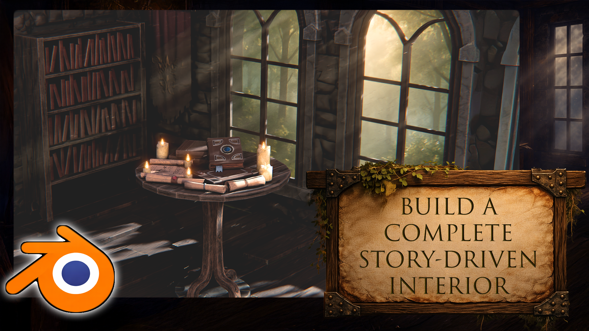
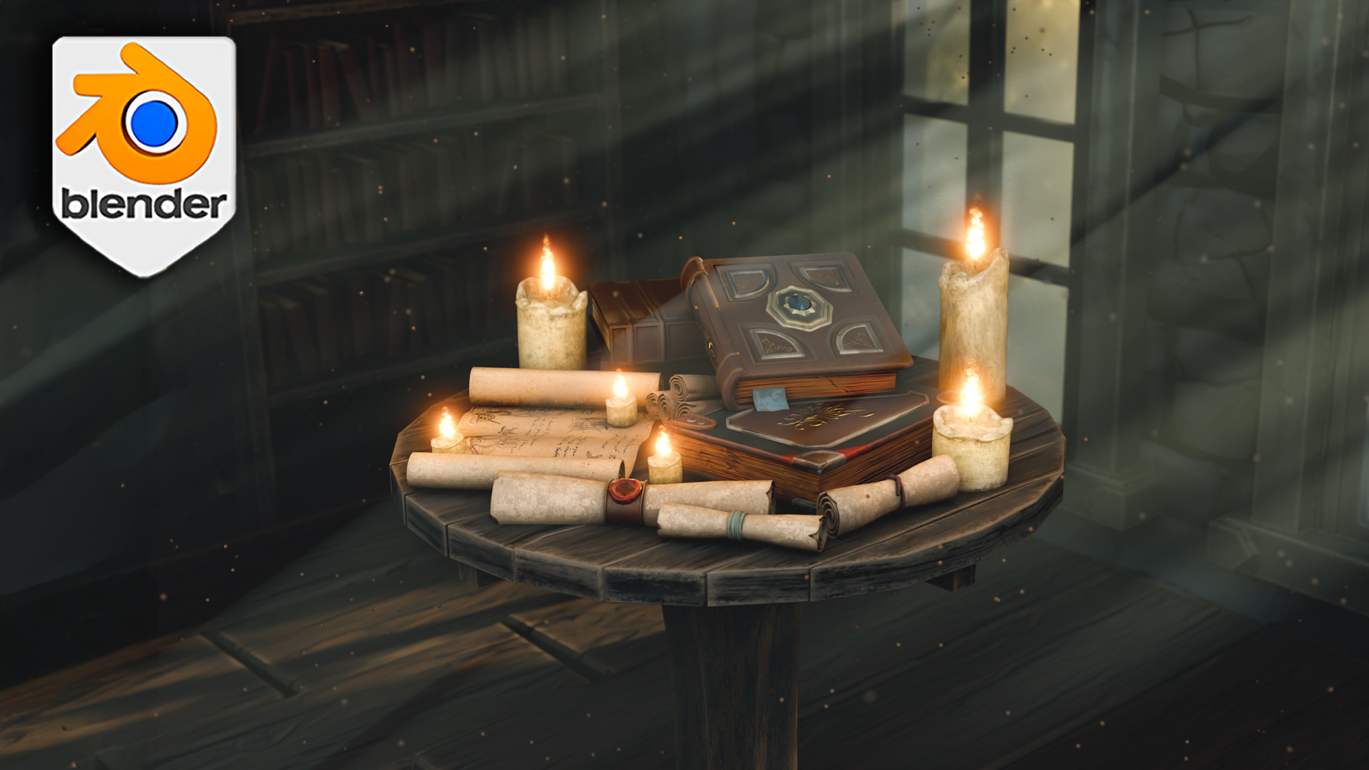
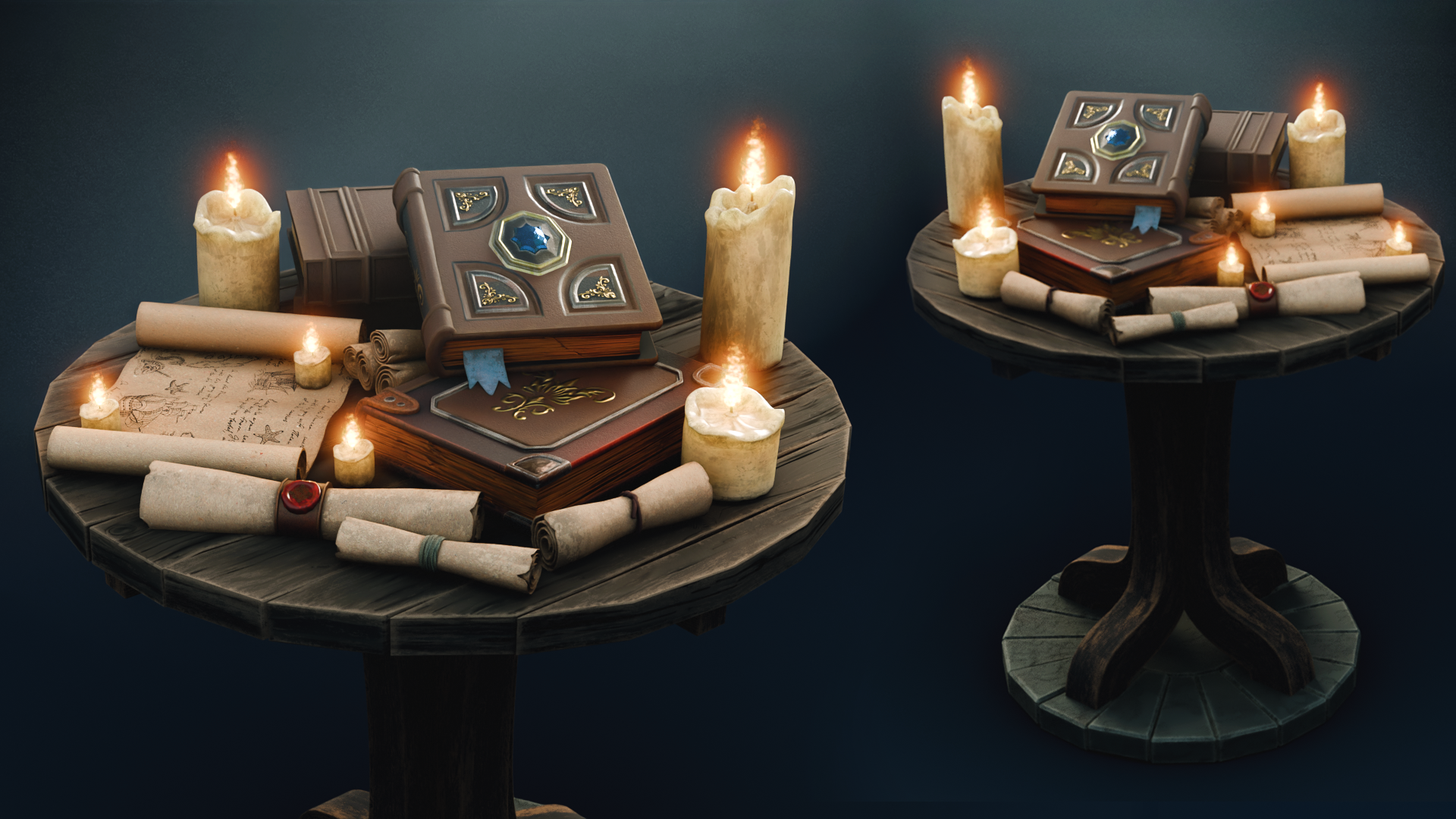
build a complete medieval interior
in Blender five centered around the Eoprop desk presented in a richly
list dusty atmosphere. I'm Luke, and in
Blender three D model Medieval Research's desk, I'll guide you for building a full indoor medieval
workspace from start to finish
using Blender five, updating modeling tools, UV workflows, lighting,
and compositing. This course is built
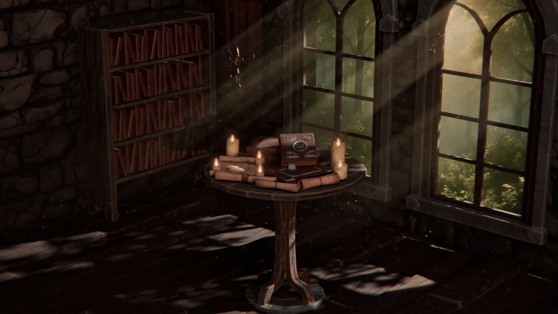
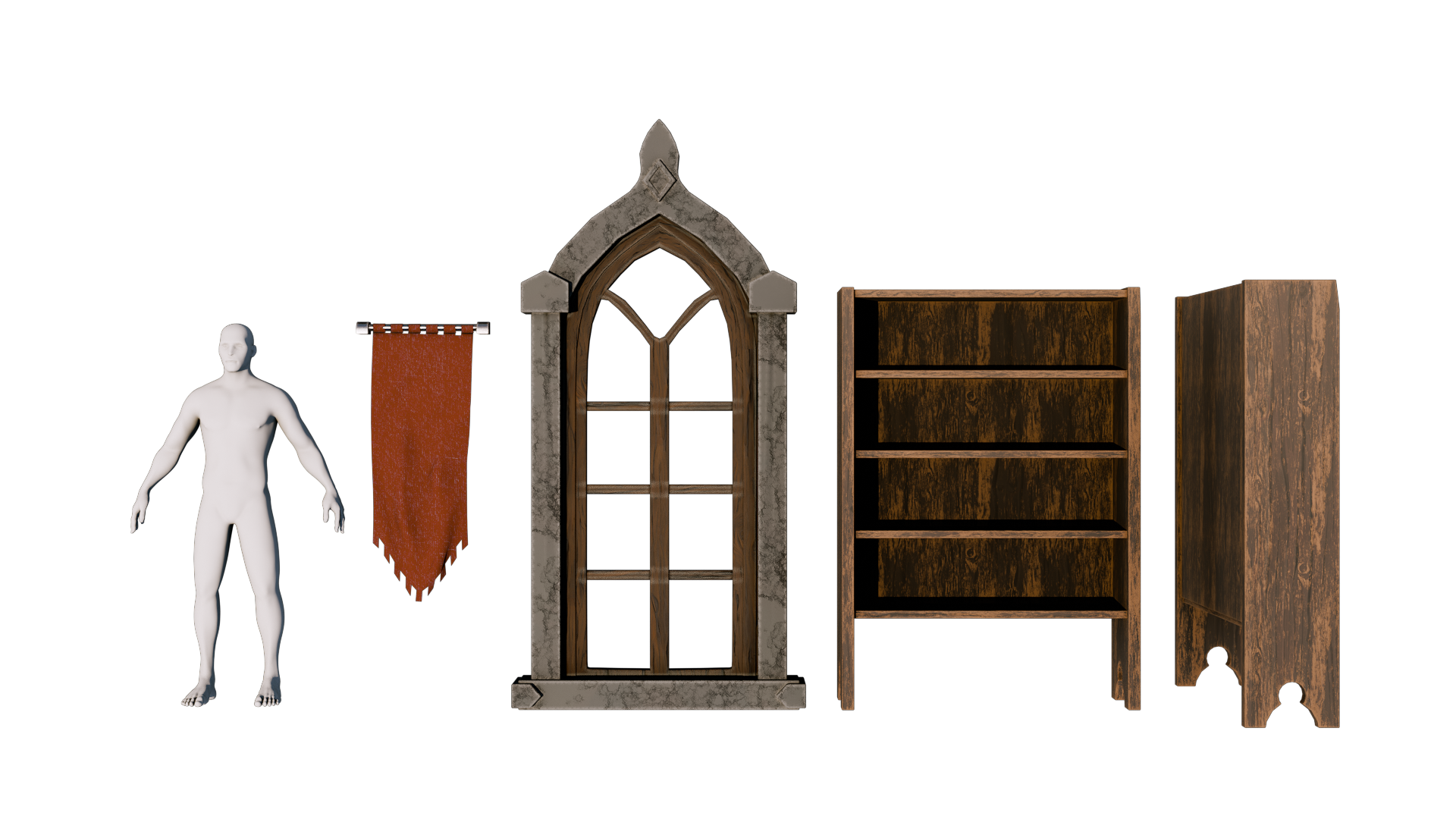
around a clear goal. An interior setup that feels like a real space with history. We start by building the
background props and interior elements to warm
up your modeling skills. Then we move on to
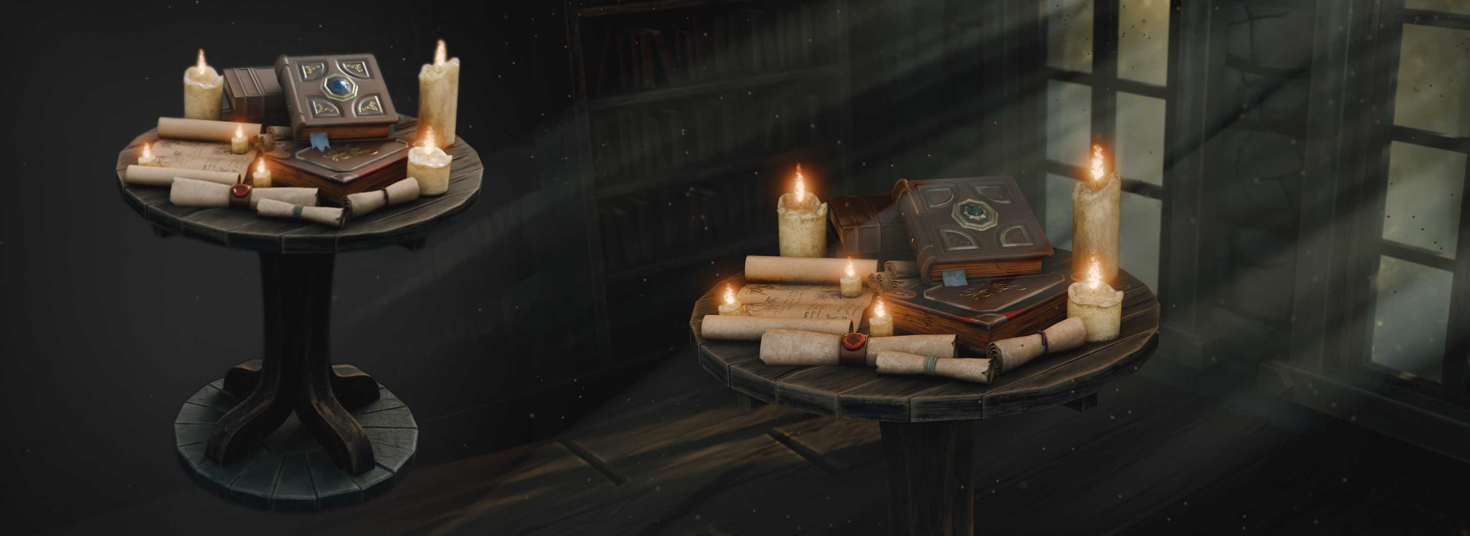
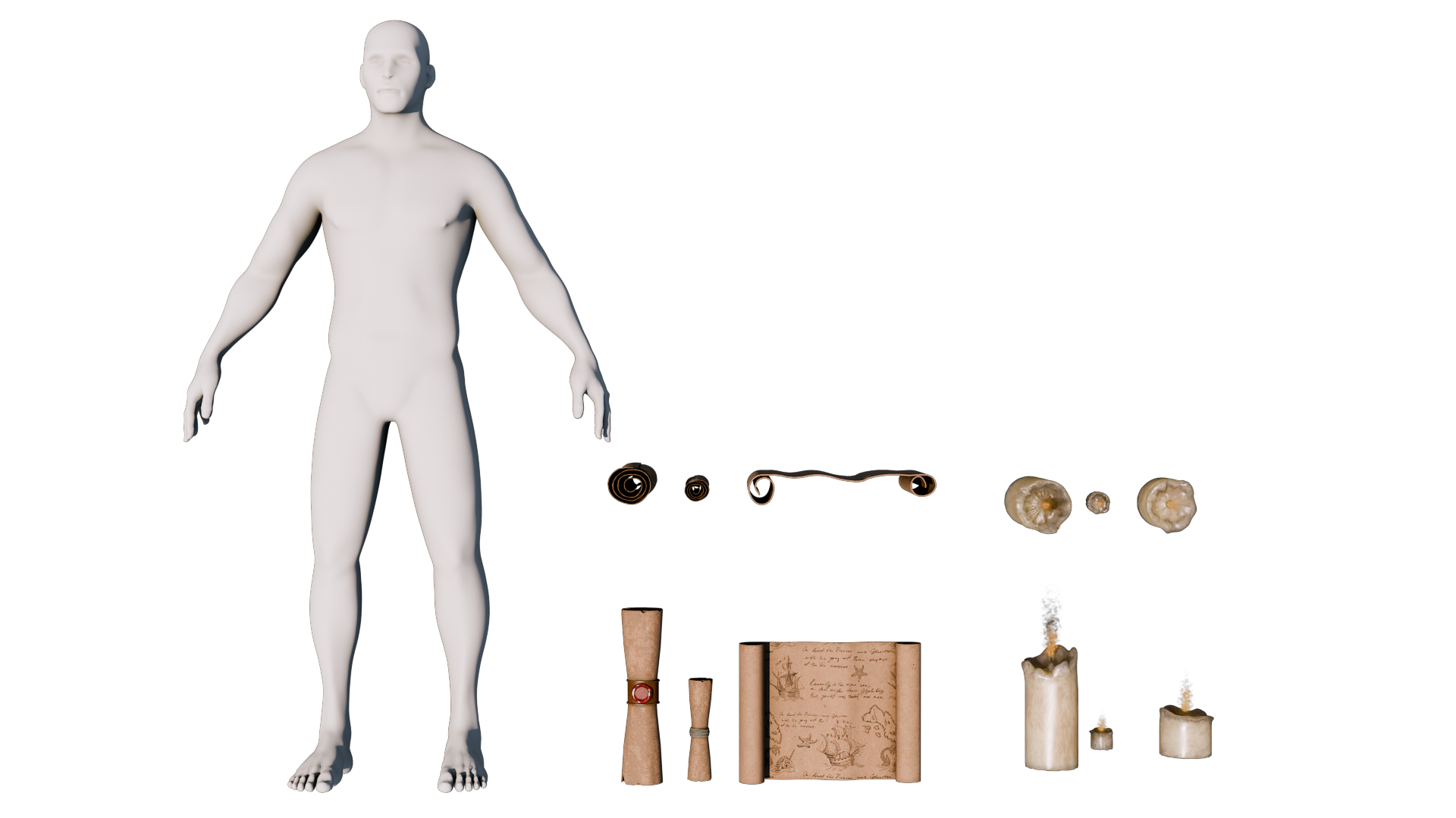
the hero prop desk, packing it with books, scrolls, candles
and research items. And finally, stage everything so the whole room
supports the story. We'll take advantage of
the newest tool set, like updated array features, for structural and
radial symmetry, improved bullion workflows
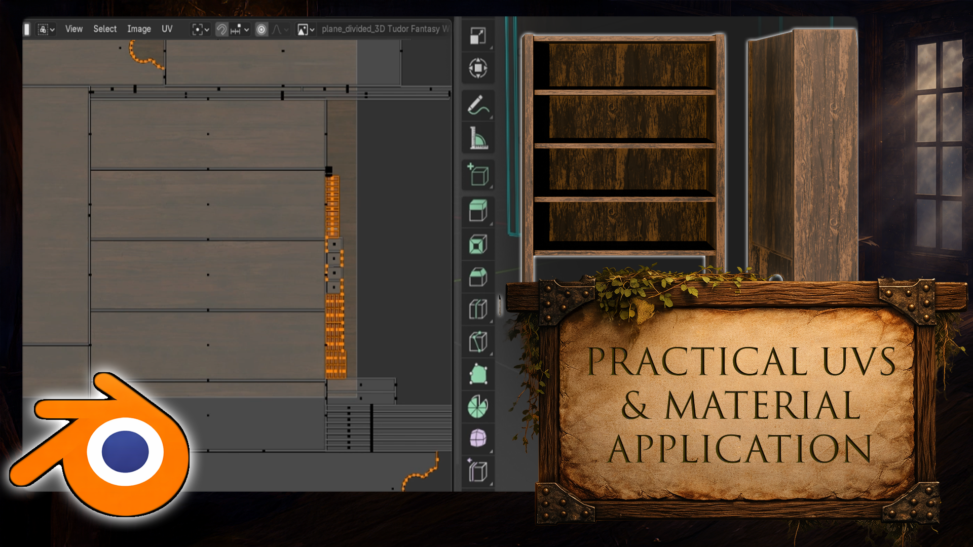
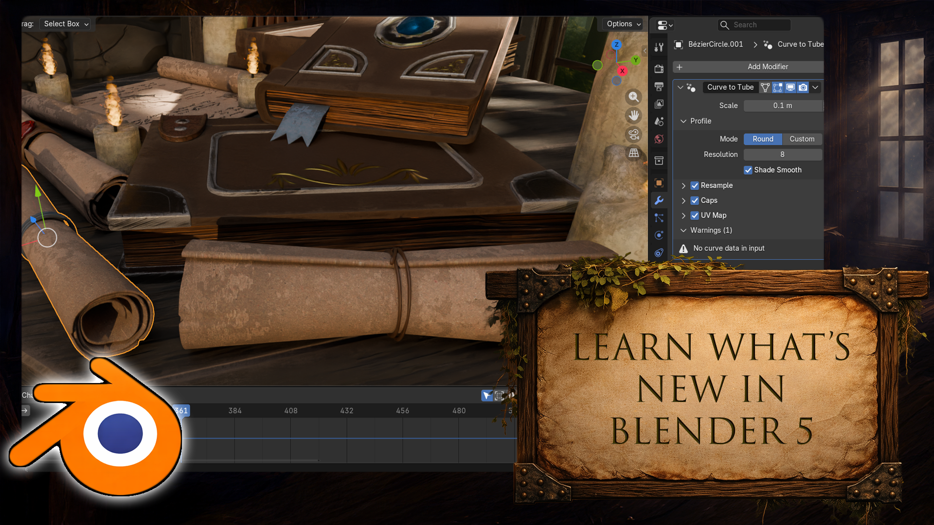
for wall cutouts, and even curve to tube, modifier for generating geometry with UVs already in mind. Then we unwrap like a pro. So the grain flows exactly
in the right direction. We'll apply the included production ready
shaders for wood, stone, wax, and fabric. Then tweak them for the
exact look that we want, including realistic candle wax with subsurface scattering. You'll still get all the
storytelling details in place, books, scrolls, rope
ties, seals stamps, projected decals, so you can use the same decal workflow across multiple props without rebuilding
anything from scratch. But then we push the scene
into that alive category. Hanging flag, we set up a clean cloth simulation with
weight paint across areas, so the top stays anchored, and the subtle breeze
motion gives the room just enough life without looking
floaty or over animated. Now we lock in the
signature look that aged dusty
interior atmosphere. We built a dust
particle system that actually moves slow drift, subtle variation,
and natural motion so the air feels
thick and lived in. And we use child particles
where it makes sense, so it stays performant while
still reading on camera. Then we combine that thus motion with volving metrics
and lighting. So the particles
catch highlights and Rob gets those soft
cinematic rays. But the real trick is how
we add detail to the light. We use a light mass
to break up the sky as if three branches outside
are partially blocking it. Creating that uneven
natural shadow pattern that instantly makes
the scene feel real. And because you're
not left guessing, the course resources include the kind of mask shaders
that support this look, so you can focus on dialing
in the mood and composition, not reinventing
technical setups. We finish, we frame
the shot with cinematic composition
and depth field, polish the balance
across foreground, midground, background, and
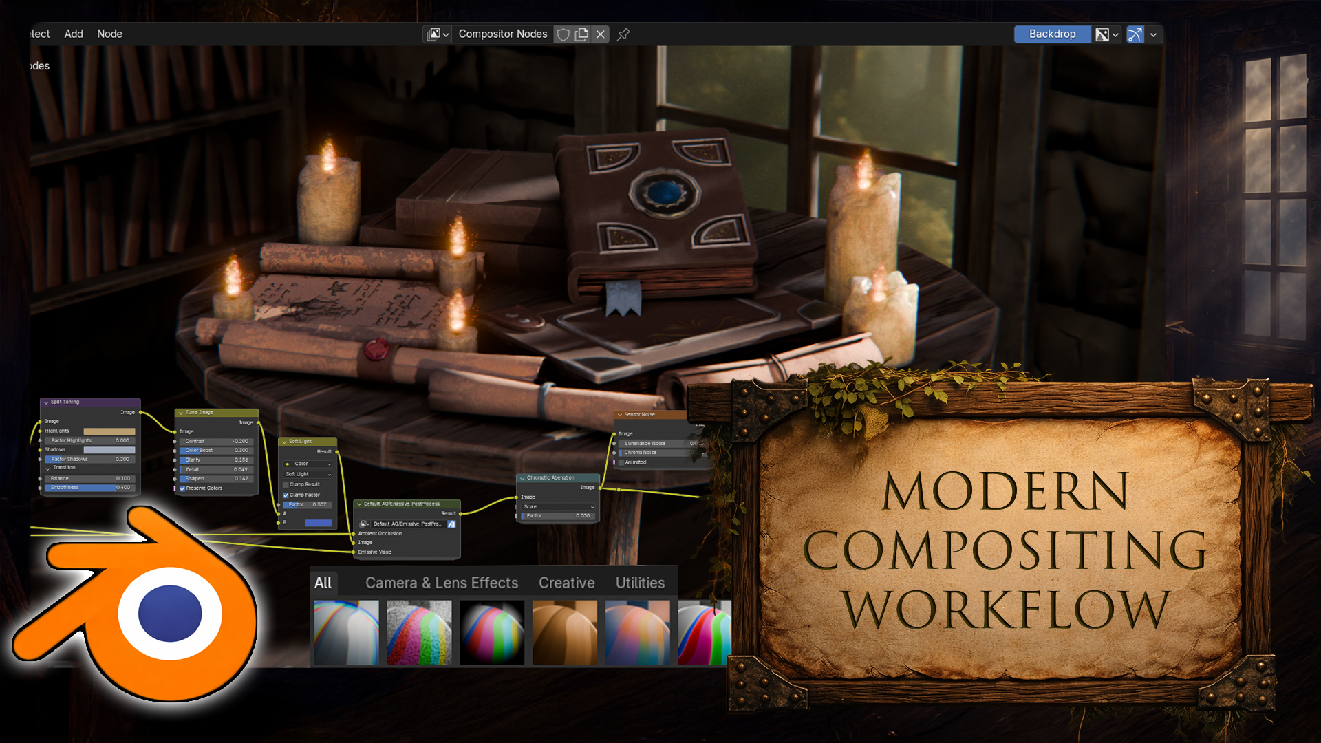
render the final scene. You'll also get an in depth look on Blenders
composite workflow, adding subtle noise
chromatic caboration, color balancing, and saving reasonable composite presets for future blender five interiors. If you want a
repeatable workflow for building interior
environments, where a hero prop
reads instantly, the background
supports the story, and the lighting sells the mood, this course is built
exactly for that. Joy now, and let's build your medieval
researchers workplace in Blender five step by step. My name is Luke, and I'll
be seeing you in a course. Happy modeling, everyone.
2. Setting Up Blender 5: Hello and welcome, everyone
to Blender free D, model A medieval
Researchers desk. And we're going to
start off by opening ourselves up with
Blender 5 point oh. If you're using
anything below that, you might encounter some issues. For example, Compositor has
been slightly revamped, as well as the Array
Modifier has been changed, things like that, small
tweaks for the functions, as well as some visual
cues within the program. Highly recommend you to
stick in with Blender 5. Now, before we get into
the program itself, let's go ahead and
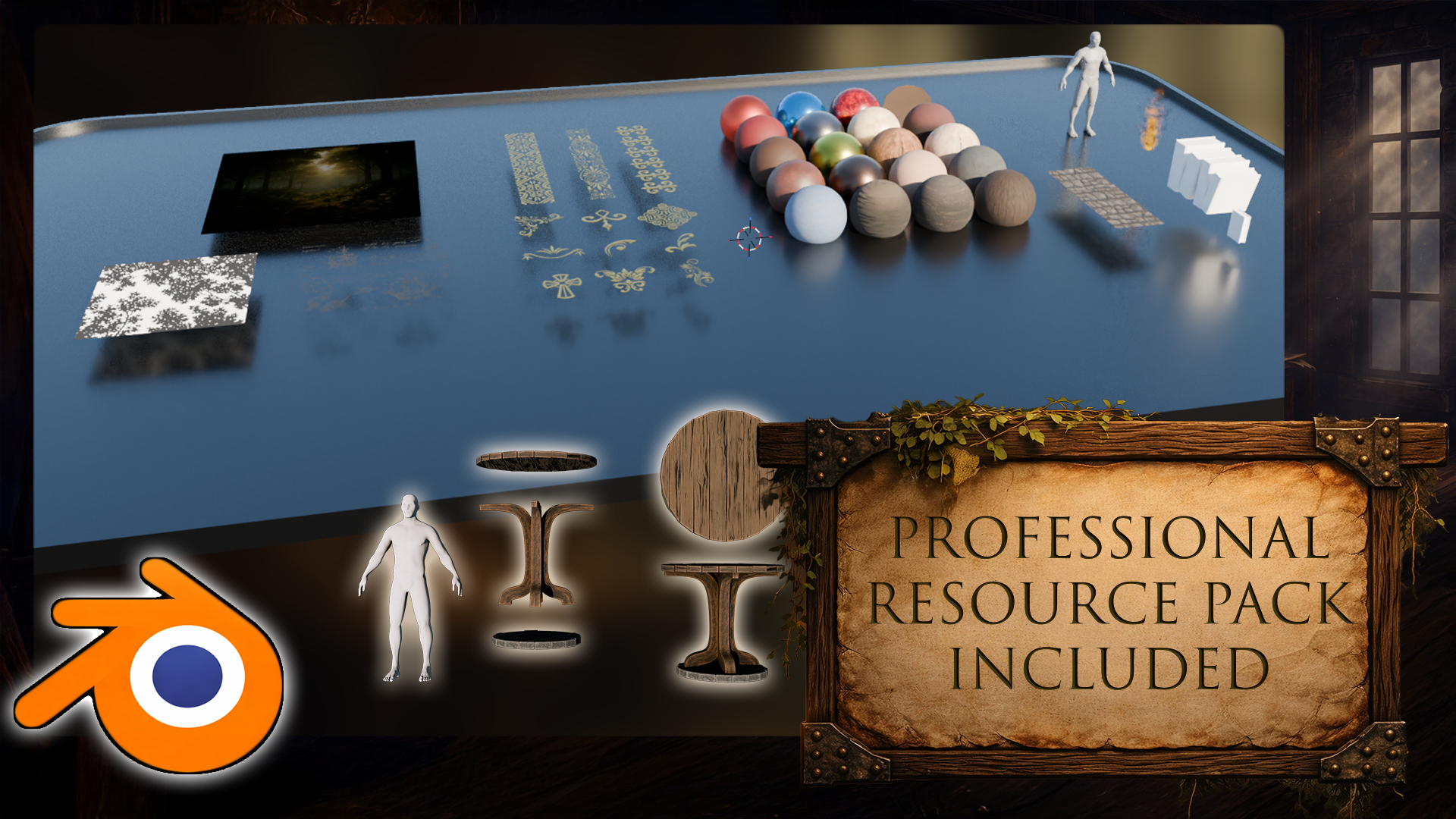
open ourselves up with a resource pack. Within the resource pack,
you will find yourselves a reference folder as
well as a blend file. So let's go into the
reference folder. We're going to have
ourselves some PNG files for the referencing, which you can open up
directly as a file, or alternatively,
what I am going to be using is going to be Pure ref. Little program over here allows
us to essentially, well, drag a bunch of images
and reorder them just to make sure that it
overlays with the program. So right now, we
can, for example, have all the images in one spot. And for us to do that,
I'm just going to use right mouse button
to drag it to the side, open up the reference folder, select all the images
using Control A, or just dragging
across and click in holding and dragging
into the PURF. And right away, it's
going to put us with all the references nicely
sorted within one spot, which is going to
be great for us. The items are going to include prop items as well as some
close up shots for the table, some book references, as well as the layout of the entire
room in a mesh form. All of that we're going to make use of to make
sure we are creating a nice little cozy
isometric room for the scene, for the render. Other thing that we
have is going to be within this blend file. You'll notice that it
also has TXT document, meaning that this is also an asset library with attached
categories inside of it. In order to make
use out of this, what we need to do is we need
to go on to our blend file, the newly opened one. We're going to go
ahead and ourselves an asset library tab. So at the top, you'll
notice that we have a bunch of tabs on
a Blender file. In order to make
use out of these, we can simply click
and go through all of them like so to well, go for different
layouts of Blender depending on the work
we're going through. But right now, what
we need to do is we need to go onto the
plus symbol over here. We need to go on to general. We're going to create
ourselves a new layout tab. So this layout will be exactly identical to
this one over here, in case you perhaps
right click and delete a layout or even use
with the new version, there is another button
called Delete Our Workspaces, which would mean that every single layout would be deleted. We don't want to do
that. Once we create a layout tab that's duplicate
to the previous one, we're going to then grab ourselves this piece at
the bottom over here. We're going to click on this timeline tab over here and switch it from a timeline
to an asset browser. And within this asset browser, we're going to find a
bunch of different type of assets that are
default with Blender, but we're not going to see
the assets that are found within our resource
pack in order for us to make use out of the
resource pack items. What we need to do is we need to go on to edit preferences, and within here, we're going
to go onto the file paths. Within that section, we're going to find ourselves
asset libraries, which we can go ahead and click on the
plus symbol over here, then find it ourselves or we can simply paste it in just
like I'm doing it like so. Then click Add Asset Library. And once you're done with that, you should be able to close this down by an additional
tab, such as extra. Extra will show you
some of the items. But if you want to see
them all in one spot instead of just seeing all
the default items as well, what we can do is
we can click on all the libraries and select the user library resource pack that we just created like so. And that way, we'll find ourselves with this
asset library. So this asset library
includes various items, including some gonode
such as book and fire Gonode some of the stamps that we're going to use
for decorating the books, as well as a bunch of
materials and shaders, some trim sheets and other
items that would help us to, well, make the
environment look better. But we're going to
go through all of that uout the lessons. So let's not get
ahead of ourselves. Now, though, in order to make sure we're able to
continue on with the next lesson and just making sure that everything
is saved out properly, what we're going to
do is we're going to just simply
click Control an S, and make sure that we're
saving out this project. So the next time when we're
working through this project, we can click Control S to
save it in order to make sure that if the project crashes
or if there's any issues, we can just well, come back to the project. I'm going to name M one course. Project, like so and click on Save Plan file. There we go. The next thing that
we're going to do is we're going to go
ahead and click and drag our human onto
the scene just like that. This will give us a
nice human reference, which we can use together with the references created
over here to see the type of scale that we're
going for in some of the areas inside of the
room, for example, and such. We move around our character, what we can do is we can use our middle mouse button to
move it around, like so. We can also use shift and middle mouse button
to pan it around, and we can use our mouse
wheel to zoom in and out. If at some point your camera is a little bit off centered, you can also use the dot on your numpad to zoom
into the selection. So because I had the
selection set as human, we're able to zoom into that. If you have it
deselected, for example, you can find your human at
the top right hand section. Over here, you can
simply select it, and then with the selection, you can click on the
dot again whilst your mouse is hovering
over the viewport because a mouse position is important in relevance
to what the options do. So for example, if
I was to try to use the dot over here while my mouse is on the
top right hand side, it's not going to do anything. So positioning of the mouse is really important in Blender. And in case you forget
any of the shortcuts, any of the usability, you can simply glance on the
left hand side of my screen, and you'll find that all
of the shortcuts that I'm using are going to be presented on the
left hand slide. So whenever I'm clicking Mouse, I'm using shortcuts for options, they're all going to be
presented in this section. All right, so that's
going to be it for me. Thank you so much for watching, and I will be seeing
you in the next lesson.
3. Building the Room Base with Modifiers and Sky Lighting: Hello. Welcome back
everyone to Blender FD, model A medieval
Research's desk. In the last lesson, we
left ourselves open with a project that includes our resource pack
asset libraries, as well as the human scale
within the scene already. Next up, what we're going
to do is we're going to do the classical selecting
the cube and delete B, of course, replaced
by a new cube. To create a new cube, we're
going to click Shift A. We're going to open ourselves
up with a mesh tab, and we're going to select
the cube from here. The reason we're doing this is because on the left hand side, you'll now see that
there is a tab. If you deselect from the cube, you won't be able
to get back to it. So just make sure that this is not deselected or not moved, for that matter, because
now within the stab, we're going to make
sure that the size, I believe the size by
default was set of two. So if your cube is a bit
smaller, don't worry about that. We're just going to
change the size to 6 meters and you're going to
get the right dimensions. Then next step is we're
going to make sure that it's sitting
on the floor at the base basically sitting at the very floor of
zero to one space. So what we're going to
do is we're going to find ourselves
locations, set values. And because the
size is set to six, we know that this is going to be halfway point being centered, meaning that we just need
to simply move it by half to be sitting to be making sure that the
cube is sitting at the well, at the floor. Let's go ahead and just change the z axis to f,
and there we go. We're going to change it
to make sure that it's sitting now at the floor. Next step is we're
going to make sure that this location X and Y are
changed to minus four. So we're just making
sure that it's set off by a meter to the side. Actually, sorry, we're
going to make sure that it's set up by
five minus five. So we're going to have 2
meters off a little bit. So the center world position is going to be left off alone. That way, we have a
lot more freedom, creating props and whatnot, and it's not going to
interfere with the room. We're going to
actually position this as five, not minus five. There we go. That way, it's going to go onto this area, so and the next
step is going to be simply making sure that this cube doesn't
have the front faces. So we're going to go
into mesh editing mode. So on the top left tsection
we see object mode. We can change this to edit mode. Alternatively, we can
use a shortcut tab, which changes between
those two modes. We can go into phase
selection mode by clicking on this button or clicking free as a shortcut and holding Shift, we're going to
select these pass. So we're going to go
ahead and delete tab, and we're left with
this type of a result. Just to make sure that
it is more visual, what we can do is we can add a little modifier for extruding the faces a little bit because otherwise it
now it's just a plane. So modifiers are
very interesting. We can go onto the
stab over here on the right hand side and we
can click Add Modifier. And here we can just
select the search. We can just type solidify, like so we're going
to find ourselves. Solidify and right away, we're going to get ourselves
a little bit of thickness. So we can change this thickness from the
thickness panel over here. So from 0.01, we
can change to 0.05, and it's going to be like so. And the other thing is
that I realized that this is going inwards. We want this to be
going outwards instead. So the thickness,
we can just put a negative symbol at the
front, make it hit Enter, and now it's going
to go at the back, meaning that the floor the z value is just
sitting right at the top. It's going to make
it just a little bit easier for us to work
with placing objects, especially if we need to. So yeah, that is going to be it. Modifiers are very nice. They have a lot of functionality
and a lot of options. But the key thing is that
we're not creating any of the additional messes whilst
we are using the modifiers, meaning that if I was
to go to Edit mode, we can see that we still
have only one plane. These other pass
are not selectable. And that is because, well, it just creates a calculation on a specific function
or that mesh. So the solidify
is just extruding all the meshes into these
directions, which is great. But let's say if we want to make use out of the
meshes themselves, we could do that by clicking on this arrow button over
here and clicking Apply. We're not going to do that just yet because we're going to go through a bunch
of other options. Next up is we're going
to tweak how we are previewing this visually
within a setup. I am going to go actually and just change the tab
that we created. We can also just double click, by the way and just call
it Asset Manager. Like so. We're going to go on
the modeling stage just to make sure that the base, the bottom is not
visible and we have more workable space
within this layout. Uh, next step is we're
going to make sure that the preview of our assets is
a little bit more visible. So for example, this
character is being washed out a little
bit with the base and the shapes are not
quite as visible. If we were to click on this
arrow over here at the top, we can change this
to use cavity. Now, the solid view is going to allow us to preview
our meshes with cavity, meaning that it
highlights some of those edges and bumps
and and whatnot. And all of the
measures are going to be, much easier to see. The thing is that in order to preview how our
setup looks like, we can go on to render mode and we can change the render
engine from EV to cycles. If you're not seeing cycles, just make sure you
go to preferences, make sure you go to system. And change the cycles render
devices to either Kuna, Optax or whichever
one that you have. If it's set to none, you're not going to be
able to make use out of the GPU rendering. So now that the
cycles is enabled, just make sure that
you have that enabled, and you can change
it to GPU compute. The other thing is
that the view port by default is set to
max samples of 1024, which is way too
high for a preview. Change it to something
like 20 or 30 for rendering basic type
of setup and then you're going to have a much easier time just
making sure that the scene doesn't become performance heavy too
performance heavy, that is. Next step is just make sure you have the noiser
enabled here as well. And I would recommend to
change the noiser here to be let me have a
look there we go, pre filter to use fast. So in rendering mode, it should be set to accurate, meaning that the noise of texture noisy texture is going
to be handled way better, but it's at a cost
of performance. When rendering, it's not
really important because we can let it render each
frame for a long time. But if we were to go now to Viewpoort shading
or rendered, we can see the type of
result that we're getting. And this is what we
have right now with the a viewport de noiser
which is set too fast, and right away, we're just
getting this kind of result. So you can see the
type of delay a little bit and whatnot, but all in all, honestly, as a rate tracing cycles
type of renderer, it works great for the preview. And I would even say that we can sort out our
lighting a little bit. So although we're not going to use this lighting when we're
finished with the setup, so this default lighting
is just coming from a basic light spotlight
that's visible in the scene. If we were to delete
it, we're going to darken an entire
scene like this, but we don't want
this to happen. We want to have certain bit
of preview in our scene. Though what I would
recommend you doing is go up to the shading tab, make sure you are within
the world shader, like so. And here we can just click
Shift A and use sky texture. Sky texture is
great for preview. As it gives us a nice ambient
lighting for the scene. So we can just make
sure we use that. We can just put it into the
background color like this. And we are going to have
ourselves a nice little setup. So just make sure you drag from color socket to the
background socket found within the shader
tab of the world Shader. And next up is just if
we were to enable this, we can see the type of
result that we're getting. So we're going to get
ourselves nice bit of lighting coming
from the setup. We're not going to have windows just yet, so for starters, we're just going to rotate the light coming from an angle, like so we can change
it to be at 100. I think that's quite right. Oh, it's going to be
positioned over here. That's looking quite nice.
Next up is the intensity. So the intensity itself
is going to be a little bit too intense
or a sun skylight, which is, of course,
how it should be because it's well,
sun sun is bright. So what we can do is we could
firstly we start up by just lowering the strength over here and holding shift we
can do so like so. And I think that's
going to be quite all right for our setup. Let me just have a look, yeah. So a value of 0.09
seems to trick. And otherth that I'd
like to mention is that this kind of a sun skylight
is now updated in Blender 5. Previously, it was
single scattering, now it's set with
multiple scattering, meaning that essentially
the sunrise and dawn type of scenes are going
to look a lot better. If we want to do so, we
can just start lowering the sun and we can start seeing the type of difference
that we're going to get. So, oh, there we go. So the sun as it goes lower, it changes scattering
of the overall, you know, background
and whatnot, of the ambient lighting. And it's quite nice. But we don't really need
to have it too low. We can change the elevation to five and get this
type of a view. Actually, it's a
little bit too little. I'll just double it,
change it to ten. There we go. Nice nice
lighting. And that's it. We can now go back
to the modeling tab, and we have ourselves
a basic type of lighting which we can use
to preview our items. Now let's go back on to the
viewport shading solid, and we're going to continue on with this in the next lesson. Thank you so much for watching, and I will be seeing
you in a bit.
4. Modeling a Realistic Shelf Frame with Solidify Modifier: Hello and welcome
back up front to Blender three D model
A M DivlRsearchs desk. In the last lesson, we
left ourselves off with some nice lighting
preview which we can use now anytime we want. We're now going to
go and make sure we start doing some
prop modeling. So, for us to do
that, we're going to go ahead and click Shift and A and create ourselves
a mesh cube, like so. And just to let you
know something, you might have some of you might have
accidentally, for example, changed the location of the preecursor this icon over
here right in the middle, which can be done, for example, with shift and right
click and that lets you just change the location of
this predecursor like so. And if that is changed, if you create a mesh, that's going to create it in the center location of
that set predecursor. So in order for us to create it in the
center of the world, what we can do is we can use shift ins and we can change
the cursor to world origin. This will make sure
that the cursor is set to world origin. Which should be set
by default over here. Now, next up is we're going to create ourselves a new cube. We're going to make sure
that the cube is more manageable with a
reasonable size of two. And then we're just going
to go ahead and move this upwards by one just to make sure it sits
nicely on the floor. Next up is we're going to
start looking into the scale. So we're going to go ahead
and go into Edit mode. We can click eight to make sure that the entire
mesh is selected, and then we can click one
and then see what kind of width we want
out of this shelf. So if we go onto the references that we
have set up, over here, we're going to see
that the type of a width that we have over
here is going to be, I'd say, I'd say, a little bit more than the width of the human from arm to arm. So if I was to example, make a reference like so, I can then quickly make
a duplicate out of this and just see
that here we go. We got ourselves the scale, and it is just a little bit of an extra towards
this other side. So I would say it's a bit of, like, an arm length. So this and this is going to be the same
as this and that. We are eyeballing this
because it doesn't need to be an exact same type of value. But if you want
to see the value, if you were to click
on this button over here when in edit mode
and select edge length, you're going to start seeing
the length over like so. So you can use my values as a reference for your own setup. I'm also going to now just move this character a little bit
more to the front, like so. And we can use E Z and
move this upwards. So the way we're
moving this character is simply by clicking GX to move it sideways like so
and GZ to move it upwards. We are also in the front view. So by clicking one
on our numpad, we're able to go to the
front view like So, which is very important
because we can go click free, for example, to go to side view, or we can use I believe AltnFe or sorry Control
free to go to side. So Control and one, for example, we go to the back side, one
will go to the front side. Important stuff when
working with free D because you can just
simply go from front view, side view, and even top
view by clicking seven. All of it, good stuff.
We don't really need to get too much into it,
but it's worth knowing. So next up is just making
sure that this scale is going to be the same as what we talked about previously, which was, just, you know, human scale plus an
extra arm length. Let's go ahead and
do that. I can actually we can actually
just click Shift D, GX and move this
a little bit more so that way we have two
human references like so, and then we can just
simply position them to be more to the center and
select this b over here, go on to Edit mode
and then use S and X and then scale it like so. So using a value of 1.5
will be quite well. Step is we need to decide the scale in terms
of the height. So right now, I'm just going to go ahead and delete
this extra reference. And the scale of this shelf
is going to be just over an extra head over the scale of this
human reference. Let's go ahead and do that. I'm going to go ahead and
delete this extra human. I'm going to go ahead and select this and just place it
back on the ground. So and we are going to
instead of using scale, so as Z instead of using scale Z to make sure
it goes upwards. I want to just simply
go on to Edit mode. Click free to make sure
we are in face selection, just select the upper
section like so. Then when we click
one, we can see that there is a
selection at the top, which means that if we click GZ, it's going to affect the scaling of this piece at the top. So you can see it
moving upwards. These numbers of values
go in upwards like. But when we are in front view, it might not be quite as
visible with the selection, although it's quite
good right now we are already at the
2 meters, actually. I don't think we need
to go any higher. I think the default version is going to work
quite well for us, so that's pretty good. Next step is we can
just select this our side and we can actually, we can just click A to
select it all and click SY and just squish
it up like so. In terms of the scale, we can use a value of, let's say, 00.4, like so. That will work perfectly for us. If we look back
at the reference, we can see this with over here. And honestly, that overall type of setup is already
looking pretty good. So next up is going to be
just going to phase election, selecting this front
face, back face, and we're just going to
simply delete these bases, we're just going to have
this type of setup. We're also going to delete the base phase as well,
and we're left with this. Now with this, we can
go on to modifiers, a modifier and use solidify
just like we did previously. This time, we're just going to make sure that the thickness, if we hold shift
is set properly, and by that I mean that
if we look back at this, we see that the horizontal
bars are going to be much slimmer in comparison
to the ones on the side. The reason for that is you
can imagine the supports, for example, off the shelf, the main framework, which are going to be these
vertical lines, they need to be
stronger to support all the weight that comes in the section and
middle section, whilst these are just more
for stability and, of course, to place those items
in between the rows. So we're just going to
make sure we do that. We can start off by
just making sure that the ructure is set
to be quite fix. A value of 0.08, I think
is going to be quae. Although I think can be
a little bit smaller. So 0.075, there we go. That's perfect. I
like this a lot. Next up is we're going
to make sure that the shelf at the top is
going to be smaller. So what we can do is we can
just select this upper shelf. We can hit P and
separate by selection. This means that this
upper section and these items are now
two separate objects. So we separated this inverse
U into two separate objects. And why would we do that? Well, the solidified doesn't
have much of the control for well changing the thickness,
the values individually. There is option
like vertex group, for example, that could
potentially help, but you will definitely have more control when you just
separate an object like so. And now with this,
we can just change the thickness holding shift to a much smaller value like so, and I'm even considering to
offsetting it a little bit. We definitely need to offset it because now it's overlapping. You can see these kind
of artifacts over here reason those
artifacts happen is because the mesh is essentially overlapping in
the same exact position. Those vases are basically
biting for being rendered, and they will definitely cause issues even
especially in render. You can see the black
type of structure. So we definitely
need to fix that. We're going to go
on to Edit mode. We're going to select
this entire plane. We're going to click and X and just lower down until we
get to this value like so. Can be slightly overlapping. I don't mind that because
what we can do also, what we are going
to do for sure, is that we're going to
click S and Y and just make it a little bit
smaller like so. There we go, just a little
bit to value of 0.38. Yeah. And then we're
going to click GST and just move this
downwards a little bit. So if we look back
at the reference, you'll notice that
the upper section does have a tiny bit
fraction of a space, that's going to be good for us. We are also going
to check the back, so the back has this
type of spacing while the front if we have
more of reference, reference also has no spacing, so I'm wondering if we should have a little bit more
of spacing in between. So SY maybe a little bit more. Like so. I think that's
going to work much better. All right, so now next up is now that we have
the position of this, we can change up the scale, the thickness of the solidify. Holding Shift, we're
going to lower this down, so holding shift
allows us to move this in a more controlled
manner with higher accuracy, and we are going to set it
up to a value of your point. 15. And I think that
is a good base. Actually, it's not a good base. I think we should double that. Let's go ahead and do that. Looking at from a distance, I can already see that
it wouldn't be enough. And now, 0.03, I think,
is going to look lovely. So yeah, we got ourselves
the main framework. We're going to continue on
with this in the next lesson. Thank you so much
for watching, and I'll be seeing you in a bit.
5. Modular Shelf Creation with Array and Bevel Modifiers: Hello. Welcome back, everyone to Blender three D modeling a
medieval Research's desk. In the last lesson,
we left ourselves with a frame for the shelf. We're now going to
continue on setting it up. This time, we're going
to make use out of the Array Modifier to make sure we get ourselves
some nice shelves. So the way we're going to do
it is we're going to simply hit at Modifier tab over here. We're going to search for Array, and there's now two
arrays with Blender four. They updated Array Modifier. Previously, the previous
array was Array, this one, which is now legacy, and the new array has a
couple of other options. So one of the things you'll notice that you have
a Gizmo over here, which allows you to control and offset how the ray
is being affected, which is very nice,
although I'm going to click Control Z because we're still going to use
the values over here. This gizmo basically
allows us to manually change up the parameters
that we see over here, which is very nice, but
we are going to just use these values because it's a little bit better for this case. Sorry, let me just
scroll down there. We go, that's the modifier. Is going to be applied right
underneath the solidify, and it's quite important because the hierarchy value goes
from the top to bottom, meaning that solidify
will get applied first, as in it will create a
thickness for the mesh, and then next up,
it'll create array, so it'll give us that duplicate. Then we have some
options for shape. We just want a line, so it would go in straight line. And we want to offset
not to go in X value, but in Z value. So if we were to start going
in the negative value, we'll see that the
shelf parts are going downwards,
that's quite nice. And one thing that I would
say that we should get is we should change the
offset method from relative, which would mean basically
that every gap is going to be -13.85 in between. But if we select endpoint, let me just before doing that, if we were to change the count or if we were to
increase the count, we'll see that it
starts increasing the amount of shelves
that we have. But if we were to change
this to an endpoint, it would mean that once
we get this back to 04x and change this
to z negative, we can change the endpoint
where it ends basically. So right now, we can basically create that same reference
that we have over here. So we're going to have the
bottom shelf to be going just under where the knees are. So just like, so I'm going to make sure we lower it down
to around this amount. And then afterwards, once
we get this endpoint, we can basically
change the amount of count that we have
for the shelf. For this case, we want to just have a four additional pieces. So five, so basically
plus the original one, that's going to give us
a nice differentiation between all of these parts, which is looking pretty good. And that's pretty much it. We also need to
make sure that now we also have realized
instances ticked off. By the looks of it,
it might not do much. But basically, when we
convert this to a mesh, realized instances if
this would be ticked off will mean that all of these mesh parts
would disappear. We don't want this
to happen. It's good for optimization to
have this ticked off, but if you turn
this into a mesh, you need to make
sure that this is ticked on. That's what it means. So, next up is we are going to have
ourselves a nice backside. So what's the best way to
create ourselves a backside? Well, we can go on Edit mode. We can grab this part over here, both of these edges,
we're going to be a little bit cheeky
with this basically. And we're going to click F, which is going to fill
this in, but don't worry, it's not going to make
sense as yet because now we're going to click
P, separate by selection. This will basically
create this little piece, if I was to go out
of the edit mode, it's going to create this
little back piece over here, which we need to adjust now. So what we're going to do is now we're going to go
back onto Edit mode. We have this selected.
We're going to click and X. We're going to shrink
this down by quite a bit, L and we are going to
make sure that the base, the bottom is nicely
matching up to this part. Like, so that's going
to be quite nice. Then once we have
the general setup, the upper section
should also be lower. Like so. Then we can just simply change the thickness because right now it's a little bit too fake. So I'm going to go onto
thickness, hold shift, and just low it down
until I start seeing a gap or something like this. And then we just go basically back into it just a little bit. Like, no, I think
that's quite right. Just going to make sure that we also maybe push this
inwards a little bit because now we have some parts overlapping
over here to make sure that we don't need
to be perfectly aligned. What we can do is we can click GY and just move this
inwards, like so, and that's going to just help us get a nice little backface, like so, and there we have it. We got ourselves
nice little setup with all the parts added. So it's already
looking pretty good. Next up is going to be adding some beveling onto our parts. We can simply do that
by selecting the parts like so add modifier,
selecting bevel, generate and just like that, we got ourselves some
extra bit of bevels, except by default, it's going
to be a little bit too big. So what we're going to do is
we're going to hold shift, and we're just going to make
it a lot smaller in amount. So if we want to have
extra smoothness, we could change up the segments. That way we could have even more of a softening look, like so. But honestly, having
the default of one, just to kind of
get that sharpness off is going to be
more than enough. And there is an angle
option over here, but because we're just dealing
with 90 degrees angles, we don't need to really
worry about it just yet. We're going to worry about
it when we're going to do some decoration at the
bottom of the shelf, but that's just going
to be in a bit. For now, though, this type
of setup is quite nice. What we can do is we can also just simply grab
an entire shelf, like so, holding Shift, grab the rest of the pieces, like so. And then with this
selection entirely, I'm just going to
hold Shift and just make sure that this
is the orange, the main selection, the one that we just made the bevel for. Then we can just click
on this arrow over here and there is option
to copy to select it. If we were to do that,
we're just going to copy this same modifier onto
the rest of the items, and every single one of them
will use that same option. So it's going to be quite nice. I don't like backface
having such bevel though, so I'm just going to
lower it even more. So I think it needs to
be a harshal little bit because it's just like you can imagine a plane in the back. Being, like so, even though
it's made out of, like, wood, it's still much
thinner and whatnot, we can have those edges a
little bit more sharper. And the rest is going to be left as is. That's
pretty much it. Now we're going to
continue on with the base part of our shelf. But that's going to be in
the next lesson, though. Thank you so much
for watching, and I will be seeing you in a bit.
6. Boolean Detailing and Bevels for a Clean Shelf Base: Hello, and welcome
back over on to Blender Fred modeling and
medieval Research's desk. In the last lesson, we left
ourselves with a shelf, but we need to just now focus on the base part of that set shelf. Make sure we make a
nice little, well, decoration for the base to just make sure it's not just a
chunky type of a setup. So what we're going
to do is we're going to create
ourselves a new form. And before doing that, I'm just going to make
my life a little bit easier and actually, no. I was thinking to change
the cursor position, but that's not
going to be needed because it's already
nicely centered. We're going to create
ourselves using shift and A, a new cylinder, and we're going to have this set as
a little bit lower. Let's see, 12 is reasonable. It's for the base, so it doesn't need to
be quite as much. But maybe 18 is going to be
quite nicer, but a lot nicer. Let's go ahead and
use that. Let's go ahead and just rotate this by 90 degrees and use it on
just one end because this, as you remember, is just going to be basically
flipped over side. We can make use out
of that in a bit. But now, though, let's go
ahead and just work with this e. And the way we're going to do it is because looking
at the shape of the form, we have a cylinder
at the base like so, but we also have a
cylinder at the top. So the way we're going
to approach this is going to be actually turning this into a two D plane first because it's just
going to make our lives, much easier just
manipulating this shape. So let's go ahead and
do that. We're going to just select the face front. We're going to click
sorry Control and I to invert this entire selection
and delete the pass. This way we have
ourselves this option. I'm going to hold
Control and click free to just make sure
we are on this side. And then what we
can do is we can just shift and D, duplicate it, and then GSO click Escape, GZ, and move this
upwards a little bit. Then we can make this a
little bit smaller, like so, and we can see where those
vertices kind of overlap. If I were to go to vertice mode, we can see it a
little bit better. We can kind of align
those vertices legs. So and we're going to
get this sort of a form, which is going to
be quite right. We're not worried about the
scale or anything just yet, but once we have this type
of shape, what we can do, we can just have
this so selected. We can click, and we're
going to merge by distance. Merging by distance will allow us to merge these
vertices together, but we just need to increase
the distance amount. And once we see at the bottom, where it says removed
two vertices, it means that we basically well, merge these parts up. We can just go to
verte selection, see that they did merge
up just by moving it around and then
hitting escape to make sure we
don't move anything. And then finally, the
final step would be to just simply remove these
vertices over here. So we can just select
them, and I believe we can just dissolve vertices and select this part over
here, dissolve edges. Oh, no, let's go ahead
and leave this as is. I think that's going
to be quae all right. We don't really need to worry
about the shape as a whole, because we're just going to make this as a free diversion. We can just extrude
it fut like this. And we can just make this smaller until we get
the desired shape. So this desired
shape is going to be basically if we have a look at the base because I think that's the
most important part. We got like one part over here, one part over here,
and this part, I would say is kind of like two parts of these
ends over, like so. So you can imagine that two fourths are going
to be taken away. And looking at this, we can make it just a
little bit smaller. Like, so, then we can
perhaps position. Like, this part basically
starts going downwards, like so and then stops. So we can just lower this
down a little bit, like so, and make it a little bit bigger, a little bit bigger,
like so, like so. I think going to be
quite all right. I'm going to click X to make sure we expand
it to both sides. And then we can select
this shelf side. We can make use out
of the bevel tool. So to use Bevel Tool, we can just use a
modifier bevel. So we can select
it. At the bottom, we'll find bevel now we can make use out of an
option called Boolean. So let's go ahead and find
that Boolean, like so. And we're going
to have ourselves this option with spart selected, we can now select object which we're going to use
for Boolean, like so. Once we have it selected, we can make some
final little tweaks, and it might be a
little bit hard seeing what it's
doing this shape. So what I do recommend you is going onto the shape itself, going to the object
properties and visibility. The viewpoard display, and
there is option display as, set it to wire, and there we go. We're going to see this option. Now when we go back
to the Boolean, so we can change that if we
were to change to difference. Difference doesn't
seem to do anything. So what's going on over here? Float. There we go. We're going to change
from exact to float. Exact is a more
accurate operation, but for some reason,
it wasn't working, but ev wave float
will do the trick adjust fine for this
specific setup. And once we have this setup, in order for us to preview it
a little bit better because now we don't have option
to view the bevels, what I would like to do is just grab this option over here and just move it above the
bevel option, and there we go. It's now going to try to apply the bevel right afterwards. But as you can see, it
is a little bit messy. The main reason is probably most likely because I will look. Either because of the
faces, face orientation. Yeah. So this is inverted. That's what I was
that's where I fall. So the reason that these bubble options
aren't previewing it properly is because
this option over here, by default, it was
well, inverted faces. And the red indicates that the
faces are facing outwards, not outwards from the
object, but from you. So when we're seeing the red, it means that it's not
facing the right way. If we go on the
inside, we can see that everything else Everything else is red because the
faces are facing inwards, except for this part and this part needs to be
basically flipped. But the way we're
going to flip it is we need to understand that Boolean basically inherts
the values of an object, whether it's materials
or face normals. So we need to just
grab this pace, grab this entire object, go to edit mode, select
the entire piece, and hit Shift and F. Alter F. There we go. No. Shift
and N. There we go. Once we do that,
we're going to see that this is automatically
getting fixed, that we don't see the bases now and they are
properly on the inside, meaning that the bevel
option is now able to follow along the shape nicely
and doesn't give us some weird artifacts,
which is very nice. We have the shape set up like so we can also just
select this object, click Shade autos mooove, which will basically is moving
out these parts over here, which is not moving it out because we also need
to select this option, this object that's
being beveled, and just shade auto smoo. There we go. Now we're going to have ourselves this nice curve. We're not going to see the
edges of well, the object. We're not going to
see the topology, it's going to be much nicer. That way, we can still
make some final changes. So for example, we can
select now this object. We can click GST and just kind of maybe tweak it if we want to. But I think maybe I'll make
it a little bit bigger. Here we go. Something like
this and lower this down. So, something like this
will work very well for us. I think in comparison
to reference, maybe this part is a
little bit too big. But I think I quite like
it a lot more, actually. It gives us a nice result. All right, so now that
we're happy with this, all we need to do is just
go back onto an object, go onto Boolean and hit Apply. This will individually
apply this for just this object,
this Boolean. So once we hit Apply, it just
creates that same mesh now. It means that we don't
really need this up piece. We can go ahead and
delete this junky setup, and we're going to get ourselves this nice little mesh setup. So we can see that this
is now an object piece. Which is looking very nice. Alright, so now we're going to continue on with this
in our next lesson. We're going to start adding
some texture onto it. So thank you so
much for watching, and I will be seeing
you in a bit.
7. Texturing Wooden Shelves with Smart UV Projection: Hello and welcome back
on to Blender F D, modeling medieval
Research's desk. That we have ourselves
an entire mesh setup. We're going to continue
on with textures. And for us to start that, we will need to firstly
apply the material within the asset manager
that we created previously. There we go.
Resource pack alter. Now we should have all
of the items required, and what we're going
to do is simply find ourselves to materials. We are going to find the
dark and light version. I believe the dark wood is
going to go on the back side. We can simply drag and drop it onto the
back face, like so, and it's going to take
some time to load in order to see that we
applied it properly. We're going to click on
this material preview on the top right. There we go. And the light
version, I believe we can just apply it on
the side like so, and that's what
we're going to get. Alright, so once we have
those two materials, we can also just
select the sides. We can hold Shift,
select the middle part. And sorry, we're going
to hold Shift again, making sure that the
right side is active. We can then hit Control L, and we can link materials. So from the orange
selection onto the darker more reddish
selection is going to just runs for
that material data. Going to get ourselves
this material. By default, it's not going
to look quite as nice. The main reasons. Well,
there's two main reasons. One of which would be that this shader is set up to
be used for cycles render. If you go on to cycles render, we are going to see that we have some edgeware and all of it is going to look
a little bit better, although it's still
not quite there yet. And the reason it's not quite
there yet, to actually. And the reason it's not quite
there yet is because, well, the UV coordinates,
the data that tells how the material gets applied is not
properly set up by us. So we're going to use this
lesson to set it up properly. So in order for us to do that, what we are going to do first is we're going to make
sure we select this entire oh Make sure we
have box selection. We're going to select this
entire shelf so going to hold Shift and we're just
going to make sure that well, the sides are
selected. Quite right. We're then going to just simply convert all of the modified data onto its own mesh setup because right now we don't
have entire mesh setup, meaning that the mesh data
for the sites, for example, is not going to be quite working quite as well because
it's just going to be used from solidify and Solidify doesn't have
the data on those sides. So what we need to do is simply we need to apply
all of that modified data. Instead of clicking one by one, like we did previously
with the bullion, we're going to go
onto object option, convert, and convert mesh. This will convert all of
the data to a mesh data. Now if we were to go
on the edit mode, we'll see that we have topology, including the bevel, including the solidify option,
all of that nice stuff. For some people,
be nicer to keep the bevels as a
separate modifier. I personally prefer to just apply them right
away because I get a nicer idea and more control
over the UVs of the asset. But boy, in this case, what we're going to do
is with the selection, which is going to
go on to Edit mode, we're going to make sure we
have this entire selection, go onto Edit mode for the
shelf, select it all, and we're just going to click
unwrap and SmartTV Project. And this is going to open us
up with a tab for selecting angle and the type of packing method for
what we could do. But most of this is
just 90 degrees. We're going to go
ahead and hit unwrap. And that's what we're
going to get by the fall. This is the type of
option or material that If we want to see how
the material now looks like, all we have to do is
move our mouse on a top section and just scroll it until we get
to the material tab. Then we just select
this material over here because the
window now is much smaller. This entire thing on
the top doesn't fit. So by just scrolling
whilst hovering our mouse, we're able to
select this button. And now we see that this is
how it's going to look like. And by default, this
is looking right, but we just need to
rotate it 90 degrees. So this material is using
a seamless material. If I was just to change to wood, you
would be able to see it. This is what's being used, but this entire grain of wood
is not going the right way. When we unwrap it, there is an option
for rotation method to be changed from
vertical to horizontal. We could use that to unwrap it, and now the grain is going
to go the right way. One thing that we need to
consider is that perhaps maybe the scaling might
be a little bit off, maybe some parts might be
looking a little bit stretched. One of the reasons for
why that could happen is because the scaling
affects the unwrapping. So if I was just to click on this on this section over here, click see that we
have scale over here. By default, now
it should be one, but if I was to use S Y, for example, I'm going
to be stretching it out. And you can see that the
scaling of the resolution for, well, this grain of
wood is getting worse. So when it's unwrapping, it's not considering the scale. It looks at the default mesh before the scale is
getting applied, and that causes some, well, issues when we're
looking at the object. So a quick fix would be to
just select the entire shelf. And just click Control A, and rotation and scale. Applying that would
help us out with it. We can just apply scale, but rotation and scale means that if an object is rotated
a little bit and whatnot, it also gets applied as
a default parameter. So that's something
good to know. So now we can, again, just quickly redo the
Smart TV project, and this should be quite
right. There we go. And we're going to get
this type of result. This seamless material is, well, has seamless textures, meaning that by default, the textures would
occupy a squared space, but for this case, because we're also keeping
it in blender as a material, we can just upscale it, so until we get a result of wood that we are
satisfied with. I'm going to go on
to material preview also just to kind of preview
a little bit how it looks. And something like that
might be quite nice, a little bit too much,
I'd say, there we go. Something like that will
be quite nice for us. I'm just checking
the wood, so yeah, the back wood going
to be quite nice. We can also go on the
shader real quick and just lightly rotate the sun. So we could preview how this
looks like a little bit. There we go. Yeah, this
looks pretty good, say. All right, so now we have
ourselves the wooden shelf. We can now go on to
layout our modeling tab, I way it will work for us and
we can select this option, this entire shelf, and finally, that we have all of
the item parts done, including this base part. Right. So most of the shelf is
set by set to 90 degrees, which works quite well, except the only thing that would get in the way would be this bottom part over here. So how do we fix it?
Well, the quickest way of fixing would be
to go to edit mode, selecting one phase over here, holding control, and
selecting this our phase. Now I'm going to go
to the same part on here, holding Shift, selecting this part, selecting holding control and shift,
selecting this out part. Oh, now it's going
the wrong way. What's going on?
Control and Shift going to go through
this part over here. Control basically allows us
to use pick shortest path, meaning that we are
able to while control, we're able to make
a selection that goes from A to B
in a short path. In this case, I was trying
to go down the wrong way. So to fix it, we just held control and just selected the part at the top, and then at this part over here. So now we have selection
on both sides like this. Holding Shift, I
was able to make selection on the other
side, basically. And you remember how I
talked about the bevels a little it can get a little bit complicated
while working with them, but honestly, it's not that complicated in
this particular case. We can hold control
and click Plus, and that's going to increase
selection to bevels, meaning that the bevel are
also going to be flowing with that UV setup. And I am seeing that
there is a bad selection. Yeah. It seems like there
was an additional selection. I'm going to hold control
and just select these faces, so tonight we have this. I was able to notice
that by the way by just looking at
the faces in UV. Because the selection
was way too big, but now it's only these
parts at the bottom. So now we can just
click U and unwrap. This time we can use
unwrap conformal, which is going to
basically stretch the UV coordinates you
are nice little setup, and there is a An issue. Okay, so I'm going to click
Control then going to just click Oldst to
make it transparent, and I'm going to position
my camera like so and hold control and deselect
this part and this part. Again, basically
just this selection. We can also click
Shift and H and see what exact selection
we are having. Which might be a
little bit better actually for this
particular case, just to kind of visualize it. Once we have this
type of selection, we can use unwrap
conformal, and there we go. We're going to have
this type of a look. We just need to rotate it, so hover the mouse over the side, use 90 and make this
smaller as well, because we don't want the
wood grain to be too high up. Now it's going to be
good. We can go and use AltenH whilst in added mode, make sure that everything
is de selected from the hidden from
the hidden mesh setup. And now this grain is going
to be going in the right way. So I'm very happy about that. The entire setup of wood is
going to be going nicely. You can have a look a
little bit closer up. Sometimes I'm worried about,
you know, the bebles, but even how small they are, in this case, we don't really
need to worry about them. For example, over here, this grain goes vertically. Whilst on this side, oh, it's actually also
going vertically. It's good for us, but
in certain cases, it might go sideways because
it inherits upper value. You might need to
be wary of that. Again, because the
bevel is so small, it's not going to be
noticeable, so all is good. You now go ahead and
select the shelf. We can hit Control J, and now we have
ourselves a shelf. So that's pretty good. We can now move this shelf
to the section on our map. There we go. We're
going to double check. The setup, the layout. So it's going to be like over here or over here, actually. Yep, so just a little bit
leaving a gap for the flag. So it doesn't actually overlap it when placed and whatnot, doesn't look too
well, too close. We're going to just rotate this and move it over, like so. And position it a little bit, leaving that bit of
a gap. There we go. And that's it. We got ourselves
a nice little bookshelf. Alright, so that's
going to be it for me. Thank you so much
for watching, and I will be seeing you in a bit.
8. Modeling and Texturing Realistic Books from Scratch: A Allon, walk back a
run to Blender FD, modeling a medieval
research's desk. In the last lesson,
we left ourselves off with a lovely shelf. Now going to continue on
modeling process, and this time, we're going to get ourselves
some books in the shelf. So for us to do
that, we are going to find ourselves asset manager, and we're going
to go to Extra to find Geometry Nodes book setup. So all we need to do for
this is just simply drag and drop it into the
scene to get this result. And this setup, allow
us to basically stack multiple books
across our shelf, except that this setup is, well, using some default
template books, we need to recreate
our own ones to get a nicer look
out of the setup. So how can we do that? Well,
we're going to go ahead and just quickly create
a cube for starters. We're going to go on Edit mode. We're going to make this
much, much smaller, and then we're going to start
doing some well editing. If we look at the reference, we're going to see that
these books on the back are a lot less detailed
than the ones on the front, so we don't need to
worry about the detail too much in that regard. We just simply need to create some variation that
would be just simply, nicely placed in a section. So this one over here basically is what we are creating
for reference. All right, so what we're
going to do is we are going to start by making this
a lot thinner, like so. Even thinner, let's say, then we can click and X. Make this wider, smaller. Something like this will
be a good starting point. Then the next step is we
can make this into covers. So we're going to go
on to face election. We're going to grab these pass. We're going to hit
Shift D, escape, and then hit P, and
separate by selection. That way, we have
ourselves two objects, one for the base and another one for this
section over like. If you're struggling
to make a selection, just make sure that you
are with an outliner. You can find this cube over here and just switch
between them, and clicking G and
then escape to basically see which one you have selected gives a
good starting point. Anyways, we're going to now go ahead and get the selection. We're then going to go ahead and simply make some
iterations on it. But before making iterations, I'd say we can go ahead and
add a modifier, solidify. This way, we're getting some
thickness out of the setup. Which I noticed is not
going the right way. So I'm going to check phase
orientation real quick. Is there an issue
in regards to that? There doesn't seem
to be an issue. I'm going to turn
on even thickness, and now going to play
with this value, and it seems like it doesn't
want to work properly, and I'm wondering why
that is the case. There we go. It works now. So I just reset lutify maybe I had a
different selection but now you can
see that it works. Now we can go onto Edit mode, grab selection for edges, GY and extrude this
outwards a little bit. We're going to then
grab the other edges. I think we can just use
Old Z, make it C frog. That way we can just
select these edges, and then S and X,
extrude it out. So I'm going to real quick,
just check the reference. It's not by much,
just by a little bit. You can see it going outwards
a little bit, like zo. We can just make it
just that little bit. I think that's going to be quite right, maybe even too much. We need to very go. Something like that will
do us quite nicely, like. And then afterwards, we
got this face over here. We to click old Z to go
out of the sea fry mode. Then we can just move the solutle bit to
the back like so, and we're going
to make this sort of a spacing, which
is very nice. Then afterwards, all
we need to do is just simply bevel
some edges off. So we're going to go
ahead and go back to the Si fry mode in edge
selection. Going to select this. I'm going to click Control
B and make something like so, there we go. Then afterwards,
what we're going to do is we're going
to click Control R. We're going to make an
edge loop over like so. If you're struggling to
see it, just click old Z. You should be able
to better see it. Maybe that actually is
worse. There we go. SFru is a little bit better. If you place the edge
loop a little bit off, you can double click G, which allows you to basically
slide this edge, like so. We're going to place
one edge over where the book part starts,
where the paper starts, we're going to do the same
on this out end, like so, and then we're going to make additional edge loops
in these sections. We're going to grab
these, click S z and then indentum
just like that. And that's going to create
that nice indentation. I'm just wondering if that's
a little bit too much. Let me just have a look,
maybe a little bit too much. There we go,
something like that. I think that works quite nicely. Okay, let's right click
Shade Oto Smoove, just to make sure we get
rid of those pesky edges. Increase the angle a little bit. There we go. I guess
it's raber low poly. That curve was rather low. And I think we are
pretty much done. The only thing is that
we potentially need to add some bevels and such. Let's go ahead and add them in. Thickness. Oh, sorry,
that's a thickness. We need a mount and
lower this a little bit. Just a small little edge. There we go. Very nice. And as for this part, we can go into isolation mode by clicking the slash
button like so, which allows us to
basically hide the cover, and then we can select the top, the bottom, and
delete these pass. The reason being
is that we're not going to see the paper itself. We can click the
slash key again, and that gives us some bit of optimization
for the section. Uh, for this part,
I don't think I want to add any of the bevels. I don't think it's needed
because it's paper corners, such sharp corners would look, I think, much better. So the next thing is
simply adding some tures. In this case, I don't
think we need to apply solidify or bevel
for this particular setup. We can just go ahead
and select this, go onto Oh, sorry, let's select the upper cover, go onto materials and
find ourselves lever. That's what we're
looking for. We're going to just apply it onto the book. And for this, we are
going to apply paper, but paper light or paper dark. We have two options, basically. Let me have a look at what
sort of paper was here. I think I think this
is light, actually. This does seem like
a light setup. So it's going to apply
it, and there we go. We got ourselves a nice
little book to use. Just to make sure we
got a nice setup, I'm going to select tie part, going to go onto Edit mode, UV editing that is, going
to it Tab. It isolation. That way we have just a book. And then we are going to just simply UV and wrap everything. I'm going to select
the book first, the book cover, going to go to Modifier and apply Solidify. That way, these edges are going to be last separately.
There we go. It has its own mesh
now. And with this, I believe we can just
simply UV and wrap it. But I'm just going to double check the scaling if
everything is right. So we have, let's say, almost two rectangles placed together in terms
of the scaling. Just want to see if
the scaling matches. If you have this
issue, by the way when you click seven and it
goes to the top view, you can click four to
just rotate your angle, and that way, we
can just see how it looks like, well, not sideways. So that's also a
nice little trick. And I think if I
think it's right, I am going to just select
this entire piece, go to Edit mode, and
I'm going to click Old Z lick one to go
onto vertex selection. Just select this
entire part. So G, Y, and then we can just move it outwards just a little bit. Like so, so final
adjustments, basically. Afterwards, we can click free to go to the
face selection, and before doing anything else, I'd like to go onto Object mode, just select entire item
and use Control A, rotation and scale. There we go. All right, so we got this setup. We can go on to well, edit mode, a selection, unwrap SmartTV project, and we're going to get
ourselves nice little setup. And there might be
some *** First of all, going back to rotation, when we clicked seven
and clicked four, we rotated the book, yes, but if we now were to rotate it, you might notice that the view is kept in orthographic view. Obviously, that's
not what you want. You want to make sure that it changes to perspective mode. So if we click seven or one or just basically go
to the side view, we can then move it, and then you can see
user perspective. For some reason, Blender,
when you rotate an angle, decides to lock down orthographic view
whenever you're rotating. But if you click
on just, you know, top down camera and
then move it again, then it's going to be changing to perspective camera angle. So you avoid, that's
good. Now, let's see. Um, oh, the book looks good. Everything except
for these parts, let's make sure we fix that. I'm going to just click A Z, click L. We select all of these book edges
and just rotate. Move my mouse to
the left hand side, rotate this 90 degrees. Doesn't matter if it's
overlapping or not because it's nice semils
textures with some, well, cycles render system set. And if we were to just check
how the book looks like, we're going to get
this sort of a look, which I think looks lovely. We might want to, for example, maybe change up
the angle of this, make it maybe larger if
we want to, whatnot. But I think, honestly, I think it looks quite nice.
I'm happy with this result. Let's go ahead and
keep it as it is. And yeah, we got ourselves
nice little book. Let's go ahead and
make use out of it. Let's go on to the
modeling mode. We can just go on
to render view. And this thing needs
to perhaps be well, firstly, it needs
to be one object. So we're going to go
ahead and do that, and we're going to then put this as an object to be used
for Geometry node. But I just realized we
are running out of time, unfortunately, so we're
going to continue on with this in the next lesson. Thank you so much
for watching, and I will be seeing you in a bit.
9. Filling the Shelf with Custom Books Using Geometry Nodes: Hello and welcome back
everyone to Blender FD, modeling and pdvalRsearchs desk. In the last lesson, we got ourselves a nice little
book to work with, which has basic shape to be used for background prop
books for the shelf. So we're going to now
make use out of it. And before that, we need
to make sure that this is just one object,
not just two pieces. As right now, it's well, two pieces. We don't want this. We're going to go
ahead and select all the Control J to join
it, and there we go. We got one nice book. Now, next up is making
sure that we see what this geometry node
sample, how it's being used. So first things first, we
notice that we have well, seed will help us to randomize. We can talk about that
later. Book collection. Book collection is
an interesting one because it is using book sample. And book sample is I
don't see it here. I think it's using
it from a default from default file of
the Geometry Nodes. If I was to make
a new collection, we'll be able to fit this book in. Let's go ahead and do that. We're going to go ahead
and just select this book. We're going to create new
collection and book prop and call it like that. Let's
go ahead and create it. And there we go.
We got ourselves a book, prop collection. And if we want to
be super orderly, we can go ahead and
select this book. We can call this book so. Alright, now next up is going to be selecting back onto
this Geometry node, getting book collection to
be changed to book prop. And we'll notice that, Oh, this is a mass.
What's happening? Well, this book has a different
rotation in comparison. What we need to do
is select this book, go onto Edit mode, select it all and click RY 90. That way, it will just simply basically rotate
this entire book, like so giving us this type of a result, which
is very nice for us. Next up, I want to figure out
whether or not the base is touching because we
want all the books to be on the same level. Believe this is using scaling to offset some
scales of the books, which is going to
be at the bottom over here, height, I believe. Yeah, if we scale it, we'll notice that it offsets it like this. So I
think we're fine. Yeah, I was worried that
the origin point is going to get in our way
because it's going to be scaling based on
the center point, but it seems to be scaling on pivotal point of the boundary
box basically of an object. So it's always going to
just reset it at the base. Which is good to
know because, well, we need to figure
these things out before doing anything a
voice is going to be very, very bit of a nuisance working
with all of these books. So next step is we are just going to play around
with some settings. Don't be afraid to play
with the parameters. We can always just,
you know, check what each one of them does. So with randomness, we can just have some
variation of books. You see that putting it to extreme value flips those books. But even if they're flipped, we can click on
face orientation, and we'll see that you're
going to look right. In the render, they're
going to be fine. So that's something worth
considering for us. Oh, it is better not to have such a high width randomness or something like 0-1, I'd say. Will be quite right. I'm going to have face
orientation on just in case. And yeah, that's
looking quite right. Okay, so now we can
populate our bookshelves. Let's go ahead and go to click
seven, move the bookcase, click RZ 90, and
let's scale it down a little bit to get
them into our shelves. Like so maybe even less. And now we can just
simply determine how much how big we want
these books to be in. If we look at our reference,
we'll notice that, well, there is a bit of a
gap in the upper section. The variance is not too much in terms of the
thickness of the books. They're just background probs. Basically, there is some big variants over here, for example, but most of them have
just a bit of a gap, and that's something
worth knowing. So we're going to
perhaps First of all, play with the thickness a
little bit, random width. I think that's quite all right. We're going to make
them a little bit bigger just to make sure
that it's like this. And then depth does not need
to be too much variant. So I think if we keep it closer to a value of
one, it's a multiplier. So when it's one, it's
basically not going to do anything when it's zero, it's well, going
to be like that. So one is keeping the original
book scale, which is good. Holding shift. We can
just play around with it with the randomness itself. And that's good. I place
the books in the shelf. And we look, I think
that's quite right. I think just the thickness, the width is a little
bit too fiick, so I'm just going
to low this down and increase the
thickness over this part. And once I have
something that I like, we can also play with
the height a little bit. So height, I think,
by default is okay. We can just increase it
just a little bit to make sure it's kind of almost
touching the upper section. And then we can finally just increase the amount of
books we have over here. So, something like that,
we'll do the trick. Like so. So you'll notice that this book on the side
is touching the edge. We can sort that
out really quickly. I'll show you how.
But all in all, these books are
looking quite nicely. So we can now go ahead
and click Jif D, GS and move it down. Just go to position my
camera a little bit so I could see what's going
on and do it again. And now comes the fun part. So basically, once
we have everything sorted, the pattern sorted, we can just change up the seed, and that's going to give us
more unique type of a look. One is going to be seven, another one is
going to be eight, another one is going to be six. And that's all we need to know. Now, if we were to hold Shift and just kind
of scale these books down, we could change them up, be able to fit them
a little bit more. Or if I click Control Z, we
can simply, for example, remove this entire book
by lowering the count. We have two options, basically. So for these bottom ones, I'll remove the count. But this section,
I'm just going to click holding Shift
and just lowering the whip and making
sure it doesn't overlap with the book part
with the shelf, and I think that's good. I forgot the bottom
part of the shelf. I think I'm just going to go
ahead and duplicate this up part and just change
the seed a little bit, making sure that we have them placed in the right section
in the right location, and there we go. Is looking quite nice. Let's go ahead and
have a look at it in our endo you,
and there we go. You got to sell some nice, lovely books that are going
to look very, very nicely. Just going to double check the reference just in
case everything is right. That will look. So yeah, every scale
seems to be alright. And the final render over here, it's going
to look like that. Yeah. Okay, so I think I am pretty happy
with this result. Nice background little props. We can now continue on with other sections of
the environment. But that's going
to be it for me. Thank you so much for watching, and I will be seeing
you in a bit.
10. Modeling a Stylized Flagpole and Cloth with Clean Shading: Hello welcome back on
to Blender of three D modeling a medieval
researchers desk. In the last lesson, we left ourselves off with
a nice bookshelf, which has all of
the books for us. One thing that I do realize
now that I look at it is that if we look at it
through a mesh setup, we fought a material. We're going to notice
that the books look like their faces
are a little bit off, like it's trying to
soften it up somewhat. So what we need to do is simply
we need to click back on the book and just use Shade
Oto Smooth. There we go. And that's going to
fix it over, like so, and now we're going to
have that shininess, that odd shininess that
we had previously. Alright, now we're going to
move on to the next object, and that is going to
be our beloved flag. So over here, we have
ourselves a nice little flag. Let's go ahead and recreate it. And it's going to be a
rather simple setup. So let's go ahead and
do that right away. We're going to go ahead and just simply hide this
book out of the way. So if we look at the book, we see that we placed
it in a collection, which is going to click
this tick box off. That way, we're hiding
the collection, which includes the book, but it's not going to be
hidden in the bookshelf. Bookshelf will still have
all of those lovely books. So next up is going to be
just figuring out the scale, the proportions of
this entire setup. So if you look at the
entire setup, the flag, you're going to start off with just this part of the year, the metal foundation
of the flag, which is going to
hold the entire flag, and it's going to be a
rather simple setup. Going to start off with
a simple cylinder. Let's go ahead and create
ourselves a cylinder, so this cylinder can be
quite a bit smaller. We can set it up to eight.
And the reason we don't need that many topology is because this is going
to just be a pole, which is going to be rubber fin, which is also going
to be covered up by, well, the fabric over here. So it's barely going
to be noticeable, and we don't need to use any extra topology
if we don't need to. All right let's go
ahead and just rotate this by 90 degrees, RX 90, sorry, R Y
90. There we go. We can just scale this down until we get more of
a reasonable thickness, and then we can just use S and X and just scale it upwards. Afterwards, we can
just use Shade Smooth with an increased angle so because it's
based on an angle, we just need to make sure that
it's looking quite right. I'm going to check real quick the thickness in our reference. So we can, for example, use the R that we
have over here, and the itself is going to be, as you can see, like, almost, I would say, 20%
less than a year itself. We can just use that
as a reference. And we can just
move this upwards. Oh, let's use Gs to make sure we don't ruin the symmetry
in our world space. And now we can just make it smaller to use just
a bit of extraction, just kind of see how it looks
like and compares to the e. And something like this
maybe a little bit smaller. Something like so, yeah, that looks quite all right.
I'm happy with this. Let's go ahead and
just simply make it, use S and X, just scale
the thickness of it. And for the thickness, we
can simply just look at, for example, the
shoulders over here. And in comparison
to the shoulders, it's going to be just well, around that same amount, so I think we can just
have it something like so that's going
to be quite all right. I believe my measurements
are turned off, so I'm just going to go
ahead and turn them back on. Or actually, they're
going to be visible only in this format. So it's actually 2 meters. Or it's not going to be 2 meters because if I
was to apply scale, we'll notice that
this is the type of scaling that
we're going to get. If we are scaling it in
an object mode again, it's going to only change the transformation in
our scale over here. But once we apply
it, we can then see a proper scale within edit mode. So something like that is
going to be quite right. Next step is just
within edit mode, we can just add a cube, which is going to give us
this lovely cube over here. We can just make it smaller, too small, something like this and just move
it to one side. So just reposition it
till we get something that would help us holster
up this entire section. So just this side
piece over here. If we look at it from
a side view over here, it's just going to be going backwards a little bit more into the wall so we can make it
extrude a little bit the back. I think this is a little
bit too thick anyway, so we're going to make it just a little bit thinner
GX, move it inwards. And for a nicer look, we can also just bevel this
off a little bit, like, so this time we can
use bevel options, increase the segments
a little bit, lay around with the
shape if we want to. I think this is going
to look quite lovely. Then afterwards,
we can just grab the back piece a little bit. We can click I to make an inset, which is going to just scale
in this selected face. And then we can just click E
to extrude, and there we go. We're going to get this
lovely type of chunky look. Afterwards, we can also just
include a Bevel Modifier, just to make sure that
it's looking quite nice. And I just realized that
this shade Auto smooth wasn't working with
the entire setup. So maybe ignore sharpness. Yep. So in certain cases, shade Atosmoove when
creating new topology within edit mode will not show up
with the shade smoothness. So what we can do is
just we can click on Ignore sharpness
and that's going to help us to kind of
stabilize the entire setup. I'm also going to lower
the angle by a little bit. Until we get back those
flat faces over here, this pole should still
be remaining the same. So that's going
to be quite nice. All right, next up is
just simply grabbing this entire piece and
duplicating it to the outside. The way we can do it is in
order to symmetrize this, all we have to do is simply just select this
mesh by clicking L, and I'm just going to make sure dlimeter is set to normal. Afterwards, we can click
Mash and symmetrize. And this will give you the
symmetry to the other side. If you're not getting
it in a proper end, just make sure to switch
between those angles, and I believe because
we rotated our object, it's going to be from Z axis. So that's why it's
giving it to us. But yeah, just have it, like so, and it'll just
snap it to the other side. And that's all we need
to do for this setup. So next up is going to be setting ourselves
up with a flag, which is going to be a rather
simple task for us to do. We're just simply going to go ahead and create
ourselves a plane, rotate this plane at 90 degrees and go to Edit mode
just scale it down, and then reposition this
be something like so. Alright. Yep, that looks a
little bit bigger there we go. And then we're going to
leave a little bit of a gap at the bottom, because if we were to
look at our reference, over here, we're going
to start getting the section from here to just attach it
to the pole itself. So we're leaving this
bit of a gap, basically. And so, yeah, this gap
should be quite alright. Then next up, we can just
decide about the Then next up, you can just tie about
the scale itself. So we're going to basically start with
this part over here. So this is going to
give us the square. So this will end just in
regards to this sort of a scale just underneath a Strzo and the part that ends it is going to be
the top of his forehead. So we can actually move this
entire setup just to kind of help us get a nicer result. Do what we're trying
to do, like so, and this part can go a
little bit lower. Like so. So I'm just looking
at the grid lines, by the way, making
sure that, you know, we have the right kind
of look for that, which I think is quite okay. Alright, so next up is
going to be just giving ourselves up with more triangulated
space towards the end. We can extrude this bottom part, so we can click G Z and
just move it downwards and then make this
sort of a look, which is looking quite nice. Next up is going to be just simply giving us some extra
topology to work with. And for this part, we
can just figure out how many of these stripes
we want in this part. So we want one, two,
three, or five, six, because these parts will also have the
gaps in the middle. So it's going to give us
five gaps in the middle. And for that, we just want to create six parts with five gaps in the middle.
So we can do that. We're going to
just use Control R and create ourselves
this sort of a scenario. So one, two, three, four, five, six,
is that correct? So I'm just going
to double check. Oh, going to hit escape, so we're making sure it's
right in the middle. So one, two, three, four, five, and
that's not enough. I'm going to go ahead and
just undo it real quick. And increased amount. There we go to our
number of ten. And now next up is
just going to be just selecting this
section, like so. I'm just double
checking. One, two, three, four, five, six, yeah. I'm actually going to make it my life a
little bit easier. I'm going to just select
these parts instead, sorry the ones that
we have the gaps in. And then we're going to use a local individual origins and SNX and just scale these
down a little bit more. So that way the gaps are
going to be a lot nicer. I think that's a lot smaller in comparison
to these parts. And next up is we're going to add some extra
topology in between. The reason being is that we are going to use some simulation. So you can see the topology
now is a little bit looking maybe a little bit off because these are smaller
and these are bigger, for example, and whatnot. But for something like this, it's going to be quite right. And I'm just checking
one more thing. I would like these parts to be a little bit, just
a little bit wider. I'm going to go ahead
and increase the scale. Just a little bit like so.
I think that's quite right. And next up, you can just select these upper parts like so. And we are going to actually continue on with
this in the next lesson since will be
running out of time. Thank you so much for watching, and I'll be seeing you in a bit.
11. Animating Flapping Cloth with Shape Keys and Cloth Simulation: Hello and welcome back
here. Everyone. Hello and welcome back everyone
to Blender PD modeling a medieval
research's desk. This is where we left off
with a nice little flag, the base mesh photo
flag with its holster, which we're going to
attach it to the wall. We're going to go ahead
and select this selection. We're also going to go ahead and actually go
into object mode, grab both of these, just the holster and the flag, then go back onto Edit mode. And that way, we can select
these edges like so, click H to hide it, then re select the
ones that we needed, like so, and we're
going to click free. We called ResideVew.
And afterwards, we're just going to
click E and extrude it all the way around this pole. So you don't have to
worry about it if it's overlapping a
little bit or what not. We can keep it simplistic, and we can just simply
readjust it afterwards. All we want is something like, oh, now it's going to give us this kind
of a look, basically. Extruded the selection
all the way around. We can use shade Oto smooth for just
the flag part though, and we got ourselves
this type of look. Additionally, we're going
to also use a modifier for solidifier which is going
to give us a thickness, but the thickness itself
needs to be just the minimum. So something like 0.001, small little bit of
fabric, like so, and then we can check, for example, if there's
parts that are overlapping. So for example, over here maybe, we could potentially
fix that up. And the easiest way for us to do that would be
to, for example, grab these parts over here and just kind of move them a
little bit on the side. Something like that is
going to be quite alright. I think it's quite nice. So next up, what
do we do about it? Well, we can go ahead
and create a simulation. In order to make use
out of the simulation, the first thing that we
need to do is simply go on to physics properties. Then we're going to
enable Cloth Simulation. If we enable Cloth Simulation, we can go on to layout in order
to get ourselves a graph, I believe, by default, it will be just a timeline like so. And if we set this
to a value of zero, we're going to be
able to basically go to the start of
the simulation, and then once we hit Play,
it's going to drop down. So first things first,
what we need to do is just figure out how we can
make it not drop down. Well, we're going to have
an issue with this setup, and that issue is
going to be that well, the Cloth Simulation needs an idea of what's
going to be simulated. We need to basically
tell that we need to pin the upper section of the setup. So for us to do that, we're going to create ourselves
a weight group, which we're then going to apply onto the Cloth Simulation. So weight groups are basically, if we go onto weight paint, it's going to allow us to create vertex paint information, which we're then going to use as a coder to say where exactly
we can pin down this cloth. So for us to do that, we're
going to firstly go onto Vertex group and create a
new vertex group like so. We can double click on
it and call this pin. So we're going to
use this as a pin. Next step is in order for
us to start painting, all we need to do is just simply click and drag or mouse button, then we're going to
start painting like so. Uh, by default, the weight
should be set as one. So you should be
able to see this. Red means that the value is full and the weight
paint value one. And then as it transitions,
it goes in between. We can change, for example, stroke and fall off in order to get a different result,
but by default, the custom should be
this type of shave, and you should have,
transition from red to green then blue. And if you're getting
some issues like this, you can hold Control
and just kind of basically invert or
erased the value. It'll basically just use
instead of weight of one, it'll use a weight of zero. So you can also just change
the value over here. And using that, we can just simply paint out
the upper section. So I'm just going to do a quick, simple type of setup on one
end and then another end, and that's all we need
for this upper section. Afterwards, what
we're going to do is we are going to just simply
go back to object mode. We're going to get
back to physics. And within this
Cloth Simulation, we are going to find shape pi. So within shape, we're
going to find a pin group. We're going to
change this to pin. And now once we hit
Play, it's going to, well, keep our
simulation in place. Another thing that we
need to fix is, though, that this simulation is
simulating an entire mesh, including the solidify option. So you can see the
thickness ends up varying. We need to make sure
that we don't well, use unnecessary
computing information for double the mesh. We're going to go
back onto modifiers, and we're going to drag
this cloth up to the top, so it will firstly simulate
and then it'll solidify. This way, it's going to
give us this result. And now, now that I look at it, I might want to just
grab this a little bit, like so and just use a Gizmo to kind of
rag it out a little bit, just a slightly
bit, there we go. Oh, I had proportional
editing on. I bet, there we go.
Just a little bit. Nothing too much. Like so
giving it a bit of a gap, a bit of a breathing room. And now we are not going
to see any of the issues. So this is being simulated. How do we know if
it's being simulated? Well, you could for starters, maybe rotate it to this angle
and then see that like, Hey, it now goes back and forth. So because it's
completely downwards, we are not getting any results. So first things first,
what we're going to do is we're going
to make use out of this technique to get some more interesting
cloth wrinkling effects. So one way of doing it is
actually by making use out of a Cloth Simulation
using Shape Keys. Shape Keys will allow
you to basically control the shape of the mesh while
it's being simulated. Because right now,
if I was to make an edit setup like so and
then make a simulation, it's not going to
detect that movement. We need to make sure we're
doing it whilst it's being simulated. So
how can we do that? Well, we can go onto data and
we can create a shape key. So first shape key that we create is
going to be the basis. That's going to
be original mesh. Next up, when we
create a new key, it's going to allow us to
basically use the basis, and it's going to tell
how to move this key. So once we create this key one, we can go on to Edit mode. And what we're going
to do here is we're going to select
this upper section. We're going to use Old Z, and we're going to just select
this upper section like. And then we are going
to make sure that the transformation pivot
point is set to median point, use and X and just
drag it inside. So by doing this, we're
basically telling that right now it's going
to go inwards a little bit. And if we check the key
now between the bases, the original mesh, and this is going to just shrink it up. So what this means
is that we can potentially change this value to original value and
change it to zero. So then we can click I when
the timestamp is set to zero. That way we're getting
the original mesh. And then when we get to a
value of, let's say, 100, we are going to then change this value to one, and
then we can click I. And now that means
that we're going to go 0-1 for the key from original
mesh to our edited mesh, and it's going to shrink it up, so you can see the shrinking
happening like so. Unfortunately, we are not
getting much of a result. And the main reason for that is because we don't have
enough vertices. If we go to Edit mode, we can see that this
amount of vertices is just not going to be enough. What we're going to do is we're going to select an entire mesh. We're going to subdivide
it a couple of times, so now we're going to get
plenty of topology for the simulation to compute
and now if we hit play, it's going to start giving
us that wrinkling effect. So right now, the last vertice, the last simulation part might
be a little bit too much. We get ourselves much
creasing and stuff. So what's nice
about this type of a setup is that we
can potentially, well, create our own
wrinkles and whatnot. We can see where exactly
we want this to end. So maybe at a value of 45, I like those kind of
wrinkles just a little bit, and it's giving us that
nice tension on the top, which gives us well, the
creases in between this area. I'm very happy about
this type of setup. Now we're going to
make sure that we apply because once we hit Play, if we have some rendering
video or whatnot, this is just not
going to be saved. So what can we do
about it? Well, we can simply go back to the Shape
Keys and we can hit Apply A. Then afterwards, we are going to apply this cloth to
a default setup. So we can go onto our modify And we can simply apply
this Cloth Simulation, meaning that now this will
have this mesh as a default. So all of those
creases and whatnot will be part of the mesh,
which is pretty nice. We can now go ahead and
do a new simulation. So if we were to go
back to physics, make a new Cloth Simulation, and we were to set
this to a value of zero for a frame so it
wouldn't just disappear. We're going to redo the Pin
group like we did before, and now it's just going to
be a lovely and nice flag. The reason we're going
to use the simulation now is to make sure we're getting some flailing
back and forth, a little bit, small
tiny bit of animation. Going to make sure
that the cloth again, is at the top, like
we did previously. Next up, we're going to go
back on to the data keys, and this time, in order for
us to simulate something, in order to make sure it's
part of the simulation, what we need to do is we
need to create ourselves a group or that set simulation. So what we're going to
do is we are going to go on to then we're
going to go back onto the weight paint because we need to make
sure that we're able to control the certain bit and pin a mesh set up that will
move using the shape key. Otherwise, if we don't
have the weight paint set, we're not going to
be able to make use out of the shape key. So all of this
part, for example, if we were to try to
use the shape key with, it's not going to work. So all we need to do now is just simply tap on one end over here. Like so, we can also make sure that the
weight, for example, is a bit smaller, we're just going to tap
it a little bit, like so, and it's going to
give us this part over here. And then afterwards,
if we hit play, we'll notice that
this is just now going to be more
solid, more stable. But this will also let
us use this shape key. Again, we're going to
use the shape key like so if we were to make an edit, for example, on this part, if I was to adjust it like so, you'll notice that
when I hit play, was just to make this
zero clicking I and then moving it to part
like this, clicking one I. So this part will not move because even though we're
making simulation over here, it only will work
before the simulation. So that is something
worth noting. I'm just going to redo
the new shape key, so it's going to be fresh. So for that reason, we're
only going to do it in area where we had the weight
paint, which is over here. What we're going to do is
we are going to just make sure that we have it
set at zero for now. We're going to go
on to Edit mode, and we're going to
select this part of then we're just going
to move it outwards, maybe upwards a
little bit as well. Not too much, just a little bit, got to sway a little bit like. And then afterwards, well, we're going to make
sure that's set to one. And then we can go and
check out looks like. So zero to one is going to
start swinging like this. But if we set this value
at zero at frame zero, and then on the next frame, we're going to set this
to one and click I. Then it's going to give us
this kind of a sway motion. So it's going to kind of
crample this up a little bit, but that's right
because we can just get ourselves with a vertex pain what we can do is just, well, lower the value to zero
and just kind of make sure we remove all the
necessary parts from here, and then use even a lower value. So value of 0.1, we could
say, put it up like so, maybe a value of
0.2, up like so, and then using shift, you can just moving it out
a little bit even more. Then afterwards, just maybe
a race a lot of these parts. And there we go. We are creating sort of a
shape of a heart. That's quite nice. All right,
so now we have it like so. We can see how it affects
it in our object mode. So going to be set to
zero. There we go. So a nice little sway. Grabs it a little
bit and pulls it. Like, so again, I'm just making sure that the frame zero
is set to a value of zero. Then the next frame is
set to a value of one. Just making sure, clicking
I, and there we go. Now, next step is
making sure that it cycles back and forth instead
of just pulling it upwards. So next step is going to be clicking Control C
on the first frame, then moving it to, let's say, a value of frame 60. So it would basically
grab and pull this outwards from the wall
in a slow motion by the wind, and then once the
wind disappears, it would just get pulled back basically to the original value. It's going to be weighing
front and the back. Like so. And next up is just
making sure that this setup is just
cycling through. So no matter how
long the video is, it's going to go back and forth. So what's nice about this
is if we were to go onto Oh just made a bit
too many windows. If we were to go on
to our graph editor, this is the same
setup as we had, and this is essentially
showing the animation flow. So what we can do is we can just select the value over here,
and on the right side, you'll see tab Modifier step
If you're not seeing it, just click N. Then
we can go on to Modifier Stab and select cycles. And this, as you can see, starts cycling through our animation. So and fourth. What's nice about this is if we have this entire selection, is that we can use
S and X and kind of stretch out this animation
and make it slower. So slow bit of animation, or we can squish
it inwards using S&Xind make it
flail a little bit. If you want it
even more intense, you can even use
S Y and just kind of increase this value of graph, so it will amplify the effect. And I was just going to start flailing our flag back
and forth like this. It really is up to you
how much you want it to be flailed around and
just moving and whatnot. But you can see the type of effect that we're going to get. I'm going to just grab the
default one, I believe, and just making
maybe slower type of motion because this is
a prop in a background. We don't want this
to be too much. I'm also just making sure
that the original frame of a stationary setup
will be set to zero. It doesn't really have to be, but it's just making sure
that the first frame is just not being pulled. Oh, there we go. We got ourselves a nice
little motion off the flag. That's going to be it for me. Thank you so much for watching, and I will be seeing
you in a bit.
12. Texturing Flags with Shrinkwrap Decals and UV Unwraps: Hello and welcome
back everyone to Blender three D modeling
Advil researchers desk. In the last lesson,
we got ourselves a lovely type of E flag, which is going to have
some bit of motion, and all of it is looking lovely except we don't have
material for it, so let's go ahead and
sort that out right away. So the way we can do it
is simply we are going to just grab ourselves to
pole and use some textures. So, let's see, an asset manager, we got ourselves we are going
to find ourselves a metal. There we go. I'm just going
to double check. Yeah. Okay. We only need this one. Let's go ahead and simply
drag and drop this onto our well pole. There we go. And to make sure that the
UVs are properly set up, we're just going to go
ahead and grab it all. Click Old Age, don't
hide everything and just simply use U. MarTVPject going to give us
most of the setup properly. We might need to check
the pole as well, and to make sure we don't
have as many seams, we can just lower
the angle limit. That way, in UV editing, you'll see that this
is the way it unwraps. Everything is looking great, and we don't need to
honestly overwork with this. The pole itself is going
to be pretty well hidden. I believe it should
be just two parts. It's actually one, that's good. And honestly, that's
pretty much it. We don't need to
do anything else. Or this part, we can
find a fabric cloth. Leaves, good to be a cloth,
good to double check. Yep, cloth it is. And then we just simply need
to fix up this topology. The way it's set up is just a two D plane with
no solidify applied yet. So what we can do is we can go on to Edit mode and unwrap it using unwrap where is
it minimum stretch. So it's going to give
us this type of result. It's going to
slightly stretch out. So for something like fingers
and such, where it has, like, longer pieces, it's going to do this sort of a setup. But honestly, it's
going to be great. Let me just go back
to there we go. Not going to do quite as well, so I'm just going
to go ahead and do a unwrap conformal
instead, there we go. So now it's going to
be going straight, meaning that this fabric is going to warp around it nicely. And the solidify is going to give us exactly the same
vicordans on our side. This little part over
here is so small, so thin that we don't really
need to worry about it. That's why we can unwrap
our mesh beforehand. And then next final
thing would be to well, get ourselves a nice
little piece for the flag. Because we're now
moving it too much, we're just flailing it back
and forth a little bit. What we can do to make
our lives easier, we can just simply grab
ourselves a plane, like so, and use this
as a sort of a decal. So if we were to
make it a little bit smaller, around this amount, let's say, we can then
go on to Edit mode, go and use subdivision. You can increase the
subdivision to ten is enough. Yeah, it will be
definitely enough. And next up is once we
have enough subdivision, we can just use a modifier
called Shrinkwrap. Shrinkwrap will allow us to wrap this mesh onto our
selected target, which is going to be
this one over here. But because it wraps it with
just identical positioning, it's going to give us
this glitchy result. We fix that, all
we need to do is hold shift and just move this offset a little bit
by value of 0.003. And then next up is we're
going to shade smooth. So this way, we got ourselves
this type of a plane. And if I was to hit plane,
if I was to hit play, you'll notice that it moves together with the fabric,
which is pretty nice. It's going to give us
just enough motion to make sure that it's well, conforming to the flag, but because we're not swaying it too much or
anything of that sort, we don't really need to worry
about the fact that this is actually just being kept
in the same z position, So it's not changing
the height or anything. If maybe it was lower or
something of that sort, you'll notice that this would
be kept the same and so our decal would look like it's not moving
properly to the flag. So but again, for
such a small swaying, it's going to be
more than enough. Next step is going to be simply grabbing
one of the decals. Feel free to use any one of
the stamps from over here. I think we can make use out of the dam that's this
one over here. I think it's going
to look quite nice. Oh, I'm just going to
move it off to the side. I believe this is just actually
putting it as a plane, which is fair enough because
we just need to drag it out. And then next step
is just going to be applying the same material. So let's go ahead and
find this material. So gold stamp atlas. Okay, let's find
gold stamp atlas. There we go. And then we just need
to find it in here. So the way these
decals are set up is that we have all of
these materials, all of these decals
in one section, meaning that we just
need to bind it. Oh, going through real
quick double check what is being used
as a base color. There you go. It should automatically change
up the material, but it doesn't seem
to want to change. I'm wondering why there we go. So if it doesn't change for you, just make sure you bind
on the top bar or was it? This stamp image pin. And if it was on, it was
pinning the previous texture, but if it's off, then it's
not going to do that. Anyways, all we
need to do is just locate the right
type of a decal, which is going to be this
one over here for us. We can move it up, like so, and there we go. We're going to have ourselves a nice shiny decal and
now when it's moving, adding extra topology
didn't fix it. The reason being is that
it tries to stretch it out into a nearest surface. We're using wrap method
and nearest service point. If we were to change
this to project instead, it is then going to try
to project it like so, and we should have
it turned off. If you're not seeing
any of the result, it might be because one of the options is not properly set. So I believe it should
be, just negative. But basically, it's
going to project inwards to the negative value of its normal value. Should
be able to use that. And then we can select the axis. If we select the wrong
axis, by default, if everything is ticked off, it's just going to project
to the closest base. But if we use one of the axis that is going
in this direction, keep in mind this is
using local axis, meaning that if I was to
show you, there we go, the blue axis is going back and forth because we rotated
an entire plane. So this means that by
just having axis as z, we are basically just
pushing it backwards, and we're not allowing the vertices to offset the value in any
other direction of a dense Z and just
make sure that the offset is set to z negative, and auxiliary target
might also be off, or just prefer to have it the same additional
target if needed, doesn't have to
be, but the target should move onto
this object as well. And if you need to, if you
see extra lines like this, just increase the
value a little bit, like so maybe buy
one more like so, and one tiny more. Bye. One more. Okay. I'm trying to move
it as little as I can just to make sure that we're not seeing any extra lines. But once we do that with
this shrink method, you'll notice that we are
able to basically now move, have the motion of the flag, and it will have that same sigil on this flag just like that. And if you want, you can always make some additional
adjustments. You can make this
larger, for example, if you want, though it'll
give you a larger option. Or you can reposition
this as well, maybe bit high, bit
lower, up to you. I think I'll lower
my one a little bit. I like this positioning
a little bit better. And then going to move nicely. All right. And that
is pretty much it. We can now put our flag. I'm just going to double check
how this looks. Oh, okay. One more tiny thing
is that this plane, because it's a decal, we need
to turn off the shadows. So let's go ahead and do that. We are going to go to objects. We are going to go
to the visibility, and we are going to go to ray visibility and
turn off shadow. And this will just remove the entire plane's shadow
and just give us a nice little decal or the
flag, just like that. Alright, so next up is we're
just going to go ahead and just move this entire
setup into one empty plane. So I'm going to create an empty. That way we'd have more
control moving this around. I'm just going to move it
right above it, like so. And next up, I'm
just going to grab the entire flag except
for this empty. And what I'm going to do is
I'm going to just hold shift, select the empty over here, click Control P and set pan to object keep
transformations. That way, now we can select this empty over here and
just move it around, and the flag itself is
not being attached. So what's going on with it?
Well, let's have a look. Oh, there we go,
because we had to go to the timeline of zero, and now we can finally move the entire piece
to our location. Let's have a look at the
reference point real quick for where
the flag would be. So it just goes just above the bookshelf. Let's
go ahead and do that. So I'm just going to
give it a final check. Yep, looking pretty good. Alright, so that's
going to be it for me. Thank you so much for watching, and I will be seeing
you in the next lesson.
13. Modeling Rounded Window Frames Using Vertex Snapping: Hello and welcome back
everyone to Blender F D, modeling A medieval
researcher's desk. In the last lesson, we left ourselves off with
a lovely flag, playing in the background
if we hit play. We're now going to
continue on with the setup and get
ourselves a nice window. We we placed on the scene. So if we look at the reference, we'll notice we have
some windows over here, and we're just going to go
ahead and create those. Oh. For studia, we're
going to firstly go ahead and click one to
go into the front view. We're going to create ourselves a cube whilst in object mode, and we are going to go
right away to Edit mode. We're going to shrink this down, and I'm going to make sure that proportional editing
is turned off. So when I was scaling,
I noticed that there were there was
a circle around it, so that's how I know
that it was turned on. So it's a lovely little feature. Now let's go ahead
and have a look at the reference over here. So first wings first, what we're going to do is we're going to grab ourselves a
window inner frame. That will help us to kind
of get initial shape, and then we can extend it
outwards and extrude out. So what I mean by that is the shape over
here that we have. We're going to start
with that, and that will allow us
to just afterwards, use the extrusion method to
get the frames and whatnot. So for this, we're
going to just start by seeing how high the size is. You can see that we can
start off, for example, the frame at its um Shins. And let's go ahead and do that. I'm just going to move this. We like so, and
then upper section. We can actually just go
ahead and click free. We can select the front face, so then we can click
Control I to invert it. That way we select everything
outside of this face, delete the pass, and we're
only left with this plane. So we're working with
two D piece, D mesh. That way, we can just
give depth afterwards. It's going to give us
less hassle to work with. Now next step is we're going
to make sure that we have ourselves a nice little that up. I'm just going to make sure
that we have edge length turned on so that we can
see the length itself. I think we can just
put it to a value of 2.3 as initial window, I think that's going
to be quae right. It's going to
double check again. Maybe 2.3 is a little bit
too much in comparison, so let's go ahead and
lower it down to 2.1. Yeah, that looks all right.
I'm quite happy with this. As for the width, something like that, we
can change it afterwards, but we can start off by having it I will check real quick. So the width is like this. I would say it's just outside
of the shoulders length. So value of 1.1 will
work quite well for us, even less actually value of one will do the trick actually. Like so. Yeah, that
looks much better. Okay. Next up is just making sure that we
have the right shape. So if we look at the top, we have this rounded off part. So we need to make sure
we make that as well. For us, it's actually quite easy to do because
all we need to do is just select these
parts on the side. We can click Control Shift N B, and just extrude
it out like this. No extrude bevel out like this. Next up is we're
going to make sure that the shape itself
is reasonable. So we can go ahead
and play with that. We're going to also
make sure that clamp overlap is enabled. Otherwise, if we were
to go with vertices, it's going to give us an issue like this.
We don't want this. We want to make sure
it's clamp overlap, and now we can play
with the shape, not worrying about giving
us a weird result. I think this is going
to be quite right. Let me go ahead and just play with the shape a little bit, making sure we have some
bit of bending outwards. And as for the segments, we need to consider the
segments a little bit because, well, for Cards, we want to make sure
that the planes on the inside of these parts
have enough topology, but they're not
overly too dense. So we can see that over here, we have some visibility of topology on the
corners over here. But it's not quite visible
from a reasonable distance, so that's going to
be quite right. Honestly, I think
using segments five is going to be great in this case. Let's go
ahead and keep that. Next up is going to be, well, creating a frame. We can go ahead and
do that right away. We can go ahead
and select it all, actually, select it all. We can firstly click, make sure we merge by
distance with a low value. You'll notice that one
vertex has been merged, and that was probably most
likely this one at the top, because when we were doing well, beveling, we had the vertices to just clamp up on this value. Next up, we're going
to go ahead and select the entire edge
within an edge mode, so we can see that this entire
piece, that's selected. We can then just simply
make a duplicate by hitting Shift D. So we can then click G and see that
this is what we have. We're going to hit P and
make a separate selection. That way, if we go
to Object mode, we have two basically
objects like this. We're going to real quick
go into isolation mode, and we're going to
go onto Edit mode. We're going to select this
inner piece for the face. We're going to dissolve pass. Only faces. That way we
have this outliner that. And the reason
we're doing this is now when we hit E and Enter, we're going to extrude the part that's only for the piece. Let's make sure we are
in edge selection mode. Then when we hit E and Enter, we're going to just extrude
the faces outwards. If we were to extrude with the face included
in the middle, it would give us a three
dimensional shape. And if I was to real quick, show you what I
mean by that is if I was to have this,
just a quick example, by the way, and if I was
to make an extrusion, not only would it try to
create the faces on the side, it would also create
another face in the middle. So it would give us a duplicate, even if we are on edge
selection because we have an entire selection
like when we make an extrusion and then we try to maybe play with it from the
front view and whatnot, it would look maybe okay,
giving us the borders, but this wouldn't give us right setup because it would
fill in the inner side. So we don't want this to happen. We want this to be
separate plane. We want this to be a separate
frame. So there we go. Now we have a separate
frame like so, were going to go
ahead and just simply realign the bottom
piece a little bit, like so, and we go to
sell a nice little frame. Next up is we're going
to go ahead and just make another extrusion
actually out of this. This time, we can
actually go ahead and just use the
frame on the outside. If we were to make an
extrusion like this, you see that none of the outer
faces pop in the center, and only on outside, that's
exactly what we want. So that's going to be just a quick work
around for this issue. So let's go ahead and click E, Enter and scale it
outwards like so. We're using a scale. We're not using an inset or
anything of that sort. I feel like scaling is
giving us nice proportions. Except for the bottom part,
which we can easily fix, and we can just
readjust it afterwards. So the inner frame is going to be a little bit
thicker than outside frame. So these values, you
can see the values, so 0.75 reasonable. Very nice. All right, let's go ahead and fix
the bottom part, though. Make it something like this. Although the bottom part,
I prefer to keep it thinner because we are going
to have place at the bottom, if you look back at reference. Notice that this realistically doesn't have any
frame whatsoever. We can actually do
that here as well. I was thinking about
having just a thin one, but we can totally just
completely remove it. So let's go ahead and
do that. We're going to go ahead and select
this bottom part. We can go ahead and
delete the face and select these
bottom vertices. Then in order for us to realign it with these
vertices over here, we're going to use
Snapping option, Snapping with,
where is it vertex. So we're going to snap
to the closest vertex. Then when we use G, say, Oh, let's go ahead
and move the sim. We use GZ, we can just simply control which vertice with
our mouse we want to snap do. And it's only going to
if we're using just GZ, it's only going to
affect the z axis. So just going to pull it upwards and snap it
directly to here. So this is going to be
completely straight line, which is exactly what we want. Alright, so now we got ourselves
a plane on the inside. We got ourselves
this frame over here and we're going to
be playing around with that in next
lesson, though. Thank you so much for watching,
and I will be seeing you in a bit. Oh
14. Detailed Window Framing with Solidify and Bevel Modifiers: A one, welcome back everyone to Blender freed modeling a
medieval researchers desk. In the last lesson, we
left ourselves up with a plane in the middle
and some out of frame. That we have this
setup, honestly, the rest will be rather
straightforward. We're going to work with some additional pieces over here. So let's go ahead and do that. We're going to go onto
the outer frame, like so, and we're going to separate this inner frame
with out of frame. So let's go ahead
and make selection. Let's go ahead and click
P. Eaparate by selection. That way we have two
different pieces. And then afterwards, we can
go on to our modifiers. We can use Solidify like so, so it will make an extrusion, and we're going to play around with the thickness
going outwards. The outer frame is going to
have a bigger thickness. The inner frame is going to
have a smaller thickness. We can play with that
in a bit, though. I'm also going to go
ahead and shade or smooth both of these pieces, though, that we wouldn't see Well,
the poultry and inside. Next step is we can
just also add a bevel. Move little bevel with a Oh, that's solidify,
with a small amount. So just something like No, I think it's going to be quite
right. Just a little bit. I'm going to increase the
angle to 45 just to make sure it doesn't reach up to
any of the four parts. Let me just double
check. Yeah, it's good. Yeah, so quick way of checking
it is just to go onto the topology itself when it shades flat and you can
see the faces individually. So you can see which bevels
are being used and what not. So that's pretty
nice, I would say. Next up is if you're having a bevel and you have
this option ticked on, you can even go onto
option over here. Let's just make sure that
we can go into edit mode, and then if we go
to Y frame mode, we can see the individual frame, so we can see where the Bbl is being
affected and what not. But that's pretty good
as well. I would say. Next up is this. So for this part, we can just basically reuse this
over here, actually. We can grab this outer frame. We can just grab
the out of frame, grab the inner frame
holding shift. And the selection needs to be the out of frame
first, actually. So let's go ahead and holding
Shift select out of frame. So orange selection
is on the outside. We can click Control L, and we can use copy modifier. And that way, we get the
same modifier setup. So for this part,
it needs to be a little bit thinner, so
let's go ahead and do that. We're going to make it
quite a bit thinner, like so, and there we go. Now, this frame, we can just drag it inwards a little bit. I would actually be
inside of this frame. And there we go. We got
ourselves lovely little setup, maybe a little bit too much. Want to be just touching it. Like so. Alright. Looking good. So next up is going to be
creating some inner frames. So for us to do that,
we are going to, let's have a look a little bit. We are going to make use
out of this plane again. So let's go ahead and just click Shift D Escape and just move
this outwards a little bit. You can see what we're doing. Next step is we can click one, and basically we
have two planes, one on the back for the
window, and then one, we can just decimate
for the frame setup, and let's go ahead and do that. So the way we're
going to do it is we are going to firstly, make sure that this
is not an end go. Right now it's an endgon so
we can't use edge loops. We're going to go ahead and just quickly select both
of these edges. And if we click J, we are going to join these two vertices
together just like that. So that way, when we
can control an R, we can have edge
loops over here. This amount is not enough. So I'm going to increase it. I think three is okay. It's reasonable.
Yeah, three is okay. We're going to then select
those little parts, and we can click Control B
and just kind of extrude it a little bit with segments
set all the way to one. That way, we have ourselves
nice topology over here, and we can just click E extrude
make some little planks. I'm going to click Control plus. Then I'm going to
click Control and I, and oh, we need to
be in face mode. Go ahead and go back to
that selection. Like so. Control I let faces, like so, and we have ourselves
these little planks. That way, they're going
to be able to be sitting right over here. Like so. Alright. We got these
planks very nicely. I think I'm actually not
seeing it well enough, so I'm going to
go ahead and just make sure that we
have this setup properly and I ought to
move going to check, ignore our pages. Yeah,
that looks better. All right, so next step is we have a vertical
beam going across. We can actually just do
it with a simple plane. So we're going to go ahead and make ourselves in object mode. We're going to make
a new mesh plane, and we are going to
click RX 19, EY, move it forward, and let's reposition it in
edit mode a little bit, so we actually see what we're
doing here, just like that. Next step is we are going
to create apart until here. And it's basically where
the bend starts for the side of the window, so we're just going to drag it. Oh, let's make sure we have the snapping turned
off now, actually. Notice that it was snapping
around a little bit. Dever go, we have ourselves setup and the beam is
going to go all the way to the bottom like this or actually I'm going to turn on the snapping option just to kind of nap it
to the very base. So next step, we can actually
just push it downwards. Oh, so the beam in the
middle is going to be a bit thicker. Looking
at the reference. Yeah, that looks
good. And let's see. Looking at these panels now, I realized that the thickness of this window is a little
bit too wide, perhaps. I prefer to make it a
little bit thinner. So what can we do when we are in this situation at this point? Well, we can actually just
grab our entire piece, our entire mesh, go
to vertex selection and grab all of these
vertices on one end. We can use mesh symmetry, and I believe this is
going to be X axis. And now, if we were
to make it smaller or larger, we can move them all. I'm going to use Olds and
just grab all of these bases. And it doesn't want to
move in the same way. So why is that? Mm. So I'm not sure why it
doesn't want to work with the vertices like that
on the outside on this. We could fix this
outside by potentially using a modified
mirror or a little bit more of a cheeky
way would be to, well, grab all of
these vertices, make sure we have the
symmetry turned off. And now when we move it, we need to move it like
so, which is fine. We are going to just simply
move the entire part, like so by a value of something
that's more manageable, so a value of 0.05, like so. And now if we grab the outside, we can just use the motion
a little bit and then just change the value
over here to 05. So and now that I look
at it, you know what? That's quite all right. I'm
quite happy with this result. I think it's quite nice. So next up is this plank over here.
What do we do about it? Well, we can start by splitting
it in half, actually. We're going to go
into edit mode. We're going to just
split this in half, and I'm going to make a topology
at the very top as well. That way, we have these
faces over, like so. And it's going to give us some reasonable thickness
when we are moving it to well, our position. So for Saudus, I'm going
to just simply move it into this position into
this position like so. Then I'm going to just
reposition this a little bit. Just like that in terms
of the thickness, a manual doing it because
it's also going to give us some custom
thickness at the top. And I'm just mainly worrying about the general
wideness of this beam. And once we have
something like that, what we can do is we can just
select this in edge mode. We can click Control
B, and we can just add some bit of variation, like so, I think that's
going to be quite all right. Maybe it's a little
bit too much. Looking at the reference.
Something like this, maybe. Let's go ahead and have a look. You can also just play
around with this a little bit if we have
proportional editing. Oh, like, there we go. Maybe like beat There we go. So once we have a
beam like this, what we can do is we can
simply use a mirror modifier, which we talked about previously a little bit, but
we not touched. So we can just enable this, and we're going to mirror
it to the other side. If you're not getting
it mirred properly, just play around with the
values and see if it works. So it should be by
default X axis. We're also going to
enable clipping. So it's going to prevent multiple phases
just overlapping, especially on this
part over here, as it's also being mirrored. We're going to have a
nice little ability to basically prevent
the verticae to go through the transformation. But to make sure it's
not overlapping, the meshes, we're also going to use
bisect option over here. So it's going to
basically now make sure that any part that goes over it is just
going to slash it. So once we now apply
it this option, we're going to get
ourselves well, a nice little
topology over here, which I think looks
quite alright. I'm just going to be a
little cheeky and just crab a modifier from this part over here and just
lower the thickness. Oh, F here, for here. And just place it in the back. So this part needs to be
going inwards into this part. We can just use GY and just
kind of position it legs. And it should be going
over this part, though. We got to sell this lovely
window, just like that. Yeah, right. I think
this looks quite nice. So we're going to continue on with this in the next lesson. Thank you so much
for watching, and I will be seeing you in a bit.
15. Creating Stone Frame Details with Boolean and Bevel Techniques: Hello and welcome back
everyone to blend FD, modeling a medieval
research's desk. In the last lesson, we left ourselves off with
this lovely framework. We're now going to continue on the setup and make
sure that we have some stone type of
decoration around it, and then afterwards,
we can work with some materials for this window. So the setup is going
to be quite simple. We can just start off by having a cube that's going
to be scaled down and placed right underneath
this little window. So the thickness should
be something like this. We can go ahead and
thicken it a little bit, and this is just going to
be the part at the bottom. So this part over here. So we just need to be just
a little bit thicker, sort of wider, like so, and I'm just going
to pull it inwards. Something like this will
do us quite nicely. By the way, I'm
not worried about the faces in the back
being missing over here. The main reason for that is because we're not going
to see the back faces. So we can be pretty lenient
with the back side. And here, I'm just worried a bit about the
shade or this move. Why is it moving off
the faces like that? Sorry, I'm going to love
this until I get Let's rest. There we go. That's better. Okay, so going back to this, let's go ahead and create
ourselves the arrow shapes, make a little bit
thinner, there we go. We're going to
create ourselves the arrow shapes going in here. And for that, what we
can do is we can simply, well, make a duplicate
out of this actually. We can go ahead and
hit Shift and then EX, move this off to
the side, San X, move this inwards, like so. And just by simply repositioning
something like that, we're going to get ourselves
a nice little setup. If it was a game asset, I would personally make an extrusion out of
this shape itself, but sometimes it's
nicer to just have a separate little mesh piece that you can have
much more control, I believe, over the setup. So just like that, we're able to make an arrow going
off to the side. I'm also going to go ahead
and right click Set origin to free deecursor which is at
the centerpiece of the world, meaning it's right in the
center of this window. This means that we
can use a mirror, we just put it to the outside, and that way, we can just play around with how this looks like. So I'm going to
just use sea fru, X ray just to kind of
select this entire part. Just kind of incur it with
the size of this arrow, and I think that's
quite alright. Yeah, that's looking quite nice. So next up is going
to be the outer part. And I just realized
a big mistake I had over here, actually. And that big mistake, is something on my
end because I just realized we need a frame over here going
vertically for the stone. So to fix that, we're
just going to go ahead and extrude
this a little bit to give some space and move this in edded mode onto the side. The reason we're doing it
in ddt mode because if we were to move this
in object mode, it's going to move
the origin point. And the origin point
is what determines the mirror ring. That's
something important. So we left some space now
for the stone section. So now let's go ahead and
grab ourselves the object, make it smaller, move
it off to the side. Like so, and I'm just going
to place it right on top, except it's going to
be way on the side. So like this is going
to be looking lovely. Let's go ahead and select
the upper face and just move it outwards, like so. And I think that's good. So we can stop over here, and the upper part is just
going to be another arrow, actually, which we're going to readjust in a bit, actually. But I would prefer to grab a place section
for this outer. Let me just show you. This
outer part over here. We wanted to go all
the way around. And for us to do
that, we're going to just grab this frame section. We're going to make a selection that goes all
the way around like so. We're going to hit Shift and
we're going to hit Escape. Then we're going to just to
P separated by selection, and we got ourselves just
a floating the setup, it's going to act weirdly, and the reason for
that is because we're using solidify with bevels, which we don't need
at this moment, so I'm just going to go
ahead and turn these off. Then the next up is we
are going to go ahead and just make an
extrusion, so enter, and then scale it outwards, like so, and we can reposition
it just a little bit. Just like that, I think it's
going to look quite nice. I'm wondering if we need
to make it thicker, even so I am going to make it
just a little bit thicker. And these parts on the outside, I'm going to manually
readjust and scale it inwards. Like so. So we get something like
this type of a shape. And next up is just going to be, well, making some thickness. And let me have a look. We can have it done the
shape first on the top, actually. Let's go
ahead and do that. So the shape on the top is just a simple play
with the geometry. We can add some
topology over here. So using Control R, left crack right click, it's going to be placed
right in the middle. And then afterwards, we
can just hit E extrude, EZ, move it upwards, and something like
this, we'll do trick. Then afterwards,
we can just select these parts over here,
which is going to be right, and we can make a quick
little setup over here, just to kind of get the
basic shape inwards. So we're just creating some extra topologies just
to make sure that we have some extra control
with the shape, and we're doing it as little as possible because we can now use Control shipped in B and just kind of bevel
these inwards. Like so, going to play with
the shape a little bit. I think the shape
is right. This is just now a little
bit too high up. We're going to make it smaller. And then we can just do the
same over here as well. So when we are using it, like so you can see that it
creates a bit of a mess. So there is one way to
fix it would be two. Merge these parts individually. So what I mean by
that is we can select these vertices like so. One way that we fix it. And then afterwards,
holding Shift, we can just select this
vertices last part, and then clicking M
to merge at last. It's going to give us the
strangulated section. It's not always great, but I find it that it's
sometimes just well, lowers the topology count, and also it makes it
easier to manipulate. I'm just going to make sure that it's selected
and merge at last. Oh there we go. Like I had, I've vertices selected over
there. There we go. All right, so it makes
it easier to manipulate, so those vertices not
overlapping and whatnot. But sometimes if you're using
subdivision and whatnot, it can cause some issues. Luckily, for us, we're just going to use the same
method as we did before, which is going to be selecting this last part for out
of shell copy modifiers, and we are going to or if you're using bevel
that also can cause issue, so we can just real quickly actually use the
modifiers from this part, Opi modifiers, and there we go. It's going to create
these trangultor parts, which is not what we want. Not even well, shade
orders move would fix it, but we won't have
those edges moving. A shade orders move with
a round amount might help because we're
going to be able to, well, flatten it out, as
you can see over here, keeping those faces on the side. So that could
potentially be good. But if you have an issue
where it's not working, the best part, the mess
thing might be at this point to just remove the bevel
and just do it manually. So what I mean by that is if we just remove the
bevel over here, apply the solidify like so and what we can
do is we can just simply wrap an entire face from the top while transparent. So go to Face Selection and just click to make an inset, like so, and then if we were to
just use move option, so we can just create a
nice little bevel manually. A so if we're not
too happy about it, we can just use There
you go. All right. So once we have
something like that, let's go ahead and
reposition it. It would be maybe
something like this. And actually, the
front should also be just as thick as this
block chunk over here. What I'm going to
do is I'm going to just select the
entire top section, like so in vertex mode and just move it forwards,
just like that. A little bit too
much. There we go. Now it's looking
great. Hey, miss ****. I might have missed the vertice. I did actually miss the vertice. I was wondering why the
move was going badly, and I just did not select
an entire base front. So now it's good, making sure we select the
whole front face, and now we're going to get
this result. All right. So next up, when I talked about this mesh being
nicely positioned, being separate
object for the base, that means we can just
reuse that real quick. We can use Shift DG Z
and move this upwards. And then in edit mode, I can simply go ahead and
just rotate this 90 degrees. So R Y, 90 degrees minus. There we go. And yeah,
but just rotating it, we can just reposition
it the way we want as X. Exploded it a little bit, expand it, and that is
looking much better. So we are able to create
this alternative decoration. That's an arrow, similar
to the base of the window, and it's already looking
much, much better. Next step is just making
sure that we have the same kind of setup route. So these arrows, for example, might be lacking bevel. Which is going to be quite nice. This is also lacking
bubble, actually. This is not going to give us the right bubble because we need to apply scale. Oh, there we go. But applying scale resets
everything a harsh state, and now it's looking good. This I'm also going to apply
scale and just going to copy the modifier from
here. Looking good. And finally, we can
just go ahead and mirror it to the
outside. There we go. So we got ourselves a
nice little window. And I'm not happy with this. I'm not happy with
this up there we go. I'm just going to lower
it so I could see the flatness in here. And now we are ready to texture. So that's going to be
it for this lesson. Thank you so much for
watching. We're going to continue on with it
in the next lesson. And yeah, I'll see you in a bit.
16. UV Mapping and Texturing for Realistic Wood and Stone Frames: Ellen, welcome back
of Rome to plant the three D modeling and
medieval research desk. In the last lesson, we left ourselves up with a
nice little window, and it's looking quite nice, although I would say there's a room for a little
bit of improvement, and that is for the upper section to
be a little bit wider. Let's go ahead and fix that up. I'm going to go click one to make sure we are
in the front view, and we are going to
just simply select this upper section and just
expand it using SNXthou. And there we go. Maybe
a little bit too big. Yep. That's going to
look quite right. Go to love the sharpness now. So. All right. Next up is getting
ourselves a cube. So we are going to go ahead
and position this cube, be right where it needs to be. That is going to be right at the middle section over here. Actually, this part over
here might need to be a little bit wider. Now
that I look at it. Let's go ahead and just widen it up and just select this
upper section as X, and just widen it
up a little bit. And I'm going to
click GZ just to make sure it follows more
with the flow over here. I think over this. There we go. I think I'm quite happy
with this result. Then we can just
go back and select this tube that's at the back, use R Y 45 and just
simply go into Edit mode. This down. This a
little bit better. Like so and use mode a Z. Scale it upwards, like so. Then we can just select
the front piece, I inset, and E extrude
inwards, and that's it. You can even delete the
backpaces like so that way, not going to get in a way. And so if you want this to be
even thicker, we can do so. I'm going to go ahead and just make this quite
a bit thinner. Like so, and we can use ls to kind of extrude or
thicken this up a little bit. Like, so I think this is
going to be quite nice. Let's go ahead and
add a Bevel Modifier. Like, so I'm going
to go ahead and just like so, and there we go. I think it's looking
quite right, maybe a little bit, maybe
a little bit smaller. So. Yep, looking good. All right, so next
up is we are going to This part now looks a
little bit too much for me. I'm going to go ahead
and select this again and verdict selection
and just kind of down. Like, so I don't think now
it's looking quite alright. We're just going to
play with Jade Smooth. There we go. All right. Next step is just,
unwrapping everything. Let's go to UV editing. Let's select all of the pieces, and let's work our
way with the setup. What we could do is actually
grab ourselves the stone. So we have stone over here. We can just drag and drop it. I believe this is the one
that we're looking for. I'm going to quickly do
automatic projection just to see that this is indeed the
stone we were looking for. I think it is. Yep. All right. To check it in render
view. Seems good. Okay. Next up is
just simply applying the entire setup of
stone to the section. So I'm going to go ahead
and select entire window just going to link materials, and it's going to stone the entire part except we need to be having wood for the frame. So we can just go
ahead and select the wood and just simply drag and drop it onto the parts
that we want, like so. So that way, we can
easily assign it. This part doesn't want to be
assigned for some reason. Coach needs to zoom in. And this window part, I'm going to flip
it, so I'm going to go on the face edit mode. Going to hit Shifting
end, and there we go. And this part needs
to be also flipped. So, and they also
need to have wood. As for this, it
needs to be glass. So let's go ahead
and find glass. Actually, it's going
to be there we go. Glass. We're just going to drag and drop it onto here, like so. And the first thing we're going to do is we're going
to select the entire piece. We are going to go on
to our UV editing mode, and we are going to make sure that this entire
selection that we have is simply hidden
away or isolated. That way, we can just
work with just the window and nothing on the
back is selected. So just using the slash key, making sure that
it's set to local. And now we can just start
off by wrap it tie piece. And actually, before doing that, I'm going to select
an entire mesh just in case I'm going to apply the scale
just to make sure that everything
is nicely set up. And yep, there are some
oddities out here. Those being the arrows
over here, actually. So I'm going to go
ahead and just readjust the bevels and checking if anything else got a little
bit different off a bubble. Readjusted. Okay, so now
we have entire setup, so we can grab an entire piece. We can go on to Edit mode and we can unwrap using
SmartTV project. So the reason we start off by doing this is because we can then grab ourselves some well, the grain that we're
seeing the entire texture. It's going to start
going in the right way. We're going to be able to see
how the textures flowing. So for example, something
like stone using Smart TV projection
is more than okay. We're never going to see
the edges and whatnot. So all of that is
great for such pieces. Like, so all of this is nice. But for something like wood, it's going to be a
little bit different. The wood is not going
to have a good texture. The reason for that is that the wood has posaus solidified. We need to make sure we apply
that because otherwise, we're not going
to be able to get the right UV output for this. We're not going to have
the right control. Let's go ahead and apply that
for all of this framework. And I'm just checking, solidify. There we go. So I believe now all of it, you just have just the bubbles. So we're not going to touch
the bubbles because they're going to be such thin pieces. We're going to be quite alright, but we do need to fix some of
those issues with the UVs. And the main issues are going to be just the flow of the wood. You can see if we zoom in this wood is going flowing well, but this wood is not,
so we need to fix that. The way we can do
that is if we go to phase selection in edit mode. So I'm just in edit
mode by headed dab, licking old Z and making sure that all the faces
are now selected. We can just simply have this LT and we can
just rotate it. So let's go ahead and do that. We're going to hover our
mouse on the right hand side, and we're going to make
sure when we click G, it's deparating objects. I'm going to hit Escape.
We can see that it's being well just bundled up. I'm also going to make sure
that UV sync selection is on. It should be on by
default with a version Blender 5 and up before this
needed to be turned on. So I'm just letting you and also we are going to disable
stick selection nodes. So that way, when we click G, it's going to right away
separate those pieces. So using that, we can now
click R 90 and there we go. That's all it's going to take to just basically rotate
entire piece. I like that. And I just realized
another mistake that I made was that we need to select all of
these pieces again, actually, and Smart UV project. The reason we need to
do that is because we applied solidify now and
it has more topology. So now when we select this base, like so, we're going
to have not one phase, but we're going to
have four phases. And now we're going
to rotate it, and it's going to hopefully give us the right flowe except these two these two are not
going to go in the same flow. There we go. Now it's going
to go in the same flow. That's good. Next up is going to be straightening
up the wood for the top. Actually, everywhere else
seems to be going well, except for these
parts over here. So this part, you can see
that the wood is just, well, not following
the right direction. We need to make sure we
make it follow the path. Otherwise, it's not going
to look quite as good. The other thing is
that we can unwrap it Using either unwrap conformal or we can another way, actually. Let's go ahead and just make
our life a little bit easier and unwrap these parts
using unwrapping conformal. The way we're going to do it first is we're going to delete these faces on the side
because we don't need them. Going to make our
life much easier. Do the same on our side as well. And next up is going to be well electing
this entire part. And just checking
how this looks. Yep. Okay, so in this case, I was trying to
determine whether or not I want to split
this phase in half. That way, our wood grain
would go in one direction. But I think in this case, it might be quite right. It's going to end up
joining on this end. So I think that's
going to be okay. So what we're going
to do is we are going to quickly create
some mark seams. Mark Seems will allow us
to help with the flow. I'm going to hold Alt and just select this part over here. It's actually going to be
a little bit hard to see, so I'm going to go
into this view. So going to hold Alt, select
this, hold Shift and Alt, select this up end, and now
we're going to mark Sam. So right click and Mark Sam. If you're using an older
version, by the way, this icon is not
going to be visible, but option mark Sam
should still be there. And once you mark Sam, you're
going to basically tell how the UV shell needs to be broken using
the unwrapping method. And the other thing that we
need to do is going to be just selecting these vertices
over here at the bottom. We're going to also mark Sam and these ones in the middle. We're also going to mark Sam. That way, we're
basically telling that this UV shell and this
UV shell is going to be completely
separate over here, and it's not going to be touching this bottom
part as well. But that's exactly what we want. Step is going to be simply just going to the
face election mode, electing this entire part, and using U and unwrapping using either
conformal or minimum stretch. Let's see minimum stretch. This is going to
look quite well, but let's try to use conformal. I think I will use minimum
stretch because I see that it kind of tries
to keep the ratio, the proportion of the
basis a little bit better, although that really depends on visually how it looks like, and I think I think
I'm happy with this. Yeah, I'm quite happy with this. Now you can see that
this gel ends up being going into the same
wood, which is great for us. And the other part will be to do something similar
over here as well. We can go ahead and select
both of these at once. We can go on to Edit mode and we can select
this upper part. Actually, let's go on
to Edge selection, and let's just select the space. Again, I am in seafrw mode, so we're able to make
a selection like this. So next up is just
going to be Markem. Then next up is just going to be going to check which was
front and which way is back. So this is the backside.
I'm going to go onto out of the material mode just so we could see
a little bit better, and we're going
to using Control, select this part, holding Shift, and then control other part. No. Mu is clicked. So
let me have a look. I think this part on the back is a little bit hard to see. I'm going to actually just
bring this a little bit back. I could actually grab the edge. I want to make my life
a little bit easier. So what we wanted to do here
is just select this part, old control, select this part. And then I forgot
to select both. And then we are going to hold Shift and
select this up part. So basically, we just have these two edges or these
two different borders. Then we can mark SM and we can go back on
the face selection, old Z, select this
upper section, and and we are going to unwrap this
time with conformal. Conformal is definitely going to keep it a little bit straighter, and there we go, right away, we are going to just
allow ourselves to have that wood to flow
nicely through the top. The other part
perhaps, potentially, is that we could split
this in the middle to if we imagine
like the wood grain, the way this frame
of wood was built, maybe they had, like, one curve and then
another curve, and then they just kind of
cobine them in the middle. Or maybe they try to, well, curve this entire part entirely. But being how sharp this is, we are actually going to go
ahead and split this off. So I'm going to go ahead and
make a selection like this. And with the selection,
I'm going to click G, and that's going to split it off and move it off to the side. That way, this is going to
actually have a visual seam. It's going to look like a
different piece of wood. And I think that's
going to be a little bit nicer of a detail. And we are pretty much
finished, I believe. The only thing left
to do is just simply select this wood, actually. So, we're going to
go on to Edit mode. And then within the V selection, there is a nice little option called average Island scale. This will make sure that
the entire wood grain is being used as the
same wood scale. We can now make it smaller
or bigger if you want to a little bit smaller, like so, and that's
pretty much it. We don't need to worry about
V shelves being going in the same part again because
it's a seamless texture. We can have some parts outside of it, and that's totally okay. So now that we're
done with this setup, we can place this
window into our scene, which we're going to
do in the next lesson. Thank you so much
for watching, and I will be seeing you in a bit.
17. Placing the Window with Boolean Cutouts and UV Safe Scaling: Hello and welcome back
over on to Blender of three D modeling and
medieval researchers desk. In the last lesson, we
left ourselves up with a lovely window that
sees onto the outside. We're now going to go ahead
and place it onto our scene. One more thing that
I'd like to mention is that this wood grain, let's say, maybe is a little
bit too small, this frame. If we were to try to
scale it using S&X, it's going to widen up to
grain of the wood itself. If you want to avoid
that and you want to make some quick little tweaks, what you can do is
you can click N, and within the options when
you are in the move tool, you can make use out of
correct face attributes. If you have this
enabled afterwards, you can gliss and X, and then you'll notice
that the wood is, well, not changing
when we're scaling it. But that's something
worth knowing because it helps us to well, you know, make some quick adjustments, some quick tweaks when we
need to fix up some parts. And for example, maybe this part would be a
little bit higher up. Again, because I
have this enabled, it is not going to affect it. So just like that. Very much it. And when you're
done, just have it turned on because
it's just using extra computation power.
We don't really need that. So in edit mode, just have this turned
off as it is by default. All right, so next up is going
back to modeling section. We're going to go ahead and
now convert this into a mesh. So we're going to select
an entire window. We're going to go to
object, convert mesh. That way, we're keeping all of those bevels and
whatnot separate, and we can also join
us up as a window. So you can use this
window elsewhere if needed. Nice and simple. And we are going to place
this window into our scene. Let's have a look.
We are going to place it something like so. The thing now is that
we need to, well, grab a make a hole in this wall. What can we do about
it? Well, we can simply grab a face from here. We can use Shift D, escape
and P separated by selection. That way, we should have here
we go. That's the whole. The plane like so, we're
going to go on to Edit mode, make a little bit larger
because we don't need to be giving us any tiny
gaps or something. We don't need to
have so precise. Then we're going to make
an extrusion out of it, and we are going to make
a booling operation. A Boolean operation like so, going to check face orientation, just to make sure that it
is facing the right way, and we're going to make
ul float used object. Realize I'm doing
it the wrong way. Sorry about that. We need to
put a bully in on this wall. So let's go ahead and do that. We're going to put
it as a float. And when we are putting this
in should see it as a hole. As stern as to bounce. You know bounce or wire. Bounce is going to
be easier to grab, actually. And there we go. We got ourselves a nice hole, which we can put our window, and I just realized that
this hole, I think, needs to be much, much bigger. I'm going to make it
much, much bigger. That way, we have some section for the frame
to go in as well. All right. So now let's figure
out the location of how close it needs to be
and whatnot for this section. We can just put it a little
bit off to the side, just next to the flag
and have a bit of a gap. We have two windows. What we can do is we can just grab both of
these parts, like so. We can just move it off
a little bit, like so, a little bit, and use shift D, GX and move it to the side. Except now this part
is not going to work, and the reason for
that is, well, because it needs another
option for the Boolean. Let's go ahead and make a
duplicate for the Boolean and use another float. So another option. There we go. So when we make
a duplicate, unfortunately, this Boolean does
not get duplicated, so we need to
manually set it up. And once we have it, so let's have a look and rendeview
and there we go. We got ourselves
some nice windows, maybe a little bit of a
bigger gap between those. I look quite nice. There we go. All right. So I'm pretty
happy with this result. Let's go ahead now and move
on to the environment setup. But I think we're going to
keep this lesson rather short, so we're going to continue on with this in the next lesson. Thank you so much for watching, and I will be seeing
you in a bit.
18. Creating Realistic Wooden Floors with Edge Split and Bevel: Hello on, welcome back to Blender FD modeling
MMDvRsearch his desk. Now that we have our setup for the props for
the background, we're going to go ahead
and move on to creating ourselves some detail for the floor and the
walls, as well. So for us to do that, we are going to
start with the ors, and that's going to be, well, setup for a floorboards. We are going to just simply go on to edit mode
for the back faces. We're going to just select this face and click P
separate by selection. That way, when we
go to Object mode, we can see that
this is separate. Next up is we are going to hide Solidify out of our way just so it wouldn't get in our way. We're still going to make
use out of that in the bit. Just not quite yet. And look at this. This also has bullion setup. We're going to go ahead
and close this down. So we're just cleaning
it up by removing it because it's being used on
the walls and not the floor. And yeah, we're going
to just click on this button over here to take off Solidify from the
plane, the floor. And we're going to
go on to Edit mode. Electoral hit shift and N, and use recalculate normals. That way, it's not inverted, it's facing upwards, like so. Um, okay, next step is
going to be in edit mode. We're going to hit
Control and R, and we are going to move
our mouse wheel until we get a reasonable
amount of floorboards. So I would say, something
like this will do the trick. Let's go ahead and use
Left click, right click. That way we have
lovely amount of floorboards on the
floor. Like so. And next up is we're
going to add some well, some lines going across. We're going to click Control R, and we're going to just create
two lines going across, like so, and then left click, right click, and there we go. Then next up is going to
be making sure that we are separating all of these
parts by phase individually. I believe we can do so by
selecting it all, like so, and one way of doing it would be selecting
a phase and then clicking Y. And then if we
have a look at it, we could have all
of this separated. Hover, doing this
would require us to do it every single one
of the phases individually. So another way of doing
it is if we were to use a modifier called Edge Split. So if we were to
search for Edge Split, this modifier over here, and you'll notice that there is an option for sharp edges. With this selection, it'll
split every sharp edge. Edge into its own face. That means that if we
go to Edge selection, just select it all and right
click then mark Sharp. Then it's going to split everything up
into separate phases. It's not going to
work by default, as is because it's still
going to be treated as individual mesh because
this is only a modifier. In order to make use out of this to be sure that it works, we need to just simply
click on to apply Modifier. So we can't do that here because we need to go on to object mode. When we are in object mode,
we can now apply this, and if we go back, we should be able to move each one
of those separately. That's quite nice
for us. Next step is we need to consider about, well, the different
placement of the boards. You can imagine that the
boards would be, well, looking quite nice, but they're not going to be
going in the same line. We want to make sure we have some more organic
type of a look. So we are going to
move that around. But before doing that, let's go ahead and turn on
back the solidify. That way, we have
the boards back on, and we are going to
add Bble as well. Oh, that's the division. Sorry. Let's go
ahead and add Bble. Just like that,
we're going to get ourselves some lovely boards. Before I make some adjustments, I'm going to go
onto object mode, use Control A and apply scale, just to make sure that we're
getting consistent result, and we can just change the bubble amount a little
bit to get a nice result. And yeah, before continuing on, we are going to adjust
the order of the boards. And for us to do that, we're going to go to
the top down view, so go on to edit mode. And then when we are
in edge selection, we can see all of
those parts over here. We can just simply select it like so and then move
it out of the way. It's like that. It's not going to work quite as well
if we're not seeing it, what we're dealing with. So using Alt and Z
to kind of visualize our edges will help us to move
both of the edges at once. If we are just selecting
it with our mouse, it's going to move
just a single edge. We need to make sure
that it's moving both the edges of the boards. So from one side
and from another, it wouldn't give us those
kind of gaps for now. So that is why we're going to make those
kind of box selections, make sure that the box
selection is set for you. And by doing that, we
can use Move tool, kind of offset the
boards a little bit, maybe a little bit over here,
a little bit over here. Like, so and just like that, we are able to get
some variation. Feel free to play around
with the scaling, but just make sure
that it doesn't have the same seam in the same
area across two boards. And that's all you need to do. And then you can just play around with these a little bit. You get some lovely,
lovely variation. And just like that, we are going to be able to get some interesting and
unique type of a look. If you want it to be
a little bit easier. What you can do is
you can just go ahead and select multiple ones. So make sure you are selecting
the horizontal beams, and then you can just offset it. Like so. And just like that, we are going to be able to
work with multiple at once. I think we are getting
some nice results. Like so. If you want to check,
feel free to just move the camera from the top down view and see how it looks like. For example, something like this clearly needs to be offset. Again, using Open Z, make a selection like so. I am going to make some
additional tweaks over here just to make sure it doesn't
look too straightforward. I think that is going
to do us quite well. Alright, so we got ourselves nice little f board
over, like so. Next up is going to be making sure we are offsetting
it a little bit. So for the offset, what we're going to do is we're going to go
on to Edit mode. We're going to
select the vertices, like so and then we're
going to go mesh, transform, and there is
an option to randomize. Randomize will
give us ability to well randomize these boards, which is very nice. Just make sure your option
is not too far off. Because just a little
bit is enough. Otherwise, it's not going
to be quite as good. But you can see that a little bit of an
offset with the boards, it's going to make though
much more of a difference. I'm going to make
the entire setup look a lot more organic. Make sure not to do
it too much because the overlap is going to be
a little bit too visible. A little bit of an overlap like over here is totally okay, totally viable because with
the bells and whatnot, it's going to make
it seem quite okay. So next up is just simply
applying a material. So for us to do that, we're
going to go to asset manager. We are going to find
the right boards. Which is going to be dark wood. This one over here. Let's
just drag and drop it. Like, so let's make sure
we unwrap it properly. So let's go to UV editing. Let's just see where
those boards are. Over here, and we're going to select it all unwrap
Smart project. This is with Solidify
not being applied yet, meaning that the edges are not going to be
looking quite as well. But first of all, let's
just make sure that the grain of the wood is
going in the right direction. So I'm just going to change
the rotation method to be horizontal for the
Smart UV project, or you can just rotate
it in the UV space. Both ways will work,
and I'm just going to upscale this till I
get some nice grain. So all of this grain is
going to look quite right. I am not too worried about
the edges over here, even if solidify is stretching
it out a little bit, because on the gaps
on the entire setup, it's just going to be
such a small detail that we're not going to get any close up shots
on this setup. That's going to be totally
okay to leave it as it is. Let's go ahead and check
it out it looks like deg. That's the final
look of our boards. And I'm just going to check. I think, actually, that
was the wrong dark wood. There is anova one
called dark wood. Let me just go
ahead and try that. And I think, yeah, that was the right type of wood because this Ava one was
just standing out too much. I just need to make sure
that we are rotating it. I'm just going to go ahead
and rotate it again. There we go. And that is
what we're looking for. Nice, lovely, soft type
of detail for our boards. So all in all, it's
looking quite nice. Alright, so that's going
to be it from this lesson. Thank you so much for watching, and I will be seeing
you in a bit.
19. UV Mapping Brick Walls and Animating Jagged Flags: A Hello and welcome back around to
Blender F D modeling a medieval Researchers desk. In the last lesson,
we got ourselves some lovely boards for
the base of the wood. Well, for the floor. We're going to continue
on now with the walls. So for these walls, we're just going to go
ahead and apply a material. All we need to do
is just select it all and just use
Smart TV project. Like, so we're then going to go ahead and grab
ourselves as a manager, find the bubble one material. That is going to B, which is for stone. Cobblestone. Nope. There we go.
Cobblestone. Let's go ahead and apply
it onto our wall. And let's see how it looks
like in UV editing mode. Going to go ahead and
check our material? Okay, that's looking lovely, not quite as lovely
as I hoped for. Let's go ahead and fix
it. We're going to go ahead and just make sure that
the scale is applied first. Do quick unwrapping again. Change the line to
horizontal first. Doesn't seem to want to
change that. That's okay. We can just go ahead and
select it over here. Click R 90. There we go, because
we want them to be going a little
bit more horizontal. The bricks are more horizontal. And then afterwards, we
can just upscale it, so to a reasonable amount. Something like this
a little bit more. If we do it too much,
then the pattern is going to be starting to
be very, very visible. So we just need to make sure
we don't do it too much. We do it to a certain amount. Something like this
will do, I think. I'm just realigning a little
bit some of those bricks, making sure that they
look nice and lovely. Will it be quite
alright? Have a look. That looks quite right. I'm quite happy with this, and I just realized that this part, for some reason is not not hiding it away. So what's going on over here? This part is covering
part of the window. And why would that be the case? Well, one reason might be guys, it's overlapping it
wrong, huh, I see. So what's happening
here is that both of these bevels that are being used are not properly
going inside of the wall. So I'm just going to
click GY and just make sure it goes through the wall itself
goes only outwards. That way we're not having
that more of an issue. And next up, I notice that the flag we had a bit of
an issue over here with the flag that being that the flag itself doesn't
have the same detail as we had on the
PURF so the flag. Add some bits over
here at the bottom, some parts that are more like
a jagged type of a look. I'm going to need
to extrude some of those parts to make sure we get that same
amount of detail, and that's going to
be quite easy to do. But we need to just
go ahead and well, make sure we are in a
layout on frame zero, so the simulation is
not getting on our way. And to fix it, we
are going to also notice that there
are some parts over here that are just
giving you some issues, but because this is a transparent
material on this part, not going to be too
much of an issue. If you're having that kind of an issue with the Shrinkwrap, just make sure to
scale this down a little bit, and you're
going to fix that. But it's not
necessary because it just has no opacity on that end. Anyways,
going back to this. Just going to go ahead and
select some of those parts. And I think the easiest
way for us to do that would be to just
grab this entire piece. So and use select,
check or deselect, and now we're going
to make sure that you selected and
one not selected. Going to give us this. And we are also
going to make sure that we have an option. There we go. Option,
correct face attributes that way
when we hit E extrude. I so when I was
checking the motion, trying to make sure that the
UVs aren't stretching even with the correct base attribute
from the tool section, I realized that it's not
actually doing anything, and I was wondering
why that's the case. Well, the thing that we need to make sure
when we're editing mesh like this is that we are editing it back on the
basis of the Shape Keys. If you're not doing that, it's going to cause a
bunch of trouble. One of the things
if I was to show you as an example is if I was to extrude it and then
go back to the bass's not going to be
there. So what's happening? Well, because we made an edit on the shape key when we go back to the bases,
it's not going to be there. So if I was to go
to the object mode, we'll see that it starts showing if we were to
have that animation, it's just going to be going
in and out with the mesh. We don't want this to
happen. We want to make sure that it's well, all the edits of the
mesh is being placed on the basis of the shape key
or not the first Shape Keys. I'm just making sure that
we have bases selected, and then we are going to go ahead and make
those adjustments. What I'm going to do here is I'm going to make a
selection like this, and I'm going to deselect
parts from here. Little bit more,
something like this. I think a little quite nicely. Then next step is actually, I'm going to go
ahead and select, check and deselect, and I'm
going to give me one side. I need to do this
out side as well. Manually. I'm going to go ahead and just
deselect every 01. Like so hold the control up. I was just able to deselect it, make a selection like this, and then we can
click Enter and GZ, and you should have yourselves this sort of a pattern
just like that. And now I'm hoping that the
key itself, when I move it, it's just going to move this back and forth and
not going to do any width motion with the extruded topology that we added to the base shape key. So if I was to put this to
frame zero and hit Enter, the Cloth Simulation
should still be there wavering or lovely black, which is very, very nice. I'm going to go out of the isolation mode
just double check. There we go. Nice,
lovely bit of animation. Alright. So next
up is going to be a continuation with the next
lesson for us and whatnot. We're going to do that. Well, with the next lesson. Thank you so much for watching, and I will be seeing
you in a bit.
20. Simulating Floating Dust with Particles and Translucent Shaders: Hello. Hello. Hello. We'll come back over on to Blender
of F D modeling a medieval Research's desk. In the last lesson, we
left ourselves off with some lovely floorboards for our scene for the environment. We're now going to
continue on and establish certain well more atmospheric
aspects of this scene. We're going to start off by
getting ourselves a simple cylinder just for the reference of where the table would be. So I'm just going to go
ahead and place that in. Just going to move it to a general area
where it would be. So I'm just grabbing a
general scale and placing it where I'd like it to go in
just a general section. The reason I'm doing
that is because now we're going
to start thinking about the focal aspects
of the setup and whatnot. And I would really like to have an idea of where
we would like to have this table to be so if we look at the
main reference shot, the table is being placed somewhere in the
middle of the room. So just a little bit
outside of, well, the setup of this window with the height being just a little
bit above the hip section. So that's what we're
going to go ahead and do. We have to make this table
a little bit smaller, checking the height and placing it just going
to double check again just a little bit to the
right of the center board. So just a little bit right. So I think this is
a good position. So yeah, we have ourselves just a general idea where we
are placing this main setup. Next up is we're going to set ourselves up with
some particles. So I am back in my layout tab. We're going to go ahead
and just quickly create a cube in the mesh and then move this entire mesh onto
the shape of our environment. Like, so it doesn't
have to be perfect, but just a general
area of our scene, like it's going
to be quite nice. Alright, now we
have this, we can go onto our particles
properties. We can click Plus, and that way, we're going to allow us to
start spotting particles. So if we hit Play, it's going to start playing
and we can see the particles. So, of course, we
don't want to see this cube by itself as a mesh. We're going to scroll all
the way down until we find viewport display
and render display. And both of them, we're
going to see show emitter. But let's make sure
we disable that. We're not seeing the emitter. That way, we can see just
the particles itself. Up, what you'll notice is
that these particles are being spawned outside of a room. So if we zoom in,
there are, well, some particles because we are having some gravity
working on them, but once we start spawning them, all of these particles are
just spawning outside. So next thing is we need
to scroll all the way up until we get to
the source tab. Within a source tab, we'll
find a miter where we are able to tell the program how
to emit these particles. From pass, spawning just
on the pass of the mesh, we're going to just
select volume, meaning that it's now
going to start spawning inside of this setup over, so. It's already looking
pretty good. Next up is we need
to determine, well, the setup of our particles, just to make sure they're
not just falling. We don't want them
to be like that. We're going to scroll all
the way down until we get to field weights in here, yeah. And then we're going
to just change the gravity to be zero. We want to make sure
that those particles are floating in the sky,
lovely, just tangling. And now we are going to have these particles just kind of
floating around outwards. The reason they're
floating outwards is because the initial velocity, if you scroll upwards, going to see the
tab for velocity. Initial velocity is
based on a normal, meaning that the ones that spawn towards this
side of the face, they're going to
be flying outwards and towards this
side of the face, they're going to be
flying this way. So that's how it works.
We're going to make sure that this is set
to zero that way, all of them spawning just going to be placed in one position. Next step is we're going to
determine randomization. Atomization, if we increase it, we're going to see
that the particles now just start wobbling around playfully
just in the scene, which is nice for us, but we want to make sure that they are just barely moving, almost acer, but not quite. If we set it to a value
of 0.01, I believe, we'll have that light motion that we're looking
for, which is great. Next step is, you'll notice that the particles appear and
disappear very fast. And the reason for that
is if we scroll upwards, we'll find the
option for lifetime. So if we're having an animation that's quite a bit
longer for Sus, we'll need to make
sure that the frame start and end is not just 1-200. If we are planning to
have a longer animation, we need to hide this
out of the way. If we're planning to have a
longer animation than that, we'll want to make sure that
it expands more than 200. So once it gets past 200 now, it's just not going
to spawn anymore and it's going to start
resetting it. But we don't want
this to happen. We want to make sure that
the lifetime is the sorry, the end frame is a
little bit higher. So for us to do that, we can actually change the start and end
to be both on one. That means that all of
the particles will now spawn at once simultaneously. And afterwards, they disappear.
So what happens here? Well, the reason for that is because the lifetime
is set to 50 frames. So after 50 frames, all of those span particles
are going to disappear. So we're going to
increase this lifetime. Be something larger. So we can just set it to 50,000. Like, so now all of those
spawn particles realistically, they're not going to
disappear in their lifetime. So there we go. They're going to
once they spawn, they're going to all
of those particles going to last 50,000 frames. So it's more than enough what we would
realistically need. Oh, now we have ourselves little floating bulls
in our environment, which are not going to look
too good because, well, for starters, we need to
change it into mesh items. So right now, we have
a couple of issues. We're going to deal
with them in a bit. Right now, all of these
are just Judy sprites. We can make them
a little bit more free D. You're going
to look much nicer. So for Asuria we're
going to create ourselves a little
mesh called dust. So we're going to create an icosphere with as
little subdivision as possible, so set to one. That way, we're going
to get minimum amount of vertices for a
nice looking sphere. Except is we're going to
shade this smooth and we're going to get ourselves
this spherical setup. And afterwards, we're going
to go on to asset manager. We're going to
find this material 02, and we're going to drag it. All this is, is just a
simple translucent BSF with color to give us very nice looking
brownish type of a u for this sphere. So this can be now
used for particle. If we select this entire source, we can go all the way down
until we get to render setup. In here, we are going
to select object, and we're going to just select
this to be this gosphere. I'm also going to make
sure we rename it. Us particle. So we can click F two and
just quickly rename it, so, and there we go. We got ourselves
these particles. Let me just check
if they're visible. Yeah, they are visible in
rendevie, which is very nice. But you'll notice that
all of them have shadows. We don't want shadows. Particles don't need
to have shadows. This is way, way too much. So to make sure
that we don't have just massive blobs
from the shadows, we're going to go ahead and go on to the selection
of this cube. Spans particles, we're going to go on the object properties, roll all the way down until
we get a way visibility, and within here, we're
going to take off shadows. Just like that, we're
going to get ourselves these more flat looking type
of shadows, which is, well, not flat looking shadows, but just flatter type of particles that aren't affecting the actual shadows of the setup. So already, it's
looking pretty good, but we still need to continue on working on the
setup a little bit. So next up is going to be making sure we have smaller
particles and we have enough of those
particles. So how do we do that? Well, for SS we're going to go back to locate the
object in particles. So object scale, we're
going to lower this down to a smaller way smaller
version 0.03. So there we go. We got ourselves these tiny clumps of particles. So now in rando Ve, we're going to if
we click off of it, We're going to see Oh, just going to tap tap A
to di select everything. We're going to see
these small particles. So that's quite nice and lovely except they don't
have much variation. All of them are the same scale. So what we need to do is
we also need to increase scale randomness over
here to a value of 0.02. That way, we have some
variation in scale now as well. That's
already looking nice. But now you'll notice
that the matter particles is not quite there. It's just too vast in our scene. So what
can we do about it? Well, what we can do is we can either increase it
for a number over here, but that would be very
expensive if I was just to add a couple
of zeros over, like, so it might be okay, but I would not recommend. So I'm going to click Control Z, keep this emission
number as it is. And instead, we're going
to make use out of something called child children. So Children of particles
is an interesting one. Children means
that each particle will have its own
groups of instances being spawned in that location of where the particle
spawn point is. So none of them will require its own individual motion
for velocity and whatnot. All of those values, they end up increasing
computational power. If we use children, they will allow us to basically treat clumps of
particles as one. And that's very
good for saving up, well, computational power
to optimize the scene. So using that, we can do
some nice little setup. For SAAS, we're going
to make sure that both the display amount and render amount is
being kept the same. We're going to keep it as ten, just to make sure
that render and preview is going to
be exactly the same. Next step is we can
control the length. Length will be over here. So that's going to determine
how long those chains are. We can just leave it
as a value of 0.25. That's going to be quite right. And we can play around with seed if we want to, but not yet. I can leave it as default zero. Next up, the up thing that we should control is
going to be radius. So radius will
control how clumped up these children are
to the main particle. If we lower this down, we can just have them
clumped up like so. You can see these little clumps but if we start increasing it, they start spreading around. But that's quite nice for us. We don't want them to be spread around just uncontrollably. We're going to use
a value of 0.28. That's going to give us
some nice little clusters of dust throughout the scene. If we look at it now, maybe
from this distance from here, you see that they are
looking quite nice. And if we hit Play, I'm
just double clicking A. See that this is
what we're seeing, so nice little
clumps of clusters floating around lovely
dust particles. So that's already
looking quite nice, but now there is a bit of an
issue with these particles. And that issue is when it
gets close to a camera, they're going to
look very sharp. They're going to even even
if they're being very small, they're going to look very surreal when they're so close to camera and you can see the
topology of these particles. Luckily, we're going to
work with camera lens, making sure that when the dust particle
gets too close to us, you're going to be
blurred out and whatnot. That's going to be though
in the next lesson. So this is it for this one. Thank you so much for watching, and I will be seeing
you in a bit.
21. Camera Depth of Field for Blurred Dust Effects: Hey, Lord, welcome back
on to Blender of FD, modeling a medieval
Research's desk. In the last lesson, we
left ourselves with some lovely particles
floating out in the scene. But when we get
too close to them, they're going to look very well, very sharp, very unnatural. They're going to just look
like polygon type of spheres. We don't want that. We want to make sure that when we are previewing a render, they're going to look nice
and lovely in our scene. I'm going to move my table just a little bit
more to the back, perhaps, like so, and now we're going to talk about well
setting up the camera. So for us to do that. We're going to firstly probably select everything in terms
of the last particle. We're going to click
M and we're going to create a new collection with the particle emitter
and the particle itself and call
this maybe extra. Like so. So that way, we'll have everything that's
extra in the scene, like so, and we can just hide it out of the way whenever
we feel like it's getting in the way of
the clusters or well, topology and, you know,
switching around the scene. We can now go ahead and just hide it out of the
way if you need to. Okay, so now next step
is we can also move this dust particle and just hide it out of the viewport
and render, like so. So now, even though
they're hidden, it's still going to be used
by this particle emitter. It's just not going to get in our way of
realistically anything. I be just hidden out
of sight, out of mind. Um, next up is going
to be yes, camera. That's what I want to
get to the camera. So in terms of camera, I'm going to firstly actually
just think that yeah, there is additional camera
over here right away. So by default, you
should have a camera. If you don't have a
camera, you can go ahead and just simply add a
new camera like so, and that's going to give you
that exact type of camera. And next up is in order for you to make sure
that it is being used. So right now I have two
cameras, for example. If I click zero, it's only going to be the
one that's in the back, not the one that's in the
front that we just created. In order to make sure that we're using the right type of camera, what I'm going to
do is I'm going to just click on this
button over here, which is going to
switch between cameras. So if this camera
is highlighted, it's going to be used
as the main camera. But that's something
worth noting. And we can actually just delete the previous camera. We
don't really need it. With the create a camera,
we can have it like so. And next step is, in order to move
it, we can evo just use Ogizmo or usual
type of motion, or we can click
zero on our numpad, which is going to
possess the camera, which is very nice, especially in combination with
if we click N, Go to view and use
camera to view. We can now move our frame. You can see the frame is being moved whilst we are in here. If we click zero, we can see
that now the camera moved. Basically, what this does
is it allows us to move the camera when
we are possessing it with the motion.
That's pretty good. If we don't want this,
we can just tick it off. We can just move
it out of the way. Or when we click zero, we can click zero
again and that moves our camera out of
the possession. That's something worth noting. Anyway, what we're going to do now is we're going
to just position our camera to something
that is quite reasonable, I would say, a
little bit closer. Something like this a
little bit further, like so, and that's
going to be quite nice. We can reposition it afterwards
as well if we want to. But I think something
like this will be quite lovely. All right. So next up is going to be, well, making sure that those what we talked about the particles, they're going to be blurred out. So there are some camera
options that we can do. I'm going to firstly just go out of camera view
and just zoom in. That way, you can see
the frame gets closer. E. The reason I want to do it is just to make sure that we're seeing more of
what's in the frame. I'm going to go ahead
and take this back on because I'm usually
keeping it on. And next up, yeah, let's go back onto
the camera options. So one thing that we can do is firstly focal length will allow us to have it
closer for the part, and if we use this to a maximum, it's going to give
us a fish eye lens. I'd prefer to have focal length of 60 for this type of setup. Now we can just zoom back
out a little bit, like so. You have something like this. It will give us a lovely shot. So it's going to make sure that when we have focal length like this and zoomed
out a little bit, it's not going to have that perspective distortion as much. So an extreme value, for example, if we set
it to 100 and zoom out, we can see that it's getting more and more
closer to, like, isometric type of a view, that's something worth knowing. So yeah, having it
something like this will do us quite nicely. Oh. Next up is, as we talked about
the particles, the particles are still here. We have those particles. If you want to bite the wave,
we click off the camera, we can click back on this frame if we're
still possessing it, and we should be able to
select back on that camera. And next up is going
to be depth of field. We can just use an object to select this table
area over here. And if we have it so we can use F stop, basically blur it out. So if we A to use it. We're not going to see it
in this view, I believe. We need to go into
this. There we go. So if we get closer, closer to this value to zero, it's going to blur as much as possible closer to the target. That's outside of
the target that is. So as you see, if we get
back to the default value, it's going to be
quite nice for us. But the type of value that
we want to use is going to be a little bit less in
terms of FSTop I think 2.3. We'll do us quite nicely, maybe 2.5, sorry, 2.5. It gives us that blurness again, we can select back
onto those particles, but you can see now that
they're blurring out and blending in with the values
of the entire environment. But it makes it look like
it's quite a dusty room. That's very nice and lovely. Next step is let's have a look. I'm wondering if we
need some motion blur. I don't think we do, but in case you guys
want to experiment, feel free to go to render
settings, enable motion blur. And now with this on, you should have some
motion blur in the scene. I don't think we need
this here, though. So I'm going to go
ahead and take this off because I think it's already
looking very, very nice. Alright, so next up is going to be well
setting up some lighting, making sure that everything
looks nice and atmospheric. We're going to continue on with this though in the next lesson. Thank you so much for watching, and I will be seeing
you in a bit.
22. Volumetric Shadows and Background Setup with Geometry Edits: Hello and welcome back Brown
to Blender Fred modeling, medieval a researchers desk. In the last lesson, we
left ourselves off with a nice little setup
for the camera. We're now going to continue
on with this type of a look, and we're going
to make sure that we have some nice
lighting coming out of the windows because right now it looks quite plain. I'm going to go ahead and just add all of this extra stuff. So I'm just going to
actually grab this camera. Click O. Grab the camera. That's why I'd like to
grab the camera first, click M, and move it to extra. That way, all of this extra detail is
going to be over here. Next p is we're going to
grab ourselves a plane. We are going to just apply our asset manager
material onto it. That is going to be
environmental background. Let's go ahead and apply it
and it's going to give us this type of look,
which is very nice. Doping to go behind the windows. We're going to go
ahead and click RX 90, move it behind the scene, like so, and just scale
it outwards a little bit. Soothing like this
will do us quite nice. I'm going to click
zero just to check, and I'm going to
just actually rotate this set 180, something like so. L zero now and what's
going on over here? Face orientation is the issue. So I'm going to go ahead
and fix it up real quick. Is seems like this is also affecting the
surface area over here. Why is that the case?
Face orientation. No, it seems right. I'm
just going to rotate it. Like so it should be good. Why is it that when
I go to camera, my Laura ends up being
a little bit weird. I'm just going to go
ahead and check that. I'm going to select it. Oh. I'm going to select the base, select the mesh, and
hit Shift and N. Oop. So I'm going to
go ahead and turn off the face orientation for now because it's not
going to get in our way. Alright, going back
to the lighting. Let's go ahead and just
quickly check some things. First of all,
selecting back onto this environmental sector,
environment lighting. We're going to go ahead
and move this onto extra. We're going to change this
to background like so, and we are going to go
on to object properties. Make sure that the visibility is not set for ray
visibility shadow. We don't want this to happen. We want to just make sure that the lighting or the camera view, except some nice forestry. We also move it
around a little bit, making sure that when
it's in our main shot, it's going to give
us a nice view. I'm just moving it like so, maybe even making it
smaller, just like that. Something like this will
it'll be quite nice. There we go. Alright, I
think this is pretty good. Alright, next up
is well, actually, I just want to
something like salt. Alright, next up is going
to be getting some of a nicer volume type of
fog coming through. So we already have
dust particles, but those particles are
not going to give us a nice little volumetrics
type of lighting. We got to manually set that in. So for us to do that,
what we're going to do is we are going to grab
one of the windows. I'm going to go ahead and now
hide all the extra stuff, so it could actually make use out of the parts of the windows. Go to hit Shift D, G Y,
move it out of the way, select this window piece and delete the rest
by using Control I. This way, we just have just
this plane, a duplicate mesh. We position it back so we could see all the little frame pieces. Like like so. And now what we're going
to do is we're going to go on to Edit modes for
this particular plane. We're going to get this
mangan out of the way. Is getting in our way,
like so. Alright. The next step is we're
going to basically cut ourselves out a shape
from the frame. The reason we're doing this is because we want to make sure that the volume has
some gaps in between the frame just to
make it a little bit more interesting and unique. So for that, we are going
to grab this plane. And we're going to start by going into a vertex selection Z. We can just see the vertices. We can select these
upper vertices, click J. The reason we're
doing this is because the upper section is gone
and bottom section is not. And that way, we can just simply click control R
and just position each one of these edge loops
now in where the frame is. Going to give us
something like this, and we're going to also position our middle section as
well, something like so. Next up is we are going to move this downwards a little bit, actually,
or you know what? We're just going to
move this middle vertice a little bit down. Like, so next up is we're
going to just click K and kind of trace it around
a little bit, like so. Do the same on up side. Doesn't need to be symmetrical because it's going
to be using volume. We actually would prefer to have a little bit more
breaking points because it's going to give
us more unique of a shape. Now we have something like
this, we can just go ahead and isolate the entire section just to make it easier for us, and we are going to
go ahead and just select all of these
pieces like so. Then holding control, we're
just going to deselect everything that we don't
want in terms of the frame. So we are just making
a selection of lines that we're following alongside the frame,
just like that. And I think the bottom
part over here as well. Then next step is we're
going to click Control B, expanded a little bit. Something reasonable,
something 0.03, like so, and we are going to click free to go on to phase election, then delete these pass, and we're left with
this type of a look. Which might look like
might not look like much, but if we now select
it all, click E. We can extrude it like so. Then we can go ahead and use
GZ, just move it downwards, and we can reposition it to B a little bit more
going into the floor, like so, and it's
going to be going sideways a little
bit, not too much. Something like this
will work quite nicely. I think we can just extend
it even more like so. We're going to go ahead and
make duplicate out of this. X, move it to the side to
the other side that is. Just kind of reposition
it just a little bit. I'm going to go ahead
and select both of them Shade Smooth or shade
or smooth that is. And next up is we're going
to go with Both selected. We're going to go on Edit mode. This selection still has
those faces like so, so that way I can just
slightly reposition it. So the window is going to have the rays
going onto the table, maybe a little bit extended. Like, so something like
this will do quite nicely. Yep, this will do quite nicely. And once we have
something like this, all we need to do is set
ourselves up with a material. Material itself right now is not going to look quite nice. It's just going to be this. This is not looking nice. I'm going to make sure
I click Shift and end just to make sure
it's nicely positioned, but also shouldn't
be transparent. Oh, okay, so we have
this selection. I'm going to go ahead
and just simply go into edit mode or sorry, with this selection
or both of the parts, I'm going to hit Control J, just to make sure
it's one object, makes my life a
little bit easier. I'm going to then go ahead and simply delete all
of its materials. That way, is just going to
be plain material like so. And next step is
we are going to go ahead and start creating
ourselves our new Shader. So let's go on to
the Shader mode. Let's go click New, and that's going to be the
base setup of the material, which we are going to continue on doing
this in the next lesson. So thank you so
much for watching, and I will be seeing
you in a bit.
23. Creating Atmospheric Volumetric Lighting with Custom Shaders: All right, welcome back
everyone to Blender of three D modeling a
medieval Research's desk. In the last lesson,
we left ourselves off with some nice blockout or a volumetric type of setup for the mesh with some breaking points
coming from the frame. So this type of setup is now we're going to be able to
make use out of so for Sarus, we just opened up a Shader stab, and we clicked New Shader with the previous Shader setup removed because we made a
duplicate out of the window. And now we are
going to start off by getting ourselves
some detail. And this detail would be
is we're going to use a gradient to make sure we tell the height setup of this mesh. I'm going to start off
by clicking Control A and applying rotation
scale just in case. So we'd have the same
consistent result. Next step is we're going to
use texture coordinates. If we were to search
for x coordinate, we're going to get
this little node. And this little node,
we're going to be able to generate the coordinates
out of the object. So out of the object itself, it's going to make use out of the bounding box
basically local space, XYZ, which we can then
separate into XYZ coordinates, and we're going to use
a separation of XYZ, and let's go ahead and just have a look
on just a z value, how it's going to look like. We're going to make use
out of volumetrics. We're just going to make
use out of principle BDSF default material
just to kind of preview how this looks like. And you can see that yeah, object basically has
local XYZ coordinates. We can use z coordinates
to just kind of get ourselves a nice
gradient going upwards. From black to white, but
we want some control. So for the control, we're going to add a math value called Add, just a simple math value add. We're going to add it here,
and this will allow us to control high how low this is, which is already pretty nice. So we're going to set this
value to something like 6.7 maybe, it's a
little bit too high, going to go ahead and just
keep it as is the main point, what we're trying to
do here is make sure it doesn't touch the
floor completely. But basically, once it goes past the section of
where the window is, it's going to kind
of darken it out. That's what we're
trying to do here. So, so next step is we're going to get ourselves another math node called Divide. Divide will allow us to kind of get this
nicer transition. So if we start using divide, you can see that
gradient gets higher, which is exactly what we want. So we can use a value
something like four to make sure that the
gradient is nice, maybe even lower
this a little bit. I think the original
value of 0.1 is okay. Just a little bit added up. And the final part would
be to use a color ramp. So color ramp will
allow us to get final control for whether or not we want to kind of
tighten it up maybe, or if we want to, a little bit tightening
it up, like so, and we can also select the final arrow over here
and change its color. In this case, the color will
be just an overlay mask. So the closer we get to black, the less of a density
we're going to get. We're going to be
changing it just to something like this amount. It's not going to be completely white in terms of density, and now we're going to
change the principal BDSF to a volume BDSF. Go and find it BD SF.
Where would that be? Ah, yes, volume principle
volume. That's the one. So we're going to
attach this mask onto density and just
onto volume output. And that's going
to give us, well, seemingly nothing, but
if we go to end of view, we're going to now get ourselves this lovely little light setup. If we want to have increased, we can change it
up a little bit. You can see it's
already nicely breaking up the lighting and everything. The other thing
that we want to do is just change up
the light itself, the color of this
dust to more of a brownish type of a result,
something like this. Now it's going to give us
this nice warm dusty type of a look coming
out of the windows, combined with the
dust particles, it's going to look amazing. If we want to check, actually, we can just turn on
extra. There we go. We'll click A, and yeah, these dust particles will
look very nice. All right. So next up is going to B, making sure that we have
some nice lighting. So with the dust particle, bowing or whatnot, we need to make sure that everything
is looking quite nice. I'm going to go on to
modeling, actually, and I'm going to I'm going to go on to shading
because we need to now change up the
lighting setup. The lighting right now
is set as a daytime. We don't want this. We want to have our
own custom control. So we're going to go on to
shade or type to world, and we are going to
just start off by lowering this down
to a value of 0.02, something that's quite dark. Like so. The reason we're doing it is we just want to get an ambient
lighting out of this. And that's going
to give us plenty of nice ambient lighting. I'm also going to play around with the rotation a little bit. Just to kind of get it
be sideways, like so. So it's hitting it
from this direction, even though we're
going to make it seem like the light is
coming from this angle, but that's a nice bit
of ambient lighting. And next up is we're going to do the rest with light sources. So in terms of light sources, all we need to do is grab
ourselves an area lighting, like so, and we are going to
position it in the scene. If I was just to
increase the value, once we have the light
source selected, we can just go on to the light properties
and increase the power. For now, I'm just going
to increase to 100, kind of play around
with it, and I'm going to just get myself
some light source. Notice how there is a box for this square light,
for this area light. And this box is
basically determining how the source of lighting is. So if I get myself, which is to the light source. If I was to get this
closer to a wall, you'll be able to see
it a little bit better. But basically, this is where
it starts and the size of this square determines
how big the volume is. If I make it very small, it's going to start off quite small. If I make it quite a bit larger, the volume is going
to be quite larger as well. So that's quite nice. We can start off by just
getting a very basic type of lighting coming off
from the front section. So we'd have it somewhat
behind a camera, basically. Like, so it's going to help our camera to kind of pick up some
nice extra detail. We're going to make
sure that it's more of a yellowish tone, like so. And just like that, we got
ourselves first light. We're going to continue on with the lights though
in the next lesson. So thank you so
much for watching, and I will be seeing
you in a bit.
24. Realistic Leaf Shadows Using a Gobo Texture and Area Light: Hello and welcome back
on to Blender FD, modeling medieval
Research's desk. In the last lesson,
we left ourselves up with some nice volumetrics
coming out of the window, as well as our basic spotlight. Now we're going to
make sure we get ourselves even more detail
out of the spotlights. And the way we're going to do
it is we're going to create ourselves yet
another area light. Time, we're going to
play around a little bit with it some more. So this is the default
type of lighting. It's going to give us a
very flat type of a look, default type of a look
as a source light, which is good but not always quite as detailed
as it needs to be. In this case, we have ourselves a forestry type of look
from the background, which is looking quite nice, but we're kind of
partially creating extra detail coming with these
volumes out of the window. Want to make sure, though
that we are getting some leaf shadows coming
through the window as well. So we're going to use this
rectangle light to just that. First things first,
we're going to create ourselves a plane. And this plane is just
going to show you what a Gimbo is Gimbo is essentially a sort of a
custom shadow catcher, which you can set up with
a material for a light. It's going to be able
to basically tell how light should be
lighting up the room. So that's going to be quite exciting and
interesting, I believe. Personally, I quite like
gimbos. They're quite nice. Sorry, not gambos, gobos.
That's the true name of them. Gobo. That's what we're
going to look for. We're going to start
off by going to x. Actually, asset manager. And we're going
to find ourselves asset manager for Gobo mask. We're going to just
drag and drop it onto this little square just so we could see
what it looks like. So this is the type of a
mask that it looks like. It's just some black
and white mass that creates a shape of leaves, penetrating sunlight
penetrating through the leaves, something like that. So with that set, we're going to make a
light material out of it. We're going to select back onto this square that we
created at the very base. Simple rectangle square. We're going to make sure we
get it back onto object. And now we see that
there's nothing here. Well, by default, light
sources don't use nodes. We need to make sure we
enable use nodes over here, and that way, it's going
to start using nodes. So in this case, we're going
to use this Gobo mask, which is a PNG called leaf Gobo. We're going to go ahead and just find it within our setup, leaf Oh, sorry, it's going
to be called just a texture. Image texture. There we go. That's one we're looking for.
And this image texture is what's going to be
used as a leaf go bow. Now that we import
it into the scene from the resource material,
you should be able to see it. And this is going to be
now set up with demission. If we were to set up with
demission like this, it's not going to be
quite as visible, but you can already
see the type of detail when we get
closer to the scene. I do recommend you generally to have a texture
coordinates just to make sure with a
generated vector. Just to make sure that we are
getting consistent results. And next up is what we're
going to talk about. You notice how when we get
close to the lighting, we're going to see
a nice result. But as we get further, it's going to start
blurring it out. The reason this is doing that is because if I was
just to make this light source a little bit longer is because
we have spread. If the spread of the
beam is set to zero, it's going to give us
straight type of a result, rejecting this
entire detail as is, which is very nice, but we don't want to be completely projected. We want us to be
something like 1.5. And that's going to give us
a nice result because this is being used as sort
of a sun source light. We can imagine that
the sun source is going to be more parallel type of lighting, going straight. If it's more like spotlight, then it's going to
have more of a spread. But honestly, with the sun, it's going to be just
almost like perpendicular, but we give ourselves a small bit of spread just to kind of soften
up those shadows. You can see already it's
softening up those shadows, which is going to
be so much nicer. And now all we need to do is
just position this to be in the same kind of an
angle as the windows. We're also going to make
it quite a bit larger, and we're going to
make sure it doesn't penetrate through the wall. But we need to make sure that
the distance is quite big. Also, perhaps we
need to just make sure we are just
positioning it nicely, and there we go,
something like that. So this way, we'll be able
to see some of that shadows. You see how it's coming through. Again, if you want it
to be stronger shadows, you can do that, but 1.5, honestly, will do the trick. So just like that, we're going to get ourselves
some really, really nice results, maybe
a little bit of rotation. And don't be afraid to
play around with it. You can also change this to
local transform orientations. That way you can
use Z I believe to kind of rotate us around
without changing position. Kind of get some nicer
shape of the light sources. And the combination
of volumetrics, the particles of the dust, as well as those Gobo textures, you're going to get such an
interesting kind of result. We're also going to
change the light to be just a little bit like so. And I think light
source, I believe, can be a little bit
stronger, just like that. And having it to a power of 1,000 should be good for
a source of a sunlight. I think all in all, we are done. I'm just making sure
we're checking. We can also adjust
and do final twiks towards end of the scene setup. But now that we have this, we're going to be
able to tell much better how the environment is going to give off
the atmosphere for our entire setup for
the scene and all. And I'm just making sure
that all of it is aligning. Maybe I need to lower
the angle a little bit towards the ground because if I look at this
source of light, it's going to be
more horizontal in comparison to what I
have with the rays. I believe I will just go
ahead and use RY on RX, low this down a little bit
and move this backwards, playing around a little bit, you know, with that up. Like so. I'd be a little bit higher. Extra. There we go,
something like that. I'm quite happy
with this result. Okay, so that's going to
be it from this lesson. Thank you so much for watching. And as a bit of an extra, if you do want to have a little
bit of an extra control, what you can do is you can add a color ramp towards the
end of the leap Cobo just to make sure you
kind of can maybe sharpen it up the mask
after you're done, just have a little bit
of an extra control. I think that's going to give
us an even nicer result. Alright, so that's
going to be it. Thank you so much
for watching, and I will be seeing you in a bit.
25. Modeling a Realistic Wooden Desk with Bevel and Solidify Modifiers: Hello, welcome back on to Blender Fredy modeling a
medieval researchers desk. And in this lesson, we
are actually going to start modeling a research's
desk, literally. We have ourselves this
little drop setup over here. We have ourselves sliding. So let's go ahead and start off with getting ourselves
to tabletop. And the way we're going to do it is going to be quite simple. We are going to go
ahead and just well, first of all, we're
going to hide the extras out of the way. I'm also going to select
these shadow, sorry, volume setups and the
lighting on the top, and I'm going to move it
to the extra as well. That way, we're just
hiding everything that we're covering our table with. Then next up is we are going
to make sure that we see the floor and we are able
to now click Shift S. We are able to move the
course at the origin point, so it would be that
center in the world, just so we could have a little bit more of an ease of time. We're going to then
click Shift A and use ourselves the circle option. Circle option will let us create a nice little
circle over here. We want to decide how much of the circle vertices we're going
to get out of this. If we end up lowering too much, it's going to be triangulated. Using this as five points
is going to be too little, and we want to
determine basically how many boards we are
having on the setup. So right now, if we look at
the reference over here, we'll notice that we have
one board, two, three, four, five, six, seven,
eight, nine, and ten. We have ten boards. Most of them will be just
having a single edge like so, except for the last part. So this board and this board
will be off to the side, having not just
simply four vertices, but an extra fifth
one on the side. Every single other one
will have just two each. So there will be
vertices here, here, here, and here, and
then afterwards, we'll turn them into boards. So I believe 22 vertices, individually, will be enough to give us this sort of a shape. Let's go
ahead and do that. We're going to use
22 vertices over. And it's going to give
us something like this. All right, now that we
have ourselves circle, let's go to the top down
view by clicking seven, going into the edit mode, and we are going to start off by clicking F to fill in the shape. That way we see
what the shape is. It's just going to be a
circle with a filled in face. We can then click
one and we can start joining the parts so we could
create ourselves lines. Going to select this part
over here on both ends. Basically on opposite ends, we can click J, and that's going to create our first line. And then afterwards, we're
going to continue on. Oh, we're going to
continue on and clicking J by just selecting two vertices and getting
ourselves lines like so. And then the last one can
be kept as this, actually. It's going to have not
as sharp of an edge. It'd be quite right,
which is going to continue on the
other side as well. Let's go ahead and do
that a little bit. Like so. Alright,
we got ourselves. Oh, that's a little
bit of here we go. Like so. We got ourselves
some variation in boards. Next up is we're just going to slightly move
them around just to make sure that the thickness
is varied in these parts. I'm going to go to Edge mode. I'm going to select
this edge over here, going to click GX, move this
a little bit to the left. Select this edge, GX, move this maybe a little
bit over, like so as well. GX. Move it a little
bit manually, GX. Just a little bit, not too much. Just kind of stretching
it out a little bit, one of the reasons
we're stretching it out is because well, we're kind of adjusting that this plank was a
little bit wider, and other thing is now that
we have manually moved these, we're going to have more interesting width
in these planks. These two are a little
bit too wide, reckon, so I'm just going to click
this Gx and move it. Or alternatively, if you
think that the top and the bottom ends up getting too skewed when we're using GX, notice that once we get it like this, it gets too squished. If you want more extreme value, you can use double click of
G to go into sliding mode. But this will try to keep the
shape as much as possible. Giving us ability
to basically slide with that circular shape that
we have for the parameter. So that is pretty good. I reckon we got
ourselves some planks. We're now going to go ahead
and select every upper plank, click so and click Y. That way, we got ourselves these planks separated like so. And we got ourselves nice
basis for the table. We're going to go ahead and now go ahead and go on
to object mode, and I am going to go on to
modeling mode at this point in time because it was just
throwing me off a little bit. You can also see the parameters that I'm using at the moment, which don't really matter at this point because
we're going to be rescaling everything. So next up is with this, we're going to go ahead
and you solidify, just like we did
with the boards, we're going to create ourselves nice little thickness
out of this setup, so we're also going
to add Bevel, because this will give us a very nice little setup or the smoothing edges of
the table, just like that. Next afterwards, we're going
to go back on the Edit mode, select the vertex selection, and click A just to make sure that
everything is selected. And of course, use
transform randomize. They'll always give us
a nice little variation if we just use shift
and just kind of lower down something that's a little more
reasonable, I'd say. That look, this is okay. I'm quite liking this look. I think it's looking good, and we don't need to
overdo it, honestly. Like the table itself is
going to be a prosection, especially quite reasonably flat because we're going to be
placing objects and stuff. We don't want them to be
barely holding on top of it. So with this done, we're now going to
go ahead and, well, continue modeling process
for the bottom part. The bottom part
itself is going to be these little stripes over here and they're going to be
relatively easy to do. All we need to do is
simply create one and then we can just
duplicate it route. To do that, we're going to
go ahead and use curvature. Let's start with Bezier. We're going to click
GZ, just move it down. We're going to go on
the Edit mode and just use A to select it all R Y 90, and then we can just
play around with this shape before having
played around with the shape. Let's go ahead and
just make sure we have some free dimensional
form otherwise. This is just going to
make lives very hard. So let's go on to the
curvature option over here, and I believe it's
going to be extrude. There are two ways to expanding the curvature
into a free D shape, and one would be, I
believe, beveling. Yeah, using bevel, I think that's going to make
it just round, though. We don't want to make it round. We want to make sure we are
making it more of a well, squarish shape, more of
a wood type of a setup. So we're going to use extrude
instead holding shift, and we're going to just
expand it like so. Now, the extrusion, I'm just looking at it if
it's going to be right. Looks like it's
going to be right. We can just lower it down. I was going to say
how potentially we might need to rotate
this in edit mode. So if we were to select
it and use our Z 90, maybe we could rotate it, but I don't think we
need it at this moment. With this type of thickness, we are going to go ahead and
go on the modifiers and use solidify a lovely little option to give us even nicer shape. We can extrude it, and we're going to go back
on the object mode. We're going to select it, right click and we cannot
we cannot move in this out, unfortunately, at this point. Is okay because after we have this kind of
shape, we can, I believe, use bevel as well
with just a small little Oh, that's solidify. Sorry. With a small
little amount. Something like
that. There we go. Now we're getting proper shape, and we can start
playing around with this lovely little shape to
get this kind of result. So let's go ahead and see
what we can get out of this. Let's go ahead and click
one or sorry, three. There we go. We
are in this view. We're going to go ahead
and go into Edit mode, select the star piece and
just kind of lower this down. And we are going to start off by getting this one piece
towards the end, like so, then we
are going to get this piece in this
direction, this position. Afterwards, we can go ahead and select both of these points. You'll notice once we have
a selection of the points, we'll also have these
handles over here. So these handles will
allow us to control and adjust and tweak
how these are placed. And we can do most of the setup partially with
just these handles. But for example,
over here, I want us to be going inwards even more. So for that, I'm
going to go ahead and click A to select
both of these points, like the main points that control the location
of the Bezier curve. Then we're going to right
click and subdivide, this will give us one
more piece to work with. But I'm going to go ahead and increase the number of cuts, the subdivision amount to two. That way we have ourselves
even more control, and now we're able to just
simply select these points, change up the location,
and there we go. We're going to get
ourselves nice setup. One thing is that these controls now might be a
little bit finicky. If we get them too close. If you're having this issue, you can simply click
S to scale down these large control
interpolation points to just make use out of it and get a nicer result out of the setup. And I think maybe I'll just increase this move this around playing
around with the shape. Don't worry about it too much. This is a non
destructive workflow, so we can always
just play around with the shapes in various ways. The other thing that we can do is we can have this selected. We can use Alt S.
Instead of just using S, we can use AltnS and
that's going to allow us to play around with the
shape of the curvatures. You can see how much
it fins out and such. So this is going to be
a very nice option. So I'm not sure if it's visible. Maybe on here, it'll
be more visible. So Alt and S. You can see
making it thinner, thicker. So here we can make it a little bit thicker towards the base. And here we can
also use Alt and S and just make it a little
bit thicker as well. You get this sort of shape, and then I'm just
going to play around with this a little more because I want to get a nice little
zigzaggy shape instead. Like, so we have ourselves
this sort of a shape, and we are going to continue on with it in the next lesson. Checking if it's
straight, it is straight, but a little bit off
the main center piece. By way, we're going to continue on with this
in the next lesson, and we're going to sort out the overall structural integrity
of this foundation. So thank you so
much for watching, and I will be seeing
you in a bit.
26. Array Modifier Legs and Sculpted Circular Base Design: He one, welcome back front blend the FD modeling and
Deval research's desk. In our last lesson,
we left ourselves off with this lovely leg, but it's not quite
finished because, well, the leg is just one. We need four of them to be able to support an entire weight and, you know, one, two, three, four, and the fourth is upside. Go ahead and sort it
out. So real quick, what we're going to do is we're going to just add
another modifier. We're going to go
ahead and add array, lovely array mesh,
which gives us so much control over
everything, basically. We're going to go ahead
and make sure that the offset is set to zero, zero, and we're going to go ahead and use Z rotation. There we go. Believe we can set it
up to 360, like so O. And that's not going to
give us the right result. And the reason for
that is that oh, because it's relative,
so we need to just make sure this is
90, and there we go. It basically rotates
every 90 degrees. And if we give ourselves
the four fleg, we're going to get this. Now, this is looking like
everything is offset. And the reason for that is if
we go back onto Edit mode, we'll notice that this
orange point which is used or the Rotation for
the array is offset, and it's offset by quite a bit. So I believe we can go back
onto data onto extrude. We can use this
offset over here. And this is not going to give us the offset
that I'm looking for. So that's not it. I'm going to just go ahead and undo that. And next possible way of fixing it is just simply going into Edit mode, clicking one, and then clicking A and
moving our option, not array. Let's go back to
the normal option. Clicking off from array. We don't want to use the
Gizmo for the array itself. We just wanted to click it off. And then we can just
click A to select this entire curvature
and click X, GX, and just move it. So basically what
we're doing is we are moving this entire that up. But whilst we're doing
it in edit mode, we're keeping this
giz more centered. And that way, we can just go ahead and click GX and just move this little bit more
centered like so, and that's going to give us very nicely centered piece of pink. Can just go ahead and
just a bit of offset. You can see of a
side because it's using a ray as
that origin point. We're going to get
that offset look. These are also
moving, by the way. If I use GX, you can see
them moving as well, but from this point,
it's not visible. So again, with that being said, I'm just going to go ahead
and move them, like so. Alright, so that's
pretty much it. We can now go ahead
and make some final adjustments if needed. I can select this, for example, and I can use this square over here to make
sure that X axis is not being adjusted and maybe make an
adjustment if needed. I don't think it's
needed, though much. I think this type
of thickness for such a table is
going to be great. I think it's going
to look lovely. And I do want to add
shade move auto shade. So I can just use
modifier to use move by angle over here
and just do it manually. There we go. We got ourselves out of that issue
with the faces. We could have fixed that once we converted it to a
mesh, but I really, really want to see how it looks like with all the modifiers whilst we have that still
non destructive workflow. And what else? What
else? What else? This would going inwards?
I really don't like it. I'm going to go ahead
and just fix that. I can select this dot and this dot and just use
subdivide over here. And now I got this
dot, and I can just move this a little bit to kind of straighten it out, like so. And now we got this. So it goes a little bit inwards, but I don't really
mind it as long as just the overall shape
is lovely, which it is. Being upwards a little bit too high up, I do mind, though. I'm going to put it back in. And something like this. There we go. Something like
this is going to look, I think, very, very nice,
just a little bit straighter. I think it's a little bit
straighter than reference. Let me just go ahead
and have a look. So, yeah, it does straighten
up towards the end. I think I think I'm okay
with that, honestly. I think I'm quite happy
with this result. I don't want to
change anything else. Next up is the bottom part. The bottom part is going
to be rather simple. So that's going to be
this pad over here. I think it's more visible
in this area. There we go. So it's all it is, is just simple shape over here, it's going around
and central piece. That is going to be super
nice and simple to do. We're going to go ahead and
create ourselves a circle. I am going to figure out how many vertices we're going to do just in case just
just double check. I think 2020 seems like
a reasonable amount. I'm just going to lower it
down a little bit to 20, like so, and we got
ourselves this. Now we can go into Edit mode, click F, and we got this. And now we can go
into face selection, click I to make an inset, and there we go, already or
shape, lovely little setup. And what else do we need to do? Well, we just need
to make sure we get some thickness, some
depth out of it. And of course, we need
to position it properly with the table. Let's
go ahead and do that. We're going to go ahead and
select this, click G Z, move this downwards, and I'm
going to actually we shift, select the upper section of
the table, click Control L, copy modifiers, just to
get some nicer result. And, of course, that's
not going to give us the nicer result because
these need to be broken up. So we can do it the same way
as we did with the blanks, but it's really necessary. It probably is for the
best. Let's go ahead and select it all. Mark Sharp. If I was to find it, like so. And let's go on to add modifier. Edge split. Let's find the
edge split at the very bottom, and we are going to just drag
it all the way to the top. So. Then sharp edge is selected. We can go ahead and
click Apply and should should work, right? No. Why not? What's
going on here? Let me go ahead and
use Mark split. Edge split, sorry. And
again, sharp edges selected. Is our sharp edges, I believe, that's just
going to double check. Take. Alright, so Mark Sharp. And it's not giving me that result that I'm looking for.
So what's going on here? There we go. Just tracked it on top, and now it's updated. So it now works. Well, it's good. Let's go ahead and
apply it because I don't really like to
have that modifier, like so, and once we apply it, we can go on to edit mode
with the selection and make some bit of transformation
magic with the randomizer. Always nice to have that, always nice to play around with that. And also play around
with normal by the way. If we play around with normal, it just offsets mainly
based on a normal itself, which is quite good. So for example, this would go
up and down a little more. And I think having it so is
going to be quite right. Yep, I'm quite happy with this. Now we can go ahead and
increase the thickness a little bit because the base needs
to be a little bit thicker, and also we need to
now position it to be properly laced on or setup, like so we're having nice place for this
wooden foundation. Having it a little bit outside of this wood foundation is good. And then we can just solidify a little
bit, and of course, bevel. So for the bevel,
because it's done, I'm going to increase the
segments a little bit, and I'm going to just soften it. That way is going to look
very nice, very lovely. And I think that's all we need to do for
the base, honestly. We don't need to overdo we can actually do a little
bit of an extra technique. So because we still have all
of these lovely modifiers, we can go on to Edit
mode and we can go on to the vertex selection. And then the top
down view, all s, make sure we see it all,
and then we can just select it all, so that way, we're selecting not only this
phase that's on the inside, but we're also selecting
all these vertices that go next to it. So that's going to be lovely. What makes selection like that, we can just click S and scale
it up because everything is based on the centerpiece, which is the center of this
circle, this doughnut shape, it's going to be very nice and easy to just kind of
make some lovely, quick adjustments
just like that. If we want a smaller
circle, we can do so. And again, because we
not apply solidify, we don't need to worry
about the thickness. All it's going to work
out, parade it nicely. All right, so,
something like that is going to work out
pretty well for us. So next up is just simply adding some
material and texture and then positioning it a little
bit more onto the table. I did notice that
looking at this now is a little bit too high. I believe this is a
little bit too high. Let me just go back onto
reference a little bit. So this base is quite
not as lengthy, and I think this needs to
be a little bit thicker, like the width of
the main table. So let me just go
ahead and adjust it. Luckily, it's actually quite
easy to adjust this now. We can go ahead and just
select this. We can click one. We can go on to Edit mode
and select all these parts, GST and just move it downwards until we get
more reasonable amount. Then we can move this down as well and we can use the solidify just increase the the
thickness of the table. Like so. And just like that, quick and easy type of fixes for this
fantastic little table. And this, I think,
should be a little bit a little bit wider. There we go. Something like
that will do us quite nicely. So that's going to be
it from this lesson. Thank you so much
for watching, and I will be seeing you in a bit.
27. Smart UV Mapping and Realistic Wood Grain Alignment: Okay. Hello and welcome back on to free modeling
MMDvalRsearchs desk. In the last lesson, I left you with this model of the desk, and now we're going to go ahead and add some texture to it. So, what can we do about it? Well, first things first, we can just apply some
of the modifiers. The biggest one that
we're going to set ourselves up with is going
to be this one over here. We're going to make sure we
add some well, moldification. We're going to turn
this into mesh. And to do that, we are going to go ahead and go
to object, convert mesh. But the thing is that
I don't really like is that the bevel is also
going to be applied. And just to make our lives
a little bit easier, I really want to
avoid that because we're going to be
curving the UVs. We're going to go
ahead and actually remove the bevel, unfortunately. We're going to go ahead and
now convert this to Amesh, and now we're going
to apply back the bevel with the right amount. Like, that's going to make sure that when we are
working with the mesh now, that's all that's
not a curvature. We're going to have
a much easier life. For this, we just simply need to make sure that
the solidify is applied. Bevel can be kept on because
it's such a small option. And here, even though it's
bigger type of bevel, we're still going
to do only solidify because this is
going to be stone, and the noise really
is really easily hidden for the seams. So that's that next up is
we're going to go to shading. We're going to go ahead and just start applying some
of the materials. Actually, sir, we're going
to go to asset manager, and we're going to apply
some of those materials. So first things first, we're
going to find a wood dark. We're going to apply
it for the base. So just going to double
check if it gets applied. Yep. And then wood light
is going to be applied. Onto the top section. Like so. And then the stone, of course, let's not forget
the stone, will be applied on the bottom,
just like that. Now we can go on to
using UV editing. We can hide everything by
just selecting this table. We can click Isolate button. We can go onto the
material just so we wouldn't have the lighting
to deal with in this moment, and we can play around
W with the UVs. Most of the time, it'll
be rather simple. It'll be just selecting
the entire mesh using SmartTV project and
projecting the setup. And I'm just making
sure that the grain is going in the right
way, which it is. I'm just going to
also make sure that this section is going
diagonally or across. For example, this one over here, making sure that it is
going sideways and it is not doesn't want to select
the right type of wood. But what's going on over here? For some reason, it
just doesn't want to work for the
wood to be shown, even though the pin is disabled. So manually, I will
just change it to fantasy wood just to kind of see what we're dealing
with in general. I'm just going to sample this
part over here is, I think, I don't like that
there is no grain, so I'm going to move it a
little bit to the side, and the rest is quite all right. This on the side, we should always make
sure that we click L, go to UVs and just
check that it's just one piece because I think it just looks much
nicer if it's like that. This could potentially
go vertically, but it's just going
from the side, it's not going to
look quite as nice. The other side, we can also
click L with select link TVs, and that's just
make sure that in our section that we selected. And yeah, I am pretty
happy about this. Maybe you can just
select it all and just slightly upscale it
just a little bit. Like, so now we can go onto our lovely viewboard shading to see how it looks
like, and there we go. That's what it's
going to look like, which is going to be not enough of the wood
green. Well not enough. I just scale it
upwards. There we go. Something like that is
going to look quite nicely. Right, it looks a
little bit intense because the main life so
is going from the side. I believe if I were
to enable the extra, we could see it a
little bit better. It doesn't seem to
work quite as well. Alternatively, what
we can do is we can just go back to the material and just
kind of see the grain. Just slightly. Okay,
so that looks nice. Now, next up is stone, because it's the
easiest one to do. Let's go ahead and just unwrap Smart TV project
like we did before. This time, we're just
going to go ahead and crank the angle limit
all the way to top, so we get as little as possible
with the UV differences. You can see, even though we have smooer edges and whatnot
in all of these, not going to be very
visible when there is a seam. But
that's quite nice. I'm just going to make sure
we also use shade mooove. There we go. Nice
little stone base. And this part, on
the other hand, might be a little bit
more problematic. Let's go ahead and
select it all. Let's just use Smart UV
project, and you'll see that. It's just not going to
look quite as well. Firstly, the sides
are going to be always just go in straight. So the grain is not
going to follow it. Secondly, there's
going to be a lot of cuts where there should be cuts. So we're going to go
ahead and fix it all. And the way we're
going to fix it is going to be quite simple. First of all, we're
going to go ahead and just go on to edit mode.
We're going to click free. We're going to
select these edges like so because we
kept the bevel, it's going to make
our live so much easier with something
like curved like this. So we're going to
select the top. And there we're
going to click one, hold Z and hold Shift
and select the bottom. That way, we're able to select the faces at the bottom
over here and the top. We can then click two, which
goes to our edge selection. And we can mark where is it? Mark SEM. There we go. That way, these at the top
are now going to have SMs. Next up is we are going to go ahead through every
single one of these parts and just make sure we're
going to firstly click ls to make sure we
don't have a C fru. Otherwise, we might have an increased chance
of mis clicking. Next up is we're going to
hold Alt, select this, hold Shift Alt, and
just select this. Basically, we're
going to go for every single you might as well go
to solid viewport shading, so we'd be able to see
a little bit better. And essentially, we're
just making sure that all these 90 degree
corners are selected. Or to make it even easier. What we can do is we can go
to select option over here, and we can select, where is it? Select sharpness. And if we select
equal sharpness, it's going to basically be 90 degrees and all of
it should be selected. Alternatively, if we have
everything selected, we can use Select Sharp. Select lb trait, oh, sorry, select Albi trait. And Sorry, there we
go. Sharp edges. That's all we need. If we
were to select this to be 85, so it's going to be now
selecting all of these edges. Hopefully, all the right ones. I'm going to click G to
move it out of the way, and that's what's
moving, which is good. I'm going to click
Olds just to kind of see selection, and
that's the selection. So all is good. And we can right click and Mark SEM. There we go. So all of these
now are Mark SMs. We can now go ahead and
click Alst and click free, select it all U to unwrap
and use unwrap conformal. And we're going to get
this. Is very nice, but still, these are
not being straight. So we need to make sure we kind of straighten
them out manually. What can we do about it?
Well, we can select one. Like so we can just straighten
it up a little bit. So this main square is
going to be straight. We can hold shift and
just double click on it to make sure this is
an active selection. Then next step is we can click and we can use
follow active quads. That's going to follow
this active quad, and it's going to, as you can see,
straighten this all out. Can redo this part
for all of them, and just going into click L, double click on this,
U, follow active quads, length average, and there we go, straighten them out nicely. A little bit more of a tedious
process, but it's very, very worth it because it
makes the wood follow the nice grain of the entire
pattern of the table. So we're just making sure we just kind of doing
it one by one, getting ourselves
the main that ups, like so and almost done. There are some add ons that could be used
potentially with this. UV square, for
example, would work. But this method is
also quite reasonable. And you can potentially
do multiple at once. I've been able to do it
sometimes, but honestly, this doing it one by one
avoids multiple issues. Okay, so now that we have
entire setup like this, we can just select
it all and click R 90 because we need
it to rotate it all. And we'll get our entire
wood piece moved like this. And that's going
to quite nicely. Going to go ahead
and increase it until I'm happy with the grain. Amount, something like this. Perhaps, let's go
ahead and go on to the cycles mode. How
this looks like. And yeah, it looks lovely. Perfect. Sice. I
think this overall, we out very nicely. And the next lesson we
can just finally place in this entire table into our little side and then start working with
what's on the table. So that's going to be it for me. Thanks so much for watching, and I'll see you in the next lesson.
28. Modeling a Decorative Book with Bevel and Panel Details: Hello and welcome back
everyone to Blender of FD, modeling and medieval
Researchers desk. In the last lesson,
we left ourselves up with this little desk over here. The next thing that
we're going to do is we're now going to
go ahead and convert this entire piece into a mesh. The reason we're doing
this is we're going to get rid of the bevels because each one of these table parts have unique bevel modifier sizes. We want to make sure we
preserve those bevels. And then it makes sure that it conforms the scaling and
everything to the same thing. And just having one mesh
instead of multiple meshes is more reasonable and it's easier to just use.
Let's go ahead and do that. We're going to go ahead and
select the entire table, use convert mesh,
convert it all, and then we can use Control J, and that's going to well,
join everything together. Now we have ourselves,
lovely table, let's go ahead and
move this table to where our placement was, and we're going to scale it down to the placeholder, that's
going to be quite all right. Let's go ahead and
just move it upwards. And I believe it's going to
be quite a nice little setup. And this is a little
bit higher up. I think that's reasonable. We can also work with
planks a little bit. I think I'm going to actually
lower this down like so until we get it to this site. And now the planks that
we have over here, we can actually just
manually just select it and just move them when
needed, because why not? We have the option to do that. We want to make
sure that the table is not overlapping with
the wood and whatnot. And pink, something like that will work
quite a little bit nicer, there we go, a bit more
of a flat surface for us. There is something over here. Pink. Oh, this is
the plank over here, so just going to move it down so we wouldn't
be able to see that coming out from the
top, and there we go. We got ourselves lovely table. We can now remove
the placeholder that we had, and there we go. Going to go ahead and take off the face
orientation for now. And, yeah, it's looking good. Alright, so next up is
just going to be sorting out items on what's
on the table. We are now going to
do yet another book. So let's find ourselves
this segment over here. We're going to start
with a more basic one, not the most basic one. We already did that. This
was a background book. This one is going to be
well reasonably basic. You just as a bit
of an extra detail, and that's all. Let's
go ahead and do that. We're going to go onto
our lovely setup. We're just going to take off the extra because we're going to be placing the books on a table. So next up is just going to
be creating ourselves a cube, and we're going
to start off with the same premises we did
previously in edit mode, we're just going
to squish it down. I get quite a bit smaller, so as Y extended a little bit, let's check this looks
reasonable, let's say. This looks like reasonable
that up for a book, maybe aX a little bit wider. Lo so. Okay, good base. Lovely. Next up is
just going to be well, getting ourselves this as cover
and inside as the inside. We can actually just make our lives a little bit easier by just already splitting this
off to separate by selection. That way, we have this separate, and it's going to be part
of the inside of the book, and this is going to be outside. So next up is going to be, well, we can use
Solidify most likely. I think that's going to
be a nice little that up. We're going to go offset
into the positive side, it goes outwards like so. And next s is just
moving it like this. Ra ra, ra or about that. I was just thinking whilst
doing of the scaling, going to move it a
little bit outwards, a little bit less than
this sticking out point. I think it's a little bit
nice in regards to the shape. And we have this. Is this going to be reasonable? If it's too much, the white, I think, yeah, the height is a
little bit too much. We can go ahead and select both of these pieces in object mode. We can then go on to Edit mode, and now we have
these both selected. We can click one and we can use Old Set and just select
this upper part only. That way, we can click GST and both of them will be moving. That's going to be
very, very nice. That way we can just control
the thickness of the book. I think that's going
to be much nicer. All right, next up is going
to be this inner side. We can just bevel these
off a little bit. Well, let's bevel it
just by tiny, tiny bit. We don't want them to look you crazy or anything,
so that's good. Next up is going
to be a Control R, left click, right click, and then we're going to use Z and just kind of move inwards, for the front section, actually. But now, we're going
to do it for it all, just a little bit, hold its, and just move it just
a little bit inwards, like so going to use Shade move or sorry,
shade Otis move. And yeah, that is looking that
is looking good, actually. I'm quite happy
with this result. The bevel is going to be
perhaps a little bit too close. We can just move it
off a little bit. Like, so because otherwise, I believe it was overlapping
with one another. We just end up fixing
it a little bit. And I think that's good. Now next up is just going
to be just clicking two, holding, selecting
this entire edge loop, clicking Control
B, and just having some nicer easy motion into it. So there we go. It just
goes inwards a little bit, and it's quite nice. And next up is going
to be this cover. So let's go ahead and
work with the cover. The cover itself, firstly, we can just go ahead and
apply the solid to five. Like so, and we can then
grab this backside, Control R, left
click, right click, and just move it with the back to the
amount that we want. Actually, before doing
that, we can go ahead and make sure that the
inside is not visible. We can select both this on
inside and the cover outside. We can go on to Edit mode
and then see what's up. And yeah, okay. So what we can do here is we
can just simply hold alt, select this part,
and we can select. We can make a bevel,
actually, whoop, make a bevel, match
this side as well. Next step is we're
going to go ahead and just make one Holt. Click one on the numpad
and just select this part. That way, we can
move it both the inside of the book and
the outside cover. And we're also going to turn
on the proportional editing. So that way, we can just move
this a little bit outwards, like so, and it's going to give us this lovely,
lovely curvature. That's looking very nice. The next up is just going to
be adding some decoration. So first of all, let's use Otis move
because it gives us nice side movenes. Then next up for the top, we'll notice that you
have a look at it. We have basically two sections, one at the bottom, this square over here, and one at the top. Well, let's go ahead
and grab those. We're going to click seven. We're going to go
into Edit mode. We're going to click Control R and move one section
to the bottom, like so, and can keep
the one on the top. And then afterwards,
we can click I to make an inset to a reasonable amount. Something like this, I
think is going to be right. Then we can select the
bottom part and do the same except this bottom part also has a gap at the
bottom, as well, we're just going to
make another edge loop, and now we can click I and
make the same that up. So I'm going to make
something like this, and I'm going to click
and X with proportional turned off SNX and just kind of move it
in the same section. We can also just select
individual the edges, use the snap with edge snapping. And then with that, we can just click GX, and it's going to
snap to this edge. This edge, click GX, and it's going to
snap with this edge. So there we go. Both
of these edges now are exactly the same. It is very good for us. So next up is just going to be selecting these
parts, clicking E, and extruding inwards,
like so. There we go. Love extrusion, inwards. Then next up is just going to be getting an upper
section over here. Except now there is a
little bit of an issue. So right now, I made an inset
before making an extrusion. So at the bottom, we
had leftover space, and honestly, we
should have done something like that
at the top, as well. But the reason being is that we have a nice edge line
going all the way around, and we don't have that here. So that's going to
be a little bit problematic because we
need that edge on the top. You give us some extra
decorative work. So what can we do about it? Well, first of all, we're going
to go on the object mode. We can make sure that
only the outside is selected. Discover. Then we can just simply go to the top view and
we can select it all and use the
knife tool and using the knife tool with an X ray, I believe, we need to turn
off the ocludeGeometry. We can just select
the top shift, I believe. It's
not going to work. We're just going to make a mess. This is not going to give us a straight line as
straight as I want. So instead of using
this, another option would be to use mesh. Bisect. Mesh bisect kind
of works the same as knife tool except once you
make a knife cut of route, the selection, we can
change up the plain point. So this is the plain
point that we're using. We can just simply move
this as a bisect control, and we're just
going to make sure that the rotation is set to zero for everything and Y is just going
to be set as one. That way, it just goes all
the way across like so. The only thing that we need
to do is just make sure that the decorative setup is placed
nicely in this section. And that's going to give
us a straight line. To fix these parts, for example, we could potentially just move these and click J or non J. We can click Control J. No, sorry, my bad to merge
at last. There we go. And now it's going to
give us that same type of a mesh setup that
we had There we go. Now we have ourselves
as a nice edge loop. So next step is just going to be making sure we have the
selection nicely set up. You can select this part.
We can go to the outside, hold Control, select
it on the outside. Hold Control, select
it over here as well. And we have this
type of selection. Then I'm going to hold Shift, select this part, hold Control, select this part, and
select this part. Which would work
well, but I'm not in edge selection. I'm
going to click two. And then I holding control, I'm going to select these parts like so just to make sure that we only have
these faces selected. I'm just going to hold shift, select this part, full control, select this part at the
top, and there we go. We basically made
ourselves a nice little selection like so. Afterwards, all we need to
do is just hit Control B, make a bevel with one segment, and I'm just going to
check this part over here, which is making a
little bit of a mess. Why is it making a mess for us? I'm not happy about this mess. I'm going to click Control
B and just check it again. Yeah, everywhere else, the bottom, for
example, it's okay. It creates a triangle
at the bottom. But here, for some reason, it just doesn't want
to work like that. So manually, I will
have to just go ahead and fix it, unfortunately. There we go, now we're getting that same triangles
we had at the bottom. And here, it's unfortunately
going to be the same. So, let's go ahead and
fix it real quick. There we go. And
over here as well. Just like that. Quick
little simple fixes whilst keeping nice shape. Now we can go ahead and
make a selection again of this entire setup of
our little bands. So let's make sure we don't
mix up shift and control. So first of all, we click Shift, and then we hold Control
and select the bottom and select the so it's
not going to go across here because it
doesn't have the faces. But once we have
it, so we can go ahead and click E Enter. And that's right away going
to give us this issue. What happened here? E, Enter
and Altens. There we go. For some reason, I think I just mis clicked and it
went off to the side. But here, it's
looking pretty good. So the only thing that I want here is now, well, first of all, turn off the snap, and we're going to make use out of
the individual origins, so we can use S and
Y and just kind of go inwards a
little bit, like, so that way, going to have a nice little indentation
inwards, just like that. Next up, we can simply go ahead
and add a bit of a bevel, add another segment just to make sure we're getting a bit
of an extra resolution. And there we go. Got ourselves
a lovely little book. Now will continue on with
this in the next lesson. So thank you so
much for watching, and I will be seeing
you in a bit.
29. Precise UV Mapping and Material Application for Books: Hen. We'll come back
everyone to Blender of FD, modeling a medieval
research's desk. In the last lesson,
we left ourselves off with a lovely little book. We're now going to
go ahead and add some material onto the set. So let's go ahead and do that. So we're just going to
go into Asset Manager, and we are going to just simply get
ourselves the book cover, lace it on a book as
well as the pages. Let's go ahead and find
ourselves the pages over here. So paper side light. We'll do the trick. Let's
just play add it in. On the side, I just like to sew. And next up is just going
to be fixing up the UVs. So for this kind of
a book, honestly, the best approach would
simply be to take off the item from the
inside on the inside parts. I'm just going to just hide the side of
the way real quick. So this inside part
would be separate. And all of the rest of the outside could be
just one simple UV, even though we have some
indents over here and whatnot, by simply unwrapping
it as one piece, we're going to just stretch it around the edges of the curve, and the lever fabric, the lever pattern
itself is going to look quite nice and lovely, making it seem like it's
just being indented and added detail within
the cover itself. But that's what
we're going to do. I just going to go ahead and control Z or we can use AltenZ AltenH that
is to unhide it. This part. And we are going
to go ahead and select Is the type book
isolated so we don't have the parts in
the background. And then we're going
to select this book like so and we are going to click two and hold Alt and we should
be able to There we go, we should be able to
select one side, like so. Now, let's hold
Shift and Alt and we should be able
to, hopefully, nope. The you want us to
select the sub a part. So instead of what we're
going to do is we are going to make our lives
a little bit easier, I reckon by simply, we're going to hide
back this page over, so we're going to click
one and we're going to go into Edit mode, click free, and then Z. That way, we can have a
selection on the inside part. So this entire selection, like so is going to be
done just like that. And we're also going
to hold shift and just select this part
over here as well. Way, we have an entire
selection just like that. And with this selection, what's nice is that we can go to edge selection
by clicking two. Then we can go
select and select. There we go loops,
boundary loops. And that way, we just
get outside part. That way, we can mark SM. We can grab the entire piece, and then just click to unwrap
and use unwrap Conformal. And this should give us a nice and lovely unwrapping with all these
indents and whatnot. Being indented inwards. You can see the way the
stretchiness works now. It goes towards the parts. And if we were to use cycles, we can just see it even better that it gives us some nice
edge where and whatnot. So all in all, it turned
out quite nicely. All right, so next
up is going to be clicking Old Age
to get this page. And now we can just unwrap this entire piece as
one piece, I believe. There we go, just like that.
And that's it, actually. I don't think we need to
do anything else to this. I'm just double checking if
maybe we need to slightly tweak the way they
are positioned, maybe, like over here. Maybe we can make it
even smaller, actually. I have less page look. Something like that will do, I think. Maybe
something like this. I don't like the way this
edge over here is being held. I'm going to try and use maybe a minimum
stretch. Let's see. Maybe that would work
a little better. Kind of works, but
let's try unwrapping it by just selecting
double clicking to get the active selections. So we'll deselect
selecting and then using follow active quads. Let's see if this would help us. Maybe kind of partially helps. Let's go into cycles mode. And going to slightly adjust it. Think I'm going to
keep it as it is. Part looks very off. So I'm going to go ahead and
select this part over here, the edge, see what's happening over here.
It is going straight. So if I was to move this, for example, it is
going to move it. I'm going to just quickly
check shared vertices. But Yeah, it looks like it's fine. Maybe I'll try checking if
base orientation is off. But no, it seems right. Rotating will not help here. That's for sure. So
I'm just going to maybe move it off to
the side a little bit. Like so. Or what we could do a little
cheeky way of fixing this issue would be if we were just to grab
this part at the top, click GY, and move it downwards. So that way essentially
flips the pages. So this is like
mirred basically. And that I think works
a little bit better. I think that will sort
our issue over here. I I'm also just
going to grab this, G Y, move it down as well. There we go. So now it's
very nice over here. Our side. Super side is fine, so I'm not really sure why this upper section was an issue, but here, I think it
looks much nicer now. So reusing the patterns like that is totally
okay overlapping it, especially in seamless textures, totally reasonable thing to do, just to get the desired result. And there we go. Alright, so
now we got ourselves a book. We can go ahead and
just combine it all. I'm just wondering if I need to apply the bevel beforehand
for this upper section. But I believe because we
already bevel these manually, they're not going to get
other types of bevels. So I think we can just select
these and click Control J. I'm selecting the
cover as the last part, and that way, this bevel
will be still kept. So checking that Art over here wants to
overlap a little bit. I don't, Okay, so I'm
going to go ahead and just increase the smooth
angle a little bit. And there we go. A little more. Or actually a little less. I'm just going to do it
something like ten. There we go. Gives us some nice, just going to put it to 12. And I think that is reasonable. This part over here
is slightly off, so I'm just going to
move it a little bit. Like so. And yeah, just final little
bit of tweaks and touches, and we got ourselves a book. Alright, let's go ahead
and place it on the table. We can go ahead and
just click A two, call it a book one, and go ahead and now go
on to modeling section, place this on our table. Like so. Looking
at the reference. We have placement like
so, so there's two books. We can just make a
duplicate over here and just place it in the
back a little bit, and that will be a
good starting point. And I'm going to make it
just a little bit smaller. I think that's going
to be reasonable. Rotate this a little bit, so it's going to be
having the back. And then I'm just going to make a duplicate and just kind
of offset it a little bit. Like so and then position it. Something in this regard. I'm going to click zero
just to check how it looks like on the setup.
Think it's reasonable. We can adjust it afterwards
with additional items. And yeah, we're going to
leave our lesson here. Thank you so much for watching. And I'll be seeing you in a bit.
30. Carving Detailed Corners with Bevel and Solidify Modifiers: Okay. Hello and welcome
back on to Blend F D, modeling a medieval
Resources desk. In the last lesson,
we left ourselves off with some lovely books. We're now going to continue
on this book setup. Going to move them a little bit lower because they're
floating, actually. So next up is we're going
to create yet another book. This time, it's going to be more of more of a fancier
type of book. This one in terms of, like, what the context of it is. We have an emblem over here. It shows that it's, well, more of um aristocracy or, like, a richer type of a book. We also see that there is some extra bits
covering the corners, so it's maybe more protected. It's better maintained perhaps. And in general, it's just
let's say, more fortified. So maybe it's being
used more in, like, in places where you
need to carry it around more, maybe like something
closer to, like, a Bible or something or like a family's history that needs to be shared throughout the
lands, something like that. And that's the kind of context we're getting
out of this book, and we're going to make sure we implement it into
our environment. So what can we do about it? Well, we don't really need to do the entire thing
from scratch. We can go ahead and grab one
of those books over here. I'm going to make a duplicate, and I'm going to click
Alt and R. If you haven't changed any if you
haven't applied any rotations, using Control at A,
you should be able to use Alt and R and just
I'll revert the rotation. If not, don't be worried and
simply rotate it manually. You don't need to be
super accurate about it. What can we do about it? We just need to make sure we revert this to
the original setup. So the way we're going to do it is we're going to
go into Edit mode. We're going to just
click L and use UVs. That way, we're just getting this part over here at the base. We're going to click
B, separate it. That way, we're able
to get this out of and next step is we're
going to click L again, and we're going to again, click E and separate
it this way. We have the book pages
already set for us, and we have the starting
point of the book as well. And looking at the shape, we noticed that very similar
with the back being curved, and we might need to well, we do need to round off
the edges over here. It's going to be all
right. There we go. Let's use this as a
better reference. Going to be easier for us. So yeah, let's round
off the corners, make this a little bit thicker, this entire part cover. And I would say, also let's thicken up the book
because in comparison to this, it's just a little bit thicker. So we're going to
go ahead and use those make all of those changes. First things first,
let's go ahead and select this part over here. We're going to delete it,
and we're just left with this chunky two pieces or
thin pieces, actually. Next up is we're just going to go ahead and select them both. We're going to go
into Edit mode. Click A to select it, and then use S there
and just scale it up just by tiny bit.
Just a little bit. So that's going to
be great for us. Next up is we're going to well, round off the corners
a little bit, and I think we should
also tweak up the front. I'm not quite happy with
the way this front is. So what I'm doing right
now is simply using old Z and just from
the top down view, I can make it a
little bit smaller, like so, and then next up, we can just select
these corners over like soap and have a look. We should be able
to click Control B, Control Shift B, and
squish it in, although, I'm going to click
Control to that actually because I
want to click two, and holding Alt, select the
part over here, like so. Holding Shift and Alt, I'm just going to all of these edge loops for now and I'm just going to
dissolve these edges. This way we have solid
piece to work with. Oh, next up is going to be well, giving our lovely book some thickness. Let's
go ahead and do that. We want to use
solidify. There we go. Lovely book is getting
some thickness. We're going to make it
just a little bit thicker. We make sure it's thicker
than the other one. Not by too much. I think
is reasonable, honestly. I'm quite happy with this.
So next up is going to be making sure that
we have these edges, these corners beveled
off because they're too sharp and we're going to
add some metallic bits. Even though we're going
to be covering them up, it's still better to just
kind of cut them off. So Control Shift B,
I'm just going to go ahead and do that, like so. And actually, we
can just increase the segments over here because we can actually reuse
these parts a little bit. I'll show you how for now, yeah, this is going
to look quite right. Next up is we want
to make sure that the bevel is being
used up properly. So bevel should go
after solidify. We should still have that,
and we're going to increase the bevel to something like
80 degrees. There we go. And we're going to go ahead
and use Shade Atos move. That's by default firty
angle. That's good. And next up is the fact that these corners over here,
a little too sharp. So we're going to
go ahead and select that these edges over
here up in the bottom, and we're going to
click Control B and just bevel it with two
segments this time. So something like this is
going to look very good. And then I believe
that's as much as we can go for with the setup
that we have over here. Be this time we'll need to set ourselves up with
the solid device. So the mesh that we have will have well, we'll
have more depth. This way, we'll be able to
set up this, for example, indentation over here, and we'll be able to use
the thickness to kind of make an extrusion to create these shapes over years as well. So yeah, let's go
ahead and do that. We are going to
start with, well, turning the solidify. Let's
go ahead and do that. We're going to
apply the solidify. We need to go out of the
edit mode, so hitting tab, and let's apply the solidify, and now we're going to grab
ourselves these owners. So what can we do
about them well? I think at this point, I'm actually just
going to go ahead and make a duplicate
out of this. Shift D, GZ, I'm going
to move it upwards. I'm going to then manually place it down into the book afterwards manually because we can just offset it a little
bit to our own desire. Then next up is we're
going to go ahead and hit App to go into Edit mode, it ls to go into transparency, and I'm just going to select
this upper section only. Then we can click Control I to invert it and
delete the rest. This way, when we are
using a knife tool, we can just cut inwards,
add it into it. And let's see. We are going to use
knife tool over like so. We don't need to
occlude geometry, and we can, I believe, just do this, actually. There we go. Something like this. I reckon we'll do the trick. And let's go ahead
and click Enter, and that's what
we're going to get. Now, we can click free. O we can go back
to the Move Tool, click free to go onto
Base Selection Olds, select this entire
part, like so, and then click Control I
inverted delete basis. Next up is just going
to B, have a look. Is going to be filling
in this space over here. So let's go ahead
and select this. Let's click F, and there we go. We got ourselves this filled in, and now we can just place
it inwards, I think. That would be the best option. So that way, we can go back into Edit mode and use Alt sorry, we can select it all, then use Alt ands and just
expand it like. And that's going to give us a nice a little bit of an edge. And I think we can also use a Z, kind of scale it outwards to give us some nice
chunky thickness. And let's see. Is that
going to be reasonable? I think the beble amount
is going to be too much. I'm going to lower the segments, and I'm going to
lower the amount, actually. There we go. Something like this. Would that look nicely or should we fix it? Is the question. I think
it's looking quite nice. The only thing that I'm
worried right now is actually, I will increase the segments. There we go. I like
this a lot more and change the amount
to 0.0 or three. There we go. That's
looking very nice. This hampered off edge is a little bit too much for me. That's what I'm worried about. So I'm going to select
this entire part, so I'm going to use S, scale it, and then I can use, I believe, Alt and
S, sorry, Shift NSD. There we go. So basically, when we click S, we are
scaling the entire part. But while scaling, If we use shift and Z, we are locking the Z value. So Y and X x is the only thing that's
going to matter here. And we can just use
it to just well, tighten it up like so, and then we can just
move it outwards, a little bit, like so. And I think in order to
make this the same value, so you can see move X and Y are basically one is positive,
double one is negative. What we can do, for example, is if I was to use
0.004 over here, I would just be able
to opy and paste this, but with a negative
value just like that. And that way, it goes just basically after the
scaling process, it goes diagonally outwards, giving us that same, well, the same kind of corner for
both the bottom and the side. And I think that is
looking quite nice. Now, next up is we need to put it on the top
bottom and the other side. What we can do is
we can use mirror. Mirror is a lovely tool and just helps us to
speed everything up. We can use Y and Z, I
believe. There we go. It's almost good except
Z is not matching here. So that's very unfortunate. And honestly, there are
multiple ways of fixing this. One way would be to just make sure that it is
in the center of the book, this origin point, which honestly, I think
we can do that. The way to move the origin point without moving the
mesh, by the way. So like previously we
talked about how we can just go into Edit mode
and move the mesh itself, and that would move the mesh
and keep the origin point. But if we want to keep the mesh and move the origin point, we can go to options, and whilst the
arrow is selected, the move option selected, we can go to options and use effect only location.
Sorry, the origin. There we go. And
with this selected, we can just move this downwards. So I'm doing this while in
object mode, by the way. We can move this downwards, and we can just reposition it, so so origin point now changed, and everything is nice. Let's make sure we
turn this off now. Option overwis is
going to give us a bit of a headache if
it's not turned off. And like this, I think we got ourselves
a nice little setup. So I'm quite happy
with that, although I would say now that
we have this setup, I'm going to go onto Edit mode, going to just use S Z and
just squish it just a little bit and make sure that GZ
we can move it outwards. But this part on the
inside is not going to be overlapping with the
pages quite as well. It's only going to
be an upper side. That's what we want. And, so a little more so I'm only doing this in
edit mode, by the way. That way we can
just adjust it and everything else is going to
be kept exactly the same. So very nice. All right. Next up is going to be, well, adding more decoration, but we are running out of time, so we're going to continue on with this in the next lesson. Thank you so much
for watching, and I will be seeing you in a bit.
31. Creating Inset Borders and Front Panel Decorations: Hello and welcome back
everyone to blend of freebie, Molinga medieval
Researchers desk. In the last lesson, we left ourselves off with
a lovely book. We're going to continue
adding detail, and we're going to start
off by simply adding, well, just a little
bit of indentation. Oh, this section. So
how can we do that? Well, we can go ahead and
just grab this top base over, like so and we can click
I to inset a little bit. It, then we can just
use S to scale it down. The reason we're
doing it like so instead of just using I to inset the entire
part is because at certain point, vertices
start overlapping. But if we were to do it just a little bit
by clicking I like so, it keeps the same shape, and then we can
use S to scale it down without worrying about
these vertices overlapping. But that's something
worth knowing. Okay, so next up,
this part over here, I'm liking this curve, but we need to make sure that these parts over here also
have that same bit of a curve. So I'm just going to
double check over, so bit of a curve, and these will have the
same matching curve. So I'm going to go ahead
and use Control Shift and B and just kind of do this. Like so. It's going to
be quite reasonable. I'm going to go ahead and increase the amount of segments. And is this reasonable?
I think it is. I think it's good. All right.
I'm quite happy with this. Next up is just we can select this and we can use
Inset yet again. So clicking I, Enter, and without moving it, now we can just move
it inwards like so. And I think that's good. We just need to make
it a little bit. Then Control R, and
we can just make an edge loop and then use
GST and move this downwards. And just like that,
we got ourselves a nice little indentation. These parts are a little bit I'm not very happy
about these parts. So what I'm going to
do is I'm just going to grab these all, like so, and I'm just going to
move it, I believe, to the last part and use last. You go. That's a
little bit better. And I'm going to do the
same on the overside. Just to make sure we get a nice little setup over
here. Last, and there we go. Nice little setup. Segments, we can just change up the
amount a little bit five. And I'm worried about this
shader setup being an issue, but honestly, I think it'll be quite right
with the metallic setup. So the noise itself will hide these parts if you don't want these parts
to be as visible. What you could do
is you could add another edge loop before
this indentation. So a quickest way for us to do that would be just
select this entire piece, like so and then clicking I Enter and then
scaling it inwards. So we can just go ahead
and actually, sorry, we're going to use inset
faces I believe that's going to be after insetting it, I'm going to go ahead
and just select it all, like so and then I'm
just going to well, I'm going to scale it
in just a little bit. So there we go. Now it's fixed. I'm
happy with this outcome. And let's move to the up piece, which is going to be over
here on this section. So we want to make sure
that the upper and the bottom part as an
edge over here. We can't do an edge loop because this is an end
goon at this point, so we're going to go
ahead and select it all, click seven and use mesh bisect lovely little
tool to cut it across, so we're going to make sure
that Y is set to zero. I believe it's Y. Yeah, it is Y. And we're going to get
it little bit closer, a little bit closer, like so. That's good. We just need
this edge and this edge. Using these edges, actually, sorry, we will need
the entire edge loop. Just to make sure that the
apology doesn't get messed up, we're going to click Control B, bevel it out a little
bit, use two segments. Yep, with should be very, very small something in like so, and then we can just select
this edge over here and hold Shift and select
this edge over so. Then use as and just
kind of hale it down. Need to make sure that
this point median points selected as z, and there we go. We're going to get ourselves
nice little indentation. And given the fact that
we added extra topology, we can just select this entire
part so and use scaling. So scaling shouldn't
be affecting Y axis. So I think I'm just going
to use S and shift the Y. That's going to scale it though, and I'm just going to
drag it back a little bit and maybe it's a
little bit too much. Go ahead and use as
I said and just kind of rink it down a little
bit, something like so. And it's looking lovely.
Alright. So next up is going to be just some straps
on the sides. And actually, we can even make a little bit of
detail at the front. I think that's
going to be faster. And since we are
running out of time, we're going to make that just because we can and
because it's fast. Let's go ahead and create
ourselves a simple plane, go to Edit mode,
make it smaller, GZ put it on top and move it to the part where it
is just in front, then use a Y and X. And just like that, we got
ourselves something like this, maybe a little bit.
We're like, so. And afterwards, we
can go ahead and just make the shape a
little bit nicer. With some beveling
control should B, go ahead and increased amount, so we'd get ourselves some
nice amount segments like. Then we can click I,
Enter and scale it down. And just like that,
we got ourselves some nice little borders. I look much nicer in
the original reference. The edges weren't as smooth, but I think here it's going
to work a little bit nicer. The other thing is
that in a reference, We didn't have an
emblem over here, so you're free to basically
put any emblem that you want. I'm going to show you
how to do that in a bit. And I am going to manually
just bevel these parts over here just to make sure we have some nice control
over the setup. And she said to
kind of move this, like so end the move
this downwards. So, right. So we have ourselves
a nice little setup. I'm going to move this just a little bit to the side
because I know that we're going to have these patches
of lever holding the sides. And yeah, we're going to continue on with this
in the next lesson. Thank you so much for watching, and I'll be seeing you in a bit.
32. Designing Leather Straps and Metal Embellishments: Hello and welcome
back over to BlantFD modeling a medieval
Research's desk. In the last lesson, we left
ourselves off with this book, which is still in the
mid progress of itself. And I'm just going to make
a couple of adjustments before we continue on with those sides that
we talked about. First things first, I'm
just going to select this, and I'm going to go on to the paselection, wrap this face, click Control plus,
select it like so and do it a couple more
times to grab the bevels. The wy we can click and then ship Z make sure we
lock the position. And we're going to make that way the FICre borders just to make
sure we are adjusting it. Next step is I'm going to
go ahead and just click L to select the entire
part based on normals. I'm going to click
Control I and then, is that actually
a separate part? It is a separate part.
Just double checking the bottom face if it was on or not, but it
seems like it's good. And next up, I realized, looking at reference that
the quick mistake that I did was that this part needs
to be well rounded off. And actually, luckily for
us, it's quite an easy fix. All we got to do is just
go onto the upper section, and in edit mode, we can use an entire selection. You can go ahead and click free. To use old Z and make
a selection like this. That way, we are able
to select all of the needed pass that
we need to adjust. Then next step is
just simply going to the knife tool and making sure that we only
have only selected on. That way, when we make this
cut so we can select it, click Enter, and it should
give us a nice little setup. Except this part over here, I just realized it's going to be giving us an extra edge loop. So I'm going to go
ahead and fix it by just merging this to last, and just like that, go to sell this nice little setup so next up is we can go into seven. We can click Old Z, and
we can select this, and we can move this out of
the way, just like that. And then next up is
we can use Control B and make a nice
little shape like so. Something like that will
be quite nicely done. My just shape a little bit. But honestly, something like this is going to be quie right. Now, you might be
worried about this part, which is fair enough. You can go ahead
and fix it again, manage it last, and there we go. Selves a nice little setup. Alright. Uh, I am worried
about this part, though. This might need to be slightly adjusted. Go to go
ahead and do that. So in case when we
have such an issue, we can just slightly
move it, rotate it. And actually, what I'm
going to do here is I'm going to just grab
it and just move it outwards or upwards like so. That way, we have this
a little bit nicer. There we go. I was going to
fix it up over here as well. A little bit. Just to make sure we straighten
it up a little bit, like so a little
bit more over here. Going to move it like so it will be a little
bit more straightened up. And I think that's going
to work for us. Oop. We need to dip a
little bit even more. Writing it up a little bit, oh. There we go. Alright. All right. There we go. We
ended up fixing it. That's good for us. So next up is going to be the
patches on the side, and that's going to be
a rather simple task. We are going to just grab
this entire part like this, make a duplicate, shift D, and then escape, hit
P, dp by selection. That way, we have ourselves
this little is little. If you're not able to select it, just go ahead and hide
the book out of the way and move this a little
bit off to the side. Actually, let's not
move it to the side. We can just go ahead and
add solidify right away, and we're going
to make sure that offset is in the
right thickness. Then we can click AltnH. And hopefully, you'll
now be able to grab this piece that is required. So and there we go. All right, so next up is going to be going into Edit mode, liking A to select it all, a Y and scrolling it down. And I'm just going
to double check. Yeah, it looks like
everything is okay, actually. Double checking. Yep, all is good. So
we are going to just simply make our lovely
shapes or this section. I think we're going to start
off by doing the ones on the sides because I think
they're going to look well, they're going to be a lot wider, and we can just
adjust it afterwards. So once we get a
shape like this, we're going to go ahead and
grab the top and the bottom, like so, we're going to go
ahead and click E, Enter GX, move it like so, and going to check if this needs they need to be getting closer so they
wouldn't be floating, so we could potentially, make an edge loop
over here and then kind of making smaller sea. But because it's like a
lever strap, clicking SNY, sorry SN Z going to
make it look like it's just indenting
a little bit, pushing up a bit of a tension. So afterwards, we
can go ahead and click one to go to
the vertex mode, click Control Shift B and make ourselves this
lovely, lovely shape. Something like that,
except the shape itself is not quite as nice, so we can use the profile shape. We got something like this, and I think that is
looking quite nice, although we can also use
SY to kind of squish it down over here to make sure that this next is not a straight, and also, I'm going to
click Control plus. And with this
selection, also do SY, and then make sure
that we have some, well thinning up
towards the end. And then afterwards,
let's have a look. Is this going to be right? I think we can make it just
a little bit wider, like so, and I'm going to go
ahead and select it all and use SY and just kind of squish it just
a little bit more like so. And now it's looking
very, very nice. I'm quite happy
with this result. Now what we can do is we can
simply apply the solidify. Let's go into object mode, apply solidify, we get
ourselves this result. And we can make sure that
the bebl is not too much. Use just one segment,
there we go. I'm going to click
Control A and apply a scale because the
amount is very, very finicky, for some reason. There we go. All right, so now we have
something like this. I'm also going to go
ahead and click GX. Kind of squish it into the book a little
bit, just a little bit. So it would be overlapping and that would be
I think better. So next up is adding ourselves to shape on the top. Let's go ahead and do that. At this point, I
think I'm just going to turn off the measurements. I don't think we
need them. Goself to general scales and everything. Go ahead and select it
like so and click Oh, the scale is back. Edge
length, there we go. Yep. All right, so just selecting the
entire part like this, with the face selection,
then clicking I. And this time, we're just
going to insert it like so nice and thick. And now we can click
Enter or E, Enter, and then use Alterns and
then insert it like, so this looks quite
lovely, not as much. The amount is going
to look quite nice. I'm quite happy
with this. I think this is overlapping
a little bit, if we were to check
face orientation. No, it's not, actually. This
is just a normal bubble. It turned out quite nice. I'm quite happy with this. So we're going to go
ahead and keep it. And next up is just going to
be adding couple of bolts. Those bolts are going to
be very, very simple. Let's go ahead and create
ourselves a new mesh. We are going to set ourselves up with UV spirits easier to edit. But the segment amount
is going to be very, very small, eight by eight. Let's go ahead and
have a look at this. Could it be even smaller? But I think this is
reasonable start. Yes. Go ahead and
go into Edit mode. We can select verte, select the top word center click Control plus Control
plus Control plus, and then go to face
election. And there we go. We change from vertex
selection to face selection in click Control I, and we can delete
the bottom faces. That way we have this that
looks more like a button. We can go ahead and
go into Edit mode, select it all, make it smaller, put it in the right position, like so, and make some
bit of adjustments. So firstly, move it
all the way down. All the way down a
reasonable amount because I'd like
to also click two, make an edge and just get it. Oh, what's going on here?
That was not intentional. Way to do it again, holding Alt, selecting it, E, enter, and I'm just going
to use S to do this. There we go. And I think, yeah, we're going to just go
ahead and select it like so and just click E to
extrude it this way. It's going to give us
this lovely indentation. It's going to make it look
like dumped into the setup. Wondering if it's bick enough. If we want to make it thicker, we can do it, but I
don't think it's needed. Although I'm going
to select it all, I'm going to use S Z, I'm just going to squish it a
little bit, like so. And I'm going to select
this again and just use GZ and move it upwards, like so and I think
we can use shade or smooth to see
how it looks like. I think it looks
lovely. Let's go ahead and place it in
a proper position. Right now, when in object mode, the origin point is way off, I'm going to go ahead
and right click at origin point to geometry. And that way, we can
just make ourselves lovely little part of a here, one for this part and shift D, upper one for this part. Though just above the seam, this one can be smaller, and I think it's going
to look quite nice. I think they're
actually too small. Looking from a distance,
they're definitely too small, so this is going to
look much, much nicer. There we go. Just going to make sure they
are placed nicely. Like, so this one
actually needs to be dared upwards because we scaled
it to a different shape, and there we go. Lovely little setup. Now we just need to
make sure that we are moving this to
the upside as well. Making sure that
in the same area. And I just realized
in case you're getting some wed
offset and motion, make sure you have
the transformation set to Global. And there we go. The next step is going to
be making sure that well, the outside also has
that same detail to get these parts to the side, we can make use of out of the books origin
point, I believe. Should be good for us. We can
just select the book pages, for example, like shift
and S, cursor to active. And then when we select these
parts over little parts, so I'm just going to make
my life a little easier, click Control J, and that's going to make sure
it's just one object. So now I can just do operations for all
these buttons at once. So now we're going
to right click Set origin to Freed
cursor because we set free cursor and we
are going to just mirror. Mirror, mirror mirror. Lovely little tool use, especially in cases like
this and especially when it's not going to
work, unfortunately. That's right, though,
because we can just offset it easily now that
we have ourselves, set up I'm just going to
go ahead and do that. There we go. I think
that's looking lovely. Alright, and turning it off. Next up is going to be a part of a year,
which is going to be, if we have a look
at the reference, is going to be a little
bit thinner in comparison, and it's only going to have
one bolt, smaller bolt. So we're just going to
make sure it's like that. Luckily, it's quite
easy for us to do. We're just going to
go ahead and make a selection for the bolts. And one of these belts, we're going to make a selection, yeah, for bolts and this belt. It shift E, G, Y, move it downwards. Right away, I'm just going to go ahead and go into
the mesh over here. Use Old Z, make sure
we deleted everything, and we're just going
to go ahead and select all these free
bolts except for this one, because we need to
make use out of it. So we're going to go
ahead and delete. So we're only left
with this bolt. And now next step is going to be making sure we
select the belt, the bolt, and we can go
ahead and click seven, Old Z, asparency click one, and just select these
vertices and that way, we can just squish it in words. Just like that. I think
that's going to be a right. At this point, it might be needed when we squishing
it a little bit too much. You might need to select
these edges and use SY and just kind of scale
it outwards a little bit, like, and a pink is a
little bit too bunch. There we go, something
like this. There we go. I am quite okay
with this result. I think it worked
out quite nicely. So, yeah, we now just need to make sure that
we apply some textures, which we're going to continue
on in the next lesson. Thank you so much for watching, and we'll be seeing
you in a bit.
33. Texturing with Smart UV Mapping and Stylized Materials: Hello and welcome back
everyone to Blender Fred, modeling a medieval
Research's desk. In the last lesson,
we left ourselves off with this
lovely little book. I'm going to go
ahead and select it, make sure it's isolated
by clicking the dash key, and we're going to go onto material mode just to
see what we have so far. So by default, because we copied it
from the previous page, we should already
have the pages. These are just material setups
and just a quick unwrap. We're going to continue on with just adding bit of
an extra detail. So let's go on to Asset Manager. And we are going to start off by adding different
variation in lever. So we should have two
types of lever, actually. We have one lever and another
one is called book cover. So for the main section, we can use book cover like so. And part these
sections over here and use these parts
can use that lever. I think that's going to
be quite right. Like so. That looks good. We
just need to make sure we well, unwrap them properly. I'm going to just select this, and I'm going to hold shift, select the rest, hold shift, and make sure that this
is the first selected. Then click Control L
and link material. That way, they have
that same material. Next step is metal. We should have
ourselves stylized metal that we can apply
onto the corners. We're just going to go ahead and make sure that this is applied, as well as applied for
this part over here. So to do that, we can
just select this part, hold shift, select the edges, click Control L. And actually, before doing that, I'm
going to double check if we need to have a metal on
the nails over here. I think we can use
a different metal. So we're going to leave
that off for now. Go ahead and use
Control L or this. And now we're going
to go into edit mode, select this part over here. We're going to create ourselves a new material for this part, and we are going to just change it into well,
a new material. So we are going to, I believe, use the
book cover over here. So we're just assigning
new material on the slot. And now we just need
to make sure that this selection being assigned the face selection
that we have is being assigned with the
book cover over here, like so, and that way, we can have multiple
materials on that same mesh. So these parts over here, I'm just going to check if
we have the right metal. We have metal over here and
we have brass. There we go. That's the one
we're looking for. We're going to go ahead and apply it onto these
nails, like so. Let's not forget this
main nail over here. And just like that, we got
ourselves the entire setup. Now, next up is just
making sure that we have the right UVN wraps. And for these parts, I believe
we can just select it all, click SmartTV project
for the front. I don't think we
needed anything else. We're going to be
right with this setup. Because it's just
a default noise, we don't really need to
worry about the flow. I'm worried, though, that
it's a little bit too thin. From a distance, it's not
going to look like much, so we're going to make it
smaller. And you know what? Let's go on to UV Editing
section right away. Select material mode so we could actually
see what's going on. And this part is missing. What's going on? Is it? Yep, it was in a
perspective mode. Going to select the book again, go into local isolated
mode, like so. Now we can select this
part, go into Editor, and I'm just going to
make this smaller. So the detail is going
to be larger, like so. We don't need to cover
entire UV shell with this. We're using seamless textures, it's going to be quite alright if we are
having it like so. These parts, I think we
can just select them, and we are going to just convert
them right away to mesh. Reason being is that we want each one of those
UVs to be unique. So they need to be
individual meshes, and now we can use
Smart UV project. We have a highest angle degree, so we have less shells. And just like that, we're
going to be more than enough. We can also make them smaller
just to make sure that metal and perfection is
going to look quite right. I think that's
looking be smaller. Yep, looks good. Okay, yep, that looks good. So we got the front, we got the sides.
These parts over here. I'm also going to apply the mirror before using
the SmartTV project, like so, and we are
going to make it smaller just so we can have
those imperfections white visible over here. We're going to have
nice little bit of bumps and scratches, and I think that's looking very, very nice for the corners. And I think that's
pretty much it. Now we can go ahead
and just simply select the entire
book, actually, and now the bevels and
everything else we have detail on them
sites. That's good. We can go ahead and
select an entire book, and we're going to right away
just convert it to a mesh. And one more thing
that I'm worried about this is that when we
go into object mode, we can have some bit of maybe
issues with some basis. I'm still worried about
this pace for example. So let's go ahead and just
select the entire book. We convert it to a mesh, and now we can just
click Control J, that applies that same shade
to smooth based on an angle. We're going to ignore
the sharpness. No, we actually are going
to keep the sharpness. Seems like it's reasonable. But yeah, I'm not liking
the phases over here. So one way of fixing this would be using weighted normals. Weighted normals
recalculate the phases. And it's going to use
that what's it called an average normal based on the face angle of its
surrounded faces. So, for example,
something like over here, you can see before and after, it's going to look much better. But here, because it's just massive face that's
also an angle, it's going to try to
take the information from its surrounding faces, and it's going to look like
it's going to have a curve. But we don't want
this to happen. So how can we fix it? Well, we can enable keep sharp. If we keep sharp, and then we just select
edges over on the side, can mark sharp, and that's going to flatten
this entire edge, and the rest is going to
look quite all right. So just like that,
we're able to get some of that additional
detail without adding any of the topology by averaging out the
normals of the faces. And we have some control
without the need of any high topology bakes
or anything of that sort. So just checking, making sure
it's looking quite right. I'm not entirely
sure that I'm happy with this edge over
here, for example. So this seems to be mark sharp. I don't like the sharp, so I'm going to go ahead and select these parts over here, go to edge selection, and
we can use clear sharp. So now it's going to be
maybe a little bit better. That's actually making it worse. We check before and after. Yep. Okay, so in
the section over here or the hinges or
the sides of the books, I'm going to go ahead and
just select this entire part. So using control and
shift technique, Oh, this part over
here didn't want to it properly. Like so. There we go. We got
this entire selection. We're going to go
into edge selection, election loops and
select boundary loops. That way we can just
mark sharp over here, and hopefully that fixes the issue that we
had previously. So this part over here, I think it's just
because of an angle. Yep, just by increasing
it a little bit, we're able to take
off that sharpness from the curve of the book. And, we can just now apply some bit of
a detail if you want. We can go to Asset
Manager within an extra. We can find ourselves some
lovely little decoration, put it over here,
and just like that, get ourselves something nice. Maybe I'll rotate this
actually by 90 degrees. I think it's going
to look quite nice. I'm quite happy with
this basic decoration. I think it's going to not overwhelm the detail
of the book and keep make it look like it's
still quite nice overall. Looking at this, I just realized that the edges here
are stretched out. The reason being is that we
forgot about the solidify. So as a quick fix, I'm just going to go
ahead and select all of these faces that I know were
used with the solidify, holding Shift andalt make sure it gets an
entire edge loop. And we just have
the thickness of both the book cover and those lever belts
that go around it. Then we can just click
U SmartTV Project. And that's good, although
it's a little bit too big, so we're going to make
it smaller whilst having the sticky selection
mode disabled there we go. So we just making it molar
like so, and there we go. We got ourselves a quick
little fix with the edges. So, yeah, that's going to be it. In the next lesson,
we're going to create ourselves a variant book. So thank you so
much for watching, and I will be seeing
you in a bit.
34. Modeling a Jewel Encrusted Book Cover with Boolean Cutouts: Okay. Hello. Welcome back around to Blender
the Fred modeling a medieval researchers desk. In the last lesson, we left ourselves off with
this lovely book, and quickly to fix
for this decal, I just simply forgot to we adjusted a little bit onto
the front of the book, make sure there's less of a gap. Then have to be perfect, we're not going to get too close up, but something more reasonable. And next up is, if you're getting
some odd shadows, just make sure you are having
the ray visibility for shadow off for the decal and you should have
a nice little setup. And then afterwards, we
can just select decal, select the book,
click Control P, and set parent to
keep transformation. That way, this decal, even
though it's a separate decal, it's going to be right, moving ourselves with a book like so. So next up is we're going to go ahead and make a duplicate
out of this book. You make anova version. So I'm just going to move this entire book off to the side and this one is going
to be right here. I made a duplicate, so there shouldn't be a
decals for this now. It's all good. Let's go ahead and go on to Edit mode
and pick what we need. We need this cover, so clicking L, we're
going to select it. We're going to set
the limiter to normal just to make sure
that everything selected, and we're going to select
the pages as well. These pages can be
selected like so, and next step is just going
to be making sure that Yep, that's actually pretty much it. That's the only
things that we need from this particular book. We're going to go ahead
and click Control I to inverse everything and
delete pass off of it. And we have a nice
base to work with. So first things first, what we want is we
want to make sure that these covers on here are made. So it's going to
have a bit more of a nicer reinforcement for the section. Let's go
ahead and do that. For us to do that,
we can simply just reuse this particular
part over here. I'm going to just
make a duplicate the holding Alt I just selected. Actually, that selects
an entire part, so I'm just going to select
this upward section, holding Control, going
to select the bottom. That way we have just
a nice pase selection. And then click Shift D, Escape, P, we separate
by selection, and then we should have
ourselves this little section, so except it's hard to select. I'm just going to double
click. There we go. Next up is going to
go on to Edit mode, just making a smaller
whip for that. Moving around this amount, moving it up to the side, like so, and we can just
make some bit of a variance. First part of the variance would be just to
grab some thickness. I'm going to do it manually
this time because I want to do also at the same
time the rings, that's going to be better. So let's go ahead and do that. I'm going to click E,
Enter, and alters. Going to give us this
lovely little thickness. Then next step is
clicking Control R and moving some
edges on both sides. Like, so if you want them to be consistent
in terms of thickness, what we can do instead is we
can just scroll mouse wheel, like so, make two
of these, like so, and then use S and Y
and just move them off to the side, just like that. And it seems like I might
have forgot to turn off maybe option face attributes. I'm going to turn that
off. It seems to have stuck because I noticed that
it wasn't squishing the UVs. We're going to redo UVs, but I just want to
make sure that it doesn't make up my
performance whilst doing it, and you can always keep
an eye on that as well. Next up is just going
to make sure that holding shift and then
control afterwards, you select those on
upper section, like so, and we can click Enter Altns and make an
extrusion bit just like that. And then next up, we should
be able to just make a modifier with pebble like so. And then I would like it to go slightly inwards
into the section. So what I'm going to do is set. I'm going to just select
all of these vertices, and I'm going to either
move it down or rotate it. So by moving it down, we
could just reposition it like so. That would
potentially work. Would give us a
nice little option or alternatively by rotating it. So R Y, rotating it, and then moving it downwards. We have a variance in
thickness over here, the thing that kind
of works a little bit better because we're able to reposition it with
a smaller edge on the top and it doesn't
go into the book itself. I think that's going to
look a little bit nicer. We're also using
this green square that gives us option to
move between Z and X axis, and like that, I think it's
going to be quite all right. Next up is we're going to use old Z reposition our camera
a little bit to the side, or we can use one on our numpad and then just select this
section over like so. And that way, we can just
pull this inwards, actually, even, something like this, bit of manual control.
That's quite all right. Next is just these
sharp parts over here. We're going to also
select them and move them a little bit back. That way, it gives us a
nice beveled off edge. Just like that,
we're able to get ourselves a nice little
detail for the book, which we can mirror
it to the other side. I'm just going to do
it manually. I was thinking about doing
it with mirror, but honestly, it's okay
to just do it like so. Then next up is going to
be some extra detail. First things first,
we got ourselves some detail at the
front of the book. This detail is a
nice, lovely gem. Over here at the front, I believe we can create
ourselves a gem from scratch using either
kosphere or UV sphere, but alternatively, what we can do is we can make
use out of an addon. There is a nice
little nifty addon. You go to preferences addon, we can search for extra objects. If we're not able to find it, we can go to get extensions
and search for extra. Oh, let's make sure we allow
online access. There we go. There we go. Extra, and we should find extra mesh objects. Let's go ahead and
click Install. It'd be rather
simple. There we go. And now within add ons, you should find it
that it is installed. Extra mesh objects will give you a nice additional option tool within your shift in A option, which if we go to mesh,
we'll see here you go. We have ourselves a
lot of extra options. One of them is called gemstones. And I believe gem. There we go. A nice little gem will
work quite well for us. We have some additional
segments, for example, but default one, I think, will work quite well,
maybe segments of nine. We have some additional
options for radius, for example, which we can
make it a little bit smaller. And I believe we should make it a little bit wider, actually. Oh, this one is yeah, that's a reasonable thickness. In terms of pavilion
at the bottom, we don't really need it much, so we can just lower it down
more reasonable amount. And yeah, afterwards,
we're just going to go ahead and slightly squish it outwards because if we
look at the reference, it's not exactly,
you know, circular. It's more of an oval shape, so we're going to
go ahead and just wretch it out just a little bit. Nothing like so, and then place it at the
center of this book. So something like this. A reasonable size. Little small gem xo
will do the trick. And next up is going to be
adding some additional detail. We're going to make
sure that it's placed not just
stuck into the book, so we're going to have
a little bit metal decoration that goes around it. So first things first, I reckon is we can start
off with the circle. The circle itself over here
right now could be just 24. That's a reasonable amount. And let's go ahead
and make it smaller. Move it to where the
gem is or to make sure that it's perfectly centered
because we can select Jem. We can right click
and set Bury instead, we can use ShiftinSKurt
that is selected, that will be going under Jem. Then going back to the circle,
we can then right click Set origin. That's not right. Using shiftinS again,
we're going to use selection to cursor. Evo ones would work well,
there's two options. One is keep offset in case we're having multiple
objects selected, but we don't at this point. So we're going to go
ahead and just go center this out and expand
this a little They expand it
even more like so. Then, looking at the reference, I think it's better to assume that we want more
straighter edges. So what we can do
is we can go on the Edit mode selection and we can select every other
edge to do that, we can just select
it all, go into selection and use a
checker Diselect, there we go, it selects like so. In this case, the vertice on the top is selected
on the bottom. I want them to be not selected. I'm going to just offset
it by one. There we go. We then can use Altns
we squish this inwards, and it's going to give us this
slight bit of indentation, so it's not going to
be perfectly straight, which yes a little bit, which is going to
be great for us. Now we can go ahead and
select it all, click F, and there we go, we go to
sells a nice base section. We can then go into
face selection, select this, click I enter, and just scale it inwards
to a reasonable thickness, like so with this
reasonable thickness, we can go ahead and just grab
this selection and click E Enter and just GZ move it outwards, something like this. And then we can just play
a little bit smaller. And then we can just play
with additional details such as extra edge loops. So we can add an extra edge
loop like so and maybe make an indentation and then
extra edge loop over here, make an indentation like so, and just playing around
with edge loops. Will do us quite
nicely. There we go. And next up is just
making sure that it is giving us some
additional detail for these parts over here. If we look back
at the reference, we have these parts
of sharpness, maybe it's better
to see over here, these parts of
sharpness over here, which keeps some that
bit of topology. But it's softening
it up a little bit. So we're going to basically use beveling on the edges manually. We just need to make sure
that this at the center is inset into the center, so, then we can click
and merge or sorry, collapse at the center. There we go. Now every
single one of these edges will have its own selection. And with that, we are going to just manually
select all of these holding Shift and
all making a selection. Oh. Once we have a selection
of all of these corners, we can use Control
P to bevel it. That way we are giving a
nice bit of an extra detail. And I'm going to even go
further and use a GST and just slightly move it upwards
just a little bit so we can have these type of
details you see, like so. So instead of just flat surface, it's going to have
this zigzag pattern. Slight little bit of detail, but I think it's
going to look very nice when we are rendering it. Even fat material, you can
see how it looks like. Alright, so next is
just going to be making sure that the gem itself has, well, certain grasp within
this metallic decoration. It's not just, you
know, slammed into it. There's something
holding onto it, but we are running out of time, so we're going to continue on with this in the next lesson. Thank you so much for watching, and I will be seeing
you in a bit.
35. Decorative Gem Settings and Symmetrical Boolean Inlays: Hello, and welcome back
everyone to Blender of free day modeling a
medieval research desk. Now that we have ourselves a nice little metallic decoration and a gem on the front, we can go ahead and
make some extra bit of detail and make sure
that it's well, nicely connected to
this decoration. So we're going to
go ahead and add ourselves a mesh circle. It should be placed
in the same position, and we're also going to keep that same amount of
vertices, which is 24. Way when we go to edit mode, we're going to see
that the vertex location matches with the setup. Next step is, I'm just going
to make sure we match, well, the overall setup of
this jab like so, and we are going to write
some triangles out of this. So we're going to go into vertex selection
by clicking one, like so and do the same
option as we did before. Check or the select,
which is over here. And at this point, we can, we can just upscale it. So Altns make this
sort of a shape, which is looking very nice. Then next up is we're going
to go ahead and click A, select it all and use
Alt and F this time. Alt and F should
use beauty fill, which should give us
if I'm just going to just actually move the
subbard so you can see, which should give us
this sort of a result. So triangulated type of
fill, so no end goons, meaning that each one of those pieces will now be
able to be selectable. And for starters,
we're just going to make a bit of an
extrusion like so, and then we're going to select these strangles manually and make a little bit of extrusion afterwards,
just like that. So then afterwards, we're just going to
put it back in place, and we should have ourselves a nice little setup,
just like that. We need to make sure
we add a bevel. Make sure we moving it off, and now it's going to look
like it belongs in here. Maybe we need to make
some quick adjustments in object mode by just using SNX slightly tweaking
this just a little bit, it would have
keeping that shape, I'm going to move this gem
a little bit higher now. I would this edge would go
underneath all of these parts. And what I'm going to
do also, I'm going to go into selection,
verte selection, select these parts at the bottom by clicking
Control plus, like so. And I'm going to
with the selection, I'm going to click E and then move this
downwards a little bit. I'd have bit of thickness. Even though it's a
gem, it's going to be just a little bit nicer to look at because otherwise
it would have been very sharp angle for
this particular part, maybe just a little bit smaller. So and just like that, we got ourselves a
nice little shape which goes into the decoration. So next up is just going
to be making sure that we have all the lovely
detail textured. So we're going to start off
with these edges over here. I'm just going to go
ahead and select them for the back side, you
know, the cover. It's going to make sure
we apply the material. I'm going to match the texture. Right now, it's a little bit too thin in comparison
to the book cover. These edges need to be somewhat the same in
terms of patterns. I'm going to click actually, I'm going to go R by
isolation mode real quick. Is because reals we weren't able to see
this part over here. And this part,
speaking of this part, we're going to make
sure that this gem is actually placed on top of
the book and not floating, so we're just going
to lower this down something more reasonable. Like so I'm going
to also select this and use in edit mode. Going to make sure
we have it selected hit shifting end to just
kind of invert this. And next up is just going to check this
part over here is good. Next up is going to be this. Actually, we can do
all of them at once. We can select them
all and just use SmartTV project like so. And next up is just going to be simply well applying
the material. So in Asset Manager, in material stab, we are going to find one
that's called sapphire. Let's go ahead and
apply this sapphire, or we could also
do Ruby by the way if you're feeling like a red
color is a better matching. But sapphire, I think, keep with the default
type of a look, is going to be quite right. So we'd get some bit of a
blue shine in our render. So that is up to you, though. If you want to get a
ruby, feel free to do so. Next up, this part is golden, so I'm just going to go
ahead and apply gold, like so, and I'm going
to apply gold over here, even though this part
in the center is going to be different material. So right now, I just went
into vertex selection and just selected all the
vertices in the middle, then click Control plus, and then clicked free to
go to Fake Selection, just to select all of this area. Or alternatively, a
nice little option is to use C, letter C, and just kind of make
a selection like this, then use Right click to
just go off of that tool. Um, so, yeah, a
couple of options. Either way, let's go
to the material slot. Let's create ourselves
a new material slot. And I believe we already
assigned the metal over here. Let's just find metal
stylized and assign, like so, and there we go. Nice little metal set up. Um, I think this is a little
bit too small in detail. We're going to go
into UV editing, select the star, select this little decoration
and just make it smaller. There we go. Something like
this is going to be much, much better, just like that. All right. So I am pretty
happy with this result. We just now need
to make sure that, you know, everything is
combined into one book, and we have some additional
details for all the decals. And to create those decals, we can start off by
getting ourselves so strangulated part.
Inside of the mesh. And this part, if we have
a look at the reference, is going to be a little bit more interesting because this has triangulations on each one of the corners on the inside
of the front of the book, and it has indentations going
downwards a little bit, meaning that we
have some geometry that has some additional
indentations going down. And for Asida we are going to just create ourselves
a simple plane, like so we are going
to select one edge. We're going to hit
Control Shift B and make lovely little up like so. This amount of vertices
should be enough. But now we have this kind
of a corner type of look. Next step is just going
to be making sure that we have some thickness, like so, so clicking E and
then go into object mode. And we're going to
use this shape now to make some additional detail. So let's go ahead and
position one, like so. We're now going to Right click
and set a new sorry Shift. No, sorry. Use R click and
set origin to free curse. So we have this gem over here. This way, we have
the origin centered, so we can use Mirror tool now. Like so, and it's going to
be going to the other side, and then we also need
to have one that goes on top as well. So why? So then once we have it so, we can just slightly
reposition some parts. For example, I'm going to
go ahead and just elect the parts for the front or
the gem and both of this. That way, we can click
Gx and just move it slightly with the right because I noticed that there is a
bit of an extra basing. Something like this is
going to be quite right. And now we can go into
Edit mode like this and just maybe make it
larger if we want to. I think that's going
to be quite right. In Edit mode, I'm also
going to just move it around because we're not changing the origin
point with Jami, so now this frecursor is offset. We can just shift and click
it off if it's getting in our view using right
mouse button like soap. And yeah, once we have
a shape like this, we're going to make a
little bit of an incision. Using the bevel option. So we're going to
now click GST and move this down whilst
in object mode. So all of them go down
actually with us in a mirror. And we're going to make sure
we just barely able to, you know, to make a cut, so it wouldn't go through the thickness of
the entire cover. Once we have something like
this, we can go ahead and select back onto the book
cover at Modifier use Boolean. Like so this Boolean is going to have this object selected, I'm going to click H.
We're going to have indentations like that,
so that's looking lovely. And we're just going to right away apply this indentation, delete these parts,
and we have ourselves something like this shape,
which is looking lovely. Afterwards, we're going to
select the faces over like so, and we're going to click
Control plus and delete this. The reason we're
deleting it like so is so we could have flat faces on to the top section
because we want to make sure we have some intersection, some actual bit of
detail before we going downwards with
the decortation. Oh, let's make sure we just select one by one
and fill in those holes, holding Alt, selecting
one of the edge, and we're able to do
something like this. All right. So what's the
point of doing this when we got ourselves this Well, we got the geometry now. For swing squares,
I'm going to just go ahead and just make some extra edge loops
just to make sure that our end gon is not
messing anything up. And yeah, we're just
making sure that then go doesn't have too
much complexity inside. And by just connecting
some of those edges, creating some of
those edge loops, we are avoiding some
of those issues. You might have noticed when
we were filling, for example, we tried to fill
everything at once and we had some intersections
in a weird way. Well, we were able to avoid situations like
that in the future. Now that we have
shapes like this, we're going to continue on with the book in
the next lesson. Thank you so much
for watching and I will be seeing you in a bit.
36. Insetting Interior Panels and Adding a Beveled Ribbon Bookmark: Hello and welcome back
everyone to Blender FD, modeling a medieval
Research's desk. In the last lesson, we
left ourselves off with some nice shapes right
inside of the book, but the flat surface
is still there. So we're going to go ahead and just create ourselves
some extra detail. This detail is going to be let's have a look how
many edge loops we need. Oh, we're going to need a bit of an edge loop that goes from
one corner to another, then it goes a bit
of a wider edge, and then again,
back to small one. And then we're just
going to leave this face over here or some
decorative decal. So we're going to do just that. Alright, let's go
ahead and start. So we're going to select
all of these parts at once, so we're going to be able to, well, edit them at once. We're going to click I and
insert it a little bit. Something like so. Then we're
going to click I again to make the width to this amount. I'm not going to do
too much because I noticed that the vertices
were starting to overlap. Whilst we have this shape, we're going to make sure we have the transfer pivot point
to individual origins. That way we can just
scale it down like. I think that's reasonable. You might need to
reposition it though. I'm going to click
SNX and just SN Y. And no, it's not working. I'm going to go ahead
and undo this task. Then I'm going to click I and just make this sort of shape. I think it's better. Even though it's overlapping,
I think it's okay. I think it's
reasonable because we can go ahead and just click one Click Control plus
to make sure we have selection of all the vertices, then click and we're going
to merge by distance. And then we're going to
start increasing this whilst holding Shift and just making sure that we're only removing just
like eight vertices. That way, these parts that were like overlapping
with one another, they're going to be just
turning into one vertice. So just a quick little fix of intersection because I
didn't want to scale it down and have an offset of where this little detail is sectioned. So now let's go ahead and
select back onto the space. Click I to intersect, and we're going to get ourselves very similar thickness to
what we had previously. We're going to hold shift
over here and just kind of fine tune it a
little bit, like so. And something like this is going to be a wreck in quite right. So next up is just going to hold shift. That's
not going to work. We are going to, I think, manually just selected all of this edge loop for
as much as we can. I'm going to use Alt and then Alt again over here
whilst using shift. Yeah, let's just
use Alt and Shift, holding Alt and
Shift entire time and just make
selections like this. And then afterwards, we can hold shift button to
select the triangles. Yeah, Alt and Shift,
selection like this, and then just holding Shift, we're going to
select these parts. In that way, we can now
click E and inward section. And, of course, we're
going to get this type of tool because
we're still using weighted normals on this one as well because we've
duplicated this book. So we're going to fix that. We're going to fix
that later, reckon. We don't need to do this now, but I really want
to do this now, actually. I'm going
to click two. Select boundaries. So that's going to be Loop,
select Boundary loop. And right click Mark Sharp. There we go. Fixed. Lovely. Next up is just going to be just grabbing these
parts over here. All things shifting old. Bit of practice for
grabbing edge loops. When I'm making selection,
I'm making sure I'm grabbing it
closer to the edge. If I was to click here
towards the center, it's going to try to
go this way direction. So location on the face of
the click also matters. Because we're making sure
we're selecting this phase, but we're getting closer
to this part of the edge, it's going to try
to go that way. After this selection,
we can click E and then just extrude
it a little bit. So I'm going to click
Control N plus Edge mode, and then we can do the edge
loop boundary loop and Mark Schar just like that just to make sure we
fix it, and there we go. The final part of fixing it
will be this little option, this little face in the center, Mark Sharp, there we go. Nice little fix. And we can also do some edge
loops over here. Yep. So right, click, left click Control R, right click Left click. And I'm just doing it for
all like so like that. Afterwards, we're
going to hold again 15 lt, let these parts. And the reason we're
doing this is because, well, we want some
extra curvature. This is going to
be metallic parts. We want to make sure we make it, you know, a little
bit extra detail. This book is going to be quite
a nice little focal point. We want to make sure we get this nice extra detail
just like that. And yeah, afterwards, let's go ahead and check the material. We just need to make sure we add some extra detail on here. First things first, I'm going to just make sure
that in edit mode, I select this entire book part and just assign it
with the book cover. Oh, no, that's not.
To click Control Z. The reason I want to do
it basically is just to grab these parts and make sure all of it is just lever because I see that this part
over here was metallic. We just want to make
sure we start off with just lever, like so. And then afterwards, we
can probably the best way. We can just select
the edge loops on the center part, like so. Oh, edge loops, edge loops. Then we can expand those
edge loops, get phases. Control plus, make Base
selection like that. And this is why is
this being selected? This is not supposed
to be selected, being selected. I don't know. We'll see that in a bit. I'm going to go ahead
and just make sure we have this selection
like so, Control plus. You have selection that
goes just on the top. I'm going to click free
to make fase selection. I'm going to just hold Control, drag it across this face. And now in click Control plus again to make sure the
sides are also selected, and we can select
metal stylized assign. I'm also going to now
knowing that most of the book already
has the textures, I'm just going to
make sure that these parts have them too. So I'm going to, I'm going to click Control
plus again because I realized that the outside parts on this edge was
not being selected. So now that we have a
selection like this, I'm going to make some of these selections,
holding Control. And on the inside of
these parts. Like that. There we go. We
have full selection now of these parts. That's good. Now we can go ahead and
just click and unwrap. We can do so in conformal stage because these parts are Oh, that's not going
to work, actually. Look, it's not Oh, well, I was hoping we'd be able
to unwrap it like so. But it seems that
because of the shape, it just not going to
overlap it quite as well. Either way, it's
okay to just use MartvPject. You can
keep it simple. We don't need to
overdo it honestly in this. And there we go. We got to sell some
lovely detail, which is going to
make it smaller. So the metal is visible
with all its perfections. Yes. Abe. Next up is just this part on
the inside as well. I'm just going to go ahead
and make some selections. Just doing it manually
at this point, honestly. It's quite right. So
this part had it. I'm not sure why
this part had it. I'm not sure why these did not. Oh, well, going to do
squeak RTV perfect. And there we go. A nice
matching detail size. And I believe that's it. The only part that's left is just this blue part coming
out of the side of the book, which is rather simple to do is just going to
be a simple plane. Like so. We can just
extrude it on this part. We can extrude
downwards, like so. And going to reposition
this a little bit more using the red. Where? There we go. And then we can just, you know, make some extra etche loops. R should be enough, and we
can just select these parts, use Alts or not AltnS we can
use different positioning. Normal base, there we go,
normal transform orientation will help us to get this gizmo, and you just need to use
this part over here. Nothing too complicated. A
little bit of an extra detail, though, quite all right. And I'm going to just reset median point and
global orientations SN x. And there we go. Something like this, I think, will do us quite lovely. We can just now get
ourselves solidify, to get some extra thickness. And for this edge, use Control B and just kind of
paper it off a little bit now. We'll be able to
put this in a book, and it's going to
look very, very nice. Except we need to make sure
we sort out the book pages. So for the book pages, we're going to do that
in the next lesson. Thank you so much
for watching, and I'll be seeing you in a bit.
37. Gold Ornaments, Material Setup, and Shadow Optimization: Hello and welcome
back room to Blend of RD Modeling in medieval
Research's desk. In the last lesson, we left ourselves off with
this lovely book, and we have this book marker
going off on the side, but we're not going to have the right placement
just yet because we firstly need to make sure that the pages are a bit of
a different material. If you go back onto
the asset manager, we can select ourselves the book Sideight over
here on the side. And then when we click and hold and then drag this
onto the book, we're going to be able to
replace it right away. So we just change up the slot. And then afterwards,
we can just go ahead and maybe play around with
the U vis a little bit. I'm just looking and
actually, honestly, to me, this looks
like a great setup. I don't really want to
change it too much. So I'm going to go ahead
and leave it as it is, instead just grab
this bookmarker and maybe move this
a little bit to the side and a
little bit lower to where we get this
little gap over here. So I think that's going
to look quite nicely. Also not worried about
the placement of, you know, the side
of this touching, whether or not it
needs to be touching the floor, not the floor, sorry the table, the
base because when we place it on the table,
we'll be able to sort it out. And all this bookmark, we can just simply go ahead and add the blue that up over, so make sure it is
UVN wrapped with Smart U projection,
going to be quite right. I don't think we need to worry about the detail
too much because the edge where will be that
I put this quite nicely. I think it's going
to be quite okay to have such thin detail. We don't need to change
anything in other words. And we can just go ahead and join this up to the
side of the book. So let's go ahead and do that. We're going to select
this bookmark called shift, and then afterwards, I'm going to go ahead
and just double check, actually, the other items
just to see what they have. So this one, for example,
has a bevel still. This one would need
a bevel as well. I just realize that now, and I'm going to make sure we apply rotation and scale first. Oh, that is going
to be too much. I'm going to take that off. I don't want to play
around with the solidify anymore as we need to be. So I'm going to keep
the scale as is, which is going to be
a little bit offset. Um, so it's going to affect
the values because of it. So the scale you
can see is 0.31. If you don't have
that same scale, just feel free to eyeball
the bevel amount, and we can just head and just increase it by
a tiny bit, like so. And we are also going to have these edges over here,
because it's so thin, we're realistically never
going to see that detail, so it's going to
be quite alright to keep it as it is actually giving us a nice fabric
type of edge look. I'm quite happy,
actually with just leaving this stretched mark. I think it's going
to be quite lovely. Oh, next up, once we have everything set up, we
can just go ahead and, well, grab the entire book, hold Shift, select this. Before doing anything,
I'd like to just click Object and convert
everything to a mesh. Let me just go ahead and
do that. Convert to mesh. Then we can just hold Shift, select the book itself,
click Control J, and now it should
be just one book. And I'm just going to make
sure that the weighted normal is being applied
the same as before, should be quite right with
keep sharp basis enabled. And then the other one
was shade oro smooth. So that's going to
be also removed. I'm just going to make sure it's applied with a value of 36. I think that's going
to be quite right. Just going to double
check maybe 38. Just checking for this edge
over here just to make sure that it gets tampered
off a little bit. So yeah, 48 is
going to be right. And now that we join
everything together, the weighted normals
on this part is going to be maybe
a little bit too odd. They're going to
give us too much of depth in comparison to before. So we might want to
adjust that a little bit. What we can do is we
can just select this by clicking L, Lectink by UVs. We could do that. And
then we can click Shift and he and hide everything
except for this part. Next step is going to be going
on to select sharp edges, and we're going to lower it
or increase it until we start getting only these parts, so, I think actually even less, I'm going to hold
shift and just lower it until, yeah,
something like this. There we go. Although that's still not giving me the right type of
resolution that I want. Oh, we need to be sorry in edge mode. So sorry about that. Once we are in edge mode, we can go ahead and just
play around with this value until we get there we go, these edges, like so. Yep, just like that. You
can then mark sharp, and this should hopefully bring back all that
little thin type of microdtil instead
of just making it to a rooted type of a look. So, that's looking really nice. Alternatively, we can do also, I really want to have
detail over here as well. So what we could potentially do is we could grab one of this and we can select
select similar area. And then holding Shift, we can just low
at the threshold, and this should give us
just that. There we go. And once we have that in
edge mode, we can select it. We can try Mark Sharp. And I just realize now
that all of these are now being used for Mark Sharp, which I think turns out right. So we can either just mark
the ones that are going intent inwards or we can mark the ones that
go outwards as well. Yeah, it works either
way, but it looks a bit. Visually, I think,
going to look good. Okay, let's get on with the decals because
we have an entire book, but we don't have
the decals played. So let's go ahead and
do that. We're going to go to our
Resource pack extra, and we're going to find
our lovely little detail over here because
this is going to be the main book that I feel like it's going
to be like the focal point. It needs to be extra
extra type of biness. It needs to have
a little bit more of that decorative look. Right now, the other book over here just has a one
simple type of, you know, golden type of
ornament etched into the book. We could have maybe some
writing over here if you'd like to. That's totally viable. But for this book, we just need to make sure we add in very nice detail because
we already have a gem. This is going to be way
like richer type of a book. So maybe this is something
that's, like, very, very hard to obtain,
for example, and it's just placed carefully
on top of all the books. So I think that's going
to be quite nice. I'm actually going to
just select this and just going to place it
on the top because I don't want to rotate
it unnecessarily. Let's go ahead and do that. I'm just going to use
GZ, move it upwards, but I'm going to move it
just by a value of 001. To just going to be like so. And when we're placing it because it places
directly on the surface, so it was already
snapping to the surface, all I had to do is
just move it upward, just by a little bit to make
sure it doesn't overlap and glitch whilst rendering doesn't give us some weird artifacts. Something like this sort of a detail, I think,
is going to be very, very nice looking, and I
just realized this edge, I somehow missed it. I guess we need to make sure we have it also as a book cover. There we go. That's
going to look lovely. Next up is this part
needs to have a mirror. So to our side and the mirror has to be in the center
of the book, I believe. And you know what? Instead of just doing
it inside of the book, what we can do is we can just manually switch
up to origin. So I think that's
going to be a little bit better because
at this point, looking at the origin point is not going to be
the same as the gem. So we're going to be switching
that around a little bit. Which is fine. So I think the quickest start point
would be if we were to grab the center of
this em over here, I'm going into the
books edit point, grabbing this vertice and using shifting S and
cursor to select it. That way, we can just grab back this decal and
then right click Set origin to free decursor
nothing's happening. Why is nothing happening? Origin to free de cursor. I'm not sure what's
going on over here. So it seems to work fine. Ah, so what's happening here is that this is still
linked this mesh. It's still linked
to original data of the stamp. So that's
what's causing it. We would need to go
onto object data. Not the data. We just
need to select the decal. We need to click on the
focus point.in our keyboard, and we can just find
ourselves this stamp. Then we can right click and I
believe we can just unlink. It is going to be
with the selection. Right click ID data
and then make Local. This will change this mesh
into its own unique mesh, not a duplicate of what
we have over here, meaning that we can, for
example, go into Edit. Bill doesn't seem
to want to do it. So why is that the case? So make so if that doesn't
work through ID data, because this is a collection
and it has multiple items, that's a plane, a
material included, what we need to do is we just
need to have this selected. We need to go onto objects, and then it's going to
be under Object menu, relations, and make local all. So once we do that, then we can go into Edit
point, for example, and we can change up
how this looks like, and you can see
now it's changing. So that's something
worth noting. And then afterwards, we can, well, adjust this origin point. Let's go ahead and do that. We go to options, change
up the origin point, and Oh, actually, we already
had a Fred part over here. Let's just use the set origin to free the cursor,
and there we go. Now we have ourselves.
This mirror and we are also going
to mirror it onto Y. And because this gem was
centered to these bevels, it's actually going
to be perfectly placed for the rest
of the pieces. Let's just make sure
that where is it? Our ray tracing. Is
set to visibility. There we go. Visibility
with no shadow. We don't need shadows. But
when we are rendering it, it to look quite lovely. All right, so next up is just going to be making
sure that we get ourselves a nice little
stamp over here on the side, but we are running out of time, so we're going to continue on with this in the next lesson. Thank you so much for watching, and I will be seeing
you in a bit.
38. Floating Decals and Dynamic Book Arrangement: Hello, welcome back everyone
to Blend of three D modeling a medieval
Research's desk. In the last lesson,
we left ourselves off with these lovely
decorative pieces. We made sure that we
adjust these origin points and mirrored it across each
one of those angular bits. Now, we're just
going to go ahead and grab an edge off here, make sure it's offset slightly, and then we can place ourselves
with a nice lovely decal. So let's go ahead and just grab ourselves this entire
edge over here. Using Control, we can
just click on one on other wraps the shortest
path, which is this. We're then going to go
ahead and use Shift D, Enter and use Alton S, just to kind of
expand it like this. But expansion is
going to be very, very small, so we're
just going to use a value that's 0.001. Just a little bit floating
right above the book like so. We can then go
ahead and click P, separate by selection, and we got ourselves
this little piece. This little piece, we're going
to cut into it in a bit. But now, though, I would like us to ideally just make sure that we are setting it up
with a nice, lovely stamp. So what we can do is
we can remove all of these details of these
materials from this edge. Just clicking on all of them, and we can just
replace the final one or if we removed
all of them, we can just search for
Atlas. There we go. Grab the Atlas, like so, and we are going to
go to UV Editing. And I think we should be able to see what we're
looking for in here. So if we were not
seeing anything, I'm just going to go ahead
and search for Atlas. Damp. Actually just going
to go ahead and see what textures
being used in shading. So it is like a wax made for, like, decorative seals and stuff. That's why
it's called wax. We're going to make sure we just find that name
in UV editing. A base color, like snow, and then we can just simply find the one that
we're looking for. So we're going to select the V. We're going to rotate
it's nine degrees, and we are going to place this nicely on the setup,
just like that. You can already see, it's
going to look very nice. So we need to just decide
how it's going to look like, and I want to ideally
expand it even more so make sure it covers
it nicely on the book. I like so I would
even go ahead and just use S and Y and
just kind of squish it. So this way, it expands it
on here, as you can see. I'm not worried about
these panels being S frou because we can
just cut this part out. So we can use Control R and just put this edge loop where
this ends and Control R, put this up one where this ends. That way, we can just
go ahead and use A Z, make it see frog,
grab these faces and delete them
from these slides. That way, we have ourselves
lovely little up. And I just realized that some reason this is not giving me
the right U Vs over here. I'm wondering why
that's the case. I'm just going to go
ahead and actually unwrap using conformal. There we go. I'm just going to redo it real
quick, there we go. That actually works
much, much better. I'm quite happy with that.
Going to squish it in. Just like so. Like so. And more, there we go. What I'm trying to
do is just make sure that it nicely warps around it and gives us a nice bit of detail on
the side of the book. So there we go. I think that's
looking pretty good. And Maybe we can even squish it just a little
bit more using this method. There we go,
something like this. Yeah, that looks very nice.
I'm quite happy with this. Okay, so after we're done, let's go ahead and
just place everything out. Let's go to modeling mode. Let's make sure that we select those decals, these decals, and these decals, and I'm
just going to actually double check this that yeah
the shadow was on. So I think it was going to
give us some very weird edges. This case, it wasn't
giving us weird edges, but I'm just going
to turn that off. So yeah, let's go ahead
and select these decails. Let's select the book
and click Control P, the parent Keep transform. That way, we have this book as one because it's being
placed in just one object. We can rename this
as book fancy, and we can have
this one as well. So this one is already
set up nicely. These pages, though, maybe
we want them to be changed. We can do so if we desire to. We can just change
these to paper side, for example, and this
one is up to you. But looking at the reference, I'd prefer to have this pages to be a little bit
older looking. I think it's adding a little
bit of history to this book. But again, it is up to you. And next up is just going
to be simply placing it. We can name this book
by clicking F two, book fortified or call
it nice book nice. If you to the
naming. I'm not very good when it comes
to such things. So I'm going to go ahead now and go out of the local view. You see the rest of the scene. Going to grab both these books, going to make sure
that these books are reasonable with the size. I'm just going to compare
it to a one last comparison with this human scale. So I'm just looking at
the reference that we had this is one over here. So if we were to compare just
the size of these books, we can have a look that it goes, basically just above the
knee and from hints. So, Okay, fair enough. You can just have a look
in comparison to that. So, this is a
little bit too big. Scale this down
and a little more. Yep, this looks
good. Alright, so now I'm happy with the
result of these books. I'm going to move them up, and if these books in
the back also need to slight change in that scale, but we can sort
that out in a bit. Looking at the
reference. This book over here is going to be
placed at the bottom. Like, so I do want to be just
a little bit bigger though. Looking from the top, want
us to be just a little bit bigger, a little
bit, like so. And it's going to be
placed nicely on the book. We're going to leave some space
for the scrolls, as well. Something like this we do. And then this book will go
right between those books. I'm just going to make
sure that this is placed nicely. On the table. When doing general setup, I would highly recommend to
just look at some references of the books and of just the
placement of the tables. So, for example,
when we're doing it, might be good idea to block it out using general primitive
shapes to kind of visualize the shapes and the way they get in with one another. And when the
placement is set up, sure to have a variation
in terms of the setup. You can see that, for
example, this scroll over here is going this way, then we have a scroll over here, and it is playful with the book orientation
for this section. And then we also have a book that is going in completely different orientation over here. It's just kind of going
basically kind of a bit of a zigzaggy type of way
with some orientation. These, for example, scrolls
will go in one direction, but then it kind of is
slightly offset with the orientation of these
candles over here, and then we have
in the back just some lines that go across. But they are intersecting in, like, not like right in the middle and not
right in the corner. If we had, like, a book
that's as diagonal line that's straight up added
to the sides, for example, if this book was a little
bit higher and we just have this type of a setup, the entire, in my opinion, the entire setup
wouldn't look quite as good because we wouldn't
have such nice silhouettes. So we always need to consider
with the placement of that. So that's why perhaps if you're making a table from scratch, you might want to
play around with just the general shapes and
then kind of, you know, after you have those shapes, a nice silhouette you
can then play around with what's in those shapes. You know, if you have
more of a longer setup, you can play some scrolls. If you have more
of a wider setup, you can play some
books and whatnot. So yeah, then also, you need to consider lighting. Lighting is quite
important in the setup. We're going to actually talk about lighting in a little bit, but it's quite important to know that sometimes even
if we place a candle, you can have them turned
off, you'd like to. So this book is going to be
placed something like this, I reckon, have a look. I'm just looking at the
reference right now and just seeing that it
is placed more like this. I'm going to manually
position it. Something like so. And I like the angle of this, but I see that back is not really touching
any of the books. So let's have a look for
the solution to that. I'm just looking if when we're
zooming in for the camera, by the way, because we
have that focal point, it's going to blur
out a little bit at the moment, that's
going to be right. But it actually
helps us because it helps us with the
shape recognition. So I'm just making sure
that this book is slightly offset when we look at the
this corner over here, it has a nicer transition from horizontal to
diagonal lines. And yeah, I'm very happy
with displacement. Now we just need to make sure we lower it to a
reasonable amount, so it would touch the
bottom a little bit. So that's reasonable.
And these books, we can play around with them
a little bit in terms of use Sz a little bit to scale them up just a tiny
bit, not too much. And then we can also just
just a little bit closer. So the unter would be touching this So that's how we're going to go around
with these logistics. Still not touching it here. So I think I'm going to make this bottom book even chunkier, actually, if we can
get away with that. And this book perhaps can just get it a little
bit closer even. There we go, I think,
it's almost touching. Yeah, it's touching, so
so that's just a corner, and that's all we
need to be honest. Just a bit of a corner. It
doesn't have to look stable. It just has to look
like, you know, there is some placement
from underneath. Maybe we can have this corner, for example, slightly tilted. So if we just use R, it's going to be
based on the camera. That way we can just
tilt it slightly. I think it's going to
be quite all right. It's going to look
like the weight is going onto the
side of that book, and I'm quite happy with that. And once we're done with that, once we're done with that, we can just play around
with this a little bit because this now is
going inside of the book. So I'm going to go ahead
and click as Old Set, select as Edges, like so, and then we can use the
proportional editing. So it's going to just give us a nice clay playful
type of a variation, like so, and we can even use R and just kind of offset
it a little bit, like so. And by doing that,
we can get ourselves a nice little detail to make it seem like it
has some bit of a weight. And I think I'm alright with that. I'm quite
happy with this. From this distance, it's
going to look quite alright. So yeah, we're going to
leave this now as it is. I think I'm quite happy with it. We're going to continue on
with it in the next lesson. Thank you so much for watching, and I will be seeing
you in a bit.
39. Modeling Rolled Scrolls with Curves and Solidify Modifier: Hello. Welcome back
up front to Blend of freed modeling a medieval
researchers desk. In the last lesson, we
left ourselves off with these lovely books in
front of the table, which are looking fabulous. We can go into RendaVew
and turn on the extra, which has all the
lighting variants and see just how it looks like. And I think looking
pretty good so far. Now we're just left with the
scrolls and the candles. But before doing that, I noticed one little detail, and that is, if we look over here, we have the detail in the render piece. That's well, more
detailed over here. This is quite a
bit blank section. You don't really need to
have this blank section. The outside has that
bit of extra detail. So what I'm going to do
is I'm going to use, and I'm going to use X. No, actually, I'm going
to use local variance. There we go and
use S Y minus one, and that ways just going
to flip the book to side. Basically just
flips it over like, you know? And
that's all we need. It's going to give us
that extra bit of detail on this corner, which
I'm quite liking. Next step is going to be
making sure that well, we have some scrolls. Let's go ahead and add those lovely scrolls onto the scene. The way we're going to
start is going to be by getting a bezier curve. Using bezier curve, we're
then going to go ahead and enable the where is it? Data and then extrude, and we're going to extrude
it out to get ourselves this lovely little bit
of extrusion detail. Next step is we're going to get ourselves some bit
of solidifier. Or if we go to add
modifier, solidify, we're going to get this
a little bit of a curve. I do want to see how it looks
like a little bit better, so I'm going to use shade flat. And for the thickness, it's going to be for a scroll, so very simple and flat. Half of that, I
think it is going to be quite right,
maybe even lower. Looking at the references, I noticed that it's quite thin, so I think this is quite okay. Anyways, once we
have the modifier and the thickness,
that's reasonable. We can go ahead and
start playing with it. We're going to go
onto Edit mode. We're going to
actually just click A, delete vertices and
then it's going to be empty because that way we can click seven and we can use once in edit mode of the curve, which has no curve right now, we can use something
called draw. Draw will allow us to just
make a squiggly line like so, and doing this will get us quigly type of a scroll
look, which is very nice. This is a little bit not
enough. We're going to redo it. I'm going to start off
from just drawing around by giving some bit of an extra it's going to
zoom in even more. Going to give a little bit of an extra detail in the center, and then we're going to
just kind of taper off a little bit like the
something like that. And let's have a look. You might need to add
some extra detail, but we can just play
around with this for now. So for example, here,
at the very start, I believe it has we to turn
off proposed shelting. I believe here it
has multiple dots. We don't need those extra dots, quick to delete these vertices. You just need one
dot at one center. Then next up is we're
going to go ahead and fix these extra overlaps. So this seems right. This seems it might need some
extra work. There we go. So just a little bit quick extra tweaking just to make sure
it doesn't overlap too much. It can be close, but
it doesn't need to overlap because it's
going to be well, not quite as visible, but still we want to make sure, for example,
the curve is there. When we select the vertice, we get those extra
um what's it called? Handles. And we can use these handles to kind of
reposition a little bit how to intersect
with this curve. And just like that, we
can just play around. And once we have something
like so, actually, this would be a
little bit lower. I think it's going to be a
little bit better like so, and have a look. This
is what we have. We have ourselves
a little setup. If we want to add extra
edges and retess, we can just select
the last vertice. We can click E and then it's going to extrude it outwards. Can right click also on
it and use automatic, and that's going to kind of
position it automatically. And then afterwards,
we should be able to click on the handle, which is going to
change from red to green once we start moving, indicating that we are
indeed in control. If it is red with the automatic, it's going to try to
position it with this setup over so it's going to try to connect to
what we already have, and you can see
that automatically changes the location
based on where it is. So sometimes it's helpful. You
get these original shapes, and to make one more loop,
and I think that's good. Next step is just going to be a little bit of positioning, a little bit of rotation, positioning, and all
that lovely stuff. Something like that is
going to do us quite well. Next step is we can also
play around with Z values. So for example, you can select these last three
vertices and I can use GZ to kind of
move this upwards, which doesn't seem to work, so we're going to
leave it off for now. We can offset the
values afterwards. I just want these middle
parts to be just a little bit more greater or more curved. So and part over here, I think can go inwards. So we can leave some gaps. We can just flatten some parts. And you notice that, for
example, this edge over here, I intentionally went ahead and made it overlap a
little bit more. That way, this place can be
placed more on the ground, and that's going
to be quite right. Anyways, once we have
something like this, I'm going to go ahead and
make a duplicate out of it. That way we don't have to repeat this entire task on
the next scroll, and we can play with the
value of where is it? There we go extrude. We
can lower this down. So for example, if
we want to make a little bit smaller wider,
we can use it like so. In this case, we can start off by doing this part over here. And that's quite right. So we can just make it
a little bit smaller, and once we're happy
with this result, we can convert this to a mesh. Next up in modifiers, we will have to unfortunately
turn off the solidify. The reason being is now
when we go to object, convert mesh, we are going to have a slight
bit of an issue. If we don't have the
solidify turned off, it's not going to
work, unfortunately, because when we
are converting it, we have option to
keep original MGBs and there is sometimes an
option to keep modifiers. But if the modifier itself, which was the solidify this case was kind of an alternative
version for the curve, it's not going to
have that option. So when going from curve
to mesh, unfortunately, there is no option to
that. So that's that. On the bright side, though, we could potentially keep
the original option on. That way, we have a
duplicate to work with. You can see one and one will have solidify
and another one. We don't need the one we
solidify at the moment. We can just keep the one without because this
is now going to be a mesh. This mesh is going to be
helpful for us because we can now go ahead
and click Control R, left click, right click and
we can just scale this in. This way, we can get that
bit of an extra indentation, which is going to be
very lovely for us because once we have it
to a reasonable amount, there's something like
this but look at the top. Something like this will do. Then click Control B and
then we can just ourselves a nice bit of curve
and we can even play around with the
shape over here. I think that's going
to be quite right. So yeah, once we're
happy with this, we can then bring
back to solidify. We can have that
same type of value, which was 0.05, like so, and I'm even going to
now use Shade Auto Spook because it's going to bring up a lovely value that we had. And next up is going to be adding some bit of
edgeware to this part. So the way we're going
to do it for this one is going to be selecting
this part over here, and we can just lower this
down, and there we go. Way, we're going to get ourselves
this lovely invitation. Afterwards, we can
just play around with a couple of more
like this and get some lovely little bit
of a visual alteration. And once we're happy with this, we can also just
grab a little bit, so in terms of, you
know, the extra. And we can, for
example, belend it in. But I'm just going
to actually do it with the proportional editing. So GZ and we're going to
lower Wait where is it? Okay. I'm not seeing the
median point in here. Some reason adding it
up to the up side. So there we go. For some reason, I was grabbing the uperside as well.
Didn't want to do that. Just wanted to make sure we
have ourselves I indentation. I'm right now
scrolling my mouse. But there we go. I wasn't seeing that
proportional editing, so I'm just going
to there we go grab myself something like this
until we get this value, and now we can around with
the values a little bit. To get some variation in here. Bitter variation is always nice. We can do it on the upside or if we want to be
a little bit cheeky, what we can do is we can
use a mirror modifier. Mirror is always lovely to have. I think I'm
going to do that. We have an origin point
right in the middle. I'm going to go ahead and
delete these points vertices. And we are going to just
add mirror. Mirror, is it? Is so and making sure
that the merge is there, and it should give us
nice little setup. I'm going to go ahead and
apply this mirror that way, biangle is going to work
nicely. And there we go. Our first little scroll, which we now need to make
sure we bind it together. We are running out
of time, though, so we're going to continue on with this in the next lesson. Thank you so much
for watching, and I will be seeing you in a bit.
40. Scroll Binding with Curve to Tube and Material Details: Hello, and welcome
back over on to Blend three D modeling a
medieval researchers desk. In the last lesson,
we left ourselves off with this lovely
little scroll, which we're now going
to bind it together. And the way we're going
to bind it together is if we were to
use a new curve, New curve, that's circle. We're going to wait I
moved there by accident. I want to make sure er
circle. Nope, it's fine. Okay, so we're going to just go into placing the erb like so. And now the next part
is in modifiers, there is a curve you che, I believe option, there we go. This option is very nice. I think it came
with Blender five, and it has option to, well, add, for example, UV Maps, so we won't have to deal with
circular UVs and whatnot. If we look into UV editing, I think it's visible
even go to Edit mode. Nope, it's not. But we'll
deal with that later. Ivo case, we have some
nice option for this rope, so we're going to
make use out of it. For this material, I
believe we can just add that blue lever fancy. And should pop pop. So there we go. We have
ourselves lovely material. Now with this, we can just go
ahead and play around with how we want the shape to
be and modify a stab, we're going to love
it down the scale to something more reasonable
for, you know, you can imagine, like
a string or something, like a little blue
levery string, like so. And then once we have
something like this, we are going to just make
sure we duplicate it. So control ship D, and then we can use GS so, and I'm going to turn off the proportional editing for now, and going to make couple edges. So once we have
those couple edges, we can have some variation
in them, like so. Making a little bit of
variation in the positioning. And then we can even
have, you know, selecting one of this rope part, like so, and use Shift D again, then S to scale it outwards. And then I'm going to use
just R to make sure we have some nicer
binding in the area. Something like so. There we go. Something like that.
We'll do the trick. I think that's
looking very nice. It looks like just
a binded piece. Except for this part, go ahead and make sure
we fix this part. I'm going to use GX,
a little bit, G Y, a little bit more,
though looking nice. This part over here, I think it's going to be quite
alright to keep it. Maybe this part can be
going inward a little bit. Like, so and yeah, I'm happy with this result.
I think it looks lovely. So we got ourselves
a nice little piece, just going to double check. Yep, it's looking quite lovely. Next up is going
to be making sure that we have some
textures for it. So I'm going to start off with
the solidify not applied, even though the edges are
going to be stretched out. I think we can get away with them being stretched
out in this case, because it's such a thin
piece or paper of render, it might work quite well. Even now, actually, with
the default material looks quite nice
with such light. So yeah, let's go
ahead and do that. We're going to go on to editing, and we are going to, I believe, just go ahead and select it all use wrapping with
minimum stretch, and it's going to give
us this type of result. There is option for iteration, so this one is going
to control how much of relaxation of those vertices
we're going to have. If we increase it, it should kind of relax all these vertices in
iteration with one another. We should have just, you know, nicely unfolded piece of paper. And once we apply
a paper material, so in materials app
in asset manager, we should find
ourselves scroll paper. We should be able to apply
it on the right roll, like so, and we should
have something like this. So already looking quite nicely. I'm just going to check
whether or not we need to change the
resolution or whatnot. Honestly, though, I think
it's going to be quite right. I think it's looking
lovely as a scroll. So next up is going to be, well, creating a new scroll. Let's go ahead and do
that. We're going to grab this previous scroll,
which was the curve. We are going to go ahead and play around with
the shape a little bit, maybe, from the top. So this one should still have that yeah thickness. There
we go, so we could see. And I'm just going to play
around with the shape maybe a little bit, just because we can. And it gives some
more unique look. Again, we have to consider
the tension of the paper. So once at the very end, it's like, you know, harder to keep it,
not unfolding. The tension is going to try to unravel it unless, of course, it's going to have something
binding at the centerpiece. So we can imagine it hedge
is trying to be unraveled. We're going to do
something similar. Looking at the reference. This time we're going
to use a bit of a thicker piece
that's binding it, so we don't have to have such a, you know, extreme
slope in comparison. And also, this is going
to be a little bit wider, we also have to put
consideration into that. So maybe because it's
wider than this, we can just upscale it
a little bit, like so. And because of that, we can kind of correct attention
a little bit. So for example, this part over here would be more like so. Like the last part would
be like, you know, trying to undo itself. I
think that's quite right. And the rest is, I think it's right,
actually now. Let's go ahead and
just work with this. This is also going to be taller, but we can fix that after
we turn off the solidify and convert this to
a mesh, like so. So now we have yet another
little mesh to work with. And this mesh is going to get, again, the same treatment, solidify with the thickness of half of the default
0.5, like so. And, of course, we're going
to click Shade at smooth, avoid these with little
shade smooth artifacts. And next up is just
going to be, well, making this wider,
which we can do so through scaling the
object in edit mode. So as Z, upwards. I'm looking at the reference
right now just making sure that when the reference is, we are having the right result. I'm going to actually
position this scroll at the bottom in object mode to position so the
bottom matches, and now I'm going to
go into Edit mode, click Alt Z and click one to go into vertex
selection, select the top, and now we can just
manually scale this up in comparison
to what we have. So it's almost double the
size by the looks of it. I'm not looking at the
proportion of the human yet, so we don't need to
worry about that. We're just looking at
the general proportion of overall scale of the scrolls. And once we have something
like so, I think we are good. Next step is we can
give this well, we got some thickness already. We can give this an edge loop like we did previously,
right in the middle. Scale this inwards like so. Scaling, I think it is
going to be very similar to this one except because
the stroller is going to naturally not be as
an extreme type of curve. So I think it's going
to be quite nice. I'm just going to
make it like so, and then I'm going
to click Control B and do something like this. I'm actually going to add a
couple of extra edge loops, just scrolling my mouse wheel. And I think that's
going to be quite good. We can also play around with the profile shape
afterwards as well. So this is looking quite nice, except I don't think
it's wide enough looking from the side.
This is way wider. This needs to be
way wider. So I'm going to go into scale mode, and I'm going to use S and Shift Z and just kind of scale
it upwards a little bit, so that way, the wider role is going
to be this one, sure. And now next up is just going
to be giving ourselves up with a nice little
straight edge over here, so we could put that
stamp location over here. So I'm going to grab
the middle edge, going to click Control B, and I'm going to
lower the amount and just give us this
straight type of a look. The reason we're doing this is basically because we want
to make sure we have ourselves some space to place that nice little
detail of the stamp. And something like that,
it's going to be quite okay. I think it's going
to be quite right. Next step is playing around with the values over here
like we did previously, we can go ahead and
just select some parts, squish them, rack them, torture them a little bit, make sure that we get nice
detail going inwards. I tend to I just noticed that I tend to just make
them go inwards, all of them, mostly because
we keep that manual shape. Obviously, we can't
have triangles sticking out like this, though
it makes sense. But with something
like, you know, just selecting it some parts and using propulsion editing, it gives us some nice control to make it go inwards, like so. So even now that some parts
are going inwards with this, it's still going to
look like it's part of, you know, just a general flow. So we select one vertice, upscale it and just kind of
make it go inwards over here. And we can even just
Control plus again. And with small
proportion editing, we can just make it go inwards a little more in this direction. And the bottom part, um should we mirror it? I
think we should, honestly. I think we should. I think it's going to help
us quite a bit. And I just realized that this I think I lowered the
entire vertice over here. Somehow? But that's
going to be right. Let's go ahead and
just grab ourselves the mirror. Mirror modifier. Let's go ahead and use, we'll need to cut it
off a little bit, actually. Let's go
ahead and do that. I'm going to turn
off axis for now, place this right in the center, use a Z, AZ zero, like so, and move this to where the general origin point
is, this orange dot. And then the rest
can be just cut off, like so that way, when we mirror it in Z axis, we can see what's
going on and we can increase this value. And once we go past this value, it should overlap
and should clip. If we have this option
prevent from clipping, it should not go over that edge. So I think it should
be all right. Yep. So now we can
go ahead and apply the miror modifier
whilst in edit mode. And I'm going to check one of the vertices without the porch editing just to see that Yep, there's no extra vertices and oversight will also have
that lovely detail. I'm quite liking this. And now it's just time to
make sure we get ourselves a nice little
stamp in the middle, which we're going to
do in the next lesson. So thank you so
much for watching, and I will be seeing
you in a bit. No
41. Creating Wax Seals and Scroll Stamps with Deform Modifiers: Hello and welcome back around to Blended FD modeling a
medieval researchers desk. In the last lesson, we
left ourselves off with this lovely little
setup or a scroll. And we have one more left to do, which we're going
to do right away. We're going to go ahead and just firstly finish this
off with a circle. We're going to make sure we
add a bit of a seal, a stamp. For the Mato vertices 24, I think is a little
bit too much. We can lower this down
without feeling too guilty because of how it
covers the role. And I'm just going to adapt
it a little bit to the shape. I was thinking about putting
the shape itself into more reasonable setup
as in trying to reuse the curvature over
here of the scroll itself. But I think having more of a circular design over here is going to look
a little bit nicer. Also, it's just
going to imply that, you need to slide the
scroll into this section, maybe, and I quite
like that idea. So let's go ahead and just
simply make an extrusion. Like, so we're going to get
ourselves nice little setup. And looking at this, I just realized that we need
to make sure it's centered. So what I'm going to do
is I'm going to just simply make sure it matches with the origin point over here. And the way I'm going to
do it is I'm going to firstly do set orgy
into geometry, like so, and then I'm just
going to move it a little bit. So then there are
pieces over here. I'm going to click Z for this, move this to where
the grid line is. We don't have to
do it perfectly, so I'm just going to
eyeball it a little bit. Now when I click this, I'm going to just make
sure that it is also within this grid. So just on top of
this over here. So you see this one is
sitting nicely on the line, and now this is also
sitting nicely on the line, using old Z to see transparency
and a grid past the mesh, and we got ourselves
this little setup. Next step is looking
at the reference. We'll be able to see
the with of this, and I think the
with is reasonable. I'm going to use
Shade Oto smooth. And I'm going to add thickness by just selecting
it all, clicking E, Enter Alton S, and just
manually adding the thickness. I don't think we
need to overwork ourselves of s.
Going to use S Z, go squish this in a little bit. We're going to have a
nice little tapering. Going to select it all
and I'm going to just click S and just kind
of tighten it up, tighten this up a little bit. And looking at this, I'm wondering if
we need to close up this gap as well over here. I don't think we do, honestly. I don't think we do, but we can. I'm going to go ahead and hold,
select this a little bit, then use the
proportional editing, and then we can just squish
this down just a little bit. So going to be a perfect circle, but it's going to be
giving us a nice output. Next up is just
giving ourselves up with some nice little
detail over here on edges. Going to go ahead and just
create a couple of edge loops, use a Z and just squish it out without the
proportional editing. Squish it out, so that way, we can create ourselves
it of extra edge loops. Selecting these edge loops, we enter Alterns and just extruding it out
just a little bit. Then afterwards, I'm
going to make sure that we use active element and use S, not active lement
individual origins as that allows us to kind
of damper these off, giving us these nice
little edge lines. And I'm going to actually use S, again, just to kind of push
them inwards a little bit. So just gives us just a tiny, tiny bit, an extra detail. I think that's going
to look quite nice. Then afterwards, I
think I will use median point, Clinic
Control plus, and use S Z and just kind of push it in words
a little bit, so this tampering is
a little bit thicker, and I'm quite happy
with this result. So next up is just
a simple seal. How are we going to
do it? Well, do it. We're just going to
go ahead and use our lovely little
circle over here. I would love to have
more detail for this. So 22 or 24 or 18. Yeah, 18 is going to do well. 18 is going to do right. Let's go ahead and just
go to the top view. Hide everything out of the way with isolation because we can, and we're going to go ahead and create ourselves a little stamp. For the stamp, we're
just going to go ahead and select it Edit mode. Click F, you fill it in. Then click I with
this inwards Lo. And we are going to play a little bit with a little
bit of proportional editing. Go ahead and select
some of those vertices and just kind of squish it in. And what we're doing here is this is going to be
made out of wax. So we're making sure that we have just not perfect shapes. We have a little
bit of variation, and inside of the
center is going to be more circular,
but not too much. It's still going
to be like after, you know, after the
stamp is being placed, if someone does it fast and, like, releases it, then, like,
some of the thicker wax, especially for a style I seen
a thicker wax will just, you know, brrll a little bit. And yeah, I think this
is going to be alright. Let's go ahead and make ourselves we're going
to select it all. We're going to click
E and then extrude, like so to get some bickness. Next step is we're
going to click Control R. We're going to
go ahead and left click Right click GZ and move this upwards with
tht proportional editing, like so, something like this, then we can use Control B, and we can just get ourselves. This kind of look.
Like so and now, right click, shade out of
smooth or Shade Smooth even. We go, going to get
this type of result. Let's just make sure that
this inside is marked sharp. By the way, we're going to
get blobby on the outside, and this is going
to be flattened up. And all we need to
do here is just simply use wax red fancy. So again, within asset manager, just drag and drop it, and you'll get yourself
this type of result. And if we just use SmartTV
project with high angle limit, we're going to get ourselves
this lovely little waxy Dow. Now the thing is, we have some detail to add on
top of it potentially. And I was considering
about doing it. But honestly, looking
at the reference, if we have a look over here, I don't want this to
be too distracting. This part over
here, like, it has a nice little golden piece, which is kind of darkened up. But if you want to have
a bit of a detail but not too much and
just make sure to, you know, have something in
the center or something, at least a little bit,
you know, can do that. We can go ahead and just create ourselves a little bit
of that extra detail. So how we're going to do it? Well, first of all, we can just drag the stamp out onto this piece over here, so we
already, you can see, have a little bit,
so I'm going to use GZ and move this upwards
just by a little bit, change the Z val to
zero, zero, one. No, so just sit
and just up a bit. And next up, we are
going to go ahead and convert this to data. So relations, make local all. So there we go. Now, we can see that like, Okay, we are able to
change it. All good. And we are then going to grab the ECL material
to this part of a year, which is going to simply make a duplicate by clicking
on this part of the year. Then a neat little trick
going into the shading mode, we're going to go ahead
and remove everything except for the normal
so holding control, we can just drop it off, except, sorry, for
normal and Alpha, we need Alpha, for sure. Next up, it's going
to look like this. And with that, we can then change up the
color a little bit, so we can make it a little bit
darker, brighter, like so. And I think it's going
to look quite right. In this case, I think I'll
make it a little bit more red and just brighten it up. It's going to look like it's
part of that same stamp. I think that's going to
look much more nicer than a golden type of a seal. And I'm just going to reposition it a little bit to make it center a little more in
regards to the shape. Next up is, I think I can just simply Control J to
combine them together. I'm going to double check, and yeah, that looks
nice. I quite like this. I wanted to check to make
sure there's no, like, black faces or anything going on with some shaders who
use ambid eclusion. That might cause
issues in, like, material when they
use ambid occlusion, get dirt and whatnot. That can be an issue.
But here, it's fine. And one more thing I'd
like to talk about is just quickly adding some
extra topology. So I'm going to go ahead and add some topology in the
centerpiece over like so. And I'm going to real quick, just select this, click H, grab the piece behind it and
use believe trangulation is enough or we can use let me
just go ahead and check. So AltnF uses trangulation. UT trangulation should be right. We're just looking for
a way to basically have the option to
bend this form, and having this shape
should allow us to do that, although I'm still not
quite too happy about it. So what I'm going to
do is I'm going to manually join in
some of those edges. Uh, just to kind of
make sure we are just preventing a disaster afterwards because I would
like to ideally fold it in. I'm just giving some
main edge loops, like so and then afterwards, these parts can just use AltnF with beautify and
that's going to be right. We just make sure that we have some clean apology at the front, and I'm going to use AltenH
make sure that we're getting that beautiful little
stamp over back. And I feel like I made a little bit of a mistake. So what's
going on here? A ha. So what I did here was I ended up creating
some extra apology, which I did not want to do. I like? What's going on here? Let's go ahead and go into
Edit mode real quick. I'm just going to click L
H to hide the top view. And this part over here, what's happening over here? To be glitchy, a
little bit glitchy. What's going on? Why
is it doing that? Bass it's because I
had sorry about that. It's because I had Apulgeelect it and forgot to
delete these faces, which happens. It's okay. Once we delete these faces, I still have this
little face over here, and then I can instead
of using and F, I'm going to triangulate these tgulate
faces. There we go. I made a mistake
with this front, which is going to
use UBN rap again, and that's going to fix it. Yeah, for a stamp, it's going to look very nice. Quite happy with
this, Let's go ahead and just go out of
isolation mode. Let's find ourselves the model. I'm going to go back to
modeling model, actually. So that way, we can see
everything and use AltonH. There we go. Going
to hide everything. Then we can just position
this to the side of the stamp R Y 90, like so. Make it reasonably
smaller, like so. And I am having some issues
with smooth angle modifier. I'm just going to increase it
a little bit. There we go. So now we can position this
a little bit, like so. And for a deformation, we can use an option
called deform. Simple deform is going to
be more than enough for us. I think bending in axis? Yeah, that axis seem
to be doing well. Maybe y axis? No. Doesn't want to work properly. I'm going to change
the origin based on the objects cylinder, and that seems to give me
some control over the bend. There we go. N bit of bending. That's not going to work for us, is it? No, it will not. So what's happening here is
that the simple deformer, is going to work quite nicely, only if the origin point
is set up properly. So what we can do is we
can go to options origins, and now if we use the
rotation of the set origin, we can just rotate this
origin around and we can see how it rotates simple
deformer based on that. And so if we were to just
change it by 90 degrees, we should find another result. And if we were to play
around with the axis, maybe we'll get a more
fitting type of a result. So here, it's folding this way. Here, it's folding, I
don't know which way. And here, it's folding inward. So if I was the reverse
angle, there we go. We're getting something
more like it. So very nice. Let's go ahead and just
check how it looks like in this view, and I'm happy with this result, although not too
much going to lower this do something
more reasonable. Something like -15, I
think it's going to -20. Let's go all the way.
And I'm going to make the Once I turn
off the origin point, I'm going to make this
much, much smaller. So click G. Oh, click the move tool, move this up for a little bit. And next up is I'm going
to reposition the front decal just to go
a little bit more up in the front, like so. Alright, so we got ourselves
a nice little seal. We need to make sure we
texture everything else. This little scroll has an option to be unwrapped with where
is it? Minimum stretch. If I was to have this
set as scroll paper, be able to see how
it looks like, going to UV editing because we need to make sure
when we use minimum stretch, we can see how many
iterations are going to work. Bert seems to work well. We're going to keep it as it is. And where is our Oh, let's make sure we go out of a localized mode. There we go. So we got ourselves the paper,
the scroll and everything. This little piece needs to be
inverted using Shift and N, just because we want to make sure that the
faces look normal. And yeah, we can just unwrap it using a minimum
smart we project. You don't need to worry
about it too much, and we can put this as a lever. Lever is going to look
very, very nice over here. I think it looks quite nice. Alright, so another
scroll properly done. Now we are going to work on
an open version of a scroll. So we're going to continue on with that in the next lesson. Thank you so much
for watching, and I will be seeing you in a bit.
42. Creating a Stylized Scroll with Mirror and Solidify Modifiers: Hello. Welcome back everyone to Blender Fred Morling
medieval researchers desk. In the last lesson, we
left ourselves off with this lovely little scroll stamp. We're now going to go
ahead and continue on with the setup. And I just realized there is this little bit of
an issue over here. Just going to go ahead and
see what is up with that and just manually
give it some detail. Alright. Next up is
making a scroll. So we're going to
make use out of this previous old setup
that we have over here. The reason being is that, well, this is still curvature, and we want to basically make this into something
more manageable. I'm going to go to
our top down view, and for starters, we are going to go ahead and just
select the last point. I'm going to click Control
plus a couple of times. I think this is
enough. I'm basically just undoing some of the loop. So I'm just selecting
a reasonable amount it's going to look at the
reference real quick. Yeah, it's more than
enough, I think. Let's go ahead and
then afterwards, delete these vertices, and we're going to
be left with this. Then we can even delete
this part over here. Yeah, let's go ahead
and delete it, and we're going to be able to just extrude it
outwards like so. Then next up is just
simply we'll need to make sure that it's well,
mirror to the outside. So we can imagine
that this is actually going to be lipped upside down. Going to go onto modeling mode
because what am I doing in UV editing mode where we can make use out of
this whole full space. So Alright, so I believe we can do a mirror modifier
over here. Yeah, we can. It's great for us, and then we're going
to go ahead and just select this entire piece and then place the mesh
into a reasonable size. So something like this
perhaps will do the trick. Then I'm going to
select this last piece, and I'm just going to combine it connect it at the center,
something like this. Make sure that
clipping is turned on, it should combine
with one another. And we might want to just
play around with these, roll pieces over here, make sure that we're getting
something more reasonable. After we're happy with just
a general shape, you know, we can then Are we happy? Let's see. Here we go.
Something like this is good. We can then apply mirror. The reason we're doing
this in object mode. The reason we're doing this is, Oh, we cannot. But that's right. I wanted to make our lives a
little bit easier because we want to have ideally some bit of control over how these
options are for both sides. So we don't want them
to look identical. Because if they look identical, they're not going to be quite as nice looking, I don't think. So what we're going
to do is we are going to turn off solidify, and we're going to select
it all, or in object mode, select this piece, and then we can convert it to
mesh, and there we go. We got ourselves this
little thin piece, which I believe when
converting to mesh, I kept the original based
on a previous setup. At this point, we can just
go ahead and delete it. We're going to be
left with this. I'm going to go ahead
and add the solidify. The solidify is going to
be the same as this one. So the easiest way to do that is just select this hold
Shift, select this. We Control L, and it's
just a solidify with 0.05. Just copy modifier onto this, and now we have some thickness, I hope. But we don't know. What's going on over
here? This is Oh, this is actually a curve, but this has solidify, so I'm happy about this, so I'm just going to go
ahead and do that. There we go. Now, it
should have thickness. I hope it does at least. I
do not see any thickness. Maybe we can use Control
A and apply scale. Is it having any thickness? I do not see any thickness.
So what's going on over here? Oh, worry about that. We're going to turn it on
in the real time part. Go ahead and use
shade out smooth. And, we're just going to
go ahead and just make sure that size of
this is reasonable. And then we can go
back to the top because it has a solidify, we can just click Old Z.
And then you click one. And then with this, we
can just slightly tweak the way these are with proportional editing
and just a little bit, just a tiny bit of tweaking. Make sure that you're getting some more interesting shape. You even select one of the
edges over here, for example, so it wouldn't look
like a perfect circle, and we can just lightly
something like that. Maybe something like this. Yeah, that looks
quite all right. I'm quite happy
with this result. Next up is, I'm just
going to select a couple of points maybe
across this section. Or you know what we could do to make our lives
maybe potentially, hopefully, a little bit easier. We can just go
ahead and click A, select it and use select
random, actually. Select random will allow us
to deselect some points. Oh, sorry, we need to double
tap A, then select random. Although it would work
with action if it was set to deselect invo voi. But it will basically allow us to take down the ratio
to something like so. And then we can use because
it's on both sides, then we can use S Z and just
kind of squosh it down. We're going to take off the proportional editing
for this, though. But by simply doing
this right away, we can see that we are
adding lots of scribbles, lots of bobs, and that's nice. We're then going to go
ahead and just click SX and rotate it minus.
Let's put it a minus. And I believe this
is quite right, except this part is I want
this to be a little bit wider. I'm just going to grab
one random piece, and using old Z, so everything is
selected and just going to extend this outwards. As I think that is
quite reasonable to do. I don't think we need anything extra over here,
it's quite right. And is this wide enough? I think it can be a
little bit wider. I'm looking at the
reference, and I see that we can definitely make it a little bit nicer. Something like this,
I think it's good. I'd like to add some extra
edge loops and whatnot. You can do so. You can just add it in the
news S and Y and just maybe, you know, wash it up or get
some bit of an extra detail. But once we have
something like this, it's going to be
rapper easy to do. We're just going to go
ahead and select it all on a wrap with
minimum stretch, maximum duration of 30, give us a nice little setup, and what does it
say at the bottom. It says something at the bottom. I didn't quite object
has non uniform scale, and wrap will operate on a
non uniform scale. Okay. I like it'll be right. We're just going to
put on a paper light or scroll paper, and
we're going to get this. And then I would like this pattern to be
smaller, I think. So it's going to be for, like, a scroll and stuff, so Finer is okay. I'm going to go to Edit Mode, going to go ahead
and select this in edit mode and just click and just upscale this until
we get something like so. Quite a bit more happier
with this result. And next up, adding detail. Of course, we need to do that. So what we're going to do is we're just going to go ahead and grab our lovely little
detail from Asset Manager. There is something
called B in material. There we go. Map detail. So for now, I'm just going
to show you what it is. If I was to grade
ourselves a plane, drag this out. We're
going to get this. Once we drag it into the scene, it's going to be, you know, within material slots,
selectable, so that's great. But essentially, this
is a nice little texture which can be used to, well, just cover up some
front of the scrolls. And it works quite nicely. I believe this is also a
Always to scroll it upwards. It's also aimless. So if you want more detail, you're free to do
so if you want a little bit less can also do so. And that will help us here. I'm going to go ahead and
just simply select the faces. We only need the
front faces, though. So what I'm going to do is
I'm going to go on to Modify, and I think at this
point, we are totally okay to just apply solidify. Like so, so we can just grab
the front faces like so. And we don't need to grab
all of the front faces. We can just grab it from
one corner to the next. But we can always just
select one piece over here, inside of the
scroll, and then use Control and apply it to
the outside of the scroll. And that way, we can
then use Shift D, Enter and use Alt and S
will let us rink it in, and offset is going to be
0.001, something like that. And afterwards, we can go ahead and just change
the material for this. We can click on a plus
symbol over here. We can click on the sign. So it's going to give us that
section of the selection, and we can search for the
lovely, what's it called? It was like a map
detail, I believe. There we go. Lovely
little detail. We're just going to make
sure we have this selected. We can move it up from
the entire mesh, so, because we don't have the
sticky selection in UV, I'm going to click R
90, R 180, actually. Basically want to make sure
that it's up front, like so, and I'm checking how
this looks like, and I'm going to try actually use minimum stretch maybe
it's going to work well. I think it's going to
do us much better. Yeah, making sure that it's
more or less straight. Then we can have
ourselves a nicer detail. Is this the right side? Not
the right side. There we go. That's the right side.
And I'm going to just go ahead and do
something like so. Nice little setup, like that. And I'm quite happy with this. Maybe the ship can be a
little bit more to the side. Make it a little bit smaller,
something like that. And if there is, like, areas where you
don't like the details. So for example, I'm not very sure about this
starfish over here. What we can do is we can click K and we can just cut it out. We don't really
need to, you know, worry about
restricting ourselves, we can always use
full creativity to get exactly what we want. And I didn't want to starfish. I wanted to have full of ships and the
text at the bottom, and that's exactly what I got. So yeah, that's pretty
much it. For the scroll. We can now go ahead and just
make sure it's one object. These also need to
be one objects. These can be deleted, and
these can be joined up, except we need to, well, put it in out of
the solidify mode and place it on a
desktop for us. So we can continue on with
this in the next lesson. Thank you so much for watching, and I will be seeing
you in a bit.
43. Arranging and Enhancing Scrolls with Rope and Texture Details: Okay. Hello. Welcome back everyone to blend of F D modeling medieval
Researchers desk. In the last lesson,
we left ourselves up with this lovely
little scroll. We're just going to go ahead
and delete everything that's unnecessary except for
those lovely scrolls. And then we are going
to set it up nicely. I'm going to make
sure that this is enabled in the viewpoint.
Realize it wasn't. All of the modifiers
are nicely set up. I'm just going to grab
all of these free, like so go to object, convert to mesh, and then I'm going to combine whatever
is needed to be combined. So this should it have
been converted to mesh. What's going on over
here. There we go. Not sure why it wasn't
converted, but now it is. Everything else seemed to be. The way that I
noticed, by the way, is this is still not a mesh. I'm going to try to combine them, bring these two together. But nope, that doesn't
seem to work on to mesh. Doesn't seem to
want to be a mesh, and Carbin be applied. Okay, so yeah, it turns out at this spot of
fire at this point with version 5.0 doesn't allow
the object to be converted. If I was to turn this off, then try to convert it to mesh. I bet it would do it,
which I think it does. So that's a little bit odd. But turning it off, it seems like this was a
curve to mesh operation. So it works fine. You just need to once
you convert it to mesh, I guess, remove that modifier. I think it is like a little
bug with the new version. So just keep in mind. But afterwards, the rest
should work quite right. You can see that this Ah, so that is a mistake on my part. Sorry about that. I'm
going to move this, and I just realize
what has happened. Just going to click every
single point by one. And you'll notice
that I have lots and lots of details.
What's happening with it? Well, I made a mistake. I made a massive mistake,
which duplicated everything. So, Okay, I'm going to go
ahead and select it all. Now not going to make
that same mistake. I'm going to click Convert Mesh, and I'm going to make sure that keep original is ticked off. We don't need original.
We're done with it. We're going to make
sure it's not here. We're going to grab this
silhouette and the mannequin. We're going to rotate
this by 90 degrees. Oh, sorry, RX, 90 degrees. So everybody's
going to make sure that the scaling is
up nicely set up. So let's go ahead and see that. We're going to make sure that
this is much, much smaller. Turns out this is way too big. Something like this will do. You can look at the
reference by the way and see the one that's being used. So this part of the year, you can see that the scrolls
aren't actually that big. They're just barely sizable. We can also resize
them afterwards, but something like this
will do the trick. This one is actually much,
much smaller as well. Something like so.
Yeah, that will do. This one is going to be I'm just going to make sure that
everything is joined now. I'm just going to select parts, join them up, and place
them accordingly. And it looks about right.
I'm happy with this. Okay, so going to
select them now, going to just apply scale. So these are the default scales. Now we can place them
on our lovely table. Go ahead and move them
up into the table, and we are going to place
the scroll over here. Just on the table. So if we look at the reference, we're going to have a
scroll on the side. I can go out of the
way a little bit, and this one can
go over like so. I think it's going
to be quite right. We can have some
candles placed to keep them the scroll not rolling
off, be quite right. This one is going to be
just placed like so. That's going to be quite right. That's going to look
lovely, I think. And this actually needs to
be looking at the reference. So this red was over here. On this side, go ahead and make sure we place
that in properly. So put it up in here, facing the front a little bit, going to rotate this in local
axis and use RX or sorry Z. There we go. And it seems to
be rotating the wrong way. So I'm going to set origin to geometry, or Z and there we go. Going to make sure that
the stamp is more visible. So something like this
will do, I reckon. Yeah, that's going
to look lovely. And then we have this
scroll over here, which I think A made a bit of a mistake. Have this rope over
here on the side. I'm just going to reposition it, and I forgot to, I suppose, combine them. So you have something like this, we can just control J. I'm going to make sure that the first or the main selection
is at the rope ring. That way, it's going to be looking nicely with
the origin point. And then we can just
place it on at the table. This part goes in here. And yeah, this looks quite nice. Just to make my life
a little bit easier and just to save some time, we can also make a
duplicate for this. This is basically going to
be the same as this one, and we're just going to
fix up a bit of this rope. So the way we can
do it is we can just make a duplicate over here. I'm going to use
scale, it local. So as Z as Y and X is
going to move it like so, and we just need to make
sure we lock it to shift Z. That way we can
just expand this a little make the scroll
a little bit chunkier. The thickness of this scroll is going to be
still quite right, and we can just rotate it a
little bit in Z axis, though. The afterwards, those
couple of strings, we can just go ahead and use L I delete them a
little bit, like so. So going to be just, you know, loosely tied, like so. And afterwards, I'm
just going to slightly reposition this a
little bit. Like, so. We're just quick little fixes. I didn't want this to
be overlapping too much in this particular area, so we can just lightly
raise this up a little bit. Like so except this part
now is there we go. Now it's fixed. Next up is we can grab some of
this part over here. I'm going to use
Alt and Left click, then Control plus to kind of
expand this a little bit, so Shift D, and then afterwards, we can use G to move it
out after a click Escape. And then we can just
fill in these gaps like so and filling in these gaps, and we can then reposition
this so it's going this way, look like it's coming from underneath this
rope over here. Nice little bits and bobs like so will help us
wide a little bit. And I'm just going to tweak
this up from the top, though, and there we go. It's going to look
like just loose. And I think that's
going to be quite nice. Also, another thing is
in proportional editing, you can use connected
only that way. You can just rotate
this, for example, just a little bit and tweak it and nothing else
is going to be changed. So something like that is quite nice to have connected
only when you want it, and you can see, there we go looking quite
nice for a string. And this string over
here, at the reference, I realized that it's going to
be a Nuer type of material. This is just going to be
lever. Lever type of string. Let's go ahead and
just basically change it within the slog,
and there we go. Nice, little lever string. Let's go ahead and have
a look on how this looks like, and there we go. We got ourselves a
nice little setup. And looking at this, I realize now that the
scroll in the back, I mixed up the directions. This needs to be in
the front, actually. I think it's going
to look much better. We could keep it in
the back as well, but this is going
to either go with the text inwards into the fing or it's going to be
going away from the camera. And I want the text to be at least somewhat
facing the camera. So I'm going to go ahead and
just rotate this 180, L so. So now it's facing the
direction of the camera, and I'm going to put
it on over side. I would much rather
prefer that also, it's going to help us with it's just going to be
sideways to the camera. It's going to help us
with the silhouette. If we look at the
reference over here, we're going to place the entire candle over here on the side, just helping us to break down the shapes like so,
and then afterwards, here is just a little
bit smaller candle, couple of candles over here, and it just helps to ease
off from the overall angle. That's the general direction
that we're going for. And I think it's
going to look very, very nice once we are finished, which we are getting close to, by the way, we're almost done. We just need to set ourselves
up with some candles. So we are going to continue on with this in the next lesson. Thank you so much for watching, and I will be seeing
you in a bit.
44. Sculpting Realistic Wax Candles Using Dynamic Topology: Hello and welcome
back everyone to Blender F D modeling in
medieval researchers desk. In the last lesson,
we left ourselves off with this lovely little setup. We now just need some candles. We're going to go ahead and
start us off by creating ourselves a simple
cylinder like so. Motor vertices, 40
chew reasonable. We're going to be re meshing
the candle in a bit. And we can just make it
quite a bit smaller. You don't need to be
this big with candles. You can make them nice and
something like that. We'll do. We have essentially
two variations. Well, there's but one, but the biggest ones
are like this size. And then there's another that's going to be even
smaller, like thinner. And once we have those versions, like general shapes
and sizes, over here. Once we have these
two, basically, we are able to size, by the way, that's
the general size. So it's reasonable and fix it up in a once we
have something like this, though, we can start
doing some sculpting. The way we're going to do it is we can just grab both of these, and the Mannequin, we can
go on the modeling mode. We can just isolate everything
and start off with this. So how can we do it? Well, there is an entire tab called sculpting over here
on the top, but honestly, it's just I'm not really using that because it's just
easier to for me personally, at least, just change the
sculpting mode through here. It gives you all
the necessary tools and everything is
nicely laid out. All we're going to
need realistically is an option for essential draw. At the bottom, you can find
it in the library over here, and that's going to be it. We're just going to
use dynamic topology, which if you enable this, it will essentially we click
enable a here as well. It'll essentially
change your topology. You generate new topology
based on the sculpting data, and that is also
going to be based on how close you are to an item. So if I am disclose, you can see me doing some
sculpting like this, even though realistically,
when it comes to topology, there was no topology,
but now there is. So that's pretty cool. But, yeah, it's
based on a scale. So if I was to try to
sculpt it from here, you can see that
amount of topology is not going to be the
same as it was before. So that's something
worth knowing. You can change this
using detail size, but the default version will
work for most of the cases, especially for something as
simple as creating candles. So what we're going to
do is with this dynamic, we can just hold shift and
we can just quickly tap it. Oh, that doesn't seem
to work because we need to make sure we get ourselves
a little bit closer. And now holding shift, we can just tap to add a
bit of the extra detail, and I'm just going to go around a little bit as well, like so. And because it's
a thinner candle, you can imagine
that the flame is going to be like with a bud. On the top, the flame
is just going to melt the wax downwards, all around it, most
likely, not most likely, but more or less equally
when it comes to the candle. So. So in terms
of the sculpting, we don't need to do it too much. We're just going to sculpt
around it a little bit. We're then going to hold
Control, by the way, which is going to
just lower down this. And I'm just going to
create such a shape, maybe hold shift, and
just remove it like so, and we got ourselves
something like that. And that's all we
need realistically. Afterwards, we can go
ahead and simply add, well, a more
reasonable topology. There is an option in data
objects called geometry data, which Sorry, not, Geometry data, remesh data, which you
can select for quad. If you are in object mode, you can then simply click
Quad Remesh number of faces, 4,000 more than
enough for a candle. Let's go ahead and click
on it, and there we go. We got ourselves
lovely little candle. We can click Shade Smooth, and that's what we're going
to get. Lovely little candle. And then we're going to be
able to also apply some well. Picture. We can
go ahead and just select it all, MRTVPject. So I think we'll do quite well. As a manager, we still haven't grabbed the wax,
freed wax over here. This wax is very interesting. It's not like other textures. When it comes to textures, there are alternative like additional detailing
for shaders. So something like a wax, it will use a shader called
subsurface scattering. So that shader allows us
to get a bit of light. You can see from
here from the side a little bit lighting it up. This is what candle
wax will get us do. So, for example, that
red stamp that we had, I don't think we had a
subsurface scattering, but this one required
us to have it. And yeah, subsurface scattering is great for, like, skin tone. It's great for partially
transparent objects, perhaps. And something like wax, for example, if it's quite thin, you can have some
light coming through. Foliage is also good with
subsurface scattering. So all it is here
is if we go into the wax shader just
really want to show you this is a subsurface
scattering over here. But I ended up mixing
up a little bit with original principal
BDSF as well as some additional type of notes just to get a little
bit extra detail out of it for a stylised effect. But when it comes to wax, up surface scattering
is what you need, and you could just
connect it directly to the surface with base color, for example, and such,
and some normal values, and you would get
really good results. Principal BSF, by the way, has also subsurface so if you
look at the tab over here, it does have options
for subsurface. So you could even just use it directly for principal PDSF. And yeah, changing up
the scale, for example, would allow you to pass the light through the
sides a little bit better. But the main controls,
for example, would be over here
for the radius. Radius will allow
you to control how the light bounces in the setup. And all of that good stuff, but it can be a
little bit technical, but if you play around
with different directions of lighting and stuff, you'd be able to see the
difference and whatnot. Or a candle like this, you see, it's glowing
from the bottom. It's very nice. From a candle
like this, it's very nice. So this part is done. Now let's go on to
this uper part, this candle, which is going
to be a little bit thicker. So if you imagine the light coming from
this thicker candle, it's going to be well,
holding control. We can just go inwards, or dynamic pulgs enabled. Holding control,
we can go inwards. You can imagine that candle just kind of goes down
and down and down, heat ends up picking up
onto the sides as well, and that kind of
starts melting it, but it doesn't melt it equally. The heat is not able to
contain all around it, so it ends up just kind of
grabbing the details from, like, parts from, like, this part, and, like, this part maybe ends
up grabbing and, like, the hot wax that's inside, it's trying to, like,
escape and kind of run out. Once it gets little wall
that's, like, close up, then it then it just
basically weakens it to the point where it just gives us a little waterfall
and then it kind of, like, droops down a little bit. So that's why we have
these little details. And some walls just end
up being, like, you know, not touched because by the time the candle fire goes
a little bit lower, just doesn't touch
that part at all. So it just ends
up being like so. And with that in mind, we
can just go ahead and just, you know, rate ourselves. So nice little shell, like so, and then using control, we can just lowers down. Holding Shift, we
can just make sure we don't get weird artifacts, where like here, you know, it's a little bit too thin. But yeah, just doing it like so we can
get ourselves very, very nice detail, and we can
make the brush even bigger. And for example,
we can just make this massive difference
in shape, like so. So some parts would
be like, taller, other parts would
be like, smaller, and just like that,
we're able to get some nice little
detail just like that. Alright. Do we need
to do anything else? Well, I think when it
comes to the scandal, the sky is the limit honestly. When it comes to candle shaping and whatnot, we can have, like, a little bit going
inwards like so, and all that good stuff, all of that nice stuff
is there for us. But we are running out of time. I think we can
continue on with this in the next lesson, honestly. We have, like, a bud to add. We have a flame, which is
part of the resource pack. But yeah, we can do that
all in the next lesson. Thank you so much for watching, and I will be seeing
you in a bit.
45. Adding Wicks and Flames to Sculpted Candles for Scene Lighting: Hello, and welcome back
everyone to Blend of F D, modeling a medieval
Research's desk. In last lesson,
we left ourselves off with this lovely
little candle. I do want to add some bit of drooling over here on the sides. Even though they're not
going to be too visible, it's going to be
still quite nice. Over here, we can
exaggerate some of those details like a little bit, like so you can imagine
like a wax maybe over here. And just giving us
these kind of bumps and lips and all of that
drooliness, softness. Over here, we can use shift a little bit,
maybe quick tap, using control to kind of
moving it out a little bit. We don't have to have
perfectly straight type of a handle. So you notice that some
corners I touch, that's okay. Now we can go ahead and use the remshq and in object mode. But this time, I'm just
going to increase the amount of pass to 6,000. I think it's going to
be more than enough. And it says use mesh symmetry, but we don't have symmetry,
so it should not touch it. I'm hoping at least,
and there we go. Got ourselves a lovely candle. Go ahead and just apply
simple UV smart project. It is quite a noisy texture. The UVs aren't going to
be quite as visible. And then afterwards,
we can apply the wax and see
how it looks like. Going to go into
protection mode. So here, it is quite visible. I'm going to go ahead and
just lower the angle limit. That was the main
reason, and there we go. Fixed, nice and simple. And in render mode, we're going to see
something like that. Very, very nice, very lovely. And also, don't forget
that once, you know, the re measure is finished, you can still select an object. You can still go
into sculpt mode. Another option that's
pretty good is grab tool. Grab tool will let you
basically just move the items. Similar what we did with motion. And what was it called proportional editing this
button over here. It's similar. So you can just, you know, control based on the radius, all these vertices, all
these little setups to exaggerate some
of those shapes. And if you hold
control and use it, it's going to move the vertice, not based on the camera. So, for example, if I move
it here to the right, it's going to move it
to this direction. You but if I hold control, it's going to be moving
it based on the normal. You see, it's going to now
move it from the normal. So I have my vertice selected over here and just going to pull it
towards the camera. So just nice little extra
detail to know about. And let's shade smooth,
and there we go. Got ourselves a lovely candle. Let's go ahead and just create ourselves a nice little bud. You don't need to do overly
complex setup with this one. We can just go ahead and
make something like this. There's something some
sort of a shape in here to make sure that we
don't have a floating fire. That's we're looking
for, not floating fires. And something thin,
something nice and simple. And we don't even need to create we don't even need to get
ourselves a custom material. We can just create a
simple material, like, so turn this butt black
roughness, we can increase it. By the way, I never go black. I just almost there,
but not quite. Usually the best way to do it. And then afterwards, the
roughness value over here. So it's not going
to be as shiny, and we're going to
get ourselves this plug this little bud over here. Also, this is also going to be smooth shaded, because, well, when we combine it with
the wax handle over here, should be end up being
smoothing out as well. So it doesn't have to
be, but or a render, I think it's going to look nice. Now I just realize I made
a mistake by joining this because I need to
select it in edit mode, move it off to the side and click P, separate by selection. Now I have this
little bud over here, and I'm just going to put it in the centerpiece like S. Now
just selecting the bud, selecting the candle,
Control L, copy modifiers, and we not copy
modifiers, Control L. Control P. Sorry, there
we go, or Control J. There we go, Control J.
I'm sorry about that. Afterwards, we are
only left with asset manager putting
in the light. So we got ourselves a
little bit of a setup. And I am going to go
ahead and find it extra. There we go. GeonautFre. Let's
bring it into the scene. I'm going to put
it on the flat on empty surface so it wouldn't
change the rotation. And once we have
something like that, we can just click S to scale it down to more
reasonable amount, put it right where
the fire should go. And there we go. We are going to have this
lovely little flame. You can also click as set
and move it downwards. This geometrne is actually very complex, very interesting. You can always play
around with it. There's like layer so you can have multiple thickness, radius, which would allow you to make it super wide if you want this, I don't know why, but if
you want to set a fire, set tire table on fire. Feel free to do so. No one
is going to judge you here. And yeah, let's
go ahead and just move this with our flame. We can make this a little
smaller for a smaller candle. We have the option to do so. And I think something like
that will do quite well. Let's go into render mode
to see how it looks like. And you'll notice we have
some black spots over here. The reason we're
having black spot is because the rend
view, by default, has different variants in
light light passes through. So the more you overlay, like, planes that have
multiple transparencies, at some point, it's basically going the render
is going to say, we're not going to pass
through any more planes. We're going to
stop there, that's going to give us black spots. We can fix that
if we go to PAPs. There is option for, I believe, it's
just transparent. If we change this to 12, we'll see that it's getting smaller, and if we change something to 24, it's going to disappear. And that's exactly what we want. In lote, there is some
side effects over here, but once we render it, it's
not going to be visible. It's only in the preview.
And that's that. The next part is just getting
ourselves another candle. So we have this
candle over here, and we can just use Shift D, X or sorry, GX, there we go. And probably I'm just going
to make a duplicate leg, so why not like that? And select both of these, move this up when it's going
to be a taller candle, and I'm just going to grab the bottom part just like that. Move this down. He
said, Ove down, so I'm not too
worried about UVs, because we can just select clicking L, select entire mesh. Clicking L, select in normal, which selects entire mesh, then use Smart project again, and there we go.
Nice little setup. The seam is over here, but
if you go to render view, it's just barely,
barely going visible. If you wouldn't know there is
a seam, you wouldn't know. I think it's quite right. In terms of the shape,
though, you know, I mentioned that you can use
just proportional editing. You can do that just to kind of change up the
shape a little bit. So I have the
proportional editing turned on now and
just, you know, moving some parts over here, maybe moving this
part over here. Just a little bit. Doesn't need to be
much. And there we go. Quick changes, easy fixes,
lovely little setups. I'm also going to
go ahead and use Control R and just add
some topology over here, and there we go.
And Shades move. Shades move. Turn
of sharp edges for some reason now doesn't want
to shade move properly. So what I'm going to do
here is I'm going to again do remshing because I don't like this jaggedness that
we have over here. I didn't have such
jaggedness over here, so I'm not sure why
that's being caused. Let's go ahead and do that.
Again, remsh and again, I'm going to use
Smart TV projection once this is finished. So there we go.
And select it all. Smart, we project and
done. That is it. We got short, we got tall, all that we need and more.
Let's go ahead and use it. I'm going to select this
flame, going to hit Shift and select this Control
P, that parent two. And that way, we can just move this around and
flame is going to be sticking to our
lovely little setup. So it's just going to
make our lives of moving these candles around
much, much easier. We going to go ahead
and select them like so, practical seven, move them onto the
table. Bit higher up. And now the first
sphinx first is we want one candle over here and
another candle over here. The reason we're doing this,
and I just made a mistake. We need to select both of these. If we want to
duplicate, it should D, and now it's going
to be duplicated. And this should still, yeah, it's still going
to keep that up. So why do we want to have
these two flames, these two Les over here. Well, we want to make sure that it
keeps this scroll from just wrinkling up from
it going back together. You know, the
tension of the paper is making it try to fold itself. These candles are a
little bit too big, looking from the distance. I'm just going to make them much smaller by half, actually. That's going to be, I
think, much better. We then place one candle here, one candle here,
and now we're going to see how it looks like. These flames look a little
bit too much, but let's see. There we go. We
are getting there. That is looking very nice. I'm quite happy
with this result, and now these candles over here, they're actually very,
very much too big. I'm going to just select
both of them and use a 0.5, so they are in half. It's cut in half. There we go. The one candle, the shorter
one, this is the longer one. Longer one can go
in this section. I'm not going to put it next to the corner over here
because if I do, then it's not going to
look quite as nice when the corner of the book ends
and the candle begins. So I'm just going to go
slightly behind it, like so, and that way, it's
just going to, like, intersect just a little bit
to make it feel more natural. And then next up is going to be this upper
candle over here, going to move it down and just place it
next to this scroll. Hopefully, we're not
going to burn this down. To bring this back a little bit, just snugly fit this in, and I think this can
be brought back. So I like the shape, how they intersect
with the book. I'm just going to bring it back using this
square over here. Just a little bit, like so. Yeah, something like
this will do the trick. I'm looking at the
bottom over here, just making sure that
this part over here is not just ending or the corner doesn't start with the bottom of the candle. But this bottom is also going
to be just hidden a little bit with I think I'm just going to move this
scroll just a little bit, make it fit in a
little bit more. Like so. And I think
that's pretty much it. We just need to have one
more little candle over here just to fit the
space in because we can. Oh, again, let's make sure
we select those two items. There are two different items. We're just going to
go ahead and place candle over here just to make sure we have
enough lighting. We're going to play
around with the lighting itself in a little bit, in a little bit. And speaking of little, we're going to make this
candle into smaller one. I like this candle, but it just needs to looking
at the reference. So if we have a look
at it over here, we have this candle over here, which is short, never tall. So we're going to make this squish a little
bit downwards, and it's going to give us
that right type of shape. I'm going to select
this, move it over here. So again, I forgot
about the Yomici node. There we go. We got this moved, and now we're going
to select this part. Use a Z, squish it, and I don't want this
to be squishing this, so I'm going to use lt P, the clear parent, which ends up moving the flame
over there, actually. I don't want this to happen. I think I'll just do
it a little bit more cheesilyG to lower this
down to a value of 0.6, and then just squish
this fire back out. And I think that works,
I think, quite nicely. Go ahead and have a
look at the camera. Let's turn on extra and
see how it looks like with all of the
items nicely placed. So that is what we have so far. Lovely little book being lit up, the flames and all
nicely shining through. So all in all, I think
it's looking quite nicely. Alright, so let's continue on with this in the next lesson. Let's just do some pool shop and get this scene
ready for rendering.
46. Optimizing Camera Focus and Rendering Settings in Blender: Hello, welcome back
everyone to Blend of three D modeling a
medieval researchers desk. In the last lesson,
we left ourselves off with pretty much
finished off setup. We have a couple of
things to finalize. So first things first, if we click zero and go
onto the camera, which was set up beforehand, we had a setup
that's already nice, but if you look at it closely, or you might not need
to look as close, you are going to see that
it's blurry, it's too blurry. The reason for that is because
we have depth of field, which we have never readjusted. We're just going
to simply go ahead and click on the
Focus on Object. And select the table. I'm just going to
actually find a table. Going to see which object
it is, so it's circle 01. We could actually just rename it to a table by clicking F two, and all we need to do is just
click back on the camera, which is this ame on the side. By clicking zero, you'll
be able to see it. Then we can just
simply either use this pipette over here by
clicking on the table like so, or we could just
use the search bar over here to find that object. Uh, Ivo way. Once
we have it set up, it's pretty much done. Then we can play around
if we want with F stop. So the closer we get to zero, the more blurred out it'll be. And I think the default value
of 2.5 was quite right. I think it blurs out
the backside nice enough for it to
be nicely set up. Next up is going to be
in Renders options. We're going to make sure
that the renders engine is set up to cycles
and GPU compute. If you're not able
to see that, you need to go on to
edit preferences, and within the system, you should have the option for eva Cuda or Optex
and afterwards, just make sure you enable GPU, then you'll be able to
make a choice over here. Then next up within the render panel over
here, Mac samples, we're just going to
set it up as 20 or 30, very basic, very small
sample for a quick preview. Also going to make sure
that the noiss turned on and it is going to use GPU, just to make sure
again, it's faster. Quality, we can keep
it as accurate, although if you're
running a slow computer, you can change this too fast, which would speed
up the rendering. Next step is light paths. For starters, we're
just going to click on this one over here
and we're going to make sure we use fast
global illumination. Is going to remove
the transparency over here for the candles.
Just keep that in mind. There you go, we're getting back that non transparent
part of the candles. But we're basically doing
this to make sure that we're rendering at a faster setup. Afterwards, we can
go ahead and use full global
illumination and then changing the transparency
again to higher value. We give us a nicer
volume metrics overall, but all in all, this is a very good starting point.
So what do we do next? Well, we are going to go onto the compositor
tab over here, and with Blender five, they have updated
it by quite a bit. And first things first
is that we have now option to create a new
compositor over here at the top. But this means that
the way it works is similar to a modifier,
and actually, you can use this setup in Modifier tab when
editing videos. So it kind of works
the same way. But either way, you can
make a compositor setup, and then you can just basically reuse that in our
projects, for example. But right now, we're just
going to focus on this setup. We have multiple of
presets at the bottom, which is a library. We're going to have render
layers on the side. And instead of the
render output, it is called now group output. So this is what's going to
give us that image output. And we need to make
sure we set it up nicely before we start rendering because we do need to have ourselves multiple options. We're going to go to
output properties. We're going to make sure
that the resolution for this image is 90 20 by 1080. And then afterwards, we're
going to scroll down output. We need to make sure that
the output is set up nicely. So I'm just going to
pick an option for that. Like so then I'm going to
hit Accept and there we go. Then afterwards, if we were to bind ourselves
view layer over here. We're going to go
ahead and click on it, and we're going to apply multiple render layers to make sure we have more
control over the setup. So combined is going to give us the base nice little render,
which is great for us. But we want to have a
couple of extra options. One of those options will be if we scroll
down a little bit, will be amben oclusion. Amber oclusion will help
us get a little bit depth in crevices and whatnot to make sure that the
shapes are more visible. We'll be able to make
use out of that. And we also are going
to use emission. So both of these are
going to be turned on, and that's all we
need to be honest. That's all we're going to use. Then afterwards, once
we have this enabled, we can click F 12
on our keyboard, and it's going to start
rendering the entire scene. So let's see what's
going on here. First of all, we have
some issues where the windows are not visible and the bottom is not visible.
What's going on here? Well, my guess is
that in our modeling, we are going to make sure that everything
is unhidden. There we go. We have a box for particles. So it's not visible in here, but in render, it is visible. So I believe that's
what's causing our issue. We're going to go onto
particles properties, and we are going
to go onto render. There we go. And there
we go. Joe emitter, which going to make sure
that this is turned off. Now I'm going to go ahead
and click F 12 again. And there we go, much better. We got ourselves nice
background window setup, and also these particles
are looking quite nice, although one thing I would say that we can turn
on is motion blur. Motion blur is sometimes nice. Though I would say
we can do that. If we go on to
render properties, we can go onto this option
over here, motion blur. Even though we are
rendering an image, it will help us to get
that bit of a blur. So I think I will lower
this a bit smaller. We don't need much of a blur. 0.2 is quite right, and we're going to
click F 12 yet again. There we go. So essentially, what we have when rendering
out this piece is, if we go on to composite,
this part over here. So already in the back,
we're going to see it. If you're not going
to be able to see it, you can just simply
turn on backdrop. And afterwards, you can use V on your keyboard to zoom out and
use Alt and V to zoom in. Then you can also
hold Alt and use your mouse button to just
move this image around. Otherwise, if you're just
using middle mouse button, you're just going to move
it move the nodes around. So it's a little bit confusing
because essentially you have two layers that
you can move around. Or essentially, if you
have just two screens, you can just put
a blender render onto the side when
rendering out, and that's going to
be the same outcome. And yeah, we also can check
how the outcomes came out. So if I was to hold control and shift and
then tap on the render, you'll see that the viewer is getting attached to the top. And then if I was
to do it again, it's going to show Alpha. We don't have Alpha emission, which is coming from the flames as well as the
environment and back. Then we have ourselves Amber
occlusion, which is lovely. And that's going you're going to be able to see how
nicely it looks, and you're going to be able to get some detail
out of that in a bit. And the noisy image is
not quite needed for us, so we don't really
care about that. Anyways, this is pretty much it. We're going to continue on with the setup in the next lesson. Thank you so much for watching, and I will be seeing
you in a bit.
47. Enhance Your Scene with Chromatic Aberration and Vignette: Hello and welcome back around to Blender three D modeling a
medieval researchers desk. In the last lesson,
we went ahead and created a base render, talked a little bit
about render layers. Now let's go ahead
and talk a little bit about all of these
wonderful options. So with Blender 5, we
have multiple options that help do some post
processing for the render. And I just would like to let you know that whatever
you do for the image, you can also just change
the render to be a video, and then it will use the
same compositor setup. So first things first, we
have chromatic abration. If we were to click and hold
and drag it onto the scene, we'll be able to see what it is. And essentially, it's a group
that allows us to well, play around with the options and get ourselves
Chromatic Aberration. We can even click tab to go into the group itself and see how it's made. That's quite nice. And if we want to go out of it, we can click Control
Tab to go out of it. Or alternatively, we can
just double click on it and simply click on the
top section over here to go back to
the compositor nodes. So that's just make
sure that we're not getting lost going in and
out between those options. Chromatic Aberration.
Can we use it? Well, technically, yeah, I think a little bit of it would
do us quite nicely. Essentially, what
this will do is, if I was to click Control
Shift and just tap on it, it'll give us, well,
chromatic abration. That means that some of the pixels will give us
that kind of offset. You see over here a
little bit of offset. If I was to increase
it, you'll see it quite a bit over, like so, and it just basically offsets a little bit
of those colors, giving us a look that's more
like camera lens, let's say. Want to go for more realism, feel free to have it
just a little bit, not too much, of
course, but just a little bit would to
us quite nicely. Honestly, having it as
a value of 00.05 is just giving us that bit of imperfection and I think it's going to look lovely overall. Next up is we have some
noise. Do we need noise? We could use a bit of noise. I think honestly we
can try doing that. The question is whether
or not we should do it before chromatic
operation or after. I believe after doing it after would help us out
because we don't want to offset some random noise with chromatic operation. I think that would be
a bit of an issue. So if I was just to put it
over here, drag and drop it, so we'll be able to increase the noise and
see how noise it can be. Again, we don't
need to overdo it. We can also hit backspace to use default value,
which was 0.1. But something like this
is still too much. 0.01, I believe, would
be way, way better. So if you're not
seeing the difference, see before and after. Just a little bit of that noise. Although with rendering, you can say that it would give
you that bit of a noise, but having it like
so is quite nice. So we have ourselves
a bit of that. Why not add a little bit
of an extra Vignette? Vignette is always nice, honestly, a little bit of
vignette, not overdoing it. The key part is
not overdoing it. This will essentially darken the parts if I was to zoom out. I'll darken the
parts. Of the image. So let's go ahead and
drag this and drop it into just after the viewer. There we go. It's
going to darken. So default factor
of one is right for now because we're able to then play around with the
favoring option. And once we get
something like this, which darkens the bits
angles on the corners, then we can just lower
it to a minimal value. You can see before and after. I don't know if that's
going to be a good example. I'm just going to
reposition it a little bit. So before, and after just a
little bit, maybe even 0.4, I would dare to say, just
to make sure that the focal is on the books 0.5, even. But I don't like once 0.5
gets to the window I think, I'll go back to 0.4, like so. And this CPM is good for more nostalgic type of
look if you're going for kind of like
Indiana Jones vibes, maybe or something
like that where it's those old school cameras and you want to make it
look more adventurous. You can do so. You can have
it like so and you can see. Type of variation you
can have with this. Honestly, it's quite nice, but it is not for
that kind of a setup. So I'm going to go
ahead and click Control Z It's not
needed in our section. If we can't do it,
we can just go ahead and delete it
and then afterwards, drag out the image back, like so, and there we go. If you by any chance, by accident, plug it in
the wrong direction, you can hold Control and drag it basically like so using
the lap Mouse button. Alright, so next up is
going to be split toning. So split toning is very, very nice because it gives
us all the main controls of, well, playing around
with the values. Whether we want it to be
I didn't just move this. So whatever we
wanted to add a bit of shadow coloring or highlights
coloring, we can do so. If I believe we were to
put it back to zero, so you can see the type of difference we're going to have. So for shadows, I
would like to ideally, make it more bluish. I'm going to change
this to a value of one. And then going to lower
this do something like, so I'm looking at
the reference right now of the rendering, just getting something closer
to what I'm more liking. So something like that.
And then afterwards, I can play with the tone. Something like so is quite
nice. Factor four highlights. I don't think we
need it. You can see if we turn it
all the way up. This is what we're going
to get, but even so I think can just get it a little bit and put
this to a value of 0.1. I don't like that it's
changing the color of the light here. So maybe I'm just going to
keep it at zero, actually. Yeah, just getting dark values, light values to be played around a little
bit is quite nice. And I'm putting this before
Chromatic Aberration. I think it's going
to be quite right. Next up is this lovely
thing Ton image. This is all of the main
options, honestly. I think it's a must in most of the post processing that we
do because it has everything. If I was to put it right after splitoning and before
chromatic aberration, we're going to be able
to play around with it. So for example, contrast, can we play around
with the contrast? Yes, we can. So we can
do that. Color boosting. We can bring out some
colors a little bit back. Ours we can. We can just see extreme values before and after. Clarity. Clarity, if we hover over with our mouse, we'll be able to see what it is. It's a low frequency
contrast using unsharp mask. So that's quite nice. Basically alternative
for sharpening it up. Do we need to sharpen
it up is question. I think having it a
little bit is right. Then detail and sharpen is also quite similar
to, well, contrast, detail will be able to highlight those edges
a little bit more, which might be quite good, just a little bit, though. I would like to ideally just click Z and recenter
it. There we go. And sharpen is also alternative
for some bit of values. I'm not liking how the color
is washed out at this point. I think I'll just
lower the shadow to a value of 0.3 now that I add in this tune
image, there we go. We're getting this back
or 0.35. There we go. Something like that, I
think it's quite nice. Afterwards, unsharp mask, Unsharp mask is an
interesting one. Basically, actually,
if I was to show you, at the very start, for example, you can see that it gets that, how should I put it, sort
of a compression effect. If it's needed,
you can add it in. Radius perhaps is a
little bit too much, but if I was to increase it, something more reasonable,
I'll be able to see that it might
work quite nicely. But honestly, yeah, no, in here, it's not I
would not recommend it. Let's go ahead and get this out. I think it's just going to
remove that classy feeling. It looks a little bit washed
out for digital setup. And finally, retime,
it's not needed. It's more for video
editing and such. I think it's really
okay not to use that. It's a bit of a different setup. So, yeah, that's
pretty much it in regards to just quick
overview of the library. You also have options
to go between the tab, so instead of just
clicking on A, and you have library
selection over here, which again, again,
turn on and off. Like that, a little bit
of an extra control. If you want to see more, you can just pull it out and down. All of that lovely stuff, it works very similarly to all
the other tabs in Blender. Uh, but, yeah, in
the next lesson, we're going to continue
on with the setup. We're going to make our
own custom adjustments and twixs with emission and ambit inclusion and
create our own, very own preset that we're going to be able
to use afterwards. So that's going to be it for me. Thank you so much for watching, and I will be seeing
you in a bit.
48. Create Reusable Ambient Occlusion and Emission Node Groups: Hello and welcome back
eon to Blender of Free D, modeling MIDWLRsearchs desk. In the last lesson,
we went over some of those lovely post
processing values. We're now going to
go ahead and create our own customization
a little bit. So first things
first Ambclusion, we can use it to essentially highlight the lovely detail
that we have over here. Unfortunately, the
default Amber occlusion, as you can see, is
very, very noisy. So first things,
what we're going to do is we're going
to use the noiser. Like, so we're just
going to put it in here and we're going
to change this too fast because we don't need
it to be too accurate. It is something that's
overlaying on top of the image and something
like accurate, I would personally
just leave it mainly for image texture themselves. So something like embolusion
is just high and low values. Only okay to keep it as it is. Oh, next up is I'm going to actually move these to the side, like so, we're going to
give ourselves some space, and we're going to place Ambient Occlusion
right over here. The reason being is that
we want original values and fine tuning to be of the
image to be done beforehand. Then chromatic operation can be done with the noise afterwards, and Vignette, of course,
can be done afterwards. So we're not going to
affect this too much. So, what can we do about it? Well, we can use color
mix, lovely little option. So if we were to use A and just search for color
mix. We're able to get this. We're going to place
the top value, the tune image value at the top. I'm going to click Control
Shift and just click on this value like so you can see that nothing
has changed much. Once we plug this
into the value of B, we'll see that some
things will start to change and not
in the good way. Reason being is that
this is mixing up the direct value between
factor one and zero. So this is not what we want. We're going to go
ahead and change this to multiply blending mode. In that way, we're going to have ourselves an ability
to essentially overlay that detail from the ember clusion
onto the setup. We're going to put
this value to one, and then we're going
to create ourselves color ramp after the noiser. That way, we have a lot of
control on how the depth is. You can see, I'm just going
to zoom out a little bit, though we can see the type of
values that we're getting. So this is a little
bit too much. I'm going to lay around
with values a little bit. So going to bring the
whiteness out just to make sure we're getting that original
value, and there we go. So before and after,
quite lovely. I would say maybe even we can click on this
arrow over here, then select the color and just brighten it up
just by a little bit. So the multiplier would not be just completely
super intense. I think that's a good base, very nice little setup to have. Next up is going to
be the emission. Emission is lovely
because it allows us to make those
lovely lights glow. We're going to make
use out of that. We are going to just drag
it from emissiveness, like so and search
for gloss or glow. There we go. Glare, that's
the node we're looking for. So glare node will allow us to if I was to click Control
Shift and step it, will allow us to
play around with some options for glowing
of these candles. There are multiple options now, a couple extra added that allows us to get even more nicer setup. So something like light beams is quite an
interesting one. And you'll notice that we
also have this over here. Now some of the nodes
will allow you to have control within the
posit the image itself. So if I was to click
on this X X over here, then we can just move it around and change the direction
of this value. So this is not a
completely new parameter. This is something you can see
over here, the positioning. Essentially, we can just control the values
parameters over here, and that gives us a nice little options to
play around with. But in this case, quite it's not
quite what we want. I just wanted to highlight
that now some of the options might be also just able to be changed
via the options of itself. Anyways, let's go back on
to either gloom or ghost. Well, glow is also quite nice because if we
were to change it, I think it's quite
nice, at least. It gives us a nice bit of glow. And if I was to
change the layer, we can just make
it nice and glowy. We can even change it to
an extreme value like ten and going to do us
quite well. Why not? Well, the threshold,
for example, might not be allowing
us to do that. If I was to change
the threshold, there we go to zero, that's
what we're going to get. But right now, I'm
just making sure that strength is extreme
value, there we go. And we're basically having extreme value of
size and strength. And this will allow us to play
around with the threshold because what we want is we
want to affect the candles, but we don't want to affect
the back lights in the back. So if I was to change it to two, you can see it's still glowing,
but not quite as much. I'm going to lower it, lower it, lower it until I start seeing that windows are going to be
starting to get picked up. Actually, 0.2 value, we
can leave it as 0.2. I believe value. There we go. Next up, glare is not needed
to be such a high value. Instead it to ten is going
to be more than enough, then we can play around
with the strength. So there we go, we're
just going to lower and lower the values until
we get something like that. Afterwards, we're going to
simply add it on top of our lovely or
lovely little setup that we have over here with
the Ambient Occlusion. So what we're going to
do is we're going to get ourselves mixed color
again, like so. We're going to place
the multiplayer value, which was the final
part that we had after the ambinoclusion onto A, and then we're going
to get ourselves this glare and
combine it like so. W to click Control Shift and tap this to preview what
we have like so, and you can see that this
is what we have right now. In these two values. Very nice. So what we're going to do now is we're going to change the mix, be added or color dodge. Both of them work quite nicely, I reckon and play
around with these. I don't think color dodge is going to be quite
as nice over here. So we're going to go
ahead and just use add. That way, it just
basically adds the value, never removes it. So
that's quite nice. We multiplier was just
constantly taking it away and making sure that the darker spots
getting darker, but it never affected
the lita spots. Here adding it, we're just
adding the value on top, so we're only making sure that lita spots is
getting affected and never applying the darker
mass that we so yeah, after that, we can just play around with the
mask a little bit. We can get ourselves
a little bit more of a red glow with using
tint if we want to. Just a little bit, not too much. A little more. Here we
go. Nice bit of redness. Yeah. Yeah, yeah, that's something that I'm
quite happy about. So now let's go ahead and check how the final
result looks like. We'll shift, tap,
and there we go. That's the final setup. It's looking quite nice, but we can play
around a little bit with some additional settings. Before doing that, though,
I would say that we can just simply make
our own custom setup. So these parts that
we had over here, with the amber occlusion,
with the glare, we can just simply select
them all and click Control G, and it creates us a new Gonde. This gende is going
to be placed like so. It's going to give
us the emissiveness, and amber clusion and we're inputting that into the setup. So the top part is going
to be the Amber occlusion. We can go into the node, we can click N, and we can just change the
name of the input. So next time if we're using it, we know where to put what. So at the top, this is going
to be Ambient Occlusion. So again, I clicked
N to open this up, making sure of the
group over here, and you can see now
that we renamed it. A is going to be a plav
the original value. So Image, Image, like so, and B, sorry C is
going to be emissive. Missive. Well you like so. Like that. We can
click Control tab, go out of it, and there we go. We got ourselves
lovely little setup, which is going to
look quite nice. We can now click on
this Panova here, to change the name
and we can just call it default AOE MissIPostPcess. I am not very good with naming.
Feel free to change that. I think it's right, though. Afterwards, we can
just right click on this part of the here
and mark as asset. So if you were to set this up via the edit preferences
and file paths, if you were to set this project up with asset library setup, you'd be able to constantly
access your own part. And afterwards, you can
see it in the library. Now it's being here. I can drag and drop it, and we'll see that here we have that same group with all the
setups already done for us. But that's quite nice, I reckon. Okay, so what did
we want to do next? Well, we want to make
sure we have an output. What's going on with
this? That's not right. There is no output. I'm just going to make
sure we have this output. So result. That's good. And I'm going to click
Control S to save it. And if it is saved, yeah, the result now is here
before we weren't able to have the result.
We have the result out. We can just drag and drop it onto the next part,
and there we go. We're going to get ourselves
this lovely little setup. Do we need to add it
maybe less contrast? Too much, it is too much. And I'll play around
with the values. And honestly, I'm not too happy about the darkness of the Amber occlusion. We can go into it and just
lower the amount even more. So there we go. That's a little bit
better. I'm liking this. And then we can play
around a little bit with, well, do an image. Color boosting, do we need more? We can have a little more. Or sure. And I would like to check if we have everything
in here that up. So I just want to
see if these items, especially these are
that up for us. Yep. I'm just looking,
making sure that this camer button is turned on. Otherwise, it's not
going to render for us. This dust particle
is off on the side. We don't need to render
this, that's for sure. And now that we have this setup, we are going to be able to
render render the scene out. Oh.
49. Cinematic Camera Animation and Final Scene Export: Hello and welcome back
everyone to Blender of FD, modeling a medieval
researchers desk. In the last lesson,
we left ourselves off with this lovely little setup of our own custom library item
piece for the compositor, which we can now reuse it
pretty much anywhere we want. Next up is, I do want this to
be shadow sorry about that. I'm just going to
increase it just a little more because I think
it looks very cool. It's bluish hue a
little bit too blue. Something like this.
Maybe it's a little bit. It's a little bit
too much. All right. Go ahead and go
back to that setup, little layout, like so, and the highlights part and just lower this down a
little bit. There we go. Okay. 0.1. Tag around with the
values a little bit, back and forth. Quite right. Next up is going to
be setting ourselves up with, well, a render. So now that we're happy with just a general setup
we can go ahead and simply prepare
this for render. So we can go on to
render properties. We can increase the render
amount to something like 200. We need to use a
reasonable amount because we have the volumetrics, and volumetrics will always
demand more samples. Next up is Paps. We can change this to
full global illumination, which is very nice. It is full global illumination. Transparent value is
good now above 24, which is what I'm happy about. And we also have fat
global approximation, which can be good, but I don't think it's needed in this case,
we can keep it off. And yeah, let's see
how it looks like. Let's go ahead and click F 12. Now that I see the render
a little bit better, I'd like to make a
couple of final tweaks. So first things first
is that I believe that the Caliburn the color
itself was a little bit off. It's a little bit unsaturated. We're going to go
ahead and increase this colour booze just by a little bit until
we get this result. So I have this on
my secondary screen just so nothing
would be overlaid. I find these to be
well a little bit pragmatic when working with the notes because they are
overlaying the screen. Eva way, Cal Boost 0.6 now
seems a little bit better. Next step is we can get away with using RGB Curves,
lovely little option. You'll notice with
the new setup, you have standard and film like. Film like is not what
you think, actually. It's more. Well, we
can look over it. It keeps the hue constant. So this is more used for whenever you're using a
higher color range renders. If we go onto, I believe, color management, you'll see
that we have, for example, render option to
not only use SRGB, but to use Aves, as well, and view, we can
use, for example, ACS, which is, like, for film production and stuff. But we're now using
that. Standard is going to be good enough for us. This is the default setting,
and that's what we need. Uh, so using this is
going to be quite simple. We can just lower
this down a little bit until we get
the sharpened up, darker setup. Looking lovely already. Next up is we need
to get ourselves a little bit of bluish hue. Looking at the
render. You'll notice that we are lacking that. You see how just too orangy it looks a
little bit too orange. We can go ahead and
use a mixed color, put it on after RGB curves, Ding ourselves up
with soft light, and we can just make this blue. Nice blue value, like so, and then afterwards, we can
play around with the factor. So now it's going to look like a very nightly scene if we
add it completely like so, and see bit of glow and bring it to a
value of 0.8 or 0.7. Yeah, 0.7 will do a little bit too blue perhaps,
a little bit too blue. Low down there we go. I find this to be
quite quite nice, actually, quite nice, maybe
maybe 0.65, maybe 0.6. We don't want to
overdo it. I think it's reasonable to
keep it like that. And then the glow of these candles is a
little bit lacking. It is a little bit lacking.
Let's go ahead and just add a bit of an extra strength. Value five. Let's see. There we go. Nice and
lovely bit of glow. That's what we like to see. Makes the scene a
little bit warmer, and I think it's quite nice. And a little bit of
that. There we go. Okay, let's not overdo it. We can play around
with it all we want, getting just the right
kind of feeling. But once we get it, we can
move on to the next part, which would be setting
ourselves up with a video. So in the layout, yeah, we can use layout. We're going to have this over here and we're going
to have the camera. Now, with the setup, what I would recommend is grab the camera and just
find it in outliner, grab the camera and don't start the video with where you
want the main shot to be. I often see those
kind of mistakes. It's a very bad kind of
habit because basically our nicest shot ends up just either being starting
point or endpoint, and it kind of goes snap
and done, you know. We don't want this. So what
I recommend you doing is I recommend you just to click
I with the camera selected, click I with the mouse
avering over the viewport. You create that main time frame. So right now we have this
right in the middle. Doesn't matter where for now, but we just wanted to have it. Afterwards, we're
going to go ahead and change transform
orientation to local. That way we can move it based on the
rotation of the camera. And to make our lives
a little bit easier, I would say we can
click zero to go into the camera and
then we can use GZ, who you can see
moving in and out. But right now if we
were to do that and move the timeline to the side,
it's not going to change. We need to make sure we are
at the timeline zero for now or just off the frame
that we have over here. And I'm going to click GZ and just kind of move it
outwards a little bit. So click I, then move this to something like
this and click E Z, and N and Y. Or sorry, I, there we go. Using this might not
be the best option. Maybe going back to the
dope sheet is okay. Although, from what I heard, a dope sheet might be going
off in future updates. Don't quote me on that. But a way, either dope
sheet or rough editor, you'd be able to make
the right adjustments. You just need to
find the Erames. And yeah, once you have
something like that, you'll be able to just see the slow bit of motion like so, and it's going to
look quite nice. If you're not seeing that, and if you want to simplify it, we can go on to
dope sheet like so, and we can, for example, play around with the
frames a little bit more. So, for example, if I was to
put it more in the middle, it's going to be maybe a
little bit more consistent. If we want to have
a faster start, we can just put it closer to the starting point and then
it's going to be like, Whoop and then slow down. You're having something
choppy, I would recommend you just
having it all selected, right click and then use interpolation mode
to be set as bezier. By default, Bezier just going to equalize everything in
terms of the setup. It's not going to give us the constant speed
that's going to be easing in and out from
one frame to another. So what I would say
is that I would personally like this to be
closer towards the end, so now it's going to
be slow, slow, slow, slow and once it
gets to the end, it's going to be like Whoop, maybe too fast too fast now. I'm going to put
it somewhere over here. That's quite right. To finalize the setup, what I ended up doing
was I actually went back to lower down the
value of the lighting. Right now the light intensity that I'm using is actually 600, just to make sure
that we're getting those softer shadows
instead of just having contrast between
light and dark. And then afterwards, if
you'd like to make sure to adjust the material for the
fog for the volumetrics, you can go ahead and
do that as well. I did not touch it
at this moment, but if you feel like it, feel free to do so just
adding in some value. Then going back to
the compositor. The shadow factor, I
went down and lowered it to 0.1 just to make sure that it's only
a subtle difference. In terms of the color boost, I kept it pretty much the same. And then the soft light, which is a color mix, I ended up just mixing
up a bit of blue. So you can do ever. A mix with a soft light, or you can also try
using color or overlay. These would give you
some nice ways to additional color values into your scene and increase this. It gives us this blue tin. I wanted to add a
bit of an extra. And the rest is pretty
much is nice little setup, and it gives us this
sort of a result. Then also, if you have
particles that are too bright, what you can do is you can go ahead and select
these particles. So. And instead of
using translucent, what you can do is
you can also use principle BDSF with the
same type of color, something of a brownish
setup, and roughness value. Make sure it's one.
This will give you a very similar
outcome to translucent. But now you can also use Alpha. So if you think
that the particles for dust is a little
bit too solid, feel free to just change up this and use this as a surface. And now to render out this, we will need to
go to the output, make sure that output
cache is set up. While format, we are going
to go ahead and yeah, keep it as PNG. Compression 15 is okay. Color depth as eight is going to be okay
for a fast render. And then afterwards,
we just need to make sure that we have a
reasonable amount of frames. So I think 130 for a
quick motion is okay. Bum bum, bum. Yep, quite nice. So 130 frames is quite okay. We can go ahead and
just simply set it up. Yeah. There we go. 130. And frame. And afterwards, you can
click Render Animation, and that would be it. But usually, PNGs would
require you to use some sort of a program to just combine everything,
which is fair enough. You can use that.
It's a good practice to do or alternatively. You can change media type to video and use this
as an exporter. I think that's going
to be pretty much it. So let's go ahead and
render animation. And that's pretty much it. Thanks for making all the way through the end of the course. If you're watching this, you
have done the hard part. You have shown up, you
have put the reps in, and you have taken
a full project from blank scene to something you
can actually be proud of. Over the course
of these lessons, we have gone through
the entire process of building an
indoor environment, a research space step by step. Started with planning
and blockout, then pushed into modeling
and shaping the main forms. Then ontoVs and material, lighting and rendering, all of the polished steps
required for this render. And more importantly, you
have not just copied clicks, you have built a workflow you can repeat on your
next environment, whether it is a cabin or
a Scifi lamp, dungeon, cozy bedroom, or whatever
weird and wonderful things your brain decides
to build next. Before you go, I have
two quick things to ask. First, if you enjoy the course, please leave a review. It generally helps a lot. Reviews help our students decide a course
worth their time, and it also tells the platform
to show it to more people, which helps these
courses to stay alive and lets us keep
making better ones. Second, if you
have any feedback, please do tell us what worked
for you? What did not? Was there any part that
fell too fast or too slow or you wanted a specific
topic to be more in depth. We read your
feedback and use it. We make sure that the
next courses and updates for them are always and
constantly improving. If you want to share your
finished work, do it as well. We love seeing it,
what you make with it, and it is always
interesting to see how different everyone's
versions turns out to be. We have a discord
server that we use, but please do not hesitate
to post it there. And right, that is it for me. Thank you so much for
learning with me and supporting what we
do at Fredy Tudor. Until next time, happy
Modeling, everyone.
 3D Tudor, Bestselling Blender Author & 3D Educator