Transcripts
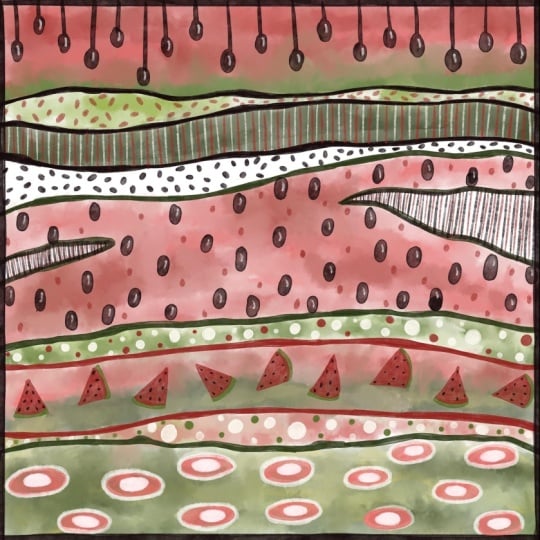
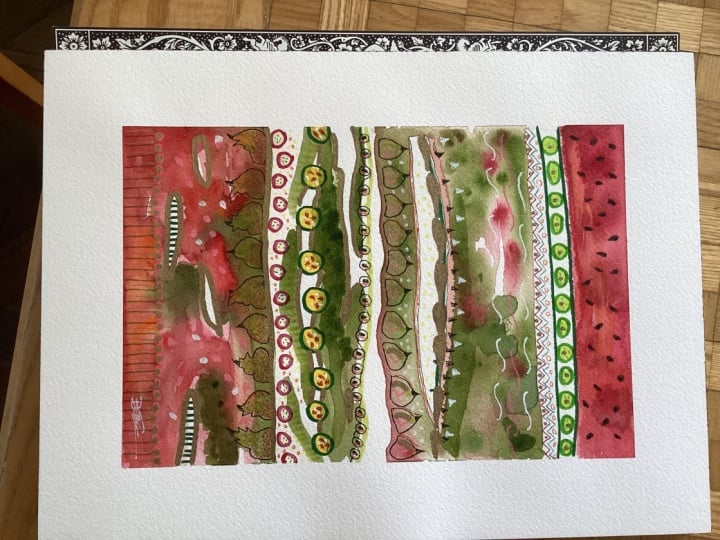
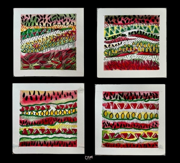
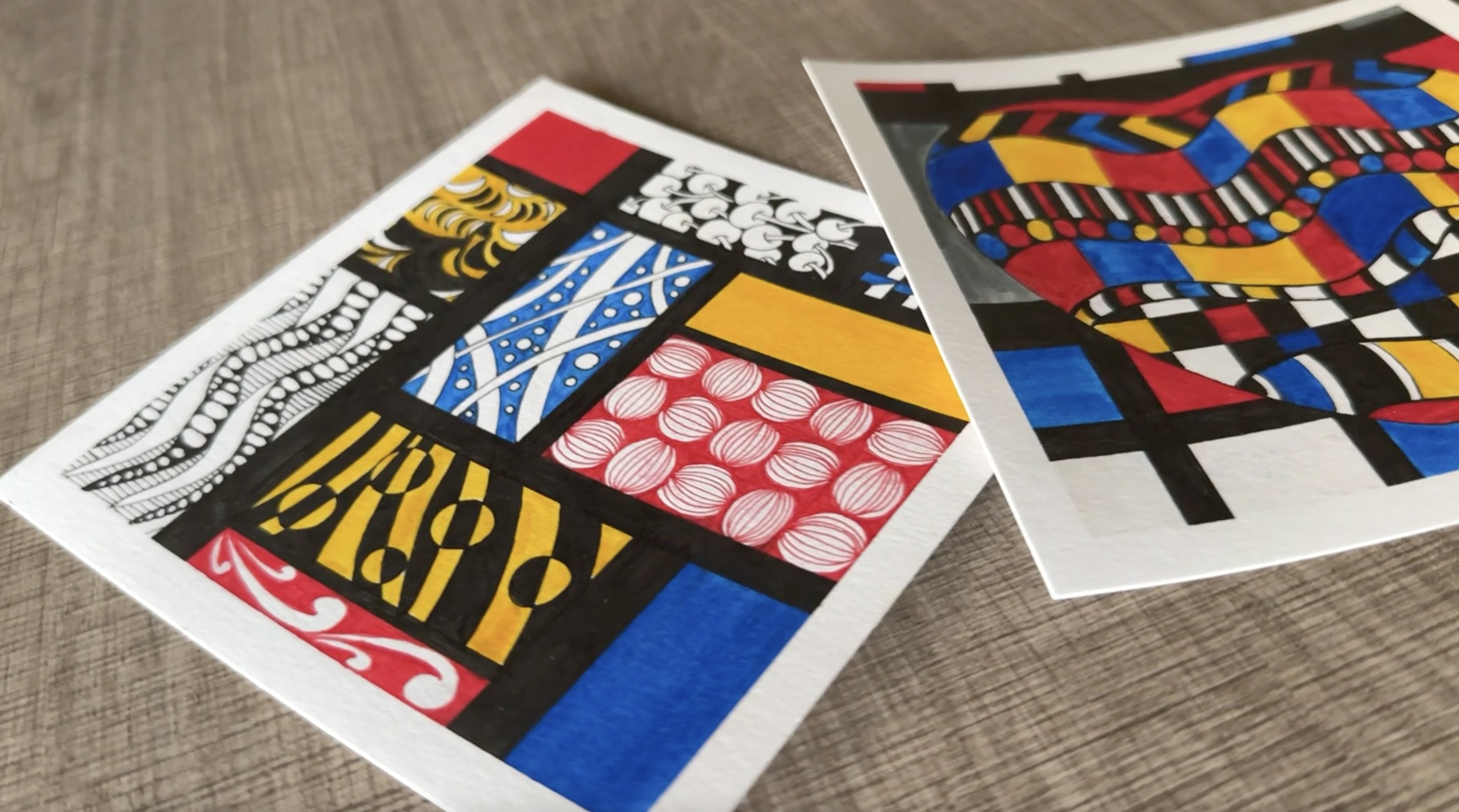
1. Hello & Welcome!: When you sign up for a
traditional art class, one of the first and most
obvious subjects that they ask you to draw or
paint is a bowl of fruits. No offense, but that's
just really not my style. Three, two, one. Go! Drawing your subjects
realistically can be a lot of fun, but it can also be
slightly intimidating, especially if you're the kind of person who prefers to draw stylized or abstract art rather
than hyperrealistic art. And let me tell you
that does not make you any less of a
professional artist. If you ask me, I'd much
rather slice a fruit open and create ten
different abstract artworks, inspired by its textures, colors, patterns,
and hidden details, rather than treating it as a single subject for just
one piece of realistic art. So in today's class,
I invite you to be a little rebellious and to
break a few rules with me. Permission to play granted. Hi, everyone. My name
is Ridhi Rajpal, and I'm a filmmaker and a multi disciplinary
artist from India. I'm also an art educator and a creative entrepreneur running my own creative business by
the name of TheColorBirdie. I love finding inspiration
in unexpected places and transforming
everyday subjects into playful works of art. And in this class, we're going
to be doing exactly that with one of my favorite sources
of inspiration, fruits. Together, we'll
explore how to look beyond the obvious and
discover the shapes, colors, textures and patterns
hidden within fruits. Then we'll use those
observations to create vibrant, playful and abstract
pieces of art. Think of it as
creative liberation. Instead of trying to draw every little detail
hyperrealistically, we're only going to focus
on the elements that excite us and use them as the starting point for
creating abstract art. It's like a little
gamified version of making art where we're
going to observe, extract, abstract, and then create. All with the spirit
of experimentation. What emerges as the final result will be artwork
that's expressive, imaginative, and
uniquely your own. Whether you're a seasoned artist looking for a fresh source of creative inspiration or someone
who is just starting out, this class is
designed to help you see everyday objects
through a new lens. So if this approach
has made you curious, grab your favorite beverage and your supplies and
meet me in class, where we're going to go on
some fruity adventures.
2. Class Overview: Alright. Let's begin our
creative adventure together. In this lesson, I'm going to give you a quick overview of how this class is
structured so that you can make the most of your
learning experience. First things first, head over
to the resources section of this class and download
the class resources document. It contains links to all the reference images that we'll be using
throughout the class. While I've designed this
class as a mixed media class, because I love the
tactile experience of working with
physical art supplies, I understand that not everybody has access to the
same materials, and some artists simply
prefer working digitally. So if you'd like to follow
along with a digital software, you're absolutely
welcome to do so. The process remains
exactly the same. And if you're using
Procreate to follow along, then I've also included
three color palettes that you can download and import
directly into the software, making it easy for
you to get started. And for those of you who like to work with physical materials, we'll move on to the
materials lesson next, where I'll walk you
through all the supplies that we'll be using
for this class. After that, we'll spend some
time looking closely at fruit references and
breaking them down using the creative process that we'll follow
throughout this class, which is to observe, extract, abstract, and then create. Then we'll jump into
the class projects, and I'll guide you through
these projects step by step. You can follow along and
recreate the exact same pieces, or you're welcome to take
your own creative detours. Once you're done, I'd love for
you to share your project. And remember, you don't have to wait until your piece
is completely finished. Feel free to upload work in progress pictures and share your creative journey
along the way. Alright, now that we have
that out of our way, let's move on to
our next lesson.
3. Materials: Alright. Let's begin by taking a look at all the tools and materials we'll be using for this class. First, we'll need some
paper to work on, and you can choose to work on watercolor paper or
Mixed Media paper. For most of my professional
Mixed Media projects, I love using the Strathmore
400 Series Mixed Media paper. It's 300 GSM with a vellum surface and it is one
of my all time favorites. And I also really
enjoy working with Menorah's 300 GSM cold
pressed watercolor paper. For today's class, however, I'm going to be working
with a different paper. I'll be using the 230
GSM Mixed Media paper from this brand
called Zen Sangam, which I've recently
discovered in India. And while it's a little lighter than my
usual paper choices, and it may buckle
slightly with water, it does work beautifully for everyday creative
projects and can handle a wide variety
of mediums really well. So since we'll be using relatively light
watercolor washes, it's more than sufficient
for the kind of projects that we're going to be developing in today's class. So if you also don't have the 300 GSM heavyweight papers with you, that's
completely fine. You can work with something
medium weight like this 230 GSM paper over here. And I also like to tape down the edges of my paper with
washi tape before I begin. This is completely optional, but it does create a lovely, clean border or a faux mat when
you peel it off at the end. And I think it gives your
painting a very polished look, and that's a look that I
personally quite enjoy. So if you also want
a similar result, then you can use washi tape for the edges
over here like this, or you can also
use masking tape. Next, let's talk about paints. So I use a combination of watercolor pans and tubes
from various brands, including Mijelo
Mission, Rico design, Brustro Daniel
Smith, and Sennelier. Some of these are budget friendly while others
are more premium. But honestly, you can mix and match based on your
budget and preferences. I often buy individual
colors from different brands when there's a particular shade
that I really love. To mix your paints, you'll also need a palette. And I travel a lot, which is why I use the built in mixing trays that come
with the watercolor sets. And honestly, these are great. They're portable,
and they save me from carrying extra things in
my bag when I'm traveling. But if you're working from home, you can also use
old ceramic plates, ceramic dishes, or just
regular mixing palettes that you find at
the craft store. For brushes, you don't
need anything fancy. Just a simple round
watercolor brush in a size six or eight will work wonderfully
well for this class. And if you're working on
a larger sheet of paper, then you can probably
go up to a size ten. Now, my own brush collection is a combination of both premium and budget friendly brushes. When I'm creating
professional pieces that I plan to
sell as originals, or when I'm working
with techniques that required a lot of
precision and control, I usually reach for the
higher end brushes from brands like Princeton and the
Silver Black Velvet series. However, when I'm working on more playful or
abstract projects that don't require highly
controlled watercolor movement, like the ones that
we're going to be developing in this class, I'm perfectly happy using much more affordable brushes as well from brands like Camlin. So, honestly, it
all comes down to your budget, preferences and the type of artwork that
you're going to be developing. The most important
thing is that you're using watercolor brushes
rather than acrylic brushes. Watercolor brushes
are often called thirsty brushes because they are designed to hold
a lot more water, which makes the
painting process much easier and allows for smoother, more fluid brush strokes. So yeah, just keep
an eye out for that and pick watercolor
brushes when working with watercolors rather than using the general purpose
brushes which are more suited for
acrylics and poster paints. Then we'll also need
two jars of water, one for rinsing your brushes, which is often called
the dirty jar, and then one for the
clean water that you can use to do clean
layers on your project. And you'll also want to keep a few tissues
or paper towels nearby for blotting your brushes and cleaning up any spills. Now, for the drawing details, I'll be using the sakura
pigma micron pens in a variety of nib
sizes and colors. This is one of my go to brands for all kinds
of drawing work, and it's sort of
like a must have or, like, a staple in my toolkit. And then to add the highlights, shimmer and other
decorative details, I love using the sakura
gelly roll pens. They come in a
range of finishes, including metallic,
glitter, and neon, and they're a lot of
fun to work with. Then I'll also be using my prisma color wax
based color pencils. And if you don't have wax based color pencils,
that's totally fine, feel free to substitute them with any other color
pencils that you have. You can even use
Watercolor pencils. And then, in addition
to all of this, I'll also be incorporating a
few markers into my artwork. So I'll be using
both acrylic markers and water based markers from
this brand called Ohuhu. But you can also
use alcohol markers or other substitutes like
acrylic paints or gouache, if you don't have the
markers that I have. So these can be
substituted as well. And if you like,
you can also use some oil pastels for
mark-making and texture. I like these ones from
Brustro because they're quite affordable and easily available
to me over here in India. But I also have a mixed bag of some expensive ones
from different brands. So yeah, again, this
is not compulsory. This is just a suggestion. If you want to use them, you're free to include them
in your toolkit. And if you don't
want to use them, you can still substitute
this with other materials, and I'm most likely not
going to be using them, but I've just still kept them on standby just in case I
change my mind later. Now, the reason that
I enjoy working with so many different supplies is that each one brings
a unique texture, opacity, and finish
to the artwork. Watercolors create a
soft and flowy effect. Acrylic markers add
bold opaque details, and oil pastels create
expressive marks, and gelly roll pens bring
sparkle and highlights. So together, they create a rich and playful
mixed media look, which is something
that I really enjoy. But having said that,
please don't feel that you need to have every single thing that I've mentioned over here. Mixed Media is all about experimenting and making
the process your own. So feel free to substitute materials, use what
you already have, and adapt the project to suit your style and whatever supplies you have
available with you. And once you have all
your materials ready, I will see you in the
next lesson where we'll begin creating
our project together.
4. Looking at References: Alright, welcome back.
So in this lesson, we're going to be
using photographs of fruits as inspiration for
creating abstract artwork. Now, remember, our
goal is not to create a realistic drawing or an accurate representation
of the fruit. Instead, we're going to be
deconstructing what we see. So we're going to be looking for interesting visual elements
that we can borrow, reinterpret, and then transform into our own abstract
compositions. Now, before we begin, I just want to give
you a quick note about the reference images that
we'll be using in this class. All of the photographs
that we'll be using come from a website
called Unsplash, and Unsplash offers
stock photos and royalty free images under
different licensing terms. So if you plan to use reference
images in your own work, or, for example, putting it as a part of a
commercial portfolio, then I highly recommend taking
a few minutes to review the licenses associated with each image to make sure that you're using
it appropriately. For this class, the
images that I've selected are available
as free downloads. So I've got you
covered over there, and I've included links to every reference image in the
class resources document. So if you haven't
downloaded it yet, now would be a good
time to do that. Okay, now let's talk about the process that
we're going to be following throughout this class. So as you've already learned, our workflow is going to be
built around four stages. We're going to observe, extract, abstract, and then create. But we're also going
to turn this into a little creative
game for ourselves. So every artwork that
we create in this class is going to consist of
four visual buckets. And the trick is that
you have to use all of these visual
buckets at least once. So bucket number one is going
to be defining features. What makes the fruit
instantly recognizable? If you remove those
recognizable traits, would people still be able to guess that it's
the same fruit? Then bucket number two is
going to be shapes and forms, which includes the overall
silhouettes, curves, sections, structural shapes or
anything else that basically makes up the shape
and the form of the fruit. Bucket number three is going
to be interesting details. So this could be textures,
patterns, seeds, veins, folds, color transitions, or any other little visual
detail that catches your eye. And then bucket number four is going to be
abstract mark-making. So these are going to
be expressive marks that help you build
your composition, and they can be
inspired by the fruit, but that's not
absolutely necessary. They can simply
be abstract marks that complement your design. So think of simple
stripes, circles, little shapes, little
expressive marks that basically complement
the overall design. Now, as I mentioned earlier, the challenge is that
every composition has to include all four of these
buckets at least once. You're welcome to repeat any bucket as many
times as you like, but none of them can be
left out. That's the trick. So now, of course, we have to see how
these buckets fit into our overall
four step process. So in the observation stage, we're going to slow down
and really study the fruit. This is where we're
going to be looking at the defining features, the shapes, and the forms, and any other interesting
details that stand out. And then in the
extraction stage, we're going to isolate
those observations. So we'll pull out those
defining features, the shapes and the forms, and the interesting details, and then we'll basically build a visual
library to work with. So this is where we
basically start to deconstruct the fruit
as much as possible. And then we move on
to our third stage, which is to abstract. And this is where
we're going to have a lot of fun because
we start to play. So we simplify, exaggerate, rearrange, combine,
twist, morph, transform all of those
extracted elements, and turn them into
abstract visual forms. And this is also the stage where we'll be introducing our
abstract mark-making, which will help us
to create rhythm, contrast, and movement
in our composition. And then we finally move on to the creating stage
where we're going to bring everything
together and then finally develop our
finished abstract artwork. I know that this sounds
like a lot right now, but I promise that
there's no need to worry. And I know that this sounds like some serious college
level lecture, but I promise that once we start working through
our examples together, the process will become
very intuitive to you. In fact, after a
couple of attempts, you won't even need to remember these buckets and these stages anymore because they'll just
come very naturally to you. But right now, the
reason why I created this little guideline
is so that you have a starting point to begin with. Otherwise, usually,
what happens is that we have a blank piece
of paper in front of us, and then we get totally lost. And we don't know
what to look at, where to begin, what to
deconstruct, what to exaggerate. We basically have a clean
blank slate in front of us. So with the help of these guidelines and
these little nudges, hopefully, you'll be able
to have a starting point. And eventually, like I said, it's just going to become easier because it's going to become
second nature to you. So, of course, I'll be guiding you through every
step along the way, and it's going to be a
lot of fun, I promise. Alright, so now that we have this little college level lecture flow chart
out of the way, we can begin with
our first reference, which is going to be
the dragon fruit. And now, of course, the
first thing that comes to mind with the dragon
fruit is the shape. So it's almost like a
teardrop shape or like an egg shape with a slightly exaggerated bottom and a slightly narrower top. And then of course, the dragon fruit has these little green leafy
things which come out of it, which I've recently got to
know are called bracts. So yeah, we're gonna sound
all science-y and fancy today. So yeah, these are the bracts
that come out of that. So now, I think that these
bracts are basically the defining feature
of the dragon fruit because if we remove
these bracts, without it, the dragon fruit will basically not look
like a dragon fruit. It'll just be like
a little pink egg. So the bracts is what makes the dragon fruit really get that little dragon
fruit like texture, you know, the dragon like look. So, yeah, I think that's gonna go
in the defining features. And of course, there are a couple different ways in
which we can show the bracts, depending on how we illustrate
it and how we draw it. The bracts can be shown as little triangles which are
stemming out of the body, or they can just be scales, similar to actual scales
on a dragon, for example. So it honestly just
depends on how we draw it, but notice how drawing it differently gives you
two different kinds of patterns and two
different kinds of visual elements to play with. So, yes, in its simplest form, the dragon fruit is basically an oval or like a
teardrop shape. And then depending
on how we slice it, it will have some details
inside of it, as well. So, for example, if we slice
it right down the middle, then it's going to
have the inner section with the seeds showing. And then maybe the bracts
are coming out as well. So again, it depends
on whether we're cutting the fruit
horizontally or vertically. And that will give us two different kinds of shapes
and forms to play with. So in that sense, we can
also include the circle as part of the shapes and forms because depending
on how we slice it, we can also get like circular
formations out of it. And then, of course,
we have the seeds, which can be hollow ovals or
they can be colored ovals. So the seeds will
also become one of the defining features as well
as the shapes and forms. And then, of course, depending
on how we draw the bracts, we can have wavy triangles coming out or we can have
simple triangles coming out. I just realized my paper's
going out of frame, so I'm gonna bring that down. Okay. And we can also elongate
the bracts and create, like, these leafy shapes. So yeah, so that's also going to come in the
defining features. And then just to remember, I'm going to add the seeds
inside the circle, as well. So yeah, it looks like we've extracted most of the
basic shapes and forms, as well as the
defining features. And if you like, you
can also keep adding little notes around your
sketches to remember later on. And I'm also going to do an opaque version
of the seeds so that we can play later on with different formations and see which one works best
for our composition. So they can be
hollow, they can be opaque. They can be scattered. They can be put in one line together and sort of
just go in a sequence. We can place them
vertically or we can place them in a horizontal line
going one after the other And then same way
for the circles, we can have them
scattered or again, we can have them
going in a line. And then one interesting
thing that I'm noticing is that depending on how
we slice the dragon fruit, we can have an inner circle
and an outer circle. So that's also something
that we can make a note of. Again, it's just
basically giving us different patterns that we can pull out from
the same fruit, and then we can mix and match these later on in our
abstract composition. Imagine coming up
with all of this all on your own with no
reference images. That would be
slightly terrifying. But that's the beauty
of reference images. They give you a starting point so that you don't
have to feel nervous. And then you basically don't
feel alone in the process of creating these patterns. So I'm also doing a couple more variations of the bracts because I
think I can also make, like, some tiny triangles out
of them, which are curvy. And then maybe the
ones that we did as the elongated bracts can also
have some texture in them. So maybe we can do some
color gradients in them. So I'm just marking that
out with my pencil, to remember that I can add some colors and
textures over there. And then now I'm thinking
that the bracts can also give me an interesting pattern where I can sort of mount
them one on top of the other, which can really enhance the texture of the
scales, basically. So that can happen vertically
as well as horizontally. And I think horizontally, it can also imitate the
effect of waves, for example. If I elongate them slightly, I think we can stack
them like this. And then, of course,
we can also do the ovals and the egg shapes
horizontally as well. Again, they can be in a single line or they
can be scattered. And then they can also have the inner circle or the inner oval or
the inner egg shape, depending on which shape
we're working with. So that's also something
that we can make a note of. It can be with seeds
or without seeds. And you're probably noticing the fact that all my
sketches are pretty rough. I'm not even bothering
to sharpen my pencil and fine tune each of these sketches because these are meant
to be quick studies. I don't want to be in a place where I get so
hung up and caught up in just looking
at the details that I don't move on to
my actual piece. So make your studies
really quick and don't worry about refining every little detail at
the sketches stage. Do your observations and
move on to the fun part. Um, so yeah, even if you're
sharing these publicly, don't worry about what your
sketches look like because, well, they are sketches
at the end of the day. So yeah, moving on
to our watermelon. Um, I think, apart from the
fact that it's an oval, which is the basic shape
and form of the fruit, the defining feature is
going to be the fact that it has these stripes
on the outside, basically, on the outer peel. And those stripes can create interesting effects for us when we start to
play with color. And then, again, depending
on how we slice it, they can be ovals, circles, or even semicircles. Actually, now that I remember, there was also a
semicircle sliced up image that I had seen for
the dragon fruit as well. So I think that can go for
the dragon fruits, too. And then we can start looking at some other It started
raining outside. Hm. Can you guys hear it?
Okay. Anyway, coming back to my fruit. Okay, so we can also do the
seeds in the watermelon. And then, of course, the seeds will become
a defining feature for the watermelon, as well. And then, again,
depending on how we slice it and what kind of reference images
we're looking at, sometimes the watermelons
are also, you know, cut in these cute
shapes which are like little cubes or like
little trapezoids. And sometimes they're
also triangles. So we can include some
of those shapes as well. And then, again, these can be with seeds or without seeds. And then, again, the seeds
can have different kinds of formations like what we did with the circles here or with
the ovals over here. So some of the elements between the dragon fruit and the
watermelon are common. So you can redraw
them if you like, or else you can just
make a note over there and remember to use
it in both projects. And now I'm trying to think of ways in which we can
abstract the stripes. So we can, of course, do horizontal straight stripes, or we can do slightly
wavy and textured ones. And while I'm not working
with color right now, just making these textural marks will help me remember later on that I can bring in some
texture with my colors later. Like, I can do that with
watercolors or I can do that, even with oil pastels. I think oil pastels
will be great to bring in some texture for
the watermelon, rind and the overall, like, the stripy
look on the peel. And then, of course,
the same thing applies to the watermelons where we have an inner
circle and the outer circle. But what I do want
to make a note of is the fact that the inner
rind is basically like the meeting point
between the red flesh of the watermelon and
the outer green peel. So the rind basically has, like, the outer rind, which is the darker green, and then we have the inner rind, which is the lighter green. And the inner rind is
basically the meeting point between the red flesh and
the outer dark green rind. I just want to make a
note of that so that in case later on I'm doing
some color gradients, then I can include something interesting for representing
these features as well. So I think this little thing counts for me as an
interesting detail. It's not so much a defining
feature or shape and form, but it's more like an
interesting detail that I've noticed in the fruit, and I want to later on
incorporate in my project. Then, of course, we can push the boundaries of
abstraction even further, where we can reverse the
colors and the shapes. So for example, we can
do an outer red rind, and we can do the flesh
inside in green color. And that's, I think, going to be interesting
to play with. We can also make these little triangles go upside down so we can flip them. And another thing that we can do is actually do red stripes
instead of green stripes. So, of course, the
defining feature of the watermelon is the green
stripes on the outer rind, but what if we did them
in a different color? What if we did them in red? So that's also something
that we can play with. So yeah, depending
on how you function, you may or may not make notes of every idea that's
coming in your head. It really depends on
how methodical or how organized you
are as a person. For me, I sometimes just keep
certain ideas in my head and other ideas just bloom and come in while I'm
working on the project. So I basically start with
some details and have, like, a little bit of a
reference library with me. But I don't get into too
many details because then, again, I want to leave
some room for exploration. So if you want to go ahead and add some color to your notes to remember each observation, please go ahead and do that. Like, that's something that
I would totally support. For me, I just like to rely on these half baked
notes, so to say, so that I leave some room for
experimentation later on, and I don't get so hung up on my notes that then I later on start worrying
about the fact that, oh, my image is not
matching the notes. So yeah, like I said,
depending on how methodical and how
organized you are, you can go ahead and add these little details
to your notes. You can add color, you can add little text details,
whatever you like. Okay, moving on to some
abstract mark-making. Now, we've already got some abstract marks
from the fruits itself, but I'm going to now do
some basic abstract marks, which I think will go well with both of the
fruits that we've studied. So we can do some
simple vertical lines. We can do wavy lines, some circles, and some dots. And then one thing that
I think will go well with both of these fruits is
small semicircle like marks, which basically, again,
will add in some texture. And we can also
do some S curves, which will look like waves, which, again, I think will
complement both the fruits really well because both
of them have curvy forms. So I want to try and see if we can do some more
curvy details here and there. Alright, so I think that's going to be pretty
much it for me. I think this is where
I'm going to stop. I don't want to
dig too deep into the fruits because then
I know that I will start thinking like
someone who is doing a very realistic
representation of the fruit rather
than someone who is making a playful abstract
piece out of it. So yeah, I don't want to
force my brain to think too much about each of the
elements of the fruit. This is a good enough
library for me to work with. But by all means,
if you're the kind of person who likes
to dig deep into everything and you
want to create more patterns and a bigger reference library for yourself, Feel free to spend a few
more minutes on this, or you can even study one more fruit as an
additional example. And whatever you come up with, feel free to share it
in the project section because that way, everybody can exchange
ideas on what observations they made and probably somebody else missed out on
those observations. In fact, I'm pretty
sure that you all will come up with some
observations that I've missed out. So that'll be fun to look at. So yeah, like I
said, if you want to spend a few more minutes,
go ahead and do that. And if you feel that you're
confident and you're ready to work with the patterns that you've developed so far, meet me the next lesson
where we're going to start working on our
abstract compositions.
5. Dragon Fruit Base: Okay, so we're all set to
start our first project, and this one is going to be
inspired by dragon fruits. I'm just starting off by taping down my
paper to my table. This one is a medium weight, 230 GSM Mixed Media paper, and not my usual 300 GSM heavyweight watercolor
or mixed media paper, which means that
it will start to warp once I add a lot
of water and pigment. So taping it down gives me
some control over the warping. Of course, it's not gonna be as controlled as
heavyweight paper. But like I mentioned earlier, I don't mind this paper for
low pressure activities, and if you're using a paper
that's similar to mine, I highly recommend
taping it down. Okay. And once we are set, we can start adding
the watercolors. We want to do simple stripes and blocks of color
on the paper, and I'm starting with a very, very diluted mix of the
color that I have over here. This is actually a mixture of permanent rose and permanent red from the Mijello Mission brand, and I'm starting with
a very diluted mix. And then I am adding in
some more saturated pigment randomly to create random
areas of light and dark. And then same way, I'm going to load
my brush with water and do a nice big chunk
at the bottom, as well. I'm going to start light and then gradually build
up the saturation. I want to leave some
negative spaces, but I think I want
to do them slightly higher up on the paper and
not so much at the bottom. So I'm just roughly
marking that out, and then I will add
water and pigment randomly to create patches
of light and dark. And, of course, you're free
to be as random as you like. There are absolutely
no rules over here and no single right
way of doing things. So don't worry if your composition does
not look like mine. In fact, I would
encourage you to do it as per what you
like best so that your artwork becomes uniquely yours and reflects your
personal style and aesthetic. And I'm just doing, like, about four or five
stripes, but, of course, you can increase or
decrease the number of painted sections as per the paper size that
you're working on. If you have a bigger paper size, then it makes sense to
do a few more stripes. And of course, you can do more green ones and
less pink ones, or you can choose to do only pink ones and no
green ones at all. So feel free to play around
with the project and have fun with it and do whatever
comes naturally to you. Now, I don't want this area
to be completely pink. So I'm just adding a few drops
of green here and there. And I'm being very
intentional about this, because I just want
specks of green to blend in organically without
overpowering the pink. And we basically want
to do specks instead of blends so that the color
does not become muddy. So be very gentle when
you're adding these spots. And whenever you want
to switch colors, always make it a habit to
first clean the paintbrush in a clear water jar and then load the brush
with the new color. That way, your colors
will not be muddy on the paper as well
as your palette mixes, and your palette mixes will then basically stay undisturbed. And then same thing, I'm
just doing a patch of light green and then adding in some darker
tones here and there. You can see that I'm not aiming for perfect lines over here. It has to be as random and
organic as you can make it. And I would say, don't
think too much and just lay out the
color intuitively. And I will actually connect this green patch to another
pink patch right below it. So I'm just adding some
plain water first. And then you can see
that the green pigment instantly comes flooding
down into the clear water. And then I'm just going
to add in some pink and let the colors
flow into each other. That's just the beauty
of watercolors. They just flow, blend, bloom, and do their own
thing so beautifully. Okay, the bottom patch
is slightly settled now because it's
been about a minute since we worked on it. So I think I want to
brighten it up slightly, and I'm going to add more
saturated pink spots over here. And I'm just going to
add in some more of that fresh bright green
over here as well. I actually quite like the flooding effect that's
happening over here, but I want to flood it
slightly more on this side, and then I also want to do some more watercolor
blooms on the left side. So I'm adding clear water drops, and this is just
water, not pigment. And I think there's already
plenty of pigment over here, so just clear water drops should bring in
some more interest. If you've already taken
my other classes like the neurographic art class
or the map tangling class, then you already know what
watercolor blooms are. But if you're new, then
the gist of it is that watercolor blooms is a
technique in which we purposely add drops of
clear water or pigment into semi dry areas of the painting to create
a blooming effect. This is a more modern
approach to watercolors, and it is not a
classic one because traditional watercolor
artists actually avoid these blooms and go for
very realistic blending. But the blooms effect has
started to become more and more popular in
modern and abstract art. And personally, I quite like it. I think it looks very
organic and makes the artwork look
very human made. And the blooms take
some time to form. So after you drop the pigment
or the water droplets, you should just let it
sit for a bit while you work on other
sections of the painting. So here, I'm just adding
some abstract waves inspired by the bracts of the dragon fruit while the
rest of the painting settles. And at this point, I'm not thinking about
patterns or final details. I'm just laying down
abstract blobs of color, and that's the beauty of
these low pressure abstracts. You just have to
take it one step at a time and trust the process. And I think that looks fine. Maybe I will just connect
this section over here and just a few more
specs here and there. And now I'm going to let
this sit for a minute or so before I come
back with more water. Okay, so I waited for a
little over a minute, and now I'm just adding in some clean water
drops here and there. Again, to do this, it's very important that
your paintbrush does not have any residual pigment of the previous color that
you were working with, and you have to
make sure that it's loaded with clean water only. Also, you kind of have to eyeball the dampness of
the paper over here, because depending on the
weather and where you live, maybe your paper
dries very quickly. I'm working in the
rainy season over here, so the weather's a
little humid and my paper was wet
even after a minute. But when it's too hot, especially during the summer, then I definitely have
to work a lot faster. Okay, so you can already see some of the blooms
forming very well, and now I will let
this dry completely, and then we'll start
working on the details.
6. Dragon Fruit Details: Okay, we are back. So I let this try for
about 30 minutes, and I quite like the way the blooms have formed and
the way the paint has dried. So now we can start working on the details. Now, let's see. So we can start with the white space over
here, and right away, I want to jump into one of the defining features or the recognizable traits
of the dragon fruit, which is the seeds. So I'm just going to draw a few of these randomly over here. You'll notice that I'm
letting the seeds overlap the paint sections on the
top, as well as the bottom, which makes it look a
little bit more organic, and it looks like the seeds are floating or that they are
scattered all around. And I'm choosing to do this in the white
section over here. But you can definitely do it in one of the
painted areas, too, or you can choose
any other section of the painting where you have some negative space
and do it over there. Whatever I do in
my demonstrations, they're just guidelines
and suggestions, and by no means, they are
strict rules to follow. So you're totally free to interpret the project
anyway that you like. And I'm just going to add a few more random
ones over here as well and let them overlap the painted
areas a little bit more. And since I'm already working with the black pen right now, I think I'm also going to add the other defining feature
of the dragon fruit, which is the bracts. So I'm going to do it in a very loose inky
style where I'm purposely creating uneven lines and organic loose strokes. It's almost as if I'm
sketching it out. So again, don't try to
be too perfect over here and aim for a
loose grip on the pen, and that will lead to
free flowing strokes. No. And now I'm going to bring in my color pencils and start
to color these bracts. I'm going for a very heavy, deep rose color over here and just putting
in a little bit of the light yellow and the greenish yellow and
some fresh bright green. And I'm not going for a very realistic
approach over here. You've seen my other
color pencil classes, you would know that I
always encourage you to start with the lighter layers
and then build gradually. But over here, I'm
going to give you some freedom and
permission to play. You can go random if you like, as long as they're sort of
blending into each other well, it doesn't matter which order you choose to apply
the color pencils in. Of course, you don't
want them to be muddy, but at the same time, you can
sort of do it in batches. Like you can do all
the yellows together, all the greens together, and then all the deeps
or the pinks together. Look. And again, you will notice that some of the color is going
outside the pen lines, which I'm totally okay with because we're not
aiming for perfection. And I'm going back and forth to blend the
colors a little bit. But again, I'm purposely leaving some parts
as it is so that the organic texture
of the colour pencils and the lines and the
strokes remain as they are. Okay, moving on, I now want to play with
some basic shapes. So we're already done with two of the recognizable traits
of the dragon fruit, and now I think I want to
switch to some circles which are inspired by the
dragon fruit slices. So I'm going to come to
this really tiny area over here and draw some
small circles. It's giving an art to
my classic zentango and zendodle pieces because I absolutely love
drawing small orbs and then saturating the surrounding areas
with inky details. So again, I'm going to let these overlap the paint
areas at the bottom. And again, I'm not going to
be too perfect over here. I'm just basically enjoying the process of
drawing these orbs. And now I'm just adding some black ink behind the
orbs to make them pop. And I think it'll also help
to build contrast a little bit in the piece because we
already have black seeds, it makes sense to add a few more black
details here and there in the composition. You can, of course,
add these details to as many areas as you like, depending on how many
stripes you've created or how many blocks of color
you have on your paper. And, of course, it
also depends on the size of the paper
that you're working on. But for me because I'm
working on such a tiny paper, I think I'm just going to do
one row of orbs over here. Okay. And now I'm thinking
that maybe we should add those triangle tips
over here like the smaller bracts pattern
that we had practiced. So I'm just going to fine
tune these a little bit, make them more pointy. And then we'll add a few of these loose curvy triangles
and bracts over here. I don't know why,
but this suddenly reminds me of sharks
in the ocean, you know, when they're
partially visible. So yeah, it's like sharks floating or swimming
in a pink sea over here. Okay, time to
switch it up again. So we're going to do some
more of those slices. But this time, we are going to do it with
an acrylic marker. So I'm just going to start laying down some
circles over here. It looks like this pen is
not giving pure white ink. The nib seems to have absorbed some of the
watercolor pigment from my previous projects. So I think I'll just
have to clean this up a little bit on a
scrap piece of paper, and that should get
the ink running. And, yeah, that's
better. There we go. Yeah, but then again, I think
I'll have to layer this at least three or four times
for it to be fully opaque, because right now it
looks like the nib is still absorbing some of
that color from the paper. And Yeah, okay, this is
getting better with each pass. So I think I'm going
to do it a couple more times so that it's
fully white and opaque. And of course, depending on the brand that
you're working with, some acrylic markers take
a little more time to dry. These ones from O huh, as
you can see right now, they're fairly quick to dry, which is why I'm able to layer them pretty quickly over here. And with each pass, the ink is becoming cleaner and it's
becoming pure white again. So, yeah, I think these are pretty
decent markers to work with. Okay, now I'm going to
bring in my color pencils, and I'm going to start
outlining these circles. Now, of course, you can do
this with any other medium. If you don't have color pencils, you can continue working
with acrylic markers and use a pink or a magenta or a
deep purple acrylic marker, anything that goes with
your existing color palette and start to outline
these circles. But again, don't aim for perfection and just go with
uneven strokes over here. Even if some of the
outlines overlap the inner circles,
that's completely fine. I actually love this color. This one is process red from the Prisma
Color Pencil series. And this is one of my
most used pencils, which I think you can make out by the fact that
this is the shortest out of the lot that
I have used so far. So I keep replacing the pencil over and over again because, yeah, I run out of it
very, very quickly. Alright, so now I want to
add some more pink details, but I also want them to have a little bit
of shimmer in them. So I'm going to use
this jelly roll pen that I have from Sakura. I don't remember the
name of this series. I think it is the
moonlight series, but jelly rolls
basically have, like, a bunch of these
beautiful series of pens where you have
shimmers in the ink. And this one, even though it looks pink in the beginning
when the pen is wet, it leaves a nice golden shimmer on the surface once it's dry. So I'm just going
to use this to add some simple stripes on this
green section over here. And so now we're
basically getting into the abstract details and
mark-making territory. And I think you can make this
out in the light over here when I move my paper that
the ink is pretty shiny. So I'm just going to add one more thin line
of it over here. And I know that it's
not very obvious on the camera right
now, but yeah, once it dries and
once I move my paper, you should be able
to see the shimmer. Okay, now, same thing. I want to saturate some
areas with green ink, so I'm just going to
bring in a green pen now. This one is my water
based marker from Ohohu and I'm just going to
outline this negative space over here just so that
the slices that we have created can pop out a little bit more against the green lines. And I'm also just going to add a thin one under the Shiri
stripe that we have created. And since we have done
stripes on the top, I'm going to use
this pen to create some simple stripes in the negative space
over here as well. I'm not going to cover all
the negative spaces because, well, that's the point
of negative spaces. They give some breathing
room in the composition. So I'm not going to
cover all of them, but I'm just going to add
some details here and there. And again, I'm not looking
at things like balance or harmony or contrast
in too much detail. I'm just basically letting
my intuition guide me and whatever I feel like doing in that moment,
I'm just doing it. So none of this is planned. And that's the
whole point of it. We want it to be relaxing
and playful and sort of like an exploration of
maybe unused materials that you have or new patterns
that you can discover. So yeah, just
basically have fun. For the seeds over here, I'm again using my
sakura micron pen, but you'll notice that
I'm making the seeds a little bit smaller to the seeds
that we had done earlier. So I'm basically trying to vary the proportion and the sizing as I'm building the
piece bit by bit. And again, I'm doing
this with the black pen, but you can definitely
try out a version where you do the seeds
with green pen, as well. I think that would also
look very interesting. Yeah, I think that
looks quite nice. And now let's see
what else can we do? I definitely want
to do something on the pink section at the top, and I also want to do something behind the watercolor bract
pattern that we have created. So I think let's start with
the pink section first. Want to do the shapes again. So this time, I'm going to use the egg shape of the
dragon fruit body. But again, we're not
going to make it look like a realistic
dragon fruit. So I'm just going to get my
green acrylic marker running. And then we're just going to add some nice egg
shaped bits over here. And honestly, if you feel like you're not able to get
the egg shape properly, you can just do regular
ovals, as well, because they would still be
in a similar visual language. The seeds are ovals, so if you don't do the egg shape over here and just do ovals, that's fine, too. And again, these are quick
drying acrylic markers, so I'm just going to
layer them a couple more times to really get that nice, saturated green pigment and make it pop against the pink
watercolor section. And once again, I'm
going to let it overlap the black seeds
that we had done earlier. Now, I want to give these shapes a little bit of an outline, but I don't want to do that with an acrylic marker
because I wanted to have a little bit more organic
feel where we can also see the watercolor
background partially. So I'm going to do it with a
white colour pencil instead. And I'm just going to
sharpen this real quick. And we can start doing
the outline now. Again, not aiming
for perfection. I think I've said this
about 20 times till now. But I'm just constantly putting reminders out there because
I want you to really, really breathe and just
have fun with the project. Now, again, some of the
strokes are pretty imperfect, but I'm not worried about them. And some bits are overlapping the pink
section in the background, and some bits are overlapping the green acrylic
marker section on the top, which is
completely fine. Now, you see that
the color pencils giving a little bit of
a translucent effect, which is what I was going for because if I had done this with an acrylic marker instead, it would have been
completely opaque. And I want to play with different degrees of
saturation over here and different degrees of opacity so that we can basically
have nice tones, shades and tints of the
same color in the piece. Okay. And I think with that, we've actually managed to put quite a few details of the
shape and form over here, and we can actually
now switch to some more abstract
details or mark-making. So I'm going to come
in with my green pen, which is basically my water
based marker from Oho ho. And I'm going to use
the fine liner side of it and add some wavy
lines over here. And now using the same pen, I also want to add some very, very thin lines between the shimmery pink lines that
we had created earlier. And I think this looks
pretty nice because we have one line which
is not shimmery, and it's with a matte effect right next to a shimmery line. So I think that creates a wonderful little
pattern over here. And now on this wavy section, I want to add tiny
yellow dots using my acrylic marker because that'll just brighten
it up a little bit. Now, yellow can be a
very overpowering color, which is why I want
to use it minimally. And just like the shimmery
pink jelly roll pen that we had used earlier, I also have a green one, which leaves a shimmery residue on the surface once it's dry. So I'm going to use that to add some dots over here
at the bottom. Look. And I'm also going to use this to add an inner egg shape inside the egg shapes
that we have created. If you don't have
a jelly roll pen, you can do this in
another color as well. Or you can use an
acrylic marker which has a shimmery ink in it. I really like this pen, so I'm going to add one more thin wonky line at the bottom, which is basically going
to be right at the edge of the composition once I
peel off my washi tape, and I think that's going
to look very pretty. Okay, now I also want to add a few more floating black seeds behind the egg shaped green patches that we
have created on the top. So I'm just fine tuning some of the existing ones and then just adding a few more behind these green teardrop shapes
that we have created, which, honestly, at this
point, look like avocados. But they were inspired
by dragon fruits. So yeah, just adding
that over here. Okay. And now, if you like, you can call this
piece done over here and you can
consider it finished. You will be the
best judge of where your piece is right now based on how many details
you've added. But for me, I'm just
using my white pen to add a few more floating
seeds at the bottom, as well. And I also want to brighten up the bracts inspired
Watercolor section. So I'm just going to add
some pink dots over here. And I'm also going to use
my pink jelly roll pen and add a few more circles inside the little orbs that
we had created earlier. And this is plainly
for my love of the jelly roll pens because they leave this glittery
shimmery thing behind. And I love that. I think
the teenage girl inside me squeals with joy when
I use these pens. So yeah, I love that. And now just basically
go over your piece ones and see if there is anything else that you'd
like to do with it. Anything else that
your heart desires. Maybe you want to fine
tune some of the outlines. Maybe you want to add
additional outlines. So just go over it once and
just do some final touches. For these little accidental
avocados that we have created, I am also just adding in some outlines with the green pen because on second thoughts, I felt like they needed
a darker outline. Honestly, I think they
look more like avocados now with the dark green outline. But, well, anyway, I like them. And yeah, if I didn't say
that they were avocados, maybe you'd just think of them as beautiful tear drop shapes. So yeah, that's the
beauty of these projects. Everyone sees different things
in these abstract pieces. Now, I'm just thinking
if I want to add any more details behind these
slices that we had created. But for now, I think I'm
just going to settle for a nice thin black
line over here. And now the little teenage
girl inside me is asking for more glitter and more
shimmer on the piece. So I'm just going to use this jelly roll pen
that I have over here and add some details on the bracts that we have
created at the bottom. This one has a nice lemon like color to it with gold shimmer. Et me actually show this to you on a scrap piece of paper. It has a nice, subtle, golden tint to the ink,
so I quite like it. Okay. Okay, and now I'm definitely gonna call this done and remove the washi tape, which is my favorite part. Yay. I love removing washi tape. So yeah, here we go. This is our final
finished piece. And now that all
that jelly roll ink is dried and I'm moving
the paper around, I think you can see
all the shimmer. I'm actually going to refocus this a little bit for you to see all the nice shimmery details
of the jelly roll pens, and I absolutely love the
way this has turned out. And I'm quite sure that yours is looking equally
beautiful and stunning. So I'd love for you to
share your project with me and show me what
you're working on. And even if it's a work in progress, that's
completely fine. And once you're
done with that, I'm gonna see you in
the next lesson, where we're gonna start working on watermelon inspired piece.
7. Watermelon Base: Alright, it's time to start working on
our second project, and this one is
inspired by watermelon. So I'm going to start off with a patch of clean water
over here on the top. And then I'm just going to dilute this red that I have over here and add a little bit of it over here in
the wet section. And now I'm going
to take a very, very strong mix that I have over here of the pigment
with very little water. And just using the
tip of my paintbrush, I'm adding it over
here on the edge. Now, because this area
is pretty wet right now, the strong pigment is just
going to bloom into the water, and it's going to create
some beautiful effects. So I'm just going to let
this be untouched and move on to another section while the watercolors do
their own thing over here. So I think I want to do a nice big red chunk over here in the bottom
half of the painting. And once again, I'm starting with a very, very diluted mix, and then I'm going to
gradually build up the saturation by dipping my paintbrush in the pigment and just dropping it over here. I have three different types of the red color with me
over here on the palette. One of them is slightly cooler. One is sort of like a mix between a cool
red and a warm red, and then the other one
is a more orange red. And personally, I like to mix the warm and
cool versions of the same color
because I think it creates a lot of interest
in abstract paintings. But of course, this
is not a rule. And if you don't have two
or three different versions of the same color,
that's completely fine. You can use whatever you have and actually work with
a single color as well. The good thing with watercolors
is that you can mix two or three different
colors and actually create a full spectrum of colors
with a limited color palette. So if you want to try making two or three
different types of reds, you can take your
base red color and then add in a little bit of yellow to create a
more orangy red, or you can add in
a little bit of blue to create a more cool red. So you can play around with your limited color palette and still have very
beautiful results. And the same thing applies
to the greens, as well. I have a custom mix of an olive green with a little bit of sap green
from two different brands. And then I have the
regular sap green from the Michelomion brand. And then I also have, like, a couple of other greens from
different different brands. So you can definitely
mix and match brands and create your
own custom mixes as well. So just like we did with
the previous project, I'm trying to vary the sizes of the stripes
in this project as well. And I definitely want to
do a few thin ones and some really big chunky sections so that we have plenty
of variety to play with. I don't like that
the darker green is pulling so much over here, so I'm just taking a tissue and soaking up some of
the extra pigment. One of the reasons why this pooling is
happening over here on the edges is because this is a medium weight
make media paper, and it starts to
rise up or buckle up a little bit when we put
a lot of water over here. There's basically a lot of
pressure and tension that's happening around the edges
because on the one hand, the washy tape is trying to push the paper down so that it
stays stuck to the surface. But the water is causing the fibers in the
paper to swell up, and that's why the paper is
rising more to the surface. So when this friction happens, the water starts
to travel sideways because the paper is sort of
bubbling up from the center. It starts to rise
up from the middle. And so the water starts
to travel sideways, and it stops exactly
at the point where the washi tape edge is and
while the water is traveling, it's obviously going to take
the pigment along with it. So you can see the pools
happen on the edges. Now, of course, if you
want to avoid this, you can take a heavyweight mixed media paper or watercolor paper, which will, you
know, stay stuck to the surface with the
help of the washi tape. Or you can also use a glued watercolor paper pad where you can just rip off the paper after the
project is done, and that's like an easy way to avoid the pooling, as
well as the buckling. So, honestly, at
the end of the day, it's just about altering your techniques to suit the kind of surface
that you're working on. Once you try your hand
at different kinds of papers with different amounts
of water and pigment, you'll automatically
develop a system, and you'll know how to maneuver or alter your techniques
to suit the paper. Like I always say, don't get
hung up on the supplies. Use what you have and just alter your technique to suit the materials that
you're working with. The top section has
now settled a bit, so I'm just going in
with a little bit of the green pigment and adding it right at the edge
of that wet section. And this will instantly
create beautiful blends. So this section on the top is basically inspired by
the meeting point of the inner red flesh of the watermelon and
the outer green peel. And then in the middle,
we have the inner rind, which is usually like a light green colour
with hints of red in it. So now that's exactly what
we've created over here. We have red and
green on the edges, and then we have a light pink and green mixed in the middle, which is basically
like the inner rind. In this patch over here, I want to do a section
where the green meets the red in a slightly
more abstract manner. So I have a very,
very diluted red. And then I'm just going to
connect it with a very, very watery diluted green. M You've probably noticed that I'm working with
multiple brushes over here, and that's because
I've allocated one brush each to a color. And this way, I can
remember not to mix them. And also, it saves me a
little bit of time, you know, in the cleaning of it because I have one brush also allocated
to the clean water jar. So this way it saves me a little bit of
time in the cleaning. And then, of course,
it's an easy way to remember which brush
belongs to which color. In this big red chunk
over here, again, the pigment and the water has started to go towards the sides, which is why the middle
section is pretty dry. So whatever droplets I'm
adding over here are just basically staying
static on the surface. They're not blending
into the wet areas because the paper is
pretty dry over there, and the wet areas have
actually moved to the sides. But I don't actually mind
it because these droplets will dry and then
they will create a little pattern over
there on the dry section. So that's also fine. Of course, if you feel that
that's not the kind of look that you're going for, you can always add a
little bit more water over there and just blend
the whole area again. You can reactivate the
pigment on the same patch. And now I'm just adding
a little bit of water here and there to
create a few blooms. O I'm letting a few seconds pass to see how the
blooms are forming. At this point, I'm
not very fond of what's happening in
the big red chunk, so I just want to wait for a few seconds to see
what else I can do. So I love the blooms
that are happening over here as well
as at the bottom, but I don't like
this middle section. So I'm just using a tissue to soak up those droplets
that I had added and also soaking up some
of the pigment from the sides because it looks like it's going
very, very flat. And now I'm just adding a
little bit of water over here to just make this
whole area flat again and just reactivate all the
pigment and blend it into each other so that I can
work on it once more. In some places, there
are harsh lines because the pigment has dried very
quickly and I don't want that. So I'm just basically taking
my paintbrush and going over it a couple of times so that
the harshness goes away. And I'm again soaking up
the extra pigment because I want to now build this layer a little bit
more intentionally. What I think I added a lot of pigment
in the previous pass. So this time, I just
want to add very, very controlled little
droplets so that the blooms form
better this time. Honestly, I'm quite glad that this happened while recording the video because I
always get questions about reactivating a section that you have already painted. So you actually saw
me reactivating the whole area and basically
building it up once more. So yeah, I'm just
going to let this sit for a couple minutes, and then I'm just going
to come back and maybe add a few more water
droplets to create blooms. Okay, so I let this sit for exactly 1 minute and the
surface is almost dry, so I have to work quickly. I'm just taking a wet paintbrush and adding in some
of the droplets. Because the surface
is almost dry, I have to take a
little bit more water to create the blooms effect. And, of course, this section of the painting will
dry very quickly now because we had
soaked up so much of the water and the
pigment earlier. I'm also manually and intentionally creating
some sections over here so that this resembles more of the watermelon
flesh texture. And I think now you can actually
see the blooms forming. So I think I just want to add
one final thin red stripe, and then I'm going
to let this dry. And And while this is drying, I want to show you a few
more watercolor backgrounds that I have prepared using the same color palette and a similar composition because I've noticed that when
beginners make abstract art, they start to compare their watercolor backgrounds
with those of others. And honestly, I
don't think that's a great idea because if you
see this one over here, you can see that
some of the pigment over here has not bloomed
the way I wanted it to, whereas it's beautiful
at the bottom. And in this one, you can
see that the pigment has behaved very differently because I did this with the
air conditioner on. So the breeze was causing some parts of the paper to dry more quickly
than the others. But I do like the blend that
has been created on the top, similar to what we
just did right now. And then in this one over here, I really like the
blends on the top over here and maybe a little
bit of the red sections, but I'm not particularly
fond of the rest of it. So yeah, these are basically different versions
of the same project. And I want to show
you these to tell you that there is no such
thing as right or wrong when it comes to
watercolor textures or backgrounds because
each person's paper, each person's pigment, each person's way of
handling the brush, the water quantity that
the brush holds are all variables which always will
create unique results. There is no fixed
formula to this, and each time you work with a different brand of the
paintbrush, the pigment, the paper, and in
different temperatures, you are always going to end
up with different results. So, yeah, it's just all
about familiarizing yourself with a few
brands of papers, paintbrushes and
pigments that you like, and then basically practicing
the technique over and over again so that it becomes
a system in your head. But other than that, there is no such thing
as right or wrong. Sometimes playful,
happy accidents happen, and sometimes they are
complete disasters. But that's the beauty of
working with watercolors, especially, you know,
abstract art in general. So yeah, just don't compare your pieces
to anybody else's. Whatever you have come up with, I'm sure it's beautiful, and I'm sure you'll find a
way to work with it once we move on to the stage where
we're gonna be adding details.
8. Watermelon Details: Okay, so this has
completely dried now, and we can start to add some details into this beautiful background that we have created. And honestly, I'm quite happy
with the big red chunk now. I'm glad that I decided
to redo it because the texture and the blooms
look a lot better now. It's pretty close to
actual watermelon flesh. And even though it did take a few extra minutes to reactivate the area
and do it again, the effort was totally worth it. Okay, so now I want to start building
on the same red patch, and I want to add some
watermelon seeds over here. So I'm using my sakura
pigma micron pen for this. And I'm doing the
seeds as ovals, but you can also choose to
do them as tear drop shapes. It's totally up to
you how you want to represent this defining
feature of the fruit. And you'll notice that I'm not covering the entire
red section over here. I'm just sort of placing
the seeds in the middle of this section and leaving some space at the
top and the bottom. Now using the same black pen, I'm also going to add a couple of thin lines in
the green section. I'm going over the line
a couple of times to add some line weight
and also to make it look like it's slightly
crooked or jittery, kind of like jagged edges. And I think in this composition, I want to use black a little bit more than
the previous one. So I'm just trying to
look for places where I can add tiny black
details here and there. Now, another defining feature of the watermelon
was the stripes. But instead of doing a very
literal representation of it, I'm going to use my markers, and I'm going to make
some straight lines or some bold stripes
with straight edges. And for this, I'm going
to use a different green, which is something that I've not used in the palette so far. And this way, we can bring in some more interest as well as some more variety in the piece. M and now for all these
white spaces over here, I'm going to use my darker green pen and
just fill those up. Now, as we were discussing earlier during the
referencing stage, you can also choose to
do these stripes in red. You don't have to
do them in green. And in fact, if you like, you can also make them
more textured and organic looking so
that they resemble a little bit more to the actual watermelon
stripes on the nd. So you can basically customize little details on
your project and you don't have to do the
exact same thing as me. So feel free to experiment. Okay. And with that done, I want to move to
the top section, and I want to add some
abstract line work over here. But because I really like the
watercolor blend over here, I don't want to
hide it completely. So I'm going to do some simple lines and then
add some ovals at the bottom. They're sort of like
hanging bobbles or Christmas ornaments, and basically the ovals at the end will match well with the seeds that we
have already created. So again, I'm just basically playing with
some abstract shapes and formations over here
and looking for interesting ways to use the
same shapes again and again. Then I think I also want to add some simple lines in the
negative space over here, which is, again, in the same visual language as the stripes
that we have done. Okay. And now for some
abstract details, I want to use my
white acrylic marker, and I actually want to use the round nib of this
pen to add some dots. So this acrylic marker from Ohohu has two different
kinds of nibs. So you can flip them around and use the nib that you like. And with this round
nib or the dot nib, we can actually create
different sizes of the dots with different
amount of pressure. So the more pressure you put, you'll get a bigger
dot, basically. And the smaller dots don't
require a lot of pressure, and they just happen with
a very, very light touch. I do also want to add a nice bright red
chunk of triangles, which are basically inspired
by the watermelon slices. So I'm going to
get my marker for that because it's a
very nice bright red. And I think I'm going to add it over here in
the negative space. Again, these are not a realistic representation of the slices because I'm kind
of joining them together, and I'm not really leaving any space for the curvy bottom, and I'm not really showing
the rind at the edge. So it's more or less like an ornamental decorative element inspired by the references
that we created. And now I think for some
more decorative details, I'll add green triangles
as well in the middle. And now, of course, all of this comes down to
personal choices. I'm a bit of a maximalist, so I like to add in a lot of
color and a lot of details. But if you like
more white spaces in your compositions and if you prefer a more
minimalistic look, then you can definitely
avoid some of these steps. And then once again, I'm going to do some black
seeds over here. But again, these will
be smaller in the size. And I will also vary the direction a little bit to make them look more organic. I actually quite like
this size of the seeds, and I think just for the
sake of harmony and unity, I'm going to place it once more over here
in the white space, but I'm just going
to give it a little bit more of a
formation this time. And, yeah, I think
that looks good. So I think what's intuitively happening
right now is that I'm currently vibing more with the ovals and the curvy forms
rather than the triangles. And I think I will also
do some ovals here, and maybe we will color
these as well in a bit. So it basically just depends on your intuition and what you're
feeling in that moment. Maybe you want to do
more structured forms and maybe you want to do more straight lines and triangles. Right now I'm feeling like I
want to do some more ovals, so that's why I'm
adding them over here. And maybe I think
I will also add some more lines over
here in this tiny space. None of this is planned.
It's all pretty intuitive. So I'm just kind of
making this up as we go. Maybe it'll be a mess, and then you'll see me
correcting everything, like, while the video is recording, or maybe it'll just
turn out to be good, but currently I'm getting
a good feeling with this, so we'll just carry on. Oh, I just had an idea. I think I want to add some tiny white curves to these seeds. So they kind of,
like, highlights, like little arcs, basically. And white on black basically brings a lot of
interest and contrast. But then it's also
a kind of nod to the wet and glossy look of these seeds with
the tiny highlight. So I think that
looks kind of nice. And then with this same white jelly roll
pen that I'm using, maybe I also want to add some ovals here
in these stripes. So again, these are just
for ornamental value, and these are just tiny decorative details
that I'm playing with. Feel free to skip any
of these steps if you think that this is looking too much for your composition. Or maybe if you just want
to add some extra details, feel free to do that, as well. I also want to do
some more thin lines. So kind of like veins that we see in the
watermelon flesh. So maybe with the
same white pen, I can add some more
lines over here. These lines are actually
pretty fun to draw. So I think I'm going
to do a couple more with the red pen, as well. And again, this red pen is
the sakura pigma micron one. We can also do this with an acrylic marker or like
the alcohol ink marker, but the nib sizes of those
are slightly bigger and thicker than my
pigma micron pen, so I'm just using the
thinnest pen that I have. A Okay, so at this point, I'm pretty satisfied with this, and my battery is running low. So I think that's a cue for me to take a little coffee break, and then I'm going to come back and continue adding some
more details on this. Okay, so I had a
nice cup of coffee, and while I was
drinking my coffee, I got tempted to start
working on another piece. And so I created some details on this other watercolor base that I had shown you earlier. And I actually tried to do
it slightly differently than the piece that we
were working on together just to show you
some more possibilities. So, for example, if
you look at the seeds, I've done them in white with a black outline and I've also done the watermelon slices
in a reverse color palette. So the triangles are green
and the rind is red. And now it kind of looks like a kiwi and a watermelon
had a little baby. So yeah, but that was
interesting to play with. And, yeah, again, I've done some ornamental
details here and there. I've played with some stripes and just played with different
formations of the ovals. So this is, again, a
different interpretation of the same patterns and the same abstract marks
and the same shapes. And now I think I want to
finish both the pieces together with you so that you can just see
me playing with them. And hopefully that'll
give you some more ideas. So first up, I want to get
my jelly roll pen started. And so this one is
basically a green pen, which has a nice
golden sheen to it. So as I'm moving my scrap piece of paper around, you
can see the sheen. And I'm going to use this to add some more decorative details on the piece that
we were working on. I basically love adding
shimmery glittery details, and I always look for different ways to
use my jelly roll pens. So yeah, you're
gonna see me using jelly roll pens in literally
every project possible. Honestly, at this point, I'm quite tempted to start working on a third
piece, as well, because I think it'll make for a nice series of watermelon
inspired abstract art, but I'm just going to finish off these two with
you guys first. So one thing I'm realizing is that the bottom
edge will not look as impressive or as polished and finished once I remove
the washi tape. So I'm just going to
use my dark green pen to saturate this
area a little bit. And I think that
kind of just, like, gives a nice ending to the composition or
it's like a nice edge, and it'll look nice once
we remove the washi tape. Honestly, with these
abstract pieces, you can choose the orientation. You can flip them around and make them upside down or you can just use them horizontally. There is no right or wrong
in these abstract pieces, but I'm currently vibing
with this direction, which is why I'm kind of trying to focus on the details
in this orientation. So again, similarly, I want
to use a red jelly roll pen, and I want to add some details inside these
ovals that we've created. Honestly, these
ovals now remind me of something similar
that I have done in my other class where we did patterns inspired by
Gustav Clems art. And now I think I want to give a similar treatment
to these ovals. The jelly roll pens sometimes
keep getting stuck, so you kind of have
to start them again. I want to spread the
shimmery details all over the piece instead of keeping them contained in one section. So I'm just looking for
more opportunities in areas where I can use more of
the jelly roll pens. So I think maybe a little
stripe here will help. And then maybe I'm just going to outline this negative
space as well. And then let's see. I think I also want to add some red stripes at the bottom, as well, because I think
it'll brighten up the area. And again, when I
move this around, I think you can see the
beautiful shiny details. I love the jelly roll pens. I think I've said that
100 times till now, but I absolutely love them. Now, because the
red triangles that I added are quite bright, I'm looking for ways to balance that in some other places
of the composition. So I am purposely trying
to brighten up some of the red spots
and just saturating that with more ink so that there is unity and harmony
overall in the piece. So basically, that's the
red. That's quite bright. So using the same marker
that I used over there, I think I'm also
just going to add a tiny line at the top
of the composition. And now I kind of like this
because it's almost like the red and the
green are sort of like book ending the design. So we have these saturated lines on the top edge as well
as the bottom edge. And then in terms of the
overall look and the design, I'm quite happy with this, but I do want to add some more tiny little shimmery details. So I'm just going to
use some patterns or some tiny ornamental
details which are not going to overcrowd the design and take away from
the main focus. So, for example, over here, I'm just using the
red jelly roll pen and adding in some tiny dots, which are not taking away the focus from the black
seeds that we had added. And again, these will
look stunning once we move the piece
around in the light. Right now, because the
camera angle is such, I'm quite sure that you can't
see a lot of the shimmer, but I'm sure you can at least make out a little bit of it. But it definitely does
look beautiful once you move it around and when the
light hits it at an angle. And then in this negative space, I want to add some
more lines using the green shimmery
jelly roll pen. And then maybe just add a nice thin line
over here as well. And then in this middle
section over here, I think I just want to
add some diagonal lines. So again, they are connected
to the lines that we have done so far as in they're in
the same visual language. But I'm just trying to create
some variety by adding in different angles or
different orientations or different sizes of
the same elements. And I think I also want to add some more red jelly roll ovals over here in this
green stripy section. So these are, again, like
little ornamental details. It's getting pretty
decorative at this point, which, honestly, I quite like. But this may not be
your aesthetics. So if you feel like you're
done with your piece and you want to stop and you don't want to do these
additional steps, you're totally
welcome to do that. And then coming back
to these ovals, which were loosely now inspired by Gustav Klimt compositions. I'm also gonna just outline
these with the green pen. Now, in this section, again, I want to add some
tiny red dots, but I'm purposely avoiding the jelly roll pen over
here because I want to add them in a more matte effect
rather than a sparkly effect. We've already done
the sparkly ones. So I think I want to use the same pen that I used
here for these triangles. I was using the sakura
pigma micron pen, but I'm going to
switch to my marker. And this time I'm using
the pen side of it. So I'm just going to go
over these and match the color and then also
add some extra dots. I like that the piece is looking very festive and
joyful right now. This is totally my kind of vibe. I absolutely love such
playful abstract pieces where there's a little
bit of everything. Those green triangles are
looking a little bit flat, so I'm just going to go over them with the green
jelly roll pen. And while the pen
looks green at first, once it dries, it leaves a golden sheen behind
on the surface. So you can see the
gold appear gradually. L. And, yeah, I think that's
pretty much it for this piece. I'm going to now
remove the washi tape. I'm pretty happy with the
way this one turned out, and now I want to actually
move on to the next one. So yeah, I'm just going to remove the washi tape
so that we can see it. Honestly, it just
looks ten times more beautiful once you see it
with the white edges around. The format effect or the frame around it just completely
elevates your piece. So, yeah, that's
our finished piece, and I'm quite happy with it. And I think I'm just going
to fine tune a little bit of the sections where
I've left some empty spots. But other than that, I'm just, like, pretty happy
with this piece. And yeah, this is definitely
going on my wall today. But now since I've shown you the other piece,
and of course, I don't want to leave you guys hanging as to what I
did with that one, consider this like
a little bonus. So I'm just going to fast forward through this so that you can
see the process. It's honestly the same
in terms of, like, the steps because I'm using the same tools
and the same materials, but I'm just trying
to do it slightly differently than what I've done so far with
the other piece, just so that there's a little
bit of variety and play, and I'm basically using the same template where I'm
using abstract details, then going back to
a defining feature, then going to a
shape and form and basically just having
fun with the project. One thing that I honestly always recommend is that
you keep rotating the piece every few minutes
because it helps you to see it in different perspectives
and from different angles, and then you basically
get new ideas for how to fill up the design. And you also then realize which orientation
you like more, and then you start to fine tune the details
according to that. So as you're
building your piece, just keep rotating it
every few minutes, and it honestly helps. You have to kind of do it
to realize what I'm saying, you just have to trust
me on this because it's better experienced
than explained. So you'll have to kind of
experience it yourself. So overall, I quite enjoyed working on this
piece, but later on, when I saw the piece after
I stopped recording, this was the section
that I disliked. I was watching the
video and I was like, hmm, I should not have covered up that
white negative space. So you see me applying the
red jelly roll pen over here, and then I'm basically using a white acrylic marker to give that space a
little bit of an outline. So this is the section that
I later on decided that, you know, wasn't working for me because the negative space
was honestly looking better. Yeah, other than that, I was pretty happy with
this piece as well. And then I also added in some more tiny
highlights to this one, similar to what we did
in the first design. And then I also added
a few more lines. And, yeah, turned out
to be pretty good. And I think both of them
together look quite nice. So I think these two will be companion pieces
that go up on my wall, and maybe I'll just do the rest of the backgrounds as well that I prepped and they'll
all go together on my wall. So yeah, that was the process for the
second piece as well. And that finishes up our
watermelon inspired project. And I can't wait to see
what you guys have created. Please do definitely
share pictures with me and definitely share
your experience with me. And yeah, I hope you keep practicing this technique
on more fruits as well. Now that you have a basic idea of how to deconstruct them, I hope you experiment
with more fruits and more patterns and keep
using this technique.
9. Before You Leave: Alright, congratulations
on finishing this class, and thank you so
much for taking it. Before you sign off, however, I have a little
challenge for you. Can you try to apply
these techniques to a different subject matter? For example, vegetables.
Whatever you come up with, I want you to share it with me. And if you found this
class to be useful, please do drop a
review about it. Your reviews ensure that my classes and my
presence on this platform keeps going forward
and that I can keep building more
valuable content for you. Also, I really value
your ideas and opinions. So if you have any suggestions
for future classes, please feel free to
send them my way. I also recommend that you
hit the follow button on my profile so that you subscribe
to all my notifications. This way, you'll be
the first to know whenever I launch
a new class or add a bonus lesson or host a giveaway or have other
exciting announcements to make. And in case you haven't
already done this, I want to give you a quick reminder to share your project. I reply to all the
projects posted over here, and it will be a
great way for you to receive
personalized feedback. And, of course, let's
stay connected socially. I post a lot of tips, tricks, and tutorials on my
social media handles, so I'd love to be friends
with you over there. So that's all for today. Until
next time, keep creating.