Transcripts
1. Intro: Have you ever made an
illustration and thought, It's nice, but it's
missing something? Maybe it looks flat or the
colors aren't quite right, or it just doesn't have that
polished, finished feel. In this class, I'm going
to show you how to make your illustrations pop in eight
simple steps in procreate. Whether you're a beginner or
an experienced illustrator, these steps will transform your art from decent
to outstanding. And the best part is,
you can apply all of these adjustments
to your existing designs easily and quickly. I have to confess I don't
really like saying 'make it pop', specifically when I'm
working on a project for a client and the
feedback is 'make it pop', it's the worst, but it's honestly the best way to
describe this process. Anytime that I'm stuck
or have art block or I don't know if an
illustration piece or a lettering piece
is actually finished, I follow these steps, and it always transforms my art. It's like adding
a touch of magic. In this class, we're
going to start with an existing lettering
piece in Procreate. You can download that
in the resources. You can also decide to follow along with your own
existing design. Just a quick reminder, this isn't a Procreate
basics class. We're going to go
over the steps pretty slowly so you can follow
along as a beginner, but we're not going to
cover all of the basics. I'm going to use Procreate
for this process, but most of these steps could apply to other tools as well. We're going to focus on the
design and design principles, not on the tool itself. This class is perfect for
beginners and experienced illustrators that want to add that extra WOW
factor to their art. Let's gather our materials
and let's get started!
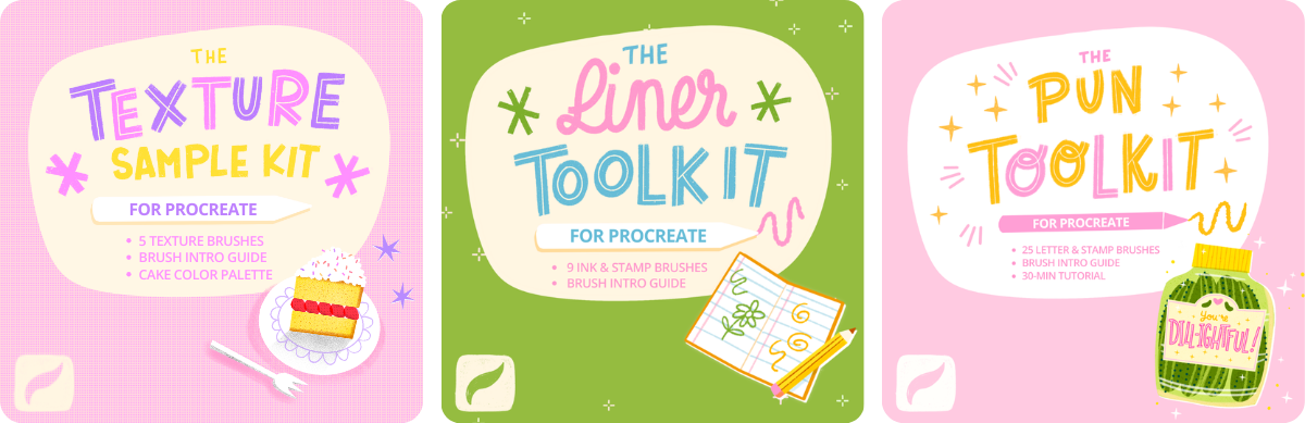
2. Color Profiles: For your class project,
you have two options. You can either
follow along using one of your own
existing designs, something that
includes lettering, but it's not a necessity,
or use my Procreate file. You can download that
in the resources. We're also going to be using some colors in this
design so you can either grab those colors from this file or download
the color palette. So let's open our Procreate
file in the gallery. Whether you're starting
with this that you can follow along with or with
your own existing piece, make sure to duplicate this. On your file, swipe to
the left and duplicate. This way, we don't have
to touch the original. If you're starting
with your own piece, make sure that you have
some stuff saved in layers. As you can see here, I have
all the separate colors in layers and that will make it a lot easier to make
changes to this. If you downloaded
the color palette, this will show up
in your color menu either at the top
or at the bottom. The first thing that
we're going to look at is color profiles in Procreate. To check your current
color profile, go to the Actions menu and then to Canvas
Canvas information. Then in the color profile tab, you can see you've got
several options here. When you make a new Canvas, you've got different color profile options to choose from. The most important ones are
RGB for screens mostly, and CMYK specifically
for printing. Then you also have
Display P3. As you can see, in this file, I already changed that
to Display P3. You don't need to make
any changes here. P3 is a profile that
enables an even broader range of colors than a
regular RGB profile. This is specifically for Apple. So if you're not planning on
printing your design later, just pick the best
color profile possible. Here you can see the
difference that this makes. Keep in mind that if you export
this file to your phone or your PC, it's going to show up differently on different
screens sometimes. Next up, we're going to make some changes to our lettering.
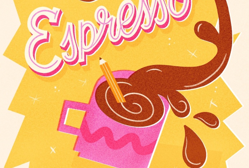
3. Inline Letters: Now we're going to
make some changes to our lettering and we're going to add an inline to our letters. Letters with inlines have a thin stroke inside the
letter forms and this adds a bit of contrast
and it breaks up heavier letters or
heavier shapes. It's also a nice way to add some texture and make the
letters more interesting. We're going to
firstly add this to our most prominent
lettering, espresso. And we're going to use a slightly textured
brush for this. I like to use the
Tinderbox brush which is in the Inking tab, and this is an opportunity
to bring back some color. Let's use pink, the same
pink as our cup of coffee. Of course, let's add this
on a separate layer. Because this is a script, we want to recreate these
curves. To make this easier, you can turn up
the stabilization in the pressure
and smoothing tab. You just want to follow
the curve of your letters. You have lots of
different options here. Instead of just a basic line, you could add dots
or double lines. But I'm just going
to keep it simple and just try to follow
the curve of this letter. By the way, if you found a
brush size that you like, make sure to save
it in the sidebar. To do that, just tap once on the + sign and this way
you can save that exact size. I'm changing the width
of the line in this E. I think it looks
better if it's all just one line width
for consistency. Then to make this
inline just seem a little bit cleaner and
a bit more intentional, this is just a little detail, but you can erase the
edges a little bit, especially because
this tinder box brush has a bit of a sharper end. I think this worked pretty well. We're going to do the same
thing with our other letters. This time we're going
to use a clipping mask. Just create a new
layer on top of your letters 'yourself' and then set that to clipping
mask because this time we're going to, again, create that inline, but create
an inline until the edges. For that, we want
to make sure we're only drawing inside our shape. You can see the inline
is exactly the same. But this time just draw that
inline until the edges. To make these straight
lines easier, just draw your line, hold down your Apple pencil, and then the quick shape tool will create a straight
line for you. This makes it a lot easier to quickly draw straight lines. That is our inline letters done. I think this already
makes such a difference. As you can see, this cup
feels a little bit flat. I already added this
swervy line on top, just a little bit of a pattern. On top of this cup, you can try to add something else with our same tinderbox
brush like a pattern or some stars or lines. In this case, I'm just going
to keep this cup as it is. Let's say you don't have any
lettering in your piece, this would be a
great time to add some details to your
main shapes if possible. Adding these detailed lines, it really helps to make your
work a bit more interesting. I think the tinderbox
brush, for example, is a nice texture brush
that you can use for this. In the next lesson,
we're going to add some dimension
to our design.
4. Adding Dimension: At the moment, our design
still looks a little bit flat. We're going to create
some depth here by adding an additional layer to our main lettering, our
espresso lettering. We're going to create this
3D effect to make our main lettering
more prominent and stand out a bit more. For that, let's
duplicate our layer. Set it to alpha lock
if it wasn't already, and then fill that layer
with our dark pink. Then let's go to the transform
tool and we're going to just move this layer
slightly at an angle, a 45 degree angle more
or less, and that's it. Here we've created
a drop shadow. This is one of the
easiest ways to make your lettering just
feel a lot different, feel a lot more dynamic. Adding a different dimension to your letters like
this works both for bold blocky letters as
well as thinner scripts. We're going to just
finish this up by connecting our pink
layer to our white. Turn off the Alpha lock
on the pink layer, and then we need to select
a brush without texture, something like this
monoline brush. Then we want to connect
all of those edges. Connect all of these edges
all at the same angle. And that's it. Now that you
have that drop shadow layer, you can even duplicate
this and move this even further to
create an even more extreme drop shadow effect. You could even add shading
and highlights to this, but this is all optional. I'm just going to
leave it as it is with our original drop shadow. I really like adding a drop shadow like this to
my letters to make it feel more dynamic and it's
also a nice way to bring back some of the color that you're using
in your design, especially when you're using
a limited color palette. Next up, we're
going to talk about shading and highlights.
5. Shading & Highlights: We're staying on a
similar topic here. We're going to talk about
shading and highlights. Firstly, we want to connect our lettering and our foreground shapes to our yellow background, and we're going to
use shading for that. As always, we're starting with our most prominent shape or
espresso lettering here. Let's duplicate our
pink, our drop shadow, turn on alpha lock if it
wasn't turned on already, pick yellow and then turn the
blending mode to multiply. And then move this at an angle. Here you can see how it
almost feels like this. The espresso lettering is this block sitting
on our background. By adding this
additional shading, you've connected your
lettering to the background. To make this a bit more intense, you can duplicate that layer, move it again slightly, turn off the blending
mode for those real quick and then
merge them together. And then turn the blending
mode back on to multiply. We can bring down
the intensity of that layer by lowering
the opacity a bit. We're going to do the same
with our other lettering, but because these
letters are smaller, we're going to make
this a bit more subtle. Duplicate your layer, turn it to alpha lock,
fill with yellow, turn the blending
mode to multiply, and move it at a slight angle. We can create the same
effect with shapes as well. For example, for this cup, you can duplicate it and do
exactly the same process, or you can draw your
own shading here. Add a layer under your cup. Then I'm just using the
select tool to draw a shape. Then just color drop
the yellow into this. Set the blending
mode to multiply, and then we'll bring down
the opacity a little bit. You can make these shadows as big or as small
as you want to. It just adds another
dimension to your design and even
though it's really subtle, it does really make
your shapes stand out. Now that we've made
all these changes, especially to our lettering, I think our cup looks
a little bit flat. We're going to add
some more shading inside of our cup and
some highlights as well. To do this, we're going to
create a clipping mask. For that, you also
need to make sure that your layer on top, the details on your cup, are
also set to a clipping mask. That way you can add another
clipping mask on top. Let's use our dark pink. Then to add your
shading and highlights, you can use a smooth brush, but I like to use
this noise brush because it's a little
bit more textured. And that makes our shading
less perfect and smooth. Instead of just adding it
right onto our clipping mask, I'm going to select the parts that I want to add a lot more
shading to than the rest. Firstly, let's
select this handle and then we can add some
shading to this handle alone. The same thing with the
bottom of this mug as well. Then also to the
back of this mug, there should be a little bit
more shading there than the rest to create
a bit of depth. Lastly, to the sides
of our mug as well. For just a little
bit of a highlight, you can add some of this
off white in the center. We're going to follow
the same process for the shading but with our coffee. Let's add a clipping mask
on top of that brown layer. Then we're just adding
some subtle shading to the droplets and to
the sides of our coffee. You can use a smoother brush for this process as well, as I said, but I like using this noise
brush or something a bit more textured just to retain a bit of the graphic look
in this design, and it's a bit more subtle. To add highlights
to this coffee, we're going to do
something different. We're going to add some lines with the tinderbox brush again. Use that same brush from
the inlines of our letters, the tinderbox, and then
with our light color, we can just add
some lines to this. Again, this is a nice
way to just break up that big block of that brown color because
it's quite prominent. You can bring down
the opacity of this layer to bring down
this white a little bit. I'm not making any changes
to this pencil here, but you can add some shading and highlights to that as well. You can follow this
entire process with smoother brushes as well, but I like using this
noise brush to add a bit of texture and
to find the balance between a graphic flat
style and using shading. But in a way that it
doesn't distract from the bold exaggerated shapes. That noise brush is
perfect for still getting that textured
tactile feel. By the way, we are halfway
to the final result. If you don't want to make all of these adjustments, that's fine. You can pick and
choose what you like here because this process is about you discovering how you can take your art
to the next level. If you want, you can
totally stop here. Don't forget to upload your result to the project gallery. I would love to see what
you created so far. Next up, we're
going to talk about filler elements and flourishes.
6. Dots, Stars & Swirls: As much as I love this
yellow background, I think it would be nice
to add something here to break up that big
block of yellow. We can do that by adding filler elements like
dots, stars, flourishes. This is a nice way to
fill up the empty space, especially around lettering and it makes the layout
feel more dynamic. Let's create a new layer and
let's use our white color. Well, off white, this is the white color of our
background and our lettering. If you have any little shapes saved as stamp brushes,
you can use that here. But we're going to use
the tinderbox brush and draw these filler
elements ourselves. The way that you use
these embellishments and accents, flourishes, they can totally become part of your style because they set the tone of
your piece as well. I like to usually add big retro stars and they have definitely
become part of my style. But they can also
be really subtle and blend into the
background a bit more. It feels like a pattern
or a texture in that way. In this case, let's pick
something that's a bit smaller so it doesn't draw
the attention in too much. Let's try two different shapes. Maybe these little stars, and then we can add
some dots as well. So try to balance them out
throughout your canvas. This is also a nice way to
bring back some colors. By reusing that color in
your filler elements, you can make your design feel a lot more balanced as well. And that's it. I think this already feels a lot more interesting to look at. In the next lesson,
we're going to add some more contrast
to our design.
7. Offset Effect: At the moment, some of our
colors are quite similar, especially our pink
and our yellow. In intensity, they're
just quite similar. We want to try and create
a bit more contrast here. If you want to check
the tones of your work, you can do this easily by creating a hue layer
on top of your work. Add a new layer on top, fill it with black and set the blending mode to
hue or saturation. This turns your work
into gray scale, and now it becomes
a lot easier to see which values really
stand out from the rest. And here you can see,
it's even more clear that our brown is really
in contrast with the rest of our colors and then our pink and yellow just
feel really similar. You could fix this a little
bit by simply changing the colors or changing their
saturation, their brightness. We can also add white layers in between our colors
to add contrast. I like to use this technique
a lot when I'm working with a limited color palette or my tones are just
really similar, especially when using lots
of subtle pastel colors. This is just a great way to separate your colors a bit. This cut out
technique is actually a consequence from
printing back in the day. With offset printing, your
colors are printed separately, and then when layers of color don't line up perfectly,
you'll, on one side, see these colors overlap a
bit and on the other side, you'll have white edges
between your layers. You can create this to give your designs a bit
of a retro look, but it's also just a
really great technique to separate your layers and your colors and give your illustration a
really unique feel. We're going to do this
to our biggest shapes to separate it from our yellow
background a little bit. Let's start with our mug. Let's duplicate that layer and
then the layer underneath, Let's set that to Alpha lock
if it wasn't already. Then we're going to
fill this layer, not with our off white
but with pure white. With the selection tool, let's move it slightly. Now you already
see, now we've got this little white edge between
our pink and our yellow. Next up, let's change the
blending mode of our mug, our pink layer, to multiply so that our colors will blend into each other
on the other side. Here you can see even with just a little bit of a subtle movement, on the one side, you'll
have that ink bleed, the colors blending into each other and on the other side, a white edge as if the printer misaligned colored
layers basically. Let's continue and
do the same thing to our espresso letters, to
the drop shadow layer. Duplicate your pink
espresso layer. Alpha lock, fill it with white. And then move it slightly. In this case, we
don't really need to change the blending mode of our pink layer to
multiply because we can't see it anyway because of
our white letters on top. We'll do the same thing with our other letters with 'yourself', duplicate Alpha lock,
fill with white, and move it slightly and then change the blending
mode to multiply. Let's also do that
to our brown coffee, even though this color already
stands out from the rest. Lastly, let's also do the
same thing to our background. In this case, because
our background layer underneath is already
very similar to white. You won't really see that
much of a difference, but you'll still
see that ink bleed. It's just a nice
detail to add here. As you can see, you can
make this effect as subtle or intense as you want
to by moving these layers. This offset printing
technique both works with intense colors
like this or with, for example, a pastel
color palette. Another option
would be to simply change the colors
that you're using, but sometimes
that's not possible or that's just not the
route you want to take. I think this works
specifically well with lettering designs because
you get this tactile feel. It's also a really
great technique to use if you want to print, but you don't have the option
to do risograph printing, for example, or screen printing. I'm not saying this
will always fit with every style with
every single design, but it's definitely worth
experimenting with. In the next lesson,
we're going to have a look at textures.
8. Textures: Remember that when we
started with this file, we only had clean
smooth shapes and apart from our shading and our inline with the
tinderbox brush, we haven't really added
any type of texture here. An easy way to add a bit of
interest and make it a bit more tactile is to
add a texture on top. So we're going to
do that by adding a layer and then
selecting black. Then we're going to
use the blending mode to create a texture
on top of our design. For a subtle texture, let's use the noise brush that we used before
for our shading. That should be still in
your Recents probably. Fill your layer with
the noise brush. Even if you think, well, this isn't really for me, I
don't want to add texture. My style is a lot
smoother and cleaner. Just adding this really
subtle noise filter or texture on top
of your design, it is so subtle that it
actually adds a sharpness. I would say just
experiment and try it out regardless. And then set the
blending mode to overlay. Here you can see this
noise brush actually blends in with the colors
of your design underneath. You can lower the opacity a bit to make this
effect less intense. Here you can see if you zoom in, this subtle tactile feel that it has and it actually
sharpens your design a bit. But if you want to try
something less subtle, I would suggest using a
different texture here. Something like a speckled
brush, for example. Because this is a
bigger texture, the saturation is going to
be a bit more unnoticeable. As far as I know, procreate doesn't really have a
speckled brush like this, but I always add it
to my brush sets. Any of my classes here
have a brush set that includes either a speckled brush or ink speckles,
paper speckles. These are all perfect for adding a texture on top of your design. Here you can see an example of what those speckles
would look like on top. You've got the
saturated speckles, which is the overlay
blending mode. I also added another layer on top on the divide blending mode. This turns into
lighter speckles, which also adds a bit more of a tactile feel and a bit
of a retro look as well. We are almost done, but before we move on
to the next lesson, make sure that you've made
all the changes that you want to and don't forget to add
your signature somewhere, preferably with a color
that we've already used.
9. Adjustments: Lastly, we're going to change
the adjustments slightly. For that, we need our
design on one merged layer. We're not going to merge
our existing layers. We're going to make a copy. Go to the Actions menu, Canvas and then copy
Canvas, and then paste. Now we've got a separate copy of our work that we can
make changes too. Let's go to the adjustments menu and then to hue
saturation and brightness. Here you can make basic changes, but we're going to just bring up the saturation just a little
bit, and the brightness. If I feel like my work just needs a little bit of a change, I like to turn it
up by just 1, 2, 3% and that already
makes a huge difference. This is the final result. We started with a
really simple design, but you can see how by
making these simple changes, you can really take your ideas, your illustrations
to the next level. Don't forget to export your design and share it in
the student project gallery. If you follow this process
with your own design, I would love to see
a before and after. So please share it to
your student project, and if you have any other tips for making your
design stand out, whether it's in Procreate
or another tool, you can share this in
your project as well, and you can also give your recommendations in
the discussions tab, I would love to hear what you
do to make your design pop!
10. Final Bits: I hope that these steps
showed you how easy it can be to add a touch of
magic to your design, whether you're using
Procreate or something else. These steps work for me, but they're not a set of rules
that you need to follow. I wanted to share this
with you to inspire you and to get the best out of you and your
creation process. But if you have any
other recommendations, make sure to add them to the Discussions tab or
your student project. Don't forget to
leave me a review, and I would also love to hear your suggestions on what
we should make next. I really enjoyed
making this class, and I would love to
know if you want to work on something like
this again in the future. If you like using Procreate, I also share my brush packs that I love to
use on Skillshare. If you want to learn
more about speeding up your workflow and improving
your illustration process, make sure to check out
this new class as well. I also have a bunch of
other classes mostly around the topic of lettering
and textures, illustration, so make
sure to check those out. I added links to these classes and resources in the
notes in the menu bar, and I also like to add resources
to the Discussions tab. I love to take classes myself, and I regularly share
my recommendations, Procreate brushes, tutorials
and more in my newsletter. Thank you for taking this
class, and I'll see you soon! :)
 Claire Makes Things, Illustrator | Lettering Artist