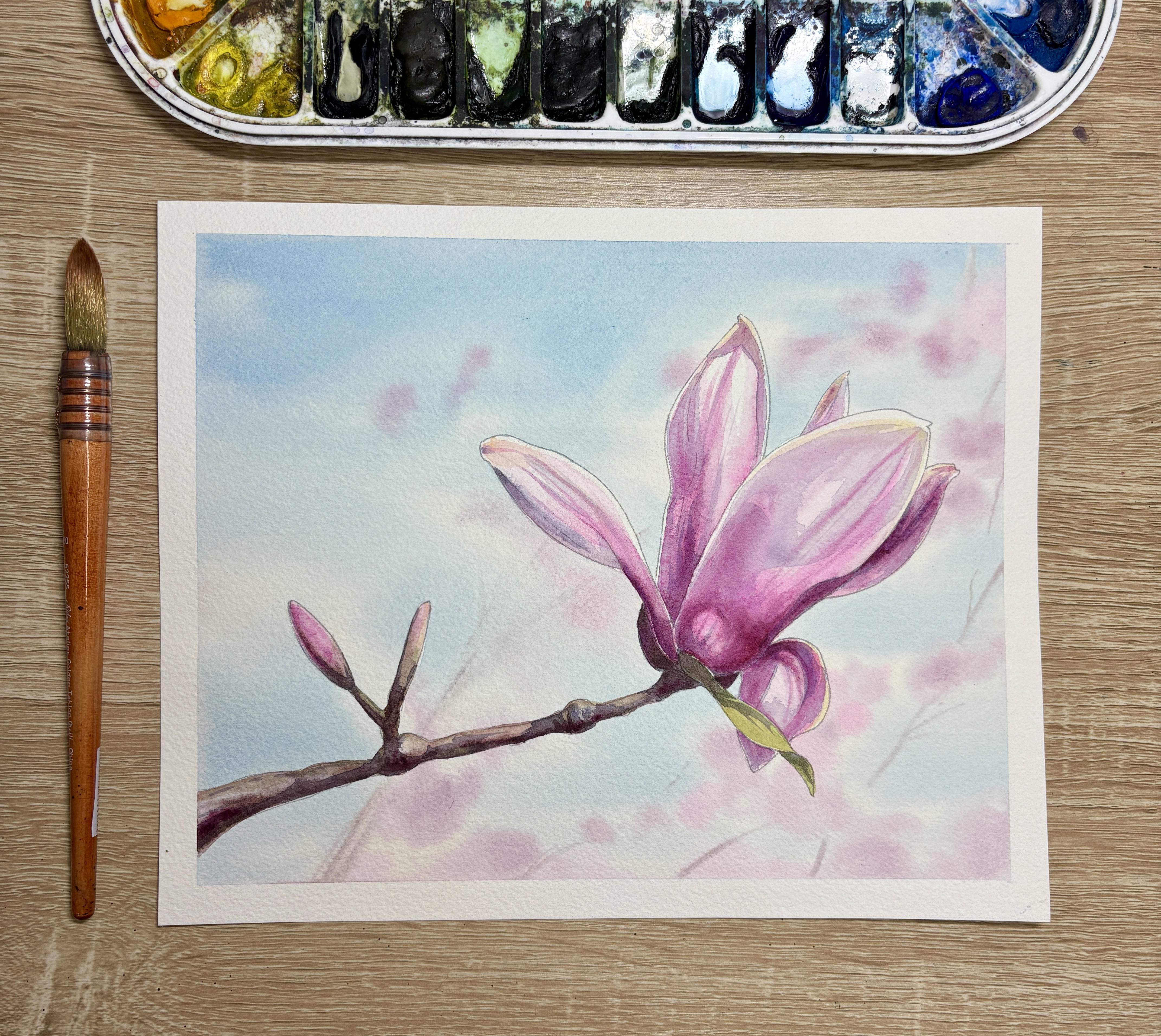
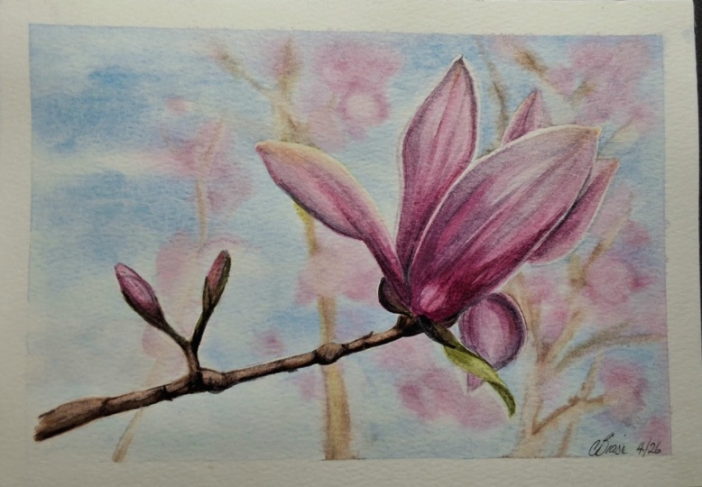
Transcripts
1. Intro: Hello, and welcome.
My name is Emily, and I'm an artist and instructor based in Madison, Wisconsin. In this tutorial, we'll
look at how to make our magnolia branch pop
off the page by first creating an out of focus
background and then adding lots of wet on dry details to
our main flower and branch. You'll have access to a tracing template
included in this tutorial, as well as some color
reference photos and printout instructions that will teach this
tutorial step by step. So grab your
watercolor supplies, and let's get started.
2. Prep and masking fluid: Alright, so to get started
with this tutorial, I already printed off the template onto my eight by
ten inch watercolor paper. For this class, I'm using
arches, cold pressed paper. I do suggest that you
use something that's 100% cotton because we are going to be wetting
the entire background, and we need the paper to stay
wet for as long as we can. I've taped it on
all four sides onto a plastic corrugated board
so that it stays in place. And now I'm using Windsor
and Newton masking fluid to mask my magnolia
bloom petals. Now, you notice that
I'm using an old brush. If you also have an
old brush at home, you can use an old brush
for your masking fluid. You can also use a fine tip
applicator for this process. Just know that the fine tip
applicators for masking fluid do take a little
bit longer to dry. One suggestion that I have as you are painting
your masking fluid onto the magnolia bloom is to make sure that you
have a thick enough layer. Sometimes beginners will try to conserve their materials and so they don't use quite
as much as necessary. I do definitely suggest with masking fluid that you
have a nice thick layer, and having that nice thick layer is going to protect your paper. It's going to make
it easier to take it off of your paper
after you paint. And then it also is
going to make sure that your edges are nice
and hard edges, and you don't have
any sort of texture. Now, you'll notice that
I am painting around the edges of my
magnolia petals first. On the smallest of these petals, I will go in and I'll
fill in those petals. However, to conserve a
little bit of masking fluid, I don't need to fill
in the entirety of those large petals. I'm also not masking the branch. The reason I'm not masking
the branch is because my background color is
going to be a light color, and my brown of
my branch can sit nicely on top of that
blue background. If you're choosing to paint a darker background for
your magnolia bloom, then maybe you should
mask your branch. But if you're going to
keep it slightly lighter, just like I am, there's really no need to
mask that brown.
3. Wet on wet background: Okay, so now that I have my masking fluid around the
edges of my magnolia flower, I'm going to wet my background. Now, as I'm wetting
my background, I'm going to use as clean
of water as I can get, so it looks like my
brush is a little tainted from the past
color that I used. That's okay. So I'm gonna try my best to
go around these edges, but I definitely want to try to avoid wetting the inside
of the flower here. I added masking fluid
just on the edges, mainly because I didn't want to spend time masking
the whole flour. However, if you have time to mask the whole flower at
home, you definitely can. And then I am going to what
all over the stem area. Because my stem is brown, I don't need to worry about a lighter colored background
affecting that brown color. But I do need to worry
about the background color affecting the magnolia petals. And I forgot that I
didn't mask this section, so I'm just gonna lift up that water quickly
before it dries. I'm kind of bending
my head here, I know you can't see
it in the video, but I'm bending it to the side, just to check on all of
these areas and make sure I did actually wet all the way up to the edge of
the magnolia flower and that I have kind
of an even wetness throughout the whole page. So I'm going back to
where I just started, making sure that
it's an even wetness that there's no
pulling anywhere. I don't want pulling,
but I just want to make sure that it's still evenly wet. Alright, now I'm
ready for my color. So I'm going to
start with a blue. This is a thalo blue. I am going to mix kind of
a lighter shade of blue. I'll start kind of at
the tip tops here. And I do want to have a little bit darker
blue towards the top, but I also want this blue to
just kind of peek through. I'm going to leave
a little bit of sections of the paper open. So my background, I don't want really dark and
intense of a color. I want it to be kind
of a lighter color. You can always choose
if you would like this background to be
a little bit darker. You're more than welcome to have it be a different
color than mine. You can also use
different tones of blue. So if you want instead
a Cerlean blue, you can also use a
cerlan blue instead. So now that I'm moving
kind of quickly, I'm making sure to not add
any extra water to my brush. If I add any extra
water to my brush, it's going to be too wet, and then it's gonna push
all the pigment away. So now that I have some
blues where I want them, now I can wet my brush. I'm going to go in
with some pinks. Now, this brush has a very, very large capacity for water. So I'm going to switch
to smaller brush. This is a round size six. I'll grab some magenta here. Now, the most important
thing to think about is that I don't want this
brush to be soaking wet, so I might tap it on
the side of my palette. And then I'm just going to test out how wet these
blooms are going to be. So I want the bloom
to still expand, but I don't want it to expand
too much. That's the key. So if I lay down my brush and I start
to see it moving too much, I'll tap my brush, and that'll release
some of the liquid. And then I can go in and I can add my color
where I want it. Now, here I'm just trying
to add a little bit of this magenta kind of popping
out in certain spots. This is going to act like the blurred magnolia flowers behind the larger flower here. So I can have it Really I'm
need to clean my brush. It's getting a
little too purply. So I'm going to
just have it kind of popping and peeking out. I'm still working a
little quickly here. I might add a little bit larger. I'm kind of trying to work where I left those open spaces, just because if I mix too much with the blue
in the background, it's gonna turn into a purple. I clean my brush, dried it off, and now I can use a dry
brush to kind of smooth some of those edges or lighten some of those pinks if they got a little
bit too dark. So I can kind of
play around here. Make them a little bit
more circular if I want to just kind of make it look a little bit
more out of focus. I can use my dry brush as long
as the paper is still wet. Now there is another color
that I want to add here, so I'm going to work on the
next color before it dries, and this next color
is this opera pink. So just like last time I
do have to wet my brush, but I want to make sure
that it's not super wet, so I'm tapping it on my paper towel if
it's too much there. I'm just going to add in this opera pink in
certain sections. If I want just a little
bit brighter of a pink, Now, here you can add different
colors if you would like. So if you're wanting to
add any sort of yellows, just be cautious of
mixing with the blues. I'm already starting to see that my paper is starting
to dry just slightly. And so, before I let
it dry completely, I'm going to take a
peek and just make sure that I've got these
colors where I want them. If you were wanting
to add any sort of browns for any additional
branches that are coming up, you would want to add those
browns at the very very end. So, here I have a
pyomintite genuine mixed with just a
little bit of indigo. Once again, I have
to make sure that it's really nice and dry because I really want this brown
to stay where I put it. So if I wanted to
add any sort of branches coming in
and across anywhere, this is the stage
that I would do this, where the paper is starting
to dry a little bit. It's still wet. But I have a little bit more control
because as you can see, it's starting to
dry a little bit down here in the corner. It doesn't have as
much of a shine. Up here in this upper corner, it is a little bit wetter. So if I bring my brown
up in this area, it might spread just
a little bit more. So to be a little bit more
cautious in that area. I don't want this brown
to be overly intense. And so I'm not I'm I'm not
mixing too dark of a color. It will dissipate a little bit because of the
wetness of the paper. And I just want
these little hints. So I'm not pressing
down very hard. I'm gonna work kind of more in this section that's a
little bit more dry. I just kind of want the hint that there's
something there. If it gets too dark and all, I can dry my brush. Use a dry brush to kind of lift off where it got a
little too dark. Alright, now, I already
am noticing that this is starting to get a
little bit too dry to work. So this, I'm not going to add
anything else in this area. I definitely don't want to add any more
liquid or otherwise, I'm going to see
blooms happening. If there was an area that
I did want to work at, you can see this area here
is still a little wet. So if I had wanted to add
a little bit more color here or work on adding
a few branches, I can still continue
to work in this area. But you are going
to have to be in control of your paper and notice which sections you
can still work in and which ones are a little bit too dry where you might
need to stop. Alright, and then before
I let this totally dry, I'm going to take a peek at
the petals in the center. I do want to make sure that
I don't have any color on this edge where I had left
off the masking fluid. It seems like it's
pretty good, though. Alright, and so now I'm
going to let the background completely dry here before I peel off my masking fluid and then start working
on the flower itself.
4. First Layer of flowers, wet on dry: Okay, so I've let this
dry a little bit. So I'm going to take
the masking fluid off. You can either use your hand
if you've got clean hands, or you can use a
kneaded eraser or even a gum eraser to pull
up the masking fluid. All right. So now
that we have all of our masking fluid taken off, now we can start working on the petals of our
magnolia flower. So before I start, I'm going to just mix up a little light pink. So here I'm using opera pink. And then I can drop in
any of my magenta here, my quinocraton magenta,
if I would like. I'm going to start
out with this very, very translucent opera pink. I'll start out with one of
the petals on the edges just because I
don't want to start with a focal point just
in case I make a mistake. And as I'm painting this
first layer of color, I'm thinking about leaving
a little tiny edge of white paper along the
edge of this petal. And what that little
tiny white edge of paper is going to
do is going to help to highlight this
flower so that it'll feel like it's really
popping off of the page. So I'm going to start
with this first layer. My first layer of all my flowers are going to be wet on wet. So I'm starting, of course, with this lightest layer first. And then I can come in and I can grab any pigment
directly from my pan, and I can drop in pigment directly from my pan
wherever I want. Wherever I notice those
darker colors popping up. Now, this is just to kind of get a sense of where
these colors are going. Uh, I'm gonna take a little
bit more of that opera pink. Remember that I do not want this color to be the
pigment that I choose. I do not want to be
mixing it with water. If I mix it with water, then I'm gonna have this pigment running all across
this wet area. And I don't want it running
across the whole wet area. I want it to kind of
stay where I put it. So I need to have
a less less wet. Now I'm drying my brush and I'm lifting that pigment
where it moved too much. All right. And this is all I'm
going to do with that first wet on wet layer. Now that that first layer
went on what is done, I'm going to continue
working on each of my petals using the
reference photo. I'm not really focused on
any of the shadows yet. I'm just looking at kind of
the tone of the petal itself. And then any of the shadows
I can add afterwards. Now, I do want to
make sure that I'm skipping and jumping around so that I'm not touching
too wet petal segments. But I'm going to
continue this video. I might speed it up in
certain sections just so it doesn't take
forever to paint. But you'll be able to see
where I am where I'm painting this wet on wet and where I'm leaving a little bit of
section of white of the paper. Basically, anywhere
that I'm seeing really, really white light tones, I'm going to try to leave
that the white of the paper. So right here on
this petal here, I'm noticing that there
is a bit of a white, very, very white
highlight there. I'm still trying to leave a really little sliver of white around these petals around just the
edge of the petal. And then I will
drop in my color. And then lastly, just on the bottom portion of this
little magnolia blossom, I'm going to add a
little bit of green to allow that green
to kind of seep in with that pink along the top. Then some of these
little pedal like sections that are kind of
in the background here, instead of using
that really light pink underneath for
my first layer, I'm using a quinacridone magenta that's a
little bit darker, a little bit more opaque, and then I'm going to
add a little bit of green into that section just so that it's a
little bit darker. This is this section of these petals where it attaches
to the stem and so it's going to look a lot darker there and so you're adding
this green that I'll also be using on the stem area is going
to kind of combine both the stem and the leaves so that there's a little bit of continuity throughout
the painting.
5. First layer branch and leaf: So I do need to let this
green stem dry a little bit. So while I'm letting
everything dry, I'm going to take a peek at my branch and the
little bud here. So I'm going to do the same
thing with this little bud. The top is going to be
a little bit of pink and then green along the base. And then I am going
to mix a brown. So my brown that
I'm going to use, I have this piaanteGenuine, that has some more reddish
tones to the brown. And so I do like using
this for my branches, and I used that same
in the background. So I'm mixing kind of
a lighter opacity. For the branch here.
And then, same thing. I'll drop in some
darker pigment, both darker brown, but then also some greens to
kind of tie and everything. I might also drop in a
little bit of magenta. Along this branch just to kind of tie
everything together. But I do want to do
this well it's wet. So my first layer of color here, I'll add, and then I'll
drop in my darker colors. Once I have that figured out, so now that I've got
that light brown, I'll start dropping
in some darker brown. My highlights, of course, are coming from above, so I need my shadows or my darker colors along
the bottom here. So I'll be adding
a little bit of this darker brown along the
base of my branch here. Of course, this is
all wet on wet. So any sort of other markings from this area we'll
add once it's dry. Here I picked up a little bit of that quinacridone magenta. So I might drop in a little of that quinacridone magenta
kind of where it's a little bit darker
on these branches. Just to kind of
tie in the branch. And then I'll also grab a
little bit of my green. This is an undersea green, so it does have some
browns to it, as well. And I'll do the same thing.
I'll drop in a little bit of greens while it's still wet. Now, I'm not dropping in
these greens everywhere. So if you notice, I'm just kind of here and there, I'm dispersing it a little bit. I just want the hint
of this green here. I don't really need it
all over the branch. Grab a little bit more brown, go up the sides here. Alright, and now I
can let that dry and wait for my second
layer of color. And before I do that, I'm gonna just take a peek and
see if I need to lift anywhere before it
dries if it got a little bit too dark
in any section. Alright, and then now I can take a peek at this
little green branch. So I've got some sap green here. And same thing I
did on my petals. I'm going to paint a single
layer of wet on dry. So wet on dry paper. If there are any areas that
I need to keep highlighted, I will leave the
white of the paper. So kind of here where
the fold of the leaf is. I might try leaving
just a little hint of white of the paper
and that upper fold. The underneath side, of course, is going to be darker. And then the color that
I'm going to drop in, I will drop in a little of
that undersea green that I used in the branch just to give it a little
bit more of a shadow. I do want to only drop it in where the shadow
is sitting, though. So I'm going to correct
some of those shadows. If those colors
ran a little bit, I'm correcting it
with a dry brush. Here, I can also drop in any sort of
complimentary colors. If I want this green to
be a little bit darker. Since it's in the shadow, I can add a little magenta. Once again, it's gonna tie in that magenta color from
the magnolia flower. I'm just gonna tie it into
the green of the leaf there.
6. Adding Shadows part 1: Alright, so now I'm ready for
my second layer of color. Some of the petals
are still drying. The branch is still drying. The leaf is still drying. But I do know that I
can start working on the shadows of
some of my petals. I'm working on shadows
and then any hard edges. So this shadow color
that I want to use, I'm going to mix up here. I'm going to rotate this a
little bit so you can see. So for shadow colors, I often use indigo
as a shadow color. Indigo works great for shadows. You can also use any sort of gray tone I am going to see what it looks like just
adding a little bit of purple into that indigo, so it's got a little bit
more of a purple tone to it. And I'm going to keep it really
nice and light in color, so it's going to be
very transparent. It's very watered down. I can always test that color on a little test strip
that I have close to my workspace just to check and see if that seems
like a good shadow color. I think it looks
pretty good, but, of course, I'm gonna test
it on one of my petals. That's a little further
away from my painting. Now, I'm going to try to work on the shadow that's a little
bit more apparent at first. And so I've got this really nice shadow that's running down the edge of this leaf
here or this petal here. Kind of got out of the lines. Dab it and start over again. And then in order to
blend out this shadow, I can dry my brush a
little bit and take that dry damp brush and just kind of go along that edge
and blend that edge out. If I need it a little bit
darker in any sort of section, I can take either the indigo or the purple
directly from my pan. And while it's wet, I
can just kind of drop it in in any of these sections
if I need it a little darker, I am going to kind of wait and see how that looks before
I make it any darker. And here I'm just going to take a peek at
what other sort of little shadows I
might want to add. So I am noticing there's a
little hint of shadow along this leaf here, kind
of along the center. So I added the shadow, and then I touched my
paper towel and kind of soaked up some of that purple because it got a little
too dark for me. There's another shadow that's running along the
base of this here, and it kind of curves along. Now, the one thing about
this shadow is that it has a lot of magenta in it. So now that I've added
that shadow color, I'm going to come back in and add a little magenta
that it's nice and wet. And we'll see if I like that. It kind of looks a little too
separate of shadow colors. I'm gonna see what it
might look like adding a little bit of purple. I think I like it a
little bit better with that purple kind
of connects everything. So if you are noticing
that you are wanting to kind of deviate a little bit from your reference
photo, that's okay. Reference photos are there
for us to use, but you also, as the artist can make
little corrections, um, changes to make your overall piece look a
little bit more uniform. Now, for this petal here, we've got some really
strong shadows along this curved edge
of the petal here. And so I want to keep
these edges really hard. I don't want to blend
these edges out because it is a very
hard shadow edge. And then the shadow
edge kind of runs along this edge as
well, this left side. But then this is where I
can kind of start to blend my shadow a little bit
once I have it in place. So I've got my color down first. I keep adding a little bit more shadow down
to the base here. Of course, it's going to be
a little bit more shadow, since it's being overlapped by these other leaves here.
These other petals. Now I can kind of
blend out this edge a little bit with a dry brush. So that's the edge
that I kind of want to blend out a little bit
with my dry brush. Color correct a little bit, if I need to drop in
a little bit darker. Kind of went over the edge here. Alright, now, we'll move on. It doesn't look like there's too much of shadow on this one, but I know that it's
behind this other petal, so I'm going to add a little
bit of a shadow here. I'm gonna wait for the shadow
on this largest petal, so I'm gonna add a little bit of a shadow
here to this one. Yeah, no, the shadow on this leaf that's
kind of flipped over. This also has a very
pronounced shadow on it. So if it's very pronounced, I want to make sure that I'm not blending my edges too much. However, it does look
like this edge of this shadow is blended
out just a little bit, so I'm going to
use my damp brush to blend this edge slightly. The other edges here, I'm
going to keep nice and hard. Mix just a little bit more
of that shadow color. And I'm ready for the shadow on the largest flower here,
on the largest petal. So, the biggest section of this petal that I
notice that has a shadow is there's this underside of this petal
here that is in shadow. So I'm gonna try my best to
kind of guide that shadow. Magnolia flowers. They do tend to have kind
of all these little, like, bent edges here. T in the section, use my dry brush to
soften that shadow there. This shadow is quite
prominent there. And then it comes
down and it seems to have this shadow
around almost this, like, bulb, this bulge here. So I'm going to try
my best to keep this little bulge from
that little shadow there. And then I'm going to
soften some of these edges. And I might use a little of
this shadow color to kind of help draw some veins
through these petals. If I'm finding I need a little extra details of these little veins
that are coming out. I can either use
this shadow color or I can go back in and I can use a more of a magenta. Oh
7. Shadows part 2: And then, lastly, I do like to keep the consistency
with shadows. So with this same shadow color. Obviously, this is
a little darker. It's not quite as light as
I had it for the petals. But I'm going to use
a slightly darker shadow color to come in here and add a little
shadow to the branch itself. There is this quite prominent
shadow on the tree branch. And so I do want to
highlight that shadow here. There's quite a dark shadow that's quite prominent
along this leaf here. And then I might use this shadow color to add a
few details along the branch. So I'm still trying to keep
these edges very hard. So I'm not going to
blend out these edges, particularly on the branch here, because my branch
is going to have some very hard edges because of the quality
of the branch here. So I'm going to try to
keep this color along the darkest edge here
along the bottom. But then I'll also try to bring some of these
little notches up from the base here. I'm using my reference photo
as kind of a guide here, but I'm kind of also
loosely following it. I want to give myself a little
bit of grace so that I can add details that look like they make sense without having without having to completely follow
the reference photo. So now I'm just going back in. Just connecting some
of these shadows here. Some of these. The shadows
got a little too dark. Then I'm taking a peek. I think I want a little bit more pronounced of a shadow
in some of these areas, so I can use this
darker shadow color that I used here
for the branches, I can also add some
darker shadows here. Sometimes you'll
notice that I kind of test things out to
see how they look. And then if I don't
like how it looks, I've got my paper towel right by me that
I can lift it up. If I'm not liking how it's
looking or if I think it looks awkward,
where I placed it. Alright. Now I'm going to let those shadows dry
for a little bit. And then I'm gonna come back
and I'm gonna color correct. So I'm going to take
a peek at where I want some more of these
pinks to be a little bit brighter or if I need
to add a little bit more green or if
I'm happy with how it looks as it's dried, I
can leave it like that.
8. Glazing Color: Alright, so now that my shadows are dry and the petals are
dry, I can go back in, and I can always glaze over
each of these petals and add a little bit more color just to deepen the color
a little bit. And I can do it two ways. I can either wet the whole the whole petal and
then drop in my color, or I can mix a little transparent color
and then glaze wherever I want that color to be a
little bit more intense and then drop in a little bit
of color where I want it. Now, the one thing that you have to keep in mind
if you're not going to if you are not going to wet the entire petal
is that this edge here, you are going to
have to blend out. And so I like to blend that
out with I wash my brush. I kind of dry it
on my paper towel, and then I soak up
where that edge is and then I'll just go back
and kind of adjust tones. So that gives it
a little bit more of that color along
the edge there. And I could do the same
thing with this opera pink. If I had wanted it to be a little bit more
of a pinky color, a little bit deeper of
a pink, I can go back. I can add a little bit more
of these little veins here. So at this stage, basically, I'm just
color correcting. I'm adding color two areas. I can also glaze
a little bit with some yellow to kind
of brighten up. So I notice in my
reference photo that there's a little bit of yellow tone at the
end of the petal here. And so I can just glaze
a little bit of yellow. Along the edge here just to kind of brighten it up a little bit, and to kind of give it a little
bit of a sun kissed look. So I glazed a little
bit of that yellow. I washed my brush, dried it. And once again, on those
edges that I want to blend, I'll use that dry
brush to blend it out, and then I can go back in. Once those edges are
fixed a little bit, I can drop it in a
little bit more yellow, or if I don't like that,
I can pull it back up. So I can kind of
adjust things as I go. Um, at this stage, too, you do need to kind of babysit
these colors a little bit. So I'm constantly looking back at what I already
painted and looking at these edges just to make sure that I don't need
to fix any of these edges. Sometimes those edges get a little sometimes
you fix the edges, and then you look back at them, and the edges are hard again. And so you'll have to kind of adjust those edges as you go. So it looks like this
one, I'm going to glaze over a little bit more
of that opera pink. Now, I do usually go back at the very end of
most of my paintings, and I will glaze over and kind of strengthen
some of these colors, mainly because watercolors dry so differently than what they
look like when they're wet, especially depending
on your paper choice. So if you have a
cold press paper, I notice and a cold press
quality paper like arches, I do notice that your
colors will soak in and they will
lessen when they dry. A hot press paper, your colors might
sit a little bit more on the paper instead
of soaking so much. Alright, so I'm
going to go through, and I'm just going to add a little bit more
color here with the same technique of mixing
a more transparent color. I might drop in a little bit of color where it's already wet, and then I might
dissipate those edges. I might add some extra lines. And then here I'm actually
adding a little bit of red as well just to deepen
this dark area here. So in this stage, too, you can always add
just like we added a little bit of yellow at
the tip of that petal, you can also add other colors to kind of brighten your tones
or to mute them down. A he And, of course, glazing works for
other colors as well. So here I glazed a
little yellow on top of that green branch. And here I can glaze just to separate these colors
a little bit more here. If I need that to
be a little darker, can I add a little
bit more brown just to make it stand
out a little bit more? And, you know, I'm kind of curious as to what this
yellow might look like glazing on top of some of the highlights
here in the branch. I'm wondering if
it's just gonna help give it a little bit of, like, a sunlight kiss on the top here, so I'm going to kind of add
a little bit, of course, I'm painting with my paper towel handy just in case
I don't like it. I can always switch
that stamp it out. But I do kind of like
how that looks with a little bit of a sun kiss. Alright, now, obviously,
with watercolors, you can keep on working however long you'd like and
building up layers. But the more layers
you build up, sometimes the less
definition you have for your shadows and some of these
really nice hard edges. So it really is a give and
take of letting it be done. And you can always try more intense layers the
next time you paint your subject if you weren't able to get that
really good of a contrast. But I think I'm
done with this one. So, although I can take
the tape off right now, I want to let it dry
completely to help it flatten, and then we'll take the tape
off and sign it and be done.
 Emily Marie Watercolors, Watercolor Artist and Dog Lover