Transcripts
1. Welcome To The Class: Welcome to the third class in our portrait painting series. In this full watercolor class, we'll dive into painting an
expressive sunlit portrait, building on the skills we learned in our previous classes, capturing soft lifelike hair and studying light and shadow
in the monochrome portrait. Hello. My name is Ev gene, and today we'll embark on the exciting journey of creating a portrait in
just a couple of layers, rather than stacking
multiple ones. We'll start by laying down a beautifully smooth skin
base in a single layer, complete with
highlights and shadows that bring a natural
glow to our subject. We'll define the
hair and background. Finishing with details
that transform the face into a truly
lifelike sunlit portrait. Along the way, you'll unlock the secrets of skin
tone mixing using only two colors and learn practical tips
on paper preparation, brush treatments, and how to wet the paper
for the second layer, specifically for
portrait painting. With each brush stroke, will transform the
blank canvas into a captivating portrait without the hassle of harsh lines
or visible transitions. But I've been professional
artists for many years, focusing exclusively
on watercolors. I've always been captivated
by the magic of this medium. I started to paint when I
was a child, but as I grew, I had no idea how to improve or how to create
effect that I wanted. I didn't know any of the
techniques or how to use them. Now I've taken part in exhibitions and been
fortunate enough to win rewards from such highly
regarded organizations as International
Watercolor Society, Helvetat light space time. Art show International
and Royal talents. Watercolor can be challenging to manage for those who
start to use this medium, which is why it's my intention
to help you to enjoy watercolors and to learn
it in an easy and fun way. In the step by step lessons, you can see the hunt
and brush movements clearly from different
points of view. We will explore versatile and fundamental
watercolor techniques that you can use in all your
paintings and sketches. Also, we will discuss the
materials that will enhance your watercolor experience and will help you to enjoy
the process greatly. If you find this class too
easy or too difficult, you can choose from
my different classes available for learning
varied watercolor skills. The approach of my
classes is to start with an easy wash. As we
proceed with the painting, step by step, we will add more details completing
the artwork. If you have any struggles or
difficulties along the way, you can start a discussion and I will read and respond
to all your questions. Remember to hit the
follow button next to the class title just
below the video. By doing so, you'll stay updated and be
among the first to receive updates on my upcoming classes and
exclusive giveaways. Also, you can see my latest
free watercolor tips and tutorials by following me
on Instagram and YouTube. I can't wait to start this
creative journey with you. So grab your brushes, and let's paint together.
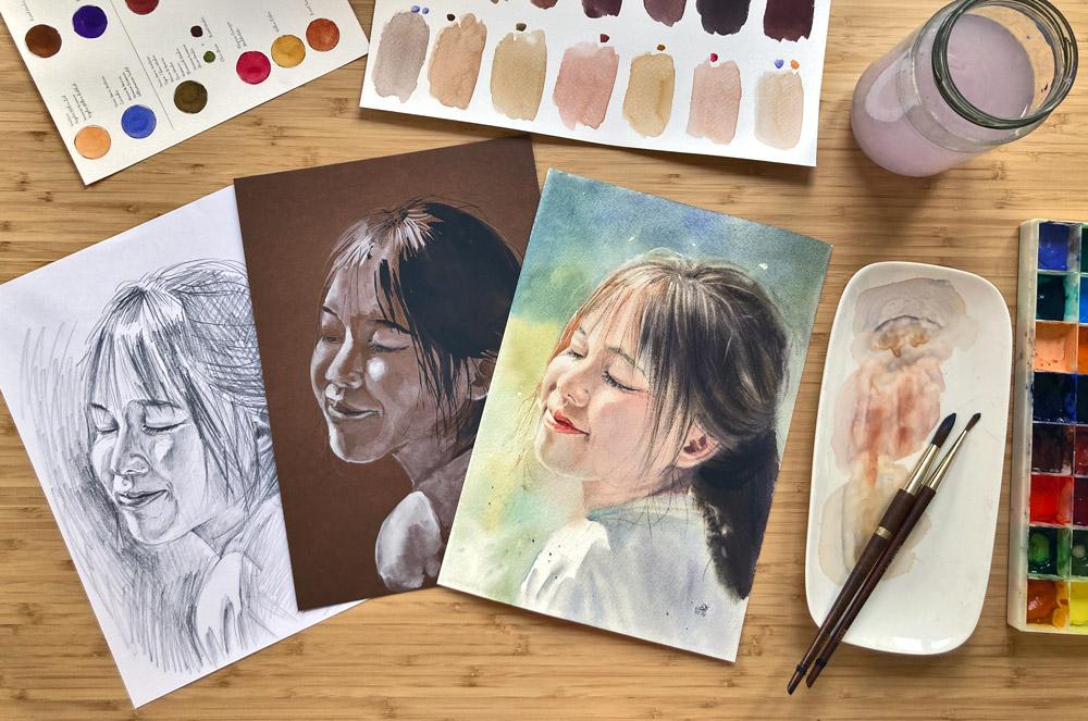
2. Your Project: Oh Before we begin
with the class, I want to thank you
for joining me today. Let's discuss our project. In the resource section, you'll discover my
completed painting as a helpful reference, along with pencil drawings
that you can trace. You have the freedom to
select your own object to paint or to closely follow
my painting as a guide. Additionally, you'll find a reference photo
and a selection of other images that can serve as inspiration for your
very own artwork. It's a great pleasure for me to give my students feedback. So after you put so much effort in your artwork,
why not share it? You can do it by taking a photo of your painting
and share it in the Student Project Gallery under the project
and Resources tab. I'd love to hear all about your painting process if you had any difficulties or what was the most enjoyable part
of the painting process. Upload your artwork by clicking Submit project on the
project and Resources tab. Upload a cover image. It can be your artwork photo, but it will be cropped. No worries. You can upload
a full photo father. Share your thoughts
about the class and your painting process. Under the field where you write, you can find three small icons. Click on the first one image, and upload your artwork. You can see a photo
appearing under your text. Scroll to the top and click on the button published
to share your project. If you have any struggles or
questions during the class, please start the discussion, and I will be sure to
answer your questions. I highly encourage you
to explore the work of your fellow students in the
student Project Gallery. Viewing other creations
can be truly inspiring, and also to receive support
can be incredibly reassuring. Therefore, please
consider engaging by liking and leaving comments
on each other's projects. Join me in the next lesson to explore watercolor materials.
3. Materials To Enjoy The Watercolors: Let's discuss general
watercolor materials and how they can enhance your
watercolor painting experience. We'll begin with the drawing. I recommend using a
soft pencil as it allows for easy arrase of pencil lines later
in the process. Having both a regular eraser and a kneading
caras is valuable. The kneading eraser,
in particular, plays a crucial role in softening the lines before
you start painting. This preparation
makes it simpler to erad the lines once your
painting is complete. For watercolor paper,
I recommend opting for thick paper with
a weight of 300 DSM. While the best paper is
typically 100% cotton, it's worth noting that
there are variations even within this category
based on different brands. The ideal approach is
to experiment with various paper types and select the one that
suits your preferences. It's important to know
that you don't always need to use 100% cotton paper. Occasionally, it's enjoyable to experiment and learn
on acid free paper, made from cellulose or a blanch
of cellulose and cotton. This choice can be budget
friendly while still providing you with
the opportunity to explore various techniques. However, even in this case, I recommend choosing thick
paper with a weight of 300 GSM to ensure a sturdy surface for your
watch color endeavors. To transfer a line drawing
that you find in the resource, a stab, you can use
artist graphite paper. It's important to use wax free graphite
paper specifically, as using carbon
transfer paper is not suitable for transferring a
drawing to watercolor paper. If you are interested
in exploring three alternative methods for transferring a pencil drawing
onto watercolor paper, I invite you to check
out my other class. A dreamy landscape
in watercolor, mastering wet techniques
for beginners. I stretch my paper using graphic stretching,
watercolor paper artboard. To secure the paper, I use artist tape. For more details on the various tape types
for stretching the paper, you can refer to my other class, clear transparent water
with shells and a starfish, mastering drawing
with water technique. Let's move to the
watercolor supplies, starting with brushes. I personally prefer using synthetic brushes
because they are vegan, and I appreciate the idea
of not harming animals. Generally, it's
often believed that the highest quality
watercolor brushes are made from squirrel
and sable hair, and they are resilient and hold water and paint
exceptionally well. However, modern high
quality synthetic brushes have nearly identical
capabilities to natural hair brushes. For example, Escoda offers a series of synthetic
brushes called versatile that possesses
the same qualities as natural Kolinsky
sable brushes. Dawnci brushes have
the Clineir series, and Isabe offers the
beautiful Issaqua series. In the exercise lesson, you'll learn more
about specific brushes I use in this class. Ideally, you should
have two water jars, one for washing your brush
and the other for obtaining clean water for wetting your brushes, paper,
or watercolors. However, I must confess that I sometimes use just one
jar for convenience, so I can concentrate
on the process without worrying about which
jar my brush goes into. Nevertheless, I always
make it a point to change my water regularly to prevent
mudding my color mixes. You can use either
watercolor cakes or tubes for your painting. There are various watercolor
brands available, and they offer
both student grade and professional
grade watercolors. Your choice between the two depends on your specific
needs and budget. If you are just starting with watercolors or working
on practice pieces, student grade paints can be
a cost effective option. For the colors used
in this class, you can refer to the
color palette lesson. To paint watercolors with this, it's a good idea to keep several paper tissues or a
cotton cloth within reach. They're very useful for
dabbing your brush or paper is needed and for
thoroughly drying your brush. If you want to truly enjoy your watercolor
painting experience, I recommend using a
ceramic mixing palette. It can also be ceramic plate. Plastic or metal
palettes tend to disrupt the smooth laying
of watercolor strokes, causing the paint to form
separate drops and pulls. A ceramic surface is ideal
for watercolor painting, and using a ceramic
mixing palette will enhance your
watercolor experience. The mixing process feels exceptionally smooth
and creamy on ceramic. A natural or synthetic
sponge is essential for making adjustments to correct small mistakes in your painting. Additionally, for some artworks, you may require masking fluid. A white gelpen or a
fine acrylic marker or white gouache to
add small details that can significantly
enhance your piece. A spray bottle is also
useful for evenly wetting your paint without
creating water pools on it. Now that you've gained insights into general
watercolor materials, let's move on to
the next lesson.
4. Color Palette - Create Different Skin Tones: Normally, skin
tones can be mixed from the three
primary colors blue, rose red and yellow. However, this process can
feel tedious when you want to immerse yourself in the creative flow and
simply enjoy painting. Mixing skin tones from three colors can
be time consuming, making it challenging to work quickly and maintain
consistency. You need to match the
exact shade repeatedly, which becomes stressful if
your paper dries quickly. That's why I rarely rely solely on these three
colors for skin tones. Having a quicker method to
achieve the perfect tint or shade can make the painting process
far more enjoyable. That's why I'd like to show you the specific colors I used to
mix skin tones efficiently. In this lesson, we'll
take a close look at the colors I recommend
and create swatches. You can download a template
in the resources section, print it out on watercolor
paper as edit for this lesson, or simply create
your own swatches and label them by
hand. It's up to you. With the colors we'll explore, you'll be able to create a
wide range of skin tones suitable for all skin
types from pale to dark. Once you've learned how to
mix two basic skin tones, you can adjust them further
depending on the environment. Portraits are rarely set against a plain
white background. There's usually nature or other objects
surrounding the subject, which can influence
the skin tone, introducing hints of green, blue, red, and more. Let's begin with two basic
colors for light skin tones. The first is naples yellow, red. This reddish hue is perfect
for portrait painting, and you can find it
from brands like Van gog or Hora Dam Sminke. It's a wonderful
versatile colour, and I use it for various
mixes beyond portraits. The second is lavender, one of my favorite colors. It's essential in my palette, adding depth and
complexity to the mixes. You can find it from Van gog, Sminke, or Windsor and Newton. For Darkaskin tones
will use burnt amber available from various
brands and blue violet. We'll incorporate
additional colors and small amounts to adjust and refine your basic
skin tone mixes. The first is raw amber, a greenish brown that's
invaluable for portrait painting. Different brands may
name it differently, such as sepia or greenish amber. Other essential colors
include a learn crimson, also known as Mader lake, yellow Ocha and burnt sienna, all of which are standard in
many watercolor palettes. Another favorite of mine
is a red brown color, which varies in
name across brands, red oxide, Indian red, English red, or caput Mrtium. Additional staple colours
include blue ultramarine, burnt amber, and lamp black. You can also create
your own version of raw or greenish amber by mixing olive green
and burnt amber. Now let's have some fun mixing the colors to create a
wide range of skin tones. Start with the first pair
for lighter skin tones. Mix the colors to a
creamy consistency on your palette and experiment
with the rashes. If the mix looks too gray, add more naples yellow, red. A touch of alizarin crimson will give the mix a nice rosy tint, while a bit of yellow ocha
creates a different tone. Adding a few other colors to the basic mix can
further refine the hue. Here I'm incorporating
red brown. The next, I add a
touch of raw amber. And here a hint of burnt amber and incorporating more lavender can create a cool shadow effect. It next, mix the second
pair for darker skin tones. You'll get a rich dark
brown with a hint of red. Mix blue violet and burnt amber to a creamy
consistency on your palate, creating a rich base color
ideal for dark skin tones. To cool and subdue the tone, add a touch of black. Yellow oca will bring
warmth to the brown. While a bit of raw amber introduces a subtle
greenish undertone, more yellow ocha gives
a Gulgent brown effect, which can be softened
with naples yellow, red. Adding more red brown
results in a deep warm tone. For shadows on darker skin, you can use blue or
lavender in your mixes. For example, mixing
burn sienna with lavender instead of blue violet produces another skin tone, rich with cool undertones. Let's mix the shadow
tones together. For the first, add a
bit of lavender to the base dark skin tone
for a soft cool shade. To keep the colors rich, use just a little moisture and create a creamy consistency. Next, mix burnt
amber with lavender instead of blue violet
for a unique cool brown. For a near gray tone, mix a light skin base with extra lavender and
naples yellow red. For the next color, add blue, tramarin to the base
dark skin tone, resulting in a rich color
with cool blue undertone. For another variation, add blue, tramarin to the
second shadow mix created from burnt
unbind lavender. Adding extra naples
yellow or red to the first mix will create yet another beautiful skin tone. The process is intuitive and
adaptable by working with just two base colors and layering touches of
other colors in it. You can easily replicate
complex skin tones. For your reference,
watches and mixes from this lesson are available
in the resources section. Experiment with different
combinations and save your watches in your
sketchbook as a reference. Label each set to remember which colors you
used in your mixes. When you're ready, move
on to the next lesson.
5. Get Ready - What To Do Before Starting To Paint: In this short lesson, we will prepare the
paper for painting. First, let's use a kded eraser to soften the pencil lines. Make sure they're not too faint. Otherwise, you won't be able to see the outlines when
you apply colour. I often start by defining
pure whites with skin fluid like
highlighted hair strands. For this, I use a rig brush. Muskin fluids resin can
damage the bristles, but only if you let
it dry on the brush. I use a good brush to
create very fine strokes, and once I'm done, I rinse the brush and treat it. You don't need to buy special soap for
watercolor brushes. Natural olive soap,
often brown in color, works just as well. Gently move the bristles through the soap rinse and repeat until the brush
is perfectly clean. Oolive soap not only cleans but also
protect the bristles. The next step in our
preparation is to wet a tea towel and lay it flat
on your painting desk. Now let's wet the paper. For small sizes, you can submerge the paper
in a water basin. While for larger sizes, it's best to use a tap. Turn the paper until it's
thoroughly moist and flexible. When the paper feels pliable and can easily fold
without resistance, it's ready for painting. We will paint on
cold pressed paper as hot pressed paper
dries too fast. Lay the wet paper on the
tea towel and use a damp, broad brush to smooth it flat. Now it's perfectly
prepped for painting. H
6. Painting Base Part 1 - Easy Smooth Skin: It's nice to watch this lesson first before
you start painting. This will prepare
you for the process and help you eventually
memorize the steps, making it easier to
paint along afterward. The paper is thoroughly
moist and rests on a damp tea towel to maintain
its wetness for a long time, giving you ample time to paint. And this lesson we focus
on painting the skin, its shape, light, and shadows. We'll use a round brush, not too big, not too small. Let's mix apples, yellow, red, and lavender for
the base skin tone. Use just a little moisture
to pick up a lot of pigment, mixing it to a creamy
consistency on the palate. I'll add a drop of
Alyson crimson, as well. I will also use a dry filbert brush to lift
the color for the highlights. Since the paper is
still glistening with water and looks very
wet on the surface, brush it a couple of times with a damp flat brush to
remove excess moisture. Let's begin. Apply
the skin color using the belly of the brush, applying pressure to fully
saturate the paper with color. Crumble a tissue and gently dab the highlights on the face. By doing so, we remove
moisture from the paper in the highlight areas
and dry the paper. That will prevent
the applied color from bleeding fully
into the highlights. Color the face
further by applying a light skin tone
defining the back cheek, the nose, the area
around the eye. Add a few strokes
on the forehead. Okay. I'll mix more
of the basic color. You can see it's just two
colors with a drop of another. It's quick and efficient. You can easily adjust the
tint by adding another color. For example, I add
more lavender to paint the shadows on the nose under the eye and
on the forehead. We begin with the nose, stretching the color to define its shape while leaving
the highlights unpainted. Define the shadows under the eye and on the
forehead behind the hair. Next, I switch to a finer brush to paint a
small area on the cheek. With the tip of your brush, carefully define the shape. Add a couple of darker strokes on the chin and under the nose. Use the belly of the brush to
saturate the shadowy areas. Leave the highlights unpainted. Add more color on the cheek, laying more saturated tones on the top of the existing ones, as we still working wet on wet. You can build up volume
without worrying about harsh lines in the colors
will continue to diffuse. Switch to a finer brush for more precise application
of the shadows. Now I'll mix more
naples, yellow, red, and talisa and crimson to paint
the edges of the shadows. Apply the colour just along
the edge to brighten it up. And some more laser and
crimson for the nose and lips, just where the shadows are. Let's focus on the chin next. Mix a little of raw amber in the existent mix and paint
the shadows on the chin, leaving the
highlights untouched. Choose a fine brush to avoid excess moisture as larger
brushes hold too much water, which we don't
want on wet paper. Continue shaping the chin, adding more color to the
shadows around the lips, under the nose, and on the chin. I'll add more lavender to make the tint cooler and darker. Adding different skin tones on wet paper allows them
to mingle naturally, creating a more lively
and artistic effect. Play the cool shadow
under the eye in the shadows below the nose
and along the back cheek. Mix naples, yellow, red, and a leer and crimson
again for the cheek. Even though we dubbed
the highlights, some colour has bled into them. You can remove unwanted
color with a dry brush. For larger areas, switch
to a bigger round brush. I'll also add more shadows on the nose and lift any
excess color again. This is easy to do while
the paper is still wet. Let's work on the eyelid accentuating the shadows
with a few more strokes. Compare the area you're painting
with a reference photo. Lift a few strokes
to shape the eyelid. Carefully add lines and shadows with the
tip of the brush. Add a few darker shadows
on the forehead, applying them with
quick, playful strokes. The neck will have a
slightly darker tone. I'll mix lavender and raw amber into the
existing palette mix. Adjusting the shape of the chin and adding more
shadow to the neck. I also lift the colour as
the t shirt color line. You can use a crumpled
tissue for this as well. Add more dark color into the wet layer to
increase saturation. Color the neck, cheek, the ear, using the
belly of your brush. Don't worry about colour
bleeding into the background. It's normal and will be covered when we paint
the background later. Using the tissue, I remove excess colour
on the highlights. Painting the base colour
involves two main actions, adding skin tones and shadows
and lifting highlights. These steps lay the
foundation for your portrait. I'll mix lavender,
raw amber and naples yellow red into a
creamy consistency to add more saturated shadows. I painted the smooth
skin layer in 30 to 40 minutes and my
paper is still damp. Shadows and highlights give a portrait dimension and
prevent it from looking flat. After adding more saturated
shadows to the back cheek, proceed to the area
around the eye, applying shadows under the
lashes and on the back eyelid. Et's dab the highlights one more time to make
them even whiter.
7. Painting Base Part 2 - Easy Smooth Skin: Et's dab the highlights one more time to make
them even whiter. Mix a creamy combination
of naples, yellow, red, alizarin crimson, raw
amber and lavender. Use the belly of the
brush to apply colour, comparing with the
reference photos you go. Now we'll add more
colour and definition in the shadowed areas to give
the face a three D effect. We're still working
on the same layer, and the paper is still wet, so each stroke will diffuse, creating a smooth skin texture. Take some darker mix for the shadows and using slight
pressure, color the cheek. Apply the color also
under the nose. Remember to lift the
bleeding color from the highlights on the
color is applied. This routine of applying
the color and lifting is essential to maintain a smooth and beautiful
base skin layer. Relax and enjoy the process. It's valuable for
any watercolor lava to try something
new and explore. Now let's add more shape to the nose under the lashes
and the breach of the nose. Slowly shaping the face by adding color and
lifting feels natural. Remember, this is
just the base layer. It doesn't have to be perfect. Imperfections can add interest and character to the portrait. I regularly check
the highlights after applying colour to protect
them from bleeding. It's a quick process, but it preserves the
highlights beautifully. Next, I'll mix black with the existing colors
to paint the brows. Add a slight yellowish
tone on the edges. If the colour bleeds too far, simply wet it slightly
with a brush and dab the area with a tissue
to remove the excess. Mix naples yellow,
red, lavender, raw amba and a touch of Azar and crimson
to paint the neck. To achieve a saturated color, use very little moisture. The mix should feel
creamy as you blend it. Begin in the corner, painting a few lines and filling in the
spaces in between. Diffuse the shadows
into the base color, stretching it with the belly of the brush into
the background. Add more shadow to the chin. For the darkest areas, I'll add a bit of
paints gray or black, along with more lavender. Carefully outline the ear lobe and paint the neck and along
the edge of the collar. Add some lines to
define the shape. To diffuse the light color, take a slightly lighter tint and straight the darker area
into the background. Color the darkest parts of the ear and apply the
shadow under the nose, starting on the edge and
then filling in between with the tip of the brush using
a series of short strokes. This technique will help diffuse the dark color into the
existing dam background. Continue shaping the
nose by applying the darker tone in the
creases and on the tip. Add color to the areas
of the forehead, where it's covered by hair
in the reference photo. Color the breach of the nose as it appears slightly
darker than the highlights. Lifting the highlights and deepening the shadow
on the cheek. Remember, the paper will
lighten as it dries, so use saturated colors
to maintain depth. That's why we add
more dark areas on the cheek to create a
more rounded shape. Apply the extra
color with light, short strokes without pressure, diffusing it into
the background. Darken the area under the eye. And atmo shadow accents in
the corner of the mouth beneath the lip
and on the eyelid. The shadow emphasizes
a highlight. Add a stroke under the eye and a dark stain to
accentuate the eye. If I run out of the
base skin color, I'll quickly mix more, adding lavender and raw
umber for a darker tone. Darker shadows make a
noticeable difference, and I try to establish them in my first layer for a
smooth and diffuse look. Add a darker stain
in the corner of the mouth to enhance the depth
and dimension of the lips. Add some accents to the ear. Take or mix some saturated base skin colour with a drop of azarin crimson and apply it to define the shadows in the
creases and on the nose. If the color appears too dark, simply dap your brush
on the tissue and use short strokes to blend
it into the background. For the final time, lift all the highlights
as with a clean, dry or damp brush. After lifting the highlights, the first layer is complete. Gently til the paper, remove the damp towel, and dry the surface.
8. Drying The Paper Correctly Between Layers: It's time to dry the
paper before we proceed. Make sure to dry it
thoroughly until it becomes completely stiff
and cannot bend anymore. The paper should feel sturdy. If it doesn't, it's
not dry enough. Blow dry until the corners
start to curl slightly. After a while, lift the
paper to dry the surface, then flip it over and
blow dry the backside. Even if the paper feels
dry but it can still bend, it's not fully dry. Altern it between drying
and turning the paper. Once it's no longer bends, it's ready and thoroughly dry.
9. How To Wet Paper For The Second Layer -Painting The Hair: We begin by wetting the tea towel and
arranging it on the table. Straight the cloth
with your hands to eliminate any faults. I'll show you how to wet the paper correctly
for the second layer. In this example, I'm using
another portrait sketch. To avoid disturbing the
already painted skin layer, we begin by mostening
the paper from the back. Then turn it so the water
from the top only flows onto the unpainted area
around the face. Let's do it. This method will
moisten the paper thoroughly without
affecting the painted area, giving you a fresh damp surface for extended wet
and wet painting. Allow the water to saturate
the paper entirely. Then turn it, letting only the water stream tighter
than unpainted areas. Hold the paper vertically to let the water
run over the face, making sure it only reaches
the unpainted area above. Turn again and repeat. Check the paper
flexibility as you go. Finally, turn it
once more and allow the water column to touch
only the unpainted area, not the face itself. Now the paper is fully wet
and we can start painting. I understand if you're nervous about using
this technique, but it's truly fantastic. Once you try and experiment
with smaller paper formats, you'll find yourself
using it often. The results are so rewarding. Play the paper
gently on the towel. Why not use a brush to wet the surface instead of the tap? I avoid brushing because it could disturb
the previous layer. Just lay your paper flat on the wet towel and if you prefer, brush the unpainted
areas gently. Brushing on wet
paper or removing excess water from the
face can lift some paint. Do you see that
stripe? No worries. I'll adjust it in a minute. I'll show you how to fix it. Mix the shadow skin tint and apply it lightly
to the cheek. Combine more naples,
yellow, red, lazaren crimson, lavender, and raw amber, adding
different tints. The wet paper will seamlessly blend these strokes with
the previous layer. Now it's time to pat the hair. For a detailed class
on painting hair, complete with exercises
and step by step guide, you can check out my other
class hair and firm portraits. Mix burnt amber, black, and burnt sienna to
create a rich dark brown. Begin by using burnt sienna to paint some hair
strands in the sun. Gently stroke the paper using
just the tip of the brush, overlapping the lines
with the forehead. Then take the dark mix and start adding depth to the hair. The technique is similar
to painting fur or feathers as we did in the previous lessons with
a fox and a duckling. Mix a rich dark brown from burn seen and black with just
a touch of moisture. Apply with short quick
strokes coloring the area. It should feel velvety on the paper without the
watercolor running. A creamy mix will stay
defined where applied, slowly diffusing into the paper. Add more black for saturation. Dab the brush briefly on a tissue to eliminate
any excess water. Use fine tip of your brush
to define the hair strands. As we wet the whole paper, the applied hair strands will develop a beautifully
diffuse texture, adding a more natural
look to the portrait. They hold their shape, but become partly blurred. Shape the volume of the hair by comparing it with
a reference photo. Switch to a ego brush
to create thin strands. Its longer bristles are
perfect for the fine details. Add some fleeting strokes
to accentuate the eyebrows. As you paint, regularly stand up or step back and view
the whole painting. Use short strokes to
define the hair structure. Add more black and burnt Amba, comparing your work to
the reference photo. It's okay if the hair color
bleeds into the background. We'll adjust that later. With a saturated black brown, paint a series of strokes to intensify the
shadows in the hair. Use the tip of the brush to paint the fine strands further. For the darkest shadows, use undiluted black and
refine the strands further. Usually, I like to sunt
while painting hair. I allows for a more playful
loose application of strokes. Deep shadows are crucial
for a natural look. So try to use saturated
colors when painting hair. With playful strokes, add more color and shape to
bring the hair to life. Leave the color
and lighter areas of the hair with a flat brush. It's quite satisfying to lift thin lines and
create highlights. Remember to dap your brush on a tissue regularly
when lifting colour. Okay. You can also use water to draw fine lines within the hair,
which adds texture. If your paper is too wet, the effect may not
be as distinct, but you can try later again. Check out my previous lesson for moon painting hair
texture with water. I tape the paper wetness
with the back of my hand and it's still
damp enough to continue.
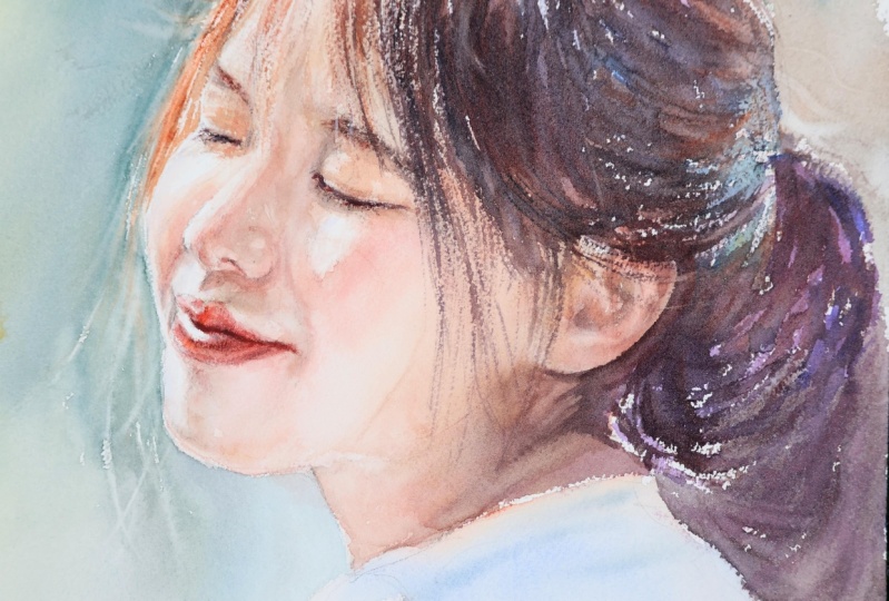
10. Painting Background & Clothes: Now let's move on
to the background. It will bring the
portrait to life. Begin by mixing green
and a touch of yellow. Switch to a larger brush
for broad strokes. Start by out lining the face, and you'll see how the
masked hair strands pop out. Blend and straight the color. Add blue to your palette. Apply a stain, then diffuse
it with a wet brush. Add more blue in other areas. With a wet brush, diffuse the colour stains
into the background. Take some more blue and
outline the shoulder, softening the edges for
a smooth transition. As you go, mix green
and blue to create a natural background that
you can modify as you wish. Cover the background gently
touching the shoulder. Soften the edges
of the stains with a wet brush for a smooth,
seamless transition. Mix dark blue into the
green and use it to color another area outlining the face with the tip of your brush. Incorporate more dark blue, playfully adding it to
the upper background. One of my favorite
combinations for portrait backgrounds is lavender
mixed with olive green, creating a cool,
granulated color. Outline the head, gently
touching the hair. Mix more of the lavender
olive green mix and apply it to the background. Add more lavender into the background with
playful strokes, and feel free to introduce other tonal variations until you're satisfied
with the result. Use a dam brush to lift some color from the
edges of the head. Adjust the hair outline and
create smooth transition. Let's add texture to the slightly red background
by mixing lavender and green, then tapping your brush on
another to create splatters. Do you see those rings from the bleeding background
color? No problem. The paper is damp, and the towel underneath gives us plenty of
time to adjust. Take a dry flat brush and
gently rub the rings. You'll lift some color,
but that's fine. Keep lifting until the masked
hair strands are modified. Use burned Sienna for the
sunlit strands of hair, making the color more saturated. With a fine tipped brush, carefully color the hair
area around the cheek and eye, outlining
these features. Soften the stroke slightly with a wet brush to blend the edges
for a smooth transition. Switch to the rigger brush
again to paint fine lines. Then lift highlights
to shape the face. The steel wet paper lends itself beautifully to
adjustments like lifting. You can do it effortlessly as long as the paper
retains some moisture. If the color bleeds again, simply dab it with the tissue before adding darker
tones on the hair. Add color to the sunlit hair
area with burnt sienna. Shape the hair with
burnt amba and black, refining the area on the
upper part of the head. We'll adjust the details later, but first add more dark
strength to enhance the depth. Define the roundness
of the head, add wisp strands and build
texture with short strokes. Let the brush dance
on the paper, adding fine lines in the area where light
transitions into dark. Go over the edge of the hair, adding more color and covering
any bled imperfections. Add some fine lines
in the background, paint the darker areas of the hair and add
strokes further. The more defined texture in this area will create
a sense of roundness. With a flat damp brush, adjust the hair outline
by stroking over it. Lift the strokes in the hair to enhance its texture
and roundness. Okay. The strokes will appear very contrasted
against dark hair. Mix some more black into the dark brown mix and
refine the hair texture. Add some more wispy
hair in the background. If color has bled
into the clothes, gently rub the surface with
a wet brush to lighten it. These imperfections add
character to the painting. Dab the area, dry
with the tissue. Switch to a larger
brush and mix lavender and green to paint the
shadows on the t shirt. Clothing and portraits
can be simple and abstract or detailed if they contribute to
the atmosphere. For now, let's keep it simple. Use a few strokes to
define highlights and folds and smooth the edges of
the stains to soften them. A couple of stains to represent the shadows
and the folds. With a clean damp brush diffuse the applied stains
into the background. Now take some o
saturated blue mix that we made from lavender, olive green, and dark blue. Outline the shadow
on the shoulder and cover the shadowy area
with the same mix. Add more lavender to the
mix and refine the folds. With a clean, damp brush, soften the edges of
the stains to make the shadows and folds
appear more natural. Now, focus on the
hair and the shadows. Add black strands for variation. Use a fine brush to lift the gaps for a
more natural look. H. Apply a few stains to deepen the color
in the shadow. With the tip of your brush, define the color edge with a
darker color of your choice. Stroke along the edge to
leave the black color. You may also use a
crumpled tissue. Stroke along the edge of the ear to leave the color
and refine its shape. Lift highlights to further
define the hair's texture. Gently stroke along
the chin to leave the color and
accentuate the outline. Do the same for the back cheek, the nose, and the sunlit
area on the cheek. Mix a bit of black into the lavender to
darken the T shirt. Strokes with a flat brush can create a variety of
interesting textures. Continue lifting highlights to enhance the hair's appearance. It's such a satisfying process. Once you're finished, dry the paper thoroughly as explained in one of
the previous lessons.
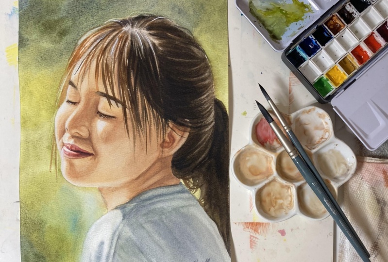
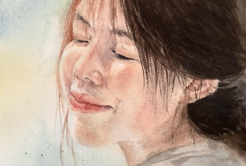
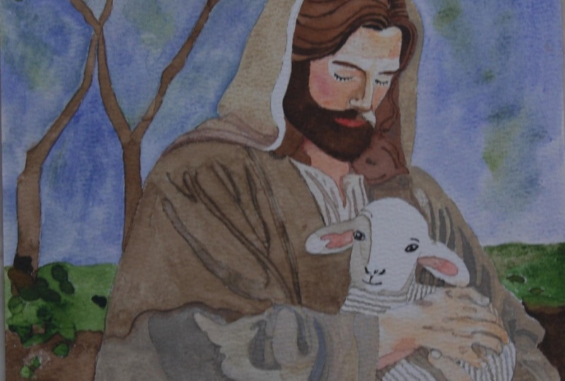
11. Shaping The Face Part 1 - Lips, Nose, Eyes: In this lesson, we will paint
the details on dry paper. Outlining the lips,
lashes and nostrils will create contrast with the smoothly painted
skin and soft hair, adding coalism to the painting. We'll begin with the lips, so you'll need fine
round brushes. Hold your reference
photo by hand and aim to replicate both
the shape and color. Start by mixing vermilion
and alzarin crimson. Begin with the
shadow on the lips, adding strokes for
the base tone and softening the edges of each
stroke with a damp brush. Then mix naples yellow, red with Indian red and paint a line on the edge
of the lower lip. Color the lips with light
red to shape its volume, leaving the bright
highlights unpainted. Soften the edges of the freshly painted strokes with a damn brush by gently
tickling on them. Add a bit of black to the
mix for the upper lip, working with small
delicate strokes as you compare with
the reference. Slowly shape the lips volume
using a fine brush for this delicate work by applying small stains
and softening the edges. For the line between the lips, use black and tesaron crimson
with a fine tipped brush, taking your time to
replicate the shape. After applying a stroke, clean your brush and smooth the edge before the stain dries. A tiny line to accend
the lower lips edge, adding more color
and definition. Switch to a smaller brush
to paint the corners of the lips and add a few
strokes for the fine texture. Using the existing
mix of Naples, yellow, red, and Indian red, paint the back nostril
and the one in the foreground with
delicate light strokes. Mix raw amber, lavender, and a touch of
naples yellow red, adding a hint of the rose
mix already on your palate. Add a few drops of water, and we'll use this to
paint the shadow under the nose and a hint of shadow on the curve
of the upper lip. To make the paint more fluid, moisten your brush before
picking up the colour. Straight the color
across the area, softening the edges with a dam brush to diffuse
them into the background. For the shadow in the crease, add a stroke, clean your brush immediately
and soften the edges. Shape the rounded nostril
wing by gently adding color, remembering that when
pating on dry paper, it's essential to
continuously soften the edges with a clean damp brush
to avoid harsh lines. Add more raw amber
and lavender for the corners of the lips
and smooth the edges. Accend the area under the lip and the shadow
under the nostril wing. Add black to the existing mix and begin pating
the back eyebrow. For the shadows on the ice, make a creamy mix of lavender, raw amber, naples yellow red, and a touch of azarin crimson. Add Maples yellow red
and lavender as needed. Using a fine brush, define the edge of the eye, outline the nose, and add a drop of darker tint to the
shadow under the lashes. Remember to soften the
strokes as you go. Add a bit more shadow
to the corner of the lips and cheek
to enhance contrast. Smooth the edges
with a damp brush. Continue refining the shadows on the eye and
beneath the lashes, softening the strokes
along the way. Smooth the strokes by
gently tickling on them to diffuse the
color into the paper. Take more colour to deepen
the shadow on the nose, lightly brushing the edges to blend the pigment
into the background. Accend the grease between
the nose and cheek, brushing lightly to blend the color further down the nose. For the eyebrows, apply
Darktin with light strokes. And use black to
paint the lashes, adding instant life
to the portrait. The lashes will have
tiny highlights, but we'll paint those later. For the fine details, use a very fine brush to
achieve precise thin strokes. Smooth any harsh
lines as needed.
12. Shaping The Face Part 2 - Ear, Neck, T-Shirt: Now let's work on the ear. Add color to the middle
of the ear lobe. If the edge of the ear has darkened due to colour bleeding, adjust it by gently
rubbing the ear with a damp brush and dabbing
it with the tissue. Add a shadow along
the ear's edge. Mix Indian red,
naples, yellow, red, lavender, and a bit of black for the darkest
part of the ear. Soften the edges to make
them slightly blurry. Shaping the ear lobe
and the ear's outline. Add more shadow in the area
between the hair and the ear. As always, apply the color
and soften the edges. Regularly compare your painting
with a reference photo. Accent the grease with a more darker color and soften the stains
with a damp brush. For the dark shadow on the neck, mix raw amber, lavender, black, and a touch
of Azar and crimson. The resulting color should
be a brown violet tone. Use the tip of your brush
to outline the ear. Add a drop of water to
the mix to make it more fluid and incorporate a
bit of naples yellow red. Once you've applied a stain, clean your brush and
straight the color to create a lighter
fade at the edges. Dab the edge with a tissue to avoid a sharp outline later. Use black and lavender to
paint a crease in the neck. Take a moment to add more color and definition
to the T shirt. Mix green and lavender for
the crease of the color. Then paint a shadow to define the color's outline,
smoothing the stain. Add a touch of
blue, yellow ochre, and some lavender to
add further shadows. Gently tickle the edge of the ear with a damp
brush to soften it. Add more dark color to
the ear where needed. The final step is to add more colour and
detail to the hair. Mix raw amber and black, and with a thin rig of brush, paint wisptrans to give
the hair realistic touch. A bit more black will
provide extra contrast. These finishing touches
will elevate your artwork. Add a few more dark
strands for texture. And use burnt sienna for hair strands, catching
the sunlight. Paint a few straps over the brow and overlap
the eyebrows. For loose playful strokes hold your brush further
from the point. Splatters are a fun way to add interest and an artistic
tie to your painting. Cover the face with a piece of paper and splatter
some colour dots. You can also create
small dots and short lines in the
lashes for sunny effect. I use a white gel pen, but white gouache or an acrylic
maca works just as well. Congratulations with completing
your sunny portrait.
13. Concluding - In A Nutshell: O as we conclude our class, I hope you enjoyed creating the sunlit watercolor portrait and found inspiration in the techniques we
explore together. We begin by learning the
foundational skin tone palette, discovering an
efficient two color mix for both light and dark tones, and how to adjust
these with hints of other colors to achieve
a full range of tints. After preparing our drawing, we cover the essentials of brush care when
using skin fluid. Followed by preparing
our paper for painting, moistening it thoroughly until
it was perfectly pliable. With a wet tea towel underneath, we kept our paper damp, allowing us to start
with a smooth, even first layer of skin tones, complete with
lights and shadows. After carefully re
wetting the paper, we used wet on wet technique to paint the hair and a
lively background, adding depth to our portrait by layering cloth as details. In the final layer, we brought the face to life
by refining features like the lips, nose, and eyes. Finishing touches, including
delicate hair strands, playful splatters,
and white accents, added that extra bit of
realism and personality. If you enjoyed the class, I would be really grateful
for getting your review it. Remember the journey of
artistic discovery is endless, and I encourage you to continue exploring and
refining your skills. I hope to see your artwork after you put so much
hard work in it, and I love to hear all about
your painting process. If you had any
difficulties or what was the most enjoyable part
of the painting process. Share your artwork in the
student project gallery by clicking on Submit Project under the Project
and Resources tap. Every piece of art, no matter
the level represents time, effort, and personal expression. But most importantly, it's a part of your
artistic journey. It's a visual record of
your growth as an artist. If you have any questions, I'm happy to respond
and to help. Just post your thoughts
in a discussion thread. If you prefer to share your artwork on
Instagram, please tag me. I would love to
see your painting. Skill Share would also love to see the artworks of my students. So please tag them as well. Remember to hit
the follow button next to the class title, just below the video. By doing so, you'll stay
updated and be the first to know when I introduce a new
class or announce a giveaway. It's been a pleasure sharing
these techniques with you, and I look forward to seeing your own watercolor portraits, each with your unique touch. Thank you for joining
and happy painting.
 Evgenia Cordie, Professional Watercolor Artist, Belgium