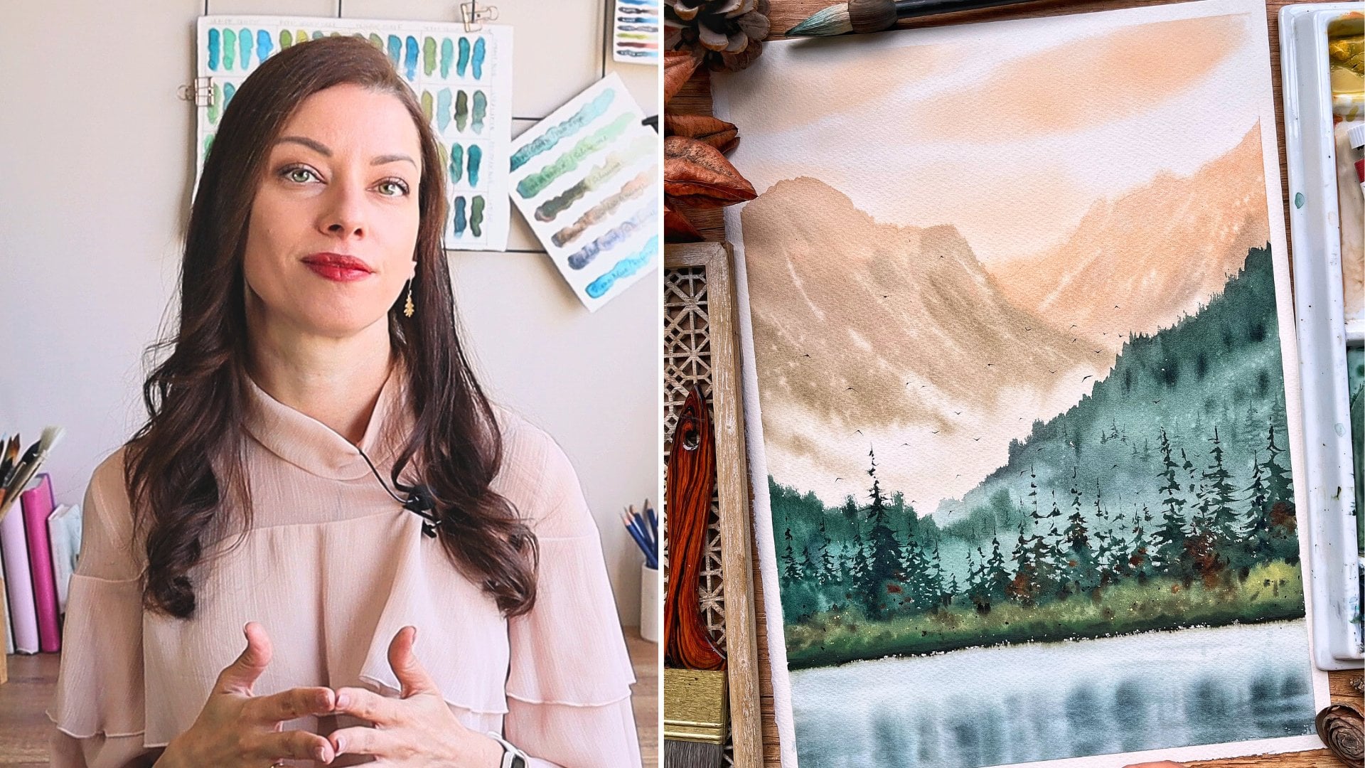
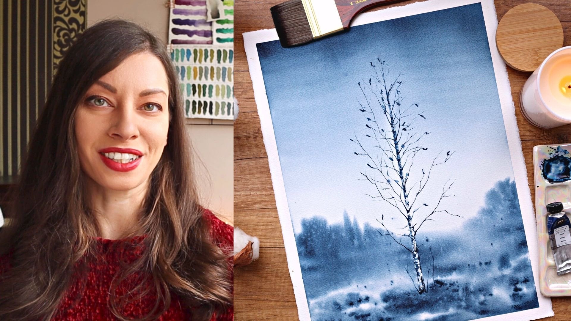
Transcripts
1. Welcome to Class!: One of the best sites
for our eyes is the lush and rich
greenery we can only find in the countryside. There is something
relaxing and inspiring in those endless greenfields
that makes me want to take out my paints.
Hello, friends. My name is [inaudible], and in this class I'm
going to show you how to paint beautiful and rich
greenfields and greenery. Painting this with watercolors
can be a real challenge. Green colors taken
straight from the tube or pan often look unrealistic. In addition to that,
plain fields often look boring when painted
with watercolor. They miss dimension
and detailing. We all know that
painting convincing and expressive greenery
requires natural looking, spontaneous shapes, which is hard to achieve,
especially for beginners. In this class, I'm going to help you solve these problems. I'll show you how mixing
our own greens can be easy, fun and can bring your
landscape to a whole new level. You will learn how to transform boring greenfields and give them life with easy and
quick techniques. We'll also have a look
at specialty brushes and maybe even try
to make our own. All these to help us
get these natural looking and expressive
greenery effortlessly. Finally, we'll paint together fresh and colorful scenery
with lots of greens. My inspiration for this class came after a trip
to the countryside. I love to paint the
beauty around me, but I've also tried and failed so many times
to recreate it. I know now that
for a painting to be captivating and convincing, it's not necessary to paint
every single blade of grass, but to use the right colors
and to give a hint of the texture with
the brush movement and the effects we can create. These class is for you if
you want to learn how to mix some greens and
use them accordingly. After taking the class, you will feel much
more confident when painting landscapes
and greenfields. You will know how to mix the exact green shade
that will be perfect for your painting and
you will spend way less time trying to make
foliage look natural. Are you ready to step
up your landscape game? Meet me in the next video
where I will tell you more about the class
and the final project.
2. Class + Project Overview: [MUSIC] For the final
project in this class, we are going to paint
beautiful and fresh landscape with lots of greens. Don't worry if this sounds
too complicated for you, we are going to start
from the very basics. First, we'll explore
the different greens in our palettes and we'll
mix our own greens. This will help you in
all your future painting as greens from the tube
often look unnatural. Next, I will show
you how to make plain green fields
interesting and diverse. We'll also explore different specialty
brushes that will help us paint out these trees and
bushes with less effort. Finally, we'll paint our
fresh green landscape combining all the tips and everything that you have
learnt in the class. After taking the class, you will feel much
more confident while painting natural landscapes
and green fields. You will know how to mix
the green shade that will be perfect
for your project. You'll spend way less time trying to make
foliage look natural. If that sounds good for you, meet me in the next video where I will tell you more about the materials that you're going to need in order to
complete the class.
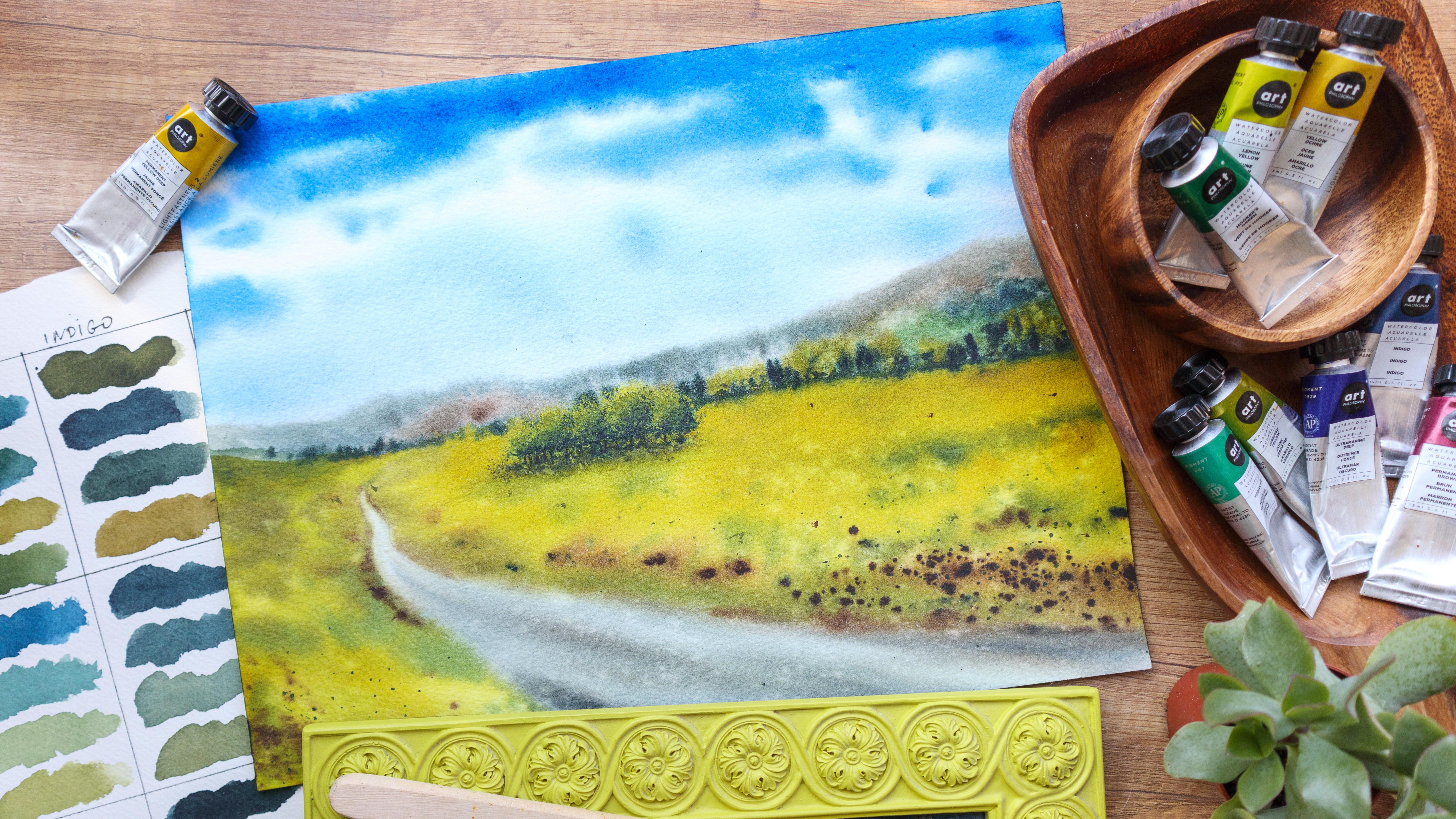
3. Materials: [MUSIC] In this video, I will tell you more about
the materials that you're going to need in order
to complete the class. We'll start with the paints. I will use these tubes
by Art Philosophy. What I did is I took
all the yellows and oranges as well as all
the blues from my set, and I will try and mix all the different combinations that come with these colors. I will show you all the mixes
that these colors can do. This is actually a
very nice exercise that you can do
with your paints. All you need is to have all your yellows and
all your blues from your palette so
that you can test your own mixes and to see
what your palate can do. The reason I took
yellows and blues is because when we mix yellow
and blue, we have green. I have also prepared the
greens that come with the set, and I have this permanent
brown here too. You just need to prepare
whatever palette you'll use mostly
for your landscape, and we will test the
different combinations between yellows and greens. Here, I have a palette where I have squeezed all the tubes. Sometimes when I need a
smaller quantity of paint, I will just go and take
it from this palette, instead of squeezing
out from the tube. For paper, I will use this
Hahnemuhle watercolor. It's 300 GSM, 100
percent cotton paper. It has a rough
texture and I love to use rough texture
for landscapes, especially when I
paint green fields. You can see the
texture of this paper. It's really nice and beautiful, especially
for landscapes. You don't need to use a rough
paper if you don't have it. But it's nice to
have a cotton paper because otherwise some of the
techniques will not work. I will test my colors and
mixes on a Fabriano Artistico. It's again, 100 percent, 300 GSM cotton paper. For brushes, I will use my big hake brush
to water the paper. You don't need to
have it, you just use your biggest brush for that. I will also use my silver
black velvet size 8. It's my medium-sized brush. For bigger areas, I will use this Da Vinci Casaneo size 4. For the specialty brushes, I will show you how I use
these different brushes. First one is this Chinese
calligraphy brush. It has soft hair, and you can rough it up a bit, and then it makes a really nice marks on the
paper. I will show you. Next is this rigger or a
liner brush by Schimoni Art, it's size 8, it is
very pointy and long. Finally, these Deerfoot
Stippler by Jackson's. I will show you
what we can do with this specialty brushes and how you can use them to make
your process easier, but you definitely
don't need to have it. You can just watch the
videos first and then decide if maybe you
want to get one or not. For pencil, I will use
my mechanical pencil. You will also need an eraser. Maybe some White
Gouache for details, cotton towel, or paper towel. I will use this spray to
activate the paint in my pens. Two jars of water. One I will use to rinse
off my brush and the other has to stay clean for
when we need clean water. This is everything you will need in order to
complete the class. Meet me in the next video, where I will talk more about the different greens
that you can buy from the stores and what you can paint with them. See you there.
4. Green Colors: [MUSIC] In this video, I will show you the different
greens that I have, and I will tell you more about what you can
paint with them, and which are worth to have, and which are not particularly useful for when you're
painting landscapes. First is this Azo
Green by Van Gogh. It is yellowish-green
or greenish-yellow, and it has this slightly
neon shade which is very beautiful for when you're painting fresh green fields. Next is Leaf Green by PWC. It is again yellowish
green. It is a bit opaque. You can use opaque colors to add details even on top
of darker ones. Next is this Olive Green by White Nights. I really love it. It's very warm green, and when you delete
it, it gets yellowish. Yellow greens are
perfect for when you're painting the highlights of the green fields, and greenery. This one is Yellowish
Green by Art Philosophy. Again, it's a really nice greenish-yellow or
yellowish-green, very bright. Yellow greens are perfect
for the highlights of the trees or as a base color
for fresh green fields, and this is exactly
how we're going to use them in our
final project. If you don't have
similar greens, you can then use lemon yellow or add yellow to your green
to make it more bright. Next, we will continue with more earthy greens so this is Yellow Green by Roman Szmal. This one has light
granulation so it's very beautiful to
use it when you're painting green fields because it has this nice texture to it. This one is again
by Roman Szmal. It's called Aquarius Green, and it's very beautiful, dark, and warm green. I use it again when painting green fields, and greenery, especially for when you want to add that warmth into
your paintings. [MUSIC] Next, this is Green
Earth by White Nights. It's slightly opaque. [MUSIC] This one is called just Green
by White Nights. It's one of my favorite greens. It is really dark, but
when you dilute it, it becomes lighter, and very beautiful enrich shade. I always use it when I want
to paint the shadows of the greeneries or
the green fields. Next is Sap Green by Van Gogh. It has this nice
fresh tone to it. Lighter, and more fresh greens like this one can be
used when painting spring landscapes
while if you're painting more moody
or autumn scene, it's better to choose
a warmer green like the first three on
this sheet of paper. [MUSIC] Next, I will show more unusual
color so this is May Green by White Nights. It looks really unnatural
sometimes but I've seen some artists are using it when they paint some
more greeneries. Next is Yellow Green
by White Nights. It is really a natural green
color so I rarely use it. This one is Hooker's
Green by Art Philosophy. It is beautiful shape but again, I mostly use it when I mix it with some other color
to mute it down. Next is Viridian Hue
by Art Philosophy, and honestly, this is one of the most unusual
greens for greenery. Mostly I use it for
when I paint seascapes. Same with this Emerald Green by White Nights so you're
really seeing the nature, a green fields or greenery
that has this color. Lastly, on this page is
Blue Green by White Nights. It's again a beautiful green, but I use it mostly for when
I paint seascapes in water. If you happen to have
any of these greens, and want to make it
look more natural, you can try to add some
orange or red to them. This will take down some
of their intensity. Next, I will show you
some granulating greens. I love to use them when I paint green fields because they
add a little bit of texture, and make the fields
more interesting. First one is this Dusk
Green by Van Gogh. It is very dark green, and you can mix it
with other greens, and again, it will
keep it's granulation. Next is this Forest
Brown by Schmincke. It has these brown particles that separate from the green. It adds a lot of interests
to your works if you use it. Next, this is Tundra Green. Again, by Schmincke. It is warmer color
than the previous one, and again it separates
to green, and brown. You can already see
the granulation. Next, this is not a green color but I decided that I can at least show it to you because it's very beautiful,
and interesting. It's called Glacier
Brown by Schmincke, and same with this Tundra
Violet. Again, by Schmincke. You can mix these colors with greens or with other colors, and you will get very
interesting combinations, and you will still keep a
part of the granulation so you'll get a nice effect
of the granulation provides. Finally, this is Ocean
Blue by Roman Szmal. It separates to blue, green, and brown particles so again, it's really useful
for when you're painting seascapes in waves. These are the different greens
that I have in my palette. I hope that it was useful
for you to see the swatches, and maybe decide
if you want to add some colors to your
palette or not. I will see you in the next
video where we'll explore the greens that we can mix with the colors that we
already have in our palettes.
5. Mixing Greens: This video will make very
useful and quick exercise in which we will mix
all the yellows from our palette with all the blues. This way we will test all
the different combinations between them and we'll
know our colors better. I will also keep
my palette here, I will spray the paints
to activate them. I will remove the tubes to
have a little bit more space, then I will place my palette like that so you
can see it better. I have prepared this
sheet of paper. I suggest then that you keep your swatch list for future references
when you're painting, especially if you want to make the best use of your colors. So let's get started. I have put the names of
all the yellows on the top and all the blues are
here on the right side, and I will start
with lemon yellow. So I'm taking some lemon
yellow from the pen, into that I will add the first blue color that is on the right and
this is cobalt blue. I will place it
here on my palette. Now I will mix them, I will add a little bit
of blue to the yellow. Let's see what we have here. So we get this blue-green color. I'm adding more yellow to
the mix and now we have this bright fresh green. Adding some more blue to see the different variations we can get by mixing
these two colors. You see that the blue is kind of dominating the lemon yellow. One more variation
with this mix, and we are ready to
go to the next one. So I'm taking some
fresh lemon yellow, this time I will mix it
with ultramarine blue. I'm placing some
here on my palette, and I start to mix, I will add just a little bit of blue to the
yellow as a start. We're getting these
nice fresh green, I will swatch it here. Adding some more blue. We're getting a deeper
shade, more darker one. I'm adding more intense
colors to the mix. I'm just playing with the
different variations that I can get there is no
right or wrong here. Just play with your colors. You can add more
water or less water. Adding more yellow now and I get this really beautiful
fresh green color, and I will continue
doing the same with all the different
colors that I have. I will try four
variations for each mix. I strongly suggest that you
do the same with your paints because it really helps you to get to know your colors better. This way you will know
the mixes that you can get with the paints
that you already have. It will be much more
easier for you to know which color to mix when you're painting your future landscapes. As you can see with the
permanent yellow deep, we're getting more
olive green shade, while with the lemon yellow, we got these very light and fresh like aqua green colors, and with the yellow ocher now
I get really muted colors, and with perm yellow-orange. We're getting very
earthy greens, sometimes even
browns, because when we mix orange and blue, we usually get brown. So these are my variations. We have some really nice colors. Here we have some granulations. I hope that you can see. It's really nice to make this exercise really
useful for you. Here is also a very
interesting color that we got. So do this with your colors. Keep the swatch sheet for future references and
you'll see how easy it is to make the perfect green
shade that you need in order for your
landscape to be fresh, convincing, and nicely looking.
6. Tips for Painting Fields: [MUSIC] In this video, I will show you how you can make plain greenfields
more interesting. You can actually use those
techniques every time you have a bigger plain
area in your paintings. Let's get started. I have six boxes here and I
will show you in each one, a different technique
that you can use. Let's say this is my foreground, and I have a
greenfield right here. If you have a greenfield
in the background, it's better to have it just one color and
at least details. But if it's in the foreground, you definitely need to
add something more to it. One of my favorite
techniques is very simple. I'm just using
some darker color. Indigo, for example. I add some random brush
strokes here and there, more thick on the bottom. Then I blend some of the color, paint some blades of grass. This is it. Let's go
to the second one. Another option is to change
the intensity of the color. For example, here I
added more water. This way, I don't
have a simple wash. I have places with more intense color and places where the
color is diluted, so it recreates the play
of light and shadows. [MUSIC] Let's go over to the next one. This is a very favorite
technique of mine. I'm just taking some water
and I splatter on top of it. The drops of water
are pushing some of the pigment and create
these lighter spots. For a better result, we need to wait for that to dry a little bit
because now the water just mixes with the rest of the paint that I already
have on the paper. Let's go to the next one. This one is very similar
to the previous one, but instead of clean water, you can use a different color. It can be a darker
color like indigo. Make sure they mix well with the color that you chose
for your green fields. This way, we added some
texture to the field. You can use this technique to quickly paint some flowers too. If you use a different
color than green or blue, for example, you can use red. [MUSIC] This is how we quickly
painted a pop field. You can use yellow or pink or any other color that
mixes well with greens. See how loose and
expressive this looks. Finally, another favorite
technique of mine is to use granulating color for the
greenfields in the foreground. With this technique, you don't
need to do anything else, but you can add some
darker colors tool or use any of the techniques
that I already showed you. But the granulating colors are beautiful enough
by their own. Now, I will splatter
some water again here. So in order for this
technique to work, you need to have not too
much water on the paper, but it must be still wet. These are the techniques that I use when I paint greenfields. I honestly use them in
all of my foregrounds, they add a lot of
interest in my paintings, and there are fun, quick, and easy to make. In the next video, I will give you some tips on how to paint greenery.
See you there.
7. Tips for Painting Greenery: [MUSIC] In this video, I'll give you my tips for
painting greenery quick and easy and I will show you what I did to make
them look natural. First, I will show you the Chinese calligraphy
brushes that I have and what we can do with them when we're
painting greenery. They usually look like
that when they're dry, messy, which is
exactly what we need. But it's also nice that
when they are wet, their tip is pretty sharp, so you can use it
for finer details. When we're painting
bushes, for example, we want to make random
brushstrokes and this brush really helps with that because
the hairs are soft, long, and messy at the tip. If you take out the excess moisture by dabbing your brush
on a paper towel, then it gets really easy to get these if forth list
natural looking bushes. See how different this looks and you can use the same technique for
when you're painting trees. This is the ground of
my tree and I will just add some
darker color to it. You should always have a
lighter and darker color when you're painting greenery
bushes, trees, whatever. Let's paint the
trunk of the tree. I will add a darker color on one side and I'll
paint some branches. I will also add some
highlights with lemon yellow. This is usually how
I paint greenery. I have a base color, which was the hookers green then I added some shadows
with indigo. Finally I added some highlights
with the lemon yellow. The next brush I
wanted to show you is these there foot
tips by Jackson's it has these very particular shape and its bristles are very hard. Again, I use it to
paint bushes and trees. Let me show you how this works. I take some paint
straight from the pan, and I make this brush
marks on the paper. If I add more water again, I get a totally
different result. I will add some indigo
for the shadows, some clean water to blend
them better and finally, some lemon yellow
for the highlight. Usually you will have one side which is lighter and
one side which darker. A nice photo reference
always helps to get to know your
subjects better. Usually I don't paint
without photo references because they show me where the highlights and
the shadows are. Next, I will show you this
rigger brush by use money art. It is very long and
pointy and it's perfect for painting such
long blades of grass. It also holds a lot of
water so I can make multiple brushstrokes with it. Another thing that I
love about it is that it makes a very nice
tiny splatters. Another way to paint such natural looking
brushes like this, if you don't have
specialty brush, is to hold your regular
brush at the end like that. This way you will make more random strokes because
you'll have less control. Finally, what I wanted to do in this video is I will try to make myself a specialty
brush for painting grass. Let's see if this will work out. This is a flat brush,
it's half-inch. I got it for acrylics back then, but I don't paint with
acrylics anymore. I will try to make myself a specialty brush using
these nail scissors. Basically what they want
to do is I will try to get the hairs of the
brush here and there. Hopefully this will make for
a nice brushed paint grass. Let's see I will try to
cut some of the hairs. It's actually harder
than I thought. Basically, I want to have three or four longer bundles of hair so I'm cutting
the hair in-between. I'm almost done
with the first one. I think I'm ready with this one, so I will try to make one
or two more like that. Doesn't look very nice, but let's see what we
can paint with it. I'm taking my practice sheet, I'm thinking some color or actually this is not
looking bad at all. I like how natural
is grass looking. I am some darker color and I can flip it
on the sides too. I will add more water to it. This is actually nice, I will definitely use it
in my future paintings. If you have an old
brush like that, you can definitely try
and repeat my experiment. Let me now how these
wines for you. I will see you in the next
video where we'll finally start to paint our
final project.
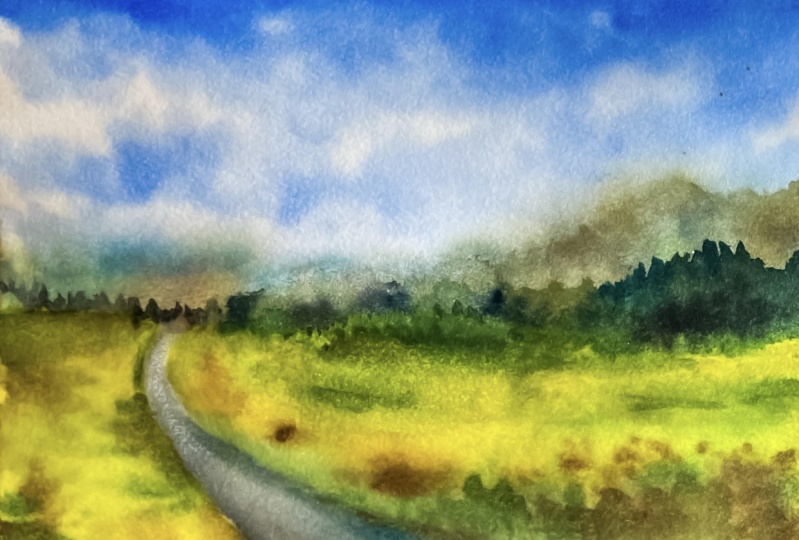
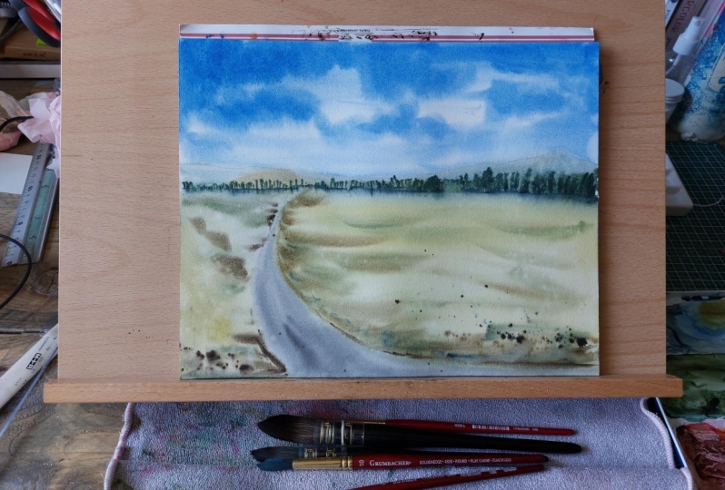
8. Final Project: Sketch: [MUSIC] It's finally time to start with our final project. [MUSIC] We'll start
with a simple sketch. I will draw the horizon line. It goes like that and here
I have some mountains. Here, I will have a road, it goes like that. I will make this darker
so that you can see. I'm trying not to press too
hard with my pencil because the pencil marks will
be visible afterwards. You keep that in mind too. Here, I will have
some greeneries. I'm tracing the distance. This is it. We are
ready with the sketch. I will just take some of that excess graphite
with my eraser. This is it. We are ready
with the pencil sketch. In the next video, we'll start
painting with watercolors.
9. Painting the Sky: [MUSIC] I put my
paper tape like that, so that's my paper
is at an angle. This way the water and
the paint will flow down and I water the
entire sheet of paper. Don't rush this step, we'll paint almost
the entire landscape using wet-in-wet technique. We need our paper to be
really well moistened. I am taking some cobble blue. I prepare my palette here. I take my paper towel so that I'll have it
handy when I need it. With my silver brush, size 8, I will start
to paint the sky. I'm just taking some
of the cobble blue. I'm not adding too
much water to it. I will just paint this
sky by making some lines. I will leave some white gaps, which will be our clouds. I'm holding my brush
high so that I can make more
spontaneous movement. By going down, I'm not adding too
much color because this sky is getting lighter
towards the horizon line. Also the white spaces that I'm leaving are getting smaller and smaller because those
are the clouds that are in the distance so
we see them smaller. I will add some color here
in this bigger cloud. I'm adding some
color on the top. This is where the sky
should be darker. I'm adding some more color here. I'm blending it. This makes for a really nice
perspective when this sky is darker at the top and
lighter at the bottom. Of course, the size of
the clouds matters too. I don't want to spend too
much time with this sky, so I will leave it like that. I will just tilt
my paper so that the water in the
paint mix better. I really like this technique for painting effortless skies. I'm tilting my board in
different directions. This way the water and the paint mix very
nicely on the paper. Here I have some white spots. I will just try to move the paint there with my
brush and our sky is ready. Head over to the next video without leaving
your paper to dry.
10. Painting the Mountains and Trees in the Distance: [MUSIC] In this video, we'll paint the mountains and
the trees in the distance. I'm watering again
the bottom side of my paper because it
has dried a bit. Now, I will choose and mix the colors for the
distant mountains. I will use my swatch sheet. In my case, the sky is
cobalt blue and I really like the mixes between cobalt blue and permanent yellow deep. Keeping your color
palette limited is a nice way to make your
landscape look more balanced, so I won't be adding
other blues here. I'll squeeze some permanent
yellow deep here. Now, I will add to
this some cobalt blue, I'm preparing a
puddle with my color. I want to have a
brighter version too, so here I will add more
permanent yellow deep. You'll see the pretty
color that we're getting. It's almost like glowing. If you have another
favorite from your mixes, you can definitely use that too. But I just love yellow-green, so I'll go with that. Here, I'll add some
permanent brown to the mix. It gives me this earthy green. Some more blue to go
back to the green side. This will be the color
that I will use for the mountains in the distance. I'm dabbing my brush on a paper towel to take some
of the excess moisture. While the sky is still wet, I will paint the mountains. I'm taking some of this
mix of cobalt blue, permanent yellow deep,
and permanent brown and I will just paint
some color spots here. I always start at the
edge of the painting because I just want to see
how the colors will flow. If they flow too much, I will wait a little bit more. But in my case, I'm happy with how wet is my paper so I will continue
with the mountain. I'm just adding different
colors to the same photo because I want to have a nice
variation in the mountain. I don't want it to
be a single color. It's much more
interesting this way. So I'm adding more
brown and more blue and I'm just making some
color spots on my paper. I'm not following any
specific pattern, just some color spots. Here, I have more
blue-ish color. Now, I will just take
some of that color with a clean damp brush because
it was too intensive. After all, this is a mountain
that is in the distance, so it doesn't have to
be too much saturated. Now, I will continue with
the mountain on this side. Usually, with landscapes, the objects that are in the
distance are more blue. We can depict this
way that this side of the mountain is going further
and further away from us. Some random spots here. I'm fixing the edge here and there because the paint
has spread too much. I'm taking some permanent
brown and I'll add it here. This is a mountain
that is closer to us, so I use warmer
colors to paint it. You see how well it pops out against the blue mountain
that is in the distance. Now, it's time to paint the
greenery in the distance. We'll do that while the
mountain is still wet. I'm taking some indigo and
I'm making a puddle here. Some hookers green too. I'm taking some of the
color that I prepared earlier to mute it down a bit. Some indigo to make it darker. Here's some permanent yellow deep to mute it even further. Some indigo again. I'm taking again the
excess moisture from my brush and I
place it this way. I'm starting again to make some random strokes
with my brush. I will water again the
bottom side of my paper, I don't want it to dry entirely. Now, I will just vary
those colors again. Some green, some blue, some darker green, some warmer green with more
permanent yellow deep in it. So by switching between colors, we get this realistic
look of the mountain. The color is blending nicely. Now, I'm preparing a
really dark mix with more pigment and less water and now we use that
to paint some trees. For that, I'll use
just the marks that my brush is making while
it touches the paper. Some are taller than others,
some random brushstrokes. I'm washing my brush. I will use this puddle here with some
green and cobalt blue. We want it to be
transparent and I'll just use it to paint the horizon
line here in the distance. Again, here the trees are
getting smaller and smaller because they're disappearing
in the distance. Now, with the damp brush, I will blend this part. I will splatter some
clean water here. It makes for a very nice effect. If you want, you can cover your sky to protect
it while you do that. I will again fix the edge of the mountain here with
a clean damp brush. I'm blending the
colors here and there. These are all small things that can sometimes make
a big difference. This is it for the
distant objects. In the next video, we'll
paint the green fields, head over to it without
leaving your paper to dry.
11. Painting the Fields: [MUSIC] In this video, we'll paint the foreground. For the green fields,I
will use these greenish-yellow
straight from the pan. You see how beautiful it is. It is almost a yellow
color, but don't worry. We'll add some greens to it so it will look more natural and blending it with the
trees that are in the distance and because
my paper is still wet, this happens very
naturally and beautifully. If you don't have
it, you can use any other warm green
or lemon yellow. You can also check
your swatch list from our mixing exercise and
choose a mix that you like [MUSIC] I won't color the road so I'm going around it. [MUSIC] Adding some permanent brown to the foreground. Some dots in the distance. With the mixes that I already
have here on my palette, I will just add some green lines in green brush marks
here and there. The way with this individual
that I showed you the techniques that I use
when painting green fields. Now with a darker green
mixed with brown, I will outline the road
and I will be very careful in the distance
to make this line very thin and barely visible. It will get thicker
and thicker when it comes closer to
the foreground. I will blend it with the rest of the greenfield so it
doesn't look cut out. With dark green, I will go again here where the trees
in the distance are and I will make their line more dark so it's not like
they're floating in the air, but they have shadows
on the ground. [MUSIC] Some more brush marks
here and there. [MUSIC] Some dots
with permanent brown. [MUSIC] You see how this greenfield is
slowly coming to life. [MUSIC] Some dots and lines
with indigo too. [MUSIC] Here I will
have some trees so I'm painting their shadow beforehand while the paper is still wet so it blends more naturally with the rest
of the greenfield. Now I will cover
the sky and I will make some splatters
with permanent brown. I think a very
intense color and I splatter it carefully
here on the foreground [MUSIC] Now I will repeat the same with some green. [MUSIC] I'm trying not to go too much into
the background because these are details that can
be seen only if we're close. Some last touches
to this part of the painting and now I
can remove the paper. I will again repeat
the line of the road because it disappeared into
the rest of the paint. I will make some cobalt blue with permanent
yellow-orange. [MUSIC] I'm trying to get
a grayer color, I add a lot of water to it and I will use that
to paint the road. My brush marks follow the
direction of the road. I will blend it with the rest of the color that I
already have here on my paper and I add more color
in the foreground again. I will just drag this color up. I'm not adding more color
in the distance because remember the objects
there are more lighter. I will use again some
brown to emphasize the edge between the
road and the grass. [MUSIC] When I add indigo
to our permanent brown, I get these very dark gray so I use that here
in the foreground. Now I will continue
on the other side. Again. I'm taking some yellowish-green
straight from the pan and I will cover the entire area here on the left side
with that color. [MUSIC] Adding some green to blend it better with the background, and now I will just
blend those two colors. [MUSIC] Now again, I'll add more
interest to this side of the painting by adding
some color variations, some lines and dots with different colors and the same that we did on the other side [MUSIC] I'm taking the excess water from my brush whenever
I need to work an error that is wet
already because otherwise, the color will spread too much. I'm blending some of the color. [MUSIC] Now I'll clean this edge a little bit with a
clean, damp brush. [MUSIC] Some splatters. [MUSIC] Some brush marks with green. [MUSIC] I'm splattering some clean
water over the road too. I really like the
effect that I got. I'm cleaning this
edge again because the color has flown too much. My brush is clean and damp. [MUSIC] Splattering some water here too. We are ready with the fields. You can leave your
paper to dry now. In the next video, we'll paint the trees in the middle
of the painting.
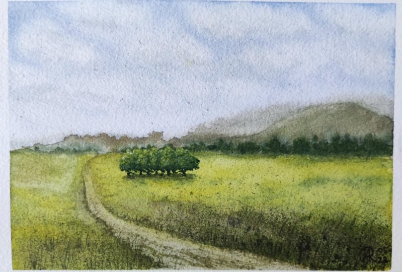
12. Painting the Trees: Now, I will paint the trees that are here in the middle
of the green field. I will use my Chinese
calligraphy brush for that. I'm taking very
concentrated lemon yellow and yellowish-green and
I mix them together, [MUSIC] adding some permanent yellow-orange, some cobalt blue. This will be the base
color for the trees. I'm washing my brush and
with some pure lemon yellow, I will start with
the highlights. I'm just touching my
brush to the paper, I'm leaving some marks
with the lemon yellow. [MUSIC] It is a bright color, so it covers some of the layers that we have
already on the paper. Now, I'm going in
with my base color. Finally, some indigo
for the shadows. This is a group of trees, so we are not painting
each tree separately. We just paint them together. [MUSIC] Some more shadows
to make them bold. I'm blending some of the color. Now, with my rigger brush, I will paint the tree trunks. So I'm just using
permanent brown and I just paint some very
thin lines that connect the trees that I just painted with the shadows that we painted when we
worked wet-on-wet. [MUSIC] I'm preparing the mix
with the darker green. I add some water to it so it's transparent and I will
reinforce the shadow. I'm not painting
a straight line, but there I lift my
brush here and there, making some random brush marks. I will smudge some of the color. It doesn't have to be too distinctive because
it's in the distance. [MUSIC] I will fix some of the tree trunks. Next, with a clean damp brush, I will just blend this. [MUSIC] Now when everything is dry, I will use my [inaudible] to add some highlights
with lemon yellow. I'm taking straight
from the pan, so it's very thick. I don't have too much
water on my brush because I want to leave these
very tiny little spots. You see the nice effect we're
getting with this brush. [MUSIC] Now, I will repeat the same with my base green
color for the trees. Lastly, with the indigo
for the shadows. [MUSIC] You see how this makes the trees looking really
three-dimensional. [MUSIC] Some last stitches. This is for the trees. In the next video, I will show you a quick trick that you can use if you don't have lemon
yellow for the highlights, which is also helpful in
many other situations. Then our final project
will be ready.
13. Bonus Lesson: [MUSIC] If you don't have lemon yellow or in your pink yellow that you
can use for the highlights, here's something
that you can do. Prepare thick mix
of the green or the yellow that you want
to use for highlights, and you can add some
white gouache to it. This will make the color opaque. Keep in mind that
it will also make the color look more
like a pastel color so this way you can add some opaque highlights and
details to your trees. The white gouache
is going to make it more opaque and strong, and you can use this trick
with whichever color. It's a nice little trick to
know and you need to cover something or to make some highlights with
a brighter color. [MUSIC] Some details on the ground. This is it, guys.
Congratulations if you made it this far. I know that it was a
challenging project, but each time we
challenge ourselves, we are getting
closer and closer to the next step in our journey. I am happy that you
took the step with me. I will see you in the next
video for our final words.
14. Wrapping up the Class!: [MUSIC] Congratulations
on completing the class. I know it was challenging, but only through
challenging ourselves, we grow and improve. We managed to cover some basic principles
that you can use in any future landscape
painting of yours and I can't wait to see
your future creations. Don't forget to
post your project in the project
section of the class. I can't wait to see
what you'll create. If you post your
project on Instagram, don't forget to tag me. If you have question for me, just post it in the
discussion section of the class and I'll get back
to you as soon as I can. Until the next class,
guys, happy painting.
 Elina Zhelyazkova, Watercolor Artist