Transcripts
1. Welcome to Class!: What if painting kits could feel as relaxing as looking at them? Let's paint just 15
minutes a day together and paint skys full of color,
light, and expression. Hello, everyone. My name isElna. I'm Wat color artist
and educator, and I'm so excited to invite
you to this What color challenge that's all about
painting skies and clouds. Painting skies is one of the most relaxing and joyful
practices in Watercolor. They're full of flight,
movement, and emotion, and they always leave room
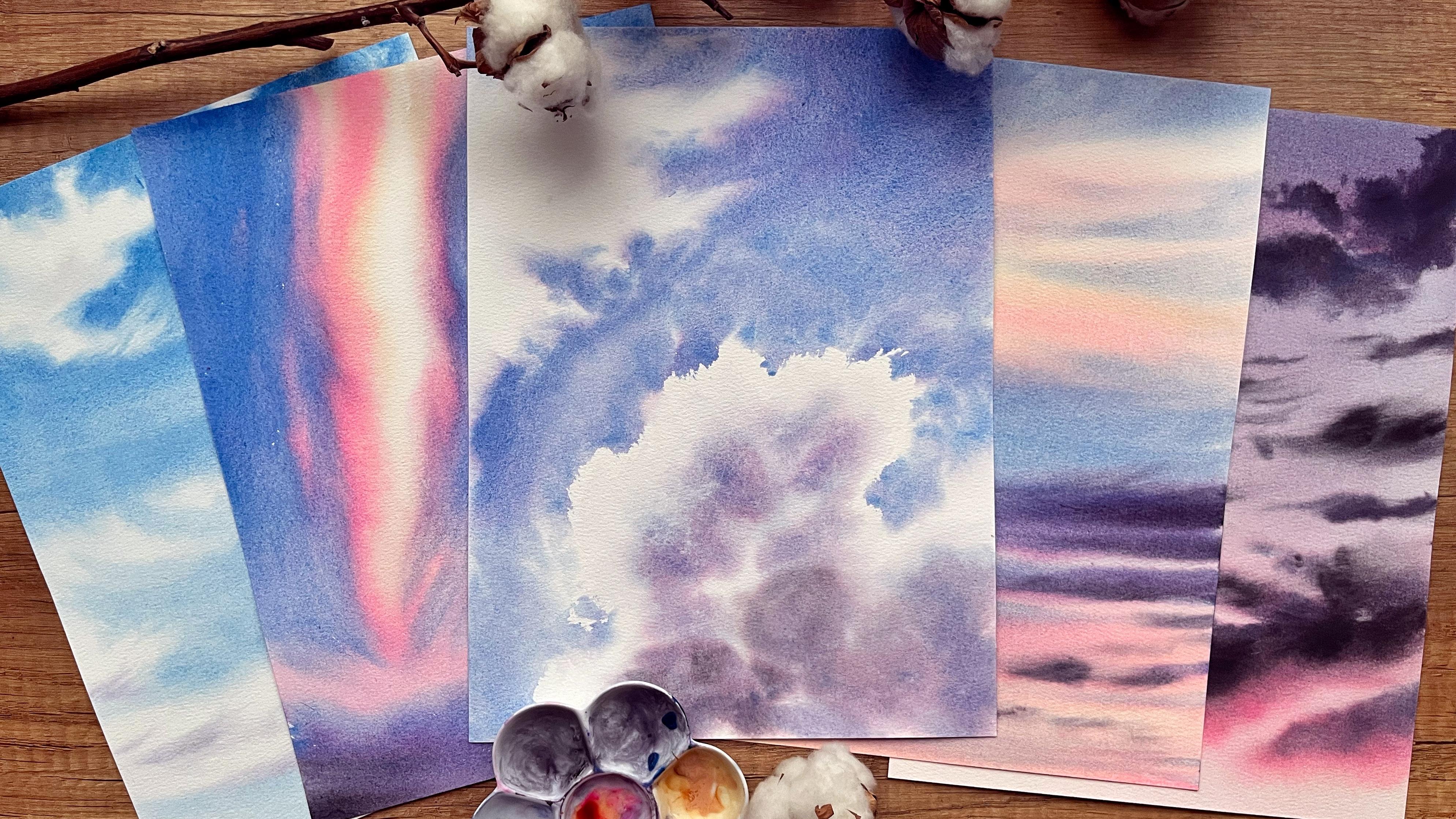
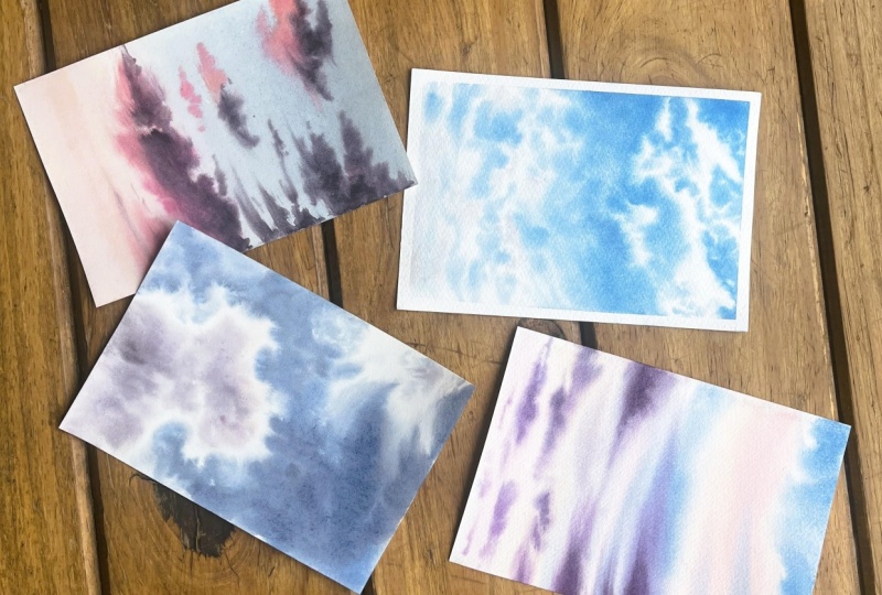
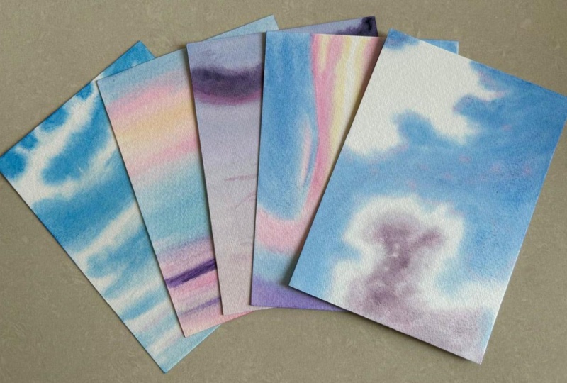
for personal expression. In this class, we'll paint five different
skies in five days, each in about 15 minutes. That means that in just a
short daily practice session, you'll have a complete
painting in front of you. These exercises are quick, approachable and designed
to help you loosen up, let go of perfection and
simply enjoy the process. You'll see that a little bit of messiness and imperfection
can actually make your clouds look even more
natural and real skies are never perfectly neat, and that's what makes
them softened paint. I'll guide you step by
step through each sky, showing you how to
create soft blends, glowing colors, dynamic
contrast, and expressive clouds. And even if you
are short on time, this challenge will help you
establish a daily practice, which is not only
amazing for your art, but also for your
mental well being. And if you'd like
to explore skies even further after
this challenge, I'd love for you to check out my classroom sunsets paint dazzling skies with what color. In that class, we go deeper into how to mix pastel colors, choose beautiful palettes
and create perfect washes. Plus, we finish with a
complete painting of glowing pastel sky and s shutt. So grab your brushes, get your pants ready,
and let's dive in.
2. Class + Project Overview: In this class, we'll be painting
five skies in five days, each one a little different from Colblue skies to dynamic sunsets and expressive cloud scapes. Each painting takes
about 15 minutes, which makes this the perfect challenge to fit into
your daily routine. Even with a busy schedule, you find it easy to set aside a short amount
of time for your art. It's how it works. Each day, you'll watch a short video and follow along paint one skite. By the end of the challenge, you'll have five finished, what call Skite each with its own atmosphere
and personality. If you like, you can
take this exactly as a five day challenge and
paint along each day. Or you can go entirely at your own pace. There is no rush. The important thing
is to show up, enjoy the process, and let
the practice inspire you. The class project is simple. Complete the five skies and share them in
the project section. I'd love to see your skies. Altogether, it's inspiring to see how different
each one turns out, even with the same steps. Remember that the goal
is not perfection. Skies are all about freedom,
looseness, and expression. So streaks, blooms or unexpected texture can often make your painting even
more beautiful and alive. By the end of the
class, you'll feel more confident painting
skies and clouds. You'll have built up a set
of expressive techniques, and most importantly, you'll have strengthened your
daily art practice. In the next video, we'll go over the materials needed to complete the class.
See you there.
3. Materials: In this video, we'll
go over the supplies that you'll need for this class. I'll share what
I'm using and why, and I'll give you
some options and recommendations.
Let's get started. When it comes to watercolor, paper is the most
important supply. For this class, I highly recommend that you use
100% cotton paper. It's crucial for the
techniques that we'll use in a way that wall paper
could not compete with. It stays wet for longer. It absorbs the colors better and allows for those dreamy so plants that we
want to achieve. One that I'll be using in
this class is by median art. It is 100% cotton, cold press, which means
it has a slight texture. The size is about a four, and the thickness of the
paper is also important. This one is 300 GSM. I suggest that you use at
least 250 GSM for this class, This one is in the form of
a which means it's glued on all sides so that we can start painting right away without
stretching or taping it. But for this class,
I will tear of the sheets and use the
cutting mat as a board. I won't be using paper tape. Instead, I'll weigh the
backside of the paper, which will make it lay flat
and stick to the board. I will show you exactly how I
do that later in the class. Let's move on to the paints. You will only need four colors
to complete this class. The ones that I'll be using
are cerulean, sky blue, naples, yellow, reddish, bright
opera, and neutral tint. Don't worry if you don't have
exactly the same colors. In the next video, I'll
tell you more about why I chose these colors and which
colors you can use instead. I will mix my paints on
the ceramic palette. You can use whatever
palette you have a dinner plate from your kitchen would work just fine as well. Don't need a variety of brushes
to paint beautiful skies. I will use these two brushes. This one is a motler
by Simoni art. It's large and soft, then I will use it to wet my paper and for larger
areas and washes. If you don't have
a similar brush, just take your biggest
and softest brush, and this one is a Chinese
calligraphy brush, and I chose it because it's very tall when it comes
to painting skies. It takes a lot of water and paint so you can use it
cover large areas with it. Comes to a fine point, so it could be used for
more detailed work. I particularly like it because I can spread
the bristles like that, and then it creates very
cool organic shapes, which is very helpful
for painting clouds. It has its downsides. For example, it is very soft. So mixing colors sometimes
could be challenging, and it also sheds a bit more
compared to classic brushes. So I feel absolutely free to
use whatever brush you have, preferably soft and
somewhat larger. Optional, keep nearby
a dry soft brush. If you have a spare
one, it could come in handy when
blending the colors. I will show you how exactly
later in the class. Two jars of water, one to
rinse off the brushes, and one for when we
need clean water. Spray bottle to re wt our
paints or the painting itself. If it dries too quickly, cotton and paper towels. I will use two cotton towels. One to take off the
excess moisture of my brushes and another one, a clean one for when we need to soak up the
water from the paper, again, I will show you how
in the following lessons. So this is everything
that you'll need for today's class,
gather your materials, and let's have a quick look
at the colors that you'll need to paint those beautiful dreamy skies
in the next video.
4. Colors: In this video, I'll
tell you more about the colors that I'll be
using in this class. I'll explain why I chose each of the colors and give
you some alternatives. You absolutely don't need to use exactly the same colors,
stick to whatever you have. My goal for this class was to stick to as few
colors as possible. A limited color
palette simplifies the process and takes
out the guesswork. But first, you need to spend
some time building it. So I highly recommend that you first try your colors on a
separate piece of paper, see if they work well the
way I will show you in this video and only then
proceed to the paintings. First let me tell
you why I chose the tubes and not
pans for this class. There are a few
reasons for that. Some are quite practical. For example, I'll be using
rather large brushes. The plastic pans could be
harsh on the softer bristles, and it's often hard to saturate a large brush well
when using them. Another reason is that for
some parts of the process, we'll need very thick paint. Not all pans have that creamy sticky consistency that allows for
thicker mixtures. And especially if you
use soft brushes, it's hard to pick up a lot of saturated paint from the pen. We also need large quantities of color sometimes for which, again, the tubes
have an advantage because we can squeeze
out however much we need. If you're used to using pens and you like them, no worries. Stick to whatever you
feel comfortable with. I'm giving my paints a quick
spray to activate them. And let me tell you more
about each of the colors. We cannot paint skys without
the classic sky blue color. For that, I'll use this
llant sky blue, bi memory. Like it because it's the
classic sky blue color. It's transparent,
so it has this glow that comes from the white
paper that shines through it. And it also has a very
slight granulation, which I like when
painting skies. It gives that light
grainy effect that adds an atmospheric feel. If you don't have this
particular color, you can use regular cerulean, cobble bloom, royal blue,
or even ultramarine. You want to make your
ultramarine softer, you cannot attach a
void quash to it. I often use it for my paintings. The next color is
bright opera by Michel. This one is almost
on like color. It has this particular glow. I chose it because opera is transparent color that is very bright and gives
this glowing quality to the painting and
mixes it great. If you have a regular opera, it would work just as well. I admit this one
is a bit bright, even for me, but it's the
only one I have right now. And if you don't have opera, feel free to use nacradon row. Permanent rose, magenta,
or even zerin crimson. The next color is naples yellow, reddish by the polish rensans. It's a soft warm yellow
perfect for glowing skies. Unlike the previous two,
this one is opaque, meaning it has high coverage, and it creates
pastel like mixes. You don't need to have the
reddish version of it, though many other brands offer it alongside the classic
Naples yellow shade. If that's what you
have, no worries, you'll just add a drop of Opera or whatever pink
color you're using. You can also use yellow
ochre, raw sienna instead, or even mix lemon
yellow and touch of pink or buntiena to create
a warm creamy yellow. And the last color in today's class palette is neutral tint. It is a transparent
gray, almost black, and it's used for
darkening mixes without modding or
changing the hue. It only makes the color darker without making it
colder or warmer. This one is by Jackson's. If you don't have
it, you can use pins gray indigo or even mix it yourself by combining
ultramarine and buntiena in equal amounts. It's the classic
DIY neutral tint. But apart from the
properties of each color, I chose those particular colors because they also
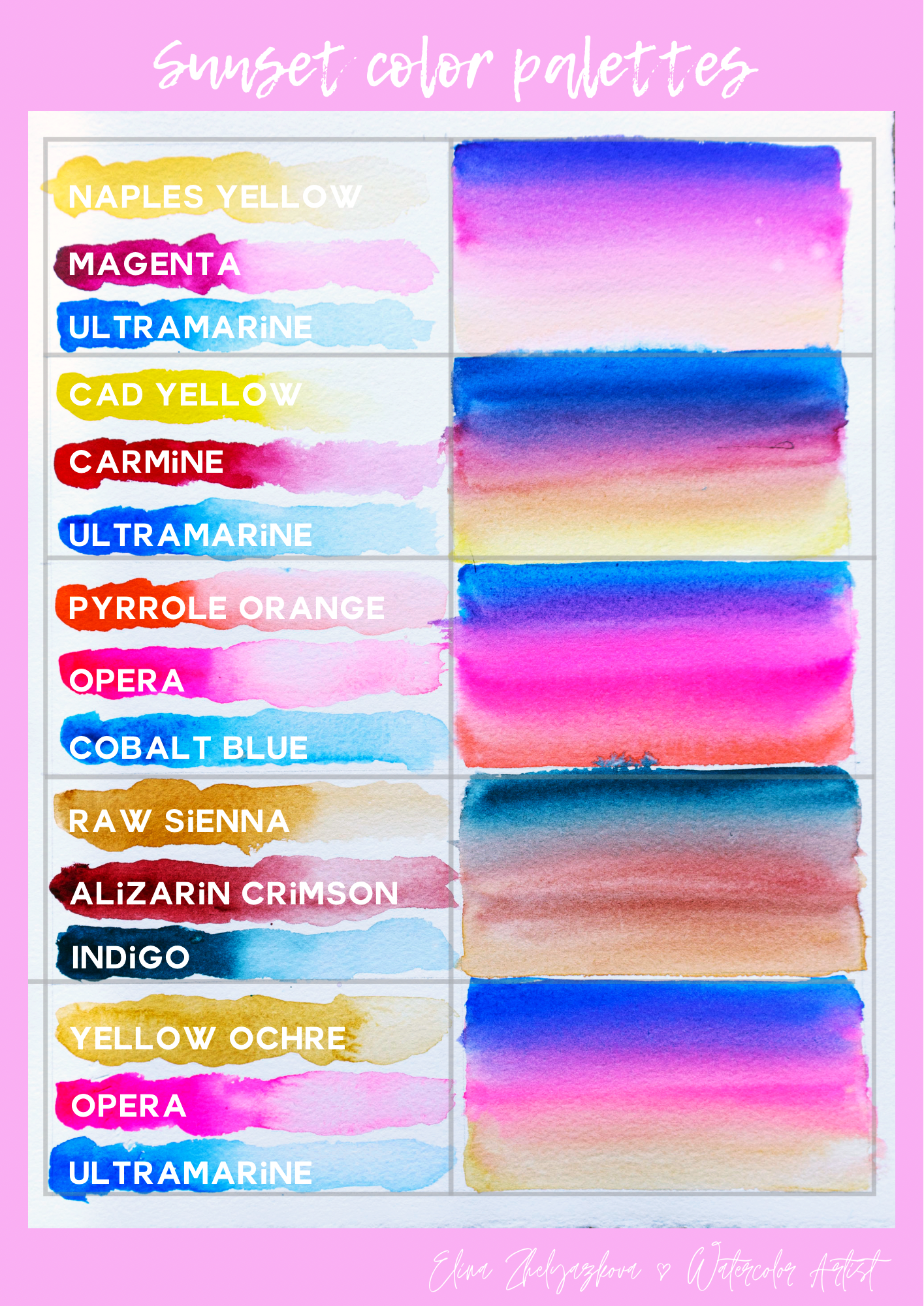
work well together. Here are the important
mixes you need to check with your
colors to see if your color palette
will work well or not. First, is purple. The cerulan sky blue and the bright opera create
a very vibrant purple. Of course, you can also use ready made purple if you
have it, but as we said, working with a limited palette
has its many benefits, including more harmonious
colors on the paper. The next important mixed try is between your pink and yellow. My idea for that one is to get this pastel peachy coral shade. And by the way, you can find it downloadable with a
different set of colors that I tested so that you can see how each of them
creates different mode. And finally, let me quickly show you how neutral tint works. See how it darkens the
opera without making it purple or shifting the
tone of it in any way. Same for the blue. If you're using paint gray
and especially in Digo, darker mixes would be colder, which is not bad in any case, just keep in mind that
it would look different. So that's it for the colors. Again, make sure to
test yours first, see how they work together so that there are no surprises. And once you're ready,
I'll be waiting for you in the next video where we'll paint our first sky. See you there.
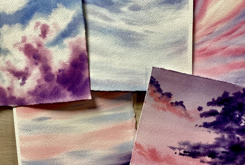
5. Calm Blue Sky: Welcome to the first
project in this challenge. Today, we're going to paint a classic blue sky
with white clouds. I use it whenever I have a more complex scene and I want the sky to serve
as a background, not the main star
in the painting. It's soft and dreamy
and so easy to paint. So let's get started. Let me first show you how I tear off the sheet from
my Wat color block. Theise usually have this
small opening where you can insert a letter opener
or a palette knife. A ruler would also work. So you insert it here like that, and then you glide
it along the edges. With some blocks, the
glue is stronger, so you have to be careful
not to tear the paper. If you feel strong resistance, it's better to leave it and
continue on the other side. Some pieces of glue might
stick to the sheet. We need to remove
them carefully. I and with all our projects
in this challenge, we are going to use the
method where we wet the backside of the paper
as well as the front side. I'll walk you through
it in this video, and in the next one,
I will speed it up as it's the same technique
for all paintings. So we start by flipping
the sheet first. I take my large brush and apply a generous amount
of water with it. I spread it evenly across
the paper surface. The goal is for
the sheet to soak up some of the moisture and for us to be able to see some of the paper texture when we
look at it from the side. We don't want it to be
too shiny nor too dry. Well, it socks up the water. I can prepare my space. I take a clean napkin. And go one last
time over it with my brush to make sure
it's moistened evenly. And now I flip it again. I repeat the same process
on this side as well, because the back side is wet, once we weigh the
front side too, it will stick to the board, and it will lie flat against it. It won't buckle, which is a great advantage
of this technique. Make sure that it's completely flat and there are
no air pockets. You can press with your brush
like that to flatten it. My board is a few millimeters smaller than my
sheet, which is okay. If yours is a bit bigger, make sure to wipe
the sides of it. The droplets that gather
there may go back into the painting while you're working on it, and
we don't want that. Now I can start
preparing my color. This one has dried
in the palette so instead I squeeze some
fresh amount from the tube. I don't want to spend too
much time trying to soften the dried paint because the
paper might start to dry. For this part, we need
a consistency of paint, more pigment than water, but still flat enough,
not too sticky. I go with my lartbush once more over the paper to make sure
it's evenly moistened. There's wet hair
here, so I remove it. And we can taste
how the paint is spreading in the corner
of the painting. We want it to look more
or less like that with soft edges and slightly
spreading, but not too much. I start applying the paint while glancing at my reference. I apply it wherever
I see blue on it, going around the clouds. I'm not being too precise. You can totally
improvise and create different cloud shapes,
bigger, smaller, fluffier. I hold my brush high. This helps my strokes be more
spontaneous and organic. I twist it like that sometimes. Once I have outlined the
bigger cloud shapes, I can go back with
some more paint and drop it around them. Notice how in the
reference photo, the sky is darker on the top
and paler at the bottom. This follows the
rule of perspective. Colors in the
distance get paler. The bottom of the painting is what we see in the distance. So it's going to be pale and the clouds there will
be smaller and more flat while those
at the top will be bigger and fluffier and the
sky will be more saturated. Here I start to outline the small clouds.
I do it quickly. These are further from us, so the shapes will be
softer, less detailed. And at the very bottom, the clouds become
horizontal and flat. Notice that I didn't
load my brush with blue paint while
I was going downward. This naturally gave me
that gentle pale ing of the color that
we talked about. Now I can go back and tweak some of the shapes while
it's still wet. We can do the same with the
bigger clouds at the top, but we need to be careful not to introduce
more water there. Here's how first, I wash my
brush and wipe it very well. Then I use the tip to add some irregularities
to the cloud shape, just breaking up some of
that outline here and there. I use the very tip of the brush and touch the paper
very lightly. We can also lift
some of the paint. I just press against
the wet paper and pick up some of the paint, then wipe it on my towel
before I repeat the process. Now we can add on volume to
the clouds at the bottom. Let's mix a grays purple. I take some of the
blue, add some opera. Then to make it darker, I
add a touch of neutral tint. This mixture is pale,
but it's not watery. Remember, we don't want to introduce more water
to the painting now. I add some of it to the
bottom of the clouds. Now I wash my brush
again and wipe it. I spread the bristles a bit, and with that, I'll spread
that color for a softer look. I like to do this with
lightly curved strokes to create a sense of movement
and volume in the clouds. We can add a darker
color here and there, maybe a touch of that color
in the bigger clouds. O some final touches. And now we can leave it to dry. You can leave it to dry
as it is on the board. Just make sure to wipe the sides so another droplets crawl their way back into the
painting while it is drying. Or what I like to do is
take a towel and move the painting onto it so that the towel soaks up
some of its moisture. This way, it will dry faster. Now that I step back, I see that this cloud has a
bit of a weird chip, so I'll quickly fix it
with the tip of my brush. And this is it. The
first ky is complete, a quick and simple beauty, but definitely satisfying paint. We'll build on that in the
next video where we'll add more colours to paint a glowing sunset
sky. See you there.
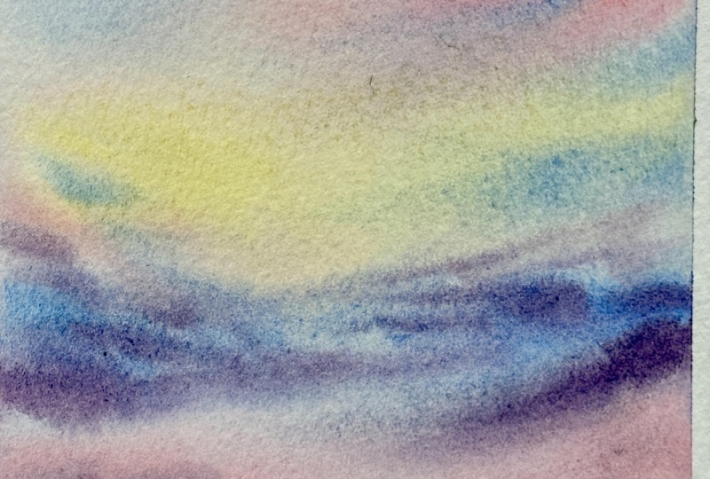
6. Peaceful Sunset Glow: Welcome today, too. Today, we'll paint a peaceful sunset sky. With that beautiful glow, we all love. Let's get started. I'll start again by waiting the backside of the paper first, same as we did in
the previous video. I'll speed up this
part. The process is absolutely the same. This sky is great as a
backdrop for cityscapes, landscapes, or even on its own. I love to paint glowing
skies with soft clouds, and I'm excited to share my techniques with
you on this video. This time, I plan to
use my large brush to apply the colors at first. I'll start by taking
some Nepos yellow. I add it where I see the yellow glow in
my reference photo. It's a watery consistency. We need to be careful
not to add too much because this color is a
peck and too much of it will look heavy and
we'll use that glow that we want to recreate because
the paper is white, the color spreads, creating
verse of blend where you basically can't tell where the color ends and the
white paper starts. Now let's mix that pastel pink that I showed you in
the colors video. I mix naples yellow,
and so opera. You can make it more
pinkish by using more opera or more orange by
adding more naples. I like the soft pink sheet. I apply that color
around the yellow. I overlap them slightly to create soft plates
between the two colors. I basically cover the rest of
the page with this mixture. Time to switch to
my other brush now. I mix again some of
that pastel pink, but this time it's
a bit thicker. We can even add a
drop of blue to it. I add some streaks with
that color here below. And some add the top
close to the yellow area. So streaks with naples to
make it more interesting. This is why it's important to check if your colors work well. Now I wash my brush
and wipe it very well. It's time to apply
the blue colour, and we don't want that
one to spread a lot. So we need to ticker
consistency. Almost no water. We can add a drop of opera
to make the painting more harmonious and drop
of naples as well. And let's start
applying the color wherever there's blue
on the reference photo. It's similar to how we applied
it in the previous video. Do it quickly with bold strokes. What I found about
painting skies is that the quicker you paint them and the less you touch your paper, the better
they will look. It makes them look
effortless and fresh. A few striks here to break
up that large shape. And here we have
another blue area. I like to add such slight diagonal strokes to create movement
and a sense of depth. I drag that color down
until I'm almost out of it, and this gives me a gentle
fading of that blue. Now I can go back and at some
twigs to the shapes here. Let's now mix the thick
purple for the clouds. I mix blue and opera and a touch of neutral
tint to make it darker. I need more blue paint. I want a dark and
thick purple mix. Let's read. Because the colors weren't fully
blended on my brush, I get that hint of
pink inside the cloud, which I think is gorgeous and makes it much
more interesting. So that's your reminder
that you don't need to spend much time blending
the colors on your palette. Sometimes little surprises like this one make the
painting more gorgeous. Add long streaks of purple wherever I sit on
the reference photo. Now I get this Blue streak. I think I couldn't have
made it if I wanted to. Here below the clouds
are getting smaller. And at the very bottom, I just add some blurry strokes. I add neutral tint
to my purple mix, and now I'll use it to add
more volume to the clouds. I add it on the bottom side
of each separate chip. I add more clouds with
it at the bottom. I took the shape here a bit. I drop more paint onto the smaller ones to
make them pop more. I find out this is. Now, I wash my brush. Wipe it and spread the bristles. I'll use it to gently
blend the colors and spread them a bit
further here and there, creating wispy tricks
for a dream effect. And this is it. Our peaceful
sunset sky is complete. I love the dramatic
vibe about it. The next one is going
to be a dramatic one.
7. Dramatic Evening Sky: Welcome to the third
project in this challenge. Today, I will paint a
dramatic evening sky. I'm starting this painting the same way within the
backside of the paper first. This will give us more time
to work on the clouds. I like these types of skies. They're stunning
and have character. I like to paint the
fluffy clouds, too. I will use my large brush
again to paint the first wash. I'll mix some of that
peach color again. Only this time, I'll
use more yellow. This will make the mix softer. And And for the clouds again, I will mix Opera neutral tint. And blue. This is two reddish, so I'm adding more
that cerulean. Now, I'll just squeeze
out what's left on my brush in this empty
well of my palette, then another bit
more blue to it. This will be the main
color for the sky. Maybe a little bit more. I start to plant it using
horizontal strokes, starting from the top. Again, because the paint wasn't
fully mixed on the brush, I get these soft nuances
on the paper. I like it. I drag the color down. Somewhere about here,
I wash my brush. And with just a clean brush, I'll continue dragging
that color down just like so so that it
softly vanishes. Now I'll wash my brush in
the clean water very well. I don't want to contaminate
the pitchy mix. I apply it at the
bottom of the paper. We add a touch of pink. Dragging it upward to
blend with the rest. I wash my brush, wipe it, and I'll use it to
further blend that color. Switching to the Chinese
calligraphy bread now. Let's mix bright pastel pink, again, using Opera
and Naples yellow. We'll use this to paint the bright highlights
on the qout. I dab my brush on my paper towel to take off excess moisture. This will help the color
stay more or less where I place it instead of
spreading uncontrollably. Let's test it. It kind of pale, so let's add a bit
more pigment to the mix and use it to
paint a fluffy cloud. Holding my brush high, trying to create organic shapes without thinking too much, trying to make it look natural, glancing at the photo
reference for some guidance. Here we have another
one. This one is more, so I'm using just
the tip of my brush, and here below is
the biggest one. Here, we can even drop
in some pure opera. Slowly building the ship Another small cloud here. Some more bright
spots with topera. That's the beauty of the sky, red color that contrasts
with the dark clouds. The purple for the clouds
that I mixed seems pale now, so I'm adding more neutral
tint to make it darker. I want it to be more bluish, a coat color, so I squeeze out
more blue onto my palette. I added to the mix. It's a little back and forth until we get the
desired hit right. Oops, so here. Okay, I think this is the mix. Again, I'm blotting out
the excess moisture and I start painting the big cloud
in the upper right corner. Some messy spots and swirls. So small twigs. Here we also need to add some darkness, not covering the pink entirely, just slightly overlapping. And we can even go
further and drop in some neutral tint here and there to increase the contrast. Here we have smaller clouds. Hold your brush higher
and try to create lose expressive strokes.
Don't overthink it. And for the biggest
cloud at the bottom. Let's add again
some darker paint. This adds volume to the clouds. Now we need to blend
that color because right now it stands a bit on
top of the other colors. It stands out too much. We want to blend it
seamlessly into the painting. You can do it by washing your brush and
wiping it very well. Spread the bristles and gently guide the color with
the tip of the brush. Do some movement to
these smaller clouds. Be careful and always wipe the pigment that
you've picked up, especially when it's dark
color like this one. Let's blend it here as well. A. You have probably noticed that even if you wipe
your brush very well, there's still some moisture
in it and the hairs come together and sometimes can make your blending
strokes too visible. That's why it's useful to
have soft dry brush nearby. With the dry brush, the blending is easier because it most be man in a softer and
less noticeable way. You still need to wipe it
every now and then, though. And as a final, that,
you can do some lifting. With a clean tame brush, you can pick up some of the
dark pigment here and there, just a few spots to
create some highlights. And this is it. Our evening
dramatic Sky is complete. In the next video,
we'll paint one of those beautiful skies with
streaky clouds. See you there.
8. Expressive Streaks: Welcome to Day four
of our Challenge. They were going to
paint a sunset Sky with expressive tricky clouds. It's one of my favorites to paint and definitely a catching. I'm starting the
painting the same way, wetting very well the
back and the front side. While the paper is
soaking up the moisture, I will prepare my paints. First time cleaning them a bit, especially the light colors, we want those
tricky clouds to be glowing and for that
we'll need pure pigments. I mix some of my
favorite pastel pink. This one is more
like candy pink, not a peach shade, but you
can use it however you like. And this time, we're going
to do something different. We'll cover the front side with a clean towel and blow the moisture that's
on the paper surface. I glad my hands over it to make sure I soak
up all the water. We do this because in order to create those
colorful streaks, we don't want the paint
to flow too much, which will happen if
we paint wet and wet. We want soft edges, but not a lot of flow, and this is a great
technique to achieve that. Let's start painting. I will only white a very small
area of the painting, the one that is the lightest
in our photo reference. Here, we want to
recreate that glow, so this part will leave
almost transparent. Then I'm taking some
water naples yellow, and I add it around
that clean water area. This way, the paint will flow
into the water streak and create a very soft blend
there while on the outside, you see I'm getting a hard edge. I'm not too precious about that because now I'm taking
some of that pink, and I will add it around
the yellow streaks. I overlap the colors a little, but make sure to
leave some of that yellow visible to create
that glowing effect. Make sure to lift
your brush every once in a while and paint a wavy streak instead of a perfectly curved
or diagonal line. A little misness here will
give us an organic look. And you see how the pink is not spreading too much
inside the yellow, but still we're getting
a very soft edge. That's because the surface
of the paper is dry. But on the inside,
there is a lot of moisture and cotton paper
holds that moisture very well. This allows us to soften
hard edges easily if we're fast enough and add more paint or clean
water around them. On the photo reference, we see
more of those pink clouds. So I glanced at it and
add those to my painting. I drop water to the mix
to dilute it slightly because the little streaks are not as bright as
the bigger ones. For that one, I plan to use my large brush to help me cover the rest of
the paper quickly. Let's prepare the mix. It's an evening
sky, so I want to make the color a
little purplish, so I add some upper to the blue. Let's start applying it
from the upper left corner. I try to apply it
evenly covering all the white areas while
I touch the pink paint. Notice that I flip my
brush to still be able to follow the direction of
the streaks more precisely. See the soft edges between
the blue and pink. That's exactly what
we're going for. Let's continue on
the other side. Now, we can start shaping
those pink clouds by outlining them more
intentionally with the blue. Let's fill in this area quickly following
again that direction. It's like all streaks gathered here at the
base of the bigger one. Only the bottom part is left now. We see in the photo reference
that it's a bit darker, and I like that, so I'll add some neutral
tint to my blue. Some upper to made up. Let's add that color
at the bottom. I want to make it darker, so I add some more
neutral tint, as well. This helps anchor the painting. Now, you can leave it like
that or you can go in with your soft ten dry brush
to blend the colors further. There is no right or wrong. I usually like to
touch it up a bit. I start from the latter parts so that I don't bring
darker pigments there. Again, I'm following the same
direction of the streak. I'm not a big fan of
what's happening here, so let's blend that as well, making sure my brush is clean by wiping it on my towel first. I'm kind of playing
with the shapes now, making them less perfect. And I feel like adding some
smaller clouds at the bottom. I take some blue, add
it to this well here, adding some neutral tint to it. Pressing my br to
my napkin to make sure it's damp and
not dripping wet. And I will add just a
few small clouds here, very simple shapes,
almost horizontal. And that's it. I think this is gorgeous and
very fun to paint. I hope you enjoyed it, too. And for tomorrow's project, I have prepared a detailed
clouds that you see there.
9. Detailed Clouds: Hello, and welcome to Day
five of the Challenge. Today, we're going to paint
the gorgeous sky with detailed clouds and we'll mix soft and hard edges for an
extra fascinating effect. I'm starting again by wetting the backside of the paper first. For this painting,
I'm going to blot out the moisture from
the front side again. But this time, I'll
go back and rewet it. I'll only leave a
small area dry here. In the reference photo, I see a hard edge of the
large cloud at the bottom. It's not necessary
to be precise. Just make sure the rest
of the paper is evenly moistened with non dry
patches or pools of water. Next, I can start
preparing my sky color. I'll mix it here. M. Once again, combining cyl and sky blue, bright opera, and
touch of neutral tint. I get this purplish blue colour. I'm not spending too much time mixing it because we've
already seen that some pretty cool
things happen on the paper when the colors
are not fully blended. I'll start from this
corner over here. I think I want it to be thicker, so let's add more blue. The soft cloud on the left, I'll paint the same way with it in the very first painting, simply outlining
it with the blue. Notice how at the edges
of the blue paint, I got a slight sparation
of the pink pigment. I think it's beautiful, so
I won't try to remove it. I like this slight nuance. Let's add more paint here
because as we already know, the sky color is more
saturated at the top. I really like this
effect over here. I'm shaping the cloud now, I won't be spending
too much time with it. This one is soft, so the less I fuss over it,
the better it will look. Let's bring that blue over here right into the
bottom left corner. Now I take some
more of the blue, squeeze out the excess liquid
on the rim of my palette, and I hold my brush like this. I spread the bristles
a little and I'll start outlining
the larger cloud. I haven't reached
the dry area yet. I won't try to correct those lighter wisps around the cloud. If you look at the reference, you'll see something similar
like halo around it. I take some more paint, squeeze out as again, and now I'll start guiding my brush until it
reaches the dry area. Because I hold it this way and the bristles are
soft and spread out. I get this beautiful rough edge. This is how we paint
a detailed cloud. Here, I will leave a soft touch. I like mixing soft
and hard edges. I really love that effect. And here I'll continue
again pushing my bras downward until
I reach the dry area. Here it goes like that. I'm looking at the reference, I don't trust myself
enough to come up with a realistic
shape for this one. Now I can go back and touch
it up here and there, making it less perfect. Lovely hot color
separate the edges. For this part, I'll even hold the brush
with my left hand. Usually I don't we don't
need precision here, just on wiggling of the brush. Now I can break that edge up,
make it more interesting. Beautiful. Now we have the
general shape of the cloud. We need to add some volume
to it. I wash my brush. Let's start by adding
some warmed to the edges. I'm taking a little naples
with the tip of my brush. We don't need much.
It's barely visible, but adds a nice touch. Mine has a little pink
in it, which I love. A slight pitching nuance
works great for this cloud. I add it here close to the edge, but not touching
the edge itself. I'll add it only
in the upper part. That's usually where
we see sunlight filtering through the clouds
giving them a warm nuance. Now let's quickly mix
a grayish purple. I use the same three
Sky colors, blue, pink, neutral tint, but this
time, more neutral tint. I get a moody purple. I'll add it here just
below the pch area. I'm holding my brush high, trying to achieve
organic shapes. I drop in some pink
here and there to make it more interesting,
more voluminous. For the bottom part,
we can make it darker by adding
more neutral tint. Leave some white
areas untouched. We can even drop in some
pure blue for parieti. Now let's move out
some hard edges with a clean damp
brush. I have one here. I go over it with my brush, wipe it off and continue
softening the edge here. There's also a hard edge
from the beach hue, so I'll try to soften that too. Make sure your brush is clean. We don't want to
introduce colors here. We want to keep it very light. Let's move the
pigment around here. My brush drugs look too
obvious in this area. I continue working on
the hard edge here, though it seems like
it has started to dry, so it's harder to remove. Here, we can even make
some splatters with clean water for an extra
atmospheric effect. We can lift some colors as well, creating highlights and volume. You can also use
a soft dry brush to help create even
softer plants. If hard edge doesn't go away,
here's what you can do. Take a soft napkin, crumble it, and gently press
it over the edge. Be careful not to
press too hard, or you may leave hash marks. You can also use it to
lift some darker paint. I don't like this effect much, so I don't use it often. I'll just go over the
edge here once again. Let's shake the other cloud
before we call it done, just a few swipes
here and there. M And we're done. You've officially completed Day five and the
whole challenge. I love how this one turned out, especially that combination
of hard age with soft plans. I think it's
beautiful. Let's wrap up the challenge
in the next video.
10. Wrapping Up the Class: Congratulations.
You've completed the 5-Day Watercolor
Sky Challenge. You now have five
unique sky paintings that you created in just
about 15 minutes each. I hope this experience
showed you how fun, relaxing and rewarding it can be to paint
skies and clouds. The real magic is
not in creating something perfect
but in letting go, embracing the mazinss and allowing your skies
to unfold naturally. That's what makes each
painting unique and beautiful. Also hope this
challenge inspire you to keep up with your
daily art practice. Even just 15 minutes a day can do wonders for your skills, your creativity, and
even for your mood. I'd love to see your
finished skies. Please share them in the
class project section. It's inspiring when we can learn from each
other's results. And if you're excited to dive even deeper
into painting skies, don't miss my class
dreaming sunsets, paint dazzling skies
with what color. In that class we'll
explore mixing pastel colors,
choosing palettes, and creating perfect washes, and painting a going pastel
sky with a cit silhouet it's wonderful next step
after this challenge. Thank you so much for painting
with me. In this class. I can wait to see your skies, and I'll see you
in the next one.