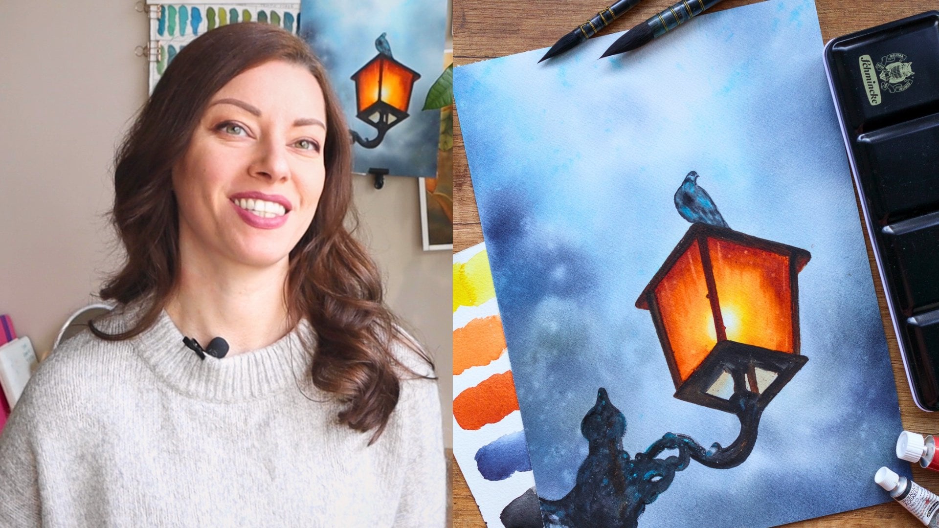
Transcripts
1. Welcome to Class!: Have you ever tried painting What color background only
to end up with patch blends, Doug colours or paint
that just doesn't flow the way you imagined.
You are not alone. Hi, I'm Elena, What Cl
artist, and instructor. And in this class, we
are going to fix that. I'll show you how
to create smooth, vibrant and glowing
backgrounds that enhance your paintings instead
of distracting from them. A beautiful background
can set the mood at that and make your
subject stand out, but it can also be
tricky to get right. To help you with
this, this class is divided into three parts. First, we'll review
the best supplies for achieving soft
dreamy blends. Next, I'll guide you through seven different
techniques from water wood blending to
layering for depth, and finally, we'll
tackle common mistakes, showing you how to fix blooms, streaks, and dull colors. This class is perfect for beginners looking
to gain confidence, as well as experienced artist who want to refine their
background techniques. By until you have a set of skills you can use for florals, landscapes, or any
subjective love painting. I can't wait to paint with
you, so let's get started. In the next video, we'll go
over the class structure, and I'll tell you more
about your final project.
2. Class + Project Overview: Back, let's take a quick look at what you'll be
learning in this class. First, we'll go over
the best supplies for creating soft and
beautiful backgrounds. Then we'll dive into seven different techniques and approaches for painting them, practicing each one
while I share my tips. Finally, we'll
explore how to fix common mistakes like plume
streaks and dull colors. For your final project, you'll create your
own Watcl background using one or more of the
techniques we'll cover. Feel free to experiment
with colors and techniques. The background you create can be used for any
subject you like, whether it's
florals, landscapes, or even abstract pieces. If you're looking
for inspiration or how to add a subject or focal
point to your painting, I recommend checking out
my silhouettes class. There, I'll show you how to incorporate a subject into
your Watcor background, transforming it into
a finished painting. Once your background
is complete, feel free to share your project in the project
section of the class. This class is all about experimentation and having
fun with the process, so don't be afraid to try new things and make the
background your own. I'm excited to see
what you will create. In the next video, I'll give
you my recommendations for supplies that will help you achieve the best
results. See you there.
3. Best Supplies for Smooth Backgrounds: In this video, we'll go over the best supplies you
can use to achieve smooth backgrounds and set
yourself up for success. I'll give you my
recommendations and share what I use in
my daily practice. Keep in mind that these
are the supplies. I believe will give you the best results based
on my experience, but you can absolutely complete the entire class with whatever
supplies you already have. First let's start
with the paper. If you want to be able
to work longer and apply different techniques
to your background and to your WC paintings, overall, I suggest you invest in or at least try
100% cotton paper. It's the gold standard
for what colors, allowing it to
work in a way that wall paper simply can't provide. The weight is
important to look for at least 250 GSM as backgrounds tend to
require more water. And if we are aiming for smooth results, we
want to avoid B. The higher the weight, the
better it holds water and allows for heavier applications of the wet in wet technique. In this class, I'll use arch, 100% cotton and 300 GSM. Some of my other favorite
brands are Sando S Watford, honeymller Collection, and
Pao hung Master Choice. You can find the
downloadable PF with my favorite supplies and
recommendations for painting, mood and dream background. The resource section
of the class. I will tap my paper to this
plastic clipboard to keep it in place and minimize warping with the
help of paper tape. I suggest working on a
plastic board as it won't absorb any moisture
from the paper and will allow you to work
waiting water for longer. Here you can see my palette filled with my favorite colors. You can absolutely use
whatever colors you like. For best results, I recommend using
professional grade wat colors as they are more pigmented and maintain
their vibrant. But once again, you can follow along with whatever
you already have. You can check the colors in my palette again in
the downloadable PDF. Use a spray bottle filled with water to activate my paints. It's also very handy when your
paper is drying too fast. Next, let's talk about brushes. Since our goal for this class is to paint smooth
and soft background. I recommend using
large soft brushes. They hold more pigment
in water allowing you to work faster and
with broader strokes, which both saves time and
provides a smoother look. In this class, I'll use
these four brushes. The first one is a soft
quill synthetic brush. It imitates curl hair, so it's very soft and
holds a lot of liquid. Softer brushes are
the best option for painting smooth
backgrounds as they don't leave streaks and provide more even look compared
to stiffer brushes. Another great option for
painting backgrounds, especially if you work in a larger format is a flat brush. This one also imitates
squirrel hair, and its soft bristles, provide a very
smooth application and an even coat of paint. I'll also use it to wet the paper when working
wet and white. This is a hag brush
made with gold hair, and I find it especially helpful for painting
backgrounds. It's even softer than the
other brushes I showed you, and I don't use it
to apply paint, but rather to blend the colors once they already on the paper, which I'll show you how
to do later in the class. They come in different sizes. This is the smaller one I have, but you can absolutely use
it to appl paint as well. Because it is very soft
and holds a lot of liquid, it allows you to
cover large areas very quickly with an
even layer of paint. Finally, you want to have a smaller brush in
case you want to add some smoke spots or
splatters to your background. I'll use this liner brush, but you can use whatever
you find suitable. Keep some towels nearby. I use both cotton
and paper towels to absorb excess moisture
from my brushes. This is very important
when painting backgrounds and have at
least one jar of water. I like to use two as the water
gets dirty very quickly, and sometimes we
need clean water. That's all you'll need today. Once again, you can refer to the PF for more details
and recommendations. So gather your materials
and let's get started.
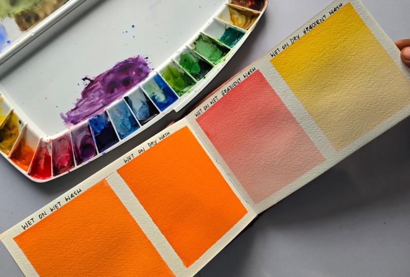
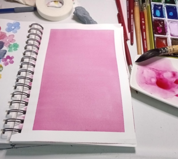
4. Smooth Even Wash: In the following
videos, I'll show you different ways techniques to
paint smooth backgrounds. We'll start with simpler
essential techniques and gradually move on
more complex approaches. In this video we'll
create a smooth, even wash with one color using
the wet and wet technique. Feel free to follow along
with any color you like. Let's start by taping
the paper to the board. This is actually a
very important step when it comes to
patching backgrounds. We want to make sure
the tape is firmly pressed to both the
paper and board. Otherwise, the paper buckle
or paint might sp underneath, ruining the grease white border or even worse the
painting itself. I leave around five
millimeter on each side, firmly pressing the tape to ensure it's not
against the paper. This is just regular paper
tape from a hardware store. These tapes usually hold up
against water pretty well. So better than
others, of course, you want to make
sure the one you're using maintains its integrity when in contact with water and does not tear the
paper when removing it. Once the paper is
taped to the board, we can start applying water. The bluish tint, you see,
is due to my brush not being thoroughly cleaned after
the last time I used it. In my case, that's not an issue, but if it happens to you and you want to go with a
different color, yo, for example, it's best
to ensure the water you applies clean so it doesn't interfere with your
background color. It's important to distribute the water evenly across
the paper surface, as this will help
achieve an even look. That's why I go over
it multiple times, making sure there are no
bottles or dry patches. We want the paper
to absorb some of the water so we
can wait a minute, maybe take a sip of coffee. I go over it again,
ensuring even distribution. Now, we need to clean the
drop led from the paper tape, and then we can move
on to the paint. When you pick up paint
from the pen or palette, you might get larger chunks
of pigment on your brush. This can lead to an even
streak of paint on your paper, so it's important to mix
it first on your palette. We want the mixture to be
saturated but not too thick. My brush is free of clumps, so I can start applying
the paint now. I quickly apply
horizontal strokes using only one side of the brush
side loaded with the paint. Make sure you prepare
enough to cover the entire area without
needing to mix another batch. Now you see we've inevitably
got some streaks, so here's how to fix that. You can take your board
and place it at an angle. Gravity will pull the liquid down even in out
the coat of paint. This will only work if you have plenty of
liquid on the paper. So for a flat and even look, I prefer to smooth
it out myself. I take my brush and move
it in vertical strokes. Then I go over it once again
in the opposite direction. Eventually, this will distribute the paint evenly as long
as the paper isn't drying. This is why it was important to wet it thoroughly
at the beginning. Another important step
is wiping the edges. These droplets can easily creak their way back and
ruin our background. You can also play something underneath the bird
to create a slope, ensuring that puddles won't form on the surface
while it's drying. Here I see my tape
has lifted the bit, so the white border
may be compromised. Now we can leave it
to dry like this. Another key thing
to remember is that what color dries 30% letter. So we always have to work
with a little more intensity, anticipating the colors
will become paler. Once you have created,
your even layer, if you find it needs
more saturation, you can go ahead and
apply more paint. This mixture needs
to be slightly thicker than the
one we used before. You can see this one
is a bit less rainy. I apply it in a similar manner, then make sure to distribute
it divently again. Since the paper is now a bit dryer and the
paint is thicker, it might be harder
to avoid tricks. If you notice this happening, you can lightly spray it with a spray bottle and
then continue. Wiping the edges again. You can also tell the
board to encourage the liquid to settle
evenly on the paper. And now we'll leave it
like that. Let's dry it. When drying your background, make sure to move
your head drier or hotter too across different
areas of the paper. We want to dry it as
evenly as possible. You can look at it from
the side and start drying from the areas that
appear the glossiest. You'll know it's dry once it lies flat against
the board again. Now we can remove
the paper tape. Always pull it at an angle
to avoid tearing the paper. And there we have it. Our
first background is complete. Even though it looks simple, it's not always easy to achieve, so don't feel discouraged if it doesn't come out perfectly
on the first try. Practice again, and over time, you'll find it easier to
create that seamless look. This single colour
flat background can also be created using
Dt and dry technique. Let me show you how
in the next video.
5. Smooth Even Wash (on dry): In this video, I'll show you how to achieve the same
smooth and even look from the previous one using the wet and dry technique. This method is faster, and because we use less water, the paling of the color
is not as pronounced. This means the
vibrancy stays more consistent compared to the
wet and wet technique. I'll start by preparing
my color mix. Again, use whatever color you
like for your background. We want to prepare enough paints to cover the entire
area in one go. It should be neither too
watery nor too thick. This time, I wet my
brush on both sides because I want to apply the
paint as quickly as possible. The larger the brush, and the more liquid it
can hold, the better. I quickly apply the painted
horizontal strokes, making sure I cover
all dry patches. Once the entire area is covered, I go over it again to
ensure the paint is evenly distributed and
there are nos tricks. Then I go in the
opposite direction, repeating the process until
everything looks smooth. The downside to this method
is that the paper might start to dry before you're fully satisfied with the result. It works best for smaller
surfaces as on a larger format, it can be challenging
to keep an eye on the entire sheet and
achieve evenness. However, for smaller areas
or whenever you want to make sure the color doesn't
go too pale after drying, this method is a great choice. That I'll write now the same way I did in
the previous video. Let's remove the masking tape. So here are both
backgrounds side by side. We achieve the
same even look and intensity using two
different techniques. Practice both and see which ones suit your style
and process best. Before we move on,
let me quickly show you another way to paint wet
and dry smooth backgrounds. This method is quicker than
the one I just demonstrated, but it might take a bit
more practice to get right. Once again, you'll
need to prepare a generous amount of paint to ensure you can cover the entire area
without running out. Start by tilting your board and loading your brush with as
much liquid as possible. Apply a strip of paint to
the top of your painting, pressing the brush to create a bit of paint at the bottom. Continue adding strips below, maintaining that excess liquid at the bottom edge each time. These hails create
a seamless wash. After covering the entire area, increase the angle of
the incline so that all the excess liquid
cutters at the bottom. Be sure to sock it up with a down brush and wipe the sides. And there you have
it a flat even wash, give it a try and see which
technique works best for you. In the next video,
we'll make things more interesting by painting a gradient background.
See you there.
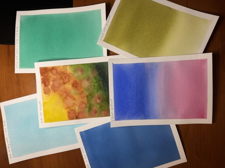
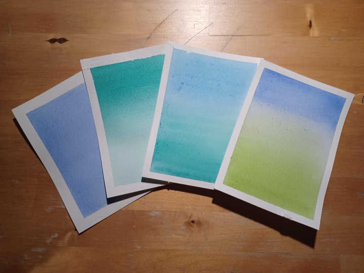
6. Seamless Gradient: Gradient washes, create
a moody atmosphere and a feeling of depth
in your paintings. In this video, I'll
show you how to create a smooth gradient
from dark to light. I find there easier to achieve using the
wetting wet techniques, so I start by wetting my sheet, just as we did with the flat
wet and wet background. Don't forget to wipe the sides. I find that gradient washes are easier to create
with the quill brush, so I'll give the
flat one a rest. I'll prepare my mix by using
only the tip of the brush so that about half of it
is loaded with paint. Another helpful
step is to create a slope by placing something
underneath your board. I start applying the
painting horizontal strokes, holding the brush at about 45 degree angle because only the tip of the brush
is loaded with paint, and thanks to the wet surface, I end up with this
tough transition. At some point, you'll
want to wash your brush, tap off the excess water, and continue dragging
the cover down. You can start from the middle or from the top to ensure
a seamless gradient. You can repeat this
multiple times until you're satisfied as long as
your paper is still wet. You can also make the
gradient more dramatic by adding more saturated
paint at the top. Just remember to drag it down so that it transitions smoothly. Always wipe the sides
after applying to paint. Increasing the
incline of the board can also help smooth
out the transition. You might not as liquid
guttering at the bottom. It's important to sock
it up with a down brush before returning your board to a more horizontal position. Double the moisture and repeat
as many times as needed. I'm happy with how this looks, so I'm going to try Now, let's remove
the masking tape. Another soft background
added to our collection. Now, let's try blending the colors together. See
you in the next video.
7. Two-Color Blend: In this video, we'll create a soft background by blending
the colors together. This technique is especially
useful for sky landscapes or any painting where you want a smooth transition
between colors. Let's get started. As always, I'll begin by wetting the
paper with an even cold water. By now, I hope I've convinced you how
important this step is. Next, I'll prepare my colors. It's essential to choose
two that mix well together, so I recommend testing a few combinations on a
separate piece of paper. I'll go with one of my
favorites, blue and pink. I start by loading my flat
brush with blue paint. You can also use a
quill brush here. I'll make it slightly more saturated for a stronger effect. Then I apply the color
as if I'm creating a gradient wash just like
in the previous video. Now I wash my brush, tap it on my towel to
remove excess water, and use it to drag
the color down, stopping about two
thirds of the way. Next, I switch to
the second color. I load my brush with pink
and repeat the process, this time starting from the
bottom and working my way up. I go about two
thirds of the way up allowing the colors to blend
naturally in the middle. At this point, I tilt my board to help the
colors flow together. Don't forget to wipe away any excess liquid that
cutters at the bottom. You can also tilt in opposite direction to balance the blend. If you notice any
hair like tricks, tilting from left to right
will help smooth them out. You can continue adjusting until you're happy
with the transition. Normally, this is how I create my gradient
backgrounds because it gives a natural seamless result. However, you could also use a brush to help
smooth out the plant, similar to how we refine the gradient in the
previous video. For this, I recommend
a very soft brush like the hag brush I
showed you earlier and using light
gentle movements. Since my paper is
already starting to dry, I might get some streaks, which is why I usually
prefer to rely on tilting rather than overworking
the paint with the brush. Now, let's dread. And here's our soft engining background, perfect for at Sunset
sky, for example. With this, we've completed
the essential techniques. Next, we'll move on to
more complex backgrounds and techniques in
the next video.
8. Multi-Colored Background: Let's make this one more fun and colorful by creating a
multicolor background. These backgrounds look especially
nice behind an object, adding depth similar to the bouquet effect
in photographs. We'll be painting wet and wet, so I'll start by thoroughly
wetting the paper. When working on
backgrounds like this, I like to begin
with the lightest color yellow, for example. This helps keep my brush
and water cleaner for longer compared to starting with a darker color like
Indigo, for example. I take some yellow and add
it to the upper left corner, lifting my brush
every now and then to create spots of
different shapes. For inspiration, I'm using a painting I created
a while ago, but I'm not following
it strictly just using it as a guide. To create a going effect, we started with yellow, and now we'll deepen
that golden hue by adding some buntena. I place it here and
there following a lot semicircle to
enhance that warm glow. You can arrange your
colors, however you like, gradually depending
them from top to bottom or placing them randomly
across the paper. Having some kind of reference, at least for the color
palette can be helpful. Next, let's add some green as we work our way
toward the bottom. The colors can overlap. There's no need to keep
them strictly separated. Leaving some white
spaces is optional, but I find it adds a sense
of lightness and glow. That is if you can keep those
areas light until the end, often the colors start
flowing all over the paper. At the very bottom,
I'll add some indigo. Now that we have all
the colors in place, it's time to refine
the background. You can encourage blending
by tilting the board, letting the colors
flow naturally, or you can use your brush to add more defined spots and
continue building depth. Oh, add some burntiena spots. This one is Bam yellow, and I love it, rich,
rusty, orange hue. I'll drop some into
the green as well. This helps tie the background together by softly
mixing the colors. Now I'll wash my brush and use it to gently
blend the colors moving between the spots and
dragging the paint lightly. Since the paper is
still very wet, this creates some blend
and smooth transitions. To make the background even
more interesting, let's add on smaller
poten splatters. I'm using burn tina again, and I love splattering yellow. It gives the effect of
sunlight glistening. And of course, I never keep
splattering clean water. Dropping water in area if
you want to keep flat, will push the pigment away, creating a beautiful effect. I'll also add a few
small green spots to tie everything together. I think it's looking
pretty nice already. If you want even softer blends, you can use a hack
brush to smooth things out and create
a buttery texture. Don't forget to wipe the edges
of your paper to prevent any pulling. Now, let's dread. I really love how
this turned out. In the next video, I'll show
you a great technique for fixing backgrounds that don't turn out the
way you want it. See you there. A
9. Layering & Glazing: If your background turned
out paler than you want it lacking depth or looking
inconsistent, don't worry. You can easily fix it by
adding another layer of color. The key is to do this carefully so you don't disturb the
initial layer too much. We're not trying to
redo it completely, enhance it by adding more
vibrancy, intnsity or contrast. Some activation of the colors
underneath is inevitable, but we want to keep it minimal. I find it helps to start by lightly spraying the
paper with clean water. You might notice that
some of the colors are already
reactivating slightly. To enhance this effect, let's take a brush
with clean water and gently go over the areas
you want to soften. This technique creates
two beautiful results. First, the blends become softer and buttery smooth, and second, the background looks
more cohesive, almost like a softly melted bouquet
effecting a photograph. And. If this level of blending is enough for you, you can go ahead and dry
your background now. But if you want even more
vibrancy and contrast, this is the perfect time to
build up additional layers. One option is to create a watery mixture of color
and use it to enrich certain areas or even glaze over the entire background
for a more crazy flow. You can also lift color from specific areas to bring
back some lightness. Adding darker, more
concentrated painting spots will make the background
richer and more dynamic. And and and And of course, you can finish by repeating
the splattering technique. A few splatters of paint
and drops of clean water will create even more dead
and light variations. If you're like me, stopping
can be the hardest part. This process is ungeable,
the paper is wet, the colors are flowing, and I could keep going
for much longer, but let's stop here and dry. Here's a little
before and after. And if you're looking for a more controlled
structured method for painting multi
colour backgrounds, join me in the next video where I'll show you one of my
favorite techniques.
10. Wetting the Back Side: And what if you don't want the colors
to flow and mix freely, but rather tear
where you place them while still achieving soft
touches between them. Let me introduce you to one
of my favorite techniques, wetting the back
side of the paper. With this technique,
we won't be using paper tape to secure
the paper to the board. Instead, we start by
wetting the backside just as if we were preparing
for a wetting wet painting. The goal is to create
an even layer of water that covers
the entire surface. Once the back side
is evenly moistened, flip the paper over and wet
the front side as well. As the paper absorbs
the moisture, gently go over it
with your brush. You'll notice that the sheet begins to stick to the board. Make sure there are no
air bubbles underneath. We want the paper to be firmly
stuck and completely flat. If needed, you can
lift and adjust it. At this point, you can start painting immediately
using this technique. Simply as a way to keep
your paper, wet for longer. But I want to show you how
this metodosa allows you to control where the colors go while still
achieving soft edges. So before adding
paint, I'll remove the excess water from
the paper surface. To do this, take a
towel or napkin, place it over the
sheet and gently press your hands over it to
absorb the moisture. What we've done here is
allow the paper to soak up as much water as possible
while drying the front side. However, the back
side is still wet and moisture remains
inside the paper fibers. Make sure there are no
glistening areas left. Now when we add paint, the surface stays wet just
long enough to work with it, helping us create soft tattes without the colors
flowing too much. Let me show you what I mean. We can also add just clean water where we want to
keep an area light. Now we can start adding
color around this wet spot. You'll notice that
inside the area, the colors blend softly, but on the outside the paint behaves more like a
wet and dry technique. I use this technique
at when painting sunset skies where I want to
work with different colors, but still keep them in place. Let's add another color. Once again, we're getting
this soft diffused look without the colors flowing too much or mixing excessively. You can keep layering
as much as you like. This technique is especially useful when working
on a larger format. Right now on a small sheet, I might still be able to achieve this effect using
just wet and dry, but on a larger paper and
especially in hot weather, paint dries almost instantly, making this method
incredibly helpful. And again, while the
surface is still wet, we can continue
blending if needed. Compared to traditional
wetting wet, the drank time is much longer, so be prepared to wait. Also, don't forget
to wipe any droplets from the edges to
prevent unwanted blooms. If you notice the surface
drank too quickly, you can likely mist
it with clean water. Now, I could keep adding
more colours if I wanted to. These turned out a
bit pale overall, but of course, you can
use more intense pigment. Okay, let's leave it here and
got to be distracted again. But before we finish, don't forget to wipe the board
to keep everything neat. This now looks a little
like a cotton candy galaxy, so I can't resist adding some water splatters
for extra texture. Now, we let it dry. In the next video, we'll go over the most common
mistake and throw goals when painting
what color backgrounds, and how to fix them.
See you there.
11. Commom Mistakes & How to Fix Them: In this video, we'll go over some common mistakes
when painting what color backgrounds and how to fix them.
Let's get started. When you use too much water, colors become dull
and washed out. The paper stays wet for too long and pigment
spread uncontrollably. To fix this, use a
controlled amount of water enough to keep the
paper damp, but not pulling. You should be able to
see the paper's texture through the thin layer of water. If you notice excess water, till the board to
let it run off. On the other hand,
so little water causes harsh edges
and streaky plains. The paint doesn't flow properly, leaving and even transitions. To fix this, spray some clean water while
the paper is still damp. If it has already dried, you can wet the area
carefully and smooth it out. Modinase happens when
colors mix too much or when incompatible
pigments are mixed together. To avoid this, taste your color combinations on a separate piece of paper first. Also, let the first
layer dry completely before adding another if you want to keep
the colors clean. If you cover your entire
background with paint, you might lose the light
and glow in your painting. To prevent this, plan where you want the
highlights to be, and leave those areas untouched. If you already lost them, try lifting the paint with tan brush or a tissue while
the paper is still wet. Fast drying paper can
cause unwanted hard edges. This is more common in
warm or dry environments. To slow down drying,
use a humidifier, miss diir lightly or work on
smaller sections at a time. If edges have already dried, you can soften them by
wetting dira gently. Adding too many layers
or constantly working wet areas can make the background
look flat and lifeless. The best way to avoid this
is to dress the watercolors, natural flow and stop
before over blending. If you need more depth,
it's better to wait for the first layer to dry
and then add another. A background that's too intense can make the painting look
heavy and lose depth. Start with water colors. You can always add
more later if needed. These streaks happen when
colors don't fully blend, usually due to uneven
water distribution. To fix this, tilt
your board from side to side to encourage
the smoother transition. You can also use a
soft brush to gently blend the streaks while
the paper is still wet. Blooms occur when extra water
is added to a drying wash, pushing the pigment away and
creating an even texture. To prevent this, make
sure your brush isn't too wet when working
over tamp areas. If a bloom appears and
you don't want it, you can soften it
with a tamp brush or blend it into the background. If the colors in your
background look too separate or don't
blend well together, it can create a disconnected
or patchy look. To fix this, you can relate
the entire background and let the colors naturally
mix to each other. Another option is to apply thin glaze of
unifying color over the whole background to bring it together and smooth out
any harsh transitions. These are the most
common struggles when painting what
co background. If you've experienced any
of them, you're not alone. With a little practice
and awareness, you'll learn how to control these effects and even
use them creatively. Let's wrap up the class
in the next video.
12. Wrapping Up the Class: That's it for this class. I hope you enjoyed learning these essential what
color background and that you feel more confident experimenting with them
in your own paintings. For the class project, I'd love to see you try one or more of these techniques and share your work in
the project gallery. It's a great way to track your progress and connect
with other students. If you post on Instagram,
feel free to tag me. I'd love to see your results. If you find this class helpful, make sure to follow me here on skill share so I don't
miss my future classes. And if you have a moment, I'd really appreciate it if you could leave
a quick review. It helps more students discover the class
and supports my work. Thank you so much for
painting with me. Keep experimenting. Have
an NLC in the next class.
 Elina Zhelyazkova, Watercolor Artist