Transcripts
1. Welcome to Class!: I have lived by the
sea my whole life. It's easy to take it
for granted this way, but it's impossible not
to be fascinated by it. For me, it's the deep
peace and relaxation it brings me, the way it washes
away negative thoughts. It's why I love to paint simple and peaceful seascapes whenever I feel like I
need some tranquility and calmness in
my day. The colors, the salt gradients
and bold brushstrokes are often so soothing
I get lost in the process. It wasn't always like this. As a beginner, I felt so frustrated whenever I
tried to paint the sea, there was always something
that wasn't quite right. And sometimes I even
couldn't tell what exactly. It's why I created this class. Hello everyone. My
name is Elina, and today I'm going
to show you how to paint simple and
peaceful cityscapes. I know the subject might
feel intimidating. I failed so many times at
painting water and ripples. I was almost about quit. But it's impossible not to
be inspired by the sea. So I kept on going,
experimenting and learning. Today I can say I feel
comfortable with this subject and I want to share with you
my discoveries and process. I call this class
a guide because we are going to start from
the very basics, like which colors to use and how to combine them to
make a nice gradient. How to layer them in
a convincing way. And what we can add
to our paintings to emphasize the
beauty of the sea. The final project combines
all that you have learned in the class and adds some more to your arsenal
of techniques. I'm sure you'll enjoy painting it and you will love
the final result. Certainly you don't need more
convincing to join me and learn how to paint simple
and peaceful seascapes with me. In the next video, I
will tell you more about the lessons in this class
and the final project.
2. Class + Project Overview: Hello again, I'm so
excited that you're here. In this video, I
will tell you more about the class
and final project. I'll start with the
materials that you're going to need to paint a
beautiful seascape. Because for a subject like that, the final results strongly
depends on what paper, paints, and brushes
you're using. After that, I'll go through the different colors that
I'll be using and helping build your own color palette for the project and your
future paintings. Colors are extremely
important for recreating the sea
in a convincing way. So I'll dedicate a
special video for this. Next, I will show
you how to layer and combine those colors to
create a beautiful gradient. I'll explain how the
aerial perspective is making us see the
water differently. You'll learn the key to
creating soft triples, which are such an important part of any peaceful seascape. Then I will show you
how I paint some of the elements that are often part of the way we
depict the sea, like boats,
lighthouses, and birds. And finally, we'll solidify everything that we have
learned in the class by painting a beautiful
and peaceful seascape that you're
going to love. Are you ready? In the next video, I will tell you about the
materials that you're going to need in order to complete the class.
See you there.
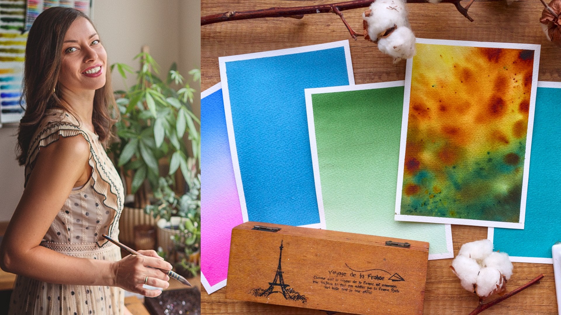
3. Materials: In this video, we'll
talk about the materials that you're going to
need in this class, but also for painting water. and escapes in general
because there are some requirements for the different techniques
that I will show you. And it's hard to
get the same result using different supplies. Of course, you don't need to buy exactly the same materials
from the same brand. Just keep in mind that if you're getting
different results, it might be because some
of that materials you are using are not the best ones for the technique
you're applying. This time, I'll start
with the brushes first. For this class, I will use
my Schimoni art brushes. I love how well these
brushes are made, They're handmade, vegan, and they
keep their shape very well. So first you will need a big
brush to wet your paper. You can use a big flat
brush like this one. Or in my case, I will use
this big and soft quill. It's synthetic squirrel, so
it holds a lot of water. I will also use this
brush for my washes and whenever I need to paint a
larger area of my painting. Next for smaller areas, I will use this round size six. It's different here than
the synthetic squirrel. It has more snap and
is more precise. And for the tiniest details, I will use these two or
maybe just one of them. They're both very thin
and with a sharp point. These are round size two
and a rigger size eight. So you'll need at least two
brushes for this class, one big and soft for the
washes and one smaller, stiffer. This is very important
for painting ripples. For paint. I will use my art philosophy,
artist grade paints. They come in tubes and I just squeezed them
here like that. I'll talk more about the
colors in the next video. But basically whatever you have already should do the work. As long as it's at
least a student grade. I will mix my paints in
the ceramic palette. You can just use
a dinner plate or a plastic palette,
whatever you prefer. Paper towel or cotton
towel, I will use both. Two jars of water,
one to rinse out my brush and the other for
when I need clean water. For paper, I will use two
different brands this time for the exercise
and for watching the colors. I will use the backside
of these old paintings. The paper is Fabriano,
artistico, 100% cotton paper and 300 GSM in for when
I'm painting water, I will use Arches, which is again 100%
cotton and 300 GSM. And the reason why I
want to use Fabriano for painting the water is because
I don't like the texture. You can see in this photo that the upper two sheets have
a more pronounced texture, which I don't find suitable for the type of cityscapes
that I paint. While Arches has a
smoother texture, which goes perfectly
with the soft waves that I'm going to
teach you today. Whatever you use
just makes sure that this 100% cotton because
they cellulose paper, won't be able to give you
the same soft blends. And 300 GSM is the
thickness of the paper, which will allow us to use
a lot of water and pigment, probably 250 GSM
and also the work. But I think anything lower than that will make your
process much harder. I will use this paper tape to tape my paper to this board. This will keep it in place
and it will buckle less. For the sketch, I will
use my mechanical pencil, soft eraser, and the ruler. I will also use some white
gouache for details, or white gel paint
will also do the work, or even an acrylic marker. And I will also use this spray bottle to activate
my paints like that. So gather your supplies and in the next video we'll discuss
the colors that I'll use and that you will need whenever you're painting
seascapes. See you there.
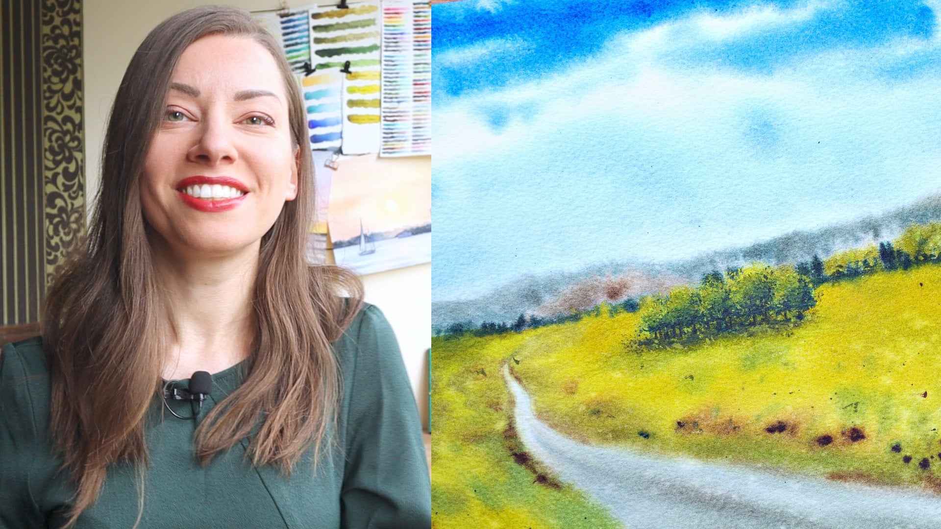
4. Colors: Okay, Let's have a
look at the colors that are oftentimes
used in seascapes We'll discuss what I will use
in this class and I'll give you some ideas for substitutes
if you don't have them. So most probably if you have
at least a student grade, you will have ultramarine blue. This one here is called
ultramarine deep. I find it to be a bit more
intense than the regular. Ultramarine is a great
color for painting the sky or the sea, it mixes
well with other colors too. I won't be using it much in
this class as it's tends to granulate and I'm going
for a more soft look. Instead of that, I
will use cobalt blue. It's a bit more
vivid and bright, not that deep as
the ultramarine. And it also makes nice mixes with pinks
and specialty greens. For the darkest
parts of the water, and especially for
the final project, I will use indigo. It's a really dark
and intense blue. If you don't have indigo, you can try and
use Prussian blue. Instead. It's more
vibrant than indigo, but still it has a lot of depth. Another option is to try and mix whatever blue you
have with black, e.g. you can mix it with ultramarine This is what I got. if you add more black, it will be darker and muted. Remember to use more pigment and less water if you want
the color to be dark. Another option is to
mix blue with a warm red or brown to make
it less vibrant. This is almost like
Payne's gray color. You will also need
some greens if you're painting
sunny day seascapes. Let me show you how you can
use the different greens. I'm using cobalt blue
to make a wash that is darker at the top and more
transparent at the bottom. And if you want to learn
more about washes, you can check my
class "Dreamy sunsets" I can even add some
ultramarine to make the upper part a bit darker. And towards the middle, I will add some green. In my case, this is emerald green and together
with cobalt blue, they make a beautiful
turquoise shade. We often see this
color in the sea. This is how it looks on its own. Going down, I will
add more warm green, which can be the seaweed
we see near the shore. Where the water is
more transparent. So this is Hooker's green. And if I add even warmer green, like this, yellowish green, the water looks like it's a really bright
and sunny day and maybe even the sun is
reflected in the water. And I make another gradient
wash here on the right. So this is ultramarine and I can add to this
some lemon yellow. And now we'll still get that warm ends and green
in the water. Let me show you now
another mix that I love. Mixing ultramarine
with emerald green, similar to what I did
earlier with cobalt blue. And again, I get this
beautiful turquoise. But if I add to that
some white gouache, then I get this
more opaque version which is even more bright. If you add more green, you get this similar to
cobalt green, which I love. And you can play with
the colors and make different variations to see
which one you like the most. If you really want to
dive deep into this, you can then do this really
useful exercise where you try all the mixes between yellows and blues or
greens and blues. Maybe even try to
add white gouache to some of them to see
what you will get. I'm sure you'll get tons
of new favorite mixtures. And it's really nice exercise, especially if you
want to get more familiar with color mixing. We have some nice options here for painting the sea though. This one I made for my greenery class, where we tried mixing different greens
from the yellows and the blues from
the same palette that I use for this class. In the next video, we'll pay
more attention to the water, which is our main start today.
5. Gradients - Dark to Light: So when painting the sea. We are basically painting a gradient wash.
And in most cases this gradient will be from dark to light like
this one here, or from light to
dark like this one. Let's start with the first one. So first we have this very
deep and saturated blue. Then it transitions into
this bright turquoise, and then it slowly transitions into this warm light green. And of course, we have the darkest tones for
the ripples here, for the rocks that we see
here in the foreground. And usually this is
how the sea looks on a bright sunny day when
we stand near the shore. So let's practice this type of gradient and also we'll
paint the ripples. The first thing that
I'm going to do is to place my paper tape here so that the water and paint I put on the paper
will flow down. This is very helpful for
when you're painting washes. And then I'll start by wetting the entire area very
well and make sure the water has soaked
into the paper and the whole surface
is evenly moistened and I'm wiping the sides because otherwise those drops
of water will flow back into my painting once it starts to dry and
will ruin everything. And I'm taking cobalt blue
straight from the pan and I add it in the upper part and
then I'm dragging it down. This creates a soft gradient
from dark to light blue. Once I'm happy
with how it looks, I'm taking some emerald
green and I will add it here in the middle where
the turquoise part is. The green and blue are mixing on the paper and they create
that beautiful color. I'm adding indigo in the
upper part to make it darker. I need to repeat this
a couple of times because I already have a lot
of water on my paper. Then I'm adding some
more of that cobalt blue to make the
color more saturated. I'm dragging it down again and now I will add more
emerald green. Now with a clean brush, I'll just dilute some
of that color down. The water in my jar is blue, so it looks like I've
added some color, but it's actually just water
And for the foreground. I'm going with this
yellowish green. You can use a warm
green or even yellow. Again, I help the colors
to blend by tilting my board even more in
different directions. I'm wiping the site
again and now I'll add the ripples. So for the
soft ripples. Your paper must not be
too wet or too dry. If you have lots of
water on your paper, the color for the ripples
will flow too much. And if your paper
is starting to dry, you will have hard edges. You need to have that perfect
condition of the paper. And you can test it in a
corner of the painting if you're happy with how
the colors are flowing, if the paint spreads too much, you need to wait more
for the water to soak into the paper and if it's
already starting to dry, you should leave it to dry entirely and then
carefully rewet it again with a very soft
brush with a spray bottle. The next thing you need
is a synthetic brush with stiff bristles that
won't take a lot of water, but can take thick and
concentrated paint and work it into the
fibers of the paper. A soft brush will hold
a lot of water which will dilute your colors and
it will become lighter, but also it will be more fluid and won't stand into the place,
you're putting it. So I'm taking my size six brush, I wipe it to take the
excess moisture of it. And I take very concentrated
paint straight from the pan. See how thick it is. My
brush is almost dry. This is also how you make the dry brush effect that
we'll use a lot in this class. I will start adding
horizontal lines in the upper part
of my painting. And I place these lines
kind of intuitively. I don't look at the reference, but if you like,
you can copy them exactly as they
are in the photo. For me, I like to improvise. Sometimes it helps if you're holding your brush
vertically like that. The camera I'm shooting
with is kind of in my way so I can't make them
perfectly horizontal. But ideally they should
be at the very top. I just make one bold, dark line because in the very distance you can't
see separate ripples. Now that I've reached
the turquoise part, I have to change the color. I'm painting the ripples with I will do that by just adding some emerald green
to the Indigo. And I continue, but now I'm trying to make those
ripples thicker, longer and leave more
space between them. Following the rules
of perspective. When I reach the lighter part, I add yellowish green to my mix. Again, very thick. Here. I'm not
painting just lines, but I'm letting my
brush go up and down, making more wavy lines. I make some splatters with more diluted color
in the foreground. I will add some burnt umber to the mix and now paint
those darker spots. Some spots again. I think it looks really beautiful when you
add some brown, you can always see this
color in the shallow waters. And when it gets
mixed with green, it looks very realistic. Now I'm adding some
pure burnt umber. If you're not happy
with how some parts blended together, you
can do the following. I'm taking my biggest
and softest brush, Ideally it will be completely dry, but I'll just wipe it
with a paper towel and very lightly, barely
touching the paper. I can spread some of the
colors here and there. I'm splattering some clean water. I'm blending this part as I don't like how harsh it hooks. And now I will leave
it to dry like this at an angle
while it's drying, the color will
hopefully continue to blend, creating
softer blends. Okay, now my painting is dry, but I'm not happy with how
the upper part got lighter. I will take some indigo
and I will place it here on the top without
re-wetting the paper. Wait, I'll get a more
concentrated color. I'm dragging some of it down and I'm washing my brush and I'm diluting that color down while
I reach the very bottom. But at that point, this is just clean water. I'm wiping the sides of it again and I will
darken the ripples too With some Indigo, I go over the ripples that
I previously painted. Making some splatters
again and we're ready with this bright sunny
day seeing gradient.
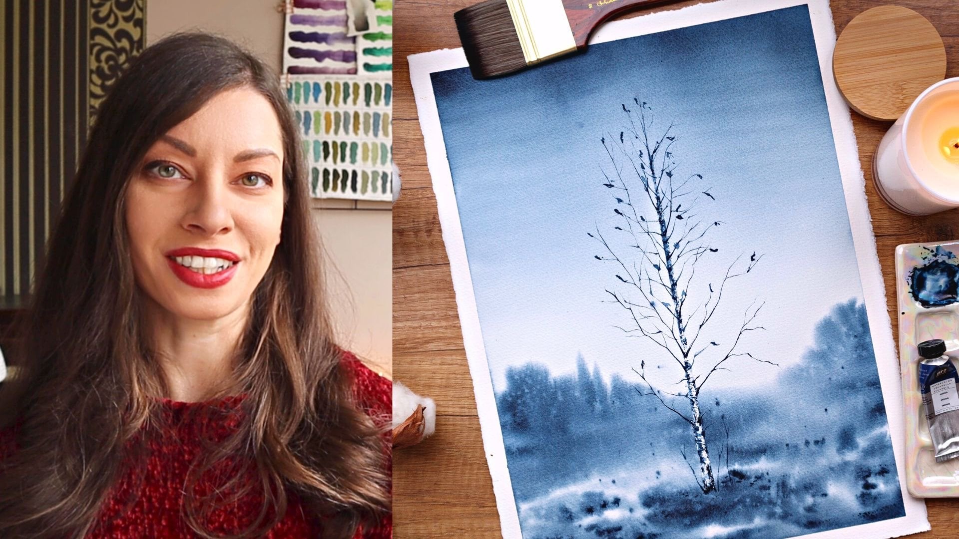
6. Gradients - Light to Dark: Welcome back. In this video, we'll paint another
type of gradient, which is from light to dark. This usually can be seen at sunset or on more
moody or miss days. I really liked the
peaceful look on this one. So I'm starting the same way by wetting the entire
sheet of paper. Hi, I'm taking indigo again and I'm starting again from the top. This time the color is
more diluted and I'm covering about one-quarter
of the sheet with it. Next I'm taking some upper
rows with plenty of water. Um, I think it below and
I blend the two together. Now I need it to be
more concentrated. So I'm wiping my
brush and I'm taking a thicker mixture and
painting a stripe with it. Now our warm it up a bit
with some yellow ocher. Now I'm taking
concentrated indigo and I will add it to the
bottom part of my painting. I'm dragging it up and now I'm washing my brush and
with just unclean water, I will blend the indigo
with the upper part. Now I want to paint
some big repo, so I'll continue
to use this brush, making some both
lines with indigo. And now I'm washing my brush, I'm taking the
moisture of it with some clean paper towel and I
will smooth out the edges. I will switch to the size six. I continue on going upward by making the ripples
smaller and lighter. Now I will repeat the process
making the ripples darker. You can even pick up some
of the color which damp brush to create a highlight
between the ribose. I will leave this to dry now. My painting is dry now and
I'm happy with how it looks. Perhaps I can darker
at the bottom part the same way I did with
the first gradient, but I kind of like
the soft colors. I will remove the masking tape. So here's a close-up
of both paintings. I think I managed to recreate the feeling of
perspective in both. If you haven't succeeded with
making a smooth gradient or you haven't got the
right tone for the ripples. Just know that this is
something I practiced for a long time and I also
have many, many fails. So all you need to do
is keep practicing. You'll dislodge gradient
that we've painted and will built on top of it for
our final project. But first, let me show you
some of the elements of a seascape in the next
series of videos.
7. Boats: In this series of videos, I will show you how I paint different elements that we
often see in cityscapes. Of them are simple to paint
and with fewer details. The idea is to keep it simple
and to emphasize the water. For boats, I usually
go with a simple bot where I draw two parallel lines. The bottom one with
shorter than the other. And depending on where I
want my boat to be facing, I connect two lines
with one shoulder, N1 longer, more inclined line. Then I add some elements on top. Someone defined objects, a mask that is more or
less in the middle. And then maybe a sale or two. I think some ropes that
connect the sales to the boat. And this is it. Now, let's
fill that with watercolor. I'm taking
concentrated in devote a dry brush and I'm starting
to fill in the shape. If you feel like the dry
brush marks are too much, you can introduce more
water as much some of them. But generally, I love to use the dry brush technique for
that because it adds texture. I carefully paint a mask
with a few shorter strokes. Instead of trying to paint
a long straight line. For the sales, I use
more liquid paint as I add darker colors
to the corners. Some thin lines for the ropes. In our boat is ready
for their reflections. I found out this is the
easiest way for me. I hold my brush vertically and I just moved my
brush left to right. As I paint the lines, more shorter and
shorter and with more distance
between them until I paint just the way
we interrupted line for the mass reflection. You can always add
more lines later. Sometimes I just paint
a boat without sales. That is also looking nice, but this is mostly in the cases where that boat is
really far away. So I'm starting the same way. And then just paint some lines
for the mass and the rope. In these cases, I don't
paint reflections because the boat is supposed to be really far and we can see them. If you want to paint the
boat that is facing you, you start with two little lines
that are slightly tilted. Then you continue by painting the sides and the
front of the boat. And you can feel just
one of the sides and for the other you can just drag
the color with a wet brush. This way you'll get a
darker and the lighter side that will represent the light
in the shadows of the boat. Again, you can add a
mask and some ropes. So we can practice this. And pretty soon you'll be
painting them really easily. In the next video,
we'll paint songbirds.
8. Birds: Okay, this one is easier. In this video, we'll
paint some birds. So there are lots of
ways to paint birds. If you want more bigger,
any realistic ones, you can find some photos of birdsong line and
copy their shape. But for me, with this
simple cityscapes, I prefer to stick to
this classic techniques. So once again, I'm taking the consistency of
paint and I paint two straight lines
that are connected and I make the place where
they meet a bit thicker. See how the dry brush is adding to the way
our bird looks. And make sure to vary the way
their wings are positioned. They can be all the same shape. So you can pay in birds
that have their wings like that or even like that. And with this here my
lines are slightly curved, but I think it suits the
position of the bird. And make sure to match your bird size to the
elements in your painting. E.g. if I was to paint
a bird next to these, both, it will be
as small as this. Similar for the other ships. If you want to paint
a bigger bird, you must place it below
the boat so that is clear that this bird is
closer to the viewer. So practice painting births before moving to
the next element. And actually, it's always a nice idea to
practice the bird, even while you're working
on an actual painting. This way you'll be prepared for the color and the marking
your brush will leave. In the next video, we'll
practice painting lighthouses.
9. Lighthouse: In this video, I'll show you how I'm painting simple lighthouses. So I always start
with a straight line, which is in the middle
of the White House. This helps me keep the
shape symmetrical. Then I mark where the terrorists of the
White House is starting, how wide it will be in the same for the bottom part that
is touching the ground. Then I connect the sides
with a straight line. For this upper part
where the light is, I draw a little
square or rectangle. And finally comes the cap. We can have different shapes, but I love to make a half circle with an arrow smile
circle on top. Now that I'm happy
with the shape, I will make the lines
more visible and I will use the ruler to make sure
my lines are straight. Now, let's fill it with
color with very thick paint. I go over the side that
will be in the shadow. I wash my brush and
with clean water, I soften the edge. And finally we would
just unclean water. I go over the side that will be facing the sun or the light. In this way, I get a nice
transition from dark to light. I'm painting the upper part of the White House with
the same color. I will leave some of the colors here to create a highlight. Sometimes I like to paint a flag to with just the line
and the dry brush mark. Adding some details. And the lighthouse is done. In the next video,
we'll give it a ground to stand on and we'll
paint on rocks.
10. Rocks: In this final video
in this series, we'll paint some rocks. I have very simple way
of painting them in. Again, it includes using
the dry brush technique. So once again, I'm wiping my brush to take the
excess moisture of it. I take very
concentrated integral. And I started to make these random brush
marks on the paper. I smoked some of them
with clean water and I continue to build the
shape of the rocks. I switch between dry
brush and clean water. Sometimes I add more
color to the wet areas. This way I get a nice variety
of tones and textures and easily create the rocks which
are never easy to paint. If you try to go into
a more detailed look, the darkest color will be the place where the
rocks meet the water. Then I will smudge some of it to paint the shadow in the water. You can also leave some of
the paint with a damp brush if you need to create some
highlights here and there. I'm adding some final touches
and my rocks are ready. We'll use the same technique
in the final project, but I will quickly repeat
the process to show you how it looks if you
paint rocks on a sunny day. So I'll take some yellow ocher or some other warm
brown or orange. And then for the shadow part, I will use burnt umber or
some other dark brown. You can even add some dark blue like indigo or Prussian blue. I wasn't very mindful of keeping more of that
drivers texture, which is definitely
making these rocks less interesting than
the ones on the left. But we don't practice.
You can learn to pay more attention to that. So these are the elements that I wanted to show
you in this class. We'll combine some of the elements that I
showed you to create our final project will start in the next
video with the sketch. See you there.
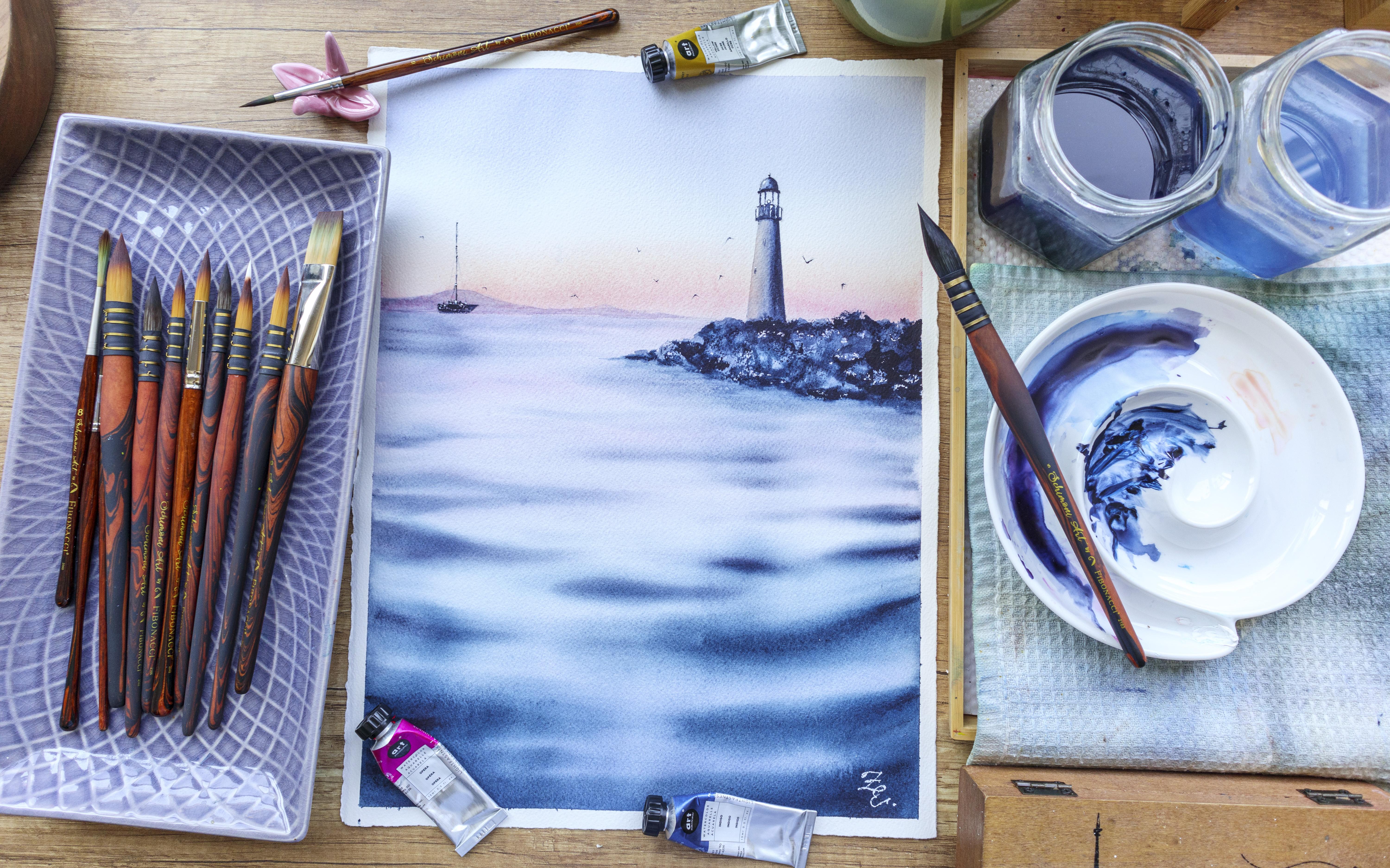
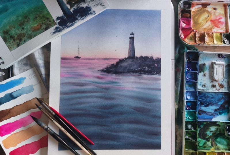
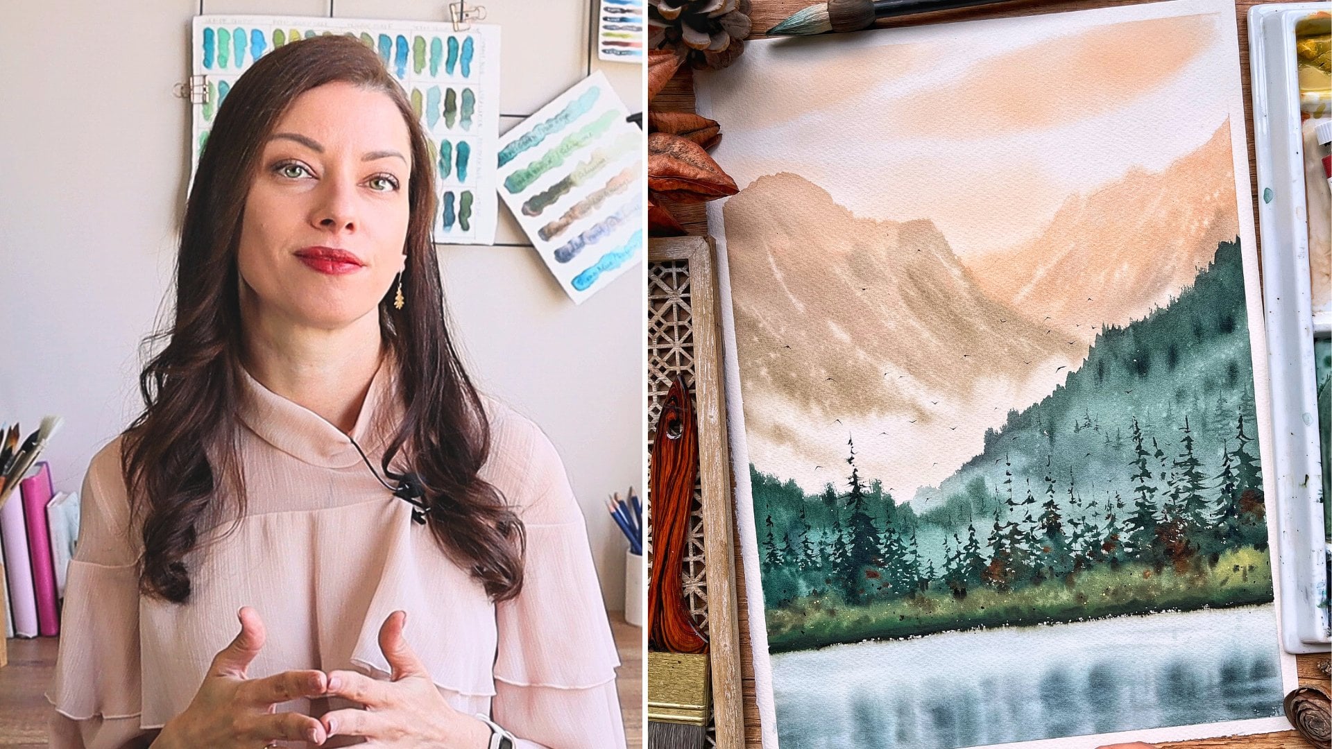
11. Final Project - Sketch: Okay, it's time to start
with our final project. And in this video
we'll make the sketch. I have taped my
shape to the board. The size is about a tree, but you can use size that
you feel comfortable with. I will start by drawing
the horizon line. And since we're
painting seascape, I'll leave more
space for the water. If you're not sure if your
horizon line is straight, you can measure the
distance on both sides. So now I see that I
need to correct it a bit. That's better. Now, I'll have a
lighthouse here, but first, I will paint the
rocks on which it stands. I'm holding my pencil real high and I make
some wobbly lines. I don't like this part,
so I will erase it. Now. I will draw the
lighthouse now Joe, vertical line that will
suit me as a guide. I mark 1 cm on both sides in the bottom part and a half
centimeter on the upper part. I connect them in this will be the body of the White House. I'm making a slightly
curvy line here. Too small vertical lines
and a curved line again. And this is, there's three small lines here where the white of the White House is. And finally, these things on
top that looks like a hat. This is my lighthouse. Here. On the left, I will
draw a boat the same way we did in
the elements view. This is the sketch. In the next video, we'll
paint the sky and the water.
12. Sky & Sea: In this video, we'll
paint the sky and the water in a single
gradient wash. I have my paper tape
below my board again, so it's slightly tilted. I'm wetting the paper very well. Will need it to be wet for longer so that we can
paint the sky and the water with all the
ripples. So take your time. I'm starting by
taking cobalt blue. Since this will be
a sensitive escape, I want to make the
blow more purplish. I'll do it by adding
some greens into it. You can make it more or less
purple, the choices here. So with this color, I will
start painting the sky. When I reached the White House, I washed my brush and
with a clean brush, I'm dragging some
of the color down. This is why we need a
jar with clean water. I love more of that
color to darken the sky. Now, I'm taking upper rows and I put it on
the horizon line. Our made-up with yellow ocher, the same way as we
did in the exercise. Hi, want the space
between two colors. I will just wipe the
side and kill the bird. I'm adding some water
to the part where the water is to keep
it well moisten. And meanwhile, I will wipe some of the paint
from the lighthouse. I'm using a damp brush and each time I'm taking
some of the color, I wipe it on a paper towel. And now we'll paint
the water the same way we did in the exercise. I'm mixing indigo and cobalt blue and I'm adding
and gang crimes. And to make it more purple, we need concentrated
color for the foreground. I'm starting from the bottom and I'm dragging the color up. Hi, I'm washing my brush
and I continue going up. For the part that is
closer to the horizon. I want to add more pink because the water is
reflecting the sky. So we have to use more
or less the same colors. How mining opera rose, my puddle of color over
here, and I mix them. The mixture is very watery and I use it to
cover the residency. I'm adding even more opera rose for the most distant
part of the water. This part is very tricky. Your brush should
be relatively dry, otherwise, you're
exporting this guy. If you introduce more liquid than what you already
have on the paper, the more you practice, the
easier this will be for you. But for now, just know
that even if this happens, I will show you how you can
fix it. In the next video. I will use some opera rose to create some colors,
boats in the water. Those are announced ripples, just different
nuances into water. But we paint them the same way. I use this outburst because
I want them to spread and have smooth edges that blend seamlessly with the rest. Now, I'm assessing the
witness of my paper and if it's the right time
to start with the repulsion, I'll go with the biggest end
darkest one in the front, Jill, using my big brush, this is pure indigo. Again, these are more
wavy and oddly shaped, unlike the lines were
making the distance. I'm wiping the sides
and now I will add more indigo before I
switch to my size six. I will soften some of the edges
with a clean, damp brush. Now, I'm taking my size six. I'm mixing some in. You go
anchoring sun directly on my brush and I will continue painting the ripples
in the upper part. Now those look more like lines below the rocks. I'm
adding them more closely to each other because
there will have a shadow towards the horizon. I just make one larger stripe. I'm mixing a thick mixture
of indigo and crimson, and I will add it some of
the riposte to darken them. Again, I'm doing everything
very intuitively. I don't want to get caught in our thinking where the
next repulsion be. Finally, I'll fix some of the shapes with this
often damp brush. The hardest part of
the painting is done. Leave it to dry. And in the next video, I will
show you how you can fit the horizon line if you
have some watermarks.
13. Mountain (Fixing the Watermarks): My painting is now dry. It is lying flat on
my desk and I want to fix this watermark before
I continue with district, you can do the same if you have watermarks or some hard edges. If you don't, you can
skip this part and leave your horizon
line as it is. In this case, I feel
like the best way to fix it is by painting a
mountain on top of it. You need to use a color
that is light because this mountain is very
far away from us, but dark enough to
cover your mistake. You can also put some paper
tape that will protect the C n will help you
to get a straight line. But I prefer not to
because I might get paint below the tape and then it will be
even harder to fix. I wash my brush and I
wipe it on my towel. And I'm taking this mix here that I used for the
water in the distance. This is the color,
see how wide it is. And now I will paint
a mountain that will cover the hard edge
that I got over here. I'm being very careful not to go over the water and
I make them out and smaller and smaller until it disappears before
reaching the Lighthouse. With a clean, damp brush, I'm softening the edge. Now I see that the heart
age still visible, so I'll add more color
to the mountain. I'm taking more from
the same mixture and then drop the color in
the steel wet mountain. I'm blending in with the damped clean brush
because I don't want to make the whole mountain
darker. Just this part. I'm fixing the edges here
and there and I will leave it to dry before I
start painting the shape.
14. Ship: In this video, we'll
paint the ship. I wonder making it too detailed because the accent is
on the Whitehouse. Somber bearing again, thick mixture of integral N crimson. See how thick it is. With my brush size to, I'll start filling in the
shape that I drew earlier. Since the mixture is very thick, I get this dry brush effect. I think it's nice because
the ship is in the distance, so we're not seeing
it very clearly. I'm adding some details. I don't really know what
these dots are exactly, but they make the
shape look more interesting. For the mask. Instead of trying to
paint straight line, I will paint a few
shorter lines. It's so much easier this way. Plus, I like that Dylan
is none that uniform. Some very thin lines
for the ropes. We are ready with the ship. In the next video, we'll
paint the white house.
15. Lighthouse: In this video, we'll
paint the lighthouse similar to how I showed you
in the elements section. I'm prepaying again
the same mixture. Often you're going crimson. He's very dense but
still a bit more watery than what we had
when we painted the boat. And now apply this mixture on the right side of the lighthouse juice
where the shadow is. I covered a bit less
than half of it. Then I'm washing my brush
and we can clean water. I will reactivate
the dense mixture to create a softer transition. Again, with clean water, which is actually
slightly bluish, I will fill the
rest of the shape. The idea is to get
a smooth transition between the different
towns though, I'm wearing my brush
a few times up and down to make sure
it is really smooth. I'm adding some color
to the bottom part into the very upper part because this is where
we have shadows, 2.2 tiny dashes for the windows. I'm preparing the same. I'm darkening the
bottom part and with the same dark
and dense mixture, I paint those lines. I'm feeling in this shape with
a more transparent color, but again, I'm darkening
the right part. I go over the bars
with a darker color. Here. I just painted dot
n. This is it. We are ready with
the lighthouse. Next, we need to find the rocks.
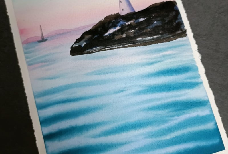
16. Rocks: In this video, we'll
paint the rocks. I'm starting by mixing
the same colors, indigo and Chris and I need a thick mixture. And now we'll use that to
create some dry brush markings, filling in the shape
I drew for the rocks. Next time washing my brush and with just some clean water, I will smudge it here and there. Now, continue doing
the same until I fill in the whole area
where the rocks are just gone back and forth
between the dry brush with thick mixture and diluting
some of it with clean water. Now I will drop some
color in the white areas. Just playing with the
different effects, I can get an almost
experimenting. It's important that
the part where the rocks meet the
sea is very dark. Here. I will dilute it again, but with horizontal movements so that it looks like these are, the rocks are fractions. I think some more color here. Sounds matching again. Some deeper shadows
on the rocks. The rocks are
ready. Well, that's some details in the next video. And then our final
project will be ready.
17. Final Touches: Let's add some highlights
to our elements. I'm taking some white
gouache straight from the tube and
with a small brush, I'm adding some white dots to the sheep and then
the White House. Finally, let's paint some birds. They always make any landscape look more alive and dynamic. I'm taking some pure indigo I that my brush on a paper towel to take out the excess paint
and I will paint on birds. I do it the same way we did
in the exercise session. I paint them very small because the ship and the White
House are small. N, if I paint bigger birds, it will look strange. Paint as many or as
little as you want. This is it guys. Let's remove the
masking tape now. This is our finished work. I'm really happy with
how it turned out. I like the colors, the soft
blends, and the model bit. Let's wrap up the class
in the next video.
18. Bonus Video: I was raised the exam photos of my final work when I decided
I can try something, I think it will
add to the mood of the painting and it very simple, so stick with me for just
a couple of minutes more. So I'll mix a warm and
very transparent color using upper rows
and yellow ocher. And with that, I will go over the left side
of the White House. This way, I created the bigger contrast between
the light and shadow part. And I introduced another
color because it was all bu. But now we have a
warmer color too. And I think it looks nice. In our peaceful
landscape is done. I think the color
palette is really reminded me of relaxation
and peacefulness. You can also try to recreate this way the color palette from the first gradient exercise and make it a sunny days escape. I'll see you in the next
video for our final words.
19. Wrapping Up the Class: Congratulations on
completing the class. I want you to take them and appreciate what you have done. I know it wasn't easy. Bending water and
ribose is a tough task. But today you get one step closer to mastering the subject. And I'm so proud of you. You've learned which are the right materials and
colors for painting the sea, and how to recreate the
feeling of perspective. And that maybe the final project was a bit out of
your comfort zone. But this is also where
growth is happening. So you deserve a huge
pat on the back. I'm so excited to see the beautiful paintings
that you have created. Not forget to post them in the project section
of the class. If you post your
project on Instagram, don't forget to tag me and I'll be happy to
share your work. If you have a question for me, just post it in the
discussion section of the class and I will get back to you as soon as I
can until the next class. Happy painting.
 Elina Zhelyazkova, Watercolor Artist