Transcripts
1. Welcome To The Class!: Hello, everyone, and welcome
to today's class where we'll be painting a
luminescent jellyfish. What I really love
about this painting is the fact that we can use
so many pretty colours. All these turquoises
and bright pinks and purples really work
so well together, and they make the
painting look so attractive just due to their
vibrancy and uniqueness. Because of the nature
of these colors, we'll be looking into the
use of warm and coolness in our colors because
they contrast lovely and work together
to create a lovely, harmonious range of colors. Not only that, but
we'll be exploring texture because the
background is full of lovely experimental
brush marks and washes to try and bring out all the excitement
that watercolor can bring. I've been a professional
artist for many years, exploring lots of different
subjects from wildlife and portraits to cityscapes
and countryside scenes. I've always been entranced by the possibilities of watercolor. But when I started,
I had no idea where to begin or
how to improve. I didn't know what
supplies I needed, how to create the
effects I wanted, or which colors to mix. Now I've taken part in many
worldwide exhibitions, been featured in magazines, and been lucky enough
to win awards from well respected
organizations such as the International
Watercolor Society, the Masters of
Watercolor Alliance, Windsor and Newton, and the SAA. Watercolor can be overwhelming
for those starting out, which is why my goal
is to help you feel relaxed and enjoy this medium
in a step by step manner. Today, I'll be guiding you
through a complete painting, demonstrating a variety
of techniques and explaining how I use all
my supplies and materials. Whether you're just starting out or already have some experience, you'll be able to
follow along at your own pace and improve
your watercolor skills. If this class is too challenging
or too easy for you, I have a variety of classes available at different
skill levels. I like to start off with a free expressive
approach with no fear of making mistakes as we create exciting textures
for the underlayer. As the painting progresses, we'll add more details to bring it to life and
make it stand out. I strive to simplify
complex subjects into easier shapes that
encourage playfulness. Throughout this class, I'll be sharing plenty of
tips and tricks. I'll show you how to turn
mistakes into opportunities, taking the stress out of
painting in order to have fun. I'll also provide you with
my watercolor mixing charts, which are an invaluable tool when it comes to choosing
and mixing colors. If you have any questions, you can post them in the
discussion thread down below. I'll be sure to read and
respond to everything you post. Don't forget to follow
me on Skillshare by clicking the Follow
button at the top. This means you'll be the
first to know when I launch a new class
or post giveaways. You can also follow me on Instagram at Will Elliston
to see my latest works. So, if you want to
learn how to paint a lovely jellyfish using gorgeous colors and
exciting textures, I'll this is the class for
you, let's get started.
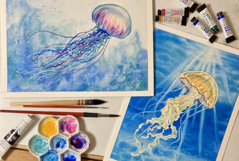
2. Your Project: Thank you so much as always, for joining this class.
I really appreciate it. Now with this painting,
first of all, we're going to focus
with texture because that's what we'll start
doing with a background, and we're really going to
push it to the limit and have fun and really get enthusiastic about creating as
much texture and mess as possible because
this texture will contrast lovely with
the refined details and transitions and gradations
of the jellyfish itself. We'll be using a large
range of brushstrokes from big grand washes to fine little details from
the jellyfish strands. Of course, as always, you can experiment with whatever
colors you like. You can make this
painting truly yours. One of the more important
things to keep an eye out on this painting
is when we do the background to make sure
the head of the jellyfish has a white background so that we can paint on top
of it later on. Then our painting will be more dynamic because we've
got dark on light, and then we've got light
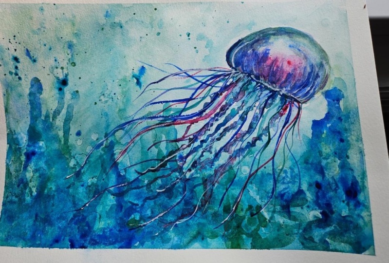
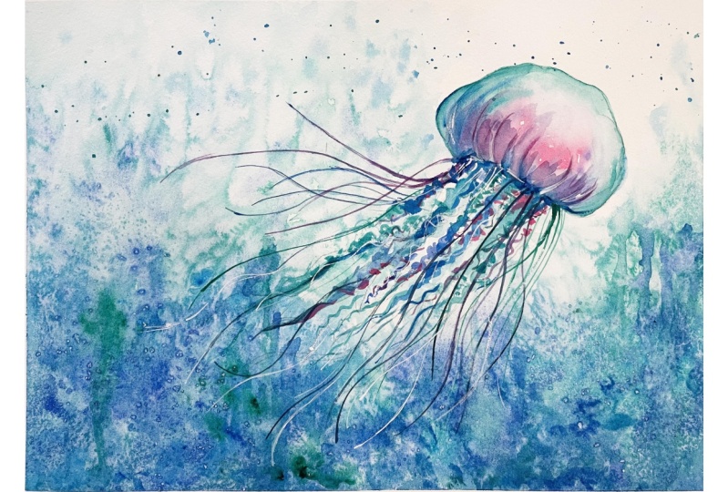
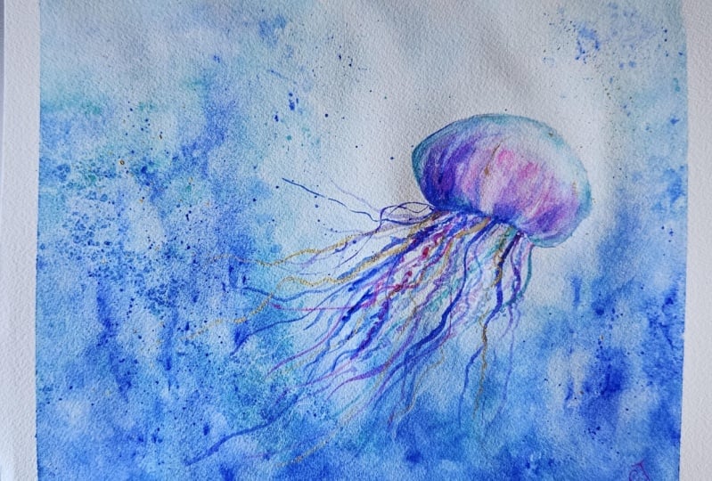
on dark at the bottom. In the resource section, I've added a high
resolution image of my finished painting
to help guide you. You're welcome to
follow my painting exactly or experiment with
your own composition. As we're going to be focusing on the painting aspect
of watercolor, I've provided templates
you can use to help transfer or trace the
sketch before you paint. It's fine to trace when using it as a guide for
learning how to paint. It's important to
have the underdrawing correct so that you can relax and have fun learning the
watercolor medium itself. Whichever direction
you take this class, it would be great
to see your results and the paintings you
create through it. I love giving my
students feedback, so please take a photo
afterwards and share it in the student project gallery under the Project
and resource tab. I'm always intrigued to
see how many students have different approaches and how they progress with each class. I'd love to hear
about your process and what you learned
along the way, or if you had any difficulties. I strongly recommend
that you take a look at each other's work in the
student project gallery. It's so inspiring to see
each other's work and extremely comforting to get the support of your
fellow students. So don't forget to like and
comment on each other's work.
3. Materials & Supplies: Before we start this painting, let's go over all the materials and supplies you
need to paint along. Having the right materials can greatly impact the
outcome of your artwork. So I'll go over all the supplies I use for
this class and beyond. They're very useful to have at your disposal and will make it easier for you
to follow along. Let's start with the
paints themselves. And like most of the materials
we'll be using today, it's a lot to do
with preference. I have 12 stable colors in my palette that I
fill up from tubes. They are cadmium
yellow, yellow ochre, burnt sienna, cadmium
red, alizarin crimson, tramarne blue, cobalt blue,
serlean blue, lavender, purple, viridian, black, and
at the end of the painting, I often use white gouache
for tiny highlights. I don't use any
particular brand, these colors you can
get from any brand, although I personally
use Daniel Smith, Windsor and Newton
or Holbein paints. So let's move on to brushes. The brush I use the most is
a synthetic round brush like this Escoda Purl brush
or this Van Gogh brush. They're very versatile because
not only can you use them for detailed work
with their fine tip, but as they can hold
a lot of water, they are good for
washers as well. They're also quite affordable, so I have quite a few
in different sizes. Next are the mop brushes. Mop brushes are good for
broad brush strokes, filling in large areas and creating smooth
transitions or washes. They also have a nice tip that can be used for smaller details. But for really small details, highlights or anything
that needs more precision, I use a synthetic
size zero brush. All brands have them,
and they're super cheap. Another useful brush to have is a Chinese calligraphy brush. They tend to have long bristles
and a very pointy tip. They're perfect
for adding texture or creating dynamic
lines in your paintings. You can even fan them
out like this to achieve fur or feather
textures as well. And that's it for
brushes. Onto paper. The better quality
of your paper, the easier it will be to paint. Cheap paper cuinkles easily
and is very unforgiving, not allowing you to
rework mistakes. It's harder to create
appealing effects and apply useful techniques
like rubbing away pigment. Good quality paper, however, such as cotton based paper, not only allows you to rework
mistakes multiple times, but because the pigment
reacts much better on it, the chances of
mistakes are a lot lower and you'll be more likely to create
better paintings. I use arches paper because that's what's available
in my local art shop. A water spray is
absolutely essential. By using this, it
gives you more time to paint the areas you
want before it dries. It also allows you to
reactivate the paint if you want to add a smooth
line or remove some paint. I also have an old rag or t shirt which I use
to clean my brush. Cleaning off the paint
before dipping it in the water will make the
water last a lot longer. It's always useful to
have a tissue at hand whilst painting to
lift off excess paint. Also, you never know when an unwanted splash or drip might occur that needs
wiping away quickly. I also have a water dropper
to keep the paints wet. When you paint, it's
important to have them a similar consistency to what
they're like in the tubes. This way, it's easier to
pick up sufficient pigment. A hair dryer is useful
to have for speeding up the drying time and controlling the
dampness of the paper. And lastly, masking tape. And this, of course, is just to hold the paper down still onto the surface to stop it sliding
around whilst painting. Also, if you plan on
painting to the edge, we'll allow you to create a
very crisp, clean border. And that's everything
you need to paint along. I encourage you to experiment and explore what
works best for you. Now, let's get ready
to start the painting.
4. How to Sketch It Out: As we start this drawing, remember, this jellyfish is
all about flow and movement. We're not getting bogged down in any precision
at all yet, especially in the drawing stage. What we want is the
energy of this jellyfish, the way it drifts and
glides through the water. The way it just has that
calming presence about it, a graceful, effortless way
of moving through the water. Don't feel the need to
get every line perfect. In fact, the more you
chase that perfection, the more you'll start to lose that wonderful looseness
we're going for. This is about capturing the
feeling of the subject, not every little detail. So as we're starting
lightly with this sketch around
the soft dome, you can even think of it as an umbrella just
drifting along. But what's important here
isn't the exact shape, but rather the
placement on the page. As you can see, we're off
center and we're having it diagonally
placed on the page. It has a feeling
of balance to it. Especially with the little
swirly little strands coming down across the page. These are the kind of things
we want to think about when we're drawing and setting the stage for where we
want to paint over later. Before you move in with a
hard pencil like I have here, take a step back and let
your mind wander a bit. Imagine those tentacles
flowing outwards, gently moving through the water. Is it exactly what you're
picturing in your mind? If not, then don't commit
to it yet and rub it out and clean up the line,
bit like I'm doing here. You're never going to get
it perfect straightaway, it's all about refinement
and adjustments. Let your hand just follow
that sense of movement. And these lines shouldn't be symmetrical or perfectly spaced. In fact, if they're
a little different from one another,
that's even better. It gives it a more
natural organic feeling. Just imagine how that water
is pushing and pulling at the tentacles and let
that guide your hand. Some lines might be longer, some shorter, and that's
exactly what we want. It's the irregularity that adds character and
life to this drawing. Loose, free flowing. That's
what we're aiming for. Think of this sketch
as a suggestion of what's to come a loose
framework that we're going to be laying down to guide
the watercolor later on. It doesn't have to
be a finished piece, but it can be if you want to, but the more details you put in, the more you limit yourself
with watercolor later on. One of the things you
can do to improve your drawing is to keep your hand on the paper
as much as possible, or at least what I mean, keeping the lead in
contact all the time. Try not to lift your hand
and lead off the paper. It keeps you connected
to the whole piece rather than getting lost
in individual sections. If you start skipping
around too much, you might lose the relationship between different
parts of the drawing. So a bit like a puzzle, you need to keep all these
pieces in mind as you go. I'm just using my putty rubber just to lighten
some of the lines because I don't
want them to show up after the paint applied.
5. Starting The Wash: So I have it all taped
up and ready to go. As you can see, I've got
my four colors here, which I'll use for the painting. I may not even use this
color, ultramarine blue. I've got pink, serlean blue, cobaltiel blue, and
this ultramarine. The only reason I might use
that is if I want to get darker tones because it's
a very transparent color, so it has its
natural pigmentation is very dark as you can see. It's not very opaic. If it's not dark
enough in some areas, I'll just use that
to make it darker. As you can see, they're
all different brands. It really doesn't matter
what brand you use. You can experiment with
what color you want. I'm just going to put
this block underneath. To give it a bit of a tilt because I want to paint
the background first. And that means that I want it darker at the
bottom or the top and just having that gravity
help us to move the pigment down will stop the water puddling in places that
we don't want it to. So using my big brush,
any big brush will do, doesn't matter if
it's the same kind, and I'm just going to wet some random areas to start off with. There are some
areas, little gaps where it's still dry
and that's okay. I want to create a bit of unevenness, some random strokes. Let's move these to the side. Now I'm going to start with
some cobalt tetle blue, which will be the main colors, eroded pantina copper color. Nice and turquoise like a tropical sea let's mix a
bit of serlean into that too. I'm just going to mix a bit of it on my palate just to get a feel of what it's like. These two pigments have quite
large granules in them. Their pigments are quite large, so they fill into the teeth
of the paper as it dries, which is quite a
beautiful effect. So I don't want it fully green. That's why I put
the blue on there. Getting a nice turquoise color and just see where it
goes, see what happens. We want to be free
at this stage. We don't want to think
about too many details. No details at all, actually, at this stage. I'm trying to avoid
the actual head of the jellyfish at the moment, if you
can call it a head. A few splats maybe. Just to get into the
feeling of looseness. Maybe I'll completely
wet the top here just because I want
there to be a nice smooth transition up here. You already see the granulation of some of these pigments. And the gravity
is doing wonders. I also have a water spray handy. If I feel like some areas are
drying faster than others, I can just use the water
spray just to reactivate it. Now, if you're using a
pigment that doesn't have such granulation
like this does, then you can apply
a bit of salt. That'll help boost the granules.
6. Wet on Wet: Now, if you didn't
want to limit yourself with just three
or four pigments, you could actually put a bit of viridian green just
to boost the green. But for the sake of this demonstration,
I'm not going to do that. Lovely granulation starting to take place and run
out of pigments so. Let's be a bit bolder. That might be a bit too much
pigment. Let's find out. Okay. This is a Cotman Cerlean
blue I'm using right now, and Cotman is an
entry level pigment. It's like a student color, so it's not expensive, and I do like the color
and the end result of it, but you have to use a lot of
it for it to go a long way. With pigments like Daniel Smith, you only need a little
bit to go a long way. So as it's starting
to dry at the top, you can see the shapes are
starting to hold a bit more. A few dabs up there. I'm really going to pile
pigment on in some areas. No and you can see that even though this
pigment is very thick, it's not actually that dark, and that is because it's
quite an opaic medium. Now, if you didn't
want to go much darker than this, that'll
be absolutely fine. Bit more of this.
7. Adding Salt: I'm thinking about tones. Of course, these
are pretty colors, so you don't need to think much about the color because they're
already very pretty. So all I'm trying to
think is I want it to be gradually darker as
we're going down. But I don't want
it to be a smooth transition at the same time. I want it to be a bit textured, like there's movement
in the water. I think I am going to use this ultramarne blue
because as you can see, it's not actually that dark. You can see how much darker
this pigment is when I put it on my palette. I'm just going to
leave it for a bit, allow the watercolor
to do its thing. Of course, I'll
keep an eye on it. But now that I've pretty much created a transition
from light to dark, I'm just going to see how the paper and the pigment react. And in some areas, I'm just going to put little bits
of salt. Not much at all. And I'm not trying to
do it evenly, as well. I'm trying to create some bits, a bit more arbitrary because I want there to be a lot of texture
in this water. Now, ideally to get the best
results from your salt, you have to let
it dry naturally. But I don't particularly need really strong
salt results for this. I want subtle textures. So I think I don't have to wait a full
2 hours for it to dry. I can use the hair
dryer when I'm ready. Now that we've come
to that stage, I think I can take it away
take the tilt the block away. Okay. Now I just have
to wait for a bit. Now you can see some
of the salt already starting to work because
we had it on a tilt. The top half of the paper
dries faster than the bottom. But I want even more
texture than that. I'm just getting a clean brush
with some water flicking. I can even drop water
directly onto these areas to create an uneven
edge, basically.
8. Creating Texture: Agitating the paper
as it's drying. Then we can get the
hair dryer again. Put it back on a tilt. I really agitating,
creating all kinds of textures because this pigments
already stained the paper. When I rub it away like this, it leaves a after mark. You can only achieve these
effects by being playful. You can't think your
way into these text. If you purely think
about technique, you're not going to end up with exciting,
captivating painting. You have to force yourself
to do adventurous things. And sometimes it doesn't work, but that's the enjoyable
factor of watercolor. If it went right
every single time, we'd actually lose
interest in it. It's that aspect of it being unpredictable that makes it so rewarding when it does work. I think I can push that
out of the way now. And then we wait
for a bit longer. Maybe we can use the hair
dryer to make it a bit uneven, so we dry the top
half of it and leave the bottom half wet and then
it'll create a hard edge. Scoop up this water and drop
it in maybe a few splats.
9. Making Drips: Where it's still wet
on the bottom half, I'm just going to drop
some pigment in there. See, I'm not being
very sophisticated with my brush work,
and that's the point. Trying to be expressive. I don't want many hard edges, so softening some of them out. To dark there, so I'm picking up that pigment there and
dropping it down below here. What hair dryer. A few splats. Going back and forth
between drying and wetting. Bit more green. Straight from
the tube. How about that? Tilt it. Again, wait for it to
dry a bit. Now it's dry. I'm going to do a
bit more texture. I'm going to create
a few drip marks. Now, these drip
marks are obviously rolling down this
way so that when we paint turn the painting around the drip marks
will be looking upwards.
10. More Drips: Always agitation creates
more interest, I think. There here drip homemade. And it kind of suggests
possible seaweed. I'm not sure, really. I just feel like it adds
a bit of interest. Bit of sea vibes going on. Now I'll wait until it's absorbed a bit and
then use the hair dryer. If I use the hair
dryer straight away, it will run even more,
which I don't want. I'll wait for a bit and
then use the hair dryer. I've completely dried it
and I've actually taken off all the salt and I'm
just going to do a few splats of pure water. All right. And I'm going to wait a bit for it to
absorb into the paper. And you might be thinking, gosh, we've spent such a long time to basically create a
mess, basically. But actually, for me, this is the most enjoyable
part of watercolor, just playing around, seeing
what you can achieve, all the detailing part that
we'll do with the jellyfish, that can be a bit
monotonous because it's just about detailing and it doesn't really
capture so much of the energy or the playfulness
of the background. So now that it's soaked in, we can use a tissue just
to rub away like that.
11. Starting The Bell: And now we're ready to
actually paint the jellyfish. I'm going to start here at
the top and I'm going to use this green that's already
on my palette, actually. I use this brush, but before I actually add that
brush to the paper, I just realized I
should wet this area first because it's
quite a large area and I don't want it to
have any hard edges. So I'm just going to wet
some of it to begin with. So when I lay this
across here like this, I got a nice soft edge. Now, this pigment is
quite difficult actually, because like I said before, it's got quite thick granules
in there pigmentation. So if you want to do
nice blending on it, you basically have to do
it all in one go because the more you touch and
play around with it, the more the magic is lost. So as you can see, we've softened all the
edges on this part. Now I'm going to have to
mix in some other colors. So using this pink, just a little bit
for the time being. And let's use this
serlean blue again. I'm going to mix these two together to create
a purple like that. And that's a bit too warm. The purple I just
made is a bit too warm for my liking,
so a bit more blue. Because green is a cool color. So if we whack warm
one there like that, like I just did haphazardly,
it's not so pretty. We need to use the cool
color with it at this stage. Of course, we'll use
warm colors as well. The pink is a warm
color that we'll incorporate into the
painting as well. But we have to do it in a
kind of controlled way. Somewhat controlled.
We don't want it to look too contrived. Blending that pink into a
purple as it meets the green. Same reasoning as before, because the green
is a cool color, and the pink is a warm color. So we've got to meet it
halfway and match it.
12. Warm & Cool Colours: If you're finding you're mixing a color with
another color, and the color isn't
quite nice in your eyes. It's not working the
way you'd like it to. Then trying to think about the color temperature that's taking place when you're
facing that issue. And often by either making it warmer or
cooler depending on the context of your color mix, that should sort the
problem out for you. I'm going to let
that be. I'm not going to leave it together, but it's already quite wet and
the more that I add to it, it comes overloaded with water. In fact, I can take
some water out by using the sponge
or you can use a towel as well to just soak away some of the liquid
or you can use your finger. You can see I'm doing inverted
strokes, so to speak. They create nice soft lines. I wouldn't even call them lines. Now we can start moving
into these bits, taking the screen again. I now, of course, I've drawn the shapes
of these squiggly bits. But I don't actually want to be so strict
of the lines because then I'll lose the energy,
the expressive energy. Got to get my ultramarine
blue out as well. If you get bogged down with
the details and try and paint all where the lines are, then it'll lose the authenticity
of it a bit, I think. That's what I tend to
find a bit more green. Going back and forth
between this green, the ultramarine and
the Cerlanblue.
13. The Tentacles: You can whirl your brush
like little Zs or s. But you do have to break
it up every now and again. They can't be perfect swirls. Corporate some pink into there. Now, the inspiration
for this class was because the other day I
was on my paddle board, and loads of jellyfish started
appearing in the water. And at that point, I decided to sit down. I didn't want to
risk falling in. But they are very
beautiful creatures so elegant the way they
move in the water. A bit more pink. Okay. There are few darker ones here. I'm going to get a tissue
and lighten this area here because what I'm
going to do later, we've got these kind of
swirly bits coming off, not tentacles, like
the little strands. Then we've got thin ones, and the thin ones, I
want to be quite dark. So I need to make the back a bit lighter so that
there's a contrast.
14. Some Refining: I'm just going to completely dry my painting because
it's a bit buckled here, so it's affecting the
way I see the painting. I can see what I can do now, and make those
ones a bit bigger. But more importantly, I think we need to go
a bit further down. If you don't have this color, if you don't want to
buy cobotele blue, you can mix aridian
green with serlean blue, and you'll achieve
a similar color. Using the tip of my brush. Just to create a rough edge. Now this is dry up there. I can go back and
just a few dry brush marks in some areas. Maybe dry brush
mark up here, too.
15. Testing Brushes: Now right here
where it connects, I'm just going to
do a darker tone. Like so. This teal blue, I'm not
sure why it's called blue, but this teal blue,
green, turquoise color. Looks quite light
when you use it, but it dries a lot darker. Okay. I think that's almost enough fun with
these swirly little bits. I think we can move on
to the next step now. And with the next step, I'm actually going
to change my brush. I need to decide which
brush I'm going to use. I can do a trial one
with this brush. Okay. Now, I wasn't too
happy with that one. So let's try this
This needle brush. I think this needle
brush will do better. I'm going to rotate. Okay, a bit wetter, I think, a bit wetter and a
bit warmer this time.
16. Swirly Strands: Before you actually commit, you need to hold your brush at the beginning and look
to where you're planning on going and kind of visualize the action before
you actually go for it. I think I wanted a
bit more pinker. The reason I think I
prefer this needle brush to this is because it holds
more water in the base of it. Or a rigor brush,
it's sometimes known. Now I'm going to do a
few more, not many more. I don't want to overdo it. I'm gonna do it with
this green again.
17. Adding Highlights: You've got to do it
at the right speed. If you go so fast, the pigment won't
go onto the paper. But if you do it too slow, there'll be too much
pigment on the paper, and also the stroke
won't be fluent. Now I'm gonna dry that off. Now, using this brush or it doesn't matter if you use a any small brush
for this stage. I'm just going to
take some white. Let's do a few more strands.
This time with the white. Having a bit of water in there because it's starting
to get a bit dry. That's too much water. I do it. Okay a few slight changes. I think there needs to
be a bit more tone, a bit more volume
in the way I've painted this jellyfish
up at the top here. So I'm just adding trying to
create a bit more of a sense of curvature. Like, sir.
18. Finishing Touches: And then I think for the
last thing I'm going to do is a few white
strokes right here. And in fact, just
fill that bit in. There's too much white
space in that section. So I'm going to have a bit of a washy kind of section there, and then a textured section
there to contrast it. I can do that here too. I overdid it, I think, with the detailing there. So I'm just softening it
out with a bit of water. I think that's it. What I'm going to do
now, which I always do, I'm going to take the tape off and look away for a good hour, at least maybe a day. And then possibly
with a fresh eye, I'll see what else I can do. I'm going to re wet this section here because I've already seen
something I'm going to do. I might not be necessary,
but I'm going to rewet a couple of strands here. Get a tissue. Okay. Okay. Now I'm going
to take the tape off.
19. Final Thoughts: While we finished the painting, and I hope you've
painted along as well. If you haven't,
please give it a go. I'd love to see your results. Now, when we did this painting, we explored many
different things such as creating texture, using a big range
of brushstrokes from large washes
and fine lines. We also explored warmth and coolness of different tones and how they affect each other, whether to mix cool tones with warm tones, and, of course, we can see that the purple color in this is the warm tone, and the greens and blues
are the cool tones. So we've explored through a whole range of
tones and colors. Remember, watercolor painting is not just about technical skills, but also about expressing your creativity and
personal style. I encourage you to
continue exploring, experimenting and pushing
your boundaries to create your own unique
watercolor masterpieces. As we come to the
end of this class, I hope you feel
more confident and comfortable with your
watercolor painting abilities. Practice is key when it comes
to improving your skills, so keep on painting
and experimenting. I want to express my gratitude for each and every one of you. Your passion for
watercolor painting is so inspiring and I'm honored
to be your teacher. If you would like feedback on your painting, I'd
love to give it. So please share your painting in the student projects
gallery down below, and I'll be sure to respond. If you prefer, you can
share it on Instagram, tagging me at Will Elliston, as I would love to see it. Skillshare also loves
seeing my students work, so tag them as well
at Skillshare. After putting so
much effort into it, why not share your creation? If you have any questions
or comments about today's class or want any specific advice
related to watercolor, please reach out to me in
the discussion section. You can also let me know about any subject wildlife or scene you'd like me
to do a class on. If you found this class useful, I'd really appreciate
getting your feedback on it. Reading your reviews
fills my heart with joy and helps me create the best
experience for my students. Lastly, please click
the follow button Utop so you can follow
me on skill share. This means that you'll be
the first to know when I launch a new class
or post giveaways. So I hope you enjoyed
this class and are inspired to
experiment more with pretty colors and
exciting textures until next time, bye for now.
 Will Elliston, Award-Winning Watercolour Artist