Transcripts
1. Welcome To The Class!: Hello, everyone. My
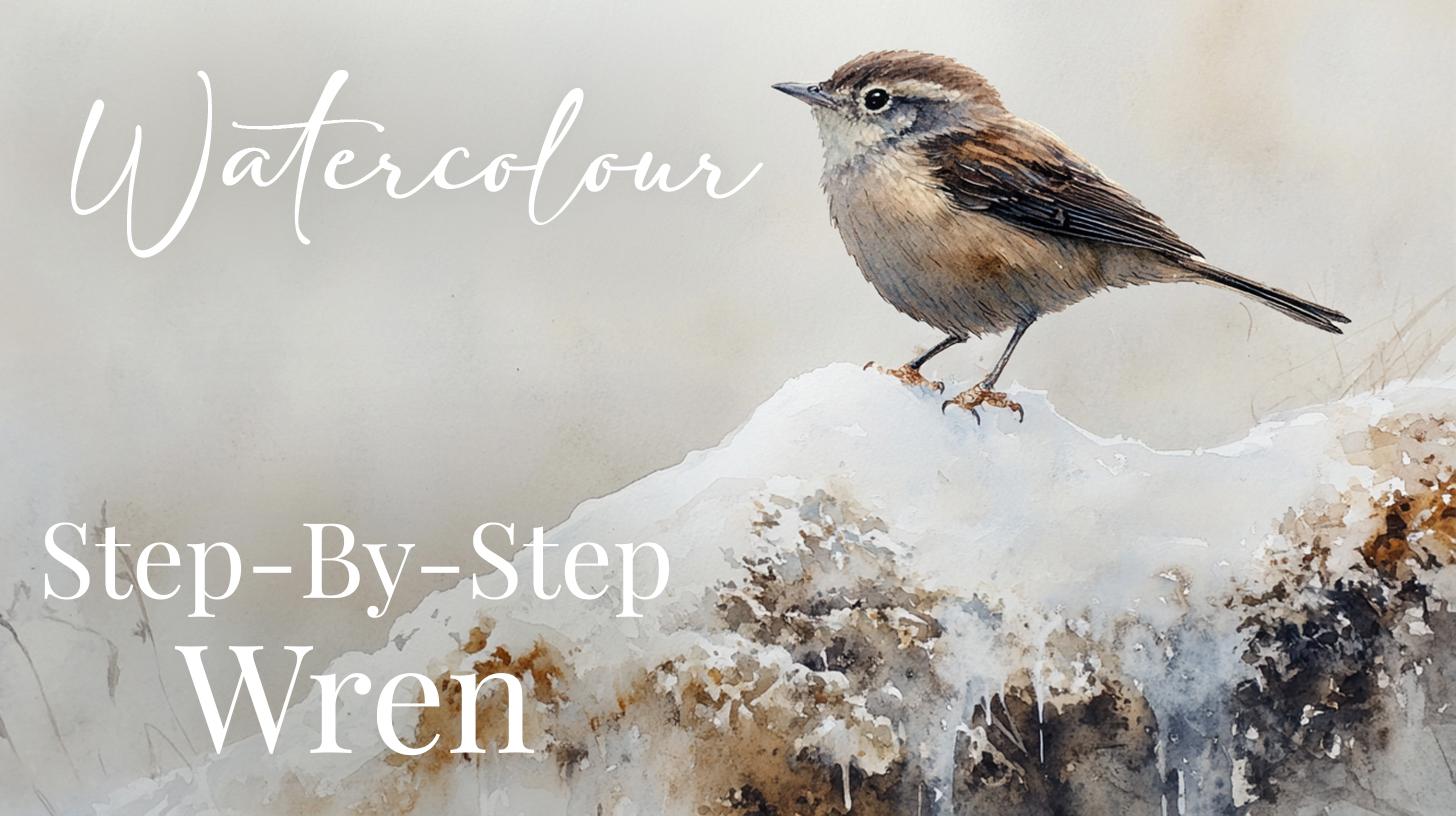
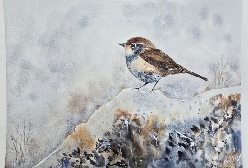
name is Will Alliston, and today we'll be capturing the delicate beauty of a small little wren
perched on a snowy mound. One of the key techniques I'm teaching today is how to achieve the soft feathery textures
of the bird's body and form while maintaining crisp detail in
the wing feathers. It's all about balancing control and allowing
the water to flow. I'll be walking
you through how to create depth in the snow touched earth and how to achieve
those delicate frosty drips. They add just the
right amount of visual interest without
detracting from the main subject. I've been a professional
artist for many years, exploring lots of different
subjects from wildlife and portraits to cityscapes
and countryside scenes. I've always been entranced by the possibilities of watercolor. But when I started,
I had no idea where to begin or
how to improve. I didn't know what
supplies I needed, how to create the
effects I wanted, or which colors to mix. Now I've taken part in many
worldwide exhibitions, been featured in magazines, and been lucky enough
to win awards from well respected
organizations such as the International
Watercolor Society, the Masters of
Watercolor Alliance, Windsor and Newton, and the SAA. Watercolor can be overwhelming
for those starting out, which is why my goal is
to help you feel relaxed and enjoy this medium in
a step by step manner. Today, I'll be guiding you
through a complete painting, demonstrating a variety
of techniques and explaining how I use all
my supplies and materials. Whether you're just starting out or already have some experience, you'll be able to
follow along at your own pace and improve
your watercolor skills. If this class is too challenging
or too easy for you, I have a variety of classes available at different
skill levels. I like to start off with a free expressive
approach with no fear of making mistakes as we create exciting textures
for the underlayer. As the painting progresses, we'll add more details to bring it to life and
make it stand out. I strive to simplify
complex subjects into easier shapes that
encourage playfulness. Throughout this class, I'll be sharing plenty
of tips and tricks. I'll show you how to turn
mistakes into opportunities, taking the stress out of
painting in order to have fun. I'll also provide you with
my watercolor mixing charts, which are an invaluable tool when it comes to choosing
and mixing colors. If you have any questions, you can post them in the
discussion thread down below. I'll be sure to read and
respond to everything you post. Don't forget to follow
me on Skillshare by clicking the Follow
button at the top. This means you'll be the
first to know when I launch a new class
or post giveaways. You can also follow me on Instagram at Will Elliston
to see my latest works. So if you want to paint your own beautiful little
wren in a snowy setting, then let's get on, and I'd
love to have you in my class.
2. Your Project: First of all, thank you so
much for joining this class. I really appreciate
you being here today with me painting
this glorious little wren. This is a very exciting painting because we're going to learn how to experiment
with layers. We're going to
start off painting a soft, muted background, mixing our own grays, not finding a gray
tube of paint, but using palettes and
complimentary colors to mix our own grays and look at the relationship between
warm and cool rays and how we can still create a feeling of warmth despite using grays. Then on top of the smooth
atmospheric textures, we're going to have
an exploration with texture and sharpness, the sharpness of the details in the wings in the
feathers and the beak and the little drips of ice on the rock formations
below the snow. So let's have fun and
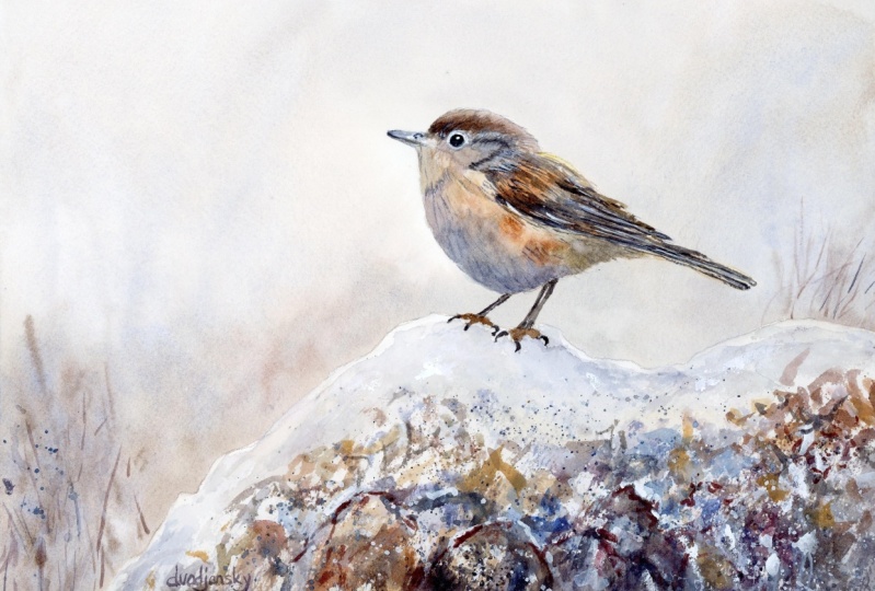
explore what we can achieve. In the resource section, I've added a high
resolution image of my finished painting
to help guide you. You're welcome to
follow my painting exactly or experiment with
your own composition. As we're going to be focusing on the painting aspect
of watercolor, I've provided templates
you can use to help transfer or trace the
sketch before you paint. It's fine to trace when using it as a guide for
learning how to paint. It's important to
have the underdrawing correct so that you can relax and have fun learning the
watercolor medium itself. Whichever direction
you take this class, it would be great
to see your results and the paintings you
create through it. I love giving my
students feedback, so please take a photo
afterwards and share it in the student project gallery under the Project
and resource tab. I'm always intrigued to
see how many students have different approaches and how they progress with each class. I'd love to hear
about your process and what you learned
along the way, or if you had any difficulties. I strongly recommend
that you take a look at each other's work in the
student project gallery. It's so inspiring to see
each other's work and extremely comforting to get the support of your
fellow students. So don't forget to like and
comment on each other's work.
3. Materials & Supplies: Before we start the painting, let me go over all the materials and supplies I generally use. Having the right materials can greatly impact the
outcome of your artwork. So I'll go over all the supplies I use for
this class and beyond. They're very useful to have at your disposal and will make it easier for you
to follow along. Let's start with the
paints themselves. And like most of the materials
we'll be using today, it's a lot to do
with preference. I have 12 stable colours in my palette that I
fill up from tubes. They are cadmium
yellow, yellow ochre, burnt sienna, cadmium
red, Alizarin crimson, Opramarne blue, cobalt blue, serlean blue, lavender,
purple, viridian, black. And at the end of the painting, I often use white gouache
for tiny highlights. I don't use any
particular brand, these colors you can
get from any brand, although I personally
use Daniel Smith, Windsor and Newton,
or Holbein paints. So let's move on to brushes. The brush I use the most is
a synthetic round brush like this Escoda Purl brush
or this Van Gogh brush. They're very versatile because
not only can you use them for detailed work
with their fine tip, but as they can hold
a lot of water, they are good for
washers as well. They're also quite affordable, so I have quite a few
in different sizes. Next are the mop brushes. Mop brushes are good for
broad brush strokes, filling in large areas and creating smooth
transitions or washes. They also have a nice tip that can be used for smaller details. But for really small details, highlights or anything
that needs more precision, I use a synthetic
size zero brush. All brands have them,
and they're super cheap. Another useful brush to have is a Chinese calligraphy brush. They tend to have long bristles
and a very pointy tip. They're perfect for
adding texture or creating dynamic lines
in your paintings. You can even fan them
out like this to achieve fur or feather
textures as well. And that's it for
brushes. Onto paper. The better quality
of your paper, the easier it will be to paint. Cheap paper qwinkles easily
and is very unforgiving, not allowing you to
rework mistakes. It's harder to create
appealing effects and apply useful techniques
like rubbing away pigment. Good quality paper, however, such as cotton based paper, not only allows you to rework
mistakes multiple times, but because the pigment
reacts much better on it, the chances of
mistakes are a lot lower and you'll be more likely to create
better paintings. I use arches paper because that's what's available
in my local art shop. A water spray is
absolutely essential. By using this, it
gives you more time to paint the areas you
want before it dries. It also allows you to
reactivate the paint if you want to add a smooth
line or remove some paint. I also have an old rag or t shirt which I use
to clean my brush. Cleaning off the paint
before dipping it in the water will make the
water last a lot longer. It's always useful to
have a tissuete hand whilst painting to
lift off excess paint. Also, you never know when an unwanted splash or drip might occur that needs
wiping away quickly. I also have a water dropper
to keep the paints wet. When you paint, it's
important to have them a similar consistency to what
they're like in the tubes. This way, it's easier to
pick up sufficient pigment. A hair dryer is useful
to have for speeding up the drying time and controlling the
dampness of the paper. And lastly, masking tape. And this, of course, is just to hold the paper down still onto the surface to stop it sliding
around whilst painting. Also, if you plan on
painting to the edge, it'll allow you to create a
very crisp, clean border. And that's everything
you need to paint along. I always encourage you to
experiment and explore all different types
of materials to see what could be useful
for you in your journey. Now, let's get on and
start the drawing.
4. How to Sketch It Out: First thing I want to do
before I put pencil to paper is figure out the
placement of the composition. I want the bird roughly a
third along the way here, so I'm just going to
start by a simple circle, the body of the bird right here. Doesn't have to be correct. I want it to go this direction, starting to add the idea
of a tail right here. It's a bit like a triangle and then another circle
for the head up here. We can start connecting the
circles like that a bit. You already see it
coming together there. Then the beak slightly
below center. The rough lines for
the time being. Rough lines. Then I look at different
patterns on the feathers maybe, but that's not essential
at this stage at all. Maybe start to add the legs
where the legs might go. We've got to paint the mound of snow I think we'll put here. I like painting snow
with watercolor, because that means we can
use the white of the paper. So let's create a bit of uneven edge for this snow.
Keep it interesting. You can have the edge,
however you like it. You can have a curvy straight. It's your painting to do what you want with at the
end of the day so you can experiment with
how you want that done. Now I'm putting a few circles here for where I
might want to add glimps of shade or the texture or the soil underneath the snow. It might be I'm planning to have this painting conveying
melted snow on the rocks. So I'm just laying it out
like that for the time being. Now, I've got it all mapped
out with a soft lead pencil. I'm going to move to
a hard lead pencil, one of my many
mechanical pencils. And I can go in with
a confident line now. I'm not pressing
too hard because I don't want these lines to be showing at the end
of the painting. I'm going to scan
this in so that you can use it for a template. If you want to skip the drawing stage and go
straight to painting, you can follow that. So rather than
spending lots of time showing you the boring stage
of adding these details, I'm going to go straight into
the painting stage next and show you the painting
what the drawing looks like when we are
ready to paint from it. So I won't draw this
all out on camera. You can see how I'm now adding more details now that we've
got everything mapped out. You can always use I use this mechanical rubber to clean a few lines
that I don't like. Maybe like that. So that's the rough idea.
Keep it nice and organic, get your drawing ready and
we can start the painting.
5. Wetting The Background: So the first thing we're
going to do is paint the background because
this little wren is perched on a mound of snow, we need to use the white of the paper to indicate this snow. So we're going to
negatively paint that mound by painting the
background a bit darker. And I'm using this mop brush, which is very nice
because it's got a very fine point despite
being quite a large brush. I'm also going to
have a tissue in my hand because if
we paint over here, I want to blot out
some of the water. We can start straight away. Pure water to begin with. So like I said, we can paint over
the bird if we want, except for the top edge here. I'm going to try and be very clean about the
edge on the top here. Because I do want to keep some of the white
of the paper up there. Down there, the
bird is quite dark. So it doesn't
matter so much down here if we paint
over the background. I'm just tilting my head
slightly off camera so that I can see
the reflection of the water against the
light to see which areas I've wet and which
areas are dry. I'm pre wetting this
area to allow me more time to fill in this whole background area
before it starts to dry. I want there to be smooth
transitions all over the area. So like I said, I
can paint all the way across the
bottom of this wren. And today I'm experimenting
with a brand new paper. A Bower hog paper. I've never tried before. It's
still 100% cotton based. So even now I'm experimenting with different
materials and supplies. It's a ongoing process. I really like this
brush because it's half synthetic and
half real fur. So it's got the best of
both brushes going on here. And if you make a mistake, if you paint over the line like I just said there, this is
what this tissues for. You can dab it like that, and it'll dry in no time at all. Likewise, you get
the tissue up there, you can fold the tissue. It's very malleable. You can fold it around and stab wherever you've
over painted. Like that. So, got it nice and wet there.
6. Mixing Greys: Now we can start thinking about what colors we're going to mix. And the color scheme for this painting is
actually quite monotone, keeping all the
colors quite neutral. There's no vivid colors in here, and that gives it kind of
a classy look, I think. It's got bronzi silver, gold kind of elements going on. And of course, neutral
color is gray like this. You can take it directly from the pan like
that if you want. What I like to do
is actually mix my own because it feels a
bit more alive that way. And what you can do to do
that is take two primaries. So for example, I'm going
to take this cobot blue, but you can use any blue. And the opposite end of the color wheel
to blue is orange, so I'm going to take
this burnt sienna and you see how it
neutralizes itself there. There's a bit more warmth, a bit more interest than just
the plain neutral black. Maybe a bit of warmth
for using red. So that's how you can
make a nice gray. But before we jump in, I'm also going to
mix a warm gray. So we've got the cool gray here. Let me give you another example. So we just mix blue and
brown to make that. We can mix green and red
to make another gray. You don't actually have
to own black at all. See that? The knowledge of the
color wheel really helps and I'll show
you a third one if you want. Take some purple. If you look on the color wheel, yellow is the
opposite of purple, in theory, when I
add this yellow, it should start neutralizing it. That was a bit too strong, the yellow so a bit more purple. Now a bit too much purple. So Now, that's a bit too red now, so we can add a bit of green. There you go. But
I actually quite like the yellowness in there. So I'm going to keep
that yellow like that. That's a bit too much. Bit of wet pigment on
there, that easily happens. But you know what?
That doesn't matter. We can always come back to this because we're going to use a lot
of this brown. I don't mind having
that on the palette. Just going to mix it
all up so there's no thick blobs on my brush. Then I can take Taron,
do you see how? It's mixing back into a nice
neutral color there. Okay.
7. Starting The Background: So before the paper
dries, let's get onto it. Like I said, you can always use black if you're more
comfortable with it. I'm just going to start
filling in this Caland. I think that's a bit too warm. So I'm going to add a
bit of blue into there. There we go. Doesn't
have to be strong. Maybe some areas can
have a bit of warmth. Especially when we get
down here where we need to create a feeling of snow. I And if you find it starts to dry on you, you can use this water spray
to give it a bit more life. Don't get too close. You have to do it at a bit of a distance. So again, I have my tissue here, just to dab away the bird. I think I want a tiny bit
more warmth at the top. Just to drop. I mean, coolness, actually,
not warmth, coolness. So a little bit of
this blue in places. That You can always swap to smaller
bruh, if you want. Just doing that a
bit now. Down here, just define that edge. I
8. Finishing The Background: Whilst it's still wet, it
has a lot of flexibility. You can still manipulate
the colors a lot. I think it looks
too green, just add a bit of red, tie a bit of red. Okay. I'm going to
add a few lines here. A few lines as it's
starting to dry here. Of course, these will blend out. So now I'm going to let it dry completely because we
want it to flatten out. But thinking about it, before we get to that stage, we can start painting
a bit of the snow. It's leaving a little gap at the top to give the snow
the illusion of form. Maybe it connects
every now and again, just a tiny little
bit of a connection. See I've swapped
to a smaller brush now, bit more control. I'm not painting the
whole area here. There's some bits I want
to add some texture later so we can make sure to
block those areas out. A bit too dark. I was using
a tissue just to dab. Trying to dab and then let
watercolor do its thing.
9. Painting The Snow: Now, I'm going to be
very daring here and mix a very diluted yellow ochre, drain out some of the water from my brush and just do
subtle little dabs of this golden yellow ochre. And it's barely noticeable. But it does something
to the eyes, having that subtle warmth contrasted with the white there. And now, I'm going to dry it completely
with the hair dryer. As it's drying, I just want
to create a few textures, so I'm just going to
use a small brush. And by textures, I mean, a few leafless twigs that
will have quite soft edges. Only one or two of them at
this stage because it's still slightly wet the paper, so the edges will be a bit
lost. Adds a bit of depth. Maybe one flick here,
one flick here. Now, clean the brush, and a
bigger flick of water there. Now let's get the hair dryer. As it's drying, I'm
assessing my values. I think it's a little bit
too dark just below here. Let's rewet that area. Of course, if your area is already lighter, then
you don't have to do this. If you're watching
this before you paint, which I always suggest, then you can learn from my mistakes. I've got this rough brush
which I would use to pick up pigment, but I've overworked. And because it's cotton based
paper, it's very durable. It can take a lot of abuse. It's really scratching it, and it's not marking
the paper at all. There we go. Subtle difference, but it makes a difference. Now, I'm going to add
a few abstract marks. So wetting some of
the paper here. Dabbing a few drops
here and there.
10. Adding Splats: Using my tittue box
to protect the rest of the painting I
make some splats. Now I'm going to do a
bit of experiment with this iridescent blue silver. But there's no need for
you to buy this tube. If you've got any
interesting pigment you want to experiment with, you're more than
welcome to do that. I'm just going to drop it
straight from the tube in there to create a
bit of granulation. I know this pigment
is very granulated, so I'm keen for that hell. Put a bit of it
there on my palate. That's coming out the tube. I want it a little
bit bluer, actually. It's a bit too gray. To. Okay. Bit more water. So this is a slightly blue
mix at the moment, of course. The pesky little drips made their way onto
the background. And then mixing a tiny
bit burnt sienna, we have this yellow ochre. See how that might look. Yeah, for the time being,
maybe that's okay. Always useful to have
a tissue in hand for when steaks and splats happen when you
don't want them to.
11. Starting The Bird: Warm up that brown. Create some organic shapes, trying to be random, not
trying to overthink it. If you overthink it,
you'll miss the shot because you're trying
to mimic nature, which is very random. Using my hand to block and protect the
rest of the painting. Spill loads of water. Okay. For the time being, I think
we can leave it like that. Again, this is just the
underlayer for the time being. So I'm going to let that
dry whilst we move up here. We can, of course,
use the hair dryer, but I don't feel like I
need to do that quite yet. I'm going to take a bit
of this blue silver, which is a gray blue. Use the tip of my brush. Start like that. Yeah, there's a bit too much
water in there. That's okay. Now, let's mix a
nice warm brown. So we can mix a warm
brown like that, but tone it down. Neutralize it a bit. Carefully avoiding the eye. I got to wrap it around the eye and connect
it with this water. And start bringing it down. Because we preserve the
white of this paper, we can really make the most
of the transparency of the medium and the layering. Some kind of dap bit
of warmth there.
12. Working On The Underlayer: Thinking about what we
want for the underlayer. Maybe we can dab
in a little bit of blue at the bottom here. Just doing a first pass. Maybe a bit of blue
silver just in there. Okay I'm actually going to let that dry because this
is just the underlayer. And whilst it's drying, I'm going to take a
brush with no water on. I just kind of create
a few highlights, maybe even use a titto itself. Just to get the white of the
paper just in the center. Like that. Now I'm going
to use a hair dryer. Now I'm going to go in with
a smaller brush and start to refine some of the areas. I'm thinking of where
the tone should be. I'm squinting my eyes
to simplify the tone. I don't want to focus on too many too many
different ranges of tones, mid tones, highlights
and dark tones. Now, got a wet area below the eye here very lightly just so I can
see where the water is. And then I'm going to
drop some pigment. Mix of blue. Maybe a bit of red in there. A
13. Problem With Small Brushes: I went a bit overboard
with the water. That's the problem sometimes
of using a small brush. It creates drips.
Sometimes I prefer to use a bigger brush that
still has a tip. Now I'm going to
wet wet the belly. I'm going to start to drop
various colors in there, so take a bit of this brown. Now, that's a bit too
red. So I'm going to put a bit of green in there. Try to keep that head soft. I'm falling for an error that's very common
at the moment. Though I always have
to remind myself. I shouldn't get stuck
in the details. The details are for the
imagination of the viewer. If we do all the details, then where's the fun
for the viewer to use their imagination and
enjoy the watercolor? The mystery.
14. Starting The Wing: It's a bit too purple, that is, get a bit of ultramarine
blue in there, I think. It's just a few dabs. Really getting to feel what
the water go is doing. Take as much time as you need. Let's try using the hair dryer. Okay, now we can go
back up to the top. And I got to mix. A dark reddish brown
up at the top here. Start off with this pure
pigment just at the very top. This is going to
contrast lovely. Right down there. Going to dilute it a bit. Add a bit more vibrant C to it. If your brown is looking
too cold, add red to it, and if it's looking too warm, you can add blue to it. So I'm going to do a
couple of strokes like Then I'm going to let the
watercolor do the rest.
15. Painting The Tail: The top. I can add
a few strands of this nice golden colors a bit more blue, I think. A bit of doc pigment. Now, a similar thing down at the bottom,
where the tail is. I'm going to use my tissue. Just to slightly lighten up a bit. Now I'm going to paint. The legs? Just a
suggestion of legs. Again, don't spend too much time trying to paint
accurately because the more time you spend, the more of a struggle it looks like it's better for
a painting to be incorrect and done in one go or incorrect but with
an air of confidence than something that shows a lot of struggle
and corrections.
16. Starting The Rocks: So even if you're not
perfectly happy with that, I'm not happy with o's claws. It still looks better than if I spend five more minutes
refining, going back and forth. Maybe I'll make the
feet a bit lighter. Now, here comes the eyes, and I'm going to mix
very strong black paint. A nice confident
circle in there. Now, we're not finished
with that bit yet, but we can disallow the
watercolor to rest for a bit and we'll come back to it with a fresh eye
in a few minutes. Now I'm going to start
finishing off the snow down here by negatively
painting some shadows. So I paint the
bottom edge and use water just to fill
it up like that, maybe at a bit of
temperature difference, so we got warm and
cool working together. I'm going to add a bit
of lavender in here. I and you can see I'm not painting
anything in particular. As usual, I'm trying to suggest details using kind
of visual language. And what I mean
by that is, like, what the essence
of it looks like, trying to convey that in as
simple a term as possible.
17. Adding Texture: Were titting. Use my hand to cover the rest of the painting. Just
a few splats there. Down here, I'm going
to try and work quickly so that I
don't overthink it. It's a bit too thick. A few dry brush marks there. We go. Now, I know this looked very bold at the moment. That's okay. Let's add a bit of water onto
there. Agitate it a bit. Bit of the earthy
colors coming through. Maybe we can add a bit more blue into some of
these areas down here. And having fun. This really is my favorite
part of mine when I paint. It's just exploring the
expressive nature of the medium. Again using my hand just to cup and stop
as many splashes. But there's always a cheeky
one that gets through.
18. Some Refining: No. You can add a tiny bit more tone of the
top using a very light, just a tiny bit of tone adds a little bit
more volume up here. A few branches maybe
twigs too light, too dark, I use the
tissue to correct that. H. Now I'm going to add a little highlight
right at the very top. A little at the bottom, like that. Two
little dots there. Decided. I'm just going to
smooth out some of these. Text is up at the top here. I Now I'm going to use the hair dry to
dress out completely.
19. White Gouache: What I'm doing now is taking some white quash or
white watercolor and just enhancing the feeling of contrast by painting this
light on gray background. Because, of course, on a frosty winter autumnal
snowy morning, a lot of these twigs have frozen Being quite brave, being quite bold, rather, adding a lot of
thick pigment here. In fact, I feel if the
pigments very thick, then it might even achieve
a dry brush effect, which again, adds
to that frosty, snowy texture and feel. Working my way along the
edge of this snowy mound. I want there to be a
nice striking contrast between the gray background
and this snowy mound. Maybe working my way down now
working into the textures, where the frost is melting
against the rocks. Again, trying to make the most of that dry brush effect
every now and then. Dabbing in random places, trying to mimic nature. A few vertical strokes to
suggest the melting of snow.
20. Adding Details: Now I've decided to
go back to the bird because I took the tape off, gave it a few days, and it
just didn't feel right to me. And that's often the
case. Sometimes you just have to disconnect
for a while. And in the moment, a few days ago, I didn't know
where to take the painting. There was something
off about it. I was trying to
minimalize the details, but it didn't work. It didn't capture
the imagination. It didn't seem so inviting. So I'm back at it, and I'm going back
with a small brush, trying to get very fine lines. The blue on my palette is from a previous painting because I've painted in between
this and the last painting. So you can see I'm using a very fine
point using thick pigment, and I don't need to clean my
brush, my palette, rather. I never actually
clean my palette when I'm doing personal
paintings because I can always mix them with other colors to fit
what I'm trying to paint. For example, there's no
strong blue in this painting, but by mixing brown, it neutralizes it and
turns it into a gray. Which is what I'm
doing. So where it's light on the wings, I want to create a bit
more texture because we've got softness on
the belly of the bird, and contrasting that with
a different kind of edge, a different kind of feeling. We've got sharp textures
and soft textures, and they're counterbalancing
each other. Using pure black because
also I wanted to increase the contrast of some of these
areas, the clarity of it. Because down on the rocks, you can see there's black paint and white paint right
next to each other, creating a very strong
visual element. But in a way,
that's distracting. So I need to do the same
thing with the bird above because the bird is, of course, the focal point. Adding a bit more
shade to the legs. Now you can see me
mixing this red into the blue turns it into a purple that I can add down the bottom
of the belly here. And then applying an almost
dry brush effect here, just a few not painting
every individual feather. I'm just suggesting
a few of them, and then the mind of the
viewer can fill in the gaps. So even though I decided in
the end to add more details, I'm still trying to
keep it quite elusive. Of course, different styles of paintings cool for
different techniques. And originally, I attempted to have more
of a smooth painting. I wanted to have a
smooth finish to it, but it just wasn't working. And that's often the
case with watercolor. You've got to adapt
to the medium or even beyond watercolor. You got to sometimes adapt the painting and make judgments that are different from how you previously expected
the painting to be. Now I'm working in
with some highlights and this little bit of cardboard that I've
got in my left hand, I just use to make
very thick pigments. Sometimes there's too
much water going on or the paints in my palette are too wet and I can't
achieve a thick pigment. So by just mixing them
on this cardboard, it almost soaks up the water and leaves the
pigment a bit thicker. And by getting it
nice and thick, it's almost like dry
brush marks again, creating more texture. But
21. Finishing Touches: Now I'm going directly
from the tube. Again, trying to achieve that
thin but dry brush mark. In particular, on the wings, I want to be nice thin
light lines going over that dark because it
will really make it pop. It adds a sense of
clarity of focus. If you think about photography, a lot of photos have clear
focus on the main subject, and then the background
is all blurry. And that's the kind of effect that I was thinking of here. And that's the way we can
lead the viewer's eye. Now I'm mixing a bit of white
with yellow ochre to create a kind of light yellow on
the highlight of the top. Because all the painting
is quite muted. But the bird itself, I want to have a bit more color, slightly more just to give it
that radiant feel about it. The eyes are very
important there. They're what really
captures the soul. If they're misplaced,
it kind of doesn't have the same quality, the
emotional aspect. Even though it's a bird
we're talking about, there's a connection
that we have when we see it and getting the eye
in the right place and those glistening highlights
are quite important. So make sure to take your
time to get them right. I've just painted the
eye black recently, so I'm waiting for
it to dry a bit more before I go in
with my white guash. Taking my time adding a few more strands of it's almost like hair
rather than feathers, they're just little
fine lines I'm adding following the
curvature of the form. If you want, you can rotate the paper around to get a better angle like I'm doing now. I'm not confident at
achieving a nice direct line, straight line at an angle, so I've just rotated
the paper around. Going back and
forth, waiting for the pigment to dry to add
a few more layers on top. Even though we're
using a small brush, sometimes small brushes don't even have a nice fine point, which I learned with this, I struggled a bit to get
a nice, fine point. Whereas brushes that are
twice the size of this, they kind of the
force of the water brings them together into a
nice fine point at the end. But I was only doing a
few small details here, so I didn't feel like the
need to change my brush. Now, the paint is
completely dry, so I'm just refining
the eye details there. Just a little dot with a
slight line at the top, just to convey some curvature. The closer the highlight
is to the edge, the more it will be a line, and the closer it
is to the middle, the more it will be a dot. And that's pretty much
the painting done. I'll again, disconnect
for a while, just to see how I feel the painting is
in a few days' time. So let's have a look at all the techniques we've done in this class and some of linkup.
22. Final Thoughts: So welcome back, and I really
hope you followed along and watch the entire
process so that you're better equipped to
give it a go yourself, which I really hope you do do, and I'd love to
see your results. Now, during the process, we explored many
different things. We looked at creating grays, creating soft textures,
creating sharp textures. And in the process, we've come up with a lovely, delicate, beautiful little
wren on a snowy mound. We looked into
techniques that make the background soft
and out of focus, creating a natural
kind of effect that gives the painting a
sense of atmosphere and depth. Remember, watercolor painting is not just about technical skills, but also about expressing your creativity and
personal style. I encourage you to continue
exploring, experimenting, and pushing your
boundaries to create your own unique
watercolor masterpieces. As we come to the
end of this class, I hope you feel
more confident and comfortable with your
watercolor painting abilities. Practice is key when it comes
to improving your skills, so keep on painting
and experimenting. I want to express my gratitude for each and every one of you. Your passion for watercolor
painting is so inspiring, and I'm honored to
be your teacher. If you would like feedback on your painting, I'd
love to give it. So please share your painting in the student projects
gallery down below, and I'll be sure to respond. If you prefer, you can
share it on Instagram, tagging me at Will Elliston, as I would love to see it. Skillshare also loves
seeing my students work, so tag them as well
at Skill Share. After putting so
much effort into it, why not share your creation? If you have any questions
or comments about today's class or want any specific advice
related to watercolor, please reach out to me in
the discussion section. You can also let me know about any subject wildlife or scene you'd like me
to do a class on. If you found this class useful, I'd really appreciate
getting your feedback on it. Reading your reviews
fills my heart with joy and helps me create the best
experience for my students. Lastly, please click
the follow button Utop so you can follow
me on skill share. This means that you'll be
the first to know when I launch a new class
or post giveaways. I really hope you enjoyed
this class and learned a lot from it till next
time, Happy Painting.
 Will Elliston, Award-Winning Watercolour Artist