Transcripts
1. Introduction to First Demo Painting: all right. Thanks for joining me on port to off harder. Loosen up your landscape painting. If you haven't import one off this close, please do so and it'll follow one. And this second close will be easier for you to tackle. If you haven't done any painting before and they're starting out, then I recommend that you go right back. And also check out my close on how to air power and impact to your paintings that will set the foundation and weaken bold on that in the Sir port to I'm going to be diving straight into a couple of painting demonstrations and spending quite a bit of time in each one, and you'll have the opportunity of trying out those lessons yourself. You can use the same reference for it so that I'm working from or use one of your own. But I recommend that you follow along with my listen and then tackle your own, and this is just a way off, reinforcing the ideas and steps that we're following. I know it can be a bit boring copying a reference or photo that your instructor is doing. So I leave that up to you, but a za way off. Just cementing what you've seen. It can really help, and you can compare and see more or less that you have followed along and then please tackle your own work and keep practising because thes steps becomes second nature, the more you practice them and experienced artist is simply someone who has practiced more often. And it's not because they are just so much more talented. They have done it through repetition and practice, so that is a critical idea. I'm gonna demonstrating concepts that you can apply and make your own, and you won't look back after that. We're going tol straight into this introduction off painting that I think you'll enjoy. I certainly enjoyed painting it myself in this. Listen, I want to focus on shapes. Added to this is the importance of balancing various elements in the scene. This will be demonstrated in the painting. After this lecture, I've chosen a favorite scene of mine called the Corner at its London in South Africa. There are a few important points about the scene. It has a strong light and dark contrast, which is always great for strong and attractive paintings. There's also a balance between the organic shapes and man made elements. There are water reflections, reflections from the sky onto the water and reflections from the, um, sandy surface below the water, depending on the angle. So we look at all of those, and I interpret them as I go along. Then they are strong lines, which make for a strong composition. Diagnose in the background strong horizontal walls and also curving lines from foreground to the focal point. One of these. Balance each other and create a dynamic composition as well. Look out for lines in your reference. If you find your own reference to work from, look full balancing lines. So if there's strong horizontal can arise online, try and find a nicer diagonal or vertical line to on add some dynamic interaction between the two. So I want to depend the scene in a loose fashion that I will also adapt the scene as you'll see where necessary. I had a few rocks here and there, for example, moved the figures where I want them and so on. Nothing dramatic but all designed to try and help the scene. Rather than frustrate me in the painting process, you can do this in a landscape where your vision must be given full sway. Leave out what's not required. Add what will help your vision for the painting are painted the scene quite quickly, and this really does help with a loose approach when you're getting to a flow state and paint almost instinctively, it took about 40 minutes, and then I looked it over the following day and made a few minor tweaks here, and there may need to add a touch more color to the figures. Important points to remember is when painting lose focus on shapes, abstract shapes of light and dark abstract shapes. Off color abstract shapes in your brush strokes, edges and lines. Don't worry about the details. What sort of weird Smoothing out your brush strokes. Keep the texture put the brush struck down. In most cases, lift the brush. Leave that mark alone. It is fine, just as it is fine. Balance warm and cool color temperature as well, and always one against the other. Um, warm shapes. Cool ships. All of that helps to make an attractive and interesting uh, painting. Avoid getting bogged down in any one area. For example, sweating over the water details put down as you see it. Then move on to another part of the painting and keep developing the painting as a whole, not just one area, and getting frustrated with that. This helps to keep things fresh and spontaneous rather than laboring anyone part and remember, have a go with your own painting off to the listen. You can use the same references I did by downloading the photo or use your own photo. Then join the class discussion and let me know how you got on with your painting. Have fun and ah, we'll see how it goes later on.
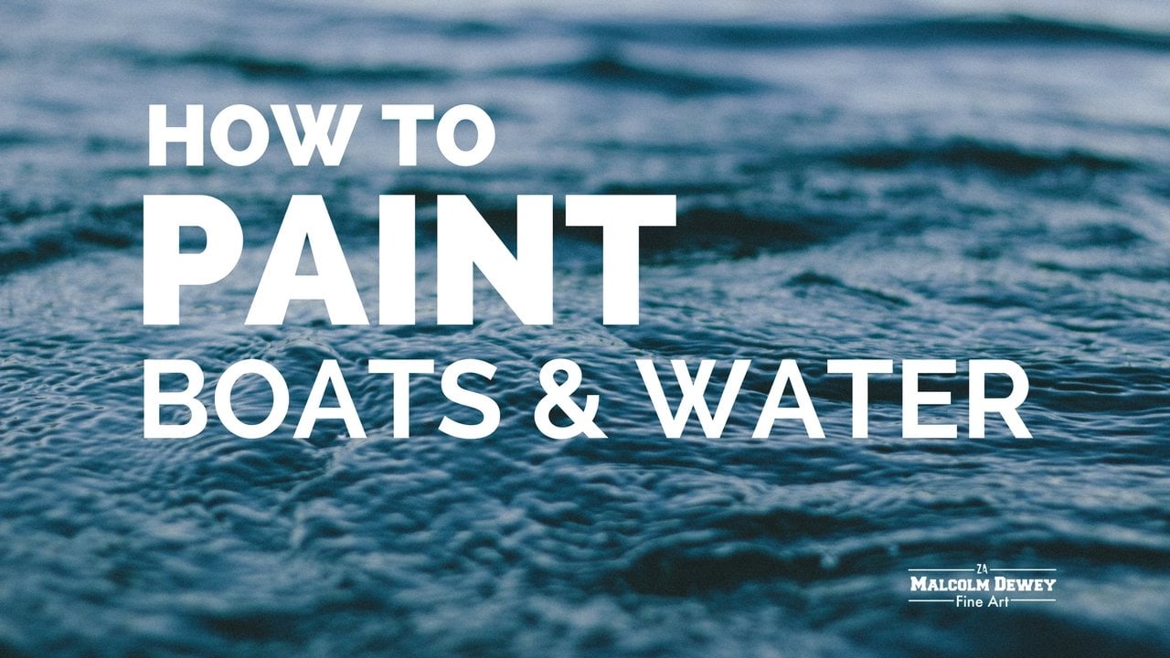
2. The Corner Part 1: at in this demonstration on painting a beach called the Corner in East London in South Africa, I love the rocks and the contrast between the lights and dark, so I'm going to be working on a loose rendition off this scene. My tools mostly. Sizes six and eight brushes, palette, math. Linseed oil is the medium and a basic palette. Nothing too fancy. They're just colors that are convenient and starting with a rough hurrahs and lan. And I'm using a fine head, brushing this case on a bit of ultra marine blue and linseed oil to loosen up a bit and getting the rough drawing in for this scene and will soon be showing you how I decide to leave. Things aren't what to leave in because it is a landscape that I want to paint in a loose fashion. So I'm not to worry about all the details. I want something that will have these figures walking on the beach. Lots of lots and dark contrast. Delightful seen ask color. So this rock are making a little larger, taking the points off the boulder Lord rock above the line of war behind it on just to break that line and then work through the blocking in stage. Roughly speaking, I'm doing the docks first in the middle of values and then the lights and ah, some nice dark lines that I'm gonna accentuate a bit more than you see in the reference you will see a crop down into the reference, um, as well. But I want to bring in a bit of the water as well. It's shallow water, so it will be reflecting sand underneath as well as some of the vegetation behind and quickly getting those docks. And I'm working all around the painting surface as well. Rough ring in where I'm gonna put these figures on moving them to more or less a strong point of composition that is, on the rule of thirds. The figures not a lot of detail but once completed will stand up mostly, and the first focal point the Lord Rockwall moralist. Be a second referred focal point and bring the car back into the painting. I'm not getting in the transparent middle values. I haven't brought really any white paint paint into the painting as yet. I just started with transparent darks and middle values. After certain lose the color too quickly. With what? What can knock back a color? Cool it down as well. So I'm very careful about getting too much white in the first stages. But now this war behind us man made structure, So there's fairly straight structural lines just gonna break those up a little well with lots of dog. Also, try and keep ignites balance between warm and cool colors. It's another part of this painting. Um, harlots warms, especially on these rocks as the sun moves in from left to right and then balance. Start with cool grays. It always adds on us counterpoint to the warm colors, just feeding the way around, adding a few rocks here and there were feel shapes need to be broken up a bit, and now I'm working on this war behind. It's a cooler color. I wanted to be clearly behind the large boulder and foreground elements. Are you gonna knock that back with bringing some blues into those bronze and cool them down on the water? It's more suggestive of water and bit of reflection off the greens and bronze, and they're but a scar reflections as well. But of Bruce Car coming through. Also reflected just all depends on the angle that you're looking at it. But I'm using the reference photo is God line on. I went to carry through the background colors into the foreground, where I cancel the waters convenient point to do that. The other thing with water is just be careful off ages. Ages must be soft, and it's just really about capturing the shapes off the colors that I'm observing the values as well dogs lots because water really is just another bunch of shapes and color and values so approaching from that and it shouldn't create too much difficulty.
3. The Corner - Final: bring in more details to add interest, break up large shapes into slightly smaller shapes and not getting into some of that. Nice to see paint for the lights. Remember, I'm still in a blocking in stages, so I'm really roughing in the lights, using with titanium white, some of that yellow Oka. It's a little touch here and there, off cadmium red to warm up spots of the sand as well, keeping the brush trucks confidence lots of paint on their not brushing out the brush shapes. So trying to put on one stroke and leave it learn on De Bure Deb, their confidence brushstroke, trying to get some direction lines bought him to that Sanders will help with taking Your are in to the painting and a bit of extra four grand texture. Well, I mean not using a bristle brush, you can still get a bit of a nice texture with a final head brush. Obviously, it bristle brush would give you but more of that. I do enjoy that, but in this case, I wanted to focus more on the color. Then no one very hard textured or in pester kind of paint. I'm bringing a bit of light behind that rock just to define the shadow of the large truck on and off pellet. Enough to get in a few straight edges off a lot, just defining the wall in the background a bit more. So the painting actually coming along very quickly, and this is the great thing about painting fast and loose, is he don't get hung up on minute details. So it's really a fun process on one that are I love using and following this approach on. It's great when a painting comes together quickly, but it's also the beauty of a strong composition with lots of light, dark elements. I'm defining the figures a little more. Remember, small heads touched off burnt sienna. Bring out the faces on the arm and a leg here or there. Some highlights in the water just break up the horizontal plans. Little suggest a little movement in that water, but very simple. I don't want to get hung up with the water and having that take away too much off the emphasis on this painting, which is really about the light in the scene. Ah phew! Warm highlights on the rocks at them stand out a little and, uh, just touches. Don't get carried away with harlots so tempting in a painting like this, you just want to get stuck in with the nice brought colors. Go to restrain muscle. You notice of brought large rocks into the right hand side of the painting. I just felt it. I hope to keep the I on the focal point as well. Made the painting a little bit more intimate, actually. And Onda, you can do that. If it's how you feel. You want the painting to go, bring in some features. These rocks could be found just in the scene, but further to the right. I've just moved them in the lover, and I'm gonna have to keep in on these rocks. They're looking up just a touch too regular for my liking, trying to break that up. But if I remember to get to them so it's very, very easy to just make shapes but regular non, then keeping art for that samast. Juicy, warm greens and yellows, using cadmium yellow lemon on a bit of surreally in blue, break those greens down just a bit, with a little cadmium rate if necessary for the cool greens on a nice a diagonal line. The in that for Lige, which takes the I don into the focal point area and actually getting pretty close to completion. I'm not bringing some violets for the cool, mysterious details in the shadows. A few touches here and there, but paintings almost a complete on Uh, yeah, I'm just going to add a few more touches, and then we'll review the final painting. Okay, so yes, the completed painting. It's in its frame. And let's just have a look at a few things up down to finish this painting off. Um, I've just worked a little on squaring off this wall behind the rocks and the figures, and the idea behind this painting is obviously to have a focal theory year on a secondary focal point with rocks, so that I will come in and then go around, come back. So with the figures off added a bit more womb brown, send it bronze to define the legs and arms a bit. Some highlights on the clothing with lines, direction lines in the sand just to help bring the I in. I haven't added much more to the painting at all kept it simple to suggesting water over here and otherwise. The idea behind a loose approach to the painting is to use the reference material is a god line and, uh, given us Lord brushstrokes Last counter change between light and dark. Interesting shapes, um, and choosing what stays in and what to leave out. So ever rule, I think, a pleasing result. Something that was painted really in one girl with a few touch ups before framing Onda. And that's it's without tightening it up with too much detail into many little shapes. Just interesting shapes that are left in and letting the light do the talking for us. And I think we've captured a bit off the character off this beach scene, and that's it. A loose study. Your overall. I'm quite happy.
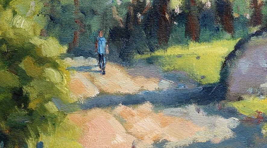
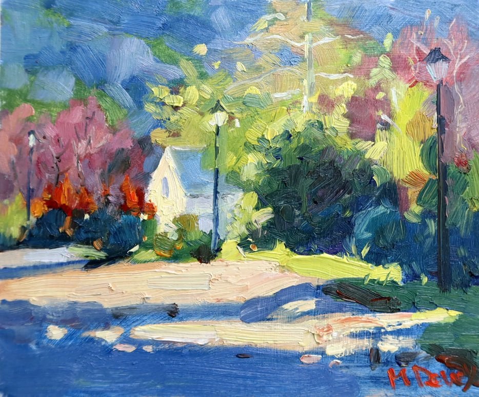
4. The Farm Meadow Part 1 : this for? Meadow is situated in Lovely village off New Bethesda in the career region of South Africa , and I'm going to focus on this purely to get the light in the scene. Onda my pellet. A few extra warm colors, the number eight bristle brush. It's a long flat, and I'm using the palette knife and linseed oil is my medium, so this gets straight into getting a basic drawing, said Arthuis. HRH as, um as usual and using the ultra marine blue on, uh, but of linseed oil, getting the rough shapes of the hills block Tim. And in the foreground, I'm gonna have some overhanging leaves and trees. When I was at this particular place on, I was looking at these four meters. I had these trees in front of me with the bronzes, and it's just, Ah, lovely writer introduced a view into the sunny meadows up ahead, and I'm gonna balance that overhanging dogs of those trees and bronzes with shadows coming from the left. Now just using some tissue paper marking out, we're all I'm gonna put these form buildings Onda just a leading some more light through. And if you find your paints but really But to Morris, you can dab it off with your paper Tireless will. And this dim is also about simplifying a scene and leaving out what you want. Leave art put in what you want. Use your reference purely as a reference. No, with the size eight brush which really use pretty much throughout this entire demonstration , I want to show you the variety off brushstrokes that you can use variety of shapes. Now, this is the basic walking in that you're familiar with already on now, getting in light of slights which will be in the sky as usual, Um, bringing a bit of warmth in there with some yellow orca and then using cerulean blue and titanium. What Having uh, that bit of darker blue cooler blue just hopes to give that impression off the scar overhead. The transition, which is so important. And I work on these plants but more at the end of the painting, it's always good to go back re assists on DSI, where you need a punch out those colors a little more. And I was just getting a a feel for where I'm going to place these form buildings. Onda once again out adept the three buildings to the requirements of the painting. I just really want to them as focal points. It was a bit of a lot French start amongst the darker trees around them. No, you may be team to do to get the small brush arts on the rigger brush and draw these shapes in, and there'd be nothing wrong with that. However, I want Teoh show you what you can do with the long, flat bristle brush. The danger with using a small brush is always that you're going. Teoh. Stick with it a bit longer than you need to, so the large brush just keeps you honest. Make sure you stay loose. Nevertheless, you can use the large flat brush like this with a lot of finesse and get a lot of interesting shapes but always staying in that loose and painterly style because it prevents you from getting too 1/4 in any detail. It's just a natural result off using that larger brush on the other advantage off the large brushes, you need more paint on it. You can't use in Mir ist devil paint that you would on a little fine head brush so more paint on there. You're so naturally following a painterly style without even trying. So I'm getting well into the blocking in and Theo, the whole problem was trying to simplify shapes, especially the trees. It's so easy to start drawing tree trunks and getting Braun chose in, even at a distance like this, so we're avoiding all of that.
5. The Farm Meadow Part 2 : Now I'm trying something that little different year. Normally our work from docked a lot. But in this case, with these overhanging branches being right in the foreground, I'm starting off with a light ish blew a little bit of his run in there as well. And then we'll go with over that with dogs on. Hopefully where would give us some impression off, um, looking through a three dimensional. Thus, tree shops are getting in to the middle values. Lighter middle values here, the distant Mitter making that stand up a little more than going into the meadow in front of us. I'm adding more warm yellows and yellow curry to that. Perhaps that's just a little strident, and we'll break that down a bit with the touch of white and civilian blue Lena towards the green cooler you look across on. Obviously, I'm using a lot of yellow in this cross for punchy sun for gross rather than a very strong green, which can sometimes make the planting a little cold. So working into these shapes, cutting in rather, do you initial shapes large and cut into them, then try and make them bigger, late to run. I'm introducing a bit of those warm, earthy colors in front of the farm houses, which is just essential brings in those colors from the distant hill. Be kind and, uh, also mass. A little contrast between the greens and the British earthy colors, sir. Typical of this career region as well with his very reddish color, are these hinges we're looking at. I'm putting them in keeping them irregular in shape. Regular shapes. Teoh happen so easily on what kind of dull painting don. We want to keep things rather irregular and asymmetrical. These shadows shadows don't have to be a dull either. So I'm adding variety into the shadows. Wise that because there's a lot of reflected light that gets into shadows in this world. Getting into these docks over the fighter violets, blue docks, your made up off ultra Marine burnt sienna, perhaps a little reserved Eliza, keeping them pretty much transparent. No white involved way transparent as possible, but also bringing those docks. And while the time I'm finished, your they'll fairly dark color, taking up a lot of that light blue. But keep in mind the edges. You want the edges soft. It's a rounded top of shape that you working with on now bring some darks into those shadows as well. On there's lots of variety Onda, and it also adds a little touch of interesting to their shelters. You want sort of want to peer into their shelters and see what's there. Remember, with the loose and painterly style way suggest a lot. We don't show in photo realistic detail. We try and suggest things that are there, and that was so with shadows. As they lengthen away from the object costing the shudder, they get a little lighter as more reflected light gets into the shadows and also the inches soft, typical off shadows cost from shapes like tree shapes, etcetera. They will be softer edged on more light filtering in. So just with a gradation off those shadows, Okay, we want to get back into those hills, add some more interest lights. In fact, I know in the reference has some shadow. I'm actually I'm turning that around the bits. I went to get a nice, warm light into those hills, and I spent some time in this region and those of those hills that the best with a bit of light cost on to them. And, uh, but they stole, pushed back in the saints off the foreground colors being stronger and warmer. And now bringing a bit of those Justin colors through the holes in the trees, making sure that the tree holes are a little darker as well. So they stand out like sore from notice, these shapes in the trees very suggestive. Uh, on. That's the nature of the brush on how the paint is being applied to be afraid of applying good amounts of painted with one brush stroke. Leave that stroke learn. Let each stroke being a note of color, brush it out and also working across the entire painting. Don't try and focus on one spot in work and work and work on that. But from putting a bit of green on one side, try and see that same green can be brought in another side of the painting, and that adds overall harmony as well. I'm getting close to the end of the first part of this painting on. We'll get into the finishing touches and more punches of light in Part two
6. The Farm Meadow - Final: okay, back in part to And they lost stages off this painting big getting a bit of a writing to the shapes of the hedge in front and just a few bold, juicy dabs off painting there to break it up. There's a variety of shapes in almost everything that I paint and keeping aren't things like the temperature off the paint like you're putting in some cool greens and that works against the warm greens and the yellows. And also the value of the cool greens is lighter than the dark, shadowy parts of the hedge. All of these adjustments add variety, and that is what gives interest to a painting. So a few lighter value strokes in the cross areas. Well, on trying to do just keep it flat with one color or one particular value, bringing lots and mid values and docks. And this a little dabs of light coming into the shaded areas. Just break those up a little, defuse them, get the edges slightly blurred and soft, so that they read more like shadows. And in this hill, I'd like to get more lot more variety in there as well. It is a part of the general light folds scene, but, um, more variety adds interest. And, uh, in these overhanging trees and branches, um, you'll find in the so center is darker shadows, make sure those or put in and then work out from there. Watching up the valley is a bit more heading towards the edges, which become diffuse as a lot lose those ages. It's all part of trying to give an impression off the three dimensional nature off trees and bushes and so on rather than a two dimensional element. Now I have got the rigger brush archer bits unavoidable to get in just a few of those calligraphy top shapes, the and the little details on the bonds on form buildings. A few of those just help the scene to read a bit more, and it adds those final touches, which just bring the painting together. But I'm not getting into too much detail when it comes to the drawing aspects off something like this at a distance, you wanted to look like, uh, a farm building. It is suggested as a farm building basic details. Wasel that's in history. I also would like to bring a bit more light into the rubes off those buildings, perhaps get a little more warmth into those, but also when it comes to accents, remember the dark accents. A few dark shapes, your in their office sitting against large shapes and then look at the light accents. Very often, we just consider highlights on when I put on a few bright but of highlights here and there . But the dark accents are also very important. And just seeing where I can break up a few shapes your on there, although I'm painting, weighed in tow. Wit. Yeah, I'm going to trumpet of scum bling. Dragging some thick lot values color across the grass to suggest few highlights on that gross break up. A few of those shadows shapes little mawr on uh, normally, scrambling would work much better on a dry surface, and colors are bringing through the trees. A few gaps, perhaps a few of those or a little light in value. But I'm relying on mixing with e shadow cool colors to try get those colors looking through , correct on where I can. I had a bit of light into those trees. I'm gonna try that as well. It's sort of it. These stages also where you want someone to. Still, you start to stop the painting and I'm getting close to that point. Or Citron, stand back, have a look at the painting now and then and get a feel for what needs on, uh, as a sit breaking up those large shapes but more. And then finally, as I mentioned, returning to the sky getting a bit stronger light into those clouds, it's getting a bit more punch. And, uh, yeah, that's that's really pretty much the end off the painting on, uh, as a mainstream just getting into those farm buildings, moving those colors up just a bit. Mawr where the sunny, striking them and then bringing have a more strong reflection and light into those roofs. Onda may just have to get some thick painting to that to really punch it out a bit on, then straightened things. Arts with e pela math, few little touches just to bring it all together on um, there we go. Just lift to sign it on. Um, we're done. And now let's ever look at the painting in its frame. They get an idea of with this painting worked our tithing. Overall, a colorful and large awful painting is the result and most importantly, way, succeed in simplify a complicated scene and rendering it in allusive, painterly manner with the large brush. I think we've pretty much got that result and hopefully you can feel confidence now with using a large brush and uh, turning a scene into a loose and painterly painting you can be proud of.
7. Conclusion: Okay, well, there we have to detail demonstrations on a loose and Impressionist style off landscape painting. You can try them out for yourself and particularly pay attention to the start off each painting. As you've learned in the previous classes that have shown you how to prepare and start off the painting. It is that stage that's really going to set up the painting for success. So it's OK if you start the painting off, develop it halfway and then do another one and practice that start and look out for part three off the next close, dealing with a different subject also in the loose painting star. And there will bold on these with a few new skills that will be useful to you. You can also let me know how the demonstrations were turned four year, and perhaps you can also upload a picture off. What you've done in our can give you some feedback, so I hope you enjoy these lessons and we'll see in the next class
 Malcolm Dewey, Artist and Author