Transcripts
1. Introduction: Hello, and welcome back. In continuing with the
birth flower series. Today, we are going
to learn how to paint loose sweet peas to celebrate
the April birthday. Our early practice
will begin our time together by observing a few
reference images online. Together, we'll
discuss the shapes and structure of the flowers and point out any details that may feel significant
and special. This time will be used
to stir inspiration and help you collect more
information about the flowers. As always, I will emphasize capturing those flowers
through a loose lens, keeping our objectives simple
rather than narrow focused. Main strokes and minor details
should be thoughtful and intentional without
feeling the need to pin down every mark. Next, we'll take
a few moments to sketch the sweet peas
with our paint brush as an exercise to help us capture the general shape and
structure of the flower. This time spent purely in exploration and in preparation
for the lesson will be extremely beneficial
later on when we go for it and begin
painting the sweet peas. During color creation,
perhaps one of the most exciting facets of this class will be the
use of watercolor inks. Although we've used one or
two in a previous class, today, we will use five. These are ideal when using
wet into wet technique and for creating fireworks or bleeds within the wet media. If you're not familiar
with inks, not to worry, I'll cover the entire
mixing process, and I'm certain you will enjoy using them in other projects. Bonus points, they're
on sale right now for $0.25 using the link below. Finally, we reach
our class project, where using the knowledge gained from our time and
study and application, we'll assemble a beautiful
bouquet of sweepeas featuring both the
color palettes we studied in early lessons. I'll take you through the
composition flower by flower, explaining how to avoid the
edges so as not to work yourself off the page and
how to achieve balance, which is not the same
thing as symmetry, and lastly, how to create foundational lines
from which to build. This is an intermediate class. Although I do my best to
accommodate ambitious beginners, basic concepts such as
how to mix water and paint to achieve
proper water ratios, and a year or more experience using wet into wet
technique is recommended. Additionally, I will be working slightly quicker
through the material. With that in mind,
let's begin. Okay.
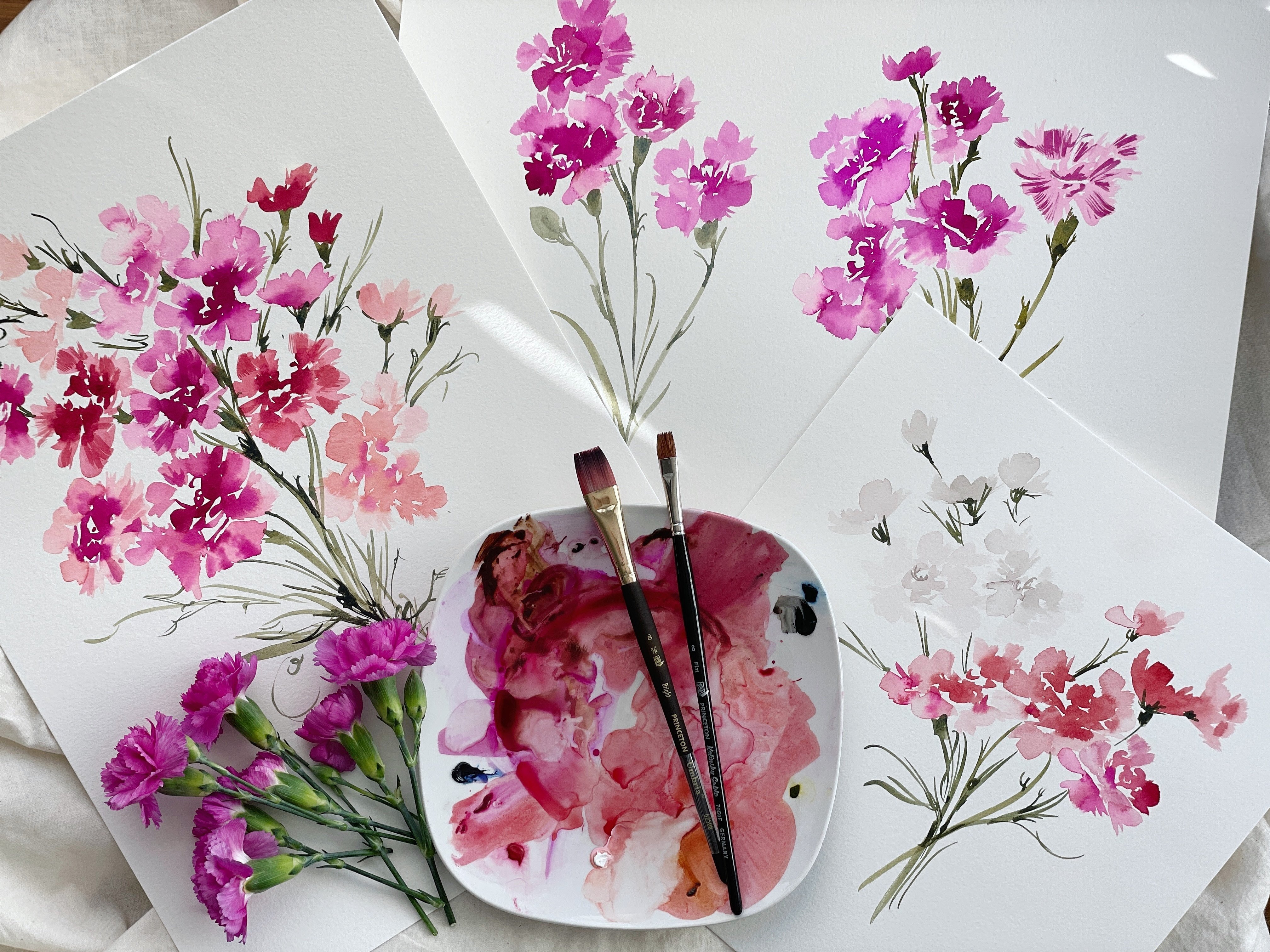
2. Supplies: Okay, so let's take a
few moments to discuss the supplies that we will be using to complete this project. If you've taken my
previous classes, you'll know that one of
my favorite things to do is to introduce a new
supply to the project, whether it be a
brush that we don't typically use or a
new paper or paint. I just find that having some facet to bring in extra interest or
an extra challenge, it allows for a better and
more rounded experience. That's always my goal. As I've selected the sweep to celebrate the
April birth flower, and I'll talk more about
this as we move forward. It's a very simple flower, and so it can be challenging
and that it is so simple, it can be hard to navigate it. So what I've done is I am paring down supplies and I
am introducing inks. And we've used inks
in previous classes. However, we typically have
only used one to two. In this class in this class, we are primarily
going to just be using only inks with the
addition of the undersea green. I may throw another
color in there. I did quite a bit
of experimenting. And I don't think
we're going to need any more colors,
but occasionally, as I'm going through
the process with you, I like to pop up a new color. So if that's the case, I will
make sure to list that in the supply list,
post production. So let's go ahead and
cover that right now. We're going to be using our
Canson watercolor paper. That's 140 pound cold press, but of course, there
are substitutes. You can look in the
supply list to see, substitutes that are comparable. I'm going to love for you to have a variety of
inks obviously. If, for whatever reason, you aren't able to get your
hands on them and you need to use just regular water
color out of a tube or a pan. Totally fine. I'm going to
present a few options for you. Um, but if you're able
to make your way over, the brand that we're
going to be using is the Dandelion paint company. They're not expensive and
they really are so fun. It's not something I would
say, get it for this class. I believe that you
will really have fun using this in
a variety of ways. They react so beautifully,
they're highly pigmented. Meaning you need just a drop or two depending on which color it is to make it work
quite a long ways. We're going to be using
the lemon yellow. We're going to be
using the orchid. This is the Tahoe blue. This is the burnt orange, and this is the rose red. Those are the colors
we'll be using and then along with like I said, our undersea green,
the Daniel Smith, and then a variety
of round brushes. Like I said, I'm really
going to simplify things. I would love for you to have
two or three round sixes and eight would be okay two. I'm going to pop
in a number three. Just in case we want
some super fine lines. You can see. I practice the sweet little
curly cues that we're going to be adding to
our sweet bouquet. So a variety of nice. Shapely round, with a
nice point on them. Other than that, I
would love for you to have either an iPad or
some reference image. But it's not necessary. I'm just going to be
going through some of the flowers with
you so we can in the next video as we observe and take notes and then move
into sketching them, we'll be able to just move
through this part together. Then obviously, a water cup and a paper temple that covers
it for our supply list. So grab yourself, either a
cup of tea or some coffee. If you need a snack,
good time to go and get one and let's move
into the next slide. Okay.
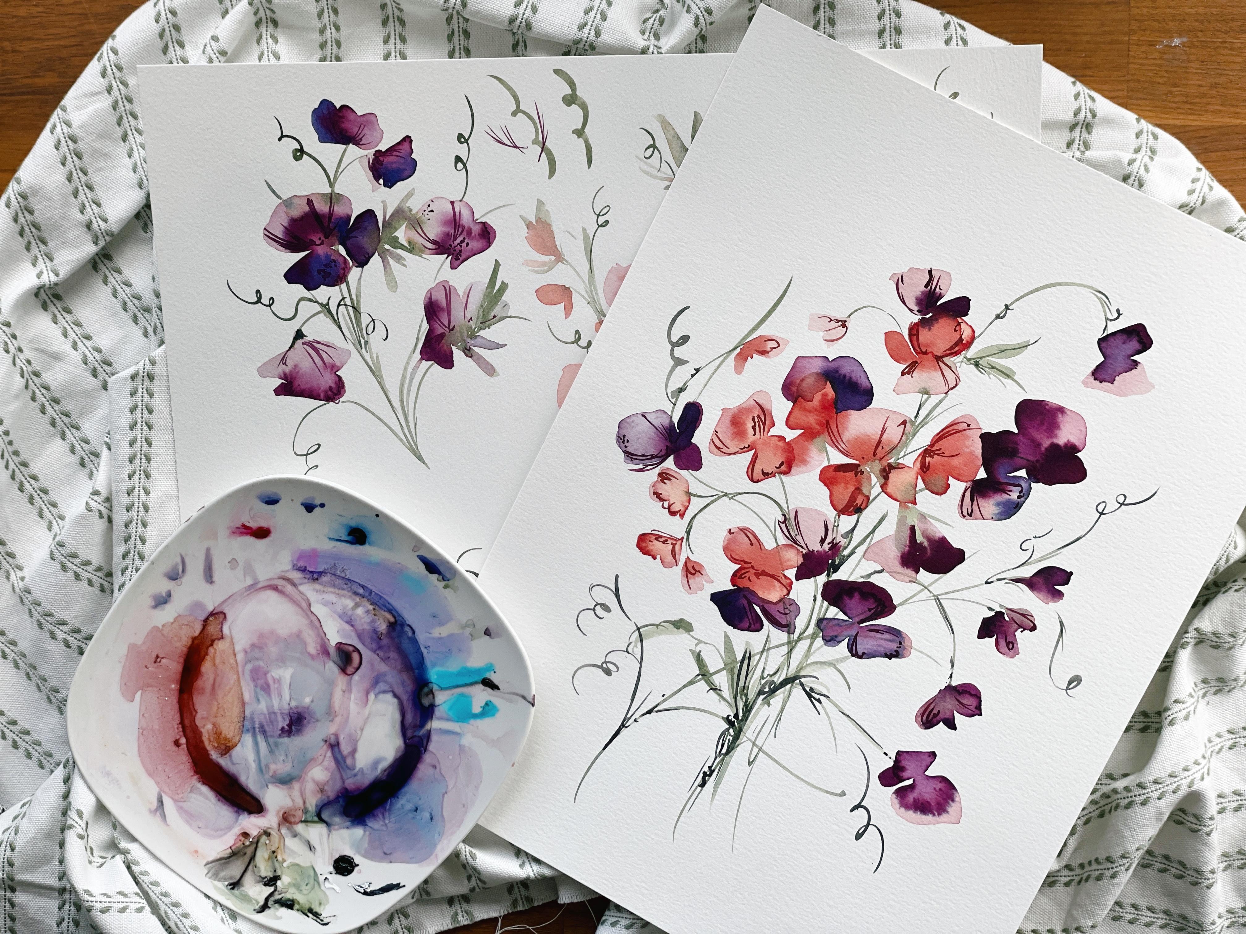
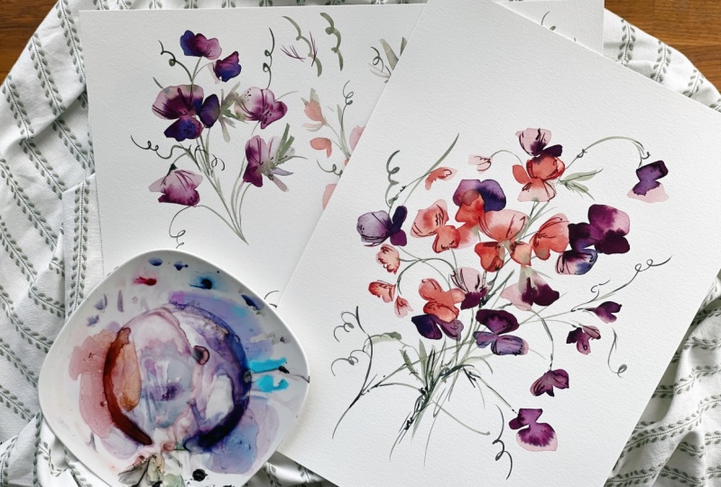
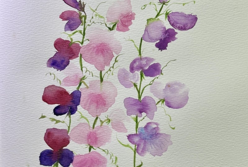
3. Observing The Sweet Peas: Now we're just going
to take a few minutes to comb through some
of the Google images that I found of the sweepe I'm going to walk with you
through this flower, why I selected the
ones that we're going to paint and
also invite you to do the same thing
because what you gravitate towards may not be the same thing that
I gravitate towards. I tend to love my
vintage palette, but many of you out there love those bright and vivid colors and with the inks
we'll be using, you will be able to
achieve those colors. The theory that I'm going to be teaching you is going
to be universal. Meaning that even though I may be painting a sweepe
in these shades, the same concept
is going to work across the board if you
were to do peaches or bright fucias or pinks and
then whatever color palette, like I said, that you
gravitate towards. Let's take a few moments to
walk through this flower, point out what we see, what we find special about it, and how we're going to
achieve that on paper. The first sweepe that I
found that I absolutely loved was this one right here, I reminded me so much
of an orchid and even an is with those
beautiful speckles and I just loved that brownish pink
color that is just so vintage and just the level
of detail in this flower. As I mentioned in my
supply list, this flower, a lot like some of
our other flowers is quite simple in structure, and even more so than some of the other
flowers that we've covered because there is no
identifiable center to it. Unless you are looking at a
complete open face sweet pea. Even then, it's very subtle. It can be hard to, like I said, identify where the center
of that flower is. As we paint, the center is
usually leading the eye, it's guiding the eye
around the composition, and so we can have a lot more
freedom and flexibility in the petals because there is this anchor point
being the center. With the sweet pea,
it's not the case. As I was exploring
and practicing, I really had to figure out, how can I best express this flower gesturally
indicating and intimating to its structure and composition without
overwhelming it with too many details as
that's always the goal. I found that I really had
to just simplify and bring it back to the basics
and not try and get too technical
with the flower. Let's look at these right here. I adore this color palette. We have a really
pretty soft white that we'll be using a bit of, I just realized I forgot
to pop in that lamp black. I set that off to the side. So we're going to be I'll
put it in the supply list. Always check the
supply list first guys because sometimes
when I'm exploring, pains get pushed off to the
side and I don't have them all right next to me
when I go to film. So this is just a side note to always check the supply list. We'll be popping in a
black. It'll either be Janes black or lamp black. I'll show you as I'm working here on the palette,
which one I'm using. But, that will include
all the details that you will need along with
Pinterest links for the specific pictures. We'll be using a
really nice, calm, cool black to create the white, and then we're going to
be mixing up a couple of the inks to create this
beautiful brownish pink. We will not be adding quite this level
of detail to the sweep. We're going to be really
focusing on bleeds. I will show you a little
bit of the exploration. These are just rough. Rough mock ups, but you can see there's a lot of exploring
happening on this page, and what I ultimately
found works the best is to allow the colors to blend and merge and create
these beautiful bleeds to indicate the level of intricacy and detail
happening within the sweep. Um, so I really like
this front over here, and we'll be adding the
green in using wet into wet. So really, we're going
to focus on timing, those beautiful blooms that we see other watercolor
artists use, allowing the water to push back against the paint and create
these fireworks blooms. However, you've heard
them referred to, and then adding the beautiful
curly cues along the way. And it's all going to come together really
beautifully as we As we focus on each step. We'll start from the
beginning and we'll work our way towards putting it
all together using the green, adding the little curly cues. Even though this is somewhat
of a simple flower, I think you're going to
find that you're able to do some pretty special
and unique things with it, especially with the
addition of the inks. Okay. As I mentioned, I love all of these
little details here, but it's mostly the color that I gravitated
towards just love this beautiful maroon
pink and these speckles. That's going to be
one of the options. You'll see that on
my Pintres page, the skill share board, you'll be able to see all of the flowers
that I'm noting here. Then let's just go through and discuss what it is that we see when we're
looking at the sweep. One of the things that I
do, especially when I wrote my book was fine
common things that, you know, we all know, you know, like a
globe, you know, that that's something we
all know what that looks like or, you know, a pyramid. I try and use objects that our brains can
easily just relate to. With this flower, the
image of a fan came to me, if we were to pull
out a lady's fan, spread it apart, that's what that initial petal
looks like to me. It has this very either shell
like or fan appearance, and we're going to be sketching that out in the next slide. But if you could try
and lock that into your mind and just get
that image conjured up, I think that will
help as you move from brain to hand to paper because it can be a
long way to travel sometimes. And then what we
have is this sort of petal that curls over, which is extremely hard to do if you're not
painting botanically. If you are not taking the
time to create this fold, allow it to dry and
then layer with paint underneath here
creating darker shadows. You're just going to miss this. With the gestural
approach that I teach, this is not something we
are going to focus on. This is a botanical approach
and something that another artist you'd be best
served by that study. I'm going to show you how
to look at this flower and just indicate what's
happening here with the petal. We're going to focus on
that fan like shape. And then creating some beautiful additional
petal shapes on the side, allowing the paint and the water to do its thing and create
some gorgeous colors. Those will be our focal points. Um, Okay. So that's the fan. Then that's just that
specific sweepea some of the other sweepes you'll see that they have these
rougfled edges to them. I'm going to take
you through the fan where it's very smooth and
then I'm going to take you through the rougfled edge as well because I'm
all about options. How can I present you with
as many options as possible so you can figure out what it is that you love most
about the sweepe. This Sweepes a little
bit more structured. You have a center
here happening, and then you have this fan like, but it has rougfles or little mountains or
hills along the side, and then you have some
roughling up here as well. That's another we'll
modify the fan, the basic fan shape, and we'll create some different
shapes to it as well. This is another one
of the sweet piece that I thought was
just so beautiful, very striking, and I
will again show you, we're going to walk
through it as we did with our daffodils showing you
just simple structure, loose, and then a bit more
structure and then highly detailed and
you can pick out which aspects of each part of the process that
you love most to create something
special and unique. I also loved these
very moody sweet peas. I thought the combination of that dark egg plant purple with the maroon was
really special. Again, you have this fan
like shape curling over and then this little rouffle
happening here in the middle. I think I need to close
out of something. S. Yeah. And so we're going
to be doing that with just simple strokes. We're really not going
to, like I said, capture the rouffles along
the edges or the shadows. We're going to create that
with just a one shot or maybe a two stroke and create something that's just indicating towards
what we're seeing. So again, these
are just a couple of different color
possibilities. We're going to explore
three together. But you can go back in here and look at all of the
different options. There's gorgeous pinks. Let's look at this
one because there's some buds on here that we will incorporate into our
bouquet here at the end. So The buds remind me
very much of how you would see a geranium bud
or possibly a poppy. It depends on the species of sweepe that we're looking at. Across the board, it
typically looks like this, but you see some that have
more rouffle some that have those beautiful fine
lines and speckles in there. It just depends on which
one you're looking at. So we'll incorporate some buds. You can see one right here,
little back end of the green, and then just a little round
m ball coming out of that. We're just going to attack that. I always say like attack, but approach approach it just gently and very loose and
not just get too over focused on creating
too many details because that's
really when we start to get in trouble when we're not focusing on a
botanical style. Okay. That gives
you a good idea of just the different shapes
that we're going to explore and the color palette. These are really beautiful, these very, very pale
lavender sweet peas. You see more of the
rougfling here. But as I mentioned,
there's no identify. I just made up a new word. Mark that down because I tend to do one of those in each class, and by the end of the
birth flower series, you will have a book of non words that sound like
they might be words. Identify. There's no identifiable
center to the sweet piece. So you can kind of
see here there's a little bit of shadow
work happening. And we're going to
use, like I said, the inks to create a
really strong bleed. But overall, there's
no defined center, and so we're just
going to play with the delicacy of the
petal structure. The other aspect
that we're going to pop in there are those
beautiful little curly cues. You can see them here
with these beautiful elongated stems that extend
from the base of the stem. We're going to have a
lot of fun with that. There's some that are really
super curly and then some of that are just more
of a slight curve, we'll play with
both and just take some liberties too because we're artists and that's
just what we do.
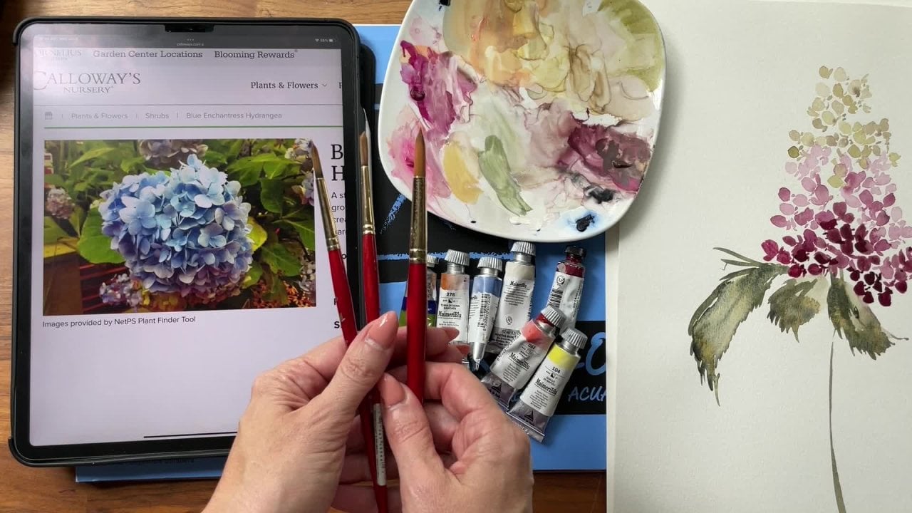
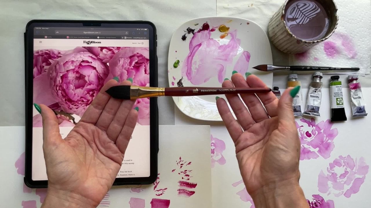
4. Swatching The Color Palette: You would like to have your iPad or your reference image out. This is the picture I'm
going to be looking at. I'm going to be moving it off
to the side so that I have this area to work with and it's not encumbering what's
happening here on the page. I'll be drawing
inspiration literally, drawing inspiration
from this photo if you want to have it out. Then I'm going to also walk you through the application of putting the links on the links. The inks on the palette. That way you can see
how it's done one time, how much water I'm
using for those who are not familiar with inks that don't use them
often in their work. I just don't want to gloss
over that brush by it and then your left stuck not
knowing how much water, how to decrease the color
value of it and all that. We're going to do that together. Let's go ahead and make it
real simple to start with. Let's just use two colors. I'm going to pop in
my orchid. Okay. Two drops shall do. Then let's go ahead and pop in a little bit
of the Tahoe blue. We'll keep those separate
because what we can end up doing is creating different
versions of this color, which I'm going to show
you right now. Okay. Okay. Let's go ahead and put
that off to the side. Getting my number six brush out. This is the heritage series, and I'm going to begin mixing
these two colors together. I'm going to pop in just a little bit of
water on the palette. You don't have to do that, but sometimes I like to do that, and a nice beautiful neon blue, not my favorite blue,
but that's okay. It's the color we need it
to be to move forward. Now I'm going to pick up
a little bit of pink. And we're going to make
this a nice purple. If we wanted to lean it
more towards the blue, we can add in more blue, so it's a periwinkle. Let's go ahead and swatch that color to see
what it looks like. You're going to
see that there is the potential for
several colors here, and we use these all within the same flower to create something
that's complimentary. So we don't go outside
of that color family, but it all looks like it's
meant to be together. And then what we can do is take this cough syp consistency, pull it out one step further to create that broth consistency. So I remember our
cough sys 70% paint, 30% water, and our broth
is more of a 50 50. And so we can
create two versions of the same color as well. Okay. Okay. So that's this color. If we wanted to draw it
out just a bit further, Here we have the potential
here of two different colors. So we could use this
color initially and then rinse off our brush and do another petal with this color. That's
our first color. If you want to make a little
note that says periwinkle, it's a blue purple. Go ahead and do that now. Now we're going to
add in more pink. We're going to turn it purple. You can see we've changed
the color quite a bit here. Let's go ahead and
swatch our purple. Okay. Now, we bring that out, add some water to
decrease the color value, making it more of a
broth consistency. Thank you're really
going to love these inks because they are so amenable to bleeds, more so than I found in
the pans and the tubes. That's our second color. Now we're going to really
lean into the pink here. I'm going to put in
a little bit more. Mixing it all together. Okay. Okay. And creating the
broth consistency? All right. I tend to create maybe three colors with when I'm using two different
colors. You can make more. You can head back in with the
blue, add that to the pink, and then you can make it really highly condensed and get
an even stronger purple. Let's just go ahead and do that. You can see that
this is a new color. There's so much potential here. It just depends on how much
of the water you're using. So very similar to this one, it's just you're using
more of the ink at that time to create a stronger
version of that color. So if you want to continue exploring with the
inks a little bit, feel free to do that now, just swatching out your colors, maybe making little notes
and labeling things, and then you can move along
to the next video with me.
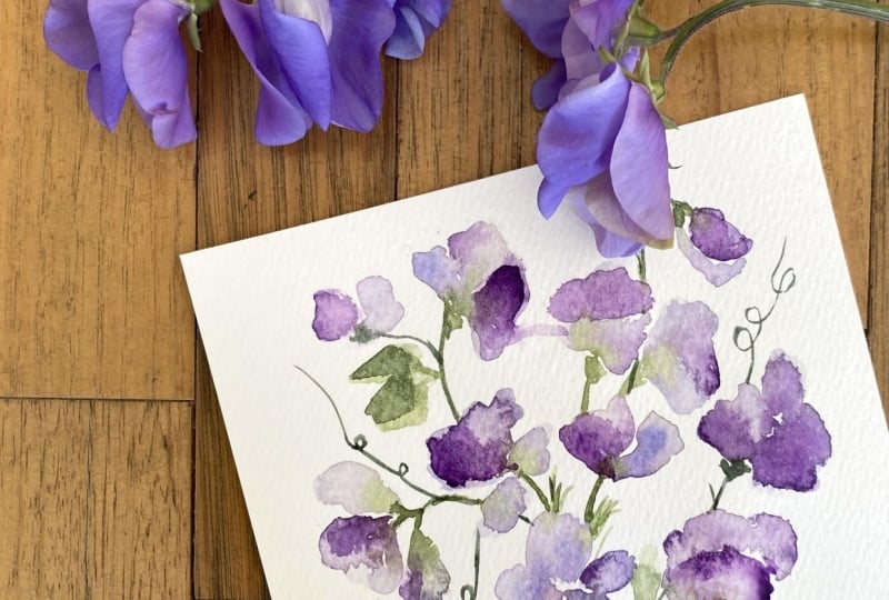
5. Sketching The Sweet Pea: If you were able to take the
March birth flower class, then you'll remember what
we're about to do here. I like to bring in this
technique of the sketching, because it helps to familiarize us with whatever the
subject matter might be. In this case and
typically is flowers, then what we do is we give
our brain permission to look at what we're going to paint and then to allow our hand to
just free hand what we see. What happens here is we get out a lot of the mistakes that we would potentially bring into the next step where we're
really painting it out. We work out the problems
ahead of time by doing this. Then when we go into
actually painting it, putting all the
strokes together, timing, the wet into wet, bringing in an additional color, our brain has
worked out a lot of the initial setbacks of
shape and structure. Before we get there. I always recommend doing this if this is a new flower for you,
it is a game changer. It's been so free and liberating for me. Let's go ahead
and do that now. I'm just going to keep working with this beautiful
periwinkle here, as I said before, this is the picture that
I'm looking at. We're going to just
take a look at what we see and then
put that on paper. I'm going to start here with this flower and I'm just going to begin to draw out
a fan like shape. Okay. And then there's kind of something
happening in here. And Okay. Very simple structure. You can see we have
is just very simple. There's also a little petal
that's coming up here. If we wanted to work
that in there, we could. I don't tend to color in. This I try and keep this primarily just sketching
because then I start to be too focused on that didn't bleed right or
things were too dry. Really to pare down this part of the process is my
recommendation. Then we can add some of the rouffles here
if we wanted to. That just gives me an idea
of how the rouffles work. Then sometimes what I'll
do is I'll put the lines in so I know this is the
direction things are going. It's a very rough nonstatic part of the process, but so helpful. Then the sweet pea below it, I see there's a little area where the petal dips
and then it comes out like this and down and
maybe back through here, and then I have a petal that
comes up and down around. There's a roughle
here. But again, we're not going
to be doing that. So if I were to be
if I were to try and um, capture that ruffle, then I would need to do
something like this, where you see the
rouffle come in here. But we're not able to do that with water color
unless we are again, creating that whole shadow, waiting till things
are nice and dry, and then we go in and we
lighten this up and then we go back in and we pop in color and allow
that to get darker. So it's a whole process. Really just focusing
on the sketching part. Okay. Then we have another
petal that would come in here and let's just keep
working our way around. We have thing like this. And then one that's
kind of like this, getting the Ruffle
shape in here, the fan, almost looks
to me like a clam, you know, if you were to
take a clam and fold it. Then let's go ahead and take a look at a different flower. We have this one
that's facing down. What we're going to end up doing here is we're going
to be running a stem. I know it doesn't make sense. We're going to be running a stem and we're going to connect all of this using wet and to wet and a beautiful array of colors. While this might look very just like I said,
rough and rudimentary, it will all come together, and this is our brain just
working through some of the shape and
structure challenges. Then we have this
one over here like this and this one
comes out here. Okay. And let's take a
look at this one. I like to look at a whole
bunch just so that I'm not feeling like that's the only way to do that
flower sort of thing. There's no wrong way
to paint a flower. There are so many different
potential options. Let's see. I like this one. I know it's not allowing
me, there we go. So again, with that
fan like shape. And then we could do something over here too if we wanted to. Okay. So if we were to
do this one right here, we have something
that starts there at the center coming out. And then a nice little ruffle here and something else here. And then we have this
pretty one here at the top. That's just a nice shape here, and then we have
another petal here. What we would do and we will
do this is we'll lay down that first initial
color and then overlay it with either another
color or with some water, and then we'll have a beautiful
bloom happening here. Just a few more moments here, and then we'll move into the
actual painting concepts. I like this little pink
one right here. Okay. Now having looked at a few, I'm going to just intuitively and I invite you to do the same, start creating some fan
shapes with me, okay? Again, this is your brain
just getting familiar. We're going to some
shapes over here, and then maybe one right there. Let's do a nice big fan here and maybe we
do something there. Something there. Let's
imagine that this is the little stem that's connecting the stem here and
how we might approach that. Making a little bit
more sense, right? I'm going to flip my paper around so we can fill
up the other side. Actually, I need a new
piece of paper here. Okay. So drawing in that little stem or the
little cap at the base the stem and then I might see
the sweet pea come up like this and maybe something
really big here. Again, just this is
my brain saying, okay I didn't really
like how giant that was. It feels too overwhelming
for this stem. So later on, when I go to
actually make the shape and then color it in and then
add that shape. I'll know. You know what? I didn't
really love how giant it was. So let's do something
a bit smaller. Okay. And then I like what's happening better. We'll get to that
part, but I want to show you why it is that we do what we're doing so
that it all makes sense and feels worth your time. I know as watercolor artists, sometimes we feel like we just want to get to the fun part, but this builds up muscle memory and these
drills really do help. The next part of the
process is to try and sketch them in
different angles. Let's do that for
just a few moments. We understand that here's the little cap,
coming out like this. Let's draw one this way. Let's draw one coming down. There's our stem,
there's our cap, and then let's get comfortable
with drawing upside down, say we were to do
a stem like that. Okay. And a few buds. So let's go ahead
and draw the cap, and then maybe a few buds kind
of like this. Very simple. You can already see how much fun the inks are going to be. There's so many different colors working its way through this one or through these
three flowers. There's a purple, blue, and then a brighter blue, and that's just using
one consistency. It's going to get really interesting and fun
here in just a moment. A few more. The more you do, the
better off you're going to be doing the stems now, just understanding
the positioning, the angles of the flower. Do it in this direction. This will help you
when it comes time to put it into a
bouquet together. Y let's pretend that we're
looking at one open face, here's the stem and then it's sort split in half a clam shell. Maybe there's a or something
happening up here. Okay. Okay. All right. Hopefully,
this gives you an idea of the shape and structure playing
with different angles. I invite you before we move
into the next slide here, if you're not feeling quite confident to fill
up another page. Just take a couple
reference images, put them next to you, and
just sketch what you see. Don't get too caught up, and the details are over
focused on it really loosely, strengthen that connection
between brain hand and paper. And then when
you're ready, let's join me in the next slide.
6. Painting The Sweet Pea - Purple: I'm going to go
ahead and refresh my palette here by
adding a bit more of the orchid. Be careful. Those inks do get on your
fingertips really easily, and then you bring
it onto the page. So be careful when applying them and then a little bit
more of the tah then I'm also going to bring
in some burnt orange. Okay. This is going to
mute it a little bit, so I'll have a bit more
of a vintage feel to it. Let's go ahead and
mix that together. We'll take our previous
mixture, pop in some pink. You can't go wrong
here. If you're not getting the same amount, the same ratio of color paint, it's really not a huge deal. Pop in a little bit more blue. T I'll stick to purple
because we're going to be using a different color to
create that brownish pink. I want to give you
guys a bunch of different color
possibilities here. Let's go ahead and Stick
to purple for now. All right. Little
bit more brown. Here we go. So many
shades of purple. I wanted to walk you through this mixing process because
it does take a little while. Then go ahead and
bring that color out over here so that you have the
broth consistency as well. Okay. Okay. All right.
So let's go ahead and start practicing
those basic shapes, those fan shell shape and the combining of the
two consistencies. We're going to load our brush with the cough Ser consistency, and then we're going to
take an additional brush and load that with the
broth consistency. We're going to begin
with the broth, laying down a nice even coat, then let's color that in. Okay. And then let's immediately touch against the edge here and
create another petal. And do the same thing over here, touching against the edge
and creating another petal. Leaving a little
bit of space here, I'm going to swing out to create a little bit
more of a fan like shape. Okay. Okay. And now we have a really beautiful merging
of the colors happening here with the first
with that broth consistency and then adding in. Then what we'll do is
we're going to put a little bit more color on our brush and head
in one more time here to strengthen that color so that you have three
varieties of colors happening. You have this really
deep beautiful purple and then it's spilling
out into the broth. Let's go ahead and do
that one more time. Load our brush with
the broth consistency. And filling it in. You want to make sure
it's nice and wet. Take your time making
sure that it is properly filled in and
that it is an even coat. Then with our brush that's
loaded, touch the edge. One more time. You can even spill out here along the edges
if you want to, and then let's add
another petal. Filling that in as well. It doesn't make a whole lot of sense until we add this stem in, but we're just going to
go step by step here. If we want to one more time, adding in that color. Then I'm going to show
you the next magical step once you have that
part situated. Take a brush. You're going to rinse
it off, blot it, put a little bit more
water back on it, and now we're going to create a really beautiful
little firework. Bringing you in closer
here so that you can actually see
this step applied. It's push back against the
paint by adding water. In order for that to happen, the surface, the
media has to be wet. We'll do it over here too and
you'll see the difference. Still moving because we're
working with these inks here, but it's just a
little bit different. I can extend it through the
petal as far as you like. You can push back
against up here too if you want to create a
couple of different leads. Okay. And then you can also while
things are still wet, go along the edges, add
in some more color. Just really play here with the bleeds and with
the amount of pain. That coughs are consistency
is really going to be key. You can see I'm really working with this color right here, nice and dark and then
balancing it with this color. There's a of potential a lot of potential here between
these two colors and what they're
capable of doing. Okay. Okay. Let's go ahead and do
that one more time. Loading up my brush and the
cough syrup consistency. So I have broth on one and
cough syrup on the other. Okay. Nice and wet. And let's go ahead and touch
right against the side here. Okay. Pilling it in. And now what we can do is take our broth brush and
add in one more color. So if you have a little
bit of that Tahoe blue, I'm going to have to
freshen it up a little bit. I'm going to pop in the
Tahoe blue up here. And come up again this side
to create a third petal. Then I'll rinse off that bruh, my broth brush or
what you can do, like I said, having
two to three brushes. I have a third brush here
that I'm putting water on. Now let's create a beautiful
bleed here at the top. And then still have
my cough srt brush. I can add some stronger
color in here. Okay. You'll note as things dry, they're going to lighten
up and they're going to get more crisp and
you're going to see those beautiful hard edges and they'll continue to change. All right. Now we're going to
do the cough sy consistency first and just note
the differences. Okay. Filling that in. Then let's do with the broth consistency, that lighter color. We added that Tahoe blue in and then adding that
broth a little bit later. And then we can add a bit more color into the center here. And watching things
how they move as they try and deciding whether or not you want to add in
a bit more paint here. Okay. So pretty shapes here. I really find that the more simple you go, the
better the result. I'm really going to do a light light broth consistency
for this one. Okay. Okay. We have that initial flower and then coming up. All right. For this next one, I'm going to pick a really light
broth consistency. So mostly just
water on the brush. Let's go ahead and begin
with the initial petal. And then just a bit of water. Okay. All right. The
next step is we're going to be adding the stems in, which are going to make a
whole lot of difference. You're going to see
how it all starts to make a bit more sense and we'll start putting it
together on an actual stem, so we'll take a look
at structure and composition as the sweet
peas come out and as they come up and just looking at how it'll all as we build essentially
to creating a bouquet.
7. Wet into Wet - Maroon: Now I'm ready to make
that brownish pink. Let's go ahead and we're
going to add in the rose red, really beautiful color here. I'm going to swatch
it just so you can see what it looks
like all on its own, a very strong red and just the capabilities
here with the inks because they are so potent and highly
concentrated as you get a very opaque result which just makes for
really fun water blooms. I'm going to add a bit of water on that just to push back. Really got to rinse
my brush off. For you to see the whole
spectrum of color. It's beautiful. Okay. So
we're going to add in here, adding that Tah blue to create sort of a maroon
brownish red pop a little bit more off
to the side here. Okay. Okay. With each step, I'm going to attempt to
introduce a new color. That way. You will have worked your way
through several of the color options and then
can continue on if you like. Let's go ahead and swatch that
to see what it looks like. Beautiful. Nice M. Okay. I want you to have the
coughs consistency on one of your brushes and then the broth
consistency on the other. Go ahead and do
that. Taking a bit of the paint and then
drawing it out further. And then what we're going to do is add a touch
of the Janes black. To get a nice cool color here. Just plugging in a
little bit here. And a bit more and then
adding more water to it. We want there to be a really
stark difference between these two colors to create
the ultimate effect. Since we're not getting
supers structured here. I'll show you as
we decide to add more details with
this next step. But because we're
not adding lots of a defined center and all of those gestural details that
we did with the daffodils, we want to make an impact
with our colors. Okay. All right. Now our
palettes ready. We're going to go ahead
and do the same thing except go ahead and put those off to the
side for just a moment. With your third brush, a little bit of
undersea green here. Plug into the side, or
if you need more room, you can get a new palette. I tend to just let my colors blend and merge because we're putting them all
together anyway, especially when we're working
with this technique. Okay. There we go. Okay. Now we have our
three working colors. We should be ready to
put it all together. Let's go ahead and start
with the broth consistency. It can be a little confusing
using this many brushes. Go ahead and slow it
down as you need to. The media will stay
wet for a while, but just keep in
mind that you're wanting to work fluidly here. Let's go ahead and
start with the broth. Okay. Filling it in. And touching the edge. Now, that third brush with
the undersea green on it, we're going to just run
a bit through the center here to get an idea of how that's all going
to work together. And we're going to
let these colors just play with each other. You see things have to be nice and wet in order
for it to work. We have lots of really beautiful
blooms happening here, and then what we can do if you're up for it is you can
take your fourth brush, adding just water to push back against the color
here to create a bloom. We're going to do that all
over again because I know using this many brushes
can feel overwhelming. That's why having
a palette that's ready for it is essential. Okay. So just giving
that a minute, and it can also be confusing, remembering which brush
has what loaded on it. But as you can see the result is extremely beautiful and
as we continue to build, it only gets better and better. To make a little cap here. Okay. Putting that together. Nice even coat, and then taking our cough
shirt consistency, and then let's plug in here
at the side. You know what? We can even leave it like that. If we don't want to
get two over worked, we can just add a touch here and just have that
exist as a smaller. But if we want to
continue along with it, we can do the same
thing over here. What happens though is if you don't leave the white space, you lose the separation. As you can see here,
we have some space. And so you have to be careful about what it is that
you're adding on here. So let's go ahead and just
keep playing with this one. And then what we can do is add the broth consistency here. Okay. Okay. Okay. And then we can push back with that fourth brush
against the edges here. And while things are still wet, we can always add
in more color too. If you wanted to add
a bit more color to the existing sweep, you can come along
the edges here, as things dry, you'll
see what happens. Go ahead and do that again. Okay. All right. So I have my broth consistency. Let's keep a little
separation here this time. So we'll go in at the side, but then we'll come out here. We'll just give it
a little moment and let remain to be
a bit of separation. I'm going to add a little more of the rose red
to my palette to. Things are starting to get
a little bit more purple. And that white space
acts as a light source, and so you can always decide
to keep it in if you like. I feel like it creates a bit of dissonance
within the flower if you're not doing it within
every one of the flowers. So it's got to be a
conscious choice. But then once you've
waited for things to dry, you can see a little bit
of the colors merging. As we add in more of the green, if we were to add in some leaves to it and you'll
see as we do that more and more the onset of new colors invites new
interest into everything. We'll put that together. This isn't really
where this would go, but just showing you
how as we move along, it all starts to make
more sense as we put together and pull
together a stem. So really beautiful here, the greens and the
pinks interacting. Okay. And our cough sy consistency. Let's start here at the middle now and kind of come out here. Nice pretty shape here. We'll give that a minute.
Let's do another flower. Let's do a nice little bud here. And another flower
off to the side here. Then we're going to put together a couple of
different flowers, see how those together. Using our fourth brush
with a little water. Let's push back. This is still a little too
wet to do that, but we'll try it. Going to create some
more hard edges rather than a bleed,
but we'll work with it. And then our brush loaded
with the undersea green. Let's go ahead and pop
in a bit of green here. And add a little bit on the side here. And then we can even come
out here, blend it together. Okay. And see how find all those colors
look together. My tip for remembering
what color you have on each brush is to have a little paper towel
off to the side, you can just quickly go, here's my if I'm using a
scratch piece of paper, then I can do it on my
scratch piece of paper, but I have a paper towel over here and you can just
say, Oh, that's right. That's my green. That's
my broth consistency and that'll help you to keep track of all the different
colors you're working with. Okay. All right. Let's go ahead and do one
more and then we'll move along mixing that
broth consistency. So this is what my palette
is looking like right now. You can see as these dry, they just get more
and more beautiful. And you would think
initially with just doing two different colors at two different consistencies wouldn't be all
that interesting. But as you put it together
and add in the green, it all starts to
be so beautiful. Here, let's add a
little bud here. Okay beginning with
that basic clam shell. And with our coughs consistency, we'll keep a little
bit of white space in here, come here
at the center. And I really like the flowers that have a
little bit of white space. I love this one, what
ended up happening here. It looks very much
like a sweet pea, the way that these petals
ruuffle over each other. This one looks a little bit
too much clam shell to me. I would probably add
in a little something over here just to break
it up a little bit, which you can do
once things are dry. If you really want a crisp edge, then you would wait
until it's dry and then add in another
petal over here. And you would just run your
brush along the dry side. And then let's go ahead and
create one more petal here. And then using our water brush. And then our green brush. Adding a bit more of
the green along here, if we were to do
some leaves and then popping in another stem here. Let's do another bud here. We'll do another here. I like to do a couple
at a time because the paper does stay wet
for quite a bit of time. You have the space. Go and then adding a
bit of the green to it. See how it's all just coming
together beautifully. Then as we work towards building the bouquet and adding all of these colors together, putting them in the
same arrangement, you're going to just
see how stunning it all starts to look
all thanks to the inks. The inks really do create
something very special. I hope you're enjoying using them so far. I know
I certainly am. But if you wanted to pop in
while things are still wet, you could add a purple here, which I still had on my palette. And then you have a
really beautiful flower. So we're going to do a
little bit more of that. I want to just take
you step by step. You can see you started
here very basic, moved into something
a bit more evolved, and then we'll move into adding another color
in the next part. Okay.
8. Wet into Wet - Maroon Part II: Okay. This is
essentially going to be the most challenging
of all of the steps. We've worked our way here. We have our different
consistency. We have a broth over here
consisting of the rose red and the Tahoe blue and a
bit of the Jines black. That's all that mixed together. I'm going to load
that onto my brush. If it's looking a little bit
too much like this color, it shouldn't because it's a completely different
consistency, but you can add a bit more of the jins black back into it, cool it down, and then
set that off to the side. Second brush. We have the
rose red and the Tahoe blue. Nice thick consistency. Consistency is going to be key here to achieve the results
that we want to achieve. Third color. We have the
Tahoe blue and the orchid. Same deal as here, consistency. We just have a different color. We're going to put all
of these together to create a beautiful sweet pea and then take our fourth brush
and push back the water. Then we will rinse off a brush and add the
green into there. I know it sounds like a lot, but I know you can do
it, take your time, have your palette set up for success and work through
each step along with me. All right, go ahead and
put that off to the sign. Going to begin with
our broth consistency. Nice fan shape. Take your time. Okay. Second color. Brushing it up against the side. And one more pedal over here. Okay. Okay. We're going to use our
brush to push back. And over here. We're going
to give that a minute. Using my broth brush to pick up a little bit
of the undersea green. Popping that in to come up here. Another stem down here. Okay, rinsing off that brush, going to create a few more. I'm going to give that a minute. Okay. Cough sp consistency here. Okay. And now, with our
purple loaded on here, we'll go into this color, which is still nice and wet
and adding that third color. And we'll just kind of watch
that sink in for a moment. You can go along the edges here. Taking our water brush, pushing back, pushing back. Again here. Taking
our third brush, you can add a little bit
of color here if you want to. Blend those together. Okay. Well, things are nice and wet. Touch along here in the middle. Really having fun
with the bleeds here. Again, while everything
is still wet, you have time to add
in a new layer color. If you really like
that purple in there, you can add that and
keep going with it. I try not to do it on
every flower just to give some interest to
the whole stem at large. You'll see when we build
the whole bouquet. The idea is to have
each one stand uniquely apart because it is
such a simple flower. You don't want it to be
simply paste of each flower. Okay. Okay. Adding a bit
of green here. Adding some leaves here. Add a bit more green. Just allow those colors
to run and play together. The more you allow that
freedom to happen, the more beautiful the results. Don't be afraid to just while things are still nice and wet, just begin adding some leaves. We're not going to get too structured here with the leaves today. Not that we usually do. We tend to keep things
pretty light and loose, but really this
class is focused on these beautiful bleeds
and the merging of colors and not focusing
on the details. This is nice and wet, so I'm just going to add a
bit more green into here. So one note I wanted to make, and I will mention this
in the class details, which I always recommend
reading over to because I tend to put
more information in there is that I expressed
that initially, I struggled with the sweepee how best to approach it in
a loose gestural way. And it was only in finding out that the more simple
and laid back I became the better I was
able to at least for my taste express the flower and allow the looseness to really
be the main character, you know, of the composition, rather than, I mean,
the color is beautiful. And, you know, the blending of the water and the paint is very beautiful, but it's almost the loosenss that I'm attracted to,
if that makes sense. Whereas in a bit more of
a structured concept, I love all of the little
details that I pull out, you know, just like
the speckles and the spots and the
center of the flowers. So with this, it was
really important that I have an idea
in mind and really focused on allowing myself to
not overwork and to get too attached to wanting things to look exactly the way
that I see them in nature. For those of you who struggle with perfectionistic tendencies, that might be a struggle
for you as well. I just invite you
all things are wet. Just keep moving them along the technique we
practiced initially. I will really help you
work out like I said, some of those problems where you just feel stuck
and stagnant. But as you put the
paint together, and it's a complicated process. It's something even as
a professional artist, having two brushes is enough, but then to add three and four, I'm really challenging you
here with this material. K that and know that
it's not going to be a home run right
out of the gate. Give yourself time to work up to each level and give yourself grace and permission to just be messy and
explore and play. I mean, you see, I initially
created a whole page of just whack a doodle sweepes all over the place figuring out, Okay, what did I want to do? You'll see here with a bit
more of the structure, I plugged in some specs and
speckles and some lines, and I really didn't love that. We'll do that here just
because I don't love something doesn't
mean that you aren't going to gravitate towards. I'm going to do that a little
bit now that things are dry and I've given it
a moment to settle. But I want you to, like I said, give yourself permission and allow the looseness to really be the main character energy
here with this class. Okay. So before we move on
to exploring a new color, I want to take our brush and add a few of
those detail markings in like the first flower
that I showed you the beautiful brown pink and all of those
speckles and markings. I didn't love it when I put
it onto the sweet peas, but I think we should
at least do it once so that we can see
how it all looks together, and then we can decide unanimously
that we don't like it. Or maybe we will.
Things tend to work out differently. You
know, each time. So the paper may
not have been quite as dry or maybe it was too wet, and all of those little
those little factors end up playing into how it
all comes together. So let's go ahead
and do that now. I'm just going to take my
brush and I'm going to run through the petals here and just add a few little markings. This is done with
a very loose hand. We practice this again
and again in our classes. But if you need to
off to the side, practice how to graze the
brush against the paper. It's really using the toe
of the brush and lightly. You're going to come
a little bit closer. Your fingers are going
to be on the feral. You're not going to
sit so far back here because then the lines
will get chunky. You want to have a little bit of a tighter grip but not so tight that you're
death gripping it on the feral and you're going to come
right above on top of the brush and just some really
nice loose markings here. Grazing the paper. Things are still actually a little wet, if you
can believe that. It's been like maybe
6 minutes since I painted that and things
are still a little bit wet. So you could wait
until they're even drier are more dry if you like. But this will give
you an idea of what it would look like
if you were to add just in a few more details. It really starts to
bring things to life. I'm liking this better
than I liked it before. I think the defining
difference is that these petals
are a bit darker, so the lines don't pull
away so much as they did when I was painting a
little bit lighter. Okay. Really trying to just
not overwork it here and just a few little
markings here and there. You can do some speckles
in here if you like, as there were in the
inspiration picture. And again, just in
case you missed it, I will attach the image
on my Pintreb. Okay. Okay. I'm going to end this
video just because this was its own little thing
where I'm just talking you through the looseness and showing you a bit
of the embellishments that you can make on the sweepe if you want to add
those gestural strokes. You don't have to. It's
completely optional, but that will give you an idea of how it all works together. You can see this see is
so sweet all on its own, but will look even
more beautiful when we assemble it together
in a bouquet. Follow me into the next video.
9. Wet into Wet - Peach: Okay. Are you ready
for a fun new color? We're going to create sort of a corly peach here with the ink. So I'm mixing up the dandelion yellow and a bit of the orchid, and I'm going to
mix that together. I'm trying to be respectful of your time while also
keeping in mind that there might be a
few beginning students who are ambitious and
wanting to take this class. Walking you through the
steps as much as possible. Although this is geared as an intermediate
class for certain and even in some aspects, more of a advanced class, I want to make sure that everyone has a chance
to succeed here. Okay, so there we have
our really lovely peach. Now, here's the thing with
these and I wanted to do one that was more softer is that you're not
going to get quite the contrast as you get with these purples and
maroons and the greens. It's more of a light color. What we did initially when we were doing that
light periwinkle, you just can't get to pigmented here with these colors
because they're just on the lighter end of
the color spectrum. Keep that in mind,
but for those of you who love those soft
delicate colors, this might completely
be your jam. We're going to do the
same thing by loading your brush with the
cough sy consistency. Then using your other brush. To pull out the color. This is where I remind
you to empty out your watercup and to
rinse those brushes because they will
hold the purple and the pinks and that is not
what we want for this flower. We want more of
this peach color. Got a bit of the
Jines black in it as well just from what
was on my brush. But otherwise,
it's pretty Clean. Okay. So let's go ahead and we're going to do
the same thing here. Just to show you one more color. We'll add the greens
in there as well. And then if you
like, you can add those gestural markings. Okay. So let's start with
the broth consistency. Filling that in. And
cough sy consistency. I'm going to move a little
quicker here because you're getting a little bit more
further in the material, so I won't take quite as
long to do each step. Then using our water brush, make sure it's nice and rinsed. Can push back a bit here. Okay. And with that third brush, undersea green to
run that through. Just putting it
on my brush here. I'm going to put it right
here in the middle, running that stem all the way through while things
are nice and wet, so beautiful, such
a pretty color. Let's add another stem here, touching along the edge.
Maybe a leaf or two. Again, try not to get two, focused on those leaves. Okay. Okay. Now we have a framework. Let's go ahead and keep
going Broth consistency. Playing again with those angles that we practiced initially. If you're struggling to get
positioning and the angles, go back to those initial videos
where we were practicing the sketching to see how
those angles work together. I really love these two colors
together. Too much pain. There we go. Okay, let's
keep building here. I touch the side. Okay. I'm going to use our water
brush now to push back here and push back here. Come over my little
peach lines here. I think I picked up a little
peach when I was working, so we'll darken that up a bit. Again, this is all
just practice. I'm not going to be thinking too hard about each
step along the way. Letting the looseness be the main character.
Green in there. Okay. I'm going to
do a couple of buds. Plug in a bit of green. Just letting it
all run together. Do a little bit of the
coughs consistency in there. Do one right here.
Playing on this flower. Oops. I think I used the wrong brush there.
That's all right. I'll soften it off a little
bit more more of a pink, and then coughs are
consistency here. And we'll do the
same thing here. Go. Putting a bit of
cough syp in there. Then just let that sit for a moment. Things are quite wet. You have to keep in mind since we're moving a
little bit quicker. Things are staying wet
a little bit longer. Then we will use our water brush to push back at create that beautiful bleed. Things will get even more
beautiful as they dry. Let's go ah and plug in
a few leaves here. Okay. Just playing here. We're not trying to get the
leaves perfect. We'll work on that as we
assemble the bouquet. But really wanting you to
just get an idea of how the green presses up
against the wet media, how it all interacts together. There's time to it and
make it more elevated and precise as you practice
the material again. The initial run
through should never be you trying to get every leaf in the right spot because
you're going to miss out on the exploratory phase, which is so essential
for not only anchoring joy into the
process and just, you know, creative epiphanies, but it's what lays the foundation
for the entire piece. So you need to work out
all of those little bugs, find all of those little
details that you like, and then as you put it
together, you know, as we do in the
bouquet at the end, then you can make
those choices that are a little bit more calculated
a bit more intentional. Just sort of playing here. Okay. Now that things are a little
bit more dry over here. Let's practice those
sweet little curly cues that we saw in our
reference image. We're going to go ahead and practice them off to the side. I'm going to show
you if you happen to have the velvet touch brush, this is the one I recommend. It has a really
nice point to it. More than the heritage series. I invite you if you have
that brush to use it. If not, no big deal, a fresh brush or one that is still quite pointed,
will work great.
10. Painting The Curlicues: So much like we approach these previous sweet peas
with the gestural markings, we're going to apply
the same technique with those sweet little
curly cues and lines. So we're just going
to be grazing the paper and we're going to be moving the brush in a way to create those
fun little lines. So we have something that
looks a little bit like that. Okay. Your brush may lift
up at certain points, especially if you are moving very lightly, and that's okay. I feel like that actually brings just a really special interest and intrigue into the painting. You can go the other direction. You had some that were really more just like curves like this. You can play with how
curly you want to make it. You can do some real
corkscrew curls or you can just keep it really light here. Okay. But I would suggest definitely filling up a page because the
more you do it, the more comfortable
it's going to become. You can work on getting
some curls that are a little bit tighter together like these and then do a really one or you can have
them spread out. Again, I think where
the brush lifts up, it actually makes for moments. Okay. Just be filling up the whole page
of these before you move into actually putting
them on the paper because, you know, you get a little bit more anxious as
you're moving along. Practice both directions,
moving towards the left, moving towards the
right, moving upward, moving downward, and just get real familiar with that
whole before you plug in. Let's go ahead and add those
onto the sweep up here. I'm just going to get some
more pain on my brush. You're wanting to use a cough S consistency just so you know. It will dry two to
three times lighter. So you can already see
when we applied it, it was a bit darker and now it's lightening up, but not too dark. The reason I say practice in
all directions is because you can move your paper
around to get a better angle. But sometimes if
you're painting, you just want to be able to move in all sorts of
different directions. So the more able
you are to do that, just the more enjoyable I
feel like the experiences. Okay. Let's go ahead and
start here at the top. Okay. And let's see I think
to be right here. We connect that down. Very cute. I think these curly
cues are so fun and are essentially the thing that just bring it all together. You can see as
we've continued to build upon each step
as we've learned. Each new part brings us a little bit closer to feeling like there's sense to the piece. I know that when we
begin initially, you see these things where
we're at this stage, and you're just like, how is this ever going to be beautiful? And I find myself struggling
too sometimes thinking like, Oh, my gosh, is this
ever going to pan out? Am I going to be able to make something that's makes
sense, and it does. It all comes together as you patiently wait for each step. All right. Let's see.
Let's do a nice line here. Also, what the curly cues can do is provide a
directional identity for the flowers. We
talk a lot about that. And so if your stem
is kind of looking like it's going too
much in one direction, you can use these
lines to kind of pivot and move the painting
into a different direction. So we talked about
that in our in our daffodil class where
we created a bouquet and then we took out two
daffodils and really extended them far over
to the left side of the page to create this contrast of a composition where we have a lot of flowers going
in one direction, and then we had a couple,
and it really made just for an interesting way to
assemble the bouquet. If you didn't have a chance
to watch that class, I definitely recommend
it because we explored a lot of different
techniques and approaches. So Right around here is
probably where I would stop. I mean, there's definitely
more potential, but you don't want
to add so many that it becomes unspecial
if that makes sense. So choose your moments. If you want to go back
within the practice pieces, you can just kind
of begin plugging in where you feel like
they might be most beneficial and serve the
entire painting at large. But I I wouldn't do
every single branch. Oops. Sorry, I came out
of the frame there. Let's see, maybe up
here a little bit. But again, like I said, the velvet touch brush
really is wonderful. It has such a nice point to it. It makes this a
little bit easier because the stroke is not easy. I know it looks easy because I practice these
strokes all the time. If you're not getting it, please be patient with yourself. I know that initially it
can look more like this. And it's just it's
so easy to chunk up your strokes when
it's just hard. It is just hard. Sometimes we need someone to just acknowledge that
it's hard and it is. So please be patient
with yourself, fill up a page, moving
your hand back and forth, all around, grazing that paper, and giving yourself lots
of room to play here. Okay? We have covered so much in such a little
amount of time. I really challenged you here. I feel like I do
with each class. I hope that you love the way that we've
approached things so far. I tried to show you some simple
structure and then making things a bit more
detailed for those of you who love all of
the pretty details. Hopefully, you will
find your happy place within the framework
that I've set here. We're going to finish up.
We're resuming the next video, which will be our class project. Clean off your palette and
your brushes if you need to and join me for the next
part of our time together.
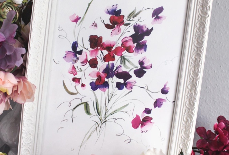
11. Class Project Part 1: All right. Welcome my friends to the class project portion
of our time together. I have moved my paper so that it is in
portrait orientation. I like to do this when
we're working with a bouquet because it gives a little bit more length
here for the stems. But if you like working with
your paper and landscape, you can definitely do that. I've also added a palette to separate my green so that
they're not flooding into my palette of
peach and coral and pinks and all of that just
to keep things a little more separate since we're going
to be using several colors. Keep that in mind.
Additionally, give your inks a little shake if everything
is settling to the bottom, just to freshen them up and make sure your brushes
are clean as we're going to begin with the lighter colors first and then we'll move into those beautiful deeper hues
and finish strong with those. Let's go ahead. I have
loaded up my brushes. I have the same color that we were using in the last portion. I have the cough
sy consistency on one brush and the broth
consistency on the other brush, and we're going to begin here at the middle of the page and
begin building our bouquet. As always, we're going to
try and stay away from the sides of the paper
so that we leave ourselves lots of room to
add leaves and curly cues and bring a center focus
here to the composition. Let's start here with a
beautiful fan shape coloring in. And then we'll plug in with
the cough ser consistency. Okay. Then giving it just a moment. We'll use our water brush to create those
beautiful fireworks. And then using our
velvet touch brush, I'm going to add a little bit of the undersea green while
things are nice and wet. Okay. Go. That's where I'm
imagining that stem is landing right here coming
towards the center. Then I'm also just going
to bring it through. I really working
with some beautiful, nice wet and wet green
on top of the orange, all looks beautiful together. We're going to continue
building here. Setting things off
to the side that we don't need the green brush, can turn your paper if you need to as we go about
this next sweep. Go running those two flowers
up against each other. Let that settle
for just a moment and continue working here. And right here at the center. This flower is still very wet, so I'm just going to let
it sit there for a moment. And picking up my brush to
add a bit more of the green. Just adding a bit
of the stem work in here while we can while things
are nice and wet. Okay. And then I'm going to begin moving the stem in
this direction. We're wanting to create
a sense of flow here. We'll do this first. I don't want to cover up where
the sweet peas would be. I'm just going to create a nice stem down here
towards the end of the page. This helps to remind me okay. I'm staying in the center here, I'm not going too
far left or right, but I'm beginning to create
some flow here. Okay. Using our water butt brush to kick back here or push back. You can kick back. But I
suggest you also push back. I'm going to do the
cough serve consistency first here as I create
another sweet pea. I'm going to turn my
paper just a bit as well to get a nice angle on this flower and touch it
right against the side here. And then with my
broth consistency, am I using my water brush. Okay, we have a nice
little bud here. I'm going to create
a nice stroke to kind of curve over to do the same thing and begin to plug in some sweet
peas down in this direction. Also going to add
some green here and connect the stem to the flowers. Again, bringing things
back to center, creating these nice long stems. Let's continue building here. Turning your page
if you need to. Having a few beds burned below. Yeah, continuing to make
the connections here. Add in a few leaves as well. I want to make sure you leave
space for your curly cues, so keep that in mind
as you're working. Right. Using your water breast, you can kick back here. And if you like,
you can also head back in to darken up some of the areas if you
want to do that. You don't have to. Okay. Okay. We're just about done with the
peach and coral, and then we're going to add in a different color
palette than one we were using previously when we were mixing the
two colors together. Go to put a few more
leaves over here. Using broth consistency. Okay. Okay. And now we're going to create a few stems to sort of
filter through the middle here that we're going to add
to our next arrangement of. This will give us a framework. Adding it a bit of color here. Well, things are nice and wet. Plugging in the green, adding a few little gestural markings. It's pretty stems connecting. You can do the same
thing up here, adding a few gestural markings. Remember, we're just using
the tip of the brush. I'm not going to add those
lines in that we used. When I was teaching you how to add the
speckles on the marks, not going to do it
with the peach ones, but we'll do that
with the other color. You can, if that's something you want to do a little later on. But I'm not going to do
it just so as not to overwhelm the flower. Okay. Okay. Okay. I like how things
are looking here. I'm going to add one
more stem to circle back here and provide a little
bit more interest. This will help bring
things up and around as we bring the other set of sweet
peas in this direction. I like the lines that we see in the sweet peas and I want to continue to try
and capture that. Let's go ahead and
add another flower. Okay. You had a bit more color here. Handing my water brush. To make a few more blues. Okay. All right. I'm going to pause here because I'm
going to clean off my palette a little bit and get things ready for the
next round of sweeps. So part two of the class
project will be below for you.
12. Class Project Part II: Okay, we're back ready for
part two of the class project. Have a look at my palette here. You can see that
I've mixed together, the rose red along with the Tahoe blue to make that really beautiful brownish red. I also have the
broth consistency. This is this color pulled out. I've lessened the
color value by adding water and added a touch
of that Jines black. The same thing we did initially, I just did it already
so that I could walk you through
it and we're not having to spend too
much time doing that. Then I have that
loaded on this brush, and then I have the co sir consistency loaded
on this brush. Then we also have third color, which is more along the
lines of that purple that we used when we were doing this sweep. That's
where we're at. We don't have a fourth
brush for the green, so we'll have to be rinsing off a brush when we want
to add green in there. Just make sure your piles
are nice and ready for you. Load those brushes, set
them off to the side, add a little bit more ink
if you need to. Okay. Add a bit more ink to this pile. There we go. Nice
egg plant purple. It was looking a little
too close to this color. We really want to lean into
the color potential here. Okay. So now that we've
laid a foundation. We have something that's
really beautiful. We have some messy structure
here, intentionally messy. We're going to begin
to pull the sweep in this direction to fill up
this portion of the page. With composition, we never
want to have things just completely chunked or
plugged into the middle. We want some things happening in the lower regions
of the page or the upper regions of
the page just to lead the eye in an aesthetic way. So we've done our part by anchoring the piece
here in the middle. Now we're going to be a
little bit more playful, and we're going to
come up here into the higher regions of the paper
and then also down below. We'll do that with
curly cues and also with the sweet
piece obviously. We've laid the groundwork
here by adding the stem. We're going to build on here
and we're also going to begin to mix the
sweet piece together, so it doesn't look as though they were
separately created. Let's go ahead and do
that, making sure I have the right brush here and
refreshing this brush, moving things back and forth, and then we can beat it. Maybe our breath consistency. And now let's plug in here. So you can wait until
these flowers are dry, or if you like the look, you can obviously overlap we go. Giving that just a moment. I'm going to do the
same thing down here. Okay. Thank you. Okay. So kind of working around
these leaves here. You can re wet them if you like. So you can take your water brush and just re wet it so it's all
kind of blending together. Or you can keep it separate,
whatever you like. Let's use our water brush
to push back a little here. And let's continue building. Go ahead and touch
the outside here. I pause for just a
moment so that it's not immediately going in there. So just giving it
a little moment. Because this color is so dark, it works really nicely
over the stems. Okay. I'm going to add a sweet pea up here as well. I don't mind the look of the stem here because
everything is so loose. I like that it looks it's a
shadow in the background. Okay. Okay. And then what we can do with
our third brush, we've kind of been waiting here. Because we can add
another color. If you like, don't have to. And use your water brush. Okay. Adding a few more buds. Okay. And then using our water bag. Okay. Okay. I'm going to use my water brush
briefly to dip into the undersea green and begin pulling the bouquet
over in this direction. I had a chunk on my brush. Okay. Okay And adding a bit of the green. Now we can practice
those calculated strokes being intentional with
where we place them. Let's look at our
bouquet for a moment. We have a little bit of
symmetry happening here. That's not typically
my favorite thing unless I'm working
with a pattern. What I'm going to do
here is I'm going to bring down some flowers into the lower region so that it feels a little bit
more off kilter, which actually brings more
balance into the piece. We don't want it symmetrical,
we want it balanced. Those things are
not the same thing. These calculated strokes
will allow us to do that. M. Okay. Okay. I'm going to turn my
paper around just to get a nice angle on
this flower here. And dipping into my
cough ser consistency. Okay, I use my water
brush here to push back. And just taking a look
at what you have, if you wanted to add
some more colors, some more purples to the
palette, you absolutely can. I weaving these together so
that it looks like they're put together in a bouquet
and not so one on each side. Let go ah and create
another flower here. And then we'll dip into
our purple over here. And picking up a little
bit of that blue. Okay. And picking up my water brush. I like the idea of there
being some merging here. Okay. Okay. And then picking up
our water brush. Bending those two
together a bit. Adding a bit more water here. And now we have something
that I feel is much more balanced and we're going to plug in a few more leaves
before we add the curly cues. So using my velvet
touch brush, Mm. And we'll add in some
gestural markings as well. Through our leaves here. And through the center here. Remember the looseness
is the main character. I keep saying that in my head. This is not a flower where everything is supposed
to make perfect sense. Okay. I'm going to go ahead and add a few
of the curly cues now. When I'm looking at the piece, I'm figuring out where
can I put those markings so that it feels like it is an extension of the flowers
and not something separate. That takes a little
bit of thought. Stand back, look at the piece as a whole
and figure out where could some extra markings
benefit the piece overall. There's some room to
play in certain areas. I'm going to do one down here. Make sure if you want, you can even wait until things are dry before you
add them because it's going to be difficult to navigate if you have
some wet spots. You may want to wait
until things are dry. Okay. I feel like that benefits the piece
without taking away from it, without adding too many moments. I feel like it leads
the eye beautifully through the bottom of the
piece up through the top. I'll pull you out a little bit. It's always a balance between getting you close enough
to see what's going on, especially in this orientation, and also making sure that you're seeing everything
that's happening. This is typically
where I would stop. Things are a nice balance
of gestural and loose. Things are still
drying, however. There might be a moment where
I see that things are still wet and they're drying a little bit lighter
than I might want. I'll go back in with a darker color or I'll see
this stem and just think, Oh, let's just darken
that up a little bit, add some gestural lines here. Just to add a bit more interest. You're going to
be able to notice the same things as you move
through your painting. The last thing that we can do and we're going to have
to wait until things are dry is to add those
gestural markings. Go ahead. Take a look at what you have, figure out if there anything
else needs to be added, and then meet me
back here and we'll add in those final
markings to the piece.
13. Class Project Part III: Okay. The painting is dry. I'm ready to add in
those gestural markings. So I have my palette
all prepared here. I'm using the number
six elvet touch brush, that nice pointy brush, and I'm going to go through and pick out which flowers I want
to add those markings to. All right. I do? Okay. Okay. Just using the toe of the
brush to those petals. Trying to make sure every
marking isn't exactly the same. Again, you don't want it to
just look like and paste. Okay. I've decided that I do want to make a
few gestural markings through the other sweet peas. I thought that I
would like just the loose look of it altogether, but I think a few
intentional markings would look really nicely
with it altogether. So I'm going to come into my ink collection over here and I'm going to bring in a little
bit of the burn orange. I'm going to add
that to the palette. Okay. And I'm going to mix that with my rose red and
Tahoe blue mixture. And I'm going to do the same
thing with the sweeties. Careful and mindful of my wrist. Sometimes it just takes a couple markings to make it feel as though
everything belongs together. And that's what I feel
here in this case. I feel those markings actually complement the curly es so
well because they're similar, but they're just different
enough that they feel as they stand alone too. Okay. So there you have it. I'm going to pull you back here. You can see the whole And I think that we did
a beautiful job of blending the two
flowers together, using a variety of
colors and employing gestural approach while
allowing the looseness and the bleeds to really shine
here in this project. Um, I know this might have been a stretch for
some of you who aren't used to possibly using inks or just with the wet
into wet technique, which it really
was so focused on. I hope that you
learned something new. That's always my deepest
hope is that you learned something
new and you also found something that just feels like you that um you know, when you go to paint, it just speaks of what you love and
what you gravitate towards. As always, I so appreciate you spending your class
time here with me. I love our time together, and I'm already
looking forward to the next month's flower
and just a reminder to upload your projects so
that I can have a look at them and just see what you've been up to and to
tag me on Instagram. Thank you again for joining me today and look forward
to seeing you next time. Happy creating my friend.
 Cara Rosalie Olsen, Floral Designer + Watercolor Instructor