Loose Watercolor Landscapes | Paul Cheney | Skillshare

Playback Speed


1.0x


  • 0.5x
  • 0.75x
  • 1x (Normal)
  • 1.25x
  • 1.5x
  • 1.75x
  • 2x

Watch this class and thousands more

Get unlimited access to every class
Taught by industry leaders & working professionals
Topics include illustration, design, photography, and more

Watch this class and thousands more

Get unlimited access to every class
Taught by industry leaders & working professionals
Topics include illustration, design, photography, and more

Lessons in This Class

    • 1.

      Introduction

      2:02

    • 2.

      Materials

      4:09

    • 3.

      Preparing your painting and sketching2

      2:07

    • 4.

      Painting the sky

      2:30

    • 5.

      Painting the meadow

      2:37

    • 6.

      Painting the flower

      3:07

    • 7.

      Removing the tape and wrapping up

      1:15

  • --
  • Beginner level
  • Intermediate level
  • Advanced level
  • All levels

Community Generated

The level is determined by a majority opinion of students who have reviewed this class. The teacher's recommendation is shown until at least 5 student responses are collected.

19

Students

12

Projects

About This Class

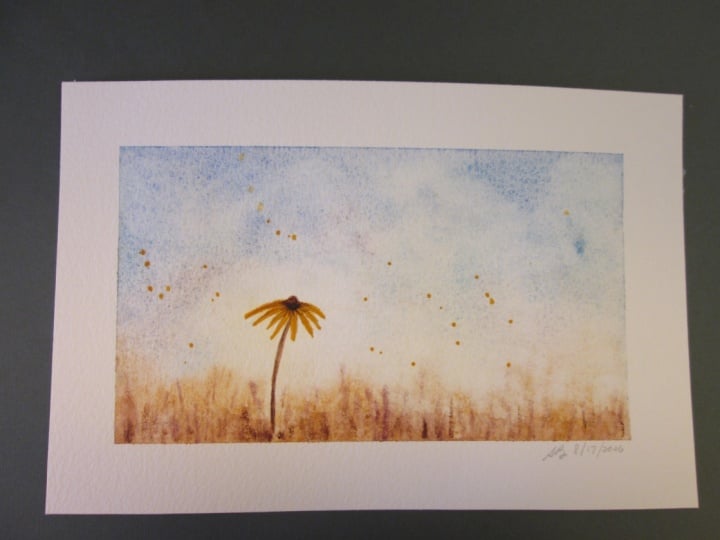
Paint a Wildflower Meadow with Soft Skies

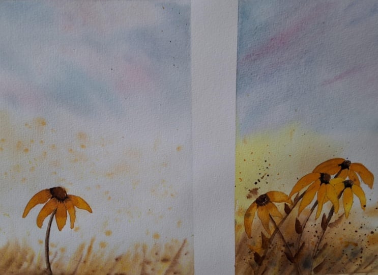
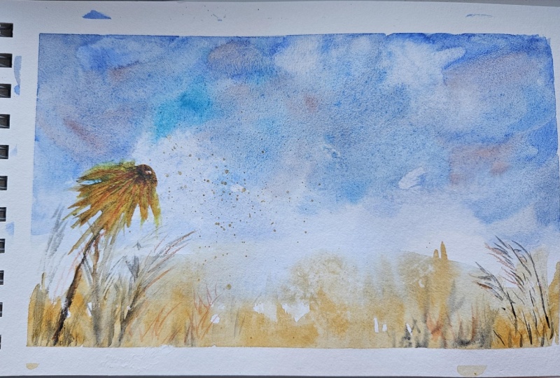
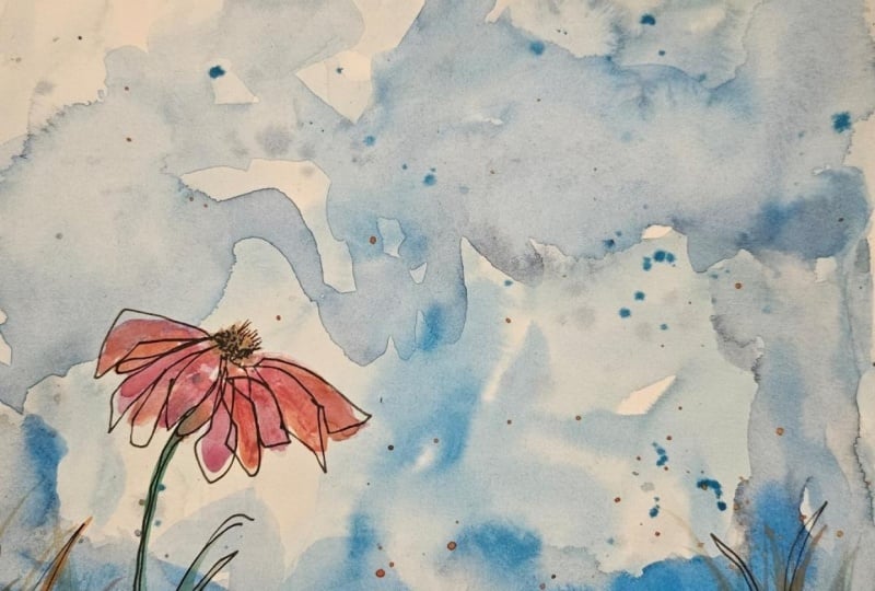
Learn to paint a loose watercolor landscape — a soft sky over a field with a single yellow wildflower — using nothing more complicated than water, a few colours, and the patience to let each layer dry.

This is a fun, fast class, and the painting you end up with looks far harder than it was. If you have never picked up a brush in your life, you can do this one.

It also has a bit of history. I painted this scene in oil over a decade ago, loved it, sold it, and regretted selling it more or less immediately. So I rebuilt it in watercolour.

The Idea Behind This Class

Here's the thing about this painting: almost none of it is brushwork. It's water.

Every value in it — the pale washes low in the sky, the deeper blues along the top, the warm field, the dark centre of the flower — comes from the same small handful of colours. What changes is how much water is riding in the brush. A very wet mix goes down thin and sits back. A drier, stronger mix comes forward. Stack those in the right order, letting each one dry, and you get depth without ever having to draw it.

That's the whole class. Not more colours, not better brush control — just paying attention to how much water you're carrying.

It's also why this painting is quick to make and slow to finish. The painting part takes very little time. The waiting between layers takes the rest.

What You'll Learn

  • Paint-to-water ratios: how much water to carry for a soft pale wash, a mid tone, and a rich dark — all from the same few colours.
  • Loading your brush: how to tell what's actually in the brush before it touches the paper, which is where most beginner trouble starts.
  • Building depth in layers: thin, watery mixes first, stronger mixes on top, and how that simple order creates distance.
  • Letting layers dry: why the waiting is doing as much work as the painting, and how to tell when it's ready for the next pass.
  • Painting a soft, atmospheric sky: a big loose wash that stays luminous instead of going flat and grey.
  • Suggesting a field: how a band of warm colour and a few marks reads as an entire meadow.
  • Painting one small flower well: the petals, the dark centre, and the single thin stem that holds the whole picture together.
  • Knowing when to stop: the least glamorous skill in watercolour and the one that saves the most paintings.

Why Take This Class

Because it's quick, it's genuinely relaxing, and you end up with something worth putting on a wall. There's no drawing, no perspective, and no fiddly detail to get wrong.

And because water control is the thing that quietly separates watercolours that glow from watercolours that look muddy. Once you can judge what's in your brush, every painting you make afterwards gets easier — long after you've stopped thinking about this particular flower.

Being fast matters too. You can paint this twice in an evening, and nothing teaches loose watercolour faster than repeating a small painting while you still remember what you'd change.

If you've ever wanted to:

  • Paint a loose watercolor landscape in one sitting
  • Understand how much water should be in your brush
  • Stop your colours turning muddy
  • Paint a soft, believable sky
  • Build depth with layers instead of drawing it in

…then this class is for you.

Materials

Please don't go out and buy anything for this class. I walk through everything I'm using in the materials chapter, including what to swap in if you don't have it, and this painting works perfectly well with whatever is already in your paintbox.

Some watercolour paper, a large brush and a smaller one, a couple of jars of water and a paper towel will get you through it.

Who This Class Is For

Complete beginners who want a finished painting today rather than a long project. Anyone whose skies keep going flat or whose colours keep turning muddy. Anyone who loves wildflowers, meadows, or nature journaling. No drawing experience required — there's a traceable outline in Projects & Resources.

When you are finished your painting be sure to upload it to the Projects and Resources section for feedback

Meet Your Teacher
Teacher Profile Image

Paul Cheney

Teaching watercolour and digital painting

Teacher


Hello, I'm Paul. Prior to the pandemic, I ran a small independent watercolour shop in PARIS ONTARIO. I enjoyed teaching watercolour to hundreds of people in person. Fast forward a few years and I am now transitioning my teaching process online. I think it is imperative when teaching online to do your best to offer the same level of quality instruction. People have to understand the concepts and be able to apply them to their own work. Whether in person or online, learning art is a skill that anyone can master. Sure it might come easier to some people but there is no magic, hidden talent etc.

Art is a learned skill, no one is born with it - like most skills - it just takes practice. I hope you enjoyed my classes, please leave feedback if you can!


... See full profile

Level: All Levels

Class Ratings

Expectations Met?
    Exceeded!
  • 0%
  • Yes
  • 0%
  • Somewhat
  • 0%
  • Not really
  • 0%

Why Join Skillshare?

Take award-winning Skillshare Original Classes

Each class has short lessons, hands-on projects

Your membership supports Skillshare teachers

Learn From Anywhere

Take classes on the go with the Skillshare app. Stream or download to watch on the plane, the subway, or wherever you learn best.

Transcripts

1. Introduction: Hello, everyone. For those of you that do not know me, my name is Paul. I've been a Skillshare teacher for seven years now. I specialize in both watercolor painting and digital painting. Today we're going to do something different that I haven't done before on my channel. We're going to paint a landscape, a whimsical landscape at that. It's a small wildflower. It's an abstract painting. It's very loose. There's lots of water. There's lots going on. The end result is a really pretty picture. And as with all my classes, I've included a high resolution version of the painting, as well as an outline so you don't have to sketch it. I do show you my sketching process in the class, but you don't have to do it if you don't want to. There is no reference picture for this, like a photograph of the flower because I made this flower up. So this painting is the reference picture in this case. I think you're really gonna like this class. This class is definitely meant for beginners, all levels, anyone can do this class. It's very easy. It's very fast. It's very quick. There's not a lot to it. It's broken up into a couple very simple, very easy to follow chapters. We start by putting down a big heavy wash with lots of water, lots of, you know, lots of paint, lots of water in the wash. Then we're going to do the meadow area or the grass in the foreground. Then we'll paint the flower bit, the stem, we'll take the tape off and voila. We're done. The materials that we use in the class are simple. You're going to want to have some painters tape to mask off these edges here. Other than that, we've got some yellow, we got some blue. Got some reds in here and some different yellows, some burnt sienna, different things like that. Use what you have. Don't run out and feel like you have to buy anything special for this class. Mine is done on hot press paper. Again, use the paper that you have and enjoy it. Make sure when you're done, you take your paintings and post it in the projects and resources section. That really helps me, it helps you. It helps inspire other people. It's what makes Skillshare so great. That's enough talking for me. Let's get painting. 2. Materials: Okay, let's take a look at our materials that we used here today. So I've got down here my trusty palette that really doesn't ever move from my table. And on the palette, we've got our tlors. We'll go through the colors now. So we used for the stem and the top bulb of the flower, we've got burnt umber. For the meadow in the field, we used yellow ochre. We used, some burnt, sorry, some cacrodon red or magenta. One of those two. Cocrdone we used a red. It could be quinacridone red, acridone magenta. I got cadmium red down here that I didn't use. Or the sky, the bulk of the sky, we use ultramarine blue. We dabbed in some pho blue. We dabbed in some yellow ochre. We dabbed in some cacrodone magenta. Basically, we just mixed in some reds and some yellows and some different blues. We used our dark mix up here, and the dark mix is essentially ultramarine blue and burnt Bernsiena. And the reason I use that instead of indigo is that some people were having trouble with the staining that indigo does because it uses two heavily stained pigments, one of which I cannot pronounce pigment blue 60, it is. Aradone I think, something like that, and it uses a lamp black, which are both very heavily staining pigments. Altramarin blue and burntiana are not heavily staining, and if you mix them, highly saturated, you get a very dark color. And then you can also make a neutral gray or you can warm that gray up or cool it down depending on how much of each of those colors you put. Anyways back at it. So we've got our dark color that we mixed in. We've got our um, Hansa yellow medium here that we used for the flower petals. Now you'll see mine is a bit kind of bit of red in it, just from mixing it from previous colors. That tended to work. So I kind of like the orange look of the flour, um, and that's about it. For the brushes here, I've got a mix of synthetic brushes. Got this flat brush here. It's fairly large. I've got my liner brush that I use quite often. Um, then I used a water soluble pencil to draw with my spray bottle that I used to spray and wet my palette here. My tape here that I used to tape around the edges. Now, I use a wide, um, tape because I wanted to be able to go and paint over it and get the edge that we have on the painting that that's what that is. It basically stops the paint from going there. So it also holds the paper down. MNable eraser. Everybody needs one of these. Get it. Neable eraser up here in the corner. You see this in the painting ever? This is my iPad. This is just the stand. I don't have a stand for it, so this is just the case that I use to stand it up in. And my trusty water containers here. In theory, I always like the idea of having a clean water container. I just never ever bother to keep one clean. So here's my dirty water container. And that's about it. This is a really simple class. Yellows, reds, blues, use what you have. I'm giving you the specifics so that if you want to know what I'm using, then you do know, and it just makes it easier for you. But if you don't have these colors, use what you have. Just, you know, have fun with it. You can get away with just about anything for this kind of painting. But again, as far as pigments go or paints go, I always recommend using artist gray paints. They don't the characteristics of watercolor a huge part of that comes from the paint itself. When you're using student grade paint like cottonon or something like that, they have fillers in, and those fillers are used to extend it. And that makes the paint chokier, less transparent, less well, less watercolor like, right? Me guash like, almost like an acrylic paint almost that's just really heavily watered down. And those extenders are what caused that, but they also make the paint cheaper to produce and therefore cheaper to buy. So I do recommend you use artist grade paint whenever you can. 3. Preparing your painting and sketching2: Okay, the first thing we need to do is we need to tape down our paper. And for that, I am using painter's mate tape here. It just happens to be the cheapest paint that's available at my local hardware store. You can use anything. I've seen people do this with masking tape, with scotch tape. The thing that I like about using, like, a painting tape is it doesn't stick to the paper as much. It still does, and I will show you a little trick as to how to get it off at the end. And depending on the tape that you use, you may have to experiment with this a bit to find one that doesn't peel up your watercolor paper or the texture on it. The smoother your paper is, the less likely it's going to gram onto it. So a rough texture paper, for example, is going to peel up a bit more than, say, a hot press paper that I'm using here. So I'm showing here. I'm peeling it up. No paper came off. Now, you can put the tape anywhere. You want to you want your image or your square smaller. Move your tape in, you know, closer. It doesn't really matter as long as it's holding it down because we're going to put a lot of water on this. Okay, the only thing we really need to sketch out here in our wildflower meadow is the wildflower itself. I'm just loosely doing this here with a water soluable pencil. You can use any pencil really because the paint's going to be pretty heavy in this part and will cover up your pencil lines. So basically, all I've done is made a little cone shape, like, to outline where I want the petals to be, and then I'll just pencil in roughly, you know, the bottom shape here. You don't have to do that. We're gonna paint it anyway. Um, and as well, I've also provided you with an outline of this so that you can just trace it on if you like. You don't need to worry about all this silly sketching. You can just have at it and start painting if you like. But, you know, this is an excellent place to start sketching, if you've always wanted to try your hand at drawing. 4. Painting the sky: Now we're going to start the painting. We're using a flat brush here. You can use any large brush. Just use the biggest brush you can. You essentially just want to hold a lot of pigment and a lot of water. I'm using pure Altamarin blue here with lots of water, a lot of water. I just flopping it on, flipping back and forth. No real method to my madness here. I'm just trying to get a lot of coverage. I'm grabbing more water as I go, more pigment as I go. And I'm just trying to cover this up, this whole area here. You can see how much water there is. There is a lot. This is on hot press paper, so it's sitting on top, and you can see the nice granulation that the ultramarine blue makes, which is why I chose it. We are going to add in some other colors, but for the base, I'm just using ultramarine blue here. And again, I can't stress this enough. A lot of water. Like, I'm scooping it up with the brush and plopping it on. Go back and forth. As much paint and pigment as you need on here. Fill up your brush. I'm going to grab some palo blue now here, so it's a bit brighter, and I'm plopping that into the wet paint. Now I'm going with some quinacridone magenta. Again, just dabbing it in. These are just little highlights colors that we're going to bring out in the flower later on, and these will help accent it. So a lot of back and forth here, grabbing water, grabbing paint. So I've got some darker pigment from an earlier shadow color that I had mixed up, which is essentially the ultramarine blue with burnt sienna mixed into it. All the same colors here, we'll grab in some more of that shadow color, put it up at the top. We're keeping the top darker, and then we're gradually going lighter as we get to the bottom. So you'll notice down by the flower and the landscape, it's very light, and at the top, it's darker. And so now I'm grabbing some complimentary colors. Again, some magenta. We'll add in some yellow later as well. But we're just filling this all in, keeping lots of water. We want to make sure it stays wet. You can paint right over top of the flour, if you like. I'm not because I want you to see where the flour is and my pencil's water soluble, so I don't want you, you know, to lose the flour, essentially. If you're not comfortable with that, just paint around it lightly like I did. I'm trying to keep it very loose around there. So now we're plopping in that some yellow ochre, which is, like, a warm yellow. Just keep it loose. Try not to overwork it. We'll let this dry. When we're done. We'll come back and we will do the field. 5. Painting the meadow: Well, I got excited and carried away and started painting before I hit the record button. Anyways, we've got yellow ochre here that we're putting on, and we're going to put it right across the whole bottom. We're just going to keep this wet, and we're gonna keep it loose. I'm just dabbing this in along the bottom. You notice I paint right over top of the tape. That leaves that nice sharp edge when we're done. So I'm mixing this in with lots of water. We're gonna come back and we're gonna when we've got this all on, and we're gonna dab some off with a cloth just to even it out a bit. F right now, we're just kind of making some streaky marks, giving it the lines there. And I'm just using the sharp edge of my brush to do that. Don't put too much thought into this. We're essentially just making the shape here. Try not to go too tall or else your flour will look stumpy. Now, I'm grabbing some burnt sienna. We're gonna put darker colors over top of the lighter one. So we started with yellow ochre, which is our light color. Now we're gradually building up that we're adding depth to our little field here. So we're putting some burnt sienna in now. And once we've got that on how we like it, we're going to grab a smaller brush for some smaller details. And now we've got a mixture of burnt sienna and ultramin blue making this shadow area here. And I'm just plopping it in along the bottom, and then I will come back with my liner brush now and just kind of flick this up. If you don't have a liner brush, just use the smallest brush that you have. And you're just kind of dabbing it in, flicking it up. So we're putting the paint more saturated along the bottom, and then we can just flick it up as we want to get these fine little like, grass like hairs here. So again, we've got lighter color in the back. And we've got then we gradually go up with burnt sienna, and then we add in our shadow color or gray, which is burnt sienna and ultramarine blue. Got some more yellow ochre, grabbing some more depth in here, just kind of playing around. I'm not really, you know, there's no rhyme or reason to this. Like what I'm doing just flicking the paint in, you know, back and forth. Lots of water here. Um, you know, again, like anything, you can overwork this here. I'll just fill in that little corner that I missed and get some more water on here so that when it's all said and done, I can dab some of this out with a cloth. I want it to be a little bit softer in some areas. So what that's doing is that's giving us more depth to our field. And again, try not to overwork it. We'll let this dry. You don't really need to let it dry, but when we come back, we're going to do the flour. 6. Painting the flower: For the flower petals, I am using Hansa yellow medium. Mine has a little bit of some kind of red or magenta mixed in there from a previous painting. So that's why it's got a little bit of an orange color to it, but I kind of like it. It goes well with the yellow ochre. Feel free to use any yellow you have, or, for that matter, any color that you like. It's a made up flower. It's just an exercise, right? So what we're doing now is we're putting on some thicker paint. We want this to be relatively opaque. Hansa yellow is a transparent yellow, but I'm just using lots of it. You're just going to paint in the little petal shapes here. Keep it nice and simple. Again, don't overwork it. We're gonna add in some more colors to give it a bit of depth. And for that, I'm going to mix some coracradon magenta with some yellow ochre, making an orangy red color. Feel free to use any red, any orange, any color you like. We just want a darker shade to add some depth to our petal so it doesn't look flat and all one color or monotone. And for the top part, we're going to use some burnt umber. Again, highly saturated. We're just going to dab it in here along the bottom. And once we've got that dabbed in, we'll get some cleanish water and we'll just sort of bleed it up. Again, we're letting the water do the work. Now I'm switching over to my liner brush. You don't have to use a small brush. I'm just pulling some of that brown down into the flour. I just, you know, it kind of has, like, an overall scratchy feeling this painting. So I just want to add in some lines here, give it a bit of character, add a little bit of now I'm going to add in a bit more color. So I've got my quinacridone red here. I'm mixing it with Hansa yellow medium, making a bit of an orange color, and I'm just dabbing this in, making some lines, kind of, you know, like a center petal or center part of the flower, you know, like a ring like a rubekia that kind of goes around the edge a bit. This is my made up flower, so this is how they look. This is a pall flower. And like every fall flower, it's got red around the center of it, obviously. Now for the stem, we're going to use burnt umber again, making a nice thin line. Try to keep it as straight as possible. You know, I mean, again, it's your flour. So if you want to bend it or curve it, that's okay, too. I want to darken up one side of that stem, so I'm just grabbing some more saturated burnt umber and using my liner brush just to dab along kind of the edge here just to make it a little bit darker. And we'll just darken up around the cone a bit, as well, again, giving it some depth. And as we all know, you cannot have a loose whimsical flower painting without some accidental paint splatters. I didn't make any accidents, so I'm gonna grab a lot of water, take some of the colors that we had, and splat them on. This kind of like dust or whatever blowing in the field. We'll let this dry. We'll come back and we'll take the tape. 7. Removing the tape and wrapping up: A little trade secret here. Depending on the tape you use, it can often loosen some of the glue by going over it with heat on a hair dryer. That's what I'm using. You could use a heat gun, as well, but I'm just using a hair dryer. And when you're pulling a tape off, you want to pull it as low as you can, like flat, like, away from the paper. See, I'm just kind of edging it off. And that helps stop the tearing and, you know, shredding or ripping of your paper. This is hot press paper, so there's not a lot of um tooth in it to get stuck on it, but you can see I'm still getting some paper in my tape here. There are some tapes that work better. I believe this one is paint Painter's mate, I think it is. It's the cheapest one available at my local hardware store. The more you heat it up and the slower you go, the better the result. And again, see how I'm peeling it away. I'm not lifting it up. I'm peeling it back. That makes a big difference. Well, that wraps up another class. I hope you enjoyed it as much as I enjoyed making it. Let me know what you think by leaving a review, and please don't forget to upload your finished painting in the projects and resources section so that I can give you feedback. Thank you very much, and I will see you next time.