Transcripts
1. Introduction: Hello and welcome. In this class we'll be painting
a forest landscape using a variety of wet-on-wet techniques and wet
and dry techniques. Creating a soft and hazy
look with a sense of depth can be tricky when
you're learning watercolors. Painting wet and wet is often associated with a
loss of control. The right knowledge,
you can create a mess. But don't worry, I'm going to
show you the importance of timing when painting wet in wet. I'll show you how to
gain control and layer effectively to create soft
and atmospheric scenes. It's easier than you think. Wet and wet techniques bring out the natural strengths of watercolor and is essential
for your journey. In any painting,
planning is crucial. I'll show you how to simplify shapes and sketching
the larger ones, such as sky, trees,
grass, and lead. Getting those large
components and accurately beforehand is essential for
your painting to make sense. So join me in this class. I'm looking forward
to showing you the secrets of natural
landscape painting.
2. Materials Required: Here we have a few materials that I want to go
through with you. Here's my finished painting
and the paper I'm using is 100% cotton watercolor
paper in medium texture. The medium texture or rough texture is really
important because this is what allows you to get into the soft atmospheric sort
of looks in the background. So some of these
trees you can see that blended edge
where you've got a, I guess a soften the edge
here as well for the shadows. It's very hard to
do this when you're working on smooth paper, dries quickly and
often inconsistent. The good thing about textured
papers that it also leaves these little natural highlights
when you're painting. See little bits of white
in here and there, and that's where the brush skips over the surface of the paper. So those can be turned
into little highlights. But I find that it just makes that landscape painting look
a little bit more realistic. You can turn some of those
into rocks, bits and pieces, just adds a bit of
sparkle into saying, okay, so let's go through some of the brushes
that I'm using. And you can see here the main brushes on the left are these watercolor brushes. And these are really
good for getting things in like the trees, smaller mop brush here. And I use that in the
beginning to get in a lighter wash of yellow. And in the background here
you can see that sky. I've actually used a slightly larger mop brush, this one here. And actually picked up a lot of cerulean
blue pop that in. But smaller brushes like
these smaller mop brushes, let you pick up a
fair bit of paint, but still be able
to get in details. Even that tree there you can see while that background
was still wet, I'll just drop that in quickly with this smaller mop brush. And really depends on the size of the paper
that you're using. This larger ones
too big, probably. We might be able to use this to paint the sky or
something like that. But I've used mainly
these two on the left. I've got this brush here. This is a little round brush. And the round brush is
good for getting in details in the trees
like the branches. This brush here, which
is a little flat brush, is also fantastic for
getting in branches. I use this one quite
a lot actually. And a few more brushes that you might
want to look into as well, rigger brush, and it has
a long tip like this one. And that helps you get in large shapes and little details for the branches as
you can see up there. But these long shapes out the
back there for these trees, the distance works really well. With that brush, a
little fan brush, I use this too. Just getting little details for the grass and
things like that. It just textures really
makes it very easy. So you don't have
to use a brush, something like
little round brush and just do thousands
of little strokes. This gets in a few
brushstrokes at the same time, which is why I use it. That's basically about it. In terms of the paints. I just want to talk a bit about which ones I've used
for this scene. Now in the ground, I've
used a little bit of Hansa yellow and also a bit
of quinacridone yellow. So if you've got Hansa
yellow quinacridone yellow, even if you got yellow ocher,
that's completely fine. I've used a more vibrant yellow here because I
wanted to draw out the contrast between the
light and the darkness. It's also a little bit greenish and errors and
that's because I've got some of this other green that's mixed into it as well. So when you're
working wet on wet, often you're going
to get a little bit of that happening here, especially I've done it on
purpose to get in some of these grassy effect
in that region. The green that I'm using is basically I've got a
few different greens, but this is one called
undersea green. And by Daniel Smith, there's a whole bunch of different greens
that you can use, as long as you've
got a dark green, even a hookers green, failure, green or
something like that, it's gonna be completely fine. You can also mix up a green, got a bit of ultramarine
blue, and a bit of yellow. We're getting quite a
nice dark green color. But that's the green
that I've used. Just make sure that it's
dark so that you can get in these larger contrast here in the background or so
for the trees as well. If you want it
louder, just water it down and you can get some of these little brush strokes
here in the foreground. For the flowers and things here I've just used
a little bit of white gouache and comes in
this little bottle like this. And that's opaque
watercolor paint. You'll notice that I use some of this gouache and areas here. Here. The flowers,
little bits in the background that figure here standing there in the
distance as well. And that makes it
quite easy again, these highlights
right at the ends. You don't have to spend time cutting around
things and getting, fussing about some more details. You can just wait till the end. Make sure I think that that wash is nice and
consistent all the way through a rather give up and get mixed up a
few of those highlights, then have a wash that does it doesn't look cohesive enough. Another thing that I
want to mention as well, I use a small knife to just scratch out these
tiny little lines. You can see them here. They're just like little
grass or things like that. You can use a credit
card and edge of a card, something sharp as well,
and just use this motion, scrape off the paint and
that you can use this basically only when the
paper has almost dried. So you want to wait
probably until it's about 85, 80% dry. That paint's still is slightly damp and then you can
go in and scratch off. That way. The surrounding
paint doesn't immediately pull
into those areas. So quick little
trick to get it in little highlights and not have to rely on the
gouache all the time. I also use a bit of
darker paint here, so a bit of black, I've got
some brown here as well. Burnt umber in the sky. It's mainly just cerulean. Cerulean blue. You can mix up most of these dark colors
here for that tree. So if you mix up your
three primary colors, red, blue, and yellow, you can get
that nice darkness there. I just use my own
black or neutral tint just makes it a lot easier. Probably the Browns will be something that you want
to get separately. You can't mix that up anyway, so you need to get that. But apart from that, the rest of the colors, just your primaries.
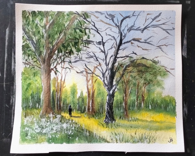
3. Drawing: Today we're gonna be
doing this scene of this trail going into the
forest and could be a park. I think it's a forest. It's quite large at the
pack there, lots of trees. But the main thing
I really like about this photograph is that
strong sense of light. Here. You can see it
across the ground. That's sort of
yellowy green grass and the shadows of the trees, beautiful sky as
well at the back. So we're gonna go ahead
and give this a try. So let's start off. I'm going to go in and look exactly where the
trees are grounded. Now, we've got, I'd say about a quarter of the
way through the page. I'm going to draw a little
line here like that. And then remember that
the path kinda dips a little bit in the center here. Okay, It's not a huge deal, but that's roughly
where the trees are there or some sort
of closest to the front, some further out in the back, but roughly on this line. So you can see some
mountains coming round just above the halfway point
from the backward like that. Coming all the way down like this and tapering off
at the end there. And of course you've
got trees all around. But that is the basic part here of the landscape that
we're doing with sort of separating the ground
from the mountains and then the mountains in the
background from the sky. So I think what I'll do is start by penciling in this tree here. I know it's a little bit further up in the
front like this. Simplify that down. It's just the trunk. It's the closest one. And I want to get
it in fairly large. And you can see kind of branch off near
the top like this. Okay, and I'm trying to keep
things quite loose as well. Great thing about trees
is that they come in all different shapes
and sizes so you don't have to worry about getting
in the perfect tree or anything that looks to representational in terms
of that reference photo. But there you go.
That's a little tree there and you can
see also there's some leaves and they just shroud part of the tree
around the side there. You've even got some branches that reach out behind
the tree like that. Just coming off the side. Of course, there's
some other shrubs and things in the background. I think that's another
something here, just another here's
another tree there. Then another smaller one here. Okay? And always try to keep
these varied a little, but also don't try to
draw everything in. I like to decide a bit later, especially when we're in
with the watercolors. Just the precise
location and leave, leave a bit of that
decision-making into later. But you can see here e.g. there's this sort of
Mount comes up like that. And then over here
there's a large shrub just planted right there. And there's actually
some branch has little branches going
up from within. We've got this path that
runs through the center. And I'm gonna see if I can
just indicates some of this path by putting in generally some of
this grass that comes around the side, the edges. Okay, kinda like this. And we have it. So we've got a bit of a
clearing in the center. And then notice how it's
so dark as well in there. This is really
important for later so that we make sure that we get a bit of that contrast the darkness in
that sense a bit. We've got another
tree just running up through the center, not the one directly
next to it like that. And this tree here, this really interesting
looking one, probably my favorite one out of this whole scene
just kinda coming up here. So I spent a bit
more time with it. And we'll start with the trunk. Notice how I'm holding
my pencil as well. Very quiet down
the end so that I don't get too bogged down
with all the little details, but it's got two main limbs that come off like this and then they separate out into
additional limbs. Okay. It's just a thing with trees, they all just come in these
interesting configurations. You can see how that,
how they branch off in such odd tangents at times. But you notice that
the branches will turn into two more
branches like that. This is definitely patterns in here that you can identify. I'm not again, trying to get the exact reference
that I see in here. I'm just using the
structure of that tree, that general structure
of that tree that I see. Taking some of the
characteristics that are alike and I'd like the branches, how they sort of go off on all these different tangents and effect that the
quiet bare as well. And again, this is
something that we are going to emphasize a bit more with
the watercolors afterwards. But I think it's
important to get in a general sort of shape for
this tree while we can. There's another larger branch, it just goes up, exits
out the top of the scene. Another one that comes
out here just exits out as well like that. Here. Look at that, Just
another one there. They all come out in these
odd little tangents. But we don't have
to get them all in. We just have to get an a general indication for
them for now and later. We'll do most of the
work with watercolors. So some of these branches, I do think they should be coming over to the
right-hand side. You can see it's just more balanced if we have some
more branches coming over to the right and the smaller ones
and things as well. Here in the background
we go to a few shrubs. There's a hedge or
something here. Don't know if I want
to include that. We'll see how we go later. There's a large shrub or shrubs, a large tree here, and another tree here in front. Roughly where we want to put it, just eyeing it out. Use the shadow. Just again. Indications of those shadows. This large shadow here
coming across the front, which is formed by all that, all that stuff yielded
the larger tree. So we have in the sketch,
once you're ready, we can get started with
the actual painting.
4. First Wash: Alright, first things
first I'm going to be picking up some yellow. I've got some very bright yellow that I've
got here on the palette. It's lemon yellow,
vibrant, and bright. And I'm using that
in the areas where I want the most saturated color. And this grass isn't yellow, really this part,
so this yellowish. But you'll see what I'm
doing in just a moment. I'm going to add in some
greens over the top. But the most important
thing is to start out with all the lightest elements. First, if you can get
there's lots of elements in, then you get into the habit
of preserving them for later. It's just an important
thing to do. And obviously with yellow, if you add more green
to it just turns into a green or yellow or green, it's yellow was one
of those colors that very easily turns to green, which is good for this
particular scene. Some more water. I'm picking up a lot
of water and just dropping it into areas
where I want there to be a little bit more
of that sunlit feel, I suppose running through. You can really drop it
in all over the place. It's no big deal, I think to just avoid putting too much of
it into the sky. That's the main air that we want to preserve for
some cerulean blue. Okay, but pretty much
everywhere else you notice. I don't mind just
dropping in a bit here or there and letting it sink
in and do its thing. They're just bring
that across like that across the ground. I also like to carry
around a spray bottle. And the spray bottle helps to just add a little bit more
time so that it doesn't dry. Especially here in Melbourne, it's quite hot today, so I don't want that
to dry too quickly. Now time for a bit of the sky and I'm going to actually
mix in some cerulean blue. Got a whole bunch of cerulean
blue here over on the side. And I'm going to just pick
a bit of that up with the brush and keep it
away from the yellow, want to contaminate it, but just start it off
at the top there. Little bit of that cerulean. I want to make this
pretty light wash, not much in there at all. I can actually pick up a
bit of a little bit of Titanium white as well. And that just kinda adds a bit of this miss the feeling there. Not only that, I sometimes
pick up a bit of gray and drop that in two. Because these clouds
aren't exactly blue. They, they're, they're,
they're more grayish color. And I want some of that to
just blend downwards into this yellow and not create a Fosse. So some of that just
carrying downwards. And remember to keep this
really light as well. You don't want to add
too much paint in there. I'd say keep it about keep it about ten per
cent paint to 90% water. Just want a nice
little indication. I've got some more blue as well. I thought I'd add a bit
more up there in the sky. It's up to you how much
you want to put in there. I tend to add a bit more at the top and then
fade it downwards. Come down. He's a bit more of that
gray that I've mixed up. This is just pre-mixed gray, which is essentially
neutral tint. Just mix that downwards into the shrubs or
whatever like that. There we go. Like grayish color, a bit more of that
blue at the top there. See kinda just
mixing them nicely, letting it all
settle in and do it. Do its thing. Really. Get rid of some of these bubbles up the top there.
I don't know why. Dries like that. Get rid of some of that. And the sky is pretty much done. And so what I wanna do
now is work a little bit on the shrubs and
things like that. And I tend to actually
pick up a number, rushes to do this and
I like to do all this while the paint is
still relatively wet. So I've got some of
this color here. This is color-code
undersea green. It is a granulating green, but any type of darker green will do if you don't
have a dark green, just mix them up with a bit
of blue and a bit of yellow. I'm just going to pick up
some of these and drop it in. And let's see how we go. Alright, so I'm just
dropping it into the yellow. And like I said before, that yellow was wet already
in it still is fairly wet. And this allows me to getting
these nice soft effects, as you can see, they're not
really there, but on top. As well of these trees, notice there's actually
quite a dark layer of leaves and running across. So I want to get in some of
that little bit of that. Just feather that brush around. And when this is nice
and damp the paper, you noticed all the
leaves blend in nicely to the sky and create
a nice transition. Some more green here. And noticing how that
yellow then starts to transition a little
bit too green as well. Okay, moving downwards. Let's have a look a bit more
around that right-hand side. I think here that
probably be a bit of green here would be good shot. That's sharper sort
of section here, but I will have to
redo it afterwards. We just want to get in a little indication of what we think is happening over
there in the background. And especially here you notice there's a sharper
edge from where the trees and little
treeline is at the backend of the scenes. So just paint a bit of that in, and I'm going to get
into some of these, some of this tree here as well, soften off the edges. When the paper is wet, it does it automatically look at that? It's a timing is so crucial. When you, when you're
using watercolors, make sure the paint
that you add in as well is slightly thicker than the paint that's already on the page so that way it
doesn't spread or too much. I'm just adding in some
darker, darker bits. You can see it
happening already, but i'm, I'm doing
some layering. It's a little trick
that you just do. Layer essentially with the
with the colors wet into wet. And you can get in
little details, amazing little
details like that. There. Some here in
the grass as well. Here. Here. Okay. I'm leaving that that
area of the tree in a lighter as well. The reason for that
is when a crisp edge, when I go in lighter, I'm going to actually
paint it a little bit darker with some grayish color. Now, we've got some
potential shadows here. Coming across to the
right-hand side. I'm seeing how we can do this. I might wait for it to dry a little bit before
we attempt that. I want that shadow to be
sharper coming across the page. So what we can do
now is just, again, just fiddle around a bit
with these wet and wet work, getting some more
of these bits of trees and things here
on the right-hand side. And also don't be afraid to
use a bit of other colors. Sometimes I'm mixing e.g. bit of purple with the green. And that creates
sharper contrast because it darkens
that green down. Okay, bit of blue and
the green works as well, but I find purple just balances better so that it doesn't
appear to bluish. You can do this sort of thing. Anything you can't
really do just yet. We'll have to wait it a touch, but some of these little
branches at the end, I think we'll have to go in
with a smaller rigger brush. But you can see
already I'm creating a nice contrast in
the background. Take your time with this
and look at the shadows. Look at the darkness in
here and see what can you portray and what kind of
contrast you can get in here. Let's have a look. There's
also, if you look here, some little branches
coming off the tree and this is where some of these
other color in a bit of brown or something
comes in handy. So I've just got the
small little Rashi, I've got a couple of brushes
pretty gonna use this one. This is the rigger brush. A little rigger brush and
I'm picking up bit of brown. Also got a bit of
brown on this on this other brush,
the flat brush. And we can just have
a little play around. Let's just see, test, test it first to see if the
paper is too wet or not. That's good way. So drop that in like that. Use a very high concentration, I'm using almost
100% paint here. Then I can do something
like this with this tree here in
the background. I can just drop in
a line like that. There we go. That's a bit
of a tree or something. I might want to add in
a bit of other colour, bit of neutral tint in there to darken off
this brown a bit as well to get that
full, full contrast in. I'm hoping this will
subdue down and not stick out too much later. But the paper is wet and it allows you to
do stuff like that. It just blends beautifully and
without much interference. So look at that, just
tiny bits of that, like they're little bit to that tree should be the sharpness in here
and there is fine. Okay. Grabbing this other brush
and just changing that brush around so that I've got another
different sort of shape. So this tree here
in the distance, I'm just trying to get in
a bit of that texture. I don't know of it
here in the distance. But you can see it's quite dark. It's like a brownish
green color, like a muted green
coming down here. Okay. Fantastic. Let's have a go at this tree. I'm going to put in a
bit of burnt sienna and a bit of this. Let's have a look. She might leave it too late. I just wait wait for
that area to dry. More kind of like on that side. But what I will do is work on
some of these grassy areas, some green, a bit more green. And let's put in some little indications of
grass or something here. Small green for easy for it to mix in with the
other colors as well. You've got to be
mindful of that. Like that. Just
drop that in here. Good. Okay. Here. This darker green color
here and browns like that. K, this large sort of
shadow coming across. Gonna be a thing as well. Notice how I'm just
being patient with the way it dries too. This is just a shadow
coming across. I want to preserve some of
this light in the there we go, Just some more of that green. So nice, soft, wet and
wet work as you can see. Okay, good. The paper is also a flat, which makes it easier
for me to do stuff like this. Let's try this. Let's try this little
shadow here to the right. A wet-in-wet shadow coming
all the way across. And look at how it just preserving some of
that light as well. Bring that across
and it just goes all the way out of
the scene like that. Okay, nicely connected on to this tree, which
conveniently enough, we will start to paint in a pit of darkness back
there as well for some, for that little hedge
or whatever it is. And I'm just contrasts here and they're really
important to do that. Okay, good. Now, I think this tree could
do with a little work. While I am here. I've got that big shadow. But I might just work quickly on these little indication of a shadow like that running running to the right-hand side. These little trees there. Okay? Okay. Just one little line and here you can see it just hit this row of grass or whatever. So I can go a bit
darker and then connect the shadow up these
trees to the left. Okay, It's many, kind
of a greenish shadow. I'm going to bring this
down a bit more like that and this one
down a touch as well. So that the shadow just
looks like it connects. Better. Look at that just a bit sharper because this area has started to dry and come down and then you can do it
for this one as well. But mainly we've got this
really big tree that will cost this enormous shadow across the bottom of the scene
and across to the right. Okay, let's get in a bit of gray or something here for
that tree, black. And I'll mix it in. Just a bit of black, fine if I just
double it down with some water and a bit of white, titanium white and get myself
in this grayish color. Maybe a bit of burnt sienna
would help to look at that. Just warms it up a touch. I like to leave you see on the edge I leave
a little, little, little wedge there so that the colors don't mix completely
into the background. So see that even where the
grass is here on the front, I'll just leave a bit
of an edge like that. Continue upwards like that. More brown in here and
some more black as well, I think would be good. Bit of darkness in there. It gets quite dark
up the top too, so you can just increase
the saturation. How much color is on
the brush like that, and just get in the top
parts of the branches. Let's have a look.
This one here, just going to see if I can
do all in one go like that. Connect that downwards. You've got this part of the
branch as well that just goes up like that,
disappears off. Okay. But connected onto
the rest of the tree. There. We've got it.
We've got a bit of a tree going on happening there. I'm happy with that
part of the part of it, but I'm just putting
a bit more more of this grayish color
like that. Okay.
5. Second Wash: You can also do stuff
like lift a bit of color if you think
that might help. Good. It's trying to get some
of these like striations that you can see on the tree
with the tip of my brush. You can just imagine some of these helping to form
the texture of the bark, I think is a good idea. If darkness up here as well. I liked to just try
my best to paint all the scene wet into
wet, where possible. Look at that tree, go up. Here. We can start playing around, playing around with
these branches. So I'm just putting in a few of these branches coming off this side of the tree like this. This one here is pretty dark. I can pick up some brown
and mix it in with some black and work straight into it. You'll notice there's even a little something growing
on the side of that tree, which I'll try to leave an indication of that
in and look at that. It will just form
this darkness here. Mostly using a lot of paint to get this dark
shape of this tree in that we go sing, doing my best to try
to get it in with a few brushstrokes that all. We'll look at this side,
you've got actually quite a large section of
the tree that just goes up. They're there and you've got this bit that just
goes directly up, like that. What's this side? You've gotten large branch
grew up, disappear off there. It's important to get
these bigger ones in. Here's another one there. This one just trails off
and joins onto this side or this other tree here as well. Look at that Just more. These branches going off
on different tangents. And that's why, as
I mentioned before, to do all this in
the watercolors. And because you can spend all that all the time just drawing. But at the end day you
have to go over it a second time with watercolors. So I tried to do some of this, some of this painting
slash drawing. Almost of it when I'm painting. And even the smaller ones, which we will
actually get in with some finer details later on, just with another,
another brush. For now, I just want to make sure I am getting
in the bigger ones. Using a bigger
brush as well stops me from fussing too much. It's a big issue, I think with new painters
where you overwork and area. And it looks good, but then you just
add too much in. Using a bigger brush is a great strategy to actually
prevent that from happening. Once you get in the
main ones is that as these bigger branches
and things like that. That's when you want
to think to yourself, Hey, let's pick up a
smaller brush now. Before you even get in. Before we do that, just
see how much you can get in with the largest brush. At this point, I'm making it up. I've stopped looking
at the reference photo and started to think to myself, well, maybe I'll just
figure some of his own. And where's that smaller
rigger brush? It's still here. It's just picking
up some more of this brown and black paint mixed together and it's really dry the brush when
you do this as well. This is kind of like a tree
or something here that has also some branches
that go upwards. Little ones that just
run off like that. Again, you can put that in with a few brush strokes
without much effort at all. Okay? Um, another thing I wanna do is perhaps darken this
area in the center. A touch, again to
create more contrast. But because the paper
is still quite wet, it allows me to
blend it nicely like this so that it doesn't
look too out of place. Like that. Good. Now, do note that
there is some kind of mountainous area
in the background and I am going to pick up touch of green and see if I can just
indicate some of it in here. Wow. Yeah, Just
while the paper is still wet and also being careful to leave in
some of that light, as you can see running
through the scene. But the slightest
indication that there is some mountain or
mountainous region off in the background. Ross, I don't need to
worry about too much. Even the left side here you've
got a fair bit of shrub, shrubs and things
that just block, block the view of the
mountains anyway, it's more this center
part I wanted to get in. Okay. Good. Dark in this tree bit more, there's not enough contrast and some of these
areas like up here, needs a bit more darkness. And especially I'm
thinking to myself maybe a bit more darkness on the
right-hand side of that tree. Too hard too. Get it all in fat, just blend it a touch. I can, I think that looks a bit better because it doesn't make sense with this
tree to be so dark. And for this one in the
front to be lighter, should be significantly dark or at least the same
tone up the front here, unless the light has caught
onto it, which it has not. And I'm just trying to
put in also touch of darkness on the right-hand
side of some of these branches.
That's going to help. Not only that, but there are
little, you can see here, just little branches
coming off this tree, stuff that we've
missed out before. And I'm trying to create
a little more complexity. In this region. Of course, you can see all the leaves and
things that we've, that are indicated in there. I might actually put in some more detail with
those leaves afterwards, but for the time being, I'm actually happy
with how it appears. Just playing around with
some of these subtle, subtle bits of light and
dark areas on the tree that, that spirit darkness there. Maybe you can just work
a bit on this area. And I've always actually pick up a little fan brush and
some green or whatever. Just feathering, some kind of grassy like structures here. To increase this sense of
texture here in the foreground. Now look good thing to do
as well is if you've got a little pocket knife or a little credit card,
something like that. You can scratch out
some small highlights. I'm just looking to see some areas maybe too
dry, but here e.g. look at that. You can put
in a little highlight for a branch or something like that. They can even do it for part
of this, this tree here. Little, little bit of a highlight just scratched
out on the side there. I don't want to overdo it, but a little bit of that just indicate
that light source coming in from the
left-hand side. You can only do this while
the paint is starting to dry. You can see, let's try here. You gotta beat here as well, can just scratch off. And notice it just
comes straight off the exposures that the
white area of the paper. But this kind of
thing here look at it just creates micro details. Micro details. And I think it's
amazing this little, just a tiny bit of
grass and things here suddenly starts to look
like a whole lot of detail, especially from a distance. And this is a trick that
I learned some years ago. And you want to make these these kind of like bigger at
the front as well, thicker. As you get closer. Blades of grass, little
bit more pronounced. And as you move
towards the back, you can make them smaller. So just remember to
keep them varied. I also run into the trap of
forgetting to vary my marks. The grass as well. It helps to blend blend the grass in the
shadows a bit more. But more so I just, I love the texture
that it creates, the versatility of
this technique. It's something that I think is really important anyway. So even
here, look at that. There's a little area of
shadow behind that tree there. And I can use this
technique to scratch out a little bit of grass and stuff in their tiny bits
and pieces in the shadows. Suddenly you've got
a bit of detail that looks like it's a tree or highlight or
something like that. There's another one. I want to indicate
this a bit better. Almost so wary to just, again, not over overdo. It helps to create a sense of light coming from
that left-hand side. If I don't have to use Gua Sha, I won't use gouache it ten
times can complicate things. And the natural
contrast of the paper, my opinion tend to
look a lot better. I'm gonna go over to that
left-hand side again. I'm gonna go put in a few
marks in here over the top. This is this paper is
already dry on this side, but this is just allowing me to get in an
extra bit of contrast here. That left side of the scene. A little bit of detail. More grass. Again, just preserving some of that some of that
yellow there as well. Good Times got an old brush like this and that helps
as well to create some odd scumbling
marks like that. And of course I'm actually
going to use that for some of the leaves up
above now, kind of in here. Now this area has dried off, which allows me to
just stumble some of these leaf-like indications
over the top here. I don't want to overdo it, but I do feel like it
needs some leaves. This tree leads, needs
a bit more life to it. So over the top of
those branches, That's how it goes. I'm good. Having a look at
what else we could potentially potentially
work on here. This point, I'm just looking at some quick finishing touches on not looking for
any any miracles. Lot of this has already
dried off, but e.g. I. Could put in
this indications of some branches or something
in the distance like that. We have darker paint,
just dry brush on the edges of the
boundaries of the tree. I think I just want to
reinforce that a touch through a few quick little
brush strokes. I'm careful as well just to make sure I'm not overdoing it. I'm blending it onto
the tree itself. And also some of these
branches which I have gotten rid off before. E.g. might even put
another branch in here, just a darker one. Looking at the composition
and thinking to myself, well, it just needs a bit more. Something in here for this tree. So close to the
front of the scene. We don't have enough
detail in there. Sometimes it can
look out of place. But it really just
depends how far you want to go. Look at
all these branches. We could sit here
all day doing this. If you look at this
tree here on the right, one of the things
you'll notice is that the branches are so
varied and they go all the way to the right in quite a, quite a dramatic fashion. If you see, it just
goes all the way. He's going off to the side
of the scene like that. And I'm going to try
to get in some of these nicely and keep, keep it on a bit of a tangent. Some of the branches as well. Look at that, just
continue that pattern. And if you skip over
the paper as well, so don't draw the whole branch and draw part of it in stop
and then continued on. It looks like that
branch might be in some sunlight or
something like that, so it works that way. I'm also looking at the left
side of the tree thinking, I just got to make
sure this is balanced. More darkness on
the right-hand side of some of these
branches as well. Just to indicate an extra, an extra layer of
contrast and shadow. It's already pretty dark, but a touch of that is going to, again, just help look at that. Just touch that on like that. Watercolor is all
about layering. Look at that Just more of
these little branches. Maybe I've got one here again. Like that. Small brown, bit
more brown of lost. Some of that in the process
of getting quite excited. Maybe go just some more bits
and pieces on the tree. Remembering to keep some of
those contrasts as well. Super important. There. The shadow is in
there quite nicely. I don't want to, don't
want to touch that. This feeling of light
as well is quite nice. I might want a dark
and again around here. And all this stuff just
goes and serves to create some extra bit of extra feeling of light and
creating extra contrast, I suppose what I'm
trying to say. So darkness in the background, just having a look maybe a bit closer to the
tree like this, even to bring out the edge of the tree is quite
dark behind here. But making sure I'm just
feathering it out and blending it as well. Okay. Good. Some
more lighter color. Doesn't matter what it is. I'm just using kind
of a greenish brown that's leftover on the palette. Feathering it in
underneath here. Just a few more brushstrokes. And this is layering over the top and it's creating texture. It's creating a sense
of complexity in here, and especially here in the
foreground. Look at that. I'm picking up a bit
of darker paints and I'm feathering some of that near the little
scratched out bits of paint at the base as well. Also creates more textures,
nice little textures. Some little bits of green
here in the background. Now just over here, I'm going to just feather
a few little bits here in the yellow so that I don't know, it just joins on a
bit, a bit more. That just like that. Careful not to get rid
of that contrast though, but a few blades of grass
and things in here, it's not completely yellow. So we need to imply
that there are bits of grass and stuff running through their obliterating that light. It's tricky. It's for sure. Okay. We're almost done here. I'm just going to pick
up this other Riga and look at some extra branches. I can quickly get in here easy little movements
of branches like this. I want to turn this
into a larger branch first, like that. Again, this is a
little tip that you can pick up on is
just don't completely follow that reference
and change it up and add some more detail if you
think that's appropriate. Experiment. Thing I love about painting these
natural landscapes, you, you're not tied down
to the reference photo. Some darker contrast
here in the background. Even up here for this
to be just a tree that's hitting the light
or something like that. Some more brown and a tiny little
indications of some of these trees here
in the distance. I'm just layering and layering. Roddy. Final touches. I'm going to pick up some
little bit of white gouache. Touch of white gouache. For some bits and pieces. Like the trick is really
not to overdo it. It's easy to do that
if you're not careful. So just some little bits there, their side of the trees that
you might want to draw out. Some small details
here and there. Bring back some touch of
light like that. Okay. I find them more deliberate. I am in the marks as well
to the better it looks. Okay. Disrupt that out for
a second like that. A computer sparkle. And sometimes I'll
pick up that gouache, dry the brush as well. And by doing that, you get sort of broken lines. As you can see, it's not
too sharp edge where you're applying the
gouache, tiny little bits. And you can even
see here there's two like flowers or something. I can just add these tiny
little dots of them. Color that might appear to be flowers like on the
ends of these stems. Okay. It'll be to that here. The top. Try not to overdo it as well. Just using this
technique sparingly works nicely to bring
out some final touches. Especially where you've gotten quite dark, contrast and spots. Last minute. Addition,
thinking of putting a figure. Thinking of putting
a figure right here. Just pick a bit of darker
color. It a purple. I've got here a little bit of
neutral tint that could do the trick as well. Neutral tint. And a single output. The head here. Buddy. And maybe a couple of legs here. Okay. Figured just walking
off into the distance. Little bit of a shadow as well, coming to the right side, enlarge and touch some highlights on the head
and shoulder like that. Shoulder as well. And I'll call that finished.
 Watercolour Mentor (Darren Yeo Artist), Art Classes, Mentoring & Inspiration!