Transcripts
1. Welcome and Class Overview: Come. In this class, we're going to be painting a
loose watercolor hydrangea, focusing on softness movement
and letting go of control. Hydrangas are so
beautiful and they're such a great subject
because they're made up of all these tiny
little small shapes. But instead of
painting every detail, we're going to simplify that. We're going to be painting
clusters of color. This allows the watercolor
to do what it does best, blend, flow, and create those
soft natural transition. Begin by creating
a gentle wet on wet background to
build atmosphere, and then once that dries, we'll add in layers
of hydranga using loose marks and subtle
shifts in color. I'll also walk you
through how to vary your values so that your bloom has depth
without feeling heavy. This class is designed to feel
relaxed and approachable. You don't need to sketch, you don't need to aim
for perfection. The goal is to enjoy the
process and learn how to suggest the flower rather
than define every part of it. Before you begin, take a moment to think about
your color palette and whether you'd like to paint a single bloom or
a small grouping. That little bit of
intention will help guise you as you move
through the project. When you're ready, gather your
supplies and let's begin.
2. Understanding Hydrangea Shape and Color: As we look at these
reference images together, I want to start by saying
something really important. This is what a hydranga
actually looks like up close. But today, we're not going to be painting every single
individual petal. Instead, we're going to
simplify what we're seeing and translate it into a loose watercolor style
that feels soft, natural, and full of movement. When you're looking
at a real hydranga, your eye might go straight to all those tiny little flowers. There's so many details and it can feel
almost overwhelming. But if you step
back for a moment, what you really start
to see are clusters, areas where the flowers
group together, areas where the color
is a little bit deeper and other areas where it's
more light and more space. That's what we're going to be
focusing on in this class. Instead of thinking, I need
to be creating petals, individual little flowers
to create the hydranga, I want you to start
thinking that we're going to be creating
clusters of color. If you look at
this section here, you can see how some areas
are tighter and denser and darker or lighter and you can see a lot
of variation in there. That's going to be where
we're going to be adding more of our paint
closer together. In some areas, we're going to be allowing
the light to hit with bloom where it's opening up a little bit or where
the sun is coming from. That area will have fewer
dots or lighter color. If you take a look at
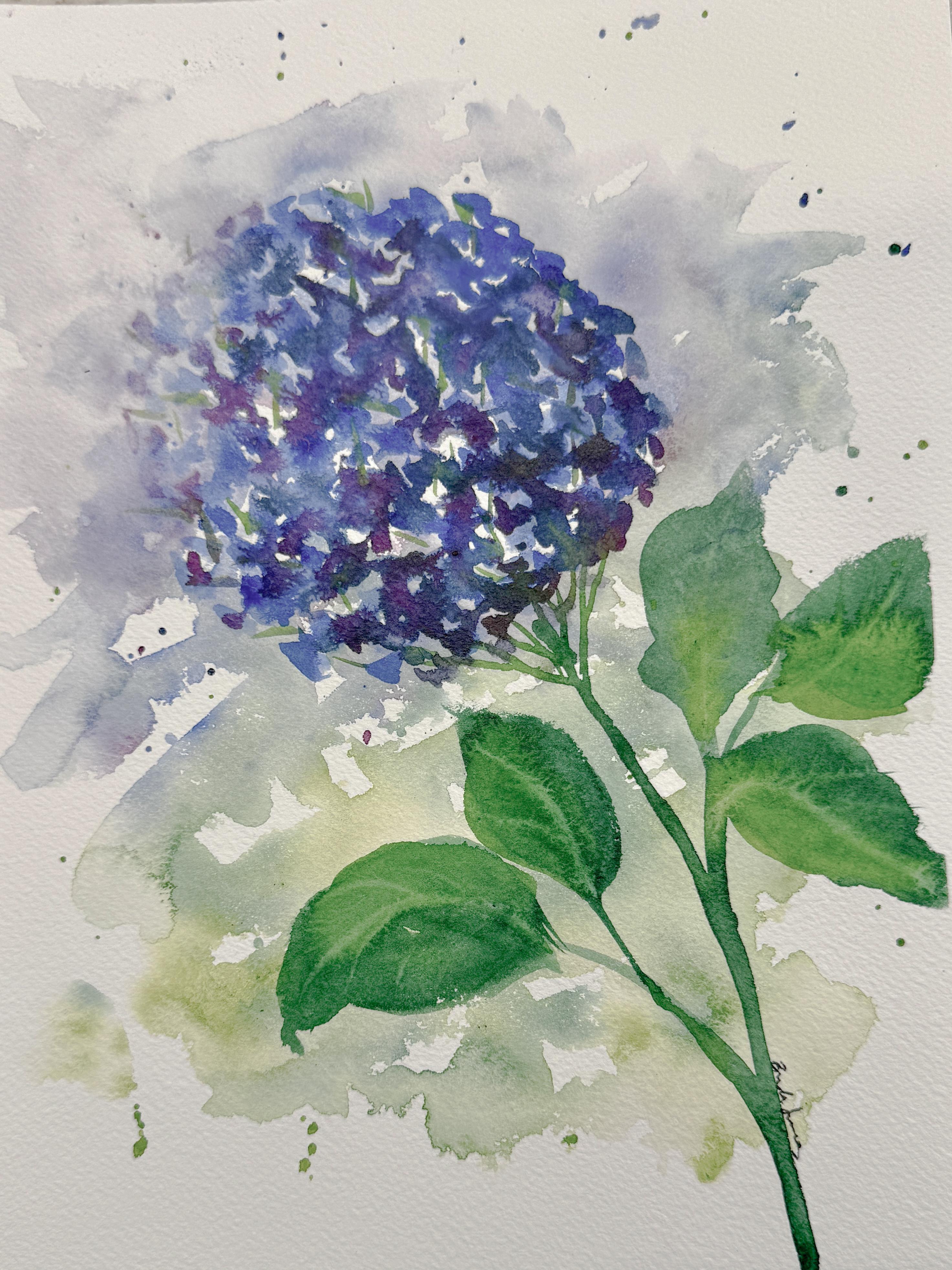
the finished art piece, you can see that here
where we created a darker area and a lighter area where
the sun is coming from. Even though we're going to
be painting very loosely, we still want to be aware of where that light
is coming from. You can usually see
one side of the bloom feels a little bit lighter
and brighter and softer, where other areas feel darker and deeper
with more shadow. Fewer dots, lighter paint, more dark dots, darker paint. That's how we're
going to be creating light within our painting. Really, we're going to
be painting more with value than we are with
painting details. This is where watercolor really does something
beautiful for us. When we let those
little tiny dots softly blend into one another, they really begin
to suggest that all these little flowers
without actually having to define any of them we're not describing
every single petal. We're just suggesting
a feeling of a bloom and letting the
eye fill in the rest. That's what loose
watercolor really is. So now I want to look at
the color for a moment. Hydrangras are such a great gift because they're not just
one flat, continuous color. If you look deeply into this, you can see that there's even little hints of purple in here, different shades
of pink and blue, all the different colors, even some darker colors
in the background. So instead of just using one
blue or one purple color, I want you to think of this
as small families of color. For example, you might choose two blues and two
purple, one lighter, one darker, and then as you
start to place your dots, you're going to be able to
gently shift them around. That's how we're going
to be creating richness and depth without
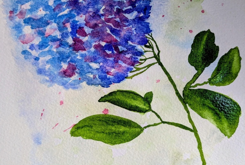
overworking the painting. Here you can see that I have used several different
colors of the blue and several colors of
purple to create that effect. I also want you to remember that hydrangas come in so
many different colors, blues and purples, soft greens
and even creamy whites. Look at all the beautiful
colors that they come in. I just love them so much. So when you are choosing yours, you're going to be
able to select which colors work best
for your painting. Do you want to paint a single
bloom as a focal point, or maybe you want to paint
multiple blooms on one stem, or maybe a loose grouping
of them, like in a bouquet. There's no right or wrong here, but having that
intention before you begin will really help
guide your painting. The same goes for color. Decide on your palette
before you start. That way, you're not
stopping in the middle to try to figure out
what colors you want to create and how you want to design your final arrangement
for your class project. Deciding ahead of time is really important in
loose watercolor. If we were going to paint
each and every single one of these little petals,
these little flowers, we would be working very slowly, very controlled,
outlining shapes and then filling them in. That can be beautiful and it creates a completely
different look. What we're going to be doing instead is using simple marks, soft dots and touches of color to build a
bloom as a whole. Both approaches represent
the same flower. But in this looser method, this is going to allow
our painting and our water to do a lot of
the work all by itself. It keeps things light, expressive, and just a
little bit unexpected. As you move into your painting, I want you to let go of the idea that you need to
have this exactly right. I want you to focus on where
is it going to be darker? Should I add more dots? Where is it going to be lighter? Should I have more white space? Can I shift the color slightly? Jen, just let it happen. Most importantly, trust what the paint is doing on the paper. You only need to give the viewer just enough information for their eye to
recognize the flower, and then the rest will
fill in on their own. That's where the magic of loose
watercolor really begins.
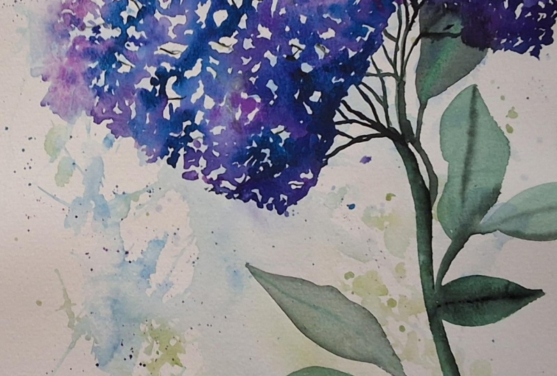
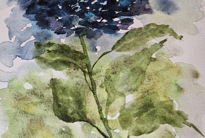
3. Building a Soft Background: In my finished class
project that I did here, I want you to see that I have this really loose background, very watery, almost
that atmospheric look. I kept all my purples and
blues up here at the top, and then I put some greens down here as a
little background. So I did it that
way and I did that first so that when I
painted this next layer, it could really stand
out from the background, and it allowed for
this leaf and the head of the hydranga to
really stand out and be the primary focus with this really soft
background that's almost atmospheric to just
fade off into the background. Something I want you to notice
is that it wasn't solid. I did not make a
solid background. I left lots of white spaces around the outside edges
and on the inside here, it's all very wispy and
irregular and jagged. So I'm going to show
you that first in this next lesson as to how
to create that background. I'm going to be using one
of my larger brushes. This one is a quill brush, also known as a squirrel brush. I need some plain clean water. It's important
that you start out with clean water
because otherwise, you're going to be introducing some other colors on here that
you may not want to have. Now, this is just a piece of my cheaper paper where this paper that I did my
final work on is cotton, so it will work a little bit differently,
but it's close enough. What I'm going to be doing, make sure I move that in
here so that you can see it is picking up
lots and lots of water. The reason I'm using this
larger brush is that this brush head is going to
really just fill with water. I want that to be done on purpose because what
I'm going to do is actually splash water
over here onto my paper. Not in any particular
order or way. I'm just splashing water
so that it's not uniform. I'm not going to be brushing it across and making sure
that it's all perfect. Splashing some down here. I'm splashing some up there. Now you can see,
bring this up closer, you're going to be
able to see that this has puddles of water. That's not just a
little bit of water, that is puddles and
puddles of water. I'm going to leave it
like that and then I'm going to start splashing in and adding some of the other colors that we have been using to
create this background. Spin my palette around. I have this lilac color
that I really like. Adding a lot of water so
that it's nice and loose. I want this to have
more water than paint. It's almost drips off
of the paint brush. It's so full of
just watery paint. I'm just going to just
kind of drop it in, splash it in a little bit. You can move it around
if you want to. Just make sure that
if you're moving it around, it's very random. I'm going to keep that color
up here at the top and then I'm going to allow this area down here to be for the green. So while that is still wet, I'm just going to
come in and grab some blue and I'm going to be adding in some little
blue splashes too. Get this other darker color going just for fun and
lots and lots of water. I can even wash off my
paintbrush and bring it back in here and let that
paint just flow around. I'm really going to
be focusing more of my color on the outside edges than on the inside because
the inside is where this flower head is going to
go. I'm just pushing it out. Then I'm going to
grab some green. Again, I'm just going to
drip it down in here, let it land where those
splashes are, move it around. It's okay if it even comes up into this green if you want
to add some more color, but watch how it's just flowing. And then you can add in
some darker green colors just to really let that
flow around in there. And even the blue is flowing
down into the green, which is totally fine. I'm leaving lots of white space. So that is how I created
this background. And then I would just let this dry at least for a little bit. If I go and try to use have
this dryer that I have, if I go to try to dry this, it's going to move the paint
way too much and move it all over the paper and probably
even muddy it a little bit. So it's best if I just
let this dry naturally, at least until it doesn't have water that is literally
pouring all over this. So I'm going to dry
this off camera and come back and show you
it when it is finished. So I actually decided that this has so much water that's
just laying here. I'm going to take
my paper towel, and I'm just going to dab up some of it just because I feel like it just has so much it's going to take
too long for this to dry, and it's just not
necessary enough. So I'm very carefully
moving it around, picking up some of the puddles, trying not to spread it around, just picking up some of
the really bad puddles. Now that it's not sitting in it, that will dry a lot quicker. Okay, so since it
was almost dry, I went ahead and
started using my dryer. But when you do that, when
this isn't taped down, it's going to start buckling
on you and get warped. So what I'm going to do is
I'm going to dry it enough to get the front kind
of dry, mostly dry. But as I start to see it buckle, I'm going to flip it over
and then dry the backside, which is actually going
to straighten this out. So go ahead and watch
how that happens. See how this is really
starting to buckle. You can see that this side
is really coming up far. But now if I flip it over and
start drying the back side, you can see that,
you can see here that this is starting to
actually lay back down flat. But so now I flipped it over, and now it's curling again. You can see that
it's really starting to curl. That's fine. I'm going to just
lay it back over. And now it's
starting to lay back down from drying the backside. But now it's mostly flat. So when you haven't
taped it down, that's just a little trick to help you dry it off if you're using a hair dryer or a heat
gun or heat tool like that. So there's our background. It's all ready for us to now start to put our
final blooms on, which I'll show you
in the next lesson.
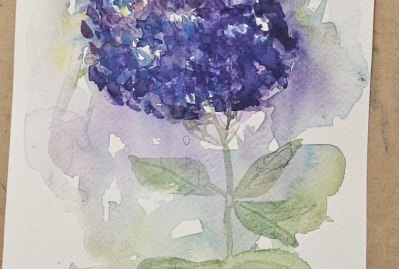
4. Creating Loose Hydrangea Blooms: To add in these blooms, I've chosen to do a couple of the purples and
a couple blues, I always like to
start off with my lightest and work my way up. I know that I want
to have my sun shining this direction and so I would be putting in little tiny dots,
very similar to this. I'm just going to
make something small because in our next class, I'm going to go
nice into detail. I just want to show you a
little tiny bit right here, just to make sure that you fully understand and have a
chance to practice it. If I take some of my purple, I can start putting
in my purple. I can even bring it up in here and touch into the other areas. Then I'm adding in
a little purple, just a little small one. Then I actually switch my brush. If I wanted to put in some blue, I can come and grab some of this blue and I'm just going
to be moving it around, leaving the white space, coming up here, touching
into the lighter purple, that lavender color,
touching into the purple and allowing that all to just bloom
and go together. I can create a second one over here because
sometimes they just really group together.
I like that. We're just going to create
a second bloom over here with that lighter area
and then grab some purple. And see how they touch
in with each other and just naturally blends together, which is really fun.
Really like that. Maybe add in some
blue. That's a lot. Drab that off. That's okay. That's going to be
our shadow area, so that's a perfect spot
for that to have happened. See how that's
working, and then I can even create a third one over here and create another one
even up into my white space. Maybe this is going to just be three different heads all on one coming
off of one stalk. Adding in some of
my darker purple. I'm not being precise. I'm just dabbing it in there, letting them blow and
bloom and move around. You can come back over and say, maybe this one needs a
little bit more purple. Then grab in some of that blue. Again, this is my shadow side so I can get a little bit
darker down in here. Because I have several, I can even make this one a
little bit darker up on top to define this one versus that one and adding in
some of that blue. Yeah, we did that. Then if I would let
that dry completely, then I could come
in with my green, and I can add in all
of my different stems. Just do something really
quick here just to give you the concept of what
we're working on. I'm going to go into much more
detail in my final class. Just wanted you to have a
concept as to what we're heading and then you'd be putting in your
flowers and your, um, all your blooms
of your leaves, put in your leaves and
all the different spots. I'm not going to get
into all the details there because I'm
going to go into more details about that when we do this class project here. But there is a couple
of different ideas. You can cluster them together. You can make one single one,
however you want to do it. That's how we're
going to be making that very atmospheric
loose watercolor hydrangea instead of painting
individual little buds and little flowers
like we saw on here. I hope you join me
for this class. If that's going to be
coming up next where we actually dive right
into making this. And then once you
have yours painted, please make sure you
upload this into the class project so
that we can all see it. Whether you're
painting it like this or this or you're
making the purple, it doesn't matter if
it's something you are excited about or maybe it's something that you feel like you could have done differently. Go ahead and upload it regardless so that we can all enjoy it and see your progress. If you've been enjoying
these classes, please make sure you
give this class a review so that other people can
also learn about this class. Please.
5. Class Project: Loose Hydrangea Study: As I get started, I'm just
taping down my paper. Since it's not on
a board and we're going to be using
quite a bit of water, this will help keep everything flat and in place while I work. There's something
about this step that feels like settling in. It's simple, but it gives you a moment to slow down
before you begin. I'm not being too precise here. Just randomly sprinkling in a heavy amount of water that
lands in little splashes, that will allow the paint
to have somewhere to flow. This step really sets the
tone for the whole pace. It takes away that pressure
of a blank page and gives you something to work into instead of feeling
like you have a place, everything perfectly
right from the start. As I start adding color, I'm working with a couple
shades of blue and just a small touch of purple
or magenta to mix in later. That contrast is
what's going to keep the background feeling light
and airy instead of heavy. You can gently move the water around a bit with your
brush if you need to, but I'm not overworking it. I'm just letting the paint
and water do most of the work together
and blend and flow. This part is really about
letting go of control just a little and trusting how the
watercolor wants to behave. The more you allow
the natural movement, the more interesting and organic your
background will feel. Now I'm starting to bring
in some greens using several different
shades of green so it doesn't feel flat
or all one tone. I'm still working mostly
with those wet areas, letting the color spread
and blending on its own. You'll notice I'm
even allowing some of that green to move up
into the blue at the top, and that's completely
intentional. This is where we
begin to suggest what's happening in the
background of the finished piece. These greens are going to become the feeling of leaves and stems, even though we're not painting
anything specific yet. I'm not outlining anything
or trying to define shapes. I'm just placing color and
letting it softly connect. So later on, when it's all dry, it feels cohesive
underneath the blooms. I'm going to go in with my
lightest lavender tone, and I'm just using
a small dots and soft little dashes to begin building the
shape of the bloom. I'm not thinking
about petals here. I'm really just placing
tiny bits of color close together so that they start to suggest the overall form
of the flower head. This first layer is
very light and loose. It's really just a guide for where everything
else will go. We'll come back in
with deeper colors later and add more
depth and interest. But for now, we're just
creating that soft foundation. Now, if you're planning on
painting more than one bloom, you have a couple options. You can either fully build
out one flower at a time, or you can lay down all
your lightest shades first and then
come back to them. Just keep in mind, if you choose to do
them all at once, you will need to work
a little bit more quickly so that the
paint is always wet for the workable stage and the different colors
can blend together. Now you'll see that I'm
coming in with some of the darker blues
and richer purples, layering them right
over that first watch. I'm still using that
same kind of soft marks, just building them
up a bit more, and in certain areas, allowing the bloom to feel
fuller and more dimensional. As I'm doing this, I'm keeping
my light source in mind. I'm imagining that my light is coming from the
upper left hand side, so I'm going to leave that area a little bit lighter and softer. But down towards
the bottom right, I'll be adding more
of the deeper tones. That contrast is what
starts to give the flower its shape without needing to
define individual petals. You'll notice that I'm not
blending everything out. Some of those marks
stay visible. That's part of what gives this piece that
loose paintery feel. This is where the bloom really
starts to come to life. You're just blending,
building layers, letting the colors sit
next to each other, and letting them do their thing instead of trying to
control every detail. If it starts to
feel like too much, just pause, take a look. Sometimes stepping back for a second helps you see that it's already doing exactly what it needs to do, and
you should stop. Make sure you have it the
shape that you want it to be, and that you have light spots, darker spots, white areas, and the shadows exactly
the way you want them before we move
on to the leaves. Now we're going to
ground the bloom to add a bit by adding in the stems
and a few wide leaves. I'm keeping those
leaves really loose, using enough of a soft stroke and letting that brush
do most of the work. The leaves don't need to
be perfect or detailed, suggested shapes that
support the flower. You can vary your greens here
a little bit if you'd like, or just work with what you
already have on your palate. Either way will
work beautifully. I'm also paying
attention to how this connects back to the background
that we created earlier, letting some of
the edges say soft so everything feels cohesive. This part really helps anchor the flower and
gives it a sense of place without taking away from that light airy feel that
we built up already. I'm just finishing up with
a few more leaves here, but I'm being very
careful not to overdo it. With leaves, less
is really more. You can always come
back in and add another one if you feel
like something's missing, but it's much harder to take them away once
they're there. I'm starting to add in some of the small important details that really help this
read as a hydranga. I'm using a slightly deeper green to create those
thin connecting stems that move up the main
stem and into the blooms. Even within some of those white spaces that we intentionally left in the bloom, I'm adding just a very few
tiny connecting lines. They don't need to be perfect
or even fully defined. They're just there to
gently connect those areas of color to give it an
impression of structure. Even though we didn't paint
individual detailed flowers, these little connections
help bring everything together so that it feels
like a full hydranga head. It's a really simple step, but makes a huge difference
in how the whole piece reads. Now I'm coming back
into the leaves to add just a few
soft vein details. My leaves are still a bit wet here because I'm working
on cotton paper, which holds moisture longer. If your paper is drying faster, you may want to have moved
onto the step a little bit sooner while you still have some dampness to work
with in those leaves. I'm using a small brush with
just clean water, no paint. And lightly drawing in a
few simple vein lines. What's nice about this
is that the water actually lifts and lightens the pigment that's
already there. So instead of adding more, we're gently pulling
away color instead. This creates a soft
natural look that feels integrated into the leaf instead of sitting on top of it. You don't need many of these. Just a few subtle lines are enough to suggest
the shape and give those leaves a
bit more character without overworking them. Now I'm going back in
with clean water again. This time focusing on the upper left side where my
light source is coming from. I'm gently softening then lifting a little
bit of that color, letting it fade slightly
into the background. This helps reinforce
where the light is hitting and keeps the area
feeling soft and open. It also blends the bloom more naturally into
the background, so it doesn't feel like it's
sitting on top of the paper. I'm not removing a
lot of the bloom, just lightly
touching and guiding the paint so everything
feels connected. These are small
adjustments at the end, and they can really
bring the whole piece together in a quiet, subtle way. Now I'm going to gently remove the tape and reveal
the finished piece. There's always something really satisfying about that part. Seeing that clean edge around your painting and how
everything just came together. Take a moment to look
at what you created. Even if it doesn't feel perfect, there's so much beauty
in the softness, the movement that you
allowed to happen here. This style isn't about
getting every detail right. It's about learning
to trust your marks, your color, and the way
watercolor naturally works. If your painting looks a little
bit different than mine, that's exactly how it should be. Each one is going to have
its own personality, and that's part of what makes
this process so enjoyable. And remember, you can always come back and try this again. Each time you do, it
becomes a little bit more familiar and a little
bit more comfortable. I hope this class
gave you a new way of looking at painting
florals without needing all the details
and just enjoying the process of creating
something loose and expressive. If it doesn't feel right the
first time, try it again. It really does get easier, and remember, this should
feel relaxing and enjoyable.
6. Final Thoughts and Encouragement: Take a moment and step back and look at your
painting as a whole. Notice the areas where the
colors blended softly, where you left space,
where you added just enough depth to
bring the bloom forward. Those small decisions
are what is giving your painting
life and movement. You might also start to notice how your eye moves
through the painting, how the darker
areas draw you in, and how the lighter spaces
give you room to breathe. That balance is something
that develops over time, and every painting helps you understand it
a little bit more. If something feels
a bit heavier than you expected, that's
completely okay. Watercolor tends to have a way of teaching
us when to stop, and that awareness will come more naturally
with practice. There's always something new
to learn from each piece. I'd love for you to share your project in
the class gallery. It's always so inspiring
to see how each person interprets the same subject in their own way with
different colors, different levels of looseness, and different compositions. If you enjoyed this class, you can follow me here on
Skillshare so you don't miss any upcoming classes
and leave a review. It really helps others
find the class as well. Most importantly, I hope you had fun and learned
something new. Thank you so much for
painting with me today, and I'll see you
in the next class.
 Brenda Jones, Watercolor Artist & Teacher