Transcripts
1. Introduction: Hi and welcome. In this class we'll be painting an atmospheric river
landscape using a variety of wet in wet techniques and wet
and dry techniques. Creating a soft
and hazy look with a sense of depth can be tricky when you're learning watercolor. Painting, wet, wet is often
associated with a loss of control and without
the right knowledge can definitely create a mess. What I'm going to
show you today is the importance of timing
when painting wet-on-wet. I'm going to show you how
to gain control layer effectively to create some soft and
atmospheric landscapes. It's easier than you think wet on wet techniques brings out the natural strengths
of watercolor is essential for your
watercolor journey. Creating fine sharp details. What is crucial in an
atmospheric landscapes creates contrast and interest. But understanding when to
add the mean is crucial. Something that we'll
cover together. Before we start
with the painting, I'll show you how to simplify shapes and sketch
in large shapes, such as sky, trees,
grass, Atlanta. Getting in those large
components accurately beforehand is essential for
your painting to make sense. So join me in this class. I'm looking forward
to showing you the secrets of natural
landscape painting
2. Materials Required: Before we get started
in the class, I want to show you
and go through a few materials to help you decide which ones you
need and which are best. So I'm using a bit of 100%
cotton watercolor paper. And it's medium texture. As long as it's got
some texture on it, medium or rough texture, you're going to be
completely fine. Really recommend that because
that's allows you to get in these nice soft clouds and
these wet and wet effects, especially with these type
of natural landscapes, when you're painting on paper
that's really, really flat. So hot press paper
can be difficult to get in these background areas and these areas
of softness here, the paint just drives more inconsistently and
sharper on that paper. So you can also get textured
paper in cellulose. Cellulose is that it tends to lift off the previous layers when you go over
that second layer. So if you can get yourself
some cotton watercolor paper, here are some
brushes that I use. Watercolor, mop brushes
are really important. You use these to get
in areas like the sky, these large areas of the bag, even some of the
trees and this one here use that these mop brushes, different sizes obviously depends on what you're painting. Painting something smaller, use a smaller brush like this. If you're using trying to get in that air sky and
the background, probably larger one like this one or this one
would be better. The great thing about brushes is that they have a small tip, allows you to cut around
different shapes easily. Got a little round brush here and also a little flat brush. And these are really good
at creating small details. So if you're looking at
getting you in a bit of water or branches mainly
is what I use these for. You can get those in very easily with the
smaller brushes. They don't hold much paint. But I think that's a good thing, So that just doesn't
create a mess. So apart from that, I've got a few other
specialty brushes here. This is a little fan brush
and you can see here I use that to get in textures
with the grass. I've got this brushy, which is a rigger brush, and I use that to get in the
trees in the background. Smaller branches here just gets you into a point
where you're able to detail there is a larger
round brush would just create two to wide branches. So this brush, this brush
is a filbert brush. Filbert brushes for blending. So it's got a funny sort of tip. It's almost like a flat brush
with the edges cut off. And here I use it to get rid of some
hard edges like here, here, the backgrounds bit of lifting here in the
shadows as well. I've used the filbert brush, can use a round brush for this. I just find the filbert
brush to be a lot easier to do that
scrubbing motion. That's about it for brushes. Let's talk a bit about painting. You can see here I've got
my palette not cleaned up, just finished the painting. And I use really large wells. It makes it easier to, especially when you're
getting enlarged areas of this yellow in the
background, the sky, want to make sure that
I'm not having to continually go back
and having to mix up paints over and over
again because I find it's very difficult
watercolors to get that same consistency of paint. So if I know I'm going to
paint in large area in, I'll make sure that I
mix up enough paint for that main colors
that I'm using. Quinacridone, yellow here. And this is like
a golden yellow. And if you've got
this other color, this is hansa yellow. It's also good if
you want to get in a little bit more contrast, more vibrancy with that yellow. I've also got this stuff here, which is yellow ocher. Yellow ocher is subdued. Yellow are not as saturated
as these two yellows, but at the end of the day, you can use that to
also get in and nice. I'm golden color in the ground. Few other colors that
I'm using for the trees. I've got a bit of burnt sienna, also got a bit of burnt umber. And just basically
my browns earthen colors use some of that in
the background as well too, with some of these
background trees, you can see some of it also here in these, these Teresa left. The darker colors are
basically just a bit of black, black, black here. I've also got a bit
of neutral tint, which is a pre-mixed gray, so you can mix up
your darks anyway, if you've got a red,
blue, and green, and mix those together
in equal proportions. Me a little bit more
blue and you can get a very dark color, which is basically you're black. You've noticed the
little scratches and things like that here,
these little highlights, I've actually used a small blade to scratch off these bits of paint and you can
actually use a card as well. So credit card or anything sharp has a small
edge at the end. You can actually scrape off paint and create
little highlights. And another way you can create highlights is through
using gouache. So I've got a bit of
this white quash, haven't used any of it
here in this painting, but it's just something that
you might want to hold onto, especially near the end. We want to bring out some
extra little details
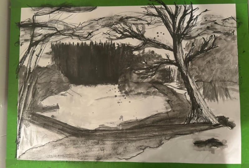
3. Drawing: We're gonna get
started with the scene and really liked this
one because you've got a nice little creek or river running
through the center. Lots of contrasts
with the trees. And the quality of light is something that
I really love as well, just as golden light
that seems to be coming. And I'm just filling
the entire scene, the grass as well. And you've also got some darker contrast
in the background. I think this will be
good because we can also practice getting in some clouds. And the clouds are, there's some that are softer, some that are slightly, I have some slightly
sharper edges. I think I might simplify them
down and just make them all wet into wet in the background. But yeah, let's firstly
getting the drink. And what I wanna
do first is again, look at where the
trees rod at the back. So basically where the sky
connects with the ground. And if we have a
look very closely, we can see it's certainly
not in the center, but little bit below
the center point. So if we say that's the center
point there of the page, I'd say it's around about here. Maybe. I'll just draw a line running across the scene and a very, very loose line as well. Okay, I actually tend to
draw a bit darker on, on camera so that it
makes it a little easier for you to
see what's going on. However, normally speaking,
I do tend to go lighter. Just running across
the page. Like that. It's roughly where the trees
end off in the distance. Now, probably the next
thing I wanna do is get in this stream and we know
that the stream comes in. You can see just the
edge of the page. So it comes in and
then finishes off roughly around the one-third
mark of the page here. And of course it is, gets in the way of a
few bits and pieces. Let's just start
drawing it like this. Okay, Just a general
indication of it. We can see it sort of
finishes off here as well. So just center right of the
center part of the scene. So there's all these like
clumps of bits and pieces here. So just draw that
in pretty loosely. But we just want to
have that indication of that creek in there
so that we're not getting confused at where it is, a
little bit lighter. You can see here there's
actually quite a large tree. Well, a bunch of trees, and there's no leaves
on them really. There's just a couple of
these branches running up like this and I'll
indicate them quickly. I'm not going to really
draw much of it in. I'm going to wait until
later once we have some watercolors to
start getting that in. Main thing you want to do here is you want to
look at placement, the placement of shapes. And it's more of a planning
technique that I like to use. Here in the background you
can see there is a sort of a large tree line and some of them that
stick up along the back. So see how I'm just penciling reading roughly where they are. You can see also here there's
a lot of treeline goes higher off into the
background like that. And the other, really the only other two objects that
we need to put in here, I would say is this larger
tree coming in from the side. And this one is interesting
as well because you've got a lot of light on that tree. The branches which just go off into the edges of the scene. Some of them branch over. And I think the
great thing about these branches as
well as they form a connection between the
different sides of the scene. The natural kind of connection. And then you can
see just some of these branches and things
like that coming through. And just try my best to get in a simplified
version of this, you can see some of the branches gets cut off at the
edges like that. There's lots of these
branches and we will detail them in much more later on. But I just want to
penciling roughly where they are located. Here. There's actually a
bunch of, that's like a rock or something like that. You can see a series
of little rocks. And I'm trying to just
make sure that they are basically a bit
more randomized. A case some of the
shadows of those rocks, some rocks and things here
in the water as well. So this is also a good chance to just indicate some of
these kind of like a warm colored rock and the water is quite dark
and some areas as well, and has taken on more of
a murky type of color. You can see a bit of
the reflected blue here on the side as well. So just take note of these Little observations I
think is important. So there's another rock there. But the big thing here
is just this tree. And this tree is quite
important its forms. I think anyway, the main
subject of this entire scene. So I can see the treatise
comes over from that. Shimon, call it
right-hand side there is this sum shadow and it just
goes all across the water. Like this shadow a lot. It again just sort of connects the scene together
from left to right. It's quite a sharp shadows, so we'll have to get
that in probably a bit lighter and kinda comes
up here like that. See the angle of that
shadow just change a bit. As the terrain goes upwards, the shadow starts to shift
on an upward angle as well. Okay. Roughly where the trees
there is some kind of like rock or a mound of
something there as well. So I'm just going to indicate it like that simplified down. Of course, there's
another tree here, which we've indicated
roundabout there anyway, but I'm going to just put
that in a bit further. So we get this tree going up. Let's see what we can do. I like the shape of it and we
can kind of get it up like this is the main
trunk, I suppose. And it goes all the
way off out into the back at the
top of the scene. We just want to connect
this up like that. Here's a branchial
or something that's limb that's been broken off. And look at these
amazing details. All these little branches. I want to get everything in, but we just want to make sure that we've
got in the basics. We don't want to spend too
much time on this drawing, but I do think with something
like this tree which I'm focusing on as a subject and my
chosen main subject in this area of interest. Anyway, I want to make
sure that I've confident enough with the detail
that I've got in there. So that when I go in with the
brushwork, I'm not worried. Thinking too much. These large branch you
can see kinda goes upwards and it comes down. Hold the pencil like
I am just at the end. And this creates a
natural flow with the, during some natural
variations in your marks that resemble the natural
variations in the tree limbs. So there we go, just they're the bits and
pieces connected onto the tree. I will add some larger limbs in, smaller limbs in afterwards. You've got this one that
just comes all the way out. The seen this, so many of these little limbs
that just branch out everywhere can be quite tricky to get in all the
details for this really. But I want to I want to make sure that I've
got enough in here. Okay. Another one coming enormous
from the top area like that. There, that there, there's
the branch coming in, then coming downwards
like this. Like that. They're actually extend out some of those branches
at the back there. We'll see. I think this is
good to go for the drawing
4. First Wash: So one of the first
things we wanna do is getting all the light
areas of the scene. And that basically for me, means areas of the
sky and also areas of the tree which we want to get in in a more warmer color. So this is gonna be
a tricky one because the colors in the background, as you can see in the
sky, very, very cool. Hints of purple in the clouds, which I quite like. What I'm gonna do first is wet this area a little bit
over in the background. I'm just picking up
bit of water and I've got a watercolor mop brush. I'm also just being
careful not to go over too much of the tree because I
want to get into some yellow, yellowy colors in the treaty. And left side also, we want to preserve some
of those yellows in there. But I think the background
is really important. Just getting in some
of those blues. So I'm just wetting that
paper a little bit. Now, let's pick up some colors. I've got some cerulean strapping a bit of
cerulean blue up here. At the top. I'm gonna go a bit darker.
Drop in a bit of that. Of course, here's that
trig and I'm just cutting around it to hold that
brush at the end. And that way you just
get more looser, broader sort of brushstrokes. I think it looks more natural
that way. So there we go. Just move this, this
cerulean downwards. Cerulean blue is my go-to sky color for these type
of these types of scenes. It's pretty subdued. And just a nice sky blue color. Do have a touch of purple. Where's it here? I've
got a bit of purple. I'm thinking maybe
I should add in. Just try putting a little
bit of that purple just to soft and purple further down, like this, even in here, I will actually add
some more in a moment. But I want to add some
variation in the sky. Notice how, how quickly
I'm doing this as well. There's no fussing about just getting in that
color in the sky. Further down, you can
see how it just gets lot more lighter as well. I have actually funny, funny thing, a bit
of titanium white. So don't use often. But I'm going to put it
in just at the base. And hopefully this will help. Just sort of soft in
that area up like that nicely and more that you're
going to be to that cerulean. I can just drop in
here to the left. Like that. It's a bit too
dark, but doesn't matter. Notice how I'm leaving
in a lot of that. The tree there. Okay, Let's have a look
and I think we can go ahead and maybe pick
up some of this darker. This is just a bit of
darker purple and I'm dropping in some little clouds. And the way to do this is
just pick up that paint and drop it in while the paper is
still wet, as you can see. And from that, you
can just drag around these little cloud-like effects running into the background. If you do find that
there are bits that are too dark or that kind of thing. You can just soften
the mountain, move that paint around a touch. All I want is just
some softer clouds running into the background. I don't want too much
detracting from the sky. As you move down, you can
add some smaller clouds. So again, another perspective thing
where you want to make sure that there's
decreasing size as you move down
through the page. So here's a smaller cloud
that's a smaller one. And another one here, they're just little bits
and pieces like that, not fussing around too much. But a lot of this, you can only really do all
the papers wet, so you have to make the most of it while you've got the time. And you will notice
also at the bottom of the clouds that there
might be a little bit of extra darkness at the bottom that's too dark and pick
up that pain again. But this is what I mean, sort of at the bottom
of the clouds. Like that. Often you just get a slight
contrast of darkness here. So I'm just detailing really with these
clouds wet into wet, subtle detailing and just
want to soften it off a bit. And here we go. There's all the bits
of clouds and things. Often the background look a
bit like clouds back there. I think I'll leave
that and continue on. Let's put in all the yellows
and bits and pieces in here. Now, I have a colleague here which has a bit
of quinacridone in it. So it's called the
Australian red gold. Let's try this Okay. Kinda like a bit of
a yellowy color. As you can see, it's quite
a vibrant yellowy color, but it's got a
golden tinge to it, which is why I'm using it. Because this I think amazing. Just tint of gold in there. And I'm using that on the tree. Of course, like sometimes you can leave in a bit of
that white as well. Don't color the whole thing in, but as you can see here, I'm just using this golden
color to go over the edge of the tree and some of
it may go into the sky, it may bleed into
the sky slightly. Don't worry too much about that. Just look at that. Just kidding it in
because afterwards I'm actually going to
drop in some more, little bit more brown and K, but it's important
to just have some of these golden highlights
in here for later on. Because then you can cut
around them with some other, sort of some other
double sort of color. So important thing to do anyway. These are just highlights essentially that will
help you later on. Let's get some more. And especially on
this left-hand side, I think we're missing
some of these and the paper is starting
to dry there as well, which makes it tricky
because we want it in a way to blend
on with the sky, slightly just melt into the sky. So I'm just adding in little bits and pieces
of that so that it comes through and even
leaving a bit of white in there for some
incidental highlights. If I move downwards
through the page, you can see rant
about here is where the all the little
shrubs and things start. And over here as well off in the distance and bits of yellow. It's really just
a lot of yellowy, warm colors in here. And just I don't need to fuss
around too much with this, just getting a few
bits and pieces. And if you can
skip over parts of the paper as well, That's good. So then you can aromas creates these incidental
rocks and things. Anyhow that you're
going to put in there. Just like that, see how there's
little bits and pieces. I've not gone over,
just leave it. Okay. Can use any type of
yellow for this. I've just used your Kronecker. Don't base yellow for
the golden effect. Okay. There we go. Looking good. I won't mix in a little bit of buff titanium in areas because it just looks a bit
too saturated parts. The buff titanium and even
like a bit of titanium white can just help to create some slight
variations in here. Make it more interesting
in my opinion. Some more here. Drop that in nicely. Like that. Now I'm going to get
into some of the water and I will pick up clean off my
brush quite well. In fact, I'm probably pick up another brush because
it's just tricky to, when you're using
blues that they don't mix in any of the other colors. It's very, very, very hard. Especially cerulean blue
has the tendency to just turn green if
you're not careful. So look at that. I'm just dropping it in. Try to put in a few little
brush strokes like that. I'll carry it downwards more
like to say around here, maybe a bit here as well. But the water is actually
quite murky color. There's not a whole lot of
whole lot of blue in there. And so that's why I'm
going to mix up some, perhaps some brownie, greenie color which I already
have anyway on the palette. But I'll add in extra Brown
bit of burnt sienna in here. And you just get that
to blend a bit on with the with the water and
some of the land as well. But look at how I am
just, at that point, just leaving bits of
those white highlights on the page helps. But this soft joining on to the water I think
is quite important. It makes it look more natural. And getting that through this is kind of more
of a brownie color, but there are some greens
also mixed in here. We're good. We've got the basic
wash of colors in the background or the
light colors, so to speak. And the next step I think, is to build on that
detail a little more. And I start to pick
up some brushes that something
like a flat brush, angled flat brush, a little little brush
like this one as well. This brush here is basically a fan brush allows me to
just get in small details. So what I wanna do is just
go up into this area here. And I'll also use
a spray bottle. Sometimes a spray bottle helps so that you can just
re-wet parts of the paper like this just to
get more softer effects. Because at the moment that's
what I'm aiming to do, just getting some
softer effects. And the tree you can see has
a kind of a brownie color. But I'm mixing it
into the quinacridone yellow to just create
more warmth from there. I want to exaggerate
that warmth, but still have extra
brown in there. So you can see that tree, just the general edges of
that tree in there like that. So it does have a
yellowy color to it. Okay. But you can see there
in the background, you've got a bit here as well. Okay. I mean, it doesn't mix around with that purple
slightly the background. And that's all it takes. Just getting these kinda like the rays of light that
are hitting the leaves and areas like
that here as well. Okay. They're using these
quinacridone yellows. I find they work a bit better with the cooler colors as well. They just don't really turn so much into green
when you use them. Now why? But it's just the thing. Look, I mean, we've gotten
most of this detail. Let's think about what else we could
potentially put in here. I'm thinking maybe a bit
of green or something like a bit of this color, like some brownie green shrubs or something just
running through here. These are just little
bits of little bits of details through this
section so that it doesn't look too yellow and has
a bit of texture to it, even here, especially
in the foreground, you'll notice there
are some texture, browns and things
like that in there. Okay. That they're their bit of that brown area here
and there as well. Here's a bit of the trees and
things in the background. Again, just sort of pointing
up towards the sky. A lot of these trees are
actually in a bit of a sharp color and dark tone
as well and background. So I wanted to leave
that to later on. Good. Okay. Alright. So we'll let this
dry off slightly
5. Second Wash: Paper is mostly dry
now and this is where we can really start to get into the details
and all the darkness and sharper bits
and pieces in here. And it's kinda tricky to
pick a place to start, but I'm going to go
straight into the tree, this tree on the
right hand side. I mean, so because
it just seems like the most natural place really for me to start and I
don't want to overthink it. So I'm just dropping
in a bit of brown here over the left-hand
side of the tree. And I'm just having
a look at it as well to see and compare, making sure that we've got
some softness in here as well. I'm just looking at that
reference picture as well, comparing it and adjusting
where necessary. There may be areas where
you want to indicate some sharpness of light
and things like that. It's up to you. That's mostly just dark darkness in there so I can just
get that in like that. Okay. These are just some browns
and I'm using I'm using a flat brush and see how
it just goes down page. Put some darker brown as well. But if darker brown and some
of this other brown there, there we go, Just coming
down the page like that. The link that you can get some of the
sharpest contrast in there. As you can see. I will work on softening that
down in a moment, but you leaving a bit of highlight on the
right-hand side of the tree? Yeah. And I'm exaggerating this more than you can see
in that reference. But it's something I wanna do so that it creates an extra, an extra sense of dimensionality and strengthens
that light source as well. And you can see how that gold and yellow ecologist comes through in the background. Quite easily. This has to be
fairly dark as well. So i'm, I'm using fair
bit of paint here. It's mostly maybe about
60 to 70 per cent paint. The rest of it being water. Go on and going on here as well. Notice what I'm doing is I'm getting in the larger branches. I'm not worried about
the smaller ones. I'm gonna do those
smaller ones later. But this allows me to
just getting some of these main limbs before we put in the bigger ones
and more interesting ones. Interesting ones but
detailed ones later. Okay? Because that just
coming down like that, there is another
one branch kind of sticking out from the
right-hand side of that tree like that. Just want to soften that off that branch slightly like that. And look at that. There's just some
another one here. There as well. It's interesting
because it helps to build a bit of
detail on that tree and create this sense of there's the contrast between light and dark
on that right-hand side. Because what this
sharper sort of branch sticking out that sits
right next to the yellow. What I'm doing here is
that I've just dried off my brush and I'm just feathering the dry brush through that era of the right-hand
side of the tree in this, for me, creates a
little bit of texture, tiny bit of texture in there. You can even see you can do this same technique
and even getting these little shrubs and things
here in the background. Tiny bits of detail
from this end, I use the little fan
brush as well for this bit of that rock. Okay. Some more of this brown
and what have you, I'm going to just work
a bit on this tree, some of these trees here and flesh out bits, bits of them. Okay? And I'm looking at that
reference, but again, I'm keeping it fairly loose and I'm not
trying to replicate it. The reference exactly, just
taking some ideas from it in terms of the directions of the branches
that are moving around. Because of these branches
are quite close as well. You can go darker Notice how I'm skipping over the paper a bit as
well so that I'm just creating a bit of broken lines and the broken lines
help. You can see here. So just another thing I'm doing, a pickup bit of black. And this black, I'm dropping
into this left side of the tree to create
much dark contrasts. Running through the brown
because the brown is still wet. So if I can get some softer
transitions running through, I think that would be better. Okay. That's pretty
dark branch there, but I wanted to leave more of a highlight and
the right-hand side of it, you can see, look at how it just nicely kind of blends in. And that's what happens when you're painting
wet into wet. You can get these amazing blends of color that you just can't get if you're doing
everything wet on dry. And of course time is of the essence with
this sort of thing. That tree still working on the other one
here, take your time. And again, I'm trying to
do this thing where I'm outlining the left-hand side
of some of these branches. These largest branches
exaggerating the more of course than what they
appear in the reference. But here's one e.g. just the left-hand side
of that golden color. Maybe another one just
coming through like that, that left-hand side. Here's another, another branch, like in front like that. Another one here. That that bit of shrubs and dry brush
here at the base. Look at that. It's a bit of feathering. This little fan brush around to create
some small details. Always trying to be careful
to just make sure I'm varying loose brush strokes a bit as well so that they don't
look all the same. I really liked this
tree to the left and even this one
here on the right, how it just allows you
to join up both areas, the left and right-hand
side of the scene together. And lovely contrasts,
amazing little contrasts. More darkness as you can see on just some parts of
the, the trees. They might even get
really dark branch like this one that cuts through
every now and then. So that's important as well. Having some really dark
areas that join up, okay, there's even
one that's sort of comes out there and disappears off the even the
left-hand side there. Okay. Good. Bit on the base and
sharper lines on the base, but other than that,
not really much. They're looking good. I'm going to just pick
up the green, the green, and then also a bit of black, maybe brown or whatever
mixed together to create this extra sharpness. And over here I'm just
going to go and cut around. Firstly, I'm actually
going to wet, wet this area, touch so
that it blends better. But I'm just trying to get in a little bit of this background. And at the same time
create a just some of this negatively painted
levy area, I guess. The more black in that area
just to make it darker. That's kinda black, brown
and green in that area. I don't know exactly
what color it is, but I'm just trying to
make sure that I've got a nice blend in. I'm leaving in also some of that previous wash in
the background to this. Soften that off a bit more, that you're leaving in some of the yellow on the top
of those trees, it's tricky Necessary here. Actually, I've gone
a bit too dark. This is the shrub that's in
front of everything there. And can actually just lift off a bit
sometimes when you make a mistake or if you go too far into a region that you
don't want to go into? That. Some more this brown? Yeah. There there we go. Darker. I'm just gonna go significantly darker at the base as well. Try to increase the
contrast and the, just exaggerate that effect. There we are. Okay. Nice granulation hopefully
from this, once it dries, here's some more little bit of darkness in the background of this region and am
actually mixing in a touch of purple in there as well. Because I find the purple has a nice sort of trust
with all these yellows. I don't want to go too dark, not as dark as this tree anyway. That's tricky thing
because you wanna, you wanna make sure the
tree comes forward. And if I make the
background too dark around this area that the tree
is going to just look funny and more towards the
foreground or background. So here again, it's another shrub or something
around this region. And I'm actually going to darken a little bit
in the background. There's a bit of this
brownie color that I've got. I can just chop that in here. As you can see, creating some extra contrast
on the tree as well. But I wanted to leave
again just leaving some of that yellowy color in there. But the tree off in
the background or just soften that off there. Just soften that. I want to make these trees a
little softer than the, than the reference photo. Actually. Just a touch of that. Maybe a bit of green in
there too like that. Okay. Fantastic. And you can see just
this sort of come down. Now, there's actually
some shadows running across the ground. I'm going to use a bit of this purply gray color and
just work on a few lines, a few simple lines maybe
running through here. I can just missed
that area quickly as two quick little midst of
color like that water amine. And just bring some of these
lines across the scene. Soft and lines, of course, there's not really too
much color in there, but just soft because we've got the the water we've just put
some water in there as well. Just so that you've got a bit of this kind of a strange way. It also helps to
connect up the scene. I can talk about
connection a lot, but it is very
important to join on the left and the right side
portions of your scene. There we go in these like some trees and
things in there as well, which I will get getting
in just a moment. I just want to get
in the bank of the river or something
running through in here. A few sharper bits and pieces. I think a crucial, There's another one, Here's
another something as well. Perhaps. It's kinda tricky, we cutting around and just
indicating the lights on here. In this section, I
can pick up something like a small rigger brush. And getting details
for the tree. Just picking up with a
black or some neutral tint. That's going to work fine. And over here, you've actually got a branch
that comes up, a little branch there. Are these rigger brushes
are fantastic for this. They just hold them at the
end and you do this kind of thing and can really imply details without
much thought at all. Okay. But yeah, all I'm trying to do is just implied
that there's a tree that's forming in this section so that it makes sense with
all the yellow back there. Okay, There's react
and that's probably part of the brand, the leaves of that tree. Okay. It's all wet in this area, which certainly helps a lot. And here's what we've got, another one we're gonna
do the exact same thing. You want to make sure that
the paint that you're putting on your brush
is pretty thick. It's 100, almost
100% paint in here. And I'm drawing that
brush off as well. At the same time on a
bit of tau on the side. And that helps me to control how how much paint goes
actually onto the page. Okay. So this is some
of those back there. I think those look
pretty decent, subtle, and they have a blend between
sharp and soft edges. It's not some of the melt and some of them
don't really hear as well. This is where we really just
picking up darker colors. It doesn't matter
what color it is. I'm just picking
up bit of neutral tint and a bit of black. Mix that with a
touch of water to activate it because
it's too thick. But e.g. we've got we might have some of the limbs
that we can just slowly start to flesh out. Okay. I want to just darken
off perhaps some areas as well that just the darker
limb here. Something. And some of them just even coming from the age
of the scene from a tree that's out of
the another area. And because using this
brush pretty dry, you drawing off that
brush and a bit of tau. Notice how you get this kind
of broken edges for these, for these tiny little branches.
And that's what you want. You don't want a lot of really, really dark lines going
through the whole thing. You want to make sure
that it blends in. And it looks like these
smaller branches are also catching a touch
of light in there. I'm just mixing a bit of
brown in there as well. Okay, So this actually
if you look here, there's another branch
or something and that forms another branch. You can go on really
forever with this thing, with this type of thing
in the sky is the limit. But at some point you gotta look at it
and say to yourself, Hey, I'm happy with
how that looks. But I'm gonna keep just playing around with it and you're adding these tiny little branches coming off and splintering off. And the way these
branches work as well, they go off and then they join. They create these tiny
little secondary branches. So you get one line and then
that splits into two lines, or could split the
33 lines even. So that's the main thing. I mean, if you look at a tree, really the branches are just smaller versions of
the actual tree trunk. And sometimes I just like to just flip that
brush around so that I'm not overly precious on how I draw every single one
of these bits and pieces in. Okay, let's try a
bit more here on the left that this many, many tiny little branches
and you can actually hold the brush closer down
to the tip as well. If you want finer details and just a little
bit more control, then they just all join
up in the center almost. He is just some I
want to get some vertical vertical
stuff happening here. More darkness on that
left-hand side of the tree. And really dark areas here in the rocks. Really dark contrasts. I'll get some of that in later. I'm just getting
some of this tree or something here in the
background like that. I don't think there's really
much going on in here. Maybe I can just
draw a few little, little lines like that that
will hopefully just break up. Make it look like
there S and trees or something off there
in the distance. Just want to create an
extra sense of detail. Often the back. And again, we're just playing around
with these little branches. Storing the mean should be, puts them all in here. Let's try just a
little bit like that. Very tricky when you get to these little ones to start
getting the easing as well as when you want to
hold the brush closer to the actual top. That's how you detail. You can see. I'm going to add
in another bit of darkness here like another
branch coming off. Something that you
realize you have to do at times is in
the reference photo, it's so easy to spot contrasts, but when you're actually
painting because you're reducing that level of detail and that
level of complexity. You often need to add in extra detail because on
areas on certain parts. Anyway, because he's taking
away detail from other areas. Area looking good. Maybe just create more of
a branch there as well. That another one coming down when other one
going up like that. Just want some larger, larger branches in this spot. Too many little ones. It's, it's funny because it's sometimes
it's hard to tell. Um, in terms of the balance. You sort of get a feel for it. It's very hard to explain, but I'm looking at the scene and just
deciding T-cell Hey, I've got that looks too much. We've got too many
little branches. Let's put in some larger
branches and get a bit of an intuition for
that sort of thing. So those are looking
pretty decent. I'm just going to now work a bit on the grass
and stuff like that. I'll spray spray it
down a touch as well. So yeah, just so that
it's not too sharp
6. Finishing Touches: Gonna be using a
small flat brush. And also some of the years, some of these
detailing brush here, which you may call it fan brush. I'm just trying to
get into that shadow here in the background. I'm not getting rid of
all of the course, the, the light there,
but just kidding in a bit of shadow like that. Because we know there's
actually a shadow on the right-hand side that just runs across
the scene like that. So I want to get in
some of that like that. Getting more little
brush strokes like this. You can also use the fan
brush and do the same thing. Just flicking a few
bits like this. Here. Little bits of grass
growing around the place. More brown. I always try to vary the
colors I'm using in here. But at the same time, I'm going back to that same
sort of pattern of colors, the combination of colors. This is interesting. We've got the shadow running
across there as well, which I'm going to have
to do at some stage. But before I do that, I just want to get in some darker shadow like
this, the foreground. For just another, I
guess there's something out on that right-hand
side casting the shadow. A bit of darkness
in there like that. Probably have to go darker, actually moves slightly darker. That I'm good. Now this shadow I'm going to
keep in kind of a purply, verbally sort of darker color. Pretty dark. But it is actually slightly lighter than the
actual tree itself. So I have to be
careful not going too dark here. Like that. I'm altering that level
of water and that's how you change how dark
the shadow is. Bring that across. Okay, you can just see, and that's why that sketch is so important because you allow yourself the ability to focus on getting in that shadow rather than
thinking too much to yourself. What is it in the right
place upon a thing? It's, you know, it's there because he just drew
it there at the beginning. Bring that across. This is about where it hits
the bank, roughly here. Let's just bring that
across like that. Good. Now get this angle, we're going to get this
angle right, like this. Like that. Excellent. And this just kinda
disappears off, doesn't it? Even a bit of a little bit of yellow showing
through is okay. There we are. Going to add in extra, little bit of extra
darkness in the water to blend things together a bit more of that
brown and blue, that green mixed
together in here. Okay. Martin, dark in
that shadow a bit. We'll see how we go. You'll notice in the center
here there's actually a sunlit spot of rocks
and things there as well. That's a nice little
opportunity for me to pick up some color
and do this sort of thing where it just kinda just indicating details in this mix. Few little splotches
of paint like that. And I'm not intending to get anywhere near what
it looks like in the reference because
there's so much in there, so many details in
their main thing. I want to just make sure
I've gotten right as the level of darkness in this region like that and preserving that light as
well, It's very tricky. But we're cutting around
bits and pieces and I'm noticing that I'm
just leaving the yellow A bit of a yellow. Here,
you've got a bit of this sharpness kinda
running through here. So I'm just going to get
some of that in blue, That's sharper color like that. And this is just
sort of draws out the riverbank in this
section like that. Don't want to go too dark. That bring some of
this across as well. Just little ripples that you can see on the surface of the water. Maybe a bit more
darkness near the banks that you can just get some
of that in like that. I always start with
a lot of bits and then later it's
just apply the dark computes wet into wet so that it looks a
bit more natural. Suppose the shadow is
started to disappear a bit and I need to bring
it back to life, just make it darker than the
actual air in the reverse. So this is what I'm doing. I'm just going over
the top of it. Once again. To strengthen it. Strengthen that shadow more. I'm good. That should dry off. Nicely. Interesting as well. I think this part of the shadow is merges a bit there as well. I'm just going to soften
it off like that. Soft and parts of the shadow off just where it
looks too sharp. I think I can make it
look better if I do that. Models. So find parts
of the painting of started dry and you can scratch out little
highlights like this. At the base of it. The tree and the
grass and stuff here. And this starts looking
like little blades of grass catching some
of the sunlight. Which is really important to have some of that
going on in here. Varying, varying it as well
so that it just looks a bit different than in spots. So it's not all the same. Line work running through. This is just a little
pocket knife that I've got. You can also use
things like gay, like a credit card,
like a bit of cutoff credit card. Do it. I do this same technique
near the edges as well of the of the river. And that creates some
almost like a boundary, makes it look a bit more like there's something going on in there and
separating the river. Notice how I'm also going
over the top of this shadow. That helps to blend. It helps to blend it a
little bit more as well. Just some more here. There is stuff going
through the foreground. Sharper ones even scratched
downwards as well. You can do that. This bit is a little bit
too wet to actually to get in so effectively, but I have to make do just scratching out
to be this painting. This is starting to look
a bit like texture. You can see. It's amazing how much detail that you can really
bring out by doing this. Even on branches, e.g. this branch here I might want
to scratch off a highlight. Some of them may be too late
to do with already dry, but like that I can just
scratch off a bit of light on that side of
the side of that tree, connected onto the branch. And I find that
looks much better than actually doing it with some gouache later if
you can get some of these highlights going already
by just scratching out. And it's not as obvious
as using the gouache. And I think that's why
it succeeds as well, because it's just more subtle. You're always balancing. It's a fine line that you
just balancing the sharp and the soft details to make sure you've got enough
sharpness in there, but at the same time there's enough details to
indicate what's going on. I'm going to pick up
a bit of brown paint, a bit of this burnt sienna. And I'm using a lot of
water on my fan brush. What I'm going to try
to do is flick through a few little variations of
grass or something in here. Because I just think there's fuel just looks a bit to bear. Needs to be some more variation Again in some, some indication of details of the grasses
and stuff like that as well. But keep it very light. Again, don't try
to go in there and to gung-ho because you can potentially get rid of
the light which you need. I love the scene just due to the quality of this beautiful
golden light in there. Got some, maybe some darker
be slightly darker be it's running through that. Maybe some darker ones here. So we look, it's just a
balancing act really, even in this section, you might want to go a bit
darker in some of them. No, Why not? Going to
combination of sharper and that sort of darker
and lighter blades of grass and things as well. Some more here and the bank. Not all over the place, but in certain spots
I think is useful. These forgot to get in there. The rocks of the shadows on these rocks and bit more
of the detailing on them. So I'm gonna go over
just try to do them now. Moving more brown
actually in there. It's a bit too cool. This is what I was
talking about when leaving in some of
those highlights. The yellow from before. And that will allow you to create a sharper
looking shadow, I suppose in some
of these rocks. Now you can pick
off bits and pieces that I know there's actually a tree, sometimes some trees
running upwards from there. So just connect
them on actually to the connect them all nicely
to those back ones that I got another one here. Now, I find that there's
a bit of a void of detail on the
left-hand side because there's a lot of focus
on that right-hand side. And interestingly, I
feel the need now to just put in a few bits and pieces in here
to balance it out. It's again, it's one of those things I was
mentioning before where you just tend to notice at times whether
something is balanced. But I'm sure we can
see here it's quite detailed and there's a
lot of things in there, but I want maybe
some more branches and branches might be
good for this section. And just running
through like that. Maybe another tree we
could just imagine like a tree like that there or
here just going upwards. Like that. That's better. Look at that shadow. How
does that shadow look? Alright. I don't want to soft and you got to just
soften off a bit of it. Like here. Soft enough that area. Sometimes sometimes it just works better when you've
got soft parts of it. Shadow, even through the water, I could just soften off
a bit of that here. That could be just a disturbance in the water or
something like that. You're just picking
off bits and pieces. You can even do it to
say here on the tree, just rub off a bit
of paint there. Okay, then see what
it does here, e.g. as well, there's some type of like bark or whatever on
the tree that's lighter. So I can just kinda Often offer a bit of that. This is a filbert brush, but you can use any type of brush for this filbert
brushes just to make it easier to blend them
to soften bits in pieces. I always use this as
a bit of a finishing. Finishing techniques, especially at the end of the painting when all this paint
has already dried. So you're just lifting
out a touch of paint, but you've got all
the necessary details and things in there already. Sometimes you might
think he's a bit of light on and bring back a little bit of
light and backgrounds. So just dropping a bit of water and lift off with
the filbert brush. And you get this nice soft
effect in the distance. Okay? Lightens that tree
up slightly here as well. Okay. Fix up this, treats a couple
of these little trees here. Maybe you want to just draw in a bit more
detail over the top. Looks didn't mean to do that. Bit of white gouache. I just drop in a bit of
that white gouache here. Some spots, soft and off
that area a bit at the back. It also can create some
misty like a fixed sum, even if you pick up some titanium white or something
and just drop that in in some spots out the back and just soften that
offered the filbert brush. You can yeah, you can
get in this sense of atmosphere and missed
this tree at the back, but I don't want to overdo it just with that
brush and lift off. Slightly like this. Okay. Subtle variations really make a difference with watercolors. Know how to explain it, but that just brings the
painting together. Let's just soften some
of these edges as well. The trees like that. More of this paint
running through there. She in the foreground, I want to flip through a bit of this paint to get
it to connect up. Connect up with everything. Okay? Just about done here. Really at this stage
you want to look for any finishing touches
that you think might be worthwhile putting in. E.g. if you want to put in some tiny little branches or little details
that you think will help bring out the bring out the scene and just emphasize what's happening
with the branches. You can go ahead and do that. Again, it's not super necessary. It's just really what you
want out of the painting. I'm just having fun
doing these branches. And so I'm thinking I'll
keep adding some more in until get bored
of doing that. But I'm holding the
brush further down. A bit of a contrast
from what we were doing before where I was holding
the brush quite far up. And by holding it further down, I can get in more details in
these tiny little branches. As you can see, the
little branches and create detail. Look. Some branches maybe here, just want to cover
up some of that sky, but much of it. Let me go a bit more darkness in some sports. And I'll call that one finished
 Watercolour Mentor (Darren Yeo Artist), Art Classes, Mentoring & Inspiration!