Transcripts
1. Intro : Hi, and welcome to this class. My name is Dera, and I'm
a teacher and self taught artist slash Illustrator from Lovely Oldenburg in
Northern Germany. I started making art
quite late in life, and watercolors were among
the first mediums I tried, and it honestly was
love at first sight. I always appreciated how
accessible watercolor is and how it invites us to play and just let
the pigments flow. While at the same time, it's able to give us
really beautiful results. And that's exactly what
this class is all about. In this easy and
intuitive painting class, we're going to paint three
small butterflies together. And even though the finished
piece is an important and sometimes satisfying part
of the art making process, this is not just what
this class is about. The focus in this class is
not just on the outcome. Experimenting is so vital
if you want to develop as an artist and as a
human being, really. So trying out new things being that new colors or color
combinations or shapes or sizes or maybe
exploring materials you have never used before should always be part
of an art process. The end, what makes these
butterflies truly beautiful, I think, is when their
shapes are a bit unexpected, a little bit off a
little wonky or quirky, those imperfections make
them look real and alive, especially in the age of overly perfect images
generated by AI. So you might end up with a
few butterflies that you really love and others that feel more kind
of like a process. But that's totally fine. That's what creative
play is all about. Now, here's how the
class is structured. I'll start by telling you a little bit about the
materials I'm using. And then I'll walk you through
three butterfly paintings. All of them take just
a couple of minutes. Each of these three ones will give you a peek into my process. But more importantly, it's an invitation for you
to explore your own. Of course, you can absolutely
follow my steps exactly. I've done that
hundreds and hundreds of times over the years, and I feel it's such
an important part of learning to kind of copy
what others are doing. But the idea is also
to use my creations as a kind of jumping off point and then let your own
creativity take over. At the end of the
class, I'll wrap things up with a
few final thoughts, and I share some tips, including a class that
teaches you how to digitize your hand painted
watercolor butterflies if you want to
take them further. If you enjoy this
project as much as I do, you might find yourself
painting a lot of butterflies. For me, it really turned into
kind of a personal project, and at this point, I have
painted over 50 butterflies. So this is the kind of
project you can grow with and easily come back
to from time to time, even if you have
a very busy life. Okay, that being said,
grab your watercolors, a paper of your choice, maybe a cup of tea or
coffee, and let's dive in. I'm really curious to
see what you'll create. Have fun.
2. Class Project: As a class project,
I want you to paint at least one
butterfly and upload a photo of that into
the resources section. Feel free to use
watercolor only or mix it up with other material
you want to explore, like watercolor pencils or ink or whatever you've
got lying around. Like I said, before, you can
follow my butterfly step by step or create your
very own version. That's really up to you. And if you like,
you can also share a few words how
it felt to paint. Was it frustrating,
meditative, relaxing? Whatever. There's really
no right or wrong here, your honest experience. So do make sure to upload your butterfly because I'm really curious what
you're going to create. In the next lesson, I'll quickly be talking about the materials, and then we're ready to go.
3. Materials: Now, first of all,
please don't worry about owning the
perfect materials. So you can absolutely start with whatever you've got to tom, a basic watercolor set, and some thicker paper
is totally fine. To keep things light, I strongly recommend
working in a small format. I'm using a six sized paper, which is roughly about 105. To 148 millimeters
or 4.1 by 5.8 ". It's quick, approachable,
and I feel it's easier to not get too fixated on one painting when
you're working small. You'll just keep going and paint multiple butterflies in a
very short amount of time. One key element in this project is to work with quite
a lot of water. So that's what helps
the paint to flow and blend and create these lovely unexpected
textures we're aiming for. So really don't be afraid to use lots of water with watercolor. Let's have a look at the
materials I be using. In the resource section, you will find a list of the exact materials I'm using for each and
every butterfly. The watercolor set I
use at the beginning is a very basic beginner
watercolor set by Van Gogh. I'll also be using a few granulating and
more professional colors by the brand Schmincke. When it came to paper, I used a 250 gram mixed media paper and something
called stone paper, which I'll explain
later on what that is. The brand of stone paper I
use is a German one called Busa not quite sure whether that is available
in every country, but I'm quite sure that there
are other brands out there. So you will just
have to do a bit of research there which kind of stone paper you can get in your country if you
want to try that out. Yes, last but not least, you will need some brushes. I've used two, which are more on the smaller or medium size. You will need some paper towels, a jar of water, and maybe also a palette
for mixing colors. This palette might be included
in your watercolor kit, and if not, you can totally just use a plate
from your kitchen. Speaking of kitchen items, one thing I also use is sea salt because that can create very
lovely organic effects. And if you have other
materials at home, like metallic paints or
acrylic inks or whatever, feel absolutely free
to use them as well. So, let's get started
with our first butterfly.
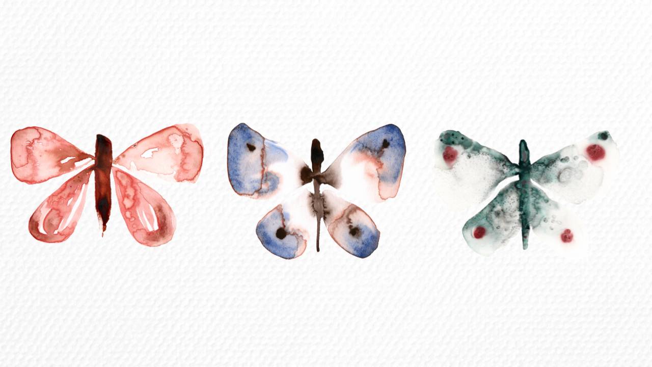
4. Butterfly II - Warm Neutrals: Mixed Media Paper: I start out by creating the
body with burnt sienna, and I've got quite a lot
of paint on my brush. So then I go in with some water
to lighten that up a bit. Now I've taken a pinkish color
that I created by mixing Chinese white with Mada Lake deep and I think a touch
of burnt sienna, as well. And it's really just in
the beginning that I use this mixed color directly. So after the first stroke, I mainly use water to let the pigments flow from the upper part through
the entire wing. So here I'm just really using water to distribute the color, and you can see some
of the brown from the body bleeding into
the wing on the left, and that's exactly what I want. Now, I'm painting
the lower wing here, and I make sure to leave
some white spaces. So areas where the paper shows through because I think
that kind of casual, airy look is really beautiful. Here I'm mixing metal deep with burnt umber to create some contrast by adding
darker tones to the wings. I gently dab that color into the still very wet paint
already on the paper. Now, I'm adding some
burnt umber to the body, again, just to make it look
a bit more interesting. I then started using
colored pencil, and the first one was a dark
brown, which I didn't like, so I stopped using
it immediately and switched to the Faber castle
cinnamon color instead, which perfectly
matched the colors I've already used
on the butterfly. Then I added some of the mixed pink to both the
body and again to the wings. And in general, it's just
a very intuitive process. There are no fixed rules. I simply place the paint where I feel that
it needs to go. I also added just water, dabbing it into the
still wet paint, which created these
lovely blooms, you can see on the
bottom right wing. Again, I dabbed a bit of
color here and there, and then continued with the
Faber Castel colored pencil. So this part is
from the next day when I reworked the
butterfly a little, I didn't like the
dark brown spot on the bottom right wing, so I rewet the area and even adjusted the
shape of the wing a bit, and that helped to tone down the brown so it wasn't
too intense anymore. In the end, I added a
few more brown spots, and then my butterfly
was finished.
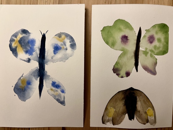
5. Butterfly II - Tundra Violett: Granulating Watercolour: I started this butterfly a little differently
than the one before. This time, I began by applying
clean water to the paper, following the shape
of the wings. At this stage, it's
important to really wet those areas thoroughly so the paint can later flow nicely. Also, make sure that the
inner edges of the wing, so the parts where
they connect to the body come very
close to each other, but don't actually touch. That way, the shape of the body will hopefully
stay a bit more pronounced and not completely
bleed into the wings. Next, I use the
Schmincke CPR brown. I had quite a bit of
pigment on my brush and painted the body in one
smooth downward stroke. I loved how the shape naturally
tapered off at the end, so I just left it like that. Then I added the Schminke
Tundra violet to the wings. I simply dabbed in
a bit of color and moved the paint ever so slightly with a
brush, but not much. I mostly let the
water do its magic. Since Tundra violet is a granulating color
made of two pigments, one purple and one more
of an earthy orange, it creates really beautiful
textures as it dries. To finish, I added four dots
of sepia brown to the wings, and that's it for
this butterfly.
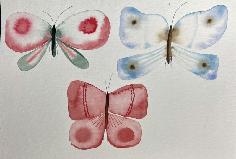
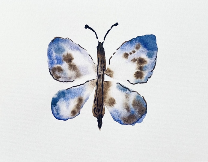
6. Butterfly III - Forest Blue: Stone Paper & Salt: Data. For this butterfly, I decided to use a unique
material called stone paper. Stone paper is an alternative
to traditional paper. It's made from
calcium carbonate, basically limestone,
combined with small amount of non toxic resin. It's waterproof, tear resistant, and has a very smooth,
almost velvety surface. Because it's waterproof,
it doesn't absorb water and pigment the
way regular color does. Instead, everything kind of sits and dries on
top of the surface, which also means it takes a really long time to dry,
sometimes several hours. But the fact that it doesn't
absorb any water also has a big advantage because unlike
regular watercolor paper, stone paper never
buckles or warps. It stays completely
flat the whole time. What I personally love about
using stone paper with watercolors in particular is that the pigments really
float on the surface. The surface, like I said,
stays wet for ages, and this long drying time
can lead to beautiful, almost magical
textures, the kind I've never been able to achieve on regular watercolor paper. And also some colors even
stay vibrant after drying. Now, if you work a
lot with watercolor, you'll know that the colors
often look stunning and saturated when wet but tend
to dry a bit washed out, with stone paper,
certain shades of watercolor really
hold their vibrancy even once they're dry. I started this butterfly in a very similar way to
the last one by mapping out the wings with clean water and then gently
adding in the paint. I also began with a body using the color forest
blue by Schmincke. And to create a
bit more contrast, I added just a few tiny touches of lamp black here and there. You might have noticed that I really don't use
brush strokes here. I'm just dabbing in the
color most of the time. For the little
dots in the wings, I used potters pink. Both potters pink and forest
blue are granulating colors, though their texture effects are fairly subtle in this case. I also brought in a
colored pencil again. It's the Kaput mortum
by Faber Castell. I only added it to the
dots in the wings. It might have looked
nice to include it in a few more spots on
the wings or the body, but I didn't do that. Here you can see me sprinkling some sea salt over the wings. It's the kind with
larger grains, though you could try regular
table salt, as well. I absolutely loved how this butterfly looked
at this stage. While it was still slightly wet, it appeared very kind
of airy and mysterious. Unfortunately, as you'll see in the next take, once it dried, much of the pigment
bled together, and the cors of the
wings really got lost. Later on, I tried to fix this mainly by lifting some
of the paint with water, adding a bit more forest blue, and then refining things
in the digital version. You can really see the
beautiful salt texture here. It sparkles in the sunlight. Now, I'm lifting off the
paint, and for that, I used the Guatca dagger brush
with synthetic bristles. It's a bit on the firmict which work really
well in this case. Here, I added some more
color to the body to give it more definition and also
touched up the wings a little, especially the lower ones which had lost quite a
bit of their color. And that wraps up
our last butterfly. In the next lesson, I'll be
sharing some final thoughts, and I'd love to invite
you to connect with me. See you there. Bye.
7. Outro: Thank you so much for
joining me in this class. I really hope you enjoyed it and feel inspired to paint your
own watercolor butterflies. If you'd like a quick refresher without rewatching
the whole class, I also created a step
by step PDF guide. You'll find it in the
class resources section. Perfect for when
you come back in a few weeks or months and
need a gentle reminder. If you'd like to
take things a step further and turn your paintings
into digital artwork, I actually got a class
on Skillshare called digitize your artwork on
your iPad using Procreate. In that class, I show
you how to scan or photograph your artwork,
remove the background, clean it up and procreate,
enhance the colors, and make overall
small adjustments that really let your
watercolor artwork shine. If you'd like to stay connected, you can find me on YouTube,
Instagram, and Kofi. I'd love to hear from you. And finally, just a little
f I want to leave you with. A world where images can be generated in seconds
by AI tools, meaningful art is definitely not about perfection or speed. It's really about how
it feels to make it. So that feeling of being
centered in yourself, of slowing down and this huge joy the process of
creating can give you, that's the most important
part of it all. So I hope you keep
painting with joy, curiosity, and a lot
of trust in yourself. See you soon. Bye.
8. Bonus Lesson: Watercolour Moth: Welcome to this bonus lesson. I painted this moth
on stone paper, which will later make the colors float very beautifully
and effortlessly. And as the paint dried, it left behind a beautiful
texture on the outer wings, which would not have happened in this fashion on
watercolur paper. To start out, I began by dabbing in CPR brown
to shape the body, and this was supposed to mimic
the furry body of a moth. I then went in with a
size two dagger brush, using plenty of water to
paint down the wings. Afterwards, I moved
the water upwards, creating a pool of water
where the wings are. With paints gray bluish
and later lamp black, I added small circles, which I will later define with a colored pencil to make
them more circle like. And using a small brush, you can see me manipulating the water again to
make the color float. The moth has these
lovely antennas, which I painted mainly with water and just a little bit
of the brown from the head. Here I'm placing two
rather random dots of naples yellow reddish. And then I continued
with lamp black. For the lower wings, I again used only water letting some pigments
float into it. And I feel you can really
see how beautiful it looks when the pigments of the color float
into the water. Here I put in naples
yellow, reddish. Again, just dabbing
in the color. And for contrast, I added in some more lamp
black here and there. Next, I brought in a Fabo cistel cinnamon colored pencil for
some mark making, which I always find adds
such a lovely touch. And with the Derven
charcoal black, I define the little
eyespots you sometimes see in the wings of
moths and butterflies, adding in a bit more water to the body to connect
the little brown dots. And after letting it dry, it formed into a
really beautiful moth.
 Julia Ulferts,