Transcripts
1. Introduction: Hello, everyone.
For those of you that do not know me,
my name is Paul. I am a Skillshare teacher and have been so for
seven years now. I teach watercolor painting as well as digital
painting and procreate. Today's painting,
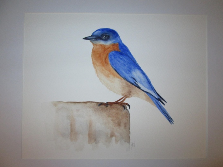
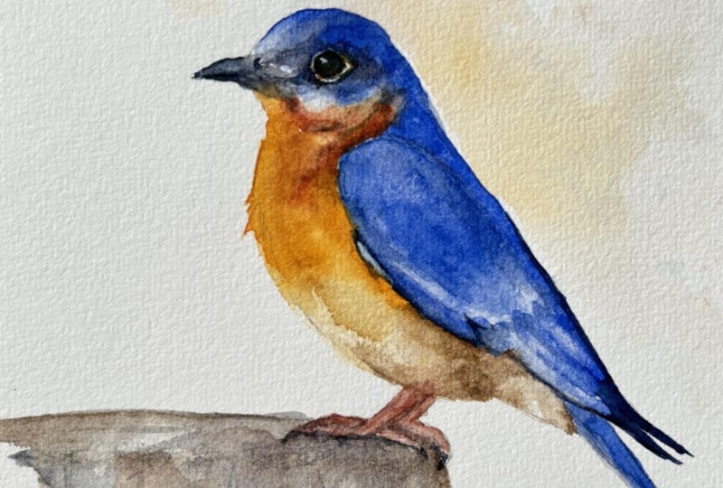
we are learning to paint this watercolor bluebird. This is considered
a loose painting. It is intended for all levels. Some might look at it and
think it's intermediate, but everybody can
do this painting. If you've taken my
other classes before that have led up to this,
it's especially easy. If you've not taken
those classes, then I suggest you go do it now. This class is a
little bit different. And what we're
doing what makes it different really is that we're using two colors here
primarily on our bluebird. We have take a look here. We've got the bluebird, the blue of the bluebird, and we've got the orangeish, yellowish belly here, some
details on the stump. But when we look at this,
you're going to see some very clear marks
and patterns in here. For example, the biggest
one you're going to notice is this wing area here. This is the same paint,
ultramarine blue, but it's just dried
at a different time. So we're using the
drying times to make these lines and
shapes intentionally. So we're using these hard
lines to define areas and contrast and whatnot
in our bird painting. So that's the bulk of what
today's lesson is about. It's a very valuable lesson, and the bluebird is a
great subject for that because it's mainly two
colors, blue and orange. So how do you define something, make these shapes and define certain parts of the bird when you've only got two
different colors? You're not going to
put red on the wing, which's not a red wing
bird. It's a bluebird. So we're using the
drying patterns and the shapes to
make these shapes. It's a great class.
It's a great lesson. I think you're really
going to like this, and it's a beautiful
painting to do. As with all my classes, you do not need to
know how to draw. I provide you with this handy dandy outline
of our Bluebird, as well as a reference photo, the one that I painted from, and for your enjoyment, a copy of a high
resolution copy of my Bluebird painting for you
to use as a reference guide. The class is broken up into
easy to follow chapters. As always, we start off with
doing a blue layer wash, then we do an orange layer wash, and we go back and forth
and paint the eye, paint the beak, paint the
feet. You know the drill. When we're all done, you've
got a beautiful bluebird. When you're done, your painting, make sure you put it
up in the projects and resources section so that
I can give you feedback. And when you do that,
please let me know the paints and the materials
or paper that you use. If you know. If you
don't about it. But that helps me, you know, assess any problems you might be having and give you
some guidance and, Hey, maybe try this
or maybe try that. It also shows other
people what you're using, and they may want to try
what you're doing, as well. I hope you like this class as much as I enjoyed making it. I really enjoyed this painting. I did it five times myself, so do it more than once. It's great practice. Let
me know what you think. I will see you on the
other side. Bye bye.
2. Materials: Alright, let's take a look at our materials that we're
going to use today. We'll start by looking at my very messy
painting table here, but, hey, it's
messy, but it works, and it's always set
up and ready to go. This is a screenshot from
the end of the painting, so we'll be looking
at the materials as they finished, I guess. First, we're going to talk
about the colors that we use. So over here on the palette, we'll start up here at the top, where we've got our burnt umber. This is raw sienna. Now, I often say yellow ochre because it's easier
to understand. More people have yellow ochre
than they would raw sienna. It's essentially the
same pigment number, index number, very
similar in color. I can't tell the difference
between the two. So use it. You know, we don't use it a
lot in this anyways. But just so you know, when I say rawsiana
or yellow ochre, just consider them
interchangeable. Over here, we've got hansa
yellow light, sorry, medium, and then we've got
hansa yellow light or lemon yellow, whatever
you want to call it. We also have acridone red
here that we've used. And down here at the bottom, we'll go to our
ultramarine blue. Oops, and let's not
forget indigo over here. We've also got indigo and some Cacradone gold and
burnt sienna, which again, are very similar in
terms of their hue or, you know, their look
and appearance. Cacrodone gold is more vibrant, but other than that, it's pretty much you can use either one. It doesn't matter. Okay, now onto our paper. Let's look over
here at our bird. What I'm using is I am
using stonehenge aqua, 140 pound hot press paper. Hot press gives you these
more distinct lines here. It's easier to lift. That is a blessing and
occurs at the same time. Being easier to lift means that when you go to
put on a second layer, you have to be
careful not to remove the first layer because it
does lift off a lot easier. And I'm intentionally using
lifting pigments here, meaning pigments that lift
easily, non staining pigments. Um, for this exercise, because what we're doing, again, is we are using the layers to create the shapes
because we're using the same color over
and over again. Okay? For our brushes, we are
using synthetic brushes. They're all synthetic brushes. I think I have a
number two here, zero, maybe, and a number
four, synthetic brush. And then, like, a
synthetic mop brush, which is also a number four, but in the mop brush
style, are quill sorry. They're always a bit larger, like you can see down here.
There's always larger. I've got my Trustee
water container here, which is a reused
peanut butter jar. And with very dirty water
in it and some cloths and rags that I use to wipe the paint off or
pigment off that I use. Up here at the top,
we've got our guash, white guash by Lucas and my spray bottle that I use
to re wet my pigments. My trusty N able eraser. If you're ever wondering
what this keyboard thing here in the background is, it's what my iPad
sits on that I'm using to paint from the
reference picture on. My paper is taped
down on a piece of cheap melamine plywood. I have stacks of these
that I just cut up to hold 11 by 14 sheets of
paper for this very reason. And that's about it. Those
are materials today. I did my initial sketch in
using a water soluble pencil, an HB water soluble pencil. You can use one of those, or you can use a regular
pencil and just sort of erase the lines light so they don't
show up in your painting. That's all for the materials.
Let's get painting.
3. Painting the first wash: Okay, so we're
going to start with a nice wet wash of
ultramarine blue, just ultramarine blue,
no other colors. Lots of water gonna get
my brush loaded up. Now what I'm going to do is I'm going to paint this in sections. So if you look at this bird, it's really just
one big blue bird with some orange and some white. There's not a lot
of colors here. But you can see that there's
different directions and feather patterns and things like that that
we want to show. But how do we do
that with one color? So what I'm going to do
is I'm going to paint this in sections, areas. And as I'm painting, the other
areas are starting to dry. They're leaving hard
water marks on the paper. And this is especially more apparent with hot press
paper that I'm using here. The pigments don't get as stuck in the little
grooves of the paper, so it's easier to lift off and the water dries in a
more defined pattern. So what is important
here is making sure that my paint doesn't dry
where I don't want it to. I'm intentionally avoiding
the area of the wing, the rounded part at the
top of the shoulder. So now I'm just going to
continue to fill this in. I'm going to get the
areas that I want all in this section,
we'll call it. A filled in with an even
wash, as even as possible. Now, we've essentially got an even wash of the same color
blue all the way through. However, you'll
notice that there are some lighter areas like up
here at the front of the bird, where it's kind of
like an off white, maybe even almost pinkish. I should have put some
agenta in, but I didn't. You'll notice I go
back and forth between my brush and wiping it
off on my cloth and like, getting water on my
brush and wiping it off. I'm just trying to
get the right amount. Sometimes I just throw in
a whole bunch of water, let it bloom, let
it do its thing, but here I want it to
be more controlled. Now that I've got that wet area, I'm going to try and cook
some of these pigments back into this clean area because
it is a soft blue there. You can see there. It's
just a little bit lighter. It's not paper white, but it's
just a little bit lighter. So I'm just trying
to convince some of these pigments to
fall back this way. Now I'm going to use the
same technique down here on these bottom wings
to define this area. We've got a lighter area there, so I'm going to lift
some of this pigment out because I'm going to
put some back in later. Right now, I just want
to define the shape. Remember, we're using
all the same color here, but we're trying to
define different shapes in our painting. Now using the same
ultramarine blue, I'm just going to add
in the tail feathers. So we painted around the
main area of the wing. And what that's done is now that the paint has dried enough, it's still wet, but it's dried enough that it's going
to leave a mark there. So, you see, as
I'm painting over it, it's leaving that mark. It's definitely now a
defined separate area. It's the same color. It's
the same amount of paint. We just let the
paint around it dry enough so that it's kind
of defining the shape. Now, you could also
do the same thing with the bottom section
here. I did not. So I'm just gonna lift it
out like I did earlier. You'll notice very
subtly at the bottom, there are some
separate wing shapes. They're like, the little
feathers at the bottom. Before we apply the
orange on the belly, we want to make sure that
the blue area here is dry, so we're gonna let that
dry before we come back and do the
orange on the belly.
4. Starting the orange belly: Okay, moving on to the
belly of the bird, the first thing we
need to do is mix up some of the
orange color here. So for that, I'm going to
use hansa yellow medium, some cacrodone red and
hansa yellow light. We can see that
there are different values of orange in here. There's some light areas,
there's some dark areas. So what I'm going to do is I'm
going to try and mix those up ahead of time instead
of mixing them as I go. So this is kind of like
a medium gold yellow. I still need a bit
of red in there. You have to be careful
with the Quinacridone Red because it's very powerful. You want to know,
you've probably got a ten to one ratio here of yellow to red to
get that orange color. Then I'm going to mix up
some of the darker, sorry, some of the lighter yellows down here by adding more water and hansa yellow light,
which is a brighter color. Then we will go back and we will do the same
thing for the red. We're gonna mix in, sorry,
some of the darker orange. We're going to mix in some
Mrequdaqidon red up here at the top and make that
darker orange color. Throw in a bit of yellow
ochre or natural sienna. Pretty much the
same color there. Might have natural sienna, but feel free to use yellow
ochre if you need to, or just skip it and stick with the yellow sin that you have. I'm going to start by taking some of the very
dark orange that we made and mark in some
of these areas here. There's a fair bit
of pigment here that I know I can lift and
move around later. So I don't mind if this
dries a little bit. I'm just kind of defining
where these lines go and where the dark areas are. Now, we're just
going to kind of get a feel for the value here, make sure we got the right
value and put it in. We know we're gonna pull it
around later with some water and sort of bleed it off or darken it up
where we need to. We've got lots of water, lots of pigment here. I'm
just plopping it on. I'm gonna grab my
number two brush here. They're gonna try
and use this to flick out some of
those feathers. Sometimes I'll use a
liner brush for that, but I had this one handy. I'm also going to use
it to fill in some of the areas that are closer
to the darker parts, the blue parts that I don't necessarily want to overlap yet. I'm just going to
take my time and try and mark in
these areas where, you know, there's
different variations. There's some lights,
there's some darks. It's the shadows of the
feathers that are fluffing up. And so I'm going to fill
that in, get this closer. Then I'm going to lift that over top with some clean water, just wiping off my brush. And I'm just lifting off the wet pigment there to give
the look of the feathers. You can see if you look at the area that I'm working on and on the
reference picture, you'll see what I'm doing here. You see that light area where
it kind of lifts over top. You could do this when it's dry. You'd probably get
the same effect. It's just easier to control right now
while it's still wet. I'm basically just picking up the paint using my
brush as a mop. This is a bit of a tricky
area, so take your time. Or if you like, you can
just fill this in all dark. You don't have to be so finicky. Remember, this is
a loose painting, so you can make it as
loose as you like. I'm just showing you different
techniques in the class. But if you find this
part here to be too detailed or too
overwhelming, just skip it. Just make it kind of
dark, kind of light, blend it together, you know, experiment, come up
with different ways. Every time I did this painting,
I did it differently. This time, I just took some time to make it more detailed
to show you my process. Moving further down
the belly of the bird, we've got kind of
an off white color, and that off white color
has got some brown in it. I'm going to use burnt umber, and I'll mix it with some of
the orange that I made up. I'll start this area
just the same way we started the orange area,
just kind of flopping in. Think of it almost as
drawing with puddles. We're just sort of
saying, Okay, this is where the dark areas here. I'm going to put a
puddle of brown here. Then I'll come and get
some clean water and I'll disperse it around to try
and get the other value. So we're letting the water and the paint do the work here. And one thing you'll
notice as we go through these paintings is
they seem to get a little bit more and more
complex, and they are. What we're doing the same
thing that we've done all along is we're taking
the loose approach, but we're just doing it in
finer and finer details now. We're still doing
the same thing. The water is still doing the work here,
it's still drying. We're still just plopping it
on and bleeding it around. If you go back to
the flower class, you'll see in the flower class, this is exactly what we did
when we made our petals. It's just a different subject
matter now and more colors. As you all know, I like
using lots of water. So here, I'm going to
take a lot of water, and I'm gonna pile it in the
bottom of the belly here, create some blooms,
let those pigments mix together versus trying to paint
every fine little detail. I'm again, letting the
water do the work. Well, we've got all
that water here. I'm just going to
dave in some of the darker brown areas
here around the foot, add a bit more value in up
here in the shadow area, let it bleed, let it spread
around and do its thing. We're gonna add in a few more details down here at the bottom, and then we're gonna
let this dry and come back and do
the next section.
5. Adding the second layer to the chest: Okay, we've got our big
shapes blocked in now. It's time to work on some
of the finer details. We're gonna add in
some shadow areas, some detail in the
orange in the chest. We'll start by mixing
up the shadow color, which will be burnt sienna
and ultramarine blue. Using a small brush, I'm going underneath this area here
where there are some shadows. I'm putting on some
saturated pigment. Both these colors lift well, ultramarine blue
and burnt sienna. I'm not too worried about, like, making a hard line right now. I'm just putting the color on, and then I'm going to
soften it down with water. Very similar to what we
did everywhere else. We're just going to take this, like, dark color that we made, and we're applying it here. We're lining it
underneath the wing now. And then we can come back later with our clean water and we'll just call it brushing out where we take this
line and we soften it. And by softening it, we're
making that gradual shadow, the gradation that
you see there. It doesn't just have,
like, one stark line. There is sort of a stark line, but then there's a shadow
area underneath it, as well. Now I'm going to take my water. I'm going to say clean water,
and it's not very clean. Oftentimes, people will
have two things of water here. I probably should. I just don't have the
discipline for that, and my water gets dirtier
and dirtier and dirtier. And if I wanted to be
a real perfectionist, I would have clean water here. Anyway, what we're doing
is we are, as I said, we're kind of scrubbing
out this dark line here, using water, kind of wiping a
little bit off on my cloth so that it's
not ddles of water, but I just want
enough to make the line as soft as possible. And again, this is
one of those cases where good watercolor paper, like a heavy duty
watercolor paper comes in handy because
you'll notice the back and forth on my brush would
wear through finer paper. Now we're going to
do some more lifting up here, got some clean water, and this little feathered area that goes up
inside the head, I just want to make sure that
I don't forget about that. So I can pull some of
this orange up in here, but it might turn green
if I'm not careful. So just be careful here if
you're going to do that. Now, we're going to take some of that brownish color that
we mixed up earlier. This is actually pretty close to just burnt sienna,
sorry, burnt umber. And we're going to
plop it on here like we did before
with the other colors, plopping on little
bits of color, and then we're going to
dilute it with water. At the bottom section here, we're going to pull
this right up and make this little whole shadow area here by using this pigment,
just pulling it with water. I'm not crazy with
this area in here. I need to darken that
value up a bit right now. It's too yellow, and if I look closely at the
reference picture, it's actually more orange. So I'm just going to
increase the value here and try and even
that out a little bit, just so that it looks more
like the reference picture, just trying to match the
values at this point. And again, values,
meaning light or darks. Let that dry a little bit. I came back with
my smaller brush, and I'm just going to pull
some of that color down just to even it out and
make some of these, like, sort of shadowy
patchy areas. We'll let this dry and move
on to the next chapter.
6. Adding the second blue layer: Okay, let's get back to
the blue of our bluebird. Keep in mind, so
far, we've only got one layer of paint on here. So I'm going to mix up a little
bit more saturated paint, and I'm just going
to add in some of these more detailed areas
like where the darks are, like, around the eye,
giving it a bit more depth, using the value to create
a three dimensional shape. And again, this is
the same color, but we're using the
drying patterns or the drying marks
that the water leaves to give us the
different um total areas, I guess, you'd call them,
or the shadow areas, the light and shadow areas, the details, if you
want to call it. But we're letting the
water do the work. We're not painting the details. We're just kind of
plopping on darker and lighter colors and lifting out areas and darkening
up other areas. Let's approach the large area of the wing here in
the same manner. We're just going to
be careful that we'll keep this section of the
painting inside the wing area. We're doing the same
thing we did before. Again, we're just creating
shapes by letting the water dry and by
controlling this, we could let this dry and
then come back and do this, but I'm just doing it all in one go and just
watching the edges. Going to use my brush
as a mop here and just sort of define
some of the areas here. I'm making this a bit too light, but I'll come back
and fill it in later. I'm just kind of
trying to decide, Okay, where are the light areas? Where are the shadow areas? And I'm sort of pushing the paint around and
lifting some out, using my brush like a mop or just using it to push
the puddles around, really, just kind
of edge the water and pigment in the direction
that I want it to go. You're essentially looking at your reference picture
and you're saying, Okay, where's a light area?
Where's a dark area here? These are those little
stripes in the wings down there that we just did
here on the shoulder. I think it's a bit too
light, so I'm just going to blend in some
pigment over here, just give it a wash over top. But I still want
to make sure that it defined that it's
a separate section. And you'll notice that it is, and a lot of that is coming from the drying time,
the paint above it, drying more and the direction
of the brush stroke, like using your brush
strokes in certain areas to make these lines and
shapes that will dry. And we can see there's some shadow areas here,
some darker areas. Sorry, like some
almost black areas. We're gonna use indigo for that. We're just going to
use a small brush, apply it down here
on the bottom, and then we will
blend in some water, some clean water
to sort of bleed it up and spread it around. Again, this is the same thing we've
done in the other areas. We're just now using
a different color. Again, that's indigo. You
can use any dark color. You could mix shadow area
your saddle color si into your ultramarine blue and darken it up if you
don't have indigo. And once we finish up
with the shadow areas, we'll let this paint dry and we will come back
and do the next chapter.
7. Starting the beak and adding details: Okay, we're going
to start and put some details on the face here. We're gonna start with
the beak. To do that, we're going to use indigo.
Just straight up indigo. It's a nice dark
color. We're gonna use the same method we've been
using in the other areas. We're going to apply our
indigo using a small brush. We're gonna try
and put on lots of pigment in the
darkest areas first. So we're just going to basically paint these darkest areas. The bottom of the
beak. There's an area at the top of the beak,
places like that. Now, I'm not sure
what I'm gonna do exactly here with the eye yet, but in other paintings,
I did leave, like, some brown undertone at
the bottom of the eye. So I'm gonna paint this
at the bottom here. I'm using Quinacridone gold, but you could use burnt
sienna or a dark brown, like burnt umber,
anything like that. And while we're waiting
for that to dry, we're gonna put some more
details on our bird here. We're gonna mix up
some more indigo, and we'll start at
the back of the eye. Plant as before,
put the darks on. We're just painting in some saturated pigment
using a small brush. Now we're going to
use a damp brush, and we're going to wet out these areas that we put the
concentrated pigment on. Just like the paint
on your palette, this can be re wet, and we're now using it to make,
like, a gradation. Like, we're pulling that
dark area out there. If you don't have enough pigment or it's not dark enough
when you do this, you can always do
it again after and build up that area to
get the right values. And once we've got all
the dark areas in, we're going to mix up some of that dark gray color that we made with our burnt sienna
and ultramarine blue, and we're just going
to put a wash in here. Now we're just trying to build
up the second layer here. We're putting in a
nice wash. And again, we're gonna bleed it out, even it out as much as possible. And to do that, we're
just using a damp brush, and we're kind of coaxing
these pigments around. We're just kind of saying, Hey, you know, you
come over here, and then you come over here and we're just
edging them around. I'm using hot press paper, so it does leave
more defined marks. You'd have This is a
lot easier to do on regular cold press paper because it doesn't lift as
much of the pigment out. I don't think that I had the
values dark enough here, so I'm going to go back in
and just repeat the process. As I said earlier, if you
don't get in dark enough, you can come back
and do this again. It is a lot easier to make it lighter and build
it up as you go. However, you don't
want to do it too much because the more
work you do on the paper, the more it gets overworked. Think of it in terms
of layers, you know? Think of three as the maximum. You don't want to go
more than three layers. So you start to lose
that transparency, what makes watercolor look
the way that it does. And now that our base
layer on the eye is dry, I'm going to come back here and fill it in with
some dark indigo. I'm going to leave a tiny
little narrow slit on the bottom area that
shows some brown through. I know it doesn't look like that in the reference picture. However, I find personally that this is actually the
color of these birds eyes, I know from looking at them, and sometimes the camera
doesn't catch it correctly. So you can either
do how it looks in the reference picture or you can follow the way
that I've done it. It's up to you. Again, it's your painting.
Don't overthink it. Um, worst case, if
you make a mistake, you can fill it in all
dark, blue indigo, and just put in
the signature tiny little dot using gouache
or something like that.
8. Second Layer on Beak and Feet: I'm not crazy about how the
ruffle area on the neck, like underneath the
blue part, looks, so I'm just going to
darken it up a bit to kind of try and match the value
in the reference photo, and hopefully that will
make it look better. I'm applying this layer
very carefully because I don't want to overwork
my paper and wreck it. Once I get it on,
I'm just going to even it out with
some clean water, lift out some of the
lighter areas there. I'm just dabbing
in with my brush. Now, notice on my painting how the area behind the beak
is so much lighter. So I'm going to use some of that gray mix that we mixed up. Again, this is ultramarine
blue and burnt sienna to make a nice even gray. And I'm just going to fill
in this area here with a nice even wash to try and darken up that shadow
area around the beak. And just like everyone else, I can't help but
overworking things. I probably should
have left that there. I lifted it out thinking, Oh, that's too dark,
that's too dark. But in reality, when
I'm looking at it, it was pretty accurate. What I had put down, I don't think I needed
to lift it out. But either way, we can
definitely see we're getting some depth and around the eye, like, it's really
starting to pop. And now I'm going to
work on the feet, so we'll mix up that
ready purply color. We're gonna use some burnt umber and some quinacridone red. And once that's done,
we'll just apply a nice even wash across the whole foot. Just put it on. I'm just dabbing in
some up here where we'll just show through
the feathers a little bit. We'll add some more
detail here later. But for now, let's just fill
the feet in with a nice, even light wash, and then we can add in
the shadows after.
9. Second Layer on Feet and the Stump: Okay, onto the feat details. We're using solid indigo here. We're just putting
on a dark area. We're just gonna almost drawing in the shadow, like
the darkest area. We'll come back later
with another wash and even that out. Now, we're going to
use the same color that we used on the
feet originally, but we're going to add in
some burnt umber to it. Actually, I'm going to
add the original color into the burnt
umber, I should say. And we're going to add in
a nice even wash over top. We're just kind of
darkening that up. We're letting a little bit
of the base color show through to give it
some variation, okay? So I'm kind of moving the pigment and the water
back and forth here. So now you can see it's kind of it's we're not changing
the color, well, we are. We're darkening it
up, but we're letting some of the original
color show through. We're just kind of using
this wash to add that very oh This area underneath
the face here. The blue on the face
is supposed to be coming over top of the
orange underneath. And the way that I have it now, I've butted it up against. And I need to kind
of lift that down. We're using the same technique
that we used earlier, and I'm just using
some clean water, and I'm lifting that over. We've done this in
several paintings before. We're just trying to
make this look like the top layer is coming over top of the
orange layer below. So the blue layer should be overlapping the
orange layer below. Just making a few slight
adjustments here. Next, we're going to go
back to our solid indigo, and we're going
to put in some of the darker areas on the bottom
of the tail feathers here. We've got a little
line in there, and then we've got basically
where the light is kind of overlapping each
other, they're darker. And just like we did before,
once we get that on, we will dilute it, sort of wet it out
with a bit of water. We're just kind of
blending it down. We want the shadow
to be a gradation. It's not a solid
line under there. It's more of a shadow. And that's what we're
trying to make. And that's what we did. Now I'm going to take my larger brush
and some of that gray area, the gray mix that
we made up, again, that was burnt sienna
and ultramarine blue, and we're just going
to rough in the top of the post or branch
or whatever it is you would like your blue
bird to be standing on. So I'm just being careful.
I don't want to pull too much color or bleed
in from the feet. If it gets it a little
bit, that's okay. Is this essentially in the reference picture is a post that the bird is standing on. So I'm just you can see how
carelessly I'm doing this. I'm going to add in a
few other colors just to give it some variation,
warm it up a bit. But really, really,
really loose. Don't put too much
detail into this. On the last class, everybody did a great job on the branch, same process here.
10. Adding the final details and closing: Okay, it's time to
make our bird pop here looking really good. Let's get some guash. You can use a gel pen. Or you could have painted
around this area here, and I'm just going to dab in my little specular highlight, being careful to get
it in the right spot. If you get it in the wrong spot, you can always paint over
top of it or wash it out with some clean
water after you put it on and do it again. We'll take some of that
gray that we mixed up, just a more saturated version, and we're just going to
increase the shadow area underneath the feet and add a tiny bit more detail
to our stump here, or post or whatever
you want to call it. We'll put some lines down here, add in a bit more details, but generally keep
it really loose. And that's about it.
We'll let this dry, and that painting is finished. I'm really happy with how
this painting turned out. I hope you enjoyed watching this class as much
as I enjoyed making. One thing I'd like to
comment on is, again, please make sure you post
this in the projects and resources section so
that I can comment on it. Everyone's been doing a
great job of that lately. But what I would like to
see when you do post this is let me know what paper
and paints you're using. That really helps me point
you in the right direction, give you some guidance
in that area, and identify any issues
you might be having. Thanks again. I'll
see you next time.
 Paul Cheney, Teaching watercolour and digital painting