Transcripts
1. Introduction: In this class, I'll be
demonstrating how to paint these lemons hang
on a tree in watercolor. I'll take you through the
steps to create the sketch and also apply the watercolor paint in a really loose
and expressive way. I like to use this
technique in sketchbooks to capture subjects
and quick sketches. This class is great
for beginners and also artists of a
more advanced level. If you're looking to
loosen up and create artworks in a really
fast and expressive way, then this is a great class to pick up some
really good tips.
2. Materials: To start with, I'm
going to run through some basic information
about watercolor, as well as a few simple
techniques to get us started. If you're already
familiar with watercolor, then you can probably
skip through this part. However, if you're totally
new to this medium, then I do suggest watching through this little demonstration
video to begin with, just because I'm going
to cover some basics. What is watercolor?
Watercolor is basically just a powdered
pigment that has been combined with a water
soluble binder. You can make the paint
more transparent by adding more water or more pigment by
just picking up more paint. Most watercolor paints
are transparent, meaning that you can build up
layers of color over time. Watercolor comes in
two main formats. There was something called
a pan of watercolor, which is a pre dried. Um filled up little
container of water color, and you can also get
watercolors in tubes. Now you can purchase empty pans and purchase a tube of water color and then pour it
into the pan and dry it out. I often find that to be the most economical way of
using watercolor. It just depends on
your personal way of painting as to whether you choose the pan or out
of the tube version. Personally, I prefer
painting out of dried pans. I feel as though
it's a lot more of an economical way of
using the water color. Sometimes I find that we
use the watercolor squeezed out from that in its wet form. I tend to use a lot
more watercolor. So I tend to go
through these tubes a lot quicker when
I squeeze it out into a palette and use it wet
as opposed to using it dry. That's just my
personal preference, but there are a lot
of artists that do prefer to use it the
other way around. So once you become
more familiar with watercolor and play around with a few different techniques, you'll probably find a way that suits you
personally better. The fantastic thing about
watercolor is that it is incredibly versatile and
also really portable, it's fantastic for
sketching on location, for taking away on holidays, for sketching and sketchbooks. And you can use it
anywhere. It's fantastic. So aside from the paint, the next most important thing that you're going to be thinking about with watercolor is the paper that you
choose to paint on. Again, there is a wide
variety of good papers, bad papers, expensive, cheap, and sometimes it does take a little bit of trial
and error to find what you like the most when it comes to your
style of painting. My personal favorites
are hot pressed papers. I prefer to paint with
watercolor on a smooth surface. So there's a hot press paper
and a cold press paper. Cold press paper tends to have a bit more of a texture
to the paper, whereas hot press
is a lot smoother. Watercolor paper also comes
in different weights, some are thinner,
some are thicker. I use watercolor mostly
in my sketch books. So when I'm choosing
sketchbooks, I do make sure that
I choose books that are suitable
for watercolor. This is my current favorite. This is a Strathmore
mixed media, and it has a nice, smooth, hot press paper. It's quite thin. It's actually not too heavy. I think it's only let me see
if I can find it written. I think it's only 180 GSM. So it's not super bulky. But it works really
well with watercolor. You can use a lot of
different mediums with it and it doesn't bend or warp. This is a block of
watercolor paper. This is actually
the brand Bohng, which is made in China. This is a very affordable
cotton watercolor paper, and it comes in a block. The block is gummed all
the way around the edge, except for one little section, so you can see a little
finger in this section. To remove the paper
from the block, you just get a palette
knife, poke it in, run the palett knife around
and the paper will come off. These are some of the
loose sheets that I've taken off this watercolor pad. So working in a block is really great because
it will keep your watercolor paper fairly flat when you're working on it, it won't lift up too
much or bubble too much. And then when you're
finished, you can just pull it off. Pull it out. Yeah. There we go. This is
a watercolor pad of paper. This is the brand fabriano. This is just a pad of
sheets of watercolor paper. Again, this is a hot
press, 300 SM paper, and the pad it's
gummed on one side, so when you finish
your painting, you can just pull it off. There is so many
different variations available and papers
that you can use. It really depends on what
you're wanting to do. Last thing I'm going
to mention is brushes. Watercolor brushes
tend to be quite soft. Usually, you can get
different varies of acrylic and natural brushes. You can also use these
rice paper type brushes, I think they're called. There's a lot of
different varieties. I am not dedicated to
a certain brush brand. I purchase a lot of different
brushes depending on what it is I am doing and
what I need it for. There is some mop kind of
brushes, some flat brushes. These ones are really great
because they hold a lot of watercolor water
and color in them. These ones don't hold as much, so you may find that you're
dipping back into the water. For washes and things, you
could probably use this, but for details this. Whatever you have
available is great, make sure it's nice and soft.
3. Loose lemons , part 1 - Lay the first wash: So what is sketching
with watercolor? Sketching with
watercolor is what I do in my sketch book the most. So essentially that
just means making rough thumbnail sketches and studies using mostly watercolor. Some of these do have a
bit of pencil in them, but they are essentially mostly
just watercolor studies. And I find these really helpful when I'm trying
to get an idea out, or I just want to play around
with color or composition, and I don't want to work with my main medium, which
is acrylic paint. So I will create these little
watercolor studies ins and it's a really fun way to create a loose effect with
your painting as well. Because watercolor very much has a mind of its own sometimes. These random things will happen that you
don't really plan, and you can build up on those
and make the most of them, and it pushes you to
be really creative. Some of these are actually, so I'll skip through
some of these. But this is a sketch that
I did with watercolor. This is a sketch from
life that I did, and I started with
like a pencil sketch, and I've just built it
up into this watercolor. It's very loose and expressive. Some more studies here. Again, this is another study
that I did in watercolor. This is in a hotel room
when I was a bit bored. Same some cat studies. Here, this is another
sketch with watercolor. This sketch here was painted
with all watercolor. I didn't sketch anything
down to begin with, I actually used the
watercolor paint to sketch, which is something
that I am going to show you and
demonstrate how to do. Sometimes I will sketch with pencil first and
then color it in. Other times I will just sketch straight with
the watercolor. See what else we
have here. Here are some more watercolor sketches that I've done where I did pen first and then sketched it in with watercolor to
create some studies. Again, some more fun. Let me find some
more watercolors. These are Gach, I believe. I think that's it for this book. Let me find another
sketchbook for you. Yeah. Here is another sketchbook with a strap more watercolor. This is actually
cold press paper, so I'm not sure if
you can see or not, but you bet to see a bit more texture on the actual paper compared
to the hot press. But again, these are just
watercolor sketches. These are just random
abstract sketches that I did where I just build up layers of paint and color. So swatching. Again,
these are all watercolor. These were some sketches
on location that I did. Those are acrylic acrylic. But, this is how I use
watercolor in my sketch books. I create very loose and
expressive sketches using the watercolor
as my main medium. I find it easier to
use watercolor than acrylic paint when I'm
out and about in the world sketching
because obviously, acrylic paint, it is a challenge
to have out on location. You know, you have to have a lot of water to clean up with. You have to set up a palette. It can be, not exactly the most intuitive
thing to take out. Was watercolor, you can have quite a small
palette with you, this was a limited palette of just three colors that I used. That was these three here. So we have new gamboge, gnacrodon, lilac, and
ultramarine turquoise. That's a little color wheel
that I did with those. And so this sketch here was created just with
this limited palette. So you could have
just three colors and take them out
with you and create a sketch on location
that you can then take back home and
use as inspiration. So This is the
kind of thing that Is that I do in my sketchbook with
watercolor quite a lot. Ha some little birds, some figure studies,
some portraits. You know, there's
all sorts of things that I do with watercolors. So what I'm going to
show you first is how I would basically color in
a sketch with watercolor. Because that's
probably going to be the most approachable
way for a lot of people stepping into
watercolor painting. This is how this is going to
be the most easiest way to approach it because you're
essentially going to be creating a sketch and then
coloring in that sketch. Think back to coloring books. That's what we're
going to be doing sketching and using it
as a coloring book, which is a really
mindful and relaxing way of using watercolor paints. That's what we're going to
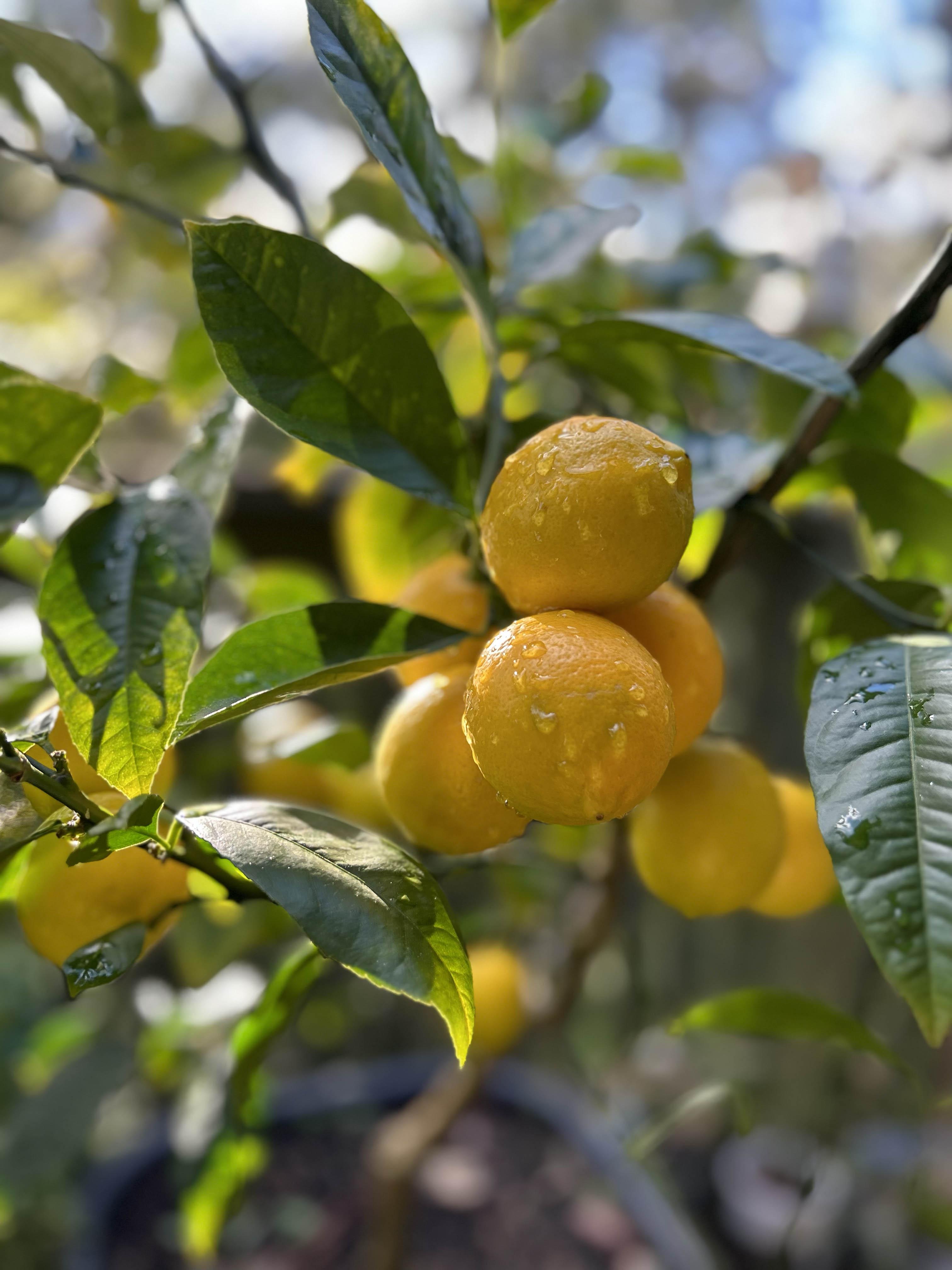
do for our first project. Okay, so I'm going to use this reference photo of the lemons in my garden to work from because it's quite a
simple reference photo, and it's going to be very
easy to loosen this up. Remember, when I'm not
interested in painting realism. I'm really wanting to push
you to express yourself and be very loose with
your painting style, which is I'm guessing
why you're here. So I want you to
not worry too much about making it exactly
the same as the reference, but we're just going to create a loose painting
inspired by this. So I am going to
sketch this out first. So even with our
sketching process, I'm going to make sure that
it's a very loose sketch, and I don't put every
single detail in. I'm just going to make it really expressive and only really sketching the most
important things, which is this collection of
this collection of lemons. Sorry, I lost my brain
there for a moment. The collection of lemons
that I have here. Okay, I will put the reference
rot up on the screen. But for now, I'm
just going to put it over to the side
so I can see it. So this is just a five by
seven hot pressed paper. And I'm going to start by Let's just place this first lemon, the scale of that lemon in here. This is a creative color
megagraphe pencil. You can use any sort of
gray led pencil you like. I like this because
it's big and chunky. I'm going to sketch
out These lemons. There's one behind here as
well. Another one here. Back in, I'm just going
to suggest that one. And then a smaller
one here and here. There's a big leaf that's
cutting off those ones. There's another leaf
jutting out here. And here. Okay? Then there's a leaf
that comes out here. And here, I like these
because they're sort of framing framing the lemons. Okay, maybe some branches
and things as well. Okay. So it's a very
a very loose sketch. Comes in co. Suggest a couple of things around here as well. Okay, so I'm going to use a really is a I'm sure
what it's called. I think it's it's a really
floppy quill brush, I think it might be
called. I don't know. These are really great for
getting really loose marks, and not worrying too much about, you know, where the
paint is actually going. So I'm going to start
with a light Yellow. I think it's
obviously ironically, I think it's called
lemon yellow. A nice puddle of color. And I'm just going
to use that to block in anywhere
I can see lemons. So really loose, don't worry
about sticking to the lines. Maybe a little bit around
the background as well. Okay. And while this is wet, I'm going to introduce
a little bit of green. Anywhere I can see in the picture where the lemon
gets a little bit green, I'm going to going
to pop the green in. Again, because
this is wet, we're working wet on wet
at this point, so these colors are
all going to squirm and blend into each other. And create some ne. Effects. So there's a bit
of a darker color in here. I'm just going to
pop in as well. Now, I will have all the
colors that I'm using. I will have listed
in the description, but because this
is in a palette, I don't know exactly which
color I'm using at the time. I'm going to be one of those
really annoying artists that doesn't tell you every
single color that they use. Just because I don't actually know individually what they are. I've got it written down, but in front of me at the
moment, I can't remember. But you can see how
I'm just adding in touches of different
warmish color. I had a bit of that green color. I'm now coming in with a bit of this warmer orange because
some of these lemons have a bit more of
an orange hue to them and touching it in
while this is still wet. The colors that I'm adding in are all going to
blend in together. Now that I've done this
area, I'm going to let this dry and I'm going to move
on to some of the leaves. Let's get these leaves are
a bit of a bluish green. Let me just get a I
think this is alo green and a little bit of I think that's
cascade green as well, which is the Daniel Smith color. Again, starting with
quite a light wash. I'm going to plop in
where some of that green is. Keeping it loose. The messier the
better at this stage, we will refine as we go. For now, I want it to
be quite slap dash. Maybe a little bit
of philo blue, can drop into some
places as well. Just let the water
color do its thing. Just drop some colors
in here and there where you've added added that green, add some different color greens. There's some darker greens
and some lighter greens that I'm adding in here. Again, I'm only working
loosely from this reference. I'm not copying it exactly. Now I've added in some greens. The next stage is going to be bringing in some
background color, but I do want to let this dry just a little
bit first because I don't want all of this yellow to bleed into the background. I want to keep these lemons
quite solid in the middle. If I added background color in around this area
here, for example, that little pool of
yellow will possibly run into the purple. Don't
want that to happen. I'm going to let it dry. This is where the patients of water
color comes in a lot. You do spend a lot
of time waiting for things to dry in between. Even though I do work quickly, you still have to dry things. So this is the first layer
that we're going to do though. So let's get this down first.
4. Loose lemons, part 2 - Add in contrast: Okay, so now that
this is all dry, we're going to come in
with the background and create a little bit
more of a contrast. So I'm going to come
and a dark purple. So let's get some blue. Ultramarine rows or rows of
ultramarine, I should say, a bit of magenta, I want quite a dark color because I
want to get some contrast. I'm going to use that to
just really loosely block in the background around some of
the edges of these lemons. I'm going to leave a nicely that little edge that
I'm leaving around. I'm not coming all the
way up to the yellow, leaving a bit of an
edge around there. Same with the leaves, to leave a bit of an edge on
some of those leaves. Still being loose. I'm not focusing on
perfection or making it exactly the same
as the reference, but anywhere where
there's a bit of a dark area around and a bit
of the background showing, I'm going to pop a bit of this. Now, the reason I love these
really loose floppy brushes is that it's very
hard to be precise, and you often get if
you tap the brush a little bit, not going
to hap now there. See, you'll get like
these real drops and splashes and
things happening, which can create this real
random, whimsical effect. And a bit of an unplanned happy accident moment will
start to happen. Someone coming around there as well. Maybe some of you here. Might mix up some more
purple into some of these, make them a little bit more some more reds in here
instead of the blues. Just change it up.
Like you can remember, you can at any stage, you can drop color in to a wash. If you want to add a bit more another value,
like for example, if you want to make
this a little bit more of a pinkish purple, I can just add a
little bit more of that magenta into this mixture. And it will come out a bit
more of a magentary color. Okay. Now I'm going to get rid of the floppy
brush and I'm going to go into a more flat harder, not harder, but a stiffer brush. While all this background
area is drying, I'm going to come
in and add a bit of shadows in between these lemons, just to add a bit of definition. I'm going to come in
with some of this color, a little bit of orange. I think this is Azie re gold, and maybe just a touch of blue. I want it to be a bit
of a dirty color. I'm going to use it to paint this lemon that's
in the back here. With a bit of this shadow
and push it back a bit. Maybe a bit of a shadow in between these two
as well just to define two separate lemons. This one as well. There's a
bit of a shadow down here. I can also come in with a
bit more of a yellow wash. Again, because these
are transparent. You can add washes a transparent color if you
want to emphasize an area. Maybe this one down
here needs a little bit of a yellow pops a bit of a. Okay, what else? Let's
go a bit more of a brownish ale bit of this
ocher color in here as well. It's going to bleed, it's going
to move, but that's okay. We don't mind that. We want a
bit of craziness happening. We don't want it
to be too precise. I can give a bit
more definition to the leaves as well by
doing the same thing, coming with a bit
of a darker version of the color that
I started with. I've just added a little
bit more al blue. Let's see, there's a bit
of a darker branch there. This leaf here is actually
quite a bit darker, so maybe we can add in a touch. You can even add in these
little leaf striations. Is that what they're
called? I don't know. I don't know the
technical name for it. Make one side a bit
darker than the other. This one here, there's a bit of a shadow here and a shadow here. Again, I'm looking at
the reference really loosely to help me determine where some
of the details are. But I'm not being slavish to it. I making sure that I get
every single twig and, you know, and branch
in this painting. It really doesn't
matter that much. I'm just trying to
get the essence. So there's a bit of belief here as well that
I might add in. Now I want to add in this lemon here just to create something
a bit of a different look. I'm going to pick
up a little bit more of a greenish color. Just add a touch of green. If you want to blend and smooth the edges
of some of the paint, just add a bit of a
clean water to it and it will blend and smooth. You can also add clean water and brush over the top of something if
you want to remove it. If you've decided that you
put too much color in there, you can take it away
again by doing that. Okay. I'm going to dry this off again and I'm going
to zoom in and show you who had to get some of these darker
details happening.
5. Loose lemons , part 3 - Finishing Details: This has been dried off now. Now you'll notice that
as the colors dry, they dry a lot lighter than what they are
when they're wet. There's a few patches here of that dark purple that's
still a little bit wet, and you can see how
much darker it is compared to the middle
section that's dry. Generally water color will dry, a few shades lighter. The first color
that you put down might seem very dark
and frightening, but remember that it
will dry lighter, and you will often
have to go back in and add deeper details constantly because
you need to keep boosting up the value
of your shadows. I'm going to come in and add in some darker shadows
in and around and in between these lemons. I'll go like this
darker brown color. I'm just using twist over to a finer liner brush just to
get a little bit more detail. And just going to brush in between some of the
edges of these lemons, just to define where they
join and meet each other. Yeah, I can also add in some darker details in between some of these
leaves as well. Little shadows and things. Some of the stems in between. It's still important
just like with any other type of
painting to remember your contrast and to
make sure that there is a nice range of
ducks and lights. The thing about lights with watercolor is you
have to retain them. You can see how I've
left this edge of white around some of these lemons, and I've also made
sure that there's some patches of white
paper showing through. I've made sure that I've done
this because I can't add white back into this unless I start introducing
acrylic paint or gouache. I can't really bring
whites back in. I need to make sure
that I maintain some lightness of the paper. By having some lights
shoving through still. I'm just adding a few touches
here and there of some of these darker use move bit
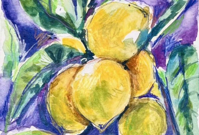
of a shadow on there. Okay. Now we have this
little lemon study. I'm just going to bring the camera down a
little bit closer. These are the gaps in the paper, the white that I was
just referring to. See how I have left some white, and you can see, let me zoom
in without losing focus. You can still see
my original pencil sketch as well and
my guidelines. I really like the fact
that you can see those. I think it adds to the overall
looseness of this sketch. I just love how you get these. Sorry, I'm just don't get
mine camera to focus. These balloons of
colors that happen. This is because the
paint was still wet as I was adding
bits and pieces in. So you get these really
interesting shapes happening.
 Clair Bremner, Professional Artist