Transcripts
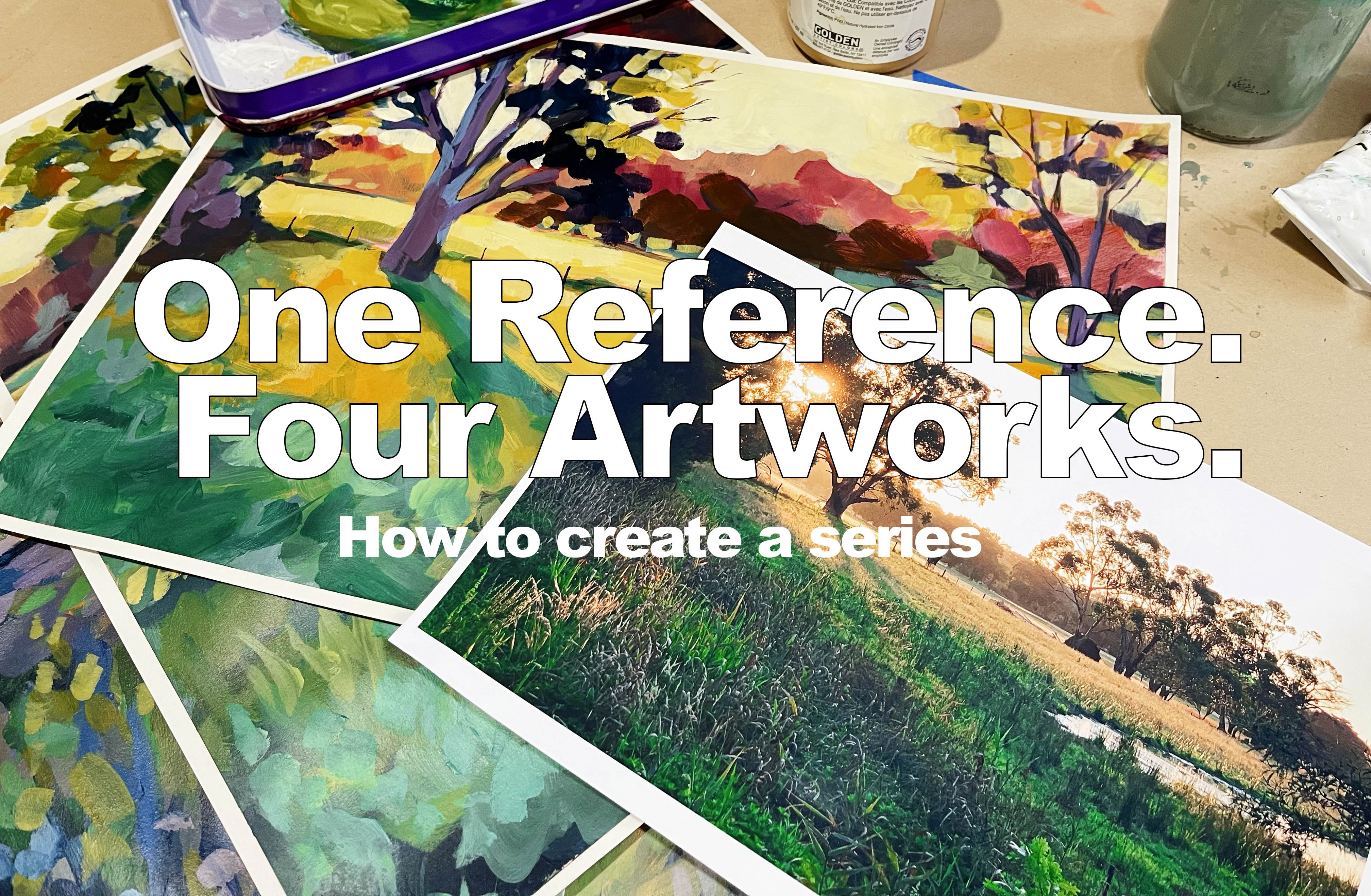
1. Introduction: Welcome to the exciting
world of abstract flowers. In this class, I'll be
your guide as we explore the fascinating process
of simplifying and abstracting for forms to
create stunning artworks. Throughout this
course, you will learn how to paint loosely and utilize design principles to infuse rhythm and unity
into your paintings. Get ready to unleash
your creativity and embark on a captivating
artistic journey.
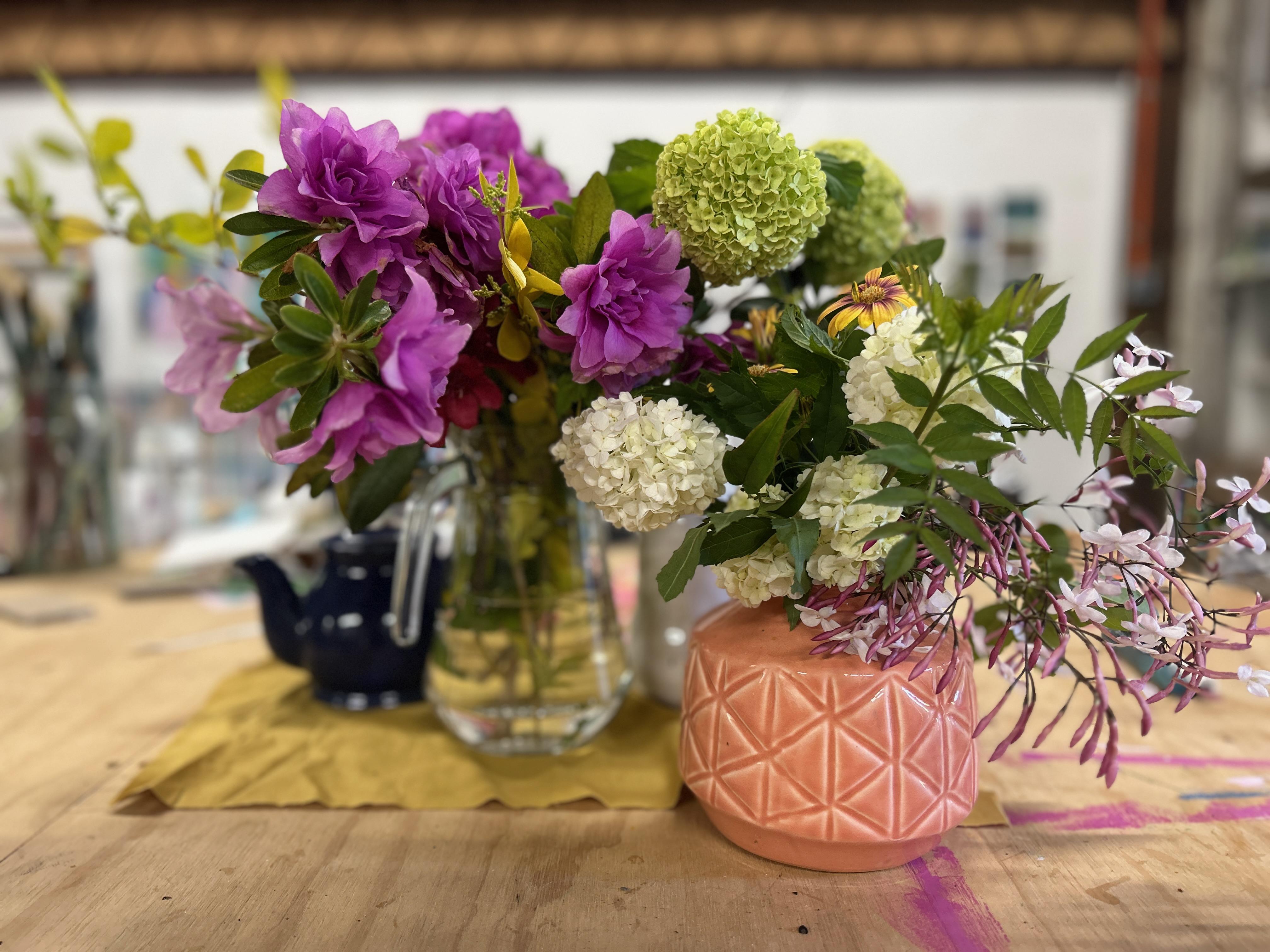
2. Loose Inky Sketches part 1: Project one is going to be a really simple contour sketch of our study that we have here. I want you to not feel too stressed or too
particular about this. I'm going to encourage that you use some really cheap paper. This is just really cheap
drawing paper it's very thin. You can use even
printer copy paper. I don't want you to be
precious about these. I want you to just be free
to experiment and play with mark making
without worrying about wasting good materials. Get yourself some cheap paper. This is an A three sized pad, but you could do A
four if you wish. I want you to get some ink. This is permanent ink
from art spectrum. You can also get Liquitex Ik. Back on for its f. Liquitex. This one here is Tila.
Some sort of ink. It doesn't matter
what the brand is, whether it's permanent
or water based, but we're going to be
sketching with brushes and different implements with the ink to create some loose and
expressive studies of our floral arrangement. For this first step, I want you to focus on monochromatic. We're not going to add in all of the colors that we see in
the foliage or the flowers. I just want you to
work with one color. Choose like a dark
color like Sepia or black or indigo and focus on just light and dark and creating lines and marks and not worrying about the
colors that you see. Before we go too far into creating abstract paintings
of these flowers, what we need to do first is do a bit of studying
of our subject. So the best way to abstractify something
is to really understand it because that way you can play around with
different elements, push things to the
edge, pull things back, and have a lot more fun when you are comfortable
with your subject matter. The first thing
we're going to do is some really loose
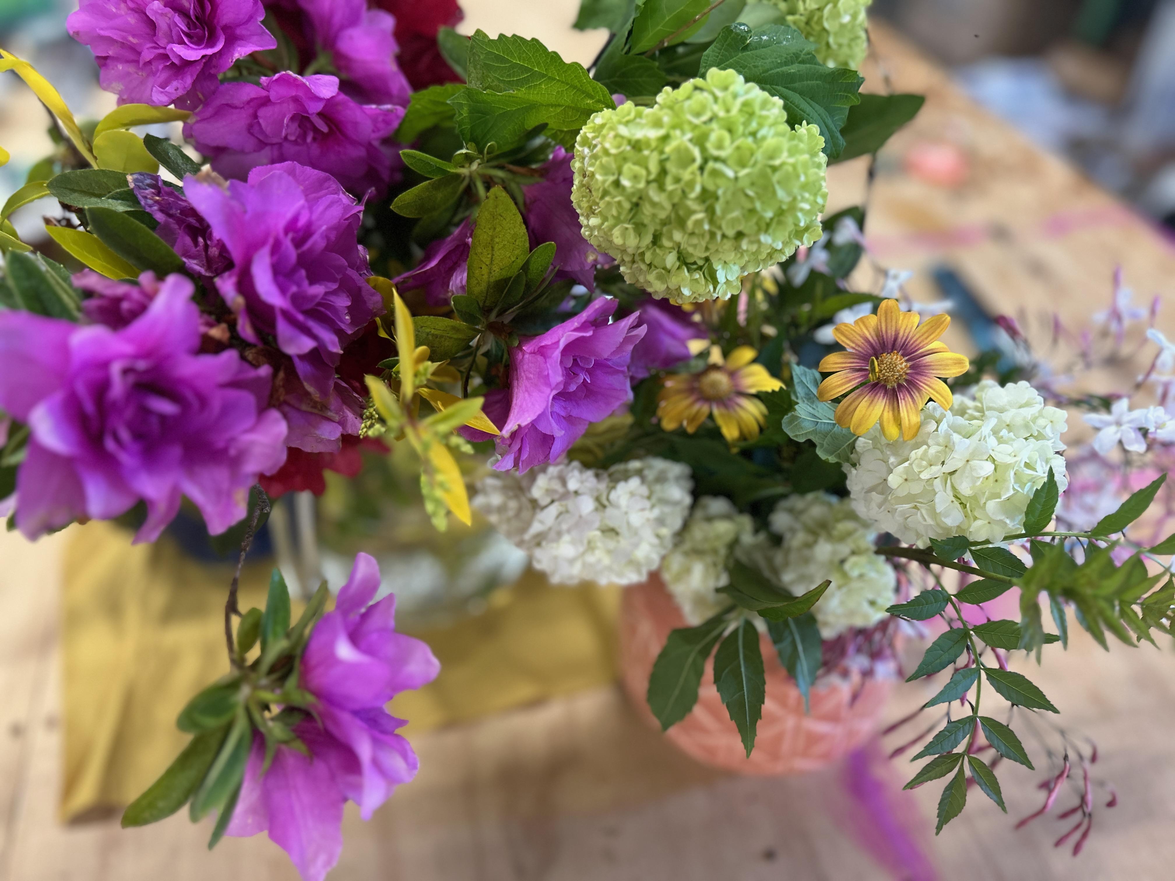
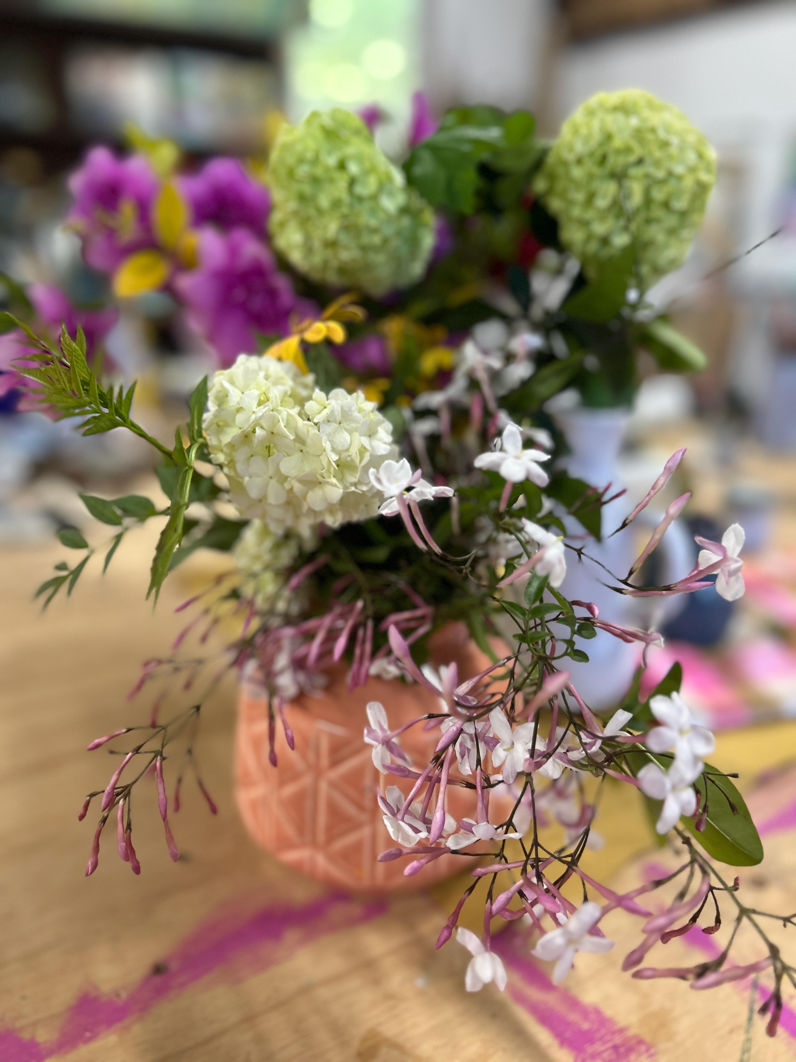
contour sketches of what we see in front of us. I am going to put some
photos of my display in the description area of this somewhere so that you can
use this reference as well. Or you can work with
whatever is in front of you. For this one, I want
them to be very loose and We're not worrying
about detail or accuracy. I guess accuracy
is a better word. We're not worrying
about accuracy, we're really looking at the
shapes that we can see, the different petals,
the different leaves, what happens when
things are touching each other, the negative space. These are going
to be just really loose and fast sketches. I've got a bit of ink
in a cup here and I've got a really
thin liner brush. I'm just going to start with any area of the display that
you can see in front of you. There's some of these
azaleas falling over here. We want to encourage these
drippy loose expressive marks. This is a really good
opportunity to play around with different
brushes and different tools to make some of these interesting
shapes and marks. But I'm really just looking
at the flowers in front of me and allowing my eye to follow around the edges and
find some of the shapes. These are going to be really loose and not accurate at all. I want you to just play around with different
mark making. For example, these
mini hydranges. I've got this really intricate
texture where there's lots of little petals or little clumps of flowers
next to each other. I'm just playing around
with different marks to see how I can represent that. Then we have bigger leaves
coming out of them. I can see some of these
more daisy type shapes. Maybe I'll paint that in
really loose like this. I'm not looking for
accuracy at all. I'm just playing around with the different
things that I can see. For example, it's a
quite a nice Jasmine. Trellising down. I might add some more
of that over here. Even though it's not, it isn't over here in the display, there's
more room over here. I'm going to just
pop some over here. I'm looking at how that Jasmine is what's the anatomy
of the Jasmine? You can side to
see that it's got these trolley bits and
then every now and then, one of the flowers is more open. Maybe I can more like that. Then there's lots of
little closed buds. They all trail down like
this. What else can I see? I can see there's a leaf. I think it's actually
Jasmine leaf, that kind goes like this. What else can I see? There's some bigger
leaves over here. I'm I'm not taking I'm
not trying to capture the whole bouquet or
the whole scene here. Just different elements
I can see you can add in the vases and
the things that the containers that
flowers are held in if you want to have
a little bit more context to your sketch. It has this really one
I've got has this really n zigzag pattern on it.
I might include that. You can change the sides
of your brush as well. You want to go for
you've done some areas. Maybe I'll go for a slightly
still a small brush, but it's more of a
flat gung brush. Maybe I can use that to create different
textures and shapes. And there's maybe some darkness. You hold the brush flight
really in a different way. So the start on sort of
holding it further back, see what what shapes
I can create. I'm going to freshly paid,
I'm going to do another one. I want you to do quite a few of these each time
that you start one, have a look at a different
element or a different area, or maybe change the direction of your setup or choose
a different photo, and try look at things from
a slightly different angle. Also, think about scale, maybe do something really large, zoomed in or something
quite close and play around with
different viewpoints, but still keep it
very, very loose. This time, I might start with. Maybe I'll start with a
slightly larger brush. S. I'm going to start. You see. Another thing that
you can do as well, is get like a bit of a water
bottle and sort of spray on your paper first before
you start sketching. What that's going to do is
it's going to encourage the ink to spread out
in quite random ways. So again, I'm just playing
around with the shape of those hydra flowers
that I can see. Got some really nice,
quite dark leaves. So I sort of fill
in those leaves. See here. We just do some of the big shapes
with this brush and then change back to
a smaller brush. So just move around as well. So again, I'm not worried about making a
perfect composition. I'm just kind of playing with what I can see in front of me. Because we're going to be using
these initial sketches as our references for our
final abstract florals. So the more of these
that you can gather up, the more material you're going to have to
work with later. So don't skip this step. Don't think that
it's unnecessary, or it's just a way
of warming up. We are going to be using
these pictures later on to help us with
our finished artwork. So have fun with it and try and do a as
many as you want, really, but make sure that you've got a good selection of different
sketches to work from. Here's some of the
shapes that I can see here with those daisies. I'm putting them in
a different place to what I can see them in front of me because we're not painting
this exact composition, we're just using
this as a reference. Even some of these
trailing bits of Foliage that coming down. See this brush makes a really
nice leaf shape just by pushing it onto the paper.
It's going to a nice point. Even adding in a
couple of these, I barely have to do
anything to make that leaf. It's just the shape of the
brush that's doing it. Just suggesting some
of those little round bits and pieces. If you're using ink,
even if it's not, if it's a permanent e, you can still use it with water. Maybe some bigger
shapes down here. Playing around with making interesting marks with my brush. Because this is going
to help inform me later on with what I decide to do. Now maybe I'm going
to switch it up and pick up what the skewer. Some of these puddles
over here with the ink. Still wet. I can use
this to scrape into that wet ink and make
some more marks. Different sized shapes. Or I can dip it into the container of ink that I have here and see what happens. It's like a more
of a stick effect. We can just some dots
with it. That's nice. I like that. It's kind of indicating like
the centers of those flowers a
little bit. Yeah. Sit in the brush and go over some of these
areas that have dried, create some more lines. There's no rules for this. You can do as much
on one as you like, or you can just do a couple of marks on one paper and then move on and
start another one. I like my paintings
to be very busy. I'm happy to just keep adding
and adding and adding. But if you have more minimalist
tastes and you don't want to have such a busy
sketch to work from, then just stop when it's not quite as busy
and start a new one. But it's really important
to just have fun and don't put pressure on yourself to
make anything spectacular. These are not finished artworks. This is why I recommended
that you put them onto very very cheap thin paper because then you won't be
tempted to make them perfect. They are just simple, quick, really fast expressive
drawings that is going to create inspiration for
you to work from later on. Oh.
3. Loose inky sketches part 2: I'm going to freshly page,
I'm going to do another one. I want you to do quite a few of these each time
that you start one, have a look at a different
element or a different area, or maybe change the
direction of your set up or choose a different photo and try look at things from
a slightly different angle. Also, think about scale, maybe do something really large, oed or something quite close and play around with
different viewpoints. But still keep it
very, very loose. This time, I might start with Maybe I'll start with
a slightly larger brush. I'm going to start.
Another thing that you can do as
well is get like a bit of a water
bottle and spray on your paper first before
you start sketching. What that's going to do is
it's going to encourage the ink to spread out
in quite random ways. Again, I'm just playing
around with the shape of those hydra flowers
that I can see. I got some really nice, big, quite dark leaves. So I sort of fill
in those leaves. Se here. Just do some of the big shapes
with this brush and then change back to
a smaller brush. So just move around as well. So again, I'm not worried about making a
perfect composition. I'm just kind of playing with what I can see in front of me. Because we're going to be using
these initial sketches as our references for our
final abstract florals. So the more of these
that you can gather up, the more material you're going to have to
work with later. So don't skip this step. Don't think that
it's unnecessary, or it's just a way
of warming up. We are going to be using
these pictures later on to help us with our
finished artworks. So have fun with it and try and do a as
many as you want, really, but make sure that you've got a good selection of different
sketches to work from. Here's some of the
shapes that I can see here with those daisies. I'm putting them in
a different place to what I can see
them in front of me because we're not painting
this exact composition. We're just using
this as a reference. Even some of these trailing bits of foliage that coming down. See this brush makes a
really nice leaf shape just by pushing it onto the paper. It's been a nice point. Even
adding in a couple of these, I barely have to do
anything to make that leaf. It's just the shape of the
brush that's doing it. Just suggesting some
of those little round bits and pieces. If you're using a inc, even if it's not, if
it's like a permanent e, you can still use it with water. Maybe some bigger
shapes down here. Playing around with making interesting marks with my brush because this
is going to help inform me later on with
what I decide to do. Now maybe I'm going
to switch it up and pick up, I've
got this skewer. Some of these puddles
over here with the ink. As to wet. I can use
this to scrape into that wet ink and make
some more marks. Different sized shapes. Or I can dip it into the container of ink that I have here and see what happens. It's like a more of
a stick of effect. We can just dot with
it. That's nice. I like that. It's kind of indicating like the centers of those flowers a little bit. I do some of that here. Sit in the brush and go over some of these
areas that have dried, create some more lines. There's no rules for this. You can do as much
on one as you like, or you can just do a couple of marks on one paper and then move on and
start another one. I like my paintings
to be very busy. I'm happy to just keep adding
and adding and adding. But if you have more minimalist
tastes and you don't want to have such a busy
sketch to work from, then just stop when it's not quite as busy
and start a new one. But it's really important
to just have fun and don't put pressure on yourself to
make anything spectacular. These are not finished artworks. This is why I recommended
that you put them onto very very cheap thin paper because then you won't be
tempted to make them perfect. They are just simple, quick, really fast expressive drawings that is going to
create inspiration for you to work from later on. No.
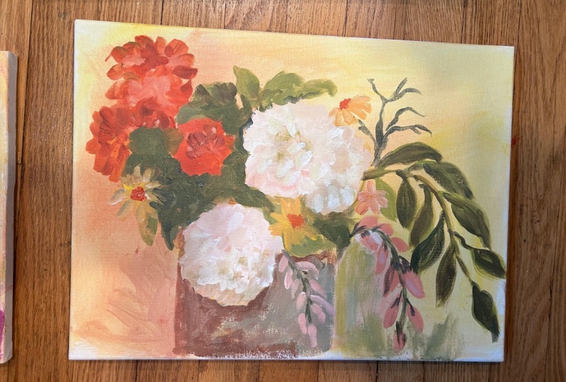
4. mixed media studies part 1: The next part of this process is going to involve starting
to introduce color. For the first project, I
really wanted you to focus on line and light and dark and shape and patterns and just focusing on
contour drawings and looking at all the
interesting shapes of the flowers without
worrying about color. But now I do want to start
introducing color in a really loose way
because I want to encourage play and experimentation
and just having fun. For this project, you
can start adding color and you can add it using
any medium you like. For this one here, I just
added a bit of colored ink. I started with the
CPA ink on top, and then I've added
some colored ink to fill in some of these spaces. This one here I just did
a lot of the drawing with the colored ink and filled in different
shapes with color. This one here is a combination of ink and
also some oil pastel. I've started with ink and then
you can work over the top. With the oil pastel
to create more color. It's really up to you to
just play around with whatever mixed media materials
you have at your disposal, in your studio, to start
adding some colors. You can see that it's
still very interpretive and I'm not making anything
look accurate at all. I'm still just looking
at shapes and textures, but I'm adding color
into the equation. I'm going to do a demonstration. This time, I think
I might actually change the orientation
of the page. I'm still using
really cheap paper. I don't think I showed
you this previously, but this is just
anson what are we? Extra white drawing paper. It's only 120 GSM. It's not very heavy
weight paper. Just standard drawing
paper because I still want this
to be very loose, and I don't want you to get fussy about
what you're doing. Keep everything light
and playful and fun. Just repeat the same
processes before, except this time, we're
going to add color. The first thing I'm going to
do is I'm going to repeat that process of sketching
with the ink first. I think I might start
with the CP again. Running out a bit, a
little bit more in here. I do like to water it down
a little bit as well. I'm just going to add that and little splits of
water on the paper too because I do
like that effect. I'm going to get my
thin liner brush. I'm going to start
to just sketch out some things that I can see. There's this really interesting long branch that I can see. That's starting out over here. It's got clusters
of leaves on it? That leads into some azaleas, like I say, here. These like really fun curly
curly petals on them. They've got their
own leaves here. I'm just glancing up occasionally
at what I can see in front of me without spending too time
studying the shapes. I'm going to have
another one of these. Down here. I'm going to make a few marks and
things over on this side, but then I'm going
to switch from using the F using that in,
I'm going to switch. I've just got some other
inks that sitted over here. I've got a bit of pink. I'm going to water that
down just to smidgen and maybe add in So different
shapes with colored ink. There's different
color. Still azaleas, but they're of these
really bright pink. Maybe I can use this
as a fan brush. Mas like a different mark. Go in behind some
of these ones here. Pick up a bit of yellow. There's some yellow
folage in here as well. So just have fun
with mark making. I'll get to a slightly
bigger brush. I've got a bit of
green here as well. Maybe I can go over some
of the green that's here, even filling some of
the stuff that I see, let me get a little
bit more of that. This is actually green, the golden or fluid acrylic, getting a bit of that
white color and then adding water to water
it down even more. I can use my brush to
make different marks. That. Now I might
use this green here to do some negative painting and leave some of those shapes
of the hydranges behind. Instead of instead of painting
that hydrange I'm making the leaves in and around and
behind, leave that shape. I can split a color
around as well. So a little bit more yellow sps. It's all about experimentation and having a bit of a play.
5. Mixed media studies part 2: I might bring some
of those yellow daisy type shapes
maybe out over here. Just to fill out this side
of the paper a bit more. I got like these really
cute red centers. These alias that original
inc has dried a little bit. I can color those in and do
some mark making inside. What I like to do as well is just add something else that has a totally
different mark. For example, these oil pastels, I can go over the ink and
the water color with these and just add in more
shapes and more colors. We add in some of
these petal shapes, and some fun marks a bit
of darkness as well. This is quite a dark blue. Maybe in here, I
might like to add add some dark blue
colors to indicate some negative space in between some of these
leaves and things. Break up the color a bit. Don't worry about your artworks
appearing messy or busy. This is just an
experimental stage. We're not creating finished,
completed, hang artworks. We're just playing around
with textures and color. If you take away that
mindset of this has to be This has to be something
finished, something special, take away that mindset
and instead just focus on the feeling of creating art and the feeling of adding in colors and seeing
what happens and experimenting with
different textures because the end goal, remember is to create
something that is semi abstract or even
completely abstract. That is going to be the end
goal of all of this practice. If you're focusing at this stage on making things
look very realistic, Then you're taking away that
goal of abstractifying. Even just adding
in blocks of color like this and filling in some of that paper with a color is going to create an
interesting texture. You can do some more of
the little flower marks. I'm not really thinking too much about the colors
that I'm picking up. I'm just thinking, lights and
darks and am I adding in, something that's adding to
this or am I making it worse? That's really what
I'm thinking of. Maybe you can add
in some details and some of the bigger leaves. I want you to create a series of these messy scribbly patterny textured artworks
using a bunch of different media because this
is what we're going to be referencing when we start to
create our final artworks. The same as with the other
drawings that you were doing, if you're not into
this business, you can keep it more simple, if you wish, stop at
an earlier stage. That's totally up to you. But I just want you to play
around and have fun. Oh. A
6. Main project materials: Now that all of
that experimenting and practicing is
out of the way, we are going to start
moving into creating some more finished pieces. We're going to be using
our sketches that we created in these
first two steps to help inspire us and direct us in our creation of our
abstract floral arts. We're going to be painting on any substrate that you like. I'm going to be
painting on paper just because it's convenient. I'm going to do a
couple on paper first, and then I might move
on to a larger one. So this paper, while this was very cheap drawing thin paper, I've moved to thicker paper. This is 100% cotton
watercolor paper. It is hot pressed. I think
it's 300 GSM from memory. It's a bit more of
a sturdier paper. It's more of a finished
artwork presentation paper. The artwork that I create
on this paper here, I wouldn't have any
problems selling on. Was this paper, it's too thin. I was just meant for
experimentation. We're moving on to
slightly better materials, that's what I have
this paper here. Now, what I also recommend, we're going to be working
with acrylic paint. I always recommend that you
when working with paper, create a ground
for your artwork. What I've done here
is I've just covered my paper in this yellow. This is actually Nicolso yellow. Just to create a colored
ground to start with, so that when we're
building up things, you don't get the
paper shoving through. I've just gone ahead and
blocked this background into all of the pieces of paper that I plan on
using for this project. We are going to be
working in a series, so it's always good to have more than one surface prepared. In this case, I have three of these pieces of
paper ready to go. To begin with, I'm just going to choose one of my sketches, and I'm going to use this
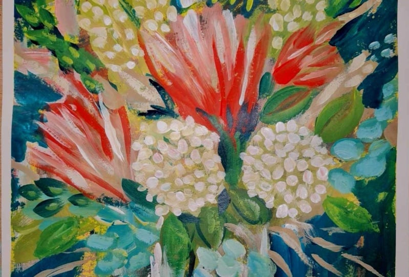
as a beginning point. I'm choosing this one here
because I really love just the looseness of it and the descriptive shapes
of these leaves. I think that I can
take it further when it comes to
layering acrylic paint. I'm going to have all of
my sketches around me while I'm doing these
artworks. You won't be ten. They'll just be out of
sight, but I can see them, and I am visually referring
to them while I'm creating. I suggest that you do
the same thing when you are starting out
your painting too. Before we go too far,
I just want to talk a little bit about materials
and also color choices. While we're creating
this painting, it doesn't really matter
what colors we use. It's really going to be
up to you and what kind of mood and what kind of feeling you want your
painting to have. But there are a few tips that I can give you to help you create a more harmonious
painting and a painting that is going to visually
work together a lot easier. The first hint or the
first recommendation that I give you is that you
work with a limited palette. A limited palette basically
means that you narrow down three or four colors and you stick to using just three,
three or four colors. For example, a limited
palette could be something like quid akon violet, I can never spell that and que blue and bleached titanium. That could be your
limited palette that you could maybe have that
yellow ochre as well. If you start with just
these four colors and you continue your painting just
using these four colors, everything that you create,
all the colors that you mix, and that you combine,
and that you layer on top of each other are going
to work harmoniously. It's going to work
together and you're not going to have any
clashes of colors. Even if you make muddy colors, they're still going
to work together. It's always a good idea to start out with a
limited palette. You can always later on, if you feel like you need
to add pops of color, introduce other colors into the palette to see what happens. For example, you want
a real bright color, you can introduce
something else. But at least to begin with, for the first few layers and until you reach that
finishing stage, start with some colors
that you are comfortable with using and mixing
and stick with those. I do always recommend
that you have at least one dark
color in your palette, and of course, white. I don't have white here in
front of me at the moment, but I would always include
white in my palette as well. But it's really good to
have a dark color and a white because you need those
to help you with contrast. If you don't have a color
that is dark enough, everything that you
mix is going to be quite neutral and mid value, and nothing is going
to be dark enough. You need to have a dark color. It could be pains gray, it could be a midnight blue and indigo, it could be black, even though I personally
don't like black. You can introduce anything you like as long as it
has a dark value to it because this is really important to help get contrast. Having a color wheel with you is always going to be helpful
because it's going to help you make decisions about what colors that
you can introduce and what colors are going
to work with each other. For example, if you want to keep everything looking
very harmonious, you want to use colors that sit next to each other
on the color wheel. For example, a yellow orange, green palette or a
green blue palette, or a red violet and
orange palette. These are going to work really
nicely together to create a really pretty varied
monochromatic palette. However, there are also different things that you
can do with the opposite. For example, red and green, red violet and lemon yellow
green, blue and oranges, introducing versions of those
colors into for example, if your painting is
predominantly blues and violets, introducing a orange or a yellow orange into your
painting is going to create a really interesting contrast
and it's going to make the colors look really
vibrant and exciting. Sometimes having a color
wheel in front of you is going to help because you could be holding it up
and thinking, Okay, what's going to work with my composition and play
around with those colors? To begin with generally, I like to start with
a limited palette that has primary colors in it. A blue or red and a
yellow of some kind. Because with those,
I know that I can produce a version of every color that's
in the color wheel. They might not be as vibrant
as this because it depends on the saturation of the
colors that you're using, but I know to a certain extent, I can create orange, purple, green, red, blue, all of the colors that
I need with a primary. It can be any red,
blue, and any yellow, and those colors together will make a version of
every single color. So for this painting here, I'm going to be
just to start with focusing on these
three colors here. I have Qin aquitone violet and quone blue and
nil Azo yellow. I'm also going to be
using unbleached titanium to help lighten these colors, and I'm also going to be using titanium white to lighten
them again as well. Because this isn't
quite bright enough. F with this palette here, I can get lots of greens and purples and blues and
different things. You can choose any
colors you like. You don't need to
use the colors, or the brands that
I'm using here. These ones are fluid acrylics. This one is a more
heavy body acrylic, and this is a heavy
body acrylic. It doesn't really
matter what paint you use because we're going to be playing around
with layering and experimenting a lot
of the colors anyway. But they're the paints
that we be looking at. I also want you to have
quite a few different tools available to yourself. Some scrapers. These is
like a silicone wedge. I've got just some really
simple paint scrapers, a spatula. I've
got some of these. These are again,
rubbery brushes. I also have a whole bunch of just regular paint
brushes as well. Because we're going to
be playing around with layering a paint in
different textures, creating transparencies
and scraping paint back. You want to have lots
of tools available to you that you
can experiment and play around with while we're building up the
layers in this painting. Get yourself all set
up and ready to go and we are going to have a bit
of fun playing around with
7. Building background layers: The first stage is is going
to be involving us creating an interesting surface that we can pull these shapes
and these colors out of. We're not worrying
about sketching a composition or anything
like that just yet. I want you just to layer down. I don't want you to worry about compositions or
anything like that. I just want you to play around
with layering down paint. The first thing I'm going
to do is add some I'm using this catalyst tool to se this paint on You
can use a spatula. You can also use an
old credit card, but I'm just scraping away, and I'm going to pick
up a little bit of the blue and a little bit
more of the white. I'm just going to blend
these on the actual page. And play around with
creating a surface. Now I don't want to get
rid of all of the yellow. I do want to keep some of
that on the page as well. A little glimpse of
it here and there. But I want to build
up a surface. C flip the page around. Maybe introduce a little
bit of a different color. Maybe we can introduce a
bit more of the Nicolas yellow with a bit of the white and blue and that's going to make
some green colors. Whatever you want to
do. Really. This is a part of the painting
process where anything goes, and it's a chance to just create something fun and
interesting and pretty, and it really doesn't matter what you do
or what you lay out because all of this
can be covered over and much of it's probably not even going to
be seen later on. We're just creating an interesting
surface to begin with. Maybe I'll change over to smaller little speculate
and I might mi up a bit of say, more of a neutrally
brownish color maybe. I'm going to scrape that
through in a few places. There's quite a lot of
things that you can do to help build up texture in this underpainting stage
to create interest. While the paint is wet, you can use the back
of your brush to sce patterns into the paper into the surface like this and
reveal what's underneath. Click it over. You can
create different marks? Sorry, that was a
bit of a noisy. Motorbike went past that. Just playing around. There's no rhyme or reason or I don't know the word like
planning involved in this. I'm just playing. This is like a pen, that's doesn't really
work that well, but it does make really
nice scratchings. You can also play around with transparent
and opaic colors. So most of the colors
that I have here are the liquid colors. Most of them are transparent. Let see if I can
find the indicator. This one here. See how you can
see hold out up and focus. You can see that those black
stripes through there, and you've got this box
down here that is empty. That indicates that this
is a transparent color. This one here has a bit
of a line through it. That means it's a semi
transparent. Let see. I don't think I have
any here that I'm not I've got a liquitex
one here there. See how that is just
a block a square. That means it's opaque. You can play around
with different opaque and transparent
colors as well. For example, the nickel azo
yellow is very transparent. So if I were to pick it
up on its own and say, scrape it down here, you can see a camera. You can see that
it is transparent. You can see the marks
that are behind it, whereas the, the unbleached
titanium is an opaic color. So if I put that on here, you can see that you
can't see through it pa. You can play around with opaque and
transparent washes and layers. So for example, if I
mix these two together and spread it around because
of that unbleached titanium, some of it is more
opaque than the other. Here we have just time
lapse of me laying down these initial marks and textures and colors onto
these pieces of paper. There's really no rule to this. I just have fun. You can layer as much or as
little as you want.
8. adding floral elements 1: Once you're happy with
this first initial loose covering of the paper. We're going to start to build
up each of these paintings to be more of a abstract floral. You can push this background
layer as far as you want. You can add heats more detail and textures and things
than what I have here. But I decided to stop here so
that we can keep moving on. But the main thing that I
want to point out is that you don't want to
get it too muddy. You can see the
textures are still quite clear and each
texture has its own impact. Nothing is blended together. It's not just all
smushed and blended. You can see there's
still sharp edges, there's blended soft edges, and each of these swipes of color are intentional
and visible. If you just have
everything blended together and diffused, you're not going to get
that these sharp contrasts of color and shape. These are going to be
important to have as we start building up the painting. Now you may end up covering
most of this layer up. That's just part of the process. But it's always nice to have
these areas that you may end up maybe creating
negative shapes with or keeping some of this
showing here and there. The more interesting textures
that you have and the more variation in color and texture that you
have in this layer, the easier it's going to be to have it work into
the painting laser on. If everything is
blended too smoothly and all of the edges are
very soft and smooth, it's going to end
up getting lost in the painting and it's really not going to help
you in any way. So I'll just suggest that
you do try and keep it quite sharp and
erratic and jagged, I guess for this initial layout. Then as we progress
through the painting, you'll find that you can
soften edges anyway. But that's just a little a hint or a tip that I've noticed that when I do this and I blend everything
together too much, it doesn't quite have
the same impact. Just keep that in
mind. What we're going to be doing now is I'm going to I think I
might start with this one here, move
these to the side. If we're going to
start to draw out and layer up more intentional marks. We're going to start to create a bit more of a
intentional composition. As I mentioned before,
for this particular one, I'm going to be using
this reference here. Now, these are quite
loose references. I'm not going to keep
everything exactly the same, but I do like the placement
of these three elements. I like the leaves that are coming out and
the shapes in it. I'm going to keep this in mind as I'm creating
and layering. In order to do that, what
I am going to do is a really quick, loose sketch, I suppose, over the top of this, just to help me remember where my elements
are going to go. We don't want this to be
a precise sketch at all. We just find my liner brush. But I do want to create that drawn feeling and those
drawn elements into this. I'm going to choose the blue because it's quite a dark color, but I am going to water
it down so that it will flow similarly to
how the ink flow. I'm just going to start by blocking in and
placing in some of the elements that I want in my expressive floral paintings. For example, I really
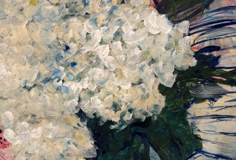
like the shapes that these hydrange balls create. I'm just going to
really loosely indicate where I want some of those
to be in my composition. I can even use this
to start to draw in some of these leave shapes. Just just some random marks. Again, using lots of water, just to blend things
and smooth the edges. I don't want anything to be
too sharp at the moment. It's really important
when you're creating this loose abstract painting. If you want to have a lot of
variety in what you can see. Variety can be color, it can be the shapes. It can be contrast,
lights and darks. You want to avoid everything
being too much the same. I'm keeping that in mind when I'm putting
these marks down. I don't want to create
too much symmetry or to too many things
that are the same. S. Draw these lines. I'm going to create some
splashes as well just because I really like
how that breaks up that surface, like that. A lot of the marks
that I'm making at the moment are very transparent. You'll see that you can see through this
color, this blue. Now that I have this
rough layout in place, what I'm going to do
is I'm going to start to piece together certain areas. For example, I want to bring out some of these shapes of
these hydranga tie flowers. I'm not doing any detail
on them at the moment. Just adding in some white. Why that's a little bit wet. Maybe I will add some texture to the edge of it just
because it's fun. Same with this one here. My there's another
one up here, I think. I'm thinking about the shapes of the flowers that I
have in my composition and I'm slowly starting to add in areas that represent
those flowers. They may not be the exact
shape or placement, but I'm starting to think
about where I want them to be. I can do that by like
I just have here, blocked in the actual shape or I can also do it by
creating negative shapes. For example, if I get a bit
of a a pale green in here. Now block that in.
Then suddenly, another one of those flower
shapes is happening in here. That's indirect
negative painting that I can start to build up. What I'm doing is, I'm
using this tool here, which I think it's
called a color shaper. It's like a little
silicone brush basically. I'm using that at the moment. Add in touches of color. I'm using a bit of
green at the moment, just to get some greenery.
9. adding floral elements 2: You'll get some. Some dock. Some duck shapes, some
hands ofs. Bump together. I'm slowly building up areas where I'm
taking away some of the background with my tools. Another thing that I
like to do as well is to disrupt something that
I've just created. That's a bit too perfect looking a little bit to the placed. You can scrape things and
mess it up a little bit. Actually really like how
this patch of red here. Now that I've placed
these flowers, this actually looks like a vase, and that is totally random. I didn't plan on that happening, but the way that this
is happening here, I quite like how that's
giving a bit of a base to these flower shapes
that I've added in here. This is what happens
when you create a abstract background
to start with. As you start adding in elements of your design or things that
you're wanting to put in. Suddenly areas start to become visible and your brain
will start to work out. Hold, hang on a minute.
That looks like a vase. Keep an eye out for those things while you're layering and creating because they will start to happen and you
can choose to go with it, or you can choose to ignore it. If you didn't want to have a
vase, and you're like, Well, that's looking too
much like a vase, you could just block it over with something and
get rid of it. I actually quite like
it at the moment. I'm going to keep
it there for now. But it's interesting. Let me continue to just build up on this and
play a little bit. Because I want to keep that, I'm going to start to introduce maybe a bit of a background. Mix a lot of ballooning
here at the moment. I'm going to go for
a bit of a orange. For example, block
this in, like that. Suddenly that vase
is emphasized more. It's really interesting
patterns and textures in here. I can keep that
and emphasize it. I've got a bit of a scraggly
brush here at the moment, and I'm just using that to
put a bit more opaque paint. So far a lot of the
paint that I've been using has been
quite transparent. It I'm going to bring in
a bit of opaque color. Just to help define
some of these sass. A little bit more. I don't
want to get rid of everything, but I just want to play around a little bit
with some negative space. That. I highly recommend that you create these
paintings in stages. Don't get you fixated
on one painting at a time and putting everything
in until it's complete, get it to a point
where there's stuff happening and that it's
becoming interesting to you, and then put it aside and bring in one of the other paintings
that you're working on. Move it to the
side, put it away, don't look at it
for a little while, and instead bring in a new piece and start
building up on that one. If you want to dive in and create a bit more of a
spontaneous painting, you don't have to sketch
anything necessarily first. You can just go in and start blocking stuff
in where you see it. For example, I can
start adding in some blobs of pink to indicate the azaleas that
I've got in my composition. Let me just start putting
some of these in. That. Again, I some splotches. I've got those blobby
hydranery themes. Maybe I can just start
locking in shapes and textures that to me represent what those
flowers look like. They like this. I'm going to just plop
them around wherever I feel like it at
the moment because decomposition will develop
more as I'm going. That some yellow yellow
green leaves and things. Similar to what you
did with the ink that you start drawing
with your paint. Let's make actually a bit of
a darker blue, for example, so I can again push my
brush around and start to create drawn elements over
the top of my background. I want these to be
more prominent. So this is like another
way of starting. As you sort of going, you can add some more textures into those flowers like they were
kind of a bit more bobbly. So you just added
some scribbles. I've now made a start
on another one. This was a more blow it
down and see what happens. You can see still I haven't covered over all
of the background. As I come back in and work
on top of this and add more details and more things and take things away
and add things, the background may
slowly get covered. But that's just another
way of jumping in. Instead of hesitating
and wondering, what am I going to do where
I'm going to put it, blah. Just jump on in and
add some stuff because this intuitive abstract w of painting involves a
lot of decision making. The decisions can't
be made until you have marks on your paper
or on your canvas, that you can then decide whether you're going
to keep it or take it. Does it need to be
darker or lighter. Is this too busy or
is it too clean? Those decisions can't be made until you have something there. Even though it might seem
intimidating or scary, sometimes it's better just to dive on in and put
something down, so you can then make decisions about the process later on.
10. Design principles 1: So this is what we
have at the moment. I have these three. Let me just I have beginnings
of three artworks here. It's nothing spectacular
at the moment. You have to remember
that every painting is going to go through a
stage where it is chaos. A lot of painting, especially painting in this
kind of intuitive semict way. You spend a lot of time creating chaos and then trying to pull
that chaos back in again. It's perfectly normal for
it to go through a phase where it's just mess. This next part of the process is to start to wrangle
it back in again and start to pull out areas of the painting that
you'd like and that you think are interesting and push away areas
that are not working. And we start to just build up the layers and the textures. Now, I do want to
remind you that we are painting abstract flowers. We are not necessarily
trying to get these paintings to look real. They're not realistic paintings. It's more about texture,
color, and pattern. Out of the three, I
would say this one at the moment is looking the
most representational, and that's purely because
of this vase shape here. Because of that, suddenly
our brain is telling us that these white
blobs are flowers. This one here is definitely
a lot more abstract still because there's no
defining point to it. You could be this way. You could have it this
way. There's no as. I guess, there's no
theme that's telling us what this is yet.
They're just shapes. This one is you can see maybe this could be
representational of a vars or even the
light bit here. It's going to be a context. But if it doesn't have any
context at this point, that's fine because remember we are painting abstracted flowers. So it's all right for it to be a very loose interpretation. Doesn't need to be anything too representational
at this point. But what we are going to
do now is we're going to start to add in more information and slowly build up our paintings to a point where we're starting to
feel happier with them. I might start with one of the ones that are a
little bit more vague. So even with some
of these ones here, for example, I still haven't quite decided even
which way it's going. Originally, I think I
painted it like that, but actually like the movement
that's happening up here. When we're painting
with abstract, we need to think more about the design elements
and principles that we can use in order
to make the painting work without having to have a
specific subject matter. The design principles
are things like rhythm, pattern, contrast,
movement, value. They're the the elements
that you need in a painting. That are relevant to what it is your painting.
It could be anything. You could be painting
a landscape, a portrait, a flower.
It doesn't matter. You can use those
design principles and elements to help you make decisions about where
things should go, how the paint is applied, what color to use next. When we're using more of
an abstract approach, we need to rely more on
those design principles, than we do if we're painting
something realistic. Because with realism,
you've got things like the details and the
representation to work with. Was whether it's more abstract, you haven't really got that. You need to use the design principles such
as balance and pattern, for example, to make your
decision about what to do next. By thinking about the design
principles and elements, we can use those to help us make decisions
about what to do next. Now, you don't have to use
all of the design principles. There's quite a few of them. Best to pick out a
couple that speak to you and speak to the art
that you want to create. Generally speaking,
I work a lot with Things like repetition. Repeating color elements, repeating marks,
repeating motifs. I also like to have texture. A lot of visual texture, not necessarily
physical texture. I don't like using
texture pastes or things to create
bumps in the canvas, but I do like visual texture. Rough and smooth, these visual textures and brush
strokes that are visible. I also like to use a lot of
movement in my paintings, visual flow and interest. I like to use a lot of variety
as well in my paintings. Variety keeps
things interesting. Variety speaks about or refers to different elements,
thick and thin, opaque and transparent,
big and small, making sure that the
marks that you make and the decisions that you
make in placement vary. Everything doesn't
look the same. It's not like repetitive
in the way that all the marks are the same size or the brush strokes
are the same size. Instead you get variety. With the marks and the brush
strokes that you're making. The questions that you
can ask yourself for example is the value in this, do I need to play
around with value more? In this particular example here, a lot of the values
are very similar. A great way of
working out whether your values have enough
variety in is to actually take change the
painting to black and white and have a look at it black
and white instead of color. You'll start to see where
areas of dark and light meet. For example, there's quite a
lot of value contrast here, for example, but not a lot here. These values are
all very similar. They don't have as much impact
as this part here does. You can use values to
help define areas. You can use the
value to show where the flowers are or
where the vase may be. You can ask yourself,
what about value? Where do I need to add value to make this
more interesting? Another thing you can talk, ask yourself is like the
texture, for example. Are some of the
textures confusing? Is it too much? Do
I have not enough? For example, in
this area in here. At the moment, that all blends in together and
there's not a lot of definition between any of those elements
compared to over here, for example, here there is quite a lot of
definition between the different elements
because the texture of these is in a different direction
to the texture of that. This is more of a scrape
and this is a brush stroke. They have different
textures and it's more interesting over here
than it is over there. Now, it really does depend on your own personal
taste as well. You may make different decisions to what I'm going to make. There is no right
or wrong decision. It's all about
experimentation and playing around with what
it is you're creating. The best way to see what works and what doesn't
work is to try it. You think to yourself
that, the values between these two areas
aren't quite strong enough. What can I do? To fix that. You may think, well, I
can get a brush with some thick paint and I
can paint that in here, or maybe I can get
some transparent paint and create a glaze over this
instead to bring this out. Which one's going to work best? You don't know until you try it. A lot of this is going
to be experimentation or putting something down, seeing if it works, if it doesn't work, try
something else. But the beauty of that is that all of those little
experiments that you do is what is going to build up the painting and create
interest in the painting. It's going to create a visual struggle that the viewer can see and they can see
where you've made decisions to take things
away and add things in, and it adds to the depth and the interest
of the painting. Don't be afraid or worried
about making too many choices. You can keep building and
building and building as much as you want until you are happy with the
finished result.
11. Design principles 2: The h I o. Oh. Oooh Too I did just want to jump on
here and talk a little bit about the color mixing and the color choices
that I'm making. So I'm still using the same limited palette that
I started out with, which was the blue, the red, and the yellow with some white. And so you can see that I'm still keeping the
colors fairly similar. Working with lots of just
greens and pinks at this stage. The beauty of, as I
mentioned earlier, using a limited palette is
that it really doesn't matter what combination of colors of these three colors
are mixed together. Even if they're muddy colors, if they're dirty or they're
neutral gray colors, they're still going
to work within the context of the painting. All I'm doing in order to again, play up on that
design principle of variety is I'm making
sure that I have some really vibrant
versions of these colors and also some quite muted
dull versions of the colors. You can see that
that brownish color that's in the vase area. That's made with the magenta
and also the yellow. The flowers are also made with magenta and a
little bit of yellow. But I've changed up the
intensity of those colors by adding cleaner mixes. But because they contain the same thing,
they work together. So just keep that in
mind that I haven't introduced any other
colors into my palette. I'm still just mixing
up the colors as I go. What I'm doing now in this
bottom corner is I was finding the color of that vase a
little bit distracting. I'm trying to play around
with a few more muted mixes. Because I want the emphasis for this to be more on
that flower area. I don't want the attention
to be drawn to the vase. Because really it's more like
an impression of a vase. It's not even a
specifically painted vase. I don't want the attention
to be down there too much. I'm introducing some
more neutral colors. When I introduce a color
somewhere in the painting, I always add it in other places. You'll notice that I'm
now putting some of that similar minty
green color in a few other areas of the
painting to travel it around. And by building up those layers, it's really going to help make the painting look really harmonious as far
as the colors go. So you can see here a bit of a closer look at all the
textures that I've been creating by scraping and painting thicker layers
and thinner layers, drawing back into it again
with the back of my brush, and it's creating a really
interesting surface.
12. Finishing up 1: I just wanted to talk
a little bit about the process of
creating abstract art. Generally, abstract art isn't just about throwing
paint on canvas. A lot of people
tend to think it's quite an easy way of expressing
yourself artistically, but there is a lot
more thought that goes into abstract art than
what you initially think, and it's often misinterpreted as being a easier than it is. Deliberate art is really a very deliberate and thoughtful
form of expression. So it's not as
random as you think. Even though it may look like
I'm making random marks, it's got a lot more
thought behind it. As I mentioned a
little bit earlier, in regards to design principles, this is what I'm thinking
of in my head while I'm adding elements
to this painting. Let's talk about why
design principles, like repetition, value, pattern, and balance, et cetera. Make abstract art or at least help you
create abstract art. So Patterns guide
the viewer's eye. And the viewer's gaze and create a sense of rhythm and
flow in a painting. A skillful use of patterns
can really elevate a piece. As you can see, I'm creating these dotted spldgy patterns on the hydrange at the moment. This pattern will be repeated on the other hydranger shapes, and it will help to
connect those elements and create a layer of
visual interest. Pattern and repetition
of visual elements, such as specific
shapes, types of lines, or particular colors can be
strategically employed to establish rhythmic
and cohesive sense of unity within an artwork. This deliberate repetition can guide the viewer's
eye across the piece, creating harmonious
visual experience and reinforcing an
overall aesthetic. It can also deliberately draw attention to
a certain area. You can use it
compositionally to help guide the viewer around your
painting into certain places. If you look at autumn
painting at the moment, see how the repeated
circular shapes give a sense of
movement and harmony. I've got those hydranga blobs
moving around the painting. It's all about creating a dynamic visual
experience, really. Then there's things like value, which is all about the lightness and the
darkness of a color. By playing around with value, you can add depth
and dimension to your work in this painting, the various values of greens create a sense
of space and form, and also changing up the
values that you're using. Going from dark to
light and creating that contrast is also going to add to the
visual interest. Because we're working
with something that is not necessarily
representational. We need to rely on other
elements besides the obvious the obvious, I'm
I trying to say here. We need to rely
on other elements other than the fact
that we're painting a flower to create interest in the work because
we're working more in an abstract form. I hope that makes
sense. Anyway, there's also things like balance, for example, which
is about creating stability in visual harmony. By distributing visual elements like color and
shape and texture, you can create a sense
of unity in your work. Things like traveling
around with the color. If you're adding in something a new color or a new element, adding little touches
of it elsewhere in your painting is going to
help you with your balance. Making sure that not everything is in the center
of the painting, or not everything is just off
to one side or the other. You need to make sure
that visually eye moves around the composition and around the painting
in an interesting way. You can use things like line, pattern texture values
to solve those problems. This is what I'm thinking
of while I'm painting. These are the things that
are going through my head. It can be overwhelming,
especially if you are quite new
to creating art. Creating abstract art is
not necessarily easy. It does take a little bit of thinking outside
the square and accepting that things
are not going to be perfect or representational. That does take a bit of
practice and it takes a while to switch your brain from painting something that is obvious to painting something that is a little
bit more abstract. Having this step in between. What we're doing
in this project is creating a semi
abstract flowers. Having that step in between extreme abstract and
representational. Means that you've got a
little bit more leeway. You know what flowers look like. You can manipulate the shapes
that you're to look floral. We don't need to go extremely that does make it a
little bit easier. But just try and avoid creating something that's too
representational. Try and force yourself to remain in that space
of semi abstraction, and just see what happens. Yeah, I hope that was helpful.
13. Finishing up 2: I'm now jumping back to this first piece
that I started with, and I'm beginning to think
about how I can resolve this and finish this off into somewhere where
I'm happy with it. At the moment, a lot
of the shapes that I can see in here are very large, very bold and ish, the hydrange shapes, and even some of the pinker
flowers are very rounded. I've decided to
come in now with a different, a different pattern. That is the thinner
representational of the what was that called Jasmine that was in this
arrangement as well. By adding in this
different element, it's creating a bit of
variety in this composition. It's not all the same anymore. I've now added
this finer detail. Instead of having all of
those rounded shapes, I've now got a
different element. It's a thinner element. It's more representational of the drawings that I originally did in that first project,
those inky drawings. I really liked those elements. I wanted to make sure
that I had some of those loose inky drawn elements
in these final pieces. Which is why it's
always good to have those original sketches in
front of you because they're going to help to remind you of what it is that
you're wanting to do. If you're stuck and you
can't quite decide, well, what mark do I need
to make or what can I add? Refer back to those
initial drawings and those loose inky sketchy
splogy drawings, and have a look at
some of the marks that you made while you
were creating those. And you can come in with either thicker paint or
thinner paint or even elements like
crayons or pastels, and you can add in
different marks to increase the variety in your painting so that everything doesn't
all look the same. It's a fine balance that needs to be created in
these paintings, where you want to have the
repetition of elements, but too much of the same
thing is not a good thing. You have to find that fine line between having enough
interest in the painting, but it's not too repetitive. Yeah, it's a game. It's a lot
of adding and taking away. But you can see here
that I'm now adding in that similar blogy kind
of passion that I had in the previous painting
because I think it's a really strong opaque mark that is different to
everything else that's there. It also helps to highlight
those hydranga shapes because they are
very blobby shapes in that particular flower. I'm just going to bring
this one back in again for a minute because I'm still not
quite happy with this one. There's something bothering
me about this shape here. It's a little bit too heavy, the balances not really working. So I think I'm going
to actually turn this into a round of vases and
cut it off down here. So this is where you can
make decisions like this. Nothing in your painting
is set in stone. And sometimes it's just not going to work
the way that it is. And so you need to edit
and change things around. And, you know, make decisions. I mean, if I decided to do this and then
I didn't like it, I can always change
it back again. You know, it's really not
the end of the world. If I decided that I
should have kept it. But I think that I
needed to change it. I'm just going to add in a few different
marks and things. Already, I am much happy
with that decision. Because now you've
got this beautiful negative space shape down here, which makes this area
a lot more interesting than just that straight vase
that was there a minute ago. Adding in a bit of, I can create an abstract indication
of a bit of a shadow maybe, which again just adds another
element to this picture. L et's get a bit of
this orange as well. Maybe we can play around
with the color on here too. Maybe it's a table and that's reflecting a bit of that orange. I'm instantly much
happier with that. What else can I do to this now? I haven't added any of this
turkisy color in here. Maybe we can come in
with some of that. Just to highlight a few
of these leave shapes. Then I need another grain. Second. It's big a bit for. He's big. Between. We add some of these
pink elements as well. Again, I'm using a
bit of variety in my marks by adding in
these little dot shapes, that could represent the Jasmine that's trailing down maybe in a more of a abst All right. I think that's
looking much better. Changing just that
one element has made a huge difference to
this particular piece. I think it's definitely
coming along nice and. I think I do need
to just brighten up some of this orange element. Maybe I'll bring in more
of the ni Azo yellow. Changing up the colors a little. Spreading it around a bit. Using really gung missing
brushes is fun too. This is like a
really gungy brush. If I tried to do anything precise with this,
it would not work, but because I'm trying to just create interesting
marks, it's perfect. H with that one now.
 Clair Bremner, Professional Artist