Transcripts
1. Welcome :): Hello. Welcome to my skill share class. I'm guessing Sanders color me greedy to art in this watercolor class for all levels were going to be focusing on florals and specifically fantasy florals. I will teach you five different basic shapes for flowers. And then we're going to take that to the next level by adding layers and color and just really working intuitively and loosely to create. Some beautiful paintings will also talk a little bit about cropping or paintings to create a pleasing composition. So hope you will join me in this fantasy for old class. Let's get started.
2. Supplies: For this class, you will need basic watercolor supplies. You will need water. Of course. You will need a cloth or paper towels for drying your brush. Who will need watercolor brushes? I have around number 10 and a round number four and also a liner brush, although I won't be using this one as much. But it's nice to have you'll need some watercolor paper. I have £140 which is also called 300 GSM watercolor paper. This is cold press. It has a little bit of a texture surface. You will, of course, need water color paint. Whatever brand you have will work just fine for this class. Two optional supplies are a dip in and metallic or colors. Now these aren't required, but I will be using them in my project and and there are a lot of fun to use. So let's get started
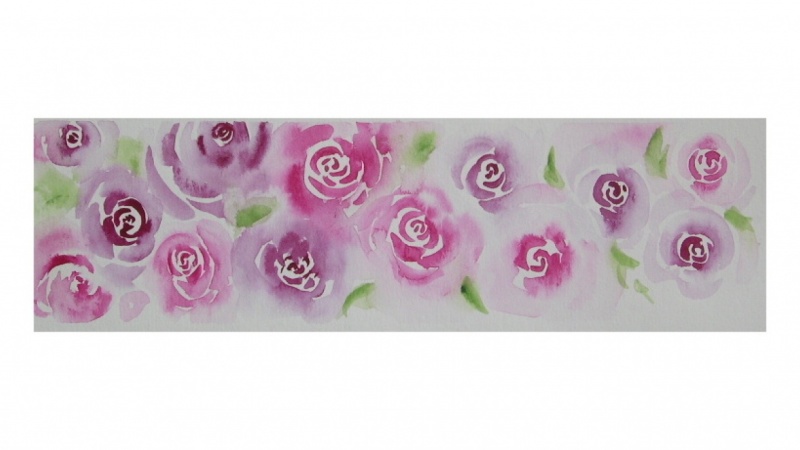
3. Fantasy Flower 1 - Rosy Blossom: so I want to teach you 54 oral shapes. Now, these air not super realistic flowers were concentrating on loose and free and fun and fantasy. They're going to remind you of flowers. Otherwise we couldn't call them florals. Right. But we're not going to be worried about getting them super realistic or anything like that . So the first shape I'm going to show you is a rose. Now, you could just call this out of pain, Rose a loose floral rose. And I want to show you how to create this shape. I'm going to use a different color this time. I will use my turquoise. See this fabulous turquoise? I've already premixed paints so that it will be nice and juicy and ready to GOP put them in my palette. So I'm just going to use my big brush for this, But you could use a smaller brush depending on how big you want arose or how much space you have. That's worth thing. I'm going to focus on using the tip and the side a little. Okay, so let's go. So the first thing you do is sort of create just a little C shaped or crescent shape in the middle. You can make it smaller, larger than mine and then a connecting C shape underneath. And we're just going to continue to make thes see shapes as we work our way around, making them a little bit bigger. And if you notice See, I have a gap here, so I'm not gonna start a pedal there. I'm going to start somewhere else and make a bigger pedal to create that. And then I will start again at the tip of this pedal and press down to create a wider stroke. It's a nice pedal right here. Now I have this sort of weird shape. So what I want to do is again It's sort of a petal shape, but it won't be such a crescent shape. So we're going to start with sort of a curry line. So I'm just gonna barely touch press down a little and move my brush in a little and then pull it back out to go around that to create that shape and then add the crescent to it. So what I wanted to do was sort of film that gap a little and let those touch a little and you notice they didn't start out touching. I added that in So you can do that anywhere you want it to touch and be all connected. And you just continue to make those questions shape pedals and that other loose pedal. You can go all the way around, or you can leave it sort of light on the top and make this skinny and light. And it's like that's the the top edge of your rose. And then I also like to soften my edges. I'm just using. I will dip my brush and I'll tap off the excess water and pull that color out and around to create that nice, soft, loose and watery outer edge of my pedals, putting a little bit more water in there. And then I'm lifting it out again with the dryer brush. So I top off my brush and then I lift off the edge of that kind of pushing it in some. Then I don't have such harsh, harsh lines, and more water makes it lighter, so course splashing zones nice can't exist. OK, so this may or may not need a second layer this first rose. It has a second layer at which are just these small few marks over the top of the others. It covers up the white a little bit and just chose to add that for a little bit more definition there in the center. But that's completely optional, totally up to you. Wait till it dries, and then you can decide if you need that second layer. Now let's move on to the second flower shape.
4. Fantasy Flower 2 - Big Center and Small Petals: So our second flower shape has a large center and some loopy, small, loopy pedals. Let's see, What color do we want? This one? What color did you like? These are all really vibrant colors, but you could have soft colors if you want to. So let's use this blue boots so really sort of a fellow blue. Really bright blue. But you use the colors that you like. You can you always soften them more water. So let's create this large center. Lots of paint. If you've taken mine too much, too little, just right water class, you will not. You will see that this is in the too much category, which is perfect for this. Now I'm going to switch brushes because this brush will make a really big flower and I want to make a smaller flower. So I'm going to switch to a small round. This is a four round, and I'm wedding it and pushing it a wedding in my jar and tapping off just a tiny bit of the water and that's it. I'm just using water now, and I'm going to touch the edge of this circle and you see the water pushing into the color . That's fine. And make my loop have a pedal. It also pulls the color out. It really depends on how much water is in your brush at the moment. But I I want to use a lot of water because I want the color to flow out, touching lightly. I don't want to drop on my brush, but I do want that and you go quicker or you could go slower. Whatever works for you to show you all cute. This is so cute. I love it. And of course, you don't have to keep going back and forth. You can just go look blue, Blue, blue If you wanted Teoh. All right, that's looking pretty cool. I'll drop a little bit more color in the middle because I did push a lot of water in there and again. This is a too much water situation. Quote too much water. It really all depends on what you're doing. I'm doing that on purpose because I wanted to push that pigment out. I wanted to flow. I wanted to have texture in there. Now you see, this is a little bit dry, so I can just add more water there if I don't want to, that's just something you kind of just can do. You can make them a little thinker, little thinner, using different brushes, different kinds of things. So that's a nice floral shape there, and it will dry similar to this one. Of course, it's a different color. Let's move on to shape number three.
5. Fantasy Flower 3 - Starry Petals: shape. Number three is done with a small brush. If you use the large brushes, you're going to make a really big flower. But I want Thies to be small. I want to be able to put these in little places around my painting, sore vents and accent. Not necessarily the focus. Or you can group them together to create something more larger. Okay, let's do our magenta. We'll use the midget A. For this again, I have a fairly thick mixture of color you can see, but it still has enough water to move. All right, here we go. So the 1st 1 in shape show you has hollow leaves, sort of like our last, our second flower that we did. So you do is you just make the loops with the color, and I like to make about five pedals. For whatever reason, odd numbers are visually pleasing, and you can lead a little space in the center. If you like. That's not required. It's an option. There we go. So that's a nice, loopy small flower with five petals. Now let's make the same shape, but with filled pedals, and all you have to do is top from the center of your flower. You're gonna tap that down and press down your brush and lifted up, and you might need to move the color around a little bit. So you pushed, tap it down and sort of pull it out and lifted up. I like my none. Even if you want yours, even all you have to do is just go back in a little bit with your brush. So there's a nice story shaped flower. Now, if we put the tip of our brush outward toward the tip of the pedal instead of inward toward the center, what do you think's going to happen? I'm pretty sure you guessed it that you're going to get more pointed leaves. So there we go and you can even drag your rush a little bit. Emphasize that point. I don't mind if I get out of the lines. You should know that about me. If you had a little wiggle, then you get a little wiggle to your pedal. Now I'm going to end up with six pedals here instead of five. That's okay. Flowers don't always follow our our artist rules, do they? They do their own thing and you can add more pigment or water in there as you like. So that is our third flower shape. Let's move on to flower number four.
6. Fantasy Flower 4 - Large and Loopy: flower number four is another loopy flower with a center. I want to use a really deep color for this because I want you to be able to see the color flow out, but you can use soft colors for all of these. I want to emphasize that I'm using really bright colors, but you can use the colors that you love. So keep that in mind when you're painting, so there's a nice deep purple. It does matter that this is not a super thin mixture, because what happens is you'll have a lot more color. We're going to be adding water to our page, so that's going to make the color appear lighter. So I want to start with his deep, dark color. That again is personal preference. So all you're going to do is create a circle. You can leave a little speck of white in there if you like. There we go. Now we have a circle, and then we're going to take our brush and clean it really well. Bronies water, and we're going to create a second circle around the 1st 1 I dropped a drip. That's OK, right? We're painting. Loosen free. What If we make a drip, who cares? It's perfectly fine. And now I'm going to make some sort of, like, spokes in a wheel and touch that color. And just basically, I'm letting it escape into that puddle of water that I created. It doesn't have to be perfect spokes. I like to sort of group some together, leave some apart. So you have a nice shape there now because I added a lot of water. I'm going to add some more pigment back in there. More water color paint. It's not really moving very much, is it? But I can tip my painting and make it move around. Okay? And then I'm going to make loops just like I did for a second flower. Except I'm going to make them bigger. I'm going to use water again. Clearwater. Nice wet brush, juicy. And I'm going to just lightly pull this out and make a big, long loop. So this is reminds me of a daisy. Now you may want to leave. Some space is in there again. I so happy to color outside the lines. I wish I could bottle that joy gives me. I don't know why I just love it. So I'm skipping spaces, making big loops, not much water on my brush that your son go to go back over that and then I'm going to go back in between. I wanted to make this really big, so that's also why am overlapping? There's that drop. See how the color just moved across? No problem. It's no problem. And then I'm going to continue going in between making loops. You could even make groups on top of loops. Smaller loops, longer, skinnier, loose, skinny and long groups on top of loose. It just adds more pedals, More texture to your flower. Layers are lovely. Now I'm going to add in mawr paint into the center. I really want to focus on adding it in the center and letting it flow out. It just gives a really cool effect. I am going to tilt a little kind of in a circle to kind of get that moving around, and one pedal here so you can just keep adding doing how you like, But at some point you stop. You go. Okay, I'm going to see what happens. I'm going to let this do it's watercolor thing. You're not going to dry this with your heat. Tour your hair dry. You're going to let it do its watercolor thing, and you're going to just let it dry and see what happens. Okay, let's move on to our fifth and final flower shape.
7. Fantasy Flower 5 - Scrubby Petals: again. I am using my small brush and I'm going to use my light blue. I haven't used it yet in this room, and I'm going to show you how to create this five petal flower that's filled in. So all you do is you load your brush with lots of paint and you're going to sort of from Imagine that you have a center here. You're going to push out on your brush and slide it so you're creating a loose flower shape and then you'll sort do that again. You're leaving the space in the centre. We want to leave this center white. And for now, at least, I dio So it's not a perfect circle in the centre, anything like that. It's just a messy space, and I want five petals, so I'm pushing out in every direction. It kind of turned out to be four. I want to connect that here and there you have it now you could move your pigment around or you can drop in more pigment. I want say, maybe that to be a little darker, and but I really like right now how these values have light and dark and so I would actually just stop there and leave it. I think it's going to be a beautiful, beautiful flower. So now that we have our flower shaves, let's move on to adding a few details.
8. Adding Details: Let's talk about a few details you can add to your flowers to make them even more interesting. So I have sort of an inspiration page here, and I can show you some of the details that we've added, and then I will put them in a little on our paper. But just let's talk about for a second. So one detail have added to some of my flowers is to make little circles and little lines coming out from the center sort of like a starburst shape. Sometimes I just add color color now notice. It's never like, perfectly circular. They're just sort of splotchy and loose, and the other thing is lots of layering. You can add dots if you can see this metallic. I've added sort of drop shapes just to my page to create a nice accent. So that's another thing you couldn dio. So let's talk about a few centers of the flower now. We don't have any flowers on this page, so we're going to have to use our imagination. You may want to use yellows or greens in your center if that's what you like, but for me, I'm just going to use this turquoise and colors that I used to demonstrate how to create the color shape size so you can see one thing you could do is just create dots. You're just tapping a loaded brush on to the paper. Some of them can be connected. Maybe some not. The next thing you could do would be to create a center. I usually like to keep mine dark, but they could be light if you choose with some little. Remember our spokes in a wheel. We can do the same thing over a colored flower or just have some little dots around it, so that creates a nice center of your flower. Another way you can do the center is to do the dots. You can use a smaller brush. If you choose. They can be close to the center or far away. I like him except both, so we're still doing some sort of dot shapes. And then, from what we imagine to be our center, pull out lightly little light lines to connect, and they don't have to be straight curved. It is really nice at some more little shapes. There on more You wanted to be organic feeling so I reduce. Maybe something like that. You could use white. You could use yellow. You could use black. Any of those will do. Another thing That is fine, I think, would be to just create some little circles. So if this were the center of our flower or near the center, unlike create little circles, you might need a smaller brush for this. You might want your circles to touch, maybe go on a ring. It's just adding some details. It's OK if someone more filled in. Some of them weren't so. The rain drops that I was creating that are not necessarily for the center of your flower, but just to add detail to your page was just a brushstroke like this. Depending on your brush, you'll get a different look. I was using my bigger brush, So let me get that and I'll show you how that will look with a bigger brush. Same color. I'm actually not pressing down as much of my brushes I did with the small brush, so if I just press down a little, I get this small sort of rain drops. I like them to be sort of at an angle And then if I press down harder like this one, I will get a longer shape. So those are some sort of kind of accent shapes you can put in. The other thing you can do for the center is just two to paint a blob. So some of my centers are just that. They're just like, Oh, dad, that's the center of my flower. And that's all it needs, really And truly, that's all it needs. Another thing you can do to add details to your center is combined These So maybe you want to make the circles right around the center of your flower, and then maybe you want to make a double line of circles. Mine are a little bit bigger, minor getting to be arc shapes. I tend to like toe work fast, so that's just mean. You do it the way you like. So that would be a nice center of a large flower if you wanted to, or you can combine them so you may want to do this circular shape with all the dots in the spokes. Then you may want to just pull some lines out, sort of mimicking this one of the top and put some dots on the end of those, and that could be center of a far as well. So just have fun and play with it. Try out different flower shapes with different flower centres, adding a little bit more detail here and there. Now let's talk about layering our flower shapes.
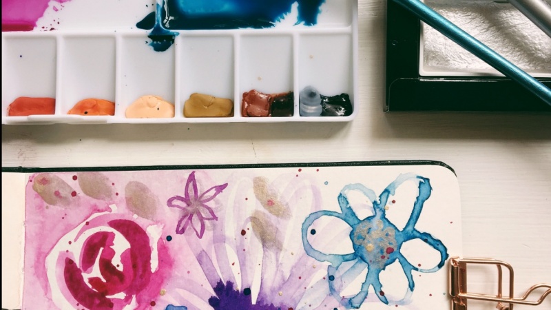
9. Learning about Layers & a Peek in My Sketchbook: So I want to talk to you about layers just a little before we get started on our project sample. This is actually the inspiration page for this class. It is loose and messy, and honestly, it's a big mess. Would I think this was a completed painting? No, but this is my sketchbook. This is my journal. This is for fun and experimentation and playing, and I had some really cool examples of things in this particular page, so you can see a lot of layering going on, so I'll have a water color flower shape. Then I'll have a dip in flour shape over it. I have the centers added in In some places, I have loopy shapes. I have the brush marks and let's see what else we have drips and drops everywhere I have. If you notice a rose shape with road with a metallic rose shapes over it, a little embellishments of flowers and florals and curvy lines. So I just wanted to share this page with you because this messy Bessy page is my jumping off point for this class, and I've done a lot of practice in playing with it since them, but this was the inspiration, and there's parts of this page that are really, really beautiful. So I want to show that one with you. And then as I was working on this class, I created some pages. So here's a really simple page. It has only one flower design shape, and it has a lot of white space and a lot of light, and I love it. I'm not changing it. I didn't add any details to it, as you can see no details to this page. So it looks really nice, as is, and that's perfectly fine. So you don't have to add details if you don't want to. And then I have this page, which is another page just full of flower shapes. Now I didn't teach you all of these flower shapes in this class. I felt like it was just too many, so I may do a second class. If you're interested in that, be sure and let me know. So this page is full of layers and adding details, so added metallic little dots in the center. Here's the little circles with lines pulled out from the center. This is just a little blobby shape just a little blob. There's a little blob, and then there's their dots over the top of it, so you don't have to do just one layer. You can add lots and lots of layers. This particular flower, I painted a blue color pedals and loops. Then I went back with purple and I painted purple, so you don't have to do just all one color or or all one shape. Most of these have the same shape over themselves. This one, though you see it has loops and then has solid end some loops in the middle. This one has lines in it so you can overlap your shapes. This one that you see it has the star shape. It has a petal shape around the edge and dots in the middle. So this is about creating overlapping shapes and making a page filled with just fun filled with fun. And then, once you fill the page with fun, if you want to, you can crop that image and create something from it, like a bookmark or a little painting that you can frame. Of course, this is in my sketchbook, so we're not going to work in our sketchbooks like I've been doing to get ready for this class, we're going to work on actual bigger sheet of watercolor paper, So this is just a page that could show you some possibilities for layering. Um, let me see if there's another page that you might be interested in now. This page has lots of layers and shapes, and it also it has the rose shapes in the straw star shapes, loopy flowers. Here's some to live shapes. We didn't talk about those. So has a lot of shape and a lot of color, and it's really busy. So what I want to show you next is how to crop your page to create a pleasing design. You don't have to paint the whole design and have it be happy with every part of it. You can cut it down to something that you really love, so let's do that next
10. Creating a Beautiful Compositon by Cropping: So let's talk a little bit about cropping, so what you can use is a mat that's pre cut for framing. Or you can make your own adjustable Matt with some card stock, All you do is cut out the singer and you'll have two L shaped pieces, which you can slide and move around on your page. And so basically what you're doing is you're isolating an area on your painting that you find pleasing. You can turn this this way this way, whichever way you like. This is for you. This is your painting. This is your page, and you're going to just move it around and find a section that you like, the way it looks when you have the frame around it. Now I'm particularly not liking any those with this particular shape, so I'll go to my handmade version. This would not give you a standard size that say you wanted a bookmark. It would be easy to you. Move them around and slide them over and pick the bookmark a size you like. So I'm just going to slide this around and see something that's pleasing to me. I really loved this flower. I'm not happy with the tulips. I don't know if I need to add more layers or whatever, but I'm just not very happy with them, so I don't really want to include them. In my composition, we were creating composition here. We're learning art stuff. Awesomeness. So this is kind of cool. I don't mind if it's there a little, but this is kind of cool. Maybe even like this. Or you could make a little small square and inch e. Well, look, that's pretty cool looking. Let me expand on that in the get away. So maybe I would like it just that size for me, you would like it in a square are more rectangular space again. I don't like that Tool it there. So that's kind of a cool composition right there. Like that. A lot. It's pleasing. It has a nice off center focal point, which is really nice and has a lose nice marks everywhere. So that's that page. We can always do more this page. I like the entire page. I'm not worried about finding a focus for it, and again, this is practice in my sketchbook. So let's go back to our three by five. You can use whatever size you like and lets just slide it around. And what happens is it visually creates a space so that you're not looking at the whole thing and everything around it. But you're just isolating that area and look, creating something lovely for me. Just anywhere on this page is pleasing to me. So you could just keep moving this around and trying different compositions and seeing what you like. And we'll do that a little bit with our final piece. I really love this composition. This will be really pretty bookmark. I think something like this. So just to give you an idea and really do it for you, it's fun. It's enjoyable. You can create something nice. So now it's time for me to do some project samples for you. And these pages I've shown thes were my practice pages, and now I'm going to get a sheet of watercolor paper and I'm going to paint flowers all over it in all different um, spaces and overlapping and adding details. Just play with my technique. I will only use the five flower shapes that we learned. I will use some details and I may use a dip in to add some layers, so let's get going
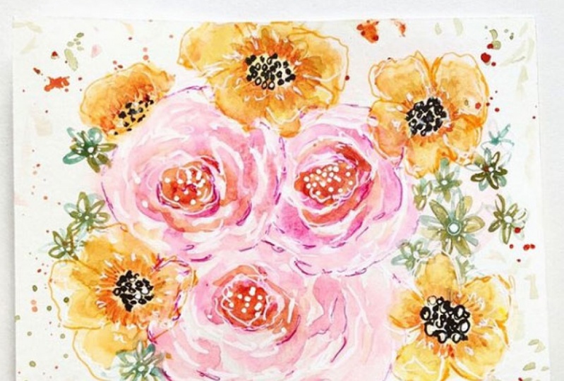
11. Using a Dip Pen for Details: let's talk a little bit about using a dip in. Now, this is a pin with a new that has no ink in it of its own. And we're just going to use our water color as the EQ. So all you do is if you have a real removable knew you just insert it, make sure it's in there fairly tight. You're different places on mind to insert it so I could just turn it until I get one where he wanted. There we go. And now what happens is the watercolor sits here in this well part. And then when you write and you put a little pressure, it flows out of the tip. So what I've done is mixed up some water color. Now, you don't want really super thin What are color? You wanted to have more of a thick in glide consistency, which means it has more paint and less water. So in the bottom of your pin, you're just gonna load it, but tapping in your brush. Now, if you get too much, it's going to drip. So I now have this bead of water sitting here. I think you can see on the new, and I'm going to draw with it, and I'm going to use my petal shapes and I can press down and make a wider stroke. But I like to make really thin strokes, so it's not going to be necessarily, even if you'll see and it's a little scratchy and look, my color is basically run out, so I'll just reload it again. Now, of course, you can always put your watercolor in an actual pot and dip it that way, but I don't mind loading it with my brush so you can just continue to make your petal shapes turn your paper. You need to, and you can layer this over for other water colors. Shapes. You have a nice flower. You can even switch colors. So like I'm going to have a mix of colors. Now, by adding that second color in, I'm going to tip it over that color there so it won't trip and you know you could make thes center shapes. You could I need to depress it down to make these little circles any kind of detail that you added, you can add even finer detail with a dip in. Now, if you don't have this. Don't worry, it's not required. It's just a little fun Tool spun to use. I'm really, like, really want to get one of those glass stick pins. I think that would be super cool. But you can use this to add a lot of details that were really fine. Like my name is very small, so you can see I can make really small dots with it. We just got a nice I could make you very thin alliance, but I have to keep reloading it with paint so you can see I can make really fan like squiggly, vine like lines where some parts or thickened summer thin by pressing down on lifting up. Now, there could be a whole class on dip pins, but I just wanted to introduce it to you here a little bit because I may be using it to create more layers on my project drawing. Once you finish with using your dip in, you could just rinse it with water. Just it's just water color paint. It's not gonna hurt it, so just rinse it with water and put it away
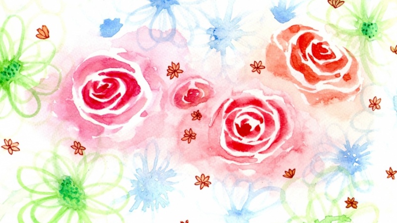
12. Project Sample 1: Let's fill a page with our flower shapes that we've learned. So we have five floral shapes to choose from. But I suggest that when you do your project, you limit the number shapes you use and that you limit the number of colors you use. So I chose to use three different shapes in this painting, and you'll see that as we go along and I limited myself to four colors of paint. Now you may notice. While we're painting, you may see more than four colors. That's because when they mix, they create more colors, which is perfect. But all of those colors will be harmonious, so it shows, first of all, the large, loopy flower that we created. But I didn't create that second outer ring with the spokes. I just left that part off. I was in Go Boat and didn't even think about it, and I'm using the small brush to create the loops for the pedals and the humane notice that I'm putting more than one color in the center. Now, if you want to just put one color in the center, that's perfectly fine. But I wanted to sort of spice mine up So I have that teal, which is a blue green mixed mixture, and I have purple, which is magenta, mixed with the teal. So they're all works together, and now you can see I'm using the magenta all on its own. But I'm going to add more color to that centre also. So I created three large flower shapes to sort of be focal points in a way for this painting, and I overlapped the loops as the pedals, so you'll see me painting loops over loops in just this very first layer. And there's nothing wrong with that. You can create long loops. You can create small, short loops. You can create skinny loops or big, loopy, loopy loops. It's completely up to you. But I did even start overlapping even at the beginning of this painting. So the next shape I chose was a filled in floral shape, and it's a little bit smaller. You can see it's about half the size of the larger flowers, and I just started putting it randomly on my page. I used the blue for the teal color, and I dropped a little bit of purple in center, and then I moved on to the small, five sort of star shaped flower. But I actually doubled up on the loops there, too. I just love of making these loops. These pedals, I don't know, is just so fun. So I really hope that you will try it and be really loosened free with it. Don't get caught up in making it perfect. We're not. We're not after perfection were after the process where after the joy and if you embrace that and you focus on that, then the beauty will come. You will learn so much and you'll enjoy it. And that's going to come through in your paintings for my last floral designs. But I chose. I chose the small star shaped flower, and I'm doing it in that bright, thick magenta paint and dropping that teal into the sinner. And if you notice I'm overlapping with the other flowers and I also I couldn't resist adding some splatter. So let the first layer dry, and now I'm adding the second layer. Now, if you notice for this layer, I'm focusing on creating the same floral shapes or even different floral shapes on top of the ones that I already created, So this is where the layers come in, really, in a big way. I'm using the same colors over top of one another, but you could just as easily use a different coordinating color or even your metallics here . And that would be a nice fund touch. I'm adding more loops over the loops that are already dry, and I'm going in between the pedals to create a lot of depth here, and the idea that there's more going on behind the scenes speak in toward the back of the painting. So will push that first layer back a little bit when I add the second layer, which will create the depth that I'm looking for. I'm also going to layer over more flowers in different places, adding even more flowers to my design. Remember, I want to fill this entire page with flowers. I don't want to have a lot of white space left. I do want to have a little bit, but mostly I want to be filled with flowers. And then after I get it all filled with flowers, I'll start adding the details. So you see here I'm adding a little loopy, star shaped flowers so It's the same design as the other star shaped flower, but instead it has the open pedals. So I still only have three types of flowers in this painting. At this point, I'm really in the flow of painting, and I'm really moving intuitively to add to this page. So I added my raindrops with the brush marks, and I added splatters and I'm just continuing toe work on adding layers and depth to the painting and doing what really just seems like it would feel and look nice. I even began to add some of the details to the center of the flowers, and if you notice I used a different color there because I use that yellow and I hadn't used it anywhere else in the painting. I also added splatters, which will tie it all together. What I really want is a cohesive painting with the depth and color and vibrancy and fun. So the layering and the splattering and in those small few details all contribute to that kind of painting that I'm looking for. So it's time to add that last layer. Everything is dried for the second time, and now I have pulled out my metallics, and I just love adding metallic touches to my paintings. It's so much fun. It has that just that little bit of shine that I really love. The only thing to think about when you're adding metallics is to not go overboard because they can take over painting. If you're not careful, so always think when you're doing the talents, less is more. And that seemed to be true for watercolor In general, I seem to when I'm painting with watercolor, really have to hold back and not just go super crazy, and it seems to work. So thanks for joining me for this sample painting. I have one more sample painting for you, and then we'll also talk about corrupting our paintings.
13. Project Sample 2: for sample painting Number two, I decided to focus on more soft look. I created a softer color of pink not as bright and vibrant, maybe a little bit more natural and a softer version of the teal. There's similar colors, but they're telling you just a little bit different, and I chose to use the role shape, and I'm just pulling that color out to create and take up more space and create that loose feeling on the background. This painting is going to have very little white in it when we're finished, and that's exactly what I was going for. Please keep in mind that this painting is done at four times normal speed actually took me about half an hour, not including drawing times to paint this painting what you are going to see in about seven minutes. So it's less than half the time that actually took me to paint it. So be sure and take your time and enjoy the process. And don't worry about getting going this fast design because I'm not even going as fast as you seem to be going for the rest of this video. I will at some music and let you watch and see how it all comes together. I think you have a good idea now of how to do it. And I will chat with you more about cropping and about your project after this.
14. Finding a Composition and Cropping My Project: I have my simple inch composition, and I really just love the colors. I'm love the metallics, and I love that shapes that that we've created together. But I want to cop it down to something smaller. And so what I can do is I can take my three by five or any size matte board just like I showed you before. And I can move it around my painting to find a composition that makes me happy. I can turn it. I could even turn it at an angle if I really wanted to and create something like that and cut it out to fit inside of this. That's a pretty cool composition right there. I like it a lot, actually. Use your L shaped sheet of paper. Let's say we want a bookmark. You just moved this all around, find something we feel you like. I like having my flowers sort of not all agree on my paintings, for I could nick artist trading card kind of like this kind of go looking the rain drops. That would be cute just by itself. Right? So there are a lot of options and it will take me a little while to decide. So I will posted in the project section and you can see what I chose. And honestly, I don't know, picking Croft this one, because I just really do love it. So after much debate, I finally decided I would like this as a composition. This section here. So I'm going to just draw around the inside of my frame with the pencil lightly because I'm going to actually race that now. We're removed the frame and I'm going to leave a slight edge around the frame that I drew so that I can attach it to my mat. See him leaving about a little less than 1/4 of an inch. Something like that. You can cut it white er's completely up to you. Now just go ahead and get this edge off, because why not? Look, I have another have a bookmark. Look, it's a little bookmark. I could write something on here. Fun stuff. Okay, so just get this off. I'm cutting slowly because this is the quarter color paper. Have a little small. I still have this large piece that I could do something with anything that I want. And now I have this. So let me just show you how we look all matted and framed. Now it will erase the pencil line. And there we have a nice composition from our large sort of collection and whole page of fantasy florals. So let's go talk about your project.
15. Project & Thank You!: So now let's talk about your project. So you have five different fantasy floral designs that you can use, and you have details you can add to the center, along with some other overlapping shapes. You could do with a depend that, or even a white shelf it. So just fill a page with all of these flowers of your choosing, and you can choose to keep your whole design or you can choose to crop a section of it. And either way, I would love to hear your thoughts and see your projects. So leave them in the project section below. And don't forget, you can ask me any questions in the discussion section. And if you don't mind, leave me a review and let me know how you like this class. Thanks so much for joining me.
16. Bonus: Make a Cropping Frame: to create your own cropping offering. You can use two different size pieces of card stock, or you can use a ruler and piece of card stock. So what you want to do is cut a rectangle out of the center of your paper, and he won about two inches of white space on the edges to give you that nice visual break from everything that is surrounding that edge. So once you get your lines drawn, you can cut it out with scissors into two l shape, so you'll have left to L shapes and a rectangle in the middle. Of course, you can always download and print my template that I created for you just printed on heavy card stock to make it easy and durable for you to use over and over again. Once the rectangle is cut out, then all you have left to do is overlap the edges and position it over your painting so that you can choose the composition that is pleasing to you.
 Jessica Sanders, Artist | Designer