Transcripts
1. Welcome: Let's paint some beautiful, glowing cloud scapes with water color. Hello, Welcome to my skill share class. I'm guessing Sanders Color. Make radio our dot com. You're invited to paint from wonderful glowing cloud scapes with me today. I would love for you to join me in this beginner to intermediate watercolor class. As we talk about inspiration, we practice different ways to move our brush softened water color and we learn about lifting as well as the anatomy of a landscape. Then we'll dive right into painting. I have three real time painting demonstrations for you today, and I make him super easy to follow. Fun loose and iTunes it. I can't wait to get started. Let's go.
2. Supplies: For this class, you will need basic watercolor supplies. You're going to the East Watercolor Paper. This is £140. Watercolor paper, cold press. I like the texture is great for making cloud. So I do suggest that you have cold press paper as supposed to smooth hot press, and £140 will be or 300 GSM would be great. You don't want your paper to be too thin. It will buckle more, but use what you have. That's the most important thing. You will also need to jars of water. If you only have one, you can get away with it, but two is better. Your paint stay cleaner and clearer, embroider, and you will need water color paint. I happen to have two different palates here. These are Jane Davenport brand, but you can use whatever brand you have. Mainly, you just need blues and pinks for this class and maybe a little bit of yellow. For those watercolor pants, you will need watercolor brushes I'm using in this class round watercolor brushes. I have to have a Princeton Select, which actually holds less water than the Princeton Neptune. But I really like this brush. It's great for watercolor, and it gives you a little bit more control or how much water you're using, especially since we're painting on small pieces. And that's a round number 10. Use the paintbrush you have and then a smaller paintbrush. This one is a size four Princeton Neptune, and since it's small, it's OK that holds more water. It's just really a personal preference, but I really enjoy using the realm brushes. You can get some cool effects with that. You will also need a cloth or spun tricked Ryan's your brushes and your pain, and you will need a tissue or a paper towel or kitchen towel, and that s all you need for this class.
3. Finding Inspiration: one of the main ways that I like to find inspiration is just by looking at images that could be on picks a B or Pinterest or even Instagram. But I have created a board for you on Pinterest. I have tons of pins on Pinterest. It's called Art Inspiration. Amazing clouds and sky. I have ah, 100 almost 100 pins in here. So this is a fairly new board for me, but I have created it for this class specifically. So this is a place where you can go and look and absorb and absorb and see how the clouds make you feel and and look at the images and find ones that speak to you like I love this one. OK, so this one has thes hot air balloons, which is pretty cool, and the clouds are soft and golden glowing love that. So any of these images look here, sort of a cotton candy kind of clouds were going to do a cotton candy sky. So just take a look through these images and let them inspire you. Maybe get a cup of tea or cup of coffee or your favorite drink and sit down and just peruse through and spend some time getting inspired by the thing that you want to paint in. One way to do that is with Pinterest images. Beautiful, beautiful, absorbed, the color, the shapes but mostly focus on how it makes you feel and reflecting on the color. I tend to look for color and shape and feeling more than anything else, and I'm going to just take this inspiration in, and then I will let it go before I start to paint. I let it go because I don't want to get too structured and to over thinking. So I will take in this inspiration. And then I would let it go and not focus on doing something specific other than I want to paint the idea of a cloud or a sky. And that's how I use inspiration. And I think you know, it's a good way to do it. And it you should Maybe I would encourage you to try it. Just try it and see how it works for you. Okay, let's move on to the next lesson
4. Warm Up - Brush Movement, Softening Edges, and Lifting: So I want to share with you a few things to practice. I want you to practice brush movement, so I'll show you a couple of things I want you to tow to learn. And one of them is using the flat side or the body of your brush to take advantage of the texture of your cold trust paper. So I'll just start with some paint and it doesn't matter. Used favorite color, use the color you want to use. It doesn't matter what color you want, Mrs. Practice. What I'm going to do is hold my brush underneath it at the end like this and I'm going. I don't want to put a lot of pressure. So if I want to put more pressure, I would do this. But I don't. I want to hold it where there's less pressure and I'm going to practice moving it on the flat side. So in letting it skip across the paper. So slide it, move it around like that. You notice you have some interesting edges there. I added some more color, makes it easier to see. I notice you have these little skips in places where you have the texture of the paper showing. So you want to practice that, so practice holding your brush, skipping in along and leaving and catching the texture. The more texture your paper has, the stronger those shapes will show up, and you can practice if you want dropping some color in the edges. That's what I'm doing there. Okay, so that will give you a nice, jagged texturally edge, which we're going to use a painting some of our clouds and in the second approach technique I want you to practice is what I refer to and what I've heard other artists referred to as dancing your brush. So what you're going to do is hold it again loosely at the end of your handle. And this time you're thinking of how if you were dancing, you would be moving your your body around. In this case, it's a rather erratic dance. You're moving your brush around so you just skip around on the page. You might move in little circles, spinning around and again. That's going to hit some of the texture more than others. And then you can just even drop in color practice dancing that around, moving it again holding it very loosely skipping around. Now, this may not look like a cloud shaped to you. That's okay. We're not going for clouds right now. We're going for dancing. We're going for moving our rush loosely, Freely. We want to get that loose watercolor look. So let's dance. Airbrush around dropping and more color, she could see. So it's very erratic, so fun to do, and you can just let your brush dance and move across the page. So just practice that sort of erratic movement a little bit and see how that goes for you. Next, let's talk about softening, so this technique is going to give you those nice soft edges mixed with the harder edges so you will learn how to soften an edge. But leave some hard edges. It's a concept of lost and found edges, or in our case, we're going to be softening. So let's say we put down a lot of pink, okay, getting some paint, loading my paint plus year. So let's say we put down paint. We could even use our brush mark, practice toe, lay down that paint and what we want to do, then to soften an edge is cleaner brush, and we wanted to be fairly dry. So get some of that water off. Then you're going to just touch the edge and let that soften and take away that hard line so that you don't have, ah, hard finishing line like here, softening that edge so you may have to rinse your brush, dry it and then go back and soften. I would like to use the edge of my brush, and as I was talking, my paint dried a little. But so now that edge is much more soft and not as harsh. You can take away these hard lines. If you have a lot of water, it will invite the color to flow, which is fun. See how that flowed out because I had a lot of water on my brush, but for softening, You don't really want that. So you really want toe? Get that brush sort of tapped off so you can soften that edge without a lot of color flowing out, clean your brush and even soften that again. So you see, I'm using a scrubbing motion, adding, in light amounts of water, you could even push in toward the pigment so that it doesn't flow out. So that is how you soften just so practice that it's a good, good skill toe have before watercolor. Next, let's talk about lifting. We're going to practice lifting in two ways. We're going to practice it with our brush and with the tissue. So the first thing you have to do for lifting toe work is to lay down color, right? You need color to list. So let's just put down some color. I'll make sense. And pinks, they're just fun. There we go. Next, what you're going to do is clean your brush, and again you're going to be drying it so it doesn't so it's a thirsty brush doesn't have as much water in it. Then you're going to sweep, press down and sweep across toe lift. Clean your brush. If you don't clean your brush in between, you're going to lay color straight back down on their. So hold that out again. Clean your brush in between. Lift that. Pull that out so you see how we had all of that color. But now it's mostly gone now because of the paints I'm using in the paper. I have color left in there. I'm OK with that. Some colors and some papers. You can go all the way back toe white, so I can even with that and then lift it more dry. It lived it. Morrissey, Almost to the white. It's good to practice lifting by pulling out and moving your brush that with. And it gives you this nice, interesting edge when you do that to you. Okay, so the next way the lift that is so fun as a lot of texture to your painting IHS with a tissue. So let me lay down some paint. You're going to take your tissue or your Kleenex. You could use a kitchen town paper towel if you need to. We're gonna make like, a little puffball almost because that's going to give us texture. And I'm kind of wrinkling it up on purpose. So I have this puffball and I'm just going to dab it and twist it into the paint and look at that nice texture you get now. If I keep going with this, it's wet. It's pigment. It's going to add it back, so you'll need to switch it around another puffball. Let me do some darker color, so you can really see that Do some really intense over here so you can see it even better. My tissue is dry. I'm a little puffball with the wrinkles, and I twisted so I don't get the same pattern every time I put it down so you can see how that really lifts it out and softens it. It doesn't take it away all the way as nice texture to your clouds. So practice that. See how your paints work with it. See if you lift everything or if it leave some behind. That's important information to know what happens if you add water and then lifted, pick up more. What kind of texture do you like? You can fold this into a really sort of much more controlled shape with the like, appoints and lift very specifically in those tiny spaces. So practice and dry it out and see how you like it. And you might find that it's fun technique to use while you're painting
5. Anataomy of a Landscape: Let's talk about the anatomy of a landscape. I want to show you the horizon line, which is actually this will appear to be the horizon line. Never rise is actually below that because it's mountains right, But for the purposes of this that will work. So here's our horizon. It's approximately 1/3 from the bottom of this entire photo, and I want to share with you a little bit about how this works. So things happen as you move away from or toward the horizon line, whether you are in the foreground, the bottom or whether you were in this guy and at the top. First, let's talk about color shift. So as you move toward the horizon, color shifts toward believe it will be more blue, and it will also be lists intense as we move toward the rising on it. As we move up, it will be mawr intense in color, and it will be a purer color, less blue. Okay, so that's what happens as you move toward and away with color, and the same is true here. As you move toward the rise in line, it is more blue. You can see that very easily here. These mountains are quite blue, and then it shifts to more and more green as you come down toward the bottom and their lesson tints same. And then as you go down, see how intense these colors become as it's really close, these air in shadow. But here see how bright and vibrant and intense those colors are. So it works in the same way as when you move toward the horizon line and it gets less intense and more blue. And then something also happens to the shapes. So as you move again toward the horizon, line shapes get smaller. So as you move down smaller shapes. So if you notice this little clouds here. But look here like look out small. These are even smaller. I'm not drawing the entire club, but look, And when you move up, look how big that shape is. An even larger it goes all the way off so you can see it gets a lot larger shape and smaller shapes as you move toward the horizon. And also, if you look at the trees, you'll see the same thing happen smaller toward the horizon. So notice these trees here her barely comptel that their trees. But you know, the trees and here, these air far away. And then you get close and look at how big these trees are. So, like we have these little bitty cheese. You have these little Rosa trees here, let the trees. And here there are a lot closer rate and they're a lot bigger. And then look at this one, even though it's in shadow. Look how big that IHS really big. So as they get closer to you because here's you, you are here all right, standing on his Iraq. And as you look as they get closer, they're bigger. And then as they're further away from you, it gets smaller and Balu her and hear these clouds air closer to use so they're bigger. But as you move toward the horizon, they're further away. So they're smaller. So that's the anatomy of a landscape
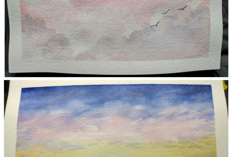
6. Glowing Sunrise: Let's paint a soft, glowing sky. It's the first thing I wanted to you just for reference, say, and this is not required, but to make it easier for you to see, I'm going to lightly pencil and a horizon line. Now I wanted to be approximately 1/3 from the top, or maybe even I'm sorry, 1/3 from the bottom or perhaps even a little bit lower, because what I want it to do is give my sky perspective, and I want my sky to be soft and glowing. So I think what I'm going to do is mix the yellow a warm yellow, and the way I'm doing that is going to take this yellow, and I'm gonna add a tiny touch of red so that's warmer that I wanted to be. So now I have some darker or G, and I have that and I'm going to add more water because I wanted to be soft and glowing and on both sides. They did that in the morning, decide. So now I have a really loose, watery mix. It's really light and thin and not the thicker, more intense color. So let's start with there and I'm just going to lay in some of this golden yellow just along the horizon line, and I'm working back and forth and skipping areas, especially where I'm thinking. I wanted to be the brightest there, and the next I will pick up the more orangey part and but that along more the edges and staying sort of horizontal and working back and forth between I have a drop of water here. That's fine. I'm leaving against some white spaces to think about clouds and sky. And now what I'm going to do is soften this area. I have a wet brush and tapping, tapping it off just like that to get the water off. And I'm goingto soften this by making a sweeping motion around and pulling that paint away from that white area, and I will do that on both sides. Make that really nice and soft, cleaning my brush sometimes so that I don't put that pigment back down in that area. But I do want this to get a little bit wet because I wanted to be very soft. Is there a little bit harsh? I'm going to add in a little bit of water to get that paint to flow there. And now I don't want a harsh line on my horizon, So I'm gonna go and really fast and add a little bit of water, and I'll let that come down just below the horizon. That's gonna be actually pretty perfect and even drop in a little bit of that golden yellow here and there to reflect this guy. So Oh, that's pretty. So you notice how my paper is working a little bit, So I have a solution for that. All I do is take my watercolor paper sprints back of it with water, and that will help it to begin to lay down flat because it will be more evenly wet on the top and the bottom. Okay, so so far, so good, Really liking this effect. Now, what I want to do is bring in some pink. I have this Red are ready. It's kind of think you read, which is actually perfect. Something going to really water it down. See, it doesn't even look read anymore, does it? So, pinky red, really watery and just start bringing in here and skipping some space is thinking about how clouds and sky overlapping a little bit do. We don't want any harsh edges, and I'm gonna just a little bit more darker color toward the top. Remember, we have lighter, brighter and darker as we moved up. And next I'm going to get a blue that I will use this neutral blue, which is a lot like an ultra Marine, perhaps an ultra Marine. You could use a surreal yin blue, really thin again, very watery mixture. Hello, and now I'll just add this and I'm keeping this wet edge of the top. So depending on where you live and how much humidity you have, that will drive faster, so you kind of have to work quickly. But you don't want to rush now. If you notice where it's hitting that pink or that's hitting that red, it's turning purple, which is actually perfect. So I'm going to continue and drop in some of this blue into that pink area and even a little bit into that golden yellow, and it's going to add some purple e shadow fix. Now, if you're using this really light mixture, my yellow has already started to dry. It's not going to mix, it's going, Teoh sort of glaze over it. And with this light yellow in this purple lee blue, you get more of a get more of a great I see there was an area that I don't like that now. I do want the top the furthest away to be darker, So I'm going to bring in more of my blue. It's all wet, so and I'm just sort of scrapping it around to convey the idea. When I actually painting sky, we're painting the idea or the feeling of the sky. The idea that there clouds and and wispy nous in the top again adding and more to create some shadow and remember, get smaller as you go down, I'm gonna add even a little bit more shadow in the shadows that I've already created out toward the edge is I want the sort of a framing effect there. So now, as I'm looking at this, I see some sort of hard edges that I don't want some going to with the damp brush, soften that and sort of sweep them across there. We get nice. I think I'll bring in a little bit more of the yellow, the golden yellow and dark in this edges a little bit with that and maybe even work in a little bit of Was Venus there to create that effect? Remember, I don't want a harsh lied, so bring that down can a little bit save on this side This is still wet So it's kind of and I'm just sweeping my brush, imagining that cause air flowing I love that word flowing across this guy. I don't want this hard edge that's forming there, so I will take that away. I do want some of these hard edges here, but not a lot. So softening bringing that out just a little. But if you notice there's light and dark all mixed in. Okay, now the hardest part. Don't touch it. And you can see I'm not 60 that I'm going to bring in a few little shadowy areas there and again. I see a sort of harsh line here, so I want to just soften that with the damn brush. I do not want that there to be hard. Hard line. Look at that. Quick, easy, beautiful sky. I will go ahead and add the land because, as I said, we want scope and While this is also a little bit wet, it's a good time to add a strong color for the silhouette of some land. So I'm going to add this and to go blue, a fairly thick mixture, sort of in the middle. If you remember my too much too little water. How much water should you use? Too much or too little or just right. This is the just right mixture. It all depends on what you're looking for about in this case. It's sort of that medium value of me mid area mixture. Now I'm just going to create a really light line right along my head. Rise and see. This is wet. So it's bleeding in and barely touching the tip of my brush to that, and you noticed it lead out. And now I'm just gonna dab in some little specks here, which is going to give the idea that there's some trees or something there. Okay, that's it. So that is it for that. Now pick up with a thirsty brush some of this that it was a little much and go just past the end to create a shadow. It's still a golden, glowing shadow which is, I think, really nice. And I want to run that shot like right that edge again. I'm picking this up with a thirsty brush and sweeping it, even off the papers. It's okay if I go off the paper. Okay, so that's going to be really light. I'm going to add in a little bit more of that medium pigment just above the horizon line in a really light delicates stroke and tapping in to the top area. We're just going to give me a little bit more entity of color. I don't go is high up. I want the idea that there's something behind there. Again, I'm always pretty much trying to convey the idea of light that there's more. I'm going to do the same on the other side. I need to move my painting just sold to the same here, but not as far over and not as much. They want to be a little bit less, and also this is not his wit, so it's not moving quite as much. But you see it is still moving. I'm going to pick up this pain again. That's because it's a little more than I wanted to be, and I don't want any hard edges. So use that lightly damp brush to just move the pigment. Where do you want? This is your painting? You were the Boston it. Okay, Now let's soften this again, lightly down, touching that in and bring it just past the edge. Very settled right there. Very subtle, heading in a little bit more pigment here. I'm just touching it ever. So it's super light of too much water, and I believe I can go in with a little bit more dark over here now. This time I'm going kind of with a thick mixture, because I'm going straight here from this little puddle, said my pants. So you see, it's not moving very much, but then putting it into water so it is going to move. So let me just work my way, not all the way at the end, because then you won't have that glowing effect. And now some of the water has evaporated a little bit, so it's not quite as moving quite as much. So a lot of water color is about observing and seeing what happens and paying attention to how wet your paper is or how dry it is. And this needs a little bit of it's just super light touch of sweeping that color out just a little. My brush is a little more wet than I wanted to be again. I'm softening. Okay, so so far, so good. What do you think? What do you think? So far, so good, Maybe a little top up there. I'm sort of mimicking the shape of the area that that it's in toe. Add more of the the glowy effect. This is really glowing here, so may want to soften that, But I'm not going to do it right now. And it kind of don't like how that just judge out there. Said So let me add a little bit more to be more gradual, I think there we go. OK, now that's very fussy. That's as fussy as I get when I'm painting just like that. So that's, like for me? Very detailed, Unfussy. Okay, so now we want our water or our our our This is water just because of the way I painted it . I didn't have a plan whether this would be water land, but in this case, because I have already added reflections and how this is going to be water. And so what I want to do is bring in. I want to bring in some blue. I want to keep it all tied together. So I'm going to use the same blues. This guy, I'm going to bring in even a little bit of pink into the reflection. And so let's work on that. So let's start with the pink, which is the same mixture used here. This really light red, really watery red. And I'm just gonna add just a tiny bit here and there. So there, a little bit on each side, kind of reflecting what's in the sky. Want to be really nice and soft notice? I did put some strokes in there, so I'm just gonna blend those out, and I will have some hard edges and some soft edges. So I'm using just the tip of my brush. Super soft. Just the tip to bring that and push that out. And then I'm moving on to the same blue that I had before this similar to ultra Marine. Use the colors you have. You can make it work. Remember, you can start really light and work darker if you want Teoh. So now I'm going to bring in this blue color. It's still very soft. I wanted to be that way at this point and bring in a little there well, here and work my way around. Now this more solid, then the rest. And I'm doing the entire corner that way. Kind of just like a did sky. Maybe drop in a little bit shadowy, just using the tip of my brush and taking advantage of the texture of the paper. Time to and be in sure, I'm leaving, You know, lots of that other color would untouched with the blue. And again you can see I have some hard edges, which is what I want, but I don't want to all be a hard edge. So I'm going to blend some of that out and pull that out. Pull it. There's sort of a push and pull with watercolor, it seems. Now I want to strengthen the color on the bottom on the edges, and what I want to do now is I want to tie the land with the water. So I have this ultra marine blue, and remember, I have the really dark indigo kind of blue, and I'm going to use a bill to this more blue, more of the light, bright blue than the indigo or oppression blue. I call it both. I think I switch back and forth between indigo, Prussian blue. So now again, I'm using the same colors I've already used in the painting, keeping it all nice and tied together and making a watery mixed, because that is quite dark compared to the other brightest color. And now I'm going to add in more shadows. This is still wet and leaving white areas just where the water would be reflecting, or whether where the sun would be reflecting off the water and making marks in the area just to add visual interest. But on the edges, I'm keeping it solid, my papers still a little bit curled. So I want those edges to be darker. So I'm going to bring in a little bit more dark because what will happen is that will draw your I to what's already there, which is the sunset, and still I'm using sweeping strokes and I just want to bring in a little bit more, a little more drama, and I think I'll go even a little bit darker on those edges still mixed with the other boehlje again. This will dry, lighter watercolor drives bigger and even more dark here, still mixing it in with with that blue with I'm sorry, I I'm mixing the indigo or the pressure blew in with the ultra Helene Blue to keep the same tones even a little bit more drama, you know, a little bit more dark here and there. Adding a little pressure pollute a little more. Okay, so this really makes me happy. Really, it does. Now I will work here a little bit more and add in a little bit more dark. It may bleed down, but that's actually good because I wanted to be shadowing. So to create drama, you need more contrast. I think you need contrast to create drama and to create that sense of light, darker darks and lighter lights. So the darker your dark so the lighter your lights will appear. That's what that means. Darker darks and warning lights touching in again. Those are just little fussy detects. Okay, now I notice here, I sort of have just this line and I don't really like that. So I'm going to pick up with a damp brush. I'm going to push this back, just soften it and lift up some of the color that's there so that that golden light will be shining through again and soften that a little. Have to be careful not to press my brush down too far again. I'm doing a little bit more softening here. That's too much. Yeah, and soften. Want to soften this area? Lightly damp brush. I'm so happy, you guys. I'm really happy. So I hope you will try this guy. I'm going to let it try and I'll show you photo once it's dry, but I hope you'll try this. It's so fun and it's just gorgeous. Korda's love it, okay?
7. Cotton Candy Clouds: Let's paint a cotton candy sky. Those are so pretty. So I have my paints pre wedded, as always, makes it so much easier to pick up your paints a few time. I'm going to start with a bright, bright pink. This could be an opera pink and fluorescent pink, really bright. A little leans a little towards purple side, really bright, adding lots of water when painting clouds and skies. Soft colors are really nice. You do need dark colors also for drama, but start with soft. So that's a really nice pink. Now I'm going to take a little bit of this pink and put it here. Well, I guess I could take you from the band there, and I want to tone it down in the way I'm going to do that. I want to be more of a soft sort of a shell pink. So the way I'm going to do that, it's at a little bit of yellow. Not much, because I don't want to turn it once. That's more orange than I wanted to be, so I'll clean my brush and pick up more of the pink. It's looking better and better. Black well Let's just add some water and see how it looks. It's a really strong color, so yeah, Okay, so that's a much more toned down pink, which will also look nice, but it's made from the same color. Is this so it's really good. Really good. So cotton candy and I also will be using the indigo has some shadow. Okay, so let's think about let's don't think too much. Rather, if you think too much, you'll start painting this symbol and he of a cloud. But what we really want to do is not paint the symbol, but pain. How that cloud makes us feel I'm going to start with soft pink here with a lot of water, the light really light value. And I want a fluffy, fluffy paint cloud. So I'm just going to dance My brush across I picked up a little bit of blue is that it's not gonna hurt me. No, absolutely not. Dancing my brush across all the way across this is just gonna be mostly a big giant cloud. But look at that nice soft color that we have there. We're gonna drop in more of that shell ping. Oh, look, I picked up more purple from my palate. Not sure where that's going from, but I'm not going to worry about it. Okay, so if you pick up extra collars, it just as more interest, So don't worry about it. Now, I'm going to pick up some of that sort of hot fluorescent pink and drop it in some places. And now I'm on to softening. So first I want to soften this and just adding water, letting that color flow out. I have some white spaces in there, which is actually perfect for clouds. Right. Softening this edge completely and now would soften some of this. I want to, like, move my Russian circular motion, which creates that sort of uneven edges, which is, I think, a better option for clouds. Okay, look at that. That looks really nice. I'm going to pick that. I will bear the shell pink and put that and and again, this is all wet because, remember, I soften. I'm gonna let that dance around again. I'll leave some white areas. Wow. I love this. I don't know how you feel about it, but I love it. I makes me so happy, which is the whole reason why I paint. It's because it makes me happy. So dropping a little bit more here now I think I'll start another sort of layer of cloud. It's going to be soft because this is wet. Uh, but that's okay. So I'm just gonna work in more of this pink. Think about this guy and how beautiful and happy and think about cotton candy and how light and airy and fluffy it is. And I'm using these circular marks, leaving some spaces. You know what? We even be nice. If we used to tissue and added textures, I'm going to let make a little puff and it's got wrinkles in it and things, and that's perfect. Don't leave some texture in my cloud. Oh, look, isn't that nice? And I love that just a little, and I have this edge, which I do not want, so I'm going to soften. Damn brush can't brush. If you use too much water, it won't soften very well. That's looking so nice now. I had in some purple by accident, but I like the way it looks. So let's do that. Let's add in more purple. It's maybe instead of the indigo. I'll use the purple, get that. It's nice, that's pretty, but it's very thin and watery. It's not strong, and I'm going to use it to add sort of some shelves here. Purples of great shadow color shadows are cooler colors. They recede and again I'm dancing my brush, so tapping and dancing is the best term I could think of. But you're just moving it in a rhythmic sort of motion to create and uneven. It's rhythmic, but it's uneven. So it's really interesting. OK, a little bit more darker. And, yeah, I'm going to just fill in that hole, leaving a little touches of white, and this really faded out here. I think I will drop in even more purple again, doing the dancing motion. The paper is more dry there because I use the tissue. So see how that's sort of a hard lying kind of like that. I think I'll actually get the tissue and tap a little bit more there, give a clean area, just sort of make that line a little bit more uneven. I I'm in love with this. I hope that you are in love with this. I like how this shell pink has yellow glow mixed in. I love this year. Really pretty. I am going to add a little bit of this purple really lightly. I don't want to take away that glow, but I do want to enhance it by adding some shadow. So again I'll take my tissue and I decide to tap because I want the texture. If you're wondering how I choose that So look, this is beautiful. This is beautiful and glowing. It has a nice cloud edge nice cloudy shapes. And so what I want to do now, IHS, I want I don't want to leave this all white Mm. But I think I want to let this edge dry even more before I continue. So I will let us try, and then I will be back, spritz the back of my paper. But because the front of my paper is dry and it's curling up quite a quite a bit. So I'm going to bring in just some low attack washi tape and sort of take down the worn and there's a little this is already dry on the front. So if this is painting was wit, I would not do this And once I start painting, it's going to lay down better. But I'm mostly doing this so that you can see more. They could have taped down the entire edge, but Okay, so now let's take down with washi tape and you understand why I did that. Look, isn't this cool washi tape? It's like clouds. I love it. Okay, Okay. So I want to bring in some blue in this area, but really Ah, light and purple Lee blue. So I've got my purple here and I have a really strong blue on this pallet. So I'm just going to pick up a little, see how bright that blue is. So when I'm going to mix in that purple and I'm gonna add a lot of water, if you notice that's been a theme with these cotton candy clouds is to add a lot of water. So that's a blue purple mixture. And what I want to do is e want there to be some light tears. I don't want to go dark here. I think I wanted to be darker. The top edge. I'm going to remove that tape in a minute. And I wanted to be soft as I go down. That's what that's what I'm going to do. So I'll have to remove this tape. I didn't for sure that would start there, but noticed my papers already more flat and again. I'm dancing my brush. Now I'm going to add just water to this edge. I want to be nice, super soft, and go over where I've already painted a little with that color and maybe even leave what looks like some little soft cloudy edges, really soft, kind of all the way down and adding and more. And remember, I have this pink on the edge what you could barely see, probably on the camera. But it is there. And so I want to dance around that and create sort of that drama again. I'll bring in more of the watery blue mixed with just a little bit of purple. It is to kick it up some, and I'm of the city dancing that in. I don't want it to be a solid wash of color and bring that in from the edge a little bit. I wanted to be You're like wispy clouds Now this is already drawing, and I don't want that hard edge. So I'm going to soften that. Stop him softened, soften it all. I want all of that soft and maybe even lift some years in the side of my brush Damp brush pulling out in a way. So give see effect that son shine a little bit more shadow with that same blue I'm using for the sky And bring in a little bit of shadow here then and texture a little more in texture. I want to bring that also into the bottom when you remove this tape. So now you can see it's late now, better watery shed We fit picking up a little bit of that. And I'm also now just sort of dabbing around so that I am adding some random sort of random kind of shadow shapes. I'll do the same on this side. Not a lot. I just said some shadows to the clouds. Well, in that else in that corner. Okay. Hmm. Okay. I hope this makes you happy. I hope you will try this also. This makes me very happy. Seven. Some nice shadows. Nice glowing clouds. Maybe a little bit more shadow over in that area. Just a little soft, soft. The theme of the cotton candy in this case is softness. Can I can, like, use my tissue to sort of work that out a little bit more sweeping? I'm using a sweeping motion and flicking it So it's not picking up very much If I am lifting as I go but picking up some maybe a little bit of dabbing here on there. Okay, that's beautiful. Beautiful. Now I want to do one more thing. Um, on the glowing sunset kind of painting or sunrise, we created the scope or the amazing largeness of the sky by creating the horizon line along the bottom. But this one, we don't have a rise in line. So how are we gonna going to communicate how amazing and big end fantastic this guy is? We have this wonderful color. But how big? What is the scope of this guy? So I want to add a bird. It's OK. You can do it. You can do it. I promise you it is not difficult. We're going to take are saying purple blue. But I'm going to add in a little bit of that oppression Blue. Oh, that's too much. See, that's really dark. So that's two this again on watery mix with the purple with a little bit of that oppression or indigo to make that dark and toned down. And I want to add a bird rather than going straight into my painting. I want to practice, so I will just do a check mark and a light line, and that's a bird. But it's come, pig. I want a tiny birth. That one's pretty nice check. And over that one's good like that. Small size. So check and over maybe add a little bit there. It's okay if the textures gets a wing, so check that would be a super tiny bird. You could actually believe that a little bit over. So I like this size of bird. I think I think these are a little bit too big. I want smaller, like these two. Okay, now I'm going to go for it. And if you think that I'm not nervous, you're wrong. I'm nervous about adding this bird because I love this painting. I love it. And so that's what makes me nervous. And I feel you if you feel nervous. But sometimes art and watercolor is about being brave and overcoming nervousness or fear. So I loaded my brush. I feel like it probably has too much. So I'm going to practice again. Yeah, that's a lot of pressure. I'm using super light pressure. Okay, there we go. I'm going to go. Sort of an idea of rule of third. So 3rd 3rd I'm going to put my bird. Here we go. Are you ready? Such a light touch. Look, I don't want that. They're looking clean right up. See the magic of water cup? There may be a shadow there later. That's okay. So I just want to touch that. That's it. He's all alone. Do you think we should add more? So maybe a little bit more. It was super tiny, even further away. You can dab in even a little bit of color there, and I like threes. So let's do in here. And we have some birds. I noticed I didn't go super dark, but I went dark enough that there would be contrast. So we're back to that idea of creating contrast. Even though this is a super light colored sky, that little bit of contrast can make a really big difference. I'm actually going to soften this with a like, really dry brush there and soften that a little. It's blending to the clouds there just a little added. I just like to blend things out. Okay, so this is this lovely painting. I will show you again when this completely dry right now. Still drying. So OK on to our next painting.
8. Fluffy Clouds: Let's paint a big, fluffy cloud. Or at least that's what I'm going to go for and we'll see how it turns out. Okay, so first I want to do is put in my horizon line, which is about 1/3 or a little bit lower again. This is not required. It's just to make it easier for you and me to see and have some perspective here. Skye. This is sketchy, you know, decide. I don't mind if little pencil marks air there. They're probably not going to show. In the end, they might. If they do, that's okay. Okay, So let's think of big, fluffy clouds now. Keep in mind at the top of our painting that's closer to us, actually, closer to me. And as you move down to the horizon line, it gets further and further away, which means things get smaller and smaller as you move down and from the bottom, it's closer to me moving toward the horizon line. It's further away. It gets smaller as you move toward the horizon line, and it gets a little bit more blue or purplish as you go. So just things to keep him on and be aware of its darker at the top. Lighter, darker, more intense, lighter. Those are just some key concepts, and I have a handout for you if you want to print it out and keep it near you. So you have a good idea. And Kim have a reminder. I have nice, clean water. I have to brush is they're both around when this is smaller than the other. Nice and wet already, my pants are wet. Maybe I'll spritz some a little bit more. And let's start with um, let's start with negative shape painting. We're going to do the outside of the cloud area, and I think I want to use are bright blue. So I'm going to pick up some fat, bright blue. I love this blue. It's bright and intense, but that's the thing. It is very intense, so I can add a little bit of indigo to just tone it down just a little and just take a little bit of that vibrancy out because I want my clock. I wanted to be dramatic, but at the same time I don't want to be overpowering. I think, though I do want to exaggerate the color a little bit this time. So I'm thinking of the top of a cloud and how I love looking at clouds. I'm not thinking about oh, my kindergarten shape or my brains symbol of a cloud, And I'm not going to move my brush in such a way that it will produce that. So that's just just have to keep that in mind because your brain will go into automatic symbol mode what I would call it So we don't want that because then our clouds look more childish and not is natural. So I'm going to hold my brush sort of flat and see how I'm holding it. And so I'm not putting a ton of pressure because of the way I'm holding it, and I'm going to scrub it across my page and create that edge. Look, I love that now I'm going to just add more color there and to some sweeping there we come and I'm going to drop it even more because, remember, I want to exaggerate. Remember I said that I want to exaggerate and letting the texture of the paper help, and I am not going to drop it in here because I want this to be softer already. I can have a sense that the light it's coming from there And then again, some sweeping motions with my brush to spread that color and make it look fabulous. Okay, so love that so far. Now what I want to do is I'm cleaning my brush really well, and I'm going to top it off. And what I'm going to do is drop some water in and it's going to push that pigment away. So I'm going to drop here. See, it pushes the pigment away, and it creates this sort of sunshine effect that I really like. So dropping in water there to push that pigment out because it's more West pushes it. Now I want to exaggerate that a little bit. So I'm going to drive my brush and with a side of my brush, lightly lift and swish that out toward the edge. Away from where? That somewhat maybe streaming through behind there. Look, I have this really dark spot. I love it. I love how dark this is and how there's a little dot there. Love it. Fantastic, because soften this a little. I don't want that to be quite that's hard of an inch. So again with a damp brush. If you put a lot of water the color will you be inviting the color to flip more than you'll be in softening it. So keep that in mind. You want a damp brush, not a really wet brush. And I'm also softening this itch and sort of doing the dancing brush to bring in a little bit of that color. I wouldn't leave a lot of white. Want this to be a really white, fluffy cloud. I'm liking how this is very subtle and how that's looking. So I'm going to pick up even mawr watery. I mean, it's so watery. It's barely any pigmented, etc. It's It's nearly white, so almost the lightest value you can get, and I'm going to add in more with this time I'm sort of a scrubbing motion, and then I want to get some clean water trying to soften that and softness, and I'm adding in more subtle shadows. In the end, I want this to be exaggerated, but right now I want it to be light and settle so that I can add to it as I go. So like here. I want to add in more shadow. So what? I'm going to do this. Take my indigo Really watery into go. But it's naturally darker than this blue and I don't want too much. So I'm tapping off and I'm going to just scrub some in here and dark in this shut, and it's going to bleed out into the wet area, which is perfect. I'm using small sort of circular motion with my brush to just drop in into that already wet and making also some small marks, adding a little bit more shadow here and there, letting my brush and my paint do the work for me when a tap, some little dots of shadow is because it's fun and I like how these looks so just sort of continuing that idea of adding in some shadowy bits. And I want this edge to be soft or so with that lightly damp brush, softening that and sort of making. Let's make some sweeping marks with that and go even over the dry paper, and they spread that color and sort of create that black, shadowy area. I want to bring this all the way down to the horizon now because I my method of painting is to be inspired by photos, but not necessarily paint the photo or be inspired by nature, but not necessarily paint exactly what I see, but to sort of make it up as I go along. So you'll see me move intuitively round my painting, and it creates sort of a spontaneous effect. And the truth is, it doesn't always turn out good, but it is fun. It does make me happy, and that's the point of painting for me. And I hope also it lets me share that joy with you. So I'm going to add it even more shadow in the Syrians notice I'm leaving that edge and letting it move out. That was pretty watery. I mean, adding a little bit more. So now I'm adding a little bit of drama to the shadow area, and again, I want to do this sort of sweeping No, my brushes quite wet. So I did invite the color to flow in that way, and this kind of clouds tend tohave a flat bottom. I want to soften this a little. It's just too much texture there, so my my rush pretty dry, so I'm actually kind of lifting some of it and let that go and bring that out. So I'm loving this so far. Look, it's just it's luscious lashes. Okay? I'm going to add even a little bit more shadow. This is mostly dry here, but I can lightly add in some shadow even more so. As I was saying, I moved sort of intuitively around the painting and go, Where do I need Shadow? Where do I need color? Where do I need movement? And that's how I work. And it just can be really, really beautiful. Now I see this white thought. I don't like that. I'm going to add This is already dry. Well, it's okay if it's light, but I just want I'm going to add more sweeping strokes gives the idea that that there are more clouds up there and I will bring in some strokes this way to added more texture. This is dry. This part is dry. I don't want to be too literal, so those were too much for me. I'm going to softened that out. That will be more settled. I'm getting a little mark that I don't like right here I could add in white, but I really don't want to. I just I'm really loving the way this edge of this cloud looks and the shadows we have in here so really nice. Okay, so we have this big, fluffy cloud. It's closest to us because it's near the top. But as we work down, we want the idea that their arm or clouds here and also we want this to be lighter. Now this the bottom, say the bottom of this cloud, we could added more shadows if you want, but I'm really liking the way it looks now. So I'm going to leave it, as is for that part. And then let's work on this area. So why don't want to do is use the same color as here the sky color, which is here. But I'm going to use even a lighter version. And I think I will bring in a little bit more of the pressure blue or the indigo just to tone it down even more now I could bring in some pink. What do you think about that? Which I'd like to see some purple lee colored area on the horizon? Maybe slightly purple. Let's let's bring in. A little bit of purple could bring in pink or purple, but I'm mixing it with that color that I already have again. It's very watery. And so let's see how that looks. And I'm going to do the sweeping motion again. That's actually quite dark. So I'm going to clean my brush and go back over with water. I'm going to leave some small spaces, and I'm now inviting. I have a fairly damp brush. I'm inviting that color to flow down all the way to rise and see. It's getting more and more Pia fail and go straight over the horizon and down. Now I'm thinking about now that I've gone past the horizon. I like that, and I'm beginning to think about what I want the ground or this to look like. And I want, I think, it to reflect the colors in the sky. So I will add in a little bit more of this purple, closer to the rising that this is quite wet. It's going to be very soft line drives, and then I'm going to darken it with the end to go blue mixture. As I moved towards me because that's Oh, look, that's I need to do something that Okay, look how strong that is. I don't want that that strong. So just adding water. And I'm going to just sweep that up, actually sweet that into the horizon, line a little and then softness a lot. I'm scrubbing this with a damn brush to pick that up and maybe add a little bit more hate and I'm going to soften. And then this is really light and bright, really light and bright. So I'm going to actually leave that like it's reflecting the cloud. That's what I want now. Bring in some blue, as in the sky colored. So this is, you know, water. Basically, it's reflecting this guy. It's soft water. I'm not going and more here and thinking about this reflection down here. It doesn't have to be exact. It's going to actually be moving. So actually, I also will soften that just because we just want the idea that it's a reflection. It's not enough. Be an exact replicant, right? So sweep that across to get the idea that the water is moving some, and then I do want to add in a little bit more. The purple lee color here, Another rise in line and here. And I will go up a little bit into that and sort of create the idea that there's something there on horizon. I like doing that. I like how this is to hurt dramatic there. Excuse me? How I had a little bit more of that. It is because look, school and I will. This is the blue indigo mix, and I'm putting it into a wet and going to do some sweeping, adding some dark, adding some drama. But remember, I'm also reflected this guy. So do you want to be more soft there? And I don't want any attention drawn to this edge, so I don't want it to be high contrast. That cloud should be reflecting here, So I'm going to lift out some of this color. I just want the idea that the clouds air reflecting drop, crafted some more lift. This is the painting process. This is really how I work. And I may not notice Something at first is that I go back. Go Oh, I should have been honest or something. But in any case, I want to be subtle. I want this to be settled, so I'm intentionally working quickly. Intuitively, I'm going to drop in more color. There again, I want the idea that something is there. I like how this is nice and bright and white. I feel like it's a good, good, subtle, kind of out of its settle. But it's a good contrast there on the horizon. Even though I did go over with paint, it's just really light and bright. It looks really nice. So sweep this off and sweep that off and soften that. I'm doing something a little. I want that car to go up a little woman. Here we go. So here we haven't It's a nice, bright sky water reflecting. Now, if you want to bring in something other than water, am I willing to experience? Part of what I like to do is experiment, so maybe he wants a land here, like here's this leg. But maybe you want some land. So in that case, we would need some green, right? So we have this blues. I'll move it over here and we have We have not used any yellow, but we can use them yellow with our blue to make a green, Maybe make it even more if I want to turn it down a little bit at a little bit of that same shadow color we've been using the indigo or the Prussian blue. Not much, though, could see how it's. There we go. I want to be more dull, and I'm just going to bring in the idea that this is land and not water. So I'm just adding some green. But I wanted to be sketchy, dark it down a little now pushing my brush up to create this sort of leafy shapes. And like I said, I just want the idea. I left some of the blue there like it that way and bring it even a little bit more of the green mix of the indigo and push some of those push that brush up and lift as you push give you that green and then maybe a little bit of a dark shadow, their same green. But it gives the idea that something's happening there, soften, softened so much and even more of this indigo here because that's in shuttle or it's further away. So you're not going to see the color as much. I'm having fun. I hope you're having fun, too. Bring in more of that intense. So what I'm doing is little by little, I'm adding this to the green to make it darker and more intense and not adding more water because I already have plenty of water. And then doing this idea that there's some leafy shapes here pushing that brush but letting it flow into that already wet paint. So there's the idea that there's something happening in the front. Bring in some more in here on the edges to make it darker. Seven. Okay, and then I will bring in a little bit more into go. To emphasize this area. I feel like that's too light. Begin. I'm using some sweeping emotions here. I want that to be the darkest area. Really Add some drama here. Our shoreline is uneven, which is perfect, but shorelines perfectly, even only manmade ones. Maybe there we go. So what do you think? Fun. Did you enjoy this experience? Are you going to try this painting? I hope that you do. I hope that you do so much fun to paint, and it has as much detail as you need to know what's but what this is. But it also has enough left out that it draws in the person who's looking at it and they want to see what what's going on here. What it does evoke that feeling of a just big, majestic, beautiful sky that is the focal point. That's the first thing you see when you look at this painting. But then it has some detail down here and you wonder. Maybe there's a trail that I could go and visit this place or something. At least that's the way I imagine or what I would, uh, think when I saw this painting. So now I'm getting fussy, and that means what does that mean for getting fussy? Was at me Probably means you need to stop. That's part of a hard part about watercolor is exercising restraint, so you have to stop. You have to give it time to dry and do different things, so I will come back and show you the finished dry version of this painting. Thanks so much
9. Project & Thank You!: for your project. I would like for you to create a practice sheet where you showed how you practiced brush movement, how you practiced softening and how you practice lifting. That would be fantastic. Use of your time to practice thes Even if you're an experienced watercolors, practice is very good for you. So would be great to see your practice sheet in the project section. And then, if you would like to just pick one of these lovely skies that I've demonstrated for you, even the bonus and just try painting it and posted in the project section share it with me and with everyone who's taking this class, we all like to see other people's work in progress and so fun and fantastic. And I just love seeing my students work. And I really appreciate you taking this class and really appreciate you supporting me by by taking my classes. And I can't really express how amazing it is to be able to teach on skill share to be able to make a living from my art by teaching. It's just a wonderful experience, and I thank you from the bottom of my heart. And if you enjoy this class, Please let me know by leaving a review, sharing it with your friends. Let's have a discussion in the comments to you happening. Questions. I would love to hear that I would love to try and help you out as much as I possibly can. Okay, Thanks so much. I'll see you in the project section and the discussion and enjoy you over. Beautiful, fantastic, fabulous guys that I know that you are going to create Thanks so much.
10. Bonus: Silver Lining Clouds: I'm having so much fun painting these clouds that I thought I would like to add a painting at that is a sort of a silver lining kind of cloud. So I'm going to use the same colors I did for my big, fluffy, dramatic cloud with the blue and the end to go deep in dark there and to sort of the similar thing. I'm not probably not going to finish this painting. I just want to do the cloud that sort of has a silver lining. And so let's again, I'm going to hold my brush and scrub it across the page to create that edge nice and are indeed and beautiful and so fabulous there. Do that sweeping motion. Add in some color don't want any completely wife. I'm going to stuff in and invite the color to flow. This is sustaining color. You could see how it leaves that line, but I could just add more color and networks. Okay, Now I am going to drop in that clean water and I'm dropping a big drop this time. I want to really push the color Papa drama there water right inside the edge of that. You're gonna flick it out a little bit, but mostly I'm just letting it push the pain. There we go. Now go back over here because this is Messi, huh? Or I may not. I'm not really trying to paint the entire club, but I do want to. Now I have, like, really soft, shadowy believe so with Maurin to go and just a touch of blue and lots of water, like super sauced. Okay. And now, one point to do start here and creates of shadow shapes just like and the other one dancing my brush a room I think I'm going to clean my brush and get some nice clean water and go along this edge. And I wanted to be, like, all the way following the edge notice It's super light. It's going to be perfect, I think, And I will add in more color find you too. But let's start here. We went to soften here, so I'm touching that color edge here. I want to leave that edge. And now I'm going to pick up more of that shadowy blue, drop it in and dance around here and sort of work my way up to this edge and that sort of circular dancing motion to create even more shadow, touching this edge a little bit because I want that to be softer. What a shadow here. So I'm going to even pick up even more of the Indigo Blue mix it in. So now it's thicker and less watery, and that's probably too much. So let me add more water, but not as much water as before. I don't want to be quite, is light and let's add in some more. Now look, that's extremely dark. It's going to be very dramatic, and I'm okay with that for this, a particular kind of experiment that I'm doing her, You know, Every painting for me is an experiment almost scrubbing this around to create texture. Pulling that color just want sweet there just because I want to finish this agile quick and then I want to continue working on this again. I have that thicker mixture, and now I'm just going to pull it around a little and throw it spread out on Sam. I want to. It's often this little bit here. It's to be softer, and I want this to be even thinner, so I'm going to just with the very tip of my brush. Go in, make that a really thin line. I love some gaps you can see again. Really thin line. What do you think? I shouldn't have touched this part. Now I need to do something about it. Think I'll lift this year a little bit. I wanted to be like the sun iss shining out from there. My tissue and I will just would get out. Get out. Where's wet? Picking up some of that paints Very good. Now I think, actually, what I'm going to do is bring in some white, which I don't often use the white water color. But I will bringing some white. It's going to have some blue still in it. This white is not opaque. This is white watercolor, and it's that's not opaque, But I'm not using a lot of water. I'm trying to get a nice thick version is this. Paint has dried and what I'm going to do is pull from here from this white, even using the side of my brush here. But I don't want that to be so hard, so soft and all that even pull in a little bit of the make that nice and soft. I don't know if that was the right thing to do, but I did it going to soften this. Actually, I'll bring in some of his dark e even sweep in using a really light touch here. So adding in this dark only came doing here is going to also the lighters. The light colors look quite light her, so I'm going to soften this. What do you think? What do you think? I think I'm liking it. I feel like sun Rays air coming out from behind this cloud. And yes, it's very dramatic. But I love a dramatic skin softening this edge. So I like the idea that there's sort of a silver lining thing going on. But I also want to soften this edge a little and notice. It's like, very harsh there, and that's not working for dramatic dramatic. Okay, so I'll finish out this painting really simply as simply as I can bring in a little purple into my blooming to go mix and sweeping here across the sky. It's a small clouds and soften and lighten and more sweeping with the purple e mixture and more softening and lightning. Now, we have a big dramatic sky using lots of water here. And that may cost some balloons in the end. But I I'm okay with that. Okay. So what do you think? Maybe soften that a little? It's a little bit much. Okay. Bonus thoughts about this lesson. Okay. I hope you enjoyed it. House again. I'll show it to you when it is.
 Jessica Sanders, Artist | Designer