Transcripts
1. Introduction: In this mini class,
you are going to create loose
expressive landscapes using just a few brushstrokes
and a tiny collage element. It's all about spontaneity, letting the water
and pigment flow to create beautiful
unexpected effects. We'll start by painting
simple wet and wet washes, using a limited palette, and exploring how
different water to paint ratios can create
movement and depth. Then we'll collage a small house adding a charming focal point. A few details of a brush pen or colored pencil bring
it all to life. No need for lots of
time or experience, 15 minutes and a
playful attitude. You'll create up to
four mini landscapes, each with its own
unique color and mood. Let the paint do
the work for fresh, loose, beautiful,
mini paintings. Let's jump in and start.
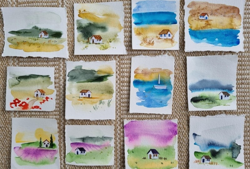
2. Your Project : Last project is to create three mini landscape
paintings using the easy wet and wet
techniques in this class. Use a limited color palette
and don't forget to add tiny collage houses
as the focal point. Then finish it off
with a few details using colored pencils
or brush pens. Under the Projects
and Resources tab, upload the photos of your
three mini landscapes. Make sure to list the watercolor
pigments and brands you used along with a few sentences about what you learned
from this process. I've also included a
downloadable PDF with landscape scene ideas and color inspiration to
help you get started. You can find that under
projects and resources, too.
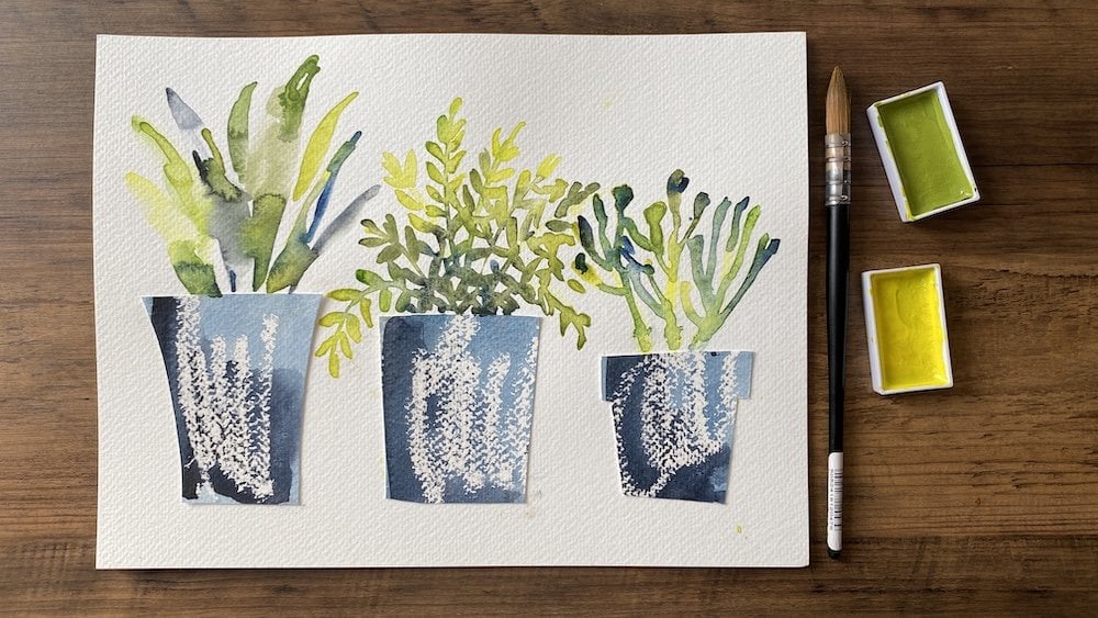
3. Overview and Materials Needed: I started making these when I had random swatches
of watercolor paper lying around bits
I didn't want to throw away because I'm
a bit of a hoarder. But when I looked at
them, they reminded me like abstract landscapes, and by adding a few tiny
shapes like the little houses, they suddenly came to life. Although they are
loosely inspired by real places like Moody
Scottish Highlands, most of these scenes
are imaginary, and that's what makes this
process really low pressure. There is no need for
anything to look exact. As you work on these, try to
keep an open mind and let go of the idea that it needs to look like a real landscape. It's really about exploring what the ward color wants to do, so stay playful and treat it
like a little experiment. Think, what happens if I add more water here or a
stronger pigment here? Just be curious and watch how the colors shift and settle and let your brush do the work. Sometimes a single stroke
is going to be enough, so don't overthink it. Just respond to what's happening on the page moment by moment. Let's have a look at the
watercolor pigments. You're going to
need basic greens, but also some yellows, perhaps some yellow ochre and also some dark greens or something you can
make dark green, you can either use
something like perylene green or you can mix up some indigo with some of the other greens and
even paints gray. And this will make sense
when we start painting. Another pigment
you might like to consider are some blues. If you want to add some sky, I've got some cerulean blue
and also some manganese. Other materials worth
having are some brush pens. These are by Kuretake and
some colored pencils. I prefer to use dark
neutrals like dark brown, dark purple, and the same again
with the colored pencils, dark green, dark red. You also need something to cut the little
pieces of paper on. This is an actual cutting board, or you can use the back of a
watercolor block like this. Palette to mix your paints
on and also a brush. This is the pro
arte quill brush. I would recommend using number ten or number 12.
Don't get too small. Furthermore, you're going to
need a scalpel for cutting out your little house
or a pair of scissors. This is printer paper
or Xerox paper, and you have the option
of using this and cutting out tiny weeny houses or something else that
I started doing was cutting out houses from ready
made stickers like this. So I'm going to show
you both options. You'll need a glue stick if you don't go for the sticky option. This is the watercolor paper
that I'm going to be using. It is the Hanama harmony, and it is Cold Press 300 GSM. And we are going to create
little squares from this. Well, I have not been
cutting these out. What I do is fairly
old fashioned method. I just take a very sturdy ruler
or set square in my case, and I just rip this off
because I like those edges. And you need approximately
seven to 8 centimeters or 3 ", something like that. There's no need to be precise. The measurements
are approximate, and one of the
lovely things about working like this
is the spontaneity. The slightly even edges
and the varied sizes actually add to the charm
of these little landscapes. So please don't worry
about being exact. If you don't like one of them, you can just have a set of two. And if you do four in one
go, I'm going to show you. If one doesn't turn
out to your liking, at least you've got
three to work with.
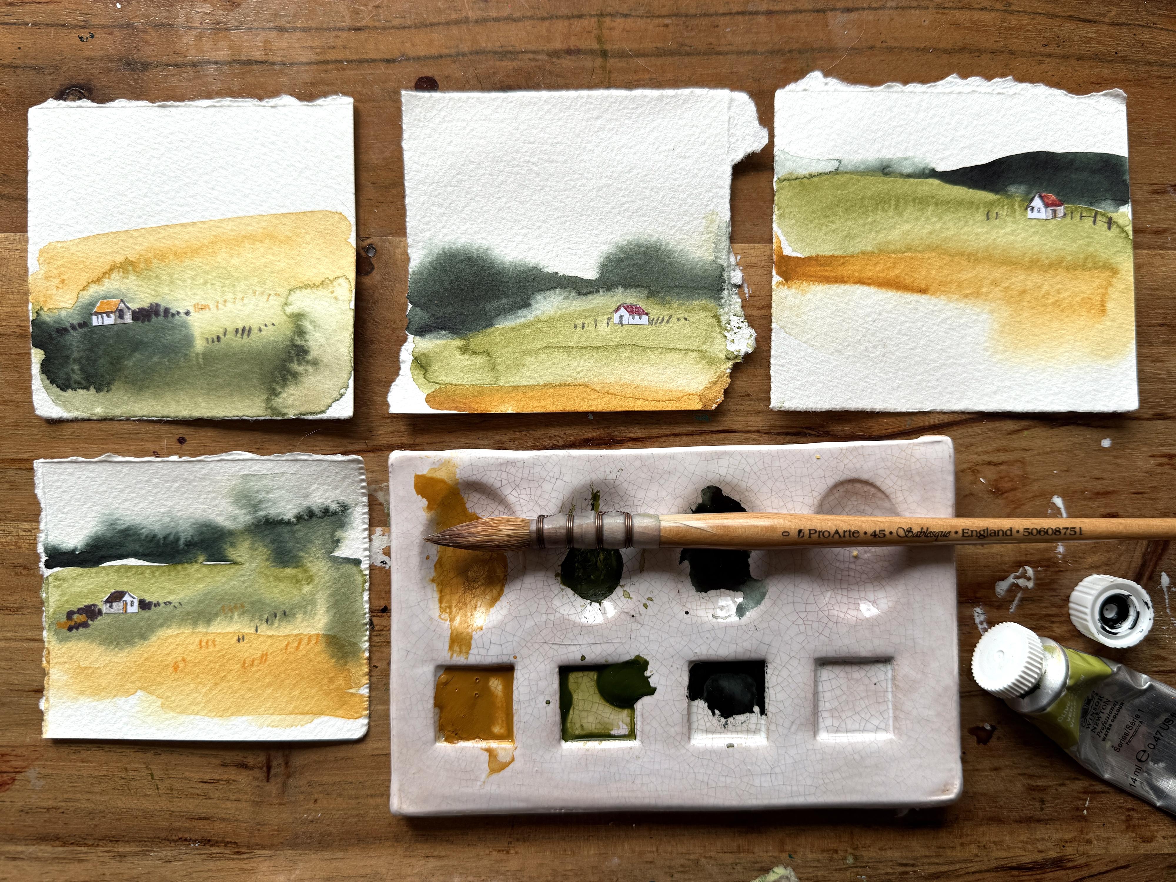
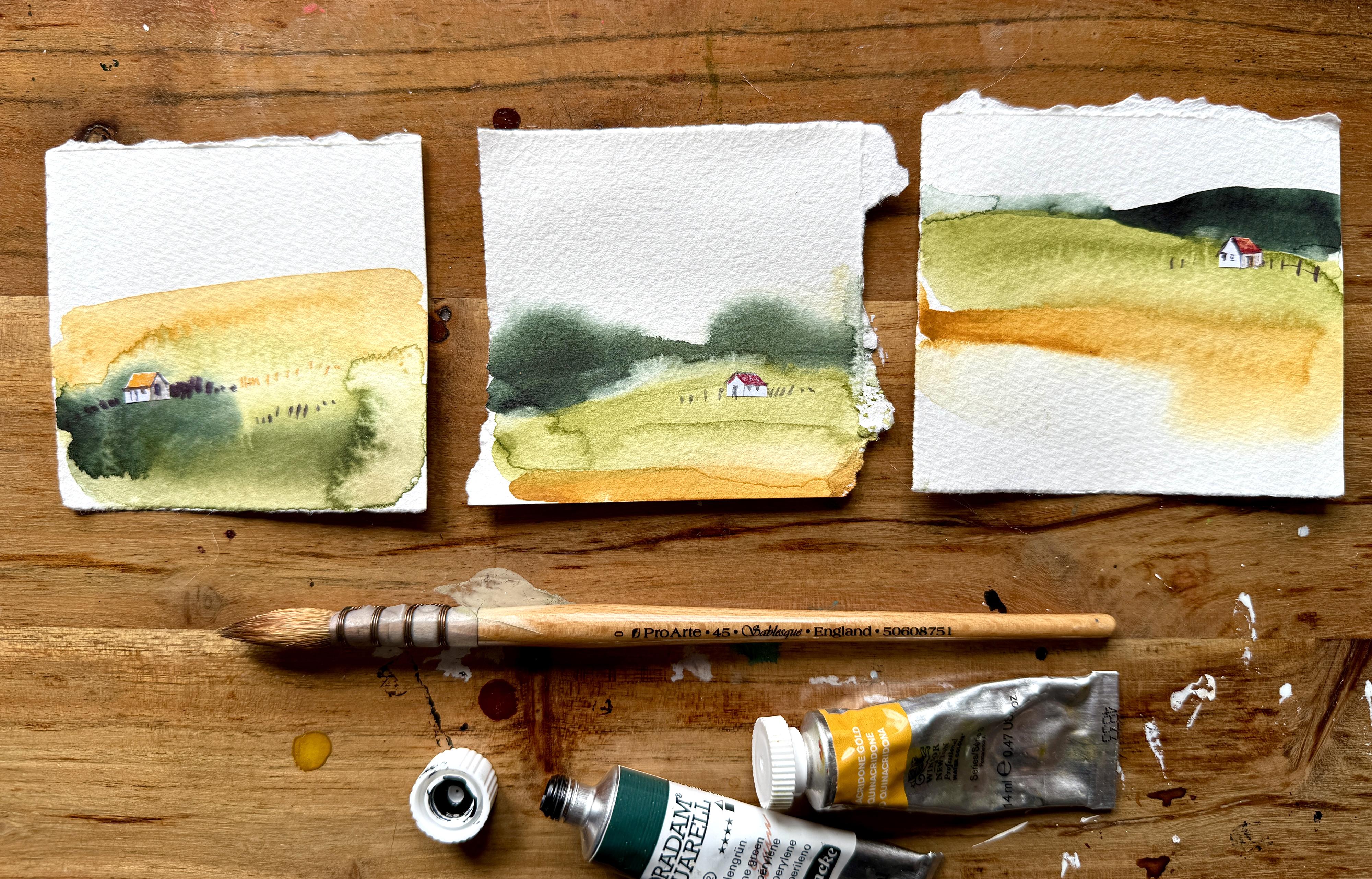
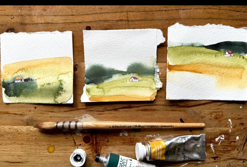
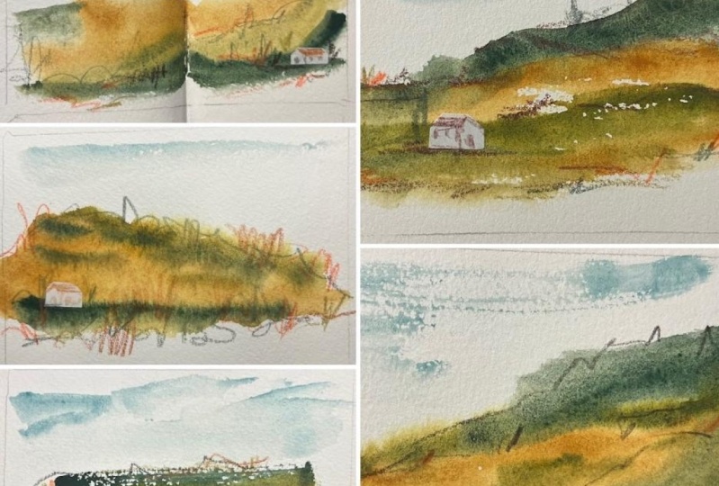
4. Creating The Watercolour Landscapes: We're only going to use three
colors for this project, and it's very intentional. By limiting your
palette like this, it can actually make things easier and look more harmonious, and they are going to work naturally because they
come from the same base. And it will help you
to focus more on the actual brush strokes
that you're making without getting too distracted by
too many color choices. I'm going to be
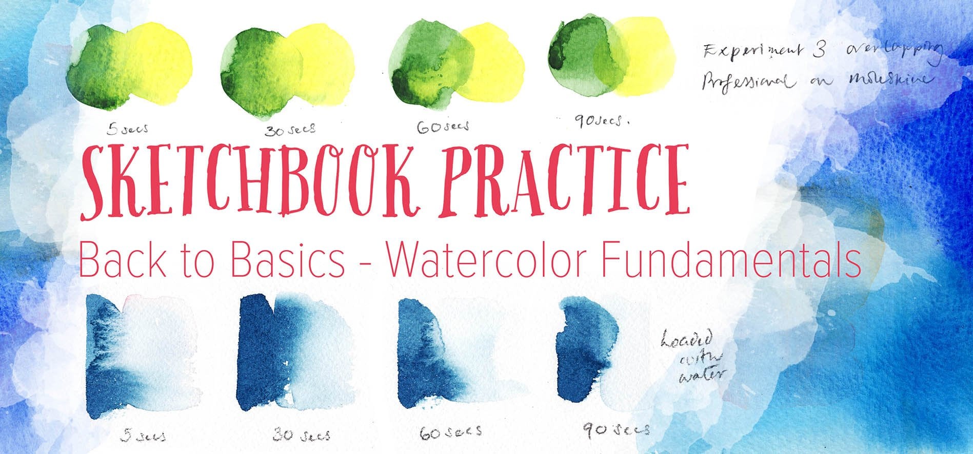
using a technique called wet on wet and it just means we'll be adding
wet paint onto wet paper. I'm going to start by brushing clean water over these pieces. On this first one, I just put clean water on the bottom half. This second one, I'm going to
put it in the bottom third, this third one is fairly random. And the fourth one, there's a stripe
right at the bottom. And this will help the
pigments flow and blend really beautifully and
create soft edges and lots of unexpected textures, which is going to be perfect for these loose
expressive scenes. Now we need to mix
up the first color. This is the olive green, and this is what I would
call a milk consistency. But remember, because our
paper is already damp, it's going to be diluted, and that's the way it flows out. First stripe, I applied
a lot of pressure, so it was quite a thick stripe. For this second
one, it's going to be thinner and I
applied less pressure. So I'm going to pick
up a bit more pigment because I want to
vary things up. For this third one, I am
going to load more pigment, and I have raised
the horizon line, so it's much higher up, and there's a gentle slope. And for this fourth one, we are going to put
it along the bottom. And remember, I put that stripe of clean
water in the middle, and that's why that green pigment has
flowed into that area. And we're going to do the
same with this ochre. We are going to
vary the water to pigment ratio and
vary the stripes. And because of where we place that clean
water originally, they are going to behave
in different ways. So this first one
is a thin stripe. This second one is
slightly thicker. And for this third one, I think I decided it
needed a bit more pigment, a bit more mph, and that's
the effect that it's created and another high pigment stripe at the bottom
of this fourth one. Now we're going to move
on to the Perlin green. You'll notice I didn't
actually wash my brush, so I've still got a little
bit of that ochre left on my brush when mixing
it up with the Perlin. So it's not going to give
such an intense color, but we can still play
around with that. We have used a thin stripe
and also a thick stripe. Going to see this in the rest
of the class where I vary the width of the stripes as well as the intensity of the pigment. You might use a
really watery wash in one area and then go in with a much richer
creamier consistency like I'm doing here with
the parylene green. It's almost straight
from the tube, and this is where you
can be really playful. Say curious and
see what happens. As the colors start interacting
with that wet paper. There is no right or wrong. It's really about exploring and just responding
in the moment. Something else I love to introduce at this
stage is adding a small stripe of clean water on top of the color
you've already laid down. And this small stroke
with your brush can reactivate the pigments and
encourage them to move. I'm also introducing a stripe of water in places where I haven't
laid down any watercolor. And this creates further options for you to get that
watercolor to spread. And that sense of
movement really is going to add a lot of
interest to your piece. Try not to fuss with
any of these stripes. Just pause for a moment
and be the observer. Let the pigments do their thing. This is a chance to practice
a little bit of patience and simply watch how the colors shift and spread on their own. It's really magical, and part of the joy of watercolor is
learning to work with it, rather than trying to
control every detail. We have to let these dry, and then we move on
to the next stage.
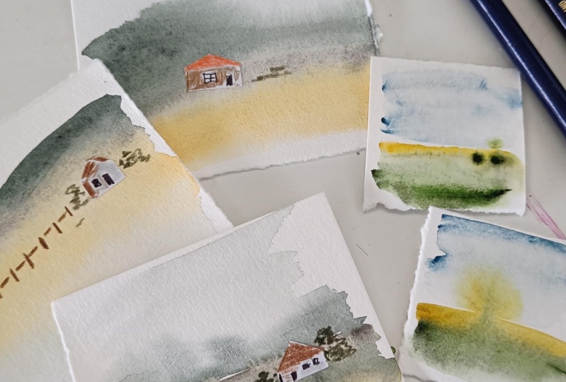
5. Adding Collage Houses: I'm going to show you the first version where
I'm going to cut out a tiny house using
this sticky label. I'm cutting out a really simple house shape
with a scalpel, but you can use a craft knife or even a small pair of scissors
if that's what you have. And don't worry about adding
any detail at this stage. Just a basic shape is enough to suggest a little
home or a cottage. And once you've got it out, take a moment to
decide whereabouts on this landscape you
would like to place it. Think about the
balance and the mood. If you feel your house
is a little bit too big, just trim down
some of the edges. I do recommend keeping your
house 8-12 millimeters, so really, very small, and then go ahead
and stick it down. It's such a tiny addition, but it really does bring
the whole scene to life. Two tips I want to
share with you is to vary the location
of the house in each landscape and also
think about the contrast of this white house against the background color
of the landscape.
6. Adding Further Details: Now we are moving on
to my favorite part, which is adding the teeny, tiny details to the house. You can use a colored
pencil or a brush pen, even a combination of both. Keep things really,
really simple, just a couple of windows and a door, nothing fancy at all. Think of them as suggestions rather than fully
drawn out features. I would recommend
using a darker color, so the shapes stand out against the white paper and the
landscape behind it. It's really amazing how just a few tiny marks can completely shift the
feel of the piece, and suddenly it becomes
a place and a moment. And there's even a little story behind each of these houses. And I think the best part is, you do not have to
overthink this at all. Just enjoy this process and
let those details emerge. I know it's easier
said than done, but less is more
in this instance, the merest hint of fencing. And if you want, you can make one side of the house tiny bit darker
to add some dimensionality. I used a colored
pencil for that. Another tip worth
mentioning is to just use four or five of the same
colored pencils or brush pens throughout this entire
collection so that you are repeating the same color that appears in the roof
or in the door. So they look
cohesive at the end. And I'm introducing
orange in this door, and I'm also repeating that
orange within the landscape. And that also helps bring
the picture to life. And I'm using the same
colored pencil now to add a roof and the same brush pen to add features like the
doors and the window. If you decide to add
suggestions of bushes or trees, keep it really minimal
and think about shape more than trying
to add loads of detail.
7. Final Thoughts : One of the best things
about working at this scale is how quickly
and freeing it feels. I can often complete a set of three or four in
just 10 minutes, not including the drying time, and I have made dozens
and dozens of them. You get to explore and
play and create something beautiful without
overthinking or overworking. As you wrap up, take a moment to reflect on
what you've explored, how different water to paint ratios affect pigment movement, and how timing plays a
role in how colors blend. Perhaps, most importantly,
you practice patients, allowing the pigments to do their thing without
rushing or interfering. Each one of your
landscapes is unique, and that is the beauty
of working this way. Embrace the spontaneity
and don't be afraid to experiment
with new color palettes. As you continue to
explore these techniques, let each painting surprise you.
 Ohn Mar Win, Illustrator Artist Educator