Transcripts
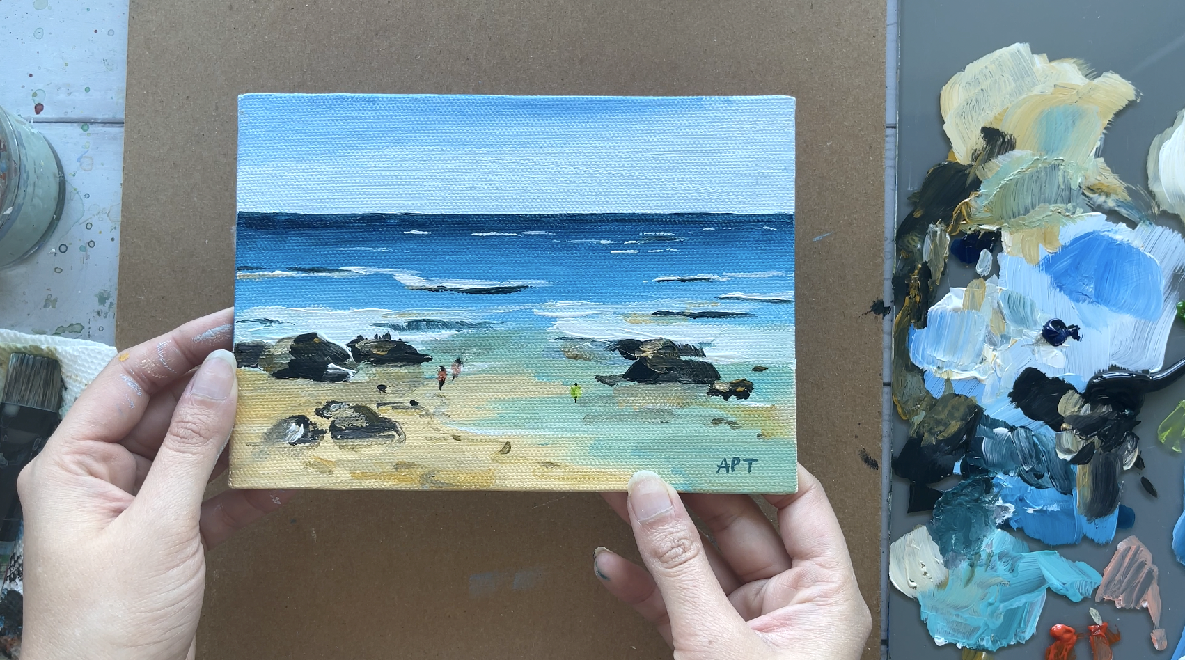
1. Introduction: Hello everyone. My name is Alicia and I'm an artist here in San
Jose, California. In today's class, I will
show you how to paint this easy acrylic
seascape beach painting, following a reference, why learning how to add
your own touch to it, to spice it up, will show you all the materials
that you will need. Color mixing techniques,
brush techniques, and an exercise on
dimension and form. We will then paint this acrylic
landscapes step-by-step. This class is great
for all levels. So let's dive right
in and begin.
2. Materials & Prep Canvas: Alright, so these are the
materials that I've used, a paper towel and
a bowl for water. And then I've only used three
different kinds of brushes. Again there. They are listed below in the projects and
resources tab below. But if flat brush, a round brush and
like an angled brush. And then as far as the panes, again, they're very limited. I only use Taylor Blue, deep green, and yellow Oxide. Of course, white and black. I love using my
artists are canvases. It's a five by seven inch. Then I use this tape
for the horizon line. And then just so two prime
my canvas beforehand. I like using a glass palette. It is easy to scrape it off. Alright, so first
step, like always, I'm going to apply a code of
Jesu to the entire canvas. This is optional if you are using a canvas in
the first place. Because most canvases
do come, I believe. But if you want to add an
extra layer that is okay too. After which, wait
for it to completely dry before moving on
to the next step.
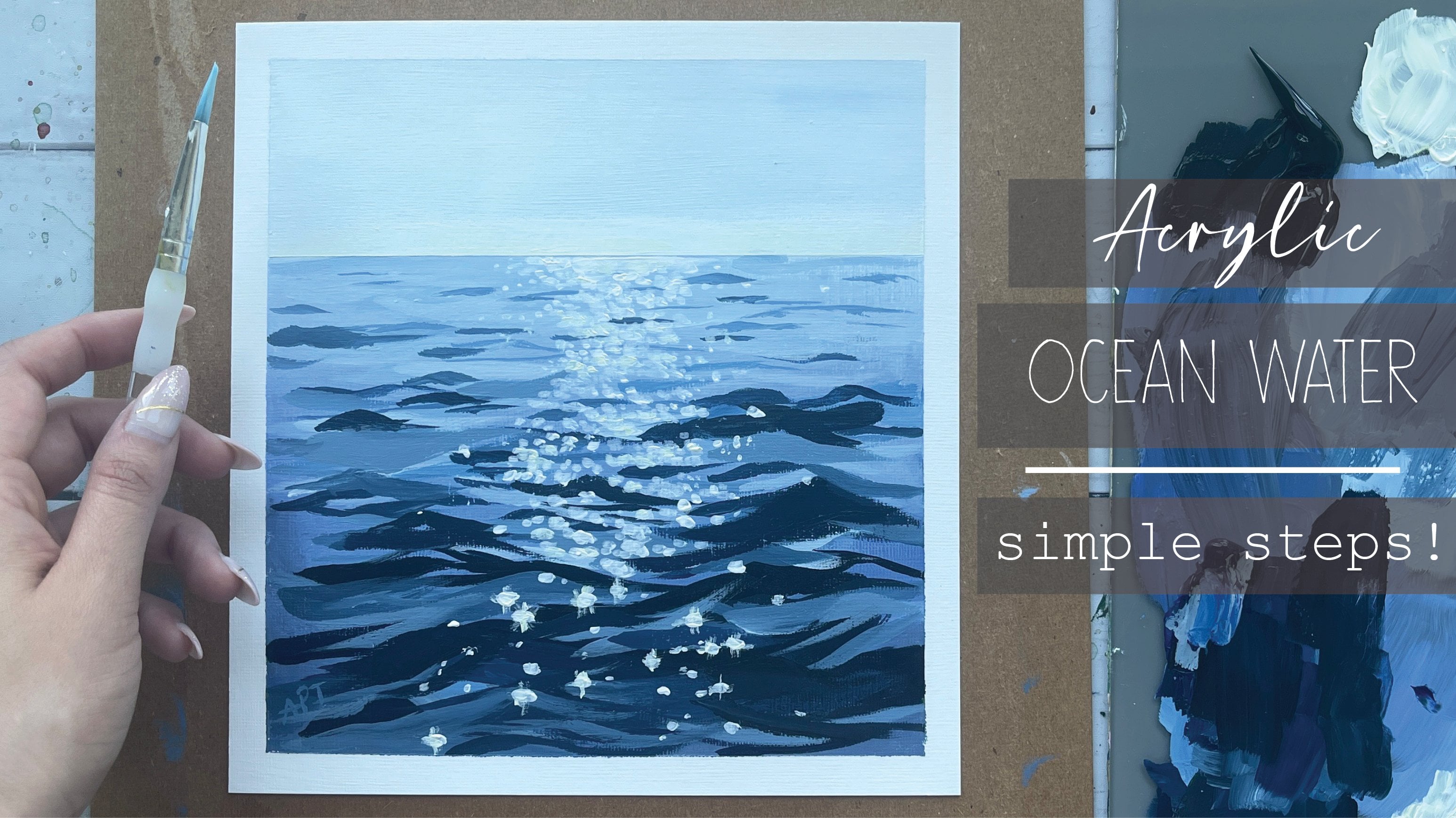
3. Exercise - Color Mixing: In this color mixing lesson, I will walk you through some
colors and show you how to mix colors to get a variation
of darks and lights. This technique can be applied with any color of your choice. So we will begin with
these four colors here, and black and white. I'm going to make
four columns here, one with the plain color
right off the tube, which will be in
the first column. And then I'll show you the different variations you can get by just mixing white
and then black. The last column will be a combination of these
colors amongst each other. Let's begin with
this darker green, which I believe is because green acrylics Liquitex basics. So here's what you get when
you mix in some white. As you can see, there's
a huge jump between the original color of this
green and then this one. And of course, you can
control the lightness of your green depending on how
much white you mixing. Mixing in some black can really give you some really
nice dark tones. And again, you can
totally control how much dark you want your
colors to lead to. So depending on how in
which black you add, you will, you can change
up the different tones. And if you want to mute
this color a bit more, adding some white and black to the screen can
give you just that, which I have on my absolute
favorite colors to mix. So remember if you want
to tone down any color, mixing some white and black to any original color can just can give you that
really nice muted tone down version of the
existing color. Here I'm adding
some more white and just a tiny bit
of black but more white to show you the difference you can get
in this version as well. Alright, so I will be repeating the same steps and
all of these colors. I'm going to just speed
this up a little bit, but I just wanted to
point out how you can get so many different colors by not using that
many colors at all. To begin with, the
variations that you can get from each
color are endless. These are just a
few basic examples and I'm able to show you, but feel free to practice with some color mixing techniques if you are an absolute beginner, these can be super
useful and handy. And before you know it, this will be second
nature to you. When you've only need to
reproduce a certain color, you will know
exactly off the bat what makes an order to
get that exact color. Alright, so, so far we
have only introduced white and black to
an original color. But now I'm going to show you even more deviations and
options that you can get by mixing our original
colors that we have together. For example, what happens when
you mix both these greens together or mixing the
slide queen and raw sienna, or maybe even raw
sienna and blue. You get the idea. So let's try some of that
to see what we can get. So here I'm mixing in both these greens with
some white and black, which creates this grayish tone. Then if you mix more of the
darker green hookers green, you'll get an in-between
green from the top. Here you can see mixing
the light olive green with why sienna gives you this
really nice warm tone. Whereas mixing some
black to that will give you a muted cooler tone. Roseola and tailor
blue will give you a somewhat sap green color
with some warm tones in it. And then mixing white that
gives you a muted olive green. But I'm hoping this exercise can help you understand the depth of colors you can get
by mixing them together and just playing
around with them. These next two colors are some of my absolute favorite
colors to paint in. And I often use these colors quite a bit in all my paintings. So if you're interested,
I got this color by mixing in hookers, green, pale blue,
some white and black. And then this next one. If you take that
exact same color, I'm mixing a little bit
of raw sienna in it. You will get this muted
version of the one on top, which is just so beautiful. Here's an example of these
colors applied to a painting, and you can tell how some of these colors have been
used in this landscape. So in order to build
dimension and depth, you need to have these
variations of colors in order to make your
painting not look flat. So play around with color
mixing beforehand to give you a sense of colors you can get from a limited
color palette. And this will really
help you visualize how you can use these colors
in your painting.
4. Exercise - Brushwork: Alright, so now let's dive
right into some brushwork. I'm going to show you the
different marks you can make with my most commonly
used brushes. And I'll show you how
I apply and use them. Let's first begin
with the flat brush. This one's super
basic and clean. I use this one for the sky and you can get simple
flat washes with this one, but extremely thin lines if you use the tip
of it as well. Hello Lee, the smaller flat
brush works just the same. And I use this for simple
flat washes for my landscape, especially when I block off
colors in the first step. Like mentioned, these
next two brushes are my most used and amongst my favorite
to paint landscapes. They are very versatile
and are great for that loose style landscape
paintings which we love. You can get really great, clean like flat
strokes with this. I love painting this. When I am painting
like huge mountains are just going to
block in shapes. I love using this brush to
block in the initial stages. This brush is also
great for layering paint on top of one
another as well. If you change the direction of the brush and
hold it vertically, you can get arch like shapes
that can be used for bushes, trees and loose objects. Because of the brushes
arch like shape. It is great for bushes and hence really great
for landscapes. Using the side of the brush or its tip can also be very useful to paint faraway
trees or houses, etc. And overall, it's just
really great for detailing. The smaller size. Full brush is great for smaller bushes and
objects far away. I use this long, thin brush in every
single painting, which I mostly bring up
at the end for detailing. So whether I'm painting
florals or landscapes, I always bring this
out at the end. This brush can really add some visual interests with
just little tiny marks. Today's painting, I use
this brush for the grass. I gave it some highlights and just little tiny marks far away. This can also signify and give impressions of little
objects far away. So maybe even houses or animals. I even actually assigned
my art with this brush. If you are wondering
how I assign them, it's always with this
brush at the very end.
5. Exercise - Dimension & Form: In this lesson, I'm going to
go over dimension and form. A form is a
three-dimensional figure as opposed to a shape being flat. And how would you add
a fall onto an object? Well, in painting, you can
do that by adding color. In this example here
we have dark tones, mid tones, light
tones, and highlights. This is exactly what
you need to turn a flat object and give it
some dimension and form. I'm going to show you
how I'll be using red, black, and white to
demonstrate this. So first, I'm going to block
in the shape with just plain red so that we can
have a base to start from. This right here is an
example of a flat 2D object, which we will now turn into
a three-dimensional shape. Now, I'm going to start
adding in my mid tones. So I'm going to add
some black and whites to the red to create that. To get my dark tones, I'm going to add some more
black and fill in that edge. So now we're going to
take these two colors and blend them in-between. You can already see how
this is forming a shape. Okay, now let's add in some light tones by
mixing in some white. Notice how I'm painting in
the direction of the ball. Not just painting
this up and down, since this is a round shape, you want to kind of
paint in that curve. I'm just going to
go back and forth in between my dark tones, mid tones and light tones until I'm satisfied and I
feel that this looks good. I'm just giving it a
rough background so that it doesn't feel like
this is just floating around. Alright, and then
for the highlight, I'm going to take a lot more
white and a tiny dab of red. So a quick recap. Dark tones are
achieved by mixing your original color
with some black. And then the more
white you mix in, you will get a gradient. So you can see how
you can move from a dark tone to a mid
tone to lighter ones. And then your highlights.
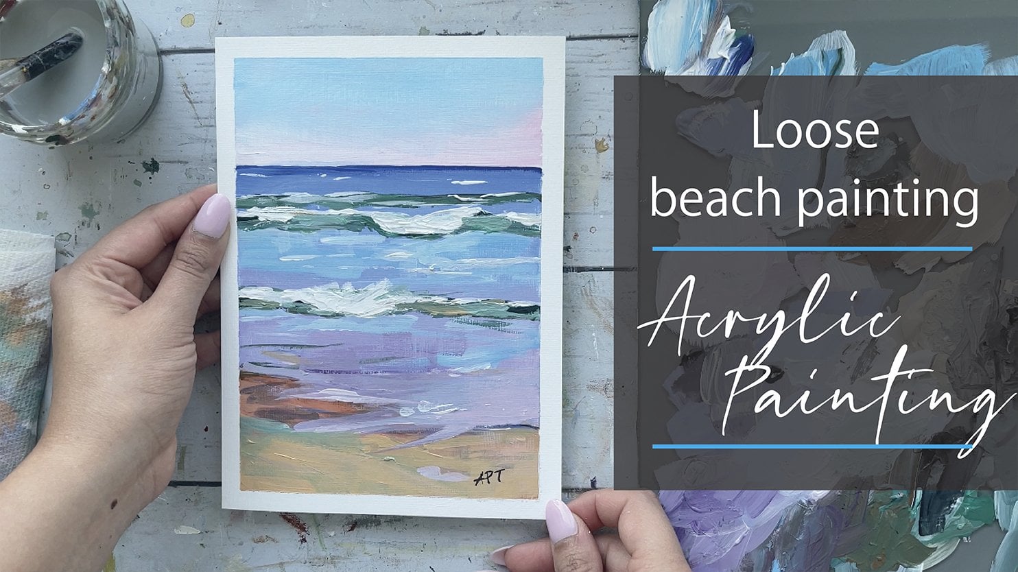
6. Painting - Base Layers: Okay, So I'm going to be
using my artist's tape to tape down the horizon line. It just makes it easier
to get a straight line. So we will be painting
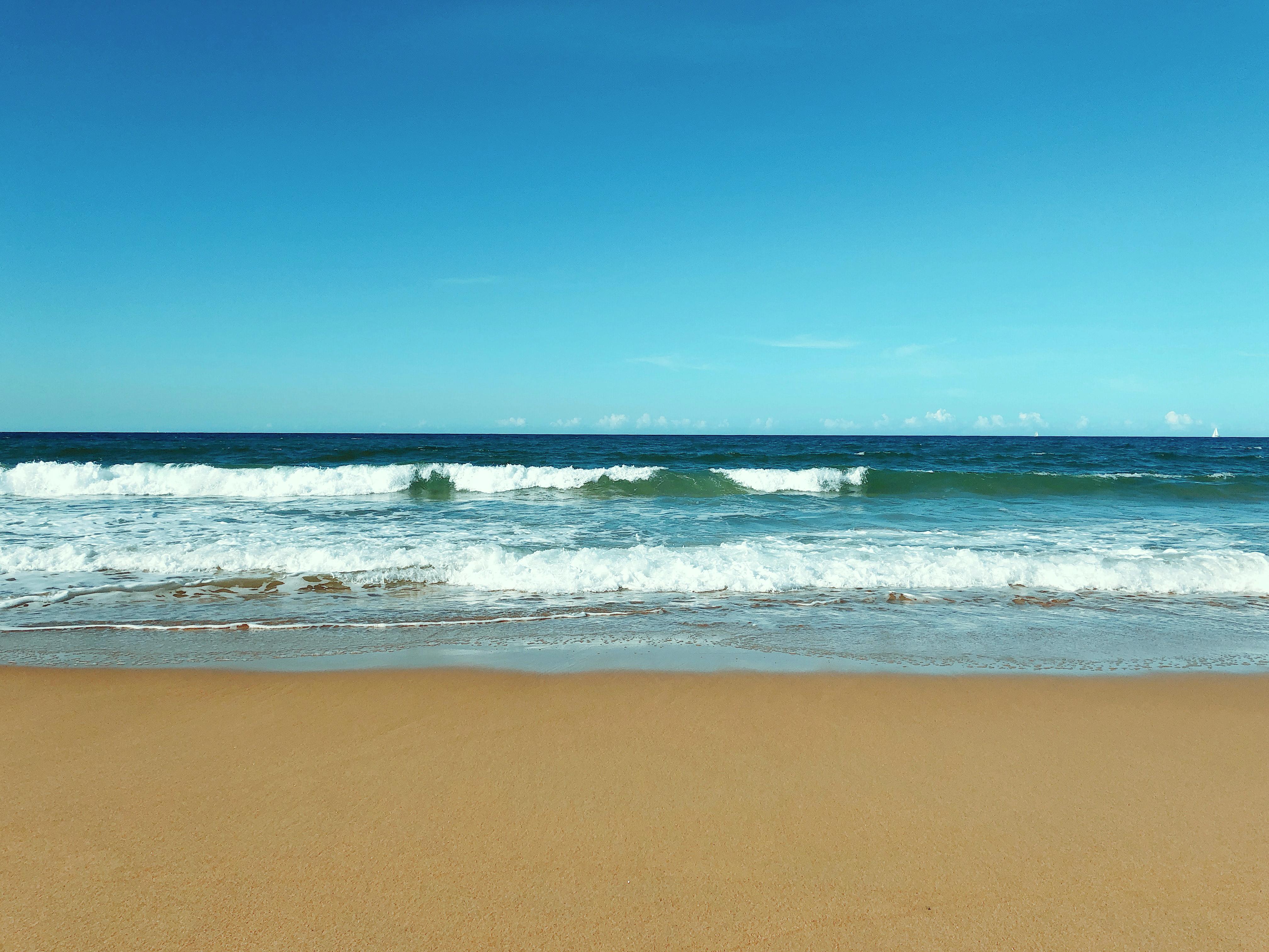
the sky above it first. Also the reference is provided in the projects and
resources tab below. It is a free pig downloaded. So right-click and save it. You will see me making quite a few changes
with the reference. Sometimes I just like to
use a reference solely as a reference and inspiration rather than copying it exactly. So for starters, I will
be making the sky a lot more lighter than
what we see in the PIC. Using Taylor blue and white
and a three folds flat brush, I'm making a light flat wash
right above the horizon. Having a slight variant of dark blue at the top
left corner here. Alright, so now we can take off this tape once the paint dries off and there you are
left with a perfect line. We are going to dive
right into the ocean. No pun intended, but I'm keeping it really simple and
using two colors. So deep green and pale blue, I'm using a three-eighths
angled brush. Now, if you are
comfortable with painting the horizon line with your brush directly and just
following the line. You can do that or
you can very well use the assistance of the tape again and place it right above
the horizon this time. But make sure you
only do this if your sky has
completely dried up. I personally didn't
have that patients, so I decided to just painted
directly following the line. Instead. I just mixed in deep
green and pale blue. I'm just working my way across. Alright, so once you have
that half inch border, you can now mix in
some white and add that layer of that column right underneath
this horizon band. I'm getting in some
white now and working Monday in my next layer
right underneath this. So I'm essentially getting
a slight gradient from dark bluish green to light. Once you have a nice band
gradient about two inches deep, you can then add the
base layer of the sand. So I'm using only
one color for this, and I decided to go
with yellow Oxide. I'm getting out my three
folds flat brush again and using some white
and yellow oxide, I'm going to just
fill up the remaining bottom half with this color. I'm just pulling in some of that blue into the sand as well, right where the water
meets the sand, keeping a super light undertone.
7. Painting - Waves: Alright, so now I'm only taking in light and deep
green and I'm just mixing that together and
keeping it a quiet water down consistency to resemble actual
water that hits the shore, which is usually
quite transparent. Again, this is not
in the reference. But I just felt like this
would be a nice addition to the composition and colors. I'm working with the angled
brush and I'm just adding in some uneven flat strokes
to the right bottom half only using the same old angled brush. I am now going to be working
on getting some waves. So working with y directly, I'm getting random white lines. Some long, some short, while keeping some lines
thin and some a bit thicker. Vary them around and you
will find that it is quite easy to get these lose impressions
of waves this way. Keep in mind to keep the
waves smaller and thinner. Closer to the horizon. You can take them up as you move towards the beach because
they would be closest to you. We will be painting over
these ways with more whites, so it's a bit
translucent right now. That is okay. You can
add more layers on top once these layers dry up. So I'm getting in some thinned out wide strokes to the
beach area as well. Just keeping it really
light and translucent. Here. I'm just going over
some of these waves with an extra layer to make
them stand out more. I'm pulling out some
black now and I'm mixing that with some of the
tailor blue and deep green, just getting really
thin strokes of that color underneath
some of these waves. Placing it quite randomly here.
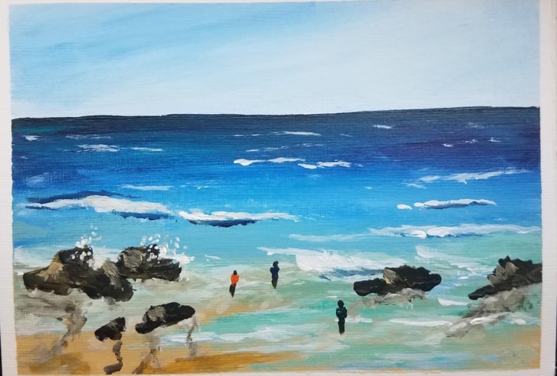
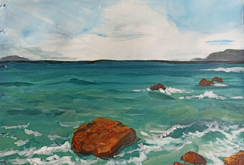
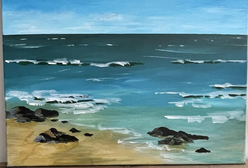
8. Painting - Rocks : I decided to add some rocks for some
interest to the painting. So simple little things like this can really pull
your painting together. And without making
it look bland. Because I think from the
reference I wasn't too happy with just how the layers, which is broken up into
three different sections. So I wanted to break it up a little bit to give
it more interest. I'm getting out Yellow Oxide with some black and I'm using the angled brush still and I'm just going to be
placing in simple, quick, short strokes using
all sides to my brush. Again, we're aiming for loose
interpretations of rocks, and this will do just that. So in the next few steps, you will see me working
my way across the canvas to create these little
rock like impressions. I'm keeping some small while
others a little bit bigger. We will be getting
some highlights to these rocks in a bit. But here I'm just shifting my attention to
the sand portion. So using a small
number to round brush, I am using some yellow
Oxide with some black and white to just kind of
get some rough texture. Sound like impression. I'm just getting some zigzags, waves on the sand here
right next to the rocks using that same color and
placing that underneath. Some of these rocks
were some shadow and reflection and keeping
it quite thin down. All right, So this part
is totally optional, but here I'm adding a few tiny impressions
of people far away. So using any color
of your choice, I'm using orange and a tiny
number two round brush. And I'm going to be
painting the body first. I would best describe this
as an upside down triangle. It doesn't have to be neat, but just make an upside
down triangle. Then taking some black, I'm pulling a tiny lines because small streak to give
this person some legs, small tiny marks here. And then a little
dot for the head. And that's it. You can repeat this a few
times for adding more people. Feel free to practice these outside of your main paintings. So just practice a little
people on the side. And once you get a little
bit more confident, feel free to come back and
paint them on your painting.
9. Painting - Final Details & Class Project: Here I'm just placing
some more tiny rocks. I'm giving the rock
some highlights with some yellow Oxide
and white mixed in. I'm keeping my light source directed from the
left side only. So here I'm just giving
the beach portion some definition by adding some more variation
of the mastery color. Don't forget to paint the sides for that finished clean look. I like bleeding the
dominant color from the painting onto the
sides for that portion. So I'm just going to speed
this up a little bit for just the Canvas
site painting part. So looking back at
the painting again, I felt like the left side was it had too busy
for my liking. So I decided to
simplify it slightly and just paint over certain
marks that I initially made. There we go. This completes our loose
acrylic seascape for today. Hope you enjoyed, and
I cannot wait to see what you'll come up with,
share your projects. I would love to see them and do not forget to
leave this class. It will ask me any questions in the
discussions tab below. I invite you to explore the different classes
I had created for you. Classes and
watercolors, as well as acrylics are available if
you want to learn more. So do consider following
me so that you do not miss out on future
painting classes from me. Follow this class up with another one of my
beach paintings. I'm going to list a few
seascape paintings down as well in the projects
and resources tab. I do appreciate all the love
and support from each and every one of you from my orders
like this. So thank you. To shop my art to do
visit my website. Follow me on Instagram to
keep up with latest updates, giveaways and all that fun
stuff. Thank you once again. And happy painting.
 Alifya Plumber, Artist | Acrylics, Watercolors | Painter