Transcripts
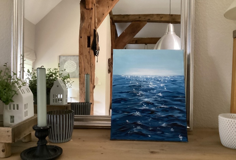
1. Introduction: Hey everyone, my name
is Alicia and I'm an artist here in San
Jose, California. Today's class, I will
show you how to paint this wonderful acrylic
ocean vase painting, following simple techniques, will show you all the
materials that you will need. Color mixing techniques, brush techniques as an exercise
on dimension and form. Along with a brief exercise
on how to draw these, we will then paint this
loose seascape step-by-step. This class is great
for all levels. So let's dive right
in and begin.
2. Materials: So these are all the
materials that I used. You will need HSO4 priming the Canvas beforehand or
your paper beforehand. Then able for water
and a napkin. And then I use acrylic
Strathmore paper. Then I also taped down
the edges with this tape. It's called the artist's tape. For brushes, I've used three different kinds of
flat brushes, like large, medium, small, and then to
find small thinner brushes. Then we worked with a
limited color palette. So just two different
kinds of blues. I use Taylor blue
and cobalt blue. And then I also used a yellow and of course black and white. You will also need a
pallet of some sort. I use a glass palette
and it also comes with a scraper That's really
easy to clean off. Again, everything
has been linked in the description tab below.
3. Exercise - Waves: Okay, so for this exercise, I'm going to roughly show you what you can expect
when it comes to painting leaves by drawing
it out for you here. So here I'm going to demonstrate
to very easy methods. The first one, I refer
to the mountain wave, where you stretch them out, hit a peak, and then
stretch them down again. You can connect them to
other mountains as well. Some of them can
be left alone by itself and some
can be connected. The second version
of a wave is what I referred to the zigzag Z method. Think of this wave
as the letter Z, but again, it's stretched
out, elongated version. You can also connect
another wave to the end of this
or at the beginning. So to recap, we have the Z-Wave and then
the mountain wave. You can very well
combine both of these together as I show
you right here. Just to put things in
perspective right here, I wanted to show you what these would look like when
you paint them. So this is the
mountain version of the wave right here,
as you can see. Alright, and then we've got
the combined mountain and zigzag version right about here. As you can see, I got the
mountain and then I stretch them out into a zigzag
into the z motion. All right. I hope this makes it a little bit more clearer.
4. Exercise - Color Mixing: In this color mixing lesson, I will walk you through some
colors and show you how to mix colors to get a variation
of darks and lights. This technique can be applied with any color of your choice. So we will begin with
these four colors here, and black and white. I'm going to make
four columns here, one with the plain color
right off the tube, which will be in
the first column. And then I'll show you the different variations you can get by just mixing white
and then black. The last column will be a combination of these
colors amongst each other. Let's begin with
this darker green, which I believe is because green acrylics Liquitex basics. So here's what you get when
you mix in some white. As you can see, there's
a huge jump between the original color of this
green and then this one. And of course, you can
control the lightness of your green depending on how
much white you mixing. Mixing in some black can really give you some really
nice dark tones. And again, you can
totally control how much dark you want your
colors to lead to. So depending on how in
which black you add, you will, you can change
up the different tones. And if you want to mute
this color a bit more, adding some white and black to the screen can
give you just that, which I have on my absolute
favorite colors to mix. So remember if you want
to tone down any color, mixing some white and black to any original color can just can give you that
really nice muted tone down version of the
existing color. Here I'm adding
some more white and just a tiny bit
of black but more white to show you the difference you can get
in this version as well. Alright, so I will be repeating the same steps and
all of these colors. I'm going to just speed
this up a little bit, but I just wanted to
point out how you can get so many different colors by not using that
many colors at all. To begin with, the
variations that you can get from each
color are endless. These are just a
few basic examples and I'm able to show you, but feel free to practice with some color mixing techniques if you are an absolute beginner, these can be super
useful and handy. And before you know it, this will be second
nature to you. When you've only need to
reproduce a certain color, you will know
exactly off the bat what makes an order to
get that exact color. Alright, so, so far we
have only introduced white and black to
an original color. But now I'm going to show you even more deviations and
options that you can get by mixing our original
colors that we have together. For example, what happens when
you mix both these greens together or mixing the
slide queen and raw sienna, or maybe even raw
sienna and blue. You get the idea. So let's try some of that
to see what we can get. So here I'm mixing in both these greens with
some white and black, which creates this grayish tone. Then if you mix more of the
darker green hookers green, you'll get an in-between
green from the top. Here you can see mixing
the light olive green with why sienna gives you this
really nice warm tone. Whereas mixing some
black to that will give you a muted cooler tone. Roseola and tailor
blue will give you a somewhat sap green color
with some warm tones in it. And then mixing white that
gives you a muted olive green. But I'm hoping this exercise can help you understand the depth of colors you can get
by mixing them together and just playing
around with them. These next two colors are some of my absolute favorite
colors to paint in. And I often use these colors quite a bit in all my paintings. So if you're interested,
I got this color by mixing in hookers, green, pale blue,
some white and black. And then this next one. If you take that
exact same color, I'm mixing a little bit
of raw sienna in it. You will get this muted
version of the one on top, which is just so beautiful. Here's an example of these
colors applied to a painting, and you can tell how some of these colors have been
used in this landscape. So in order to build
dimension and depth, you need to have these
variations of colors in order to make your
painting not look flat. So play around with color
mixing beforehand to give you a sense of colors you can get from a limited
color palette. And this will really
help you visualize how you can use these colors
in your painting.
5. Exercise - Brushwork: Alright, so now let's dive
right into some brushwork. I'm going to show you the
different marks you can make with my most commonly
used brushes. And I'll show you how
I apply and use them. Let's first begin
with the flat brush. This one's super
basic and clean. I use this one for the sky and you can get simple
flat washes with this one, but extremely thin lines if you use the tip
of it as well. Hello Lee, the smaller flat
brush works just the same. And I use this for simple
flat washes for my landscape, especially when I block off
colors in the first step. Like mentioned, these
next two brushes are my most used and amongst my favorite
to paint landscapes. They are very versatile
and are great for that loose style landscape
paintings which we love. You can get really great, clean like flat
strokes with this. I love painting this. When I am painting
like huge mountains are just going to
block in shapes. I love using this brush to
block in the initial stages. This brush is also
great for layering paint on top of one
another as well. If you change the direction of the brush and
hold it vertically, you can get arch like shapes
that can be used for bushes, trees and loose objects. Because of the brushes
arch like shape. It is great for bushes and hence really great
for landscapes. Using the side of the brush or its tip can also be very useful to paint faraway
trees or houses, etc. And overall, it's just
really great for detailing. The smaller size. Full brush is great for smaller bushes and
objects far away. I use this long, thin brush in every
single painting, which I mostly bring up
at the end for detailing. So whether I'm painting
florals or landscapes, I always bring this
out at the end. This brush can really add some visual interests with
just little tiny marks. Today's painting, I use
this brush for the grass. I gave it some highlights and just little tiny marks far away. This can also signify and give impressions of little
objects far away. So maybe even houses or animals. I even actually assigned
my art with this brush. If you are wondering
how I assign them, it's always with this
brush at the very end.
6. Exercise - Dimension & Form: In this lesson, I'm going to
go over dimension and form. A form is a
three-dimensional figure as opposed to a shape being flat. And how would you add
a fall onto an object? Well, in painting, you can
do that by adding color. In this example here
we have dark tones, mid tones, light
tones, and highlights. This is exactly what
you need to turn a flat object and give it
some dimension and form. I'm going to show you
how I'll be using red, black, and white to
demonstrate this. So first, I'm going to block
in the shape with just plain red so that we can
have a base to start from. This right here is an
example of a flat 2D object, which we will now turn into
a three-dimensional shape. Now, I'm going to start
adding in my mid tones. So I'm going to add
some black and whites to the red to create that. To get my dark tones, I'm going to add some more
black and fill in that edge. So now we're going to
take these two colors and blend them in-between. You can already see how
this is forming a shape. Okay, now let's add in some light tones by
mixing in some white. Notice how I'm painting in
the direction of the ball. Not just painting
this up and down, since this is a round shape, you want to kind of
paint in that curve. I'm just going to
go back and forth in between my dark tones, mid tones and light tones until I'm satisfied and I
feel that this looks good. I'm just giving it a
rough background so that it doesn't feel like
this is just floating around. Alright, and then
for the highlight, I'm going to take a lot more
white and a tiny dab of red. So a quick recap. Dark tones are
achieved by mixing your original color
with some black. And then the more
white you mix in, you will get a gradient. So you can see how
you can move from a dark tone to a mid
tone to lighter ones. And then your highlights.
7. Prep Paper: Start by prepping your canvas by using an acrylic gesso primer. So this will give you a paints, a little bit more
grip to work on. So evenly coat the
entire paper and allow it to fully dry before
moving on to the next step, which will be taping down the edges. So this
part is important. Remember to always, just
so before you tape down, this will prevent
your paper from tearing when you
peel off the tape, so forth, allow it to fully dry and then taped
down the edges. Also, I'm using an eight by eight inch acrylic
Strathmore paper. They do come in bigger sheets, but I like to cut mine
into the size that I like.
8. Painting - Sky: Using that same tape, I am using that to mark my horizon line so that you
are left with clean lines. After. For this entire painting, I only use two kinds of blues, cobalt, blue, and
blue. For the sky. We will use cobalt blue
with tons of white. I'm going to keep
this guy very simple. Not so much of a gradient that you see in
the reference pic, but just a single flat color with a lot of white mixed in. I wanted all the drama and
focus to be on the ocean part, so I left the sky quite plain. You can use any big flat
brush for this step. I did want the line
just above the horizon to be slightly more
white in color. So I'm adding a layer
of tag just above it.
9. Painting - Ocean Base Layers: So using a different
piece of tape now, I'm placing that right above the horizon so that we can still keep those clean
lines coming through. So I'm sticking with
cobalt blue and white, but a bit more
darker than the sky. But I'm still keeping
it fairly light. Essentially, my goal
is to have a gradient from light to dark as
we move downwards. So after each section
districts layer keep adding a bit more blue until you reach the middle
of the ocean. And then we're
going to change it up and add some more black. But just do, just follow the steps as I'm painting
until the middle of the ocean. Make sure to blend
the lines in between each color so wet your brush a little bit or use more paint. And then just go
back and forth with a few strokes to blend
the lines in-between. Alright, so now I'm
adding some black into this mixture to deepen
up the colors a bit. I'm working my way
from the bottom to fill those colors at this
deep colors forests. This way it'll be easier to fill up the middle gaps after. So again, I am
blending all of this, especially in the
middle section here. So I'm going back in with a bit more of that light blue that
you see right above it. So I'm using blue and white and blending in
those lines in-between. You may need to go over this
a few times until you are happy with your base
layers. For the ocean.
10. Painting - Dark Waves: Feel free to remove and
if you lost the top tape, since we don't need it anymore, this is where our
second blue comes in. So get out that table blue to work in
details of the waves. Mixing in table blue
and some black. Then using a just like a
medium-size flat brush. I'm first going to be targeting the darker portions
of the waves. The best way to
describe painting base is kind of like painting in
heaps are flat mountains. So you go up a little bit, it hits a peak and
then falls back down. So I'm really just using the same shape over
and over again, but just making sure to
change up the width of it. So some of them can be larger while some
can be smaller and thinner. The way it's closest to
us will be the biggest. And as you work
your way backwards towards the horizon,
make them smaller. I do like to connect to some of my bearings while
leaving some singular. Looking at the reference
will also help you just directly, hey, if you don't have to paint every single wave
you see in the reference, of course, but it is
definitely a useful guide. Once you reach the
middle of the ocean at a bit of white to your mixture
of phthalo blue and black. To lighten up the shades likely. Remember as we go further back, things do appear to be
much more light and small. So keep that in mind to
get the right perspective. So here I'm being mindful of adding and smaller,
thinner strokes. The very top layer, I'm going to add even
more white and I'm keeping my brush strokes
super thin and small. As you hit the horizon line.
11. Painting - Light Waves: Using that same color, I'm bringing it down slightly all the way
towards the bottom. I'm doing this quite randomly, but spacing them out. For the most part, I am applying these strokes right
underneath the darker waves. I think a little bit more
white to the paler blue. And I'm just adding in a few random strokes all
over the painting as well. At this point, you will see me going back-and-forth from light to dark blues to make the ocean appear fuller
and give it more depth. Even in the reference, you can see different
variations of those, ranging from dark to light. I added a little paint in the sky there by mistake
here, but no biggie. We'll fix it by
going over it with some white acrylics are
quite forgiving that way. Since you know, it's easy
to paint over layers. I'm just using a
different shade of blue, but I'm still using
paler blue and white, but adjusting the shade
enough to give me some variation in color using the same
brushstroke techniques. So working my way throughout
each color and simply adding in short, quick
wave-like lines.
12. Painting - Adjusting Lights & Darks: All right, So I'm
doing the same thing, but pulling back some of those darker layers and going over certain existing
sections with that, and also adding in
some new layers. I'm using phthalo
blue and black again, with a little hint of white. You will realize as you paint
this that it gets quite easy once you get your base layers and your
initial wave brushstrokes, then it's all about filling
in those gaps and with shades of blue ranging
from light to dark. And just keeping in mind that your strokes get much thinner as you move
towards the horizon. And they will be much thicker when they are closer to you. As long as you keep these
essential tips in mind, you've got a painting
of acrylic waves. I'm quite lucky
since I get to visit the ocean a lot since
I live in California. So paintings like this holds a special place in my heart since I love visiting the beach. And it brings a lot of
good memories with it. A lot of good warm
summer memories. And especially since we are
in the middle of summer, it's just really nice to be able to paint reflections
of the ocean. I'm almost nearing the end
of the ocean wave section. Next up we will be painting in those shiny reflections
off the water.
13. Painting - Reflection & Class Project: Now let's begin painting these reflections that
we see in the reference. I would highly recommend
a tiny brush for this, and we will be using
plain white for now. And starting right at
the center of the Ryzen, I'm simply using a
stippling effect to get these teeny
little short strokes. Be careful of keeping them
tiny at the top and we will slowly get a little
bigger as we move downwards. So as I move downwards,
I'm being intentional. I've using slightly bigger
specs here and spacing them out more as opposed to having them more
clustered at the top. So now, using your tiniest
brush that you have, I'm gonna give this a
slightly sparkled look that we see in the reference for that extra
shine in the water. I'm also using the
smallest tinge of yellow mixed with white
for that extra glow. So think of this as
tiny little stars. So working my way across and then making crosses on the side. It's very subtle, but when you look at the painting from afar, you will get little
impressions of Sparkle. I'm only going to
be adding these in the bigger dots upfront. I'm just adding in that
yellow tinge color to the horizon as well to keep that glow and
reflection all mixed in miles, but the painting just
flows altogether. Here. I'm adding in that yellow
tinge color to the horizon as well to keep that glow and
reflection all mixed in. So let's take off this tape and see what we've
got working with. This completes our loose
acrylic ocean waves for today. Hope you enjoyed, and
I cannot wait to see what you'll come up with,
share your projects. I would love to see
them and to not forget to leave this
class overview. Ask me any questions in
the discussions tab below. Lastly, if you
enjoyed this class, do consider following
me so that you do not miss out on any future
painting classes from me. Follow this class up with a watercolor ocean
wave painting. If you enjoyed this one,
I have linked below. I do appreciate all the love and support from each and every
one of you from my orders, likely. So thank you. To shop my art to do
visit my website. Follow me on Instagram to keep up with the
latest updates, give obeys and all
that fun stuff. Thank you once again
and happy painting.
 Alifya Plumber, Artist | Acrylics, Watercolors | Painter