Transcripts
1. Introduction: Hey, everyone. My
name is Alivia, and I'm an artist here
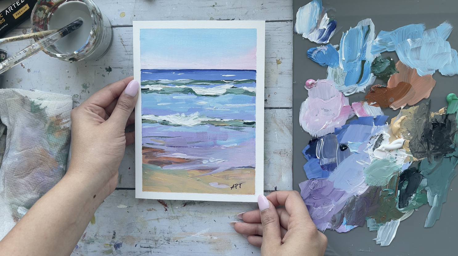
in San Jose, California. Welcome to my painting class where I will be showing you how to paint the Sluice
Acrylic Beach painting. I'm going to walk you through the materials and how to
prep your paper beforehand. We'll show you some warm
up color study exercises that are super helpful, and then we'll walk
you through painting the Sluice contemporary
Beach painting. I will also be adding a class
project at the very end, which I cannot wait to see
what you guys come up with. So let's dive fit into painting.
2. Materials: All of the materials are
linked in the description. You'll need paper table, bowl for water, this tape. As far as brushes, I I just
mainly used flat brushes. A flat brush will work, a large medium and a small. Then I also used
a palette knife, but that's optional, but if you have what that
would be nice to use. For the paper, I used
Strathmore acrylic paper, which I cut down to
a five by seven. I use a palette a glass palette, and also it comes with this little scraper
super easy to clean. These are all the
paints that I've used. They are linked below. You use whatever paints
you have available. I also use Gesso bright
white acrylic primer. This is used to primer
canvas beforehand. Okay.
3. Color Study Exercise: All right. Before we begin, I wanted to explore some
color study exercises in order to get some
more inaction and clarity as to what our final
project will look like. I'm going to walk you through my thinking process and
raw experimentation, and you will see how I change my draft to a second one
that I will use instead. For this first, I sketched out the bed scape horizontally, but in the end, I wasn't too
happy with the composition. I felt like it was a little too boxed up and evenly spaced. By doing these quick loose
sketches beforehand, will not only guide you
with what colors to use, but also will help you
with your composition. Since I didn't use this draft, I'm going to speed
this up a little bit, and I will jump to the
second draft that I actually ended up using
for today's class project. I would actually
highly recommend you into making multiple
drafts like this, even if you really
like the first one, this will just allow you to push your limits a bit more
and try new things. Okay. So for this exercise, I wanted to try sketching this vertically to allow me more
room to play with the ocean. The first line is
the horizon line, followed by two waves
that I wanted to put in the center and then the sand hitting the shore at the bottom. So you I'm using sky
blue with a bit of pink and a lot of white with
each of them for the sky. For the horizon line, I went with Persian blue and lots of white added
to it below it. A. I wanted a gradient from
blue to light purple, so I'm adding a bit
of violet with again, lots of white at the
base of the ocean. For the sandy section, I went with Mars orange and
Naples yellow at the bottom, again with white
tints mixed in it. I'm using our Tesclic pins here, which I have lanked below if you're interested
in checking out, but use whatever pins
you have available. I know some of these names
may seem strange to you, but you can substitute
Mars orange for maybe a burned sienna or Naples
yellow for a peach color. Um, these are just fancy names, but they are standard
colors that are available in different
names for different brands. So if you're ever confused on
exactly what color to use, feel free to ask me
in the discussion below and I will do my
best to help you out. For the waves, I went with olive green for the
base with white for the foam and a bit of Thalo green with
white for highlights. Remember to always use
white and black to make things lighter or deeper
in color and contrast. I'm just loosely adding
some white directly for the foam of the wave to
complete my warm up draft. Here I'm making just
quick notes as to what colors are used
and in what sections. With all honesty,
this truly truly helps and makes your painting
process so much easier. It really does take out
the guessing game as to what color will look good together because if you do this, then you've already
tried your mini sample. Like I said, this also greatly
helps with composition. So you almost have a quick mini version
of your final piece. Lick Quick just wanted
to show you how my final painting turned out
after my mini draft warm up. As you can see the
colors are very similar, and so is the composition. Doing this warm up exercise truly made the painting
process so much easier, and it served a really
good guide. Okay.
4. More Examples Of Color Studies: I just came across
these mini warm ups from previous paintings
that I've done in the past. The originals have been sold, so I really cannot show
you how these turned out, but you can still get an idea of how I play with
composition and I just test out different mid tones
and values and just how the reds look against the blue and the
background and so forth. Here we have some more This
one right here actually, I do have the original. I'm working on a new
collection at the moment. As you let me zoom
out a little bit, so you can see, there we go. As you can see this
one right here, I quickly sketched it out and just to see and
you can compare the backgrounds and all
of this looks exactly like how I envisioned it. So it can really help to
put things in perspective. I also did this little guy. You see this sketch. That was a little mini warm ups just to see how the colors look against each other and these are all the colors that I have
used in this painting. I hope you guys can
see, I think you can. Okay. Um, so these are all the colors that
I've used in this painting. And I also made little notes
like I wanted 60% to be my greens and my secondary color to be like these
little neutrals. But yeah, so it's a really
good little exercise to do before you begin
your painting sessions. I do have a last
one to show you. So this is the swatches. And then I did a
little quick study of how my landscape
would turn out. But yeah, no matter where
you are on your Jenney, whether you are a beginner or an intermediate
or advanced painter, I still think these can be super handy and useful on
a regular basis. Just get into a habit of
doing this because it can really improve your skills, I think, and it can help to
just simplify the process.
5. Prep Paper: To begin, I am prepping
the paper down with Gesso, which is basically
a primer and it just preps your canvas
before painting. You can choose to thin this down slightly
if you would like, or just use it directly off
the tub, which I prefer. Then maybe dab
your brush once or twice in the water to
make it spread better. One or two even coats
should be enough, and once you're done
with this step, we will move on to
the taping section. A little disclaimer before
you tape down your paper, make sure to not have skipped the four step and just slow
your paper down first, and then allow
that to completely dry and then tape it down. Prepping your canvas
before hand will reduce the risks of any tears or bleeds once you take
off the tape. Okay.
6. Painting Process 1 - First Layer: Before we begin, I wanted
to sketch out very briefly how waves work and what you can expect
from today's painting. I have broken it down to the
most easiest way possible. Of course, it is a lot more complicated than this
if we go in depth. But since this is a
loose interpretation, this is all you need to
know for today's class. Usually in waves, we have
multiple dips of wave, some small, some big, which is the white foam section. Then right around it, we will
have some darker values. In between each wave fold, you will have a lighter value. You will see me applying this
method in today's painting. As long as you keep in mind of having darker and
lighter values, you will give an
impression of waves, which is exactly what
we're looking for, and what the style of
today's painting is, which is a loose beach painting. If you've come back from my previous lesson on
the mini warm ups, you will find that
this project is a lot more easy to understand,
especially color wise. I'm going to keep
glancing over my draft and use that to paint
this beach painting. Here starting with the son, I am just making a
line 2 " from above. The paper size that I'm
using is five by 7 ". I'm just going to
roughly just draw out my waves just for
placement purposes, although it will
be painted over. So a little line for me to remember or just to kind of guide me as to
what I need to do. Let's begin with the sky first. So I'm using sky
blue pink and white. Use any flat brush
that you have and make large strokes
to cover the sky. Leave the bottom bit to
add your light pink to it. Don't forget to likely merge
the two colors in between. I'm now switching to
a smaller flat brush to start with the horizon line. I'm using Persian blue directly to make a thin line
by the horizon, and then I'm going
to add some white to it to cover the second
half of the ocean base. A I wanted the ocean to have a gradient
from dark blue to light blue to light purple. Here I'm using a purple with white to add to
the base of the ocean. Remember, these are
just base layers. We will be building up
slowly as you move along, but this just helps to break
down our shapes better. For the sand, I'm using Mars orange at the top
and Naples yellow, which is more of like
a peachy color for the base and mixing them
two together in between. B. And pulling in some of that color into the ocean as well.
Just a few marks.
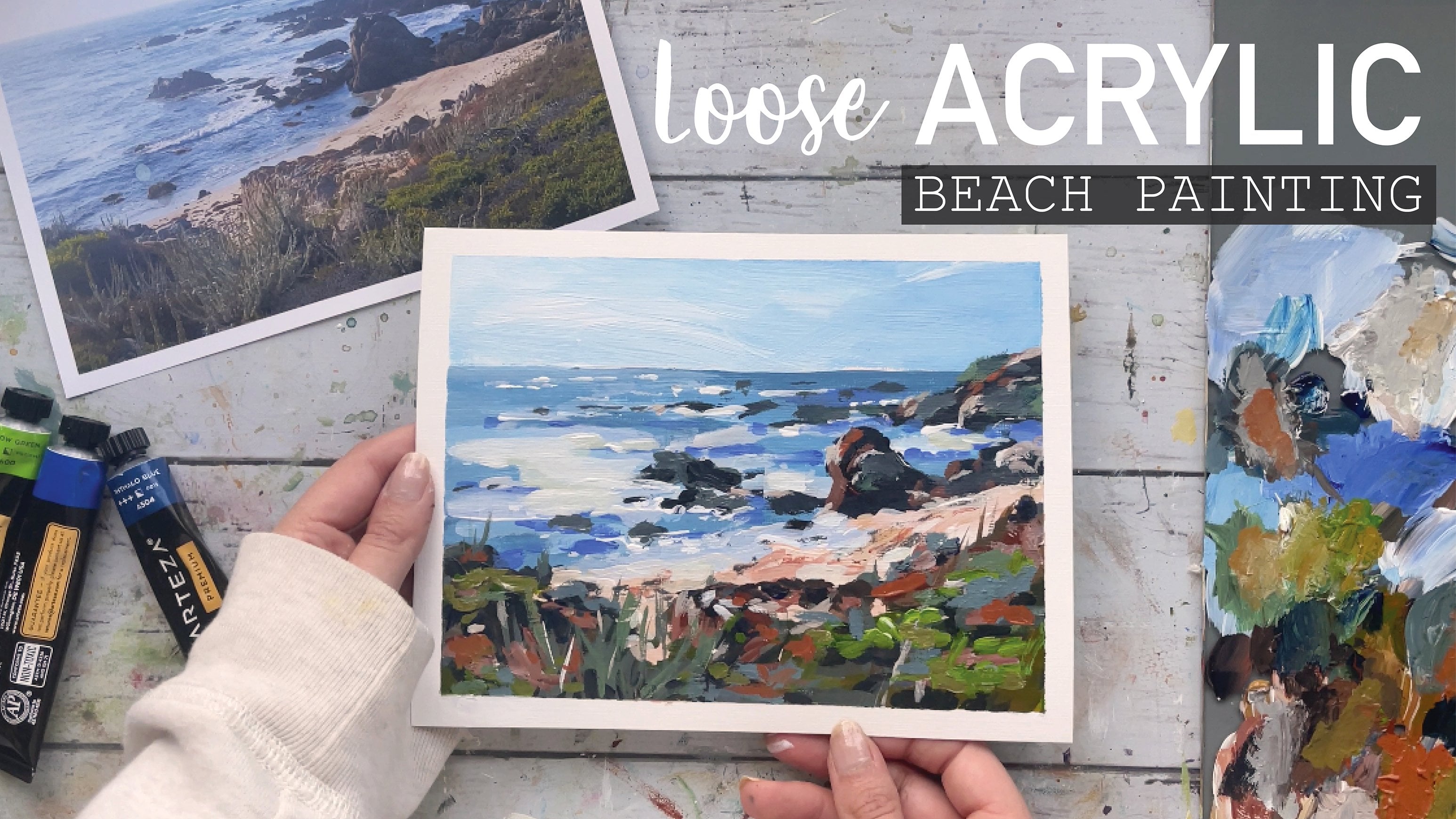
7. Painting Process 2 - Waves & Ocean: This is a loose contemporary
impression beach paintings. We're not looking for details, but simply an impression
of waves here. I'm going to start with
drawing a line across for the base of the
waves, using olive green. Doesn't have to be
straight lines, it can be slightly
wavy and crooked. Using olive green with white, I'm going to paint one
more line beneath it. Keep them loose and quick and feel free to make
your strokes bold, Sotain sections
can be a lot more thicker while certain
lines can be th. I'm using Thalo green and a smaller flat brush this time to define the
waves a bit more. Mix in green white
and olive green and add some tiny strokes to the waves in just a few places. This will give a
variety of color and add some low
lights to your waves. I wanted to bring
some of the color to the sky down to the ocean as well to
tie the piece better. So I'm using some sky
blue and white and adding some brush marks to
the center part of the ocean and just a
few at the bottom. Now, taking some white directly, I'm going to add some of
the foamy bits of the wave. Using the flat tip of the brush, makes some small thin
strokes going across. For the bigger sections, use the side of the brush or the belly to get larger strokes. Another great tip is to
hold your brush from the back and avoid holding
it like you would a pencil. This forces you to keep
your brush marks loose and organic rather than
painting in too much detail. Here's a close up
of the second wave. So think short, quick, bold strokes when making
a loose style painting. Notice how I am
using the brush from different angles to make the wave appear to be
splashing upwards. Using the tip of the brush again to create
tiny small strokes. I just wanted to pull
up an ocean pick so that it can help you
understand what waves look like. Again, feel free to look at your own pic reference
for inspiration. I did not look at this
image while painting, but I found it later on that looked like a little
similar to what I created, so I figured this may help you
put things in perspective. Usually, under the white foam, you will have a darker
greenish color underneath it. Along with some more of some
light green bits as well. For the sections, I'm using olive green and a tiny
bit of if you would like. Then for the lighter sections, I'm using tail green and white. Again, this is a loose
interpretation of waves, so you don't have to be perfect. You just need enough of an impression of
waves by giving it enough value with your darks and lights, if that makes sense. I'm just going over the
white sections again to bring it out a bit more and increase the intensity
of the color. Using some white and a
tiny smudge of sky blue, I'm adding just little
strokes to this in between the waves to
add some reflection. Add some woo cool strokes as
well every now and then to create some nice movement to the ocean along with
some reflection. This also adds a variety of
brush marks, and, you know, it breaks up the predominant horizontal brush marks
the painting already has. I'm adding some
final details here by bringing out some of
the darks and lights. I'm also adding a bit of that peachy color
from the ocean and some olive green to the
to add a tiny touch of that sand to the ocean
and to bring in some warmth.
8. Final Details: All right. So now let's come back to the sand portion here. I'm taking some purple and green and adding very loose
marks to the beach. I'm going to keep
this whole section breezy and light with quick brush marks
while keeping in mind to add a variety of
brush strokes and color. Just to demonstrate
different kinds of texture you can get. I'm using a palette
knife here to top off the waves
one final time. This is totally optional, but it's nice to just know. Using a small to medium
sized palette knife, I'm using the front of
the knife and the side of the knife to experiment with
different textures here. Once you dab in your knife
to the paint directly, you will just simply
likely apply it and layer it on while changing
directions of the knife. I like using the side of the
knife to get really tiny, far away waves like this. I did want to reflect some of the pink from the
sky to the ocean. So I'm using a bit of that with a white to add to the
corner to the right corner.
9. Project Reveal & Thoughts: And there we go.
We are all done. Now, let's remove the tape, the part that we have
all been waiting for, and let's see what our
final project looks like. A quick and simple hack, if you've got paint that
bled through your tape, applying Gesso directly to
that area, we'll fix it. Now, if you don't have Gesso, you can apply
acrylic white paint. But the color may be a bit
too white for your paper, so I prefer Jesso. Hope you all enjoy today's
loose Acrylic beach painting. Like always, I would love to see your projects down below. I truly enjoy seeing them all. Ask me any questions and the discussion time
below, if you have any, feel free to pull
up any picks of beach like beach scapes, if that is useful to
you while painting. Follow this class up with a
watercolor ocean painting. I have linked it below, and for more acrylic
beach paintings, hop on over to my
YouTube channel where you can find a walk more. We'll see you all in my
next class. Happy painting. Once again, thank you
so much for watching and for completing
your class. Well done. I'll catch you guys next time.
 Alifya Plumber, Artist | Acrylics, Watercolors | Painter