Transcripts
1. Introduction: Hi, I'm Andy. Although I've always loved making art as a kid for a long time during my adult life, I completely stopped doing any. In 2019, I took a calligraphy class and completely fell in love with it. The relaxation of the repeated movement really allowed me to enter into a Zen mode. More recently, I decided to further develop my skills and look into drawing and painting. I've always loved the look of watercolors and simple line drawings. One of my favorite things to draw are florals and so I've decided to share the process that works best for me. In this class, we will look at five steps for drawing simple line florals and by the end of it, you will know how to draw a beautiful flower that you can then incorporate into a piece with the quote and later frame it or use it as a card for any special occasion. Get yourself a cup of tea or coffee, some paper, a pencil, and a pen, and join me in the class. I can't wait to see how your flower turns out. See you there. Bye.
2. What You'll Take Home with You: Hi, I'm so glad to see you have joined. Welcome. Let's talk about what you will be taking home with you by the end of this class. For the class project, you'll be creating a piece with flowers of your choice in a line drawing style. We will cover five steps into creating a beautiful flower from a photo. But first, we will start by looking into materials and where to obtain reference photos. Then, we will cover how to create a basic sketch with two different approaches and put pen to paper. Finally, we will see the importance of adding details to make the flower gain form. As a final step, I will show you how I color my flowers using water-based brush pens, coloring pencils, and a gel pen to make it pop. Drawing flowers is one of the most forgiving ways to learn sketching basics. They are so forgiving given their wonderfully imperfect nature, meaning that no flour is completely symmetrical, and so, it is that much easier to create a drawing that doesn't look off for any number of reasons. Don't feel overwhelmed by the project or feel any pressure to make it perfect as no flower ever is, and that doesn't make it any less beautiful. By the end, remember to post a photo of your process and/or final piece in the Project Gallery section of this class. I'd love to see how it turned out and to give you some feedback. Let's get started.
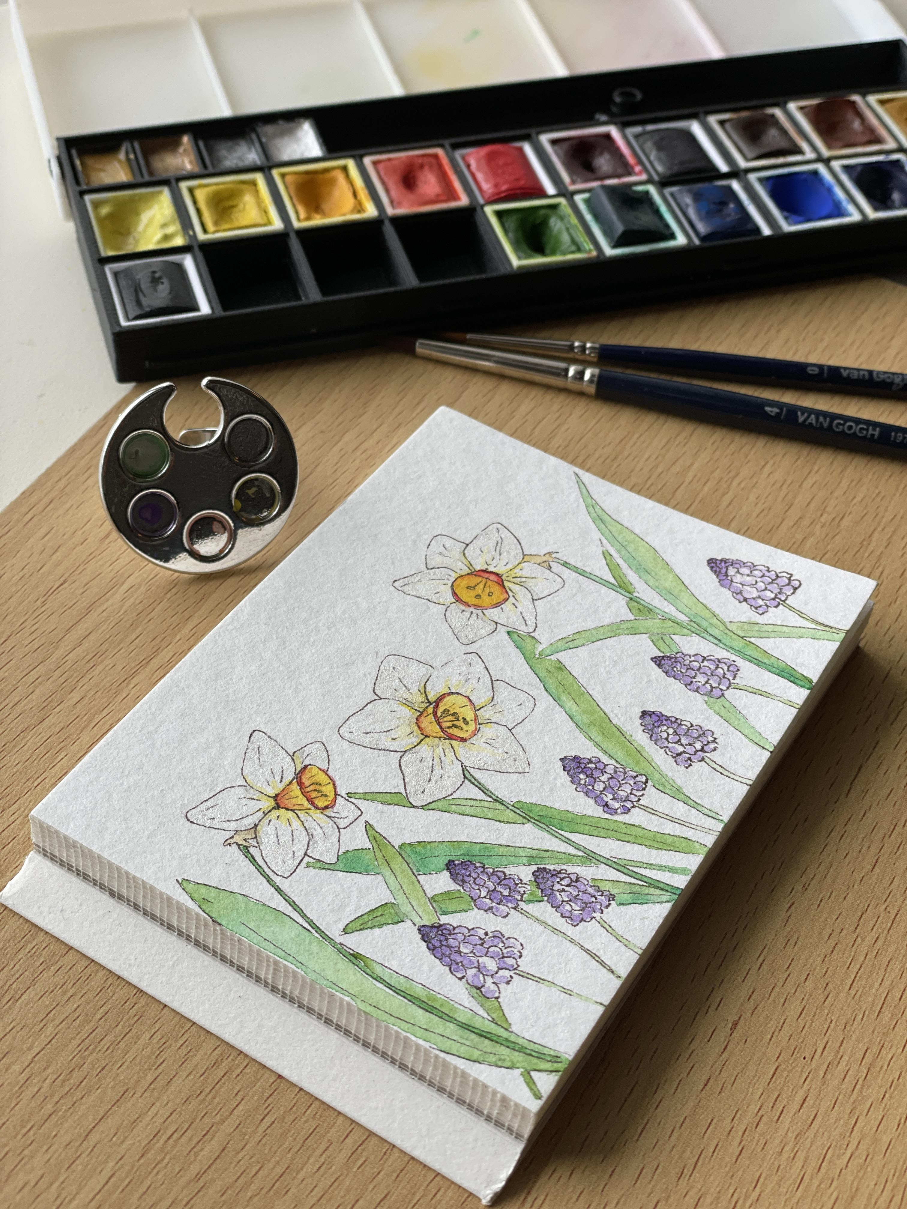
3. Materials: Before we start the actual drawing, let's go over some basic materials that you can use for this project. You don't need any fancy materials, any pencil, printer paper, and pen will do just fine. However, should you decide to color your drawing in the end with watercolors, or markers. You should be aware if the paper is thick enough to hold the water, or any markers that may bleed onto the paper. I always advise to experiment on the piece of the same paper before you start your final piece. If you're using watercolors, or watercolor pencils or pens, I recommend using the following. A pen with water resistance or archival ink like the Sakura Pigma Micron Pens. The PN one, as it allows me to make different weights of the line. This brand also has a more widely known sizes for your choosing, so you can use a 05 and a 005. One for the main lines, and the other for fine details. In terms of paper, I would advise watercolor paper, or mix media paper, 200-300 GSMs. I like the Canson XL Aquarelle, or the Canson Mix Media Imagine. The other materials are whichever you have at hand. I like sketching with an HB or 2B pencil. You'll also need a wide soft rubber, and any coloring supplies you wish to use. Coloring pencils, watercolors, coloring pens, the sky is the limit. To add the finer light details I like using a white gel pen. I use the Uni-ball Sign, or a Posca pen with a fine point, and either should work fine. Grab your supplies and meet me in the next lesson. Where we will look at where to find reference photos. See you there.
4. Finding Inspiration: Great. Now that you have your supplies ready, let's focus on where to find inspiration and photo references. The simpler and easiest way is to go online and search for some ideas. Platforms and websites that I like to use include Pinterest and also Unsplash or Pexels. These last two websites have copyright-free images. All you need to do after opening the websites is to write on the search bar the name of any flower, or generically just flowers or leaves. An array of beautiful pictures will come up and you can choose your favorite ones. To safe keep for later use, you can also either create a board in Pinterest and refer to it later, or download the images and save them in the folder in your computer or smartphone or tablet. You can always search in Google. However, be aware of possible existing copyrights. If you use a reference photo and replicate it in your drawing, please give credit to the owner and if applicable, pay the copyrights. The second, and in my opinion, best way to obtain reference photos and flower inspirations is to go outside. You can just go to a garden or a park in spring and take some of your own photos of the flowers you like best. Remember to take photos from different angles so that you can better observe the details and singularities of each flower. However, I understand that it's not always possible, and so I've taken the liberty of sharing in the resource section of this class, some of my own photos for you to use during our time together. These will be the references I will be looking at during the entire process. You are more than welcome to follow along with me. Have you decided on which flowers you will be drawing? If so, join me in the next lesson.
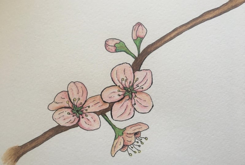
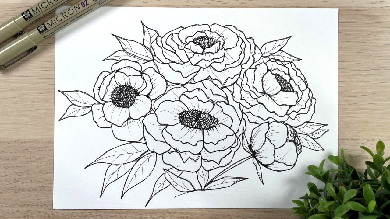
5. Sketch It Out!: Now that we've looked into the supplies and where to find inspiration, let's start with our basic sketch. There are two approaches we can take. The first and the simplest one is to trace the images onto a piece of paper using a light pad or putting the photo and the paper on top of each other against the window. The second is a more observational approach, in which we study the different components of the flower and try to replicate them in our sketch. Either approach is totally valid, and both will help you create a visual library of these shapes. However, the second approach is one that will allow you to develop your drawing skills in more depth. Therefore, this is the one I will focus on for this class. Grab some regulars sketching or printer paper and let's start studying our flower. Let's study this pink flower. We see that it has an overall circular shape. Draw that out. Don't worry if the circle is not perfect. If you look closely at the flower, you will see it's not perfect either. Then, draw smaller circles inside the bigger one. These will be your guides for the layers of petals. Start drawing the petals, begin in the center and draw a first petal in the shape of a triangle, and then two more petals that are in the center guide in different directions. This squiggle that I just drew will make it look as if the pedal has a part that turned in. After the center of the flower, move on to the next layer. If you look at your reference photo, you can see that there are four round petals with pointed ends. Two opposing petals start from the center, whilst the other two come from behind the first two petals. Then, move on to the next layer and repeat the process. Look at your reference photo, take notes where a petal starts and where it finishes, and draw the petals in that layer. Don't get too worried about it not being an exact copy of the photo or not being too symmetrical. It's part of the process. The more you practice, the better it will look. Also, when we get into the details part, it will look great overall. Move on to the next layer and repeat the process one layer at a time, roughly following your circular guidelines. You can see your flower's starting to take shape. Once you're happy with the look and shape of your flower and have understood its anatomy, move on to looking at the shape of the leaves. In this flower, the leaf has an oval shape with a line drawn down the middle, and you can also see that the shape is not continuous but instead spiky. Let's try and replicate that effect. The idea is to get your eyes accustomed to paying attention to this kind of detail so that you can add them to your sketch. These details give visual cues to our brain and allow us to identify different characteristics about the flowers we're studying. The more flowers you study and the more you practice, the greater the visual library you build. At some point, you will stop needing to refer back to photos. Congrats. You have successfully created a basic sketch for this flower. Now, let's look into a different flower. This is a plum tree flower. In Portugal, we are actually in spring, so there are flowers everywhere. That's why it's one of my favorite times of the year. This flower, as you can see, is quite different from the previous one. It has five petals, 1, 2, 3, 4, 5, a center, and the stamens for the pollen. The petal's shape is more round comparing to that of the previous flower. Try and replicate these features. Start again with a simple circle and a smaller circle in the middle. Then, divide the circle into five similar parts. Again, don't be too worried if they're not equally spaced out. The idea is to create an overall guideline for the intended shape. As the petals are more or less round-shaped, draw them the same way and then draw a second one. You can see in the reference photo that there is almost no overlap between petals. Even if the petals overlap a little bit, try for it not to be too much. Then, that's the basic sketch for this flower. Moving on to the next part of the flower, which are the stamens, Check the reference photo. Observe how the stamens are going from the center in different directions. Replicate that in the sketch. You don't have to be very strict about this. Again, nature's pretty even when it's not absolutely symmetrical. Now, look at the buds in the reference photo. Do you see that there are also circles that have C curves that are small leaves and green? Try and replicate that in your sketch. Start by drawing the stem in two parallel lines, then a circle and finally the C-shaped curves from the baby leaves. Here is the overall shape for your bud. It's also important to study how our flower looks from different perspectives. In this reference photo, there is also a flower from a side perspective. If you look at it closely, you can't see all five petals. These are important things to take into consideration, as well as the shape of the top of the stem, which in this case is bell-shaped. Let's draw that as well. The guideline for the side flower will be an oval shape instead of the circle we drew before. The stem will come out more or less from the middle of the oval in a bell shape that then turns into two parallel lines. Then, in the top of the bell shape, draw the little leaves that hold the petal in place, more or less S-shaped curves. Finally, draw the overall shape of the visible petals, following the lines of your oval guide. Finally, add two petals that are less visible in the spaces between the three most visible petals. Again, don't be too worried, as you will see when we refine the lines and add details, the flower will really look very lifelike. In the sideway view, you can also see the stamens, so draw them as well as little dots at the top, the pollens. Now, you have the side view sketch of this flower. The more you practice drawing the flowers, the better and the more natural they will look. Now that you've sketched and studied your flower, it's time to think about how you want your final piece to look. I recommend you create several tiny thumbnails of possibilities for your final piece. Try different compositions and then choose the one you like best. For these thumbnails, you don't need to make it a perfect sketch. It's just a rough guide to what you may be thinking about. In this case, I'm thinking about creating a wreath. As I'm imagining having three main flowers, I will draw three circles in opposing ends to create better harmony and then a few more flowers on their sides. The shape of these ones, as you may recall, are oval-shaped instead of circles. Finally, I added a few buds to fill in the remaining areas. I can imagine adding a name or quotes in the center, something like "Be Happy." For the next part, keep your thumbnail, your study sketches, and your reference photo next to you to refer back to when necessary. Let's move on to our final piece paper. I decided to make my final piece in the Canson Mix Media paper. The first step will be to create the same guides as in our thumbnail. Start with making a big overall circular shape. That will be your wreath. I'll be using my compass to draw the big circle, but you can use anything you have at hand. A mug or a ball, for example, will do just fine. You don't have to make your sketch lines too heavy because we want to erase them later and because high pressure may damage the paper. Move on to adding the circles that will be the three main flowers and the ovals that will be your side view flowers. Finally, in areas where you can't fit the flower, just add little buds. They usually appear in groups, so also take that into consideration. Once you're happy with the pencil guides, start adding the petals to the main flowers. Remember, this flower has five petals, so split the circle into five parts to then draw the petal shape in each one. On the next flower, as it's represented by an oval, draw the side flower you practiced. Recall that only three petals were visible on the side. Divide the oval in three and add each petal. Finish by adding a bell shape to make the base of the flower where the stem will come out in two parallel lines. Then, draw three tiny buds. Remember, their overall shape is a circle with C curves at the bottom that represent the tiny leaves that hold them together. Continue this process throughout your entire page, drawing your flowers and buds. After you've drawn them all and filled in any empty spaces, join me in the next lesson where we will go over the sketch with our pen. See you there.
6. Put Pen to Paper: Welcome back. Now that you've found inspiration in reference photo, traced or studied out flowers, made a thumbnail and sketched out the final piece, it's time to grab your pen and start going over the main shapes of your flowers. I like starting on one flower and then continue tracing in pen on a clockwise direction. Don't worry too much about going perfectly over your pencil lines, as if it comes a little out of it, it's fine. Once you've added the details we will cover in the next lesson, everything will fall into place. In this first part of the process, I usually don't put too much pressure, and later I will go over the lines which I feel need more weight to make them pop. After tracing the petals at the flower center and stamens represented by C curves that go in different directions. Then at the end, add a little circle representing the pollens. Don't worry about adding any more details as we will add them in the next lesson. Moving on to the next flower, go over the overall shape of the flower and add the two petals that are not so visible in the side view. Then for the buds, create a small circle and some C curves at the bottom that are the leaves. Continue to the next flower. Remember to not be too stressed out, if it's not yet looking as you imagined. It will look a lot better after we add details and color. Usually when I'm drawing, I like to turn my paper so that it's easier to draw the flowers and the lines, but for the purpose of this video, I kept my paper still. But you can turn yours as you go. Also, you may notice that sometimes I don't necessarily follow the pencil marks as I'm used to drawing directly in pen. I'm sure that as you start drawing them more and more, you will see that it will come up naturally to you too. It brings greater freedom to the drawing and any mistakes you may make along the way, you learn to incorporate them and make them part of your drawing. If the flower doesn't look exactly as your reference, that's okay too. There are so many flowers with different shapes and sizes and number of petals that I'm sure that almost any you draw will already exist in nature. Again, no pressure whatsoever. I am not pressing too hard with the pen or making very thick lines as I like to go over them in the next step when I have an overall look of the piece. Basically the pen-to-paper part of this lesson is done. Just let the ink dry completely to then erase the pencil marks. Once you finish erasing the pencil marks, take a look at your overall sketch and see if there are any empty spaces that looks strange and just add more flowers. I decided to add them directly in pen, but you can sketch them out first in pencil and then trace with pen. Once you're happy with how it's looking, meet me in the next lesson where we will look into adding the details to make the flower look more lifelike. You will see how they will make all the difference. See you there.
7. The Trick is in the Details!: You've sketched your final piece and traced it over with the pen. Now it's time to address the very important details. You will see throughout this lesson how adding a few details can trick your eyes to seeing depth in the flowers, and that is what is going to make them look more lifelike. You can either continue with the PN pen and just make even lighter strokes or you can grab your smallest pen size, for example, the 005. You can really tell the difference between the 005 and the 05. I will be using the PN one but pressing very lightly. To start adding the details, you need to refer back to your photo. In this photo, when looking at the petals, you can see that there are a few lines going from the base to the top of the petal, and you can tell that they're curved. I'm going to show you how to make this effect in my original sketch. I'm just going to quickly go over the petals with the pen so that it's more visible to you. To add the curve effect to the petal, draw C-shaped lines. Don't do straight lines like the ones in pencil. Draw them curved. They can be continuous or dashed, and these lines will give you the idea that the petal is going, in this case, outward. Let's do it again on another petal. The curve will give shape to the petal, and you want it to always go towards the center of the flower, and as you can see, as you draw more and more of these curve lines on the different petals, you already start getting a more realistic visual effect. Regarding the center, we know from looking at the reference photo that the center is darker due to shading and so add little dots in the middle or lines closer together. That will give texture and depth to the center. Once I'm happy with the center, I like to go over my petals again to make the lines thicker and make them pop. You see that I missed my original pen line with this petal. But don't worry too much about it as it will also give an effect to the petal, making it look more turned. Here is another example of how to purposely make a petal look like it's turned. This will give the impression that the petal is like this instead of straight. Now, look at the sideway flower. I'm just going over the pencil outline once more. In terms of details, we add, again, the c-curves from the center to the top of the petal, either continuously or dashed. That will give the overall shape and direction to the petal. Lines that are closer together will give it more depth. I also like to darken the part where the petals reach the stem, thus replicating the shadow of the flower as seen in our reference photo. You can also add c-curves in the base of the stem to also give it a 3D effect and that's it. Regarding the bud. After the outline, all you need to do is a very light line within the circle, dividing it into either two or three parts of the circle to give the effect of petals which haven't bloomed yet being curled over each other. If you want to give an extra effect to the green bits of the bud, you can also add some c-curves following their overall shape. Or if you don't like it, you can just leave that part out, and it will look like the second bud I just drew. Or you can even simplify it more and just make the bud with the c-curves at the bottom and a circular shape with one c-curve at about two-thirds and then darken the area between the leaves and the bud to give it more depth. I actually like this last one better. Moving back to our final piece, let's repeat what we just did in our sketch of the flowers and buds. Remember to draw c-curves very lightly and go over the stamens at the center to make them pop more and add the dots in the center to darken the middle, and then go over the overall petals to give that popping effect. In the center of the flower, I felt like I needed more shadows, so I added more texture with short lines close to each other to give it more depth. Another trick with shadow is to darken the lines where the petals overlap, so the petal in front darkens the one in the back where they overlap. That's the first main flower done. For the side flowers, start adding shades to the petal that is behind the other one with the same trick as before. Add some c-curves to the biggest petals, both continuous and dashed lines very lightly, and redo the outline of the petals. Now, look at the stamens in the side flower in the reference photo. You can see them coming out from the side. Add those as well and shadow the area where the petals come together. Moving on to the buds, just go over the leaves and then add a c-curve line at two-thirds of the circle and repeat it for the other buds. You can darken the base of the leaves. If you're using different pen sizes, I recommend doing the thin lines with the 005 and the overall outline of the petals with the 05. For the rest of the piece, repeat the same ideas covered and just enjoy the process as you continue your piece. Remember to be forgiving towards yourself, and if it looks a little funky, that's okay as it gives more style to your drawing. It's incredible how just a few strokes will give you such an interesting effect. We've reached the end of this lesson. We now know the importance of adding details to really make the flowers pop from the page and look more lifelike. Remember, c-shaped curves will provide shape to the petal, and shading will provide depth, and that one is a 3D effect. Next up, coloring.
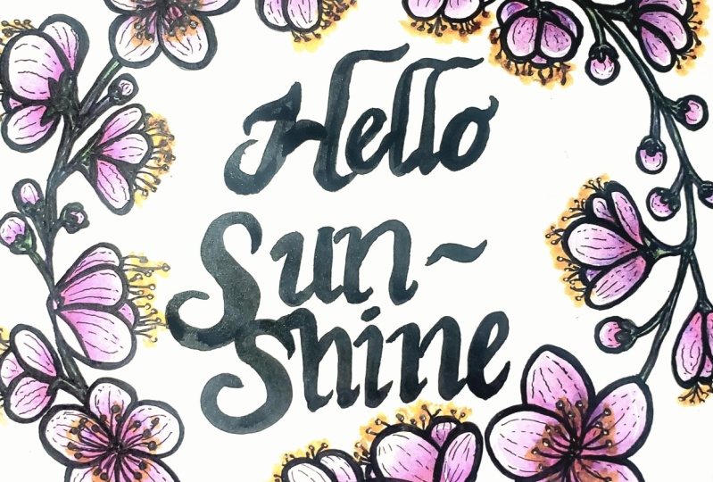
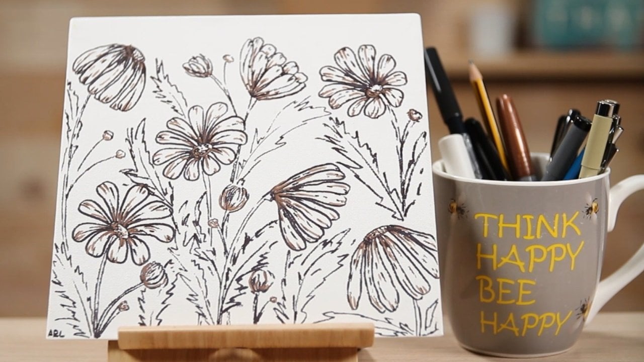
8. How to Make it Pop!: After having our flowers looking beautiful and more lifelike with all the details we added, it's time to move on to the fun part, which is coloring. You can use any materials that you have lying around, coloring pencils or pens, watercolors, all will do just fine. Here're a few examples of what I've done previously with watercolors. This other one was colored with Ecoline Brush Pens and a little bit of watercolor to mix the inks together in the yellow flowers. A few other examples with watercolors. This first one, I still want to add more details to really make it pop. This other example was done exclusively with coloring pencils. For this piece, I will be doing a mixed-media approach. I will start with my Tombow dual pens, and I've decided to color with pinks and purples, and greens. I decided to drift away from the original colors of the flowers in this reference photo and that's okay. I started coloring the stamens in yellow and I did it to all flowers. I really like these brush pens as they have both tips, so you can choose the one you prefer. I like the brush side better, even though I originally started with the fine tip. Then I picked a light pink and purple and added them to the center of the flower. I gave more color to the shadowy parts and then with a water brush, I pulled the color to fill in the rest of the petal. I repeated the process for the next flowers. For the side flower, I also used the pink and the light purple and used the water brush in the same way. Be careful not to go over your already inked areas otherwise, it might blend and make your flower a different color from what you intended. You will see this happening in my second main flower but I actually liked how it looked, so I left it as it was. Their buds are usually lighter, so I just used a bit of the watered-down color from the petals and lightly colored it in. Then I kept on repeating the process for all flowers and buds. You can always go over again with the second layer to give a flower more depth after the first layer has dried. At this point, I've finished all the petals and I will be moving on to the stems. I chose a darker pink color with some shades of brown and green and painted the stem. The colors of the brush pens mix well together so in this case, I didn't need to use the water brush to blend the colors together. But if you want a lighter color, you can add just a bit of pigment and then use the water brush like I did for the petals. In this case, I really wanted the darker thorns to make some contrast. If you're struggling with choosing colors, either follow what you see in your reference photo or you can look into color of theory, which will help you better understand which colors work best together. You may also want to take into consideration the overall feel of the piece. If you want cool colors like blues and greens, or warm colors like yellows and reds. All of these things have an impact on the overall feel of the painting. After allowing for the watercolors to dry, I wanted to add more effects so I use my Caran d'Ache super colored pencils, which are watercolored pencils. But I didn't use them as watercolors so any colored pencils would have worked the same. From the available colors in my sets, I chose some colors that are similar to the ones I've already used. I picked a darker pink and painted very lightly to give more texture to the flower. I also did some more shadow work in the flower center and when some petals overlap. I did this for all the flowers and petals in the piece. For my funkier flower with the full-width petal, I added the shadow below the fold so that it looked as if the petal had turned and therefore I was blocking the light. I also added shadow to the pointy end of that petal. However, you can see that I left the middle part lighter. Regarding the buds, I picked a lighter pink and added a shadow to the base of the petals. To give it just a final spark, I used my white uni-ball gel pen to add the final highlights. I wanted to give a hint of where the light may be reflecting on the flowers and buds. I do this very loosely and almost intuitively. If you want to be a perfectionist, you can look into light and shadow tutorials. But basically, you need to know where the light source is coming from and where the light reflects in order to paint accordingly in your piece. The final piece is done. If you want, you can add lettering here in the middle with a name or a quote. Great work, in our next lesson, we will go over the final thoughts and project reveal. See you there.
9. Final Thoughts: Great job. You've just completed the class for drawing simple line florals. As a recap of the overall class, we went over the tools and materials, looked into places to get reference photos, either online or taking your own photos, chose the flower we're going to draw, and studied them in detail to better sketch them out. Then we made our final pencil sketch very lightly in the paper we used for our final piece. After that, we moved on to putting pen to paper and traced the overall shape. We then added the very important details in all flowers to really make them look more lifelike. Finally, a splash of color just to make it even more appealing to the eye. Now, all you need to do is to frame it and hang it on the wall. Don't you just love the way it looks? Remember to add your photos of your process or the final piece in the Project Gallery of this class. I can't wait to see how it turned out and give you some feedback. Thanks again for taking this class and I'm looking forward to seeing you again in the next one. Happy art creating. Bye.
 Andie Lopes, Calligraphy & Line drawings