Transcripts
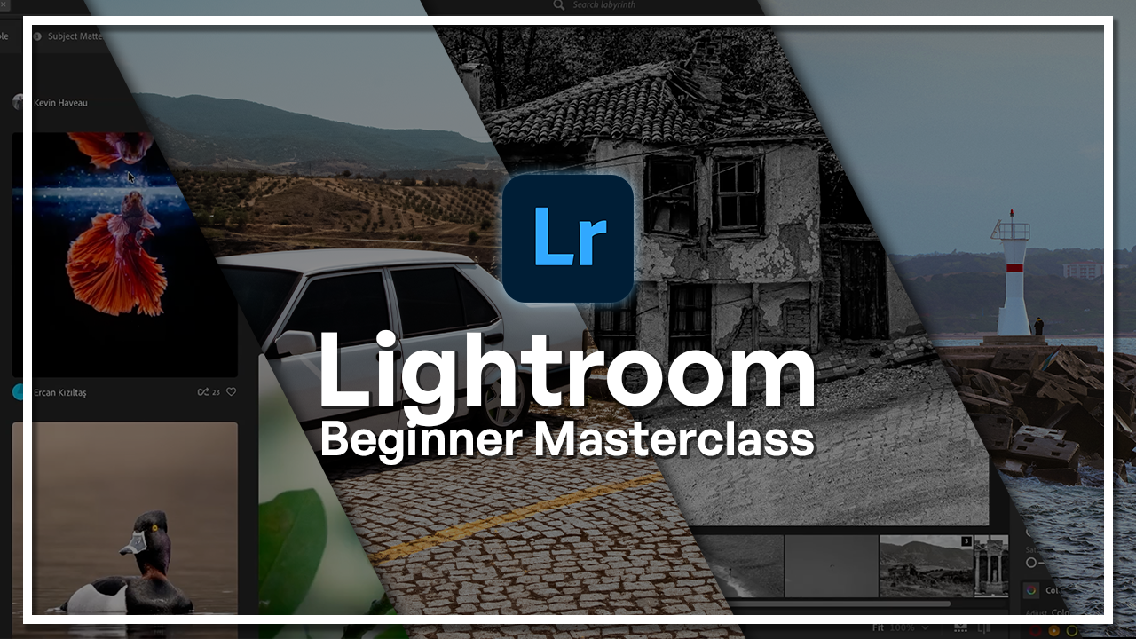
1. Welcome to the Lightroom Beginner Masterclass": Welcome to the Adobe
Lightroom beginner course. Have you ever taken a
picture that looks great in real life but didn't
look the same on screen? Well, that's where Adobe
Lightroom comes in. My name is Hosnakachui, and I'm a photographer
and digital designer with over five years
of experience. Adobe Lightroom has
always been my go to app when it comes to refining
and enhancing my images. Very simple to use. It can get very advanced, and there's so much that you can do within that one program. I use Lightroom to bring out the colors and details
within my photographs. I will be teaching you how to do the exact same thing
within this class. We'll start from
the very beginning, understanding what lightroom is, the main differences between Adobe lightroom and
Lightroom classic, and, of course, how
to set everything up. Once we have that down, we're going to learn how
to organize our images, how you should import things, label them, and keep everything
nice within your library. From there, we're
going to move on to editing from exposure, color enhancement, details,
cropping, and many more. These are core techniques that will instantly
enhance your images. After that, you're going
to be applying what you've learned onto an actual
image editing project. We're going to begin by
analyzing the image, spotting what needs
to be changed, and then working our way
towards exporting that image. And the great thing
about Adobe Lightroom is that there is
a mobile version. That's another chapter in
this class where we're going to edit the same image
within the mobile app, so you have both options the next time you want
to enhance your photos. By the end of this class, you'll have the tools
and knowledge to instantly transform your
images. So let's get started.
2. Introduction: What You’ll Learn: So in this course, we're
going to be looking at Adobe litrom from a
beginner's perspective. We're going to go
over, you know, the basic things
like how to import, how to edit, and
then how to export. But I'm also going to
show you some tips as to how to stay organized,
how to, you know, select the best pictures from
your camera or your phone, and how everything works here. Adobe Lightroom is a
photo editing tool. It's very accessible. There is a mobile version, there is a desktop version
and an iPad version. So if you prefer to use the
Apple Pencil for editing, for example, Adobe gives
you that option as well. It has cloud capabilities
as well as local storage. You get to keep your
photos in multiple spaces. And maybe share it with
someone to collapse. So overall, it's a pretty
handy program to know. And as a beginner, you're starting to get
into photography, this is the perfect
way to get started. Of course, all the phones have their own adjustment
tools that you can use, but I think if you
want to take it to another level and
do further editing, this is a good place
to get started. For example, you have a photo and you want to fix the eyes, you get red eyes in some
pictures, you want to fix that. A lot of the mobile
editing tools don't have the option for you
to get rid of that. So you can combine what you
have within your phone. With Adobe litrom. This is going to be
an exciting course. So let's get started
with our next lesson, which is where we talk about
the difference between adobe litrm and
adobe litrm classic.
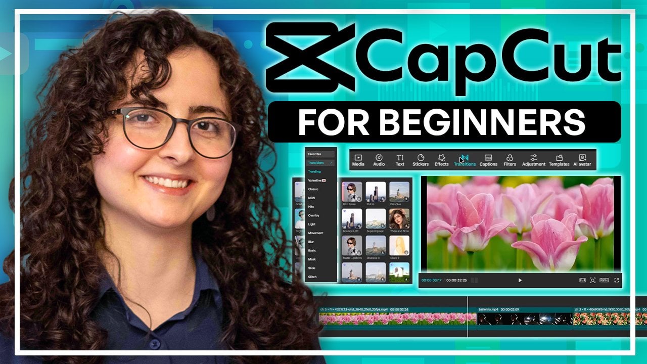
3. Lightroom vs Lightroom Classic (Quick Overview): So let's talk about
the difference between the two
versions of lightroom. If you got trum from Adobe, you may have noticed
there's a classic version, and that raises the question, what is the difference
between the two and which one
should you use? So the one that I
have on the screen right now is Adobe litrum. This is the program
that we're going to be learning throughout
this course. But there's also
Adobe litrm classic, which looks like this. Interface is quite different. You can see that
it has an older UI compared to the
regular light room. So this is classic,
this is lightroom. It looks different visually. But actually, in terms of tools, they have the exact same tools. They're both powerful. They let you edit beyond just
color and lighting. There's storage and
stuff like that. But I would say the main
difference is the volume. So Adobe lightroom classic has a very good way of managing
high volumes of photographs, and a lot of
professional studios tend to use this rather
than the other light. As you can see on the top bar, we have, you know, library, but there's, like, a developed
tab where you get to, you know, edit your image. You can map things
out with photographs. You can make books with it. You know, if someone
requested, like, a wedding book from
all the pictures, you get to do it right here. You can also do slide shows. So this is how you make
a book within Lightroom. Say you had a client that
came in for their wedding. They took like, I don't
know, 100 pictures. They want that
turned into a book, Lightroom classic, let you
just put it all together. Also make slide
shows the same way. And you can see that we got all of these options on the side, and these are the pictures that is going to be
within the slideshow. So you can see that I could put, like, a logo on the corner. I get to adjust
the way it looks. I can put music and put
in some playback options. We can also print these pictures and decide on the dimension, the quantity, and many more. So we can play around with
the margins, the guides, the page, and then just send
it over to the printer. One last thing is that you get to host these pictures on a web. So this is going to
be a little web page. It's going to look like this. You can put a name
for it and then, you know, list all the
photographs, like so. You get to change the
site info like this, and you can also put in a link. So you can either email it
to the person or just host it locally or on their
server, whichever you prefer. Generally, you can see
how in terms of sharing, there's a lot more to this, and you wouldn't
really do this if it was for your own
personal photographs, but rather if you're doing
this for someone else. So that's why I said
in the beginning, a lot of photography studios tend to use Lightroom classic. But going back to the lightroom that we're
going to learn, you can see that there isn't much options in
terms of sharing. Of course, we can export, we can share it via Cloud, but there's not much
we can do with, like, books, websites,
and slide shows. So if you have a picture, you know, you just edit it, and then if you
want you can share it with these options,
and that's it. Another thing that trom
Classic doesn't have is cloud. So we do have Cloud here, meaning that I get to share this across various devices and work on that same picture from different accounts or
different devices. But trum Classic is
just desktop focused, so you install it on that device and you get
to use it on that device. So there isn't a lot of room for collaboration and sharing
across platforms. But other than that, you know, we still have the same tools. So we have light color effects. And if I bring up classic, we have the exact same thing. So that's going to be
in the developed tab, and you can see that I get to change the light, the color. We get like curves adjustment. We can crop it, remove
stuff, fix red eyes, and anything else that you need in terms of
editing photographs. The reason why I'm
going to be focused on the regular Adobe
lightroom and not classic is because if you're
just getting started, chances are that you are
using your phone a lot, and you may want to have
an option for that, too. So that's why we're
going to focus on the other lightroom, because whatever I show you
here is within the mobile and you get to cross edit
between the two platforms. And this version of Lightroom is a lot more user
friendly because you're just thinking about editing
a picture and not so much how to share it slideshow or
make a website out of it. So now that we know
a little bit about the differences between the two and why we're
choosing this one, let's get started
by learning how to navigate this platform
from start to finish.
4. Setting Up Lightroom & Navigating the Interface: So after you download Lightroom, you can do it from
the Adobe Suite. There's different
plans for that. If you've never worked
with Adobe before, you get to pay for a subscription
based on what you need. And Lightroom and Photoshop are within the
photography bundle. So once you buy
that subscription, you can easily
download Lightroom. The first couple
screens are just going to be sinking your
accounts and all that. So I just skip that part. It's very straightforward.
But once you're in, you're going to be, you know, seeing something like this, but without any pictures. You're having trouble
with downloading it, this program, it may be because your account
isn't sync yet. And sometimes people
tend to download Lightroom from other
platforms than Adobe. Try not to do that because, you know, it's not that safe. But anything regarding
your account is going to be in this
little cloud shape, and you can also
buy Cloud storage. So this is optional, but I do recommend it if you
want to do a lot of editing. Down here, you can
see that I have Lightroom mobile and
Lightroom web as well. And then if you go
to View Plants, it tells you what you're
currently paying for, and up here, it tells you how
much storage you have left. Alright, so let's say we're in, everything is working fine. The first thing you
would do is add photos. I'm going to show
you how to import and export in the next lesson. But once you have pictures here, you're going to have to choose the ones that
you want to edit. So let's say I just imported
all of this from my camera. There's obviously pictures
that are deal for editing, maybe it's blurry, maybe
it's of the wrong subject. So this right here, this page is where you make
that selection. So down here, we have the view of how you look at the images. If you just click on this guy, it shows you one
image at a time. And then down here, we
get to rate it via stars, do the picked flag,
rejected flag, and based on that, I could
keep some of the images for editing and let the rest of them just be within my light gram. So say I want to edit this one, I'm going to do the
check down here. You can also hit Z on
your keyboard to quickly select it and say I
don't want to edit this. So I'll hit X to reject or just click on the little
flag with the X on it. So now when I go back
to my larger view, I just want to
make sure I didn't I did pick a few others. Those are just going to show up. But now when I go up here, there's a search for the
album that I'm currently in. I could click on Filters
and have Lightroom only show me the ones that I
so when you click on that, you're going to see the
pictures that you've accepted or you want to move on to the next stage of editing. And that completely shrunk down the amount of images that
I'm seeing right now. So once you have
that, you just go in, double click on one image, then you start editing with
the tools on the side. I'm just going to
click on that. So this is what you should be seeing. And then you can start
from some presets if you want all
the editing tools. And if you click on it again, it's going to
collapse the sidebar. So this is all your
classic tools. Like color exposure
and all that. This is regarding the
geometry of your image. So any sort of cropping, straightening, you're
going to do it here. If you want to remove or
manipulate parts of the image, you can go over here. This is to remove. And then
we also have a masking tab. So this is where you get to work with a certain part of the image and not
the entire thing. And this light room actually automatically selects
some of the things here. So if you have a human subject, you click on this once, and it's going to
determine where that subject is and
draw you a mask. The same thing happens for sky, and then the good thing is
that once you select it, you get to invert it and then work with everything
but the sky. So I just clicked on it
and you can see that it detected the sky pretty well. I did miss out these parts. But if I invert this mask, I can now work with
everything but the sky. So there's going to be
a little window here, we're going to get into
all of these later on. Right here is your
history panel, so it tells you all the
versions that you have made, and automatically, they're going to be saved here
based on the time, but if you want to keep a
version, you can name it here. Let's say you create a version
that's black and white, and then you want
to create a version that is very vibrant. That later you can decide
which one you want to export. Lastly, we have some
AI status stuff. Anytime Lightroom uses
artificial intelligence, it's going to tell
you where it used it. Right now, for determining
the sky that we just did, it's listening it down here. We have some additional
options where you get to copy editing settings
to different images. You can see the original and there's shortcuts
on the side, and you can also take this over to Photoshop if you want to. We have some comment sections. If you share this with
anyone via Cloud, people could leave comments. Maybe you're working
with someone or you're sharing
this with your boss. This is where you
get to see all that. There's also keywords. You get to add stuff to it. So when you export,
these keywords are going to be embedded
to your photograph. Lastly, there's a little I, and it tells you all the
information about the camera, the lens, the date
that you took it, the name of the file, and you can add additional information. And once again,
this is going to be encrypted to that image file. All right, so that's all the
editing on the right side. On the left side is where
you do all your organizing. So once you import something, you get to make an
album right here, or you get to make a
folder within an album. You can share
things with people, and you can also look
at things from here. So anything you just imported is going to
be in this folder. Anything you recently
edited is going to be here. You can search by
date, by people, and then you can also share
directly onto a platform. So say you have a
B hands account, you have an Instagram account, you get to add that here. And then lastly,
your deleted files are going to be here as well. They will be permanently
deleted after 30 days. If you wanted to learn stuff, there's this part that
you get to go to. There's a community.
This is your profile. So this right here
is your profile. This is the featured photos
from different people on Behans and Bhands is
a platform by Adobe. Do you get to get
some inspiration or just see how other people
tackled some challenges? You can follow people and also do remixes on their photos. So if you saw picture
that you really like, but you want to experiment
with a different style, you can notify the photographer that you did this
edit to their images, and they could maybe, you know, follow you back and
stuff like that. You can download presets
directly from here, and you can also filter through the stuff
that you're seeing. So if you go to
feature it again, subject matter could
just be animals, and then I'm just seeing
pictures of animals. So the good thing about this is that you're not only editing, but it also brought in
different web pages within the program, so you don't have to
go out of your way to share things or engage
in that community. So this is the Cloud section. There's also a local section. So this is where you get to
do things on your desktop. On this computer, it's not
being synced to anywhere, and everything, as you
can see, is done locally. So it depends on
what you want to do, but usually people
do it on Cloud just because they want to
have access to it later on. In terms of labeling things, I did mention the stars, the maps, but you can
also tag it with a color. There's also something
that's newly added. If you have the latest
version of Lightroom. This will use AI, but if you select something that you want to filter,
it will do it for you. So you don't need to look
at every single image that you imported
from your camera, but ask trum to only keep the ones where the
subject is in focus. The ones where the
eyes are open, I don't really have a human
subject in this selection, but you can see that it
only kept the videos. And you can also import
videos here, too. So now it's, you know, looking over all the
filtering that I did, and I'm just going to undo
that and get back to this. You can look through things
that are edited or not, the type of photo, your camera, if you have multiple
cameras, the sync status, there's a person in the photo that you want
to filter through. You can do that here,
and then the extension. We also have some that are
commented on, hearted. And if you're
contributing with people, you can look through them here. If you're looking to search for anything within that album, you get to do it up here, and others also
searching with people. So that's just a
quick overview of the interface within
Adobe Lightroom. It's very user
friendly as you see, but throughout the
next chapters, we're going to dive deeper into how to actually
edit photographs, share things, and get started
with a real so now let's go ahead and see how we can import and export
within Adobe Lightroom.
5. Importing and Organizing Your Photos: So importing and exporting
within Lightroom is very easy. Right here, there's a
big Add Photos option, and that's how you
get to import things. So you just go to your folder, choose something, maybe you got this image you want to do. You're going to hit
Review for Import. It's going to show up here if
you choose multiple things. They're all going
to show up here, and you get to check or uncheck. So if you don't want to bring anything in, you
just uncheck it. But I'm just going to check this and click on Add One Photo. Depending on which
album I was in, that image is going to
show up to my album. So right here, this
is what we imported. And I could give it a
tag to find it easier. Oops, Let's go down here. So I could give it a tag. I'll give it a red tag. And when I'm looking
for a red tagged image, this one is going to show up. And then if you want, you could make a new album. So go to this plus create album. I'll call this green. We can put this within a folder, so I'm going to
keep it outside and then include selected photo. So this one picture and create. So now in green, I have this one image. You can see it tells us
how many images we have, and I get to share this album, maybe, rename it, make
it the target album. So whatever I import is
going to go in here. You can change that later. You can delete the album, push it into something else
and just organize as you go. That was importing. There's
all these organizing features as well that we looked at. But we can also export
things very easily. So if you go to File,
there's also ad photos. So this is how you import. You can also import
profiles and presets. If you downloaded any
presets from the Internet, you can bring them in like so. And then exporting is just
Shift E. When you click on it, you're going to get this
window where you get to choose the type of image that
you want to export, the dimension, the quality. You could include a
watermark and then maybe change what
it looks like here. So it could be your
name, your company name, get to work around
the way it looks, and once you're done, you click Done, and then
it's going to show up here. You can decide what becomes
encrypted into the image. It could be every metadata or it could only be
copyright information. So this way, people
will not know which city you
took this from or, you know, which camera you
used, that sort of stuff. You can name the image,
give it a custom one. Use one of these formats. You can also sharpen
it while it outputs. We can change the color space, and then you can
also double check your image before you export it. Once you're done, you
click on Export One Photo, and then it asks you where
you want to save this. So that's pretty
much how you import, organize, and export
very straightforward. Now, let's go ahead and get
started on our next chapter, which is how we can use the tools on the
right side panel. So there's a lot to do there. So let's go ahead and see
what that is all about. Oh
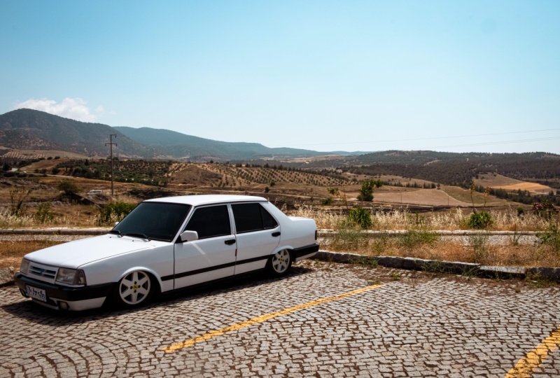
6. Understanding Exposure and Light Adjustments: In this chapter, we're going to be editing this picture and at the same time learning the fundamentals
of photo editing. This image is available to you
guys in the resource pack. So go ahead and download it, import it into
Lightroom the same way that we learned in
the previous chapter. So to activate the
editing sidebar, you simply have to click on this button on the right side, and then this thing will pop up. This is your editing panel, and it has all of these
different categories for light color effects, detail, optics, and lens blur. Going to go over light in
this lesson and then continue from there because light is
the most important thing, really, because if
there's not enough light, you cannot see the colors well. You can't see the details. And if you can't see
either of those, you can't really do
any manipulations. So just open up the panel by clicking on
this little triangle, and that's going to bring
you to the light section. So the way that all
the sliders work is that you would add or
remove via this little ball, you're able to reset a setting by dabble
clicking on that name. And it goes back
to the original. If you want to see
what everything looks like without this panel, you can click and
hold on this eyeball, and it's going to
show you before the light effects and after. Now, within Lightroom,
you don't really have to do all these
manual adjustments. You can easily go for an automated editing that's going to be done by
Lightroom itself. You can turn your photo into
black and white instantly and then choose a profile or choose another
profile from here. But in this lesson
and the chapters, we're going to focus
on manual editing because you're
going to have a lot more room for flexibility. So the first option is exposure. So this is regarding how your overall image looks
in terms of brightness. So if you move it
to the right side, you're going to add
more brightness. And if you go to the other side, you're going to make
your image darker. Having it at negative five is going to be the
darkest possible. Positive five is going to
be the brightest possible. Notice how as I move my slider, the increments are very little. That's because this is
a very powerful slider, so you want to add onto your
image little by little. When I reset this,
I could either use a slider or click on here and just type
something in myself. But usually, you want
to do it with this guy, add it on slowly until
you're satisfied. So I'm going to go
with this much, and you can see that I was able to bring out more of the
light from my image. While still keeping all the different textures
and colors in place. Now, if you lost some of the contrasts or
some of the shadows, that's no worries
because there's all these other sliders that are going to add some
depth to your images. And the first one that does that is actually the contrast option. So this is going to if you
just hover over the name, it's going to show
you the contrast, the difference between
the lightest part of your image and
the darkest part. I reduce this, you can see
how flat my image becomes. Everything looks kind of dull. It's not really, you know, fresh and real, whereas if
I go to the opposite end, we're seeing a very
clear cut between the brighter part of the
image and the darker part. So this is right here, this easy cut that's happening
because of contrast. If I research, you can see how
normal that looked before. So if you want to add
more dimension to your images or just
make the shadows pop, you can easily add
on some contrast. So now we have contrast as well. Just click on your screen
once. It's going to zoom in. If you click again,
it's going to zoom out. Next up is highlights. This is in the name. That's going to be the
brighter parts of your image. So usually that's
going to be the sky. If there's any sort
of reflections, you can control that
via this slider. So if I remove from
this, you can see that I'm mostly working with the sky and a little bit from the car because
that's white as well. So I could add on
or remove like so. Sometimes when your sky is just flat white or a flat blue, you may want to utilize this to kind of bring
out that color. So now we're getting
more of that blue, whereas before it
was just white. So I'm going to do negative 23. The same thing
applies to shadows, that's going to be the
darker part of your image. So usually that's
everything but the sky. Um, if I darken it,
you can see that everything below the
sky is being affected. If I go to the other end, it's still the same, but now we just made
everything brighter. So if something is dark, you can easily use this slider
to bring it up like that. Be careful not to do this too much because you're
going to lose contrast, which is what we try
to work with up here. So put a reasonable amount. Next thing is whites and blacks. This is going to
be the white point of your image and
the black point. Now, white point is anything that's quite literally
the brightest part. So in my case, that
would be the car here. I get to work around with
what this looks like. So if I increase that,
you can see that it's just working with the
sky and the car itself. Not so much with
the other stuff. So I could play around with this usually depending on
how bright your images, you won't really need
to add that much, but you could use these
two to set those points. And then we have
the black point, so you can see that it's mostly the mountains and the
black ridges of the car. I could make that darker, too, just like that. So we were able to add in some adjustments with these
guys. Pretty straightforward. Once you have everything done, you can always go
back and further adjust any of these sliders. Now, if you don't
want to play around with these sliders individually, you can also go
over to the curves. So if you just click on
the little triangle, you're going to get this map. And this is where you get to do the same things that
you were doing up here, but in terms of points. This gives you more control. And if you're
intimidated to use this, just go for very little changes. Now, this is the general
lighting of the image, but you can pinpoint certain
colors within the photo. So pull it towards the red or cancel out the red by
introducing the opposite color. The same thing applies
to the greens, the magentas, the
blues, and the yellows. And then you can
also play around with, you know, these guys. So highlights, shadows,
whites and blacks. You can see that each
one that I go over, it's showing me
something down here. So you can use this as
well if you'd prefer, but you don't really have to. I'm just going to undo what I did with
Commander Control Z. So green channel, red channel, highlights, and, yeah, I
think that's all we did. So now I only have changes
done with the sliders alone. This was without
the light effects. This is with the light effects. So that's everything regarding
exposure and lighting. The next lesson is going
to be focused on color. Mmm.
7. Colors Made Simple: Temperature, Tint, and Vibrance: H So we fixed the lighting
in the previous lesson. Now let's move on to color. If you do not have
the proper lighting, you cannot get the
correct colors from the original image, and that could lead to
some distorted colors. Maybe your reds are way too
bright or way too dark. So it's always important to fix your light first and
then move on to color. So over here, we
have a few things going to collapse all of them. We have the regular sliders, and then we have something
that is like a map. So something like the curves adjustment that
we had over here, it's an option for us
to have more control. Get started, you can first
change the white balance. So this is going to be the
white point in your image. If you choose Auto, you can see that
it kind of took it towards the warmer
side, balance it out. If you don't want
it to do anything, you just leave it on as shot. There's also an
eyedropper tool that you could grab that you want to, like, set to a neutral color. So for me, I don't really
have that problem, but let's say I go on the sky, which is say, it's too blue. If I click on it, you
can see that it turned everything into a
yellowish color. Alright, let's undo that. I'm going to click on this again and get my regular mouse back. So temperature is whether
your image is cool or warm. If you pull it towards the
blue side, it's cooler. If it's towards the
yellow side, it's warmer. Now, by default,
you can use this to fix the coloring that
comes from the lighting. So say you're in a room where
the light bulb is yellow, that turns your overall
images to be very yellow. So you can cancel that yellow by adding in some blue,
just like that. Since I have a sunny day, I'm going to add on some yellow, maybe five points,
nothing too intense. And now we can move
on to the tint. So this is the same idea. You can introduce some
magenta or some green, and you can use either one to cancel out an existing color. So if the image is too purple, you can add in some
green and vice versa. Just like that. So I'm going to add nine points to my image. Next is vibrant.
This is regarding basically objects that are not too colorful to begin with, but that could be like
the mountains, the floor, and you can add in some of
that color via the vibrants. So you can see that even though I remove all the vibrants, there's still some yellow here. The mountains are
completely black and white. So we can pull in some color
by adding some vibrant. Now, saturation is things
that are already colored, so that could be the yellow
lines here, the green grass. I could make them pop
more by adding in some saturation or going to the other side
to remove that. Going to go for maybe six. And already, I have changed
the colors quite a bit. So we're seeing it
before and after. Now, onto the separated panels, we have something
called the color mixer. This is where you
get to pinpoint one individual color
within your image. So we can select
the colors here. We can also go into more
detail and change its hue, saturation or luminance or
just do the color in general, which is a combination
of these three. So say that I'm not too happy with the way
my greens look, I could grab my green. And change the hue. So let me just zoom in here. So you can see that I'm changing
the way the green looks without affecting anything
else within my image. I could do the same thing with saturation and then luminance. So how bright that color is. Click on them once to reset, and I could maybe play around
with this a little bit. So just added some green. And I could do the same
thing with other colors. I'm going to try some
blue. Let's zoom out. And if I don't see the
color that I want, I could use this spotter. Click on it once, and
I'm going to go on, you know, the field in the back. Click on it, hold, and then I could go
left or right to adjust that color section. So I could go for a more green or make it
like a little red. Let's do something like that. You can see on the
right side that I pinpointed two or three
of these colors together. And I could do the
same thing to the sky. You can see how it's taking in both the purple
and the dark blue. And I'm just changing
the colors as I go. So I think that's
good enough for me. Once I'm done, I could collapse this and move on
to something else. Now, this point color
is going to give you even more control if you want to adjust one specific color. So you can see that
this is currently turned off because I have
not selected something. This is not going to be
a combination of colors, but that one color
that you choose. So let's say, I'll go for
this, like, floor color. I could, you know, use the
slider to change it up. I'm going to click on
the eyedropper first, grab this section, and I
picked out this color. And now I could change the
hue, saturation and luminance. So I'm going to make it grayish. Add more vibration. There we go. Lastly, is color grading. So this is regardless
of the colors, but you're just pinpointing the different sections
in the image. So the colors that
make up the midpoints, the shadows and the highlights. So let's say we pinpoint
the highlights, anything brighter in
the image will be affected with the color
that I'm choosing. So you can see that I'm
just changing this around. I'll go with this blue.
Then you can adjust further before or
after shadows next. Before, after. You can blend and balance these three things together with these two sliders. If you want, you can look at
either of these separately. So this is the three view. We can only look at
the shadows, midtones, or highlights, and
then we can do a general global color grading. So everything can be reddish, yellow, or anything
else that you want. So I think I'll do like a yellow just to make it like
a summer image, and you're able
to further adjust these if you don't
want to use the wheel. And there we go. So
now in terms of color, we took the image
from this to this. We have many options for colors. You can use the wheels or the sliders,
whichever you prefer. Next, we're going to move on to the composition of the
image in the next lesson. And that's regarding
the cropping and the general geometry.
8. Cropping, Straightening, and Composition Fixes: Et's continue with our image. The next thing we're
going to do is work around the
way it looks maybe bring our subject more into focus by shifting
the perspective. So we're going to click
on the sky to hide it. And whenever you do something
in one of these panels, there's going to be a half
dot on the right side, so you can see that
we have that here, but we don't have any down here. So you can use that to see
if you've major changes. So this right here is
going to be regarding the cropping and the geometry
adjustments that you do. First thing you can do
is crop your image. There's a few aspect
ratios down here. By default, it's going
to be unoriginal, whatever your image had already, but you can also choose
some from down here. So you can turn this into a
square image or portrait, A five, A four,
whichever you prefer. I'm going to go with As Shot. Once you have that,
you can straighten the image with the
second slider. So if you click on Auto, it's going to use one of the lines within the image
to make your image straight. So right now it's
using this line, but this is clearly not
right, doesn't look right. So this isn't always helpful, but if you have a
very clear grade that the program can use.
This could be helpful. So I'm just going
to scale that back. You can use one of these
to do a free form crop and use the guides here to place your image
where it wants to be. So I am going to crop my image. I do want this car to be
at this intersection. So I'm just going to lock the Aspec ratio and
then grab the edge. So you can see that I'm not
able to squish anything. But if I turn this
basically unlock this, I'm able to do a few things. You can also flip
the aspect ratio, if you want, or just
leave it as it is. I'm just going to scale
this back and focusing on this point until the cross is right at the
center of the car. Once we're done, we
could just leave it B, or you could hit Inter to, you know, see the adjusted
version. Let's go back here. You can do some
rotations if you want, or just skip down to geometry. So this is flipping. This is rotating and
this is flipping. All right. And for geometry, we have a few things
that we could do. The first thing
you're able to do is change the way you're
seeing your view. So if it's guided,
there's going to be more grid lines that you
get to use as reference. That way, you're able to make
adjustments more properly. If you're seeing, this
is a good example, if you want it to be guided, you can just grab two lines
that you want Light trim to use via this tool and let
the program do the rest. We also have Auto upright. So if it applies, you can click on that again. So the image that's being
animated right now, that's another good example. You know, you have the horizon. You can use that as reference, but my image, I don't really
want it to be straightened. Could use this line over here. Let me just deselect that. This line, I could use
that as reference, but that's really up
to you as the editor. So if I were to use
that as reference, I could skip down to rotate, and now it's straight
along this line. If you click on
Constrained crop, it's going to zoom in until we're not seeing the
transparent parts, and this will be added
to anything that you do. So distortion is going
to be, you know, regarding the center, the lens, the way the lens
captured your work. So you can distort it in or out depending on what you want. You don't always
have to use this, but sometimes it's
fun to experiment. When I add tend to
distort it outwards, you're then able to change the vertical distortion
if you want, when to hit control
or Kaman sine. Maybe we could push
it up a little bit, so it goes like away. So have this guy turned on. You can do it horizontally, so maybe we could bring the
car towards us a little bit, like so, and then you
can change the aspect. So squish it out
or make it wider. I'm going to leave this as zero. You can scale in or out
of the image if you want, and then you can
change the offset. X offset is going to
be left or right. Y offset is going to be whoops. Offset is going
to be up or down. The reason why that happened is because we have
this one turned on. But for me, my image
looks pretty good. I'm just going to
grab my canvas, move this up a little, so this is right at the middle. Once we're done, we
could hit Enter, and now my image
looks like this. So we could take a look at the original with this
button right here. I'm not sure if you could
see. Yeah, there we go. I just right clicked and did
the show before and after. So this is without the cropping
and the lighting changes, and this is with the cropping. So we were able to do this
using this one slide. Just going to dabble click on my image to make it
full screen again. Now, there are sometimes things in the image that you
want to get rid of, remove or further manipulate. And that's where
these guys come in. So first, we have
the remove tab. You get to either heal something or remove it completely
with the eraser. You can also clone
or fix red eye, but I don't have
any humans here, so what I'm going to do is remove or maybe heal the
little writing here. Let's say that's not what
I'm trying to work with, I'm gonna zoom in a
little bit first. So let's go like 300%. Use the spacebar to
move the canvas. So I'll just get rid of all
these stickers on the car. You can use either one. Use command or control
on your keyboard and your scroll wheel
to change the size. Can also hold down alter
uption to cut something out, but I'm not going to
use that right now, but you can either use
generative AI to remove this, which will give you
the cleanest result, or you could just steer
away from AI in general. It's up to you. So
I'm just going to go over, you know, the sticker, making sure that
I'm not crossing over anything that I want
to keep in my photo. Once I let go, it's going
to do some analyzing, and this is what it looks
like when it's replaced. You can click on refresh
to do something different. But as you can see, it
didn't fully remove it. So I'm going to maybe
try something else. I can maybe clone this
onto the same area. I'm just going to click on this and I'll hit the trash icon, and now I'm back to what I have. That's why we have all
three of these choices. We could try something
different, too. Let's see what the healing
brush does. There it goes. I didn't grab the
middle. It's fine. So we're able to use one
of these as reference. Let me just do that again, but keep the center. There we go. When I
go over to the side, you can see that the
sticker is now gone. And I could do
multiple of these. So let's hold down the
space bar and then maybe try to fix this
area of the car. And if it's choosing
the wrong reference, you can guide it. Let's just remove the feathering and do this one more time. So it's going to look like that. I'll come back to this
with the clone tool, but let's try to get rid
of this part as well. Just going over this
with the same brush. Okay. And again, I could come back to this
with the Clone tool. Next, I'm going to go
to the license plate and remove that
information as well. I'll switch to
remove for this just because there isn't that much I could use
as reference here. So use generative AI.
Let's do that again. So let's remove. Let's
go to remove it with AI, which is gonna be a lot cleaner than what we have. So
there's the first part. Let's make another selection
and just keep going. A Okay, so you can see that there's
still some spots over there, but like I said, I'm going
to come back to this with the Clone tool
because the Clone tool is just going to copy a
certain part of the image and put it in exactly
the way it is. So the remove and heal are
kind of trying to blend it in. Clone does not do that. So that's why it may be helpful for you guys
to start with these, then move on to the next tool. So you can see that
there's like a little blemish on the side. I could just go over
that little area and, you know, use a duplicate
of it right here. And now you can see that
that blemish is gone. Same thing here. Then
when you go to the side, let me just undo that. Let's add some
feathering to soften the edge, and then go in again. So now it's gone
with just one click. Now, when you go over it, you're going to see
a bunch of shapes. That's just your
previous adjustments. So nothing to worry about here. I'm just going to go along. Sometimes you can just
use the clone tool. It depends on what you're
trying to replace. For example, this part could easily be replaced with this, so we don't need the
remove or heal tool, but sometimes you're trying
to replace the license plate, there isn't much room for
me to use as reference because it's just a
few large letters and a little bit of white space. So you would have to
alternate between each one, but let me just show you. You can easily go in with
the Clone tool like that. And there we go.
That guy's gone. And if there's any sort
of blemish on the car, we could use the same
tool to get rid of it. So here I want the
edge to be identical. I could remove the feathering
as well just to make it a little better. Let me actually try doing this
with the Clone tool only. Use my scroll wheel and
just go over the edge once. Okay, that's not bad. Let's add in some feather
and make this smaller, fix the edge here. Alright, we got some
more blemishes here, and I'm just gonna
continue moving along like that. We
have another thing. I'm not sure what this is, but we could use this
guy as reference, cloning something
that exists already. Got some blemishes
here again and just keep on going until the car looks good
enough for you. Alright, so the license plate
is not looking that good, but the good thing
is that you get to export this and edit
it in Photoshop. If you want it to be
completely cleared. I'm just gonna leave mine. As long as it's not the original license plate, we're fine. So now I was able to clean up the car using all
of these tools. I think we forgot this red part. So let's go over this
little by little, try to, like, fix this area. Oops. Doing it with
the clone tool. And just fix the area. Let's make a bigger selection. Get that feather.
Try that again. Okay. Zooming in, we have, like, a little bit of red still. Trying to go over
that like that. So now we don't have that
red smear on the car, and everything looks good. Alright, so we were able
to change the geometry of the image and fix some
stuff from the car itself. So if you have any
sort of scratch or any sort of mark that
you want to remove, you can easily use
this panel right here. Now in the next lesson, we're going to focus on the texture and some details
that we could either use generally in
the details panel or do it to one specific
part using masking. So let's do that in
the next lesson.
9. Adding Clarity, Texture, and Sharpness: H Alright, so the details
panel is right over here. It's below color. We have the effect panel
and the details panel. They're pretty much used for the same purpose,
adding texture, adding details, and bringing more clarity to
the overall photo. So the first thing is texture that's pretty self explanatory. You can either enhance the textures in your
image or reduce it. So let's go over
to these plants. If I increase this, you
can see how that, like, spikiness is coming out, whereas if I go to
the other side, it becomes more blurry. So you could use this
to adjust your image. I'm going to go for
a little bit of texture just to make
those plants pop more. Next, we have clarity, so this is the contrast around
the edges of your subject. So if you find an edge
like the car here, I could either blur it out
or make it more intense. So this is good to make your subjects pop out
more, as you can see. It does also add contrast. So be careful with the
amount that you put in. Next is de haze, so this is going to
either add haze to your image or remove it.
Let me zoom out here. So if I go to the left side, you can see that we're
making it very hazy. To the right side, we're
making the image very clear. So this is where you
get to experiment a little bit and add
or remove the amount. Wig is going to either add a white color to the
edges or a darker color. You could, you know, add in a tiny amount to
add some contrast to the edges or just create that vintage look
when you need to. Green is going to add little
pixels to your image. It's going to add little dots. Let me just zoom
in somewhere here. And right now it's at zero. But if I add to it, you can see that it's putting in all these dust across my image. You can use it to make
your image look like film or a vintage shot. I don't want to add
any for my image, so I'm going to keep it at zero. So that's regarding the effects. Detail is going to be a
little bit different. You're able to remove or add
sharpening to your image. Let's say it's blurry
for some reason, you can use the let
me zoom in here. Okay, let's go here. You can make your image sharper. But keep in mind that it does add some noise to your image, so you don't want to go crazy
and do something like that. You can adjust the
sharpness radius and the amount of detail
that it's going to keep. Next is noise reduction, which is going to get rid
of these little dots. You get to use that
slider and remove it in terms of light or
in terms of color. We have both of that in
our image right now. These purple and green
lines are the color noise, and these little shapes
are the luminance noise. So just add a little
bit for both. You don't want to go
overboard because that could easily make
your image look flat. So this is without the detail. This is with the detail. You can see that's
quite the difference. Lastly is optics. So this is regarding how your
camera captured your photo. First thing that we could
remove is chromatic aberration, which is, you know, these
little colors that we saw. And we can also have light room fix the way our lens
captured the image. You can choose your lens
from the profile down here, but I'm just going to
disable that for now. We also have the fringe, so that's again, regarding that color noise
that we had earlier. We still have a little purple. So I could add in the
opposite of purple, which is green to get
rid of that coloring. You can also use the eyedropper
to pinpoint that color. So a little change there. Lastly, is lens blur. If you want to sharpen or blur your image, this
is where you do it. I'm not going to
apply any because, you know, I don't need
that, but if you have, let's say, a subject that you want to blur the background of, you can easily
apply this change. So now you know
how to use each of these tools and what
they're good for.
10. Analyzing the Photo (What Needs Fixing?): So now we're going to be
editing this picture together, and that's going to be the
focus for the entire chapter. So this image is also available to you guys
in the resource pack, download it, import it, and let's see what the issues are before we can
even tackle them. So right away, we can see that the exposure is a
little bit too high, and because of that, we're losing the
color in the sky as well as some details
in the background. So in terms of lighting, we need to bring the
brightness down. Secondly, there isn't
much color visible. Like, the water looks white, the sky looks white. And once again, the
greens out there are not even that noticeable. Thirdly, we're losing
a lot of details. Let me try to zoom
out a little bit. Let's try to zoom in this much. You can see that
it's kind of blurry, and we are getting some noise. So you can see, like,
there's, like, a halo. Around the subject. And if
we zoom into somewhere flat, we're getting some
noise color noise. You can see the
greens and purples. So that's another issue. And lastly, the main subject of this image is the lighthouse, but it just seems to be part
of a background element. So it's not really in focus. There isn't much contrast there, and depositioning is not ideal. First thing you always
have to do with images is understand
what the problem is, and that way you
know exactly how to tackle them using what
we've learned so far. So now that I know what
the issues are and what needs fixing
within this image, I can move on with the
lighting and color. And we're going to do
that in the next lesson.
11. Fixing Exposure and Colors: Alright, so let's get
started with light. As we said, that's the
most important thing. So based off of what we did
in the previous lesson, we figured out that the
image is way too bright. So let's lower the exposure, and immediately, you can see that we're getting
more contrast. So that's a big jump,
and at the same time, we're seeing some of
that blue in the sky and some of that
green in the hills. Back. So once we have
the exposure down, I'm just going to increase
the contrast, highlights. Let's decrease
that a little bit, darken the shadows and
then fix the white point. I'm going to increase
it in this case, and then we can kind of
increase the blacks, too, so I could see some of that
detail within the rocks. So just light alone made
a huge difference for us. You can utilize the
curve over here. I'm just going to go over to
the blue and yellow channel and introduce some
yellow to the mid tone. You can see that
it made it warmer, but it's a very slight change. Let's move on to color. I do want this to be warmer. It's very green right now, so I'm just going to
introduce magenta, which is the opposite, and that's gonna cancel
out that green. Let's increase the vibrance, bring out some of those
green in the hills. You can see how the colors
are starting to pop. And finally, some saturation. So that made a huge
difference in terms of color, and it's looking pretty good. So now with the colors,
I think I'm good. I will be using some masking in a little bit just
because I want to add more color to
the water alone, and maybe some to the sky, make that red pop out more. But I want to avoid dealing
with the other stuff. I think for red, we could just do it with the color mixer. I'm not seeing any more red, but let's just grab
it with the sky, click and let's change the hue first and then increase
that saturation. So the red is popping up
more. So we have that going. Let's move on to effects. I want to zoom in here and
see what I'm dealing with. So let's add some clarity. I'm going to use this
as my reference. Let's I guess we could add some textures because
we're getting a bunch of rocks at the
bottom. And oops. I think I still have
my color picker. Yeah, let's exit that first. And I could maybe
add some dehaze. And finally, a little bit of nie just to darken the edges. I'm not going to add any green, but you can do that
if you'd like. Then we can move on
to detail and remove some of that noise that
we noticed earlier. Using these guys as reference, we could add some
noise reduction with luminance and
some with color. Then I'm just gonna go to my
main subject and see if I got to add some sharpening
thing that's fine. Let's play around
with the detail. Okay. That's looking
good so far. We made some, you know,
detailed adjustments. Let me just collapse
all of these, go to optics, remove that. And I don't think we
need any blur for this. Alright, so I did my main
adjustments, but like I said, I want to add more
blue to the water only and maybe some
stuff to the sky. So let's go over to
the masking feature. Let's use the landscape feature, let it detect the landscape, and we could kind
of get a separation of the different
elements in the picture. This does use AI, so if you go back to the I believe it was
one of these guys, the tag, you can see it like, where the AI was used. Alright, so let's
go back to here. You can see that it
separated everything for me. I'm just going to
click on water, and we're going
to create a mask. So I didn't have to go in with a brush, try to
paint everything. It was done for me. Now,
there are some mistakes. When you zoom in, you can see
the red got onto the rocks. If that happens, you're just
going to go on that mask and use the minus, then grab the brush, and we're simply going to
brush out the stuff from the rocks or any other place
that doesn't need this mask. We can also get
rid of the splash over here because that's
not gonna be blue anyway. So just try to work around where you want this mask to be. So once we have that, we got some on the
lighthouse as well. Let's get rid of that.
Once we have that, we're just going
to go down here. It's labeled mask one because
we only have one right now, but we're going
to use the colors within the photograph itself. It's not like we're gonna take a blue brush and start
painting over it. That's only because it's not going to look that realistic. So let's go over here in color, and you can use
the hue box right here to change the
way the colors look. So if I go towards the side, you can see it's turning purple. I'm going for
something more blue. So maybe something like that. Once I'm happy with that, I could increase
that saturation, and it's becoming more blue. There's also effects. So let's add some clarity
just to show that the wave a lot more clearly
and then some dehaze. So now the water looks
a lot more dramatic. You can also adjust the temperature and I'm just going to reduce
the saturation. We can also add
lighting adjustments. So let's add some contrast. And let's lower those
highlights. And there we go. So if I just click
on the eyeball, this is what we had before. This is after. So
a lot more detail and colors for the water alone. The next thing we
could do is use that same masking tool
to make another mask. So click on landscape. Then we're just going to choose the mountains to add that green, and I'll come back
for the sky later. So create the mask. And for this, I'm just gonna
increase the saturation. I'm not going to
change the color. You could do that if you want. So it went from that pale green into something more saturated. Let's add the sky. I'm going to use the
same landscape one. I create Let's reduce
some of that contrast, make it a little bit colder. Alright. So now we
have all these colors. I'm going to click
on the mask panel again just so that it collapses. And now we have a good
foundation for color and lighting for all the
different parts of our image. There's one more masking
thing that I want to do, but I'm going to leave
that in the end. But for now, we're
going to leave it like this because
we're going to do some overall color grading and maybe something that will give this image a little
bit of style. A
12. Enhancing Details and Adding Style: But To add style, you're basically combining
different colors and putting it on top
of the entire image. So this has less to
do with corrections, but rather more with
personal aesthetics. So you may want to try something different from what
I'm showing on screen, or you may want to follow. So let's go back to the
color tab, but this time, I'm going to use the
color grading panel because this is where most
of the styling happens. We could add certain
tones to the mid tones, the shadows, or the highlights. It really depends on
what you're going for. So I'm just going to add
some warmth to the shadows. You can see it takes
it from that, like, dull gray color into something
more brownish, more warm. We can go to highlights, and I'm going to add,
like, a cool tone to that. So it went from something on the whiter side to
something kind of summary, but maybe, like,
in the afternoon. And then midtones, let's try
something red. There we go. So I think I'm going to
go for that vintage look, something very
simple to recreate. But just with the color
grading panel alone, I was able to add this style. Now let's go to the
cropping panel. And using this line right here, I'm going to
straighten my image. So click on Auto
and it should work. Let's try to make
this into a grid. And, yeah, it looks pretty even. In terms of transformations, I do want to kind of
shift the perspective. Let's distort this
backwards constrained crop. Let's do some horizontal
shifting or actually, and then click Inter. Hit Inter. Alright. Now, let's go over to light and I'll
reduce the contrast, just a tiny bit, just to make it a little faded. Let's add some
green zoom in here. And I'm gonna lower
the clarity to add a certain glow,
but not too much. Like negative seven. Okay. And lastly, I do want the
lighthouse to pop out, so I will have to
darken everything else and let this be
the star of the show. Or maybe we could just
lighten this part. We'll see what works. So let's go back to landscape. Okay, so I didn't really
choose the lighthouse. Let's see if I could
do it with object. I'm gonna brush over it roughly, and it should kind of
separate it for me. There we go. That's perfect. Now, with this, I'm
gonna change the y tone. Well, let's actually I'm
gonna turn it really up just so I could see
how I should fix my mask. Let's zoom in here. I'm going to exclude the top from my mask. And now we don't have that
white part at the top. We are only working with
the body of the lighthouse. Alright, so adjust the whites. You could add some
contrast and a little bit of exposure just so that
it looks more visible. Next, I'm just going to create a duplicate of this
and invert it. So we're getting everything
but the lighthouse this time, and I'm just going to
reduce the exposure. Just a tiny bit. You can see how that kind of
makes the lighthouse pop more as that is the
main subject for the image. Alright. So far, this
is looking good. Let's add in some kind of work around with the
exposure once more. And yeah, that's looking
pretty fine to me. I do want to add a
global color grading, see which color I prefer. Maybe something on the orange, just to go with that
vintage theme that we said, and now it looks pretty good. Alright, so now we
have edited our image. I'm just going to show you
guys it before and after. So compare before and after. This is what we started with, and this is what we have now. Colors are there, and we
even added some styling. Again, you can go ahead
and change the colors. Maybe you want something colder. You can change that yourself. You can even turn this
into a black and white. Whatever suits you. Now that we have
our editing done, let's export our image.
13. Exporting and Sharing Your Final Image: To export pictures in Lightroom, you can either right
click on it and export it immediately with either a
small JPEG or a large one, or you could click on
this Export panel and, you know, go into more details. So choose your image type. I'm going to stick
with JPEC because it's the most accessible
image type out there. We can keep the dimension
as it is, quality 100%. Keep the metadata, and I
could even give it a name. So let's call this
the Lighthouse, and that's going to
be our full name. G to keep this to none and leave the color space as it is. Let's click Export. And I'm just going to
save that in my desktop. You can see up
here the progress. And there is my image. I'm
going to click on this. So this is our image after
all the editing that we did. I'm just going to go back
to that before and after. And we can conclude the chapter here because
this was really the goal. So as you can see, it's
very straightforward. There's so many tools out there, but as long as you know how to use each one to
better the image, you can combine
them to transform something like this into
something like this. If you do a lot of
photography with a camera, you're going to get a lot
of raw files like this. So knowing how to
bring the colors in, how to bring the details in, it's going to be really helpful. You're doing this on mobile, chances are that the colors
and all are already there, you just need to
enhance them more. But regardless, you're
still using the same tools. So this was all about
Lightroom desktop. In the next chapter,
we're going to look at Lightroom Mobile and see
what the difference is, how the interface works, and how we could edit the
same photo on mobile.
14. Editing on Mobile: Interface and Tools: So now we're inside
the Lightroom mobile. The interface is pretty similar. It's just about the placing and just the overall
look of the program. So as you can see, because I have my Cloud account connected, I'm getting the exact
same album names that we saw in the
desktop version. So nothing has changed. When you first download this, you can get it from the app
store or the Playstore. You just have to simply sign in with the same
account that you had your subscriptions on and
everything will be synced. It may take a while depending on how many images
you have on there, but it should be a
pretty seamless process. This right here on the bottom, you can see that
there is a device, Lightroom and community. If you go on Device, it will show you your mobile
library, your photo library. If you don't want Lightroom to have access to all
of those images, you can change that in
your mobile settings. But basically, you
go over there, you pick the image
that you want, and it will get imported. So I just went into one
of my photo albums. This is not on my light room. It's on my mobile,
and I could simply drag and import this into my
light room library as well. So say I want to add this image, I'm going
to click on it. And you can see on the bottom, there's Import and delete. So click Import. You can import it directly into Lightroom or make a
new album with it. So I'm going to click
on the album one, and that's added to the green album that
we made previously. All right. So I already
did that and it's telling me that there's a
duplicate, but that's okay. When I click on Show Me, the image is there regardless. So let's go back here. You can add albums with
the plus right over here. You can see all your albums. You can also rename them, move them to somewhere else, and you can also change
the sorting order. Just like that, I'm now going
to show you the community. So that's the third
option. L et's click that. These are works by other people in De Li
Truman Adobe community. Say, I go on this
one, I could see what sort of settings
the person made, and I could even see a little
preview of their process. So at the bottom,
there's something called play edits
and you can see how the steps are
going to be displayed. And just like that. So I could give this a
like. There's a heart. Let me stop this.
There's a heart. I could like this. I could
save this as a preset. You have that option when
you're on the community. But when you share
your images there, you can easily turn
this feature off, meaning that other
people cannot use your editing style as a preset. But I could do that because this person lets others do that. So just click Save As preset, and we can use that when we want to edit something
quickly. So let's go back. Once again, we have all
these categories at the top. And everything
looks pretty cool. So I'm going to
just save this as a preset because it will be a lot more dramatic
in terms of editing. And I'll just show you how
you can easily add presets, because that's what most
people do with lightroom. They just in the mobile version. They just want a quick fix and they could do
that with one click. So I have this photo that we edited in the
previous chapter. I'm just going to go down
to the versions tab. There's like a clock, and I'm just going to
go to original. So just click on the bottom, original, hit Apply up there. So now we are starting
from scratch. Now, if you go above
the editing panel, there's this image, so
this is where we were. This is where I'm referring to. You can go back and grab
stuff from the community. So if you go to
yours, the next tab, there's the user presets, then there's saved
from community. And I could easily grab the
one that I just downloaded. I think it was this
one. Maybe it's this. I'm not sure which one
was the one we got. I think it was black and white. And that's pretty much
it. So you get to apply the exact same changes
that the person had. And if you click on it again, you're able to
adjust the amount. You can update it with
the current setting so that the next time
you use this preset, it's with this amount. You can rename it, export the preset as something
else, or just delete it. There's so many other presets, I'm just going to
hit Undo at the top, until I have my original image. Alright. So the different
categories, I'm still in yours. They're going to be
shown like this. So there's, like, color, there's black and whites
that you can explore. There are also some
premium presets that you can use just by
clicking on them once. You can also go to recommended, which is where Lightroom analyzes the type of
image that you have, and it will tell you which
ones you should consider. So it's giving me a
lot of blue presets, and I could just explore
these as I go on, I could click on more like this, and it's going to
give me more options. This way, I'm able
to cut through all that manual editing and just do something really quick. But of course, we can
always refer back to our many tools that trim has. So I'm going to go to versions again and click on original. Alright, so in terms of tools, they're right on the
side, on the right side. We have the light sliders, we have color effects,
detail and optics. We have our crop and all
the geometry settings, we have the remove and heal, the mask, and we even
have a lens blur tab. So in D deck stop,
this is within the, I believe, details tab, but now it's separated. So you could add some
blur to your image, choose the bouquet effect, or even have your
subject be in focus. You can see we're doing like a manual camera blur
with just one slider. Sit cancel, discard the changes. And the way you export within here is by
going to the top right. First of all, you can make sure that you're always sinking. Just click on Resume sinking. And next to that tab
is the Share button. You're able to save the copy of this
image to your device, share it on various platforms. You can add a border
and then share it. You can click on Export As, and that's going to
be the same panel we saw within the desktop version. So you choose your file type. You have your dimensions, you have the image quality. Watermark, and then
more options will be about the naming
and the metadata. Let's close that. Then we
have the undo buttons. And you're also able to send this particular image to Photoshop Mobile and
Premiere Pro Mobile. You can do invites with
other collaborators below, and you can even share
your editing process. So if you post
this to community, you can see there's a button, but you can also allow
people to see your process. So create edit replay
that's going to give you, like, a little video that
other people can see. Other than that, everything
is pretty straightforward. You can zoom in and
out with your fingers. That's very convenient. And you can even see
before and after, if you hold the screen, you can see on the
top it says before. If I let go, there's
nothing there. So if I do something dramatic, I'm able to see it before
and after like that. If you dabble click
on the sliders, you're able to reset them just
like the desktop version. So that's a quick overview
of the mobile version. As you can see, it's
not that different. There's only a few
things that are placed in other spaces. But all
the tools are there. We have kind of advantage here because we get
to use our fingers, and there's a lot more
collaboration features with, like, social media, because all of your social media apps are
already on your phone. Now we're going to
edit this image using the mobile version just to show you that the
process is very similar. But through that workflow, you're able to be more confident and more comfortable
with the mobile version. So let's go ahead
and get started.
15. Recreating Your Edit on Mobile: So we have our mobile
version launched, and we have our image. So once again, this is
in the resource pack, import it to your phone, and then bring it
into Lightroom. The first thing we're gonna
do is deal with the lighting. As we said, this is a
little bit too bright. So I'm just going to
pull this to the side, and we're just going to increase
that contrast, as well. Let's play with the highlights. I'm going to increase them this time and then
darken the shadows, increase the whites,
darken the blacks. And I think I'm going to bring back some of that exposure. You can also play around
with the curves right above. Let's play with the mid tones, and I'm going to make
this a little bit warmer just because
it's very cold. Let's go to the red channel and introduce some red to the
mid tones of the image. So far, that's what we
did. This was before. This is after. This
is just lighting. Let's move on to color. And I'm going to add more yellow to this to
make it warmer, add a little bit of magenta
to cancel out the green, increase the vibrance,
add to the saturation. Head over to effects. Let's add some texture,
add some clarity, the haze, bring the wine to the left side to
get a darker edge. And we're able to change
the way the Winnie looks, but I'm going to
leave it as it is. Let's go to detail. G to zoom in here and look at the noise that
we're dealing with. Okay, optics,
chromatic aberration, and I'm going to turn
on lens corrections. So that's what we had before. This is after. Everything's
coming together. Next, we're going to go
over to the crop panel, and we're just going to do
a few adjustments there. So you can see that
it's asking me the aspect of the platform that I'm trying to post this to. So we have original
different ratios, but there's like Instagram, Facebook, X, YouTube,
and stuff like that. So if you're going to be exporting for one
of these platforms, you may want to
use this feature. I'm just going to
straighten this. I'm going to click on it
once and you can see that it tilted at 0.53 degrees. I could also zoom this
in, crop it if I want. Let's try to put the
lighthouse in the center, and we can go to geometry
to do some distortions. So let's pull this out and
then turn the horizontal skew, and we can click on
Constrained crop, although I didn't do much. I did crop it already, so there's no need
for that. All right. Next, we're going to
go over to masking and bring out some of those
colors from the water, the lighthouse, and
everything else. So on the masking, there is a plus button at the
bottom, so click on that. And we're going to
choose, let's see. We can do the brush here. It doesn't have that landscape
feature like the desktop. So I'm just going to paint
it in using my brush. On the side, you can choose
the size of your brush, the feathering, and
the transparency. Or the flow, actually. So I have 74 for the flow. Let's use both our fingers to
zoom in and start painting. I just increase the size here. And I'm going to color this. You can use color
range if you want. But actually, let's
try color range because there is a
noticeable contrast between the rocks and the water. So click Plus, and
we're going to go to let's try luminance range. Create so dark here, and then basically
somewhere like that. Click Apply. So I got the water. I'm just going to go over
that with my subtraction. Get my brush and just take out the mountains and the rocks. It didn't include that
much of the rocks anyway, but there's a little bit of, you know, overlap there. So just use your fingers
to clear that out. Should be pretty easy. And to reduce my brush. And if you
accidentally, you know, removed from the mask, just use the eraser. That's right below. Okay, and up here, we have some stuff
on human subjects. Let's remove that.
And, of course, it's all over the mountains. So this part, there
is a disadvantage. You may want to do these sorts of masking on the
desktop version. But on the mobile,
it's not impossible. It just takes time,
as you can see. So I'm going to leave that
part of the water in, as well, remove
everything from the sky. Use the eraser, let's lower
the side of our brush, and bring back this middle part. Okay. So now I
have my selection. Let's bring this back, and I'm
going to go over to light, increase that contrast,
darken the shadows, and let's add some hue. So we're going to go
for a light blue. I could even color it
directly if I want. This is an additional feature that we didn't see in the desktop version,
but that's fine. Let's add some clarity
and some dehaze, as well. I think my color is a
little bit too intense. Let's lower the saturation. And it's looking pretty good. Let me add some
blue temperature. Now it looks a lot
more water like. I'm now going to
choose the sky next. So click on the
plus, select sky. This one is going
to be automatic. I'm glad. So you can see it
perfectly selected the sky. Let's go over to light, and I'm going to decrease the
exposure at contrast and, you know, go about
making the perfect sky. Okay, so that's my sky. Next, let's do I think I'm going to
do another luminance range and just choose the, you know, darker bits. I'm just hovering until
I just see the rocks. And you can use this
slider down here to decide how much of
it is within D mask. But if you couldn't
perfectly differentiate, you can always grab your brush and brush all the
extra stuff out. This is easier than the water because the rocks are
very easy to take out. Just go over the water. There's, like, a little
bit of overlap there. Okay. Now, let's
go ahead and make these warmer like we did
in the previous lesson. We could add some tint and make them more lively in a way. Rather than the gray
color that we had. Let's add another mask. And this time, I'm going
to grab luminance again, but I'm going to
go for, you know, the green stuff in the back. And if we remove
from the left side, we should get rid of the
people and the rocks. I'll keep it like this and
then go over it with my brush just because I don't
want to remove too much from the mountains. Just get a big brush
and take all that out. Make sure you don't have
any of those subjects in. Let's remove the lighthouse. If you had the edges
of the lighthouse in, don't worry too much
because we're going to be manipulating the saturation. So for the lighthouse, it's just going to be
nothing because it's white. So let's go ahead and
increase the saturation here. You can see the lighthouse
looks pretty normal. I'm also going to add some
tint, just like that. Alright. And finally, the last mask is going to
be for the lighthouse. You can see that it selected
a little bit of the rocks, but by now, we know
how to fix that. And I'm just going to increase the brightness for
my lighthouse. Just be sure to
remove the top area here because there
isn't much body to it. And let's bring this part. O. Let's go to light, increase that exposure,
add some contrast. And now everything is popping
the way that it should. Once you're done, click
Apply and we have made quite a difference
to our image. We're going to stop
here for this lesson. In the next one, we're
going to just add our style and then see how we can export for social media.
16. Exporting for Social Media : So let's continue
with the image. I'm going to go to the
main page, go to color, color grading, and start
adding some overall style. So we can start
with the shadows. I'm going to grab
the little pointer. And I'm still going
for that vintage look. So let's go to highlights first. Add a little bit of yellow. And lastly, we
have the midtones. I'll do some yellow
for that as well. Let's balance the colors
and blend them in. I think for I think shadows is a little bit too
much, or is it midtones? I'm playing around with
the saturation here. Finally, let's add a global one. That's gonna take everything. Basically, combine
everything together. Okay, let's go to light, and I'll just lower the
exposure a bit more. That's too much. Okay. Let's do some curves. Just adjust the colors. And yeah, we're pretty
much done with our image. It's looking pretty
good. This is what we had before. This is after. Now, let's go ahead
and export our photo. So just click on that button that I was telling you earlier. You can do, like, a border, if you want, just to
make it a little fancy. I'm gonna keep it white and
work with the thickness. Let's do five. Down here
is the border size. If you're doing it
for social media, you can use one of these. Let me try something
like that. Yeah. So I'm going to go
with Instagram post, and I'll keep a border
for the top and bottom. You can play around
with the colors, but I'm just going
to keep mine white. You can click on the blue icon. The usual share pop
up is going to be there where you get to send
it to someone via i message, Instagram or any other platform. I just had to hide that. But you can also just export it normally without
adding a border. So that's going to be here.
Choose your dimension. I'll do original, which is JPEG and just keep the
image quality is 100. So once you click on Share, it's going to prompt you to do something it with
an iPhone or iPad. I'm not going to
show you that part because all my
contacts are there, but you would save it or
share it as you would, you know, usually
on your device. So that's the difference
between editing on Dektop versus mobile.
Not that different. We were still able to get this cool image by
using the same tools. There were some
subtle differences, but I hope that by the
end of this chapter, you're more comfortable with
using the mobile version. And the good thing is
that you can have both. So if you want to do if you ever wanted to do something
more detailed, you could use Desktop, but if you're on
the run where you want something quick,
you can use Mobile. And that concludes
our mobile chapter.
17. Class Project: Edit Your Own Professional Photo: Now it's time to edit your
first professional photo. For your class project, you're going to be snapping a picture using either
your phone or a camera. Then you're going
to edit them with all the techniques and tools
that we have learned so far. Start by analyzing your photo. Look at the exposure, the color, the details, and the overall composition, noting down what needs to be improved before you
even touch those tools. You're going to apply
changes to that image. We're always going to
start with the lighting, and move on to color, then the geometry,
and just keep on going until you've reached
that perfect image. Once you're happy
with your photo, you can go ahead and export it, then upload it to the
class project gallery. And if you'd like, you can
share a before and after, showing the students and
me how you went from your original image
into the final product. The class project is all about practicing and exploring
different styles. So I hope you guys
have fun with this, and I can't wait to
see what you create.
18. Congratulations! What's Next? : Congratulations on
completing the course. You now know what
Adobe ectrom is, how you can import images, how you can edit and export. That's a strong foundation for improving your photography
and editing skills. The key here is to continue practicing
as you move forward. You want to try different types of images, learn new things, integrate new tools,
and try to find yourself a style that you
can claim as your own. If you haven't already, be sure to upload your project to the class project gallery. And if you enjoy the course, feel free to drop us a
review as it really helps us build better courses and understand what you
want to see next. Thank you so much for
learning with me, and I hope to see you guys soon.
 Skillademia Academy, Creative Skills for the Future