Transcripts
1. Class Introduction: Most of the time I get
asked the question, do you need to know
graphic design or illustration before
making a logo animation? And the answer is, it all depends on the type of
the animation you make. And sometimes you need to draw
the complete in animation. And sometimes we just
need to work with the logo and the assets
provided to you. And this is what we're
gonna do in this class. We're going to take
it this lecture logo and we will add motion
graphics to it. And a type of the
animation we're going to do is this bouncy reveal texts animation
with the speed line. Hello everyone. My name is Adam. I'm a professional
graphic designer and animator based and because
of Lancome Morocco, with over six years experience, my most notable
clients are wanting to share flex glib, an animator. So the techniques
we will use here, out of bits repetitive and may
gets complicated if you're not too familiar with
Adobe After Effects. But I did my best to simplify
things as much as I curve. This class is for beginners
and logo animation because it techniques will be pretty
much easy to accomplish. Butts at basic knowledge and Adobe After Effects
can really help. In this class, you will need Adobe After Effects,
the latest version, the better you will
need to free scripts do with basal and create
nulls from paths extended. While own logo animation. And first place. Why
is this important? And beside the fact
that it is cool to animates and it does
make you look cool. It's also can be part of the storytelling
process of a brand. And an animator Global can give more detailed explanation about the nature of the brand
than a static logo dice. So if you're ready
to animate a learned some few secret tips and after effects that you can
incorporate in your workflow. See you in the next lecture.
2. Class Project & Scripts Download: Alright guys, so now I'm
going to show you where we can download the
project files that you're going to need to
complete the class and that you're going
to need to complete your own personal projects. And I will show you
where you can upload to the project once
you finish it, okay, So I can give
you my feedback. And it's very important that
you finished the project, you guys, because
that's how you learn. You learn by doing so. Go to Projects and Resources. Here you're going to
find three files. The first one is the file you need to follow the
course with me, this second file as
the final projects. So don't open it right away
unless you are really stuck. Okay, please do the course
without opening this file. And finally, we have
another logo here that you can use to apply
the techniques you'll learn. This one. I want you to go
ahead and post it right here to the project gallery so I can give you my feedback. Okay, so just click on Create Projects and
you can post the link, embed a video, whatever
you feel like doing. Alright, you guys, now
go ahead first and open the Illustrator file that
I told you to download, viola mono line literal logo. Something quick here
I want to explain. So as you can see right here, I put each letter
and its own layer. Okay, that's one thing. And another thing
you need to keep in mind is that if you're going to be designing
a logo in Illustrator, you want to design
with the pen tool. Don't use anything else. Otherwise, it's going to
export to After Effects as a fell and you cannot animate the stroke
no matter what you do. Now, problems you may run
into when you're working with customer that's sometime we
are going to receive a fail. You can either redesign it or
you can use the brush tool. This one right here,
the paintbrush tool to trace it and then use the overload scripts to
export to After Effects. But of course,
these solutions and problems you're going to face if you're doing this
professionally. So you need to invest
on couple of scripts. So that's one thing that's a
lot of beginners run into, and it's very important
that you keep this in mind. So always design
with the pen tool or the curvature tool as the
same thing as the pencil. And one more thing is
that if you're going to be designing in Illustrator, you may want to have
the same composition here as the one you are going to be used in an after effect. So just come over
here to art board. Let's say for example,
in After Effects, we're gonna be working
with a 720 composition. So I'll just change this
to 720, just like this. And so you just get an idea about how the composition or
how the logo is going to look in After
Effects like this. Okay, so you don't want the
logo too big, not too small, it just when it's on the
active area like this. Alright, you guys. Now
let's go ahead and download the scripts real quick. So the first one is create
nulls from paths extended. Okay, so we come over here and this is the one that
we should download. Just make sure you guys who have extended here because sometimes students make a mistake
and they download the normal one that comes
already with After Effects. We want to download
do one with extended. I will tell you why
when we get to it. So just click here. It will start
downloading right now. Okay, let's go to the next one. Do weak base all year, and then you just download. Download. Once you download,
you're going to have two files like this. The first one is dot js X, and the second one is a zip
file that you need to unzip. Just open this one, go for scripts uy, and then look for
gouache basal two dots, JSX and then extracts
same folder. And here we have it. Now the next step I
want you to go ahead and copy both and then go to this PC C
drive Program Files, Adobe After Effects,
sports files. Look for scripts, script, UI panels, and then you
paste them in here. I already have them. Now, if you're on a Mac, I'm going to leave the
link for the Mac version and then go to After Effects. And then once you
open After Effects, go to Edit Preferences,
scripting and expressions. And make sure you have
this one checked. Love script to write files
and access network, okay? And you restart After Effects. Here you have it, you have
installed your scripts, you're ready to go
now to free squares. That's pretty much it. And my tip to
complete the project is to attack this
animation step-by-step. So we do the first
animation, we focused on it. Then we jump into the
secondary animation and we make sure everything is
alright there as well. And finally, we polish the animation and then
you share your projects. And also the reason why I
chose this specific animation, because you can take those
techniques and apply them to your own personal projects with couple of tweaks after you
master this technique. So that's pretty
much all you guys and see you on the
first lecture.
3. Basic Animation-Animating the Reveal: Okay guys, so in
this first lecture, we're going to be doing
the basic animation. We'll be animating the
reveal after seeing the layers and then pre-comp
in each and every layer. Okay, so new projects,
new composition. And here are the settings that we're gonna
be working with. The width, the
height, frame rates, resolution, and
background color lights. And then I'm just going to
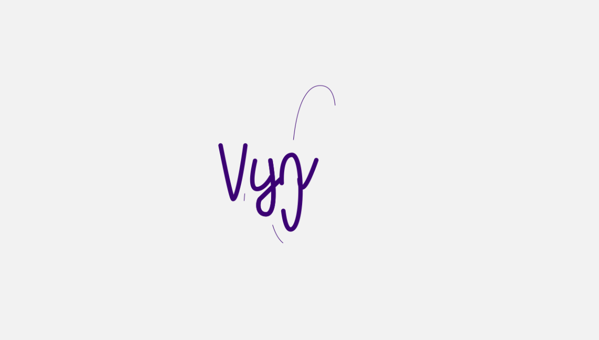
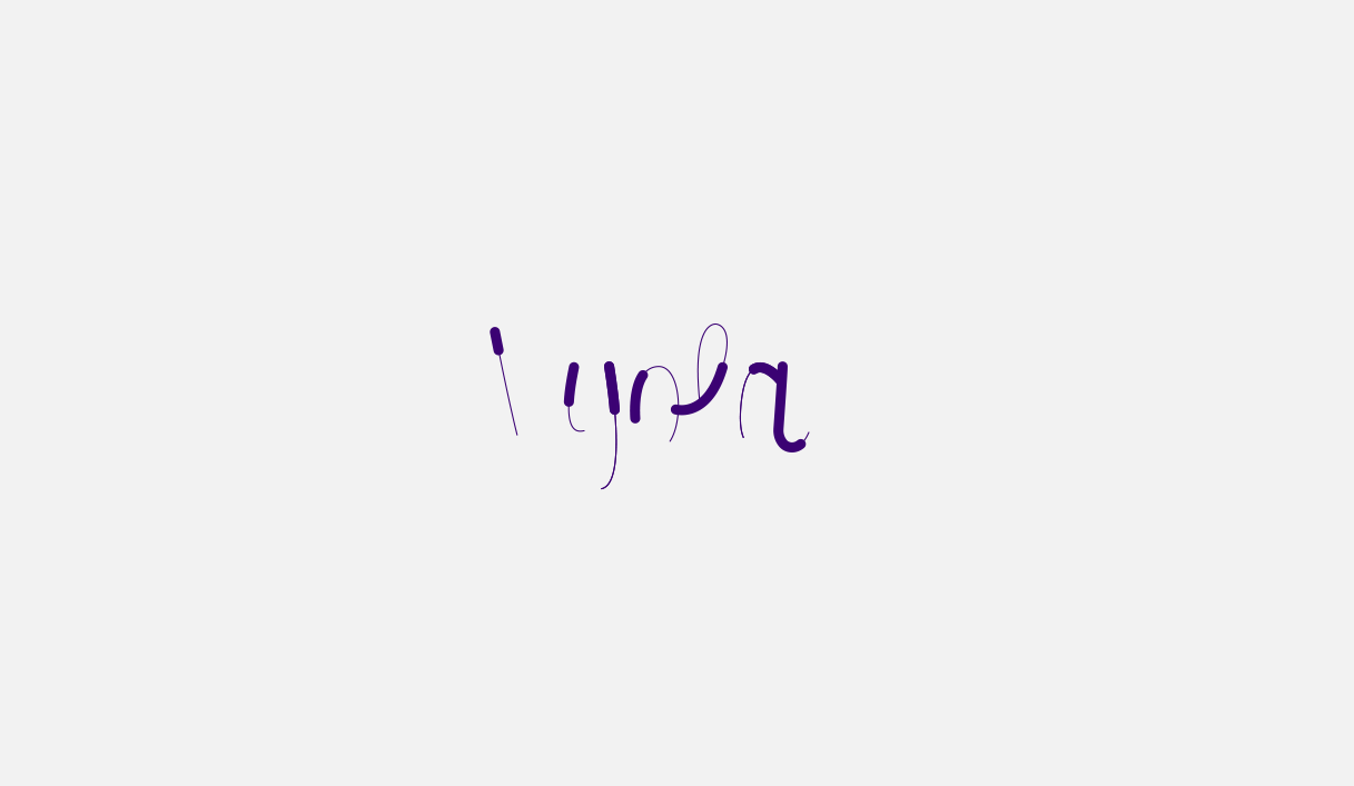
rename this real quick. So Viola, logo animation. You can see that the
background is transparent stat because I have toggled
transparency on. But if I turn it off, Here's a white background. Now let's go ahead
and double-click here and then find our logo. Composition. Footage dimension. We wanted to layer size,
not document size. Document size will give
us a big bounding box. Layer size will give us
a small bounding box, just the size of the vector. Click, Okay, I'm going to double-click on the
new composition. Select those. We cannot see them because
of the black background. Control Command X. Go back to my normal composition
and just paste them. Here. We go. Just delete this one,
we don't need it. Select everything here,
and then just make sure that it's in
the middle. Okay? Now, the next step here is to go ahead and just adjust
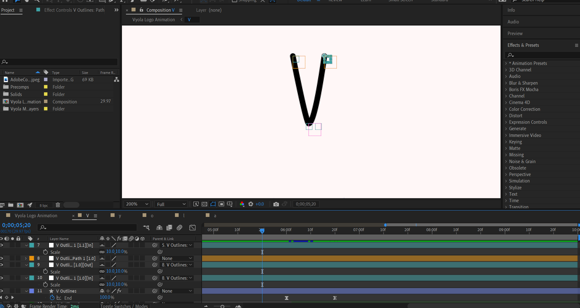
these letters, these layers. Guess I want V first. Now select everything. Right-click and we want to
convert them to shape layers. So creates, create shapes
from vector layers. So now here's what
we're gonna do. We're going to click
on the label of the vector layer,
select labeled rule. Now it will select
all the vector layers and we're just going
to delete them because we don't
need them anymore. Just going to fit
this up like this. Notice that with
the first letter. So we want here to add a trim path to animate
the stroke reveal. So trim path open and
we're going to animate the end parameter from 0
to zoom into the timeline. So just hold Alt or Option
and zoom in with your mouse. I feel like this. Then I'm gonna move this
thing here, 20 friends. And boom, I want to reveal to star from the
left to the right. Okay, click here, click on you. So we just have the
keyframes alone. Now if I click on play, nice. And then F9 for
the easiest, okay? Because ECNs, you guys
are super important. You cannot make
animation without ECNs. Let's click on Play now. Okay, Nice. Now we're just gonna go
to the speed graph and we want to judge the
speed like this k, we wanted to start
fast and end slow. Okay, not bad. So this means fast
and this means slow. Okay guys, so for example
here it's going to start slowly a little bit and
then go fast and then slow. This is how you read
the speed graph. And also here make sure you
have the same settings as me. It is speed graph and
show graphs, cool tips. And I have the Zoom toggled on. Now let's go back here
and click on Play again. Okay, it looks fine. Now we want to do the same
thing to all these letters. And instead of adding trim path and then doing the same procedure
over and over again, what we can do is
select those keyframes, Control Command C to copy them. And then we can
come over here to the search bar type in contents. We go selects the
rest of the letters and then Control Command
V to paste the keyframes. Now here we have it.
Selects all, click on you. So we just have the
keyframes that we need. So one thing here
we need to make sure of is that you want the animation or the
reveal animation to start from the left
to the right and make sure it's goes
for all the letters. Because sometimes a
letter may start from the rights and you
don't want that. You need to change the
path of deaths letter. And how do we change the
animation path of a letter? So for example, we have
the Y selected here. Let me just open the options. Then we're gonna
go to group one. And then we click here. We have path, and we have
these two lines, reverse path. Then we click. And then you can see that the path
of the animation now is reversed for this
area right here, okay? This is group one is
the tail of the Y. You can see the
animation is changed. So I know my dad's, I'm
going to leave it as it was in some cases,
like the y here, for example, you
can see that I have group one and group two, that because in Illustrator
with the pen tool, I created this part alone. And this part's over
here, the tail alone. Okay? I didn't create everything in one-click as I did with
some of the letters. That's why we have group
one and group two. And it's better to animate
these ones individually. Okay, so for example
here, the little y. What I'm gonna do is the
playhead after the animation. And then click here to
remove the keyframes. Then I'm going to open
group one and group two. And then I want to paste
the keyframes on group one and then on group
to just like this. Now you, and then
I'm going to offset these little bits like this. So now if I play, you can see what's
going on here. Okay, it's a better animation. Move, move, move, move, move. And then just write here, for example, I once the
outer part two star. Okay? So it looks better. Same thing with the a. It has two groups because
I created this part alone and this
other parts alone. So click on a mixture. The playback is far away
from the keyframes. Remove the keyframes by
clicking on the stopwatch, bring the play head
to the beginning. Then I'm pretty much going
to do the same thing here. So group one and then group two. Then you then offsets. And a little bit so on
just to store here. Then right around here, I want this to start at. Let's see. Here we go. Okay. One more thing I need
to change for the last letter is that I needed to
slow down a little bit on the opposites
of the first letter. So select both these keyframes, speed graph, and then we
just go into reverse this. Like this. We wanted
to ease outs. We go. Okay. So maybe this one. I'll just leave it as it was. I think it does
better. Just remove this click away so we can
remove the bounding box. Then I just want to offset
it in the right time. So this here. Okay, so right here, I guess. Okay, that's better. So you can see that right here. It does lag little bit, it does talk a little bit, okay? And I want this to be smooth. So what I can do here real
quick is that I can just come over here to this area
and then just lift it up. It's one stop. You see, so that's better. All right, here we have it. You guys, here we have
the basic animation. So the most common
question I get from students is that how many
frames I need to offset? And the answer is, it just depends on when you want the next
letter to appear. So first, I will just
move all these layers, 20 frames like this, because we're going to add
another animation here. And now let's start with
the first animation. So for example, I want to
intervene, reaches this area. I want do Y to start appearing. Okay, let me just
open the keyframes. Here we go. And then play. And then when
the y reaches this area, I want the OH to
start appearing. Then when the O
reaches this area, I want the L. The L
reaches this area. I want to start appearing.
Let's click on Play. Bad. Do like it's
100% click on play. So the other thing
about the animation, you have to play
it over and over again just to check if
something needs fixing, if something is wrong. And also this is a
creative process. So I'm showing you
guys are techniques, but the creative process
and what you like, it's gonna be different
from one person to another. Now quickly what I wanna
do is just add some before animation right here
before this thing appears. So I'm gonna go ahead
and select the Pen Tool. Make sure you don't have
anything else selected. Zoom in here, click here, then just add some
sort of a shape. Makes sure the stroke has the
same size as the letters. Then open this nonsense
shape stroke and then we want rounded caps and
also rounded drawing. Okay, let's click here. Let's see interests
such as this. Now what I'm gonna do
is add the trim path. You can see that's a lot of
trim path are involved here. So open this ten
and then just paste the previous keyframes to
both the star and the end. Then you, what are
the keyframes? Don't see them or their hair should have plays the play head. In the beginning. We go now, let's play the animation. Yeah, we need to update those. So you can see that it's
going to the other side. And remember the trick
I told you earlier. We're just going to
find path and switch. Okay, and now let's just go ahead and make a nice
morphine in here. Okay, Let's just
switch Speed Graph. We want it to start slow a
little bit, and then fast. Okay, so tomorrow you need
to be fast. Click on Play. Perfect, it looks perfect. You guys fit epsilon hundreds.
Let's click on Play. Now, before we pre-comp, Let's go ahead and play the
animation one more time just to check if
something's slips off. Because when animating, no
matter how good you are, something, always slips off. Dad, just what
happens in animation. I'm going to bring the play
head to the beginning, then zoom in to the timeline, and then slowly
play the animation, maybe frame by frame. Just to check, oh, here we have something. Slips off and here we have it. Okay, so you can see
that the letter V star is before the stroke
animation reaches its. So what I'm gonna do is
just take the first stroke, let change the label of
this one, dark green. So this has a stroke animation
and maybe just bring it to the beginning
like this. See now. Okay, this is better. Alright, it's good. Right? Now that's we check that
everything is smooth. We made sure that
everything is okay. I'm just gonna go ahead now
and pre-comp the letters. And the reason why we precomputed
the letters is that we want to work with each
letter individually. If you do everything
here on a timeline, you will get lost. Trust me, because we'll be
working with a lot of layers. So I'm going to pre-comp the first letter
and just name it V. I'm just going to
really use the caps lock on my keyboard and we'll do the same thing
for all the letters. Now, even though the pre-comp
starts from the beginning, if you play the animation, it will play normal. So to recap everything
and this lecture, we animated the trim
path for the offset the layers and we
pre-comp all the layers. Up. Next we will be
stretching our letters.
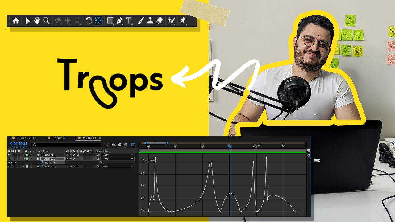
4. Stretching the Letters Using Free Script & Applying Expressions: Alright guys, In this
lecture we're gonna be doing the secondary animation, which is stretching the letters. And you also will get introduced to the create nulls from
paths extended scripts. Now let's start with
letter V. And so to achieve the desired effect
that we want to achieve, the trick here is to
stretch the letters, okay? Once we stretch the letters, we will have the
desired effects. Plus we need to apply some
expression to the stretching. So I'll just bring the play head here when the animation stops. And now we will go ahead and use the scripts that I told
you to download earlier. So go to Window
and then look for create nulls from
paths extended. Okay? The reason why we're
using this one, because this one has this
option that you need to check handle controls, okay? Whereas if we use the other one, it doesn't have that option
and it has less options. Okay, So working with this one, we're going to be
working with this one. All right, so now click
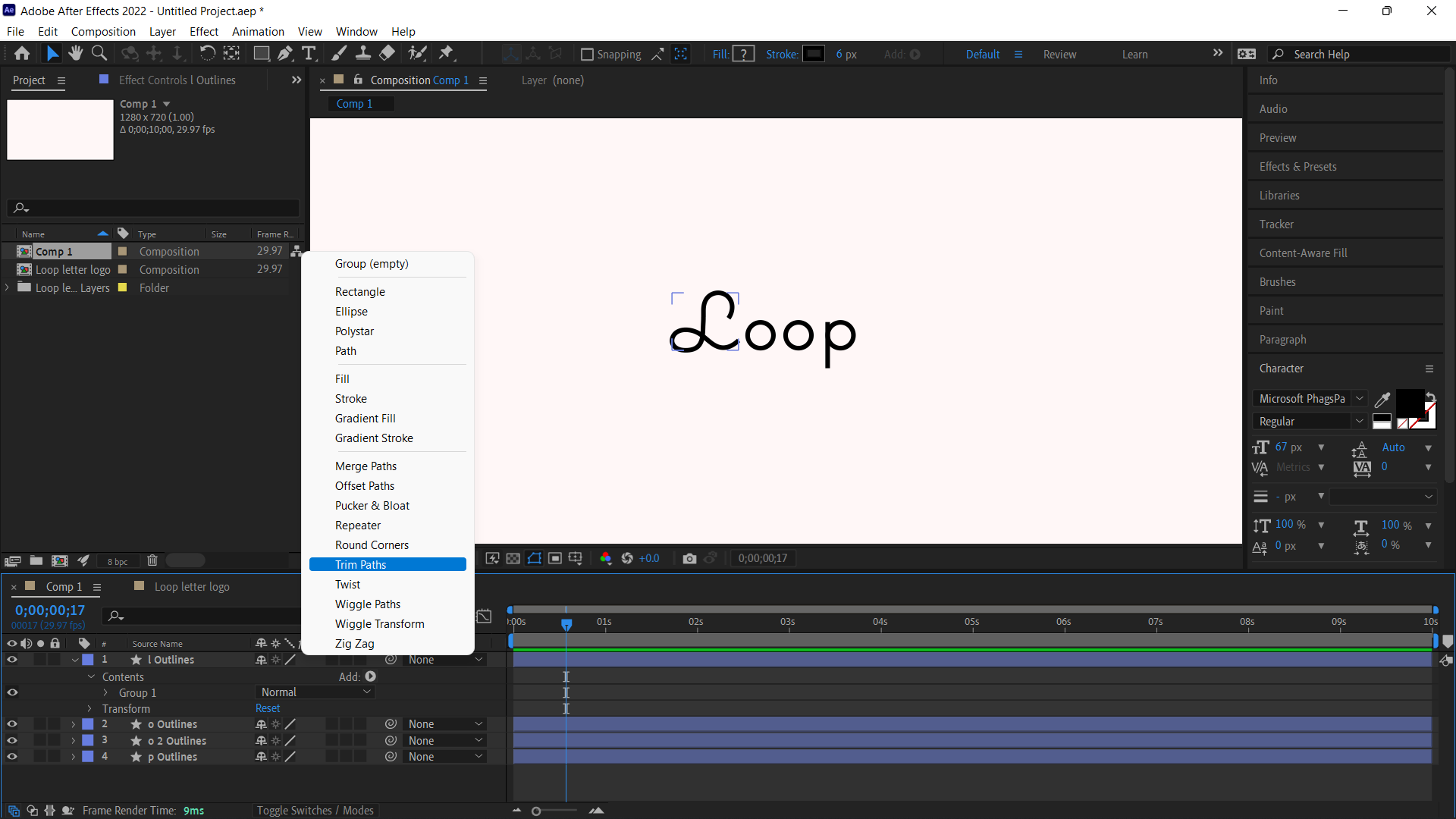
here to open the options. Click here, and then group. Then we need to look for path. But here's the thing you guys, once you open the letters, you're going to find the group. If you find group, you need to ungroup
this before you apply. Points follow nulls. Because if you leave group here and you apply it to path,
here's what happens. It's going to create all
the controls in here. See the anchor
points right here. It should be on the letter, and that's somewhere
around here. So I'm going to undo, let me just check here
effects controls. You can see that
it's not even here. I didn't apply the
effects of the letter. So right-click Ungroup shapes. Once you do that,
open path, man, check path, and then
points follow nulls. Now you can see the anchor
point is on the letter. So you can see
right here that we have a lot of things going on. No need to be scared. So real quick, I'm going to
explain how this thing works, how the script works. And then I'm going to show you a quick way to use the scripts. Okay, so first thing first, we have the yellow layers, okay? The yellow layers control
the cyan layers, okay? This big yellow rectangle has two small Science
rectangles inside of it. You can see right here
and the parent link. So if you want to re-size this because these are
some big rectangles, what you can do first is
just right-click here on psi and label,
Select Label Group. It will select all
these sign-in labels, S, right here where it says 15. We're going to change it to ten. Now for the yellow boxes, we can not resize
them using this cow. But what we can do is hit
Shift plus control and why solid settings will pop up and we can
change it from here. So we just need to
lock aspect ratio. And then here let's change
it to 30 or 20 whatever. Okay, and here you
have it. Can you guys? And then you have to
do the same thing for this one and this one. And you have to do
it individually. But the good thing is
that you don't have to do this for all
the letters, okay? Because I'm going to
show you how to work with this without
all this trouble. Okay guys, so this
is pretty much just an introduction
to these scripts. Now if you asked me why I'm Ally using path to stretch
the letters and the reason being is that you can use path,
just read the letter. But with path, you don't assign
numbers to the keyframes, which means you cannot apply
expressions to path, okay? This is why I am
using this scripts. But if you want, you can manually switch this
using the path controls, but it's gonna take you
like a lot of time. So the best way here is
use this free scripts. So for this parts now, what I'm gonna do is click here to hide layers
with the Shy button. Good. Now we just have
the three yellow layers and we don't need them all. We just need this one
on the bottom because we want to stretch
it the v like this. Okay? So I'm just
going to change the label of this
one and I can hide those as well because
I don't need them. Now, what you wanna do here is trich and the direction
of the animation. So you can see that
it's going down. So we will stretch down. Okay? So click on P
for position keyframe. Then put this thing here, and then search down like this. Okay, and we can also
do it for this kel. So S for the scale keyframes and click on you
would keyframe here. Then we can scale this thin
little bits like this. I mean, if your wants. There we go. Click on here and maybe search. There's still more for
the stretch and you just need to do like five frames
between the keyframes. Why? Because I've tried different friends and I think
five frames works the best. I'm going to click
hue on the letter V. And then bring
this thing here. Then I'm going to click Play and just find the
perfect spot to Justice. See me be here. Goes down, going
along screws here. I think I'm gonna put it here. It's better. So I have more stretching right
here around the middle. Now the final touch, it would be to add
expression to the position, not to the scale. Okay, So select both. And then I'm gonna go to Window and then look
for the R-squares. I told you there's no load. The weak base all click
here on animation. And then k leaner. Now here under the Effects
Control, uncheck dissipation. We don't need anticipation, we only need to follow through. Here for the elasticity. I will do 20, okay, Because I tried
different settings. Numbers. I think
20 works the best. Look on play. Again.
For the scale. Just apply some ECNs. Troy here. I feel like I need
to add more bounce into it. So maybe increase this to 30. Okay guys, So here's the thing. It's gonna be different from
each letter to another. You just need to try different
positions until you find the one that you like the most and then
just leave it there. If you want to add more
bouncing or more elasticity, you just need to increase here. And as we will add
more bouncing towards, okay, I think I'm only the 30. Maybe I'll feel like increasing this down
a little bit more. This is better. And also some times when you don't get enough bouncing or elasticity, you may need to stretch the position further
because sometimes it just doesn't go down enough and you don't get
the desired effects. So these are things
to keep in mind. Either increase the
elasticity or the position. This is more bounce
and more better. I like it this way. Now let's go back
to the projects. We need to do that for all. So you see right here, we have this problem because
we added the bouncing. But nothing that we can not
fix it using the pencil. Probably thinking, are
again, we have to adjust. This is too much work because
girls that says animation. Things like this will
happen all the time. So you have to get
used to it every time you're going to
face a new problem that you just need to
figure out how to fix it. Okay. Let's go ahead and
double-click on why. We're pretty much going
to do the same thing. Contents are now you
can see right here we have group one and group two. Let's see which one
is group one, okay, So this area's Groupon and
this area is group two. So why we have two
groups in here? Not one. I did it in two parts. I designed this area alone and then I created this area alone. So I included this
letter on purpose. Sometimes you will face
these types of problems. Here. While we can do is
that we can stretch group one and then we can stretch
to turn-off for group one, we're going to ungroup its path. And then we're gonna do
the same procedure again. But this time I'll show you the first way of doing things. So again, Points Follow
Knowles. Click here. But this time we're
gonna go to View. And then we're going to
uncheck Show Layer controls. And then we'll hide
all the sign layers. And then we are left just
with the yellow bouncing box. I pretty much
control everything. Select them all. And then click on P for
position, de-select mole. And then just move
the position up and down to see which
layer controls watts. Okay, so we're going
to need this one, change the color of
its swan. Not really. Okay, so now we found that this one is the
one we will need. Probably we're going to need this parts as well to
make the stretching. So here I just want to, and then I'm going to
click on the sweater and link it with this one because these two are the
ones we're going to need. And then just hide the outer ones that
we won't be needing. An alpha position. I'm going to add it here. Bring this thing here, search down like this. Same thing for the scale. Position. Like this. Maybe we're going to need to
adjust this one here too. Let me see. Let me
try for the scale. All right, So I
think we're going to be adjusting the
scale for this one. So add a keyframe here, and then I just want to adjust this edge right here
doesn't look smooth. Okay, So of course I can
spend more time on this, but we don't have all
the time in the world. But you get the idea. I hope. Now for the scale, we will do the ease ends. So F9, same thing
here, scale F9. And then for the position, we're not gonna be
applying any 0s in skills will be applying
an expression. And if you apply ease
into the keyframes, you won't be able to
apply expressions. You can bring everything here. Right? Let's make sure it's
five frames distance. So 13 plus 518. Okay, we got it right. Then. Simply apply the
K leaner flex controls. Disable this 30 here. Now I'm just going
to hide those. And then let's go ahead
and find the second one. Group to Ungroup. Ungroup and the same procedure. Okay, let's go back
to the composition. And same thing for the
rest of the letters. I'm just going to
speed things up now. So start with the O. So you can see that sometimes I switched down and up because I know we will be applying
the bounce and expression. So I need to see if it's
going to look good. If it's bouncers says why you see me
stretching up and down. Okay. This one position.
Okay, you guys, so I'm gonna be doing some
ASMR token and explanation while I'm speeding up. So right here, I am just
doing the same thing, adjusting the
position and scale. I mean, you cannot go wrong with Justin
just two parameters. And then you take the
keyframes and you adjust them to the
animation. However you like. As I said earlier, this
is a creative process, so it's gonna be different
from one person to another. And here on the last letter, we have an easy outs, which means the letter we'll
start slow and ends up fast, which means the animation
will happen toward the end. So we need to put this direction toward the end of the animation, towards the end
of the keyframes. Okay, and here you have it. Now remember guys, that
you can always download this file and gives you want
to check out something. What in case you didn't
understand something, and you want to see
how it was done. Now let's go back to projects, composition, and let's play the animation to
see how it looks. Alright guys, so to recap everything and this
lecture we did a small introduction
to the create nulls from paths
extended scripts. We stretch our letters
and we applied bouncing expression
using the weak base all up next we'll be
adding speed lines.
5. Adding Speed Lines To The Animation: This lecture we're gonna be
adding the speed lines to add more expression and
characteristics to our animation. So to add speed lines, again, we're gonna go ahead and attack every letter individually. And we're also gonna do it the stroke action or animation
here at the beginning. And so double-click on letter V. Let me just
hide the controls. Then I'm going to stop here when the letter
extends the most. Basically the technique here is that you select the Pen tool, then you trace the letter, and then you apply trim path. That's pretty much
all you're gonna do. It just a matter
of tracing or join with the pencil and
adding trim path. So they'll do it
for this first one. Click here, here, then here. Let's play it again. Okay, We want to decrease
the stroke size to one. Now we can just
adjust everything. Down here. You can see that
we have a sharp edge that I need to turn into a curve
and just little bits. So to do that, so you can hold Alt or Option on your keyboard, click here, and
then just fix that. Let's see now how it looks. So as you can see right here, you don't want the
stroke to be too close or too far away, you want to find
something in-between. And also some times when
you trying to adjust off. For example, you have this. What you can do
simply is click away, then click again and adjust. Okay? Now of course,
while we need to do is as simple as trim path, we're just going to
be adding trim path for this one as well. And we're going to repeat
the same exact thing for all the letters. So trim path animates the end. Okay? But it's here on top of these keyframes where
the animation ends here. And here, 0 from 0 to 100. Okay, now select
the keyframes F9, and let's adjust
the speed graph. So we want the animation
starts super fast. We don't want any sort of anticipation at the
beginning like this. Okay, So it started super
fast and then it slows down. Select the keyframes, Control
Command C, go to star, Control Command V.
Now just offset the star with the end
parameter. Click play. Here we have it's if you think it too
fast or too slow, you can just adjust the offsets. Okay guys, so now remember the exact same thing
for all the letters. So now the best part, after you do the
first speed line, you don't have to go again and just the trim path all over. We can just go back
to the first letter, copy this, then go back
to the next letter. Select trim path and then
just paste everything here. Let's just adjust
this with this. Let's see. Okay, It looks good. Let's click on Play. And here we have it. When you make the
first speed line, you just need to draw
the shape and paste this animation or
these keyframes. Now I'm gonna go ahead and
just speed up the process. Okay, you guys so I'm back with some more ASMR notes
while the speeding up. Remember just take the pen tool, trace the letters, trace also the stretching
of the letters. So don't just trace the
letter n its normal position. Trace it to oil at
stretching as well. And then I apply trim path, adjust the speed graph. Sometimes you may run to speed lines crossing
with each other, so you just need
to move them away, like move the keyframes away, or just move the layers away from each other so
they don't cross. Make sure you adjust the
speed graph as well. And it's all should be good. So this is how you
do the speed lines. I know it may get
a bit confused, but you just have to try
again until you get it right. So to recap everything and this lecture we added stroke shapes, we animated them use and the trim path to create
the speed lines. And we also adjusted the
speed using the speed graphs. Up next we'll be making
the logo disappear.
6. Logo Disappearing & Export Settings: Now finally, this is the final lecture and
we will be making the logo disappear you using the trim path and
the speed lines. So same thing for
the disappearance. Now we're going to do it to
each letter individually. So double-click on V, pre-comp. And I'm just going to
select those real quick. Click on you. Now select
this letter, duplicate it. Control Command D. Change the color of the duplicated one. Now I'm going to move
the play head here. And let's say for
example, you want the animation to
disappear at 6 second. You can see how
long the animation plays and make it
disappear here. Back here, around six seconds. What you're gonna do first is
click hue on the duplicated one and we want to remove
the shame path for this one. Cut it here. Stopwatch here. The stopwatch here. And then move like 20
frames around here. And let's make them
disappear. Both of them. Okay, Now the duplicated
one on the bottom, we're going to come over here and change the
stroke size to one. Then apply E says I'll let just offset it a
couple of frames. Comply. You can see now that it leaves like a nice
trail behind it. So this technique is super easy and it makes for a more stylish and
disappearance. Now wanting to do here because
it is going to disappear. We need to change the speed
graph to ease out. To comply. Here we go. Give me that was
too fast towards the end. Just like this. Give it a bit of slow
down. Does better. Go back to the composition
and we want to do the same thing for all
of them, you guys okay. Mixture on each letter. You put the play head on
the second and a timeline, okay, because we want
them to disappear all at the same time. With some letters, you
may need to offset layer on the bottom more
than two frames. Like here, for example, I find the perfect offset n
is around four frames. Okay? Now finally, we can go ahead
and export our projects. Now one last thing here
before we exports. Let's say you guys, you want to change
the colors of course, because now we have no
background in here. Let's say you want
to change the colors of the letter logo, because it's very rare to find a logo that is just
the black and whites. So I'm gonna go to downloads
and impose an image. I'm going to put
this image here. S and then just scale
is a little bit. Okay? Now here's what we're gonna do. I'm gonna go to effects, then look for fell. And we want this
one generates fill. Then I'm going to put
it on the first letter. It gives me a red color. I'm going to open this effects. Fill eyedropper and select
the color that I want. You guys. I'm pretty much do the same thing over
and over again. Okay, So here, one last trick. Let's say you want to
select everything, all the layers and a
timeline, but the image. You can just click on the image, right-click and then
invert selection. It will select all the
layers. But the image. Here we go. Now for
these two shapes, we can just change the
stroke color from here. Let's add the background
too before we hide this. So go to layer, new, then solid. Then I'm going to choose
this color. Okay? So we can see here that
the background we added. If I remove transparency, can see that it's
so small in here. The reason why it's small
like this is because earlier when we were adjusting the script creates nodes
from paddock standard. When we were adjusting
the controls, we did go ahead and change
the solid settings. That's why you can now see
the background is very small. So to fix that control
command Y as we did earlier. And then let's just go
ahead and do this here. Enter the dimensions here of the composition click
Okay, and here we have it. Guys, kill its hide this. Now to export you can go to File Exports and then
Adobe Media Encoder. So these settings, h
points 26040 says if you want to export an MP4, if you want to export
as animated GIF, you can click here and
then find animated GIF. Then click here
and you can choose the folder that you want to. You can export one transparent, so logo and another one
with the background. Okay? So this is a GIF, I
will export it now. Then we can also exports if
you want to export again mp4, we can do it here. Add to Adobe Media
Encoder, and this time, choose in before
codec. There we go. We can click here with a little bit and
maybe adjust this. Use maximum render quality. This is the same
export settings as the one you have on
Premiere Pro click Okay, and let's export
this one as well. And here we have a two guys. So to recap everything in this lecture we made
the logo disappear using the trim path and using the offset to
create the speed lines.
7. Congrats!: Congratulations you guys. So now we're pretty much
done with the class. We covered the entire
literary and logo animation from importing files
to After Effects, to exporting files
via Media Encoder. Now, let's do just a small
recap of what we did. We started by the
basic animation, which is the revealed
and we did this stretch and then we added
the speed lines. And finally we made
the logo disappear. Now it is time to
share why you have created here and this section. And if you learn something
from this class, please do leave a
review and follow me so you get a notification
when I upload. And Yulan, thank you so much for watching and see
you on next class.
 Adam Chraibi, Designer and animator