Transcripts
1. Introduction: Much of the joy of hands lettering comes from creating artwork out of quotes or phrases that mean something to us. But once we've chosen a string of words to set on paper, we can often feel overwhelmed deciding how to arrange them into a composition. When there are so many possibilities, how can we know where to start? Well, in this class on lettering layouts, I'm going to demystify the design process. My name is Alyssa, and I go by Lyssa's Letters in the world of social media. Perhaps you've come across my vibrant lettering and watercolor art or videos on Instagram, Pinterest, or YouTube, or maybe you've taken one of my other classes here on Skillshare. Well, whether you spent time with my art before or you're new here, welcome. I'm excited to have you join me today. In today's class on lettering layouts, I walk you step-by-step through the techniques of arranging the text, identifying a hierarchy of word importance, designing and selecting unique fonts, and adding decorative elements like banners, flourishes, and small embellishments. You'll walk away from this class with an easy, memorable formula to consistently create unique, eye-catching compositions. In each lesson, I provide you with a simple task that builds upon the previous lesson so that by the end of the class, you will have designed at least one beautiful draft of a quote of your choice. This class will be easier for you to follow if you have some prior experience with hands lettering. For example, if you've already taken my brush lettering basics class here on Skillshare. But if you are a complete beginner, you can download the two sample alphabets that I've provided as printable resources for the class as well as some traceable ribbon banners to incorporate into your designs. On my Pinterest account, Lyssa's Letters, you can find a board that I specifically curated for this class called lettering quotes. Feel free to scroll through that board to choose a quote for today's class and some of my other boards to find inspiration for your layouts. I cannot wait to get started on this lettering layouts journey with you. Let's dive in.
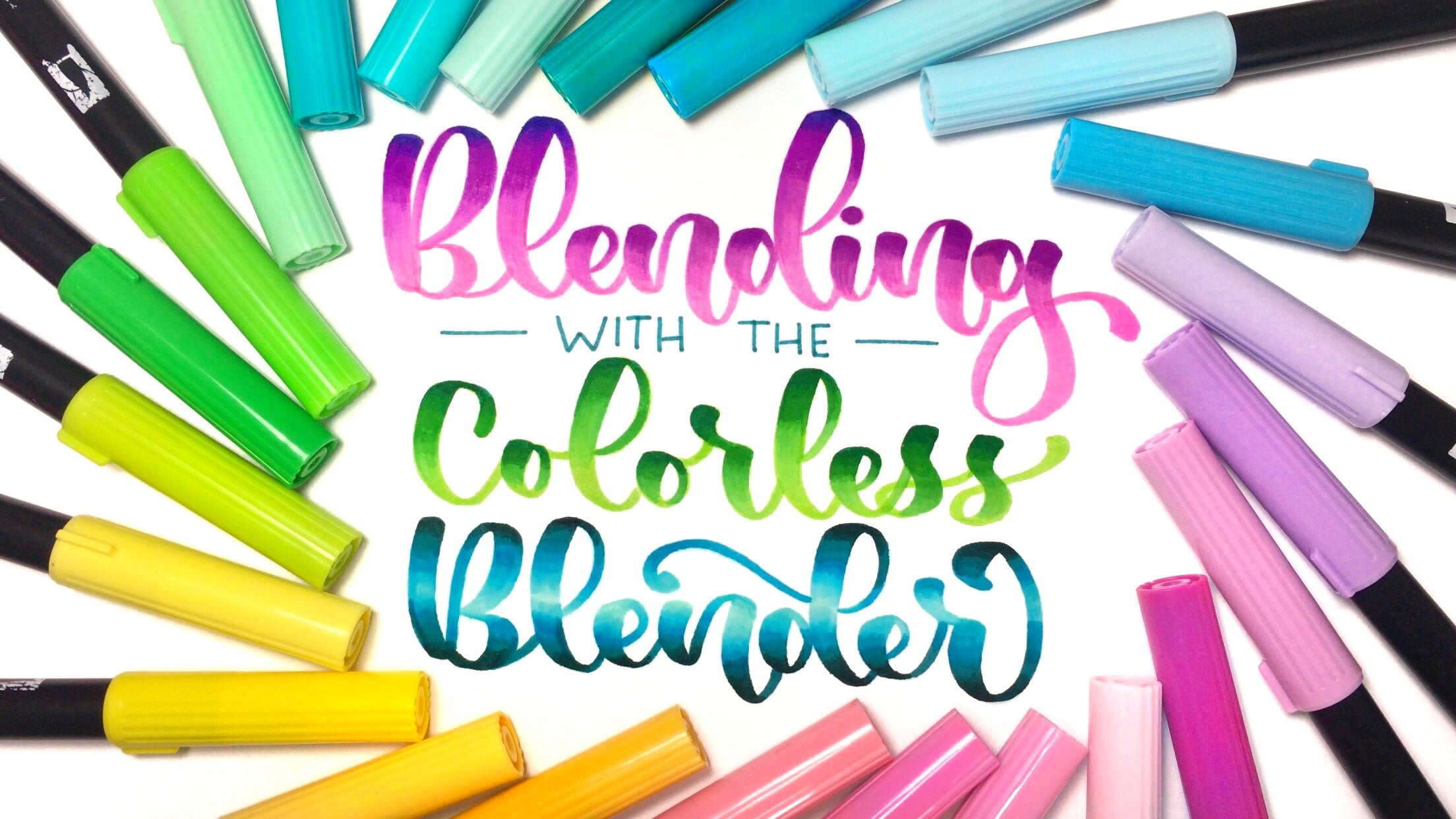
2. Supplies: I bet you're just as excited to get started as I am, but first, let's check out the supplies you'll need. There are only a few essential tools for this class, and they include, a pencil. You can definitely use a fancy pencil if you want to, but a simple mechanical pencil will suffice. That's what I'll be using. You'll absolutely want to have an eraser on hand. A ruler will come in handy for making straight lines, so make sure to take out one of those. Make sure you have several sheets of paper on hand. Now, if you're anything like me, you might have a ton of different types of art paper. For the process of designing lettering compositions, though, we really want to avoid using expensive paper that you would use for a final piece of artwork. Instead, reach for some sketch paper, like from a sketchbook, or even regular copy paper will be fine if you're only using a pencil. Tracing paper is a great option for transferring a sketch and making minor adjustments without starting all over. I'd highly suggest using tracing paper if you have it. Dot paper or grid paper, like a Rhodia pad might be helpful as well. You'll see me using my grid paper on a few occasions in this class. Now, let's take a look at the optional supplies for this class. You may wish to have one or more pens within reach. Here are the types of pens I'll be using in this class. The first category of pens you'll see me use is the brush pen, which have a flexible tapered tip that are ideal for brush lettering. In brush lettering, the main rule is that downstrokes are thick and upstrokes are thin. Brush pens come in several different sizes, I will be using a large brush pens, specifically Tombow dual brush pens, a medium to large brush pen, which is the STABILO brush pen and small brush pens. The small brush pens I'm using are the Pentel sign touch brush pens. If you plan on doing brush lettering in your layout designs, then I would suggest having at least a large brush pen and a small brush current on hand, so that you can range of line thicknesses. I'll also be using a small bullet tip pen, which is dual sided and comes with an even finer tip on one side. A regular fine liner would work too, like a Pigma Micron or Tombow mono fine liner. Use whatever pens you feel comfortable with. Honestly, a regular ballpoint pen would work fine for making thin lines. Other supplies you might find helpful are a circle maker or a compass and tape for taping down your tracing paper, trust me, you'll thank me later. Of course, if you feel comfortable drawing on a tablet, you can use that too. Procreate on the iPad is a great tool for designing lettering layouts. Lastly, I provided some printable resources, including two different brush lettering alphabets for inspiration, as well as a handout with several different banners that you can copy or trace. Once you've gathered your materials, which I suggest you do right now, it's time to dive into lettering layouts. Let's do this.
3. The Text: Today I'll be using the short phrase, you are worthy of love. I begin by writing out the phrase at the top of my piece of sketch paper. The text, in my opinion, is the main focus of any lettering composition, no matter how intricate the other details of the piece of artwork may be. I generally begin my design process by working on the text. Examining this quote, you are worthy of love, we see that there are five words and that they can be arranged in different ways. For example, I can write all five words on one horizontal line, or I can split them up into two or three, four or even five different lines. A trick you can use to generate different arrangements of the text is to open up the Instagram app as though you want to add a new story. On the top right corner of the screen is the text icon. Click on it and type in your quote or phrase. By using a finger to scale up the size of the text on the left side of the screen, you'll create a few different arrangements of the text. Write down any versions you like from the Instagram app, and any other arrangements you can think of. Fun little trick there. Keep in mind that fewer lines of text will work well for a horizontal layout, whereas many shorter lines of texts like the version I'm writing here, lends themselves best to a vertical layout design. You can even choose to have two words, one on top of the other, next to one larger word. Here, you and are, are on separate lines and worthy is on one line adjacent to both you and are. One of the simplest layout options for the text is to make all of the words the same size and font. Of course, the style and overall look of the composition will differ depending on which font and size you choose. Here are a few examples of some of my own compositions where I kept all of the text consistent and I used elements like color, shading, and flourishes to create visual interest. But all of the letters within one composition are the same size and font. Let's take a look at how we can create a layout design using just one font and size for the text with this particular arrangement of the words. This will be our first layout design. Using a ruler, I sketch three lines that are equally spaced from one another. I'm making them about three centimeters or one and three-eighths inches apart, which is arbitrary, but it's how much space I feel like I need in order to fit my normal brush lettering with a large brush pen. Then I lightly pencil in the letters, focusing on keeping the words centered and the letters evenly spaced. Once I refine the placement of any letters that were slightly off, I pick up my Stabilo brush pen and trace over at the pencil markings. With traditional brush lettering which I'm using now, the goal is to make the downstrokes thick and the upstrokes thin. Make sure you check out my brush lettering basics course here on Skillshare, if you want to learn this style of lettering. Here is our first, very simple lettering layout design. Notice how the spacing doesn't look perfectly balanced and it could use a little bit more visual interest. We'll be sure to come back to it in a later lesson to see how we can spruce it up with decorative details, and in a bonus lesson at the end of the class, I'll be demonstrating how to even out the spacing using simple flourishes and bounce lettering, so be sure to stick around for that. Now it's your turn, pick a short quote, maybe 4-10 words in length, write the quote at the top of a piece of paper, and then jot down several different arrangements of the text. Then choose one of those arrangements and create a simple layout design using just one font and text size. Nothing fancy just yet. We'll come back to this design in a future lesson, so hang on to it. Once you've done that, we'll be ready to move on to the next lesson.
4. Hierarchy of words: Often as lettering artists, we want to convey a hierarchy of word importance. Meaning we want it to be obvious to the reader which words are most important, which words are somewhat important, and which are the least important. Well, we can use aspects of the text to emphasize certain words in the quote. Perhaps the most noticeable method of making words stand out, is to make some words larger in size than others. Let's take a look at how this applies to the phrase, "You are worthy of love." I begin by underlining the most important words in the phrase, which to me are worthy and love. To make the words, worthy and love stand out, I can make them bigger than the other words. This is how I'll be arranging the words with worthy and love each on their own line. When creating a rough draft for my new layout design, I begin with a light pencil sketch, and trace over the graphite using brush lettering script for the most important words. Once I'm happy with their placements of these most important words, I can fit in the smaller text. Just for fun, I'm experimenting with a bounce lettering style. I would encourage you to loosen up during the designing process in this class, and if you feel comfortable, try out some different styles. Notice how free I am with my inking, I'm not following the pencil markings precisely because I can always refine the spacing later. I add a loop to the letter V here to create symmetry, since the letter L is so tall and I extend the loop of the letter Y a bit to the right so that the word worthy appears more centered over the word love. Now I spot the perfect place to add the words, you are, on this little arch above the crossbar of the letter T. I love taking advantage of the empty spaces that have emerged once I've inked in my larger text, which is typically why I ink the larger words first. Using the smaller pen, I fit the remainder of the phrase onto the page. Notice how the word of, fits snugly between worthy and love vertically. But there's some empty space remaining to the sides of the letters in the word of. We'll address how to fill in those spaces in a future lesson. Now, let's play around with the same arrangement of the text in a different way. Here you can see that I'm using different lettering styles than the previous version. This is where things get really fun. In the next lesson, we'll dive into several different ways you can alter the fonts of your letters to further differentiate the levels of word hierarchy. But first, it's your turn. Go ahead and underline the important words in the quote or phrase that you selected in the previous lesson. Among these words, if you have one or two that you would deem even more important than the others, double underline those. Once you've completed this task, we can head into the next lesson.
5. Font: When we are lettering, there are many options available to us in terms of letter styles or fonts. Take, for example, this design from the previous lesson. Using tracing paper, I copy only the larger words worthy in love so that I can make a new design. Notice how I originally chose to use a print font for the smaller words you are and of to contrast the script letters that I used for the words worthy and love. Print fonts are characterized by simple letter shapes where letters are usually not connected to the surrounding letters. Here's an example of a print alphabet. Script fonts, on the other hand, can be a bit more fancy. Often, letters have extra loops and are connected to the adjacent letters within a word. Returning to this layout design for you are worthy of love, let's see how it looks if I pair a script font for the smaller words with the brush lettering script font that I already used for the larger words. I think both versions of this layout work nicely, although the contrast between the script and the print in the first version does provide greater visual interest. Script versus print is just one of the many decisions we make when designing a lettering style. Using these four little thumbnail sketches here, let's experiment with a few more variables that can change the style of our letters. I'll be using the same arrangement of the text to help me brainstorm different combinations of lettering styles for the two levels of our word hierarchy, large and small. Here I use a capitalized print font for the words WORTHY and LOVE, and a script font for the smaller words. To give the letters some character, I add little serifs to make it a serif font. Serifs are extra strokes that appear at the ends of longer strokes in a letter. For example, take a look at the letter A. You can see the little extra strokes highlighted in gold. In fact, nearly all of the letters in the serif alphabet have these small strokes attached to the longer strokes. This is in contrast to sans-serif fonts, which do not have these little extra strokes. Sans literally means without, so sans-serif means without serifs. Now notice these serifs in this thumbnail sketch on the words worthy and love. In this next version, I use scripts for the word worthy, a serif print font for the smaller words, and a thick block lettering style for the word love. Here, I'm playing around with the line weight of the letters, or how thick they are. Varying the line weight of your words is a great way to influence where your readers pay most of their attention. Thinner letters tend to be less eye-catching than letters that are very bold. The thick letters of the word love, place an emphasis on this particular word. Whereas the thin line weight of the smaller words helps them recede into the background. For this next design, I play around with alternating capital and lowercase letters, which is a style I really love because it gives the words an organic feel. For the less important words, I use a simple capitalized sans-serif, print font. As I begin inking the letters in the word worthy, I realize that I like this look where the line thickness is the same throughout the letter, which is called mono line. Monoline lettering is in contrast to the style of line variability. In monoline, the thickness of the strokes remains even whether the strokes are down-strokes or upstrokes. When we use line variability, which is what gives us the classic calligraphy look, we make our downstrokes thicker than our upstrokes. Notice how in this thumbnail, I'm careful about making each stroke of the letters the same width, doing my best to make it monoline. Then I use a very thin line weight for the smallest words. In this fourth and final thumbnail, I combine many of the elements we've already discussed. The word worthy is capitalized prints. I add line variability to the letters in this word so that the downstrokes are much thicker than the upstrokes. For the word love, I choose a script font, and I use a serif print font for the smaller words. There are tons of different combinations of lettering styles you can create simply by altering the variables we've discussed. Letter size, print versus script, serifs, line weight, and monoline versus line variability. Now it's your turn. Draw four rectangles on a piece of paper. Select one arrangement of your phrase or quote. Using the levels of word hierarchy you identified in the previous lesson, create four unique combinations of lettering styles. Think about varying the size of the words, whether they are written in script or print. Whether or not you want to use serifs, how thick of the line weight you want to use, and whether you want to alternate between thick and thin strokes. The goal is to alter at least one aspect of the lettering style between the different levels of your word hierarchy. In other words, don't use the same style for your most important words that you used for the less important words. Once you have completed this exploration process, it's time to head into the next lesson. I'll see you there.
6. Orientation of the Text: Let's add another fun layer of complexity to our lettering compositions. Our words don't necessarily have to be oriented along a horizontal axis. For example, in this bookmark, I wrote the quote using a diagonal baseline for each line of text. The words are all written at an angle, and it looks so cool. Let's try this out with a phrase, you are worthy of love. I gently sketch out a diagonal line in pencil and then fit in the word worthy doing my best to space out the letters evenly. I often start designing my layouts with a word that is in the middle of the phrase that I want to emphasize as I'm doing here with worthy, because I can build the other words around it like a puzzle. I could if I wanted write all of the text at an angle, but I feel like challenging myself. I'm going to somehow fit the words, you are, somewhere in this area, I'm not sure yet, so I'll just put them here as placeholders. The word love could look really cool if it's horizontal and written in a different font than worthy. Here I'm experimenting with capital print letters, with a very thick downstroke, and then I decide to add serifs to spice it up a bit. Notice how this design leaves quite a bit of empty space and looks rather unbalanced. I'm leaving it like this for now and we will return to this design in a later lesson to figure out what to do with all of this empty space. Hint, it's going to be really cool. For now though, let's take a look at another fun way to orient the letters within a composition. In many of my lettering layouts, I use arched baselines with the letters sit at top and invisible semicircle. It's particularly helpful to use an arched baseline if I'm attempting to fit a long word into a narrow space as I've done here in this bookmark. In this piece, I oriented the letters in the words, count your, such that they fit nicely into the rainbow arch. The orientation of your baselines can help to illustrate the meaning of the phrase you're lettering. Sometimes I find it pleasing to create symmetry by using arched baselines on both the top and bottom lines of text. The top line curves like a rainbow and the bottom line curves like a smile. It just so happens in this example that the word good also fits nicely on a curved baseline. How cool? How might an arched baseline look with the quote, you are worthy of love. Let's try it out by fitting the word, worthy, on top of this curve that I'm sketching here. You may find it helpful to use a circle maker or a compass to achieve a perfect semicircle. I always just play around with my compass to get the shape that I want. Next, I rotate the paper and pencil in the letters so that they are each facing the center of the semicircle. I'm using script letters and I do my best to keep them evenly spaced. For now, I'll add the other words in with horizontal baselines with the letters just straight up and down. We'll return to this layout design in another lesson to add embellishments and to even out the spacing. Right now, it's your turn. Select one of the thumbnails you created in the previous lesson with different lettering styles. On a new piece of paper, draw with a pencil, either a diagonal line or a semicircle on which you will letter one of the important words in your phrase. You may wish to use a ruler to make straight lines or a compass for a perfect semicircle. Use the lettering style from your thumbnail sketch to pencil in the letters for this word, then fill in the rest of the words with your pencil using horizontal baselines or be adventurous and try out a diagonal or arched baseline for one of the other words. Keep in mind that at this stage it's better to keep it simple. Once you've completed this task, head into the next lesson where I'll be waiting for you. See you there.
7. Banners: You've laid out your text, but you still feel as though your layout is lacking something, it needs pizzazz, a little flair. For the remainder of the class, we'll be covering various decorative elements you can use to liven up your lettering layout. The first option we'll discuss is banners or ribbons. Banners can help emphasize certain words. They can fit into snug spaces between letters, or they can function as the focal piece of a composition. In this design that we've been working on, I'm going to fit the words, you are, into a banner above the word worthy. I sketch in the lines very loosely using light strokes with the pencil to see how I can fit the banner around the letters on the page. Notice how I molded the banner around the taller letters in the word worthy. Once I'm satisfied with the shape of the banner, I pencil in the words, you are, making sure that they're centered within the banner and that the letters are about the same size and distance from one another. I do some final adjustments to the shape of the banner because it appeared to be a bit off-center in the composition, with the front face of the banner extending a little bit too much to the right. I would always recommend using pencil to draw your banners so that you can make these changes as needed. Now let's take a look at this example in which we've left quite a bit of empty space. Over here on the left, I'm going to make a banner around the words, you and are, and I'm curious to explore a ribbon banner that has the word stacked vertically. I sketch in the banner shape with my pencil and then add back in the words so that they're centered on the front faces of the banner. Over here on the right, I pencil in a super-simple banner around the word of and then fill in the flourishes of the word worthy around the two banners I have just designed. I make sure that the letters of the word of are right in the middle of the banner and how cute does this piece look now that we've blocked in more of the space. Banners can be great design elements to display one word or multiple words. You can spread them out horizontally or make them take up more space vertically as well. Now it is your turn. Choose one design that you've been working on for this class and add a banner on which you'll write at least one of the words in your phrase. If you aren't sure where to begin, I've included a file under the projects and resources tab with some simple banner designs that you can copy or trace onto your layout design. Feel free to use any banner shape that you feel comfortable drawing, you aren't limited to the ones I've provided on the worksheet. Once you're done with that, we'll head into the next lesson.
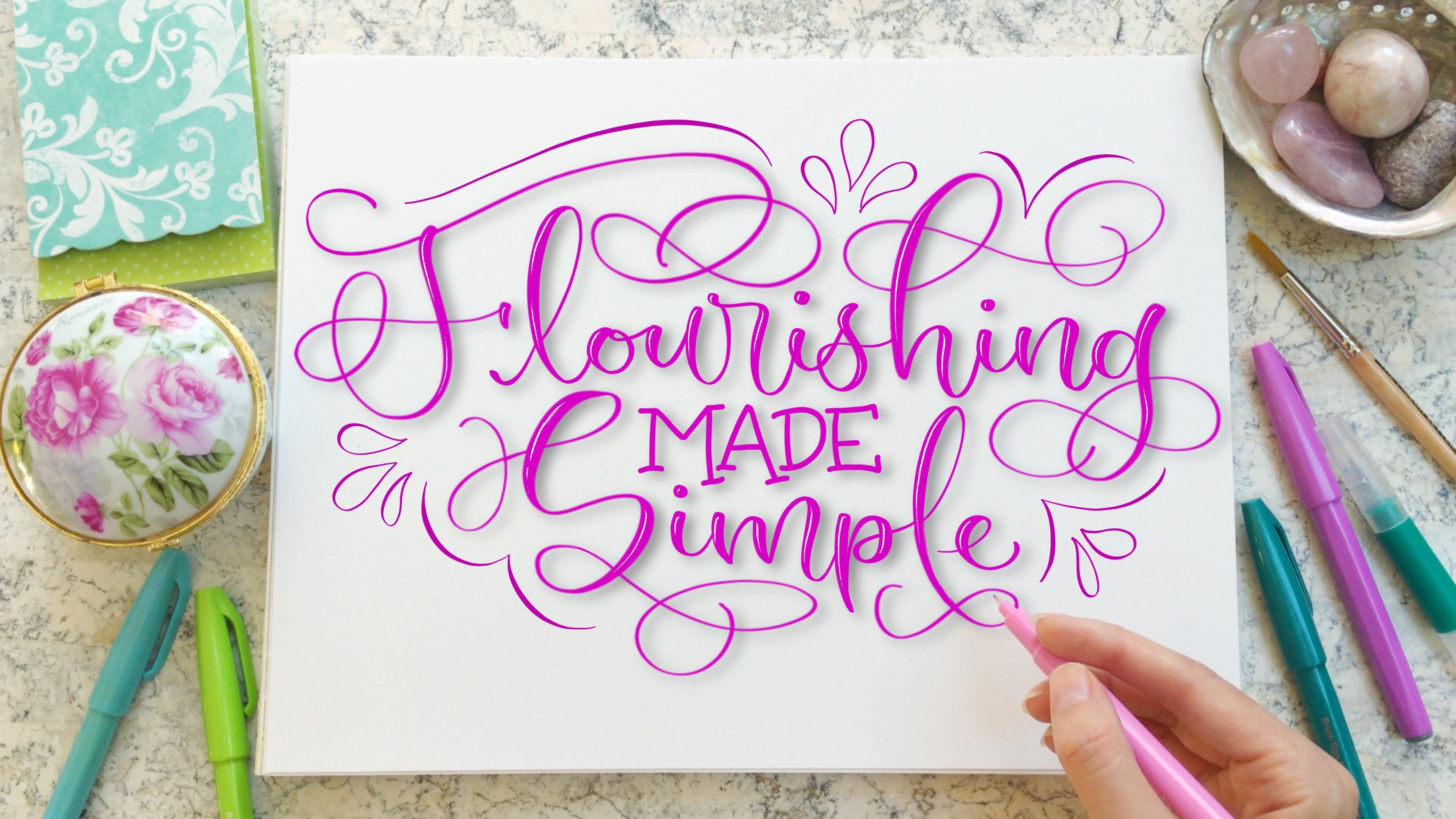
8. Flourishes: Flourishes which are fancy embellishments of the text are another great way to balance out the space in a composition. Flourishes can range from simple to complex and can be the main design elements of a composition or a small, subtle addition to a layout. Now, flourishing in a lettering layout is a topic for a whole other series of classes, but we'll briefly touch on flourishes today. If you're interested in diving deeper into how to design flourishes and add them to single words, make sure you check out my class Flourishing Made Simple, here on Skillshare, where I show you how to build up flourishes from basic shapes and determine where and how they should be placed around a word. Let's take a look at how I could add flourishes to this piece. I first identify the empty spaces where flourishes could fit and then look to see what surrounding letters I can add a flourish too. Notice how I use the letter y from the word worthy to make my first flourish. By extending the descender loop of the Y, I can make a nice little s-shaped curve that fills up some of the space. When I design flourishes, I keep my pencil markings just as loose as when I sketch the other aspects of the composition. After I add my first flourish, I see that there's some space here where I can add a small flourish onto the letter E alongside the flourish I previously made. I love how it looks as though they're kind of spiraling in the same direction. Now, on the left side of the layout design, there's some empty space under the w of worthy, and the easiest letter to flourish off of is the L in the word love. I make a simple spiral to match the style of the flourishes that I've already made, and that's it for this piece. When it comes to flourishes, I usually try not to overdo it because I don't want to detract from the text. At the end of this class, I've included a bonus lesson where I walk you through my process of adding simple flourishes to piece of script lettering to create what I call an organic style. Make sure you check out that lesson, so you don't miss out on the tips and tricks I share. Now it's your turn. Identify if there are any letters that you can easily add a flourish to, and if you feel called to do so, use your pencil to add spirals, loops, or simple curves to one or more of these letters. Make sure the text remains easy to read. Always prioritize legibility. Now let's head into the next lesson.
9. Framing the Text: Let's revisit this lettering layout from earlier in the class. Remember how I pointed out that there is an excessive amount of white space on the left and right sides of the word of, well, there's not really enough space to make a banner. I don't want to add flourishes to the word of, because it is a print font and flourishes might make the word hard to read. To remedy the imbalance and spacing, I can frame the word of, with simple shapes. For example, I could add thin horizontal lines, dots, or lines representing a burst of energy on both sides of the word. Or I could enclose the word of in an oval shape. Any of these options would work. I decide upon the simple horizontal lines, and now the piece feels more balanced. In this next example, we have a similar situation, but this time I opt for a short wide rectangle around the word. Now that I feel as though I've achieved a sense of balance in the composition, I feel ready to add ink. I trace over the letters with a large brush pen and the banner with a small brush pen. For the word of, I decide to do negative space lettering, so the rectangle will be colored in, and the letters will remain white. This is a super fun technique that I like to use to frame small or less important words. I first use a pencil to draw the outline of block letters, and then I color in the space around the letters, leaving the letters themselves white. Let's take a look at how we might design an entire composition around the shape of a frame. I love this starburst design that emanates out of the center of these two parallel lines which frame the word worthy. But I want to make the text itself a little bit more interesting. Starting a new design on a fresh sheet of paper, I first transfer this star-burst shape by drawing two parallel lines and then drawing several rays coming out of the center of those lines. I then fit the word worthy between those two parallel lines using a script font. I like how it looks, having the letters overlap the star-burst shape just a little bit. I put the words, you are and love, on arched baselines, which creates a nice symmetrical look. Once I add the ink, you can really see how this piece came together with different fonts. I decided to even add ink to the semi-circle above and below the words, you and are, framing those words. I love how this layout design turned out. In the final example of this lesson, I'm creating a cool frame around an already existing composition. You could always just draw a simple rectangle around your quote. Or if you want to make it more fancy, you could draw the same rectangle shape, two, three, or four times around the text at different angles to get a fun geometric look. The easiest way to draw the same rectangle over and over is to cut out a rectangle shape from a separate piece of paper and trace the edges onto the paper where you have your lettering layout. Now, it's your turn. Using one of the layout designs you've been working on for your quote or phrase, choose one or more words that you'll add a little frame to. There are tons of simple ways to frame a word. You could use one of the examples I shared in this lesson, or you could make up your own design. Maybe you want to try out a few options before you decide what you like best. Remember to keep it simple. Once you're done, we can head into the next lesson.
10. Decorative Elements: Now let's take a look at the very first layout from this class, way back from one of the first lessons. I promised you we'd come back to it. What we can do to finish filling up the space is use small decorative elements like dots and hearts. This way, I don't need to revise the text at all. I start with the larger of the design elements, which in this case are the hearts. Wherever there's a large whitespace between words, I add a heart. Then in the remaining empty space, I draw dots clustered in pairs or groups of three. Varying the size of the dots helps to give a more organic feel. The piece still feels like it's missing something at the top, so I add one more heart between the first two words. Voila, I've created a more balanced composition using super simple shapes. You can use any small shape to fill out the space. Two other great options are stars or flowers. I can take that exact same lettering layout we were just looking at and add little shining stars instead of hearts. Each star consists of four curved lines, like a fancy diamond, I evenly distribute the stars throughout the larger empty spaces. Then I fill in the rest of the space with smaller stars, tiny circles, and groups of dots that vary in size. Revisiting this piece that we've worked on in previous lessons, we see that there are several large empty areas. I first try filling in the space with dots, but it still looks too empty. A great option, in this case, is to incorporate these droplet shapes. I like to group them in pairs or triplets and place them in corners. The goal is to make it look as though each of the droplets within a pair or a triplet are emanating from one point. Notice how I distribute them evenly throughout the composition. I decide to add droplet shapes in pairs to this composition as well. Filling out little nooks and crannies between letters around the border of the piece. At this point, I could call this piece done, but I feel that there is a bit too much whitespace between the letters of worthy and love, so I experiment with adding lines that are slightly offset from and parallel to the letters. I primarily place these lines to the rights of the letter strokes, but I also add them to the left of some strokes where there are larger empty spaces, like around some flourishes at the end of each word. Adding the ink allows me to visualize whether the spacing is well balanced within the entire piece. It's pretty good, but we'll come back to it in another lesson to refine the spacing and make it beautiful. Now it's your turn. With one of the designs you've been working on for this class, go ahead and add some decorative elements in any large spaces. You may find it easiest to start with the larger design elements and work your way to the smaller ones like dots and stars. Of course, this step is optional and if you don't feel like your layout needs anything else, then you don't have to add anything else. But I encourage you to try it out with pencil and see if you like anything you try. Now let's head into the next lesson where we'll tie together a lot of what we've learned so far. Let's go.
11. Shapes: By now, you probably have a few nice-looking compositions. Now, how can we refine those designs and take them to the next level? A general rule of thumb is that the entirety of a composition should fit into one relatively simple shape. For example, many compositions fit into the shape of a rectangle or an oval. If you draw an outline around your composition and the shape is a bit unusual like a multi-bin, then you could strengthen the composition by intentionally choosing to fit all of the text and design elements into a more symmetrical shape. Often the shape into which a composition fits isn't outlined, but it is still obvious what that shape is. Whereas other times, the shape is more subtly incorporated into the design. Sometimes I go into the planning process with a specific shape in mind. Sometimes the shape of the composition reveals itself to me as I design the layout. Remember this layout we've been working on? Let's see if we can make it even fancier by fitting it into a heart shape. I transfer the larger words onto tracing paper, knowing that I will have to move around the less important words so that they can fit into the heart. Speaking of the heart, I pencil it in around the words, trying to make the border of the heart touch the letters wherever possible. Then comes the task of fitting in the smaller words. I try out a bunch of different layouts, like fitting you and are into the top left corner, spreading them out more, and using a capitalized print font. But finally, I decide on a small lowercase print font grouping you and are together on one line. I created a cohesive design through repetition of this arch-shaped frame on the words you are and of. Repeating design elements like this can really tie a piece together. Awesome, we're done with this one. I think it's so cute. Let's take a look at how we can take existing text and incorporate simple design elements to define the shape of the composition. I'm transferring my layout design, which you'll see me create in the bonus lesson at the end of this class onto tracing paper. I feel like this piece would fit really nicely into an oval shape. I set about sketching an oval. Not going to lie, free handing an oval shape or any geometric shape for that matter isn't easy. I'd suggest printing out and tracing the oval if you want to make things easier for yourself. For this piece, I decide to fill in the oval shape with filigree, which are like little flourishes. They're spirals, C-shaped curves, and S-shaped curves that I evenly distribute throughout the whitespace, around the letters. As is sometimes the case, I realize that I don't like how it looks after I ink in the filigree and erase the oval shape. I think it looks a lot cleaner when I add the oval border back in. Now, filigree isn't the only way you can fill in the space to define the shape of your composition. Here, I've made a new lettering layout that fits nicely into a heart shape. One way I can fill in the white space around the letters is to use small hearts. I sketch the hearts so that they touch the border of the larger hearts, and I vary the size and angle of the hearts to make it more interesting. I love how this style looks, so cute. Of course, you could use simple dots to fill out the space as well. This technique is called stippling, and it takes a really long time. Some artists love stippling, but it takes too long for me. I'm sure you get the idea. One of my favorite ways to fill out a shape with decorative elements is to use florals and botanicals. Like I did here with this rectangle composition, and this rectangle, and this rectangle, and with this heart-shaped design. Yeah, I really like this style of compositions. Anyway, let's see how I add flowers and leaves to the piece I've been working on. Just as I did with the hearts, I draw the flowers and leaves as close to the border of the big heart as possible. I incorporate teardrop-shaped leaves and pointy leaves, some long and thin, and some short and wide. The flowers I'm sketching here are super simple, with four or five petals that are heart-shaped or teardrop-shaped. When I remove the outline, you can still easily decipher the heart shape. I love it. In general, lettering inside more complex shapes, like an animal, a star, or an object, requires careful planning from the start. If I want my letters to precisely fill out a shape, I draw the shape first and fit the letters in like a puzzle, using flourishes and decorative elements to balance the spacing. To practice filling in shapes, I draw circles and try to fit the letters in like a puzzle. Here, I'm making all of the letters the same size and fonts. I use small flourishes to balance out the negative space. In this second circle, I adapt one of the thumbnails I made back when I was brainstorming different fonts and lettering styles. You guys remember that. Using the thumbnail as a reference, I pencil in the larger words first, moving strokes around as needed to create a snug fit. I notice that there's quite a bit of whitespace left at the top, so I make the words, you are, bigger than my initial thumbnail, and I make the word, of, match. Now they fill up the space. I frame the words at the top with lines on either side that fit nicely into the circle. Once I go over the pencil with ink, we can see how cool this design looks. That was a lot of information packed into one lesson. But now that it's your turn, I'll keep your task simple. With one of the layouts you've created so far, draw a rectangle, oval, or circle, around the entire composition. Notice if your design fits nicely into one of these shapes. If your composition could be more easily outlined with a moldy bean shape or another unusual shape, then that's good to know. In the next lesson, I'll be demonstrating how to balance out the spacing so that the composition fits beautifully into whatever shape you would like. As an optional exercise, I encourage you to draw two to four shapes on a separate piece of paper and quickly sketch in your quote, inside each of the shapes. Experiment with fonts, orientation of the text, and flourishes to get a nice snug fit. Once you're done with that, you're ready for the next lesson. I'll see you there.
12. Balance & Spacing 1: Let's return to this layout design. There are a lot of things that I really like about it. But honestly I think it could be a little bit more balanced. On a separate sheet of HP premium paper, I traced the rectangle from the first draft, so that I can make a second draft. I made the rectangles slightly thinner horizontally, so that the letters and flourishes would go right up to the edges of the rectangle. The height of this new rectangle is slightly taller than the first draft, so that it is closer to a square which will hopefully give a little bit more space for the banner at the top. In this case, I chose not to use tracing paper because I felt confident transferring over my designs freehand. You'll see an example of me using tracing paper to make a second draft of one of my other layout designs. Stay tuned for that. In this second draft, notice how I made the letter Y of the word, "Worthy" slightly more upright. I didn't like that it was almost sideways in the first draft. I also altered the shape of the flourish coming off of the Y. With the word, "Love," I made sure to bring the letters all the way to the bottom of the rectangle and by removing the loop on the letter V, I freed up space for the frame around the word, "OF." Now, the frame can be more centered within the rectangle shape. To accommodate the decrease in width of the rectangle around the composition, I make the banner shorter, lengthwise. Perhaps the biggest improvement in the composition was that I made all of the droplet shapes approximately the same size much better. I played around with adding a loop to the letter W and I liked it enough to keep it. Now, it's time for inking for which I use a Tombow dual brush pen. I decide to make the expressive lines next to the letters with a slightly thicker line weight in the second draft which I much prefer. I add a few extra lines here and there to fill out more of the space. I even added extra pair of droplets at the bottom to take up the negative space there. Overall, I feel that the composition feels tighter and more refined in the second draft. If I wanted to, I could trace this draft to make a finished piece of artwork with color and whatever other effects I wanted to use.
13. Improving Balance + Spacing: Now it is time to improve the spacing
in this layout design. I'm using a piece of
tracing paper and a pencil. I start off tracing the
banner on the top left, but decide to abandon that because I want to completely
redo this banner. I set about tracing the
words worthy and love, since I like their placement. I also intend to
keep the banner on the right side surrounding the word "of" in the same place. So I trace over that. I love the idea of incorporating
these droplet shapes, but they just don't fill
out the space enough. With my pencil, I sketch out droplet
shapes that are larger and come closer to the letters
so there's less white space. Now that I've transferred all of the elements
that I want to stay in this piece
onto my tracing paper, I remove the first
draft from underneath. Before I get to work on the banner in the upper
left-hand corner, I add ink to the
word worthy using a slightly thicker line weight than I used in the first draft, which feels more appropriate for the size of these letters. With the banner, I opt for a diagonal design that fits more snugly next to
the word worthy. I also learned the hard way that ink smudges very easily
on tracing paper, so be sure not to add ink until you've completed
your pencil sketch. I felt that the font
of the word love in the original draft was out
of place in the composition. Here I started experimenting with a looser style of letters. I added a slight curvature to the strokes so that they
weren't perfectly straight, and alternated the
height of the baseline for the letters so that V was the lowest letter and
O had the highest baseline. I returned to the
banner one more time to give it more symmetry, and then add a droplet shapes in the empty space
above the banner. When inking in the remainder of the
elements and letters, I used the similar line
weight for the word love as I used for
the word worthy. Then on another sheet
of tracing paper, I traced over the
new layout design to see how it looked without all
the messy pencil markings. I used my thickest
Tombow dual brush pen for the larger words, and I'm super happy
with how it turned out. A side by side comparison
of the original to the updated draft shows a subtle but recognizable
improvement in the spacing. The letters, banners, and droplet shapes fit
more snugly together. There's greater
cohesiveness because I used the same line thickness
for worthy and love. Now it is your turn. Take out one of the
lettering layouts you've been working on
and let's get to it. Balancing the spacing in
your composition will depend on what your
specific layout looks like. But let's go over a few basics. If you have several lines
of text in your layout that are centered
on the page but one or more lines that are not centered and it leaves
some obvious empty space, then I'd suggest centering
all of the texts. Symmetry is pleasing to the eye, and the easiest way to create
symmetry is with the text. Something else to
look out for in your composition is
uneven vertical spacing. If there is one line of
text just hanging out by itself leaving a rather
large empty space, then consider
moving that line of text closer to the
rest of the text. Before you consider shifting
around decorative elements, move the words first. The same principle applies when your lines of text
are all spaced out pretty far from one another, leaving unnecessary space
between the letters. I see this quite often in
other artist's artwork. Unless you're filling
that space with flourishes or banners, I'd suggest condensing the text. Using a piece of tracing
paper for your next draft, you can shift the tracing
paper up or down to place the lines of text just where you want
them to trace over. Now, let's say you want a more asymmetrical arrangement of the text like this example. How can we get
this layout design to look more balanced overall? Well, put a piece
of tracing paper on top of the first draft
and draw a circle, rectangle, or other symmetrical shape
around the composition. Identify any obvious
areas that have empty space and
consider changing some of the larger
decorative elements to fill in that space. For example, you can change the shape of your ribbon
banner if you have one. You can move around
larger droplet shapes. You can enlarge a
letter or a flourish, and you might add more
little shapes like stars and dots to
fill up the space. Once you've filled
out your oval, circle, rectangle, heart, star, or whatever shape you've
chosen for your composition, take a step back and examine it. You might love the results, or you may want to
condense it a bit. To do so, place another
sheet of tracing paper over your second draft and draw a slightly smaller
version of your shape. Trace over the text
and other elements by moving around the
tracing paper up, down, left, or right as needed. Repeat this process as
many times as you need. Now let's head into
the next lesson.
14. Bonus Lesson: As promised, here is a special bonus lesson on how I designed these cohesive lettering layouts using flourishes and bounce lettering to fill out the space. Although I don't have video footage of it, I used the same techniques to create the lettering in this design which you saw in a previous lesson. Remember, way back in the beginning of the class when I demonstrated how to letter this quote with one font and size and later on, I filled in the negative space with decorative elements? Well, let's start with the same pencil sketch for the letters, but this time we won't need to rely on stars and dots to fill up the space. I make sure the letters are all centered and evenly spaced. The lines are about three centimeters apart vertically. Now is the time to start planning how to fill out the space. The next step naturally is to identify where there is empty space that needs to be filled. Here, I take a pink colored pencil and circle the areas of negative space. Once I've marked out the areas I want to fill, I experiment with different strokes to take up the space. Before we get into that though, let's just have a super quick refresher on flourishes. Flourishes can go above a word, below a word, or to the sides of a word. When in doubt, if you aren't sure what letters to flourish off of, look for letters with loops. For example, this l has loop and we can add a flourish to the loop in a few different ways. This p also has a loop and I can turn it into a flourish as well. Letters like l that have large loops above the baseline are called ascender letters and a loop is called an ascender loop and letters like p, that descend below the baseline have what are called descender loops. For the purposes of this lesson, the shapes we'll be using to make our flourishes are simple C-shaped curves, S-shaped curves, and possibly loops. In this type of composition, the simpler the better. If you want to go more in-depth into all things flourishing, I'd suggest you check out my class, Flourishing made simple, here on Skillshare. Now let's get back to our composition. I notice that the letter l here could be widened and moved slightly to the left, which better fills up the space. Then I play around with bringing the bottom of the t in worthy, lower down. Adding a loop to the letter r in worthy takes up some of this area and if I add a tiny flourish onto the descender loop of the y in the word you, the remainder of the space is filled. There are a couple of ways I could fill up the space in the top right pink area. I immediately gravitate towards adding a long curved crossbar to the letter t that extends into this area. Lastly, there's the space above the o in the word of, which I fill in with a small flourish extending to the left of the ascender loop of the letter f. I add a little exit stroke to the end of the word worthy because I think it will look nice. Then I make the letter v just a teensy bit taller and now the sketching portion is complete. The inking should be pretty straightforward, but I'll let you in on a little secret. To ink in the flourishes. I change the way I'm holding a brush pen, just a little bit to get the thickness that I want. Let's take a closer look to see what I mean. When I letter y, I hold the brush pen such that my hand is next to the letter and the top of the pen is tilted towards the right above my hand. Then when I switch to making the flourish off of the descender loop, I move my hand below the letter and the top of the pen tilts towards the bottom of the paper, still above my hand. This way, I can make the strokes thickest when I'm moving the pen from side to side rather than downwards. The same goes for letters with ascender loops. I make the letter by holding the pen with my hand to the right of the letter. Then to make the flourish, I switch my hand position. My hand is now below the pen and the top of the pen tilts towards the bottom of the paper. Now I can make the sideways stroke nice and thick. Notice how I taper the strokes when I make the flourishes. They're thinner at the end and thickest in the middle of the stroke. You may also have picked up on my use of bounce lettering. For example, in the first line, I bring both the letter u and the letter r below the baseline. I only use this technique if there's an area of empty space I'm trying to fill. I didn't use bounce lettering for the letter a, for example, because the letters below it were too close. Here we have it. I love how this lettering layout turned out. Now, let's apply these same techniques to this arrangement of the text with each word on its own line. I start off by sketching in five evenly spaced lines. I suggest you use a ruler for this part and then adding in the words, making sure they are centered. Notice that there are several areas that we want to fill. For this design. I'm being a bit daring and adding ink right away rather than planning it out with pencil, which fortunately turned out fine, but I recommend using pencil first. For the word you, I used a bouncy style. The letter o sits slightly above the baseline and the final stroke of the letter u descends below the baseline. I add a flourish on to the letter y to fill up the space and I add a little curl to the tip of the flourish because I love that look. I stylized the letter r with a loop and made it tilted upward and then the letter e sits slightly above the a and r, so that there isn't too much space between the e and the u above it. What a puzzle. Eventually I pull out my pencil to plan out the rest of the letter spacing and man, this is so much easier. Notice how I moved the o and r down to make space for the crossbar of the t. I add a small loop to the letter w and then slightly adjust the spacing of the crossbar of the t when I ink it in. After I add a nice long curved flourish to the letter f, I mirror it by filling in the space on the right with the loop of the letter y. For the word love, I use a bounce lettering style with l and v descending below the baseline of the other two letters. By using bounce lettering throughout the entire composition, we create consistency. Here we have it. Our two lettering layouts using this fun technique. Once you've created your design using only letters, you can always add a shape around it with decorative elements or a frame. The possibilities are endless.
15. Thank you and Project: Congratulations. You've made it to the end of this class. Woo-hoo. Now is the time to make the finishing touches on your layout designs. You can use as many pieces of tracing paper as you need to adjust the spacing of your composition. Also, make sure you add the author of the quote, if you know who it is. It's important to give artists credit for their work. Once you're satisfied with at least one of your lettering layouts designs, head on over to the Projects & Resources tab from the Skillshare website and click on the button that says, "Create Project." Upload a picture of your lettering layout. You have the opportunity to add more than one picture if you'd like to share progress photos or more than one finished draft. I'm super excited to see what you create and I would love to provide constructive feedback if you request it. Don't forget to review this class on the Skillshare website if you enjoyed it and found it helpful. Follow my account here on Skillshare so you don't miss out on any of my new classes as I post them. Thank you so much for joining me today. I'll see you in the next class.
 Lyssas Letters, Hand Lettering Artist